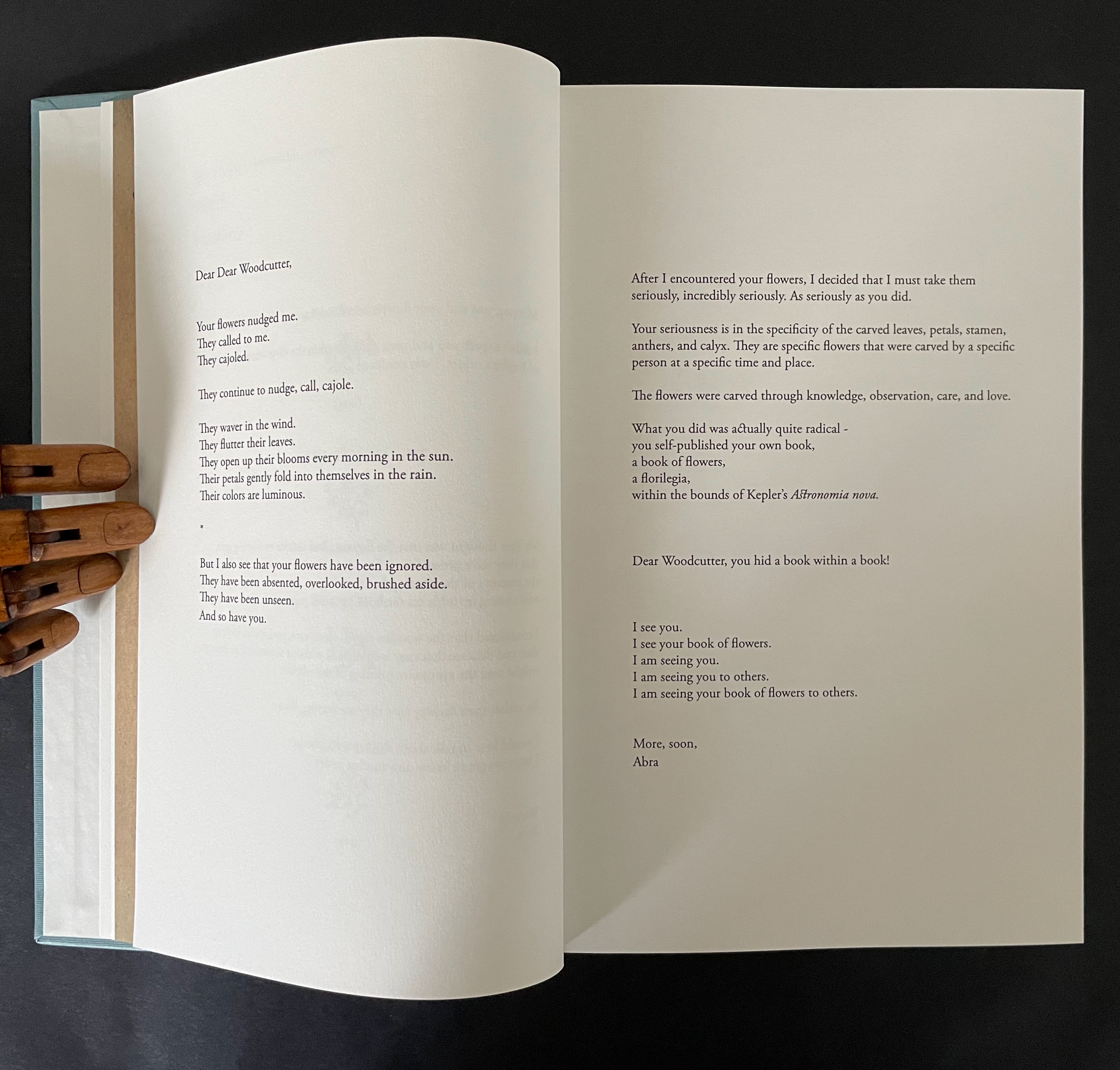
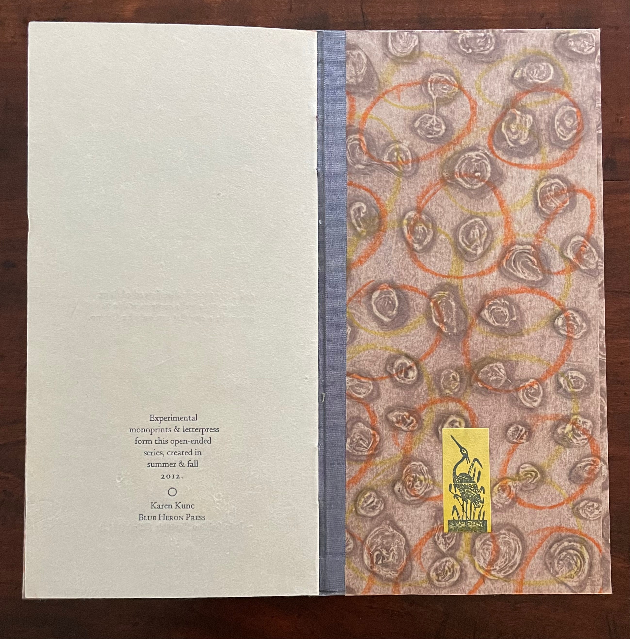
While Stéphane Mallarmé and his Un Coup de Dés may be the front runner among contenders for the title of literary patron saint of the artist’s book, Jorge Luis Borges and Italo Calvino appear in a tie for a distant but respectable second. Each have inspired some striking works. In her series Ten Thousand Things, Karen Kunc has boosted both Borges’ and Calvino’s chances and nudged Calvino’s with an additional homage in leporello format.
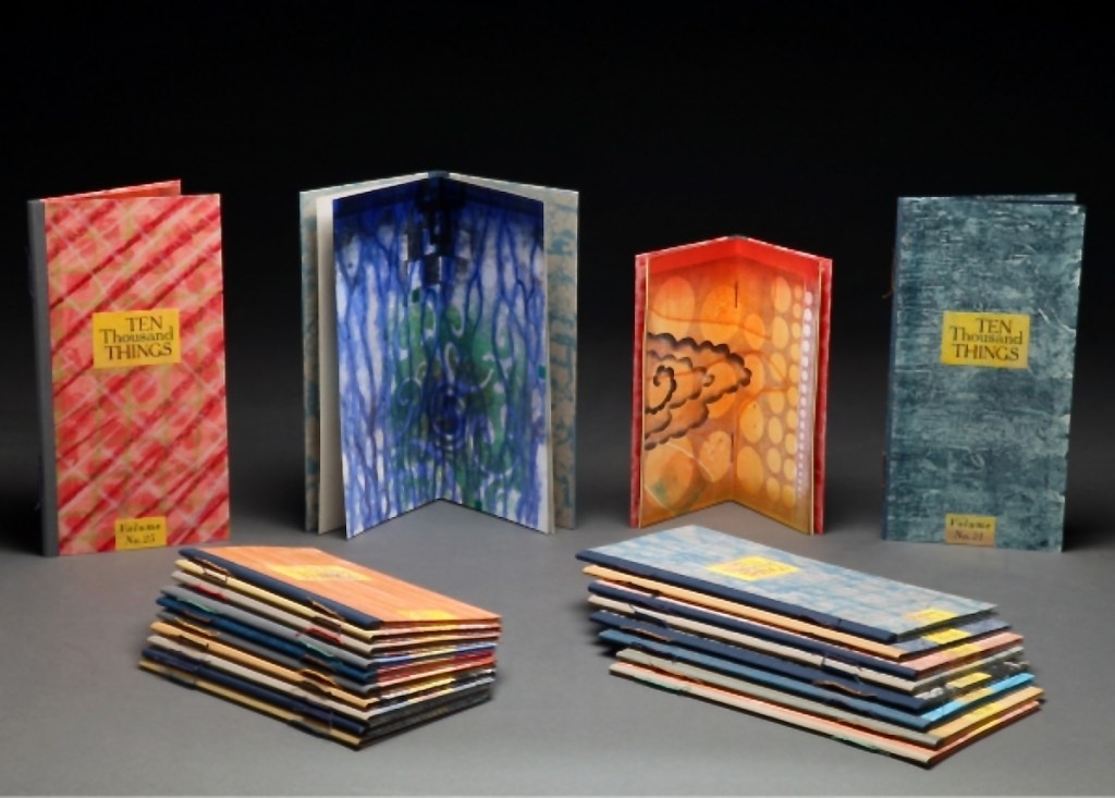
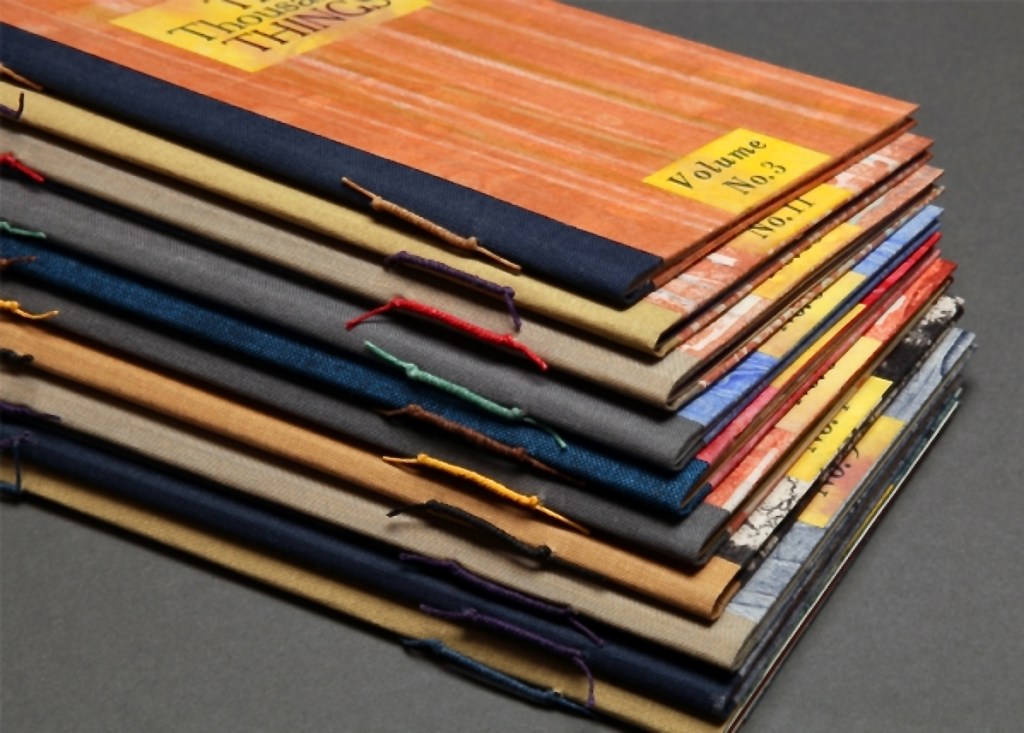
Ten Thousand Things series (2012-13)
Karen Kunc
Images courtesy of the artist.
The series title of Ten Thousand Things springs from Chapter 42 of the Tao Te Ching:
The Tao begot one.
One begot two.
Two begot three.
And three begot the ten thousand things.
The ten thousand things carry yin and embrace yang.
They achieve harmony by combining these forces.
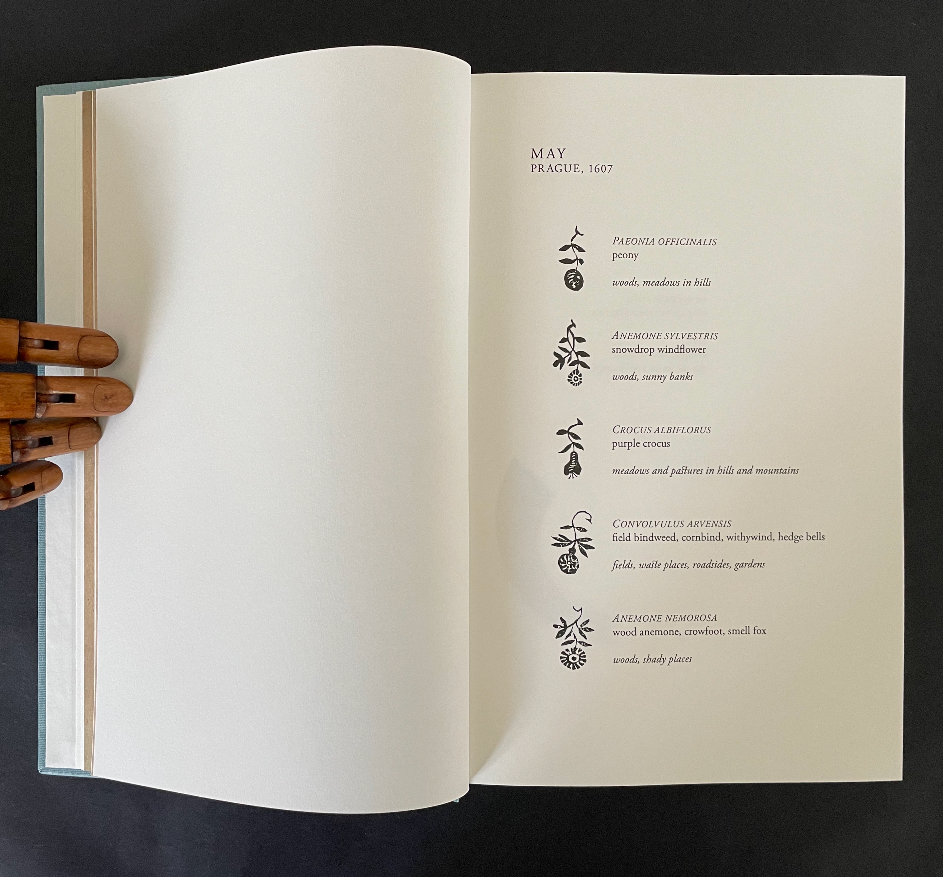
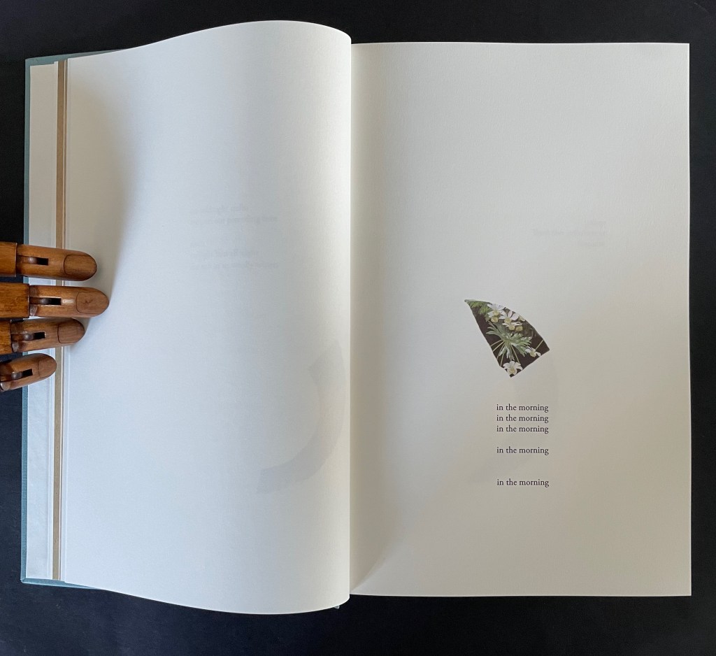
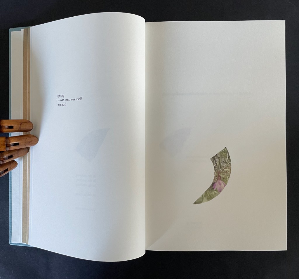
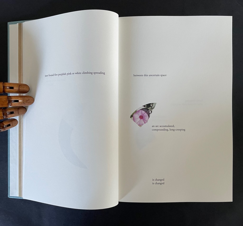
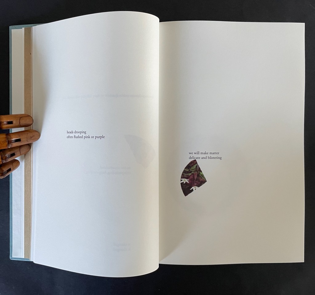
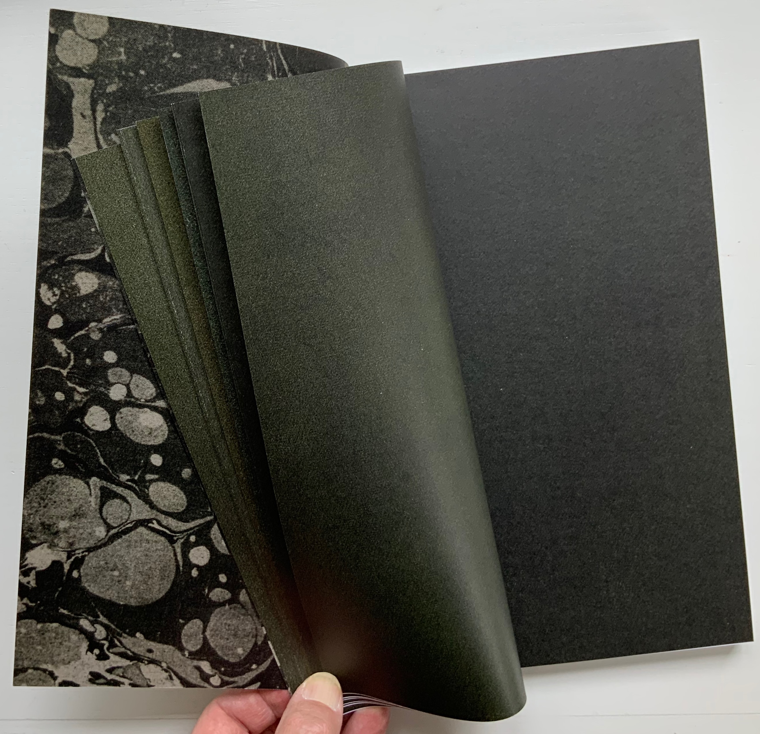
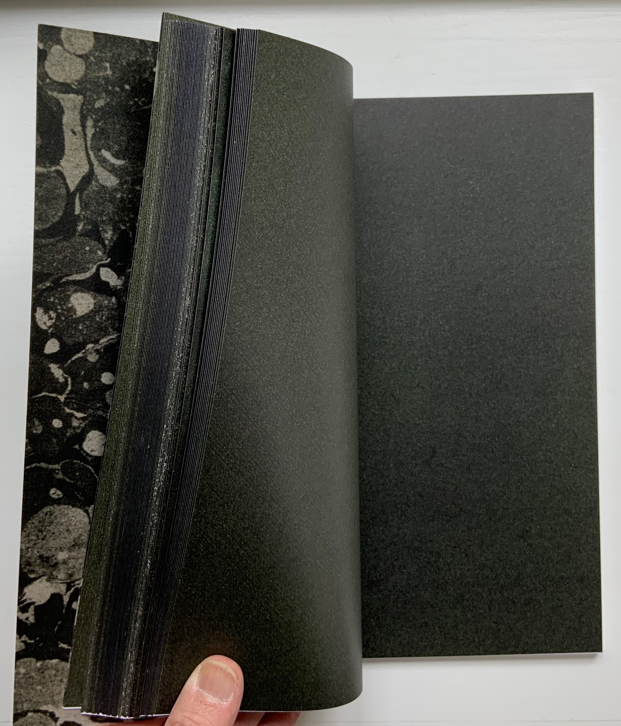
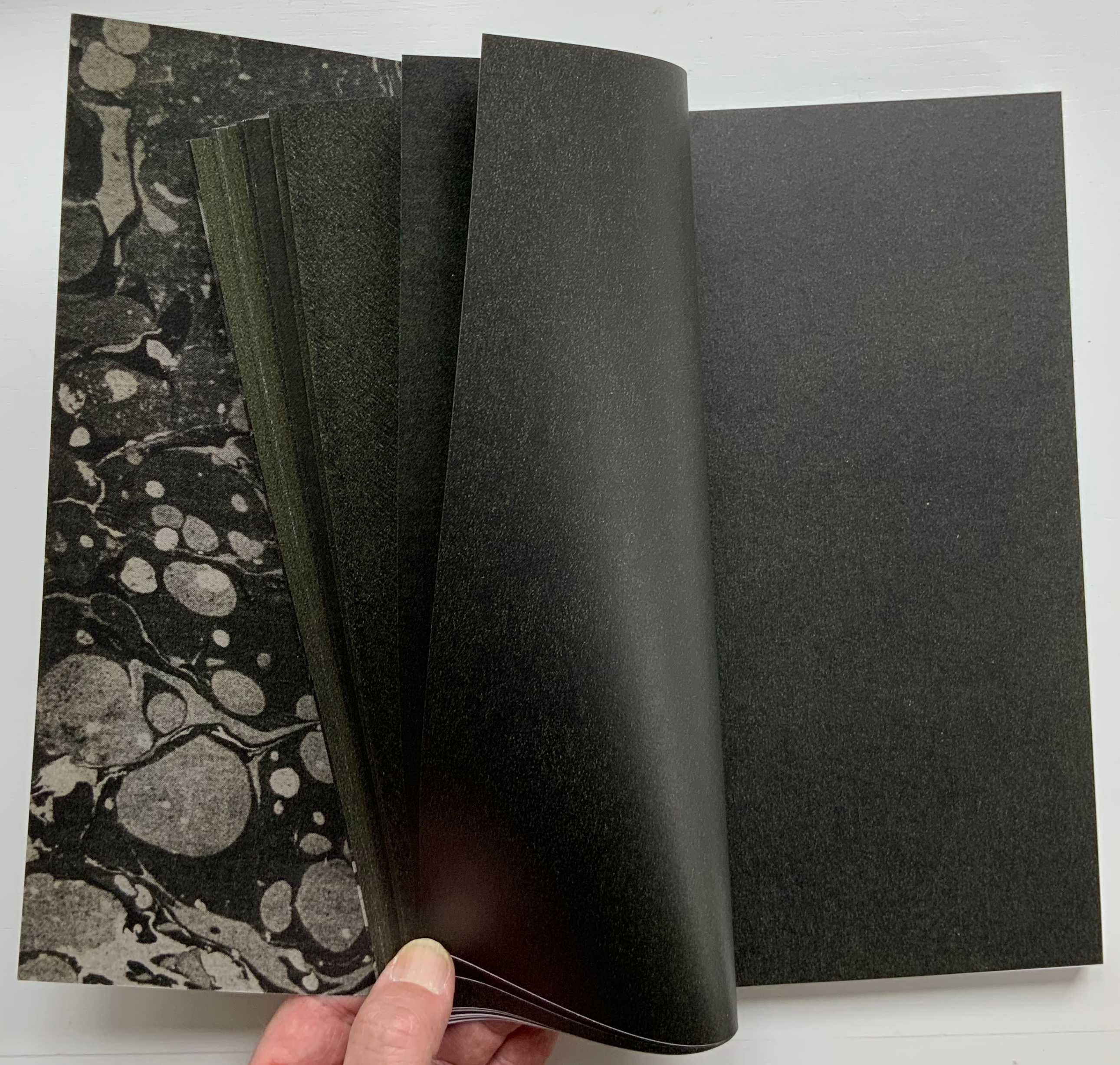
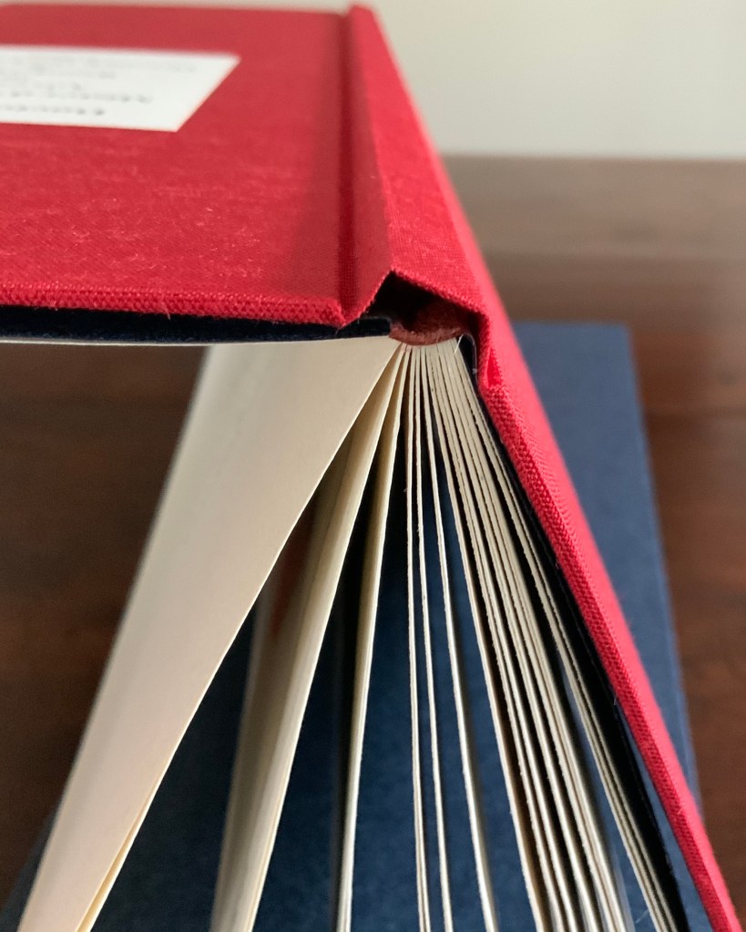
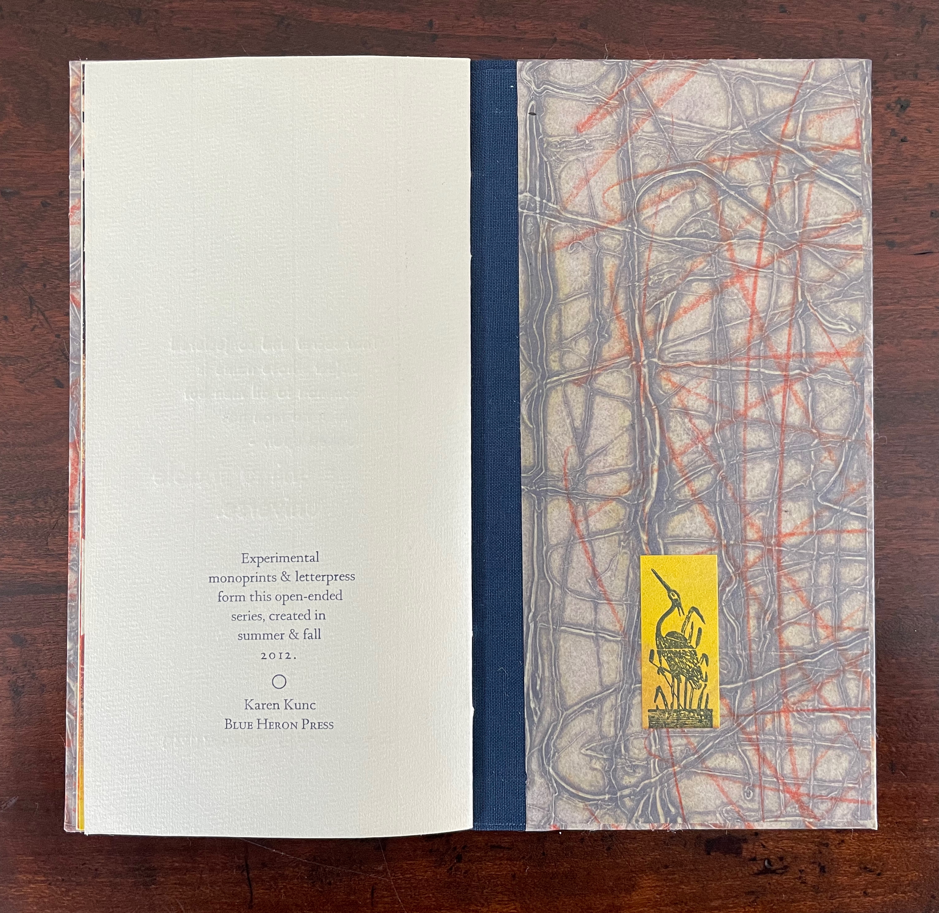
The series consists of 74 books in two sizes as the monoprints were made in two sizes of papers. The papers varied. Most of the works are on Torinoko, a Japanese paper that Kunc found to work well with waterbased Akua Intaglio inks. Some are on Arches 88 paper, a waterleaf she found also very absorbent for the Akua inks. Many of the prints have some handcoloring with ink or liquid acrylic. A few prints as well as all of the covers were made on Japanese Nishinouchi paper, a kozo fiber paper, which she has used extensively for her large woodcut prints. Printing is from collagraph plates on an etching press, with hand coloring and waxing afterwards.
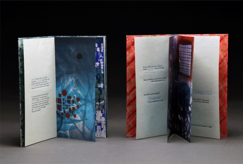
Kunc chose excerpts from the works of five poets/authors and responded to each with several different monoprints not as illustrations of the text but as evocations prompted and to prompt. In addition to Borges and Calvino, she selected from Guillaume Apollinaire, Annie Dillard, and Marge Piercy. Kunc handset the metal type and letterpress printed several sheets of each text on different papers for variety with the monoprints. In each book, the text-bearing sheet folds around the sheet that bears two monoprints, one on each side.
The Tate Museum remarks that “The beauty of monoprinting lies in its spontaneity and its allowance for combinations of printmaking, painting and drawing media.” Kunc’s series extends that allowance to combinations with the elements of the book.
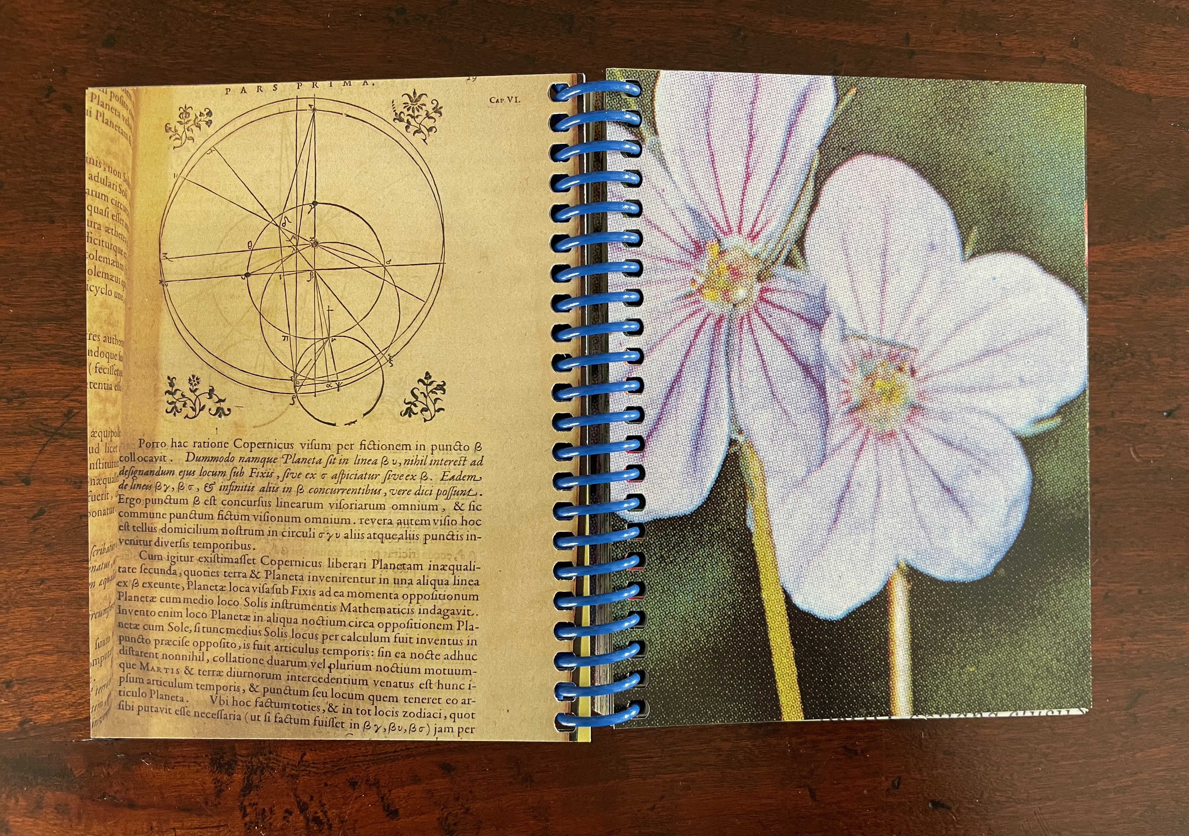
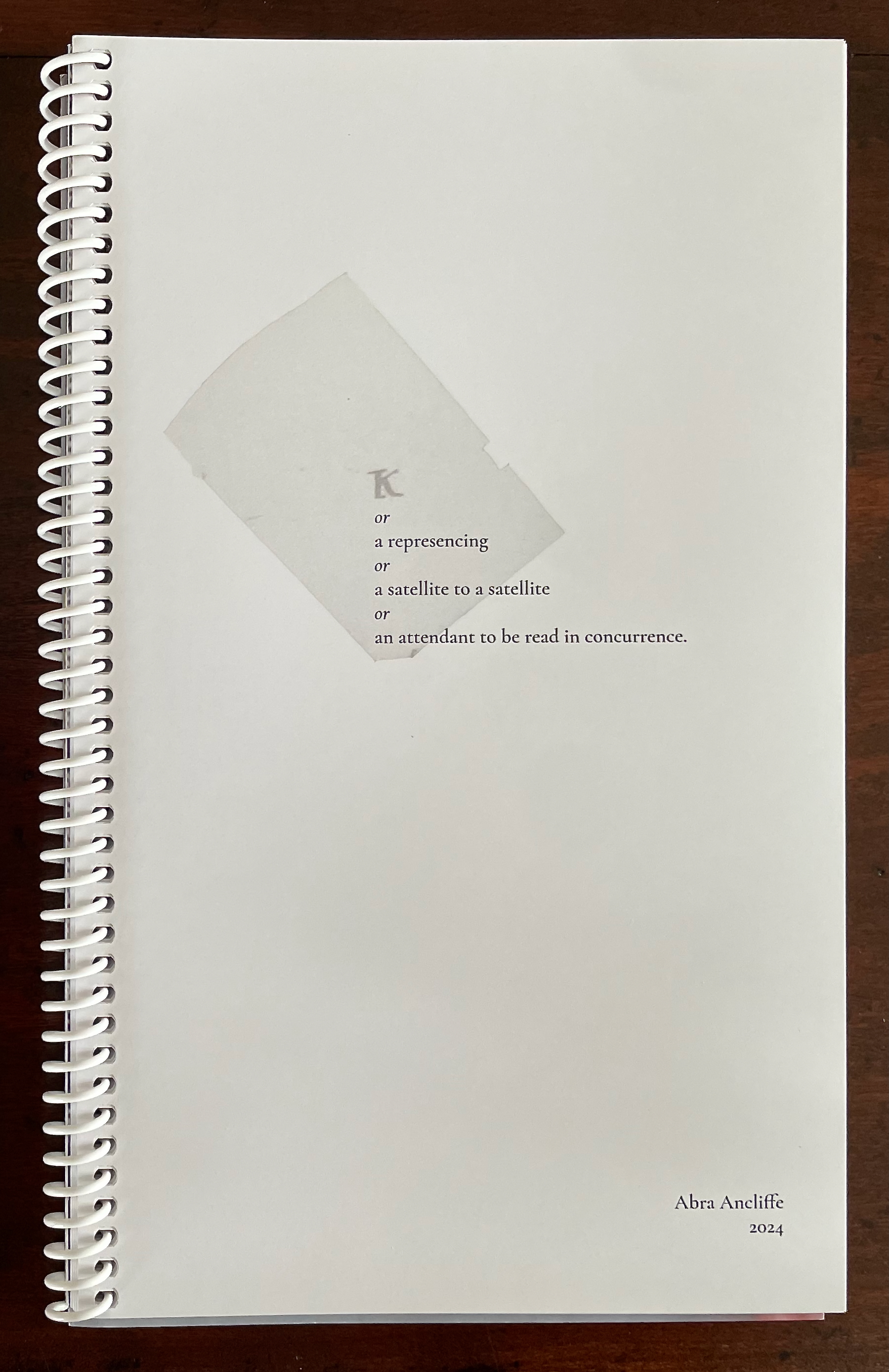
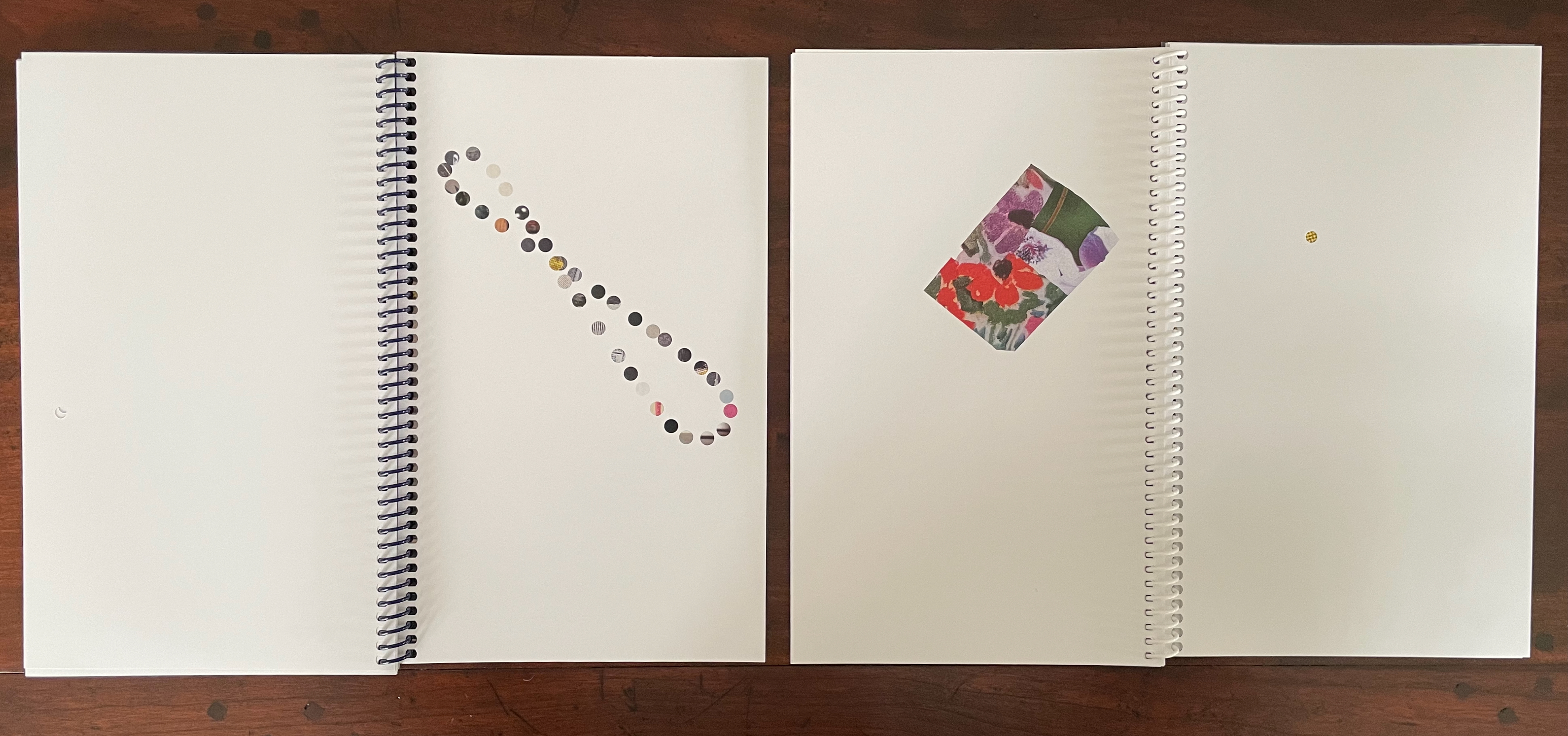
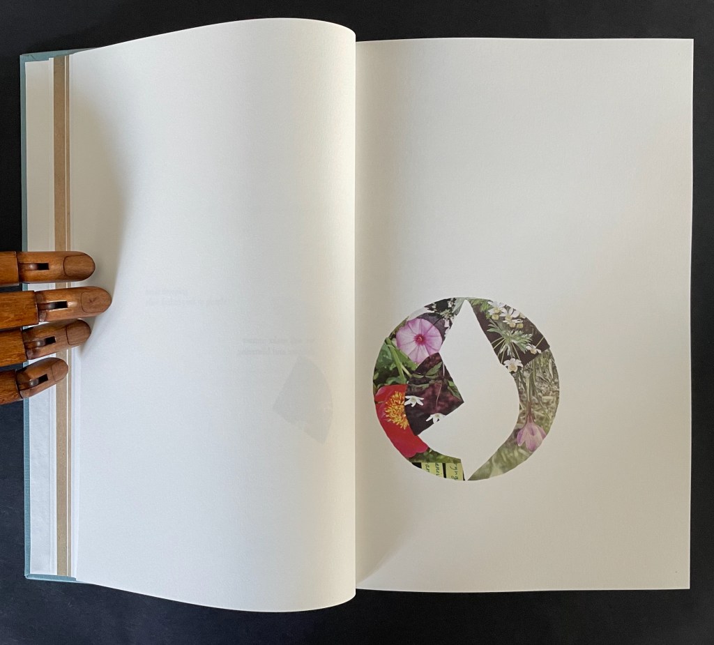
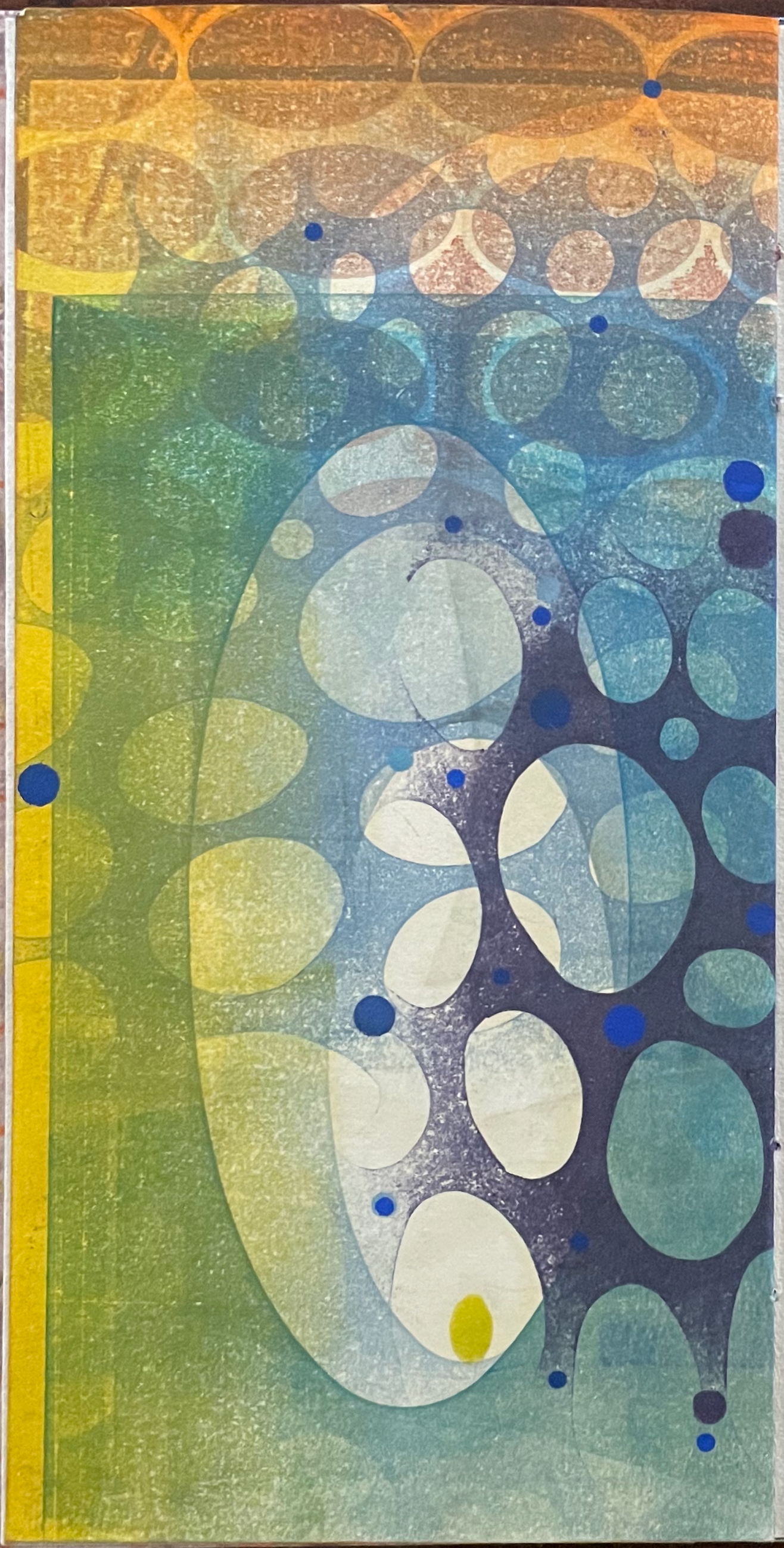
Ten Thousand Things, No. 51 (2012)
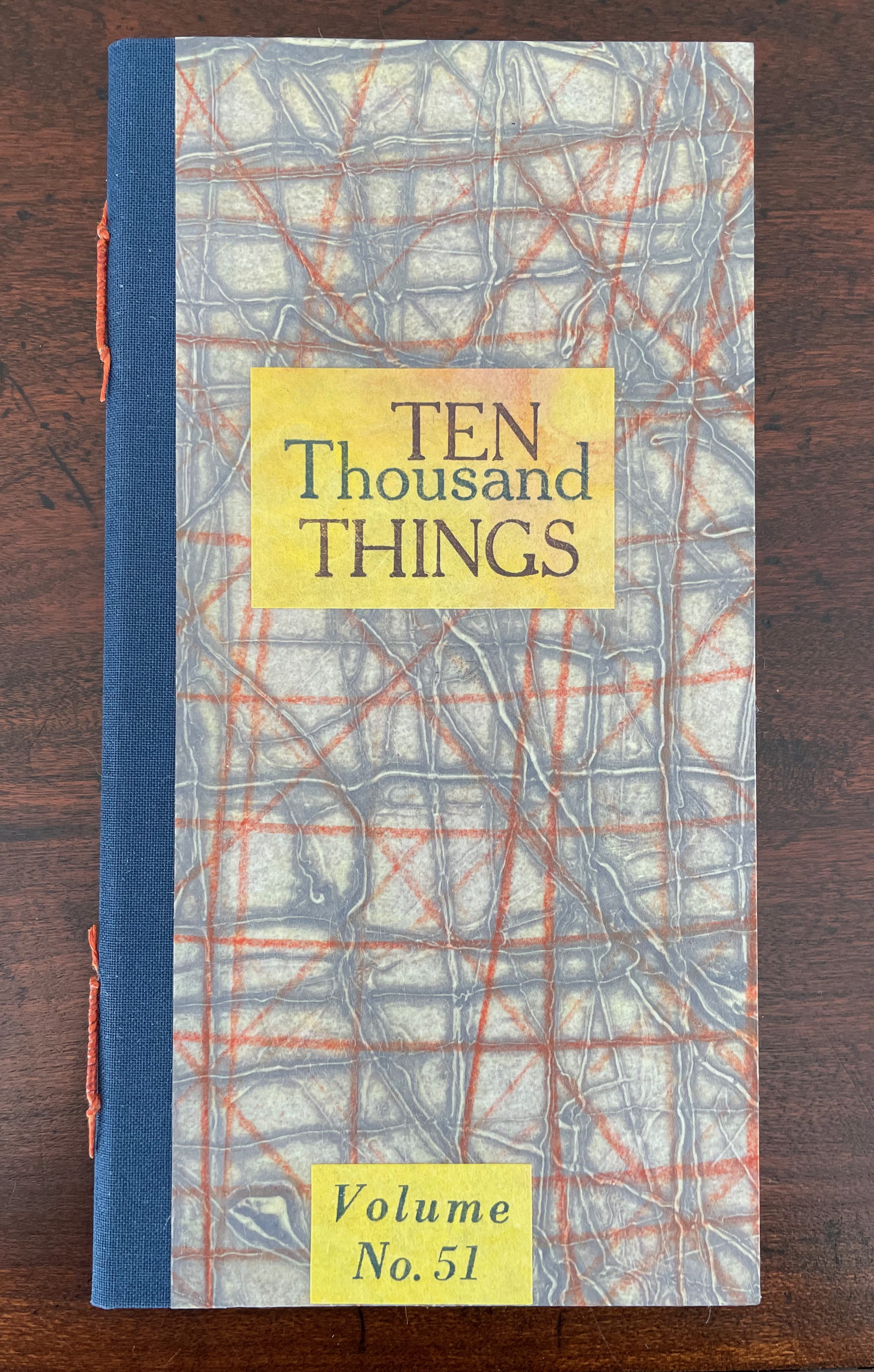
Ten Thousand Things, No. 51 (2012)
Karen Kunc
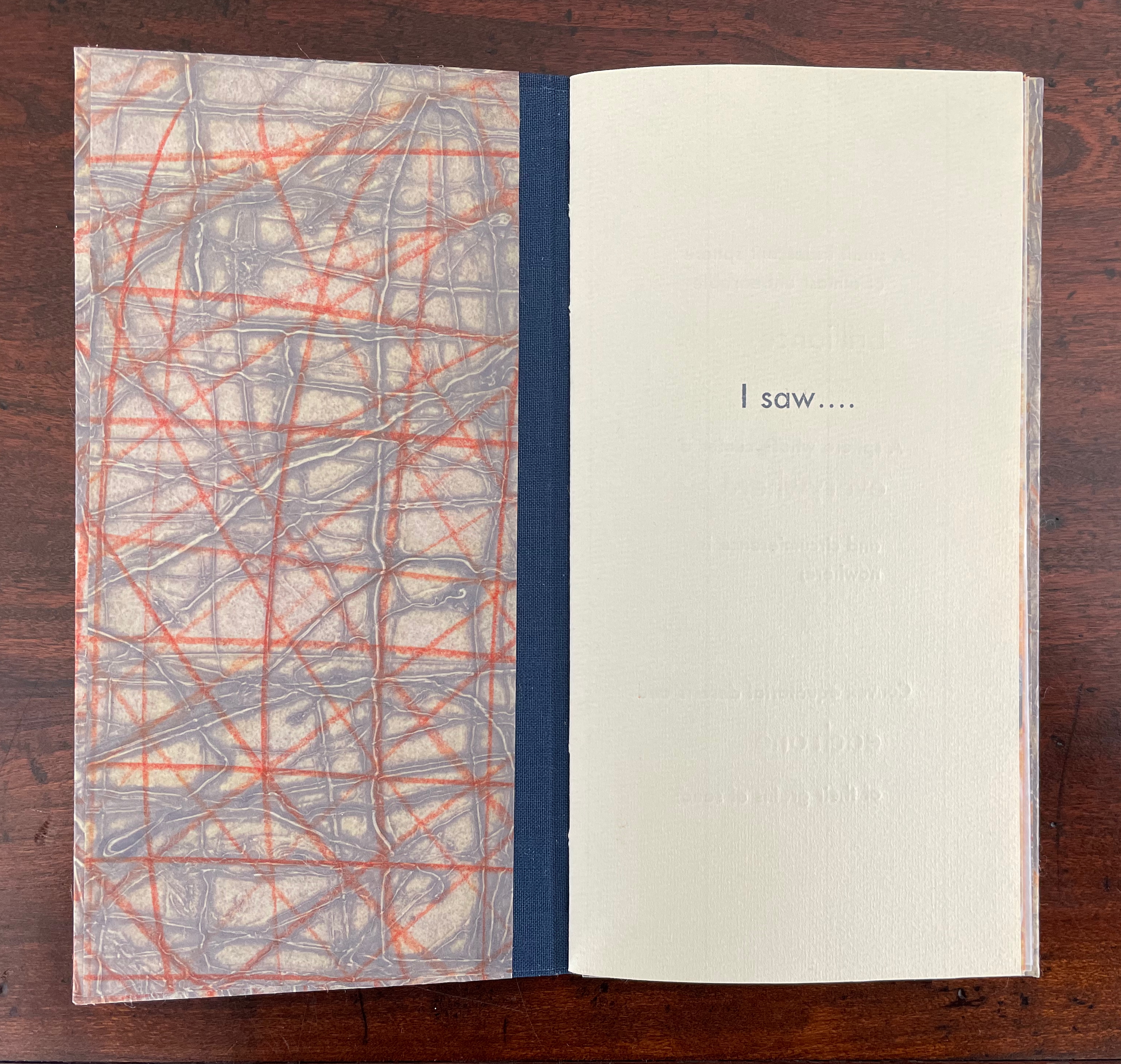
Single-signature booklet containing a recto and verso monoprint created by pressure printing, pochoir, and mixed media, with letterpress text. H205 x W110 mm. [8] pages. From a set of 75. Acquired from the artist, 9 February 2026.
Photos: Books On Books Collection.
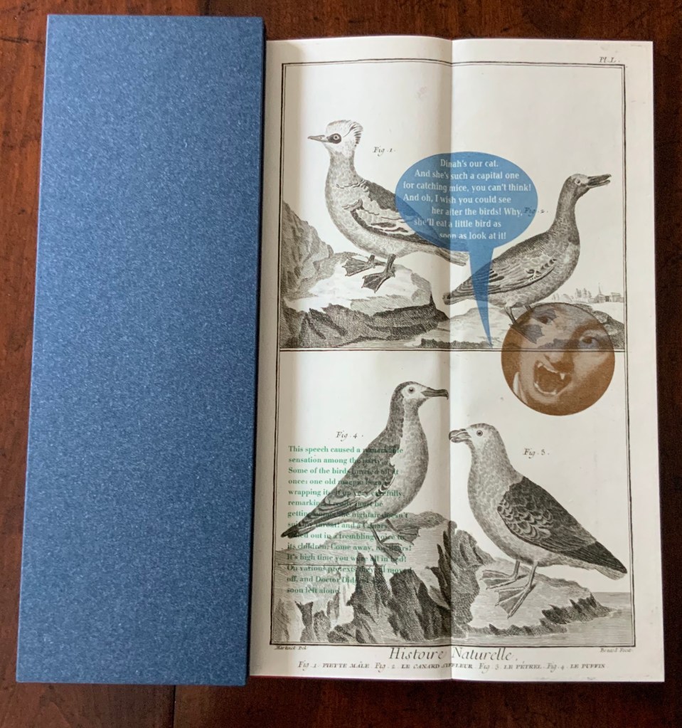
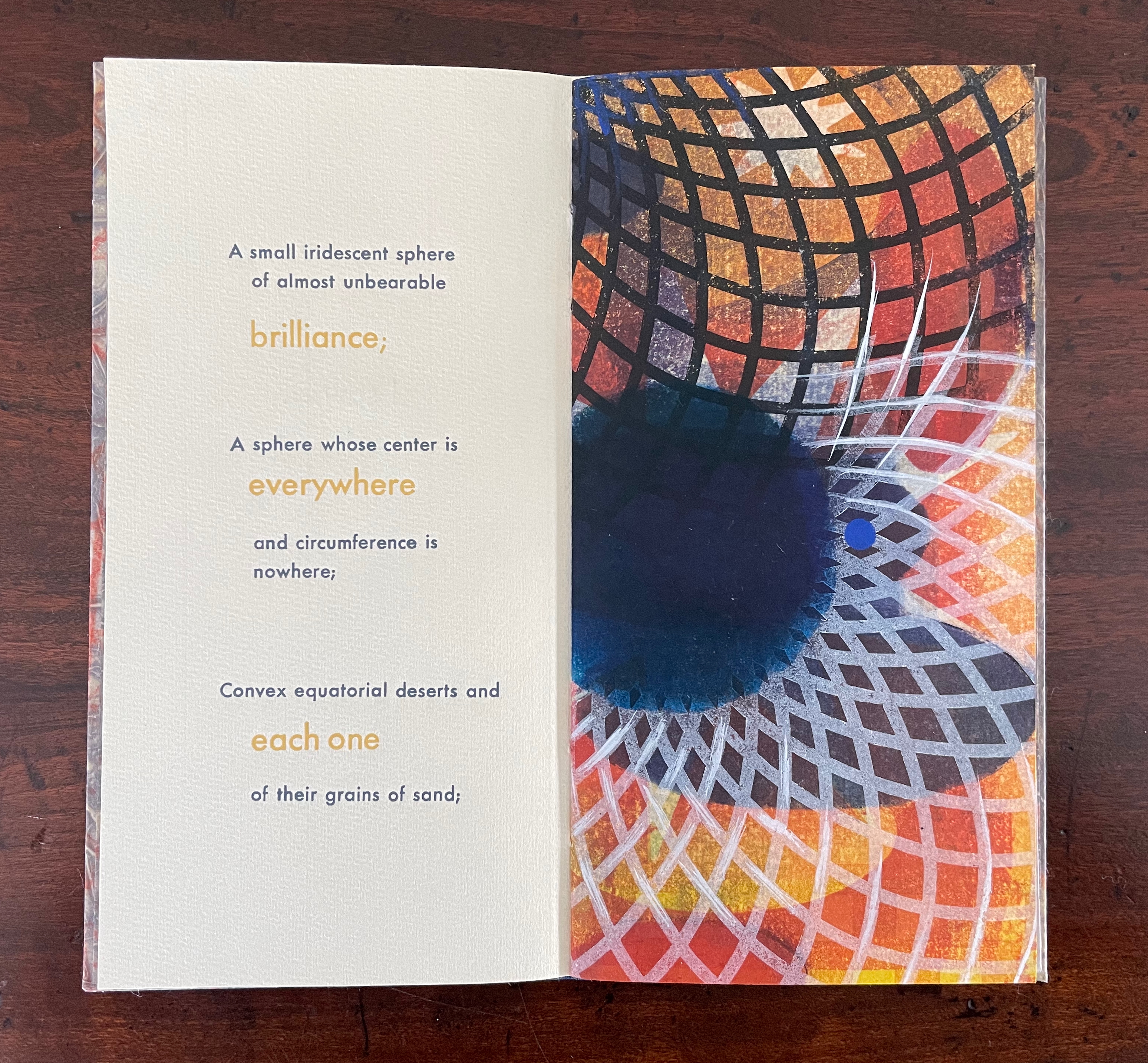
From Borges’ 1945 short story “The Aleph“, No. 51 in Kunc’s Ten Thousand Things series extracts four descriptions of the object or phenomenon Borges the narrator sees in the basement of his intolerable acquaintance Carlos Argentino Daneri:
- I saw a small iridescent sphere of almost unbearable brilliance[;]
- a sphere whose center is everywhere and circumference is nowhere;
- convex equatorial deserts and each one of their grains of sand;
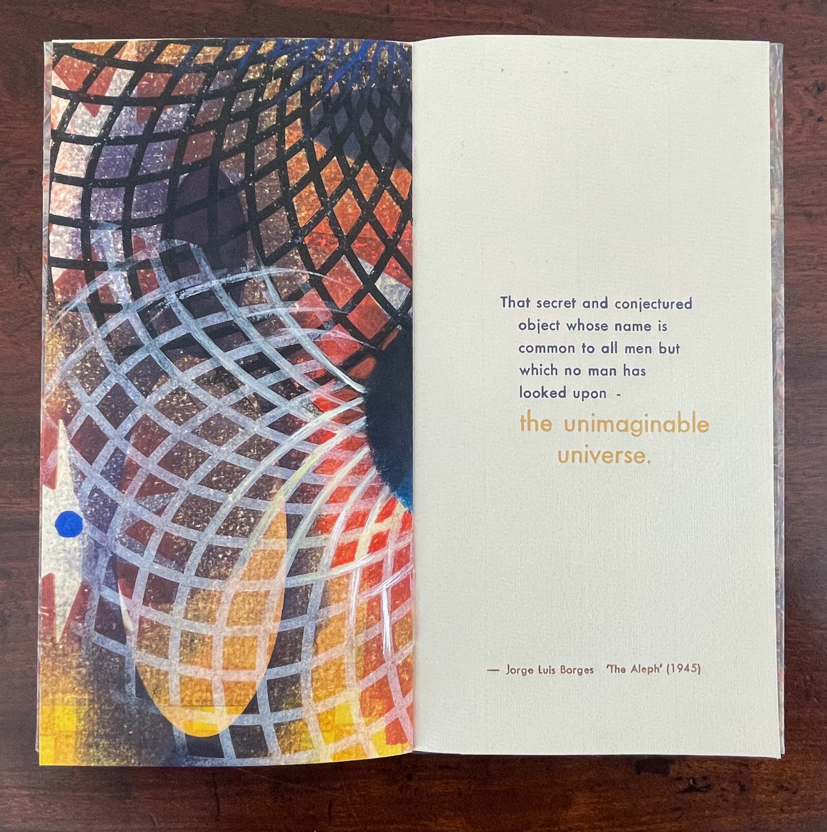
- that secret and conjectured object whose name is common to all men but which no man has looked upon — the unimaginable universe.
With a deft touch, Kunc has selected and slightly altered the more abstract of Borges’ long Whitmanic observations (in the first, she inserts an ellipsis and substitutes a semicolon for a full stop; for the second and third, the order of appearance is changed). Borges prefaces his catalogue of what he sees with a caveat about the inadequacy of words to depict the concept of multum in parvo [“much in little”]:
All language is a set of symbols whose use among its speakers assumes a shared past. How, then, can I translate into words the limitless Aleph, which my floundering mind can scarcely encompass? Mystics, faced with the same problem, fall back on symbols: to signify the godhead, one Persian speaks of a bird that somehow is all birds; Alanus de Insulis, of a sphere whose center is everywhere and circumference is nowhere; Ezekiel, of a four-faced angel who at one and the same time moves east and west, north and south. (Not in vain do I recall these inconceivable analogies; they bear some relation to the Aleph.) Perhaps the gods might grant me a similar metaphor, but then this account would become contaminated by literature, by fiction. Really, what I want to do is impossible, for any listing of an endless series is doomed to be infinitesimal. In that single gigantic instant I saw millions of acts both delightful and awful; not one of them occupied the same point in space, without overlapping or transparency. What my eyes beheld was simultaneous, but what I shall now write down will be successive, because language is successive.
In light of the snide literary sniping and rivalry that forms the background to “The Aleph”, Borges may be forgiven for omitting William Blake’s spectacular translation of “the limitless Aleph”:
To see a World in a Grain of Sand,/ And a Heaven in a Wild Flower,/ Hold Infinity in the palm of your hand,/ And Eternity in an hour. (Auguries of Innocence, 1803).
It might have brought Borges’ descriptive and narrative enterprise to an harrumphing halt. We would then not have had this particular instance of Karen Kunc’s taking up the challenge of rendering in an artist’s book Borges’ verbal description of the Aleph. What image could resonate with or reflect his words and reflect the impossibility he describes? How might the arrangement of pages enhance/diminish it? How might the act of turning a page reflect or obscure it?
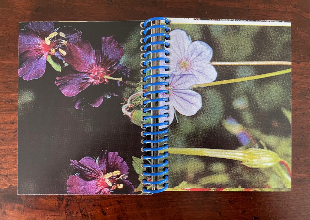
The vibrant circle of deep blue is only two dimensional, but perhaps the abstractions behind the dark convex grid suggest the three dimensionality of the story’s sphere. Perhaps the more brilliant but smaller blue circle beside the larger one conveys the multum in parvo concept in the style of medieval narration differentiating multiple points in time with images of different size in the same plane. Perhaps the full-page bleed of the image even suggests that paradoxically the image extends from the page yet encompasses the page. Likewise might the sheet’s fold that truncates the circle and the dark and light grids imply continuity coexisting with discontinuity? Does the dark blue grid that curves over the orange and burnt umber colors imply the “convex equatorial deserts”?
Turning from that half view of the monoprint, we have the full view of the monoprint on the other side of the sheet. An angular and checkered blue background hovers over two ellipsoid figures in an orange foreground. Is the background network with its numerous small red dots a version of Indra’s net, that cosmological metaphor of an infinite net with a jewel at each juncture reflecting and being reflected by every other? The dark ellipsoid seems to quiver surrounded by crosshatching. Is it in motion toward the upright orange ellipsoid? Is this a moment in time and space?
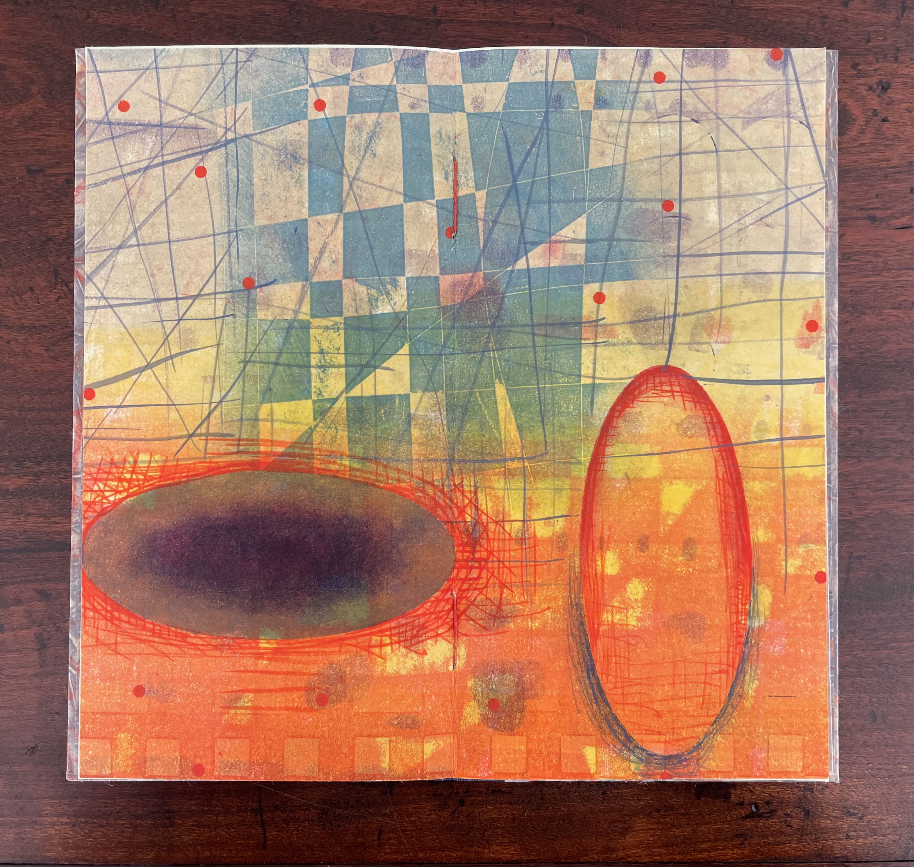
The other half of the monoprint with the dark blue circle comes into view with the last double page spread. If we could see all at once the monoprint with the dark blue circle, the juxtaposition of spheres and ellipses would stand out more.
The white stars behind the grid stand out a bit more, and the small bright circles seem more clearly positioned on curving white orbital tracks. Is it an allusion to planetary and constellatory movement, bring a universe within this small book? Without photographic manipulation, we have to open our minds to imagine it. As Carlos replies when Borges worries that it will be too dark in the cellar to see the Aleph, ““Truth cannot penetrate a closed mind. If all places in the universe are in the Aleph, then all stars, all lamps, all sources of light are in it, too.”
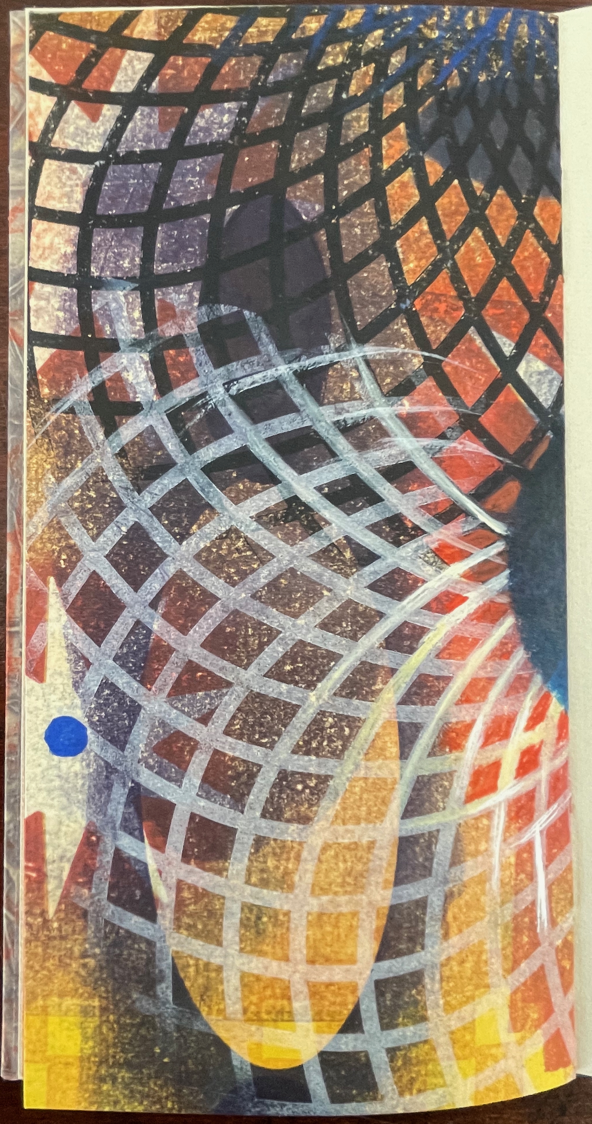
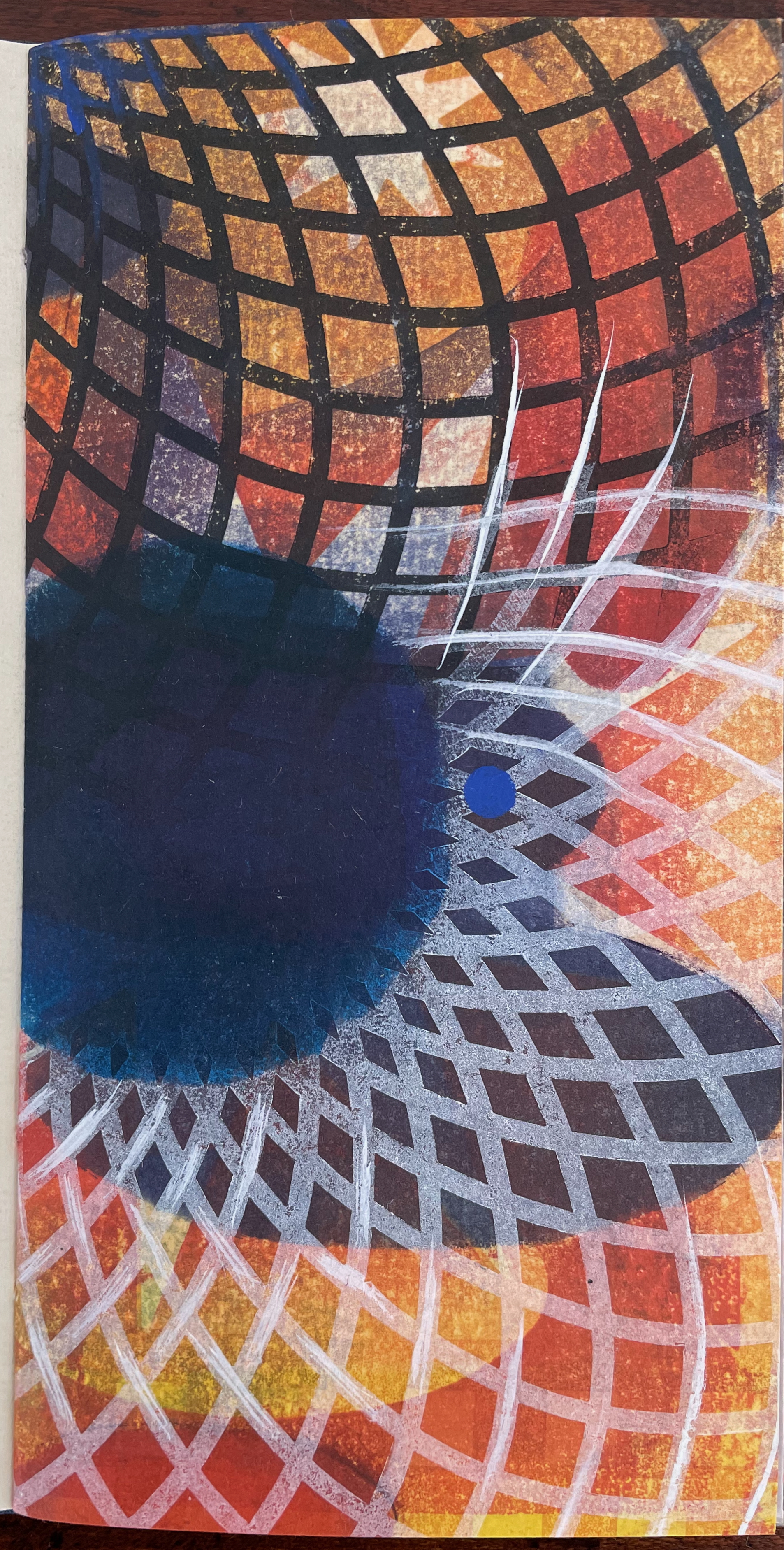
Of course, this photographic manipulation is a cheat and overlooks that Kunc has combined the half-views of one side of the monoprint with the full view on the other side to reflect the challenge of embodying a simultaneous phenomenon with successive phenomena.
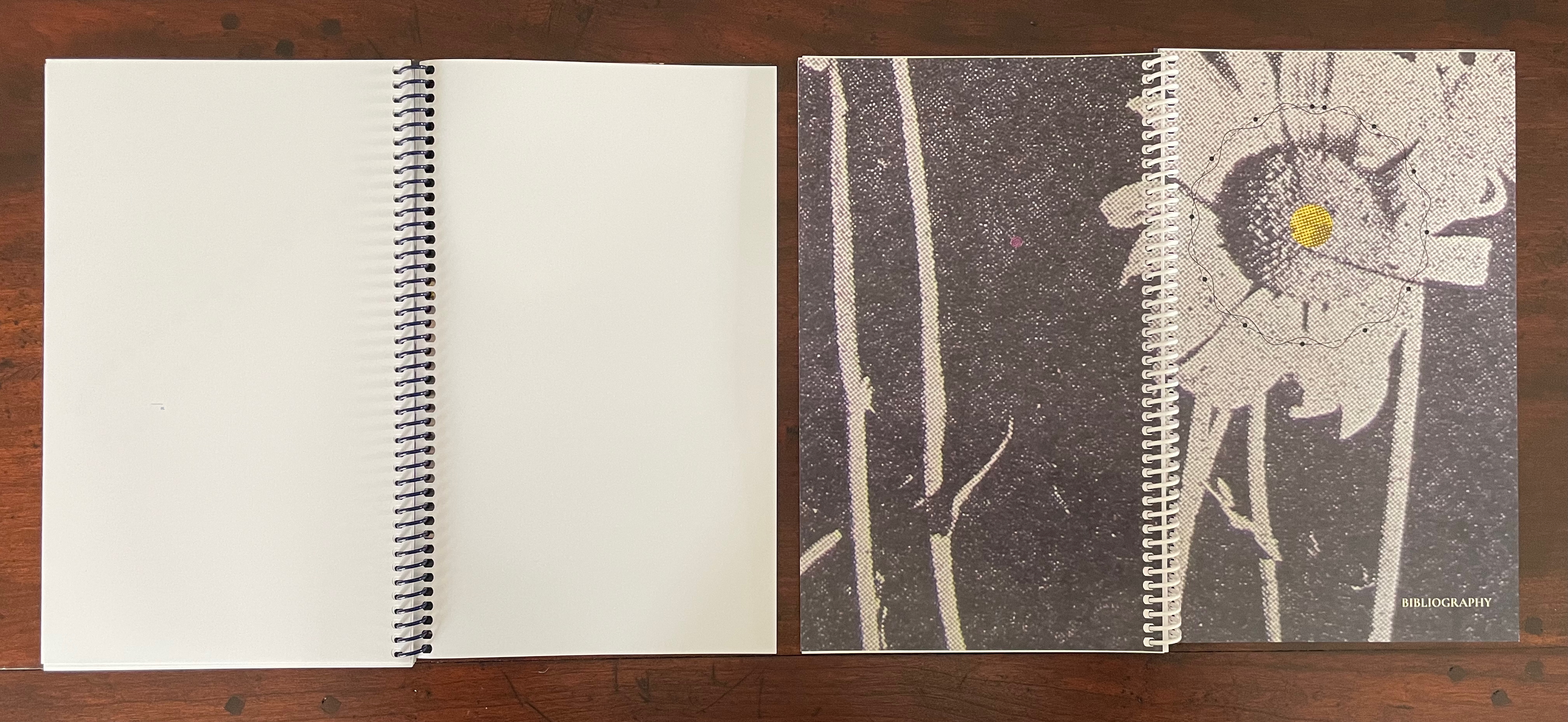
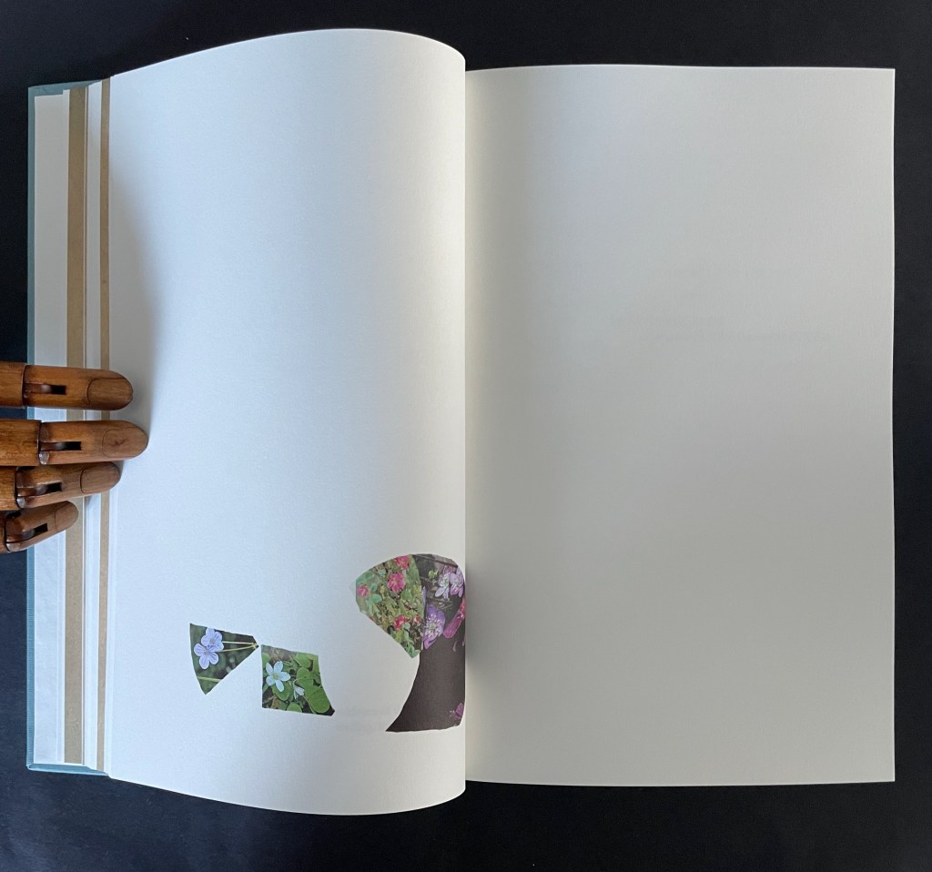
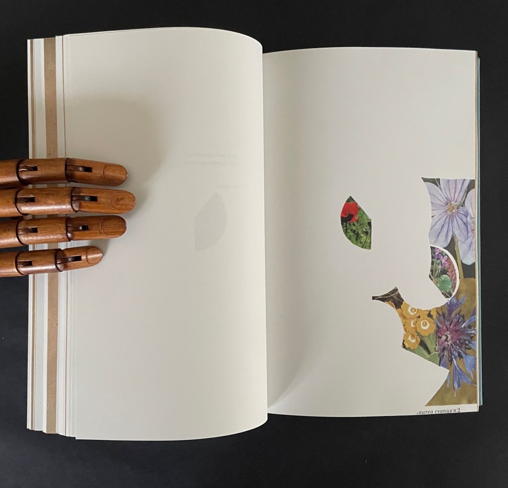
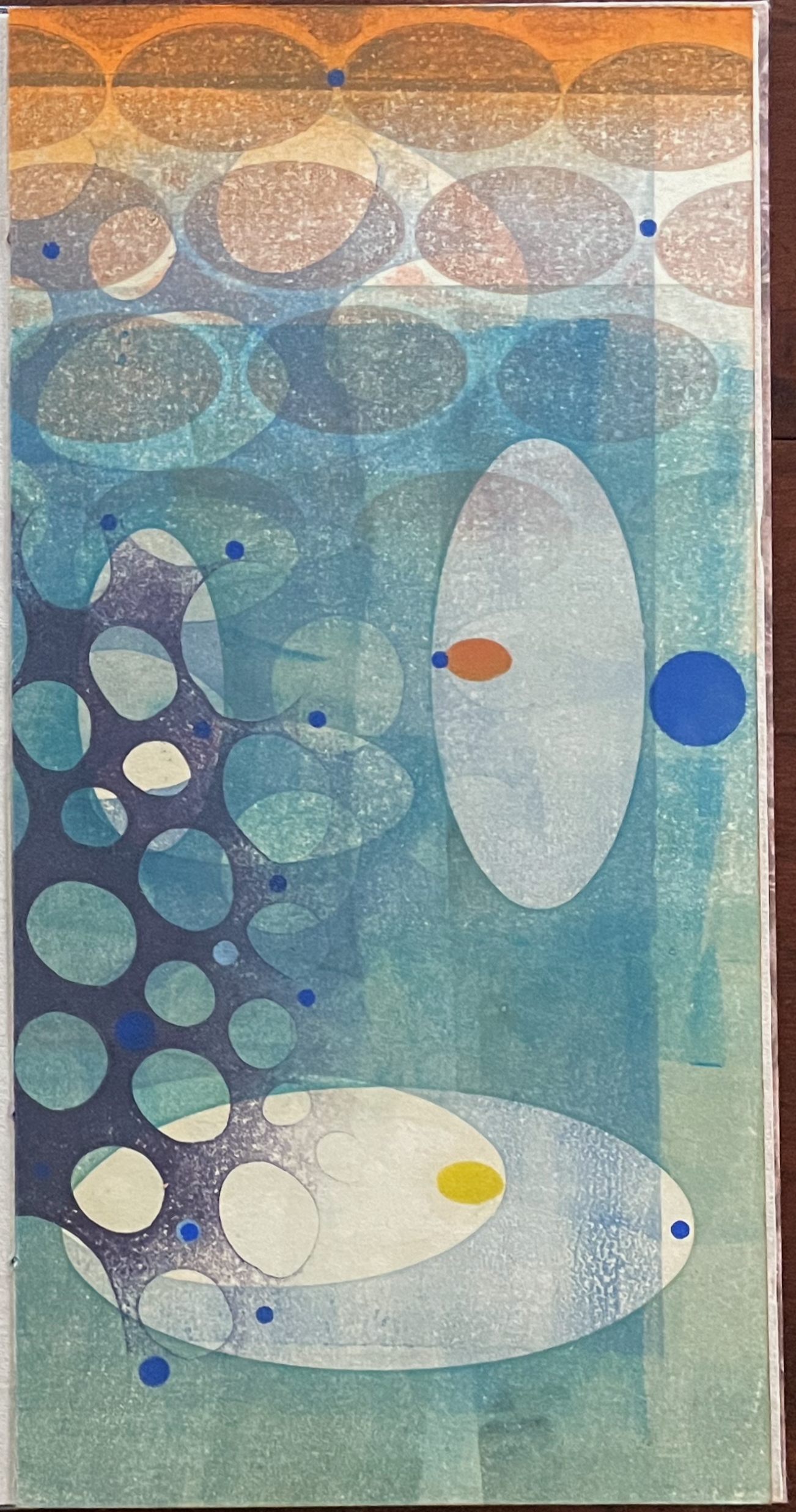
Ten Thousand Things, No. 64 (2012)
Ten Thousand Things, No. 64 (2012)
Karen Kunc
Single-signature booklet containing a recto and verso monoprint created by pressure printing, pochoir, and mixed media, and a letterpress text on various papers.H250 x W125 mm. [8] pages. From a set of 75. Acquired from the artist, 9 February 2026.
Photos: Books On Books Collection.
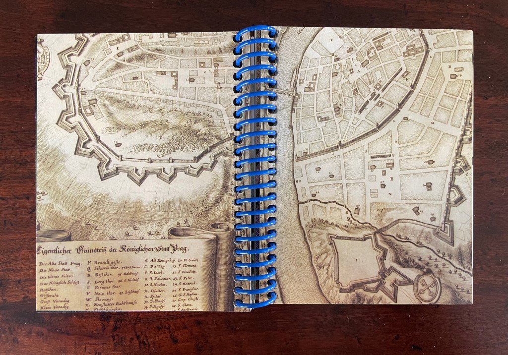
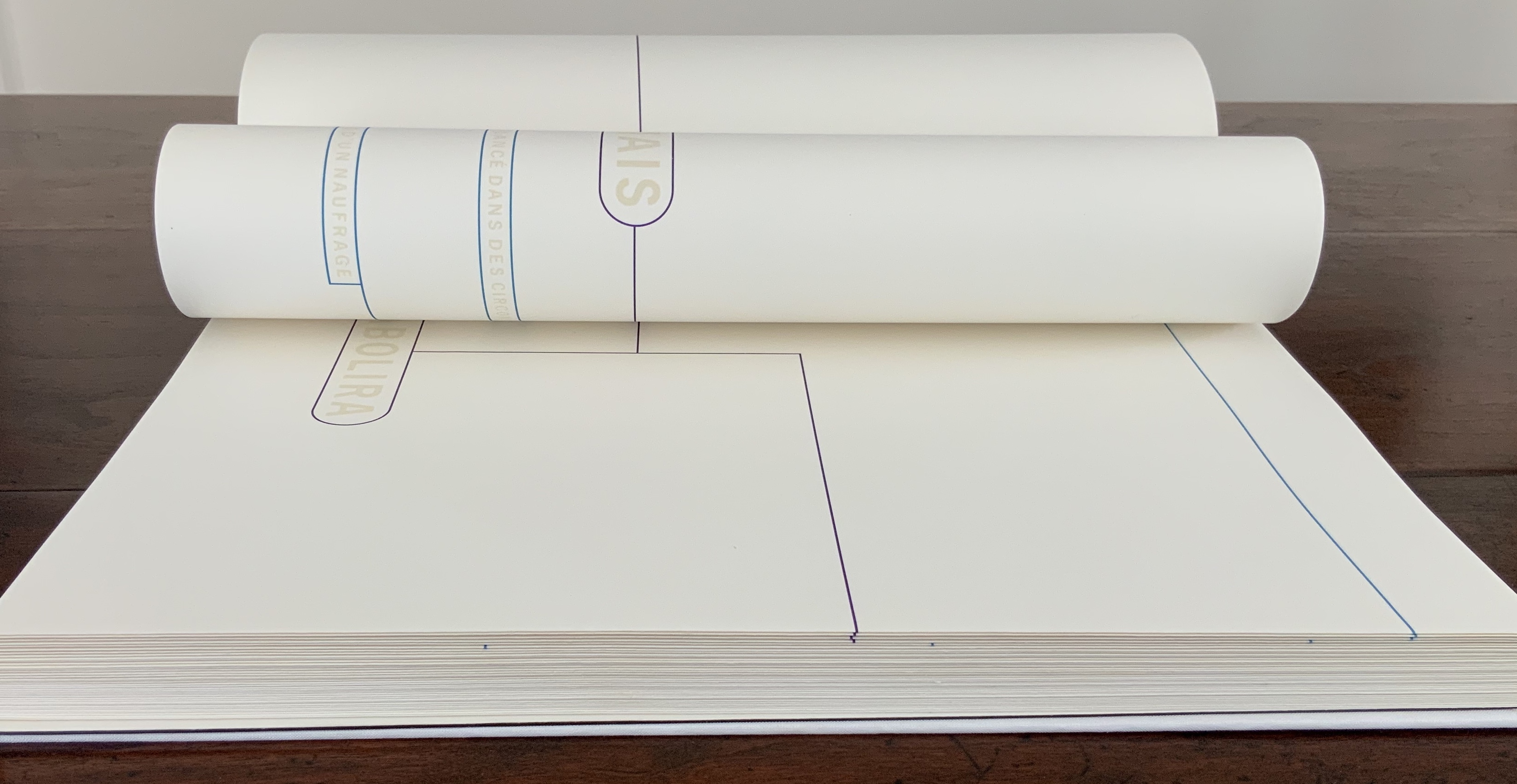
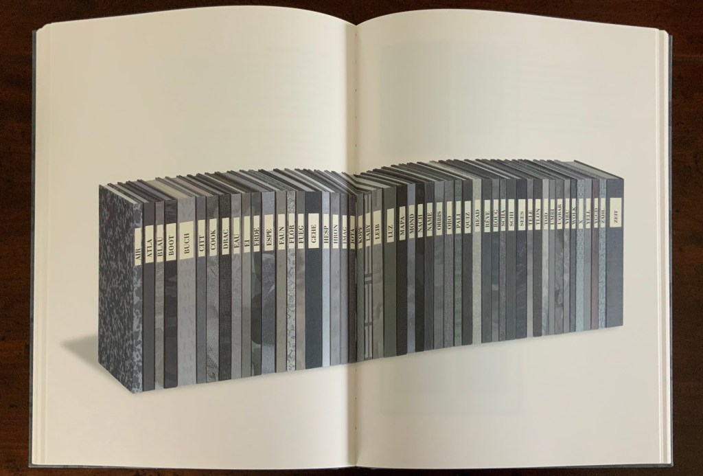
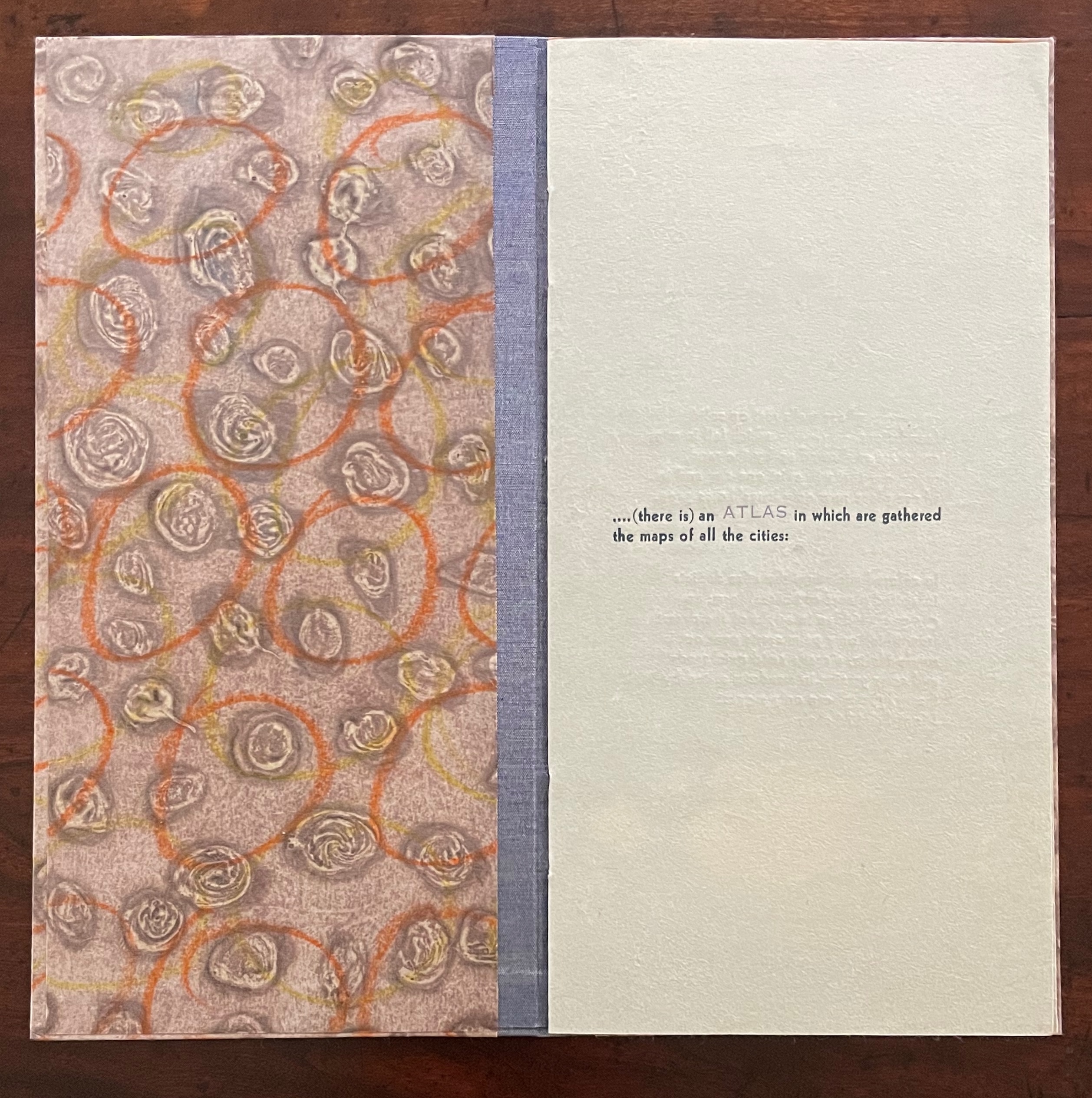
Of the 74 books in the Ten Thousand Things series, 11 of them pay homage to Italo Calvino’s Invisible Cities (1972/74). The book’s premise is that Kublai Khan sent Marco Polo out into the empire to visit the Khan’s cities and return with close descriptions. In nine parts, each prefaced and closed with a philosophical dialogue between the Khan and Polo, the traveller describes fifty-five cities — all of them imaginary. While most works of homage to Invisible Cities select one or more of these fictitious 55 cities on which to focus, Kunc chooses more general text from the preface to Part 9. This is the text used in all 11 of the works of homage to Calvino:
…. (there is) an ATLAS in which are gathered the maps of all the cities:
THOSE whose walls rest on solid foundations, THOSE which fell in ruins and were swallowed up by the sand, THOSE that will exist one day and in whose place now only hares’ holes gape.
In colored miniatures the atlas depicts inhabited places of unusual form: an OASIS hidden in a fold of the desert from which only palm crests peer out is surely Nefta; a castle amid quicksands and cows grazing in meadows salted by the TIDES can only suggest Mont-Saint-Michel;
and a PALACE that instead of rising within a city’s walls contains within its own walls a city that can only be Urbino.
With certain words appearing in all caps in a lighter weight and lighter color than the surrounding text, the excerpts have a different texture from those in No. 51. The all caps words rise above or fall below the line of type.
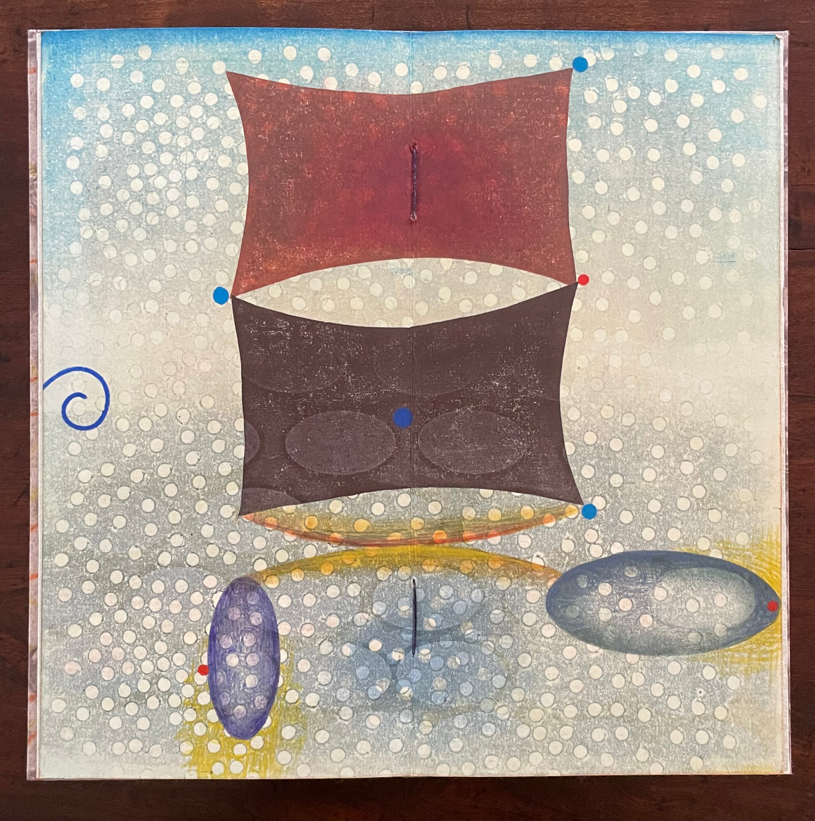
As with No. 51, only one side of the double-sided monoprint is viewable as a whole; the other side is viewable in halves. In No. 64’s first half-view, the shapes and colors have a submerged quality that echoes the now sinking or subsiding type of “THOSE”, “OASIS”, and “TIDES”:
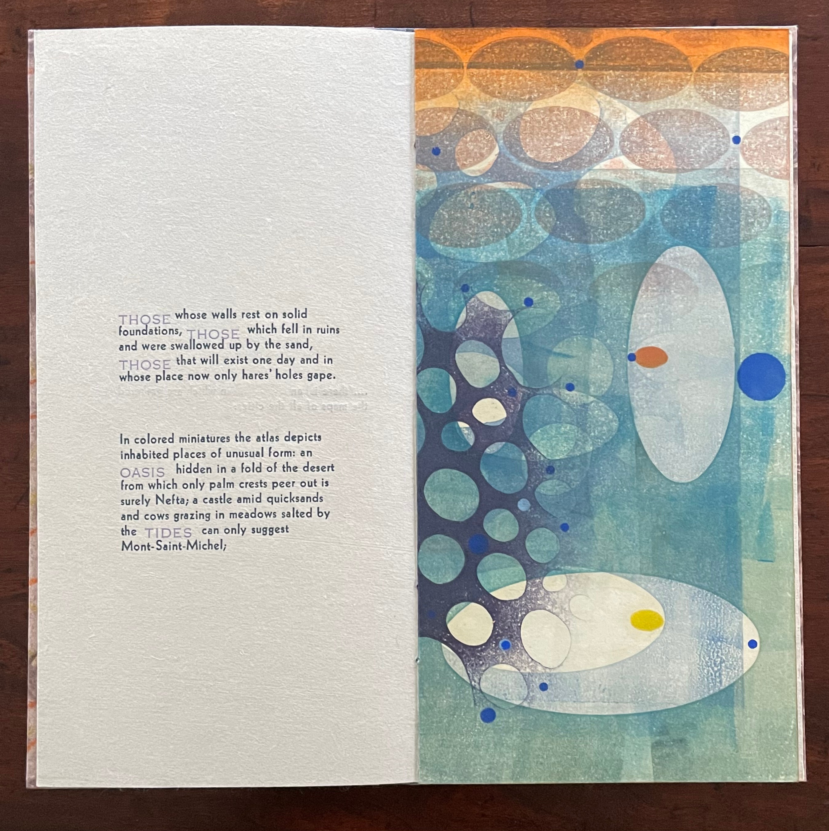
As the most prominent feature of the full-view monoprint, perhaps the two rectangular sail-like shapes recall the Chinese emperor and Venetian traveler. Or perhaps they allude to the remnants of a tower poking above the sands. The ellipsoidal shapes might be the “hares’ holes” mentioned above. The seemingly non-allusive flurry of white dots across the spread behave strangely. They lie in the background in the upper two thirds of the spread but then shift into the foreground in the lower third. The four bright blue dots may have migrated from the first half-view, but the trio of red dots are new participants. The presence of both contributes to an urge to flip back and forth between the first half-view and this full view.
The second half-view faces text that again displays all caps letters that sink below the line: “PALACE”, but more notably, the palace does not sit within a city but a city sits within the palace, “a city that can only be Urbino”. So, a real city within a fictive palace.
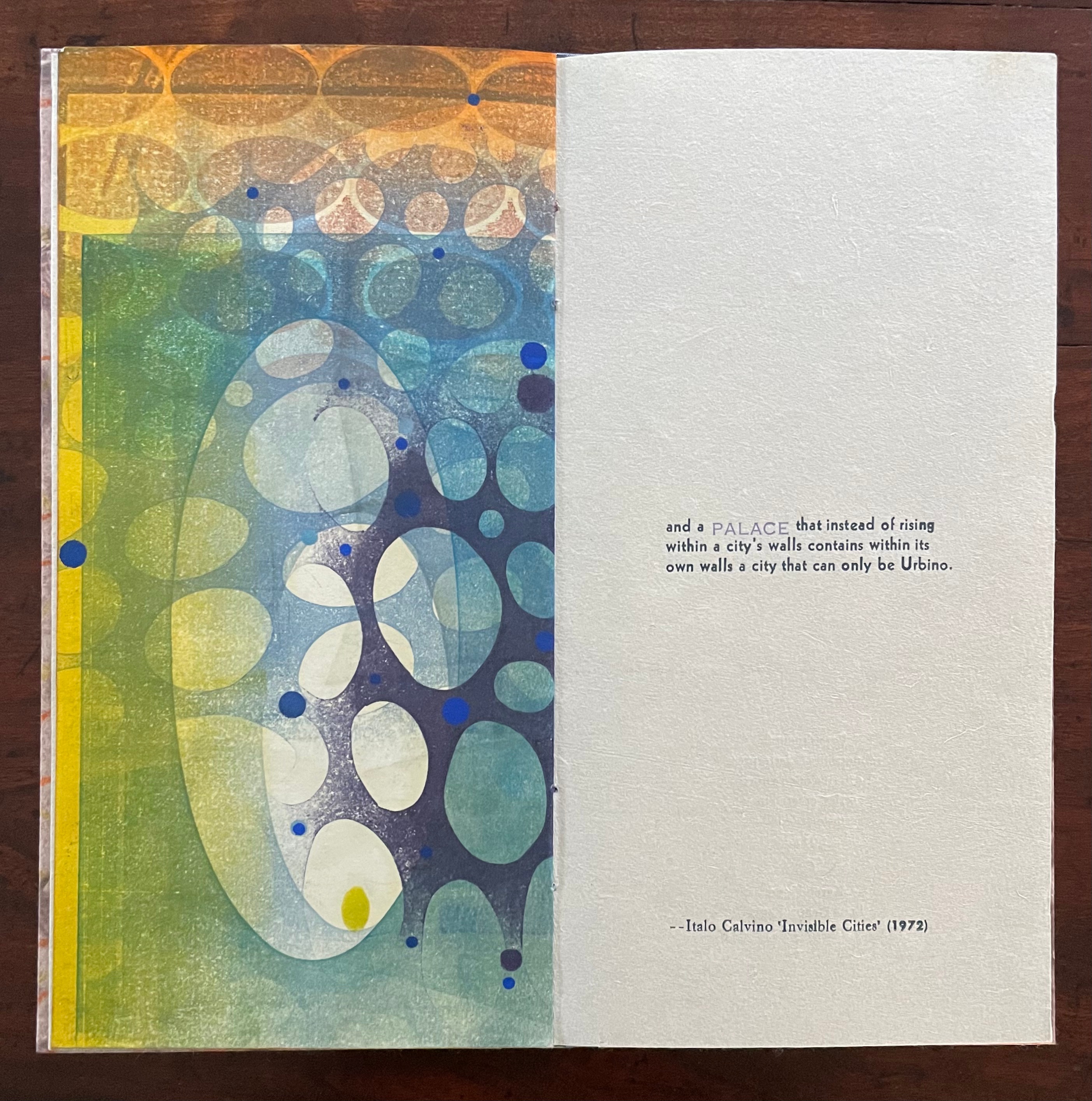
We can perform the photographic cheat to bring the two halves of the monoprint together, but as with No. 51, we overlook the deliberate hiding of the whole within the halves — like the paradoxical fictive palace that holds a real city (Urbino).
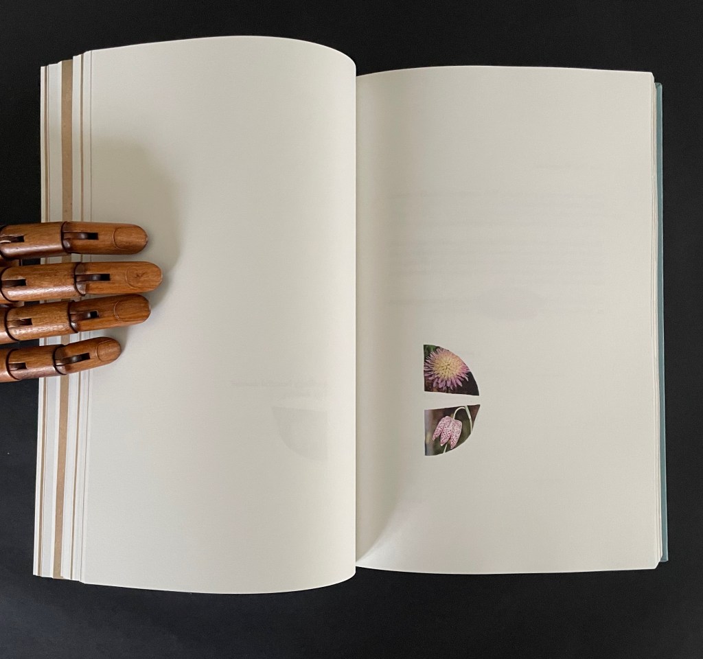
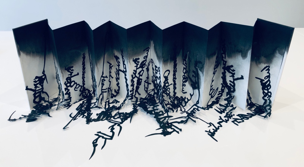
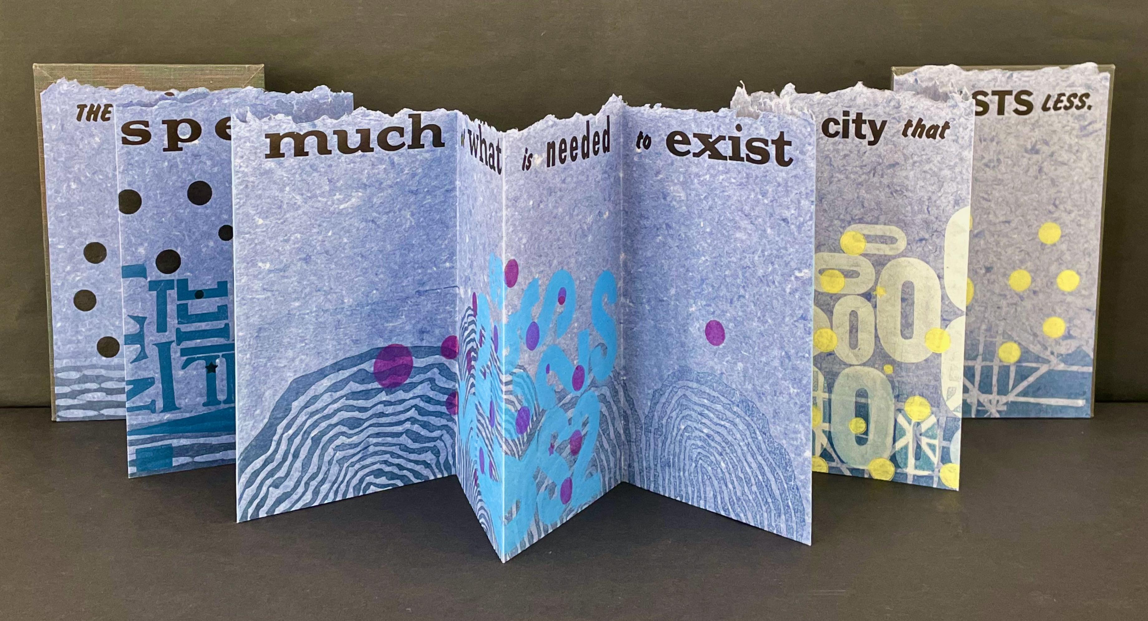
Type Cities (2018)
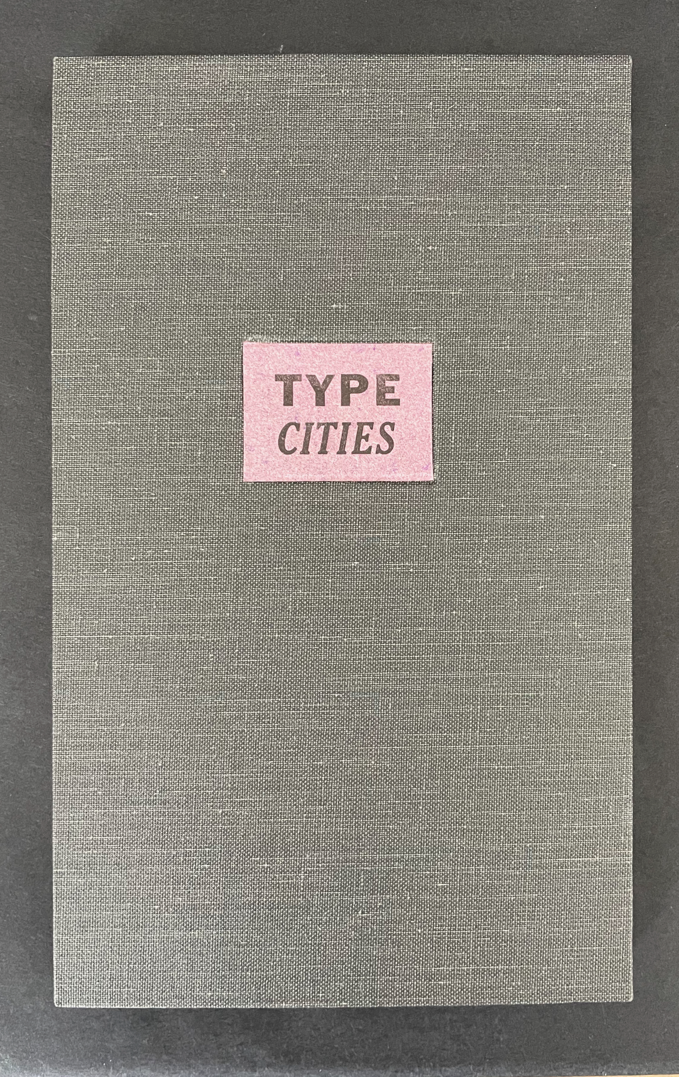
Type Cities (2018)
Karen Kunc
Leporello. H190 x W114 mm closed, extends to 1346 mm. [12] panels. Edition of 8, of which this is #2. Acquired from the artist, 25 March 2026.
Photos: Books On Books Collection.
Like most other homages to Invisible Cities, Karen Kunc’s Type Cities (2018) focuses on one of the fictitious cities; in this case, Aglaura. As with Ten Thousand Things, she uses an excerpt:
The city that they speak of has much of what is needed to exist whereas the city that exists on the site, exists less.
That is cryptic. Just as the paradoxical characterizes the general cities in No.64, so it is for the particular city of Aglaura here:
So if I wished to describe Aglaura to you, sticking to what I personally saw and experienced, I should have to tell you that it is a colorless city, without character, planted there at random. But this would not be true either: at certain hours, in certain places along the street, you see opening before you the hint of something unmistakable, rare, perhaps magnificent; you would like to say what it is, but everything previously said of Aglaura imprisons your words and obliges you to repeat them than say. Therefore, the inhabitants still believe they live in an Aglaura which grows only with the name Aglaura and they do not notice the Aglaura that grows on the ground.
For Ten Thousand Things, the single-fold double-sided monoprint provided Kunc a surprisingly flexible tool with which to capture the paradoxical in two very different texts. This time she chooses the accordion structure. Also, as the title Type Cities suggests, she chooses type as an additional tool to capture what Marco Polo describes as Aglaura’s “enduring assortment of qualities”. Across the twelve panels of the leporello, Kunc lays out the text of her chosen excerpt in multiple faces and fonts:
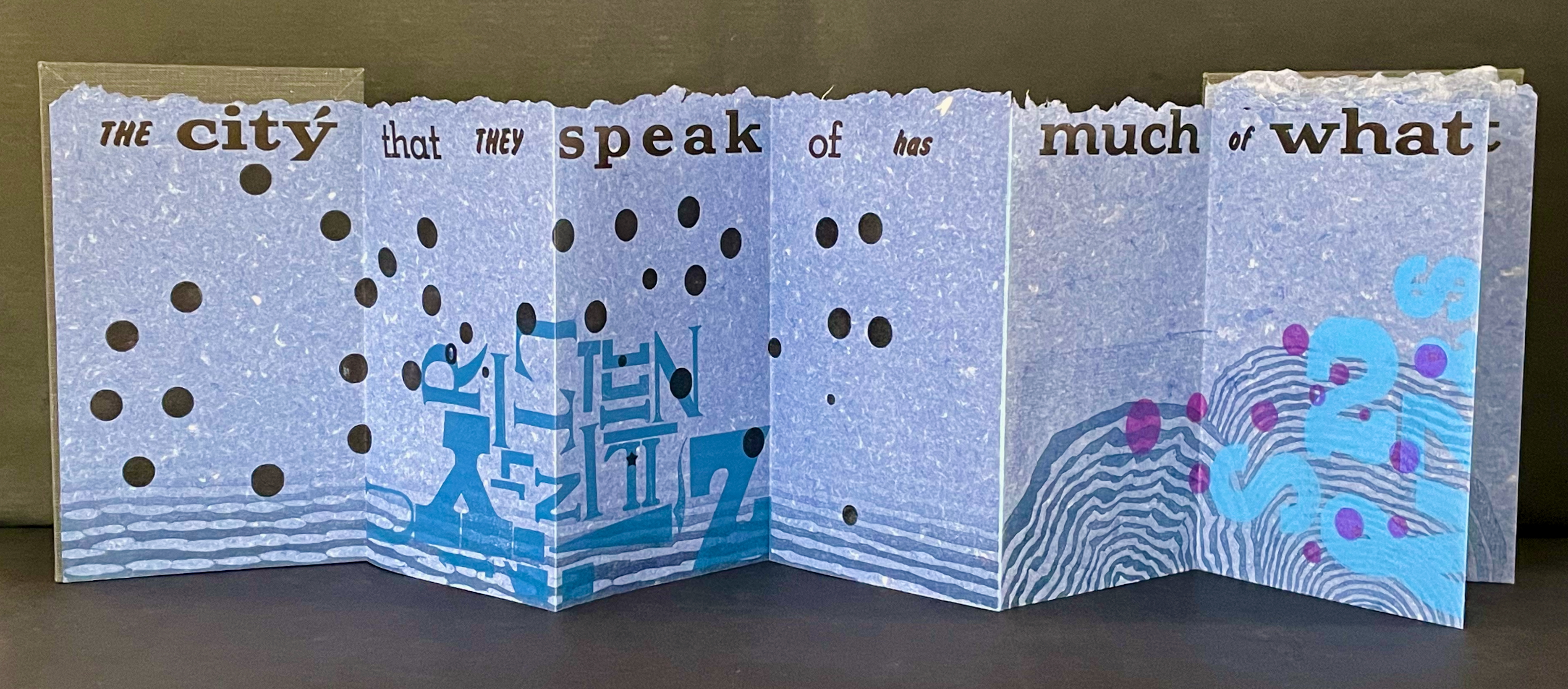
Also across the twelve panels, the color change of black dots to purple, violet, and then yellow echoes the shift from the colorless city to something else “at certain hours, in certain places along the street”.
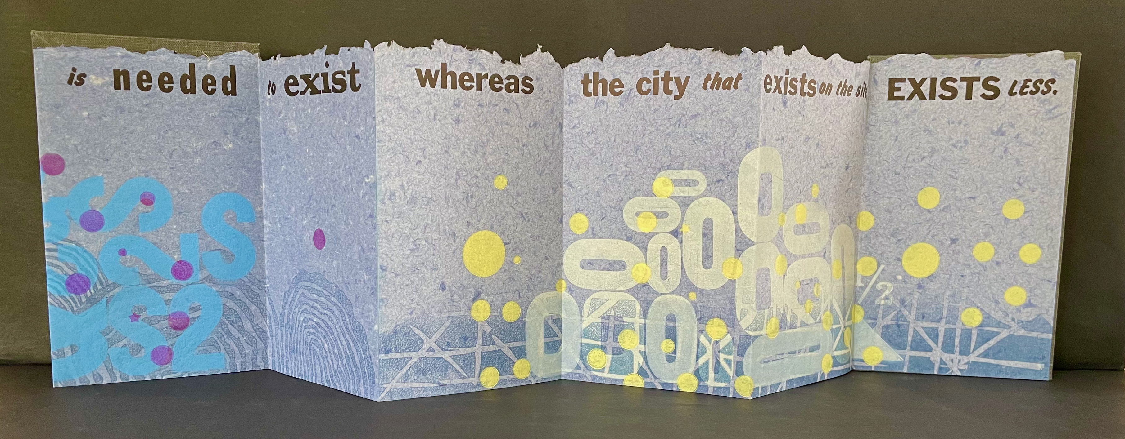
The “much of what is needed to exist” manifests at the bottom edge as wood type letters in dark blue floating along a river (?), then as Ss, 2s, and $s floating over a pond (?), and then yields to the less of zeroes scattered over a grid. The contrast of much and less even extends vertically to the handmade paper with its messily torn upper edge opposed to its neatly trimmed lower edge. It also extends horizontally to the paper as its tint shifts gradually from a deep blue to a light gray. These photographs do not do justice to the painted and stamped elements or texture of Type Cities.
Further Reading
Laozi. 2011. Tao Te Ching = Dao de Jing. Translated by Gia-fu Feng, Jane English, and Toinette Lippe. Third Vintage books edition. New York: Vintage Books, a division of Random House, Inc.
Works of homage to Jorge Luis Borges
Louise Grimshaw’s Ethereal Worlds (2017) celebrates “The Library of Babel” with hexagonally shaped pages of prints rotating on a central post.
Sean Kernan’s The Secret Books (1999)
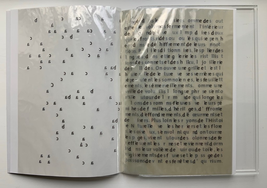
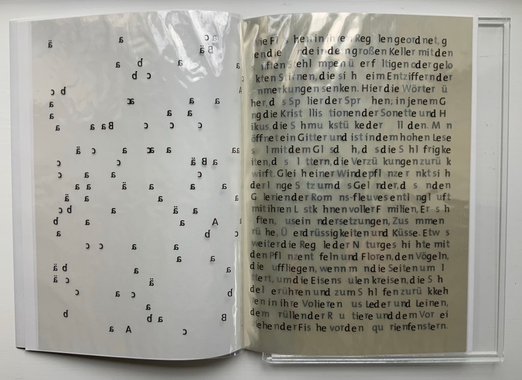
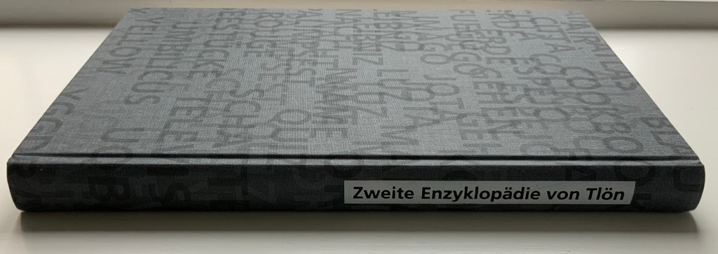
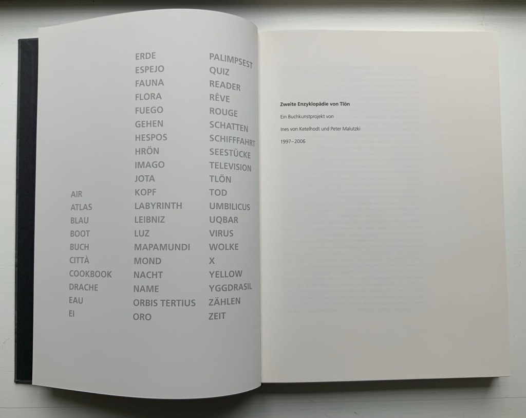
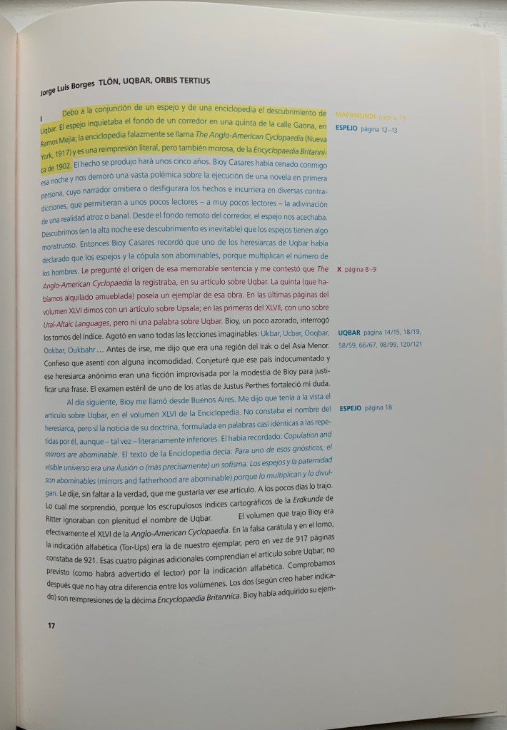
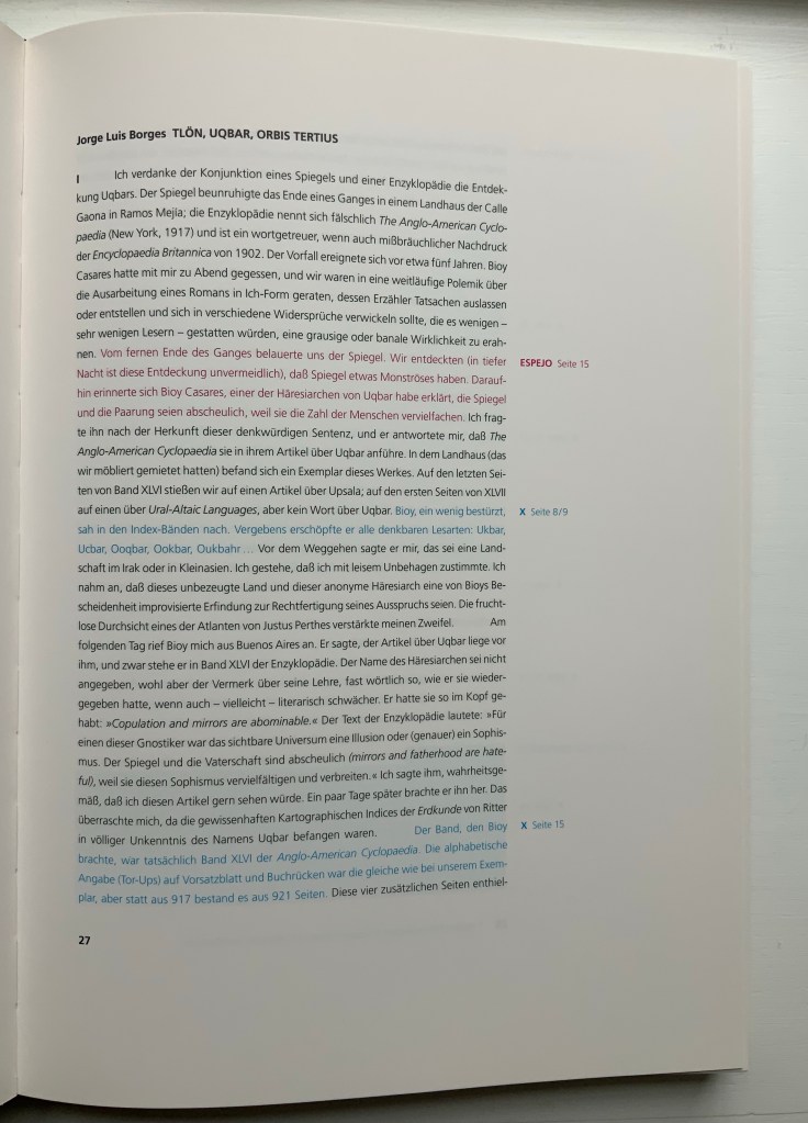
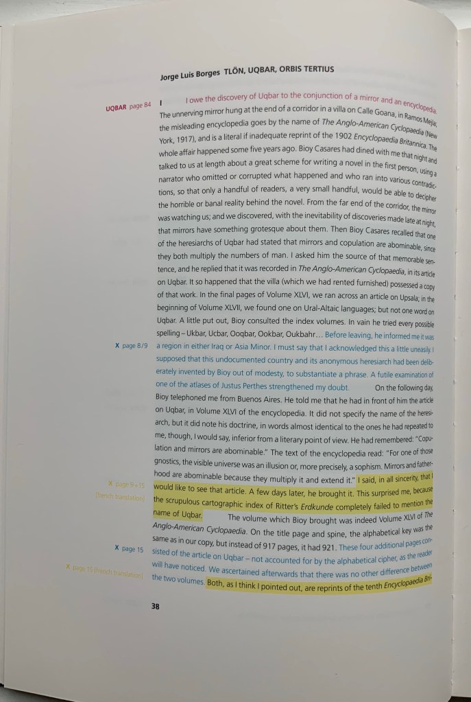
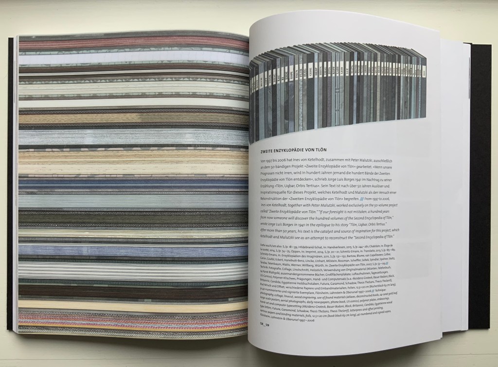
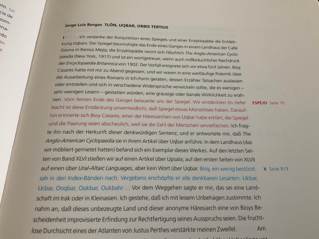
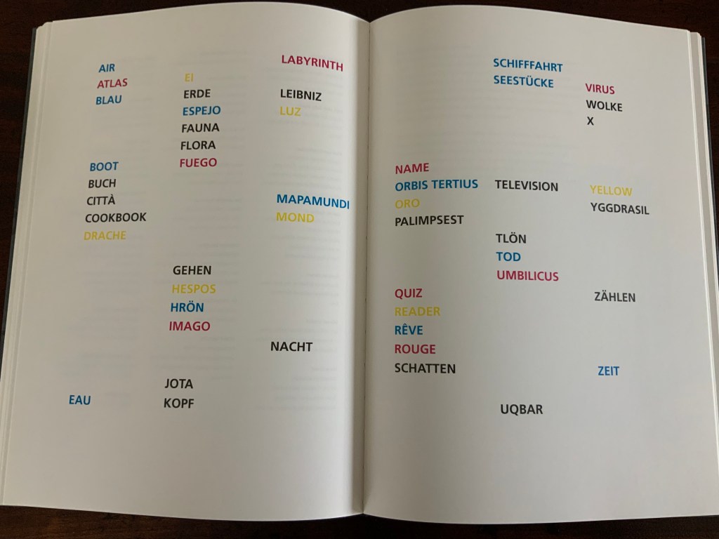
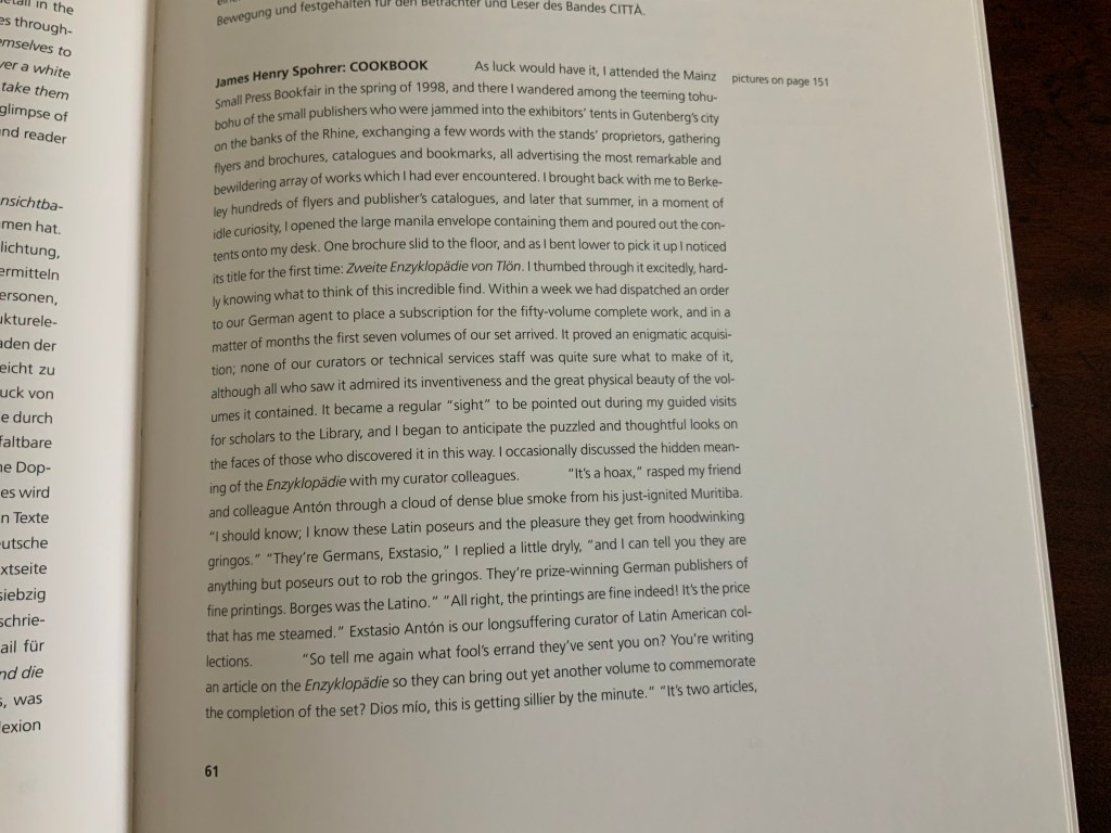
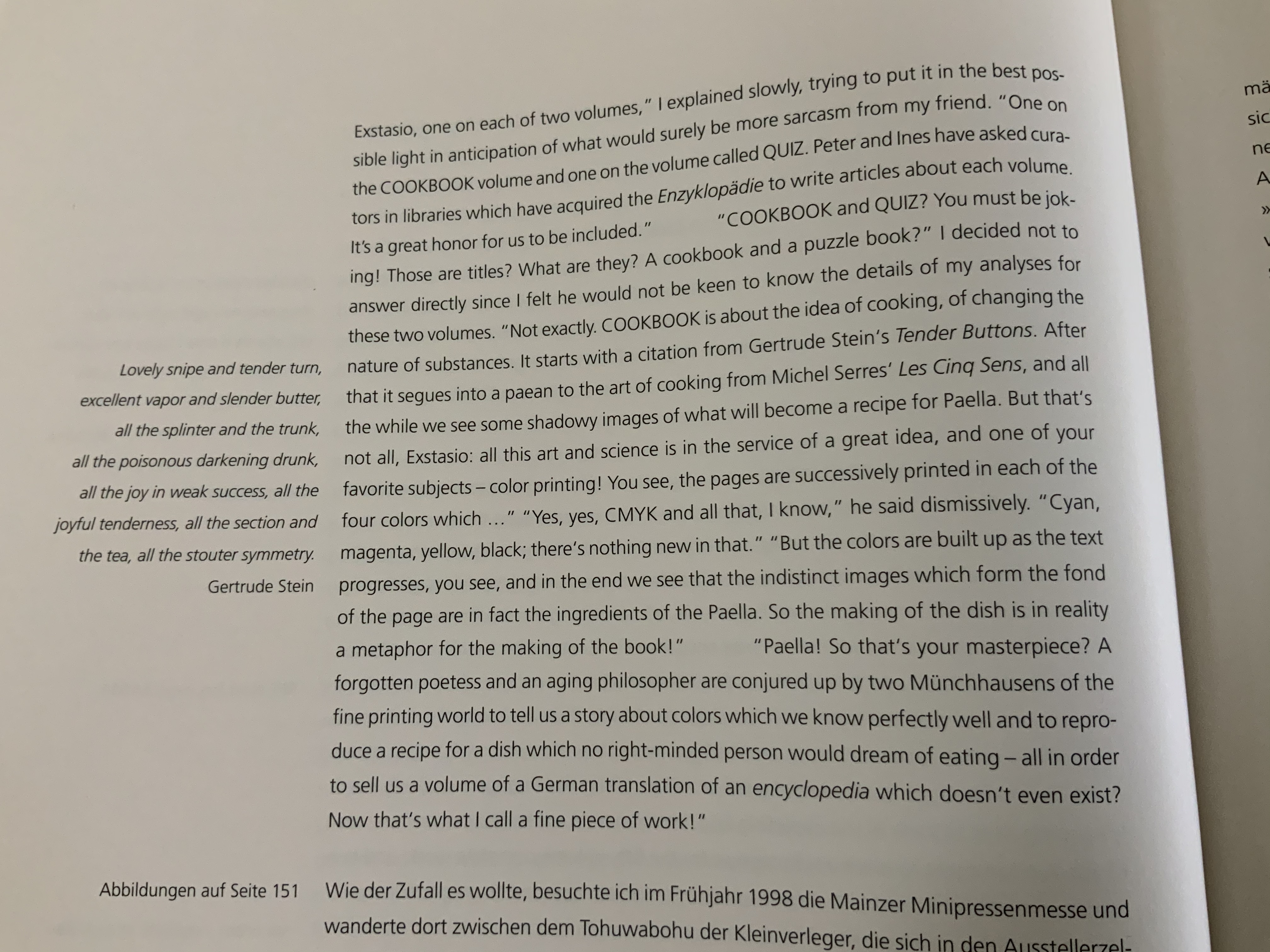
Ines von Ketelhodt & Peter Malutzki’s Zweite Enzyklopädie von Tlön (The Second Encyclopedia of Tlön) (1997-2006)
Matilde Marín’s Labyrinths “Homage to Jorge Luís Borges” (1998)
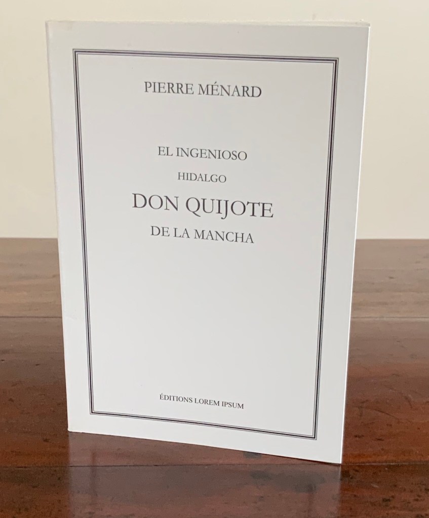
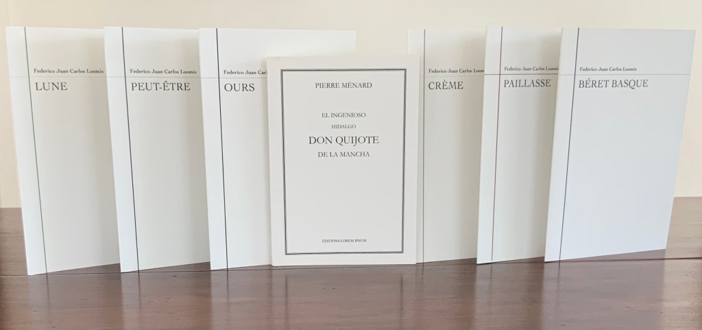
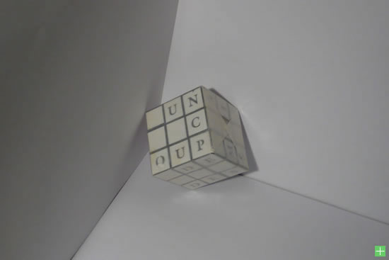
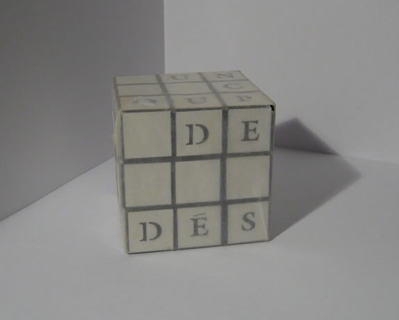
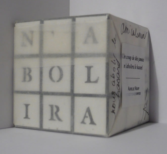
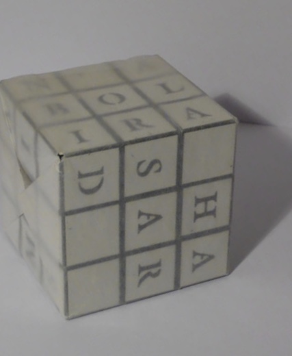
Aurélie Noury’s El Ingenioso Hidalgo Don Quijote de la Mancha by Pierre Ménard (after Jorge Luis Borges, “Pierre Ménard, auteur du Quichotte” in Fictions) (2009)
Hanna Piotrowska (Dyrcz)’s Twórca/The Maker (2016)
Benjamin Shaykin’s Z-A (The Library of Babel) (2011)
Rachel Smith’s Promise the Infinite: Drawing out Babel (2022)
Peter and Donna Thomas’ Ficciones (2006)
Heather Weston’s Borges and I (2001)
Works of homage to Italo Calvino
Alicia Bailey’s Cities and Skies (2018)
Angela Cavalieri’s Le città continue (2009/10)
Anna Giuntini’s Zobeide (2020) and Diomira (2023)
Jean-Pierre Hébert and Harry and Sandra Liddell Reese’s In Visible Cities (2012)
Judith Hoffman’s The Distance of the Moon (1990)
Sjoerd Hofstra’s Half-City (2002)
Sarah Hulsey’s Exploration of the Concept of Time – Through Linguistics (2024), volume two.
Ines von Ketelhodt Città (1999)
Josée Pellerin’s Being There (2010) presents a photographic interpretation of If on a winter’s night a traveller.
Caroline Penn, Project C: Destination Unknown (2020) If on a winter’s night a traveller.
Shirley Sharoff’s OVI: objets volants identifiés dans le ciel d’Italo Calvino (1988)
Barbara Strigel’s Invisible City (2015)
Wayne Thiebaud and Andrew Hoyem’s Arion Press edition of Invisible Cities (1999)