Books On Books Collection – Robbin Ami Silverberg

Morning Prayer II (2000-04)
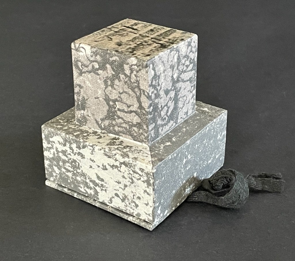
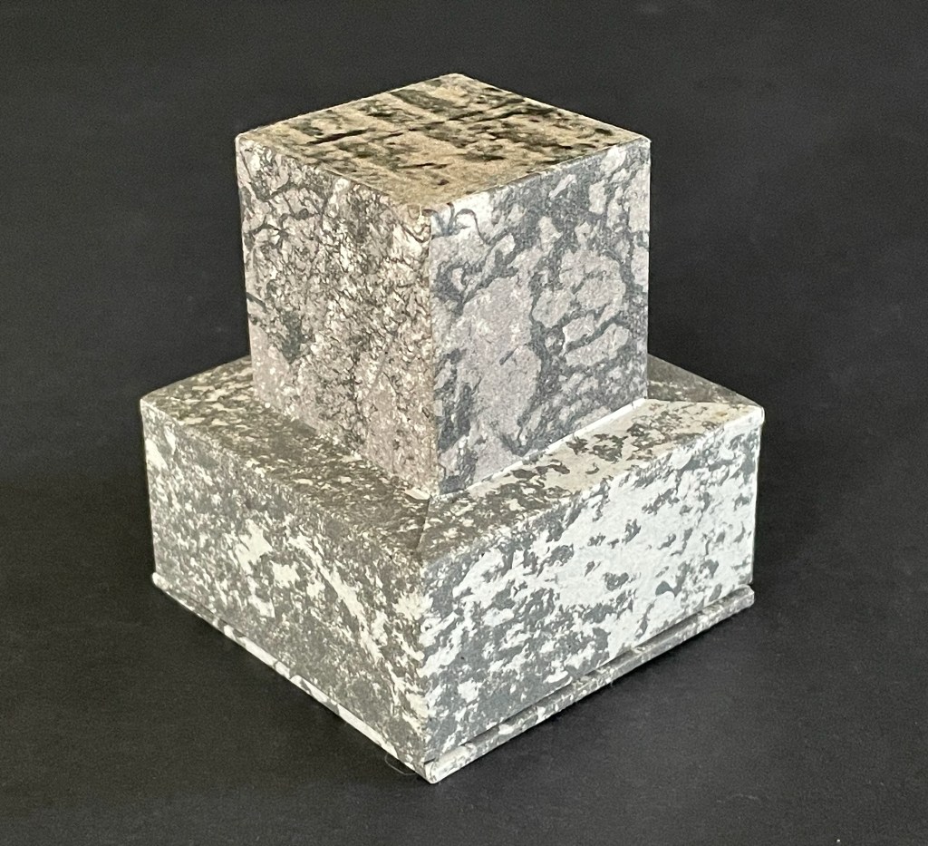
Morning Prayer II (2000-04)
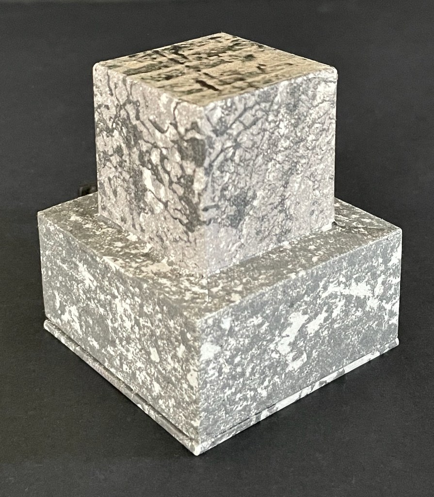
Robbin Ami Silverberg
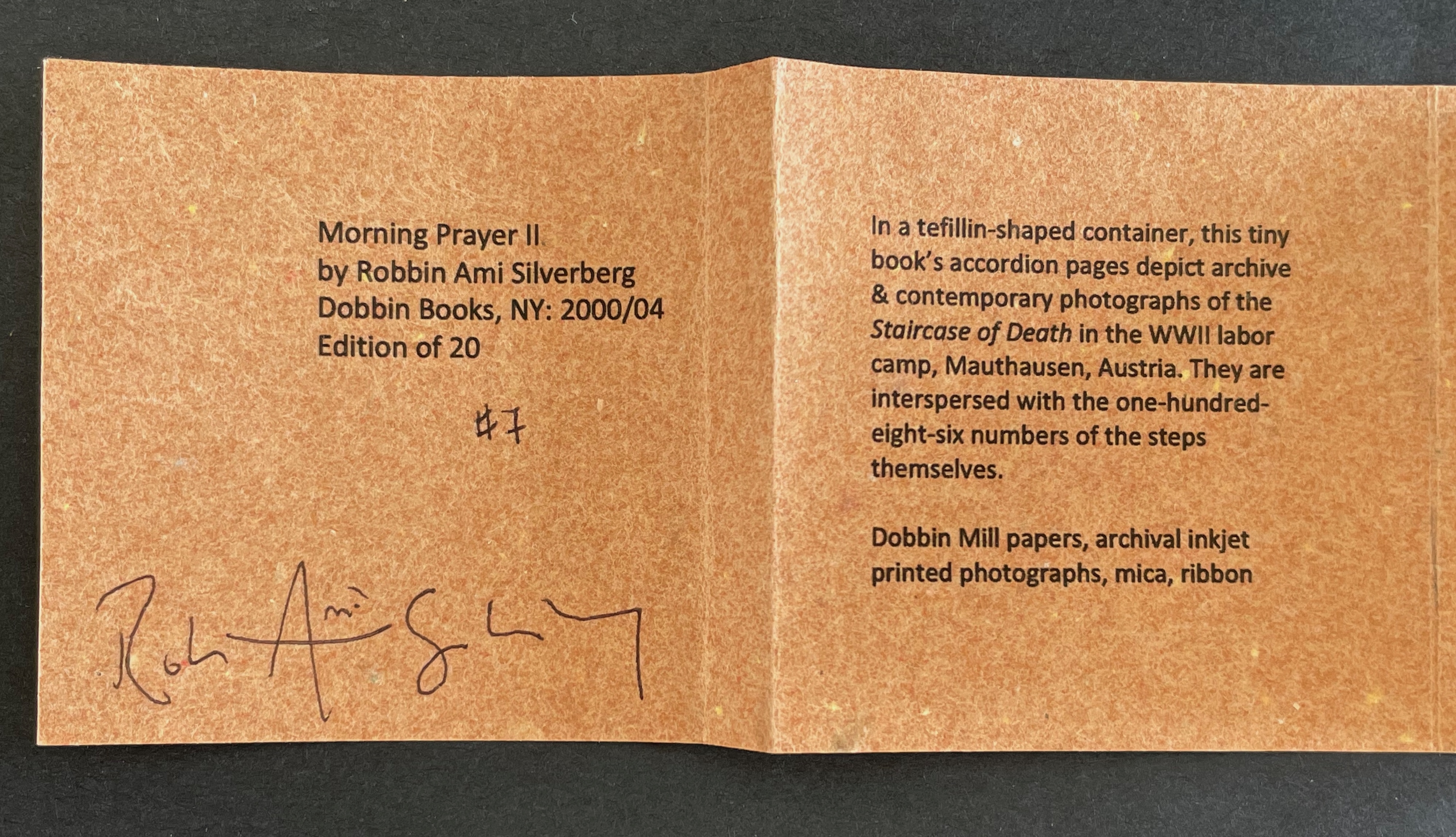
Tefillah-shaped box: H70 x W65 x D65 mm. Meander-fold booklet: 52 x 52 mm (closed); H250 x W150 mm (open). Mica inlay on bookle’t front cover. Edition of 20, fo which this is #7. Acquired from the artist, 20 April 2026.
Photos: Books On Books Collection.

In the granite quarry at Mauthausen in Austria, there are 186 uneven steps made of stone leading out of it. These are the “Stairs of Death”, so named for the countless who died in the forced labor of carrying blocks hacked from the quarry up the nearly vertical climb. Morning Prayer II is a heart-breaking memorial to these victims.

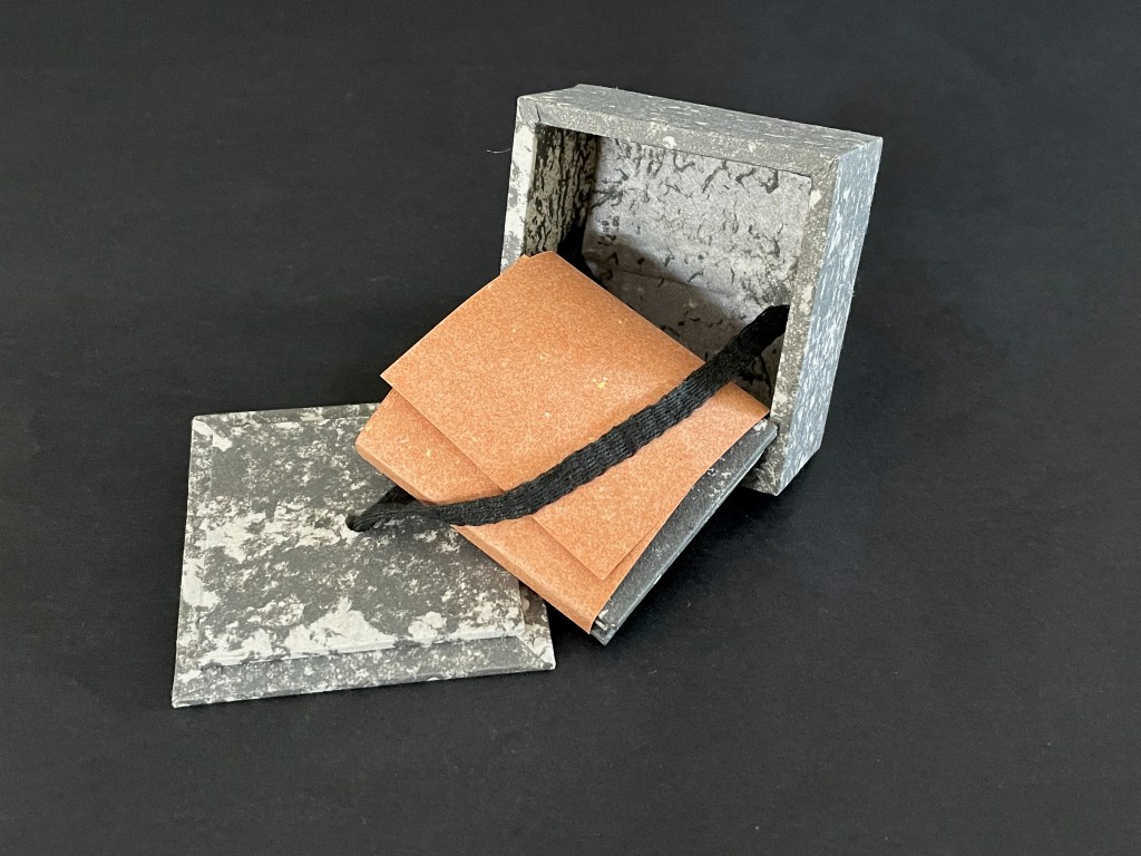
A tefillah-shaped box holds a double-sided meander-fold booklet illustrated with archival photographs from the concentration camp. Tefillin (one worn on the arm, one on the head) honor the biblical commandment to remember the Exodus from Egypt and observe Passover. Associated with morning weekday prayers, they hold parchment scrolls with four verses from the Torah: (Exodus 13:1–10, Exodus 13:11–16; Deuteronomy 6:4–9, and Deuteronomy 11:13–21). They are usually made of leather.

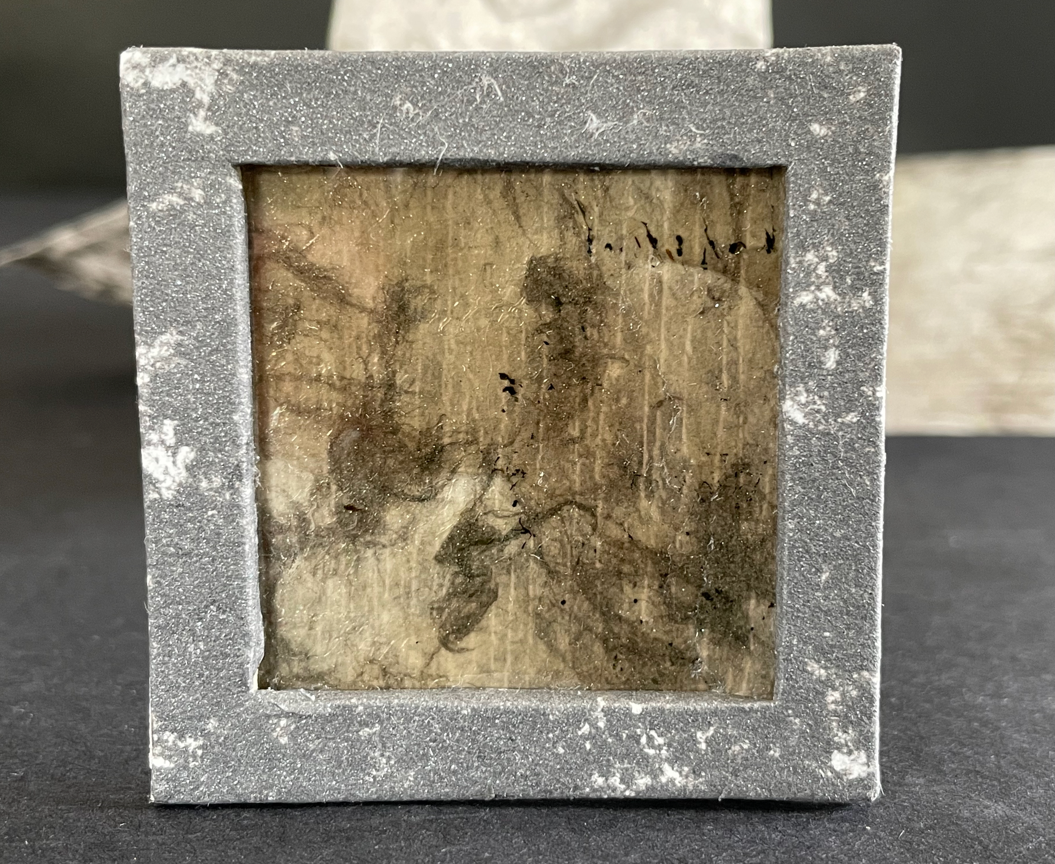
In contrast, the container of Morning Prayer II appears as stone — mica embedded in its base and granite simulated on its paper covering. Instead of a morning prayer in remembrance of the trek to freedom and passing over of the angel of death, we have a mourning prayer counting each of the 186 stone steps of the staircase.
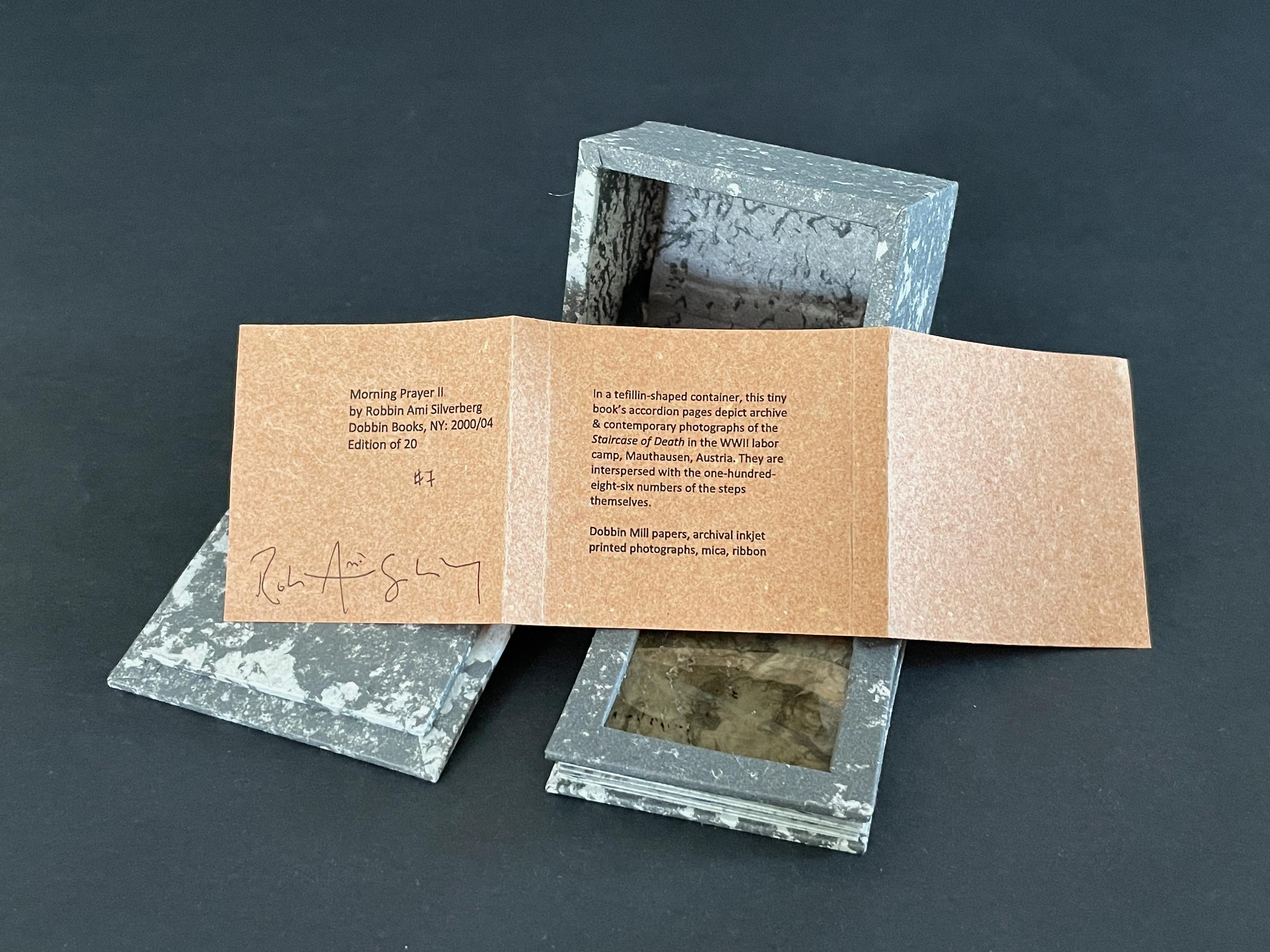
An open vintage photo album featuring black and white photographs, with a square frame at the front displaying a textured surface.

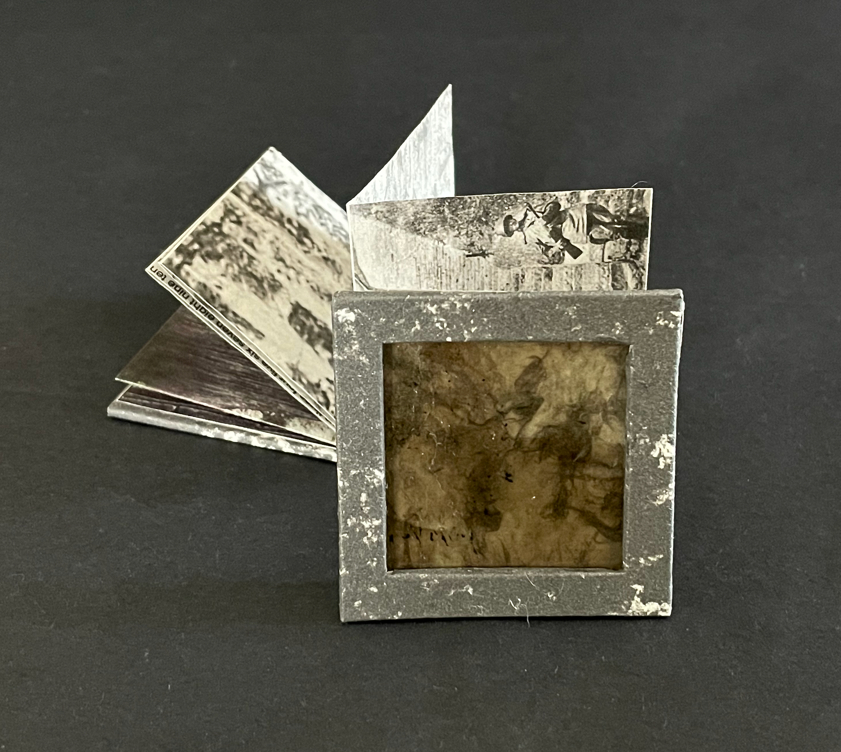
Instead of scrolls extolling the laws of the deity, we have a single sheet, cut and folded to open in a zigzag meander recalling and showing photos of the uneven granite steps.
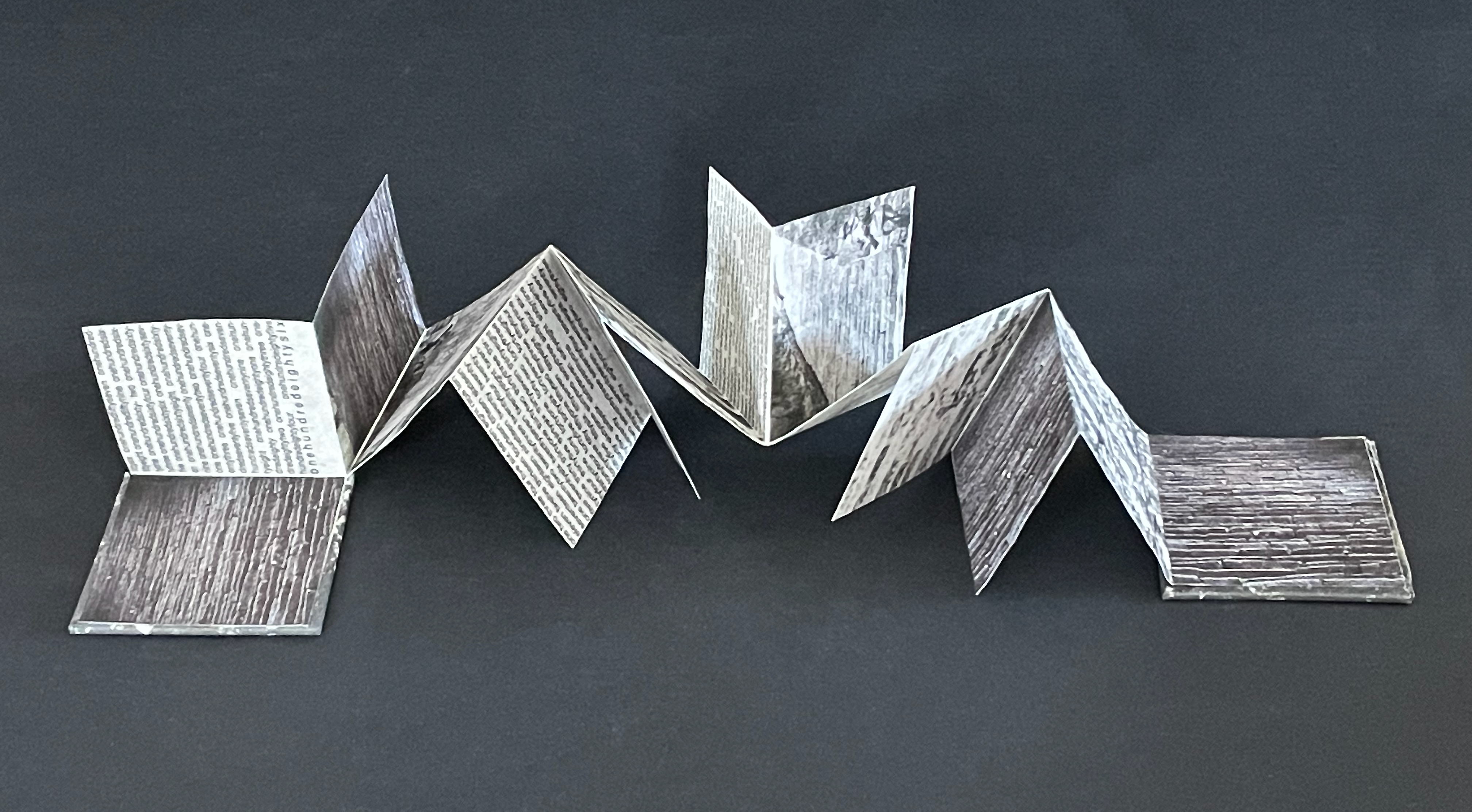
An artistic fold-out book made of paper, displaying various textures and printed text, arranged on a dark background.

Instead of the calligraphy of verses from the Torah scrolls, we have the typeset counting of steps confined and justified left and right within four of the fourteen segments of the artist’s book.
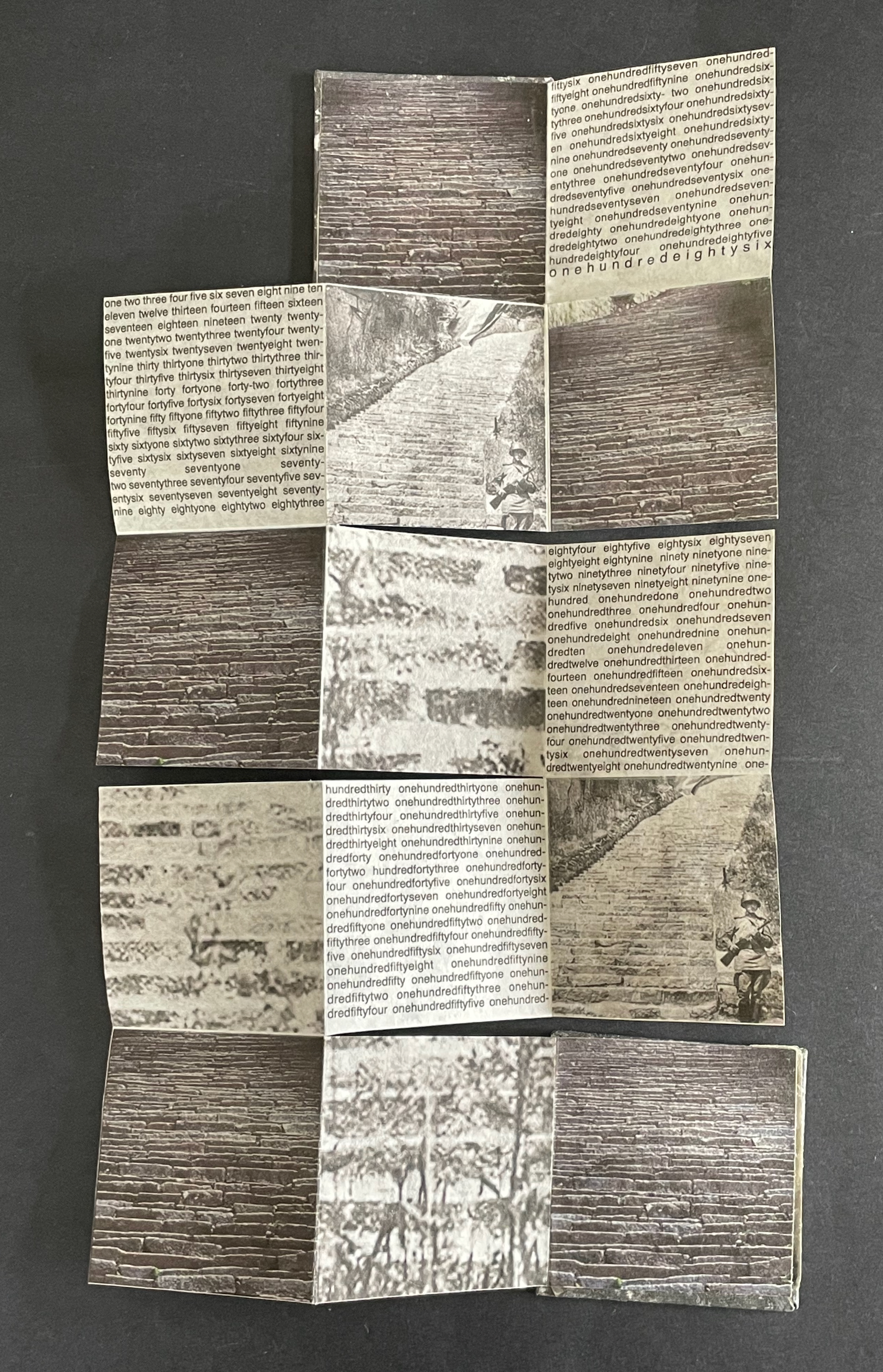
A folded piece of paper featuring a collage of images depicting stone steps and brick patterns, interspersed with text in a repeated, structured format.

Instead of morning sunlight, we have gray ink on the reverse, mimicking marble or ashes.
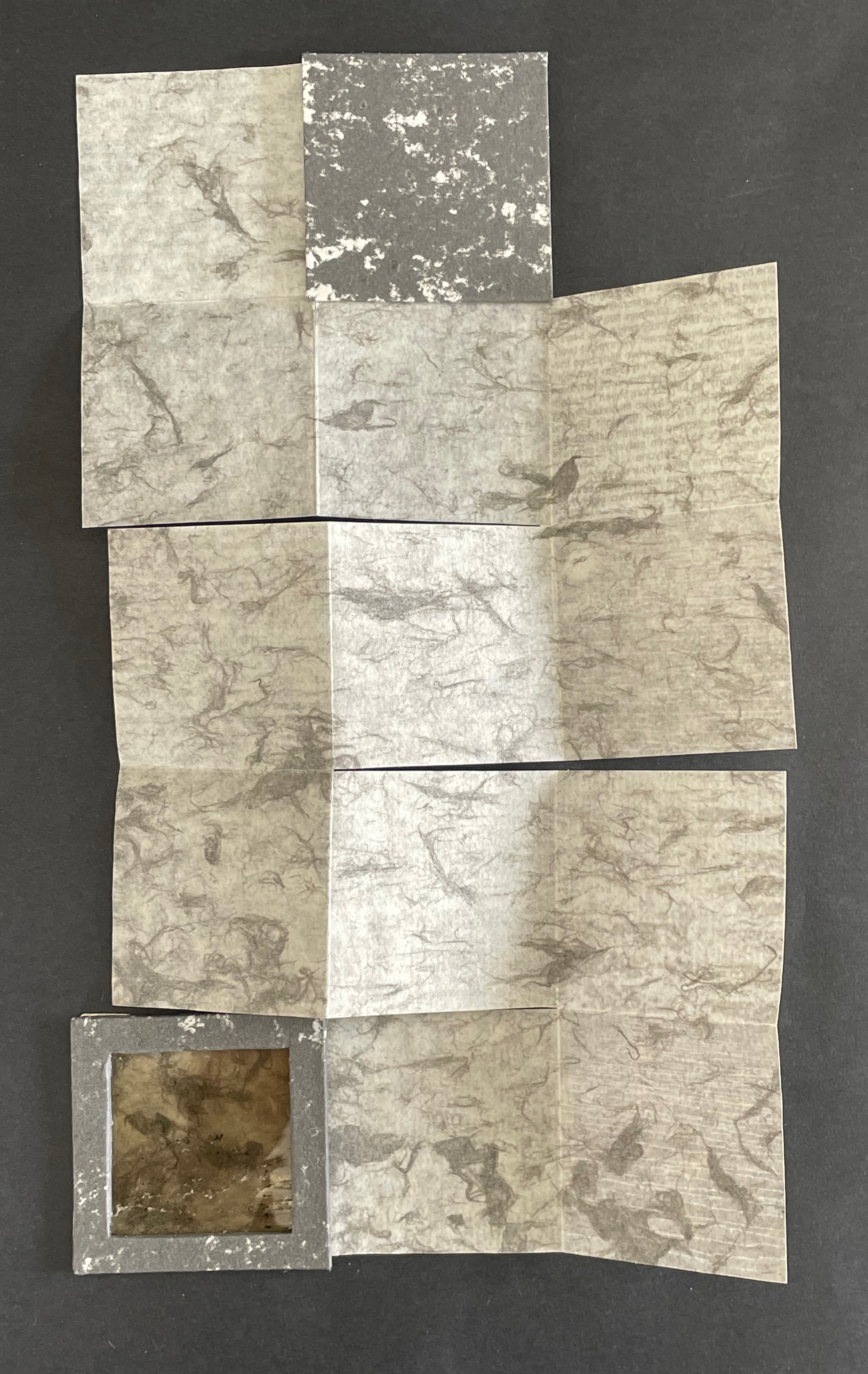
A layered composition of various textured papers in shades of gray and beige, arranged in a unique pattern, with a small square frame integrated into the design.

Instead of the rhythm of scripture, we have the gaps between stones mimicked by the gaps between run-together words enumerating the 186 steps.
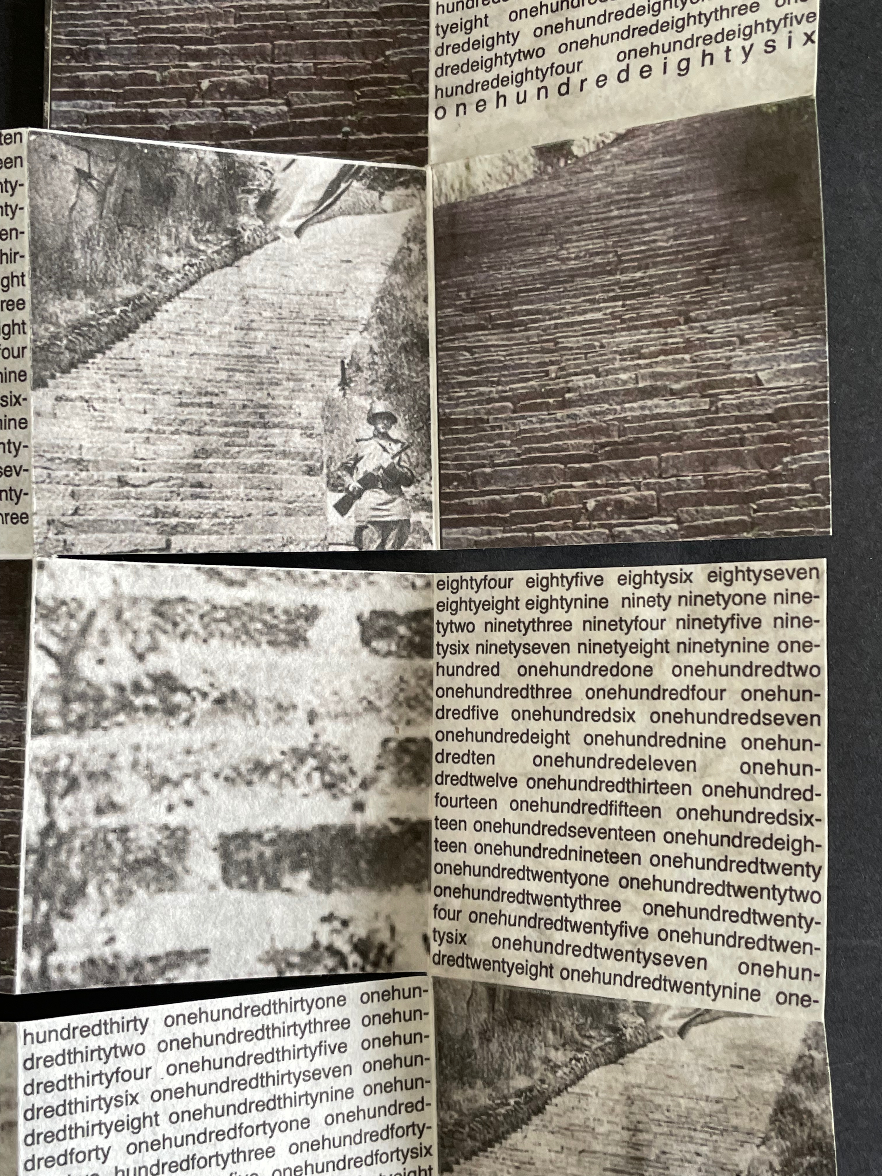
Black and white collage featuring images of stone stairs and a soldier holding a rifle, surrounded by text in a stylized layout.

Each stone in each step represents where prejudice, racism, and xenophobia lead. Each stone in each step recalls yesterday’s and today’s iniquity and inequity of persecuting those with the “wrong” color of skin, different beliefs, ethnicity, or geographic background. Each stone is the one cast against someone who is not you — until it is you.

La durée réelle: Make this cut first (2024-25)
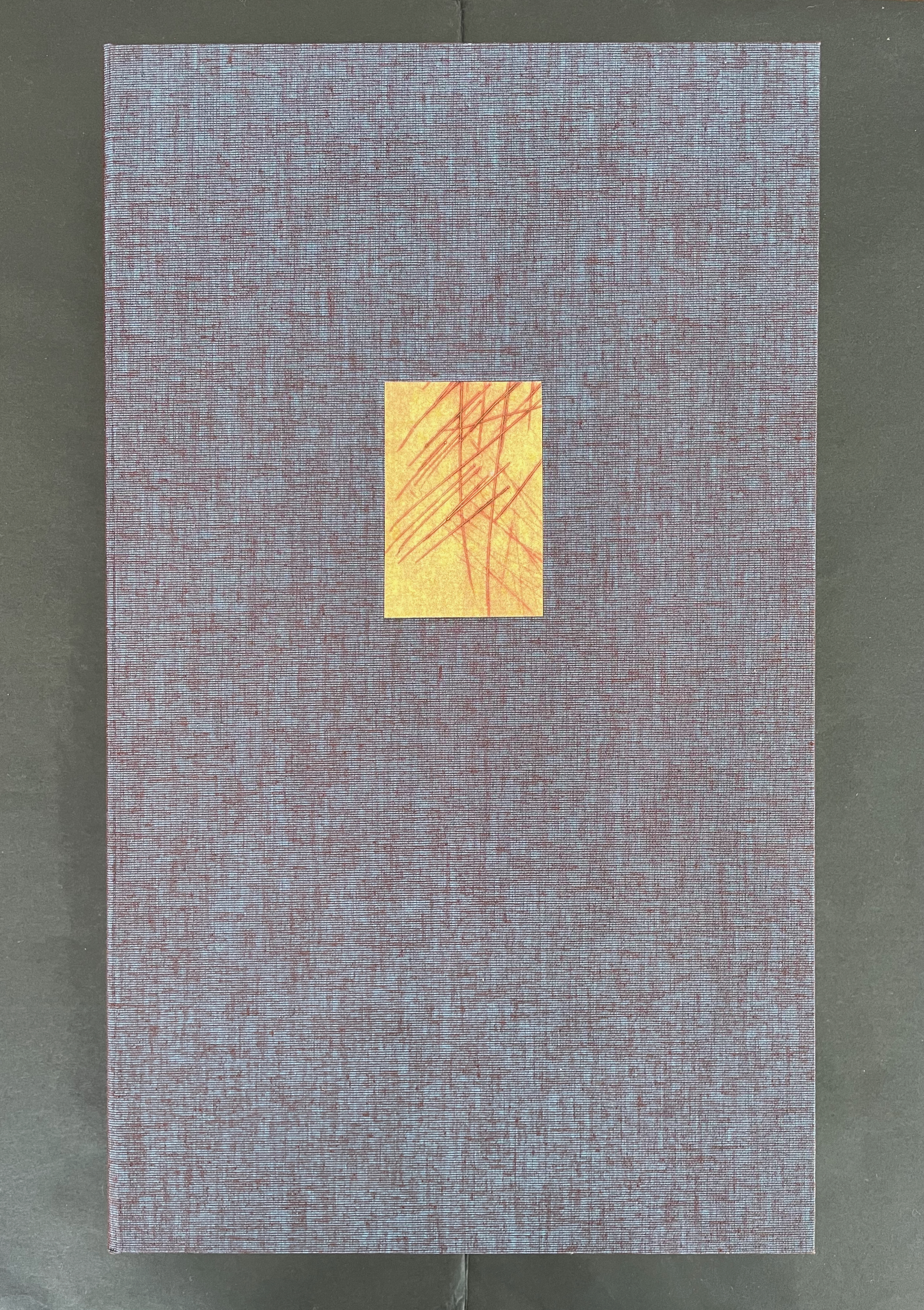
A textured book cover with a dark purple fabric background and a small square cutout featuring a yellow-orange paper with red lines.

La durée réelle: Make this cut first (2024-25)
Robbin Ami Silverberg
Box: H388 c W229 x D58 mm. Book: H352 x W204 xD28 mm. Edition of 12, of which this is #10. Acquired from the artist, 20 April 2026.
Photos: Books On Books Collection.

Our experience of time is no small topic in philosophy, literature, and art. The title of Robbin Ami Silverberg’s artist’s book comes from Henri Bergson’s 1889 dissertation on the subject and his later collection of essays translated as Creative Evolution (1911). With his term la durée réelle (“real duration” or “lived time”) and metaphor-driven exposition, his books aim to describe time as a continuous, flowing, yet nonlinear stream of consciousness rather than surrender it to the mechanistic, linear, and causal descriptions of science. Silverberg’s artist’s book is her meditation on time and life expressed with handmade paper, watermarks, pulp painting, dry point, typography, quotations as if from a commonplace book, and the form of the book.
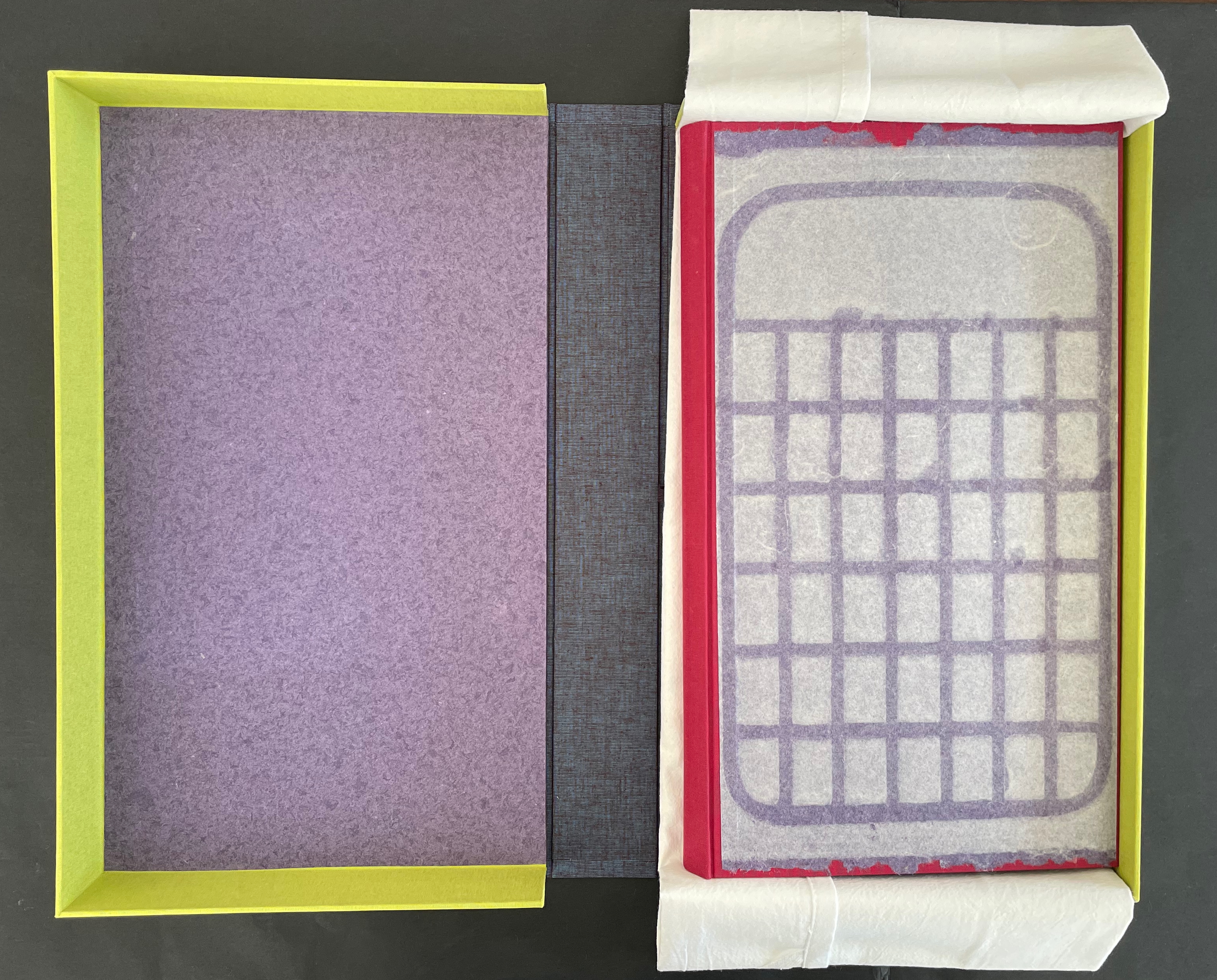
An open box with a yellow border showcasing a purple interior, a grayish-blue outer layer, and a sheet of parchment paper laid over a red base featuring a grid pattern.
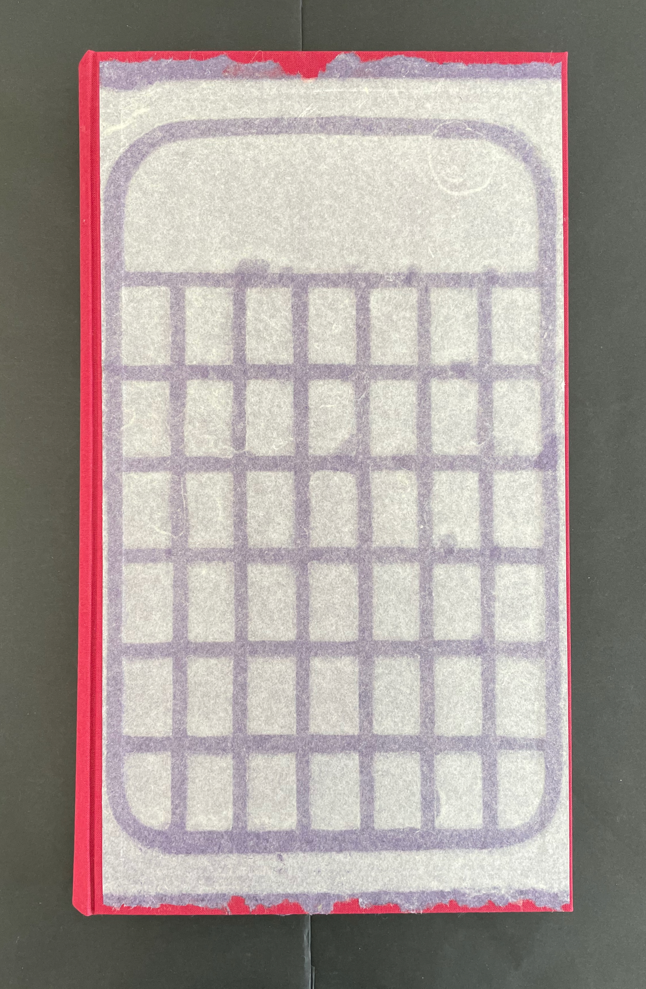
Top view of a book with a red spine and a paper cover featuring a grid pattern in purple.

So much is going on in this artist’s book. Motives interact with technique, material, allusion, text, image, and structure. Motives interact with motives, techniques with techniques, material with material, allusion with allusion, and text with image. All of it like the crisscrossing strokes left on the cutting board and transferred to paper by drypoint.
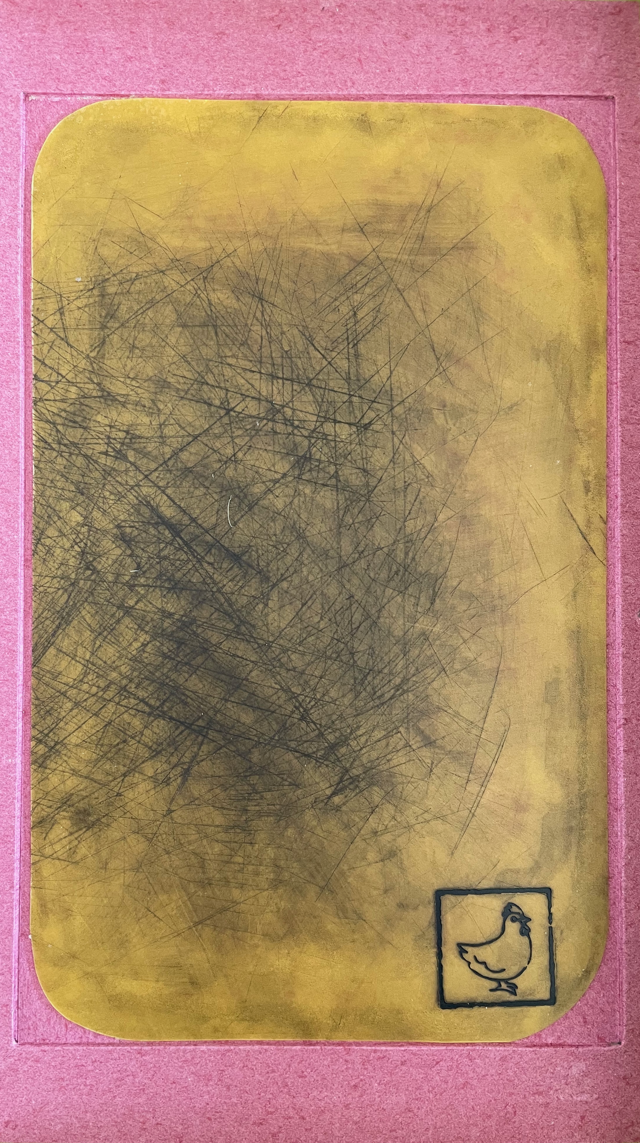
An abstract artwork featuring a textured yellow background with visible scratch marks, framed by a pink border, and a small black outline of a bird in the bottom corner.

Embedded in the custom box, a cutting board used as a printing plate.

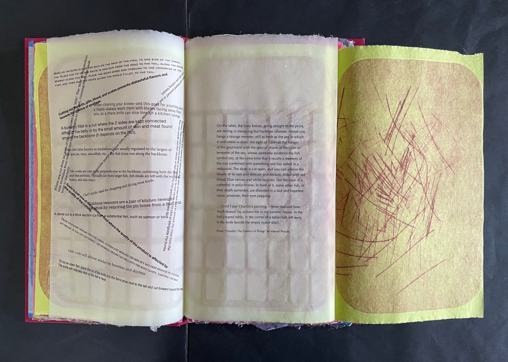
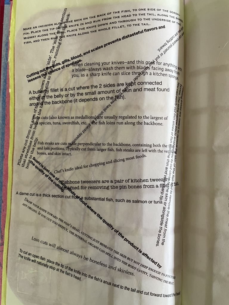
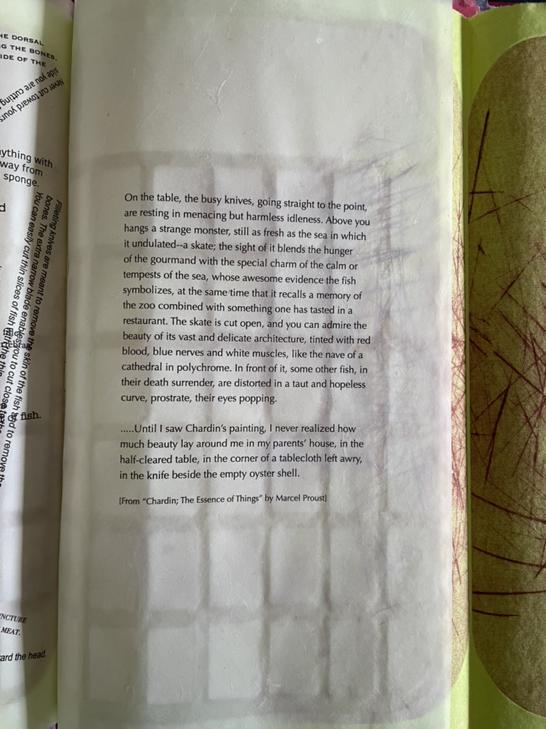
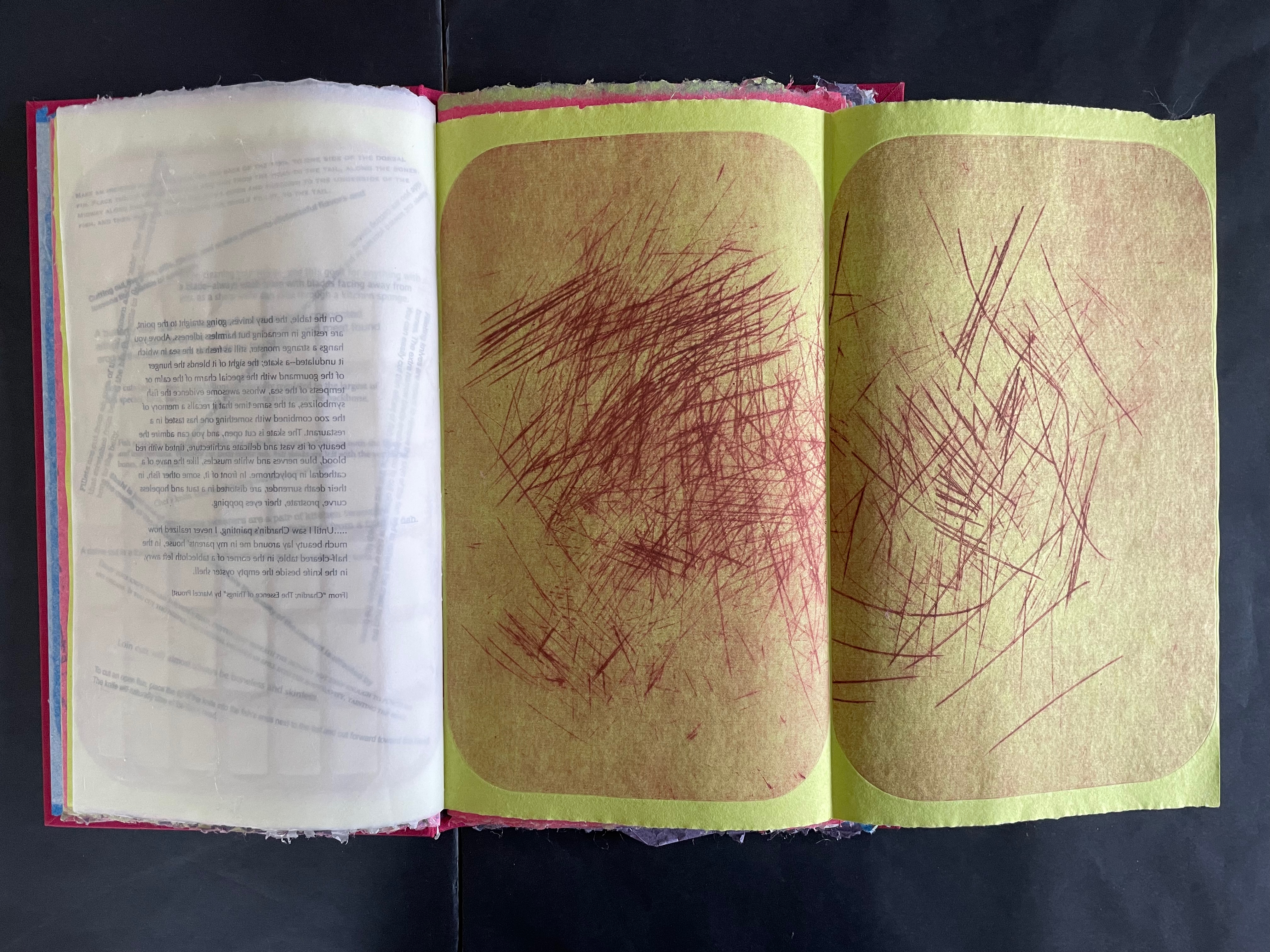
Consider the following sequence. On the verso page of chartreuse green paper, inside the impress of the printing plate, the small image of the fish in the lower left hand corner indicates the seasonal food being prepared in the Spring. On the recto page, the as-yet-illegible text showing through translucent paper mimicks the marks on the cutting board print. When the recto page turns to the left, the now legible text explaining techniques of cutting fish appears in different weights, different cases, and different orientations, mimicking the different blades and direction of cuts. The translucent paper on which the instructions are typeset bears a watermark grid in the shape of the cutting board. When the fold-over sheet of chartreuse green paper turns to the right, it shows another cutting board print. In the center of the triptych is a quotation drawn from Marcel Proust’s appreciation of Jean Siméon Chardin’s La Raie (“The Ray” or “The Skate” ).

By way of the season for fresh fish and the etched evidence of cutting, we have come to instructions for making the cuts. By way of the instructions, we have come to a description of Chardin’s still life of a gutted ray, the text of which is typeset on the cutting-board-watermarked translucent paper. By way of a still life freezing a moment in time, we have come to Marcel Proust, author of the septology In Search of Lost Time and its fictional exploration of the experience of memory. By way of Proust’s essay the “Essence of Things”, we have come to his good friend Henri Bergson and la durée.
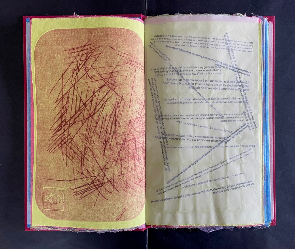
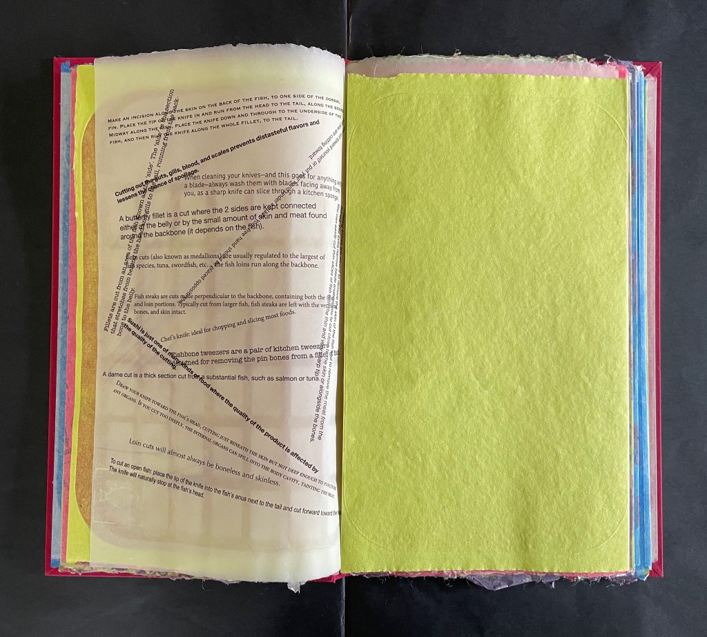
As the translucent page with Proust’s text and the cutting-board watermark is turned to the left, we now have a diptych of two cutting board prints on the chartreuse green paper. We may think of the translucent pages and the accumulated cuts as evidence of times past, but the flow of the sequence, the feel of the different papers as they turn, and the interaction of associations offer a layer of experience approaching the essence of the thing Bergson calls la durée réelle. More than a static artifact, Silverberg’s artist’s book functions to evoke temporal experiences.
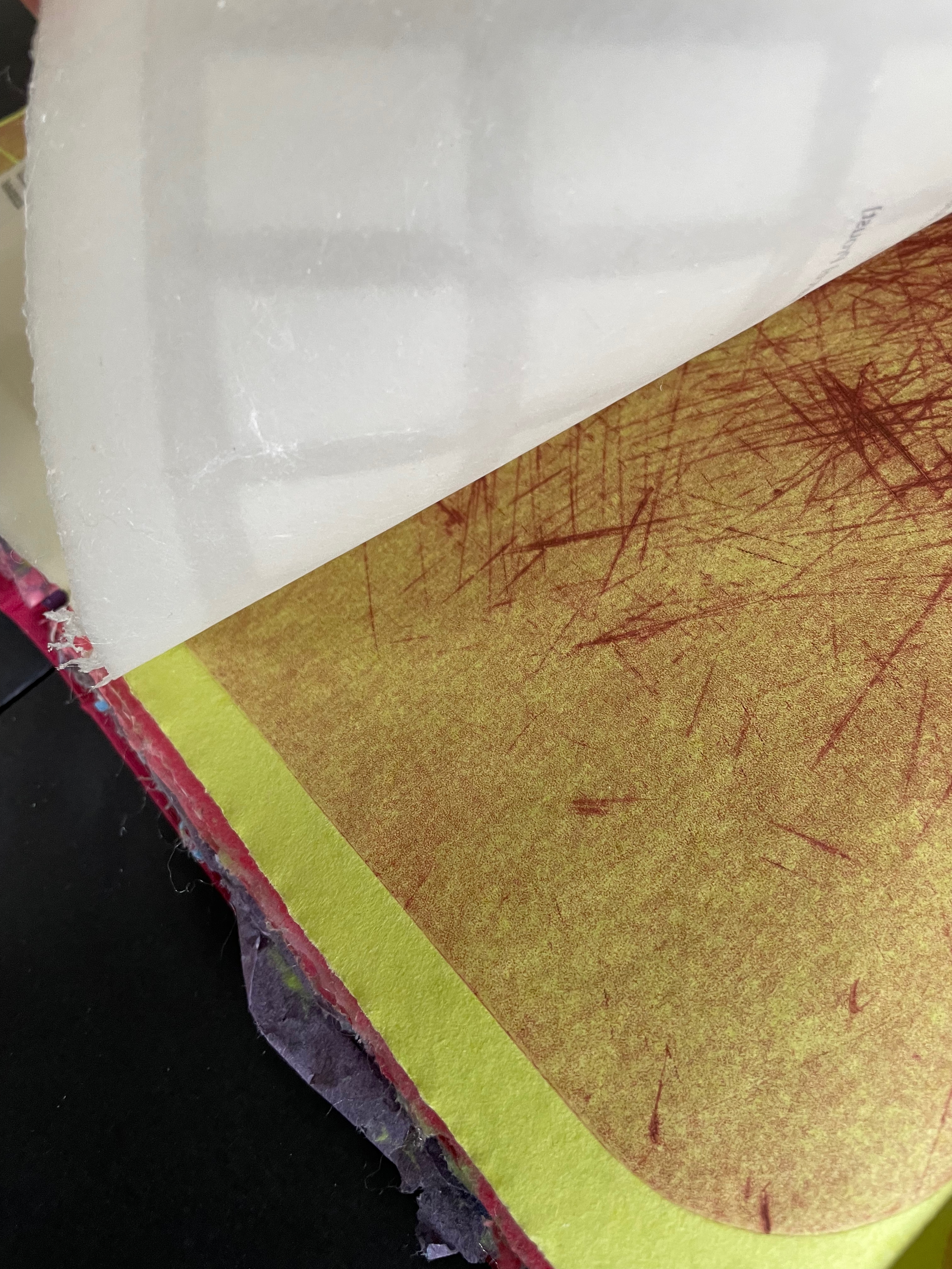
But can visual and physical art really represent or conjure up Bergson’s concept of the lived experience of time? Juxtaposition of images, techniques, texts as well as text and image, material, page with page, etc., is almost unavoidable — indeed is often sought — in an artist’s book. For Bergson, juxtaposition is static and does not fit with the concept of duration. Explaining that concept is not the point of Silverberg’s artist’s book, but if it sends you on a hunt for an explanation and you wind up at The Stanford Encyclopedia of Philosophy, you will find the following passage that chimes extraordinarily with La durée réelle: Make this cut first:

… Bergson calls intuition a method. … The method resembles that of the good butcher who knows how to cut at the articulations or the good tailor who knows how to sew pieces of cloth together into clothes that fit. On the basis of the division into extremes or into a duality, one can then confront our everyday “mixtures” of the two extremes. Within the mixture, one makes a division or “cut” into differences in kind: into matter and spirit, for instance. Then one shows how the duality is actually a monism, how the two extremes are “sewn” together, through memory, in the continuous heterogeneity of duration. — Lawlor, 2025.

Much has been made of Bergson’s influence on William Faulkner, James Joyce, Virginia Woolf, and others. Their technique of stream of consciousness in internal monologues captures the fluidity of time as experienced by single characters such as Benjy in The Sound and Fury, Molly Bloom in Ulysses, or Mrs. Ramsay in To the Lighthouse. There is no single character in Silverberg’s artist’s book unless we count the artist or the artwork itself as that character. The quotations from such a wide range of sources — Hans Christian Andersen, Matsui Basho, Jorge Luis Borges, Lewis Carroll, Charles Dickens, Janet Flanner, Franz Kafka, Etgar Keret, Alan Lightman, George R. R. Martin, István Őrkény, Plutarch, Marcel Proust, Bruno Schulz, and Wallace Stevens — appear in free association across the seasons of food preparation. They punctuate the images made with the cutting boards and the “images” made with phrases of instructive texts angled across the pages like so many cuts on the cutting board. The text jumps and glides like a knife from Plutarch’s anthropological/moral query about eating meat to István Orkény’s sly query of euthanasia for animals but not for humans. And then to the political violence in the excerpts from Etgar Keret and Wallace Stevens. And from culinary advice to self-harm cutting and statements about seppuku. From lines about skating to definitions for various types of knives.

As an aside: the repeated use of Bruno Schulz’s works, especially Street of Crocodiles (1934), conjures up Jonathan Safran Foer’s dissection of Street of Crocodiles to create Tree of Codes (2010). It is certainly apposite, but is it also a challenge to assumptions of male hegemony in the world of book art? With the use of cutting boards as printing plates, is there a sharp cut at the denigrators of women’s book art as kitchen table craftwork?

If you are still visiting The Stanford Encyclopedia of Philosophy trying to make sense of Bergson’s concept of duration, consider how this passage below echoes with what La durée réelle: Make this cut first is doing with its multiplicity of quotations and cuts:

For Bergson, we must understand the duration as a qualitative multiplicity – as opposed to a quantitative multiplicity. As the name suggests, a quantitative multiplicity enumerates things or states of consciousness by means of externalizing one from another in a homogeneous space. In contrast, a qualitative multiplicity consists in a temporal heterogeneity, in which “several conscious states are organized into a whole, permeate one another, [and] gradually gain a richer content” (Time and Free Will, p. 122). 

Silverberg’s cutting boards and their multiplicity of cuts do capture something of Bergson’s ideas of la durée réelle [“duration”]. The boards display linear traces of individual acts over time, and their accumulated presence represents the nonlinearity of the “duration”. Likewise, the unfolding diptychs and triptychs disrupt the usual expectation of linear paging through a book. Like Bergson’s concept, Silverberg’s artist’s book is complex. Much is going on in both. To grasp them, it is best to let them wash over you — like time.
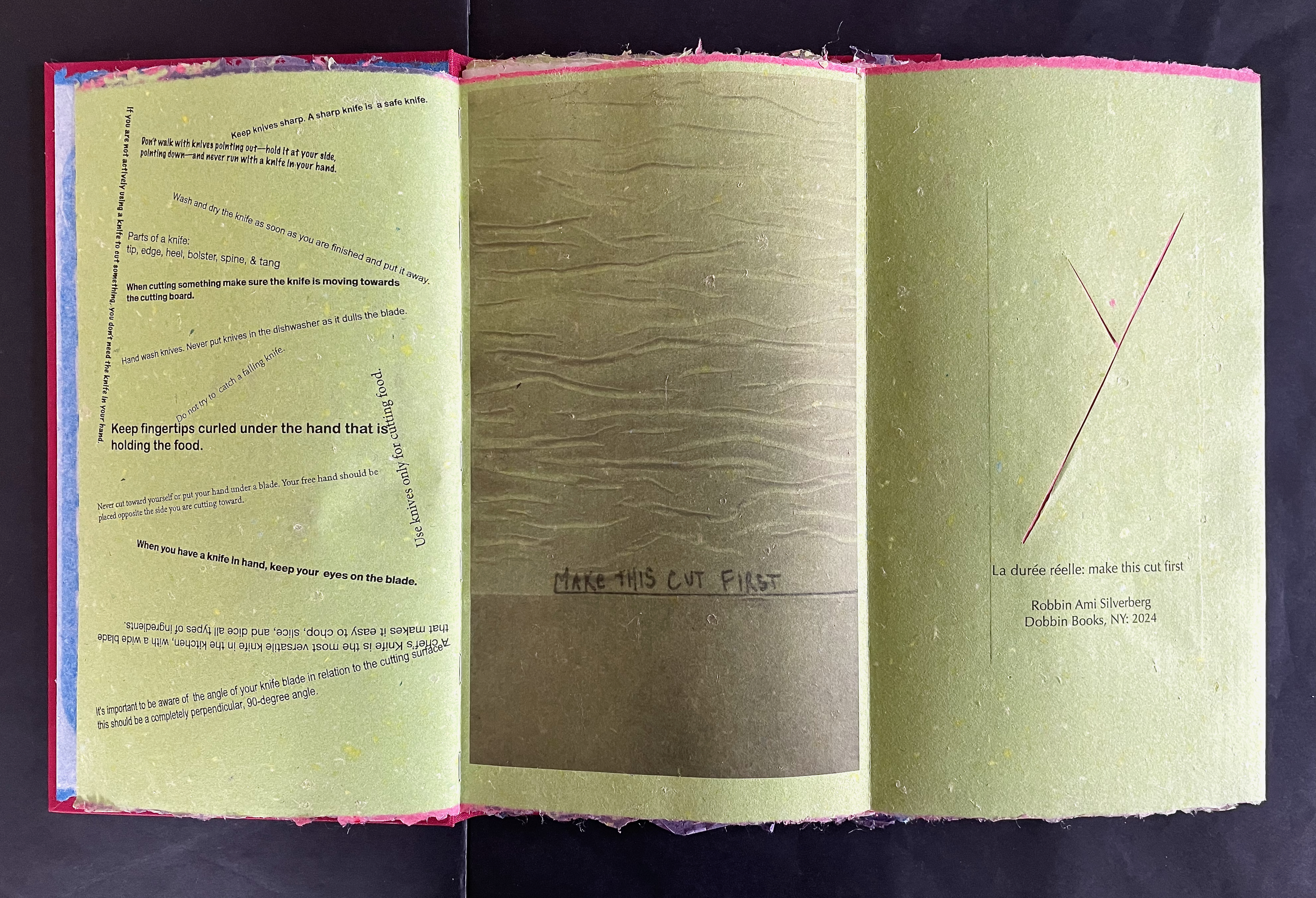
An open book with brightly colored pages displaying safety instructions for using a knife, interspersed with illustrated cut lines. The left page features text on knife handling and safety tips, while the right page includes a marker note and a design element with cut lines.

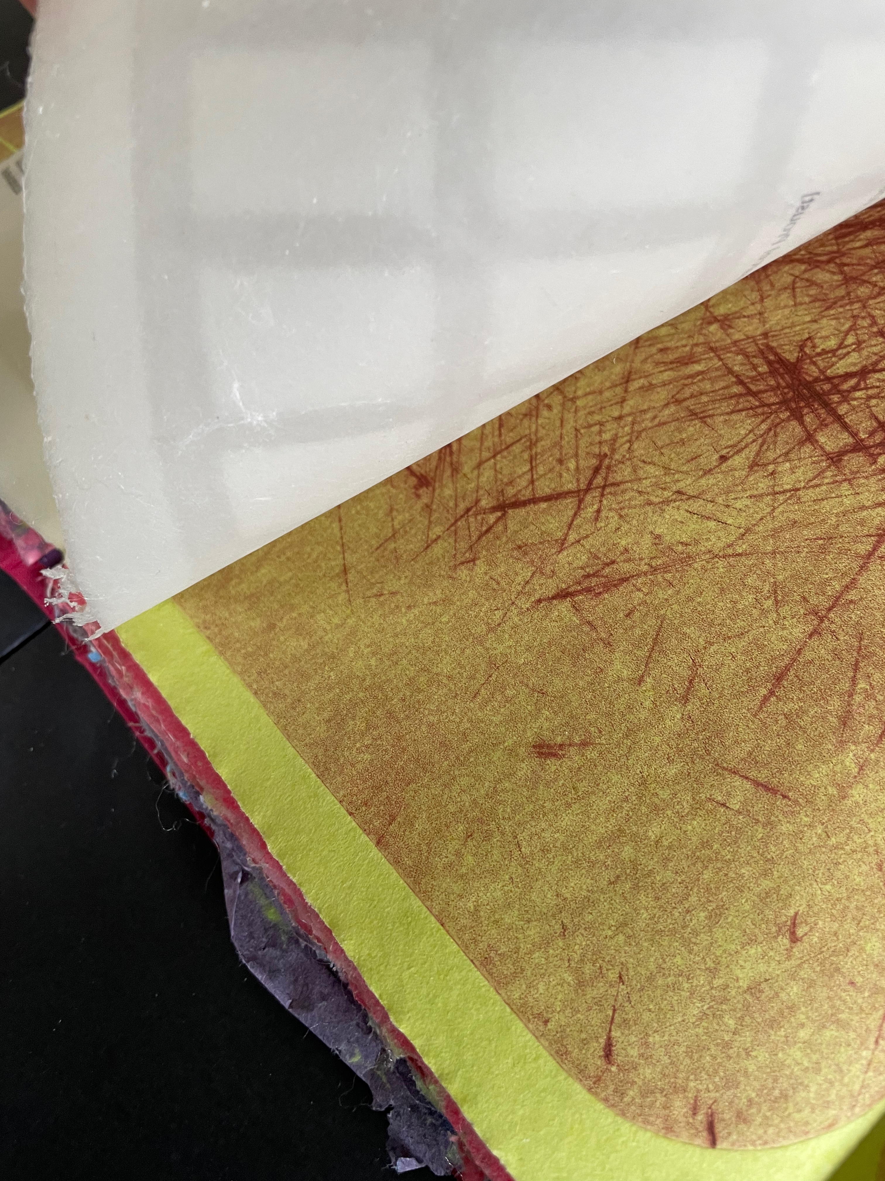
“Behind the scenes”: text-bearing translucent sheet fixed to chartreuse green folio; “watermark” grid in translucent sheet; double-spread of cutting board “abstracts”.

An open cookbook page detailing fish preparation techniques, including filleting, removing bones, and cutting methods.

Text close-up

A close-up of a page from a book featuring a passage about culinary art and a description of fish on a table, highlighting elements like a skate and various fish, reflecting on beauty and memory.

Proust on Chardin’s La Raie.

Further Reading

Bergson, Henri. 1911. Creative Evolution. Translated by Arthur Mitchell. New York: H. Holt and Company.

Bernadac, Christian. 1978. The 186 Steps. Geneva: Ferni Pub. House.

Lawlor, Leonard and Valentine Moulard-Leonard. Winter 2025. “Henri Bergson“, The Stanford Encyclopedia of Philosophy. Edward N. Zalta & Uri Nodelman (eds.), URL = <https://plato.stanford.edu/archives/win2025/entries/bergson/&gt;.

Books On Books – Jo Hamill

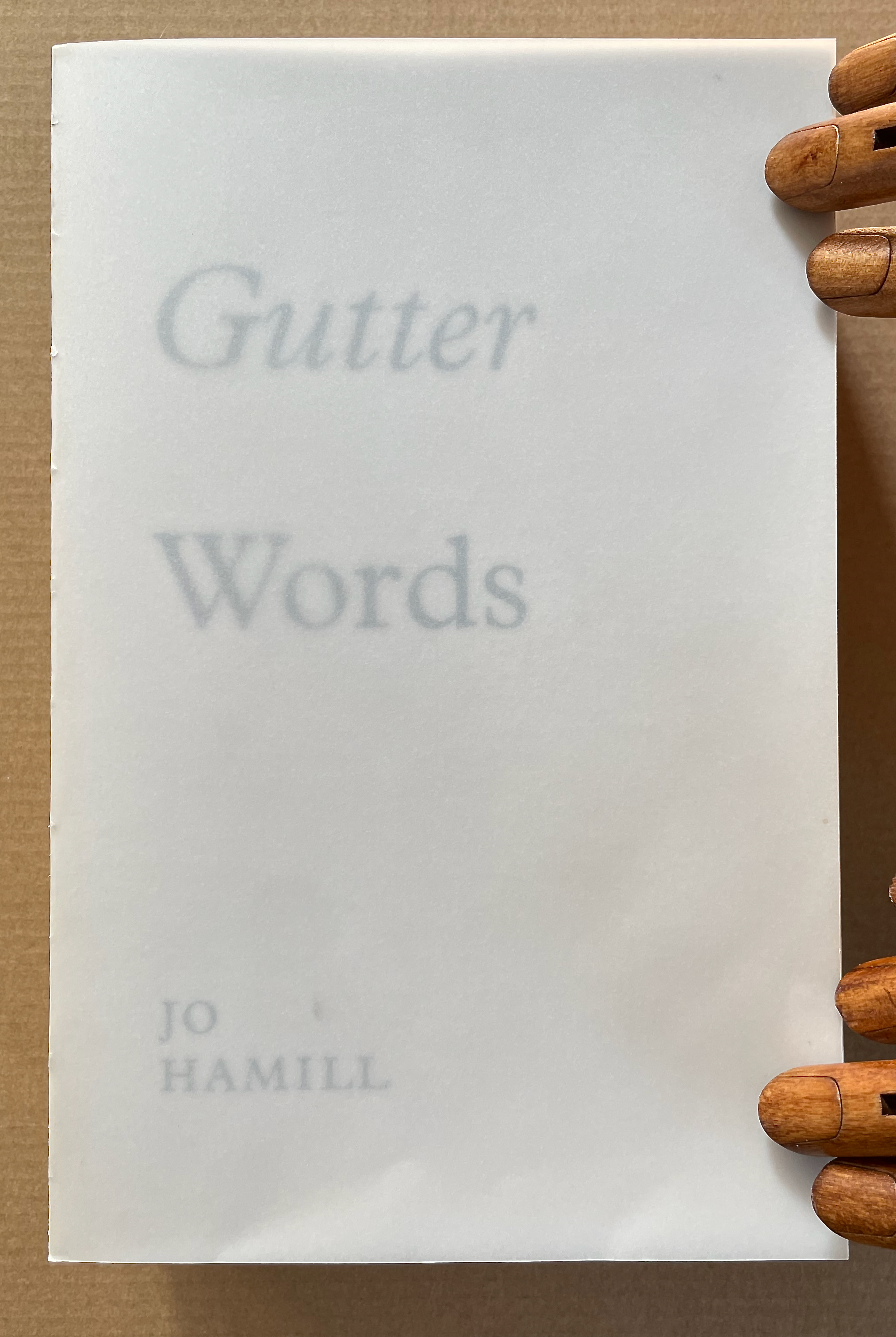
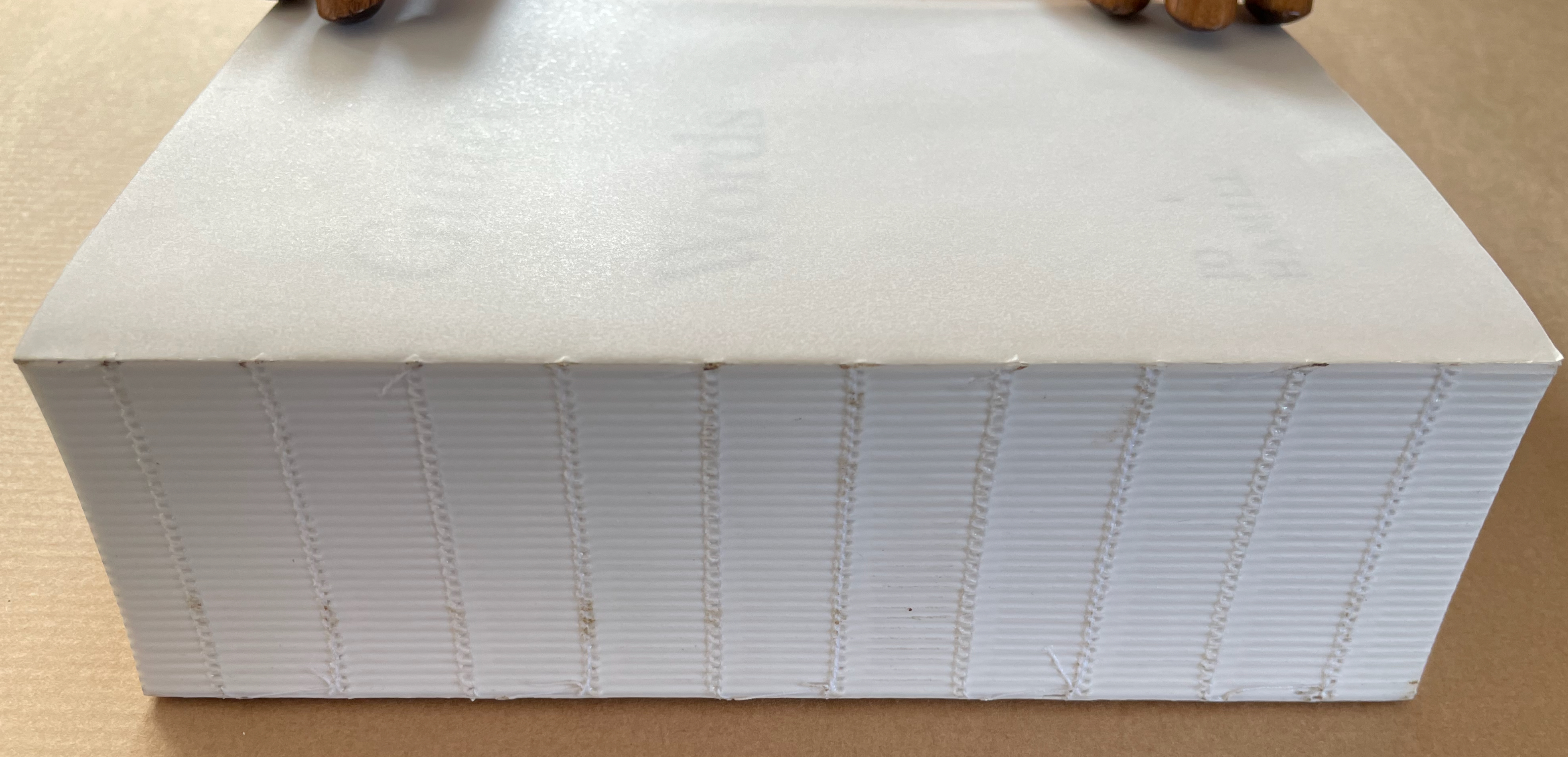
Working with an edition of James Joyce’s Ulysses, Hamill systematically obliterated the words of Joyce but carefully retained those words positioned closest to the gutter – the technical term used to describe the central margin of a bound page. The retained fragments form two extended columns that continue for 933 pages. Notable here is how design and typographic terminology is so entrenched in bodily references. Header, footer, body-copy, the arm of a “K”, the crotch of a “Y”, the foot of a “T”, the ear of a “G”, the shoulder of an “R” and so on. As is the architectural scaffolding of Joyce’s schema which underpins the structure of Ulysses, kidney, genitals, heart, lungs, oesophagus, Brain, Blood, Ear. etc. Lawrence Weiner refers to language as material for construction, the act of deletion in Gutter Words exposes the architectural scaffolding that holds words in place. Voids are physical spaces to be read and words become unanchored, set adrift in an uncertain space. The architectural qualities of this physical space will be exposed, Gutter Words will be devoid of the accoutrements associated with a “book” such as cover, boards, end papers, dust jacket and will retain only the innards, an unprotected text block.–Publisher’s website

Gutter Words (2019)

A close-up view of the edge of a thick, white book with a textured spine. The book is partially open, resting on a brown surface, with two wooden hands on top.

Gutter Words (2019)
Jo Hamill
Softcover, exposed spine. H197 x W128 x D60 mm. 956 pages. Acquired from Gill Partington, 20 June 2023.
Photos: Books On Books Collection.

Artists’ books can run the risk of being a “one-trick pony” or a toddler’s newly learned knock-knock joke. Once seen, the trick succumbs rapidly to the law of diminishing returns. A dozen times heard, the joke verges on parental abuse. Conceptualist Simon Popper’s 2006 alphabetized version of James Joyce’s Ulysses (1922) falls into that camp, albeit a stunning one. There may be some ongoing amusement in perceiving the shift from letter to letter and the subsequent alteration of the visual pattern, or in spotting the singular invented words and considering the alphabetization as a comment on James Joyce’s play with language, or in contemplating it in comparison with similar efforts. Like Mikko Kuorinki’s 2012 alphabetized version of Foucault The Order of Things (1970) that cheekily challenges Michel Foucault’s theory of how we perceive social order. Or the alpha and omega of Tauba Auerbach’s BbeehHilloTy or the Alphabetized Bible (2006); well maybe not the alpha, since Silvio Lorusso and Rory Macbeth got there first with theirs in 1997, nor the omega, since Peter Harkins followed up with his 2013 Well-Sorted Version (WSV), algorithmically generated. Apparently, one-up-manship is inevitable. Even Gutter Words has its gatecrasher: John Morgan’s Usylessly (2021) with a pair of essays, not just one. But once the joke is “got”, how rewarding is it to return to it again and again. Is there more to it?

Continue reading

Books On Books Collection – Inscription: The Journal of Material Text, Issue 3 on Folds

Now here’s a rare thing — a journal issue that requires a video to show the reader h0w to open it.

Continue reading

Books On Books Collection – Reinhold Nasshan

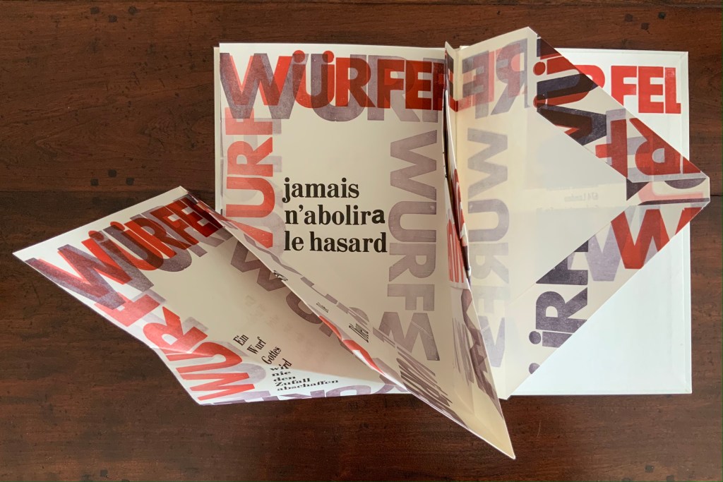
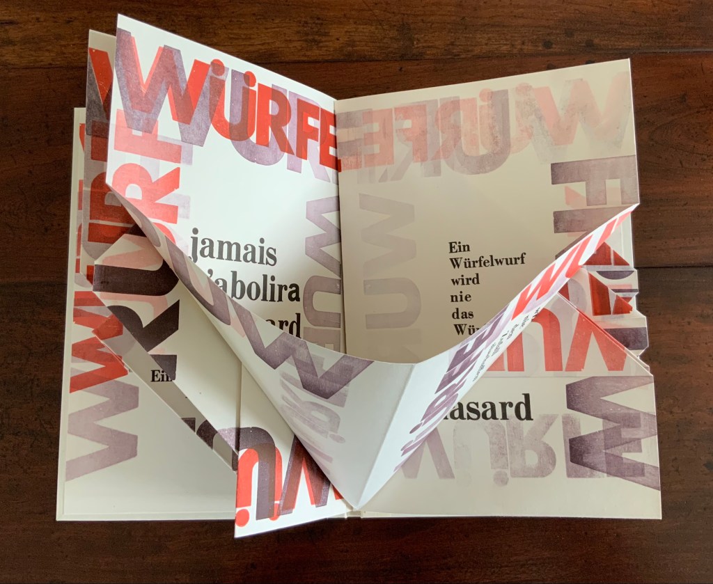
Würfelwurf (1992)

Würfelwurf: fragmentarische Annäherung an Stéphan Mallarmé (1992)
Reinhold Nasshan
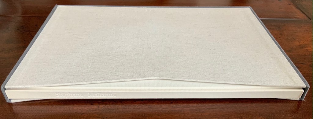
Slipcase, embossed spine, casebound in paper-covered boards, front cover decorated with title set on slip of paper woven into the cover, block sewn and glued, with relief prints as pastedowns. Slipcase: H360 x W248 mm; Book: 351 x 243 mm, 4 gatherings of folios of varying size cut, tucked or folded to fit within the binding’s dimensions. Unique. Acquired from the artist, 24 February 2021.
Photos of the work: Books On Books Collection. Displayed with artist’s permission.

“Throw of the dice”, “dice throw” or “throwing dice” are all reasonable translations of Würfelwurf, but not “a throw of the dice”, which most German translators render as ein Würfelwurf when tackling Mallarmé’s Un Coup de Dés. But then Reinhold Nasshan is not translating the poem. As the subtitle indicates, he is making “a fragmentary approach”, an approximation.

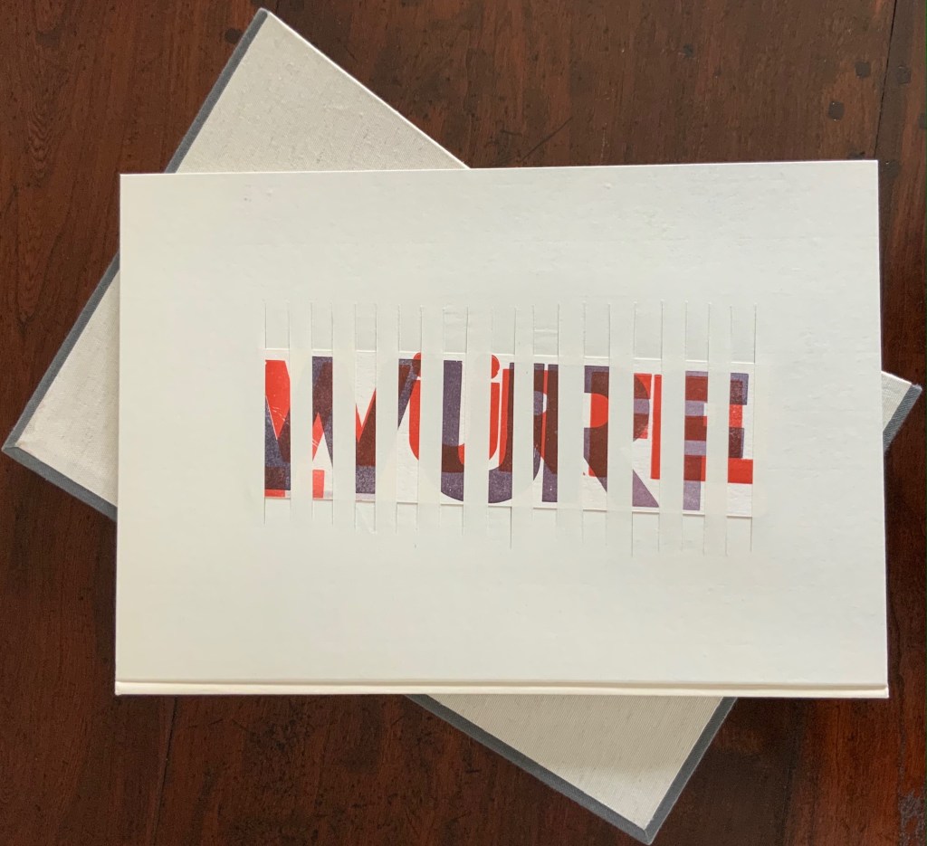
The very structure and working of Nasshan’s Würfelwurf underscore his title’s distinction between a single act and repetition of the act. On its front cover, the word würfelwurf splits in two, one half printed over the other on the slip woven into the slits in the front cover. The slip angles downward from left to right suggesting action, which comes aplenty inside the book.

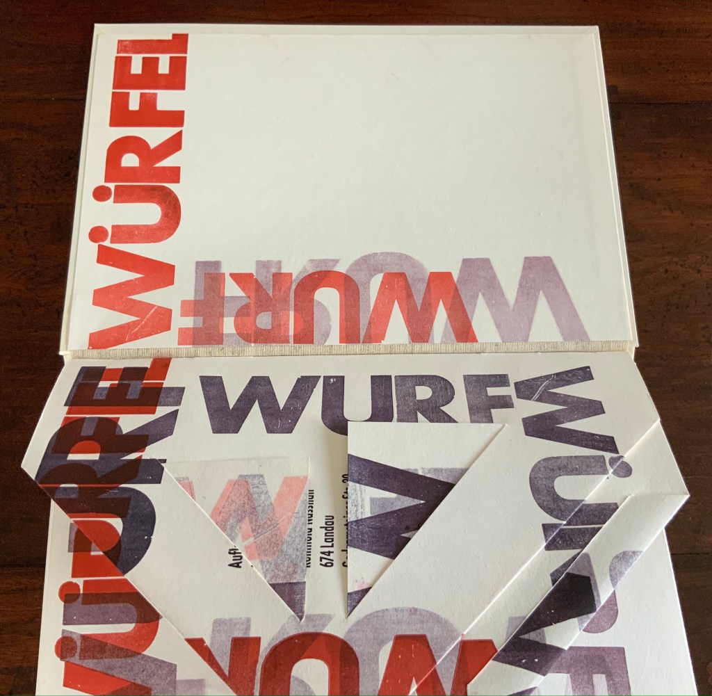
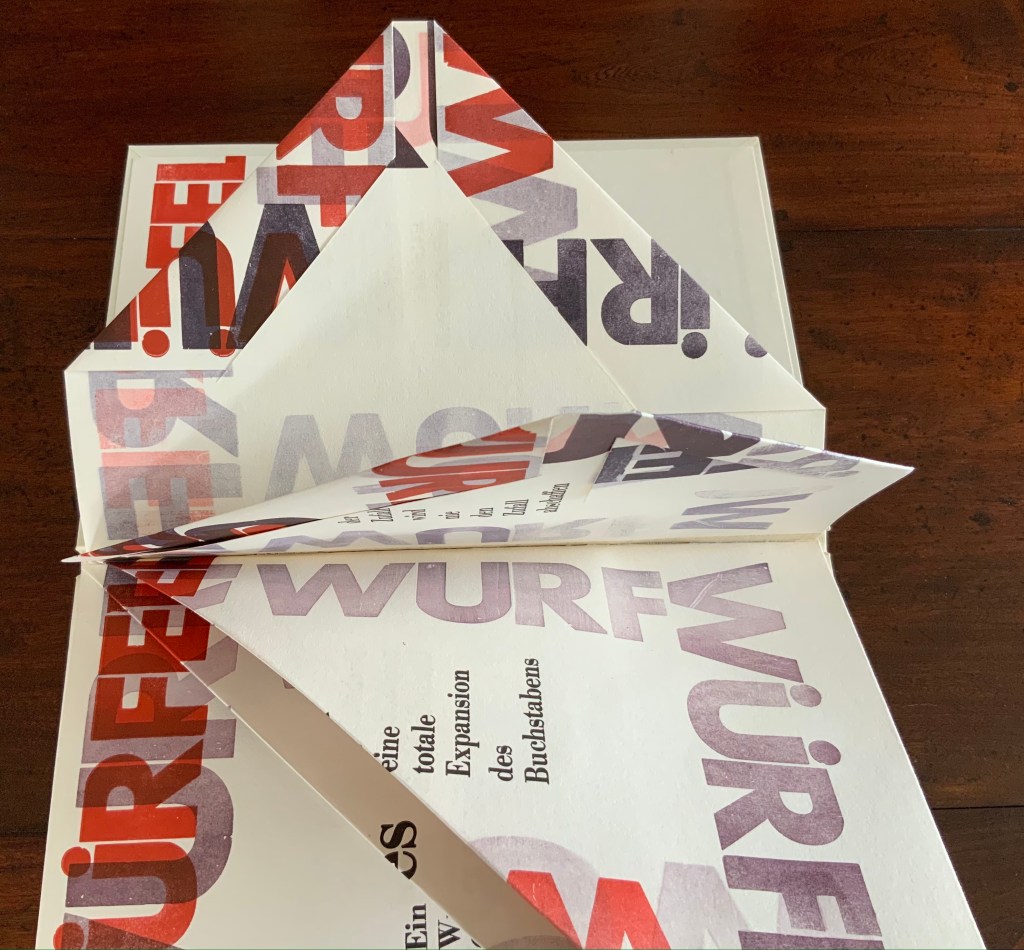
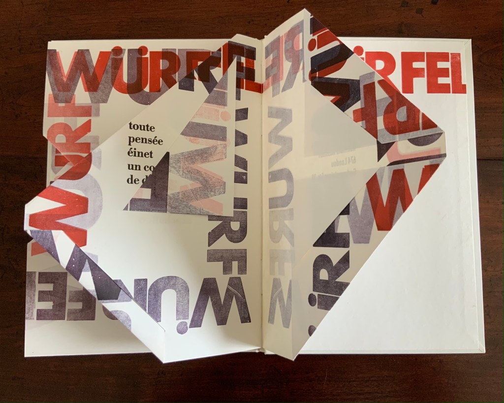
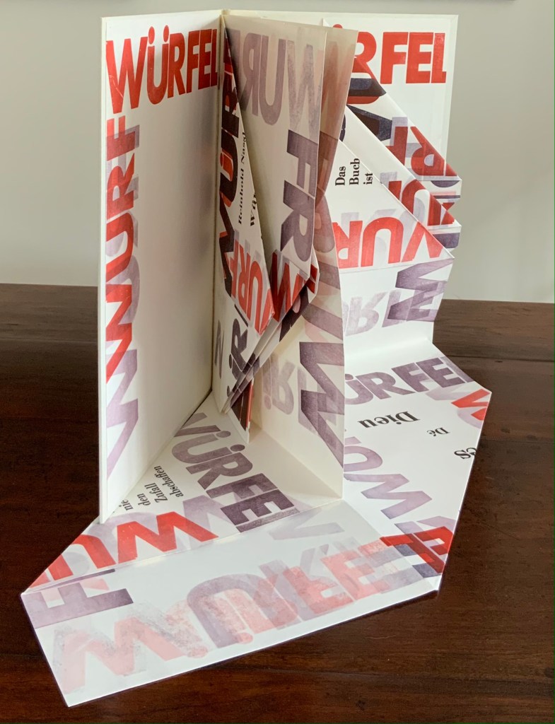
Some pages are cut, their corners folded and tucked in. One gathering consists of a sheet 688 x 470 mm that is creased with mountain- and valley-folds and untrimmed at the bottom edge so that it unfolds into a base that spills out beyond the covers. Pages take on dice-shaped edges and planes that seem to roll from within and against the book. The achieved effect of motion recalls Marcel Duchamp’s Nude Descending a Staircase (No. 2) or Umberto Boccioni’s Unique Forms of Continuity in Space.

Although the title of Mallarmé’s poem appears, most of the text scattered across the surfaces comes from his other writings; for example, peindre, non la chose, mais l’effet qu’elle produit (“to paint, not the thing, but the effect it produces”); tout, au monde, existe pour aboutir à un livre (“everything in the world exists to end up in a book”); and Das Buch ist eine totale Expansion des Buchstabens (“The book is a total expansion of the letter”). When that large folded gathering comes, though, the Mallarmé’s words begin to be jumbled: Ein Würfelwurf wird nie das Würfelspiel abschaffen (“A throw of the dice will never abolish the game of dice”) and Ein Wurf Gottes wird nie den Zufall abschaffen (“A throw from God will never abolish chance”).

Strangest of all is the mangling of émet from the poem’s final line Toute pensée émet un coup de dés (“All thought emits a throw of the dice”). The word becomes éinet. Not French, not German. Perhaps a typo of “in” for “m”? As it turns out, according to the artist, it is a fluke that the letter “m” available in the font on hand printed poorly, so “i” and “n” provided an alternative three vertical strokes.

Un Coup: Stéphane Mallarmé (1997)

Un Coup: Stéphane Mallarmé (1997)
Reinhold Nasshan
Flexible triangular cloth-covered book boards, 4 cotton paper squares folded into origami water bomb base and glued. Triangle: 127 x 127 x 179 mm; Square “pages”: 166 x 166 mm. Acquired from the artist, 24 February 2021.
Photos of the work: Books On Books Collection. Displayed with artist’s permission.

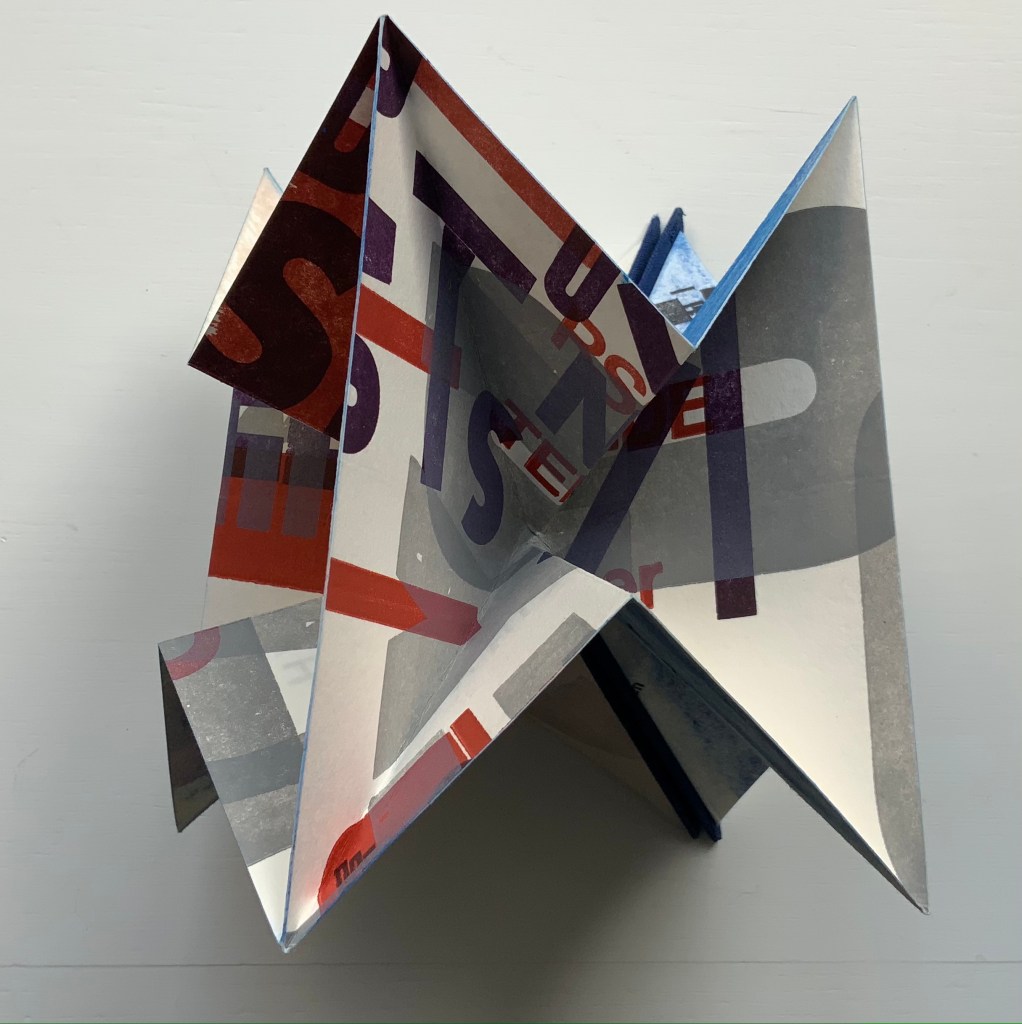
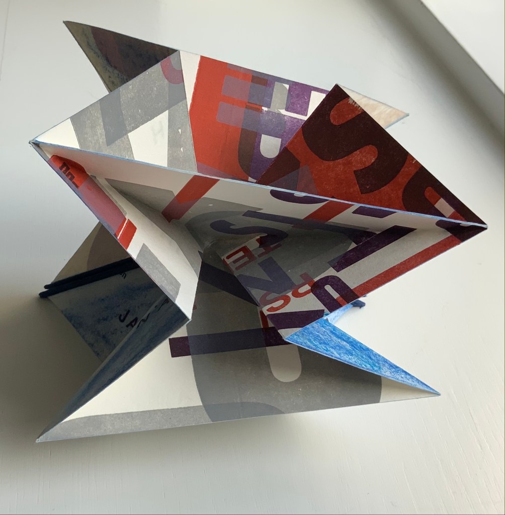
Nasshan also refers to this as a “letter sculpture”. Inviting the reconfiguring as with the works of Eleonora Cumer or Bruno Munari, or simply constant fiddling as with a paper fortune teller, Un Coup is more three-dimensional than Würfelwurf. As with Würfelwurf, this work lets the “moment of movement itself, the transition between the throw and the impact of the dice, emerge graphically” (moment der bewegung selbst den ubergang zwischen dem werfen und dem auftreffen der wurfel, graphisch hervortreten zu lassen). With less surface than Würfelwurf, though, it has fewer extracts from Mallarmé’s writings. Indeed, along with the physical shape shifting, the enlarged letters overprinted at multiple angles to one another combine to make this work more abstract than extract. But because text and book are material from which, on which and with which Nasshan creates, the abstract retains its links to the book.

Also a painter, Nasshan’s works fall into two categories or surfaces — painted books and painted canvases. Though lacking the shape of a book, his abstract paintings retain that link to “the world of Letters” in shapes and figures that evoke hieroglyphics, Chinese characters, typography and even cave paintings. His influences appear equally eclectic — though more Kandinsky, Klee and Miró than Pollock or Rothko — which matches up with his choice of substrates in fiction and nonfiction. When not choosing works from the ancient, classical or Romantic periods (from Gilgamesh to Seneca to Hölderlin), he chooses Apollinaire, Beckett, Celan, Joyce or Wittgenstein among others from the Modern period.

A wider audience would profit from Nasshan’s works. At least these two and others that might enter the Books On Books Collection will be available in the 2022 exhibitions celebrating the 125th anniversary of the publication of Un Coup de Dés in Cosmopolis (May 1897).

Further Reading

Bolton, Ama. 4 November 2013. “Saturday 2 November at the Oxford Book Fair“. Barleybooks.

Guckes-Kühl, Karen. September 2008. “Entdeckungsreise in die Buchkunst“. Buchbinderei Köster.

Klein, Thomas. 7 July 2019. “Die Sprache der Träume“. Wochenblatt-Reporter.de.

Möthrath, Birgit. 29 July 2019. “Reinhold Nasshan zeigt Malerie und Buchobjekte im Frank-Loebschen Haus“. Die Rheinpfalz.

Nasshan, Reinhold. 20 September 2021. Correspondence with Books On Books.

Books On Books Collection – Klaus Detjen

Un Coup de Dés Jamais N’Abolira le Hasard – Ein Würfelwurf niemals tilgt den Zufall (1995)

Un Coup de Dés jamais n’abolira le Hasard: Poème – Ein Würfelwurf niemals tilgt den Zufall: Ein Gedicht (1995)
Klaus Detjen
Casebound. H300 x W255 mm, 85 pages. Acquired from Stefan Schuelke Fine Books, 30 June 2020.
Photos: Books On Books Collection.

This work strikes a curious chord with two exhibitions from 2016 and 2018 — “Reading as Art” at the Bury Art Museum and “The Art of Reading” at the Museum Meermanno, respectively. The works in both exhibitions not only challenged notions of the book and ways of reading but posed the act of making as a form of reading and the act of reading as a form of making. By prefacing this French-German edition of Un Coup de Dés with a book-arts-driven “transcreation”, Klaus Detjen demonstrates that the act of making also implies the act of translating. Typographer, designer, scholar and recipient of the Leipzig Gutenberg Prize for 2017, Detjen has used color, shape, line and binding here as his tools of translation and interpretation.

To use the term “transcreation” here may be taking liberties with Haroldo de Campos’s portmanteau for the idea of “translation as recreation”, or translating with creativity and therefore making “translation-art”. The term and definition perhaps better describe works such as those shown in The New Concrete: Visual Poetry in the 21st Century edited by Victoria Bean and Chris McCabe. But then De Campos and his brother, Augusto, singled out Un Coup de Dés as one of the cornerstones (along with Ezra Pound, James Joyce and e.e. cummings) for their group Noigrandres, and Mallarmé’s poem certainly fits the bill of the ideal target of transcreation:

The more intricate the text is the more seducing it is to “recreate” it. Of course in a translation of this type, not only the signified but also the sign itself is translated, that is, the sign’s tangible self, its very materiality (sonorous properties, graphical-visual properties…. Haroldo de Campos, “Translation as Creation and Criticism”, p. 315.

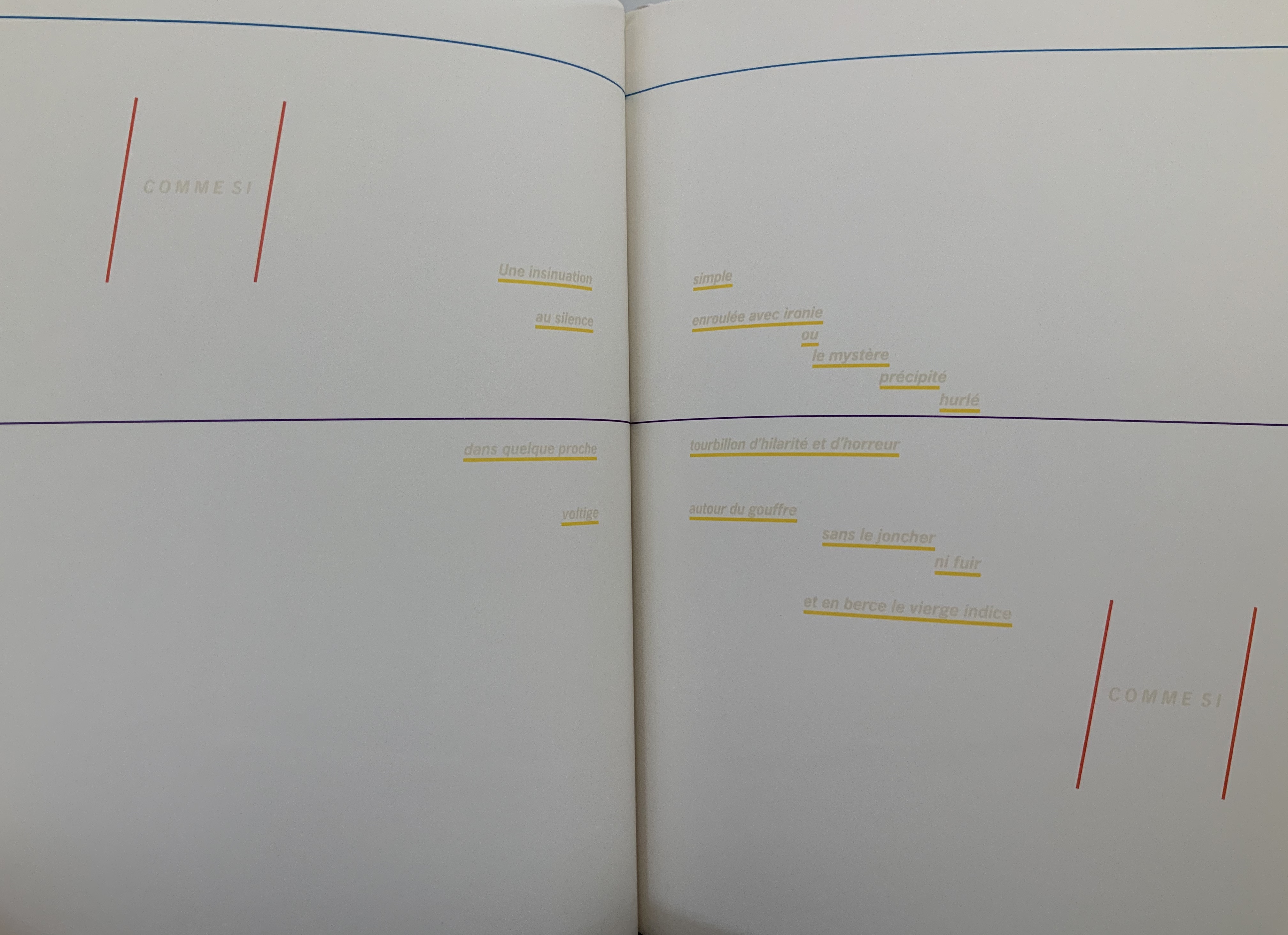
This notoriously difficult poem to translate (or even comprehend) with its cascade of metaphors and symbols (the central ones being a shipwreck and a constellation) appears three times in Detjen’s volume: first, in French with Detjen’s interpretive design, then in French and finally in German. All three instances follow the typography and layout of the first book edition of the poem as published in 1914 by Gallimard. Detjen’s own treatment of the poem very much focuses on the edition’s graphical-visual properties.

In that edition, the rhythm and position of the lines, the font and all the font sizes are precisely specified. Nine typographical motifs structure the poem. They are additionally highlighted in the front part of our book with colors, the meaning of which will be discussed later. Font sizes, styles (roman or italics) and the colors of the motifs used are as follows: First double-page spread: UN COUP DE DÉS, 11.25 mm, blue-violet / Second DS: QUAND BIEN MEME, 3.5 mm, cyan-blue / Third DS: que, 3.5 mm, green / Sixth DS: COMME SI, 5.25 mm, magenta; Une insinuation, 3.5 mm, yellow / Eighth DS 8: SI, 5.25 mm, magenta red / Ninth DS: C’ÉTAIT, 4.5 mm, orange red; autrement qu’hallucination, 2.5 mm, yellow; issu stellaire, 2.5 mm yellow. Klaus Detjen, “Zum Gestaltung”, p.81 (my translation).

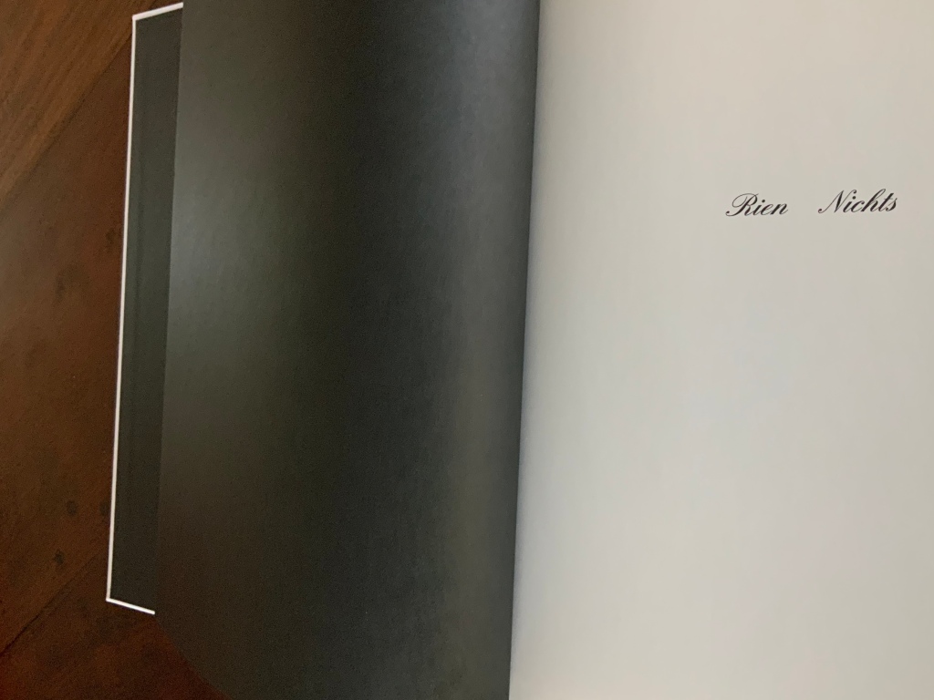
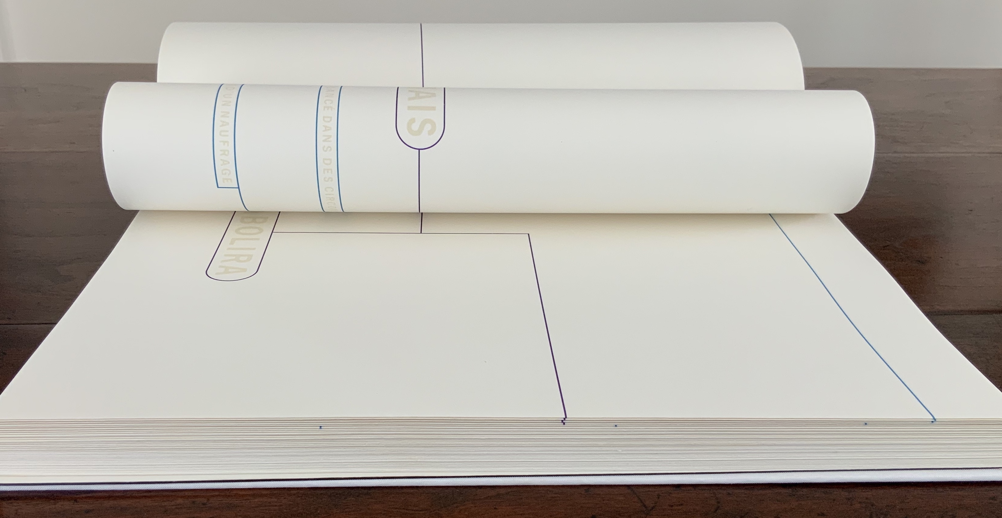
The colored linear frames, threads and markings give the nine typographical motifs additional structuring. Detjen intends them to highlight the reading order to guide the reader through the text like a score. Detjen’s later discussion of their meaning, however, focuses mainly on les blancs, the white space around the text of the poem. Taking Mallarmé at his word in the poem’s foreword, Detjen seizes on the whiteness of the surrounding space and runs to the prismatic metaphor that the spectrum of colors is simply the decomposition of white light. Detjen also notes that the unorthodox Rien/Nichts printed on the volume’s opening page alludes to the expanse of blank space enclosing the lines of text and, in support, quotes from Mallarmé’s “Crisis of Verse”:

Everything is suspended, an arrangement of fragments with alternations and confrontations, adding up to a total rhythm, which would be the poem stilled, in the blanks; … Mallarmé, “Crisis of Verse”, p. 209.

From all this, Detjen avers that it is

as if Mallarmé did not want to have his poem depicted, that is, printed, but perhaps only thought or, at best, whispered. Or did the author see the poem printed in white on white paper? Detjen, “Zum Gestaltung”, p. 82 (my translation).

Following that line of thought, Detjen switched from Mallarmé’s preferred classical serif typeface to News Gothic Bold after experimentation showed that sans serif enabled him to print legibly in flat white on white paper. Confirming his primary focus on the expanse of blank whiteness, Detjen even concludes his afterword by quoting Jorge Luis Borges on Mallarmé:

The impersonal color white itself — is it not utterly Mallarmé? Borges, “Narrative Art and Magic”, p. 79.

In his heavy emphasis on les blancs, Detjen ends up not doing justice to other more subtle aspects of his design artistry. Before he comes to the poem’s expanse of whiteness, note how the opening page of Rien/Nichts follows the black pastedowns and endpapers — the absence of light contrasting as much with the cover’s pure white as with the poem’s blank spaces.

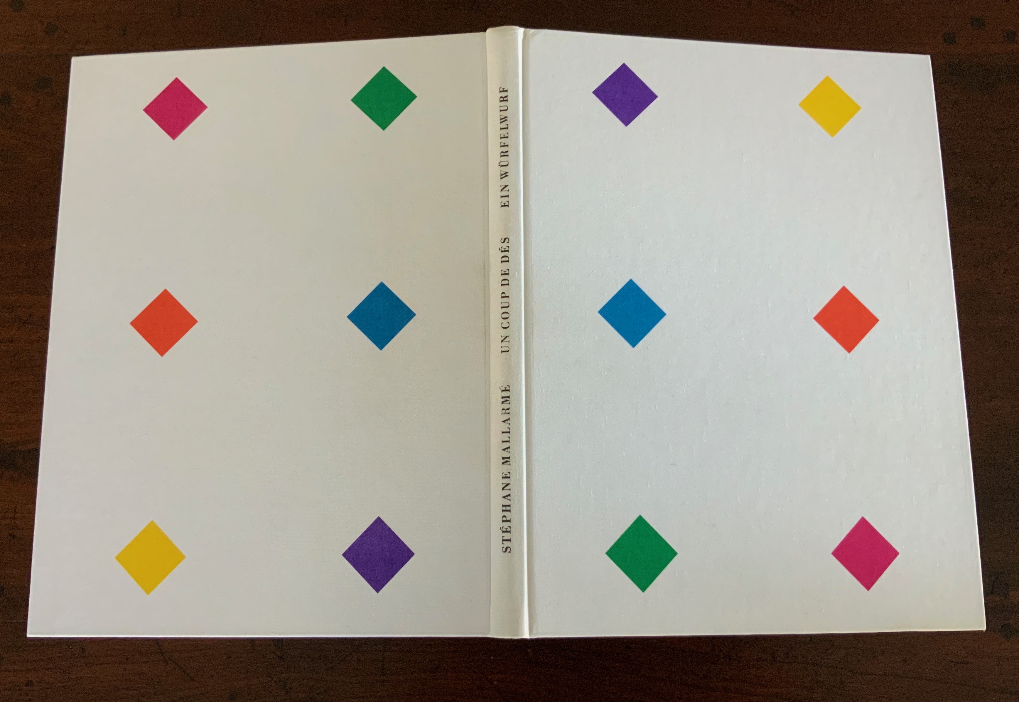
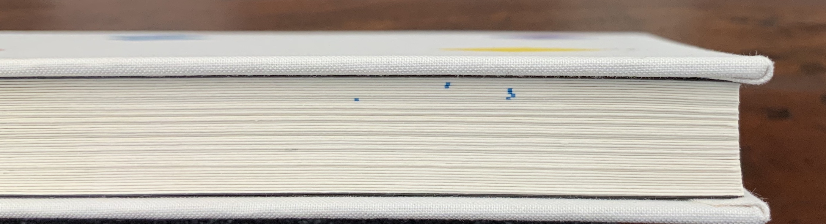
Note how the colors to come in his interpretive version appear in dice shapes arranged on the front and back white covers to suggest the faces of a pair of dice. The whole volume becomes ein Würfelwurf, un coup de dés, a throw of the dice, which echoes Mallarmé’s obsession with le Livre — that work that everything in the world comes to be.

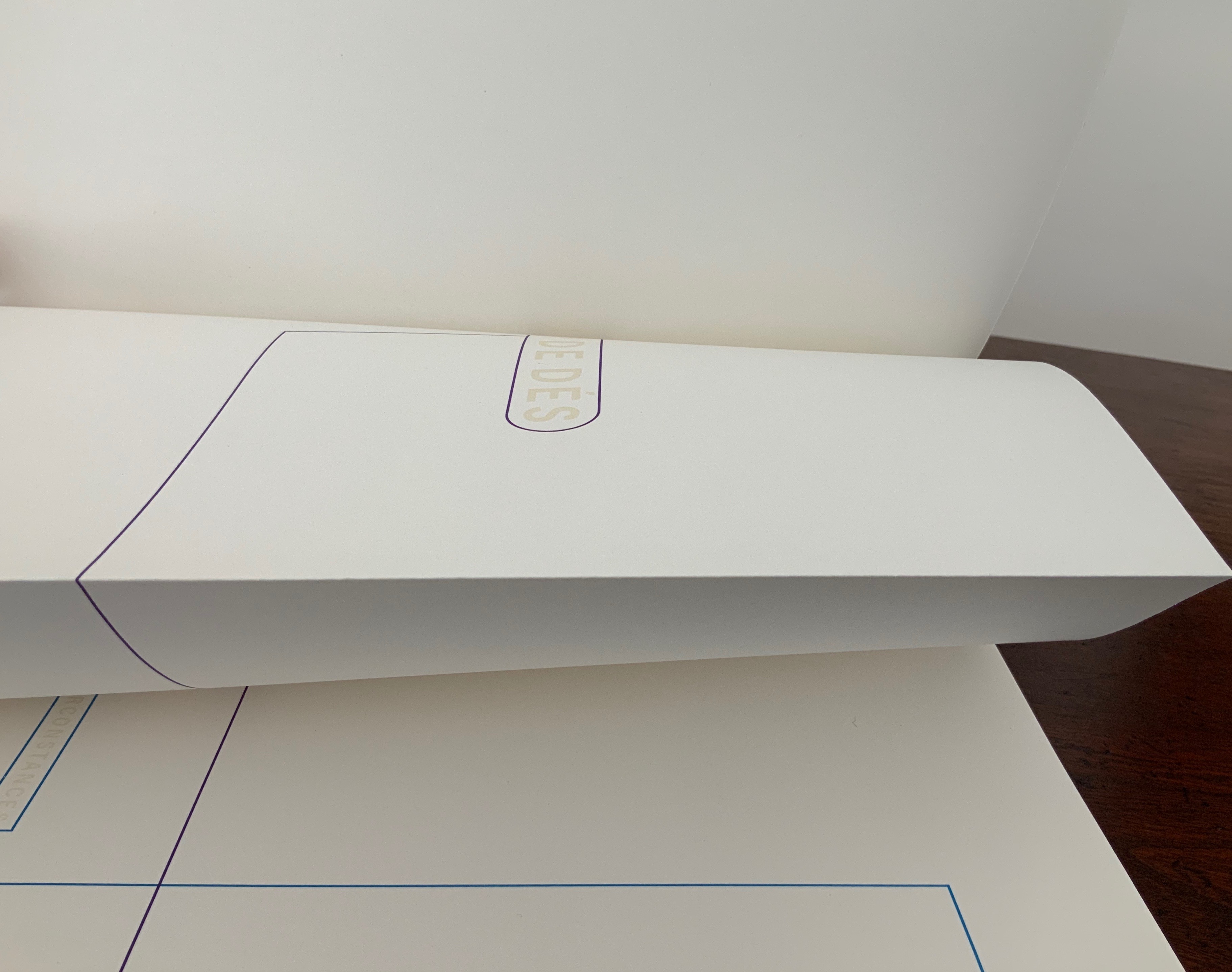
More subtly, Detjen combines the uncut folios with the colored shapes and markings to suggest “rigging” for the foundering ship and a “mapping” for the constellation. The turning uncut folios become billowing sails or rising and falling waves, across which the rigging cuts and the constellation shines.

Detjen’s visual and physical “transcreation” underscores why the French and German translations are not side by side, page for page. How could they be given the way the poem’s words work with the type, the page, the double-page spread and folios? All of which meets de Campos’s definition of the ideal target for transcreation — where the work’s signified, sign and materiality are intricately bound to one another.

In Detjen’s version preceding the French and German versions, the act of translation and interpretation meets the act of creating a work of art.

Further Reading

Bean, Victoria, and Chris McCabe, eds. The New Concrete: Visual Poetry in the 21st Century (London: Hayward Publishing, 2015).

Borges, Jorge Luis. “Narrative Art and Magic” [1932]. Trans. Suzanne Jill Levine; ed. Eliot Weinberger. In Selected Non-Fictions (New York: Penguin Books, 1999), pp. 75-82.

Campos, Haroldo de. “Translation as Creation and Criticism” [1963]. Trans. Diana Gibson and Haroldo de Campos. In A. S. Bessa and O. Cisneros, eds., Novas: Selected Writings (Evanston, IL: Northwestern University Press, 2007), pp. 312-326.

Cisneros, Odile. “From Isomorphism to Cannibalism: The Evolution of Haroldo de Campos’s Translation Concepts“, Érudit: At the crossroads of translating and writing: Poetics and experiments, Volume 25, Number 2, 2012, pp.15-44. Posted 8 October 2013. Accessed 22 August 2020.

Jaruga, Rodolfo. “Ezra Pound’s Arrival in Brazil“, Make It New: The Ezra Pound Society Magazine, Volume 4.1-2, September 2017. Accessed 22 August 2020.

Mallarmé, Stéphane. “Crisis of Verse” [1897]. Trans. Barbara Johnson. In Divagations (Cambridge, MA: Harvard University Press, 2009), pp. 201-11.

Paola, Modesta de. “Translation in Visual Arts”, Interartive, August 2013. Accessed 22 August 2020.