Affen und Alphabete (1962)


Affen und Alphabete [“Apes and Alphabets“] (1962)
Helmut Andreas Paul (HAP) Grieshaber
Slipcased, self-covered leporello with eighteen original woodcuts of stylized apes and sixteen typographical experiments. H450 x W335 mm. 36 unnumbered sheets. Edition of 300, of which this is #68. Acquired from Winterberg-Kunst, 22 October 2022.
Photos: Books On Books Collection.
HAP Grieshaber was one of the foremost German woodcut artists of the post-WWII era. His devotion to the woodcut technique was almost matched by that to the medium of the book, which he used in several formats and sizes for series works. Apes and Alphabets is one of the larger of those series and representative of his undeviating Expressionist style and blurring of borders between letter and image, the civilized and uncivilized, the artificial and the natural. This slipcased accordion book comprises 18 original woodcuts, two of which appear on the cover (one again on the wooden slipcase).

A full page of ranks of blackletter characters echoes a full page of columns and rows of apes with musical instruments. In visual cacophony, the letters make wordless strings just as the apes make soundless music.


Only one of the book’s panels has a touch of color, but the garish orange of the slipcase and book cover shows Grieshaber’s characteristic handling of this element — printing over an undercoat that serves as background. Even when working with a single color in these prints, Grieshaber earns his description as Der Holzschneider als Maler (“the woodcutter as a painter”), to which could be added “collagist”. Although influenced by Paul Klee and Lyonel Feininger, the physical intensity of the prints, this book and the others below sets Grieshaber apart.

His use of heavy wove paper in this work and other monumental ones like Die Rauhe Alb (1968) is equally of a part with a drive toward the tactile and a reaction to the alleviation of wartime paper shortages, which comes up later in Herzauge (1969) below.
Poesia Typographica (1962)


Poesia Typographica (1962)
Helmut Andreas Paul (HAP) Grieshaber
Paperback, perfect bound Chinese-fold folios, black endpapers. H215 x W155 mm. 28 unnumbered pages. Edition of 1000. Acquired from Print Arkive, 22 October 2022.
Photos: Books On Books Collection. Displayed with permission of the publisher Galerie der Spiegel.
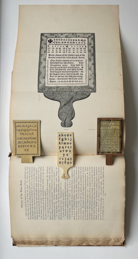
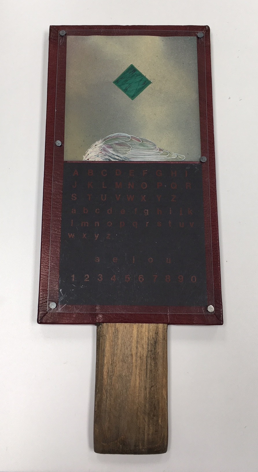
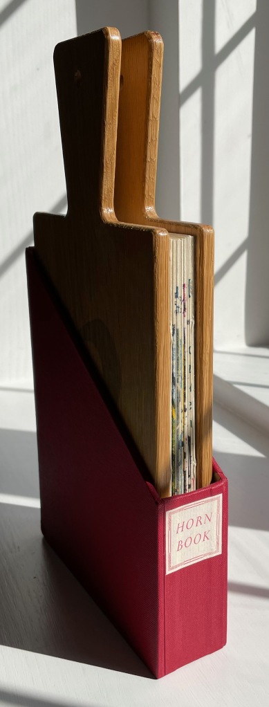
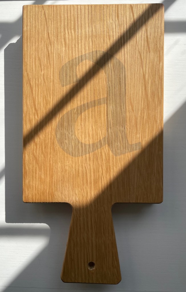
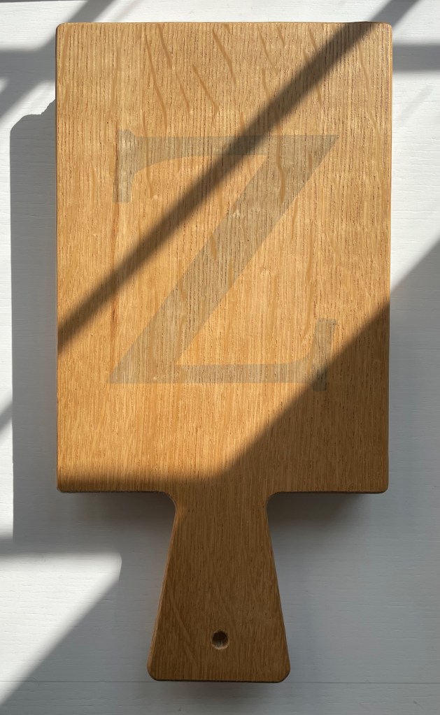
The alphabet theme of Affen und Alphabete carries over in the hornbook images on the front and back covers of Poesia Typographica. More than most typographic or concrete poetry, Poesia Typographica addresses the materiality of letters, images, ink, paper and printing — even going so far as to exalt it over the alphabet.
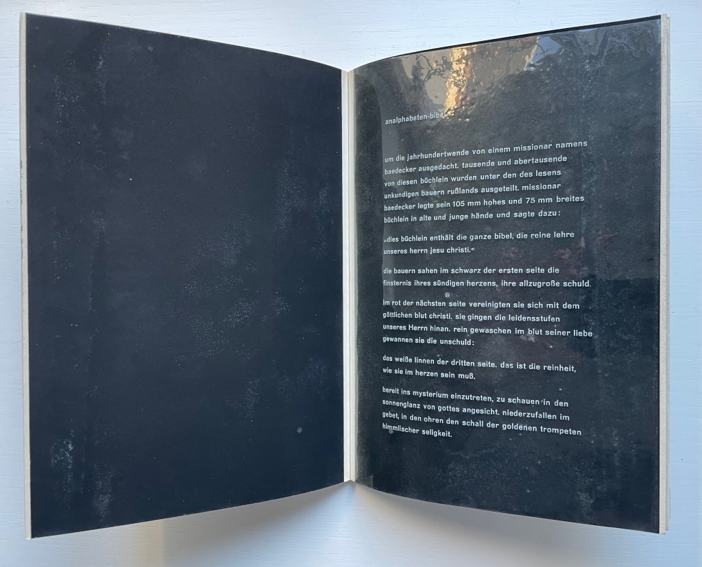
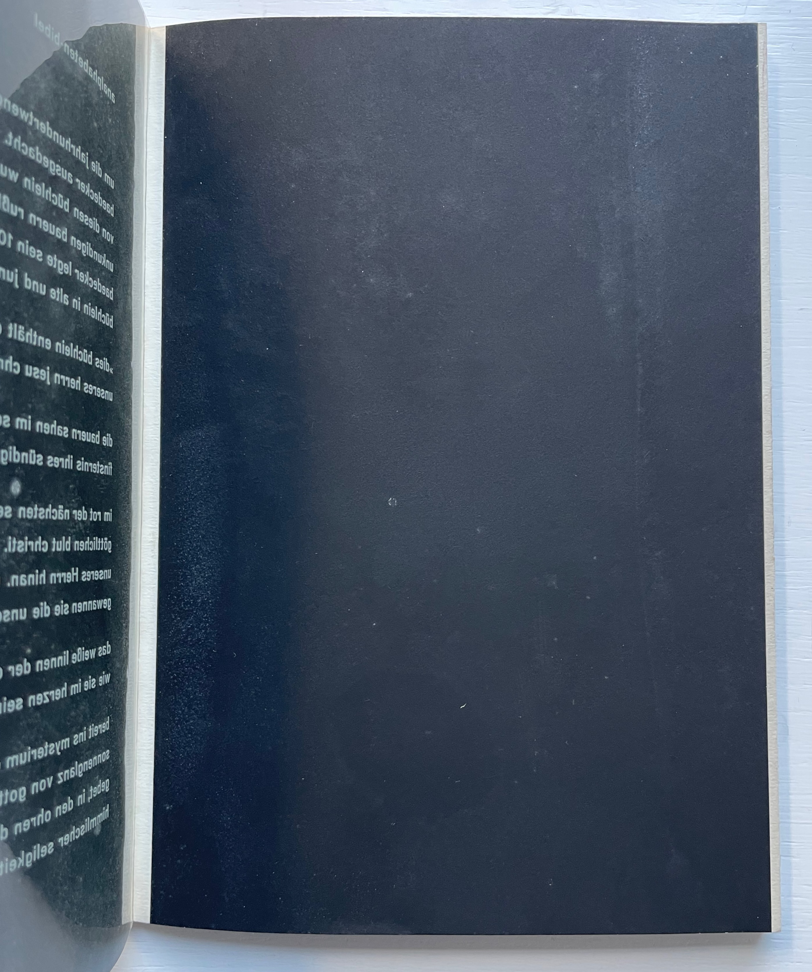
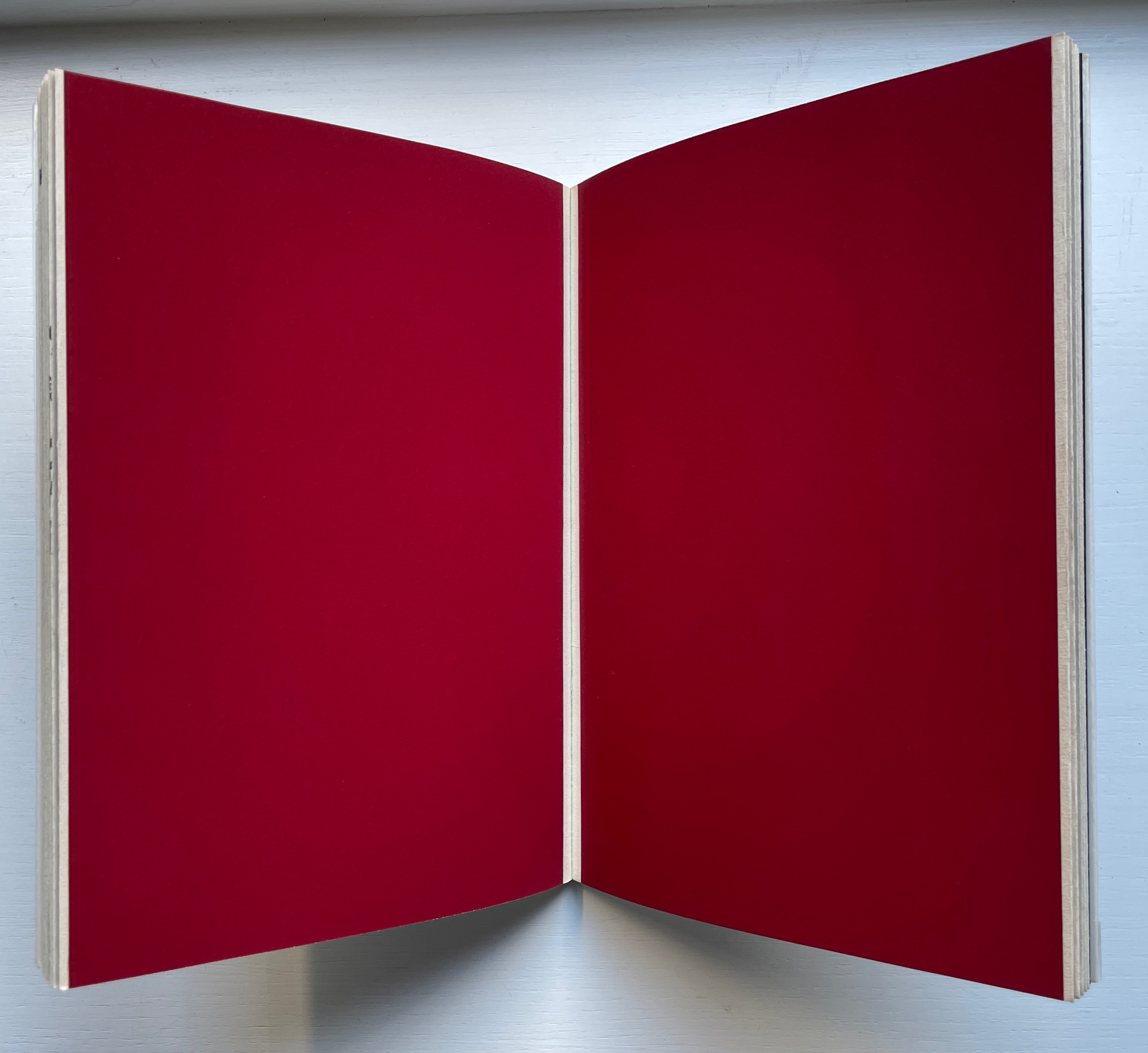
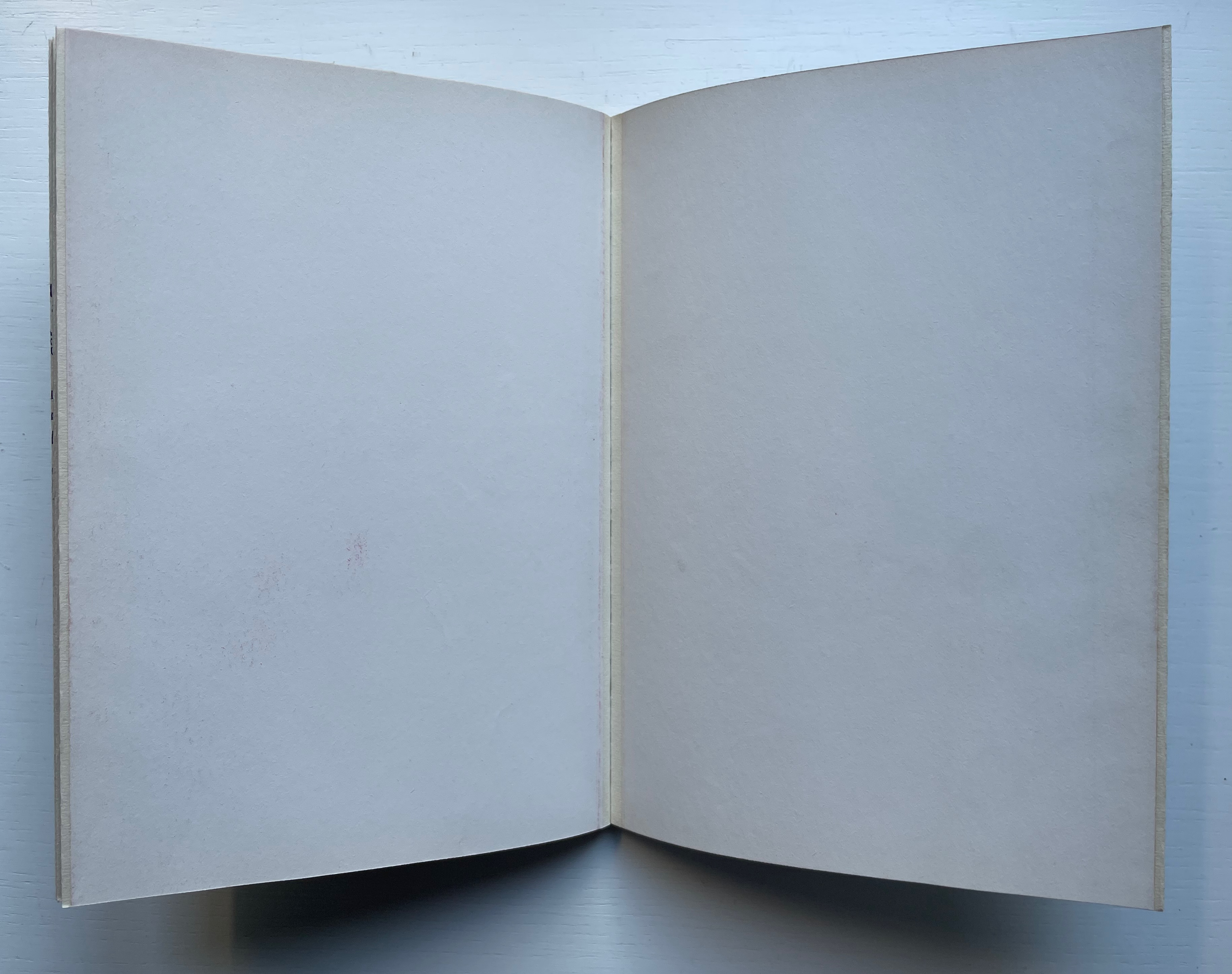
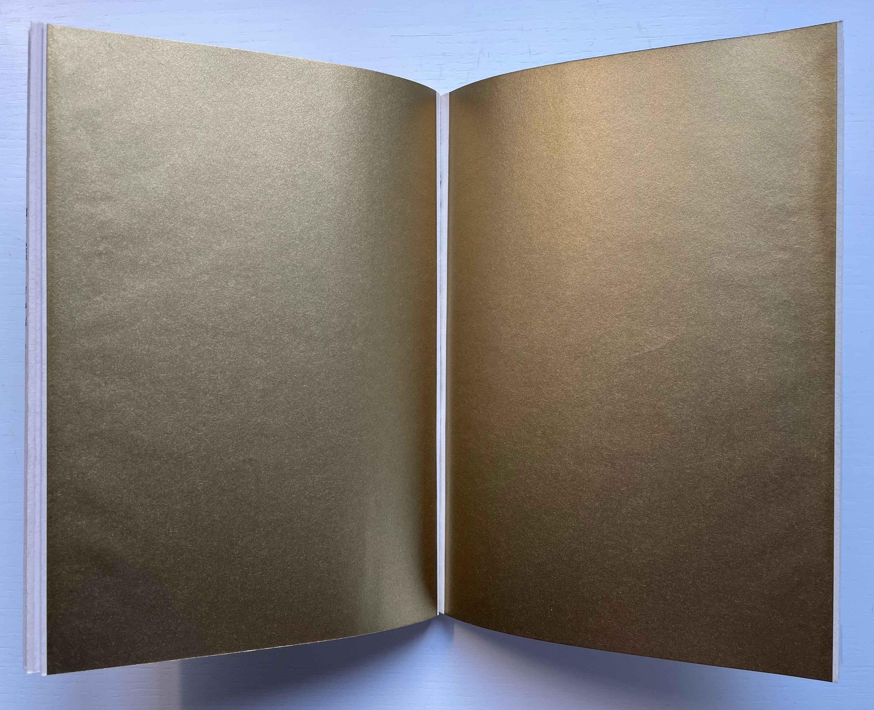
This is particularly clear in Grieshaber’s use of white ink on a transparent sheet to record the tale of missionary Baedeker and his Analphabeten Bibel (“Illiterates’ Bible”). To the Russian peasantry to whom Baedeker distributed thousands of the booklet, he claimed that its eight pages contained “the whole Bible, the pure teaching of our Jesus Christ”. The typeset transparent sheet sits between what would otherwise be a double-page spread of solid black. That spread is followed by one of red, one of white and then one of gold.


The transparent page explains :
the peasants saw in the black of the first page the darkness of their sinful hearts, their great guilt.
in the red of the next page, they united with the divine blood of christ. they walked out the suffering steps of our lord. washed clean in the blood of his love, they won innocence:
the pasture linen of the third page, that is the purity that must be in the heart.
ready to enter into the mystery, to look into the sunshine of God’s face. to fall down in prayer, the sound of the golden trumpets of heavenly bliss in their ears.
A literate reader may smile at the missionary’s metaphorical hoodwinking of the serfs, but the longer the reader moves the transparent page back and forth, registers its interloping nature, and recognizes that “analphabet” doesn’t just mean “an illiterate” but also one who does not know letters at all, the more the materiality of the stiff black, red, white and gold pages makes itself felt and the more the viewer realizes that Grieshaber is laying down a challenge to look beyond the alphabet to the ink, paper and the printing.
Just as in Affen und Alphabete, the reader/viewer must look at letters beyond “shapes for sounds”. Letters may have their roots in the pictorial, but Grieshaber isn’t taking their “shapeness” back to pre-Gutenberg or pre-alphabet pictoriality. He takes it into an expressive post-Gutenberg, post-alphabet visual and material art.

Herzauge (1969)


Herzauge (1969)
Helmut Andreas Paul (HAP) Grieshaber
Board book casebound in bookcloth, with illustrated dustjacket. H294 x W240 mm. 16 unnumbered pages with 9 color plates. Edition of 800? Acquired from K.G. Kuhn Antiquariat, 14 July 2023.
Photos: Books On Books Collection. Displayed with permission of artist’s family.
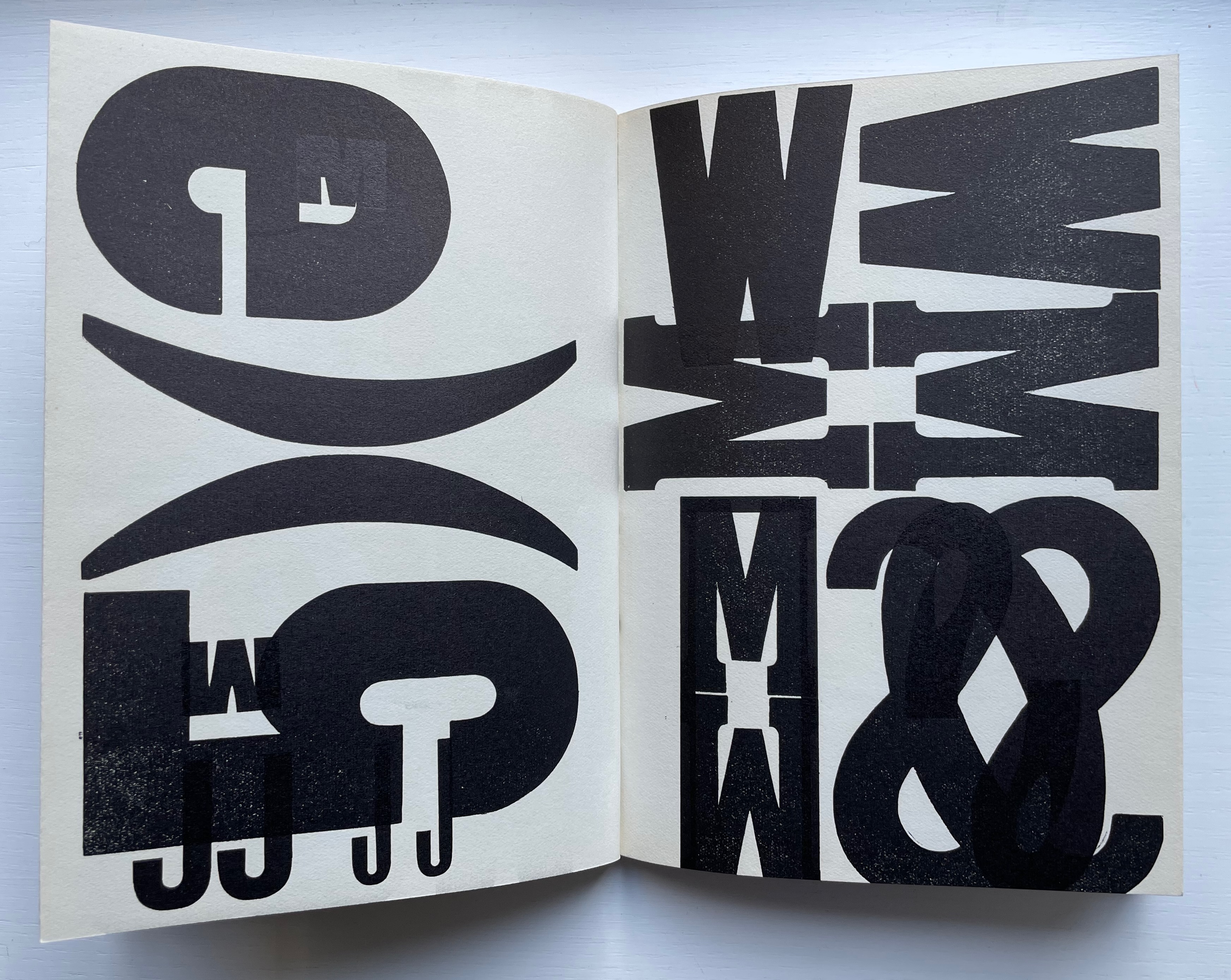
Hat das Herz noch ein Auge? (“Can the heart still see?”), Grieshaber asks on the last page of this artist’s book for children published by Parabel Verlag in Munich. It’s a disturbing afterword. It changes what you think these Expressionist woodcuts and the words beside them express. Grieshaber explains that, by 1937, paper for printing was scarce. From a generous doctor, he obtained filtration paper on which to print his landscape woodcuts Die Rauhe Alb, his visual ode to the Swabian Alps. Children brought him the sheets of glossy paper on which the original 20 copies of Herzauge were printed and over-drawn with a dry brush. No one wanted Die Rauhe Alb at the time, and all but one copy of Herzauge were lost. His summary phrase — Märchen in dunkler Zeit (“Fairy tales in dark times”) — offers a way into the board book and perhaps an answer to the question “Can the heart still see?”


Second double-page spread. “Ach Alm, a knight once moaned. Achalm, I live in your lap.”
Achalm is a mountain in Reutlingen, Germany. On its top are the ruins of Achalm Castle, ancestral seat of the counts of Achalm, a 13th-century Swabian noble family. The legend is that the name comes from Count Egino’s dying words to his brother. He meant to say “Ach Allmächtiger!” ( “O Almighty!”) but only uttered “Ach Allm…“, and to honor Egino, the brother named the mountain and castle Achalm. It’s a clever poem and clever woodcut. The last word Schoß — meaning bosom, arms, heart or lap — is close to the word Schloß — meaning castle. Turning the castle into a fairy tale crown, the woodcut also gives the mountain a feminine visage, a sweep of white that looks like an embracing arm and a village nestled in its lap.
This spread comes after the first in which a black woebegone bird in a brush-streaked patch of snow occupies the foreground alongside the lines “Winter is a hard man. The tree freezes.” And it precedes the third in which the viewer’s perspective must be that of standing on a dock and looking out on a harbor alongside text that reads, “Do you hear the horn hooting in the harbor? We are leaving.” Achalm is the fairy tale bookended by dark cold before and forlorness after.
The fourth spread’s text — Wer streicht am Abend allein über de Berge? Die Katze weiß es.(“Who is painting alone in the mountains in the evening? The cat knows.”) — is a fairy-tale blend of gloomy forest and mysterious animal humor matched by the dark purple undercoat and background of the woodcut.
A fifth spread with colors of dark blue, burnt umber and green against a turquoise undercoat and background shows a distressed Hansel-and-Gretel-like pair on the turquoise path between blue and umber trees and beneath a large blue, umber and turquoise owl that cries “Home, home!” as Der Nacht krab kommt (“The night call comes”)
The sixth and seventh spreads introduce a different air of childhood innocence, one of lessening threat. In the sixth, a child figure with upraised arms (throwing an orange ball up in the air?) wanders down a meadow valley bordered by a knoll of trees leaning over the otherwise sunny scene with black and purple foliage that suggest the faces and hair buns of stern school mistresses. The last line of text — Ich muß zur Schule (“I must go to school”) — evokes a nursery-rhyme dawdling ten o’clock scholar to English ears. In the seventh, Wir haben Ferien (“We have holidays”) sounds like the concluding sentence in a final school assignment and is matched by the child-like drawing of swans, roses, a green lake and a motherly figure. But mother is faceless, preparing us for the afterword’s hopeful but worried question “Can the heart still see?”

It’s good to see a renewed interest in Grieshaber — not only for his own artistry but also his medium. Another of his major works — The Easter Ride, a series of 27 colored woodcuts based on a journey through the Swabian Alb — was exhibited at the Elztalmuseum Waldkirch in early 2023.
Helmut Andreas Paul Grieshaber, better known as HAP Grieshaber, is one of the most important artists of the 20th century in the field of woodcuts. He created numerous large-format, abstract works on socio-political and religious themes. He was considered down-to-earth and idiosyncratic. His art was intended to be visible and accessible to all.
… The exhibition invites visitors to engage with Grieshaber’s idiosyncratic, unmistakable visual language and to become acquainted with the technique of the woodcut.
Further Reading
Fichtner, Gerhard, and Wolfgang Bartelke. 1999. Bibliographie Hap Grieshaber. Ostfildern-Ruit: Cantz.
Grieshaber, Helmut A. P., and Fuerst, Margot. 1964. HAP Grieshaber: Der Holzschneider. Stuttgart: Hatje.
Grieshaber, Helmut A. P, and Margot Fuerst. 1964. H.a.p. Grieshaber; Woodcuts. New York: Arts.
Grieshaber Helmut A. P, and Margot Fuerst. 1965. Grieshaber: Der Drucker Und Holzschneider. Plakate Flugblätter Editionen Und Akzidentia. Stuttgart: Hatje.
Grieshaber, HAP, and Margot Fuerst 1969. Grieshaber 60 (Sechzig). Württembergischer Kunstverein and Städtische Kunstgalerie Bochum.
Grieshaber, Helmut A. P.; Göbel, Johannes; and Glöckner, Wolfgang. 1989. Grieshaber Der Holzschneider Als Maler: Gouachen, Malbriefe, Aquarelle, Holzschnitte, Zeichnungen. Bonn: Bouvier.
Käufer, Hugo Ernst. 1981. Der Holzschneider HAP Grieshaber. Passau: Edition Toni Pongratz.
“The Easter Ride” – HAP Grieshaber
In this special exhibition, the Elztalmuseum is showing one of the artist’s major works: “The Easter Ride”. 10 March 202307 May 2023, Elztalmuseum Waldkirch
Brinkhus Gerd Gerhard Fichtner and Universität Tübingen Universitätsbibliothek. 1979. Grieshaber Und Das Buch : Eine Ausstellung Der Universitätsbibliothek Zum 70. Geburtstag Hap Grieshabers 25. Mai Bis 14. Juli 1979. Tübingen: Universitätsbibliothek.
