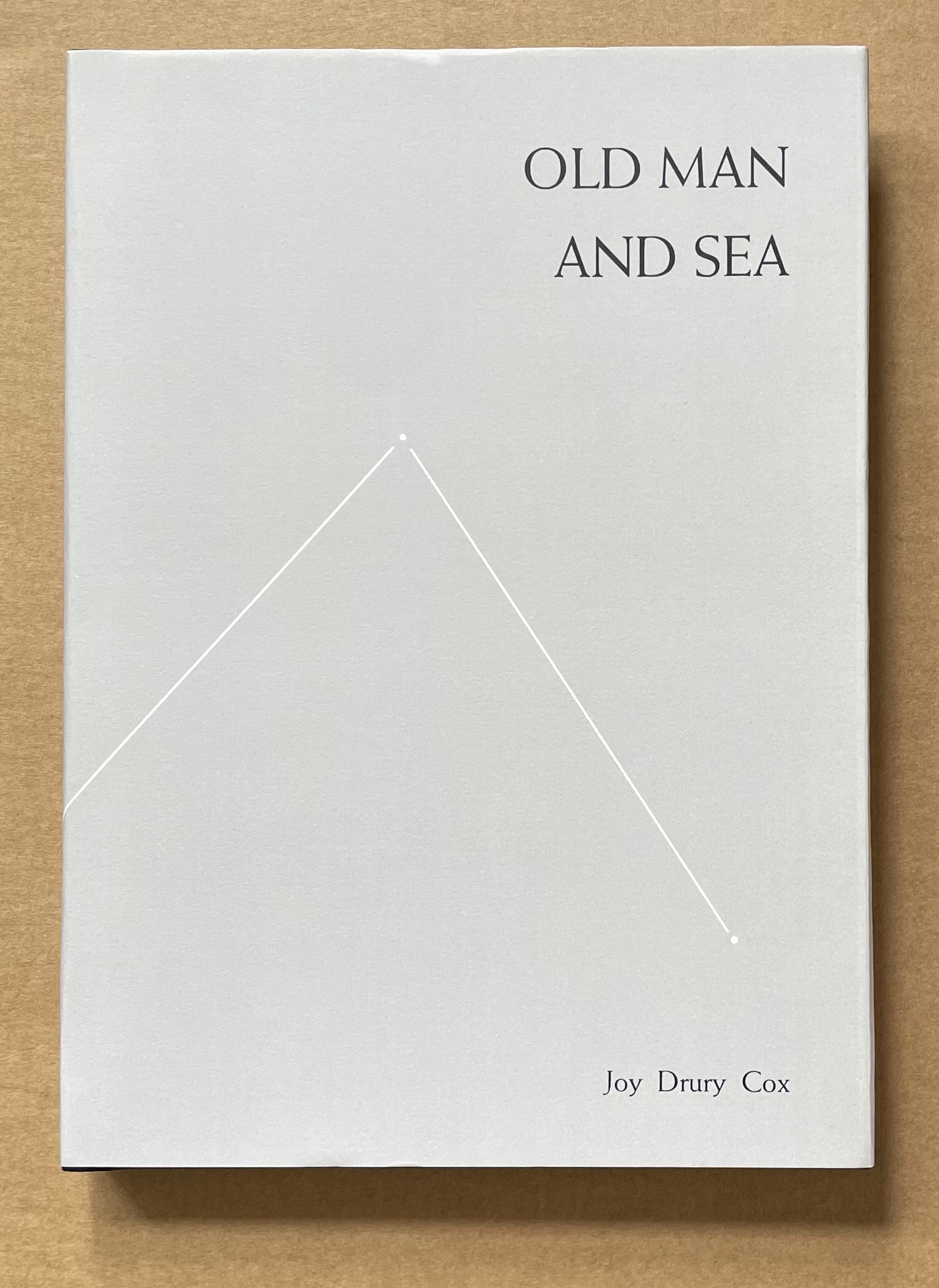
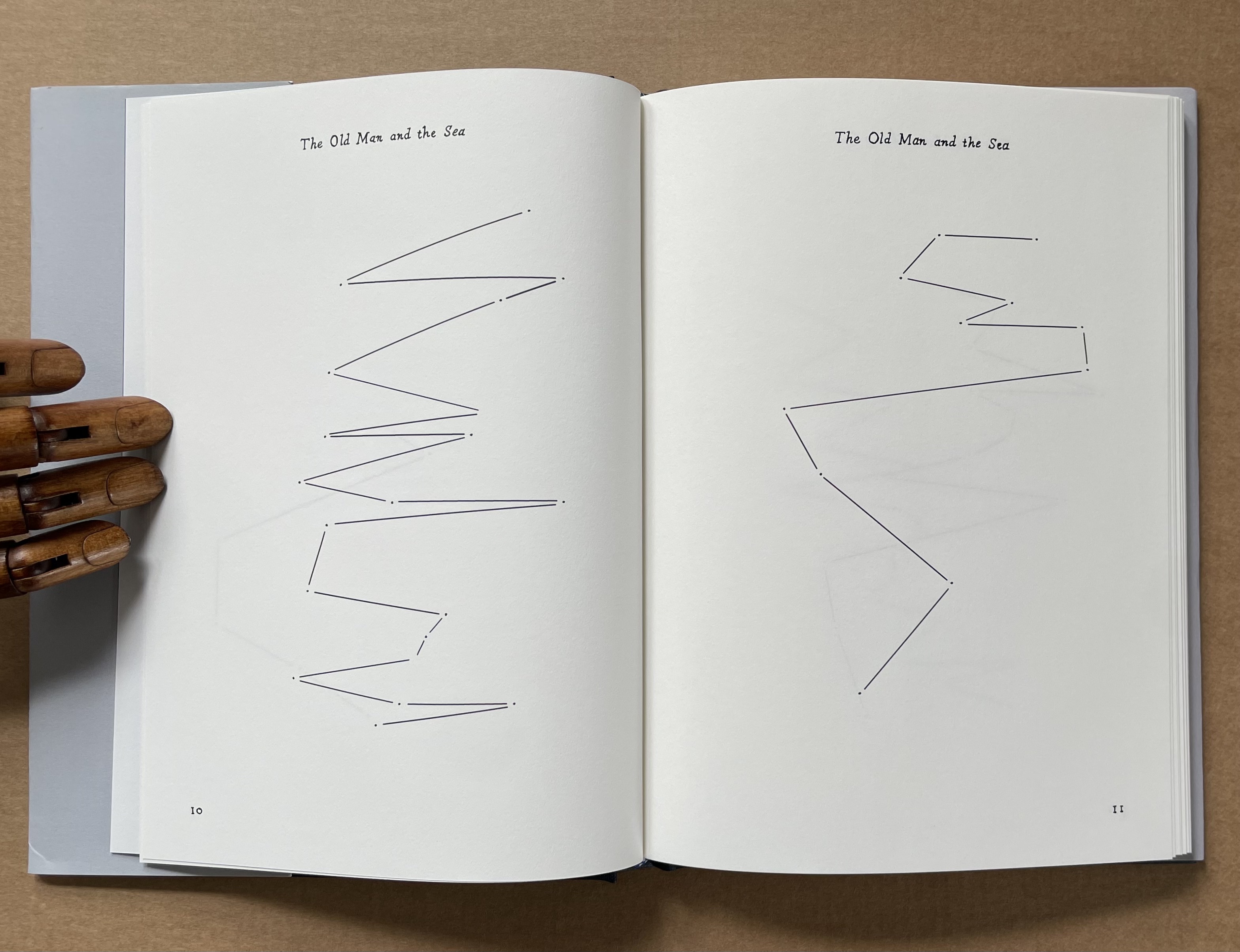
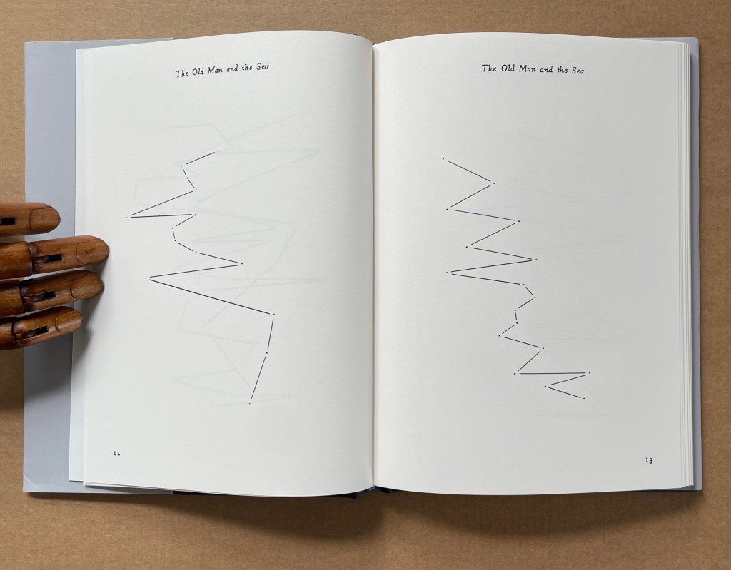
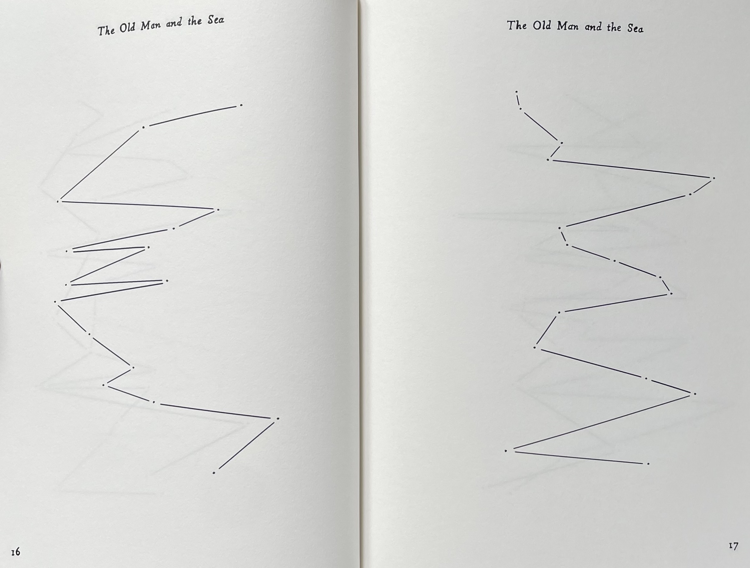
Old Man and Sea(2012) Joy Drury Cox Casebound, cloth over boards, doublures. H206 x W150 mm. 128 pages. Edition of 100. Acquired from Scott Hazard, 18 June 2017. Photos: Books On Books Collection.
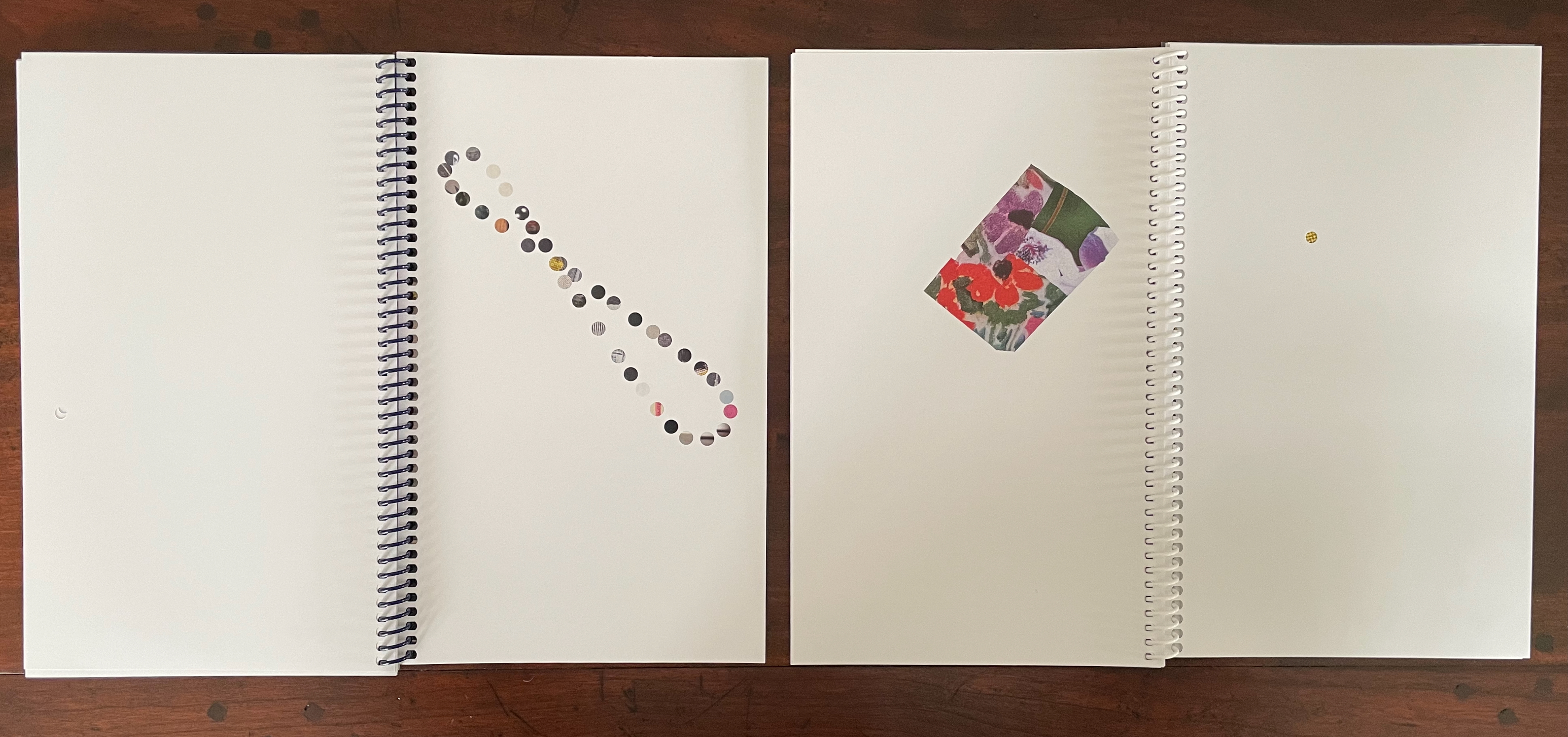
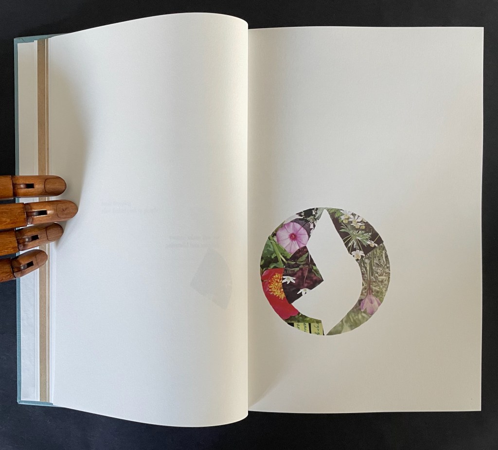
The technique of erasure, excision, redaction, extraction, etc., serves the mastery of negative space. It has attracted a large number of book artists intent on altering an extant work of text. Even webpages can be subjected to it, courtesy of “The Deletionist“, a javascript devised by book artists of course. Negative space provides the background to the marks in the foreground. Likewise, the removed text of The Old Man and the Sea is the background to the marks in Old Man and Sea as foreground, as the running head continually reminds us.
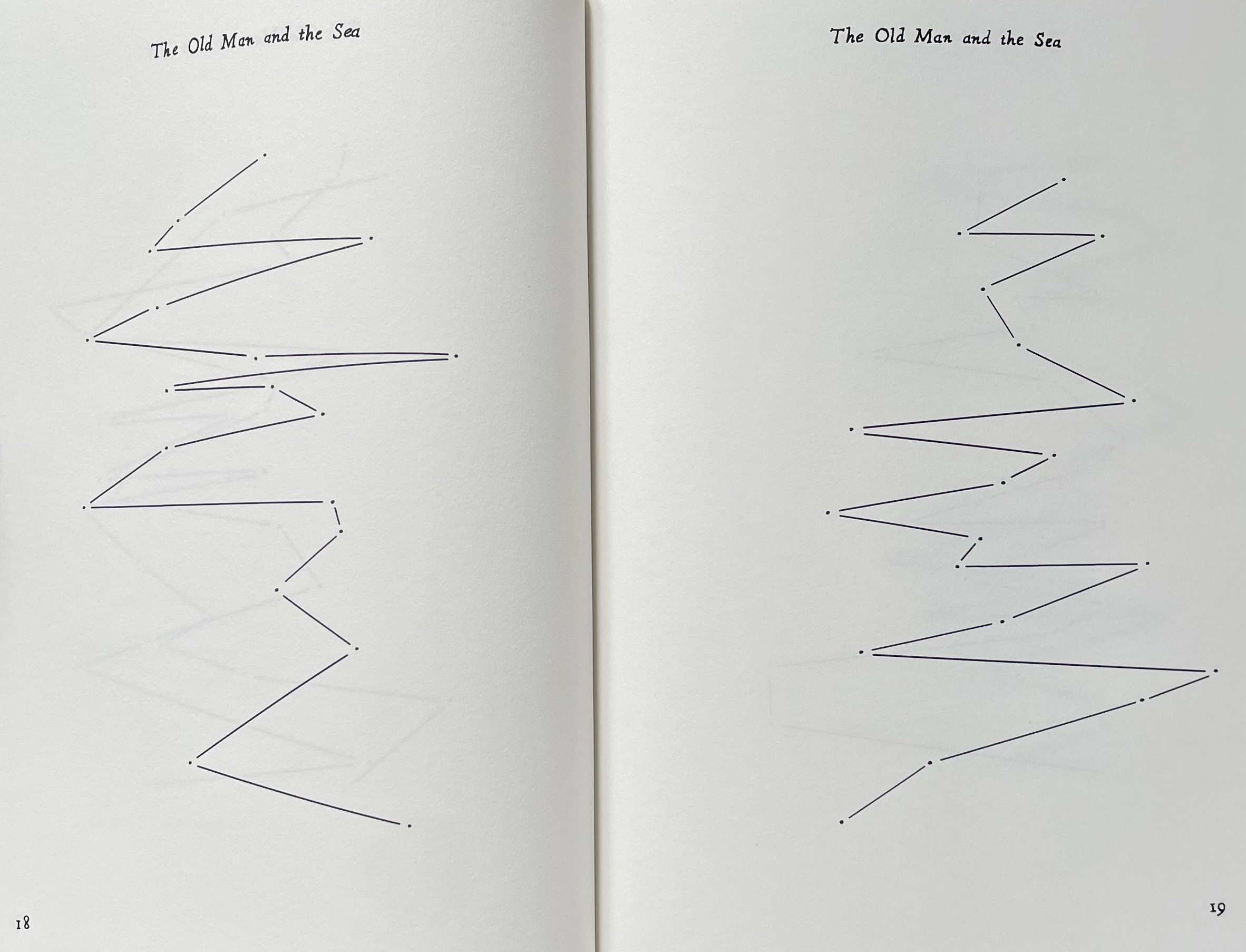
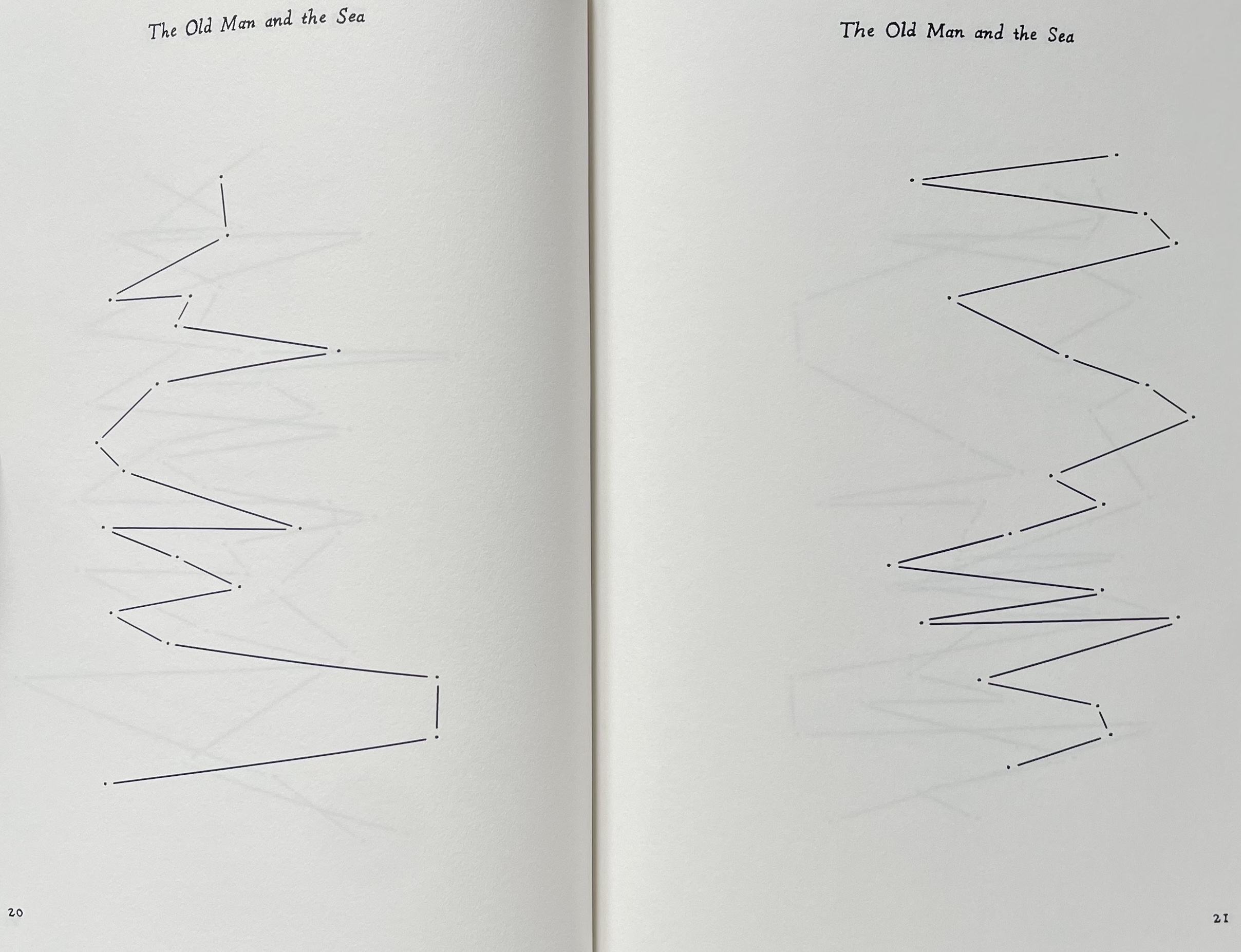
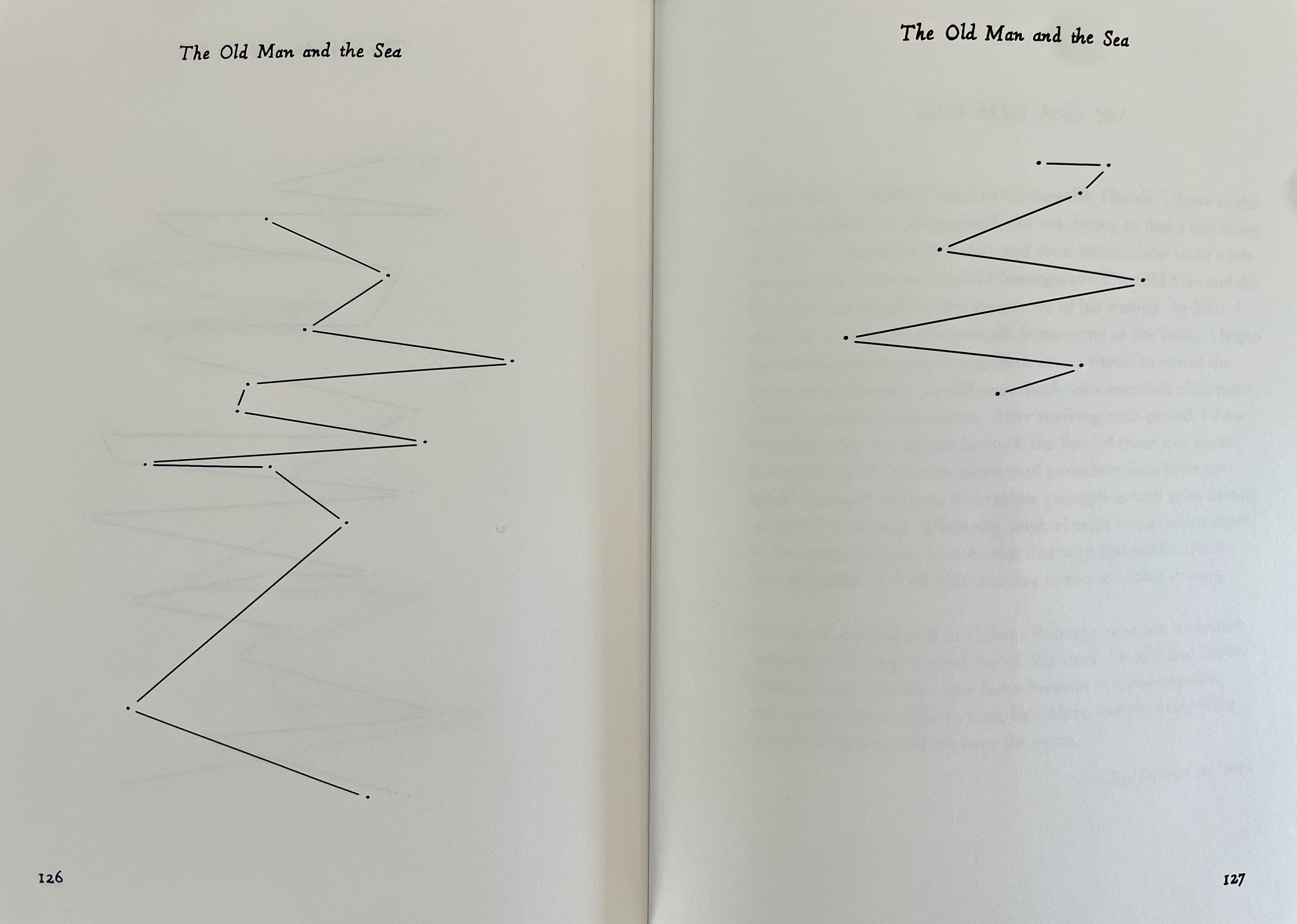
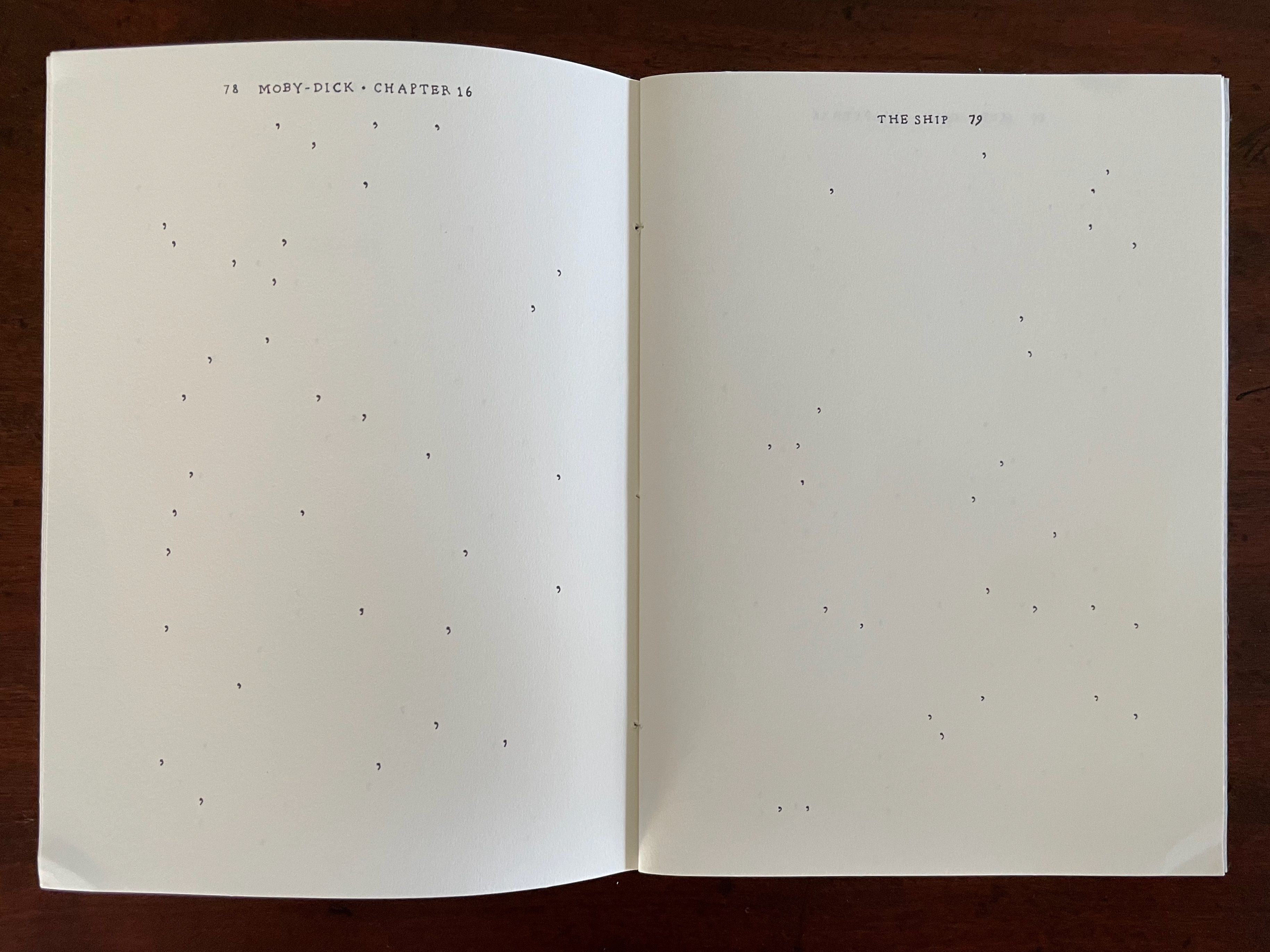
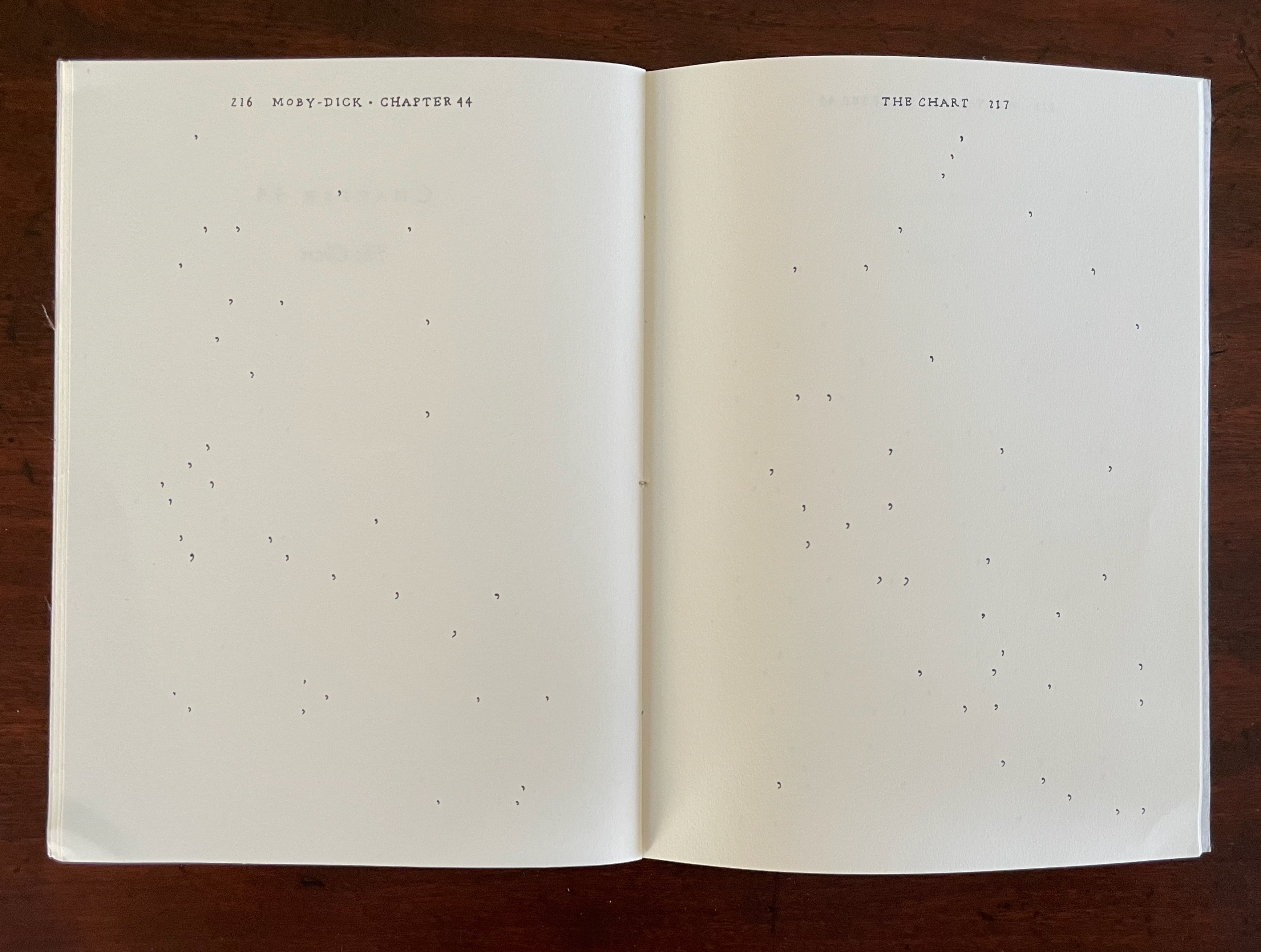
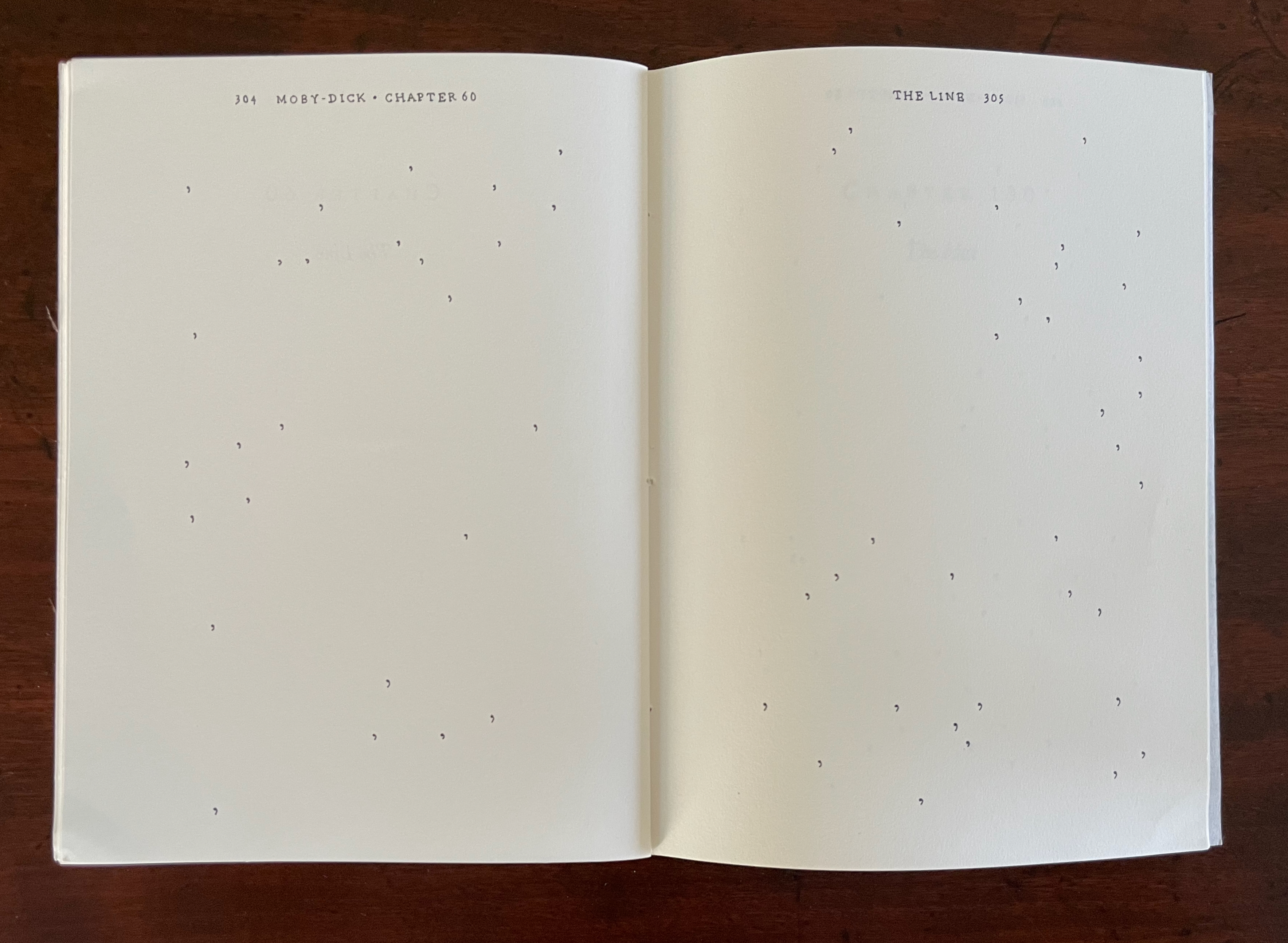
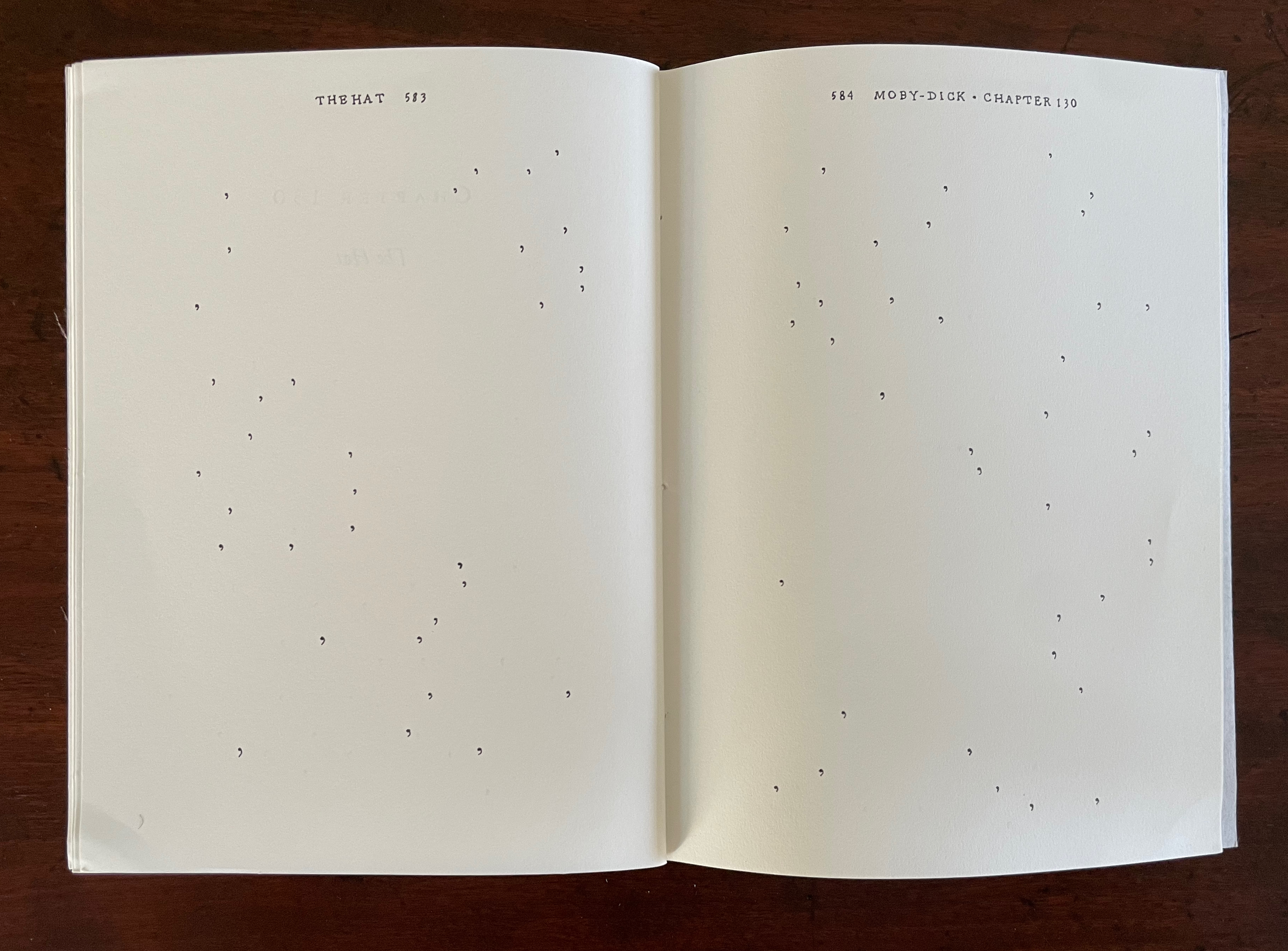
By eliminating all of the text in Ernest Hemingway’s The Old Man and the Sea except for the periods (full stops) and then connecting them with straight lines, Joy Drury Cox offers a visual reading of Hemingway’s narrative style and pace that would have made Paul Klee smile. More than a line being “a dot that went for a walk”, we have lines taken for a walk between the dots at the end of lines. And presumably OuLiPian Georges Perec would nod along in agreement with Cox’s pan-lipogrammatic approach.
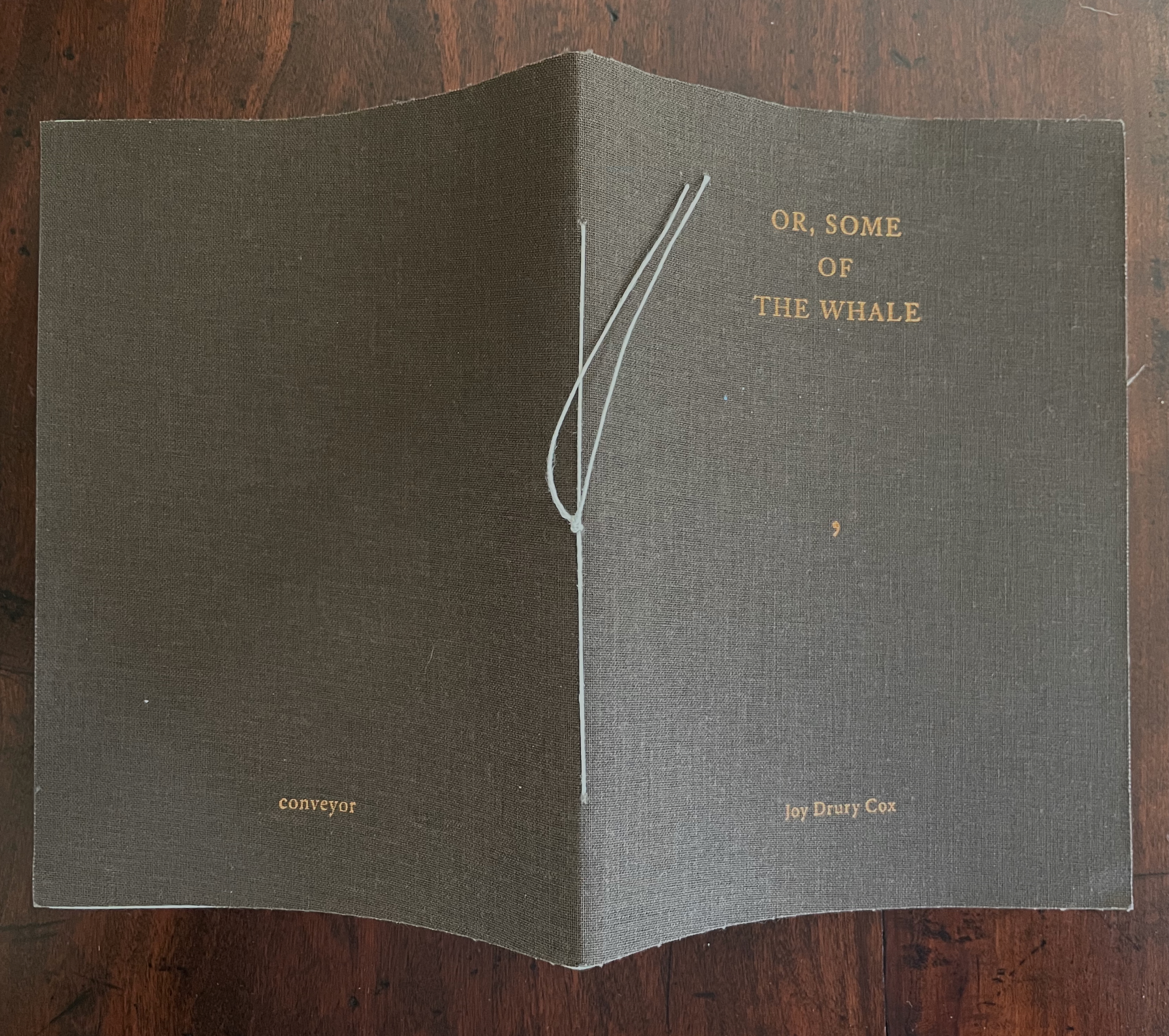
Or, Some of the Whale (2013)
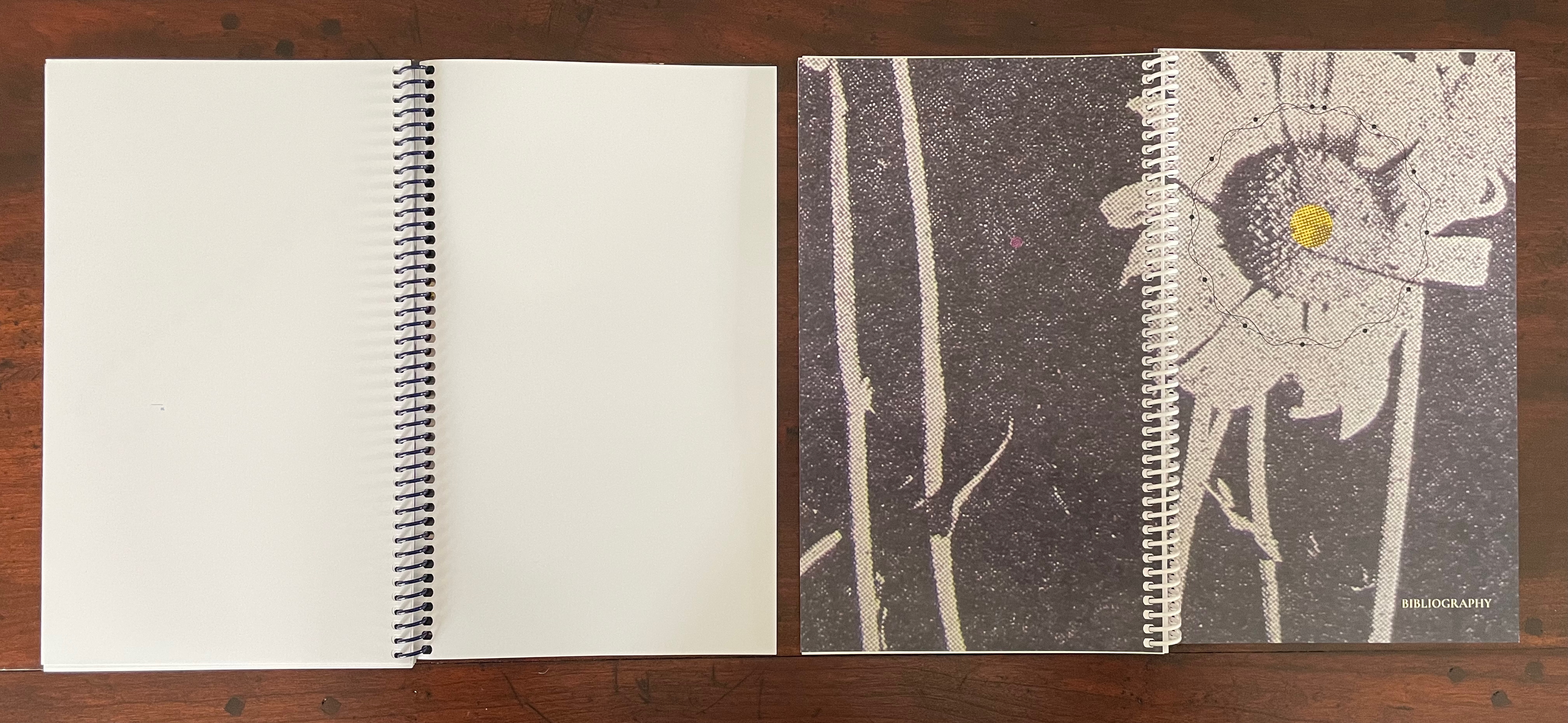
Or, Some of the Whale (2013) Joy Drury Cox Softcover sewn booklet. H184 x W136 mm. [36] pages. Edition of 100. Acquired from Southern California Vintage & Collectible Resale, 13 July 2025. Photos: Books On Books Collection.
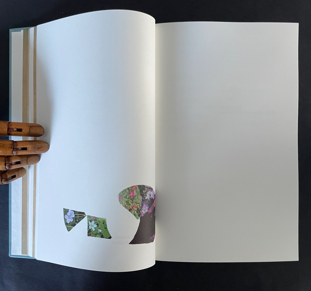
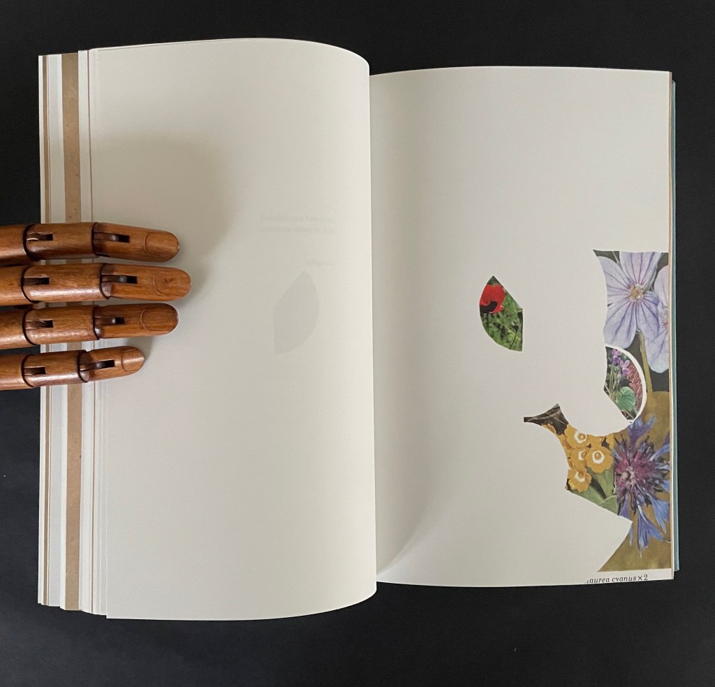
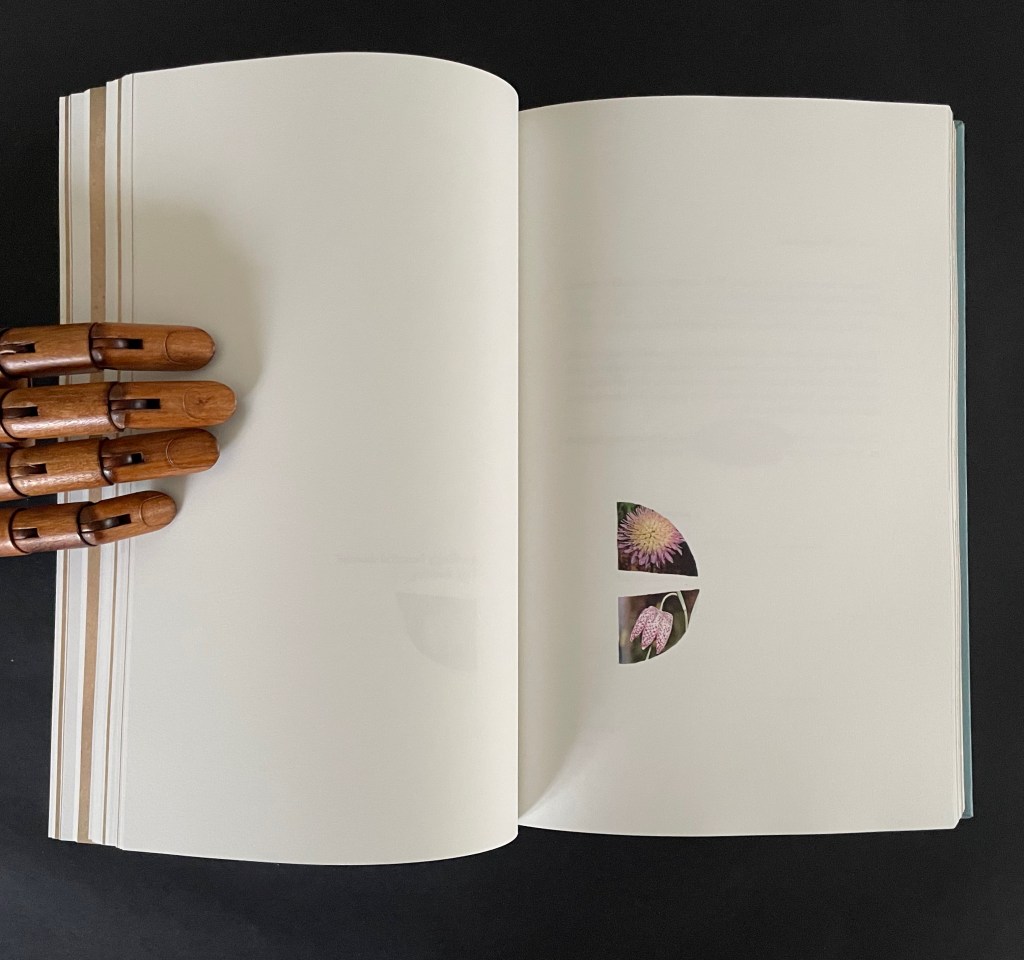
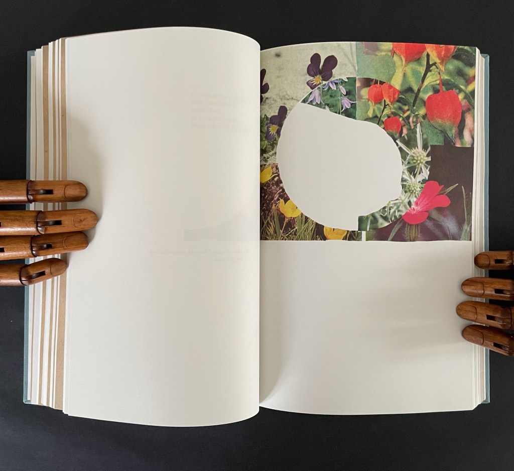
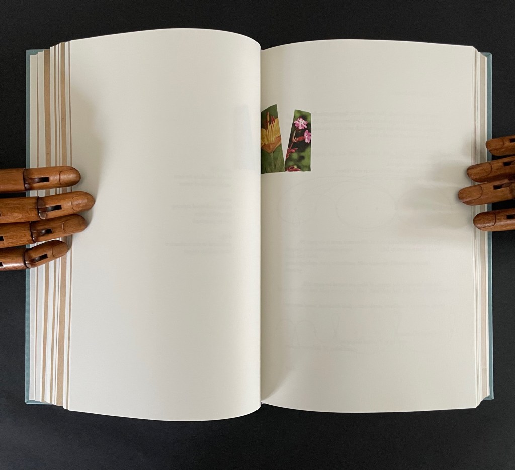
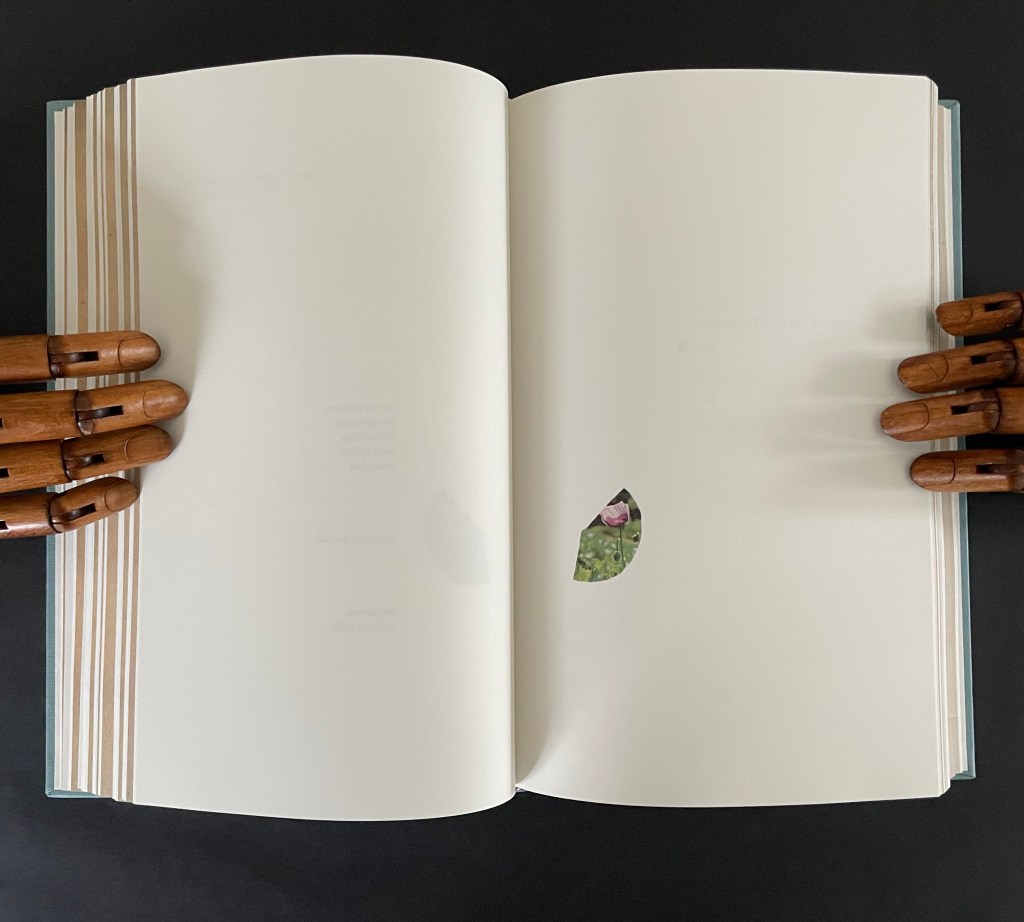
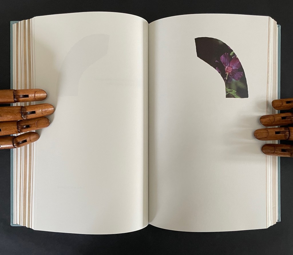
As long as we know the full title of Herman Melville’s novel — Moby-Dick; or, the Whale — the title on the cover of this entry in Joy Drury Cox’s “Punctuation Studies” (and its size) tells the story plain. Almost all of “Moby-Dick;” is gone, “Or, Some of the Whale” remains. A cover like sail-cloth, pamphlet stitched over 4 chapters of a 135-chapter novel reduced to only the commas in their positions in the original text, all swimming in the blank pages like sperm or breaching from it like microscopic sperm whales.
Chapter 16, The Ship, pp. 76-89.
Chapter 44, The Chart, pp. 215-20.
Chapter 60, The Line, pp. 303-06.
Chapter 130, The Hat, pp. 582-86
Cox’s “Punctuation Studies” are examples of inverse ekphrasis, turning a text into visual or conceptual art. Other works in the collection that use the technique of erasure, excision, etc., for that purpose are listed below. That technique is only one means of inverse ekphrasis; examples using other techniques can be found in “Notes on ‘Inverse Ekphrasis’ as a way into book art“.
Further Reading
“Derek Beaulieu“. In progress. Books On Books Collection.
Clercx, Byron, and Marian Cohn,. 2011. ‘Turning in on the Self’, in Marian Cohn (ed.), Doug Beube:Breaking the Codex. New York: The Iconoclastic Museum Press. pp 121-42.
Drucker, Johanna. 2004. The Century of Artists’ Books [Second edition] ed. New York City: Granary Books, pp. 109-19, “The Book Transformed”.
Dworkin, Craig Douglas. 2003. Reading the Illegible. Evanston, Ill.: Northwestern University Press.
Penn, Cheryl. 2009. “The Artists Book in General, the Altered Book in Particular“. Paper based on the dissertation The Use of the Artist’s Book as a Versatile Form of Expression in the Work of Selected Artists, With Particular Reference to the Altered Book submitted in partial fulfillment of the requirements for the degree Master of Technology in Fine Arts, Durban University of Technology (DUT): Durban, 2009. “By violating the ready made book, the artist challenges traditional reading patterns and inherent meaning, being at once destructive and constructive. ” (64)
This entry is preceded by “Abra Ancliffe (I)“, which describes the Personal Libraries Library (Winter 2009-10 to Spring/Summer 2021) and The Secret Astronomy of Tristram Shandy (2015).
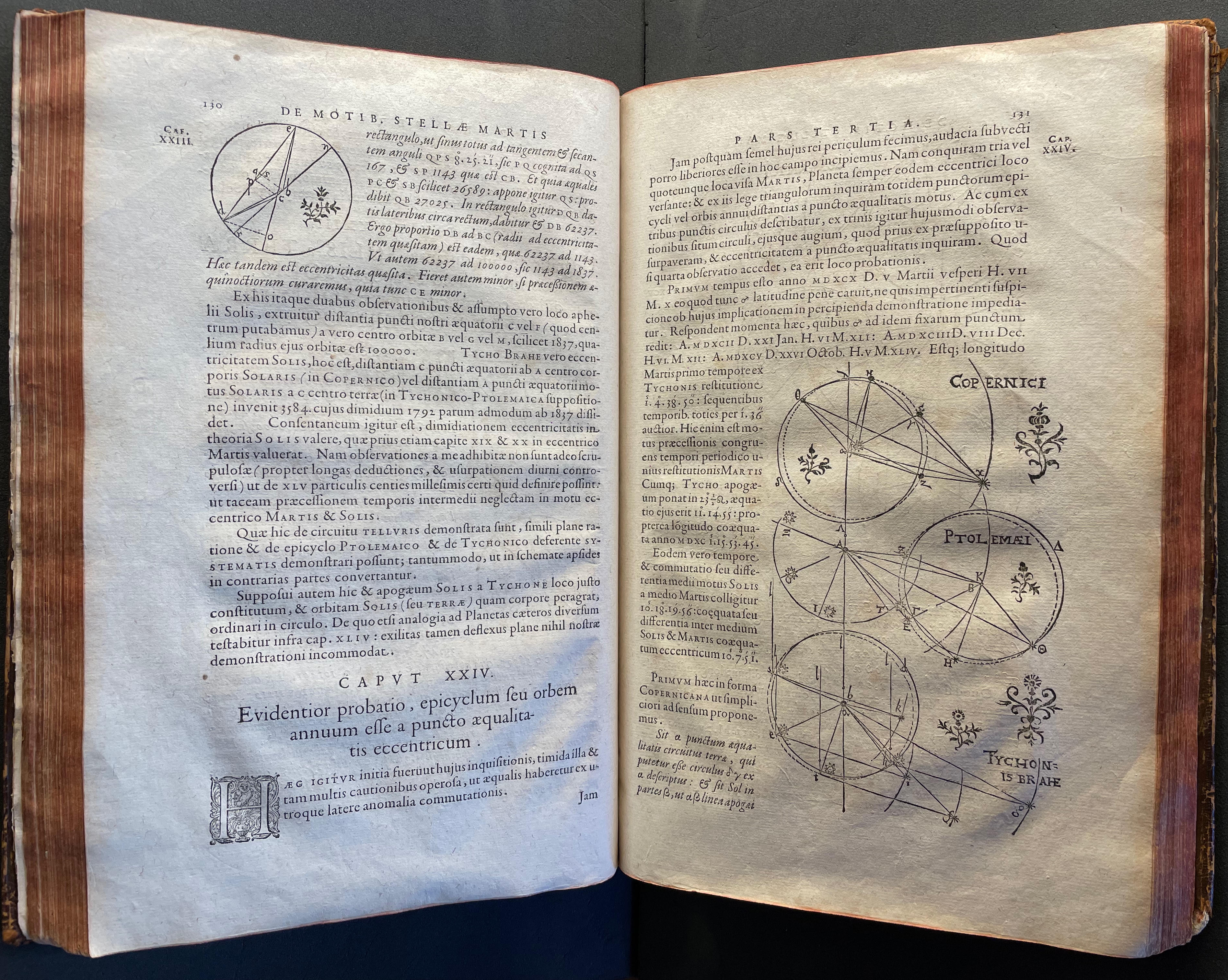
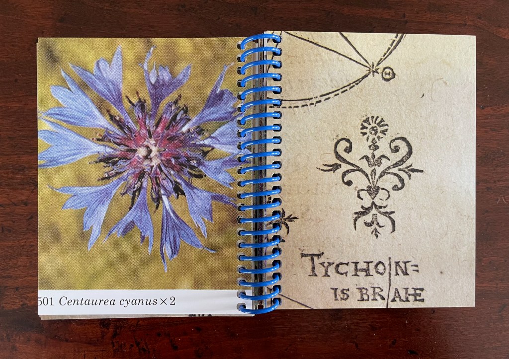
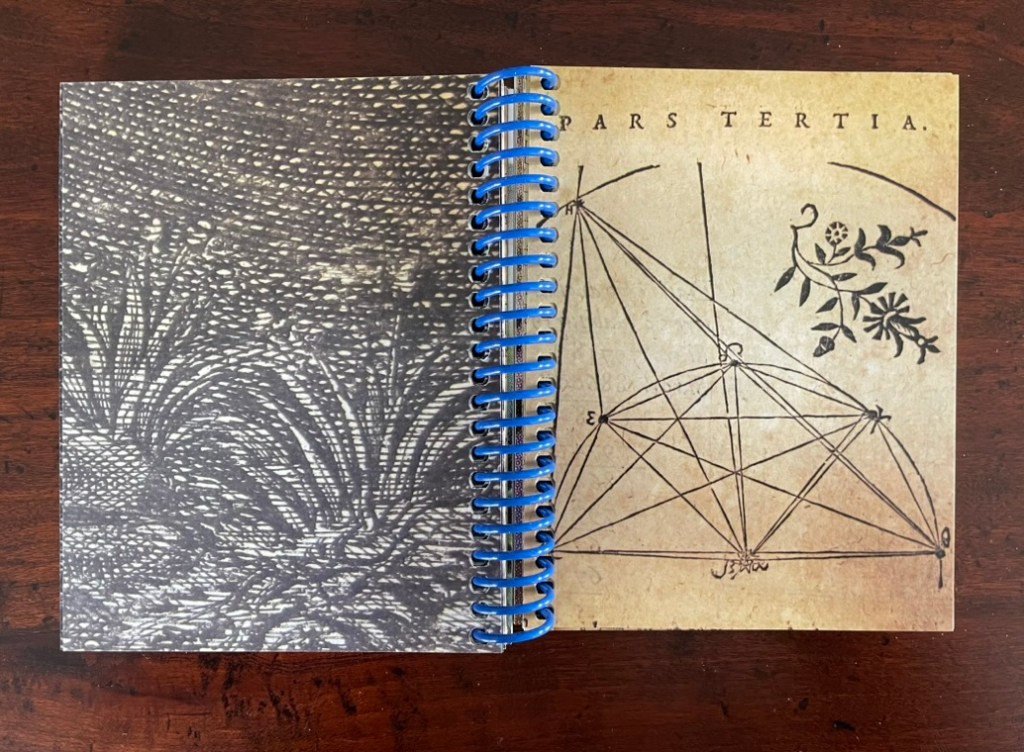
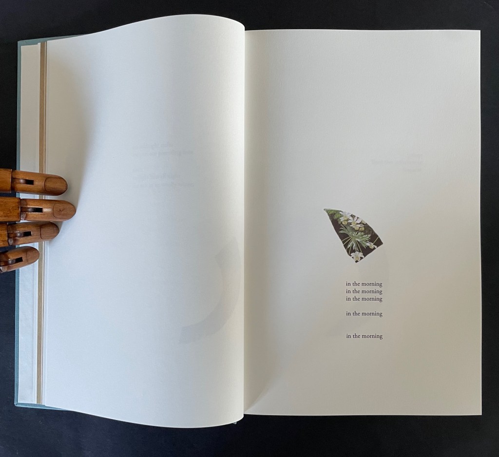
The constellatory asterisks in The Secret Astronomy of Tristram Shandy also evoke those flowers that our Personal Libraries Library (PLL) Artist/Librarian “picks” from the PLL and, later, Oleg Polunin’s Flowers of Europe: A Field Guide (1969) to include in the periodic issues of ephemera. Perhaps this confluence of stars and flowers created a predisposition in our Artist/Librarian that drew her to Johannes Kepler’s Astronomia Nova (1609). Unlike Sterne’s novel, which was part of Calvino’s personal library, Astronomia Nova lies outside the five personal collections. Of course, since Maria Mitchell was an astronomer, the works in her personal library refer to Kepler, and similarly, Robert Smithson had multiple books about astronomy, even Arthur Koestler’s Watershed: A Biography of Johannes Kepler. Still, Kepler’s “New Astronomy, Based upon Causes, or Celestial Physics, Treated by Means of Commentaries on the Motions of the Star Mars, from the Observations of Tycho Brahe, Gent.“, to give it its full and translated name, appears in Ancliffe’s heavens and garden like a new galaxy or specimen.
Astronomia Nova provided and further refined the mathematical and observational proofs of the Copernican planetary model of heliocentrism first laid out in De revolutionibus orbium coelestium [On the Revolutions of the Celestial Spheres] (1543). A little over 400 years later, our Ancliffe noticed in Kepler’s watershed publication something previously unobserved, something peculiarly geocentric about its heliocentric model.
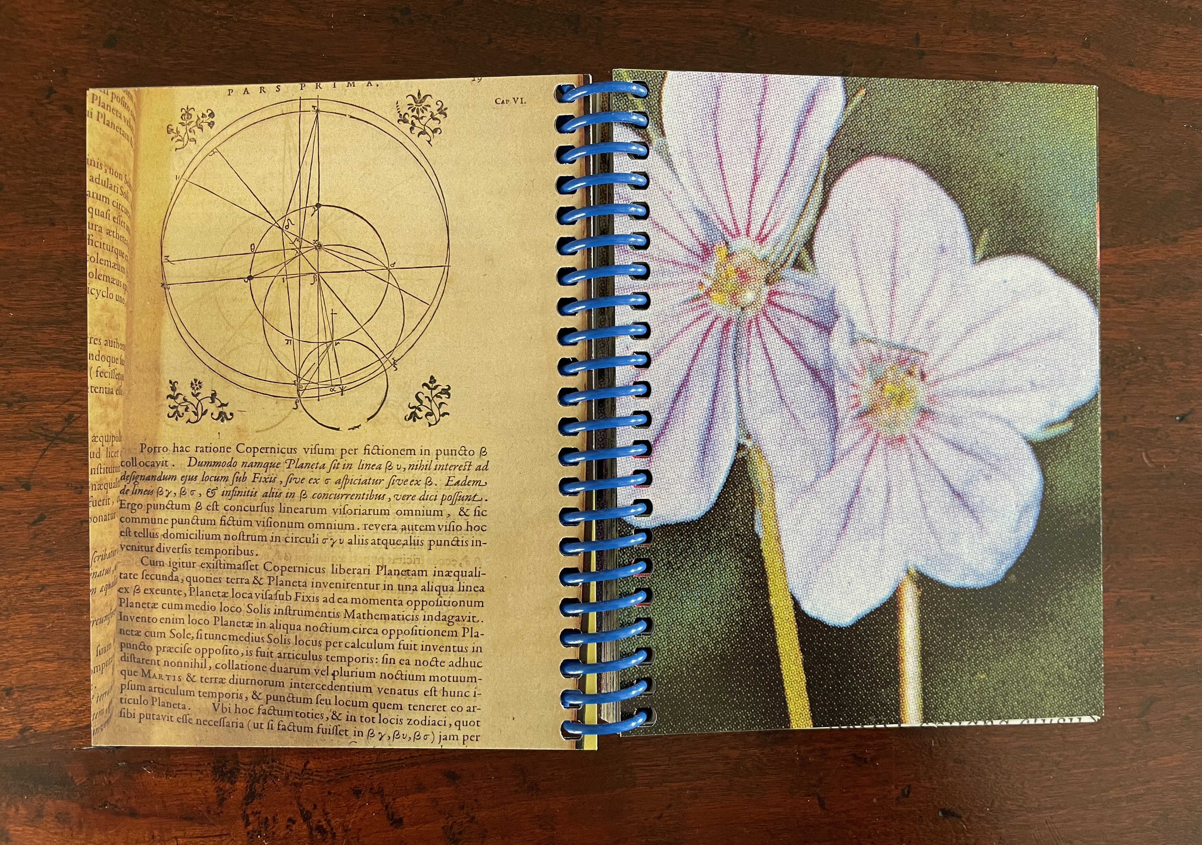
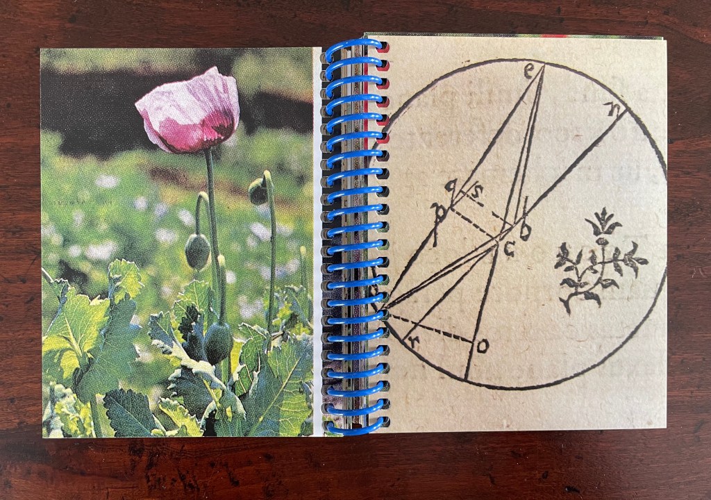
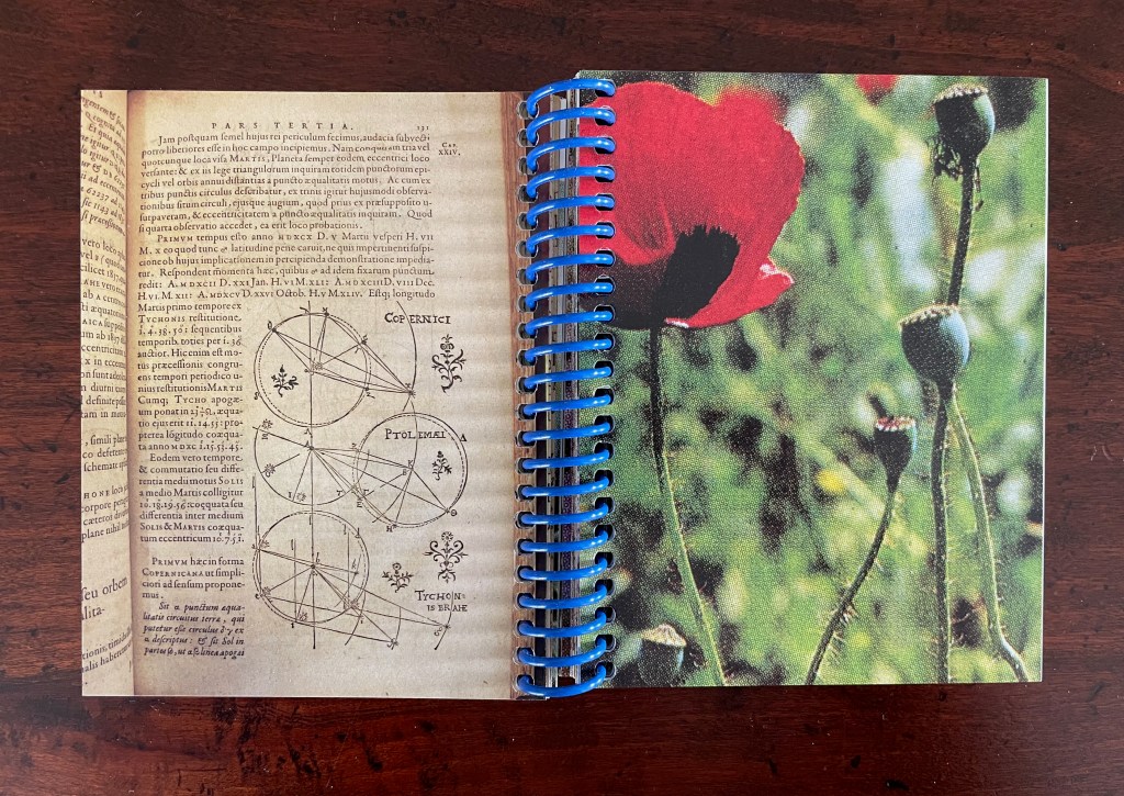
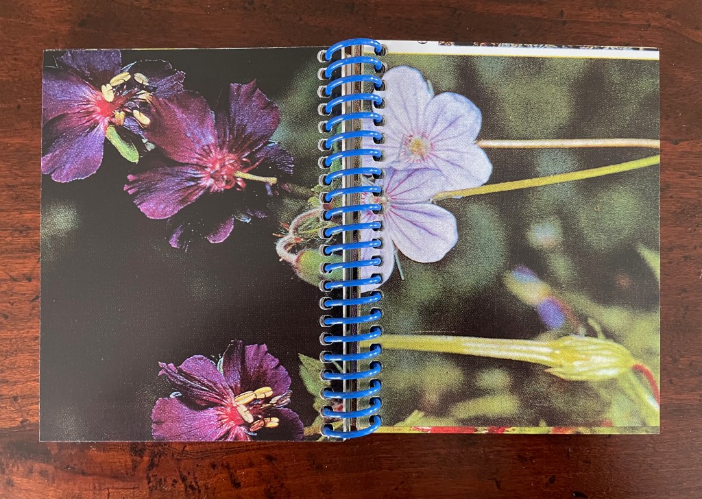
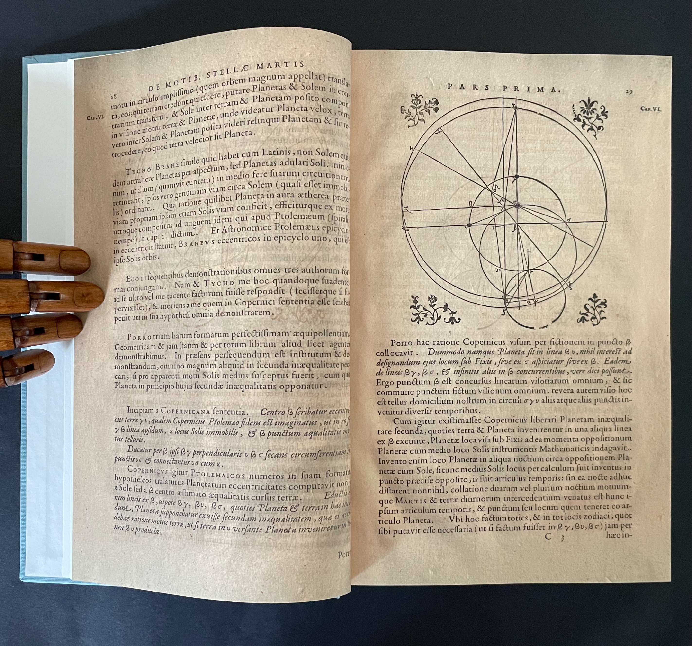
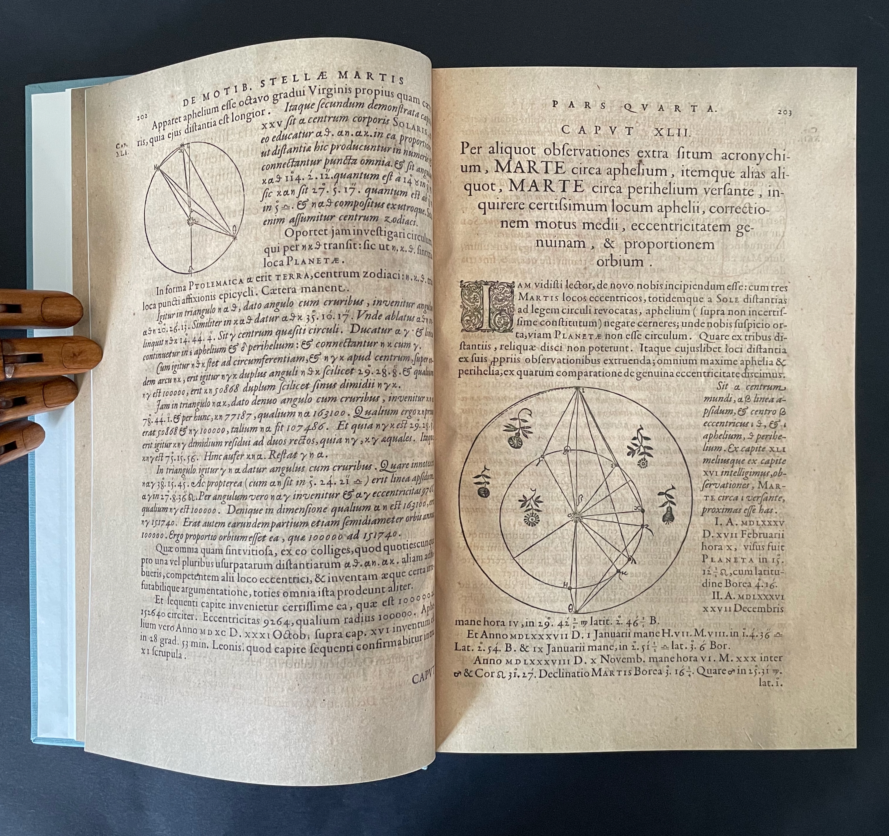
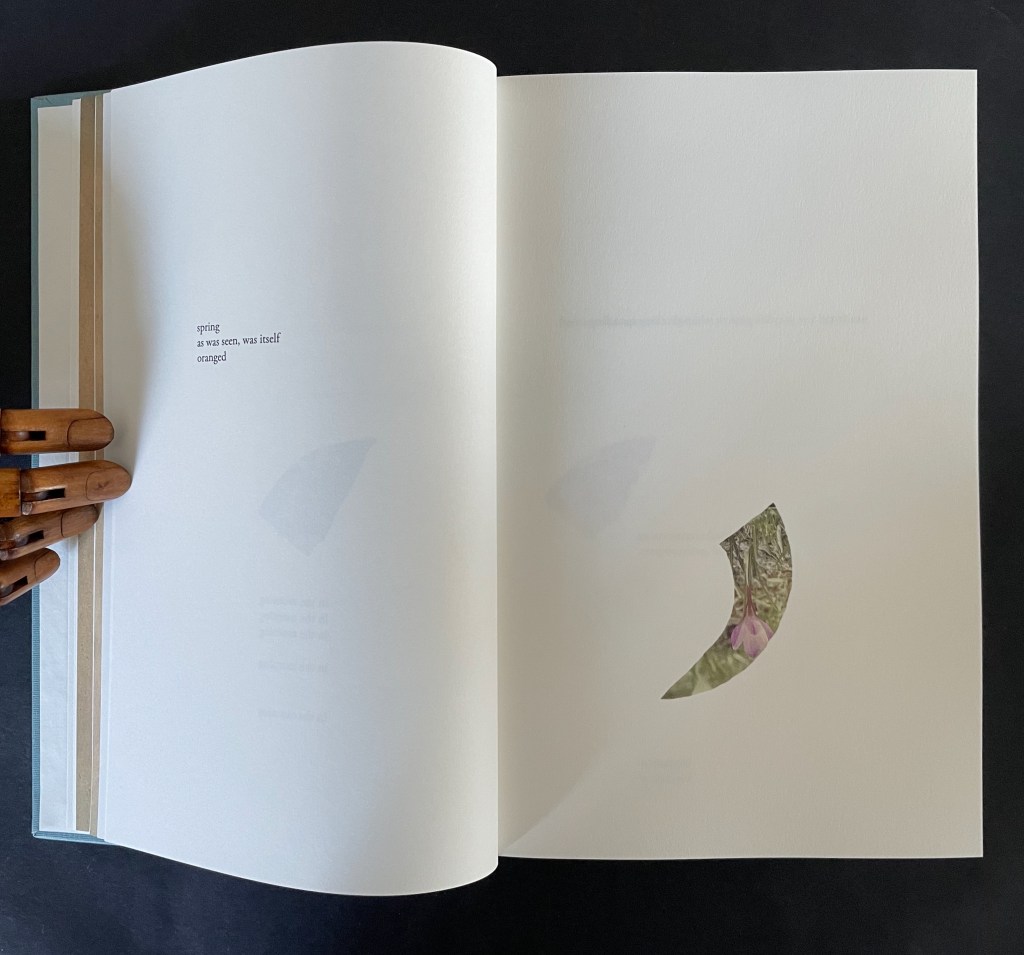
There is no florilegium or guide to these woodcut flowers, but there they are, sprinkled throughout Johannes Kepler’s 650-page investigation of Mars’ orbit, tracked by the observations of his mentor Tycho Brahe, Emperor Rudolph II’s imperial astronomer.
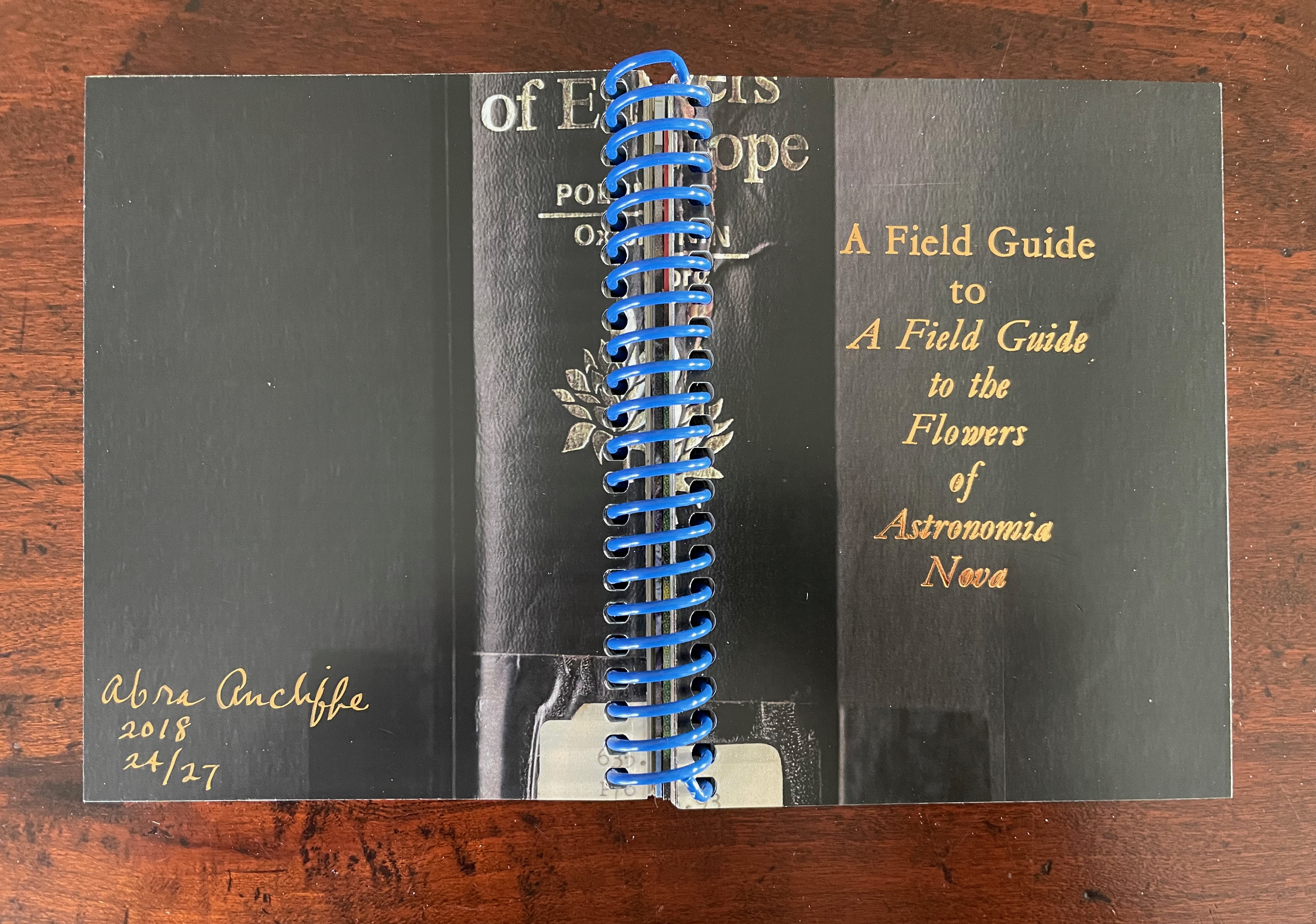
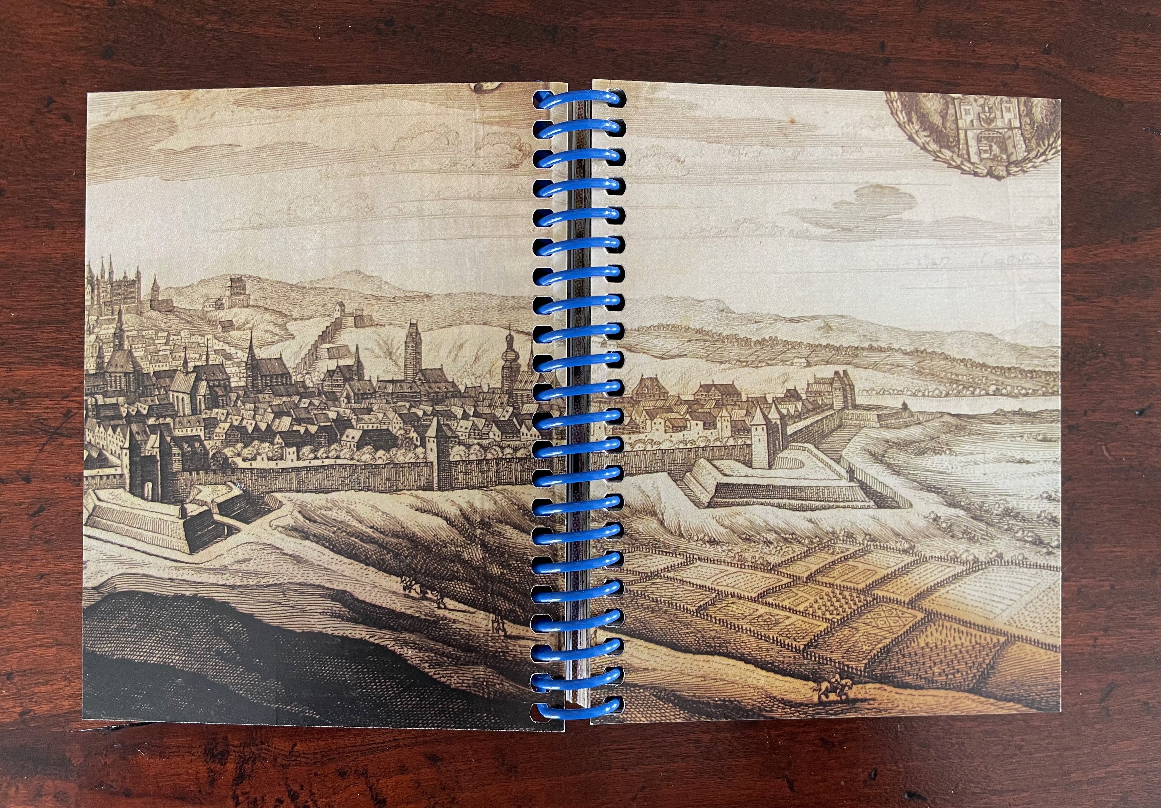
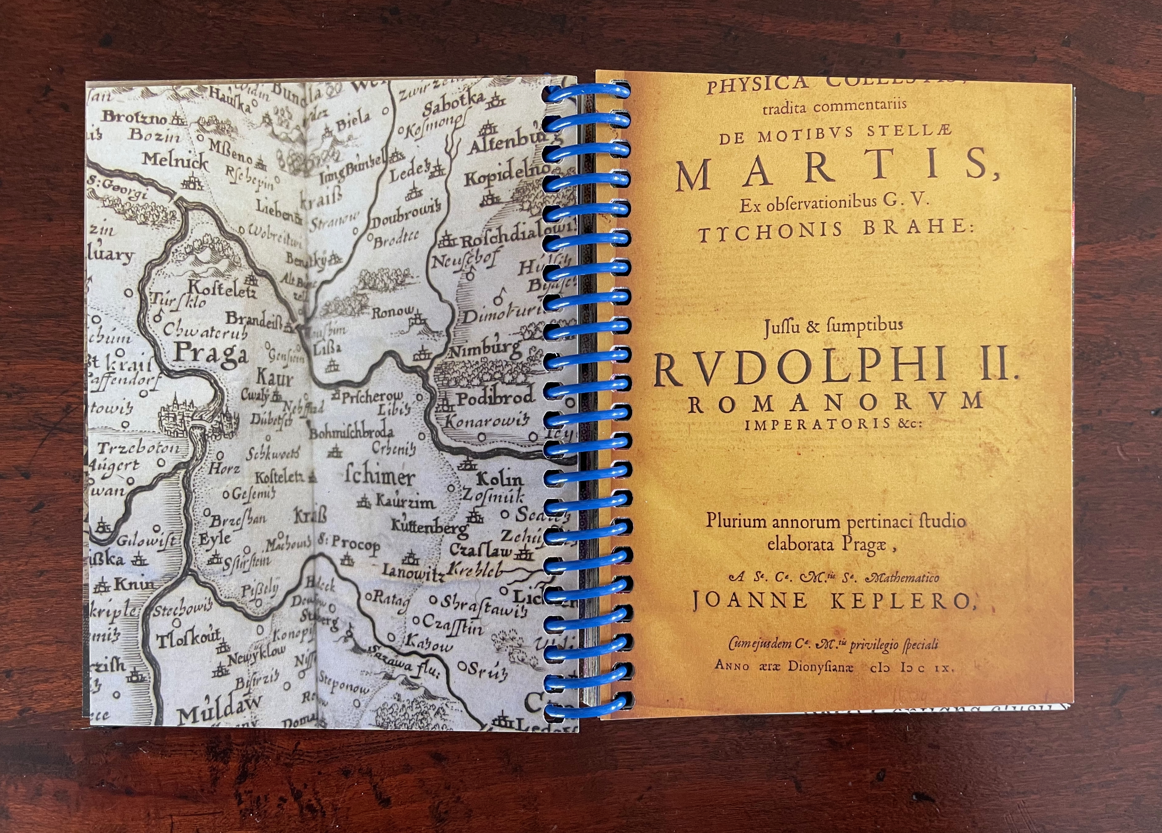
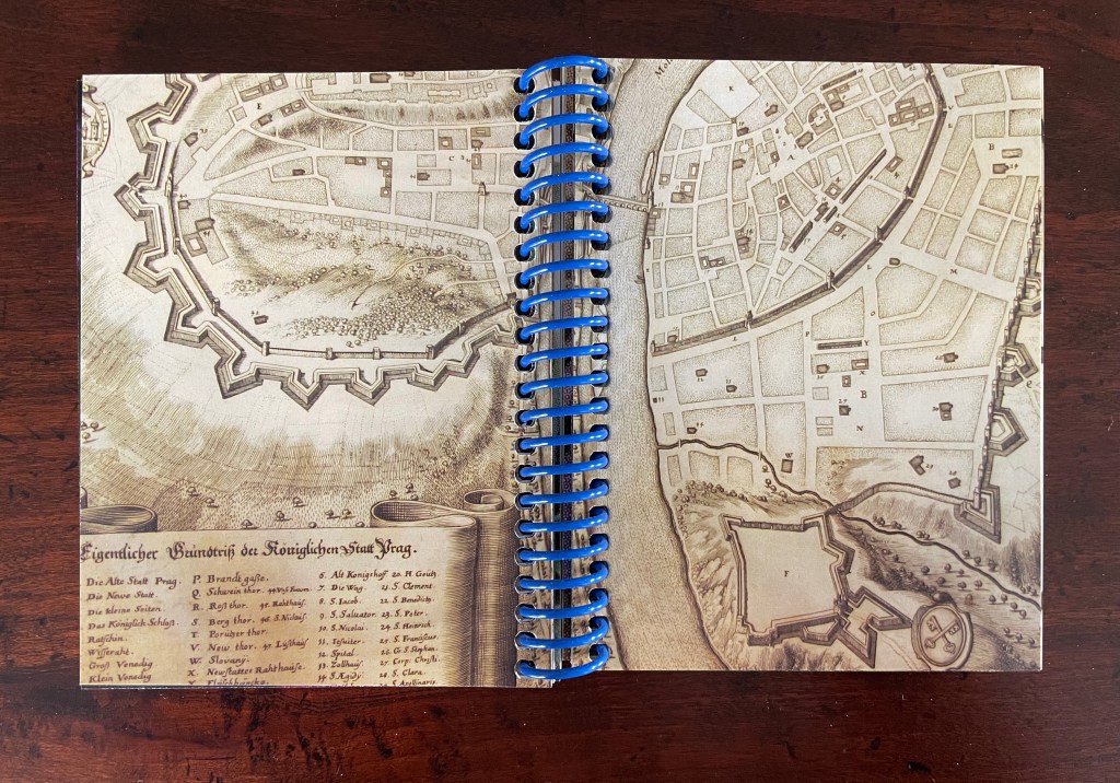
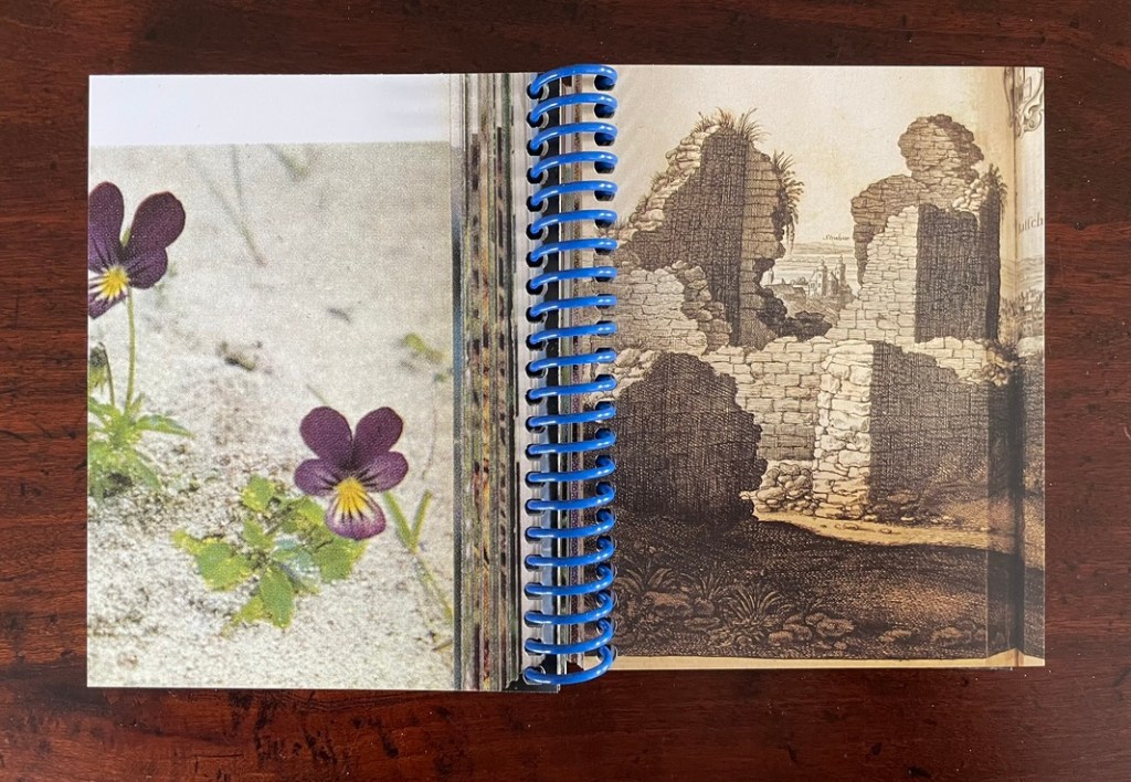
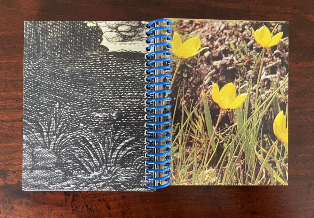
On one level, Ancliffe’s spiral bound handbook is the field guide to these flowers. Its photos of flowers , harvested from Pulinin’s Flowers of Europe, offer candidates for the historical real-life counterparts to the ornamental woodcuts. The handbook’s title, however, indicates another level: that of “a field guide to ‘a field guide’ “. But of what could such a meta-guide consist? In Ancliffe’s case, it is the artist’s book, the work before us that addresses the fields of vision and perspectives embedded in Kepler’s work, the engraver’s woodcuts, and the book artist’s work itself. The first three opening spreads of A Field Guide to “A Field Guide to the Flowers of ‘Astronomia nova‘ ” stake out the environment of the “field guide to a field guide” as well as the zooming-in approach it takes.
First three opening spreads: cityscape of Prague; map of Prague’s location and fragment of Astronomia Nova‘s title page; cropped page of AN showing ornamental flowers alongside cropped blown-up photo of the flower.
The field of vision hops from the cityscape of Prague to a geographical map, then to the cropped title page of Astronomia Nova, then to a detail of the Copernican model bracketed by ornamental flowers, and finally to a cropped blown-up image of one of those flowers from Polunin. The next two spreads that follow those first three underline the field guide’s zooming in across time and space.
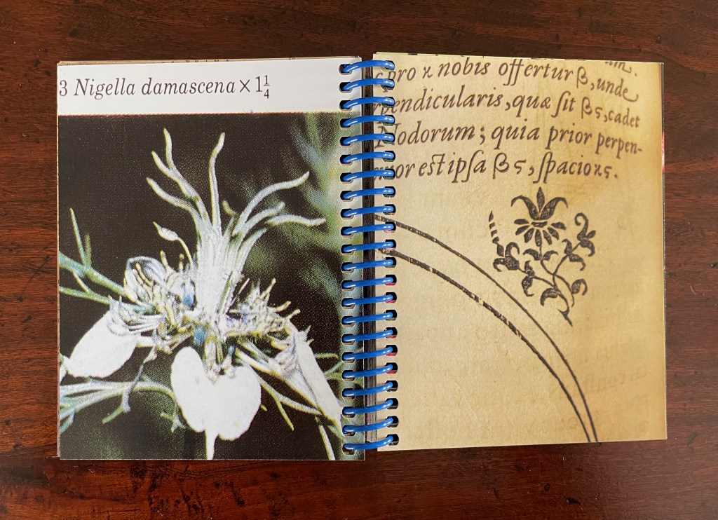
The fourth and fifth spreads: close-ups of the ornamental woodcut flowers and live photos; from the 17th century to the 21st.
Later spreads showing similar zoomed-in images highlight that we have actually hopped from the second century (Ptolemy) to the seventeenth (Tycho Brahe) to the twentieth (Polunin).
Zoomed-in images of woodcut flowers and live flowers; from Claudius Ptolemy (2d century) to Tycho Brahe (17th century) to Polunin (20th century).
Planetary diagrams, celestial maps, mathematical models, descriptive text, woodcuts and engravings are all at several representational removes from one another and from actual planetary movements over time. Likewise, the woodcutter’s ornaments had their corresponding actual flowers in the gardens and meadows of Prague. The closeness in appearance between the woodcuts and photos argues that Kepler’s artist was drawing and cutting from real-life observation. And yet the photos lie at historical and medial removes that question their correspondence. Like Kepler’s and Brahe’s mathematical and textual models of planetary movements, the artist’s book’s photos are speculative models of the flowers Kepler’s woodcut artist would have observed in Prague at the turn of the 17th century.
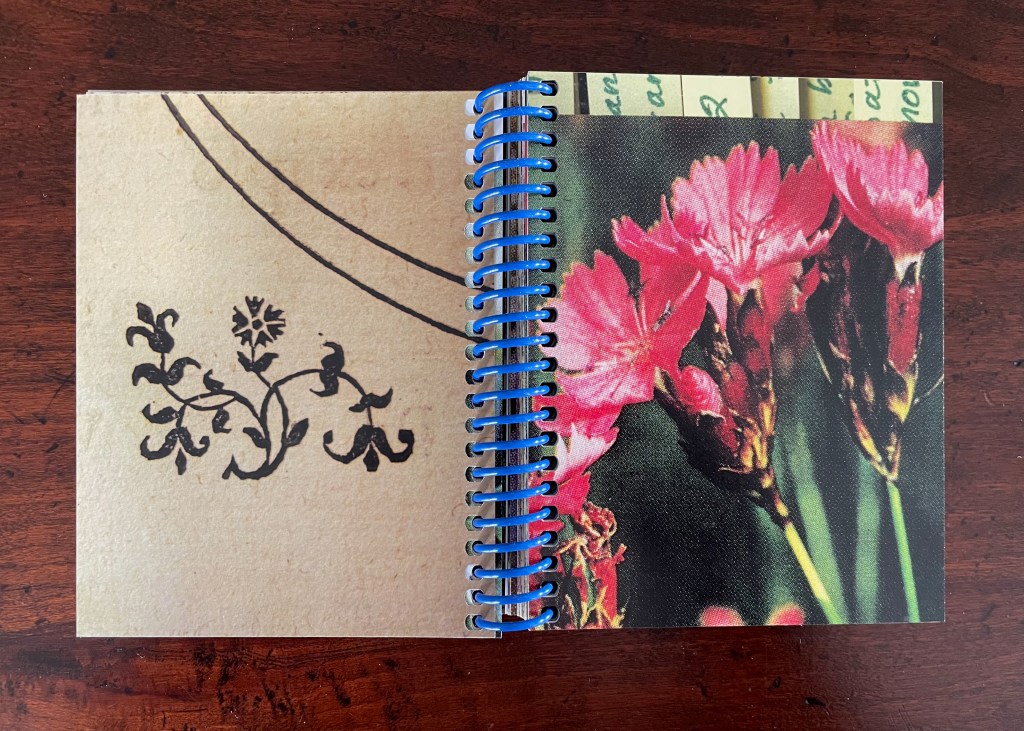
The field guide’s movement across media — engraving, printing, woodcut, photography, casebound book, and spiral bound book — is underscored by Ancliffe’s variation and sequencing of spreads. Just as we start to assume an alternating verso/recto rhythm of print/image then image/print, Ancliffe interrupts the flow with a double-page spread of print/print.
There is also interruption within the interruption: the double-page spread of text is an English translation whereas so far the text has been in Latin. Is the translation’s appearance a reminder that the various media are means of translating the observed?
Other interruptions consist of image/image spreads followed by text/text spreads. The juxtaposition seems to suggest an abstract affinity of shapes, as if the side-by-side flowers hint at an abstract shape of the map spread, and the side-by-side maps hint at an abstract shape of the flower spread.
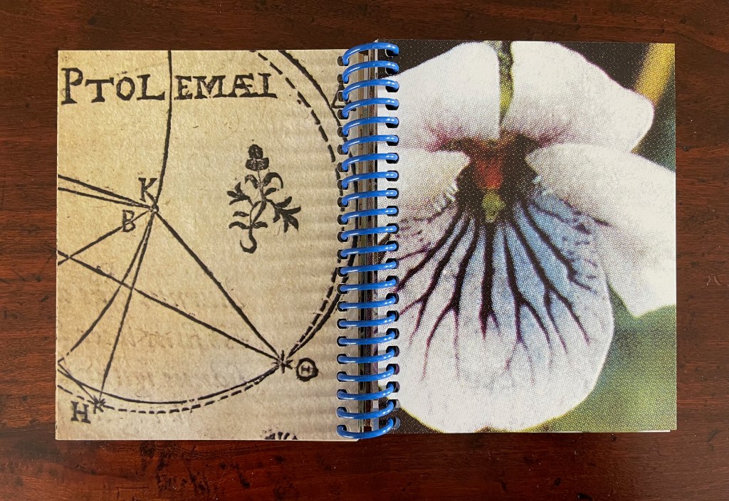
If that seems an interpretive stretch, consider the following sequence that draws comparisons between flower photo and cityscape detail, between zoomed-in cityscape detail and flower photo, and between zoomed-in cityscape detail and ornamental woodcut detail.
Note the sequence — photo/engraving; engraving/photo; and engraving/woodcut — drawing attention to translation from medium to medium.
If we step back to take in the whole of the artist’s book and note the changing rhythms and punctuations across the spreads, it is hard not to conclude that this artist’s book as field guide is teaching us how to read the environment it has created.
Opening and closing landscape spreads.
Ancliffe’s next work in her astronomy series extends her aim of teaching us how to read her artist’s books.
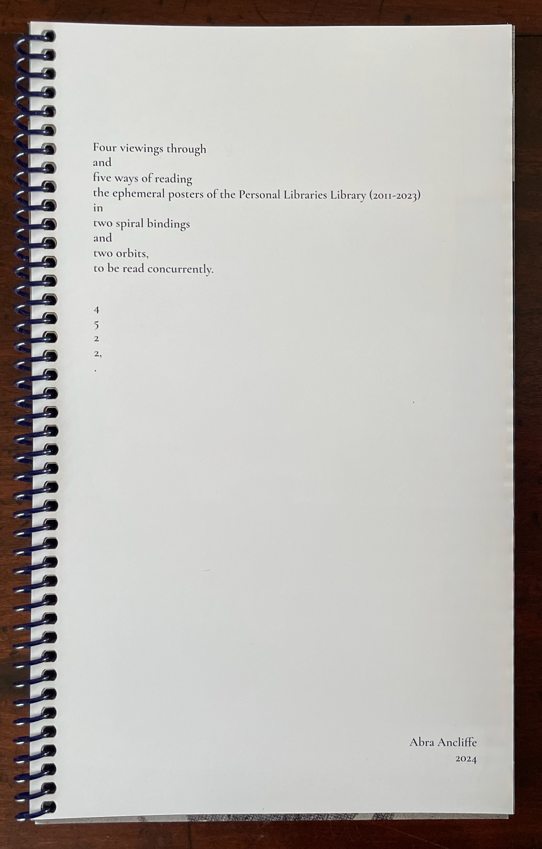
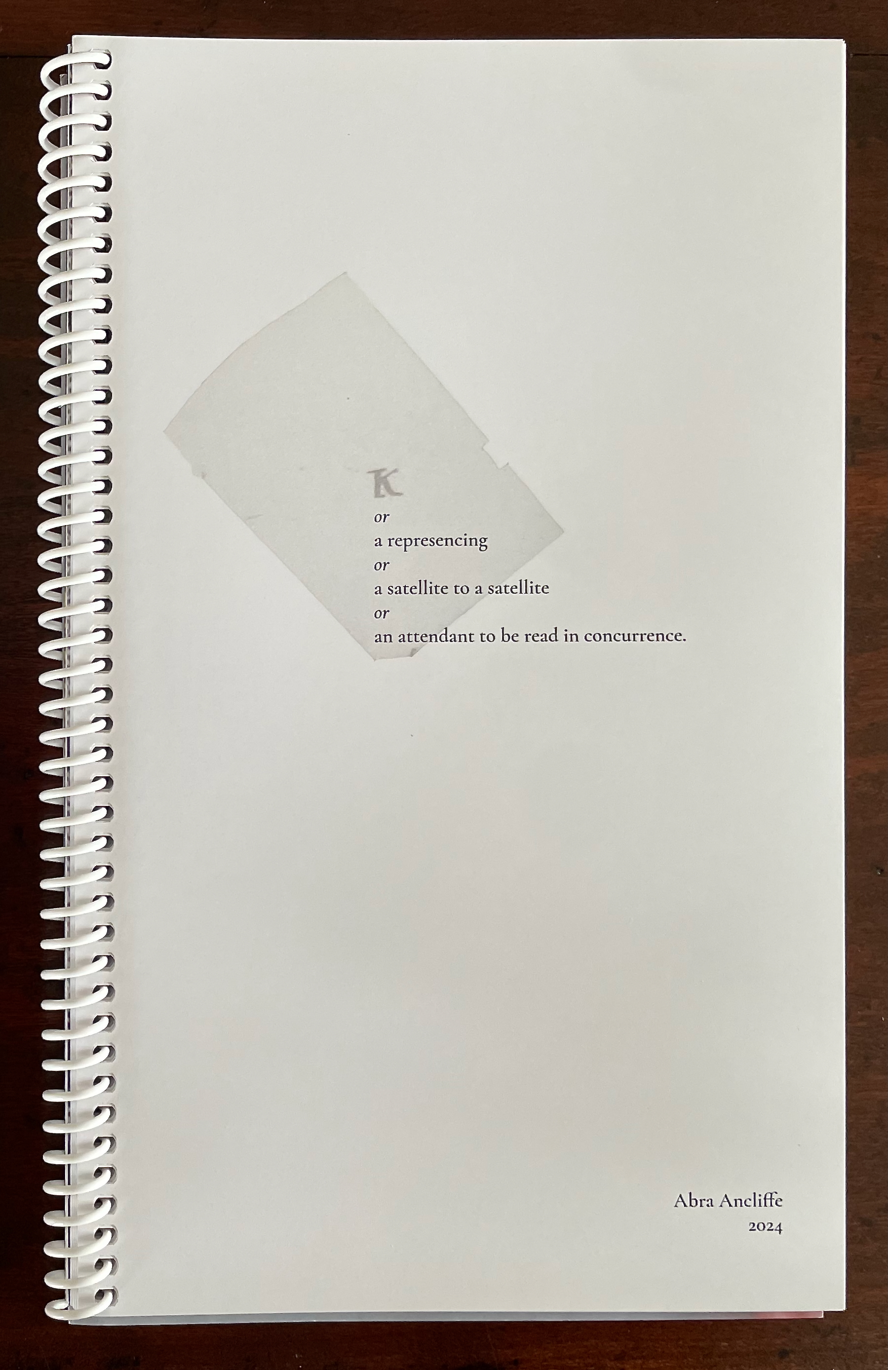
4522,. + K (companion volumes, to be read concurrently) (2024)
The cryptic title of this dual-volume work signals that we have some detecting to perform in order to read it. In fact, we have to read the companion volumes concurrently to perform our detective work. More teaching us how to read. The volumes’ respective title pages shed some light on the cryptic titles, but only a little. As the first volume’s title page spells out the vertically arranged numerical title 4522,., we learn at least that it has its roots in Ancliffe’s Personal Libraries Library series.
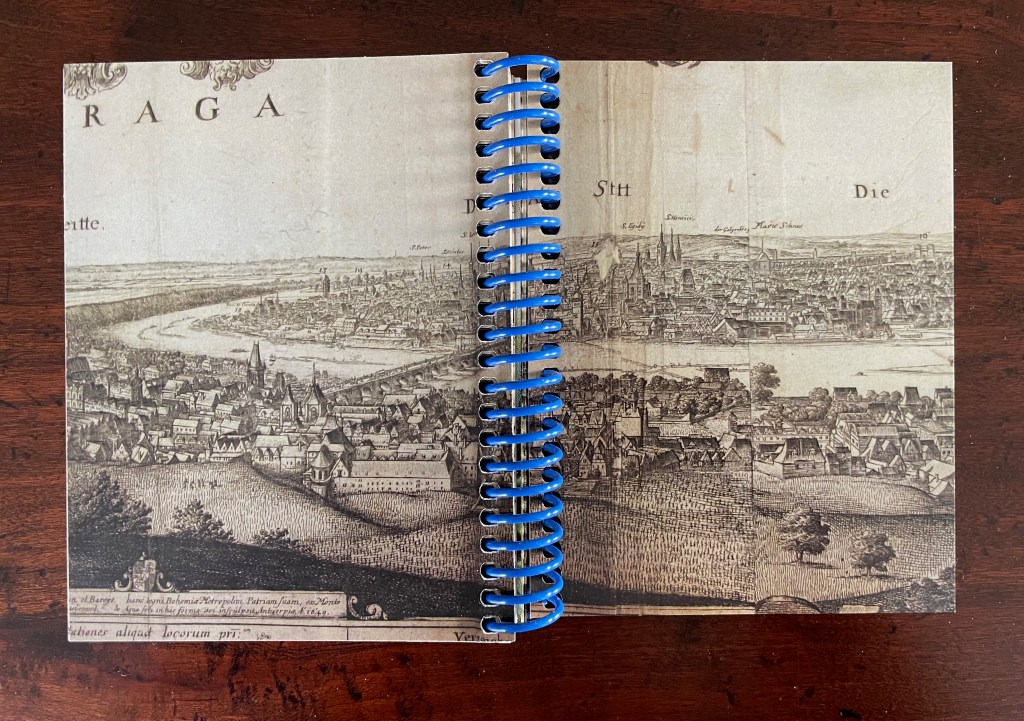
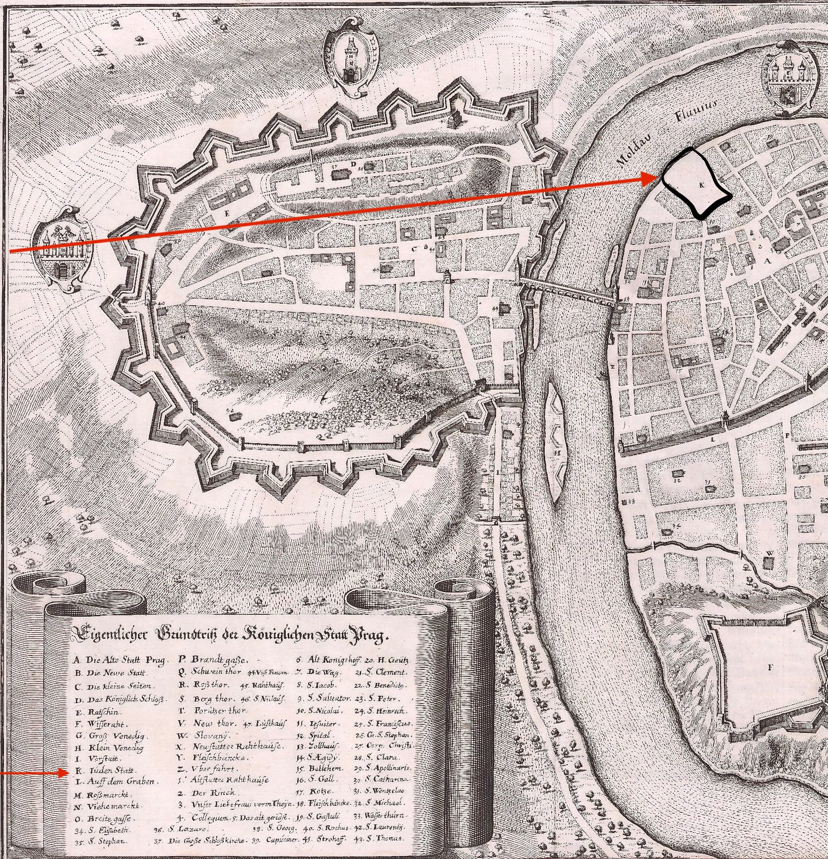
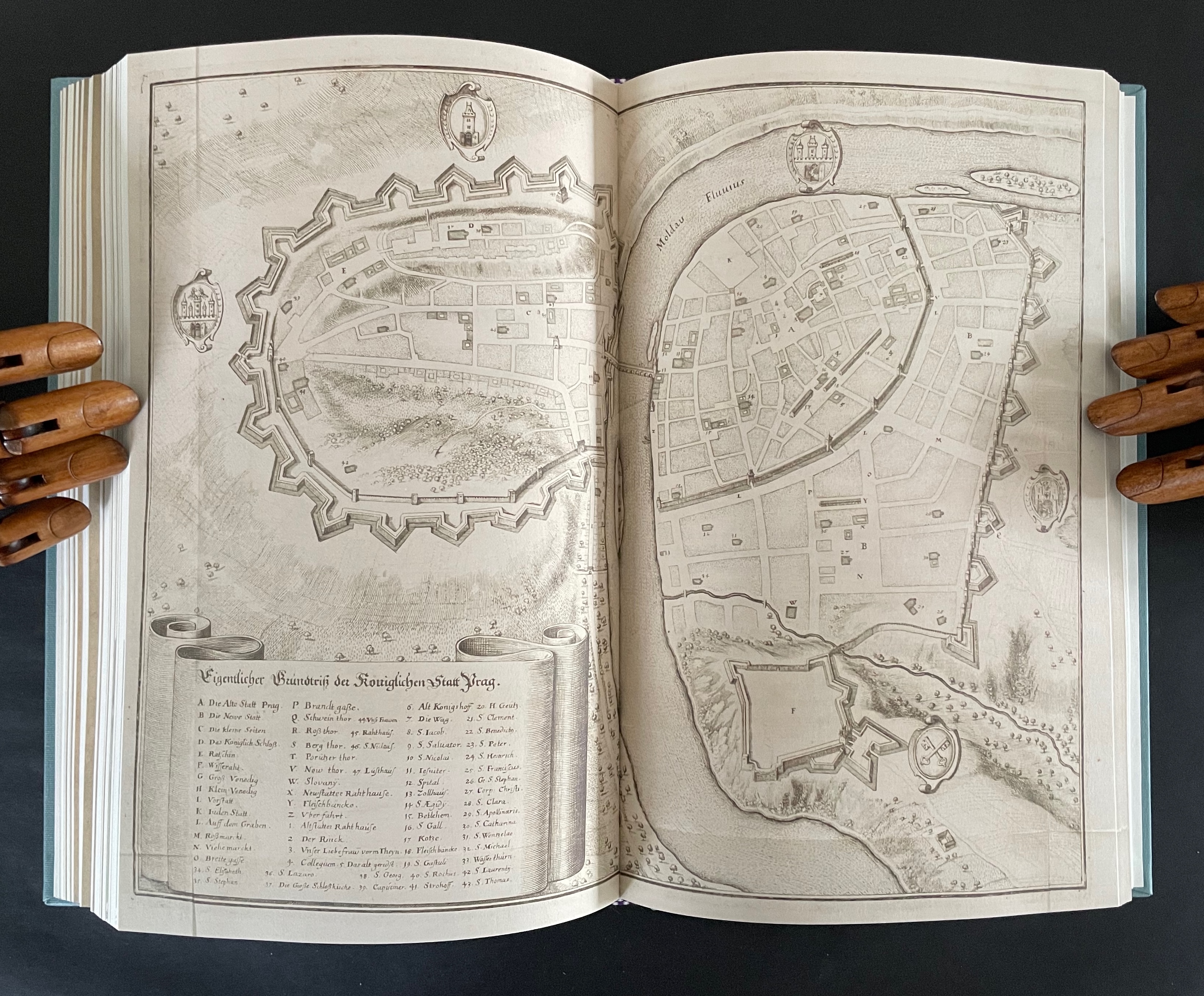
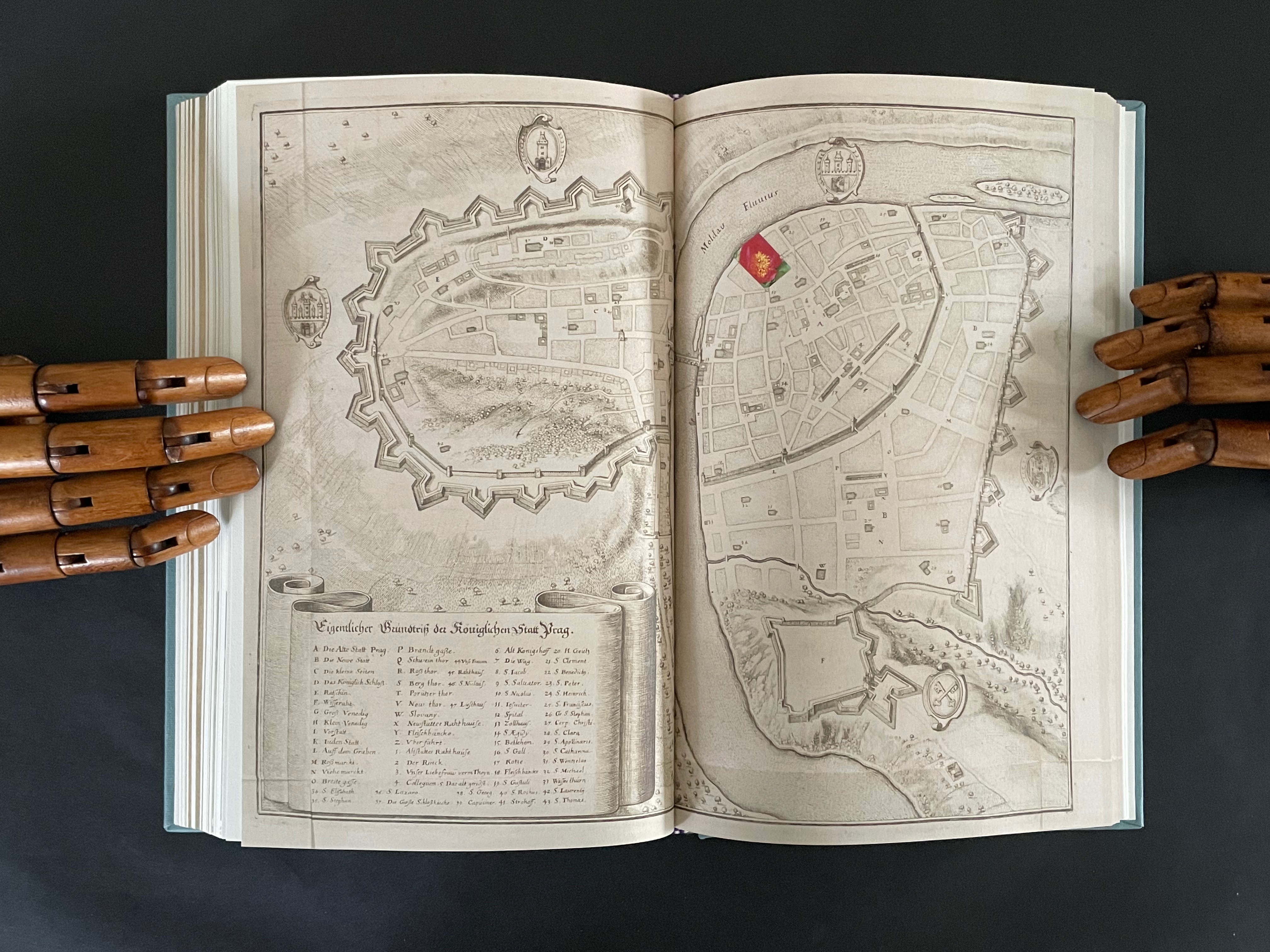
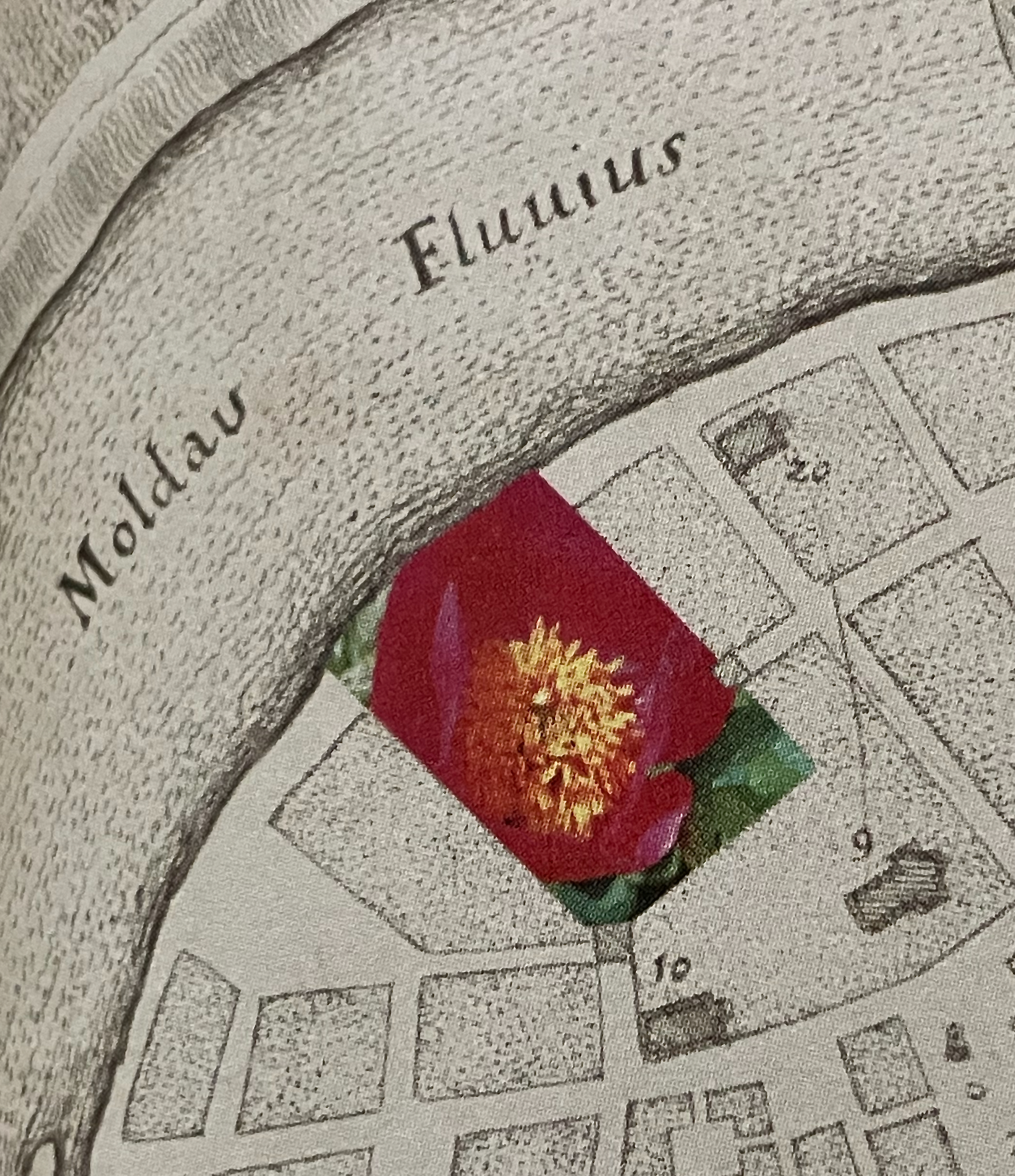
The title page of the second volume presents the title K inside a shaded irregularly shaped rectangle extracted from a map of Prague (1650) by Matthaus Merian and Martin Zeiller (which we can track through the last entry in K‘s bibliography). The letter K comes from the key to that map, which tells us that it marks the Jewish quarter of the city. It’s a “nice-to-know” detail but not essential for appreciating how to read the second volume.
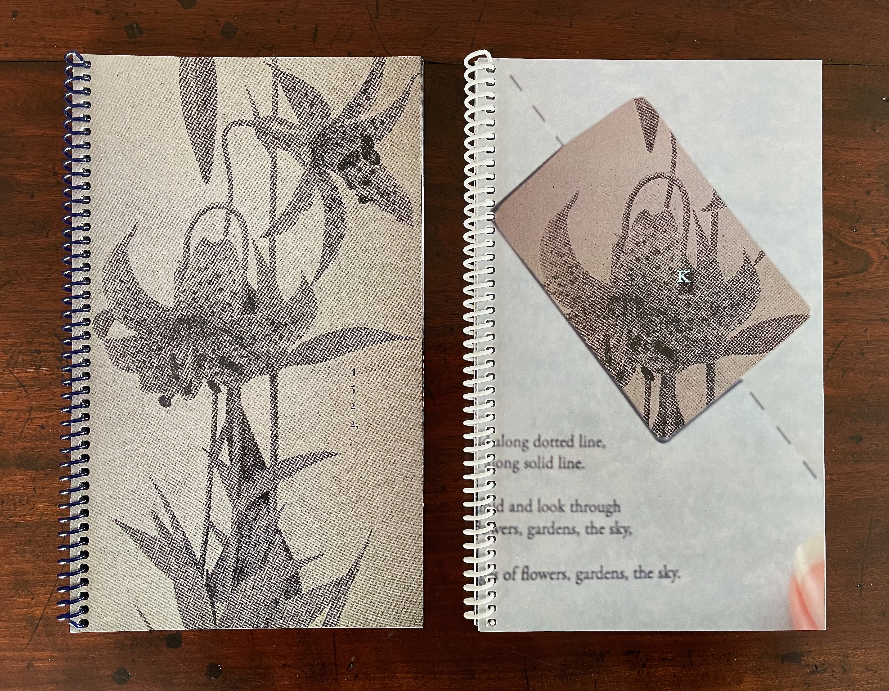
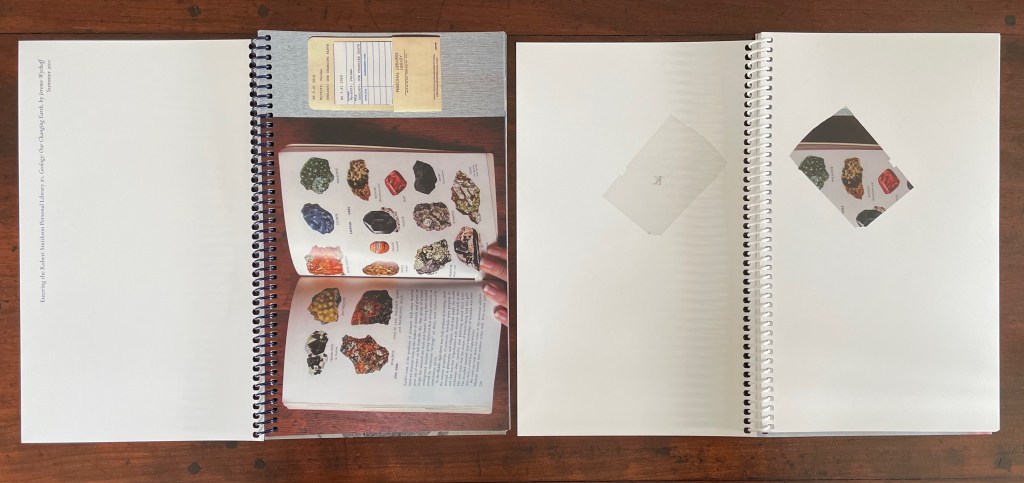
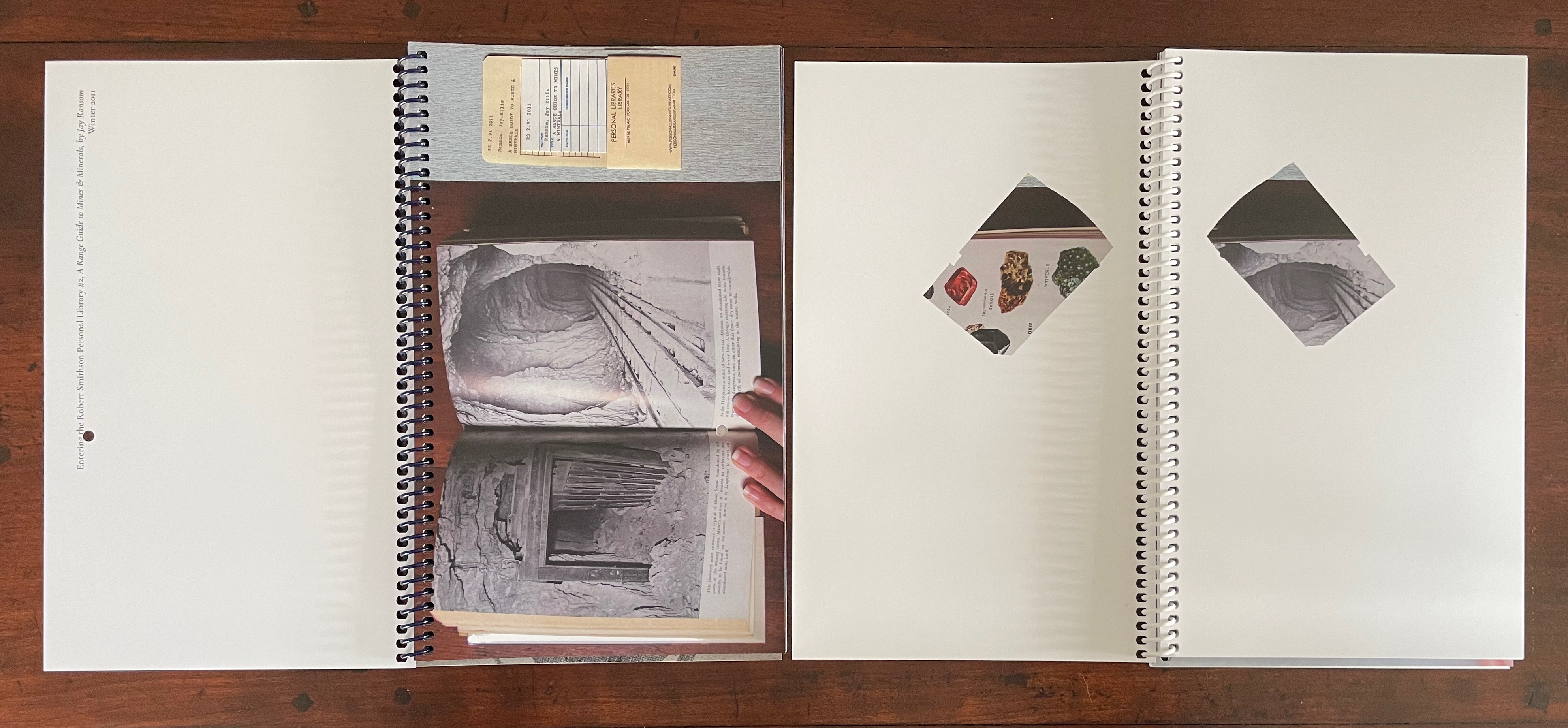
The title page tells us that K is “a represencing” or “a satellite to a satellite” or “an attendant to be read in concurrence”. We already know about the concurrence from the first volume’s title page. As for “satellite to a satellite”, we can see that K is a satellite to 4522,., which makes 4522,. a satellite to something. But to what? More on that in a minute. As for “a represencing”, the volumes’ covers (above) give us a hint. Notice how the irregular rectangle on K‘s cover re-presents or represences a snippet of the floral poster image shown on the cover of 4522,. That is the recurrent pattern between the two volumes:
From the poster image shown in 4522,. on the left, a snippet is taken and displayed within the map segment in K on the right.
Just with the covers and two title pages, we have detected two of the “Four viewings through … the ephemeral posters of the Personal Libraries Library (2011-2023)”:
The PLL posters viewed in 3/4 scale (as seen in 4522,.)
Snippets of the posters viewed through the map segment (as seen in K).
The third “viewing through” has a physical and literal form. In 4522,. a hole is punched in the recto pages where the poster images are displayed. Through that hole in one poster, the poster underneath can be viewed. In K, when a recto page turns t0 the left, its poster snippet reappears on the verso but in reverse as if we were looking through the other side of stained glass window.
With both volumes’ recto pages having been turned, we can see the punched hole on the verso of 4522,., a new poster image on its recto page, the mirror image of the three minerals from K‘s preceding recto page, and the new poster image’s snippet in K’s new recto page.
In this third “viewing through”, there is also a clue to what 4522,. is a satellite of. The small hole punched in each leaf of 4522,. seems to meander in its position from leaf to leaf. Actually it tracks a very specific shape: an analemma — a tilted, figure-8-like form. An analemma is the visual representation of the data recorded in ephemerides (tables of star positions at fixed times). In 1627, Kepler published his Rudolphine Tables, which became the new standard for accuracy of this data. If we were to point a camera skyward from a fixed location at the same angle and take multiple photos at the same time of day throughout the year, the sun’s position would form that figure across all the exposures. This is because the earth tilts on its axis as it orbits the sun and moves along an ellipse rather than a circle. So, the placement of punched holes in 4522,. embodies this projection of our orbit around the sun, and if we miss the point, the following near-to-last double-page spreads from 4522,. and K drive it home.
On the left, 4522,. shows the analemma diagram composed of the tiny views of the PLL posters’ images viewable through the holes in the book’s preceding pages. On the far right, K recapitulates the punched hole from 4522,. and wittily drives home the star/flower coordinates by positioning the hole over the center of the flower on the next spread, which doubles the wit with a black-and-white spread save for the strategically placed spot of yellow in the moon-gray center of the flower. The PLL posters’ images “light up” the recto pages of 4522,., and K reflects those images. In other words, K is the lunar satellite to 4522,., which is the terrestrial satellite orbiting the sun (the PLL project). These are the “two orbits” from the title page of 4522,.
The fourth “viewing through” comes into play with the Bibliography at the end of K. Although we had recourse to it to lead us to the map of Prague, a closer look reminds us of the PLL posters and the personal libraries from which they emerge.
So of course, the “five ways of reading” signaled on the title page of 4522,. refer to the five personal libraries from which the posters are composed.
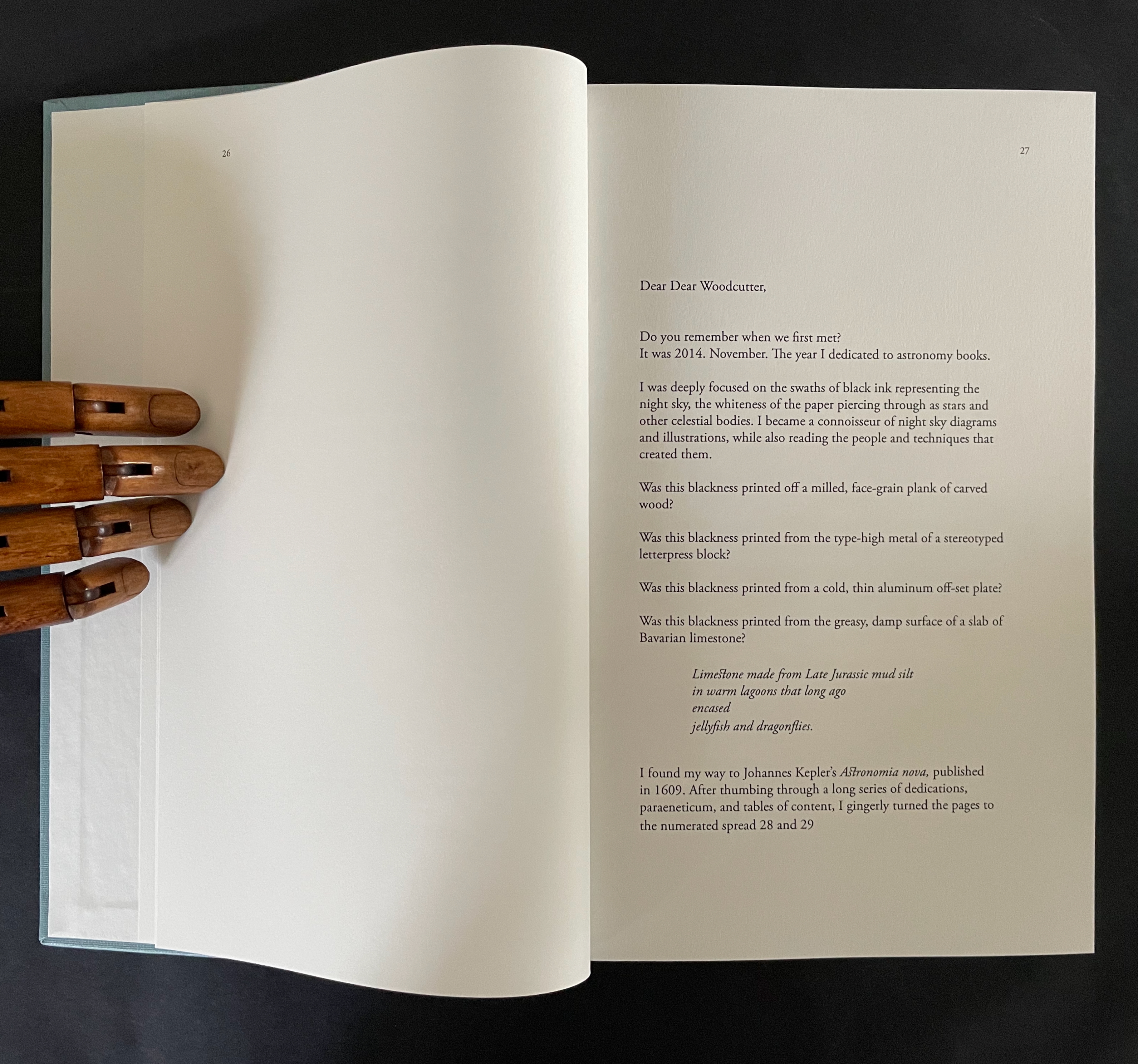
This extraordinary part-autobiographical, part-biographical, part-bibliographical artist’s book brings Abra Ancliffe’s twin obsessions with astronomy and botany to their highest pitch of unity so far. Ancliffe has built it with an extended epistolary poem, collaged images from Polunin’s Flowers of Europe, and photos of the map of Prague (1650) by Merian and Zeiller, pages from Kepler’s Astronomia Nova (1609), and family memorabilia.
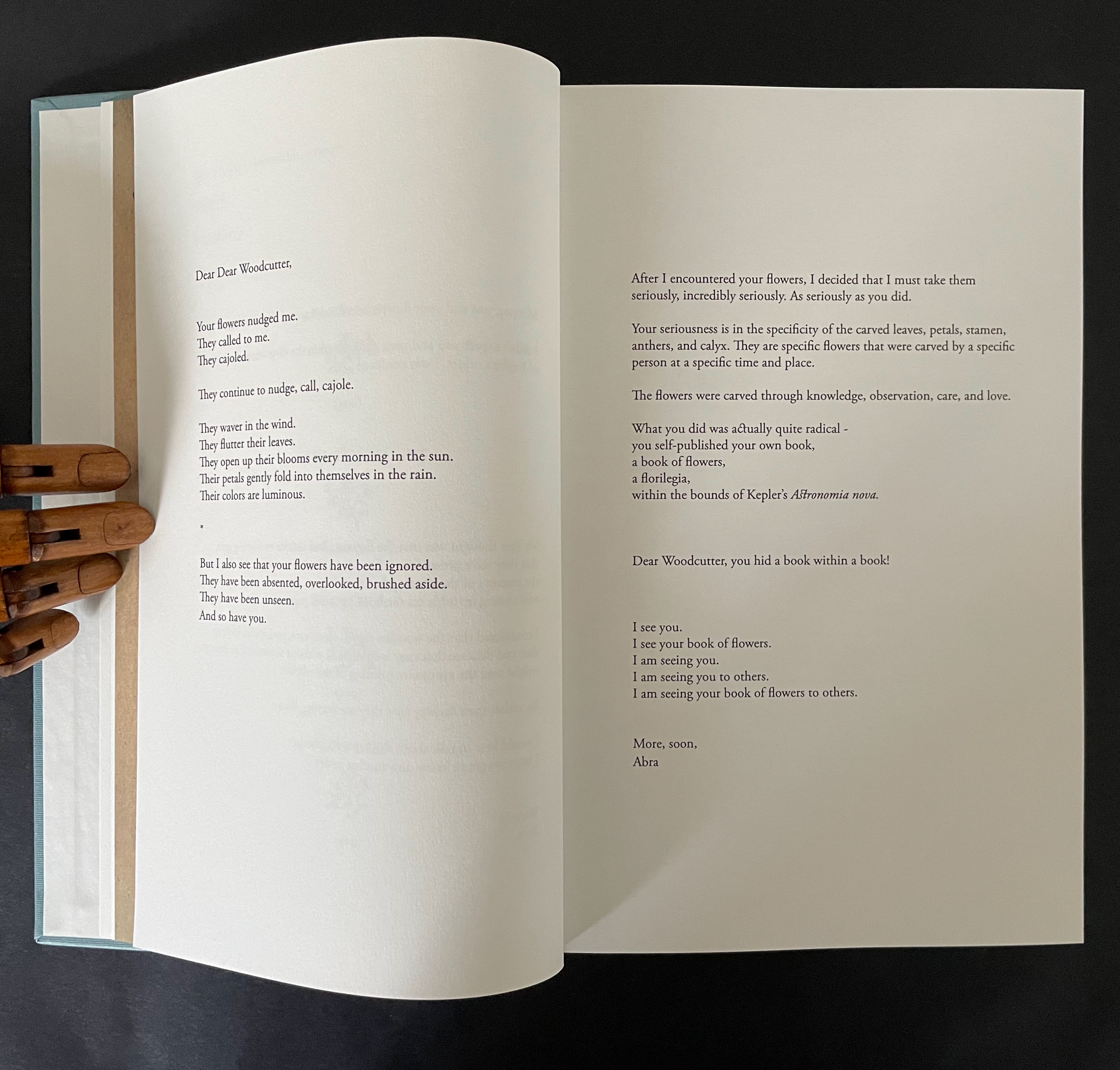
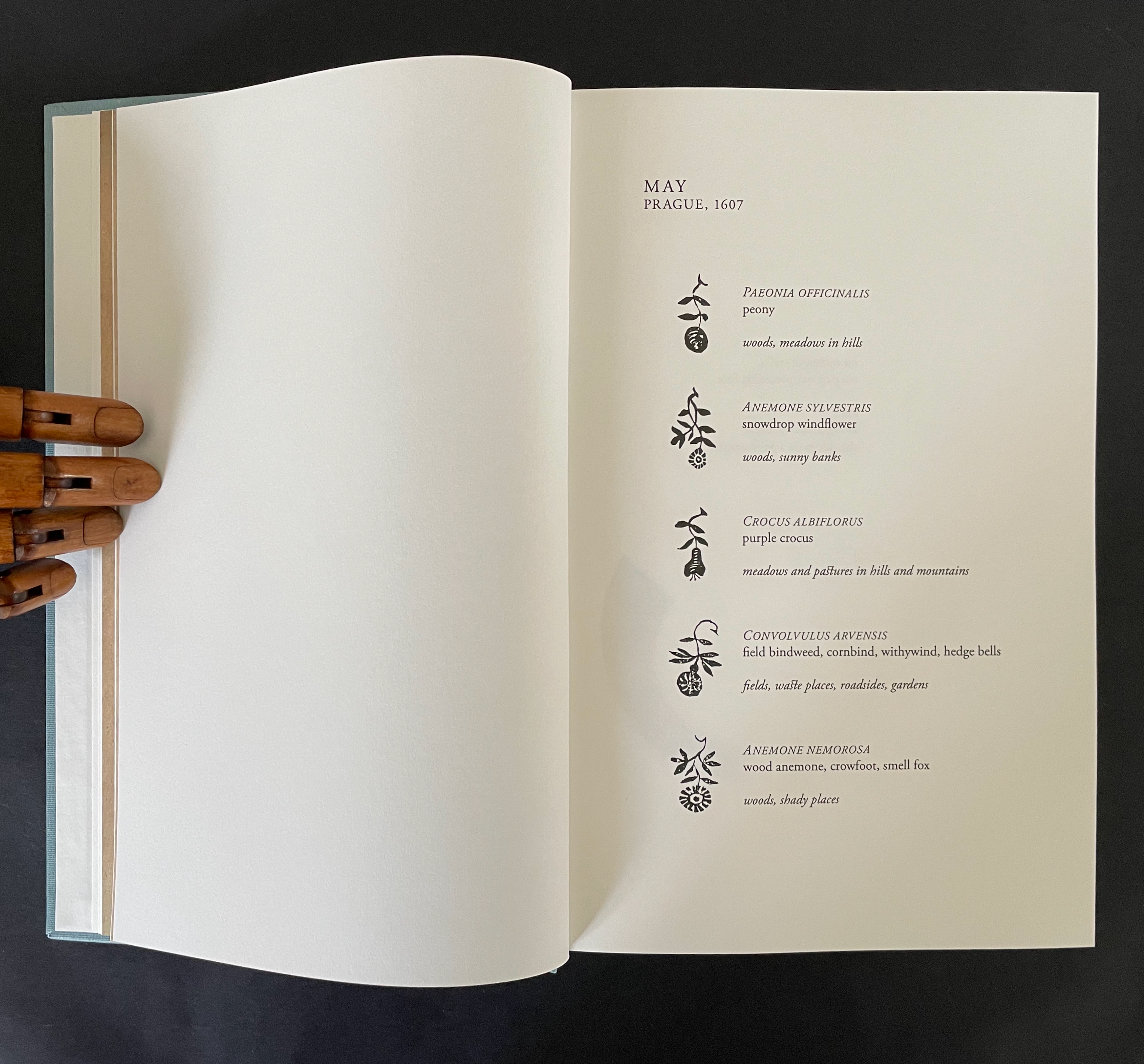
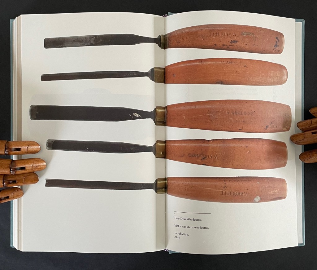
The poem addresses “Dear Dear Woodcutter”, the unknown artist who decorated Kepler’s orbital diagrams with flowers. Ancliffe’s observation of the flowers stands out when you consider that the still standard Collected Works (1938) omitted the flower images. Trying to identify the woodcutter, Ancliffe tracked down the sole reference to his existence and even visited William Donahue, Astronomia Nova‘s translator, in New Mexico to discuss the mystery. More impressively, she identified the woodcut flowers, their scientific names, and various common names, and their local habitats in and around Prague. From their unexplained presence, Ancliffe launches lyric observations on flowers (their colors, parts, and growth), astronomy, ink, paper, type, woodcutting, bookmaking, the idea of the book, and the interconnectedness of it all.
The book opens with Ancliffe’s first letter to “Dear Woodcutter”. It includes a facsimile double-page spread from Astronomia Nova , pages 28-29, showing where she first saw his woodcut flowers. From the start, Ancliffe signals how tightly woven she feels this autobiographical, biographical, bibliographical artist’s book will be. Instead of being numbered 2 and 3, her pages leading to the facsimile spread are numbered 26 and 27. So, at that moment of turning from “page 27” to page 28, the 21st century work strangely becomes part of the 17th century work as the book artist reaches back through time and craft. The letter’s tone blends fondness and fascination with matter-of-fact yet evocative observations about ink, printing methods, and the geology underlying lithography.
The intensity of her reaction to the woodcutter’s flowers and her absorption in her subject and craft translates into an affinity with the woodcutter that has Ancliffe addressing him in the present. This is poetic license and invention. In the act of addressing him, she is addressing us, her readers/viewers. If we are in any doubt of this, the second letter concludes with at a pitch that eliminates it and leaves us with a clear assertion of what she intends:
I see you. I see your book of flowers. I am seeing you. I am seeing you to others. I am seeing your book of flowers to others.
After this introductory section, Ancliffe lays out a recurrent marker of the book’s structure: a facsimile spread followed by a page reproducing a selection of woodcut flowers. There are twelve such markers.
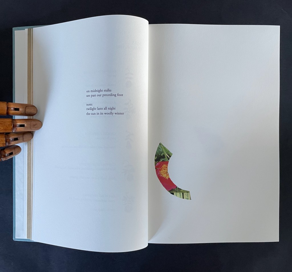
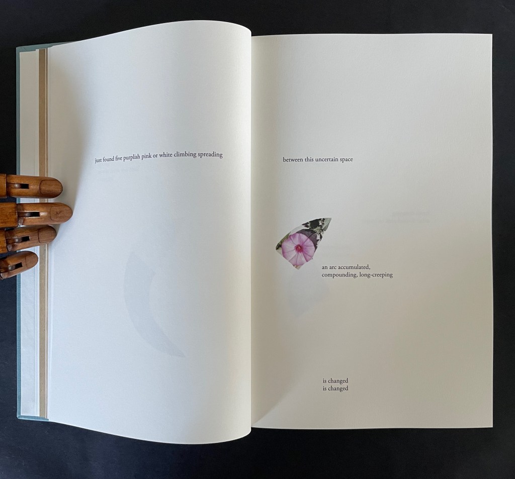
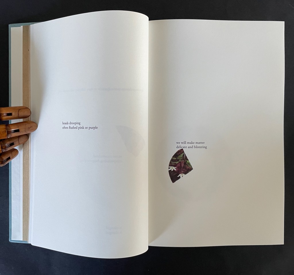
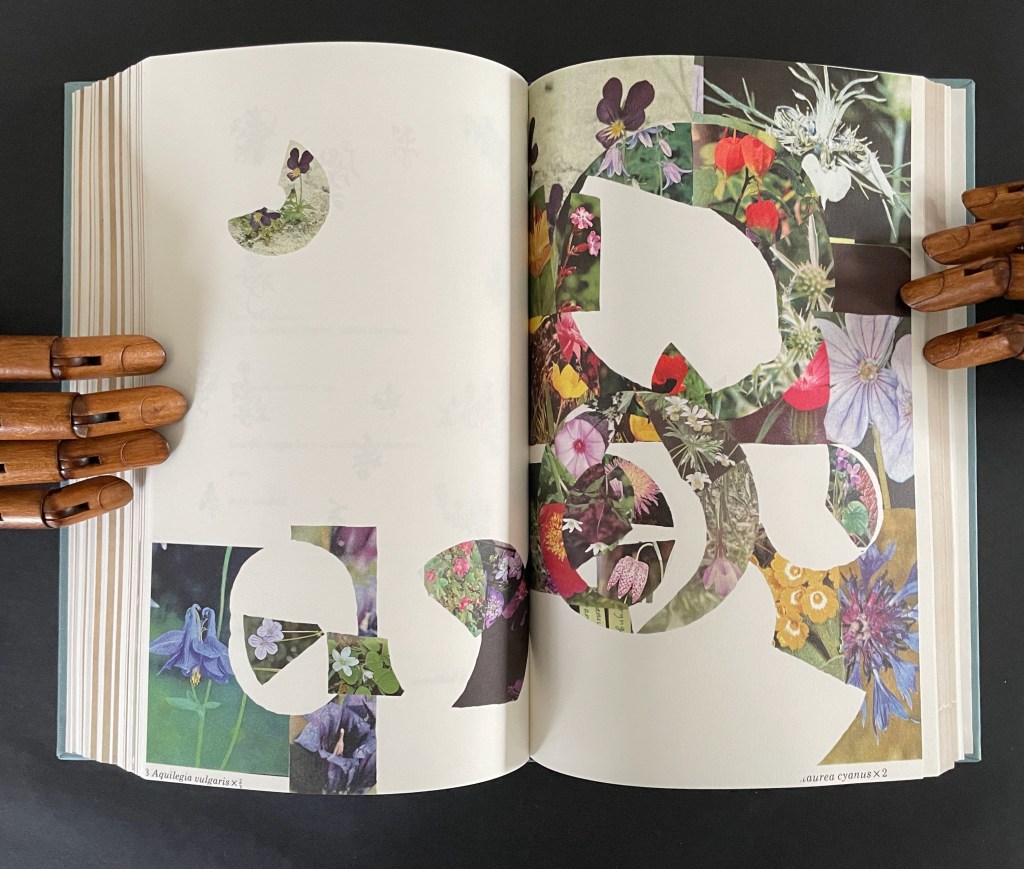
After each of them, the poem continues, accompanied by brightly colored jigsaw-like cutouts from photos of flowers Ancliffe has matched to the woodcuts. In each section, a jigsaw puzzle piece appears, then another and so on until the section ends with a page of accumulated pieces. Below is the section that follows the marker above. The accumulation (or gathering) page brings together the five preceding pieces.
There are 12 gathering pages, and they are all brought together in a closing double-page display.
Twelve “gathering pages”.
The closing accumulation page, a gathering of gathering pages.
There are also four labelled subsections or interludes that appear out of the blue.
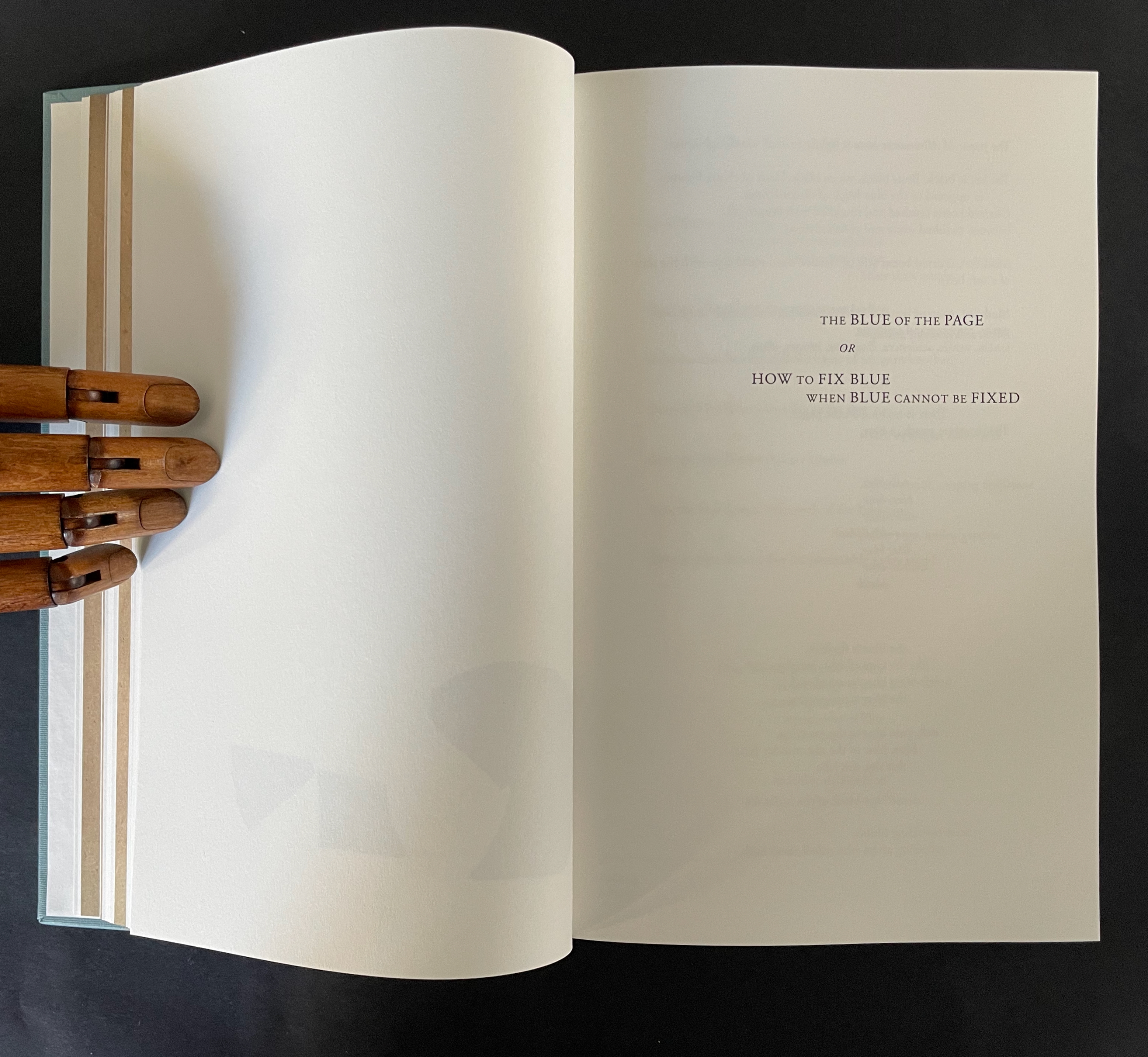
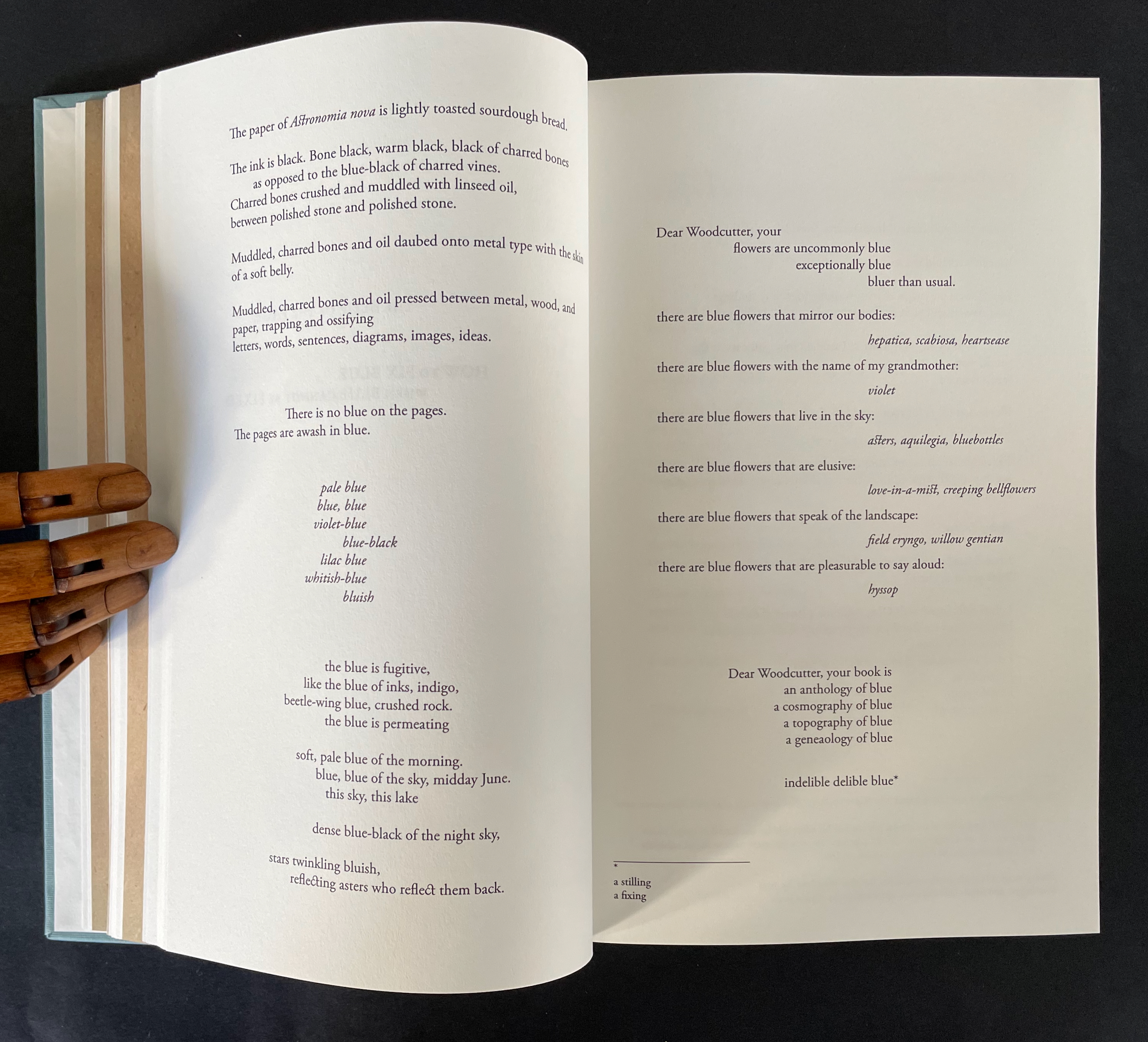
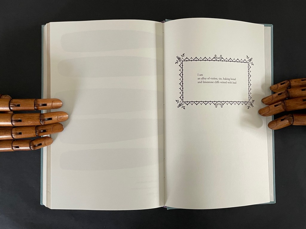
The first entitled “The Blue of the Page or How to fix Blue when Blue cannot be Fixed” addresses the color of the paper, ink, and flowers, what Ancliffe can see and cannot see but perceives (color of paper), knows (ink), imagines (flowers), metaphorizes, finds, and names.
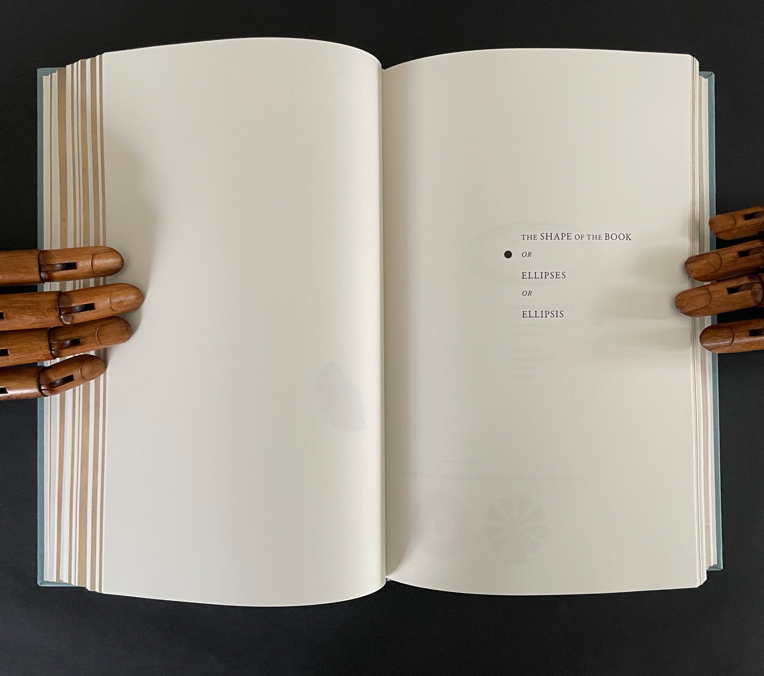
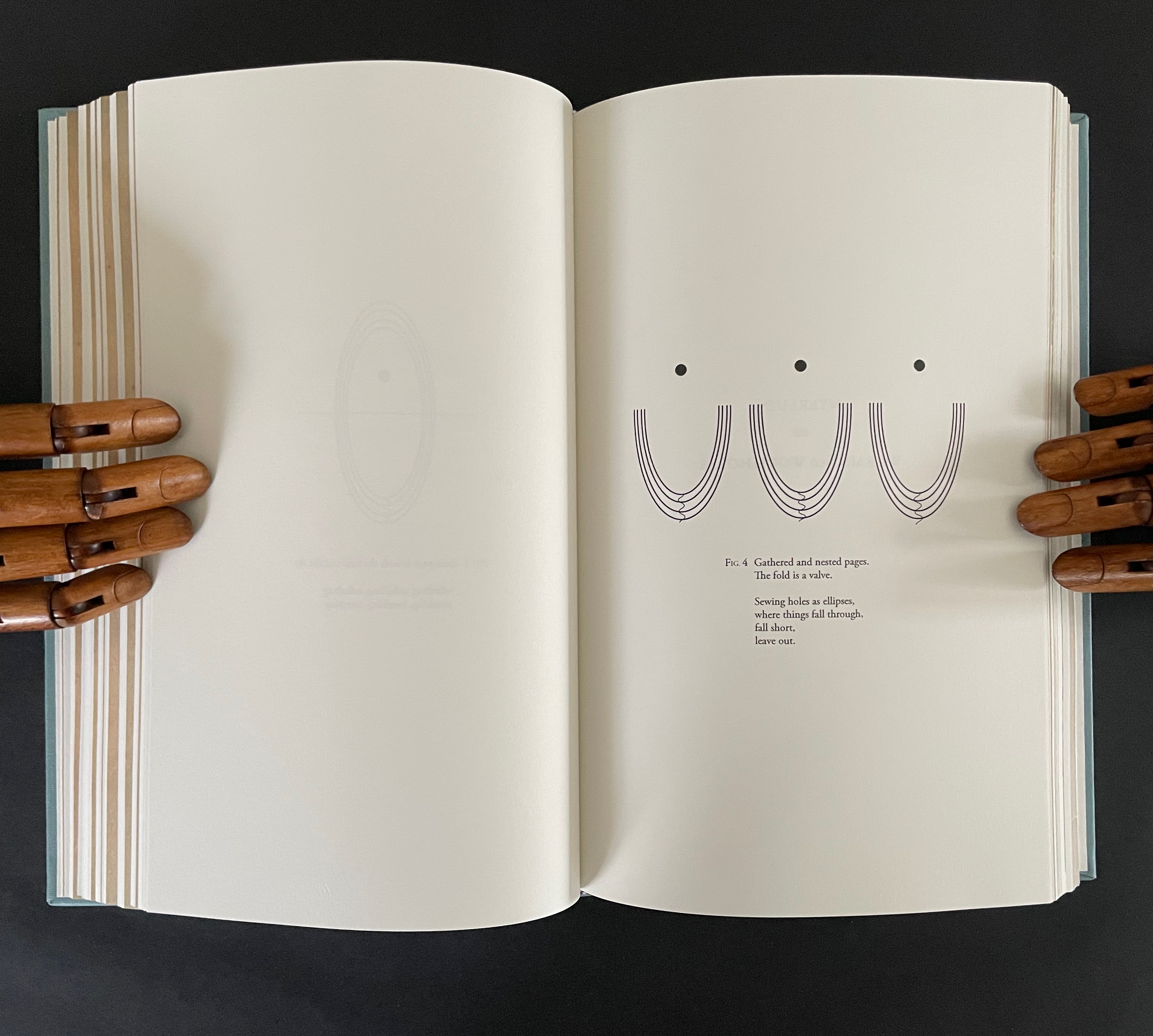
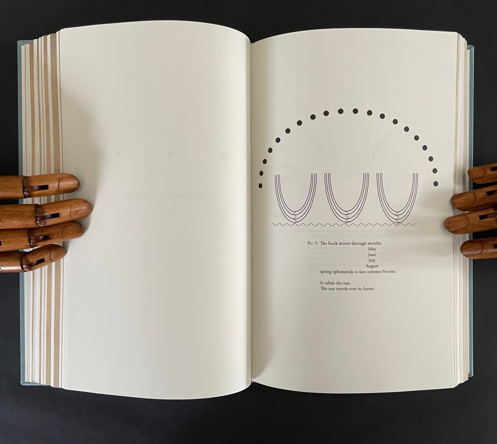
The second entitled “The Shape of the Book or Ellipses or Ellipsis” draws metaphorical, etymological, and visual links between books and orbits (ellipses) and sewing holes (ellipsis).
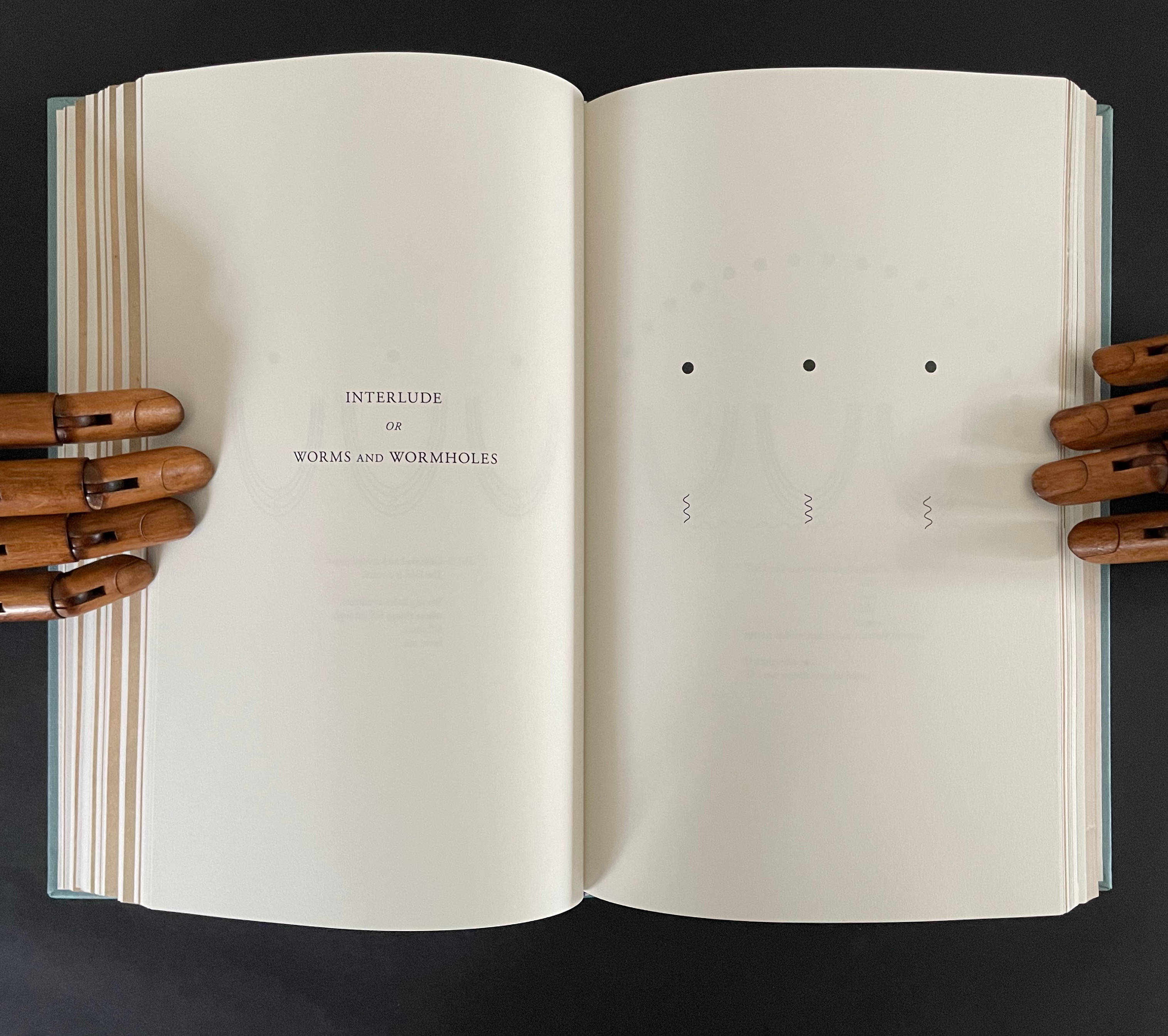
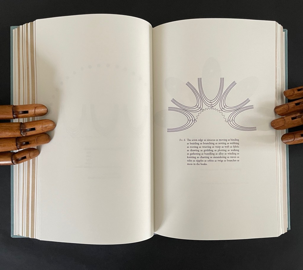
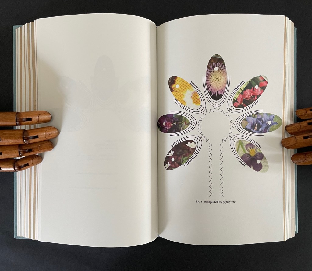
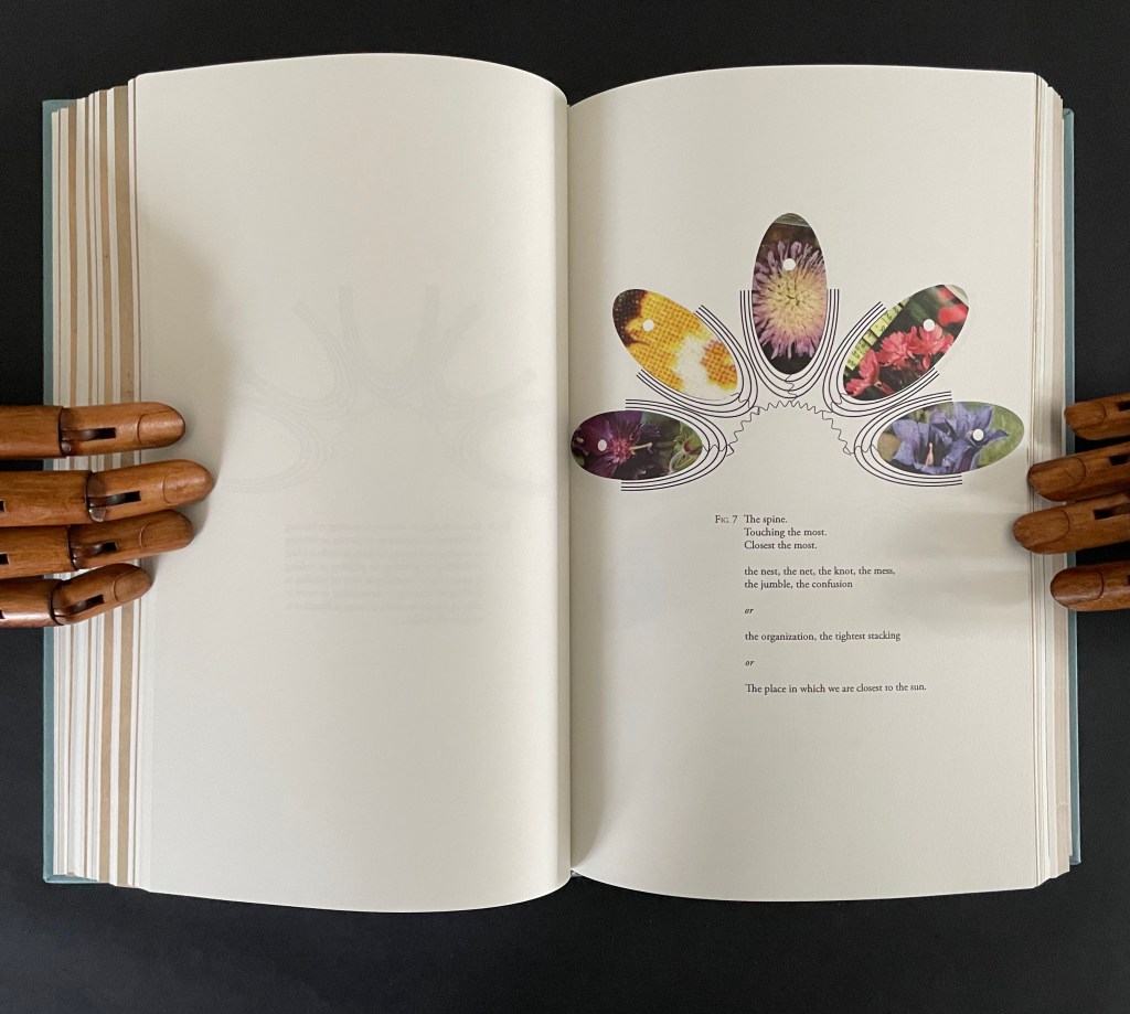
The third interlude “Interlude or Worms and Wormholes” develops an extended metaphor of the book’s sewn edge as a sinuous gathering together of nature, type production, planetary charts, and seasonal movements. It also makes another extended metaphor of the book spine as the most interconnected point of organization and confusion, the orbital point closest to the sun, and the shapes of a shallow papery cup, sewn folds, and flowers.
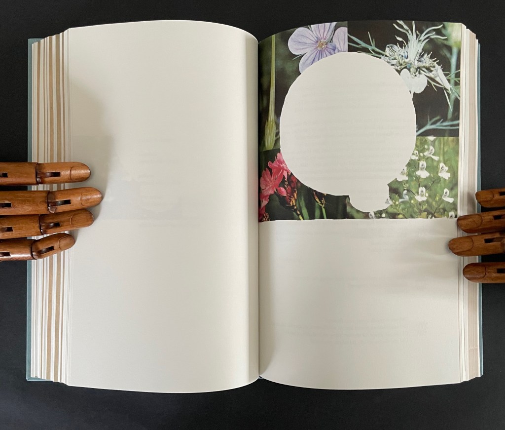
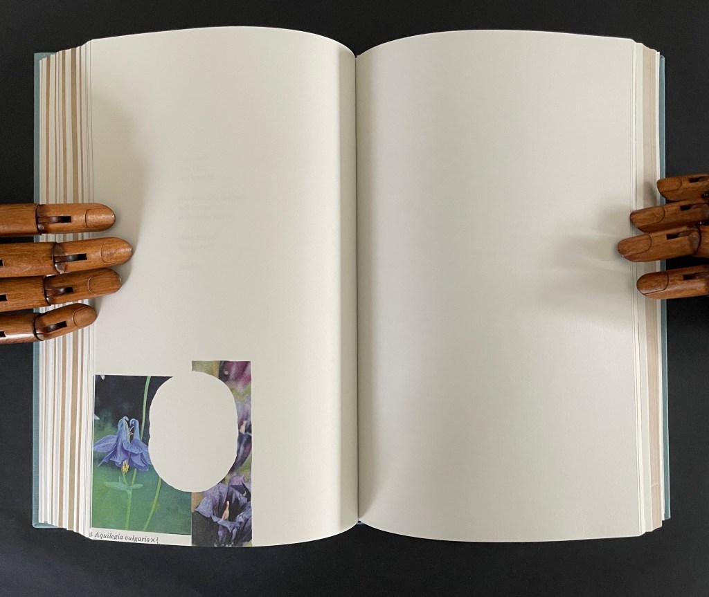
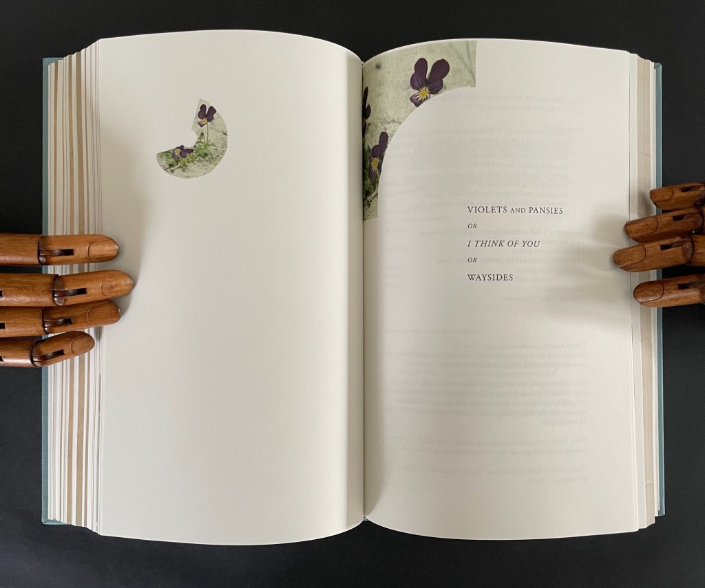
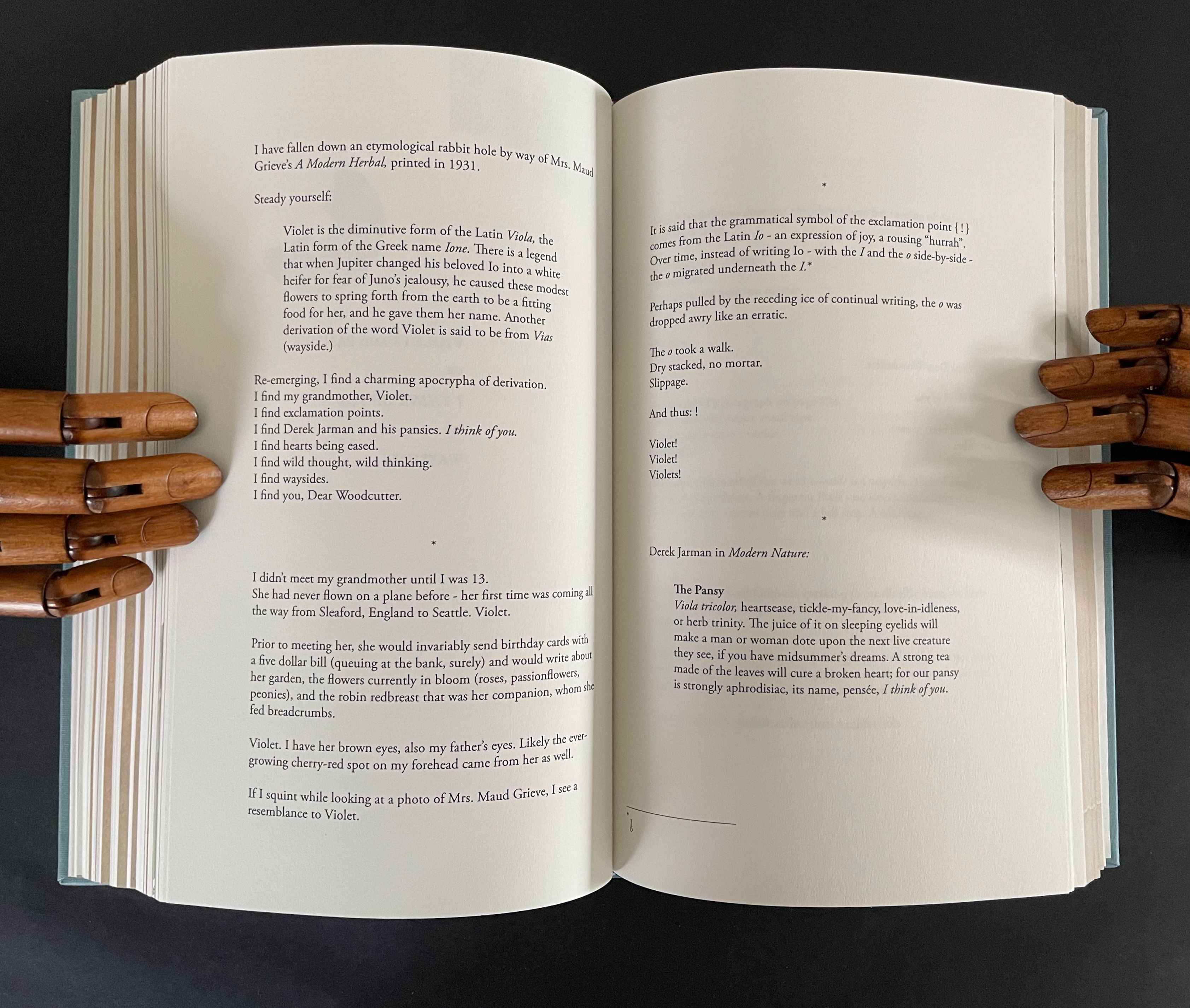
The fourth interlude is “Violets and Pansies or I Think of You or Waysides” plays on Paul Klee’s observation that “A line is a dot that went for a walk”. In Ancliffe’s case the line begins with the dot of the etymology of “violet” that leads both to the Jupiter/Io myth and Ancliffe’s grandmother’s name, that links Io to the origin of the exclamation point, which Ancliffe appends to grandmother Violet and the flowers, that jumps to Derek Jarman’s etymological linking of the common names violet/pansy/heart’s ease to the French “pensée” and thus to “I think of you”, that leads to wild pensée (wild thought), which leads back to the dubious etymology of via leading to violet and thereby “wayside”, which leads to thinking of you (woodcutter) and the flowers found by the waysides.
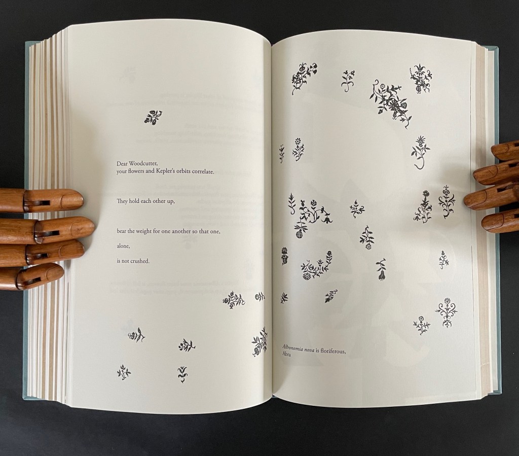
What links these subsections is their use of the elements of book production to support Ancliffe’s theme of interconnectedness. At the start of the book, she wonders whether the purpose of the woodcut flowers is that of bearing type, an insertion to prevent the weight of the press from breaking the finer woodcut lines of the orbits. Now, as the final gathering of gatherings approaches, she returns to that notion. Notice below how the layout of text and flowers on the left and the layout of the collage on the right mimic one another, which echoes Ancliffe’s observation
your flowers and Kepler’s orbits correlate.
They hold each other up,
bear the weight for one another so that one,
alone,
is not crushed.
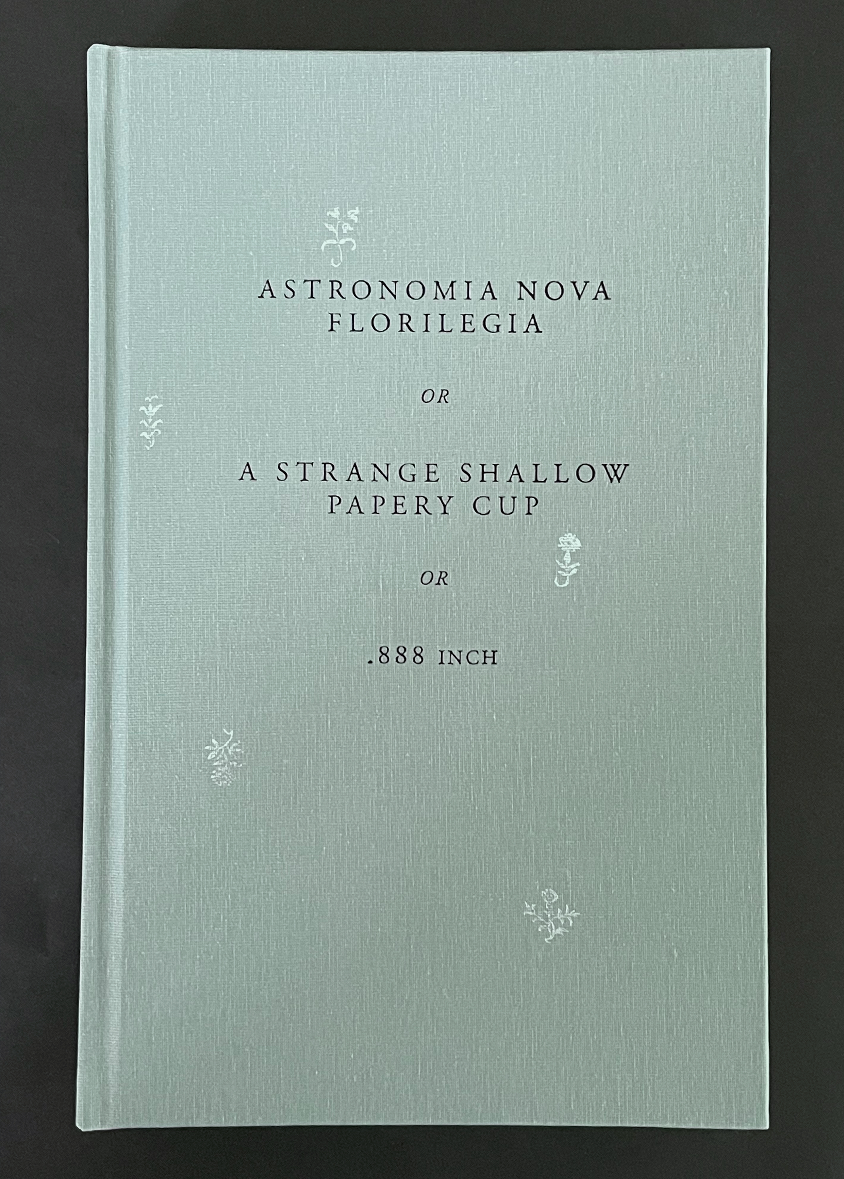
But for Ancliffe, a mutual bearing up is not the whole story of the interconnectedness she is pursuing in Astronomia Nova Florilegia or A Strange Shallow Papery Cup or .888 inch. For her, interconnectedness (correlation) is historical, metaphorical, etymological, rhetorical, seasonal, geographical, typographical, material, and personal. She sees in the woodcutter’s Prague flowers a florilegium (“you hid a book within a book!”) and a purpose — “I am seeing your book of flowers to others” — for which she chooses the medium of the artist’s book. Because this medium is so frequently recursive or self-reflexive, it is well-suited to a book hidden within a book. Like a planetary system, an artist’s book often has multiple orbits and multiple points of orbit. As noted in the interludes, any element of “the book” and its production can play a role — punctuation, words and wordplay, ink and its color, type and typesetting, images and carving, paper, sewing holes, thread, and so on.
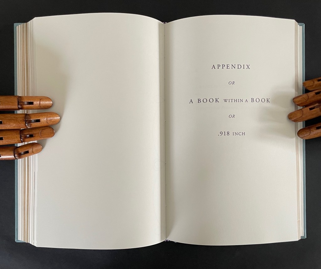
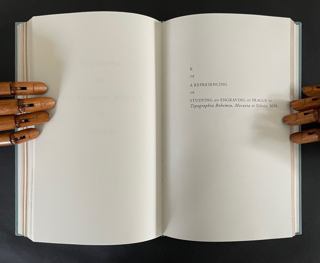
In a final honor to Dear Woodcutter and personalizing capstone, Ancliffe adds two appendixes: “the first, Appendix or A Book within a Book or .918 inch”, and the second, “K or a Represencing or Studying an Engraving of Prague in Topographia Bohemiae, Moraviae et Silesiae, 1650″.
In the first appendix, Ancliffe introduces the map of Prague, familiar from the two earlier artist’s books and then points us to K, the Jewish quarter, by filling it with a thumbnail flower. This is her book within a book: 37 flowers laid within the Jewish quarter of Prague 1650. Their color re-presences the absence surrounding the K in the map.
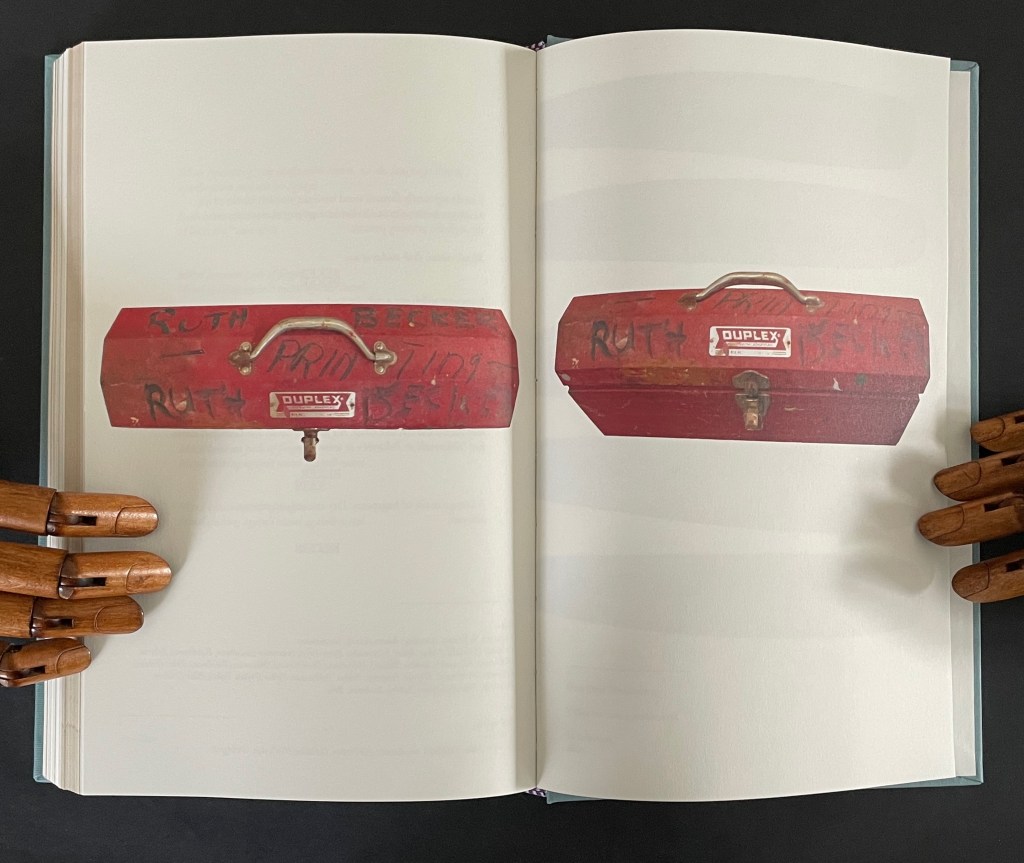
In the second appendix, Ancliffe begins with the materiality of type and setting it — how it’s made, how it feels, what it looks like — in particular for the letter K and her maternal grandmother’s married last name set in type. Again, it is an element of the book that provides the metaphor that pulls “what connects” into the orbit of Ancliffe’s artist’s book. Absence evokes presence; presence evokes absence. The absence around the carved upside down and reversed metallic strokes defines K as much as does the ink transferred from them. Likewise the presence of her grandfather Victor’s and grandmother Ruth’s metal and messy tools evokes their absence, and it is their impression on the artist that defines their presence in her,
which brings us to the autobiographical closing statement framed by Dear Woodcutter’s flowers.
Abra Ancliffe has created a body of works that, as Brian Davis puts it, “not only exploit the material and expressive possibilities of the book as object, they function as physical sites for compiling and organizing heterogeneous collections of textual artifacts for narrative and other expressive purposes”. As aesthetic objects, they demand more than a glance in an exhibition or flick-through at a book fair. They richly repay the greater attention.
Further Reading
“J. J. Abrams & Doug Dorst“. 12 December 2024. Books On Books Collection. Another example of what Davis calls a “book-archive”.
“Helen M. Brunner“. 15 April 2026. Books On Books Collection. Further example of the “book -rchive” artist’s book.
“Gracia Haby & Louise Jennison“. 28 May 2026. Books On Books Collection. Intensely colorful artists’ books exemplifying the notion of “book-archives”.
“Michael Hampton“. 8 May 2026. Books On Books Collection. Hampton’s notion of parabibliography has an affinity with Brian Davis’ notion of archival poetics. In particular, see 410/411 (2025.
Davis, Brian. 1 May 2024. “Part One: The Rise of Multimodal Book-Archives“. Book Art Theory. Starkville, MS: College Book Arts Association. Explores “archival poetics”, finding art by harvesting archives and libraries.
Affen und Alphabete [“Apes and Alphabets“] (1962) Helmut Andreas Paul (HAP) Grieshaber Slipcased, self-covered leporello with eighteen original woodcuts of stylized apes and sixteen typographical experiments. H450 x W335 mm. 36 unnumbered sheets. Edition of 300, of which this is #68. Acquired from Winterberg-Kunst, 22 October 2022. Photos: Books On Books Collection.
HAP Grieshaber was one of the foremost German woodcut artists of the post-WWII era. His devotion to the woodcut technique was almost matched by that to the medium of the book, which he used in several formats and sizes for series works. Apes and Alphabets is one of the larger of those series and representative of his undeviating Expressionist style and blurring of borders between letter and image, the civilized and uncivilized, the artificial and the natural. This slipcased accordion book comprises 18 original woodcuts, two of which appear on the cover (one again on the wooden slipcase).
A full page of ranks of blackletter characters echoes a full page of columns and rows of apes with musical instruments. In visual cacophony, the letters make wordless strings just as the apes make soundless music.
Only one of the book’s panels has a touch of color, but the garish orange of the slipcase and book cover shows Grieshaber’s characteristic handling of this element — printing over an undercoat that serves as background. Even when working with a single color in these prints, Grieshaber earns his description as Der Holzschneider als Maler (“the woodcutter as a painter”), to which could be added “collagist”. Although influenced by Paul Klee and Lyonel Feininger, the physical intensity of the prints, this book and the others below sets Grieshaber apart.
His use of heavy wove paper in this work and other monumental ones like Die Rauhe Alb (1968) is equally of a part with a drive toward the tactile and a reaction to the alleviation of wartime paper shortages, which comes up later in Herzauge (1969) below.
Poesia Typographica (1962)
Poesia Typographica (1962) Helmut Andreas Paul (HAP) Grieshaber Paperback, perfect bound Chinese-fold folios, black endpapers. H215 x W155 mm. 28 unnumbered pages. Edition of 1000. Acquired from Print Arkive, 22 October 2022. Photos: Books On Books Collection. Displayed with permission of the publisher Galerie der Spiegel.
The alphabet theme of Affen und Alphabete carries over in the hornbook images on the front and back covers of Poesia Typographica. More than most typographic or concrete poetry, Poesia Typographica addresses the materiality of letters, images, ink, paper and printing — even going so far as to exalt it over the alphabet.
This is particularly clear in Grieshaber’s use of white ink on a transparent sheet to record the tale of missionary Baedeker and his Analphabeten Bibel (“Illiterates’ Bible”). To the Russian peasantry to whom Baedeker distributed thousands of the booklet, he claimed that its eight pages contained “the whole Bible, the pure teaching of our Jesus Christ”. The typeset transparent sheet sits between what would otherwise be a double-page spread of solid black. That spread is followed by one of red, one of white and then one of gold.
The transparent page explains :
the peasants saw in the black of the first page the darkness of their sinful hearts, their great guilt.
in the red of the next page, they united with the divine blood of christ. they walked out the suffering steps of our lord. washed clean in the blood of his love, they won innocence:
the pasture linen of the third page, that is the purity that must be in the heart.
ready to enter into the mystery, to look into the sunshine of God’s face. to fall down in prayer, the sound of the golden trumpets of heavenly bliss in their ears.
A literate reader may smile at the missionary’s metaphorical hoodwinking of the serfs, but the longer the reader moves the transparent page back and forth, registers its interloping nature, and recognizes that “analphabet” doesn’t just mean “an illiterate” but also one who does not know letters at all, the more the materiality of the stiff black, red, white and gold pages makes itself felt and the more the viewer realizes that Grieshaber is laying down a challenge to look beyond the alphabet to the ink, paper and the printing.
Just as in Affen und Alphabete, the reader/viewer must look at letters beyond “shapes for sounds”. Letters may have their roots in the pictorial, but Grieshaber isn’t taking their “shapeness” back to pre-Gutenberg or pre-alphabet pictoriality. He takes it into an expressive post-Gutenberg, post-alphabet visual and material art.
Herzauge (1969)
Herzauge (1969) Helmut Andreas Paul (HAP) Grieshaber Board book casebound in bookcloth, with illustrated dustjacket. H294 x W240 mm. 16 unnumbered pages with 9 color plates. Edition of 800? Acquired from K.G. Kuhn Antiquariat, 14 July 2023. Photos: Books On Books Collection. Displayed with permission of artist’s family.
Hat das Herz noch ein Auge? (“Can the heart still see?”), Grieshaber asks on the last page of this artist’s book for children published by Parabel Verlag in Munich. It’s a disturbing afterword. It changes what you think these Expressionist woodcuts and the words beside them express. Grieshaber explains that, by 1937, paper for printing was scarce. From a generous doctor, he obtained filtration paper on which to print his landscape woodcuts Die Rauhe Alb, his visual ode to the Swabian Alps. Children brought him the sheets of glossy paper on which the original 20 copies of Herzauge were printed and over-drawn with a dry brush. No one wanted Die Rauhe Alb at the time, and all but one copy of Herzauge were lost. His summary phrase — Märchen in dunkler Zeit (“Fairy tales in dark times”) — offers a way into the board book and perhaps an answer to the question “Can the heart still see?”
Second double-page spread. “Ach Alm, a knight once moaned. Achalm, I live in your lap.”
Achalm is a mountain in Reutlingen, Germany. On its top are the ruins of Achalm Castle, ancestral seat of the counts of Achalm, a 13th-century Swabian noble family. The legend is that the name comes from Count Egino’s dying words to his brother. He meant to say “Ach Allmächtiger!” ( “O Almighty!”) but only uttered “Ach Allm…“, and to honor Egino, the brother named the mountain and castle Achalm. It’s a clever poem and clever woodcut. The last word Schoß — meaning bosom, arms, heart or lap — is close to the word Schloß — meaning castle. Turning the castle into a fairy tale crown, the woodcut also gives the mountain a feminine visage, a sweep of white that looks like an embracing arm and a village nestled in its lap.
This spread comes after the first in which a black woebegone bird in a brush-streaked patch of snow occupies the foreground alongside the lines “Winter is a hard man. The tree freezes.” And it precedes the third in which the viewer’s perspective must be that of standing on a dock and looking out on a harbor alongside text that reads, “Do you hear the horn hooting in the harbor? We are leaving.” Achalm is the fairy tale bookended by dark cold before and forlorness after.
The fourth spread’s text — Wer streicht am Abend allein über de Berge? Die Katze weißes.(“Who is painting alone in the mountains in the evening? The cat knows.”) — is a fairy-tale blend of gloomy forest and mysterious animal humor matched by the dark purple undercoat and background of the woodcut.
A fifth spread with colors of dark blue, burnt umber and green against a turquoise undercoat and background shows a distressed Hansel-and-Gretel-like pair on the turquoise path between blue and umber trees and beneath a large blue, umber and turquoise owl that cries “Home, home!” as Der Nacht krab kommt (“The night call comes”)
The sixth and seventh spreads introduce a different air of childhood innocence, one of lessening threat. In the sixth, a child figure with upraised arms (throwing an orange ball up in the air?) wanders down a meadow valley bordered by a knoll of trees leaning over the otherwise sunny scene with black and purple foliage that suggest the faces and hair buns of stern school mistresses. The last line of text — Ich mußzur Schule (“I must go to school”) — evokes a nursery-rhyme dawdling ten o’clock scholar to English ears. In the seventh, Wir haben Ferien (“We have holidays”) sounds like the concluding sentence in a final school assignment and is matched by the child-like drawing of swans, roses, a green lake and a motherly figure. But mother is faceless, preparing us for the afterword’s hopeful but worried question “Can the heart still see?”
It’s good to see a renewed interest in Grieshaber — not only for his own artistry but also his medium. Another of his major works — The Easter Ride, a series of 27 colored woodcuts based on a journey through the Swabian Alb — was exhibited at the Elztalmuseum Waldkirch in early 2023.
Helmut Andreas Paul Grieshaber, better known as HAP Grieshaber, is one of the most important artists of the 20th century in the field of woodcuts. He created numerous large-format, abstract works on socio-political and religious themes. He was considered down-to-earth and idiosyncratic. His art was intended to be visible and accessible to all. … The exhibition invites visitors to engage with Grieshaber’s idiosyncratic, unmistakable visual language and to become acquainted with the technique of the woodcut.
“The Easter Ride” – HAP Grieshaber In this special exhibition, the Elztalmuseum is showing one of the artist’s major works: “The Easter Ride”. 10 March 202307 May 2023, Elztalmuseum Waldkirch
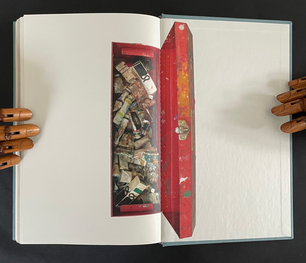
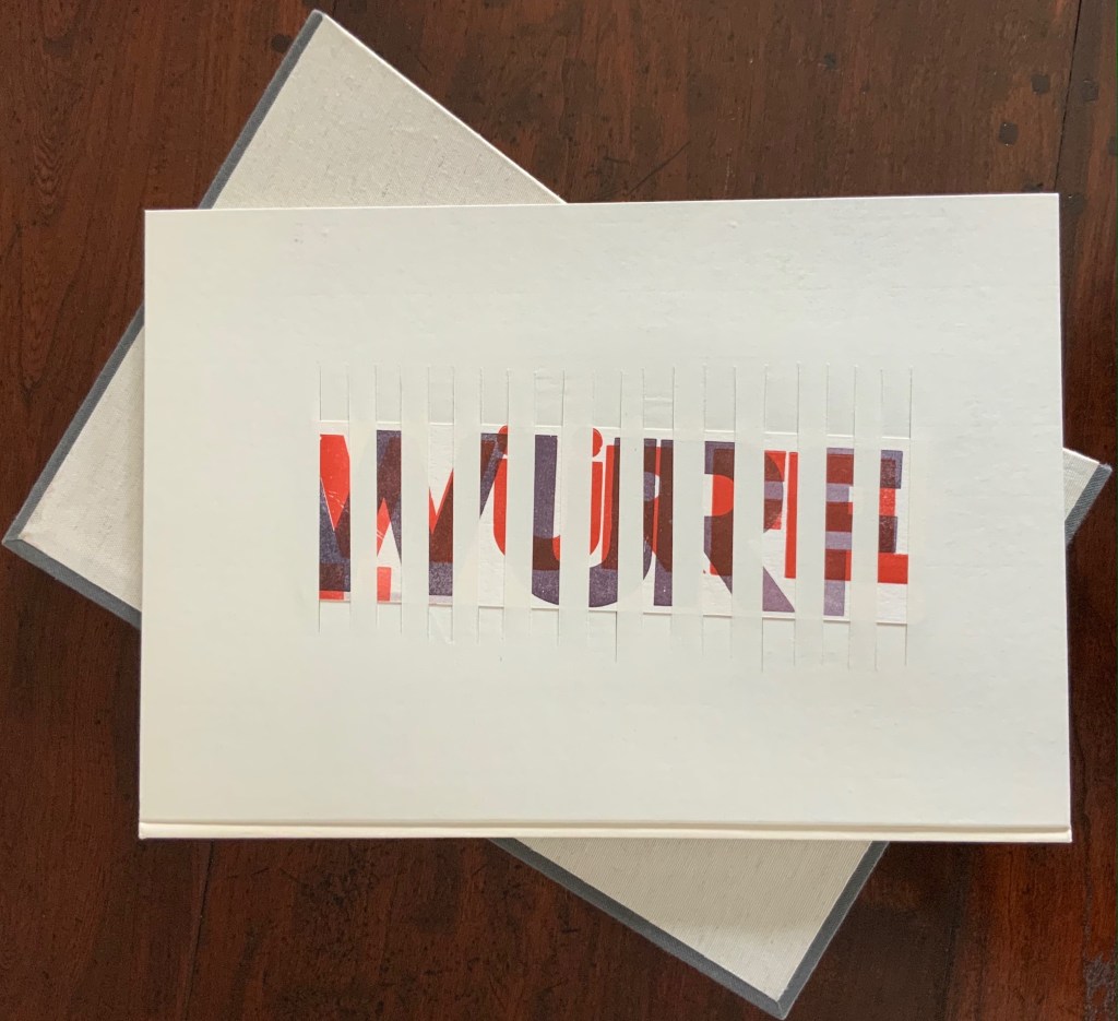
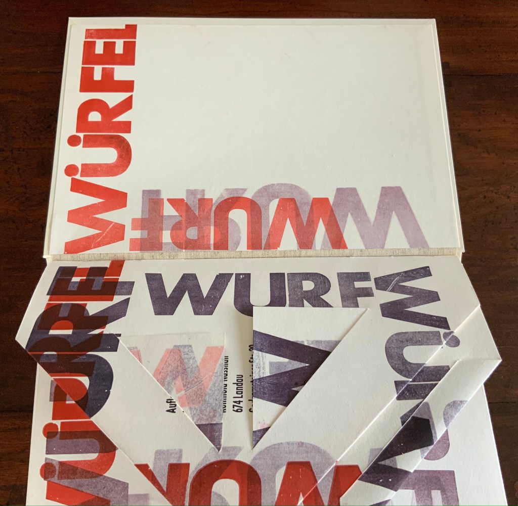
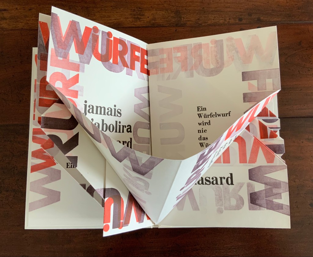
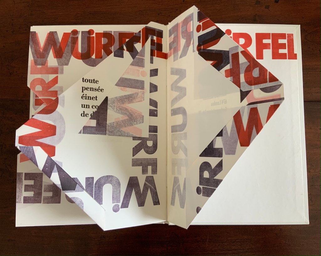
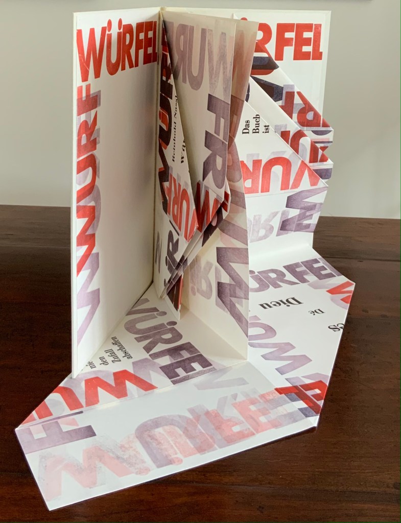
Würfelwurf: fragmentarische Annäherung an Stéphan Mallarmé (1992) Reinhold Nasshan Slipcase, embossed spine, casebound in paper-covered boards, front cover decorated with title set on slip of paper woven into the cover, block sewn and glued, with relief prints as pastedowns. Slipcase: H360 x W248 mm; Book: 351 x 243 mm, 4 gatherings of folios of varying size cut, tucked or folded to fit within the binding’s dimensions. Unique. Acquired from the artist, 24 February 2021. Photos of the work: Books On Books Collection. Displayed with artist’s permission.
“Throw of the dice”, “dice throw” or “throwing dice” are all reasonable translations of Würfelwurf, but not “a throw of the dice”, which most German translators render as ein Würfelwurf when tackling Mallarmé’s Un Coup de Dés. But then Reinhold Nasshan is not translating the poem. As the subtitle indicates, he is making “a fragmentary approach”, an approximation.
The very structure and working of Nasshan’s Würfelwurf underscore his title’s distinction between a single act and repetition of the act. On its front cover, the word würfelwurf splits in two, one half printed over the other on the slip woven into the slits in the front cover. The slip angles downward from left to right suggesting action, which comes aplenty inside the book.
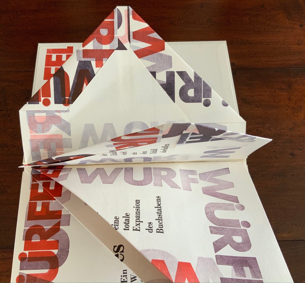
Some pages are cut, their corners folded and tucked in. One gathering consists of a sheet 688 x 470 mm that is creased with mountain- and valley-folds and untrimmed at the bottom edge so that it unfolds into a base that spills out beyond the covers. Pages take on dice-shaped edges and planes that seem to roll from within and against the book. The achieved effect of motion recalls Marcel Duchamp’s Nude Descending a Staircase (No. 2) or Umberto Boccioni’s Unique Forms of Continuity in Space.
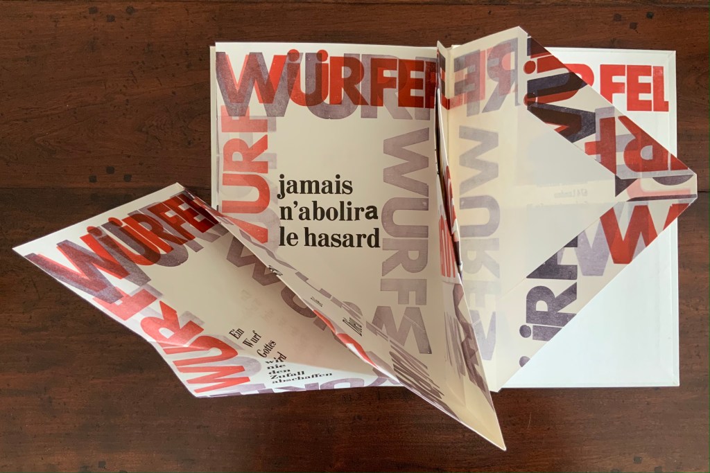
Although the title of Mallarmé’s poem appears, most of the text scattered across the surfaces comes from his other writings; for example, peindre, non la chose, mais l’effet qu’elle produit (“to paint, not the thing, but the effect it produces”); tout, au monde, existe pour aboutir à un livre (“everything in the world exists to end up in a book”); and Das Buch ist eine totale Expansion des Buchstabens (“The book is a total expansion of the letter”). When that large folded gathering comes, though, the Mallarmé’s words begin to be jumbled: Ein Würfelwurf wird nie das Würfelspiel abschaffen (“A throw of the dice will never abolish the game of dice”) and Ein Wurf Gottes wird nie den Zufall abschaffen (“A throw from God will never abolish chance”).
Strangest of all is the mangling of émet from the poem’s final line Toute pensée émet un coup de dés (“All thought emits a throw of the dice”). The word becomes éinet. Not French, not German. Perhaps a typo of “in” for “m”? As it turns out, according to the artist, it is a fluke that the letter “m” available in the font on hand printed poorly, so “i” and “n” provided an alternative three vertical strokes.
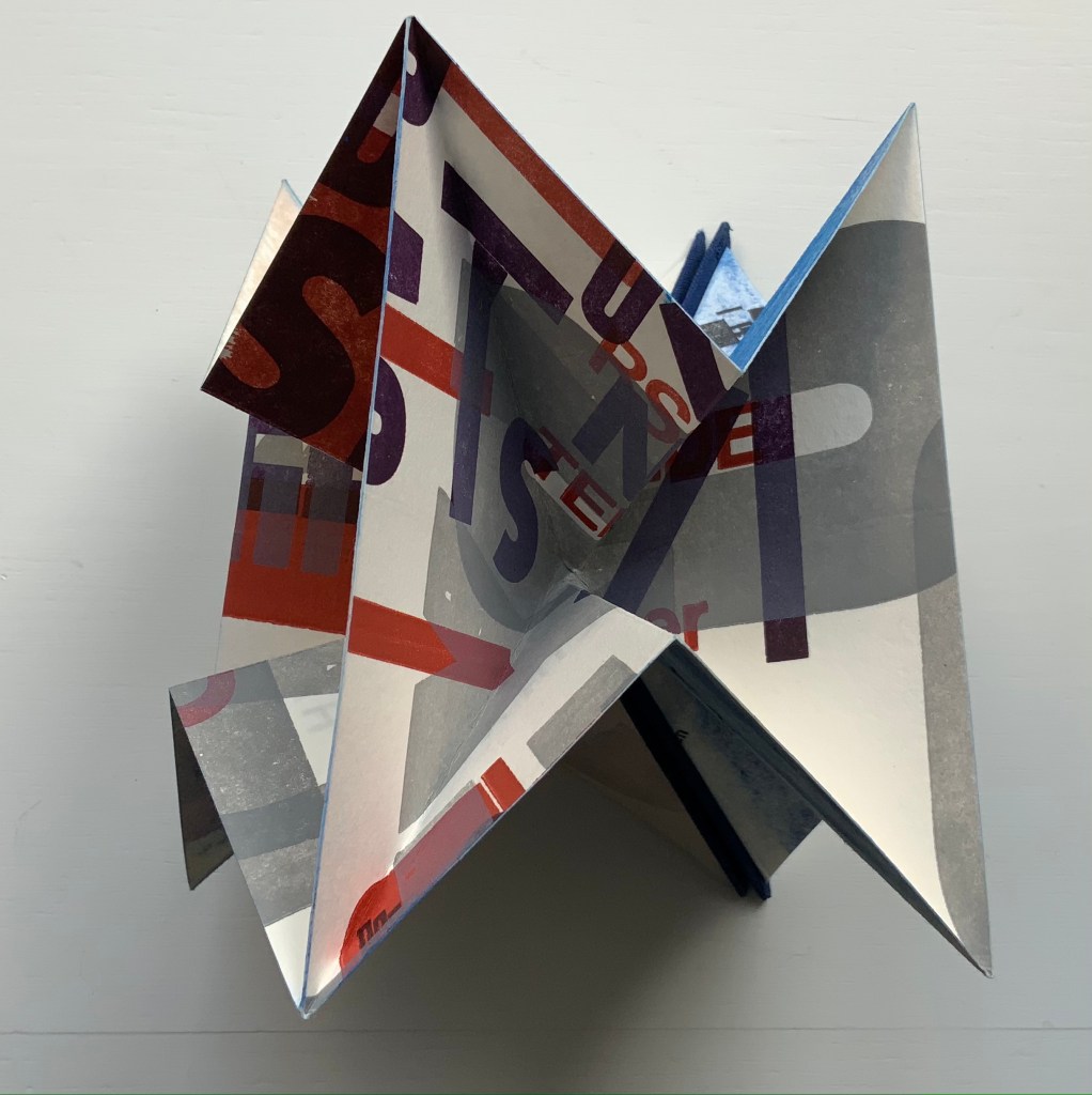
Un Coup: Stéphane Mallarmé (1997)
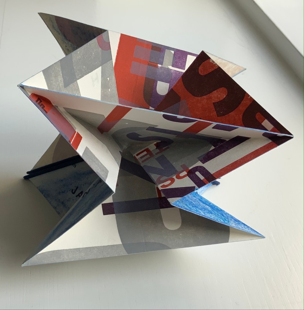
Un Coup: Stéphane Mallarmé (1997) Reinhold Nasshan Flexible triangular cloth-covered book boards, 4 cotton paper squares folded into origami water bomb base and glued. Triangle: 127 x 127 x 179 mm; Square “pages”: 166 x 166 mm. Acquired from the artist, 24 February 2021. Photos of the work: Books On Books Collection. Displayed with artist’s permission.
Nasshan also refers to this as a “letter sculpture”. Inviting the reconfiguring as with the works of Eleonora Cumer or Bruno Munari, or simply constant fiddling as with a paper fortune teller, Un Coup is more three-dimensional than Würfelwurf. As with Würfelwurf, this work lets the “moment of movement itself, the transition between the throw and the impact of the dice, emerge graphically” (moment der bewegung selbst den ubergang zwischen dem werfen und dem auftreffen der wurfel, graphisch hervortreten zu lassen). With less surface than Würfelwurf, though, it has fewer extracts from Mallarmé’s writings. Indeed, along with the physical shape shifting, the enlarged letters overprinted at multiple angles to one another combine to make this work more abstract than extract. But because text and book are material from which, on which and with which Nasshan creates, the abstract retains its links to the book.
Also a painter, Nasshan’s works fall into two categories or surfaces — painted books and painted canvases. Though lacking the shape of a book, his abstract paintings retain that link to “the world of Letters” in shapes and figures that evoke hieroglyphics, Chinese characters, typography and even cave paintings. His influences appear equally eclectic — though more Kandinsky, Klee and Miró than Pollock or Rothko — which matches up with his choice of substrates in fiction and nonfiction. When not choosing works from the ancient, classical or Romantic periods (from Gilgamesh to Seneca to Hölderlin), he chooses Apollinaire, Beckett, Celan, Joyce or Wittgenstein among others from the Modern period.
A wider audience would profit from Nasshan’s works. At least these two and others that might enter the Books On Books Collection will be available in the 2022 exhibitions celebrating the 125th anniversary of the publication of Un Coup de Dés in Cosmopolis (May 1897).