The Gospel of Mary (2006)
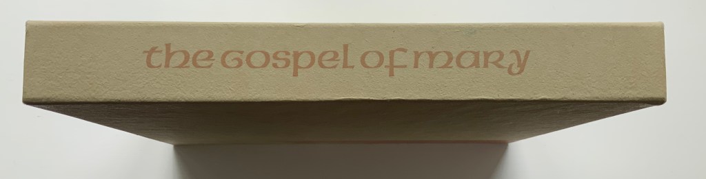
The Gospel of Mary (2006)
Claire Van Vliet et al.
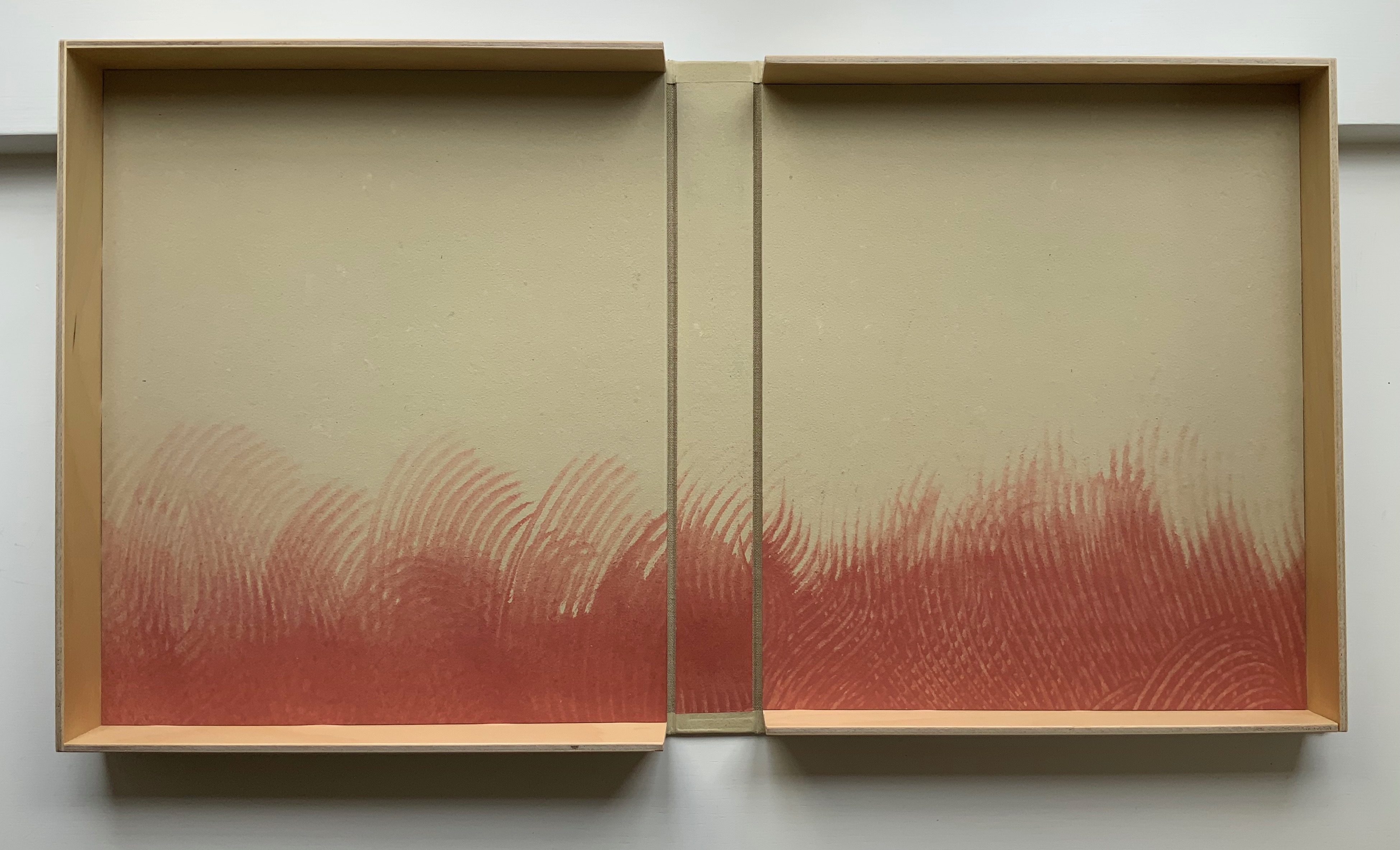
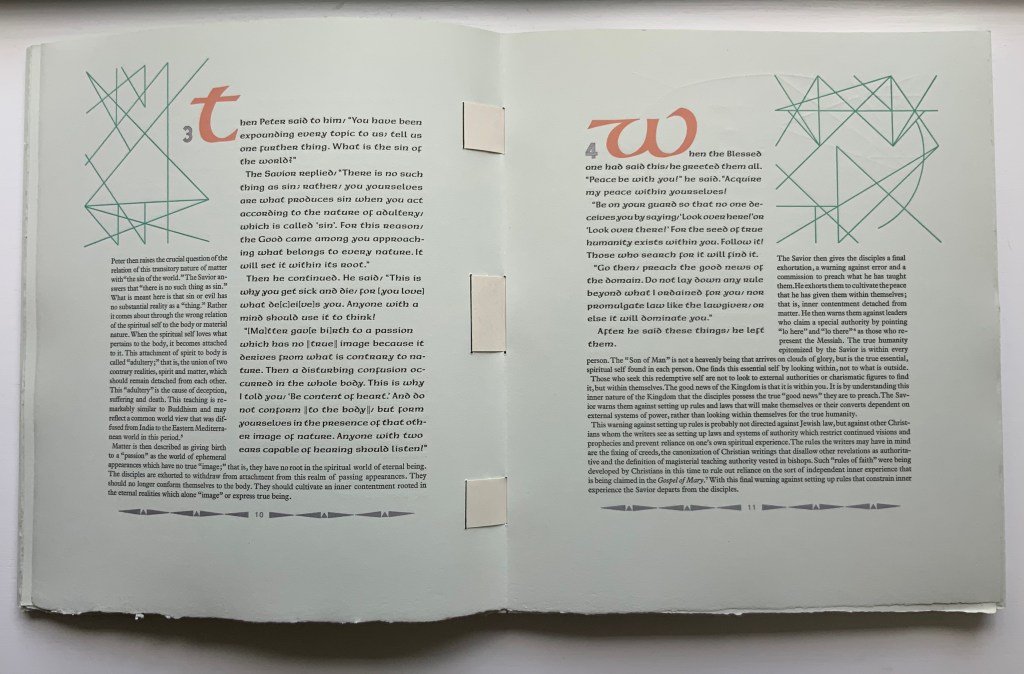
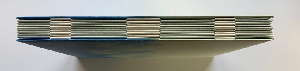
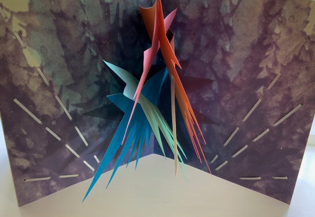
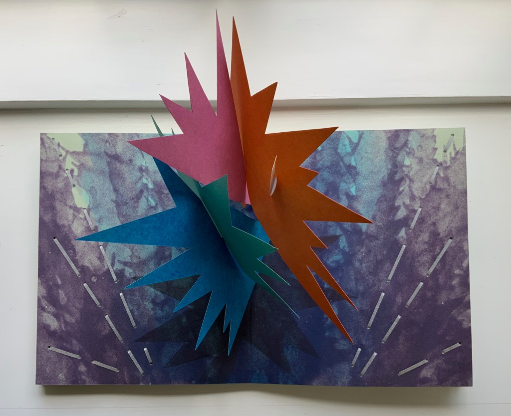
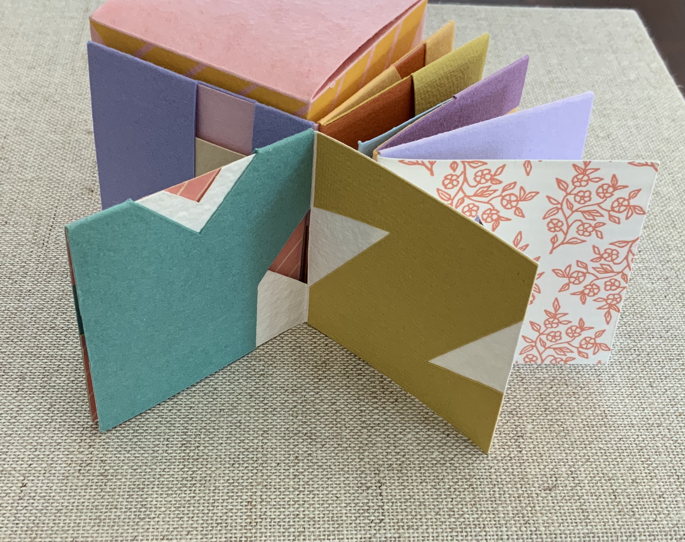
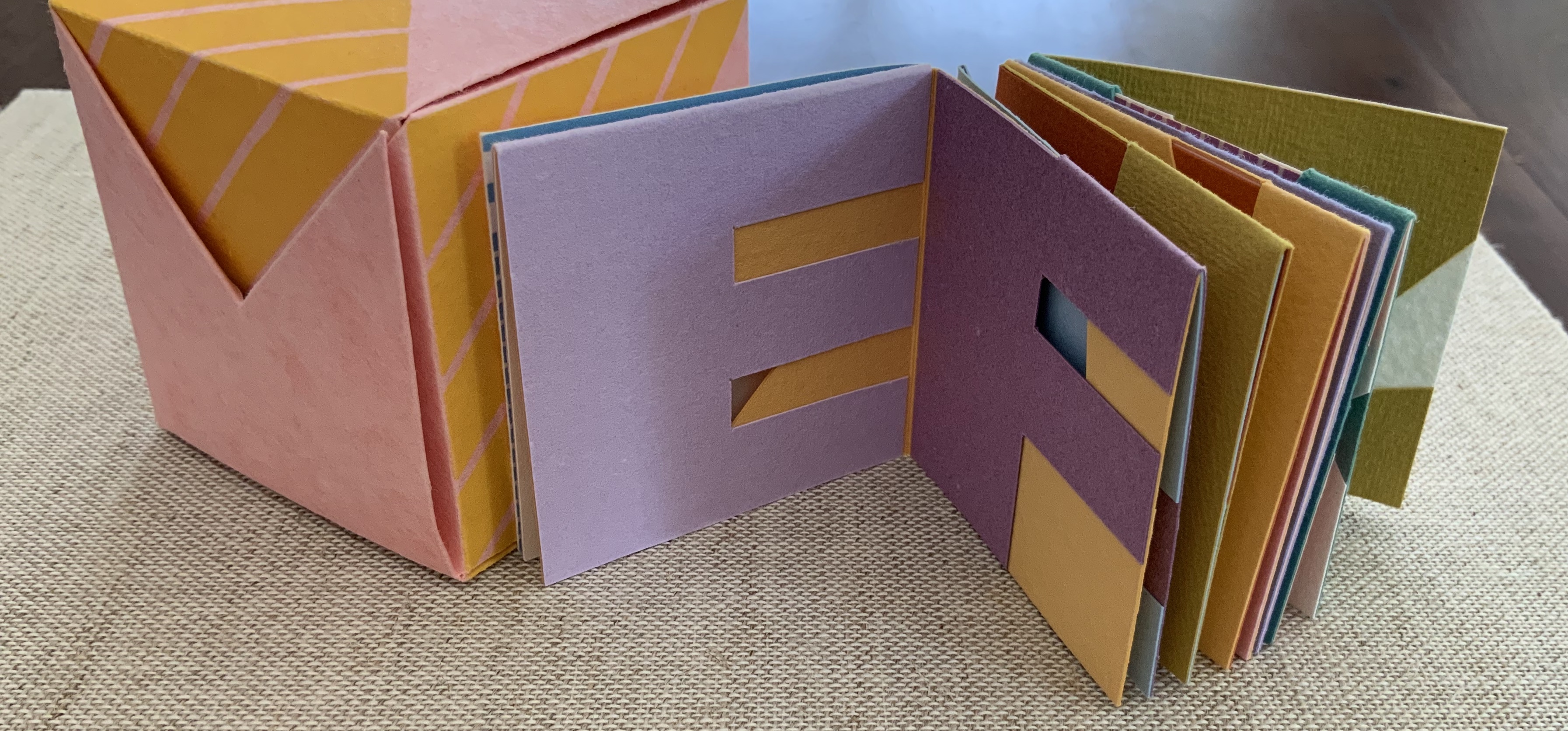
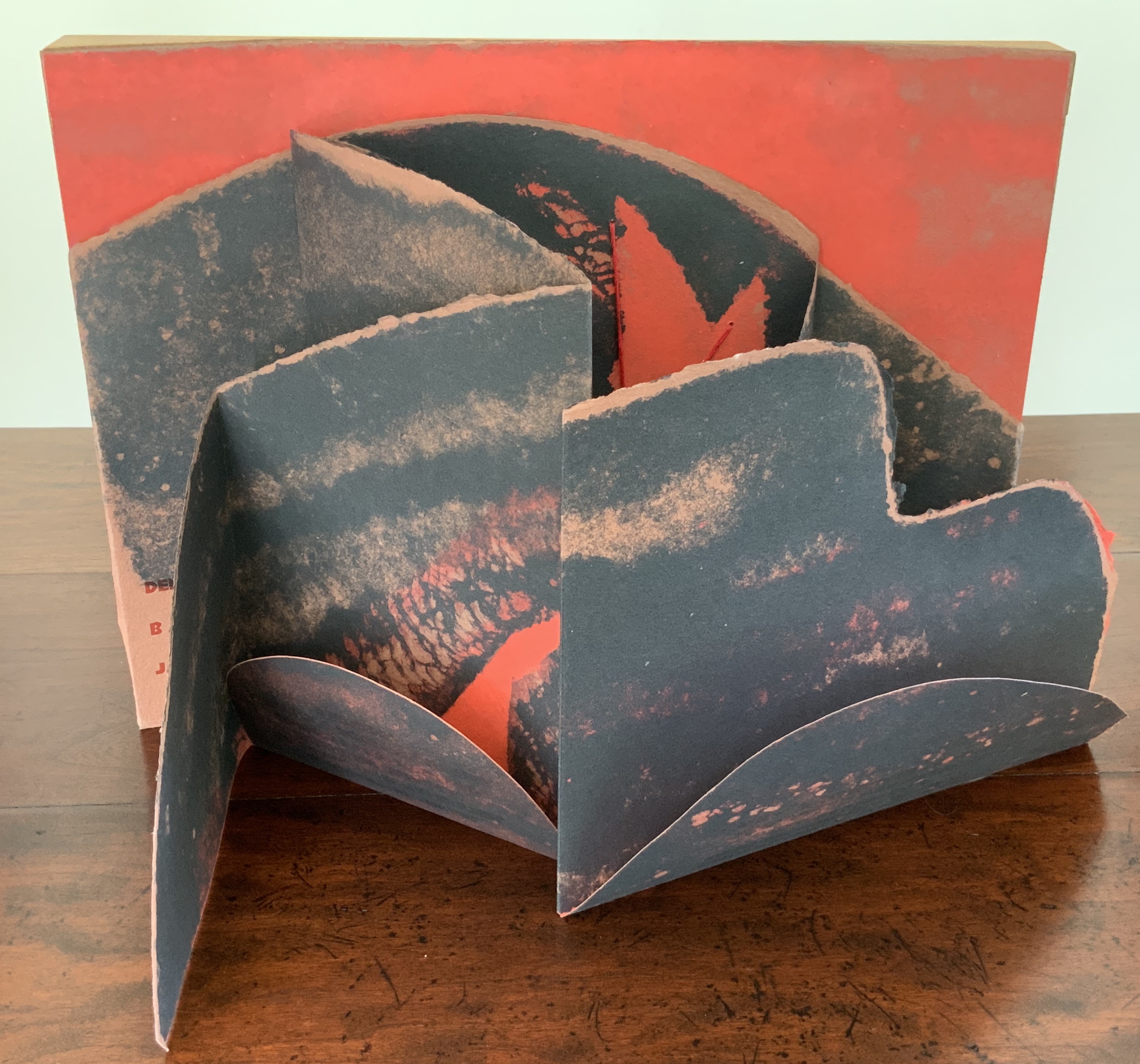
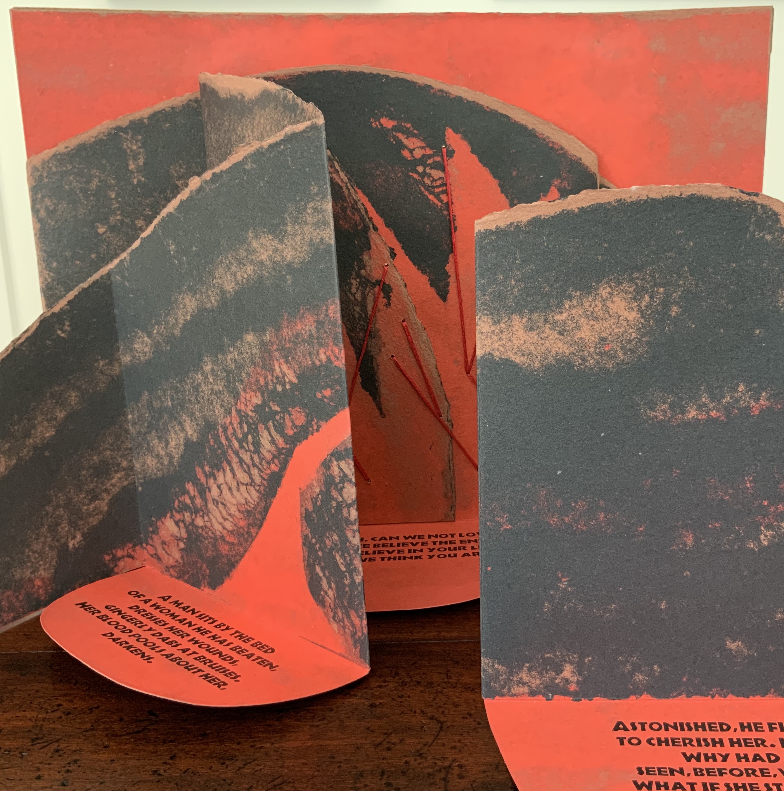
Woven binding with Barcham Green Cairo paper, housed in De Wint paper-covered and lined birch trays. Box: H320 x W274 x D42 mm. Book: H292 x W250 x D28 mm, 44 pages, center pulp-painted pop-up. Edition of 150, of which this is #27. Acquired from Thomas Goldwasser Rare Books, 18 June 2022.
Photos: Books On Books Collection.
Like Woven and Interlocking Book Structures (2002), Tumblr Blocks (1996) and Batterers (1996) below, The Gospel of Mary is an outstanding work of collaboration. Its pulp painting, letterpress, woven binding and layout make this work an important addition to works by Claire Van Vliet in the Books On Books Collection. Van Vliet pulp painted the centerpiece and cover below with Katie MacGregor (Whiting, Maine), who also made the pop-up papers. Andrew Miller-Brown, the Janus Press workshop printer and founder of Plowboy Press, is credited and has signed this copy with Van Vliet. Audrey Holden, who has also signed this copy and worked on Tumbling Blocks, executed the binding. Rosemary Radford Ruether, feminist thelogian, provided the commentary on the text, both of which were typeset with the assistance of Ellen Dorn Levitt, whose collection of book arts projects and teaching materials now resides at the Maryland Institute College of Art.
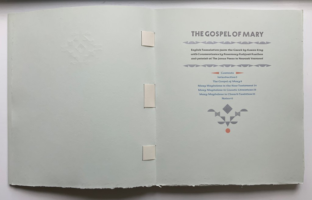
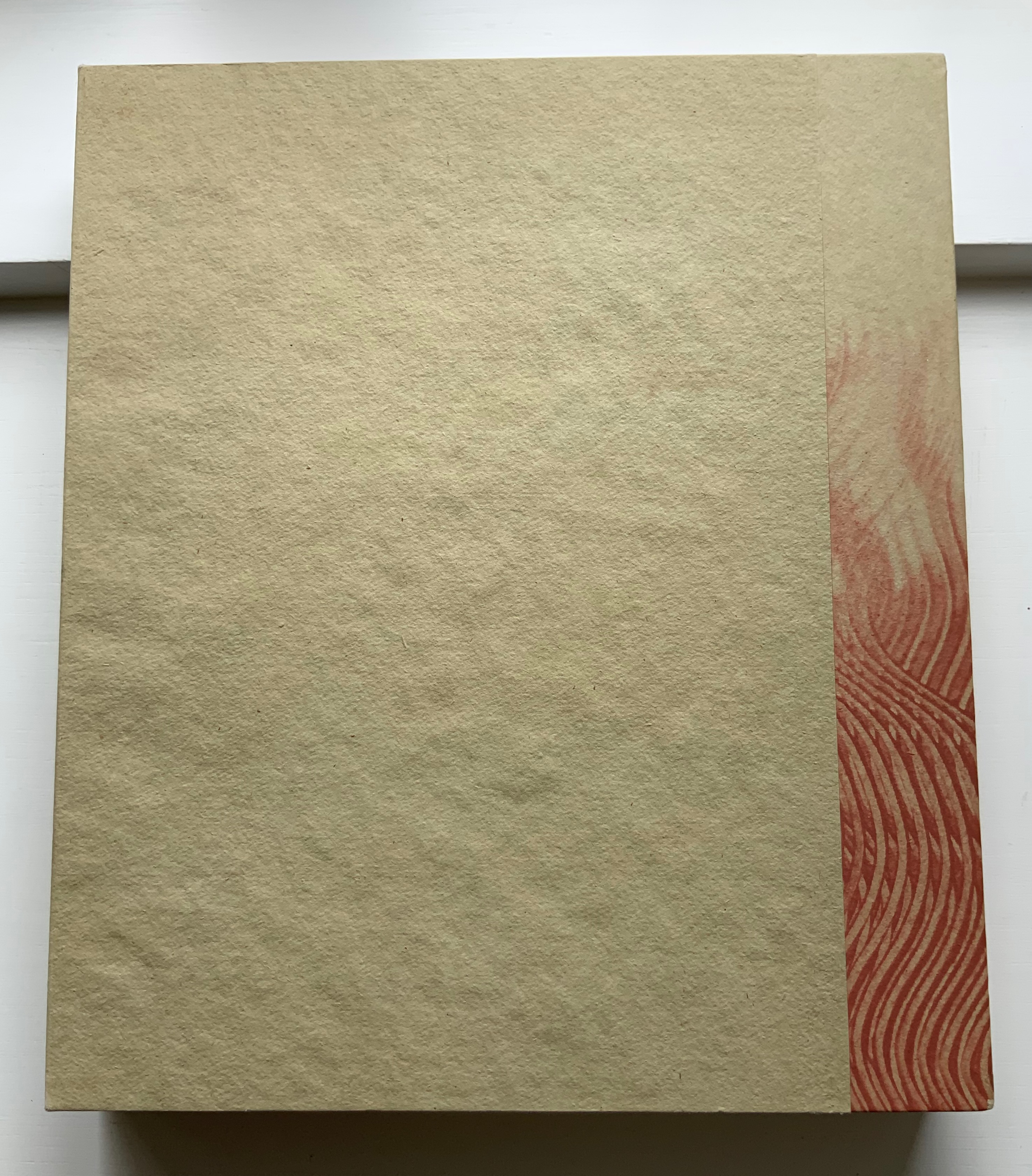
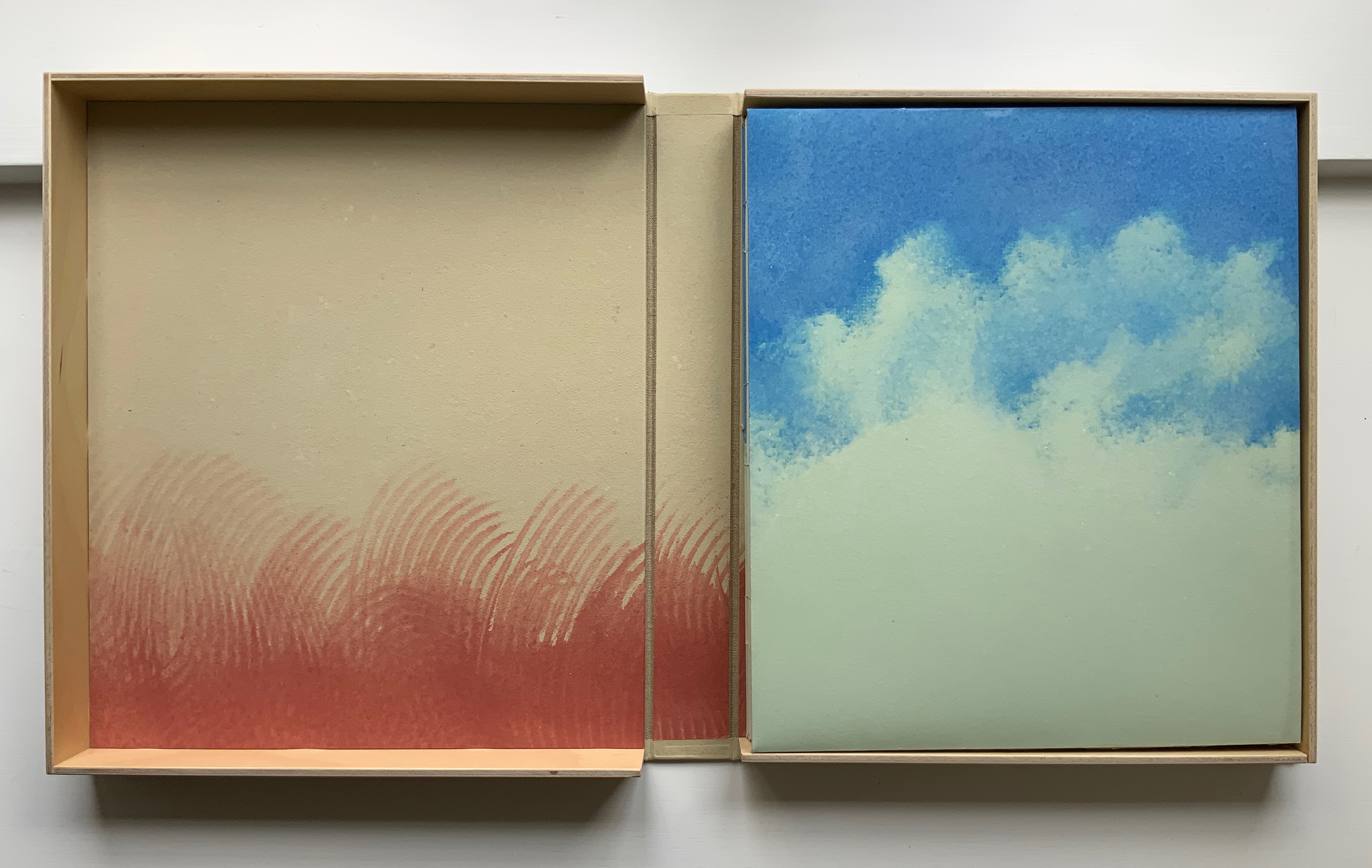
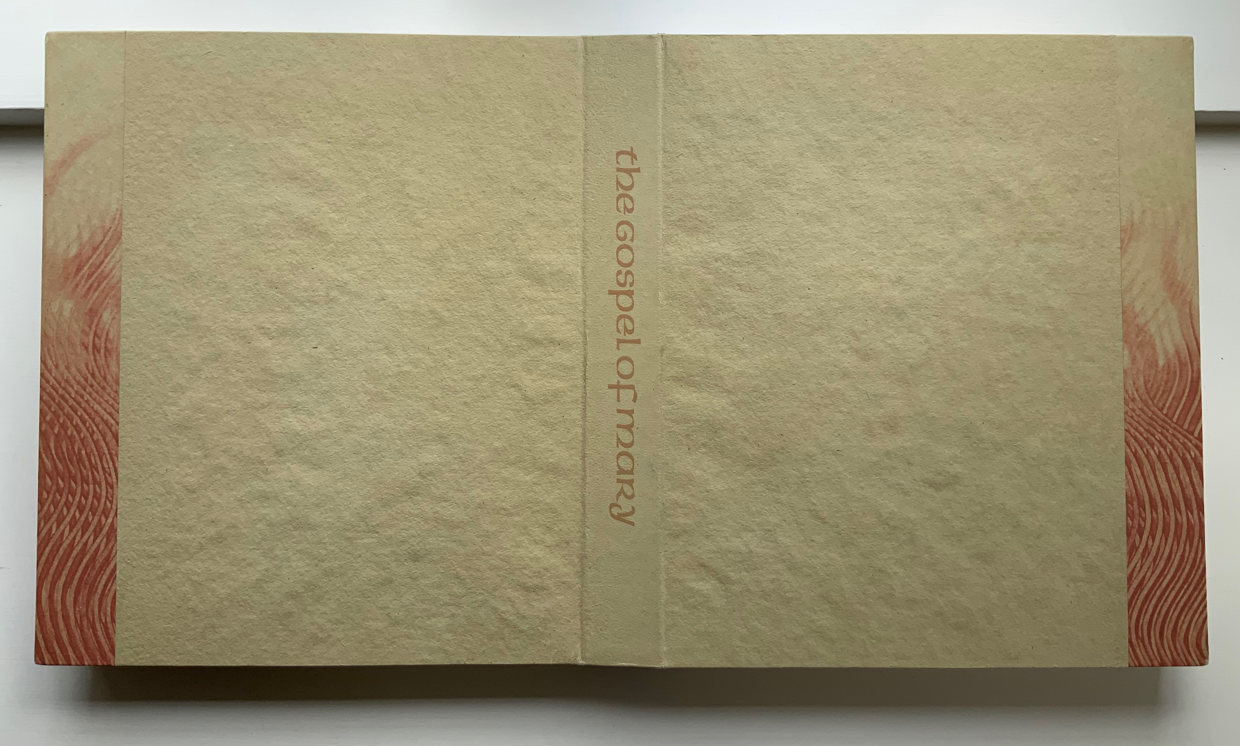
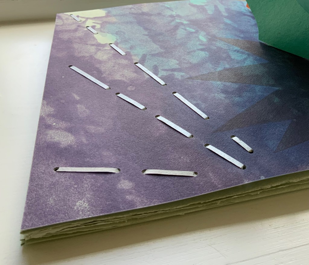
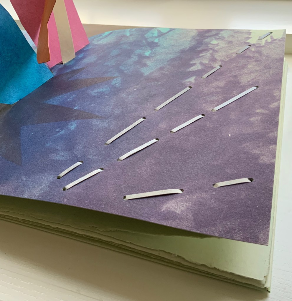
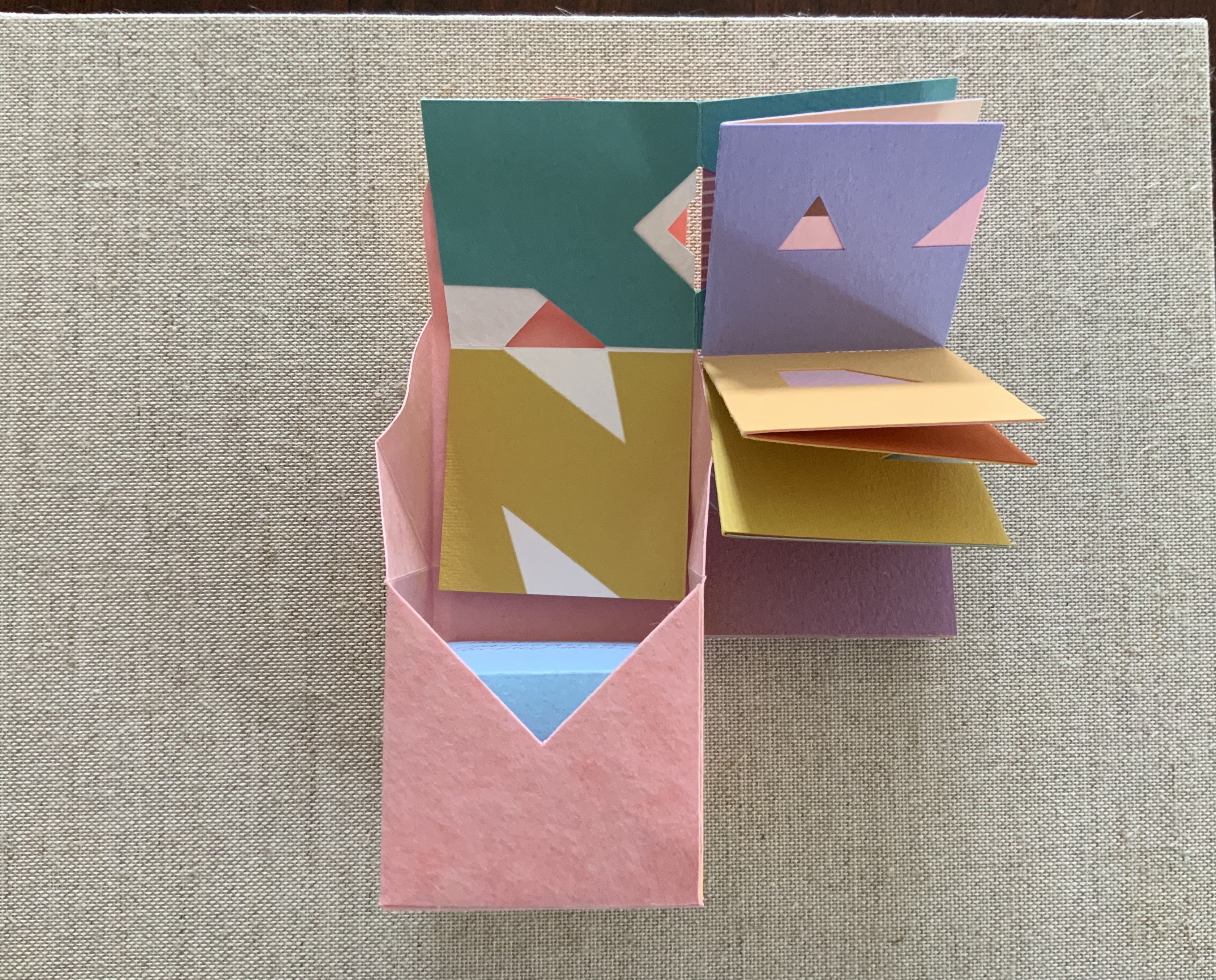
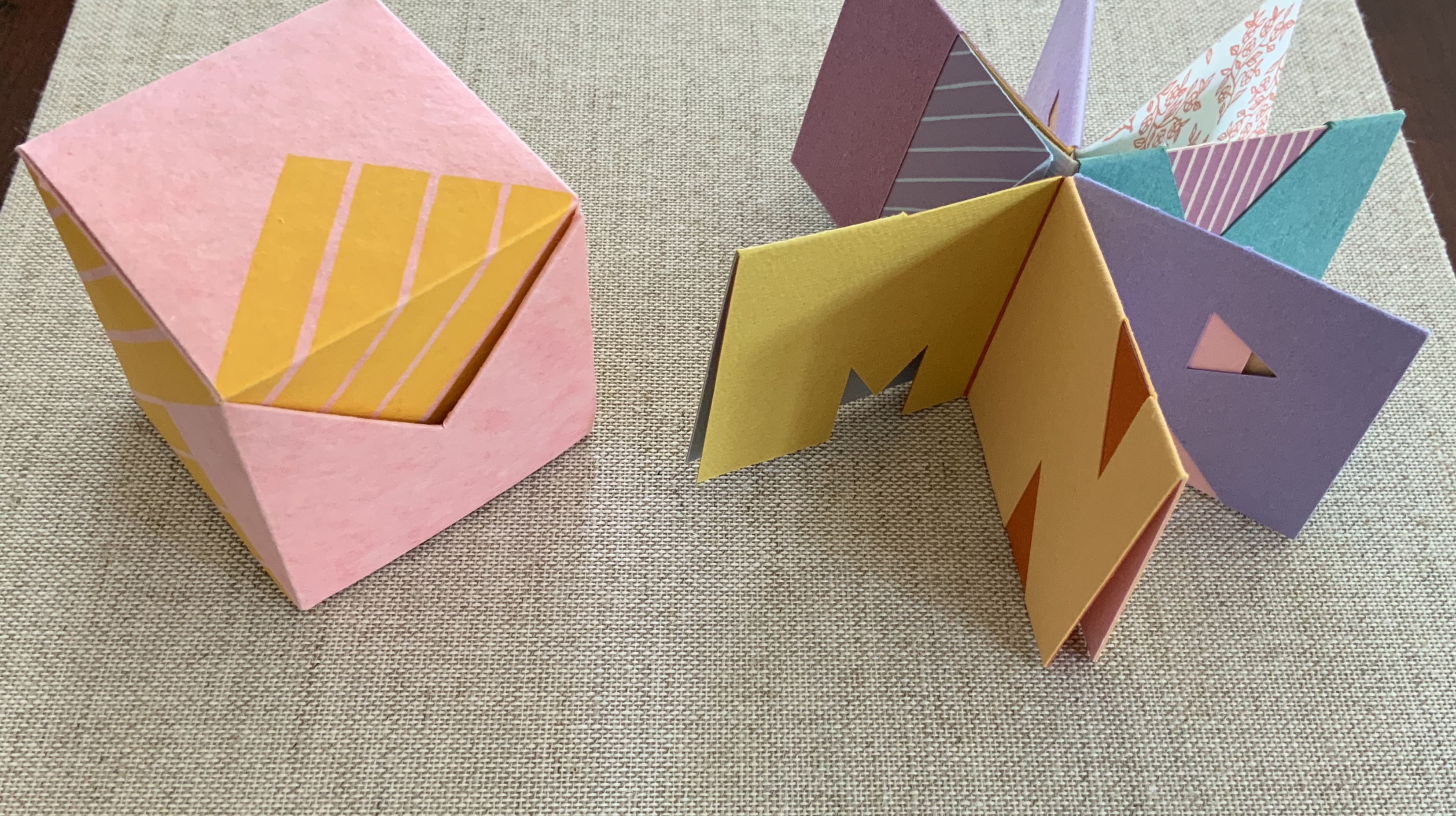
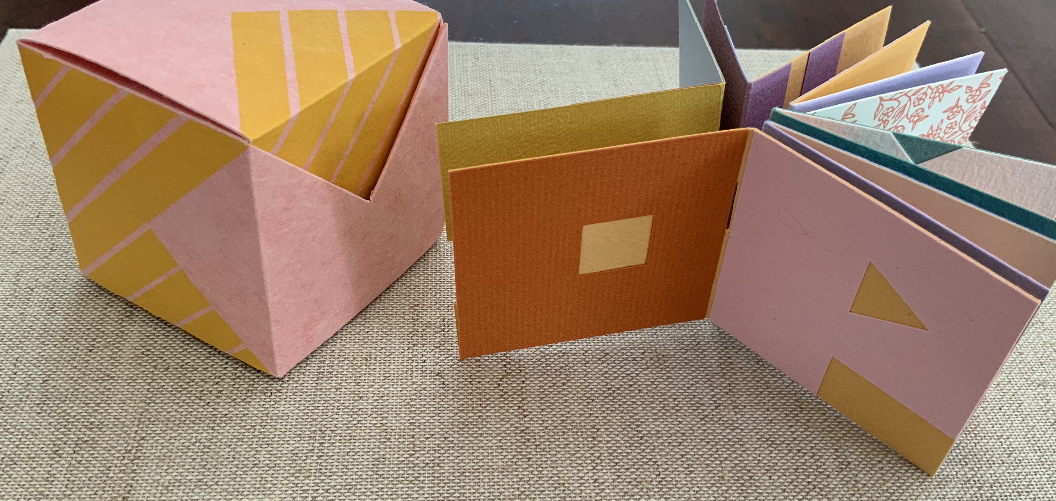
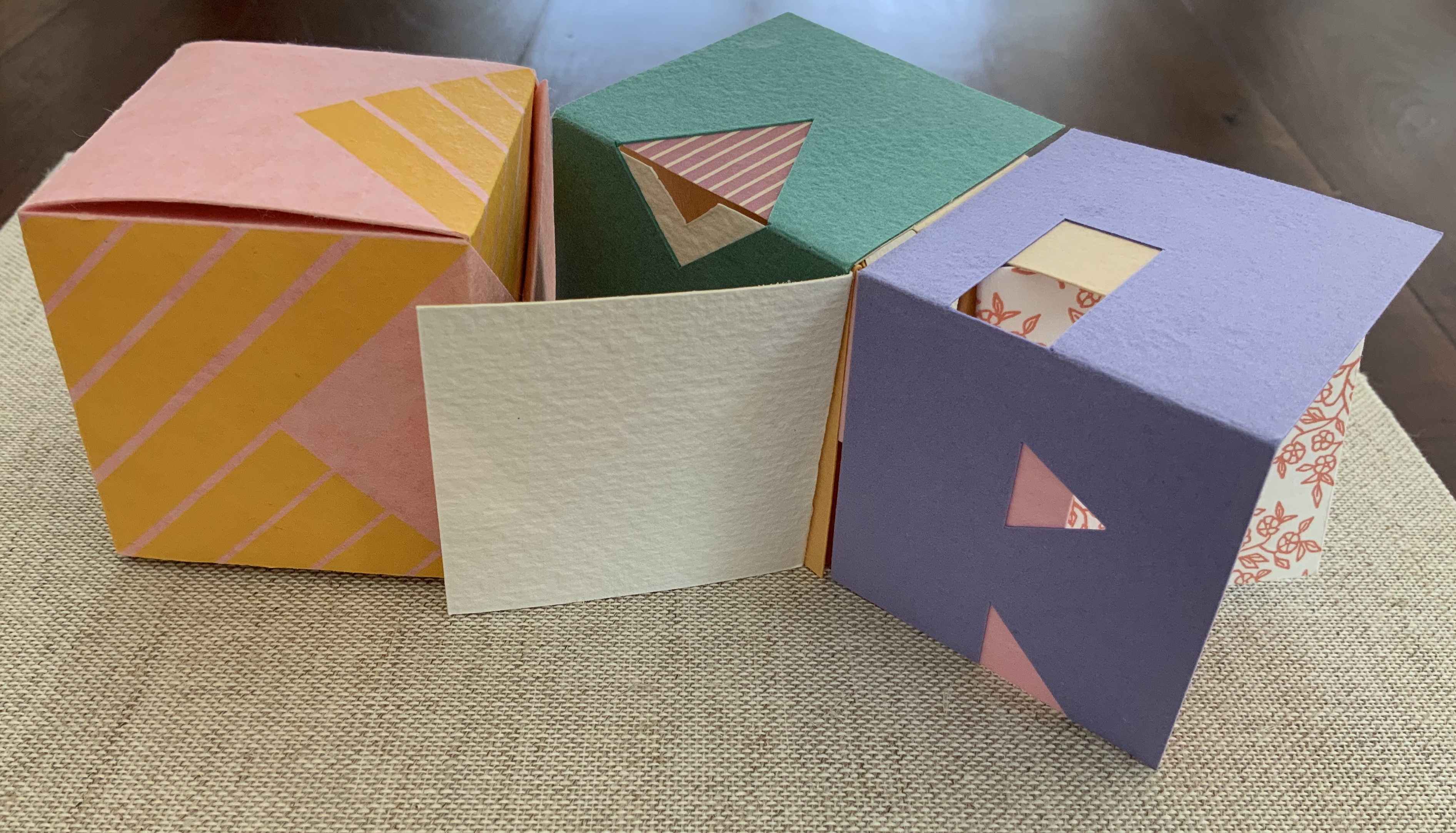
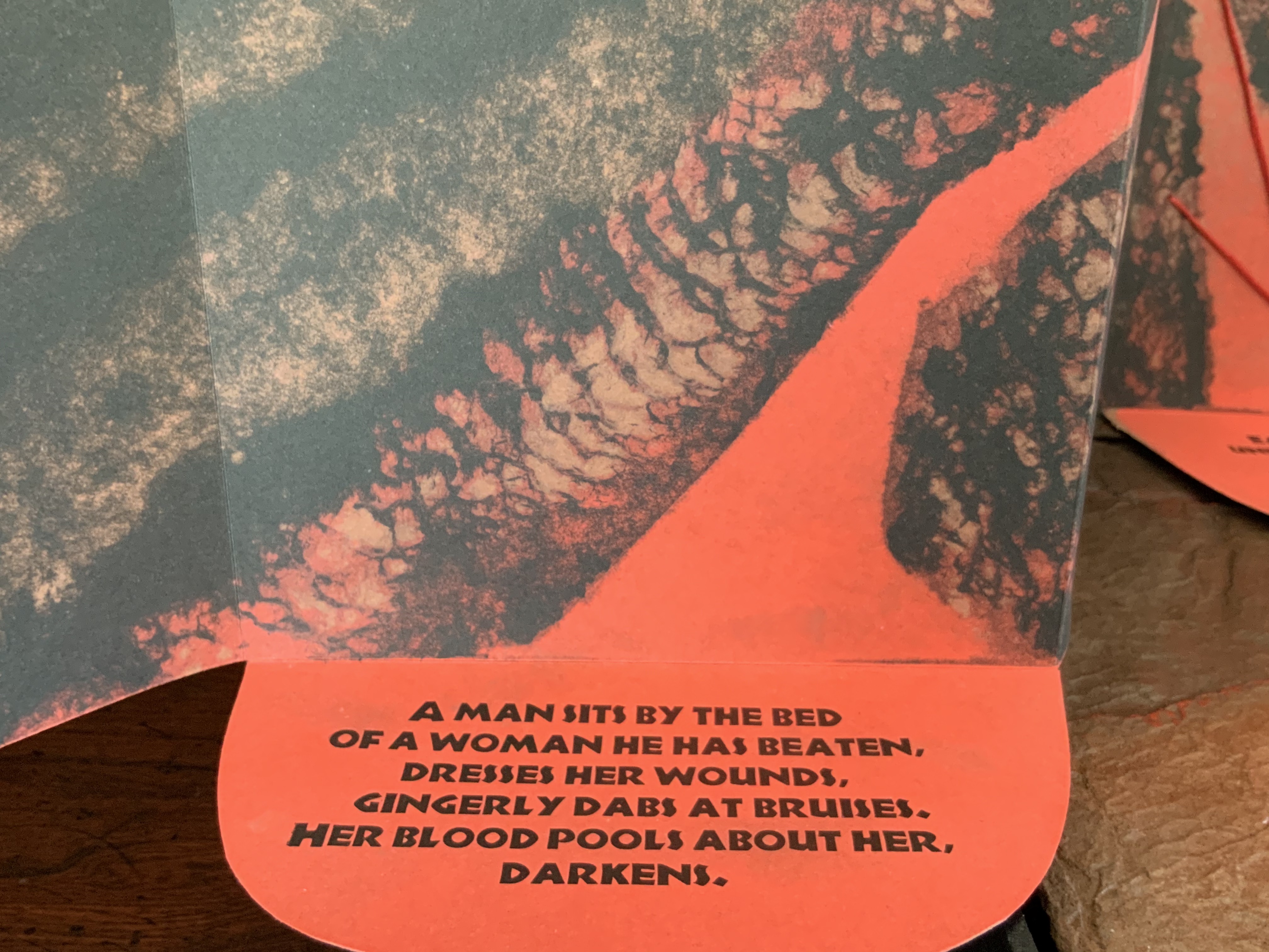
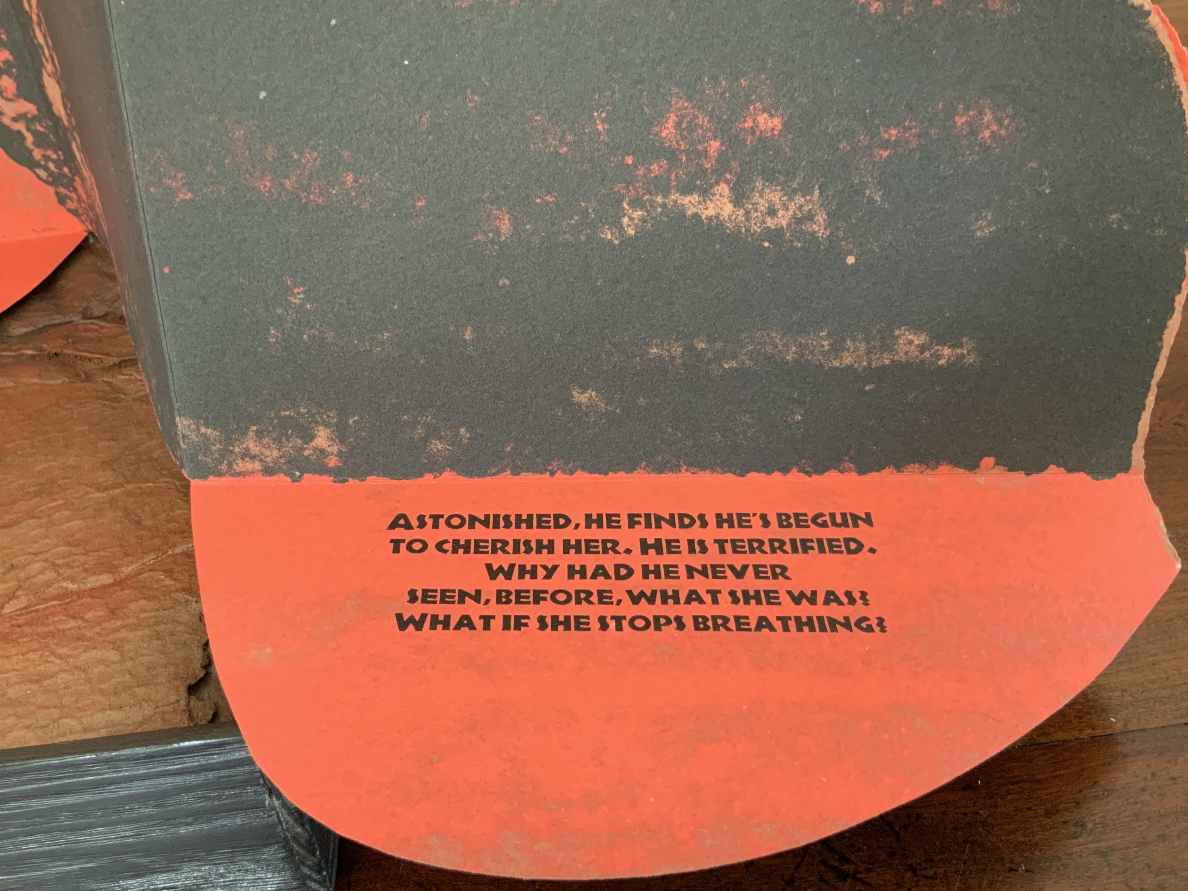
The four photos below provide views of the binding structure and also the layout in which the commentary embraces the gospel text.

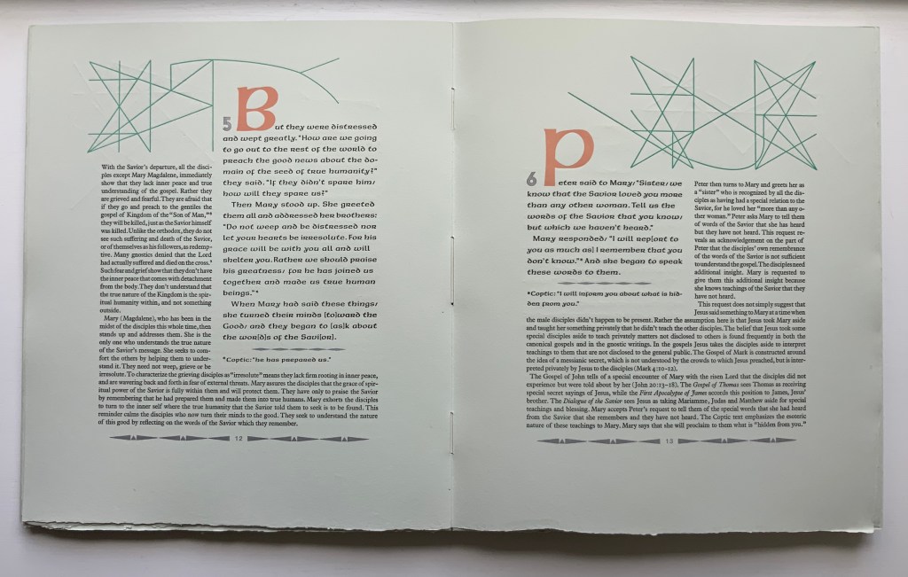
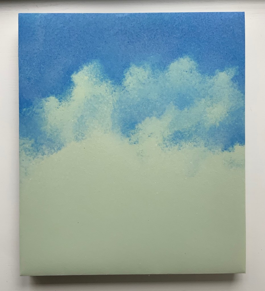
Below, the five-part pulp-painted centerpiece and the silver paper ribbons woven into the double-page spread stand out against the more subtly pulp-painted background. The pop-up echoes the images on the Barcham Green Boxley paper used throughout for the text and commentary (see above).
The size of the work and the way that the printing, paper, pulp painting, layout of text and commentary, pop-up and binding complement one another echo the age of illuminated manuscripts and incunabula. It would make for a rewarding exhibition to juxtapose The Gospel of Mary with several of them.
Additional insights and process photographs can be found on pages 48, 49 and 74 of John Buchtel’s The Art of Paper (see below).
The entries below were previously published on 8 August 2019 and have been moved here.
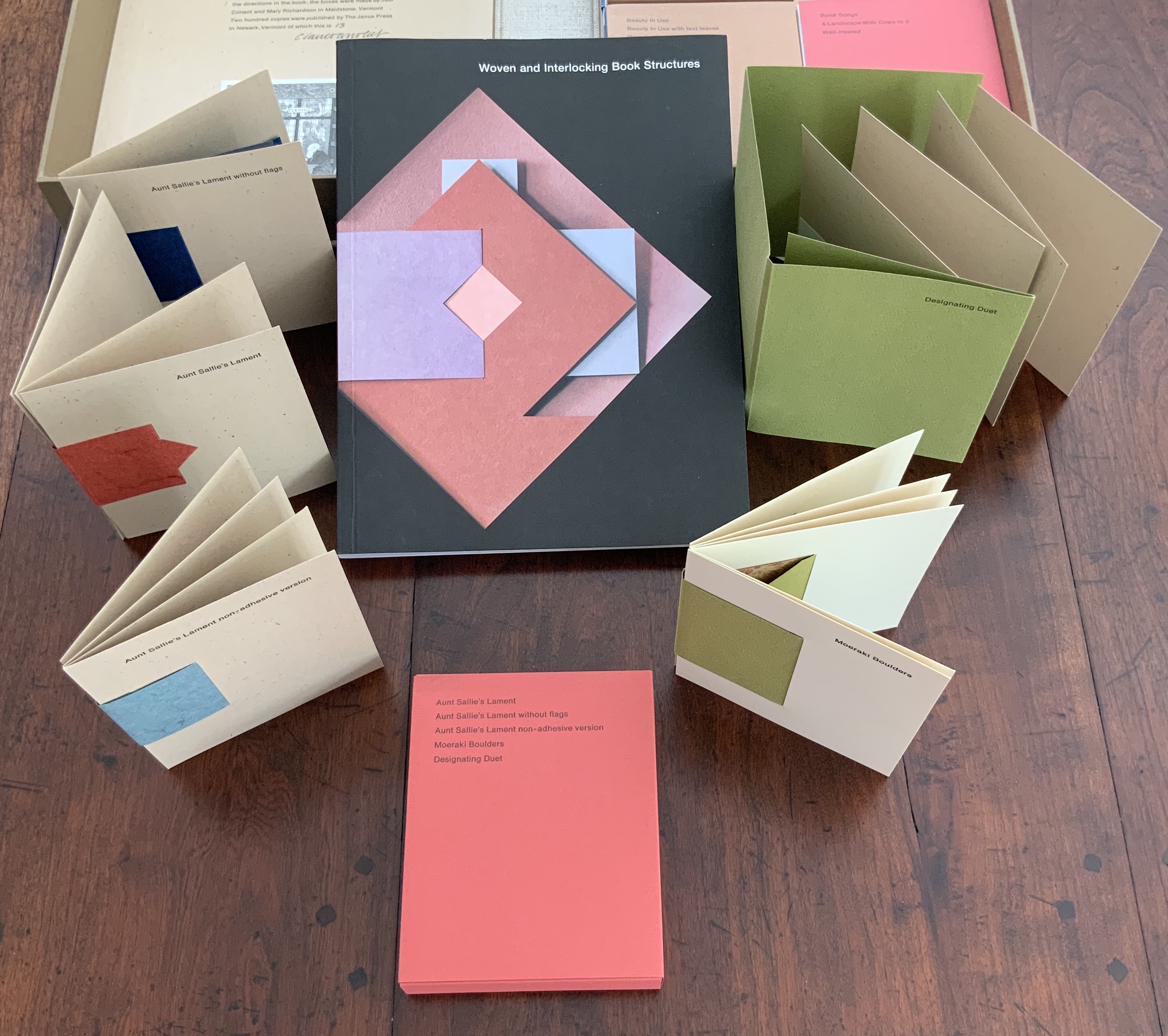
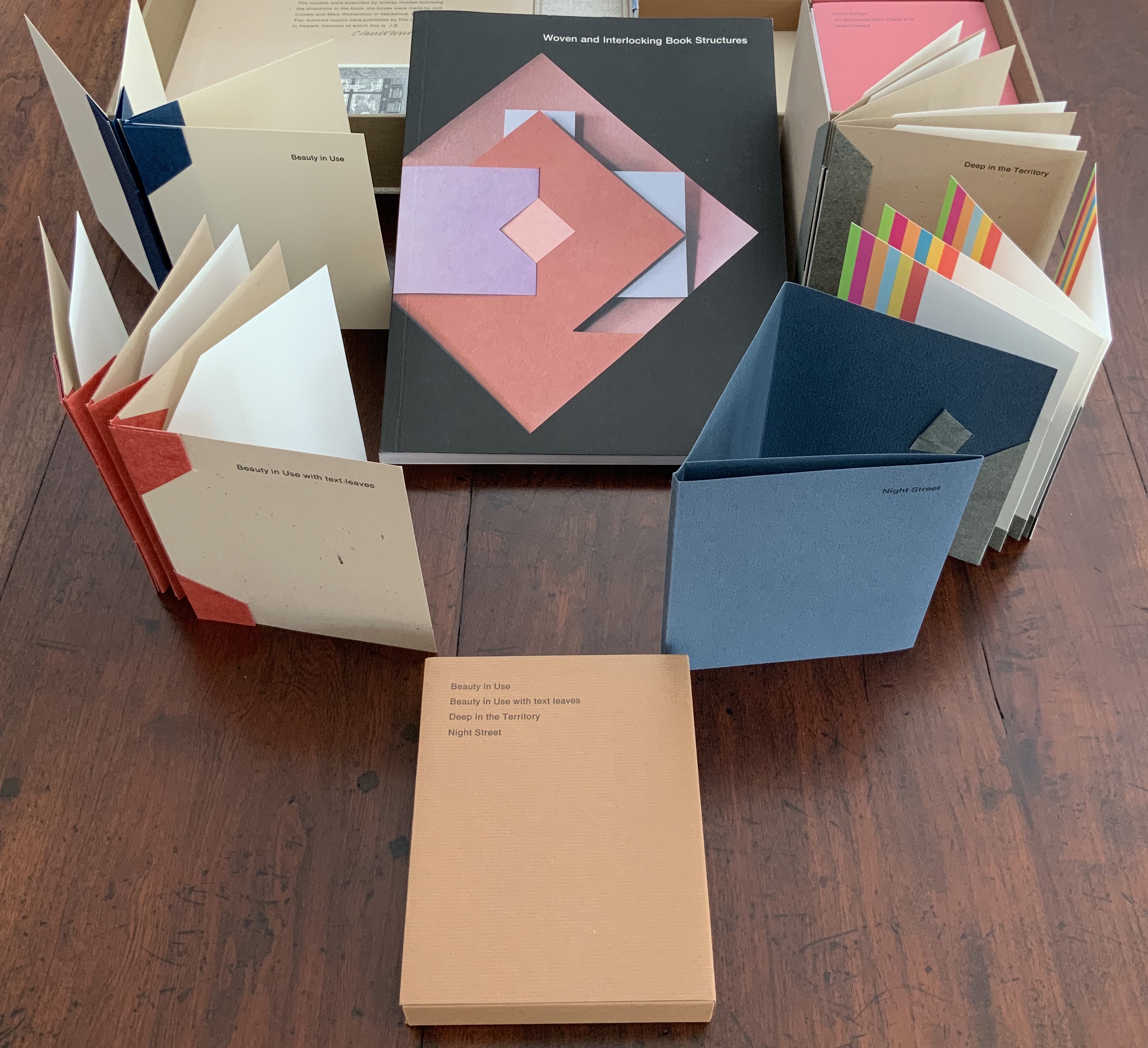
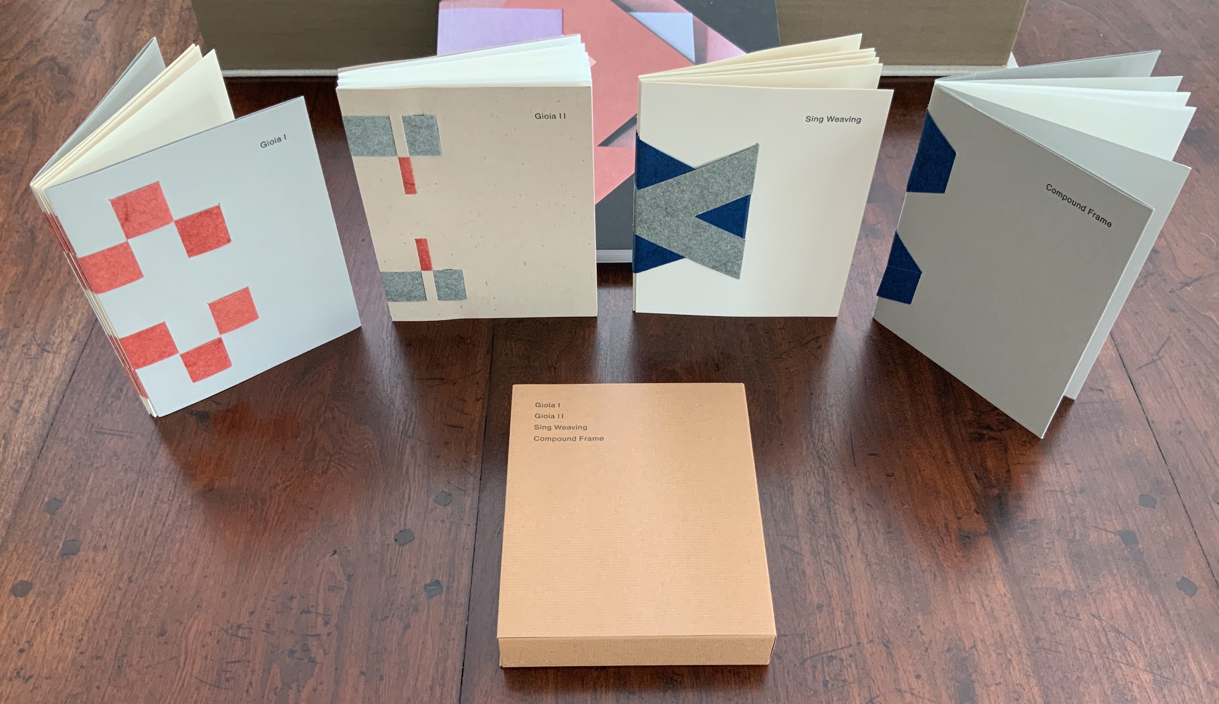
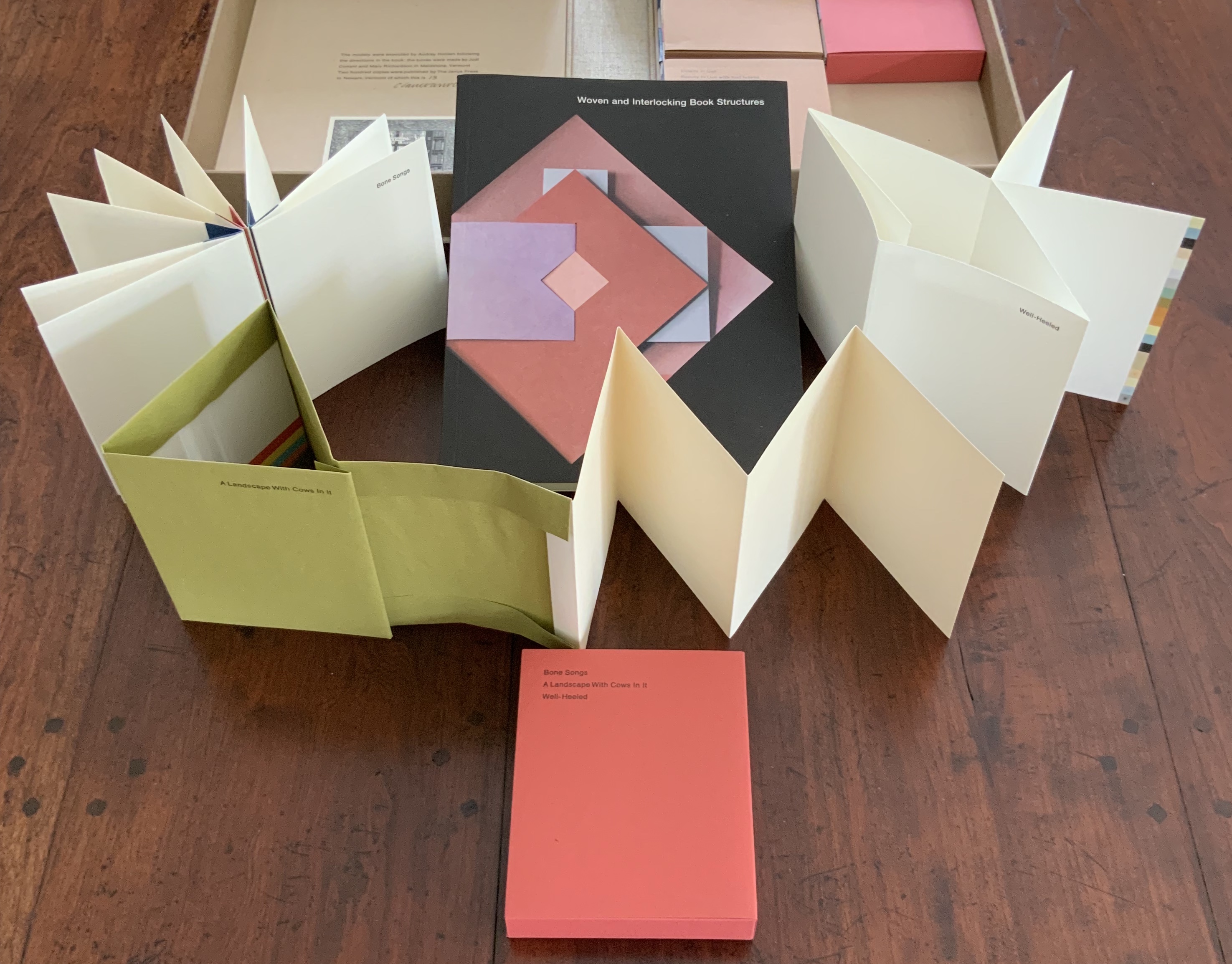
Woven and Interlocking Book Structures (2002)
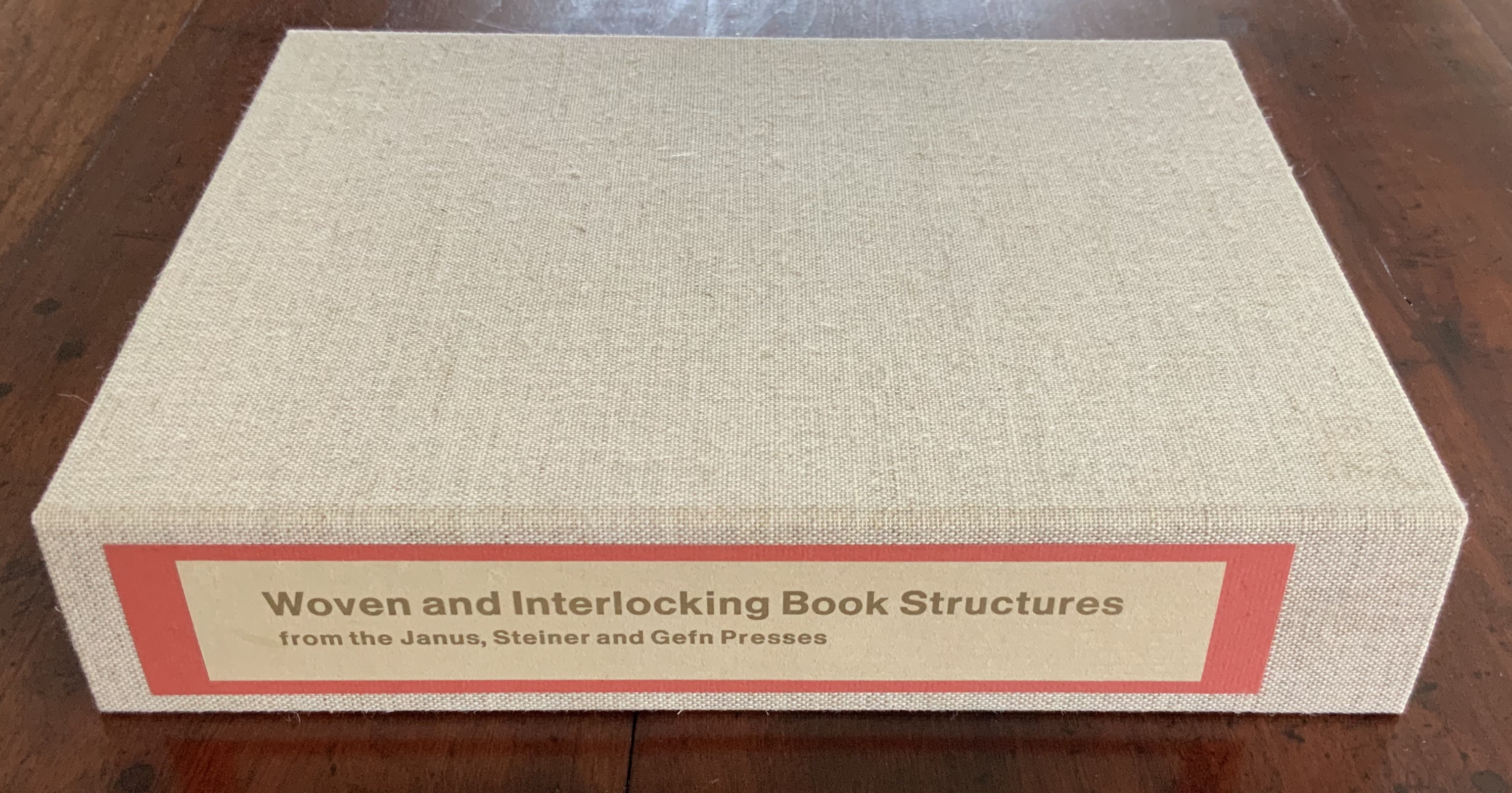
Woven and Interlocking Book Structures (2002)
Claire Van Vliet and Elizabeth Steiner
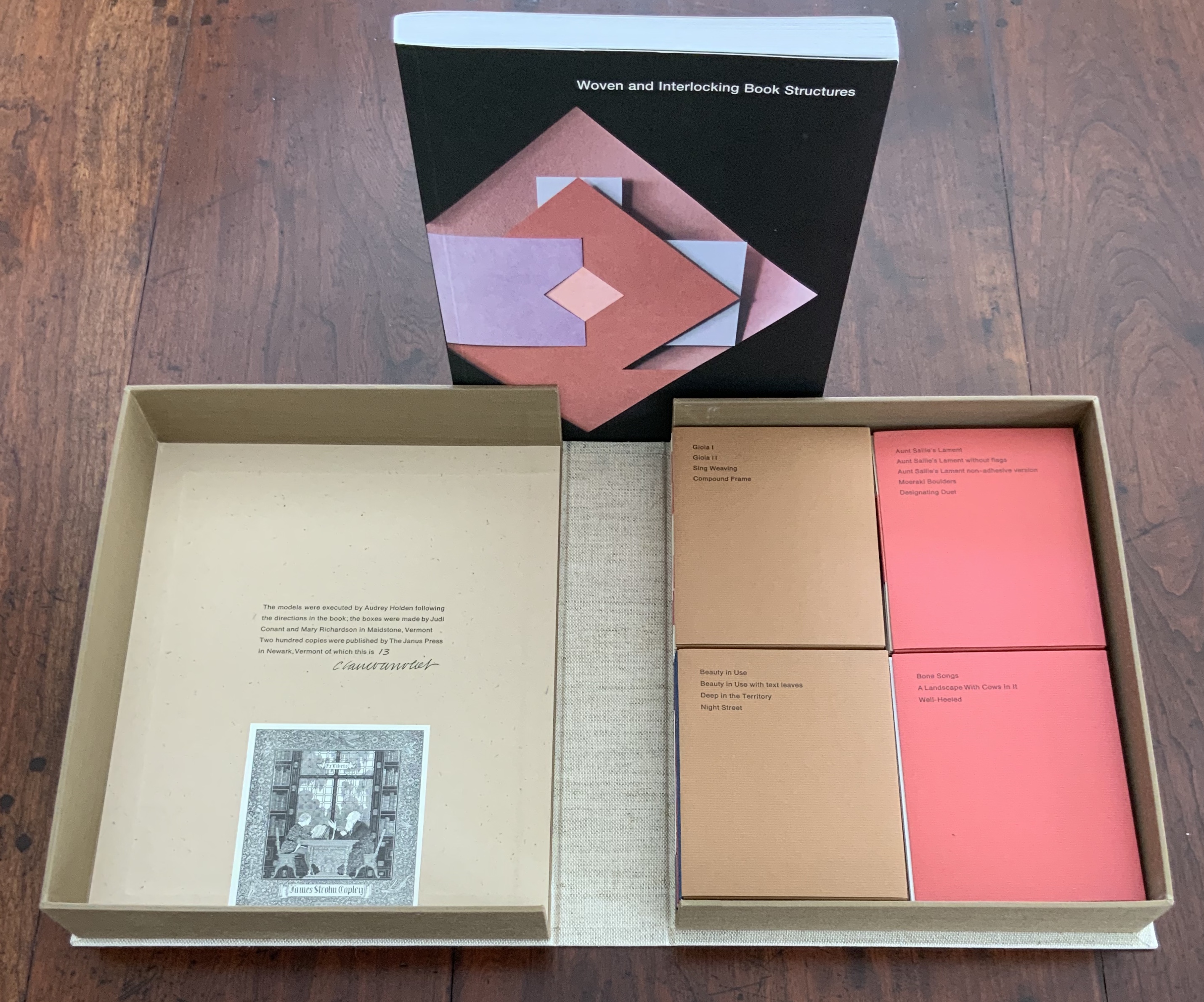
Four slipcases containing 16 book models are enclosed with the book in a cloth-covered clamshell box. Box: H282 x W226 x D55 mm. Slipcases: H128 x W104 mm. Book: H254 x W192 mm, 144 pages. Edition of 200, of which this is #13, signed by Claire Van Vliet. Acquired from James S. Jaffe Rare Books, 1 February 2015. Photos: Books On Books Collection.
The binding models and papers used for them are:
A — Aunt Sallie’s Lament; Aunt Sallie’s Lament without Flags; Aunt Sallie’s Lament non-adhesive version; Moeraki Boulders; Designating Duet. Papers used include Elephant Hide, Fabriano cover and Miliani Ingres, French’s recycled, Marblesmith, Bristol and Saunders laid.
B — Beauty in Use; Beauty in Use with text leaves; Deep in the Territory; Night Street. Papers used include Elephant Hide, French’s recycled, Bristol, Mohawk Superfine and Fabriano cover.
C — Gioia I; Gioia II; Sing Weaving; Compound Frame. Papers used include Elephant Hide, French’s recycled, Bristol, Mohawk Superfine, Linen Index, Neenah UV Columns and Marblesmith.
D — Bone Songs; A Landscape with Cows in It; Well-Heeled. Papers used include Elephant Hide, Mohawk Superfine, Arches laid, and Fabriano text and Miliani Ingres.
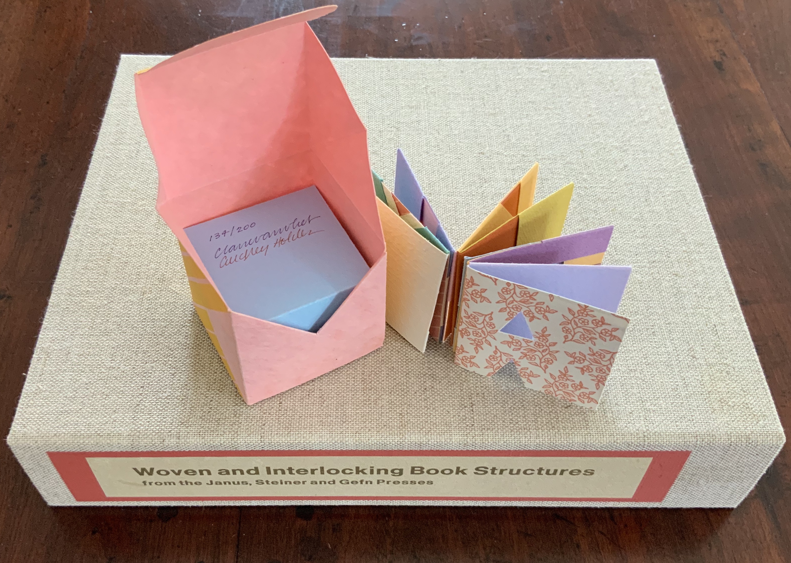
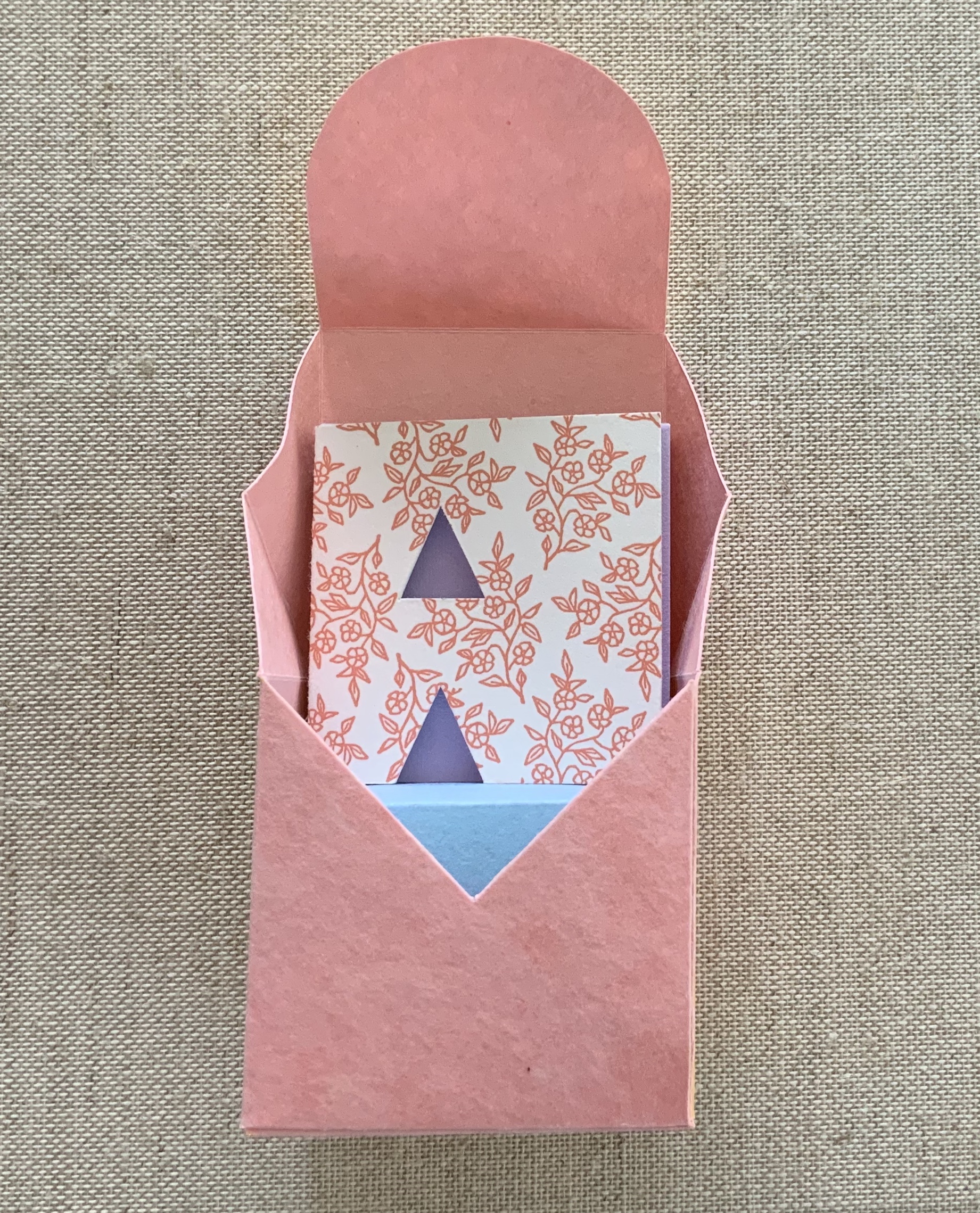
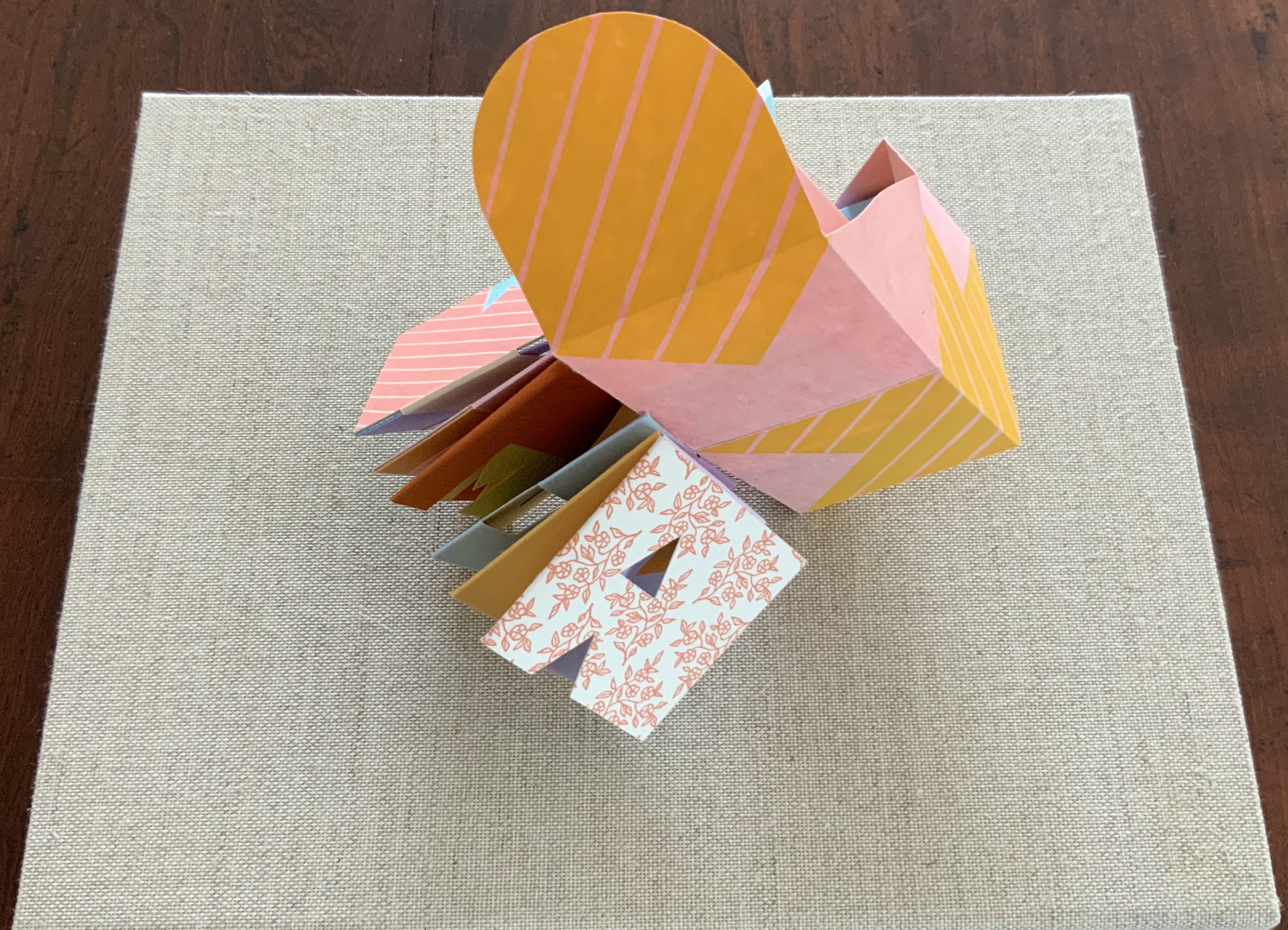
Tumbling Blocks for Pris and Bruce (1996)
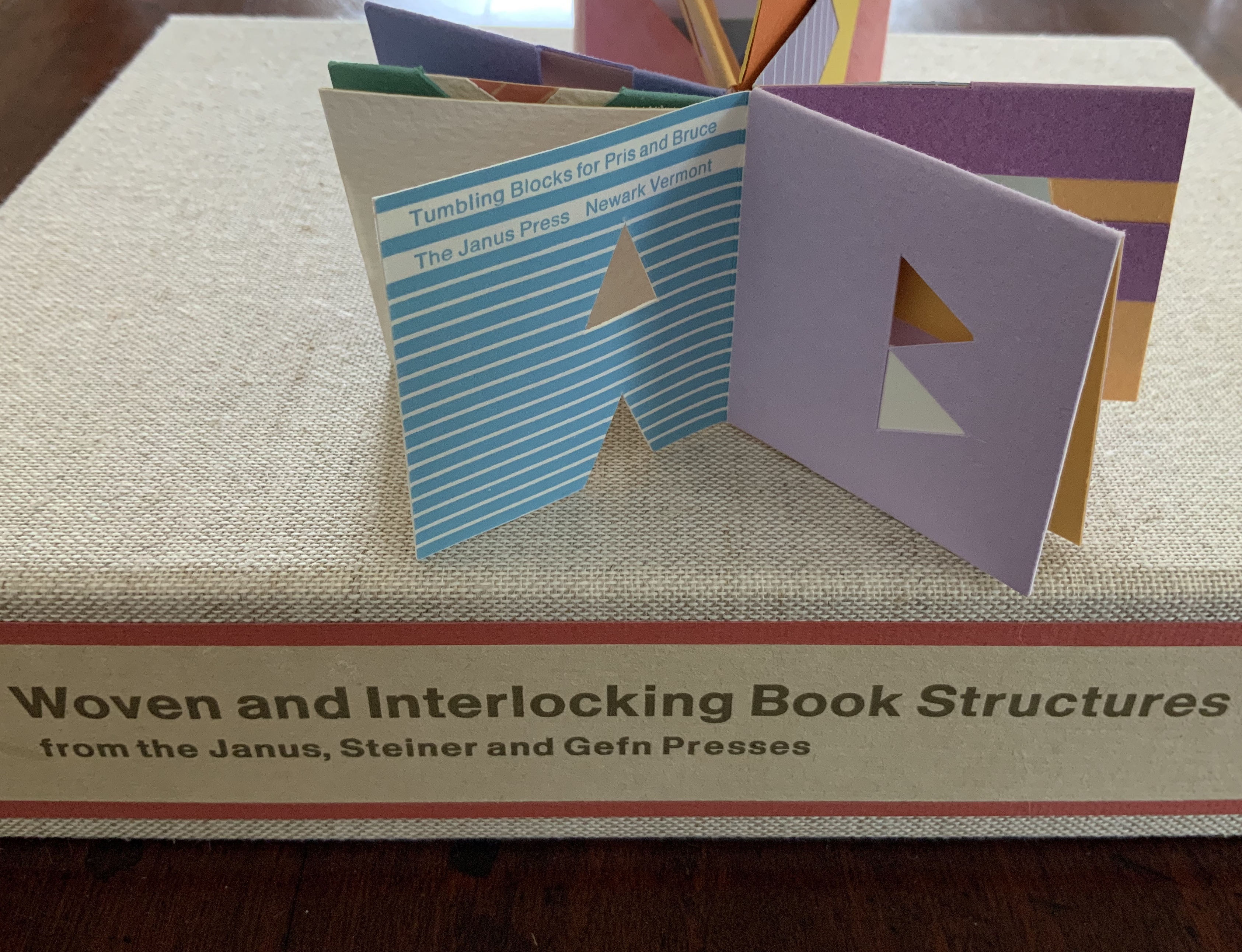
Tumbling Blocks for Pris and Bruce (1996)
Claire Van Vliet and Audrey Holden
Paper cube issued in a non-adhesive paper box housed in a clear plastic box. 58 x 58 x 58 mm. Edition of 200, of which this is #134. Acquired from Abecedarian Gallery, 21 July 2019.
Photos: Books On Books Collection.
Working with offcuts from Praise Basted In: A Friendship Quilt for Aunt Sallie (1995), Van Vliet and Audrey Holden cut pairs of letters of the alphabet and glued them back to back. These constitute the cube-book’s leaves, which are folded and glued to permit the book to open into a variety of shapes. Gently tossed from hand to hand, the book will resume its cube shape. “Pris and Bruce” are the Hubbards, Janus Press patrons.
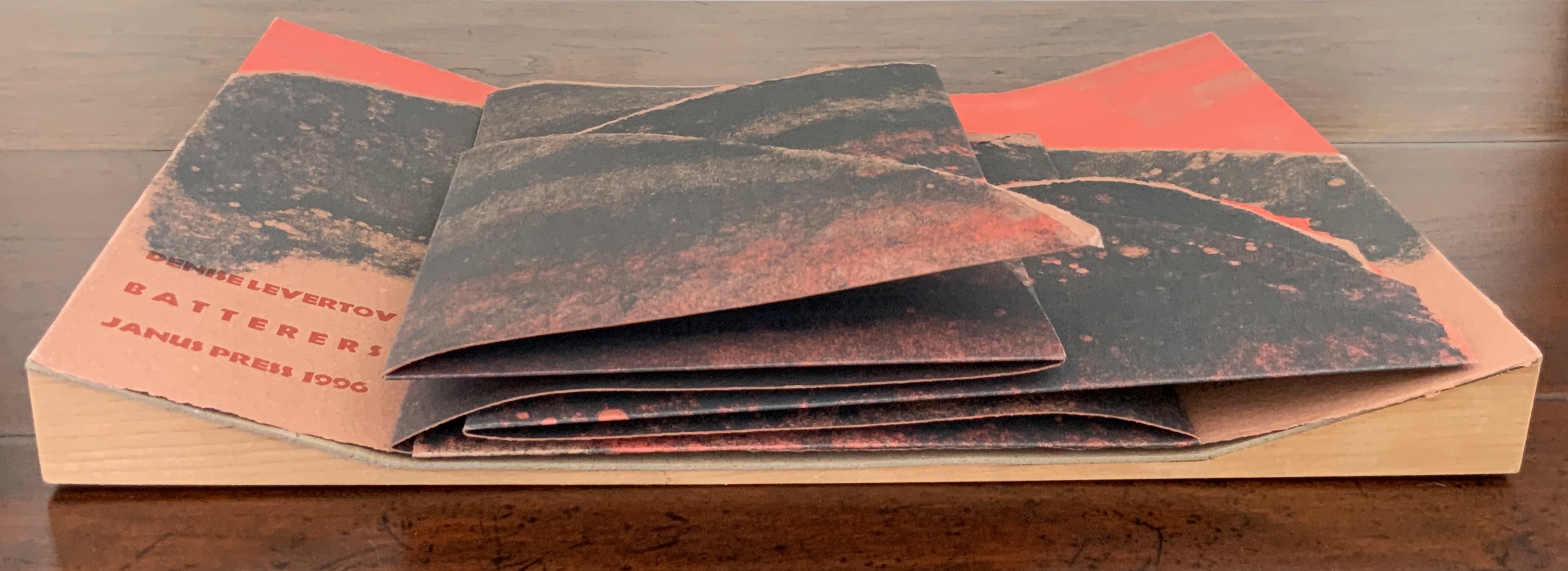
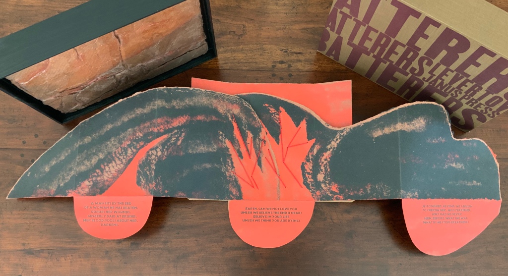
Batterers (1996)

Batterers (1996)
Denise Levertov, Kathryn Lipke Vigesaa and Claire Van Vliet
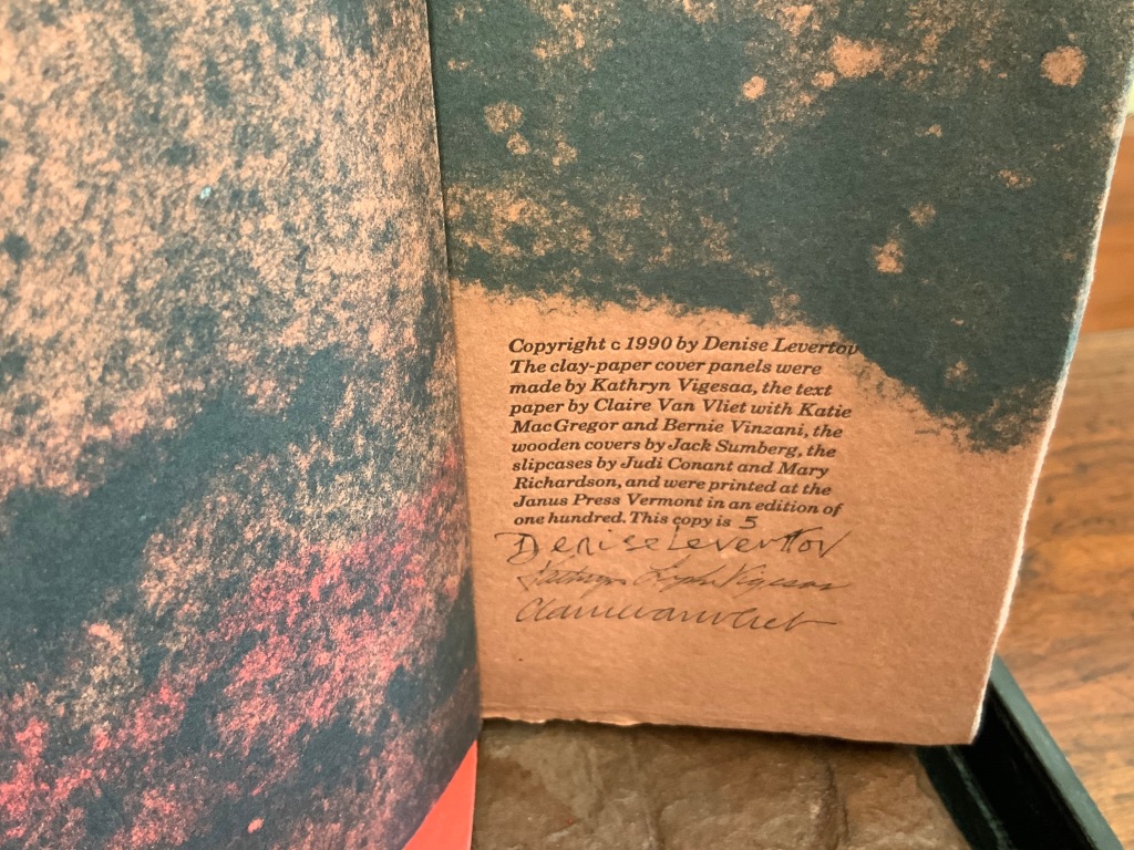
Slipcase: H307 x W387 x D73 mm; Tray: H296 x W380 x D61 mm; Accordion: H270 x W356 x D33 (closed), H270 x W1115 mm (open). Edition of 500, of which this is #5, signed. Acquired from Van Vliet via Vamp & Tramp, 17 July 2020.
What is remarkable about this sculptural book is its fusion of collaborators’ efforts, of art forms, and of text, materials, techniques and structures.
In the late 1980s, Claire Van Vliet and Kathryn Lipke (née Vigesaa) were seeking a collaborative project. After Van Vliet spotted Denise Levertov’s poem “Batterers” in the American Poetry Review (1990:6), they agreed that the poem, which enfolds our abuse of the earth within a metaphor of domestic abuse, was the appropriate text to join somehow with Lipke’s series of structural artworks called Earthskins.
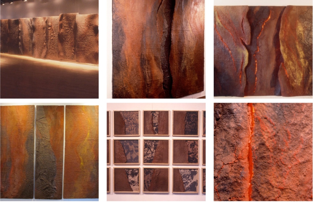
Earthskins (1988-96)
Kathryn Lipke (Vigesaa)
Installation views of the works created from paper pulp, clay and pigments; some reaching 69 feet in length. Photos: Courtesy of the artist.
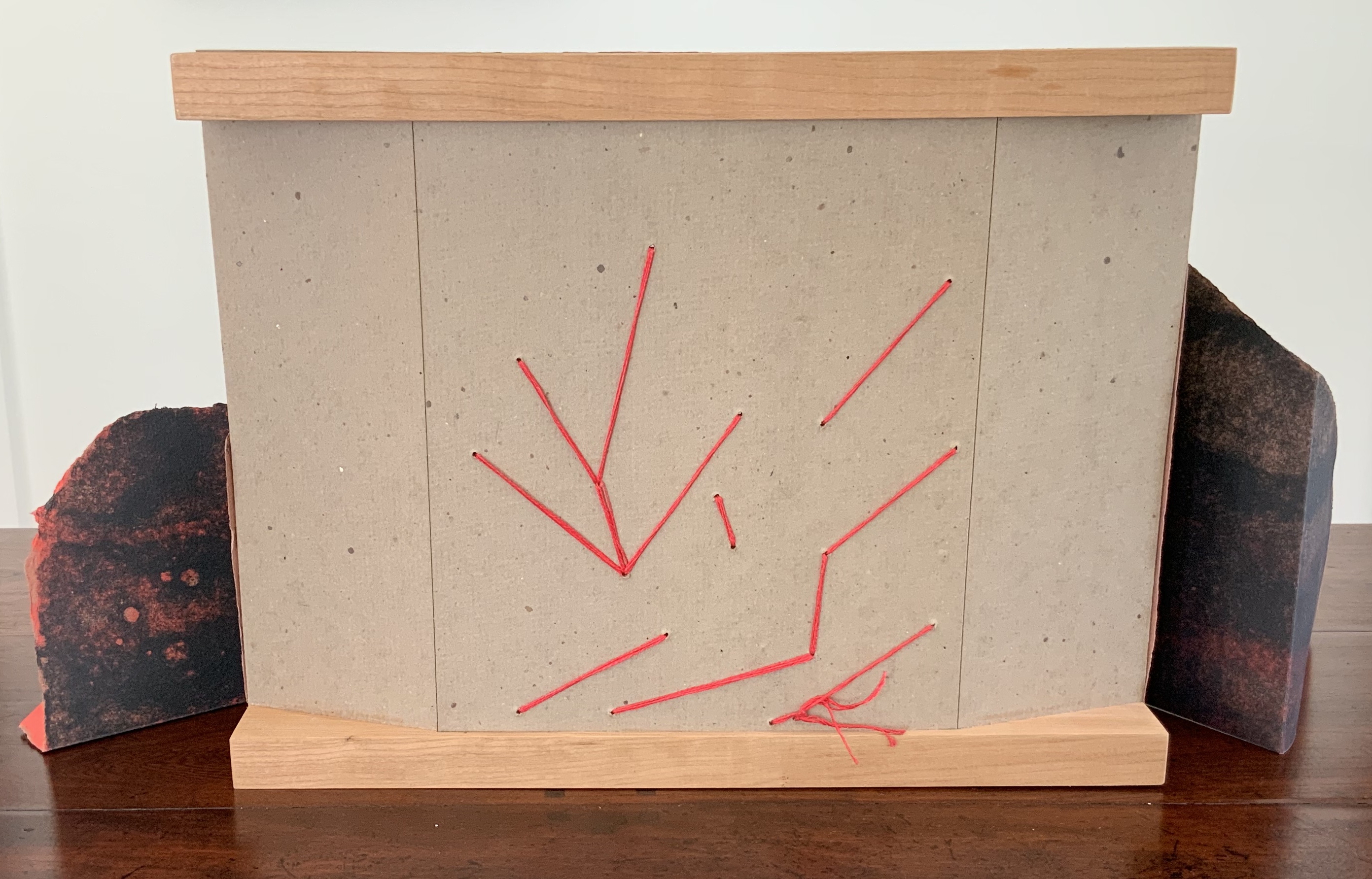
When letterpress printers consider the reproduction of a short poem, the broadside is the most common art form adopted. Van Vliet’s adoption of it is anything but common. Instead, she has orchestrated a combination of structures and art forms. From the maroon-printed, brown linen slipcase slides a tray made of tamarack wood to which Lipke’s vacuum-formed panel of clay mixed with paper is fixed. As the black tray is lifted, layers of multi-folded paper attached to a backing appear.
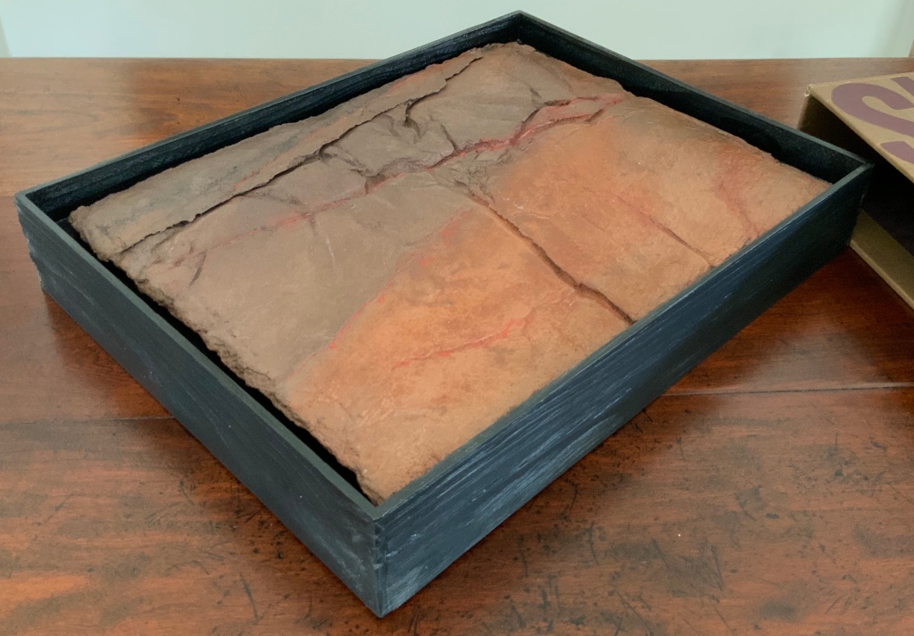
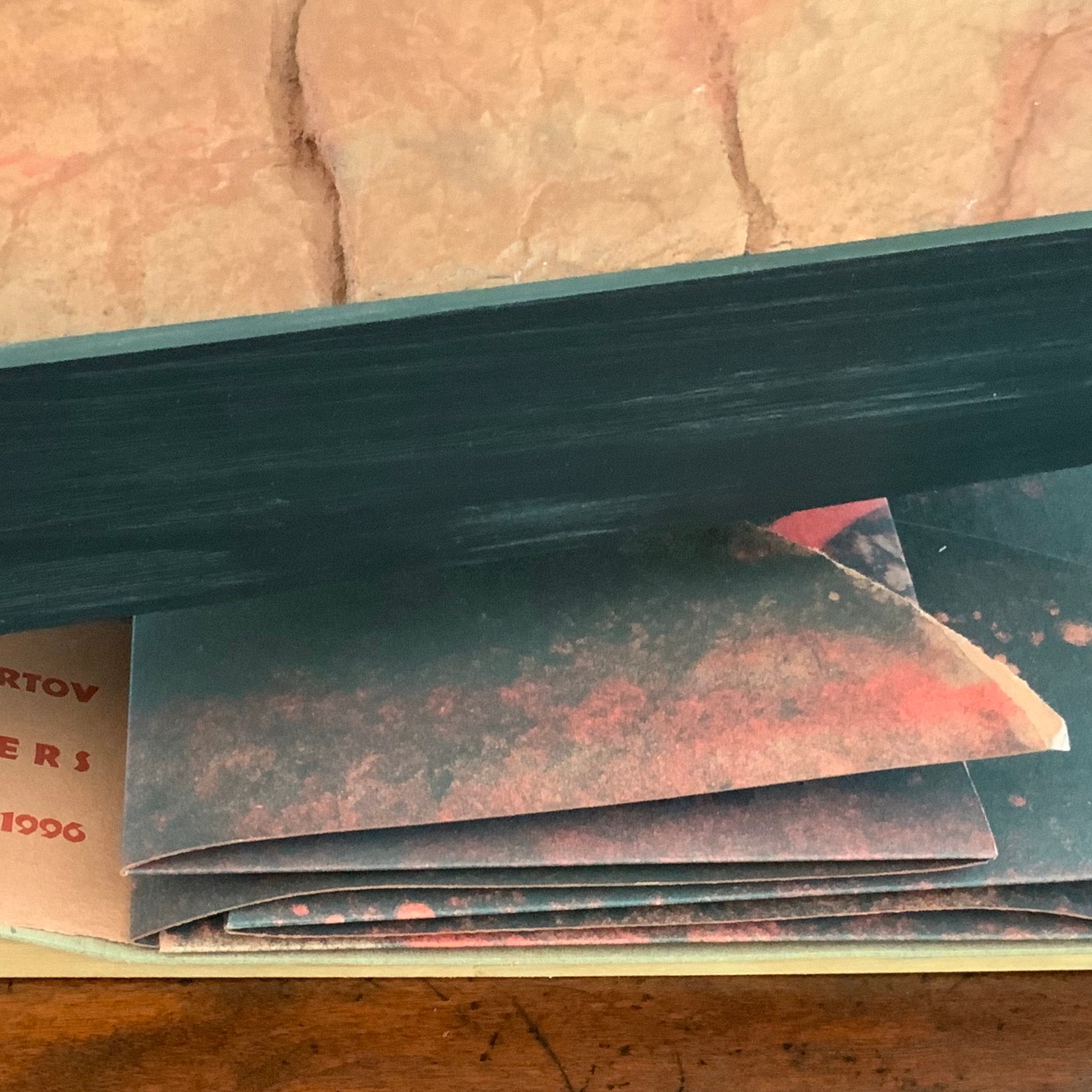
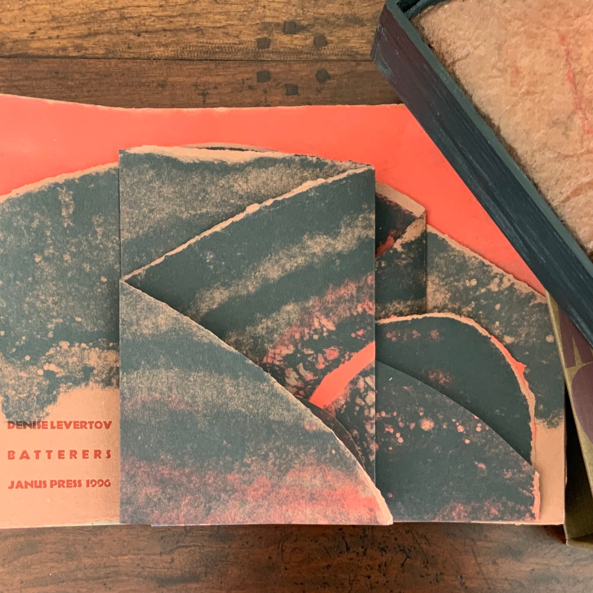
The top two layers are glued and sewn with multi-stranded red thread to the third and bottom layer, displaying the names of the author, work and Van Vliet’s press. The bottom layer is glued to a backing of three strong card panels tightly glued to two wood runners, sawn or routered into a slight U shape.
As the top layer is unfolded by pulling it apart, left and right, three tabs drop down to reveal Levertov’s poem.
Van Vliet’s combination of structures and forms offers multiple orders in which to read the poem, which pleased Levertov because she liked the poem in both the stanzaic orders of 1-2-3 and 1-3-2 (correspondence with Kathryn Lipke and Claire Van Vliet, 20 July 2020). In a book-like way, the covering tray slides from its slipcover, the cover is removed, and the accordion pages unfold to be read left panel first, right panel second and center panel third, emphasizing the embedded and central metaphor.

Spread fully open, the structure assumes a single-sheet broadside form, and the “center” stanza moves from third to second in order. But there is a third order of reading, as it were. The broadside form “leans” into the art forms of print, painting and bas-relief sculpture. The text, images and design become a whole experience, an object to be taken in as a whole.
Photos: Books On Books Collection.
Not only in form does Batterers “lean” into the form of painting: the imagery and colors arise from the technique of pulp painting, a technique defined by the work of Marius Péraudeau in the mid-twentieth century. Pat Gentenaar’s still life Water Dragon in this collection provides another example of the technique.
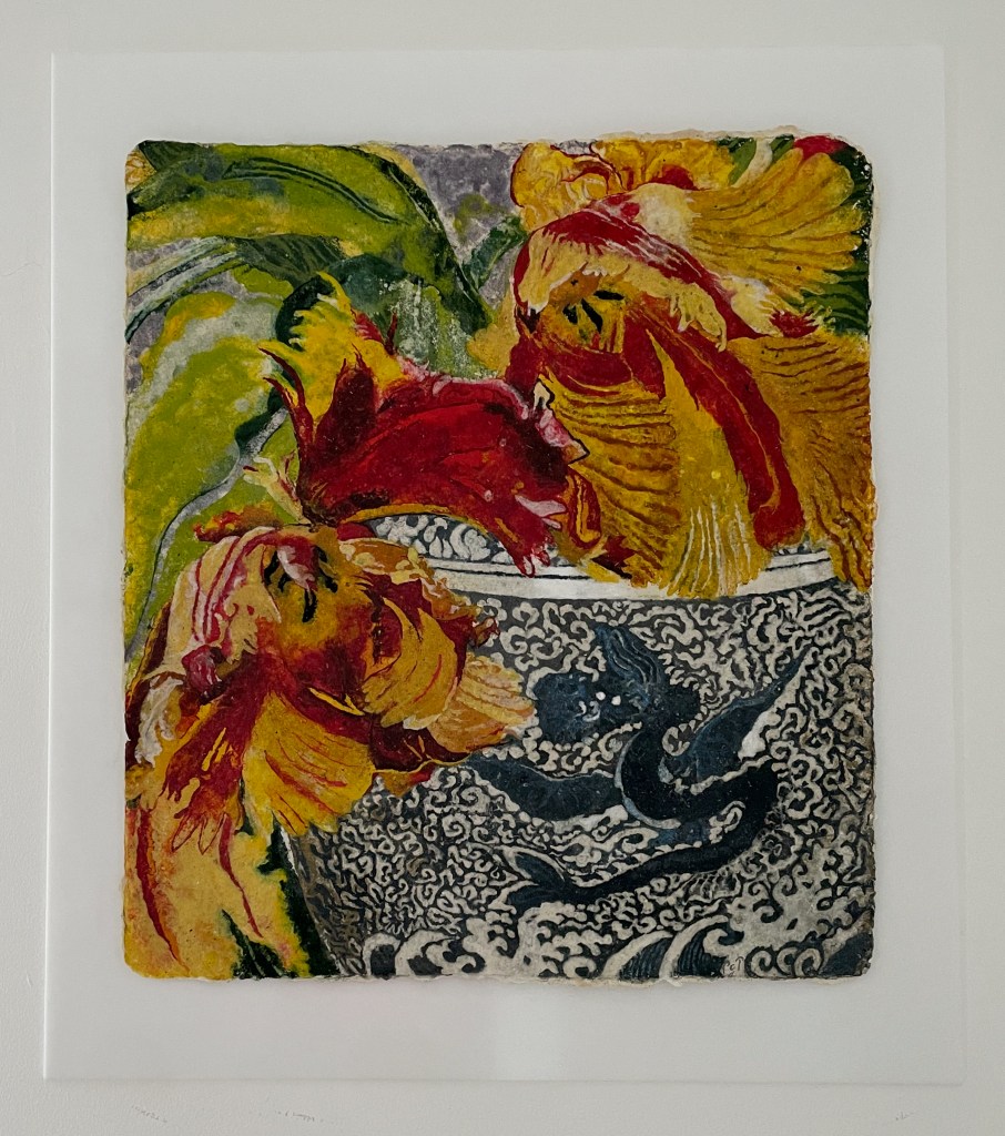
Top: cover image of Marius Péraudeau: Pulp Paper Paintings (Paris: Ernst Maget, 1991). Photo taken at British Library: Books On Books. Bottom: Water Dragon 2011) Pat Gentenaar-Torley. Photo: Books On Books Collection.
In pulp painting, the paper is the painting. Assisted by Katie MacGregor and Bernie Vinzani in their paper studio in Whiting, Maine, Van Vliet poured different colors of paper pulp into prepared forms to create three sheets of paper on which to print and then collage into the image that suggests dual images: that of a volcano and that of a woman reclining on her side or face down. The fusion of shapes, the fusion of color and fiber in pulp painting, and the fusion of clay and pulp in the covering bas-relief (which can also be used as a stand for the broadside) fuse with the poem’s words and metaphor. Once this artwork has been experienced, reading the poem printed in a traditional book can never be the same.
Additional insights into The Batterers along with illustrations of the papermaking and painting process can be found in pages 43-45 of John Buchtel’s The Art of Paper (see below).
Further Reading & Viewing
“Claire Van Vliet (II)“. 28 May 2025. Books On Books Collection.
“Ruth Fine“. 19 June 2024. Books On Books Collection
“The First Seven Books of the Rijswijk Paper Biennial“. 10 October 2019. Books On Books Collection.
“Judy Fairclough Sgantas“. 25 May 2024. Books On Books Collection.
“Helen Siegl“. 14 August 2024. Books On Books Collection
Auburn, Luke. 25 October 2017. “Typographer and founder of Janus Press Claire Van Vliet to be presented with Goudy Award Nov. 2“, University News, Rochester Institute of Technology.
Buchtel, John (ed.). 2024. The Art of Paper : Claire van Vliet and the Janus Press : Papermaking Collaborations. Boston, MA: Boston Athenaeum.
Craft in America, PBS Series. 7 October 2009. Claire Van Vliet (N.D.) Includes a short video with Kathleen Walkup (Mills College).
Library of Congress. 19 October 2017. The Janus Press. Washington, D.C.: Library of Congress.
Sullivan, James D. 2019. “A Poem Is a Material Object: Claire Van Vliet’s Artists Books and Denise Levertov’s “Batterers”“, Humanities. 8:124.
University of Wisconsin. 9 November 2018. Woven and Interlocking Book Structures. Madison, WI: University of Wisconsin.
Van Vliet, Claire. 10 October 2019. “Thoughts on Bookmaking by Claire Van Vliet of The Janus Press“. Poet’s House.
