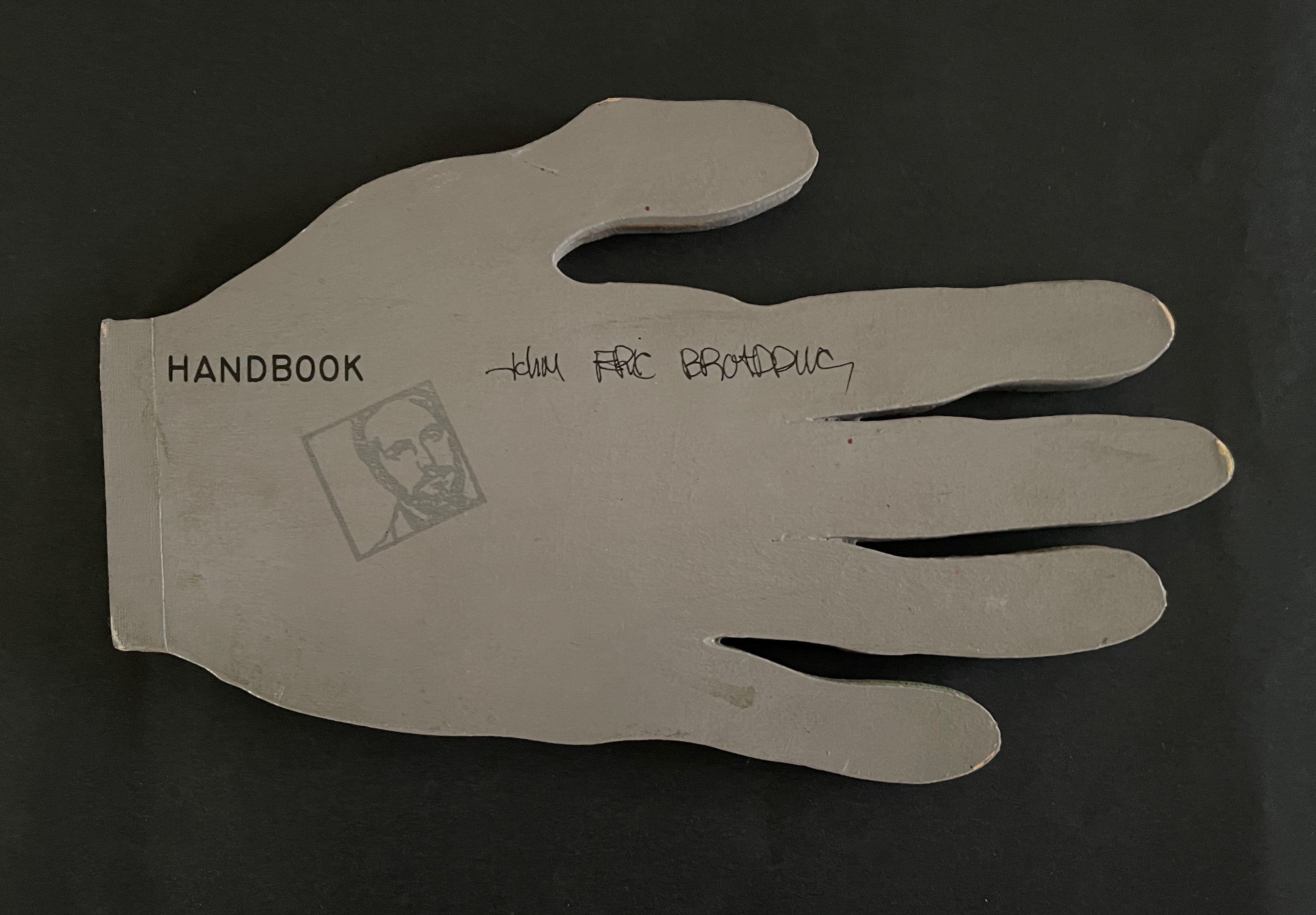
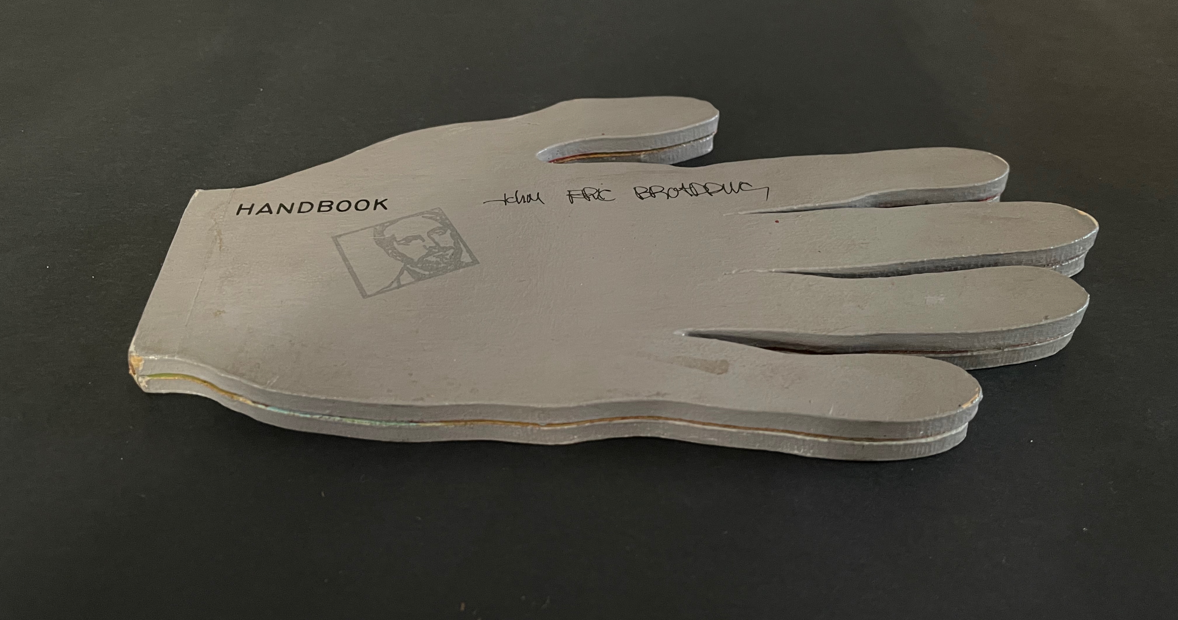
John Eric Broaddus (1943 1990) was perhaps one of the most inventive and creative artists to approach the book form. He was a prominent figure in the New York City art scene in the 1970s and 1980s, creating books before the book form even had a suggestion of acceptance in the art world. He also created one-of-a-kind costumes that he wore out on the streets of New York and in iconic places like Studio 54. He was vibrant, outlandish, and did much to contribute to the world of artistic interplay in New York City of that time. His inspired life was cut short by AIDS in 1990. but his legacy lives on in the work he left behind, a muse in itself for book artists even twenty years later.” Visual AIDS
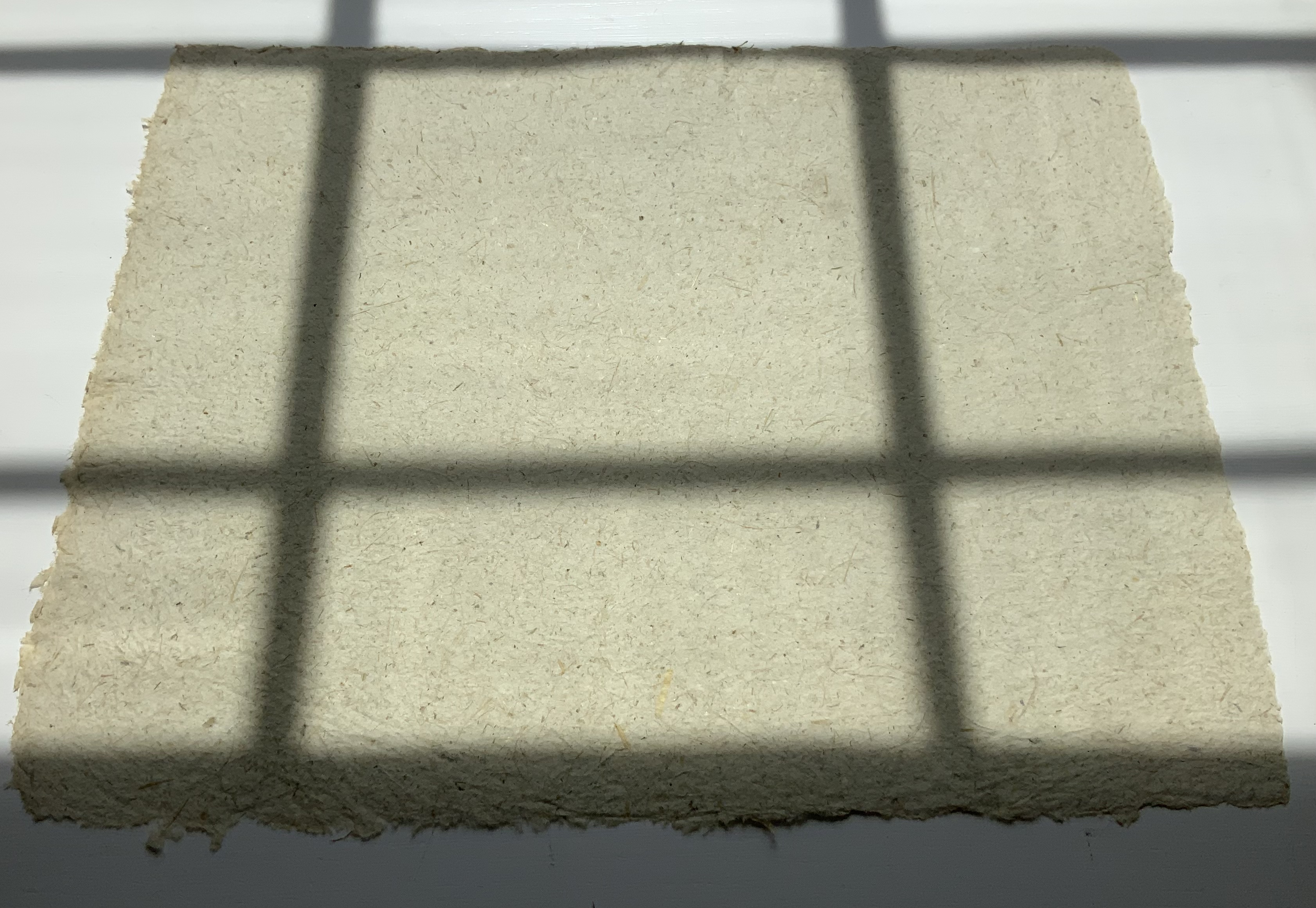
Since first seeing references to and images of John Broaddus’ artist’s books in 2012, I have watched for opportunities to add his work to the Books On Books Collection. So many of his artist’s books were unique works and already in institutional collections or private hands, it would be a long watch. In late 2025, this appeared: “Achingly scarce work from a major figure in the early book arts movement. Minimal shelf/edge wear, else tight, bright, and unmarred. Shape book (human hand), grey painted boards, black ink lettering, cut paper forms.”
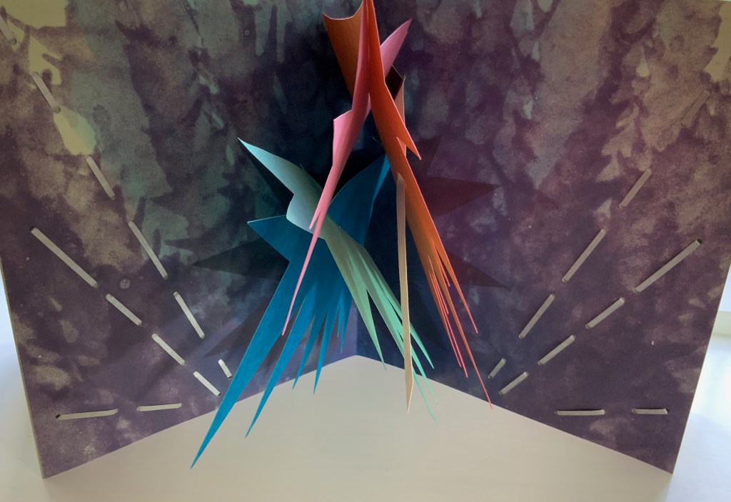
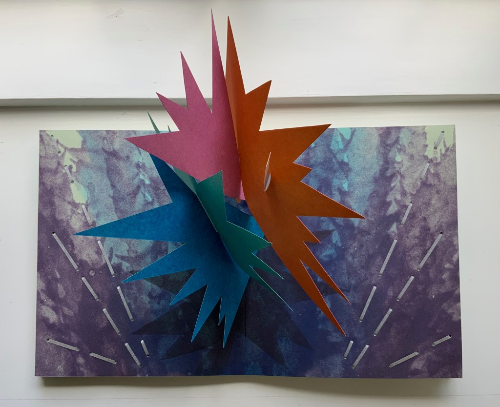
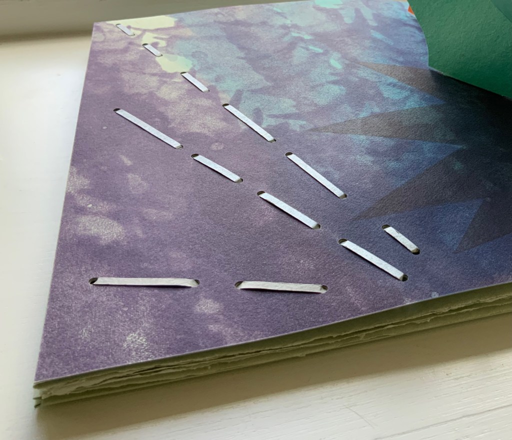
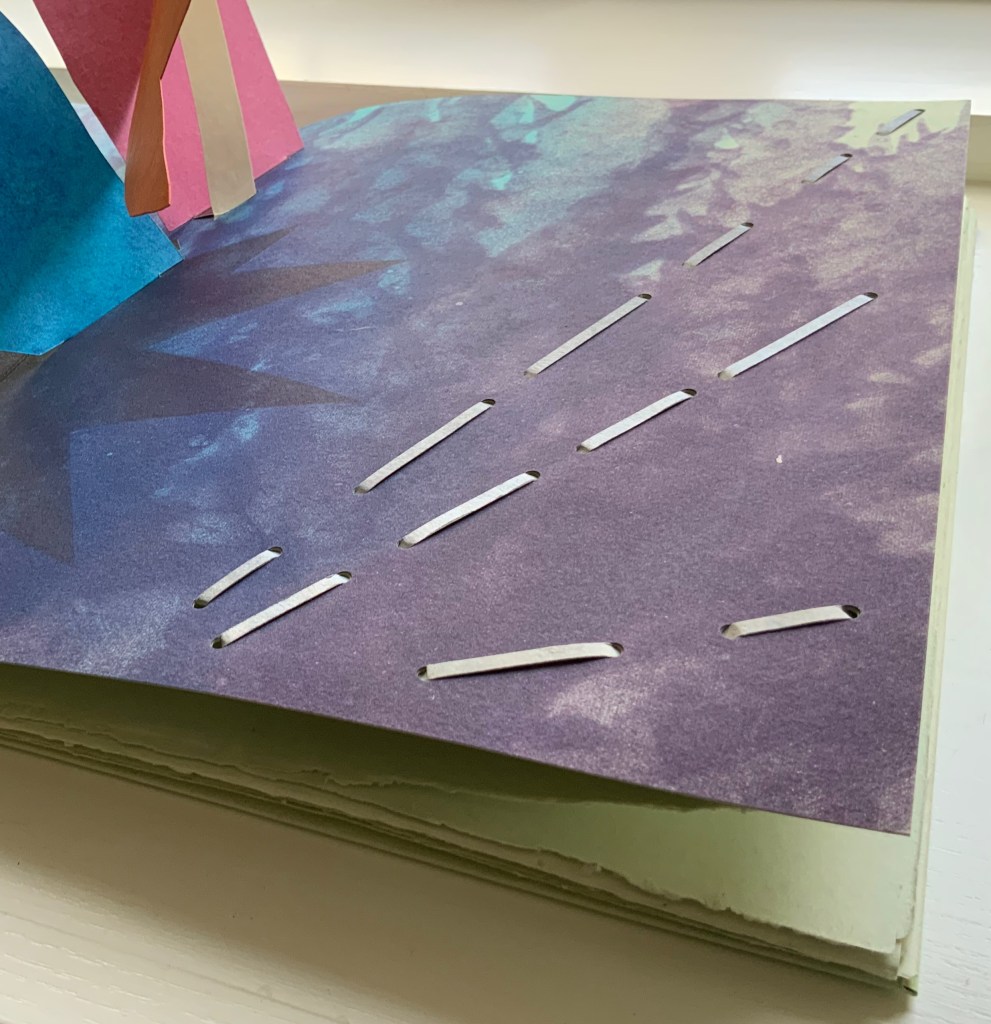
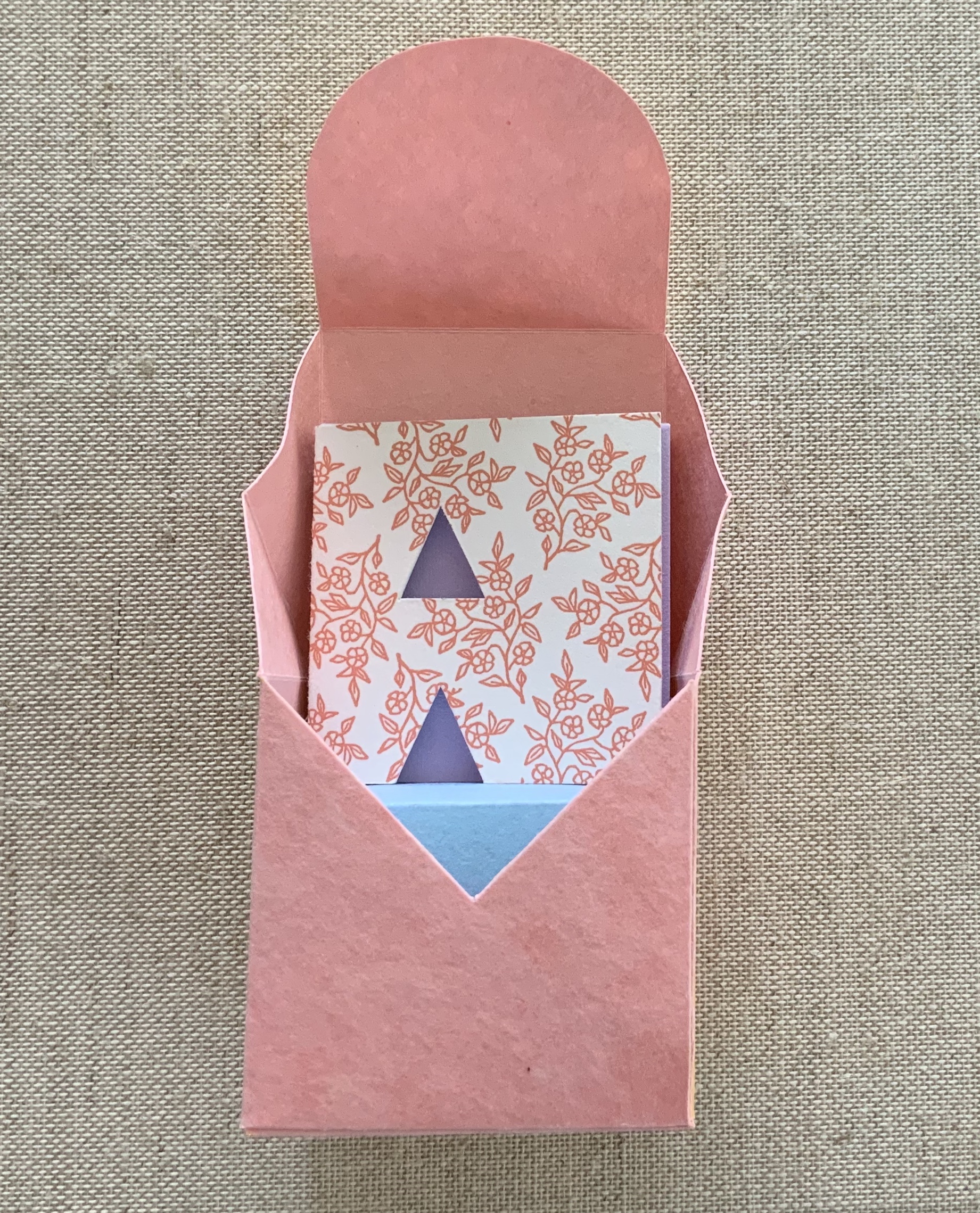
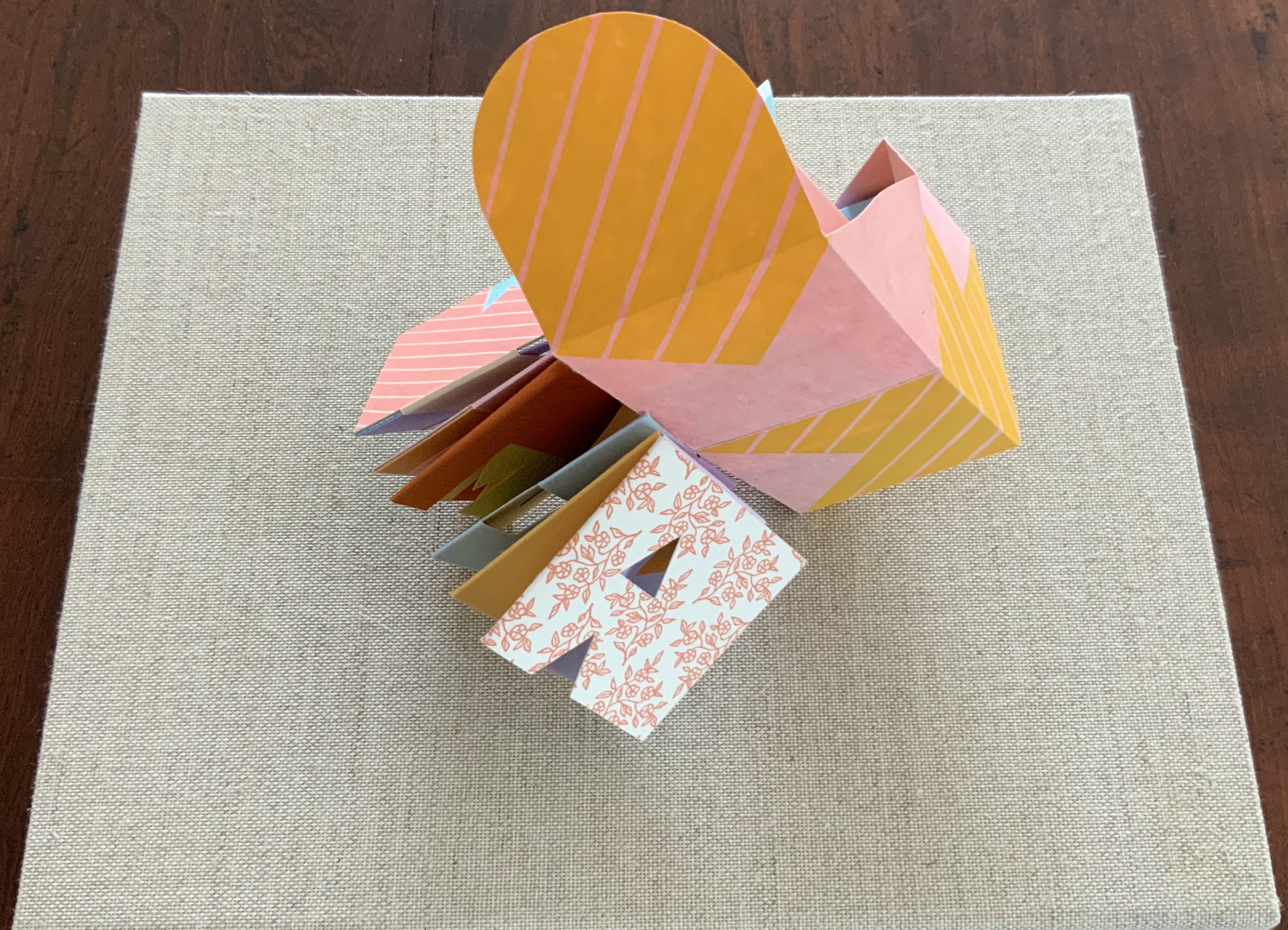
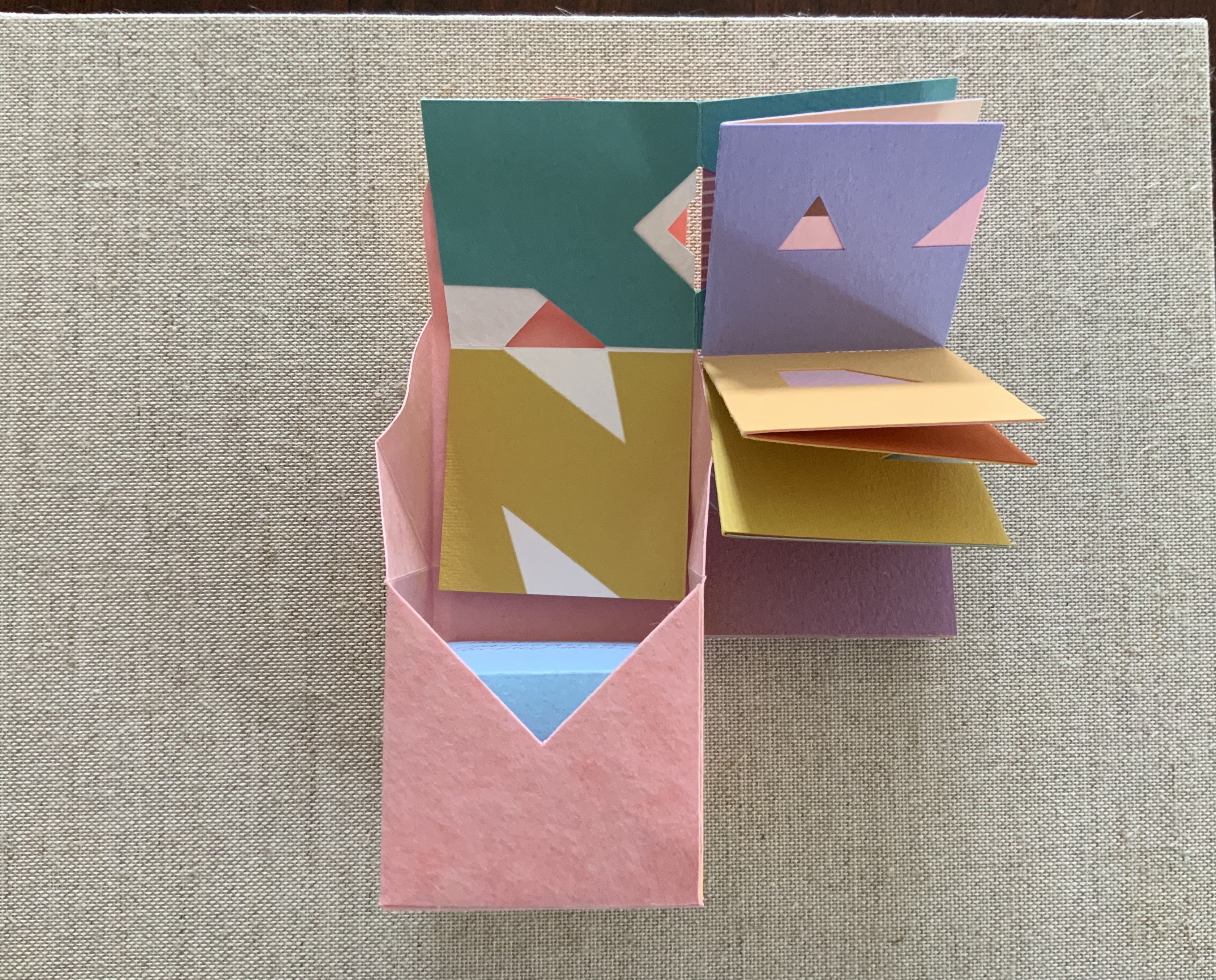
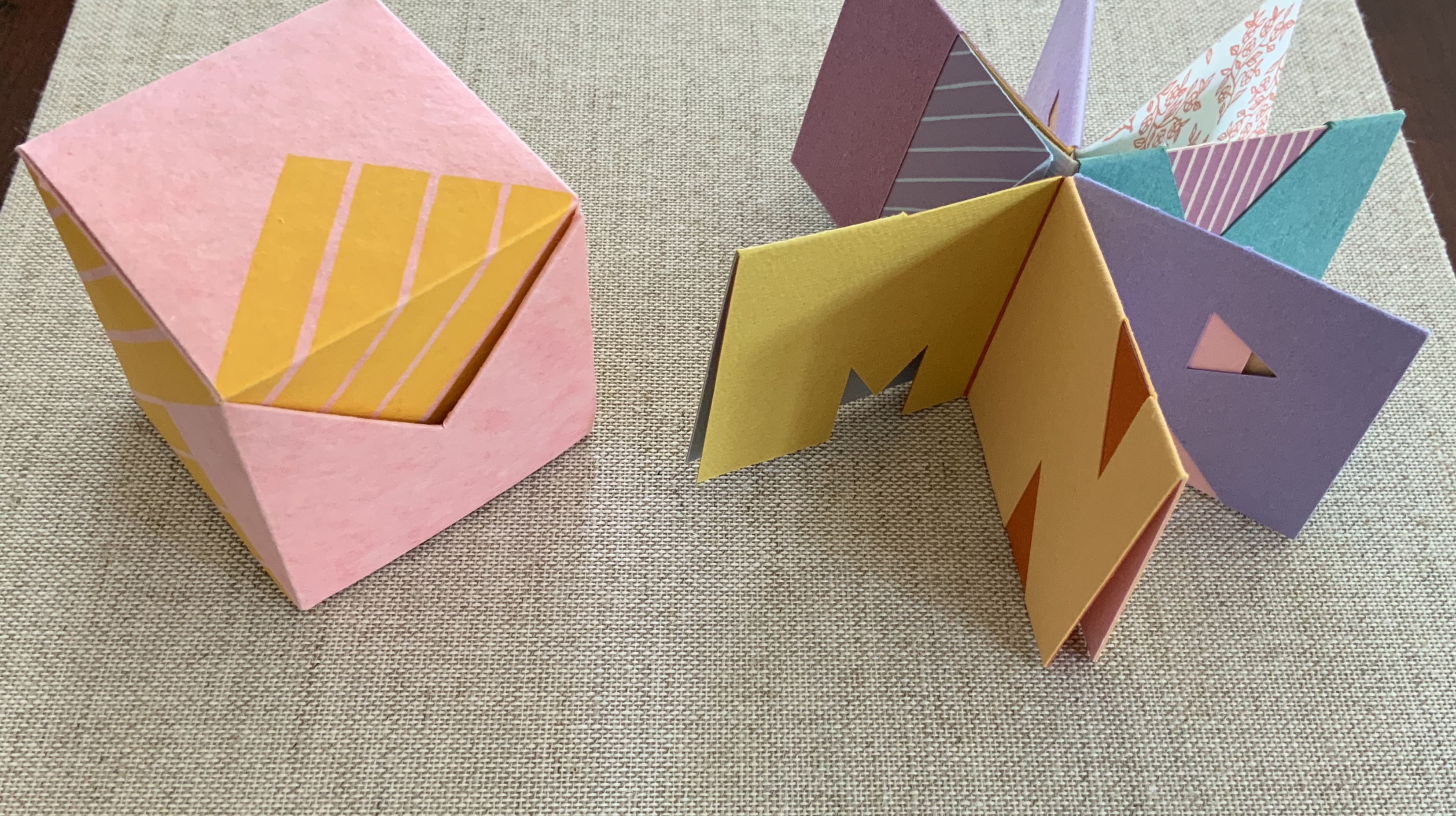
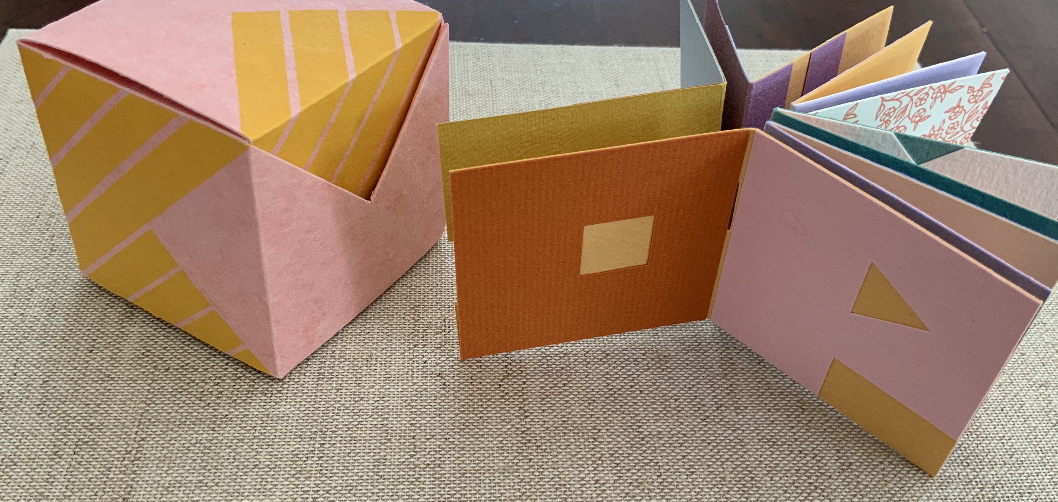
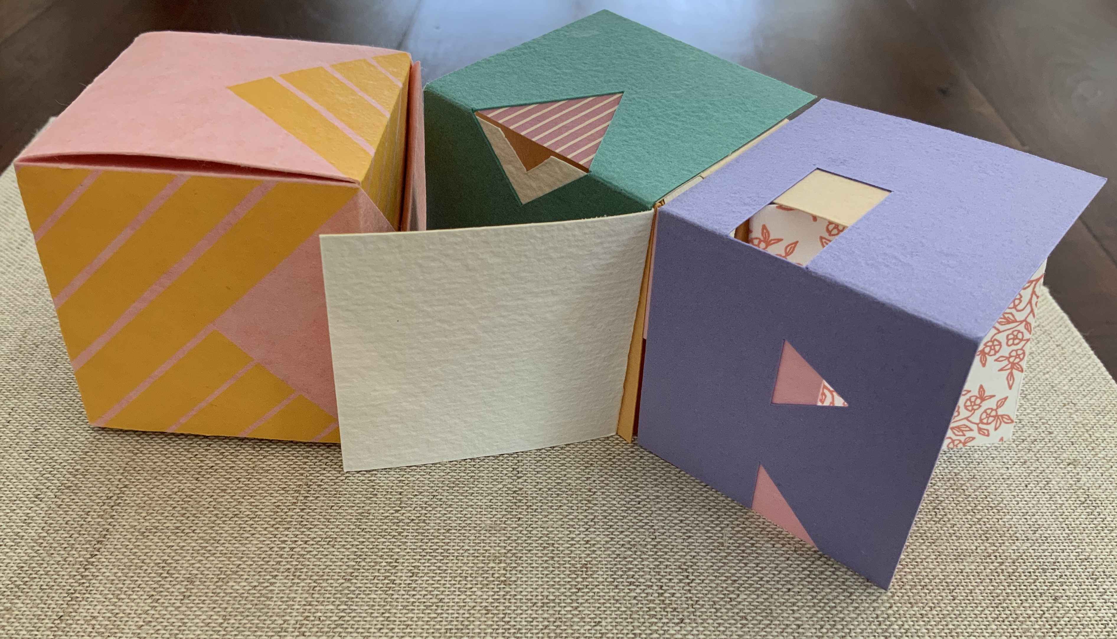
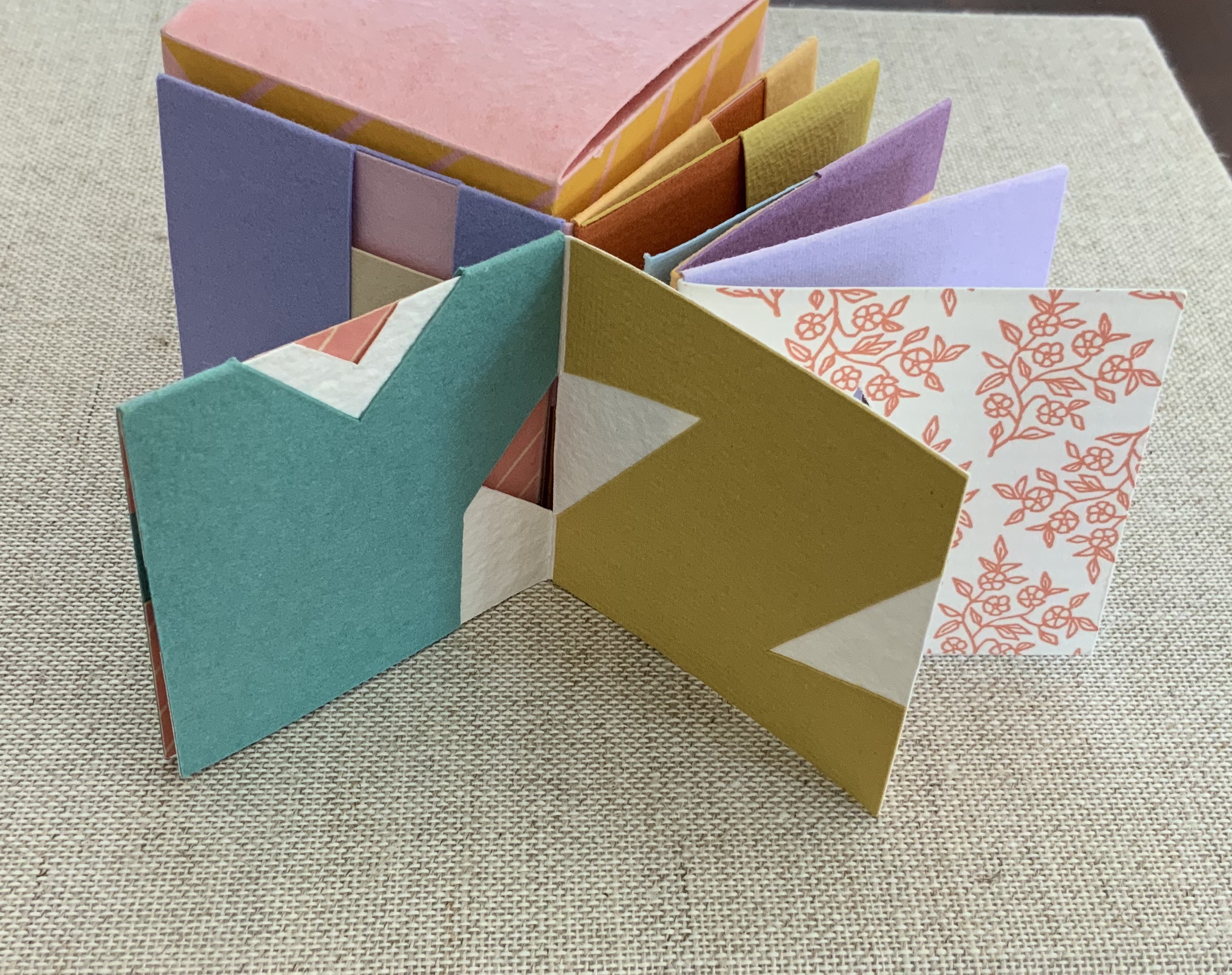
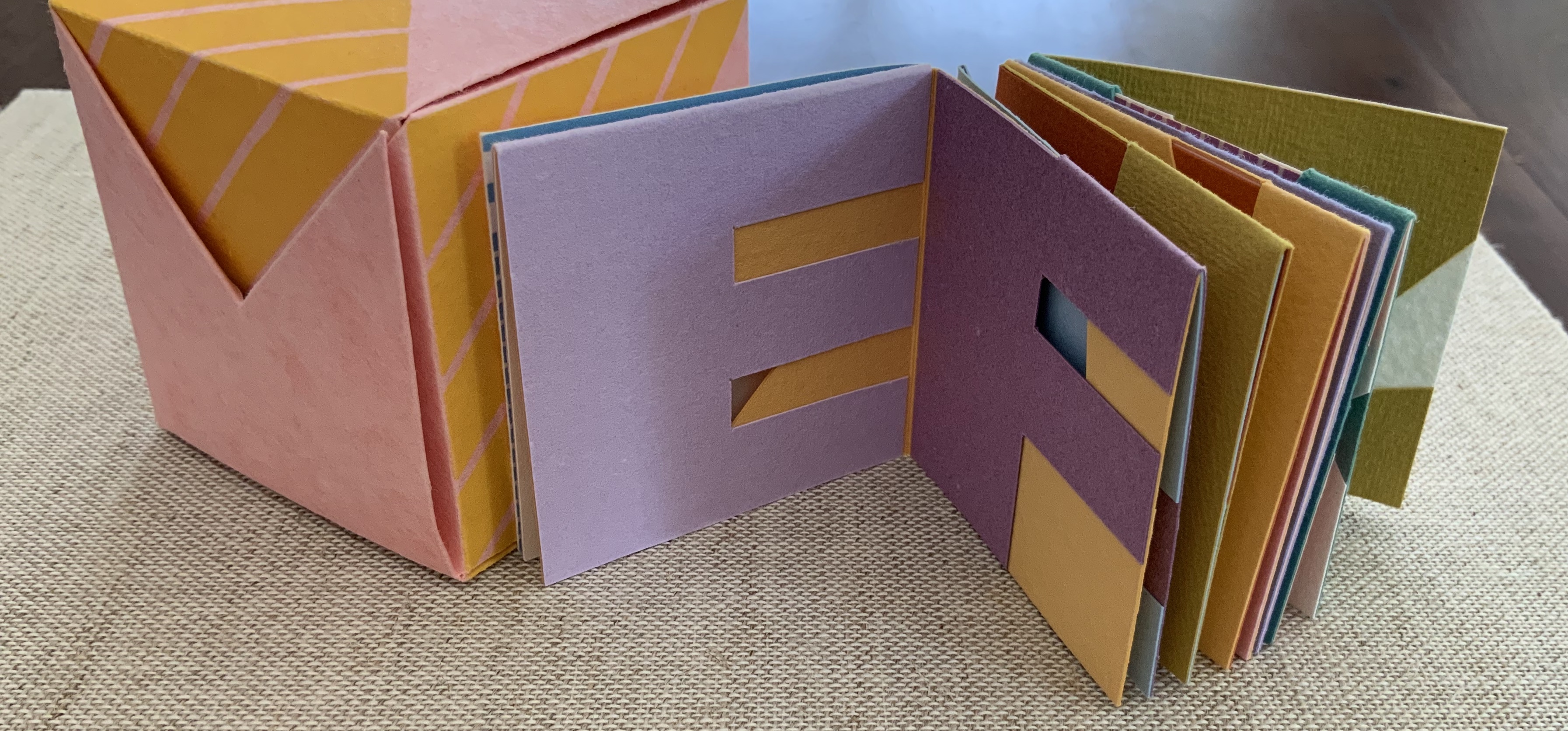
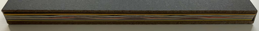
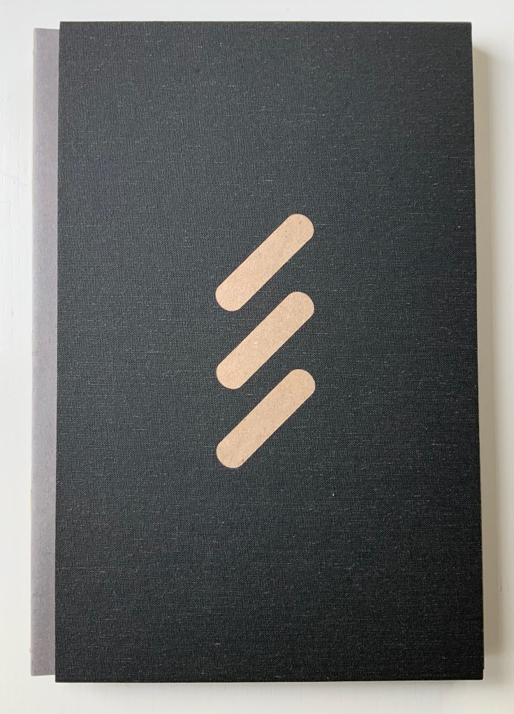
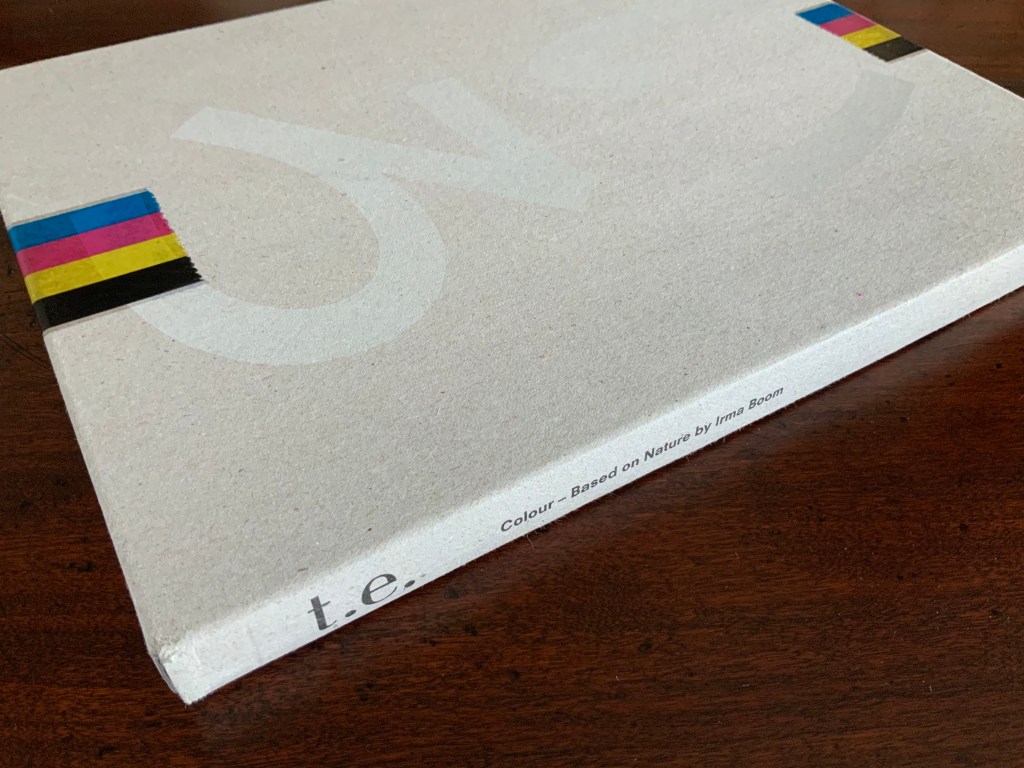
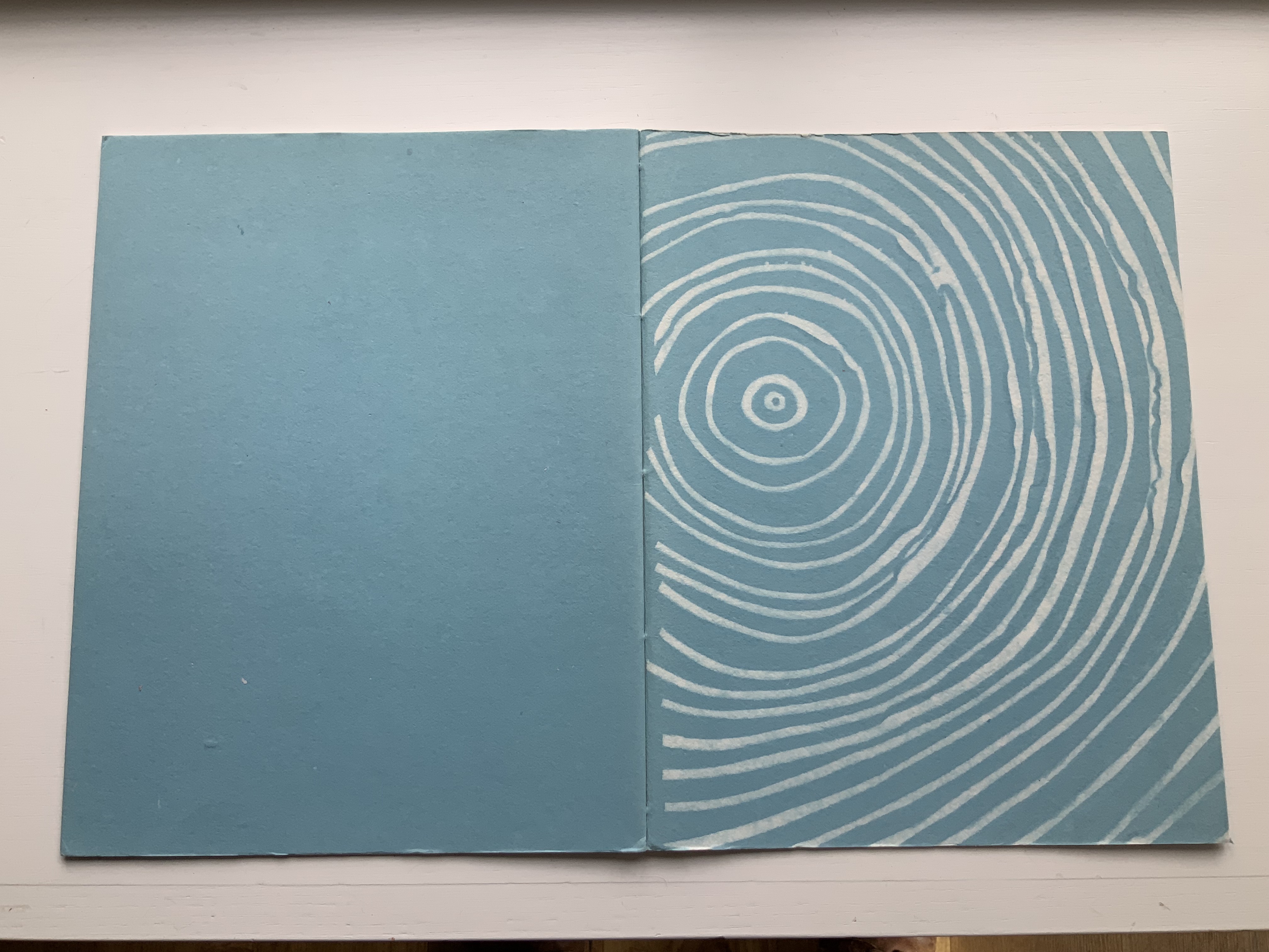
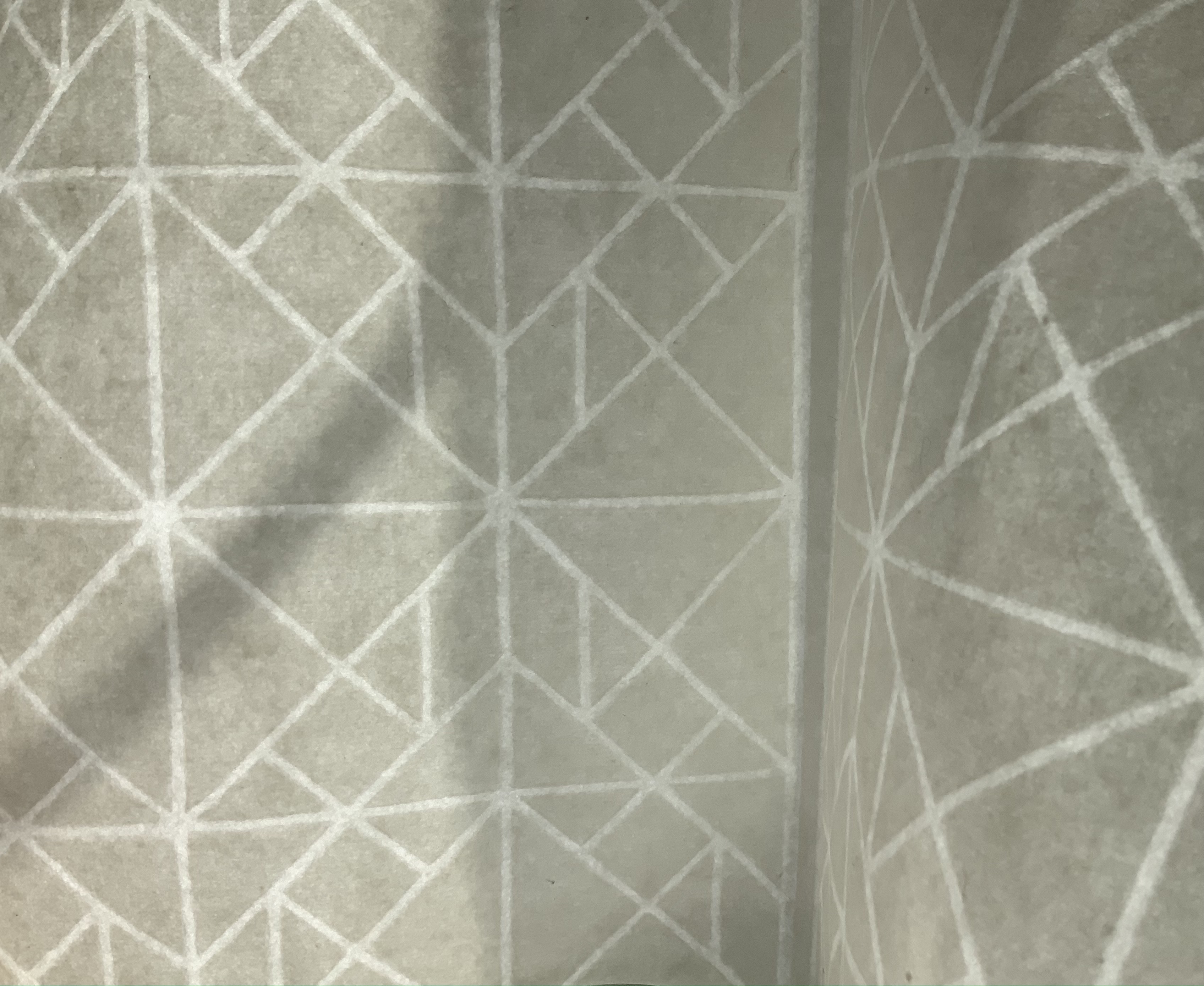
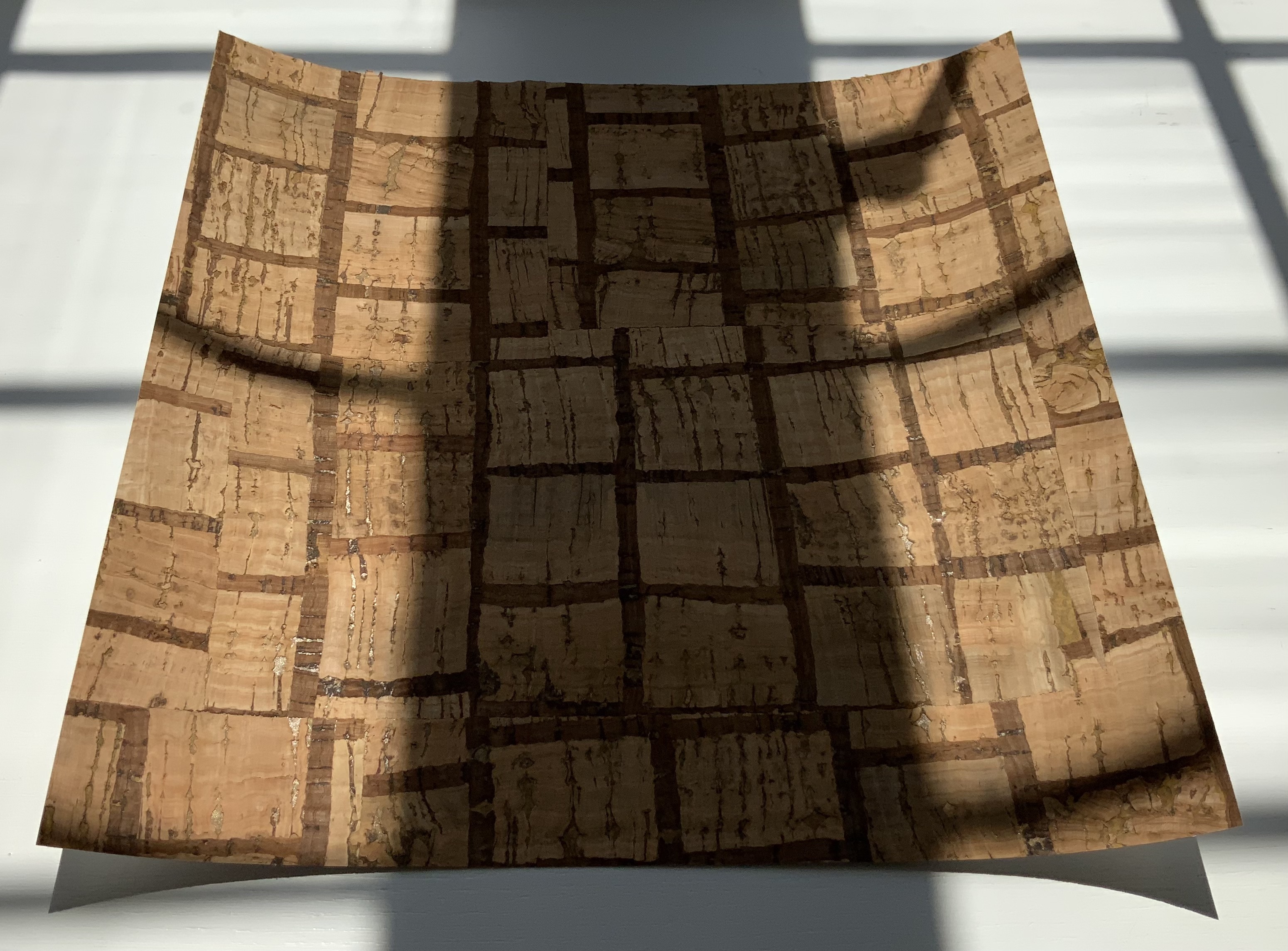
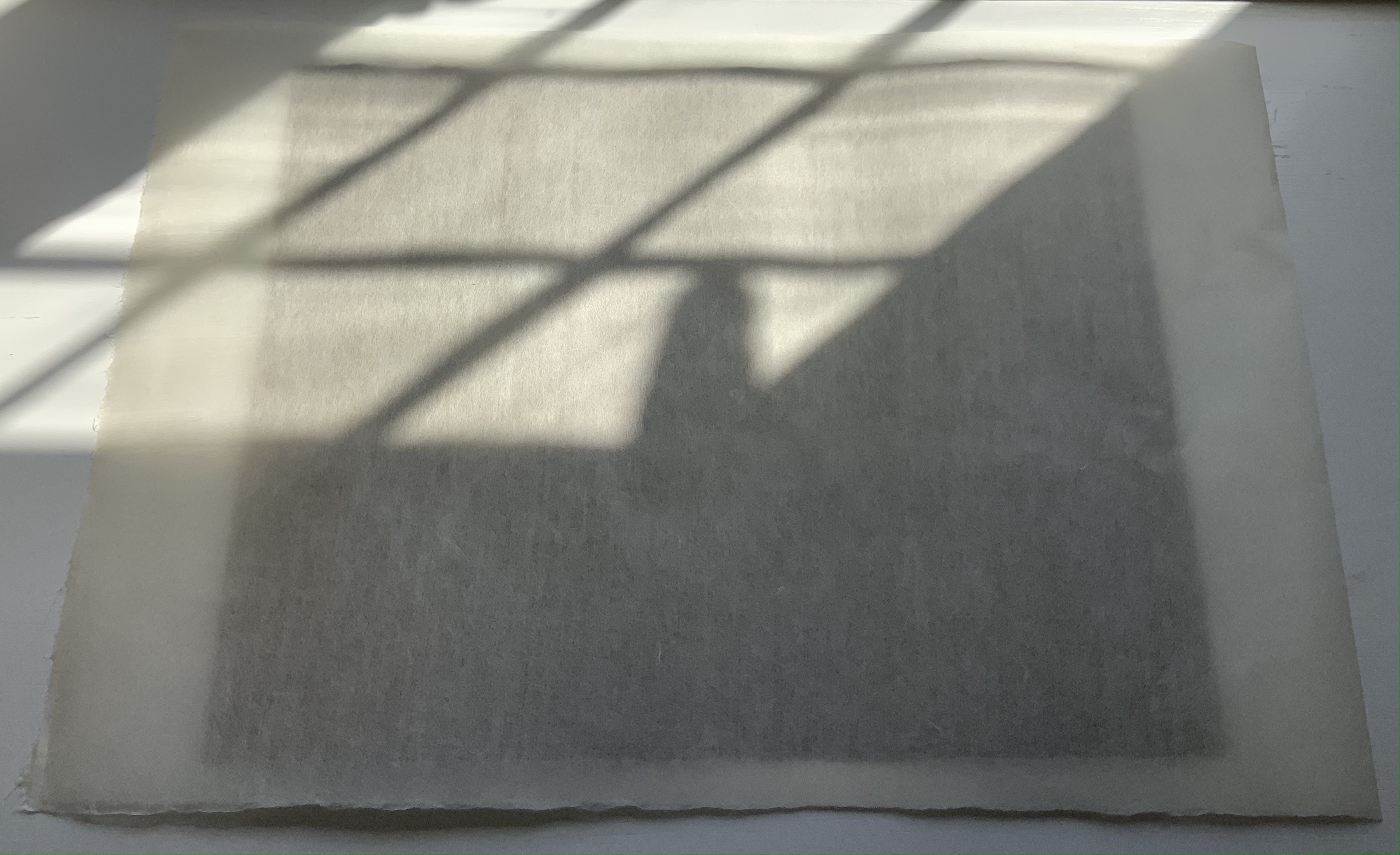
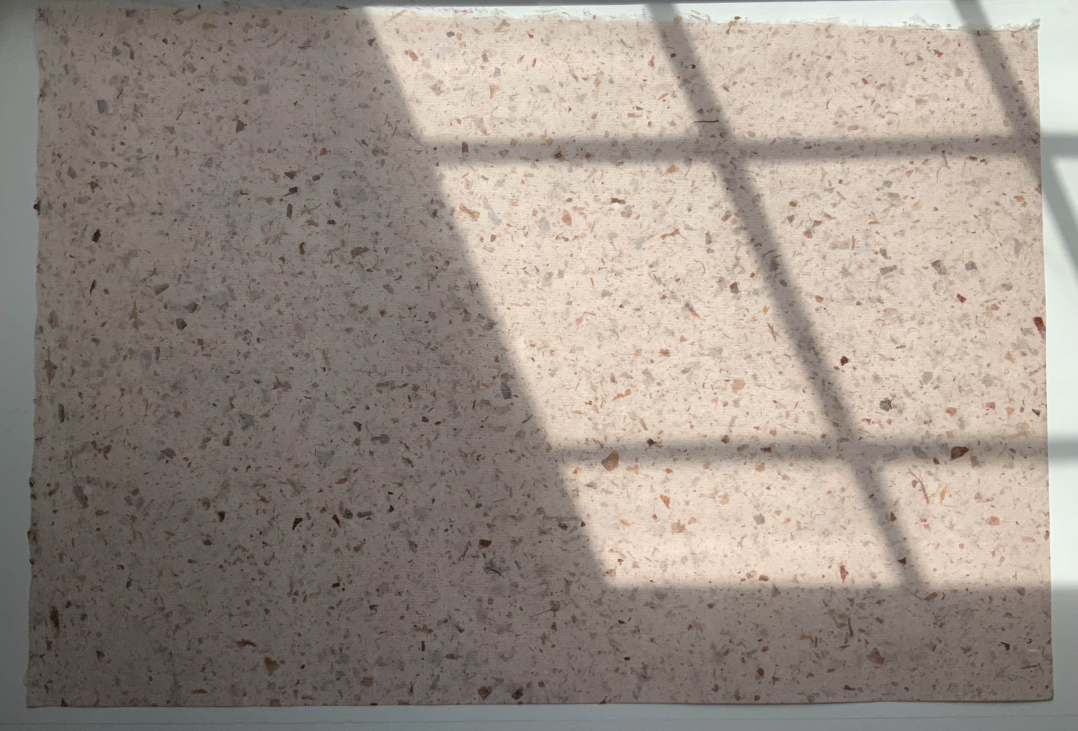
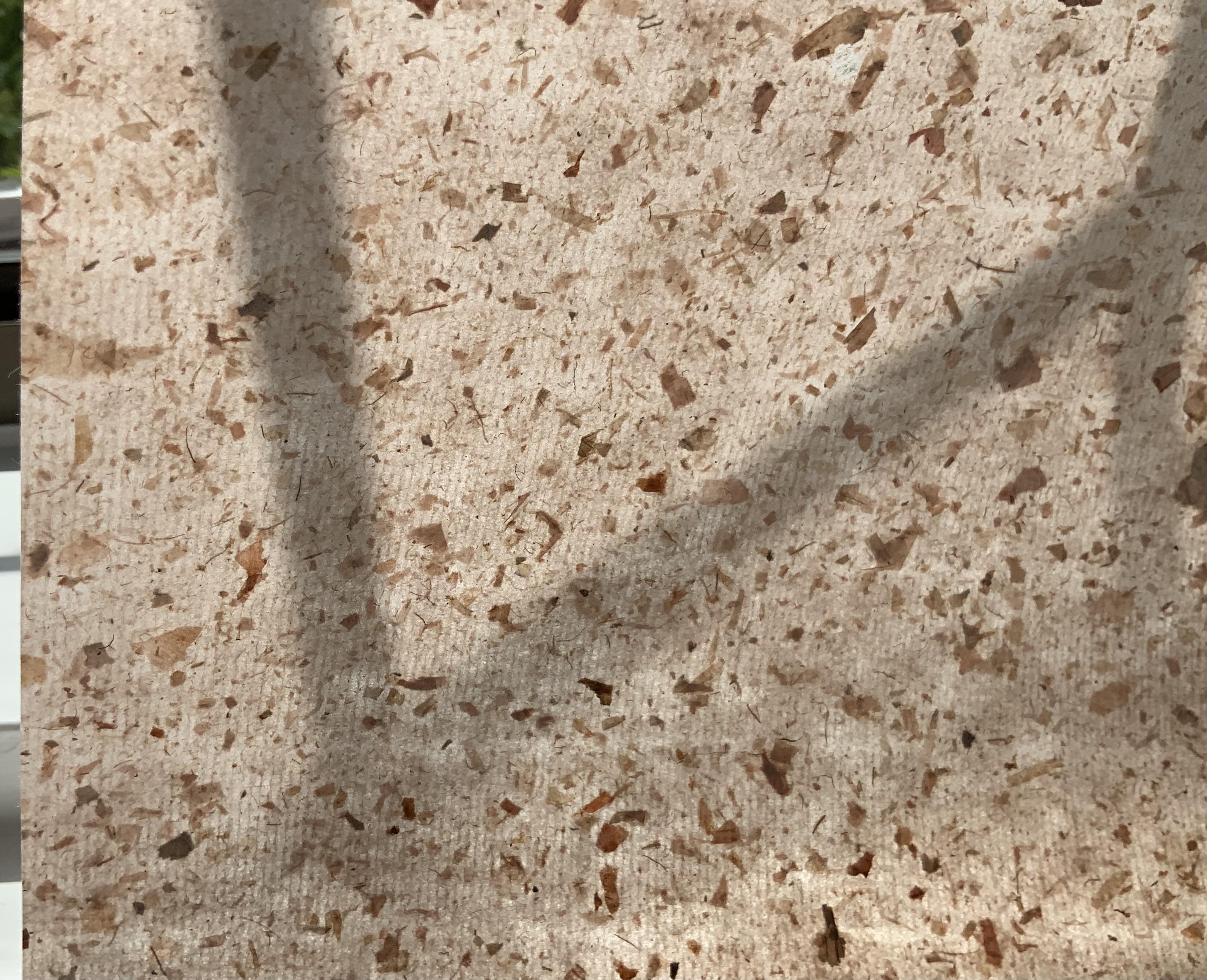
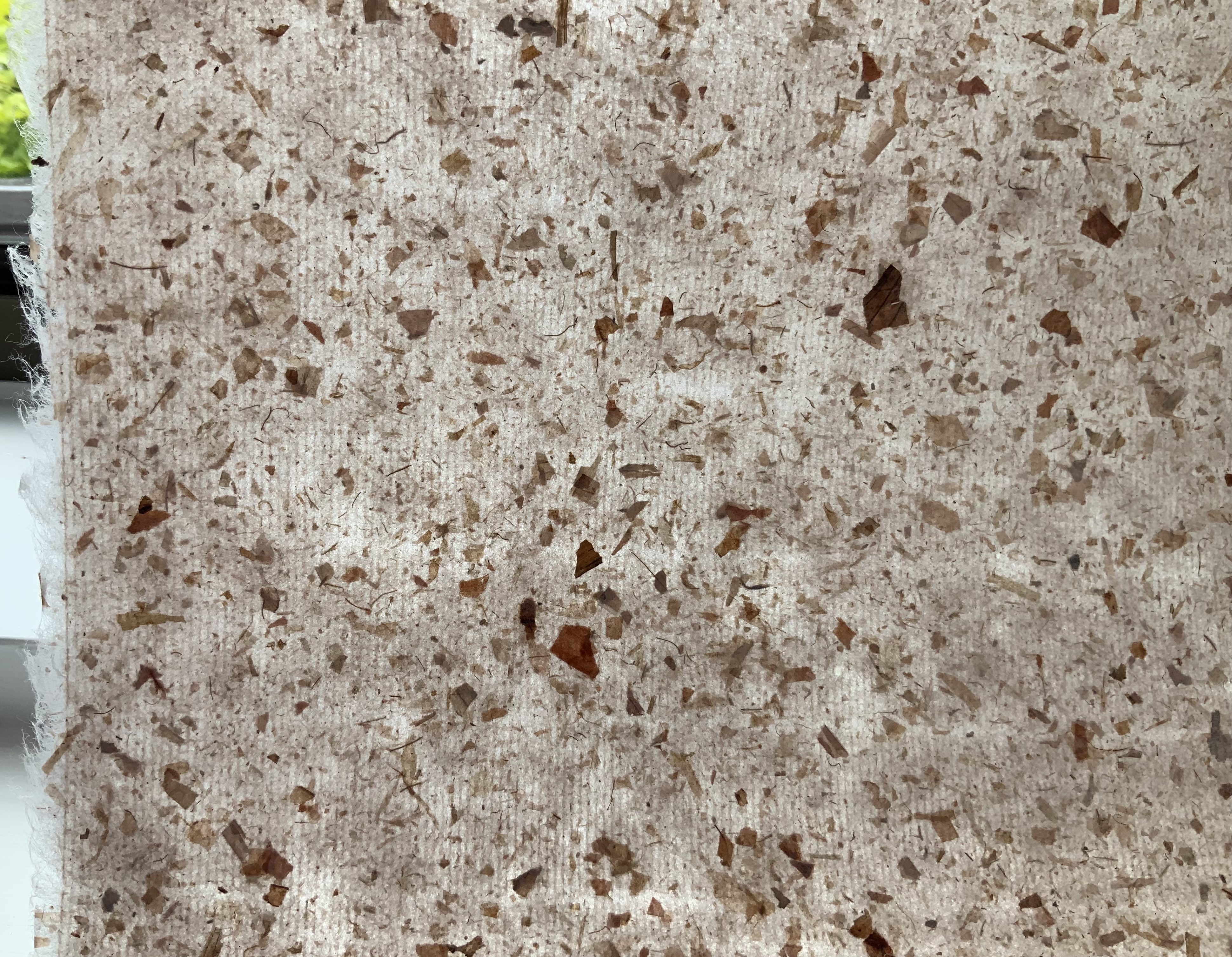
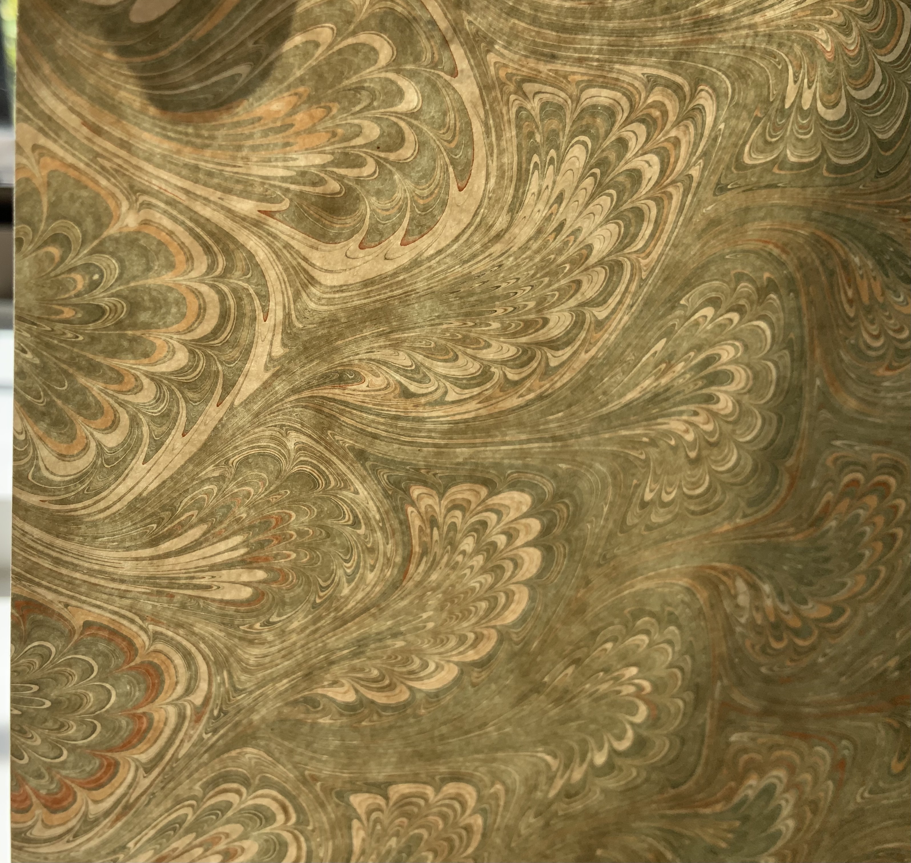
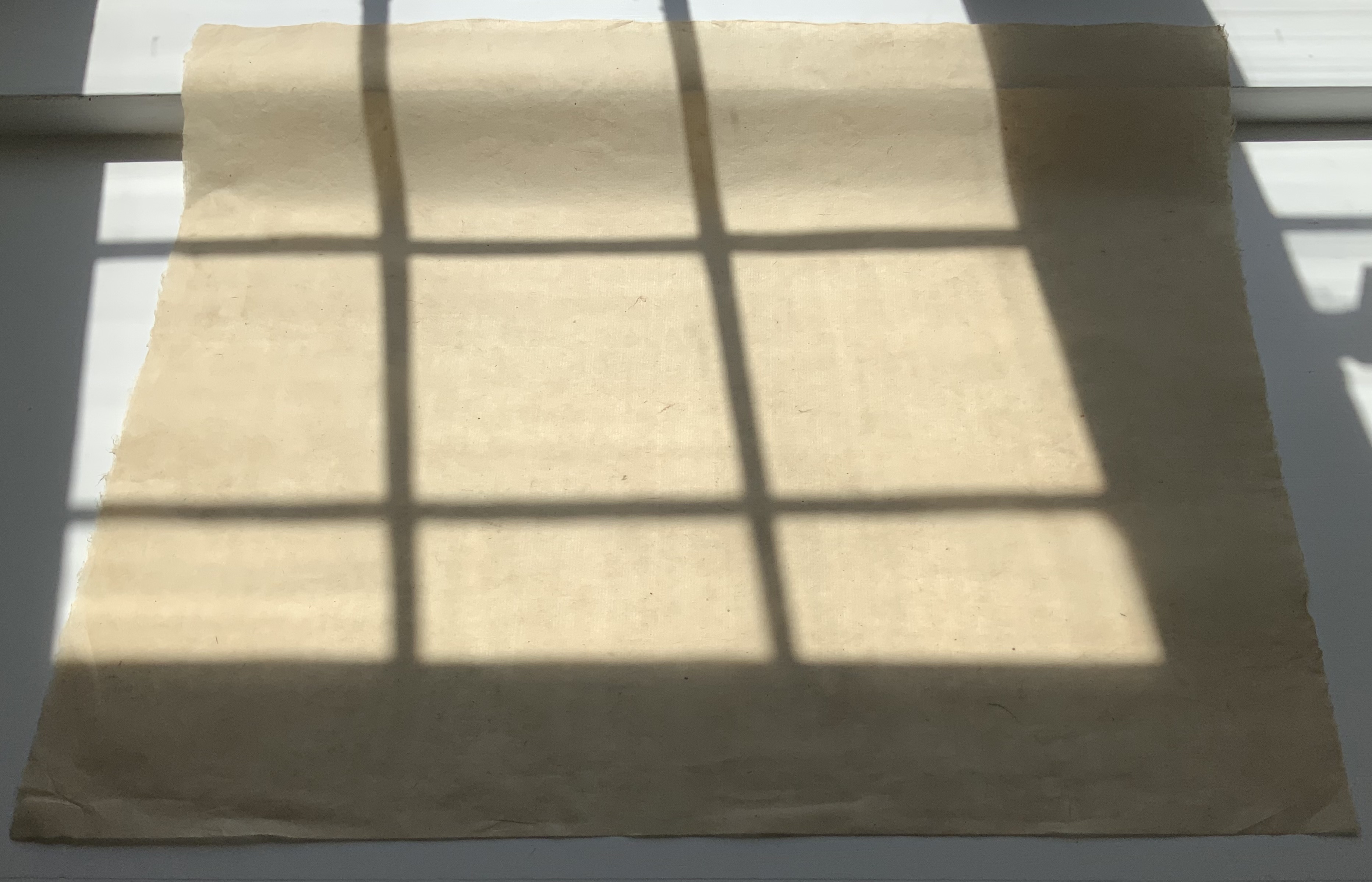
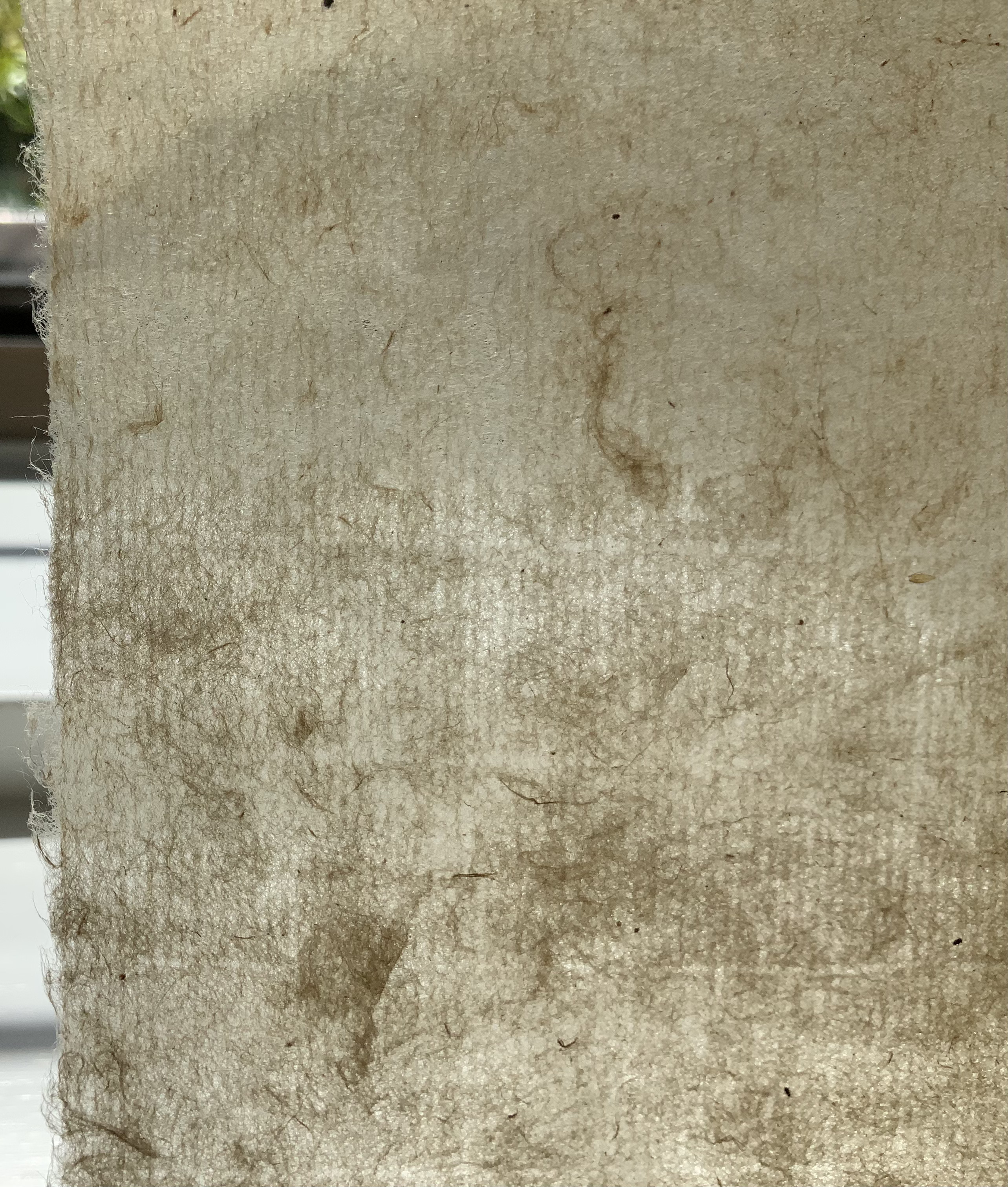
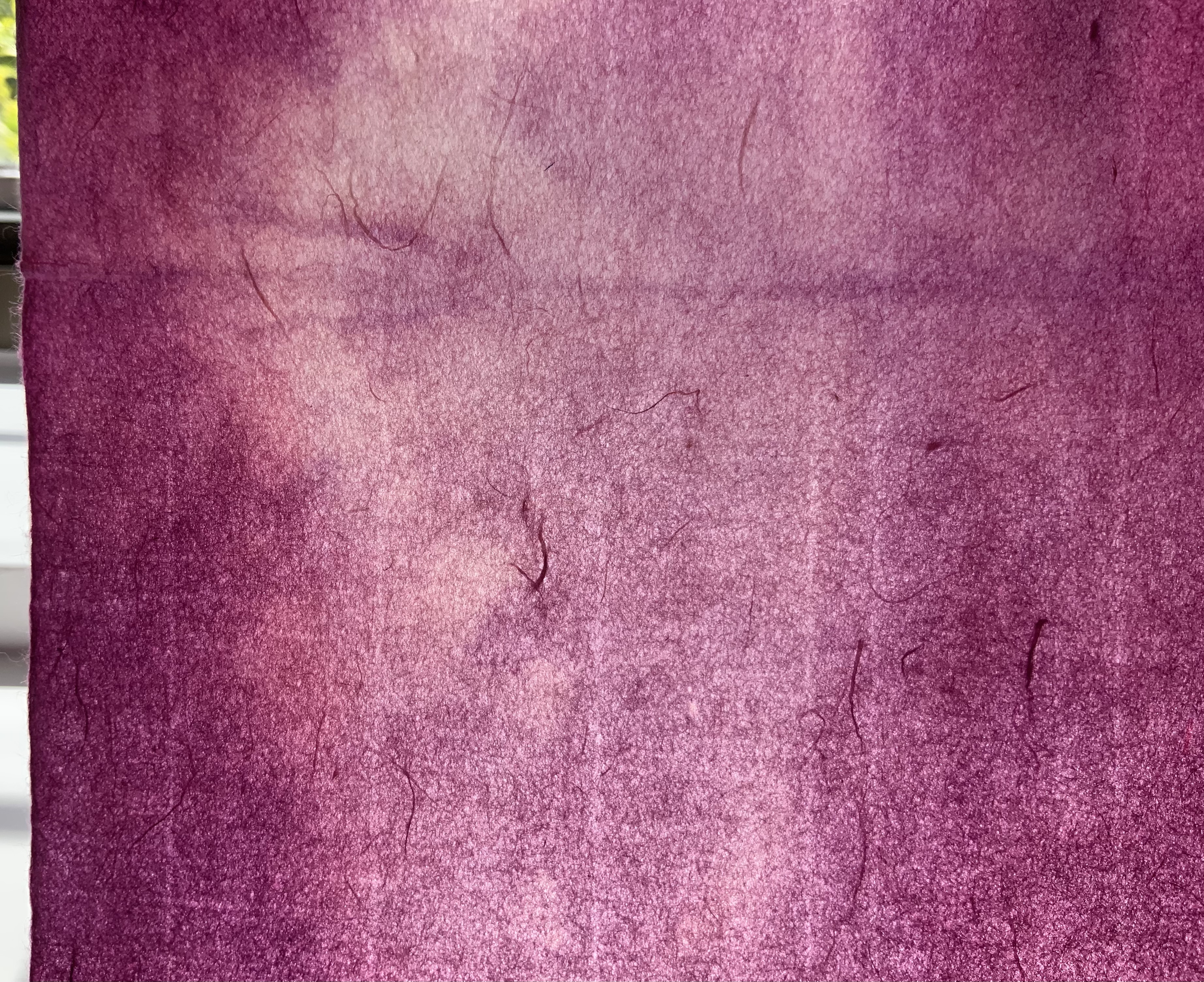
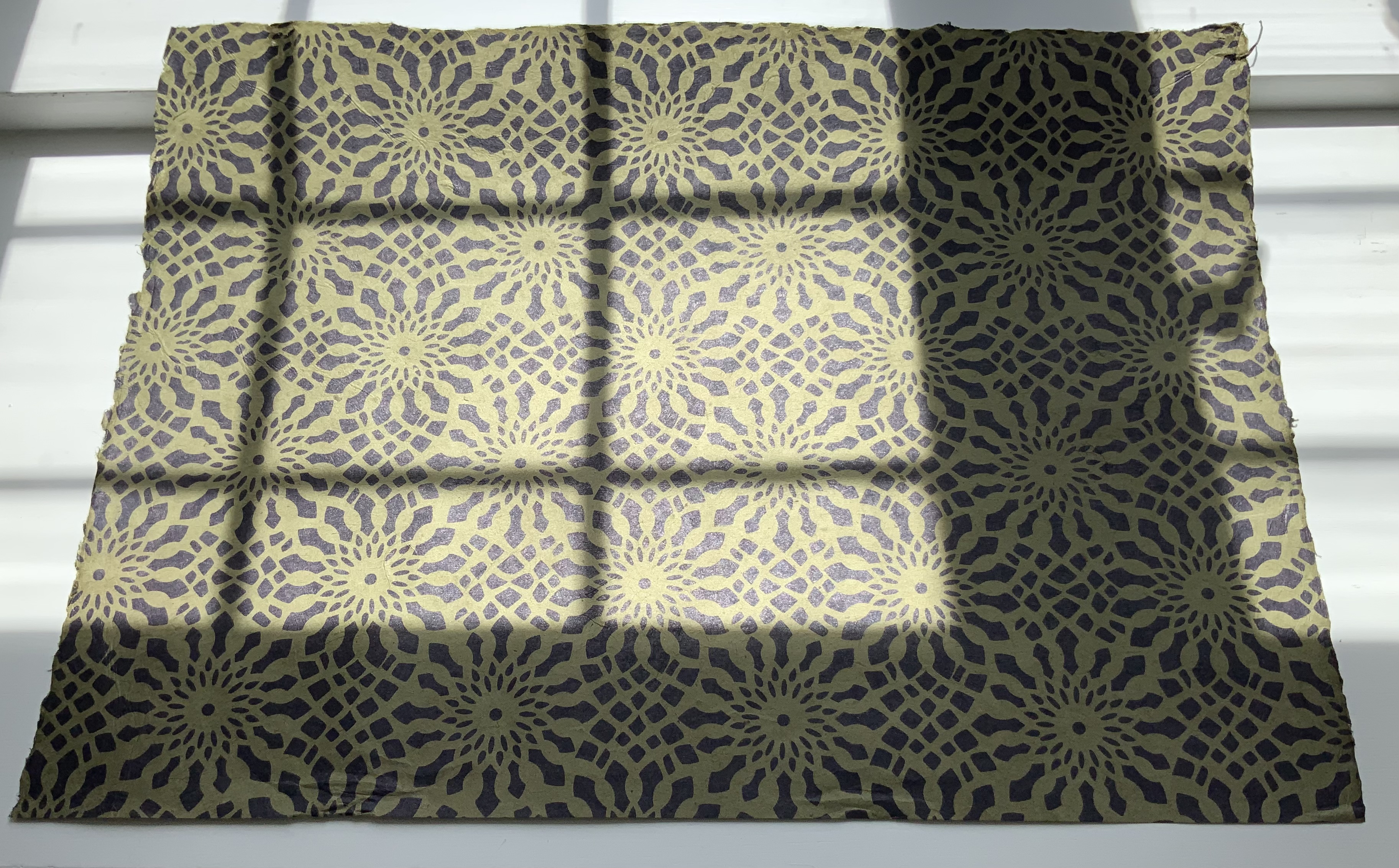
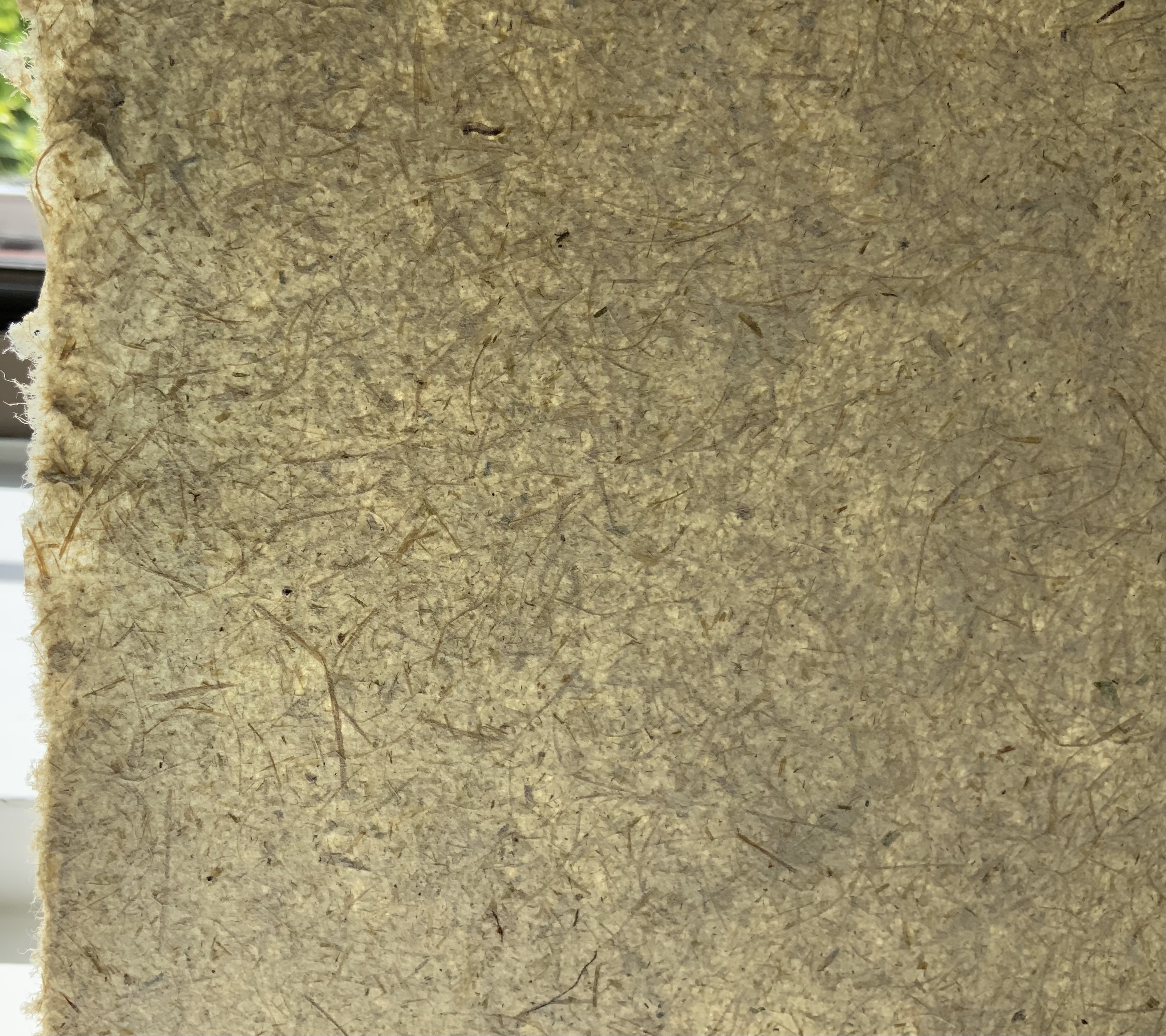
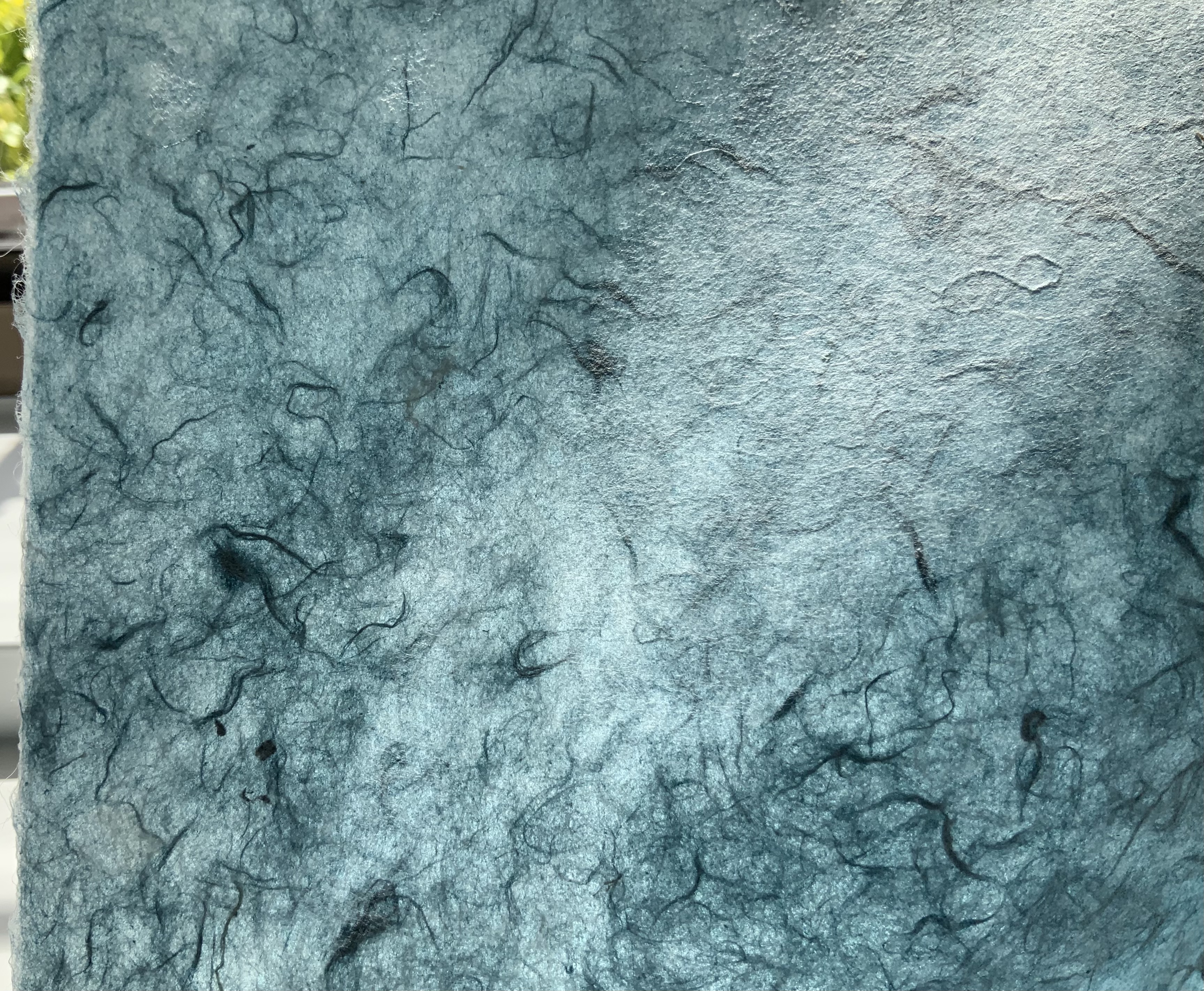
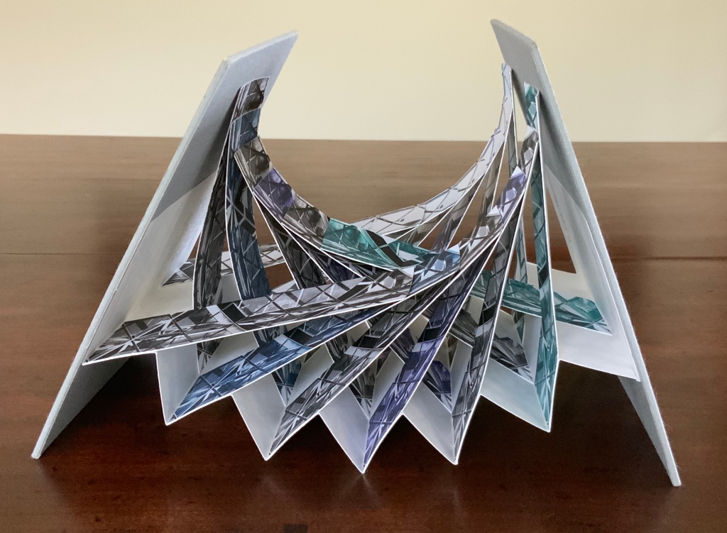
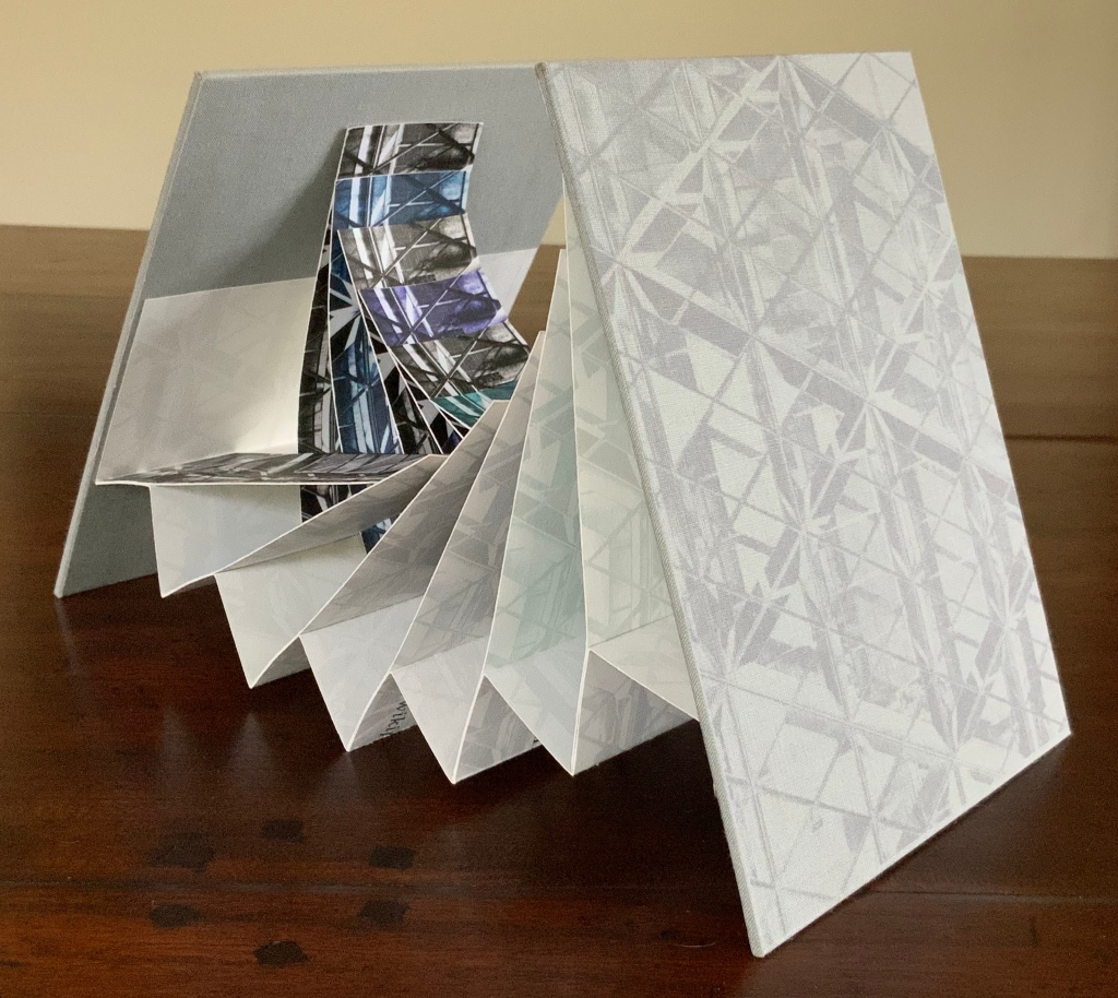
Handbook (1980) John Eric Broaddus Hand-shaped boards over hand-shaped painted and cut pages, nailed tape hinge. Variable: H123 x W205 mm. [10] pages. Limited edition, unknown quantity. Acquired from Lux Mentis, 3 December 2025. Photos: Books On Books Collection.
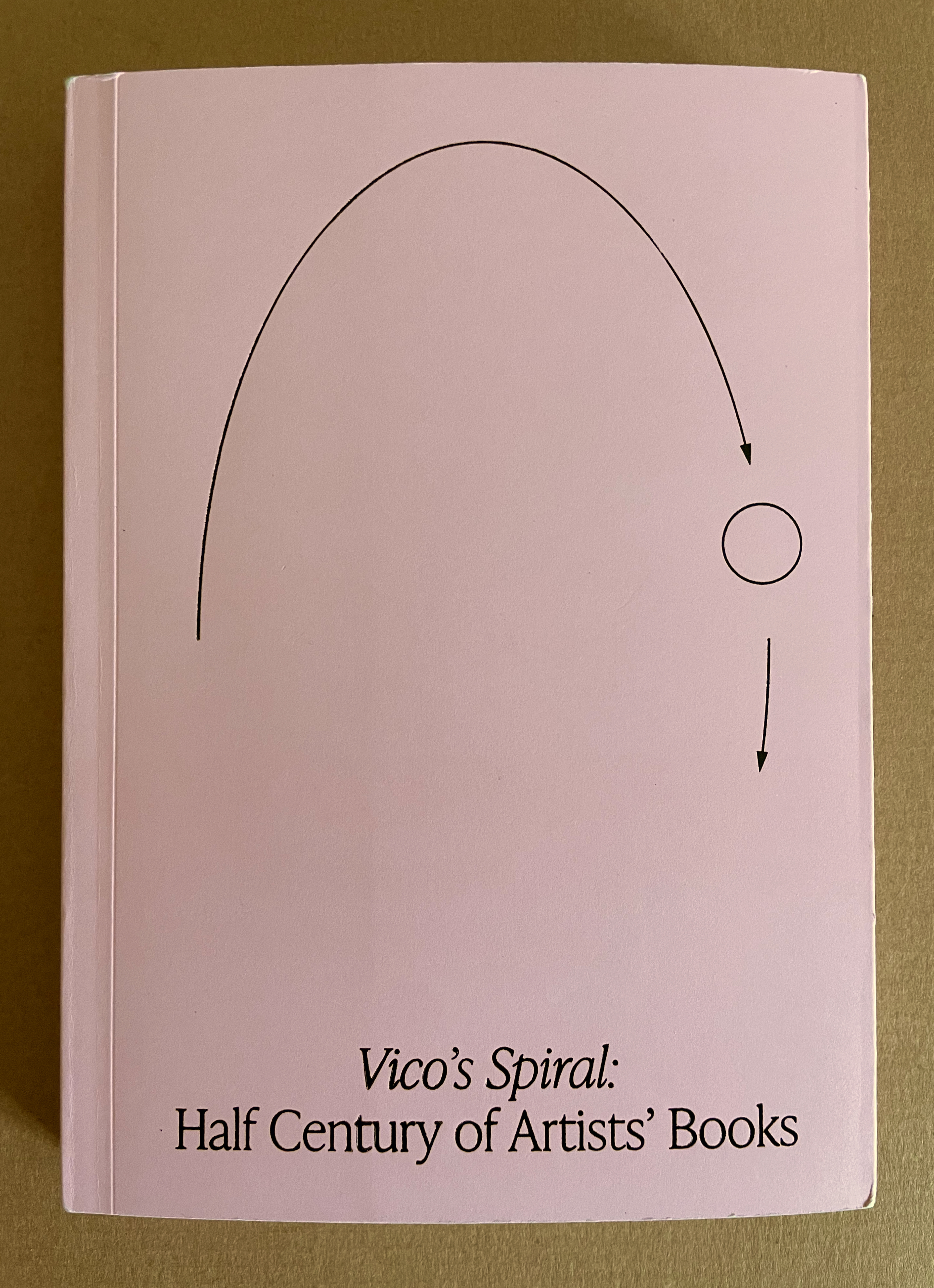
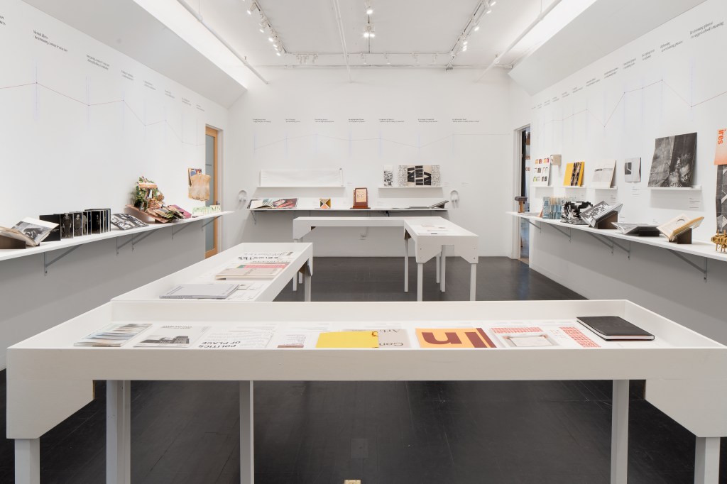
With Vico’s Spiral, Robbin Ami Silverberg, Carole Naggar, and Kinohi Nishikawa have made a significant contribution to how we can better appreciate artists’ books. The publication accompanied the exhibition by the same name celebrating the 50th anniversary of New York’s Center of Book Arts from 26 September through 14 December 2024.
The exhibition’s curators — Silverberg and Naggar — chose their organizing metaphor well. The 16th century philosopher Giambattista Vico proposed that history did not proceed in a straight line but instead spiraled, with patterns of events recurring with near similarity in different periods and even different regions. Naggar writes, As in Vico’s Spiral, artists’ books disregard linear chronology and geographies. Based on recurrent concepts and forms, they “meet” in vastly different time-spaces.
To prove the aptness of Vico’s model of history for book art, the curators paired art works from different times and places. For example, New York-born Warren Lehrer’s French Fries (1984) is paired with Israeli-born Uriel Cidor’s Greetings from America (2018).
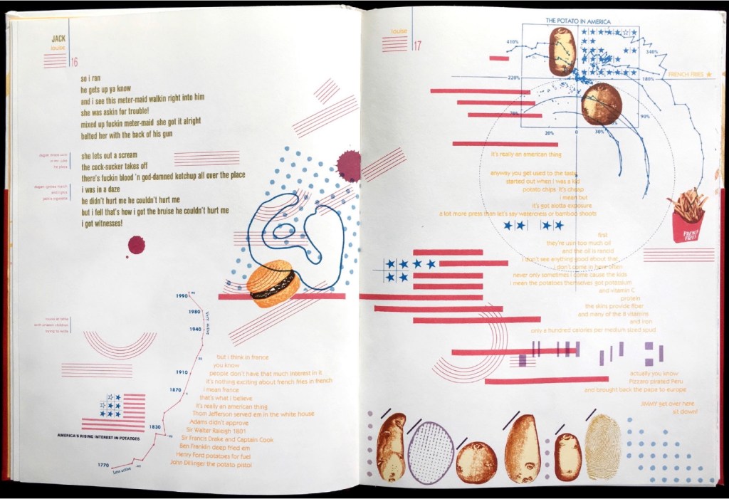
Lehrer’s satiric take on “what is America” aims to visualize the text of a ten-part play set in a DREAM QUEEN restaurant with its “core of regulars: four faithful customers, three employees and one mobile juke-box on wheels”. He calls it a “psycho-acoustic” translation in which “each character is typecast into a distinct color and typographic arrangement”. On the pages, “an array of images and marks accompany the text, evoking an appropriate ambiance, and further serving to chart the cacophony of shifting internal projections that make up the characters’ collective consciousness”.
If the satiric target of French Fries isn’t clear, consider the A assembled on the double-page spread by the text’s layout and the stars-bars-and-stripes.
Cidor’s abecedary is populated with words that are the artist’s answers to the question “what is America?”. Each letter of the Hebrew alphabet appears on a recto page, and a word beginning with that letter is worked into an abstract image on the facing verso page. At a further level of abstraction, all the letters are formed with Cidor’s stylized Hebrew font Octavk’tav.
From right to left, the Octavk’tav version letter ayin (ע) is for shem’at ha’omes (שְׁעַת הַעוֹמֶס) or “rush hour”. The words’ letters sprawl in brown across an intersection gridlocked with ayins.
As Lehrer does in French Fries, Cidor uses the arbitrary abstraction of letters and page order along with not-so-arbitrary typographical layout and words in translation (for example, Resh for the Hebrew for Rocknroll and Ronald Reagan, Tsade for Extra large Cheezburger with fries and a soda) to capture his satirical target: the big Aleph (New York and America).
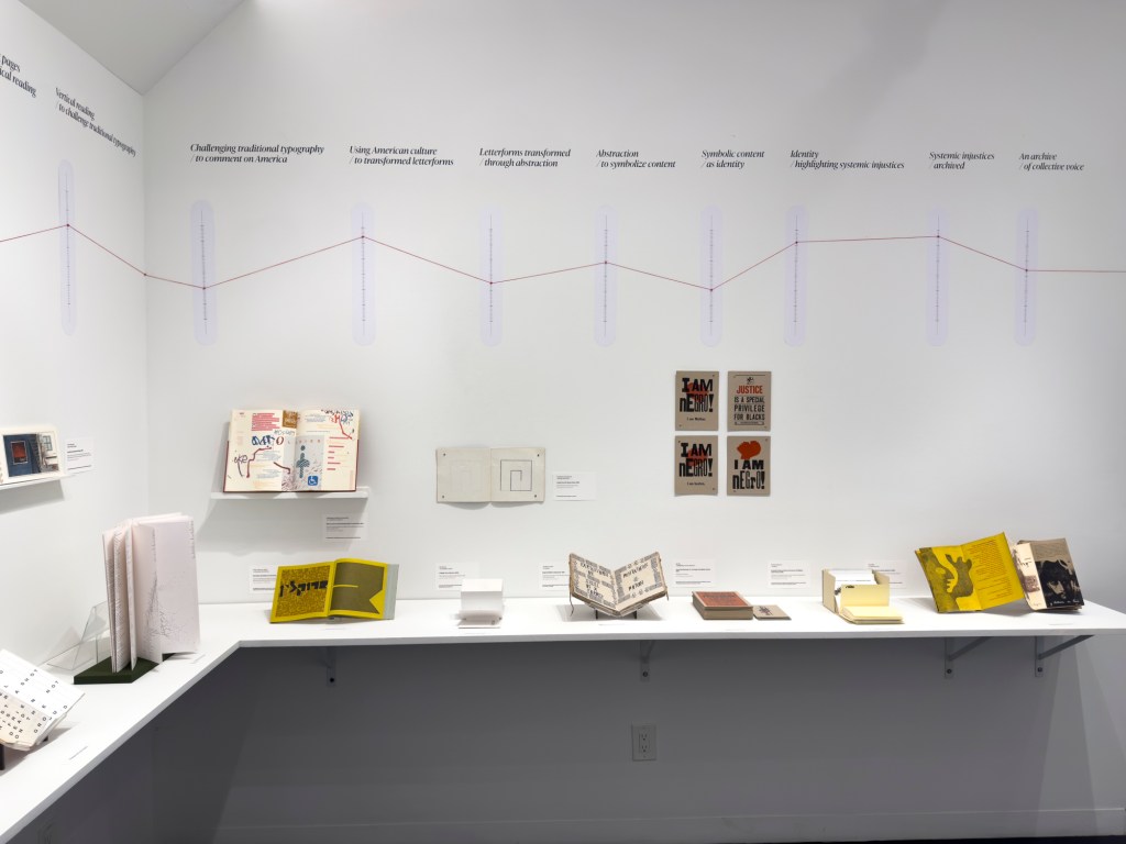
Above or beside each work displayed, a vertical time scale showing the exhibition’s span (1964-2024) was repeated on the walls. A red pin designated the nearby item’s year of publication, and a red thread ran from pin to pin around the room. Along with the spiral of tables displaying past exhibition catalogues, this fluctuating red line evoked Vico’s Spiral for visitors.
“Vico’s Spiral” at the Center for Book Arts, New York. Photo: Daniel Wang.
“Vico’s Spiral” at the Center for Book Arts, New York. Photo: Daniel Wang.
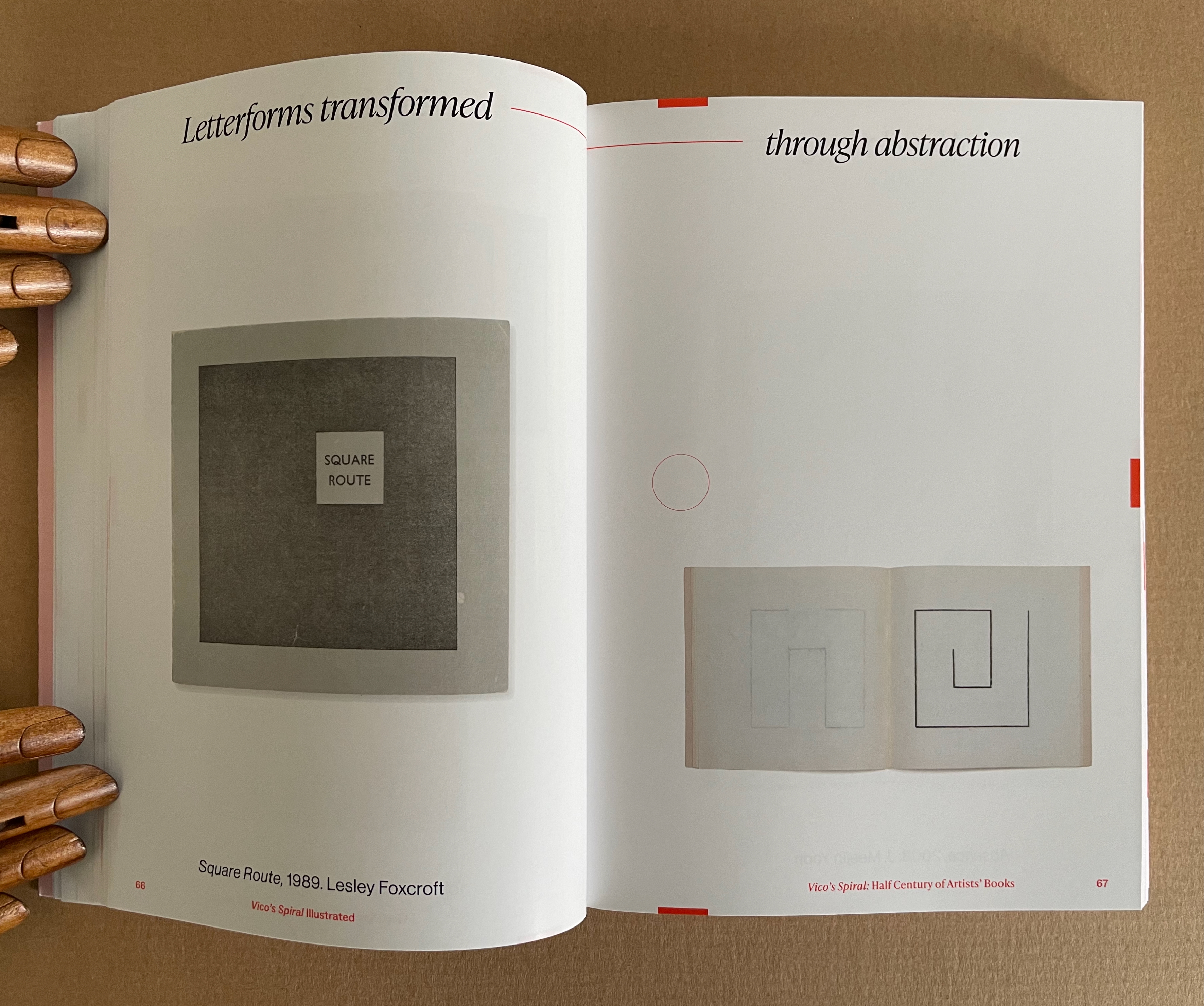
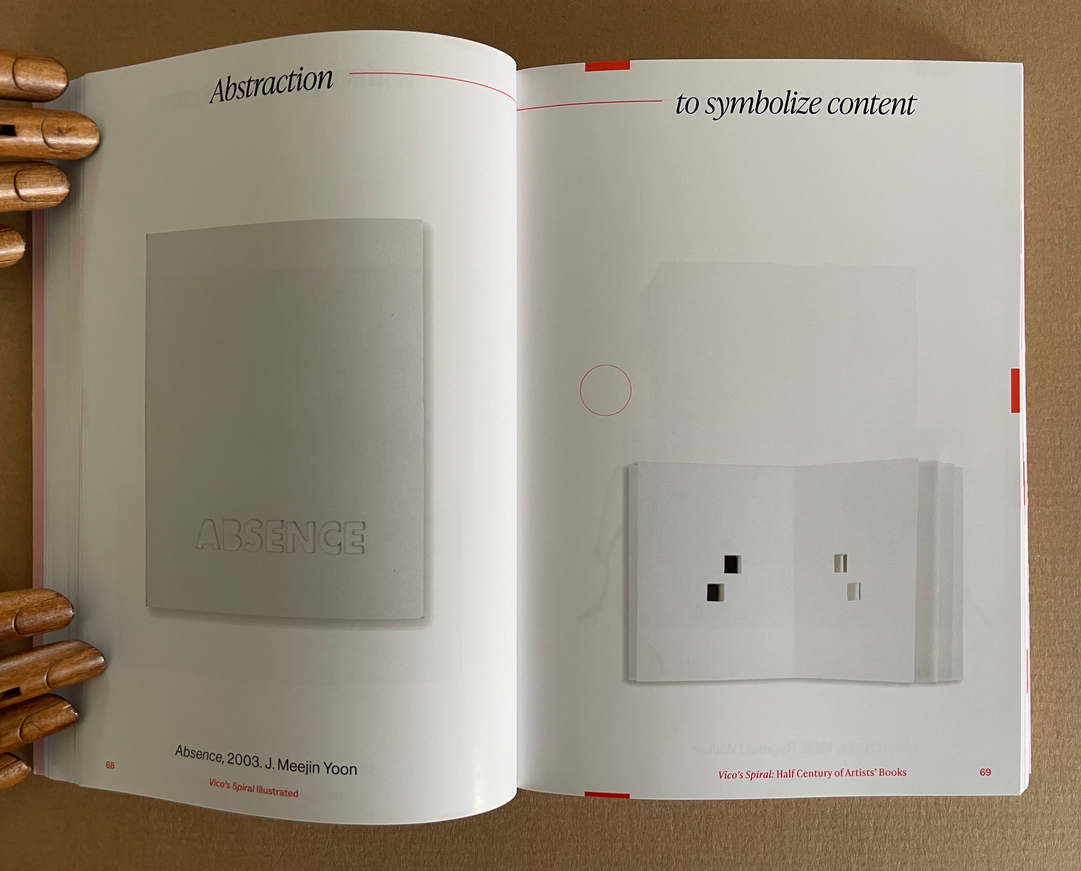
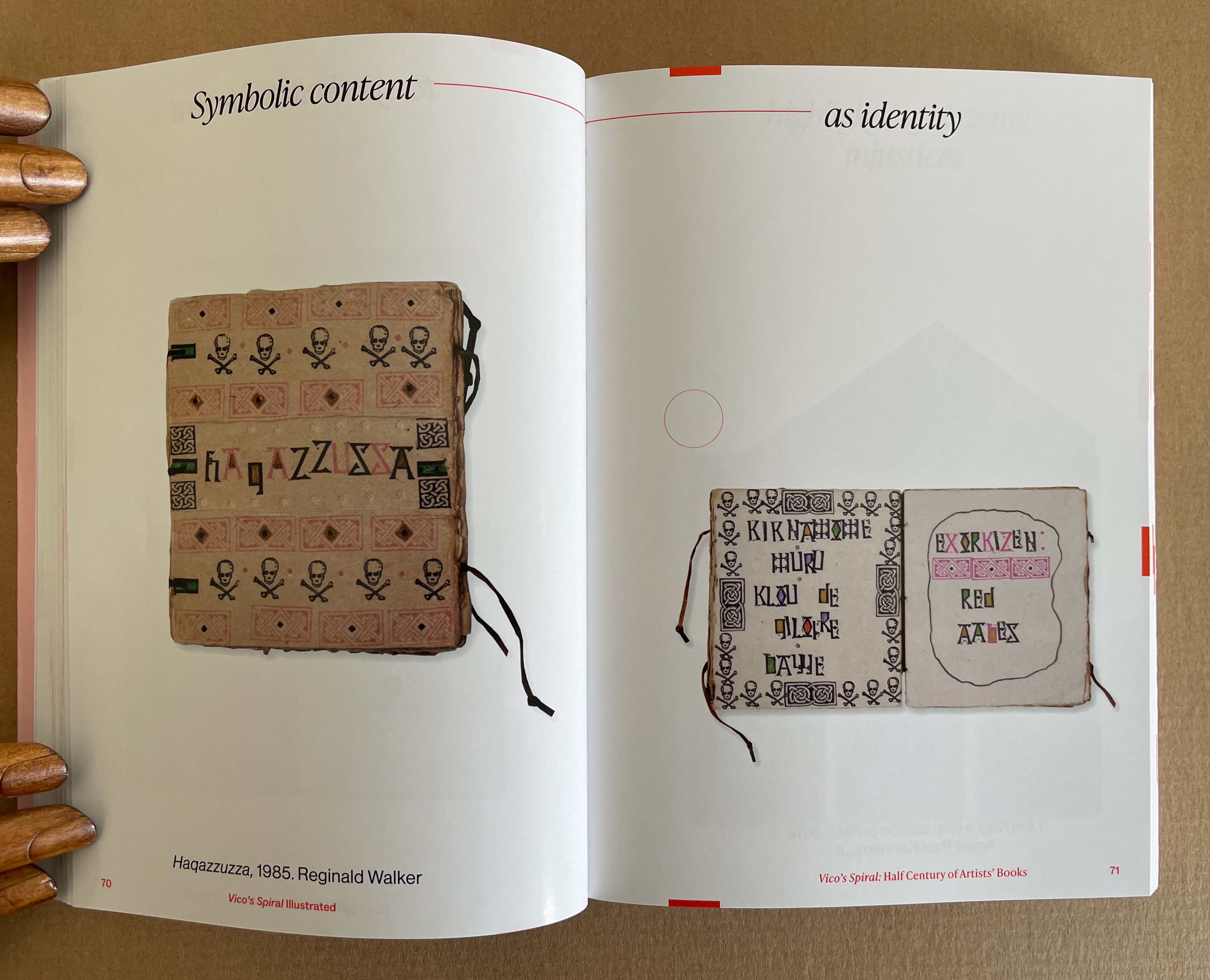
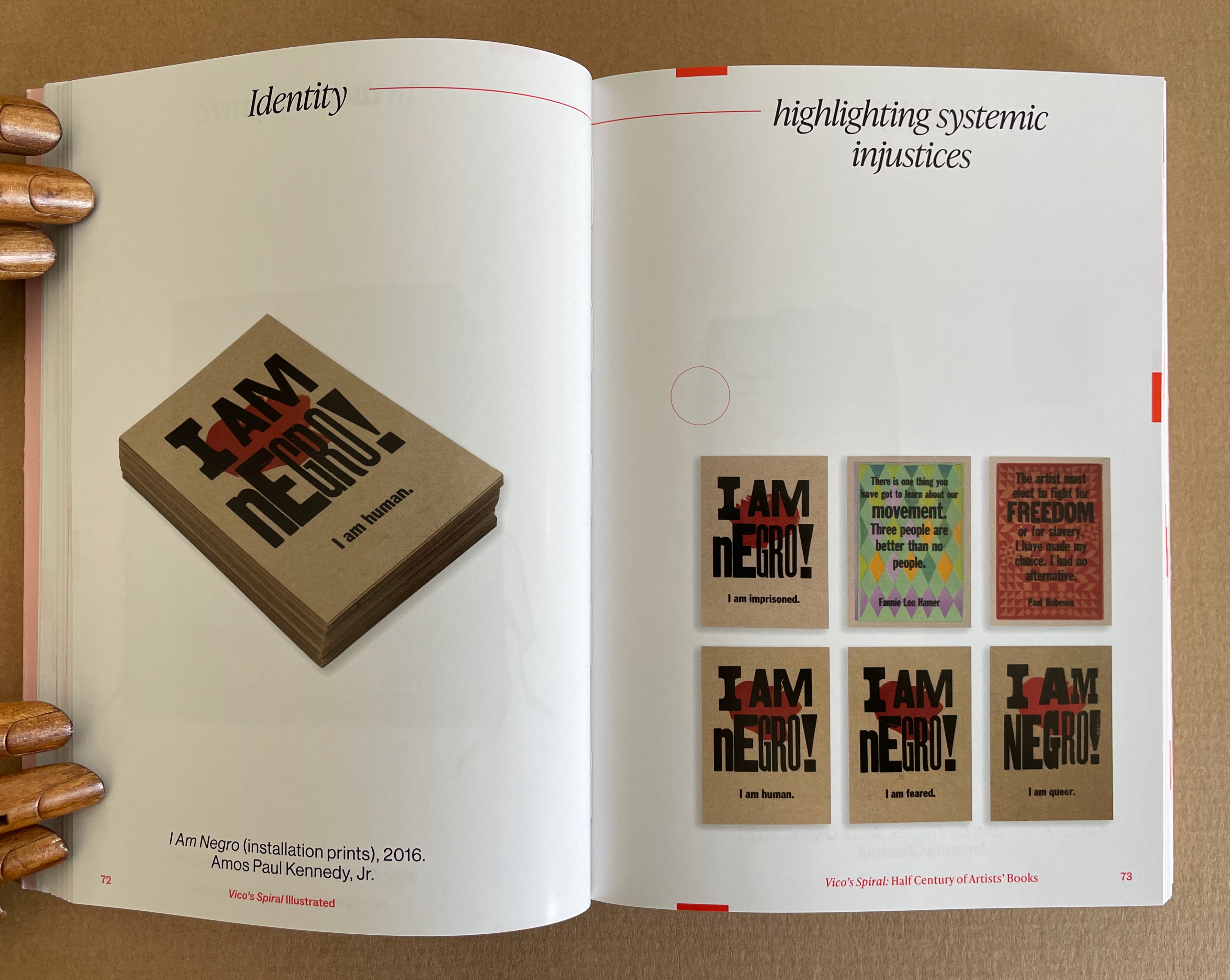
The exhibition’s catalogue emulates some of this design across pages 17-120, and what can be seen more clearly is how the curators daisy-chain their pairs with the headings used on the exhibition walls. Below are the two pairs that follow Lehrer, whose heading is “Challenging typography … to comment on America”, and Cid0r, whose heading is “Using American culture … to transform letterforms”. Foxcroft’s Square Route picks up the chain …
Pages 66-69. Photos: Books On Books Collection.
Pages 70-73. Photos: Books On Books Collection.
Kinohi Nishikawa’s essay “Strange Loops” brings a related metaphor to the party. He begins with another anniversary: the 2oth anniversary edition of Douglas R. Hofstadter’s Gödel, Escher, Bach: The Eternal Golden Braid (1979/1999).
At the heart of GEB, as devoted readers call it, is an exploration of how selfhood emerges from repeating patterns of cognition that mirror repeating patterns of the natural world, only for the cognitive patterns to turn inward and mirror themselves. GEB’s thesis is derived from Austrian mathematician Kurt Gödel’s incompleteness theorem, which contends, “All consistent axiomatic formulations of number theory include undecidable propositions.” Gödel’s theorem defines the constitutive externality of any set and, in so doing, identifies the minimal gap within a system for self-awareness to emerge. Crucially, Hofstadter does not limit his account of selfhood to the operation of cognitive processes. The metaphor of strange loops suggests how patterns that fold on themselves are perceived, felt, and, indeed, experienced by an embodied being. (p. 175)
Nishikawa’s immediate task in Vico’s Spiral is to survey the CBA’s previous half century of exhibitions, and he uses the strange loops metaphor to understand the CBA through the “set” of its exhibitions. All well and good, it is a brilliantly written and insightful essay. But if only he had also been asked to apply the metaphor to the set of artists’ books in the CBA’s archive or the set selected by Silberberg and Naggar!
In The Century of Artists’ Books, Johanna Drucker highlighted the self-interrogatory nature of the artist’s book as its defining characteristic. The application of these metaphors of Vico’s Spiral and strange loops to the history of artists’ books adds a new sense to that. The self-interrogatory nature of the artist’s book is a pattern recurring similarly but differently across time and space in those works of art created by artists who play with the book whether as material object as a whole or in its parts, as vehicle, as site of performance, as a tool-made and tool-making technology, or as concept. As each of those aspects yield fresh artists’ books with differences, we have new opportunities to perceive, feel, and experience an artwork’s pursuit of its self, the artists’ pursuit of their selves and our pursuit of our selves.
Nishikawa comes tantalizingly close to applying the strange loops metaphor to the domain of artists’ books when he writes, “Book arts is about discovering the self at the edge (fold, seam, spine) of insight and creation” and, when he writes, “… the essential question of selfhood isn’t What? or Why? but How? How do these patterns work, how do I know myself better through them?”
Indeed, “how?” is the question to be brought to each artist’s book. How do I encounter this artwork? How is it manifesting its patterns? And then to bring ourselves full circle back to Vico’s Spiral, How are those patterns manifest in other works in other times and other places?
Nishikawa’s approach to the CBA’s catalogues also offers a baton that we can hope others will carry forward. The CBA’s exhibitions provided not only a way into understanding the CBA itself but one into researching the world of artists’ books. Aware of this opportunity, Silberberg concludes the volume with a listing of artists’ books exhibitions from around the world. Who will grasp this baton next in the race along Vico’s Spiral?
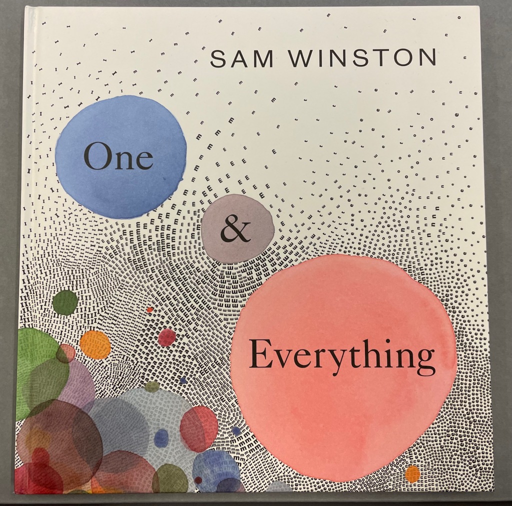
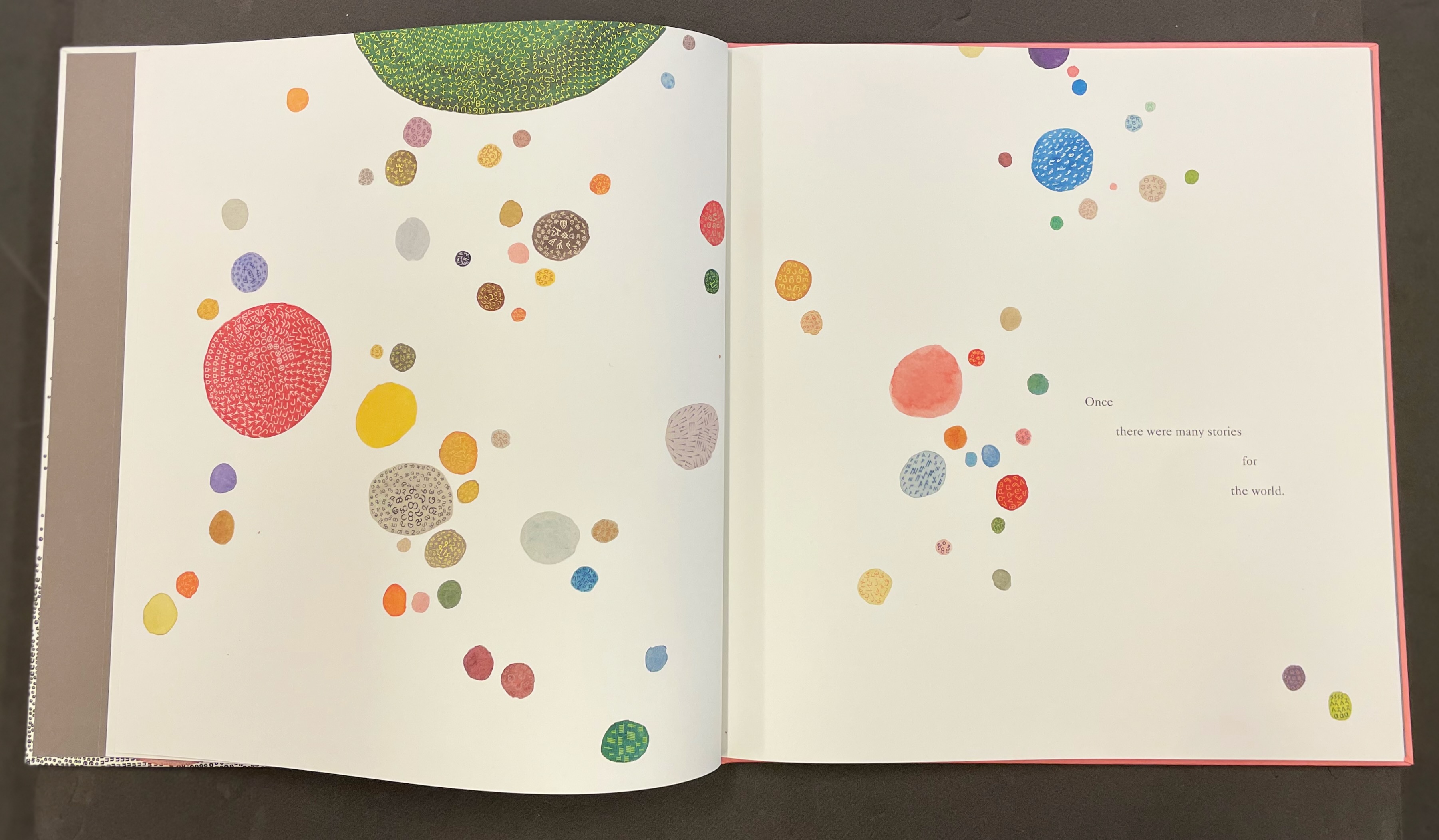
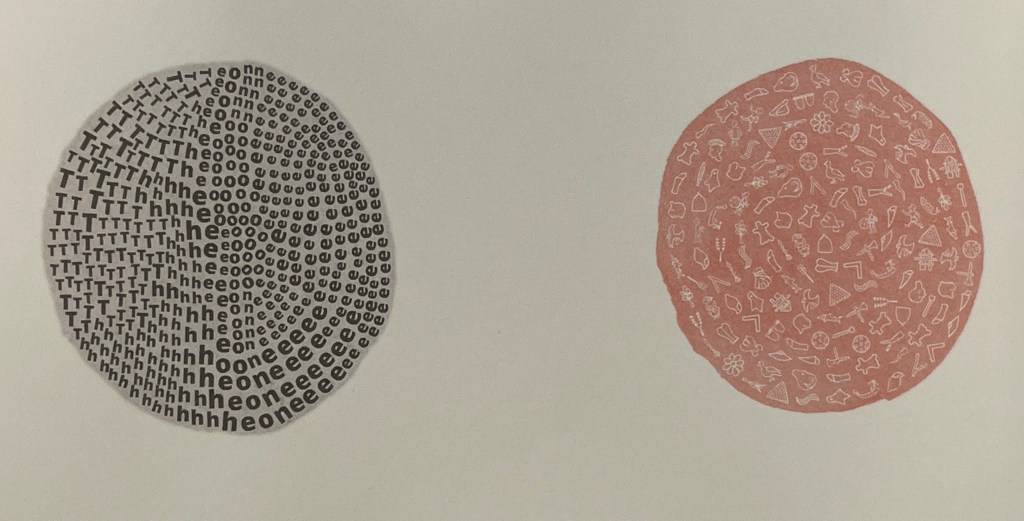
One & Everything(2022) Sam Winston Casebound with illustrated paper over boards. H265 x W255 mm. 48 unnumbered pages. Acquired 23 November 2022. Photos: Books On Books Collection. Displayed with artist’s permission.
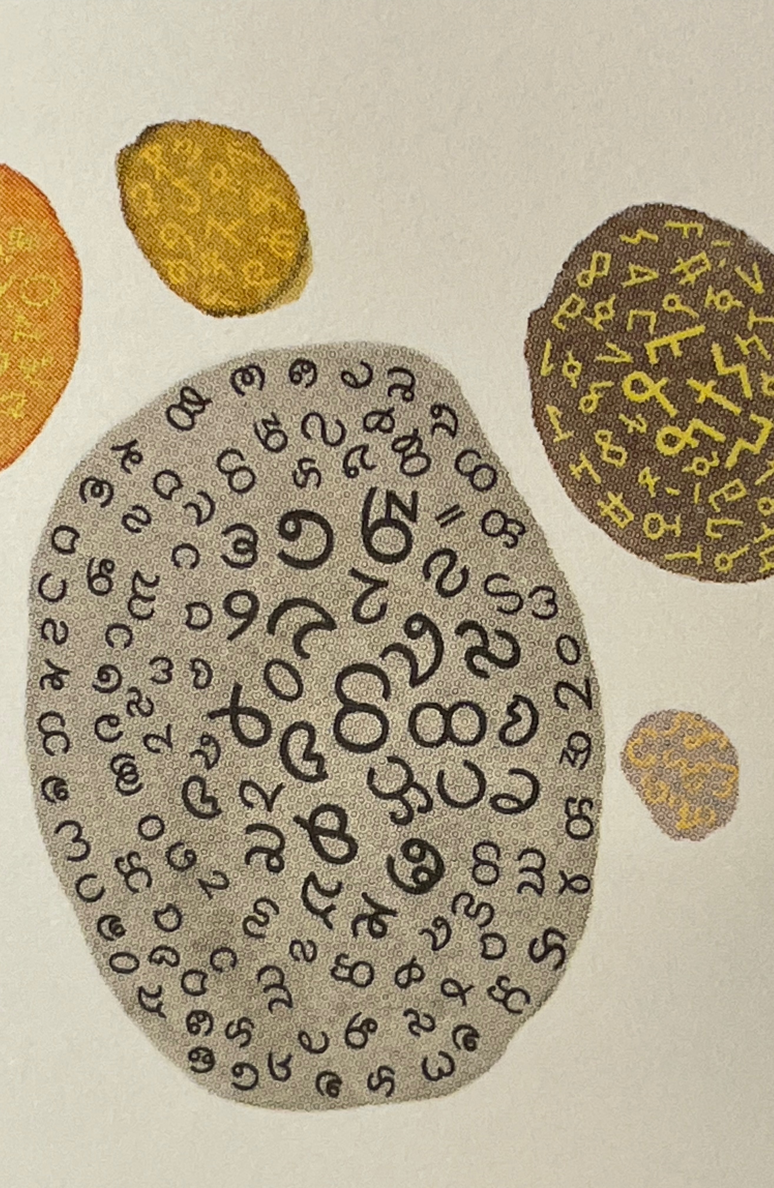
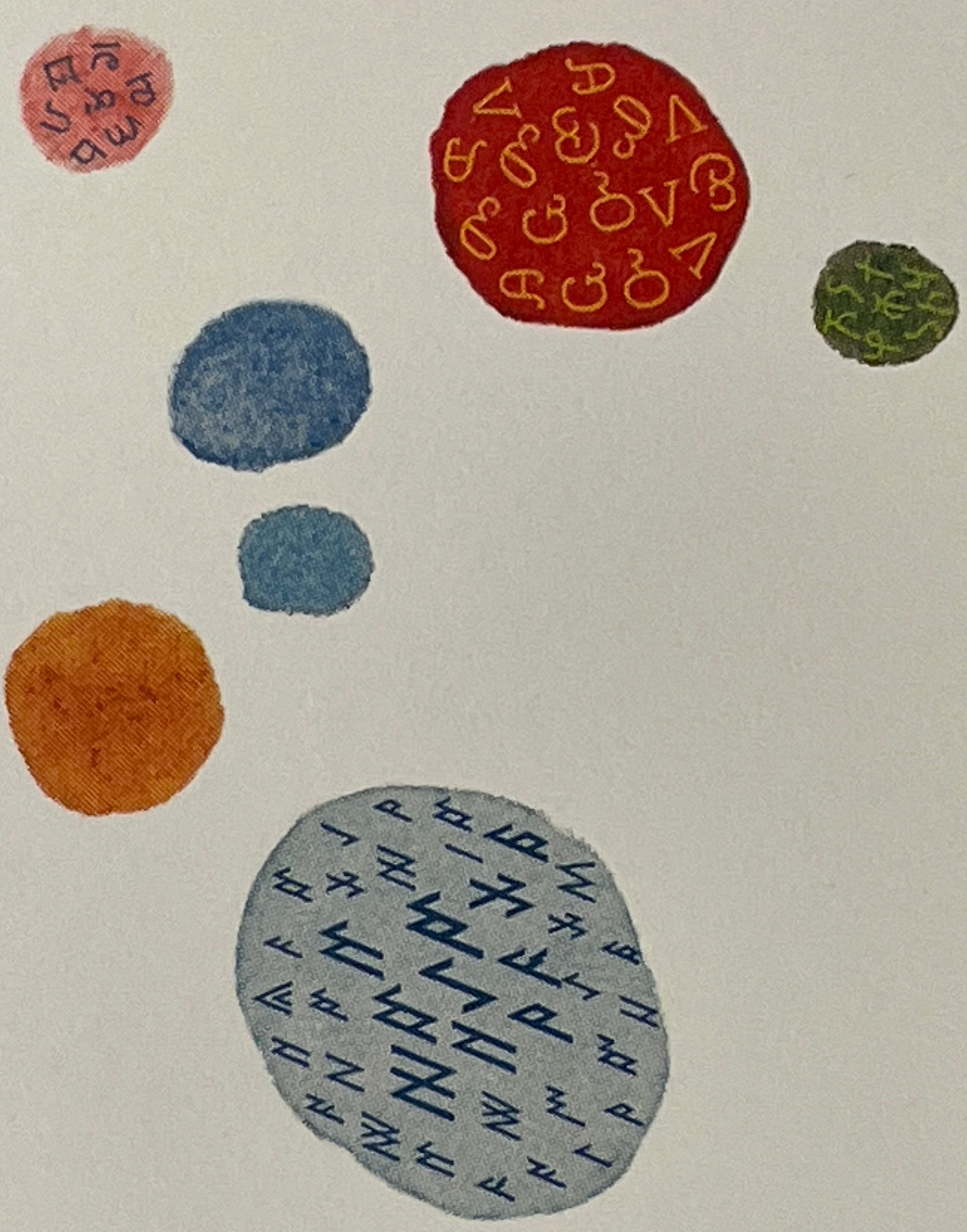
Sometimes you just know that you have read a classic. This is one of those times. Winston and Candlewick Press (Walker Books in the UK) have worked a fresh tale, tone and meaning together with image, color, design and production values to an extraordinary level. Inspired by Tim Brookes’ “Endangered Alphabets Project“, Winston uses the striking shapes of letters and scripts from the Latin, Ogham, Cherokee, Armenian, Hebrew, Tibetan and dozens more alphabets and syllabaries to create the characters in his fable about the story that decides one day that it is the One and Only story.
Shapes like single-celled creatures (each filled with a different alphabet) represent the many stories existing before “The One” arrives.
“The One” is made of the English (i.e., Latin or Roman) alphabet. Will it listen to and make sense of all these other stories?
The fable of One & Everything does more than support the notion that alphabets and languages can be endangered. Implicit in the fate of the “One & Everything” story” is the message that Babel was more of a blessing than a curse.
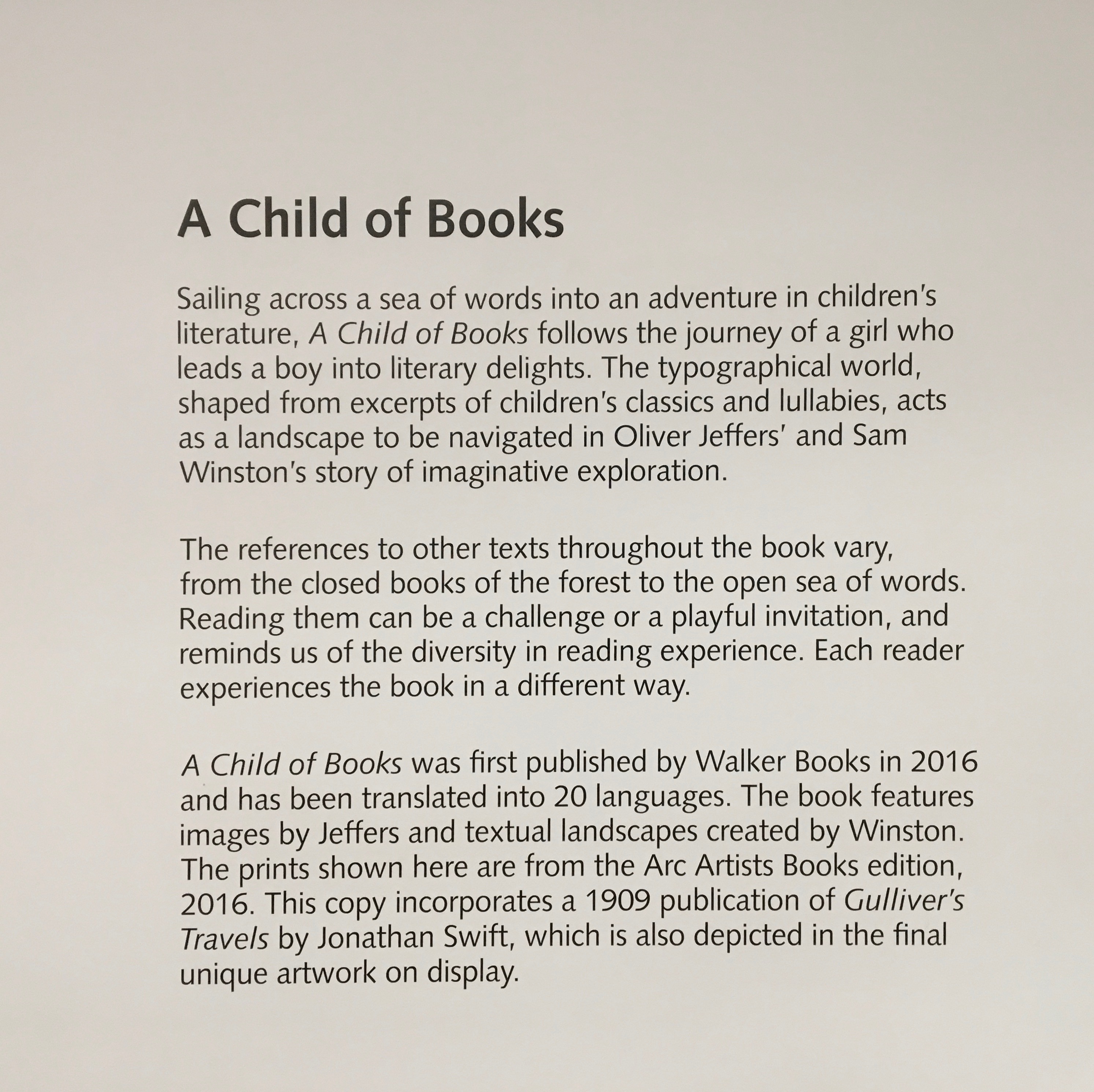
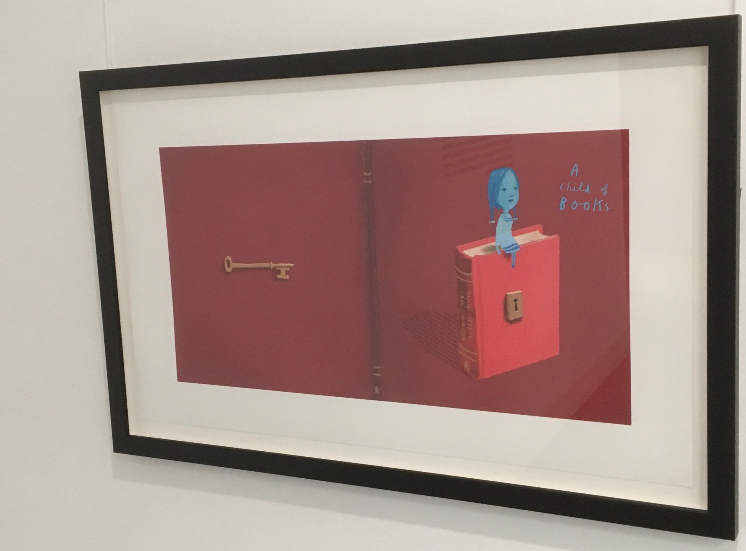
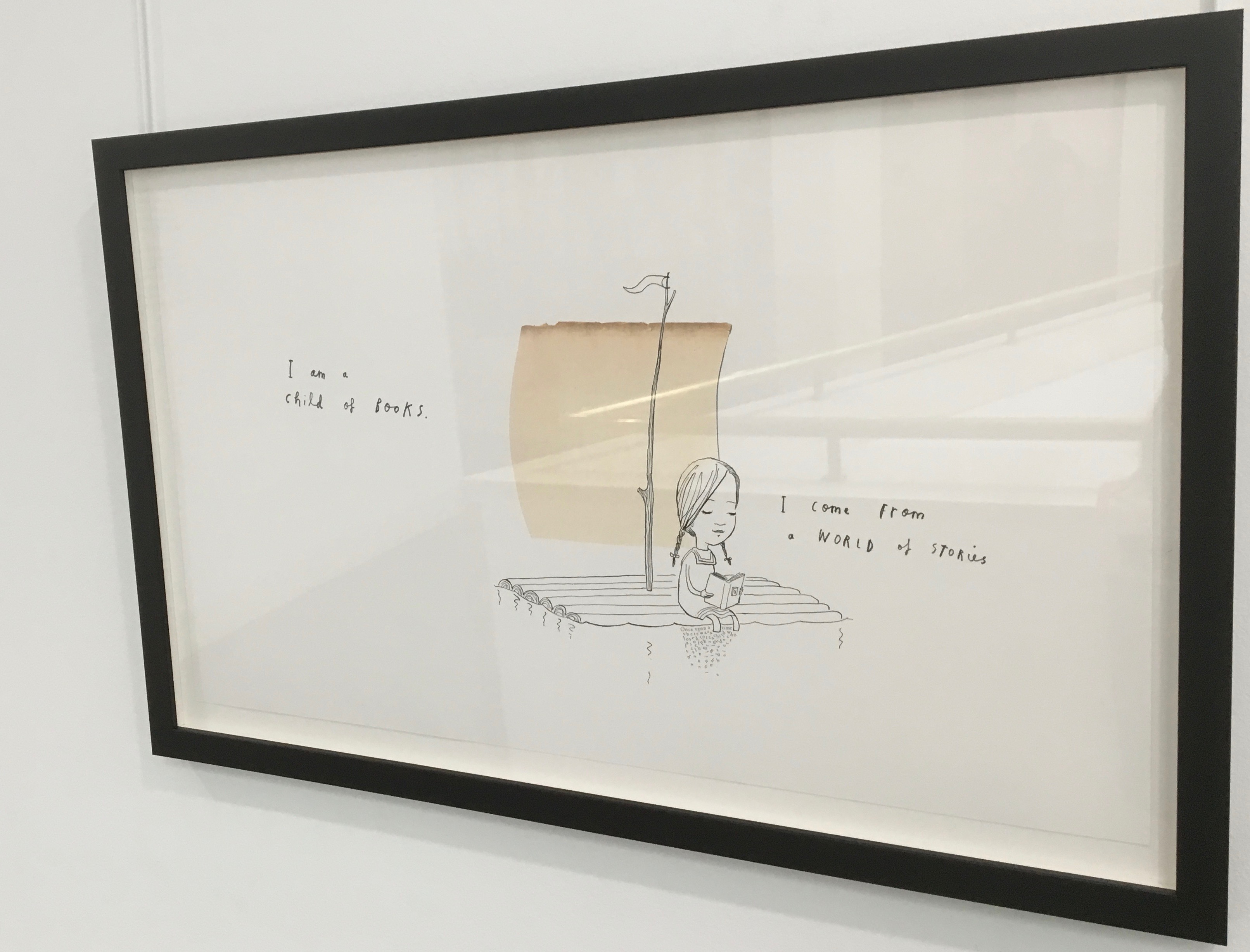
Readers familiar with Winston’s A Dictionary Story and his collaboration with Oliver Jeffers in A Child of Books (both below) will recognize a growing refinement and, now, breadth and depth in Winston’s storytelling. The youngest audience and beginning readers will be held by the shapes, colors and simplicity of the story. Older readers will easily grasp its underlying meanings and be intrigued by the variety of letters and scripts and the idea that languages and alphabets can die. Still older readers and teachers will appreciate the helpful resources following the story’s ending invitation. At all levels, the audience will delight in Winston’s creation of his characterful abstractions with letters from the alphabets and scripts identified in those resources. Those with an eye for such artistry will appreciate Winston’s extension of a tradition embraced by Paul Cox, Roberto de Vicq de Cumptich, Sharon Forss and Nicolas McDowall.
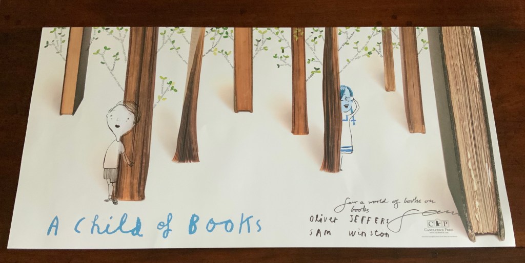
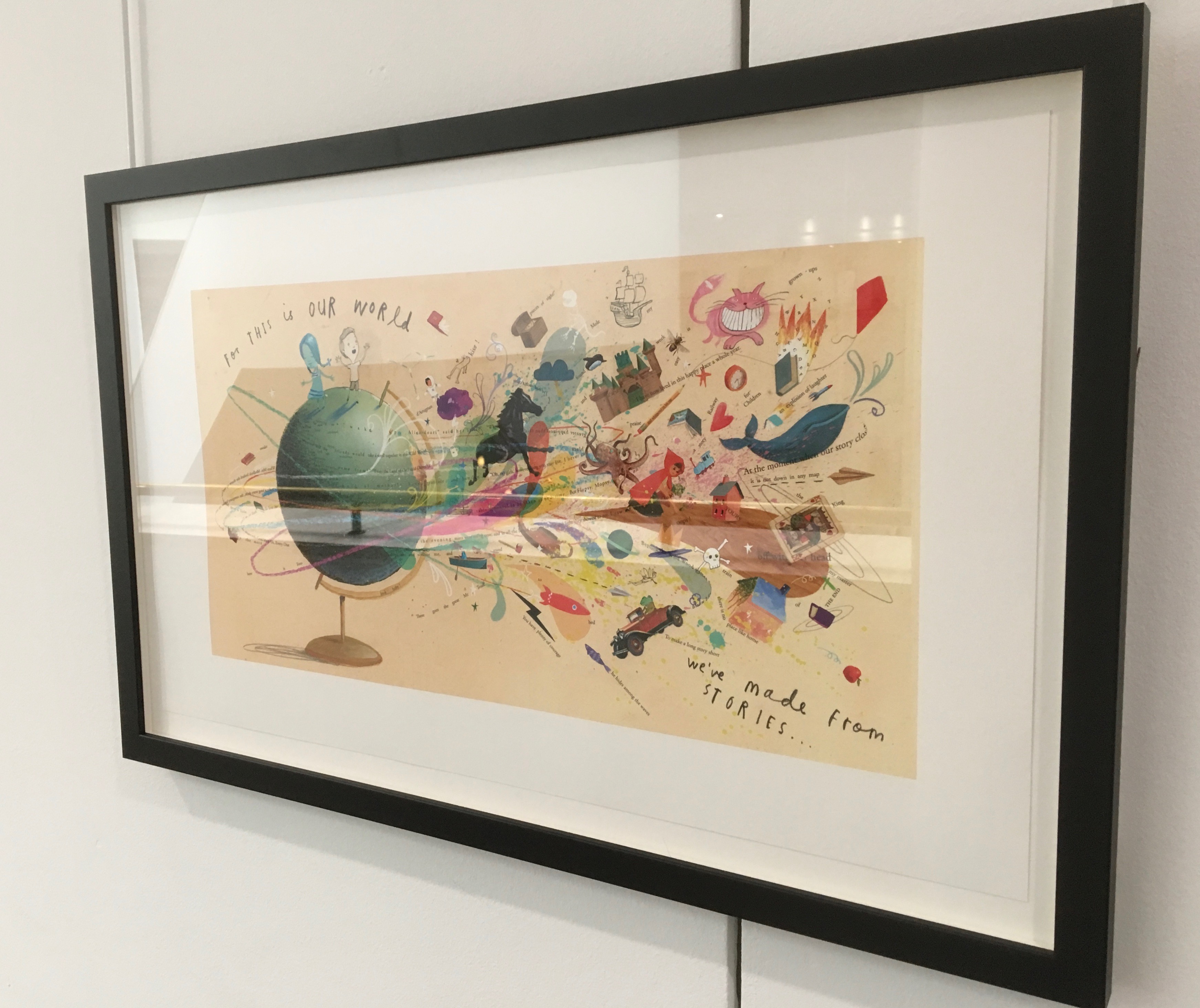
A forest made of fore-edges. A raft made of spines and its sail a book page. A wave and a path made of excerpts from books. In this fabulous world made from the features of books, the simpatico imaginations of Oliver Jeffers and Sam Winston deliver a heroine and an invitation that are hard to resist.
Promotional poster. Displayed with permission of Sam Winston.
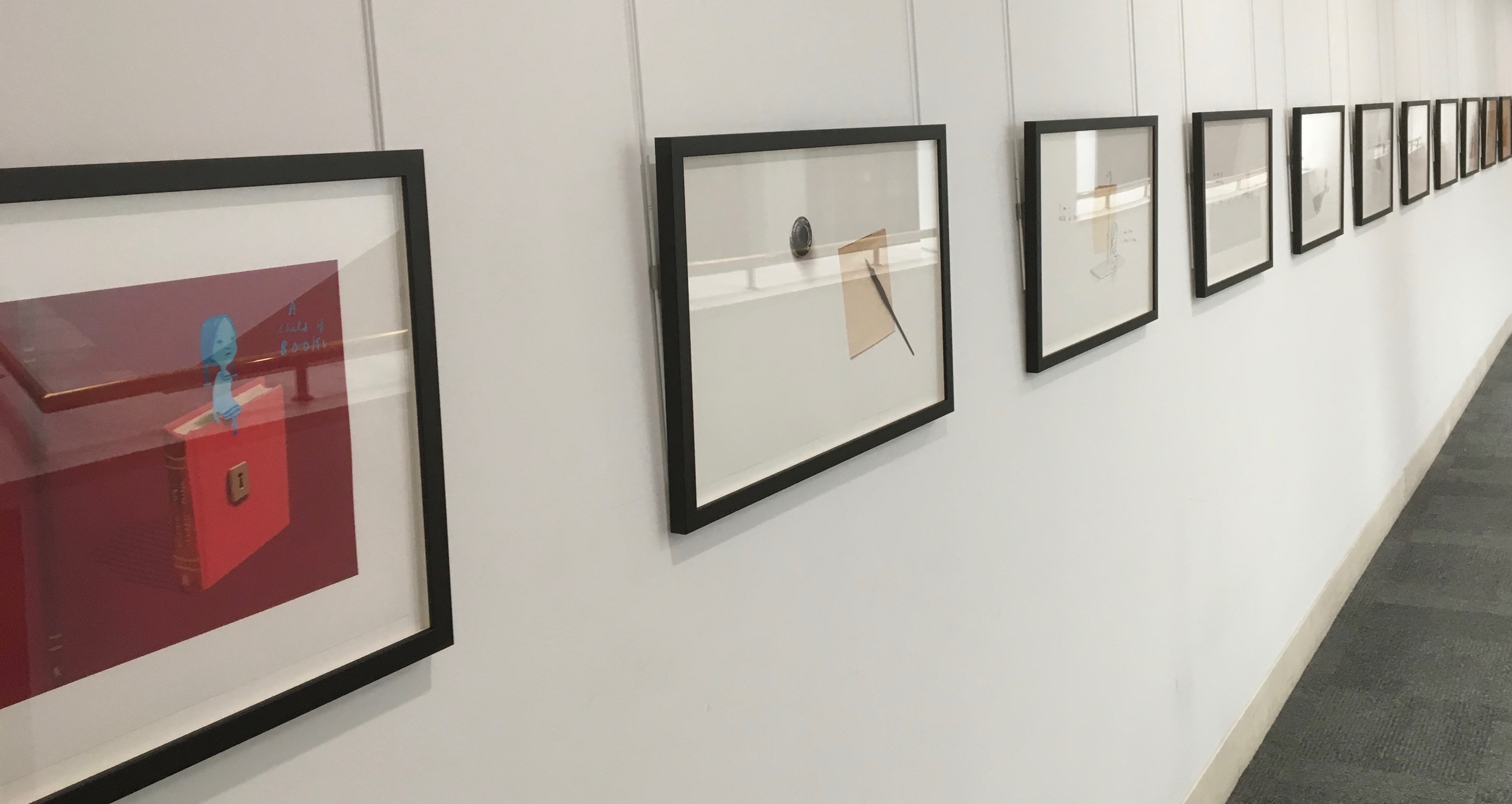
In addition to the poster above and the trade book it promotes, Winston created an artist’s book edition celebrated by this hallway gallery below mounted by the British Library shortly after its appearance.
A Child of Books prints displayed at the British Library, 9 August – 27 September 2019.
Winston’s abiding love of letters, words and stories shines through in A Child of Books. Arguably, it has its origins in an earlier work whose story is told by his invention of a very different “child of books”.
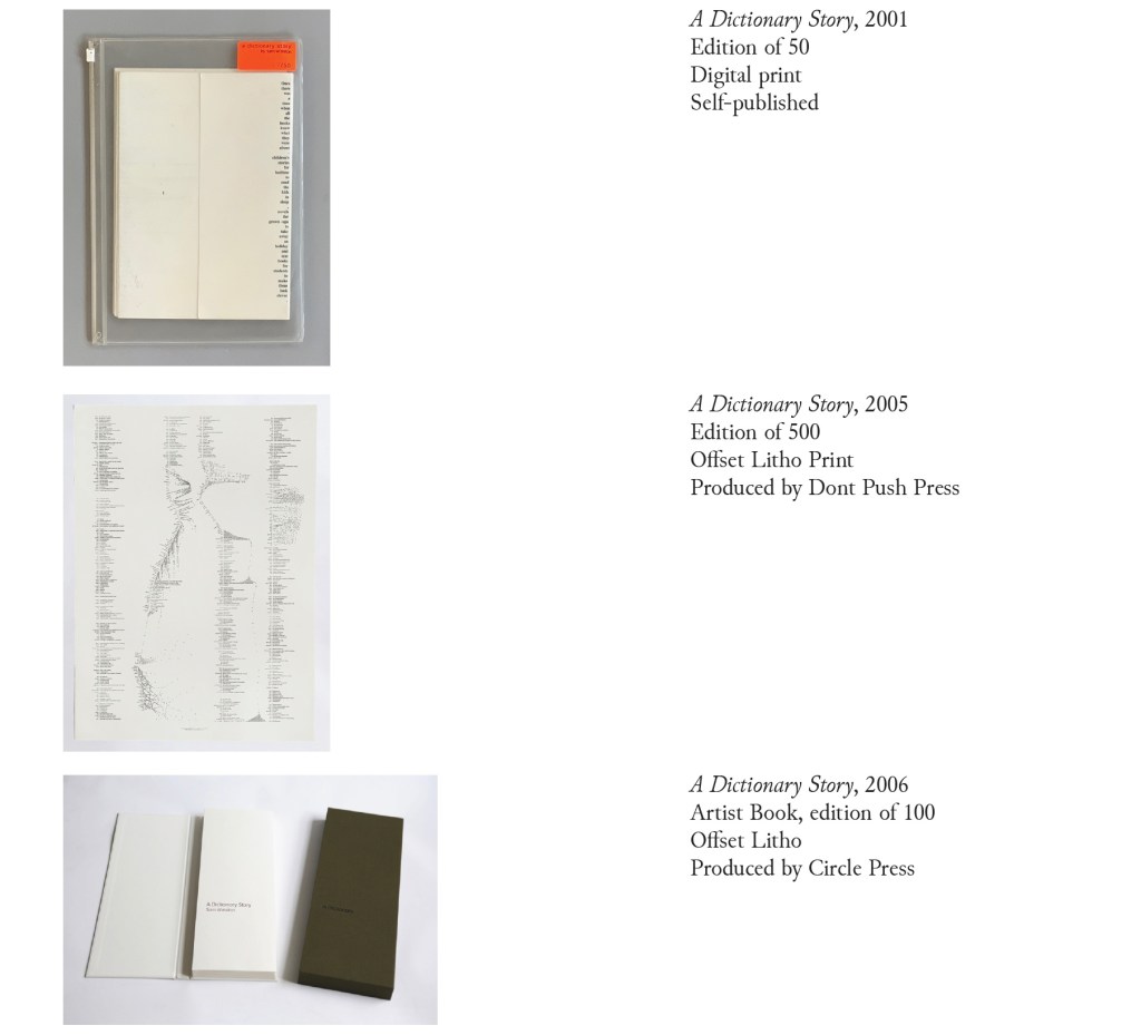
A Dictionary Story (2001 – 2020)
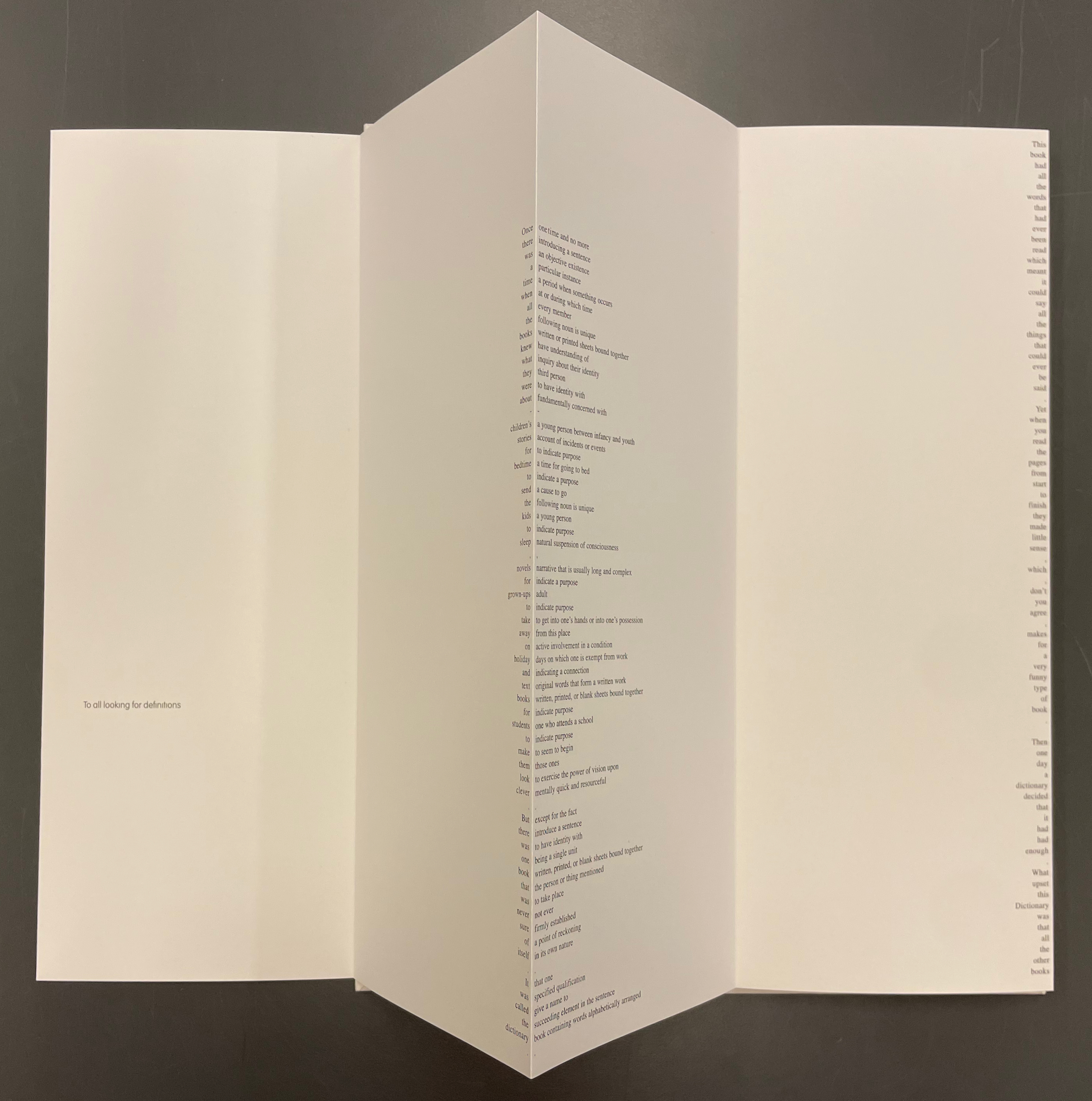
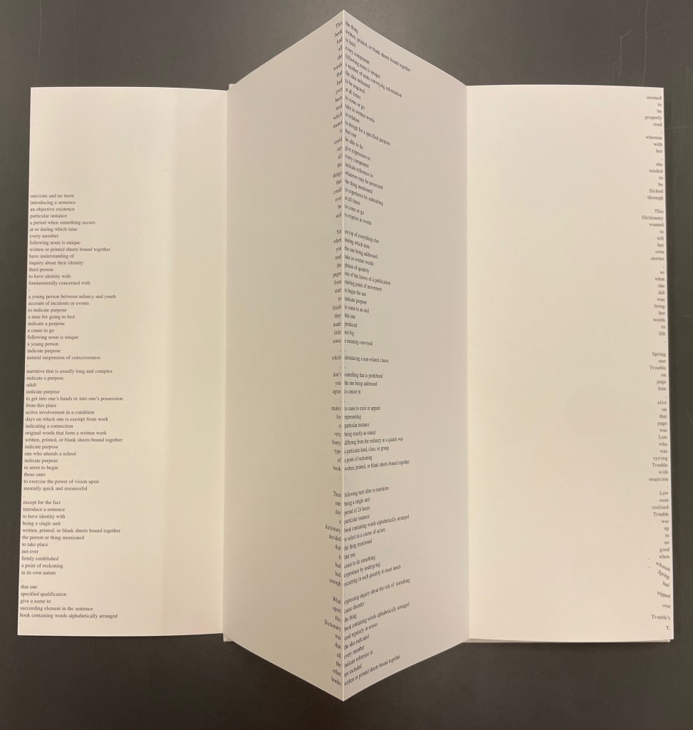
Since its origin as a student project in 2001, A Dictionary Story has appeared in an accordion book form as a fine press edition and two trade editions and as single-sheet prints. The Books On Books Collection holds the fine press edition and the second trade edition, both of which have in common a vertical flush-right single-word column that tells the story and the immediately adjacent vertical flush-left column of definitions of the words in the story. In the fine press edition, the two columns meet at each mountain peaks of the accordion fold.
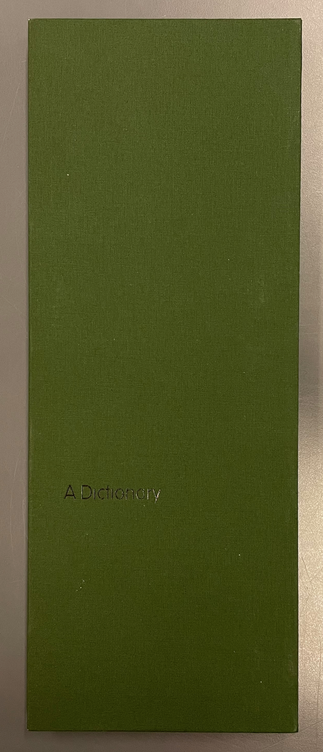
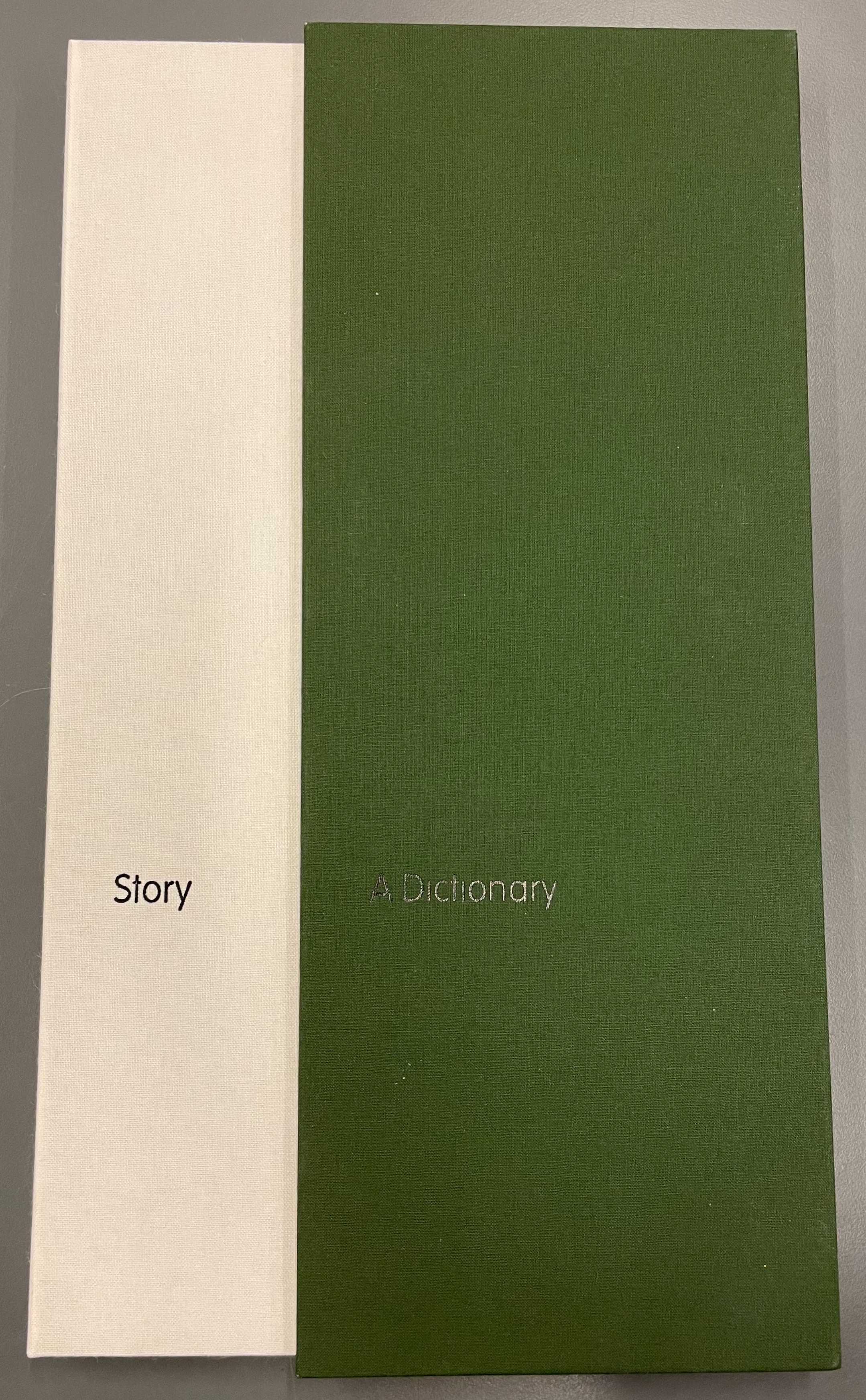
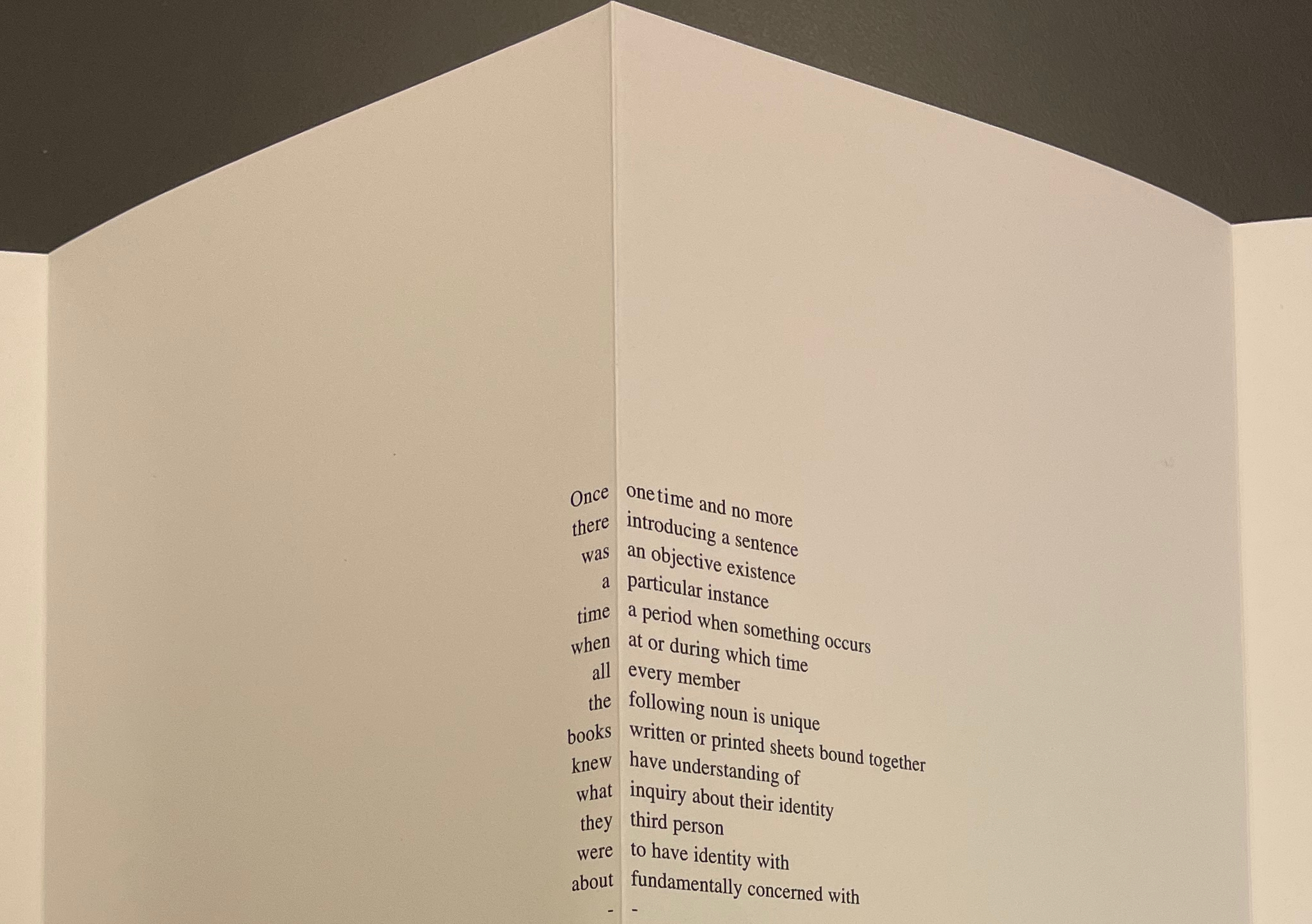
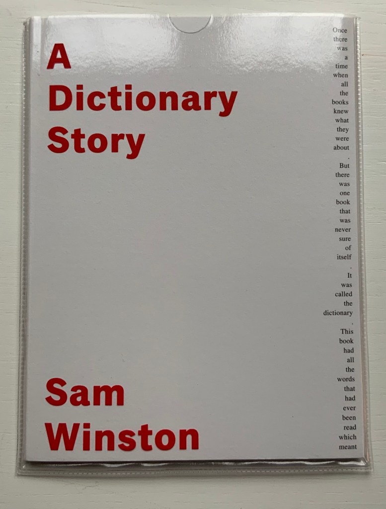
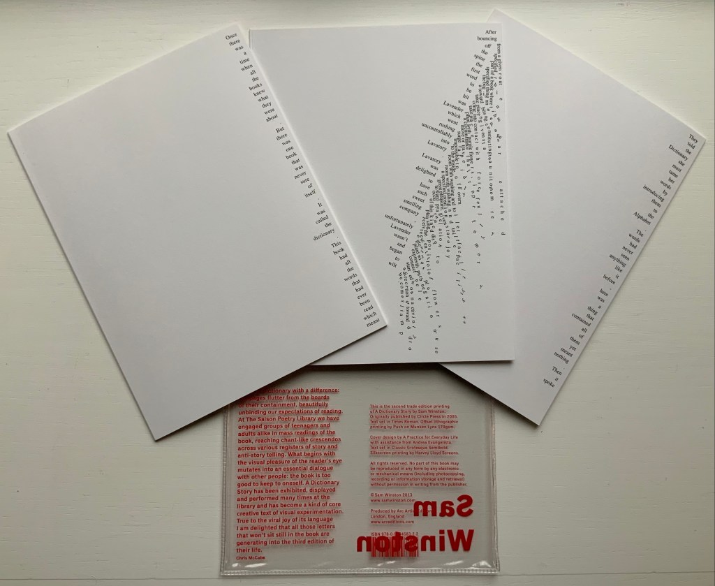
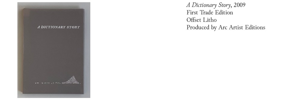
A Dictionary Story (2006) Sam Winston Slipcased leporello between cloth-covered boards.H360 x W140 mm, 25 panels. Story text set in 9 point Times Roman by Sam Winston. Book designed by Richard Bonner-Morgan and Sam Winston. Printed by David Holyday at Trichrom Limited. Bound at Quality Art Reproductions, England. Published by Circle Press. Edition of 100, of which this is #68. Acquired from the artist, 30 May 2018. Photos: Books On Books Collection. Displayed with artist’s permission.
“Once there was a time when all the books knew what they were about. But there was one book that was never sure of itself.”
Panels 2-5 from the fine press edition; detail of panels 2-3.
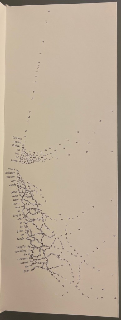
So begins Winston’s tale about this uncertain book. The book never sure of itself is the Dictionary, which of course it must be, otherwise the tale would not be called “A Dictionary Story”. The Dictionary is jealous of all the other books because they are “properly read”, whereas she is just flicked through from time to time. A bit like the “One” in One and Everything, the Dictionary seems to think she contains all the stories imaginable, because she contain all the words — just not in the right order. So she decides to bring her words to life as characters to see what will happen. Words and letters fly about, enacting the story as if in a concrete poem. A meaningful tussle between text and image is a frequent feature for artists’ books as well as visual poetry.
Another defining aspect of book art is its self-referential nature. In an interview with Typeroom, Winston captures this in his response to the question “What is Dictionary Story all about?”:
Dictionary Story is a playful way of exploring some of our presumptions around the printed word. Or you could say that it looks towards a tool we are given at a very young age – the Dictionary – and invites us to actually think about how that works. Here’s a device that is designed to explain a word’s meaning by offering further words in its place – to me that is remarkable. This is a type of knowledge that can only explain itself through referencing itself. As a visual person the image that comes to mind is a giant, never ending, Möbius strip of language twisting back on itself.
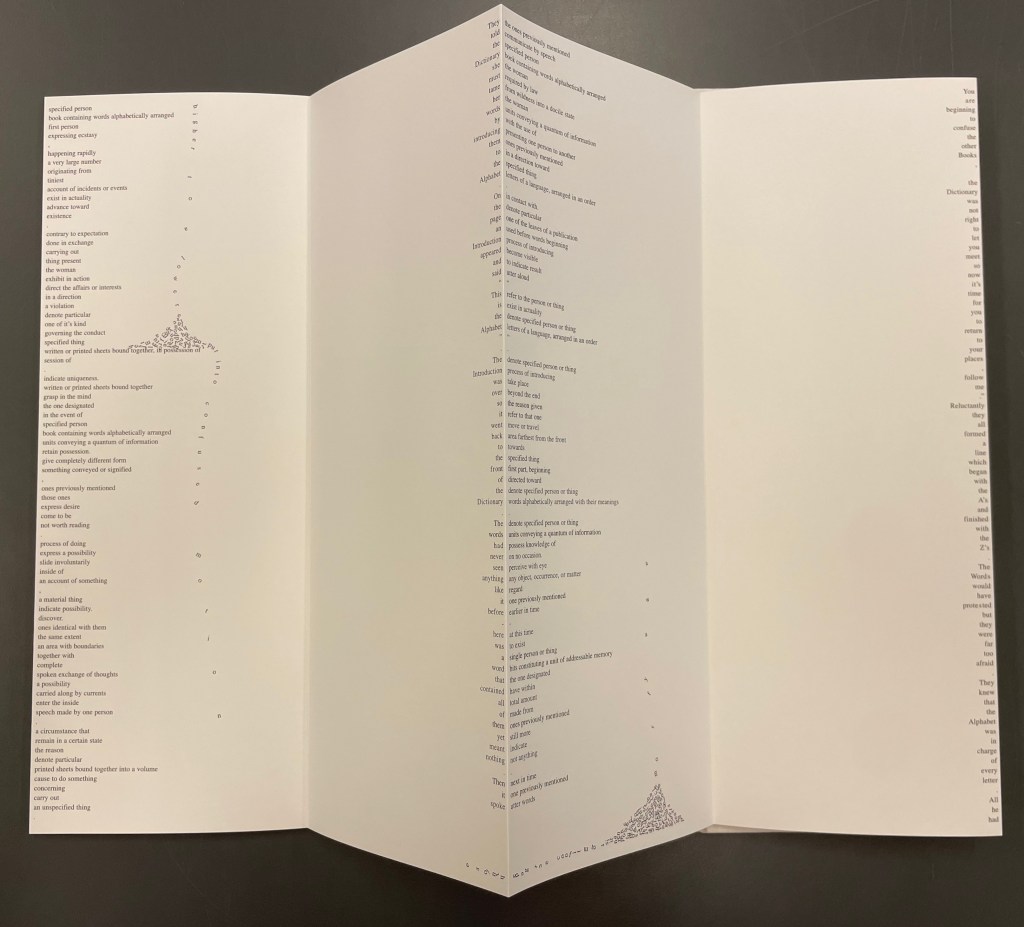
Of course for less visual persons, the Dictionary’s whim engenders chaos, which Winston, a dyslexic, can appreciate. So he brings onstage (or “onpage”) the Books, of whom the Dictionary was jealous, to remonstrate that if words become disconnected from their definitions, how will they the Books know what they are about? Insisting that she tame her words, they have the Dictionary’s Introduction introduce her bewildered words to the character “Alphabet”.
Making the journey over the hills and valleys of A Dictionary Story is satisfying, and re-making it is even more satisfying and delightful each time. The making and re-making of A Dictionary Story must also have been satisfying and delightful for Sam Winston; he has done it so many times.
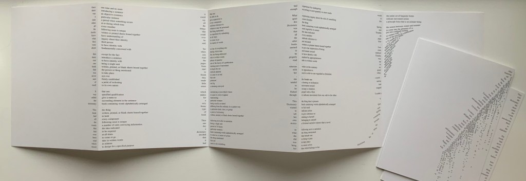
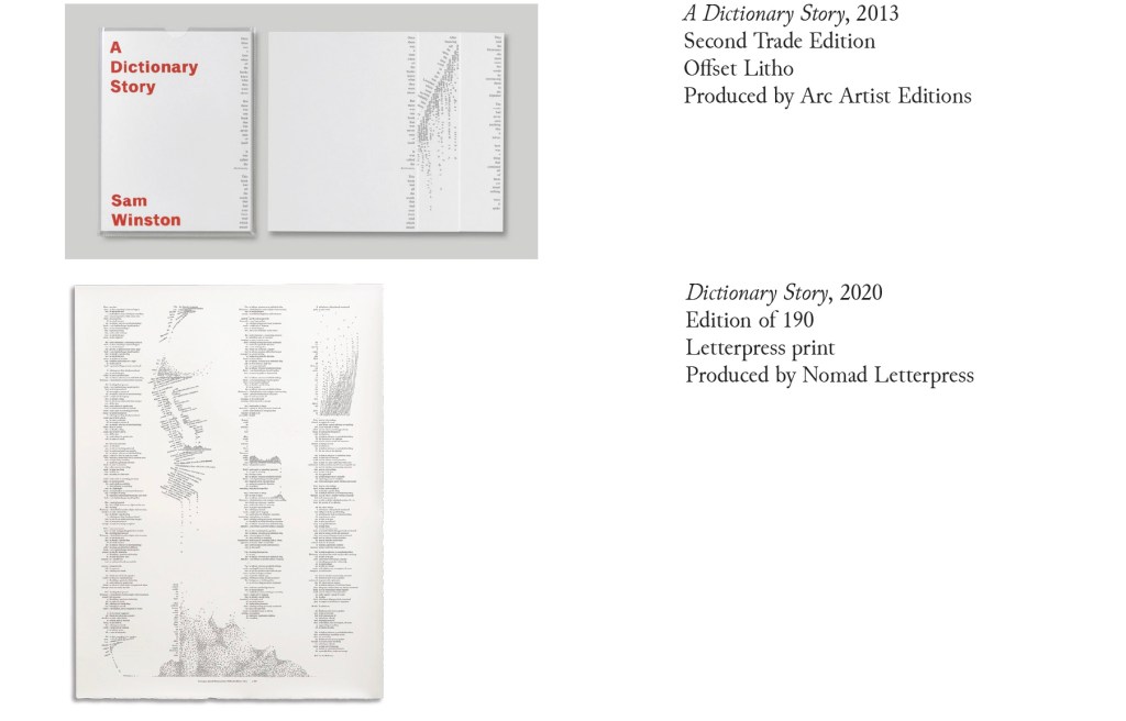
A Dictionary Story (2013) Sam Winston Three five-panel accordion folded sections in a plastic sleeve cover. Second trade edition. Sleeve: H205 x W160 mm. Sections: H200 x W150 mm, 15 panels. Acquired from the artist, 13 December 2020. Photos: Books On Books Collection.
Watching the artist adjust the typography of A Dictionary Story to changing dimensions is like watching a star tennis player who is also a star basketball player and star soccer (football) player. There’s always a ball, there’s always a net, there’s always genius.
The trade edition splits the fine press edition into three less narrow leporellos and nudges some of the two columns (story/definition) into the valley fold. Below, in the trade edition across panels 3 and 4 is where the Dictionary decides to bring her words to life, and on the right side of the fourth panel, the words begin to slip away from the fold.
The same part of the story in the fine press edition occurs on the fourth panel below, and the words tilt against the fold.
These variations create subtly different narrative paces and visual impressions in the two editions. Not one better than the other, just different. The poster variations, however, subordinate narrative pace entirely to visual impression. At present, the posters are not in the collection, but the images below help to make the point. As with movie goers, some will like the prints more than the books, others the books more than the prints, and still others will marvel at the genius in all of them.
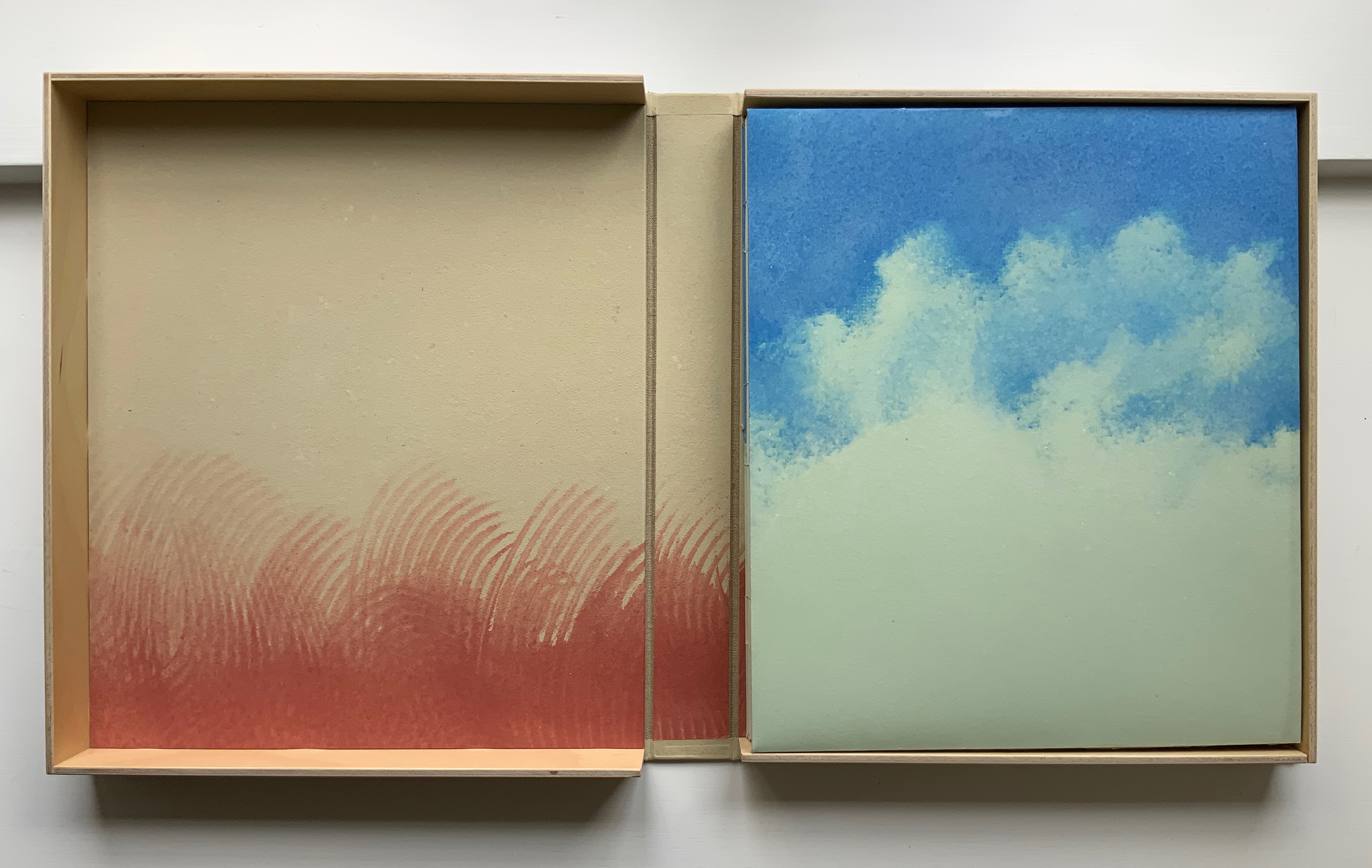
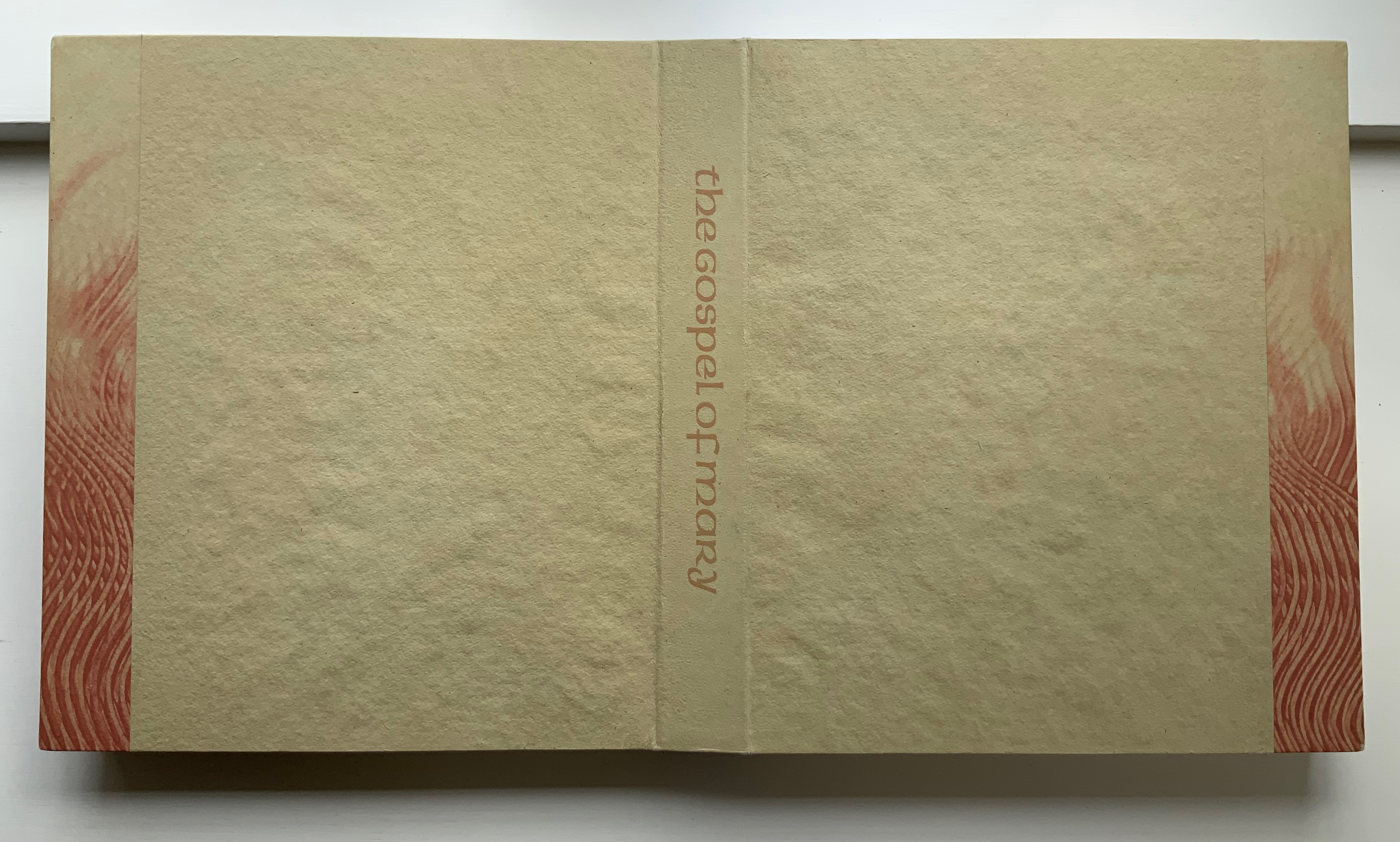
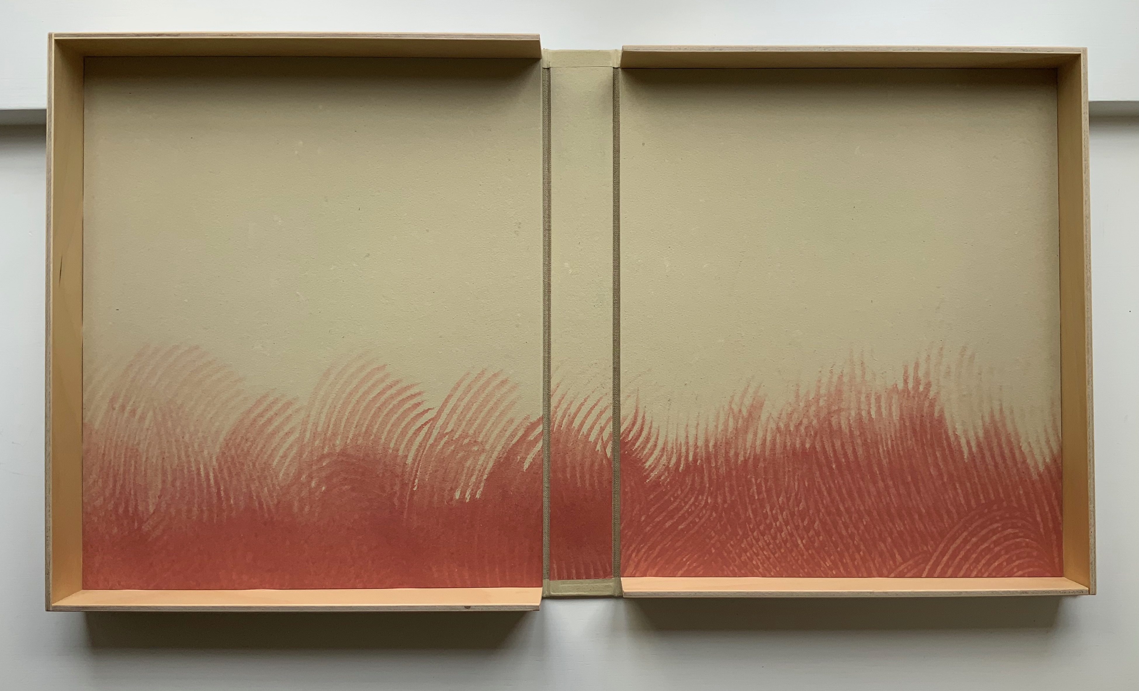
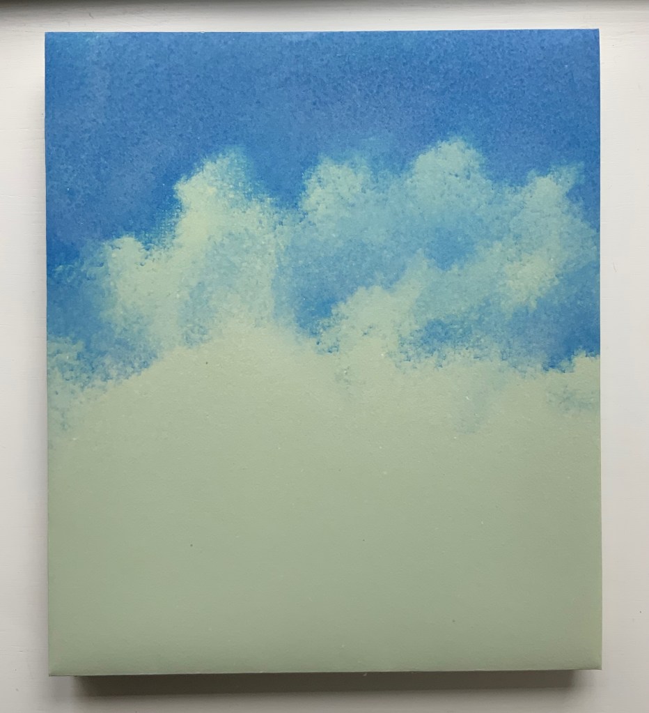
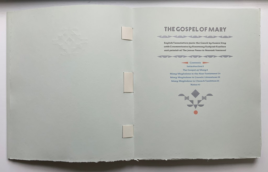
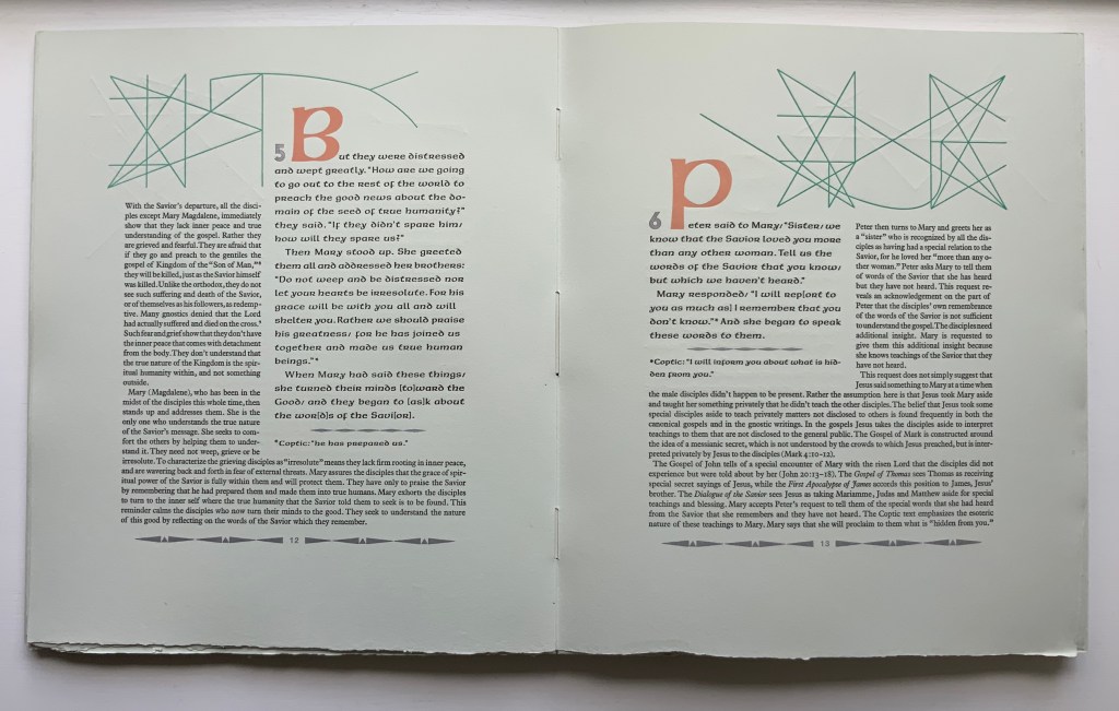
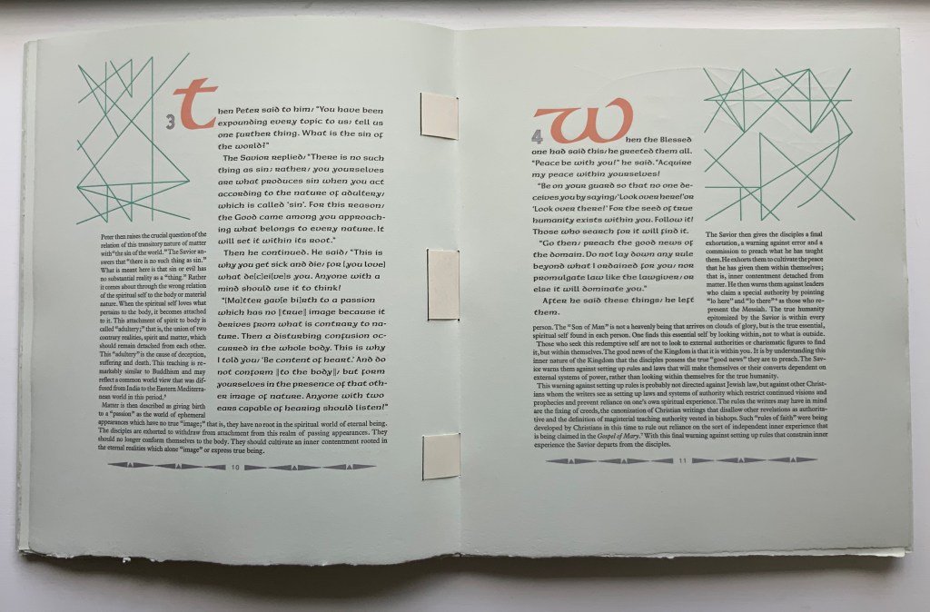
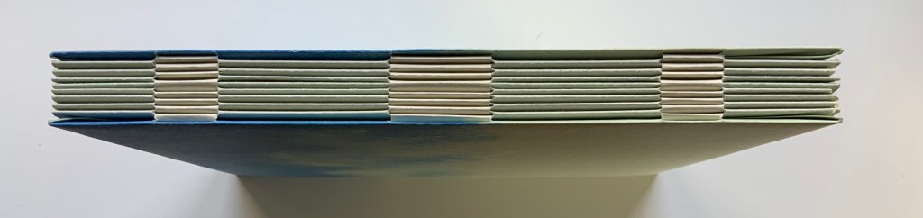
The Gospel of Mary (2006) Claire Van Vliet et al. Woven binding with Barcham Green Cairo paper, housed in De Wint paper-covered and lined birch trays. Box: H320 x W274 x D42 mm. Book: H292 x W250 x D28 mm, 44 pages, center pulp-painted pop-up. Edition of 150, of which this is #27. Acquired from Thomas Goldwasser Rare Books, 18 June 2022. Photos: Books On Books Collection.
Like Woven and Interlocking Book Structures (2002), Tumblr Blocks (1996) and Batterers (1996) below, The Gospel of Mary is an outstanding work of collaboration. Its pulp painting, letterpress, woven binding and layout make this work an important addition to works by Claire Van Vliet in the Books On Books Collection. Van Vliet pulp painted the centerpiece and cover below with Katie MacGregor (Whiting, Maine), who also made the pop-up papers. Andrew Miller-Brown, the Janus Press workshop printer and founder of Plowboy Press, is credited and has signed this copy with Van Vliet. Audrey Holden, who has also signed this copy and worked on Tumbling Blocks, executed the binding. Rosemary Radford Ruether, feminist thelogian, provided the commentary on the text, both of which were typeset with the assistance of Ellen Dorn Levitt, whose collection of book arts projects and teaching materials now resides at the Maryland Institute College of Art.
The four photos below provide views of the binding structure and also the layout in which the commentary embraces the gospel text.
Below, the five-part pulp-painted centerpiece and the silver paper ribbons woven into the double-page spread stand out against the more subtly pulp-painted background. The pop-up echoes the images on the Barcham Green Boxley paper used throughout for the text and commentary (see above).
The size of the work and the way that the printing, paper, pulp painting, layout of text and commentary, pop-up and binding complement one another echo the age of illuminated manuscripts and incunabula. It would make for a rewarding exhibition to juxtapose The Gospel of Mary with several of them.
Additional insights and process photographs can be found on pages 48, 49 and 74 of John Buchtel’s The Art of Paper (see below).
The entries below were previously published on 8 August 2019 and have been moved here.
Woven and Interlocking Book Structures (2002)
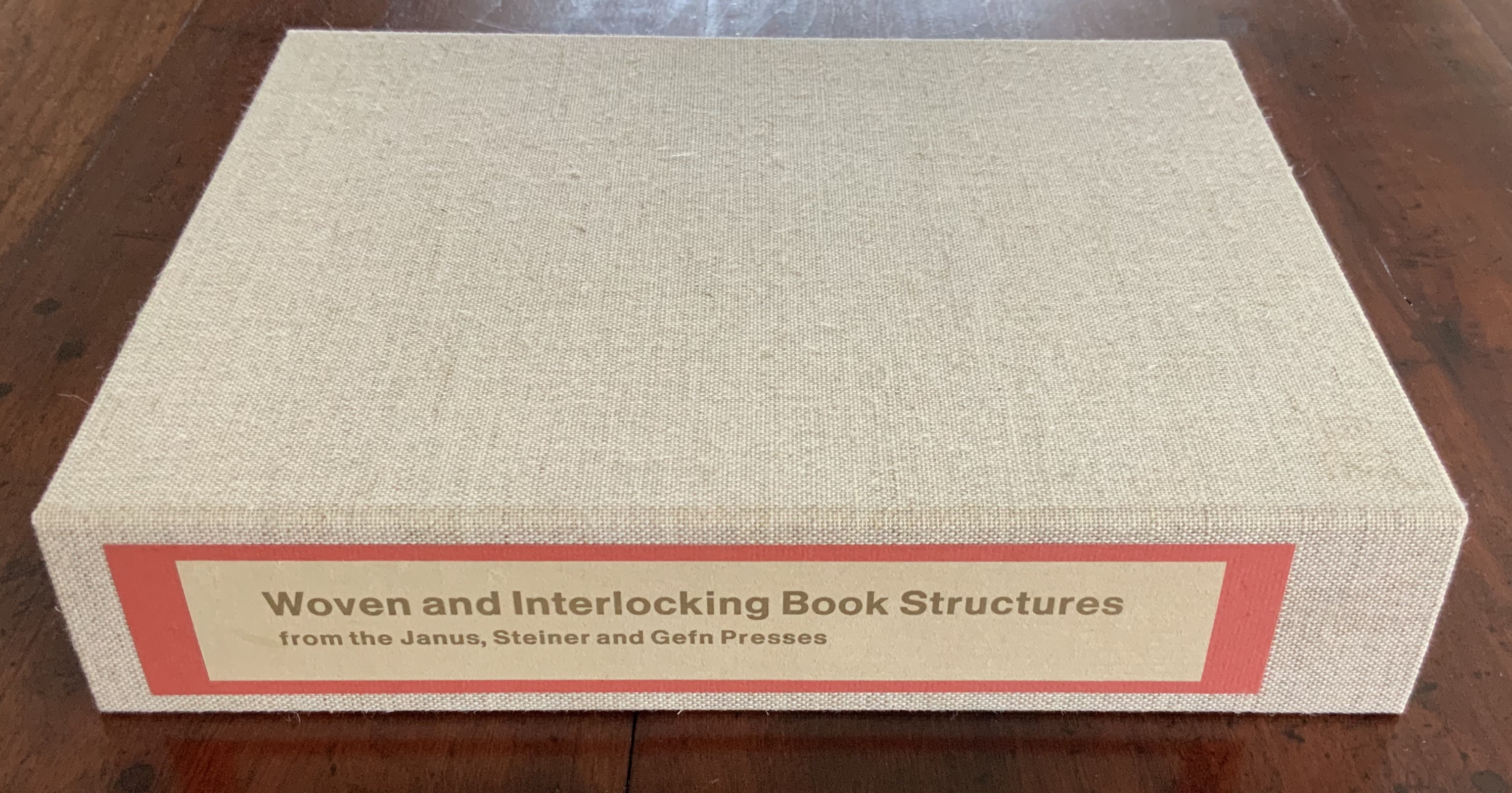
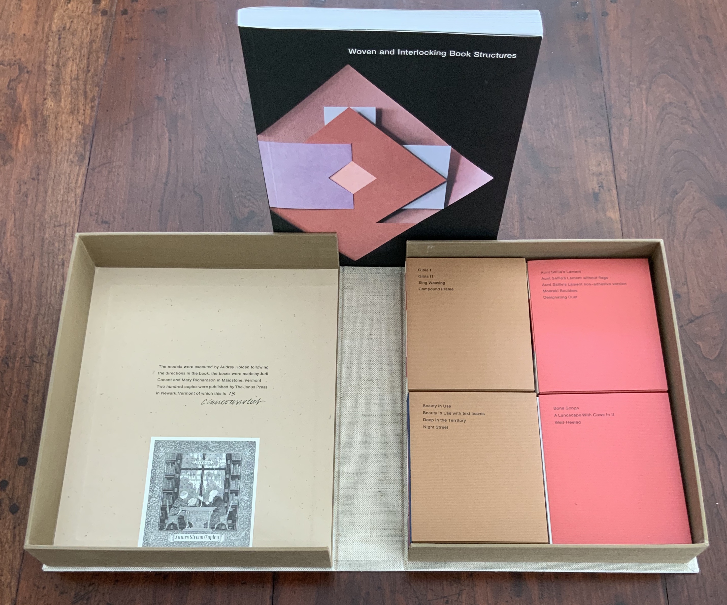
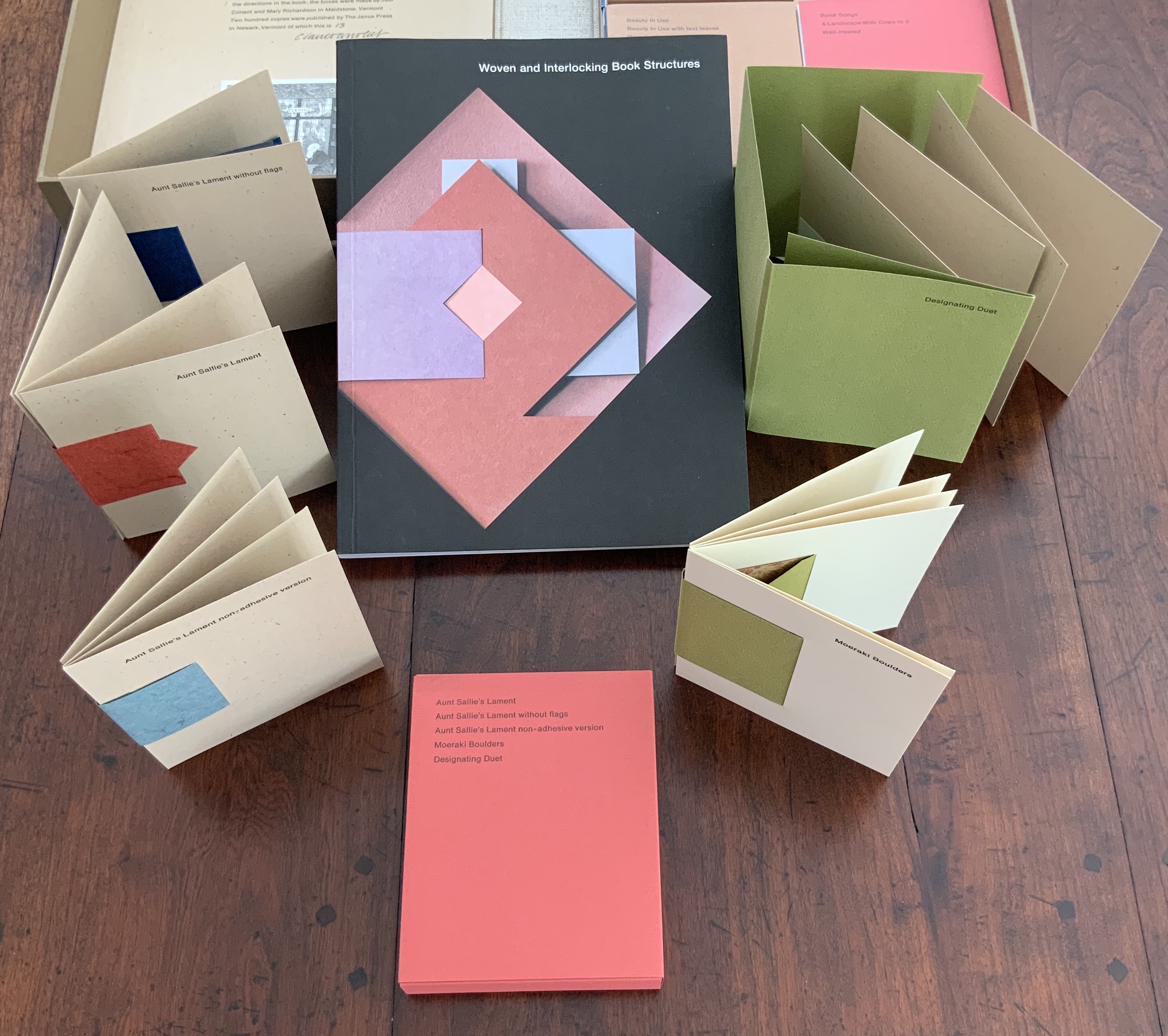
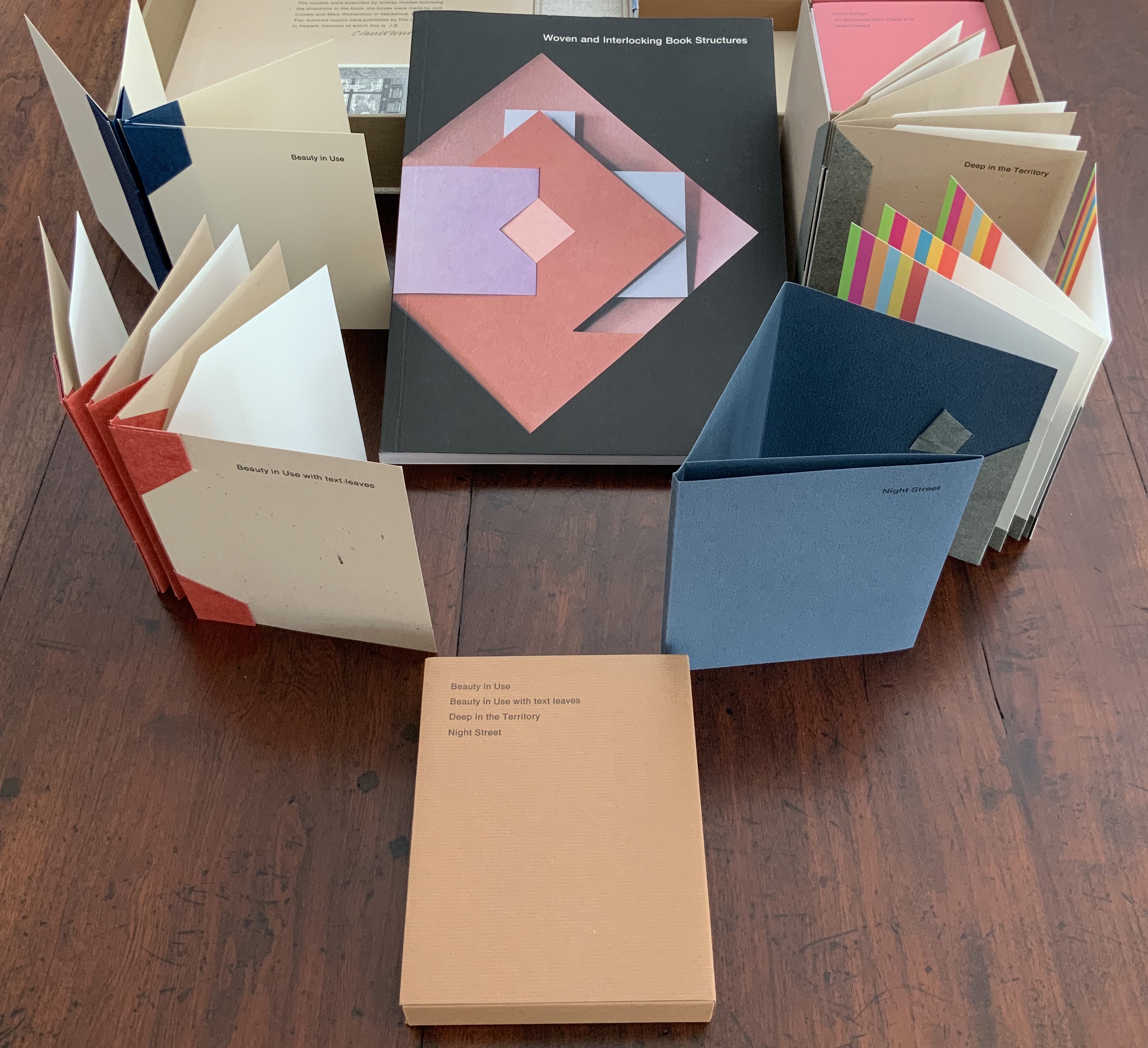
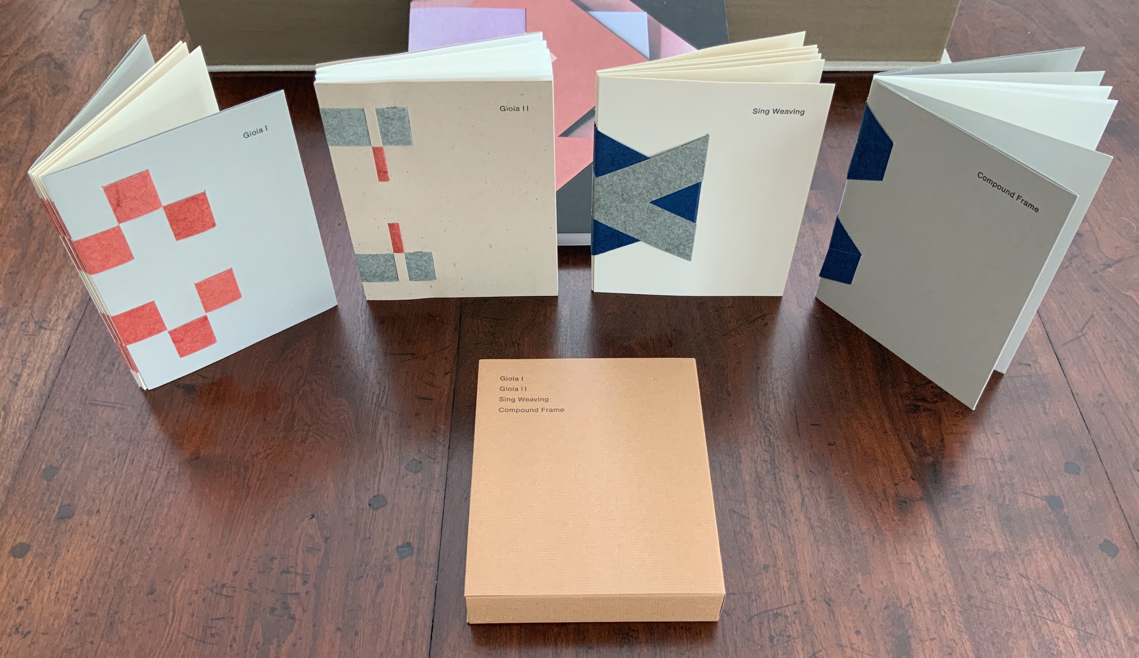
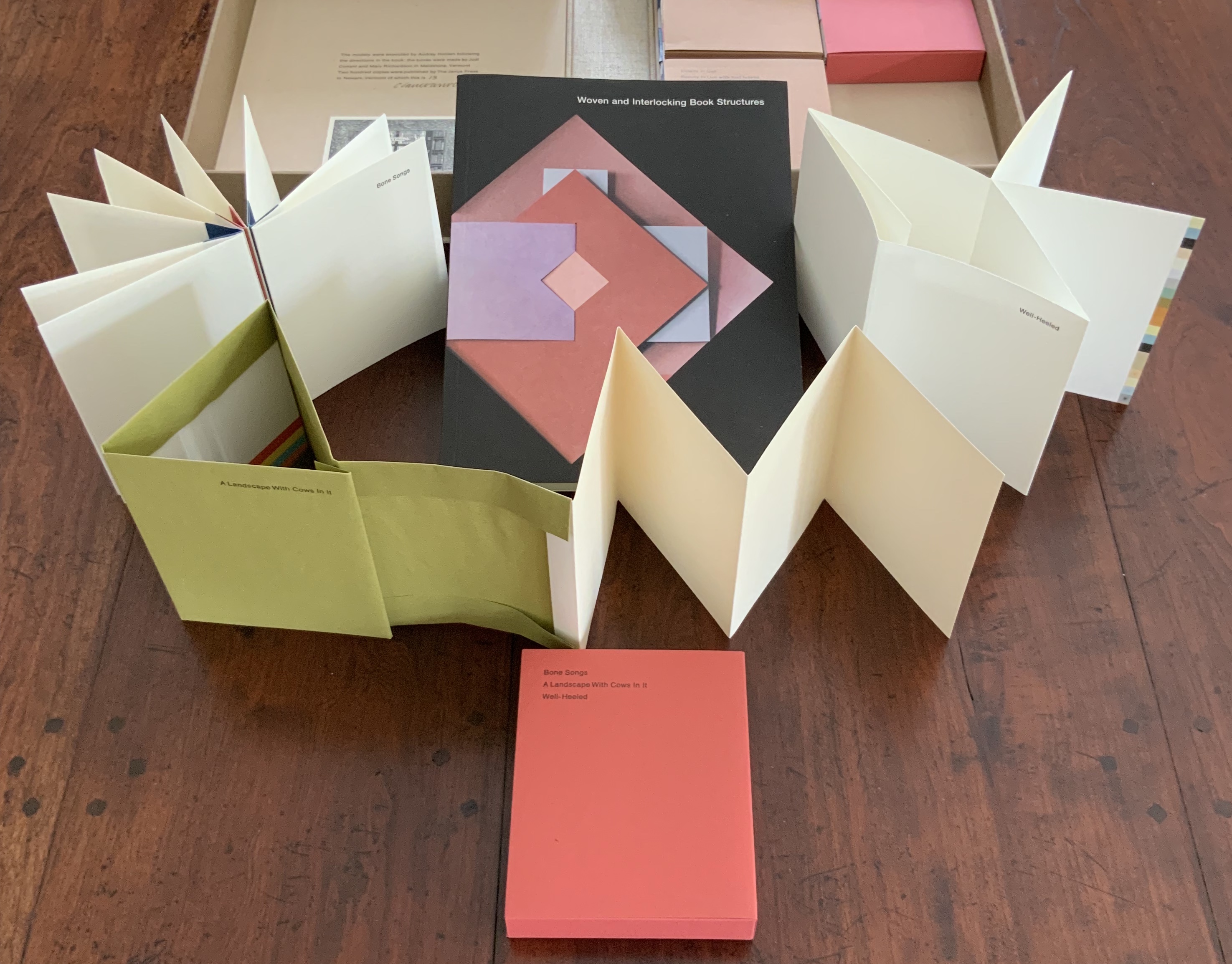
Woven and Interlocking Book Structures (2002) Claire Van Vliet and Elizabeth Steiner Four slipcases containing 16 book models are enclosed with the book in a cloth-covered clamshell box. Box: H282 x W226 x D55 mm. Slipcases: H128 x W104 mm. Book: H254 x W192 mm, 144 pages. Edition of 200, of which this is #13, signed by Claire Van Vliet. Acquired from James S. Jaffe Rare Books, 1 February 2015. Photos: Books On Books Collection.
The binding models and papers used for them are:
A — Aunt Sallie’s Lament; Aunt Sallie’s Lament without Flags; Aunt Sallie’s Lament non-adhesive version; Moeraki Boulders; Designating Duet. Papers used include Elephant Hide, Fabriano cover and Miliani Ingres, French’s recycled, Marblesmith, Bristol and Saunders laid.
B — Beauty in Use; Beauty in Use with text leaves; Deep in the Territory; Night Street. Papers used include Elephant Hide, French’s recycled, Bristol, Mohawk Superfine and Fabriano cover.
C — Gioia I; Gioia II; Sing Weaving; Compound Frame. Papers used include Elephant Hide, French’s recycled, Bristol, Mohawk Superfine, Linen Index, Neenah UV Columns and Marblesmith.
D — Bone Songs; A Landscape with Cows in It; Well-Heeled. Papers used include Elephant Hide, Mohawk Superfine, Arches laid, and Fabriano text and Miliani Ingres.
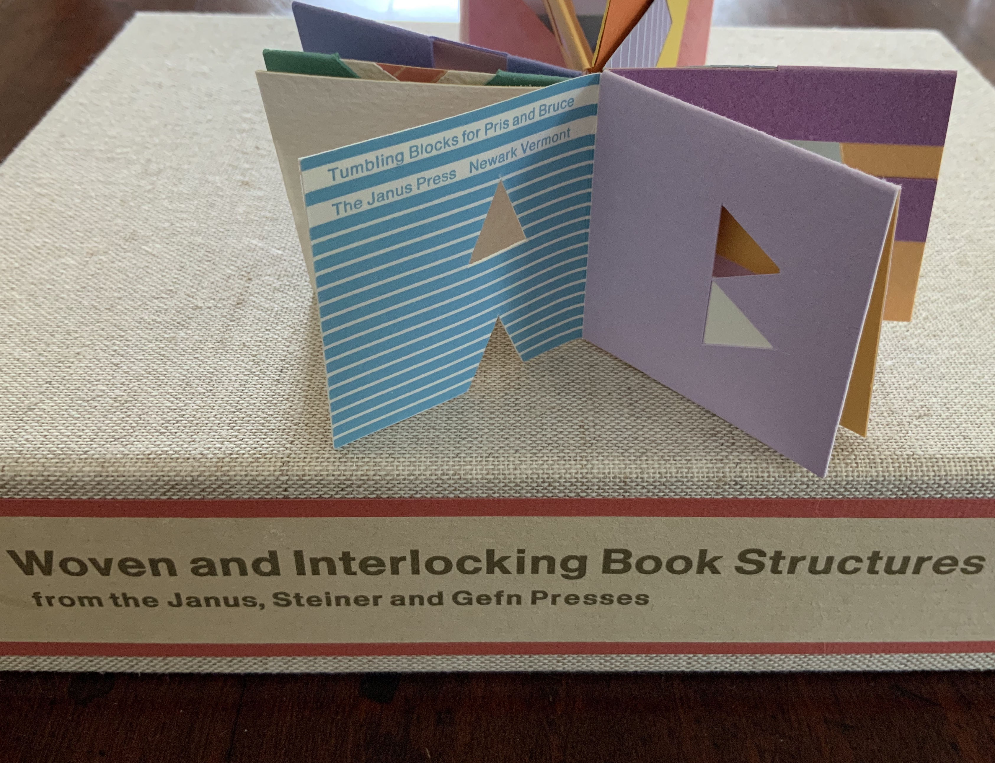
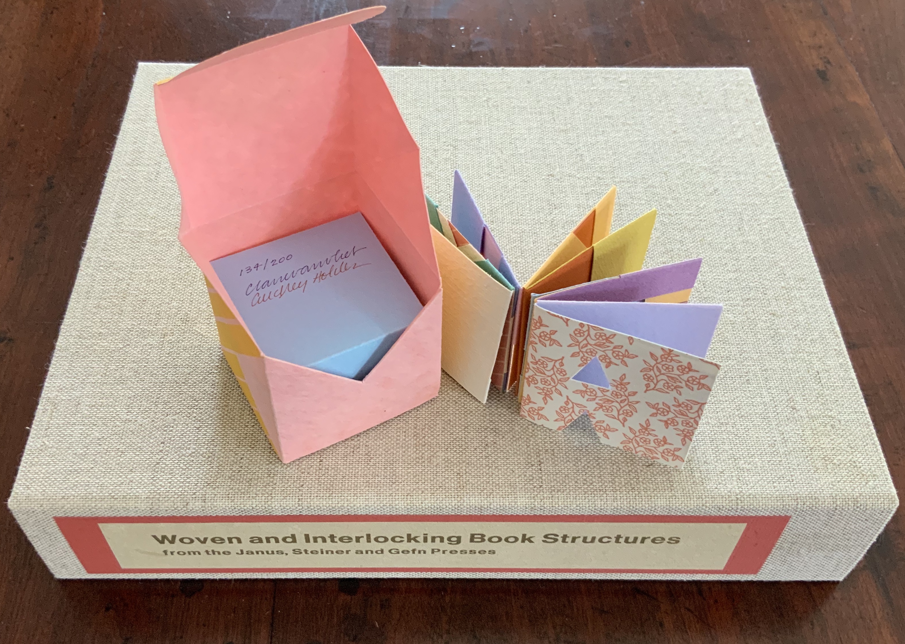
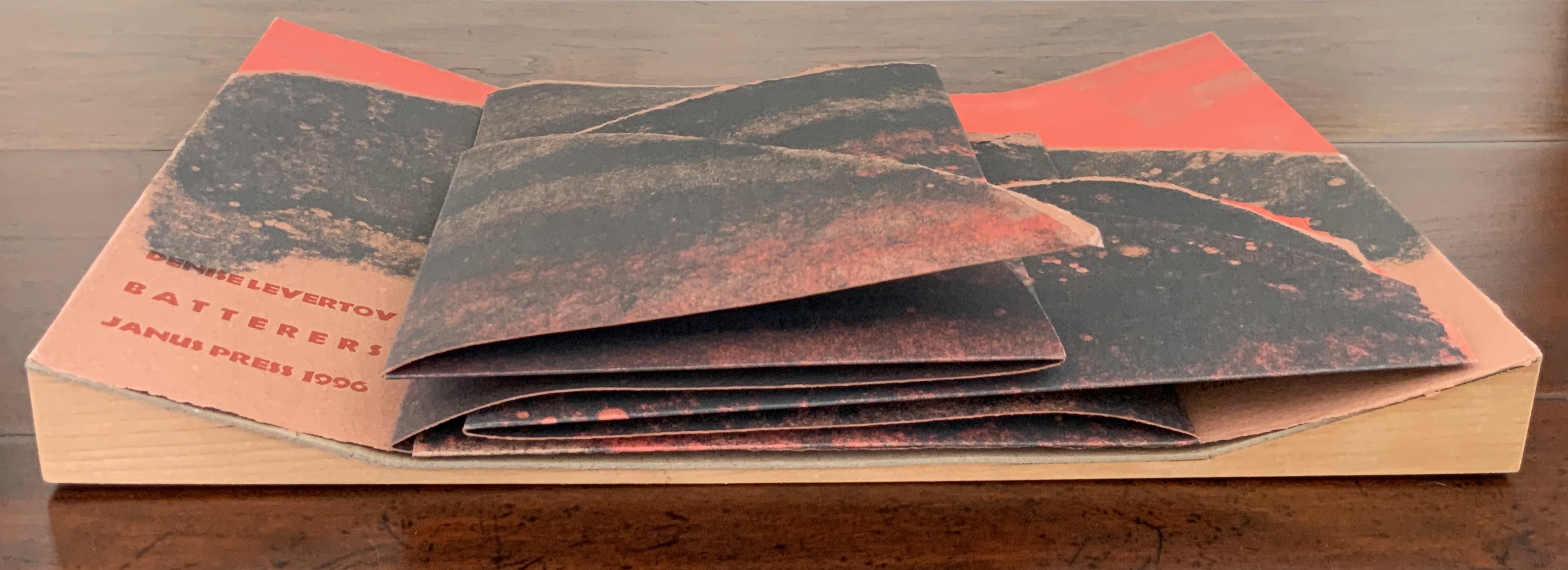
Tumbling Blocks for Pris and Bruce (1996)
Tumbling Blocks for Pris and Bruce (1996) Claire Van Vliet and Audrey Holden Paper cube issued in a non-adhesive paper box housed in a clear plastic box. 58 x 58 x 58 mm. Edition of 200, of which this is #134. Acquired from Abecedarian Gallery, 21 July 2019. Photos: Books On Books Collection.
Working with offcuts from Praise Basted In: A Friendship Quilt for Aunt Sallie (1995), Van Vliet and Audrey Holden cut pairs of letters of the alphabet and glued them back to back. These constitute the cube-book’s leaves, which are folded and glued to permit the book to open into a variety of shapes. Gently tossed from hand to hand, the book will resume its cube shape. “Pris and Bruce” are the Hubbards, Janus Press patrons.
Slipcase: H307 x W387 x D73 mm; Tray: H296 x W380 x D61 mm; Accordion: H270 x W356 x D33 (closed), H270 x W1115 mm (open). Edition of 500, of which this is #5, signed. Acquired from Van Vliet via Vamp & Tramp, 17 July 2020.
What is remarkable about this sculptural book is its fusion of collaborators’ efforts, of art forms, and of text, materials, techniques and structures.
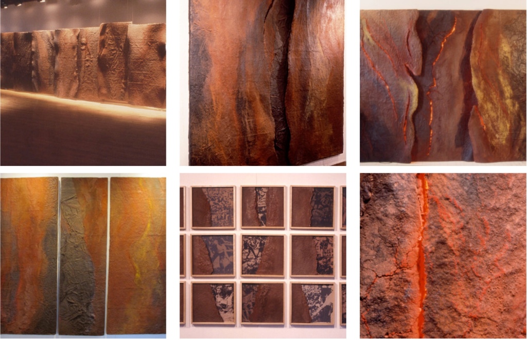
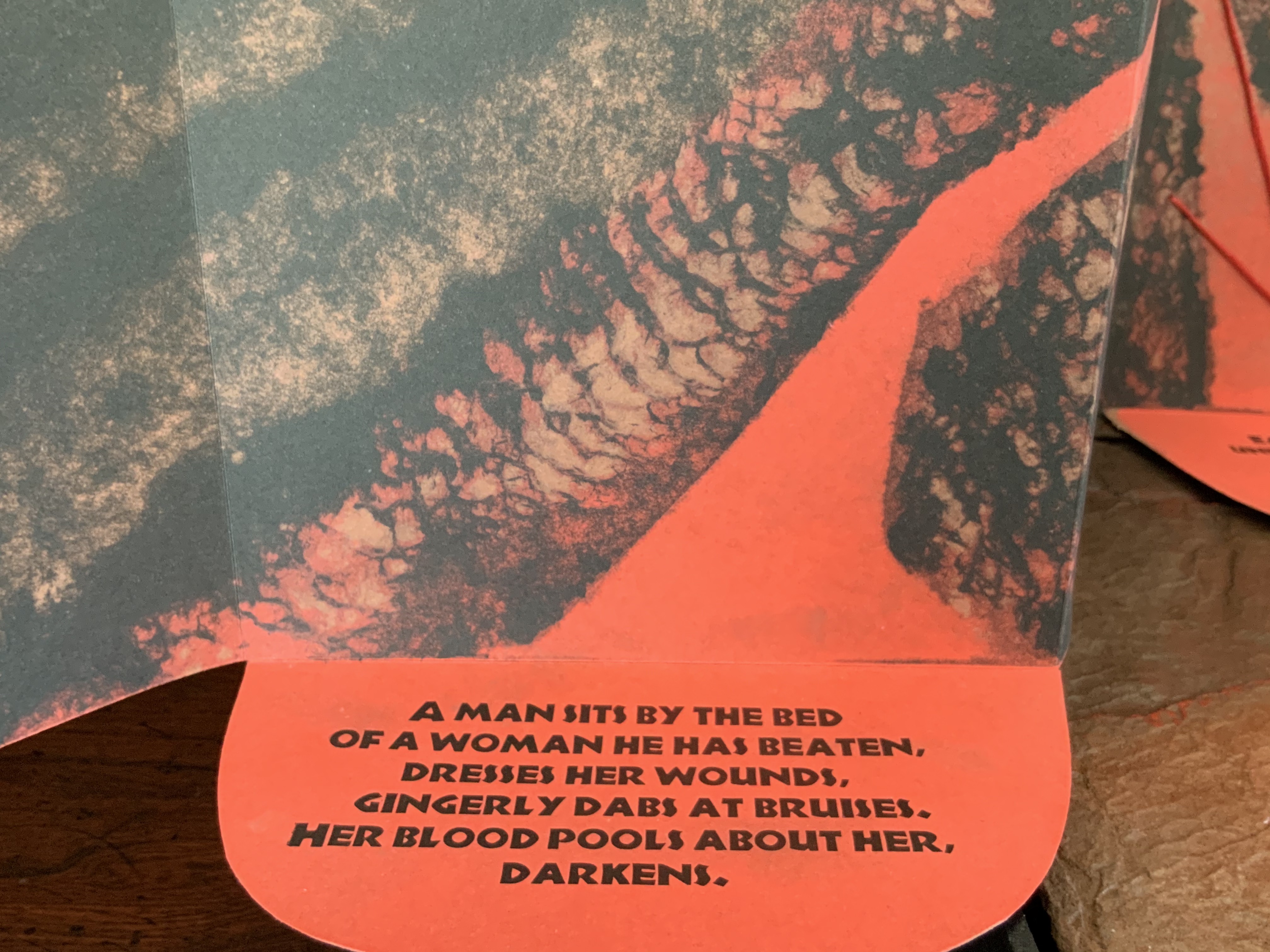
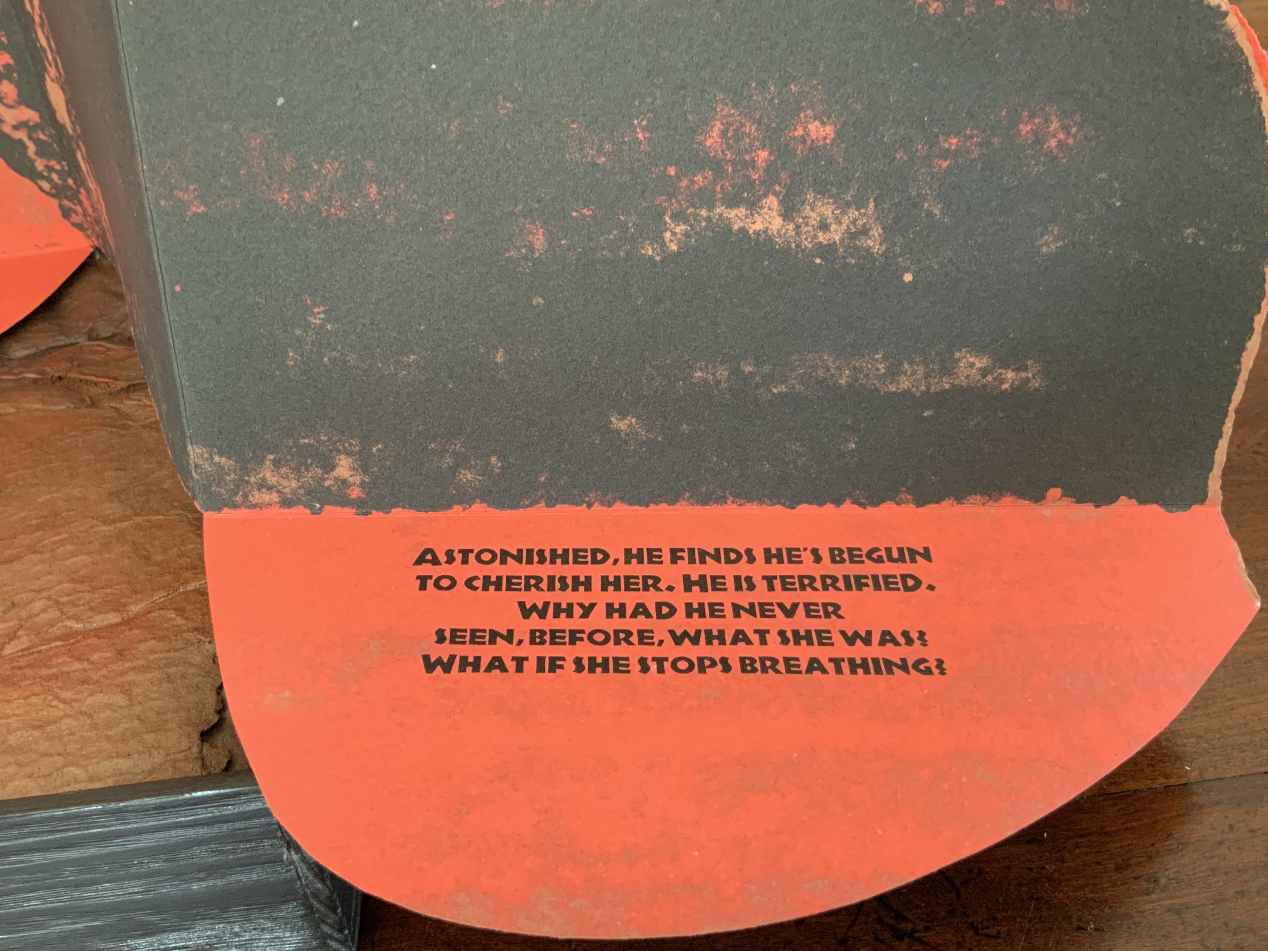
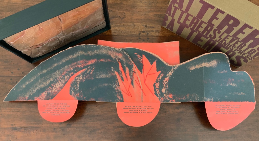
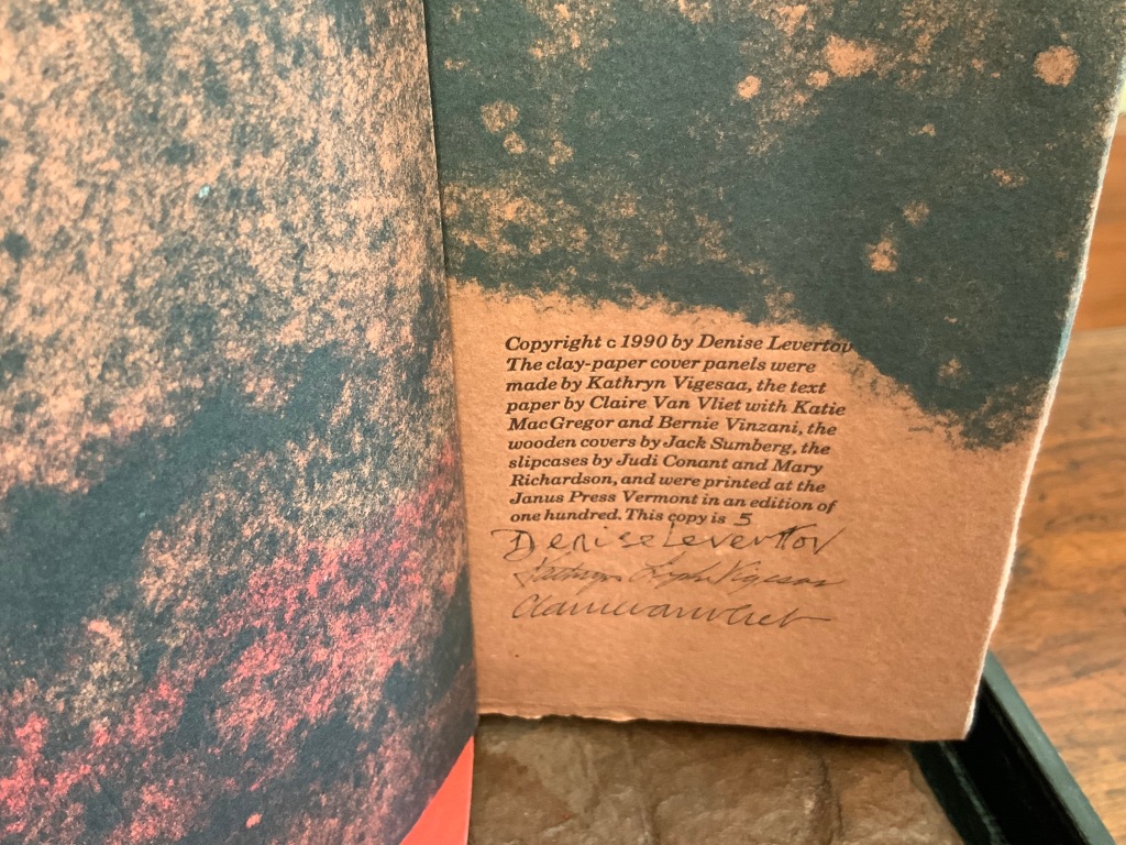
In the late 1980s, Claire Van Vliet and Kathryn Lipke (née Vigesaa) were seeking a collaborative project. After Van Vliet spotted Denise Levertov’s poem “Batterers” in the American Poetry Review (1990:6), they agreed that the poem, which enfolds our abuse of the earth within a metaphor of domestic abuse, was the appropriate text to join somehow with Lipke’s series of structural artworks called Earthskins.
Earthskins (1988-96)
Kathryn Lipke (Vigesaa)
Installation views of the works created from paper pulp, clay and pigments; some reaching 69 feet in length. Photos: Courtesy of the artist.
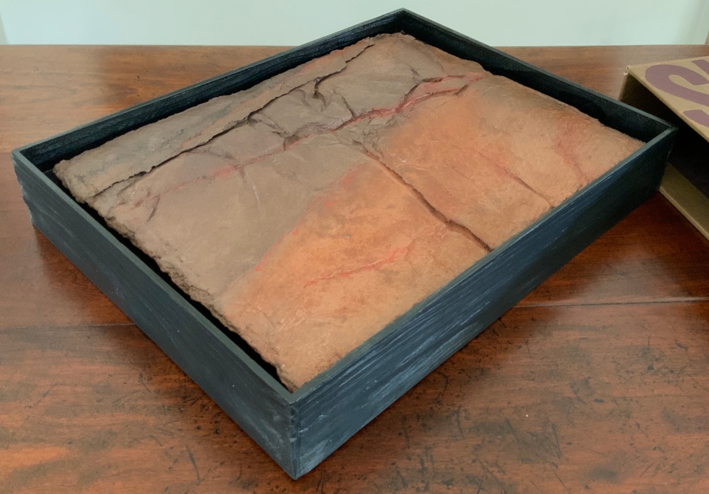
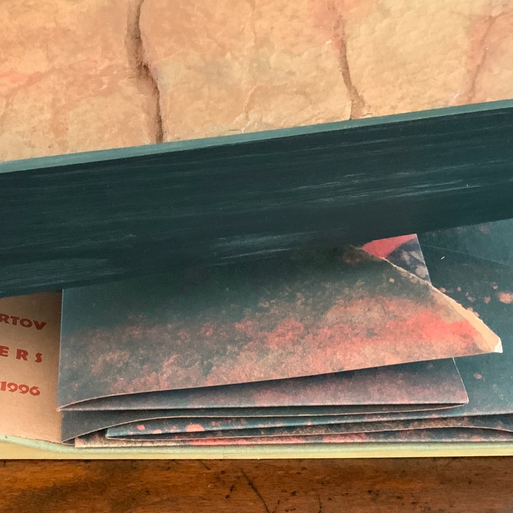
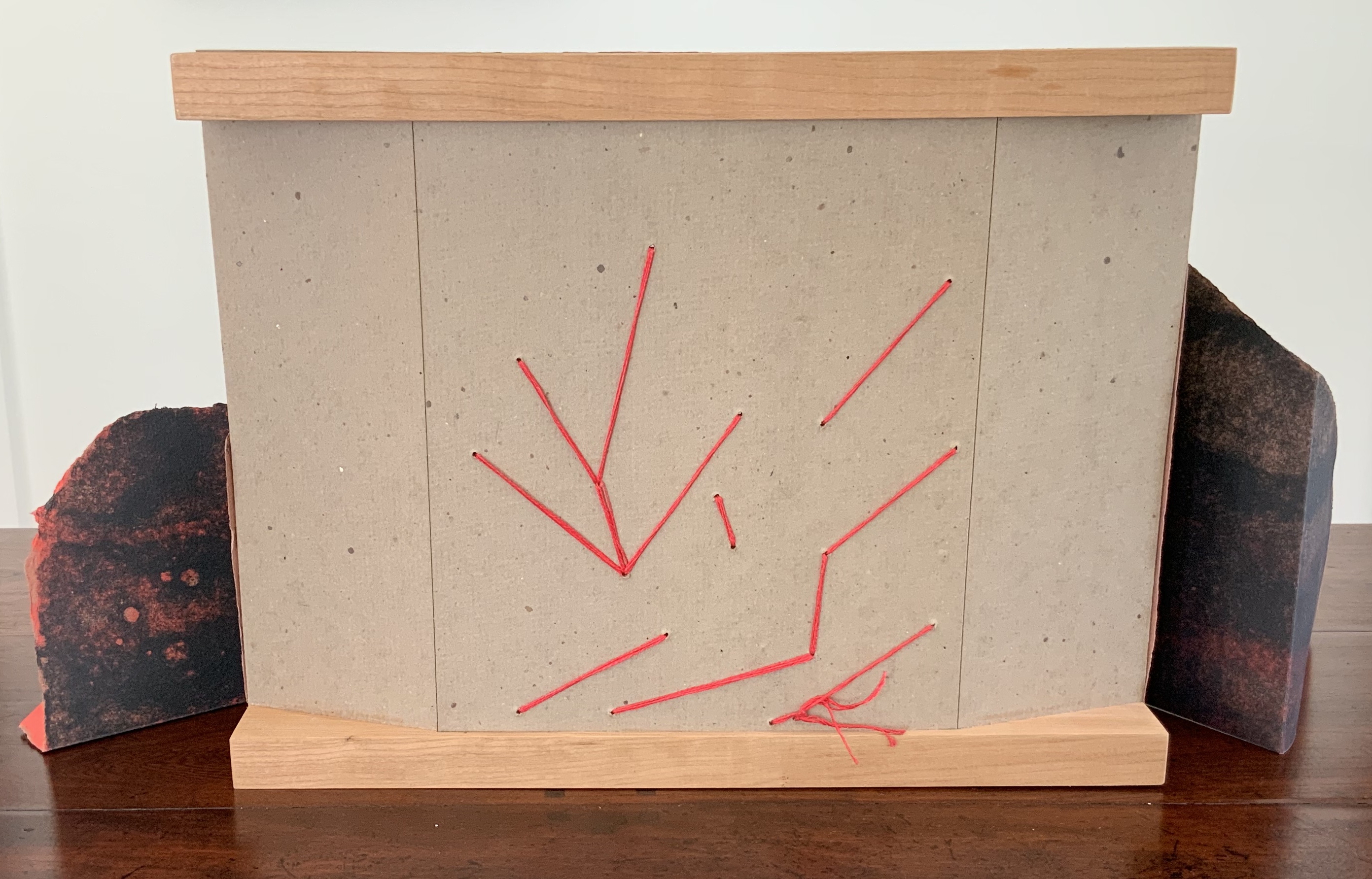
When letterpress printers consider the reproduction of a short poem, the broadside is the most common art form adopted. Van Vliet’s adoption of it is anything but common. Instead, she has orchestrated a combination of structures and art forms. From the maroon-printed, brown linen slipcase slides a tray made of tamarack wood to which Lipke’s vacuum-formed panel of clay mixed with paper is fixed. As the black tray is lifted, layers of multi-folded paper attached to a backing appear.
The top two layers are glued and sewn with multi-stranded red thread to the third and bottom layer, displaying the names of the author, work and Van Vliet’s press. The bottom layer is glued to a backing of three strong card panels tightly glued to two wood runners, sawn or routered into a slight U shape.
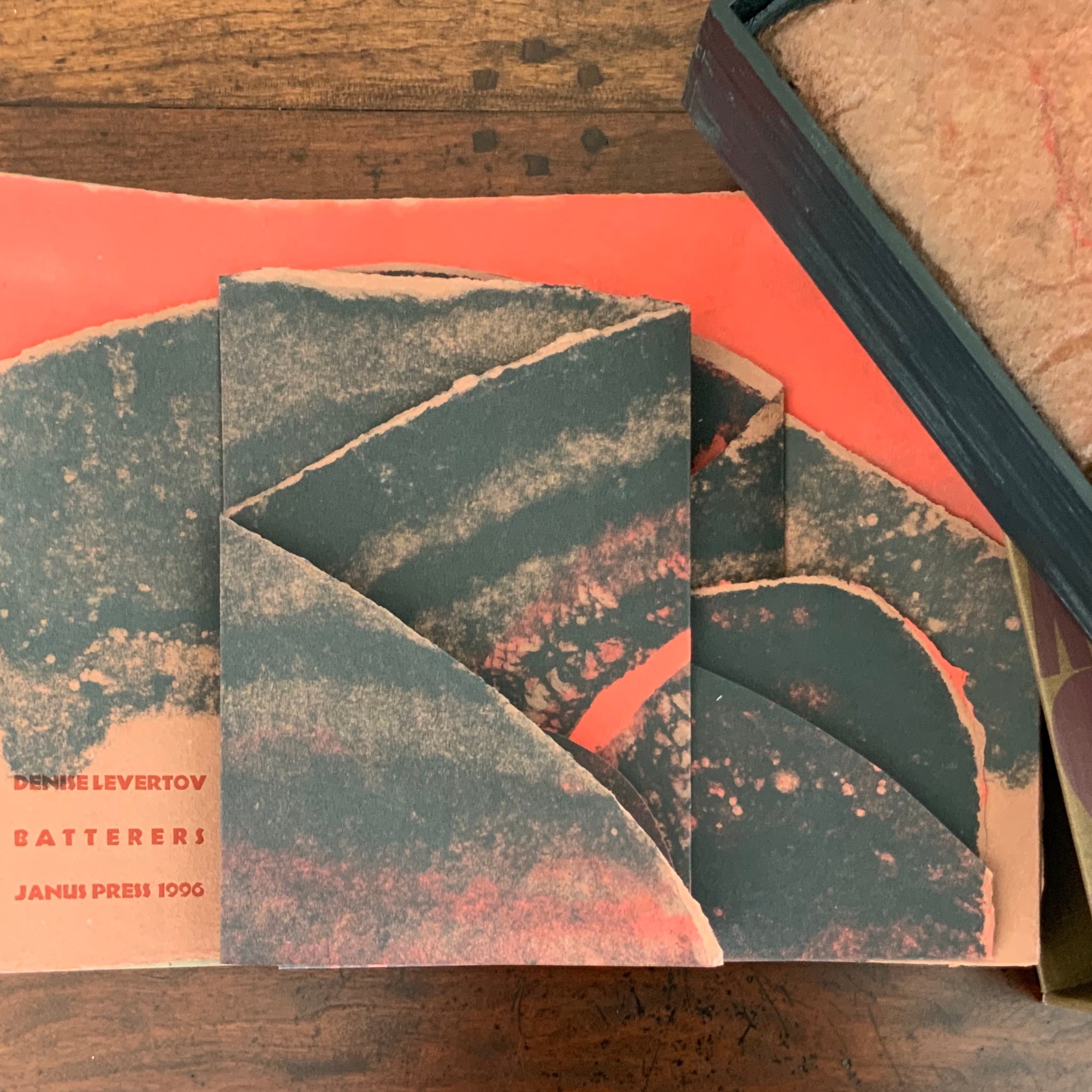
As the top layer is unfolded by pulling it apart, left and right, three tabs drop down to reveal Levertov’s poem.
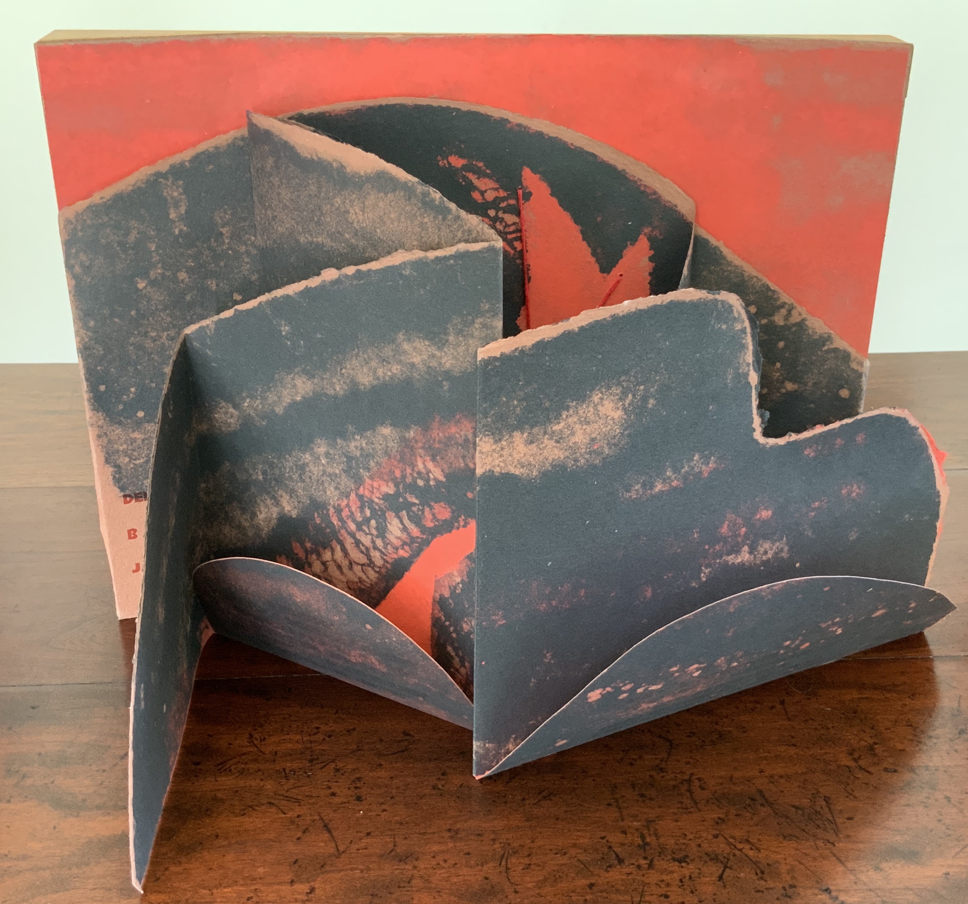
Van Vliet’s combination of structures and forms offers multiple orders in which to read the poem, which pleased Levertov because she liked the poem in both the stanzaic orders of 1-2-3 and 1-3-2 (correspondence with Kathryn Lipke and Claire Van Vliet, 20 July 2020). In a book-like way, the covering tray slides from its slipcover, the cover is removed, and the accordion pages unfold to be read left panel first, right panel second and center panel third, emphasizing the embedded and central metaphor.
Spread fully open, the structure assumes a single-sheet broadside form, and the “center” stanza moves from third to second in order. But there is a third order of reading, as it were. The broadside form “leans” into the art forms of print, painting and bas-relief sculpture. The text, images and design become a whole experience, an object to be taken in as a whole.
Photos: Books On Books Collection.
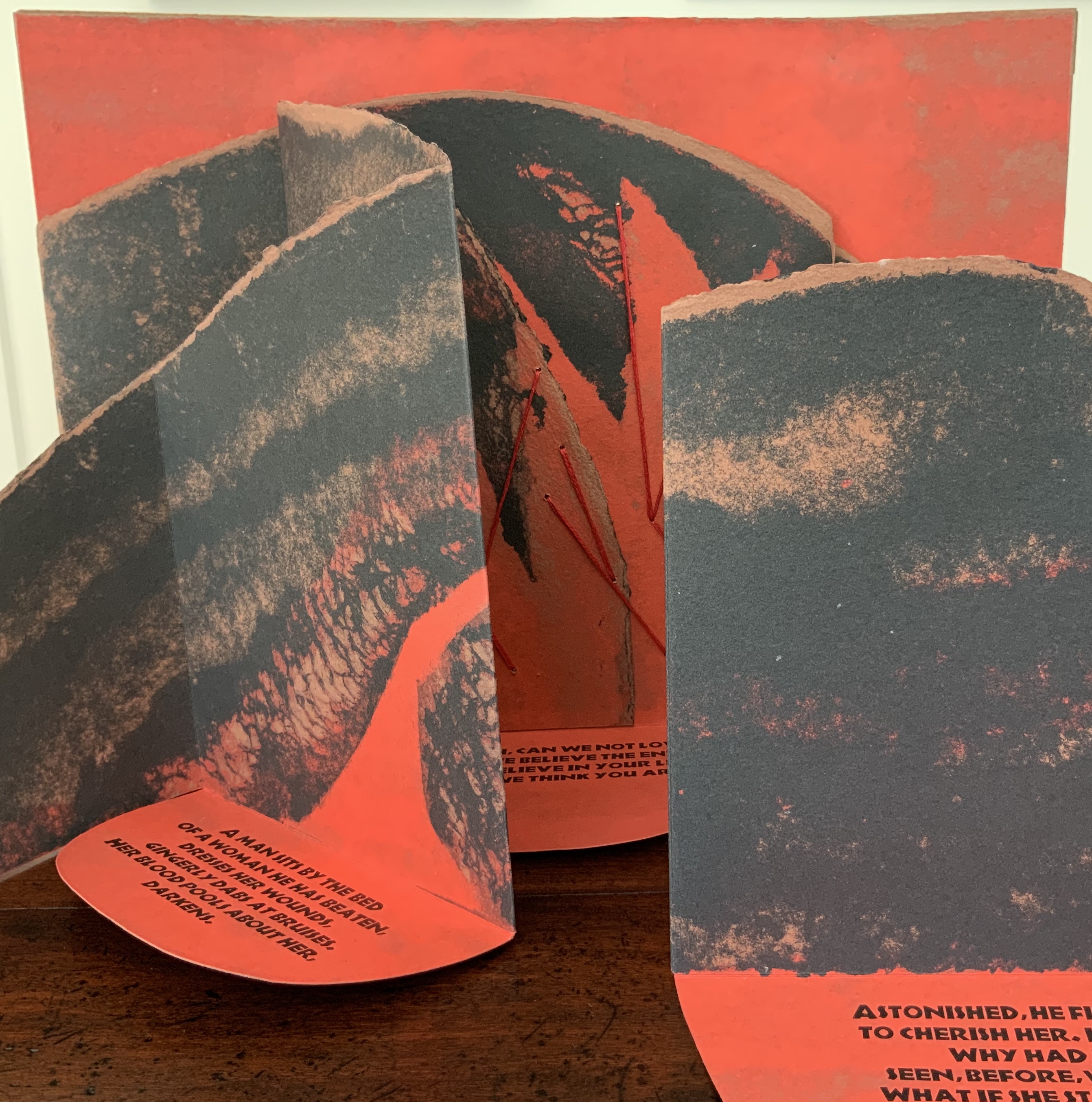
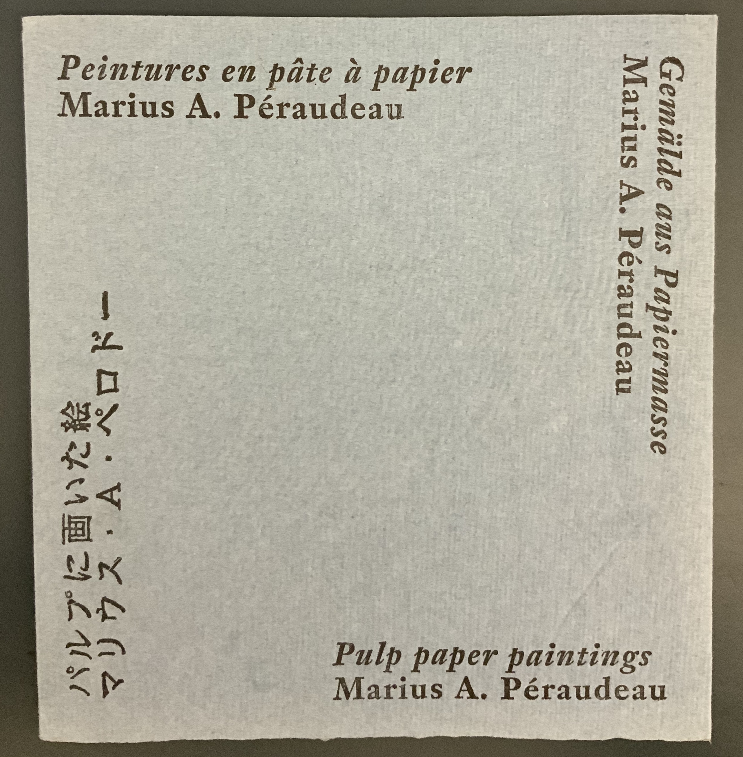
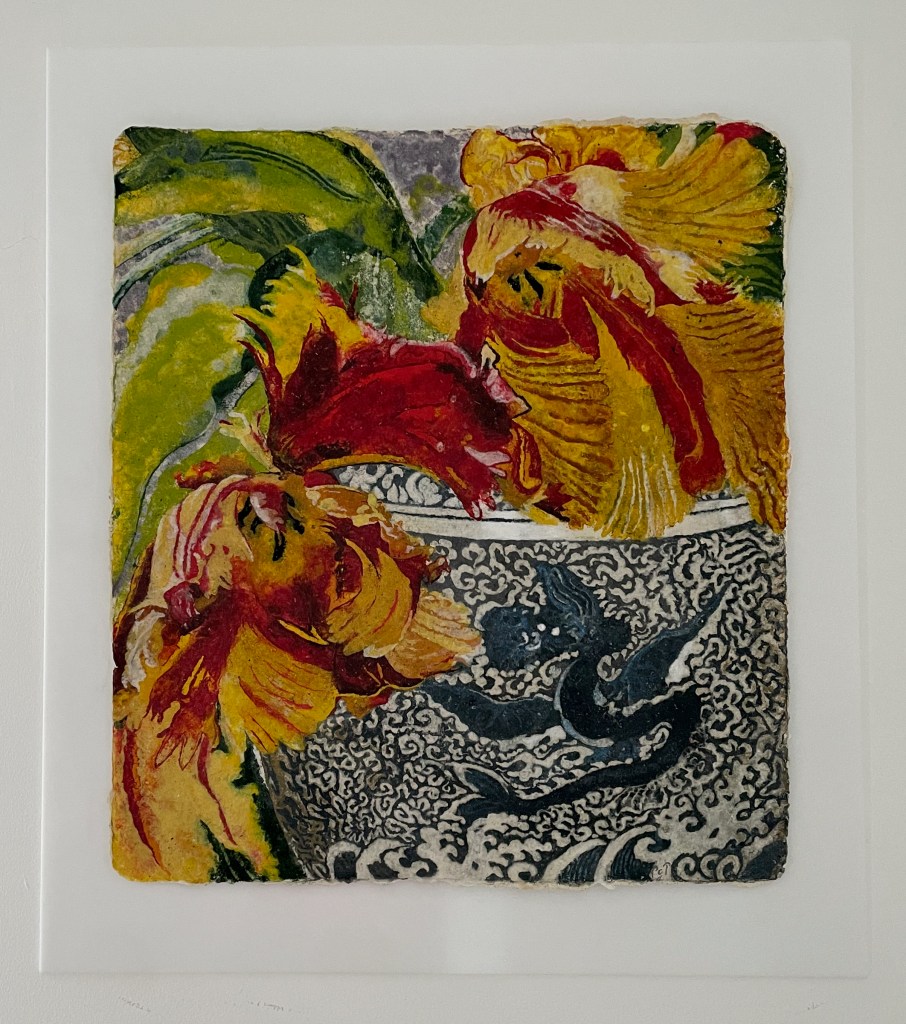
Not only in form does Batterers “lean” into the form of painting: the imagery and colors arise from the technique of pulp painting, a technique defined by the work of Marius Péraudeau in the mid-twentieth century. Pat Gentenaar’s still life Water Dragon in this collection provides another example of the technique.
Top: cover image of Marius Péraudeau: Pulp Paper Paintings (Paris: Ernst Maget, 1991). Photo taken at British Library: Books On Books. Bottom: Water Dragon 2011) Pat Gentenaar-Torley. Photo: Books On Books Collection.
In pulp painting, the paper is the painting. Assisted by Katie MacGregor and Bernie Vinzani in their paper studio in Whiting, Maine, Van Vliet poured different colors of paper pulp into prepared forms to create three sheets of paper on which to print and then collage into the image that suggests dual images: that of a volcano and that of a woman reclining on her side or face down. The fusion of shapes, the fusion of color and fiber in pulp painting, and the fusion of clay and pulp in the covering bas-relief (which can also be used as a stand for the broadside) fuse with the poem’s words and metaphor. Once this artwork has been experienced, reading the poem printed in a traditional book can never be the same.
Additional insights into The Batterers along with illustrations of the papermaking and painting process can be found in pages 43-45 of John Buchtel’s The Art of Paper (see below).
“How does a book reflect a distinct way of thinking about a subject? How does the page become a dynamic landscape of visual and conceptual ideas?” So begins the description for a workshop run by Ken Botnick in 2017. His two works in the Books On Books Collection answer those questions with a resounding “This is how“.
Table of Contents (2020)
Table of Contents (2021) Ken Botnick Slipcased, boards with exposed sewn binding. Slipcase: H270 x W170 mm; Book: H265 xW185 mm, 56 pages. Edition of 20, of which this is #5. Acquired from the artist, 3 May 2022. Photos: Courtesy of the artist; Books On Books Collection. Displayed with permission of the artist.
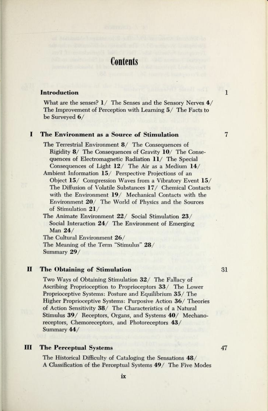
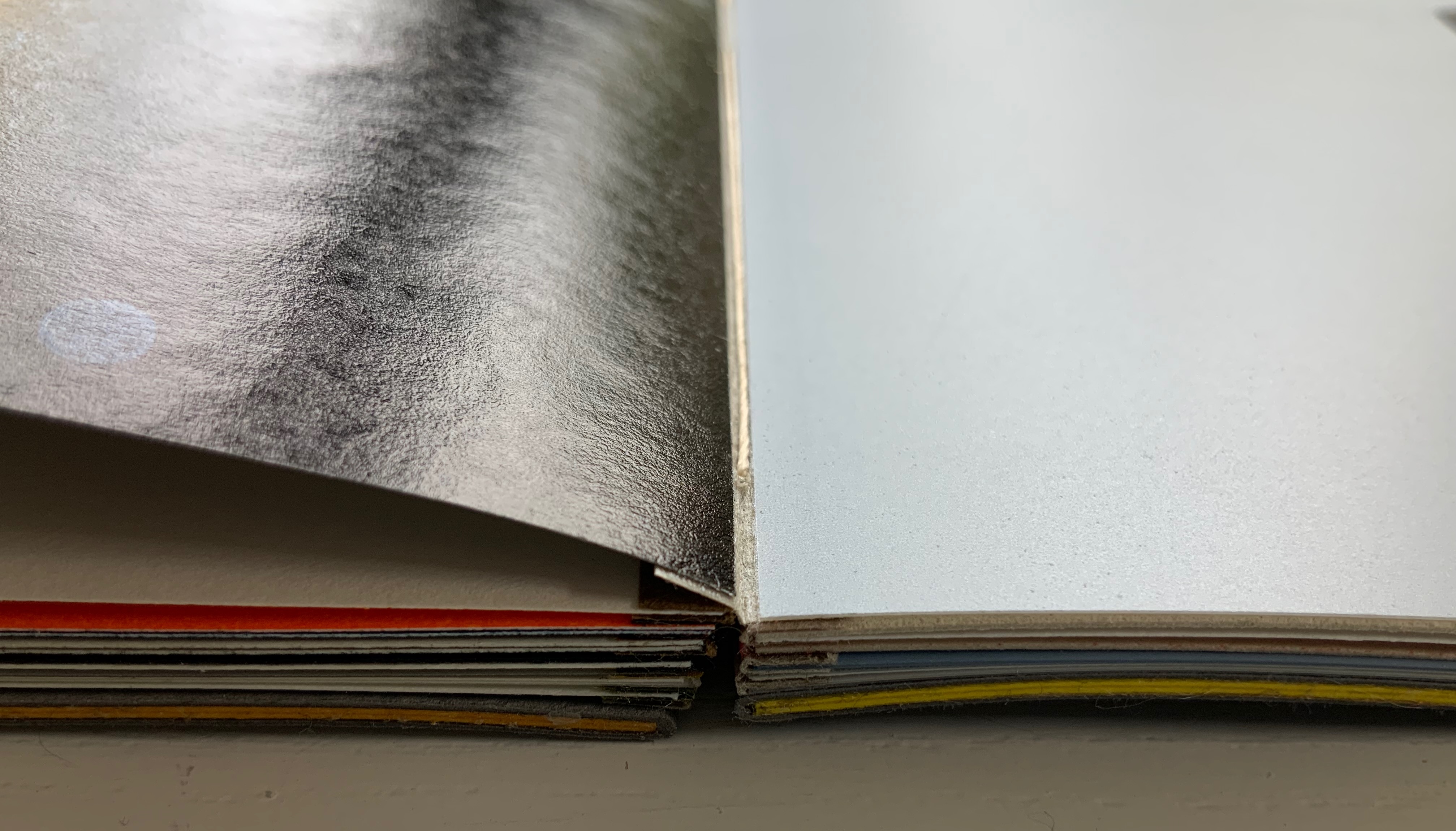
Table of Contents has no table of contents. Instead the whole book is a meditation on a table of contents — that of James J. Gibson’s The Senses Considered as Perceptual Systems (1966). On the inside cover, Botnick characterizes Table of Contents as a “book-length visual/textual poem” and identifies the cento as its model. Cento is short for the Latin centonibus (“patchwork”) and describes the technique of appropriating others’ lines of verse to compose an original “collage” poem. Rather than lines from poems, though, Botnick has appropriated text from Gibson’s table of contents and figure labels.
Here is Gibson’s complete table of contents:
Gibson, The Senses Considered as Perceptual Systems, pp. ix-xiv. Internet Archive.
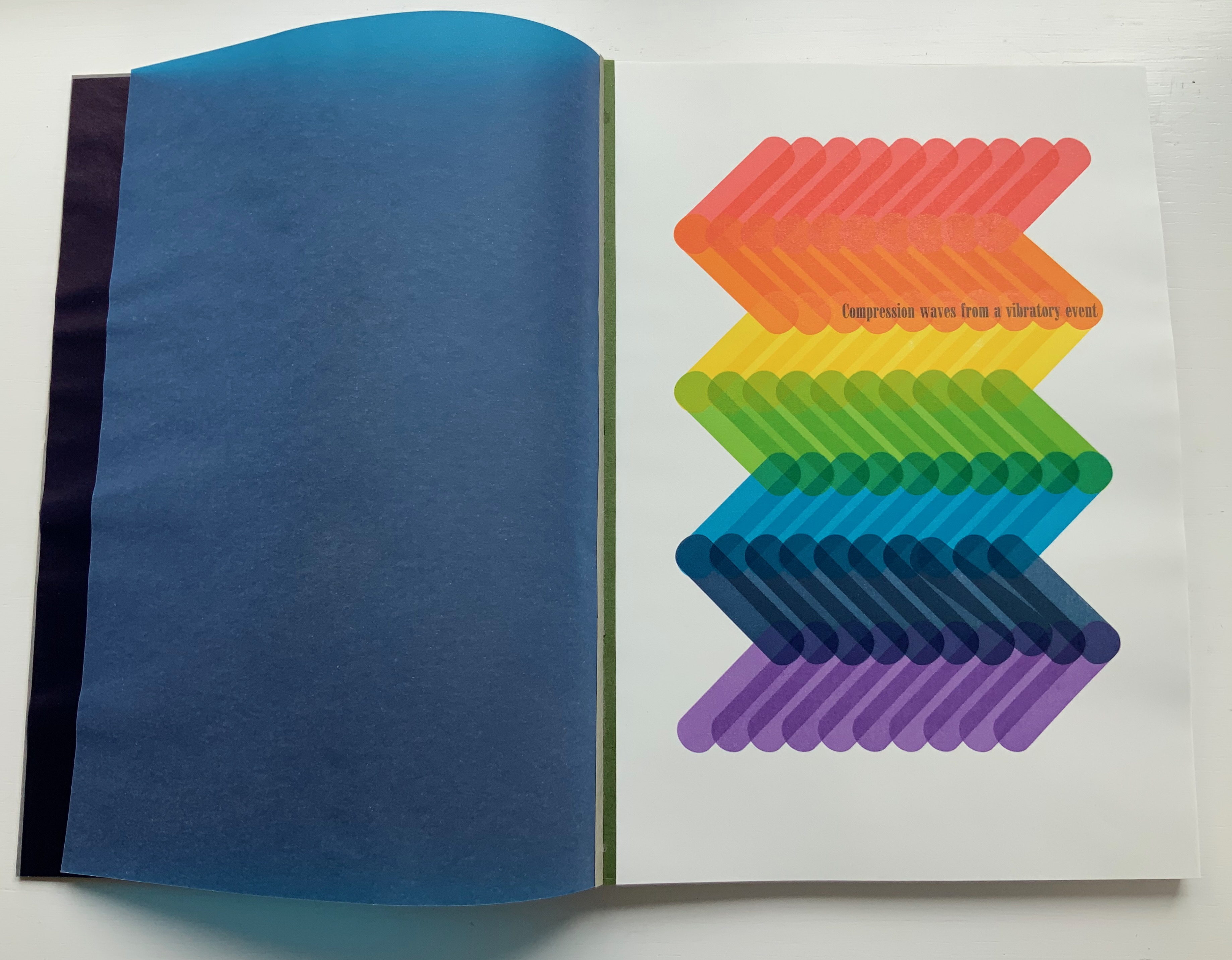
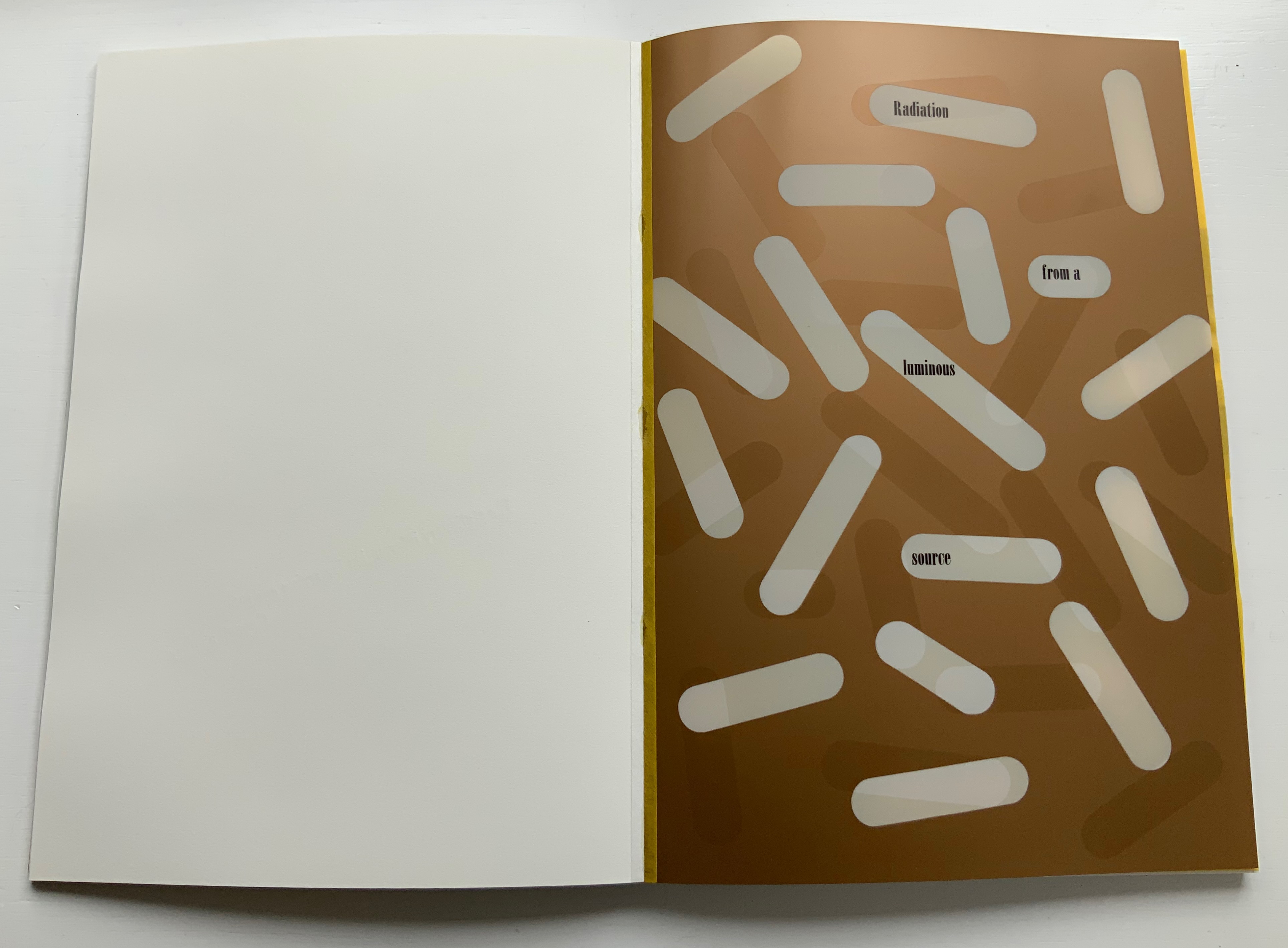
Here is Botnick’s selection of text:
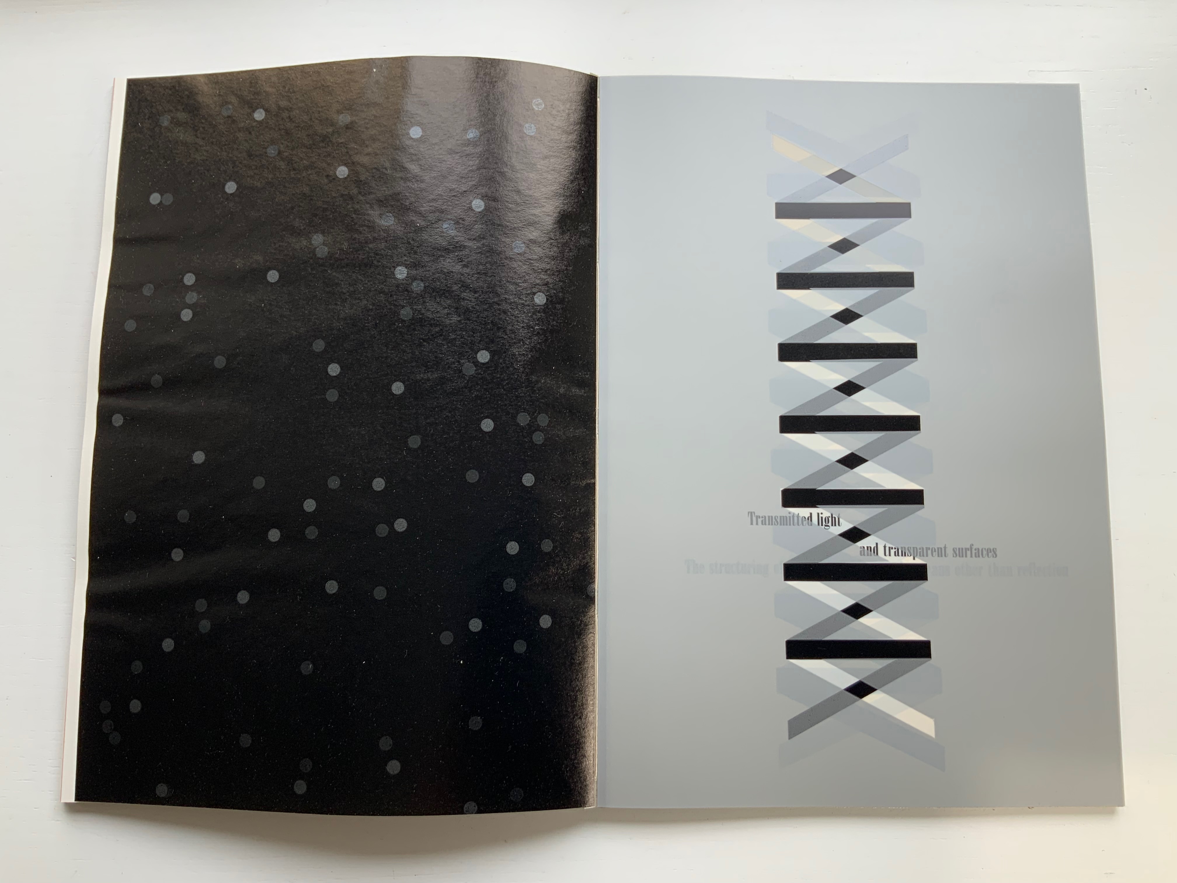
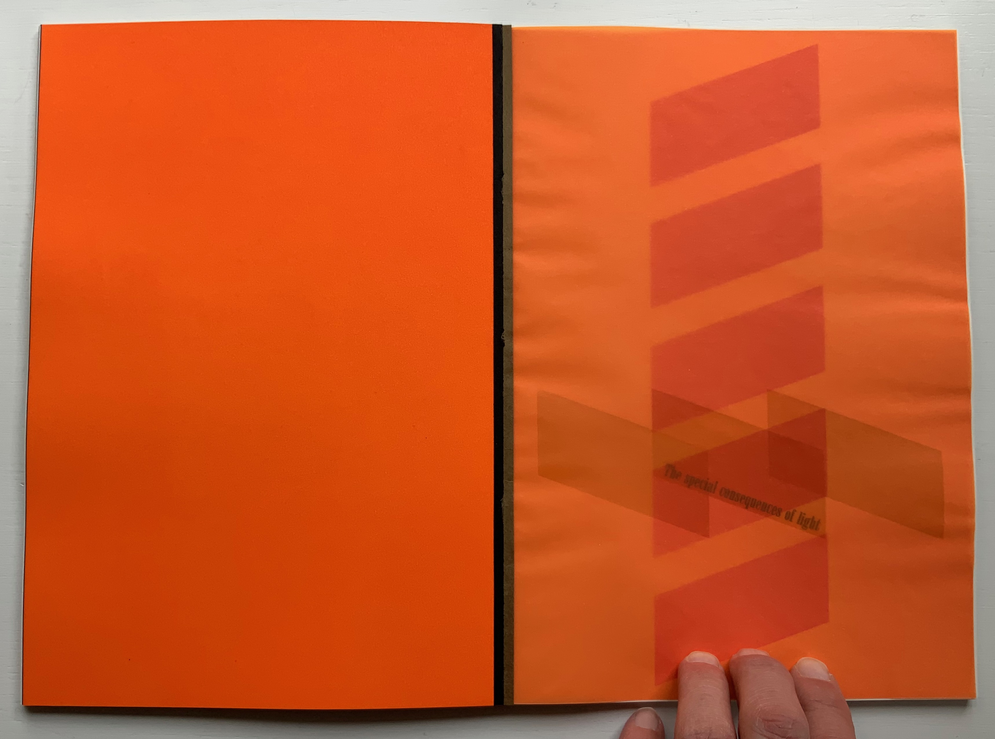
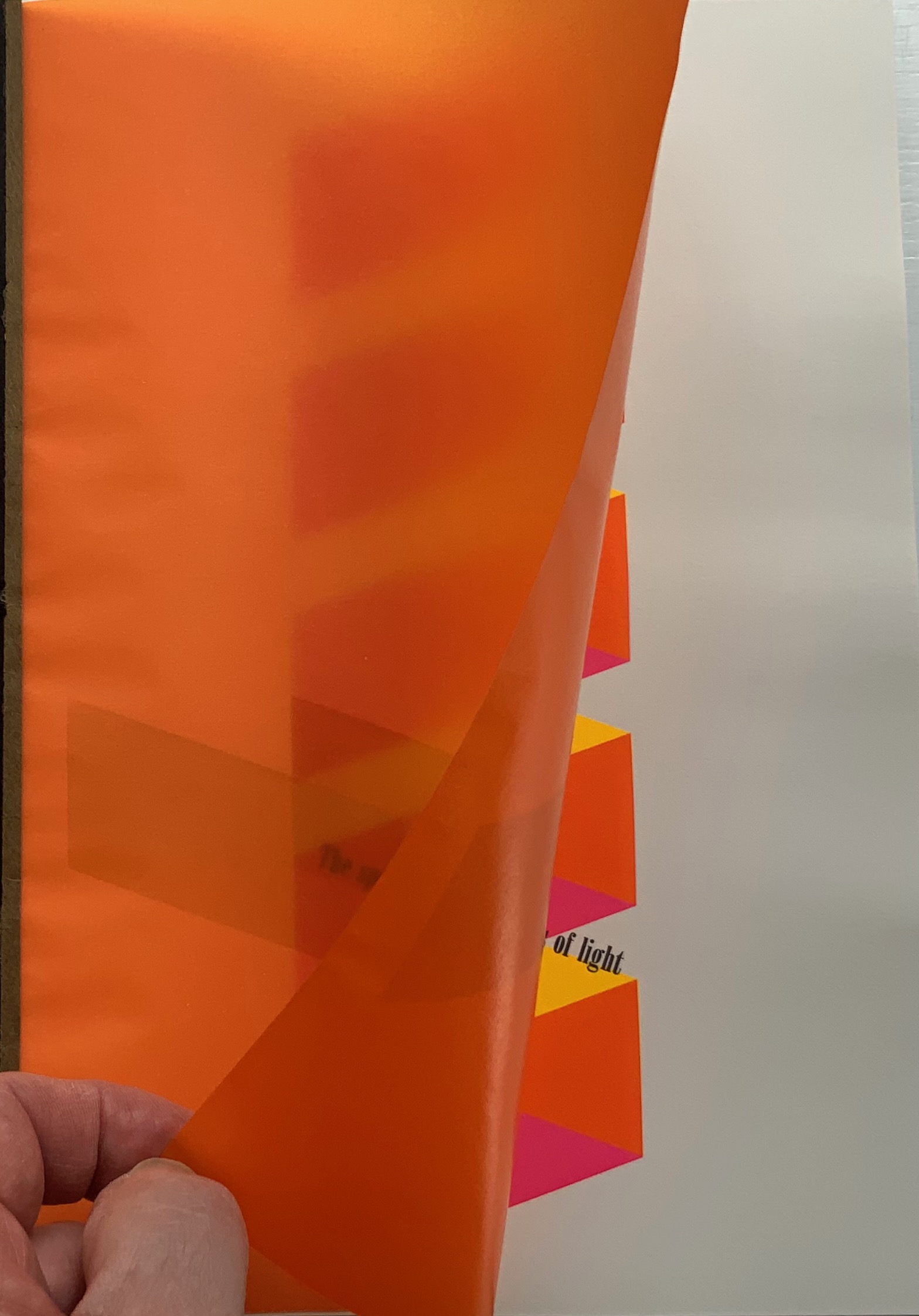
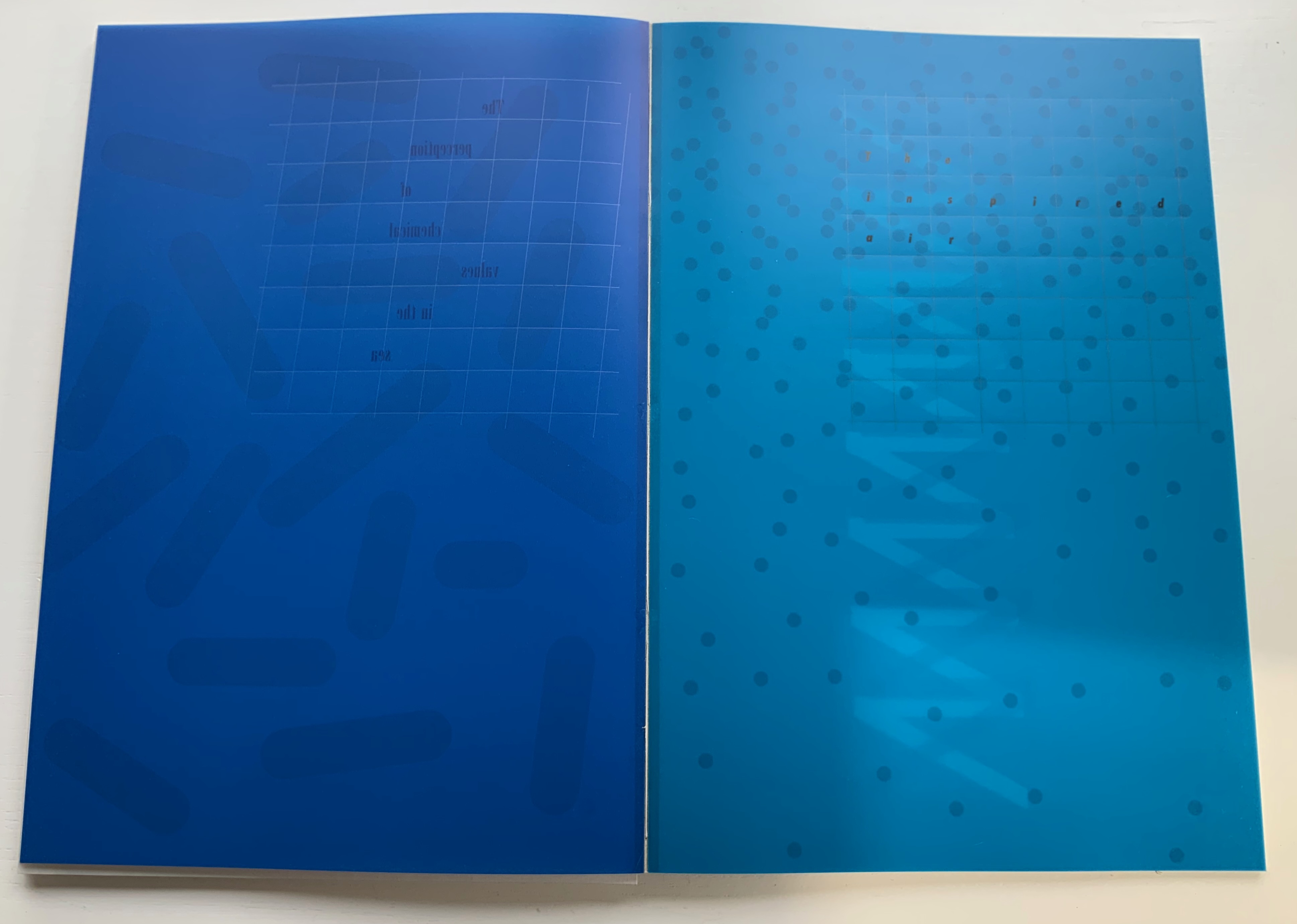
Table of Contents Compression waves from a vibratory event How are associations between events detected? The stationary information for seeing one thing through another Radiation from a luminous source The physical reality of speech The diffusion of volatile substances The development of selective attention The superfluous appeal to memory The consequences of inadequate information The consequences of rigidity The special consequences of light Transmitted light and transparent surfaces The structuring of light by means other than reflection The structuring of light by alphabetic writing The stable and unbounded character of the phenomenal visual world The perception of chemical values in the sea The inspired air The beginning of a theory
But that is not how Botnick’s cento is presented. In calling it a “visual/textual poem”, Botnick is too modest. It is much more than visual/textual: it is visual, textual, auditory and haptic — and is so from the start, proceeding by contrasts and complements, provoking multi-sensory activity and responses.
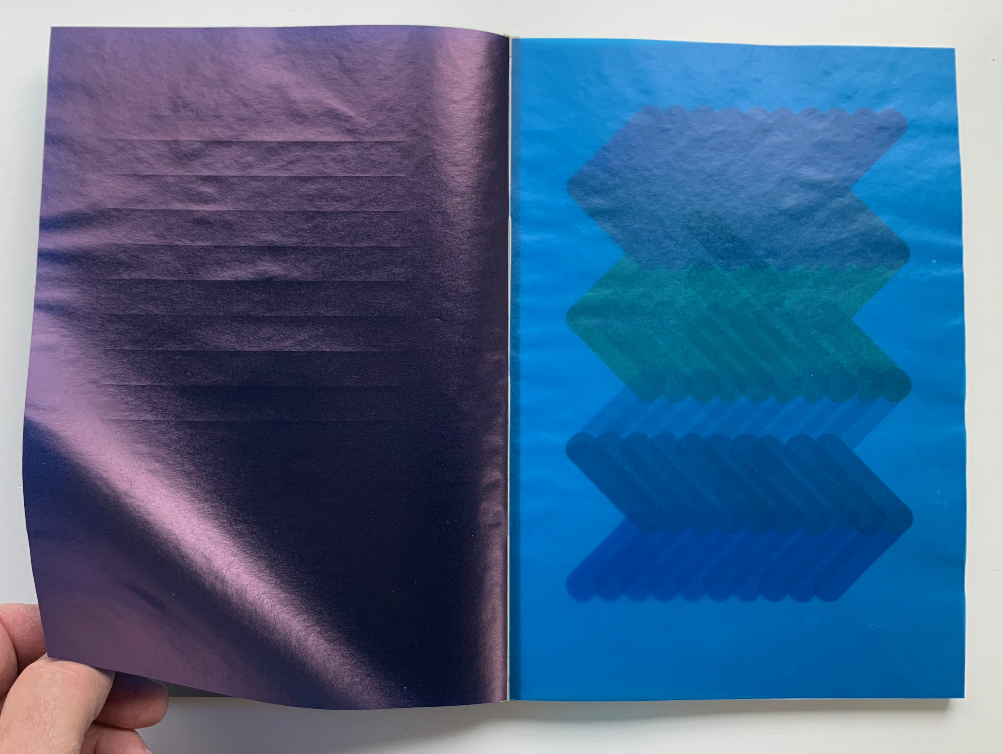
First of all, the slipcase is more of a “slipsleeve” from which the spine protrudes for fingers and eyes to feel the exposed binding threads, the pattern of knots and the ridges of the gathered signatures. This is the sewn boards structure, credited to Gary Frost, more on that later. The spine and fore edge offer bright colors that contrast with the deeply black sleeve that displays three slanting parallel cutouts in the cloth, exposing the board it covers. The pattern those cutouts make will become a recurrent visual and tactile theme as the pages turn.
As the tightly fitting sleeve pulls away from the board-stiff book, they make a “shirring” sound together. As the front cover turns, the title page bows upward showing nine impressed parallel lines beneath the words “Table of Contents”, and when that page turns, it crackles and makes a shuffling sound as its edge drags across the following bright blue page.
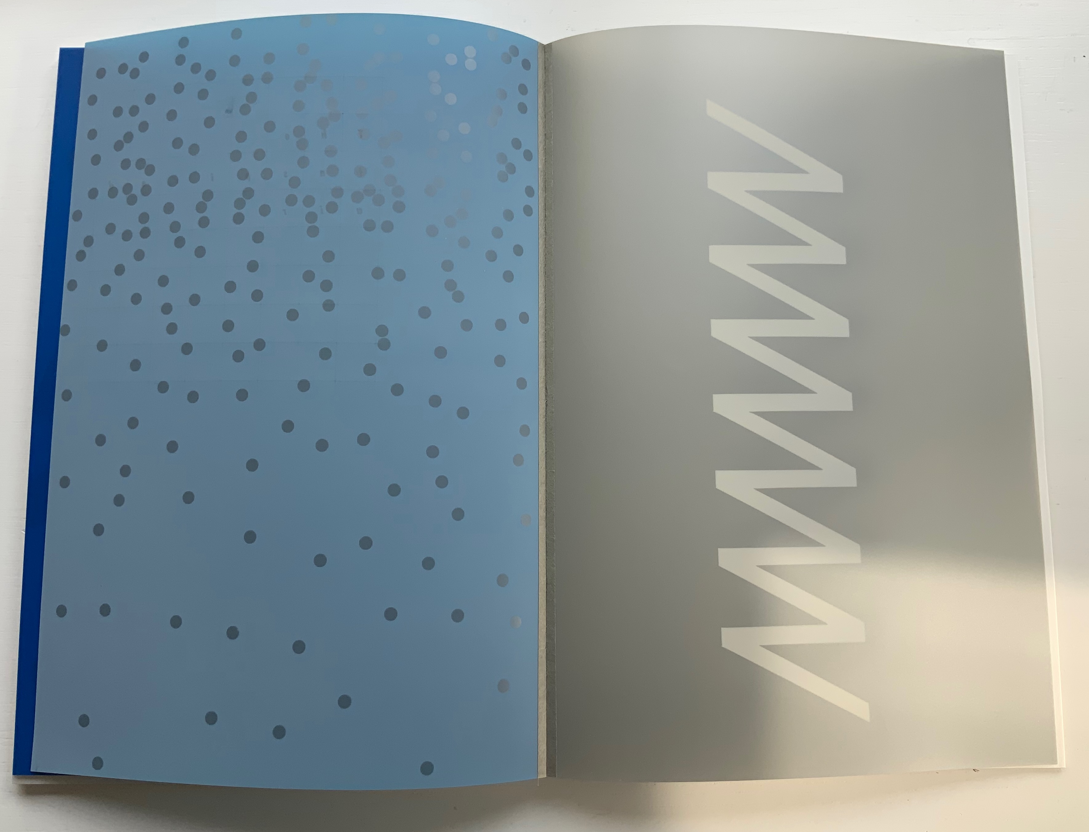
Through that bright blue translucence, the pattern from the slipsleeve reappears but rearranged and multiplied into a zigzag spectrum of colors. The physical turning of the translucent page “exposes” that zigzag spectrum and the second line of text in this poem: “Compression waves from a vibratory event”. Gibson’s text refers to the perception of sound or physical vibrations, and Botnick poetically overlays this with his selection of papers and introduction of zigzag waves of color. The zigzag pattern and its rounded elements, which on some pages are scattered, elongated, cross-hatched or sharp-edged, contribute a recurrent visual syncopated rhythm through the book. Toward the end, the zigzag moves into a more consistently vertical and angular, almost helical, appearance.
First leaf turned, second leaf turning, third leaf revealed.
Zigzag pattern scattered. Zigzag pattern become helical.
To deliver other visual and haptic effects, Botnick prints his translucent papers sometimes only on their reverse sides, sometimes on both, sometimes to the point of opacity as with the first leaf and other times to the point of transforming the colors about to appear on the next sheet beneath as with the second and third leaves. Of course, this changes the feel of the sheet from one side to the other. Botnick also uses six different paper types (including one with a watermark designed for this edition and made at Dieu Donné Paper). The variety in printing and papers introduces additional tactile and visual rhythms: slick and matte, smooth and rough, dark and light, etc. Again, proceeding by contrasts and complements, provoking multi-sensory activity and responses.
Visual effects achieved by printing on both sides of translucent paper layered over fine print paper.
Visual effects achieved by printing translucent paper to near opacity on one side, spot printing on the other side and layering that sheet over a translucent paper printed on one side.
Variation of paper types.
The sewn boards structure, executed by Emdash studio member Robin Siddall, offers the most effective means of achieving the sensory effects intended with the variety of papers, ink colors and printing techniques, as well as delivering a lay-flat binding. Each four-page signature consists of two separate sheets glued to the inner edges of a narrow folded card (the board) sewn and linked to the boards of the signatures before and after. The card used for those hinges is a Japanese washi called Moriki, known for its folding strength and colors, but how particularly apt those multiple hinges and colors are for this patchwork poem.
Detail of an open signature exposing the thread sewn through the board and showing the leaves glued to the edges of the board.
Gibson defines the haptic system as that “by which animals and men are literally in touch with the environment” (p.97). On the penultimate double-page spread, Botnick reveals the environment that touched his “book-length visual/textual poem” into existence: one of pandemic, isolation, violent exposure of institutionalized racism, the “Big Lie” and insurrection. Set in the now familiar zigzag pattern, the revelatory text annotates the lines of appropriated text and the prints, connecting both with the environment and the meditation on perception. Botnick’s book is certainly a distinctive interweaving way of thinking about these threads.
It is telling that Table of Contents ends with black and gray, the colors that dominate the other work in the collection: Diderot Project (2015), which presents this pronouncement from Odilon Redon:
Even without the prismatic range of colors in Table of Contents, Botnick’s Diderot Project (2015) may outstrip the former in the number of ways in which Botnick makes not only the page but also the codex itself “become a dynamic landscape of visual and conceptual ideas”.
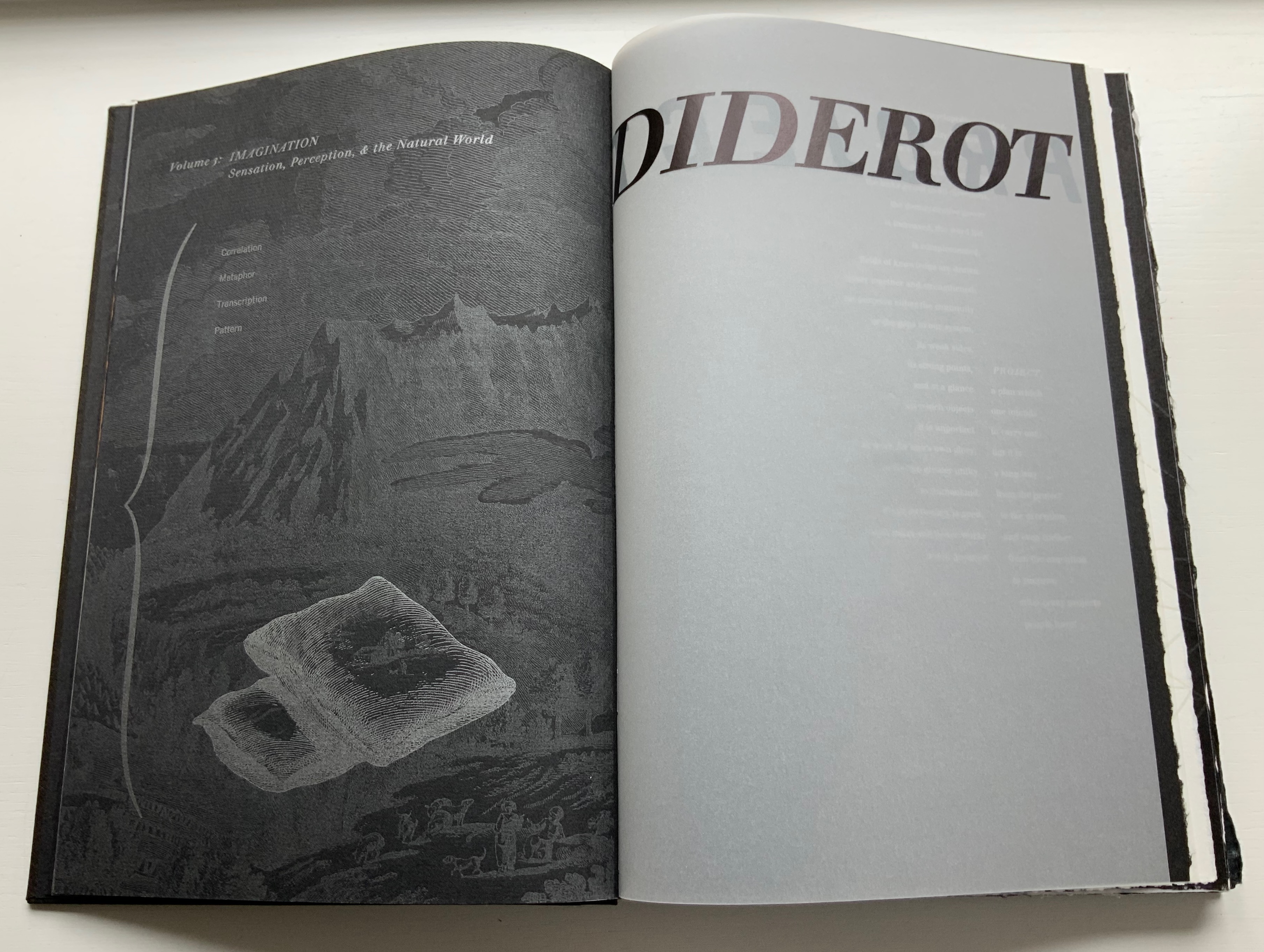
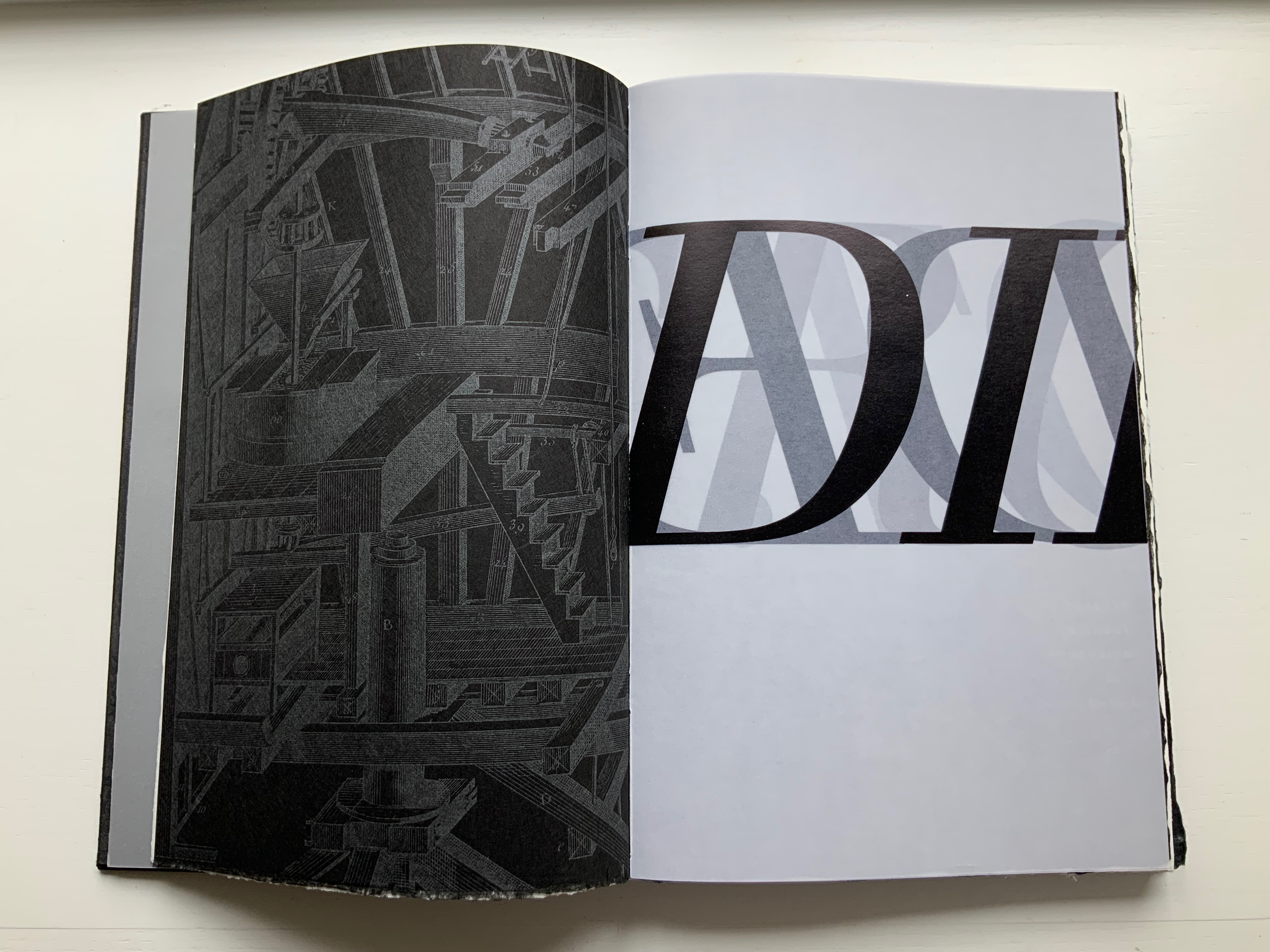
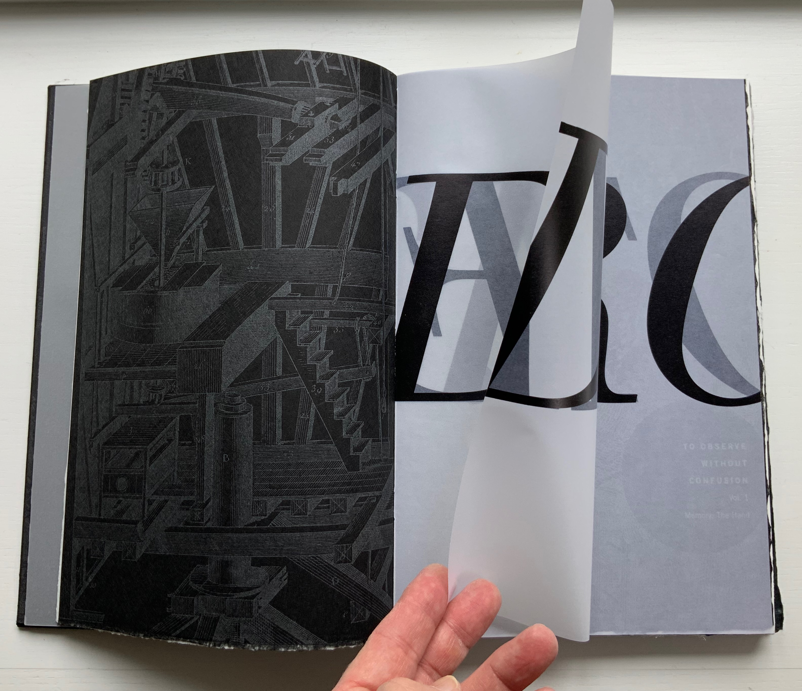
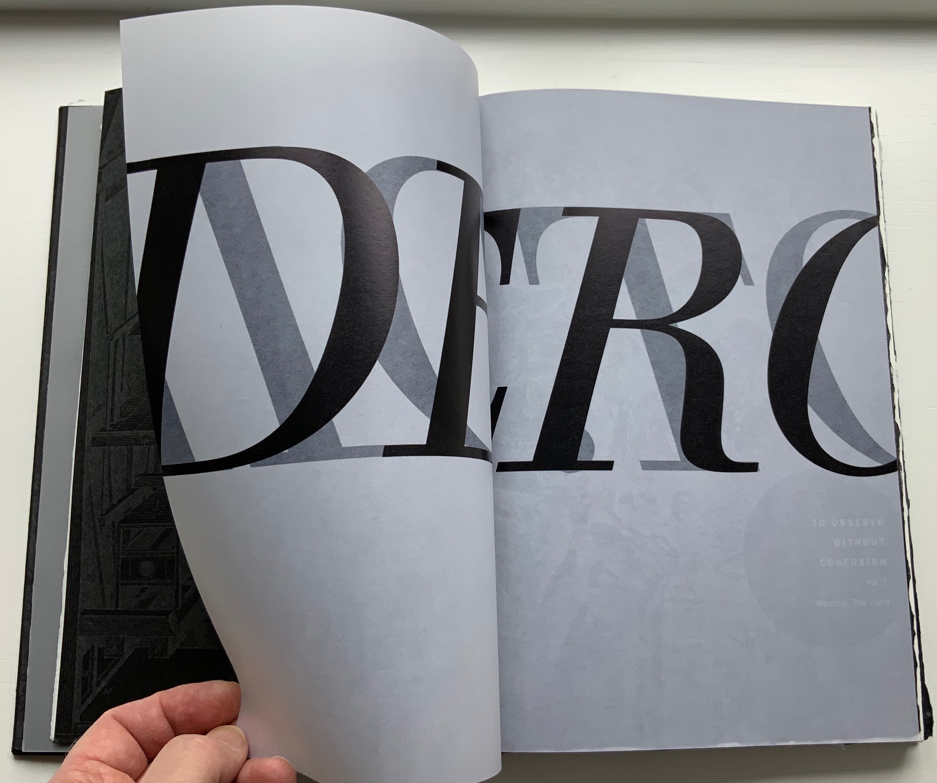
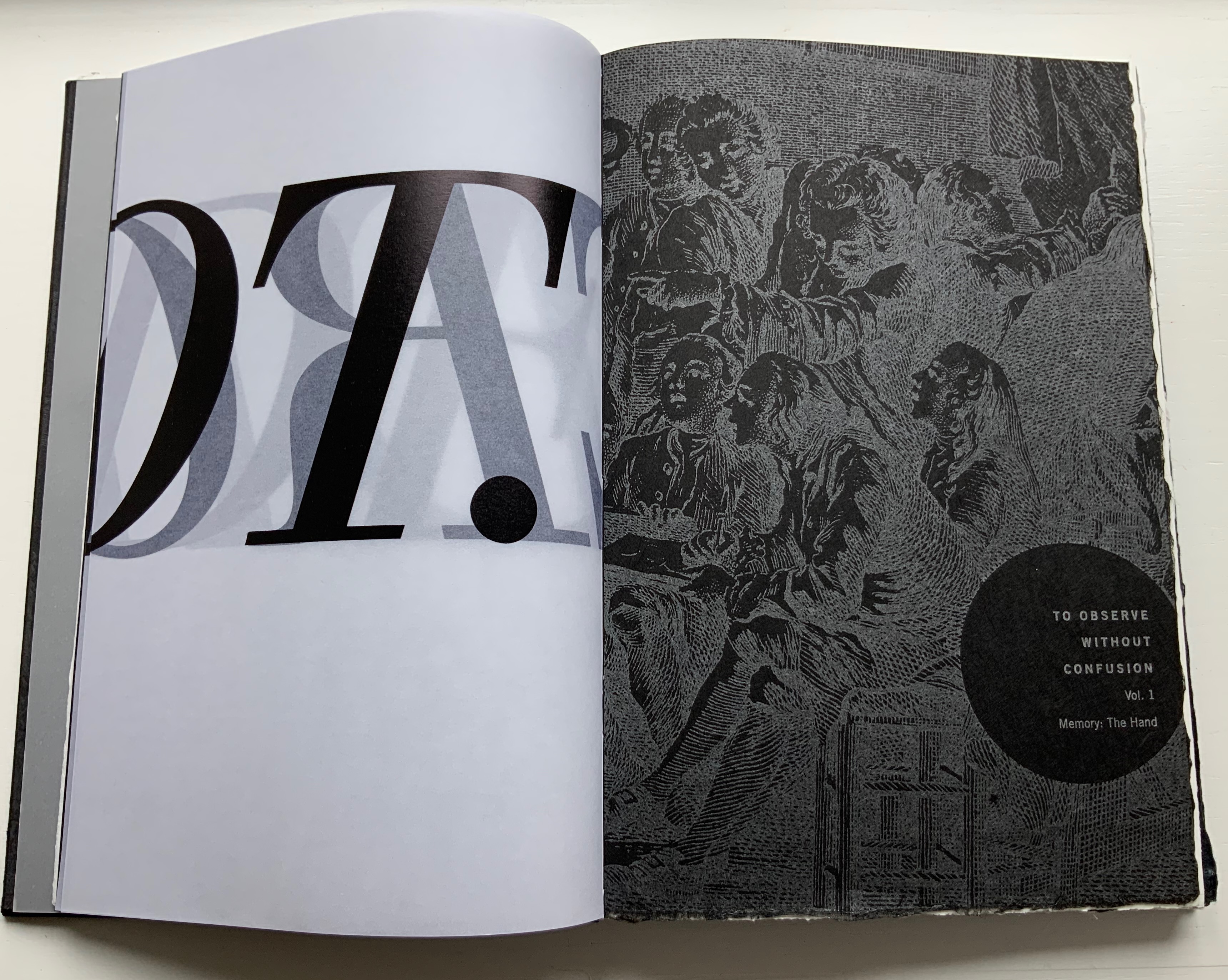
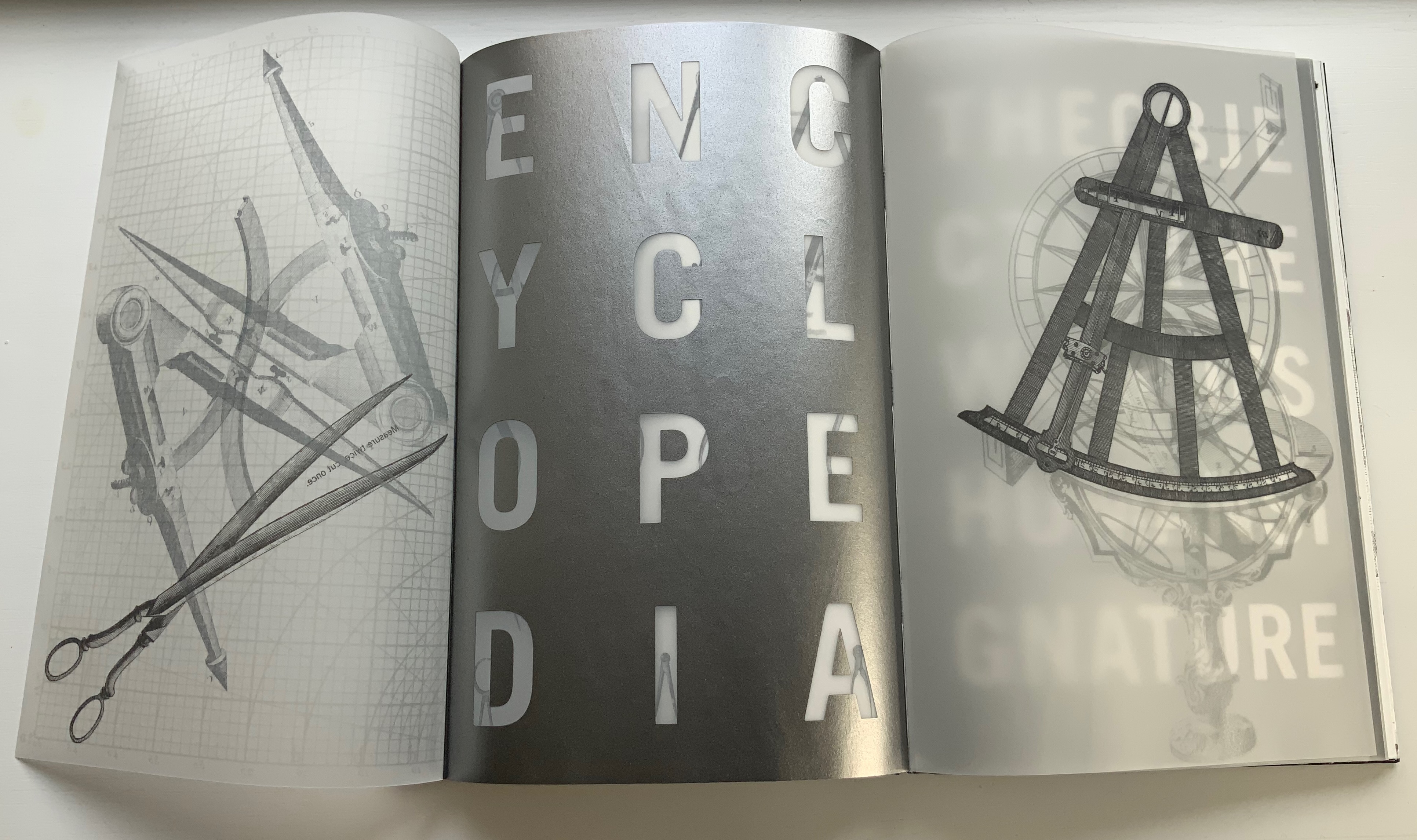
Diderot Project (2015)
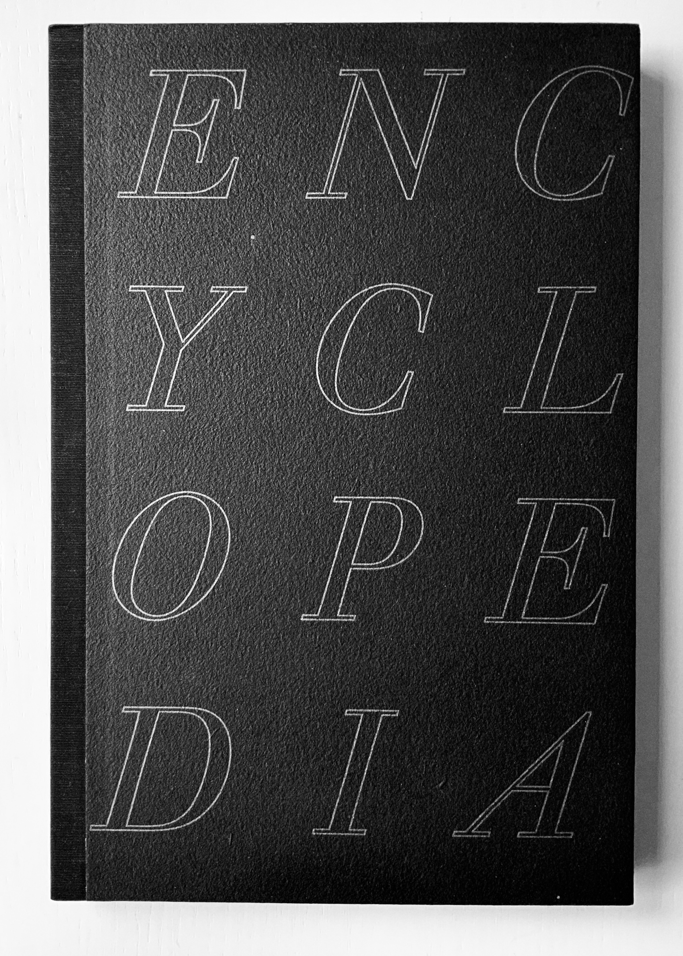
Diderot Project (2015) Ken Botnick H290 x W194 mm, 150 pages. Edition of 70, of which this is #32. Acquired from the artist, Photos: Courtesy of the artist; Books On Books Collection. Displayed with permission of the artist.
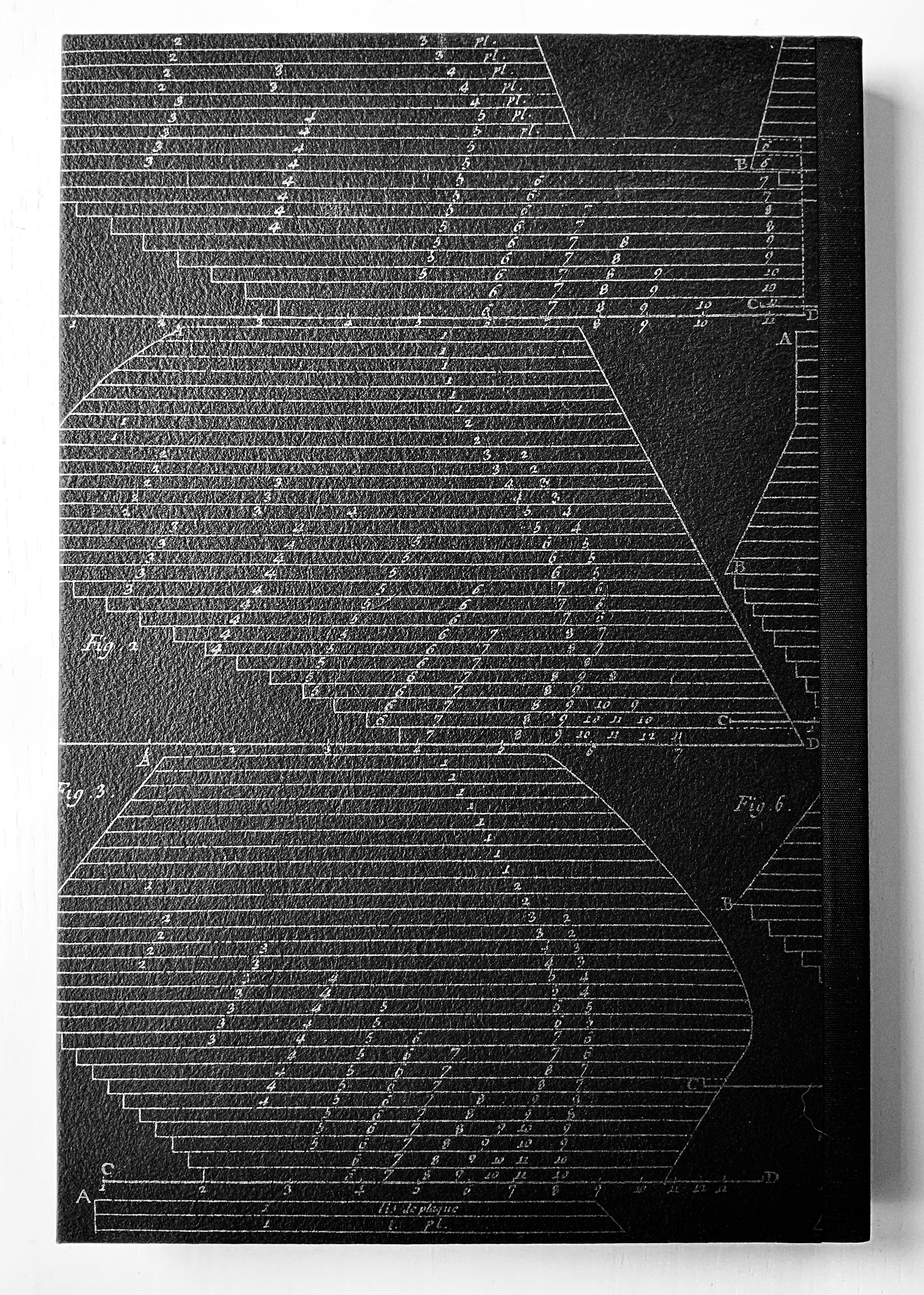
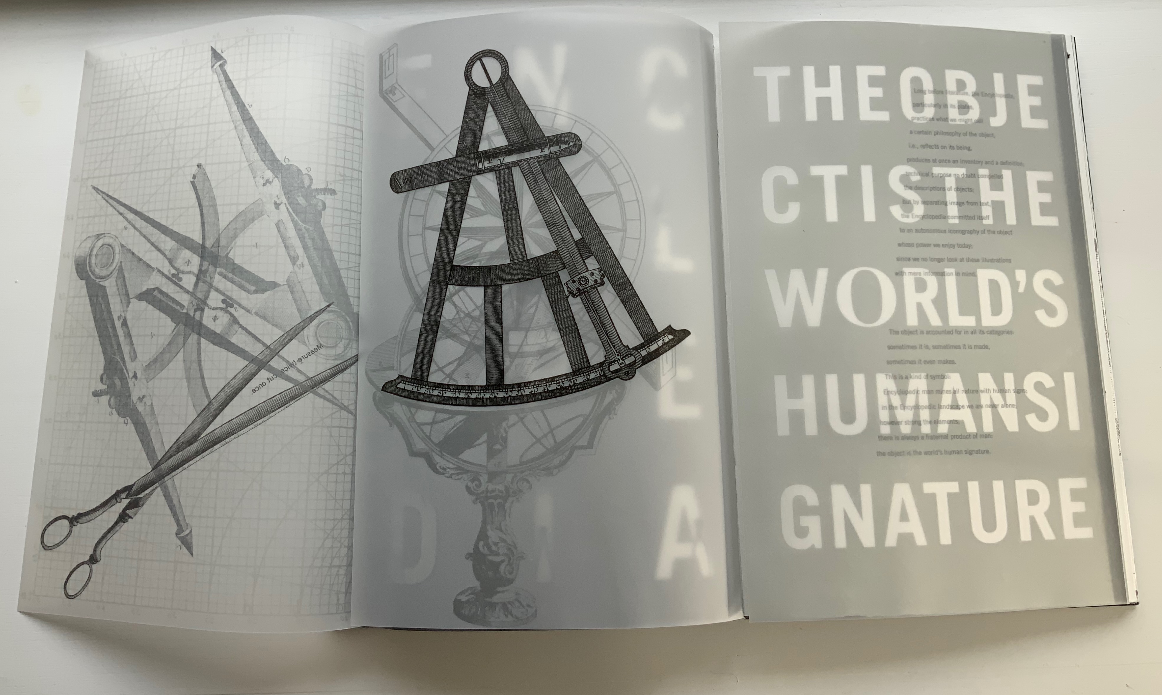
Clearly, like Table of Contents, this work is a “book-length visual/textual poem”, so it offers some insights on the book artist’s favorite rhymes, rhythms, metaphors, techniques and themes. First and foremost is his taking a literary work as his muse. With Table of Contents, it is James J. Gibson’s psychology book; in this case, it is Denis Diderot’s multi-volume Encyclopédie (Encyclopedia), a decades-long project with Jean le Rond d’Alembert and 138 other contributors. Nodding to the multiple volumes of the Encyclopedia, the artist refers to the sections of his work as Volumes 1, 2 and 3, although they are bound as one binding. The three volumes’ titles follow the Encyclopedia‘s overarching categories in its “System of Human Knowledge”: Memory, Reason, and Imagination. Digitally captured images from the Encyclopedia‘s plate volumes abound.
Table of Contents
Diderot Project, however, is not a condensed version or description of the Encyclopedia. Like literary works of ekphrasis whose words meditate on a visual object, Diderot Project is book art that meditates — inversely — on a literary work. The cover to Diderot Project does not show its name where the title is expected, rather it shows the name of its object of meditation. And it displays that name in a distinctive monumental way.
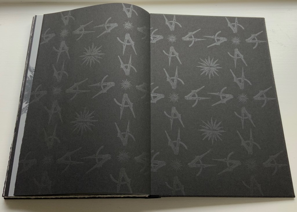
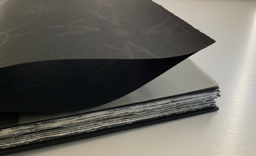
The front cover’s silver slab serif italic letters in all caps on textured, triple-dyed flax paper and the back cover’s diagram in the same palette strike chords that reverberate throughout the work. The chords are both obvious and subtle. Immediately, with a pattern of silver-gray compasses and directional stars, the doublures repeat the cover’s black and silver notes but on a less textured paper. Curiously the fly leaves of the doublures are not really fly leaves because they are pasted at their fore edges to separate leaves of black paper: a subtle hint to look beneath the surface, inquire into the mechanics. (An irresistible side note on the mechanics of the binding: the binder Daniel E. Kelm, in tipping the black fly leaf to the outer printed one, extends the fly leaf further into the book as a tipped-on hinge inserted through the first two signatures. The detailed image below on the right shows the hinging edge of the fly leaf between the signatures.)
L-R: Inside back cover, doublure with compass and directional star motif; Inside front cover, doublure leaf anchored to fly leaf; Binding detailed view of hinging edge of fly leaf extending between signatures.
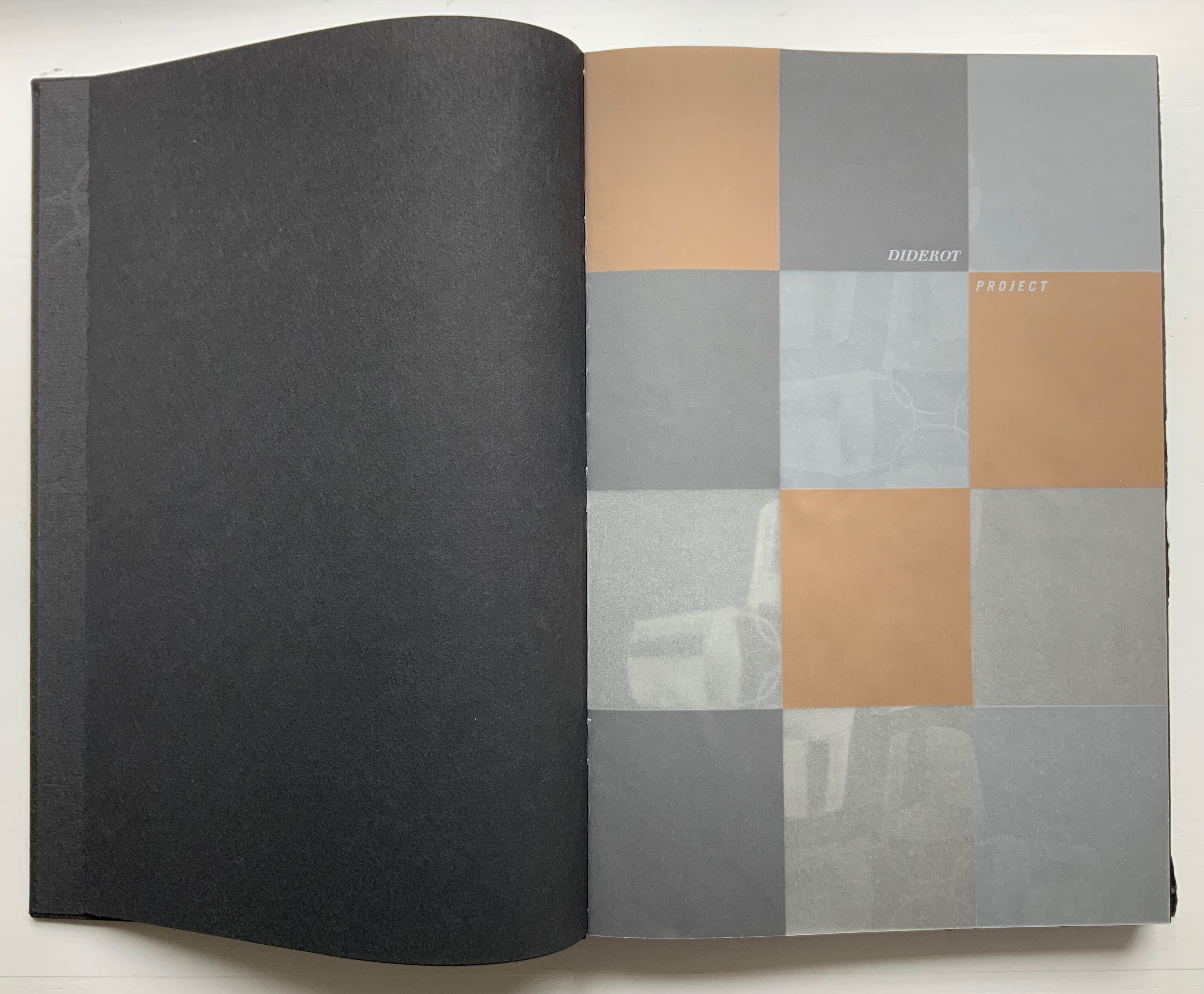
Following that almost-Chinese fold of a flyleaf, the half-title drops any pretense of hinting. Turning the half-title with its 3×4 grid of black, brown, tan and gray squares on translucent paper reveals that the squares have been created by printing in silver, copper, light brown tint and no ink on the reverse. Underneath the half-title leaf lies another black page with the recurring silver-gray image of four buckets linked by their handles. The pattern of buckets is parallel to the interlinked image of compass and directional star on the doublures. It is another subtle hint: this time, to look at patterns for their similarities and differences arising from the mechanics of effects, to consider the commonality of tools whether at the low or high end of culture.
L-R: Half-title on translucent paper; inked reverse of half-title and the interlinking buckets.
If this reaction to the prelims seems a stretch, then the following run of folios surely validates it. Not only does the text articulate the parity of craft and tools (métier) with art and science, the watermark hand gestures to it, then the watermark hand joins its mirror image “to tie” the knot of the binding thread, and then the second watermark hand joins its printed mirror image at the same point. These six pages enact parallels of similarities and differences.
The layering of translucent paper printed on one or both sides, which also occurs in Table of Contents, is another of Botnick’s favorite techniques. He has even delivered a lecture at the Getty Research Institute entitled “Transparency as Metaphor“. Botnick’s use of it in the sequence below invites the reader/viewer to meditate with him on “the nature of craft, tools, memory, and imagination, while provoking questions about authorship in artists’ books”.
Running across the four pages of the two leaves of UV Ultra Clearfold, the enlarged present, past and future letters call on perception, memory and imagination to decipher the name: Diderot, emerged and submerged. However large his name is cast, though, is Diderot the author? By bracketing these transparencies with an image of a manufactory or workshop and a crowd of listeners and observers with pens poised, Botnick evokes the other 139 contributors to the Encyclopedia and his own host of collaborators, including Kelm (binding), Paul Wong (papermaking) and, importantly the Emdash studio (Catherine Johnson, Ben Kiel, Karen Werner and, in New Delhi, Ira Raja).
Tools, the workplace and studio lie at the heart of the Diderot Project‘s second volume, which boasts the following complex foldout which in itself validates Roland Barthes’ statement from his essay on the Encyclopedia‘s plates: “The object is the world’s human signature”.
Sensation, perception and the natural world lie at the heart of the third volume, and here is another of Botnick’s favorite techniques: typographic distinction. The right-side up text on the verso page is set in Walbaum, as is every instance of Diderot’s text. The upside down text on the verso and all the text on the recto are set in Trade Gothic, as is the case for more contemporary authors (Michel Foucault and Walter Benjamin, respectively, in these instances). Note how Foucault’s upside down text reflects the action in the image of the camera obscura, and picks up the theme of perceptual flipping initiated with the watermark hand in Volume 1 and Diderot’s enlarged name across the translucent pages in Volume 2.
Both Table of Contents and Diderot Project reward revisiting for this kind of close reading, close looking, close fingering and close listening. Close comparison and contrast as well because together they answer “How does a book reflect a distinct way of thinking about a subject? How does the page become a dynamic landscape of visual and conceptual ideas?”
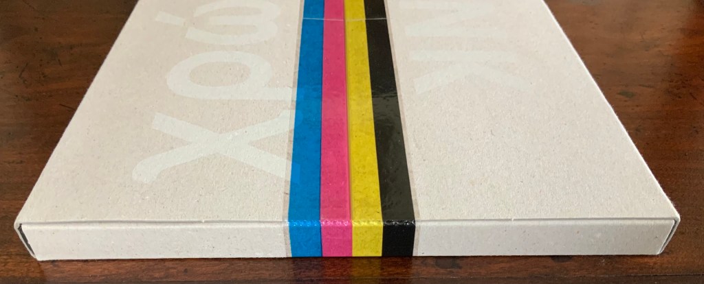
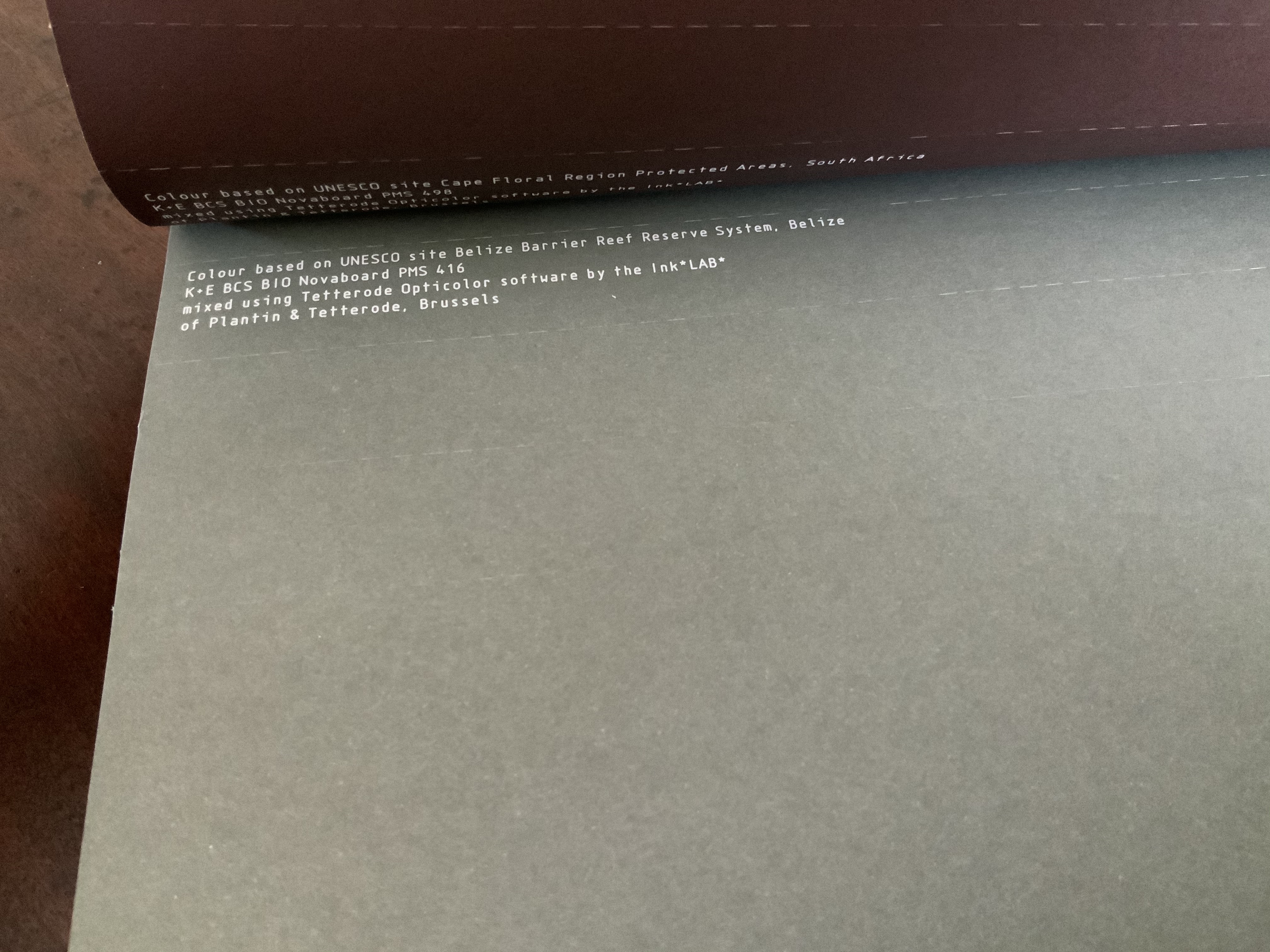
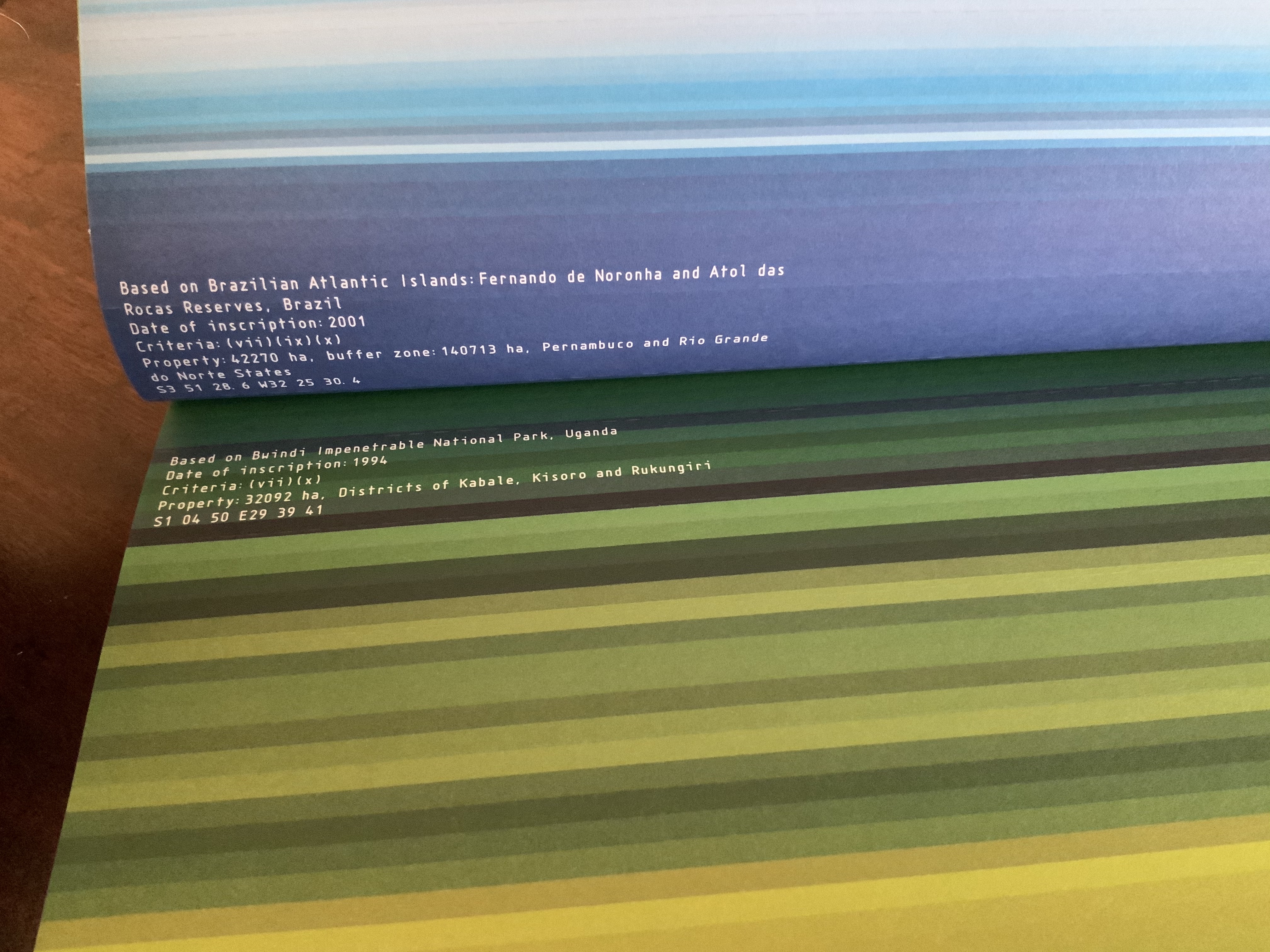
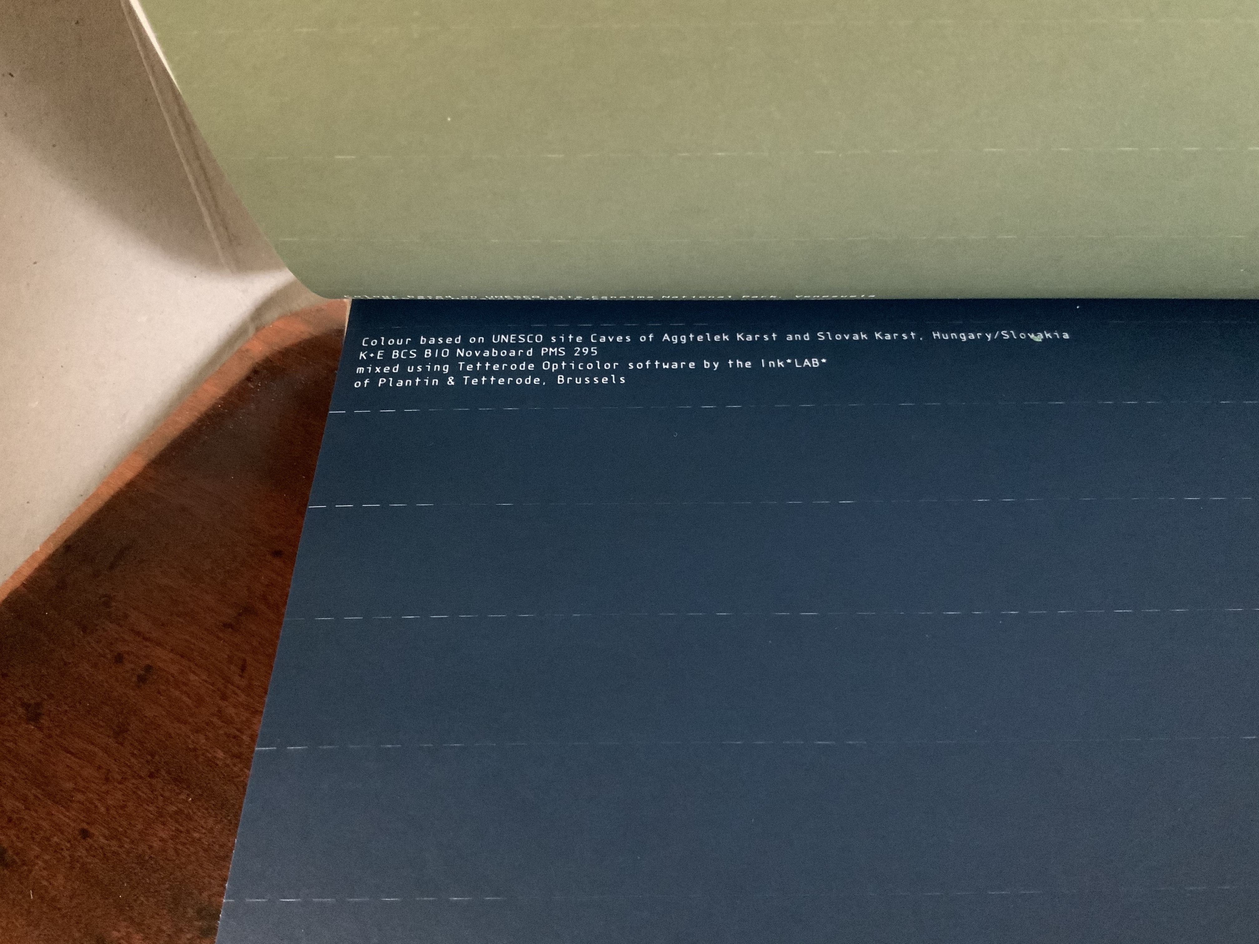
Colour — Based on Nature (2012) Irma Boom Box holding softcover. H320 x W240 mm, 170 pages. Acquired from Ursus Books & Gallery, 16 November 2020. Photos: Books On Books Collection.
This work of art in the form of a book explores and associates colors with 80 UNESCO World Heritage sites across the globe. On the exterior of each folio, all of them uncut, a single, solid color appears. As the folio is cut, the interior reveals striated variations on the exterior color.
The striations act like lines of rhymed and unrhymed verse. The whole volume could serve as a textbook on theory of colors, the destructive act needed to access the color reminding student and teacher of the fragility of the heritage sites being celebrated.
Irma Boom: The Architecture of the Book (2013)
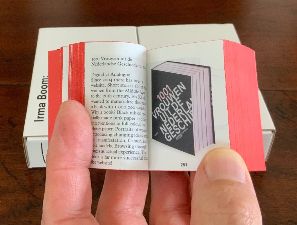
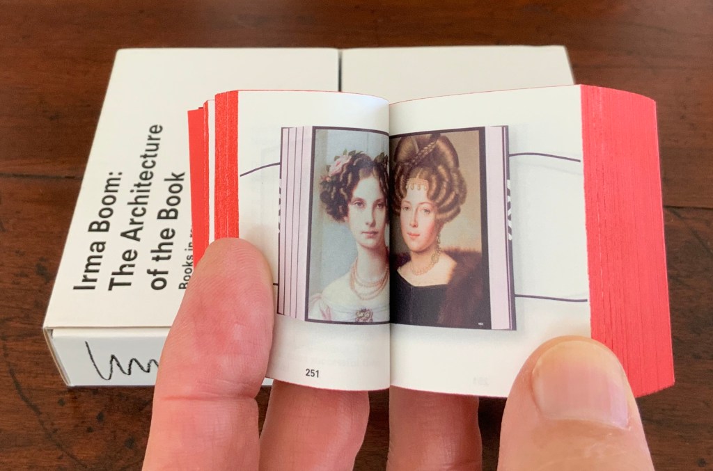
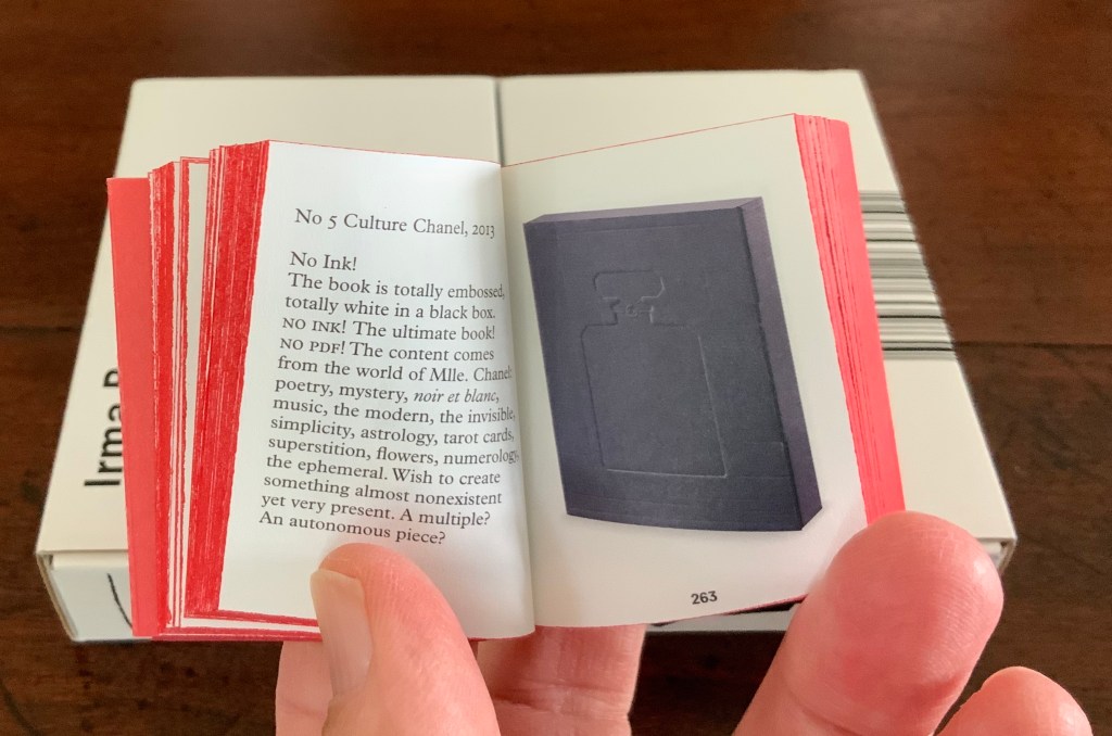
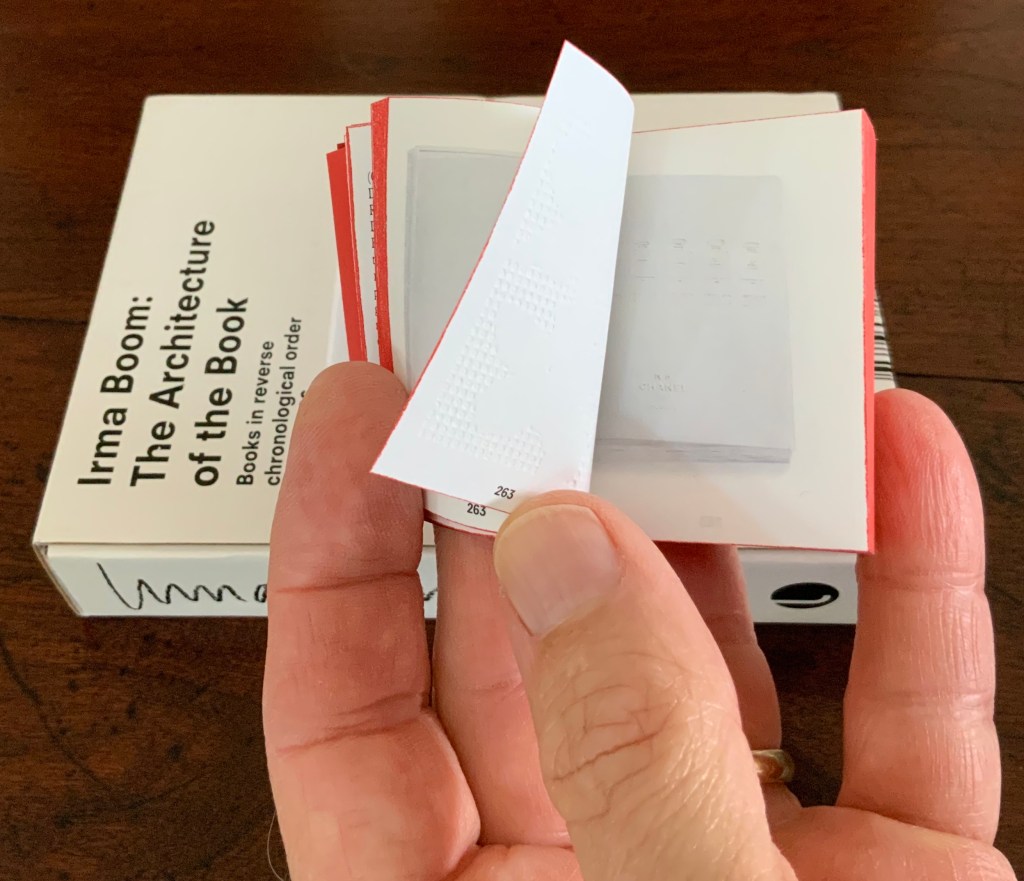
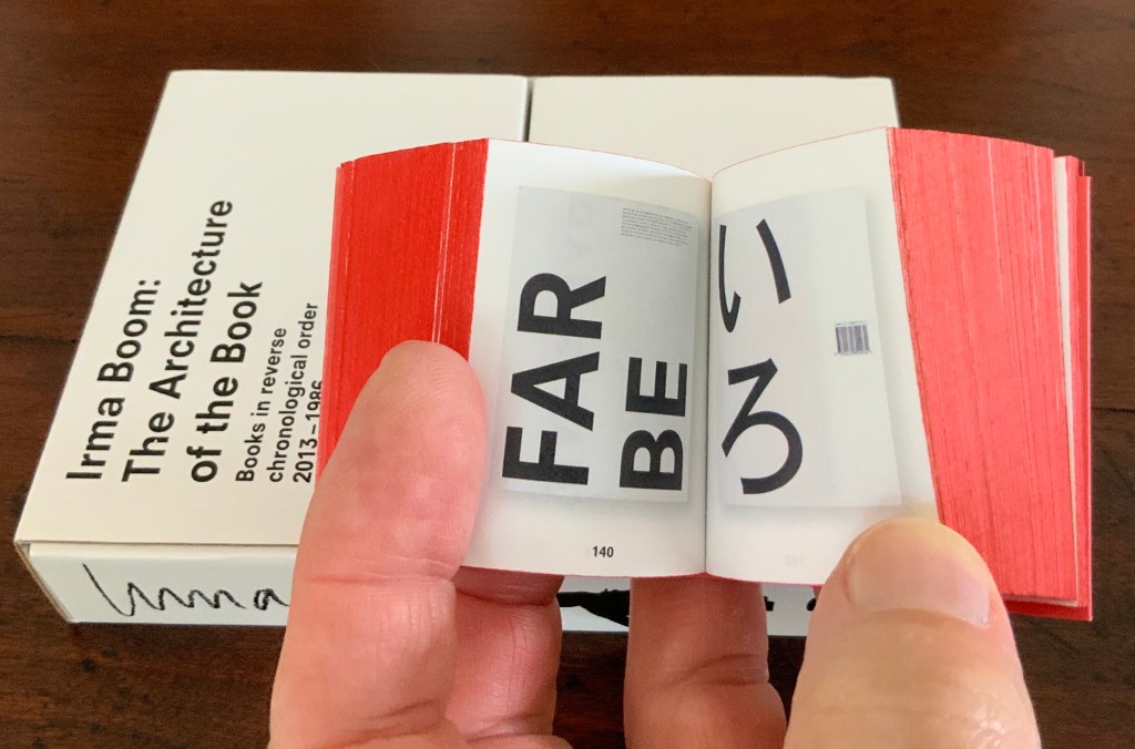
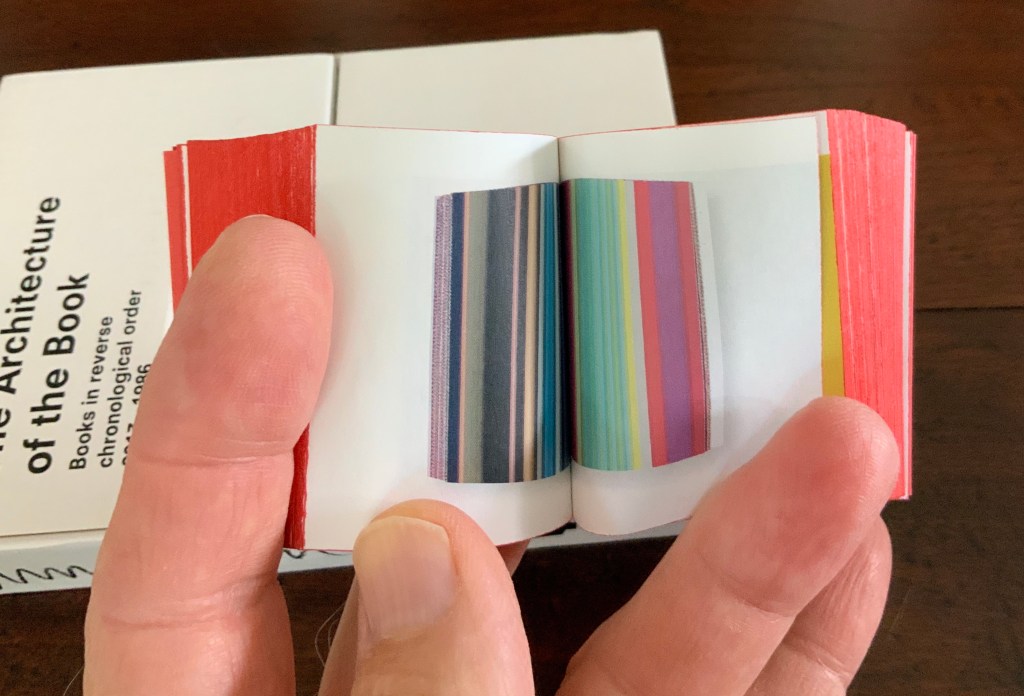
Irma Boom: The Architecture of the Book (2013) Irma Boom Box holding miniature softcover. Box: H153 x W118 x D31 mm; Book: H55 x W44 x D30 mm; 800 pages. Acquired from Amazon, 3 June 2015. Photos: Books On Books Collection.
In and of itself, a legible miniature book astounds. Add to it the design genius of Irma Boom and the astounding becomes book art. Recording her books in reverse chronological order 2013-1986 (with reverse pagination as well), Irma Boom: The Architecture of the Book uses its structure and contents to make us think again and again about the reach of the book’s technology.
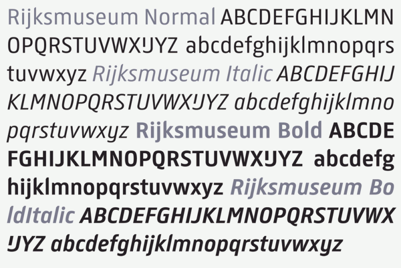
In 2013 the newly renovated Rijksmuseum opened with a new logo, new typeface design and publications design — all by Irma Boom and her studio. The new typeface — de Rijksmuseum — was developed by Paul van de Laan of Blue Monday under Boom’s artistic direction and appeared in museum signage and publications. The new typeface marks an interesting shift from DTL Documenta, the previous corporate font, designed by Frank E. Blokland. Blokland had studied with Gerrit Noordzij and later succeeded him at the Dutch Royal Academy of the Arts (The Hague). He founded the Dutch Type Library in the 1990s.
The previous style sheet leads with the serif version of DTL Documenta, while the de Rijksmuseum style sheet leads with the sans serif. Having applied to intern at Total Design in Amsterdam and been rejected by Wim Crouwel’s colleagues for her experimentalism, Boom must have especially enjoyed winning this commission. Just as much as the typographic differences, though, it is Boom’s roots in book design that differentiates the new from the old.
Guide Rijksmuseum (2013) Eric Spaans (text),Irma Boom (design) Softcover with multiple foldout maps. Acquired at the Rijksmuseum. Photos of the work: Books On Books Collection.
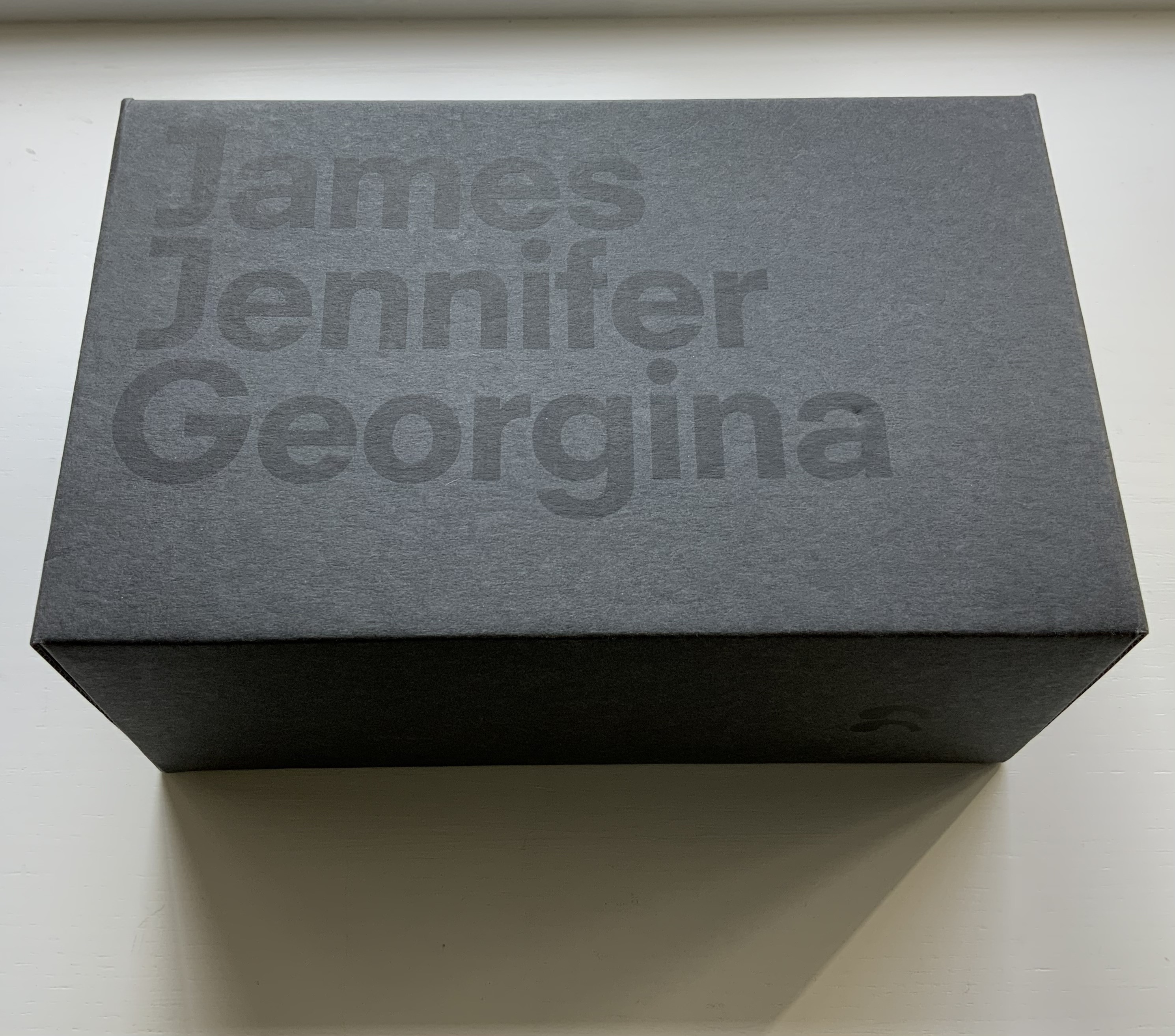
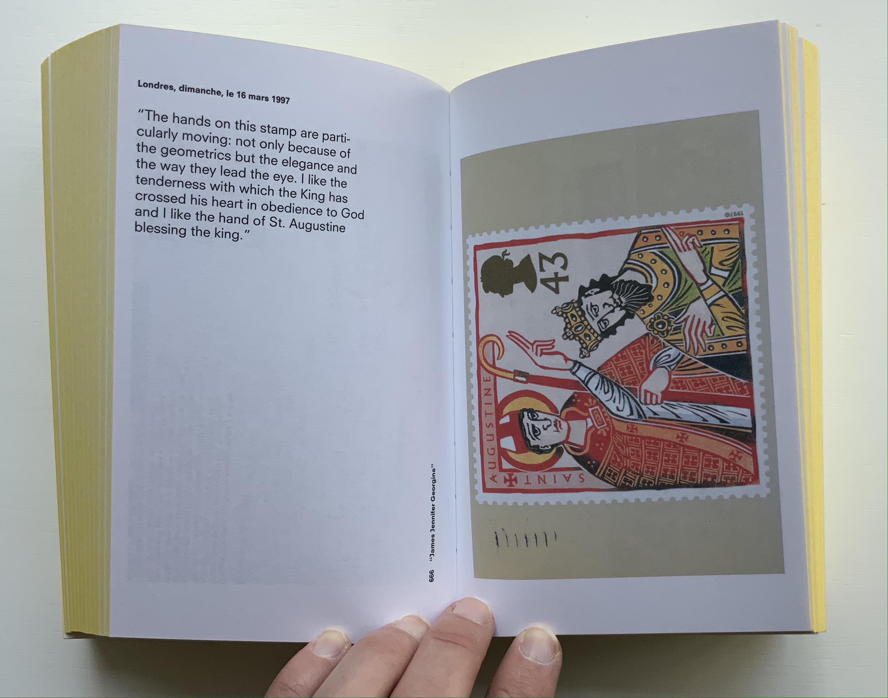
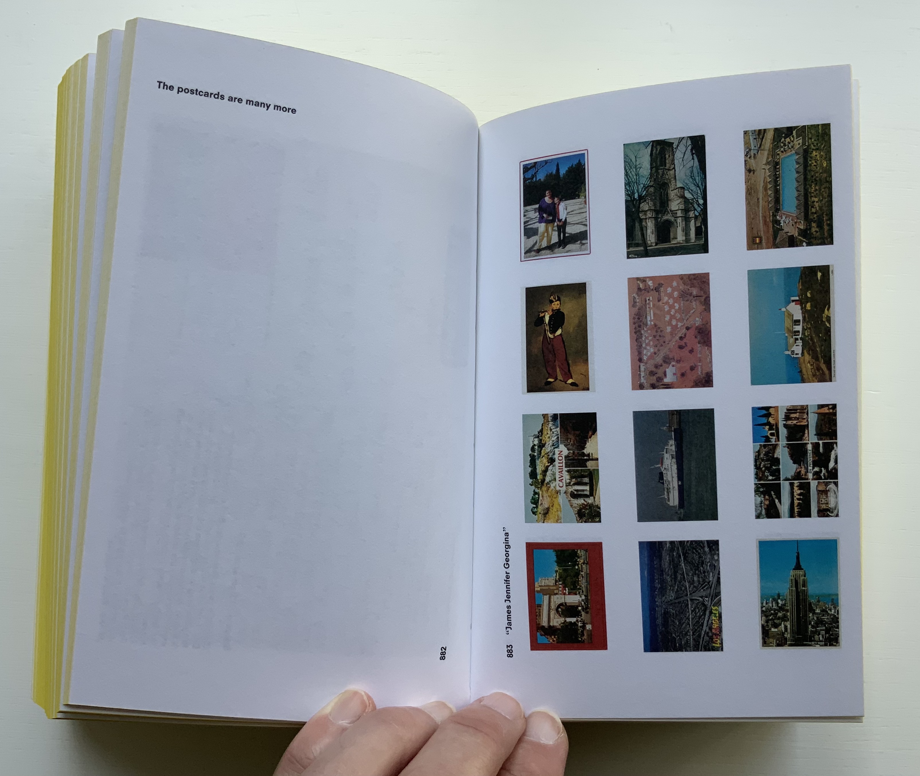
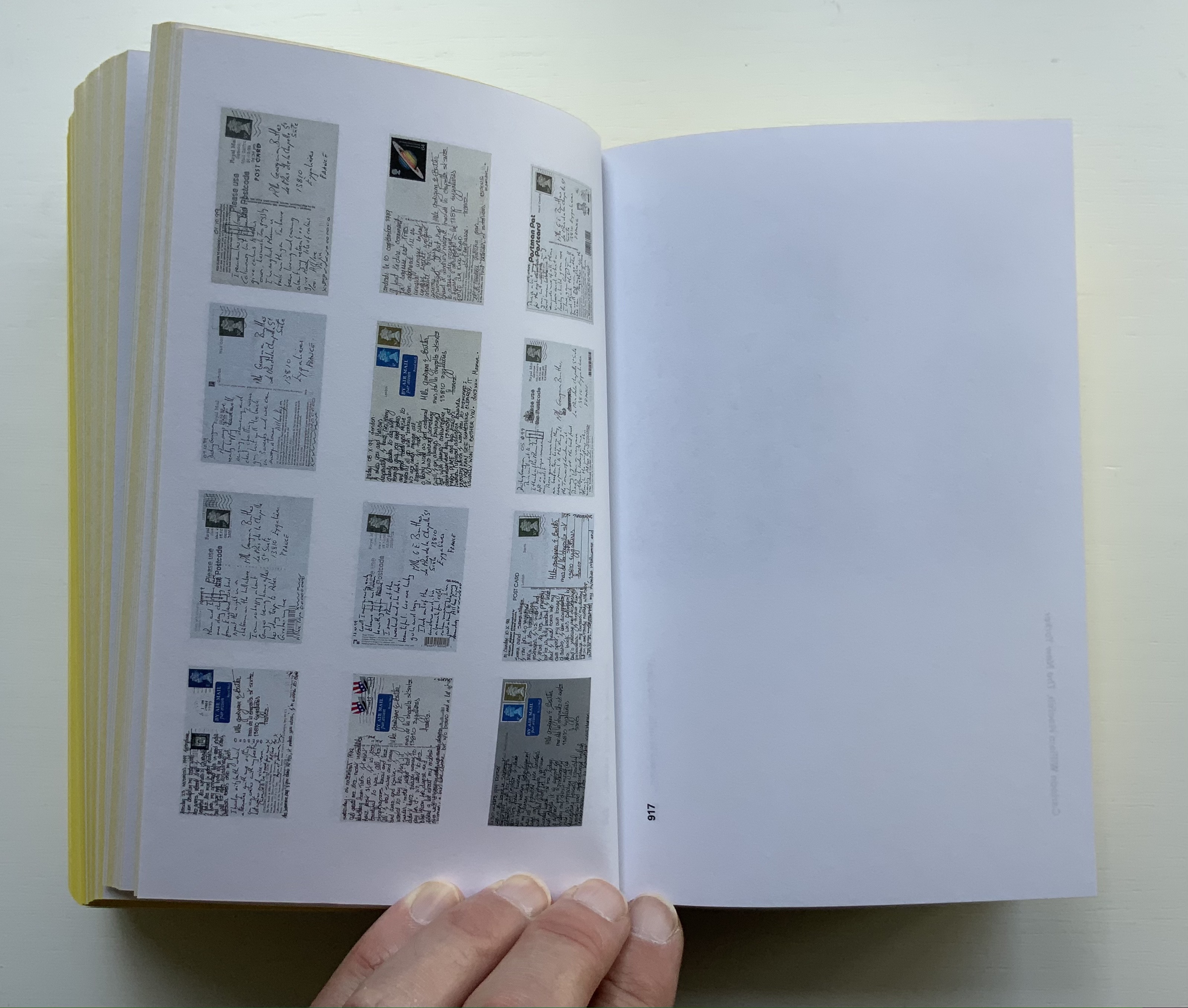
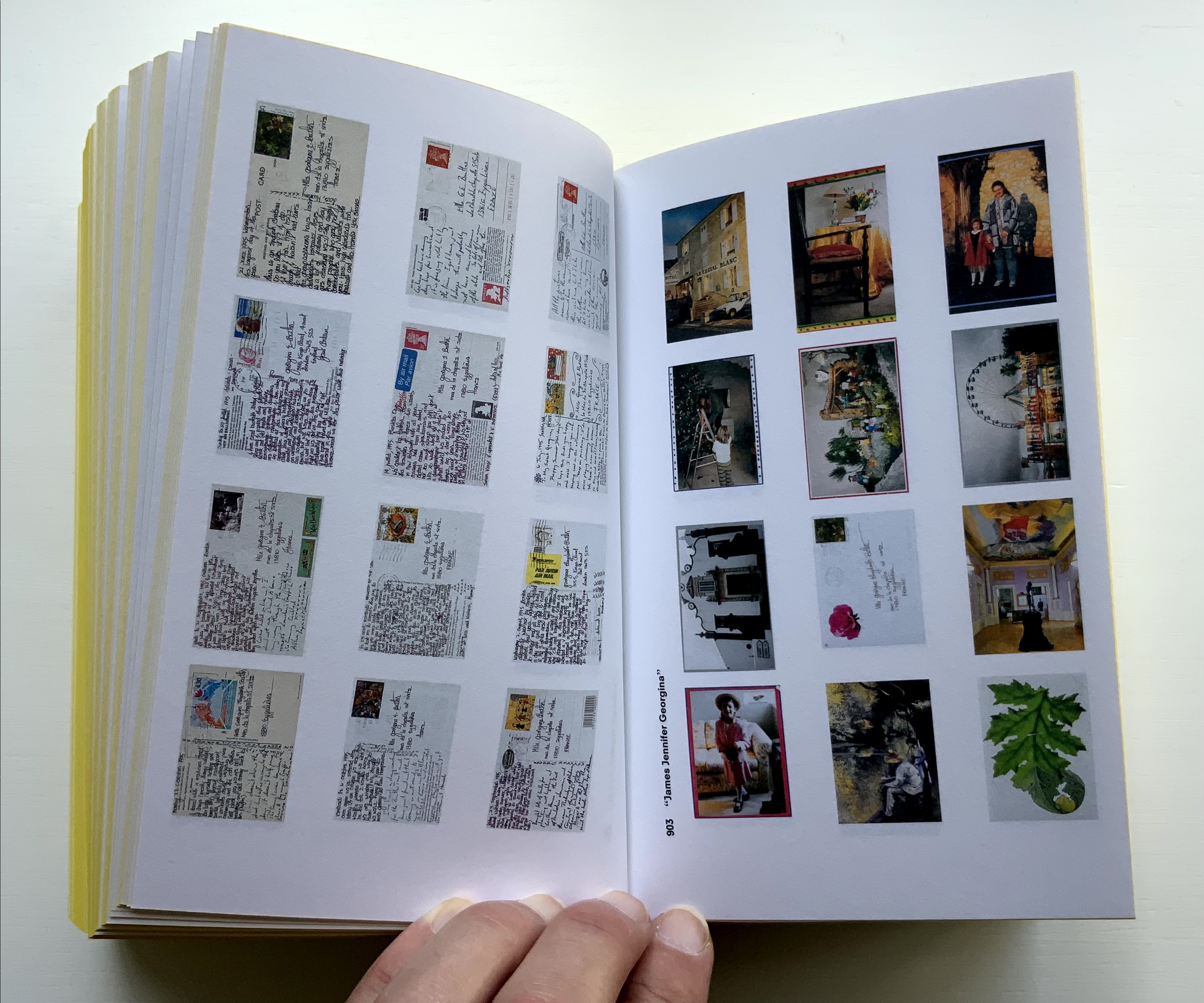
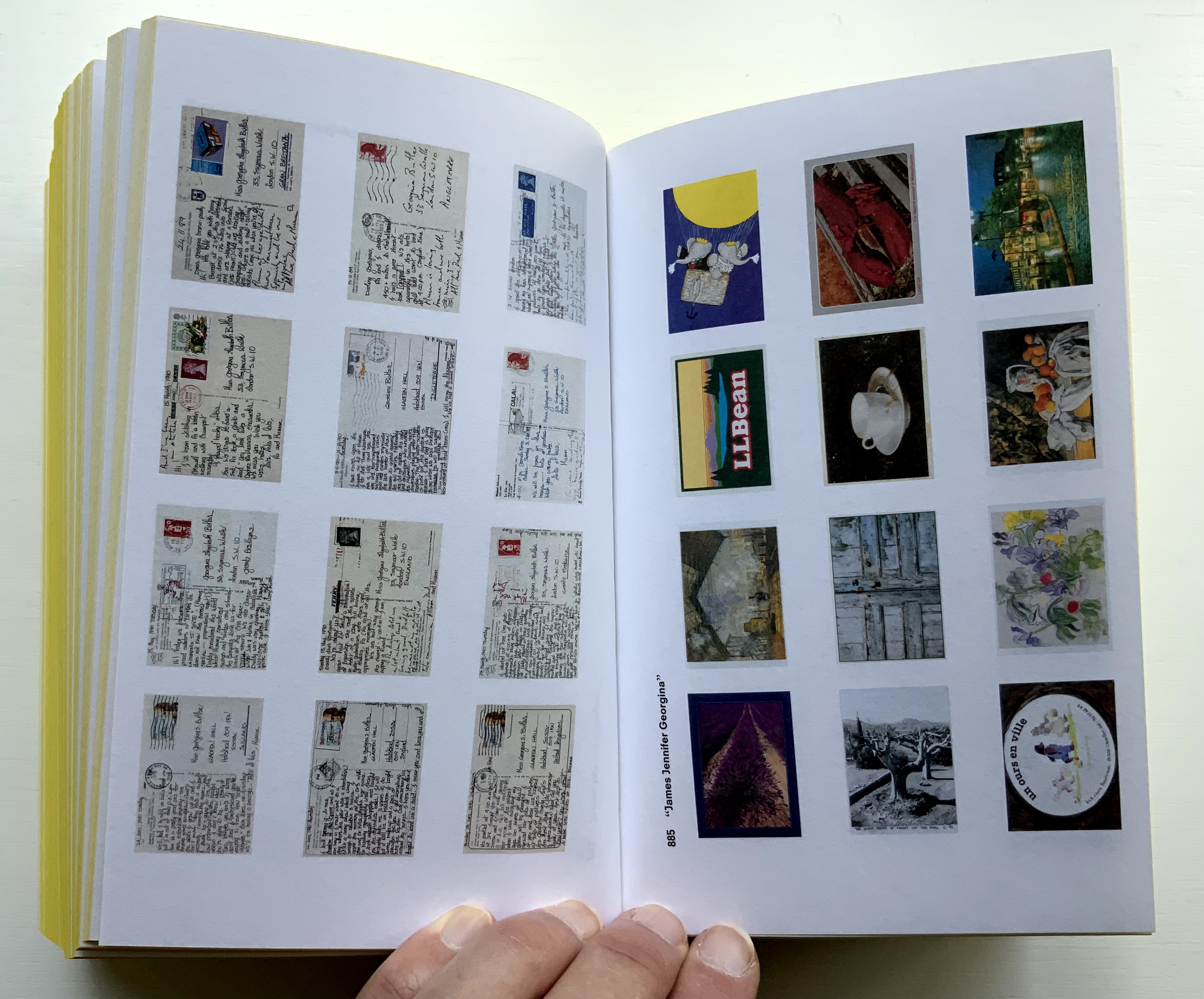
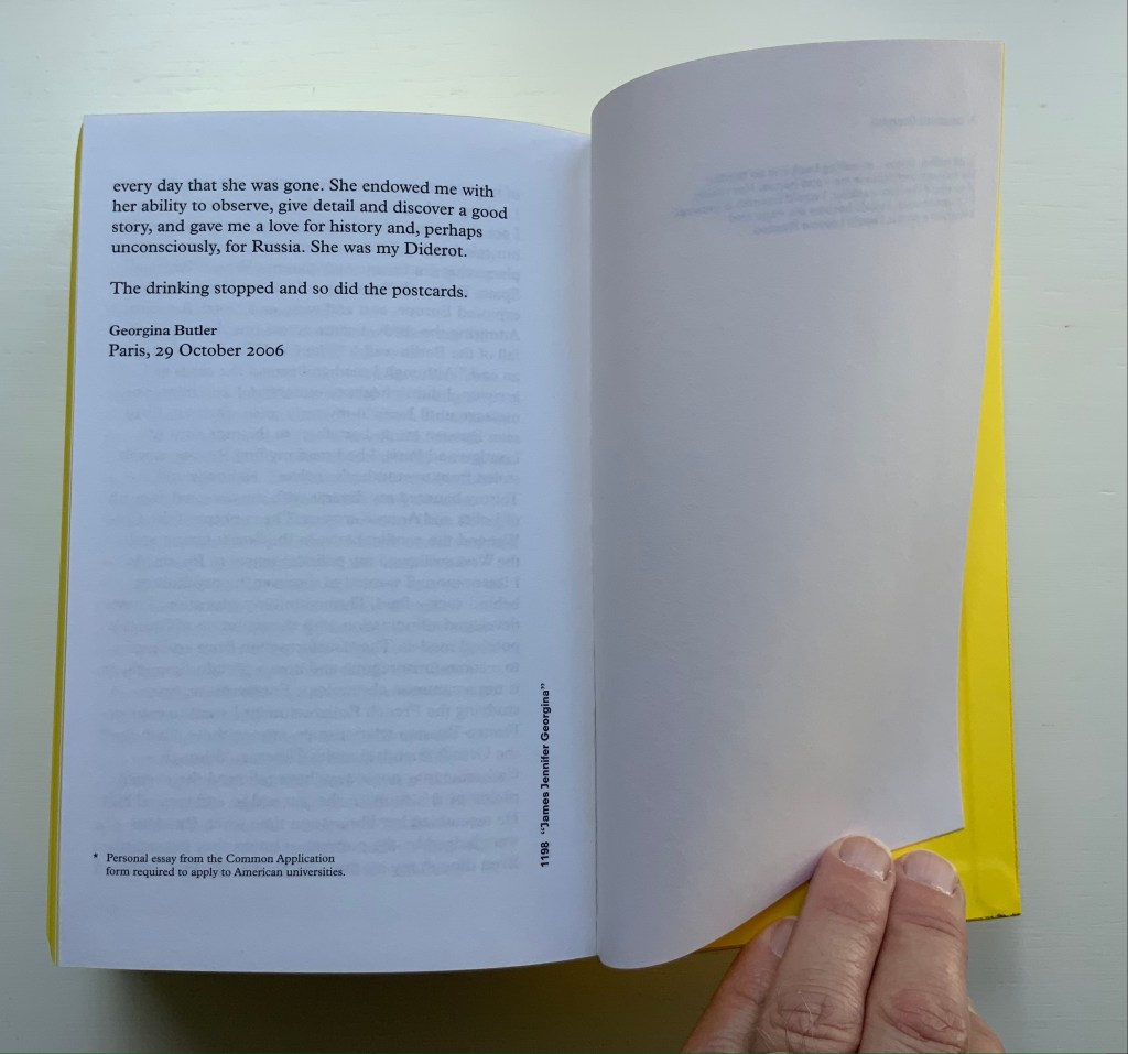
James Jennifer Georgina (2010)
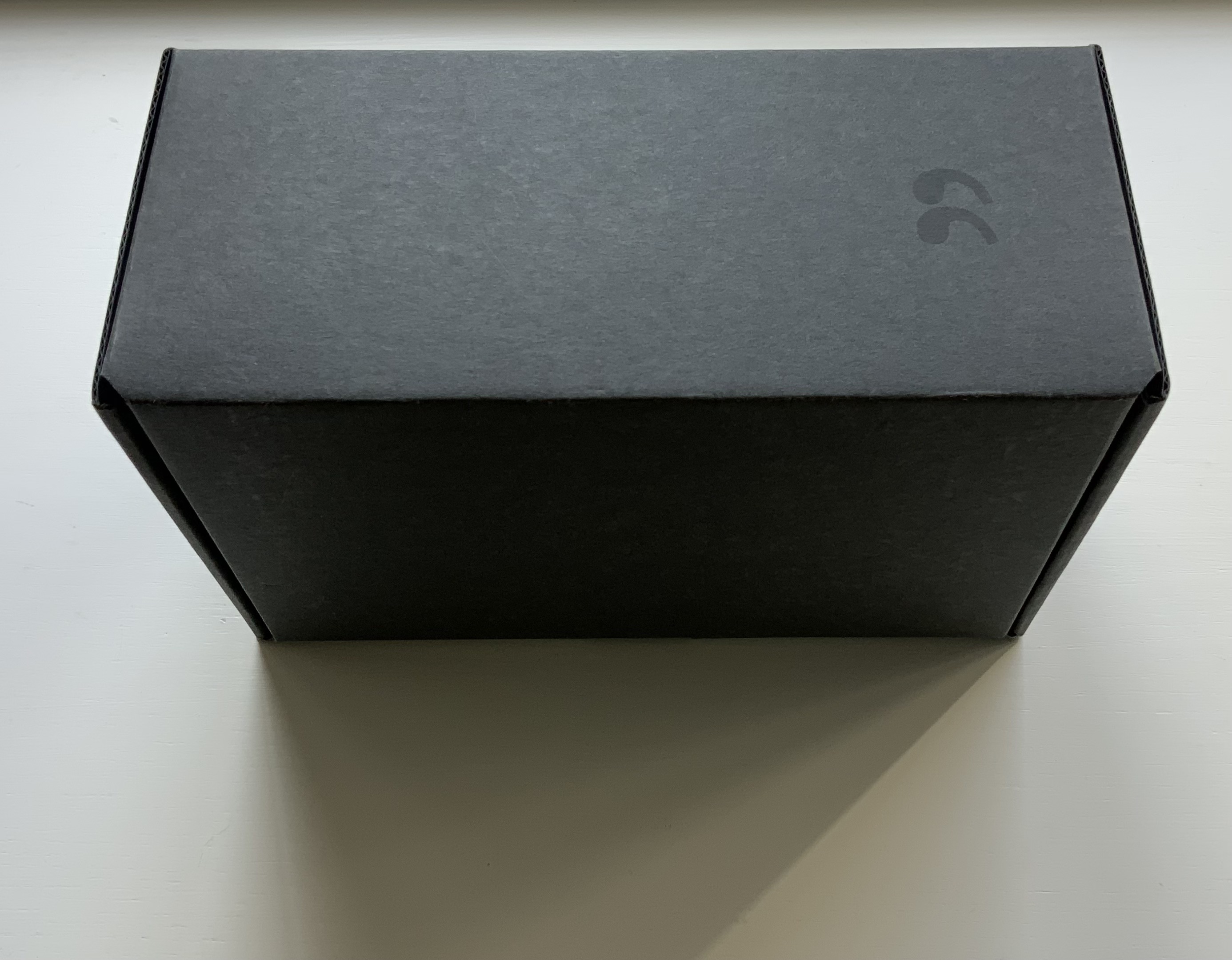
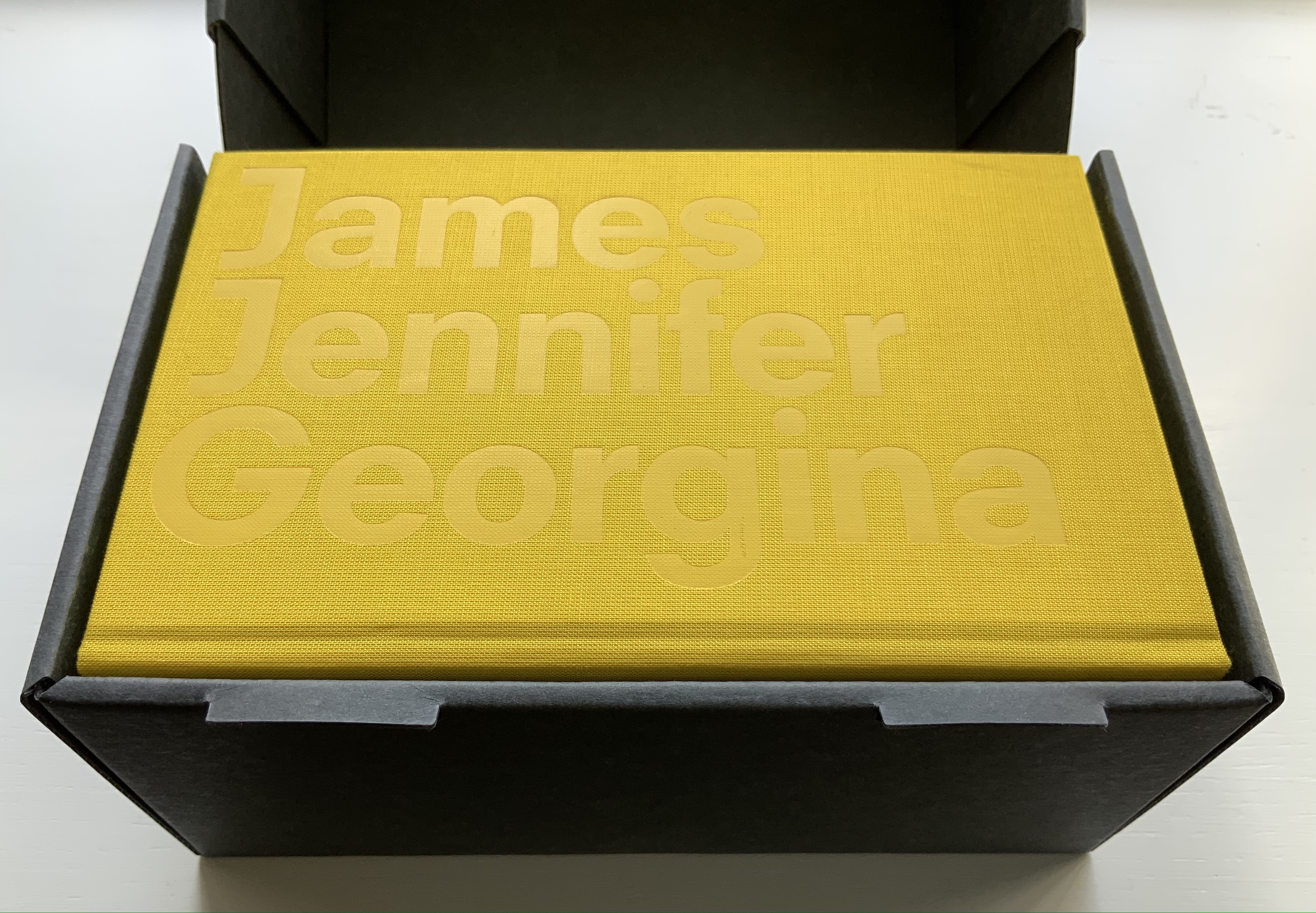
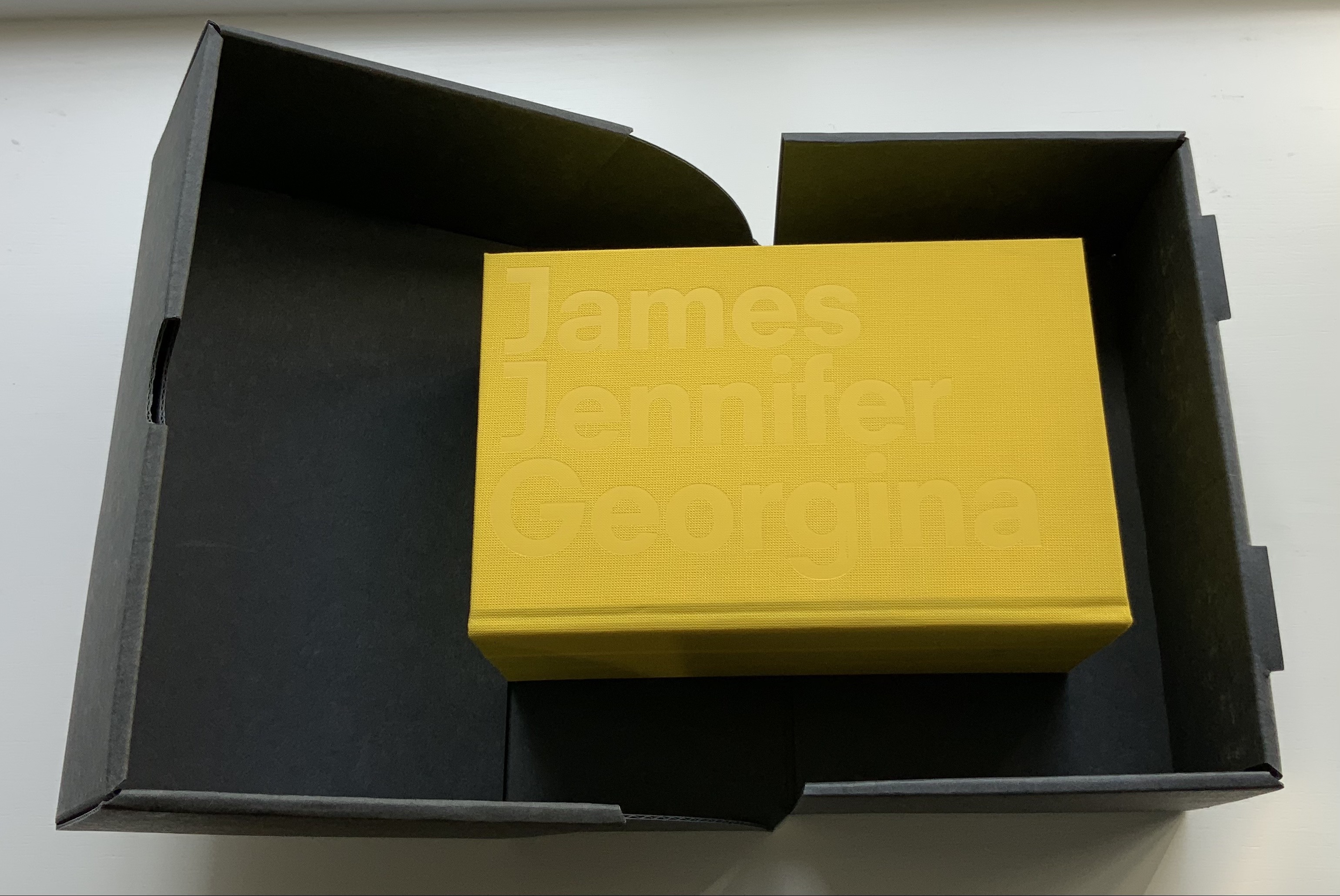
James Jennifer Georgina(2010) Irma Boom Box holding casebound book. Box: H220 x W140 x D100 mm. Book: H194 X W126 X D90 mm; 1198 pages. Edition of 999, of which this is #699. Acquired from Bubb Kuyper, 28 May 2021. Photos: Books On Books Collection.
James Jennifer Georgina is book art as epic family portrait, created with the fronts and backs of 1136 postcards, spanning ten years of travel by the Butler family. At 1198 pages, it comes close to War and Peace, and in one theme, it comes close to Anna Karenina. Tolstoy writes at the beginning of the latter, “All happy families are alike; each unhappy family is unhappy in its own way.” After poring over JJG, I wonder if that should have been “each unhappy family thinks it is unhappy in its own way”. In the end, the family portrait is one of considerable privilege, culture, shame, pain and love. What distinguishes the Butler family’s unhappiness besides that context of privilege is its form of documentation and, above all, Boom’s transformation of it into this monument of book design. Its three-part spine especially developed to allow this nine centimeters-thick book to open effortlessly to any page .
Boom’s other outstandingly designed hefty works include SHV (1996) commissioned by Steenkolen Handelsvereeniging (SHV), Sheila Hicks: Weaving as Metaphor (2006) and Artist, Work, Lisson (2017) commissioned by the Lisson Gallery. They can be viewed here, here and here, respectively.
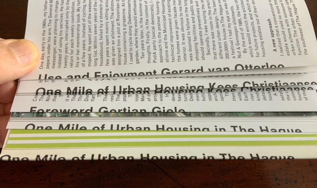
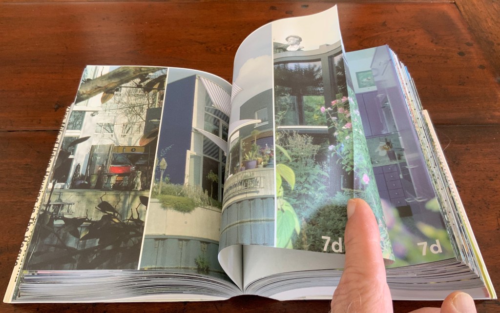
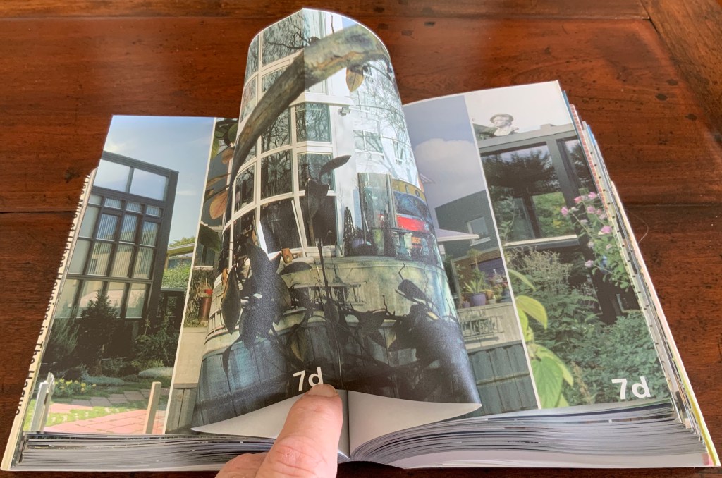
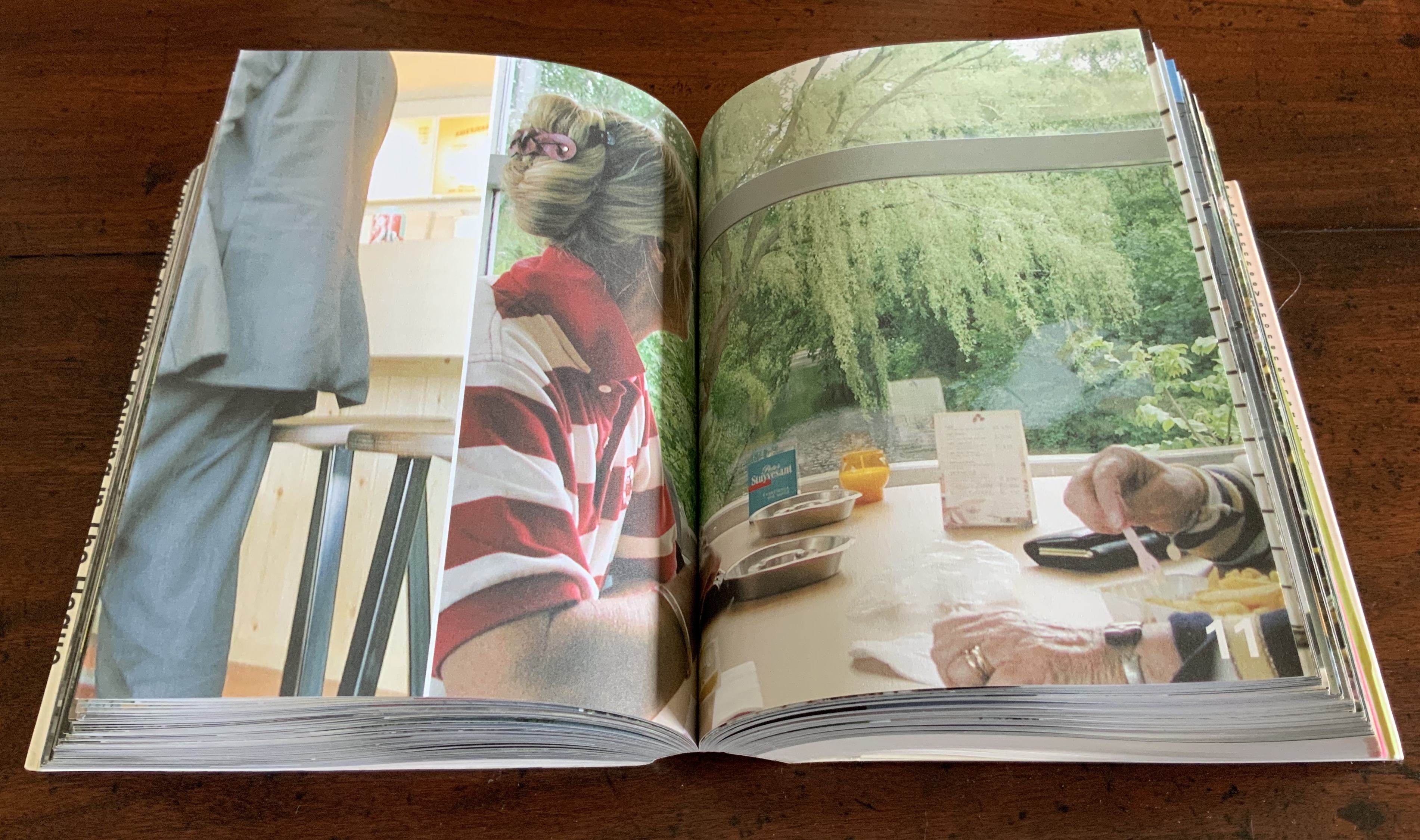
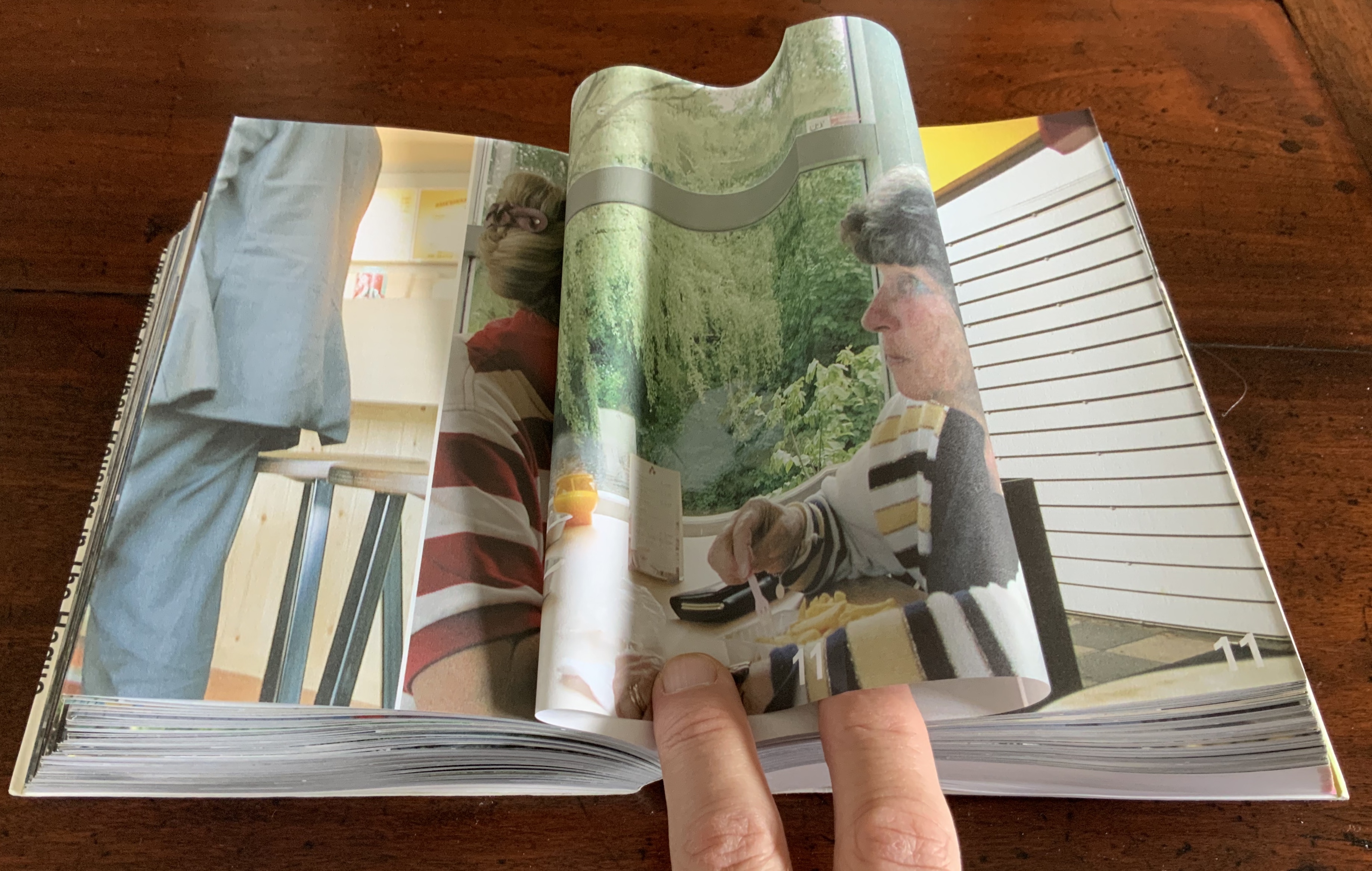
Strip: One Mile of Urban Housing in The Hague (2003)
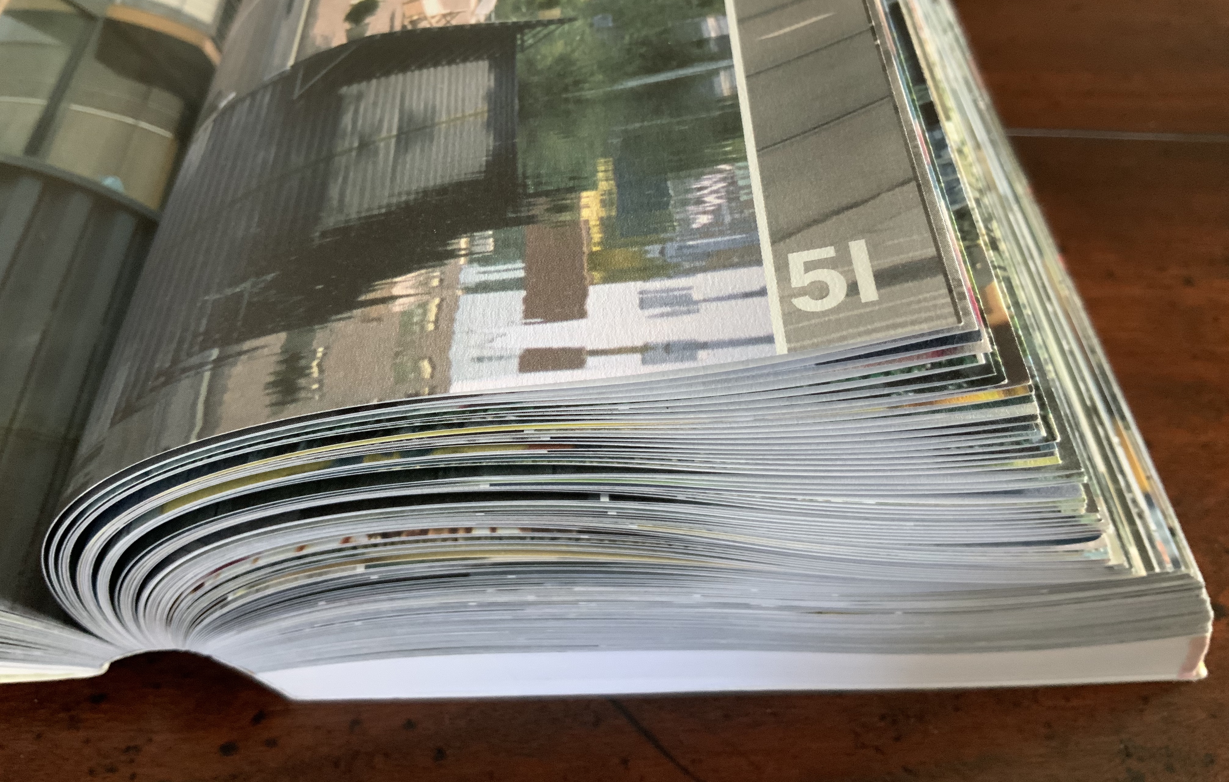
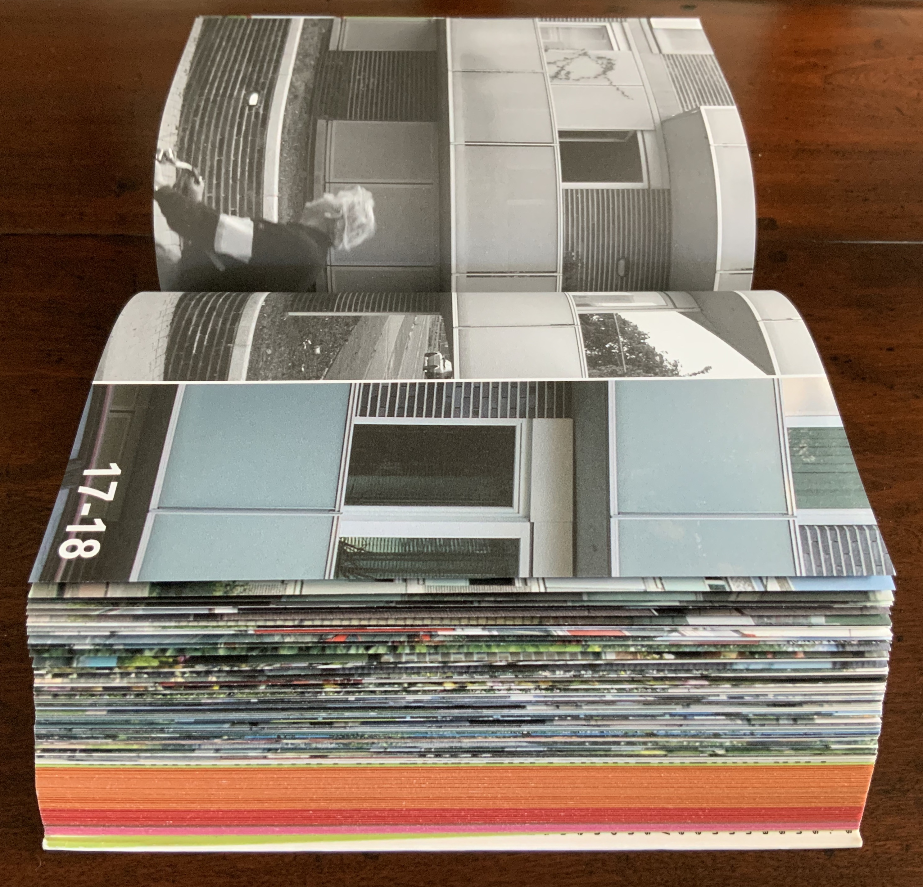
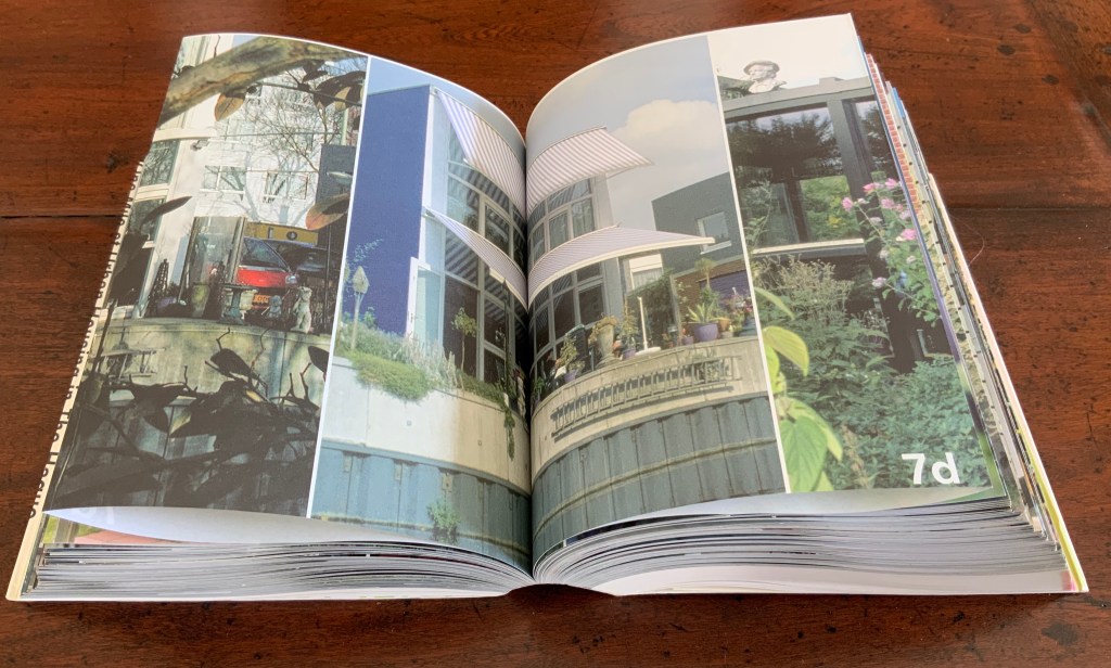
Strip: One Mile of Urban Housing in The Hague (2003) Marja van der Burgh, Kees Christiaanse, Gertjan Giele and Gerard van Otterloo (eds.); Design by Irma Boom and Sanne Beeren; Photography by Hans Werleman. Paperback, perfect bound, H175 x W142 x D40 (spine) and D48 (fore edge)mm. 256 uncut folios. Acquired from Galileo Alby, 28 September 2020. Photos: Books On Books Collection.
The primary purpose of Strip could not be further from that of Ed Ruscha’s Every Building on the Sunset Strip; nevertheless, its title and design pay a sort of homage to that accordion book with one side of the Sunset Strip at the top and other at the bottom. With its Chinese-fold pages, Strip has the same problem with thickness that any single-sided accordion has. Of course the Chinese fold offers the same advantage offered by the accordion fold: note how the section titles and photos wrap over the uncut folios, foreshadowing the treatment of the Rijksmuseum Guide above. Also like the Guide but unlike Every Building, Boom’s book is a form of information sculpture.
In some ways, Strip has more in common with the first edition of Robert Venturi’s Learning from Las Vegas, designed by Muriel Cooper at MIT Press, than with Ruscha’s Every Building on the Sunset Strip. Just as Learning from Las Vegas is intent on architectural and urban design theory, so too is Strip. Just as Cooper’s monumental design swamped the textual content (so much so that the authors successfully pressed for a reduced-size paperback), Boom’s design almost does the same to Strip‘s content. Almost, but not quite. Strip‘s blockiness, its rubbernecking around the corner of pages and its jumps in perspective match up with the authors’ intent — to document an environment and its residents.
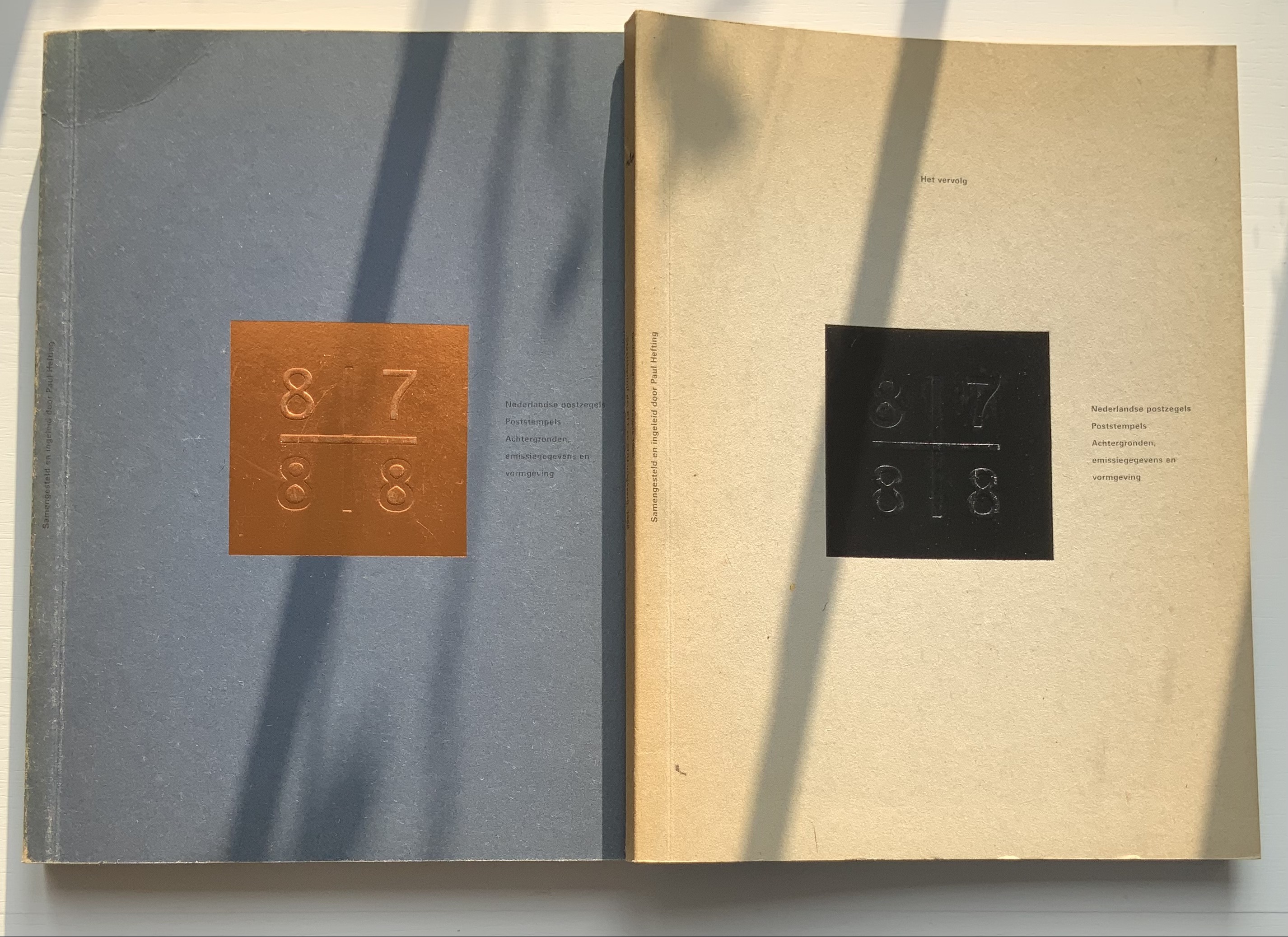
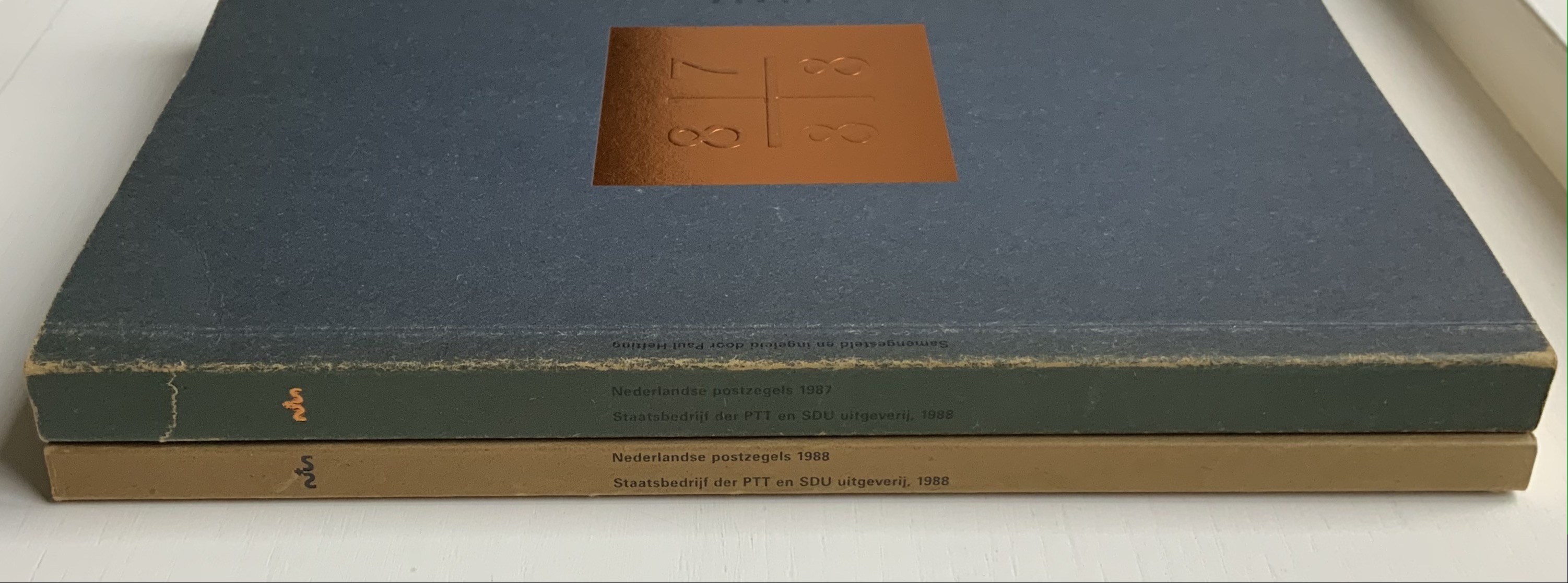
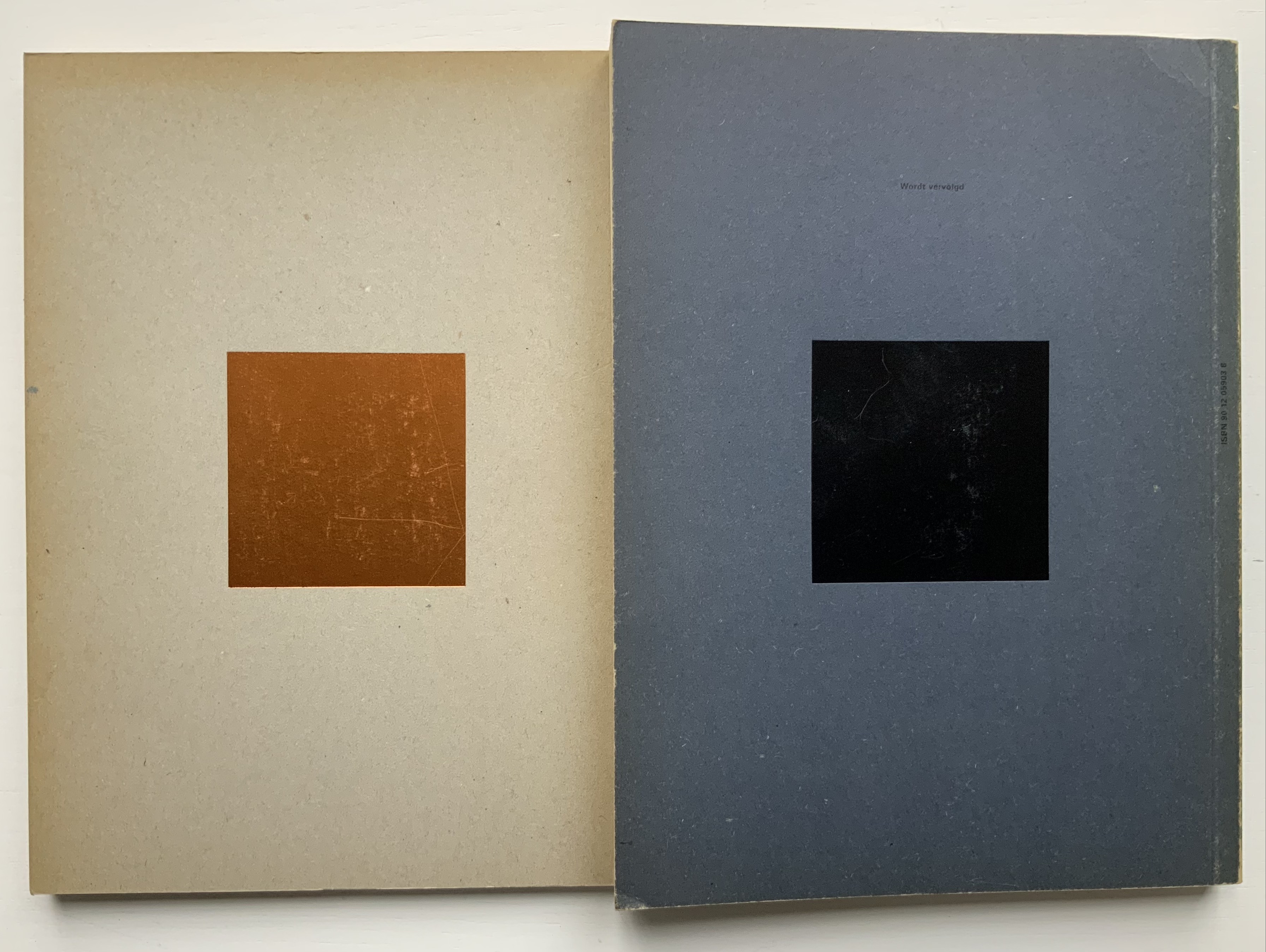
Nederlandse Postzegels, Poststempels 87/88 (1988)
Nederlandse Postzegels, Poststempels87/88: Achtergronden, Emissiegegevens en Vormgeving (1988) [“Dutch stamps, postmarks 87/88: background, issuance data and design”] Irma Boom (design), Paul Hefting (text) and Piet Janmaat (photography) Two softcover volumes. H250 x W188 mm, 228 pages combined. Acquired from Cornelis Verheij, 9 January 2022. Photos of the work: Books On Books Collection.
This two-volume set accounts for Boom’s first published book design and her first book design award. It celebrates the special edition stamp designs commissioned by the Dutch PTT during 1987 and 1988 and features an index of the different postal cancellations used during those years.
Foreshadowing Strip, the interior pages are created in the Oriental style of single-fold folios bound with the fold at the fore edge. In Nederlandse Postzegels, however, printing occurs on both sides of the folios. The outer sides are printed with 4-color offset lithography, presenting images and text sometimes in portfolio and sometimes in landscape layout. Whether in portfolio or landscape, images will often run from the recto to verso page, wrapping around the fold. In the section on the designers and their designs, the main text shows in landscape and, like the images, runs over the fold at the fore edge.
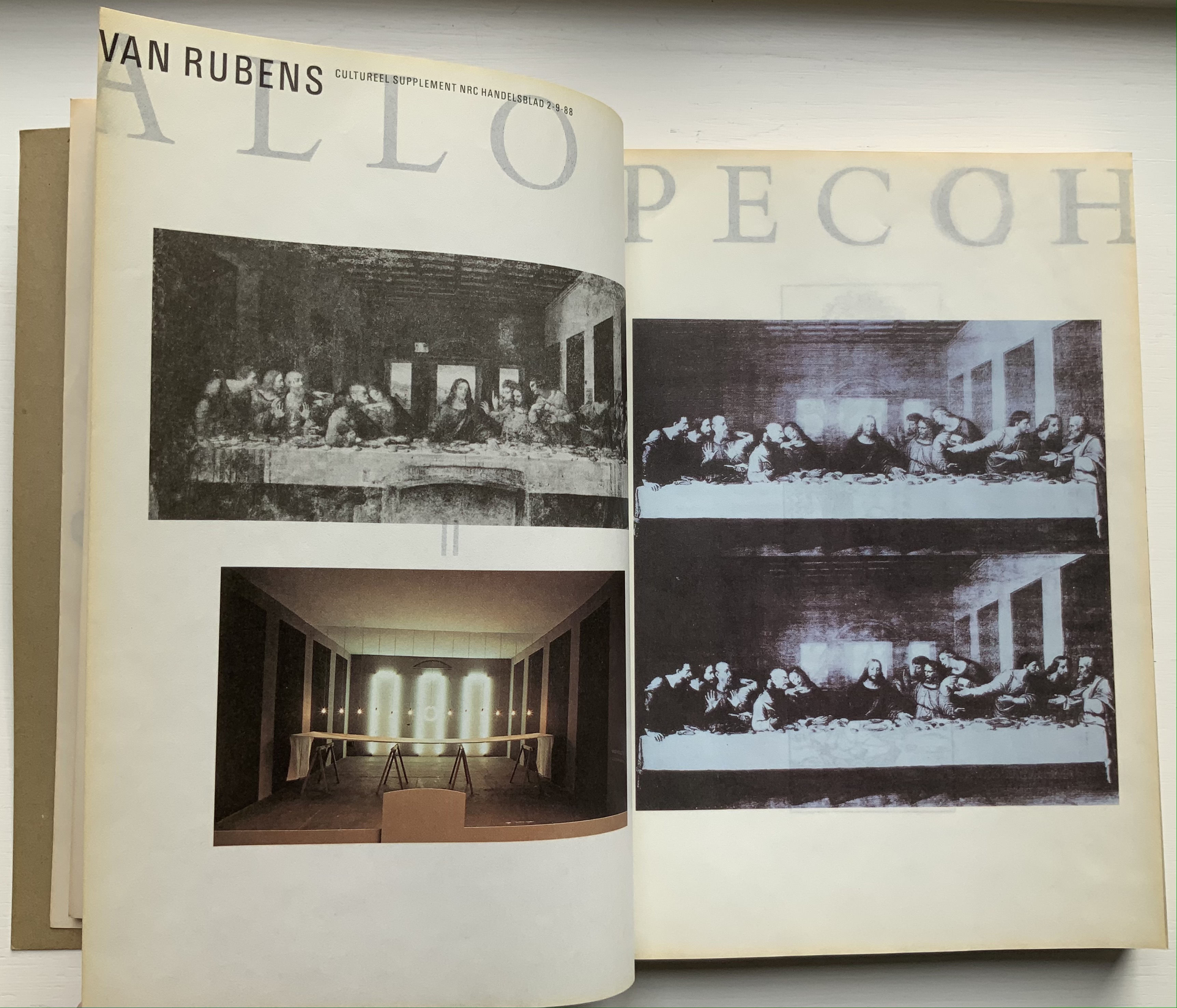
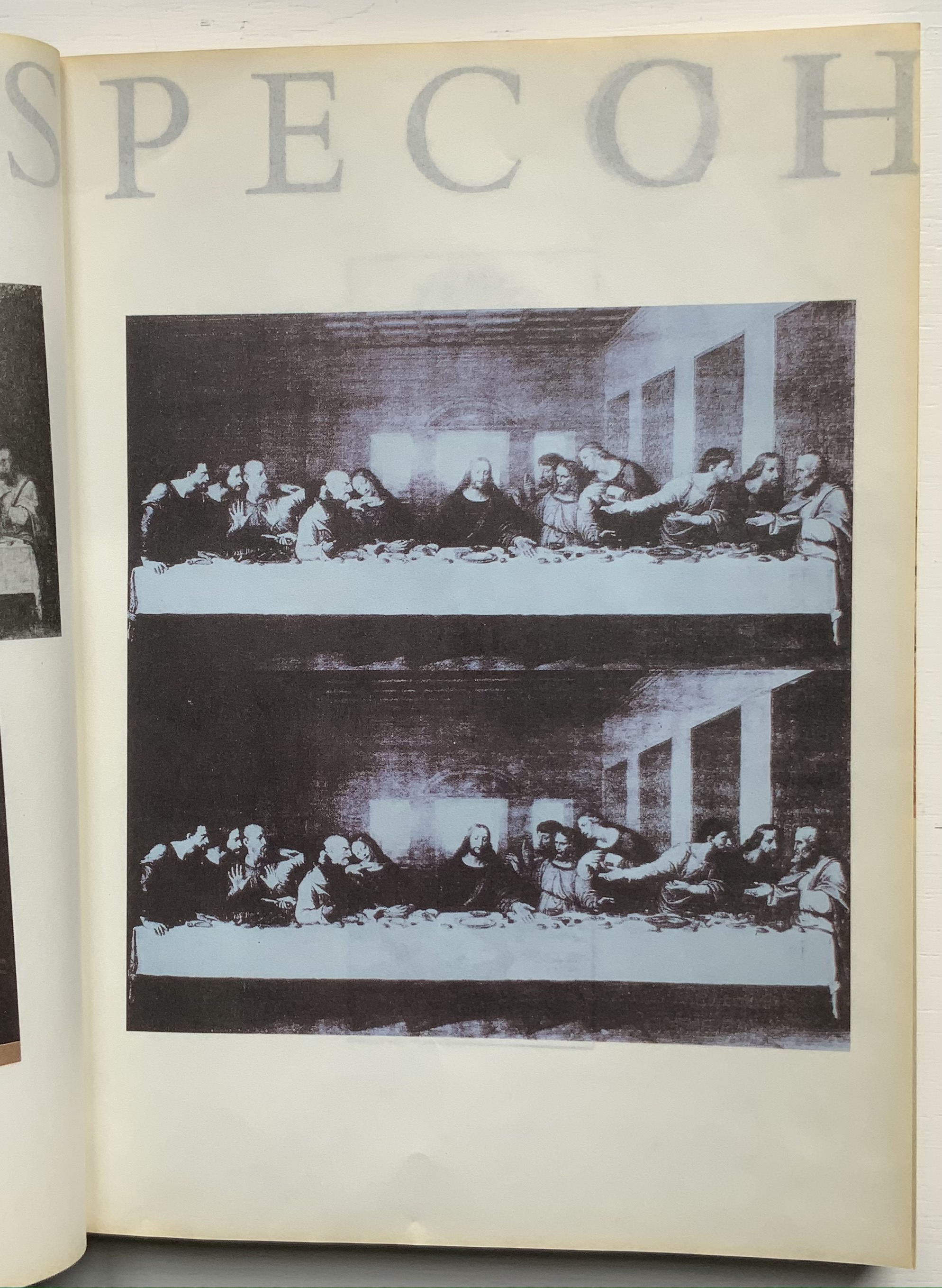
The inner sides are printed single color — black — creating shadow images on the outer side. Only by cutting through each fold (as encouraged by the perforations in Colour Based on Nature) can the inner-side images be examined closely, but this would destroy the work and the intent. With the shadows from the inner side, the outer side takes on a collage-like appearance. The print on the inner side also often serves for communication. For example, in the illustrated historical survey of design with which the first volume opens, the roman numerals for numbering plates appear on the reverse side of the plates to which they are assigned. Of course, the roman numeral has to be printed in reverse on the inner side so that it reads aright on the outer side, which is especially appropriate for this section labelled — from behind, of course — ARTE ALLO SPECCHIO (“art in the mirror”).
Copyright page and Table of Contents (pages D and E); inner side of page D.
ARTE ALLO SPECCHIO (“Art in the Mirror”) printed on the inner sides of unpaginated pages I, J, K and L, with specchio running over the fold between K and L.
Clockwise: Unpaginated pages L and M; plate IV printed in reverse on inner side of page L (note on page L the interlinear caption for plate IV — pag IV Onbekende japanse kunstenaar, Hemelse muzikanten 8 eeuw [“plate IV, Unknown Japanese artist, Heavenly musicians 8th century”]); note image running over the fold between pages M and N; pages N and O.
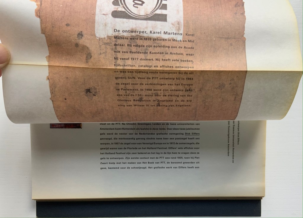
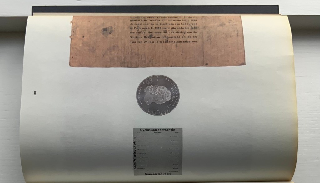
Like all of Boom’s other works in this collection, Nederlandse Postzegels is not a quick read or easily navigated reference work. Its design demands from the reader an awareness that should translate into thoughtfulness about the accomplished designers and their designs, among whom are Anton Beeke, Henk Cornelissen, Wim Crouwel, Reynoud Homan, Cees de Jong, Frans van Lieshout, Karel Martens, Rick Vermeulen, Tessa van der Waals, Piet Zwart and many others.
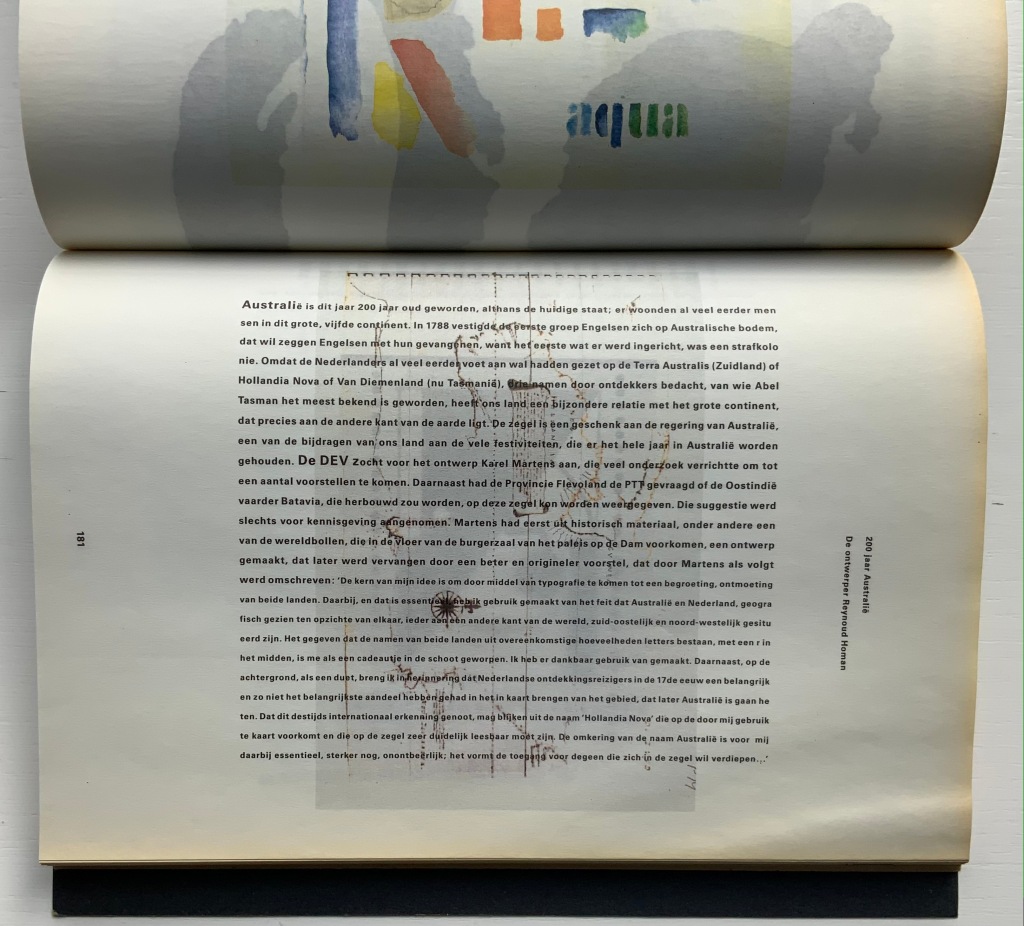
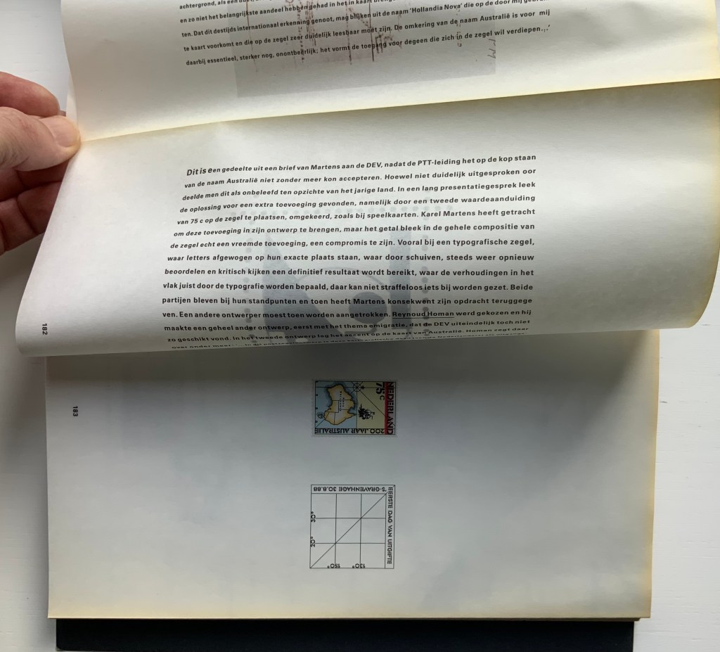
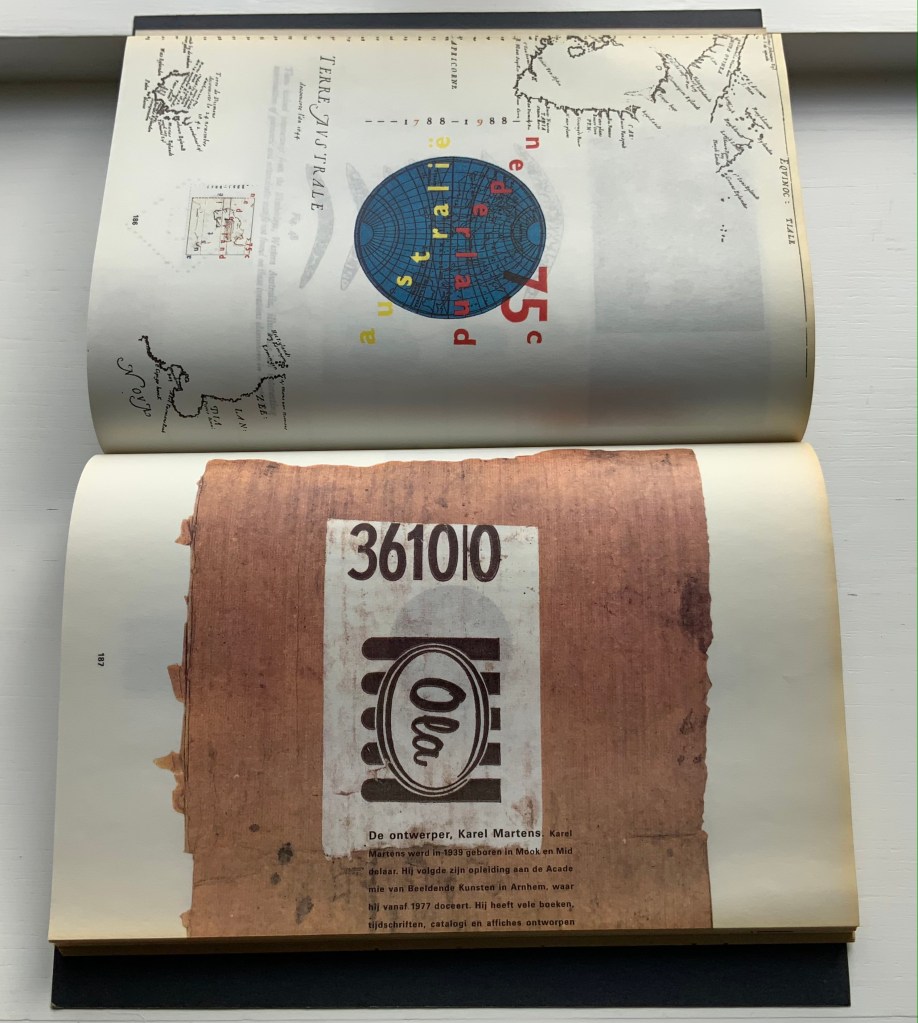
The selected pages and their “inside surfaces” recount the separate efforts of Karel Martens and Reynoud Homan to design the Dutch stamp commemorating Australia’s bicentennial in 1988. Martens’ design conflicted with PTT requirements, so Homan stepped in. The descriptive text follows a landscape layout and reads over the fore edge fold, but page numbers and some of the illustrations follow a portfolio layout.
Pages 181-83.
Pages 186-87.
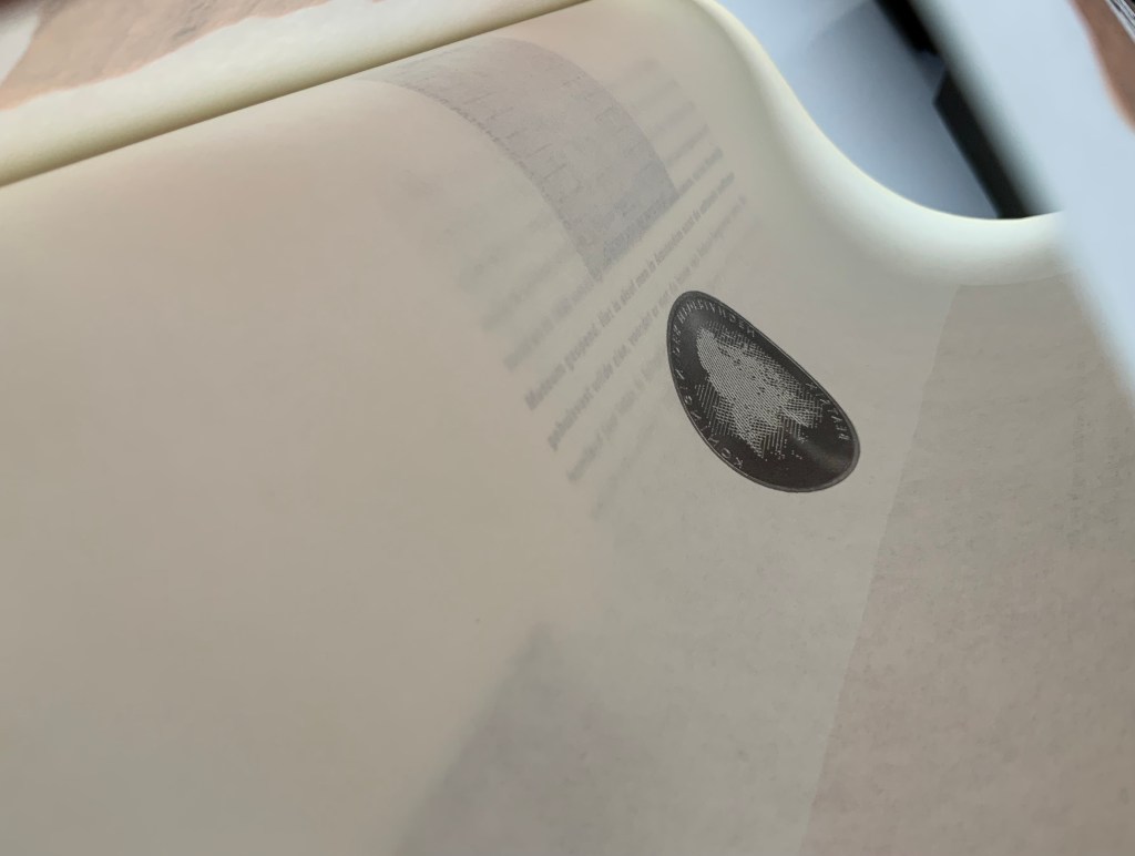
Top to bottom: Page 187’s text running over the fold to page 188; page 188 showing Karel Martens’ design of the coin commemorating William & Mary’s 300th anniversary of accession; inner side of page 188 cheekily showing the reverse side of the Martens coin.
Comparing herself to the kind of architect who produces social housing, Boom asserts, “books are industrially made and they need to be made very well. I am all for industrial production. I hate one-offs. On one book you can do anything, but if you do a print run, that is a challenge. It’s never art. Never, never, never.” But no less an institution than the Museum of Modern Art holds a copy of Nederlandse Postzegels. Display the book alongside the other five works above and the temptation to take Boom’s stance to be just as arch as that of Marcel Duchamp (“It’s art if I say so.”) is hard to resist. Nevertheless, ending with Nederlandse Postzegels, this entry defers to Boom and gives her the last word — at least on how the work came to be:
Since 1920, the PTT Art & Design Department had commissioned artists, architects and designers to design its services and products. To me, the whole idea of Dutch design comes from the design policy of PTT, especially in the 1970s and 80s when Ootje Oxenaar was head of the department.
Working at the Staatsdrukkerij meant enormous creative freedom. Those were the heydays of art-book publishing. If you made a book cover, they would encourage you to use foil or special printing techniques. The department was a springboard for young designers who would work there for one or two years and go on to something more exciting. After my internship, I went to Dumbar and the Dutch television (NOS) design department. After I graduated I went back to the Staatsdrukkerij, and ended up staying for five-and-a-half years. I learned a lot. In retrospect, it was a very productive and super-creative time.
I did jobs nobody else wanted, like the advertisements for the publishing department, which was – thinking of it now – a smart thing to do because I could experiment. Those assignments were completely under the radar but they were seen by Oxenaar. He invited the designer of the ‘crazy ads’ to do one of the most prestigious book jobs: the annual Dutch postage-stamp books.
Places like the Staatsdrukkerij don’t exist any more. When I started working there after graduation, I was immediately a designer (not a junior), and I quickly became a team leader. At that time I was very naive and fearless. I was not aware of an audience, and certainly not a critical audience! This vacuum is no longer possible for designers starting out today. I only became aware of the outside world after the prestigious postage-stamp yearbooks were published: hate mail from stamp collectors and design colleagues started to come in. But there was also fan mail.
The books polarised the design community. They won all the awards and a Best Book Award, my first one. In the jury report they mentioned ‘a brilliant failure’. Suddenly people knew who I was. I realised negative publicity has an enormous impact, more than positive publicity.” — Miltenburg, “Reputations: Irma Boom“.
Further Reading & Viewing
“Olafur Eliasson“. 17 May 2021. Books On Books Collection. Irma Boom designed the Eliasson catalogue called Contact, which is shown in that entry.
Boom, Irma, Julia Blume, and Günter Karl Bose. 2002. Irma Boom. Leipzig : Institut für Buchkunst.
Lehkoživová, Irena. 23 November 2016 –14 January 2017. “Irma Boom“. Vi Per Gallery, Prague, Czech Republic. Well-illustrated with photos by Peter Fabo.
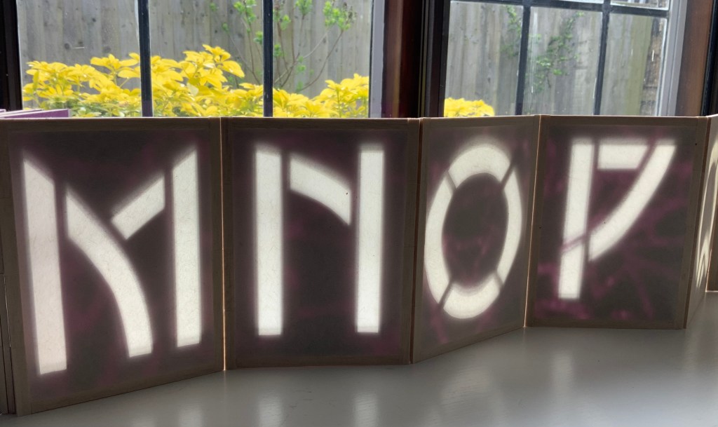
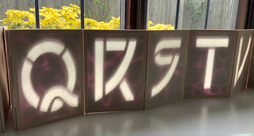
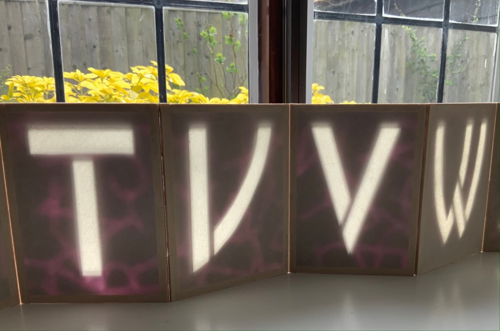
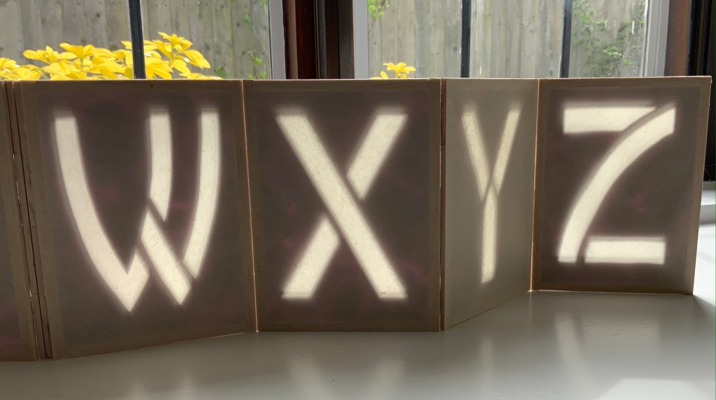
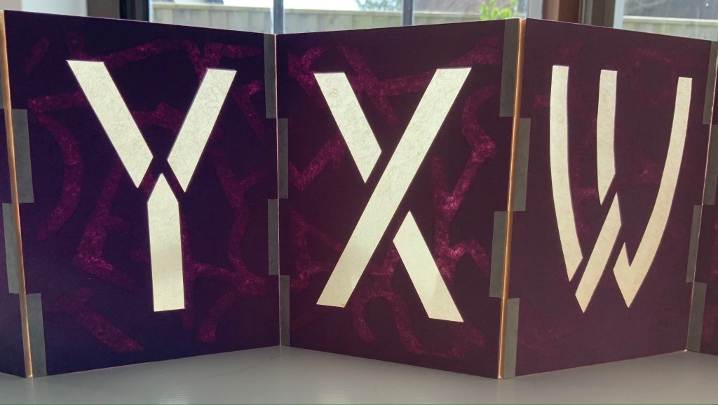
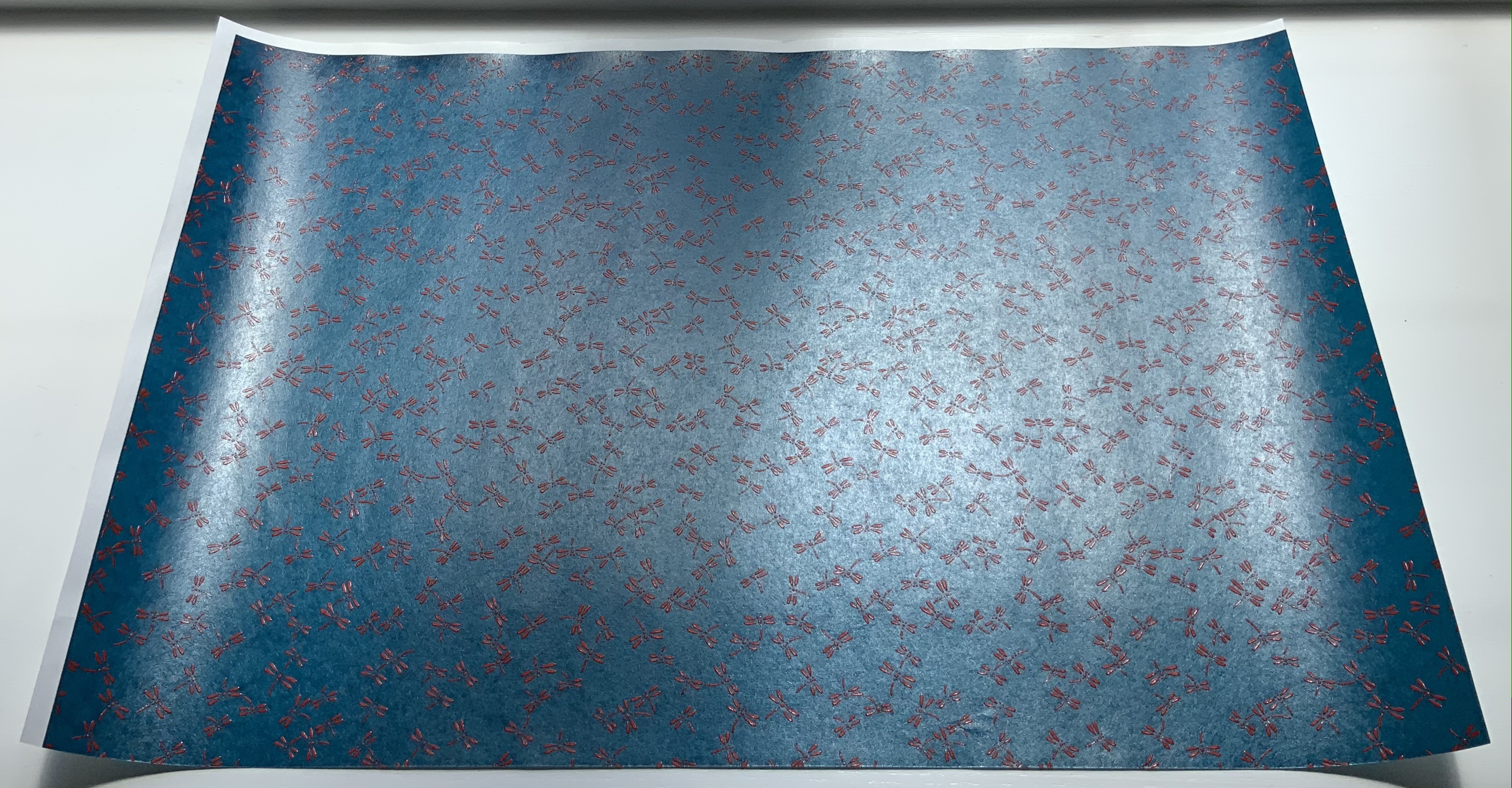
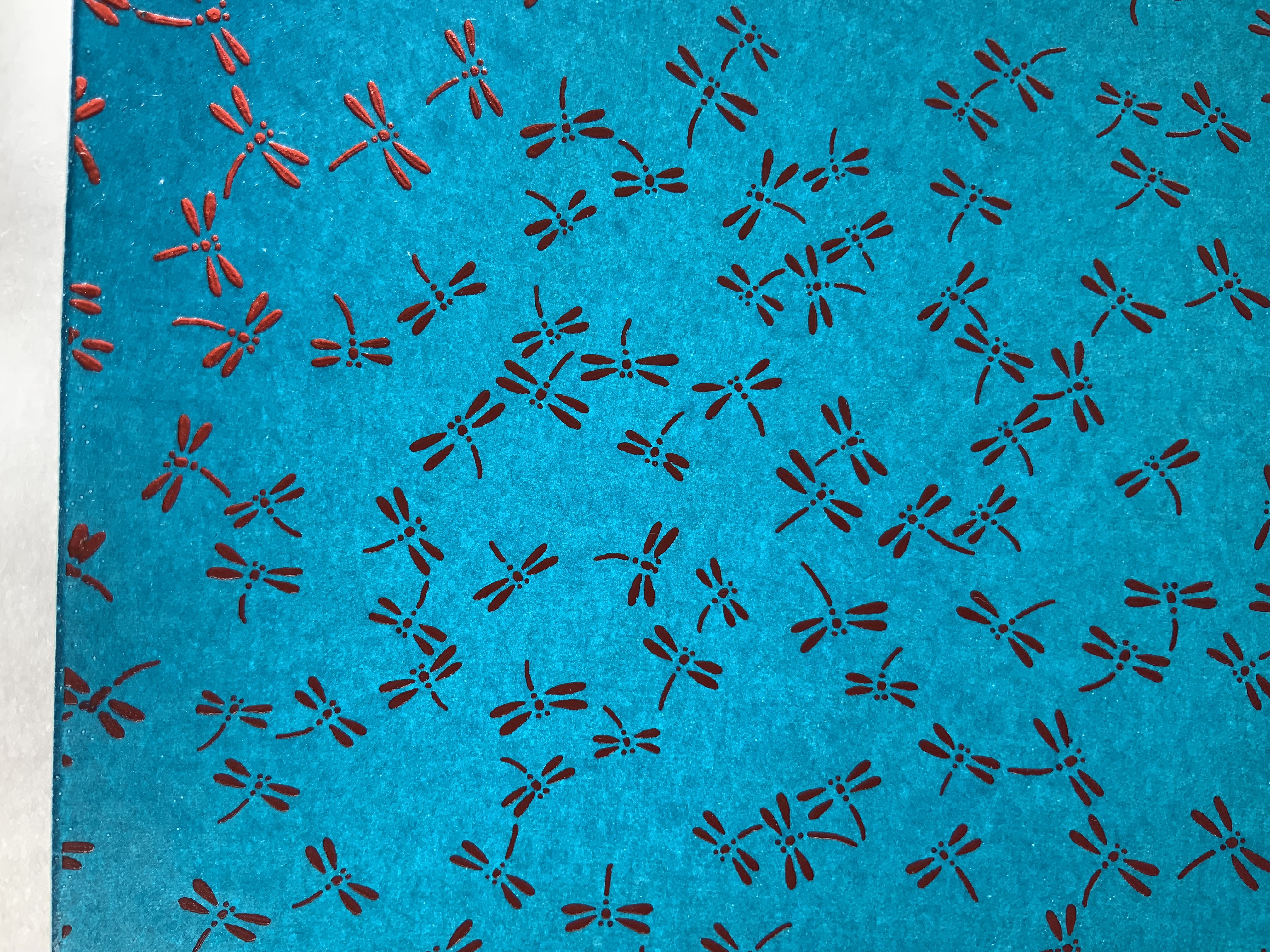
Alpha Beta(2010) Helen Hiebert Lantern-structure book in open-sided box. Closed, H158.75 x W114.3 mm; opens out to 2971.8 mm. Box size: H171.45 x W114.3 x D133.35 mm.Edition of 25, of which this is #22. Acquired from the artist, 17 February 2021.
Each panel displays an alphabet letter cutout casting a shadow against a second layer of handmade paper. Appropriately, the letters follow in the Arts and Crafts style font designed by Dard Hunter, “the father of hand papermaking in 20th century America”, renowned scholar and author of Papermaking: The History and Technique of an Ancient Craft.
The book’s flexible hinges between the panels allow it to be set up in a variety of ways. As can be seen above and below, the right-reading alphabet appears on the less colorful side of the structure. When viewed from the more colorful side, the letters show in reverse, which is, of course, more evident with C-B-A than Y-X-W. The swirling strokes that shadow the right-reading letters reveal themselves on the more colorful side as asemic characters watermarked into the handmade paper. A fusion of paper, letters, form and meaning.
On the reverse side: C-B-A and Y-X-W.
The Secret Life of Paper: 25 Years of Works in Paper (2016)
The Secret Life of Paper: 25 Years of Works in Paper (2016) Helen Hiebert Artist-made paper covers sewn over two signatures with an original string drawing in the center. H282 x W218 mm, 22 pages. Acquired from the artist, 4 April 2016. Photos: Books On Books Collection.
Catalogues like this are works of art about works of art. It came about as a result of an exhibition held at the Kalamazoo Book Arts Center and the Waldo Emerson Library at Western Michigan University. The catalogue contains an illustrated chronology of the artist’s art and career up to 2015-16. Not only does it contain that work of string art in its center, its cover is hand bound and features a pulp stenciled handmade paper.
Curated Paper Collection #1 (2021)
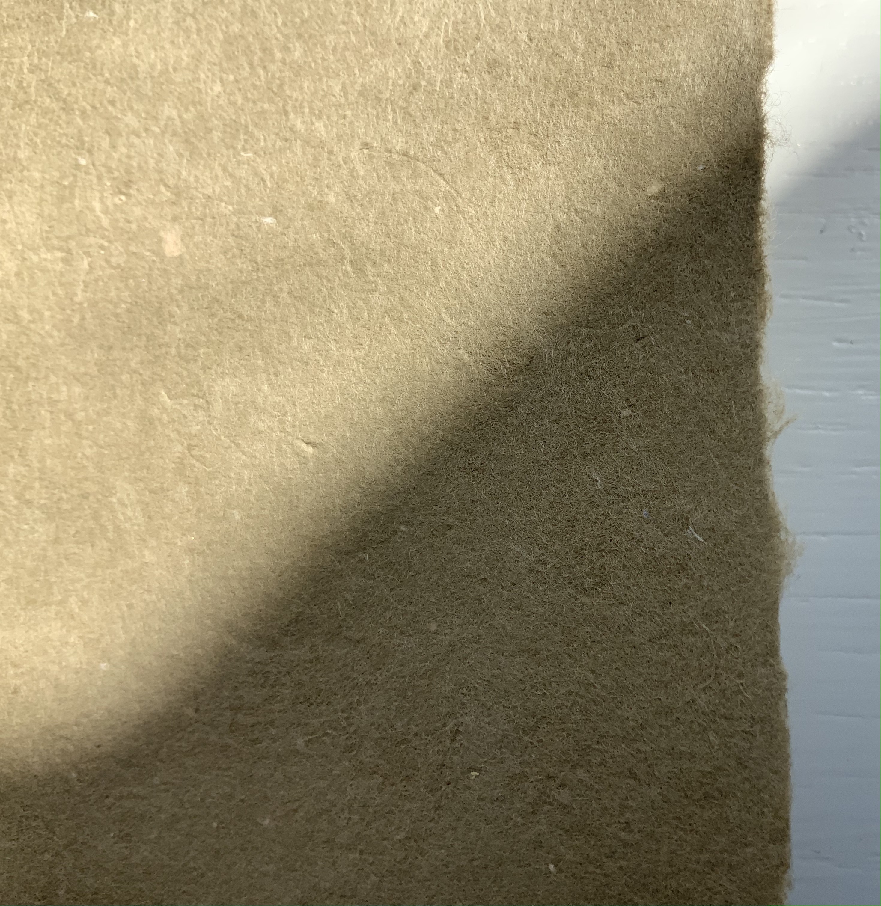
Hiebert has begun a series of curated collection of papers from around the world. The first collection contains eleven papers. The largest sheet comes from Laureli Spokes: a handmade recycled rag paper from India (100 gsm), 357 x 502 mm. It features an exclusive retro two color silkscreened design that features a retro two-color silkscreened design. The smallest sheets are ten 200 x 200 mm squares of Kite Paper at 42 gsm in brilliant colors. Similar to waxed paper, it is translucent and folds well.
In material and process, the two most interesting papers are Tangram Watermark (100 gsm with thinner watermarked areas, 310 x 460 mm) and Portugese Cork Paper (140 gsm, 255 x 255 mm). Handmade with 100% bleached flax fiber and deckle-edged on all four sides, the Tangram Watermark comes from the Helen Hiebert Studio. The first image below shows the deep impression left by the watermark design cut out of a thin vinyl material and adhered to the papermaking mould. The second image, created with the sheet held up to the light, shows more clearly the tangram design left as a sheet is pulled. The cork tree sourced is highly renewable and organically grown. Handmade in Portugal from the tree’s outer bark, the naturally water-resistant sheet consists of thin layers of cork laminated to a coated base paper. The cork is acid free, but the backing paper, shown in the last image, is not.
The next two curated papers show similarities and differences arising in the Japanese and Korean traditions. The Nanohana Washi (48 gsm, 315 x 470 mm) is a “nature paper” from Awagami Factory in Tokushima, Japan. The images show the changes under different light and from views of different sides. Traditionally, Japanese washi (like Korean hanji) is made from mulberry plant fibers. Here, Awagami has used the nanohana plant (related to broccoli). It grows along the local Yoshino river, and Awagami collects the florets each Spring to mix into these sheets of washi, resulting in the green and yellow flecks. The lightweight hanji (15-19 gsm, 325 x 490 mm) is made from 100% dak (mulberry) fiber, grown and harvested in Korea by Seongwoo Jang, a fourth generation papermaker at Jangjibang, a hanji mill in Gapyeong, Korea. Hiebert notes, “The sheet was formed using the traditional Korean technique called webal or heulim ddeugi, where the slurry flows onto and off the frame in multiple directions, resulting in a strong sheet without a prominent grain direction”. The images in the middle row aim to show this with the sheet laid atop dark art paper in full sunlight and draped over the hand. The detail of the corner in the last row shows the two-ply of the sheet, where — in another interesting difference between the washi and hanji –two thin layers were couched together to form a single strong hanji sheet.
The next two papers are paired for uses and decorativeness. The silk-screened, matte-finish Italian Carta Varese Origami Paper (100 gsm, 350 x 500 mm) is heavier than traditional origami paper, it has a smooth surface and creases well with crisp folds. Smooth-surfaced and creasing well for turned in corners, this sheet with its red scroll pattern would serve well for endpapers. Debra Glanz designed the next set of papers — Paper Assembly (28#-32# text weight, 305 x 305 mm) — with that use, among others, in mind for book and paper artists.
The next two papers demonstrate the curator’s attraction to painterly surfaces. Silkscreen printed by hand with a lacquer-like ink, the Red and Blue Dragonfly Pattern Japanese Lacquered Yuzen Paper (140 gsm, 330 x 485 m) has the depth, texture and glow Japanese lacquer ware, which the first three images attempt to convey. The painting base consists of kozo and wood sulfite. The sheet of paste paper (230 x 305 mm) in the last image comes from the late Louise Lawrence (Larry Lou) Foster. It has an op-art feel to it. More of her unique papers painted with pigmented paste can be found in the limited-edition book The Paste Papers of Louise Lawrence Foster and in the Metropolitan Museum’s Thomas J. Watson Paper Legacy Project.
A blend of abaca fibers and cotton rag, Bistre Mixed Media (150 gsm, 280 x 360 mm) from Kelsey Pike’s Sustainable Papercraft in Kansas City, Kansas, is at once hard, resilient, durable, bulky, thick and soft. The images below attempt to show the sheet’s homogeneous surface and smooth, fine grain texture, intended as the name suggests for all fine art media – pencils, charcoal, conte, pastel, acrylic, watercolor, ink, gouache, etc.
For the Books On Books Collection, Curated Collection #1 presents a challenge for display and storage alongside Fred Siegenthaler’s Strange Papers and the Gentenaar-Torley’s first seven books of the Rijswijk Paper Biennial. Helen Hiebert’s contribution to book and paper art warrants that place.
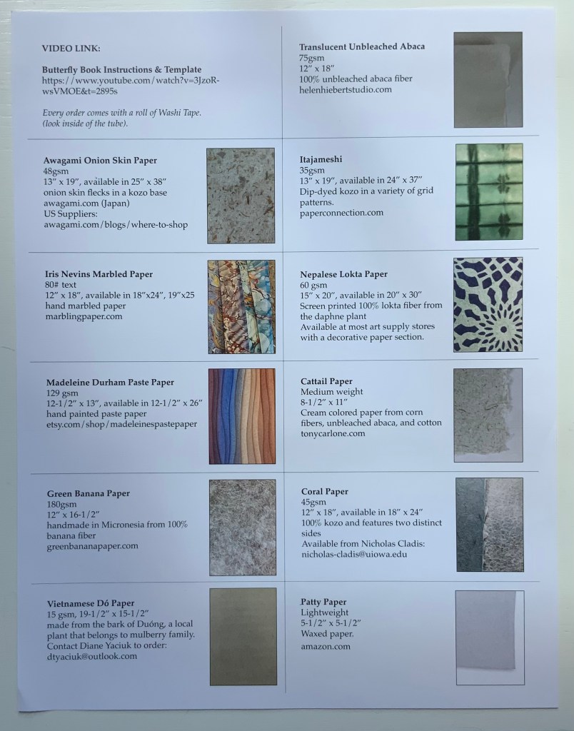
Curated Paper Collection #2 (2021)
Hiebert’s second round of curation comes with a helpful printed cheat sheet (although it was challenging fun to identify the samples in #1 without the initial help). With inclusion of a video link for creating a “butterfly” book, the cheat sheet also recalls Hiebert’s bustling business in lectures and workshops as well as tempts a collector to raid the collection with a ham-handed attempt.
The first paper in the curation comes from the Fujimori family business. According to its website, 6th generation Minoru Fujimori took over in 1945. In 1970, he was designated an “Intangible Cultural Property of Tokushima” in recognition of his skills. In 1976, Awagami washi was designated as a “Traditional Craft Industry”. In 1986, Fujimori-san was further honored as Master Craftsman and awarded the “Sixth Class Order of Merit, Sacred Treasure” by the Emperor.
Naturally the flecks of onion skin show up differently on the two sides of the sample, and the density almost completely disguises the lines of the mesh. The way the color varies in the light at different angles accentuates the supple drape of the paper.
Awagami Onion Skin Paper, 48 gsm
Like Minoru Fujimori above, Iris Nevins is a cultural treasure. Specializing in the reproduction of early marbled papers, she has delved into its past prior to the advent of marbling machines during the Victorian era and creates her “own marbling colors using, where possible, the same pigments used during the period”. On what shelves and in what crusty containers do such pigments reside?
As of August 2021, her work is still being accessioned by the Paper Legacy Project, a permanent collection house in the Metropolitain Museum Of Art, in The Thomas J. Watson Library.
Iris Nevins Marbled Paper
Madeleine Durham’s paste paper is also part of the Watson Library Digital Collection. In her artist’s statement, she refers to samples “representative of my landscape artwork”. With the sample that follows, dunescapes and seascapes come to mind.
Madeleine Durham Paste Paper, 129 gsm
This green banana paper comes from a company of the same name based in Kosrae, Micronesia. Among its products is the Green Banana Paper Wallet. The pictures cannot do justice to the toughness and almost slick feel of this paper. A raincoat or wallet made from it would keep a person and valuables dry and safe.
Green Banana Paper, 180 gsm
Dó paper is a traditional Vietnamese hand-made paper dating back to the 3rd century BC. Made from the self-stripping bark of the Rhamnoneuron balansae tree, Dó paper appears to be headed toward the state of papyrus. Urbanization leading to scarcity of the tree, the narrow seasonality of the bark’s availability (between August and October) and incursion of industrial paper production pose sharp challenges to its survival. The sample below may become a rarity.
Vietnamese Dó Paper, 15 gsm
This piece of translucent unbleached abaca is best appreciated alongside Hiebert’s video “Making a sheet of abaca” (15 August 2020).
Translucent Unbleached Abaca, 75 gsm
Like Shibori, this paper below is thin or tissue washi that has been folded and dyed. The dark, irregular lines where the dye has accumulated in the folds create a sharp contrast with the translucence of the laid lines and chain lines imprinted by the mesh in the papermaking frame.
Itajameshi, 35 gsm
Manohir Upreti discusses lokta paper, “the King of Nepalese paper”, in the Geest van papier = Spirit of paper(2004), one of the Rijswijk Biennial volumes put together by Peter and Pat Gentenaar-Torley. Upreti’s sample and this one below from Hiebert’s curation demonstrate the dramatic patterns possible with this paper.
Nepalese Lokta Paper, 60 gsm
Tony Carlone‘s cattail paper reflects his artistic aim to source material “in a proper and sustainable manner”. His output includes sculptural pieces formed by spraying, pouring and casting processes, large-scale pulp paintings, and straightforward flat sheets for print processes. The cattail paper appears heavy but is actually light and supple.
Cattail Paper, medium weight
Nicholas Cladis is an American-born interdisciplinary artist who lives and works in Fukui Prefecture, Japan. An active researcher and practitioner of traditional and non-traditional papermaking processes, he makes the paper elements of his work in Echizen—an area with over 1,500 years of papermaking history—and is also an international liaison for the papermaking community there. The contrast of the Coral paper’s two sides invites standing a window and turning the sheet over and over against the light.
Coral Paper, 45 gsm
Patty paper, as in waxed paper for food patties, makes its way into Curated Paper Collection #2 for its properties of translucence, proportions suited to origami and challenge as a printing surface. While a butterfly book might make result in an interesting use of this paper, a White Ermine Moth book would respond to all three features.
Jury, David, and Peter Rutledge Koch (eds.) 2008. Book Art Object. Edited by David Jury. Berkeley, California: Codex Foundation. Pp. 246 (Sound Blocks), 247 (Alpha, Beta …).
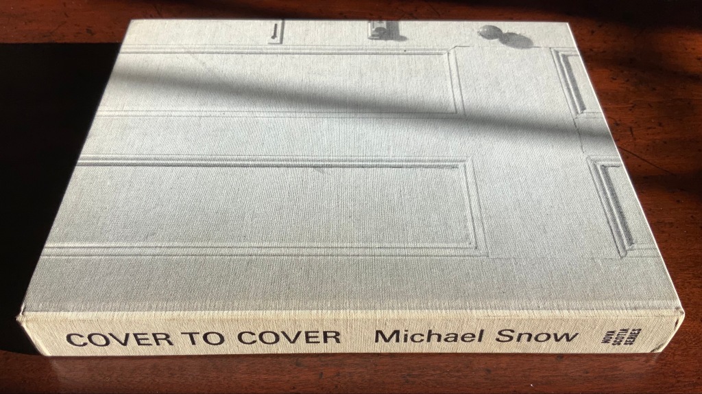
I tried to “define the book” when I designed (one of my books) Cover to Cover hoping that the “reader” would have a multi-sensory experience of the nature of what she/he held in her/his hands. (from The Book: 101 Definitions)
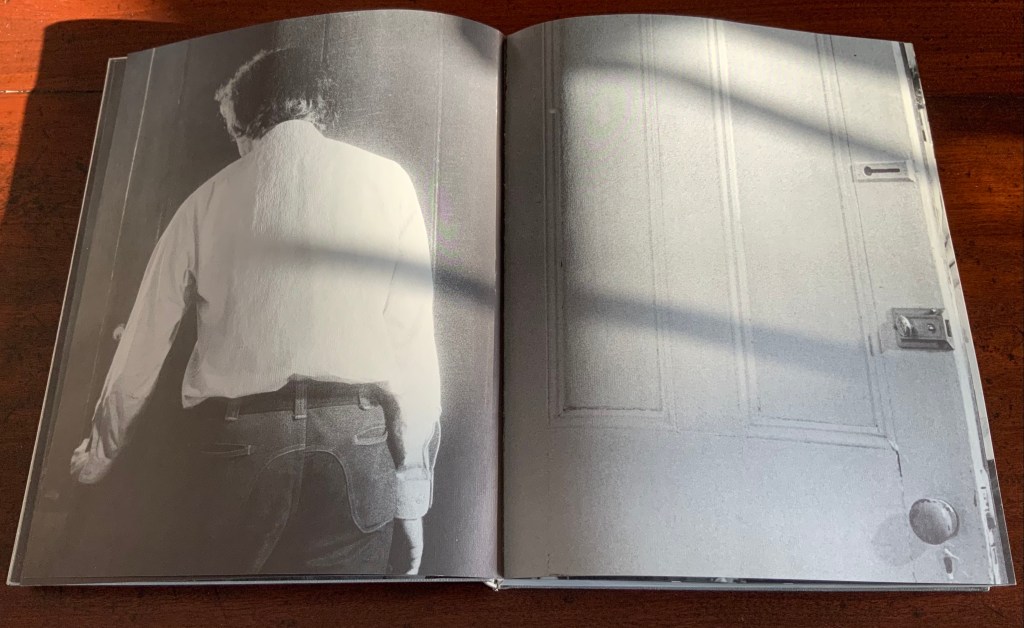
Cover to Cover (1975)
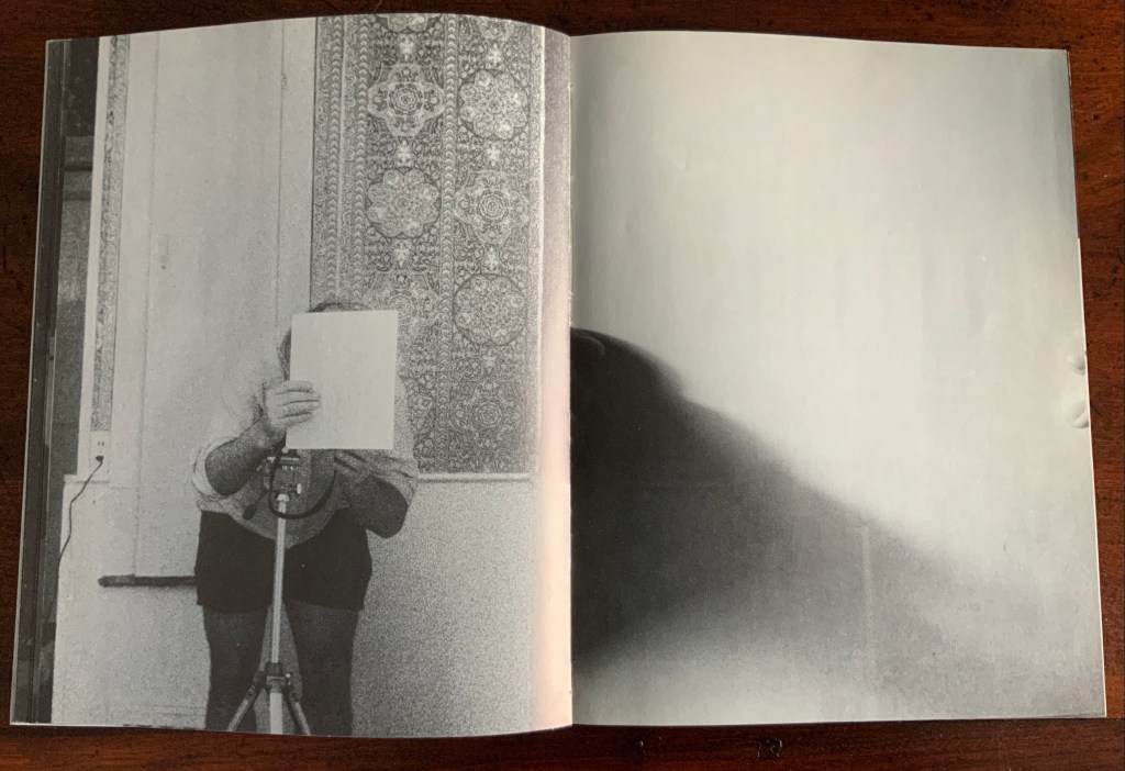
Cover to Cover (1975) Michael Snow Cloth on board, sewn and casebound. H230 x W180 mm. 310 unnumbered pages. Published by Nova Scotia College of Art and Design. Unnumbered edition of 300. Acquired from Mast Books, 10 December 2020. Photos of the work: Books On Books Collection.
After a long search since first sight of it in 2016 at Washington, D.C.’s now defunct Corcoran Gallery library, the original hardback edition of Michael Snow’s Cover to Cover (1975) finally joins the Books On Books Collection. Thanks to Philip Zimmermann, more readers/viewers have the chance to experience Cover to Cover — if only through the screen — than the original’s 300 copies and Primary Information’s 1000 facsimile paperback copies will allow.
Amaranth Borsuk describes the work and experience of it in The Book(2018), as do Martha Langford in Michael Snow (2014), Marian Macken in Binding Spaces (2017) and Zimmermann in his comments for the exhibition “Book Show: Fifty Years of Photographic Books, 1968–2018” (for all, see links below). Like Chinese Whispers by Telfer Stokes and Helen Douglas and Theme and Permutation by Marlene MacCallum, Michael Snow’s Cover to Cover evokes an urge to articulate what is going, how the bookwork is re-imagining visual narrative, how it is making us look, and how it makes us think about our interaction with our environs and the structure of the book.
The already existing commentary about Cover to Cover sets a high hurdle for worthwhile additional words. One thing going on in the book, though, seems to have gone unremarked. Some critics have asserted that, other than its title on the spine, the book has no text. There is text, however. It occurs within what I would call the preliminaries, and they show us how to read the book.
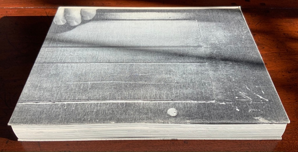
On the front cover, we see a door from the inside. Then, on its pastedown endpaper, the author outside the door with his back to us.
Front cover; pastedown end paper and page “1”.
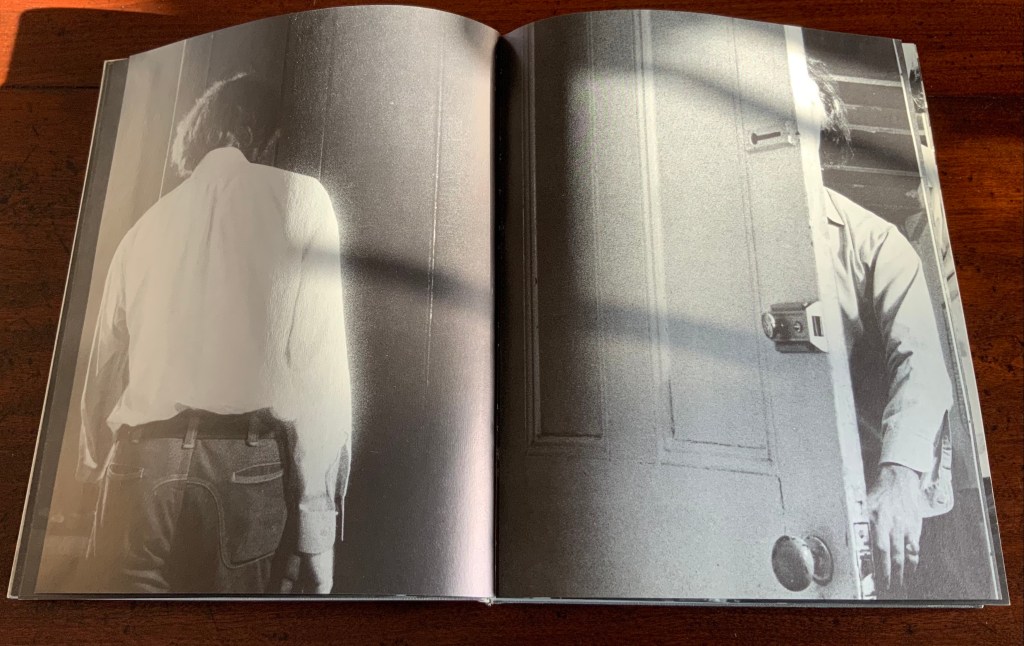
On turning the “inside door” (page “1” of the preliminaries), we see in small type a copyright assertion and the Library of Congress catalogue number appearing vertically along the gutter of pages “2-3” (a tiny clue as to what is going on).
Pages “2-3”
Over pages “4” through “14” from the same alternating viewpoints, the author reaches for the door handle, the door is seen opening from the inside, and the artist is seen walking through the door (from the outside) and into the room (from the inside). But who is recording these views?
Pages “10-11”, “12-13”, “14-15”
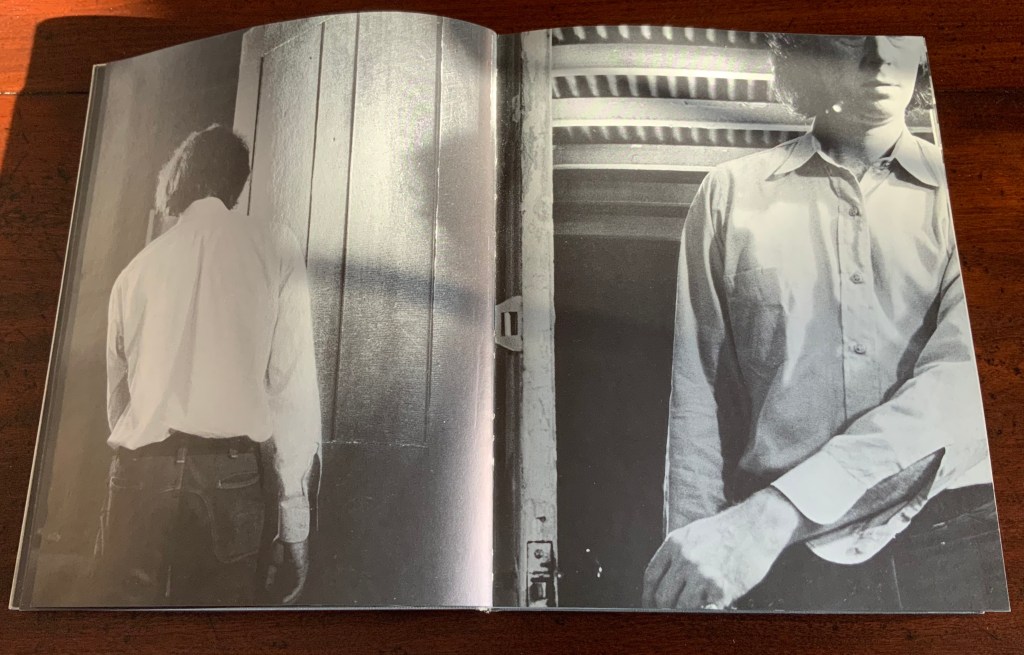
Over pages “16” through “24”, two photographers appear. Facing us, they are bent over their cameras — the one outside, clean shaven and wearing a short-sleeved shirt, is behind the author, and the one inside, bearded and wearing shorts, is in front of the author. As the author moves out of the frame, we see that the photographer inside is holding a piece of paper in his right hand. All of this occurs through the same alternating viewpoints. At page “21”, the corner of that paper descends into the frame of the inside photographer’s view of the outside photographer, and after the next switch in viewpoint that confirms what the inside photographer is doing, we see a completely white page “23”, presumably the blank sheet that is blocking the inside photographer’s camera aperture. Page “24” is the outside photographer’s view of the inside photographer whose face and camera are blocked by the piece of paper.
Pages “16-17”, pages “20-21” and pages “24-25”
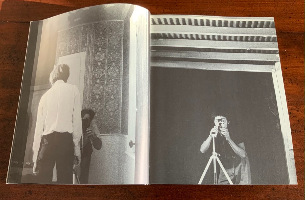
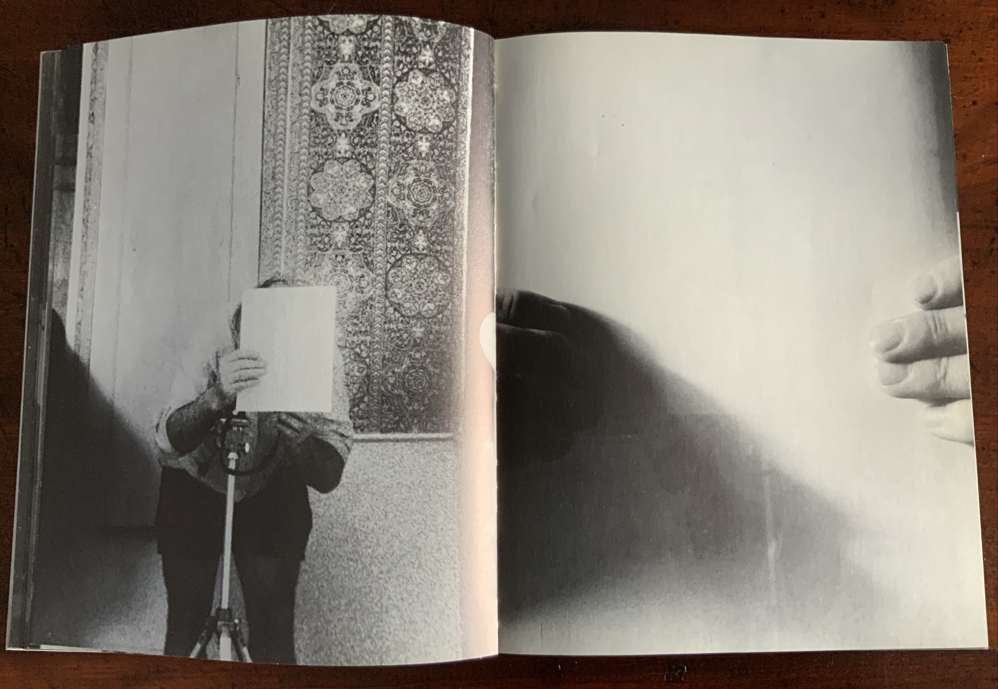
After the sequence above, something stranger still happens: on the left, a photo of the inside photographer holding the blank paper in front of his face appears. We can tell it is a photo by the tip of the thumb holding it (look in the gutter) between pages “26 and 27”. It is the developed photo the outside photographer just took of the inside photographer with his face and camera hidden by the sheet of paper. The image on page “27” is the reverse of that photograph. We can tell by the fingers on the right holding it.
Pages “26-27”
We are looking at images of images. But on pages “30-31”, whose fingers are holding the image of images?
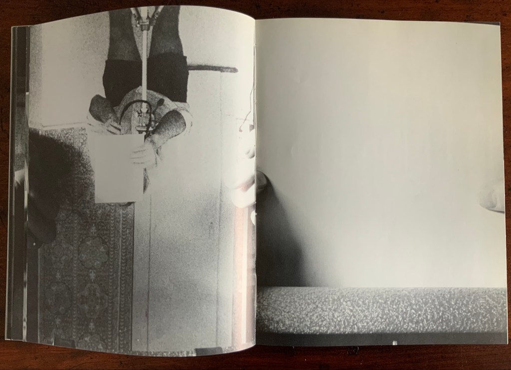
Pages “30-31”
From there on, we see images of this piece of paper being manipulated by one pair of hands. The thumbs appear on the verso (the view from the outside photographer’s perspective), the fingers on the recto (the view seen by the inside photographer). By page “34”, it has been flipped upside down (the inside photographer is standing on his head), and on page “35”, we see a close up of the blank reverse side of the paper being held between the two photographers. By page “37”, we can see the blank side of the photo paper being fed into a manual typewriter. The pair of hands feeding the paper into the typewriter cannot belong to one of the photographers. Who is the typist — the author?
Pages “34-35” and pages “36-37”
For both pages “42” and “43”, the perspective is that of a typist advancing the photo paper and typing the title page of the book. On both pages, we can see the ribbon holder in the same position. As it progresses, more and more of the outside photographer’s camera appears above the typed page. Page “45” presents itself as the full text of the book’s title page, curling away from the typist and revealing the inside photographer on the other side of the typewriter. Page “46” shows the upside-down view of the title page as it moves toward the inside photographer and reveals the outside photographer on the other side of the typewriter. Not only are we seeing images of images, we are witnessing the making of the book’s preliminaries.
Pages “42-43”, “44-45”, and “46-47”.
From page “48” through page “54”, the photographers alternate views of blank paper advancing through the typewriter. By pages “55” and “56”, the typewriter has moved out of the frame. Look carefully at page “56”, however, and you can see the impression of the typewriter’s rubber holders on the paper. As a book’s preliminaries come to a close, there is often a blank verso page before the start of the book. If Cover to Cover is following that tradition, page “56” is that blank page at the end of the preliminaries, and page “57”, showing a record player, is the start of the book.
Pages “56-57”.
Zimmermann notes that, at somewhere near the book’s midpoint, the images turn upside down, and that readers who then happen to “flip the book over and start paging from the back soon realize that they are looking at images of images produced by the two-sided system, and indeed the very book that they are holding in their hands”. He notes this as another mind-bender added to the puzzlement of the two-sided system with which the book begins. Yet the long set of preliminaries foretold us that the upside-downness, back-to-frontness and self-reflexivity of images of images were on their way. Without doubt, Cover to Cover is an iconic work of book art.
Further Reading
Afterimage (1970). No. 11, 1982/83. On the occasion of an exhibition of his films at Canada House in London, an entire issue on Snow’s work.
… Cover to Cover is the result of another distanced use of self in the course of art-making. Snow is subject/participant as he and his actions are observed and analyzed by two 35 mm cameras… simulataneously recording front and back, the images then placed recto-verso on the page… Snow is subject observed in the book at the same time that he is also choosing and making decisions about images. Cover to Cover in 360 pages, [sic] becomes a full circle — front door to back door or the reverse. The book is designed so that it can be read front to back and in such a way that one is forced to turn it around at its centre in order to carry on. Regina Cornwell in Snow Seen and “Posting Snow”, Luzern catalogue.
But as the scene “progresses,” an action is not completed within the spread, but loops back in the next one, so that the minimal “progress” extracted from reading left to right is systematically stalled each time a page is turned, and the verso page recapitulates the photographic event printed on the recto side from the opposite angle. This is the disorienting part: to be denied “progress” as one turns the page seems oddly like flashback, which it patently is not; it might be called “extreme simultaneity.” Two versions of the same thing (two sides of the story) are happening at the same time. Zimmerman.
30 St Mary Axe is a skyscraper in London’s main financial district. Designed by Sir Norman Foster architectural studio, built in 2001-2003. (Photo credit: Wikipedia)
London’s 30 St Mary Axe is referred to as “the Gherkin,” which a glimpse of the building on the skyline proves unmistakably appropriate. Mandy Brannan’s bookwork homage to the Gherkin is as architecturally intricate as the building’s cladding, and somehow more satisfying, perhaps because it’s less pickled.
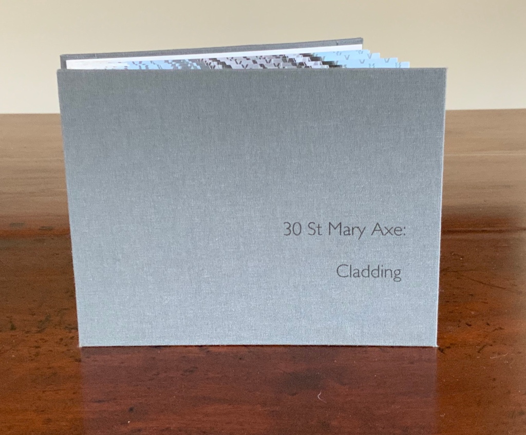
30 St Mary Axe: Cladding (2009)
30 St Mary Axe: Cladding (2009) Mandy Brannan Flagbook. H102 x W134 mm. Edition of 20, unnumbered. Acquired from the artist, 20 March 2019. Photo: Books On Books Collection
This work 30 St. Mary Axe: Cladding(2009) and 30 St Mary Axe: Diagrid (2009) are among several architecture-inspired works of book art that Brannan has created. The text in the one called Situated could have come straight from Pallasmaa, Bachelard or Merleau-Ponty:
Being situated is generally considered to be part of being embodied, but it is useful to consider each perspective individually. The situated perspective emphasizes that intelligent behaviour derives from the environment and the agent’s interactions with it.
Clearly we are not dealing with some mere mimetic piece of craftwork.
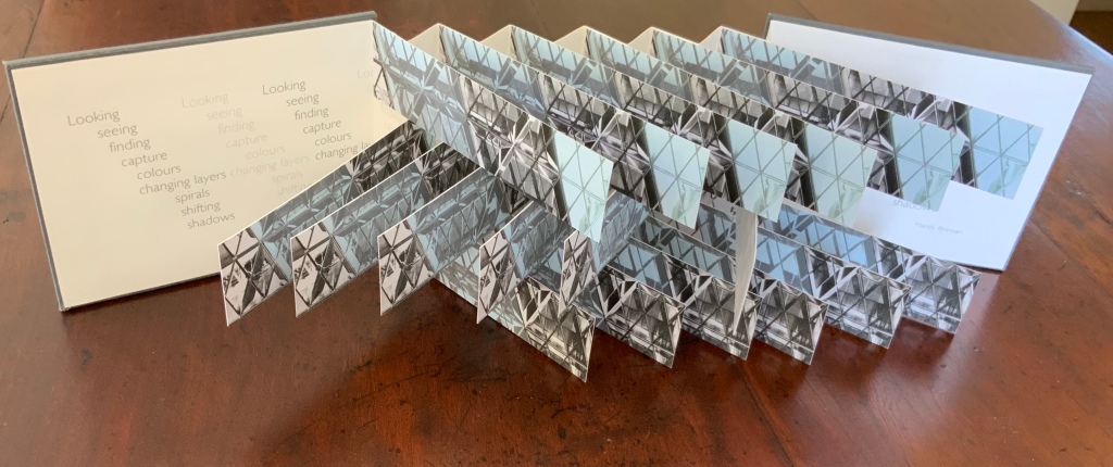
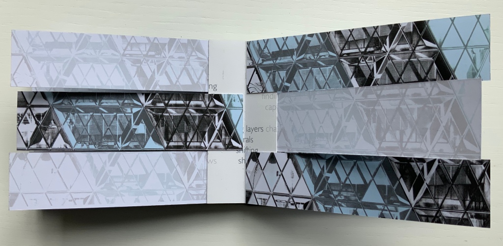
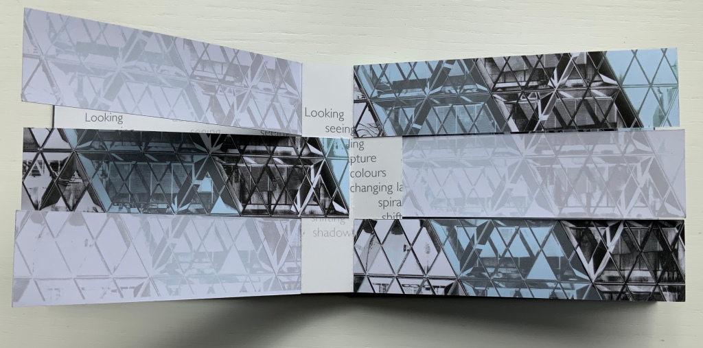
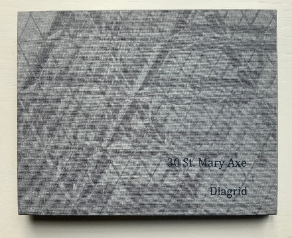
30 St Mary Axe: Diagrid (2009)
30 St Mary Axe: Diagrid (2009) Mandy Brannan Modified flagbook. H121 x W154 mm. Edition of 20, unnumbered. Acquired from the artist, 20 March 2019. Photos: Books On Books Collection
Cladding uses a straightforward flagbook structure, but not only is it double-sided with the architectural photographs, it also places text on the inner side of the accordion support and a statement about the 5,500 panels of glass cladding on the Gherkin. The modification in Diagrid is the inward curving of the flags and their formation of the shape recalling the Gherkin. The wording on the reverse of the accordion is the definition of the architectural term diagrid: “a design element used for constructing large buildings with steel that creates triangular structures with diagonal support beams”.
In addition to the flagbook- and modified-flagbook arrangements of the photos, Brannan has enriched the substance of these works with her manipulation of her photograph of 30 St Mary Axe, reflecting a nearby building. Using several different methods, digital programs and then printer settings for digitally printing, she delivers an almost kaleidoscopic, reflective and self-reflexive effect in each work. In a sense, the work demonstrates the artist’s behavior — her choices of material, subject, text and technique in each work’s making — and how it derives from her environment and her interactions with it. By integration of text, image, color, structure and material, Brannan also situates the “Gherkin’s” architecture in our hands and gives us the opportunity to contemplate, appreciate and perhaps experience the sense of being situated and embodiment.
Further Reading
“Architecture“, Bookmarking Book Art, 12 November 2018.
Alicia Martín’s series of installations called Biografías has been frequently noted across the Web — Designverb (2009), Crooked Brains (2010), SFCB Blog (2011), Huffington Post (2012), Inhabitat (2012), My Modern Met (2012, 2013), Arte Al Límite (2014), TiraBUZón (2014), El Cultural (2014, 2015) — but Nicola Mariani’s 2013 interview with Alicia Martín is the most useful entrée to this book artist and her work. The most telling insight from the artist elicited by Mariani is this:
Las intervenciones en la calle son de impacto visual, provocan curiosidad, sorpresa y la necesidad de llevársela en el móvil, en el iPad … y compartirla…. Son efímeras, por un tiempo asaltan al que va por la calle sin dejarle indiferente, la escultura “real” es la sensación que ha quedado en cada una de las personas y en la manera de recordarla, pensarla, contarla…. Una vez que se desmontan sólo queda en la memoria del que las ha vivido. Como cuando se lee un libro.
The interventions in the street have a visual impact, provoke curiosity, surprise and the need to capture it on smartphones, on iPads … and share it…. The installations are ephemeral, striking the passers-by in a brief moment allowing no indifference; the “real” sculpture is the feeling that remains in each of them, the way they remember it, think it, tell it…. Once the installations are dismantled, they remain only in the memory of those who have lived them. Like when you read a book
When I came to The Hague in June 2015, too many months passed before I visited Lidy Schoonens, owner of a bookshop devoted to book art, book arts and calligraphy, and one of the founder of the Leiden Book Arts Fair. In her shop on the fourth floor of the early 20th-century house on Johan van Oldenbarneveltlaan, I found myself sitting across from one of the orchestrators of Alicia Martín’s visit to construct her installation for the Paper Biennial 2012 at The Hague’s Meermanno Museum — an experience that put a “real” Martín sculpture in her memory. With her help, I was able to find these images of the installation.
Lidy described how the community quickly filled large dumpster bins with old books otherwise destined to be thrown away. Martín proceeded to manipulate and attach them to a wire frame, leaving their open pages to flutter and give sound to the cascade. By virtue of its here-today-gone-tomorrow status and its metaphoric metamorphosis of books into a torrent of now barely accessible information, Biografías reminds the viewer of the ephemerality of what appears to be permanent and urges “living” such moments of art to store the sight and sound in memory — or YouTube.
Biographías in Cordobá (2009).
In 2020, the Centro Galego de Arte Contemporánea in Santiago da Compostela has celebrated its Covid-19 reopening with another of Martín’s works — Biblioteca IX (1998) — in an exhibition entitled “Wonder Women: Women Artists in the CGAC Collection”. More of Martín’s work can be found on Mutual Art and in the series of exhibitions listed at Photography-Now.com.