“How does a book reflect a distinct way of thinking about a subject? How does the page become a dynamic landscape of visual and conceptual ideas?” So begins the description for a workshop run by Ken Botnick in 2017. His two works in the Books On Books Collection answer those questions with a resounding “This is how“.
Table of Contents (2020)
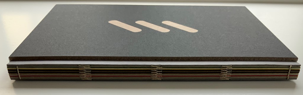

Table of Contents (2021)
Ken Botnick
Slipcased, boards with exposed sewn binding. Slipcase: H270 x W170 mm; Book: H265 xW185 mm, 56 pages.
Edition of 20, of which this is #5. Acquired from the artist, 3 May 2022.
Photos: Courtesy of the artist; Books On Books Collection. Displayed with permission of the artist.

Table of Contents has no table of contents. Instead the whole book is a meditation on a table of contents — that of James J. Gibson’s The Senses Considered as Perceptual Systems (1966). On the inside cover, Botnick characterizes Table of Contents as a “book-length visual/textual poem” and identifies the cento as its model. Cento is short for the Latin centonibus (“patchwork”) and describes the technique of appropriating others’ lines of verse to compose an original “collage” poem. Rather than lines from poems, though, Botnick has appropriated text from Gibson’s table of contents and figure labels.
Here is Gibson’s complete table of contents:
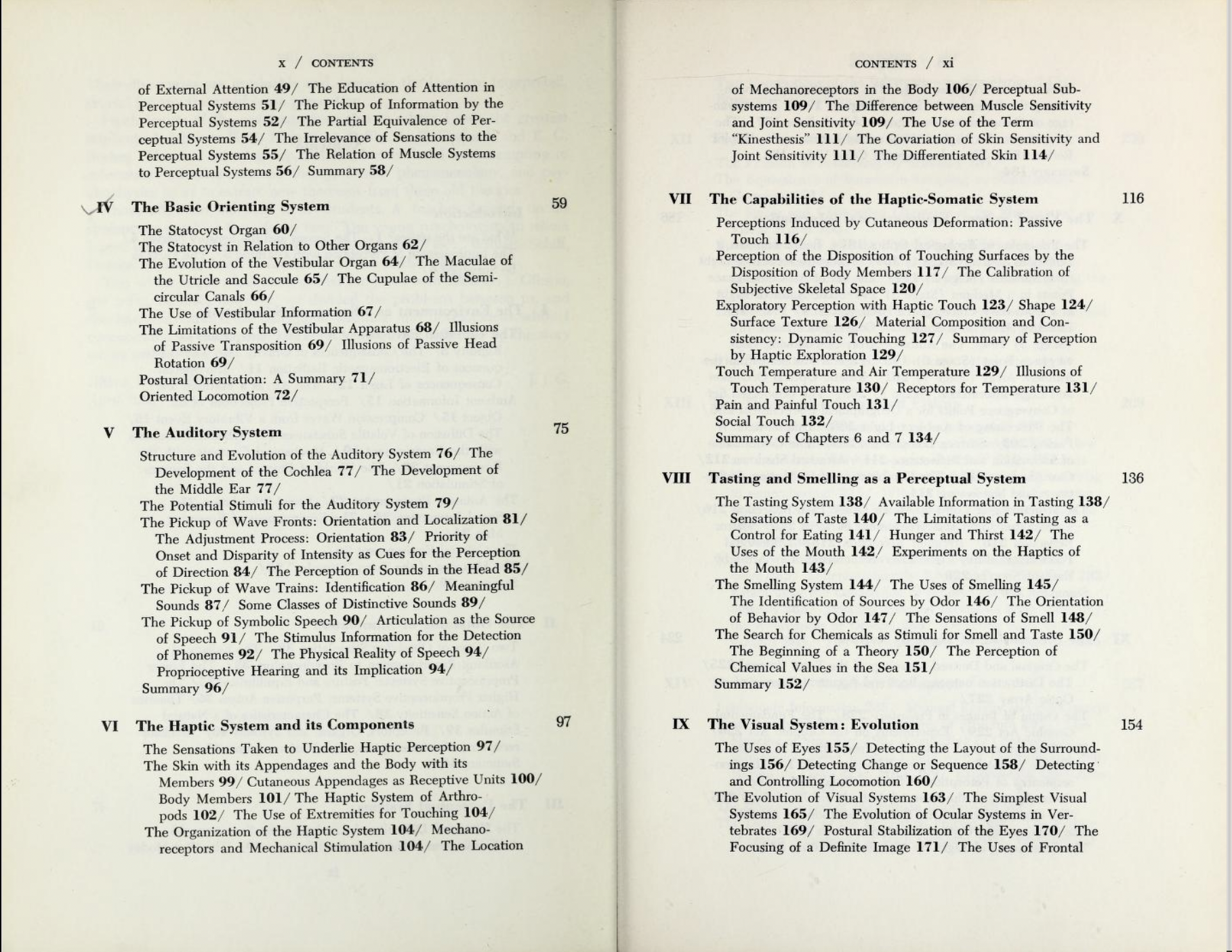
Gibson, The Senses Considered as Perceptual Systems, pp. ix-xiv. Internet Archive.
Here is Botnick’s selection of text:
Table of Contents
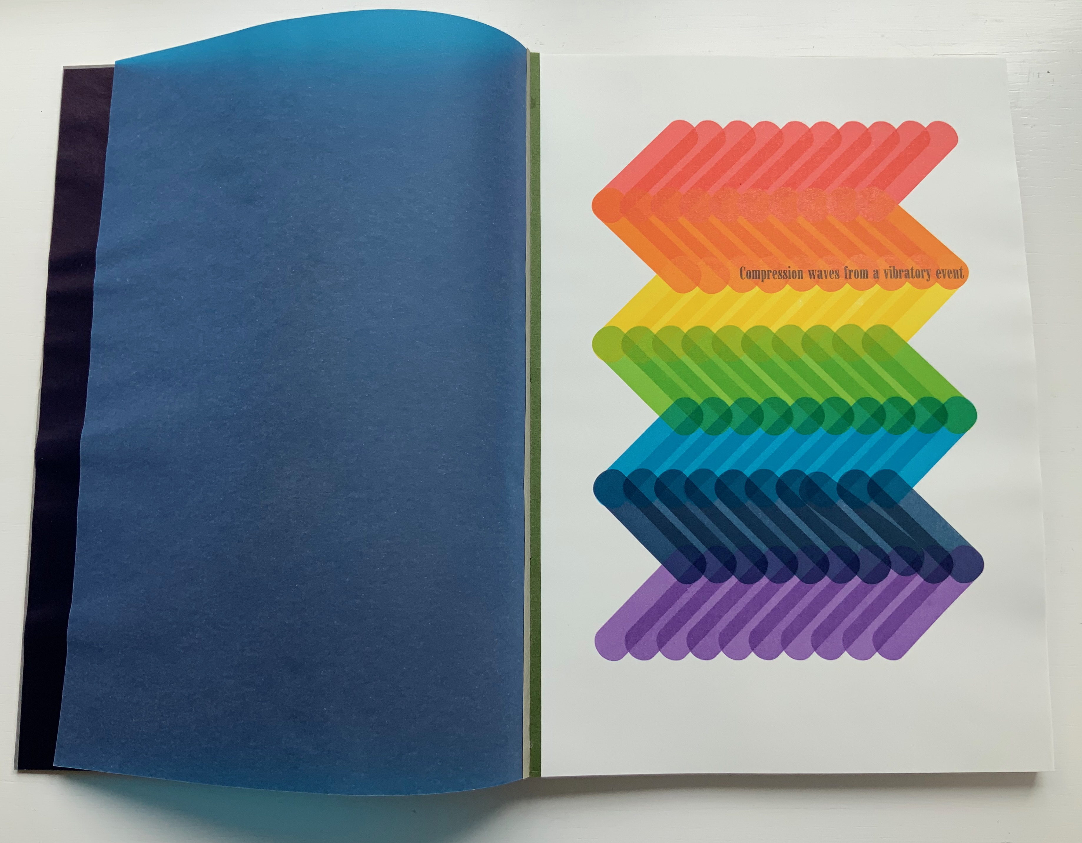
Compression waves from a vibratory event
How are associations between events detected?
The stationary information for seeing one thing through another
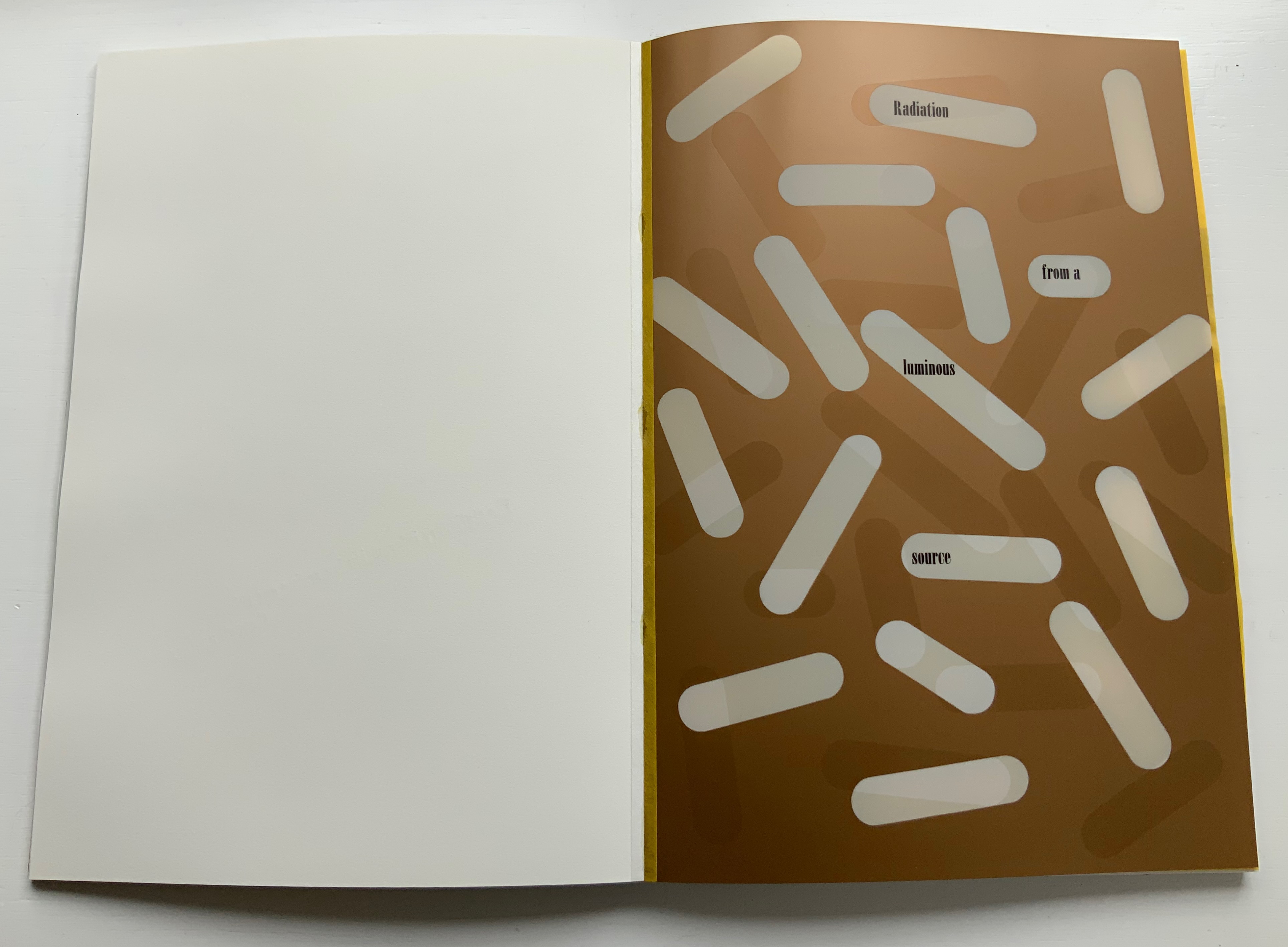
Radiation from a luminous source
The physical reality of speech
The diffusion of volatile substances
The development of selective attention
The superfluous appeal to memory
The consequences of inadequate information
The consequences of rigidity
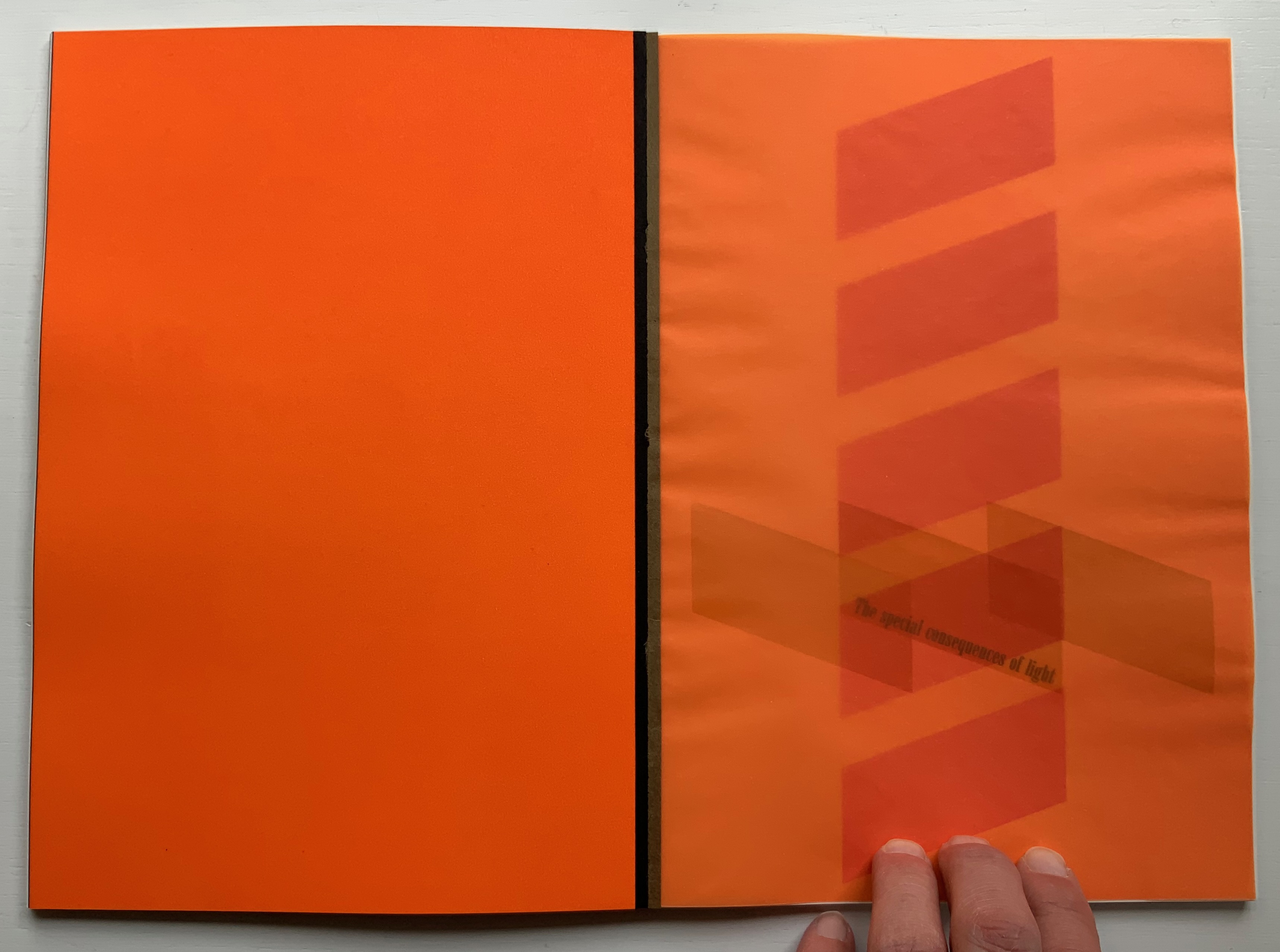
The special consequences of light
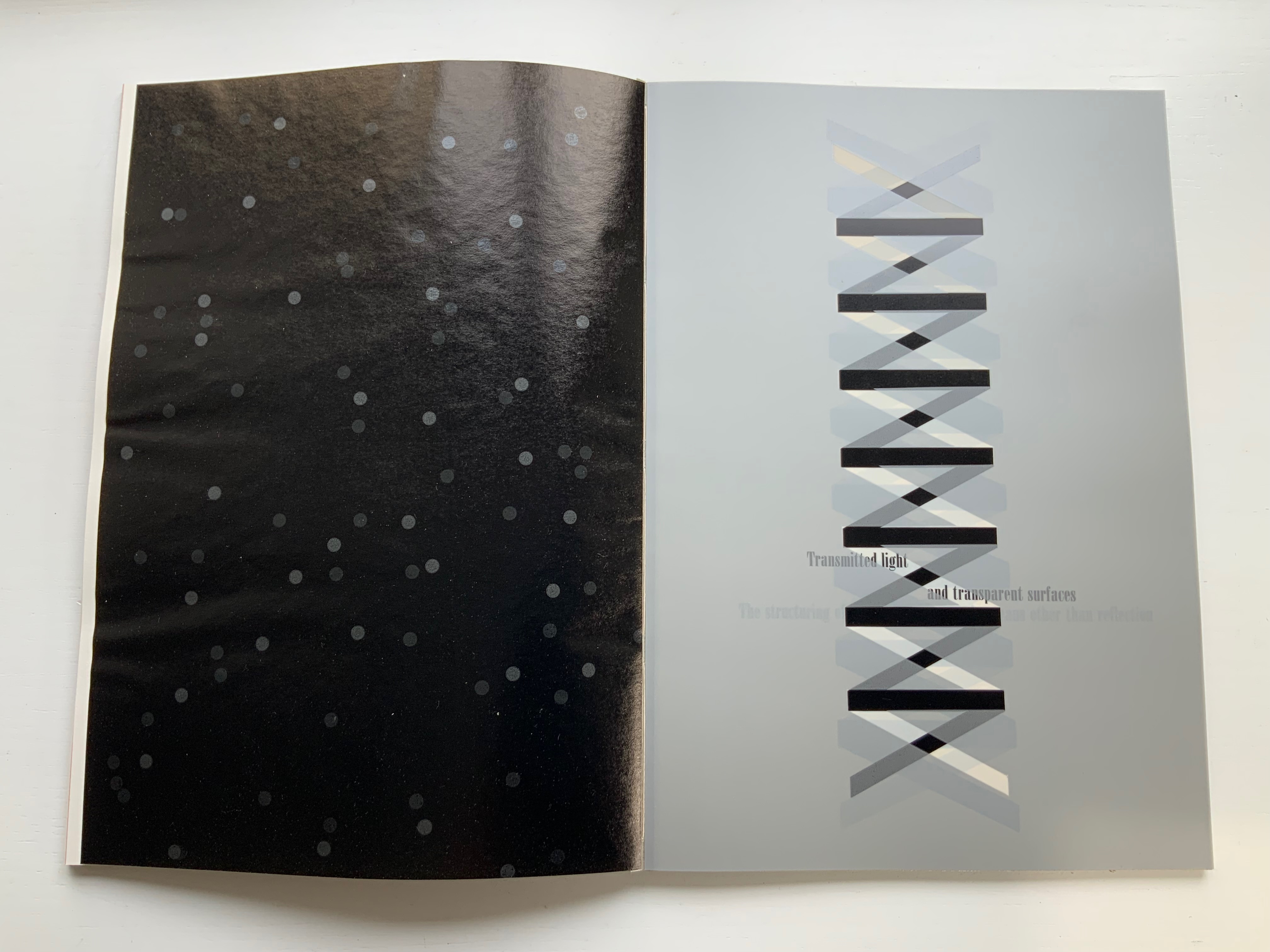
Transmitted light and transparent surfaces
The structuring of light by means other than reflection
The structuring of light by alphabetic writing
The stable and unbounded character of the phenomenal visual world
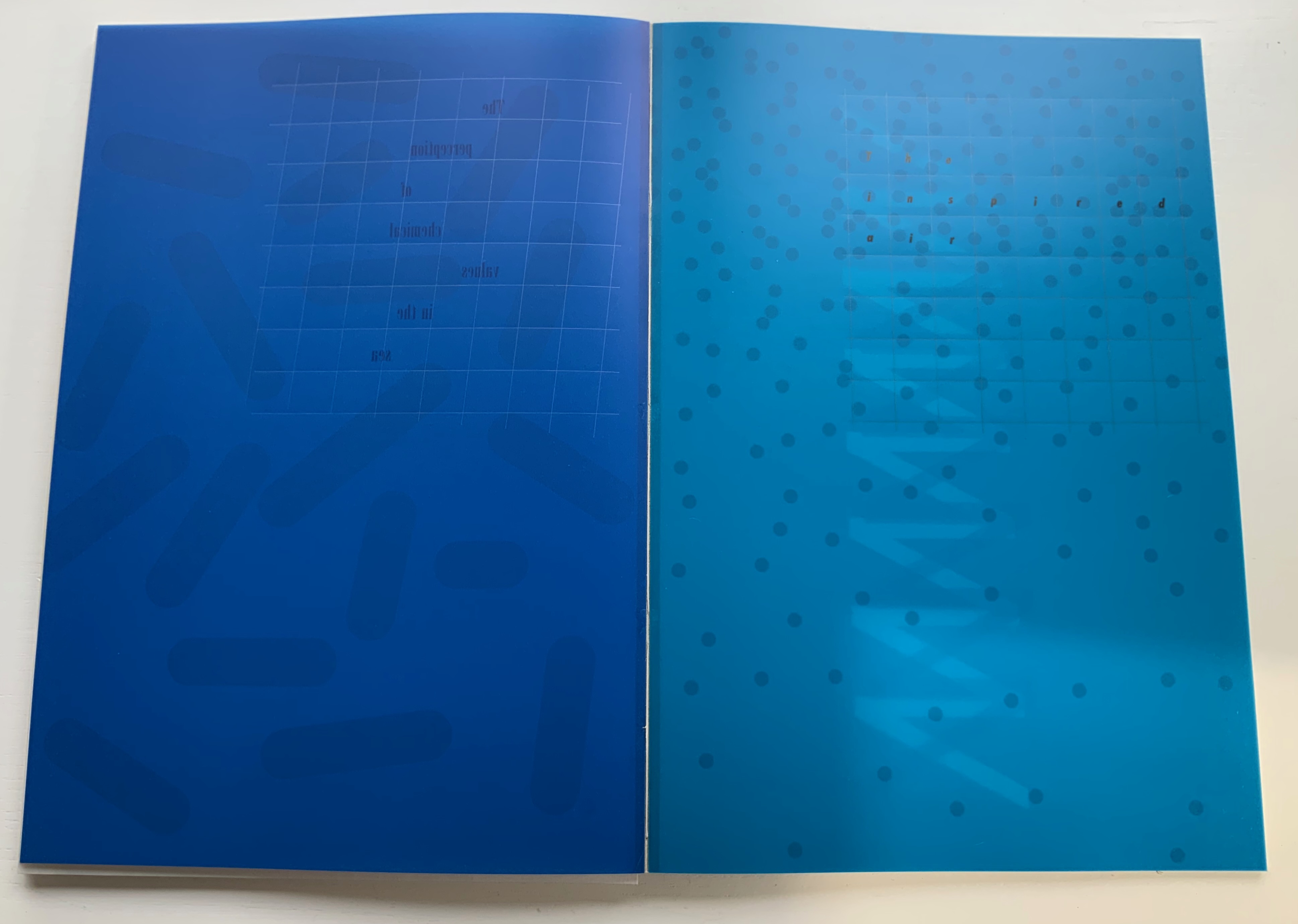
The perception of chemical values in the sea
The inspired air
The beginning of a theory
But that is not how Botnick’s cento is presented. In calling it a “visual/textual poem”, Botnick is too modest. It is much more than visual/textual: it is visual, textual, auditory and haptic — and is so from the start, proceeding by contrasts and complements, provoking multi-sensory activity and responses.
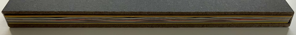
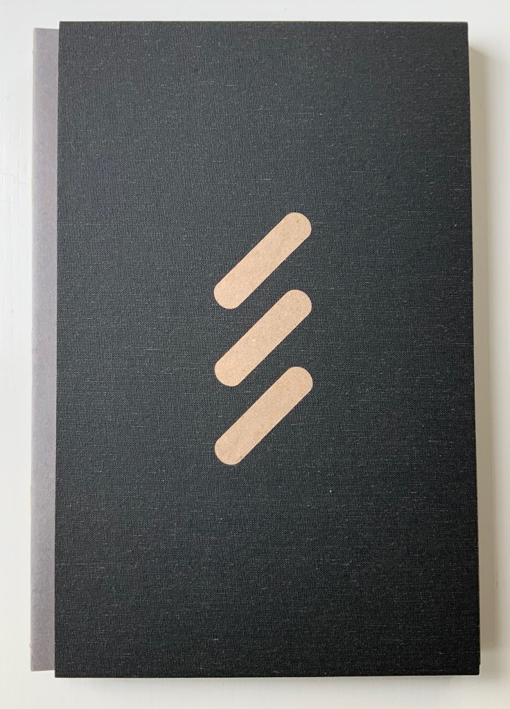
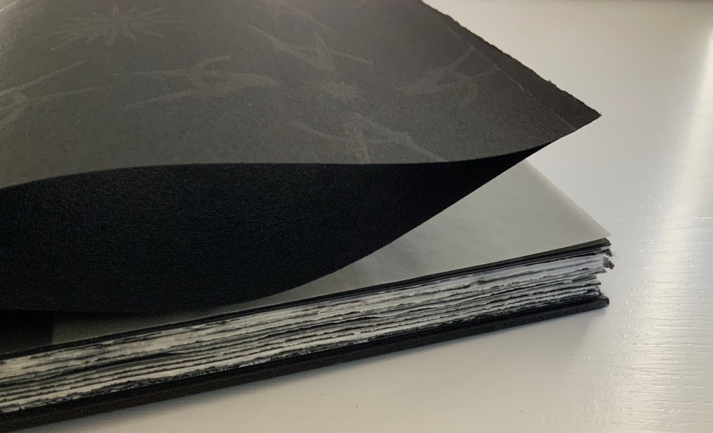
First of all, the slipcase is more of a “slipsleeve” from which the spine protrudes for fingers and eyes to feel the exposed binding threads, the pattern of knots and the ridges of the gathered signatures. This is the sewn boards structure, credited to Gary Frost, more on that later. The spine and fore edge offer bright colors that contrast with the deeply black sleeve that displays three slanting parallel cutouts in the cloth, exposing the board it covers. The pattern those cutouts make will become a recurrent visual and tactile theme as the pages turn.

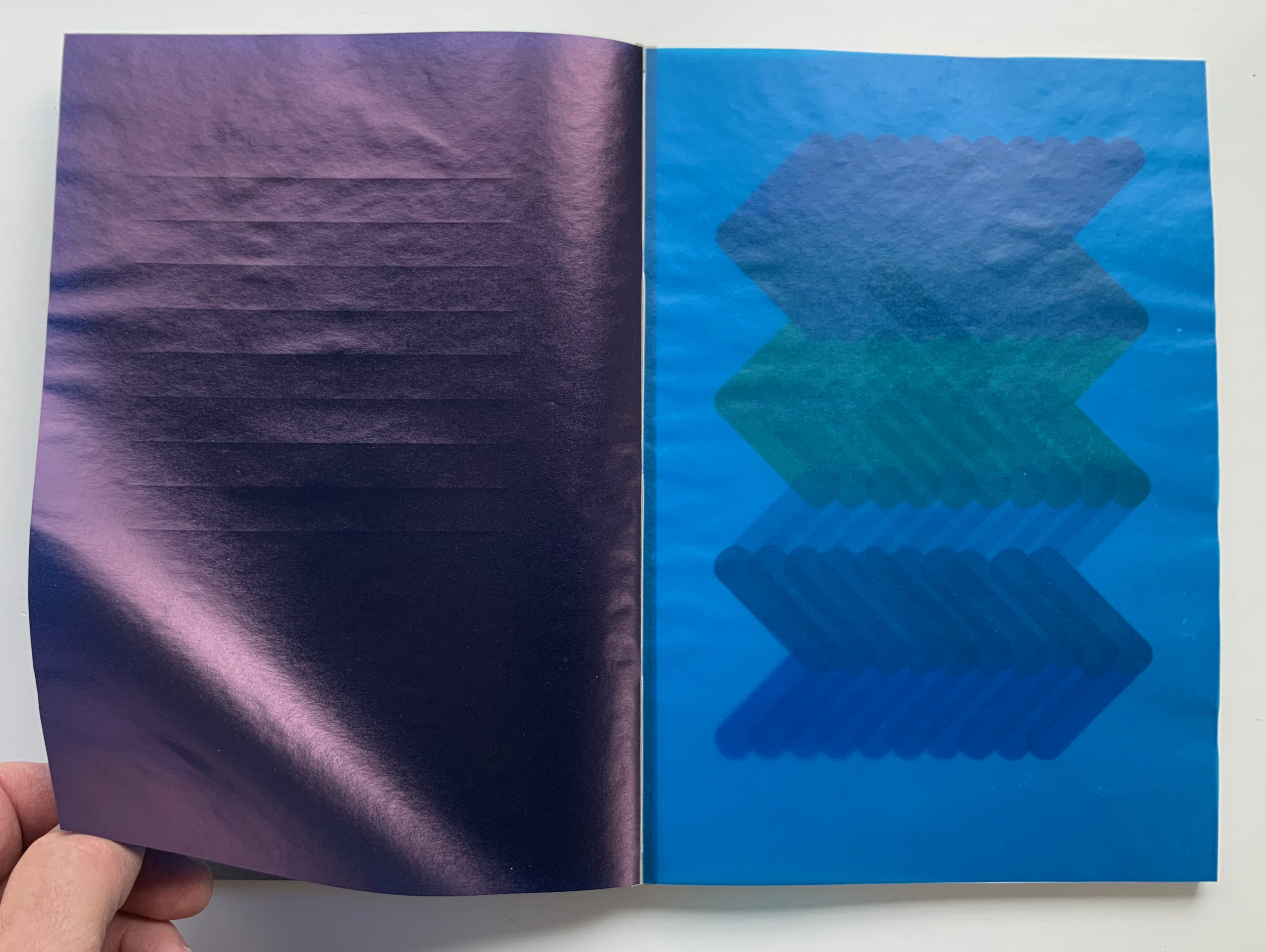
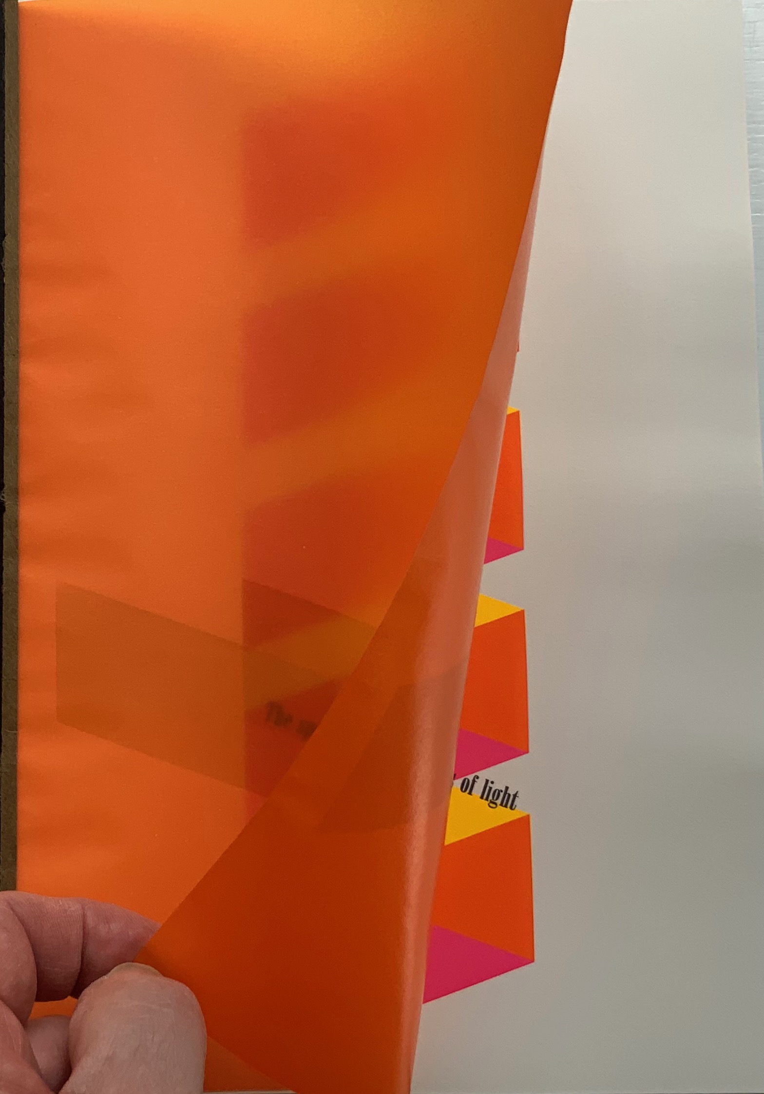
As the tightly fitting sleeve pulls away from the board-stiff book, they make a “shirring” sound together. As the front cover turns, the title page bows upward showing nine impressed parallel lines beneath the words “Table of Contents”, and when that page turns, it crackles and makes a shuffling sound as its edge drags across the following bright blue page.

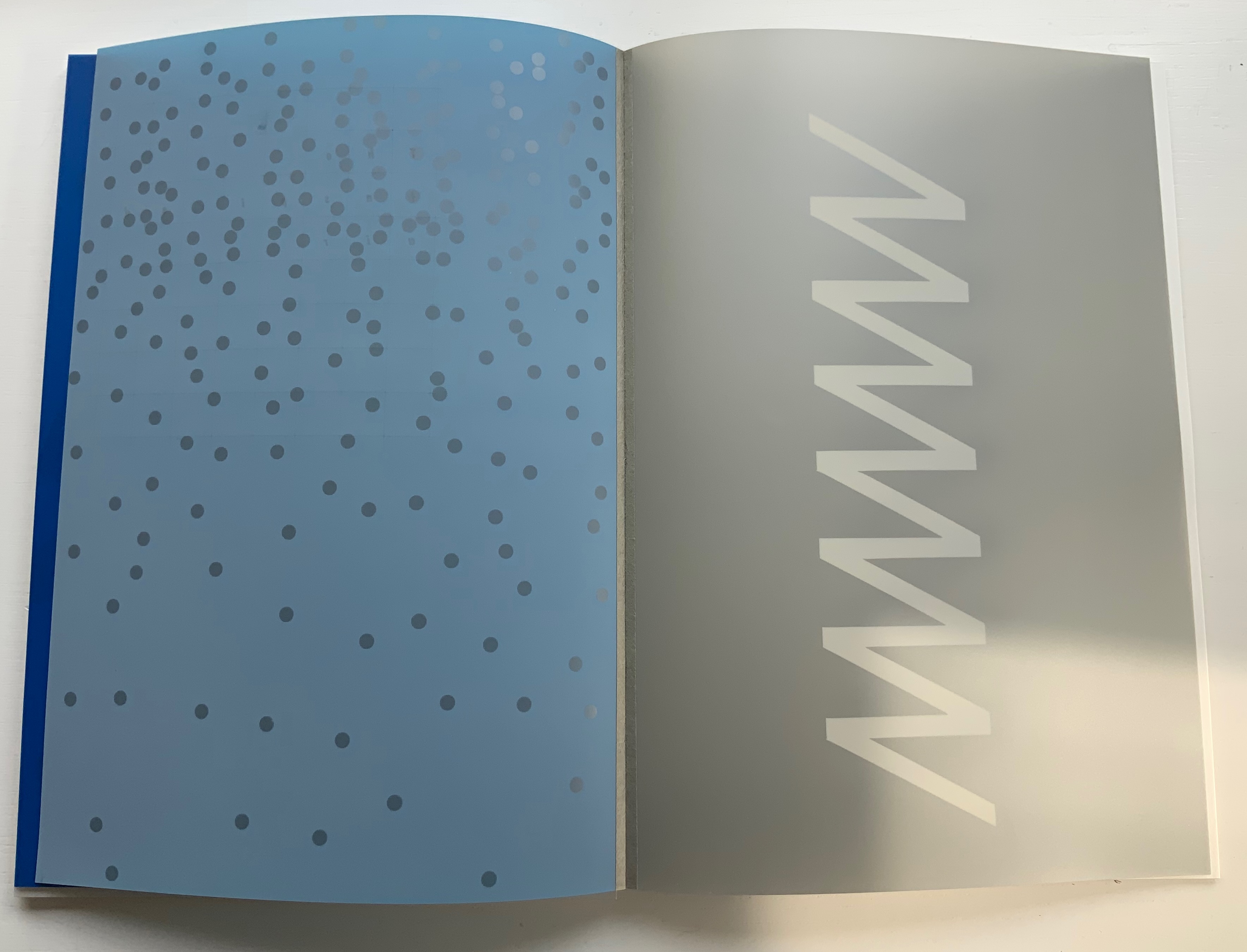
Through that bright blue translucence, the pattern from the slipsleeve reappears but rearranged and multiplied into a zigzag spectrum of colors. The physical turning of the translucent page “exposes” that zigzag spectrum and the second line of text in this poem: “Compression waves from a vibratory event”. Gibson’s text refers to the perception of sound or physical vibrations, and Botnick poetically overlays this with his selection of papers and introduction of zigzag waves of color. The zigzag pattern and its rounded elements, which on some pages are scattered, elongated, cross-hatched or sharp-edged, contribute a recurrent visual syncopated rhythm through the book. Toward the end, the zigzag moves into a more consistently vertical and angular, almost helical, appearance.

First leaf turned, second leaf turning, third leaf revealed.
Zigzag pattern scattered. Zigzag pattern become helical.
To deliver other visual and haptic effects, Botnick prints his translucent papers sometimes only on their reverse sides, sometimes on both, sometimes to the point of opacity as with the first leaf and other times to the point of transforming the colors about to appear on the next sheet beneath as with the second and third leaves. Of course, this changes the feel of the sheet from one side to the other. Botnick also uses six different paper types (including one with a watermark designed for this edition and made at Dieu Donné Paper). The variety in printing and papers introduces additional tactile and visual rhythms: slick and matte, smooth and rough, dark and light, etc. Again, proceeding by contrasts and complements, provoking multi-sensory activity and responses.

Visual effects achieved by printing on both sides of translucent paper layered over fine print paper.

Visual effects achieved by printing translucent paper to near opacity on one side, spot printing on the other side and layering that sheet over a translucent paper printed on one side.


Variation of paper types.
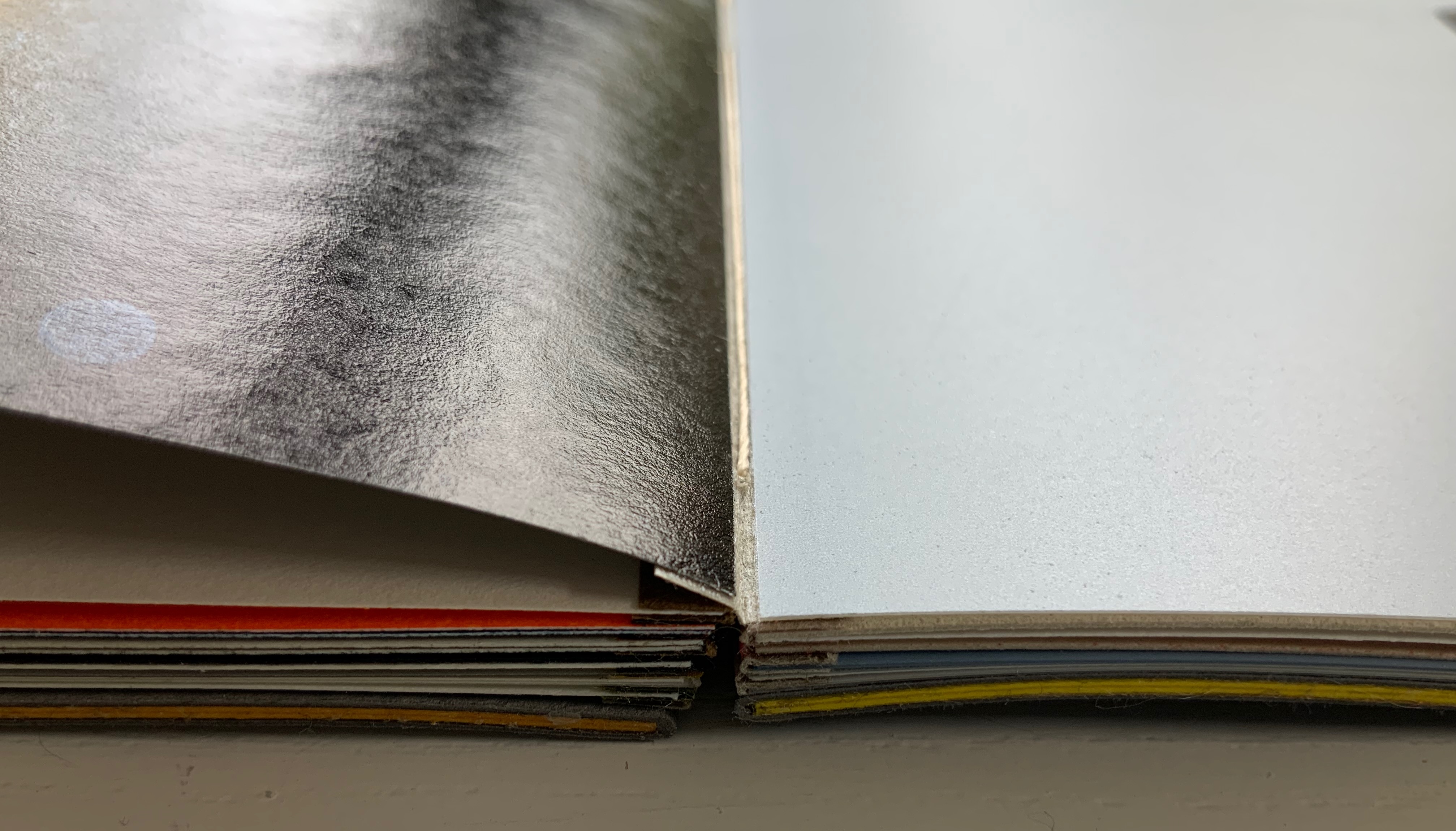
The sewn boards structure, executed by Emdash studio member Robin Siddall, offers the most effective means of achieving the sensory effects intended with the variety of papers, ink colors and printing techniques, as well as delivering a lay-flat binding. Each four-page signature consists of two separate sheets glued to the inner edges of a narrow folded card (the board) sewn and linked to the boards of the signatures before and after. The card used for those hinges is a Japanese washi called Moriki, known for its folding strength and colors, but how particularly apt those multiple hinges and colors are for this patchwork poem.
Detail of an open signature exposing the thread sewn through the board and showing the leaves glued to the edges of the board.
Gibson defines the haptic system as that “by which animals and men are literally in touch with the environment” (p.97). On the penultimate double-page spread, Botnick reveals the environment that touched his “book-length visual/textual poem” into existence: one of pandemic, isolation, violent exposure of institutionalized racism, the “Big Lie” and insurrection. Set in the now familiar zigzag pattern, the revelatory text annotates the lines of appropriated text and the prints, connecting both with the environment and the meditation on perception. Botnick’s book is certainly a distinctive interweaving way of thinking about these threads.

It is telling that Table of Contents ends with black and gray, the colors that dominate the other work in the collection: Diderot Project (2015), which presents this pronouncement from Odilon Redon:

Even without the prismatic range of colors in Table of Contents, Botnick’s Diderot Project (2015) may outstrip the former in the number of ways in which Botnick makes not only the page but also the codex itself “become a dynamic landscape of visual and conceptual ideas”.
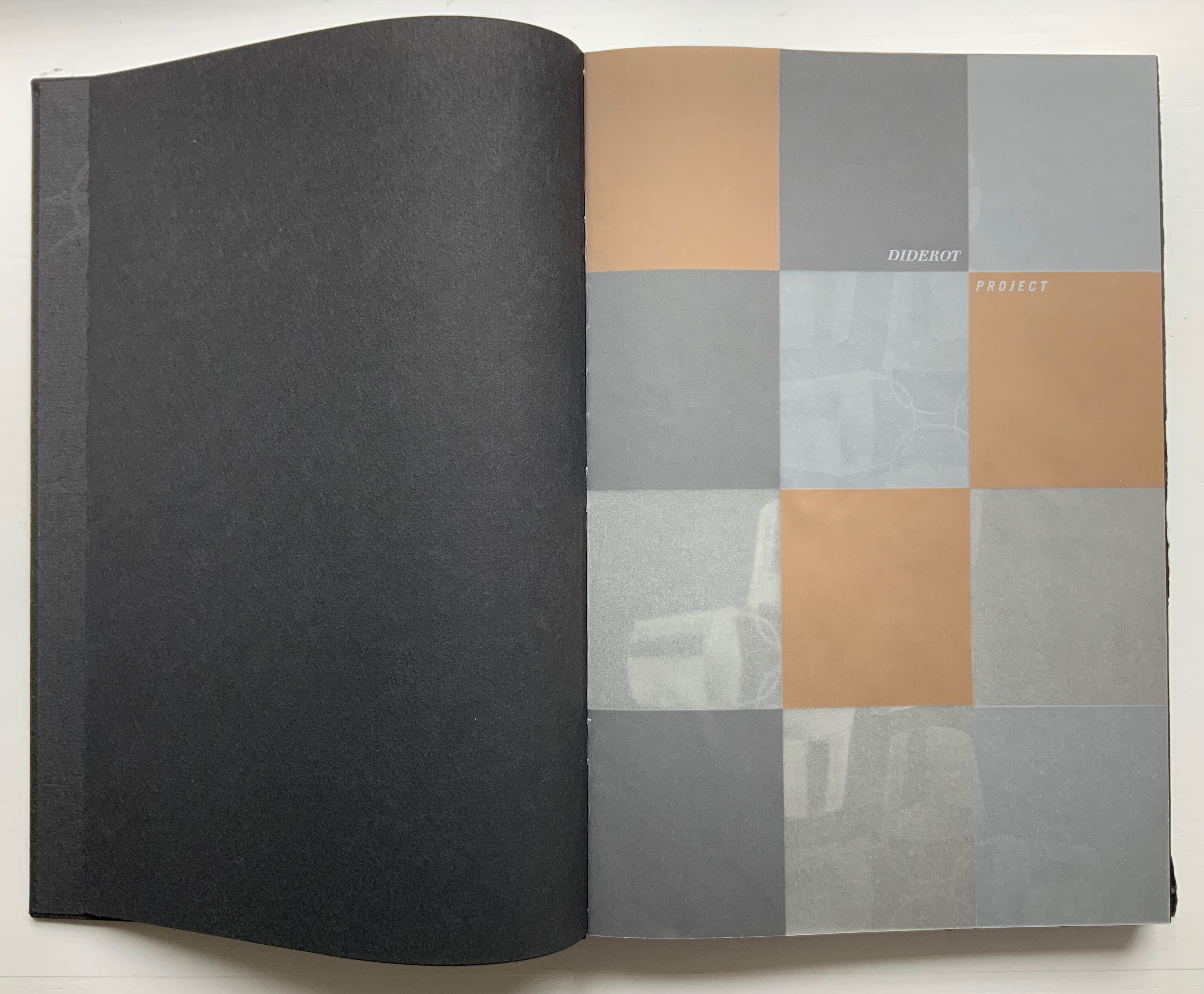
Diderot Project (2015)
Diderot Project (2015)
Ken Botnick
H290 x W194 mm, 150 pages. Edition of 70, of which this is #32. Acquired from the artist,
Photos: Courtesy of the artist; Books On Books Collection. Displayed with permission of the artist.
Clearly, like Table of Contents, this work is a “book-length visual/textual poem”, so it offers some insights on the book artist’s favorite rhymes, rhythms, metaphors, techniques and themes. First and foremost is his taking a literary work as his muse. With Table of Contents, it is James J. Gibson’s psychology book; in this case, it is Denis Diderot’s multi-volume Encyclopédie (Encyclopedia), a decades-long project with Jean le Rond d’Alembert and 138 other contributors. Nodding to the multiple volumes of the Encyclopedia, the artist refers to the sections of his work as Volumes 1, 2 and 3, although they are bound as one binding. The three volumes’ titles follow the Encyclopedia‘s overarching categories in its “System of Human Knowledge”: Memory, Reason, and Imagination. Digitally captured images from the Encyclopedia‘s plate volumes abound.

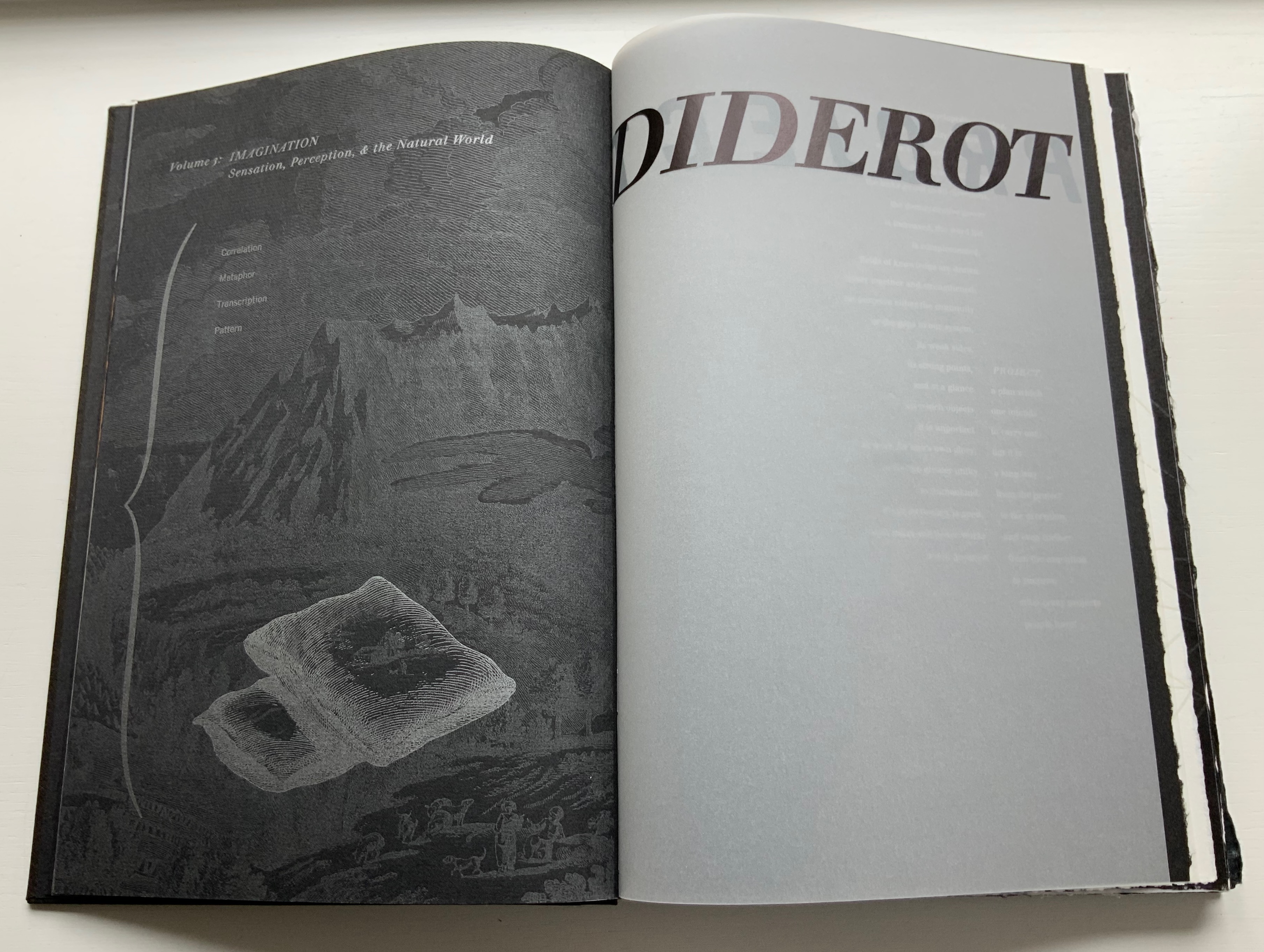
Table of Contents
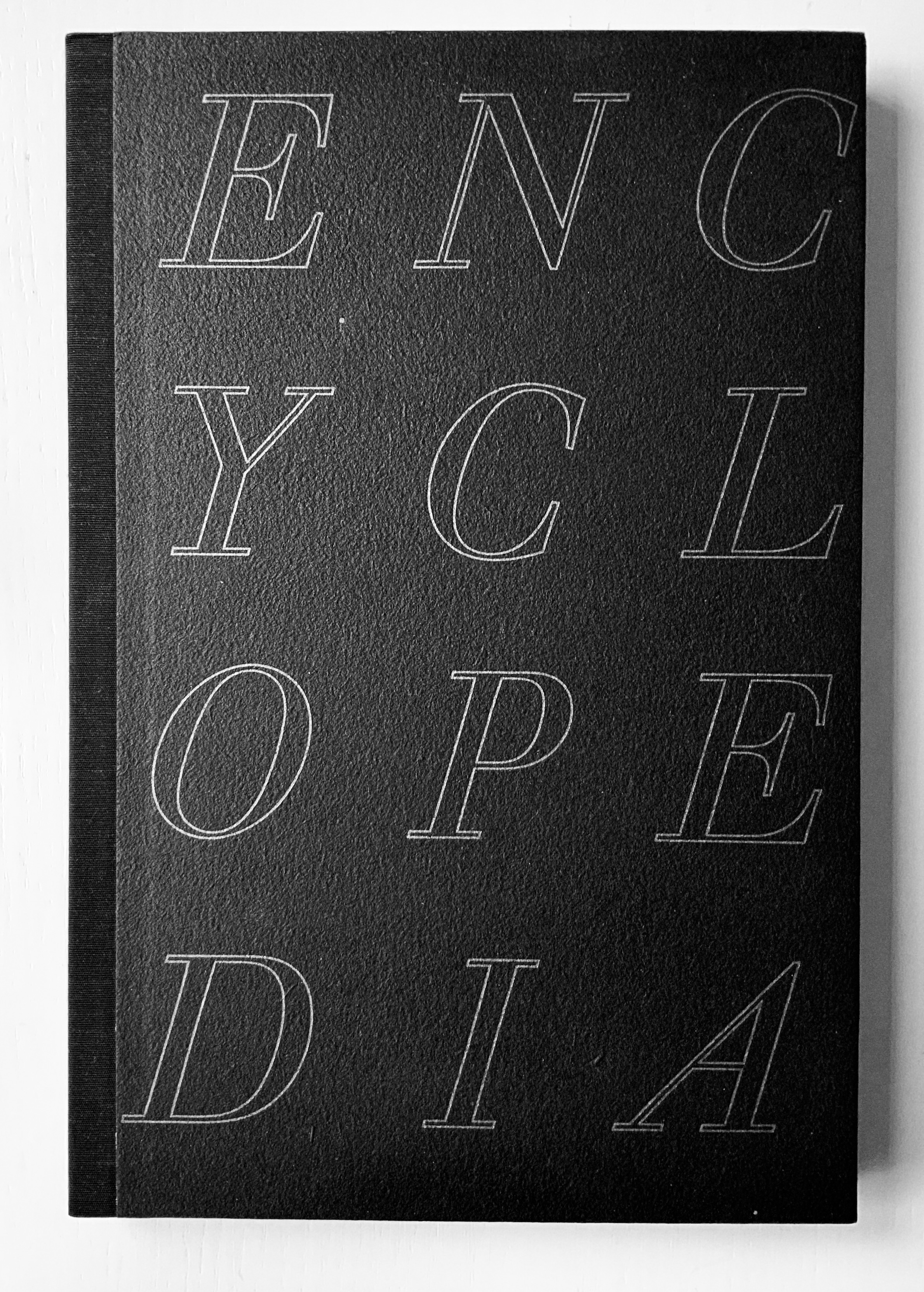
Diderot Project, however, is not a condensed version or description of the Encyclopedia. Like literary works of ekphrasis whose words meditate on a visual object, Diderot Project is book art that meditates — inversely — on a literary work. The cover to Diderot Project does not show its name where the title is expected, rather it shows the name of its object of meditation. And it displays that name in a distinctive monumental way.
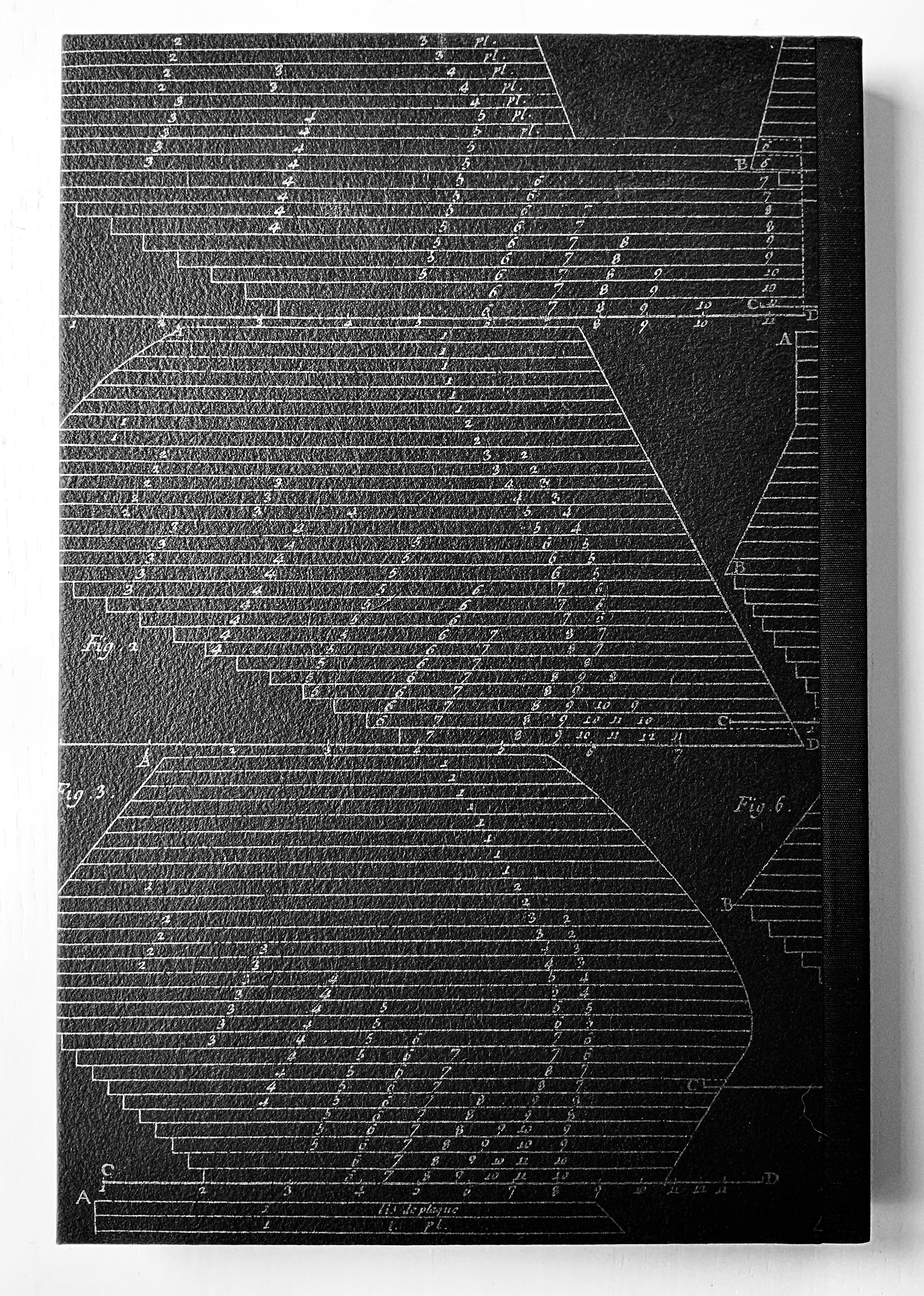
The front cover’s silver slab serif italic letters in all caps on textured, triple-dyed flax paper and the back cover’s diagram in the same palette strike chords that reverberate throughout the work. The chords are both obvious and subtle. Immediately, with a pattern of silver-gray compasses and directional stars, the doublures repeat the cover’s black and silver notes but on a less textured paper. Curiously the fly leaves of the doublures are not really fly leaves because they are pasted at their fore edges to separate leaves of black paper: a subtle hint to look beneath the surface, inquire into the mechanics. (An irresistible side note on the mechanics of the binding: the binder Daniel E. Kelm, in tipping the black fly leaf to the outer printed one, extends the fly leaf further into the book as a tipped-on hinge inserted through the first two signatures. The detailed image below on the right shows the hinging edge of the fly leaf between the signatures.)

L-R: Inside back cover, doublure with compass and directional star motif; Inside front cover, doublure leaf anchored to fly leaf; Binding detailed view of hinging edge of fly leaf extending between signatures.
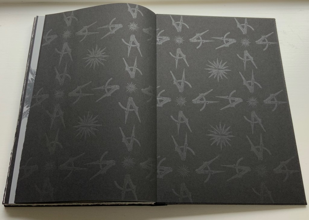
Following that almost-Chinese fold of a flyleaf, the half-title drops any pretense of hinting. Turning the half-title with its 3×4 grid of black, brown, tan and gray squares on translucent paper reveals that the squares have been created by printing in silver, copper, light brown tint and no ink on the reverse. Underneath the half-title leaf lies another black page with the recurring silver-gray image of four buckets linked by their handles. The pattern of buckets is parallel to the interlinked image of compass and directional star on the doublures. It is another subtle hint: this time, to look at patterns for their similarities and differences arising from the mechanics of effects, to consider the commonality of tools whether at the low or high end of culture.

L-R: Half-title on translucent paper; inked reverse of half-title and the interlinking buckets.
If this reaction to the prelims seems a stretch, then the following run of folios surely validates it. Not only does the text articulate the parity of craft and tools (métier) with art and science, the watermark hand gestures to it, then the watermark hand joins its mirror image “to tie” the knot of the binding thread, and then the second watermark hand joins its printed mirror image at the same point. These six pages enact parallels of similarities and differences.


The layering of translucent paper printed on one or both sides, which also occurs in Table of Contents, is another of Botnick’s favorite techniques. He has even delivered a lecture at the Getty Research Institute entitled “Transparency as Metaphor“. Botnick’s use of it in the sequence below invites the reader/viewer to meditate with him on “the nature of craft, tools, memory, and imagination, while provoking questions about authorship in artists’ books”.
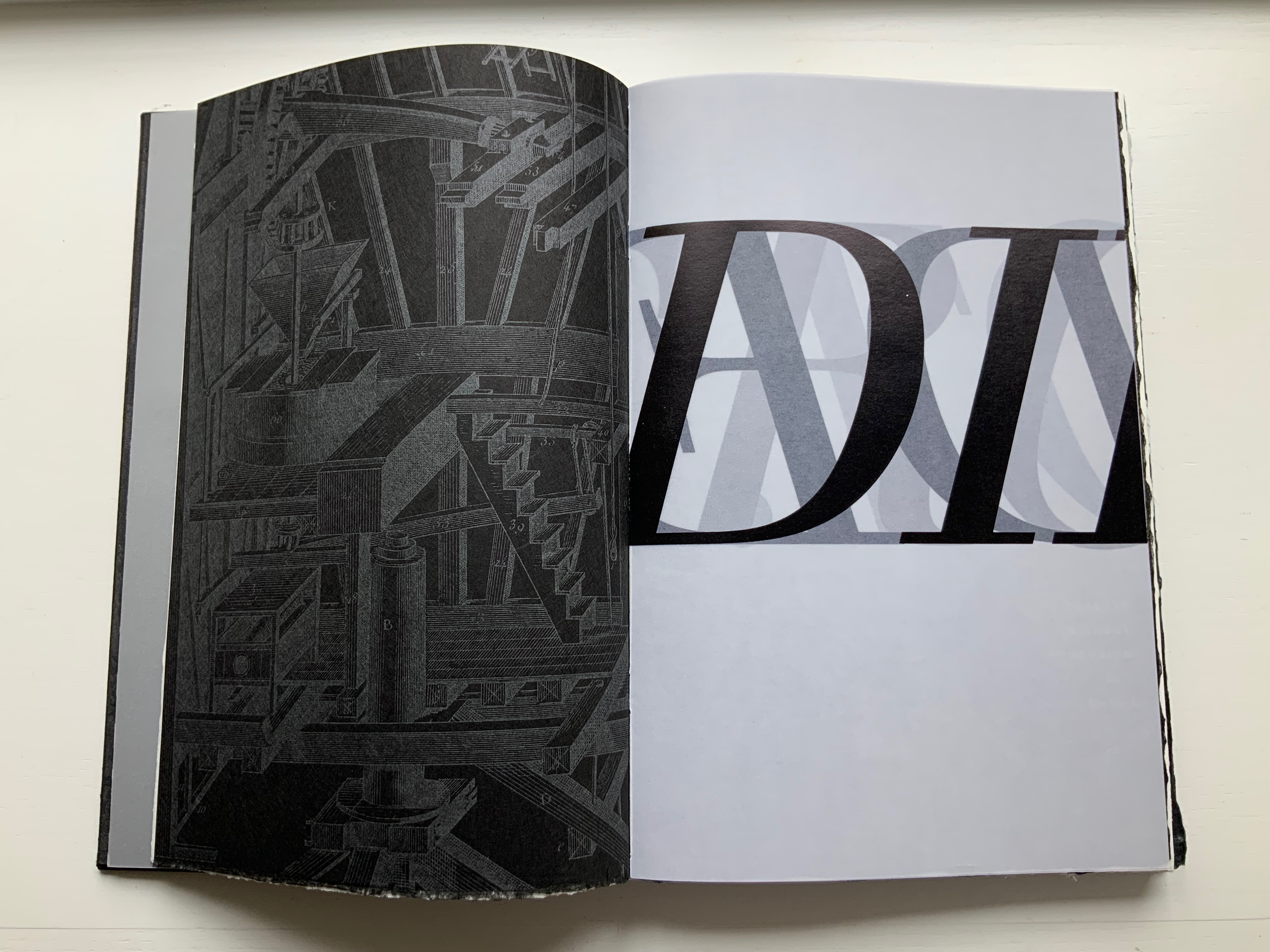
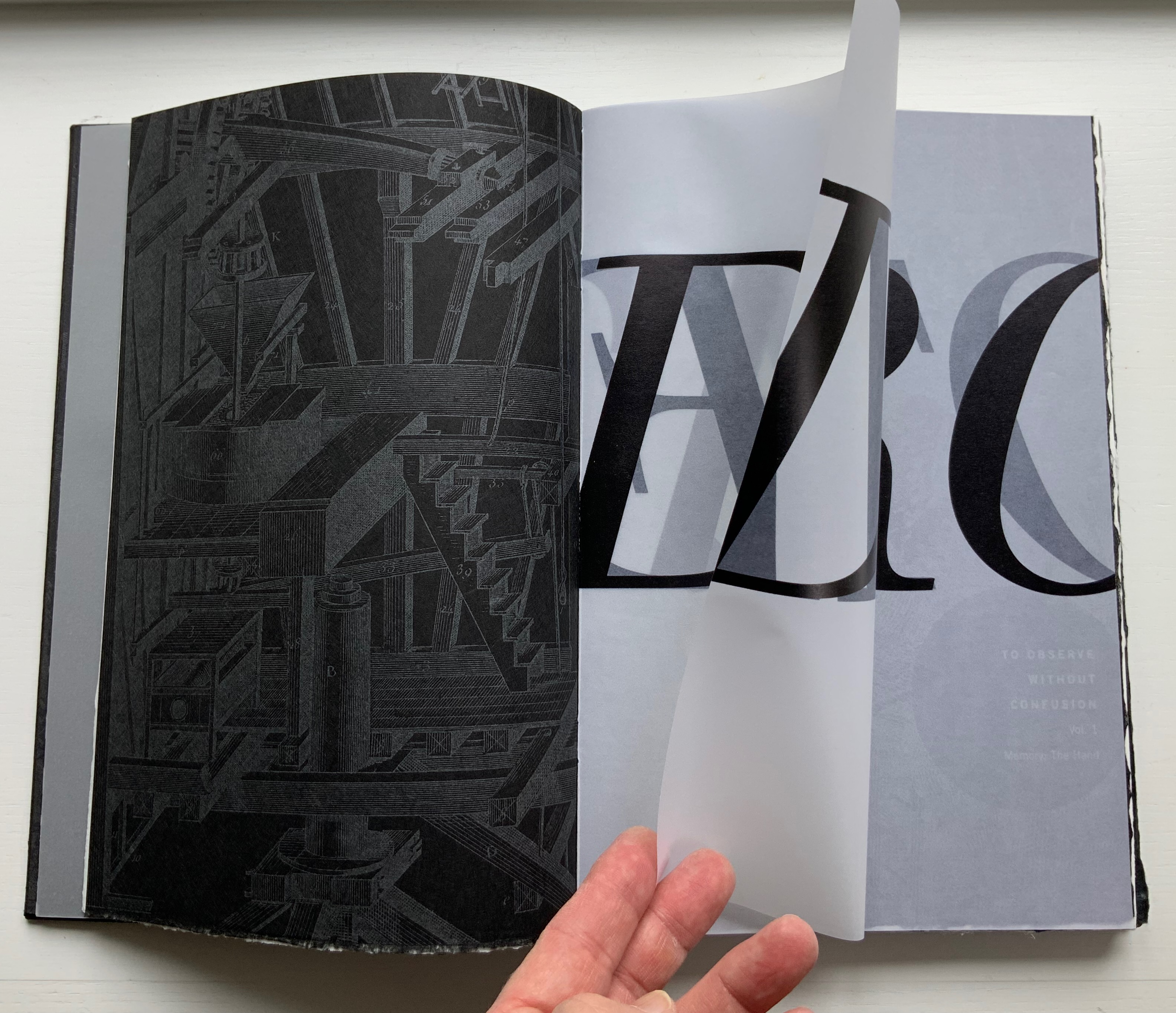
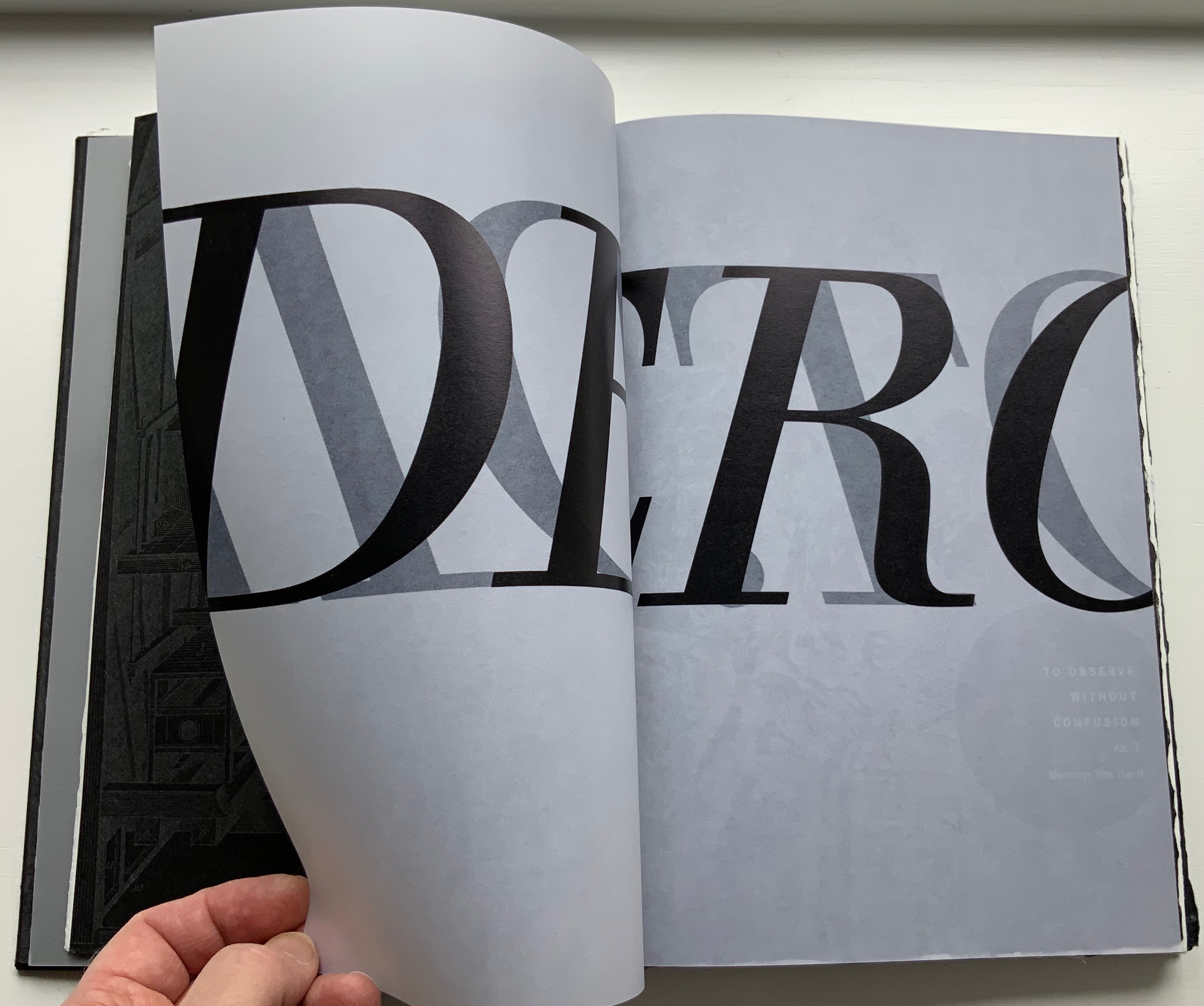

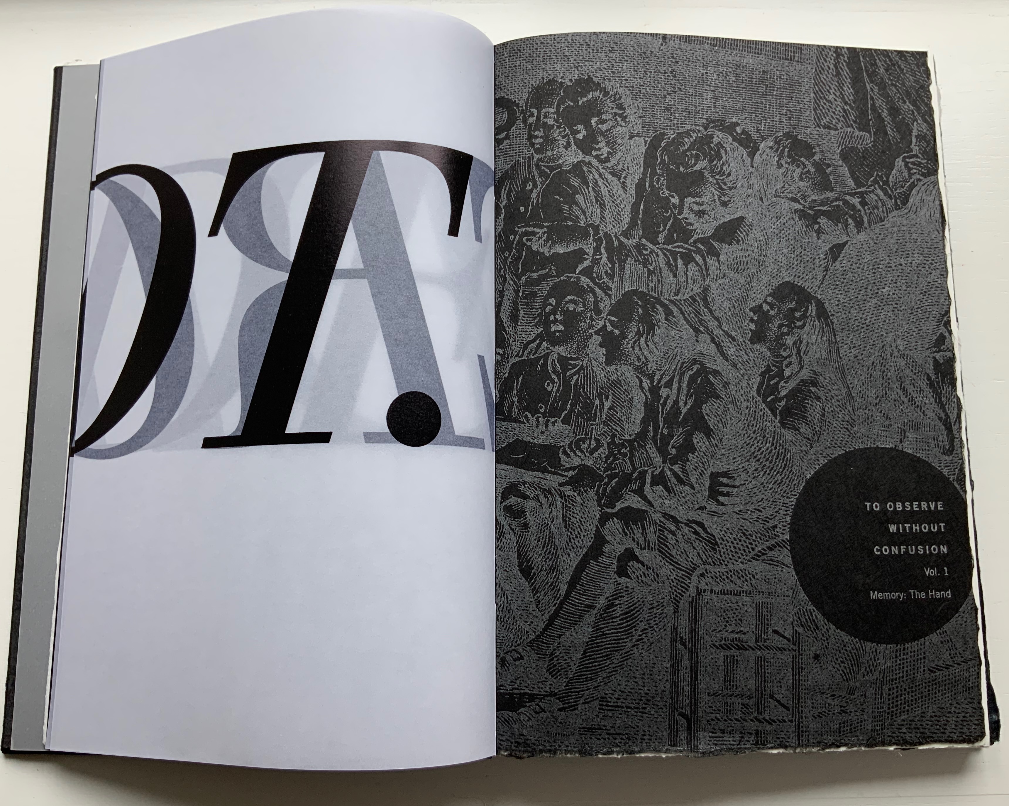
Running across the four pages of the two leaves of UV Ultra Clearfold, the enlarged present, past and future letters call on perception, memory and imagination to decipher the name: Diderot, emerged and submerged. However large his name is cast, though, is Diderot the author? By bracketing these transparencies with an image of a manufactory or workshop and a crowd of listeners and observers with pens poised, Botnick evokes the other 139 contributors to the Encyclopedia and his own host of collaborators, including Kelm (binding), Paul Wong (papermaking) and, importantly the Emdash studio (Catherine Johnson, Ben Kiel, Karen Werner and, in New Delhi, Ira Raja).
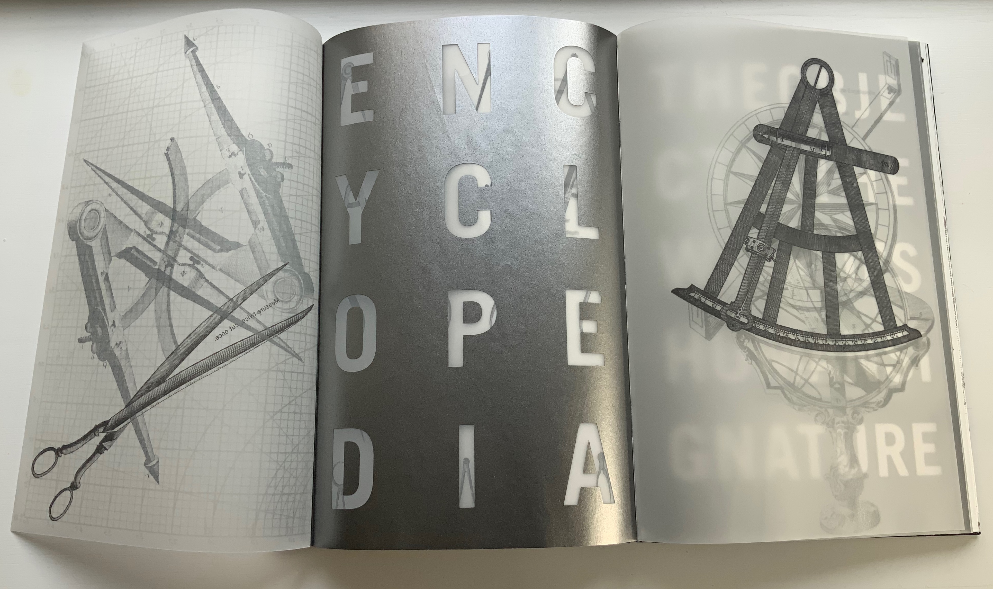
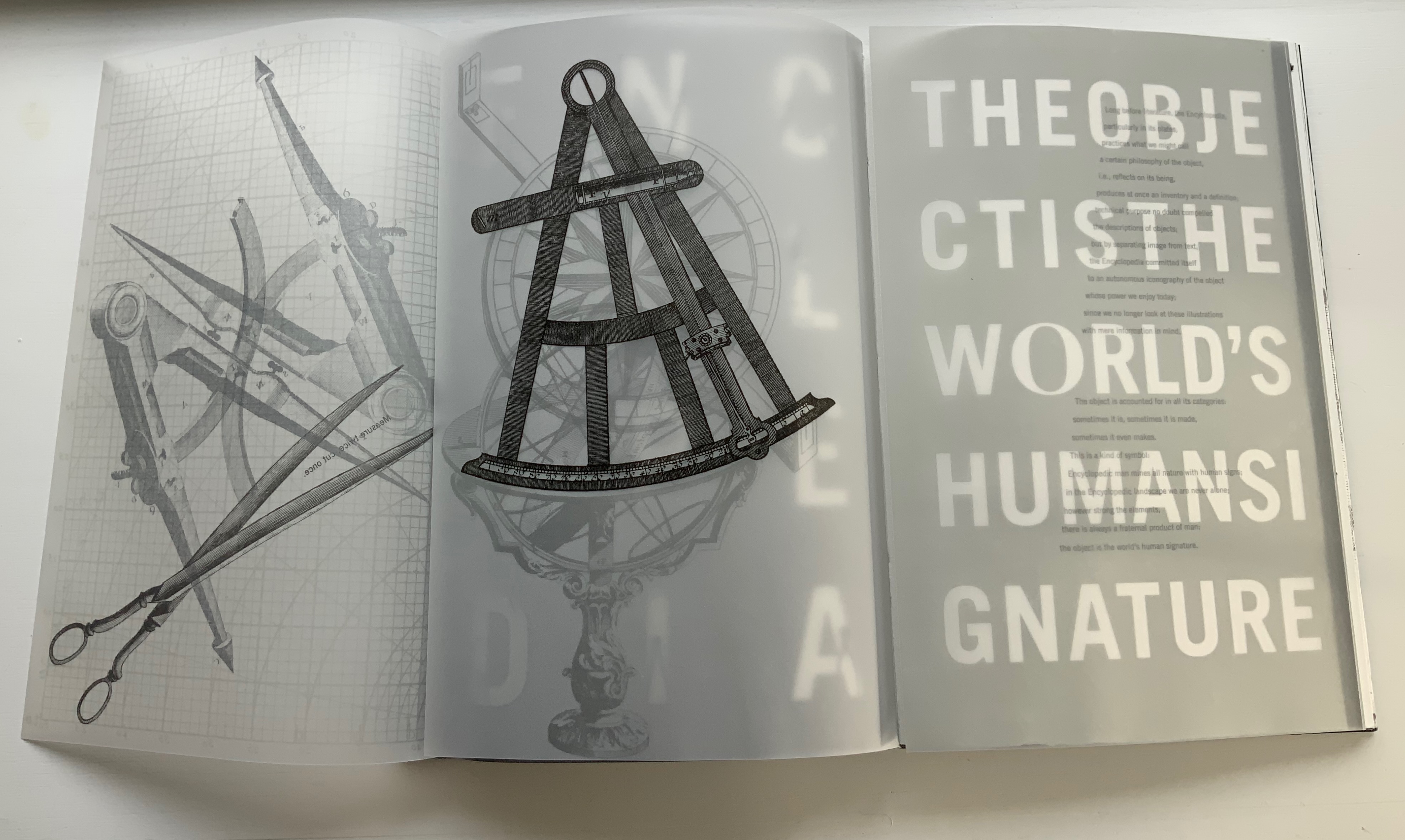
Tools, the workplace and studio lie at the heart of the Diderot Project‘s second volume, which boasts the following complex foldout which in itself validates Roland Barthes’ statement from his essay on the Encyclopedia‘s plates: “The object is the world’s human signature”.


Sensation, perception and the natural world lie at the heart of the third volume, and here is another of Botnick’s favorite techniques: typographic distinction. The right-side up text on the verso page is set in Walbaum, as is every instance of Diderot’s text. The upside down text on the verso and all the text on the recto are set in Trade Gothic, as is the case for more contemporary authors (Michel Foucault and Walter Benjamin, respectively, in these instances). Note how Foucault’s upside down text reflects the action in the image of the camera obscura, and picks up the theme of perceptual flipping initiated with the watermark hand in Volume 1 and Diderot’s enlarged name across the translucent pages in Volume 2.

Both Table of Contents and Diderot Project reward revisiting for this kind of close reading, close looking, close fingering and close listening. Close comparison and contrast as well because together they answer “How does a book reflect a distinct way of thinking about a subject? How does the page become a dynamic landscape of visual and conceptual ideas?”
Further Reading & Viewing
“Notes on ‘Inverse Ekphrasis’ as a way into book art“. 17 June 2022. Bookmarking Book Art.
“Artist Books: From Idea to Form – Workshop by Ken Botnick“. 18 March 2017. Lawrence Art Center, Lawrence, Kansas. Accessed 2 June 2019.
Botnick, Ken. 23 April 2015. Transcription of talk given as the annual Enid Mark Lecture. Smith College.
Botnick, Ken. 1 October 2015. “Diderot Project: Making the Book to Discover my Subject“. Boston Athenaeum. Video. Accessed 1 June 2019.
Diderot, D., & Alembert, J. L. R. 1967. Encyclopédie ou dictionnaire raisonné des sciences des arts et des métiers. Stuttgart- Bad Cannstatt: Friedrich Fromann.
Frost, Gary. 2012. Adventures in Book Preservation. Coralville, IA: Iowa Book Works. See “Sewn Board Bookbinding More than a Thousand Years Later”.
Gibson, James J. 1966. The Senses Considered as Perceptual Systems. Boston: Houghton Mifflin.
Gibson, James Jerome. 1950. The Perception of the Visual World. [With illustrations]. Riverside Press: Cambridge, Mass.
