Books On Books Collection – Marcel Broodthaers

Un Coup de Dés Jamais N’Abolira le Hasard: Image (1969)
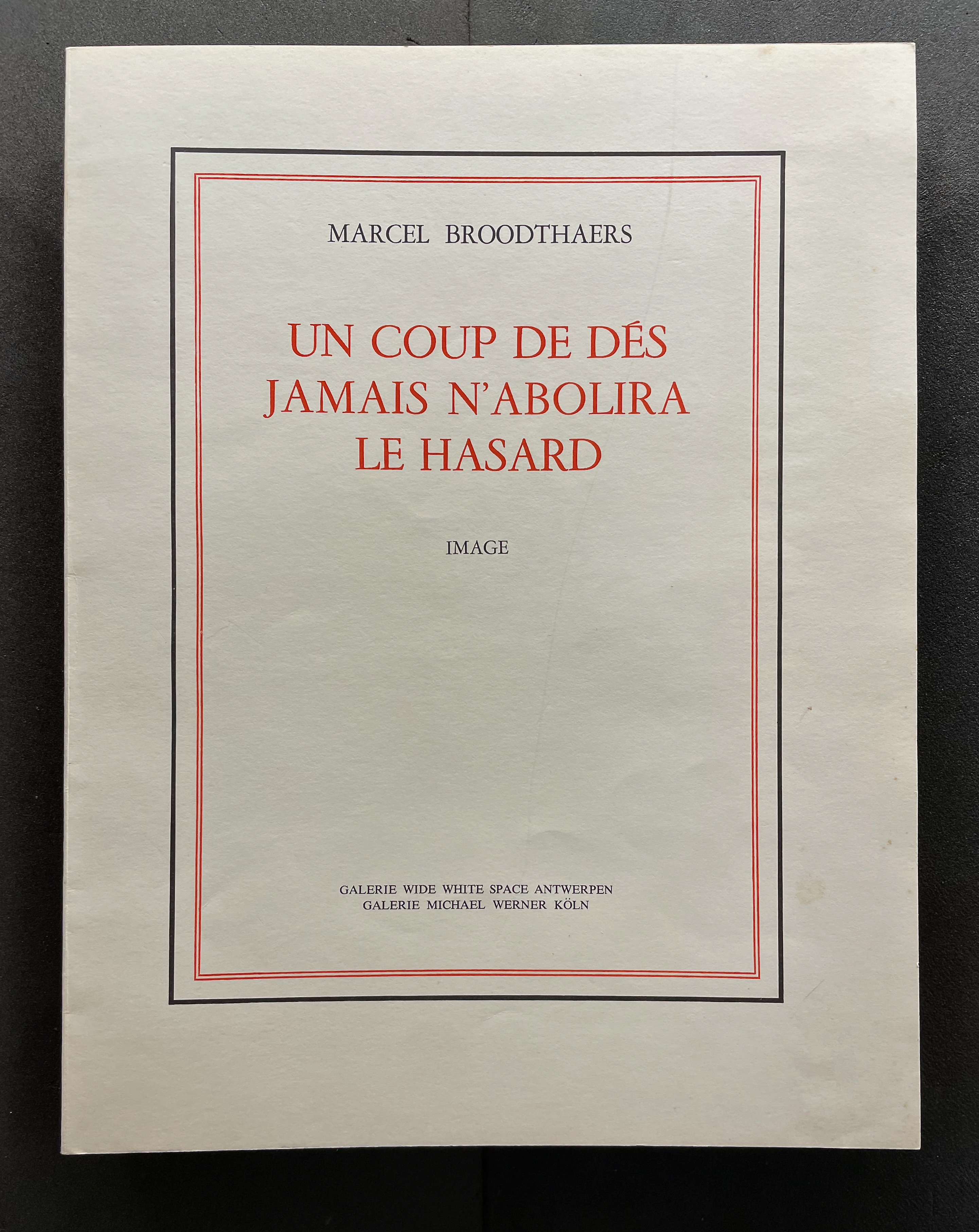
Cover of a publication by Marcel Broodthaers titled 'Un Coup de Dés Jamais N'abolira Le Hasard', featuring bold red text and decorative borders.

Un Coup de Dés Jamais N’Abolira le Hasard: Image (1969)
Marcel Broodthaers
Softcover, saddle-stitched, staples. H325 × W25 mm. [32] pages.Edition of 300. Acquired from Dr. A. Sturies, 20 November 2022.
Photos: Books On Books Collection

The story goes that in 1945 or 1946 René Magritte gave Marcel Broodthaers a copy of Mallarmé’s poem Un Coup de Dés Jamais N’Abolira le Hasard: Poème (1914). Twenty-three or twenty-four years later, Broodthaers organized an exhibition in homage to the poem. Entitled Exposition littéraire autour de Mallarmé: Marcel Broodthaers à la Deblioudebliou/S (“Literary exhibition around Mallarmé at the Deblioudebliou/S”), it presented three versions of an appropriation of the poem. The three versions consist of ten copies numbered I-X on anodized aluminum, ninety copies numbered 1-90 on transparent mechanographic paper (the original edition), and three hundred copies on opaque paper (the catalogue edition).

A vintage exhibition postcard featuring Marcel Broodthaers with details of a literary exhibition about Mallarmé, dated December 3, 1969.

Invitation to Marcel Broodthaers’ Exposition Littéraire autour de Mallarmé at the Wide White Space Gallery, Antwerp, December 1969; image courtesy of MACBA. Deblioudebliou/S puns on a distorted French pronunciation of the letter W and the three initials of the Antwerp gallery Wide White Space.

On Broodthaers’ cover, the word Image occupies the same space as Poème on the cover of the 1914 edition arranged by Mallarmé’s son-in-law. On the title page, however, Image comes first and in type larger than the poem’s title beneath it. The poem’s title is even smaller that Broodthaers’ name. Already this promises to be a bold appropriation of Mallarmé’s poem.
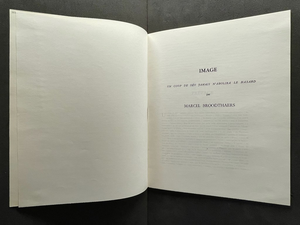
Open book page displaying the title 'IMAGE' and the text 'UN COUP DE DÉS JAMAIS N'ABOLIRA LE HASARD' by Marcel Broodthaers.

When the poem first appeared in the May 1897 issue of Cosmopolis, Mallarmé reluctantly provided a preface at the editors’ request. So reluctant was he that the preface urges readers not to read it. Broodthaers obliges. He displaces all of Mallarmé’s dismissive text with the poem’s entirety in a justified block of type with the line breaks indicated by slashes. Until the colophon, that will be the only legible text to appear in this homage.
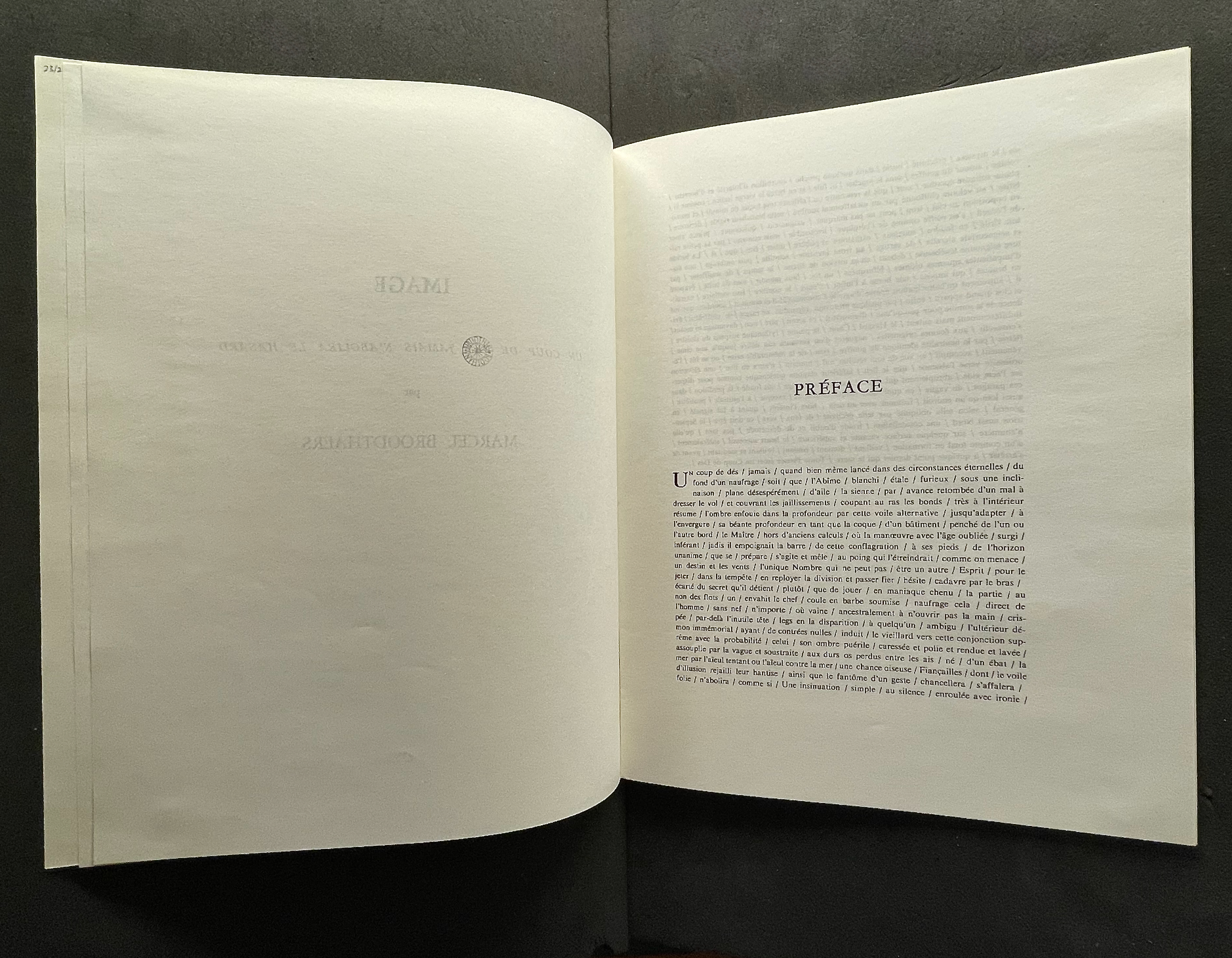
An open book displaying the text 'PRÉFACE' on the right page, with partially visible text on the left page.
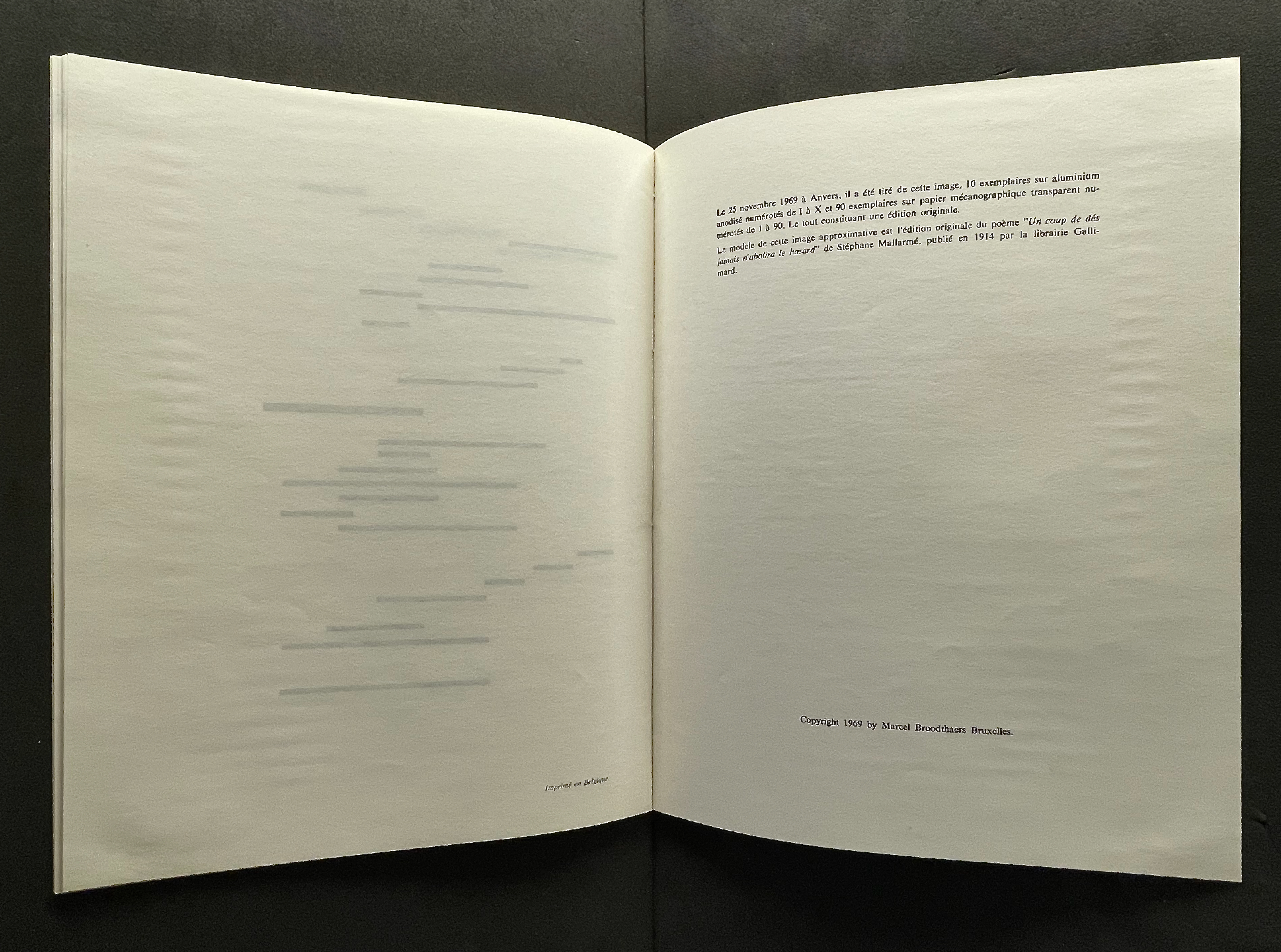
An open book displaying a blank left page with faint horizontal lines and a right page containing printed text in French, discussing its origin and publication details.

“Le modèle de cette image approximative est l’édition originale du poème ‘Un coup de dés jamais n’abolira le hasard’ de Stéphane Mallarmé, publié en 1914 par la librairie Gallimard.” Books On Books Collection.

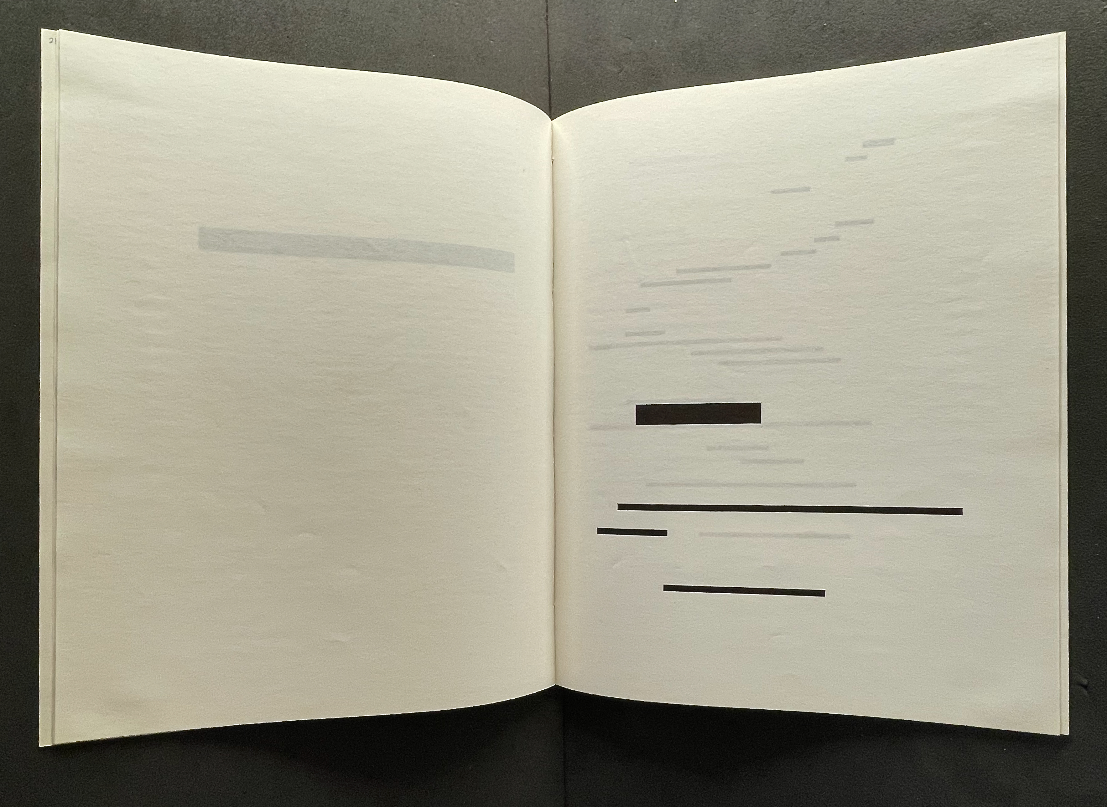
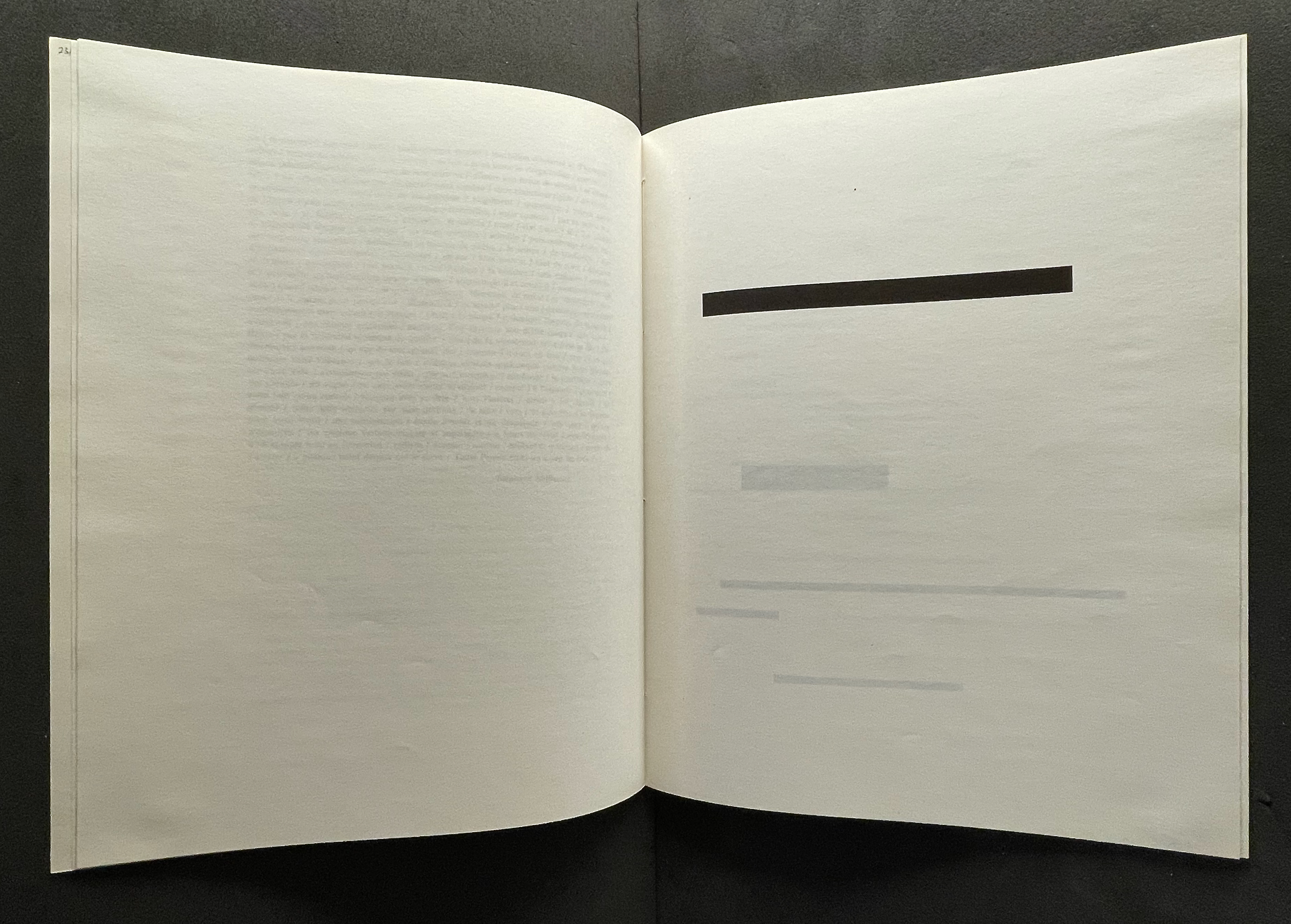
Between these two islands of text, Broodthaers offers his “image” of the poem: printer’s leading of the same dimensions as the types in the original edition of the poem. The image is the homage. In light of Magritte’s poster-essay “Les mots et les images” (1929) and its translation and appearance as an accordion-formatted catalogue for the Sidney Janis Gallery’s Magritte show in 1954, Broodthaers could equally have been paying homage to Magritte.
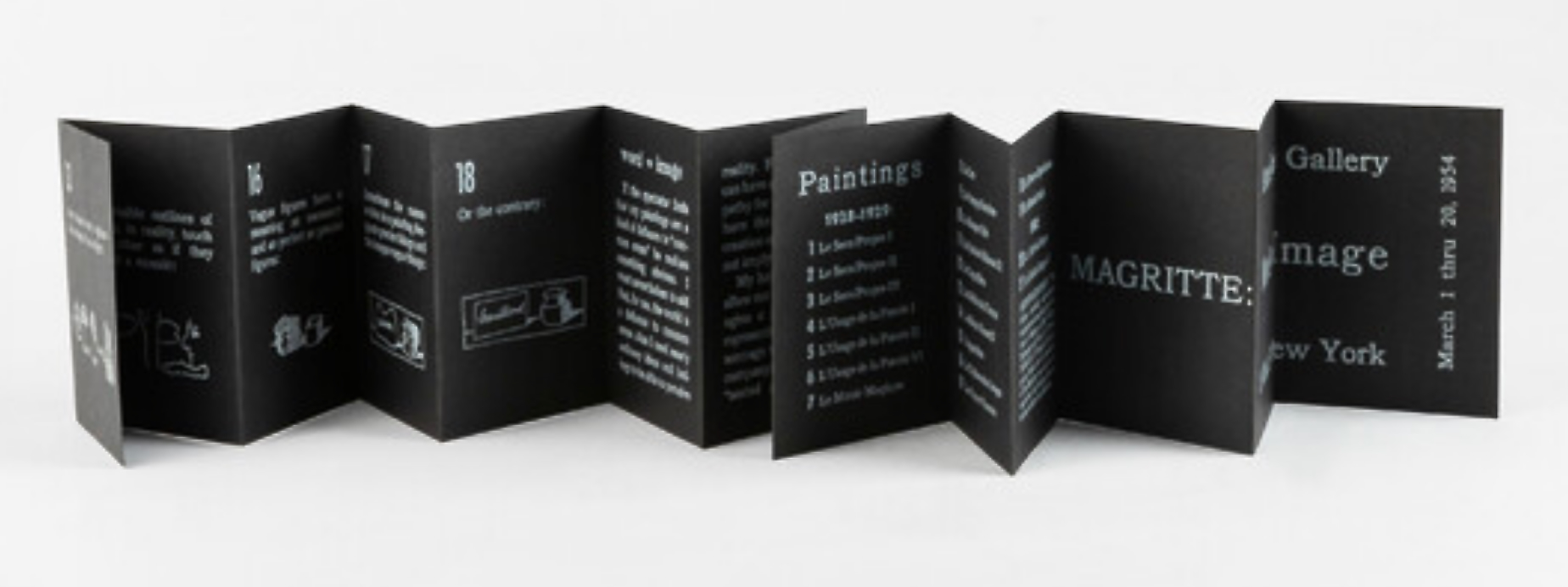
A folded pamphlet featuring text and images related to an exhibition of Magritte's paintings at a gallery in New York.
Magritte: Word vs Image (1954), Sidney Janis Gallery, New York.

Top: Printer’s leading redacts “UN COUP DE DÉS”. Bottom: The leading redacts “JAMAIS” and the next three lines, which were set in smaller type. Books On Books Collection.

The other two versions were materially even more striking, and with the rest of the elements in play in the Wide White Space Gallery, Broodthaers made an innovative advance for post-Surrealism.
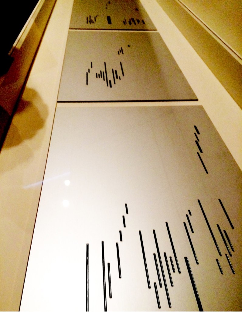
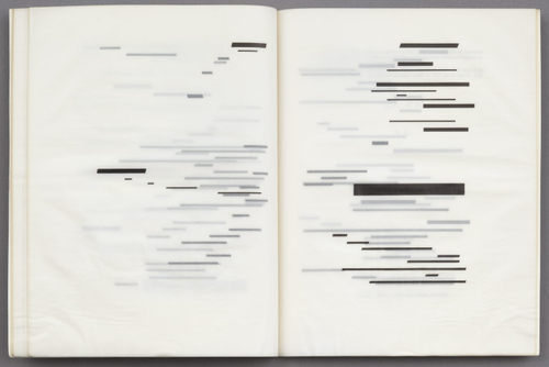
Top: the anodized aluminum edition; image courtesy of Charles Bernstein. Bottom: the translucent edition; image courtesy of MACBA.

As visitors to Broodthaers’ 1969 show perused the three editions, a tape recording of Broodthaers’ reading the poem played in the background. Broodthaers’ Image was not the only homage for Un Coup de Dés on display. Three hanging black shirts, allegedly taken from the Dallas Police Department, bore the full text of the poem transcribed in thin white chalk. With its floor painted black (the poem’s abyss?) and the works on display, the installation at the Wide White Space was also not Broodthaers’ first curation as art.

In 1968, Broodthaers established Le Musée d’art moderne, Département des aigles [The Museum of Modern Art, Department of Eagles]. Through 1972, museum shows occurred in various locations: his Brussels studio, the Städtischer Kunsthalle and a basement room at Burgplatz 12 both in Düsseldorf, at documenta 5 in Kassel, the A379089 alternative art center in Antwerp, and Galerie Michael Werner in Cologne. A 1968 manuscript in the Musées royaux des beaux-arts de Belgique in Brussels shows sketches of works of homage to Mallarmé that Broodthaers assigned to his museum’s “Literary Section”.

Broodthaers’ multimedia homage would provoke dozens of artists to create works of double-, triple- even quintuple-homage over the following decades into the new century. Among the most prolific of hommageurs, Michalis Pichler mounted Pichler: Exposition Littéraire autour de Mallarmé” in Milan in 2016. There he displayed many of those works of homage alongside his own. Later in 2024 at the Center for Book Art in New York, Pichler formalized Broodthaers’ concept of curation as art form in a show and book entitled Coup de dés (Collection) Books and Ideas after Mallarmé. Two years before, Galerie Michael Werner hosted an exhibition entitled “Footprints of a collector: Reiner Speck. Mallarmé, Broodthaers et les autres” (2 May – 23 July 2022). In addition to outstanding copies of the Image works, the curator Sabine Schiffer and Reiner Speck included Garniture Symbolique (1975), a blue-tinted glossy photo strip with nine photos on glossy paper, showing excerpts and phrases from the poem. Also included was a painting entitled Un coup de dés jamais quand bien même… (oil, gold paint, felt pen on canvas) from 1969, which is owned by Speck and, according to his afterword in the catalogue, has appeared in every exhibition of Broodthaers’ work since. For anyone looking for a description of Broodthaers’ 1969 exhibition, Sam Sackeroff ‘s “Literary Exhibitions” in the Speck catalogue is the gold standard.

The following collections offer more images of Image:

The Met (Metropolitan Museum of Art, New York, NY, USA) (Wayback Machine)

Musées royaux des Beaux-Arts de Belgique (Brussels, BE) (Wayback Machine)

MACBA (Museu d’Art Contemporani de Barcelona, ES) (Wayback Machine)

MMK (Museum für Moderne Kunst, Frankfurt, DE)

MoMA (Museum of Modern Art, New York, NY, USA) (Wayback Machine) “… all three of his variations are represented in MoMA’s collection: one with translucent paper, one with standard paper, and one on individual aluminum plates.”

NGA (National Gallery of Art, Washington, DC, USA) (Wayback Machine)

Walker Art Center (Minneapolis, MN, USA) (Wayback Machine)

A Voyage on the North Sea (1973)

An open book page featuring a warning text about cutting pages with a dagger metaphor, alongside an image of a sailboat on the sea, attributed to Marcel Broodthaers.

A Voyage on the North Sea (1974)
Marcel Broodthaers
Paperback (English version), Chinese wrapped-back binding. H148 x W178 mm. 38 pages. Edition of 1000. Acquired from Marcus Campbell Art Books, 9 October 2024.
Photos: Books On Books Collection.

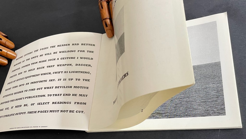
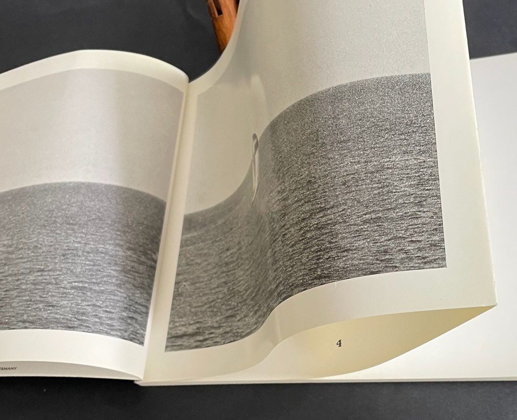
That over-elaborate and arch admonition to the reader on the inside cover doubles its mystery when it reappears on the last page of the book. If the warning has been ignored the first time, the reader knows that cutting the fore edge folds reveals the page numbers inside, but does its reappearance at the end prompt some doubt and regret? There’s no going back.
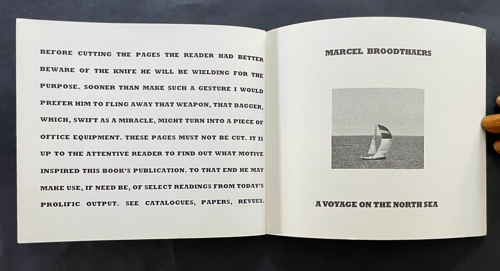
Open book page featuring bold text warning readers about cutting pages, accompanied by a small black and white image of a sailboat on the sea. Title and author, Marcel Broodthaers, displayed prominently.

Last page and inside back cover.

A vintage nautical illustration featuring a large ship in a painted style on the left and a black-and-white photograph of a sailboat on the right, both displayed in an open book.

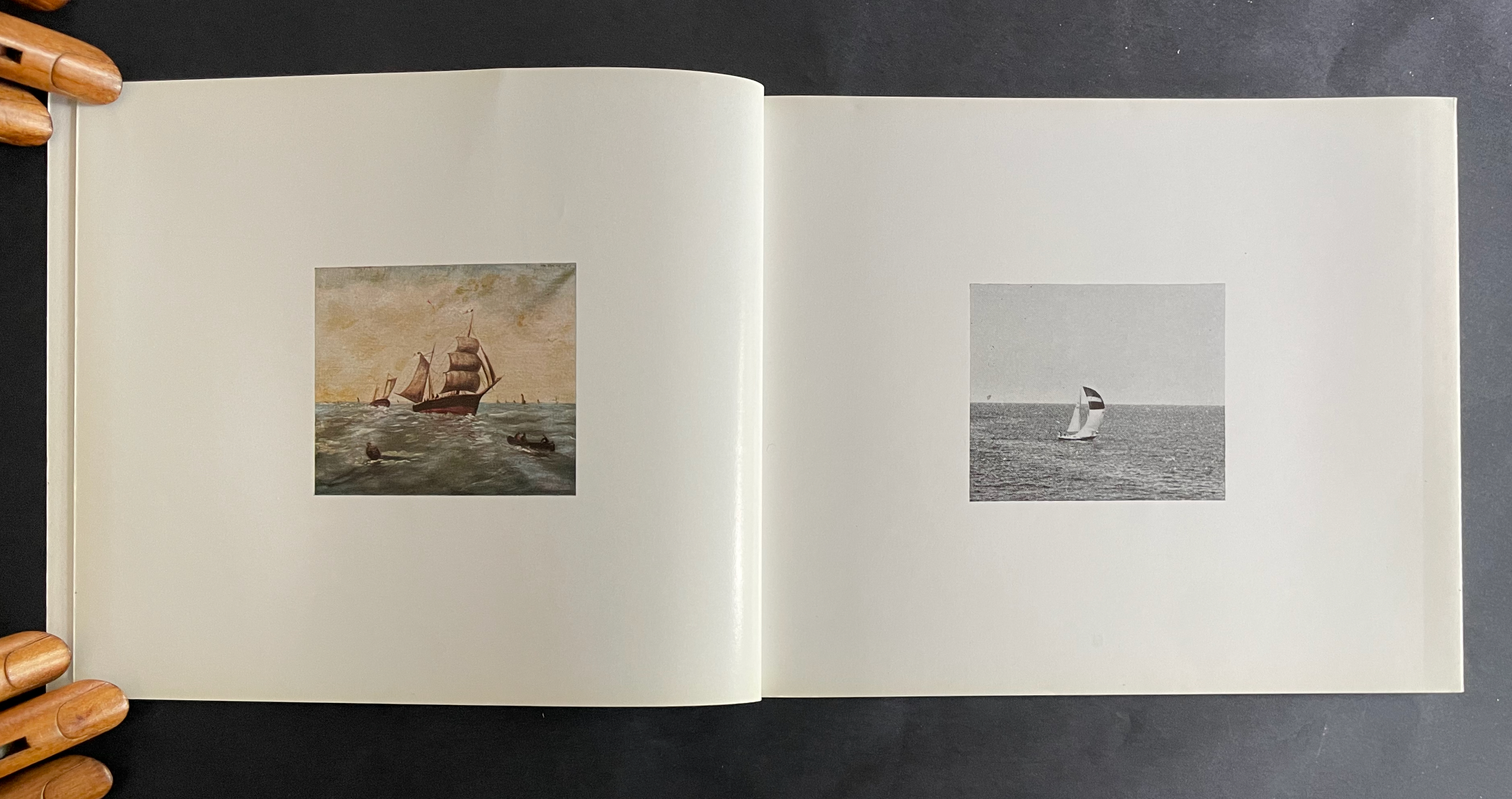
Alongside a 16mm film with the same title, the book premiered at the headquarters of the Petersburg Press, Portobello Road, London on 28 January 1974. In addition to the 1000 copies, Petersburg Press produced a numbered edition of 100 copies, signed by the artist, and distributed in a box with a copy of the film. Although developed together, the film preceded the book in 1973 and was originally entitled Analyse d’une Peinture. The painting in question is one found by Broodthaers at a Parisian flea market. To produce the film, Broodthaers added his own photographs of yachts at sea in the port of Ostend to stills of the painting and its details. With simple cuts and juxtapositions divided into “Page 1”, “Page 2”, etc., the film proceeds more like a book than a cinematic narrative, but there is no “booby-trap” in the film comparable to the prefatory warning once the book was prepared. The flea-market painting was also placed on display at the premiere.  

To celebrate the peculiarity of the anniversaries of the artist’s birth (28 January 1924), the artist’s death (28 January 1976), and the book-film’s debut screening (28 January 1974), David Platzker organized his Specific Object exhibition Marcel Broodthaers : A Voyage on the North Sea on 28 January 2009. Platzker’s description provides just the right preface to the film and conclusion to this Books On Books Collection entry:

The subject of the exhibition focuses on Marcel Broodthaers’ film and book, both titled A Voyage on the North Sea which were distributed together as part and parcel of the same publishing plot. The ostensibly related subject of both book and film consists mutually of 19th and 20th century nautical images including: 1. photographic reproductions and details of an amateur’s 19th century painting of a fleet of fishing ships and 2. photographs of a contemporary sailboat. Bringing together film, books, ephemera, drawing, and the artist’s original maquette for the book, this specific exhibition sets out to map the local coordinates of A Voyage on the North Sea’s maiden launch on January 28, 1974 at the London offices of Petersburg Press. …

Referring a contemporary audience to the original screening context of Broodthaers’ book-film—itself very much like a reading lesson–this exhibition asks how a contemporary audience might begin to unpack the particular dialectics, obtuse poetics, and critical cargo of Broodthaers’ confounding enterprise. “It is up to the attentive reader,” Broodthaers writes in the preface of the book, “to find out what devilish motive inspired this book’s publication.”

Ceci est une Pipe / This is a Pipe / Dies ist eine Pfeife (2001 )
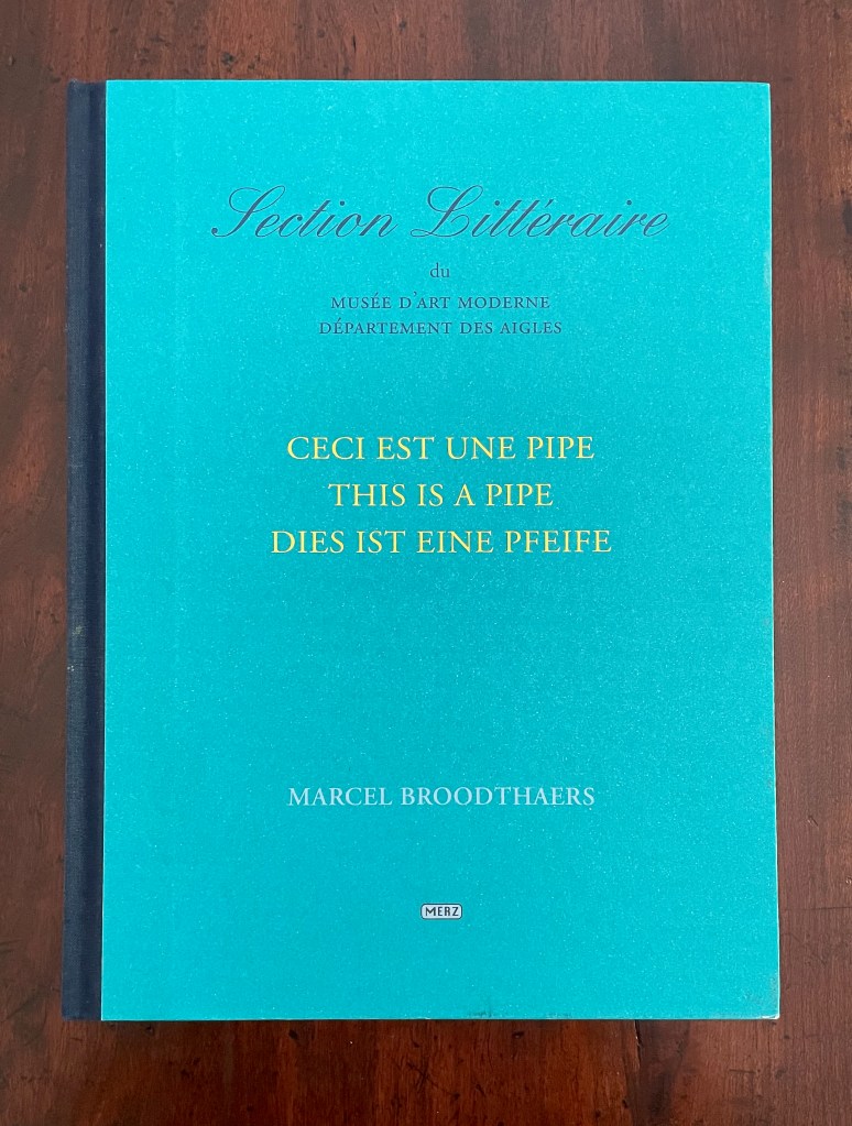
Ceci est une Pipe / This is a Pipe / Dies ist eine Pfeife (2001 ) © The Estate of Marcel Broodthaers.
Marcel Broodthaers
Eds. Reiner Borgemeister and Maria Gilissen Broodthaers
Casebound, paper over boards, cloth spine, colored doublures. H288 x W217 mm. [24] pages. Papercavalier 19 July 2026.
Photos: Books On Books Collection.

In 1972, Broodthaers renounced this project, initiated in 1969-1970. He did not want to associate his name or that of his Musée d’Art Moderne, Département des Aigles with it. Almost thirty years later, leaving aside the renunciation, Maria Gilissen Broodthaers and Reiner Borgemeister issued this volume that documents what can be gleaned from the archives. Honoring Broodthaers’ original aim to issue a work in French, English, and German, the volume is presented that way — except for an appendix that does not appear in English or German.
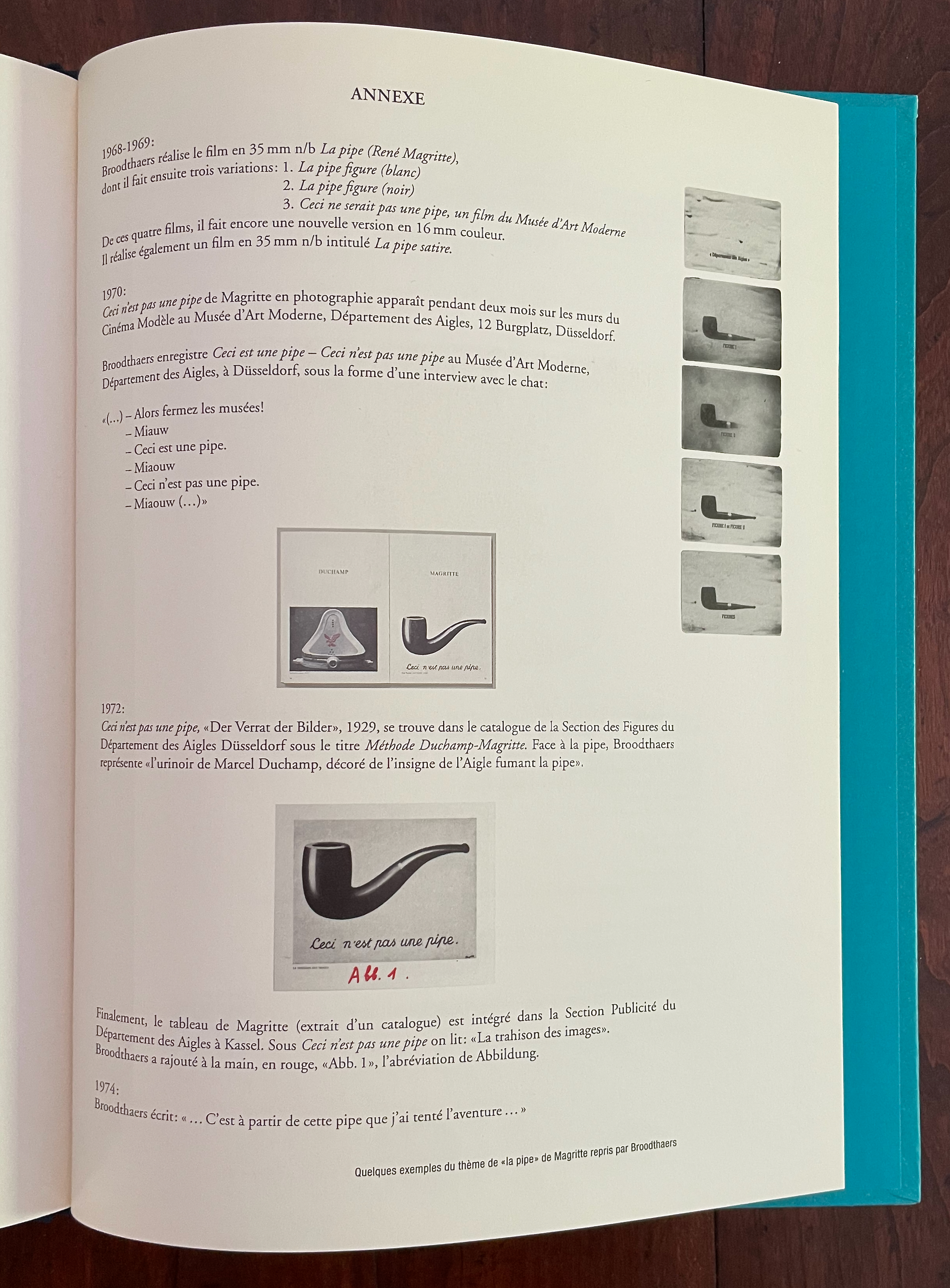
Here is an English version:

1968-1969: Broodthaers made the 50 mm black-and-white film n/b La pipe (René Magritte), from which he subsequently created three variations:

1. La pipe (white)
2. La pipe (black)
3. This Would Not Be a Pipe, a film from the Musée d’Art Moderne
From these four films, he created yet another version in 16 mm color. He also made a 35 mm black-and-white film n/b titled La pipe satire.

1972: Broodthaers registered This Is a Pipe—This Is Not a Pipe at the Musée d’Art Moderne, Département des Aigles, in Düsseldorf, in the form of an interview with a cat:

“(…)—Then close the museums! 

  • Meow
  • This is a pipe.
  • Meow
  • This is not a pipe.
  • Meow”

Finally, Magritte’s painting (taken from a catalog) is included in the Advertising Section of the Department of Eagles in Kassel. Under “This Is Not a Pipe,” we read: “The Betrayal of Images.” Broodthaers added “Abb. I” by hand in red, the abbreviation for Abbildung.

1974: Broodthaers wrote: “… It was with this pipe that I embarked on the adventure …”

Not only by Magritte’s exploration of image and text in his art but by giving Broodthaers a copy of Mallarmé’s Un Coup de Dés, Magritte exerted a great influence. Broodthaers’ realized works responding to that poem would suffice alone as evidence. Michel Foucault’s essay Ceci n’est pas une pipe (1968) expounding on his interpretation of Magritte’s Trahison des images as an unraveled calligramme apparently irked Broodthaers and became the likely seed for his idea to enroll Magritte’s pipe in the Musée d’Art Moderne, Département des Aigles along with asides on Foucault’s comments. If realized, the idea would have been a tribute that Magritte, who died in 1967, would likely have enjoyed.

In the end, though, Broodthaers was bothered over “useless text and reflections” from [André] Blavier (a fellow Belgian avant gardiste) and his own “ridiculous” interventions as well as dissatisfied with the prospective layout, so he abandoned the project. So what to make of Ceci est une pipe?

As an artist’s “unrealized” and abandoned conceptualization resurrected in an explanation of what the realized work might have been, it offers interesting insight into the concept of a concept. But it is not a pipe.

Further Reading

Un Coup de Dés Jamais N’Abolira l’Appropriation’— An Online Exhibition“. 1 May 2022. Bookmarking Book Art.

Mario Diacono“. 25 July 2026. Books On Books Collection.

Anne Lydiat“. Books On Books Collection.

Buzz Spector“. 12 March 2016. Books On Books Collection. See in particular Between the Sheets.

Baker, George. 1996. “This Is Not an Advertisement Marcel Broodthaers.” Artforum International.

Marcel Broodthaers : Cinéma. 1997. Barcelona: Fundacio Antoni Tapies.

Foucault, Michel, and J. A. Harkness (trans.). 1983. This Is Not a Pipe. 25th anniversary ed. Berkeley, Calif.: University of California Press. The essay “Ceci n’est pas une pipe” appeared in Les Cahiers du chemin (no. 2), 1968.

König, Susanne. 2018. “A work of art as an experimental exhibit. Broodthaers and the Eagle“. Angles: New Perspectives on the Anglophone World. Issue 6.

Krauss, Rosalind E. 1999. “A Voyage on the North Sea” : Art in the Age of the Post-Medium Condition. London: Thames & Hudson.
Books On Books – Jo Hamill

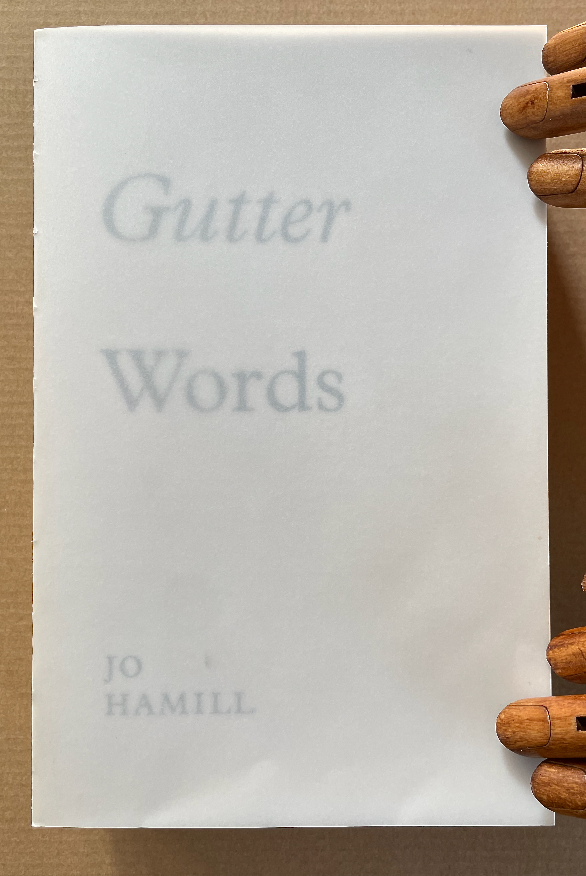
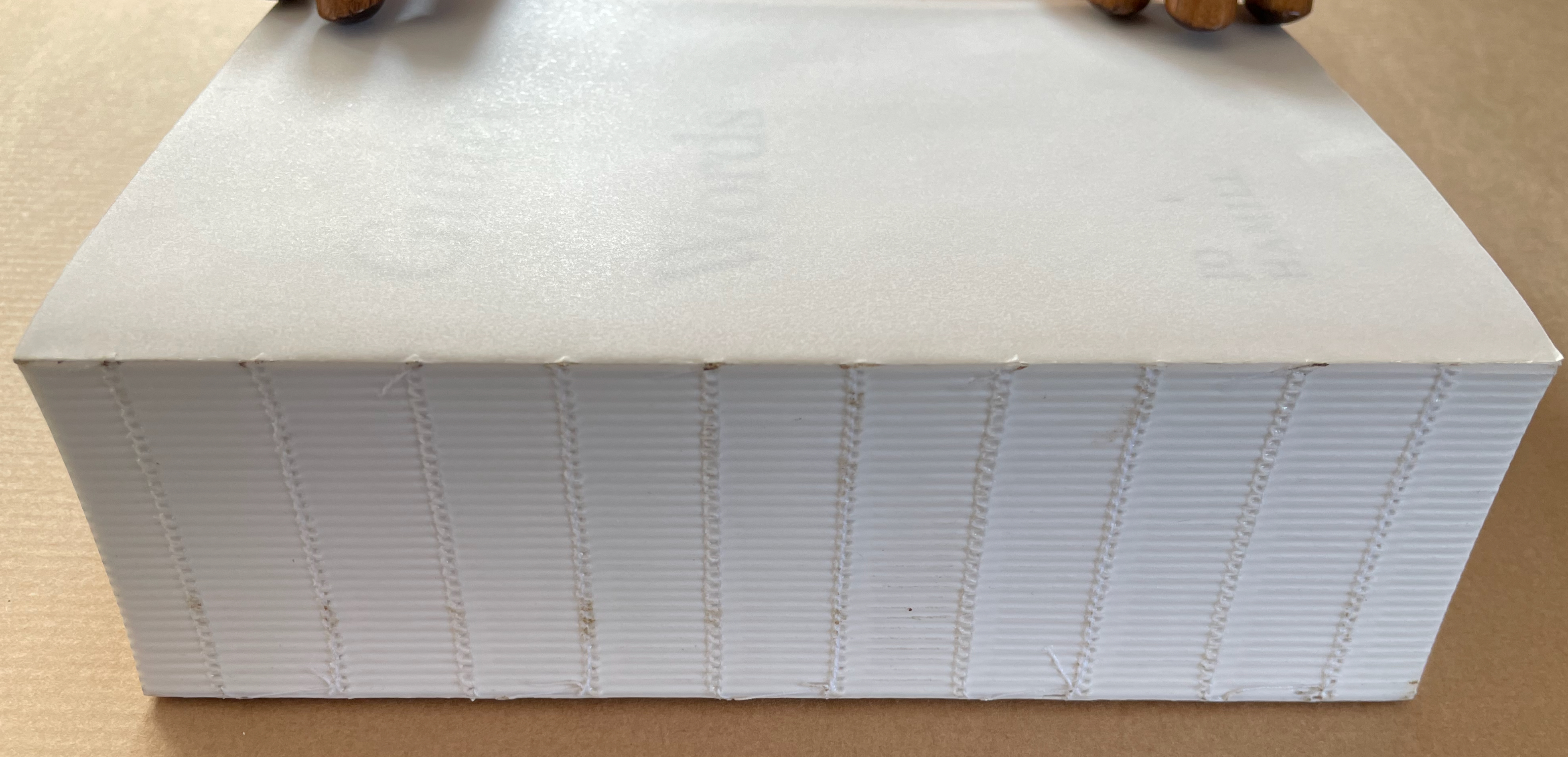
Working with an edition of James Joyce’s Ulysses, Hamill systematically obliterated the words of Joyce but carefully retained those words positioned closest to the gutter – the technical term used to describe the central margin of a bound page. The retained fragments form two extended columns that continue for 933 pages. Notable here is how design and typographic terminology is so entrenched in bodily references. Header, footer, body-copy, the arm of a “K”, the crotch of a “Y”, the foot of a “T”, the ear of a “G”, the shoulder of an “R” and so on. As is the architectural scaffolding of Joyce’s schema which underpins the structure of Ulysses, kidney, genitals, heart, lungs, oesophagus, Brain, Blood, Ear. etc. Lawrence Weiner refers to language as material for construction, the act of deletion in Gutter Words exposes the architectural scaffolding that holds words in place. Voids are physical spaces to be read and words become unanchored, set adrift in an uncertain space. The architectural qualities of this physical space will be exposed, Gutter Words will be devoid of the accoutrements associated with a “book” such as cover, boards, end papers, dust jacket and will retain only the innards, an unprotected text block.–Publisher’s website
Gutter Words (2019)

A close-up view of the edge of a thick, white book with a textured spine. The book is partially open, resting on a brown surface, with two wooden hands on top.

Gutter Words (2019)
Jo Hamill
Softcover, exposed spine. H197 x W128 x D60 mm. 956 pages. Acquired from Gill Partington, 20 June 2023.
Photos: Books On Books Collection.

Artists’ books can run the risk of being a “one-trick pony” or a toddler’s newly learned knock-knock joke. Once seen, the trick succumbs rapidly to the law of diminishing returns. A dozen times heard, the joke verges on parental abuse. Conceptualist Simon Popper’s 2006 alphabetized version of James Joyce’s Ulysses (1922) falls into that camp, albeit a stunning one. There may be some ongoing amusement in perceiving the shift from letter to letter and the subsequent alteration of the visual pattern, or in spotting the singular invented words and considering the alphabetization as a comment on James Joyce’s play with language, or in contemplating it in comparison with similar efforts. Like Mikko Kuorinki’s 2012 alphabetized version of Foucault The Order of Things (1970) that cheekily challenges Michel Foucault’s theory of how we perceive social order. Or the alpha and omega of Tauba Auerbach’s BbeehHilloTy or the Alphabetized Bible (2006); well maybe not the alpha, since Silvio Lorusso and Rory Macbeth got there first with theirs in 1997, nor the omega, since Peter Harkins followed up with his 2013 Well-Sorted Version (WSV), algorithmically generated. Apparently, one-up-manship is inevitable. Even Gutter Words has its gatecrasher: John Morgan’s Usylessly (2021) with a pair of essays, not just one. But once the joke is “got”, how rewarding is it to return to it again and again. Is there more to it?
Continue reading

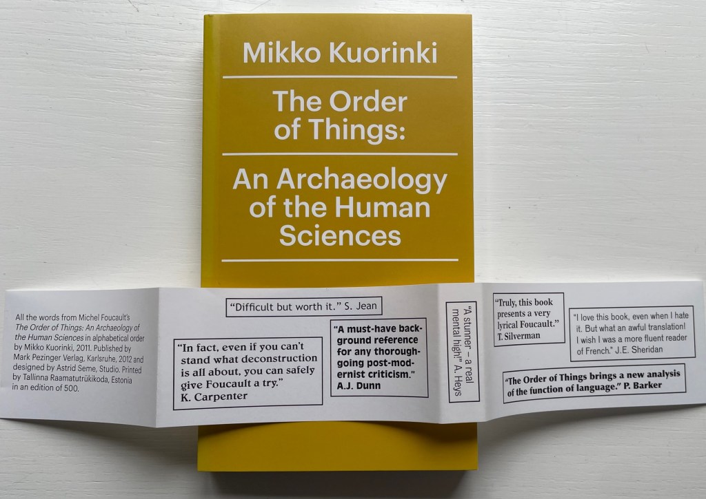
Books On Books Collection – Mikko Kuorinki

The Order of Things:
An Archaeology of the Human Sciences

(2011)

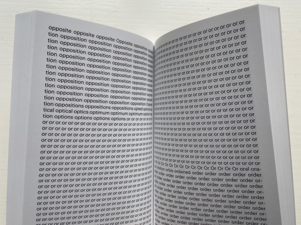
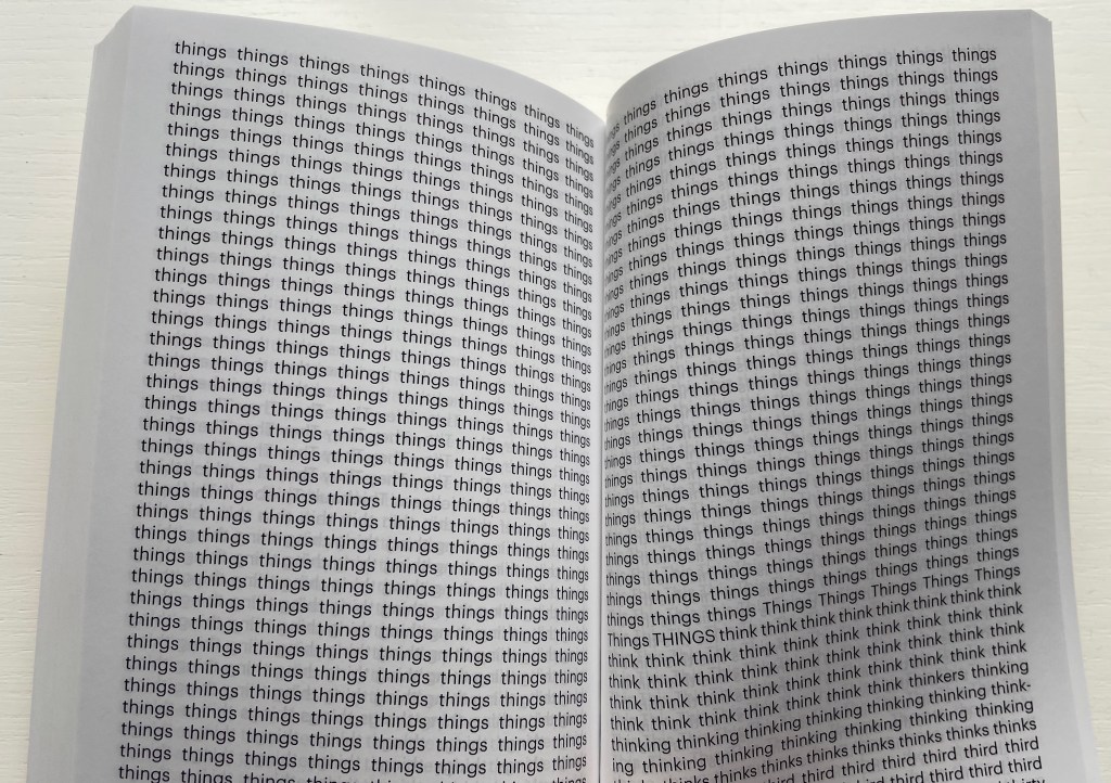
The Order of Things: An Archaeology of the Human Sciences (2011)
Mikko Kuorinki and Michel Foucault
Paperback, perfect bound. H175 x W105 mm. 432 unnumbered pages. Edition of 500. Acquired from XYZ Books, 18 September 2022.
Photos: Books On Books Collection. Displayed with artist’s permission.

Kuorinki’s alphabetical ordering/disordering of one of the sacred texts for literary theorists — Michel Foucault’s 1967 Les Mots et Les Choses: Une Archéologie des Sciences Humaines in its later English translation — rises above that too-frequent result in book art and conceptual art: the one-trick pony. Kuorinki accomplishes this by his choice of appropriation, his choice to use a translation of it and his choice of the alphabet and book art as technique and material.

The alphabet’s arbitrariness and the codical illusion of order and fixity make them the ideal artistic tools with which to make an artwork responding to Foucault’s sweeping treatise on the contingency of knowledge and language. The hefty, tightly bound block of paper and its cover title evoke the memories of anticipation on first picking up any book promising a vision of the order of things. But this book does not even offer a contextualizing preface, an orderly table of contents, chapters, page numbers or index.

When a text becomes canonical — a sort of common expression — how else to respond to it as a visual artist than “to take the mickey”? Of course, as the book’s bellyband tips us off, Kuorinki’s The Order of Things is a joke. And of course, on further reflection, it is serious.

In creating his artist’s book, did Kuorinki know the term calque — the literal, word-for-word translation that becomes a common expression in the borrowing language as in the English it goes without saying from the French ça va sans dire or the English word-hoard from the Anglo-Saxon wordhord? If so, it goes without saying that his work of book art is a calque itself — a literal, word-for-word translation of une alphabétisation of Foucault’s word-hoard for Les Mots et Les Ordres. And if granted its appropriation of the status of calque as a means of appropriating Foucault’s canonical text, Kuorinki’s The Order of Things is a pony of many different colors and tricks. Or to visit another attraction in the fun fair, hasn’t Kuorinki turned Foucault’s sacred text into an artifactual carnival of mirrors?

Further Reading/Viewing

Küng, Moritz. 3 July 2020. Artists’ Books Clips por Moritz Küng. Episode 06 Alphabet Books. Accessed 18 September 2022.

Popper Simon and James Joyce. 2006. The ABC of Ulysses. Belgium: Die Keure.

Videen Hana. 2022. The Wordhord : Daily Life in Old English. Princeton: Princeton University Press.

Books On Books Collection – Ken Botnick

“How does a book reflect a distinct way of thinking about a subject? How does the page become a dynamic landscape of visual and conceptual ideas?” So begins the description for a workshop run by Ken Botnick in 2017. His two works in the Books On Books Collection answer those questions with a resounding “This is how“.

Table of Contents (2020)

Table of Contents (2021)
Ken Botnick
Slipcased, boards with exposed sewn binding. Slipcase: H270 x W170 mm; Book: H265 xW185 mm, 56 pages.
Edition of 20, of which this is #5. Acquired from the artist, 3 May 2022.
Photos: Courtesy of the artist; Books On Books Collection. Displayed with permission of the artist.

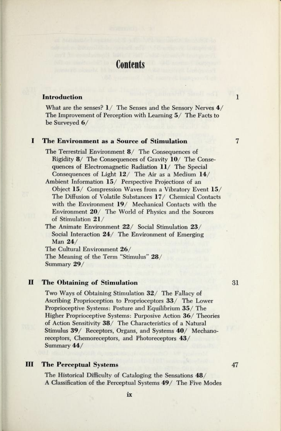
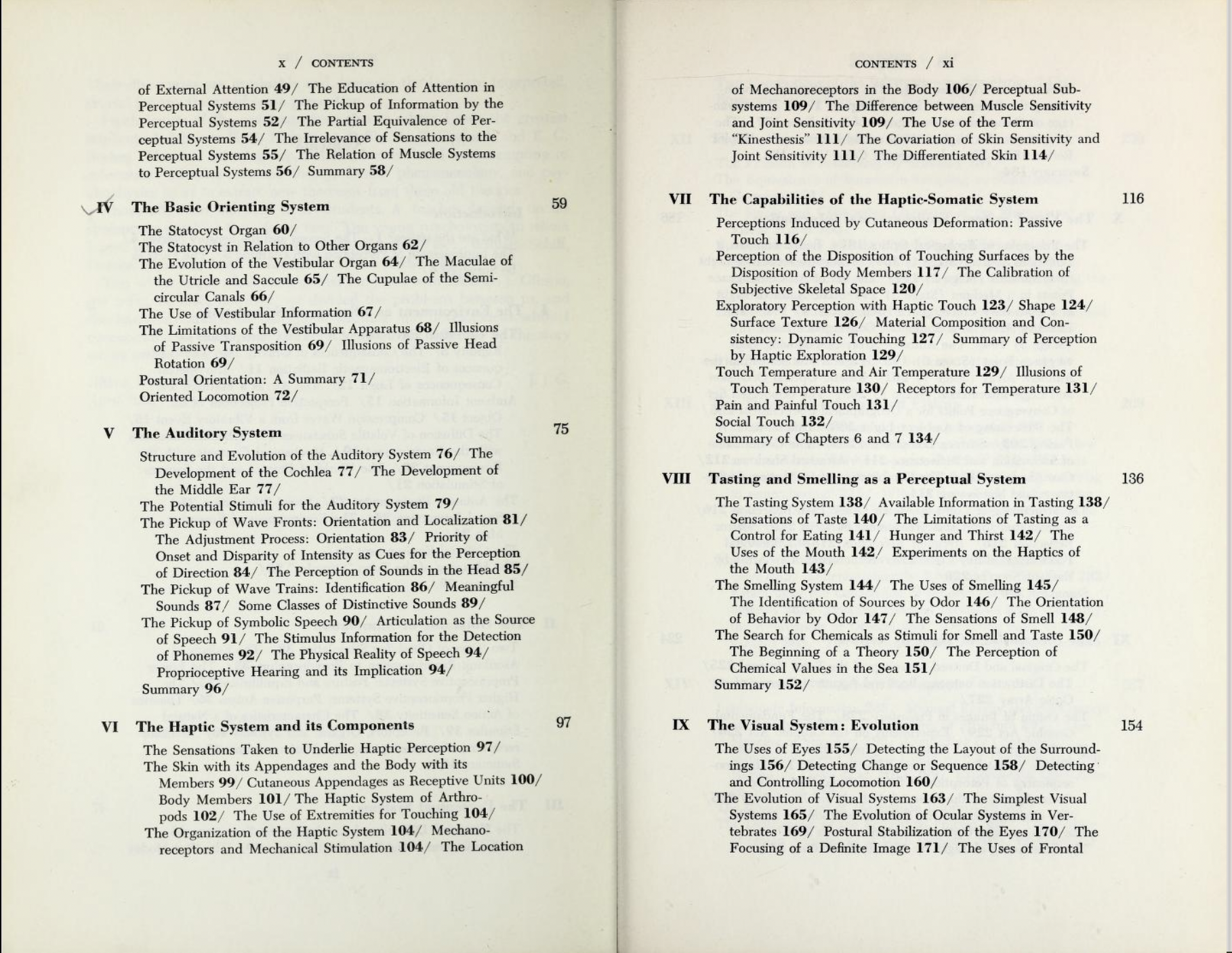
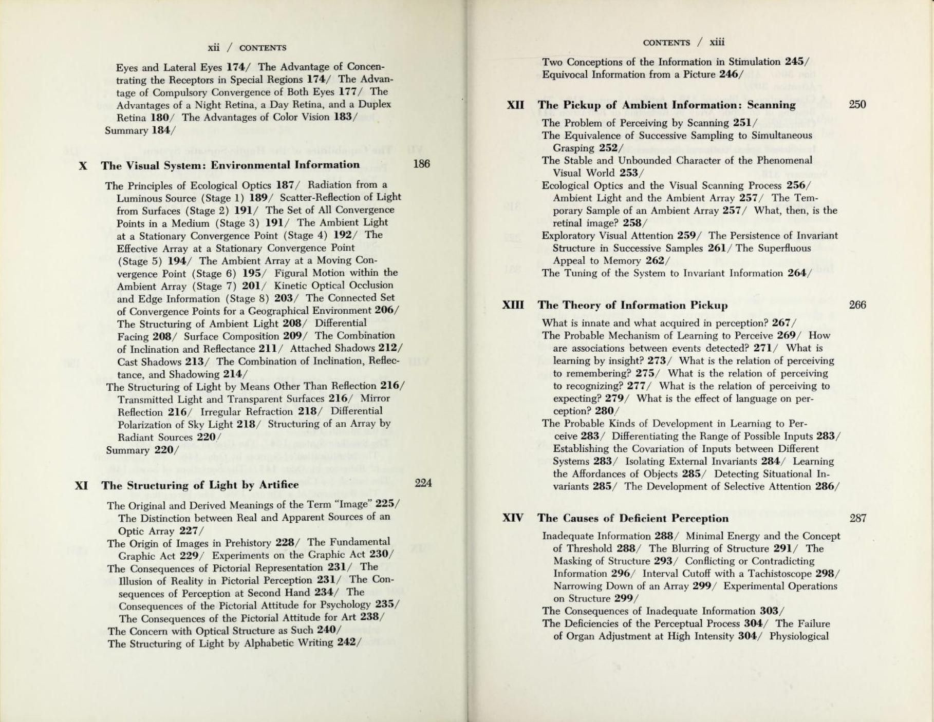
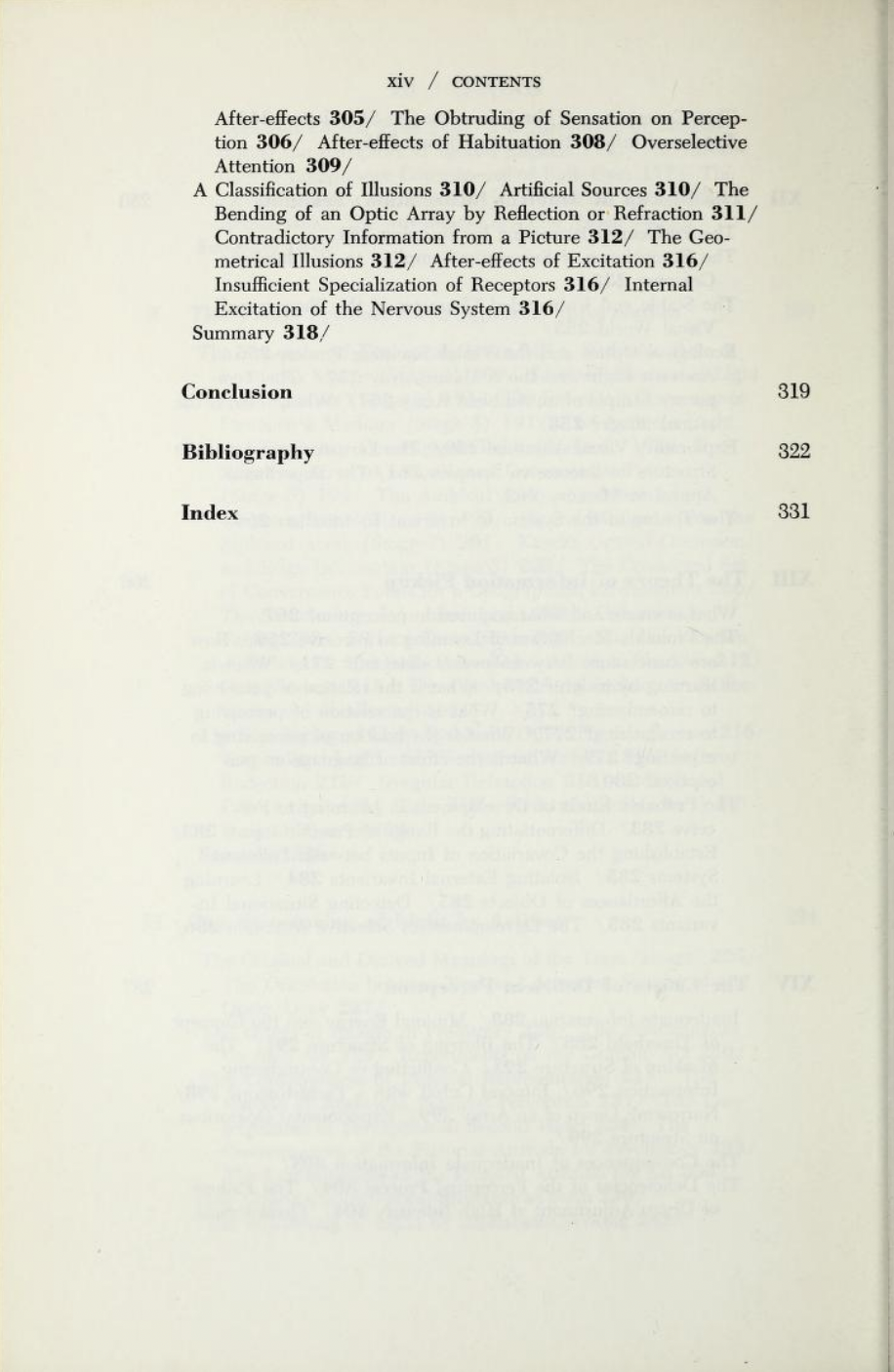
Table of Contents has no table of contents. Instead the whole book is a meditation on a table of contents — that of James J. Gibson’s The Senses Considered as Perceptual Systems (1966). On the inside cover, Botnick characterizes Table of Contents as a “book-length visual/textual poem” and identifies the cento as its model. Cento is short for the Latin centonibus (“patchwork”) and describes the technique of appropriating others’ lines of verse to compose an original “collage” poem. Rather than lines from poems, though, Botnick has appropriated text from Gibson’s table of contents and figure labels.

Here is Gibson’s complete table of contents:

Gibson, The Senses Considered as Perceptual Systems, pp. ix-xiv. Internet Archive.

Here is Botnick’s selection of text:

Table of Contents
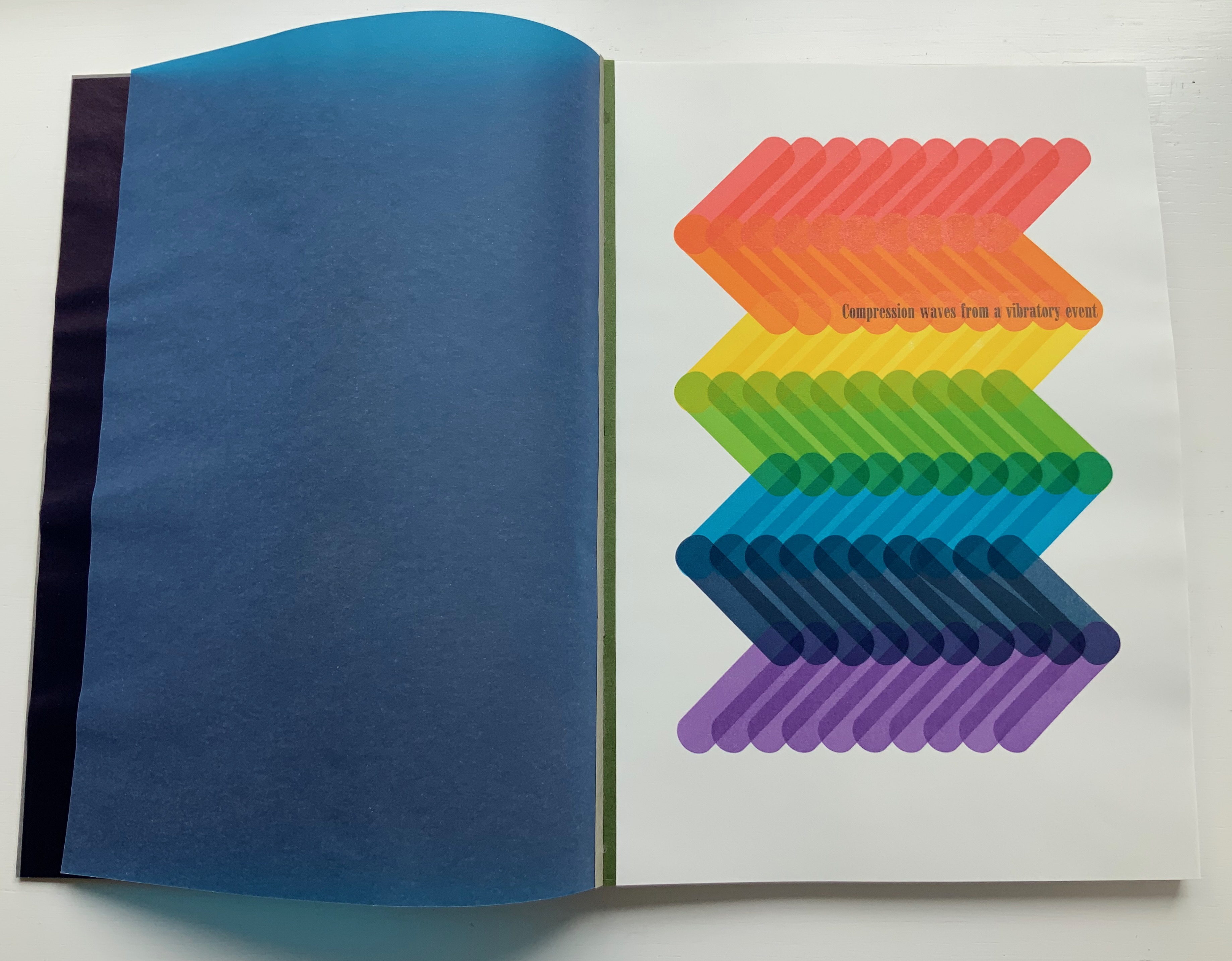
Compression waves from a vibratory event
How are associations between events detected?
The stationary information for seeing one thing through another
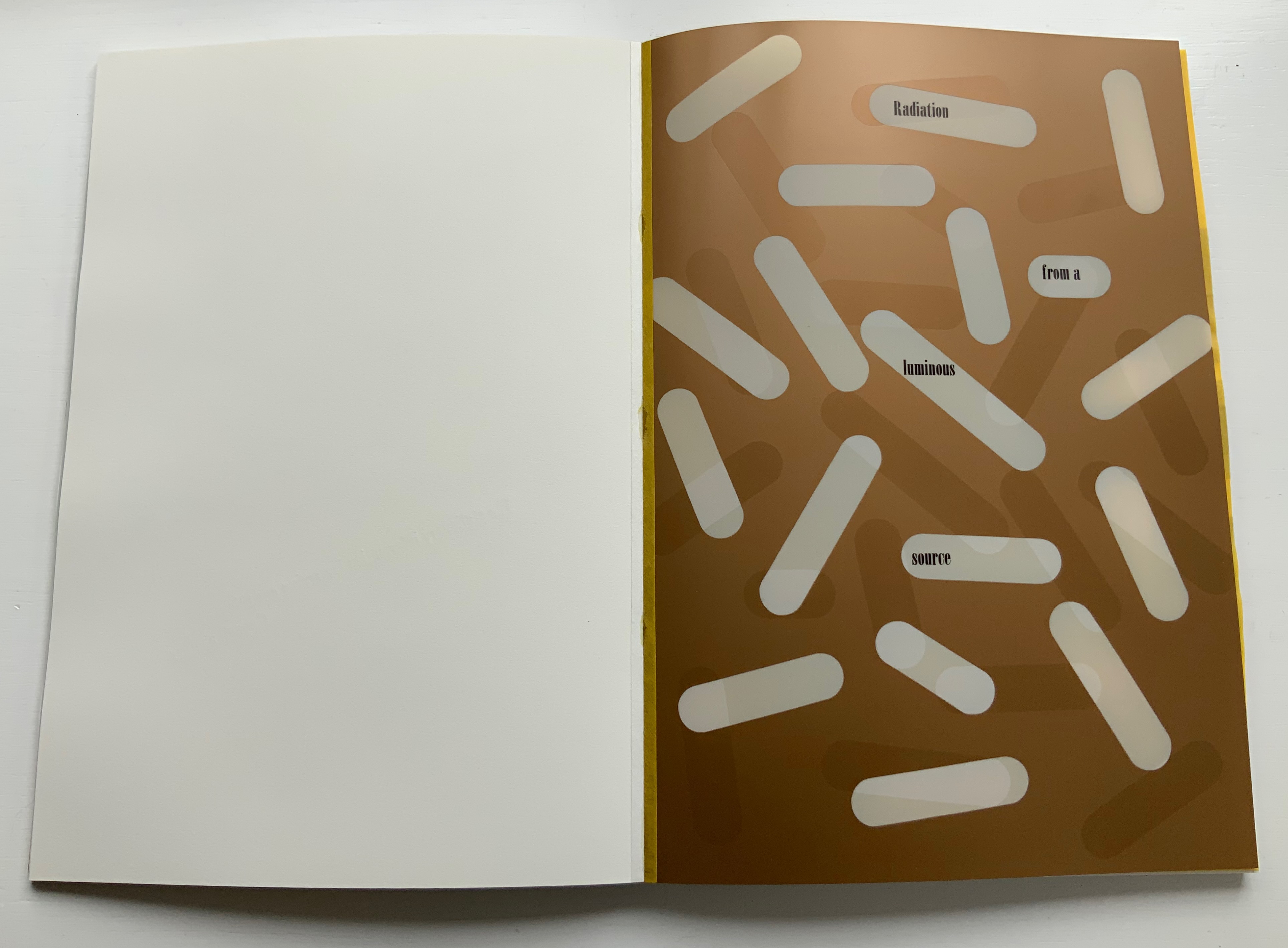
Radiation from a luminous source
The physical reality of speech
The diffusion of volatile substances
The development of selective attention
The superfluous appeal to memory
The consequences of inadequate information
The consequences of rigidity
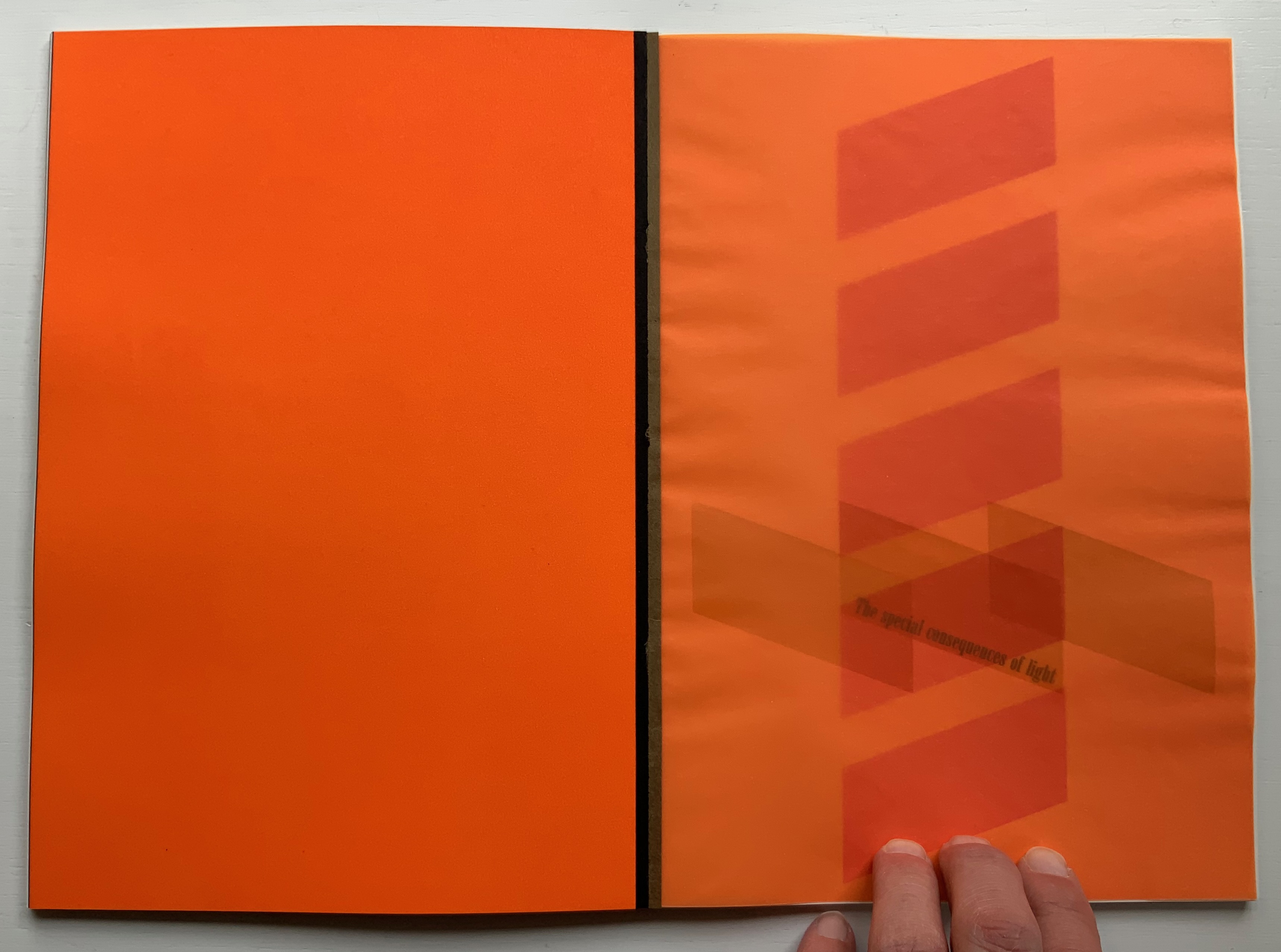
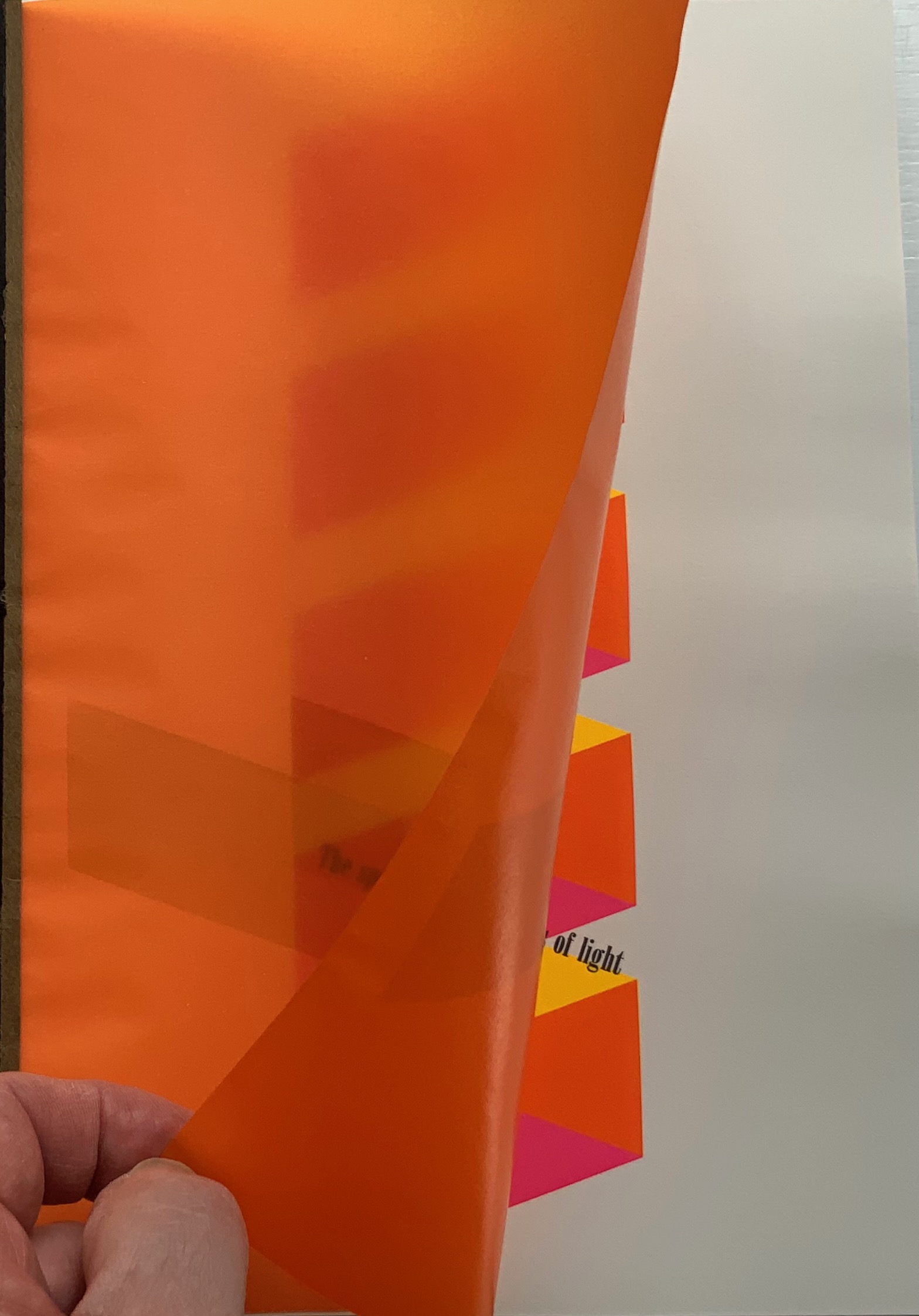
The special consequences of light
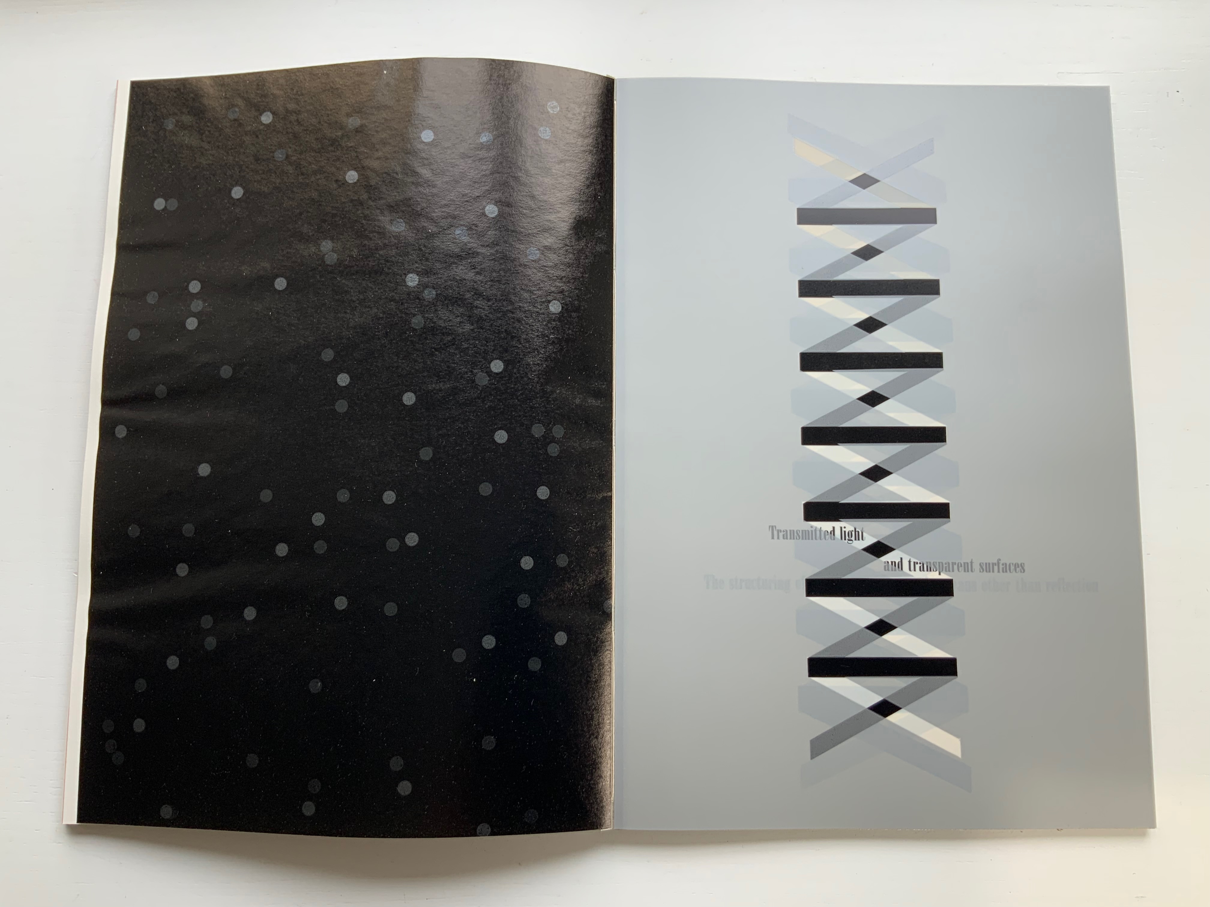
Transmitted light and transparent surfaces
The structuring of light by means other than reflection
The structuring of light by alphabetic writing
The stable and unbounded character of the phenomenal visual world
The perception of chemical values in the sea
The inspired air
The beginning of a theory

But that is not how Botnick’s cento is presented. In calling it a “visual/textual poem”, Botnick is too modest. It is much more than visual/textual: it is visual, textual, auditory and haptic — and is so from the start, proceeding by contrasts and complements, provoking multi-sensory activity and responses.

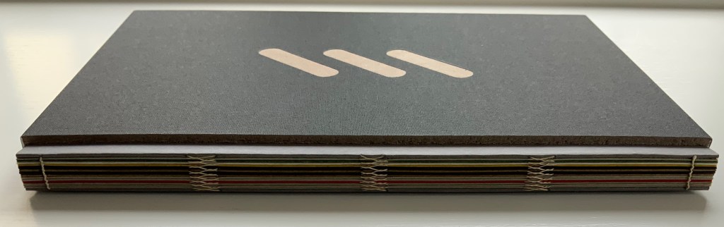
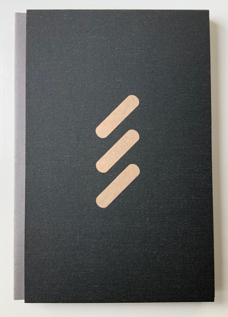
First of all, the slipcase is more of a “slipsleeve” from which the spine protrudes for fingers and eyes to feel the exposed binding threads, the pattern of knots and the ridges of the gathered signatures. This is the sewn boards structure, credited to Gary Frost, more on that later. The spine and fore edge offer bright colors that contrast with the deeply black sleeve that displays three slanting parallel cutouts in the cloth, exposing the board it covers. The pattern those cutouts make will become a recurrent visual and tactile theme as the pages turn.

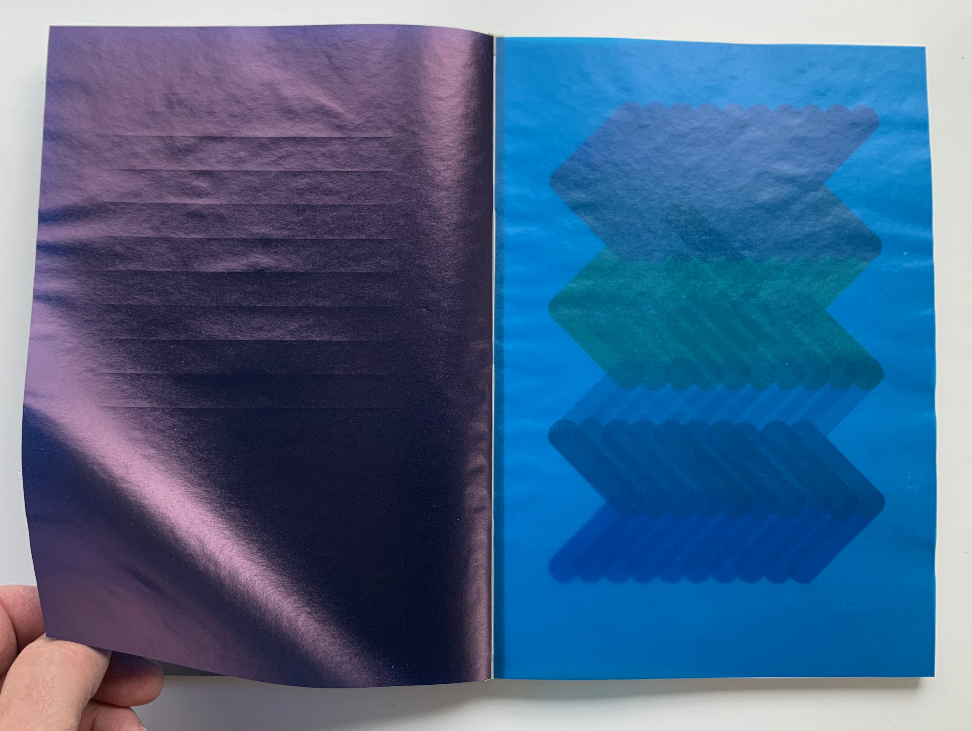
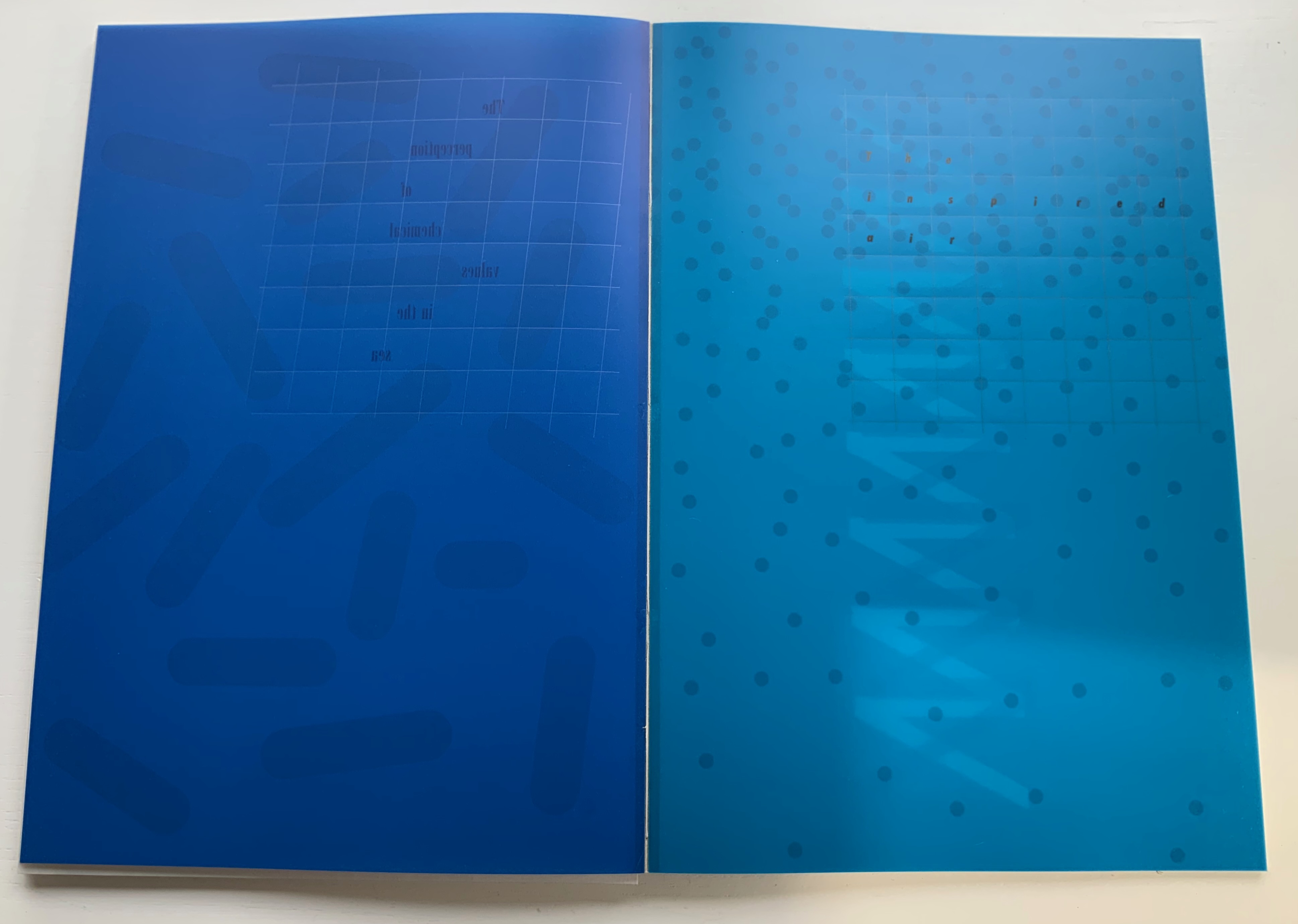
As the tightly fitting sleeve pulls away from the board-stiff book, they make a “shirring” sound together. As the front cover turns, the title page bows upward showing nine impressed parallel lines beneath the words “Table of Contents”, and when that page turns, it crackles and makes a shuffling sound as its edge drags across the following bright blue page.

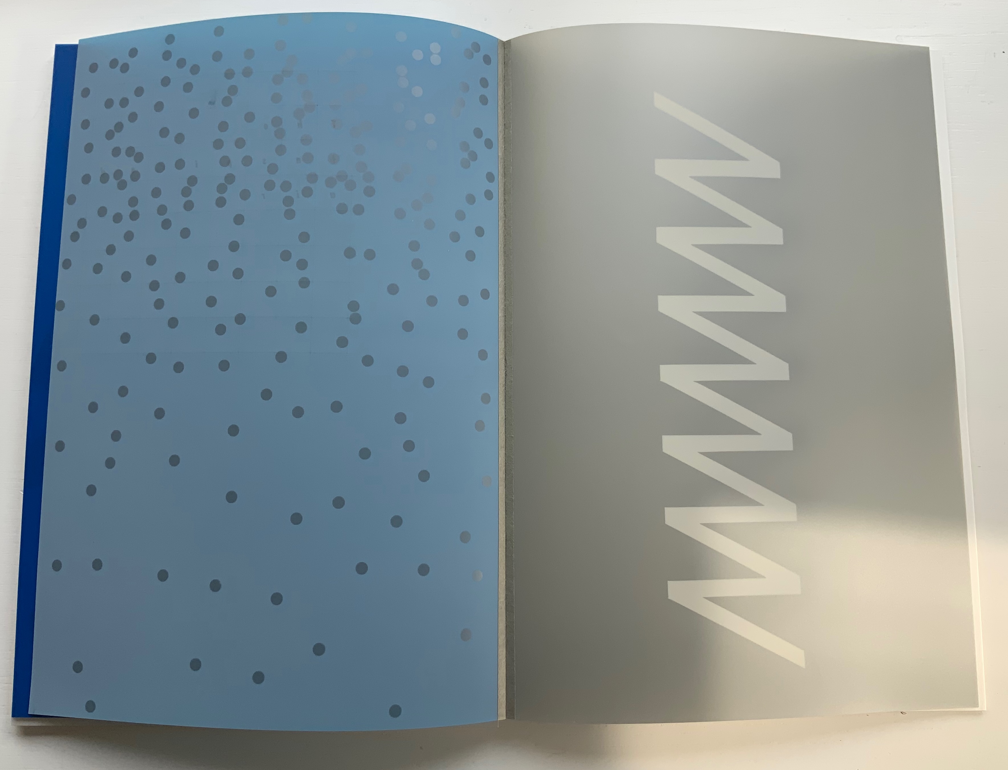
Through that bright blue translucence, the pattern from the slipsleeve reappears but rearranged and multiplied into a zigzag spectrum of colors. The physical turning of the translucent page “exposes” that zigzag spectrum and the second line of text in this poem: “Compression waves from a vibratory event”. Gibson’s text refers to the perception of sound or physical vibrations, and Botnick poetically overlays this with his selection of papers and introduction of zigzag waves of color. The zigzag pattern and its rounded elements, which on some pages are scattered, elongated, cross-hatched or sharp-edged, contribute a recurrent visual syncopated rhythm through the book. Toward the end, the zigzag moves into a more consistently vertical and angular, almost helical, appearance.

First leaf turned, second leaf turning, third leaf revealed.

Zigzag pattern scattered. Zigzag pattern become helical.

To deliver other visual and haptic effects, Botnick prints his translucent papers sometimes only on their reverse sides, sometimes on both, sometimes to the point of opacity as with the first leaf and other times to the point of transforming the colors about to appear on the next sheet beneath as with the second and third leaves. Of course, this changes the feel of the sheet from one side to the other. Botnick also uses six different paper types (including one with a watermark designed for this edition and made at Dieu Donné Paper). The variety in printing and papers introduces additional tactile and visual rhythms: slick and matte, smooth and rough, dark and light, etc. Again, proceeding by contrasts and complements, provoking multi-sensory activity and responses.

Visual effects achieved by printing on both sides of translucent paper layered over fine print paper.

Visual effects achieved by printing translucent paper to near opacity on one side, spot printing on the other side and layering that sheet over a translucent paper printed on one side.

Variation of paper types.

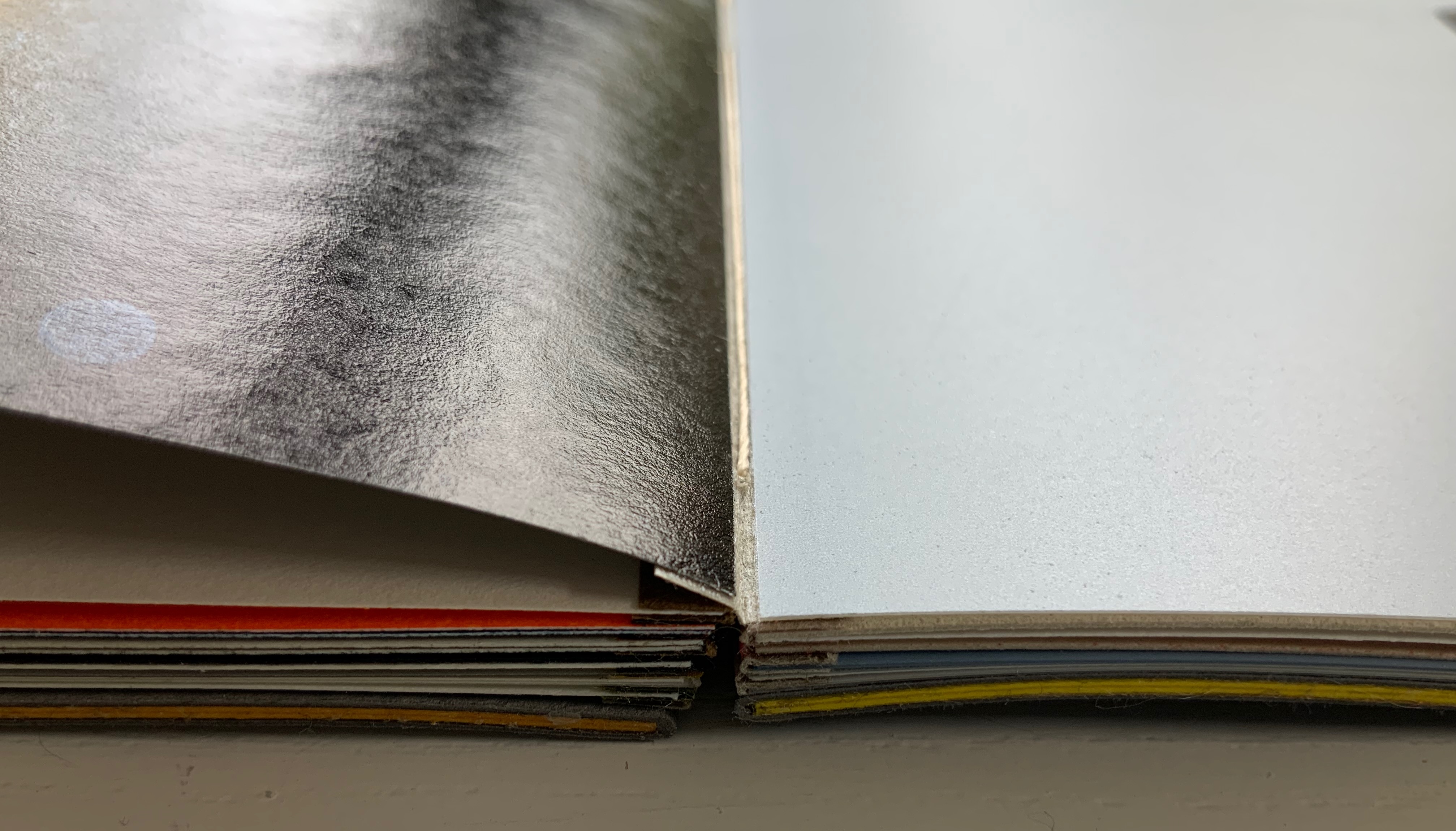
The sewn boards structure, executed by Emdash studio member Robin Siddall, offers the most effective means of achieving the sensory effects intended with the variety of papers, ink colors and printing techniques, as well as delivering a lay-flat binding. Each four-page signature consists of two separate sheets glued to the inner edges of a narrow folded card (the board) sewn and linked to the boards of the signatures before and after. The card used for those hinges is a Japanese washi called Moriki, known for its folding strength and colors, but how particularly apt those multiple hinges and colors are for this patchwork poem.

Detail of an open signature exposing the thread sewn through the board and showing the leaves glued to the edges of the board.

Gibson defines the haptic system as that “by which animals and men are literally in touch with the environment” (p.97). On the penultimate double-page spread, Botnick reveals the environment that touched his “book-length visual/textual poem” into existence: one of pandemic, isolation, violent exposure of institutionalized racism, the “Big Lie” and insurrection. Set in the now familiar zigzag pattern, the revelatory text annotates the lines of appropriated text and the prints, connecting both with the environment and the meditation on perception. Botnick’s book is certainly a distinctive interweaving way of thinking about these threads.

It is telling that Table of Contents ends with black and gray, the colors that dominate the other work in the collection: Diderot Project (2015), which presents this pronouncement from Odilon Redon:

Even without the prismatic range of colors in Table of Contents, Botnick’s Diderot Project (2015) may outstrip the former in the number of ways in which Botnick makes not only the page but also the codex itself “become a dynamic landscape of visual and conceptual ideas”.

Diderot Project (2015)

Diderot Project (2015)
Ken Botnick
H290 x W194 mm, 150 pages. Edition of 70, of which this is #32. Acquired from the artist,
Photos: Courtesy of the artist; Books On Books Collection. Displayed with permission of the artist.

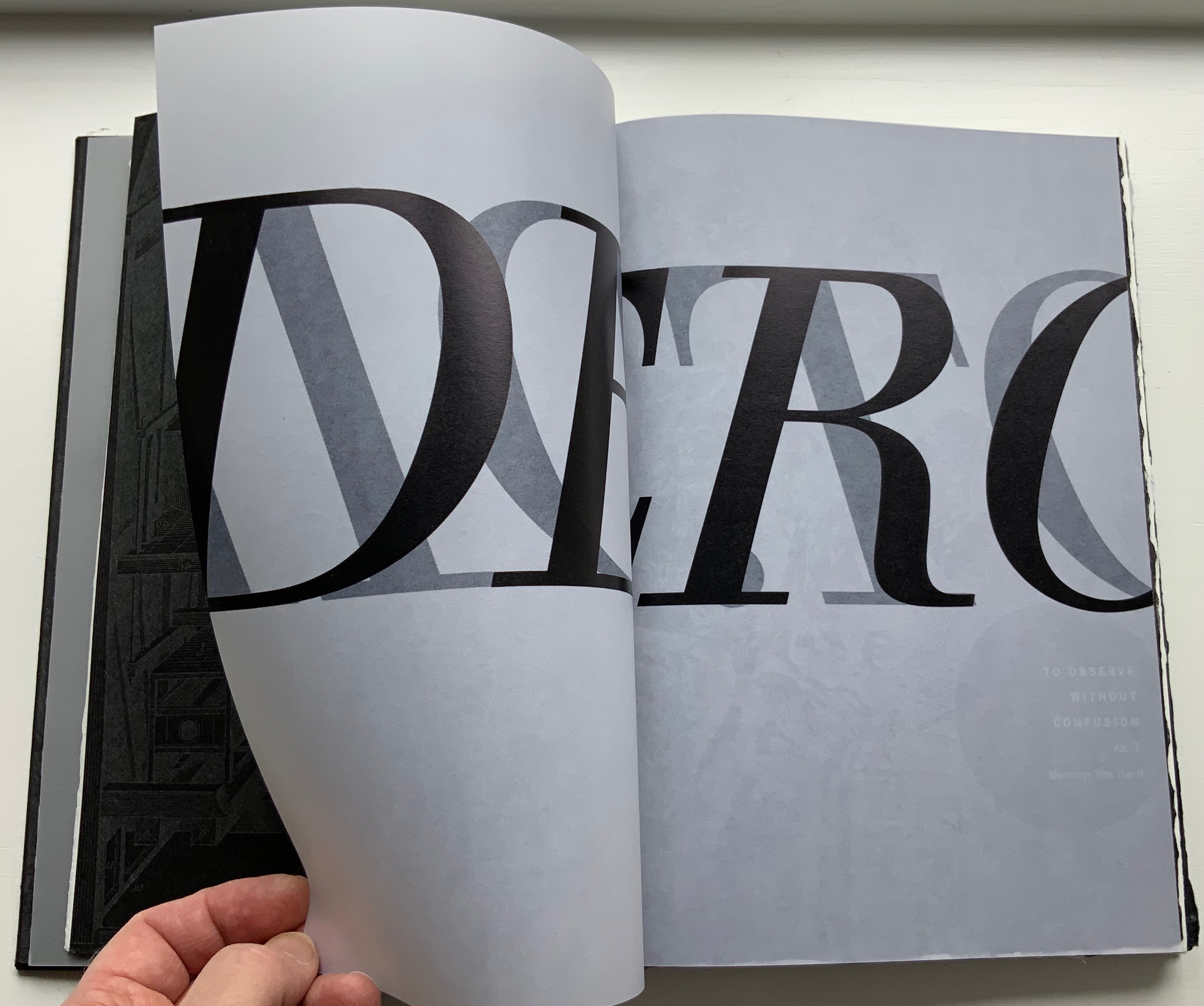
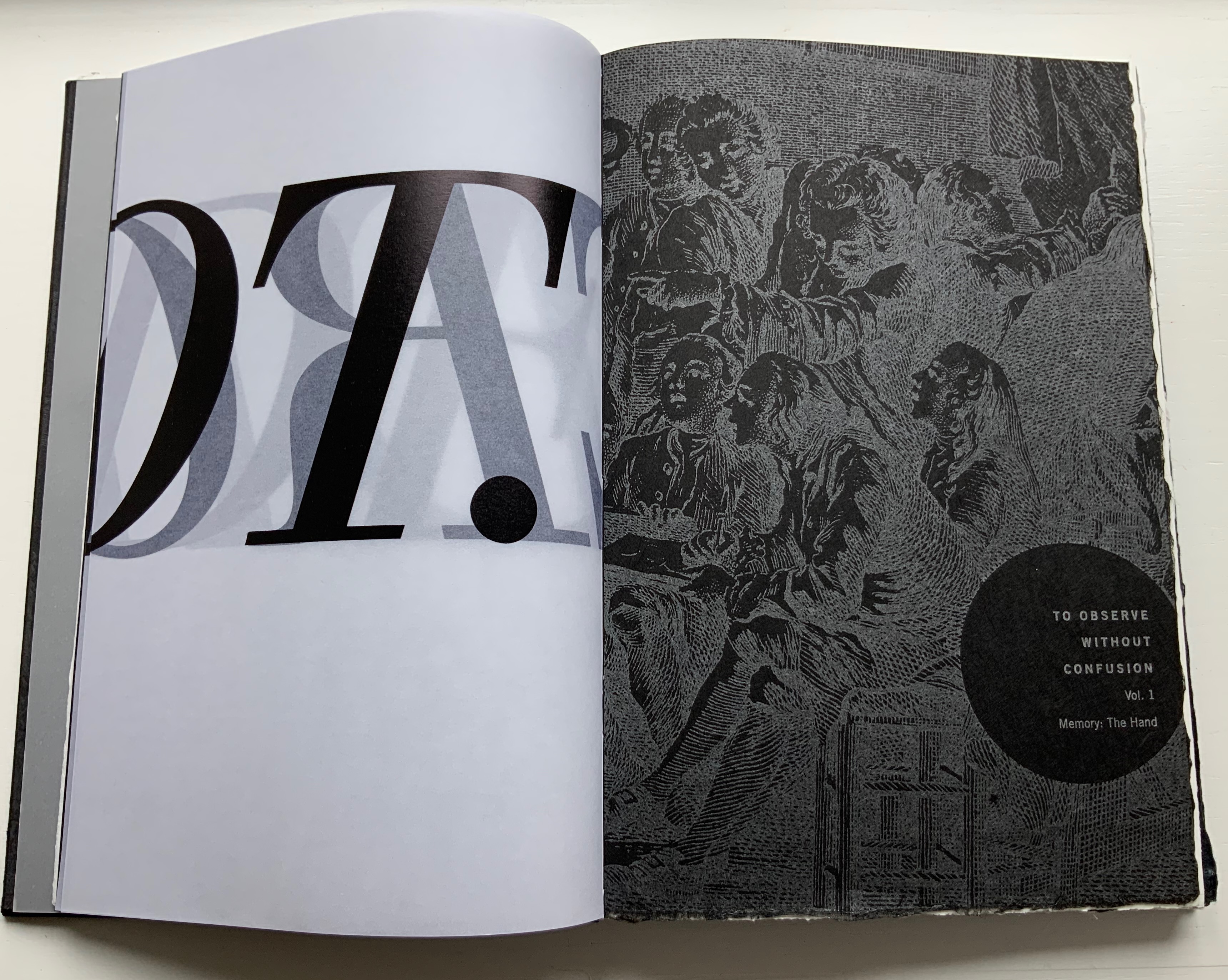
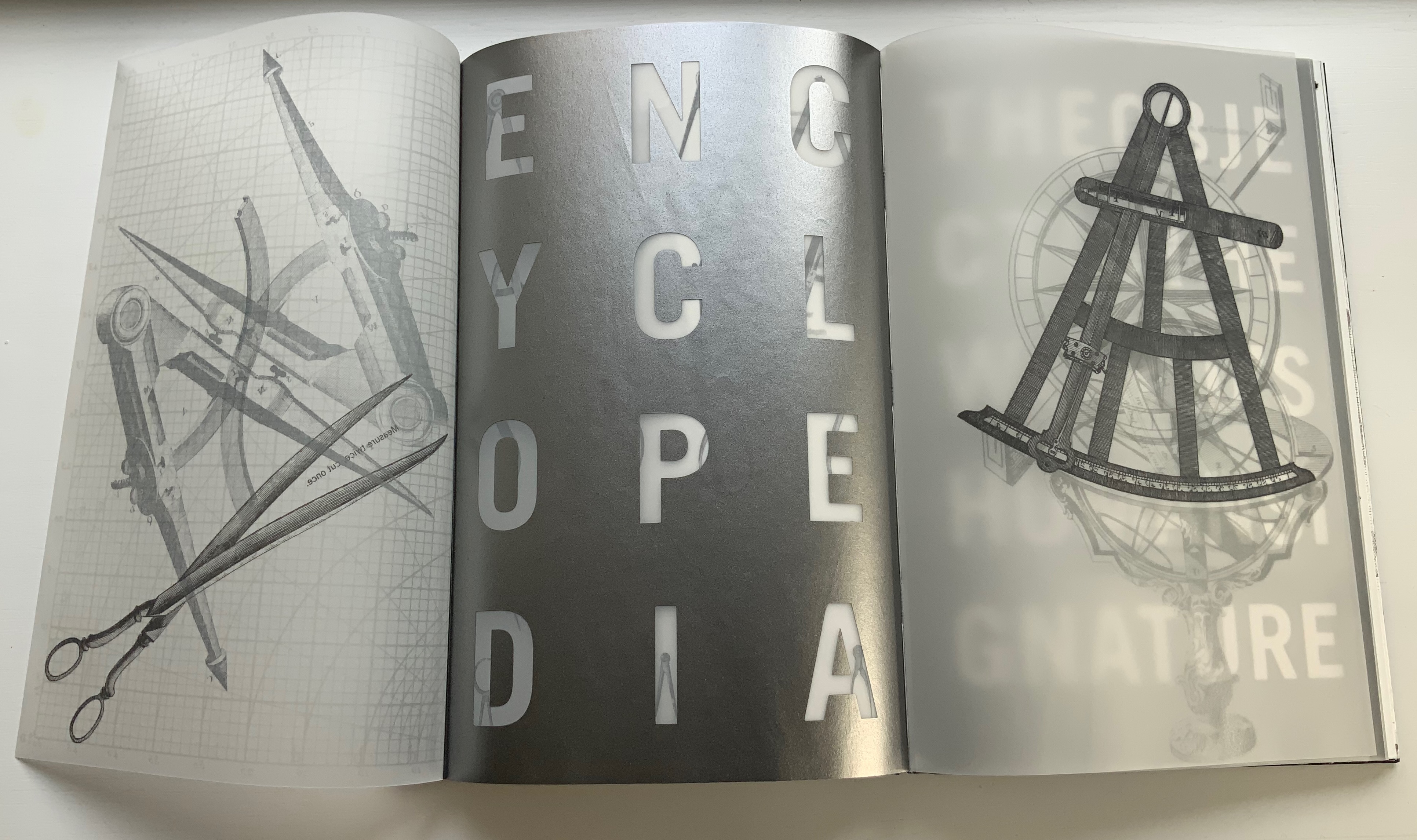
Clearly, like Table of Contents, this work is a “book-length visual/textual poem”, so it offers some insights on the book artist’s favorite rhymes, rhythms, metaphors, techniques and themes. First and foremost is his taking a literary work as his muse. With Table of Contents, it is James J. Gibson’s psychology book; in this case, it is Denis Diderot’s multi-volume Encyclopédie (Encyclopedia), a decades-long project with Jean le Rond d’Alembert and 138 other contributors. Nodding to the multiple volumes of the Encyclopedia, the artist refers to the sections of his work as Volumes 1, 2 and 3, although they are bound as one binding. The three volumes’ titles follow the Encyclopedia‘s overarching categories in its “System of Human Knowledge”: Memory, Reason, and Imagination. Digitally captured images from the Encyclopedia‘s plate volumes abound.

Table of Contents

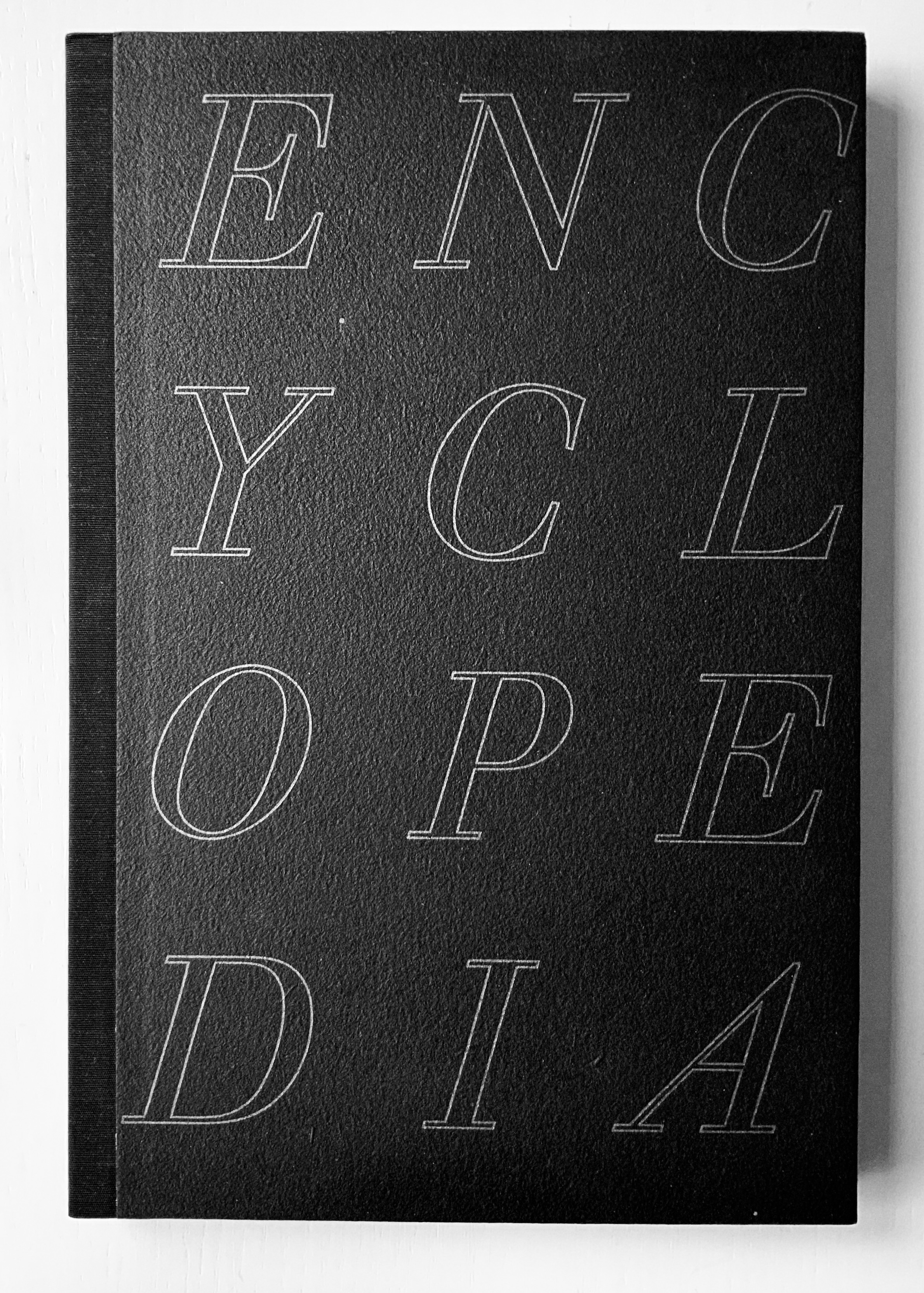
Diderot Project, however, is not a condensed version or description of the Encyclopedia. Like literary works of ekphrasis whose words meditate on a visual object, Diderot Project is book art that meditates — inversely — on a literary work. The cover to Diderot Project does not show its name where the title is expected, rather it shows the name of its object of meditation. And it displays that name in a distinctive monumental way.

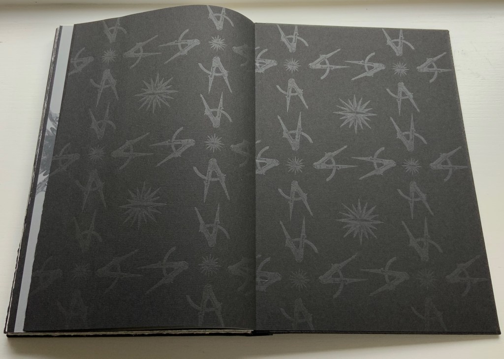
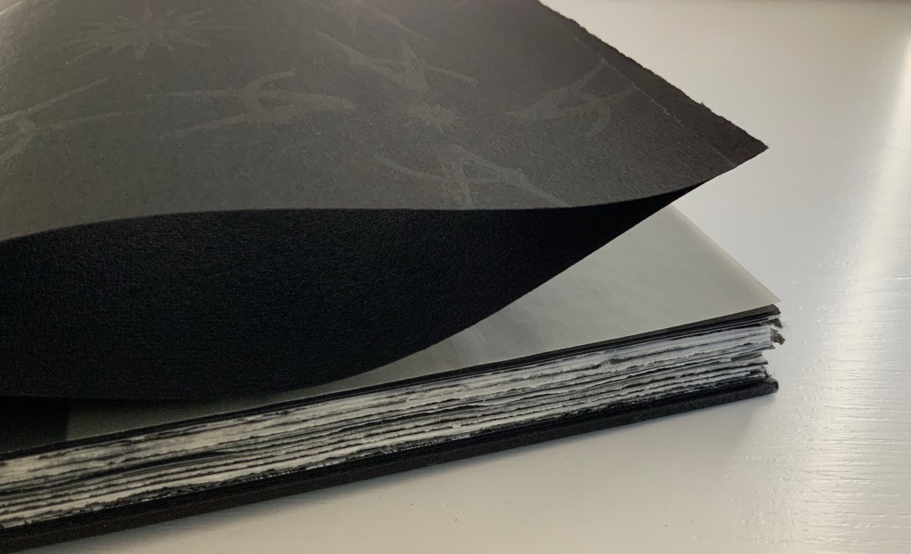
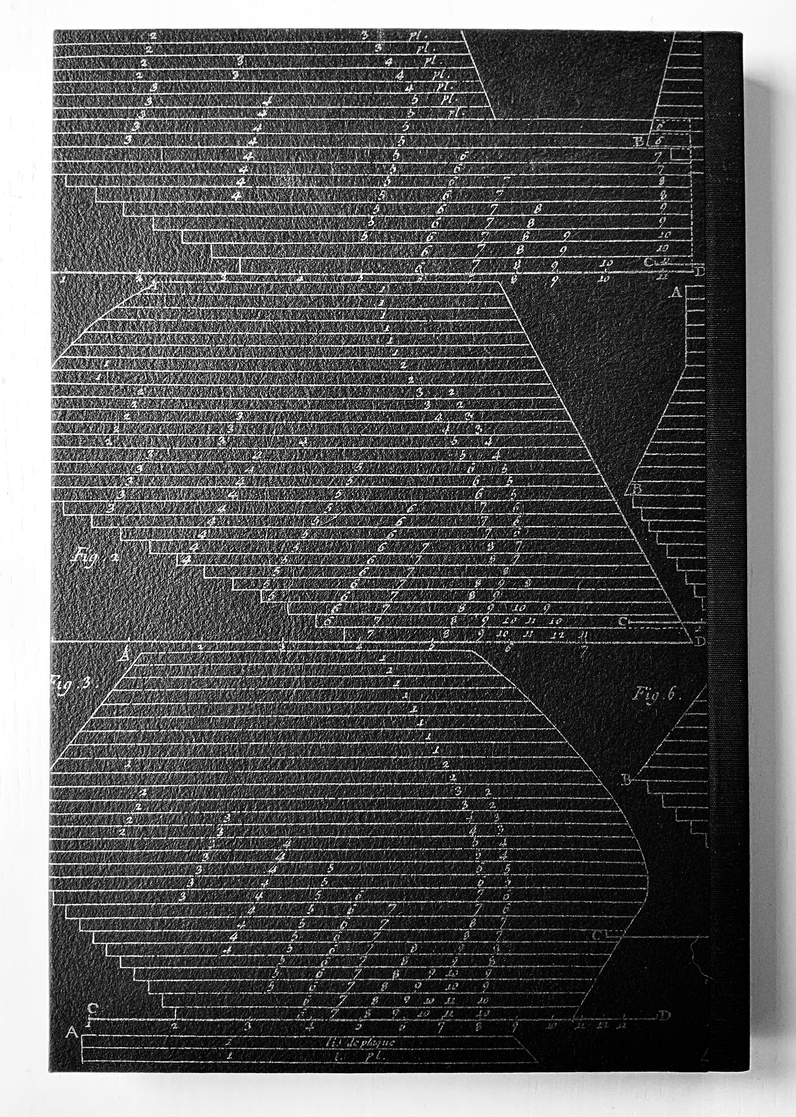
The front cover’s silver slab serif italic letters in all caps on textured, triple-dyed flax paper and the back cover’s diagram in the same palette strike chords that reverberate throughout the work. The chords are both obvious and subtle. Immediately, with a pattern of silver-gray compasses and directional stars, the doublures repeat the cover’s black and silver notes but on a less textured paper. Curiously the fly leaves of the doublures are not really fly leaves because they are pasted at their fore edges to separate leaves of black paper: a subtle hint to look beneath the surface, inquire into the mechanics. (An irresistible side note on the mechanics of the binding: the binder Daniel E. Kelm, in tipping the black fly leaf to the outer printed one, extends the fly leaf further into the book as a tipped-on hinge inserted through the first two signatures. The detailed image below on the right shows the hinging edge of the fly leaf between the signatures.)

L-R: Inside back cover, doublure with compass and directional star motif; Inside front cover, doublure leaf anchored to fly leaf; Binding detailed view of hinging edge of fly leaf extending between signatures.

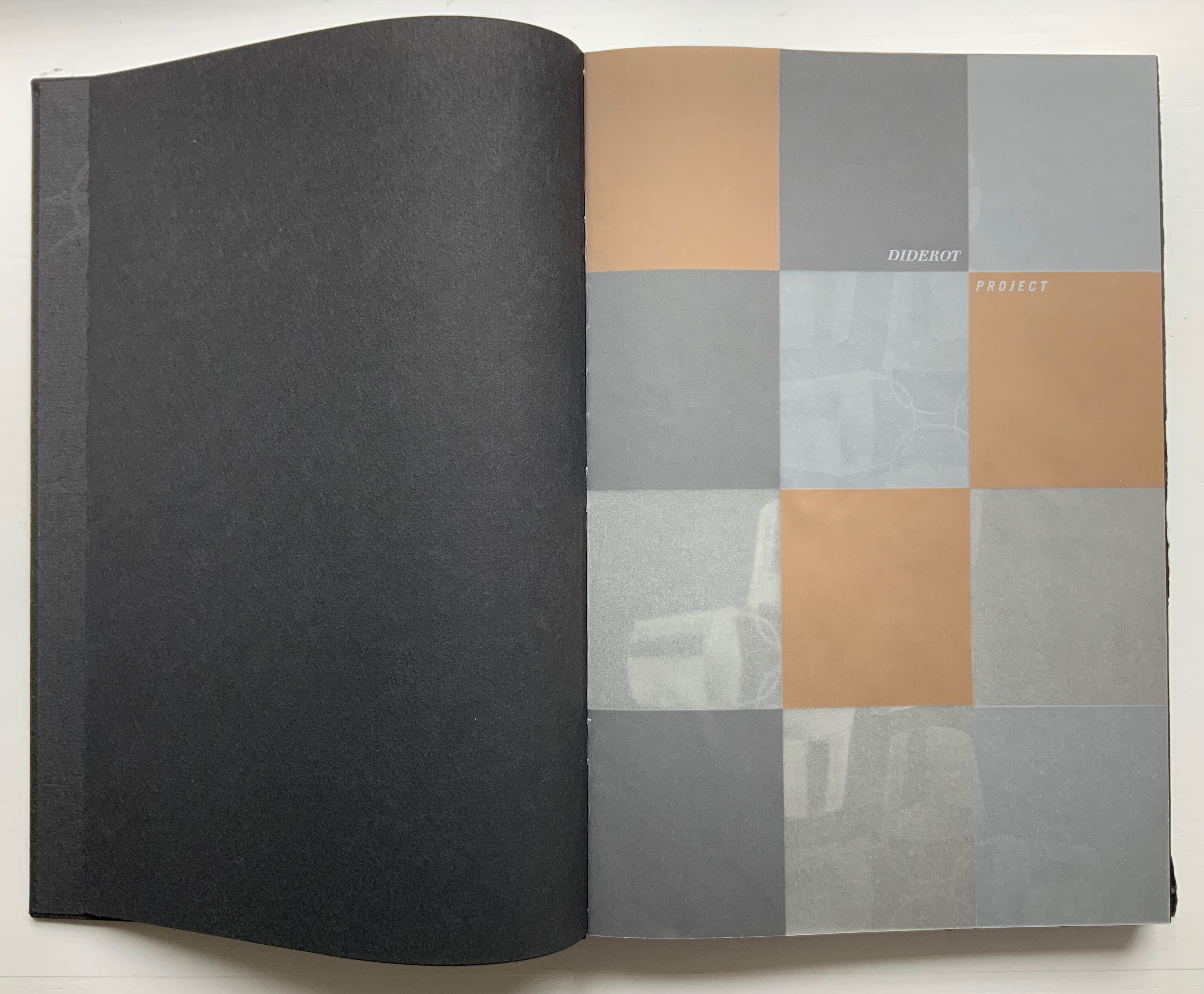
Following that almost-Chinese fold of a flyleaf, the half-title drops any pretense of hinting. Turning the half-title with its 3×4 grid of black, brown, tan and gray squares on translucent paper reveals that the squares have been created by printing in silver, copper, light brown tint and no ink on the reverse. Underneath the half-title leaf lies another black page with the recurring silver-gray image of four buckets linked by their handles. The pattern of buckets is parallel to the interlinked image of compass and directional star on the doublures. It is another subtle hint: this time, to look at patterns for their similarities and differences arising from the mechanics of effects, to consider the commonality of tools whether at the low or high end of culture.

L-R: Half-title on translucent paper; inked reverse of half-title and the interlinking buckets.

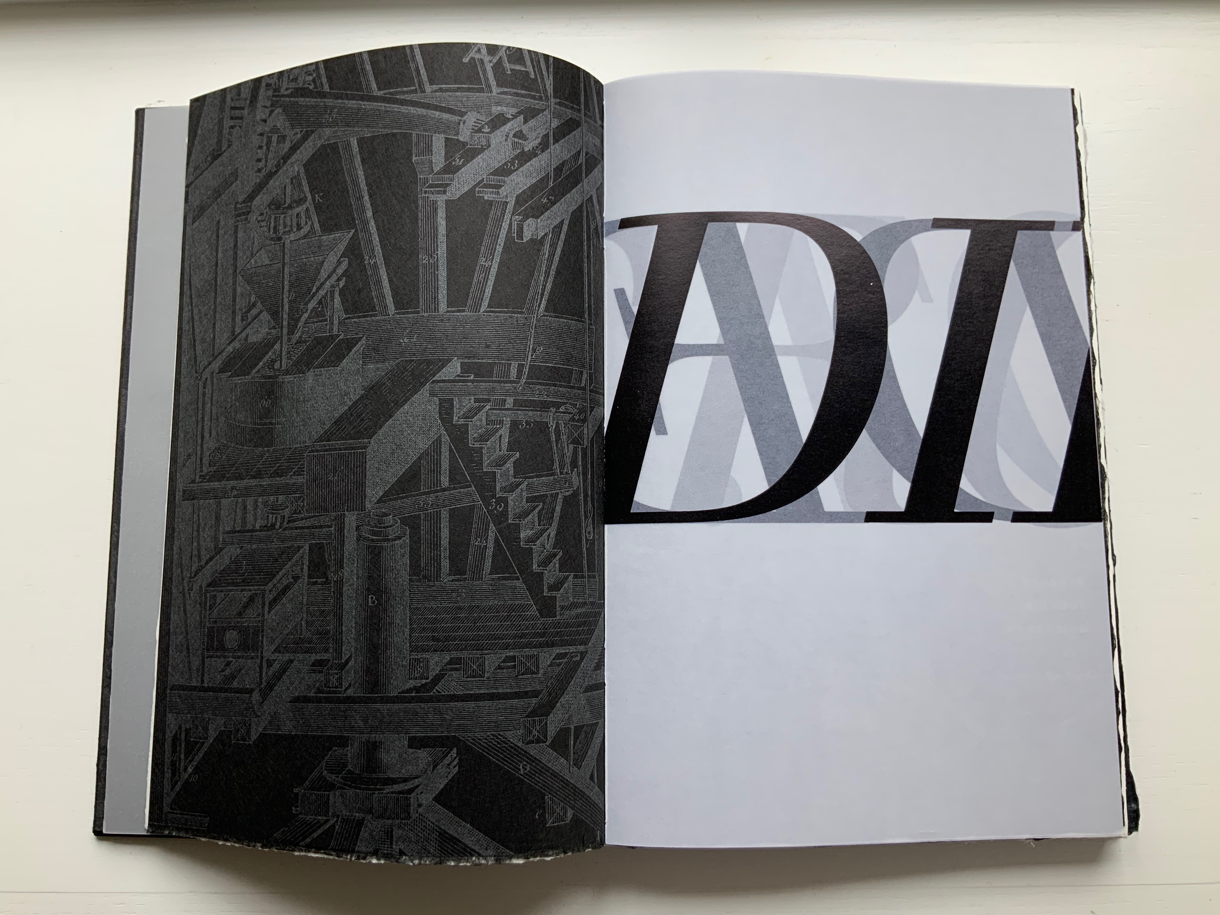
If this reaction to the prelims seems a stretch, then the following run of folios surely validates it. Not only does the text articulate the parity of craft and tools (métier) with art and science, the watermark hand gestures to it, then the watermark hand joins its mirror image “to tie” the knot of the binding thread, and then the second watermark hand joins its printed mirror image at the same point. These six pages enact parallels of similarities and differences.

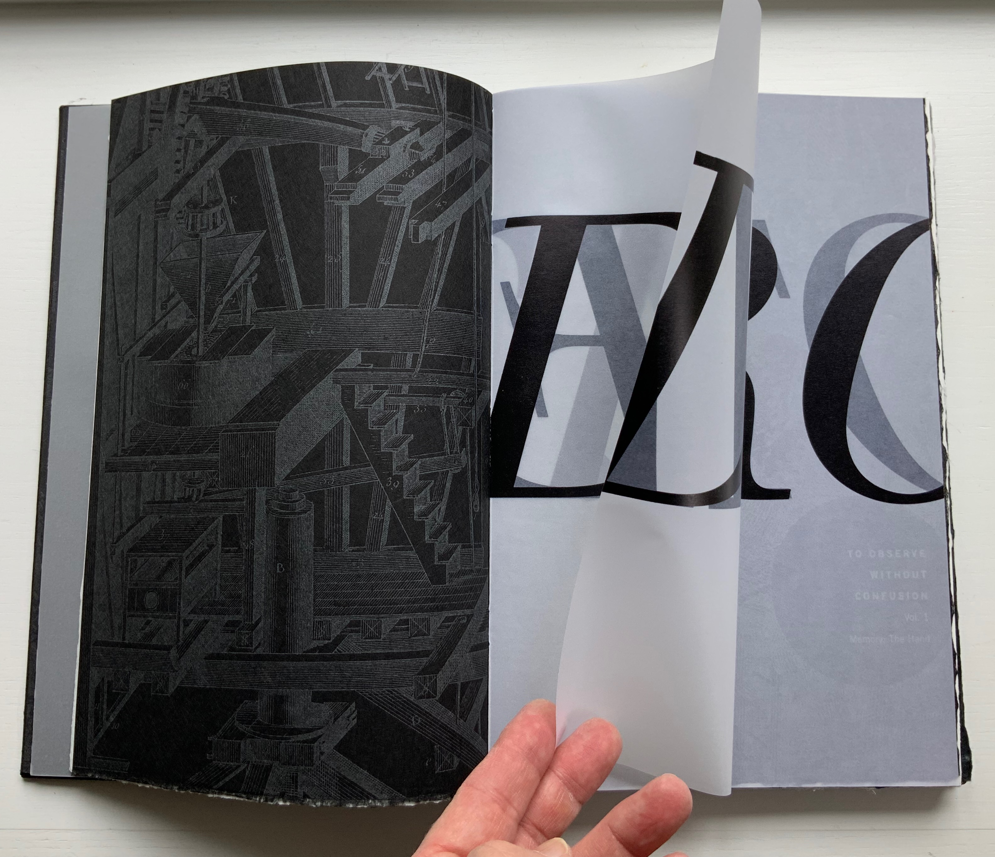
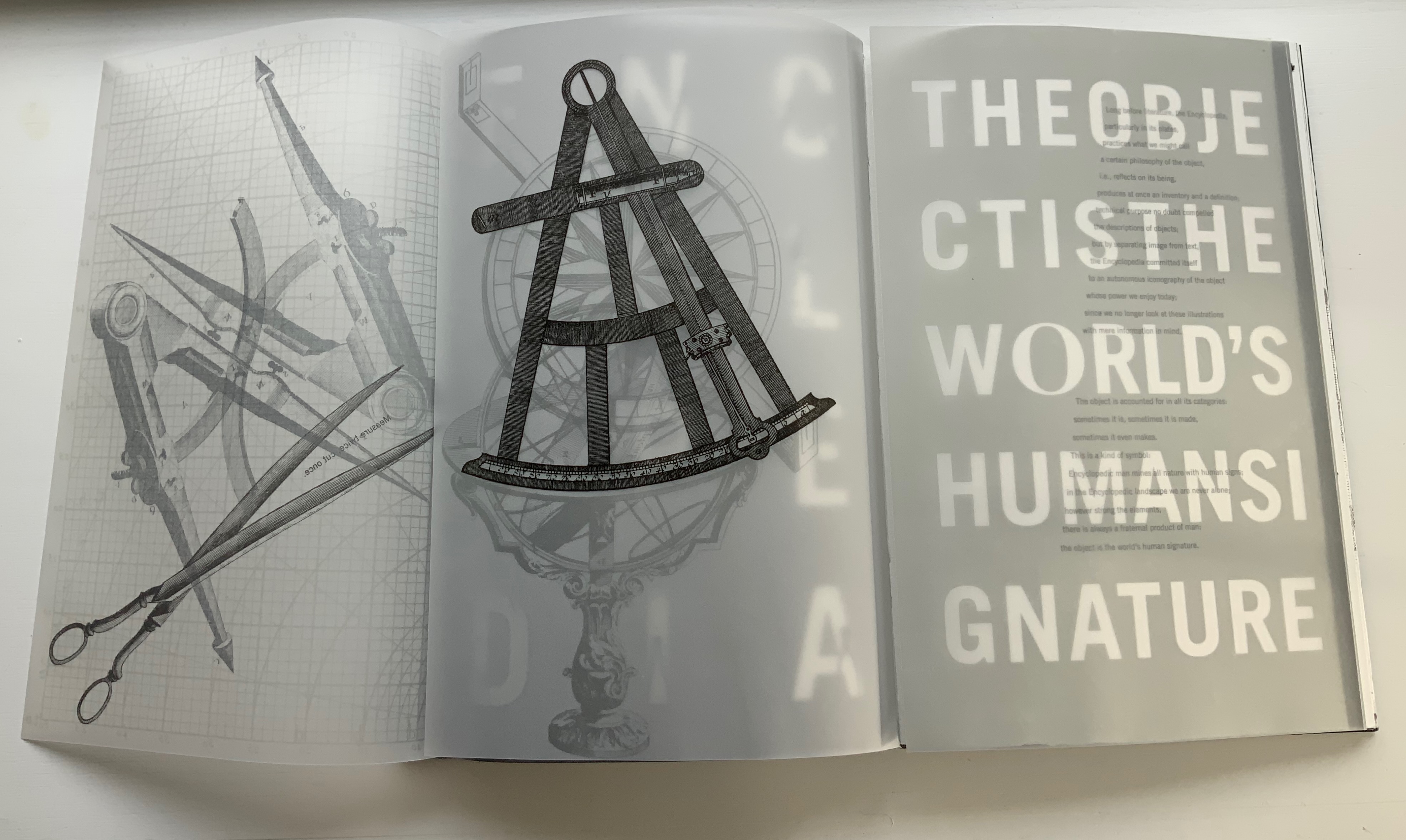
The layering of translucent paper printed on one or both sides, which also occurs in Table of Contents, is another of Botnick’s favorite techniques. He has even delivered a lecture at the Getty Research Institute entitled “Transparency as Metaphor“. Botnick’s use of it in the sequence below invites the reader/viewer to meditate with him on “the nature of craft, tools, memory, and imagination, while provoking questions about authorship in artists’ books”.

Running across the four pages of the two leaves of UV Ultra Clearfold, the enlarged present, past and future letters call on perception, memory and imagination to decipher the name: Diderot, emerged and submerged. However large his name is cast, though, is Diderot the author? By bracketing these transparencies with an image of a manufactory or workshop and a crowd of listeners and observers with pens poised, Botnick evokes the other 139 contributors to the Encyclopedia and his own host of collaborators, including Kelm (binding), Paul Wong (papermaking) and, importantly the Emdash studio (Catherine Johnson, Ben Kiel, Karen Werner and, in New Delhi, Ira Raja).

Tools, the workplace and studio lie at the heart of the Diderot Project‘s second volume, which boasts the following complex foldout which in itself validates Roland Barthes’ statement from his essay on the Encyclopedia‘s plates: “The object is the world’s human signature”.

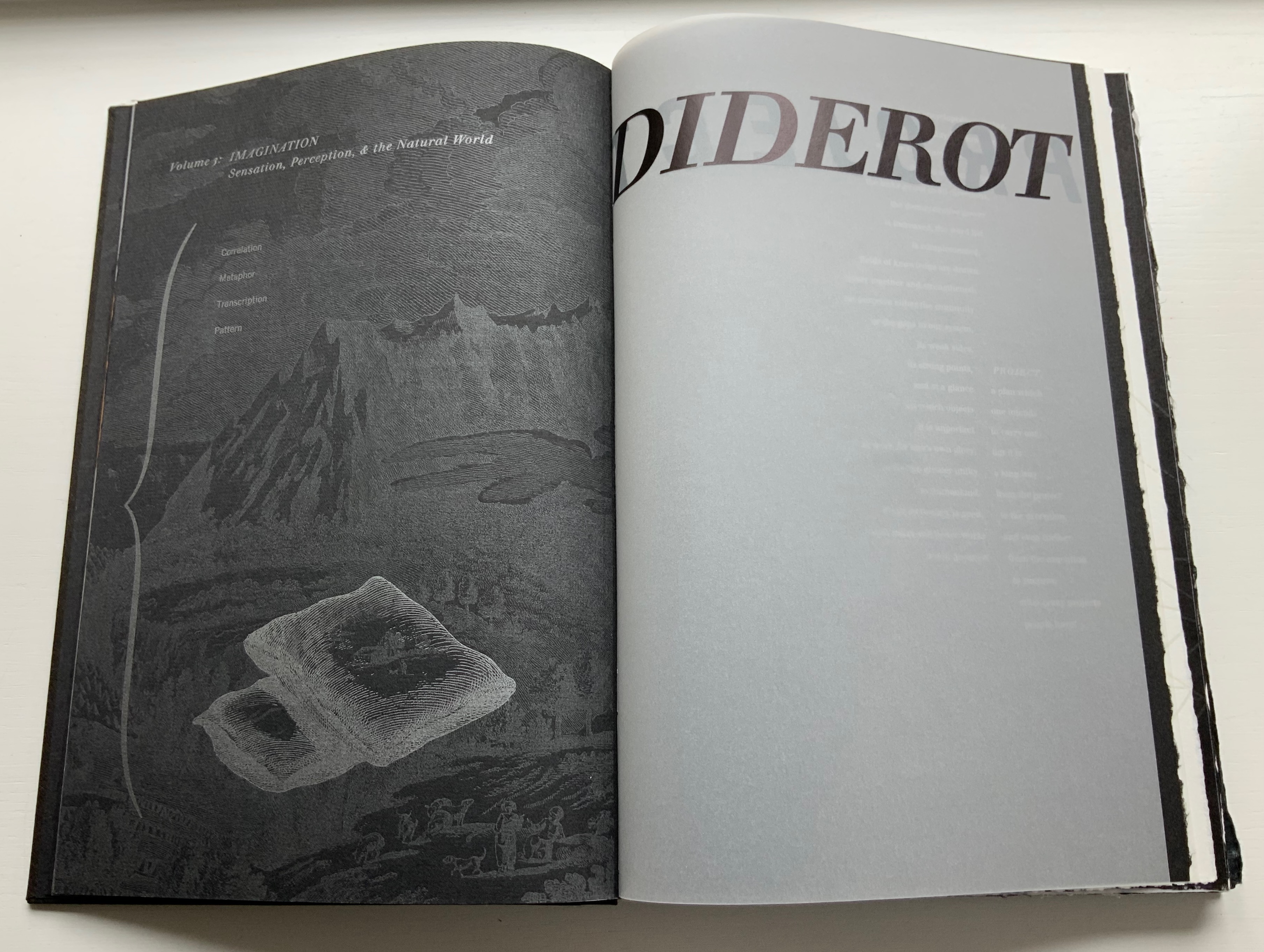
Sensation, perception and the natural world lie at the heart of the third volume, and here is another of Botnick’s favorite techniques: typographic distinction. The right-side up text on the verso page is set in Walbaum, as is every instance of Diderot’s text. The upside down text on the verso and all the text on the recto are set in Trade Gothic, as is the case for more contemporary authors (Michel Foucault and Walter Benjamin, respectively, in these instances). Note how Foucault’s upside down text reflects the action in the image of the camera obscura, and picks up the theme of perceptual flipping initiated with the watermark hand in Volume 1 and Diderot’s enlarged name across the translucent pages in Volume 2.

Both Table of Contents and Diderot Project reward revisiting for this kind of close reading, close looking, close fingering and close listening. Close comparison and contrast as well because together they answer “How does a book reflect a distinct way of thinking about a subject? How does the page become a dynamic landscape of visual and conceptual ideas?”

Further Reading & Viewing

Notes on ‘Inverse Ekphrasis’ as a way into book art“. 17 June 2022. Bookmarking Book Art.

Artist Books: From Idea to Form – Workshop by Ken Botnick“. 18 March 2017. Lawrence Art Center, Lawrence, Kansas. Accessed 2 June 2019.

Botnick, Ken. 23 April 2015. Transcription of talk given as the annual Enid Mark Lecture. Smith College.

Botnick, Ken. 1 October 2015. “Diderot Project: Making the Book to Discover my Subject“. Boston Athenaeum. Video. Accessed 1 June 2019.

Diderot, D., & Alembert, J. L. R. 1967. Encyclopédie ou dictionnaire raisonné des sciences des arts et des métiers. Stuttgart- Bad Cannstatt: Friedrich Fromann.

Frost, Gary. 2012. Adventures in Book Preservation. Coralville, IA: Iowa Book Works. See “Sewn Board Bookbinding More than a Thousand Years Later”.

Gibson, James J. 1966. The Senses Considered as Perceptual Systems. Boston: Houghton Mifflin.

Gibson, James Jerome. 1950. The Perception of the Visual World. [With illustrations]. Riverside Press: Cambridge, Mass.