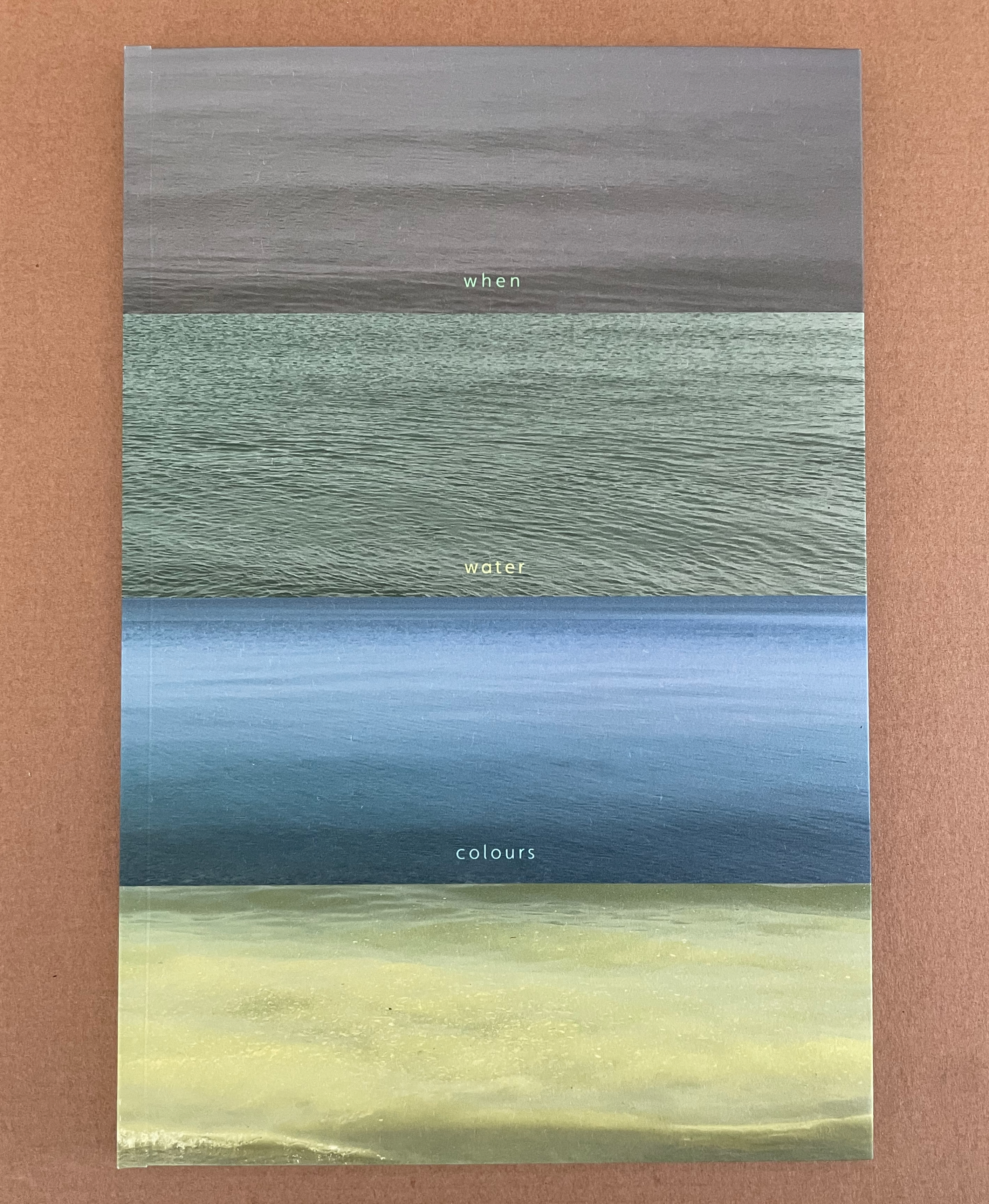
Marlene MacCallum’s latest artist’s books remind me of Claude Monet’s two series of paintings of the Rouen Cathedral’s façade and a field of haystacks. The series were influenced by Japanese ukiyo-e prints (“pictures of the floating world”). Rather than changing vantage points on Mt. Fuji, Monet used one perspective on one façade and sought to capture the instants of light and atmosphere on its surface at several different hours of the day. He rendered his vision of them with thick layers of paint, brushstrokes, and colors. MacCallum, too, has chosen a fixed-viewpoint: in her case, of Lake Ontario. She, too, follows different hours and, also, different seasons as Monet did with his haystacks. She, however, renders her vision with an intricate verbal-visual dance of metaphor, book structure, registration, photographic filters, print technique and paper.
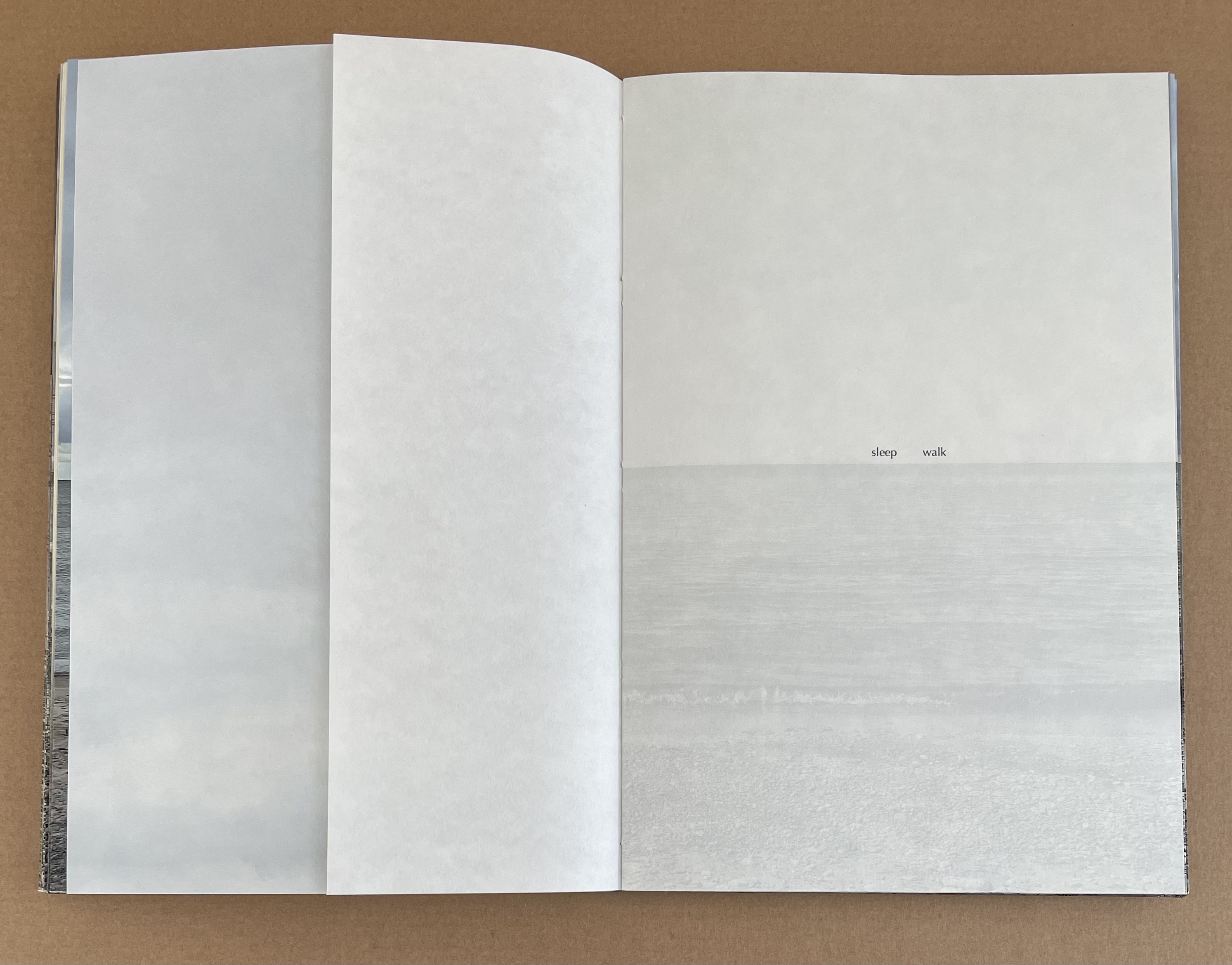
sleep walk (2023)
sleep walk (2024)
Marlene MacCallum
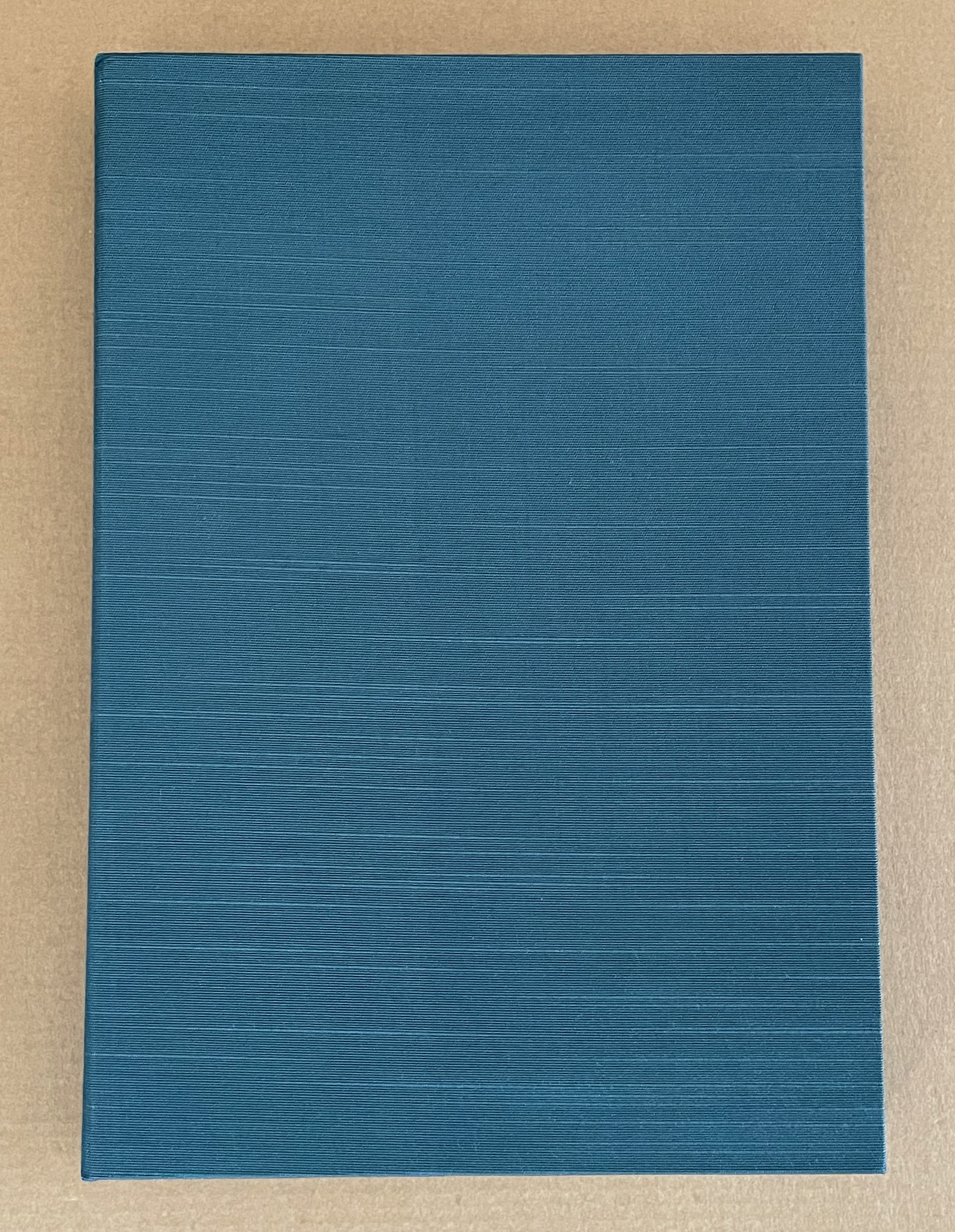
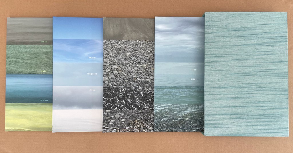
Wraparound case with magnetic closure system, covered with Asahi book cloth. Casebound book with exposed boards Eterno boards and Asahi book cloth; cover image printed on Aya attached to Eterno boards. Archival digital pigment prints on Asuka and Niyodo papers. Case: H259 x W181 x D26 mm closed; W579 mm open. Book: H258 x W174 x D18 mm closed; image spread W341 mm; expanded accordion W680 mm. [90] pages. Edition of 10, of which this is #3. Acquired from the artist, 12 July 2024.
Photos of the work: Books On Books Collection. Displayed with the artist’s permission.
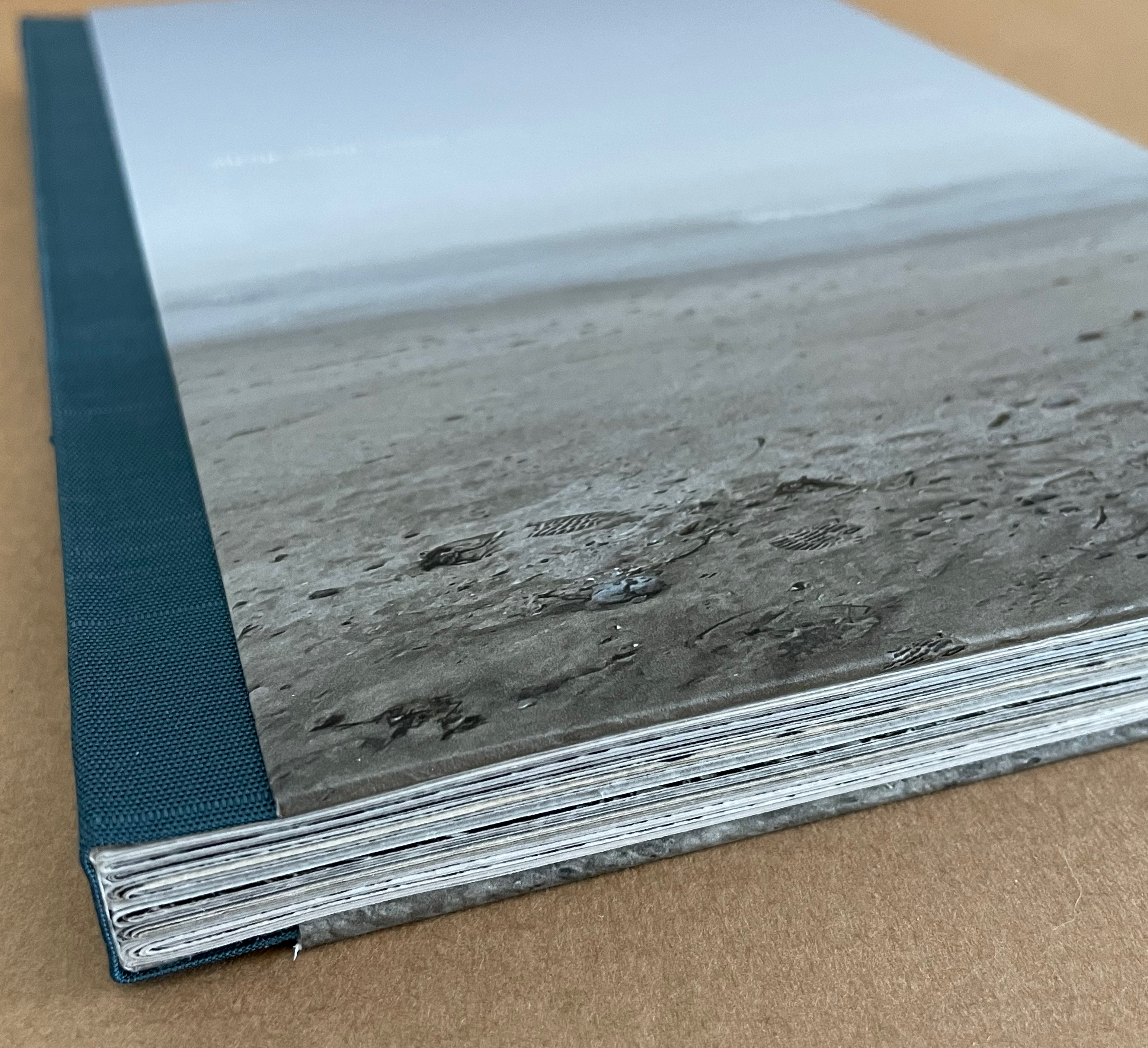
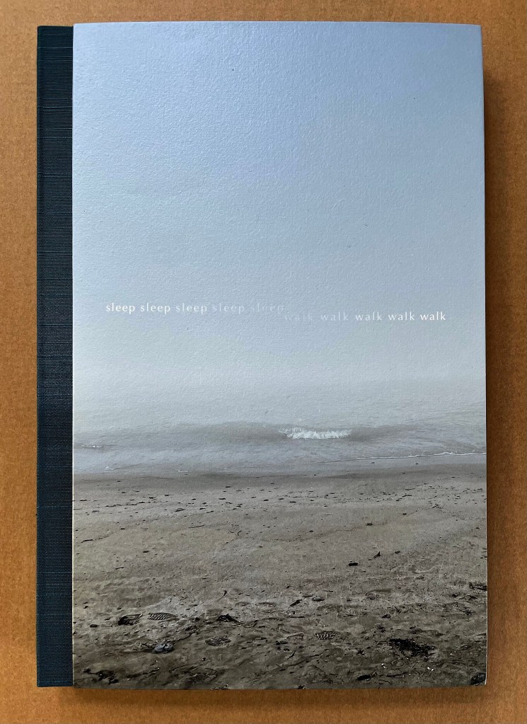
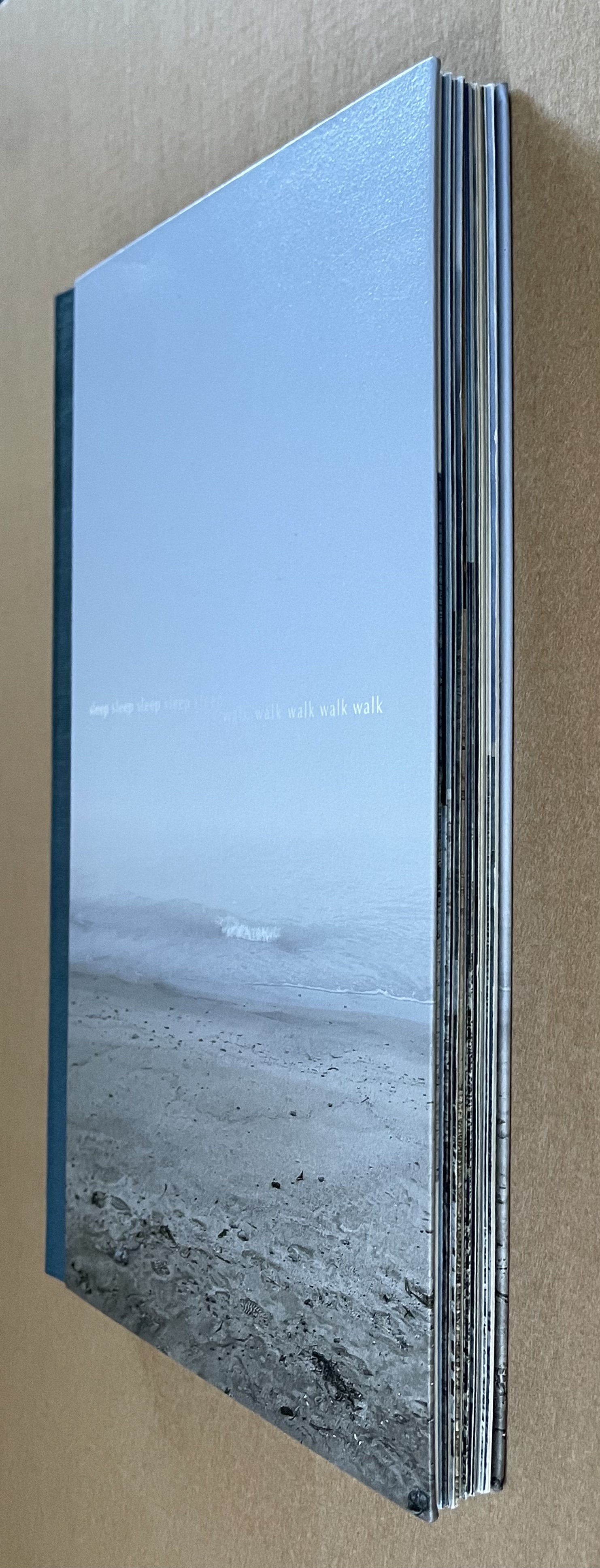
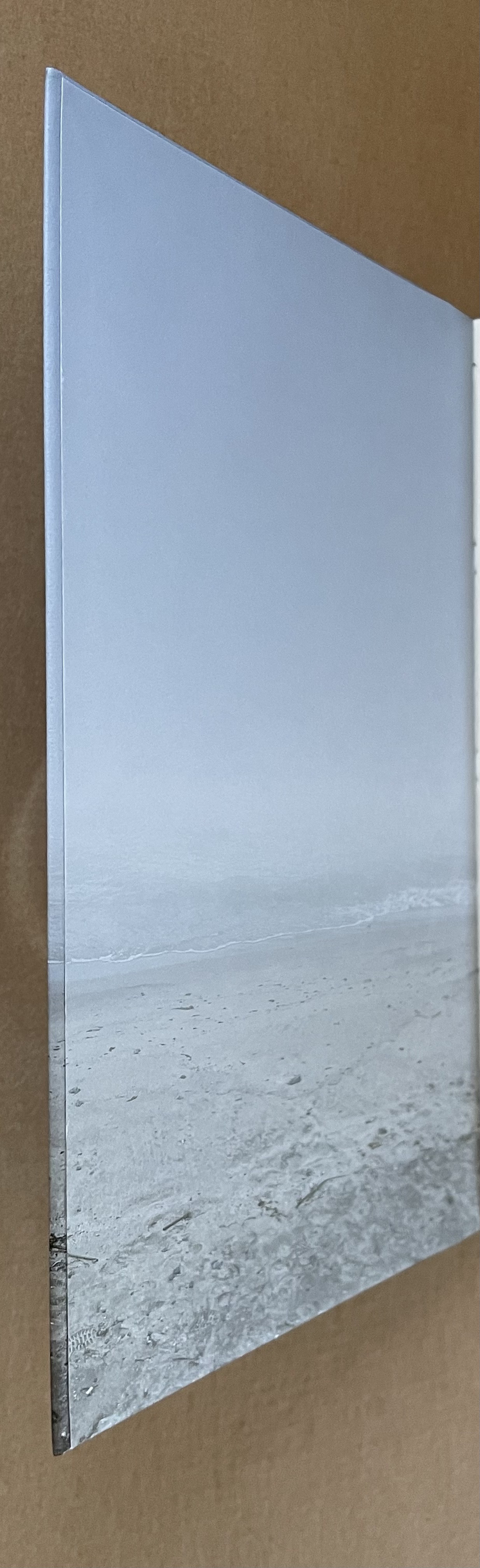
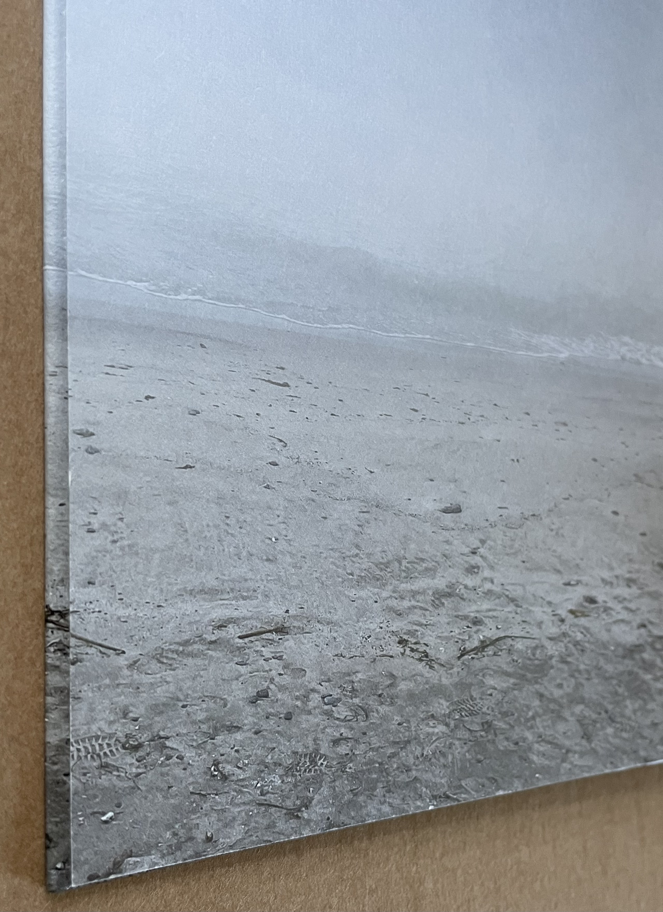
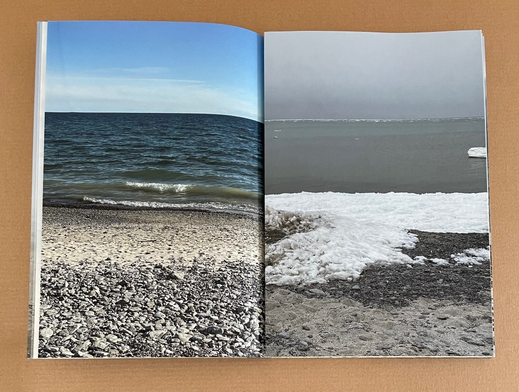
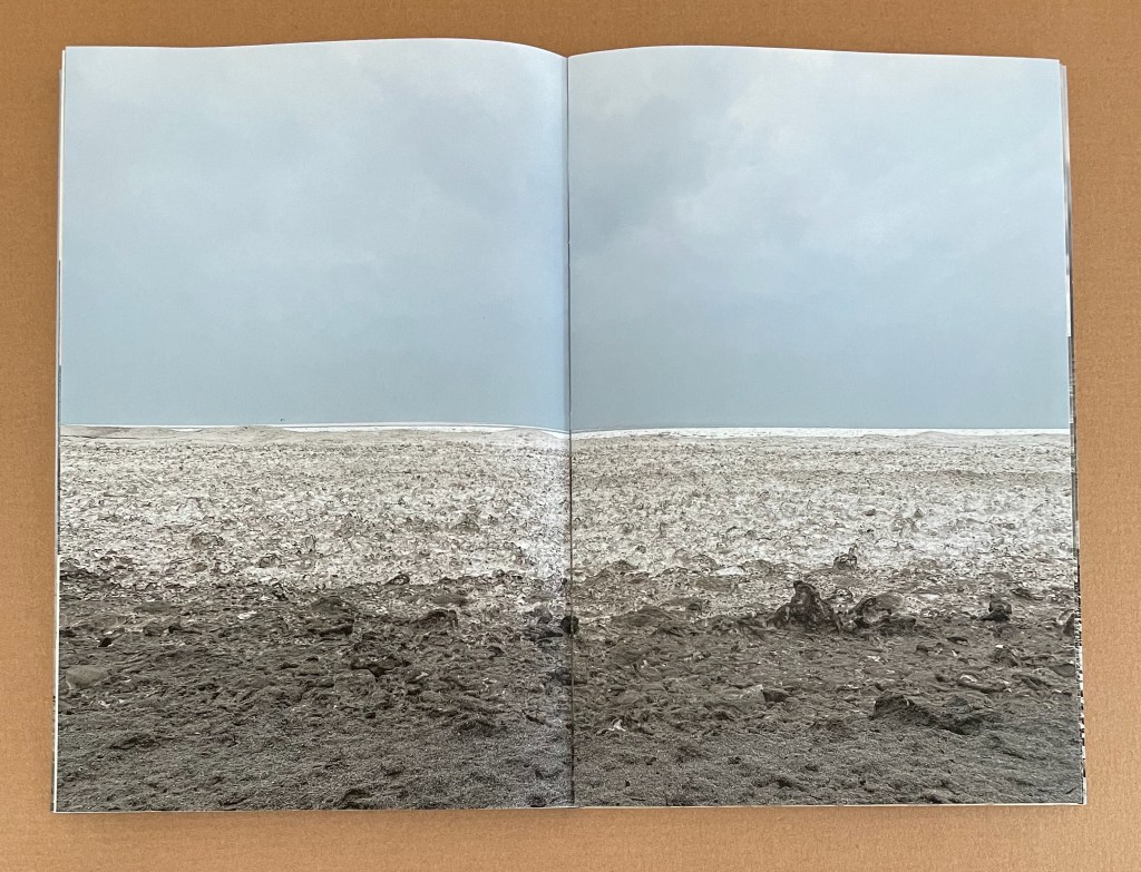
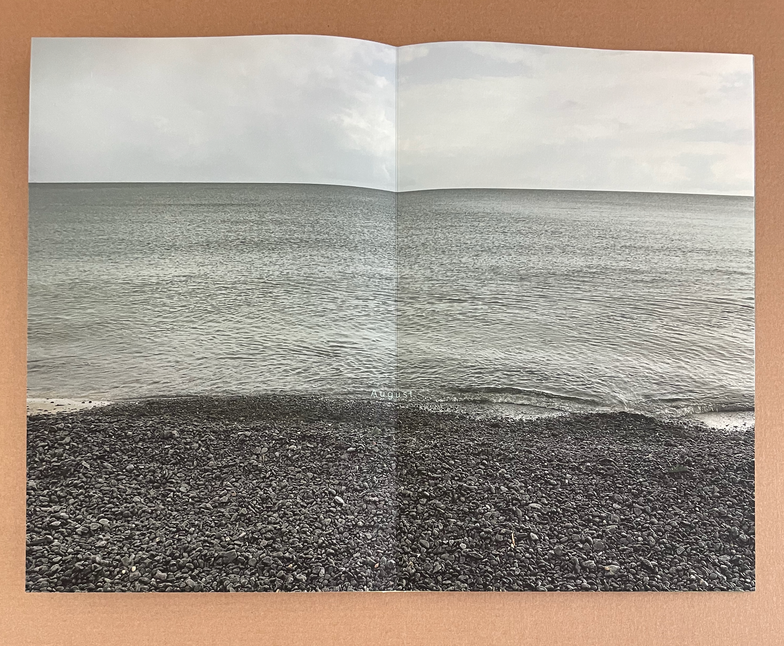
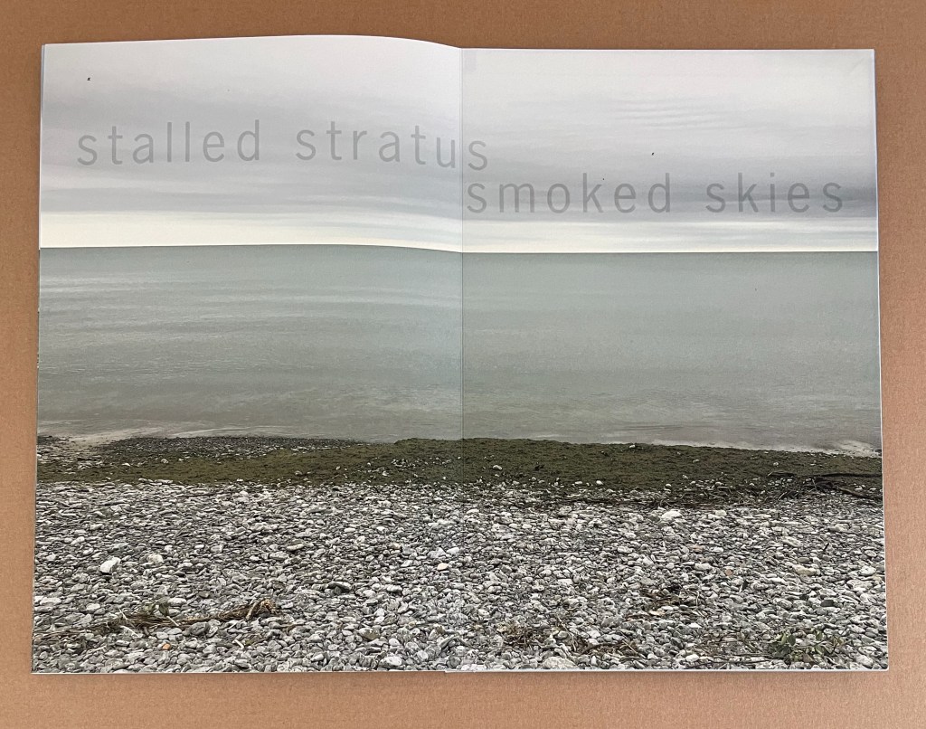
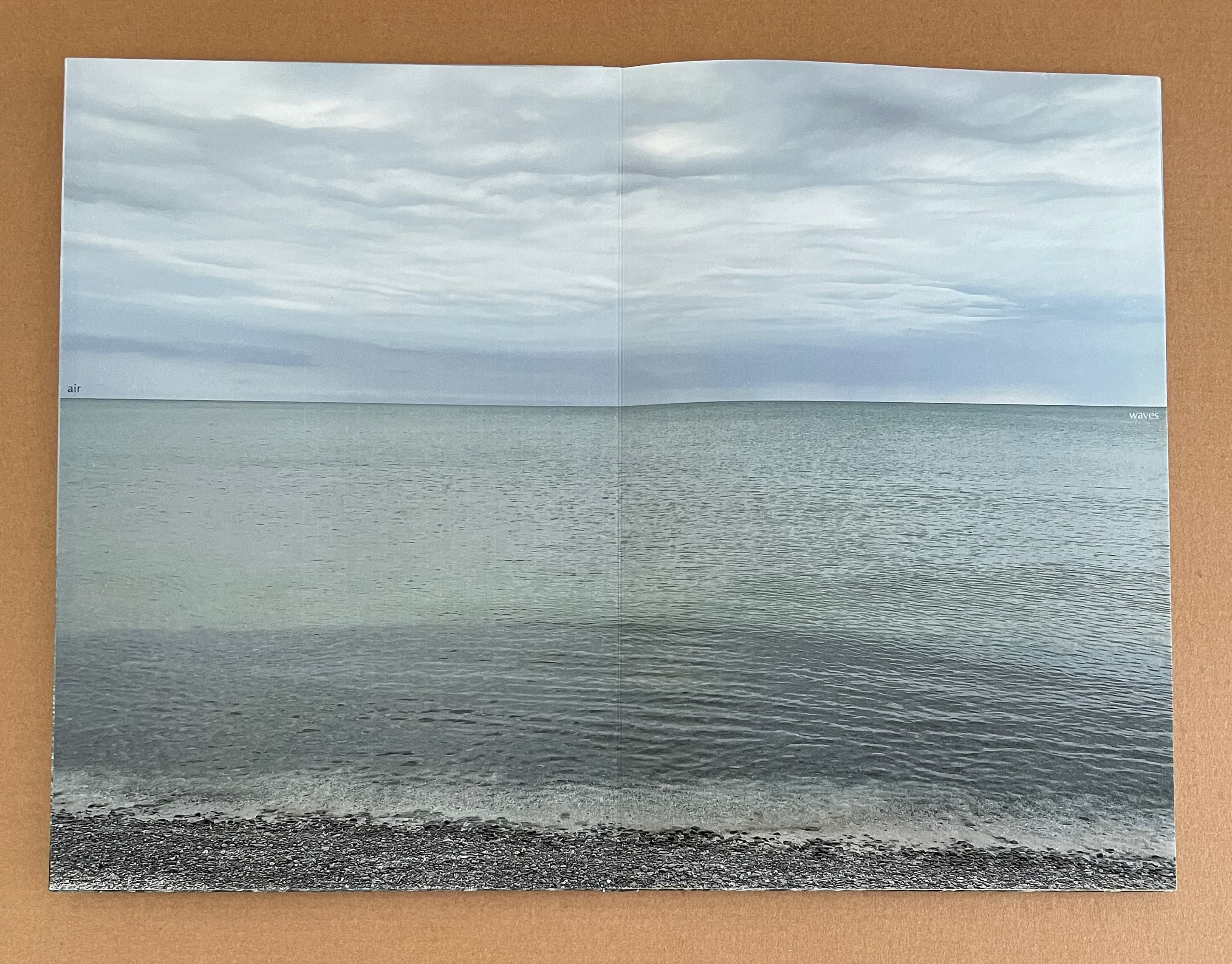
MacCallum’s vision in sleep walk lies in the metaphor she finds between the shifting states of sleep and waking with the shifting states of water, sky and land from that single vantage point over time. The wraparound case and front cover announce this metaphor as the case unfolds to reveal the front cover of sleep walk. As the front cover introduces the single vantage point, the eye remembers the case’s Asahi cloth with its horizontal striations and their seeming fluctuation. On the front cover, the title, running almost the width of the book, also fluctuates. A horizon above the horizon, it fades from both ends, disappears in the center, and even breaks over two lines. From the cover’s bottom edge, horizontal fluctuations rise from the foreground of sand, the mid ground of surf, and the further mid ground of the horizon itself where water meets the sky — all reflecting that shifting horizon of words above the horizon. This external play of elements — image and text — carries over into a complex internal play with several elements of bookmaking and photography throughout the book.
With the turn of the front cover, we realize that we have only seen half the single vantage point. The cover’s image wraps around the fore edge of the board to align precisely with the pastedown. This marvellously constructed image faces a first page with a single line of text. On the folio of stiff paper, a line of advancing, retreating, changing words hovers adjacently above the line of littoral water on the facing pastedown. Like the shifting line of water, the phonemes of the words “sleep” and “walk” shift, and the line ends in the words “sleep wake”.
With that image on the left and text on the right, the elements of image and wordplay have been split, but as the one-line page turns, they reunite, and new elements come into play across the double-page spread. A filtered image of the sky-to-ground view appears on the reverse of that folio of stiff paper. It faces a full-color slice of horizon and shoreline, printed on lighter Asuka paper. At first, the filtered image’s horizon seems aligned with the horizon in the sliced view, but it is the bottom edge of the slice that aligns with the facing image’s horizon. The word appearing under the slice announces what has just happened and what will happen in the book’s first section entitled “fluctuate”.
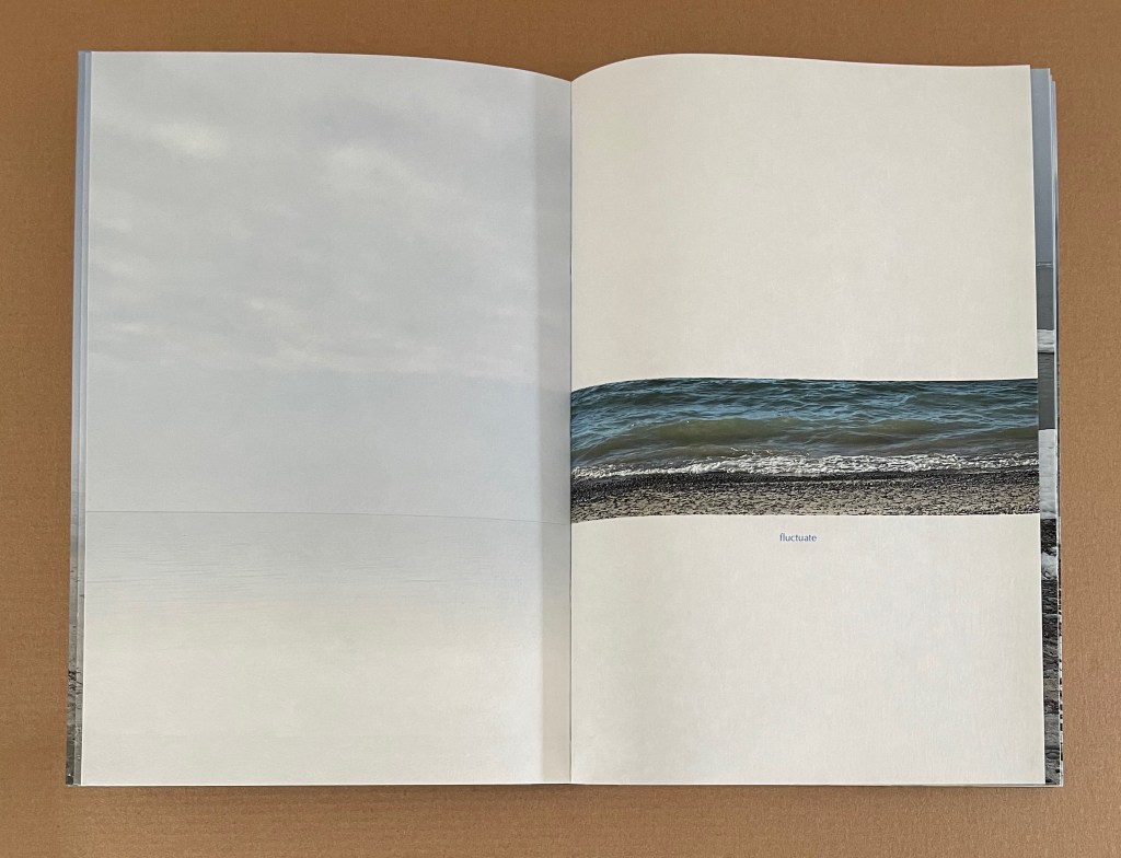
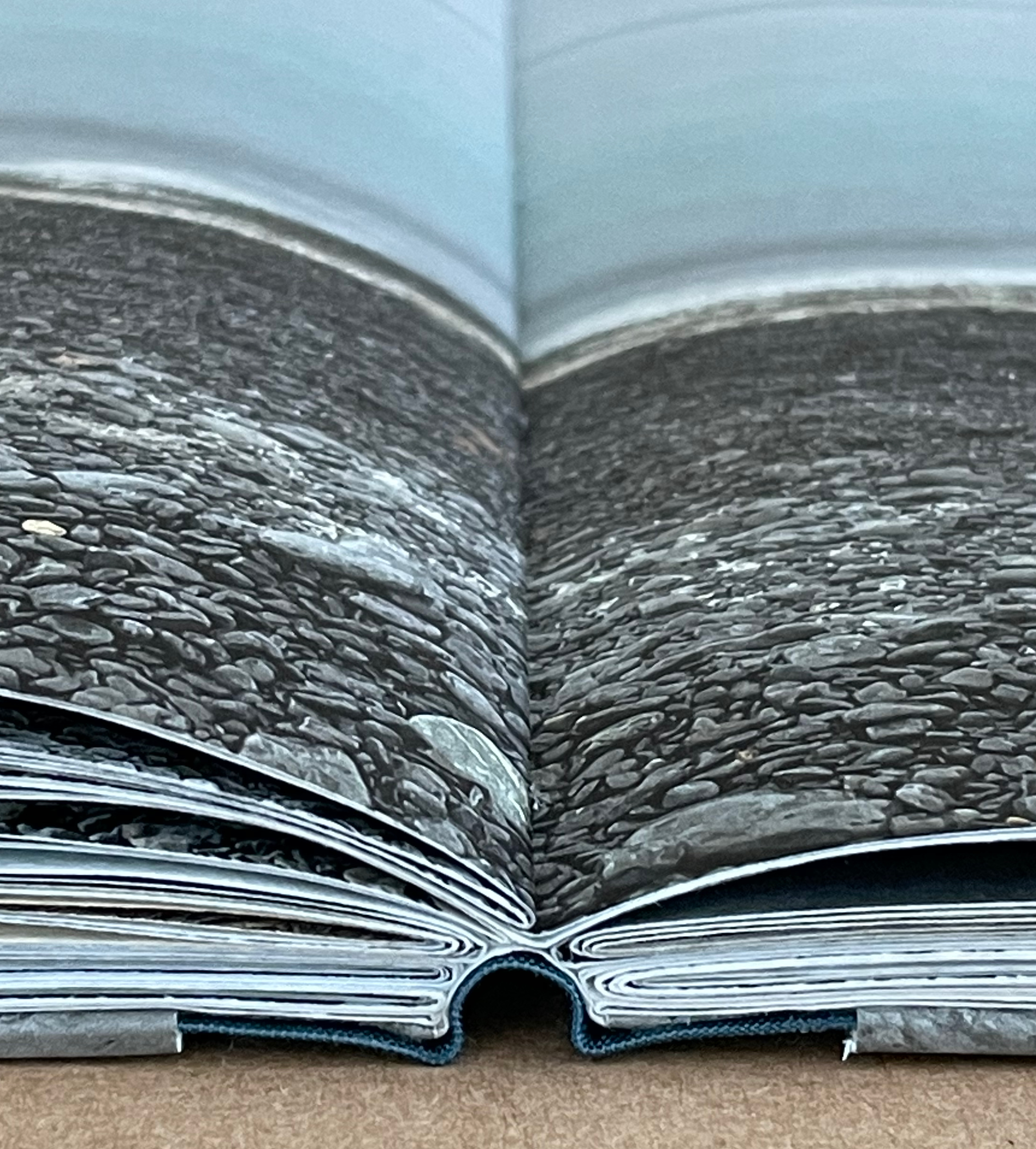
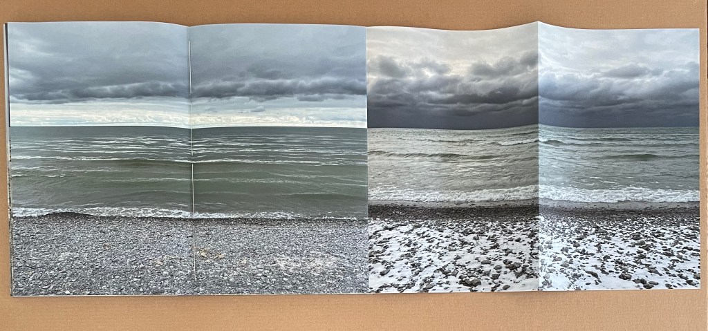
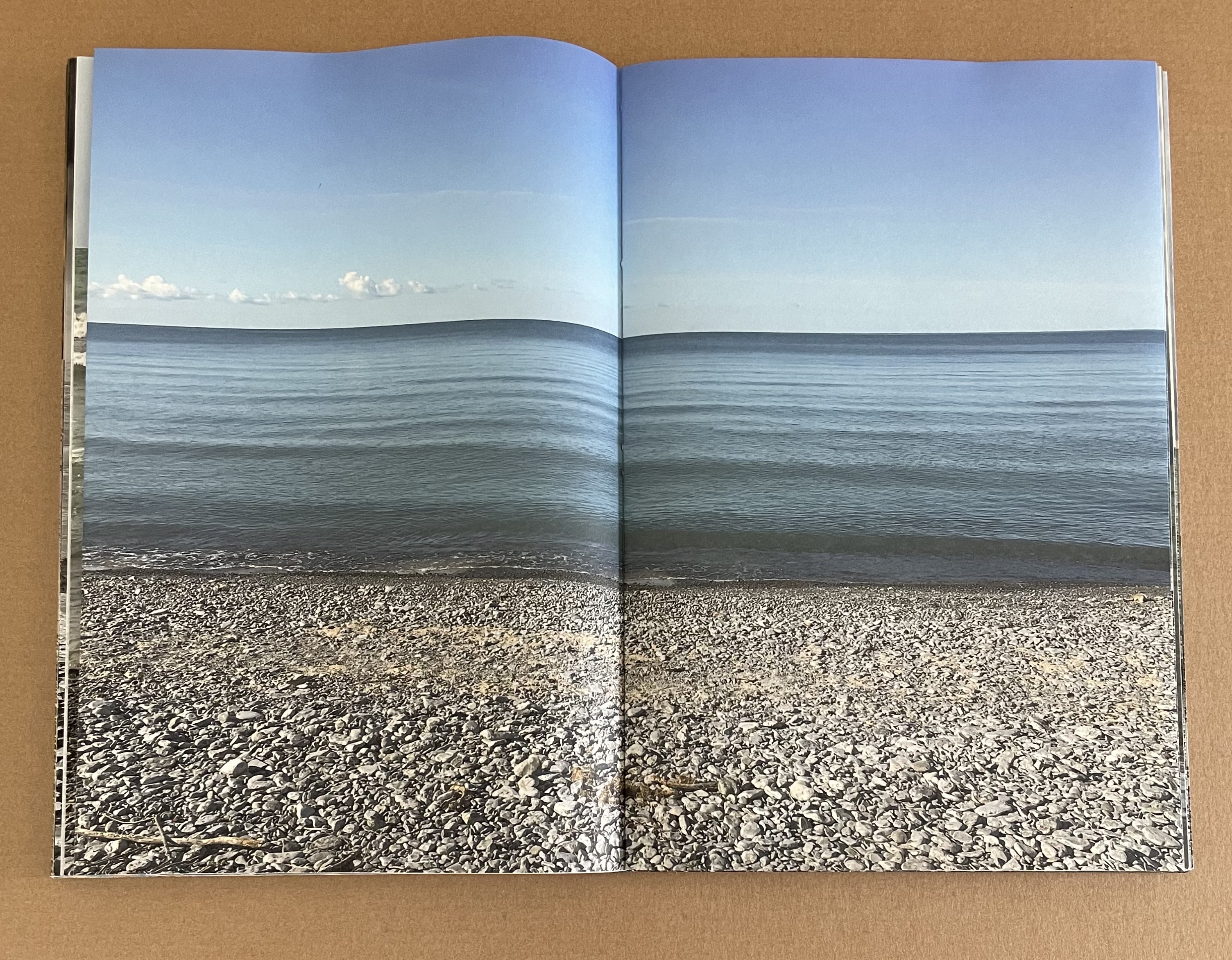
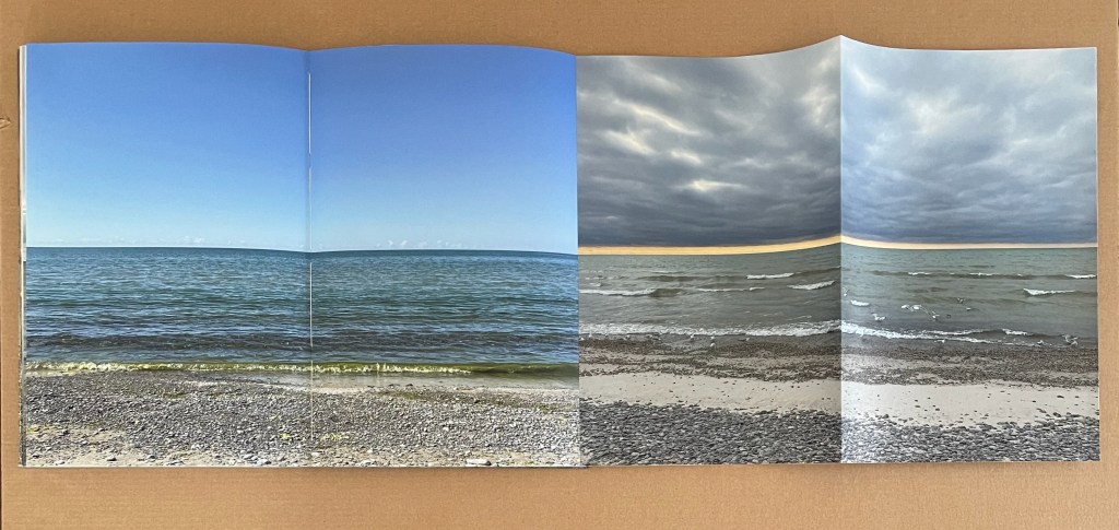
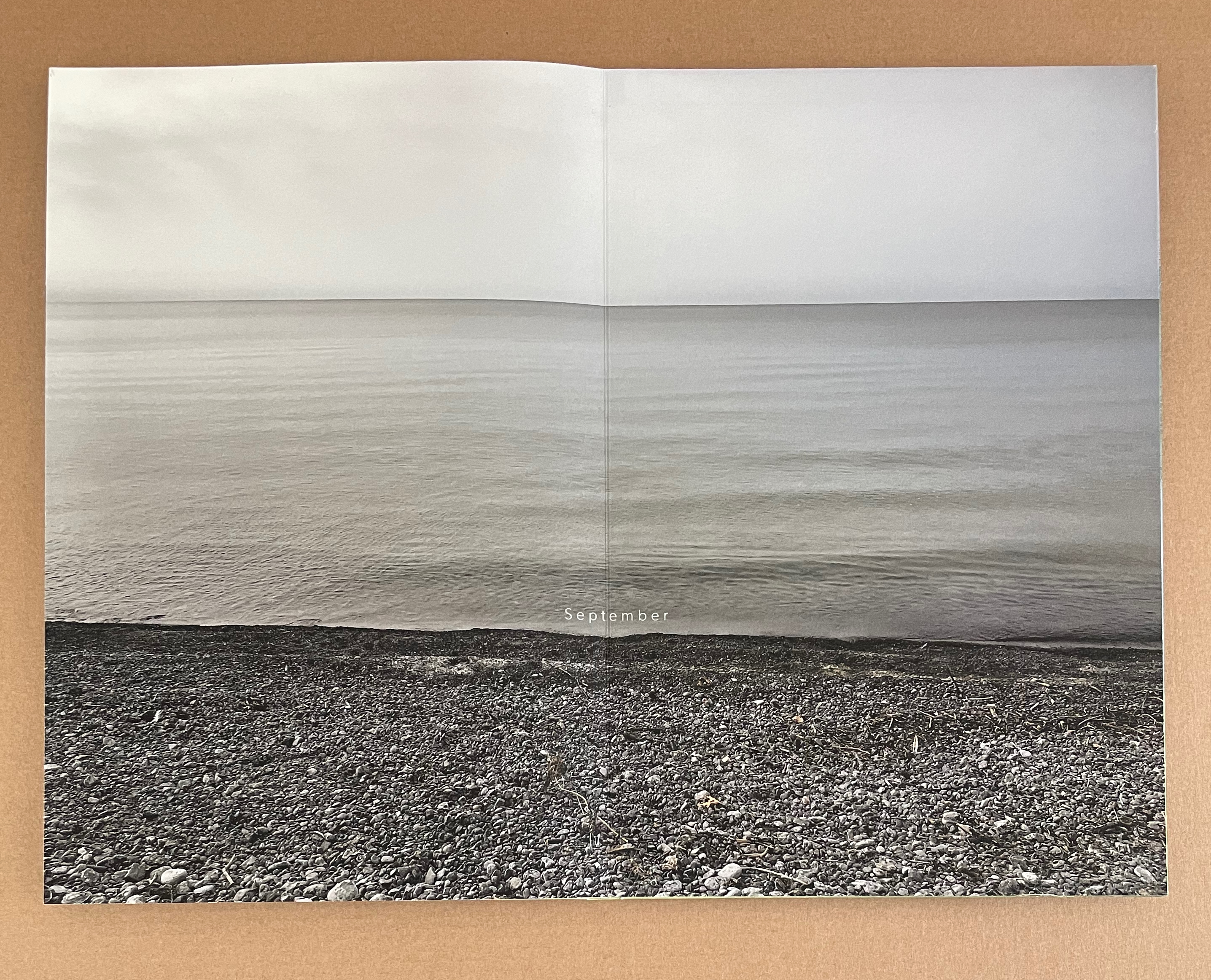
In “fluctuate”, to capture the seasonal fluctuations from her fixed vantage point, MacCallum introduces a bookmaker’s element of spatial fluctuation: the accordion foldout. Deft registration of horizon and shoreline presents a seasonal contrast even before the accordion extends. When it does extend, the horizons and shorelines align across all four seasons. When the entire extended accordion above turns to the left, MacCallum returns to the spatial fluctuation of slicing the image. Three narrowing slices of the lake view move across the accordion folds to point to the next section, labeled “sublimate”.
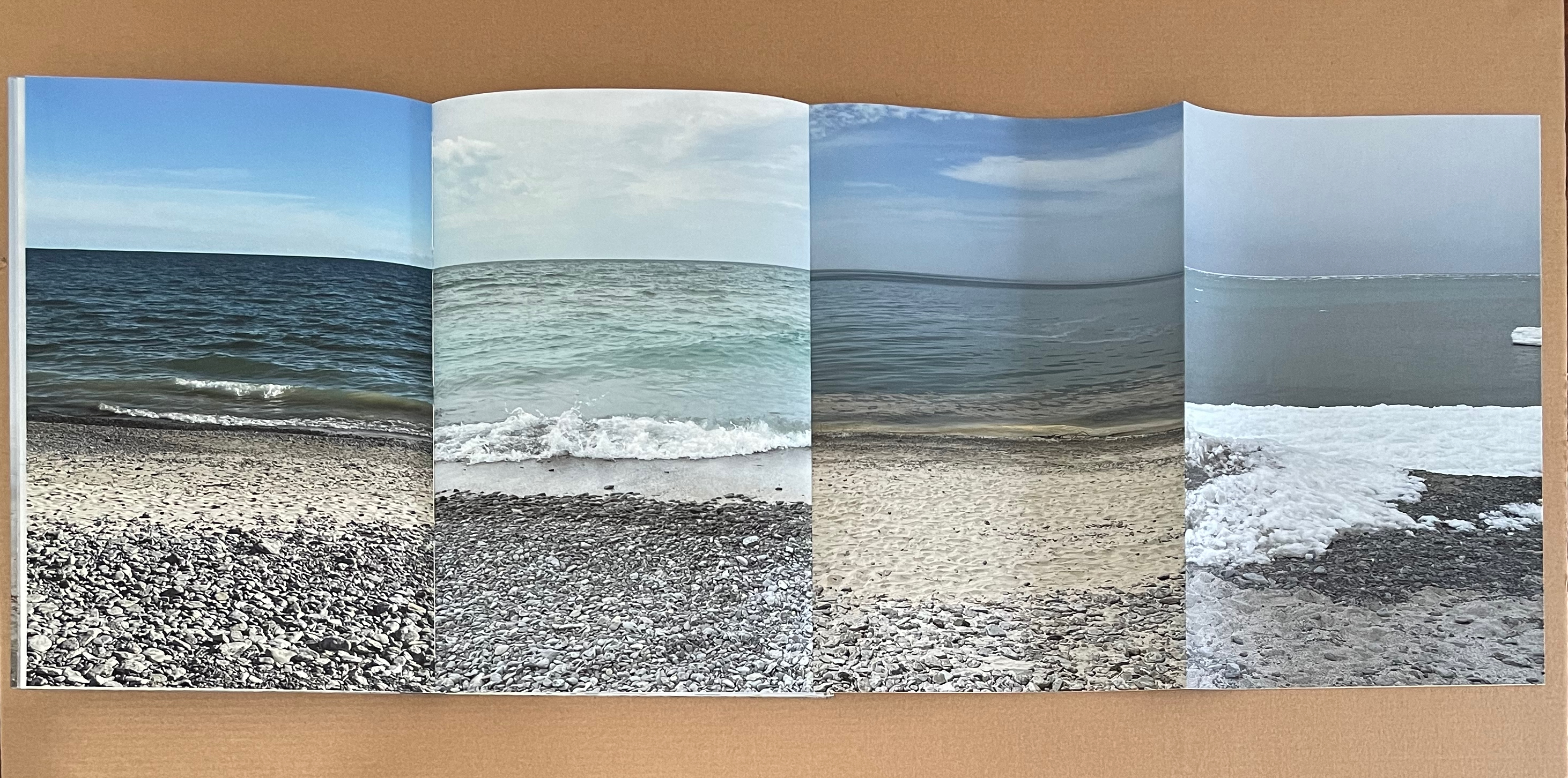
So much is going on in “fluctuate”. First off, note how the winter image at the end of the accordion’s “four seasons” view reappears to begin the accordion’s “narrowing slices” view. The way the ice floe and shoreline align at this edge of the accordions, the viewer might think the image is wrapping over a folded fore edge the way the front cover’s image wrapped onto the pastedown. It is not. The two accordions are pasted together at the fore edge, which speaks volumes for the precision of alignment. Alignment continues to draw attention to itself across this side of the accordion, but differently from the other side. Across the narrowing slices, it jumps from an alignment of horizon to one of shoreline.
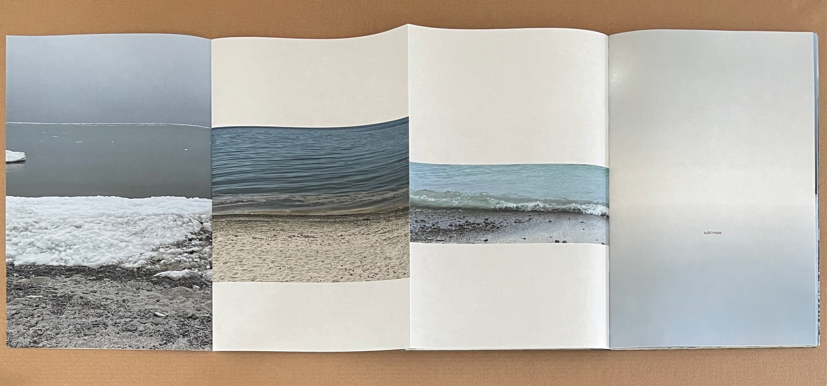
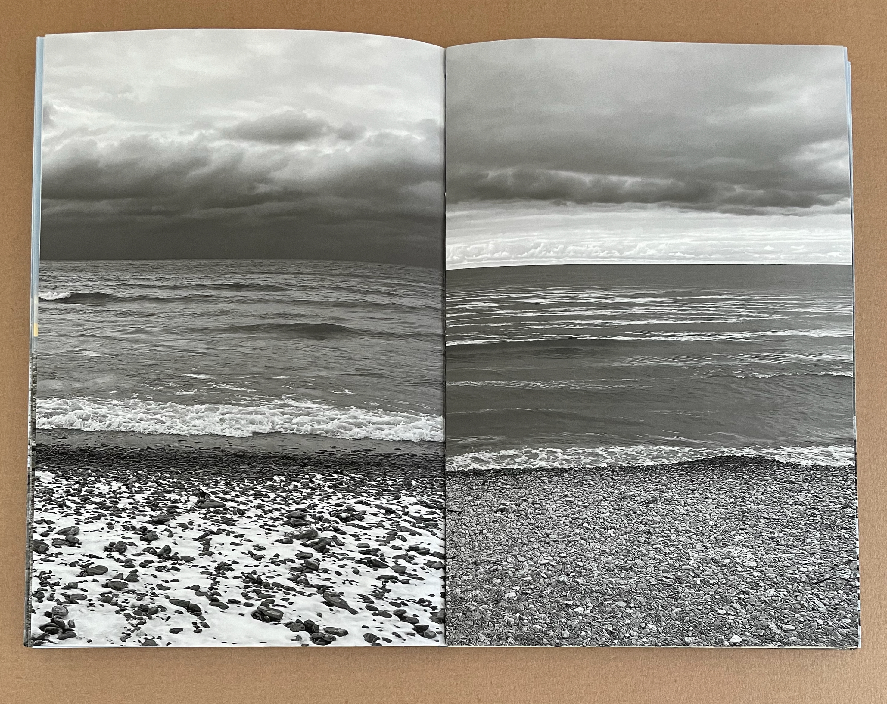
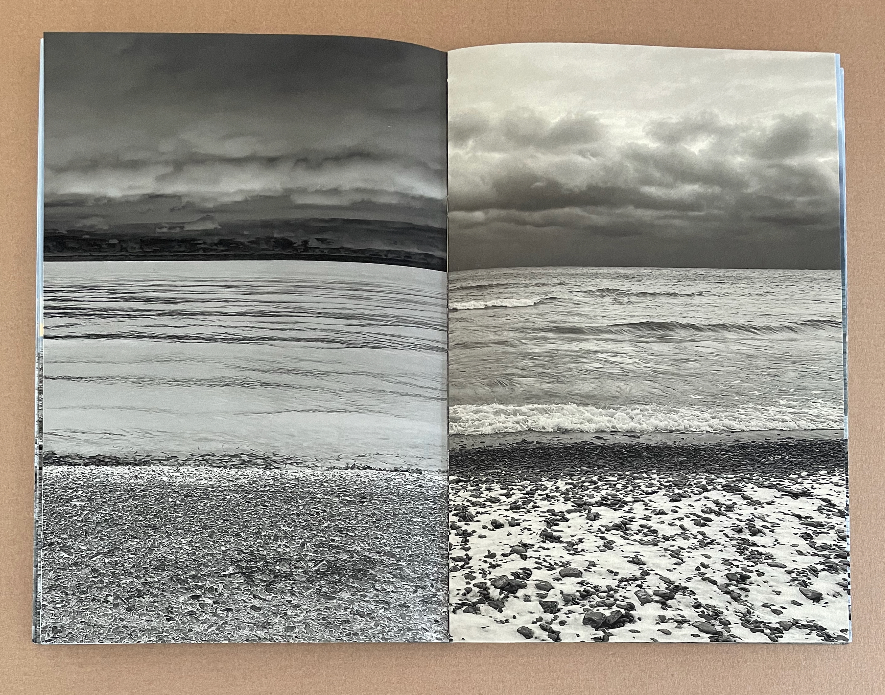
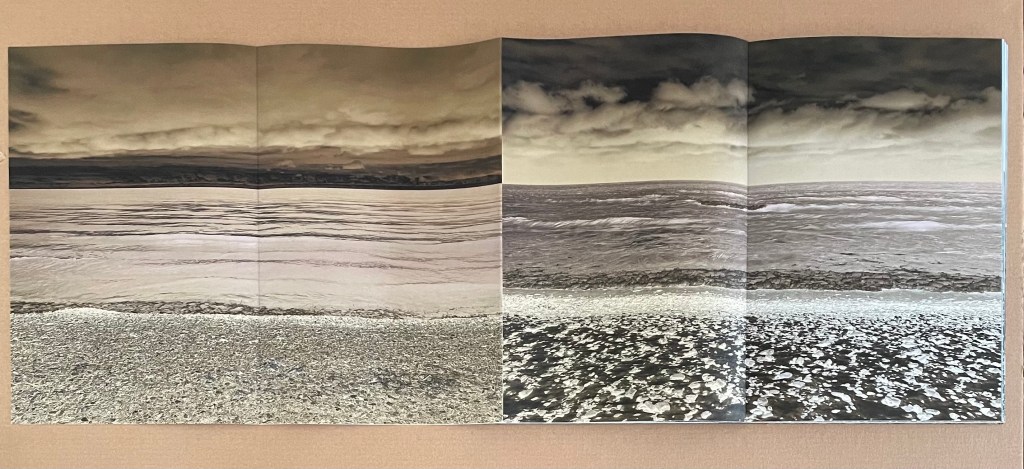
In the second section — “sublimate” — MacCallum is more straightforward, presenting five panoramic views across five double-page spreads. In chemistry, sublimation is the transition of a substance directly from the solid to the gas state without passing through the liquid state. In each of her five panoramas, only the thinnest horizon of water separates the ground from the sky. Here are two of them.
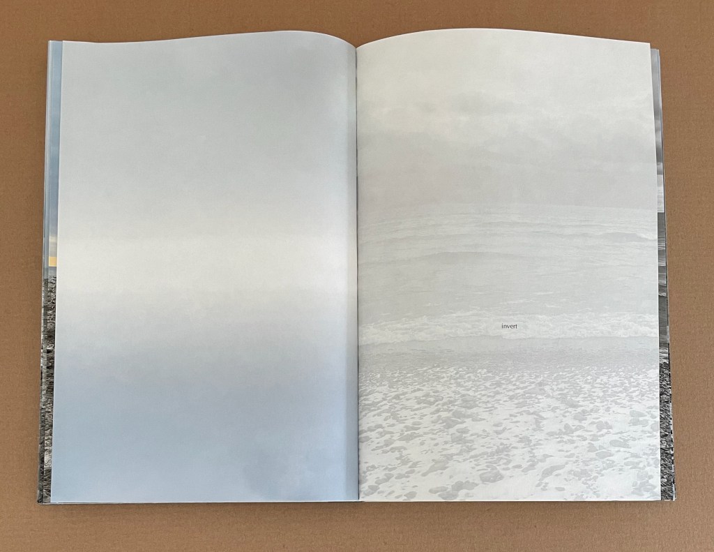
In the next section — “invert” — MacCallum combines varied page structure with photographic inversion to advance her metaphor of shift. Four single-page images introduce “invert”. Just as we recognize the device of photographic inversion, MacCallum makes it more dramatic with four double-page images spread across both sides of an accordion foldout. On the first side of the accordion, we have two double-page positive images; on the second side, we have their negatives in a sepia tone. Negatives turn water and snow into slate and glass.

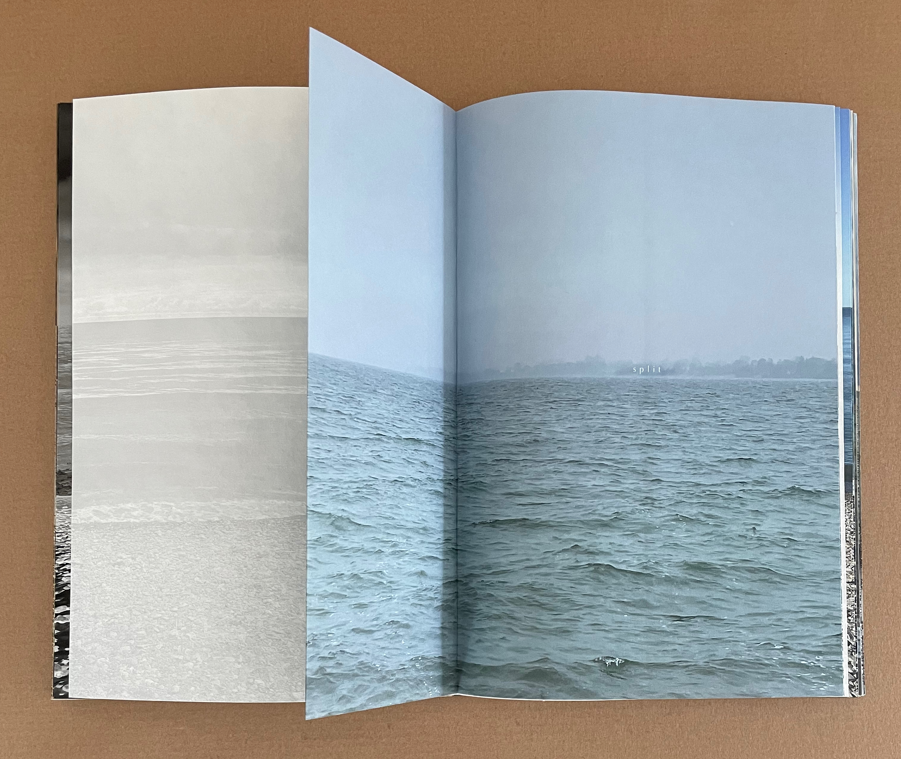
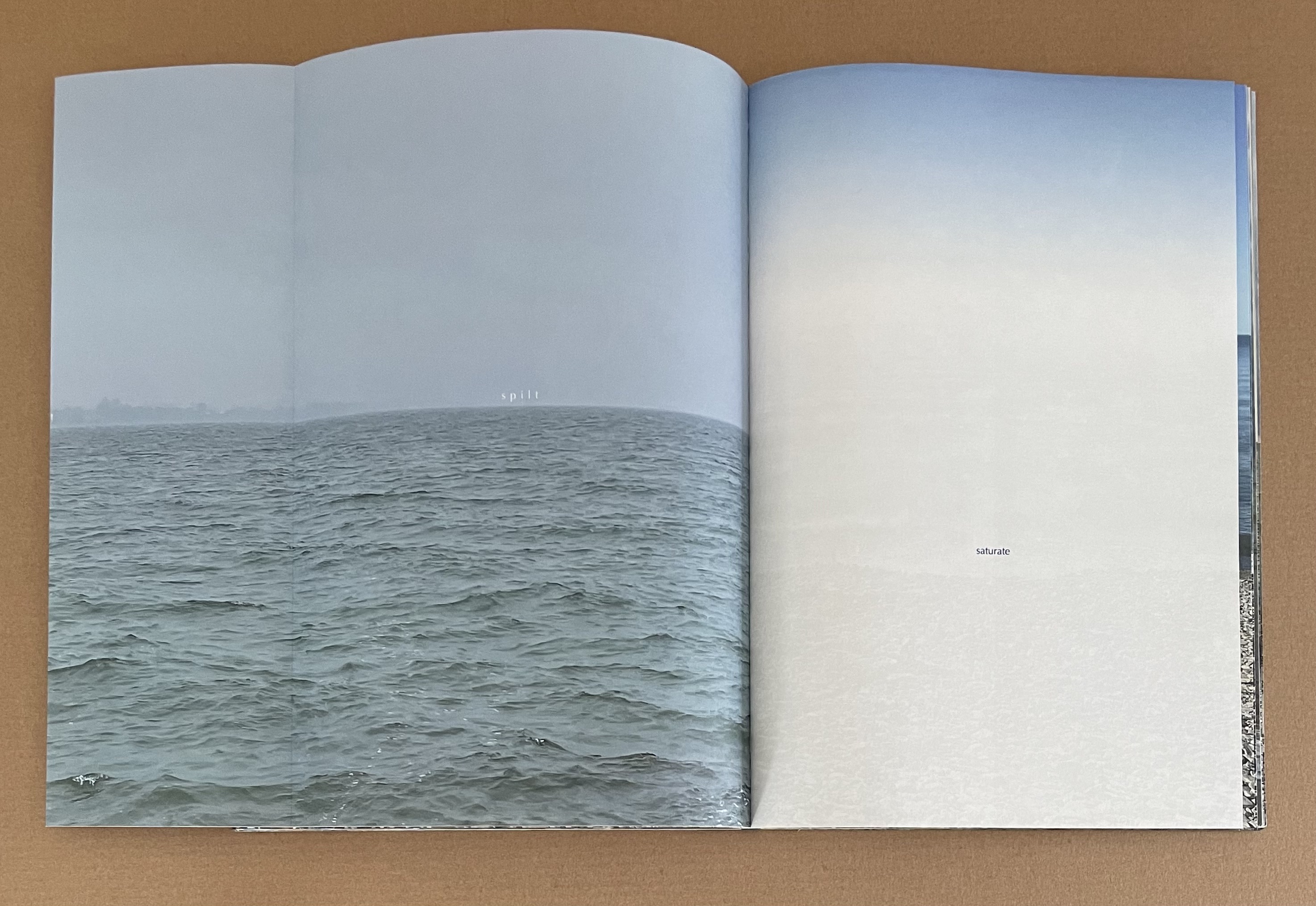
In the fourth section — “lit/split/spilt” — MacCallum uses the traditional “reveal fold” of movable books on either side of a double-page image to merge a verbal shift with a visual one. The first fold transforms the word “lit” into “split”, hovering in white lettering just above the relatively calm lake horizon. That calm surface under a blue filter disappears violently into a full-color double-page image of waves crashing into the lakeshore, which returns on the next page to the filtered calm surface and the word “split” across the second fold. The second fold turns to transform “split” into “spilt”, reminding us of the sudden shifts and spills we have just seen. As the visually and tangibly shortest section in the book, “lit/split/spilt” serves also to mark the midway point of the seven sections.

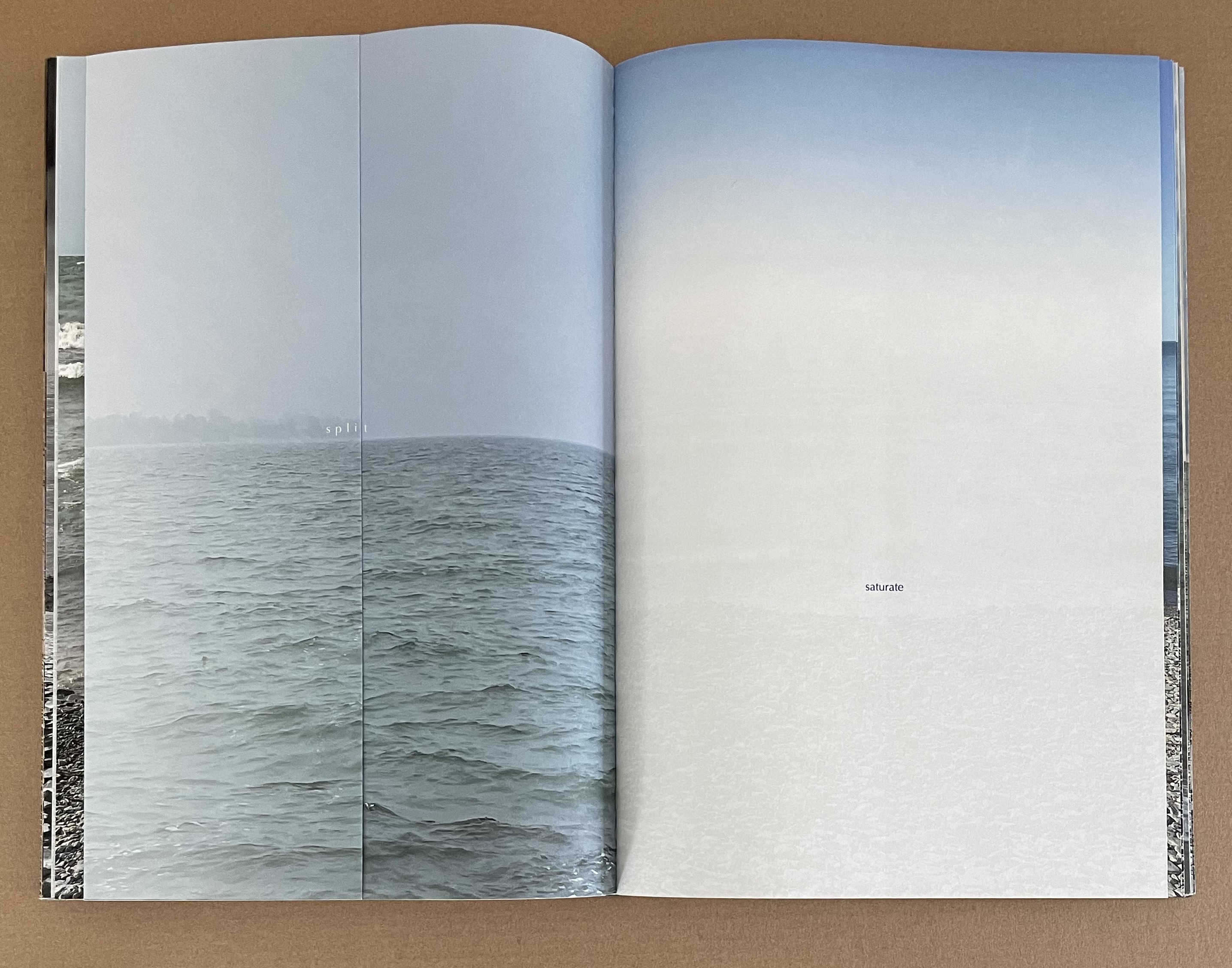
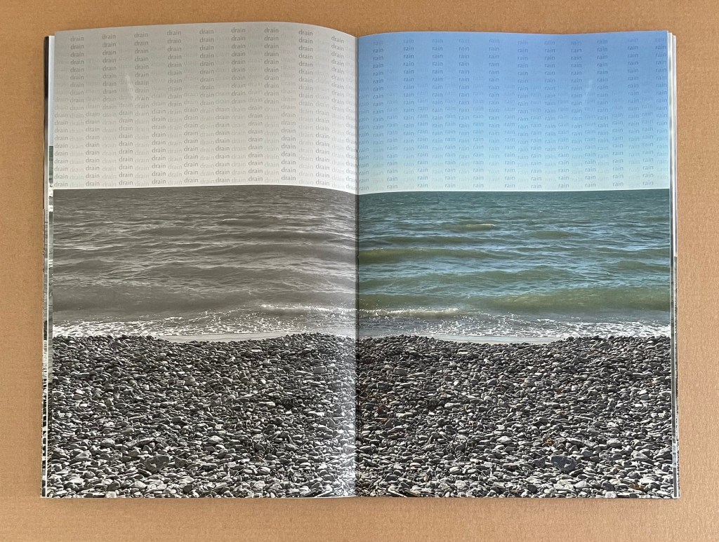
In “saturate” — the fifth section — we have five double-page images, three of which enact the words that appear across them: “drain rain drops rise soak the sky”. On the page where the word “drain” repeats in columns above the horizon, the image has been drained of color. On the facing page completing the double-page image, color returns as columns of the word “rain” fill the sky.
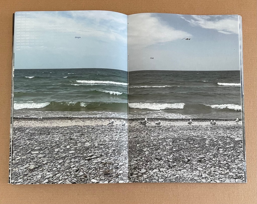
In the next double-page image, the recurring word “rain” on the left seems to condense into the single word “drops”, paradoxically above the word “rise”, appearing on the right half of the image from which the color again is draining.
Color continues to drain from the next double-page image’s left half that bears the word “soak”. The page may not be soaked with color, but it verbally and visually depicts the physics of vapor rising from the lake’s surface to saturate the sky, to which color does begin to return in the right half that bears the word “sky”.
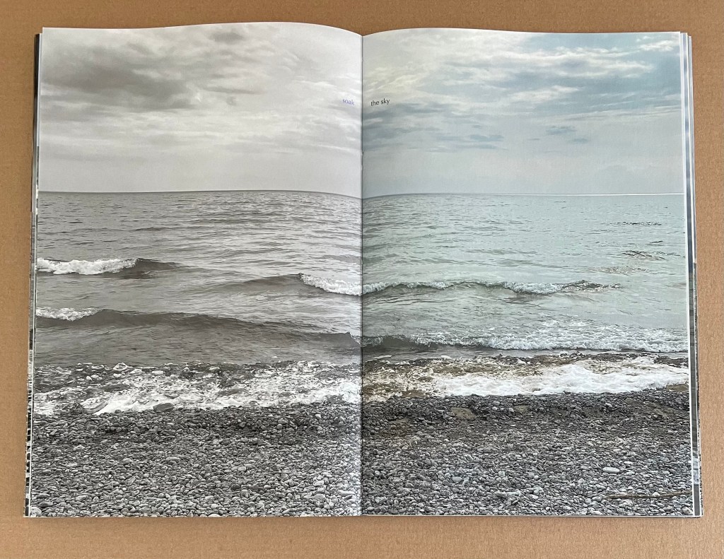
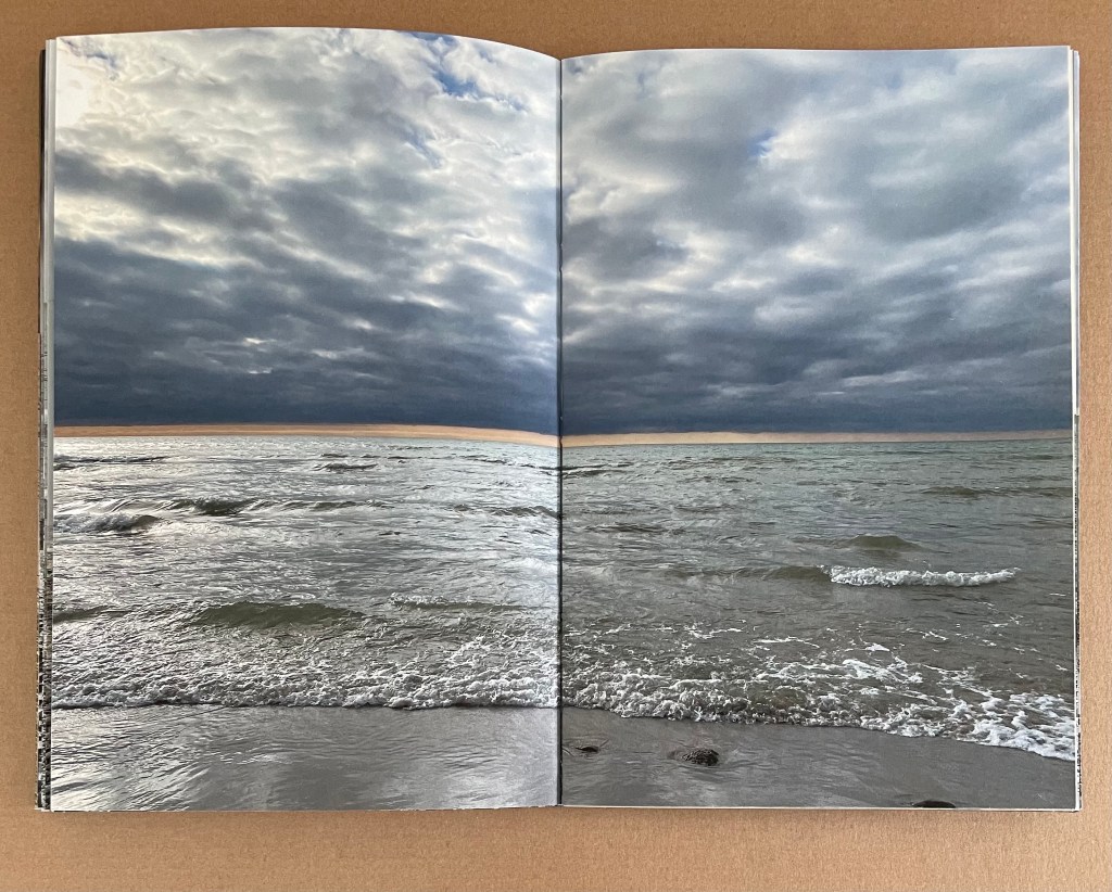
The two double-page images that bracket these three verbal-visual dances contrast dramatically with each other. The deep rich color of the opening scene has been replaced by the dimmer, hazier tone of the closing scene. This may be another pairing of waking and sleeping, but the words and transformations in the scenes between them might carry an overtone of environmental worry.
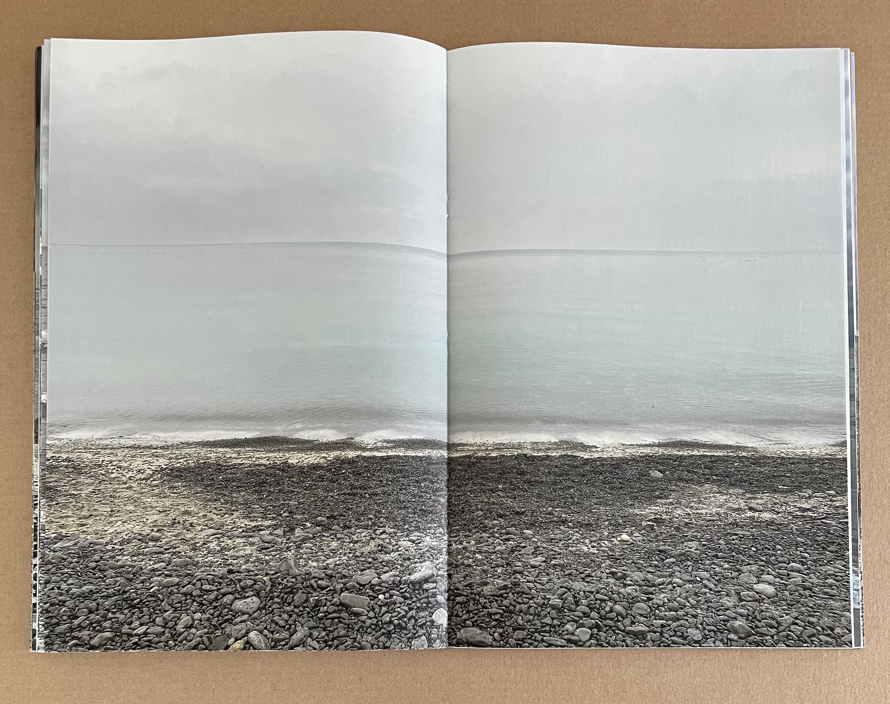
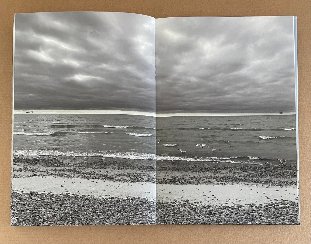
The sixth section — “cloud” — continues the verbal-visual dance with seven double-page images. The richly colored opening scene suggests we are in for a dramatic series of cloud views, but in the immediately following sepia-tinged image, MacCallum wrong-foots us and directs our attention down to the water’s edge. With each succeeding image, the cloud lifts, and we can see further out until finally the sepia departs, and we return to a full view of the sky, though only a shadow of the opening scene’s threatening dark blue.
The verbal part of the dance depends on the page turn. The word play of “over / lap / over / lay / over / cast / turn / down / cast / shadow” can only be appreciated by turning the pages. In fact, the words “over” and “turn” positioned at the right hand edges seem as much an instruction for turning the page as they are part of the word play and verbal allusions to the visual scenes. The positioning of all the words has two other functions in the verbal-visual dance. They are precisely aligned with one another across the ten pages on which they appear. Our left to right reading habit makes our eyes follow this horizon, while the words’ meaning and the visible images pull our eyes up the page from the water’s edge to see through the cloud.
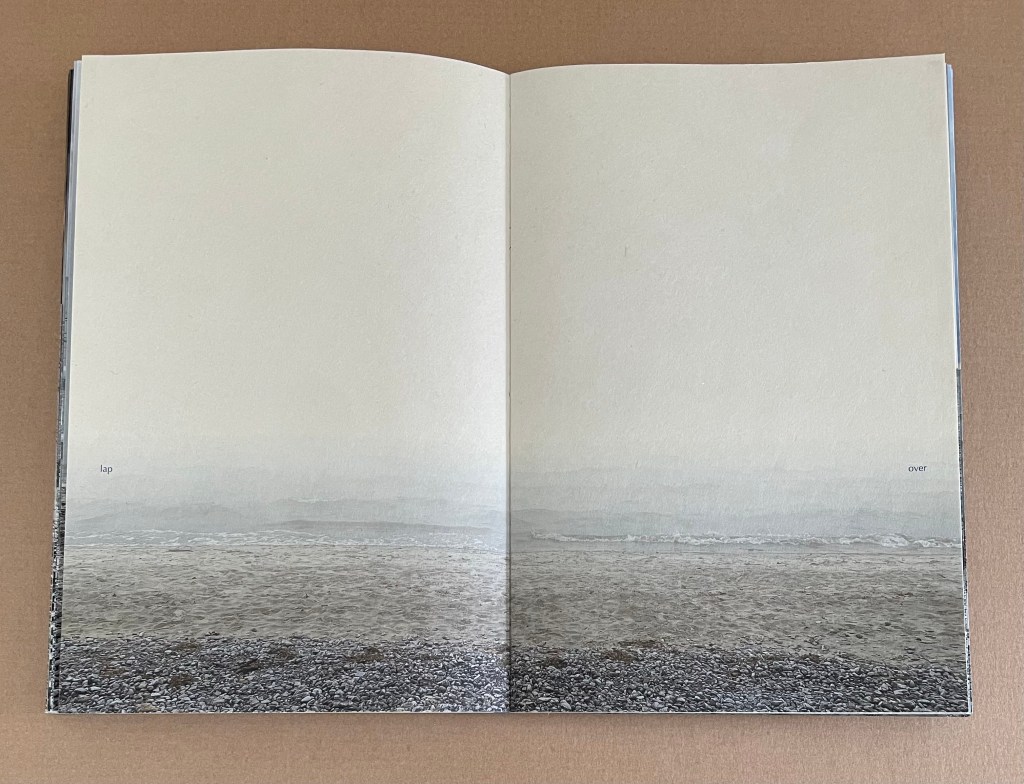
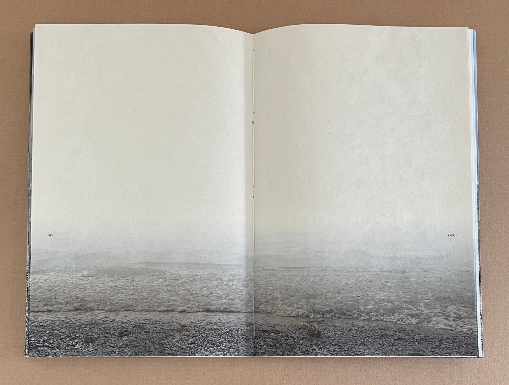
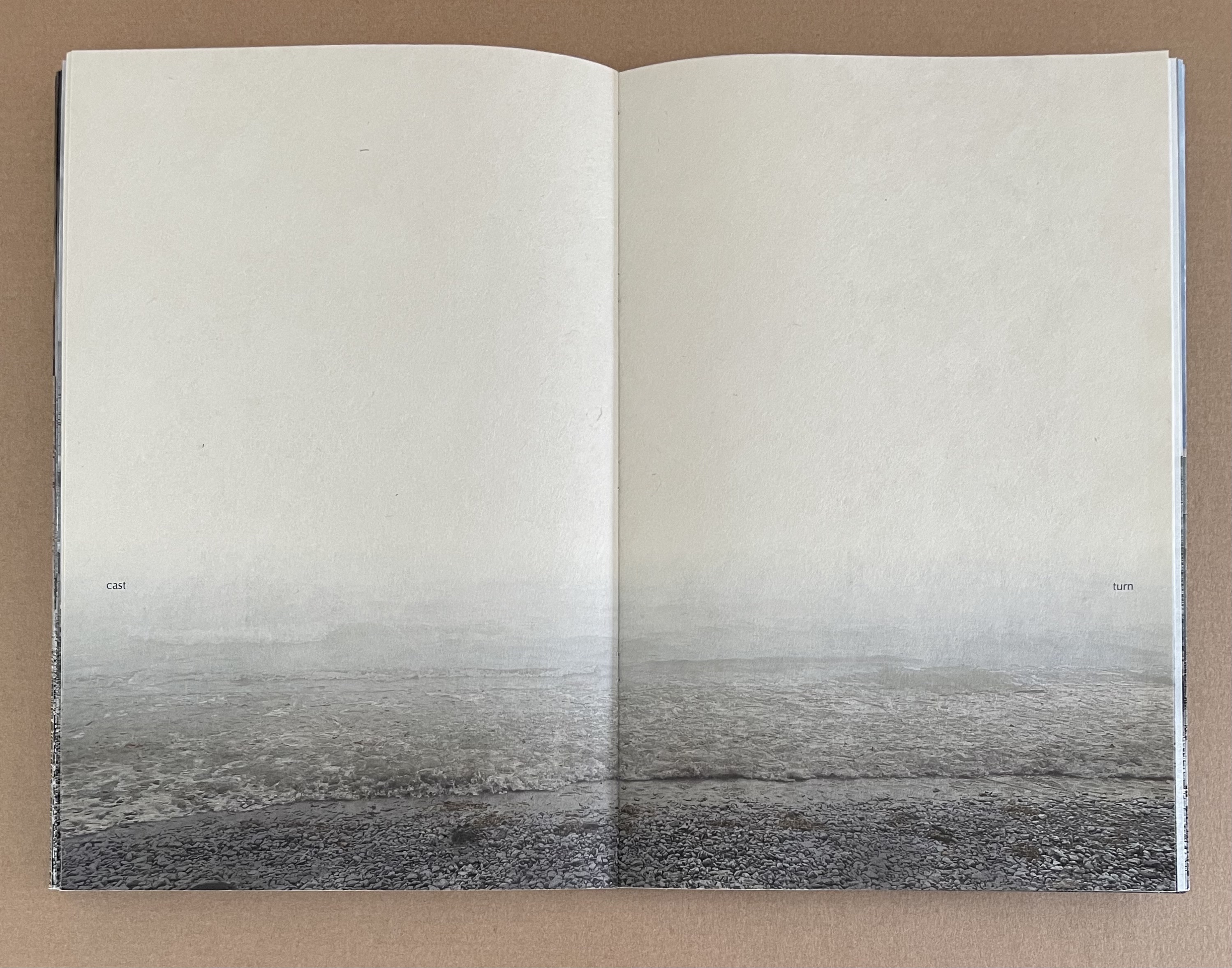
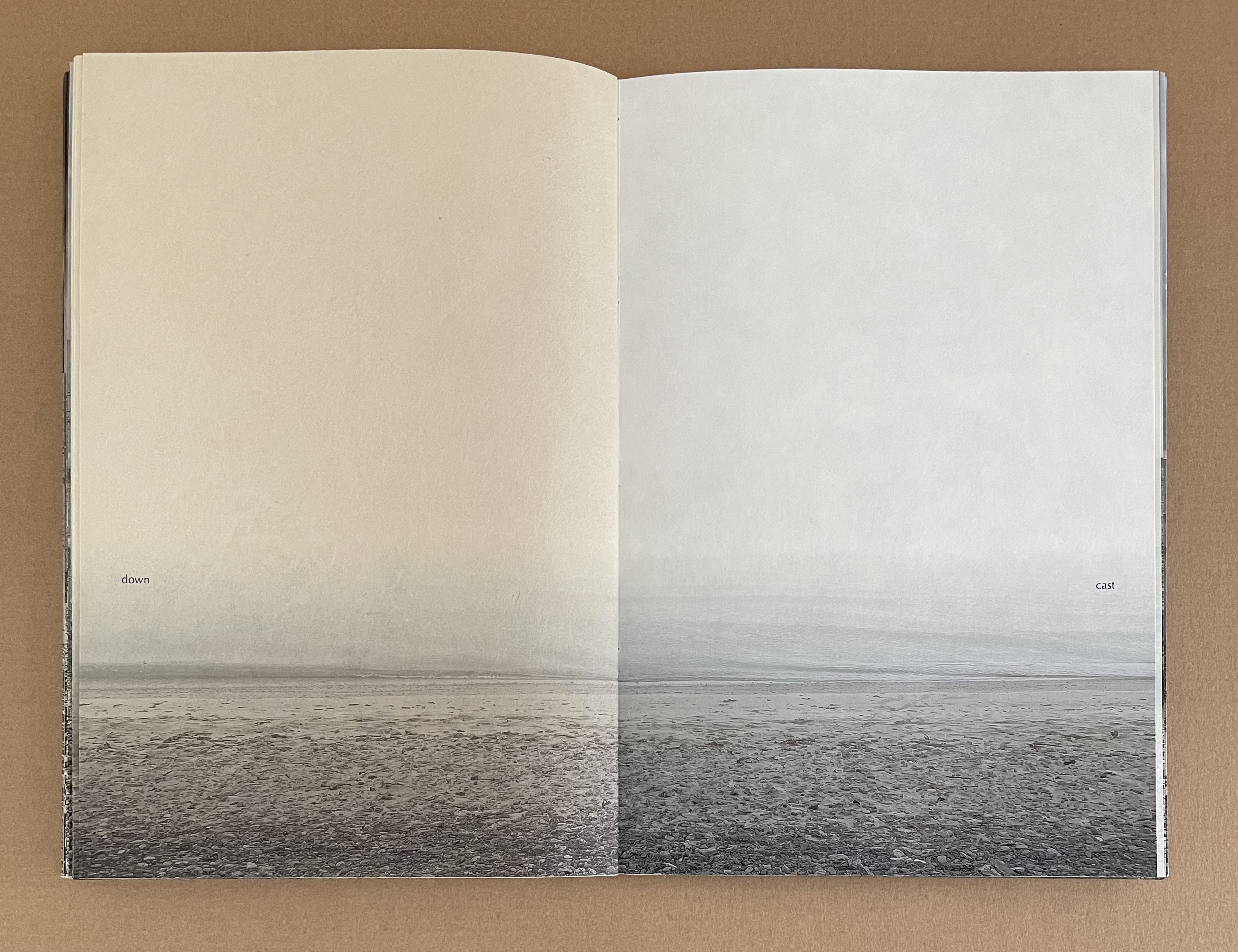
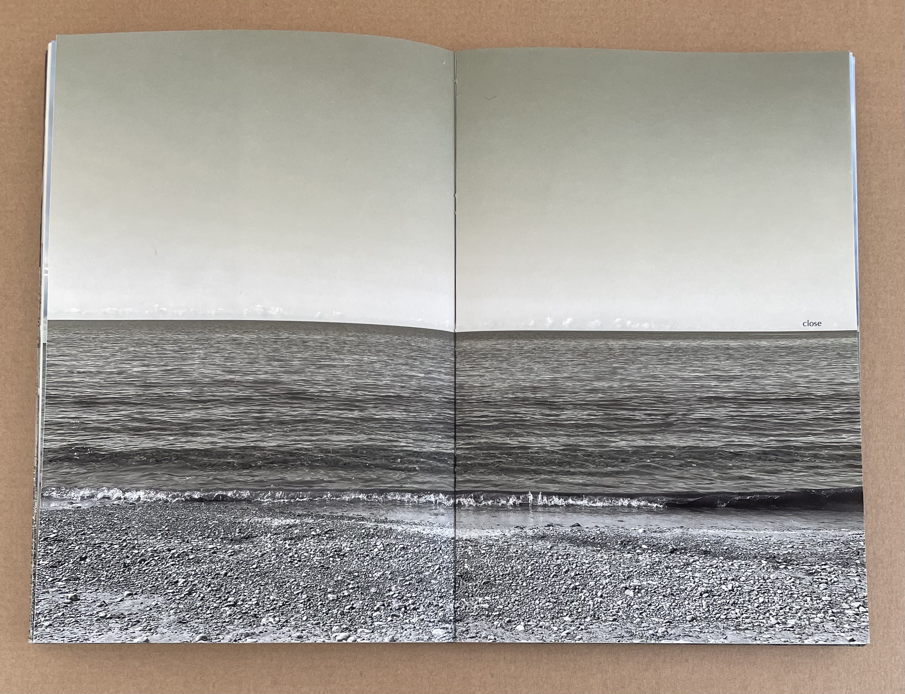
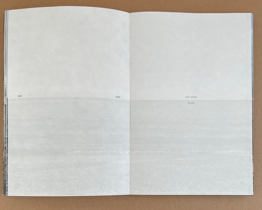
At the end, the horizon is visible again, but the remaining word — “shadow” — has almost disappeared in white against the lake surface.
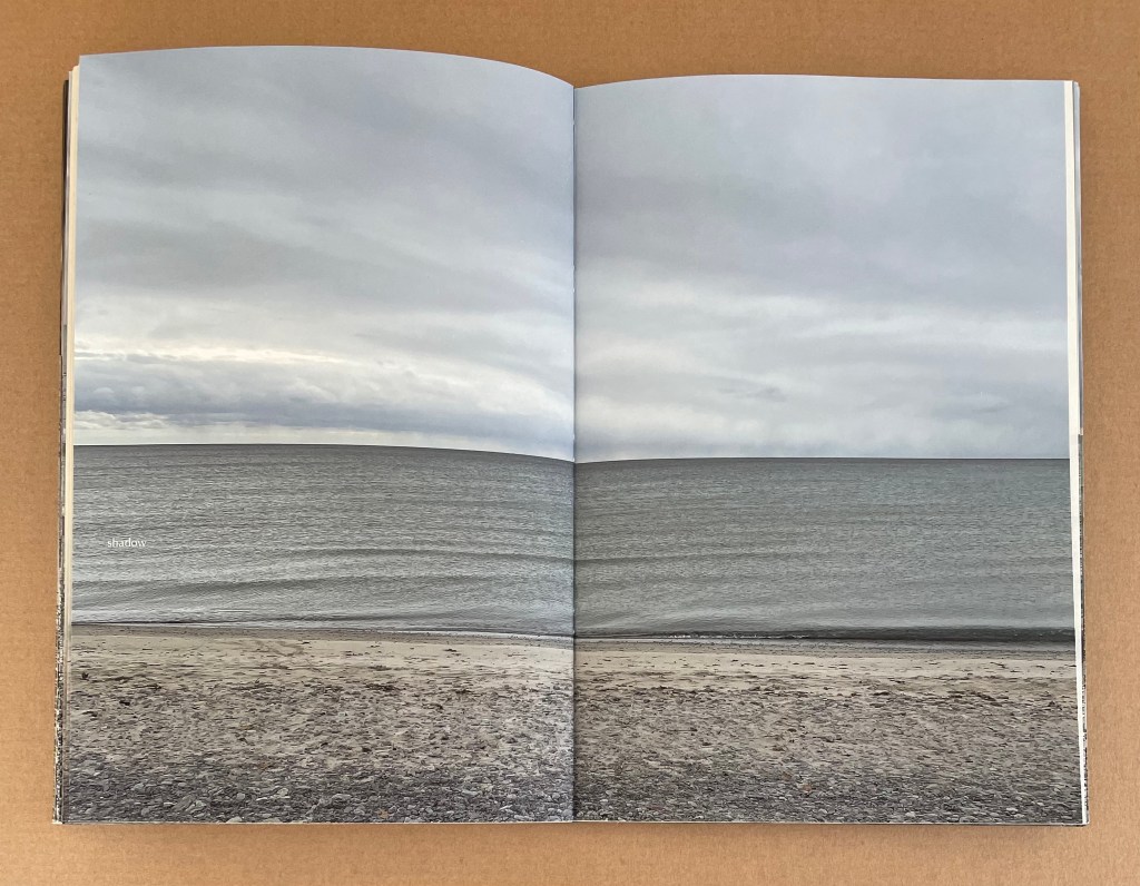
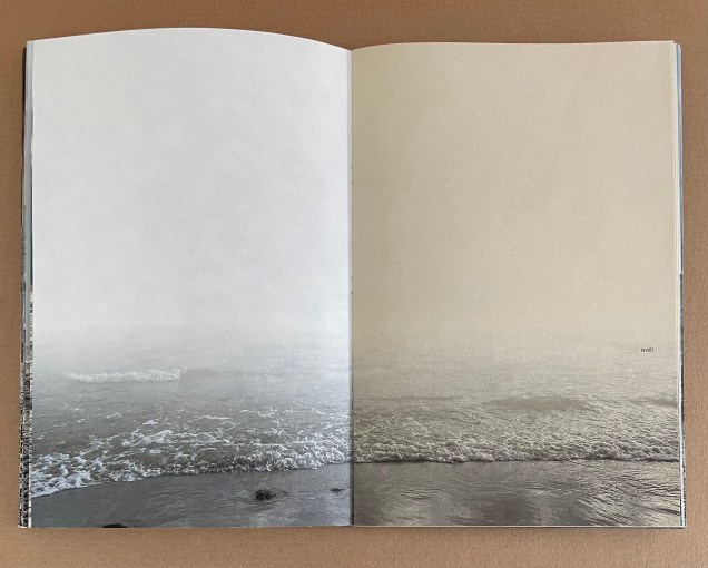
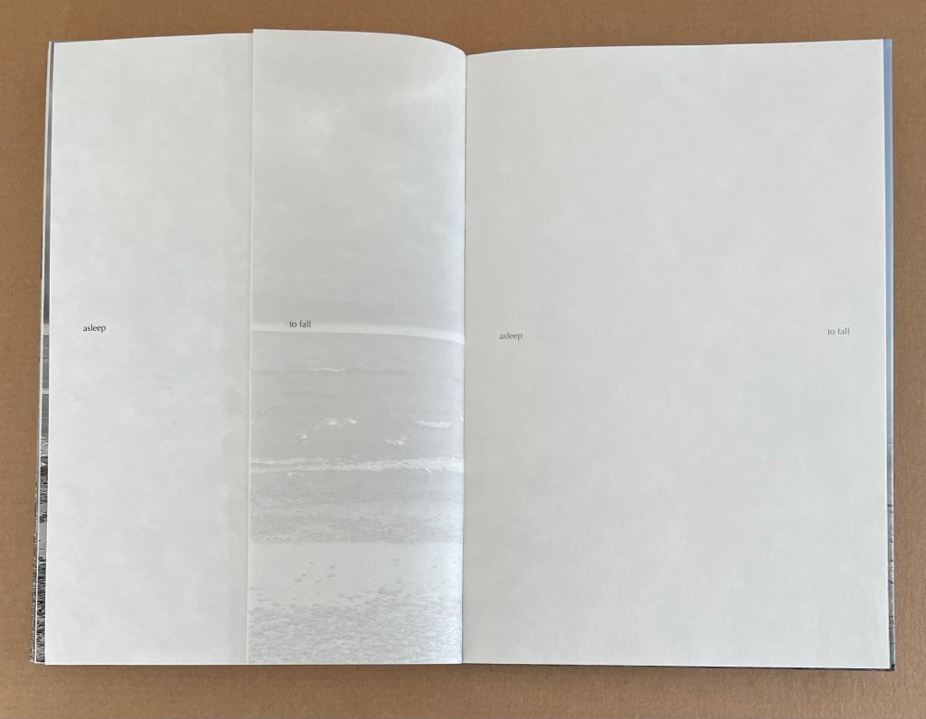
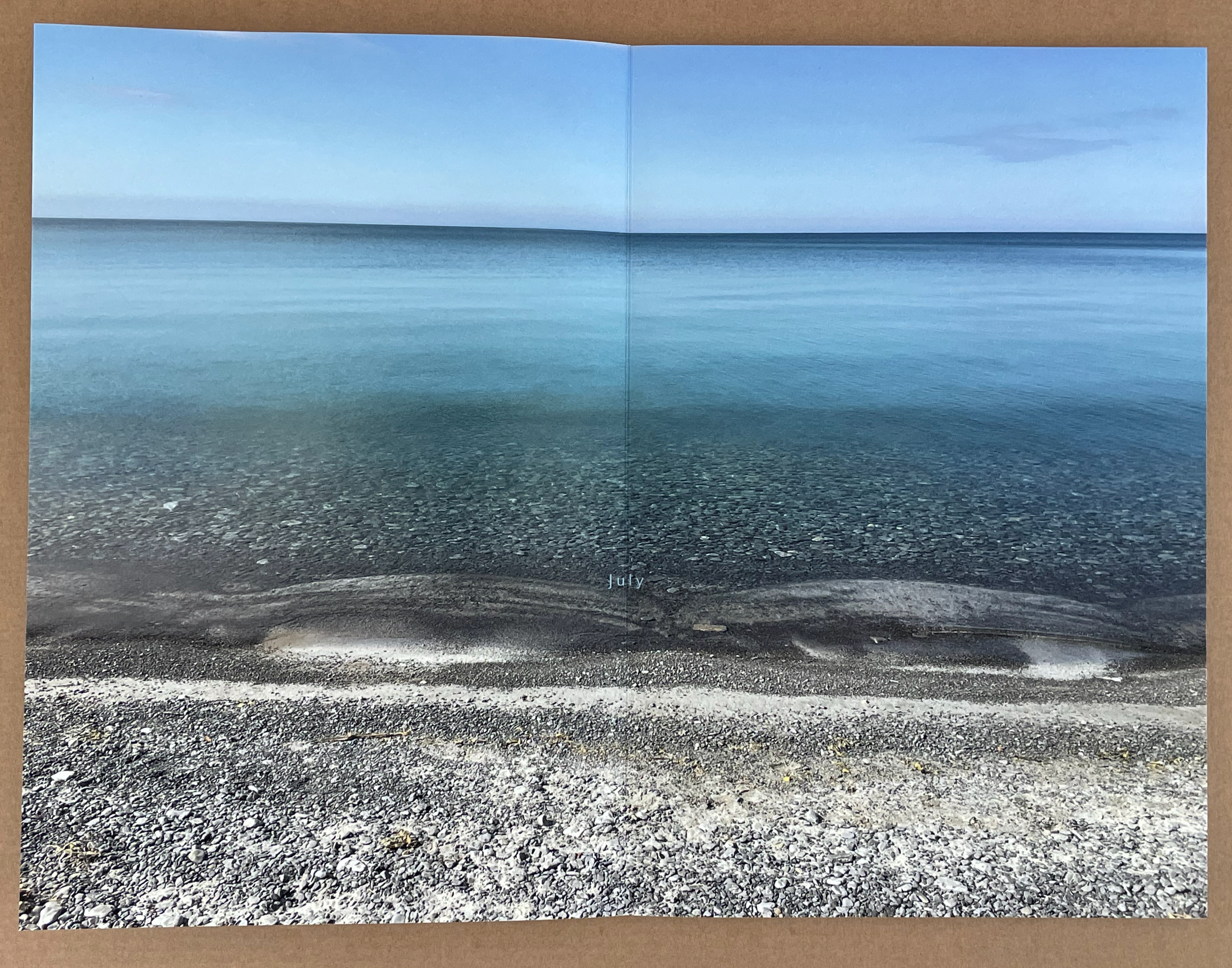
The increasing complexity of the verbal-visual dance culminates in the seventh section — “sleep walk”. Here, almost all of the previous sections’ devices come into play along with some new ones. In white, the barely perceptible word “shadow” carries over from the end of the “cloud” section but moves up the page just above the horizon in alignment with the word “walk”, which becomes “sleep walk” when the reveal fold device is turned. The ghosted image’s horizon on this page aligns exactly with that in the following double-page scene, which is full detail but drained of color. The word “close”, pitched paradoxically above the far horizon, becomes an instruction on the next double-page scene to “close / one eye”. Just to make sure we got the instruction, words in a smaller font, fainter ink and split by the horizon on the right half of this scene mimic the state they describe: “half asleep in July”.
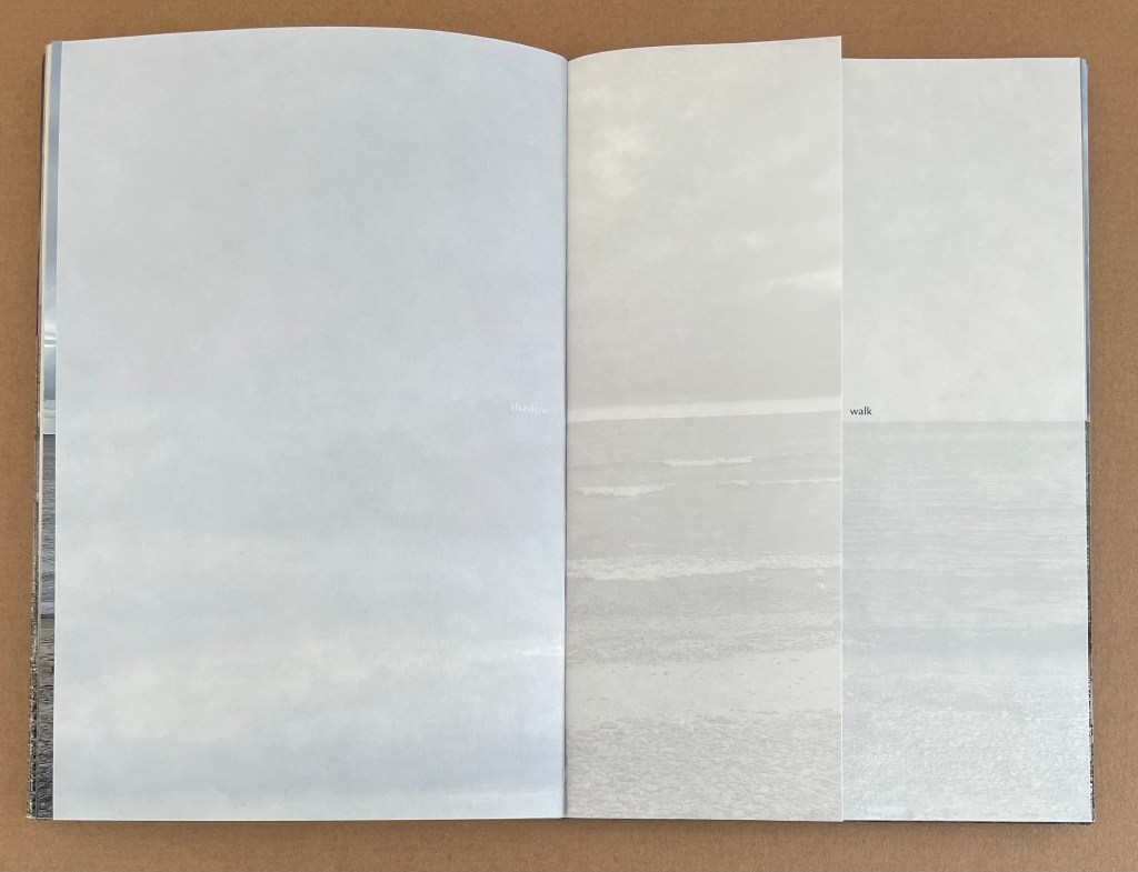
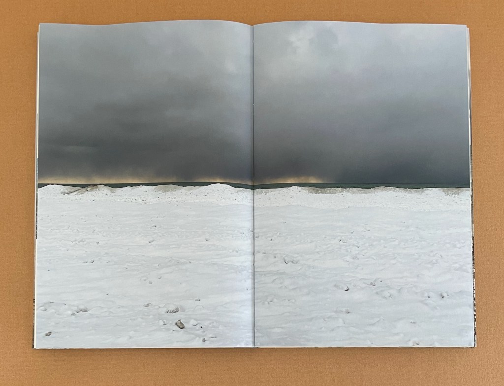
Then, to wake us up and perhaps remind us of the environmental worry, along comes a wordless full-color foldout, a double panorama, one displaying algae-clogged water under a clear sky and the other displaying a mussels-clogged strand under heavy dark clouds. When the foldout is turned to the left, the “fluctuate” device of sliced views comes back but with the difference of words imposed at right angles across them. We are to “sleep / walk / swim” through one of the book’s few text-only pages — “in December’s frigid … open / water”, which the following gray overcast double-page spread portrays.
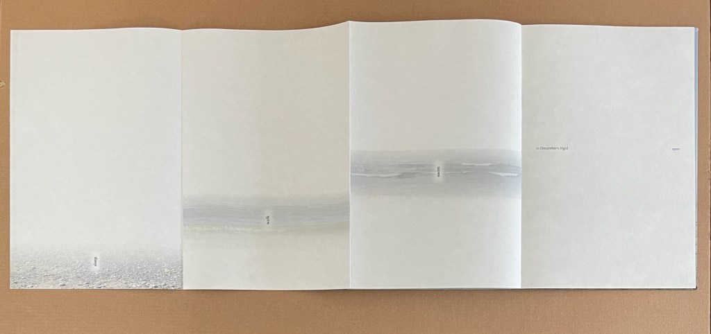
From the dark double-page scene, the verbal-visual dance unwinds in the book’s few remaining pages. We move into pages with no images (except for one ghosted scene on a vertical half page). We have fallen into an almost purely verbal dance of shifting seasons (summer and fall) and states (asleep and awake) —
“asleep / in full summer / awake / to fall / asleep … to fall”
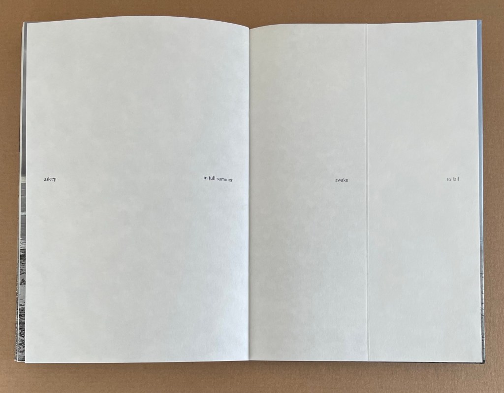
And then, we end with the faded single word “awake” on an otherwise blank page facing the ghosted image of the pastedown, just as the book opened. The verbal-visual dance — or sleep walk — has ended in a split state of cold awakening.
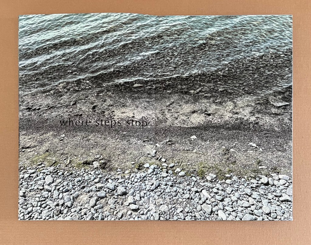
where steps stop (2023)
where steps stop (2023)
Marlene MacCallum
Slipcase constructed of Eterno boards and Asahi book cloth, with four volumes, each with drumleaf binding and cover images printed on Aya paper wrapped over Eterno boards. Slipcase: H265 x W177 x D39 mm. Each volume: H256 x W171 x D7 mm closed; each image spread: W341 mm. Edition of 8, of which this is #4. Acquired from the artist, 12 July 2024.
Photos of the work: Books On Books Collection. Displayed with permission of the artist.
We know that works of art require more than passive perception. Nevertheless, strolling through galleries and museums, we give an artwork only 25 to 40 seconds on average before moving on. Some forms of art will not tolerate this. Performance art, for example. Even more so, works of book art. They have no prescribed runtime, they demand more than seeing, and some, even more than touching. Sometimes, aside from requiring that we see with all our senses, they may even insist on understanding the tools, materials and process of making to be appreciated. MacCallum’s four-volume work where steps stop is one such case. Across this “quadriptych”, different elements of the photomechanical process contribute to the work in ways, some of which, we can only appreciate fully if we understand the process. Knowing becomes perception.
The first volume, when water colours, does not require much knowledge of the photomechanical process to appreciate the skilled use of color on a single page, or spreads, that speaks to how Lake Ontario’s water changes color from June to September. Even without the printed names of the months, we might guess from the “when” of the title that we are looking at color changing over time. It helps though to know that the artist has laid down the image of the lake and then run the printed image against another plate with a choice of type, ink and position for the words so that they “float” in just the right places. It is akin to knowing that Monet scumbled paint to realize his (and affect our) perception of color.

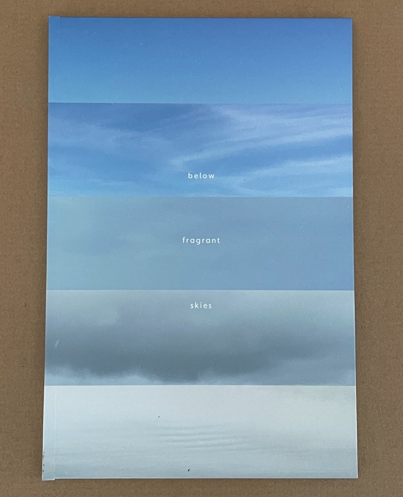
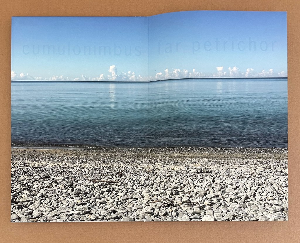
The second volume, below fragrant skies, also uses one word from its title in combination with elements of the photomechanical process and letterpress to deliver its perceptual effect. The word is “fragrant”. Although the letterpress typeface used for the words hovering in the sky is large, the ink is barely perceptible. The words name the sources of smells we are meant to sniff out: the fragrance of rocks (“petrichor”), the odor of lake molluscs (“nacreous”), the stink of “fish” (“pungent”), the scent of “rain” and tang of “stalled” smoke. Not everyone experiences synaesthesia, but MacCallum’s use of words, ink and images comes close to allowing us to smell sights.
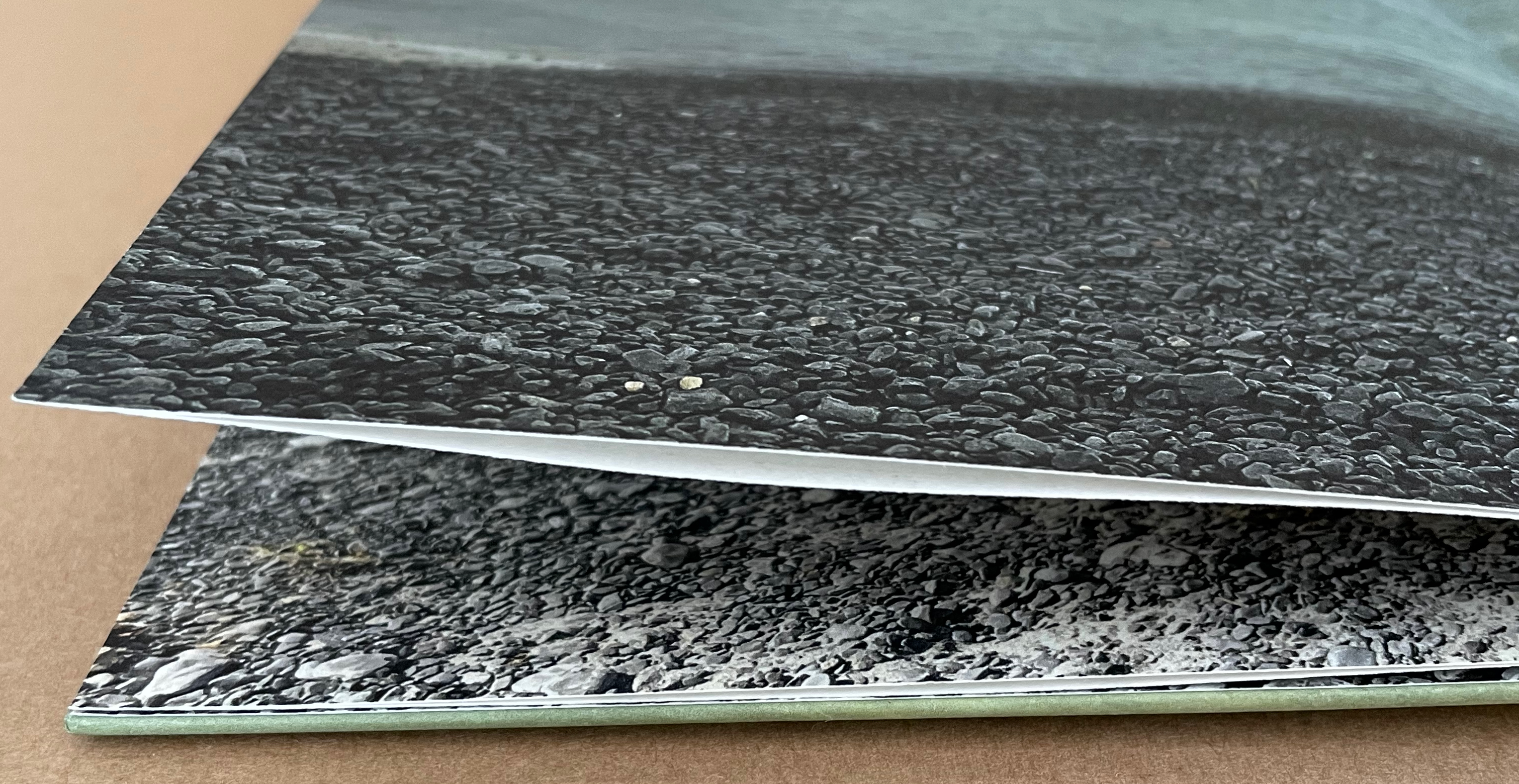
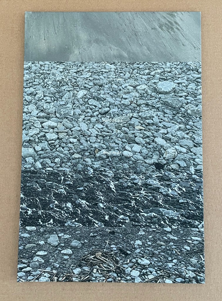
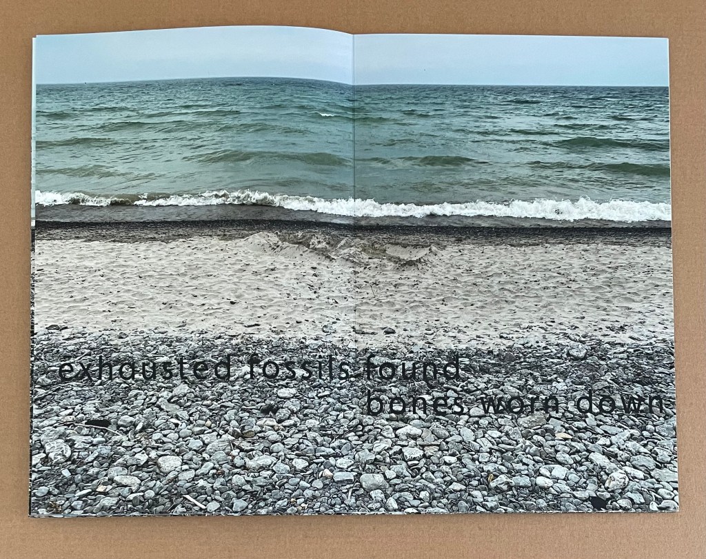
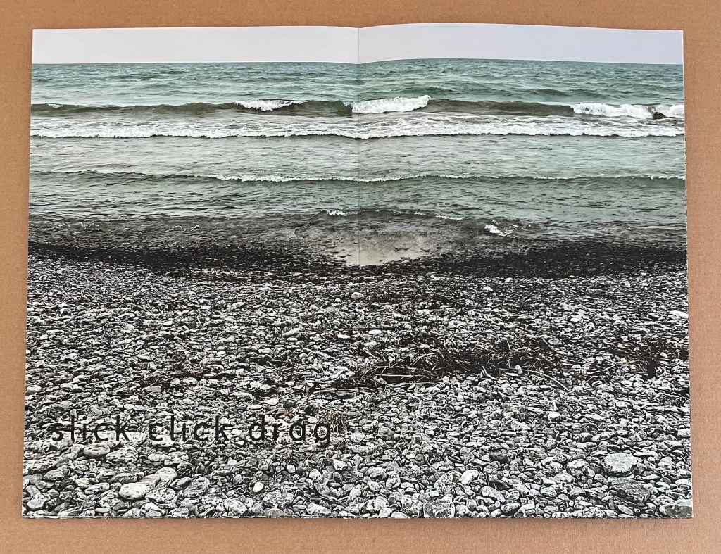
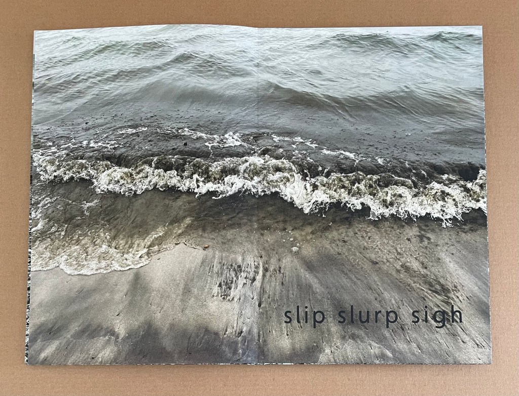
Printing processes, words and images echo what the third volume declares: surfaces murmur. Knowing that one printing process has layered the words over the images depicted with another printing process enhances our appreciation of MacCallum’s rendering of surfaces murmuring. The pigment ink of the image sinks into the surface of the paper, and the ink of the words deposited by intaglio rests on the surface.
In addition, the words’ meaning, sounds and positioning encourage reading from one double-page spread to the next so that their descriptive movement aligns with the material movement that evokes the sounds “we see”.
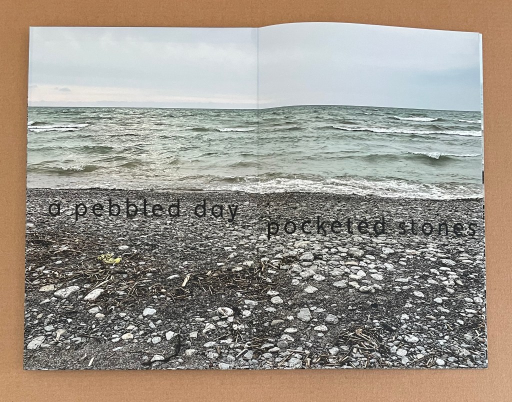
a pebbled day
pocketed stones
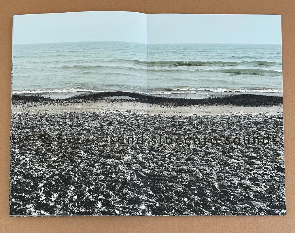
send staccato sounds
exhausted fossils found
bones worn down
slick click drag
slip slurp sigh
The final volume, steps stop, makes demands on us that go beyond photomechanical knowledge.
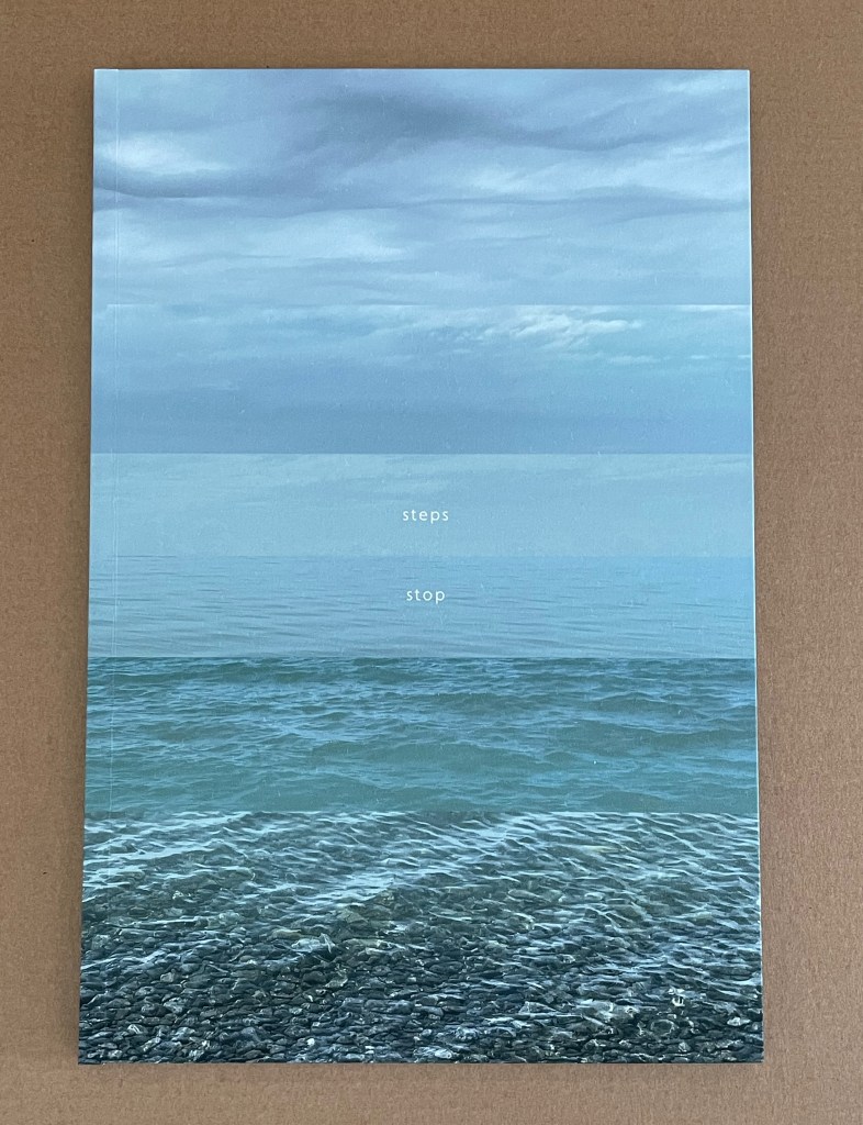
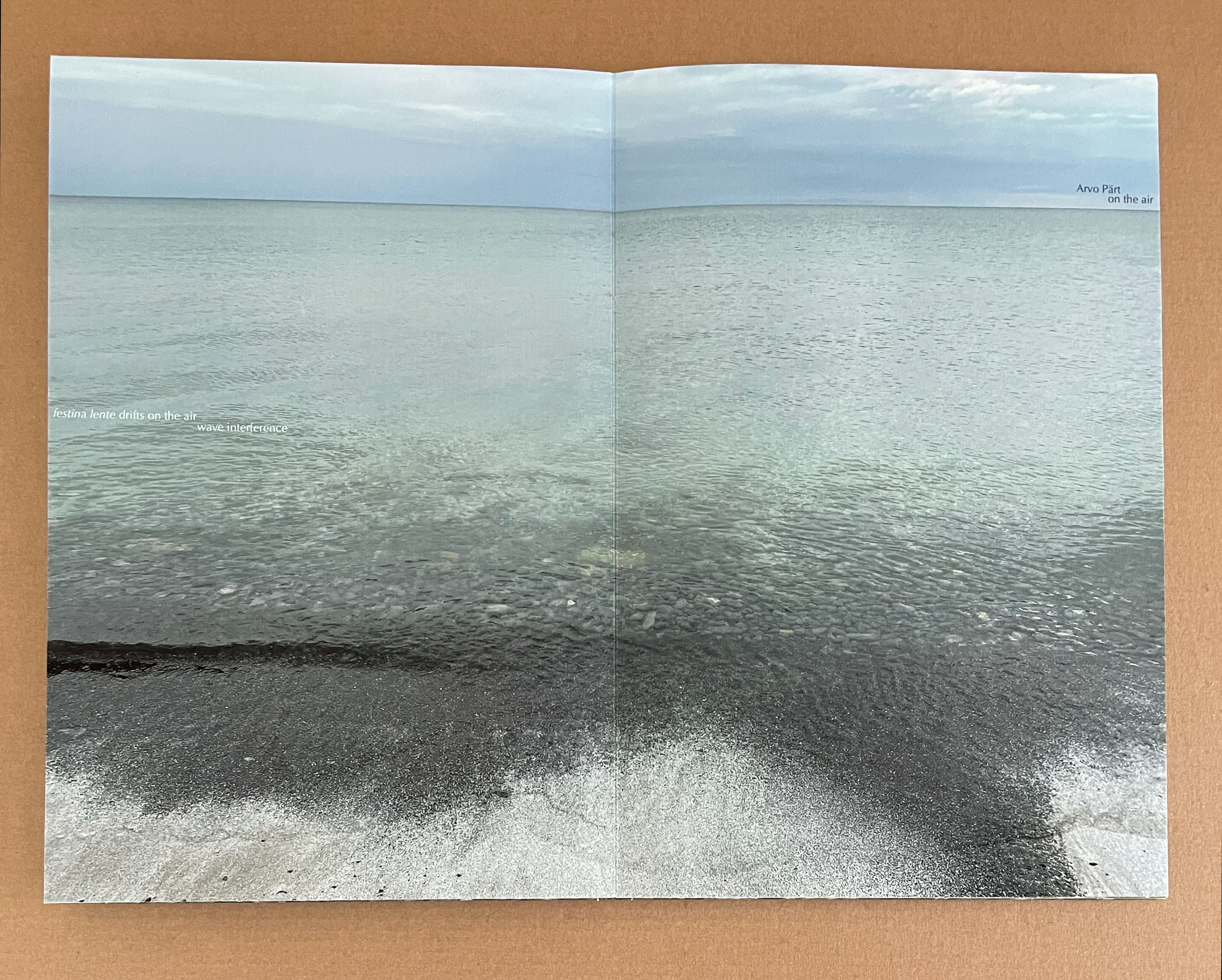
The verbal pun “air waves” on its first double-page spread requires us to listen with our eyes. On the next spread the position on the water of the words “festina lente drifts on the air” reiterates the demand to listen. (The Latin phrase festina lente (“make haste slowly”) was the slogan of the Renaissance printer Aldus Manutius.) Then, across the page, comes the reference to what the artist is hearing on a radio over “wave interference” (and what we are meant to hear along with her): “Arvo Pärt / on the air”. From the moment she places “festina lente drifts on the air” alongside “Arvo Pärt on the air”, MacCallum is connecting her art with that of the Estonian composer and letting us know that we may need to bring some musical knowledge to the party to hear what we are seeing.
The text on the next double-page spread confirms the scenario:
waves of
       transceiver weaving

waves weakly
              weaving

frequency untuned
                   yet

attuned to a lake
                   frequently
                               frequented
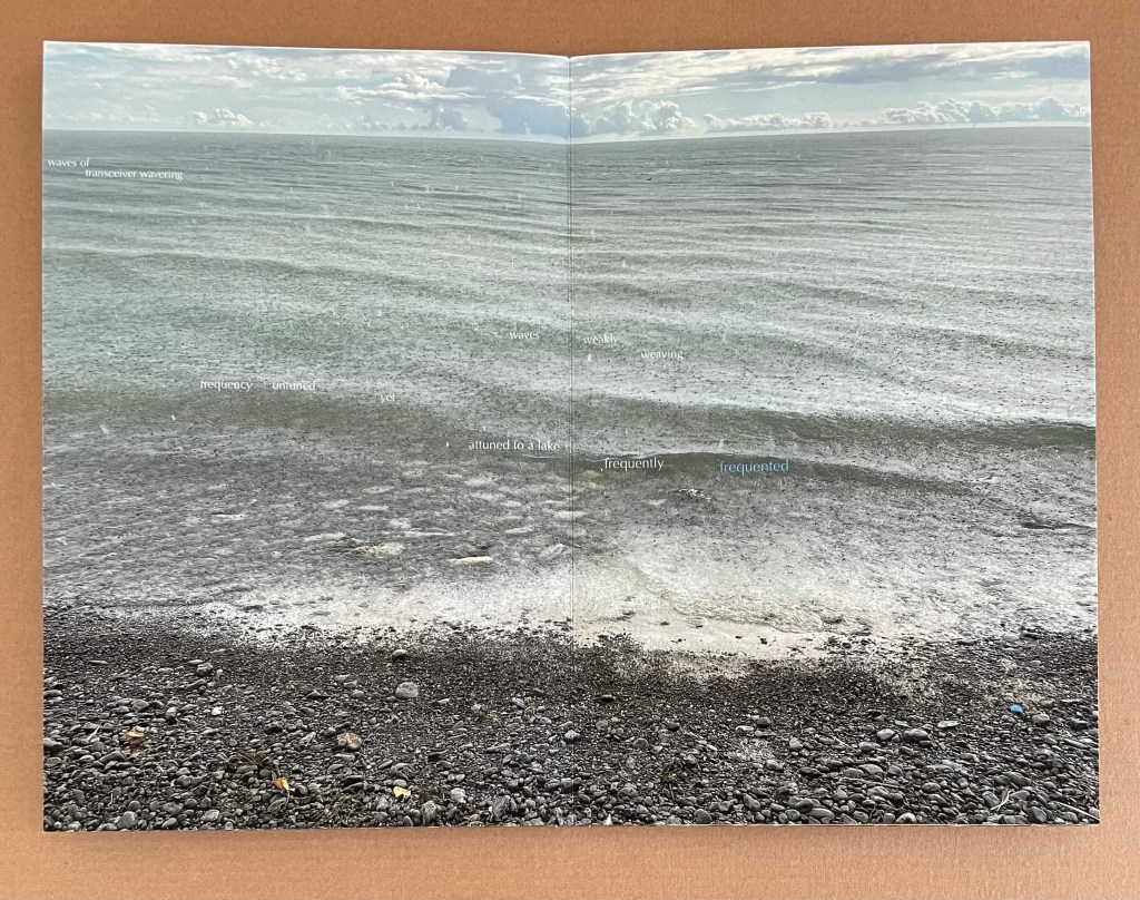
Notice how the horizon rises across the three double-page spreads above. Below, the horizon has completely disappeared. Repeating lines of text cascade from the top of the image of water to stop just above dry land. The lines come from this volume’s preceding pages and all those of the other three volumes. At first glance, this seems cacophonous; on second glance, it’s not.
Staggered across the double-page spread as if following the waves, each line of text repeats four times before being succeeded by the next line. But just where the wave crests, the first line of text recurs, the lines of words begin to overlap one another. Words like pebbles rolling over one another change then loosely separate until we come to “where steps stop”.
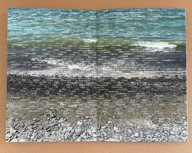
Pärt’s currently best known work is Spiegel am spiegel (“Mirror in the mirror”), and its use of a repeated and evolving triad structure with a parallel melodic line is captured verbally and visually in steps stop. With the final double-page spread below mirroring the title of the quadriptych, the volume delivers the same satisfying close to the collection that Spiegel am spiegel delivers with its final notes.
MacCallum’s artist’s statement accompanying where steps stop does not specify Spiegel am spiegel. It does describe the music’s compositional structure, so a simultaneous play of Spiegel am spiegel overlaid with radio static is not required of us. What is required is the open imagination and this bit of knowledge of the music’s structure to turn passive perception into active perception and thereby gain a fuller appreciation of this extraordinary work of book art.
Further Reading
“Helen Douglas“. 24 February 2020. Books On Books Collection.
“Shona Grant“. 20 October 2019. Books On Books Collection.
“Marlene MacCallum (I)“. 2 September 2019. Books On Books Collection.
“Marlene MacCallum and The Shadow Quartet*‘“. 30 August 2025. Books On Books Collection.
“Anne Moeglin-Delcroix“. 13 February 2024. Books On Books Collection.
“Michael Snow“. 3 March 2021. Books On Books Collection.
Carbon, C.C. 1 February 2017. “Art Perception in the Museum: How We Spend Time and Space in Art Exhibitions“. Iperception. 2017 Feb 1;8(1):2041669517694184. doi: 10.1177/2041669517694184. PMID: 28321289; PMCID: PMC5347319.
MacCallum, Marlene. 2023. “Photomechanical Process as Poetic Craft“. Video presentation. Includes discussion of surfaces murmur.
MacCallum, Marlene. 2023. “Printing the letterpress component of below fragrant skies“. Video.
MacCallum, Marlene. 2023. “Printing the fourth image/word piece in surfaces murmur“. Video.
MacCallum, Marlene. 25 December 2023. “sleep walk“. Video presentation.
