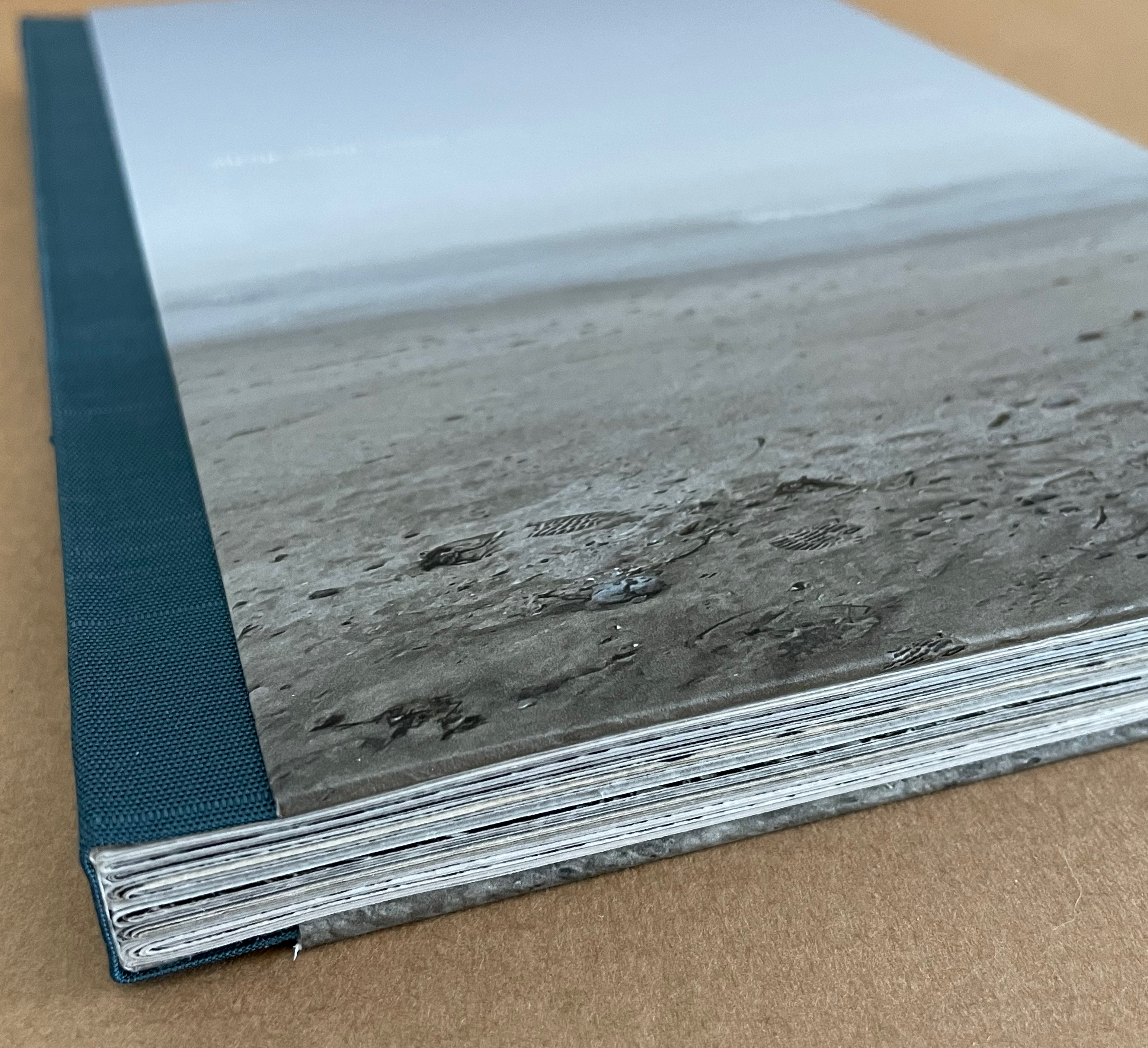
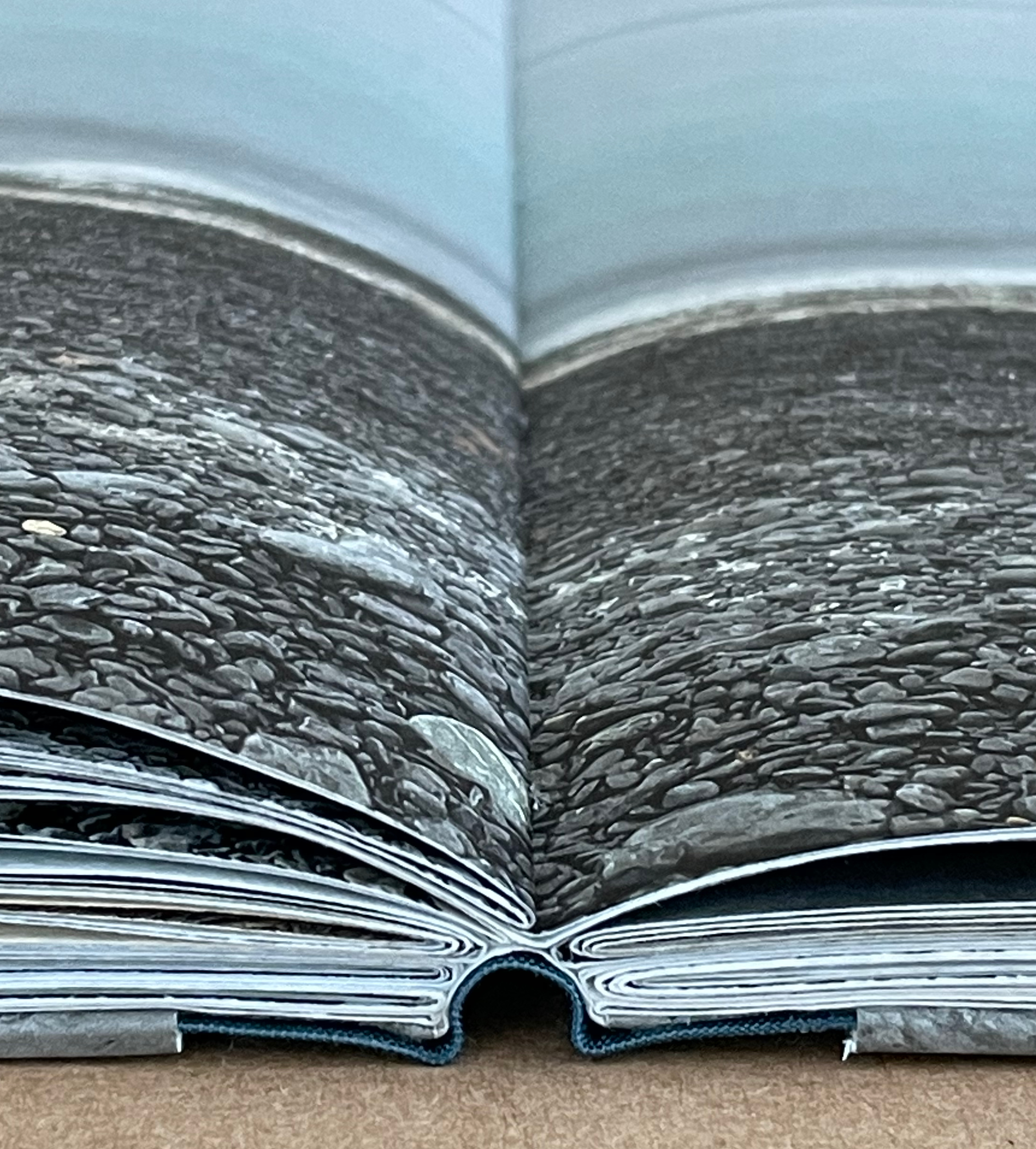
Marlene MacCallum’s latest artist’s books remind me of Claude Monet’s two series of paintings of the Rouen Cathedral’s façade and a field of haystacks. The series were influenced by Japanese ukiyo-e prints (“pictures of the floating world”). Rather than changing vantage points on Mt. Fuji, Monet used one perspective on one façade and sought to capture the instants of light and atmosphere on its surface at several different hours of the day. He rendered his vision of them with thick layers of paint, brushstrokes, and colors. MacCallum, too, has chosen a fixed-viewpoint: in her case, of Lake Ontario. She, too, follows different hours and, also, different seasons as Monet did with his haystacks. She, however, renders her vision with an intricate verbal-visual dance of metaphor, book structure, registration, photographic filters, print technique and paper.
Baabaa Aab Daad (Father Gave Water) (2020) Golnar Adili Wood, felt, board and cloth, 5 x 7 x 1.5 inches (closed). Edition of 25. Acquired from the artist, 1 July 2022 Photos: Books On Books Collection unless indicated otherwise. Displayed with artist’s permission.
Helpfully for a Western audience, the box cover of this homage to the traditional Persian sentence for first-year readers links the right-to-left-reading words with their roman alphabet transcription and English translation. Beyond that, understanding just these few characters and appreciating the artistry involved require some research.
Close-up of box cover.
The character called ‘alef and making an aa sound is آ. From the transcription, we know that the sound should appear four times — twice in “Baabaa” and once in each of “Aab” and “Daad”. The character called be and eliciting a b sound is ب . The transcription indicates it should appear three times — twice in “Baabaa” and once at the end of “Aab”. The character named daal and making a d sound is د . The transcription calls for it to appear twice — at the beginning and end of “Daad”.
As in Arabic, from which Persian adopts most of its characters, some characters’ appearance changes depending on their position in a word or syllable. If a word begins with ‘alef (آ) and is the aa vowel (as opposed to the “o” or “é” vowel), the character for it has a “roof” — as in the word “Aab” — but if the sound falls in the middle of a word — as in “Daad” — the “roof” comes off: (ا). Also as in Arabic script, Persian letters can be linked with one another, altering their appearance. In “Baabaa”, ‘alef (ا) links up with be (ب); so not only does its “roof” disappear, but it squeezes the width of ب and shifts its diacritic (the dot underneath): با. To Western eyes, the linked characters look like one character. In some typefaces, we have the similar phenomenon of ligatures, in which, for example, the letter f and the letter i will join into the single character fi.
Spine of the box.
Even if Gutenberg’s type mimicked scribal lettering, roman type was not cursive script, which explains in part the hard work by Francesco Griffo da Bologna and Aldus Manutius to come up with italic. For Arabic and Persian or any calligraphically represented language with characters changing shape with position and linkage, with diacritics and a slantable baseline to allow stacking of letter combinations, the development of movable type would be and has been even harder — if not impossible as designers Rana Abou Rjeily and Bahman Eslami explain (see references below).
All of this preamble helps in appreciating the linguistic and cultural bridging that Adili’s artwork performs. The miniaturized shape of traditional alphabet blocks meets pixellated and sculpted Persian in Adili’s modular wooden cubes and recessed felt base. Her invented typography mostly skirts the calligraphic concerns by leaping into the third dimension. Language becomes tactile and three-dimensional not only in this work but in almost all of the work emanating from her studio.
Colophon.
Larger set of letter modules. Photo: Courtesy of the artist.
The Jasmine Scented Ones is a particularly good example. This series of works uses the pixellated shapes from Father Gave Water to screenprint Persian characters and words this time taken from a Hafez poem and exploits the play of light through superimposed sheets of Japanese Rayon Lens paper and across 3D resin prints to embody the tension in the poem’s wordplay with the verbs to sit and to settle. For touch that would see and sight that would touch, Adili offers highly expressive works.
Many thanks from Books On Books — or Ketab bar Ketab (کتاب برکتاب) — to Golnar Adili and friend for assistance with the crash course in Persian characters. Any errors rest with Books On Books.
Center for Book Arts. 14 January – 26 March 2022. “Father Gave Water/Baabaa Aab Daad: An Homage to Childhood, Persian, and Process“. Exhibition. New York: Center for Books Arts Gallery. Accessed 1 March 2022. Center for Book Arts’s description of the work: “Adili drew inspiration from her own childhood education in Iran, where all first graders learn the phrase “Baabaa Aab Daad” (translates to “Father Gave Water”) as a foundational example of the elemental letter and sound composition in the Persian language. As a mother to a multilingual toddler, Adili was further inspired to employ a system of blocks and puzzles within her artist book as a reference to her daughter’s tactile style of play. In conducting research for this project, Adili learned of Iranian educator Seyyed Abbas Sayyahi, who drafted the country’s first-grade curriculum and co-founded a system of schools to serve the nomadic population. Adili could not find any formal recognition of Seyyed Abbas Sayyahi’s immense contributions by Iran’s education department, Sazman é Aamoozesh va Parvaresh, so she decided to celebrate his important work by including him in her book. Ultimately, Adili views her artist’s book as a didactic tool for English readers to fully understand the Persian sentence “Baabaa Aaab Daad.” The book includes an English phonetic key for the Persian alphabet and color-coded diagrams that break the sentence down word-by-word. A bilingual speaker and reader herself, Adili is fascinated by the connections between English and Persian, which are both Indo-European languages, and pursues new formal and visual translations through her art practice.”
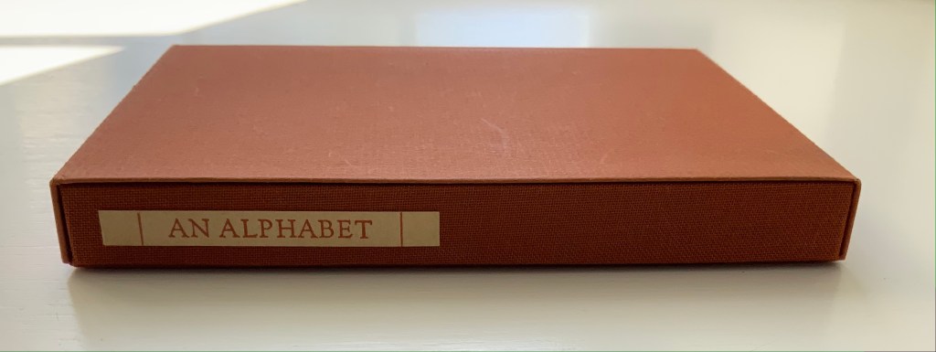
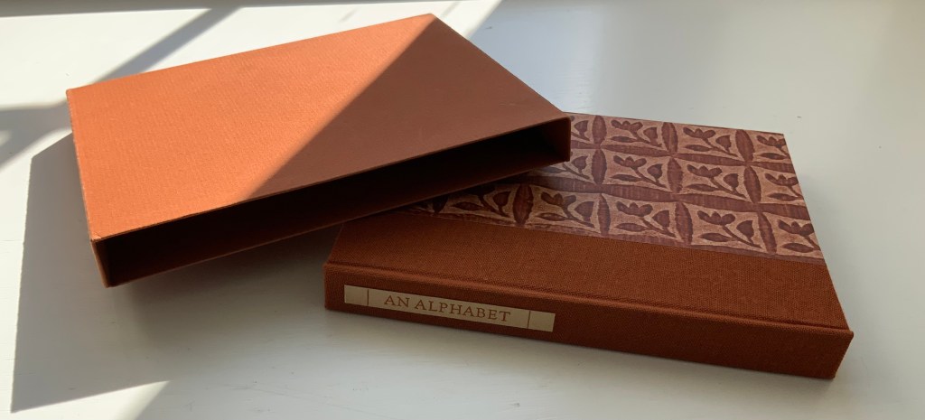
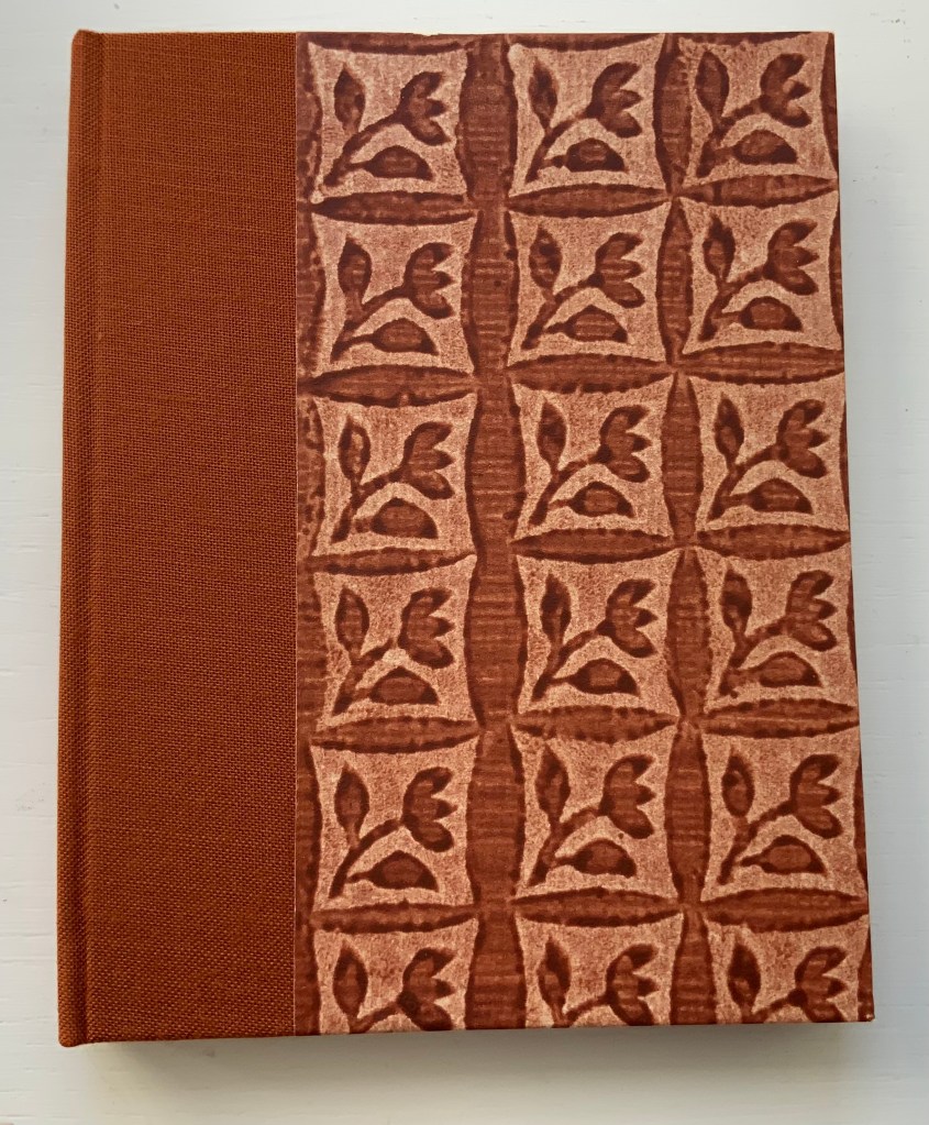
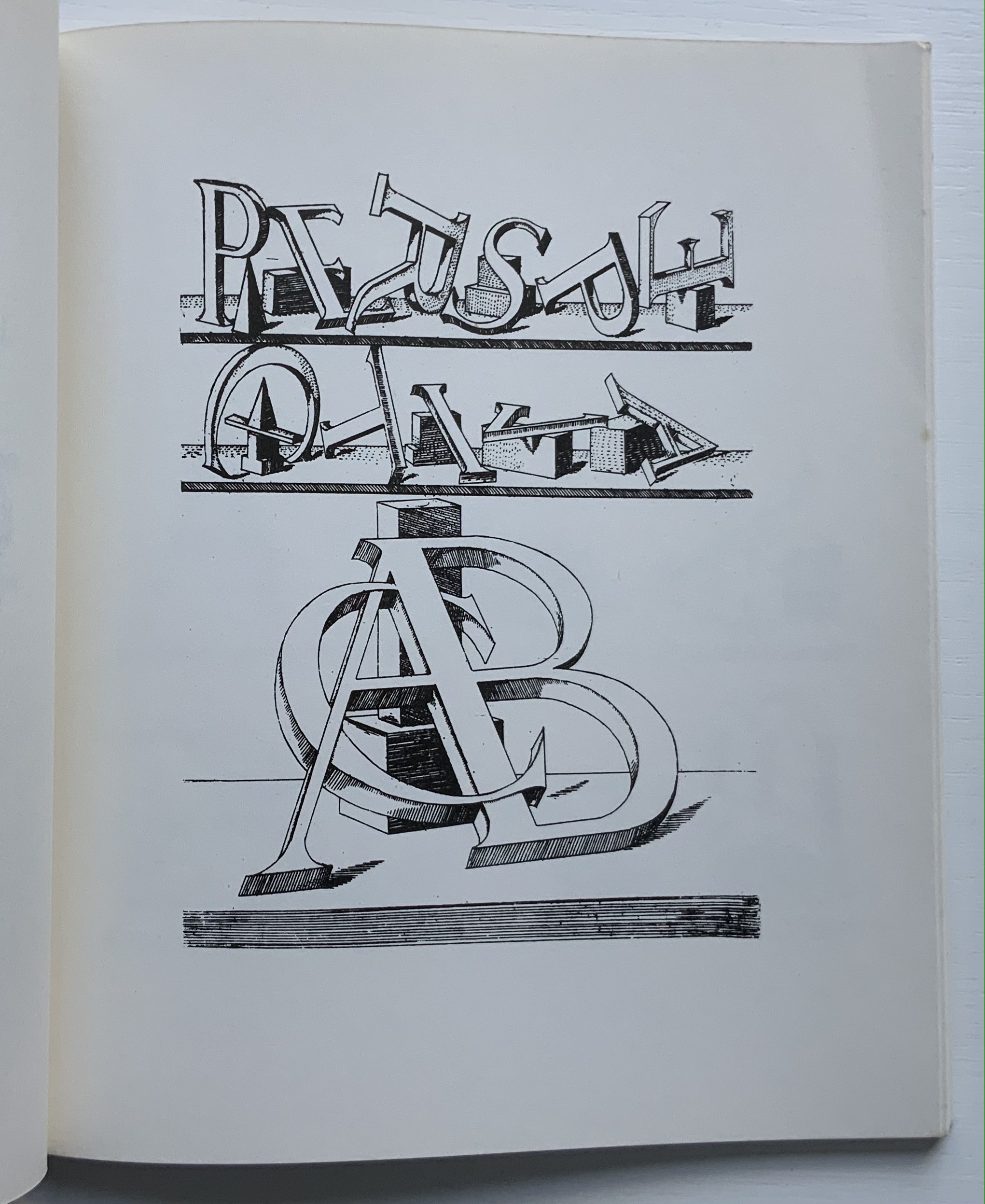
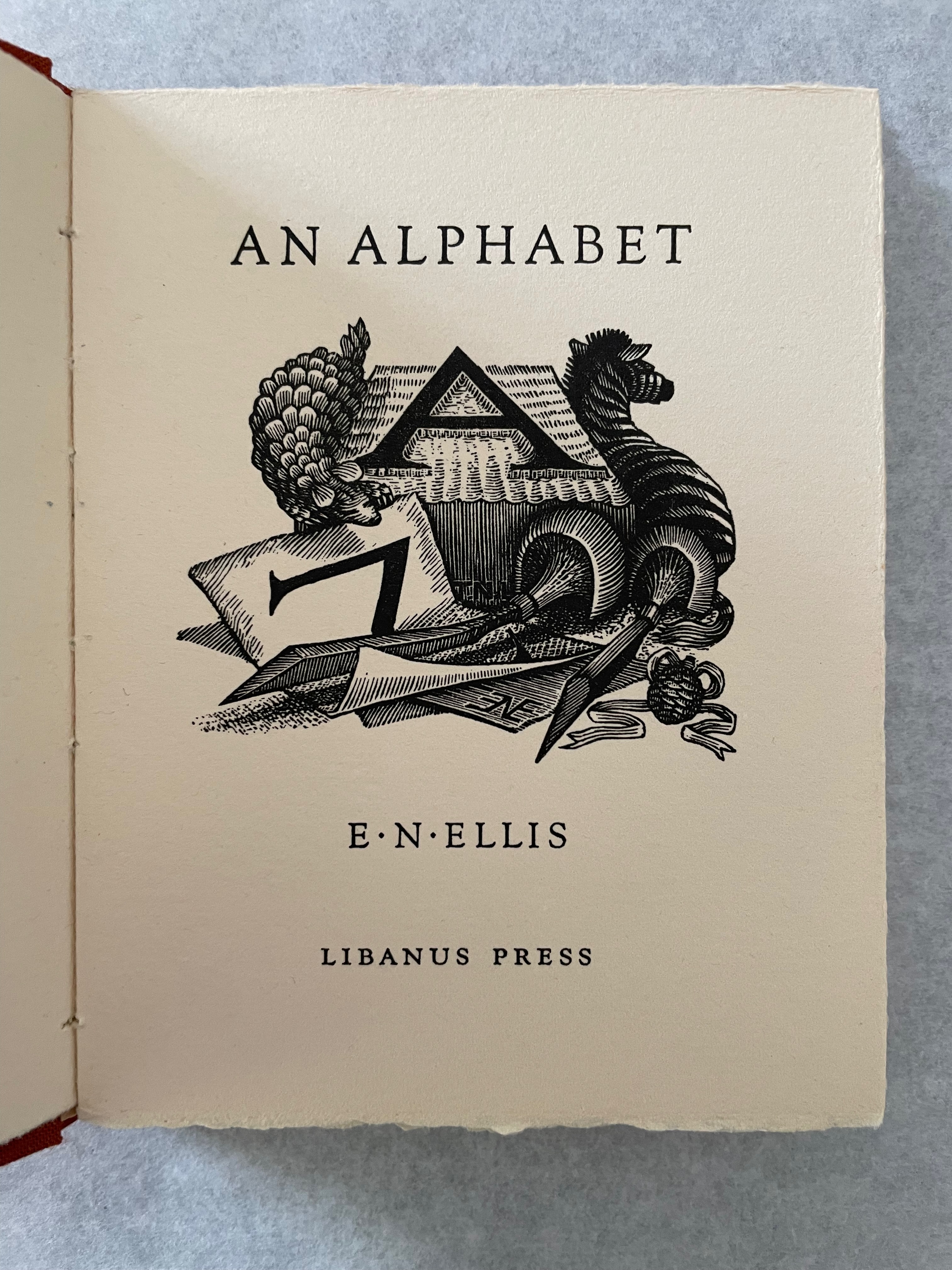
An Alphabet(1985) E.N. Ellis Terracotta card slipcase, casebound sewn, quarter terracotta cloth and red patterned paper covered boards with white-paper label stamped in red, colored endpapers, Velin d’Arches paper. Slipcase: H138 x W108 mm; Book: H135 x W107 mm, 32 pages. Edition of 75, of which this is #31. Acquired from David Miles Bookseller, 30 September 2021. Photos: Books On Books Collection. Displayed with permission of the artist.
An Ashmolean exhibition called “Scene through Wood” (10 August–15 November 2020) featured the work of Edwina Ellis among others in a century overview of wood engraving. Here is the exhibition’s description of Ellis and her work
Born in Australia in 1946, Ellis is a pioneering artist responsible for ‘some of the most technically elaborate engravings ever made’. Her work is held in international collections around the world. Her treatments of mundane objects like pieces of paper are virtuoso achievements, so realistic they take on surreal dimensions.
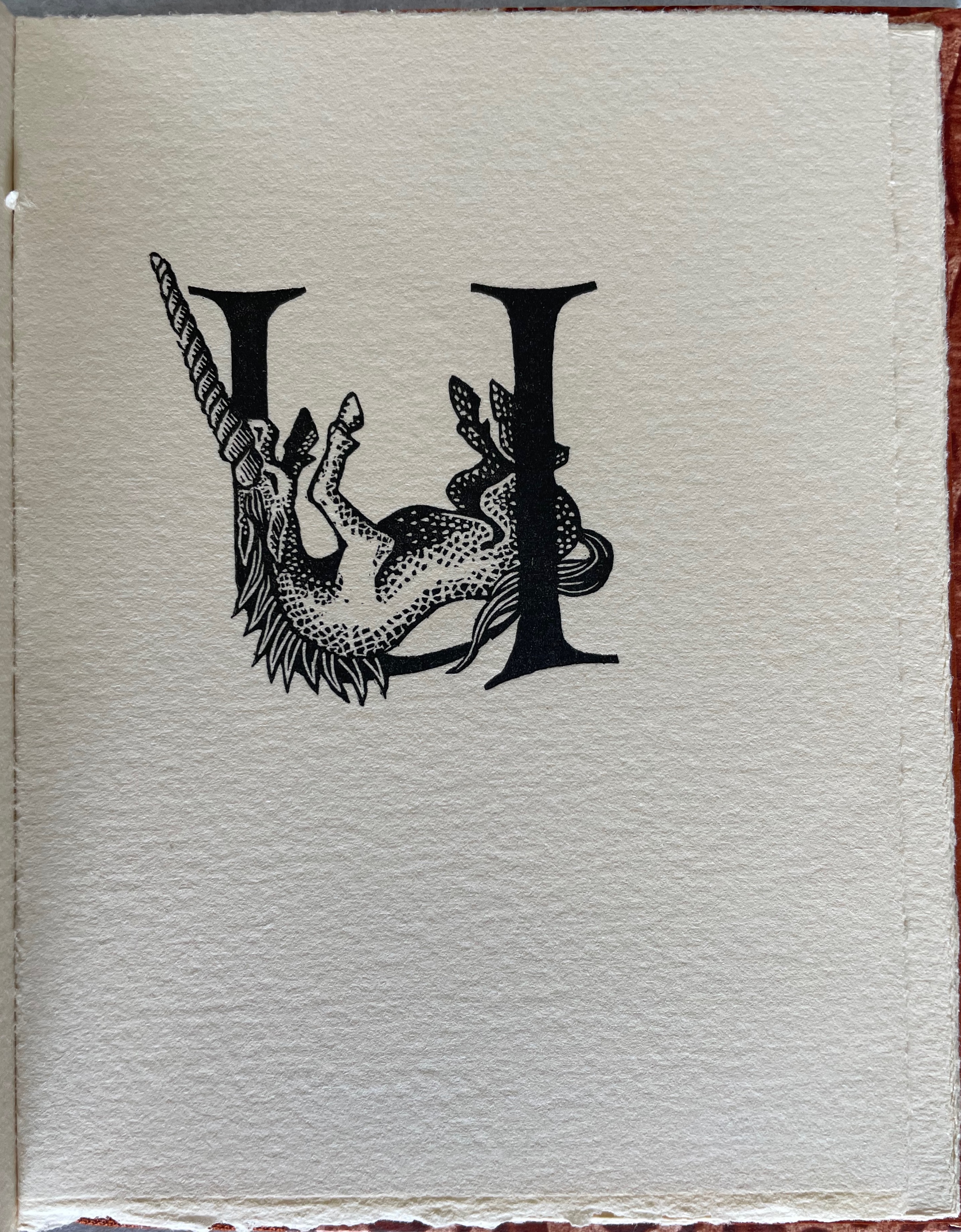
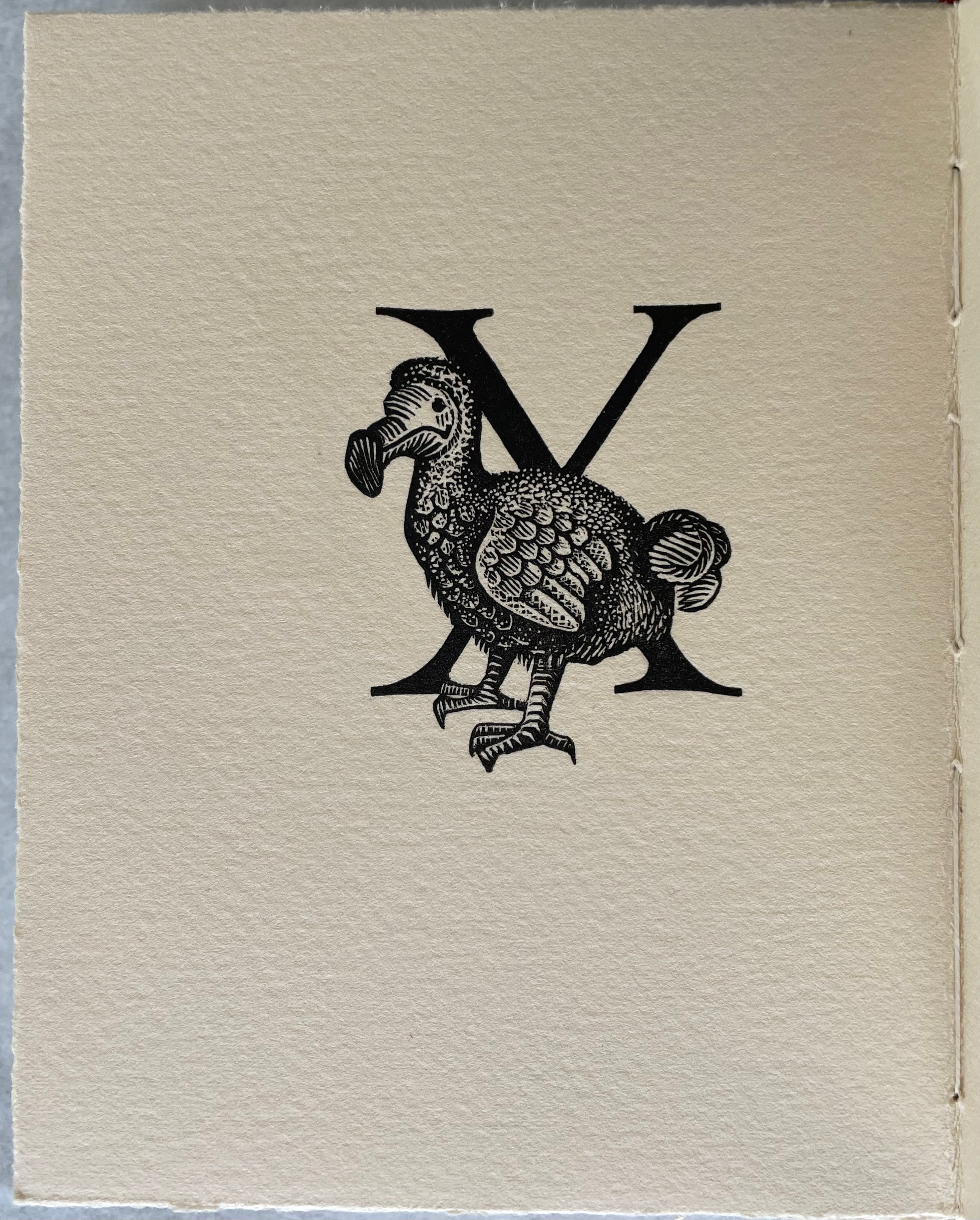
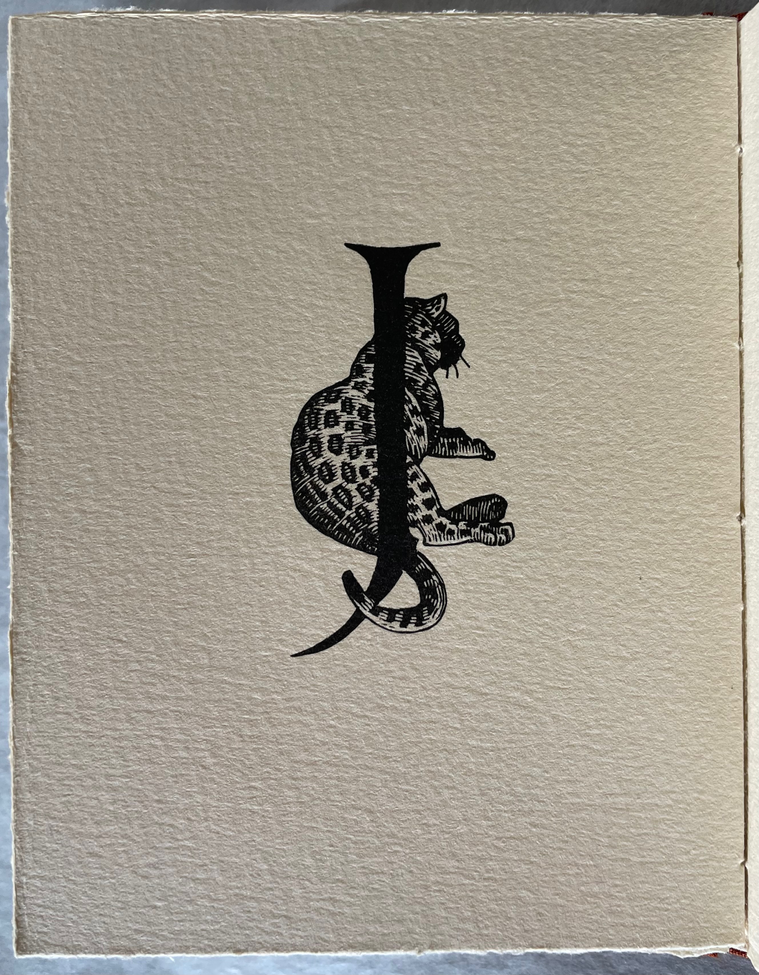
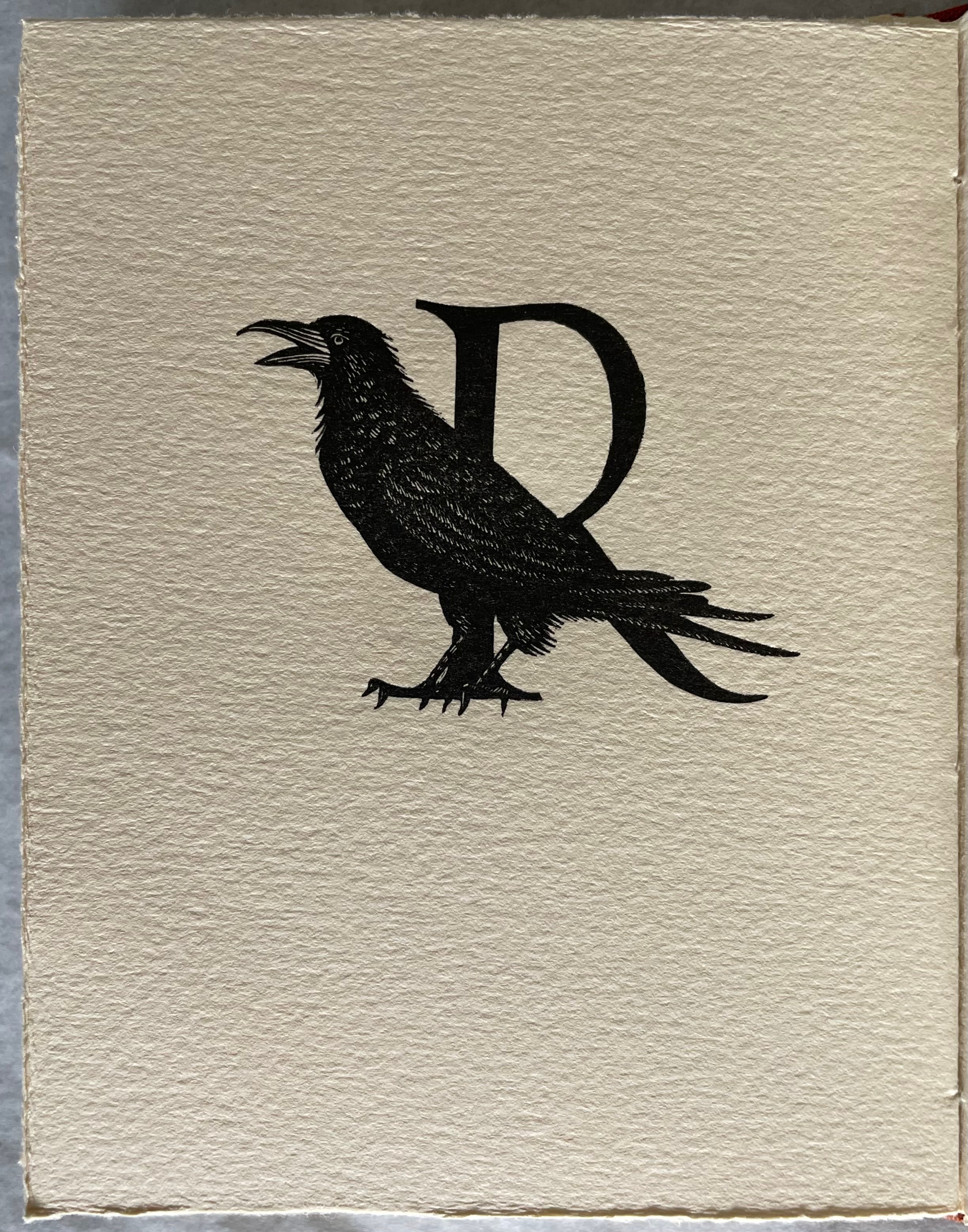
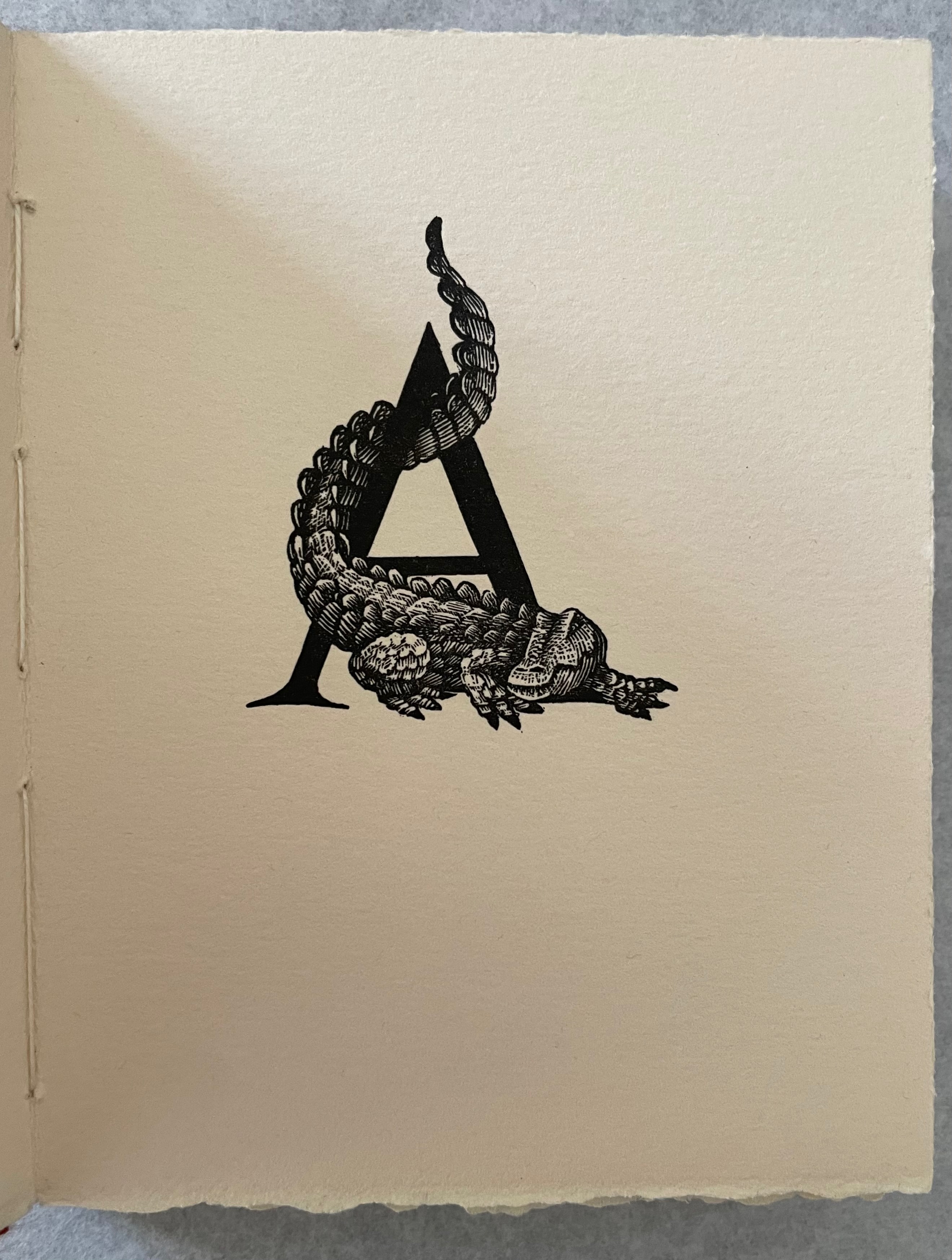
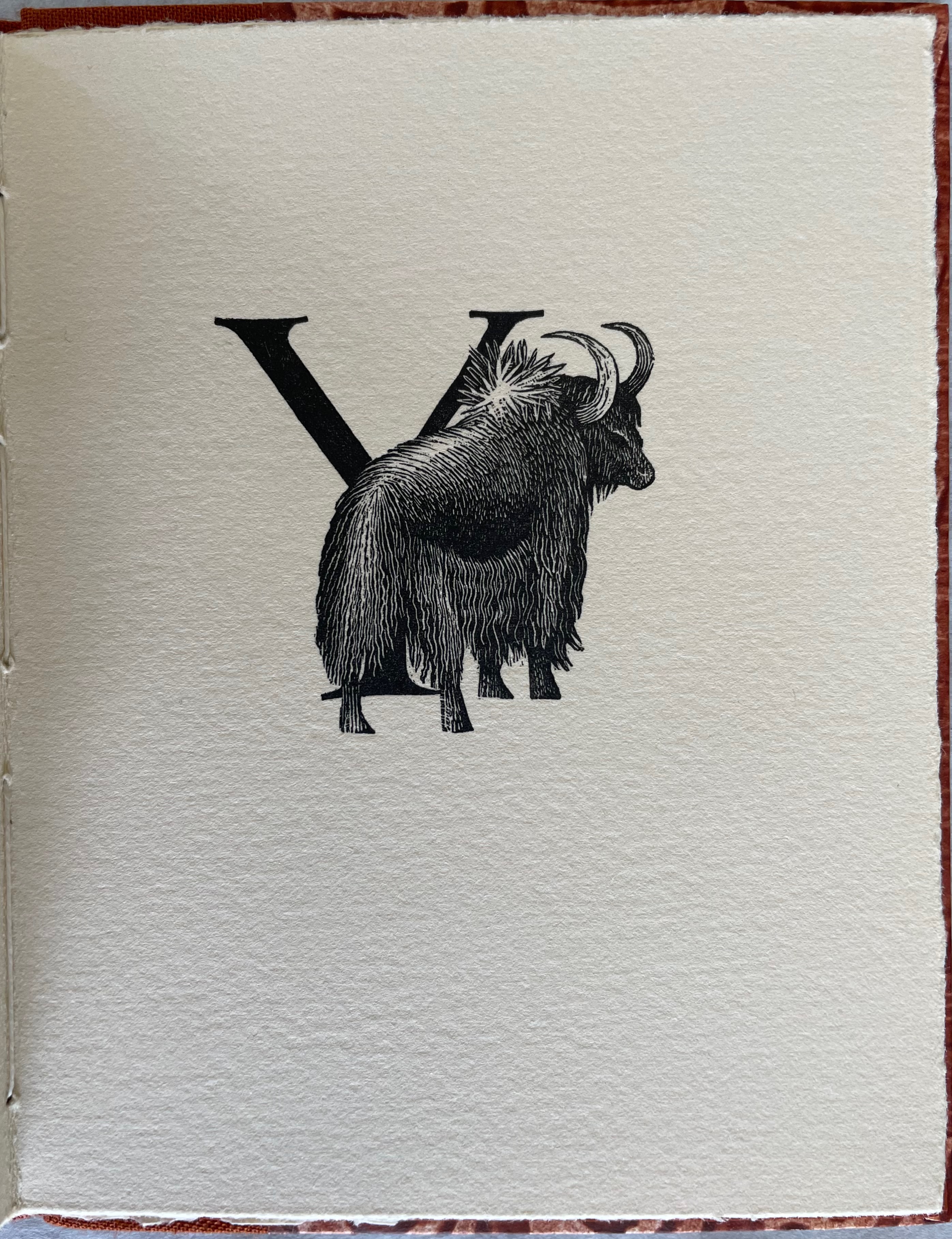
Less concerned with realism or surreality, her wordless alphabet reveals a sly humor: U for an upside down unicorn and X for a Dodo, and animal anatomy drawing attention to letter parts (for example, tails).
With Ellis and her humor, the traditional tension between text and image in artists’ books falls into reveling with entwining letters and even hiding them with their animal associates and striking the balance just right.
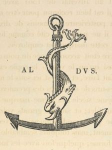
Also on display is her appreciation for predecessors: a hint of Johannes Lencker on the title page while squeezing the tools of the trade in between an armadillo and zebra, and a nod toward Aldus Manutius and his dolphin and anchor trademark.
Distinguished abecedarians and typographers have an interesting history with the black and white coat of arms and title piece atop the masthead of The Times of London. In 1953, it was Reynolds Stone; in 1966, Berthold Wolpe; and in 2006, Edwina Ellis.
The last word on this work of book art belongs to the artist:
The blocks and the book are significant to me now on a number of counts. They almost began my wood-engraving career, I worked with a seminal printer and also bonded with Stanley Lawrence over the course of the engraving. The wood-blocks increased in quality over the course of their engraving as my ability and our mutual respect grew. I had no knowledge of letterpress printing, so the initial letters and animals tightly fit each rectangle: this gave Michael Mitchell of the Libanus Press enormous headaches, as he had to carefully measure and pack the blocks differently. He was, meanwhile, teaching me to print. I often still think of the dodo makeready: a revelation. (Correspondence with Books On Books, 22 October 2021)
Stone Reynolds. 1974. An Alphabet. London: Warren Editions.
Hall, Alistair. 29 September 2017. “The Wolpe Collection.” We Made This. Accessed 29 October 2021. Wolpe was also a scholar of typography, One of the works with which he was involved is in the Books On Books Collection: Johann David Steingruber’s Architectonisches Alphabeth (1773/1972).
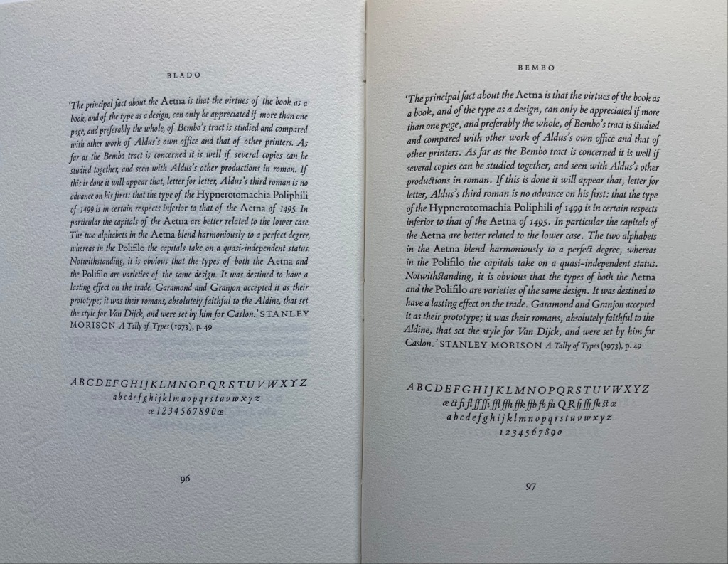
Each animal is drawn using the Roman letters of the Bembo font family, based on a letter cut by Francesco Griffo (1450-1518) for the Venetian printer for Aldus Manutius (1450-1515) and named after the prolific Renaissance scholar Pietro Bembo (1470-1547). Stanley Morison (1889-1967) revived the font while at the Monotype Corporation.
For the Books On Books Collection, Bembo’s Zoo is a light-hearted reminder of the abecedaries and typographic themes of more serious works.
Francesco Griffo da Bologna: Fragments and Glimpses (2020)
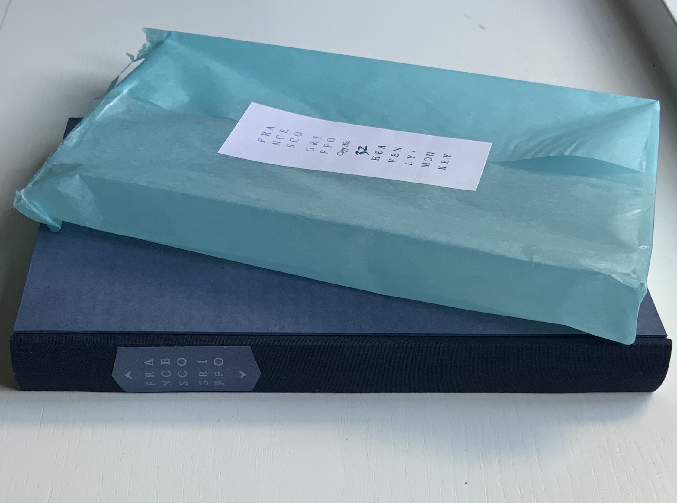
Francesco Griffo da Bologna: Fragments and Glimpses (2020) Rollin Milroy H234 x W159 mm, 114 pages. Edition of 50, of which this is #32. Acquired from Heavenly Monkey, 4 November 2020. Photos: Books On Books Collection.
Several collections of Aldine volumes made themselves known around 2015, the 500th anniversary of the death of Aldus Manutius. Several have digitized their collections to make them more accessible. By gathering these fragments and glimpses of the hand behind the roman, Greek, Hebrew and italic typefaces designed and cut in late 15th-century and early 16th century Venice for those volumes, Heavenly Monkey (founded and run by Rollin Milroy) has followed a different path. A collector himself and artist of the book, Milroy has created this work to bring himself and the reader closer to Francesco Griffo da Bologna and the historical and contemporary hunt to identify him and appreciate his typographic accomplishment.
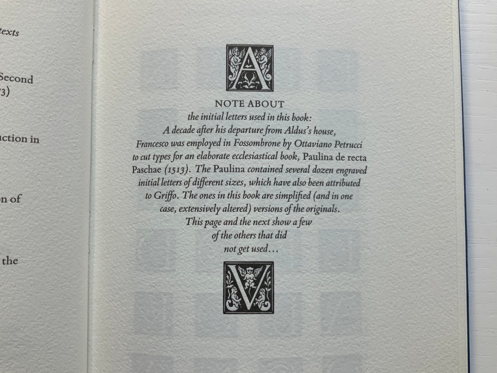
He presents a letterpress work in the modern version of the Bembo typeface cut by Griffo for the Aldine printing of Pietro Bembo’s tract De Aetna (1495), whence the typeface gained its name. In another step closer to Griffo, not only does Heavenly Monkey use simplified versions of initial letters attributed to Griffo, he offers up a note and display page that include those letters not used in the text (see below).
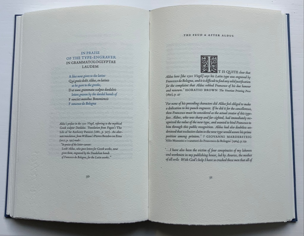
Note that distortion of the letters is due to photography of the curved page.
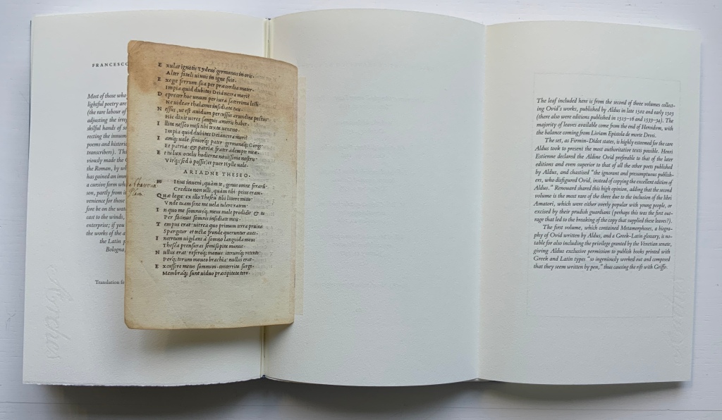
Physically true to its title, the book consists — except for the frontmatter, backmatter and brief explanatory text — of fragments: extracts from secondary sources and an actual leaf from the Aldine edition of Ovid’s Heroidum Epistolae set in Griffo’s first italic type. The leaf comes from the second of the three-volume Aldine Ovid, which over time was subject to prudish excision of racier parts, which Heavenly Monkey speculates may have led to the break-up of the copy used here to supply the leaf included. Some historians and collectors may question the inclusion of the leaf. Others as well as artists of the book will thrill to it as an act of preservation, appropriation, dissemination and homage.
The book’s prologue is an English summary of a passage from Giuseppe Fumagalli’s 1905 lexicon of Italian typography that sets out and settles the 19th century debate about the identity of Griffo, a confusion that would resurface for the legendary typographer Stanley Morison in 1923. With a narrative technique similar to an epistolary novel, Milroy lays out extracts from histories of printing, prefaces to reprints of Aldine works, biographies of the historians in the debate, the Fine Arts Quarterly Review and bibliographical journal articles to tell the story of “which Francesco was he?” The same technique lays out the development and differing opinions in reception of Griffo’s cutting of the roman, Greek, Hebrew and italic types. While following the stories of those faces, the reader walks through a hall of illustrious historians and typographers — Nicolas Barker, Joseph Blumenthal, Philip Meggs, Giovanni Mardersteig, Stanley Morison again, Alfred Pollard, David Pottinger, Daniel B. Updike and many others. The next set of extracts explores the feud that led Griffo to leave Aldus Manutius and Venice to set up on his own in Fossombrone.
The next set of extracts attests to Griffo’s typographic legacy, and then comes the tipped-in foldout that protects the leaf taken from the Aldine Ovid, followed by the listing of Griffo’s six works published on his own, documented in F.J. Norton’s Italian Printers 1501-1520.
An important contribution comes in Appendices I-IV with Emma Mandley’s translations of key passages from books, letters and documents of the main protagonists in the debate over Francesco da Bologna’s identity: Antonio Panizzi, Giacomo Manzoni, Adamo Rossi and Emilio Orioli. Lovers of type specimens and the style of Stanley Morison will welcome the samples of the modern versions of the roman fonts for Poliphilus and Bembo and the italic fonts for Blado and Bembo. In a grace note, Heavenly Monkey includes samples for the italic and roman fonts of Mardersteig’s Dante, which Robert Bringhurst opined “has more of Griffo’s spirit than any other face now commercially available” (The Elements of Typographic Style, 1996, p. 213)”.
Dante is the typeface Heavenly Monkey wanted initially to use but, on deciding that the main text would be set in italic, declined it. The Dante samples offer the reader the chance to compare and contrast it with the other faces and weigh Bringhurst’s opinion and Heavenly Monkey’s choice.
Like many fine press editions, Francesco Griffo da Bologna treads the boundary of the artist’s book or the work of book art. It certainly resonates with different works in the Books On Books Collection:
The leaf from the Aldine Ovid chimes with Jacqueline Rush Lee‘s sculptural interpretation of Ovid’s Metamorphoses and Ian Hamilton Findlay’s The Errata of Ovid.
Milroy’s “scrapbook” protrayal of Griffo and contemporaries will remind some of Russell Maret‘s typographic adventure in Hungry Dutch.
Anything to do with Venice brings to mind Peter Koch‘s edition of Joseph Brodsky’s love letter to Venice Watermark and Bodil Rosenberg‘s sculptural evocation of that city in Canal Grande.
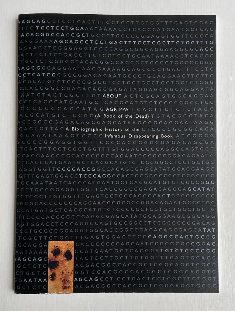
But overall, Griffo‘s bibliographic historical nature resonates far more with that of another of Milroy’s works in the collection: About Agrippa.
In the Bodleian Libraries Rare Books Collection is a yellowed, oatmeal-colored remnant of a linen casebound thing holding leaves of paper, some sharply trimmed, some with deckled edges, various colored single-sided prints tipped in between and amongst the folded and gathered leaves, a square hollowed out of a final gathering of inseparable leaves and sealed with a lining of gritty silver-gray paste. And burned onto its cover is this:
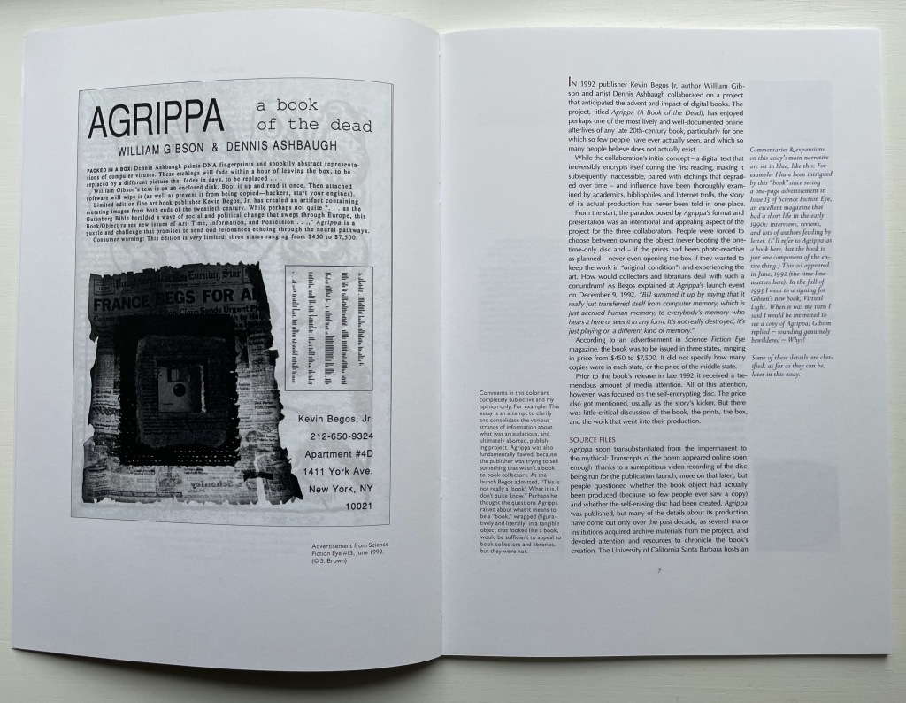
William Gibson and Dennis Ashbaugh’s Agrippa (A Book of the Dead) (1992) is as wrapped in mystery and mystique as Griffo’s identity. For the collection, Milroy’s two books play the roles of historical bookends: each addresses works from the second phases of a technological shift in the history of the book. Griffo and Manutius mark the beginning of the post-Gutenberg and post-incunabula phase of book publishing. Gibson, Ashbaugh and their publisher Kevin Begos mark the beginning of the post-Apple I phase of digital publishing. Aldine books are rare; Agrippa is even rarer, designedly so. Gibson’s titular poem is on a floppy-disk embedded in a book (H16 x W11 inches). The disk was programmed to self-erase as it was played.
Milroy provides a valuable and attractive resource covering the inception, the production, pricing, dissemination/performance and reception of Agrippa. Like Griffo, About Agrippa brings the reader closer to the principals, the mystique and importance of the work. Both books deserve an audience of students of book art and book arts as well as collectors. Here’s hoping that any library with a strong collection of fine press books and artist books will acquire them.
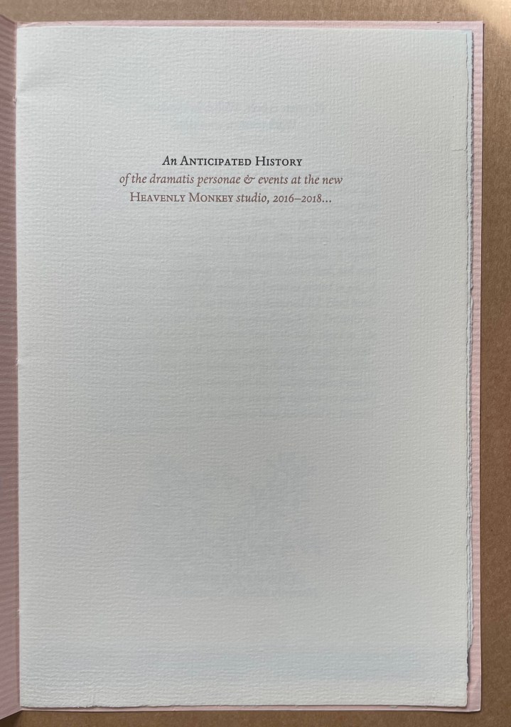
An Anticipated History (2015)
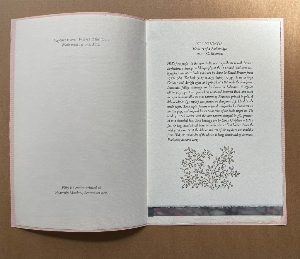
An Anticipated History (2015) Rollin Milroy Eight pages sewn into peach-colored watermarked Italia Fabriano cover. One sheet, Arches. Semi-opaque vellum cut-paper with Jane Maru painting tipped in. H243 x W163 mm. [8] pages. Edition of “fifty-ish copies” Acquired from Peter Keisogloff Rare Books, Inc. (Brecksville, OH U.S.A.) 3 December 2018. Photos: Books On Books Collection.
A catalogue of five titles forthcoming from Heavenly Monkey Press.
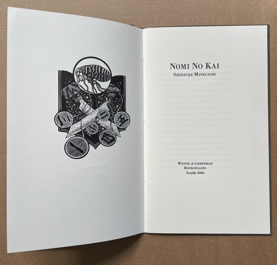
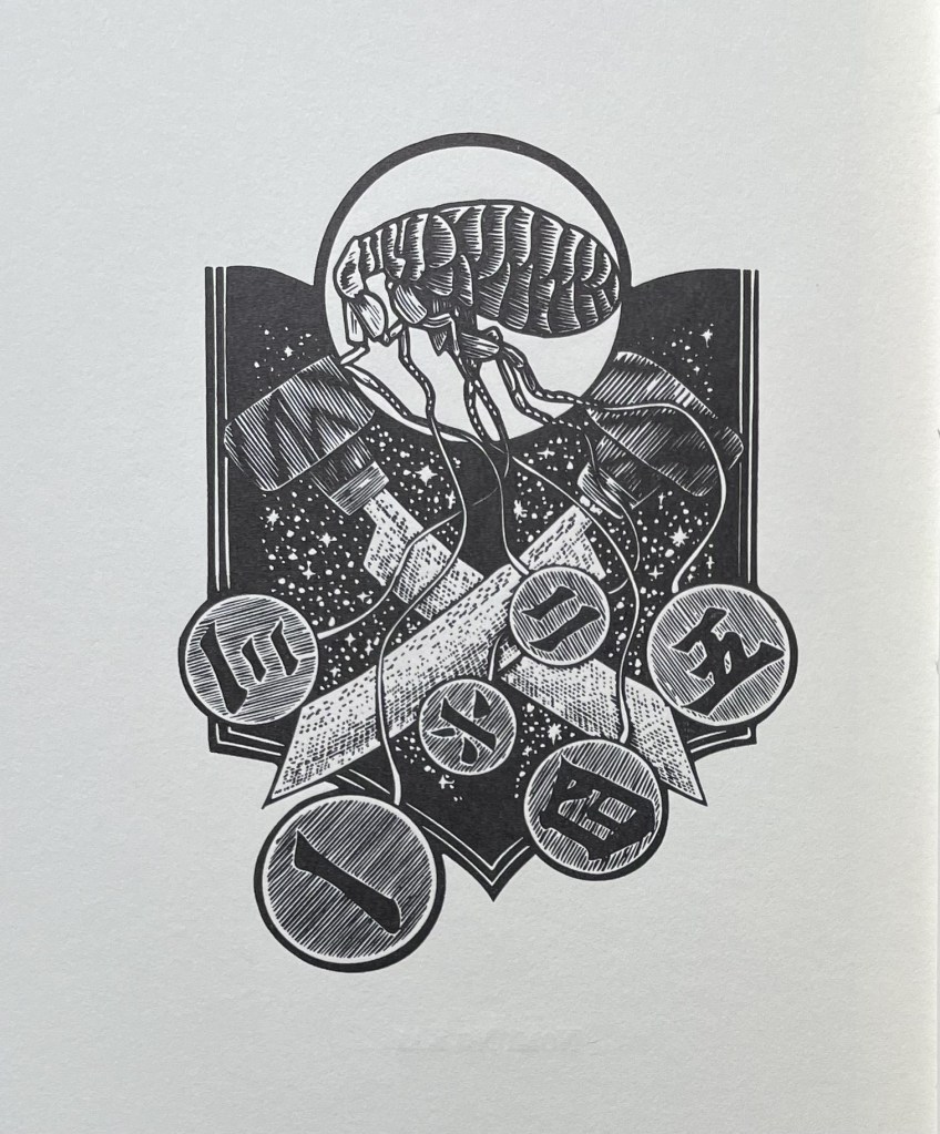
Nomi no Kai (2006)
Nomi no Kai(2006) Shinsuke Minegishi. Pamphlet sewn in a wrap of Reg Lissel’s handmade paper. H215 x W130 mm. [12] pages. Edition of 100, of which this is #98. Acquired from Charles Seluzicki Fine & Rare Books, 3 December 2018. Photos: Books On Books Collection.
An homage to six Japanese wood engravers — the Nomi no Kai: Takao Hiwazaki, Sho Kidokoro, Hitoshi Karasawa, Susumu Yamamoto, Masahiro Kurtis & Keisei Kobayashi. Set in Bodoni and printed letterpress from polymer plates by David Clifford at Black Stone Press. Designed and assembled at Heavenly Monkey studio.
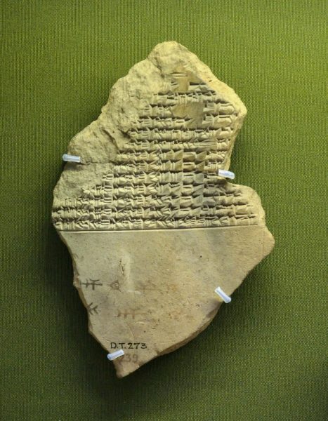
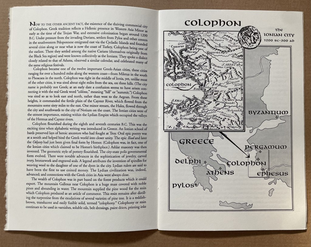
This tale comes from J. S. Kennard’s short 1901 tome on the colophon — that last page at the end of a manuscript or book. The colophon has served many purposes: giving the title of the work, identifying the scribe or printer, naming the place and date of completion or imprint, thanking and praising the patron, bragging, blaming, apologizing, entreating, praying and much more. Examples can be traced back to clay tablets and forward to websites.
Cuneiform tablet from the Library of Ashurbanipal, British Museum. Interesting that the colophon was added in ink after the clay had dried.
Its presence on websites may be one of those decried skeuomorphic hangovers from book publishing, but perhaps the colophon has an underlying value or purpose to serve in both the analogue and digital worlds. The late Bill Hill, who wrote the 1999 Microsoft white paper “The Magic of Reading” and was an early contributor to online typography, suggested making colophons a compulsory standard for website design and asked:
Why not introduce the venerable concept of the colophon to the Web? Could it be used to drive a new business model for fonts which would benefit the font industry, web developers and designers – and the people who visit their sites? [Sadly this page at the Bill Hill’s site is no longer available.]
Fanciful? Perhaps, but not much more fanciful than Erasmus’ proffered explanation of the word “colophon”. His expanded edition of Adagia printed by Manutius in 1508 includes this adage:
Colophonemaddidit He added the colophon. This came to be used when the finishing touch is added to something, or when some addition is made without which a piece of business cannot be concluded. The origin of the adage is pointed out by Strabo in … his Geography, …
And here is Strabo from the Loeb Classical Library online; scroll down to paragraph 28:
As venerable a publishing custom as the colophon may be, it is more honoured in the breach than the observance. Book artists tend to be more observant, but not religiously so, and of course some works of book art might be disfigured by a colophon. Still, there are sound reasons why book artists should bother themselves with a colophon — even if it stands apart from the work. In her review of Book Artists and Artists Who Make Books (2017), India Johnson gives one of those sound reasons:
It’s probably impossible to include every detail of production in a colophon—but some give it their best stab, exhaustively listing everyone that took part in a project. More concise colophons recap only the most relevant details of making—perhaps those the primary creator feels will factor saliently into making meaning of the book.
The convention of the colophon in our field exposes an assumption that the meaning of an artwork is informed not only by the finished product, but by the specifics of artistic labor. “Book Artists and Artists Who Make Books“, CBAA, 1 October 2018. Accessed 3 October 2018.
If craft does figure in a work’s meaning, then the more we can see how it figures, the greater our ability to appreciate and understand the work. For conveying insight — what materials and from what sources, what processes, what tools, who contributed, where and when the work occurred — the colophon stands ready. But where does it stand?
A contemporary of Kennard, A.W. Pollard declared that, to be a proper colophon, it had to appear at the conclusion or summit of the work. Artful as are some of the manuscripts and books that Kennard and Pollard cite, none push the envelope in the manner that works of contemporary book art do. Which brings us to another reason for book artists to consider the colophon: inspiration from history or tradition.
The last page of the codex may be a rightful spot for placing the codex, but what if the bookwork’s shape is challenging or musing about the shape of the book? Finishing touches might go anywhere. Think of Van Eyck’s self-portrait hidden in a reflection in The Arnolfini Portrait, or that of Vélazquez in Las Meninas.
Historians’ diligent cataloging of the “hands” of the scribes has enriched the self-identifications in colophons and connected those craftspersons with additional manuscripts. Book artists who use calligraphy or involve calligraphers should ponder the implications of this tool historians use to identify scribes by the style of their “hands”.
What potential, meaningful “tells” in a work’s colophon might the book artist or calligrapher leave to enrich the work — and provide insights for historians and connoisseurs poring over the finishing touch?
The colophon’s underlying value or purpose warrants book artists’ thinking about recording it offline and online, though this might be stretching the definition of the colophon. Our enjoyment of Kitty Maryatt’s 2018 reconstruction of La prose du Transsibérien et de la Petite Jehanne de France (1913) by Blaise Cendrars and Sonia Delaunay is certainly enhanced by the “colophonic” booklet she included with the work and the “About” page online.
Perhaps the story of the little “i” left over – the colophon – will prod the future historians of book art to examine bookworks and their artists’ websites for those finishing touches and stir artists to bestow that last finishing touch for the sake of the work’s soul if not their own.
A Prospect of Colophons
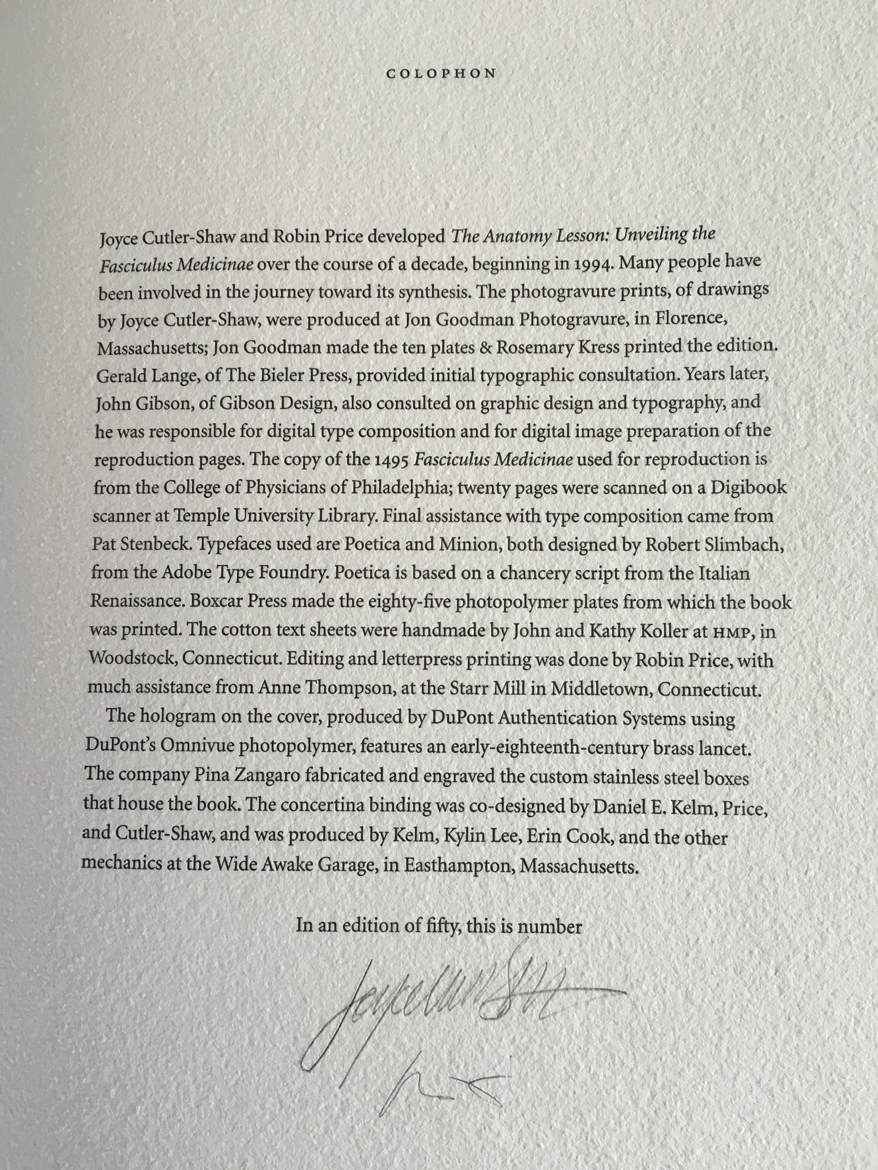
The Anatomy Lesson: Unveiling the Fasciculus Medicinae (2004) Joyce Cutler-Shaw The careful reader will notice that the edition number is missing. This instance of the work is one of the binder’s signed but unnumbered copies, having been acquired directly from Daniel E. Kelm.
Lyn Dillin, The Ballad of the Self Same Thing (2019) Can this be the first rhyming colophon?
Finding Home (2016) Louise Levergneux This may not be the first bilingual colophon I have seen, but its being inside the top of the box enclosing the work makes it the first to occupy the physical summit a work.
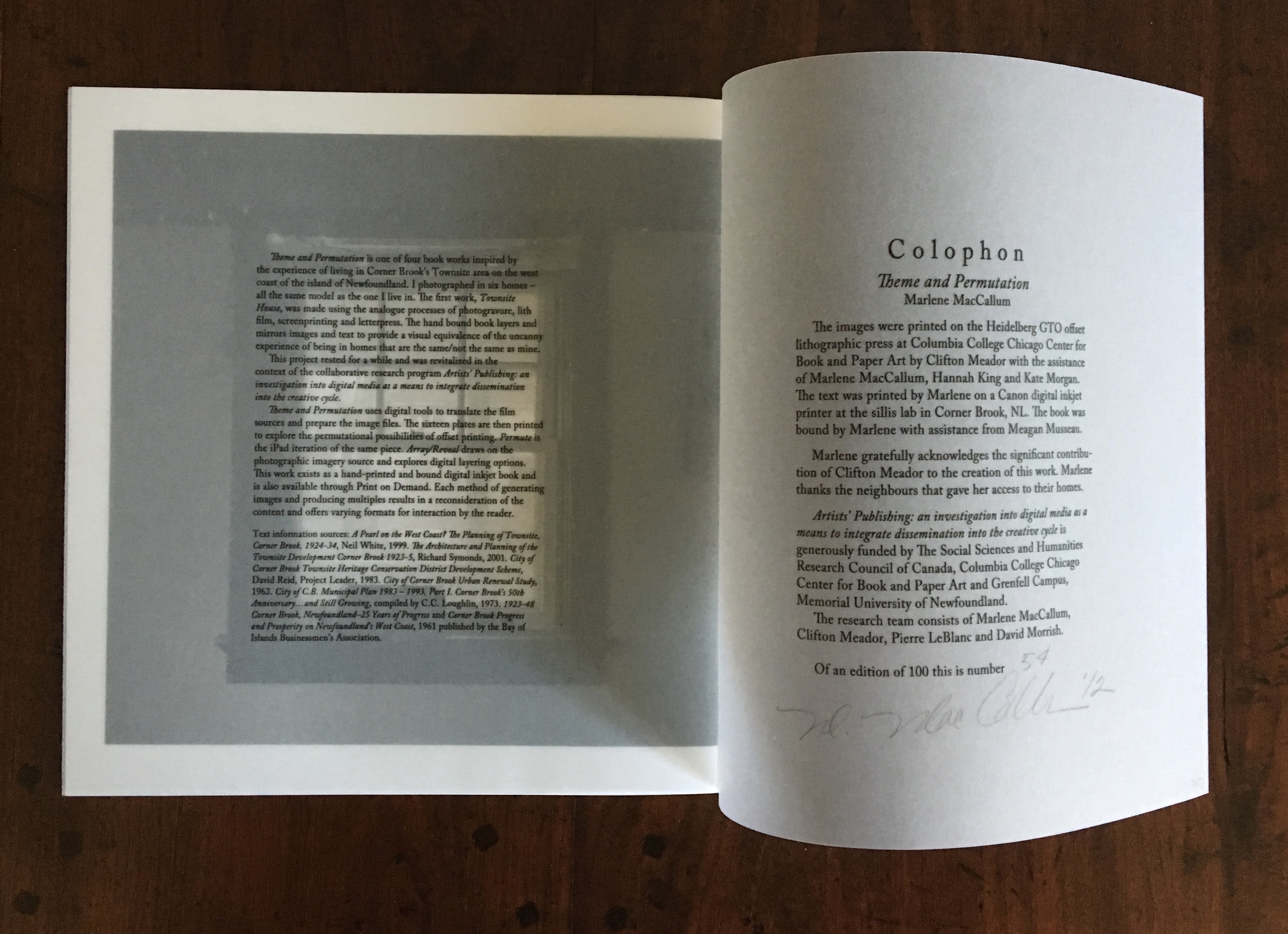
Theme and Permutation (2012) Marlene MacCallum This double-page spread reveals process information about the work that adds to the reader/viewer’s appreciation of the themes and permutations occurring in the pages.
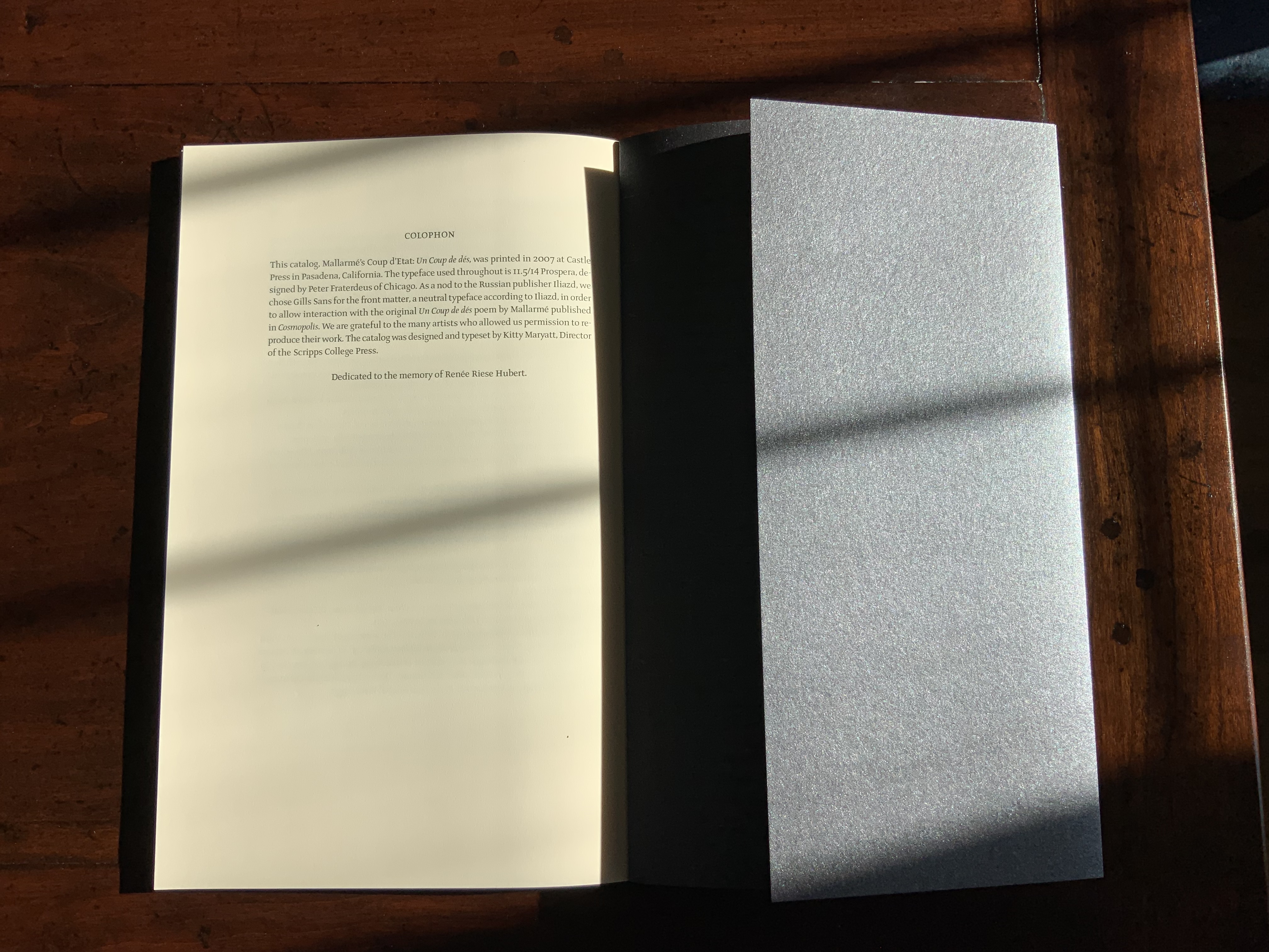
Mallarmé’s Coup d’État (2007) Kitty Maryatt The colophon’s nod to Iliazd sends the reader/viewer back to the start of this catalogue that is a bookwork in its own right.
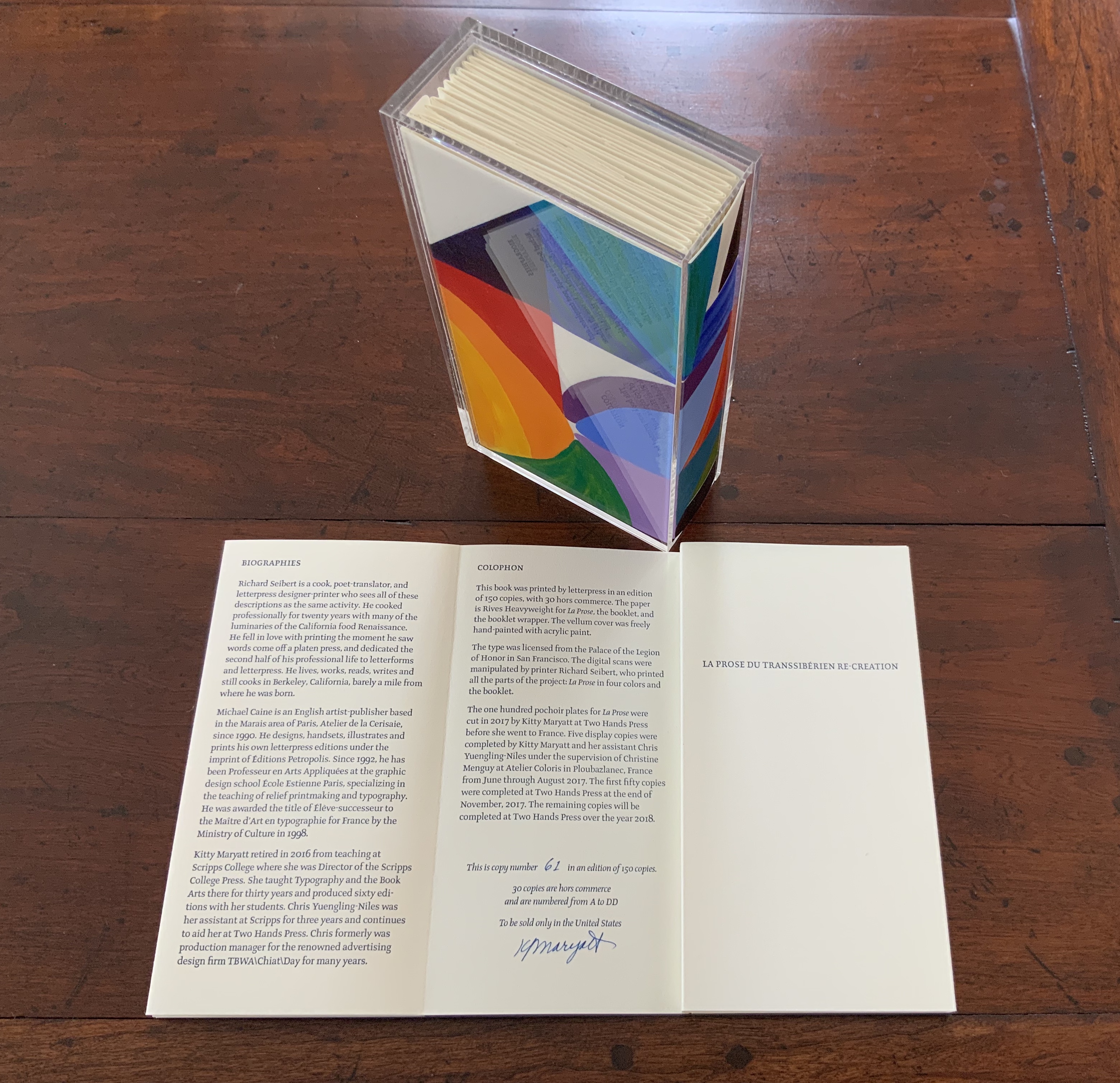
La prose du Transsibérien Re-Creation (2019) Kitty Maryatt A “colophon within a colophon”. The booklet providing details about the original work and Maryatt’s re-creation has an accordion structure and collapses into its own tri-fold wallet, which fits within the cover of the main work, seen here in its acetate holder.
L is for Lettering (2011) Cathryn Miller This hilarious and touching abecedary parades as a marked work handed in for a course, a portrait of the artist within a contemplation of the past and future of typography and letterpress. This colophon embodies the finishing touch.
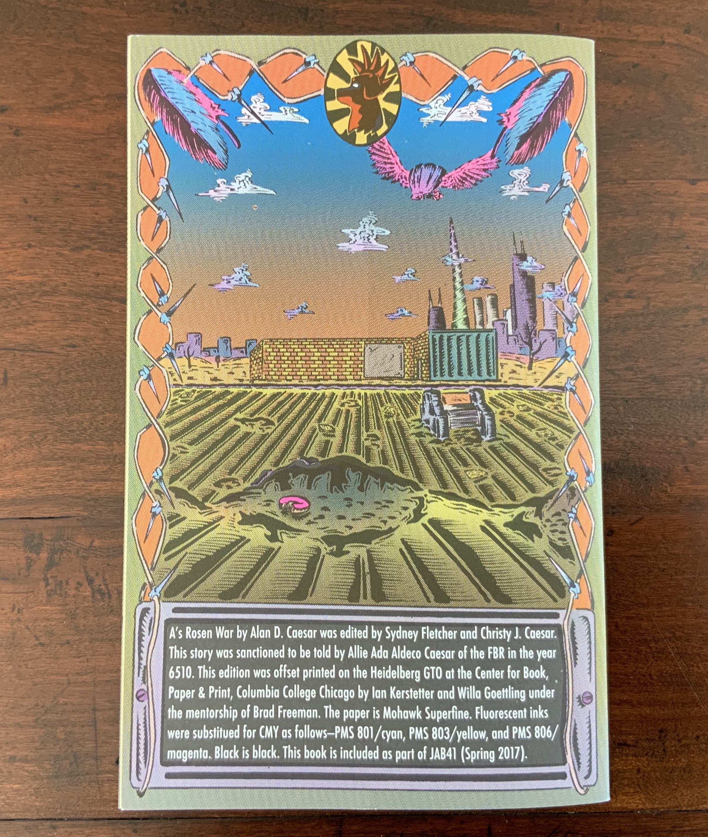
A’s Rosen War (2017) Alan Caesar This colophon continues the premised date with which this work of science fiction book art begins.
Richard Gameson. The Scribe Speaks? Colophons in Early English Manuscripts. Cambridge: Cambridge University Press, 2001. (See for the human interest: “I, Aelfric, wrote this book in the monastery of Bath”; “Pray for Wigbald”; “Just as the port is welcome to sailors, so is the final verse to scribes”.)
Hurtig, Alain. “Les colophons“. L’outil typographique. Accessed 26 January 2022. (Seventeen brilliantly designed and shaped colophons.)
Joseph Spencer Kennard. Some early printers and their colophons. Philadelphia : G.W. Jacobs and Co., 1902. (Less academic but just as interesting and typographically more fun than Gameson.)
Ming-Sun Poon, “The Printer’s Colophon in Sung China, 960-1279”, The Library Quarterly,43:1 (January 1973). (See for the 34 calligraphic inscriptions and the colophon to the Diamond Sutra: “On the 15th of the 4th moon of the 9th year of Hsien-t’ung [May 11, 868], Wang Chiek on behalf of his two parents reverently made this for universal free distribution.”)
The intriguing derivation of the word “Colophon” (1994) David C. Weber Sewn booklet. H230 x W155 mm. [16] pages. Acquired from Cotswold Internet Books, 7 May 2023. Photos: Books On Books Collection.
Pollard, Alfred W. Last Words on the History of the Title-Page, with Notes on Some Colophons and Twenty-Seven Fac-Similes of Title-Pages. Burt Franklin Research & Source Works Series, 668. B. Franklin, 1971. Pollard, Alfred W. 1859-1944. Last Words on the History of the Title-Page, with Notes on Some Colophons and Twenty-Seven Fac-Similes of Title-Pages, by Alfred W. Pollard. J.C. Nimmo, 1891. Pollard, Alfred W. 1859-1944. An Essay on Colophons, with Specimens and Translations, by Alfred W. Pollard, and an Introduction by Richard Garnett. The Caxton Club, 1905. Pollard, Alfred W., and Richard Garnett. An Essay on Colophons : With Specimens and Translations. Burt Franklin Bibliography and Reference Series ; #142. Burt Franklin, 1968. Van Elverdinghe, Emmanuel. “Modèles et Copies : Étude d’une Formule Des Colophons de Manuscrits Arméniens (VIIIe – XVIIIe Siècles).” Dissertation, 2017.
Aldus Manutius, John Rylands Library, University of Manchester
Merchants of Print from Venice to Manchester, 29 January to 21 June 2015, John Rylands Library, University of Manchester, UK:
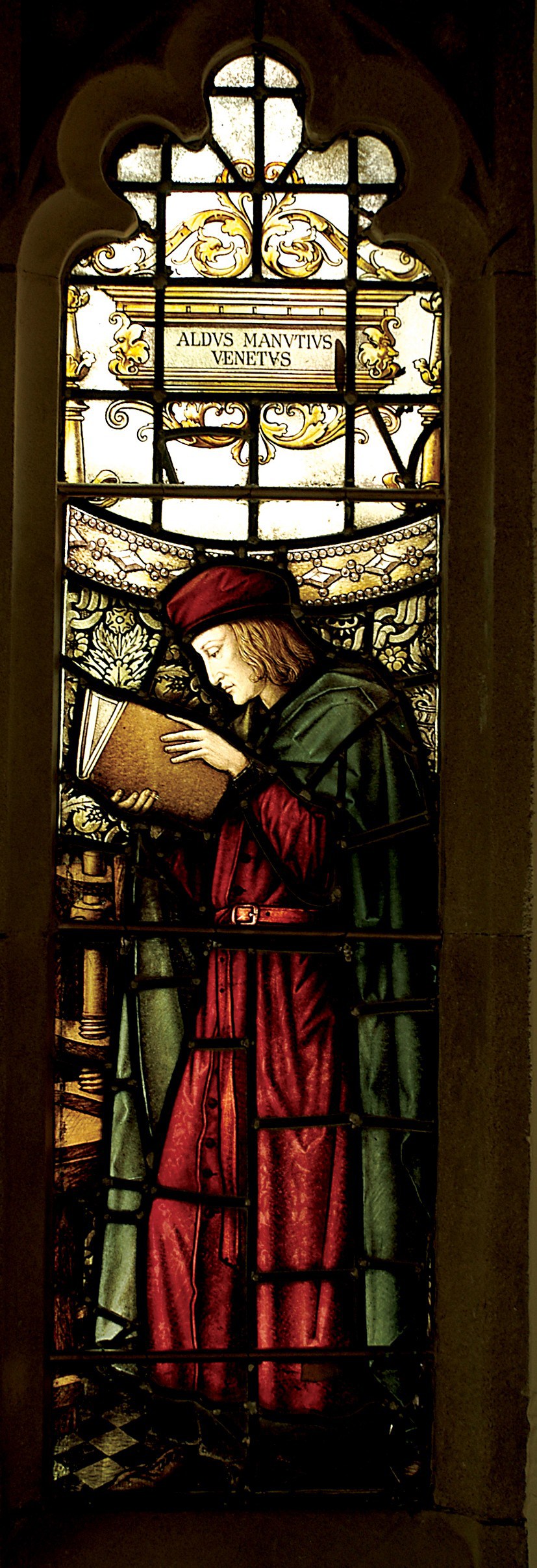
This exhibition celebrates the legacy of Aldus Manutius (1449 – 1515), an Italian humanist scholar who founded the Aldine Press at Venice. His publishing legacy includes scholarly editions of classical authors, the introduction of italic type, and the development of books in small formats that were read much like modern paperbacks. The firm was continued after his death by his son and grandson until 1598. John Rylands Library, University of Manchester website, accessed 17 May 2015
Back in February as I enjoyed Oxford’s recognition of the 500th anniversary of the death of Teobaldo Manucci, the Manchester exhibition was already running. Where the Oxford event focused on the more architectural motifs distinguishing early Venetian from Roman printing, the Manchester event dwelt more on the educational thrust, technical and business aspects of the Aldine legacy and provenance of the Manchester collection.
The Manchester focus on provenance wends its way back through the library’s donors dedicated to the cause of education (if not to impressing its practitioners with the importance of the woolen industry’s contribution to it) to the Renaissance circle on which Manutius depended:
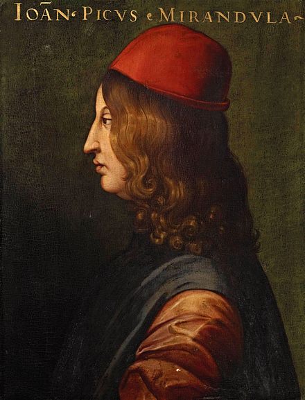
Giovanni Pico della Mirandola, 1463-1494 Uffizi Gallery, Florence
In 1482 Manutius lived with Pico della Mirandola and served as tutor to his nephews, the sons of the Princess of Carpi. Like the later, beneficent Manchester merchants, Pico’s family contributed financially to the cause: they funded the opening of the Aldine printing office in Venice in 1494. Of course, Pico made more than a patron’s financial contribution to the cause. Along with Cardinal Bessarion, Marsilio Ficino, Leon Battista Alberti and Erasmus – all known intimately to Manutius – Pico drove the revival of learning embodied in the output of the Aldines and numerous other printers (John Addington Symonds, Renaissance in Italy, Volume 2 (of 7): The Revival of Learning, John Murray, 1914).
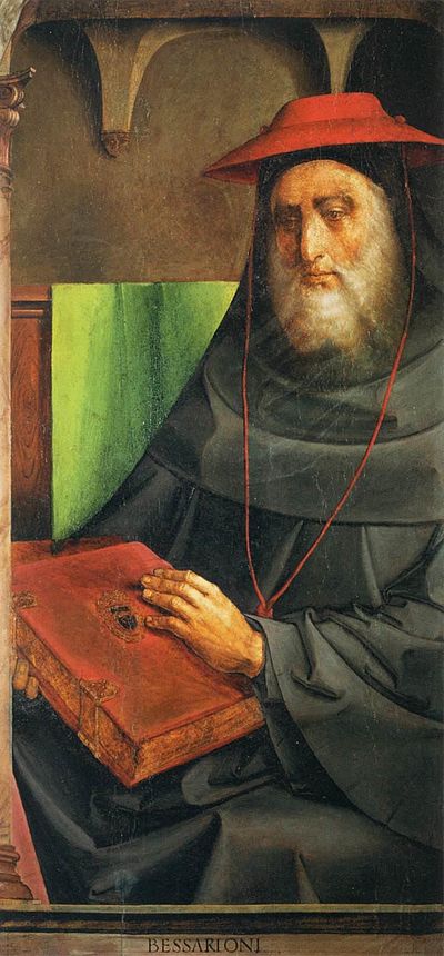
Cardinal Bessarion, Justus van Gent and Pedro Berruguete , (Les Hommes Illustres)
Marsilio Ficino, Duomo, Florence
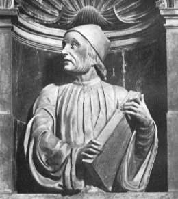
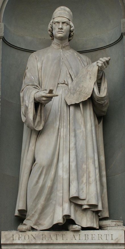
Leon Battista Alberti, Piazza degli Uffizi, Florence
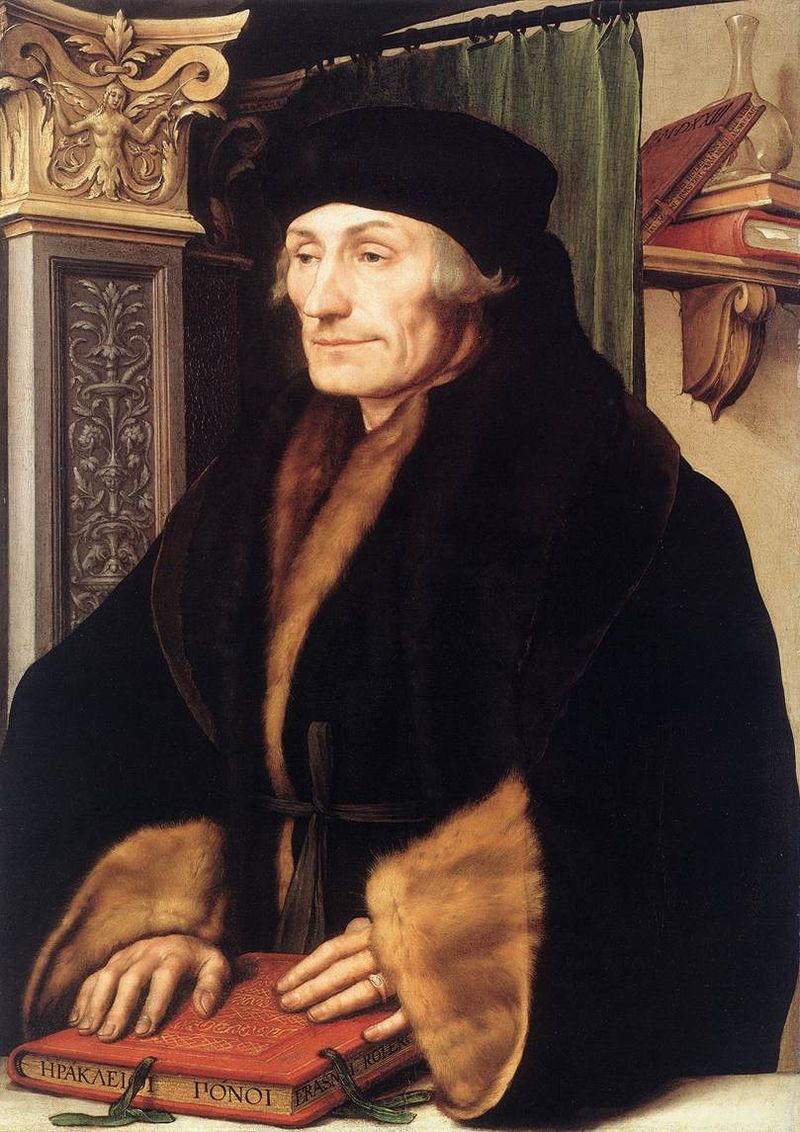
Desiderius Erasmus, 1523?, Hans Holbein the YoungerThe Manchester exhibition closes this month.
The next major Aldine event is the summer school hosted by The Catholic University in Siena (31 August – 3 September) and jointly organized by the Centro di ricerca europeo libro editoria biblioteca (CRELEB). Other events with dates still to be confirmed are planned in Brighton, Treviso, Milan and Arezzo.
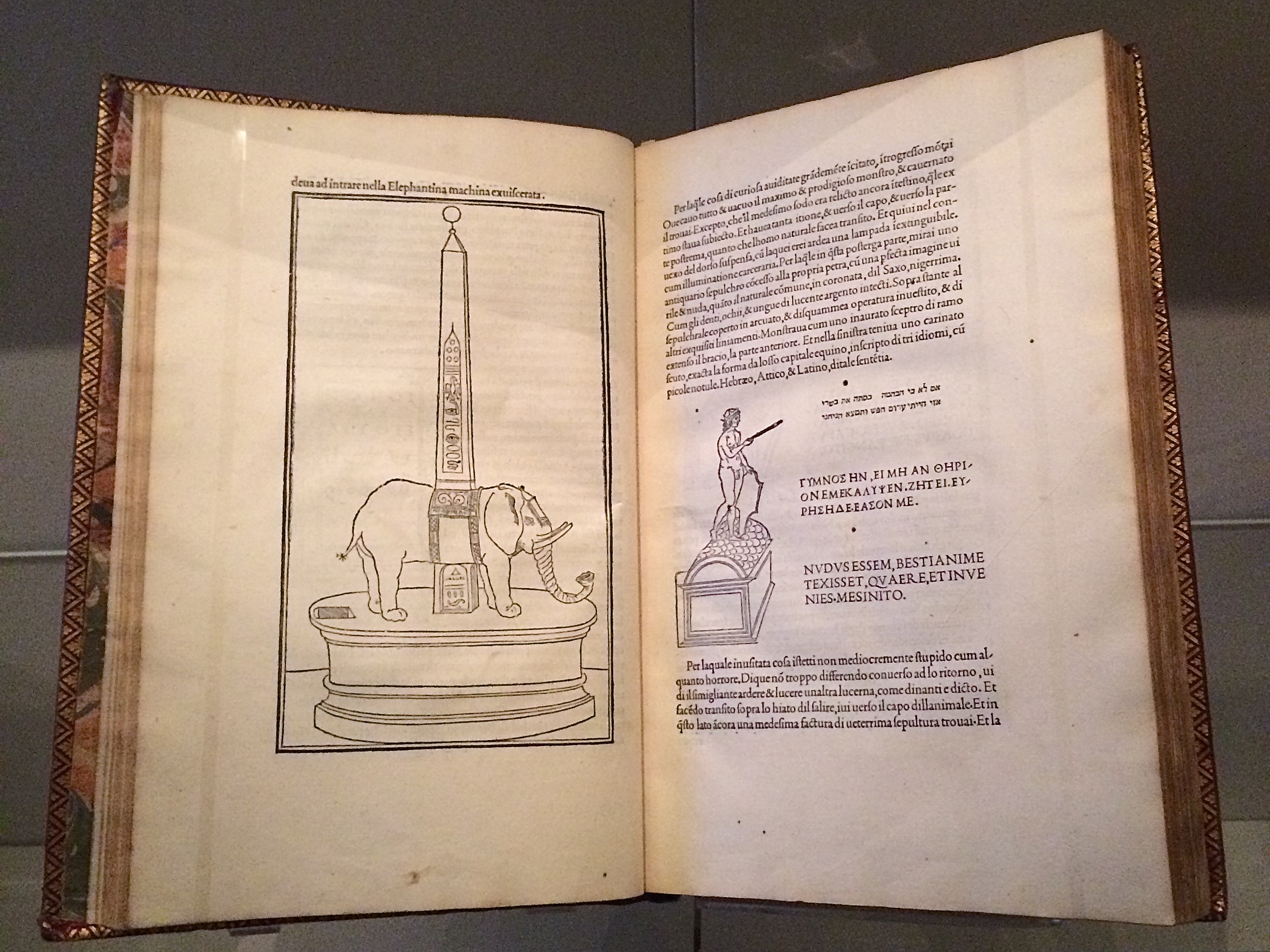
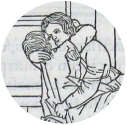
Late afternoon before the long worn wooden benches in the Bodleian’s Convocation Hall, 500 years after the death of Aldus Manutius, Oren Margolis served his audience well, providing them with a richer appreciation of the “finest printed book of the entire Renaissance”* – the Hypnerotomachia Poliphili – and of its publisher Aldus Manutius.
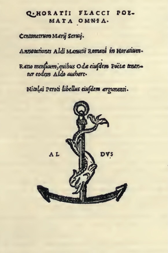
Drawing our attention to the more sculptural qualities of Venetian Renaissance printed books over the Florentine and to the evidence of the humanist agenda that drove Manutius, he led us to the page where Poliphilo (lover of all things, but in particular Polia, the ideal woman pursued to the end of the book) stands before a carving that foreshadows the Aldine Press device: a dolphin entwined around the shank of an anchor. The Aldine Press device was inspired by a similar image on an ancient Roman coin given by Pietro Bembo to Aldus, who wrongly associated it with Augustus and his proverb Festina lente (“Make haste slowly”) and adopted both for his printing and publishing business.
Erasmus praised Aldus, saying that he was “building a library which knows no walls save those of the world itself”.
For all of 2015, the world enjoyed a multitude of celebrations of the contribution of Aldus Manutius to publishing, printing and the book. After Gutenberg, Fust and Schoeffer, Aldus Manutius was perhaps the most important printer of the Renaissance. His portable books are still here, although locked away or displayed under glass, no longer so portable. Until now.
The Manutius Network 2015 provides a running list, links for some of which are provided below, including the online exhibition associated with Margolis’s talk. See also below, added in May 2016, the belated exhibition “Aldo Manutius: The Renaissance in Venice” at the Gallerie dell’Accademia in Venice.
From Crispin Elsted’s review of the Thames & Hudson facsimile edition of the Hypnerotomachia Poliphili. Parenthesis, December 2000, No. 5:
I once spent three hours in a library with a copy of the Aldine edition of Hypnerotomachia Poliphili, and I have never known a book take my breath away so consistently. Every page is a masterpiece: the dance of text with the more than 170 woodcuts; the firm, male stature of the typeface; the crisp spring of the impression; the elegant proportion of the page — all combine to an end in which the craft of printing and design carry the text into an atmosphere not of its own making. This new edition has the appearance of a fine actor in a part lately played by a great one. Here are the signs of the grace that greatness lent the commonplace five centuries ago; and in these signs, the commonplace finds here another advocate for its small claims to our time.
Timelines are, of course, for looking further back as well as forward. Earlier this year, April 2012 marked the fifteenth anniversary of the publication of Liane Lefaivre’sLeon Battista Alberti’sHypnerotomachia Poliphili: Re-Configuring the Architectural Body in the Early Italian Renaissance (Cambridge, MA: MIT Press, 1997) and the online publication of The Electronic Hypnerotomachia, which contains the facsimile text and illustrations. The online publication of extracts from Lefaivre’s book illustrates the linking prefigured by the “card stack” approach of HyperCard. What MIT Press and TU Delft, Lefaivre’s affiliation, host on their servers are not ebooks or even e-incunabula of the sort we experience today, but they are clearly forerunners to them.
In twenty-eight more months, December 2014, we will see the 515th anniversary of the original work’s publication by Aldine Press (Venice, December 1499). The founder Aldus Manutius did not normally publish heavily illustrated books. The Hypnerotomachia Poliphili was the exception and the only commissioned work that Manutius undertook. The exception reflects favorably on the overall success of his business and supports the view that Venice had become the capital of printing and publishing very shortly after the invention of printing by moveable type.
The book unveils an inscrutable, almost comic-book-illustrated story, glittering with made-up words in Greek, Latin, Hebrew and Arabic (including proto-Greek, -Hebrew and -Arabic fonts). In addition to the page displays sculpted into shapes such as goblets, this one volume displayed the technological mastery of and improvement on the new Roman (as opposed to the heavy Gothic) typeface Bembo. According to Norma Levarie in The Art & History of Books (New York, 1968), this singular volume revolutionized typography in France in less than twenty-five years.
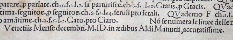
Somewhat like software releases, though, the 1499 edition came with bugs. The colophon to the Hypnerotomachia Poliphili falls at the end of a full page of errata.
“Venice Month December. 1499. in the house of Aldus Manutius, most accurately done.”
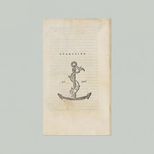
Initiated in 2015 in celebration of the anniversary and acknowledgement of the more than 100 Aldine editions in the Wosk McDonald Collection, Simon Fraser University’s Aldus@SFU is the digitization of 21 Aldine volumes published between 15011 and 1515. The image above is the edition of Lucretius’ De rerum naturam, published just after Manutius’ death in 1515.
In 1973 in an article in The Library Quarterly and in her 1979 dissertation, Mingshen Pan (or Ming-Sun Poon) concludes from her examination of books during the Sung period that the colophon gradually changed in form, content, design, and placement, demonstrating an increasing use of the colophon as an advertisement of the printer and his wares. This shift embodied a critical transition in the printing trade of that time. As support from governmental and private sources waned, support from diversified sources were sought in which the commercial element played a significant role.
Familiar? As the European printing press began to make books available to a wider economic circle, manuscript books ceased to be supported by commission and patronage. One of the earliest and famous printers of Venice, Aldus Manutius, reportedly printed only one commissioned book (Hypnerotomachia Poliphili, 1499); the rest had to make their way in the market.
In Sir Isaac Newton’s day, “Printers secured their livelihoods by advertising medicines, . . . Physicians told each other that if they want to market a new drug then they ought to go to the booksellers to do it.” Adrian Johns, Piracy (Chicago: University of Chicago Press, 2009), pp. 84-85.
Publishing has always been marked (or marred) by the struggle to establish a stable business model.
Here’s a previously missed infographic for the evolution of the book – a bit skeletal but with the elegance of the format. And while we are at it, let’s add some bibliographic and webographic “evolution” entries:
Feel free to suggest new additions to the timeline!
Ebook Timeline Updated – 20120812
Yesterday, the 11th of August 2012 marked the twenty-fifth anniversary of Hypercard. Alerted by Matthew Lasar in Ars Technica in May, gurus lined up to comment on Bill Atkinson‘s contribution in the 80s to Apple and the basics of hyperlinking techniques we now take for granted.
David Weinberger and Roy Tennant celebrated the anniversary with engaging and personal posts linked from their names here.
With the publication of The Cluetrain Manifesto, Weinberger became one of the Web’s leading light-shedders (gurus) and provocateurs. Most important in this context, he was in the audience when Bill Atkinson presented Apple’s Hypercard to the MacWorld conference in 1987. Weinberger writes, “HyperCard was a groundbreaking, beautiful, and even thrilling app. Ahead of its time for sure. But the time it was ahead of seems to me to be not so much the Age of the Web as the Age of the App. I don’t know why there isn’t now an app development environment that gives us what HyperCard did. Apparently HyperCard is still ahead of its time.”
Tennant, too, has written several books and a monthly column on digital libraries for Library Journal for a decade and currently works at OCLC. Most important, he “was there” as an early user of the Hypercard system and HyperTalk programming language on which it is based. As Tennant puts it, “HyperCard was where I learned how to DO the Web. It was where I learned the importance of screen real estate. It was where I learned the law of 7, plus or minus 2. It was where I learned how important graphics are in creating an engaging site. It was where I cut my teeth on interactivity.”
Apps, screen real estate, Miller’s law, graphics and “cutting teeth” on interactivity — all are part of the new toolkit for making books.
Timelines are, of course, for looking further back as well as forward. Earlier this year, April 2012 marked the fifteenth anniversary of the publication of Liane Lefaivre’sLeon Battista Alberti’sHypnerotomachia Poliphili: Re-Configuring the Architectural Body in the Early Italian Renaissance (Cambridge, MA: MIT Press, 1997) and the online publication of The Electronic Hypnerotomachia, which contains the facsimile text and illustrations. The online publication of extracts from Lefaivre’s book illustrates the linking prefigured by the “card stack” approach of HyperCard. What MIT Press and TU Delft, Lefaivre’s affiliation, host on their servers are not ebooks or even e-incunabula of the sort we experience today, but they are clearly forerunners to them.
In twenty-eight more months, December 2014, we will see the 515th anniversary of the original work’s publication by Aldine Press (Venice, December 1499). The founder Aldus Manutius did not normally publish heavily illustrated books. The Hypnerotomachia Poliphili was the exception and the only commissioned work that Manutius undertook. The exception reflects favorably on the overall success of his business and supports the view that Venice had become the capital of printing and publishing very shortly after the invention of printing by moveable type.
The book unveils an inscrutable, almost comic-book-illustrated story, glittering with made-up words in Greek, Latin, Hebrew and Arabic (including proto-Greek, -Hebrew and -Arabic fonts). In addition to the page displays sculpted into shapes such as goblets, this one volume displayed the technological mastery of and improvement on the new Roman (as opposed to the heavy Gothic) typeface Bembo. According to Norma Levarie in The Art & History of Books (New York, 1968), this singular volume revolutionized typography in France in less than twenty-five years.
Somewhat like software releases, though, the 1499 edition came with bugs. The colophon to the Hypnerotomachia Poliphili falls at the end of a full page of errata.
“Venice Month December. 1499. in the house of Aldus Manutius, most accurately done.”
“The Book Industry Study Group (BISG), a leading U.S.-based trade association representing the entire book supply chain, announced today the publication of a new Policy Statement endorsing EPUB 3 as the accepted and preferred standard for representing, packaging, and encoding structured and semantically enhanced Web content — including XHTML, CSS, SVG, images, and other resources — for distribution in a single-file format.”
For the record and from the Library of Congress:
“The Open eBook Publication Structure or “OEB,” originally produced in 1999, was the precursor to EPUB. Version 1.0 of the Publication Structure was created in the winter, spring, and summer of 1999 by the Open eBook Authoring Group. Following the release of OEBPS 1.0, the Open eBook Forum (OeBF) was formally incorporated in January 2000. OEBPS Version 1.0.1 [OEBPS_1_0], a maintenance release, was brought out in July 2001. OEBPS Version 1.2 [OEBPS_1_2], incorporating new support for control by content providers over presentation along with other corrections and improvements, was released as a Recommended Specification in August 2002. EPUB 2 was initially standardized in 2007. EPUB 2.0.1 was approved in 2010. EPUB, Version 3, was approved as an IDPF Recommendation in October 2011. It is substantially different from EPUB, Version 2, both in using only a single form for textual content and in having support for audio, video, and scripted interactivity (through Javascript). No longer supported are the EPUB_2 formats for text content, one based on the Digital Talking Book [DTB_2005] format and a second form based on XHTML 1.1 compatible with OEBPS_1_2. A single new encoding for textual Content Documents is based on HTML5/XHTML and CSS3, despite the fact that both of these W3C standards are still works in progress. SVG is supported for graphics and it is possible to have an EPUB_3 document whose “pages” consists [sic] only of graphics, for example for a graphic novel. Several legacy features are deprecated. Some legacy structures may be included for compatibility of EPUB_3 documents with existing EPUB_2 readers. EPUB_3 readers are expected to render publications using version 2 and version 3.”
Coincidentally, Amazon UK reported today that it is now selling 114 Kindle ebooks for every 100 print books it sells.
The EPUB format is not natively readable on the Kindle device or in the Kindle application. Customers can add conversion apps easily to their devices to make EPUB readable on a Kindle, but as consumers seek the advantages of an industry standard, how will Amazon respond?
Feel free to suggest new additions to the timeline!
Added 20120806.
Ebook Timeline Updated – 20120725
As we are still in the Age of e-Incunabula, what better than a trip half way around the world to Japan to see one of the world’s largest collections of Western incunabula — and an excellent site to bookmark?
The National Diet Library’s site refers to itself as an exhibition based on the book “Inkyunabura no Sekai” (The World of Incunabula) / written by Hiroharu Orita, compiled by the Library Research Institute of the National Diet Library. Tokyo: Japan Library Association, July 2000 (in Japanese).
The exhibition provides a timeline of incunabula from the second half of the 4th century when the shift to the codex occurred to 1980 when the British Library began entering data on its collection of incunabula into the ISTC. The site provides much more than this chronology.
Images from the collection, statistics on the type fonts used, coverage of design and how the quires (sheets of paper folded, forerunner of book signatures and files in EPUB!) were arranged, and the binding process — all are covered straightforwardly and often in entertaining detail. Look on this site and consider how far we have to go with our ebooks and apps!
Added 20120725.
Ebook Timeline Updated – 20120719
Not as interactive as the Counterspace timeline for typography below, but certainly as densely informative, and it extends to typography online.
Added 20120719.
Ebook Timeline Updated – 20120717
Another timeline, this one focused on bookbinding. Is .zip the binding for an ebook?
Added 20120717.
Ebook Timeline Updated – 20120710
On the heels of the question above comes an outstanding interactive infographic on a critical element of the book and ebook: typography.
Added 20120710.
Ebook Timeline Updated – 20120706
Yet another ebook timeline, and this one is broken down into interpretive categories, “The Age of Writing” and “The Network Era,” which is thought-provoking. Are we in “The Age of the Tablet”?
Added 20120706.
Start of the Ebook Timeline
In 1936, “Chronology of Books & Printing” appeared in its revised edition, published by Macmillan in New York. In 1996, Cor Knops picked up the torch and started a Book History Timeline from Sumerian clay tablets (he could have started with the caves at Lascaux!) through to 1997 with the first issue of “Biblio Magazine” but with little acknowledgment of ebooks.
Now in 2012, looking back to 2002, we find this journalistic stab at a timeline for ebooks.
Forged together, the chronologies would have to include “As we may think” by Vannevar Bush in 1945, Ted Nelson’s coining of “hypertext” in 1963-65, the Apple Newton in 1993 (how many publishers and authors have kept track of the free downloads of their Newton ebooks?) and much more.
Another extension of the ebook timeline appears in this book by Marie Lebert, which fills in important gaps, misses others and offers more than a few overemphasized continental developments. Her timeline takes us through 2009, which means that the signal events in 2011/12 of ebook sales’ outstripping those of print in some markets are still to be added.