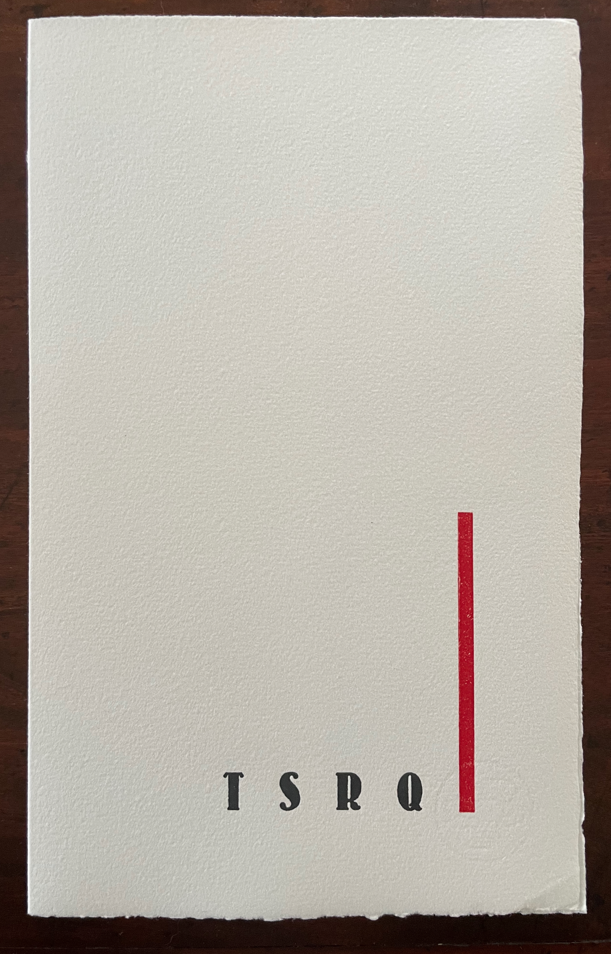
ABC of Advertising (2024)
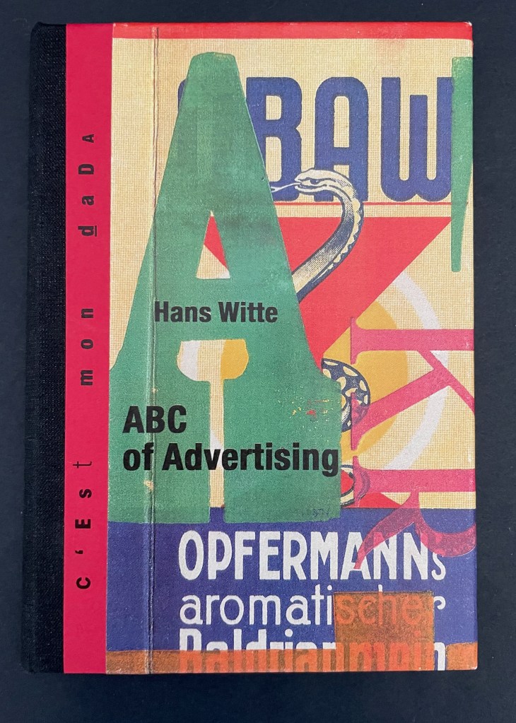
ABC of Advertising (2024)
Hans Witte
Casebound, cloth spine and paper over boards, sewn to doublures. H150 x W105 mm. [40] pages. Acquired from Redfoxpress, 2024.
Photos: Books On Books Collection.
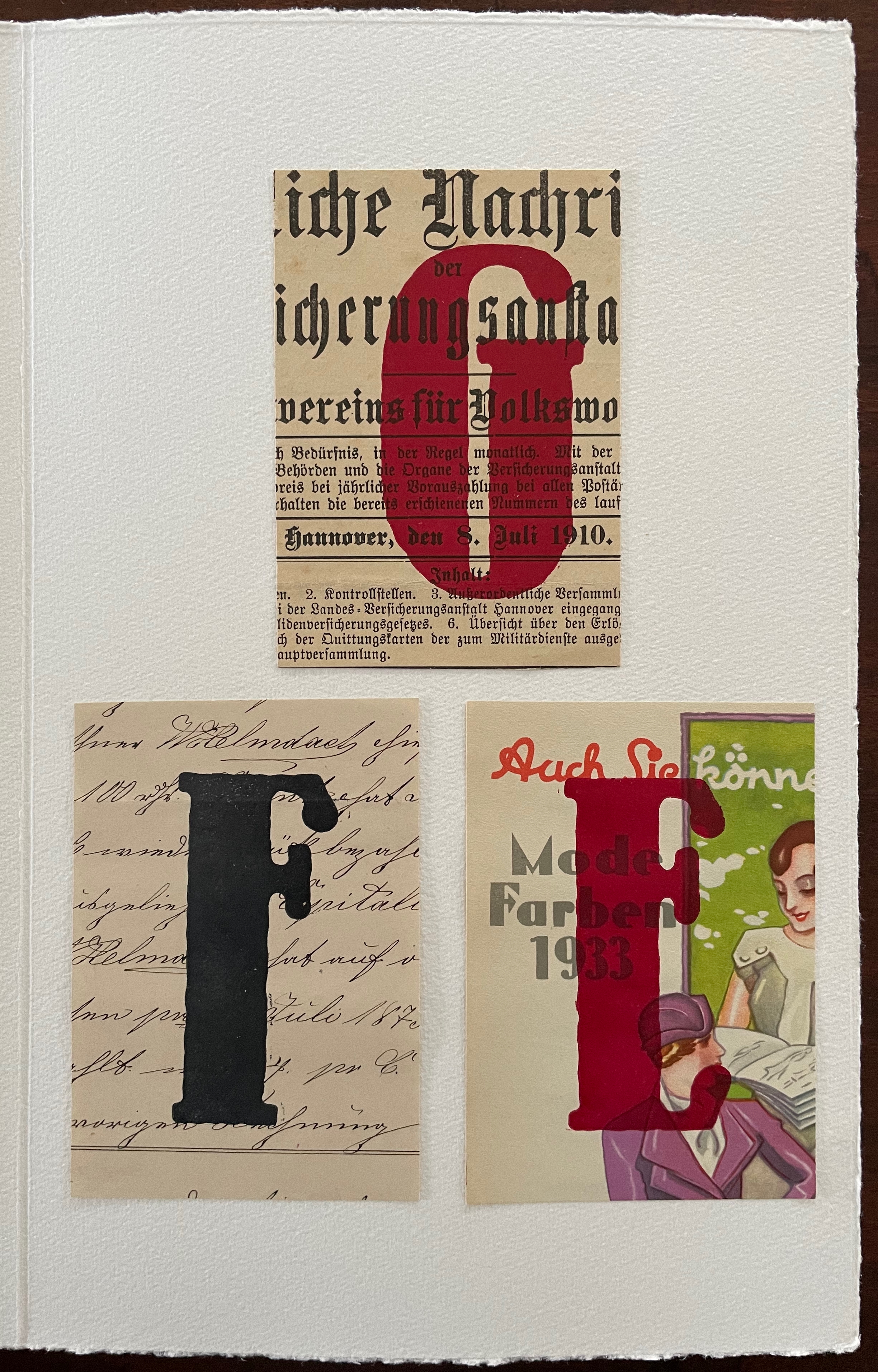
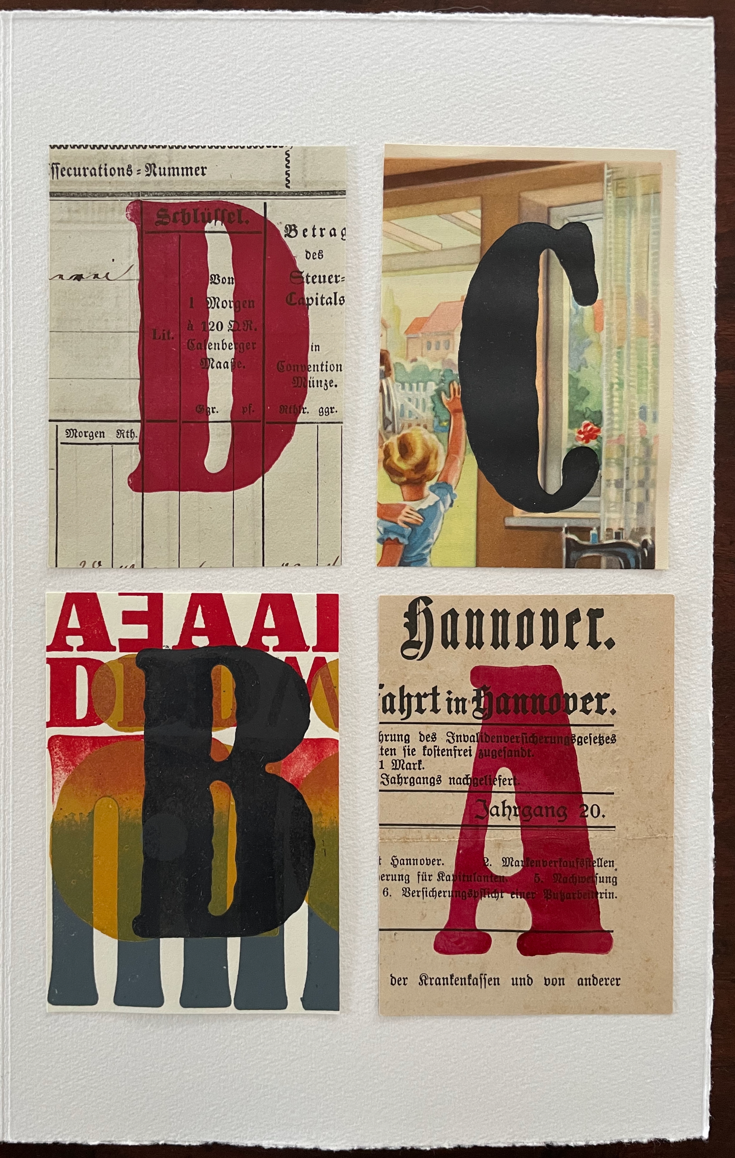
The ABC of Advertising is No. 205 in the RedFoxPress “c’est mon dada” series. The series name comes from the French expression meaning “it’s my thing”. Dada is also a colloquial child’s expression for “horsie” or “hobbyhorse”. So, of course, the French adopted it as the name for one of the avant garde movement of the early 20th century. Although you might think from The ABC of Advertising that wood type and letter press are Hans Witte’s “hobbyhorse”, it’s clear from his artist’s books, children’s books, and book object installations that he has a herd of them.
Since 1989, he has been publishing under his imprint Edition Einstein — Galerie für Buchdruckkunst in Deitlevsen, Germany. There are fine press and handmade editions presenting the work of Kurt Schwitters, Cees Nootebom and others all with the Witte’s distinctive illustrative style, as well as over forty works in Das andere Kinderbuch (“The Other Children’s Book”) series. His book object installations demonstrate an additional field of serious and historical whimsy: a Gutenberg travelling printing press stuffed into a medical doctor’s bag and a fictitious device for Galileo Galilei to have measured Gutenberg’s type for continued usability.
ABC of Advertising follows Witte’s “Sketch for a Typographical Poetics”.
- Typographic poetry is free from the rules and laws of conventional typography.
- Instead, it is solely indebted to the artist’s imagination.
- The artist draws solely from his intuition and his design concepts. In this respect, his work is comparable to a cipher.
- The cipher-like encryption is intended by the artist.
- Typographic poetry evokes in the viewer associative chains of ideas and spaces of ideas that arise from his subjective experience and that will and can only be identical to those of the artist to a small extent.
- Typographic poetry is not suited to conventional literary communication. It is more than that; it is completely open.
- Instead, it serves as a play space for the imagination.*
- The artist’s work does not consciously convey any ideological, philosophical, moral, political, historical, etc., insights to the viewer. Therefore, an epistemological interpretation makes no sense.
- In addition to the typeface material created to date, all conceivable materials and patterns for typographic printing and other design techniques may be used. Original inventions and experiments are encouraged.
*According to Kant’s definition, imagination is the human capacity to conceive something that no longer exists, or to conceive something that never existed. Imagination can be both reproductive and productive fantasy.
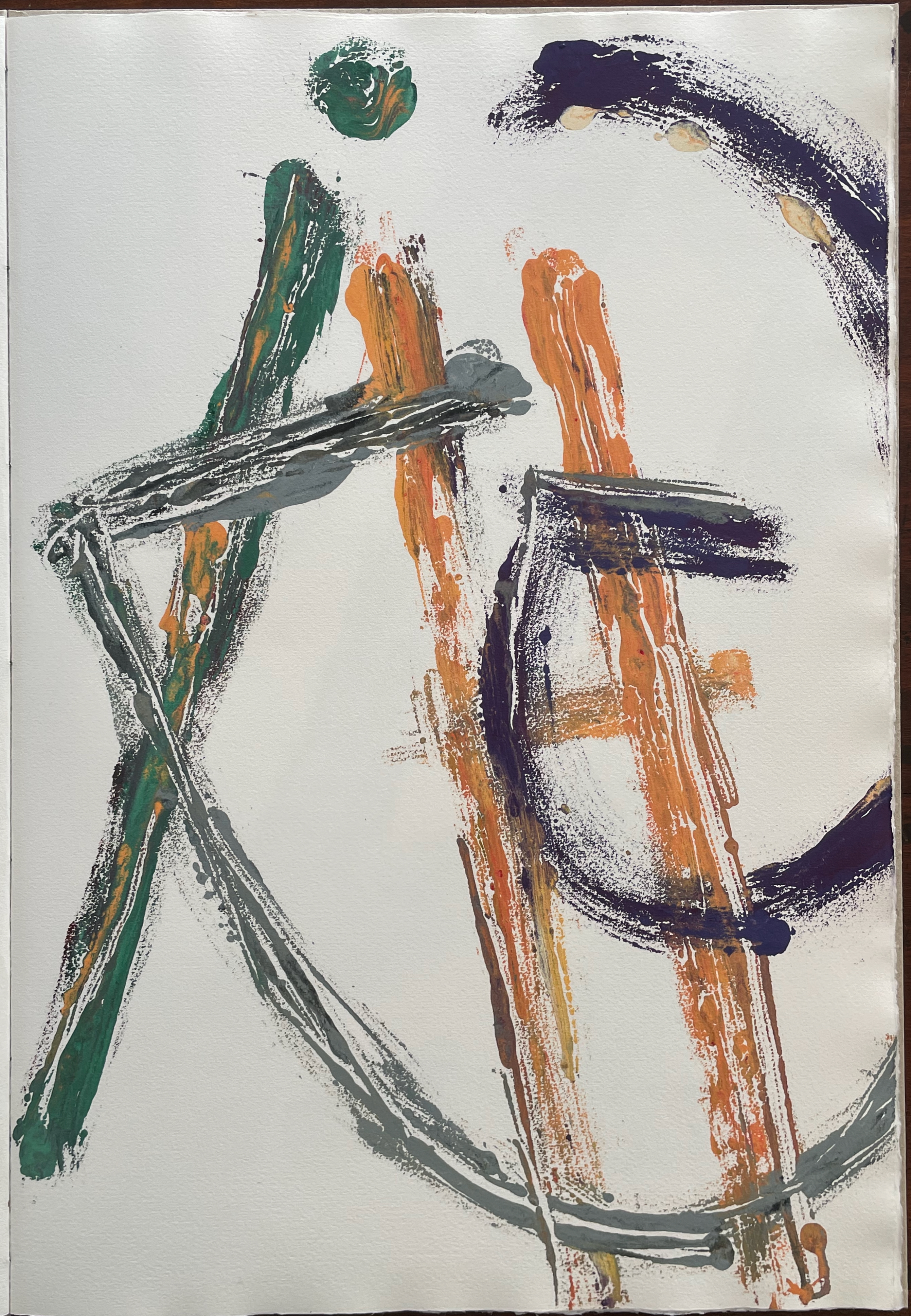
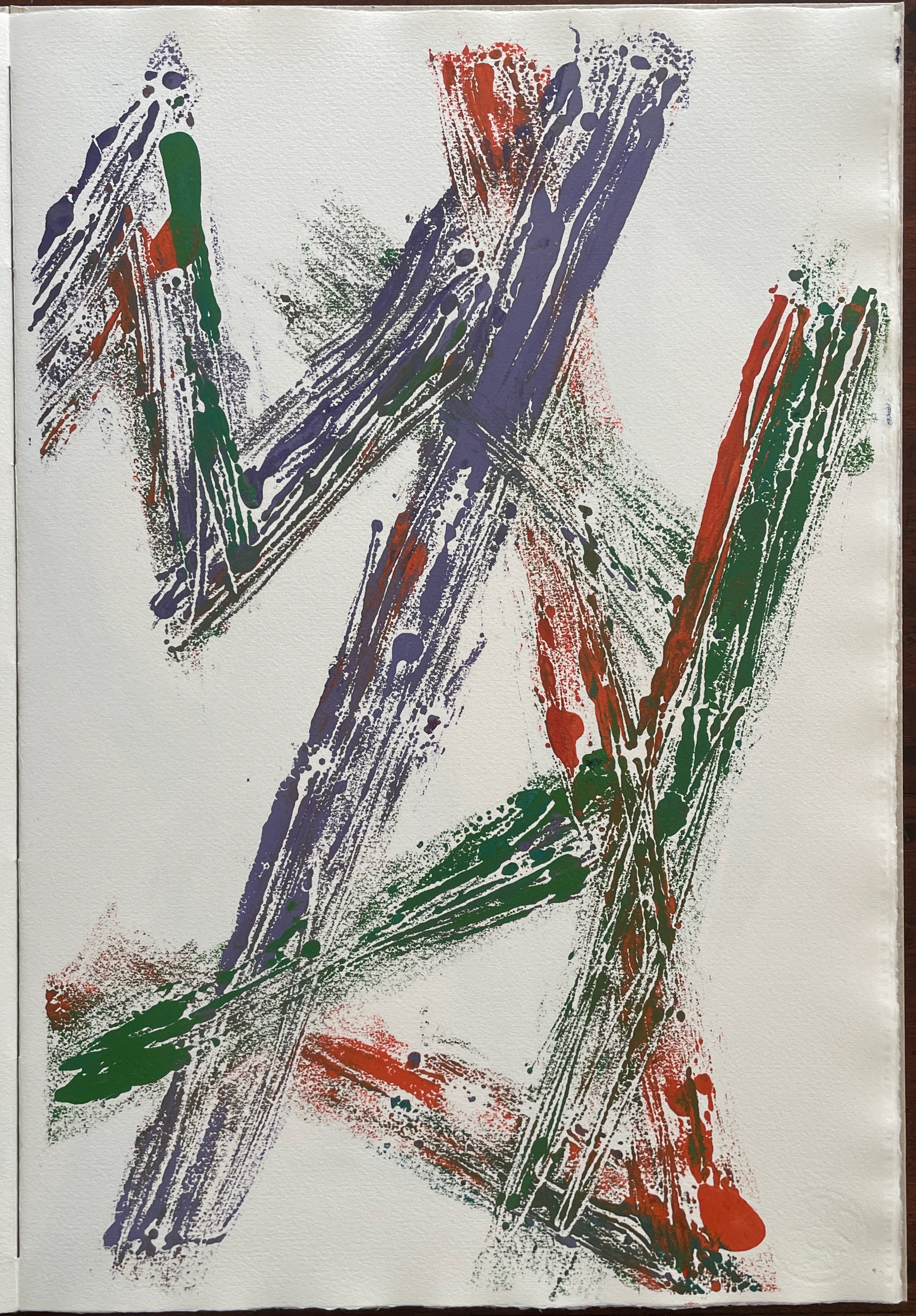
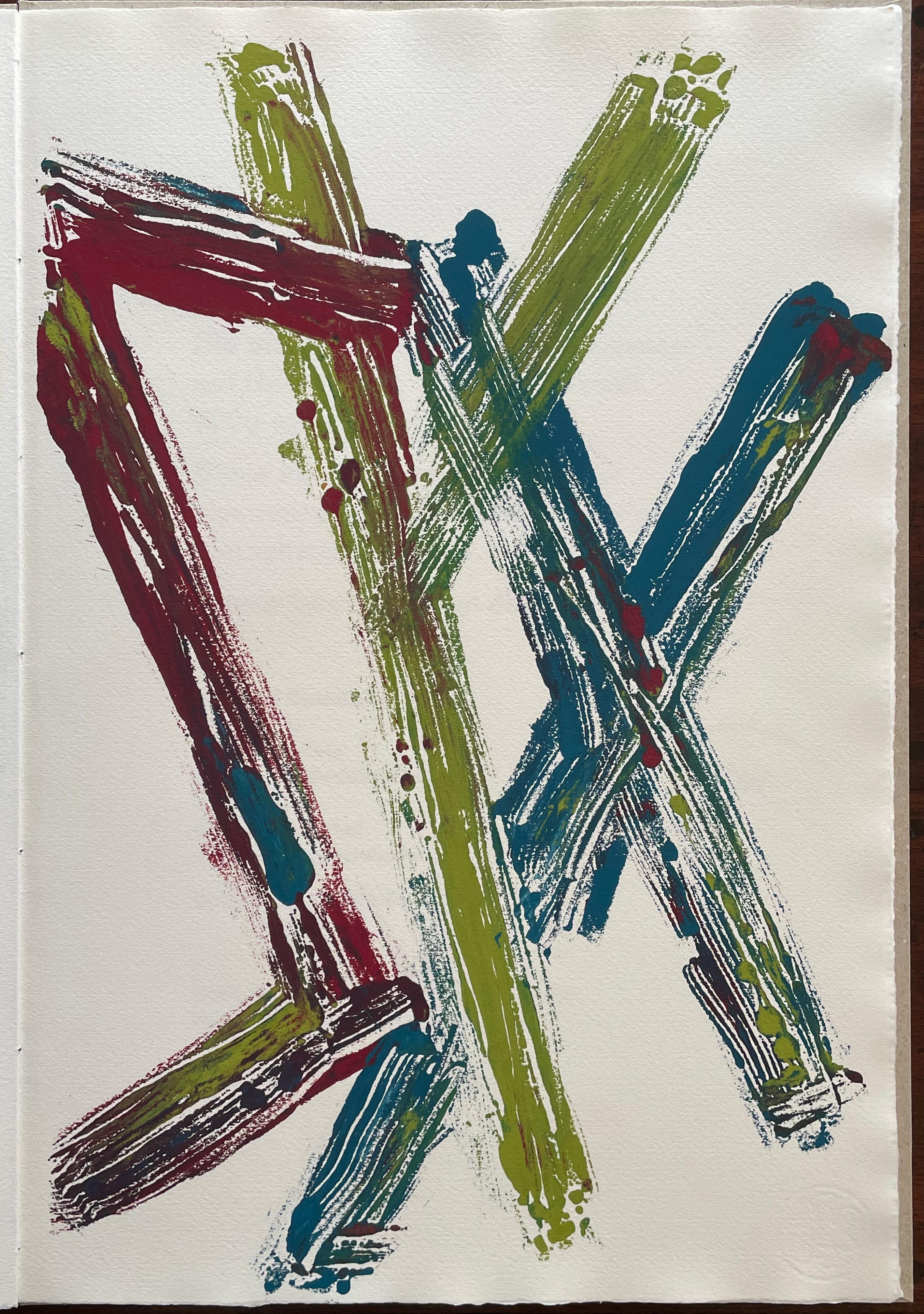
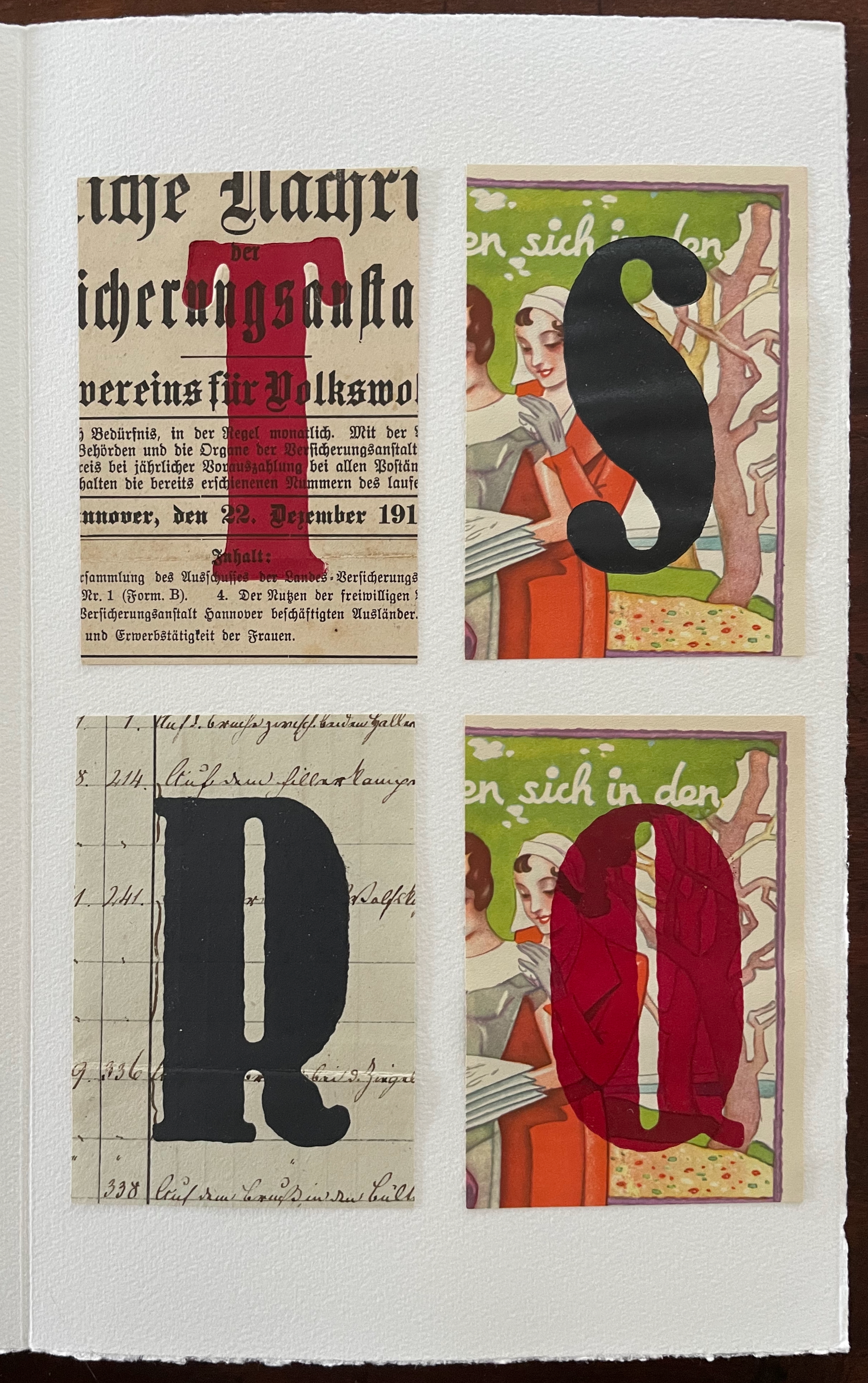
Of particular interest is how the inking of the letters sometimes occludes the background advertisements and other times thins to let them peek through.

Letter overlap is another frequent characteristic contrasted with an absence of overlap.
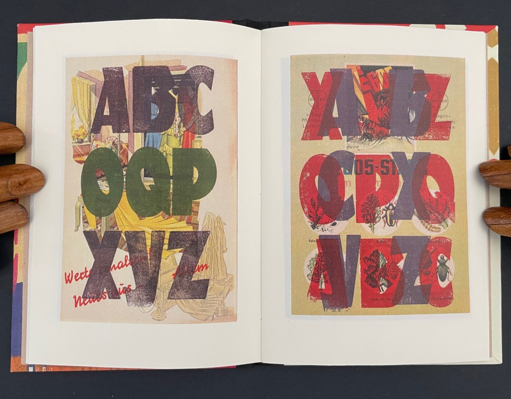
And sometimes the combination of single letter overlap in different colors creates a vibrancy on one page that seems to deliberately contrast with a flatter effect on the adjacent page.


Das ABC der wilden Kinder (2018)
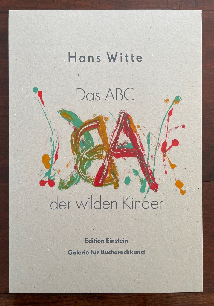
Das ABC der wilden Kinder (2018) [Wild Children’s ABCs or Wild Kids’ ABCs or Crazy Kids’ ABCs]
Hans Witte
Open spine, sewn and glued. H486 x W333 x D12 mm. [12] folios. Edition of 10, of which this #2. Acquired from the artist, 26 September 2025.
Photos: Books On Books Collection. Displayed with permission of Editions Einstein.
The method used for drawing and printing the monotypes of Das ABC der wilden Kinder certainly lends support to the title and appearance of this reversed-image alphabet. The letters have been freely drawn with letterpress ink on a glass plate then printed by “slapping” off the image onto Hahnemühle Echt-Bütten white 230g paper. It may be apparent in the photos that some strokes carry a gloss and others do not. Witte explains that this came about when the ink was applied either thickly or in several layers. With its cover’s echo of children’s board books, it all suggests the abandon of kindergarten fingerpainting and an approach entirely suited as a volume in “The Other Children’s Book” series.


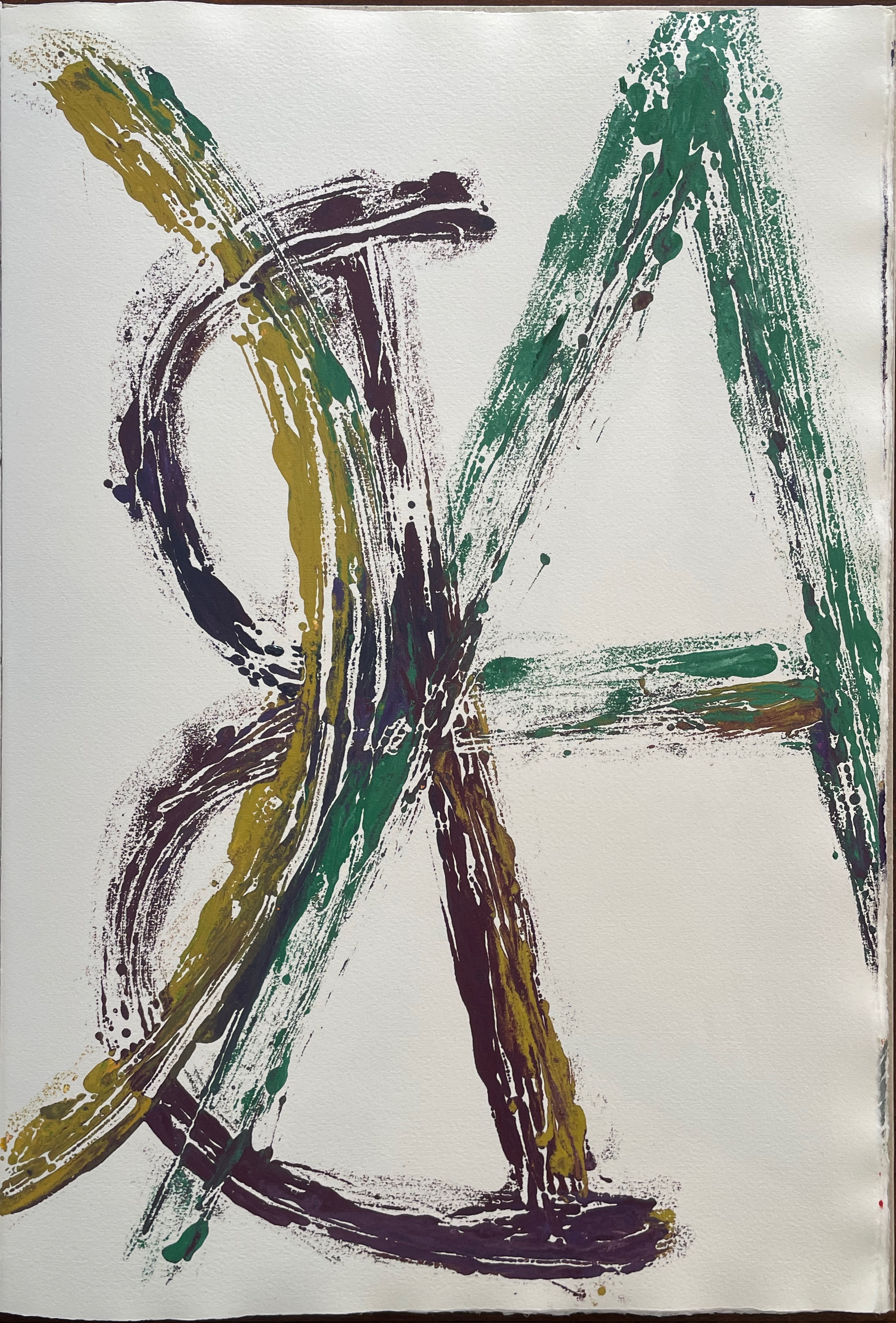


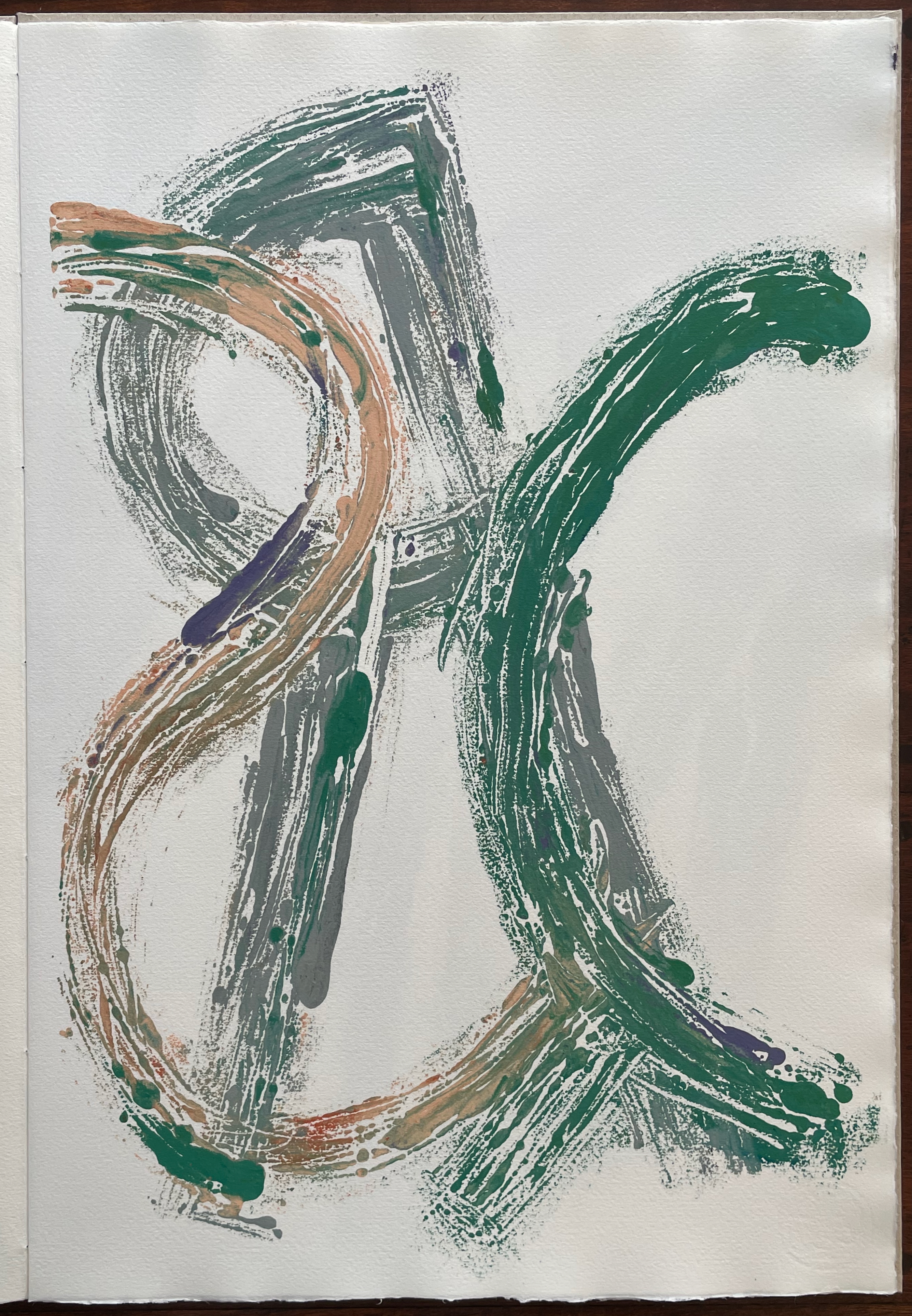

Some of the monotypes give an impression of abstract expressionism, but the technique, content, and context of book art that Witte brings to his work eludes pigeonholing.
Kurt Schwitters: ZA (elementar) (2018)
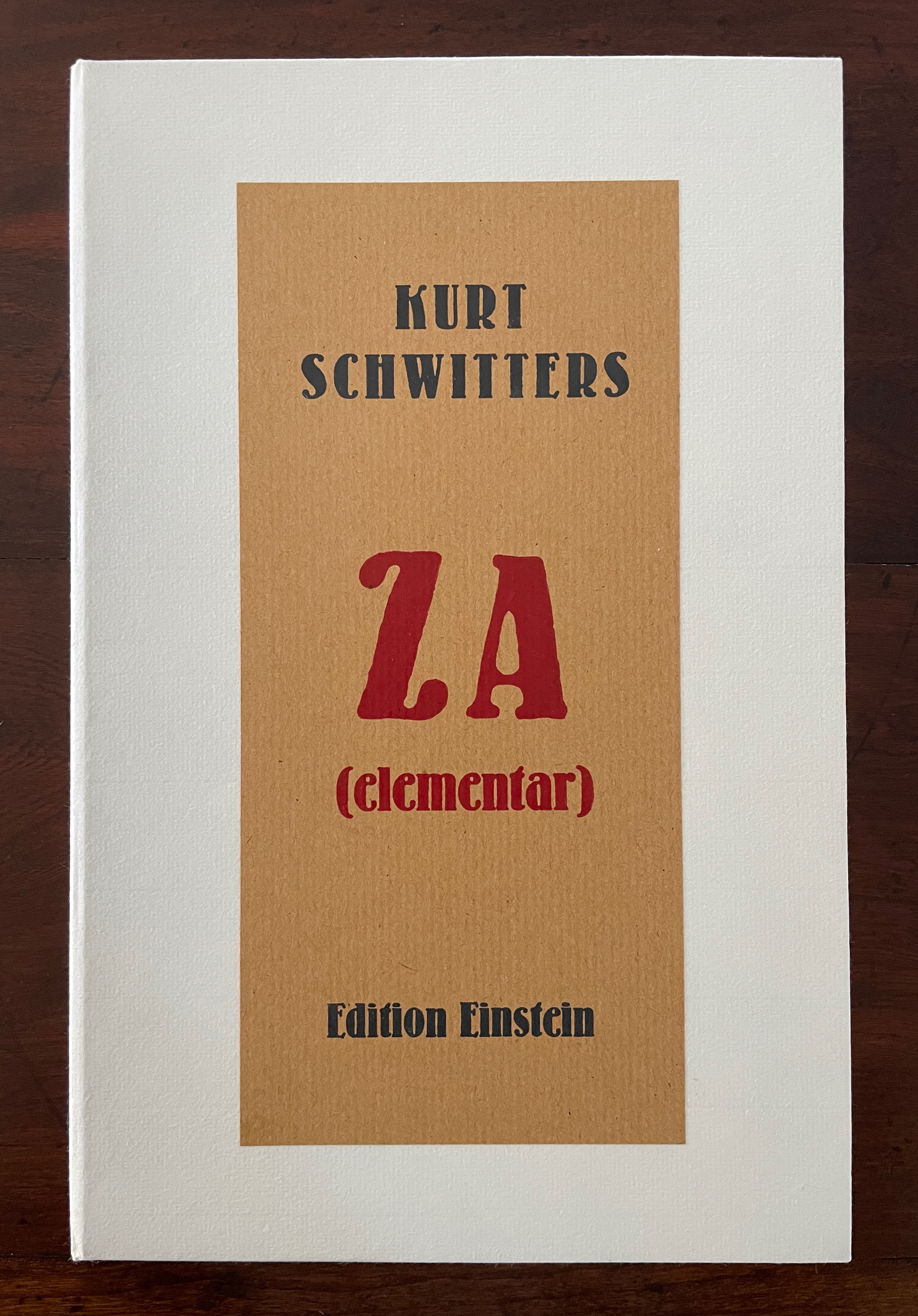
Kurt Schwitters: ZA (elementar) (2018)
Hans Witte
Cloth bound box with loose folios. Box: H300 x W195 x D33 mm. Folios: (variable) H272 x W170 mm. [8] folios Edition of 3, of which this is #3. Acquired from the artist, 26 September 2025.
Photos: Books On Books Collection. Displayed with permission of Editions Einstein.
The alphabet presented backwards underlies two of Kurt Schwitters’ earliest Dada poems: ZA (elementar) and Alphabet von hinten. Witte has brought a combination of wood type and collage to bear to make the appropriation of Kurt Schwitters’ poem ZA (elementar) into an original work of his own, which is quite the feat given Schwitters’ renown as a collagist and “funster” of fonts and letters. Indeed, because Schwitters’ poem does not reflect his collage technique or his usual typographic fireworks but instead represents his contribution to “sound” or “phonetic” poetry, Witte’s feat is all the more remarkable.
Their different layouts and cases suggest that they were intended primarily as visual poems. Not so. Schwitters performed them. Thanks to Kenneth Goldsmith and Ubuweb, we can listen to professional recordings online.
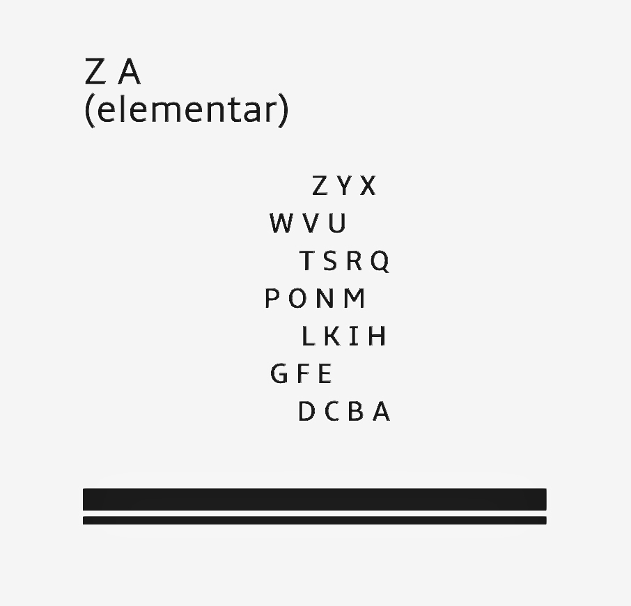

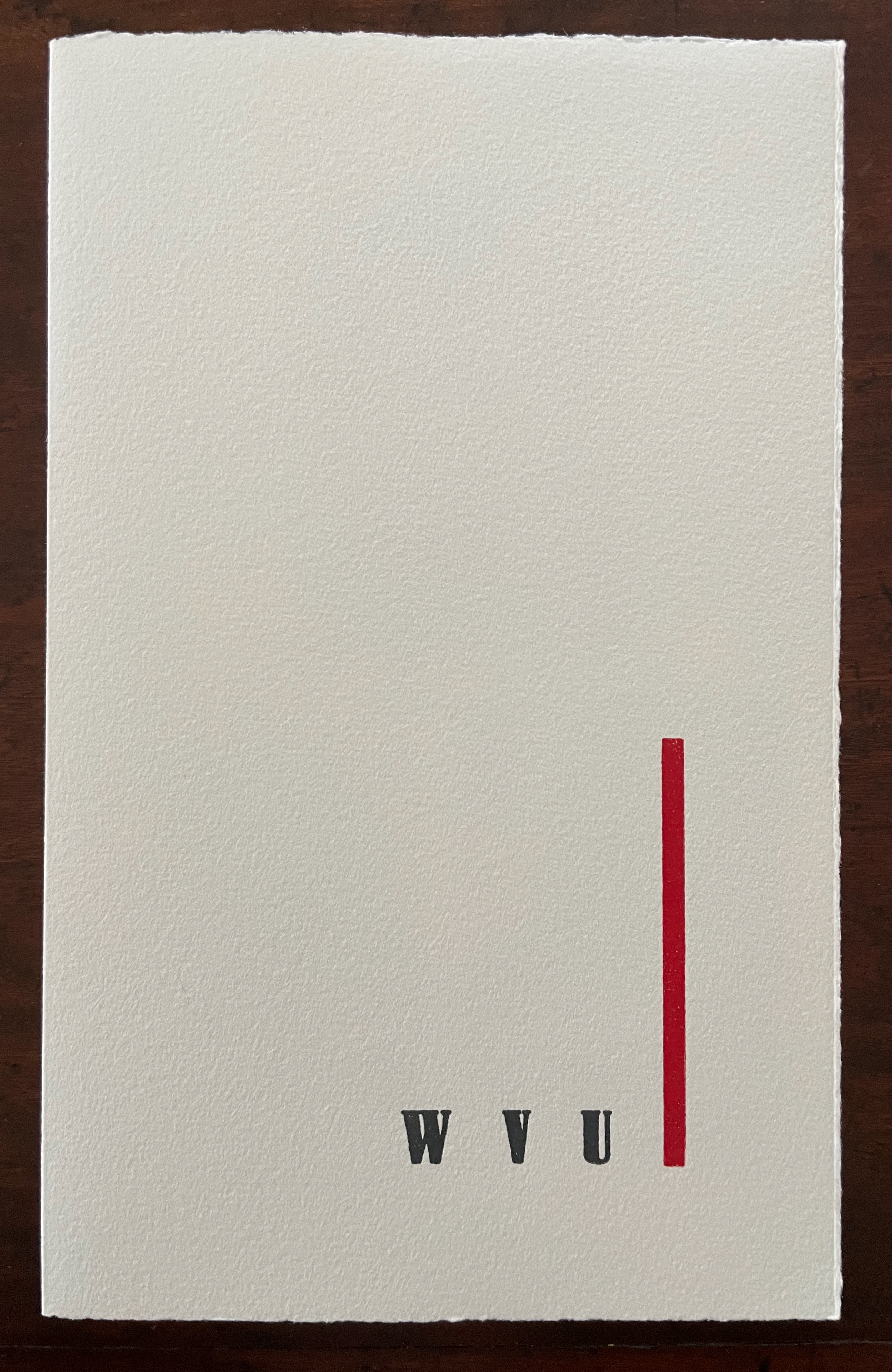
Witte’s typographical interpretation of ZA (elementar) is an entirely visual and tactile boxed set of single-fold folios. With Witte’s set of Bernhard wood typeface, red and black ink only, and Hahnemühle handmade paper, the first folio establishes a recurrent theme and platform against which the following folios will play. Its cover presents the title, and its inner recto page reproduces the poem in its original layout.


First folio
The second folio vibrantly introduces how Witte will enact his interpretation and homage. The large type’s impress in thick red or black ink makes a suitably loud visual replacement for Schwitters’ sonic element. By overprinting each rectangular clipping with a letter, Witte calls on memories of Schwitters’ collage work.


Second folio: cover and inside.
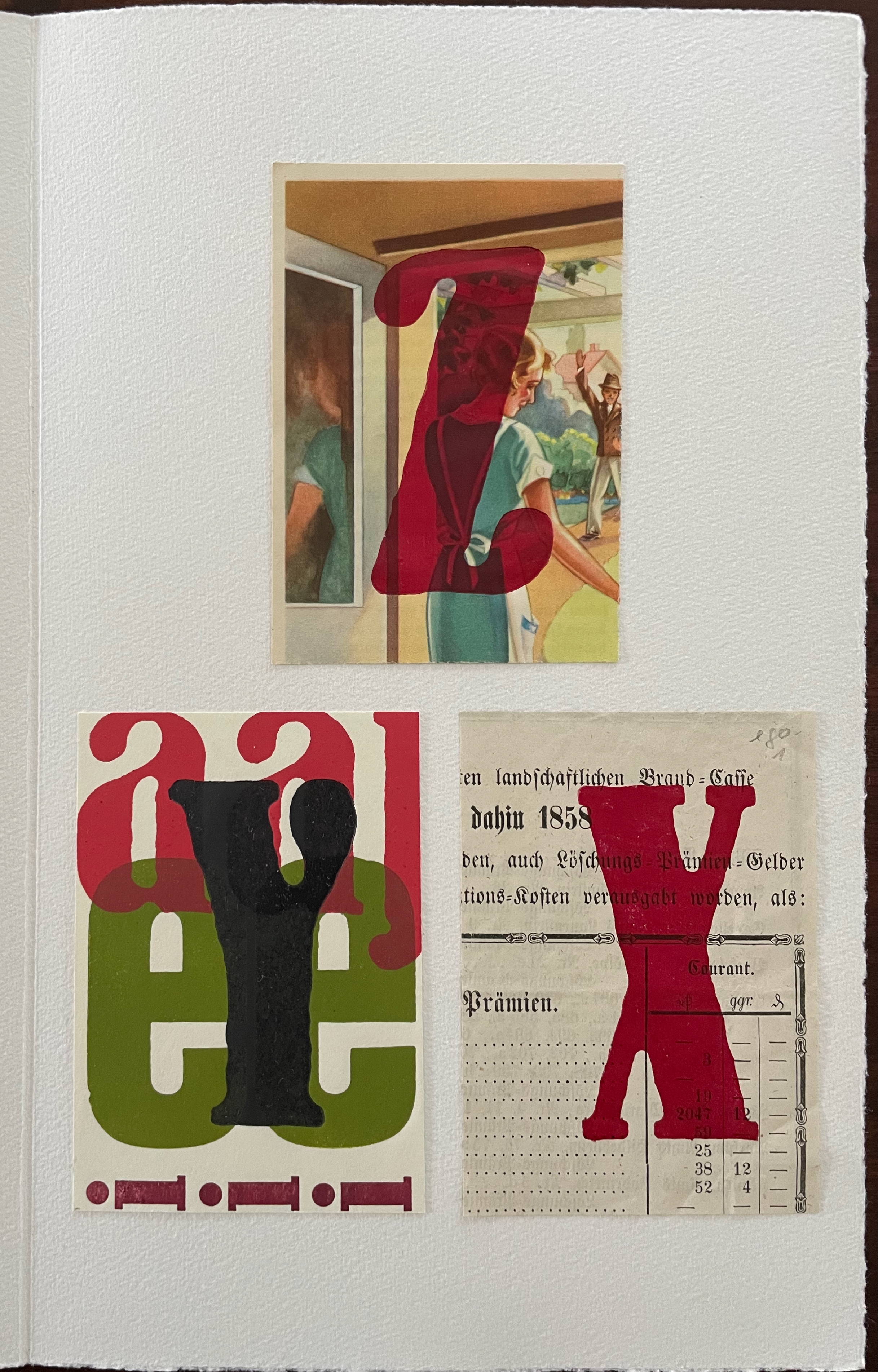
Ranging from 1840 to 1950, the clippings used for the collage work — original advertising flyers, handwritten contracts, forms, newspapers — came from the liquidation of an old drugstore and other sources.


This eclectic range also echoes Schwitters’ later collage work, but by neatly separating the clippings, Witte keeps the focus on his own typographic interpretation and “printerly and painterly” approach. Also, as seen in ABC of Advertising, several of these clippings were also reproduced and used, but here, they are clipped, and assembled, giving this appropriation its own particular aura. The variety of treatments of type and collage between ABC of Advertising and Kurt Schwitters ZA (elementar) speaks to Witte’s breadth of invention.

Third folio: cover and inside.
Fourth folio: cover and inside.

Fifth folio: cover and inside.

Sixth folio: cover and inside.

Seventh folio: cover and inside.
Eighth folio: cover and inside.

Colophon [translation]
This case with the text Kurt Schwitters, Z A (elementar) is a typographical interpretation of the text published in 1987 in Reclam volume 8392/2.
All text elements were printed with a Grafix A1 hand press on paper up to 120 years old and on Hahnemühle handmade paper using the Bernhard wood typeface.
Idea, design, and printing: Hans Witte
The edition comprises three numbered and signed copies.
This copy bears the number [03/03]
The cassettes were produced by Susanne Ziems – Communication Design and Paper Craft in Pforzheim.
The work, including its parts, is protected by copyright. Any use outside the narrow limits of copyright law is prohibited without the consent of the publisher and the author. This applies in particular to electronic or other reproduction, translation, distribution, and making available to the public.
Together Das Alphabet der wilden Kindern and Kurt Schwitters ZA (elementar) combine to pay a further homage (albeit inadvertently) to Schwitters. In 1946, while exiled in England, Schwitters wrote to his Lettrist-Dadaist collaborator Raoul Hausmann: “I live from painting portraits, but in England you must not even see any brush-marks on the surface of the picture. My pictures have brushmarks and therefore I have difficulties” (Hausmann and Schwitters, p. 33). Since the 1940s, appreciation of such material aspects has grown, especially in the contest of book art.
Witte’s works revel in their marks, ink, paper, and structure. The three in the Books On Books Collection are not his only artist’s alphabet books. Others include ABC für liederliche Kinder (2025), Buntes-Bilder ABC (2023), Das getupfte ABC (2020), and Bilder-ABC in typografische Manier (1994), some of which are scarce. They too celebrate printing as an art. Witte’s works are mostly represented in German libraries and collections, so it is encouraging that RedFoxPress has been bringing them to the English-speaking market.
*An earlier entry appeared on 2 September 2025. This one includes comments on Das ABC der wilden Kindern and Kurt Schwitters ZA (elementar).
Further Reading
Elderfield, John. October 1969. “The Last Work of Kurt Schwitters“. Art Forum. 8:2:56-64.
Föcking, Maria. 13 March 2024. “The Magic of Johannes Gutenberg’ in Dringenberg Castle“. Unser Bad Driburg.

Johannes Gutenberg’s traveling printing press
Installation by Hans Witte, Edition Einstein
An old doctor’s bag was visually transformed into a fictitious “traveling printing press” using a range of appropriate materials and equipment, intended to create the impression of an authentic object from the late Middle Ages.
Hausmann, Raoul, and Kurt Schwitters. 1962. Pin and the Story of Pin. London: Gaberbocchus Press.
Schwitters, Kurt. 1923. Die Blume Anna, Die Neue Anna Blume : Einbecker Politurausgabe. Berlin: Der Sturm.
Schwitters, Kurt. 1968. Anna Blume. Dichtungen. Zürich: Verlag der Arche.

One thought on “Books On Books Collection – Hans Witte”