Here are two works that show how the substrate of the book can be the primary element of making art and meaning. When it comes to paper, the fireworks in most artists’ books focus on printing or structural displays. Susan Mills describes herself as not just a book artist but “a conceptual rural urban bookbinding poet artist working in book form” (Mills, 2025). She does not practice printing or printmaking. She produces her books without the use of a printing press and handbinds them using innovative structures, bindings, and materials. She lets the paper itself shine — as surface and as “paint”.
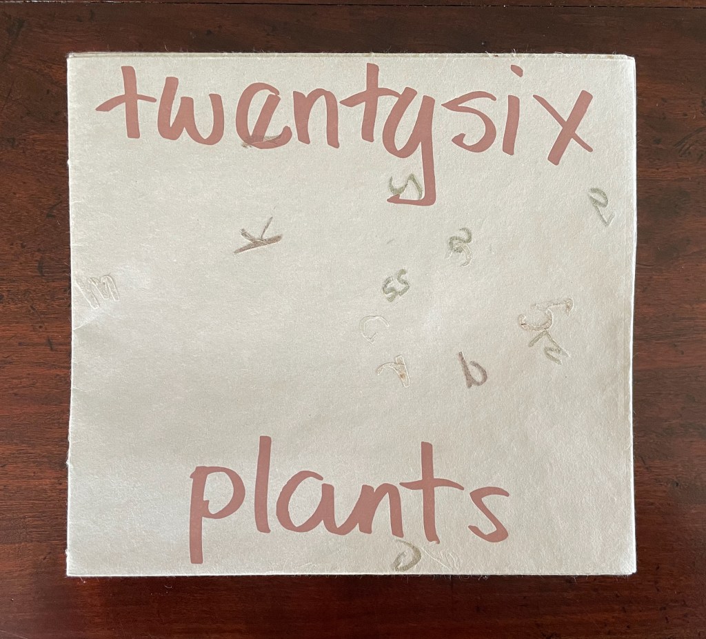
Twentysix Plants (2013)
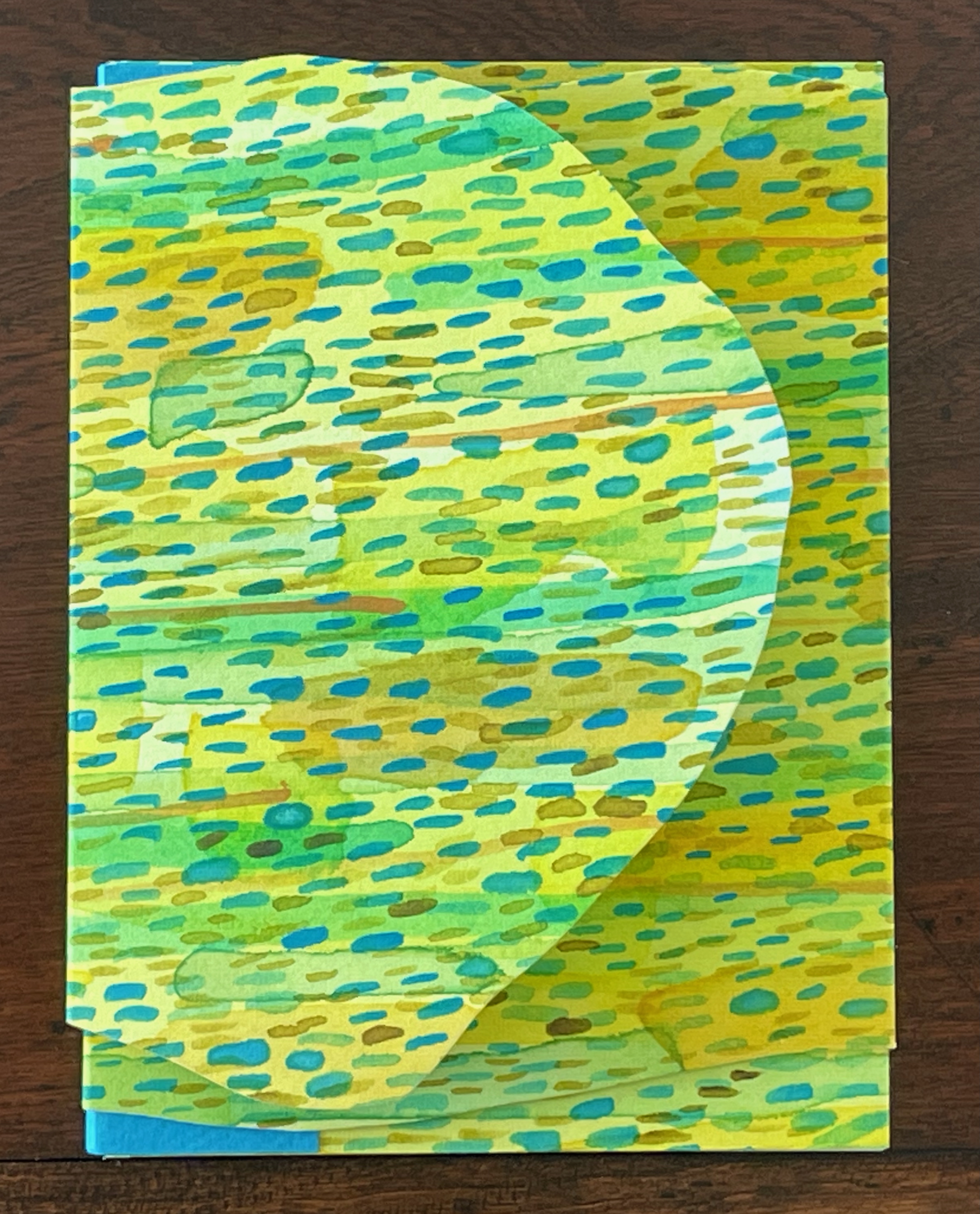
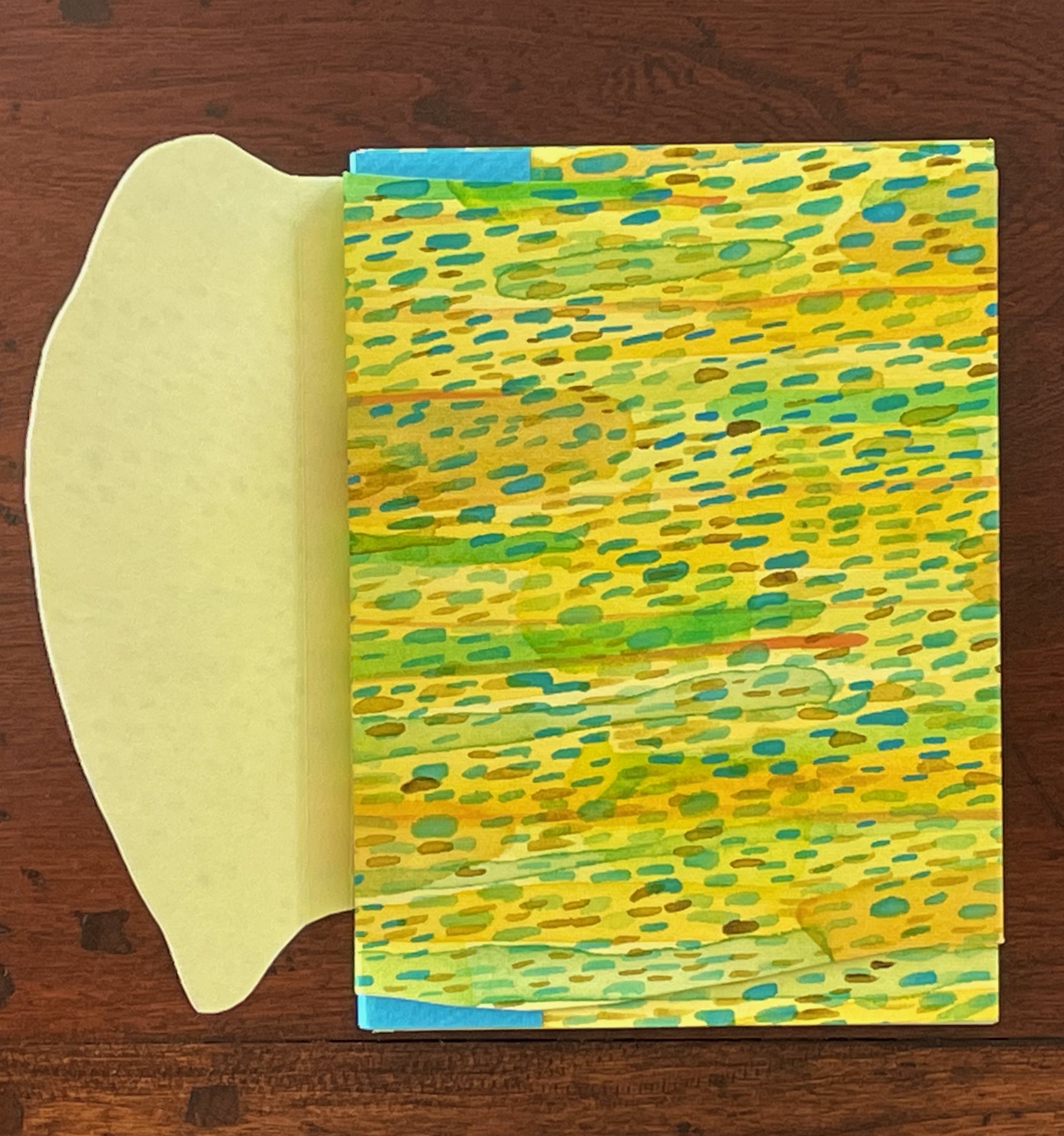
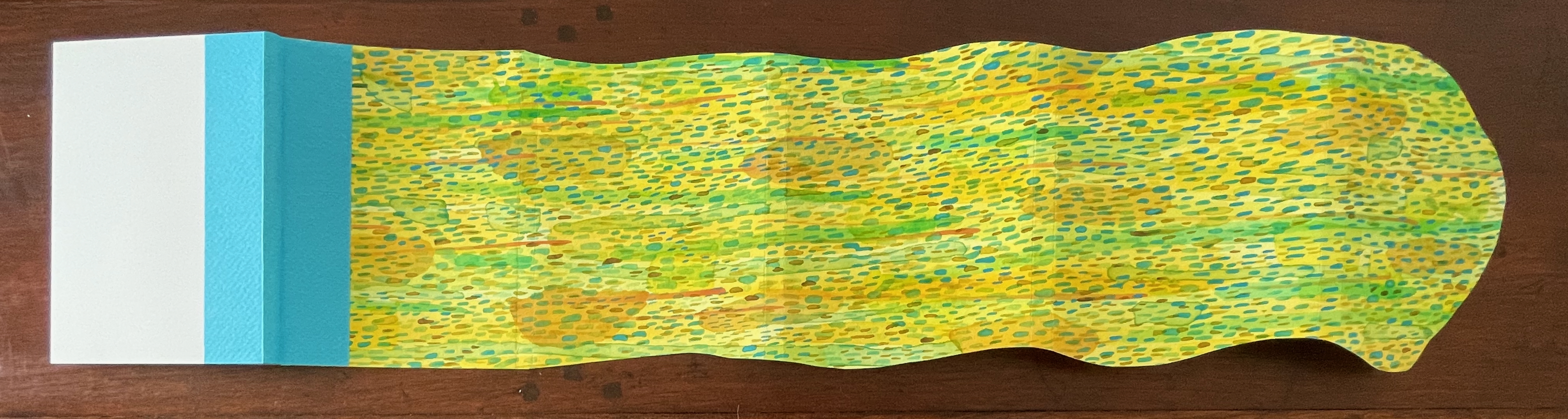
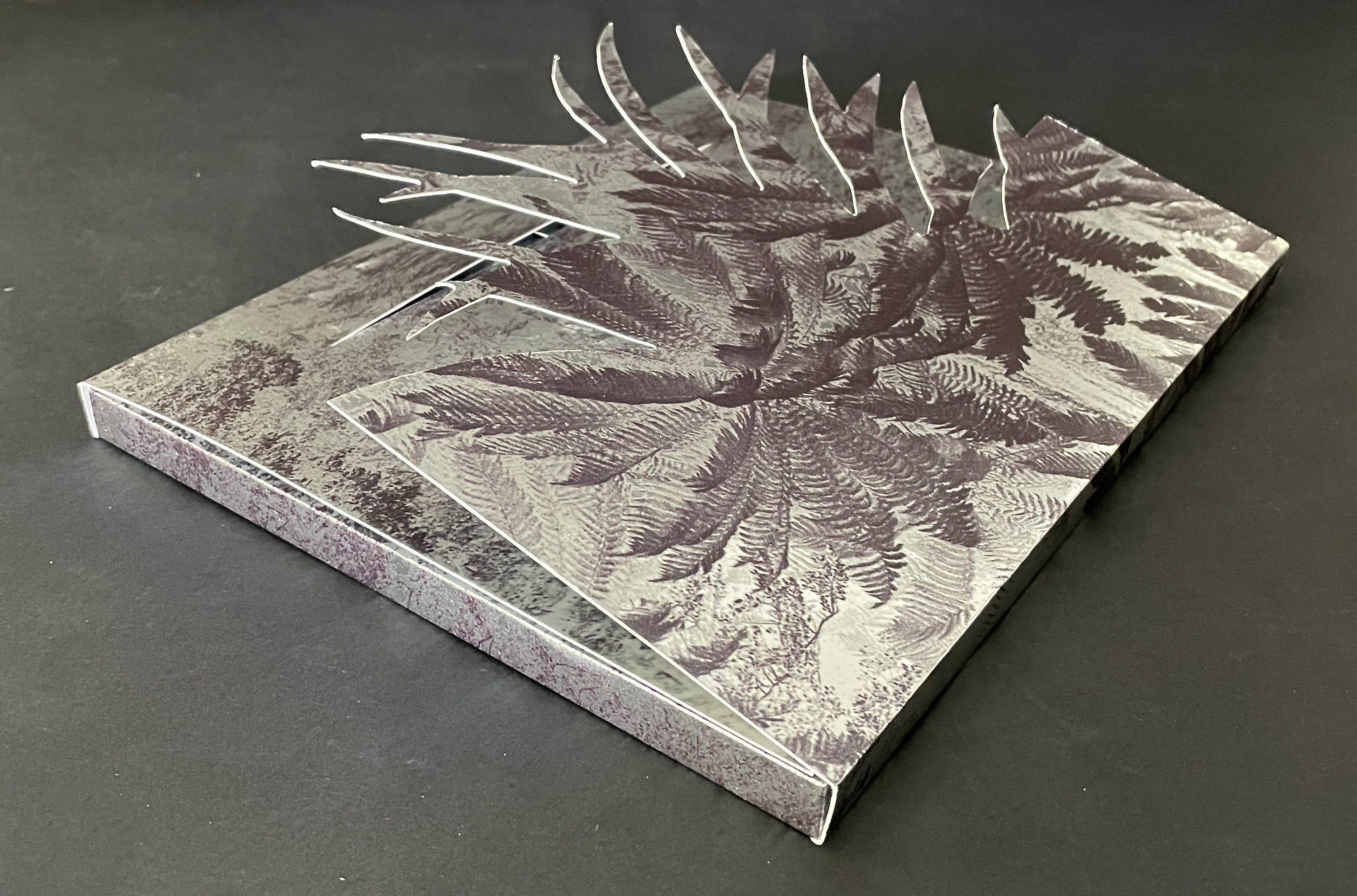
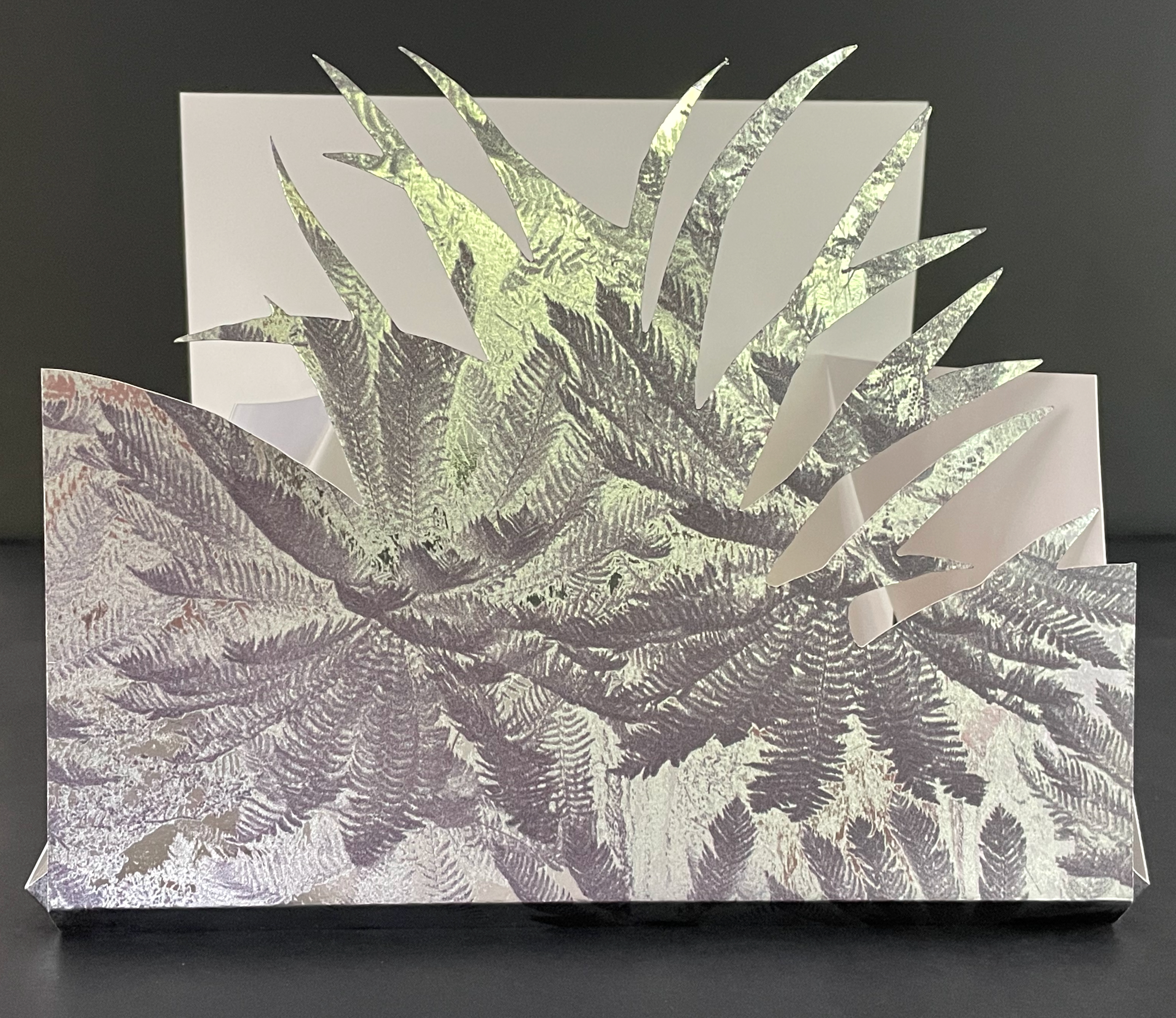
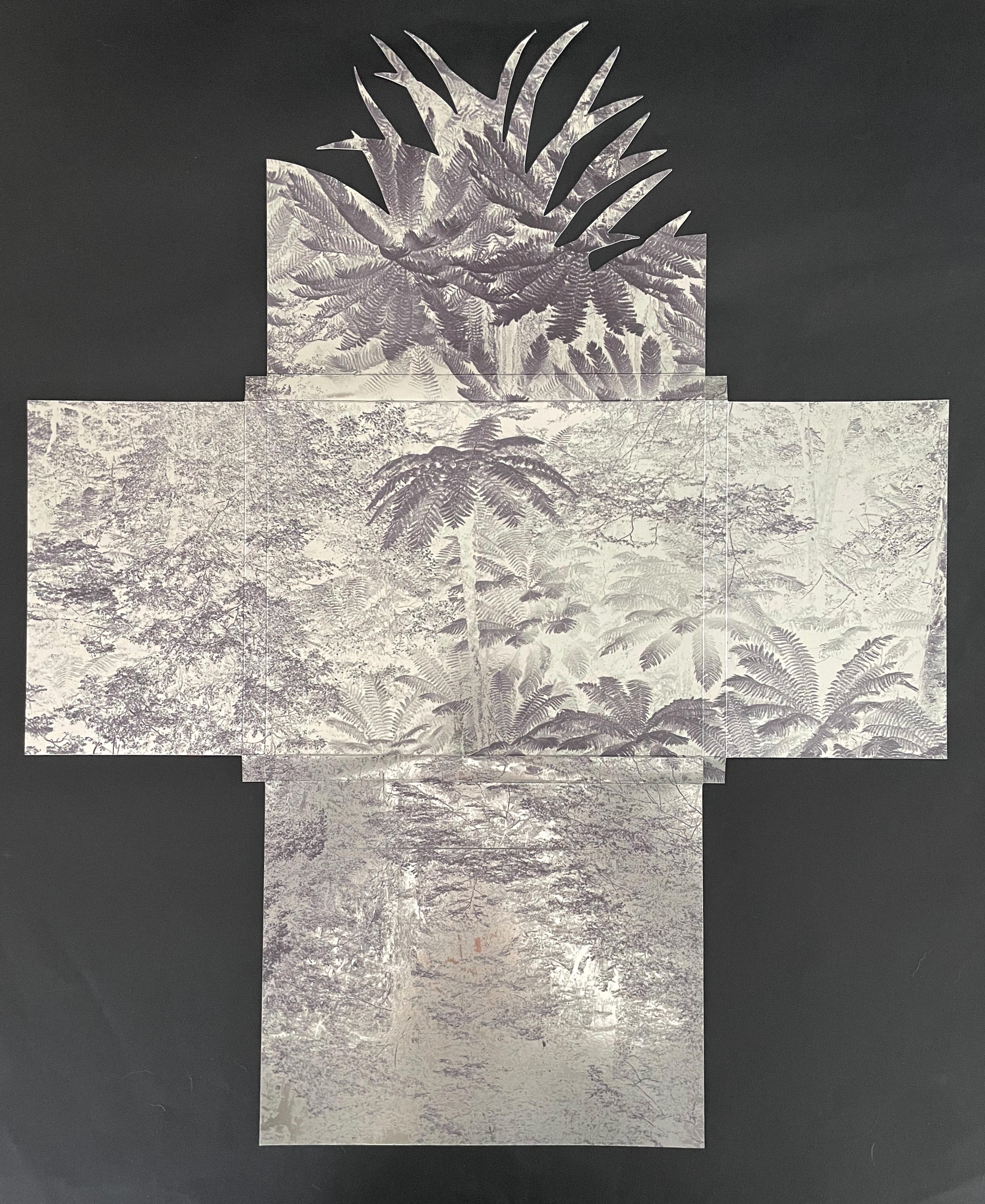
Susan Mills’ Twentysix Plants puts handmade paper at the center of its artistry as it nods to Ed Ruscha’s Twentysix Gasoline Stations (1963). It consists of twenty-seven different papers. Twenty-six of them were each made from one of twenty-six different plants. A small amount of abaca was added to the different pulps to ease them through the Hollander Beater. After the sheets were couched, dried, and readied for use, Mills “labeled” them by cutting out the name of the constituent plant in distinctive callitomic letters. For the cover paper, the twenty-seventh paper, the twenty-six cut-out scripts went into the vat.
If Twentysix Plants were an abecedarium, it would be arguable that, just as our words are made from the alphabet’s letters, so the cover of Twentysix Plants is made from all the plants used in the book. There they are, embodied in their fragmented names, embedded in the cover. But neither Twentysix Plants nor Twentysix Gasoline Stations is an A-Z.
Twentysix Plants (2013) Susan Mills Softcover with exposed spine, link-stitch and kettle-stitch sewn, and non-adhesive interlocking folios. H205 x W225 mm. [26] pages. Edition of 50, of which this is #4. Acquired from the artist, 9 February 2026. Photos: Books On Books Collection.
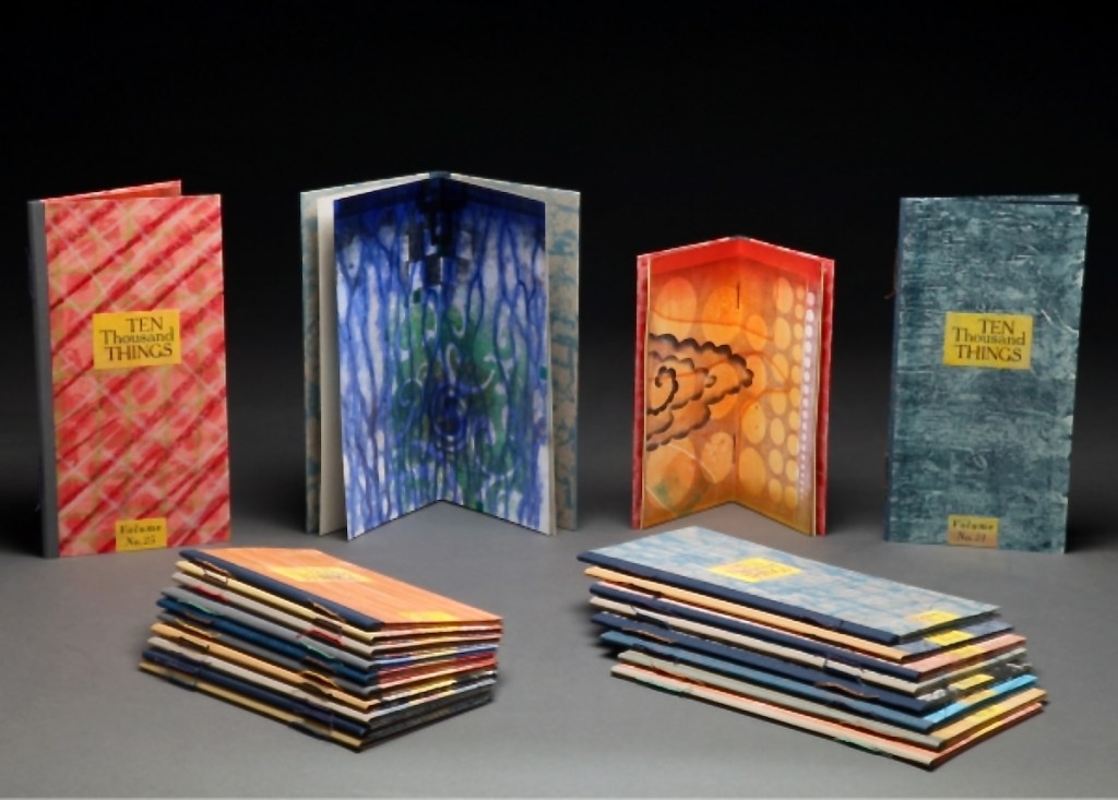
While Stéphane Mallarmé and his Un Coup de Dés may be the front runner among contenders for the title of literary patron saint of the artist’s book, Jorge Luis Borges and Italo Calvino appear in a tie for a distant but respectable second. Each have inspired some striking works. In her series Ten Thousand Things, Karen Kunc has boosted both Borges’ and Calvino’s chances and nudged Calvino’s with an additional homage in leporello format.
The series title of Ten Thousand Things springs from Chapter 42 of the Tao Te Ching:
The Tao begot one. One begot two. Two begot three. And three begot the ten thousand things. The ten thousand things carry yin and embrace yang. They achieve harmony by combining these forces.
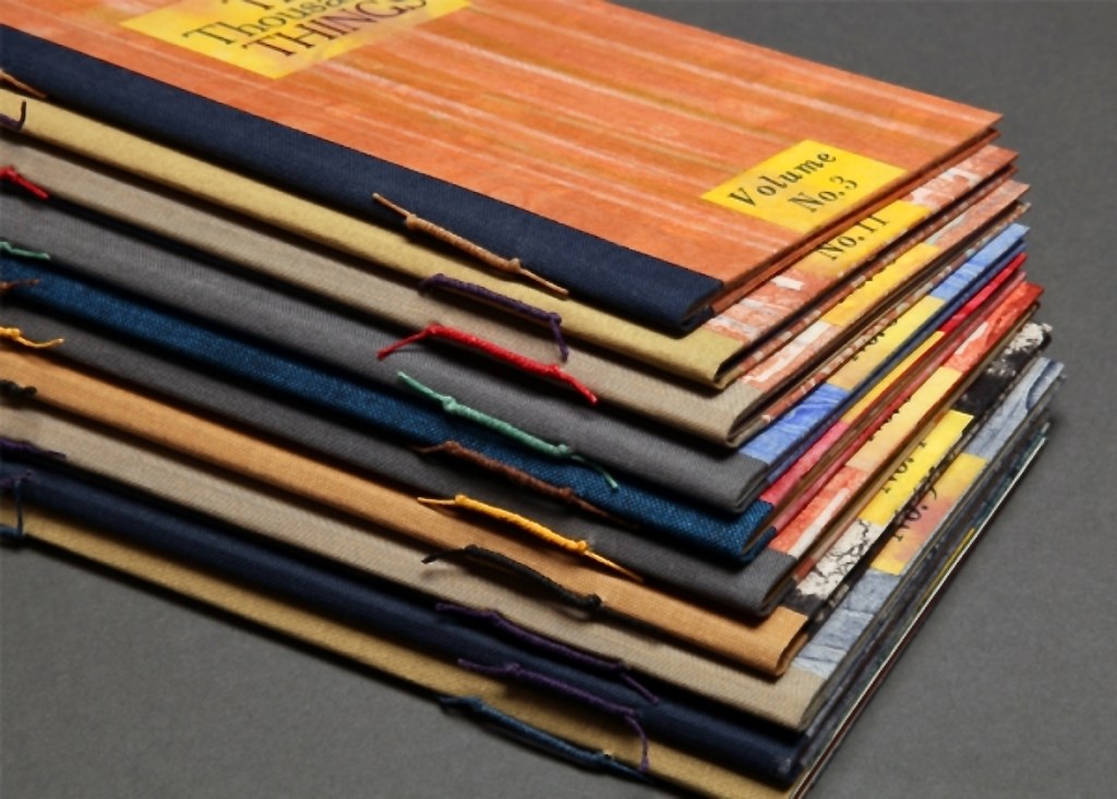
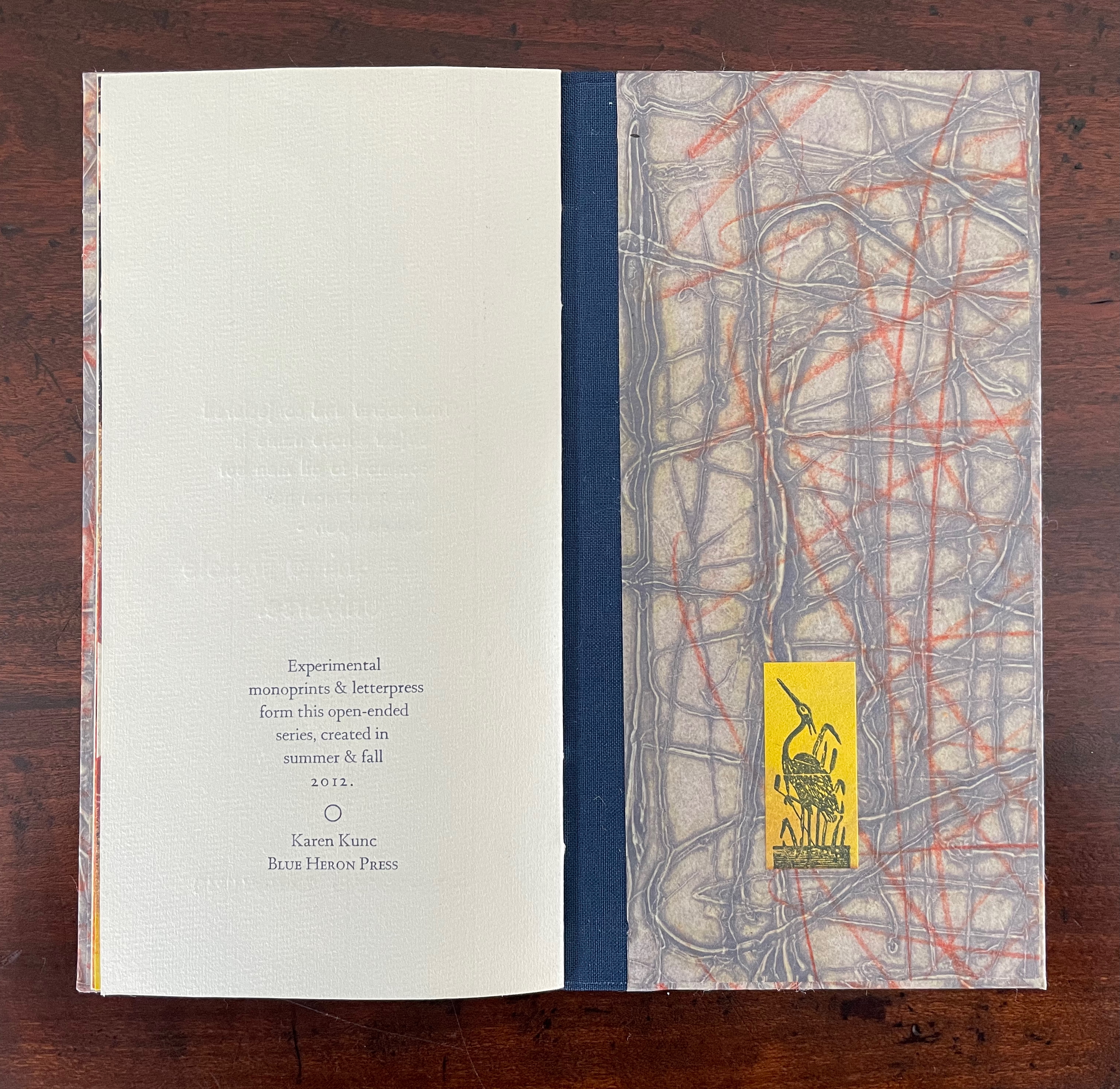
The series consists of 74 books in two sizes as the monoprints were made in two sizes of papers. The papers varied. Most of the works are on Torinoko, a Japanese paper that Kunc found to work well with waterbased Akua Intaglio inks. Some are on Arches 88 paper, a waterleaf she found also very absorbent for the Akua inks. Many of the prints have some handcoloring with ink or liquid acrylic. A few prints as well as all of the covers were made on Japanese Nishinouchi paper, a kozo fiber paper, which she has used extensively for her large woodcut prints. Printing is from collagraph plates on an etching press, with hand coloring and waxing afterwards.
Kunc chose excerpts from the works of five poets/authors and responded to each with several different monoprints not as illustrations of the text but as evocations prompted and to prompt. In addition to Borges and Calvino, she selected from Guillaume Apollinaire, Annie Dillard, and Marge Piercy. Kunc handset the metal type and letterpress printed several sheets of each text on different papers for variety with the monoprints. In each book, the text-bearing sheet folds around the sheet that bears two monoprints, one on each side.
The Tate Museum remarks that “The beauty of monoprinting lies in its spontaneity and its allowance for combinations of printmaking, painting and drawing media.” Kunc’s series extends that allowance to combinations with the elements of the book.
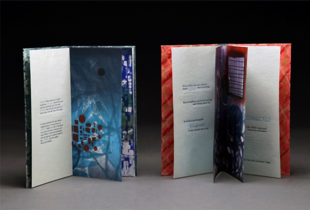
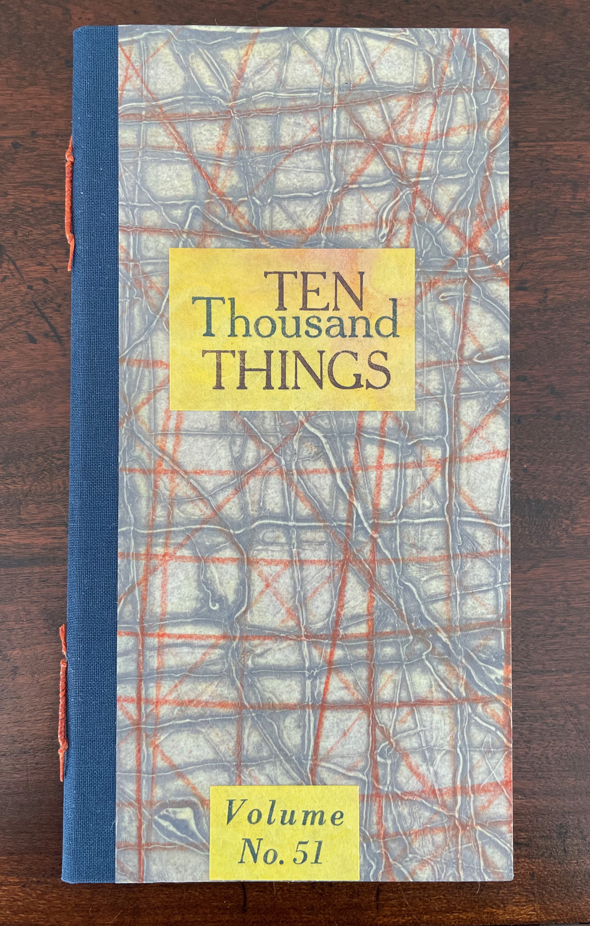
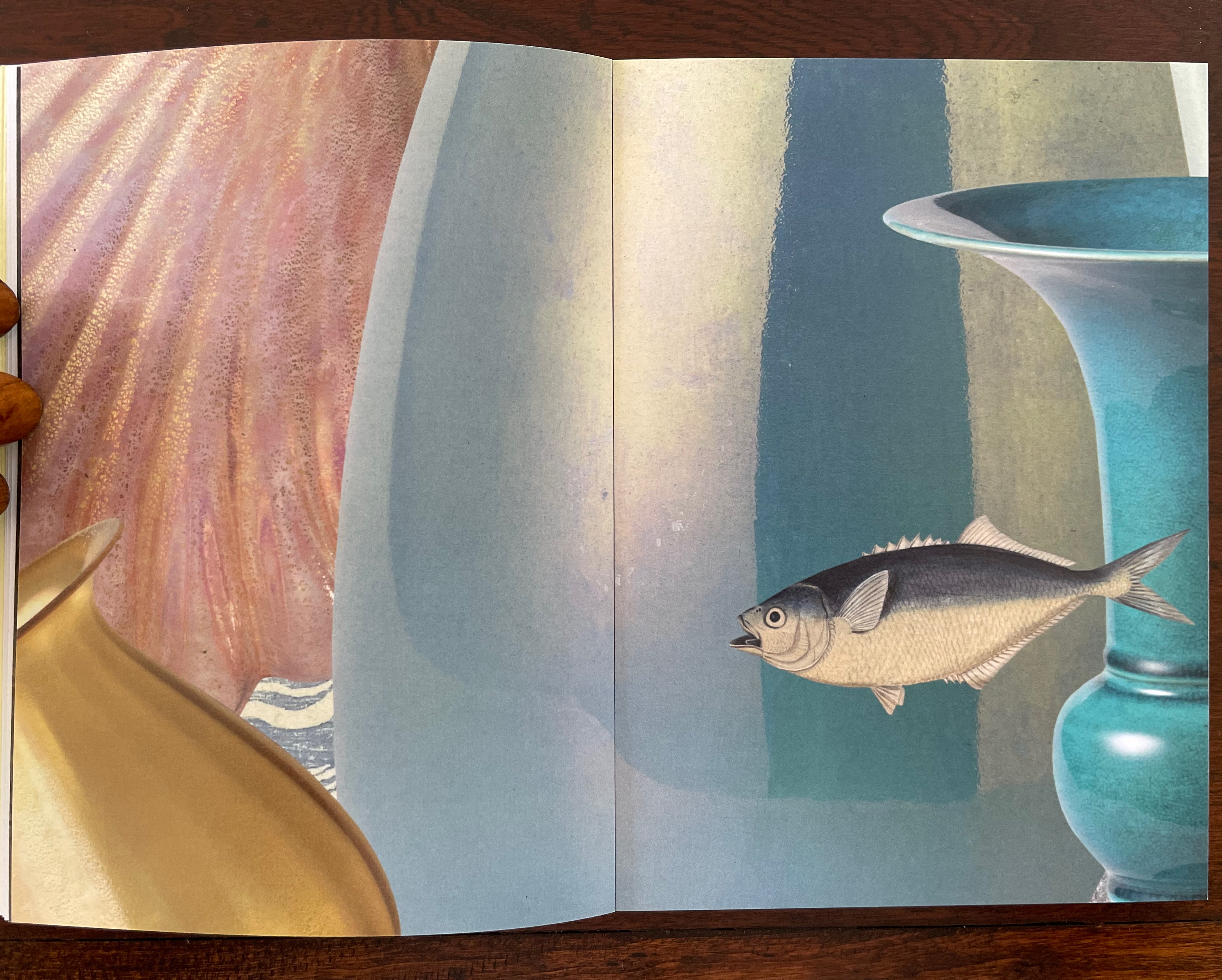
Ten Thousand Things, No. 51 (2012)
Ten Thousand Things, No. 51 (2012) Karen Kunc Single-signature booklet containing a recto and verso monoprint created by pressure printing, pochoir, and mixed media, with letterpress text. H205 x W110 mm. [8] pages. From a set of 75. Acquired from the artist, 9 February 2026. Photos: Books On Books Collection.
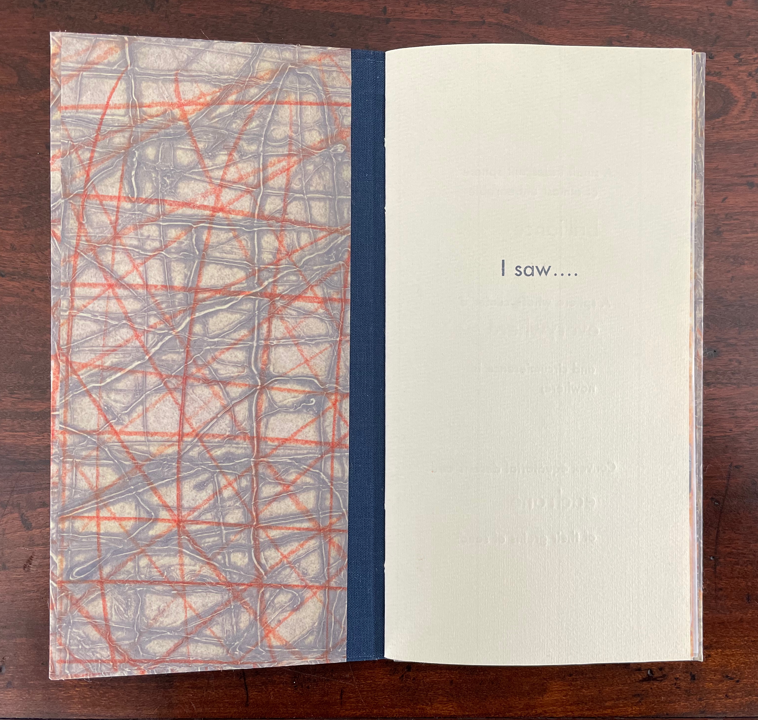
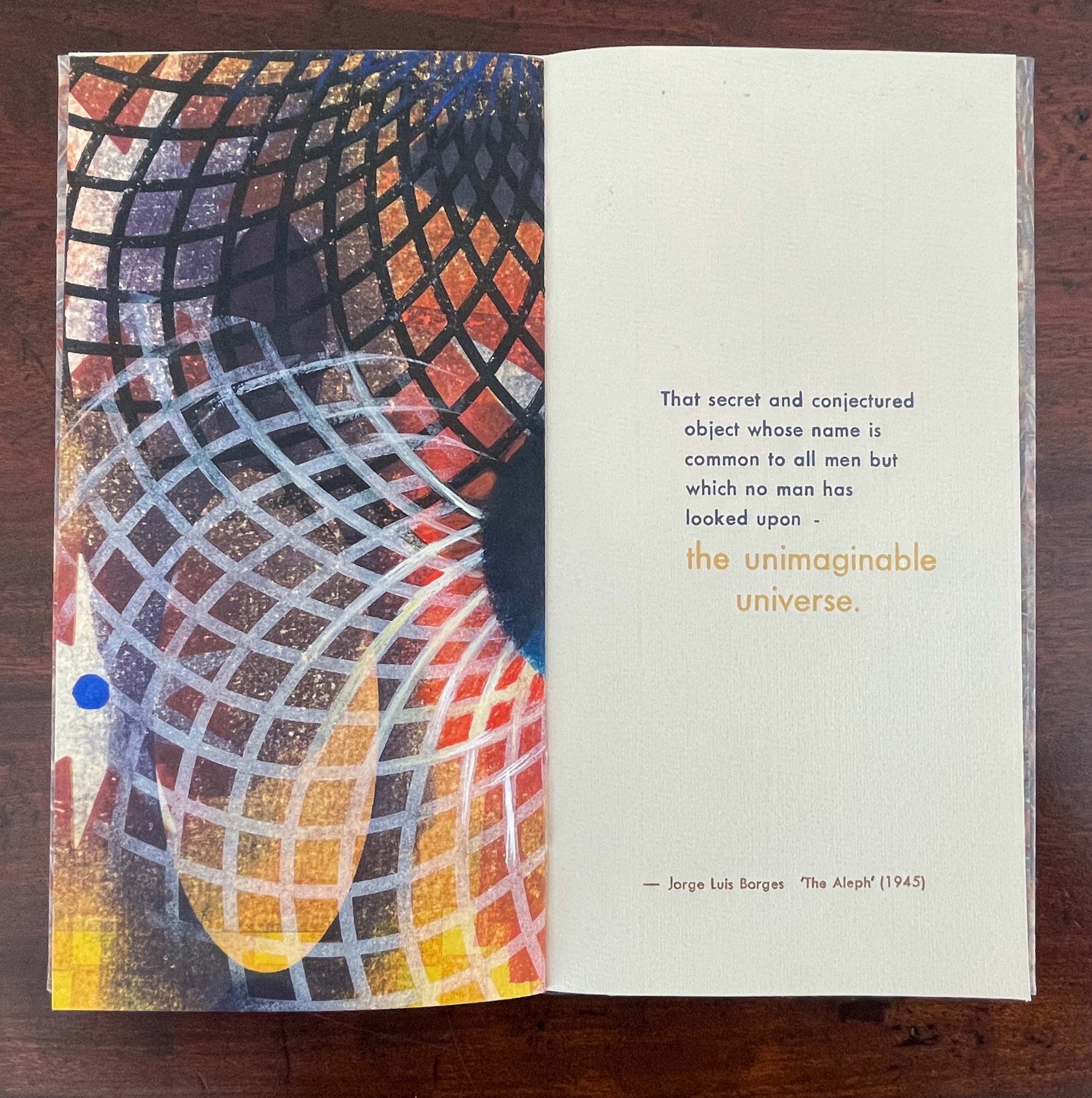
From Borges’ 1945 short story “The Aleph“, No. 51 in Kunc’s Ten Thousand Things series extracts four descriptions of the object or phenomenon Borges the narrator sees in the basement of his intolerable acquaintance Carlos Argentino Daneri:
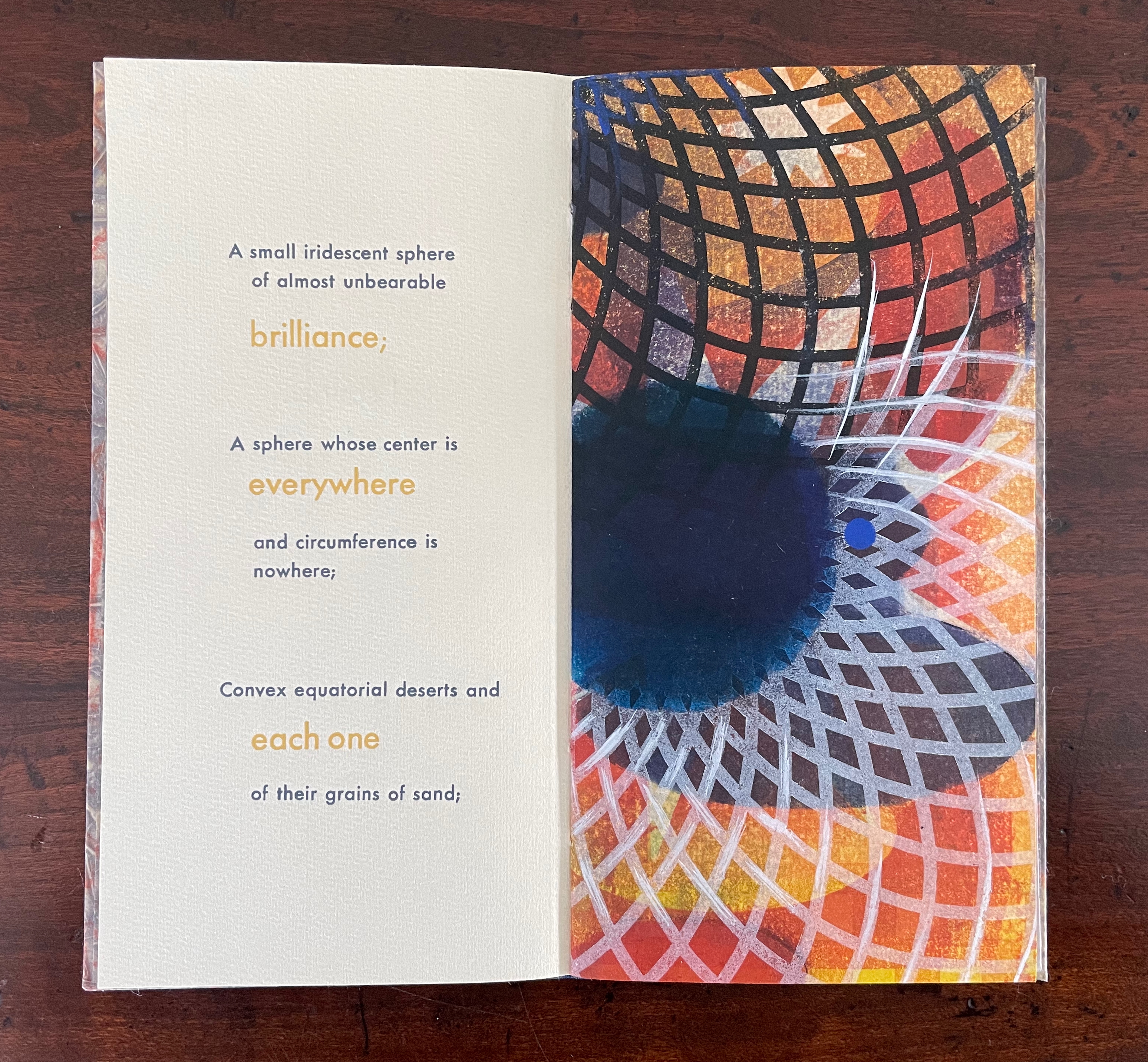
I saw a small iridescent sphere of almost unbearable brilliance[;]
a sphere whose center is everywhere and circumference is nowhere;
convex equatorial deserts and each one of their grains of sand;
that secret and conjectured object whose name is common to all men but which no man has looked upon — the unimaginable universe.
With a deft touch, Kunc has selected and slightly altered the more abstract of Borges’ long Whitmanic observations (in the first, she inserts an ellipsis and substitutes a semicolon for a full stop; for the second and third, the order of appearance is changed). Borges prefaces his catalogue of what he sees with a caveat about the inadequacy of words to depict the concept of multum in parvo [“much in little”]:
All language is a set of symbols whose use among its speakers assumes a shared past. How, then, can I translate into words the limitless Aleph, which my floundering mind can scarcely encompass? Mystics, faced with the same problem, fall back on symbols: to signify the godhead, one Persian speaks of a bird that somehow is all birds; Alanus de Insulis, of a sphere whose center is everywhere and circumference is nowhere; Ezekiel, of a four-faced angel who at one and the same time moves east and west, north and south. (Not in vain do I recall these inconceivable analogies; they bear some relation to the Aleph.) Perhaps the gods might grant me a similar metaphor, but then this account would become contaminated by literature, by fiction. Really, what I want to do is impossible, for any listing of an endless series is doomed to be infinitesimal. In that single gigantic instant I saw millions of acts both delightful and awful; not one of them occupied the same point in space, without overlapping or transparency. What my eyes beheld was simultaneous, but what I shall now write down will be successive, because language is successive.
In light of the snide literary sniping and rivalry that forms the background to “The Aleph”, Borges may be forgiven for omitting William Blake’s spectacular translation of “the limitless Aleph”:
To see a World in a Grain of Sand,/ And a Heaven in a Wild Flower,/ Hold Infinity in the palm of your hand,/ And Eternity in an hour. (Auguries of Innocence, 1803).
It might have brought Borges’ descriptive and narrative enterprise to an harrumphing halt. We would then not have had this particular instance of Karen Kunc’s taking up the challenge of rendering in an artist’s book Borges’ verbal description of the Aleph. What image could resonate with or reflect his words and reflect the impossibility he describes? How might the arrangement of pages enhance/diminish it? How might the act of turning a page reflect or obscure it?
The vibrant circle of deep blue is only two dimensional, but perhaps the abstractions behind the dark convex grid suggest the three dimensionality of the story’s sphere. Perhaps the more brilliant but smaller blue circle beside the larger one conveys the multum in parvo concept in the style of medieval narration differentiating multiple points in time with images of different size in the same plane. Perhaps the full-page bleed of the image even suggests that paradoxically the image extends from the page yet encompasses the page. Likewise might the sheet’s fold that truncates the circle and the dark and light grids imply continuity coexisting with discontinuity? Does the dark blue grid that curves over the orange and burnt umber colors imply the “convex equatorial deserts”?
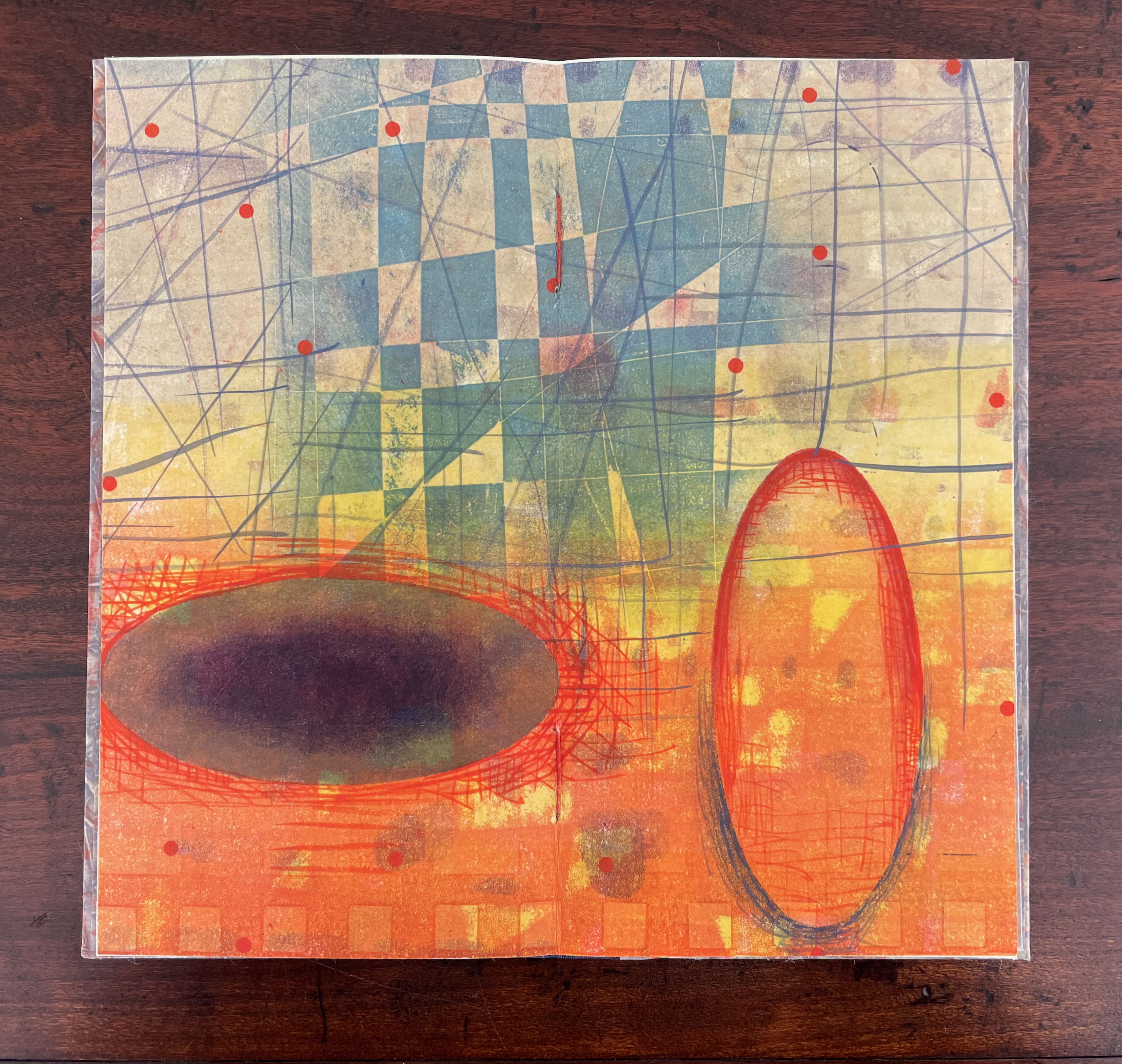
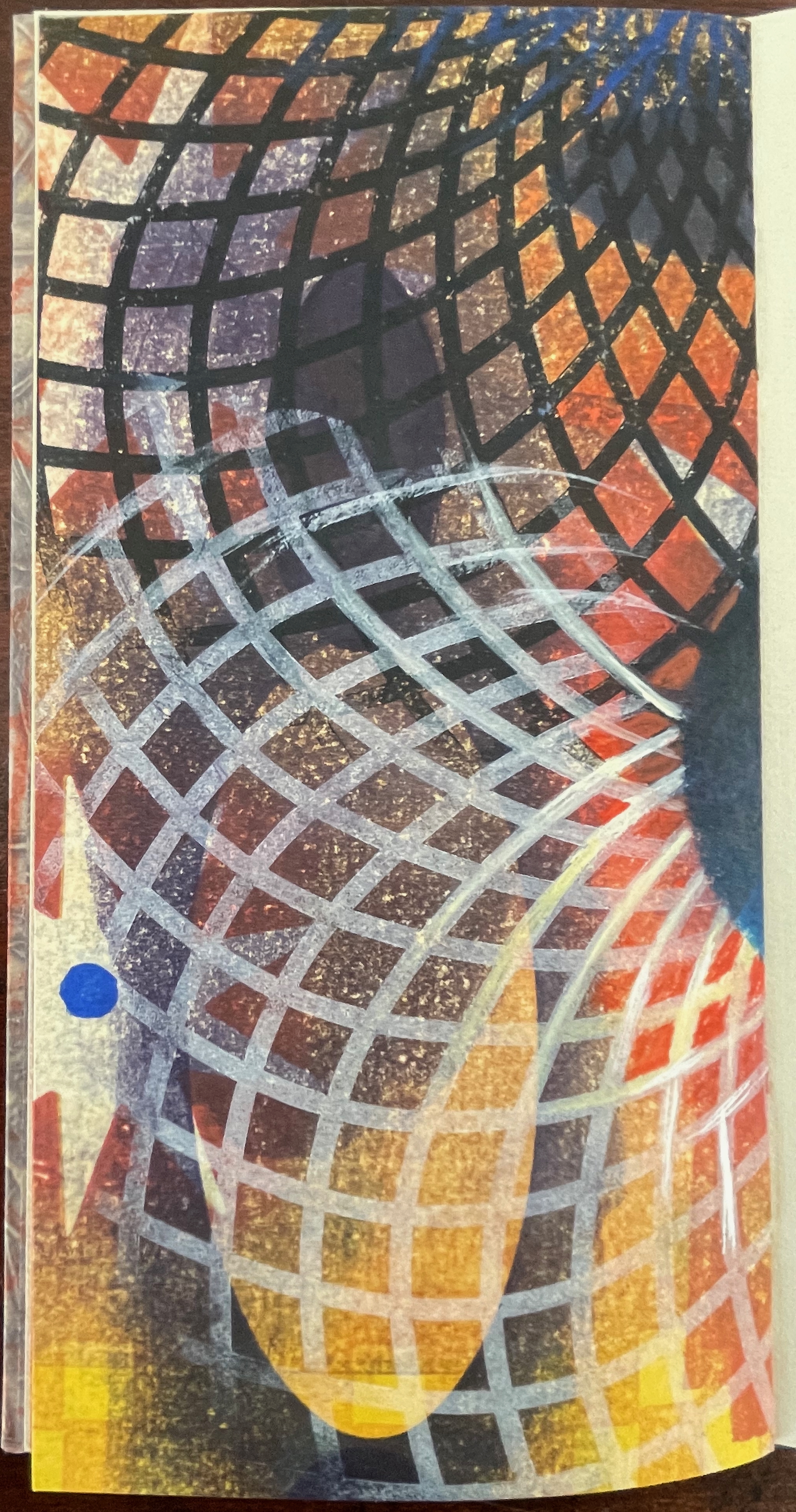
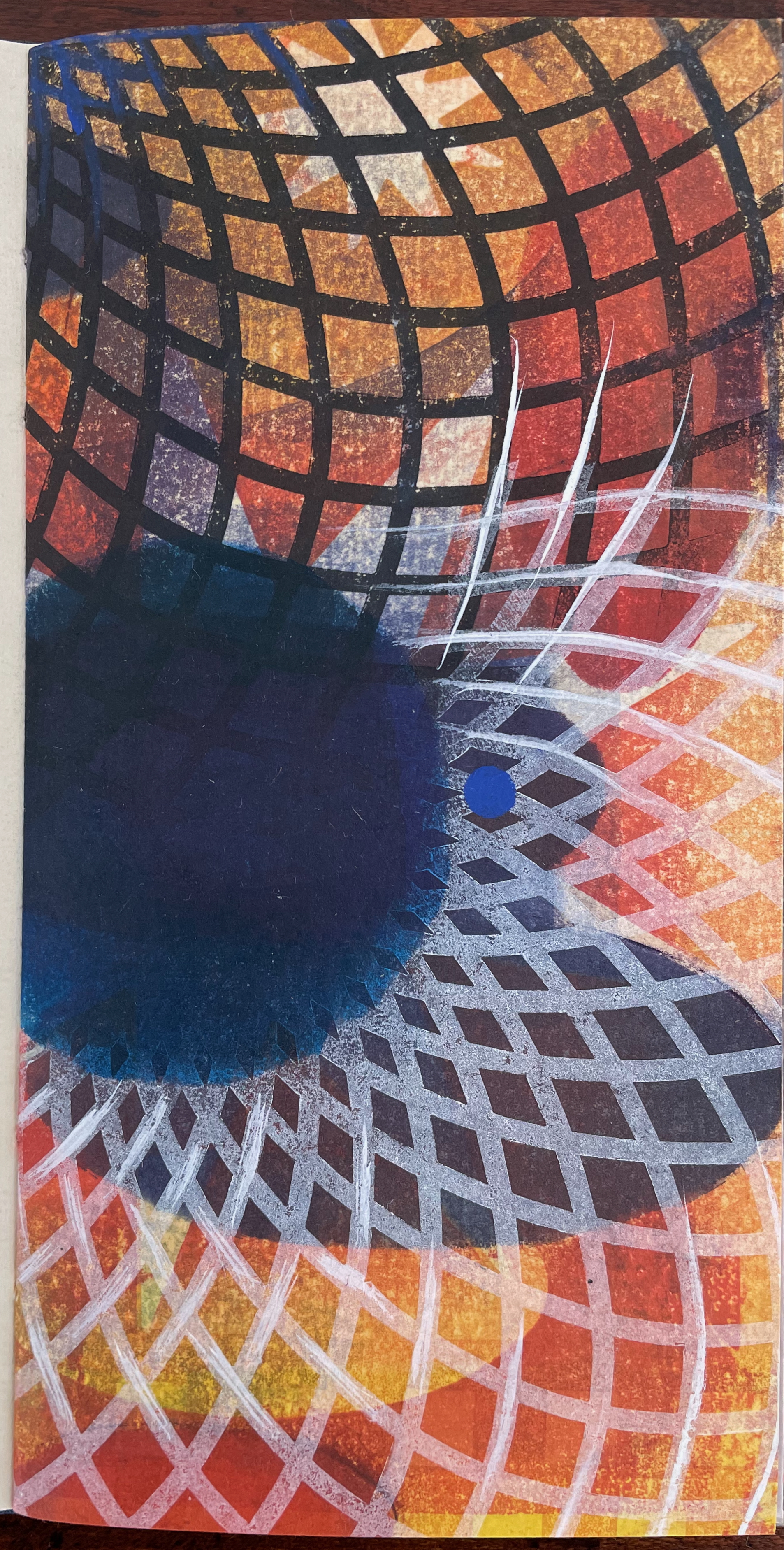
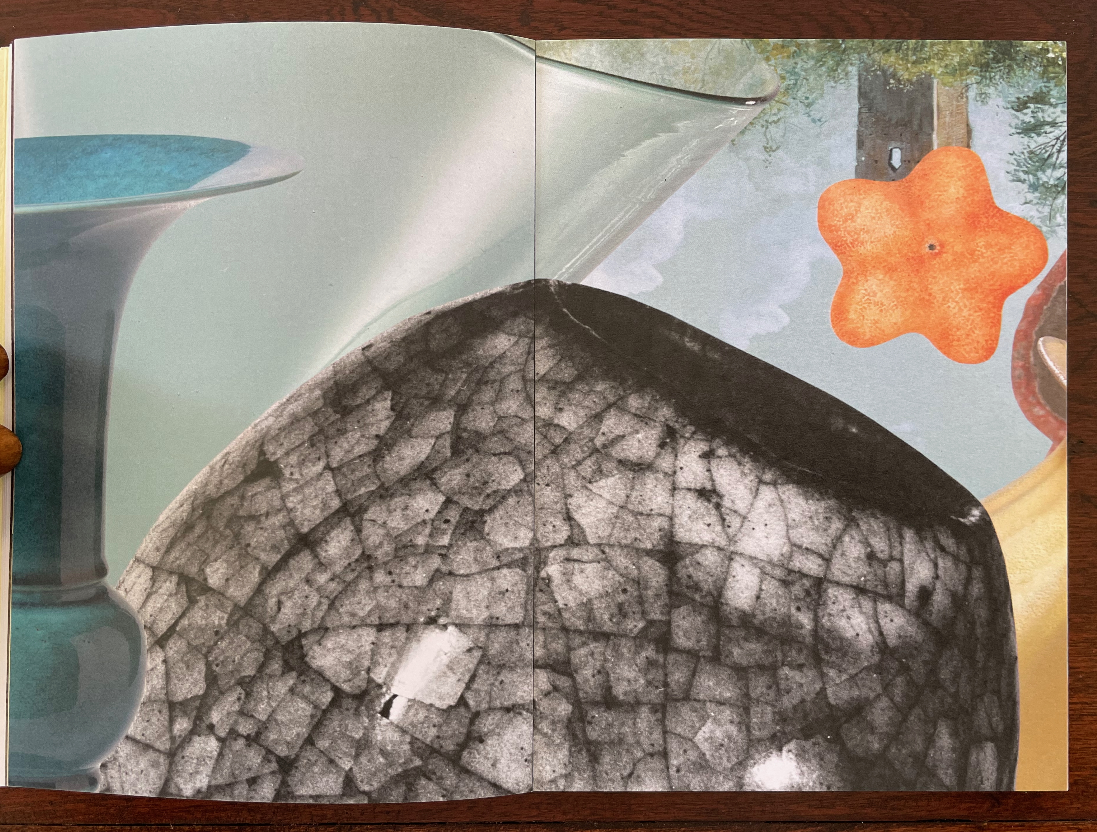
Turning from that half view of the monoprint, we have the full view of the monoprint on the other side of the sheet. An angular and checkered blue background hovers over two ellipsoid figures in an orange foreground. Is the background network with its numerous small red dots a version of Indra’s net, that cosmological metaphor of an infinite net with a jewel at each juncture reflecting and being reflected by every other? The dark ellipsoid seems to quiver surrounded by crosshatching. Is it in motion toward the upright orange ellipsoid? Is this a moment in time and space?
The other half of the monoprint with the dark blue circle comes into view with the last double page spread. If we could see all at once the monoprint with the dark blue circle, the juxtaposition of spheres and ellipses would stand out more.
The white stars behind the grid stand out a bit more, and the small bright circles seem more clearly positioned on curving white orbital tracks. Is it an allusion to planetary and constellatory movement, bring a universe within this small book? Without photographic manipulation, we have to open our minds to imagine it. As Carlos replies when Borges worries that it will be too dark in the cellar to see the Aleph, ““Truth cannot penetrate a closed mind. If all places in the universe are in the Aleph, then all stars, all lamps, all sources of light are in it, too.”
Of course, this photographic manipulation is a cheat and overlooks that Kunc has combined the half-views of one side of the monoprint with the full view on the other side to reflect the challenge of embodying a simultaneous phenomenon with successive phenomena.
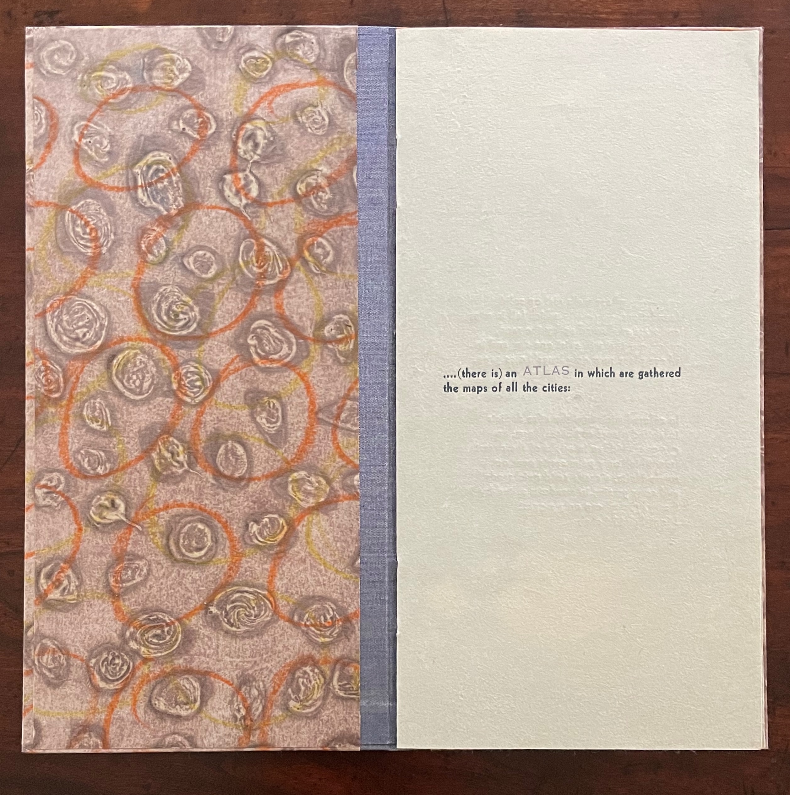
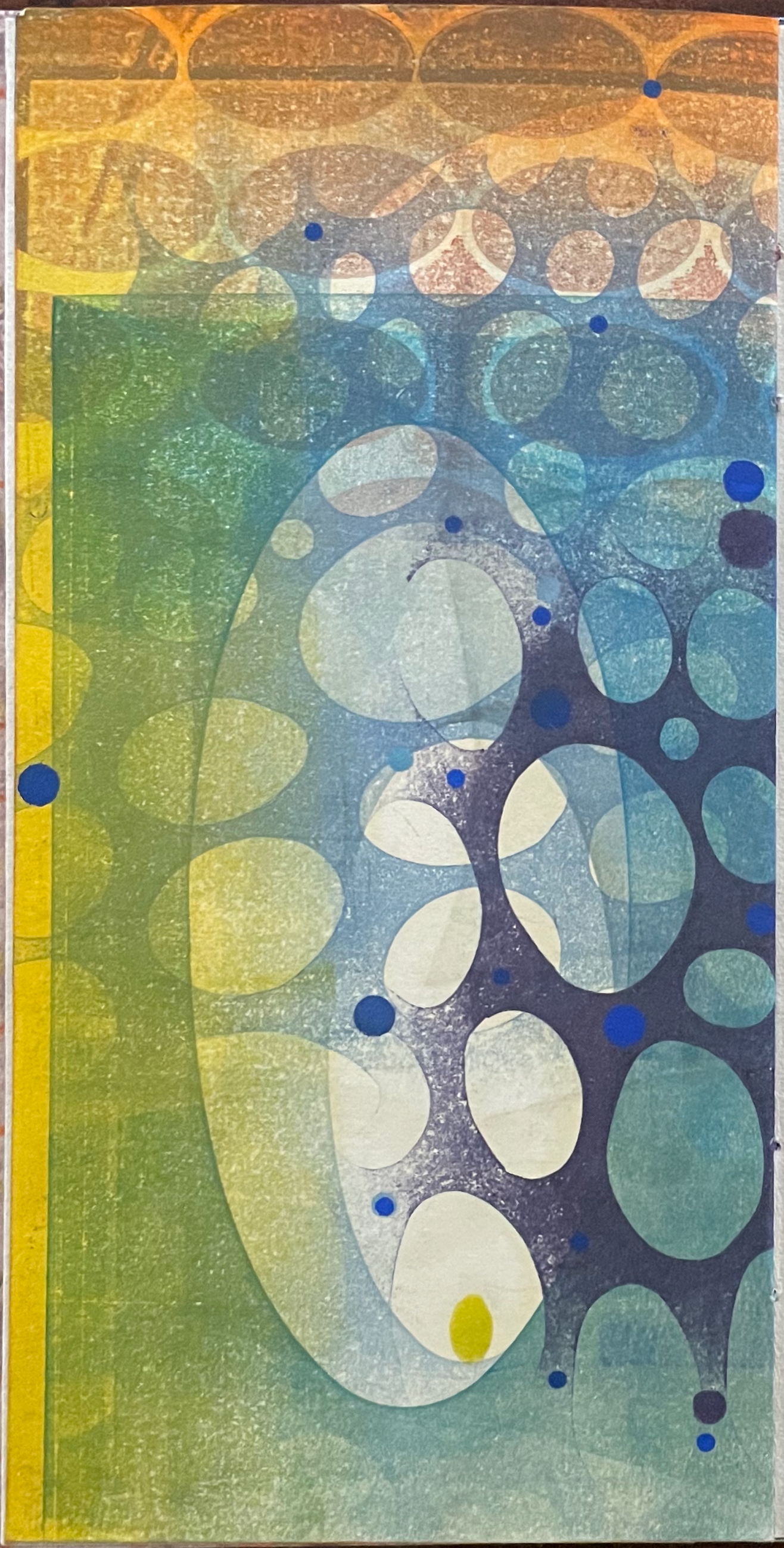
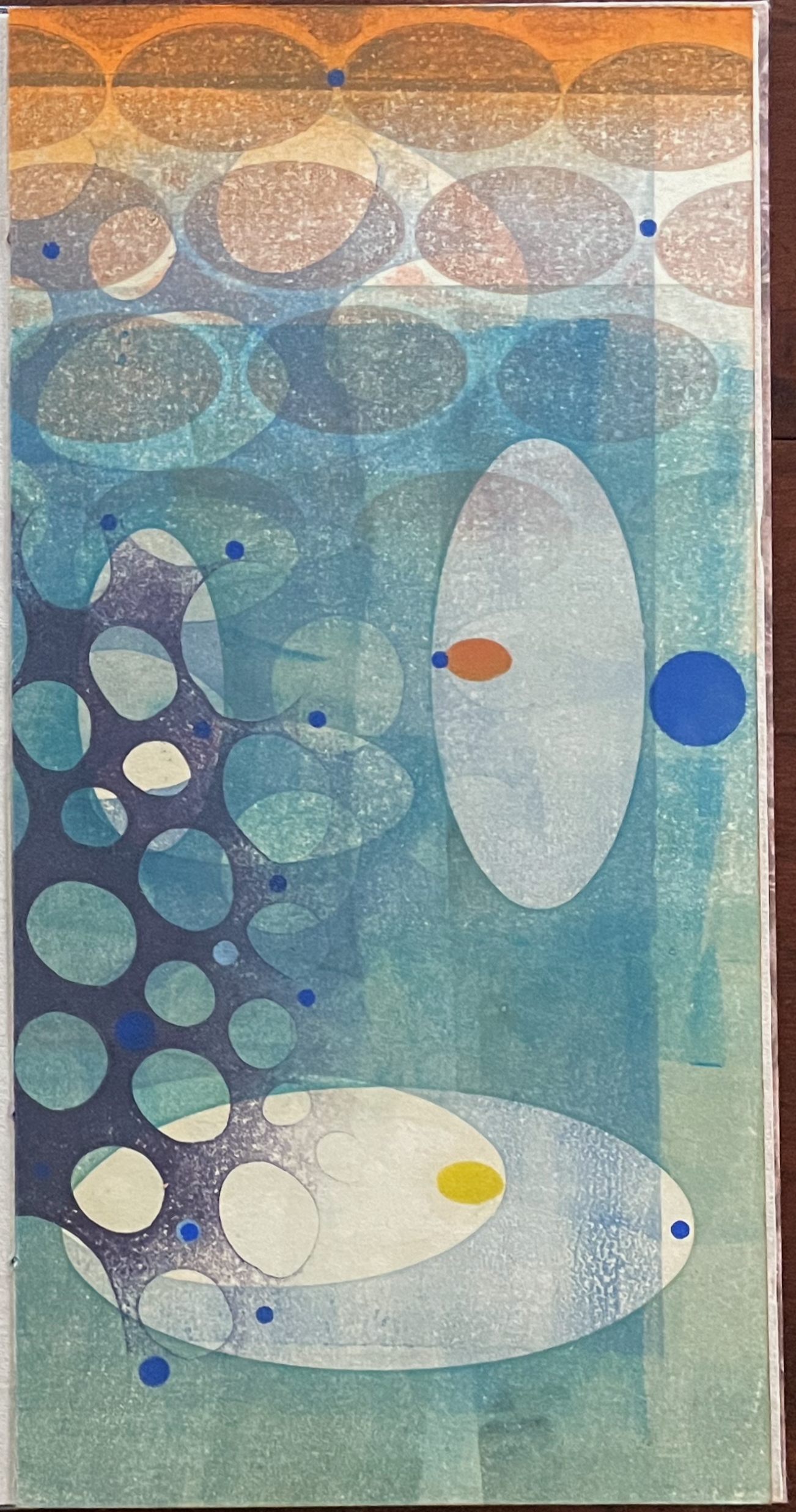
Ten Thousand Things, No. 64 (2012)
Ten Thousand Things, No. 64 (2012) Karen Kunc Single-signature booklet containing a recto and verso monoprint created by pressure printing, pochoir, and mixed media, and a letterpress text on various papers.H250 x W125 mm. [8] pages. From a set of 75. Acquired from the artist, 9 February 2026. Photos: Books On Books Collection.
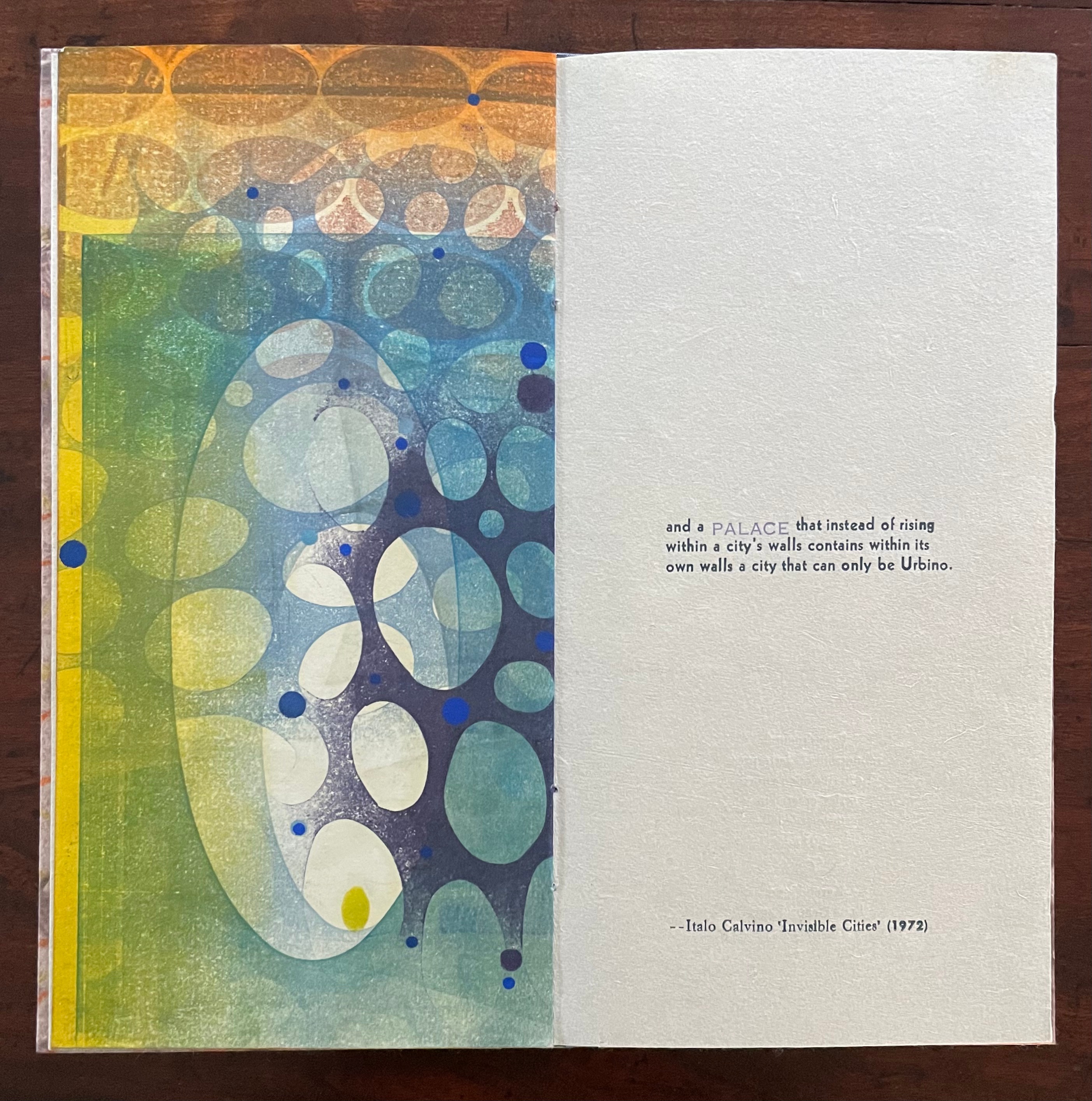
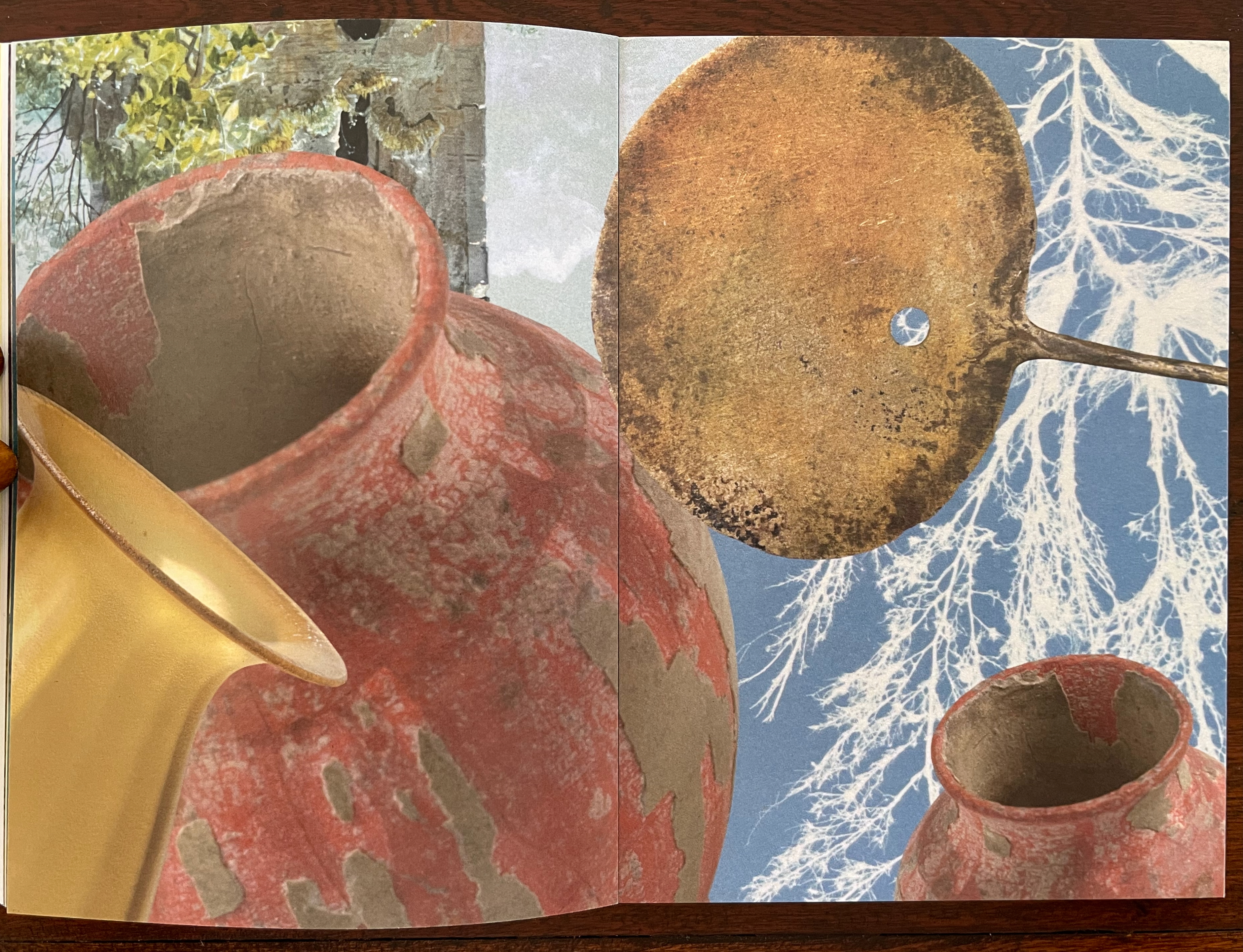
Of the 74 books in the Ten Thousand Things series, 11 of them pay homage to Italo Calvino’s Invisible Cities (1972/74). The book’s premise is that Kublai Khan sent Marco Polo out into the empire to visit the Khan’s cities and return with close descriptions. In nine parts, each prefaced and closed with a philosophical dialogue between the Khan and Polo, the traveller describes fifty-five cities — all of them imaginary. While most works of homage to Invisible Cities select one or more of these fictitious 55 cities on which to focus, Kunc chooses more general text from the preface to Part 9. This is the text used in all 11 of the works of homage to Calvino:
…. (there is) an ATLAS in which are gathered the maps of all the cities:
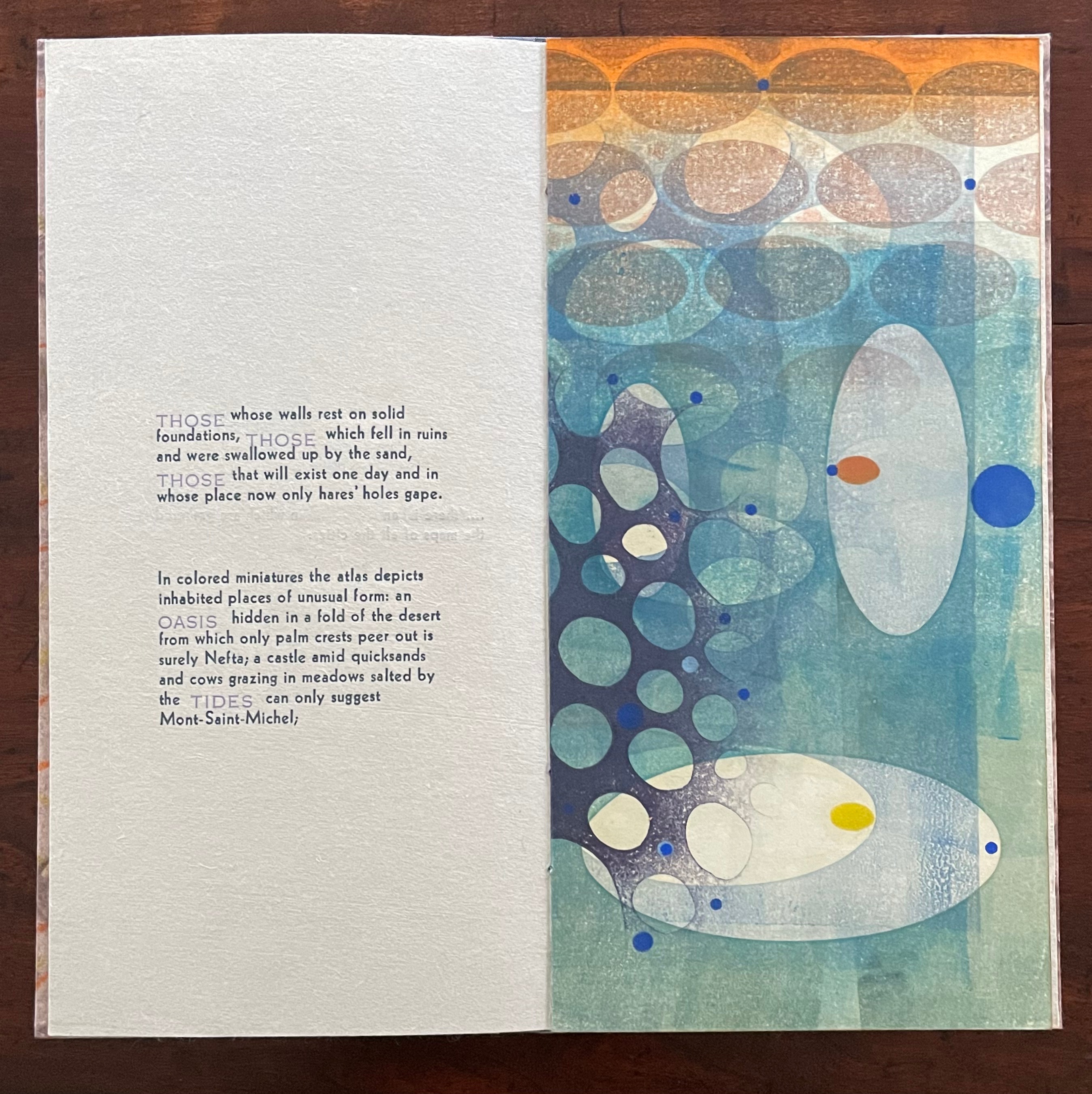
THOSE whose walls rest on solid foundations, THOSE which fell in ruins and were swallowed up by the sand, THOSE that will exist one day and in whose place now only hares’ holes gape.
In colored miniatures the atlas depicts inhabited places of unusual form: an OASIS hidden in a fold of the desert from which only palm crests peer out is surely Nefta; a castle amid quicksands and cows grazing in meadows salted by the TIDES can only suggest Mont-Saint-Michel;
and a PALACE that instead of rising within a city’s walls contains within its own walls a city that can only be Urbino.
With certain words appearing in all caps in a lighter weight and lighter color than the surrounding text, the excerpts have a different texture from those in No. 51. The all caps words rise above or fall below the line of type.
As with No. 51, only one side of the double-sided monoprint is viewable as a whole; the other side is viewable in halves. In No. 64’s first half-view, the shapes and colors have a submerged quality that echoes the now sinking or subsiding type of “THOSE”, “OASIS”, and “TIDES”:
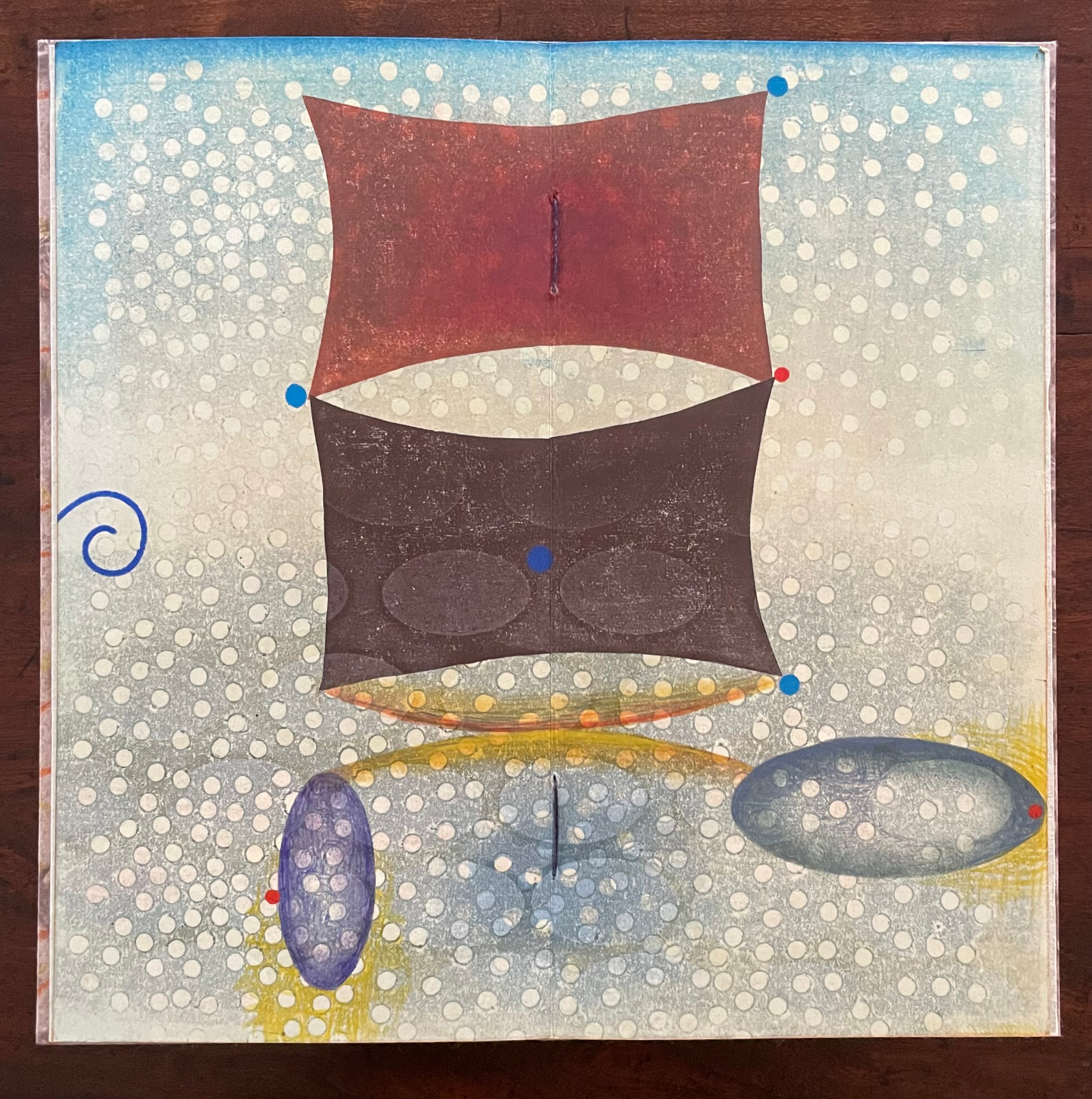
As the most prominent feature of the full-view monoprint, perhaps the two rectangular sail-like shapes recall the Chinese emperor and Venetian traveler. Or perhaps they allude to the remnants of a tower poking above the sands. The ellipsoidal shapes might be the “hares’ holes” mentioned above. The seemingly non-allusive flurry of white dots across the spread behave strangely. They lie in the background in the upper two thirds of the spread but then shift into the foreground in the lower third. The four bright blue dots may have migrated from the first half-view, but the trio of red dots are new participants. The presence of both contributes to an urge to flip back and forth between the first half-view and this full view.
The second half-view faces text that again displays all caps letters that sink below the line: “PALACE”, but more notably, the palace does not sit within a city but a city sits within the palace, “a city that can only be Urbino”. So, a real city within a fictive palace.
We can perform the photographic cheat to bring the two halves of the monoprint together, but as with No. 51, we overlook the deliberate hiding of the whole within the halves — like the paradoxical fictive palace that holds a real city (Urbino).
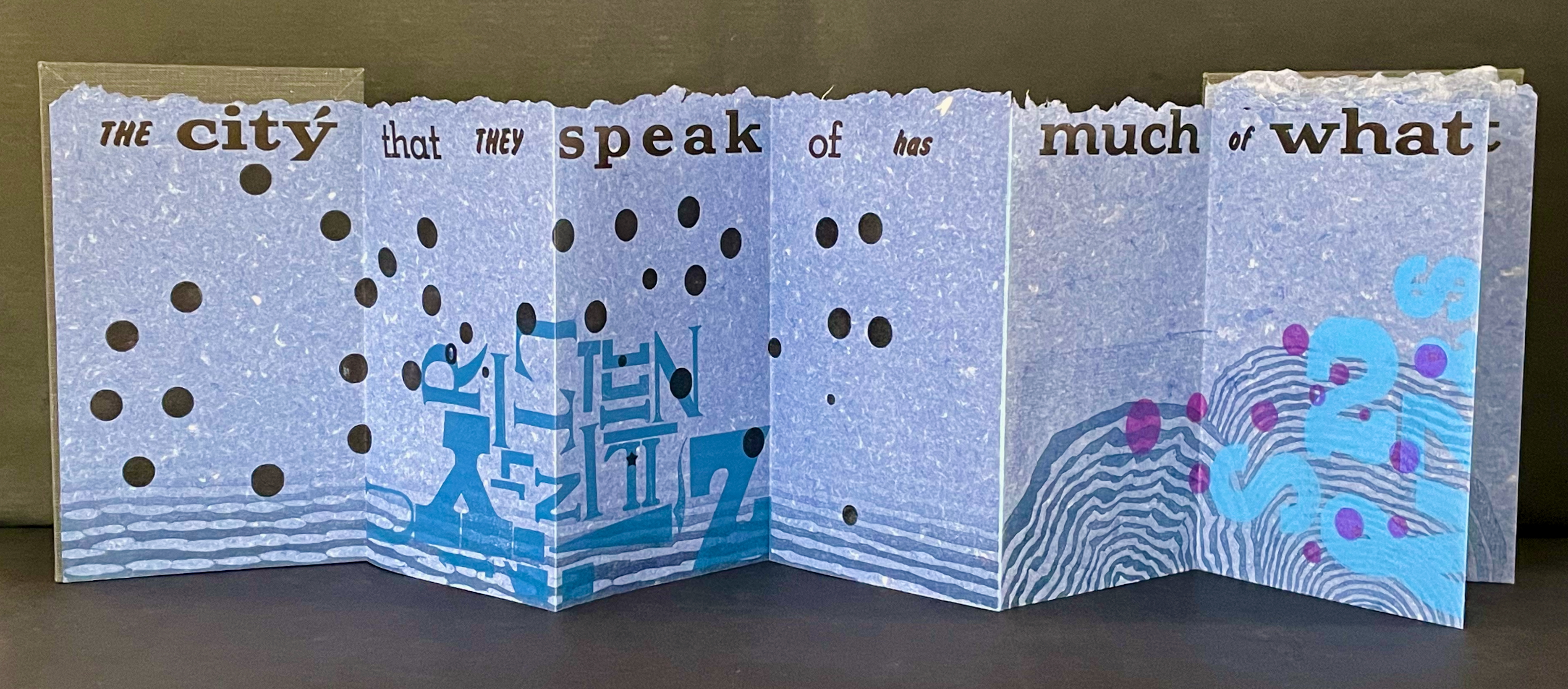
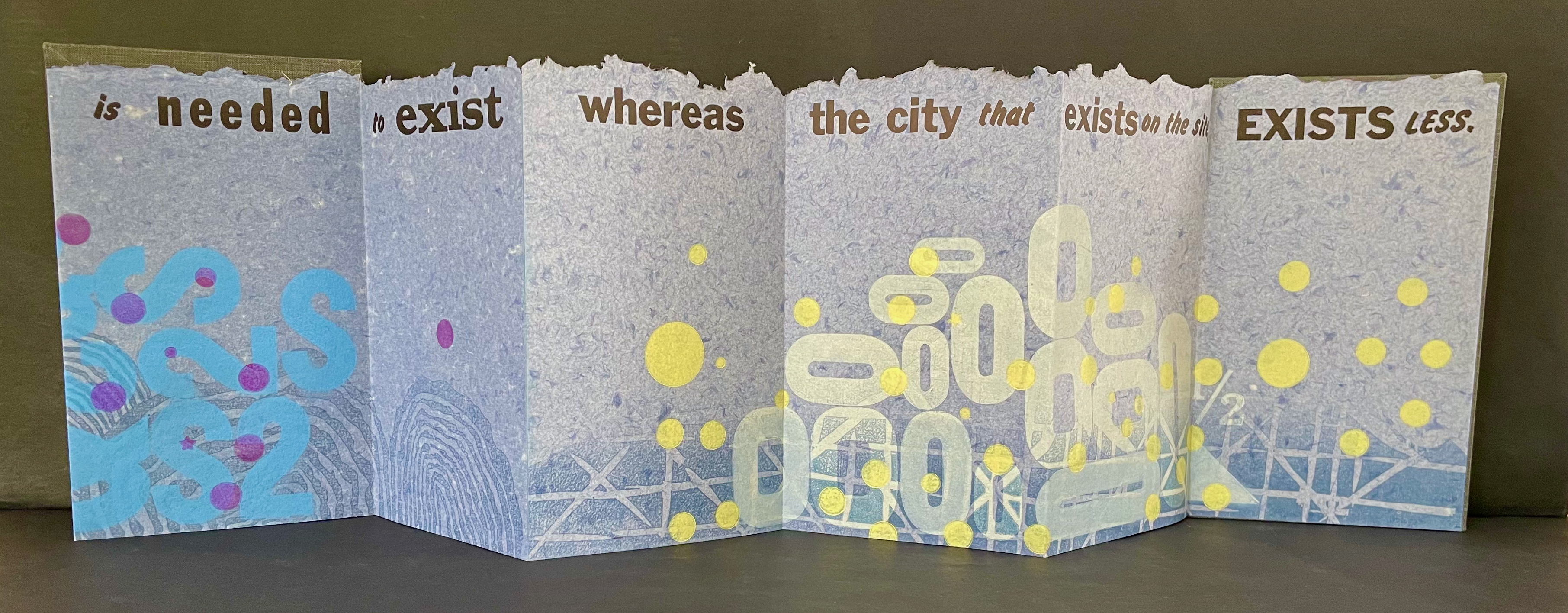
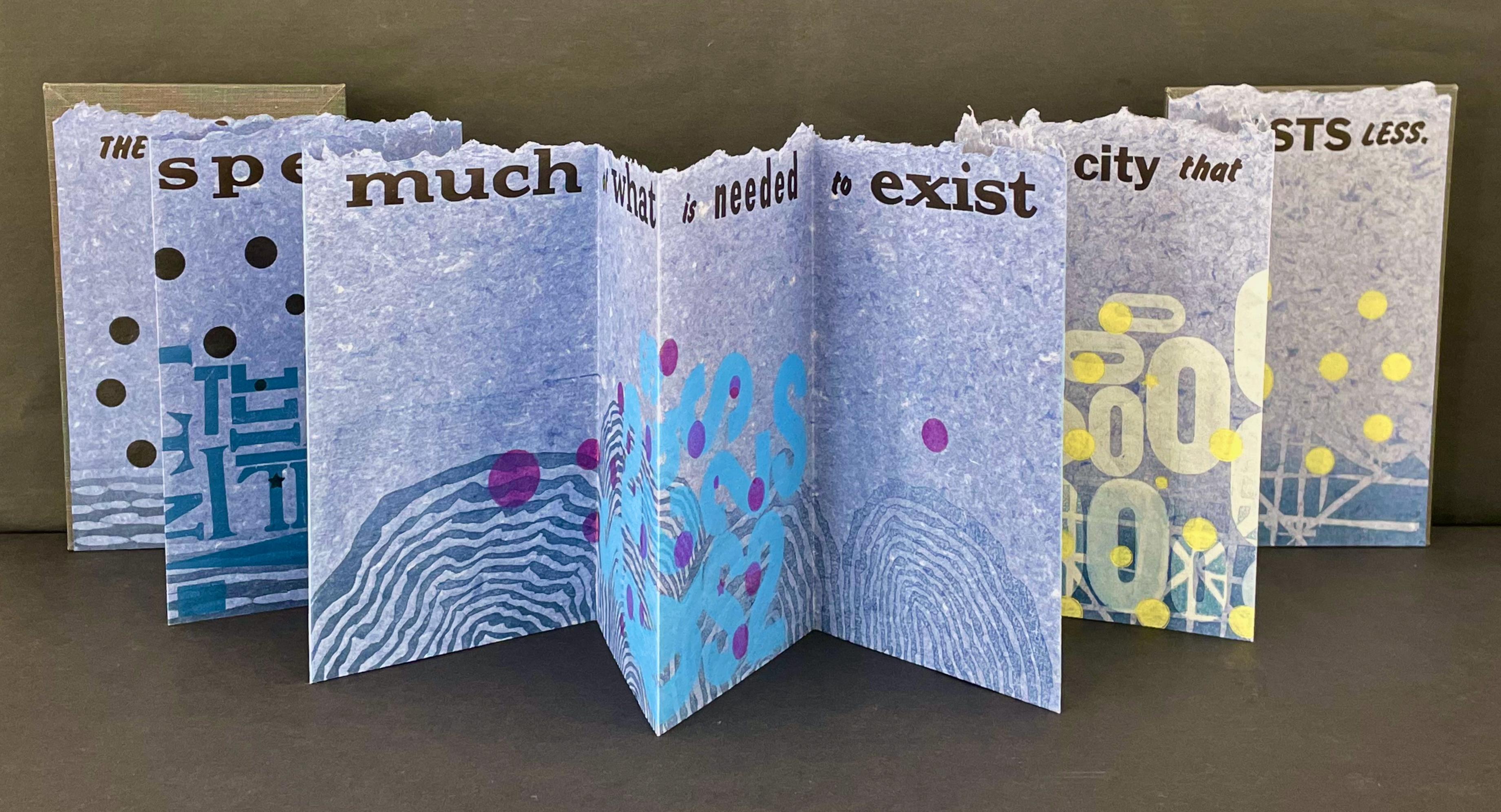
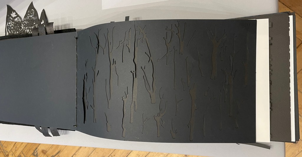
Type Cities (2018)
Type Cities (2018) Karen Kunc Leporello. H190 x W114 mm closed, extends to 1346 mm. [12] panels. Edition of 8, of which this is #2. Acquired from the artist, 25 March 2026. Photos: Books On Books Collection.
Like most other homages to Invisible Cities, Karen Kunc’s Type Cities (2018) focuses on one of the fictitious cities; in this case, Aglaura. As with Ten Thousand Things, she uses an excerpt:
The city that they speak of has much of what is needed to exist whereas the city that exists on the site, exists less.
That is cryptic. Just as the paradoxical characterizes the general cities in No.64, so it is for the particular city of Aglaura here:
So if I wished to describe Aglaura to you, sticking to what I personally saw and experienced, I should have to tell you that it is a colorless city, without character, planted there at random. But this would not be true either: at certain hours, in certain places along the street, you see opening before you the hint of something unmistakable, rare, perhaps magnificent; you would like to say what it is, but everything previously said of Aglaura imprisons your words and obliges you to repeat them than say. Therefore, the inhabitants still believe they live in an Aglaura which grows only with the name Aglaura and they do not notice the Aglaura that grows on the ground.
For Ten Thousand Things, the single-fold double-sided monoprint provided Kunc a surprisingly flexible tool with which to capture the paradoxical in two very different texts. This time she chooses the accordion structure. Also, as the title Type Cities suggests, she chooses type as an additional tool to capture what Marco Polo describes as Aglaura’s “enduring assortment of qualities”. Across the twelve panels of the leporello, Kunc lays out the text of her chosen excerpt in multiple faces and fonts:
Also across the twelve panels, the color change of black dots to purple, violet, and then yellow echoes the shift from the colorless city to something else “at certain hours, in certain places along the street”.
The “much of what is needed to exist” manifests at the bottom edge as wood type letters in dark blue floating along a river (?), then as Ss, 2s, and $s floating over a pond (?), and then yields to the less of zeroes scattered over a grid. The contrast of much and less even extends vertically to the handmade paper with its messily torn upper edge opposed to its neatly trimmed lower edge. It also extends horizontally to the paper as its tint shifts gradually from a deep blue to a light gray. These photographs do not do justice to the painted and stamped elements or texture of Type Cities.
Further Reading
Laozi. 2011. Tao Te Ching = Dao de Jing. Translated by Gia-fu Feng, Jane English, and Toinette Lippe. Third Vintage books edition. New York: Vintage Books, a division of Random House, Inc.
Works of homage to Jorge Luis Borges
Louise Grimshaw’s Ethereal Worlds(2017) celebrates “The Library of Babel” with hexagonally shaped pages of prints rotating on a central post.
Gracia Haby and Louise Jennison are exuberant archival eco-artists whose palette embraces the digital collections of the Metropolitan Museum of Art, New York Public Library, Rijksmuseum, State Library of New South Wales, State Library Victoria, and more. Their preferred media are paper, the artist’s book, and installations; their preferred technique, collage.
Dip and Bob (2021)
Dip and Bob (2021) Gracia Haby & Louise Jennison Casebound, softcover with five-panel irregular trim wraparound card. H149 x W110 mm. [72] pages. Edition of 50. Acquired from the artists, 21 February 2026. Photos: Books On Books Collection.
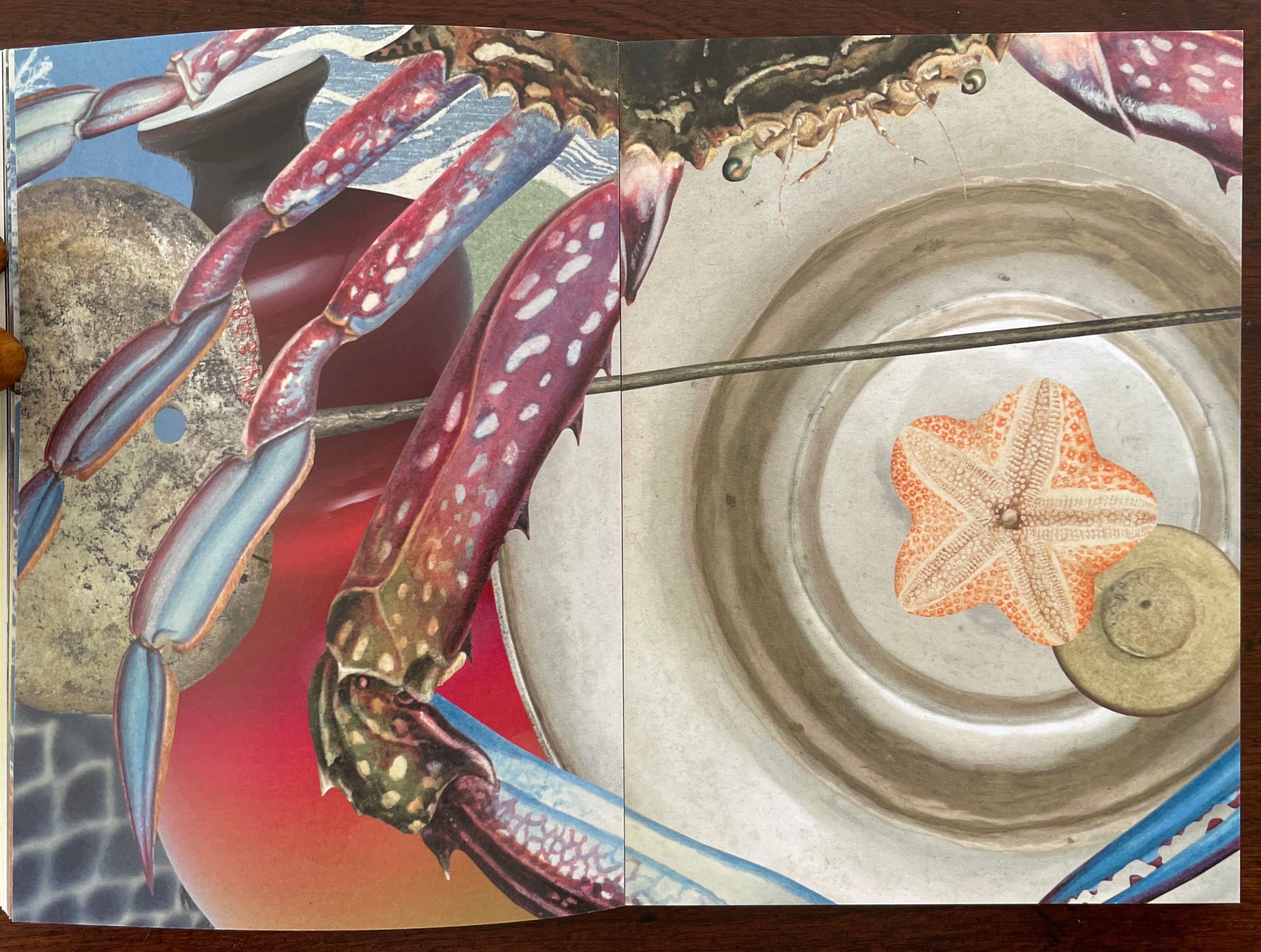
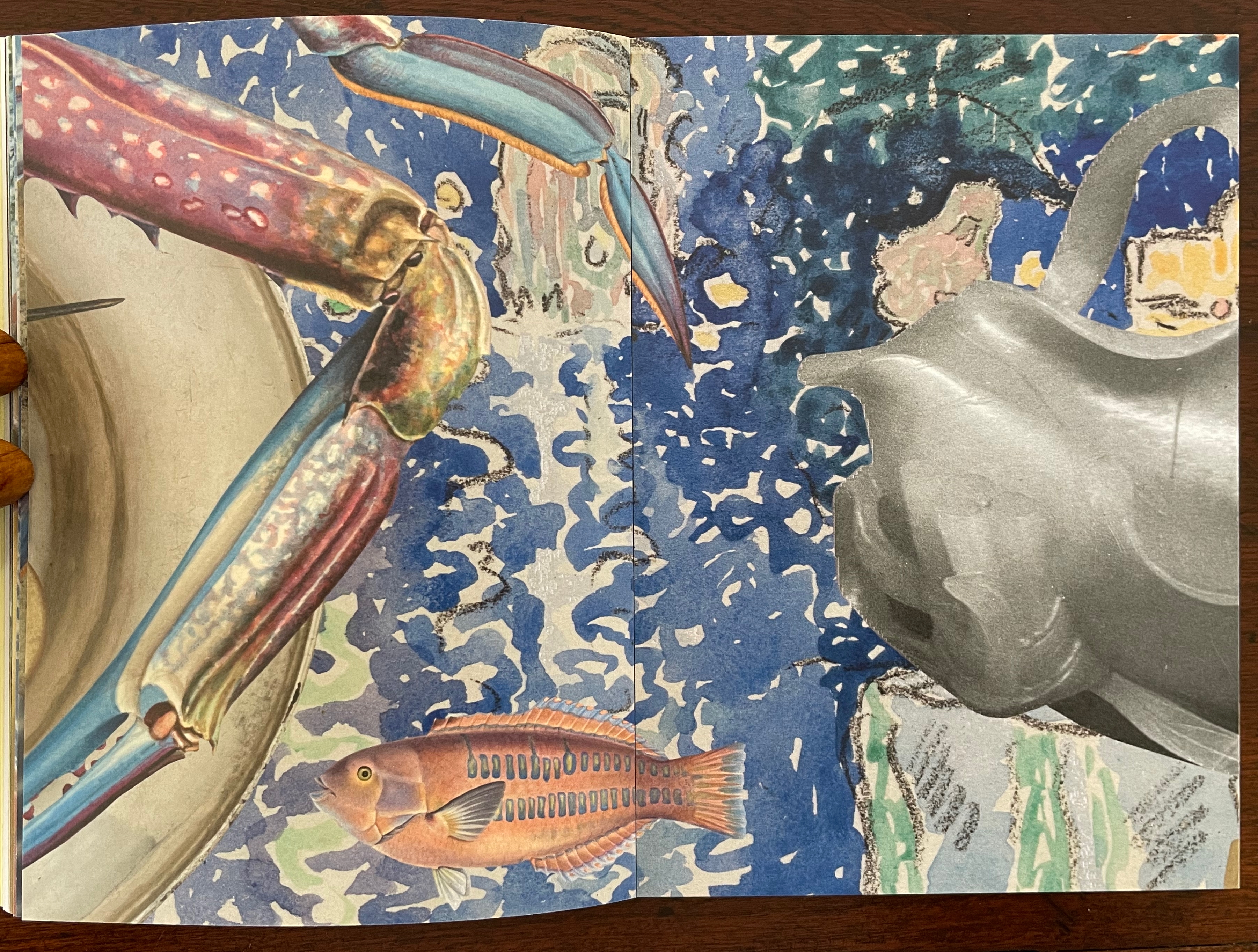
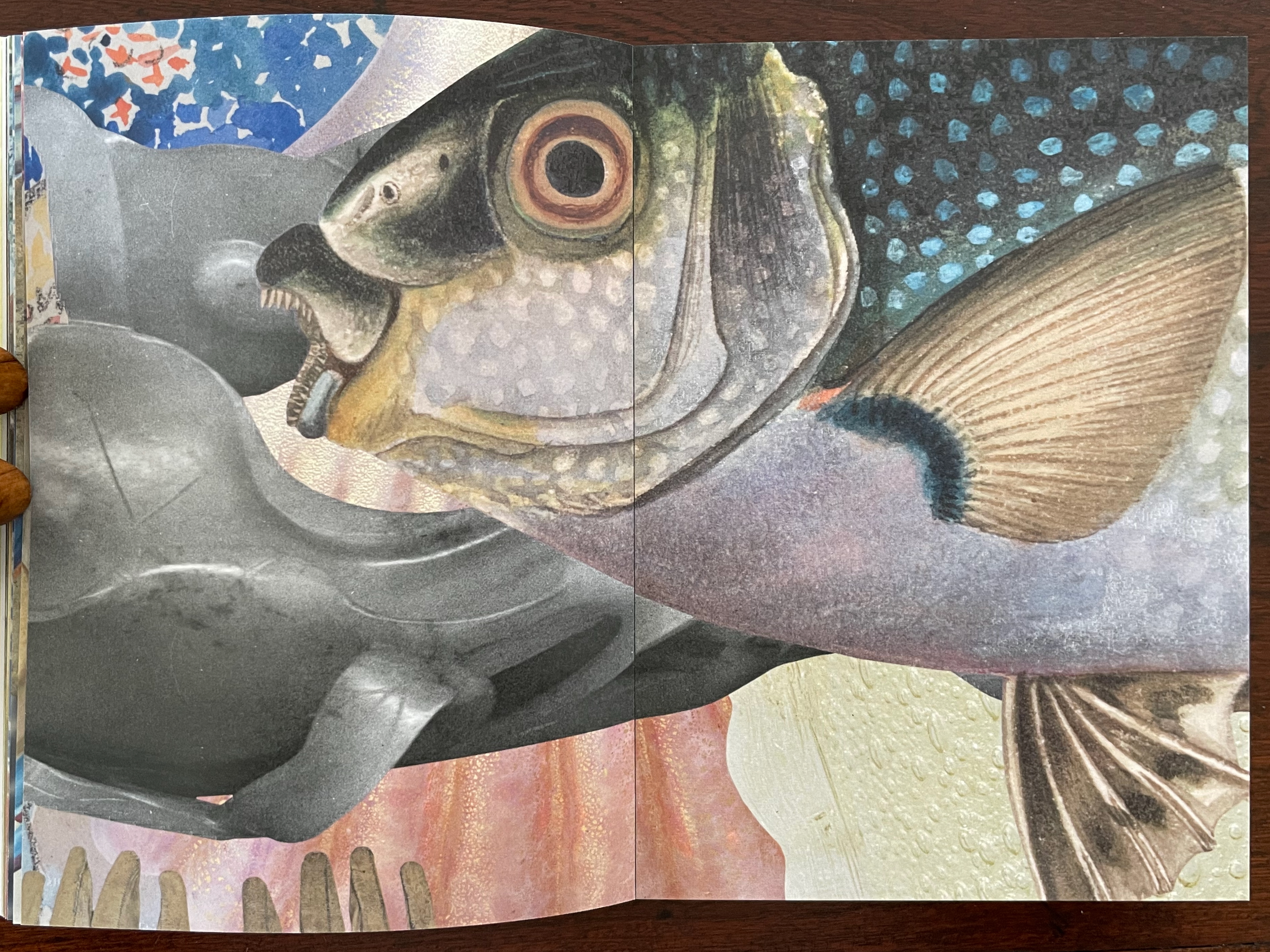
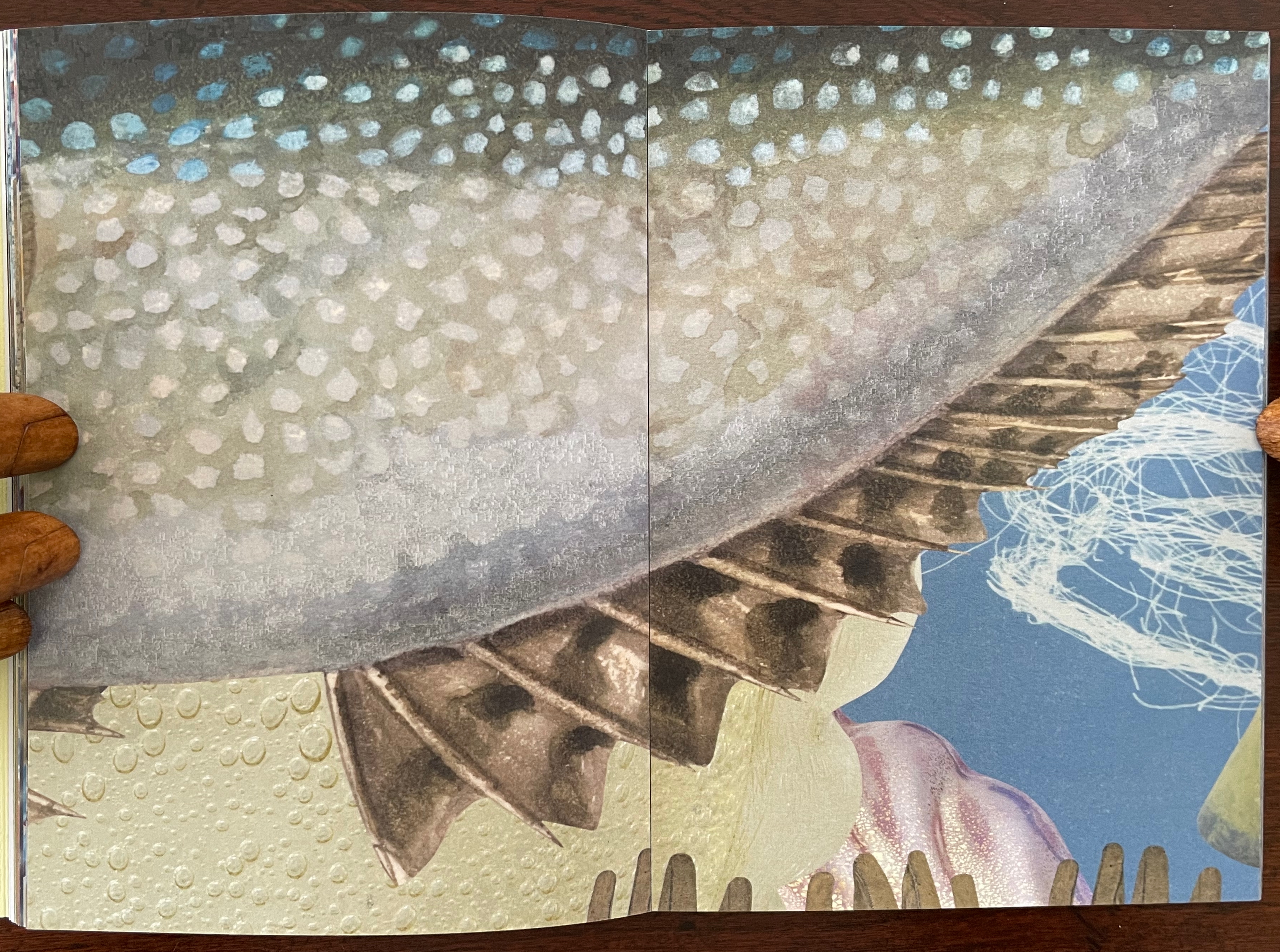
Like other works in the collection, Dip and Bob (2021) teases connections between the media of watercolor, artist’s book, performance, and installation. The cover is an original watercolor cover on Fabriano Artistico 300 gsm paper.
The 72 pages of prints on Impact 100% Recycled Uncoated 150gsm derives from a 620 cm long digital collage. Created for the 2021 NGV Melbourne Art Book Fair, its performance element was twofold. First, as the artists explain, the collage was made “in place of a swim”, the local pool being too busy. Second, toward the end of the making, several copies were bound live before the Book Fair attendees. Its installation element, however, is the greatest tease. There is and was no installation of the 620 cm long collage work. It rests in your hands, and you experience it by turning the pages, then turning them back, then turning them forward — like laps in the pool. Or if you happen to photograph the double-page spreads, you can jump out of the pool and look down on them joined end to end.
Their introduction, however, will lure you back into the collage, which is
Underwater, kind of. Yes. Dive in.
Don’t forget to hold your breath. …
Search the collection. Sift the collection. “Water”, Return key.
Invert a forest. A daguerreotype of poplars stretching across the plate could be bands of seaweed. …
A crab from a trade card. Not for the skillet. Zoom in, Moonfish.
The Young Saint John the Baptist hair tendrils ca. 1480–82, repurposed. Papyrus fragment with lines from Homer’s Odyssey, ca. 285–250 B.C., for kelp bands.
Haby and Jennison wear their eco-hearts on their sleeves and admit, or rather assert, “For us, above all, it is not the medium that is always of greatest import, but the message”, which is
Our only chance of a healthy, safe, joyous, and sustainable future is to return to being reciprocal with nature so nature can continue to look after us.
Stand up and fight for the oceans and the waterways.
And yet it is their long-held breath as they create their underwater collage and your breath caught as you paddle forwards and backwards over fore edges and through the collection of human and natural art that will most hold you.
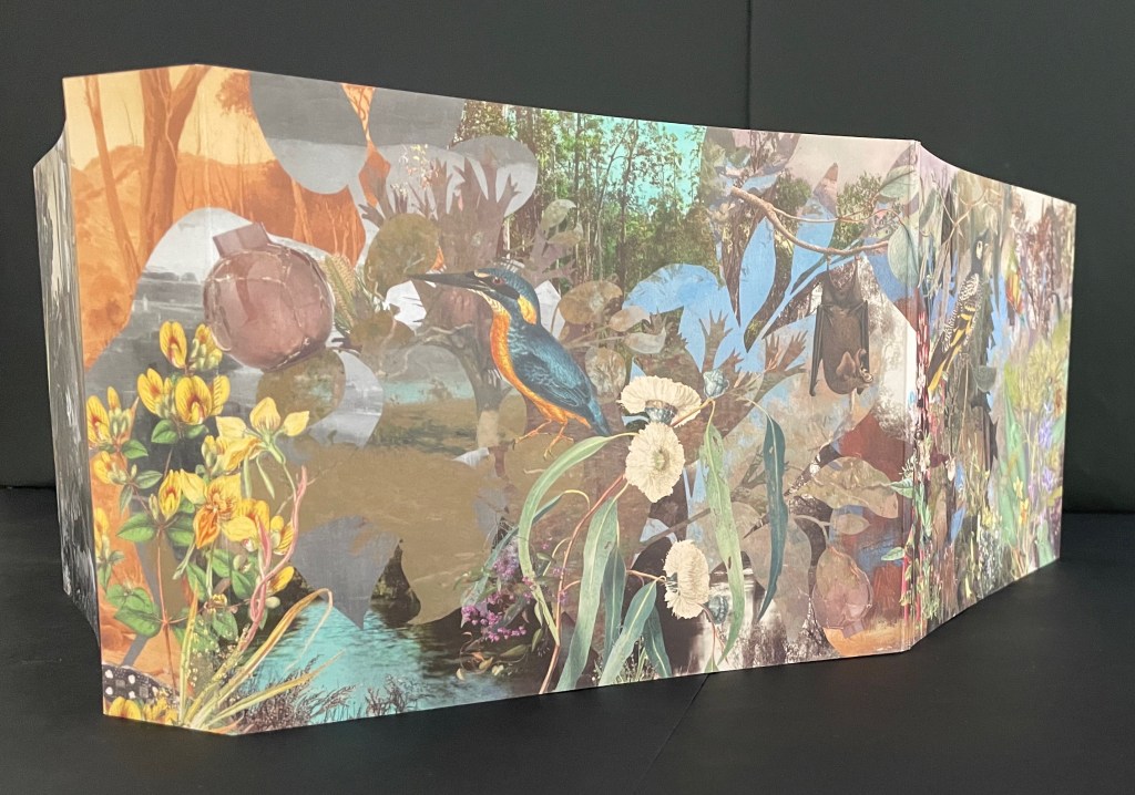
The Remaking of Things (2023)
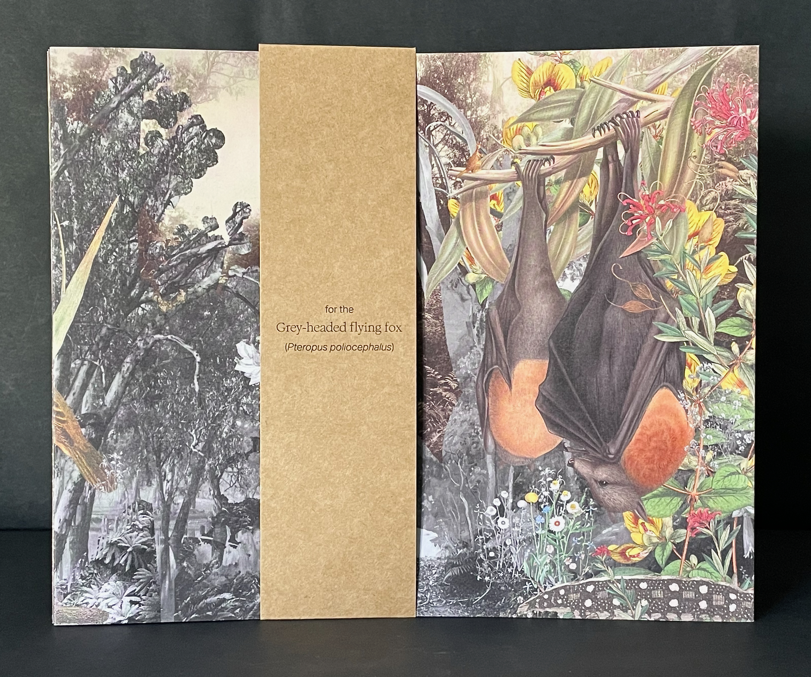
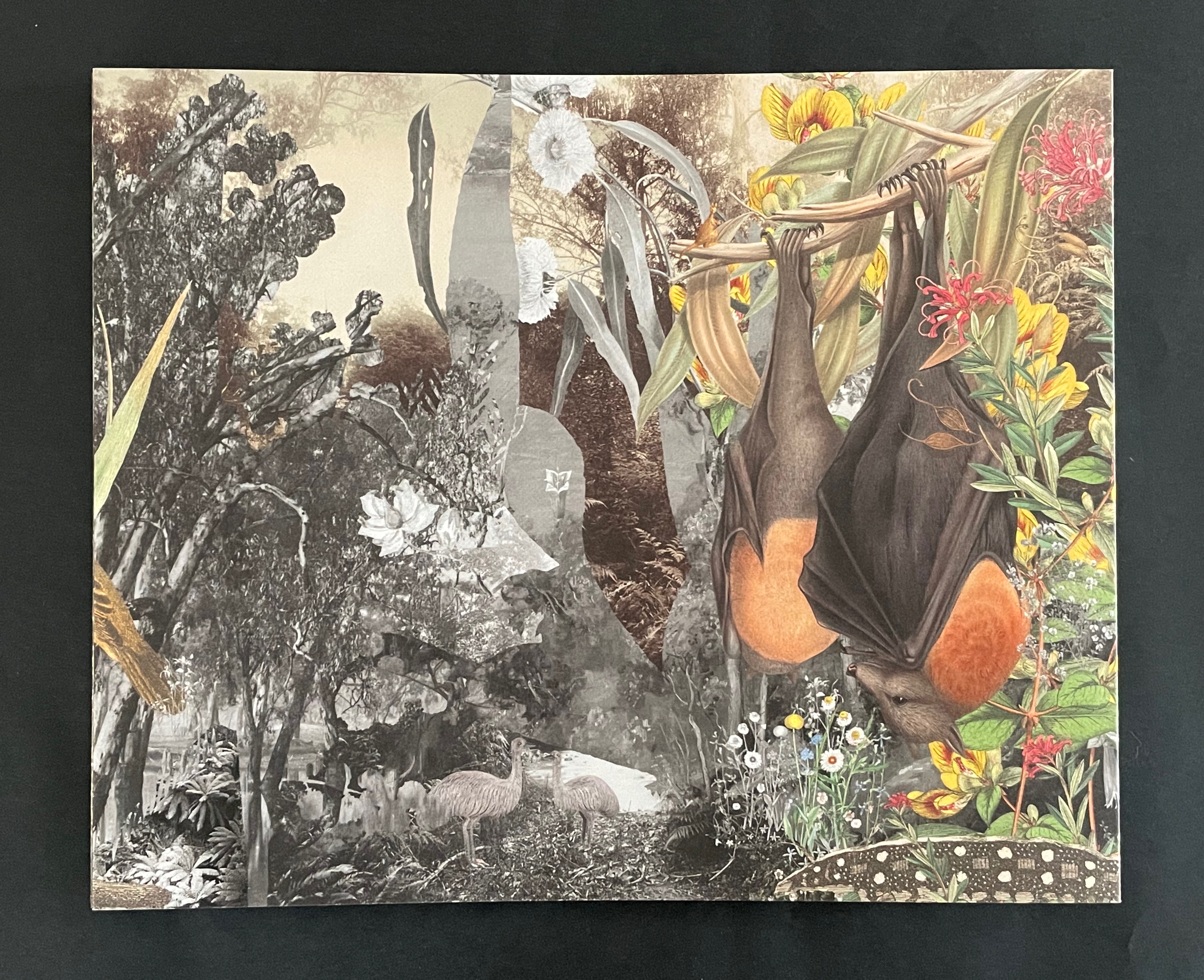
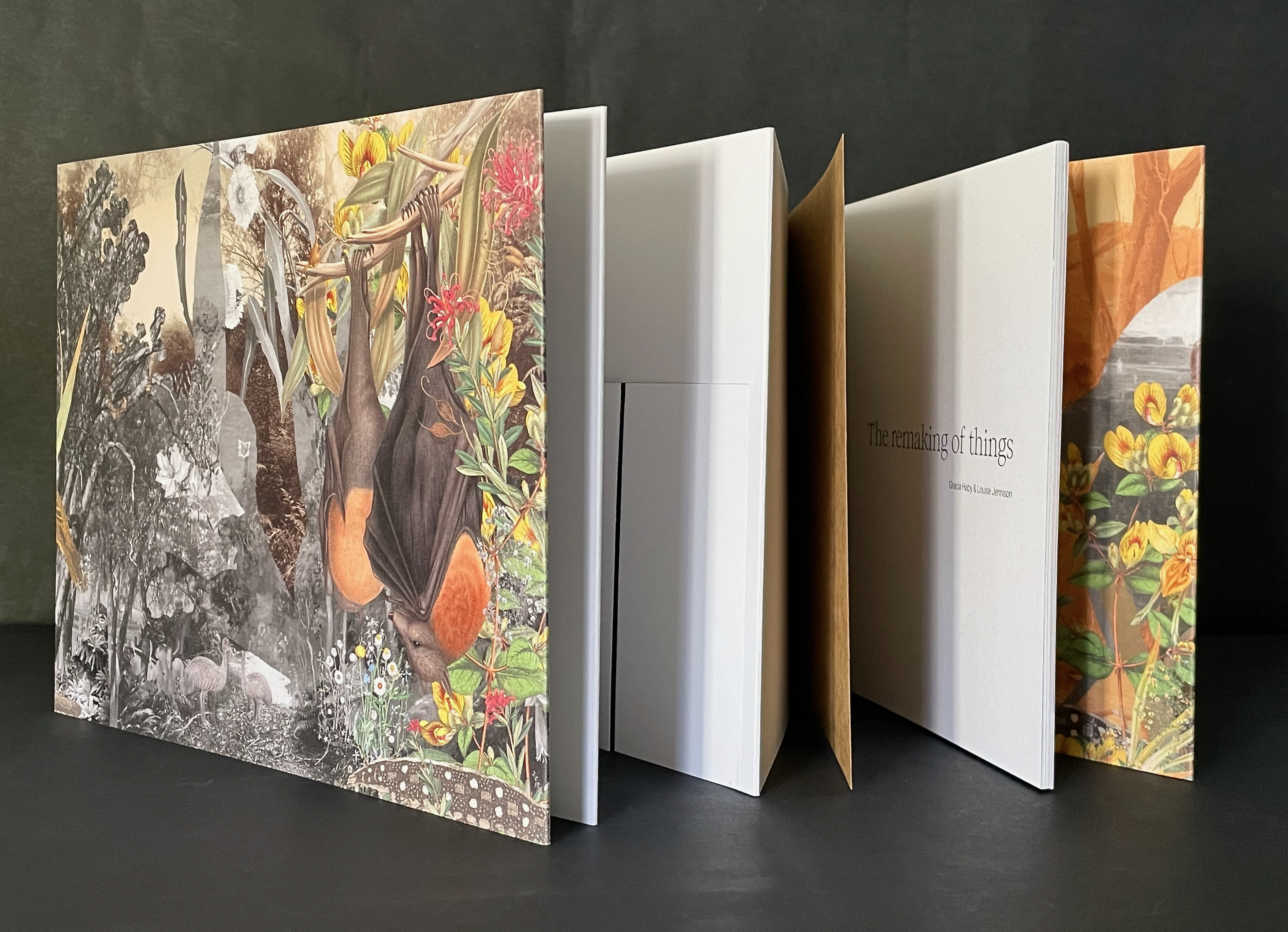
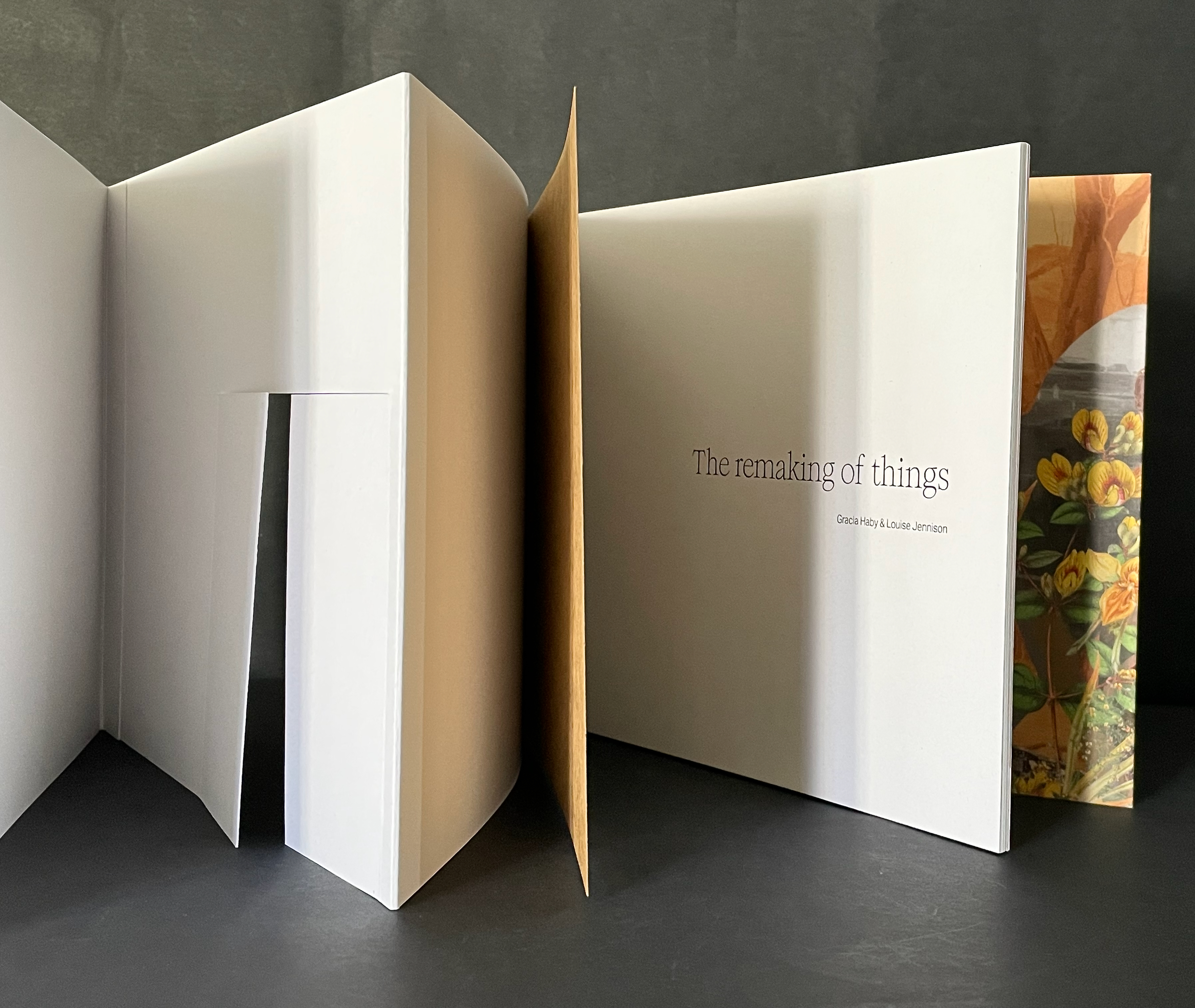
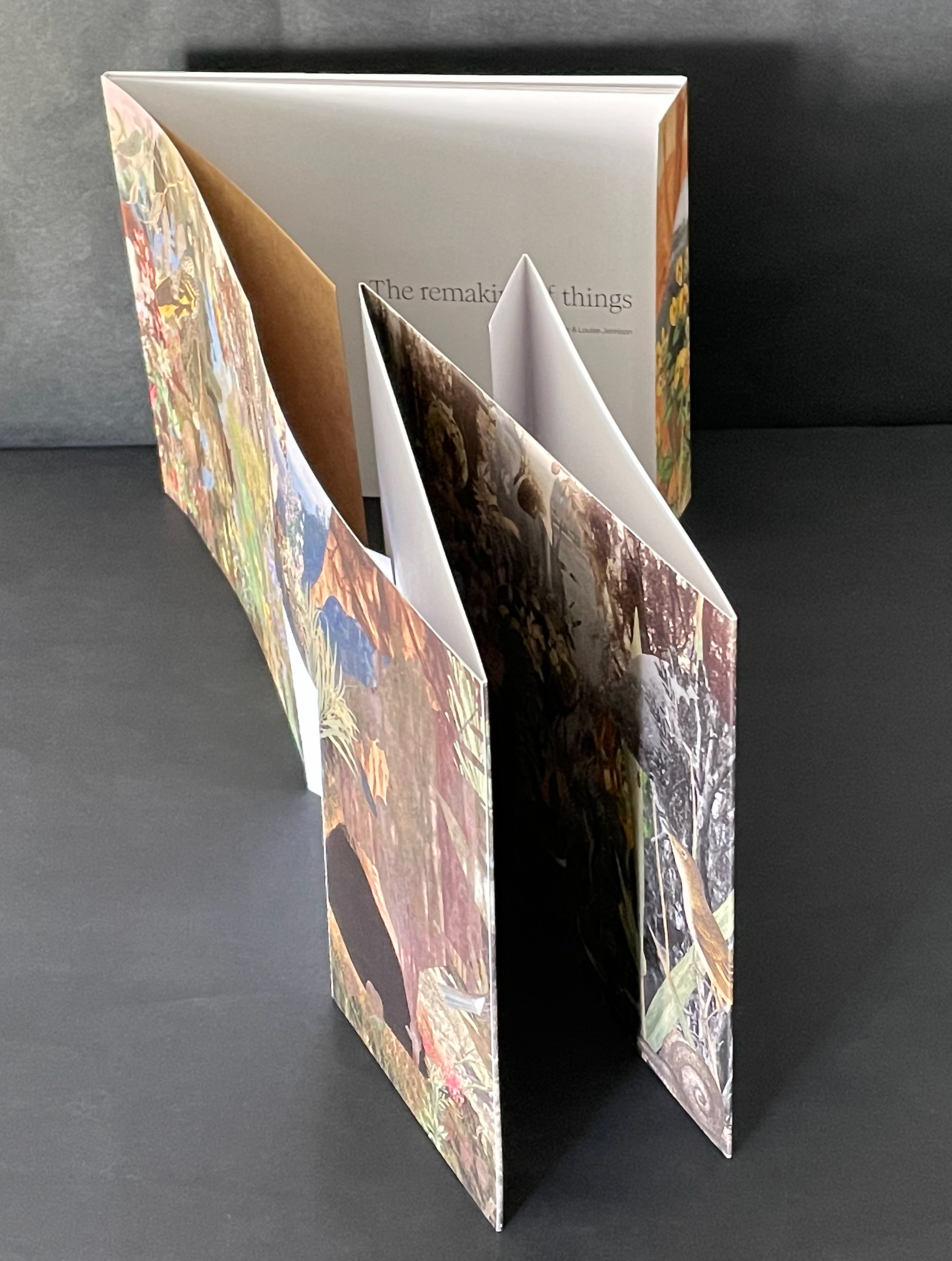
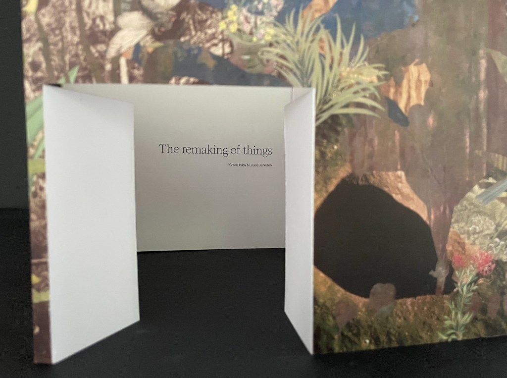
The Remaking of Things (2023) Gracia Haby & Louise Jennison Folded container with tab-and-slot closure, holding belly-band-secured front cover fold out, part of card cover casing a perfect bound book. Container: H186 x W228 x D15 mm. Book: H180 x W222 mm. [36] panels. Edition of 100, of which this is #25. Acquired from Vamp & Tramp, 21 May 2025. Photos: Books On Books Collection.
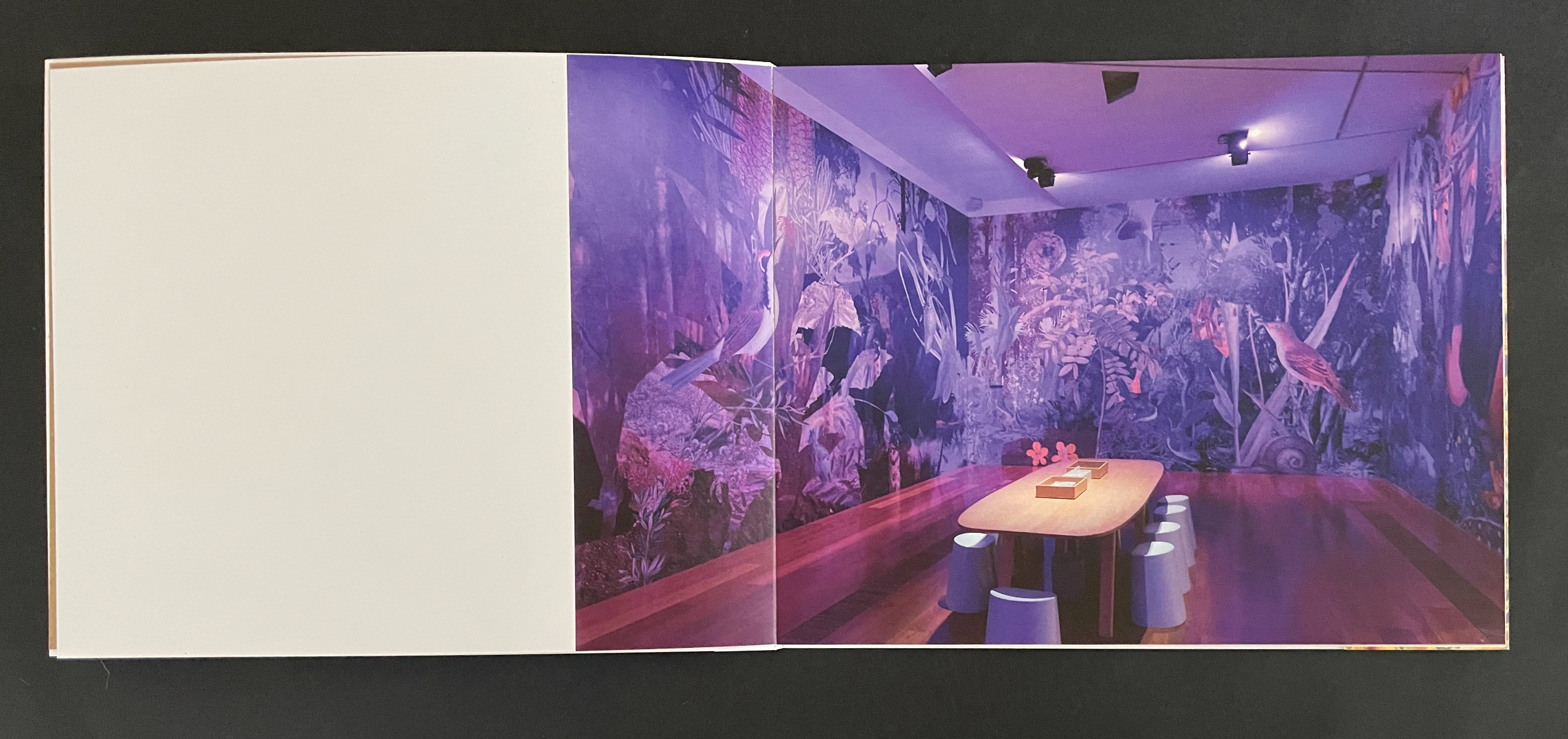
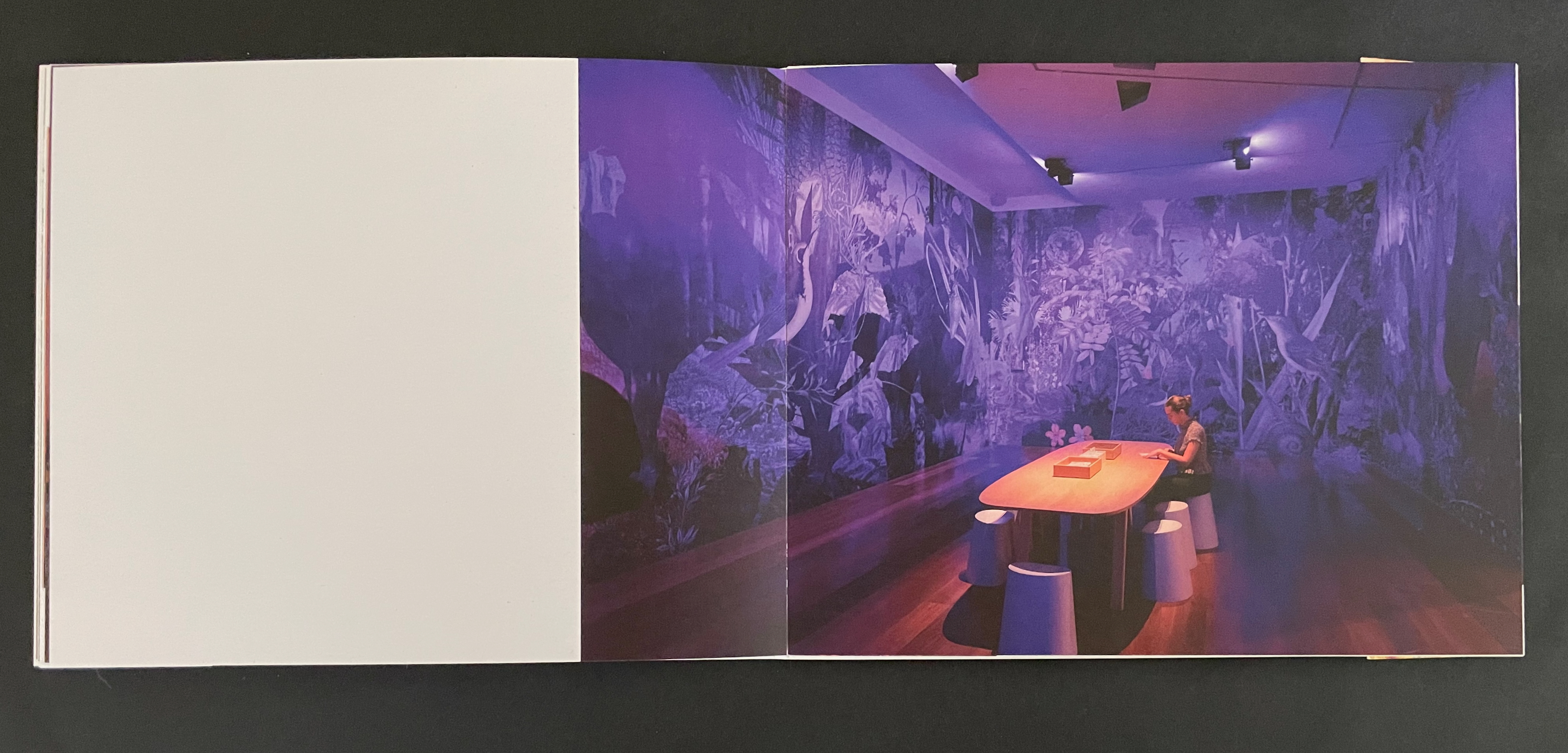
From 24 May through 20 August 2023, the Ian Potter Centre (NGV Australia) held hosted an installation of The Remaking of Things. This work produced for the exhibition comprises a silvery tab-and-slot folder, holding a casebound softcover artist’s book whose front cover opens into a desktop installation, making you wish for a sip of Alice’s “Drink me” potion or bite of the Caterpillar’s magic mushroom.
Tab-and-slot folder made of Silver Metalised Polyester satin paper 300 gsm, router cut, printed on a swissQprint inkjet printer. Image from Nicholas Caire‘s Fairy scene at the Landslip, Black’s Spur (c. 1878)
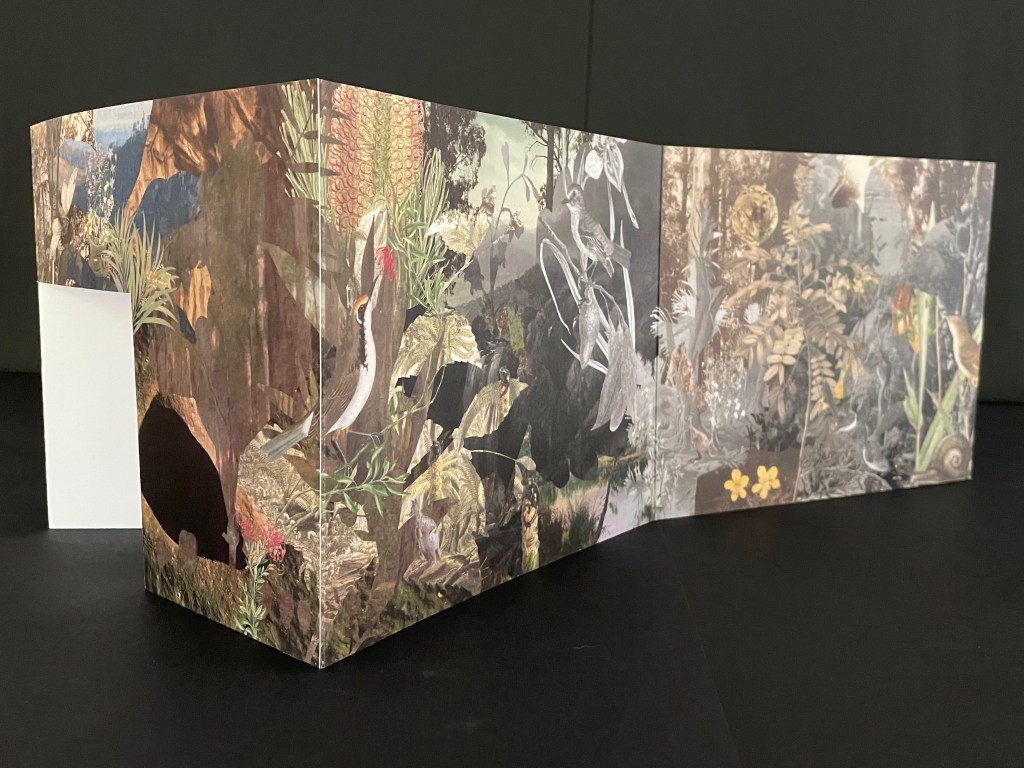
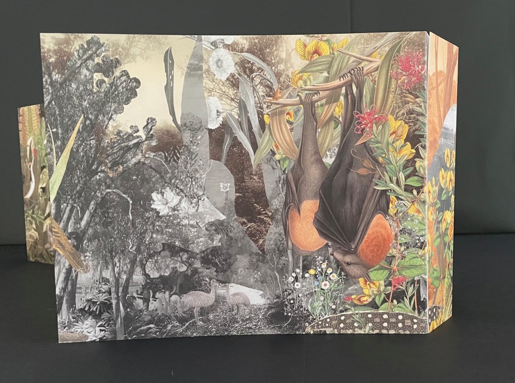
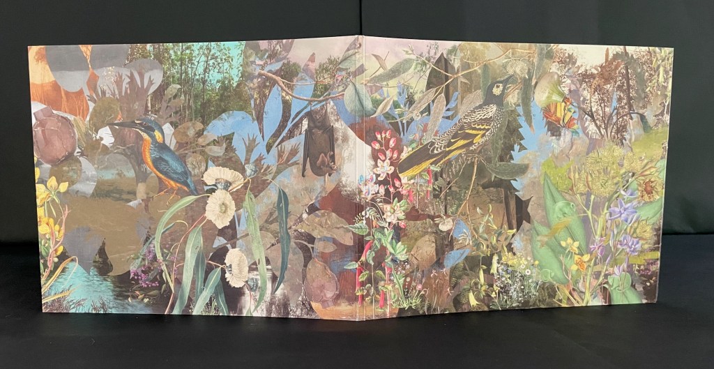
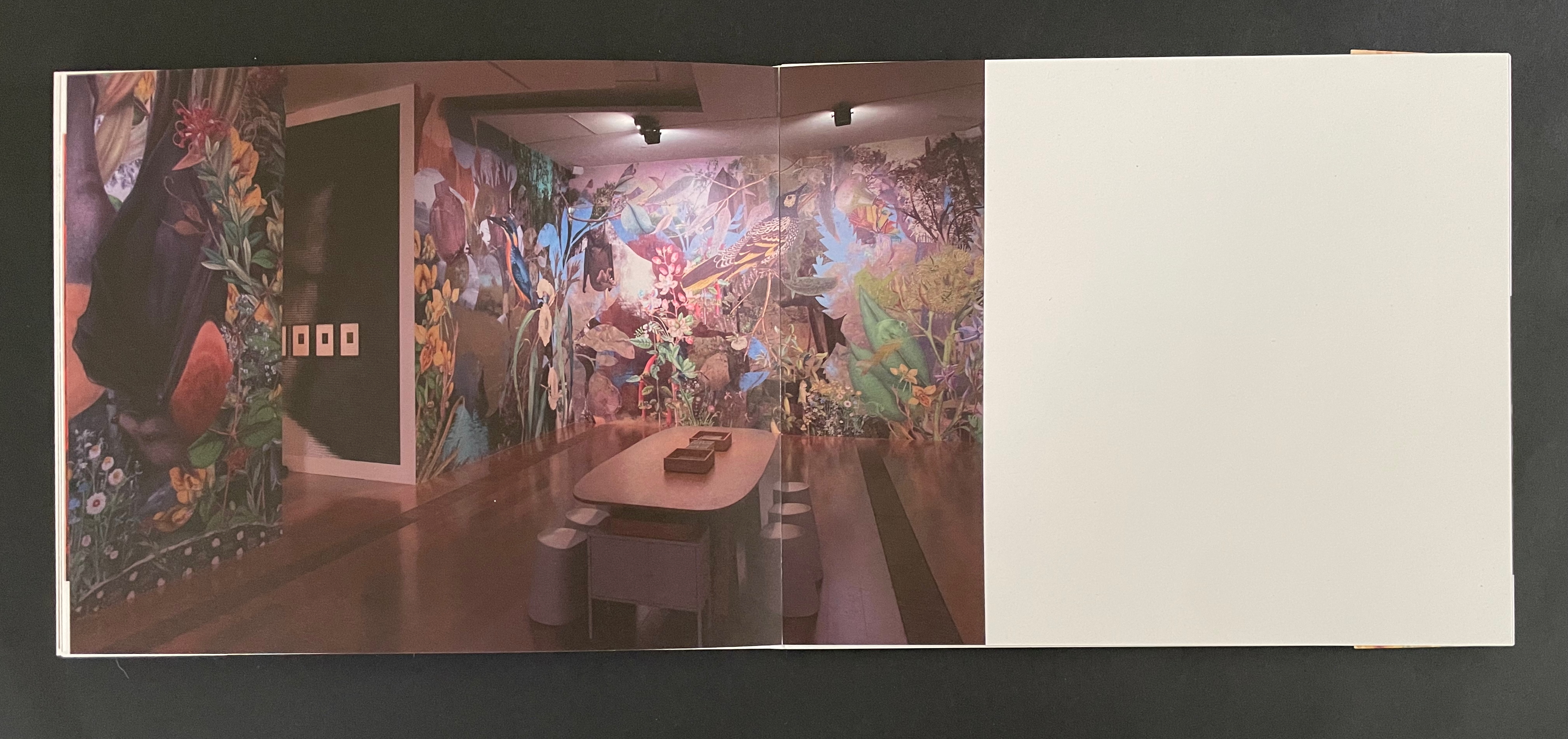
Although the work continues their archival poetics, drawing on “100 individual pieces in the NGV collection, spanning painting and photography by way of ceramics and silverware, textiles and works on paper”, it has its origin in Haby & Jennison’s restored eucalyptus forest habitat for the Grey-heading flying fox, the animal featured on the “wall” that serves for the front cover.
Front cover with and without belly band.
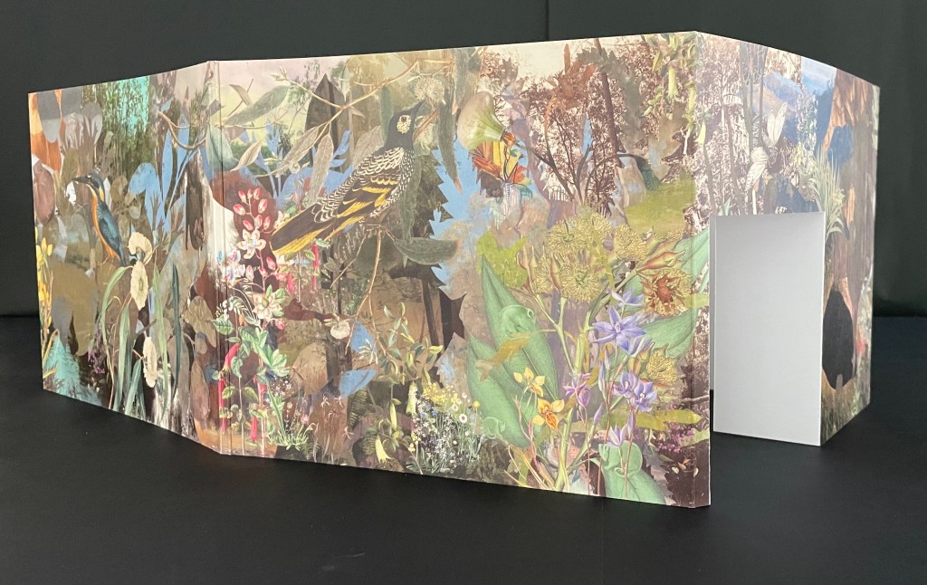
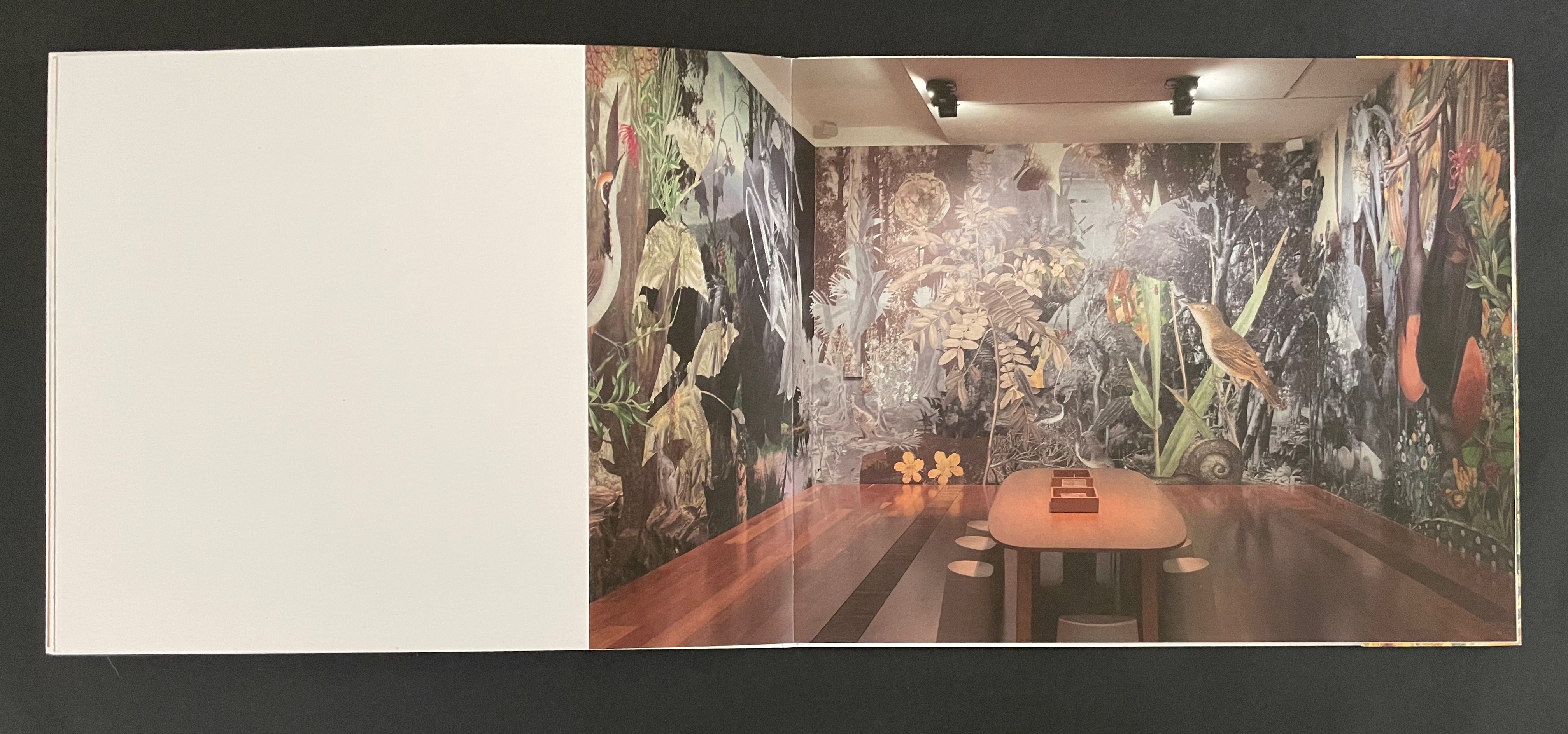
As the front cover unfolds, a double door appears, cut into one of the other walls. “Walking” to the right around the walls, you see the images that, enlarged, occupied the exhibition walls in Melbourne.
Within the exhibition rooms, a 24-minute for 24 hours sound track played as the lighting changed. Within the book, photographs of the exhibition rooms provide a sense of the visual experience and its scale.
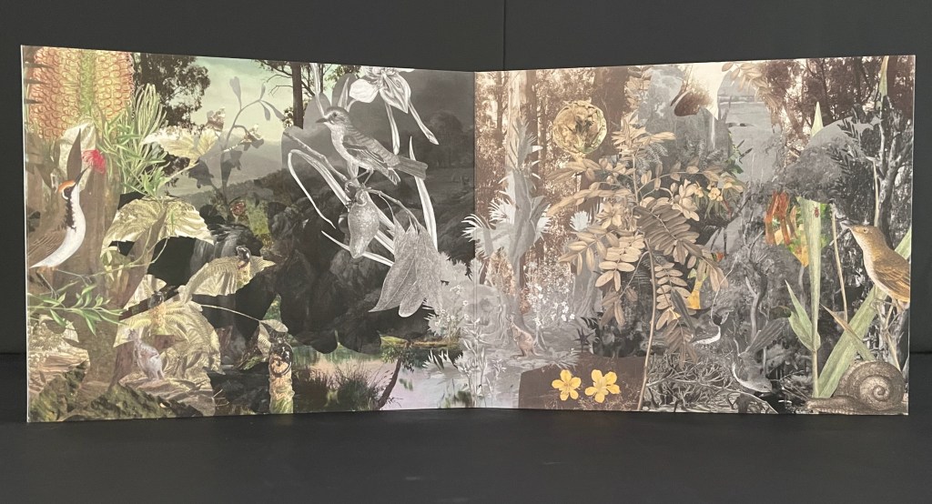
The images within the book are likely to send you back to the images on your desktop installation. There, it is much easier to register James Sowerby‘s etching Tetratheca juncea (1793), John Lewin’s Warty-face Honey-sucker (1822), Richard Bunbury‘s Green native fuchsia (1844), Anne Paulson’s Sketches of Victorian bush flowers (c. 1861), Fanny Anne Charsley‘s The Wildflowers of Melbourne (1867), Eugene von Guérard‘s Ferntree gully (1867), Tom Humphrey‘s Summer walk (c. 1888), F.E. Striezel‘s Kookaburra carving (1915), A. Shelden‘s Possum and banksia (1920s), E.G. Adamson‘s Snow coral (1930s-40s), Grace Cossington Smith’s Bottlebrushes (1935), NASA’s Lunar Crater (1969), and the dozens of others listed in the center of the book that can be found on the NGV website. As Haby & Jennison indicate in the work, they “invite you to enter the pages of the book in a similar spirit as you would the gallery”. Across time, etchings, paintings, carvings, inkwells, snuff boxes, glass plate negatives, digital photographs and a host of other artefacts, they create a complex habitat of interconnectedness of art and species.
Given that aim, it is surprising that the fold-out cover is constructed for viewing around rather than within. Double-sided printing of the cover might have done the trick and offered an additional opportunity to show the change of lighting.
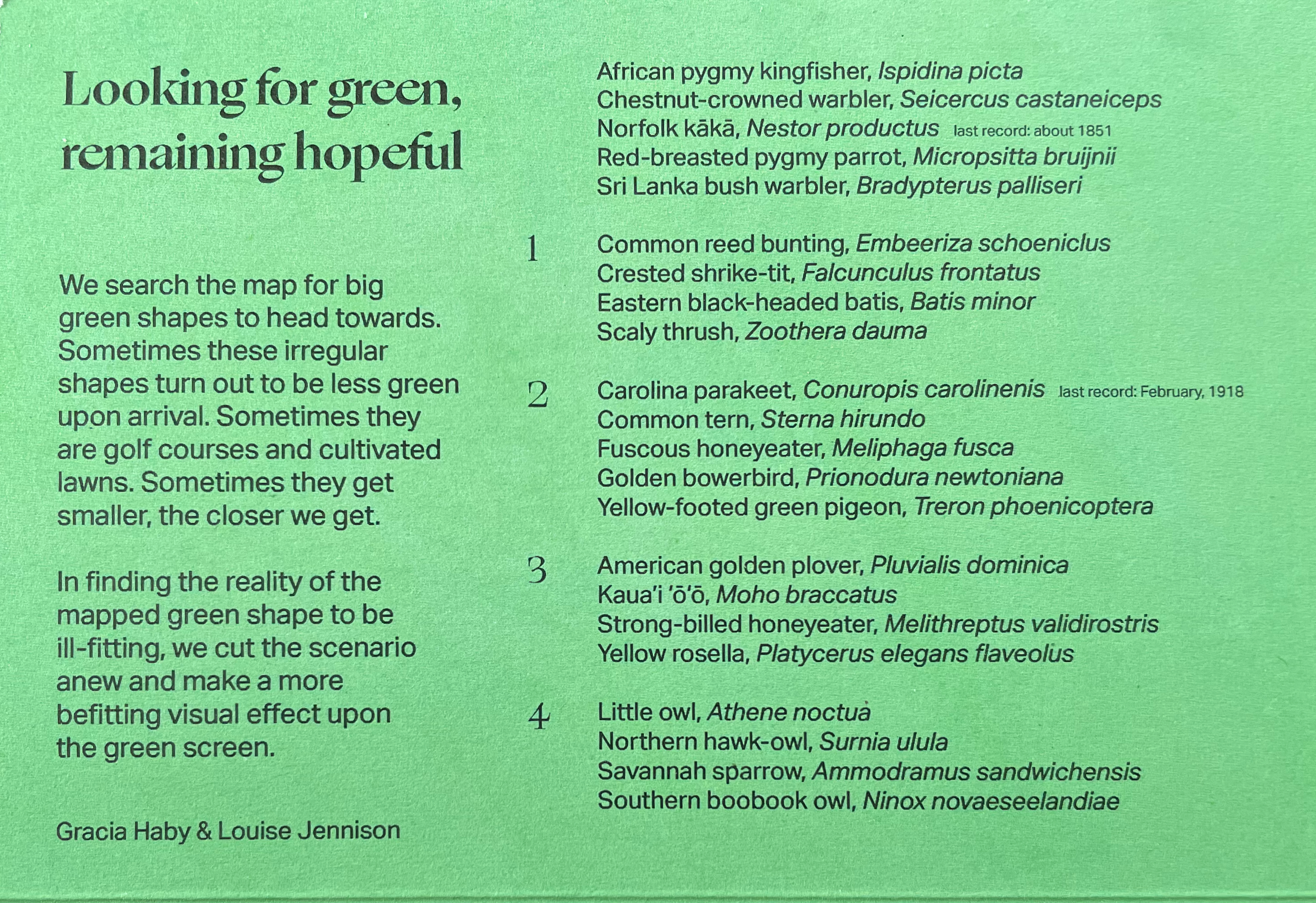
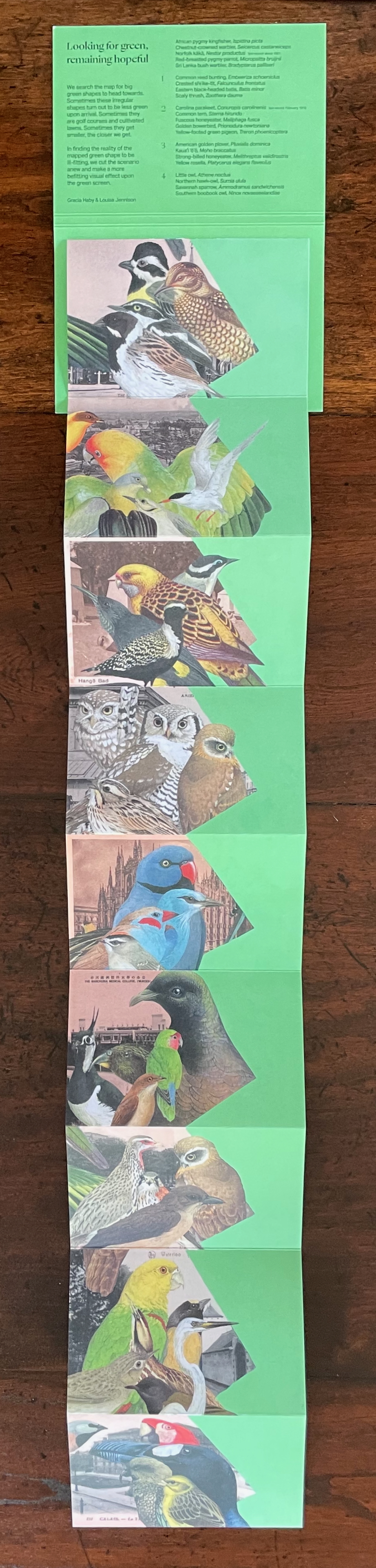
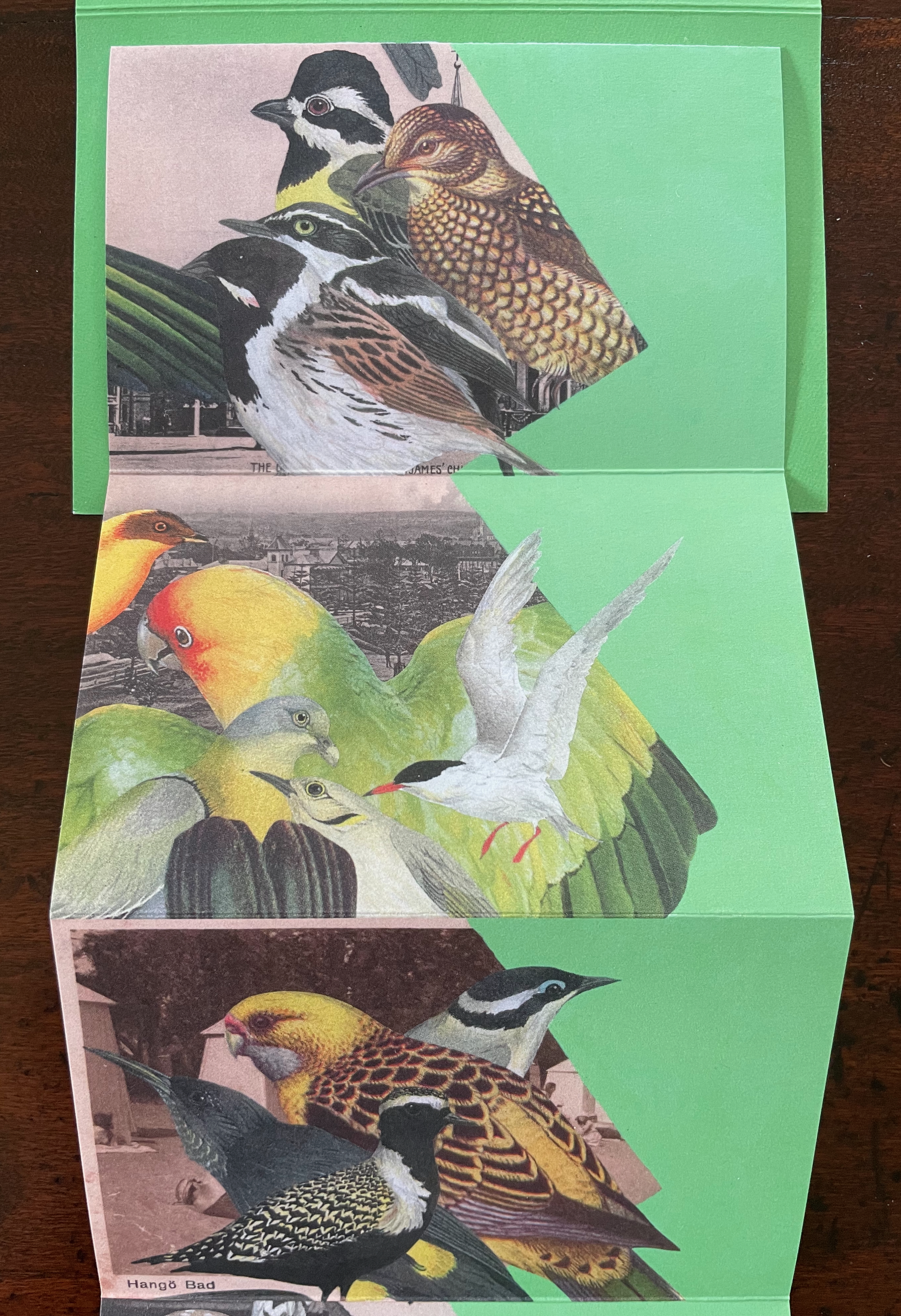
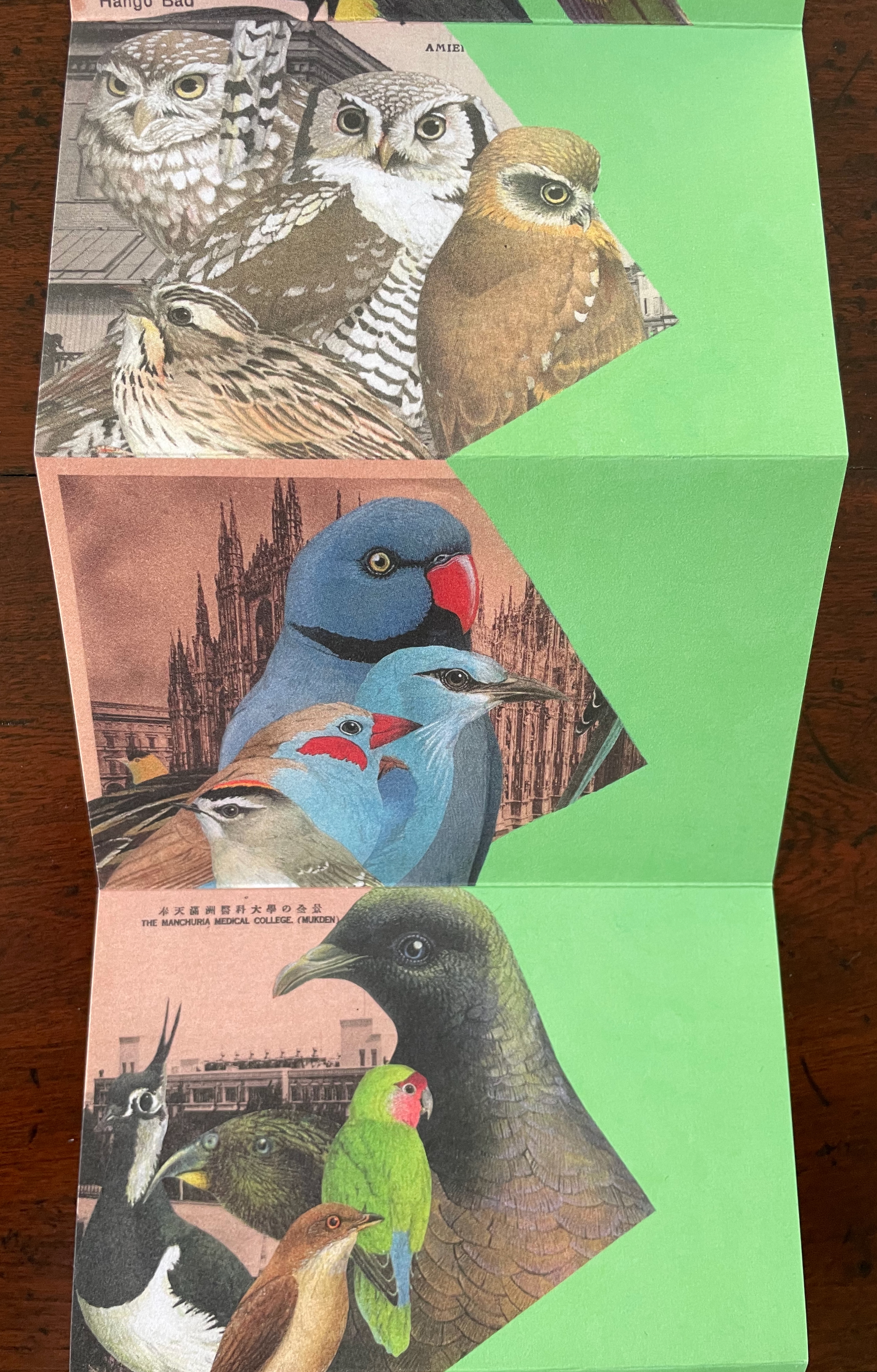
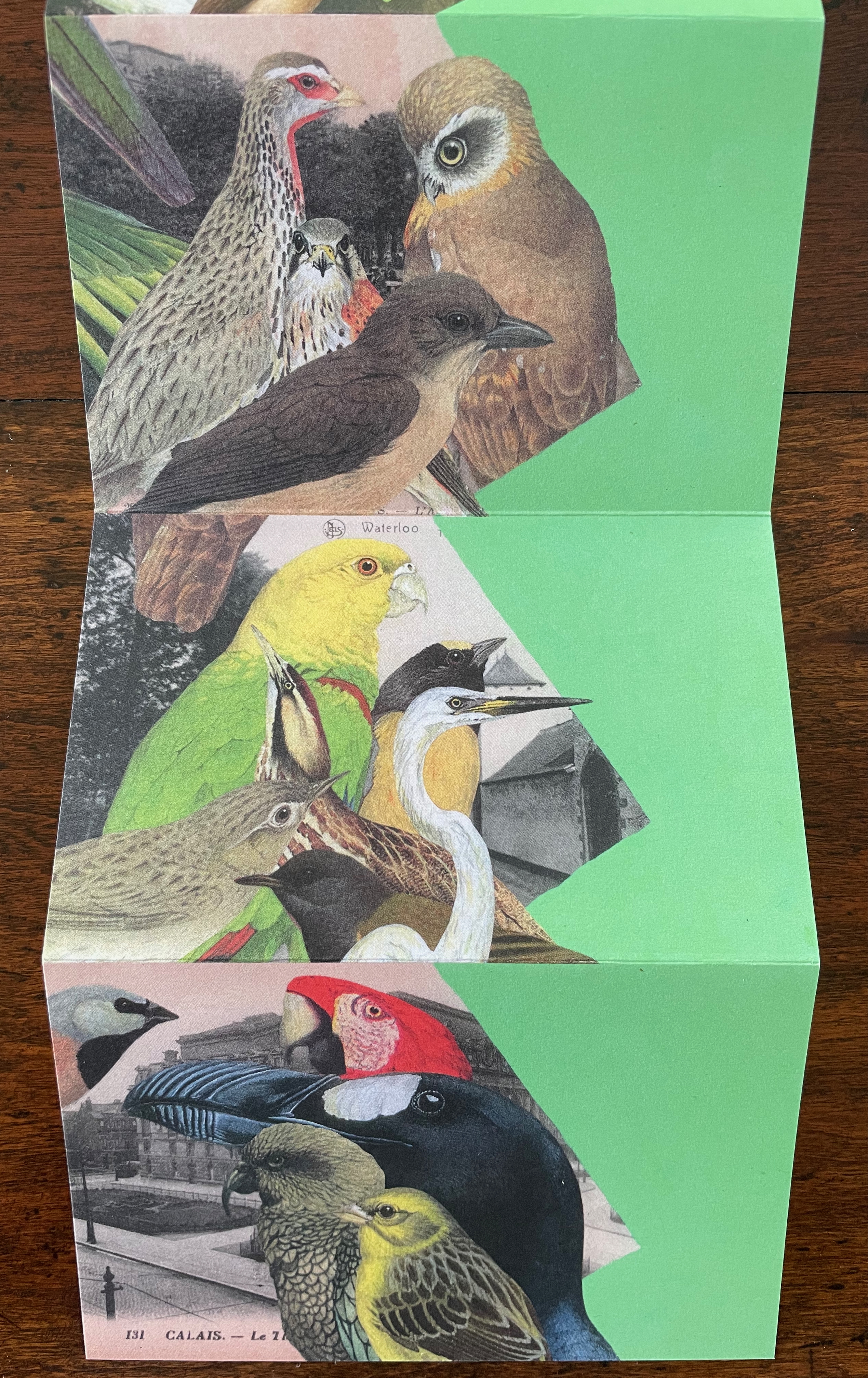
Looking for Green, Remaining Hopeful (2024)
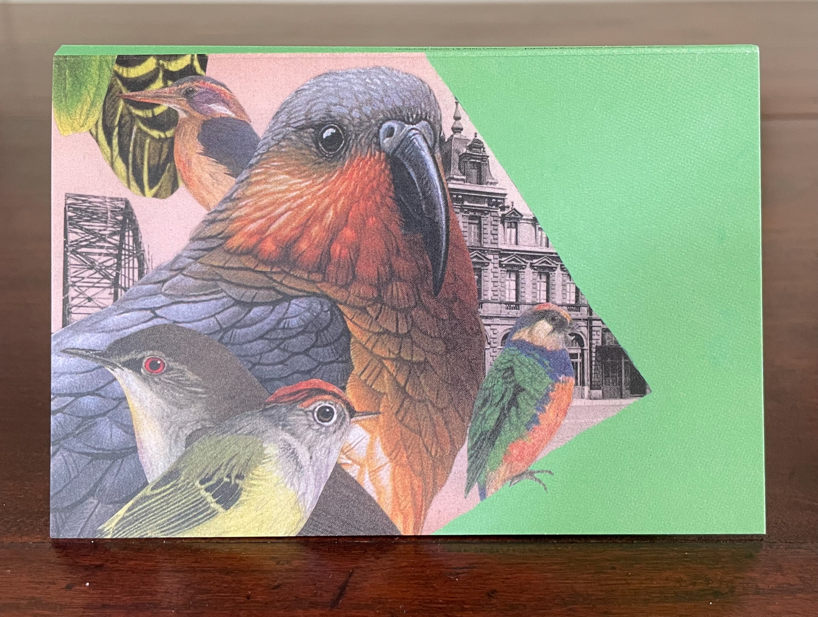
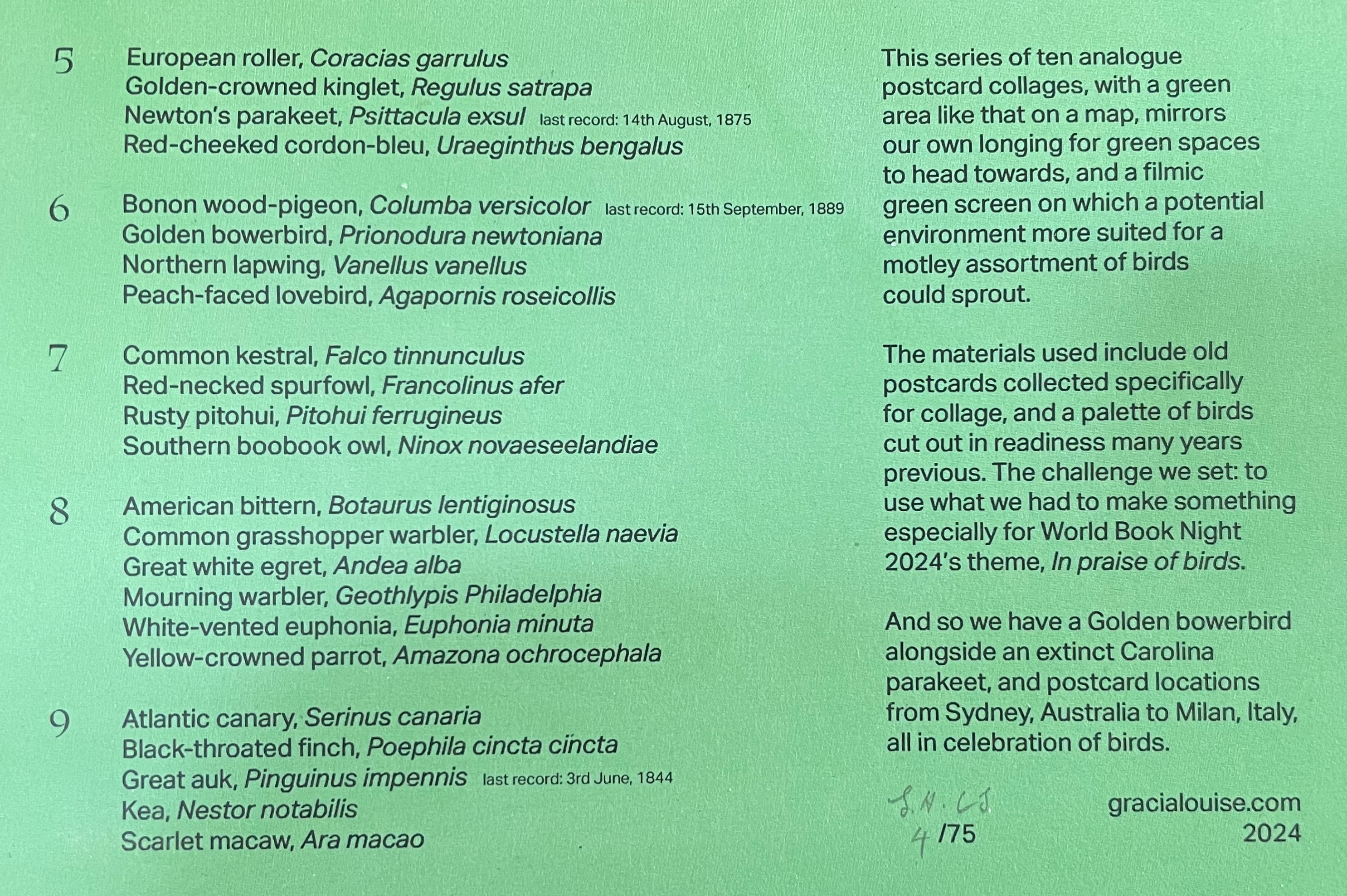
Looking for Green, Remaining Hopeful(2024) Gracia Haby & Louise Jennison Accordion book. H135 x W92 mm (closed), W802 mm (open). [9] panels. Edition of 75, of which this is #4. Acquired from the artists, 21 February 2026. Photos: Books On Books Collection.
World Book Night’s 2024 theme was “in praise of birds”. Using old postcards from various locations and cut outs collected over the years, Gracia Haby and Louise Jennison selected 45 birds to arrange in this vertical collage in response. The Indigo Digital CMYK used on ecoStar 100 gsm for the body and ecoStar 300 gsm for the cover delivers the vibrant avian colors against a chroma-key-like green screen background. The choice of the green screen effect has layers of significance. One layer is its obvious echo of the “green” choice of 100% recycled paper. Another, not so obvious, requires the textual explanation from the covers:
A green screen enables video makers to fill in the background or environment behind actors after filming. Haby & Jennison’s mimicry of it says that we need to provide these avian actors with more befitting environments than those in the sepia and gray toned backgrounds. Against the minatory background, the exuberant “motley assortment of birds” points in signposts to the “potential environment” left to be filled in on the green screen.
Despite its format, this is not a perforated pack of postcards to be detached and dispatched. You want to see and keep it all at once, as prompted by the vertical zigzagging against the green screen. But you will want also to examine it panel by panel, as prompted by the key on the covers and the detail of the images. In doing so, you sense the celebration and take the warning that this conference of birds being celebrated may disperse into extinction as has happened with the Norfolk kākā (last recorded sighting, about 1851), Carolina parakeet (last recorded sighting, February 1918), Newton’s parakeet (last recorded sighting, 14 August 1875), Bonon wood-pigeon (last recorded sighting, 15 September 1889), and Great Auk (last recorded sighting, 3 June 1844).
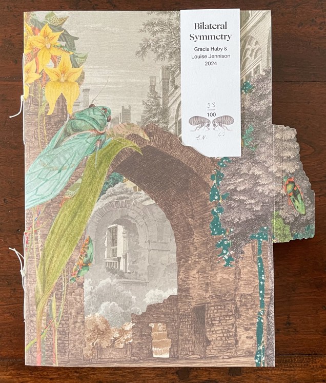
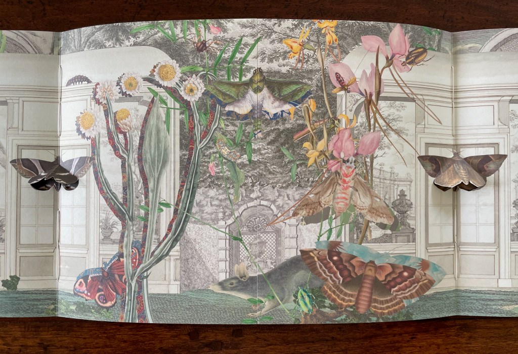
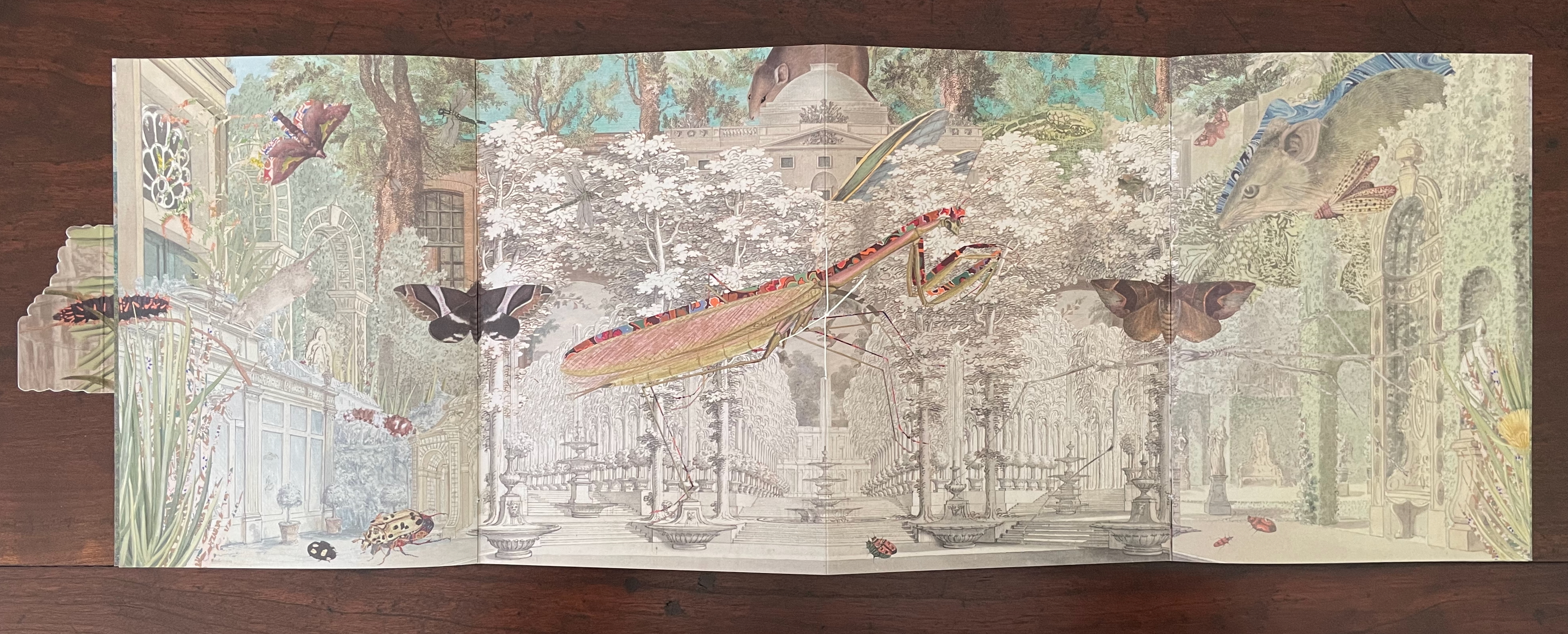
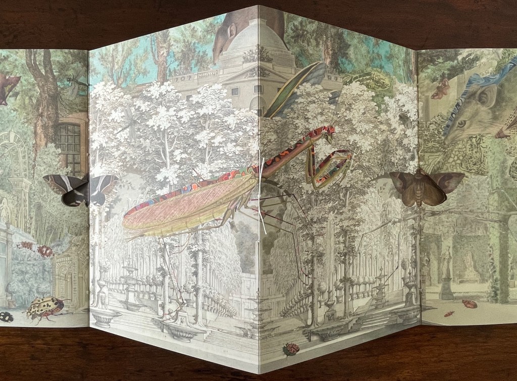
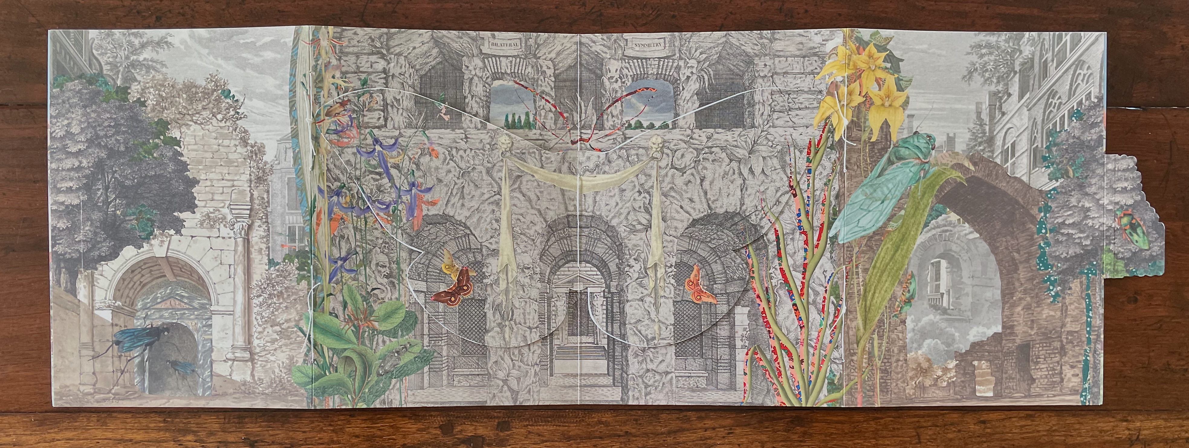
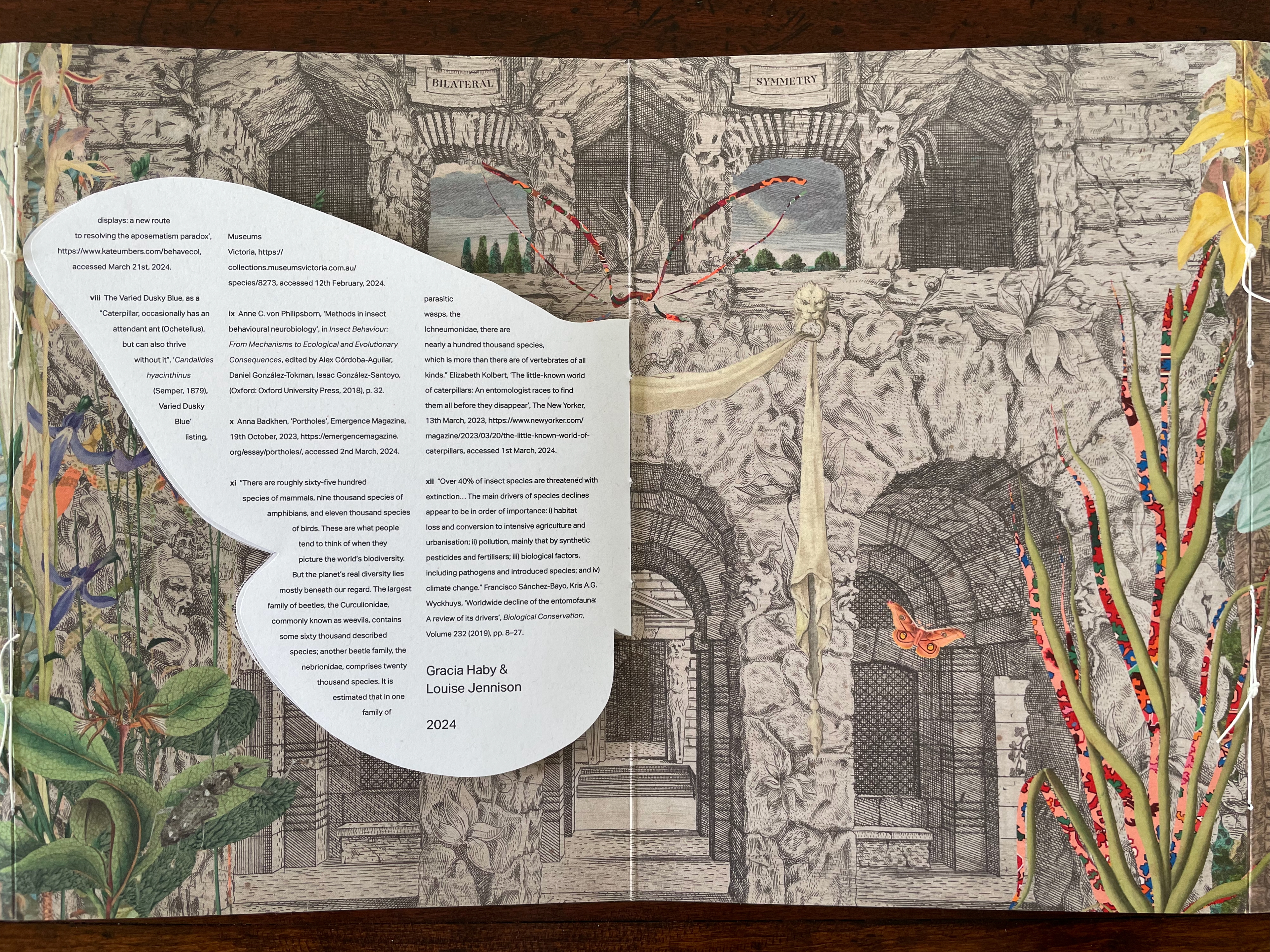
Bilateral Symmetry (2024)
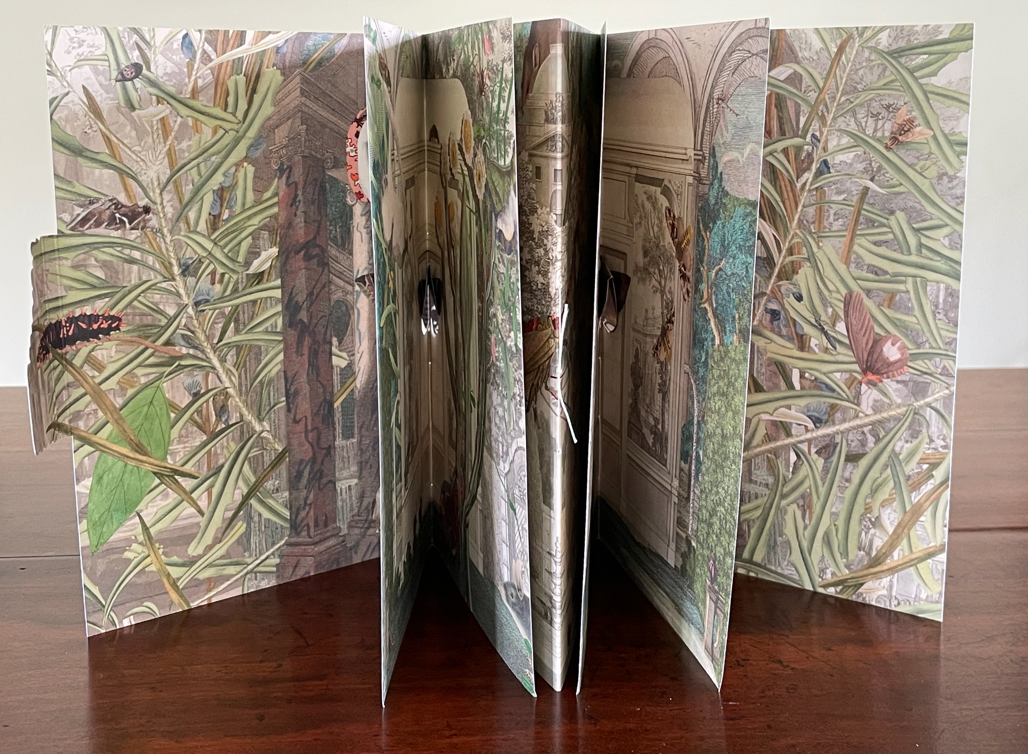
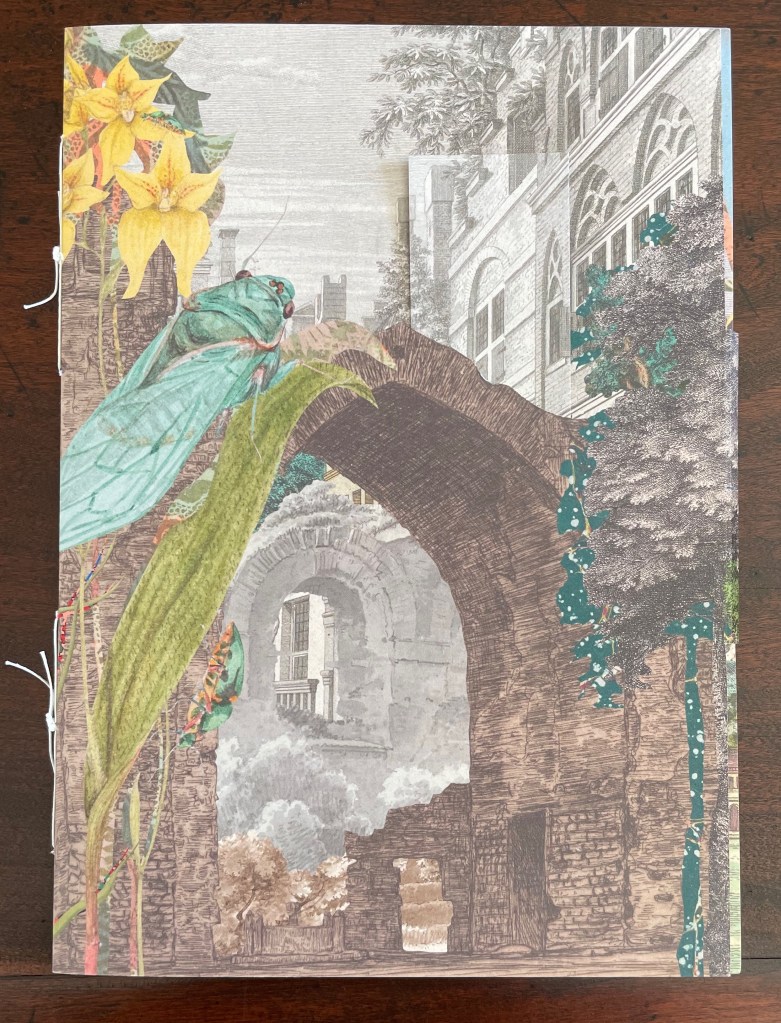
Bilateral Symmetry(2024) Gracia Haby & Louise Jennison Self-enclosing barn-fold artist’s book with tab-and-slot closure, pamphlet stitched, and pop-up components. H240 x W174 mm. [24] pages. Edition of 100. Acquired from the artists, 21 February 2026. Photos: Books On Books Collection.
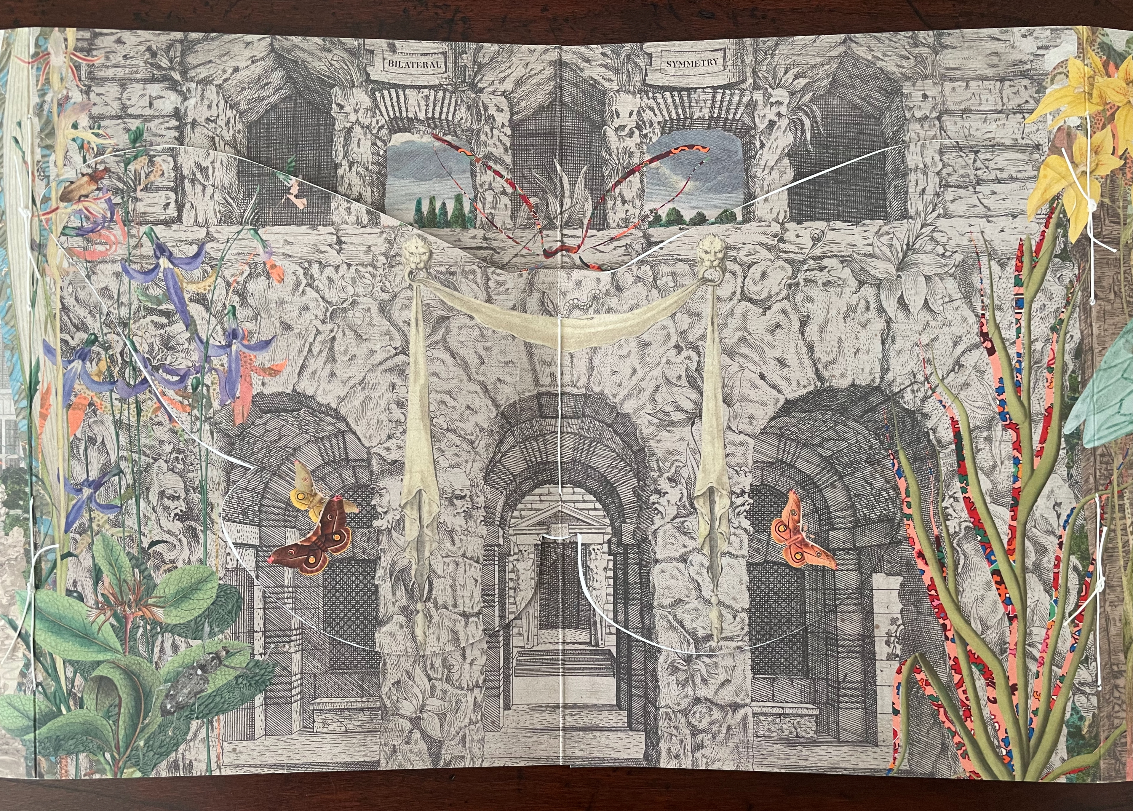
Bilateral Symmetry (2024) is the most successful of the four of artist’s books in the collection. Every element supports its exploration of perception and bilateral symmetry: the sewing, the barn-fold structure, cut outs and pop-ups, the page spreads and alignment, the choice of imagery from the natural world and architecture, and presentation of text across moth-shaped pages.
From the start, it combines surprising trompe l’oeil with startling juxtapositions. On the front cover, a bookmark aligns with the architecture behind a ruined arch overseen by a giant lacewing perched on a tree-size plant leaf.
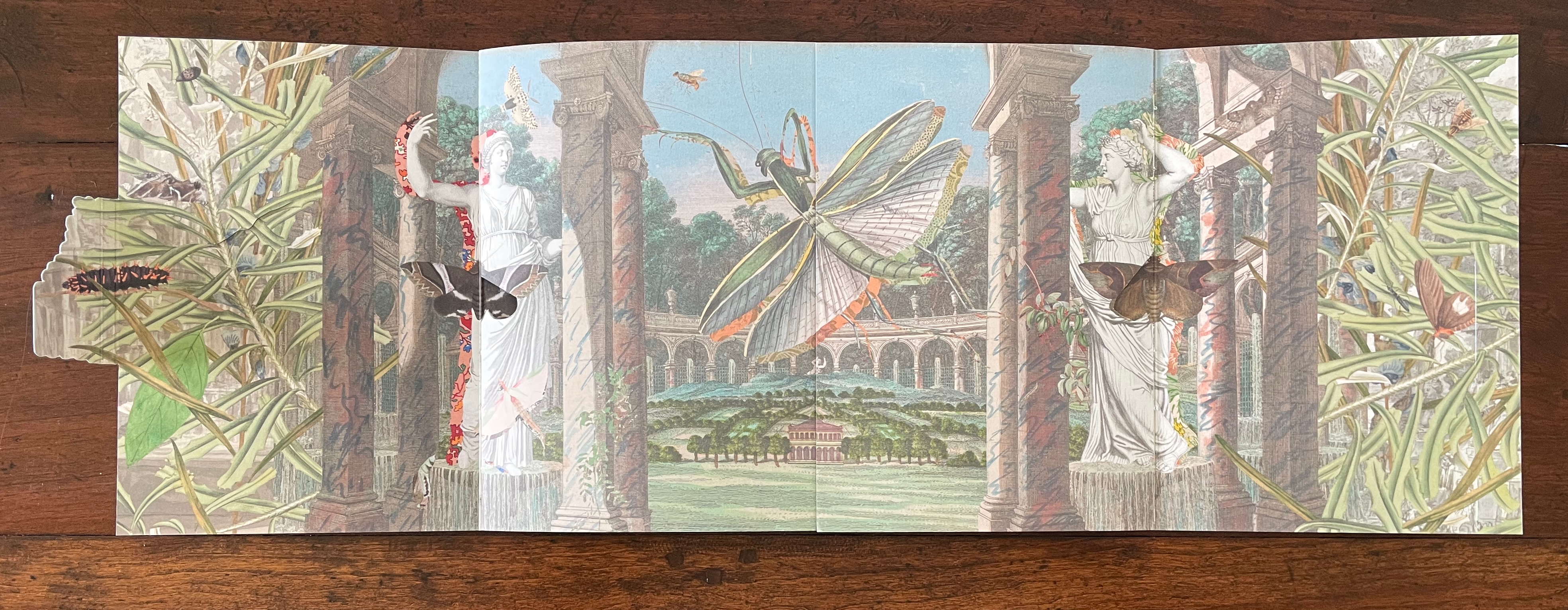
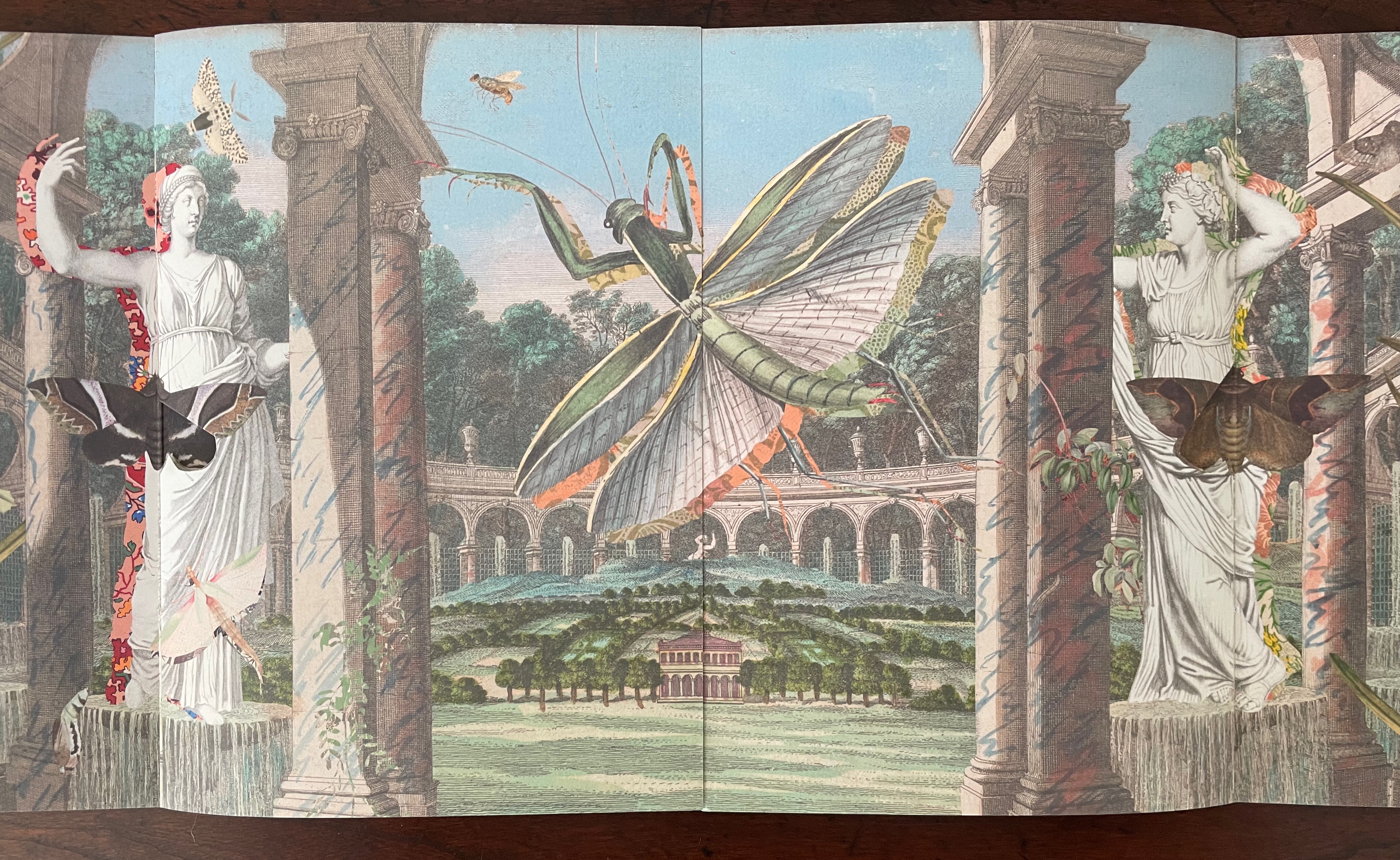
Opening the barn-fold book reveals a new set of perspectival surprises. Inside, there are two booklets facing each other. The edge of the recto page of the booklet on the left aligns with the edge of the verso page of the booklet on the right to form an image across a four-page spread. Between the two foregrounded columns and statues, we see a neatly divided and aligned building in a small formal landscape. Beyond the building and landscape, an arcade with statuary curves symmetrically to the left and to the right. In fact, the arcade extends in a circle that comes around to the columns and statues through which we are looking. But the proportions are impossible or, at least, surreal. Of course, the huge dragonfly, also neatly split by the pages meeting in the center, offers a strange perspective especially alongside the collage of other insects. Even the marbled columns offer peculiarities. Some are rounded, some are squared, some start square at the foot but end rounded at the capital. And the statuary, collaged with insects, are shadowed with bright marbled patterns.
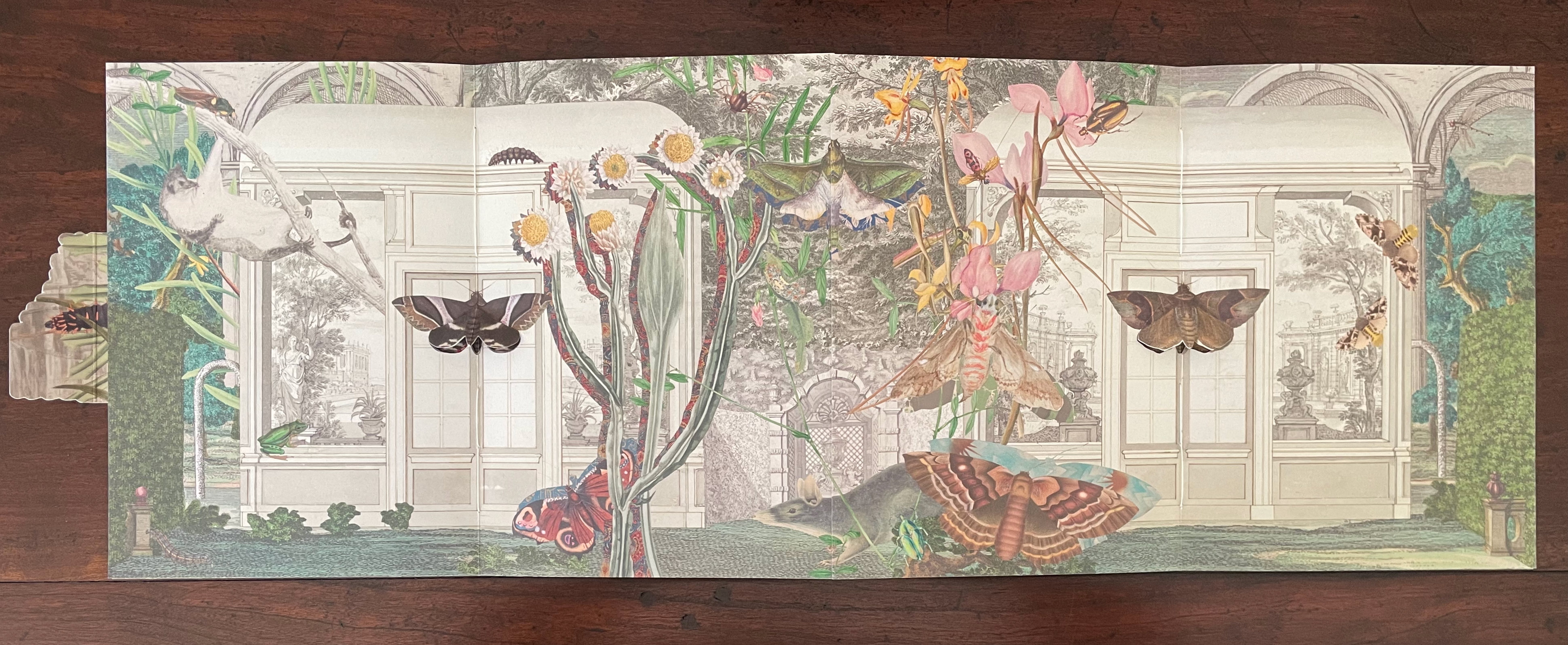
With the turn to the next set of facing spreads, the two statues and view through the arcade disappear, yet the moths that were posed against them remain as lepidopteral pop-ups against double doors in the middle of seemingly detached greenhouse walls. On the left, a flying squirrel attributed to Louisa Atkinson (ca. 1849-72) hangs from a branch intruding through an open arch in the wall. Diversity and trompe l’oeil strain at the work’s bilateral symmetry.
The final spread on this side of the book displays further distortions challenging our perception — even of bilateral symmetry but somehow nevertheless underscoring the theme. The Scotts’ pop-up moths, each centered a booklet’s spine, are flanked by Atkinson‘s far too small ringtailed oppossum on the left and by Gerard Kreft‘s far too large water rat to the right, peering down on the scene. The huge mantis in the center hangs mid air against the formal tree lined garden abnormally far in the background. The garden is perspectivally more distant than the domed edifice behind it, and an impossibly large rodent peeps over it. Although the central rodent and mantis are not symmetrically divided, and although the scenes to the left and right of the spine are not symmetrical, the central spine bisects the garden and dome precisely. Likewise the left and right spines bisect the Scotts’ moths precisely, underscoring the theme of bilateral symmetry. Meanwhile, the spreads have reiterated the point about the variety and diversity of insects, flora, and mammals.
On the reverse side of the book, between the splayed-out back and front covers of the two booklets, a cut out moth with wings spread disappears in trompe l’oeil fashion into the facade against which it has alighted. Above the moth, the two-word title of the book appears on two engraved banners hanging over the two parallel open archways centered between two shuttered archways. Two Harriet Scott Emperor Gum moths hover in the two archways shown on the lower lobes of the cut out moth’s wings. (Did I mention how every element supports the exploration of bilateral symmetry?)
The book’s text appears on the reverse side of the cut out moth’s wings. As you turn to the first wing/page of text or turn to the last wing/page, you may notice how the two Emperor Gum moths have “jumped” from the cut out’s wings to the background underneath each wing. A sort of slow motion persistence of vision, it is another perceptual trick alongside the trompe l’oeil of the cut out moth.
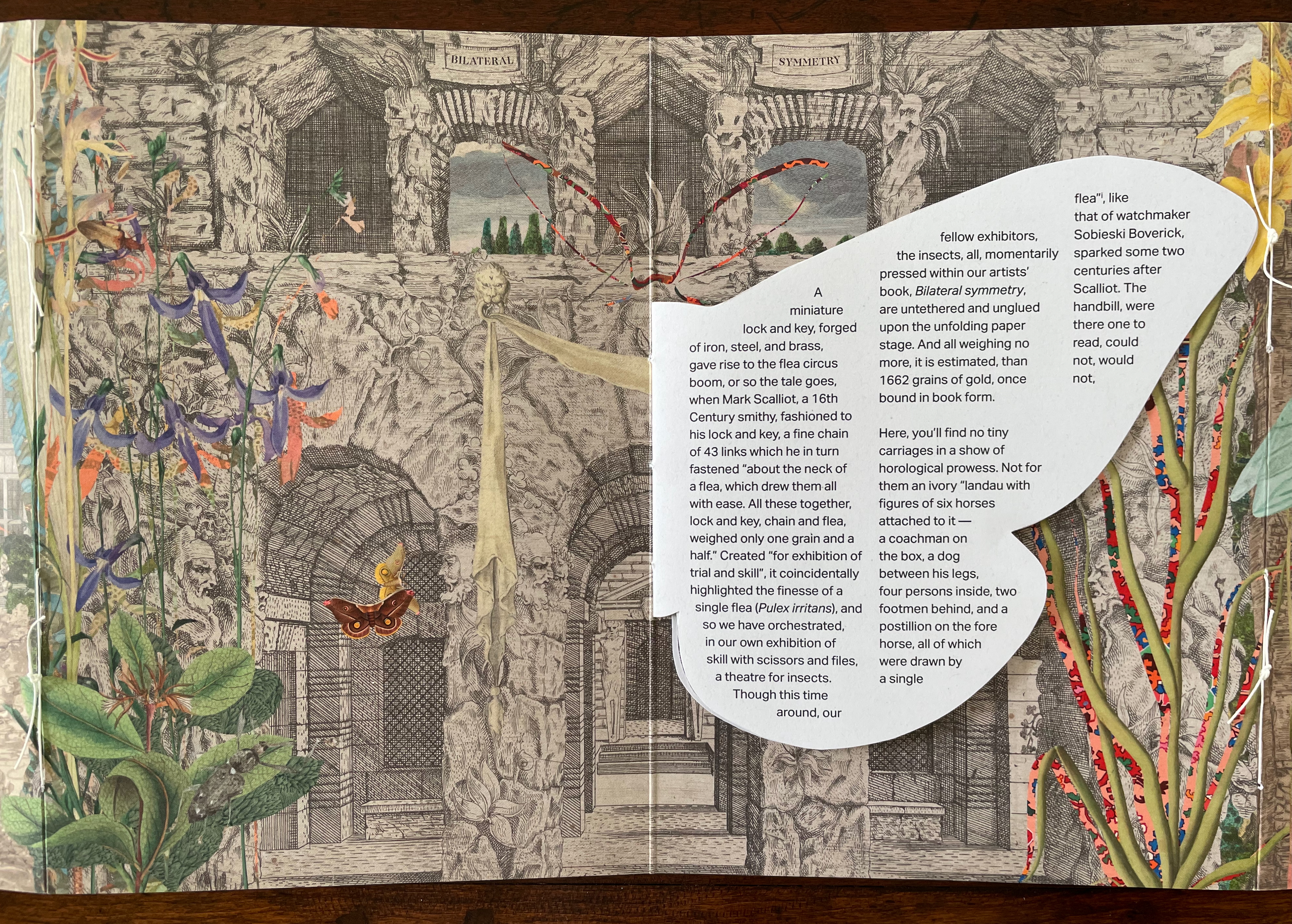
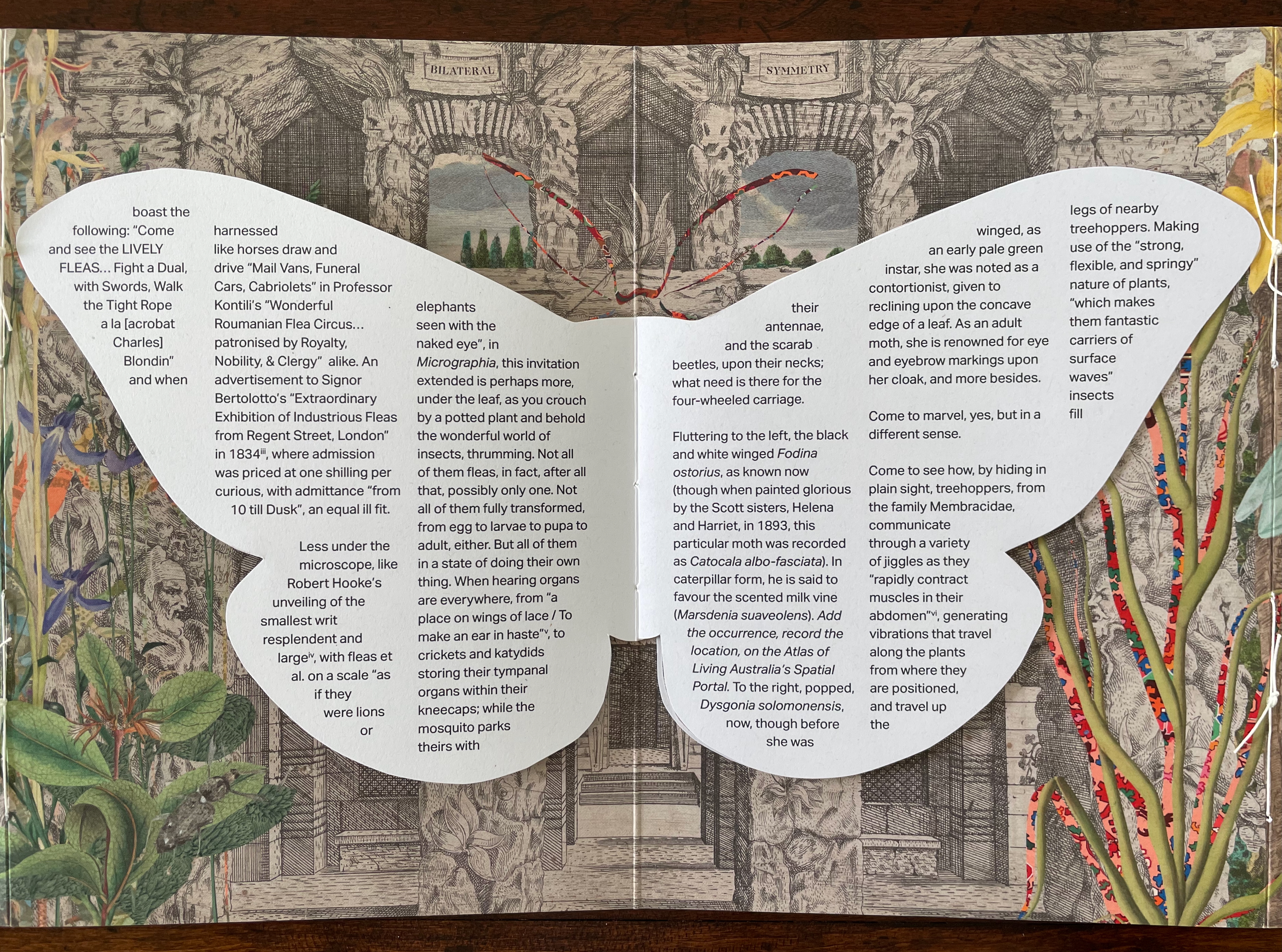
The first paragraph of text picks up on this theme of visual legerdemain by recalling the first flea circus impresario Mark Scalliot. That is a rhetorical means of introducing Bilateral Symmetry as a “theatre for insects” and posing the depicted insects as “fellow exhibitors”, which in turn is a rhetorical sleight of hand by which Haby and Jennison place themselves and the insects on an equal footing as performers and artists. The equation elevates the insects from the hucksterism of the flea circus — “Not for them an ivory “landau with figures of six horses attached to it ….” and, in the next paragraph, even raises these performers over Robert Hooke’s fleas as large as “elephants seen with the naked eye”. The exhibitors of Bilateral Symmetry invite you to better Hooke’s microscope by crouching “by a potted plant and behold[ing] the wonderful world of insects, thrumming”.
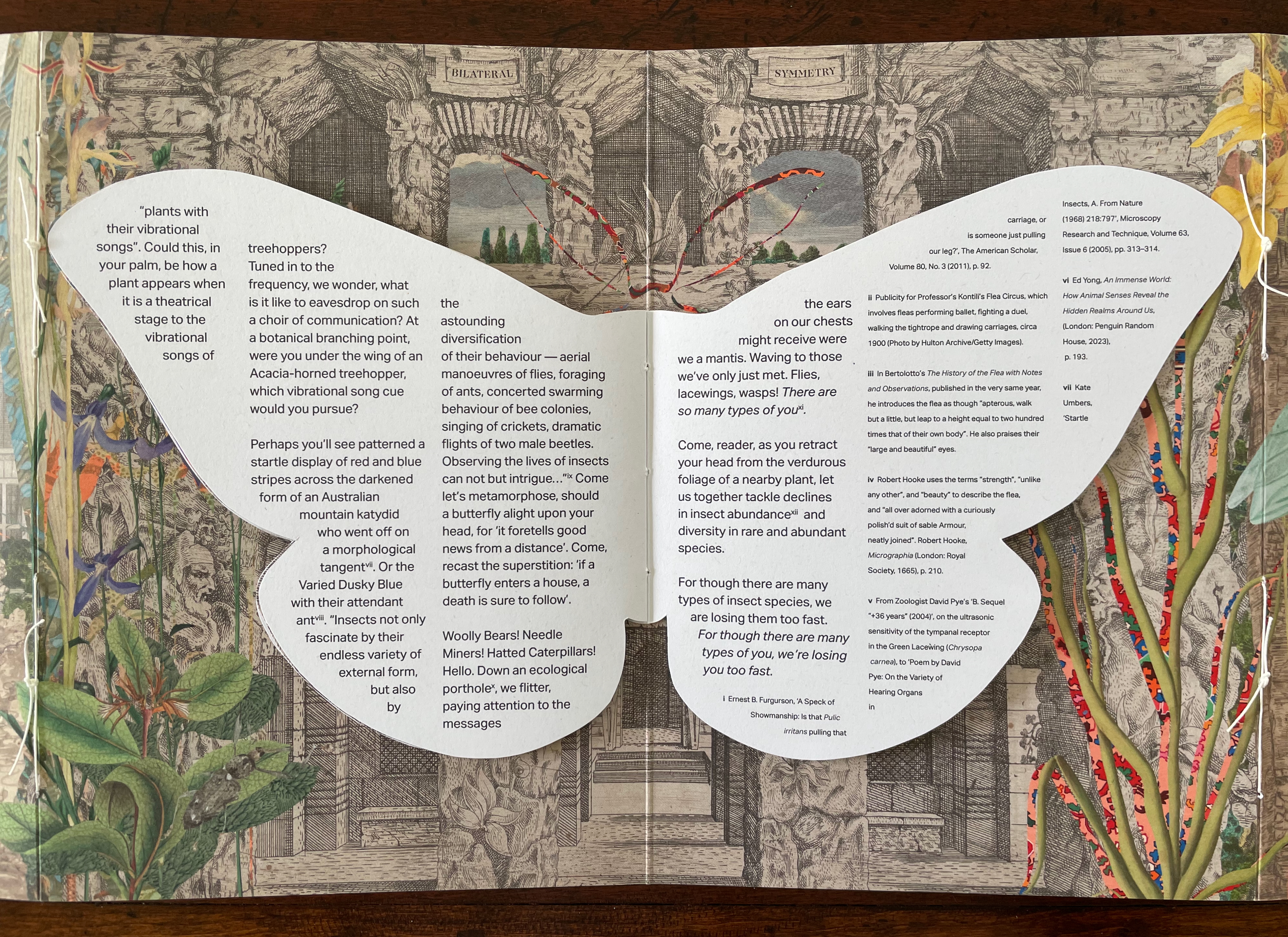
Leaning into entomomorphism, the artists invite us “[d]own an ecological porthole [to] flitter, paying attention to the messages the ears on our chests might receive were we a mantis”. Familiar by now with the artists’ message, we know this leads to the ecological observation of declining diversity, but up to this point, their artistry has been primarily about visual perception. This is not to gainsay the message, but as important as the message is, their marvelous handling of the media (the archival sources, the innovative book structure, and the collage) and reorienting of our perspective do more than simply make us receptive to it. Only in its final two paragraphs does the text exhort the reader to care and do something about the decline in insect diversity. The paragraphs preceding them conjure a world of insect perception and behavior that is as surreal as the whimsical perceptual distortions of the collage. The collage may include insects registered as endangered, but the text does not identify them. If text and collage were to have included endangered insects such as the Angled Tiger butterfly, Beautiful Petaltail dragonfly, Illidge’s Ant-blue (Butterfly), Queen Alexandra’s Birdwing Butterfly, Fan-winged Katydids, or Zaprochilus ninae (Bush crickets), might we have arrived at the same exhortation on our own?
With its blend of architectural ruins and artificial landscaping with oversized and undersized insects at various stages of metamorphosis, Bilateral Symmetry urges a shift of perspective in our perception of nature and our interconnectedness. With its structural embodiment of bilateral symmetry and diversity, it offers a rich example of the perceptual and perspectival shift it urges.
Further Reading
“Carol Barton“. 10 August 2024. Books On Books Collection.
“Caren Florance“. 30 April 2026. Books On Books Collection. In particular, see L OO P (2019).
“Ernst Huebner“. 21 July 2023. Books On Books Collection.
“Willow Legge“. 16 February 2021. Books On Books Collection.
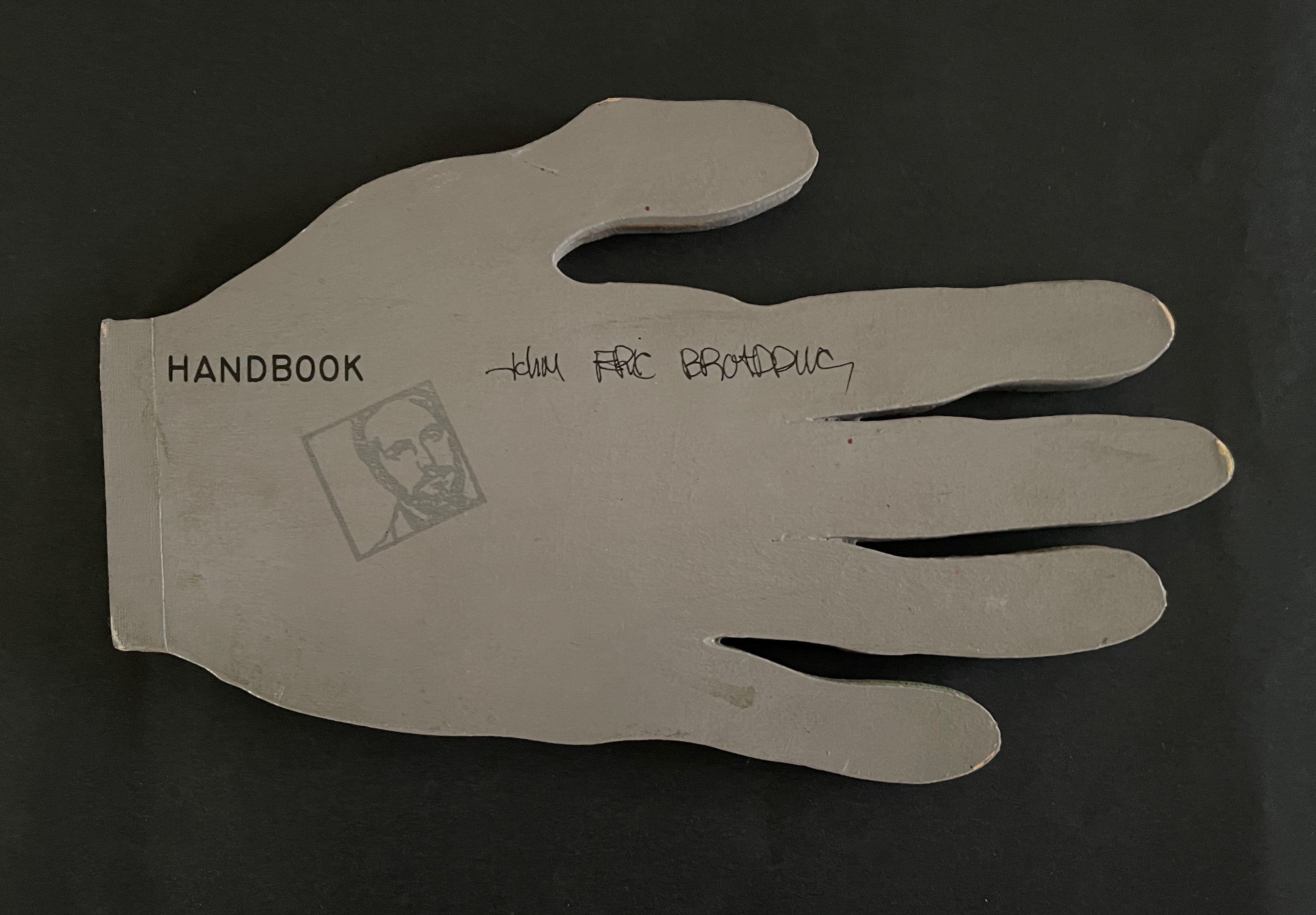
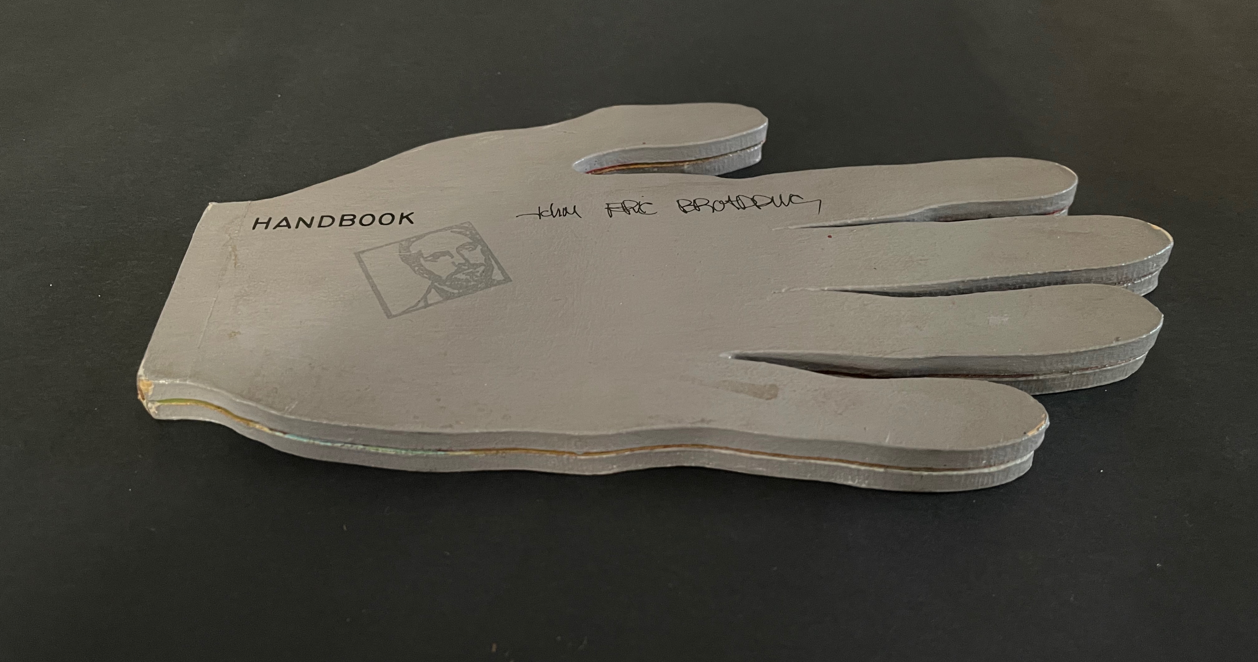
John Eric Broaddus (1943 1990) was perhaps one of the most inventive and creative artists to approach the book form. He was a prominent figure in the New York City art scene in the 1970s and 1980s, creating books before the book form even had a suggestion of acceptance in the art world. He also created one-of-a-kind costumes that he wore out on the streets of New York and in iconic places like Studio 54. He was vibrant, outlandish, and did much to contribute to the world of artistic interplay in New York City of that time. His inspired life was cut short by AIDS in 1990. but his legacy lives on in the work he left behind, a muse in itself for book artists even twenty years later.” Visual AIDS
Since first seeing references to and images of John Broaddus’ artist’s books in 2012, I have watched for opportunities to add his work to the Books On Books Collection. So many of his artist’s books were unique works and already in institutional collections or private hands, it would be a long watch. In late 2025, this appeared: “Achingly scarce work from a major figure in the early book arts movement. Minimal shelf/edge wear, else tight, bright, and unmarred. Shape book (human hand), grey painted boards, black ink lettering, cut paper forms.”
Handbook (1980) John Eric Broaddus Hand-shaped boards over hand-shaped painted and cut pages, nailed tape hinge. Variable: H123 x W205 mm. [10] pages. Limited edition, unknown quantity. Acquired from Lux Mentis, 3 December 2025. Photos: Books On Books Collection.
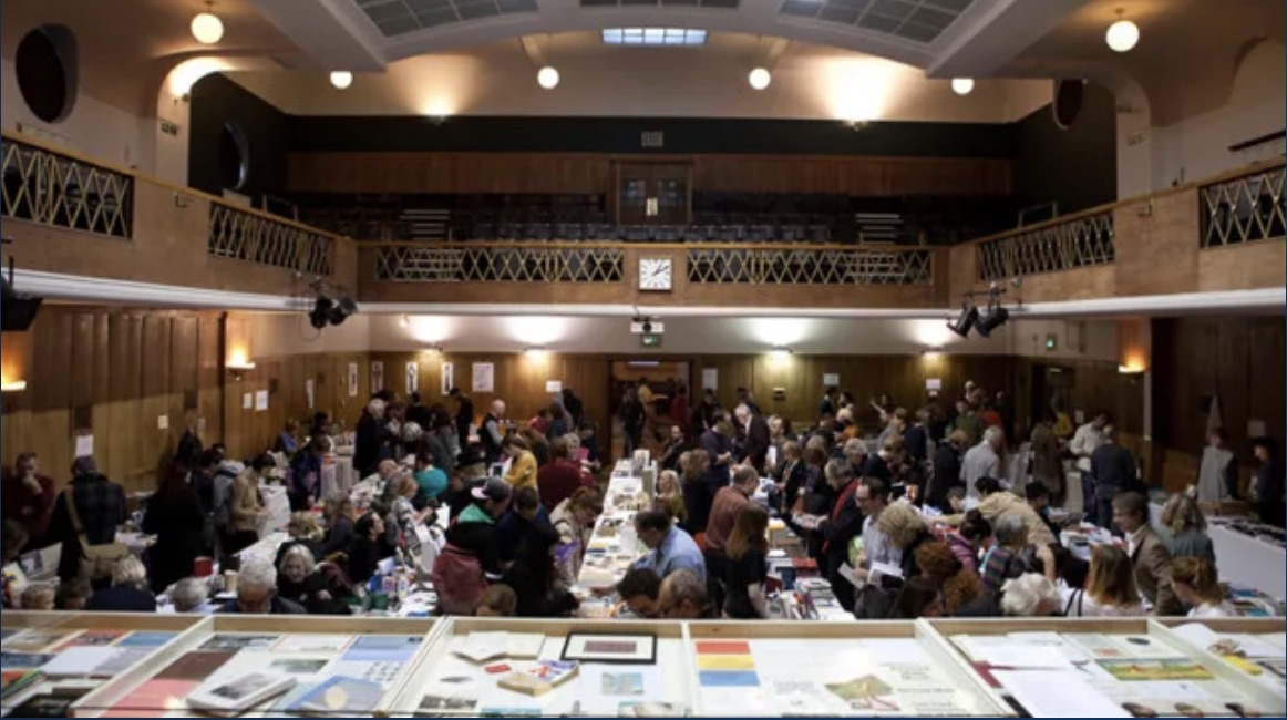
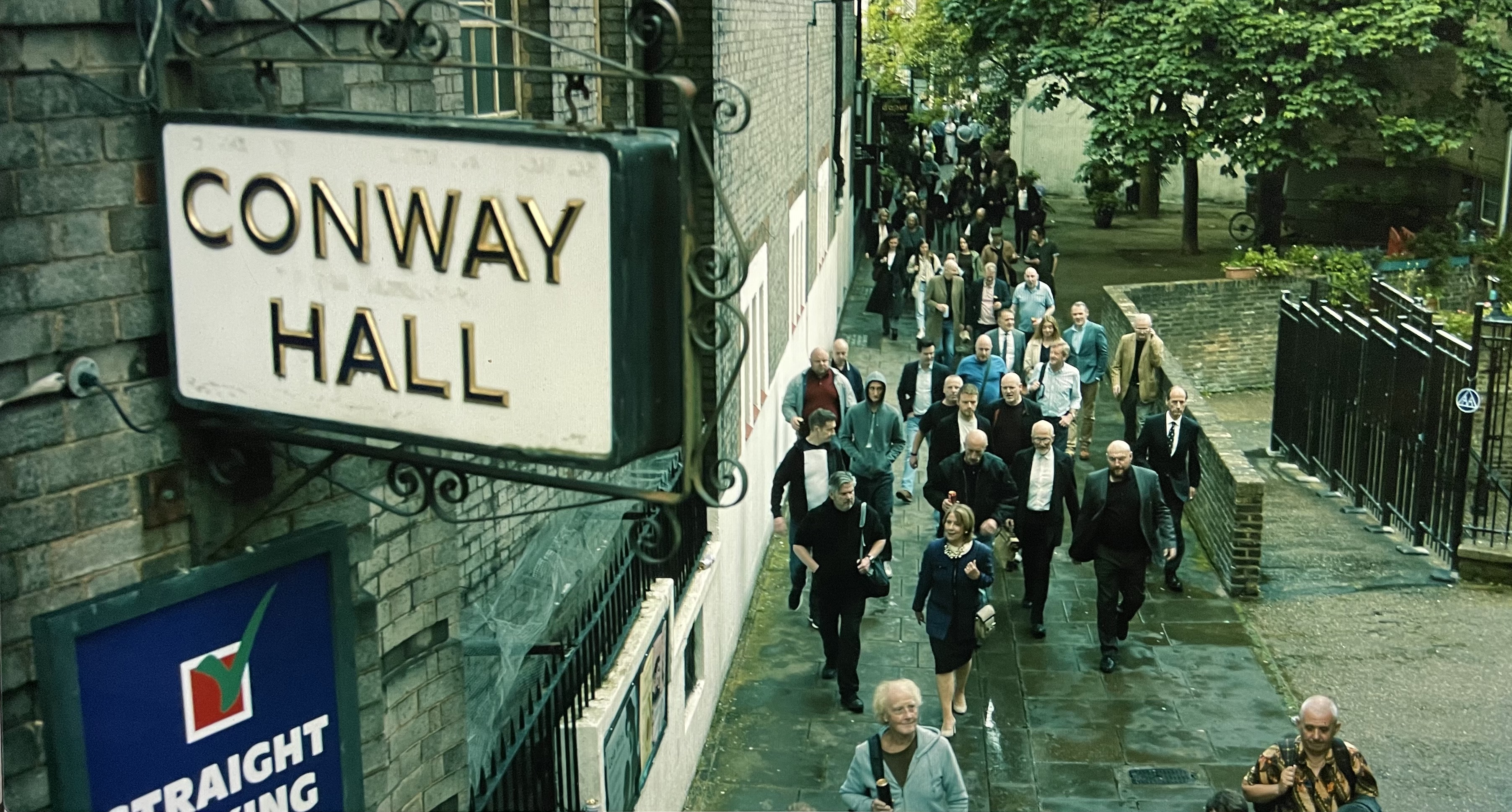
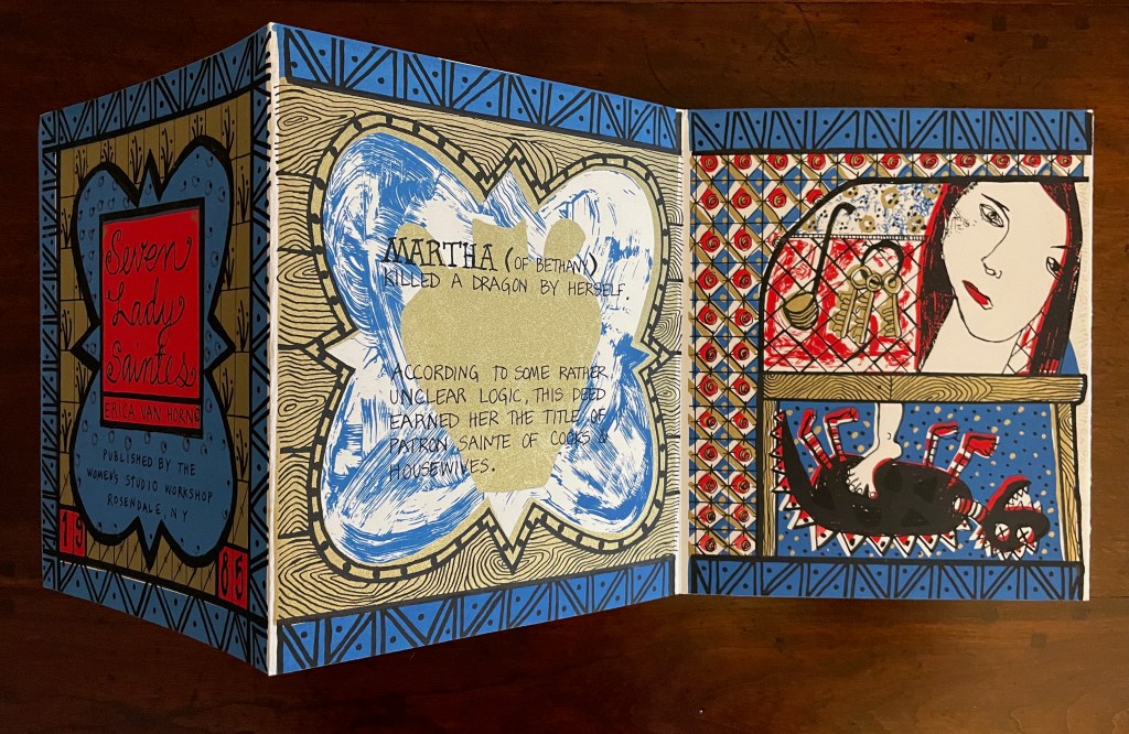
The hunt for Erica Van Horn’s Seven Lady Saintes has been long, but at last, in a glass case in Conway Hall at the Small Publishers Fair in London this year, there it was. Van Horn and Simon Cutts (co-founders of Coracle Press) have been a regular feature of the Small Publishers Fair since its first occurrence in 2002 at Royal Festival Hall.
Conway Hall, owned by the charity Conway Hall Ethical Society, first opened in 1929 and is named after Moncure Daniel Conway (1832-1907), an anti-slavery advocate and biographer of Thomas Paine. It has hosted the Fair since its second outing in 2003. In 2025, it had a cameo appearance in the spy drama series Slow Horses as the unlikely host for an ultra-right mayoral candidate’s campaign event. The setting provided the kind of sardonic humorous dig that Van Horn would appreciate (if she were a regular television viewer).
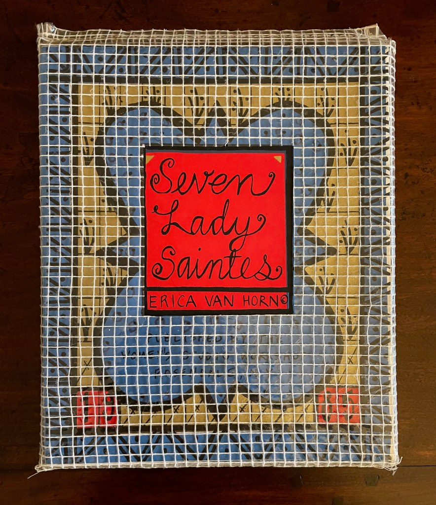
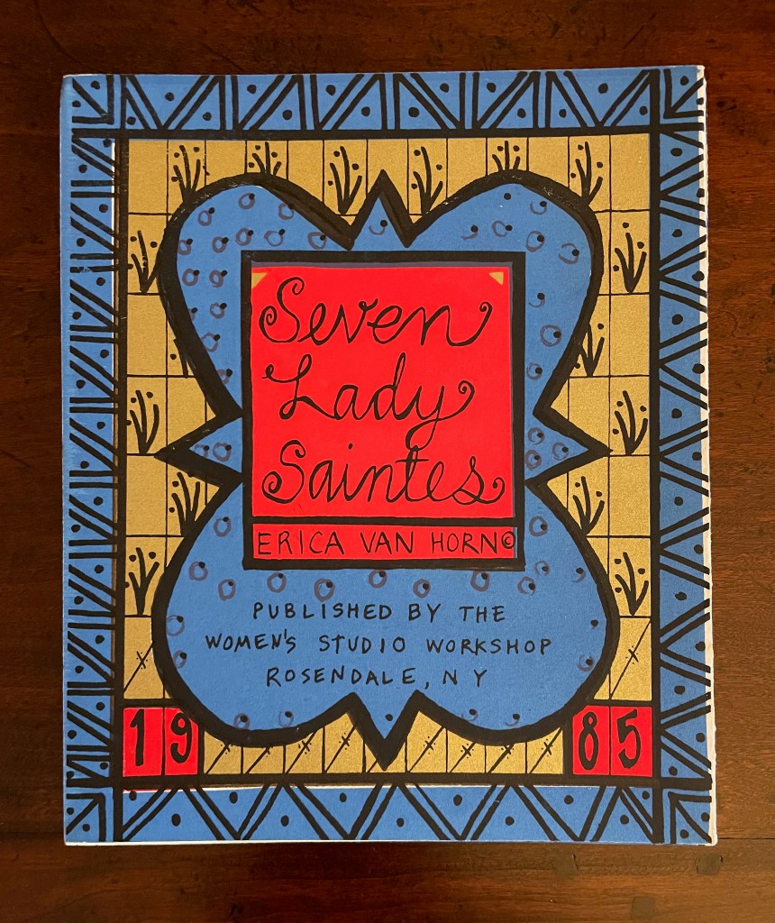
With stained-glass colors, Seven Lady Saintes splashes its own brand of sardonic humor across a stiff-card leporello produced in 1985 at the Women’s Studio Workshop Print Center in Rosendale, New York.
Seven Lady Saintes (1985)
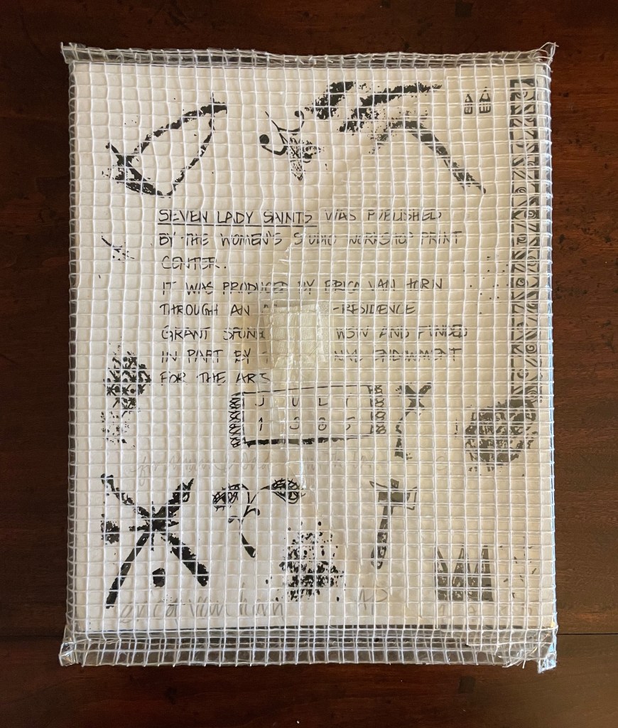
Seven Lady Saintes (1985) Erica Van Horn Clear plastic-coated white-thread envelope, self-covered leporello, watercolor paper. Envelope: H270 x W215 mm. Leporello: H250 x W205 mm (closed), W3040 mm (open). 16 panels, including covers. Edition of 90, artist’s proof. Acquired from the artist 1 November 2025. Photos: Books On Books Collection.
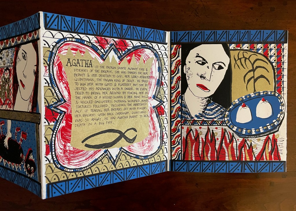
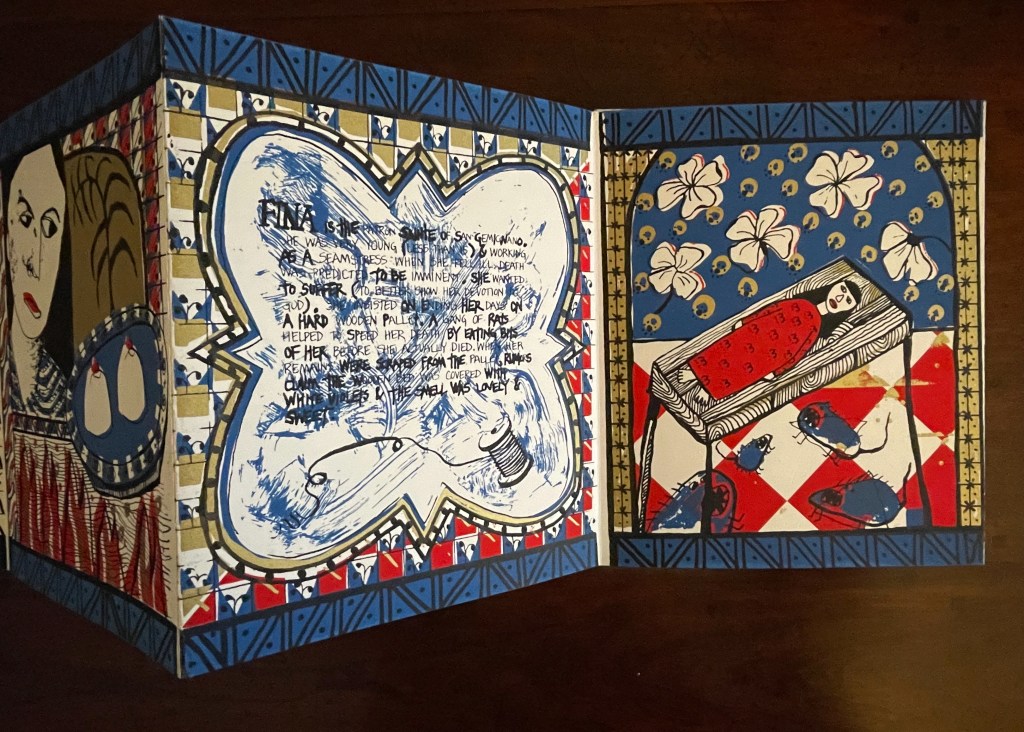
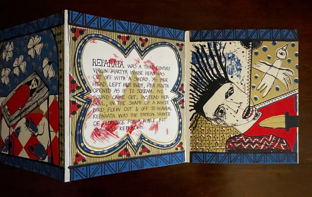
Van Horn uses a sophisticated child-like style of text and image to laugh slyly, wryly, and grimly at religion and patriarchy. Her summaries parody the descriptions in the handouts usually available in museums, convents, and churches or in the flood of hagiographies long on the market. The sophisticated-naivete of the drawing in Seven Lady Saintes appears in other works such as La ville aux dames (1983) and With or Without (2010). If the story of her plan for a series of four children’s books had turned out differently from the account in Scraps of an Aborted Collaboration (1994), we would have even more evidence of the influence of children’s books on many artists’ books that the Huberts propose in The Cutting Edge of Reading (1999).
Martha, patron sainte of cooks and housewives
Agatha, patron against fire and diseases of the breast
Fina, patron sainte of San Gemignano
Reparata, formerly patron sainte of Florence
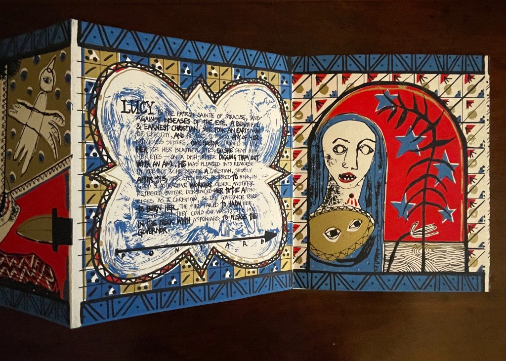
Lucy, patron sainte of Syracuse and diseases of the eye
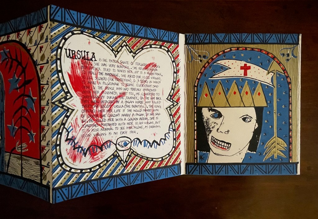
Ursula, patron sainte of teachers and young girls
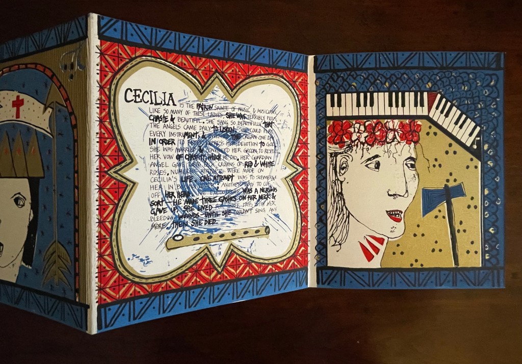
Cecilia, patron sainte of music and musicians
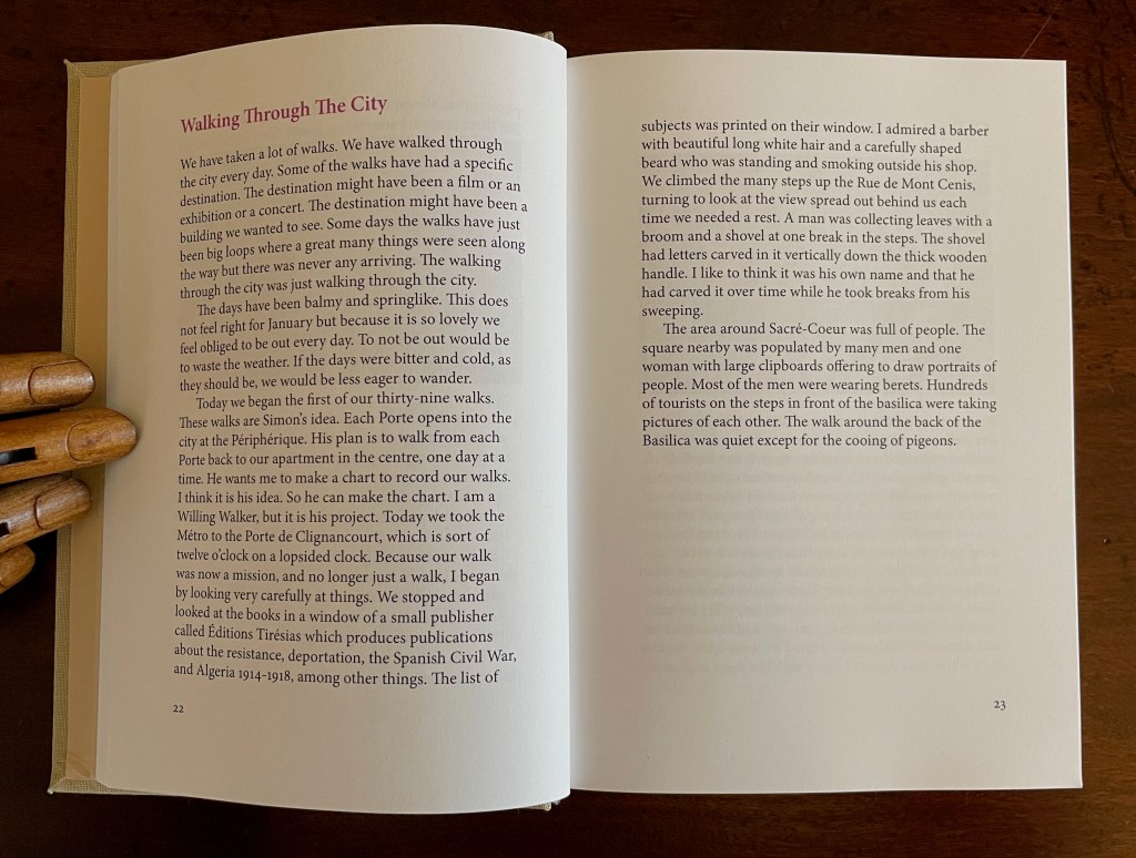
Walking the Portes (2025)
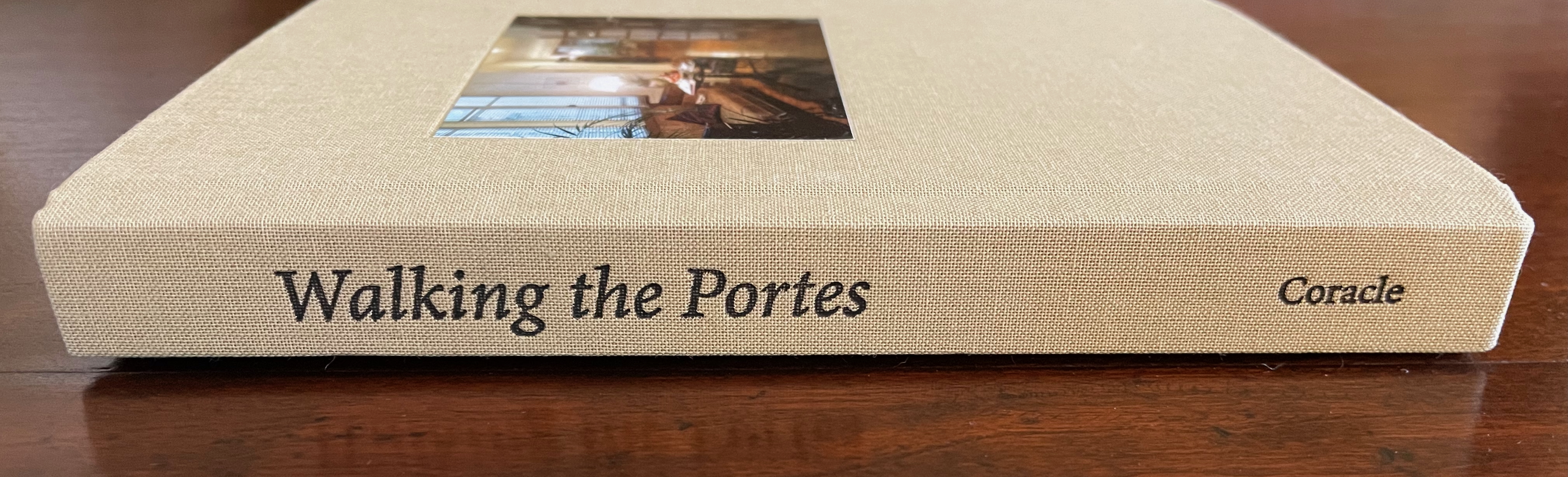
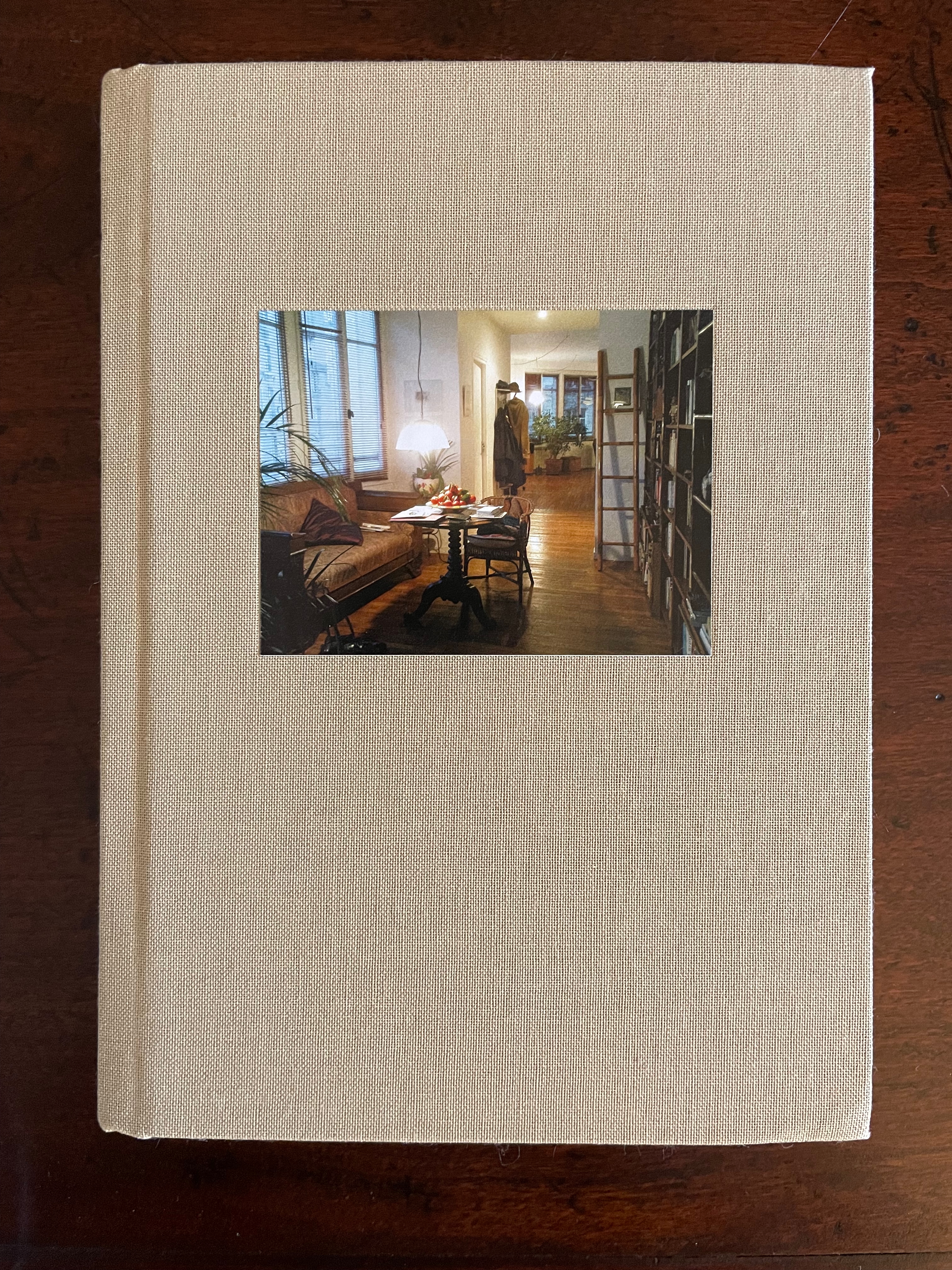
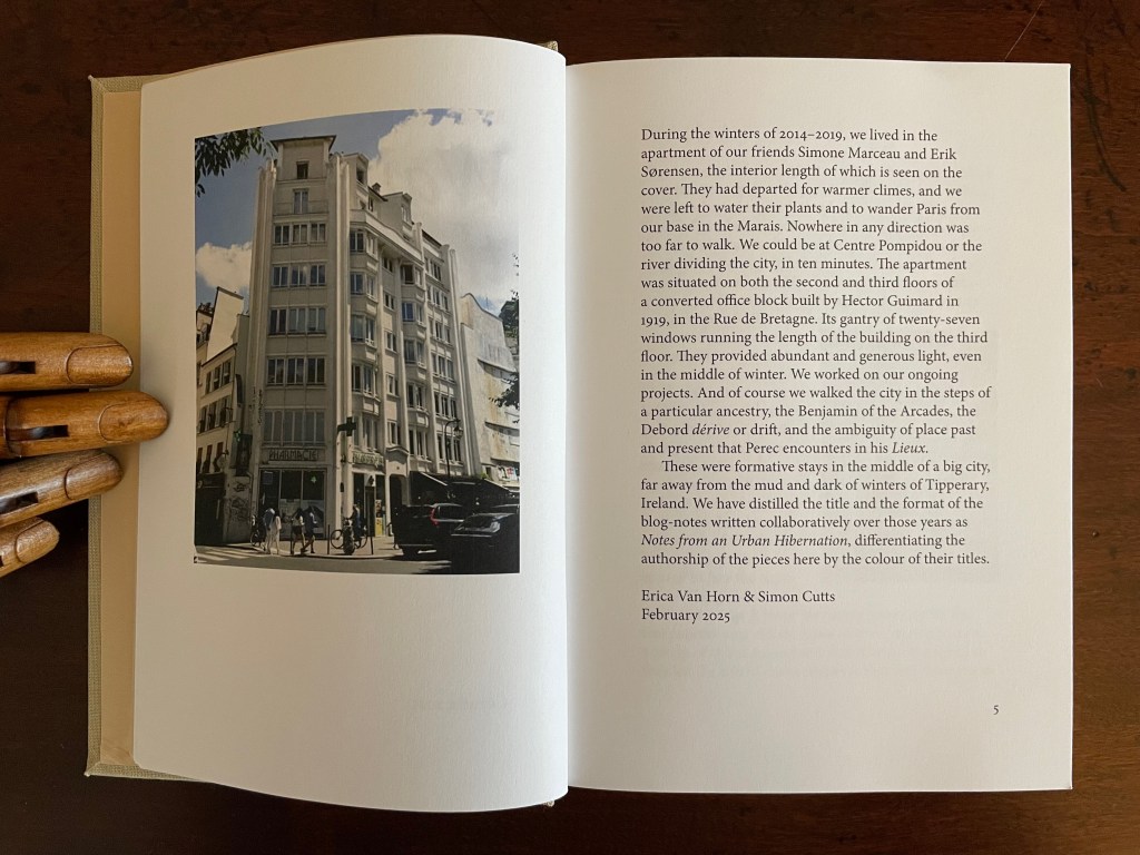
Walking the Portes: Winters in Paris 2014-2019 (2025) Simon Cutts and Erica Van Horn Casebound, book cloth over boards, blind stamped and inked spine, photo pastedown in recess on front cover, plain doublures. H182 x W132 mm. 216 pages. Edition of 300. Acquired from Books about Art, 15 September 2025. Photos: Books On Books Collection.
In the early 2000s, a series of hardbacks appeared called “Writer and the City”. John Banville covered Prague; Peter Carey, Sydney; Justin Cartwright, Oxford; Ruy Castro, Rio de Janeiro; David Leavitt, Florence; and Edmund White, Paris. White’s was the first, and it set the tone with its content and title: The Flâneur: A Stroll Through the Paradoxes of Paris. An enterprising paperback publisher might be enticed to reissue them and, allowing for a Parisian double-dip, to add Walking the Portes. Besides, I prefer Simon and Erica’s Paris to Edmund White’s, and Walking the Portes pairs better with Anne Moeglin-Delcroix’s Ambulo Ergo Sum (2015) anyway.
It is Simon’s plan to ride out to each of the entrances to Paris (the portes) and walk back to the apartment in the Marais. When it turns out that instead of twenty-one portes there are thirty-nine, Erica firmly responds accordingly:
In introducing Ambulo Ergo Sum, her extended essay on Hamish Fulton, Richard Long, and herman de vries, Moeglin-Delcroix writes:
The analysis of some artists’ books … should make it possible to show how the emphasis has been progressively placed no longer on landscape but on the search for the best means, differing according to the various artists, of rendering an experience in the strongest sense of the word: a lived experience of the world, a personal practice, that is to say, a deliberate way of being inthe world rather than before it. The walking body is the touchstone of this, because walking compels one to supersede the limits of a purely visual experience of nature to become the experience of the whole artist, with his body, in nature. (p. 6)
Whether Walking the Portes is an artists’ book or not, it does what Moeglin-Delcroix describes. It renders these artists’ lived experiences of Paris and their deliberate way of being in the world together.
Bates, Julie. 2023. “Erica Van Horn’s creative exercises“. Irish Studies Review, 31(1), 139–158. Interviewed Van Horn at the 2025 Small Publishers Fair, Conway Hall, London.
Bookmorph n. (bōk+μoρφ): a portmanteau word referring to casebound books which have been modified; an emergent branch of sculpture in which textual content is often downgraded; treatments include chewing, cutting, drilling, entombing, pulping, ripping, shooting (with a firearm), siliconising, etc; any codex fundamentally altered or warped by an artist; a site of entropic processes designed to return pages to cellulose fibre, and/or the creation of a fungal landscape; a bibliographic montrosity.Michael Hampton, arts writer, May 2025
The curators’ choice of title and epigram for this exhibition is somewhat daring. Although they have included plenty of bibliographical montrosities that fit Hampton’s definition, there are plenty of bibliographical beauties, too — even among the “monstrosities”. A strong attraction of this exhibition is that it presents so many recent works from Greek book artists. Even more attractive is its hands-on display of most of the works.
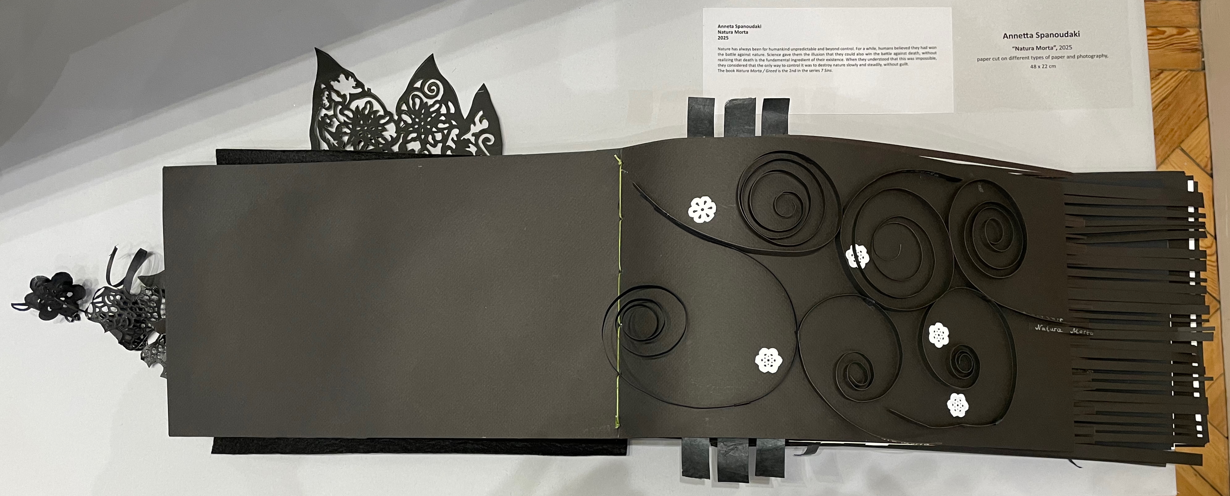
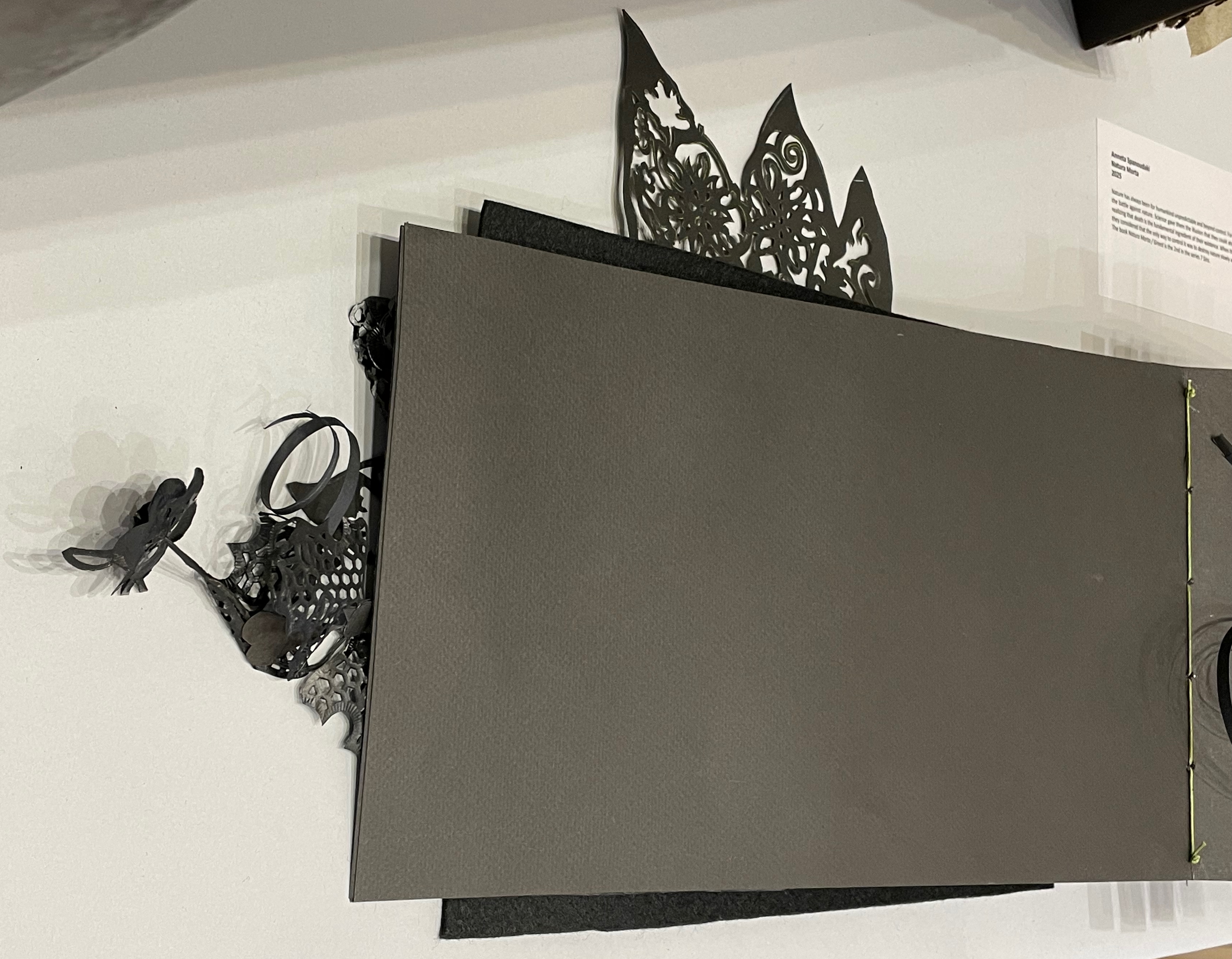
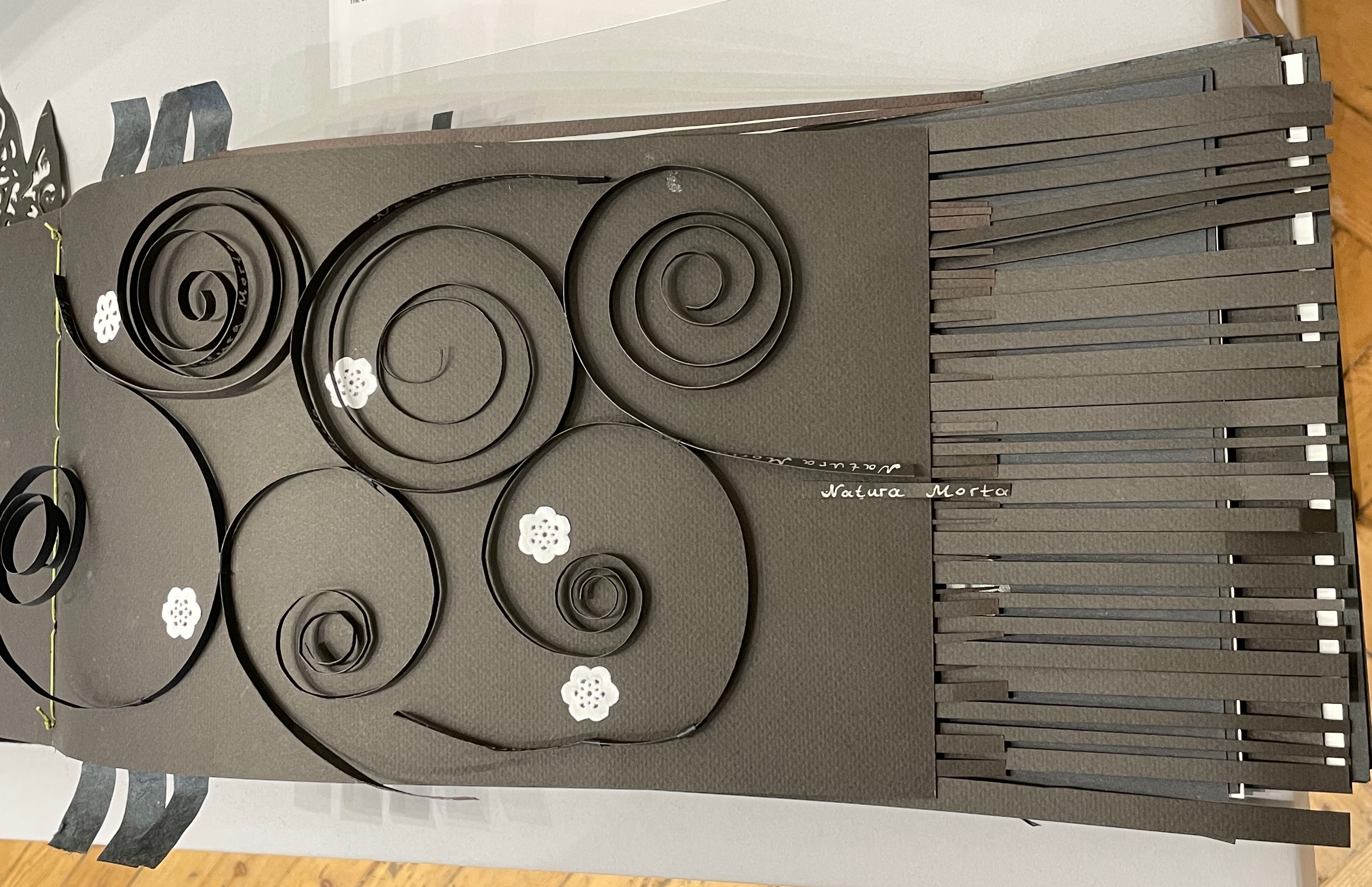
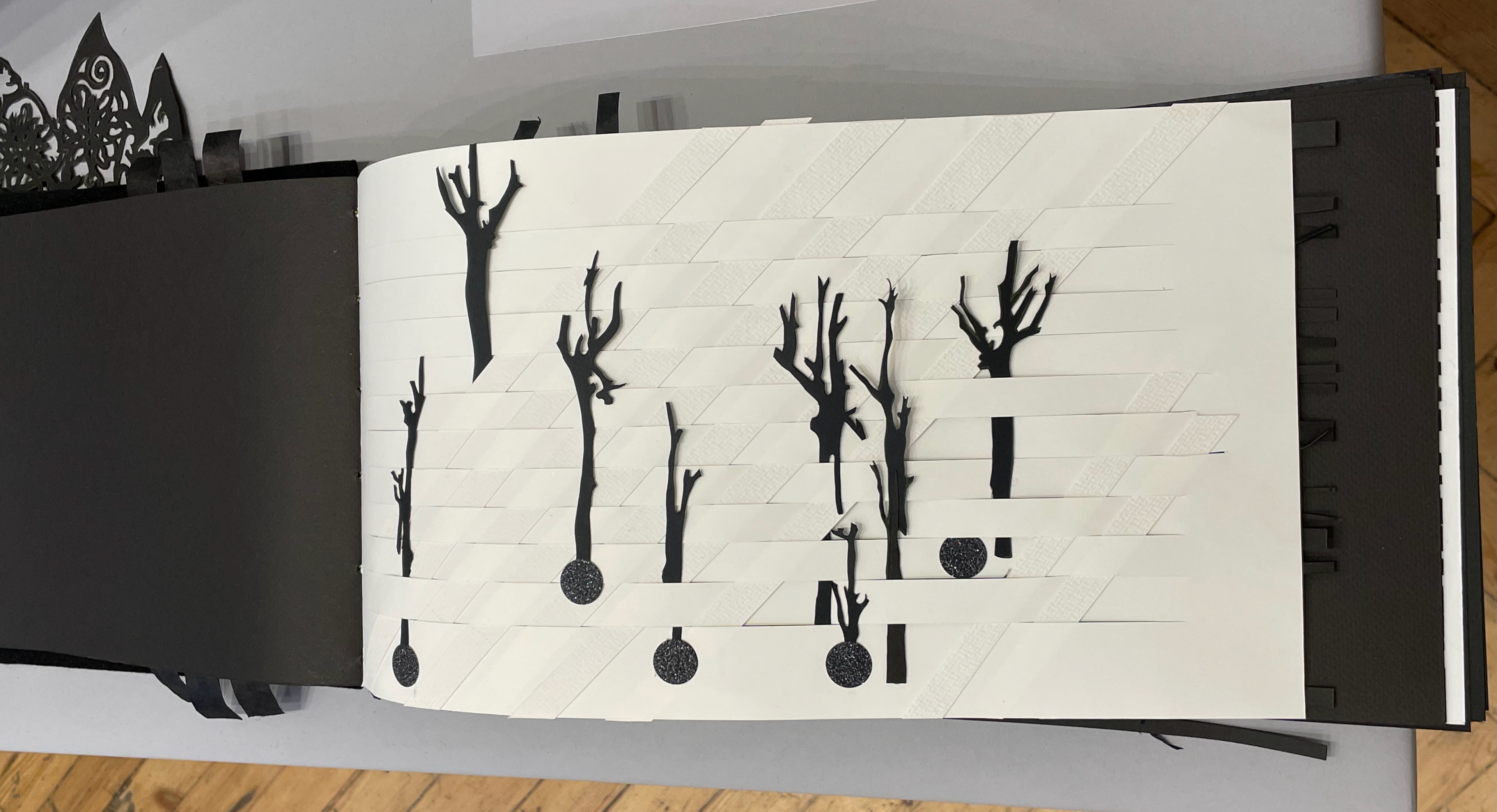
Anneta Spanoudaki’s Natura Morta (2025) is a striking case in point:
Natura Morta (2025) Anneta Spanoudaki Paper cut on different types of paper and photography. 480 × 220 mm. Photos: Books On Books.
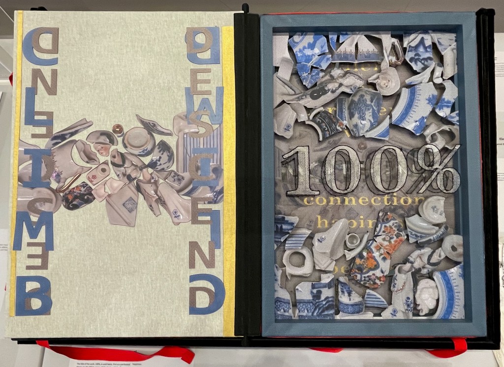
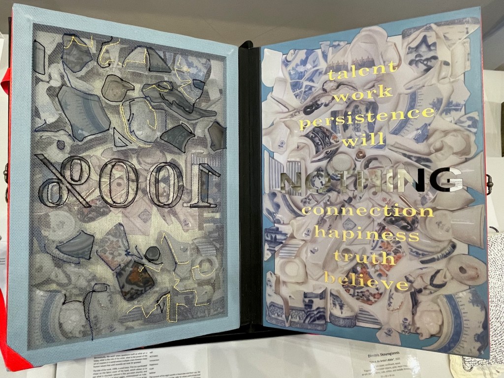
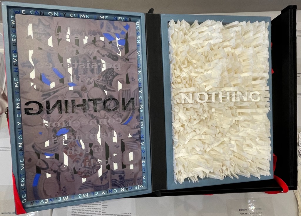
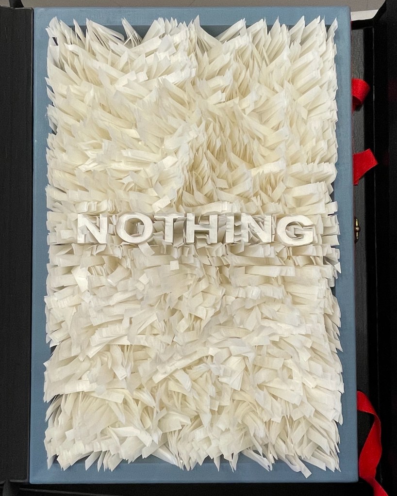
Another case in point is Dimitris Skourogiannis’ 100% An Artist’s Bible (2025). To be turned, its large “leaves” require metal rings on the fore-edge.
100% An Artist’s Bible (2025) Dimitris Skourogiannis Japanese paper, cardboard, wood, fragments of porcelain objects, print, metal rings, acrylic pains, fabris, tulle, and metallic threads. 500 x 350 x 140 mm. Photos: Books On Books.
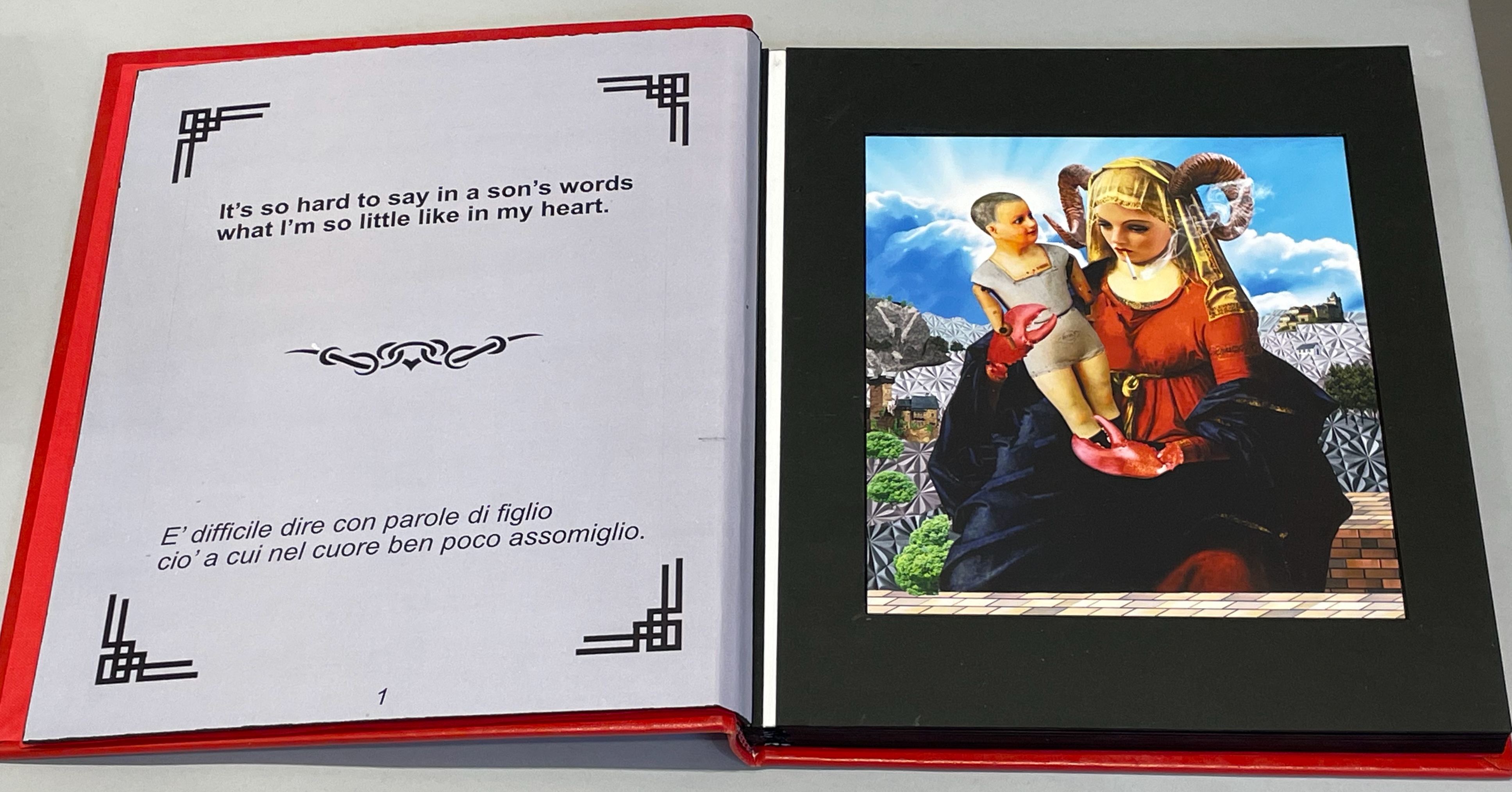
Thick leaves seemed to be the order of the day. On heavy black card, Thodoros Brouskomatis’ 10 Artificial Prayers (2025) presents surreal collages challenging the theme of “Madonna and Child” and couplets from Pier Paolo Pasolini’s “supplica a mia madre”.
10 Artificial Prayers(2025) Thodoros Brouskomatis Printed digital artworks on photographic paper, cardboard, and leather. 300 x 250 mm. Photos: Books On Books.
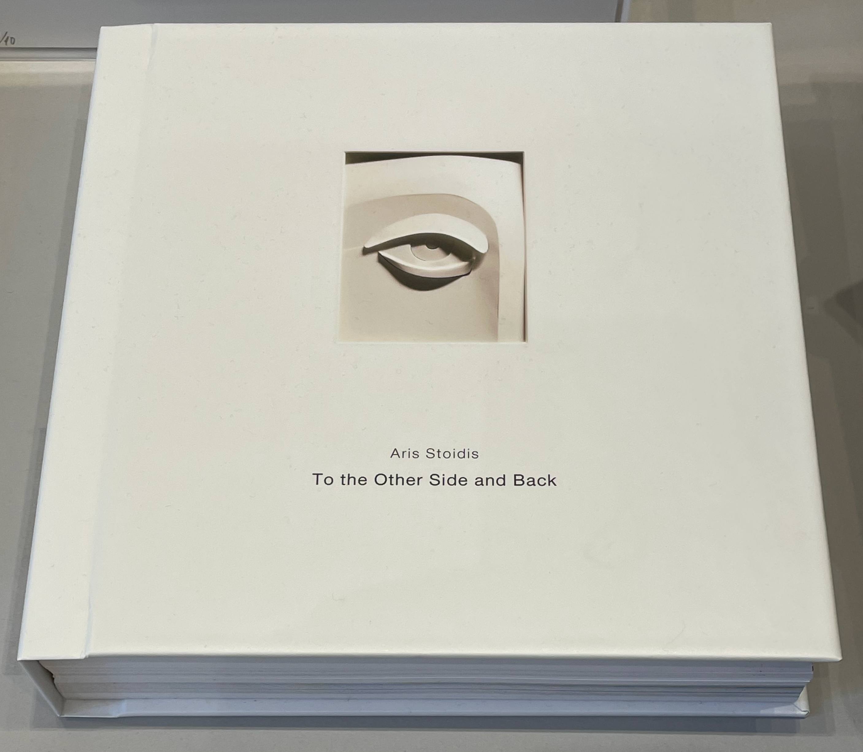
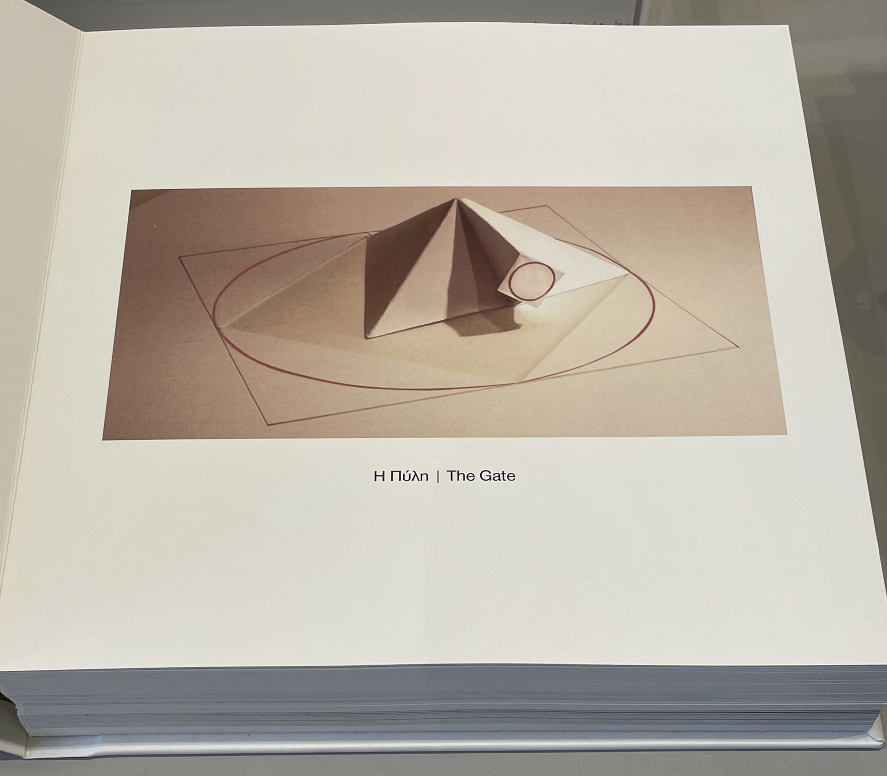
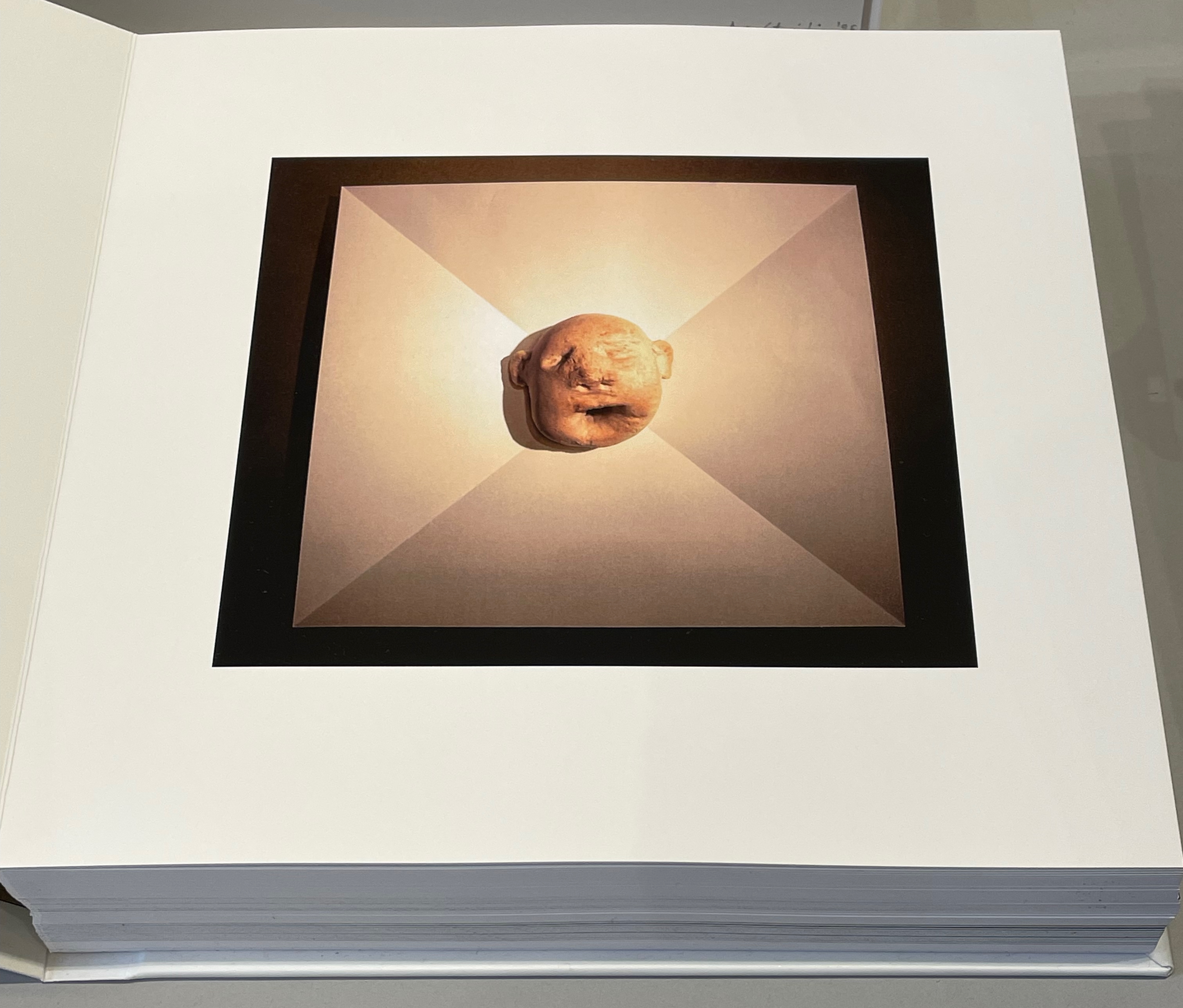
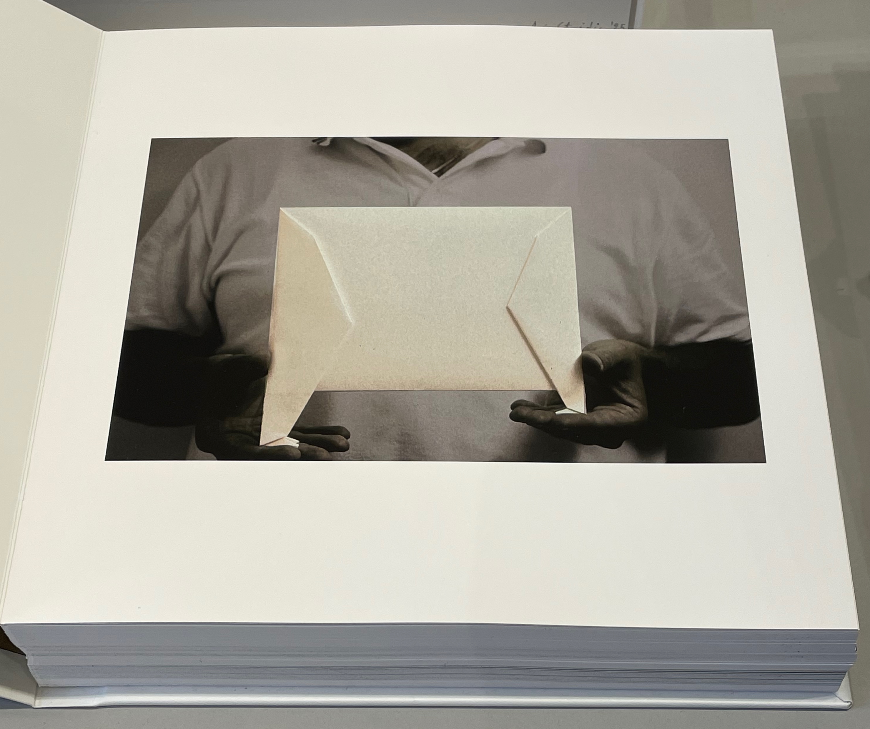
On slightly thinner card, Aris Stoidis’ To the other side and back (2025) carries a sculptural image on every page. The work straddles the borders of sculpture, photobook, and artist’s book. Stoidis writes, “Ever since my first pieces, I have been “receiving” images that I’ve materialized without really comprehending them myself. They simply exerted an inexplicable power on me.” The book comes in a plexiglas box with a papercut sculpture (not pictured here).
To the other side and back (2025) Aris Stoidis Photographic prints on card. 270 x 270 x 20 mm. Photos: Books On Books.
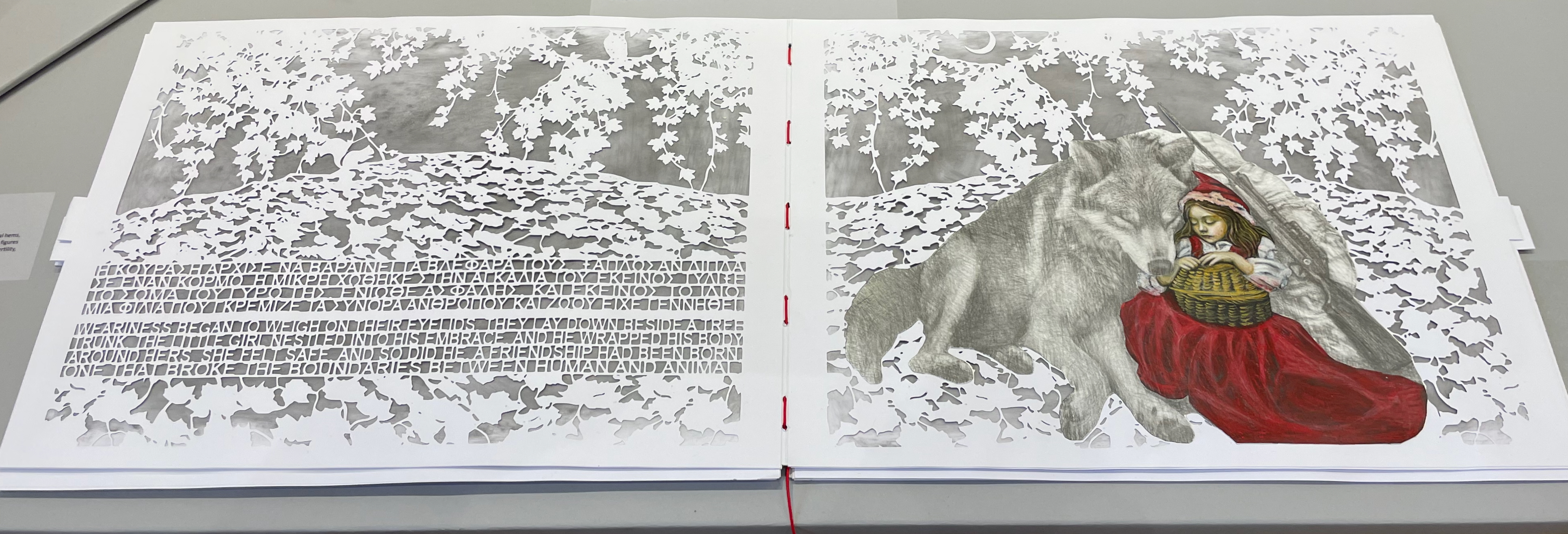
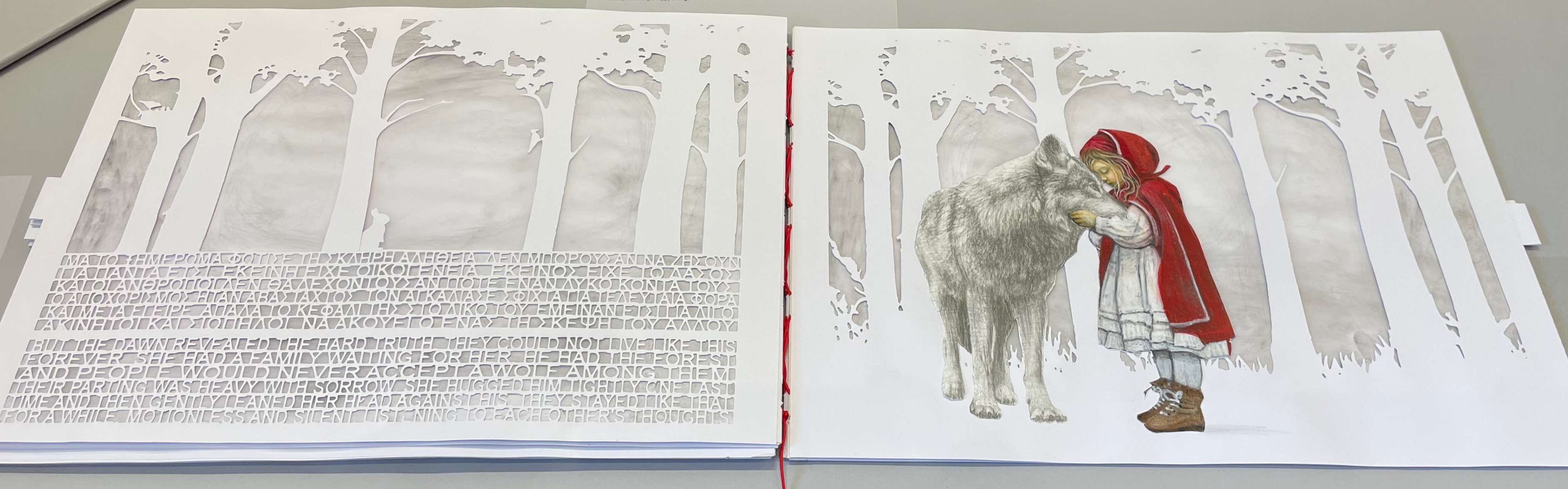
On still thinner leaves, Ismini Bonatsou’s Little Red Riding Hood (2025) nevertheless projects striking depth with its montage of papercut pages, acrylics, and pencil. Just as striking is the contemporary reversioning of the fairy tale.
Little Red Riding Hood (2025) Ismini Bonatsou Acrylics, pencil, and papercuts. 450 x 300 mm. Photos: Books On Books.
Given that the portmanteau term “bookmorph” comes from Michael Hampton, it seems appropriate that he has two works on display. Although one of them is under glass, 12 Chairs (bookmorph) (2012), the other is not. RAGE PEN by Hampton and David Blackmore is the UK contingent’s only work produced in 2025. Others from the UK contingent include Sarah Bodman, BOOKEND, Jonathan Callan, Joe Devlin, Stephen Emmerson, SJ Fowler, Rowena Hughes, and the Inscription Journal editors (Gill Partington, Simon Morris, Adam Smyth). RAGE PEN is also particularly appropriate because it requires a ruler to separate its perforated fore-edges. The exhibition provides one along with multiple pairs of white gloves. Really hands-on.
The participating Greek artists also include Eleni Angelou, Nikos Arvanitis, Rania Bellou, Maria Bourbou, Natassa Chelioti-Naga, Ioanna Delfino, Anna Dimitriou, Antonia Iroidou, Eleni Kastrinogianni, Peggy Kliafa, Alexia Kokkinou, Georgia Kotretsos, Nikos Kryonidis, Vasiliki Lefkaditi, Eleni Maragaki, Kyriaki Mavrogeorgi, Despina Meimaroglou, Christina Mitrentse, Fiona Mouzakitis, Kiki Perivolari, Stamatis Schizakis, Ifigeneia Sdoukou, Christina Sgouromiti, Danai Simou, Nectarios Stamatopoulos, Despina Stavrou, Evangelos Tasios, Yannis Tzortzis, and Leonie Yagdjoglou.
Congratulations and thanks to the curators — Christina Mitrentse, Fiona Mouzakitis, and Despina Stavrou — for bringing together this selection of outstanding works.
The Hellenic Centre opens at 11:00 and closes at 17:00, Tueday through Friday, so the chances to visit by the 28th of November are limited. The brief catalogue that documents the exhibition and these few photos cannot substitute for tactile engagement with the works on display. An hour and a half passed in a flicker.
First, the back-dating. This comes from the delightfully annoying or annoyingly delightful belated discovery of Erik Kwakkel’s 2015 entry on the history of the horn-book “Book on a Stick” in Medievalbooks. Delightful and annoying to find the truly earliest appearance of a horn-book right under my nose in the Bodleian Libraries but too late to include it in the Alphabets Alive! exhibition at the Bodleian in 2023.
Andrew White Tuer’s History of the Horn-Book (1897) came close with its dating of the horn-book’s first appearance as 1450, but as Kwakkel writes:
The image shows Christ being brought to school by his mother. He is bringing his “textbook” to class: a hornbook, which dangles from his wrist by a string, just like many of the later specimens did … Quite intriguingly, we are shown a real medieval snapshot of how children carried their hornbook to and at school. More importantly, it shows that the hornbook was indeed a medieval invention….While no actual hornbooks appear to survive from the medieval period, these visual representations show that educating young children was also the driving force behind the production of hornbooks in the age before print.
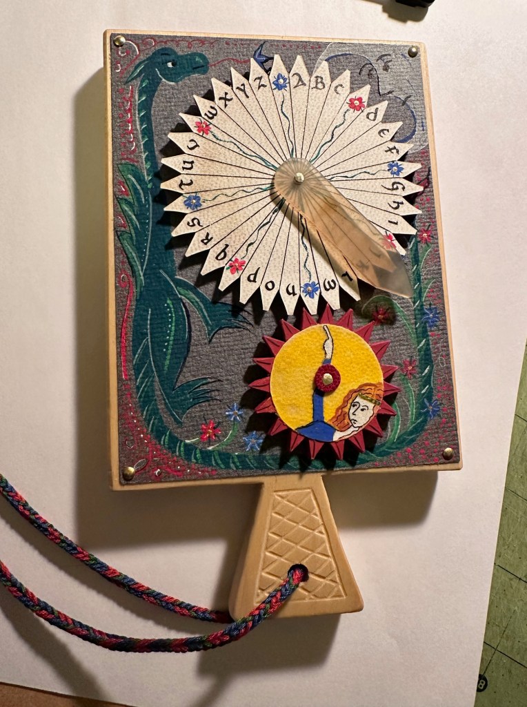
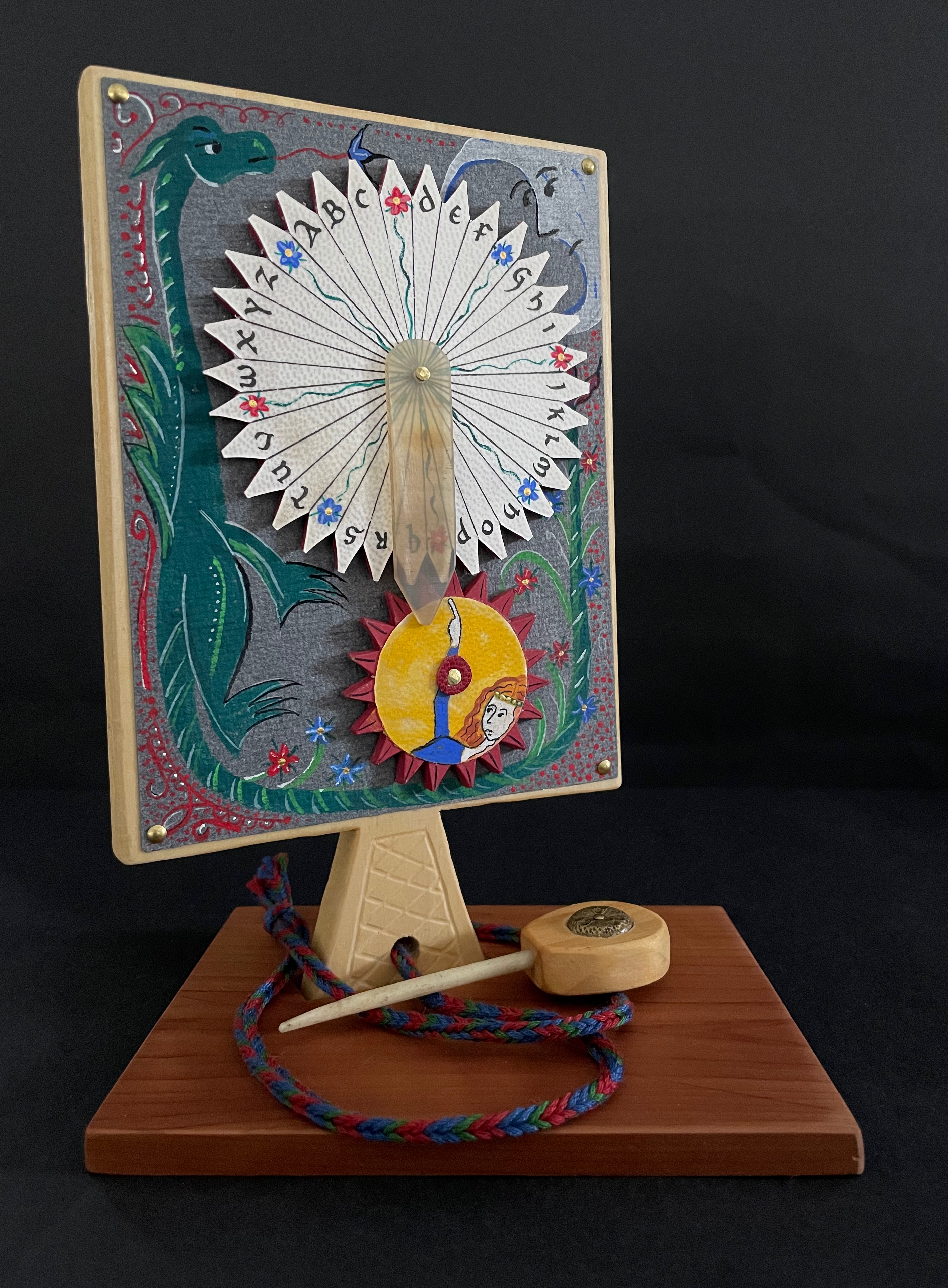
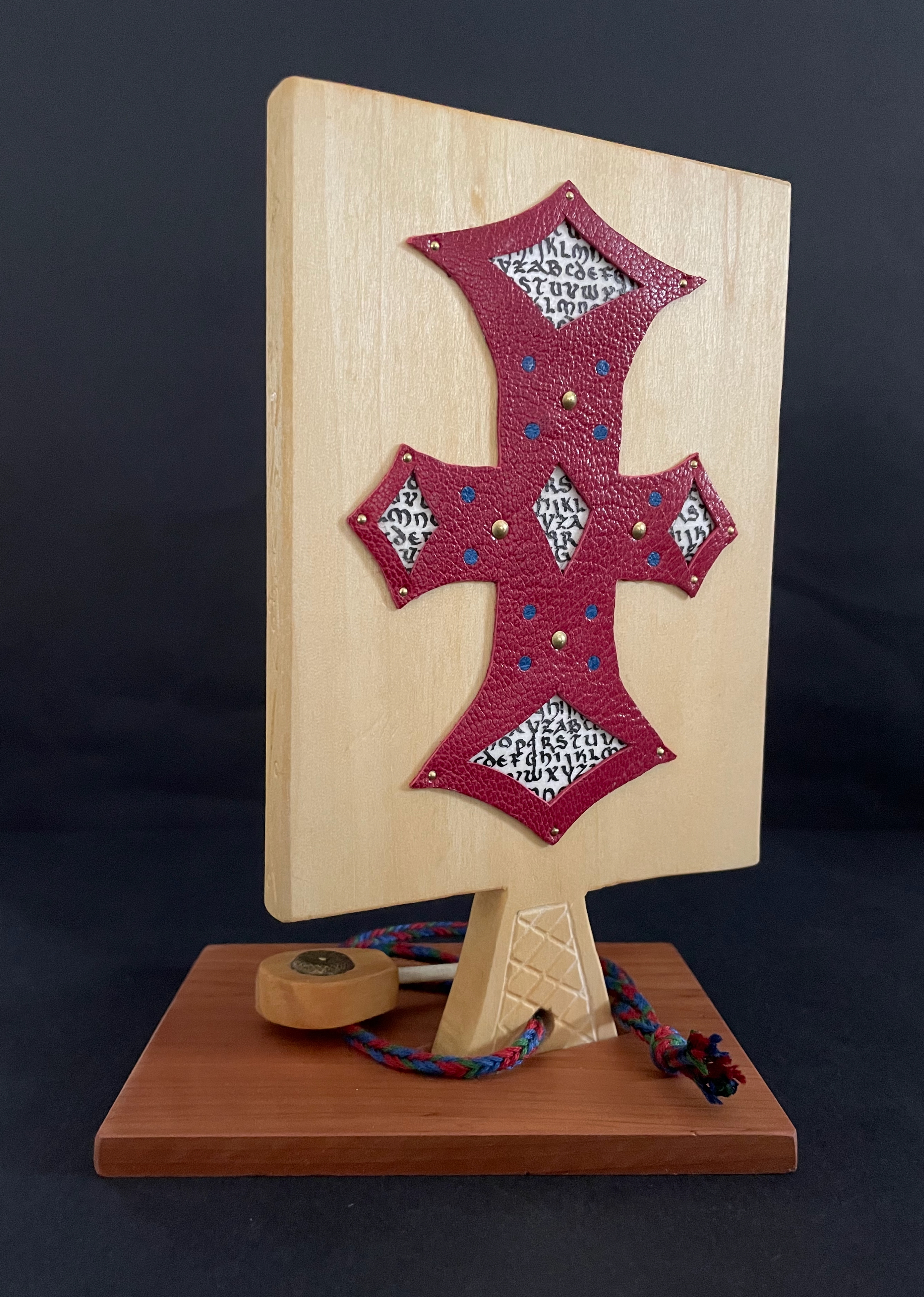
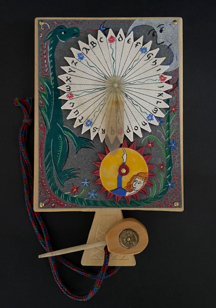
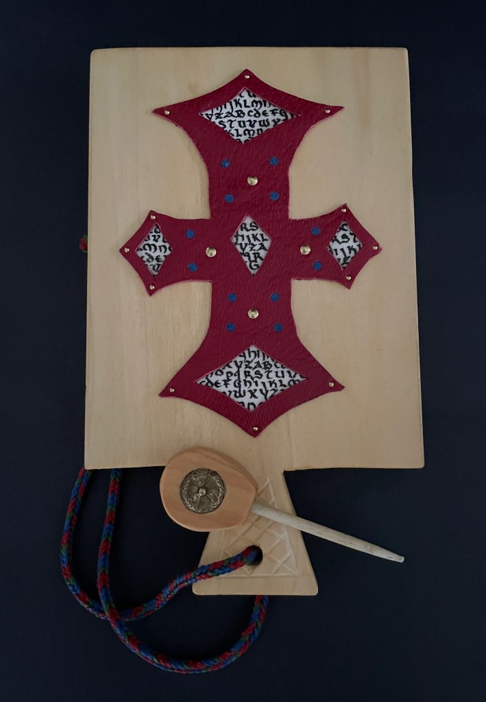
And for the updating, here is Ashley Thayer’s Mechanical Horn-book (2025) just arrived in the Books On Books Collection.
Mechanical Horn-book (2025) Ashley Rose Thayer Horn-book. On stand: H192 x W160 mm. Off stand: H192 x W115 mm. Unique. Acquired from the artist, 17 October 2025. Photos: Courtesy of the artist. Books On Books Collection.
The paddle is made of pine wood, the gears of vellum-covered bookboard, the spinning “arm” of authentic cow horn, and the wrist loop of embroidery thread by a medieval finger loop braiding technique. On dark grey-blue Khadi paper, Thayer has painted a border of the moon, a berried floral garland, and a wyvern, the heraldic emblem associated with Wessex, the Anglo-Saxon kingdom from which Alfred the Great emerged in the 9th century. On the reverse, a cross of cut red leather with five inserts of calligraphed vellum alluding to Christ’s five wounds reflects the horn-book tradition of combining religion with learning the alphabet. It also makes this horn-book reflective of Alfred’s Anglo-Saxon and Christian background.
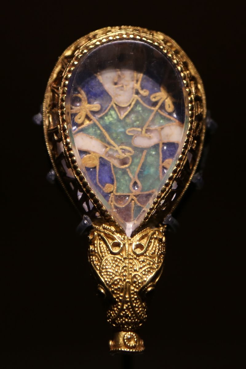
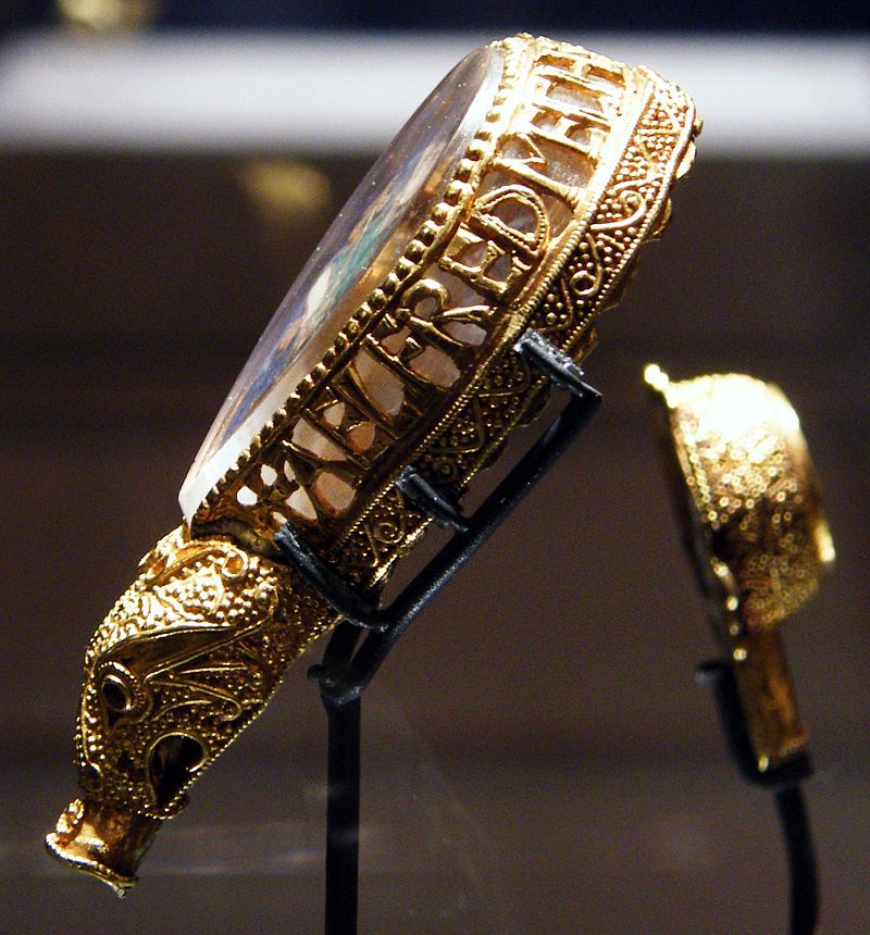
The pointer, called an aestel in Old English, is made from poplar wood, an antique button, and antique bone. Its inclusion isn’t simply functional. Appearing alongside the Wessex wyvern, it points to that famous aestel on display at the Ashmolean in Oxford: the Alfred Jewel.
The Alfred Jewel, Ashmolean Museum, Oxford. Photo taken from the front by Geni CC BY-SA 4.0. Photo taken from the side by Richard M Buck CC BY SA 3.0.
If there’s ever an Alphabets Alive! redivivus, Erik Kwakkel and Ashley Thayer have provided the pointers to the other treasures in Oxford that should be included.
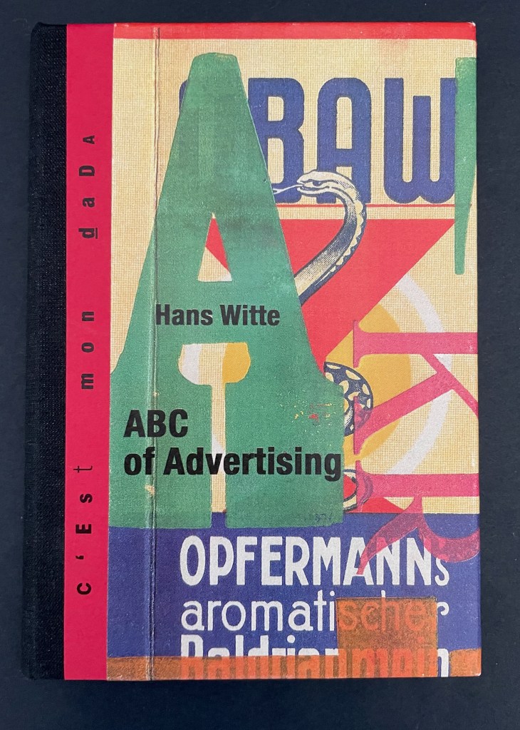
ABC of Advertising (2024) Hans Witte Casebound, cloth spine and paper over boards, sewn to doublures. H150 x W105 mm. [40] pages. Acquired from Redfoxpress, 2024. Photos: Books On Books Collection.
The ABC of Advertising is No. 205 in the RedFoxPress “c’est mon dada” series. The series name comes from the French expression meaning “it’s my thing”. Dada is also a colloquial child’s expression for “horsie” or “hobbyhorse”. So, of course, the French adopted it as the name for one of the avant garde movement of the early 20th century. Although you might think from The ABC of Advertising that wood type and letter press are Hans Witte’s “hobbyhorse”, it’s clear from his artist’s books, children’s books, and book object installations that he has a herd of them.
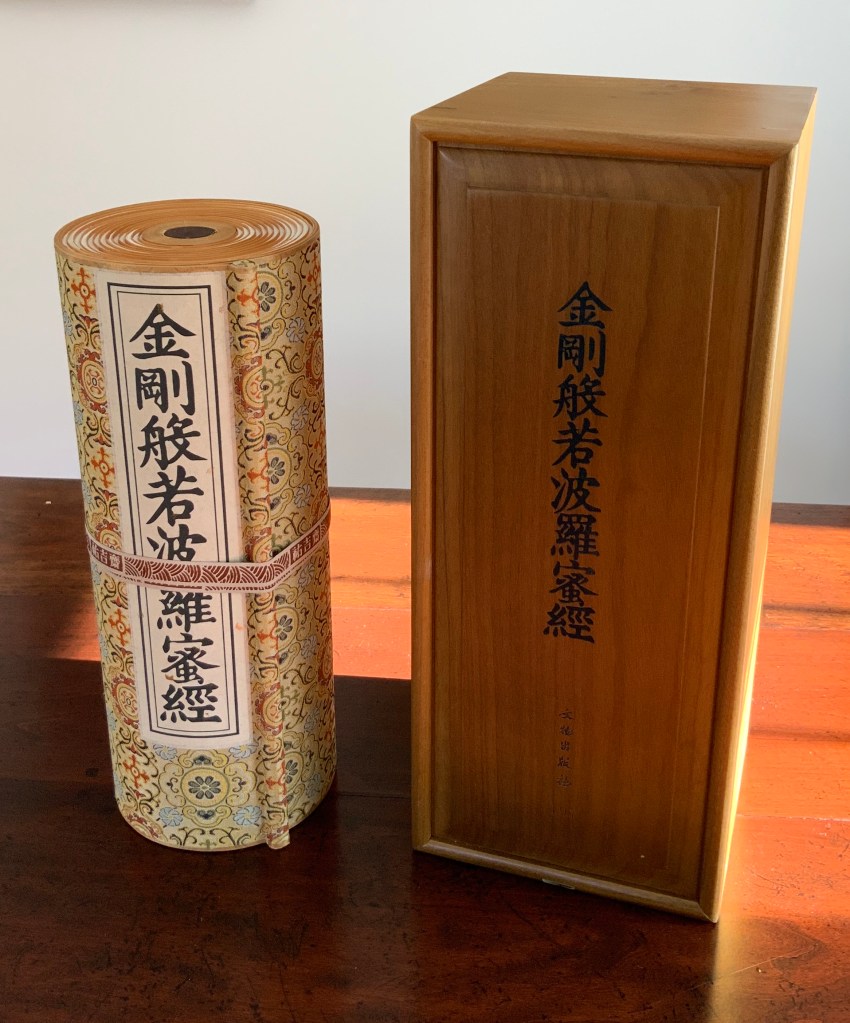
Diamond Sutra in 32 zhuan (seal) fonts (2017) Zhang Xiaodong Scroll in dragon scale binding. 152 x 382 x 160 mm. Edition of 300, of which this #197. Acquired from Sin Sin Fine Arts (Hong Kong), 31 October 2019. Photos: Books On Books Collection.
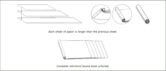
In 1900, in China’s Dunhuang province, the Diamond Sutra (868 CE), the world’s earliest complete and dated printed book, was discovered in a cave along with 40,000 scrolls. One of those other scrolls — Or.8210/S.6349 — was possibly just as important for the book arts as the Diamond Sutra was for the history of printing. Like the Diamond Sutra, Or.8210/S.6349 resides in the British Library and is “the only known example of whirlwind binding in the Stein collection of the British Library” (Chinnery). The structure is also known as dragon scale binding, although distinctions between the two have been debated (Song). It came into use in the late Tang dynasty (618-907 CE) then fell away in the face of the easier to handle butterfly and wrapped-back bindings. Besides Or.8210/S.6349, there are few surviving examples of original whirlwind or dragon scale bindings.
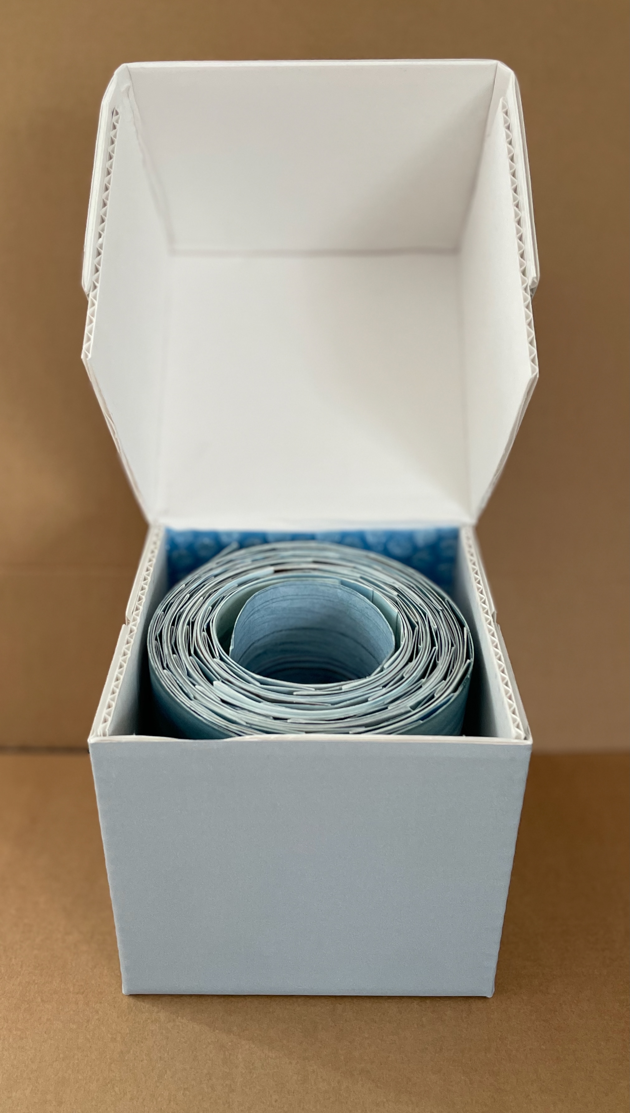
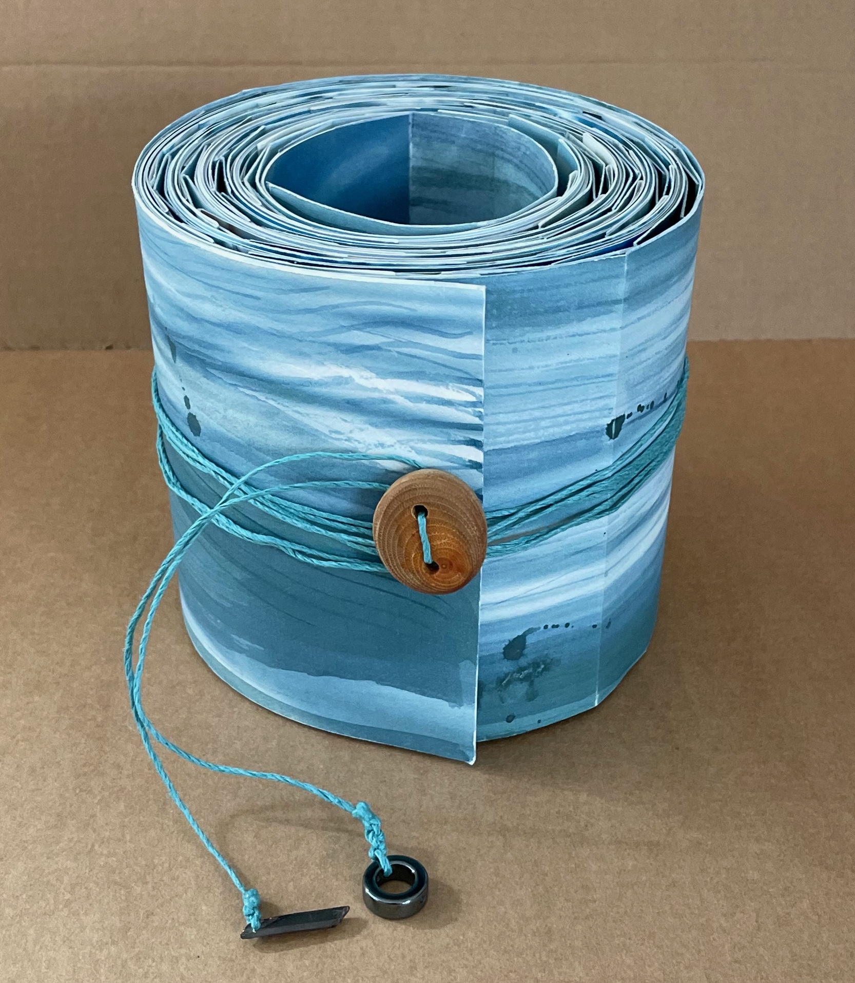
Watercourse I (2022) Barbara Hocker Scroll in variant dragon scale binding. L152 cm (variable) x W12 cm. 64 panels. Unique. Acquired from the artist, 10 February 2024. Photos: Books On Books Collection.
Works evocative of water often invoke a sense of meditative stillness, but Barbara Hocker’s Watercourse I prompts a sense of meditative activity. You can’t stop moving it about. Or if you’re not moving it, you find yourself moving around it to contemplate it. It is the layering of watercolor, sumi ink, photographic prints with archival inks on washi paper, and the ancient Chinese method of bookbinding called dragon scale (sometimes called “whirlwind” or “fish scale” binding) that achieves this. Traditionally, the binding method involves a long scroll of paper to which successively shorter folios are attached at one end, often secured with a bamboo rod. Hocker has modified this structure by attaching folios of the same size with hinges to the underlying long scroll at intervals allowing one folio to overlap the next and so on. In each case, the effect of the overlapping folios creates the appearance of dragon scales.