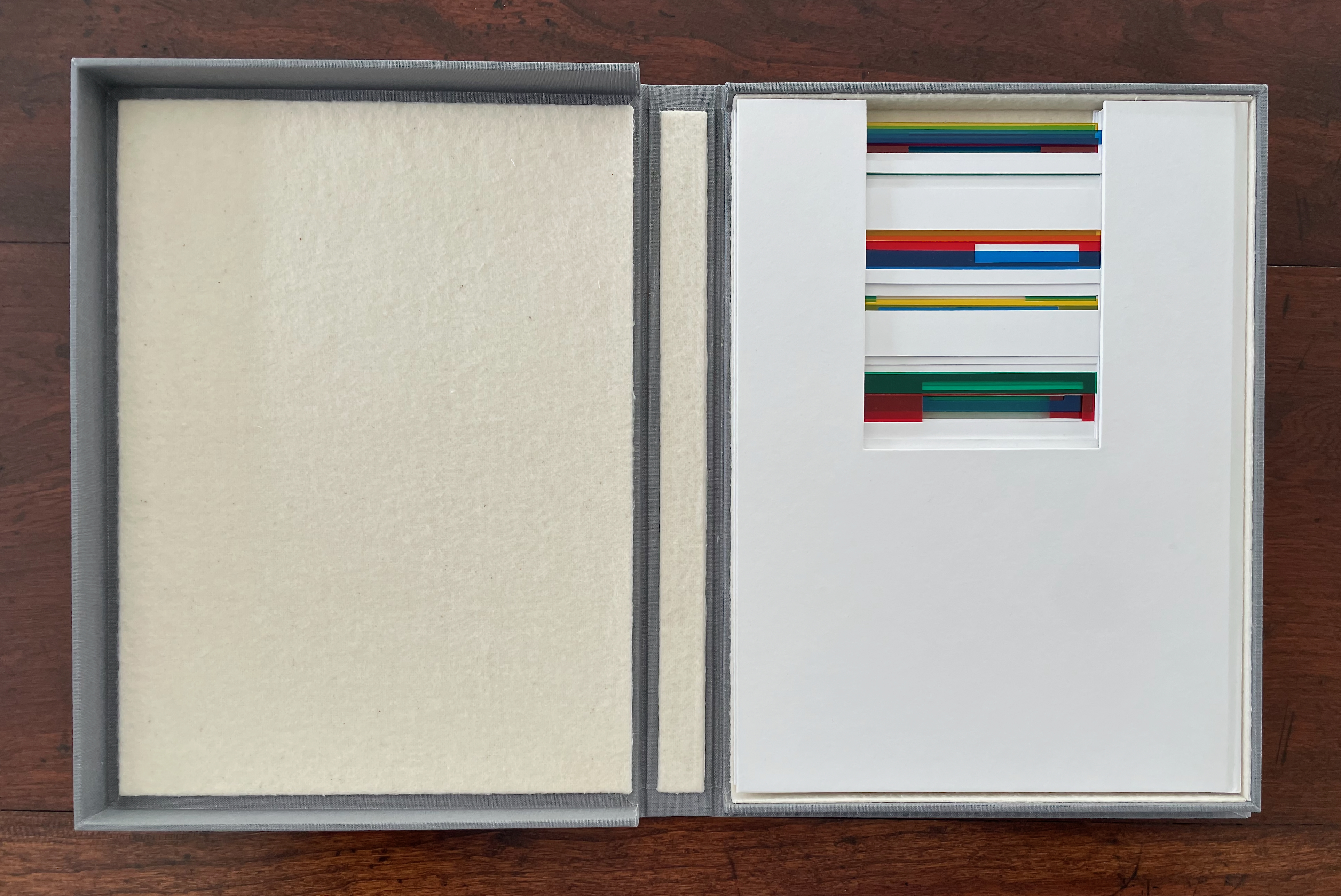
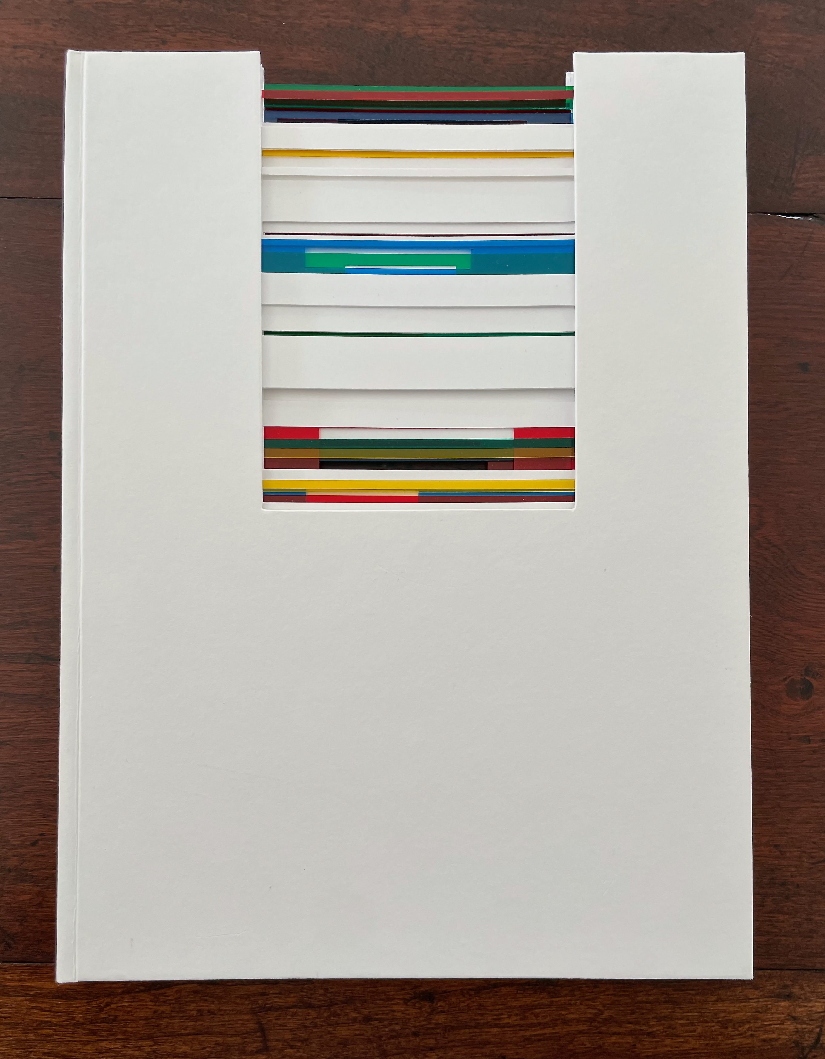
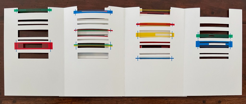
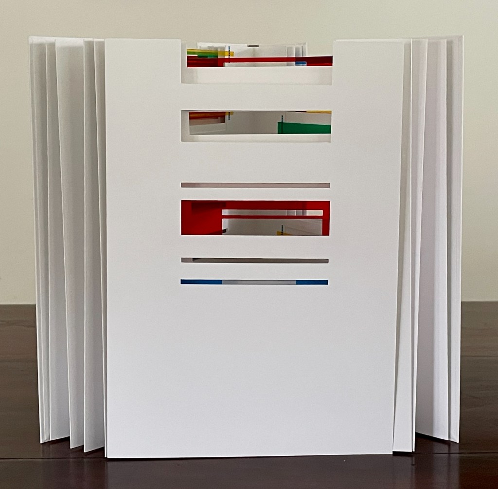
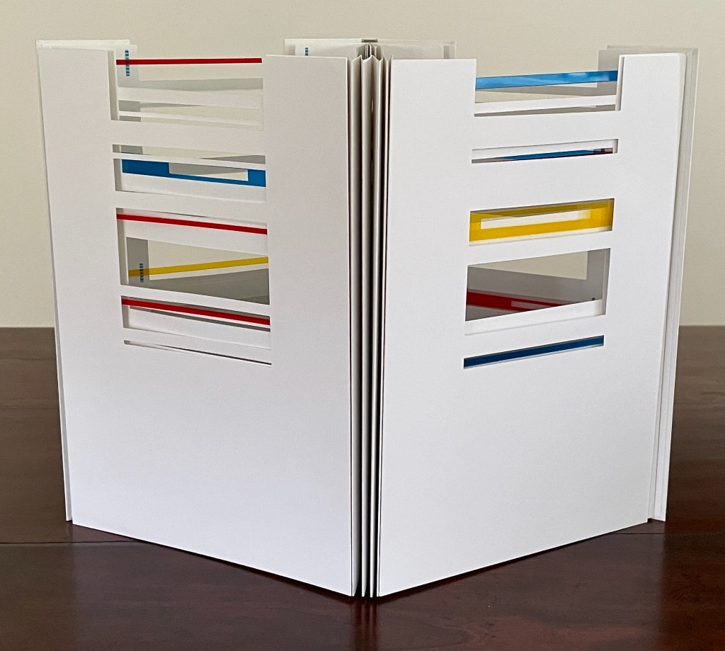
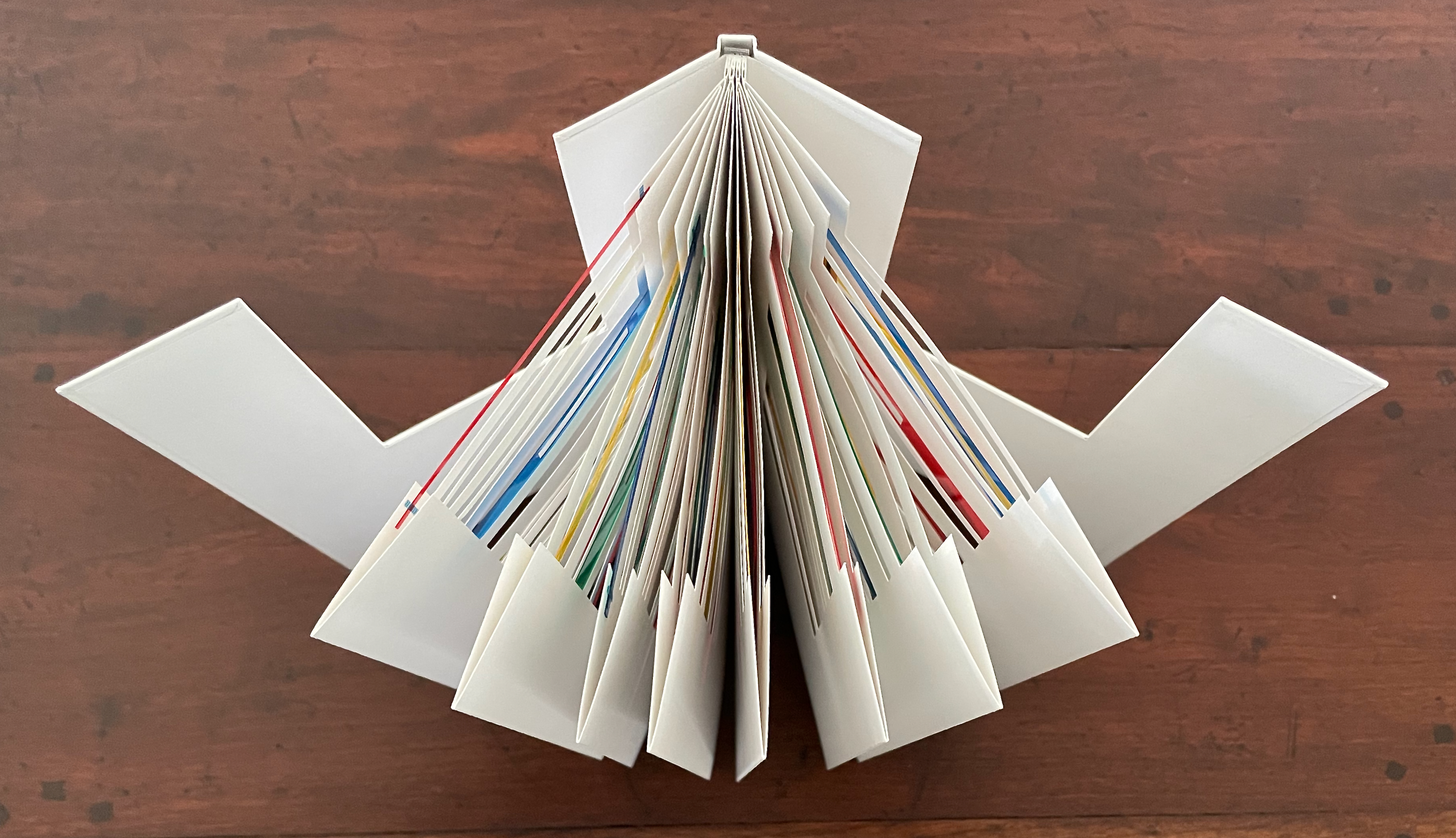
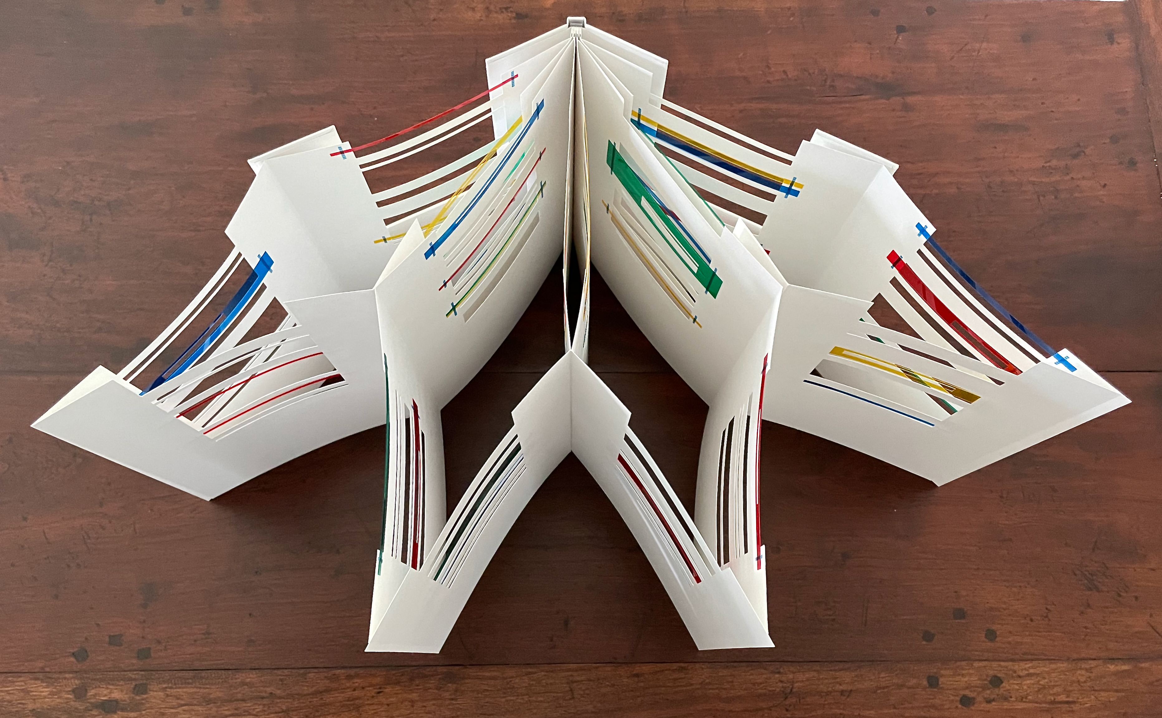
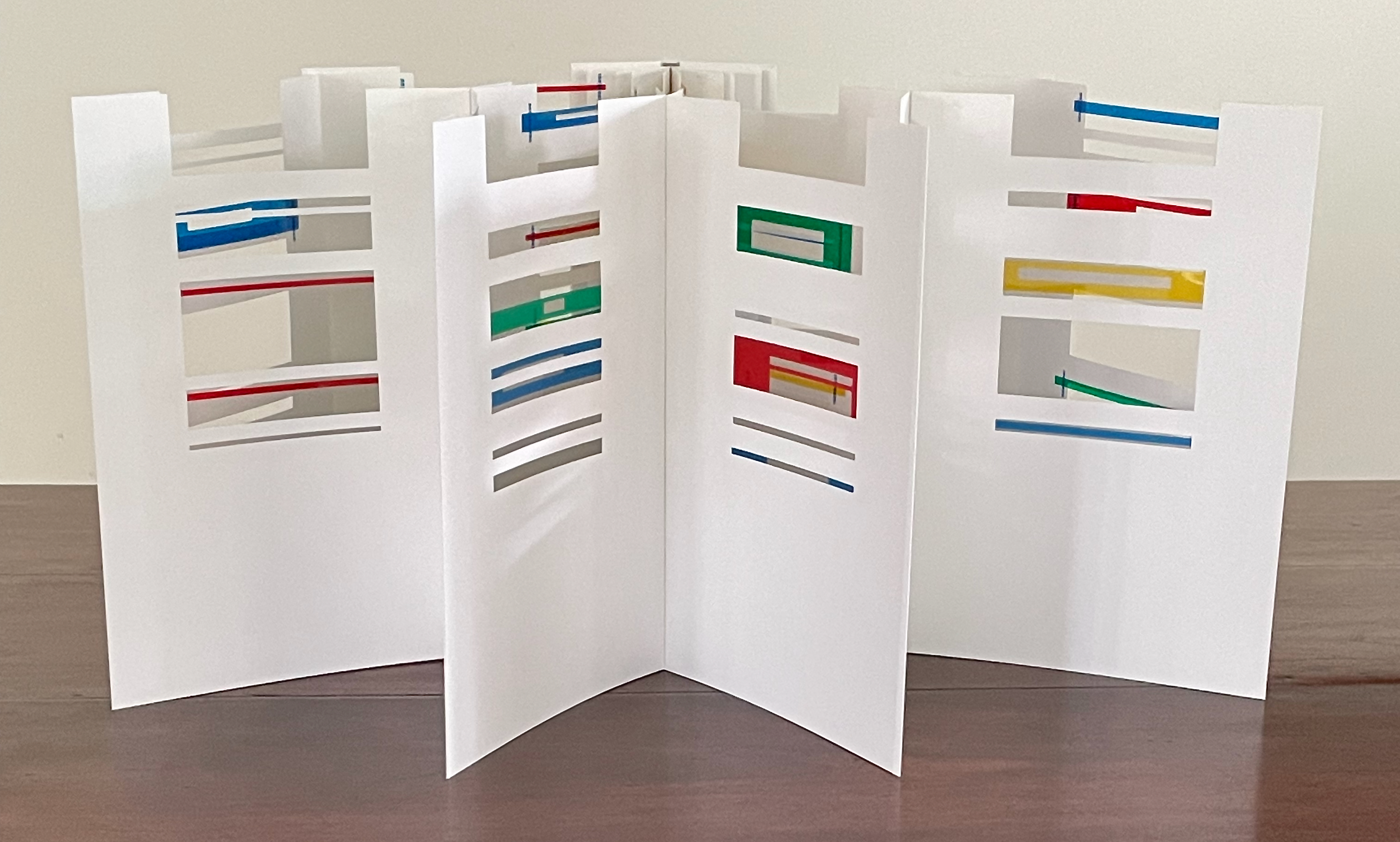
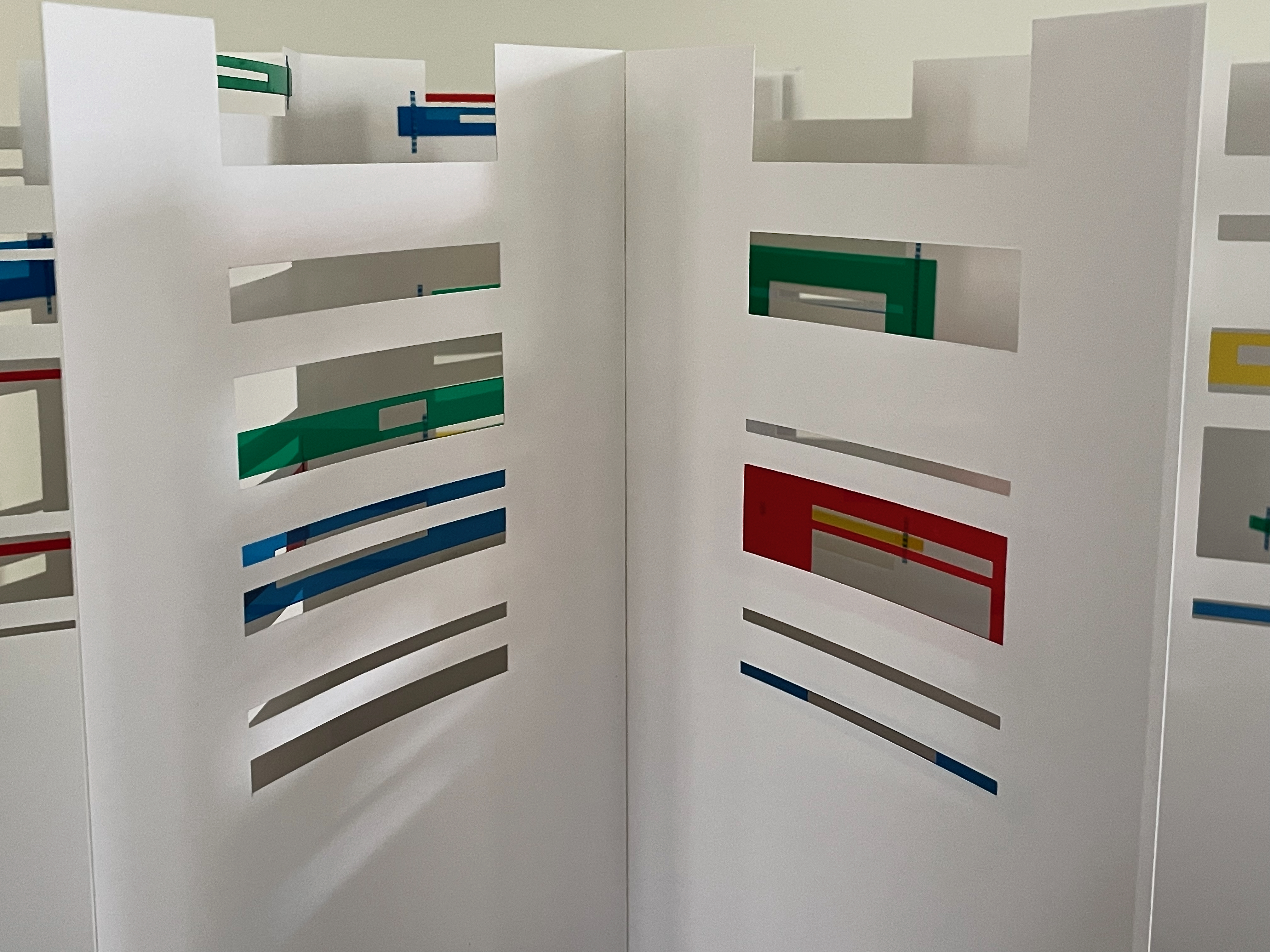
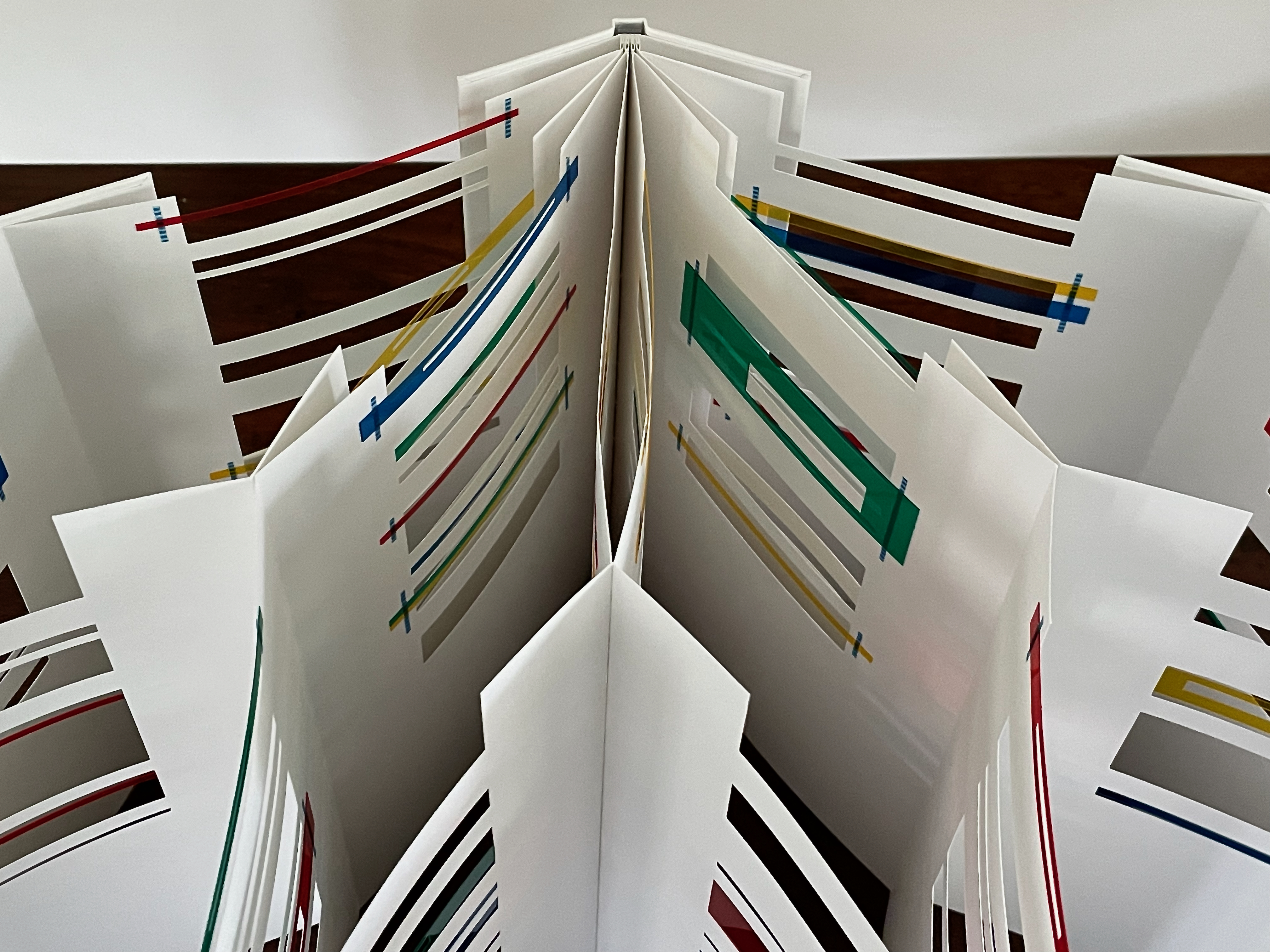
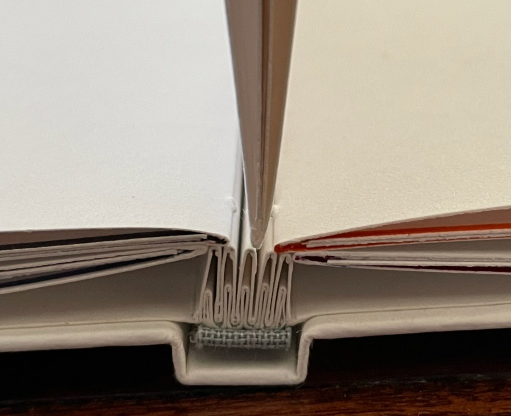
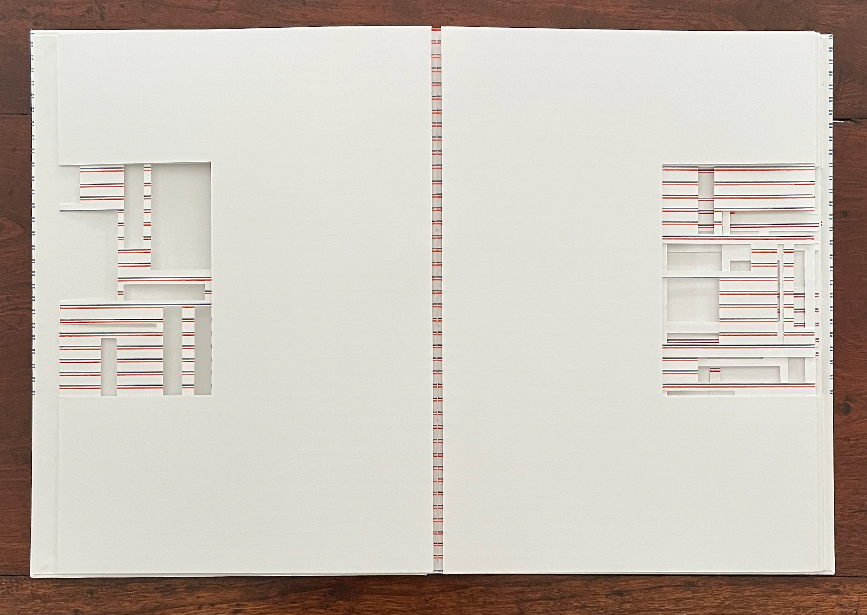
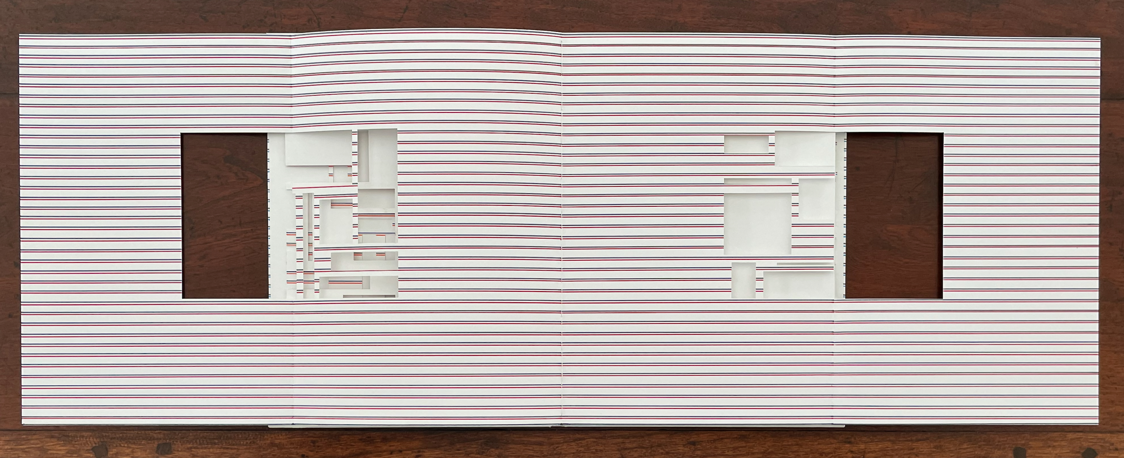
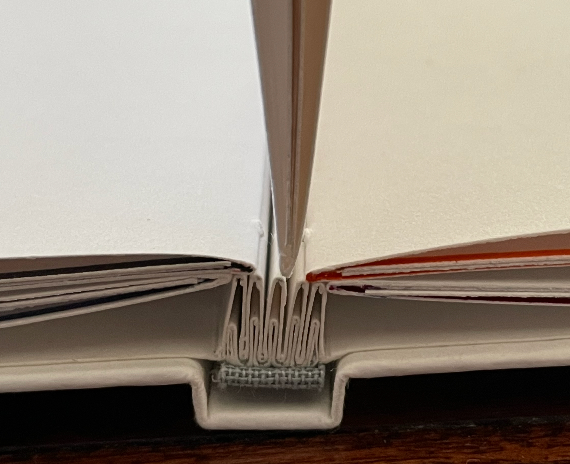
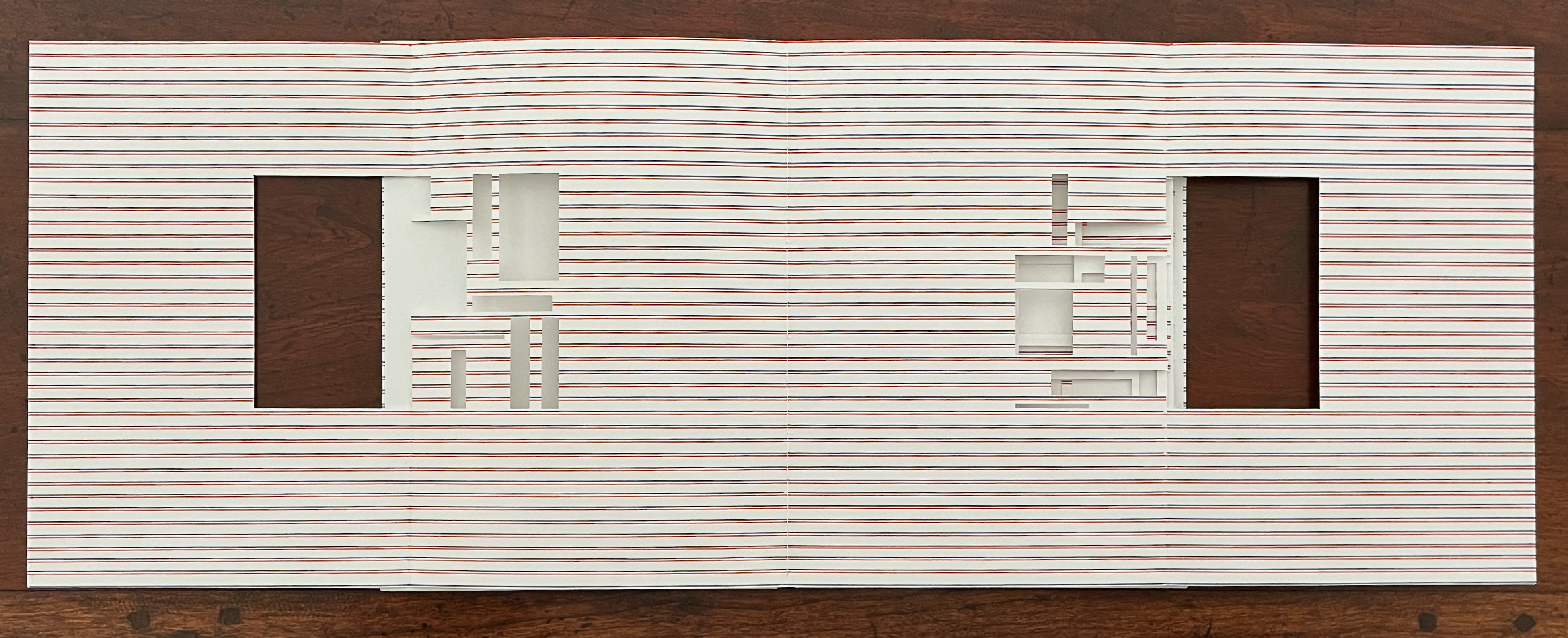
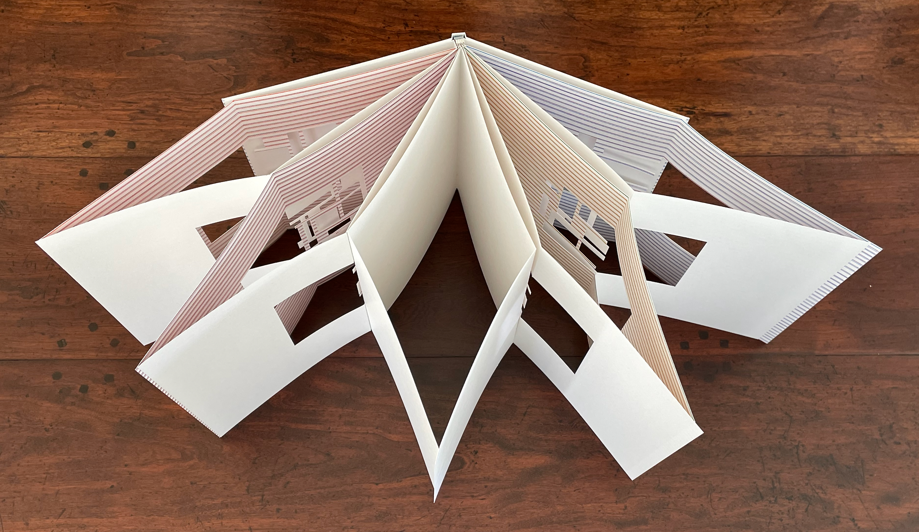
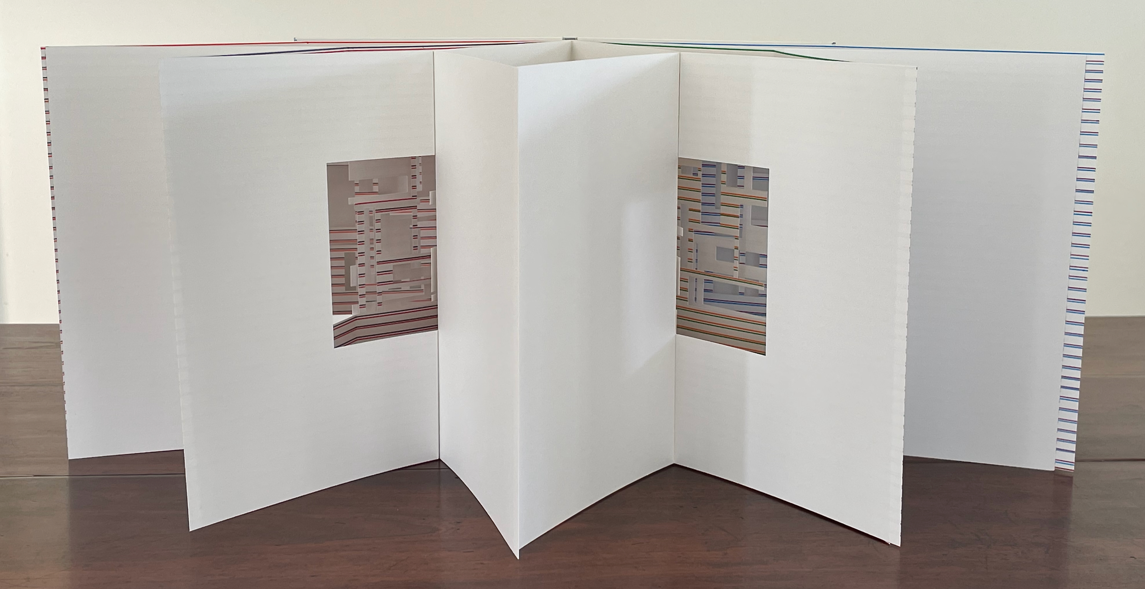
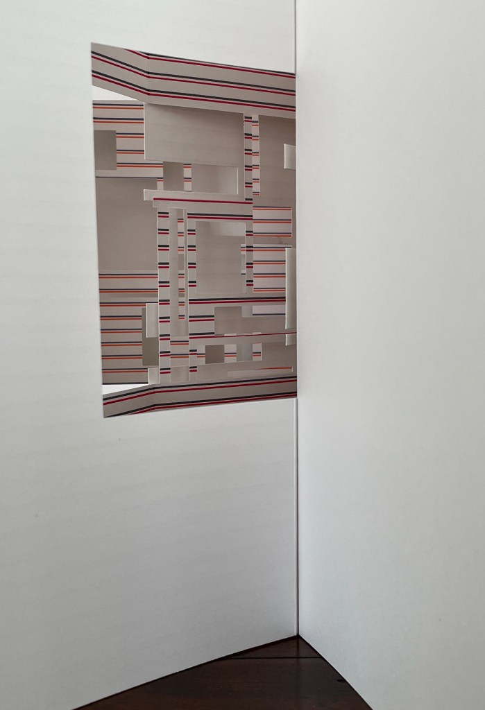
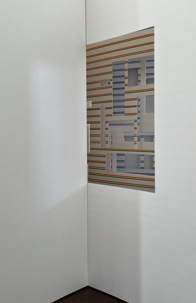
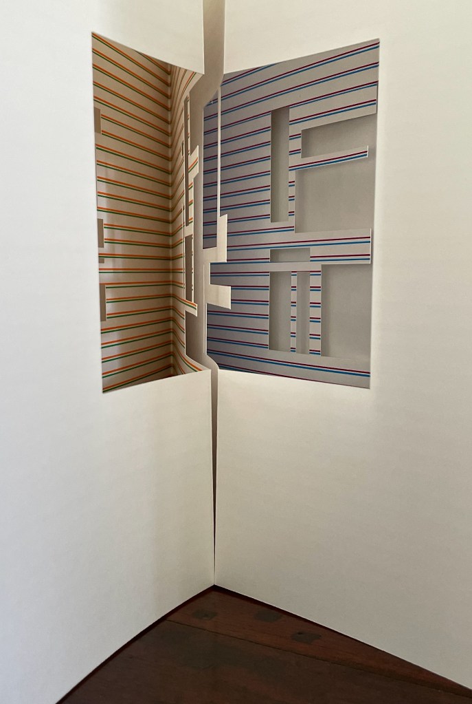
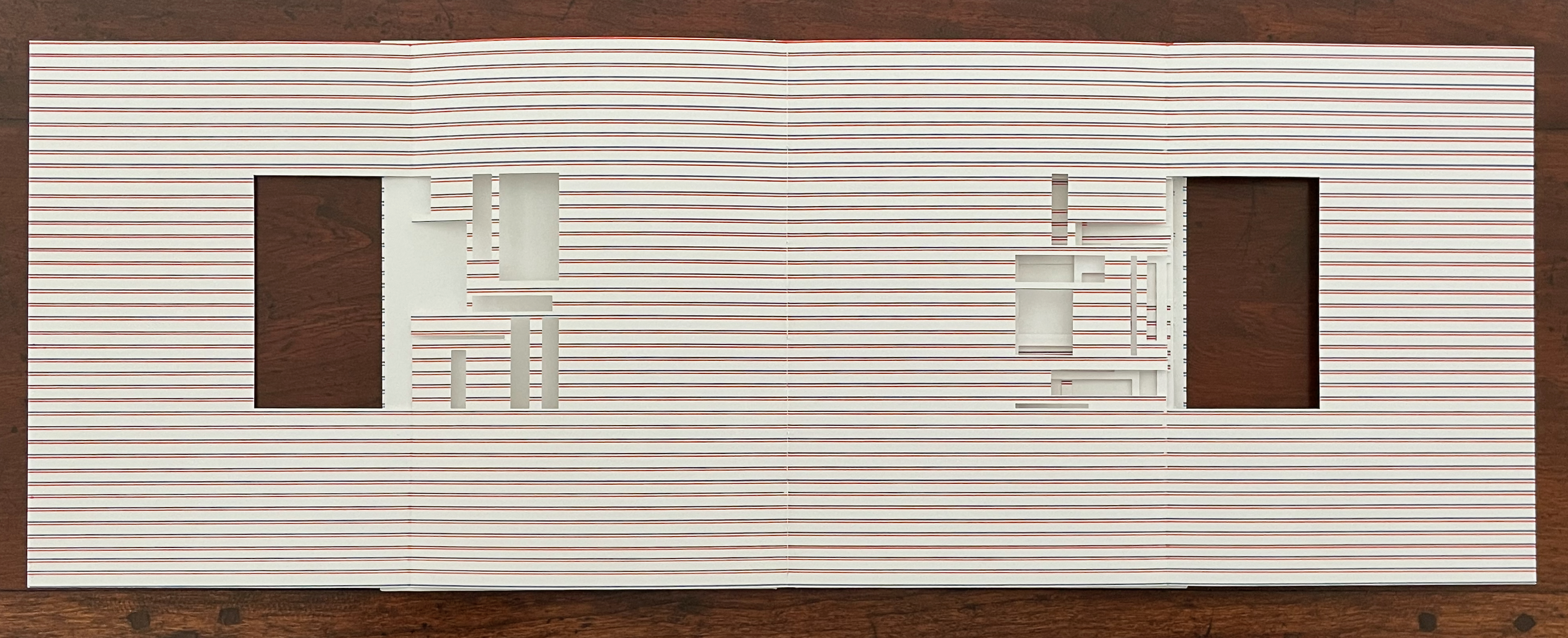
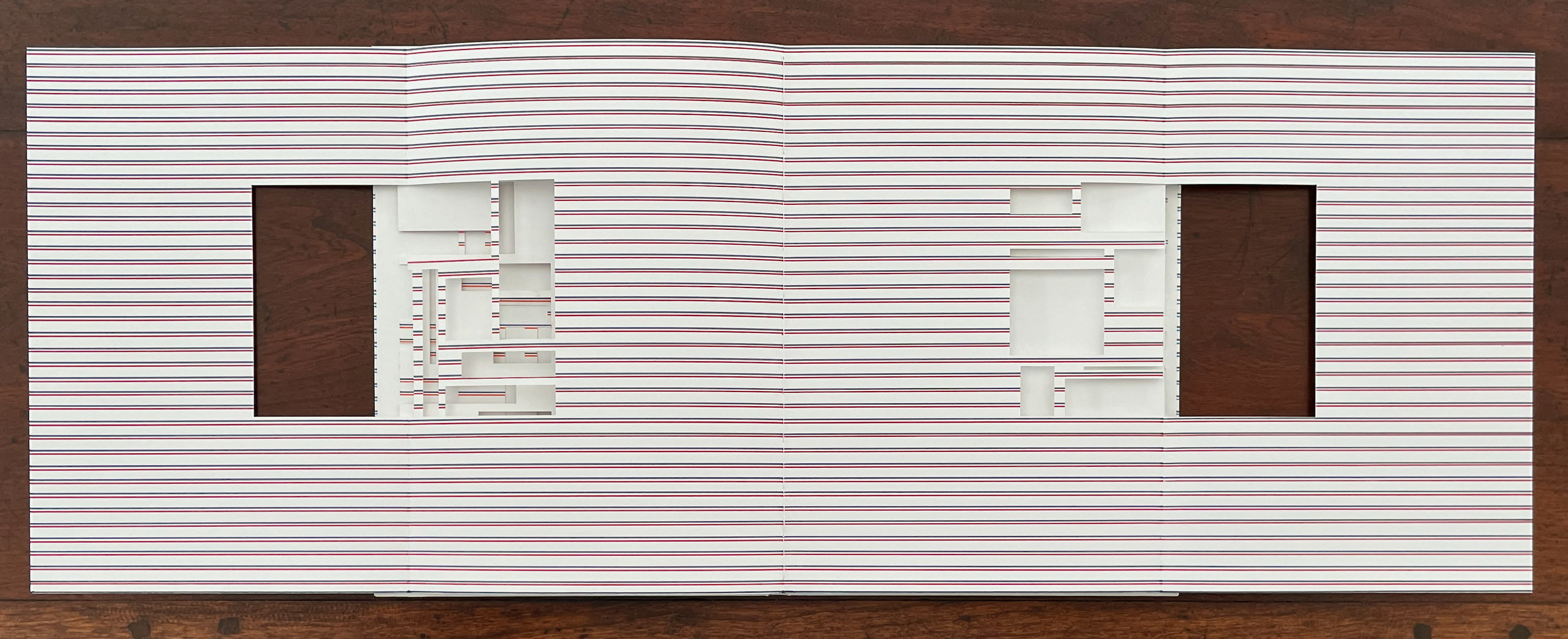
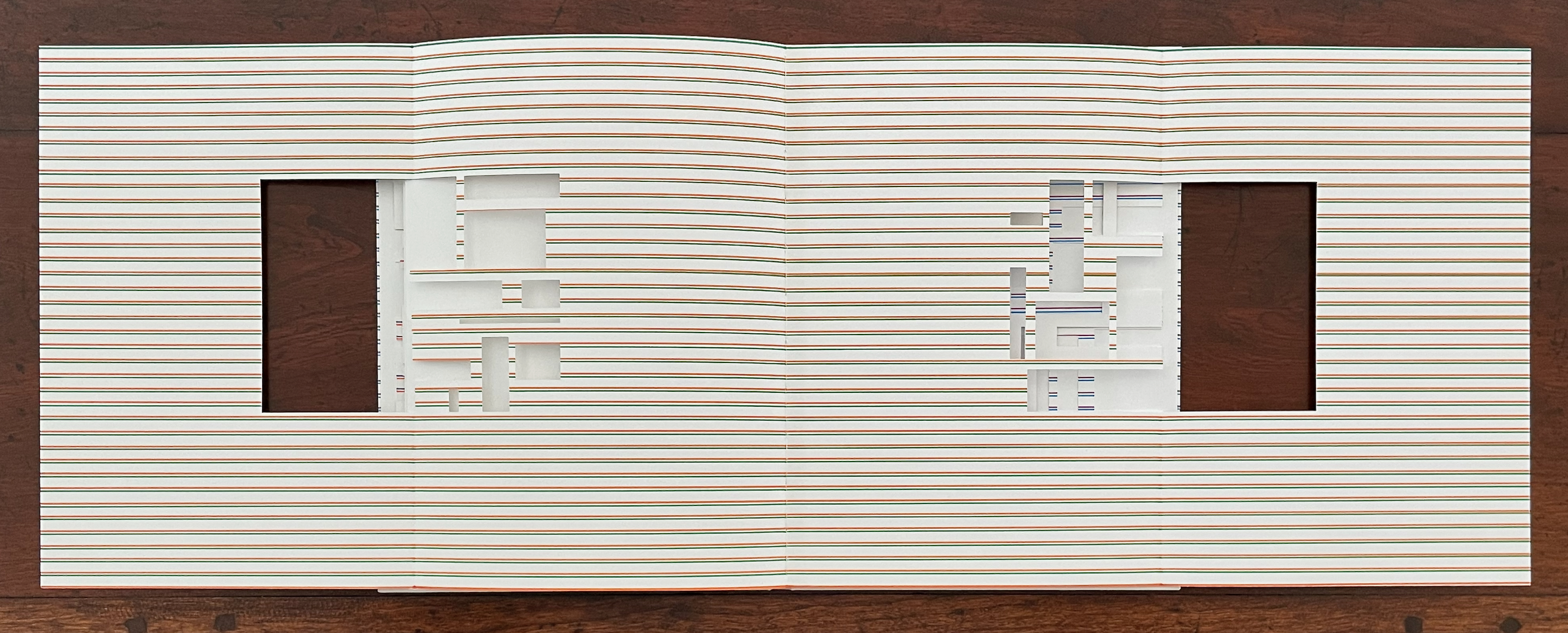
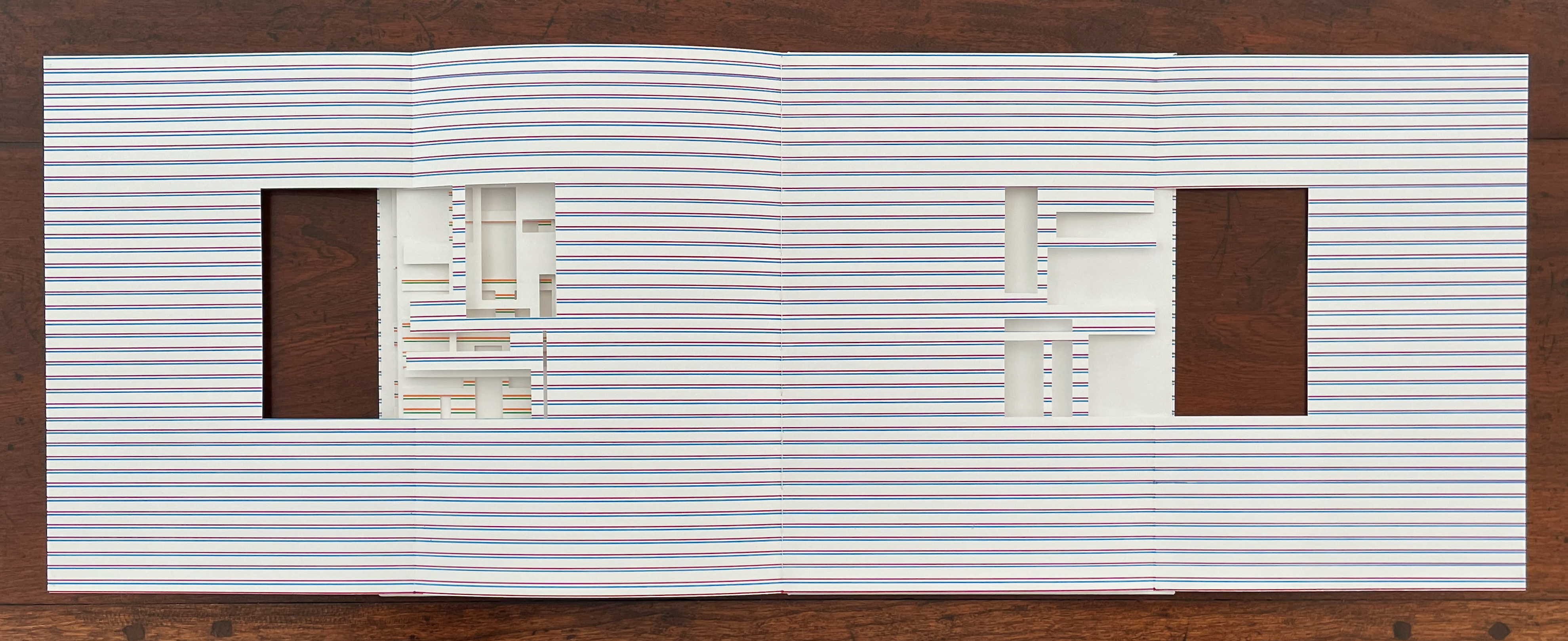
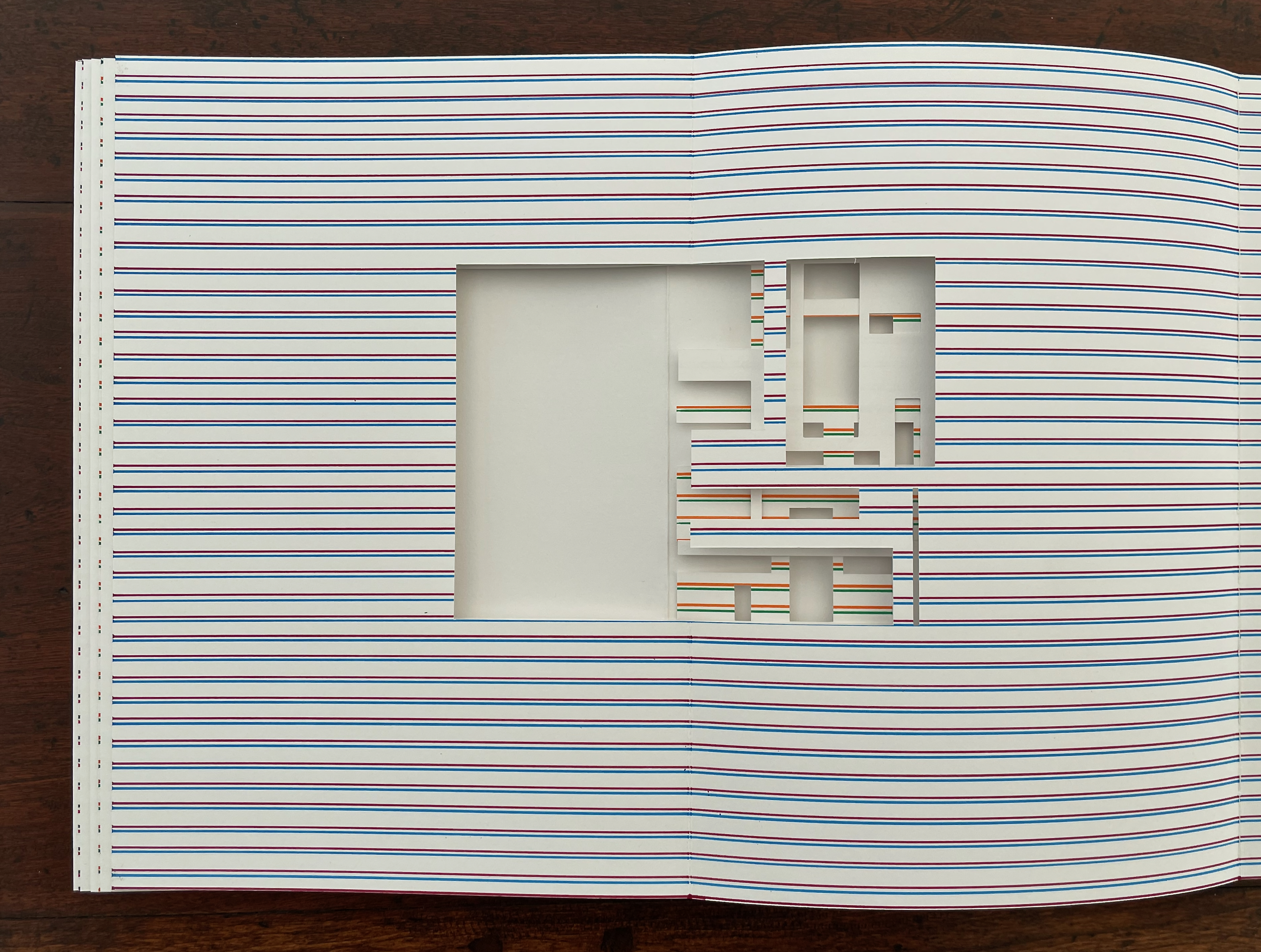
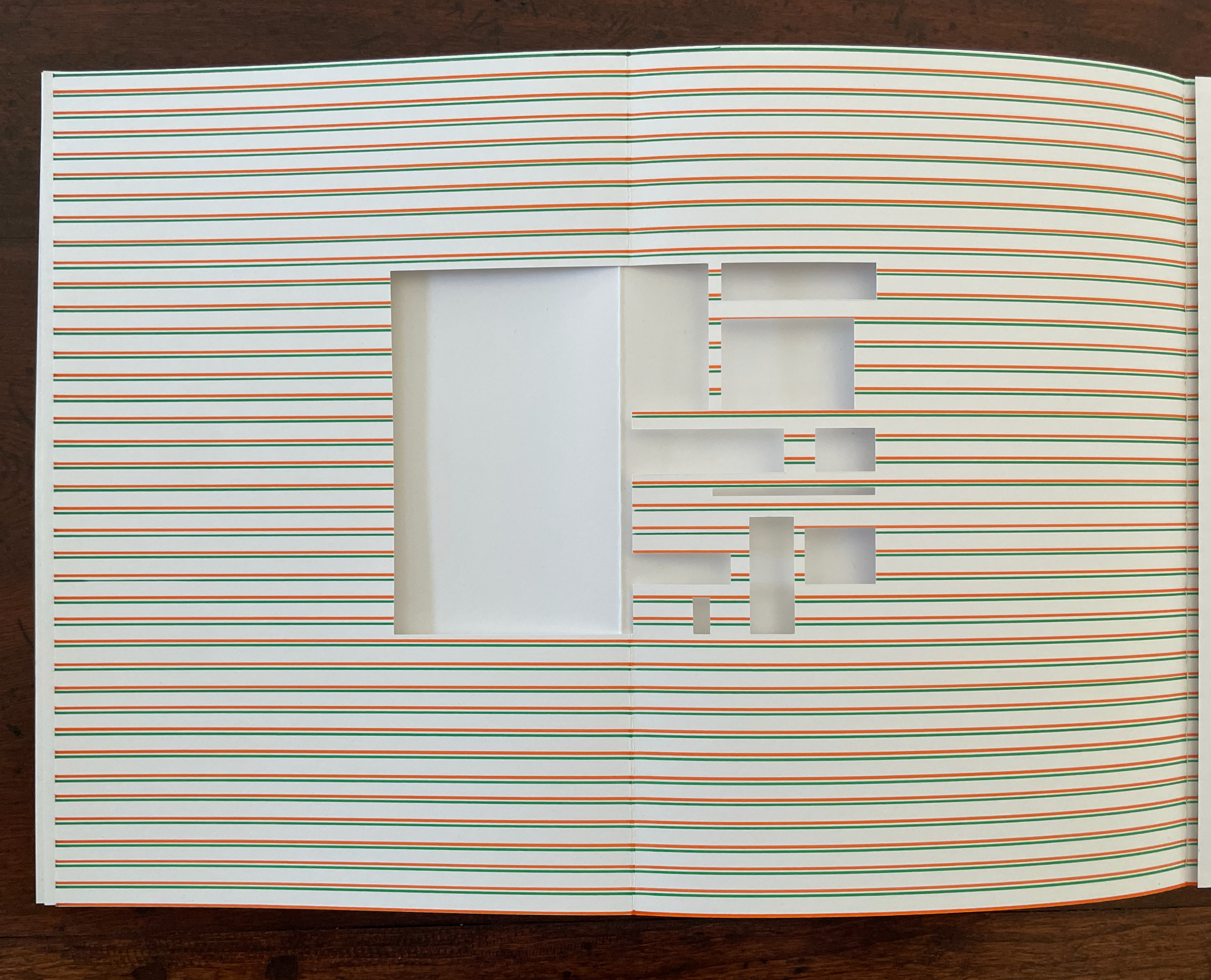
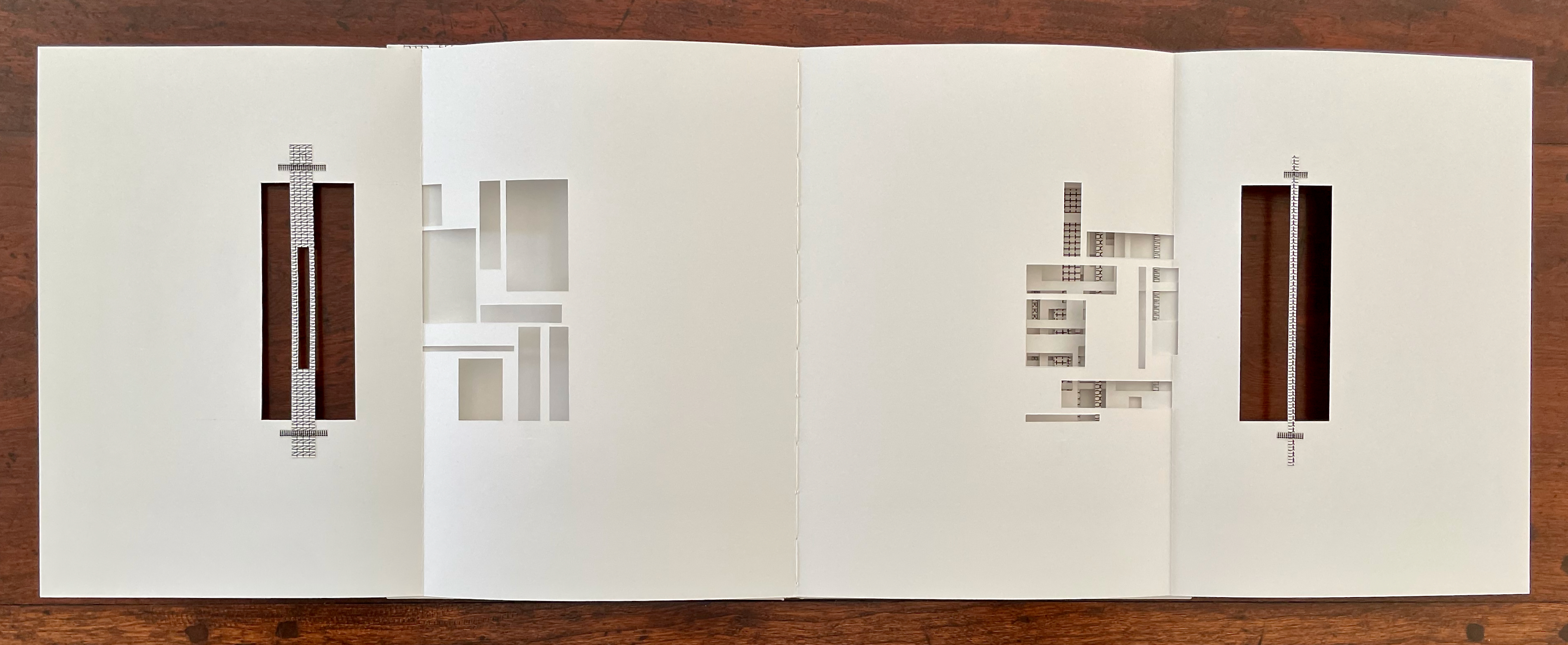
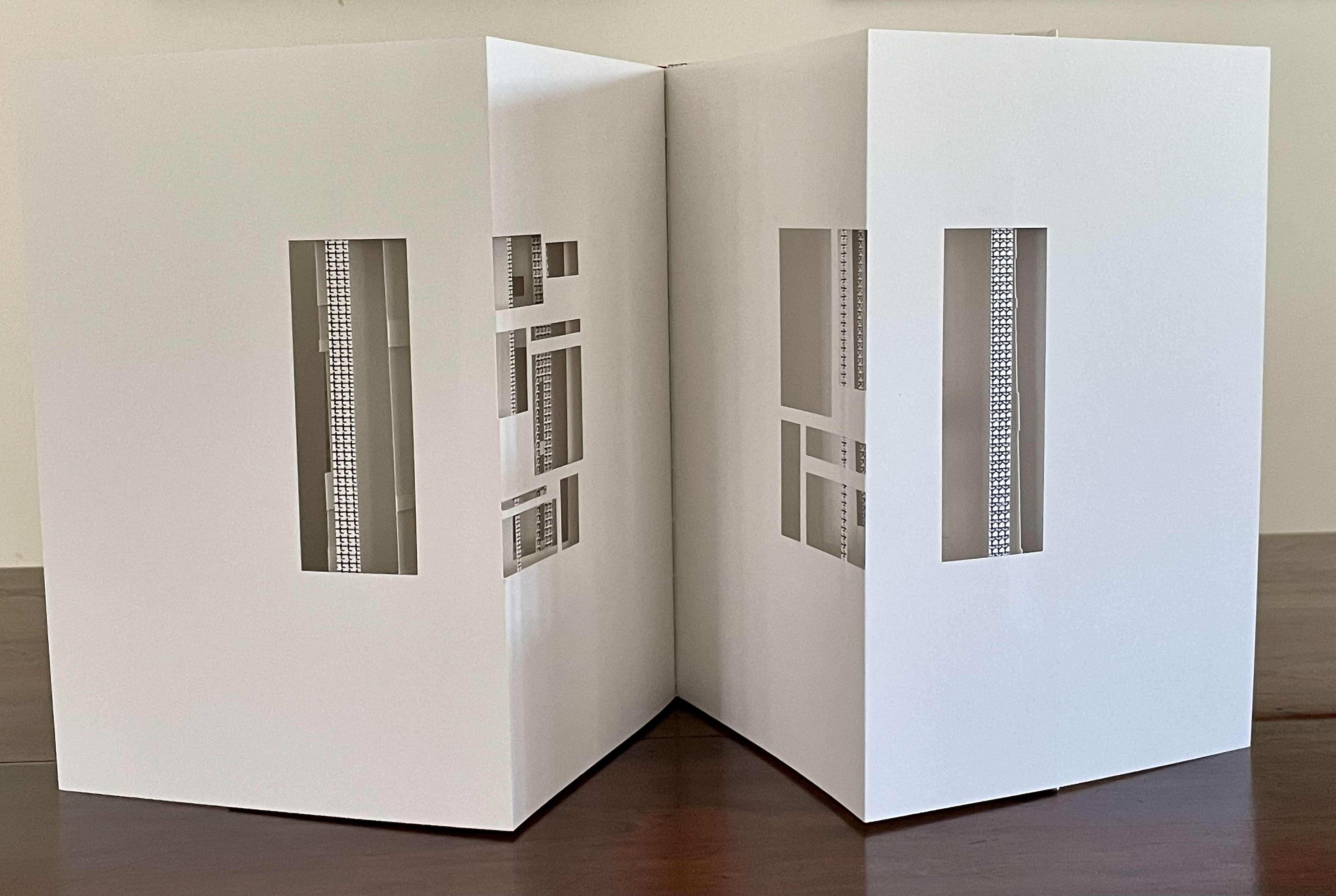
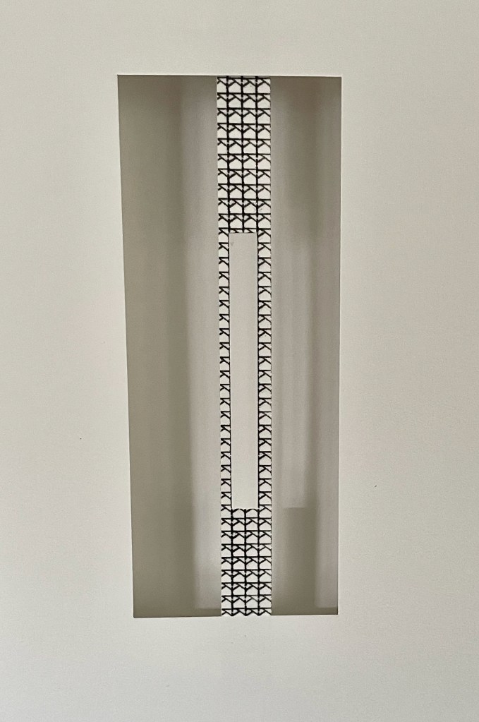
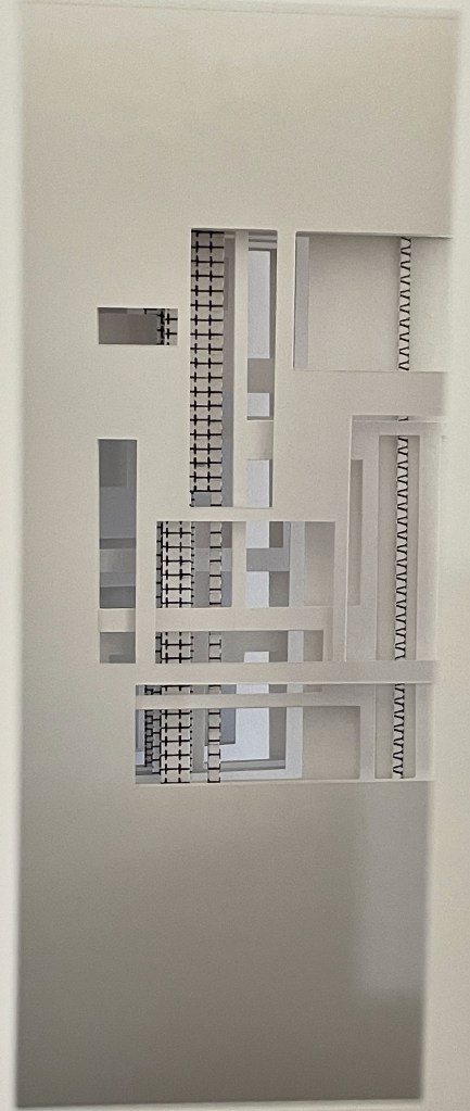
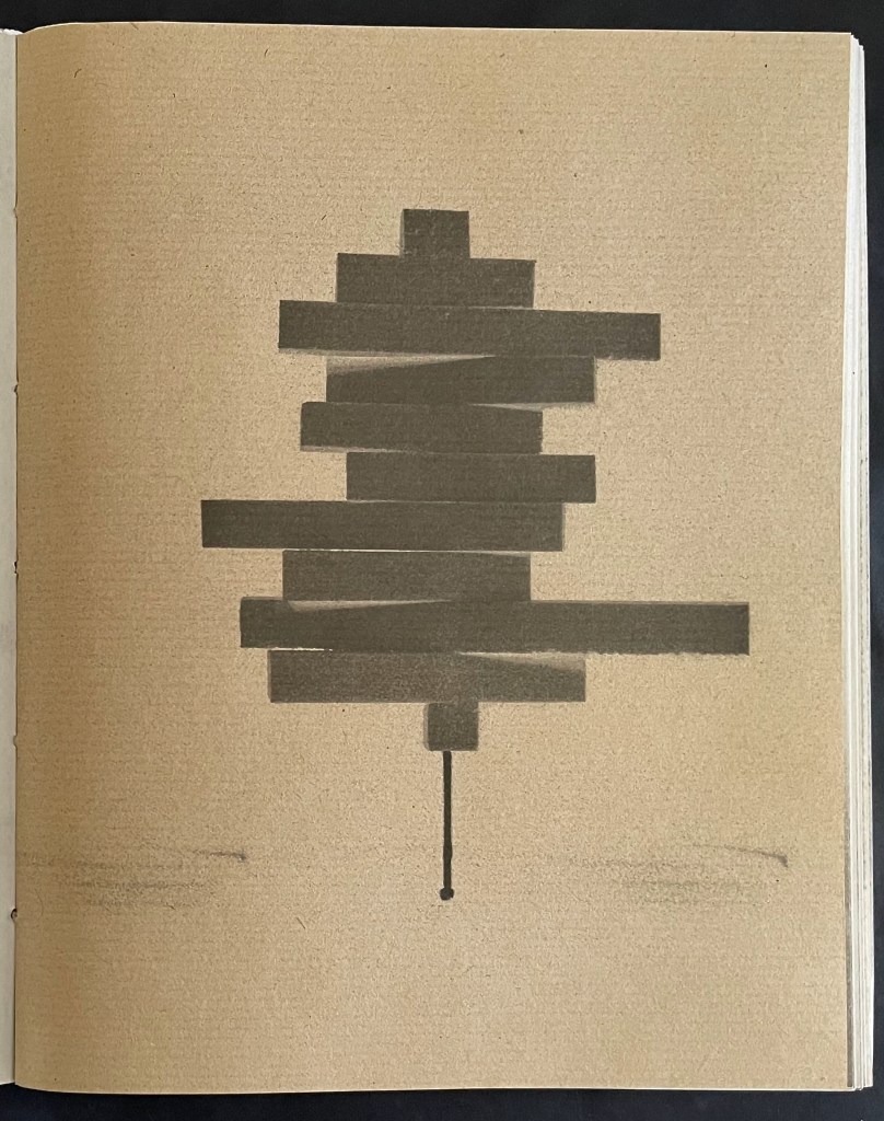
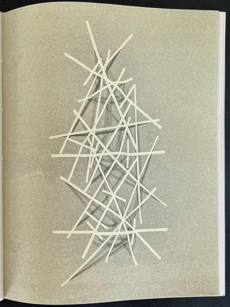
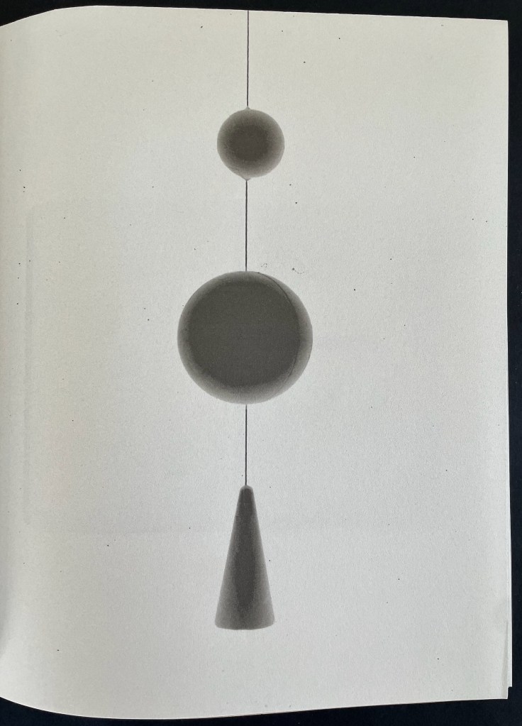
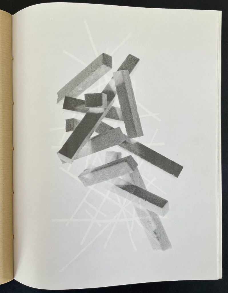
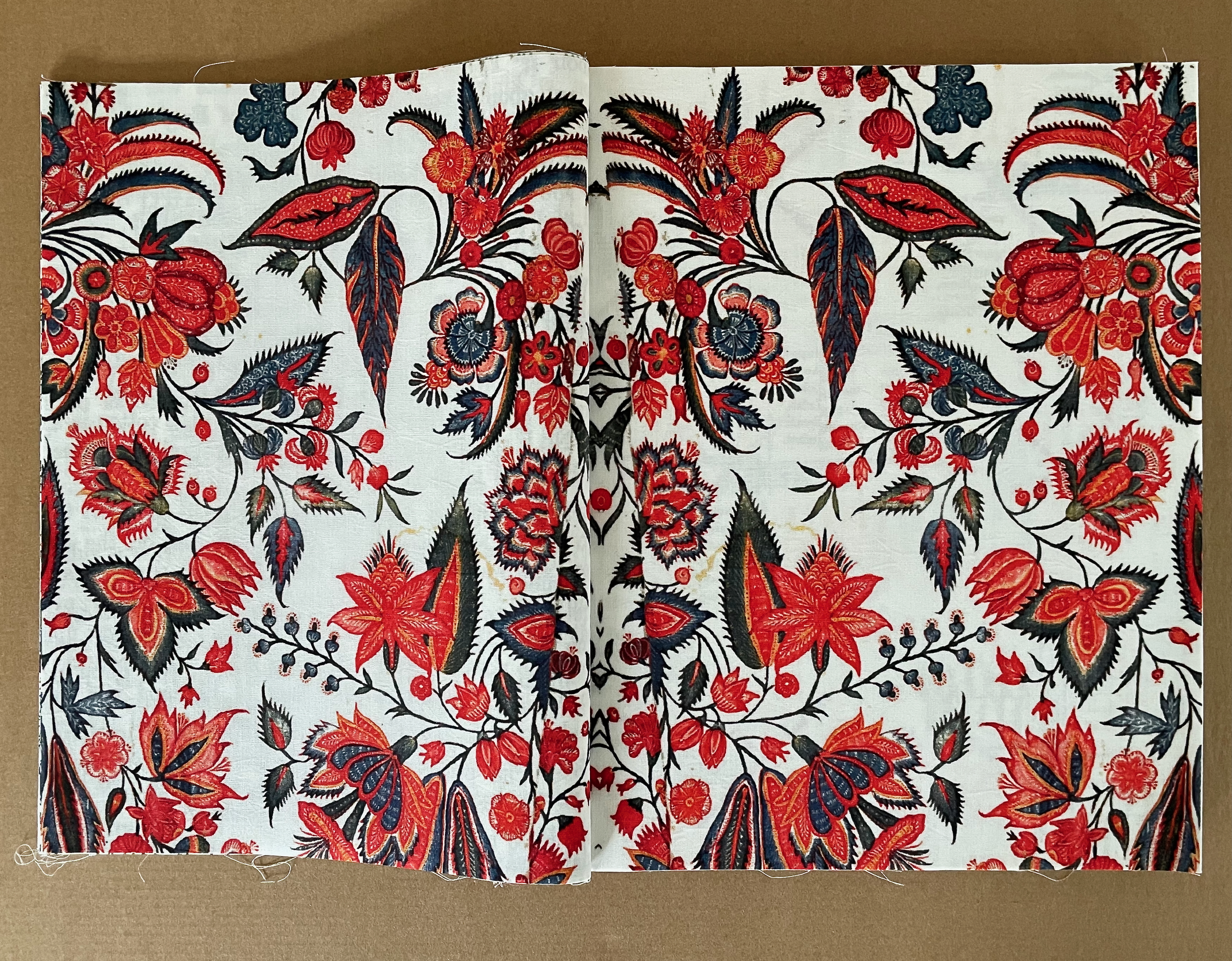
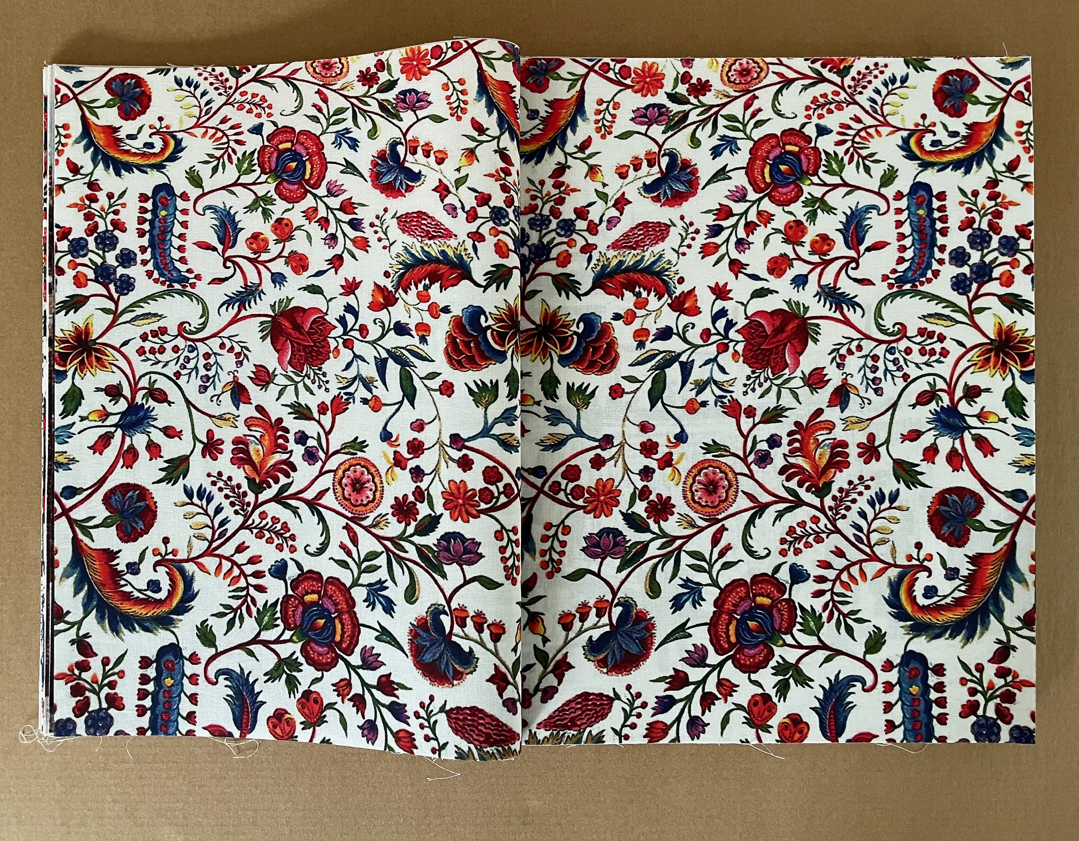
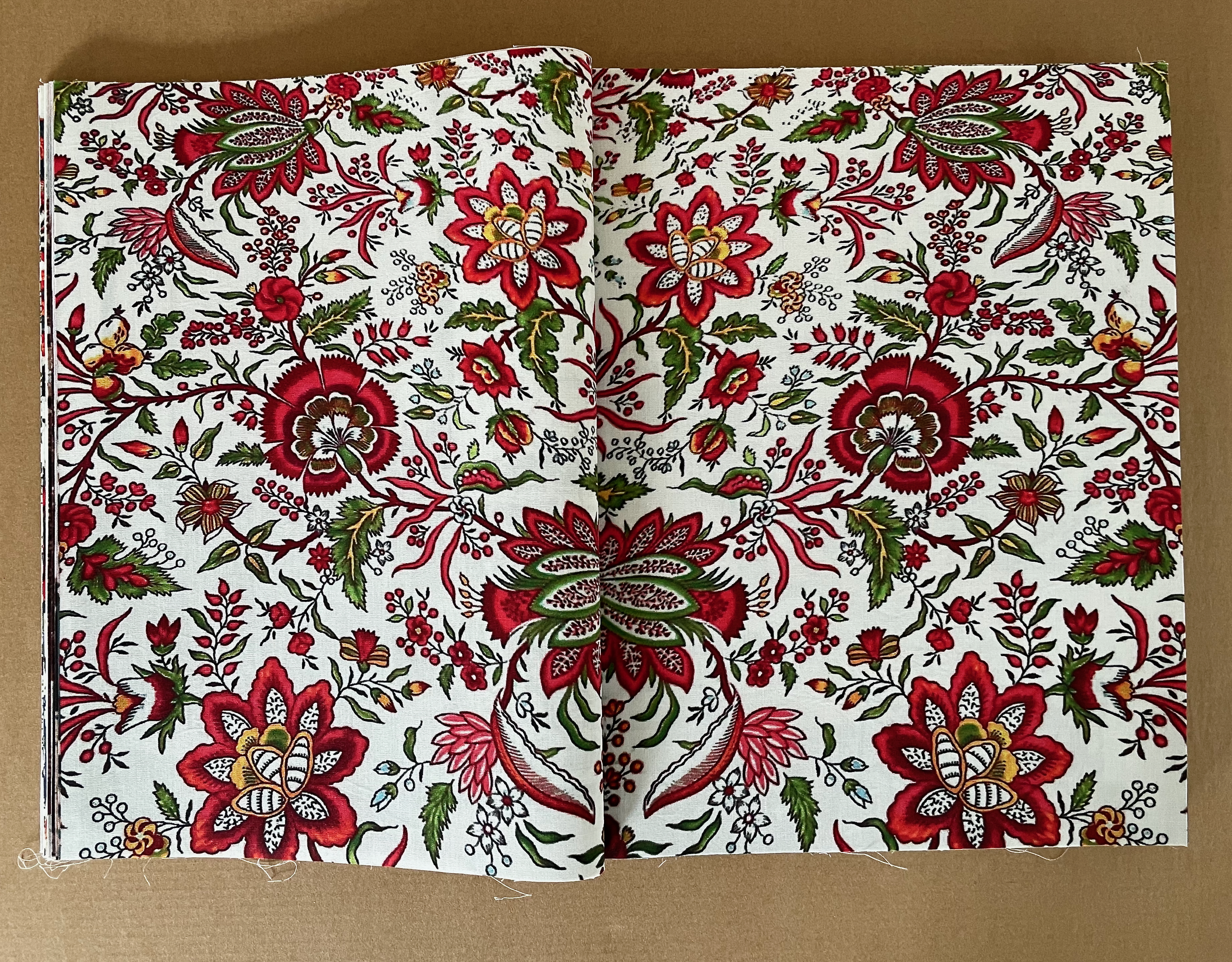
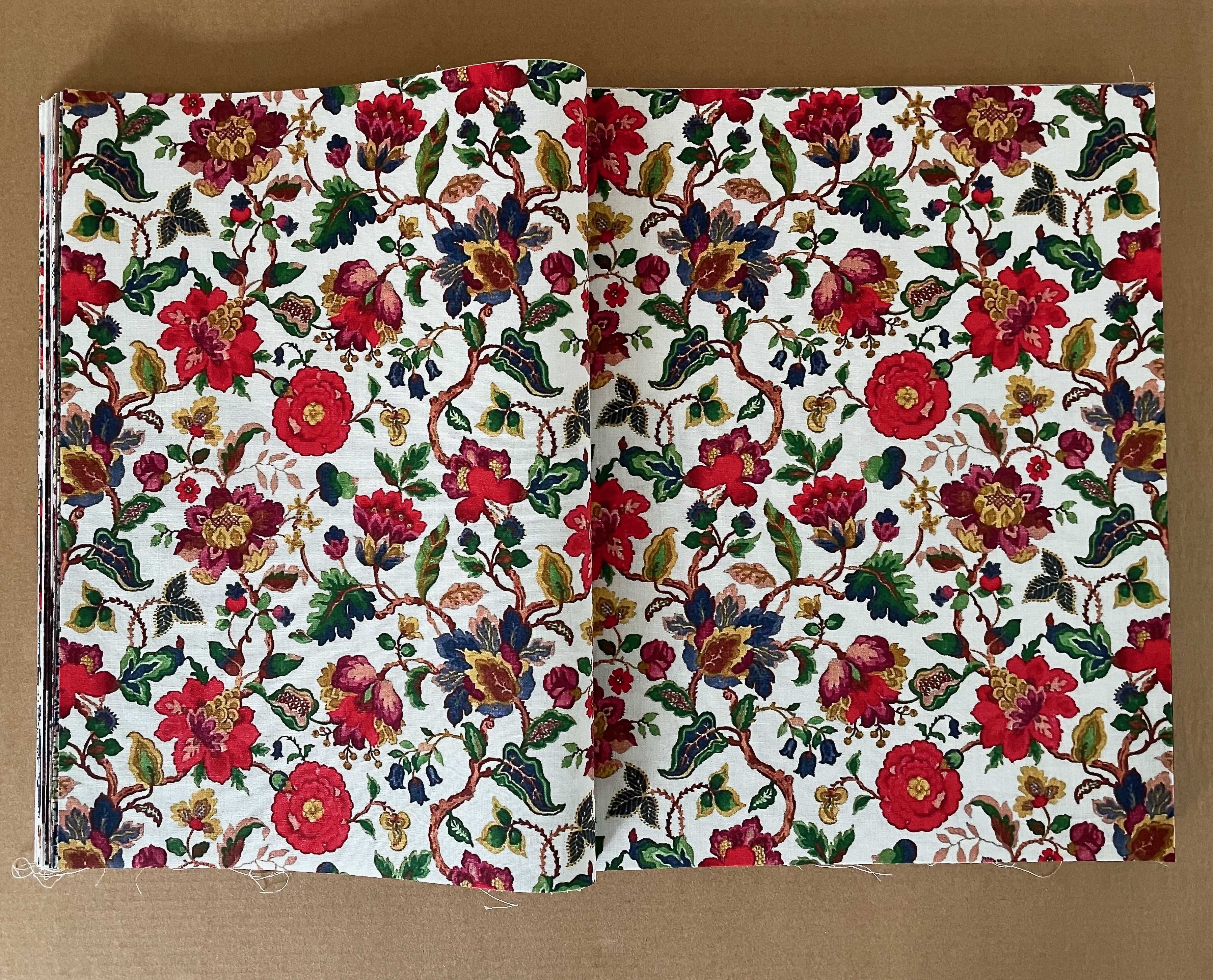
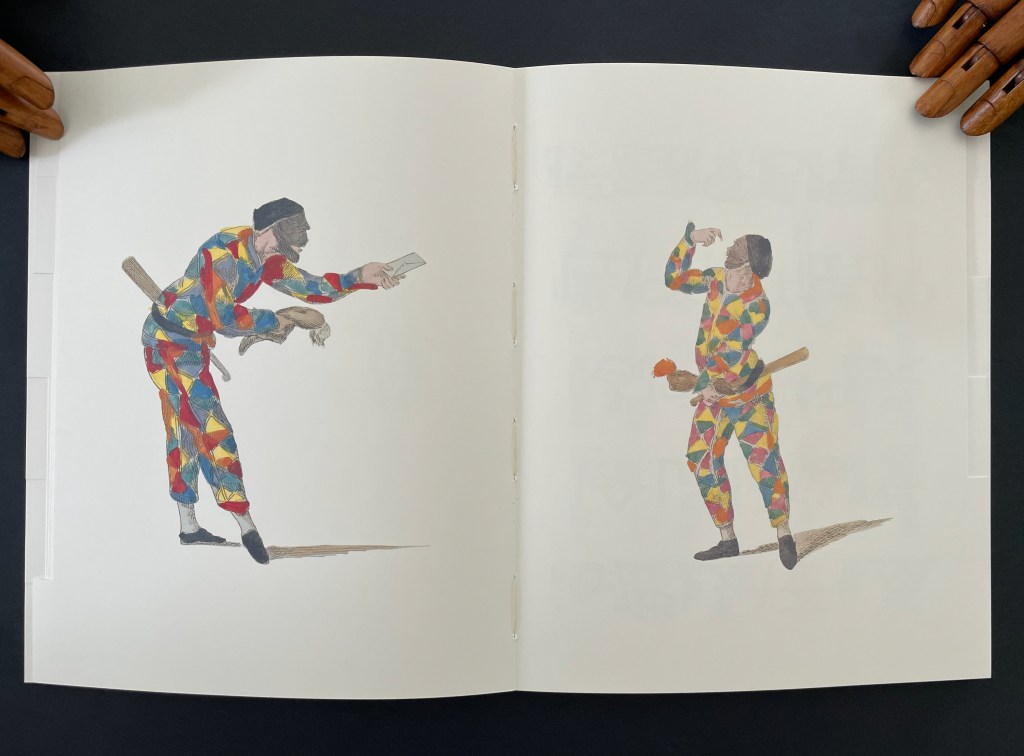
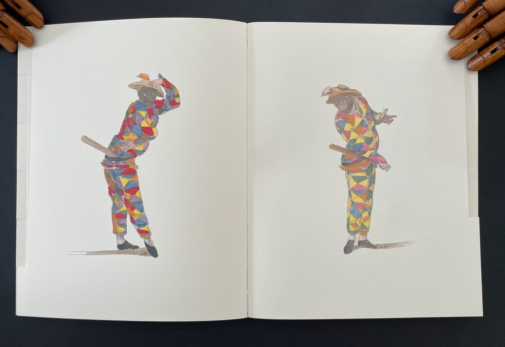
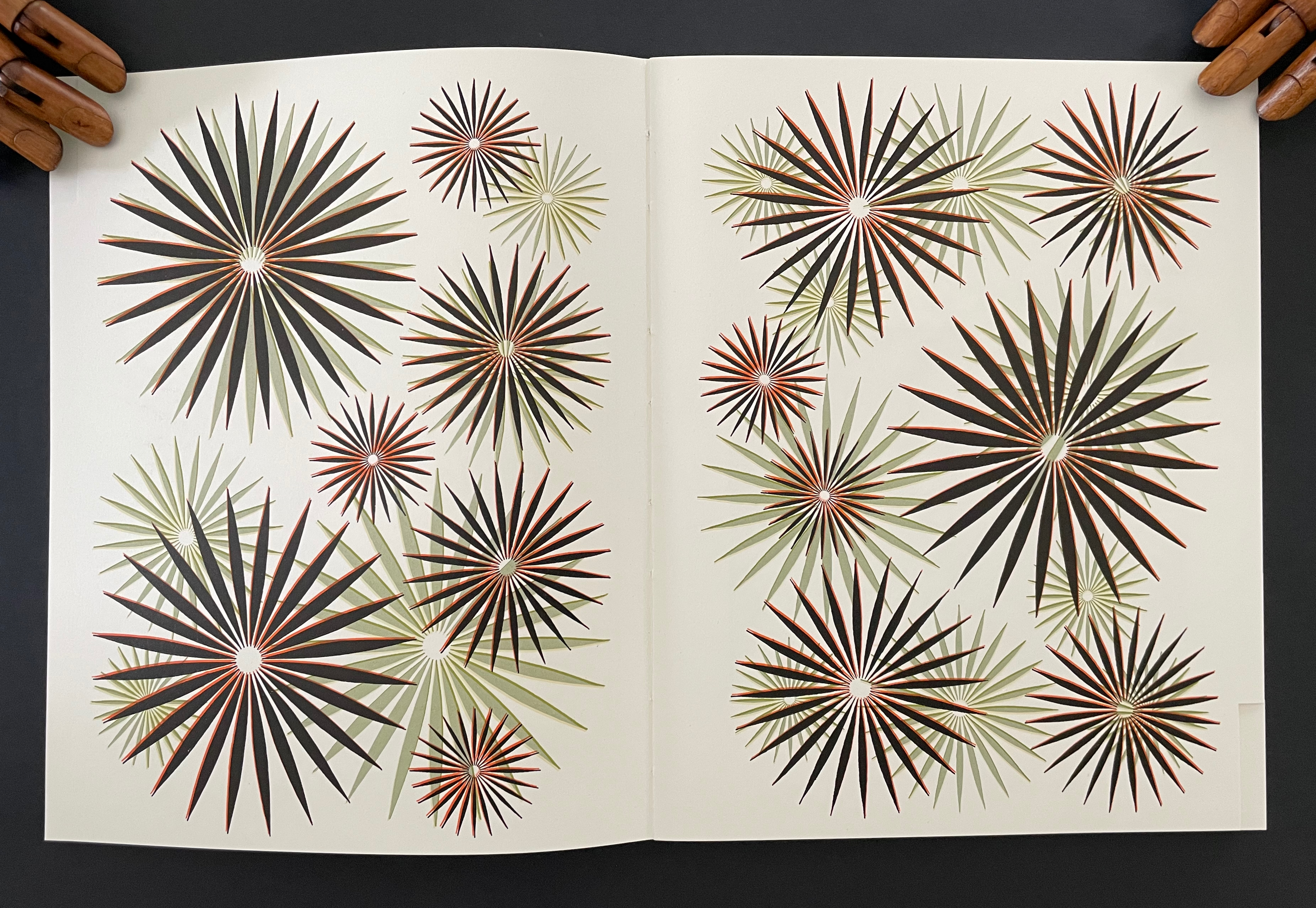
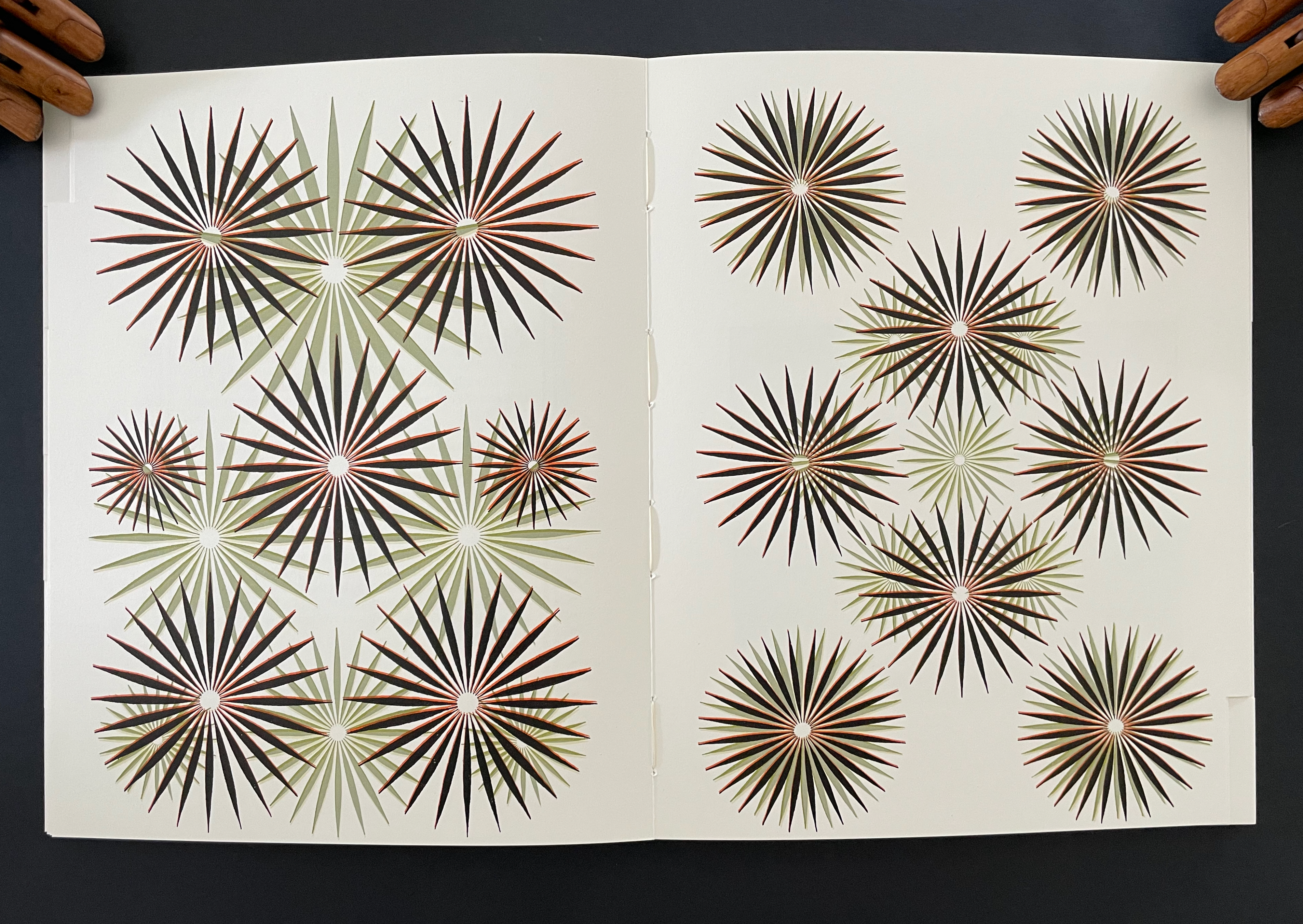
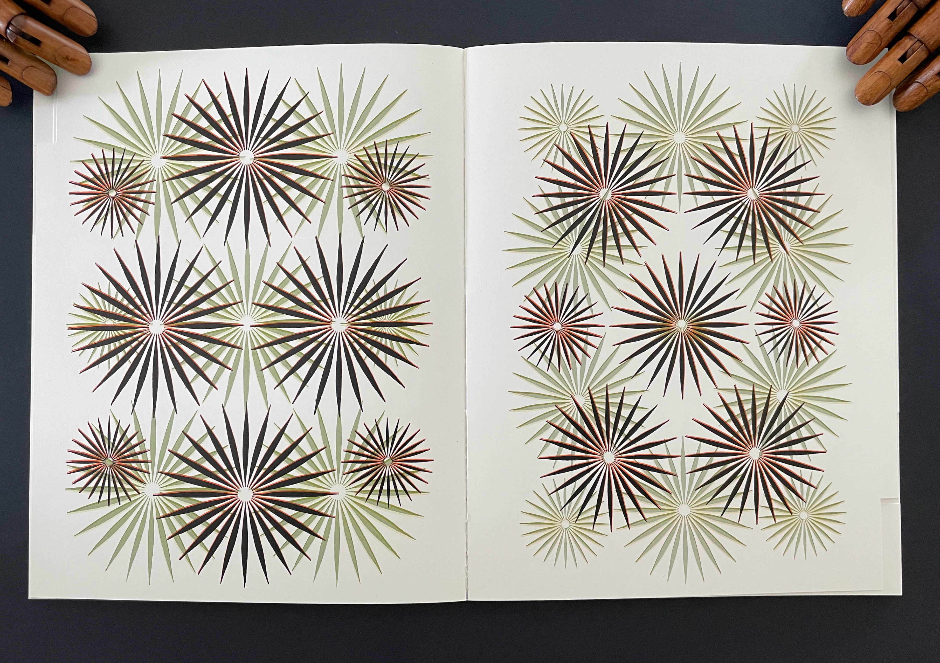
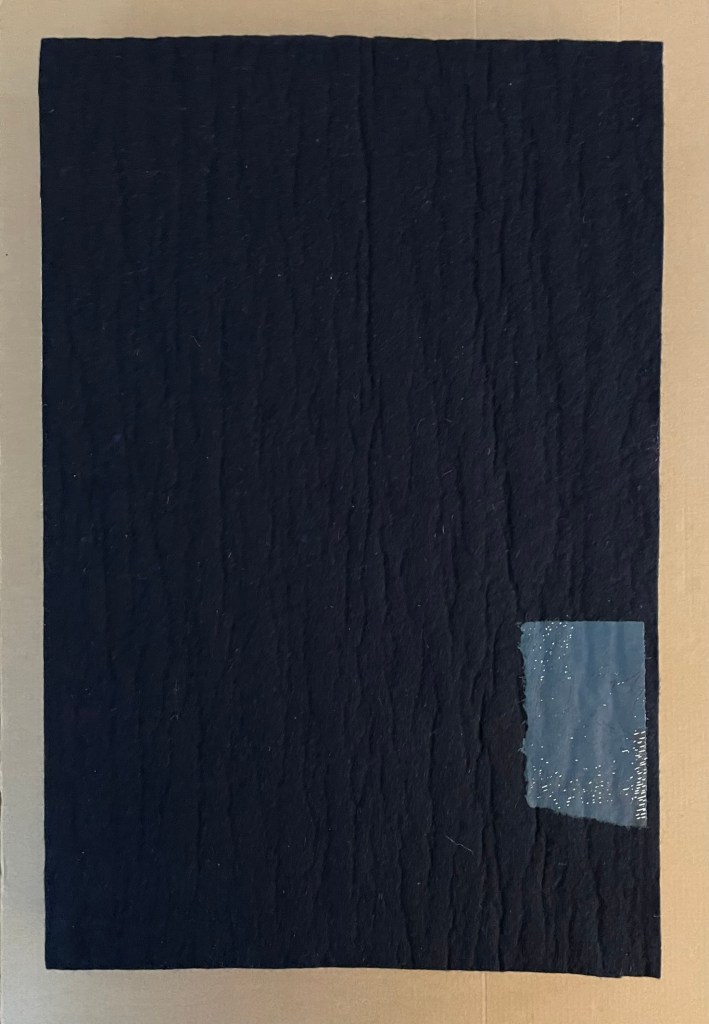
Untitled (I) (2012) Eva Evrard Cloth-covered, lined conservation box. Hardcover, case bound, tab binding, head- and tailbands, colored transparent PVC strips, Letraset Letraline adhesive tape. Box: H255 x W190 x D25 mm. Book: H232 x W171 mm. 4 gatherings, [32] pages. Unique work, acquired from the artist, 5 September 2026. Photos: Books On Books Collection.
With its tab binding structure and gatefold folios, Eva Evrard’s artist’s book revels across two and three dimensions in color, surface, and structure. In each gathering of scalpel-cut blank white pages, colored transparent PVC strips of vibrant reds, greens, blues, and yellows stand out. Air and space, too, are used as much as whiteness to contrast with those colors. The handling of color, the meticulous scalpel work, and the binding give a simultaneous painterly, sculptural, and architectural feeling to the piece.
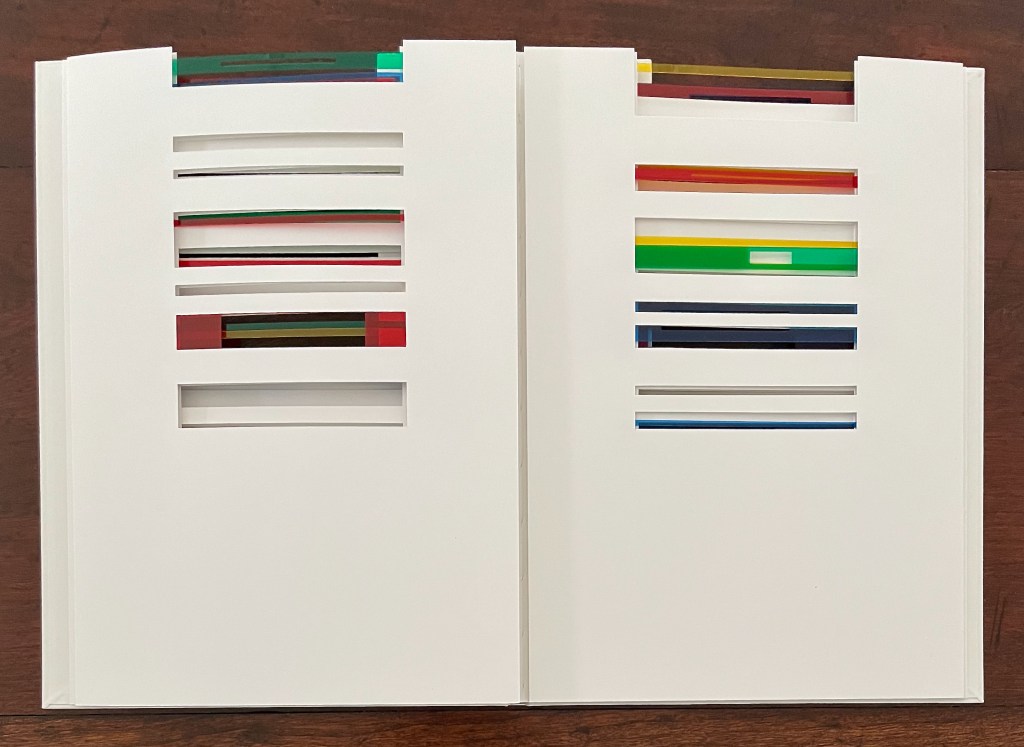
Each tab in the binding structure supports a gatefold sheet that opens first into a diptych of layered colored transparent PVC stripsand excised rectangles and then into a quadriptych showing narrowly cut slips of Letraset Letraline adhesive tape securing the PVC strips to the sheet.
The diptych view opens …
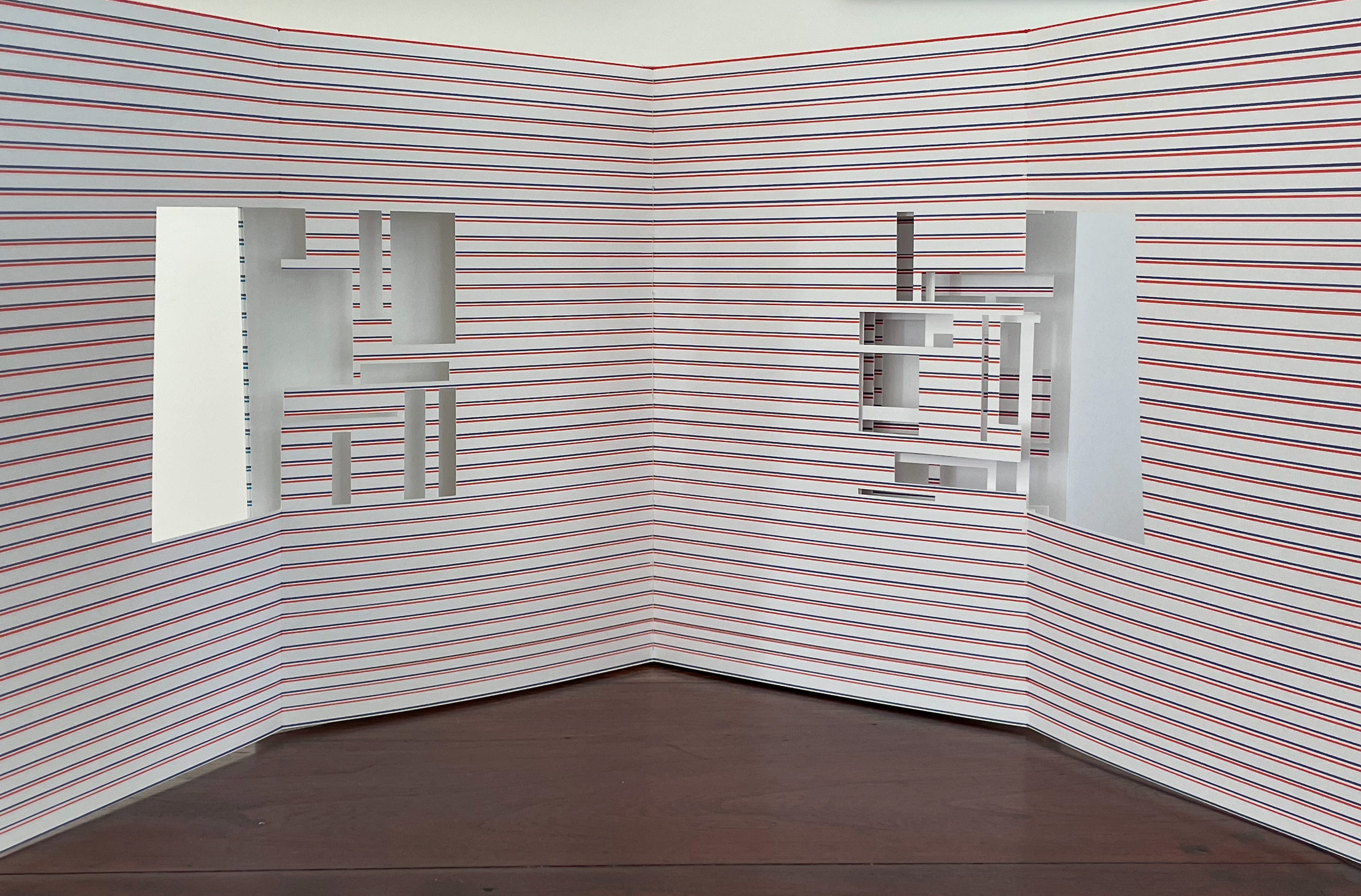
… into a quadriptych view.
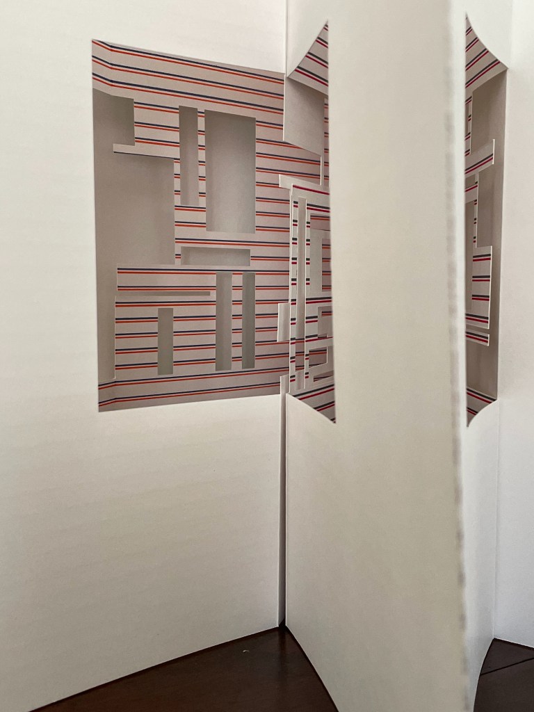
The tab and gatefold structures combine to offer a variety of standing positions for display. Each of them delivers a layered multicolor interior view as if through louvred windows into angular rooms.
If all of the gatefolds are opened outwards at once, the tension from the folds and binding forms a crenellated structure.
The lateral view compounds through and across the several interiors formed.
The view from above yields further complexity arising from simplicity.
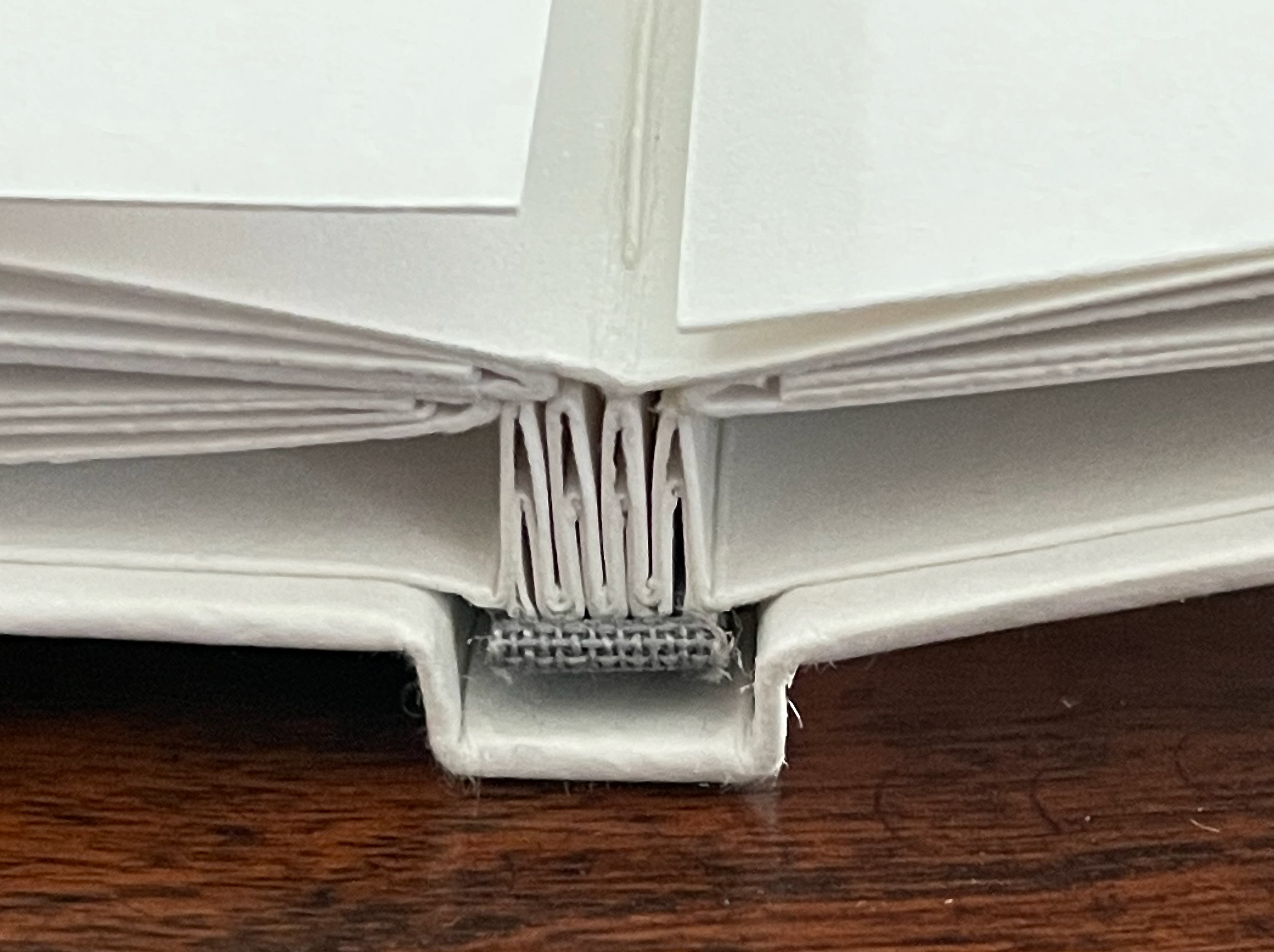
In the bookbinder Tatsuya Inuikawa, Evrard has found a kindred spirit who can sculpt board, paper, and cord into the tab binding that emphasizes her use of whiteness and her painterly, sculptural, and architectural themes. Together they have created a baroque minimalism.
Untitled (II) (2012)
Untitled (II) (2012) Eva Evrard Cloth-covered, lined conservation box. Hardcover, case bound, tab binding, head- and tailbands.Box: H255 x W190 x D25 mm. Book: H232 x W171 mm. [40] pages. Edition of 3, of which this is #2. Acquired from the artist, 5 September 2026. Photos: Book On Books Collection.
The ways in which this artist’s book resembles and differs from the one displayed above demonstrate Evrard’s creative depth. Instead of four tabs and four gatefold gatherings, there are five, and tellingly, the center tab and gathering is uncut and white.
The whiteness and space work differently with each other and with the presentation of colors than they do in the artist’s book shown above. Where whiteness framed the color on both sides of the gatefold sheets in the work above, it does so only on one side of the sheet in this work. Where excision “bled off” the top edge in the work above, the excised areas are surrounded in this work — by whiteness on one side of the sheet and by lines of color made by hand, using a ruler and markers on the other side.
As we move closer to the center tab, it comes into play — if fully extended — as background to the colors. And if viewed standing with all of the gatefolds extended, the book’s very different expression of color, whiteness, space, and shape stands out clearly as our view pivots to either side of the entirely white center tab and gathering .
As with the previous book, this one is painterly, sculptural, and architectural, but if the striped side of any one of the gatefolds is opened wide and stood on its edge, another difference becomes clear. This artist’s book orients more toward an interior view. It is almost as if we are looking into the corner of a room with large paintings or windows centered on the abutting walls.
If extended and laid flat, the gatefolds lean toward a diptych view. Or we might be looking at the edges, walls, and windows of other buildings outside the half-shuttered windows on the long interior walls facing us.
Or we can extend the blank gatefold behind a diptych panel and enjoy a more abstract presentation.
Untitled (III) (2011)
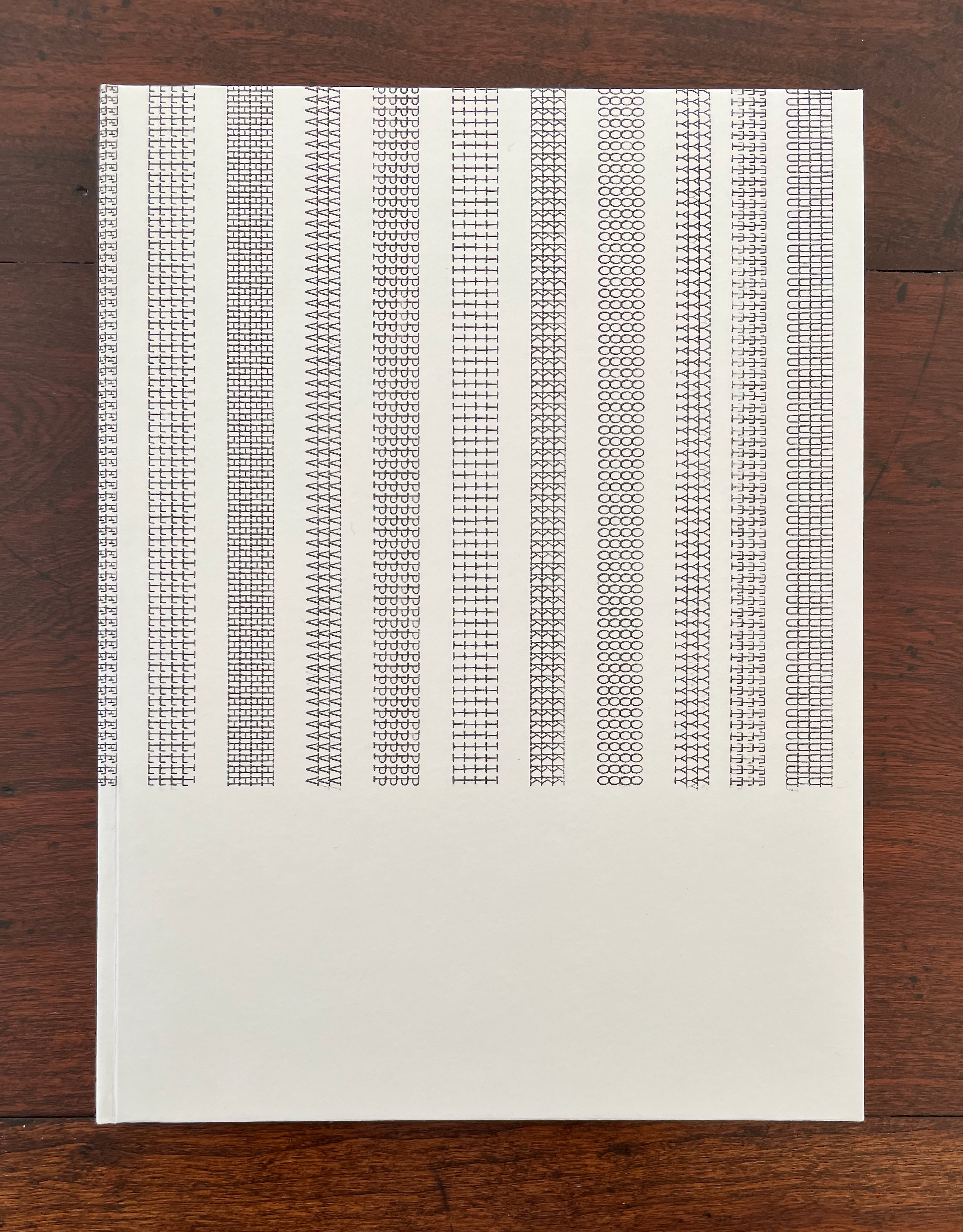
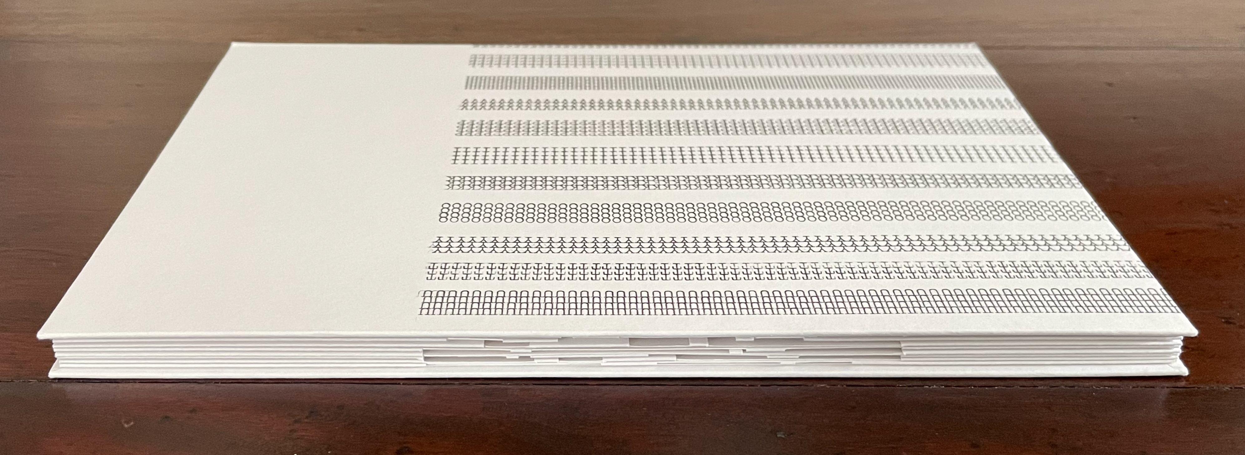
Untitled (III) (2011) Eva Evrard Cloth-covered, lined conservation box. Hardcover, case bound, tab binding, head- and tailbands, Letraset Letraline adhesive tape. Box: H255 x W190 x D25 mm. Book: H232 x W171 mm. [32] pages. Unique work, acquired from the artist, 5 September 2026. Photos: Books On Books Collection.
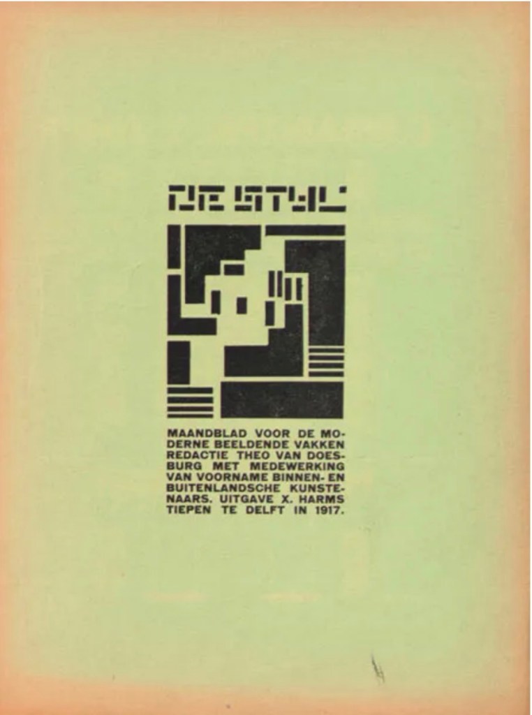
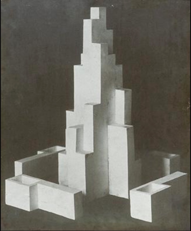
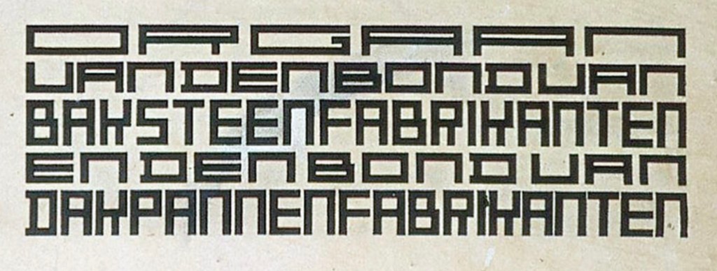
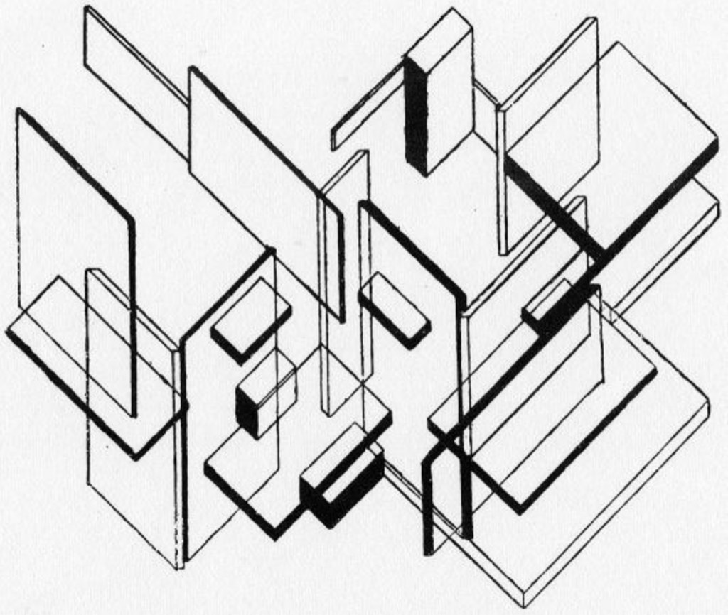
This artist’s book reverts to four tabs and gatefold gatherings. Except for its red head- and tail-bands, it is entirely black and white, unlike the two works displayed above. Also unlike them, it introduces typewriter-written letters. In art historical terms, it leans less toward Piet Mondrian and more toward Theo Van Doesburg and Vilmos Huszár. The grid in the image of Huszár’s De Stijl cover and the images from Van Doesburg’s monument design, architectural analysis, and his 1919 typeface design “Architype” echo among Evrard’s construction.
Cover for De Stijl (Oct 1917). Vilmos Huszár . Design for a monument in Leeuwarden (1917), Lettering for the ‘Klei’ magazine (1919), Architectural analysis (1923). Theo van Doesburg.
Displayed flat, Evrard’s Untitled (2011) has the feel of an architectural design drawing. Displayed upright, it has the feel of an architectural model.
Her black and white composition with scalpel, fold, space, and Letraline adhesive tape is captivating. A window cut in a strip of tape floating in the window of space excised from the page casts its light through the space beyond and onto the page behind. A multi-grid cutout could be giving a bird’s-eye view onto street markings and tram tracks or a view through the walls of a high-rise construction with girders, rebar, and sheetrock.
Ken Botnick was right when he said, “Artist books are to the world of books as poetry is to the field of writing.” Reading each of these three artist’s books is like reading a well-crafted poem. Each requires close attention, re-reading, and shifts of perspective. The reward is a world of views within views.
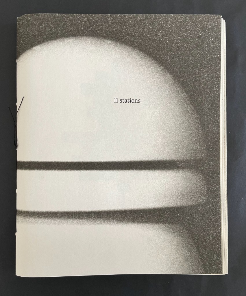
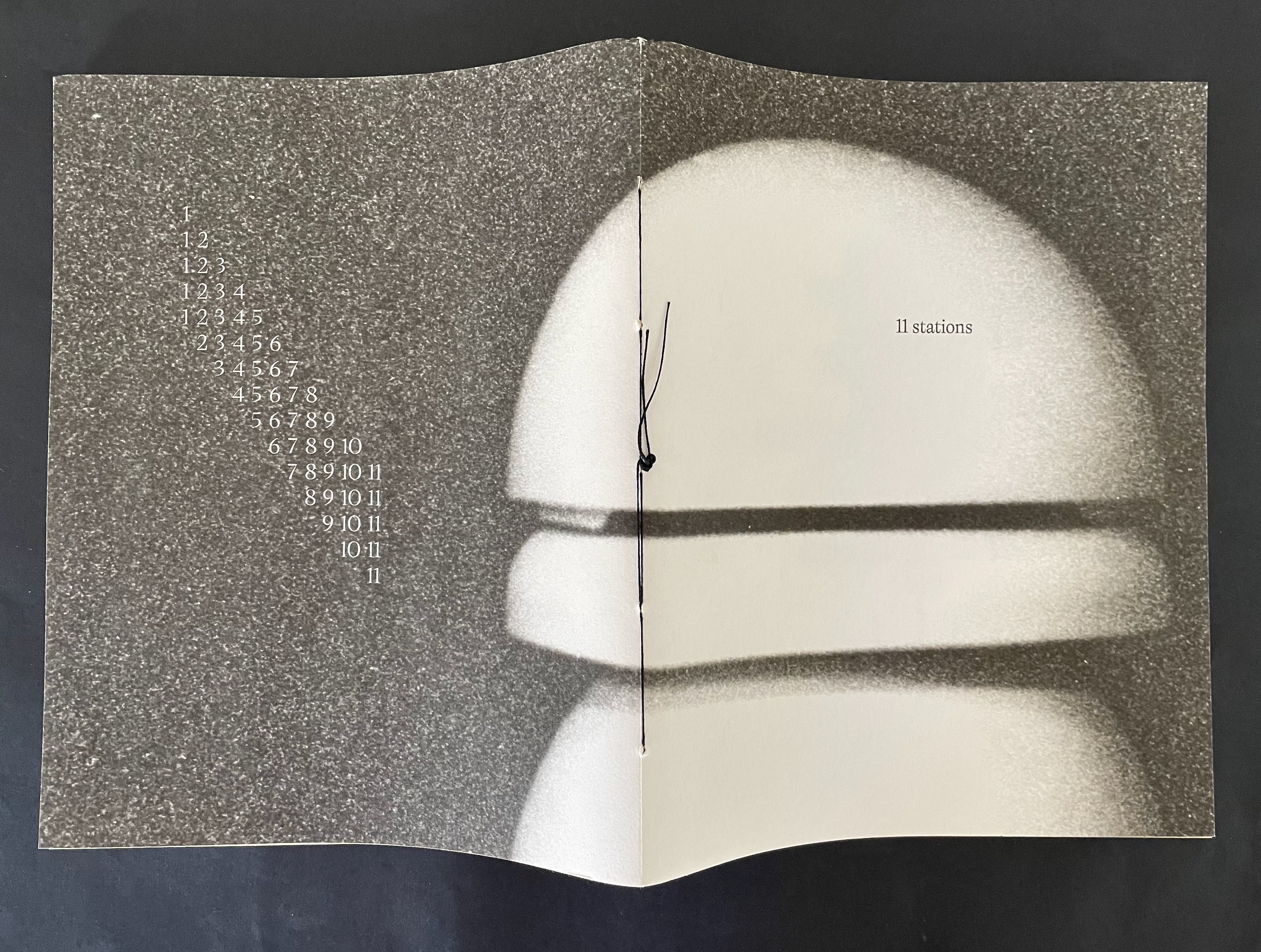
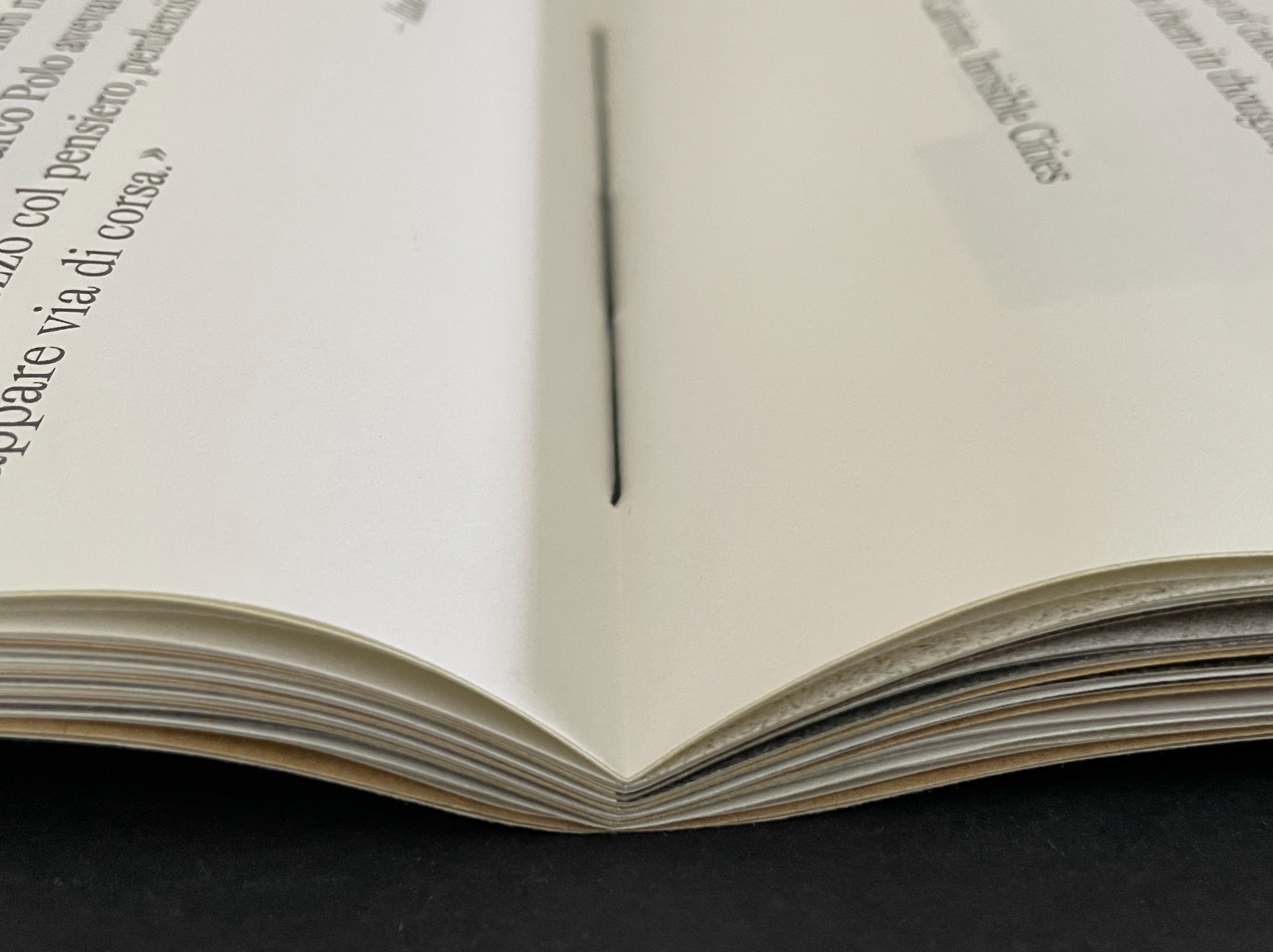
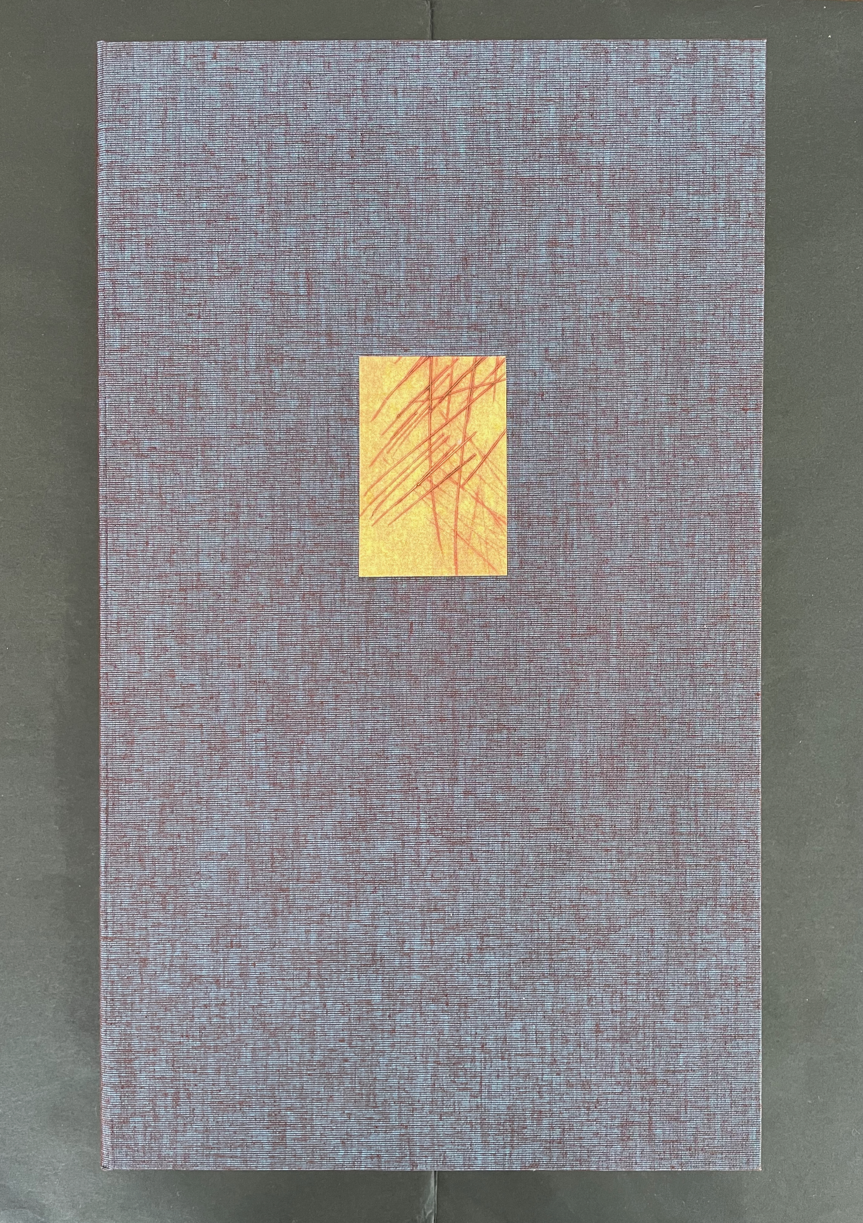
11 Stations(2025) Diego Brambilla Portfolio wrapper enclosing a paper-covered book, pamphlet-stitched with black thread. Portfolio: H308 x W225 mm.Book: H238 x W197 mm. 55 pages. Edition of 55, of which this is #53. Acquired from the artist, 16 June 2026. Photos: Books On Books Collection.
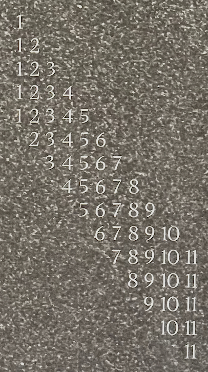
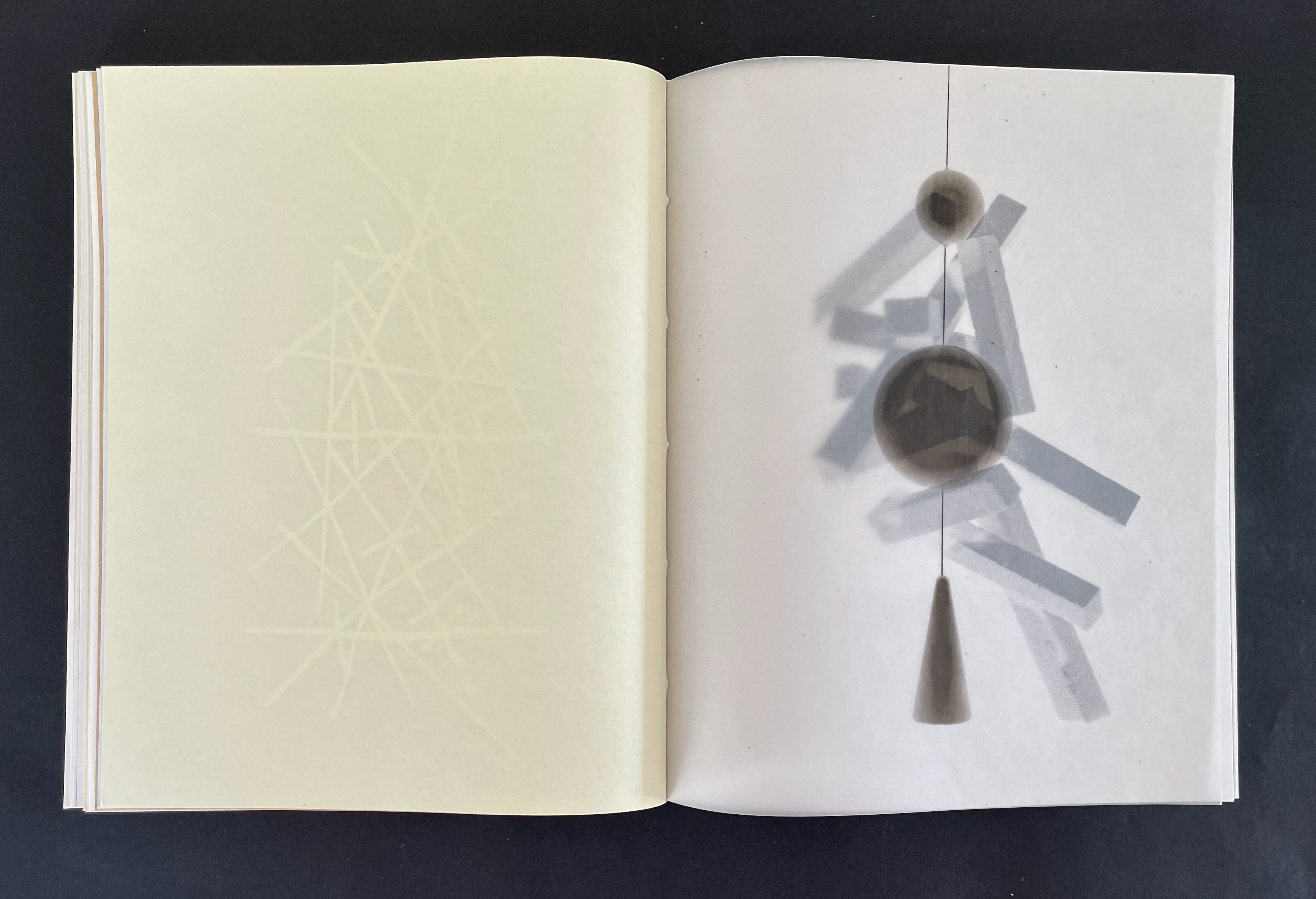
Diego Brambilla‘s 11 Stations pays homage to Italo Calvino’s Invisible Cities with a beautiful construction that visually and materially reflects the novel’s intricate structure. Where Calvino has Marco Polo describe 55 cities to Kublai Khan across a complex cascading cycle of 11 themes, Brambilla’s artist’s book has 55 pages and 11 images from handmade gelatin-silver prints each recurring 5 times. The descending staircase pattern of numbers starting from 1 and ending at 11 on the back cover shows Brambilla’s cascading cycle of images. It is in fact a structural Table of Contents for 11 Stations.
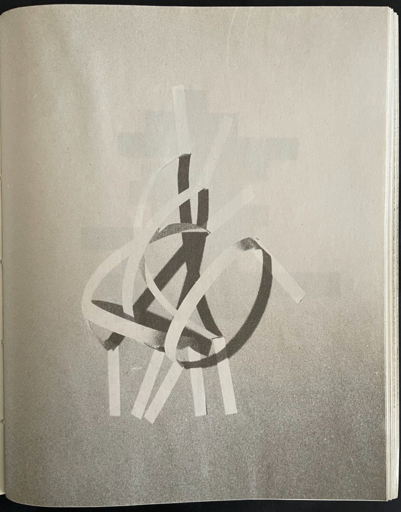
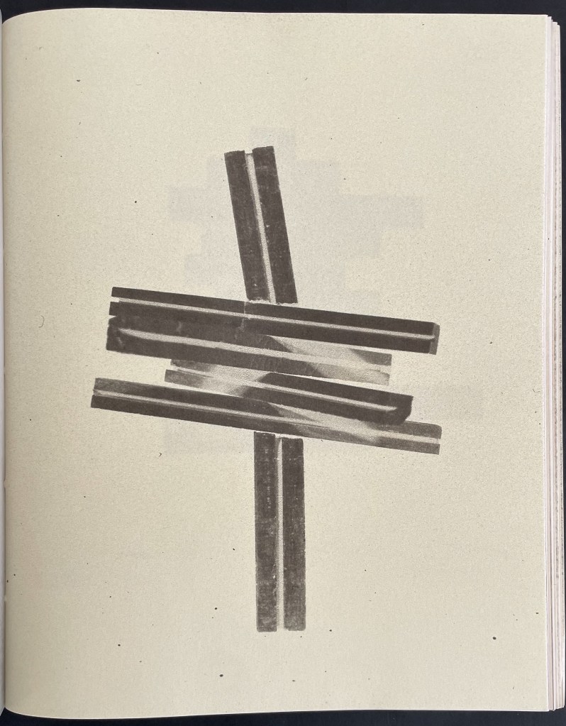
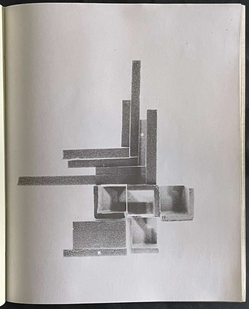
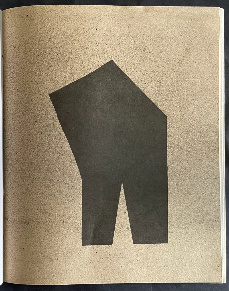
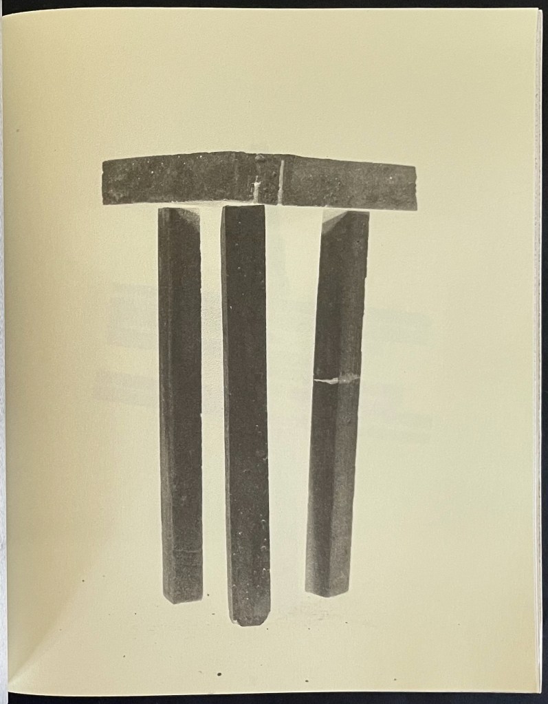
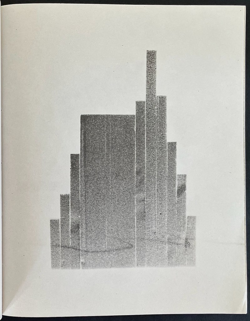
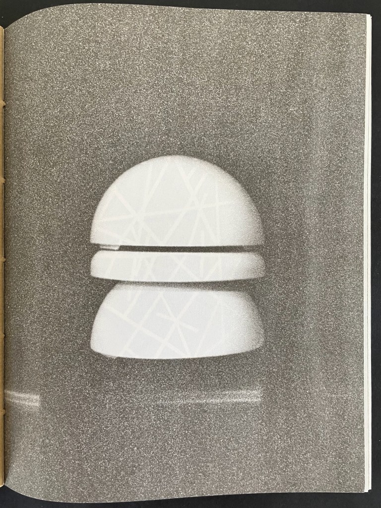
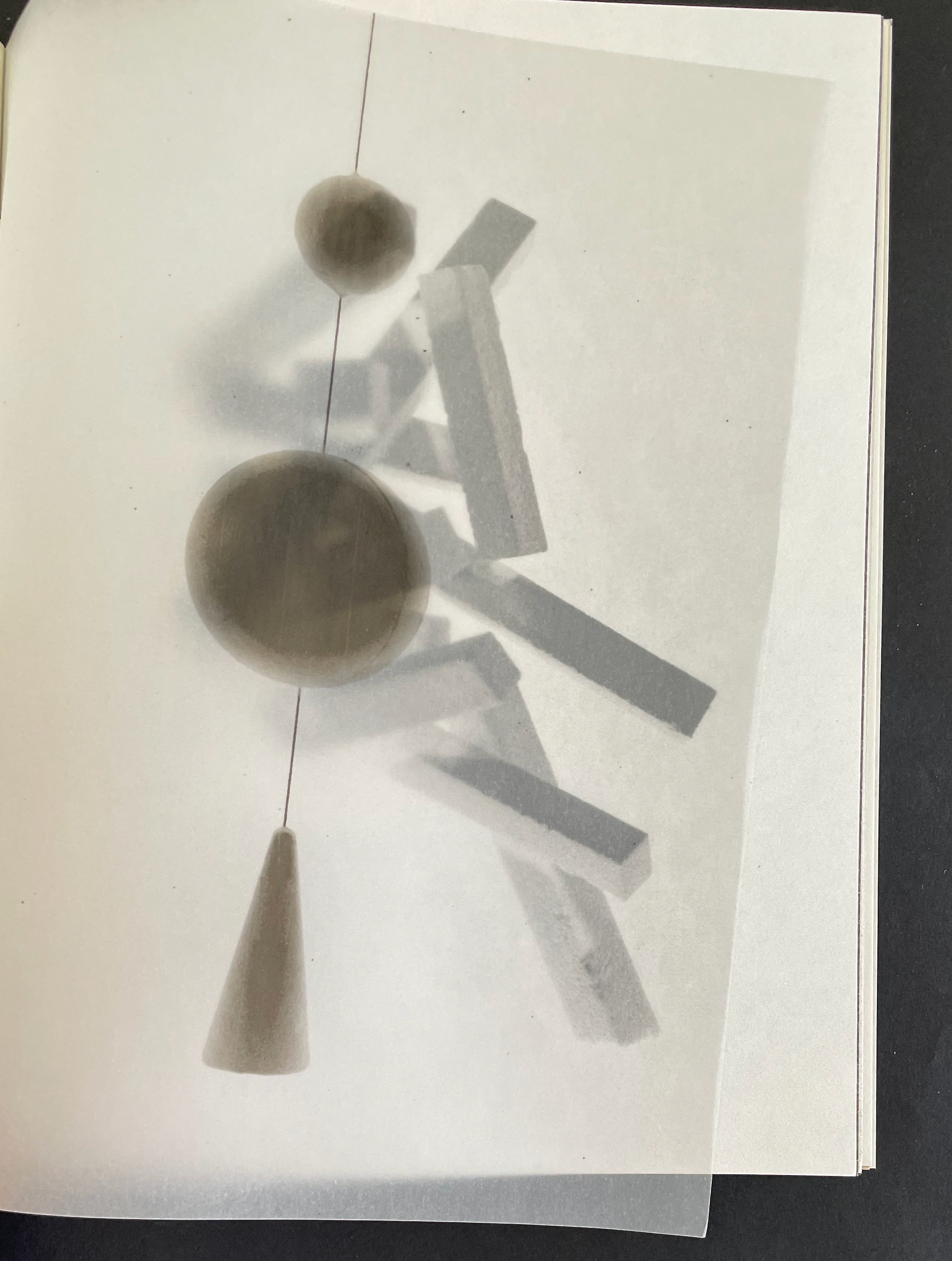
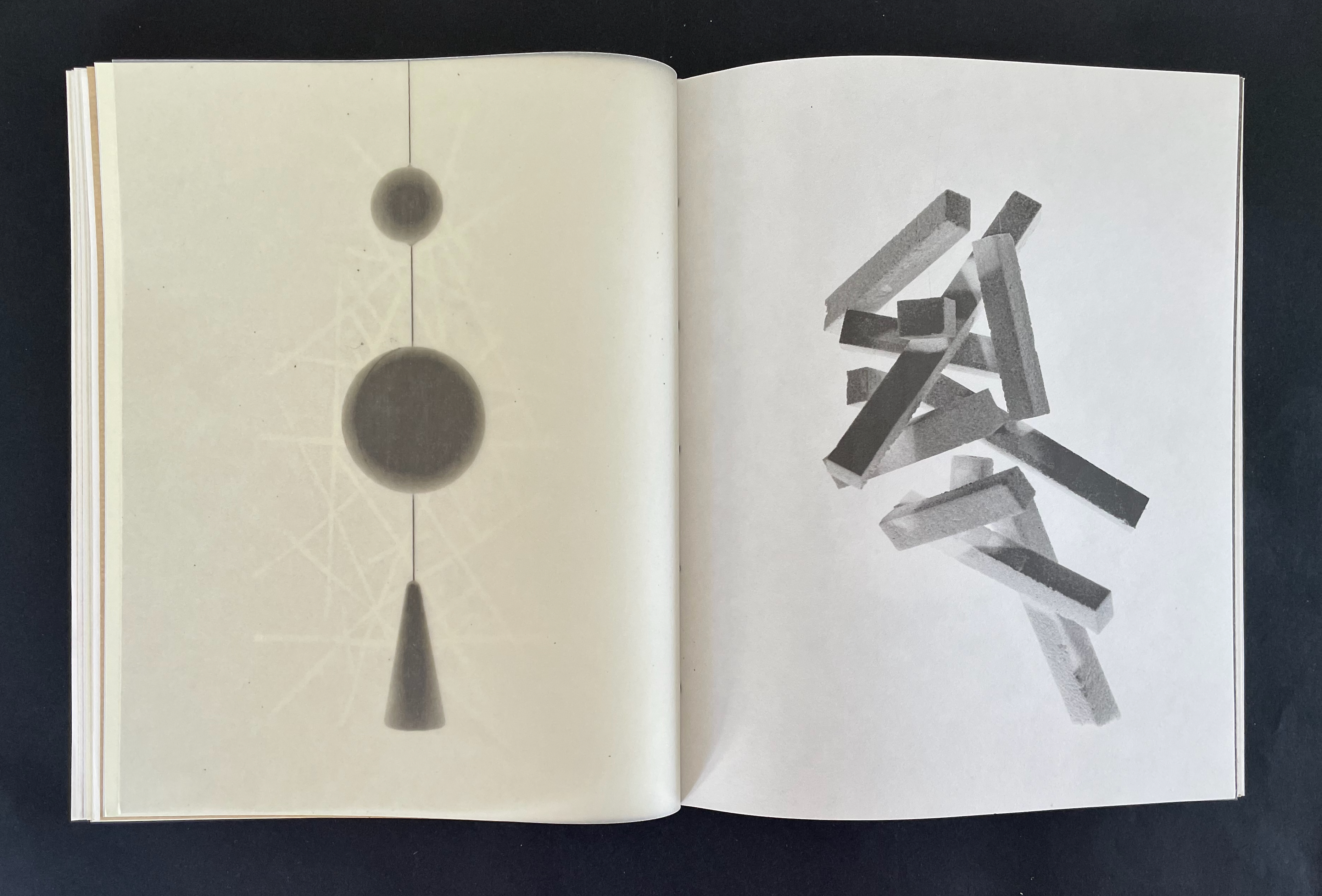
Brambilla’s 11 images are of abstract, enigmatic forms that blur the line between photography and sculpture. He has constructed the objects to be photographed, then rendered as silver-gelatin prints, and reproduced for this book.
Brambilla’s eleven images, which align with Calvino’s eleven themes.
Excluding its paper cover, the book would need 110 pages to accommodate its 55 images and 55 blanks. In fact, with 2 pages of text at the center of the book, it needs 112 pages, or 28 folios (sheets) folded in half and pamphlet stitched.
Brambilla neatly takes advantage of the arithmetic here to introduce 7 variations of paper, each used 4 times corresponding to the required 28 folios. The 7 different papers are
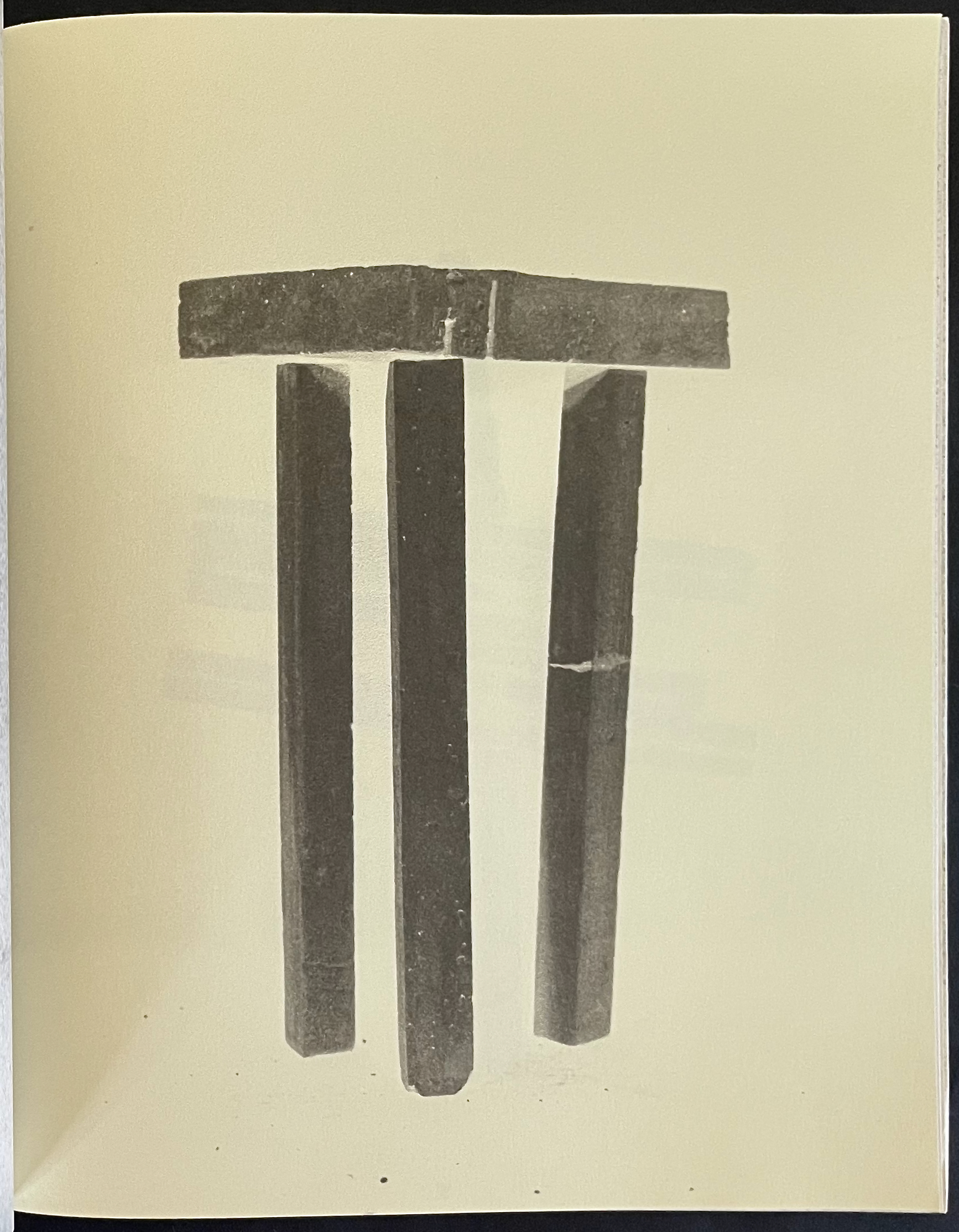
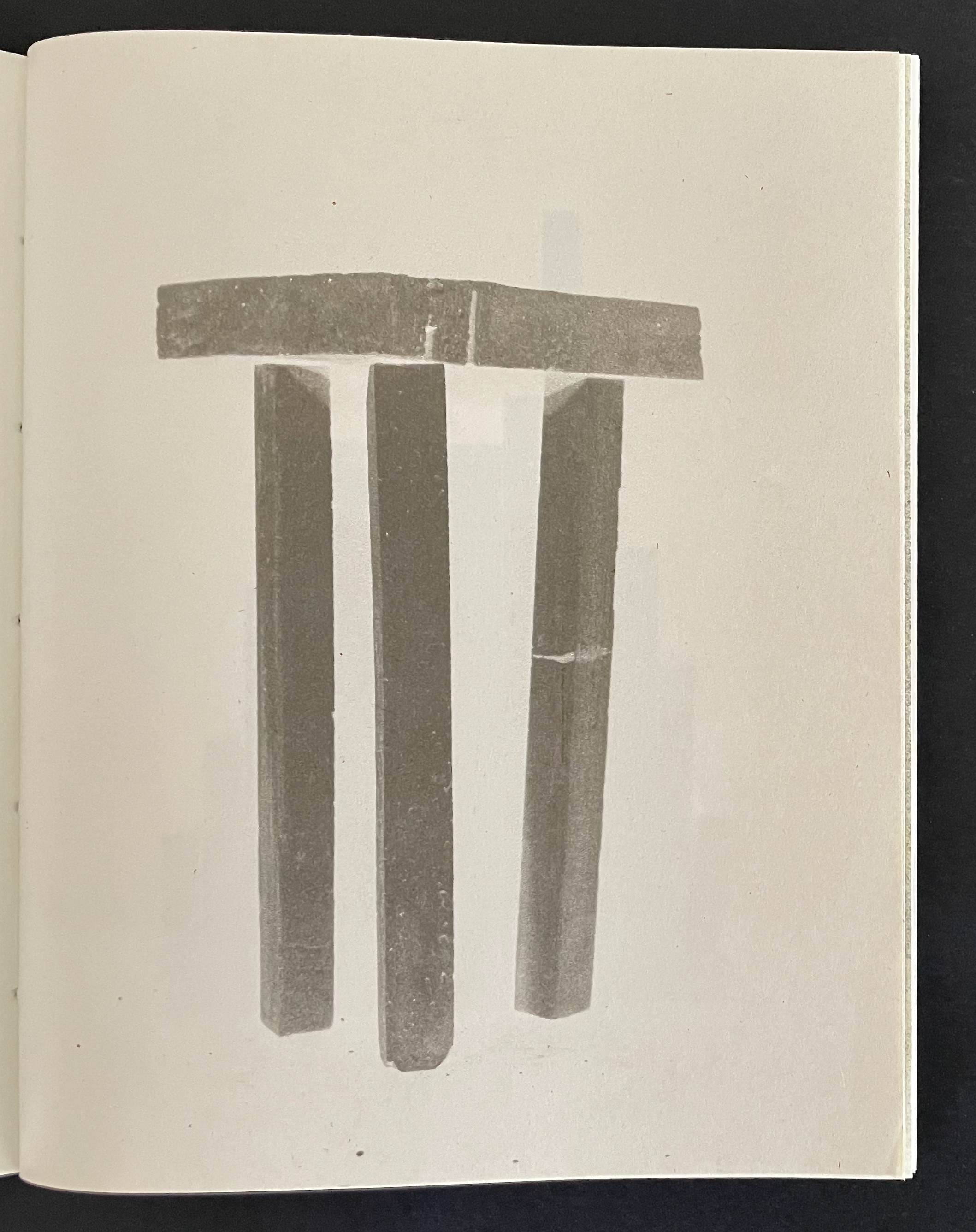
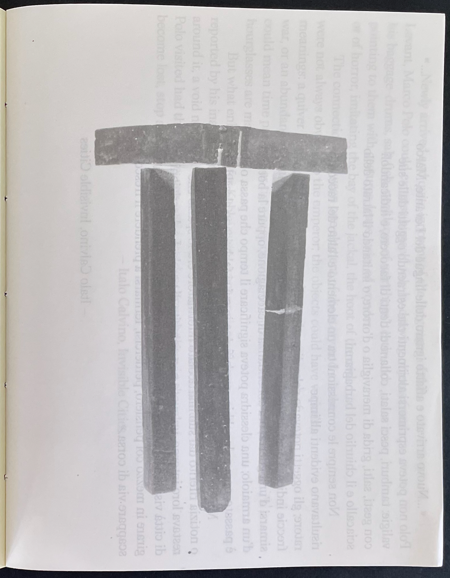
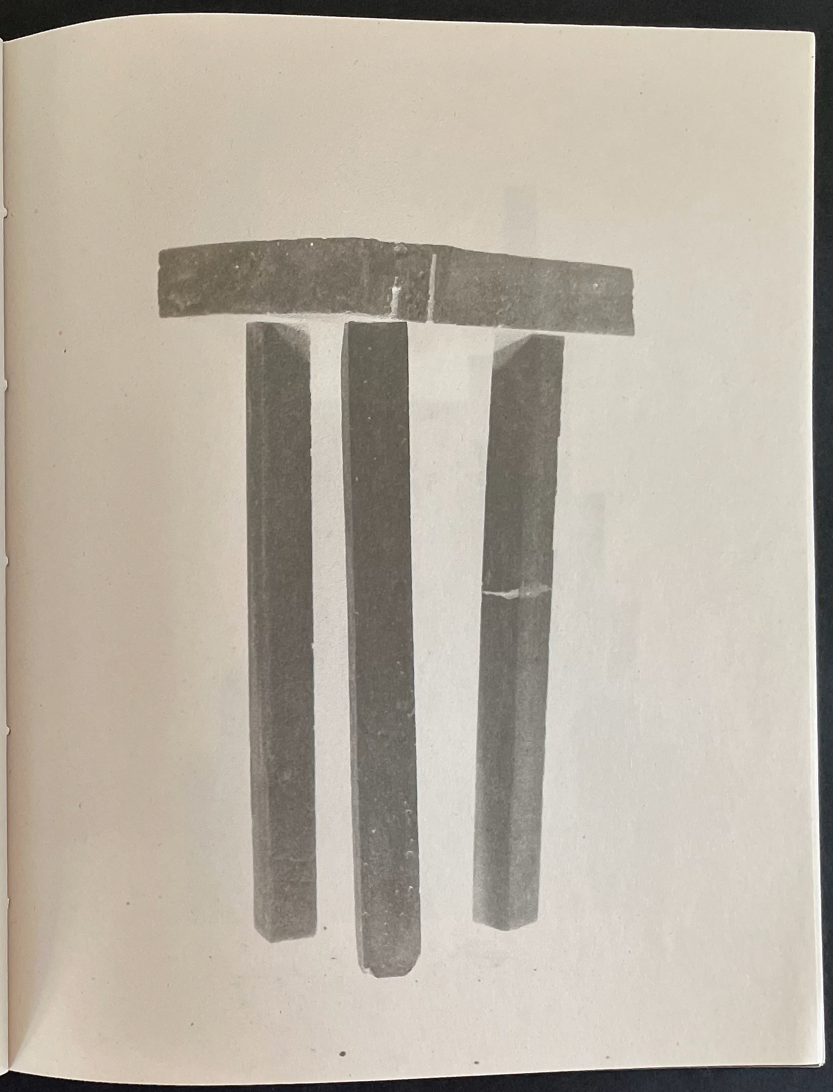
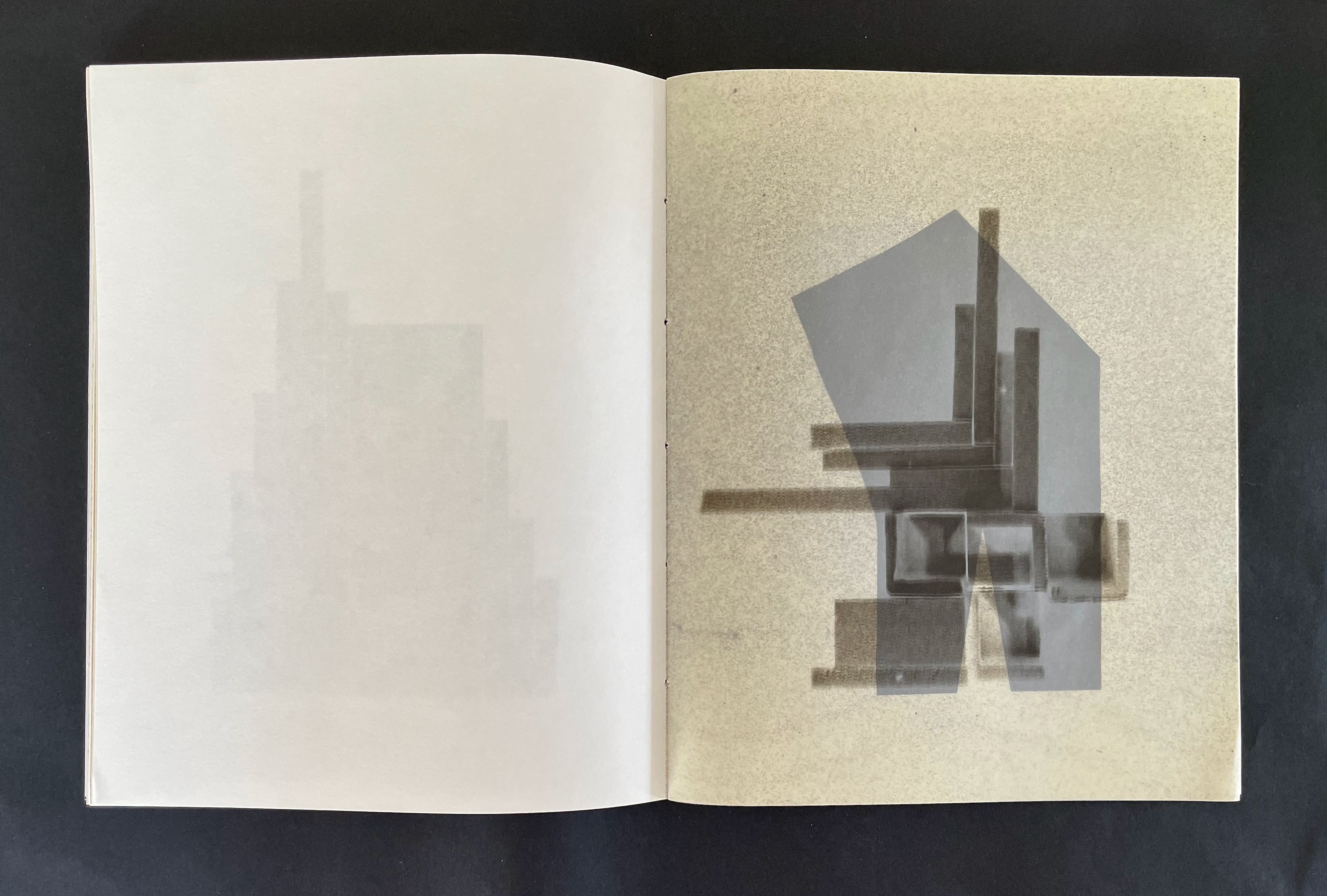
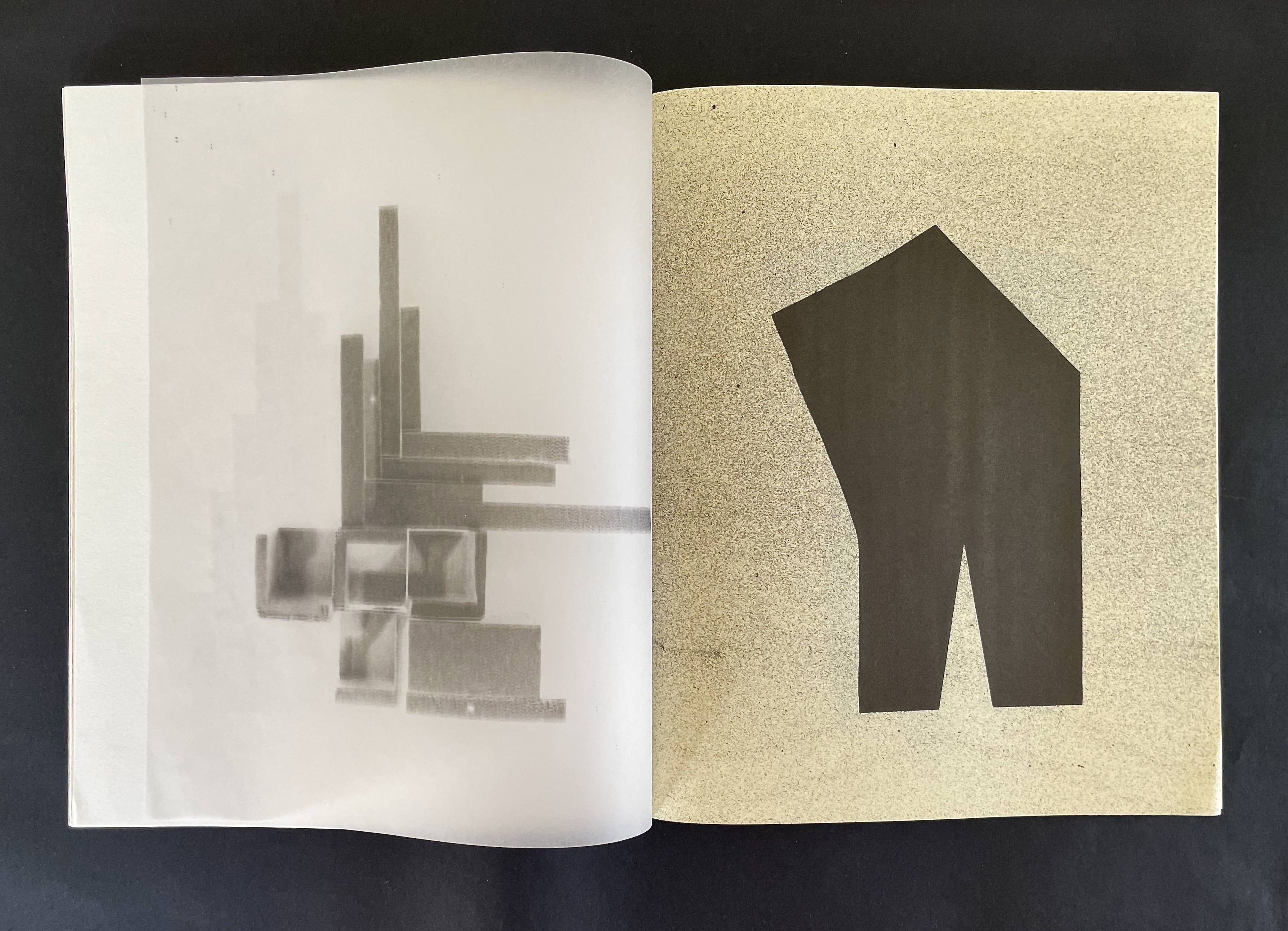
Below is the 6th image across its 5 iterations. Because the 6th falls midway among the 11 images, its position in the cascade puts its third iteration at the center folio in the book. The centered pages of text can be seen bleeding through that third iteration below. The 6th image’s position in the pamphlet stitched structure also causes its 1st and 5th iterations to share the same sheet of paper; likewise, the 2nd and 4th iterations share a folio. At first, this seems the only point on which Brambilla’s structure does not have a precise correspondent in Calvino’s structure.
But consider this: The city of Baucis is the 28th city/chapter, the midpoint, among Calvino’s 55 cities. It is the midpoint among the 5 cities in Calvino’s 6th theme: “Cities & Eyes”. As Marco Polo describes it,
After a seven days’ march through woodland, the traveler directed toward Baucis cannot see the city and yet he has arrived. The slender stilts that rise from the ground at a great distance from one another and are lost above the clouds support the city….There are three hypotheses about the inhabitants of Baucis: that they hate the earth; that they respect it so much they avoid all contact; that they love it as it was before they existed ….
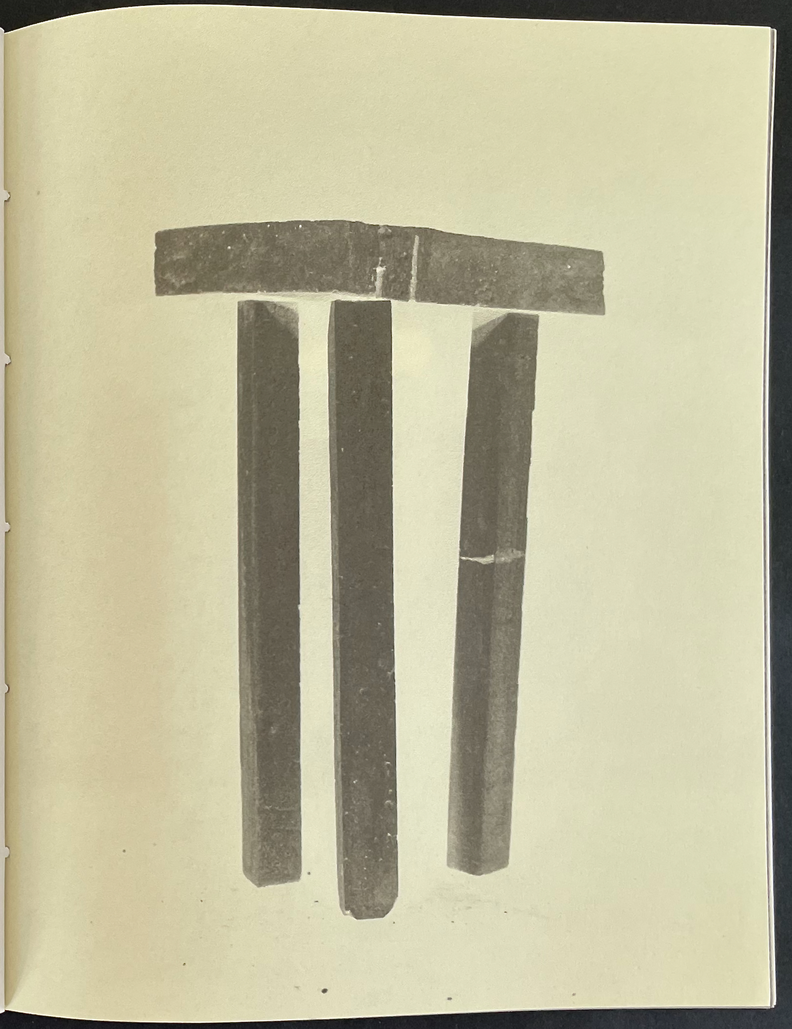
If Brambilla’s choice to place this image of a three-legged stool at the center of his 11 images was coincidental, chance is a genius — with which Calvino would have likely agreed.
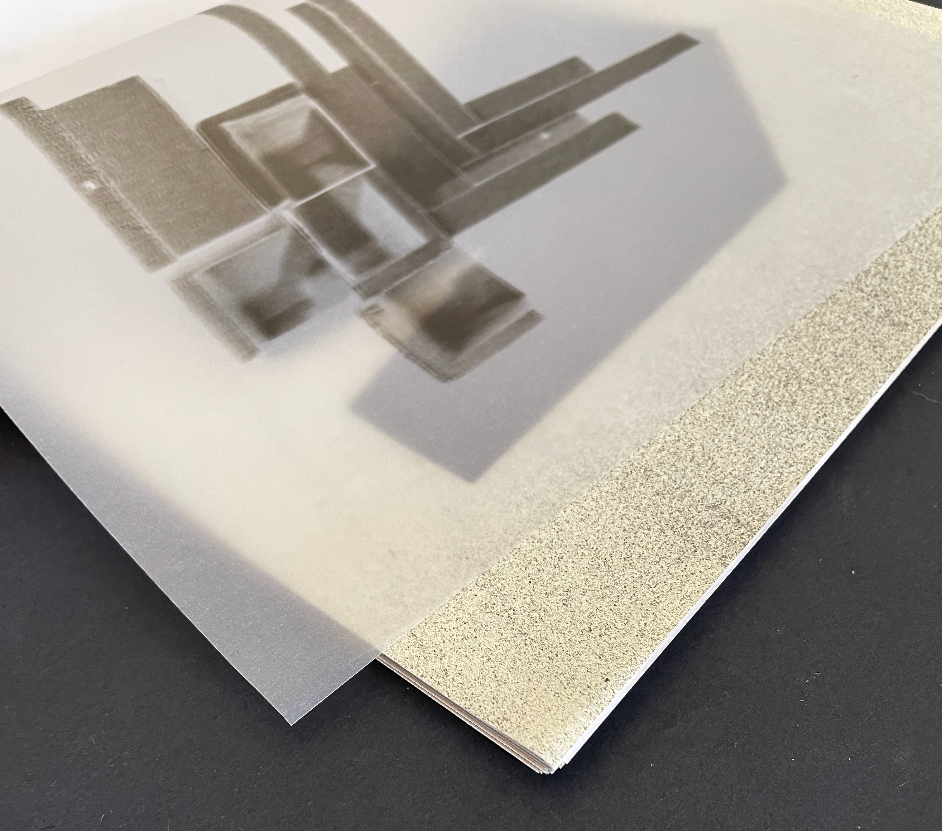
Reading 11 Stations exercises the visual and haptic mind. The use of translucent pages is a frequent technique to have the reader/viewer see more than the image that lies on the surface or behind the image.
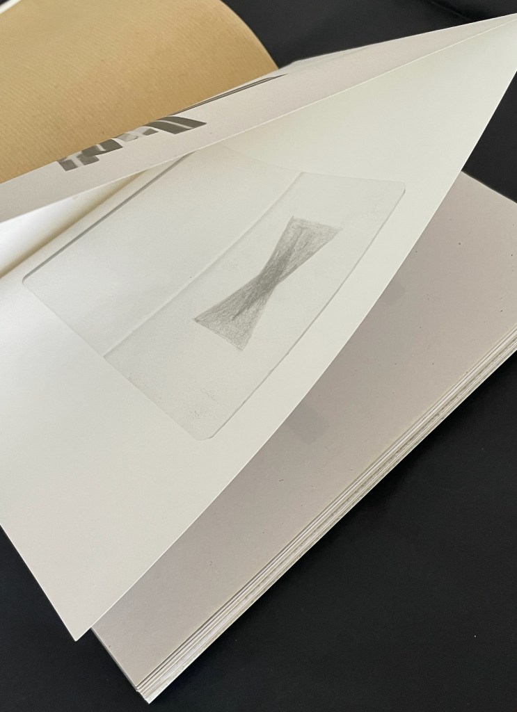
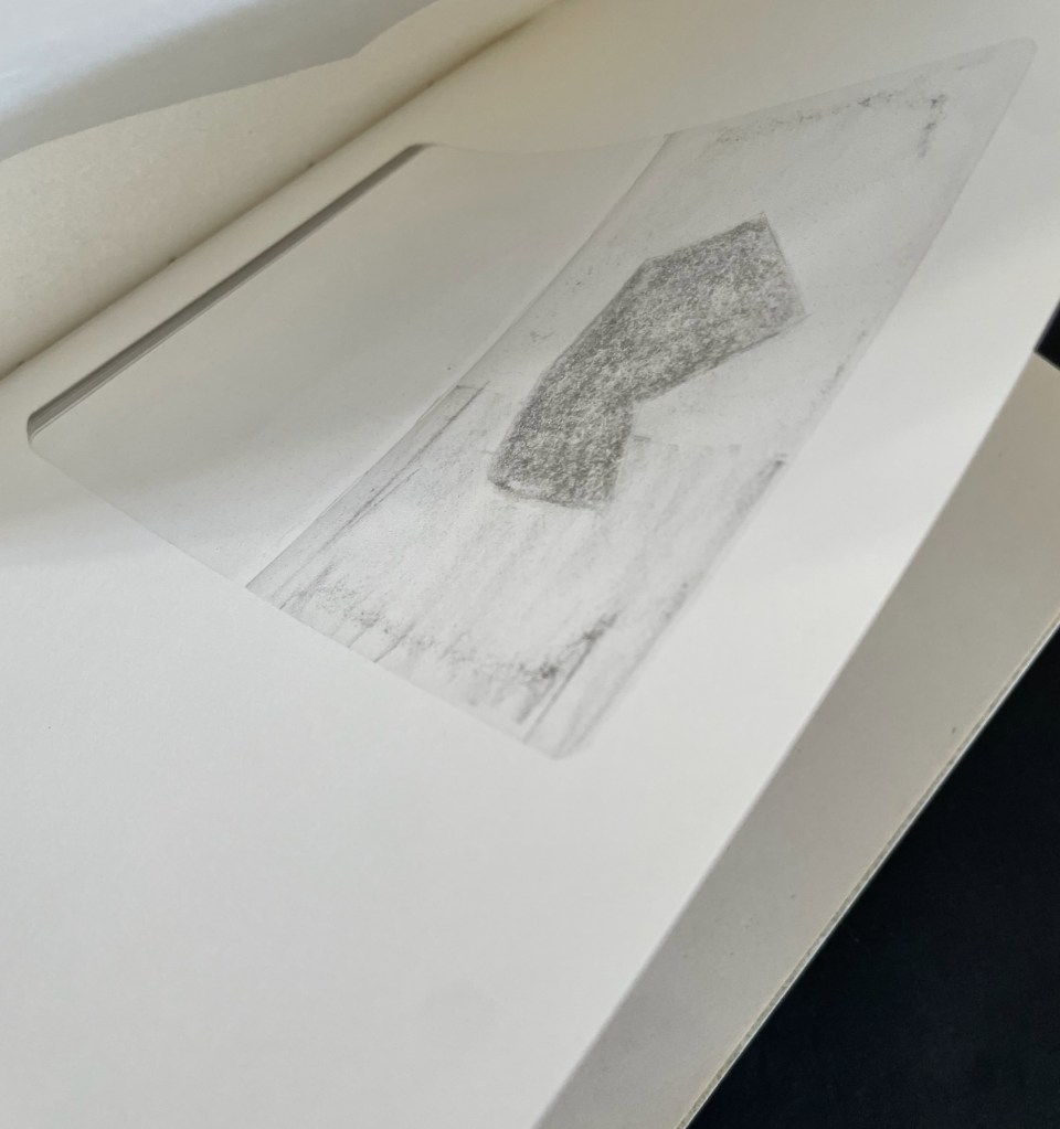
But what to make of the 4 instances in which the folio is not trimmed at the top edge? And what to make of the sketches printed inside the folded sheet? Here is another technique that makes the reader go beneath the physical surface. Is the book artist using features of bookmaking to prod the reader/viewer to think then of what lies beneath the creative surface?
Brambilla’s attention to detail is meticulous — even in the selection of Calvino Grande by Zetafont for the title and text pages — and that is what serves him so well in paying homage to Invisible Cities. Like Calvino’s book, 11 Stations is one to read and re-read.
Further Reading & Viewing
“Ken Botnick (II). 17 September 2026. Books On Books Collection.
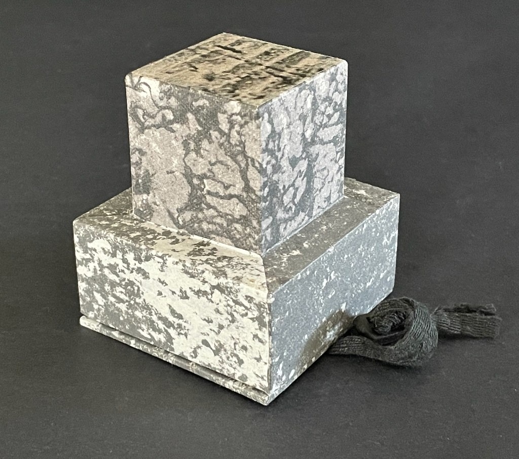
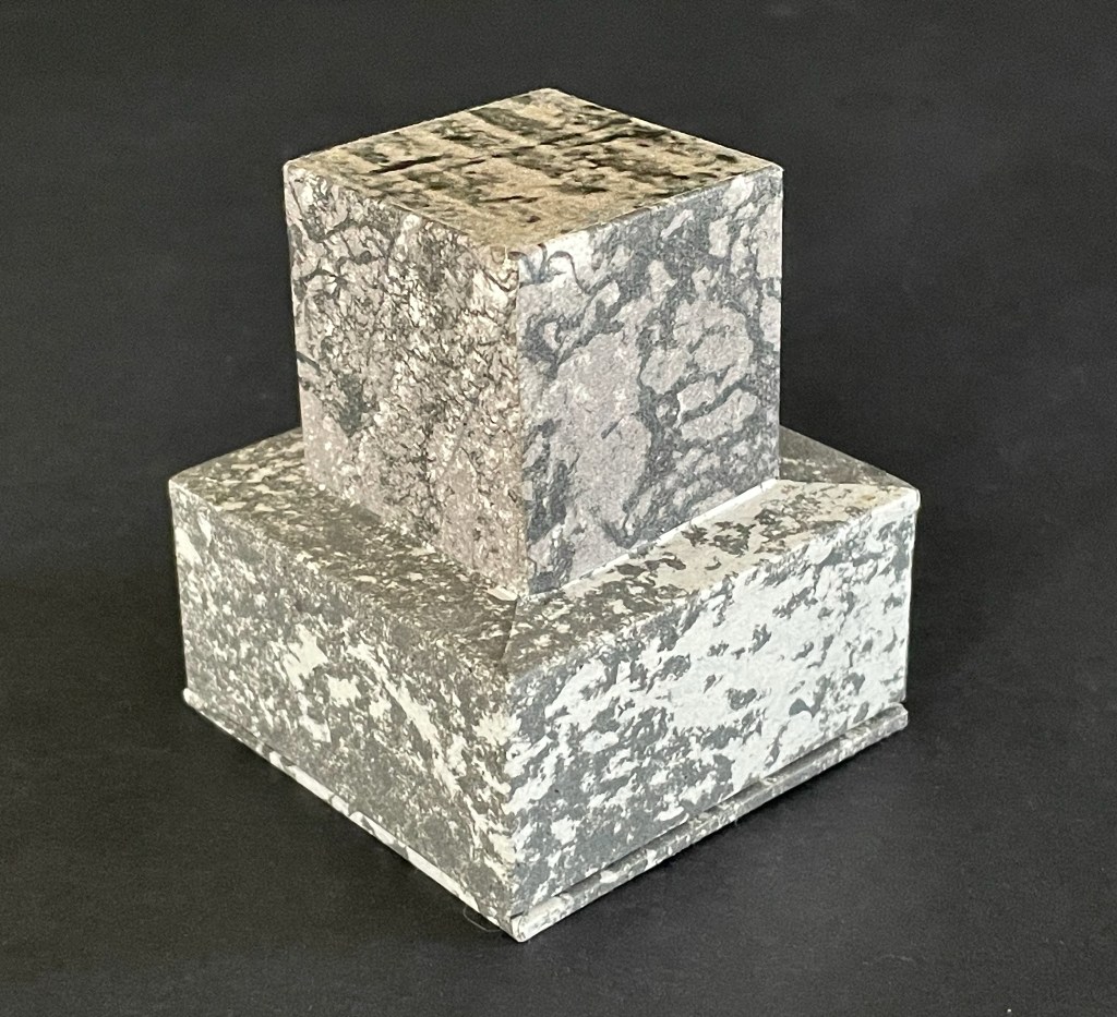
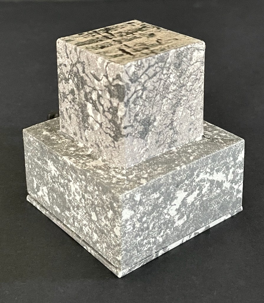
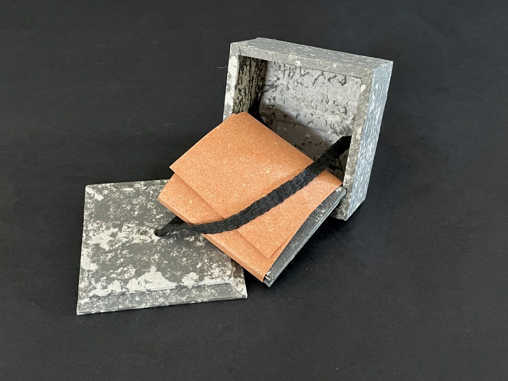
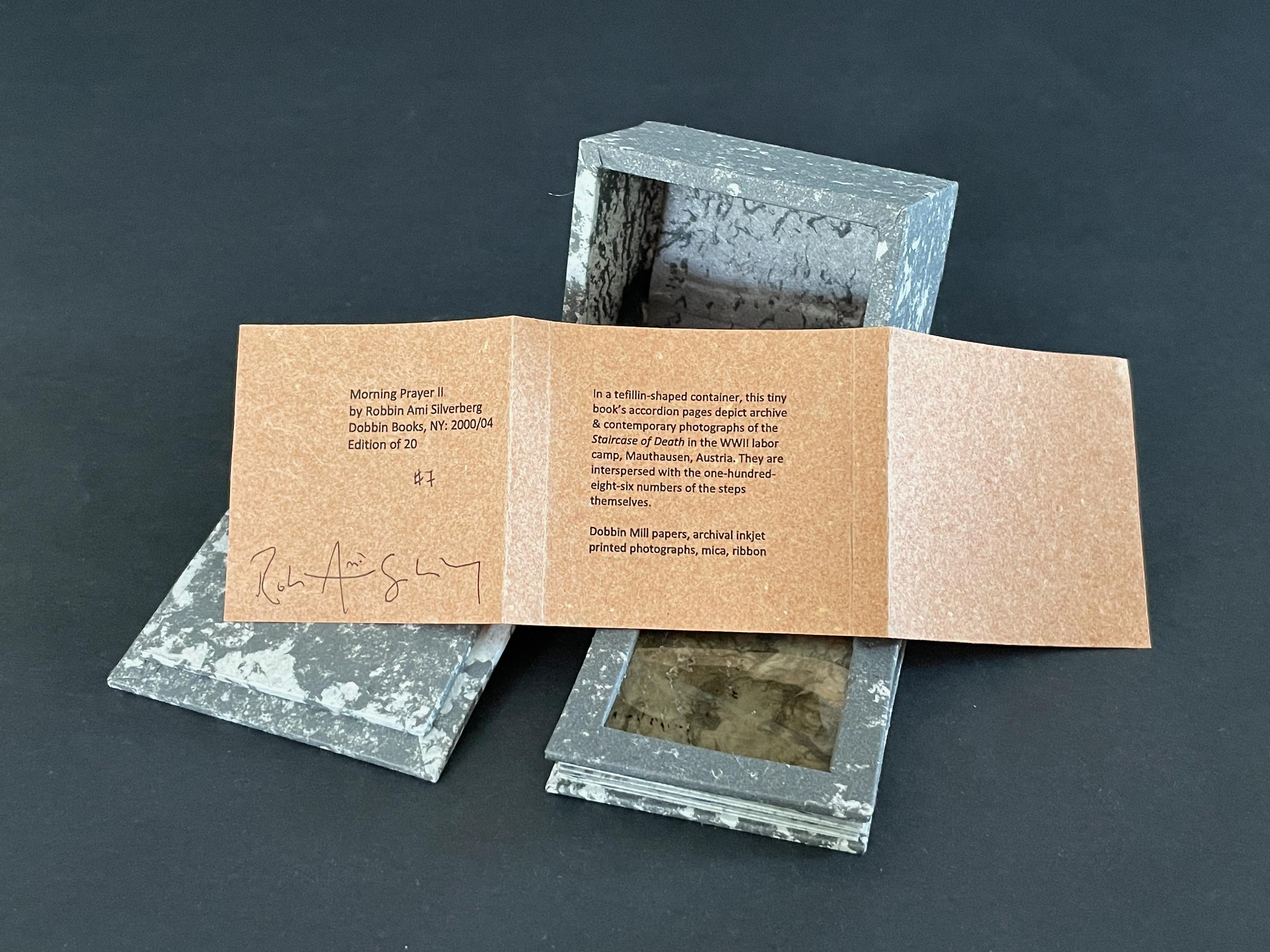
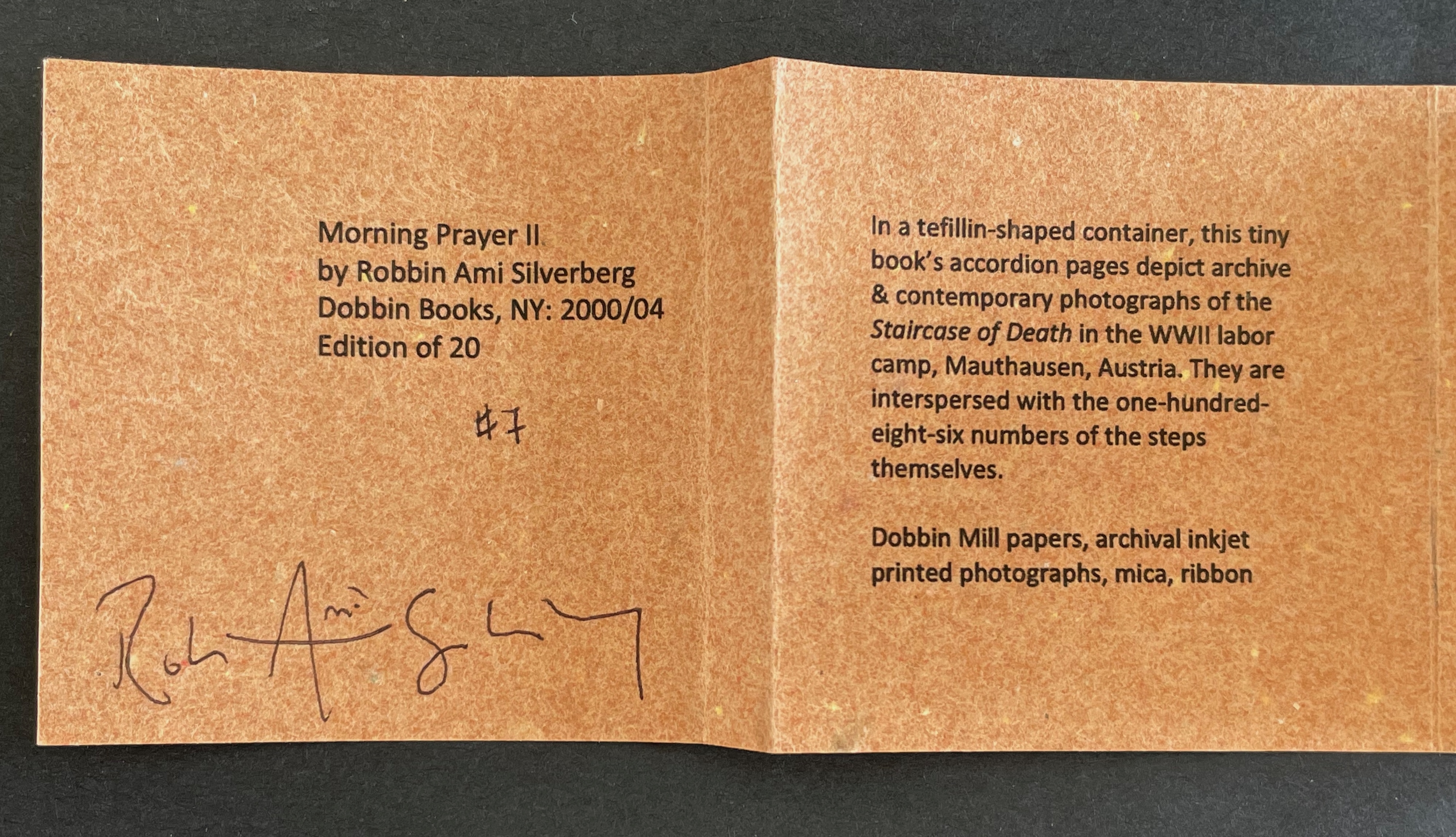
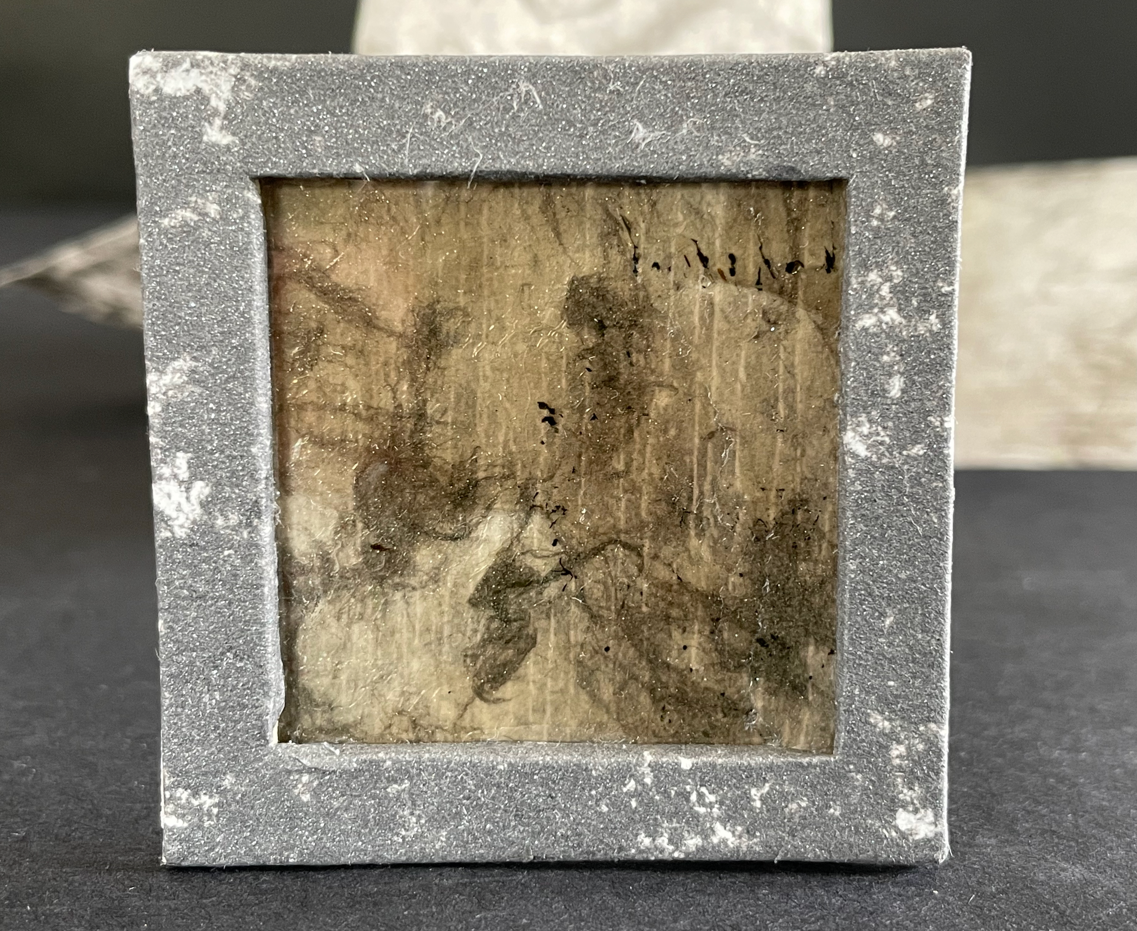
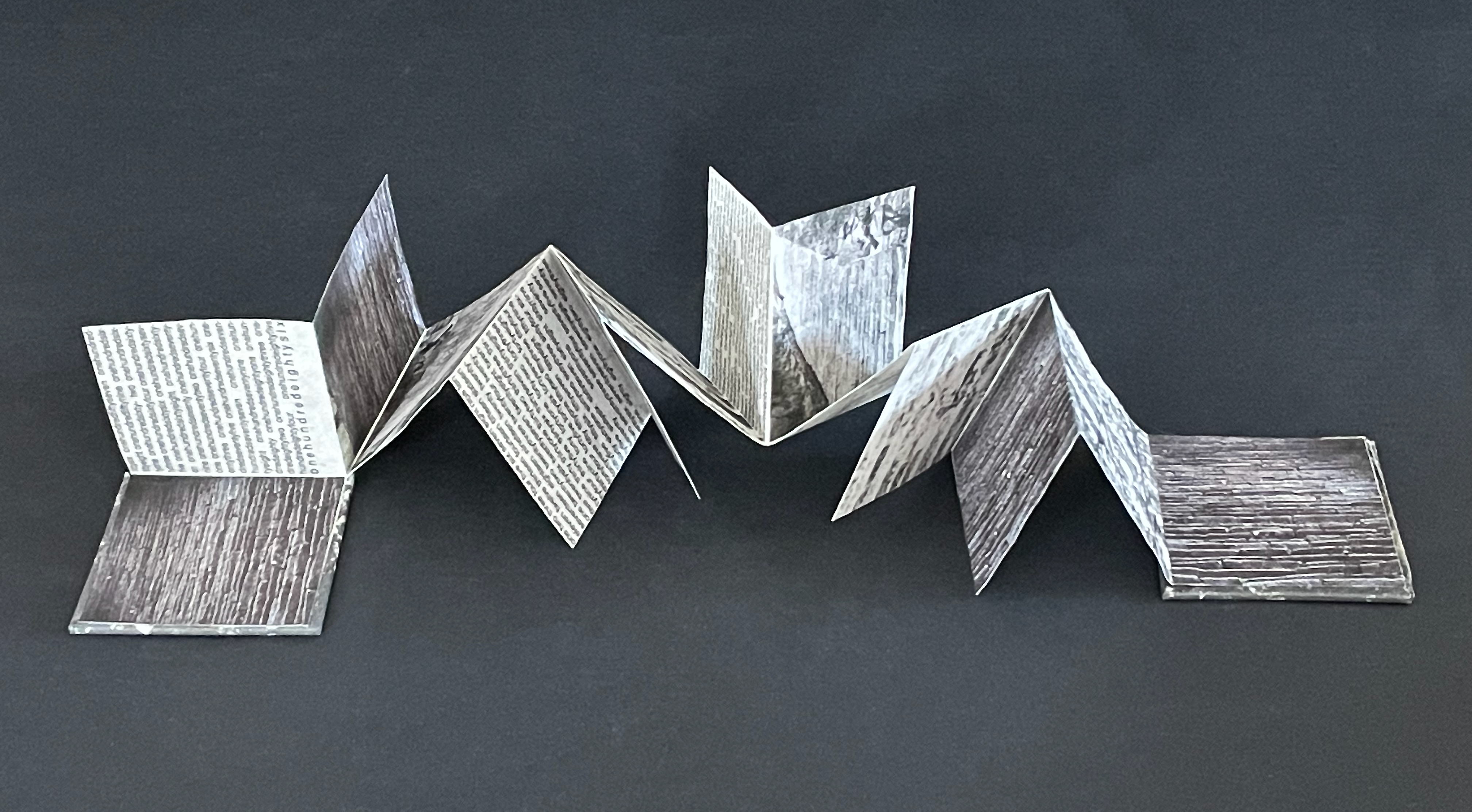
Morning Prayer II (2000-04) Robbin Ami Silverberg Tefillah-shaped box: H70 x W65 x D65 mm. Meander-fold booklet: 52 x 52 mm (closed); H250 x W150 mm (open). Mica inlay on bookle’t front cover. Edition of 20, of which this is #7. Acquired from the artist, 20 April 2026. Photos: Books On Books Collection.
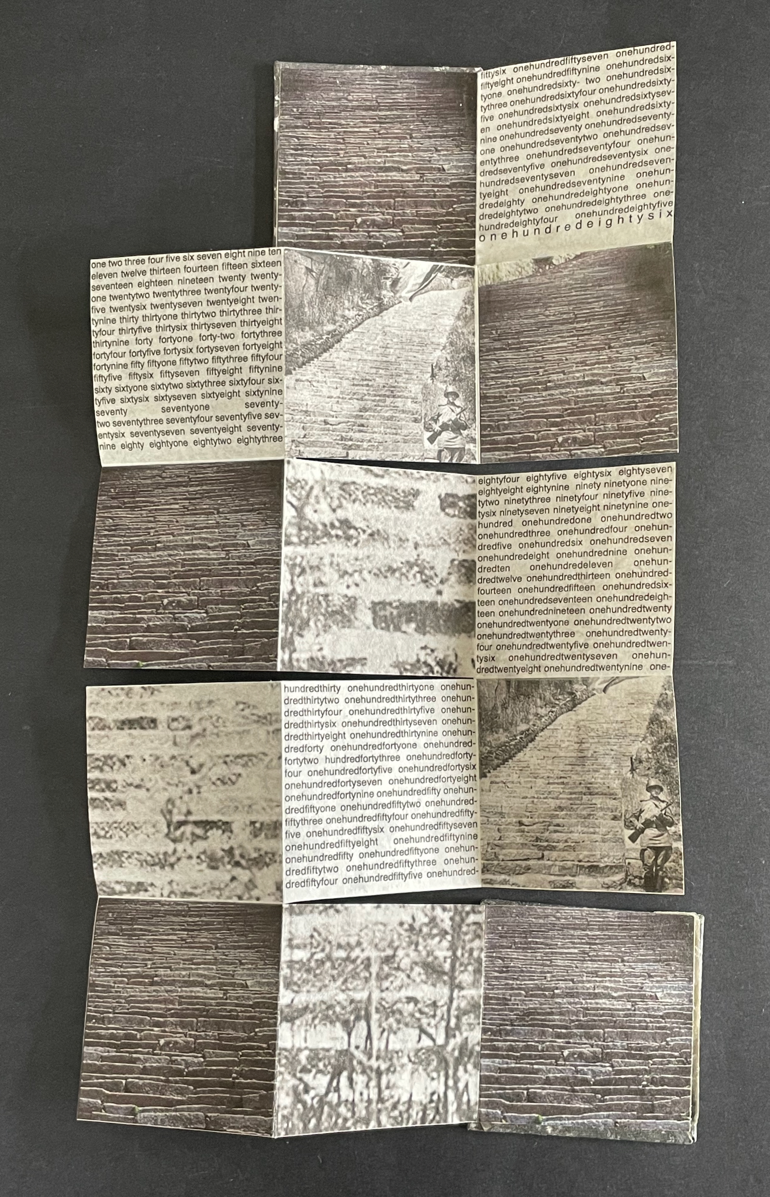
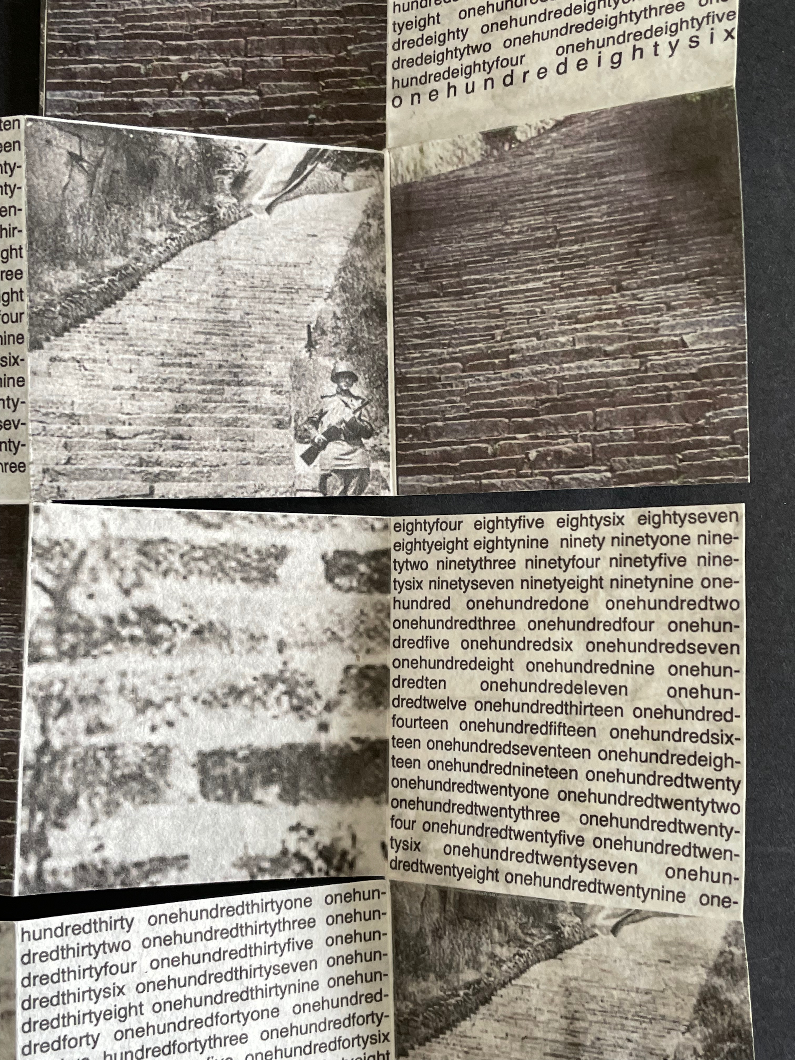
In the granite quarry at Mauthausen in Austria, there are 186 uneven steps made of stone leading out of it. These are the “Stairs of Death”, so named for the countless who died in the forced labor of carrying blocks hacked from the quarry up the nearly vertical climb. Morning Prayer II is a heart-breaking memorial to these victims.
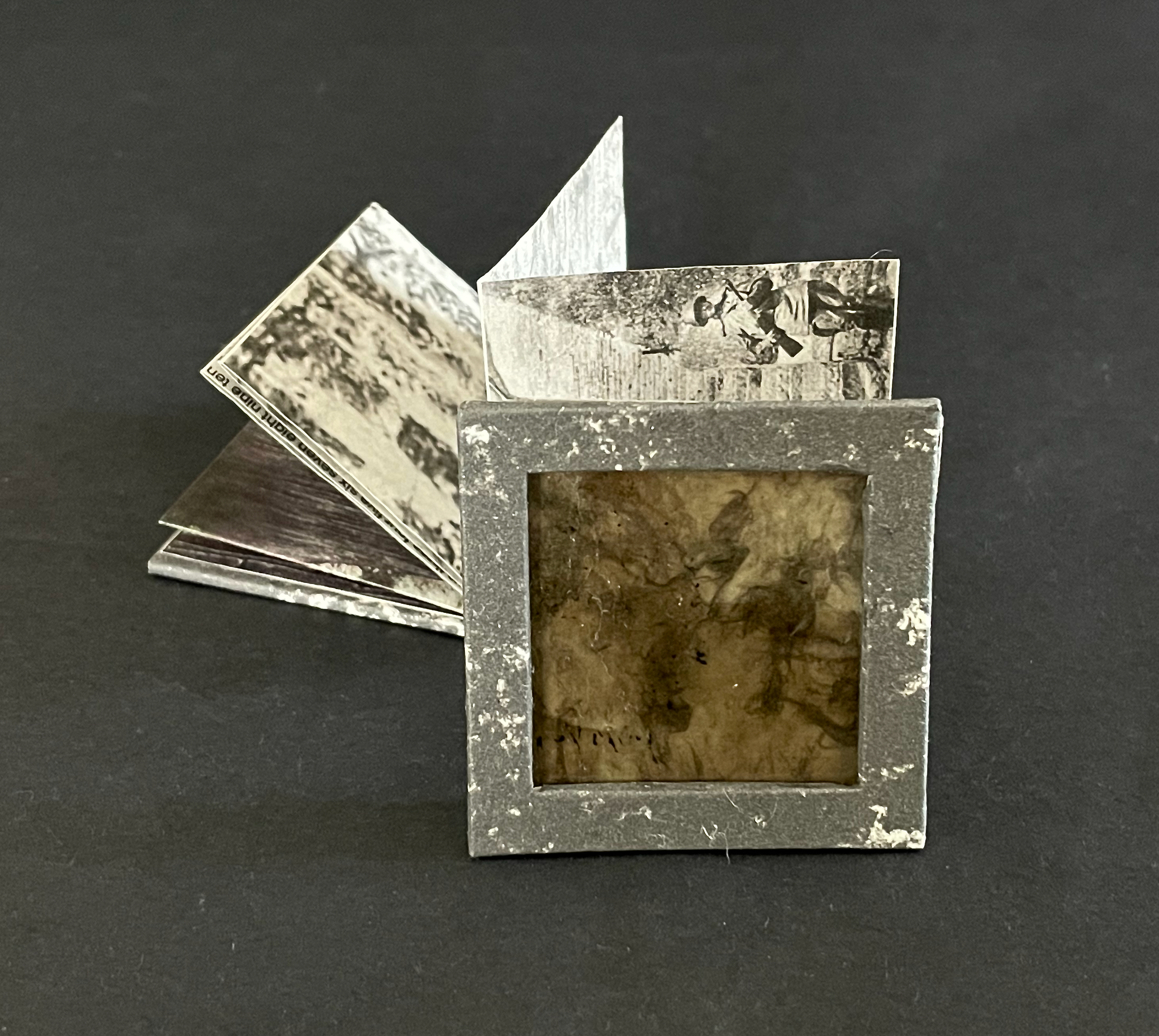
A tefillah-shaped box holds a double-sided meander-fold booklet illustrated with archival photographs from the concentration camp. Tefillin (one worn on the arm, one on the head) honor the biblical commandment to remember the Exodus from Egypt and observe Passover. Associated with morning weekday prayers, they hold parchment scrolls with four verses from the Torah: (Exodus 13:1–10, Exodus 13:11–16; Deuteronomy 6:4–9, and Deuteronomy 11:13–21). They are usually made of leather.
In contrast, the container of Morning Prayer II appears as stone — mica embedded in its base and granite simulated on its paper covering. Instead of a morning prayer in remembrance of the trek to freedom and passing over of the angel of death, we have a mourning prayer counting each of the 186 stone steps of the staircase.
Instead of scrolls extolling the laws of the deity, we have a single sheet, cut and folded to open in a zigzag meander recalling and showing photos of the uneven granite steps.
Instead of the calligraphy of verses from the Torah scrolls, we have the typeset counting of steps confined and justified left and right within four of the fourteen segments of the artist’s book.
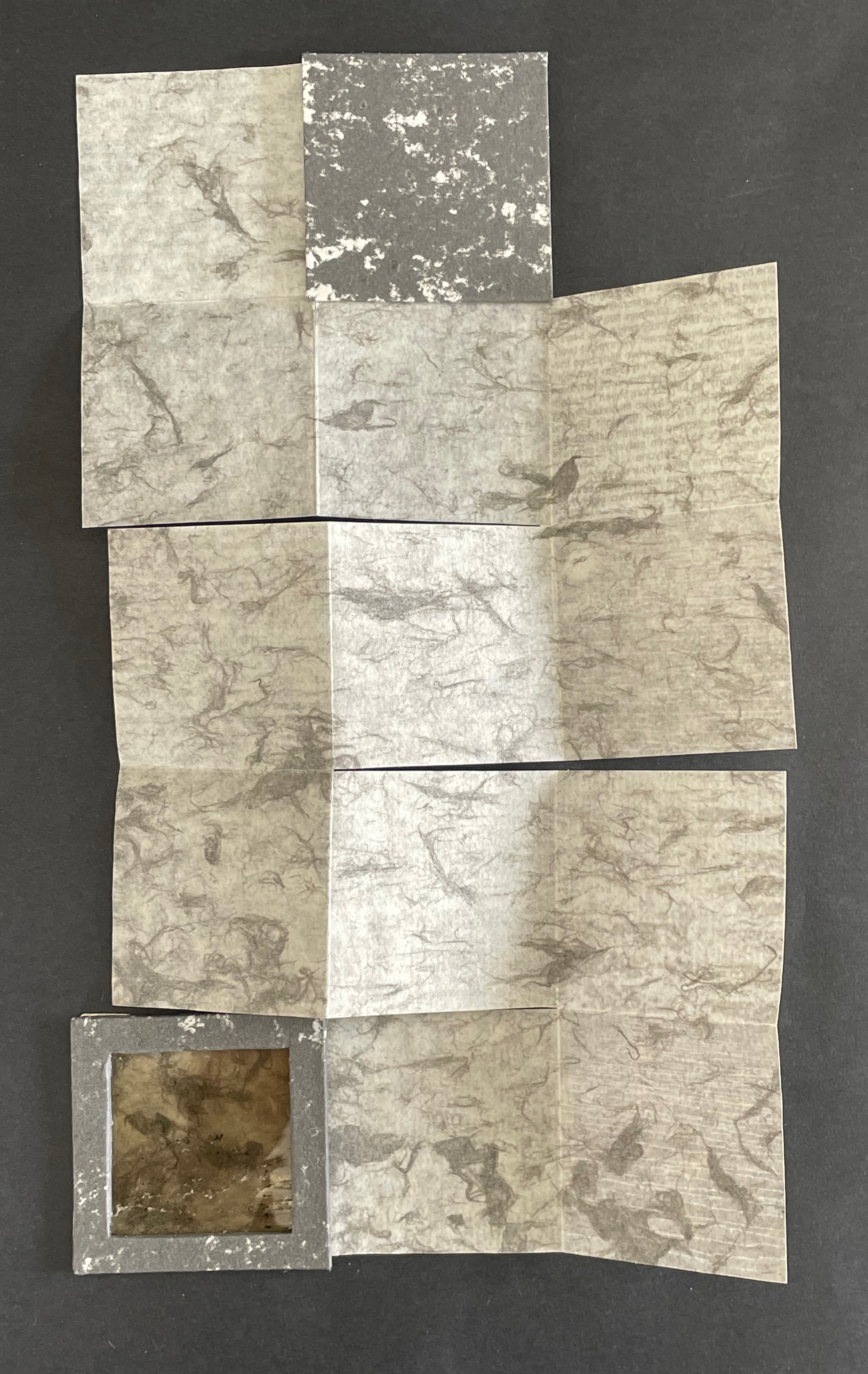
Instead of morning sunlight, we have gray ink on the reverse, mimicking marble or ashes.
Instead of the rhythm of scripture, we have the gaps between stones mimicked by the gaps between run-together words enumerating the 186 steps.
Each stone in each step represents where prejudice, racism, and xenophobia lead. Each stone in each step recalls yesterday’s and today’s iniquity and inequity of persecuting those with the “wrong” color of skin, different beliefs, ethnicity, or geographic background. Each stone is the one cast against someone who is not you — until it is you.
La durée réelle: Make this cut first (2024-25)
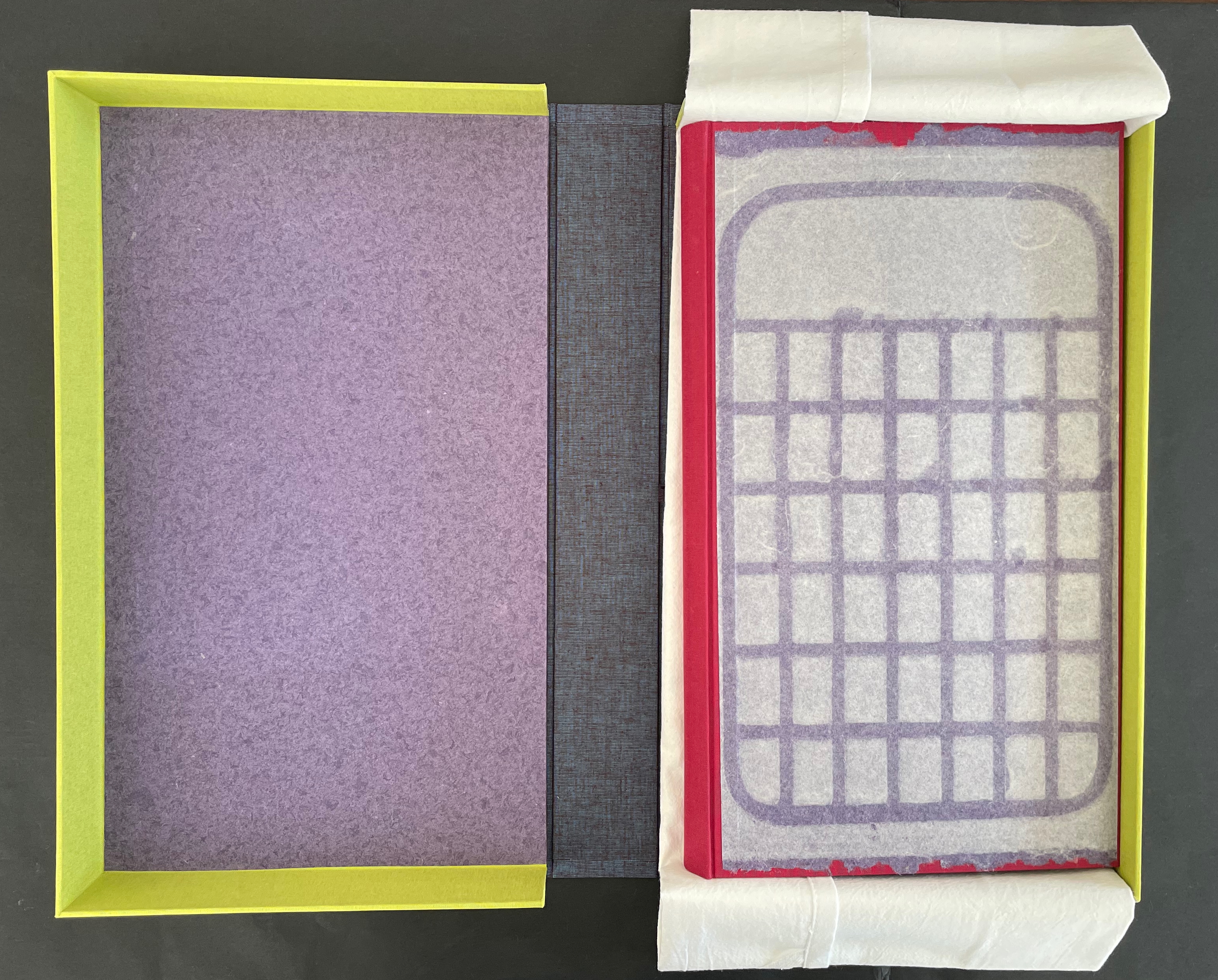
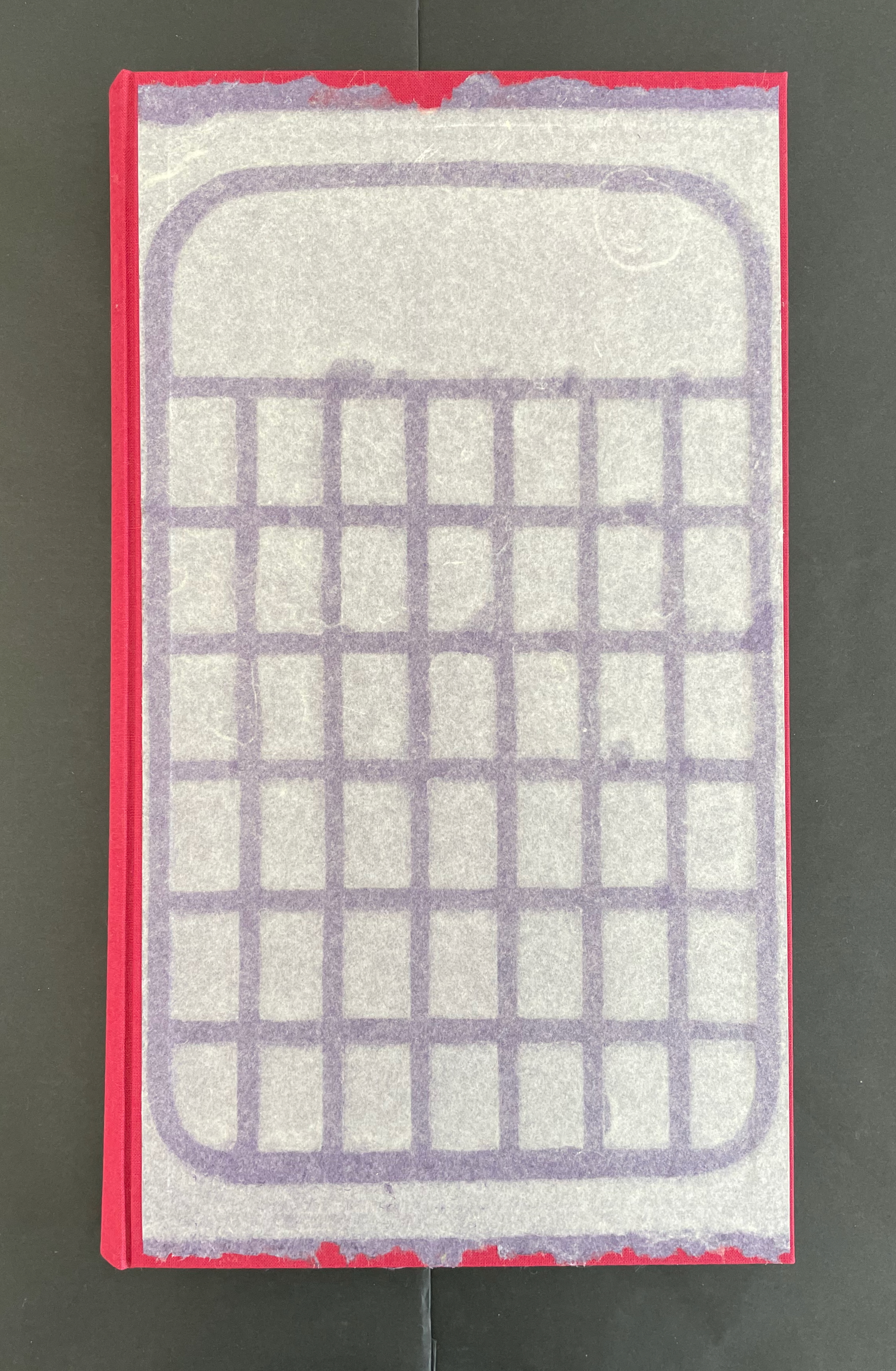
La durée réelle: Make this cut first (2024-25) Robbin Ami Silverberg Box: H388 c W229 x D58 mm. Book: H352 x W204 xD28 mm. Edition of 12, of which this is #10. Acquired from the artist, 20 April 2026. Photos: Books On Books Collection.
Our experience of time is no small topic in philosophy, literature, and art. The title of Robbin Ami Silverberg’s artist’s book comes from Henri Bergson’s 1889 dissertation on the subject and his later collection of essays translated as Creative Evolution (1911). With his term la durée réelle (“real duration” or “lived time”) and metaphor-driven exposition, his books aim to describe time as a continuous, flowing, yet nonlinear stream of consciousness rather than surrender it to the mechanistic, linear, and causal descriptions of science. Silverberg’s artist’s book is her meditation on time and life expressed with handmade paper, watermarks, pulp painting, dry point, typography, quotations as if from a commonplace book, and the form of the book.
So much is going on in this artist’s book. Motives interact with technique, material, allusion, text, image, and structure. Motives interact with motives, techniques with techniques, material with material, allusion with allusion, and text with image. All of it like the crisscrossing strokes left on the cutting board and transferred to paper by drypoint.
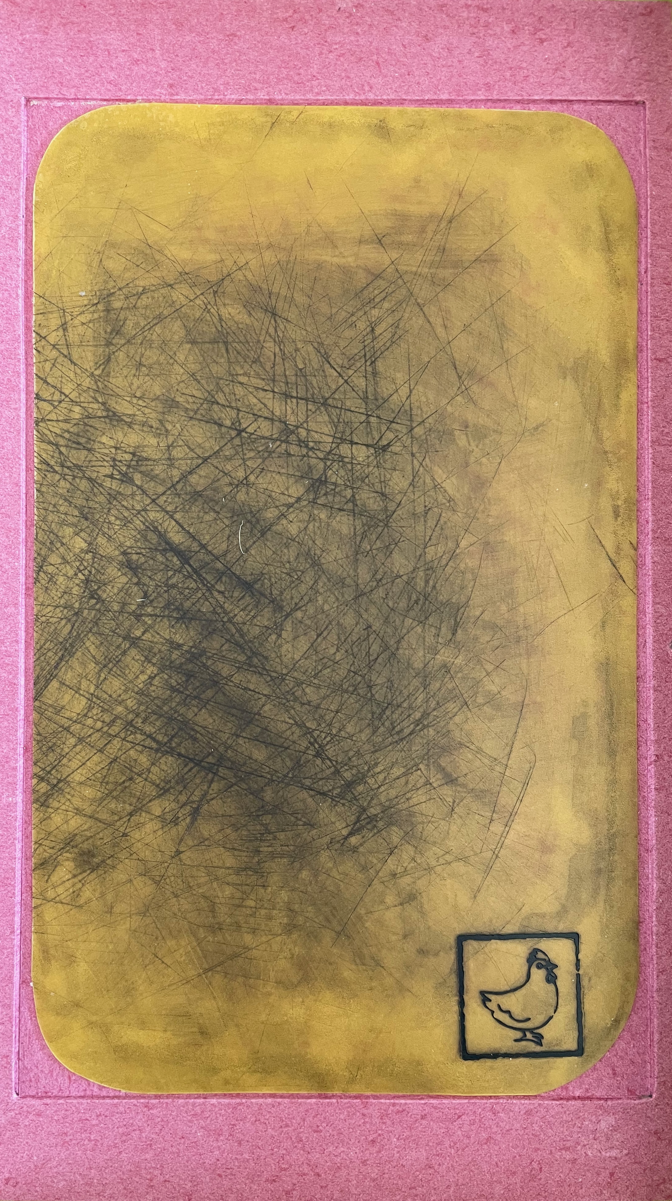
Embedded in the custom box, a cutting board used as a printing plate.
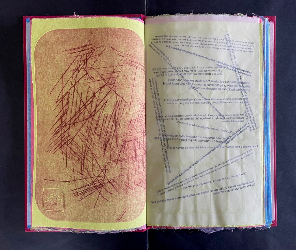
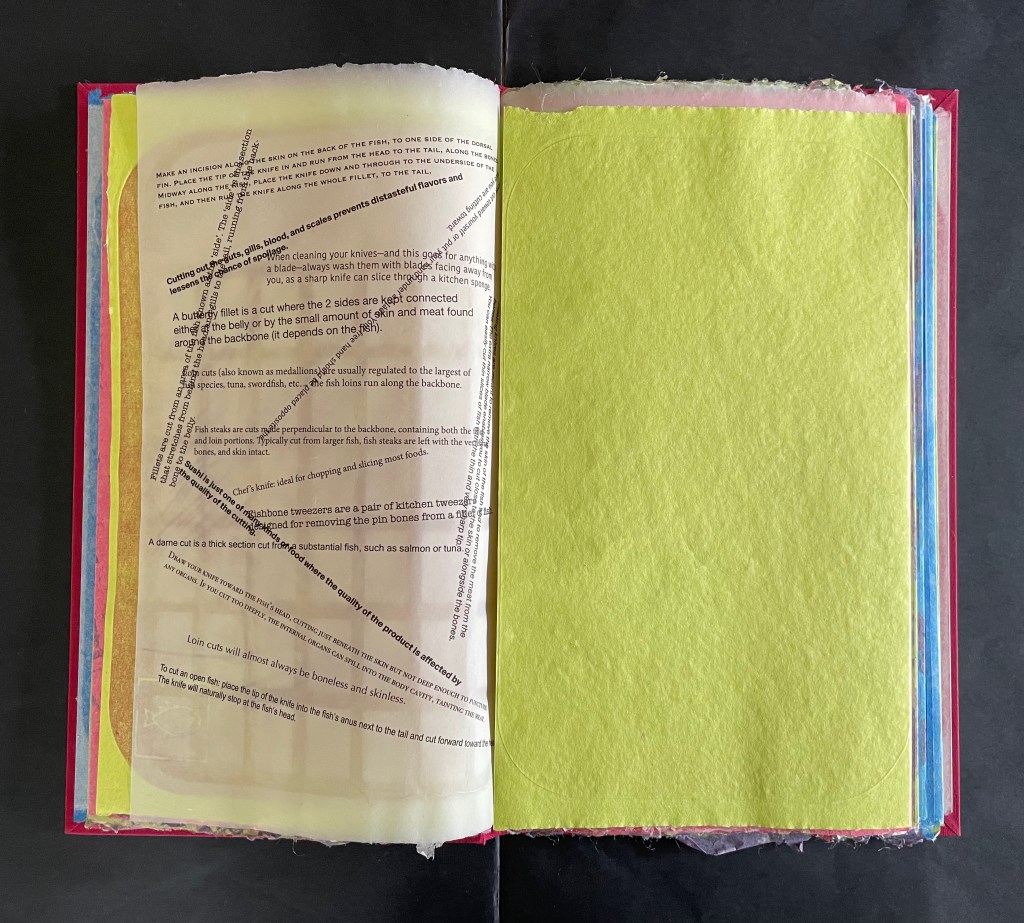
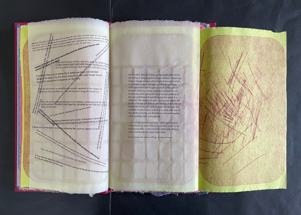
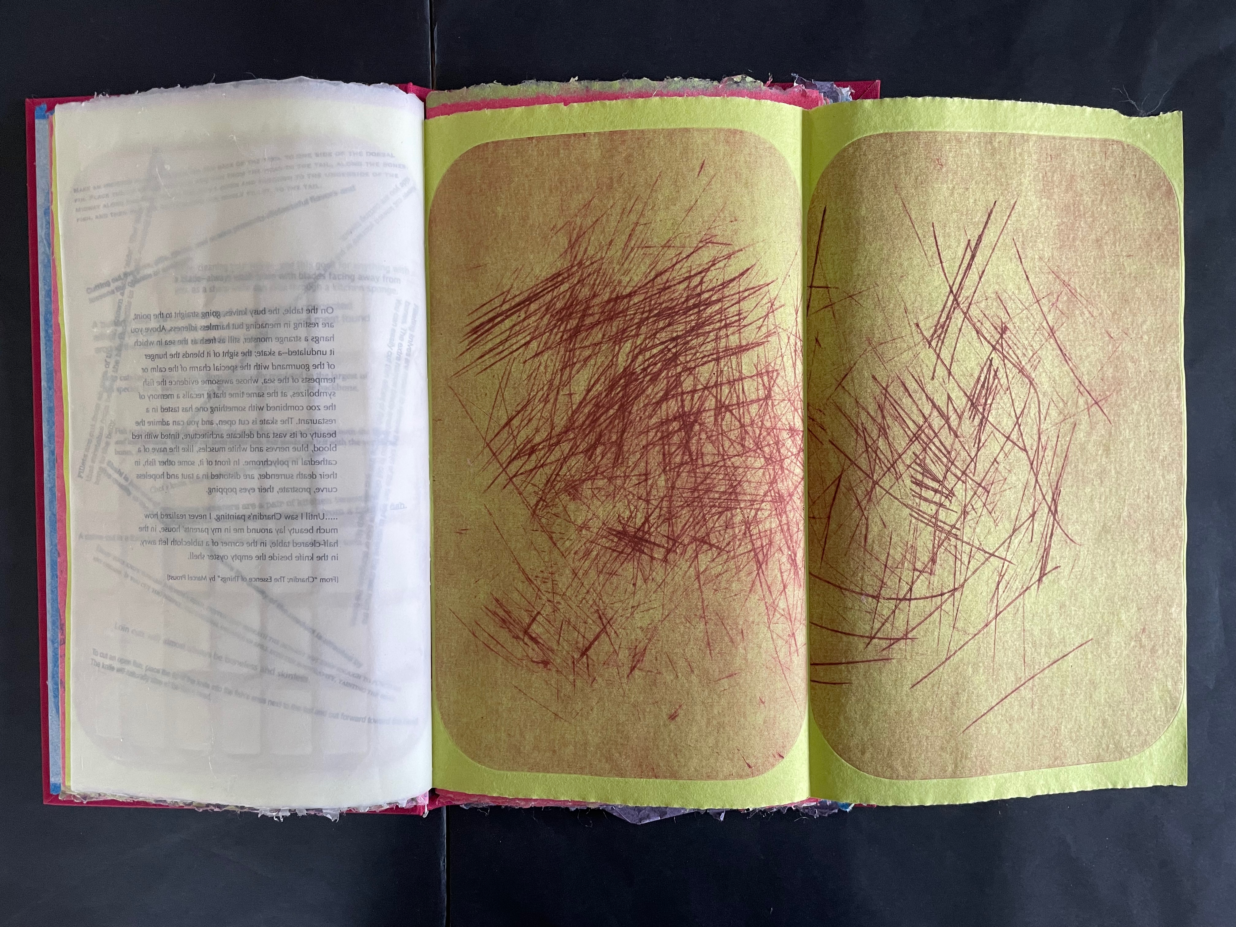
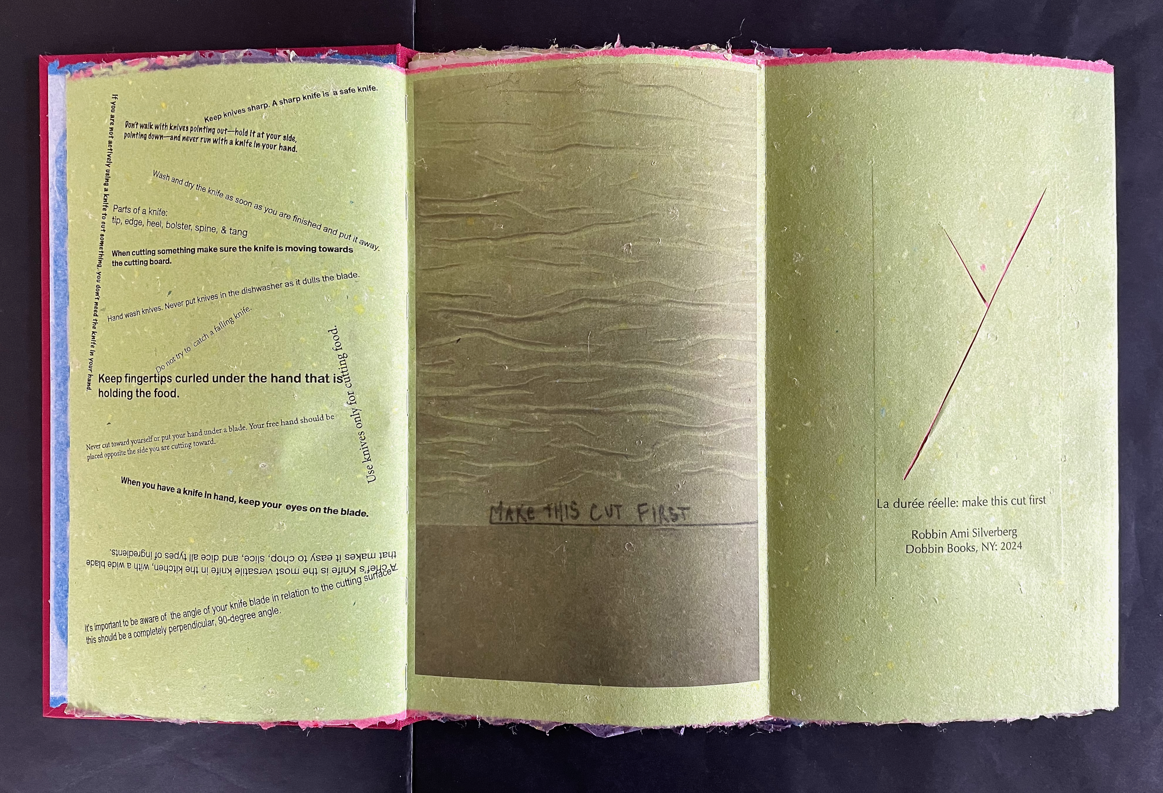
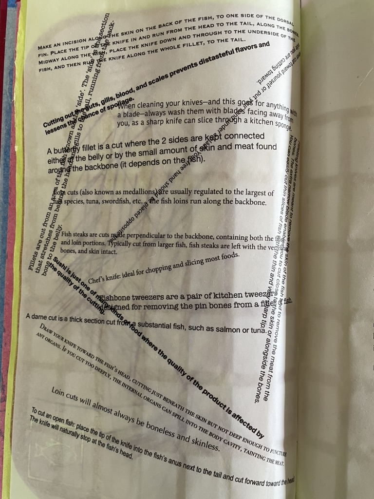
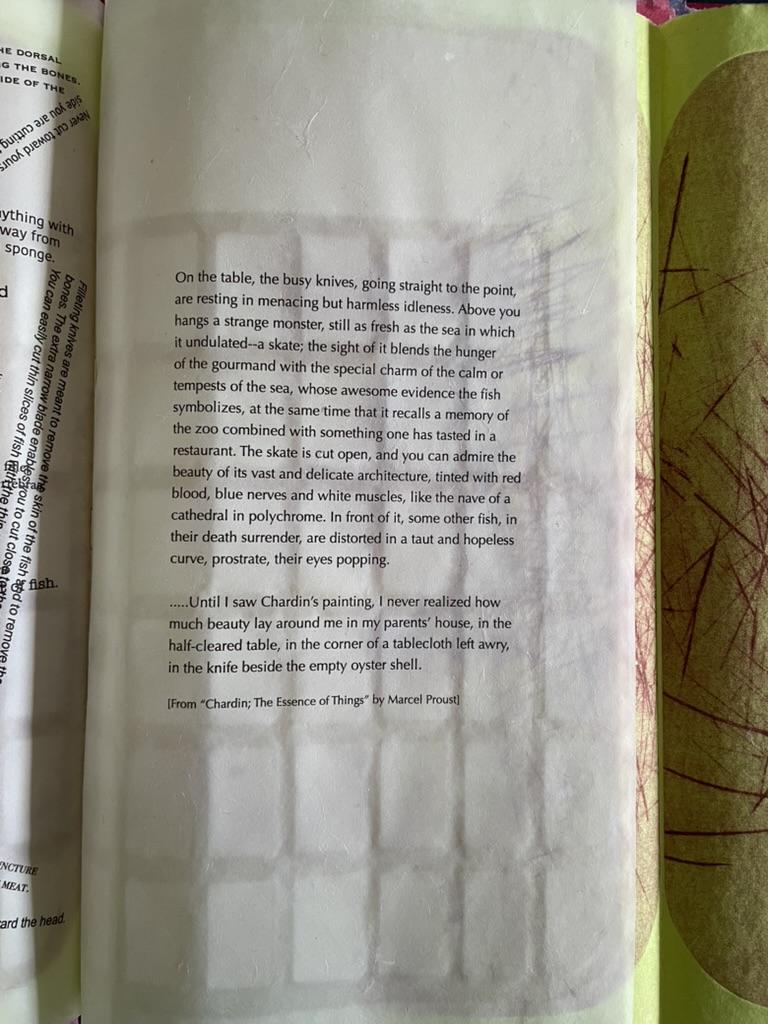
Consider the following sequence. On the verso page of chartreuse green paper, inside the impress of the printing plate, the small image of the fish in the lower left hand corner indicates the seasonal food being prepared in the Spring. On the recto page, the as-yet-illegible text showing through translucent paper mimicks the marks on the cutting board print. When the recto page turns to the left, the now legible text explaining techniques of cutting fish appears in different weights, different cases, and different orientations, mimicking the different blades and direction of cuts. The translucent paper on which the instructions are typeset bears a watermark grid in the shape of the cutting board. When the fold-over sheet of chartreuse green paper turns to the right, it shows another cutting board print. In the center of the triptych is a quotation drawn from Marcel Proust’s appreciation of Jean Siméon Chardin’s La Raie (“The Ray” or “The Skate” ).
By way of the season for fresh fish and the etched evidence of cutting, we have come to instructions for making the cuts. By way of the instructions, we have come to a description of Chardin’s still life of a gutted ray, the text of which is typeset on the cutting-board-watermarked translucent paper. By way of a still life freezing a moment in time, we have come to Marcel Proust, author of the septology In Search of Lost Time and its fictional exploration of the experience of memory. By way of Proust’s essay the “Essence of Things”, we have come to his good friend Henri Bergson and la durée.
As the translucent page with Proust’s text and the cutting-board watermark is turned to the left, we now have a diptych of two cutting board prints on the chartreuse green paper. We may think of the translucent pages and the accumulated cuts as evidence of times past, but the flow of the sequence, the feel of the different papers as they turn, and the interaction of associations offer a layer of experience approaching the essence of the thing Bergson calls la durée réelle. More than a static artifact, Silverberg’s artist’s book functions to evoke temporal experiences.
But can visual and physical art really represent or conjure up Bergson’s concept of the lived experience of time? Juxtaposition of images, techniques, texts as well as text and image, material, page with page, etc., is almost unavoidable — indeed is often sought — in an artist’s book. For Bergson, juxtaposition is static and does not fit with the concept of duration. Explaining that concept is not the point of Silverberg’s artist’s book, but if it sends you on a hunt for an explanation and you wind up at The Stanford Encyclopedia of Philosophy, you will find the following passage that chimes extraordinarily with La durée réelle: Make this cut first:
… Bergson calls intuition a method. … The method resembles that of the good butcher who knows how to cut at the articulations or the good tailor who knows how to sew pieces of cloth together into clothes that fit. On the basis of the division into extremes or into a duality, one can then confront our everyday “mixtures” of the two extremes. Within the mixture, one makes a division or “cut” into differences in kind: into matter and spirit, for instance. Then one shows how the duality is actually a monism, how the two extremes are “sewn” together, through memory, in the continuous heterogeneity of duration. — Lawlor, 2025.
Much has been made of Bergson’s influence on William Faulkner, James Joyce, Virginia Woolf, and others. Their technique of stream of consciousness in internal monologues captures the fluidity of time as experienced by single characters such as Benjy in The Sound and Fury, Molly Bloom in Ulysses, or Mrs. Ramsay in To the Lighthouse. There is no single character in Silverberg’s artist’s book unless we count the artist or the artwork itself as that character. The quotations from such a wide range of sources — Hans Christian Andersen, Matsui Basho, Jorge Luis Borges, Lewis Carroll, Charles Dickens, Janet Flanner, Franz Kafka, Etgar Keret, Alan Lightman, George R. R. Martin, István Őrkény, Plutarch, Marcel Proust, Bruno Schulz, and Wallace Stevens — appear in free association across the seasons of food preparation. They punctuate the images made with the cutting boards and the “images” made with phrases of instructive texts angled across the pages like so many cuts on the cutting board. The text jumps and glides like a knife from Plutarch’s anthropological/moral query about eating meat to István Orkény’s sly query of euthanasia for animals but not for humans. And then to the political violence in the excerpts from Etgar Keret and Wallace Stevens. And from culinary advice to self-harm cutting and statements about seppuku. From lines about skating to definitions for various types of knives.
As an aside: the repeated use of Bruno Schulz’s works, especially Street of Crocodiles (1934), conjures up Jonathan Safran Foer’s dissection of Street of Crocodiles to create Tree of Codes (2010). It is certainly apposite, but is it also a challenge to assumptions of male hegemony in the world of book art? With the use of cutting boards as printing plates, is there a sharp cut at the denigrators of women’s book art as kitchen table craftwork?
If you are still visiting The Stanford Encyclopedia of Philosophy trying to make sense of Bergson’s concept of duration, consider how this passage below echoes with what La durée réelle: Make this cut first is doing with its multiplicity of quotations and cuts:
For Bergson, we must understand the duration as a qualitative multiplicity – as opposed to a quantitative multiplicity. As the name suggests, a quantitative multiplicity enumerates things or states of consciousness by means of externalizing one from another in a homogeneous space. In contrast, a qualitative multiplicity consists in a temporal heterogeneity, in which “several conscious states are organized into a whole, permeate one another, [and] gradually gain a richer content” (Time and Free Will, p. 122).
Silverberg’s cutting boards and their multiplicity of cuts do capture something of Bergson’s ideas of la durée réelle [“duration”]. The boards display linear traces of individual acts over time, and their accumulated presence represents the nonlinearity of the “duration”. Likewise, the unfolding diptychs and triptychs disrupt the usual expectation of linear paging through a book. Like Bergson’s concept, Silverberg’s artist’s book is complex. Much is going on in both. To grasp them, it is best to let them wash over you — like time.
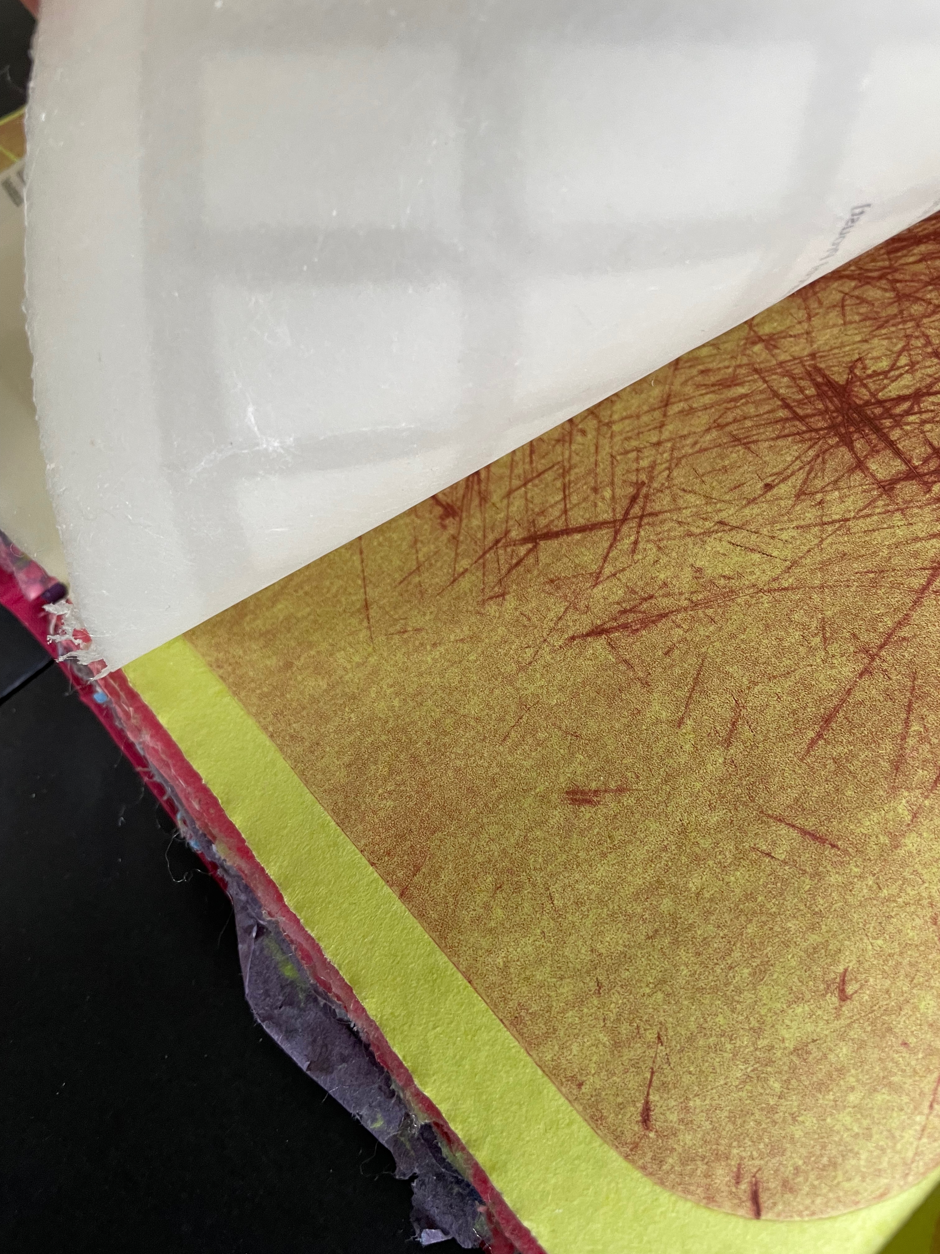
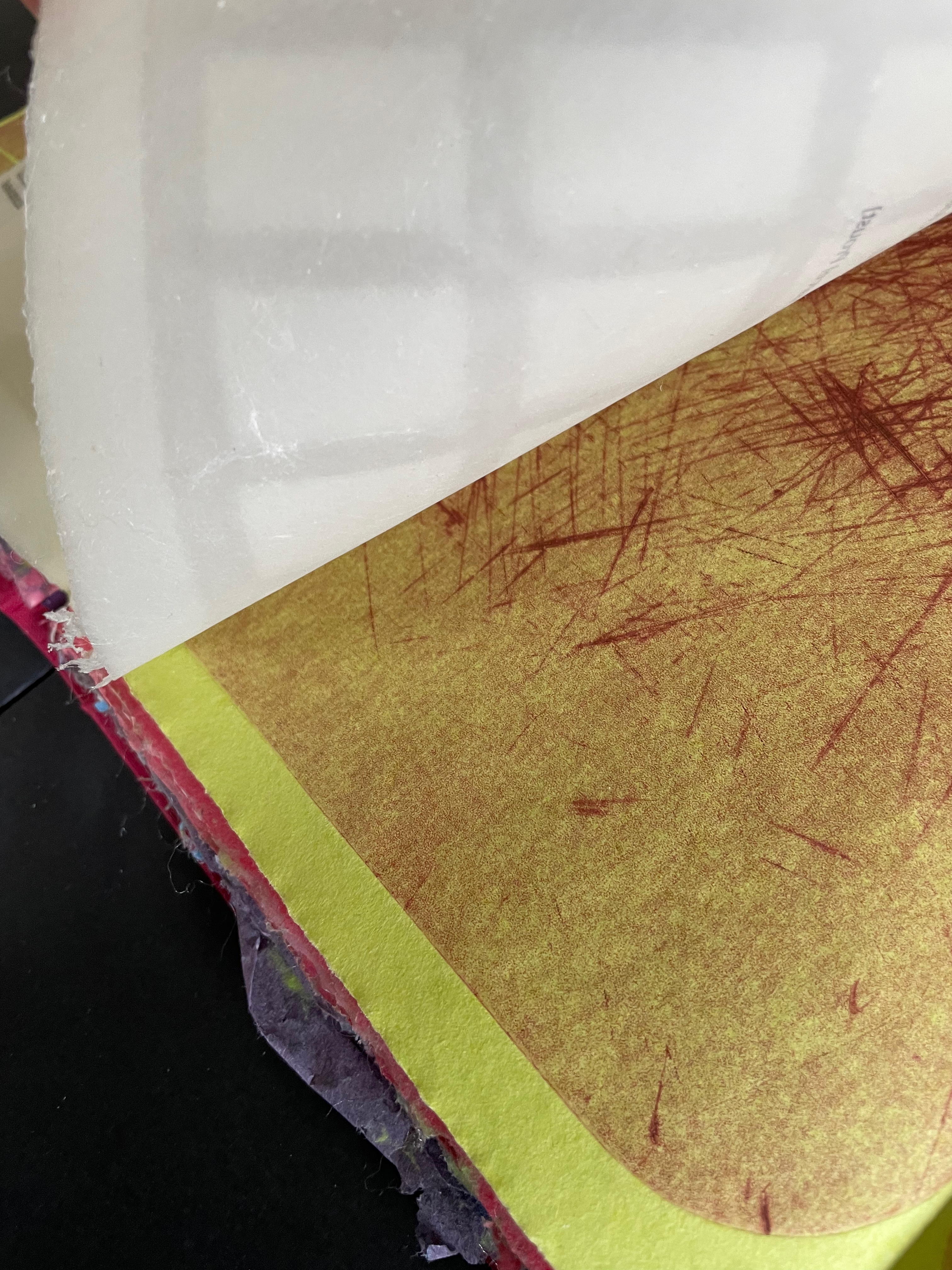
Details from “behind the scenes”: the text-bearing translucent sheet is fixed to the chartreuse green folio and is watermarked with a grid; the impress of the cutting board plate appears in the lower right corner, and the different widths of cuts show up in the drypoint etching; the deckled edges of the differently colored handmade papers appear like torn food-stained wrappers.
Text close-up
Proust on Chardin’s La Raie.
Further Reading
Bergson, Henri. 1911. Creative Evolution. Translated by Arthur Mitchell. New York: H. Holt and Company.
Bernadac, Christian. 1978. The 186 Steps. Geneva: Ferni Pub. House.
From a body of work that goes back to 1982 and covers subjects as wide ranging as Soviet Russia’s White Sea-Baltic Canal, New Orleans’ 19th century cotton industry, the Dutch Golden Age’s roots in slavery, life in Tibet’s remote Ganze Autonomous Prefecture, the west coast of Newfoundland, and an Appalachian farm-turned-museum, the four works below are by no means sufficient to represent the geographical breadth of Clifton Meador’s art. They do present his particular combination of social conscience and experimental printing. It would seem axiomatic that visual narrative (or argument) proceeds by sequential illustration or tableaux. These four works illustrate how Meador moves his narrative and argument by manipulating the printing process and the structure and material of the book.
Acheiropoieta or Not Made by Hands and Concerning Archeiropoieta (2020)
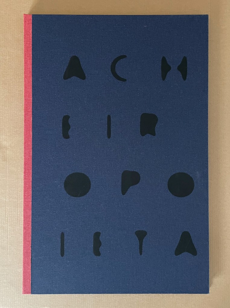
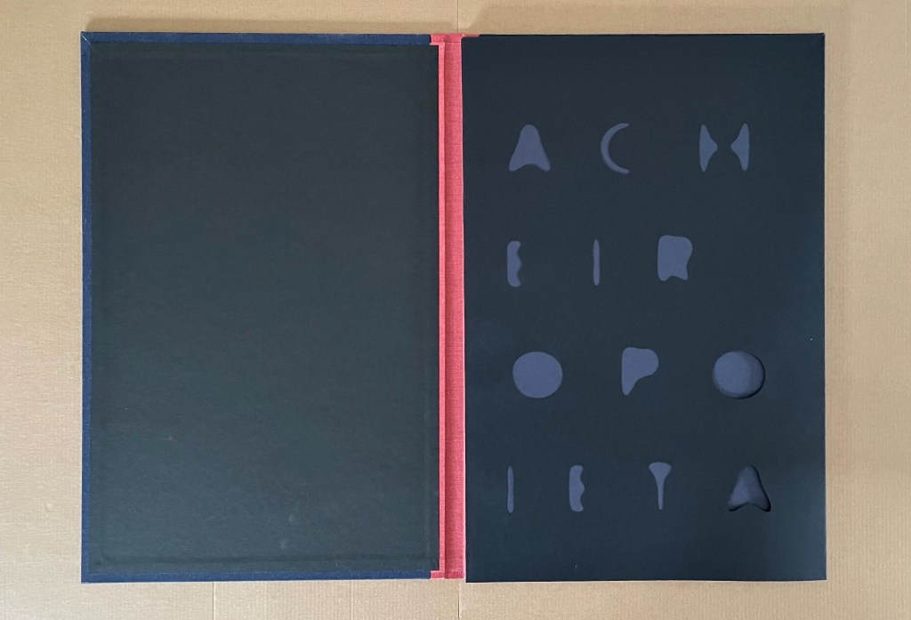
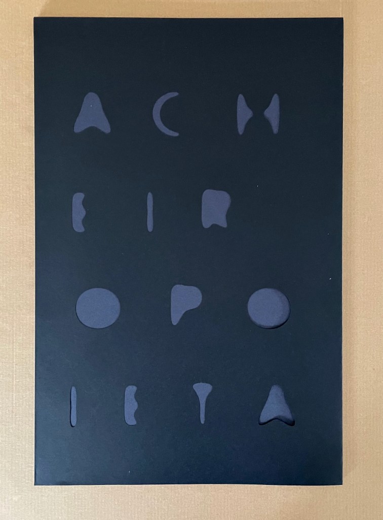
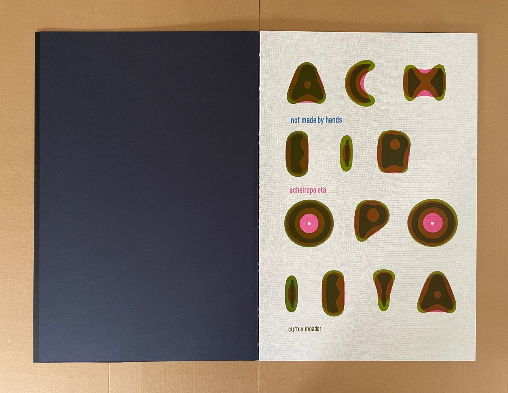
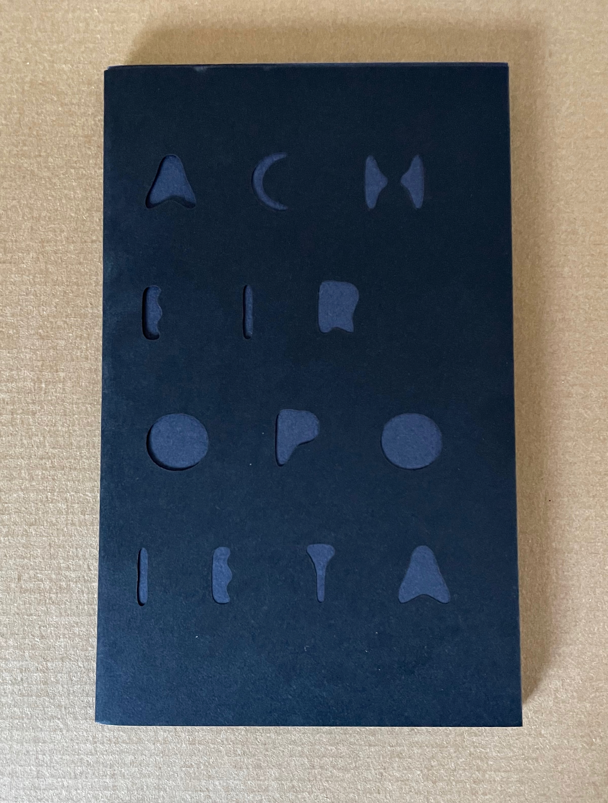
Acheiropoieta or Not Made by Handsand Concerning Acheiropoieta (2020) A Book in Two Volumes Clifton Meador First volume: Softcover, hand sewn binding, black dust jacket with title die-cut, held in a portfolio made of cloth over boards with the title in black on front cover. Book: H482 x W319 x D10 mm. [36] pages. Portfolio: H486 x W322 x D16mm. Second volume: Softcover, hand sewn binding, in stiff black dust jacket with title die-cut. H203 x W128 mm. [36] pages. Edition of 115, of which this is #42. Acquired from the artist, 21 June 2024. Photos: Books On Books Collection.
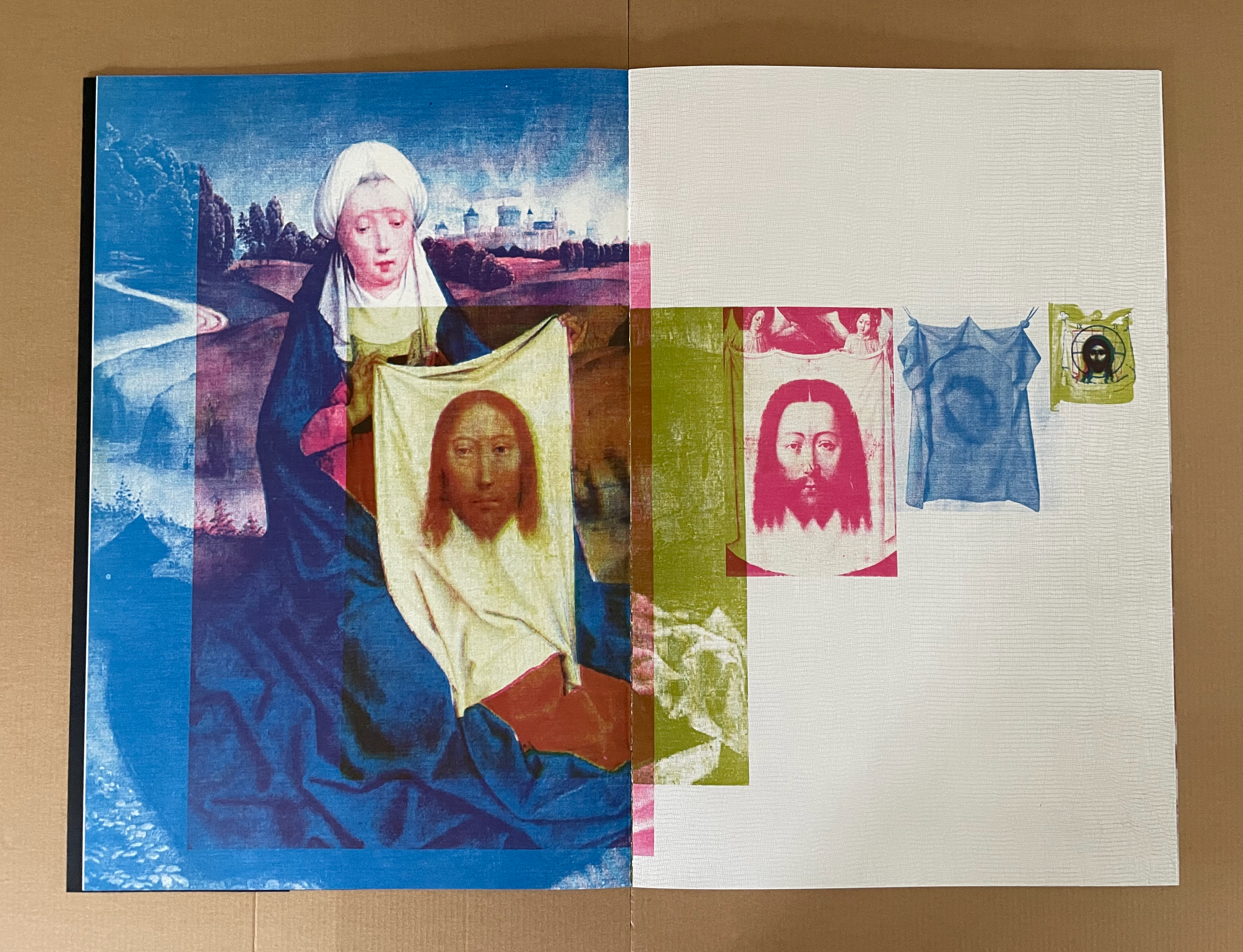
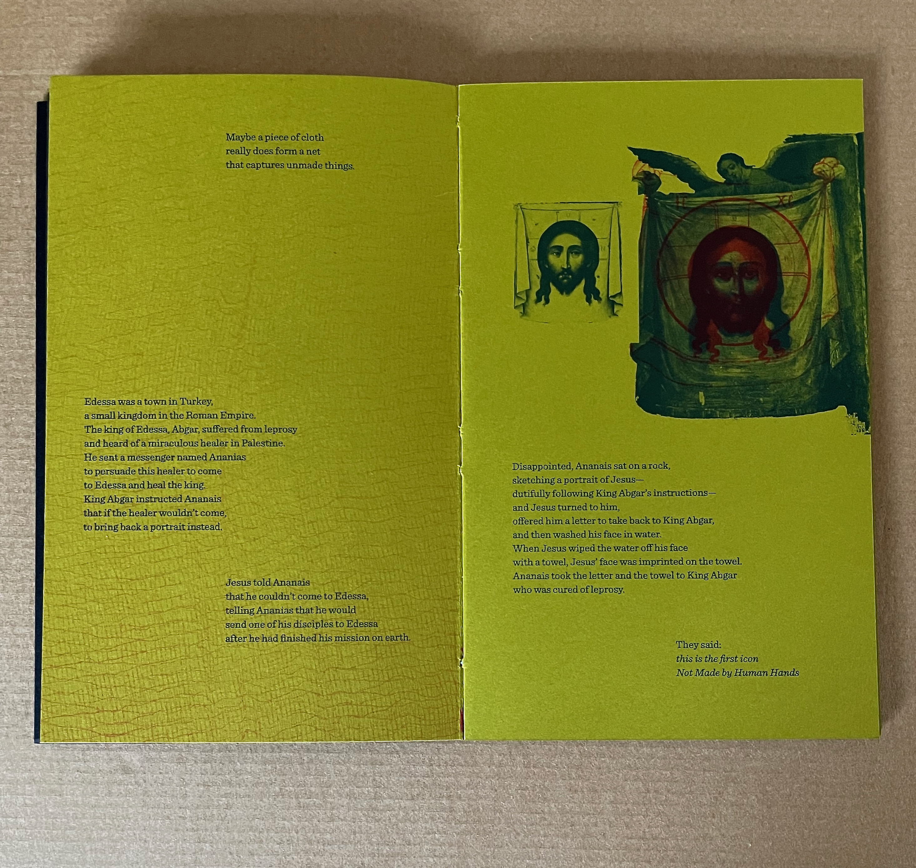
The Greek word acheiropoieta means “not made by hands” and names a class of religious icons purportedly created by miracle. The Shroud of Turin, Veil of Veronica, and Mandylion (or “Image of Edessa”) are the most famous Western examples. At times, believers have accepted them as unmediated objects of divine truth.
Other than the cover, title page, and colophon, there is no text in Clifton Meador’s Acheiropoieta. It has to be read by its images. The idea of the divine and unmediated image gives Meador a springboard for exploring whether, in light of photography’s fall from unmediated truth, authority, and trust — and, with digital photography, even from physicality — “images might be made to seem unmediated, [and] … made to revert to a kind of solidity”. There begins his search for a metaphor, and he turns to the substrate of those religious icons for it.
As Meador explains:
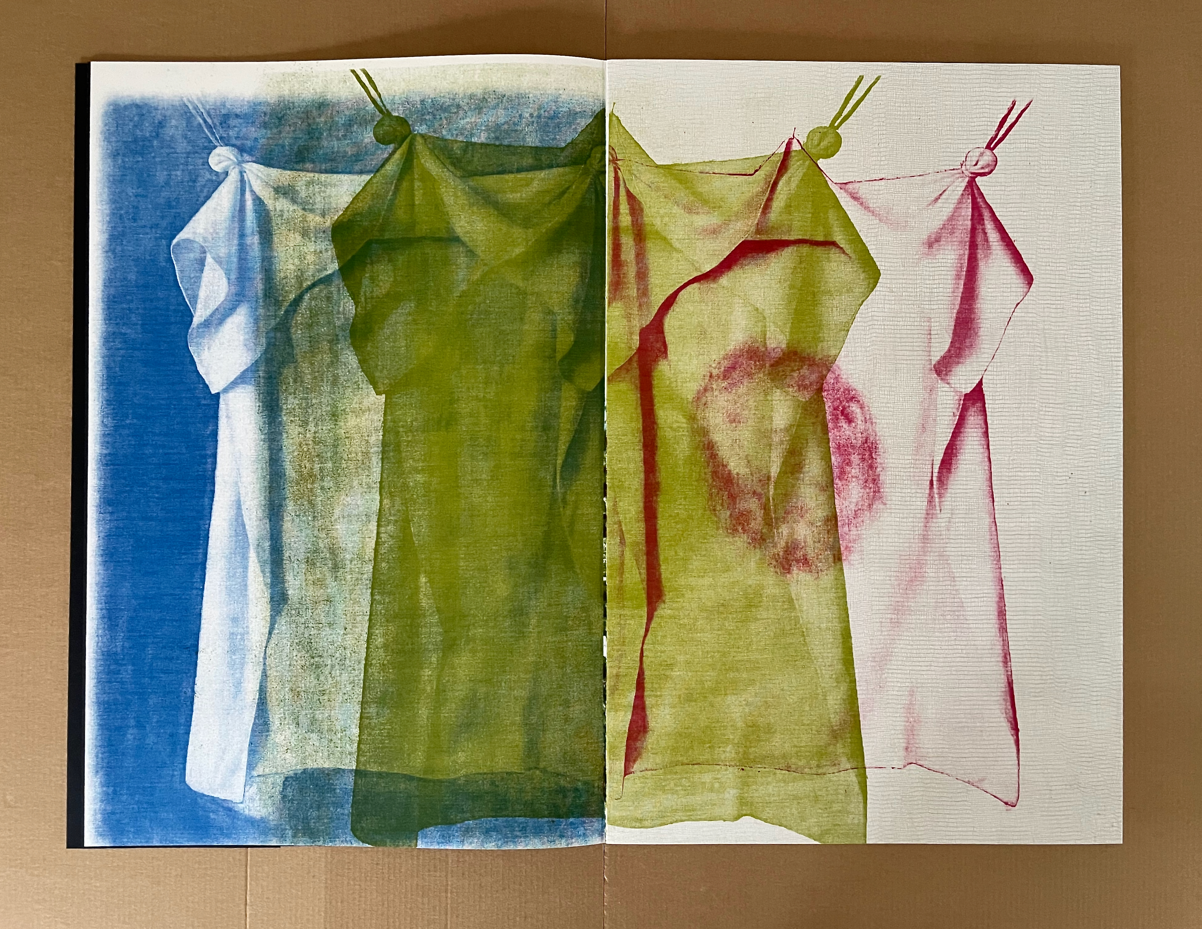
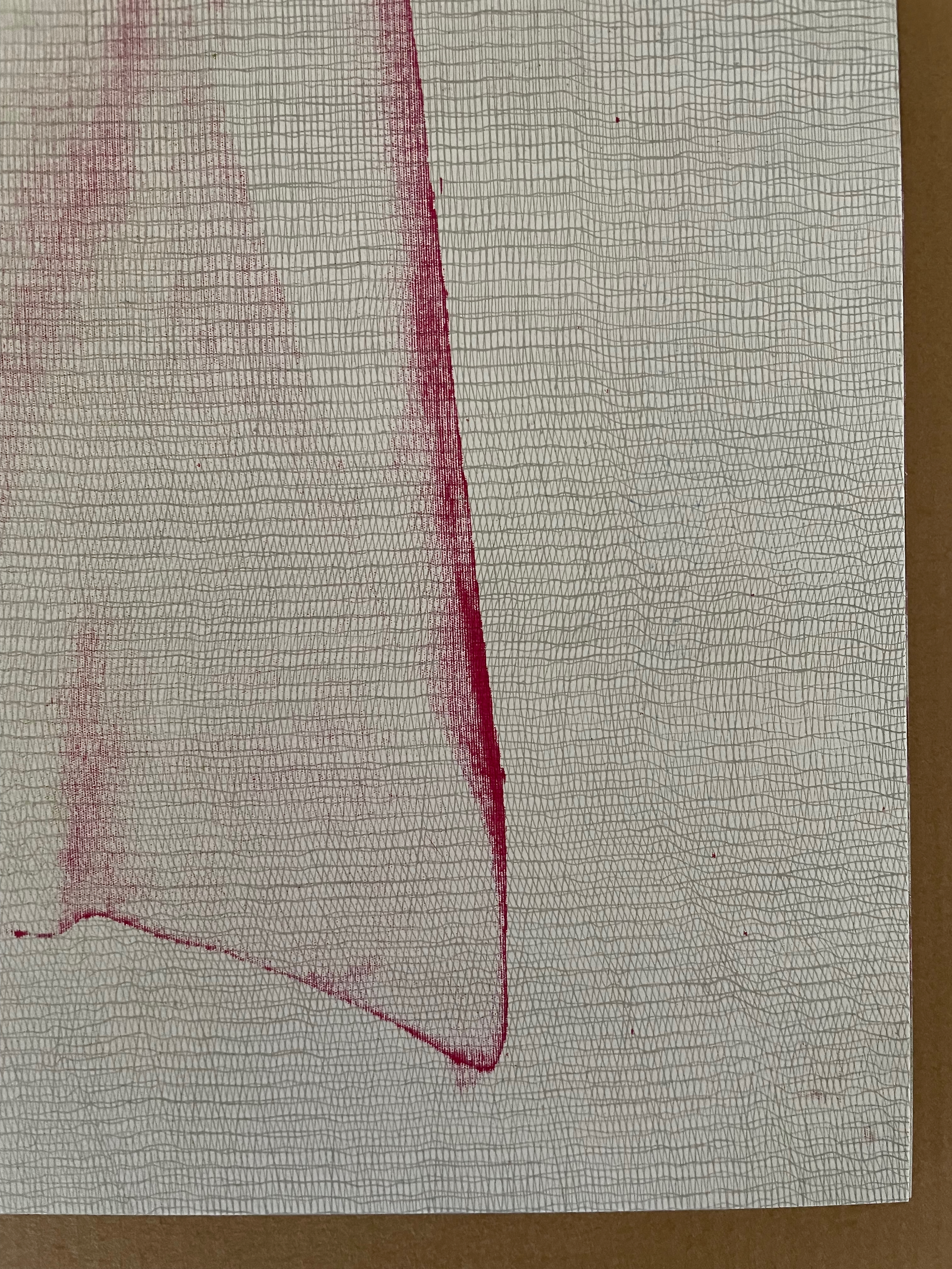
Woven cloth forms a raster, a grid of threads that forms a fabric. When seen by transmitted light, the warp and weft of the cloth forms a variable density grid-which calls to mind a halftone contact screen, a predigital piece of technology that translated continuous tone images into fields of halftone dots in order to simulate tonality. In this project, I created color separations of images, print them through dye sublimation technology onto cotton cloth, and use those pieces of cloth to directly expose offset lithographic printing plates, which would then be used to print three-color images. The weave of the cloth itself would break down the continuous tone image into dots of varying size. In a very literal way, I wanted to create a material metaphor to elaborate the idea of an acheiropoieton- where the lithographic shadows of the cloth images were multiplied into a book.
Left: woven-cloth raster. Right: Veronica’s Veil, an image of an image of an image of an image of an unseen acheiropoieton.
It is a mind-twisting metaphor. Is god the digital image that is about to be color-separated? Is god the piece of cloth from which the image will transfer to the offset lithographic plates? Is god the plate from which the image will transfer to the book? In the end, we are holding and looking at something solid that, by a process effected and affected by something solid, has sprung from something not solid.
Along with the metaphorical and metaphysical challenge, Meador weaves another challenge: one to our social consciences.
But there is a problem inherent in cotton cloth: Cotton production has a long and horrible history. Sven Beckert’s great book, Empire of Cotton, details not only the development of chattel slavery in the New World in response to the growing demand of the textile mills in England, but also the troubling history of cotton in the Old World. Cotton cloth-comfortable, easily dyed, beautiful-comes with a long, miserable history of human suffering and exploitation.
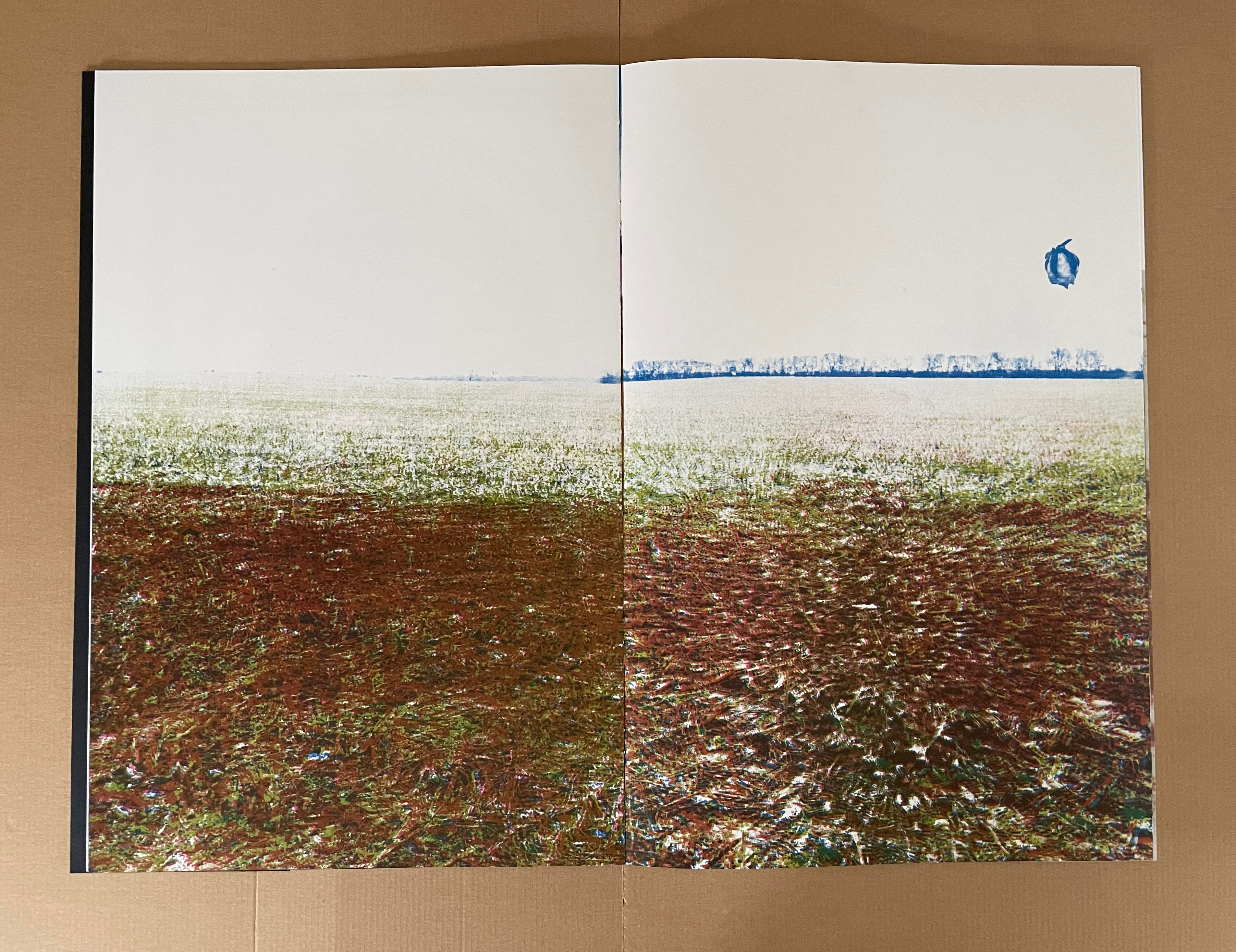
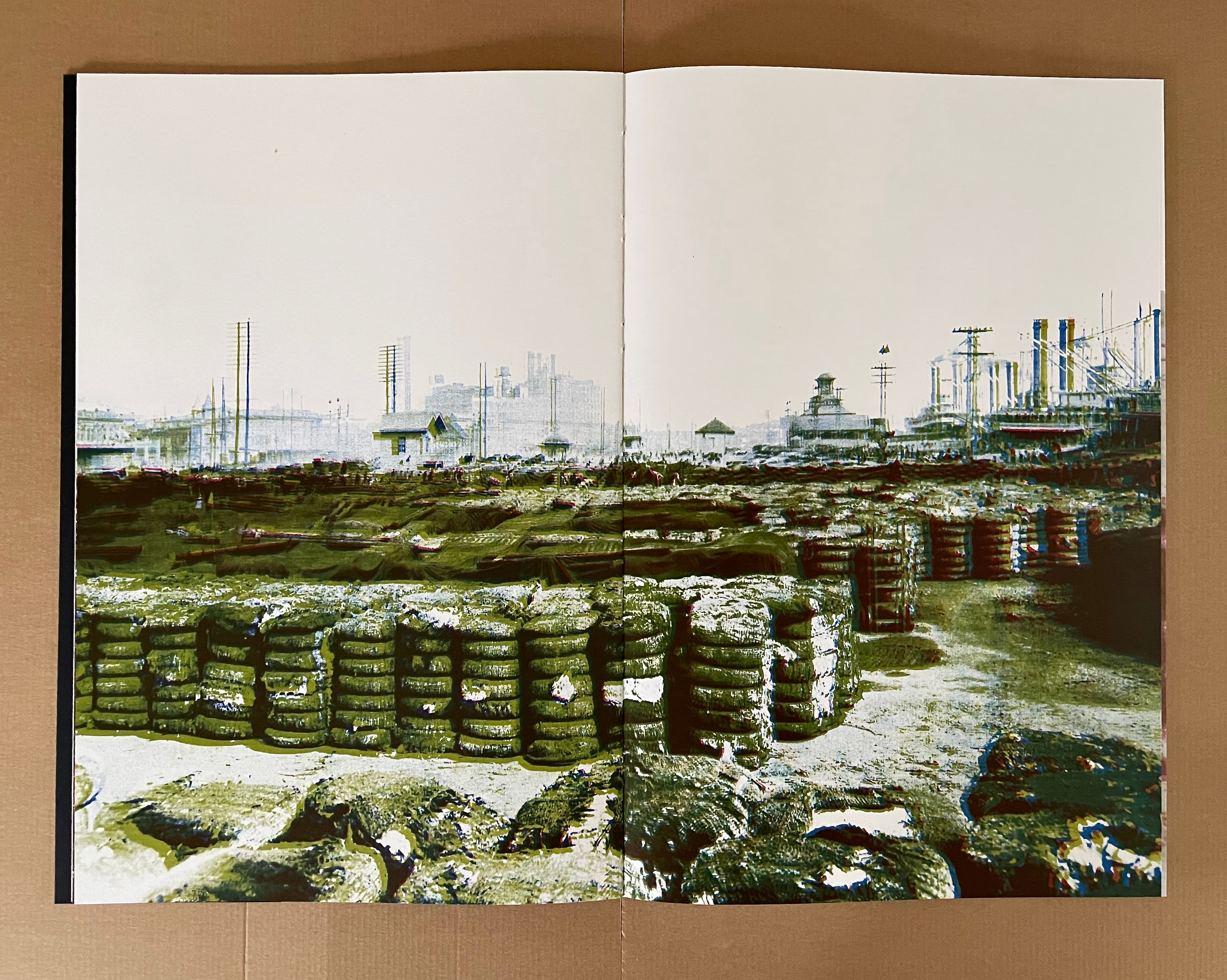
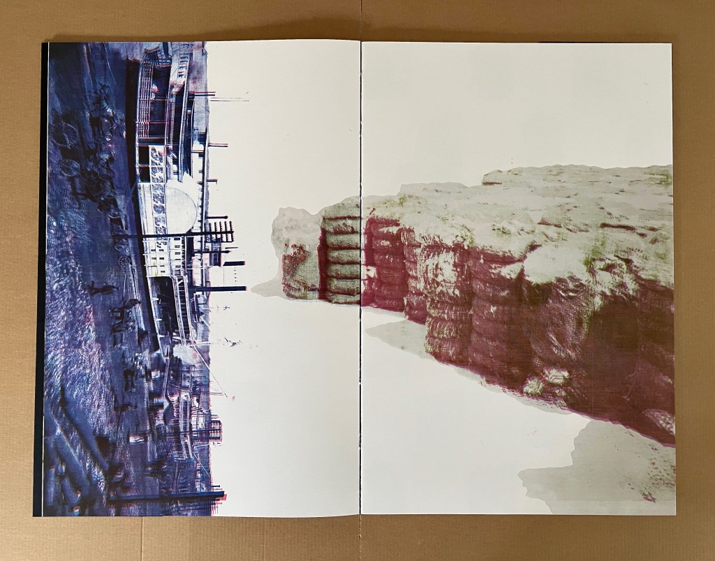
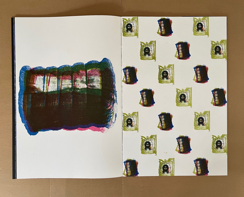
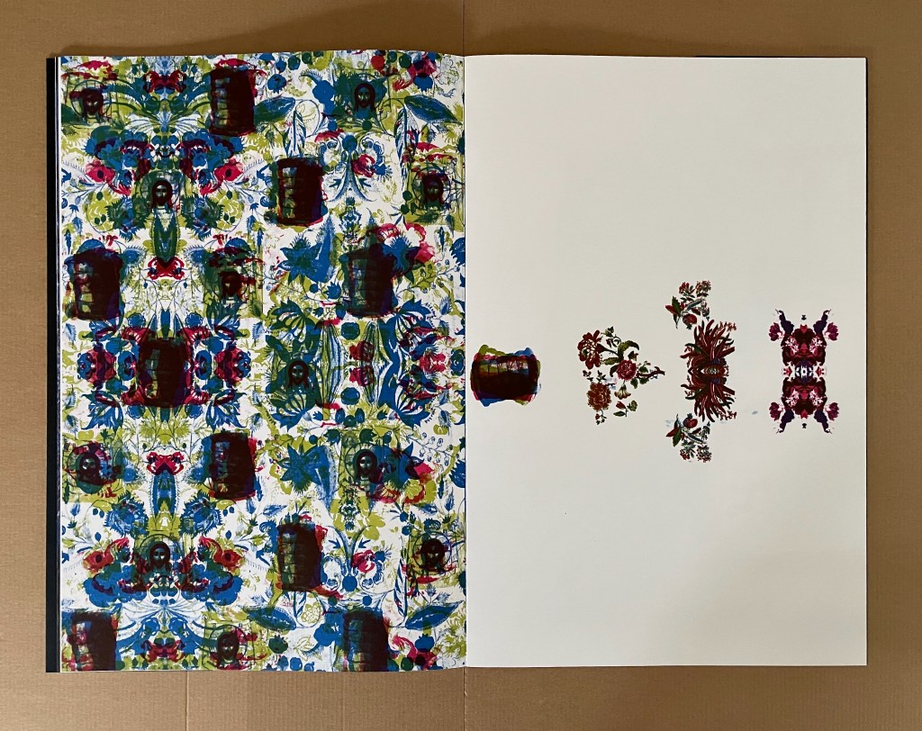
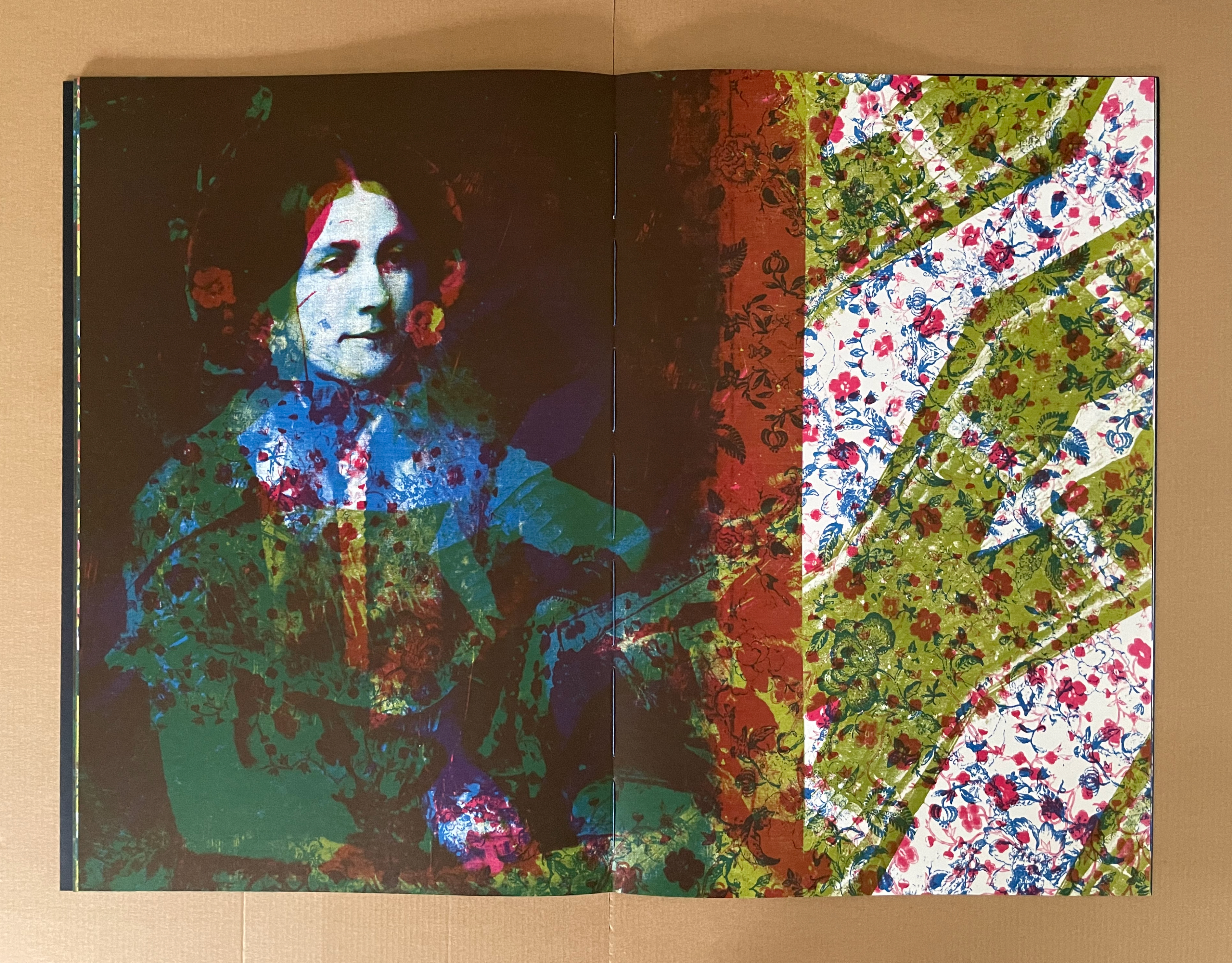
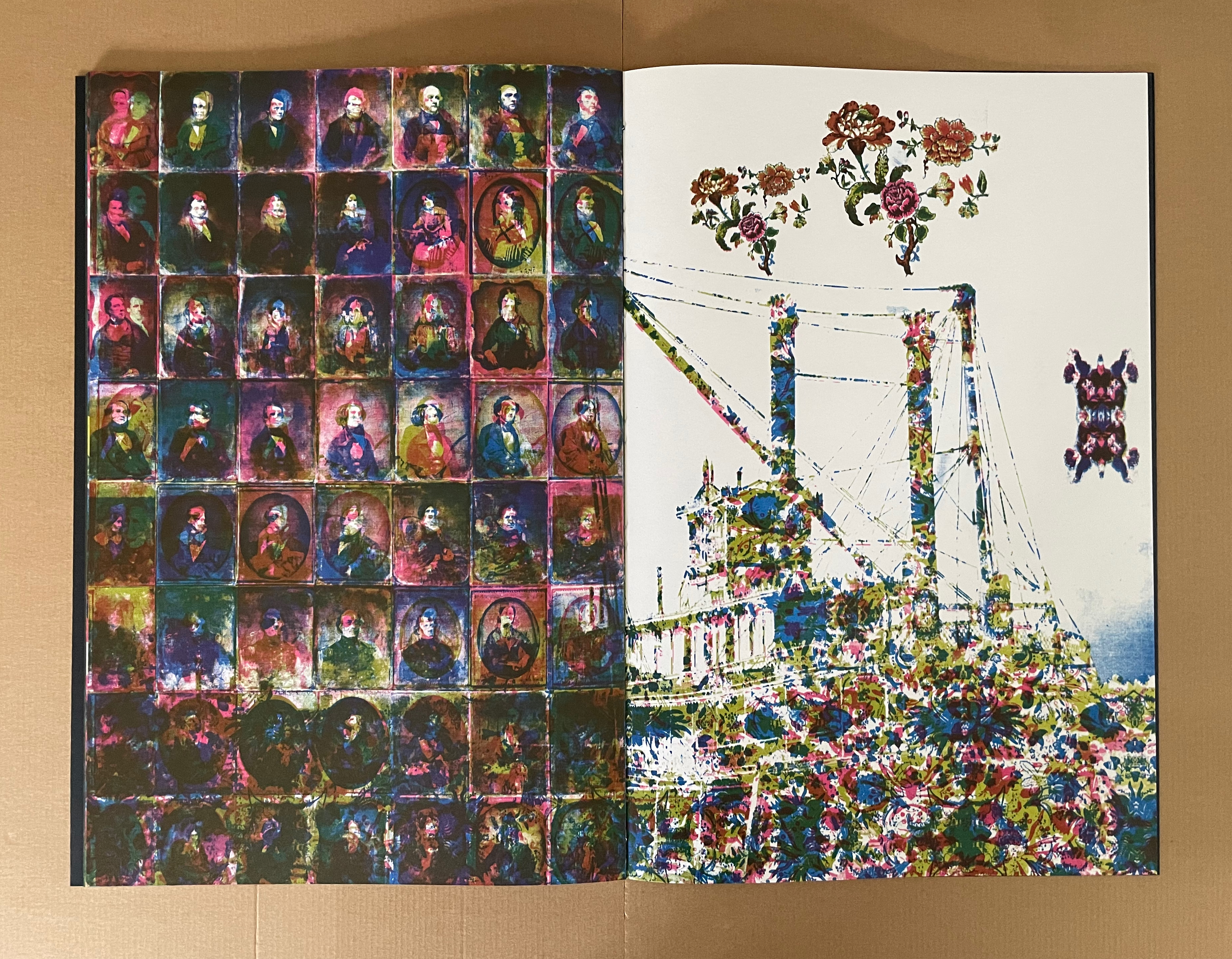
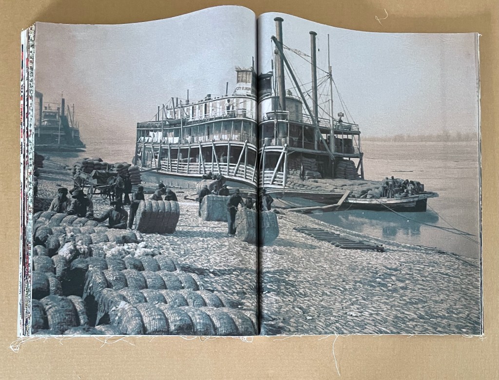
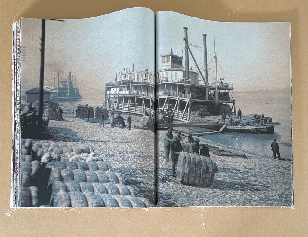
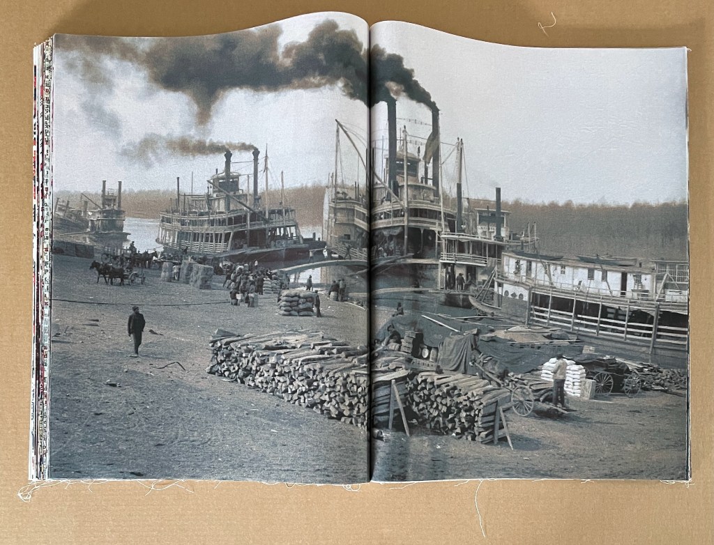
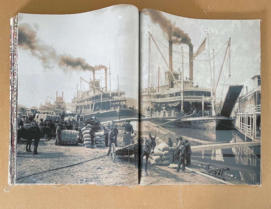
After the images of the stripped field and waiting bales of cotton, the artist asserts page layout to develop the overlapping themes. In the first double-page spread below, when turned 90º, the steamboat in portrait issues bales of cotton as steam. That which drives the boat and economy clouds the air. In the second spread, the bale of cotton as acheiropoieton proliferates and equates with the acheiropoieton of Veronica’s Veil. With the repeating bales and veils interspersed across the wallpaper-patterned cloth, the third spread below drives home the metaphor of the icon borne on its own substrate to the extent that it extrudes only the cotton icons emblems on the recto page.
In the center of the book, the mechanics of the acheiropoietic process takes center stage. The metaphors of predigital photography, digital color separation, the printing process, and the acheiropoietic result roll across the spread.
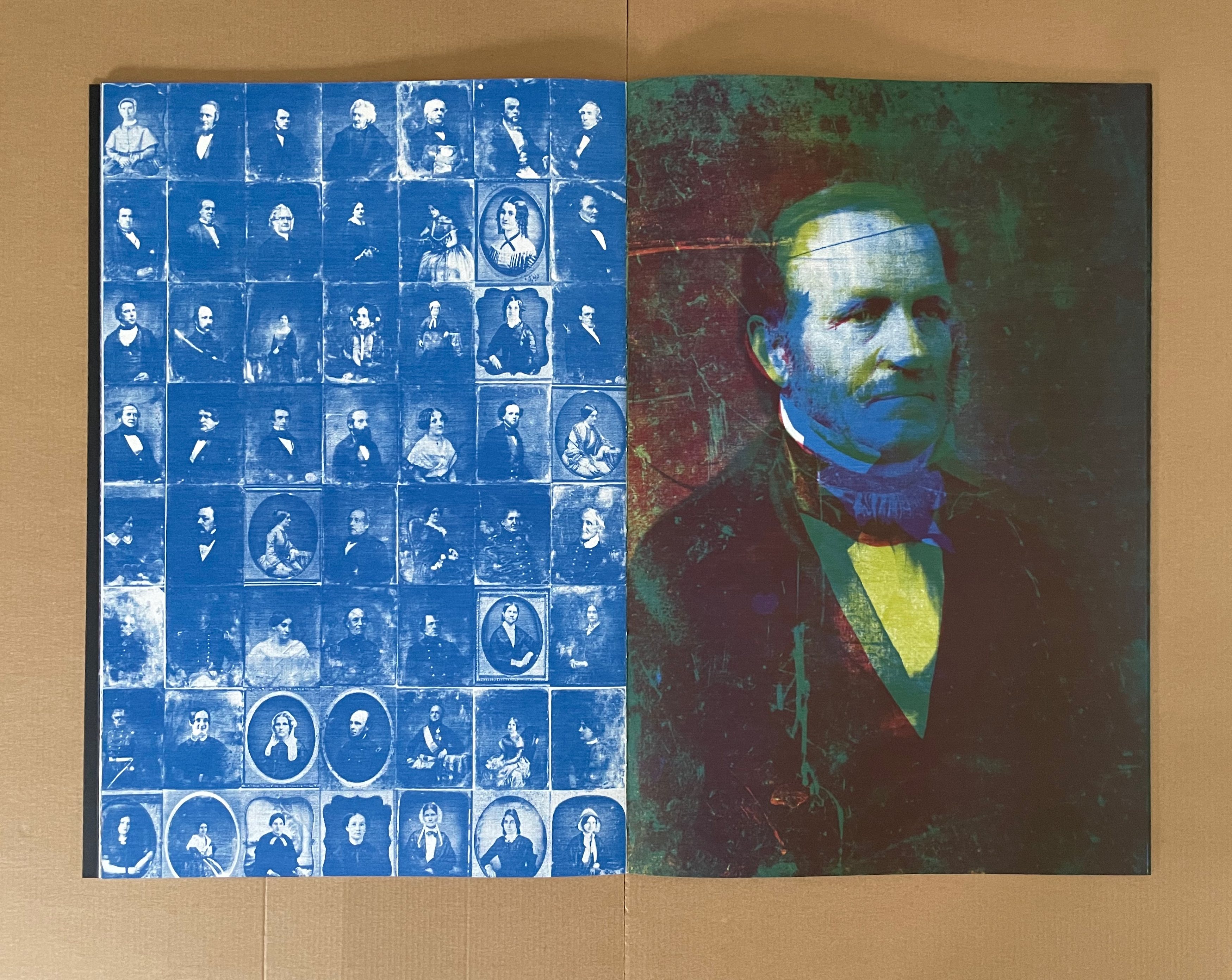
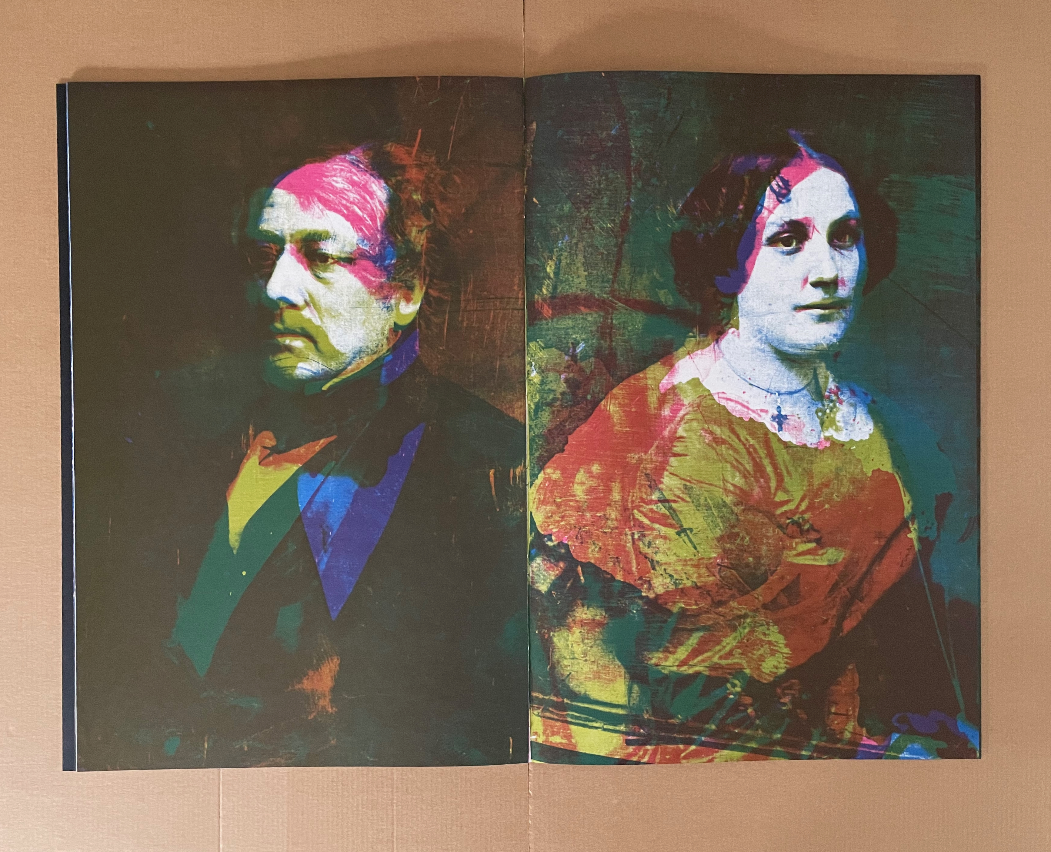
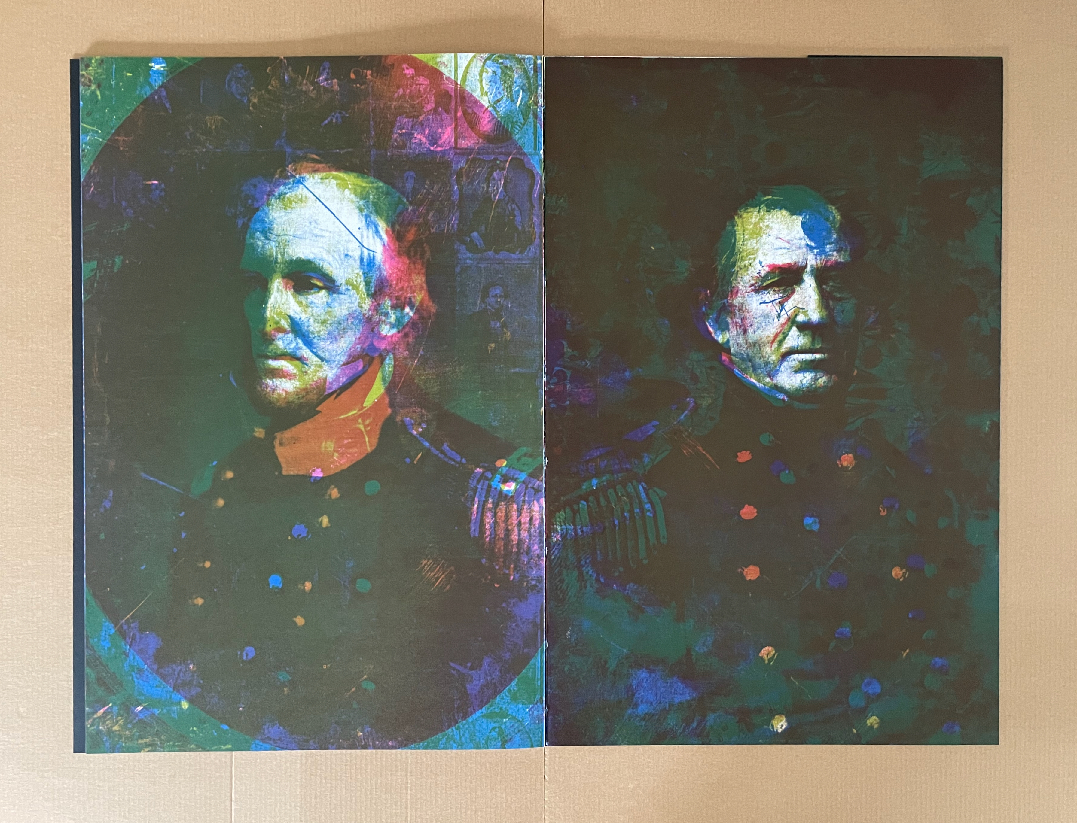
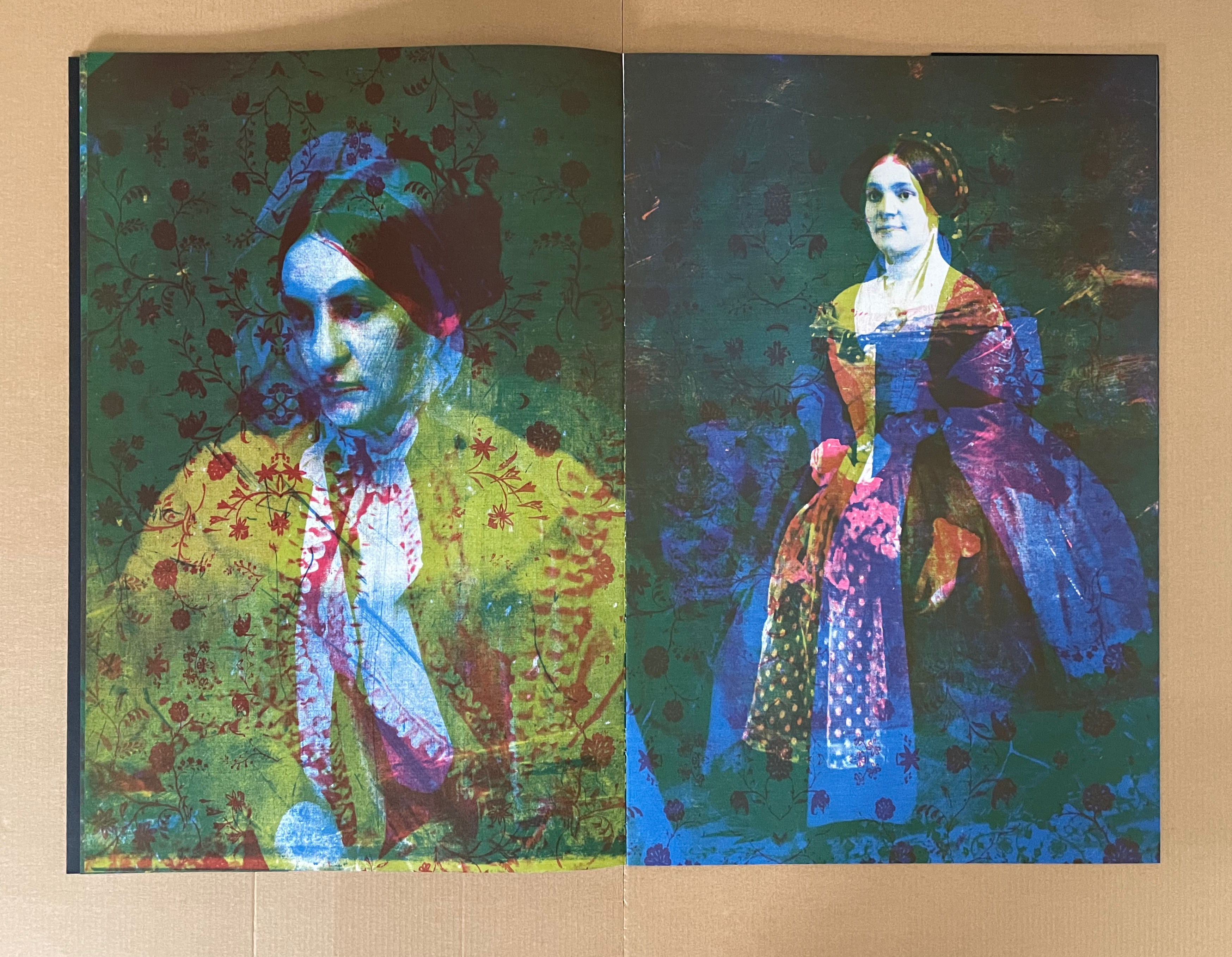
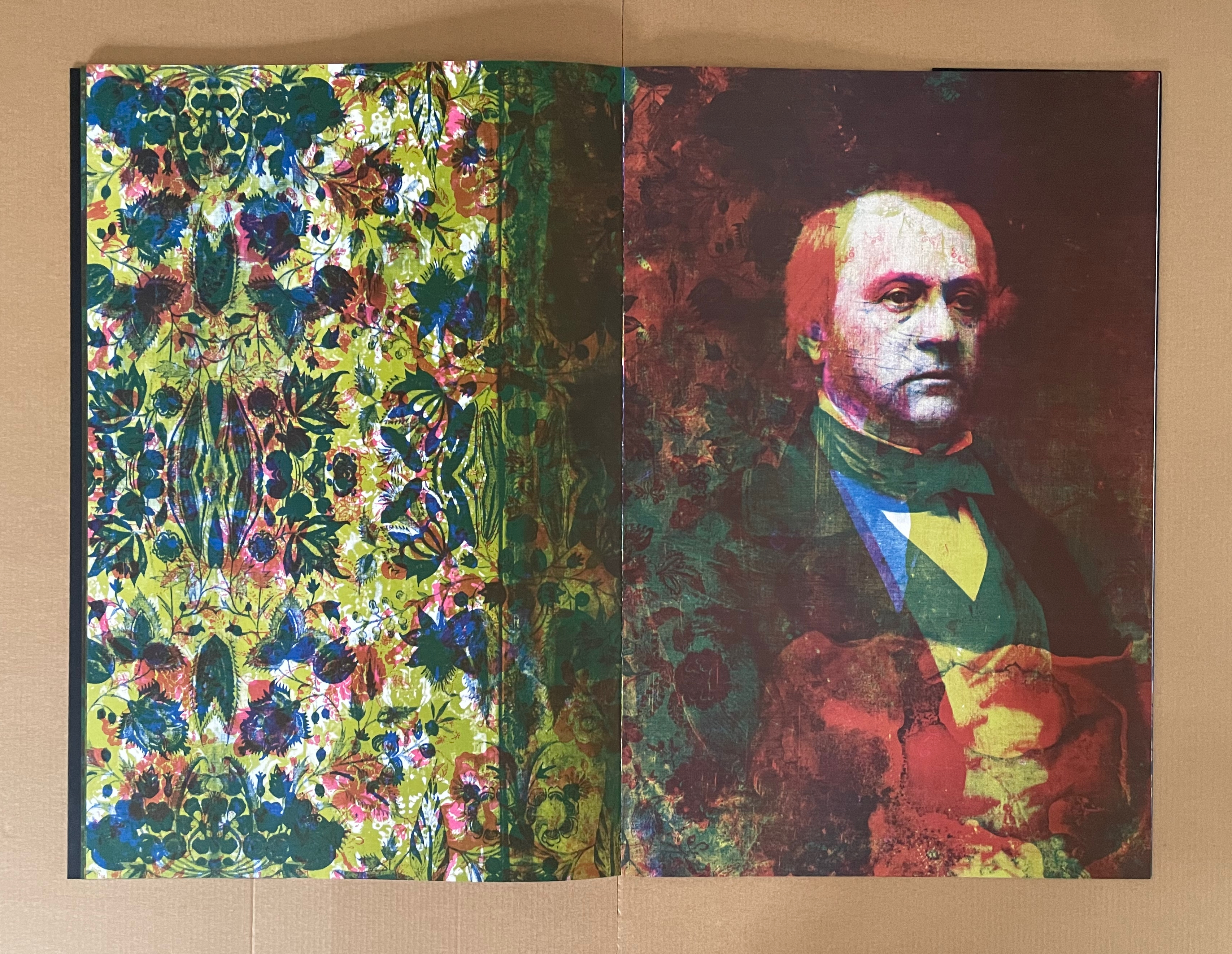
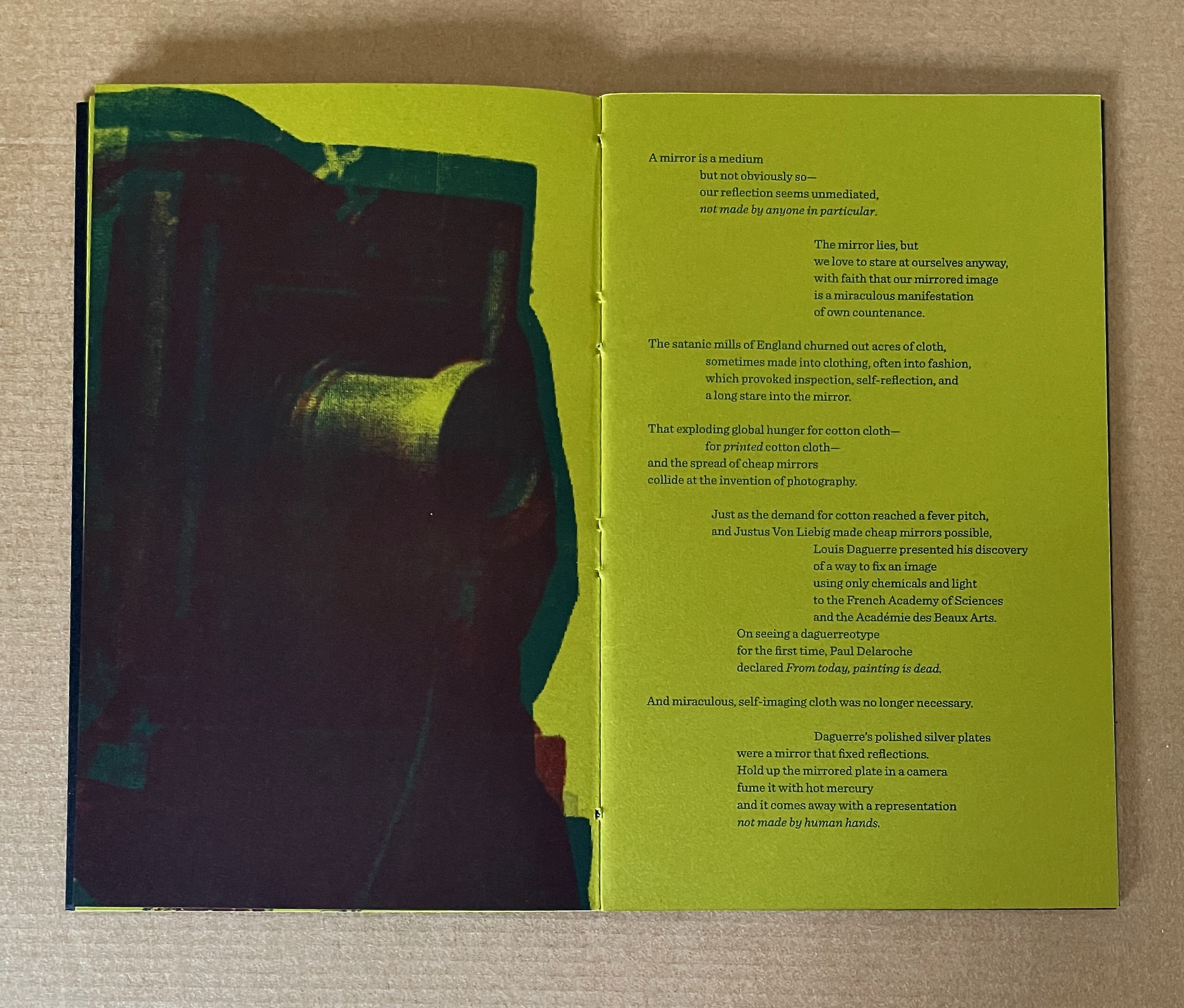
From here on — until the final image — the historical social implications of the new technology dominate. The portraits come from the Library of Congress’ collection of daguerrotypes. They are the privileged and celebrities who could afford an appointment with the new technology and have their likenesses captured without human hands. As Meador puts it in the companion volume Concerning Acheiropoieta, “”we have evolved from seeking the divine to staring at ourselves”.
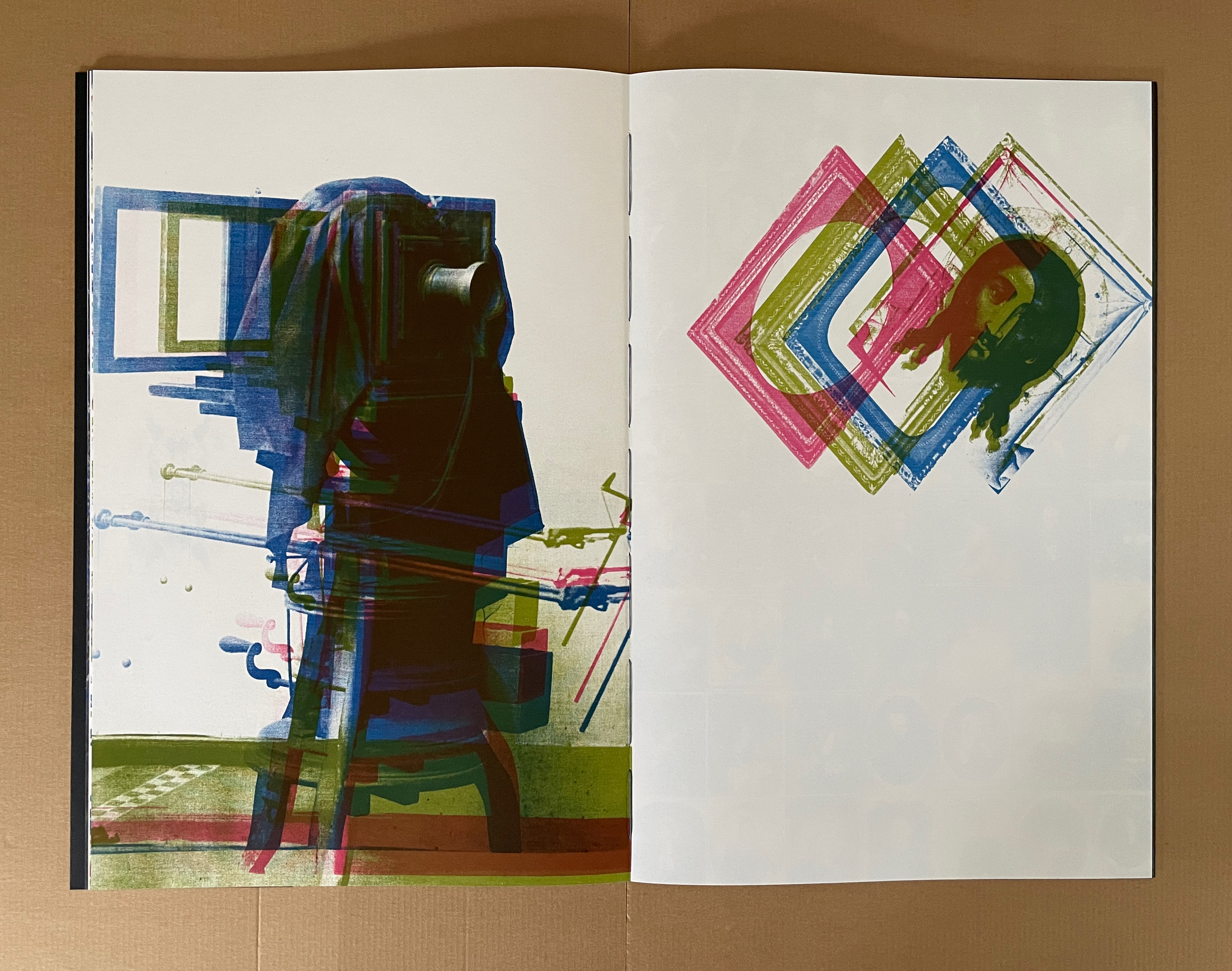
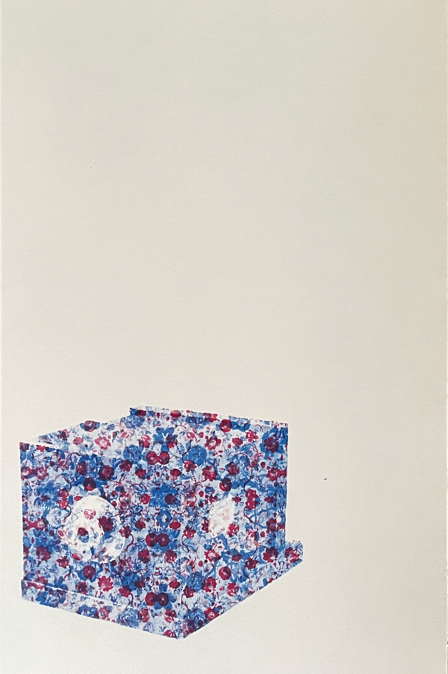
As the portrait sequence comes to an end, the overlaid images and separations obscure the faces. The pattern of colors and the floral figures take over the steamboat and its spouts of smoke. The book’s final image is the tool that brought us here — a daguerreotype camera box. It is so overlaid with a blue and red cotton print that it is almost unrecognizable. The image pushes the mind-twisting metaphor even further. The tool that creates “unmediated” images has its own likeness obscured by a pattern emblematic of the original substrate for acheiropoieta.
The camera overlaid with cotton fabric.
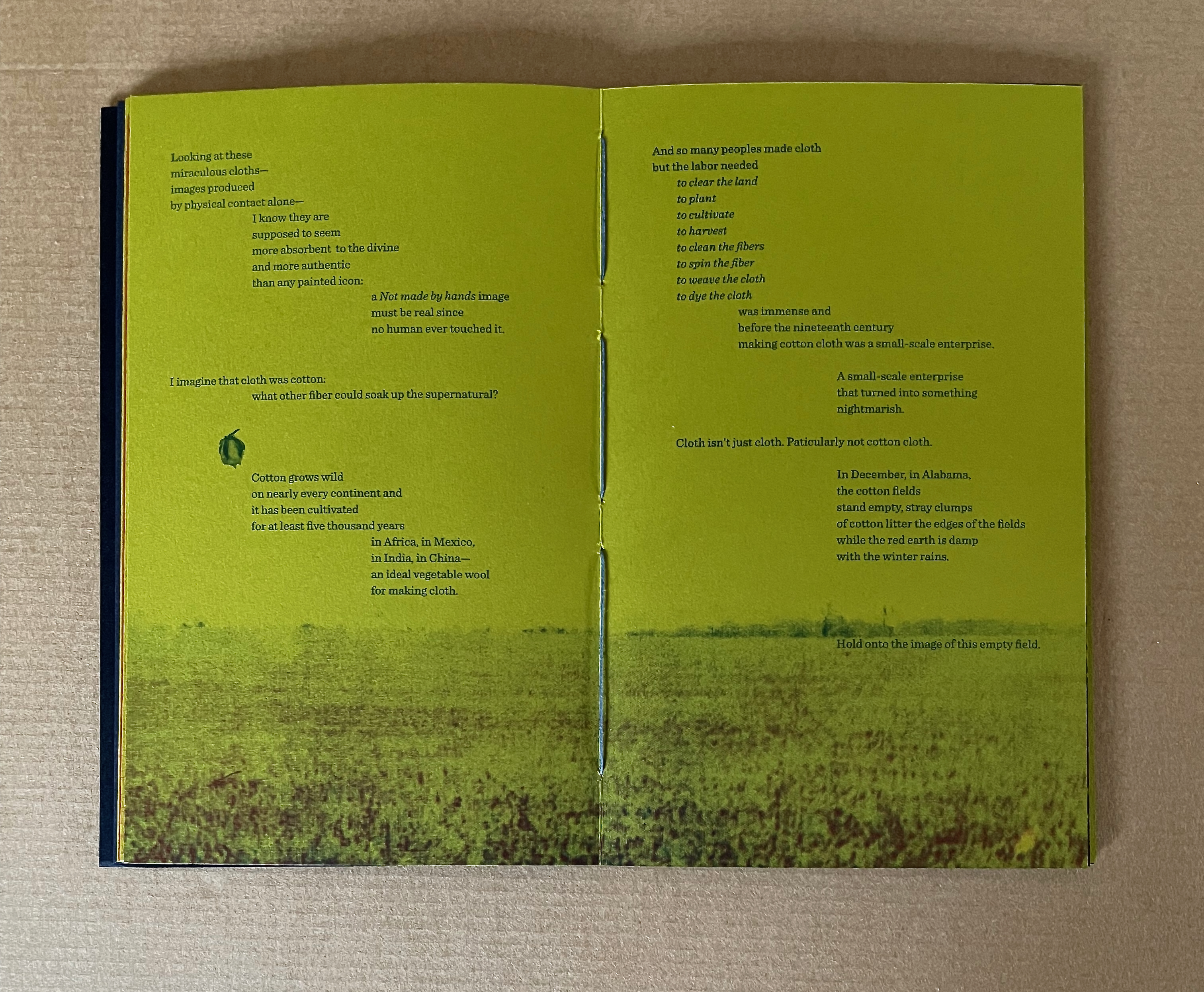
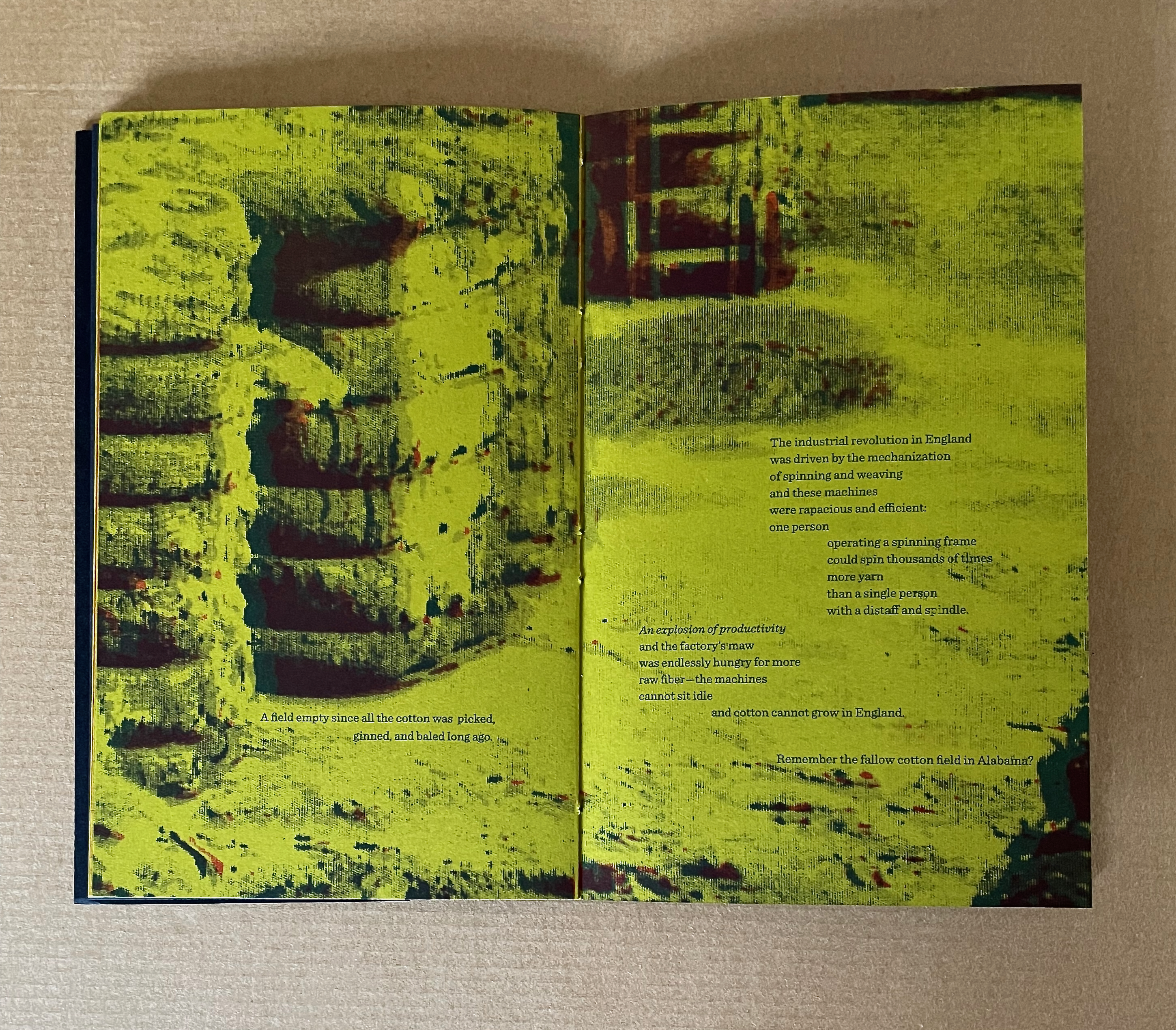
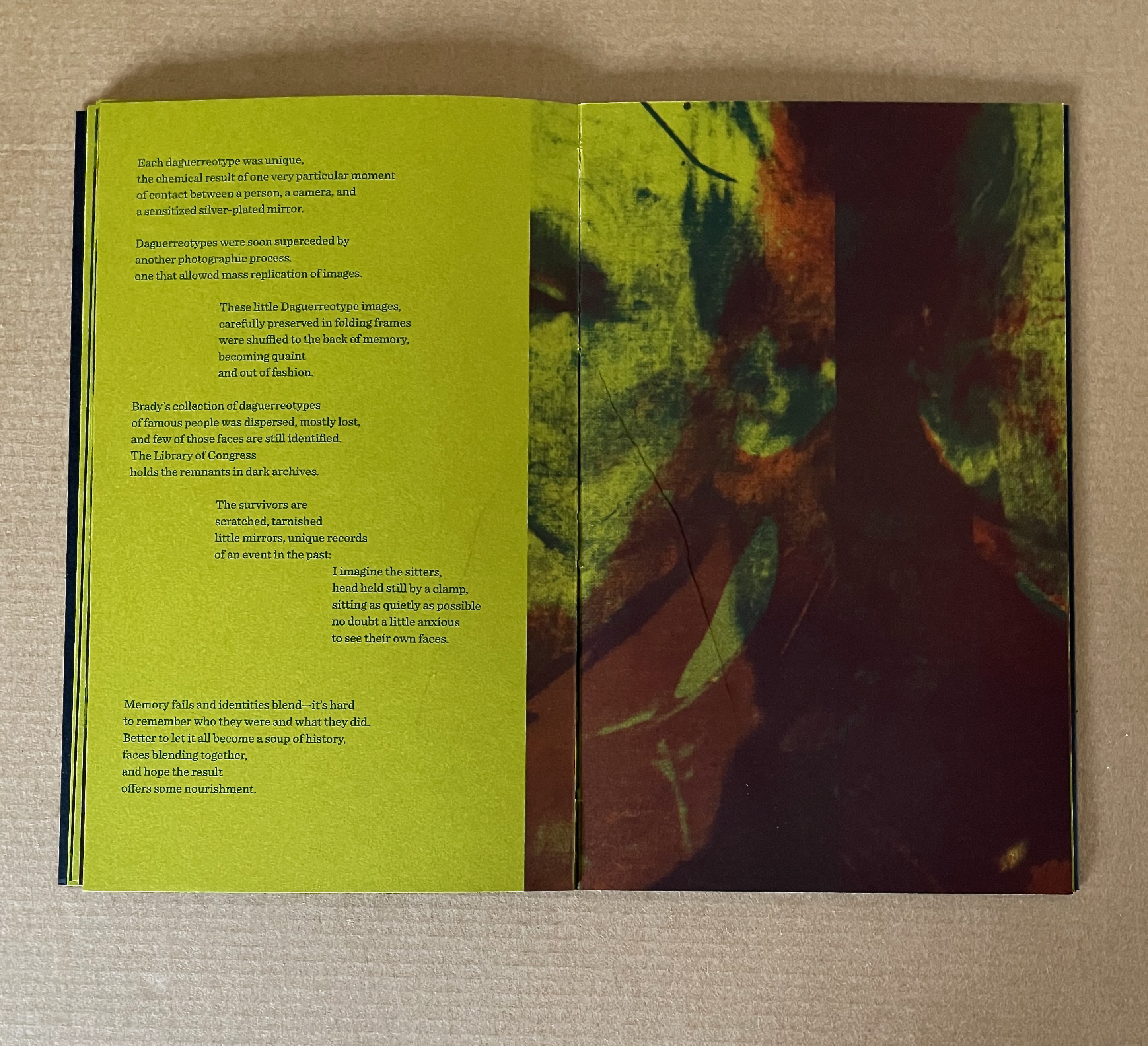
The die-cut cover of Concerning Acheiropoieta, the smaller volume, announces its companion relationship to the larger volume. Unlike its partner, though, it is printed on chartreuse paper and contains text. Text and image in the companion also begin with the grid of cotton cloth and icons not made by human hands and proceed to the fallow December cotton field, over which the text spells out the links with England’s industrial revolution, empire, and slave trade.
The text then knots those threads to the explosion of demand for cotton cloth (in particular, printed cotton cloth), the spread of cheap mirrors, and invention of photography.
The text also unpicks the structure of the daguerreotype camera. In doing so, it adds another layer to the theme of self-regard. Fitted with an achromatic lens, the wooden box held at its rear a copper sheet plated with mirror-polished silver and sensitized to light. Removing the lens cap projected the image of whatever was in front of the camera to the plate inside.
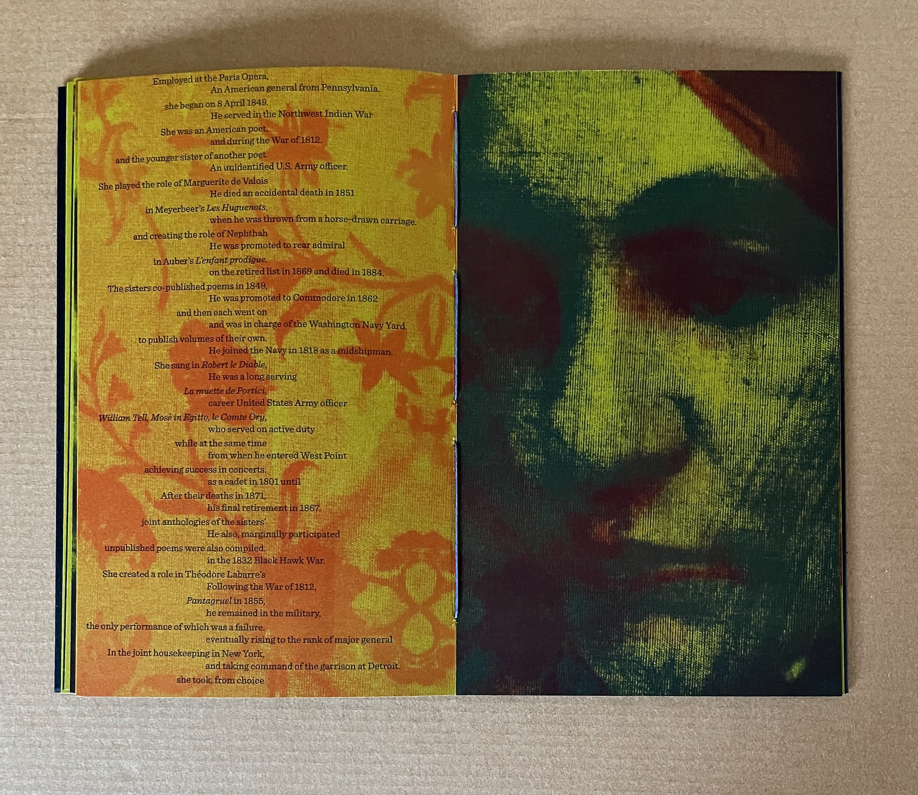
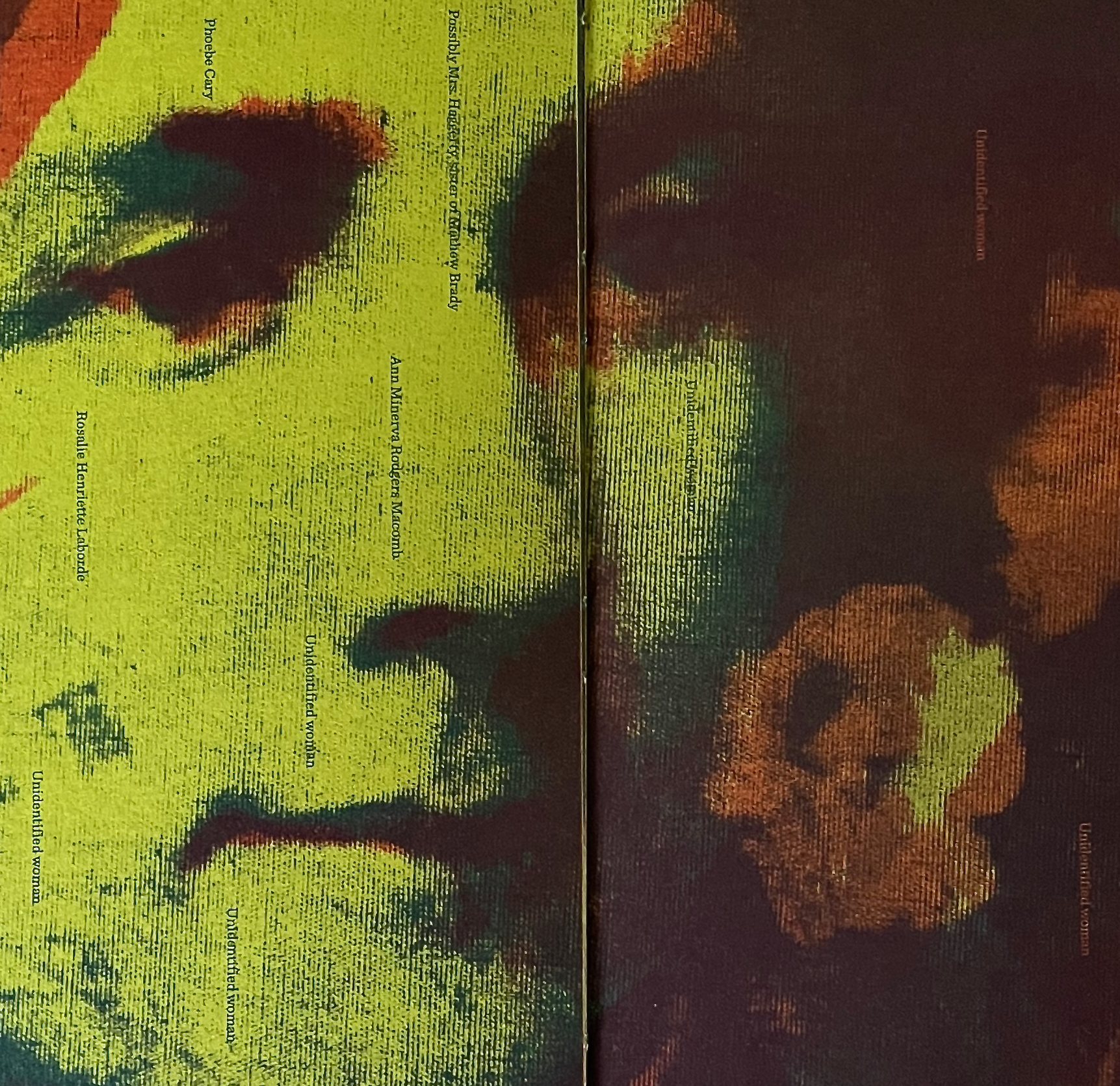
Although the text expands on the human cost of the demand, its primary focus and the entire focus of the images remain on the portrait sitters — despite their receding into “the soup of history”. The images are versions and details of those appearing in the larger volume most of whom are difficult to identify. It is at this point in the companion volume that the text’s typographical presentation begins to enact itself and gloss the images alongside which it appears. Notice how Meador jumbles the descriptions of the sitters on the verso page below.
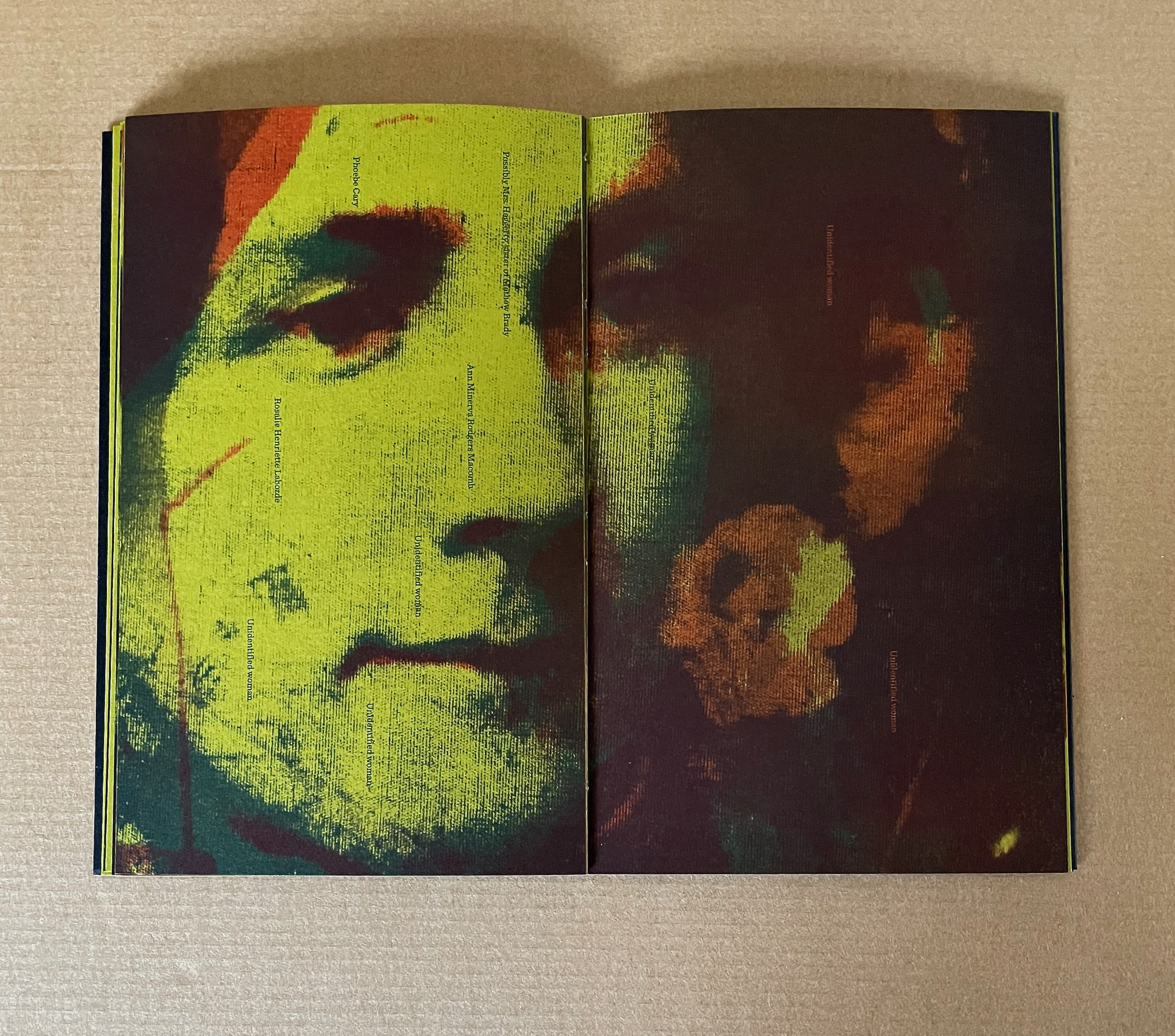
Notice also how, with the label “Unidentified woman” and names of the portrait sitters typeset perpendicularly to the image below, the typography enacts the metaphor of “the warp and weft of the cloth”. Meador is comparing the cloth and “technology” of the acheiropoieton with the page and technology we hold in our hands.
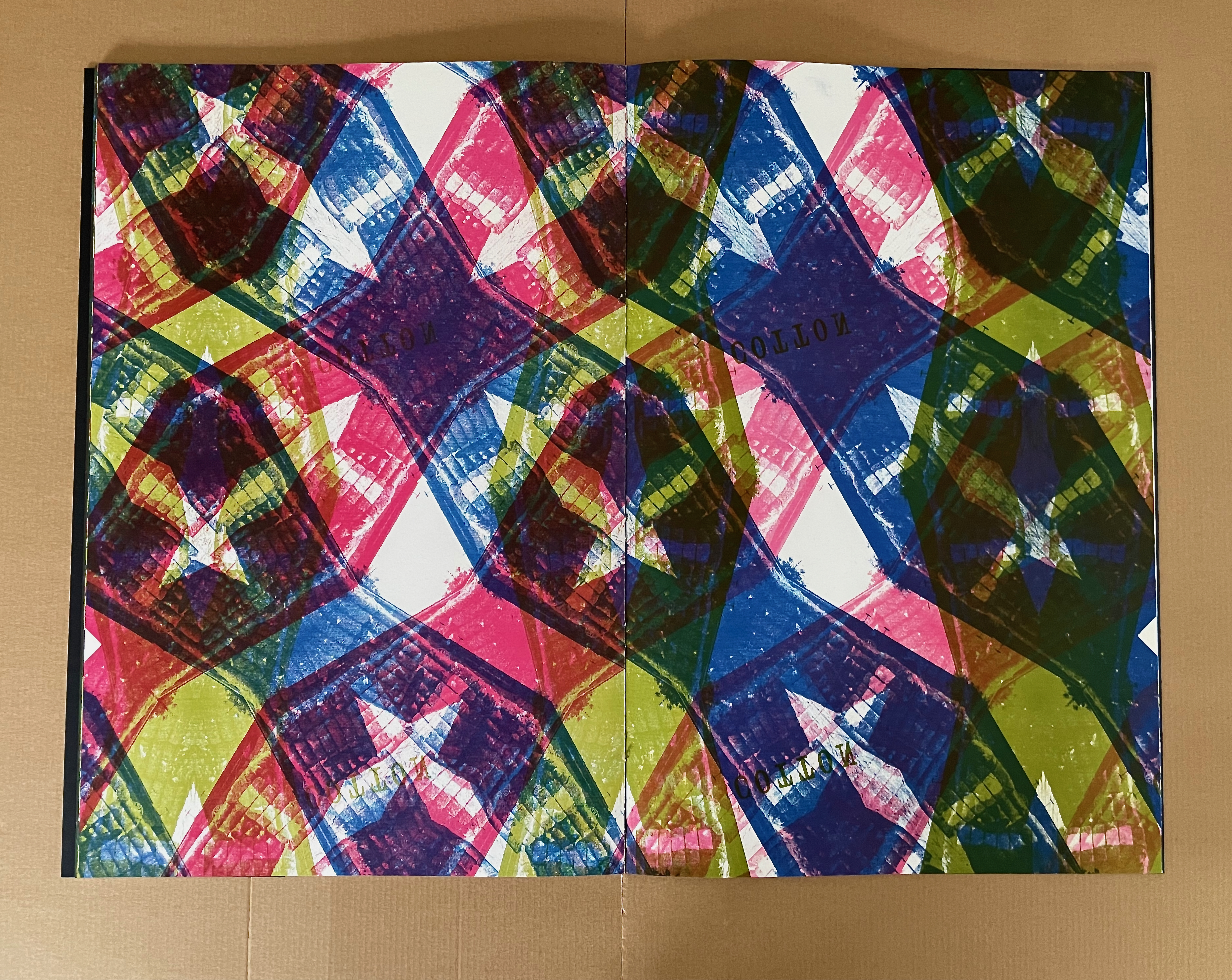
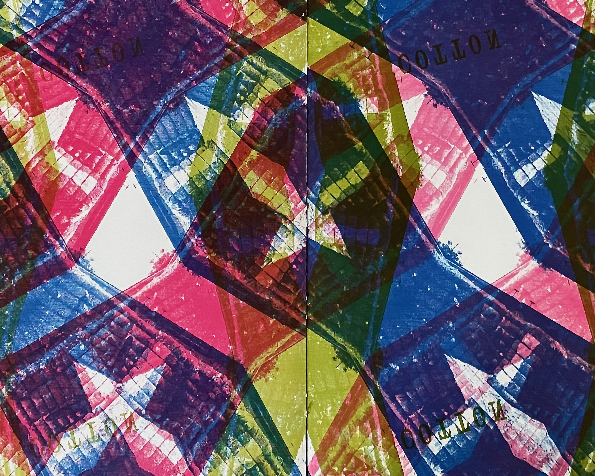
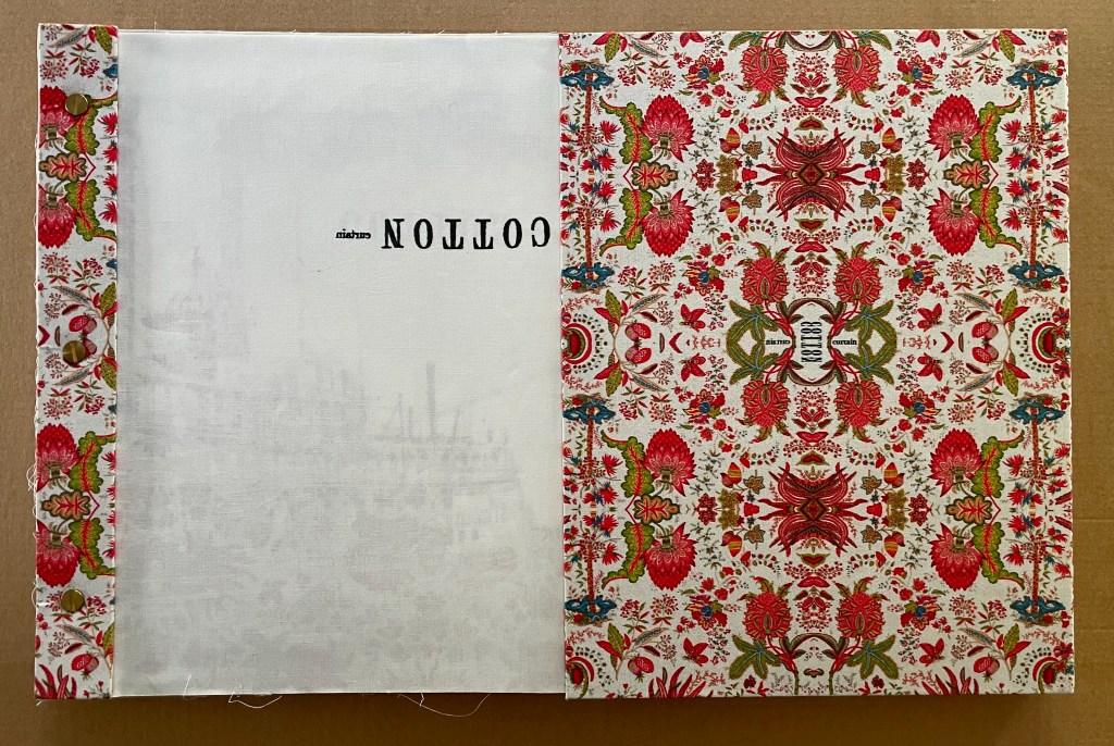
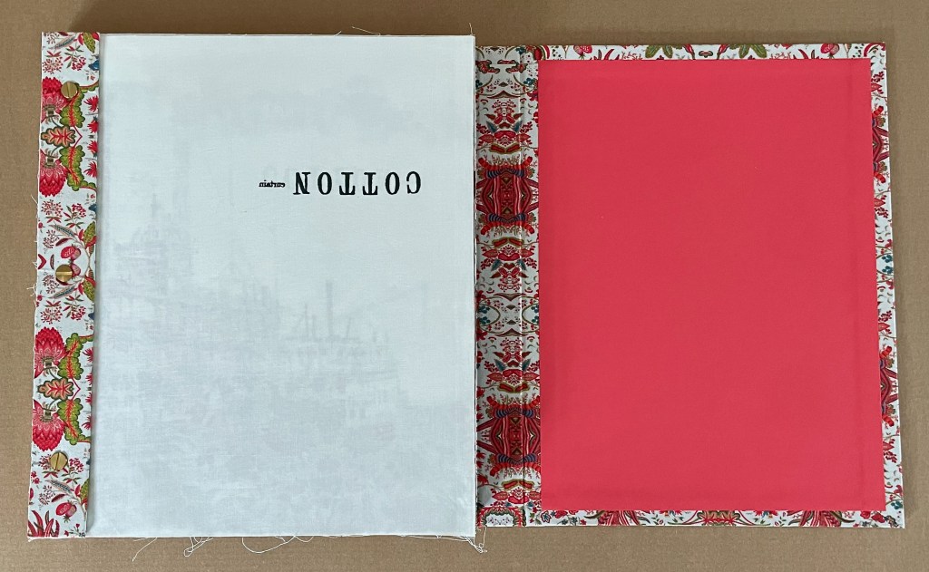
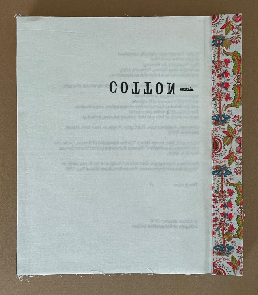
Text, image, and their interaction become the message in the smaller volume and also facilitate closer reading and appreciation of the larger volume. In fact, just the abundant presence of text in the smaller volume sends us back to the larger volume to check the impression that it has no text. In fact, there is one spread in the larger volume that does contain text. Faintly, behind the calico-like pattern composed of color-separated bales of cotton, the reverse image of the word COTTON appears.
The image above from Acheiropoieta echoes the following text in its companion volume:
What if an entire book
could be printed from cotton cloth
                 exposed onto printing plates?

                 Would that be a miraculous indictment
                 or a demonstration of the ineffable?
Acheiropoieta is that entire book printed from cotton cloth, and with the companion’s text on the human cost, they lead to the next work in the collection.
CottonCurtain (2018)
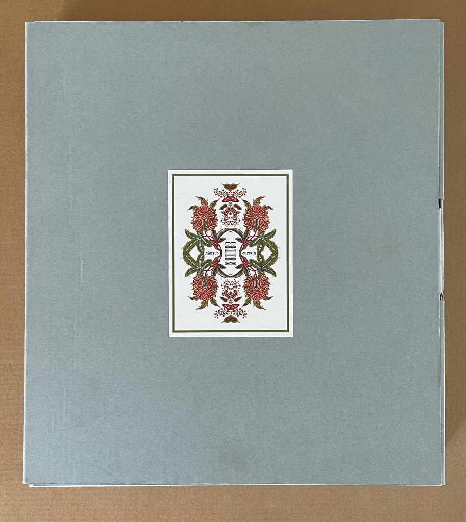
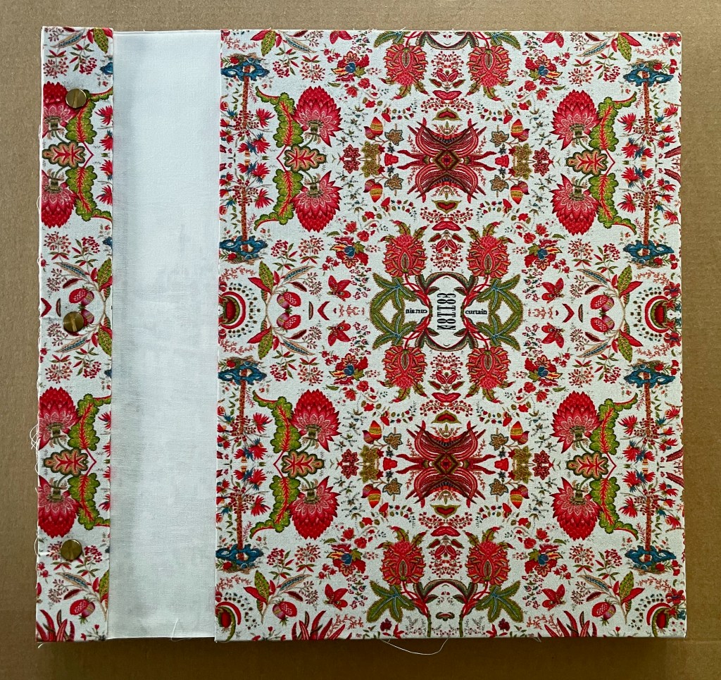
CottonCurtain(2018) Clifton Meador Archival box: H300 x W270 x D40 mm. In slipcase: H295 x W260 x D27 mm. Out of slipcase: H295 x W255 x D27 mm. [96] pages. Edition of 10, of which this is #10. Acquired from artist, 21 June 2024. Photos: Books On Books Collection.
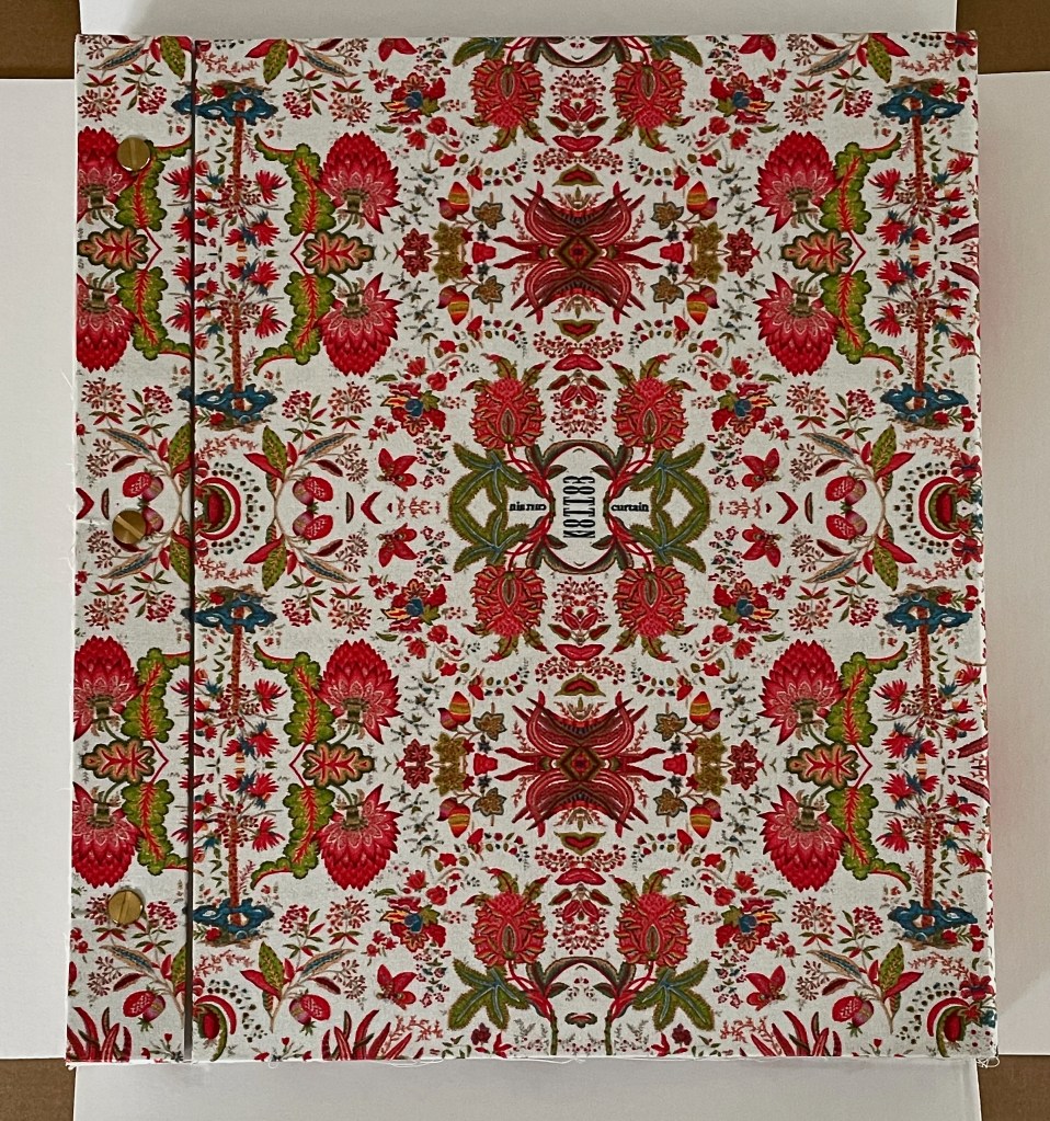
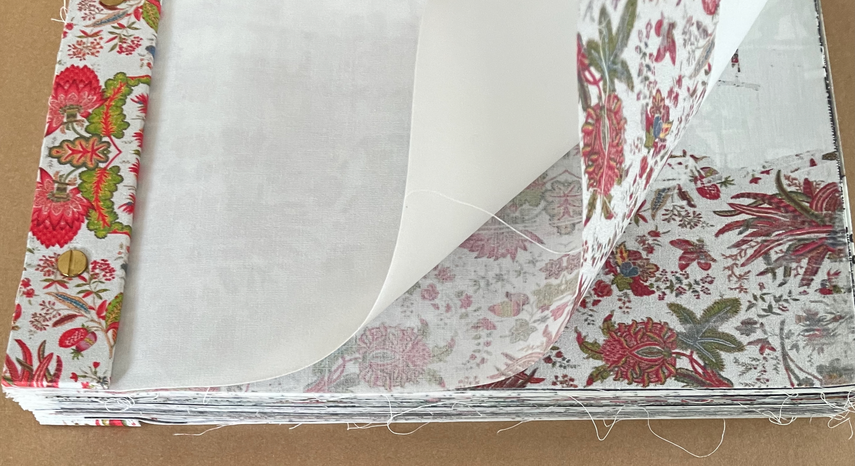
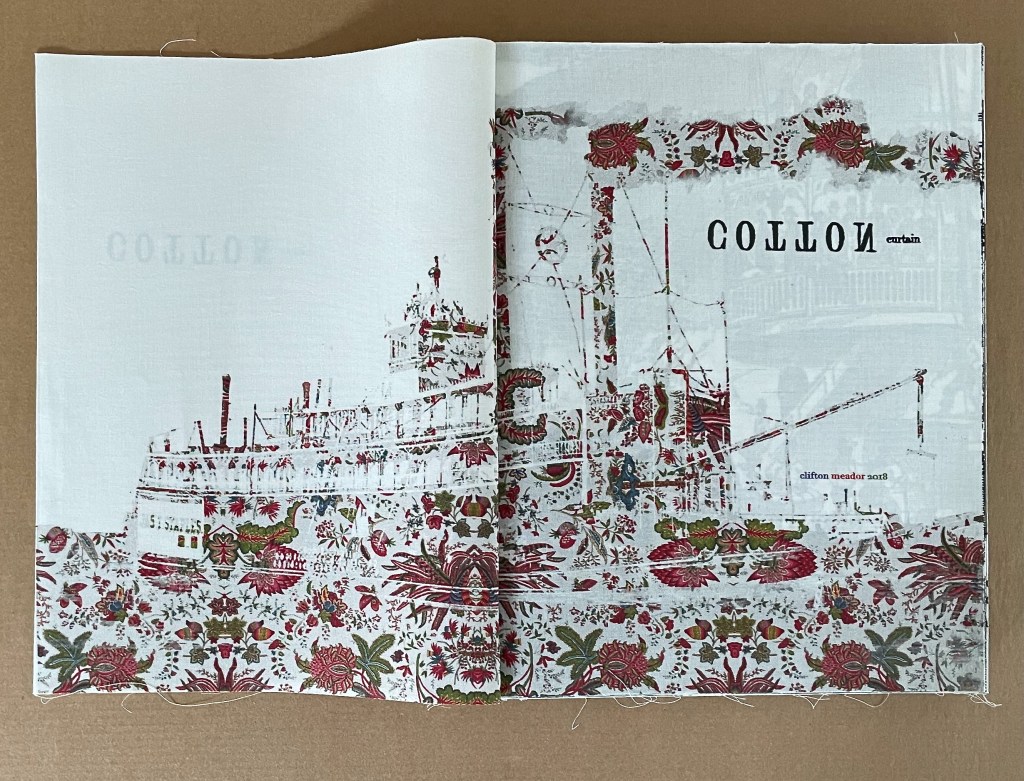
A version of Cotton Curtain and related installation first appeared in the exhibition “Four Proposals for Reading” at Seagar Gray Gallery in February 2015, which was well reviewed by David M. Roth (see below). Cotton Curtain (2018), a version with significant changes, performs its task through a remarkable integration of structure, material, sequence, pattern, text, typography, and image. On opening the archival box, we see a portfolio-style cover whose stunning printed muslin aligns perfectly with the same pattern over the book’s bolted wrapped-back binding, which places the folds at the fore edge.
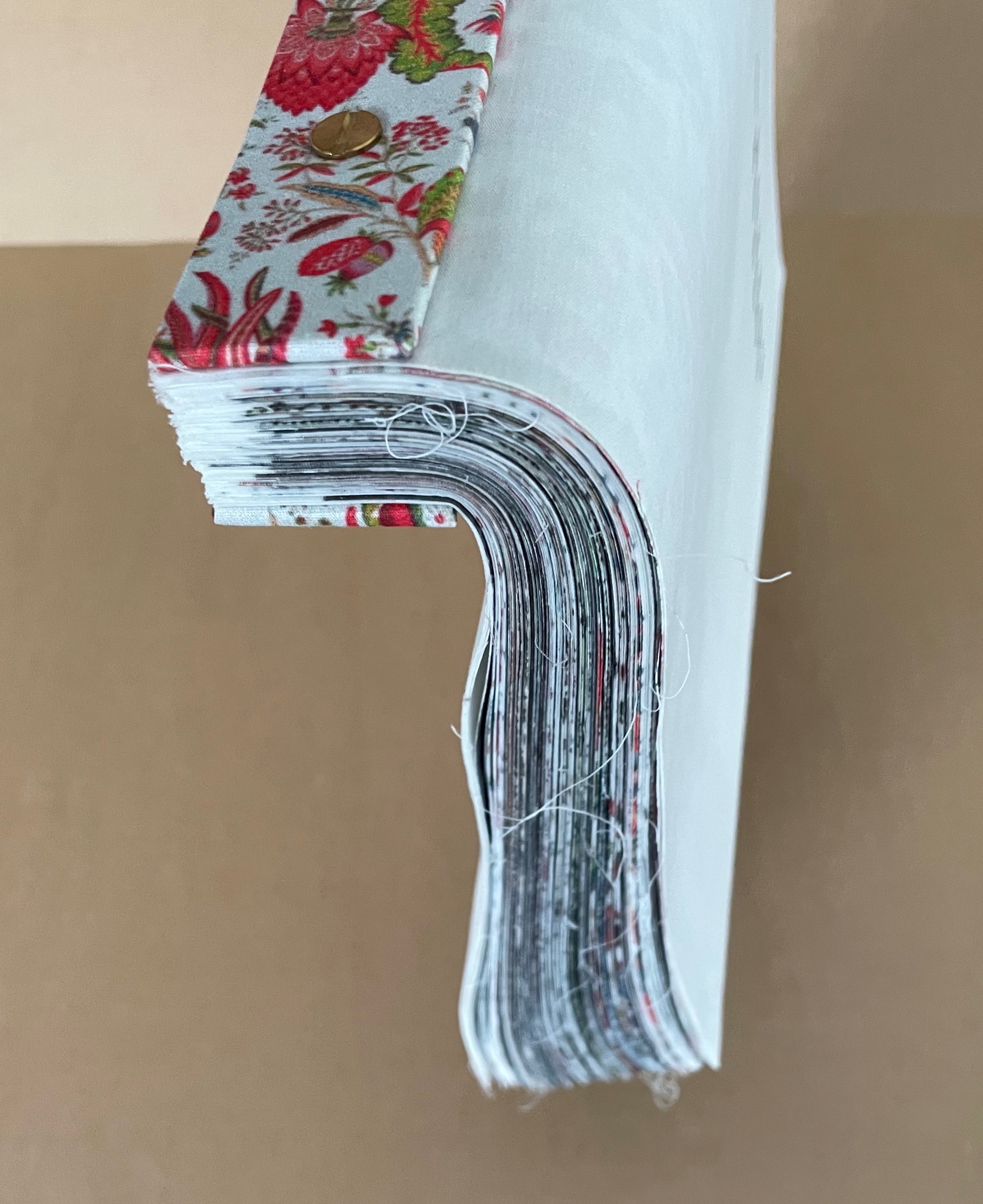
Lifted by its spine, the book’s pages flow downwards like the samples in a cloth or carpet sampler because they are cotton cloth. Loose threads trail from their edges. Together the wrapped-back binding and cotton cloth cause the half-title to billow as it turns to reveal a steamboat, streams of smoke, and river surface bearing the same print pattern.
Left: the “drape” of the book. Right: half-title folio “gapping” as it turns.
Title-page spread.
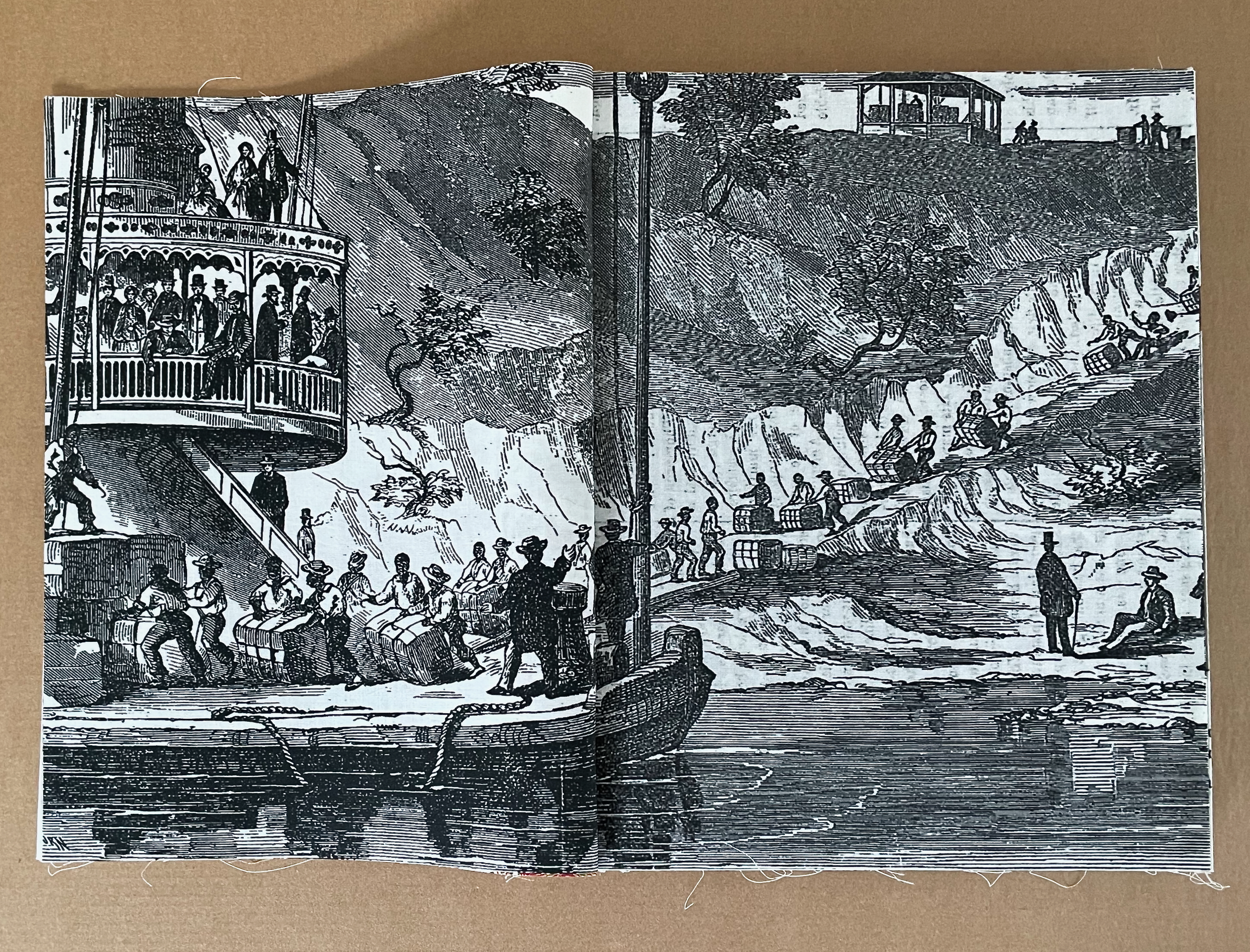
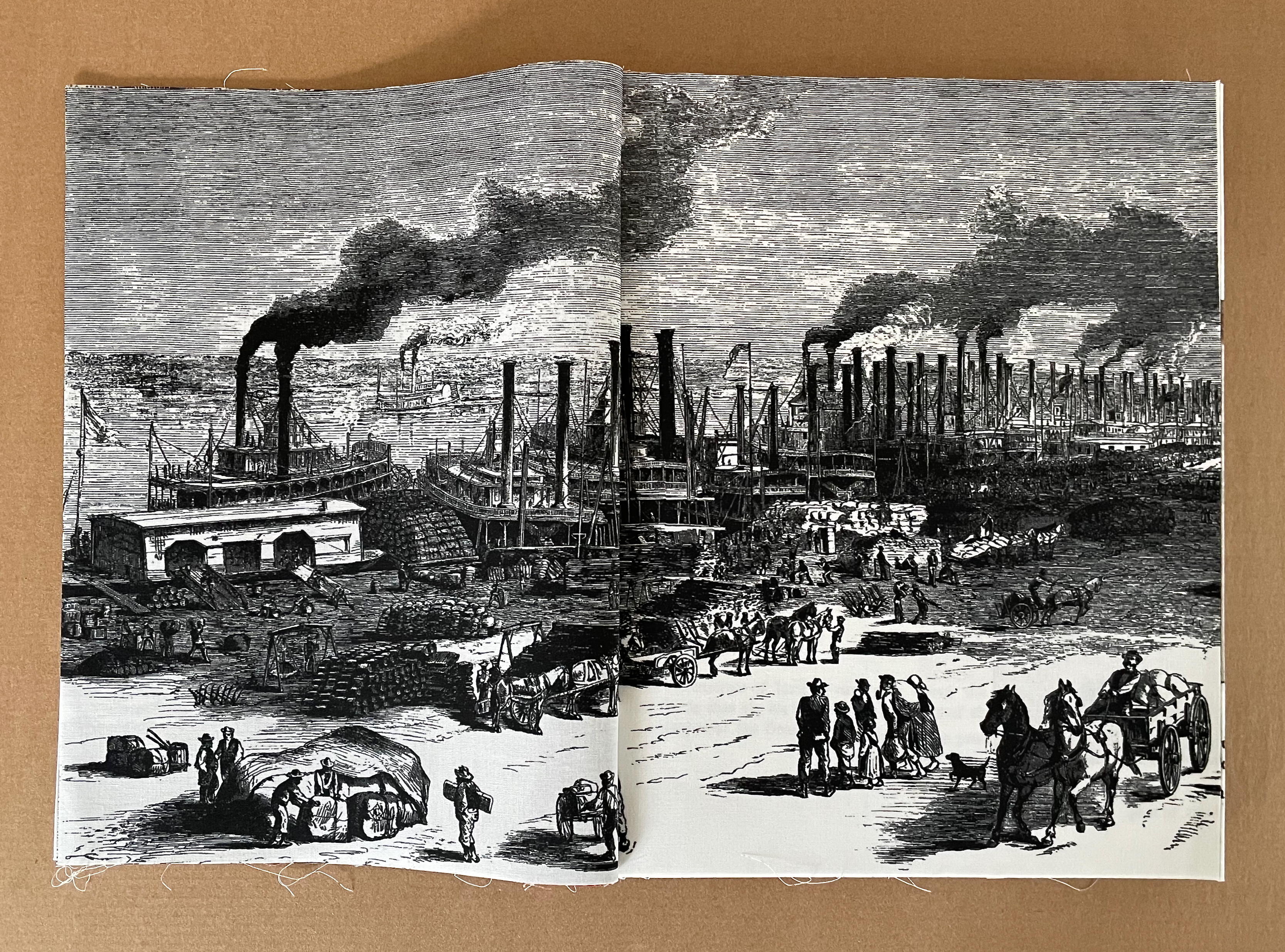
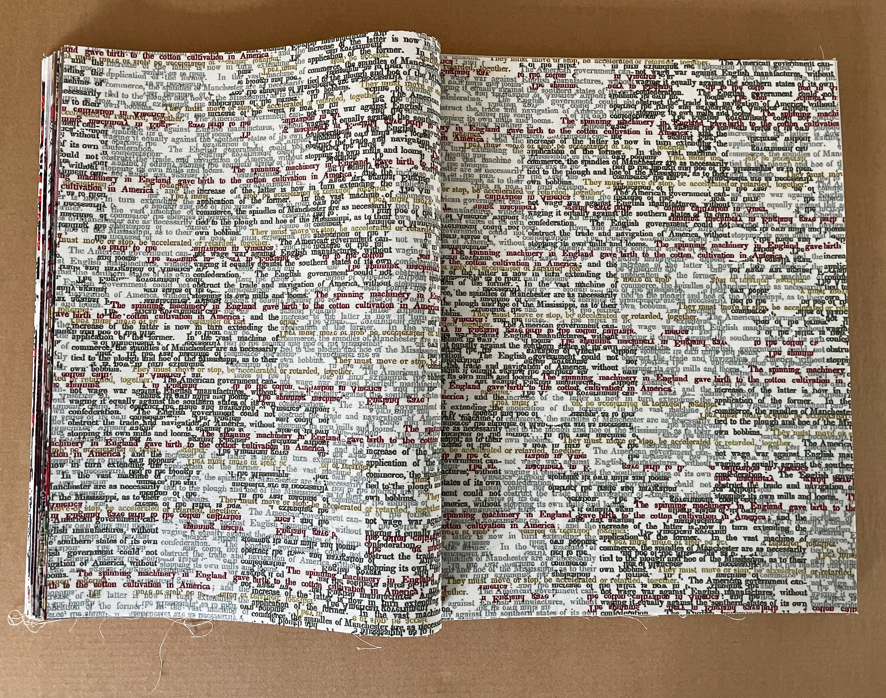
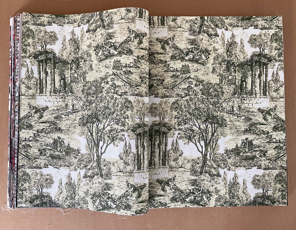
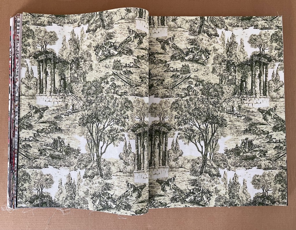
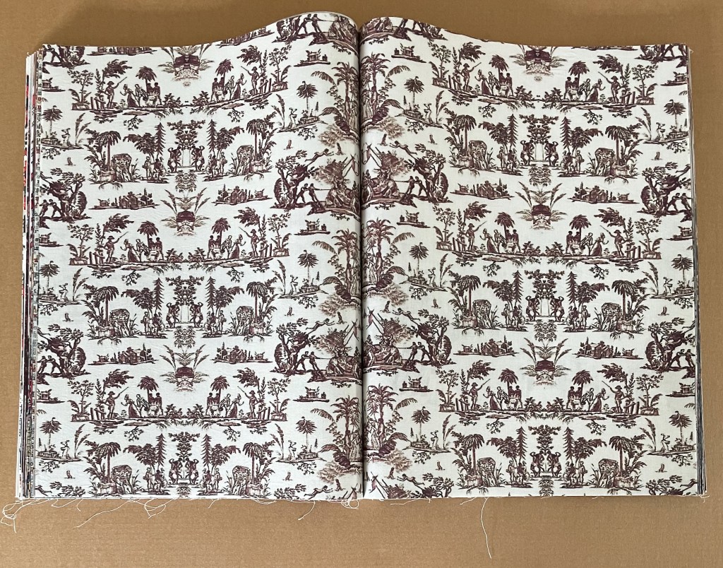
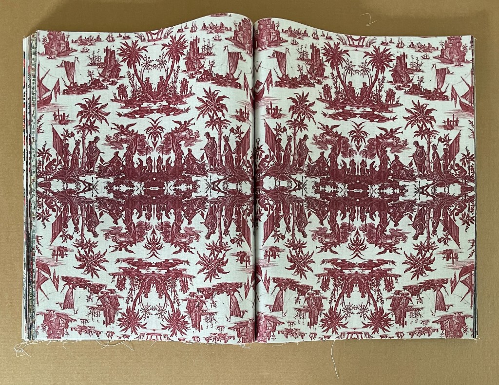
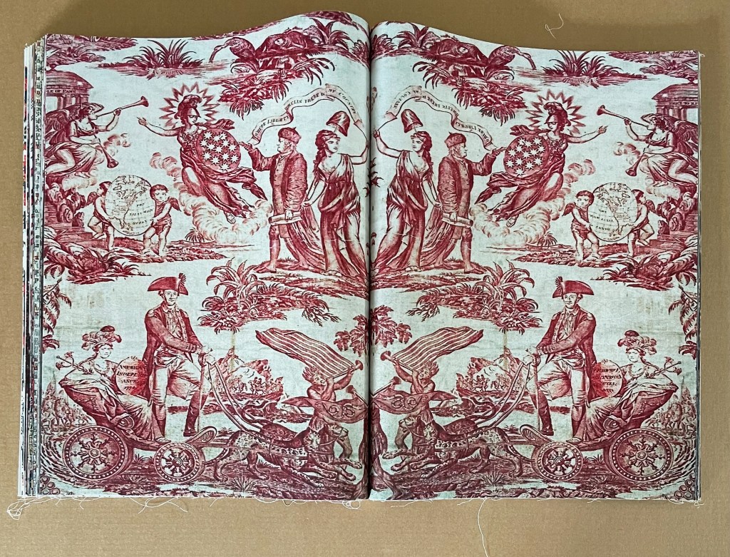
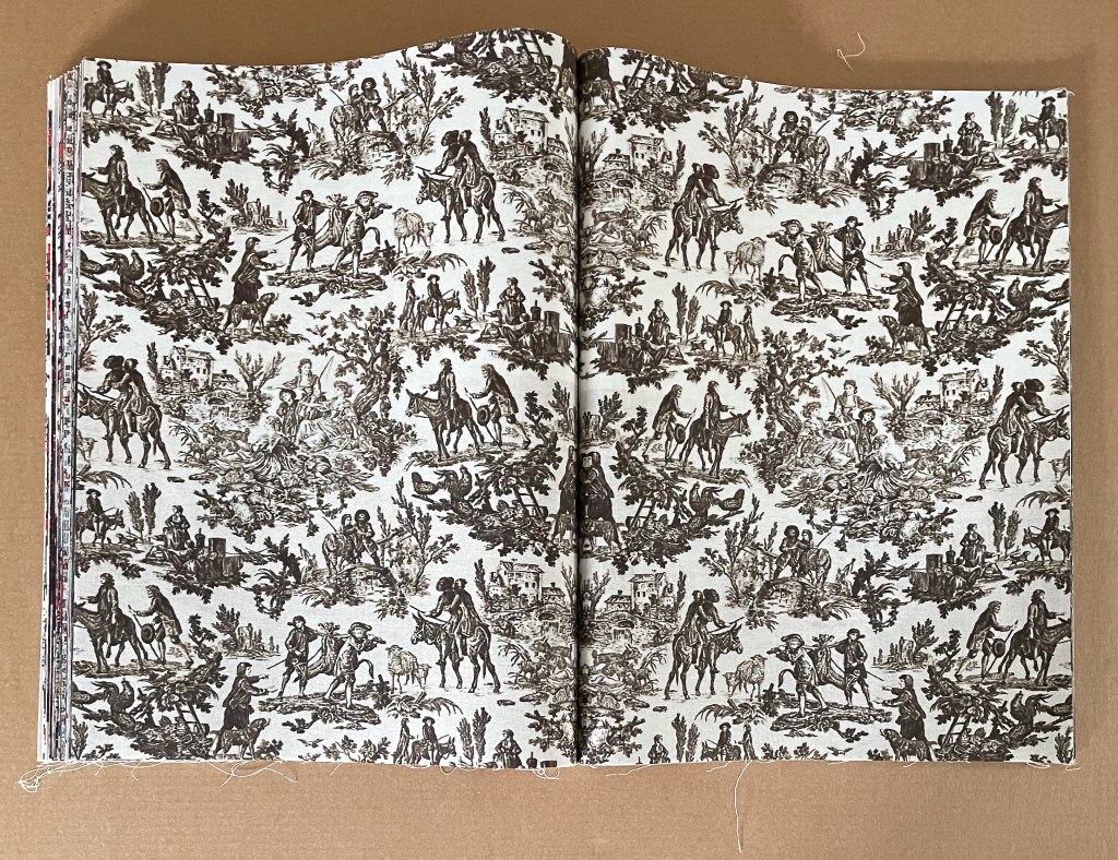
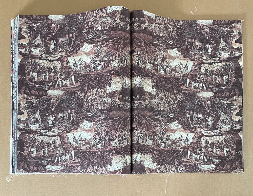
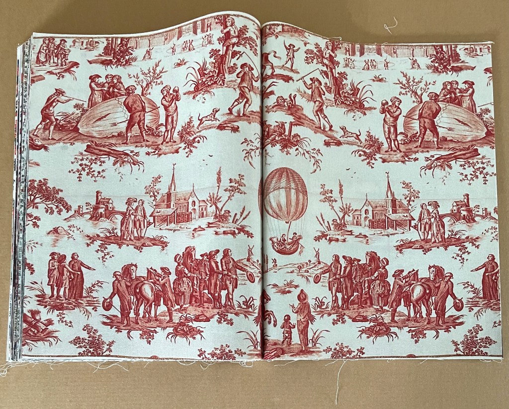
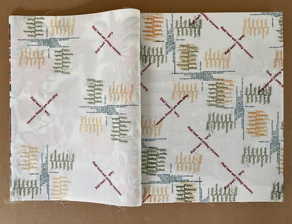
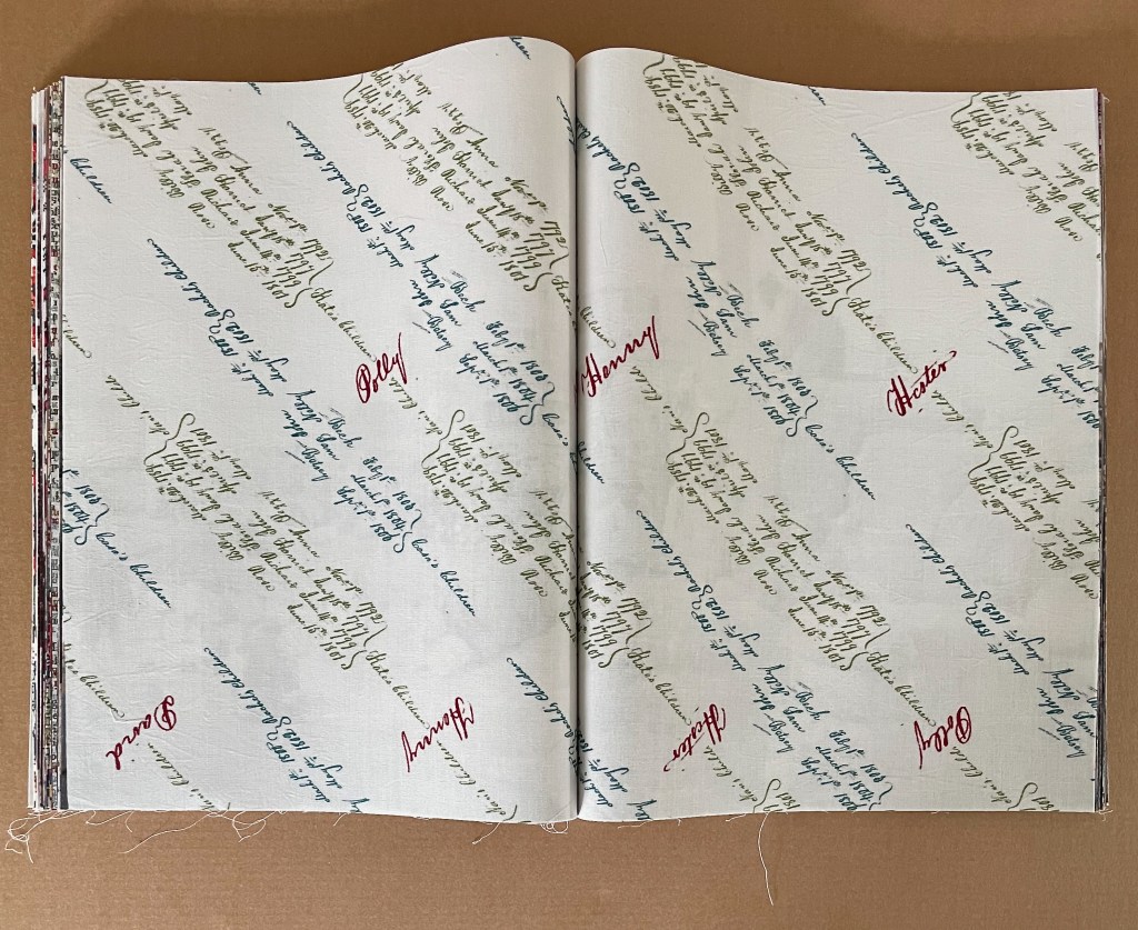
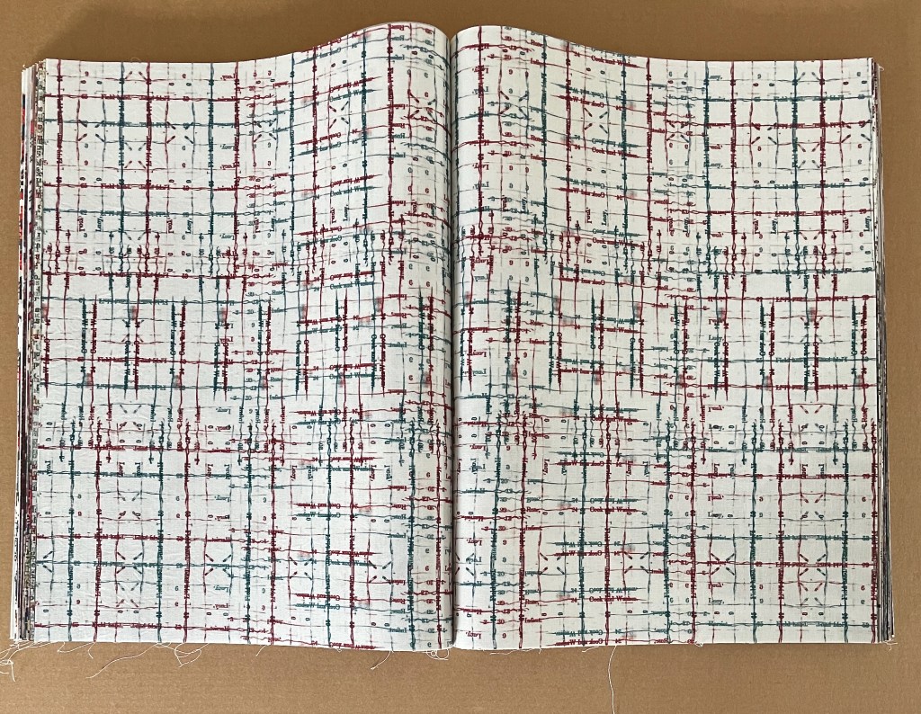
The double-page spread is the functional unit of the book, and the title-page spread is but the first that stops readers/viewers in their tracks. Drawing on the Detroit Publishing Collection archives in the Library of Congress, Frederick Law Olmstead’s The Cotton Kingdom, and other 19th and 18th century sources, the 44 spreads that follow display black and white etchings, tinted photographs, traditional Toile de Jouy with its muted single color patterns, toile with bright multicolors, typographic toile patterns, typographic mimicry of stitches and quilt patches, typographic mimicry of weave and weft, and slave inventories in script arranged to mimick decorative patterns.
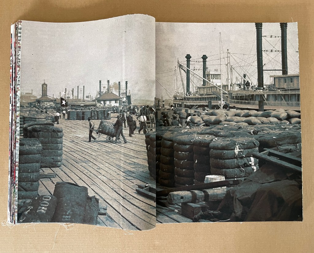
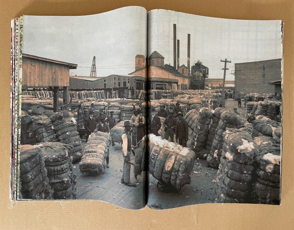
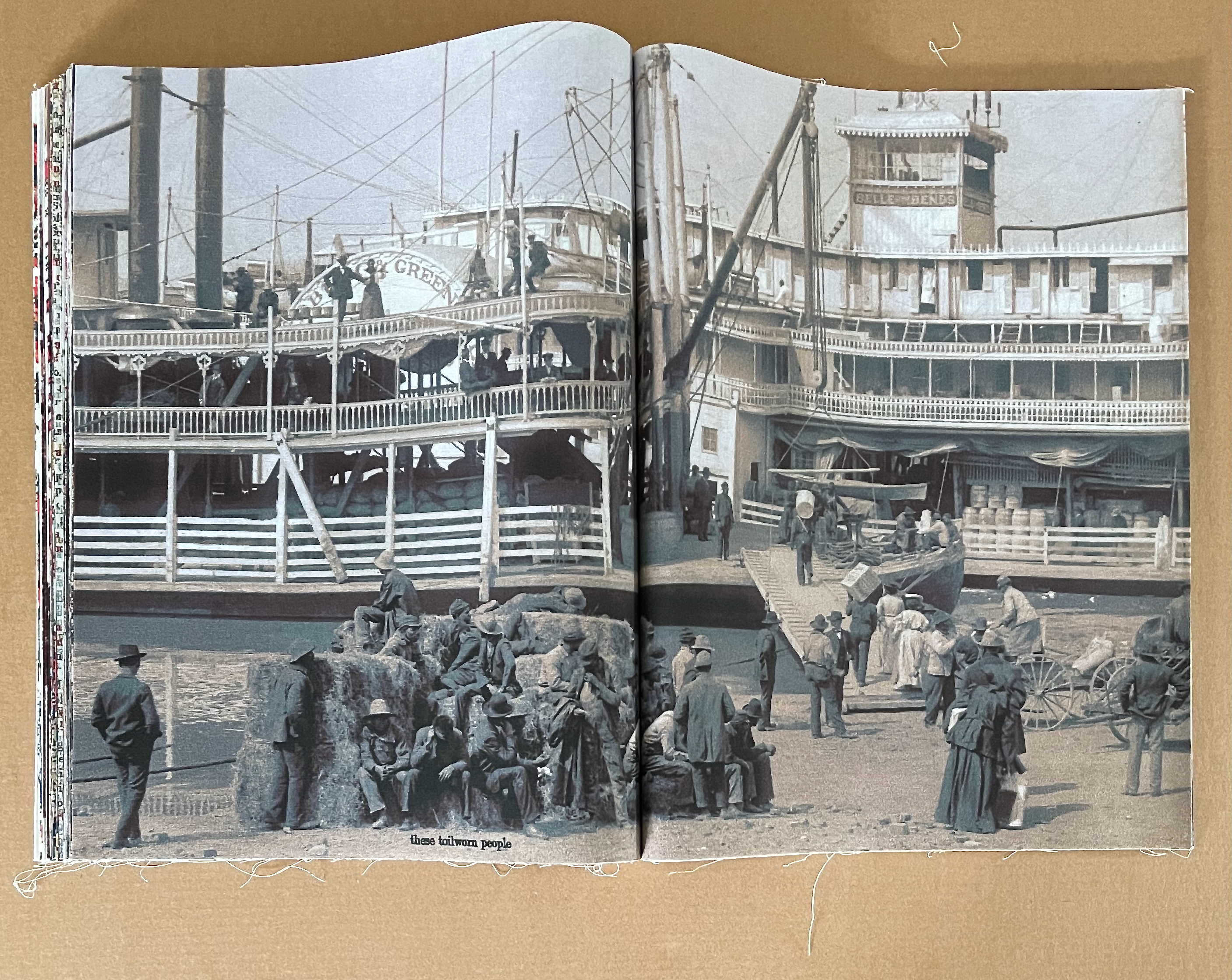
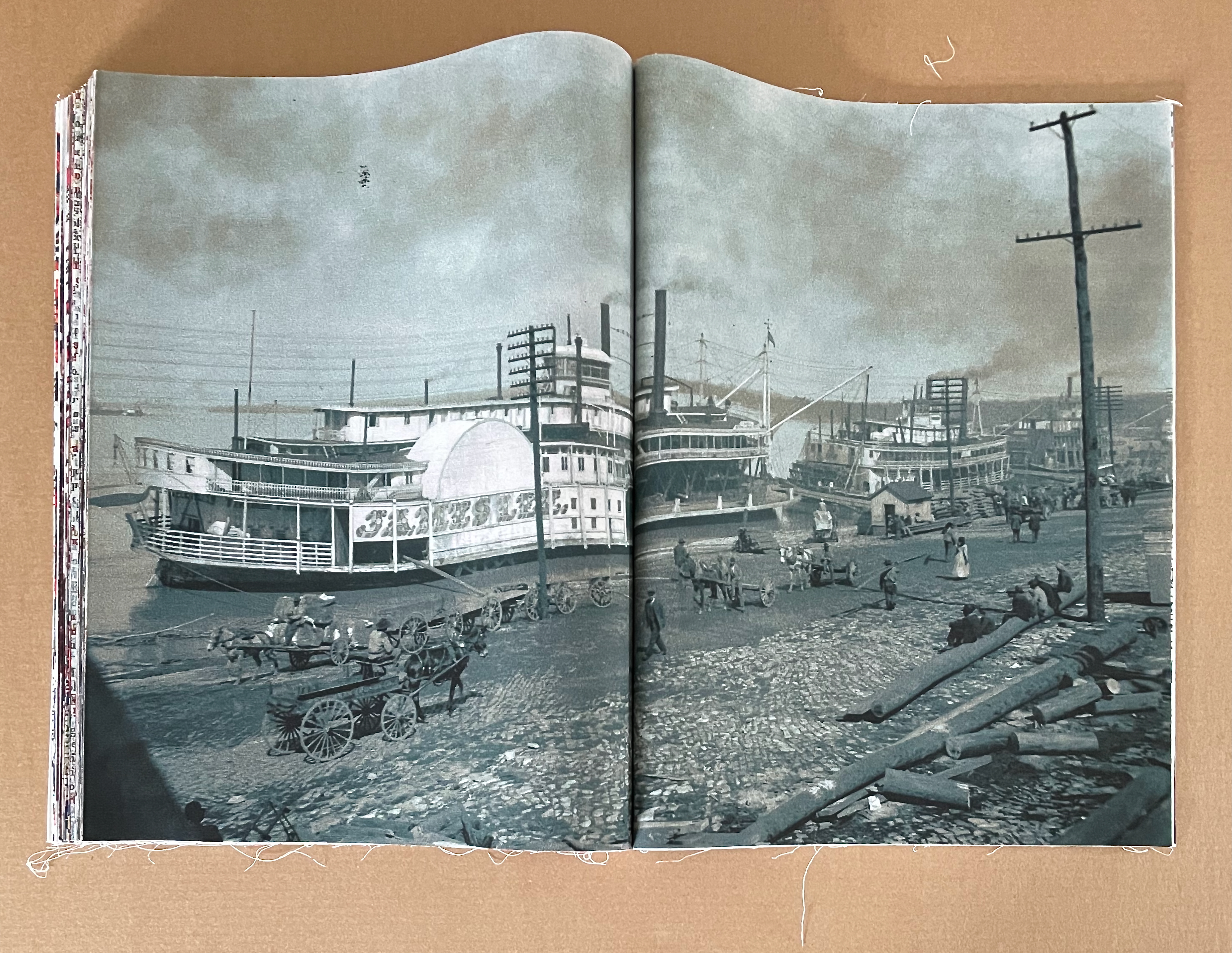
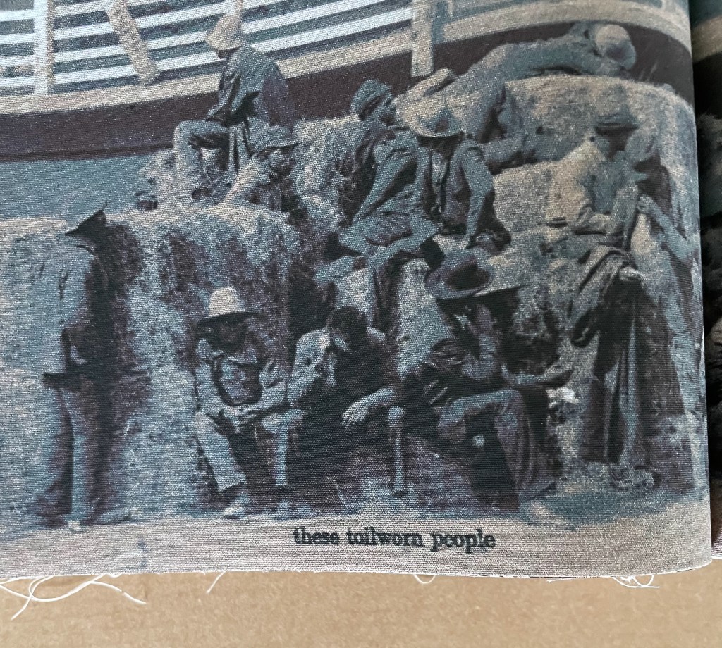
The sequencing of the spreads builds toward a run of the photographic images depicting cotton bales on loading docks, in warehouses, and riverboats with the black labor and white management engaged. Other than the opening pair of etchings showing similar earlier scenes, the photos are the only type of image that appears in back-to-back groups. There are 21 of them, 9 in the first half and 12 in the second.
Paired etchings introducing the book.
In the first half of the book, the images of the docks are mostly separated by toile images.
From first half of the book: typographic toile followed by photo, followed by Toile de Jouy, followed by photo.
In the second half, the dock and work images come in groups of 2, 3, and 4 (as in the following sequence).
From the second half of the book: grouping of photos of cotton bales, riverboats and work scenes.
All of the brightly colored toile spreads occur before the mid point of the book. There are 4 of them (or 5 if you count the title-page spread). They deceptively lighten the impact of the tinted photographs.
Multicolored toile.
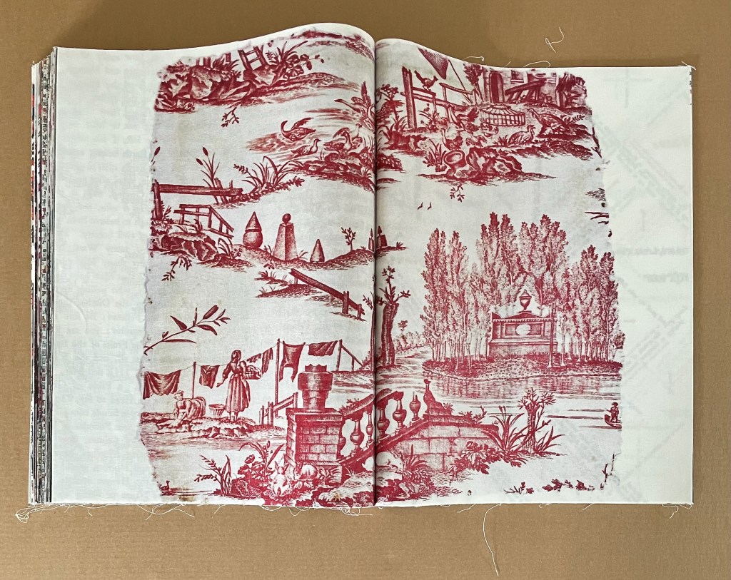
The first of 8 traditional Toile de Jouy in the book comes just before the mid point. It shows the expected bucolic scene — again, deceptively lightening. The second Toile de Jouy is a different matter. It gives us plantation scenes, dancing natives, and slave capture. A third depicts slave trading in Africa. A fourth displays a patriotic scene complete with a ribbon ironically proclaiming “Where Liberty Dwells, There Is My Country”. The fifth reverts to a bucolic theme, only to be followed by a slave raid in the sixth. The seventh and eighth come back to more traditional scenery, but the eighth and last Toile du Jouy is reproduced as a torn fragment.
Toile de Jouy.
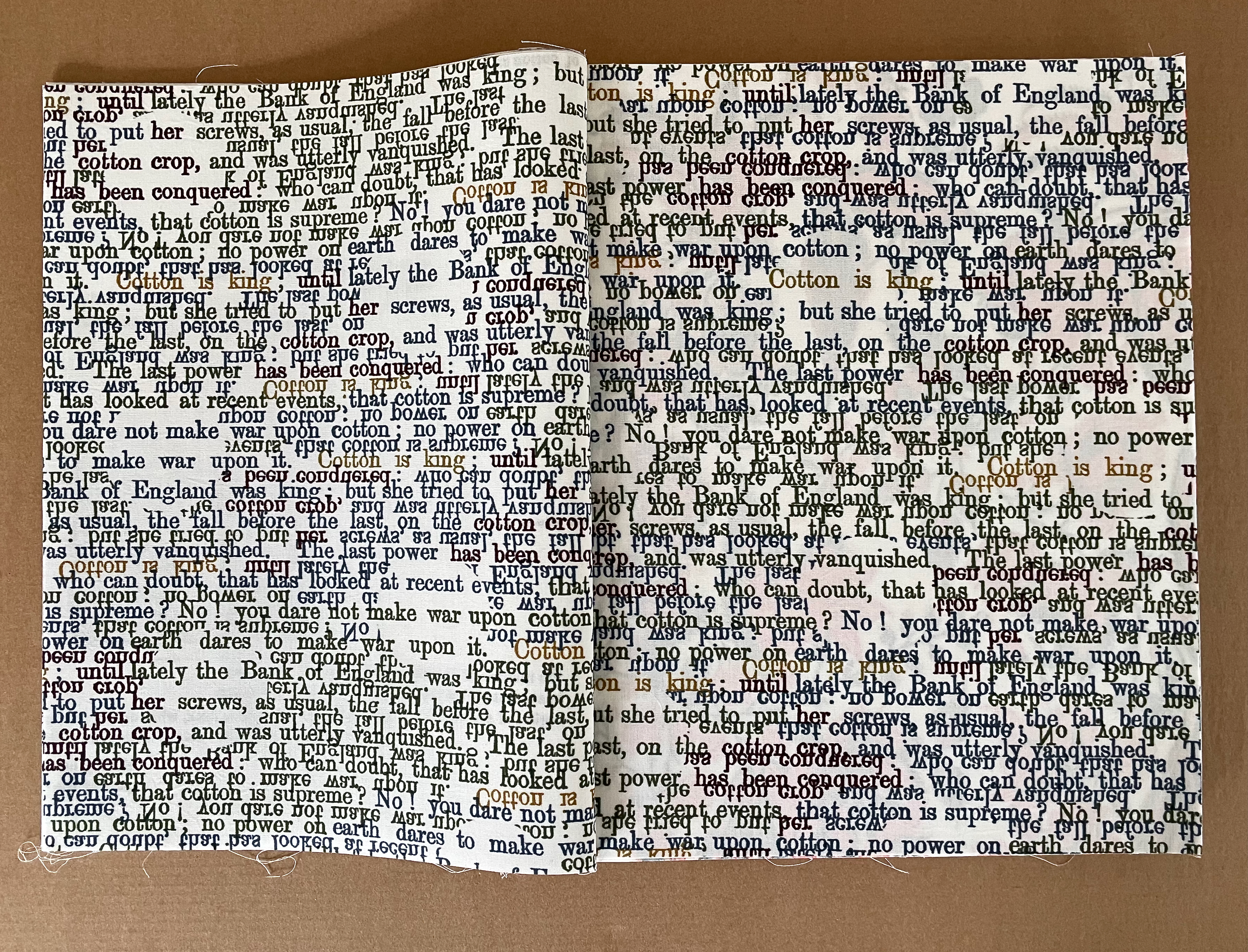
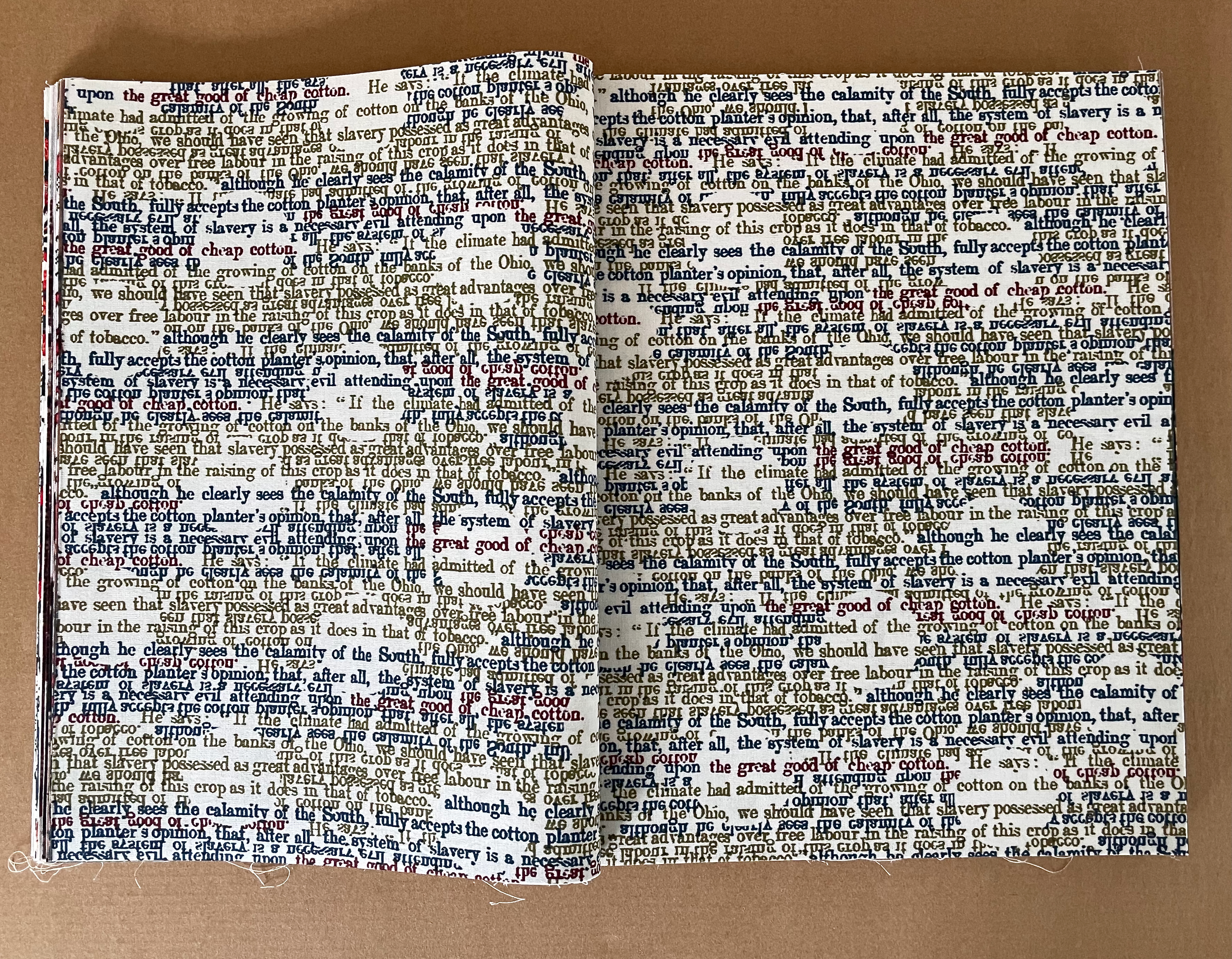
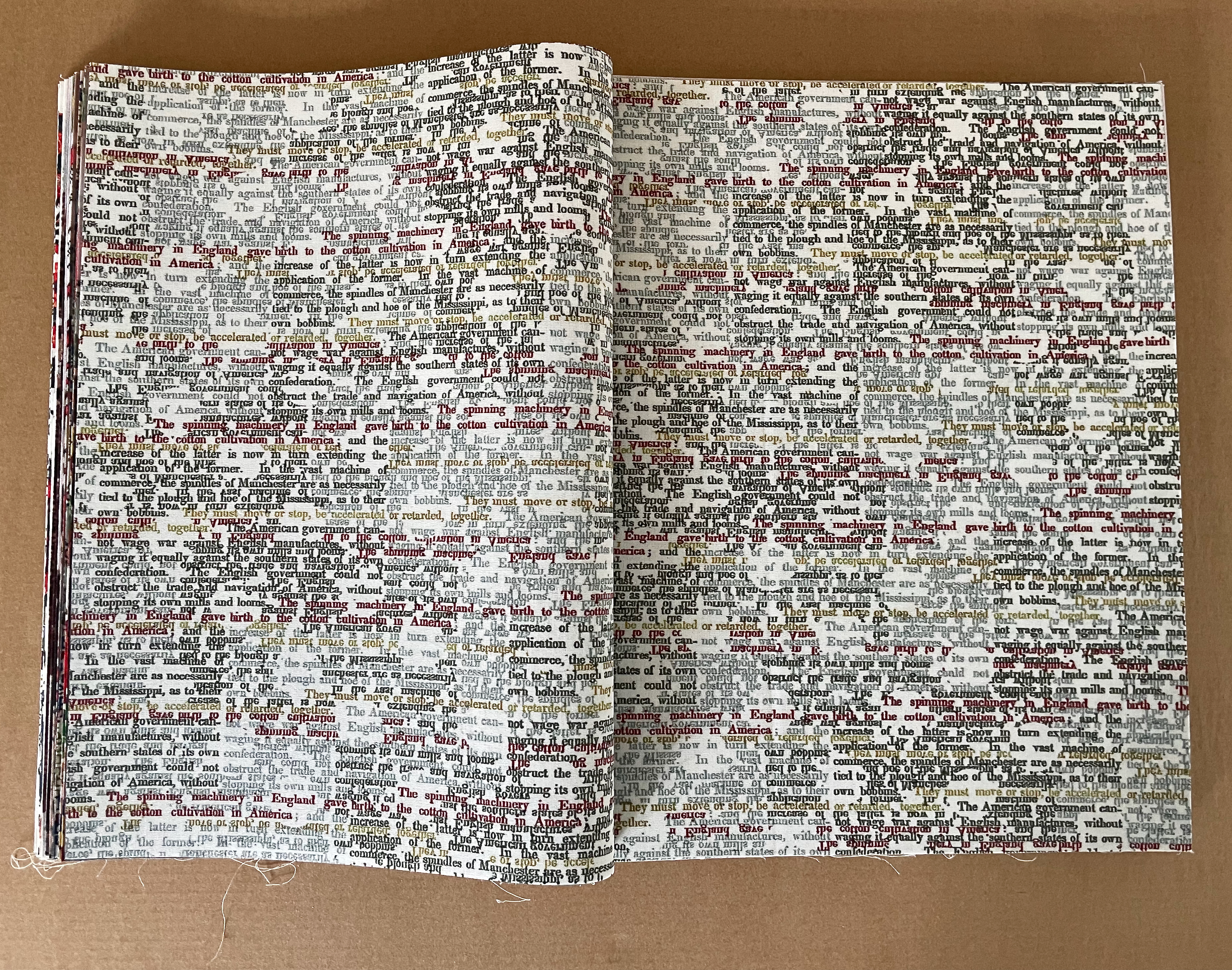
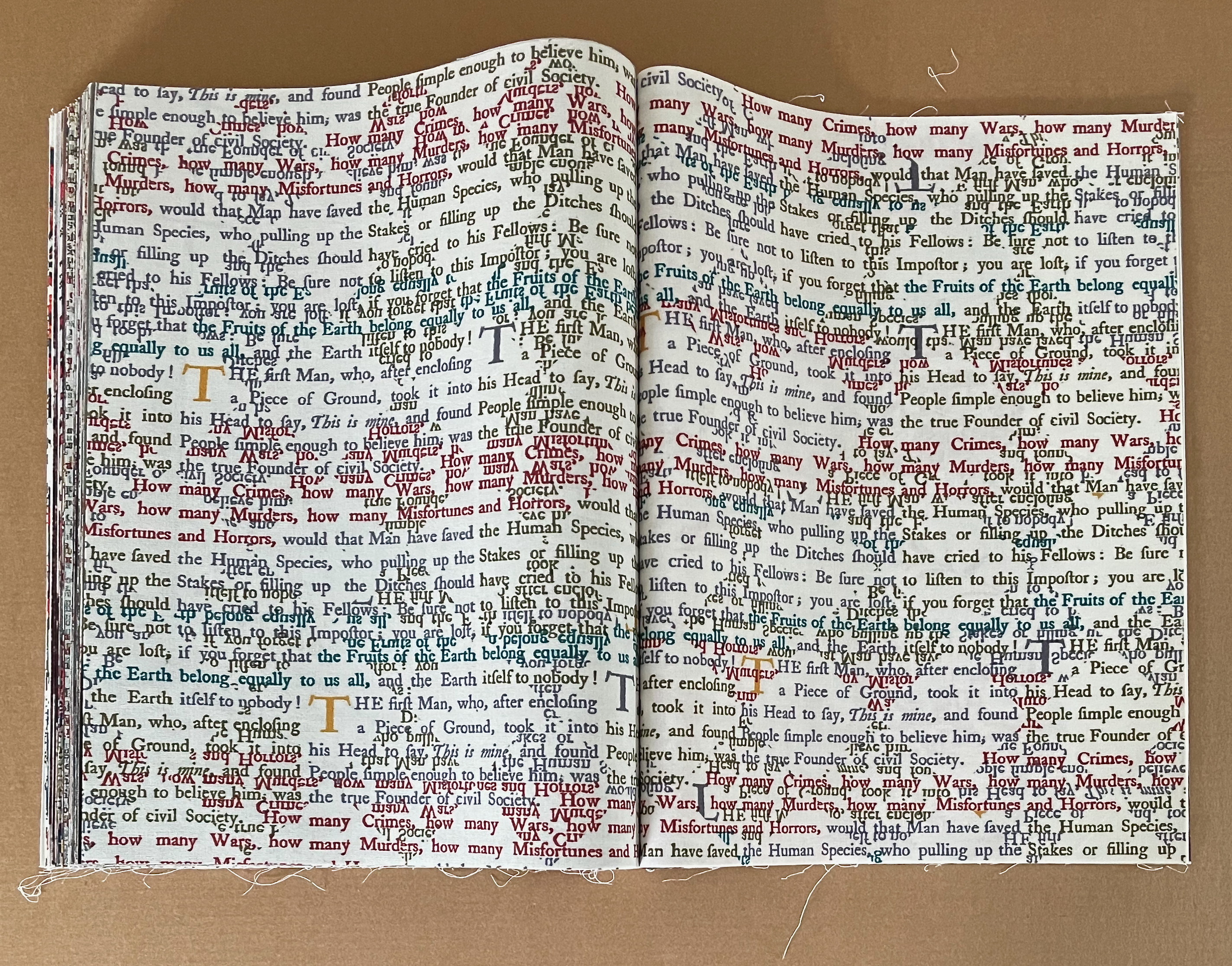
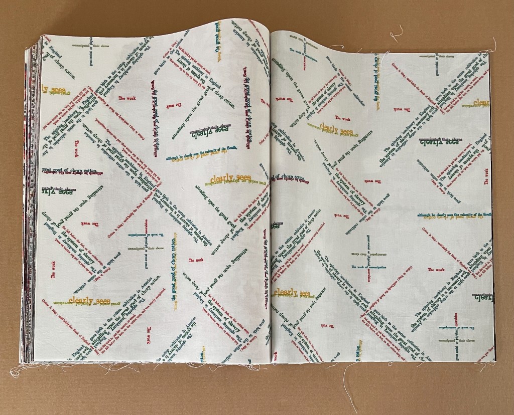
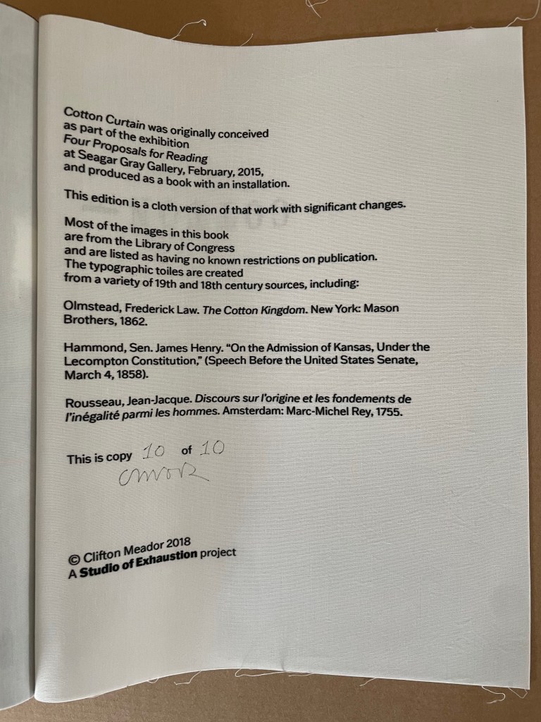
The text in the 4 typographic toiles comes from a variety of 19th and 18th century sources. The first 3 appear before the mid point of the book. Their multicolors contribute to the brightening effect of the multicolored toiles in the first half of the book, but their text does not. Almost illegible from the overlapping, some phrases can still be picked out from the fabric: notably those from Senator James Henry Hammond’s infamous “Cotton is King” sppech such as “No! you dare not make war upon cotton”, “the system of slavery is a necessary evil”, “The spinning machinery of England gave birth to the cotton cultivation in America”, which are ironically offset with Jean-Jacques Rousseau’s words “the Fruits of the Earth belong equally to us all, and the Earth to nobody!”
Typographic toiles.
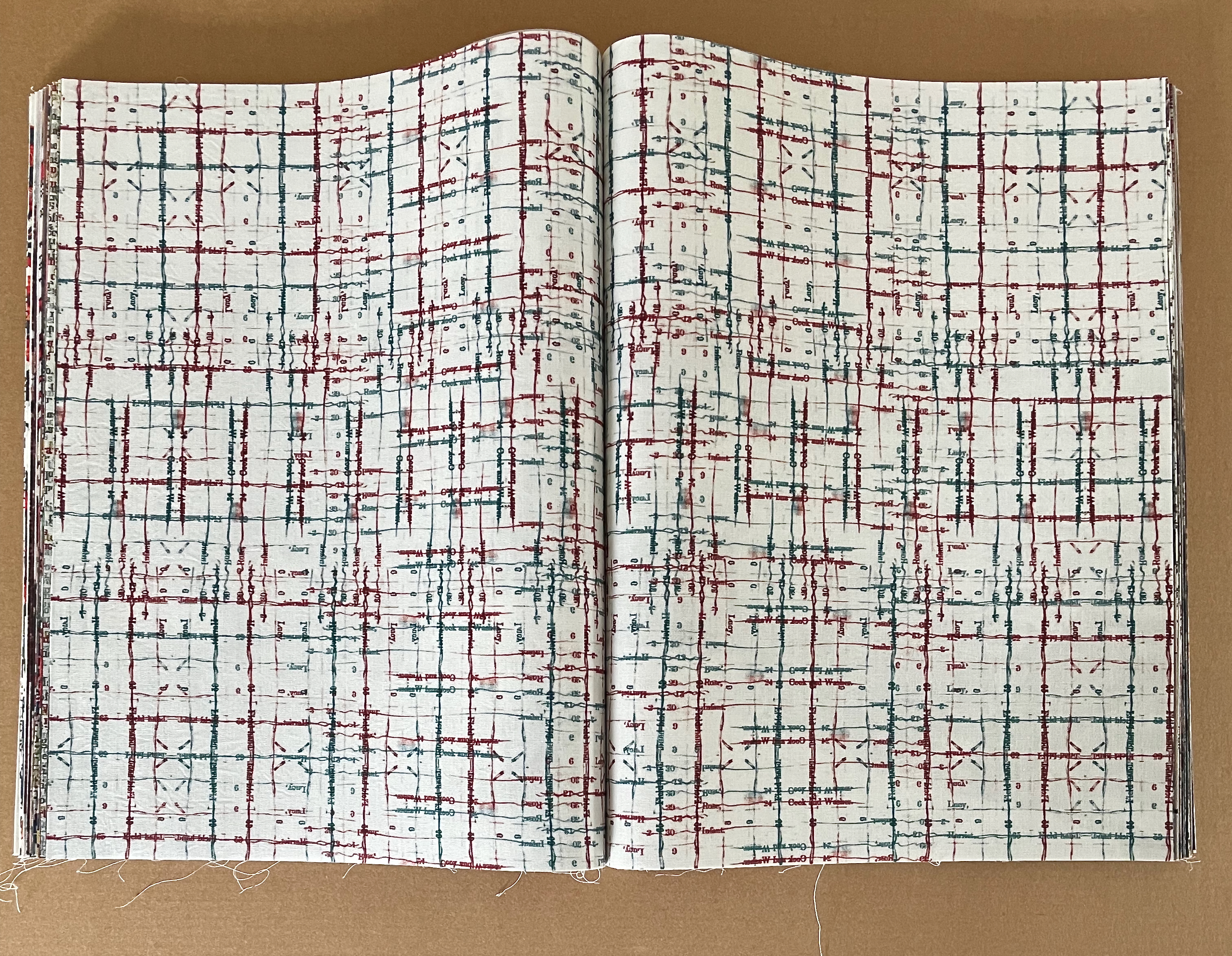
The 4 spreads that mimick stitches, quilting patches, threads, and the weave and weft of fabric include the book’s mid point spread. Like the typographic toiles, they provide color that offsets the photographs, but their text darkens the tone. The first 3 list the names and capacities of the human beings from slave inventories: “Lucy”, “Polly”, “Simon”, “Henry”, “Cook and Washer”, “Field hand and jobbing carpenter”, “Infant”. The last repeats text from Hammond’s “Cotton is King” speech.
Spreads mimicking stitchery, quilting, and sewing with type and script.
It is telling that the most intricate of these spreads typographically mimicking cross stitch and the weave and weft of cloth occupies the mid point of the book. The type bleeds red and blue ink as it threads down and across the white muslin. The names, roles, and numbers of slaves are its text — including a nameless infant. The evil of King Cotton is stitched and woven into the heart of this book.
Mid point spread of the book.
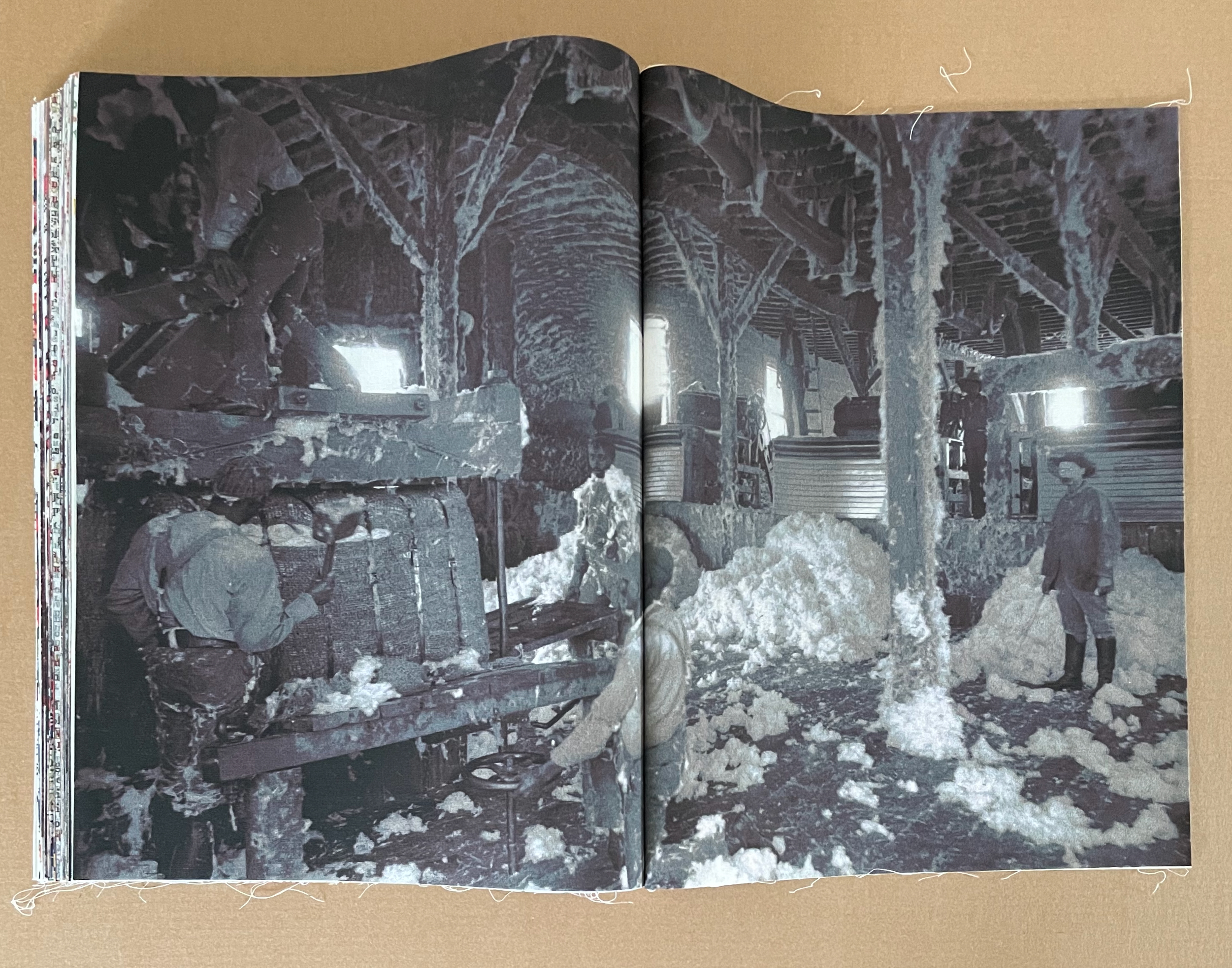
The book’s last 3 work scene photos are preceded by the Toile de Jouy depicting a slave raid, then separated by a bucolic Toile de Jouy, and paused for the run of the Rousseauvian typographic toile, the torn Toile de Jouy, and the stitchery-mimicking spread with phrases from Hammond’s “Cotton is King” speech. Hammond gets the last typeset word, and the image of the baling warehouse — a photograph taken between 1890 and 1910 — gets the last visual word.
Detail from image on the left in the row above.
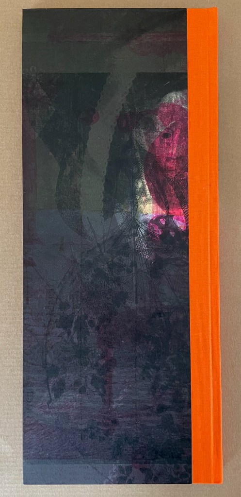
VOC (2022)
VOC (2022) Clifton Meador Hardcover, casebound. H371 x W155 mm. [96] pages. Edition of 100. Acquired from the artist, 4 February 2024. Photos: Books On Books Collection.
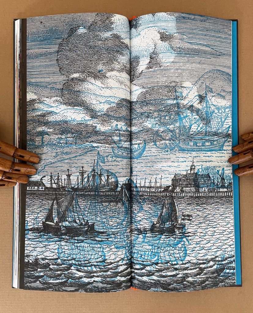
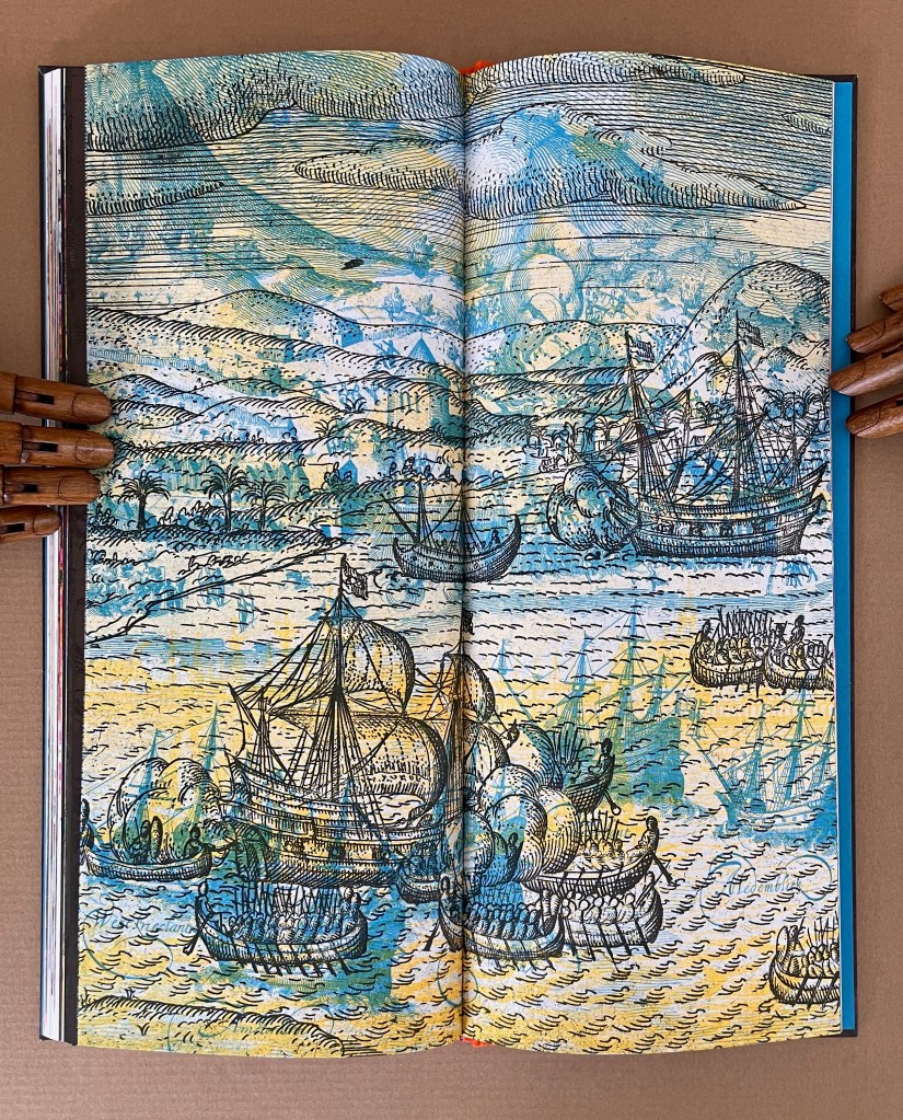
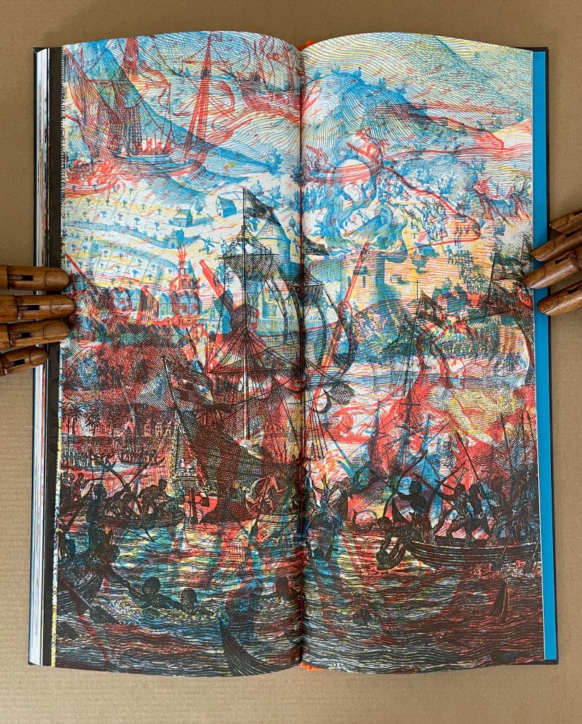
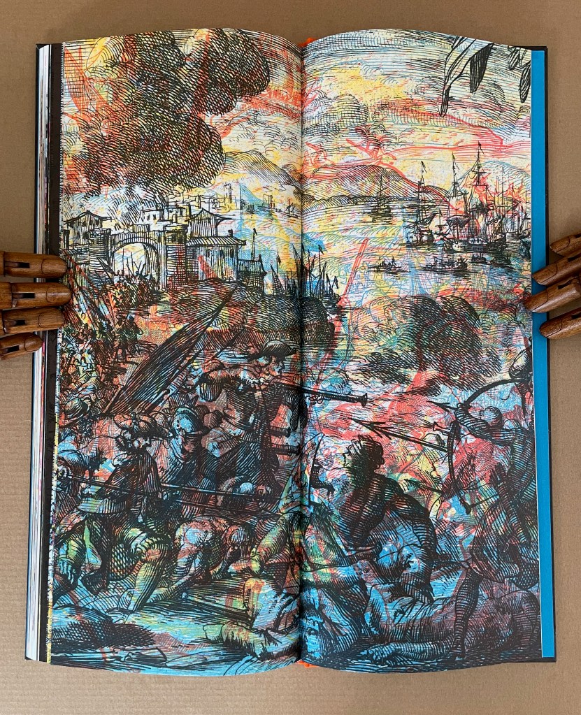
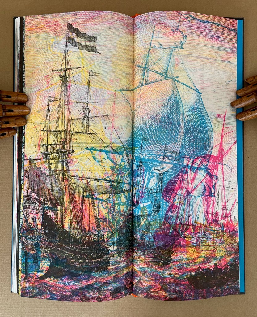
The Vereenigde Oost Indische Compagnie (Dutch East India Company), referred to as the VOC, was the first publicly-traded corporation in the world. Chartered in 1602, the VOC could “independently wage war, coin money, negotiate treaties, establish colonies, enslave people, massacre indigenous populations, and create spice monopolies by burning entire islands they did not control clear of spice plants”. (VOC, colophon) The resulting “embarassment of riches”, as Simon Schama entitled his history of the Dutch Golden Age, led to much of the art and objects now housed at the Rijksmuseum in Amsterdam. Clifton Meador’s social conscience and imagination saw the Rijksmuseum’s ongoing project to digitize and post its holdings as a creative opportunity too great to pass up.
On his site, Meador offers this project statement about VOC:
I imagined this project as a museum catalog gone completely wrong: reproductions mangled, images misregistered, odd fragments recombined from wildly different sources, cropped badly, with colors transformed into something from a hallucination. I imagined that in this catalog all text—including the vitally important informative, contextualizing captions for the images—would be removed. Gone would be the gallant, abridged histories provided by any museum, normally present in the image descriptions, but now entirely absent. The reader would be left to construct their own narrative from this unreal evidence.
And my hope is that the evidence of this museum catalog is so unreliable, so tainted by its own distorted agenda, that the reader is left with nothing other than a vague impression of a horrific cataclysm swimming around illusory objects of great beauty, virtue, and price.
Marlene MacCallum and Ruth Rogers have both registered insights into Meador’s blend of experimental printing, metaphor, and art that confirm his hope.
Central to Cliff Meador’s process in making VOC is a willfully disruptive strategy. … In text and music, we are accustomed to the suspension of comprehension, but in visual forms, we expect the coalesced image, and when this is withheld, we are challenged. We experience incomprehension. We lose our place. And in a piece where the artist wonders “about the real cost of wealth”, this is fitting. VOC is a work of dreadful beauty. The images are alluring, shimmering, and horrible. This parallel the difficult-to-reconcile reality that, quoting from the colofon, “At the same time the VOC was becoming a force for terror …, the Dutch Republic was a haven for liberal thinking”. (MacCallum, 2024)
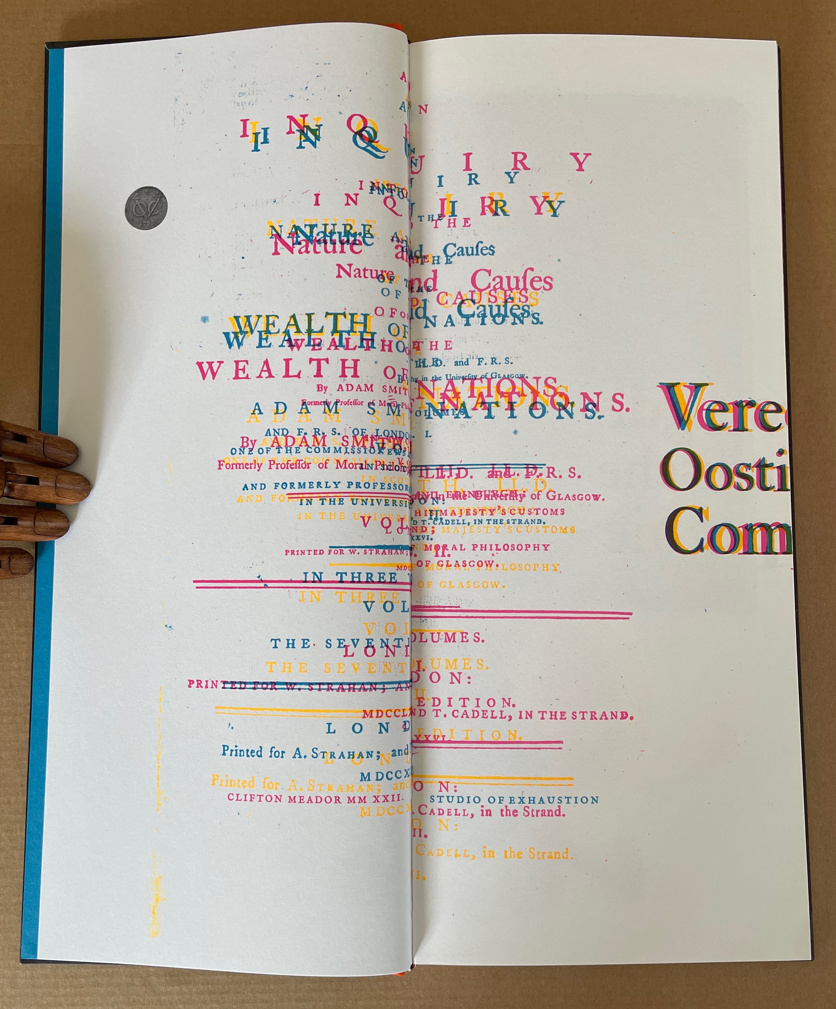
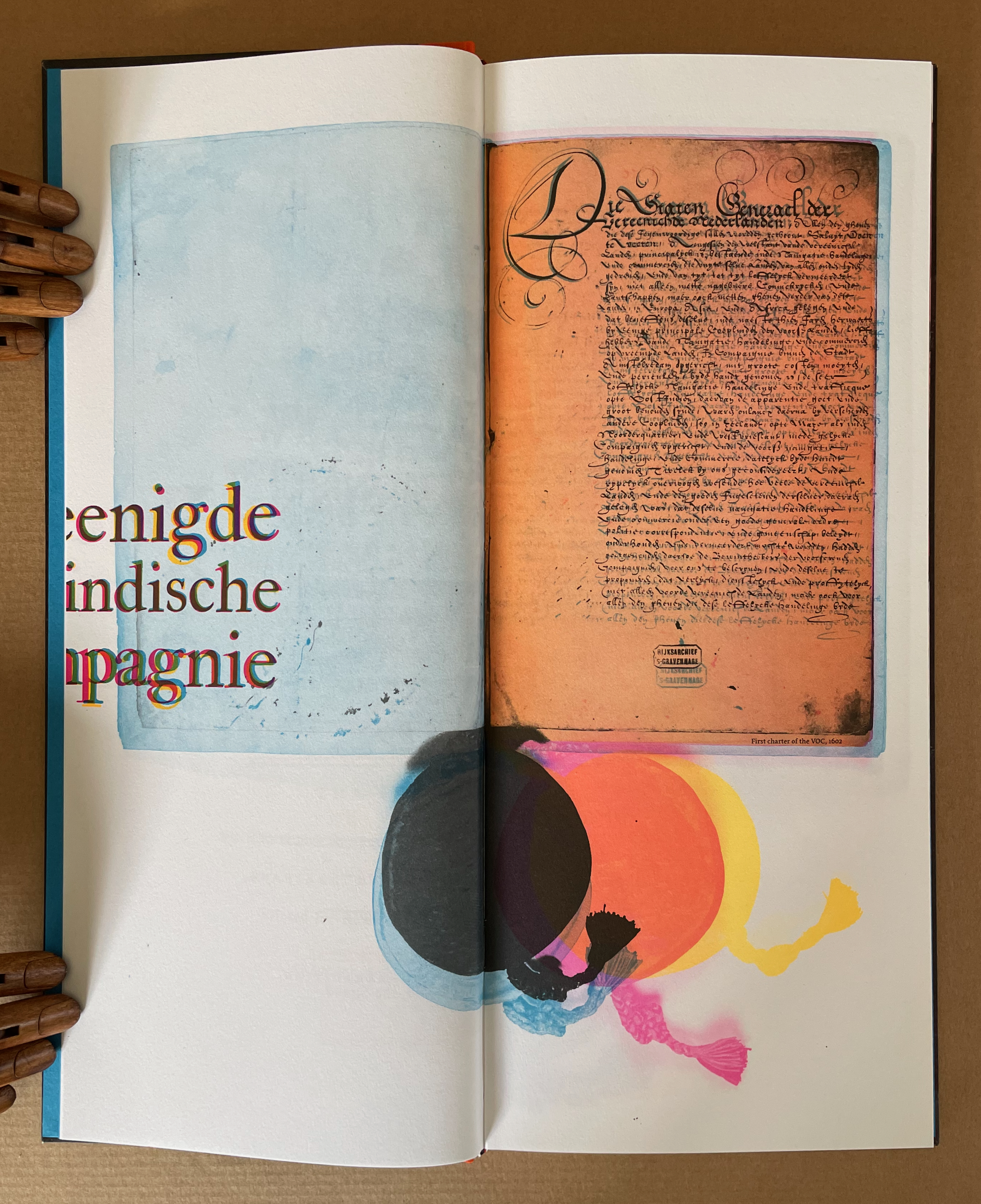
The first page spread of the book is the title page of Adam Smith’s The Wealth of Nations printed opposite the official manuscript charter of the VOC, with lead seals attached. But the words are sliding off the page, the colors are wrong, and everything is out of focus. Could this distorted mise-en-page be a reference to the corruption of wealth and power? … In this unreliable museum catalogue, richly made objects that represent the vast wealth of the Dutch golden age are combined and deformed. … There are no captions, and the reader must find the narrative within seemingly disparate images. Enlarged engravings from early printed books that chronicle colonial domination are layered over photos of domestic objects and people with kaleidoscopic effect. … In his book, the luxury goods, paintings, exotic spices, and weapons are the spoils of an extractive colonialism. But there is no text. Instead, Meador uses dissonant color and layered, dislocated imagery to provoke the reader’s complacency with the historical narrative. — (Rogers, 2025)
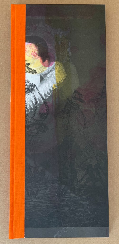
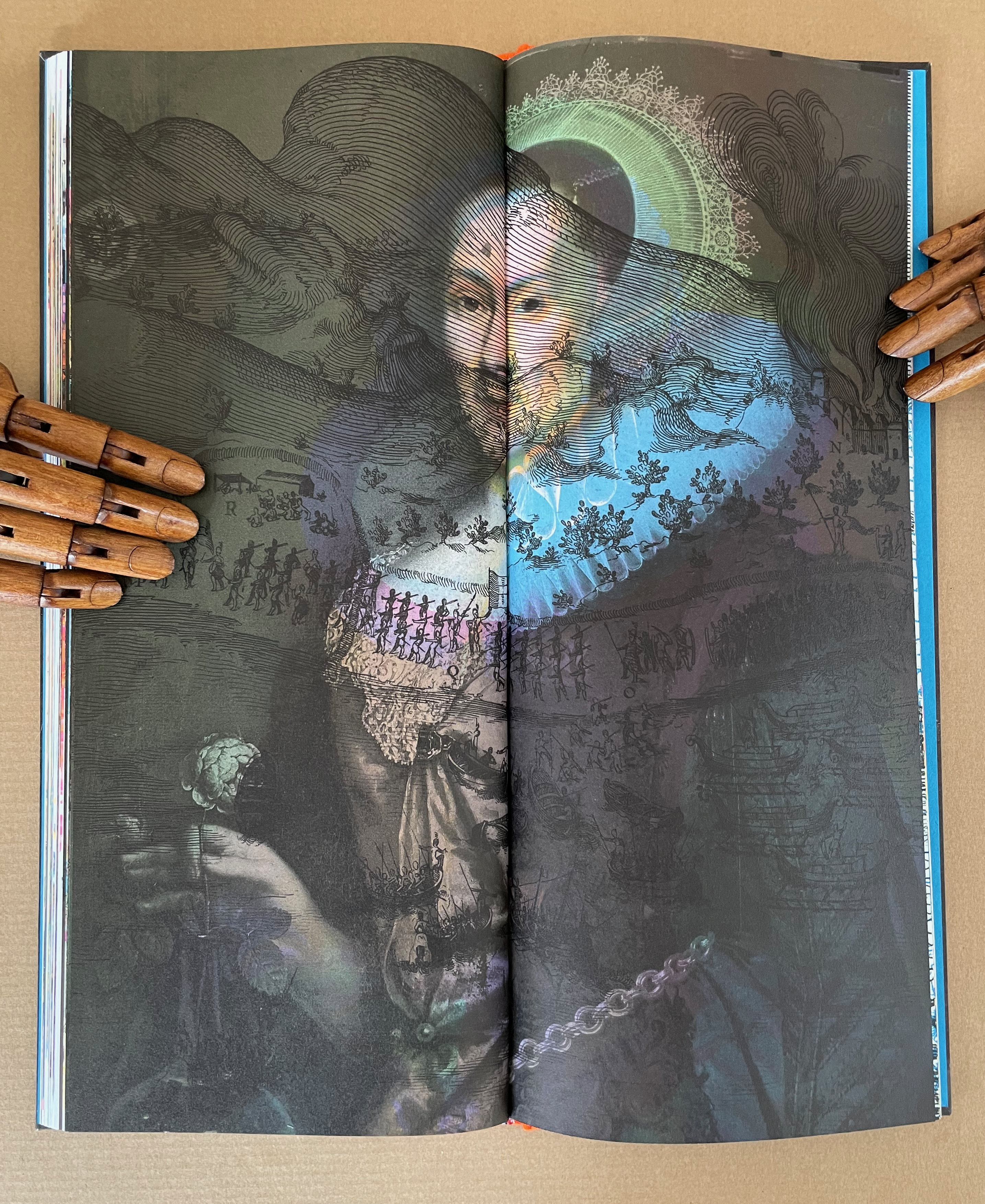
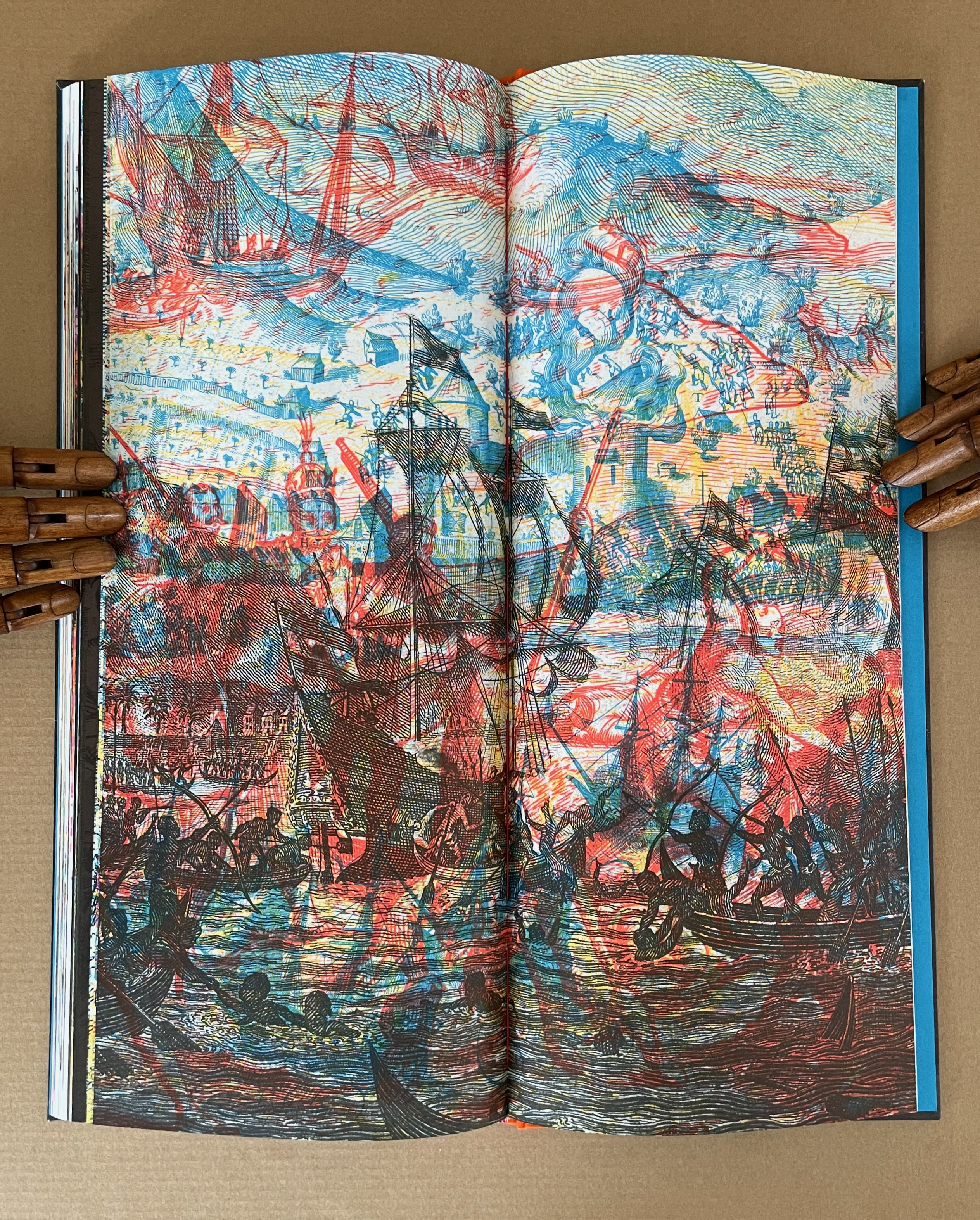
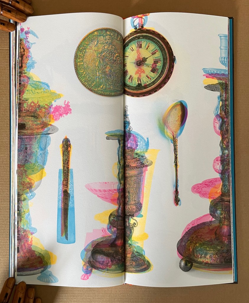
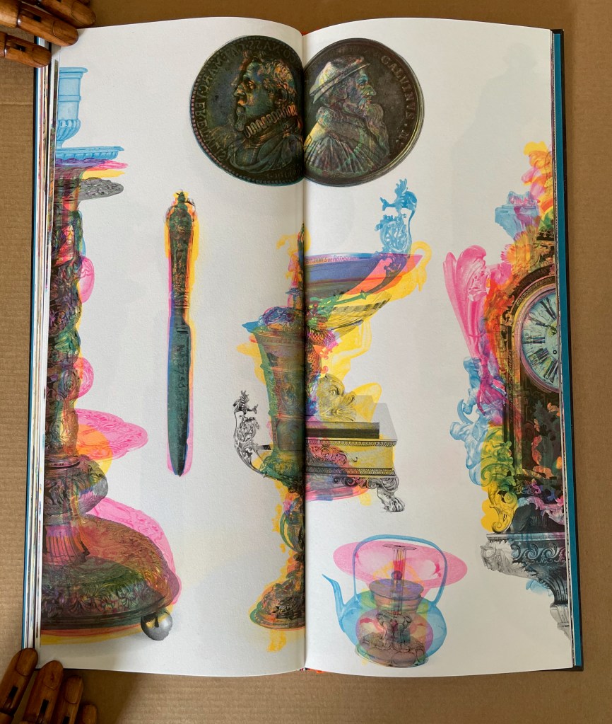
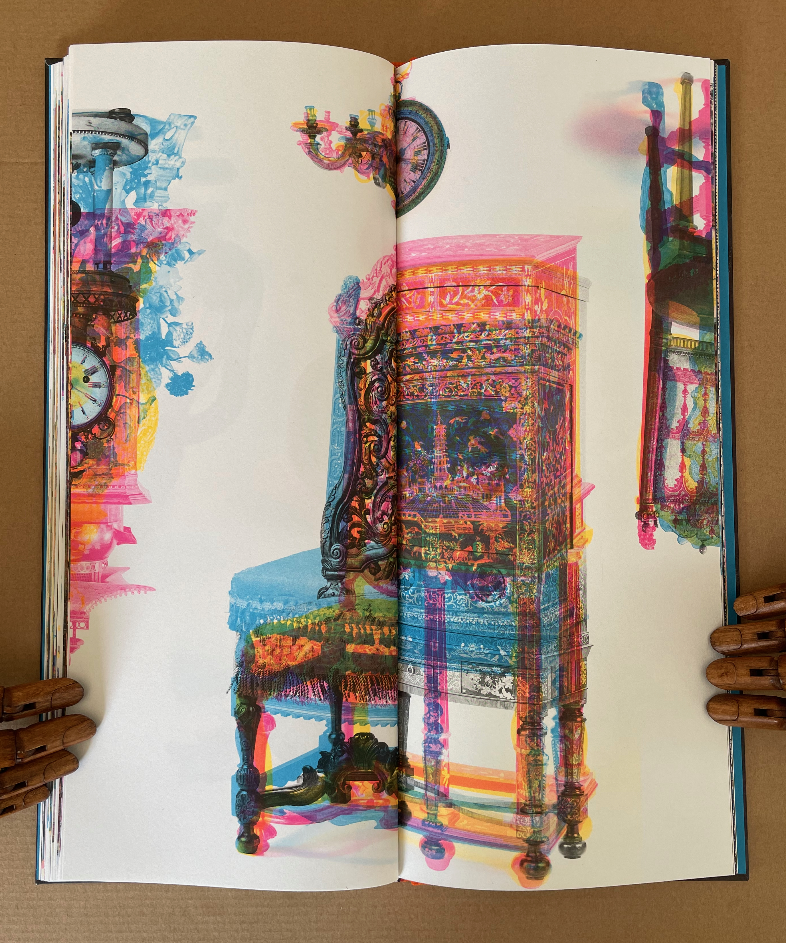
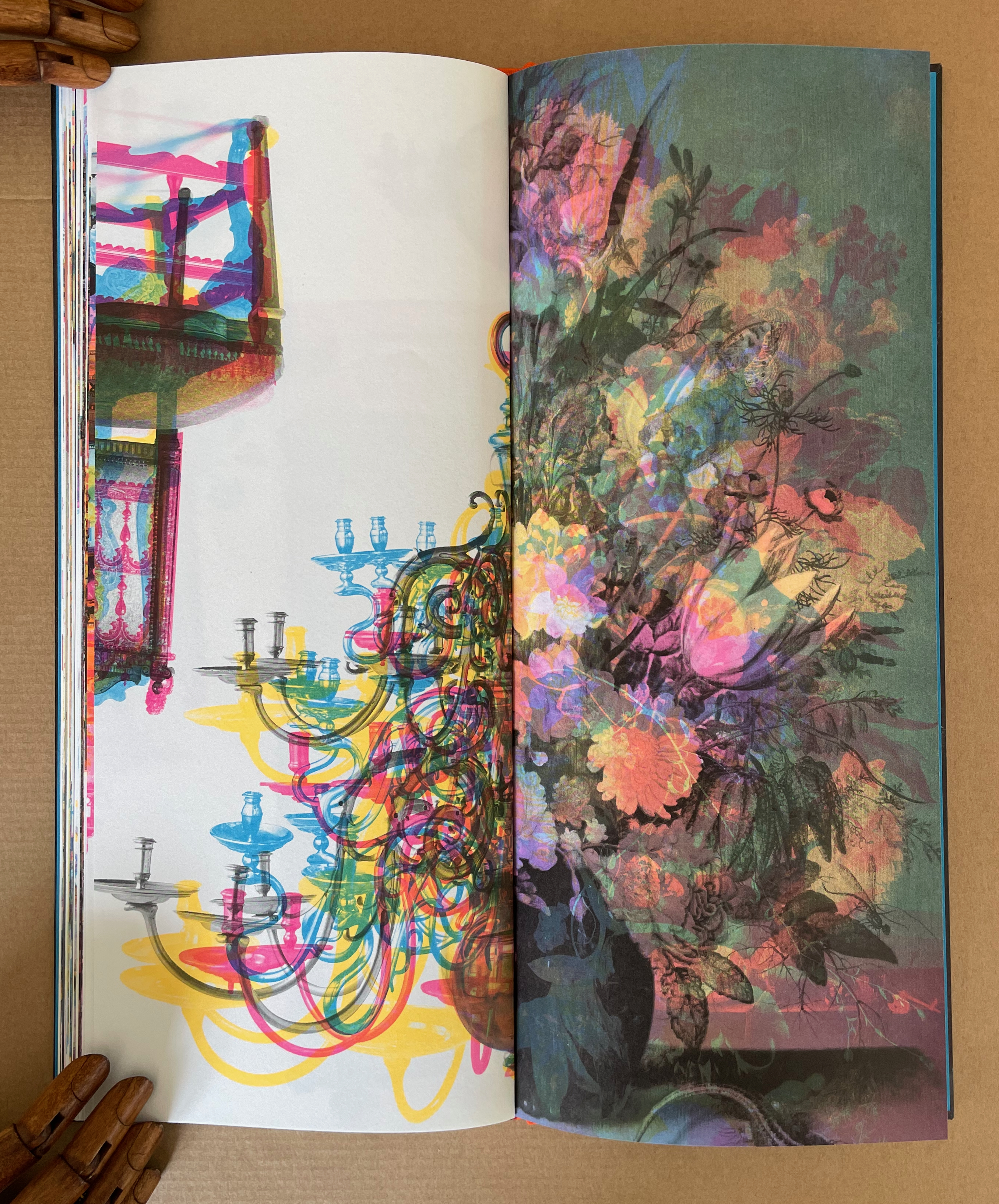
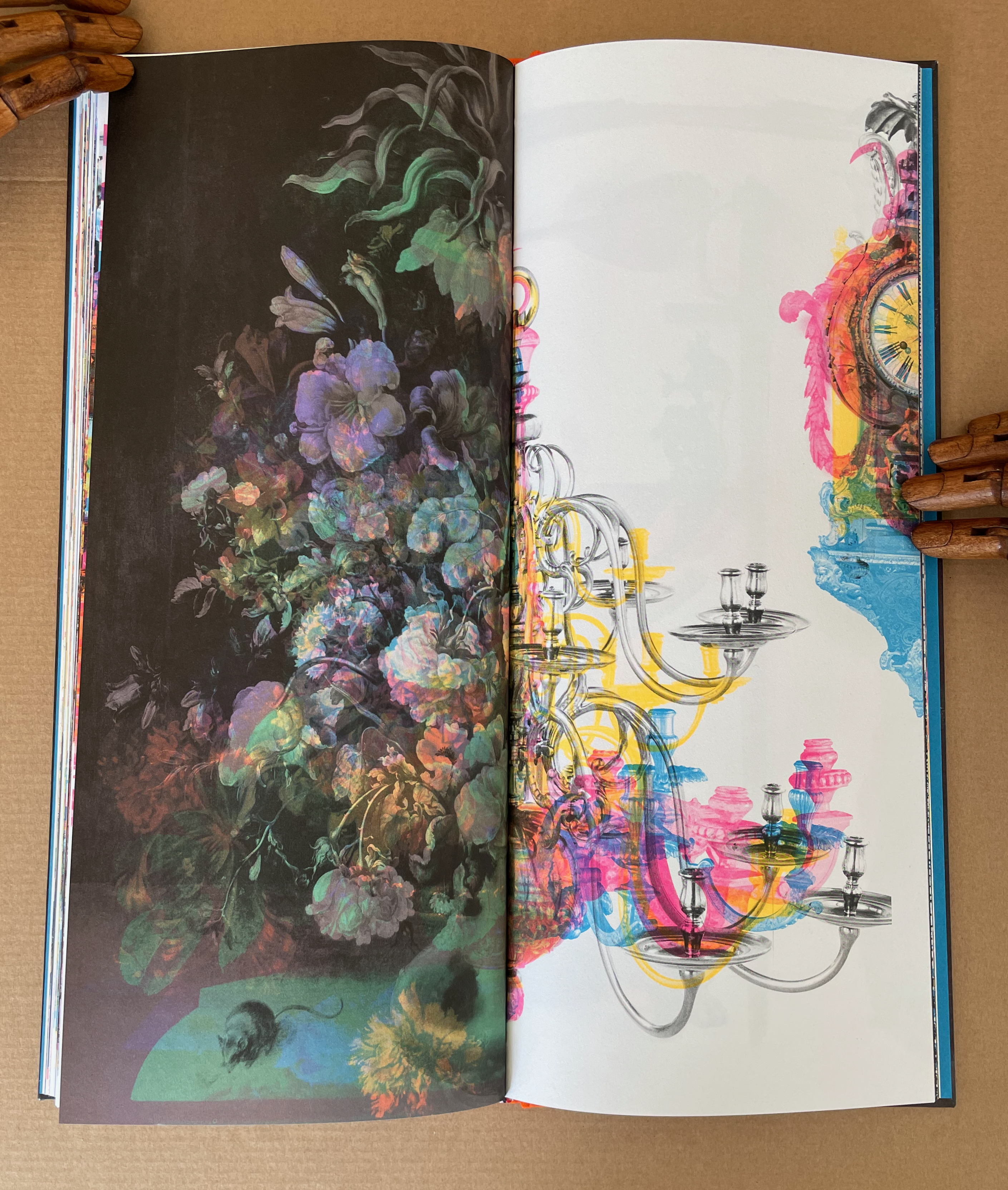
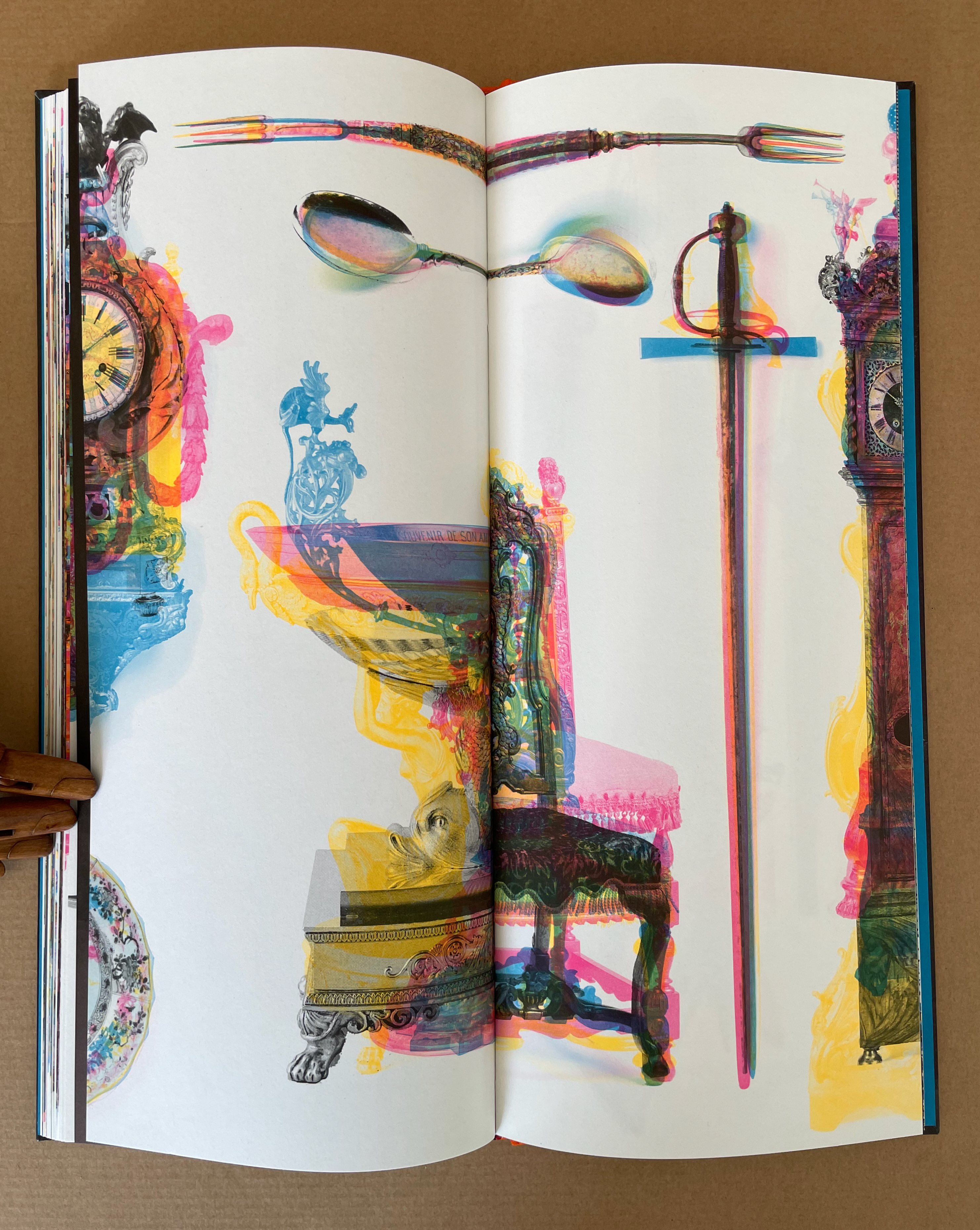
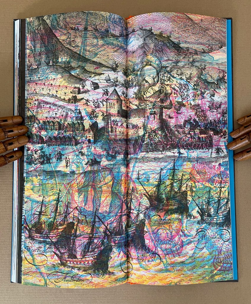
The book’s front and back covers certainly promise disruption, dislocation, and dissonance. The artist has achieved this by color-separating the high-resolution files from the Rijks, recombining the images of documents, fine possessions, portraits, paintings of battles, and engravings with each other, and skewing the registration of the separations when printing.
The book has three unnamed sections: objects, portraits, and scenes of travel and battle.
As MacCallum points out, the book’s tall narrow shape and tight binding also make it an awkward customer. Overly tight bindings are not usually intentional, but given the strange combinations in the centers of the double-page spread, there is not much doubt here. Not only do images disappear into the gutter because of the binding, they slip over the fore edges and onto the next page.
But not always. The artist frequently misfoots that expectation and many others as with forks having tines on both ends, chairs suspended from the top of a page, and folio stuck in the middle of a chandelier.
For the curious, the project statement shows the process as applied to the portraits section of the book, which follows the objects section.
Project statement: “Unseparated images from pages 76-77. This spread was printed in Pantone 801, Pantone 806, Pantone 810, and two different black inks.”
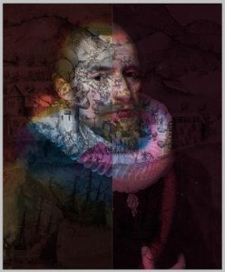
In the portraits section, we can detect scenes from images of travel and battle faintly layered over some of the faces. In the last section of the book, however, focused entirely on travel and battle scenes, the technical fireworks build at a furious pace, ending with a depiction of an Anglo-Dutch sea battle.
Just within these four works, Meador’s art evolves. How it has developed across his incredibly broad historical and geographical interests since the 1980s awaits a catalogue raisonnée of his prolific output. In the meantime, exploration of VOC, Cotton, Acheiropoieta and its companion volume yields an embarrassment of riches to enjoy, however uneasily.
Further Reading
Chen, Julie. 2013. 500 Handmade Books. Volume 2. New York: Lark. See pp. 166 and 170 for A Repeated Misunderstanding of Nature (2012) and Grove (2011).
Rogers, Ruth R. 2025. “Mutable Form and Engimatic Meaning“. New York: Center for Book Arts. Expanded version of a talk delivered at the “Luminous Books Symposium”, Boston Athenaeum, 10–11 March 2023.
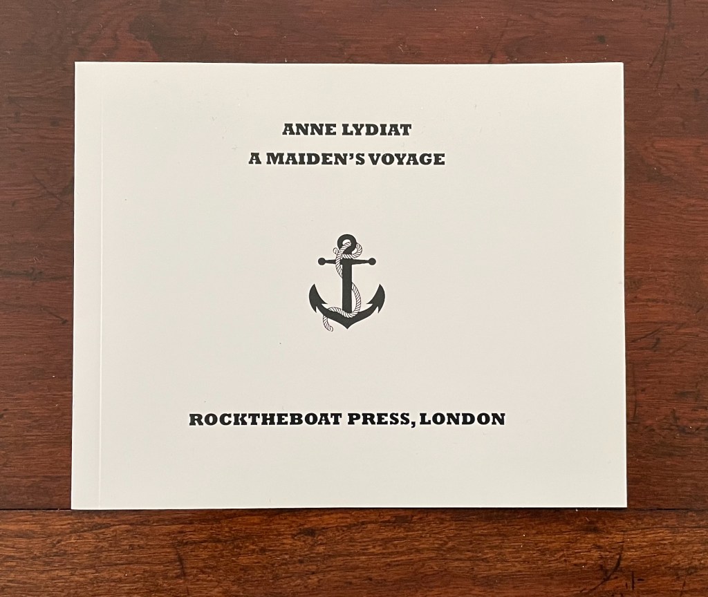
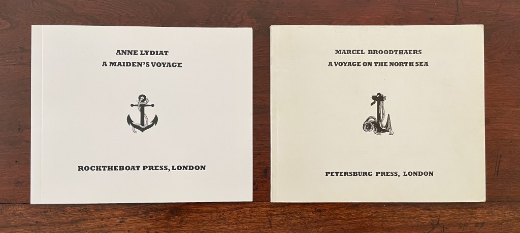
A Maiden’s Voyage(2015) Anne Lydiat Paperback. H145 x W180 mm. 36 pages. Edition of 50, of which this #31. Acquired from the artist, 28 August 2026. Photos: Books On Books Collection.
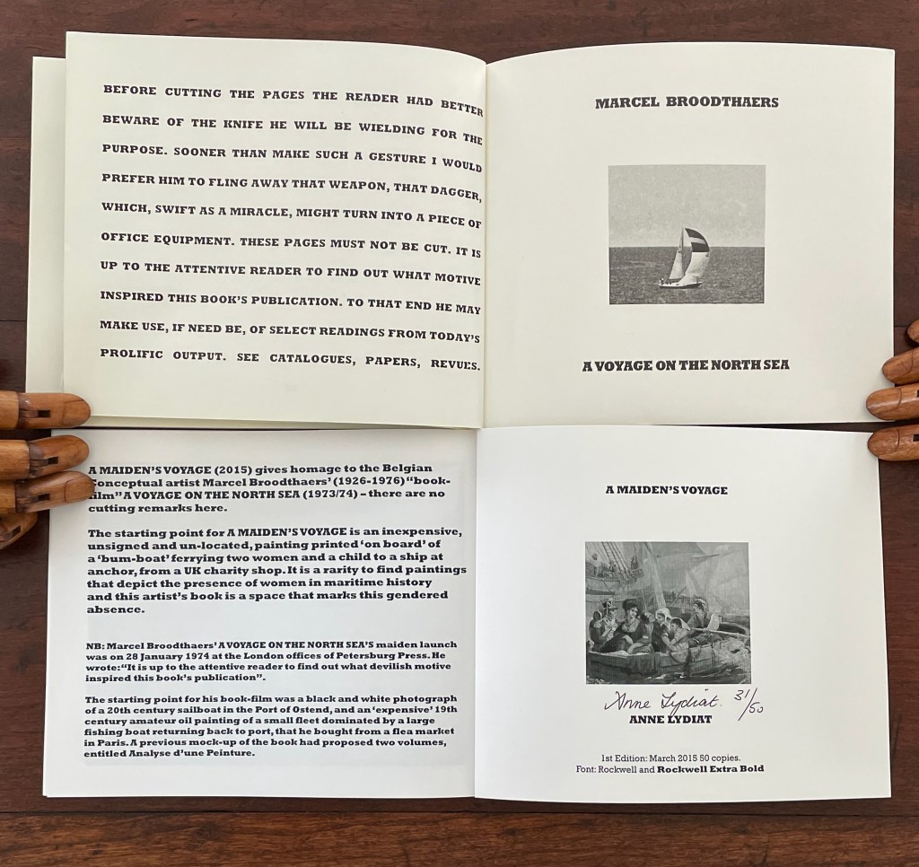
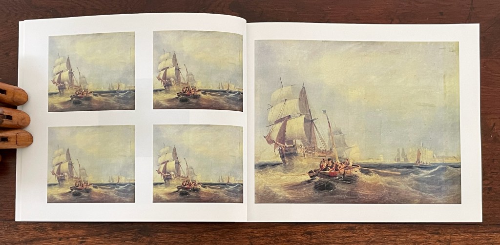
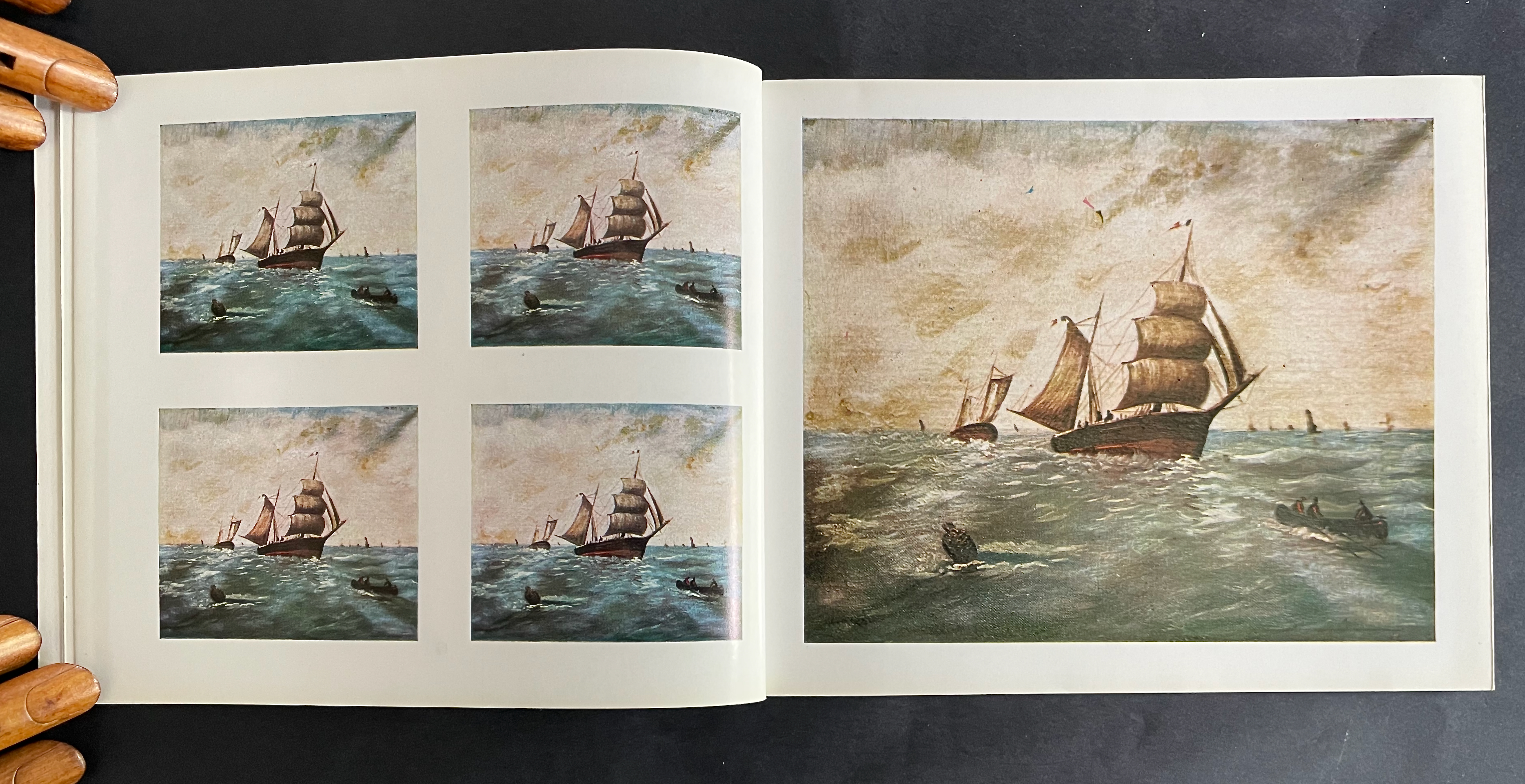
Anne Lydiat’s A Maiden’s Voyage (2015) pays homage to the Belgian conceptual artist Marcel Broodthaer’s “book-film’” A Voyage on the North Sea (1973).
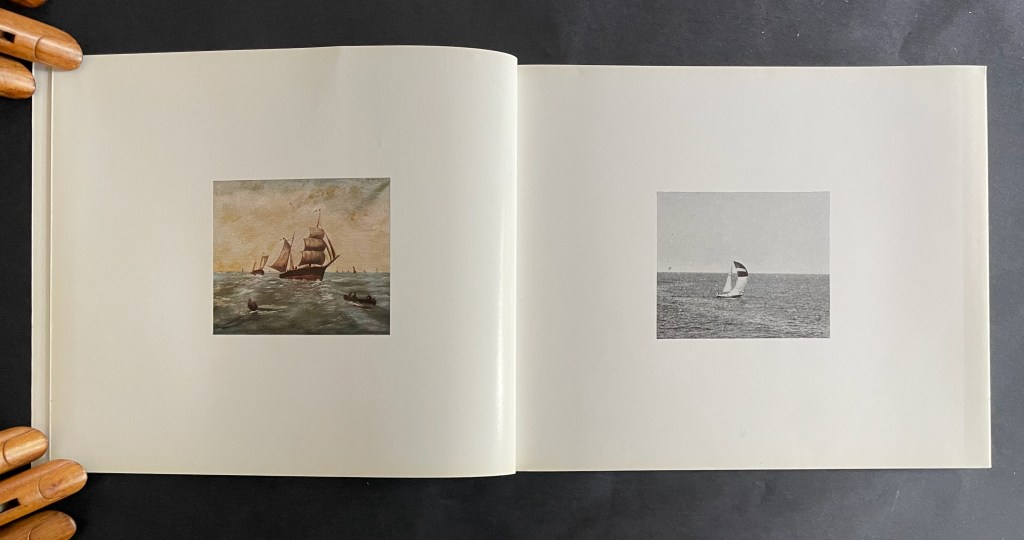
The reader/viewer of Broodthaers’ book faced three challenges, the first two of which are outlined in its preface. The first, whether to cut or not cut its uncut pages and reveal or leave hidden its page numbers. The second, to make sense of its juxtaposition and manipulation of images of a 19th century sailing ship painting and a photographed 20th century yacht. The third challenge was access to its associated film (which only came with the deluxe edition) and make sense of its relation to the book.
The reader/viewer of Lydiat’s homage does not face that first challenge. She is explicit in her preface —”there are no cutting remarks” — and the book is fully trimmed top, bottom, and fore edge. Her disavowal’s phrasing, however, slyly envelopes the reader/viewer in a different challenge. Does this homage really have no “cutting remarks”, no rebukes? Noting the rarity of depictions of women in maritime history, the second paragraph concludes otherwise: “this artist’s book is a space that marks this gendered absence”. A Maiden’s Voyage pays a passive/aggressive homage to a male artist and his work that unconsciously participates in that gendered absence.
We still have the second challenge with A Maiden’s Voyage: to make sense of its juxtaposition and manipulation of images.
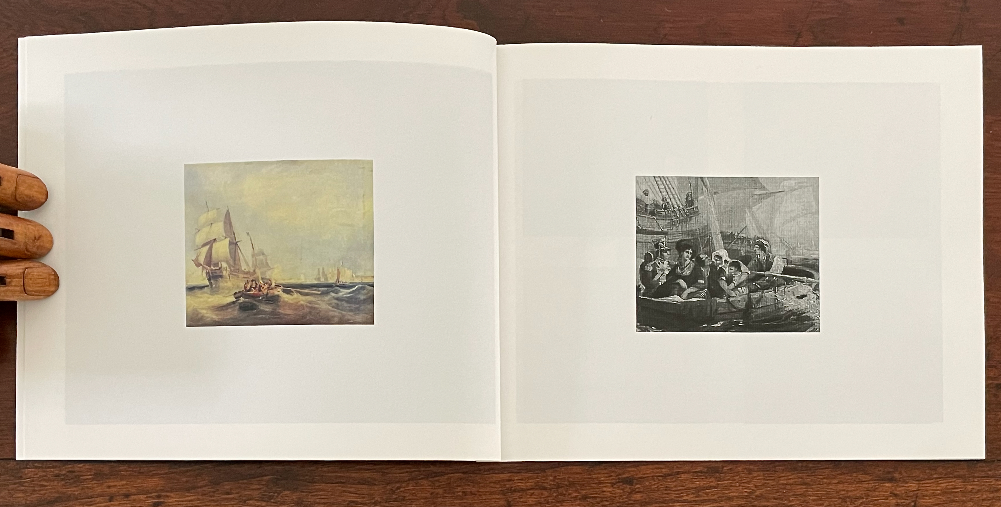
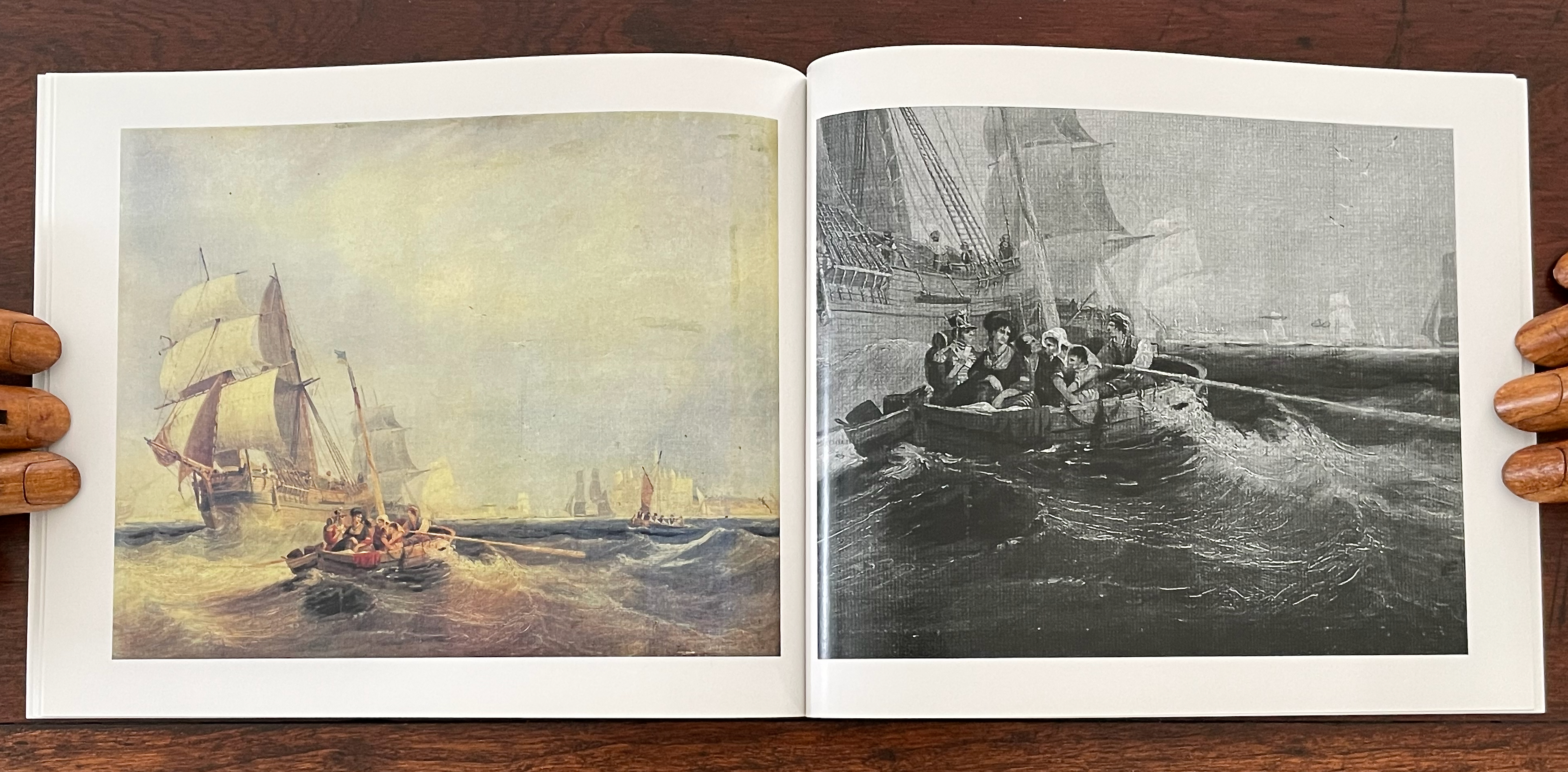
Lydiat is an accomplished artist working in photography, sculpture, and installations as well as books. She could have chosen to work her found painting and subject of gendered absence into another medium, another frame. But she chose the medium of the book and the frame of Broodthaers’ A Voyage and his projected Analyse d’une Peinture. While A Voyage juxtaposes present and past images, A Maiden’s Voyage contains no such juxtapositions. Paradoxically it makes itself the juxtaposition of present and past. Lydiat has juxtaposed her “space” with Broodthaers’ artist’s book and intent. Her space is the present; his space is the past.
The title of Broodthaers’ projected project implies that the subject of A Voyage concerns the analysis of a painting, an expensive one at that. In parallel and contrast, Lydiat takes a cheap found painting of the past and “analyzes” it, breaking it down into clipped details, stripping it of color, and framing the results as Broodthaers did in A Voyage. In doing so, she underscores that her present space is shaped by the past, implicitly arguing that “gendered absence” in the past shapes the present. It is not a situation that Lydiat lets lie. By contrasting the costs of the found paintings, she neatly slips in one of those disavowed “cutting remarks”.
As for the third challenge, the Fondation Marcel Broodthaers provided a solution for access. Likewise, Anne Lydiat provides a link to her film that accompanied the maiden launch of A Maiden Voyage at Chelsea Cafe Project (Chelsea College of Arts).
Like Broodthaers’ “book-film” (his term), Lydiat’s book-film presents image frames as numbered pages. At least since Dick Higgins’ introduction of the term “intermedia” in the mid ’60s, interest in the hybrid work that crosses media and occupies the space between painting, film, music, performance, installation, sculpture, the book, computers, and now the Web has grown — especially among book artists. In 2013, the topic held center stage at the MCBA Book Art Biennial in an exhibition entitled “Directed: The Intersection of Book, Film and Visual Narrative”. Works recently added to the Books On Books Collection occupy this intermedial space (see examples below). Anne Lydiat’s book-film A Maiden Voyage brings the added edge of appropriating form, technique, and content from an arch-appropriator and focusing them on a persistent social blindspot.
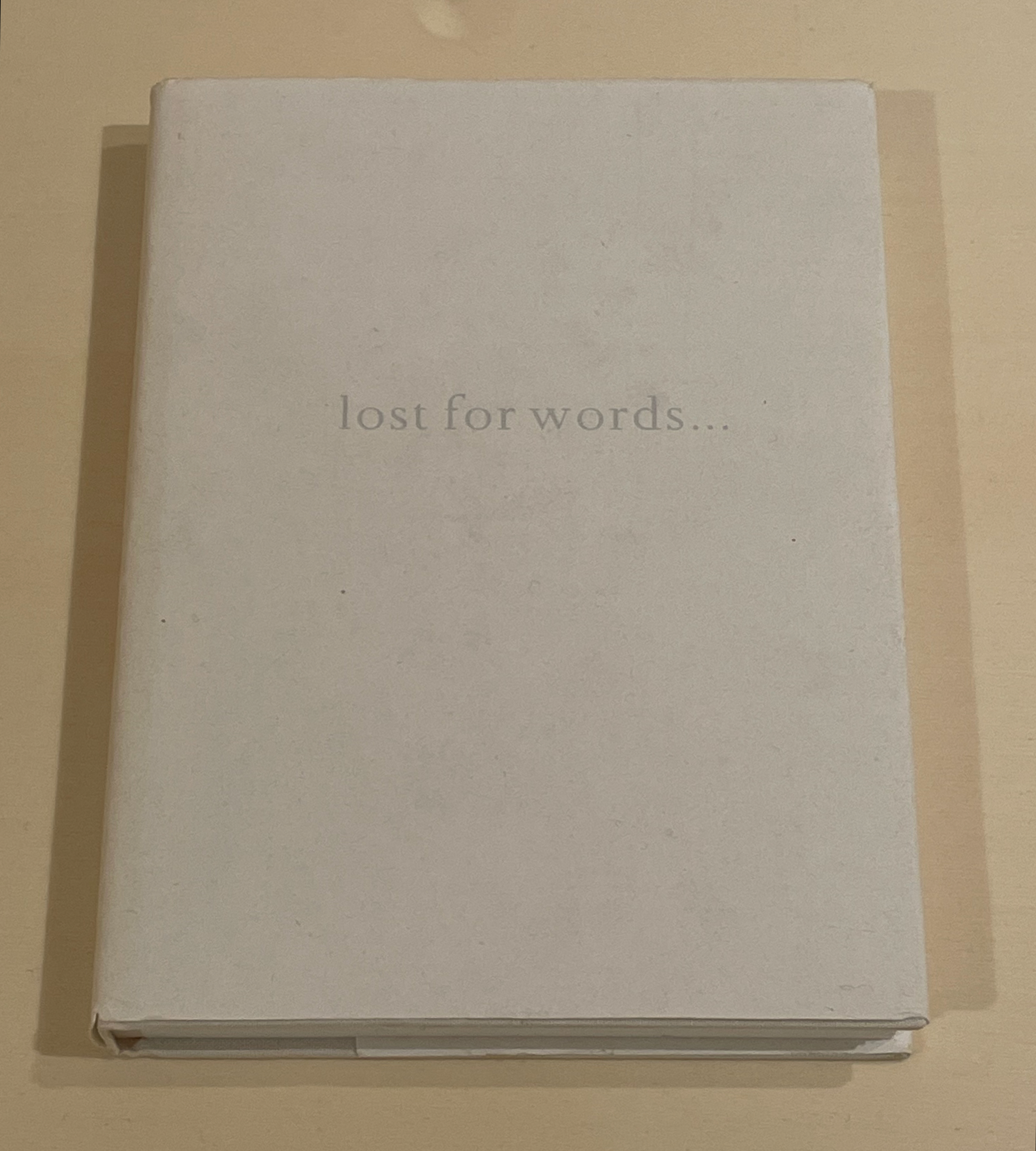
I first came across Anne Lydiat’s work at the Wittockiana in Brussels. There in the a minima exhibition was Lost for Words … (1999). Displayed as below, no one could tell that it is a blank book. Not even the subtlety of the blind embossed ISBN on the back could be seen, nor could the quotation from Maurice Blanchot on the inside flap (“About this book I had promised myself to say nothing …”). The context of the exhibition was a hint about the book’s theme — or an aspect of it — “absence, loss and nothingness” — as Lydiat’s website notes.
Lost for Words… (1999) by Anne Lydiat also appeared in the exhibition Blank. Raw. Illegible…Artists Books as Statements, 1960-2022 (2023) organized by Moritz Küng.
Although not a part of the Books On Books Collection (at least not yet), it is mentioned here as an additional gloss on her intermedial style of conceptual art. Lost for Words … first appeared in an exhibition at the Freud Museum entitled “Permission to Speak”, after which it was deposited in Sigmund Freud’s library. So where is the intermediality? It lies in her performance of secretly depositing Lost for Words … in libraries that she has visited around the world. The only means of knowing where they are is the follow-up volume — … of the book — which lists the libraries.
Further Reading
“Amaranth Borsuk“. 19 February 2017. Books On Books Collection. See Between Page and Screen (2012) and ABRA (2014) for examples of intermedia.
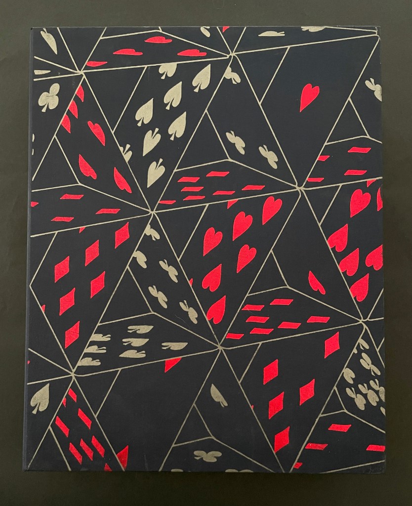
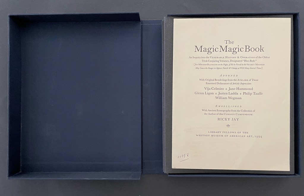
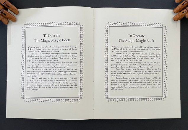
Ricky Jay’s The Magic Magic Book explains and presents a structure well suited to the artist’s book but one rarely used. The structure is called the “blow book”. Most of us know the apparatus from childhood birthday parties as the “magic coloring book” in which the clown or magician flips through a book of blank figures to be colored, calls on the birthday boy or girl to blow on the closed book, and then reopens it to show all of the pictures colored in. Hard-to-see tabs or alternating page widths enable the performer to produce the effect. Until Jay’s production with the Whitney Museum Library, there had never been an extended serious study of the blow book by scholars of magic, iconography, children’s literature, or the history of the book.
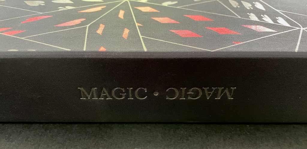
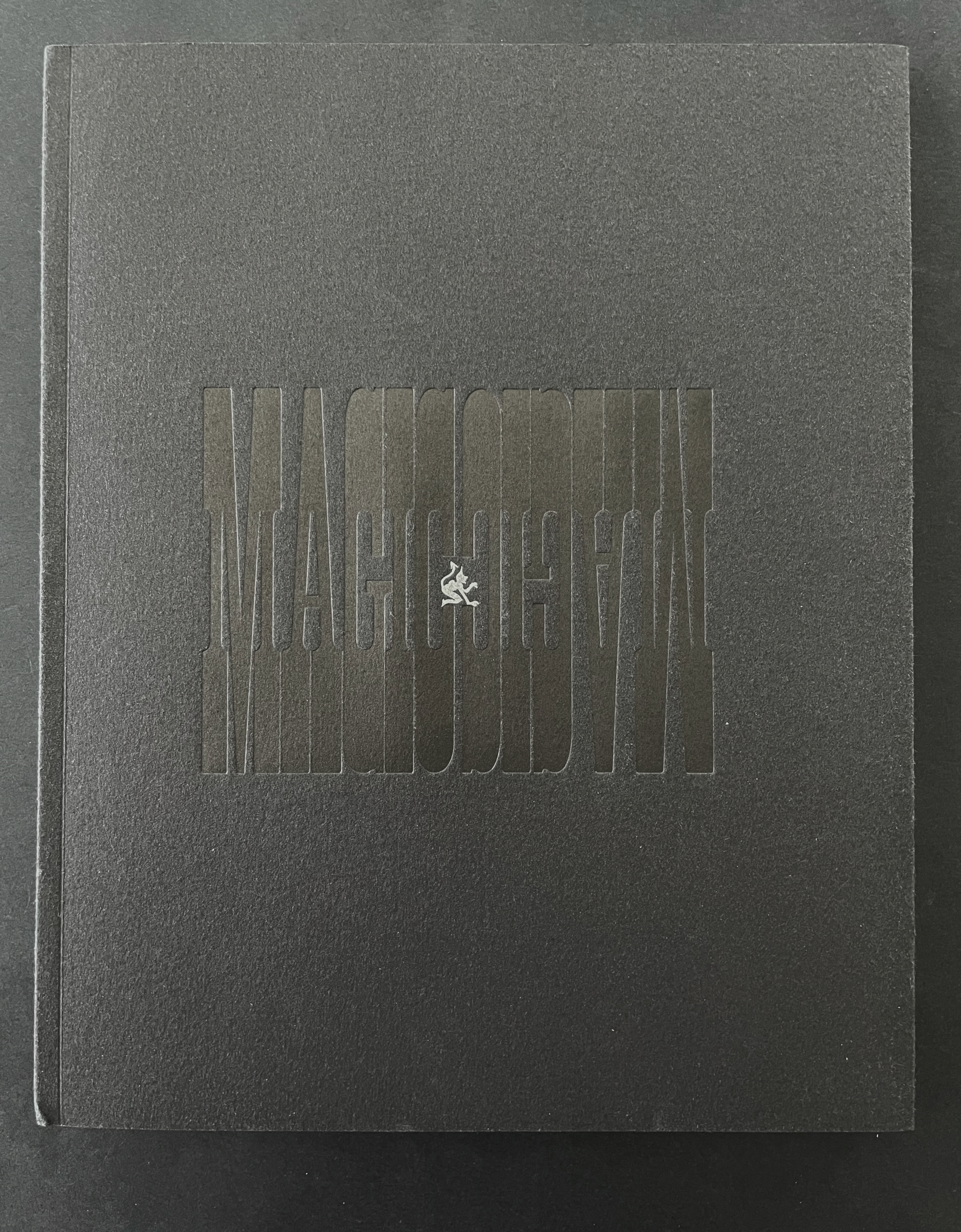
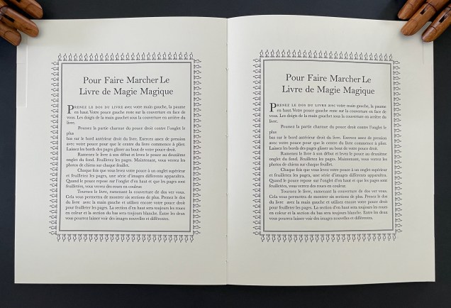
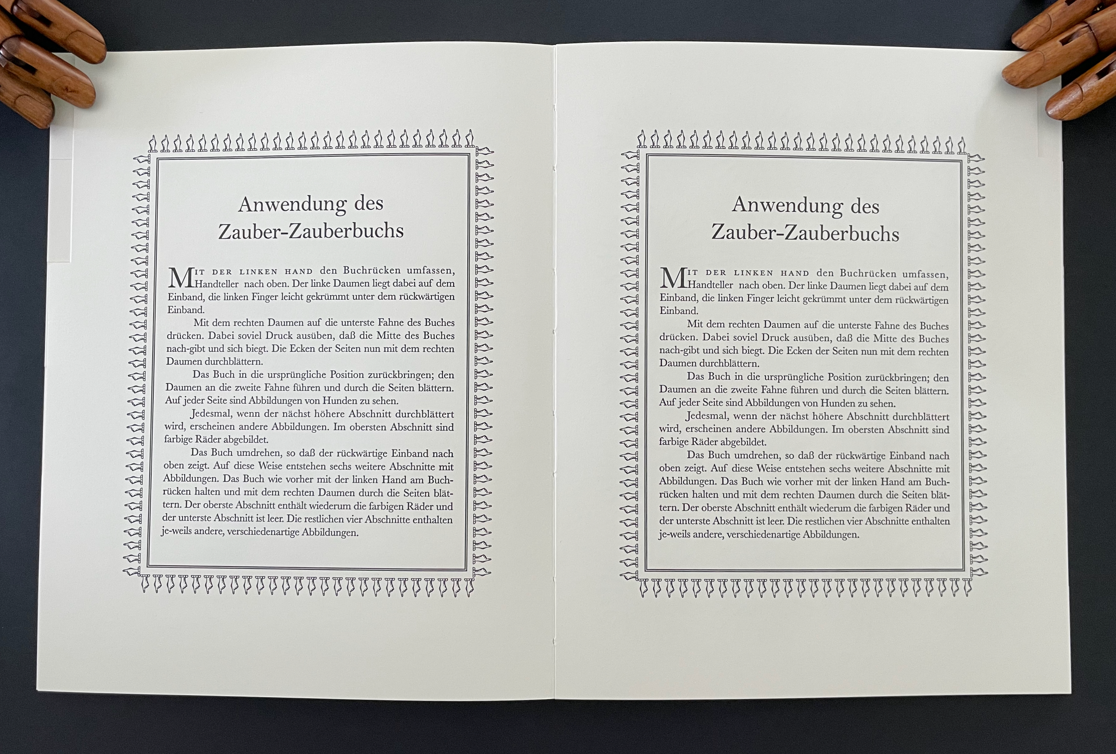
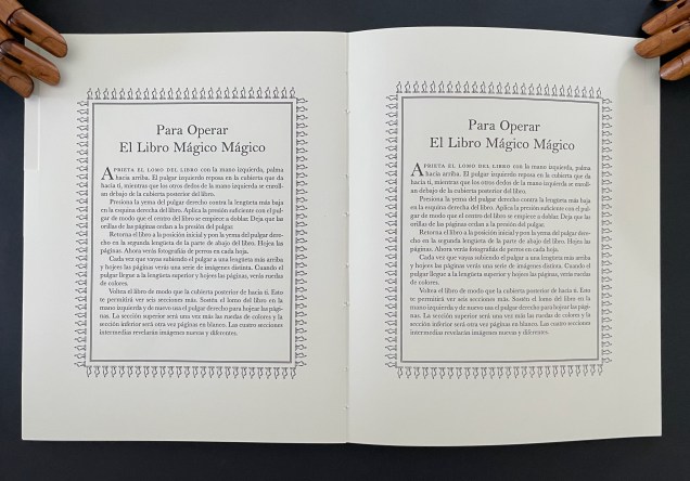
The Magic Magic Book ‘s two softcover volumes are housed in a blue silk clamshell box whose front cover displays the optical illusion of a house of cards. The card motif reflects both the blow book structure’s use in trick decks of cards and Jay’s reputation in the 90s as “perhaps the most gifted sleight of hand artist alive” (Singer, 1993). The first volume gives an illustrated essay on the history of the blow book. The second volume (a blow book itself and in a dos-à-dos structure) features illustrations by contemporary American artists Vija Celmins, Jane Hammond, Glenn Ligon, Philip Taaffe, and William Wegman as well as painted devils and harlequins, letterpress alphabets, figures in silhouette, and instructions (in four languages) for operating the blow book. After one flick through the book showing blank spreads, the next flick yields a dance of eight harlequins.
The next flick turns the harlequins into alphabets.
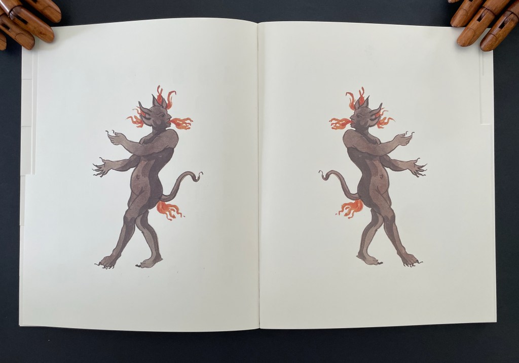
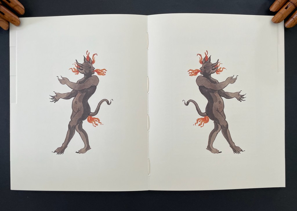
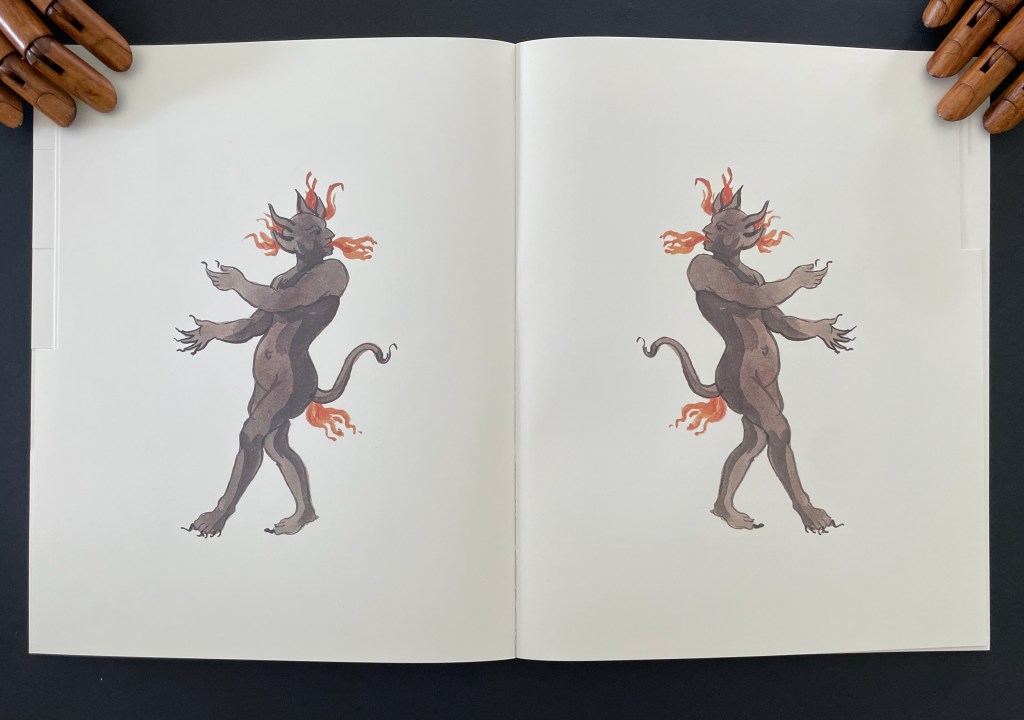
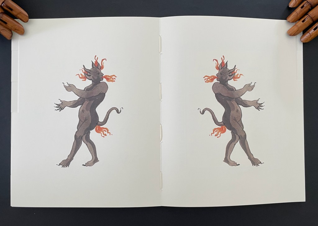
The next flick transforms the alphabets into fire-breathing, fire-farting devils (the images courtesy of Thomas Stauss to Jay).
With the next flick, we get the English, then French, then German, and finally Spanish instructions for operating the book.
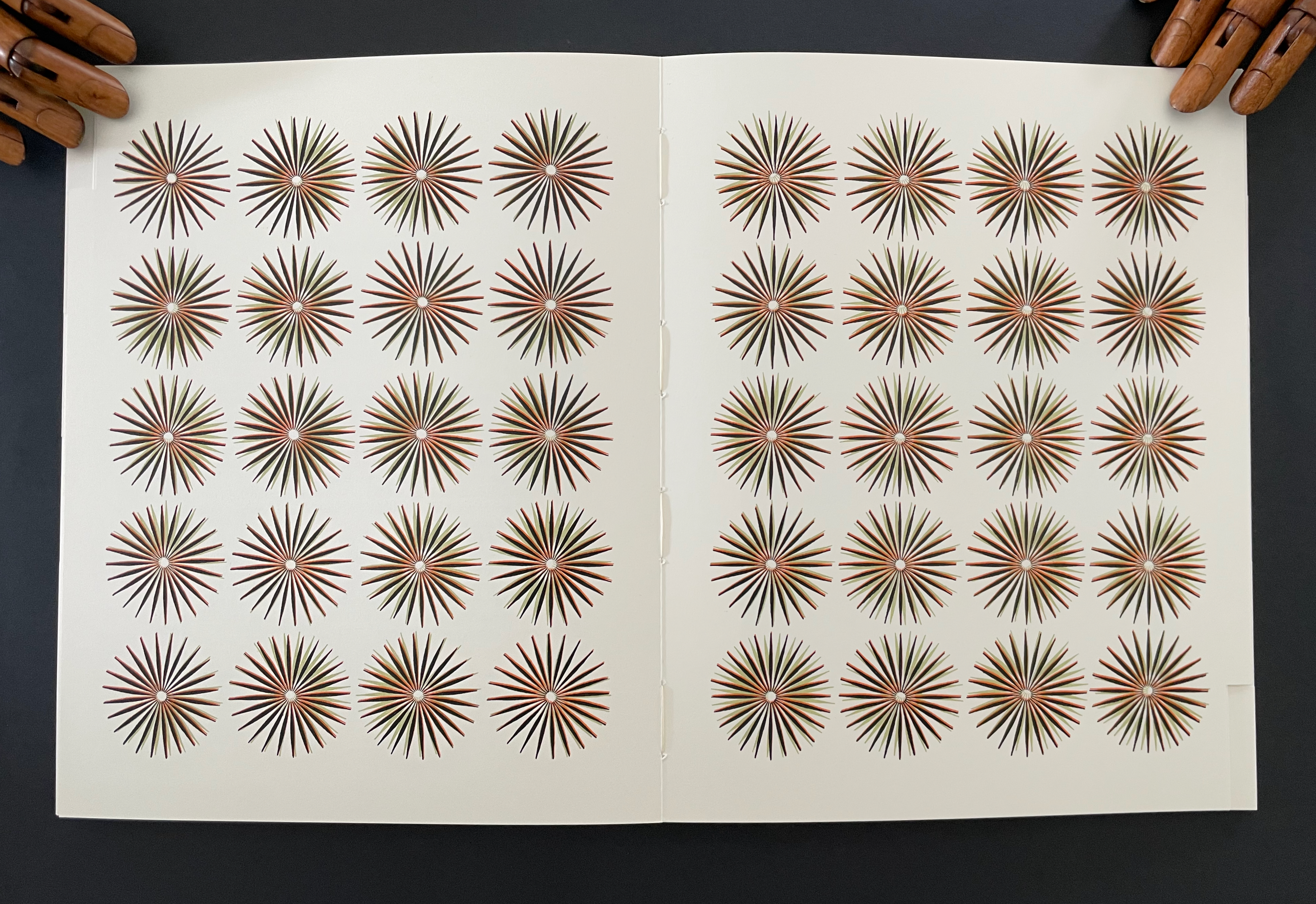
And with the last flick, Philip Taaffe’s fern-like, starburst abstractions appear, gradually shrinking and ordering themselves into columns of four and rows of five. When the dos-à-dos is turned, Taaffe’s series returns (again last in the sequence of flicks) but in reversed order, the columns and rows dispersing into other patterns and increasing in size.
The blow book offers artists a tool that can shape meaning, metaphor, and perspective. It can elicit performance by the reader to enact ideas, narrative, and structural effects. Its close association with the rise of the printing press, affordable paper, and binding capabilities recommend the blow book to book artists intent on demonstrably tying their works to the history of the book. The hard-to-see tabs or alternating page widths that enable the performer to produce the blow book’s effects offer a means of enhancing the materiality of the artist’s book. Its mechanics offer the chance to use flip (or flick) book’s animating effects, which have appealed to numerous book artists. Its twist on those effects lends it to juggling the layout of text and image in a non-traditional manner. Its mechanics can also enhance binding structures like the dos-à-dos, a structure also borrowed for magic tricks. Its reliance on manipulating a book’s fore edge offers the chance to emphasize both form and tactility, a characteristic theme of artists’ books. The two volumes of The Magic Magic Book itself incorporate “watercolors, woodcuts, etchings, hand-colored engravings, lithography (black-and-white and colored), mimeograph, drawings, decals, stencils, photo-offset — even leaves from other books” (“Prologue”, p.2) — surely another enticement to book artists to explore the form.
In the Books On Books Collection, Julie Chen and Keri Miki-Lani Schroeder’s Book of Hours (2021) and Horst Antes’ Flickbuch (2000) are the only two artists’ books that exploit the blow book structure. As examples, they show the form’s scope for artists to work their individual magic and demonstrate the blow book’s magical transformations that make us query the nature of “the book”.
Further Reading
“Horst Antes“. 2 September 2026. Books On Books Collection.
“Nicholas Phillips“. 11 August 2020. Books On Books Collection. Phillips’ Egyptian Cards demonstrate multiple image changes in a deck of cards.
“Stauss, Thomas“. 28 September 2026. Books On Books Collection.
Aling, Michael. n.d. “Publishing as Architectural Practice“. University of Greenwich. Architectural book designer Michael Aling put the “blow book” principle to work in Negative Equity: House Projects by Neil Spiller & Nic Clear. By adjusting the trim, Aling makes the book display only spreads with Spiller’s work if the codex is flicked through with the right thumb and only Clear’s spreads if flicked through with the left thumb. P. 6, Fig. 2.
Singer, Mark. 29 March 1993. “Secrets of the Magus“. New Yorker. “I’m really intrigued with the concept of the book as both a subject and an object of mystery,” says Jay towards the end of the article.
There is more to Timothy Mosely’s art than meets the eye or touch. It rises equally on an intellectual plane and a physical plane. It is the art of visual touch or haptic seeing.
ep’s (2018)
ep’s (2018) the first book from the series of artists books ”representation by touch” Timothy Mosely Casebound in felt with plywood backing, pulp printing and silkscreen on recycled cotton paper. H52o x W345 x D58 mm (closed), W693 (open). 7 interleaved folios: 4 folios of H438 x W608 mm, 2 folios of H220 x W310 mm, and 1 folio of H307 x W210 mm. Unique. Acquired from the artist, 31 October 2024. Photos: Books On Books Collection.
ep’s (2018) is the first of four works in the series “representation by touch” that offers the results of Tim Mosely’s ongoing studio research into the relationship between touch and sight / the haptic and the optic. His drive to draw us into involving touch in our reception and evaluation of art has its roots in a long tradition of concern that Western society has become too ocularcentric for a whole-bodied appreciation of art. If the artist’s aim is to express how the world touches us (as Cézanne put it), a full appreciation of art requires all the senses.
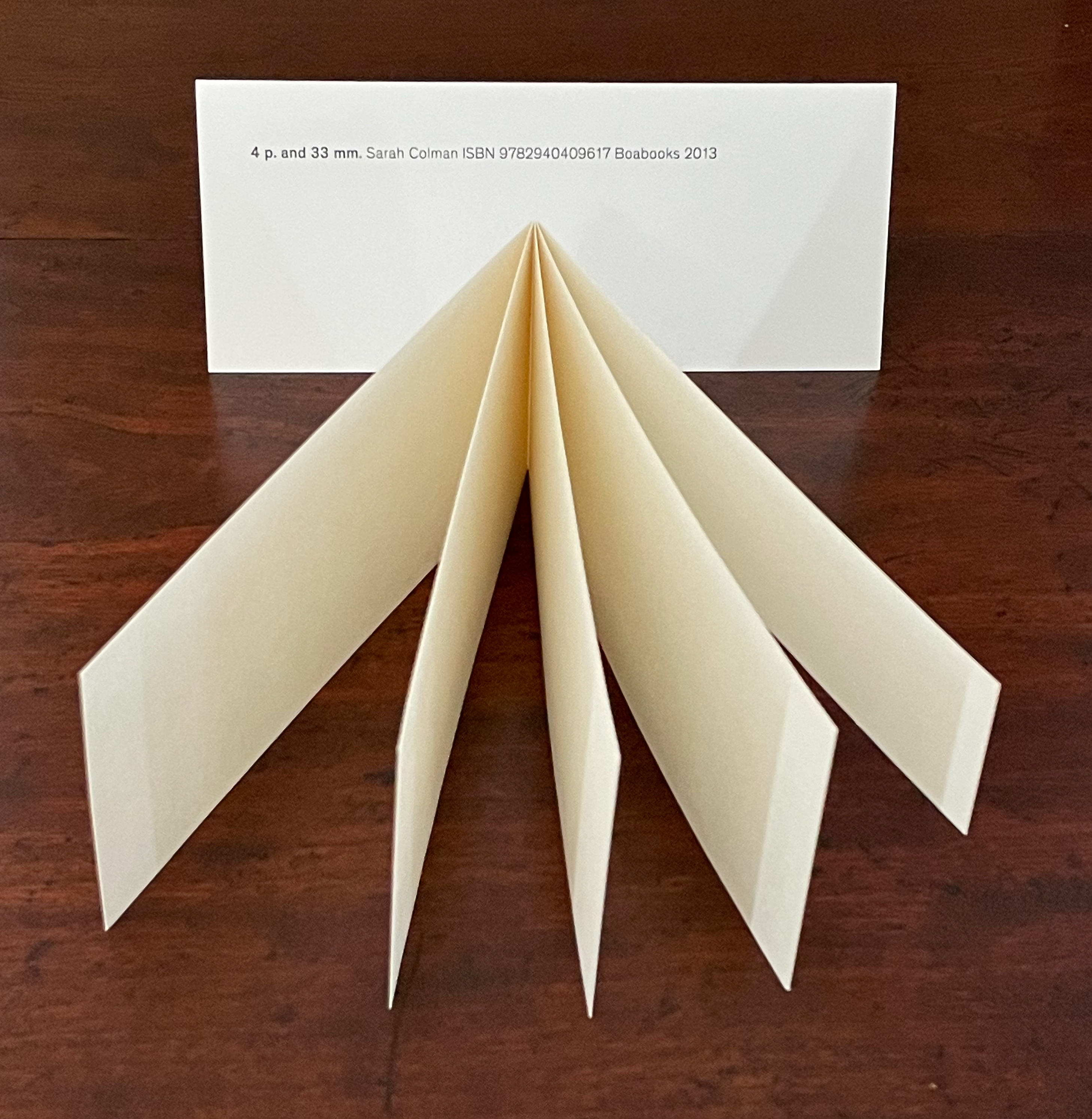
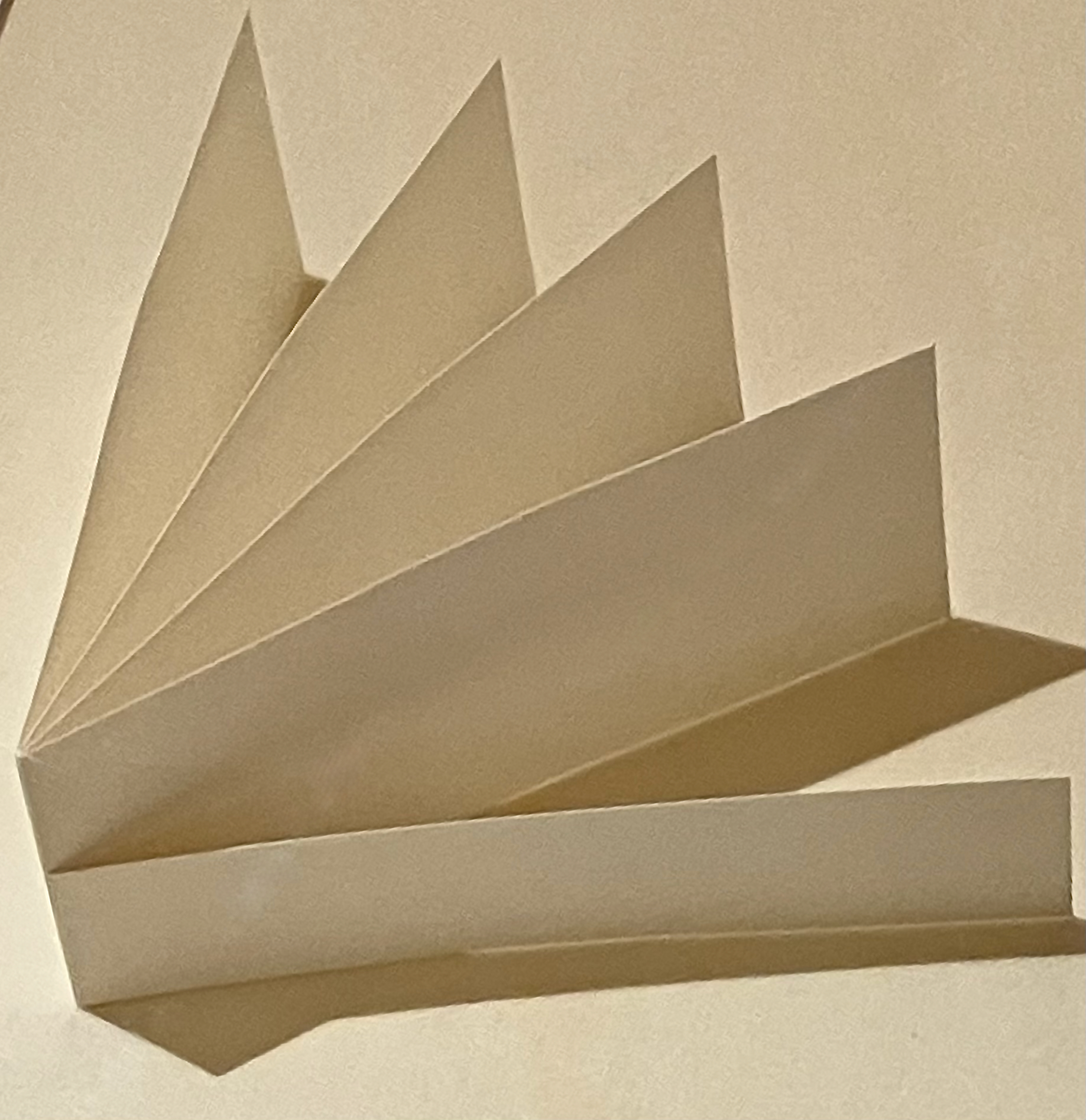
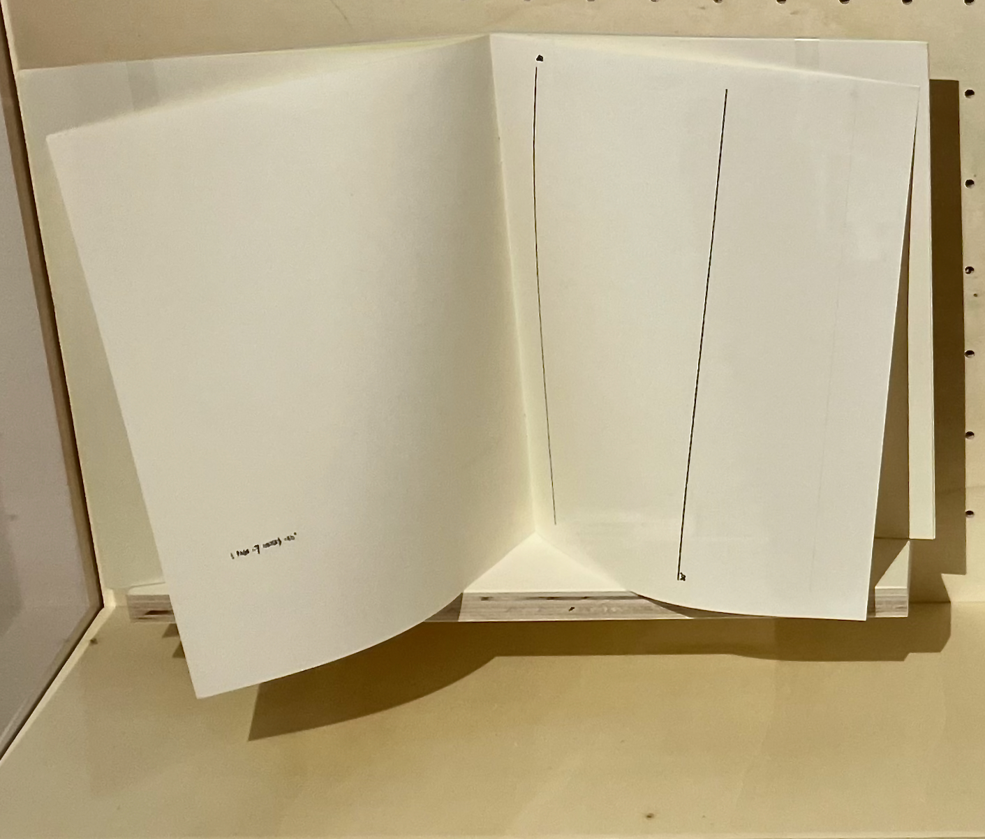
4 p. and 33mm (2013) Sarah Colman Card folder with title, author, publisher. Perfect binding of 4.33 folios. H66 x W148 mm [10] pages. Acquired from the artist, 1 August 2026. Photos: Books On Books Collection.
Colman’s 4 p. and 33 mm. was on display in the exhibition a minima at the Wittockiana in Brussels. If the work ‘s title directs us to consider first the four full folios and then the folio trimmed to half their size, then the item is displayed upside down in the image below. Observant visitors may have noticed it. Western books read from left to right.
Left: 4 p. and 33 mm. (2013). Sarah Colman. Geneva: Boabooks. Right: 4’33” (1993).John Cage. New York: Peters No. 6777a.
Being able to manipulate this work drives home the right orientation. First come the 4 pages that measure 66 mm and then the page that measures 33 mm. Of course, it ends hanging in air — just as Cage’s composition leaves the audience hanging as it ends after 4 minutes and 33 seconds.
In other words, Colman has turned Cage’s temporal art into spatial art. Given the performance origin of the next work, though, it’s not hard to imagine an invitation from Colman to watch her open 4 p. and 33 mm., place it atop a piano, and then close it at the conclusion of 4 minutes and 33 seconds.
Semiotics of the Studio (2015)
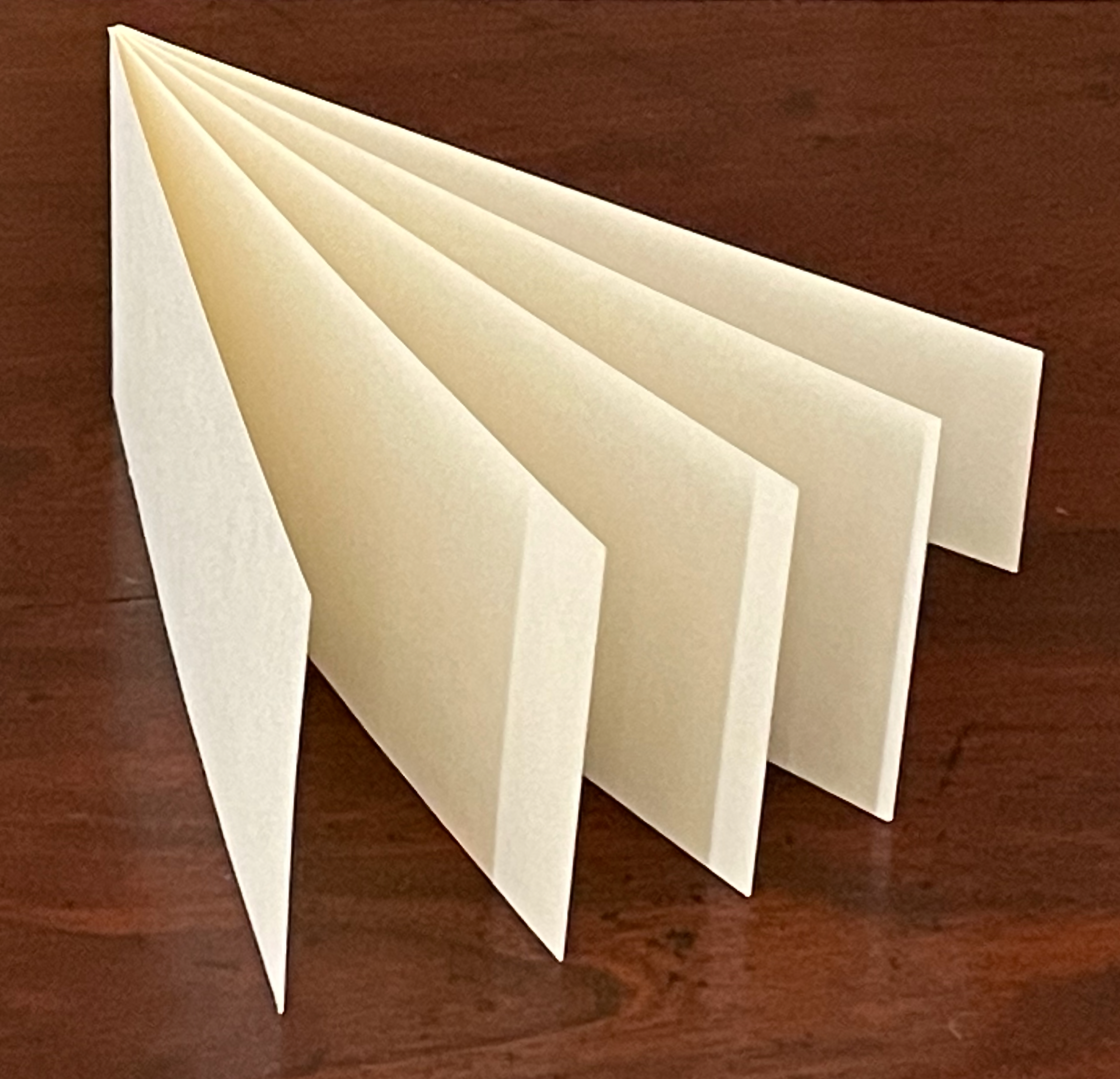
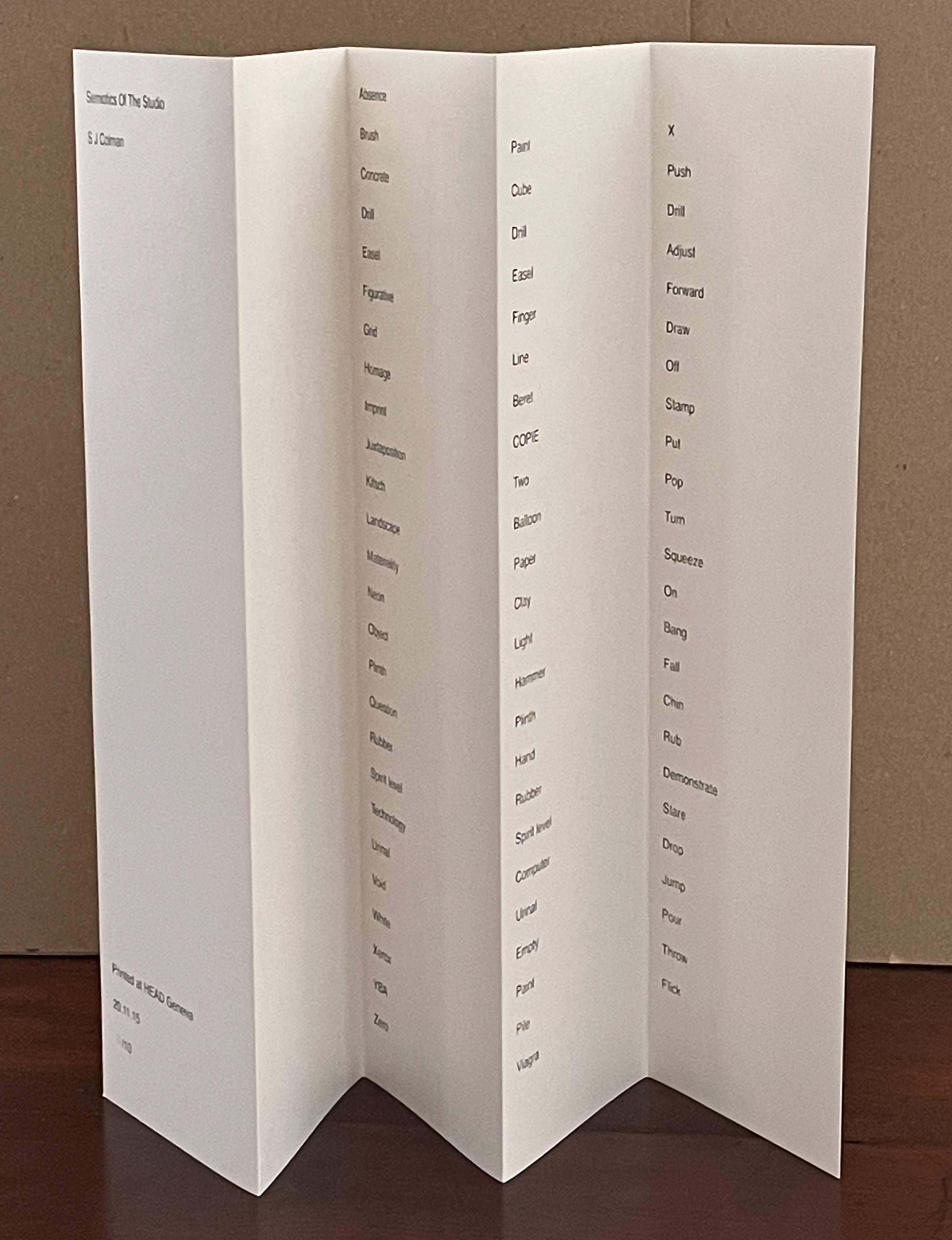
Semiotics of the Studio (2015) Sarah Colman Leporello H300 x W85 mm (closed), up to W425 mm (open). Five panels. Edition of 10, of which this is #10. Acquired from the artist, 1 August 2026. Photos: Books On Books Collection.
Like 4p. and 33mm, the Semiotics of the Studio translates a different medium into that of an artist’s book and very much insists on being experienced on its own terms.
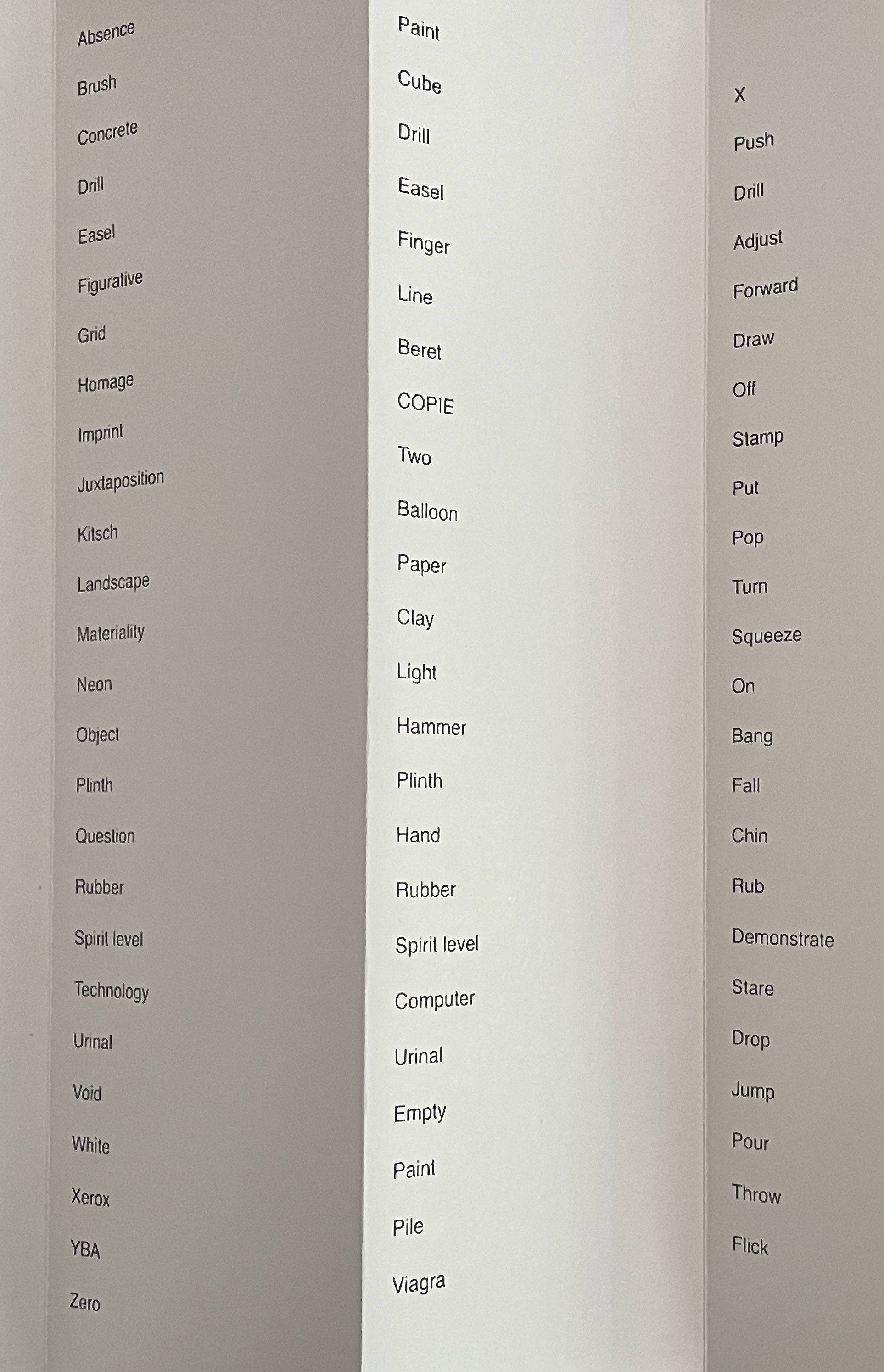
Laid flat or standing, Semiotics of the Studio presents itself as an accordion book, but the order of reading its text is not as straightforward (or downward) as the first panel’s alphabetical order suggests. The alphabetical order in panel 1 becomes a red herring in panel 2. With “Cube”, “Drill”, “Easel”, and “Finger”, Panel 2 resumes an alphabetical order only to abandon it, and in panel 3, there are no alphabetical pairs or triples at all.
Perhaps we should read from left to right across the three panels instead of down. Is the blank space at the top of the third panel showing us the product of “Absence” in the first panel and “Paint” in the second panel? But wait, maybe we should read backwards from “Paint” in the second panel to “Brush” in the first; after all, further down, we have “”Juxtaposition” in panel 1, then “Two” in panel 2, and “Put” in panel 3, suggesting that we put two in juxtaposition.
Just below that, if we put “Kitsch” and “Balloon” together with “Pop”, do we have a dig at Jeff Koons? And much further down, is the juxtaposition of “Urinal”, “Urinal”, and “Drop” taking the piss with Duchamp?
What about “Object”, “Hammer”, and “Bang”? If we are trying to figure out sentences from this, Subject, Verb, and Object seem to jump about. We need to put “Chin” (panel 3) on “Hand” (panel 2), and “Question” (panel 1) what is going on.
Another puzzle is that some words are repeated across from each other in panels 1 and 2. “Drill”, “Easel”, “Plinth”, “Rubber”, “Spirit Level”, and “Urinal”, as we have seen. Sometimes, panel 2 gives an example for the word in panel 1 (e.g., “Computer” for “Technology”). Sometimes, the words are descriptive or synonyms of one another (e.g., “Neon” and “Light” and “Void” and “Empty”, respectively).
Closer inspection reveals that the three columns of words do not precisely align horizontally. They cascade. “Absence” is slightly higher than “Paint”, “Paint” is slightly higher than “X”, and so on. Moreover, panel 1 has 26 words, panel 2 has 22, and panel 3 has 23. So perhaps we should be looking for sense in multiple directions, which is pretty much where semiotics as a discipline has landed.
Context, too, matters. Colman reaps the benefit of Martha Rosler’s kitchen setting for her subversive purposes. While Colman is in the studio, which suggests that her exploration of semiotics is one of creative process, she also slips in terms that challenge the clichés and politics of art, terms like “Beret”, “Kitsch”, and “Viagra”. It’s the artist’s book equivalent of donning the aprons and maintaining a deadpan delivery in the video.
By putting art words to work in a work of art — especially in the form of an artist’s book — Semiotics of the Studio “interrogates” itself and its subject.
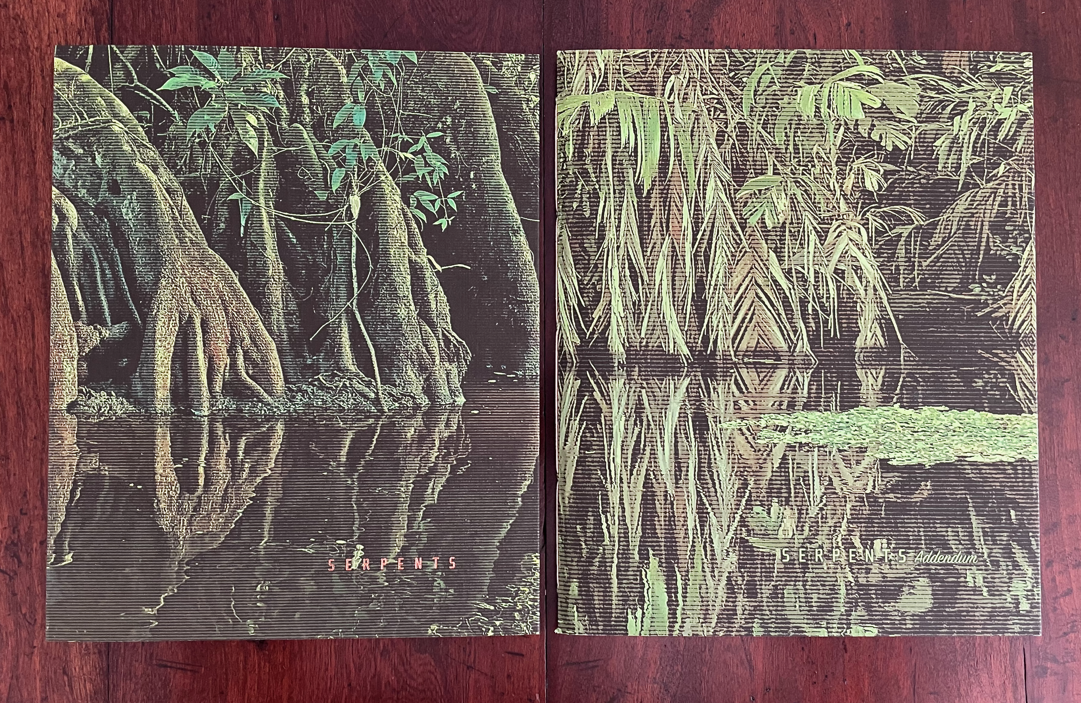
Serpents (2025) Phil Zimmermann Blind embossed white slipcase holding two volumes. Slipcase: H265 x W217 X D17 mm. Deep-flap cover: H263 x W216 mm. Vol. I: H262 x W210 mm. Vol. II: H262 x W215 mm. Vol. I: [40] pages. Vol. II: [60] pages. Edition of 65, of which this is #22. Acquired from the artist, 9 February 2026. Photos: Books On Books Collection.
Serpents is a welcome chance to add an alphabetical offering by Philip Zimmermann to his works already in the collection. Two volumes, one of which is an addendum, make up Serpents.
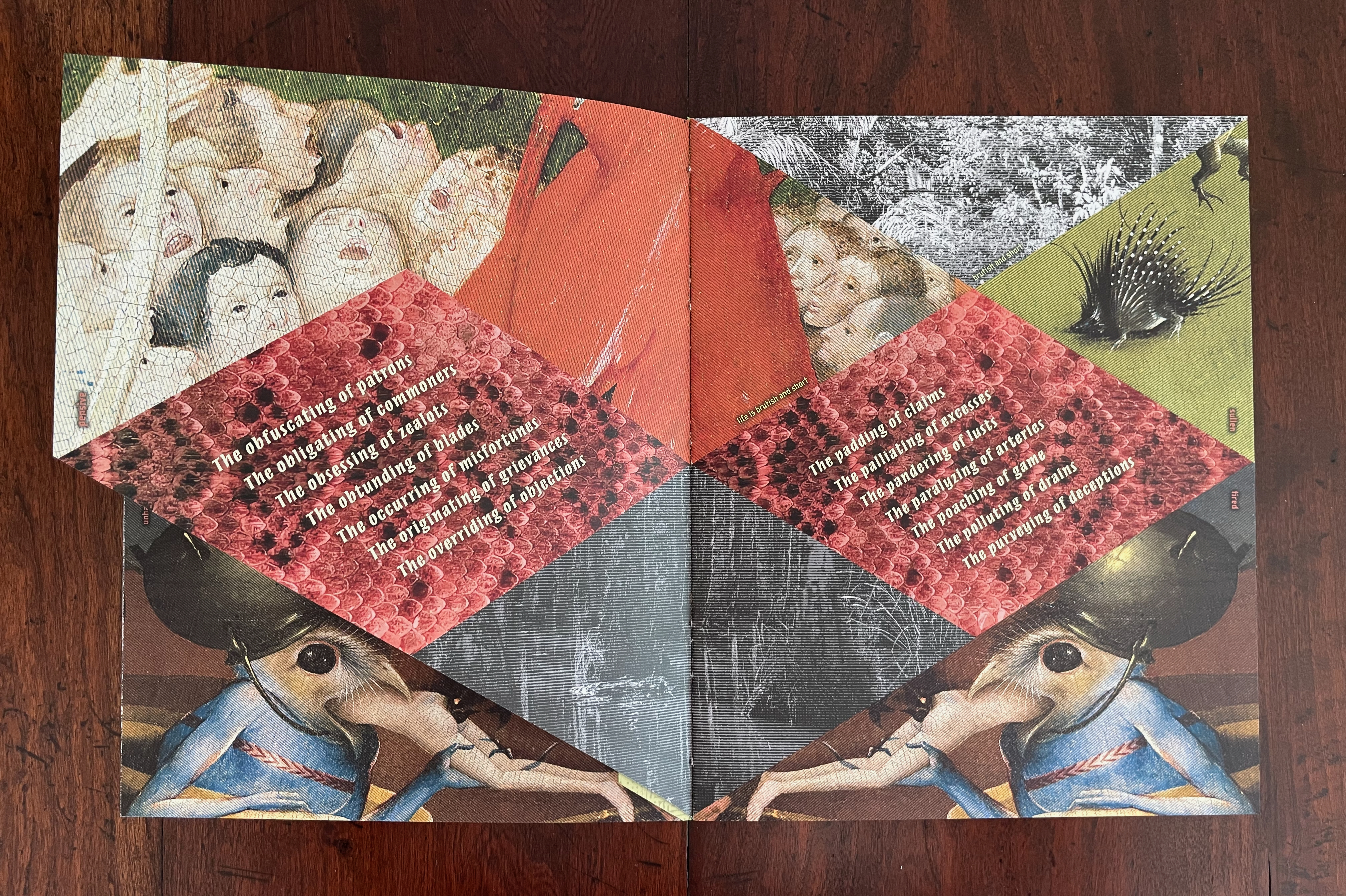
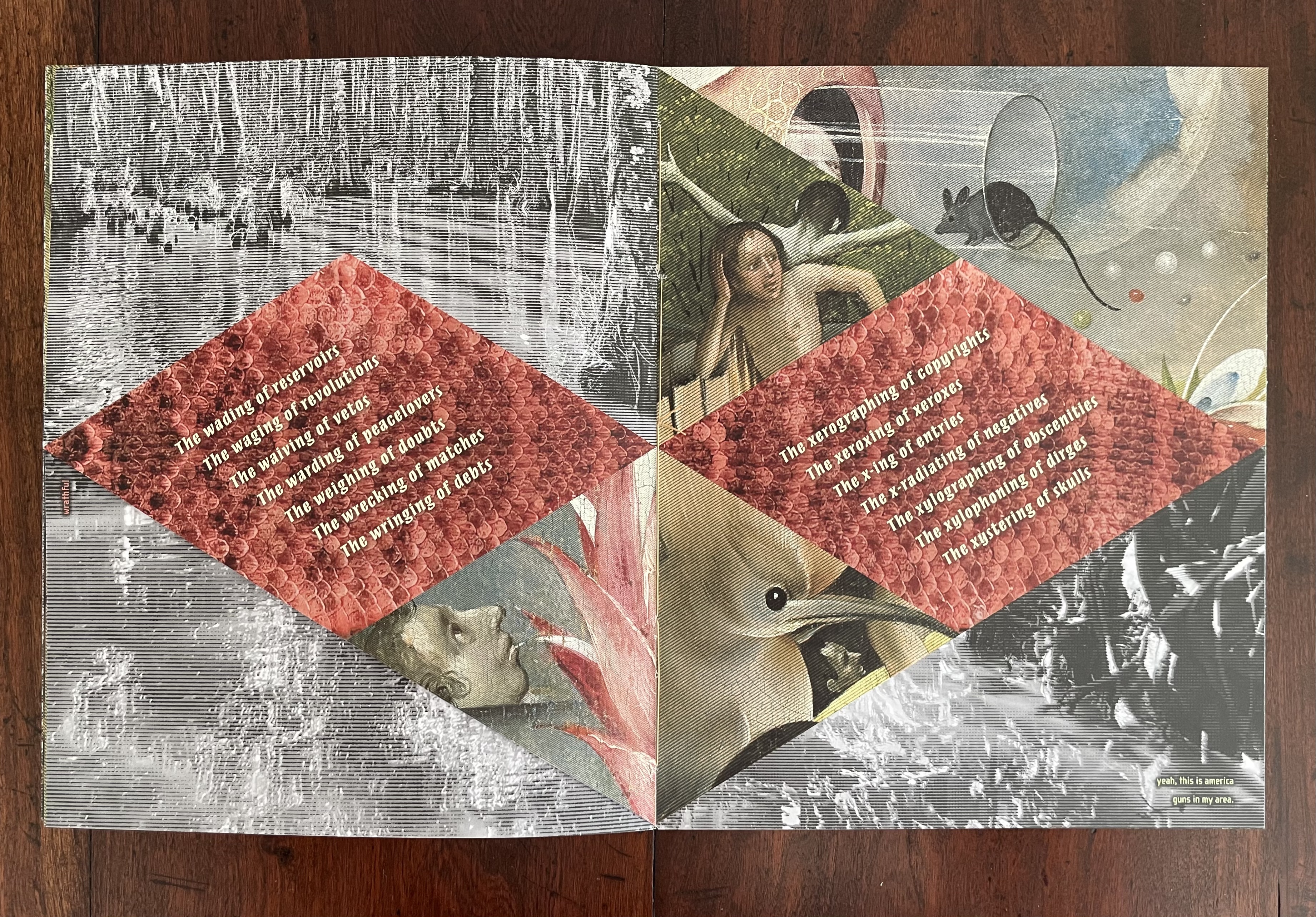
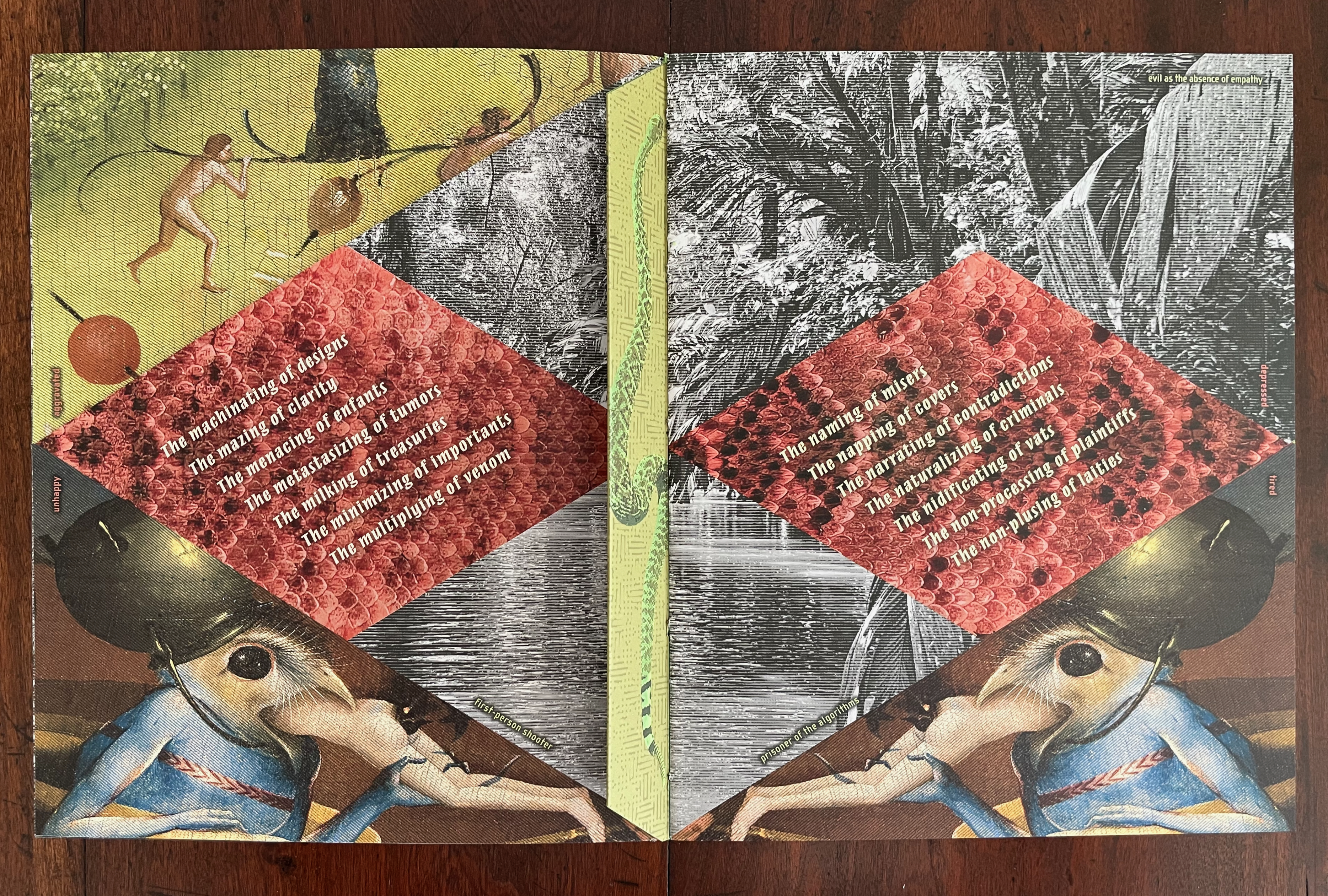
The main volume combines Zimmermann’s own photographs of swampland in Costa Rica and Louisiana with details from The Garden of Earthly Delights (1490-1510) by Hieronymus Bosch and embedded an alphabetical poem The Last Acts of Saint Fuck You (1975) by Bern Porter against a background of rattlesnake skin. Its politically conscious content echoes Sanctus Sonorensis (2009), but with sharper vi(per)tuperation against what the artist describes as “the increasingly corrupt and fascistic direction of our national and global civilizations”.
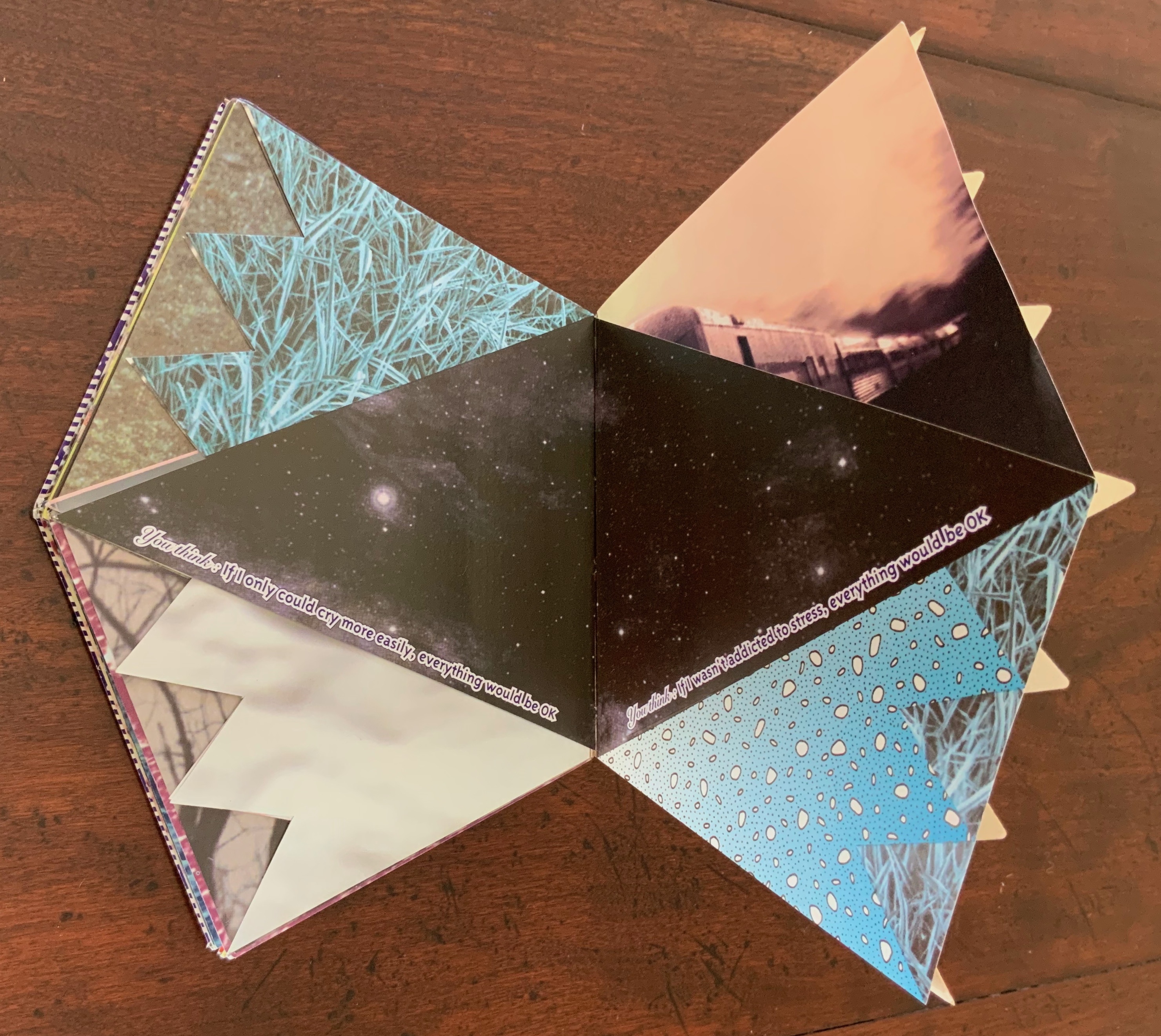
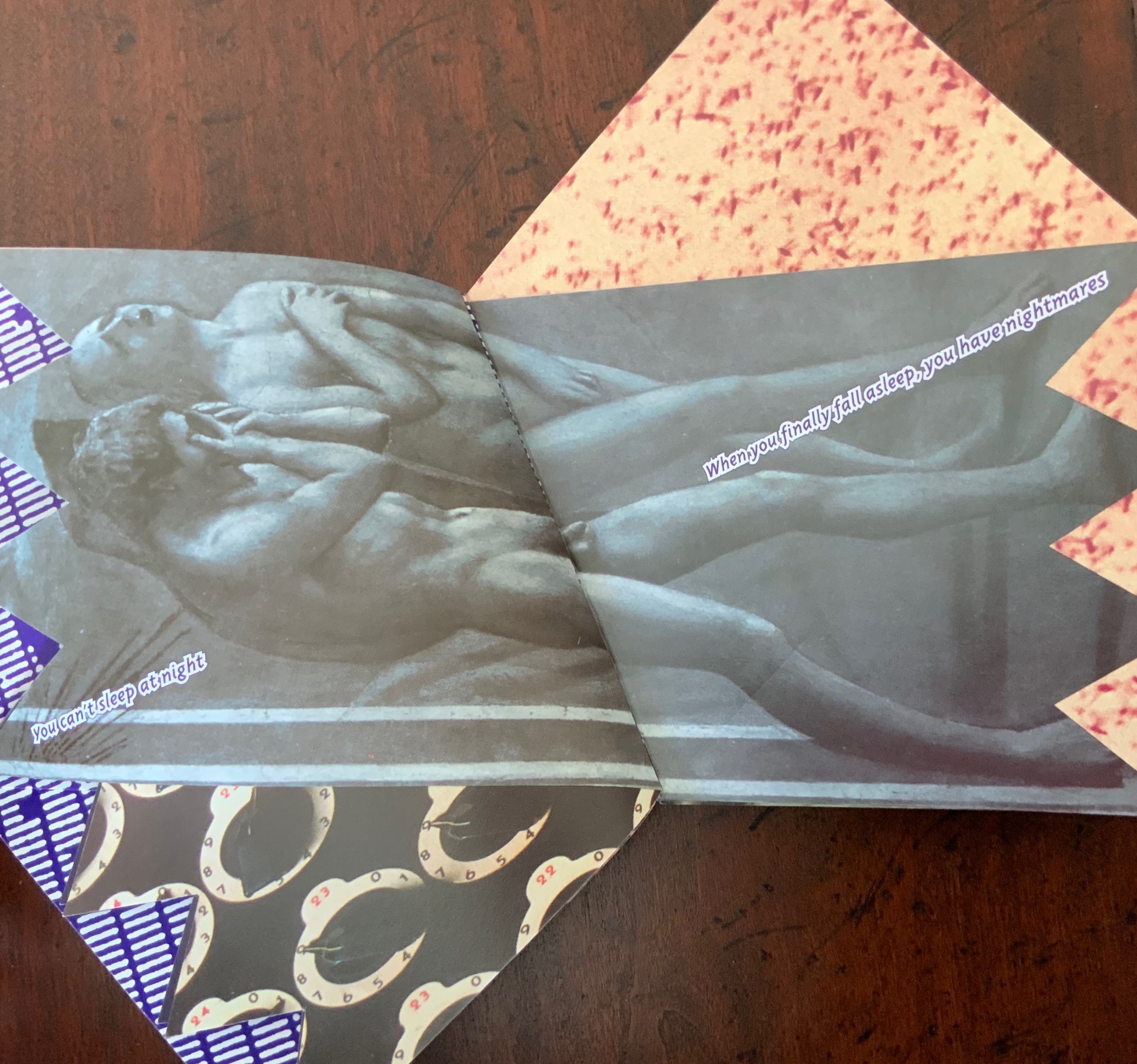
Zimmermann wields the book as a catalytic medium in just the right way to bring theme and technique together in striking and satisfying artworks. Two points of comparison with his earlier work High Tension illustrate this. Serpent‘s diagonally cut pages recall those of High Tension (1993), but notice how the diagonality works differently to suit each book’s typography and theme. Like its theme of personal anxiety, High Tension’s diagonality is spiky. Like its theme of reptilian tyrants, Serpents‘ diagonality emphasizes the diamond-back rattlesnake pattern that runs through the collage, and in turn, the diagonally set text emphasizes the rattlesnake pattern.
While High Tension includes Masaccio’s 1425 fresco depicting the expulsion from the Garden of Eden and Serpents includes Bosch, Adam and Eve’s grief and shame play their brief role among multiple personal anxieties, whereas Bosch’s creatures continuously slip and slide into the swamp and rattlesnake background of the world state.
In Serpents, snippets of text from other sources (1984 by George Orwell, “Sympathy for the Devil” by the Rolling Stones/Mick Jagger, “This is America” by Childish Gambino/Donald Glover, “The Star-Spangled Banner” by Francis Scott Key, Hannah Arendt, John McCain, Thomas Hobbes, Marcus Junius Brutus, and Elisabeth Kübler-Ross) appear in small fonts in the corners, diagonally, and at the fore edges (Kübler-Ross). Their size and positioning require close attention and draw the eye into the details of the imagery.
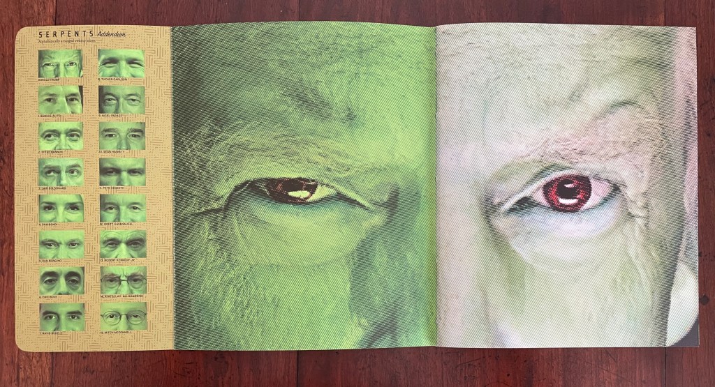
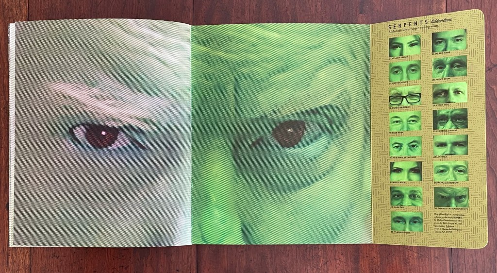
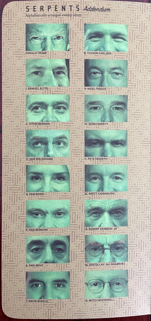
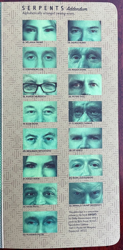
In parallel with the poem’s alphabetical arrangement, the addendum presents cropped individual portraits of Donald Trump, his enablers, and fellow tyrants from around the world in alphabetical order with amber-tinted irises and green-hued faces. It implicitly flips the script on Donald Trump’s use of Oscar Brown’s song “The Snake” (1963) to justify his concentration camps targeting the immigrant population (“You knew damn well I was a snake before you brought me in”).
The next two volumes carry forward a series of works with a different socially conscious burden — the anthropo(bs)cene period of terrestrial evolution. They began with Landscapes of the Late Anthropocene (2017) and Melt (2023) but also echo images in the earlier works Sanctus Sonorensis (2009) and Incident in Deseret (2014).
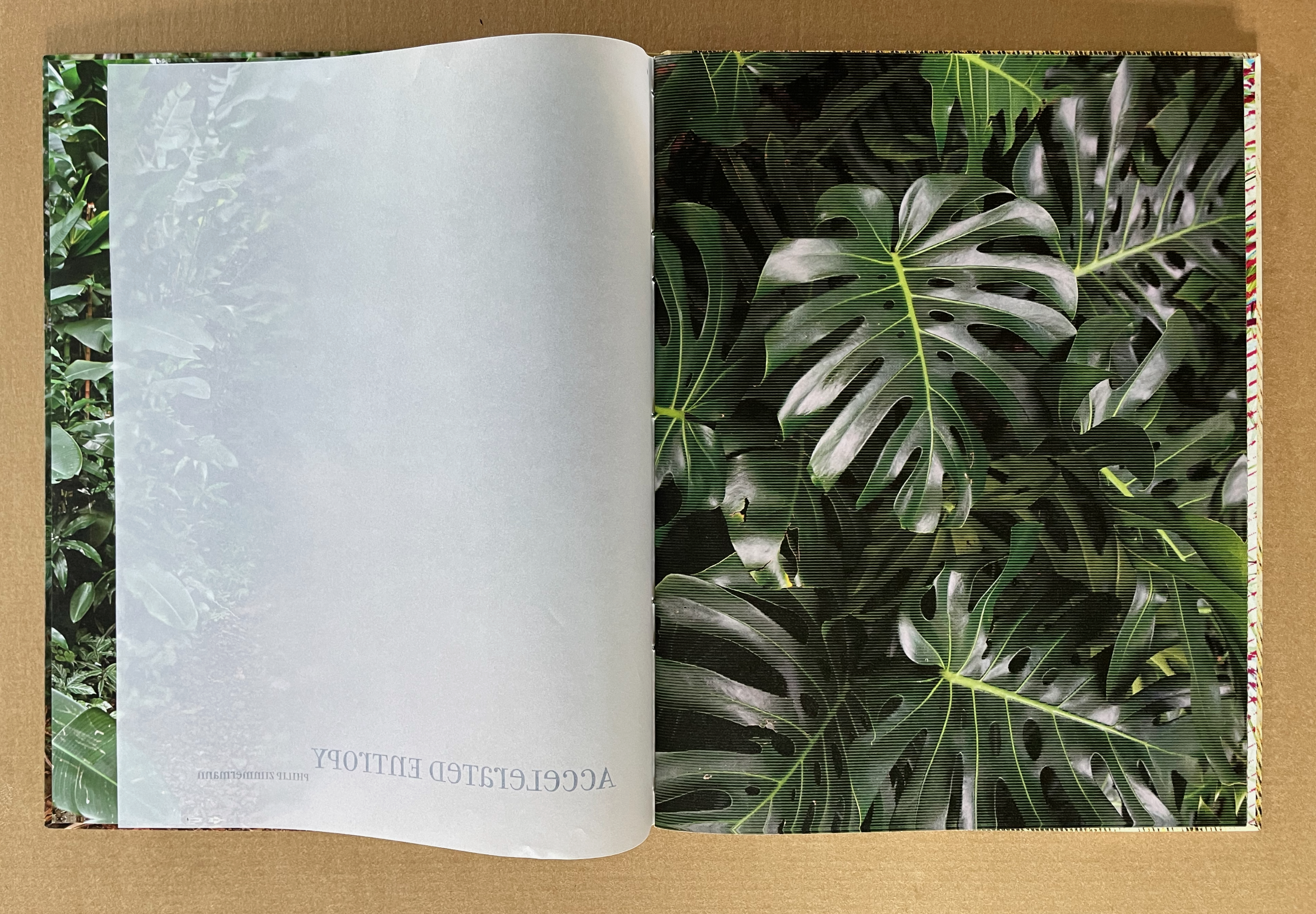
Accelerated Entropy (2024)
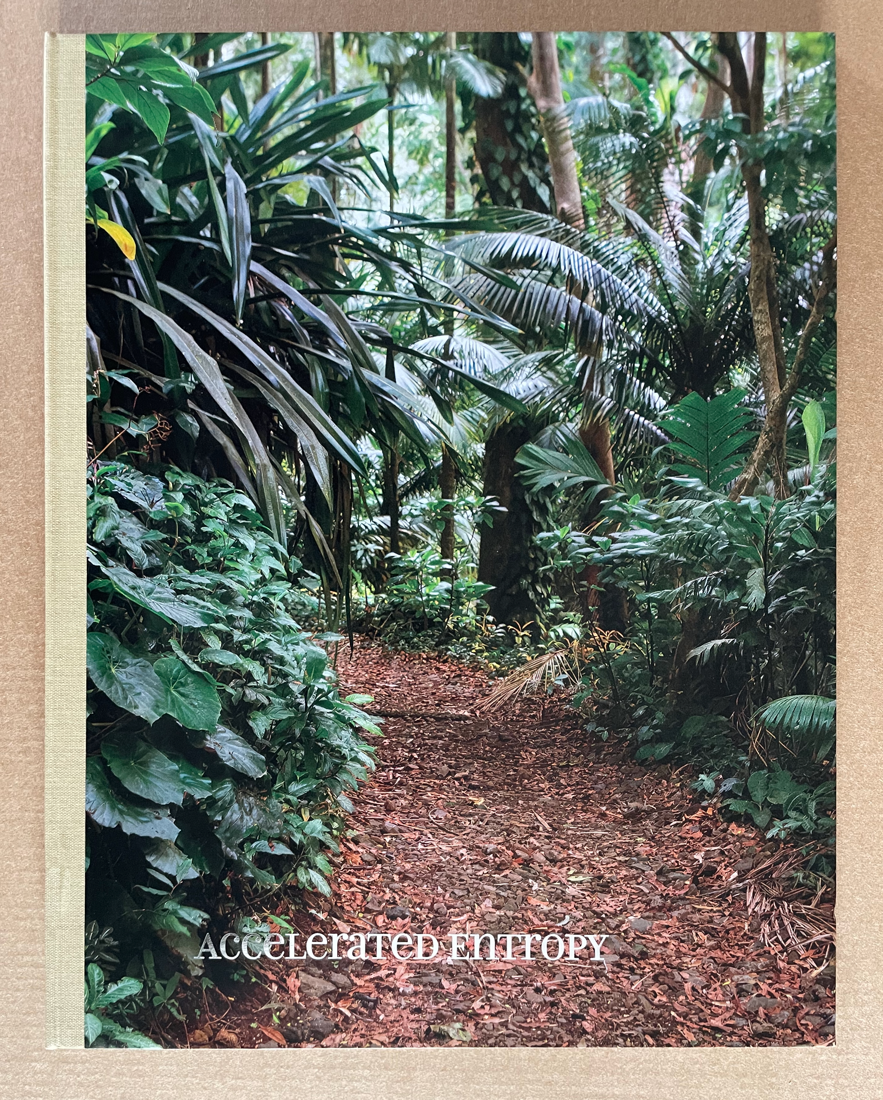
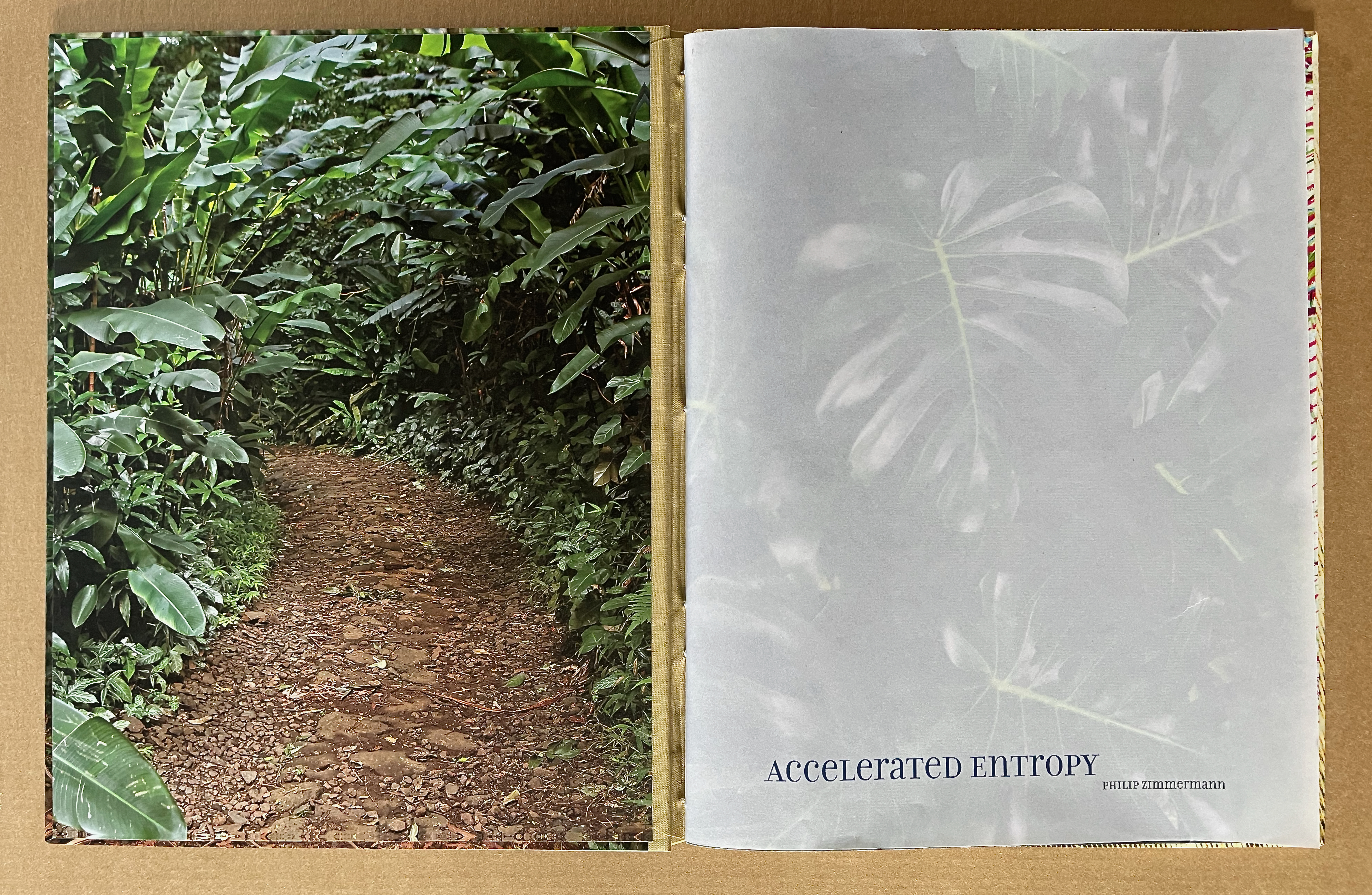
Accelerated Entropy (2024) Phil Zimmermann Casebound, cloth spine, photoprinted paper over boards and paste-down end sheets, pamphlet stitch book with translucent paper cover. H285 x W225 mm. [40] pages. Edition of 50, of which this is #4. Acquired from the artist, 31 August 2024. Photos: Books On Books Collection.
As Marlene MacCallum (2024) points out, “Phil Zimmerman has consistently woven imagery and text in response to issues related to perilous conditions of our world and social structures.” What is particularly interesting in Serpents, Accelerated Entropy, and In the Desert is how that weaving differs effectively from book to book. In Serpents, the Porter text and rattlesnake skin are tightly woven together, acting as the main tapestry weave while the snippets of text and the images of the swamp and Bosch’s Garden of Earthly Delights act as a discontinuous weft creating a changing collage around the main weave.
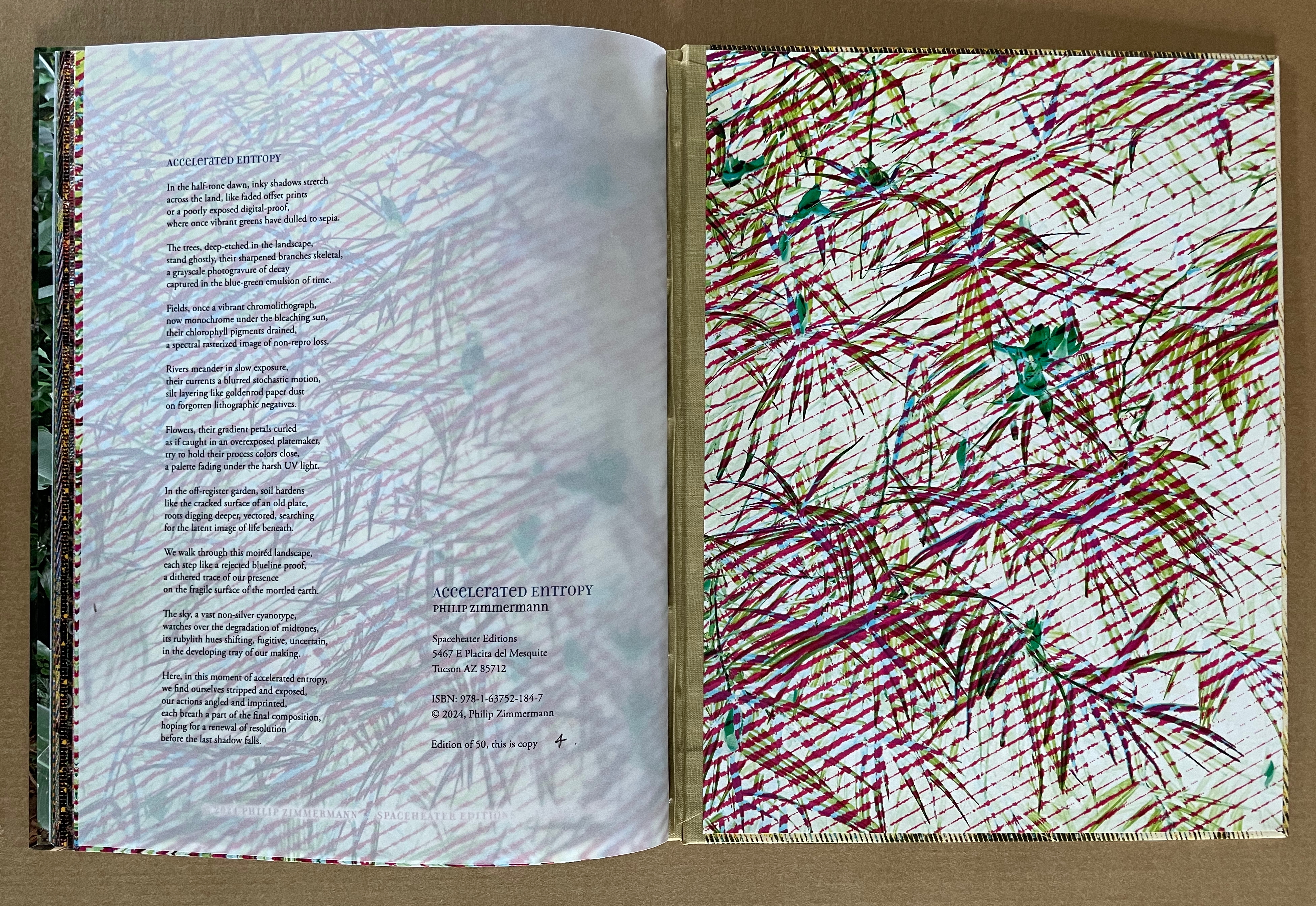
In Accelerated Entropy, the text (a poem by Zimmermann) is held to the very end. In fact, it appears on the translucent pamphlet-stitched back cover inside the casing. So how does the poem weave with the imagery? The images are not without narrative. Progressive computer-derived halftone patterns and various types of rasters of photographs of lush vegetation constitute the visual tool with which the artist writes that narrative. Like Melt and Landscapes of the Late Anthropocene, the narrative concerns climate change. The final image has reduced the foliage to abstract tracery over a whitened background, which is repeated in end pastedown. By placing the text on the verso side of the translucent paper at the end of the book, the artist makes the poem hover over and between the final image.
Zimmermann’s poem uses prepress process and photomechanical terms to create an extended metaphor for describing the decay of climate change. The terms relate not only to the visual tools used to effect the book’s images of decay but also to the disappearing tools and techniques of printing technology. Perhaps we will recognize our effect on the world around us when it is expressed in printing metaphors, and perhaps we will recognize the world’s accelerating entropy in the pace of our own disappearing technology.
Accelerated Entropy (2024)

In the half-tone dawn, inky shadows stretch
across the land, like faded offset prints
or a poorly exposed digital-proof,
where once vibrant greens have dulled to sepia.

The trees, deep-etched in the landscape,
stand ghostly, their sharpened branches skeletal,
a grayscale photogravure of decay
captured in the blue-green emulsion of time.

Fields, once a vibrant chromolithograph,
now monochrome under the bleaching sun,
their chlorophyll pigments drained,
a spectral rasterized image of non-repro loss.

Rivers meander in slow exposure,
their currents a blurred stochastic motion,
silt layering like goldenrod paper dust
on forgotten lithographic negatives.

Flowers, their gradient petals curled
as if caught in an overexposed platemaker,
try to hold their process colors close,
a palette fading under the harsh UV light.

In the off-register garden, soil hardens
like the cracked surface of an old plate,
roots digging deeper, vectored, searching
for the latent image of life beneath.

We walk through this moiréd landscape,
each step like a rejected blueline proof,
a dithered trace of our presence
on the fragile surface of the mottled earth.

The sky, a vast non-silver cyanotype,
watches over the degradation of midtones,
its rubylith hues shifting, fugitive, uncertain,
in the developing tray of our making.

Here, in this moment of accelerated entropy,
we find ourselves stripped and exposed,
our actions angled and imprinted,
each breath a part of the final composition,
hoping for a renewal of resolution
before the last shadow falls.
Clifton Meador’s observation in correspondence with Zimmermann nails how this text is woven into the images:
“The poem at the end of Accelerated Entropy is a great addition to the piece, and how could I not love an extended metaphor about climate change that uses print technology as the vehicle? It significantly changes the reading of the piece after the first encounter—I had to go back through the book again, with a vastly changed framework for reading. In the place of a reading of visual richness and formal invention, I looked for evidence of a history of print production. That’s a pretty cool trick—a textual moment that causes me to re-read with an entirely different framework in mind.” — Meador to Zimmermann, 31 August 2024.
In the Desert (2024)
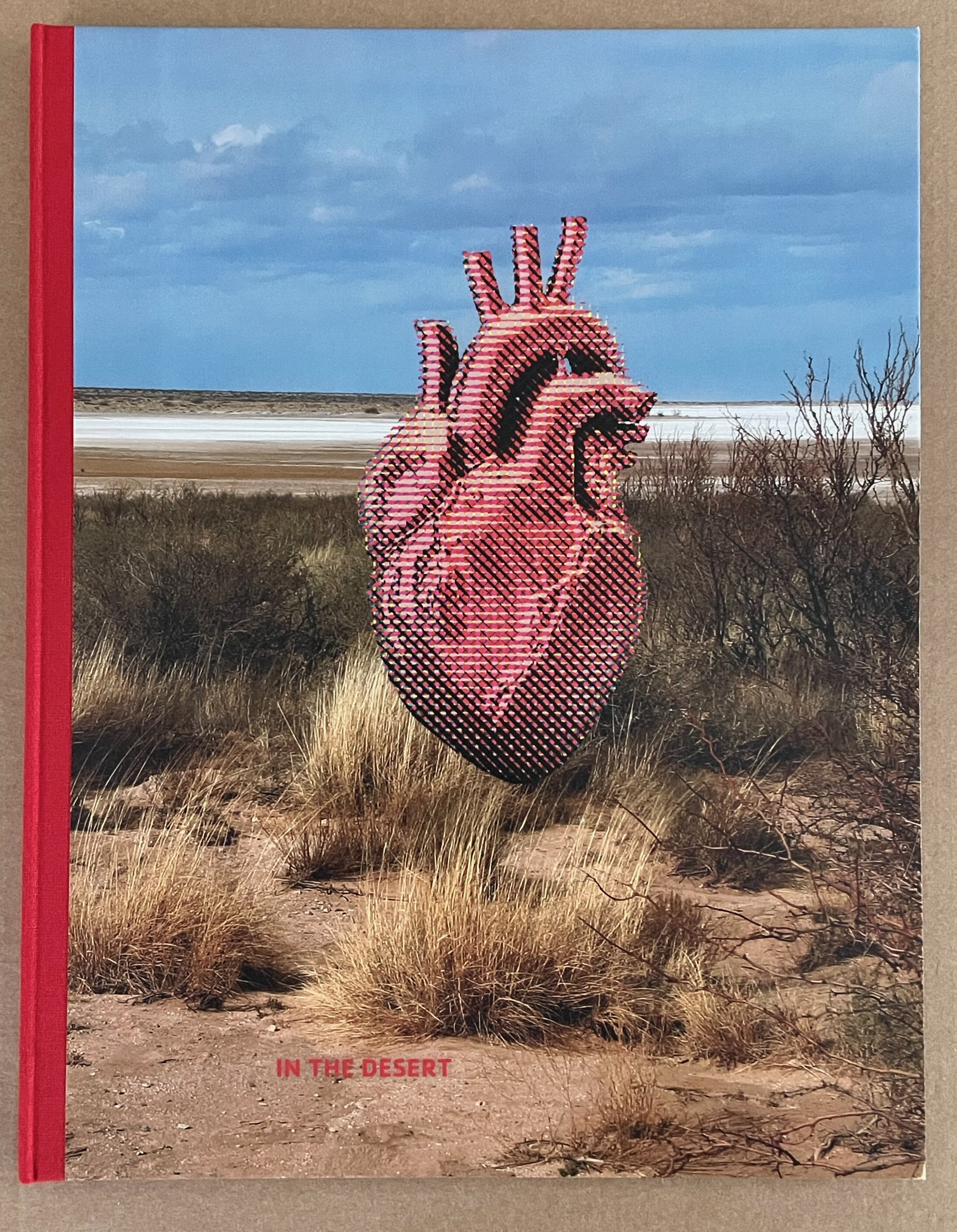
In the Desert (2024) Phil Zimmermann Casebound, cloth spine, photoprinted paper over boards and paste-down end sheets, pamphlet stitch book. H285 x W225 mm. [40] pages. Edition of 50, of which this is #4. Acquired from the artist, 31 August 2024. Photos: Books On Books Collection.
Stephen Crane’s poem In the Desert sits at the heart of Zimmermann’s artist’s book by the same name. In red ink, it sits there like the creature in Crane’s otherwise featureless poem.
In the Desert (1895)

In the desert
I saw a creature, naked, bestial,
Who, squatting upon the ground,
Held his heart in his hands,
And ate of it.
I said, “Is it good, friend?”
“It is bitter—bitter,” he answered;

“But I like it
“Because it is bitter,
“And because it is my heart.”
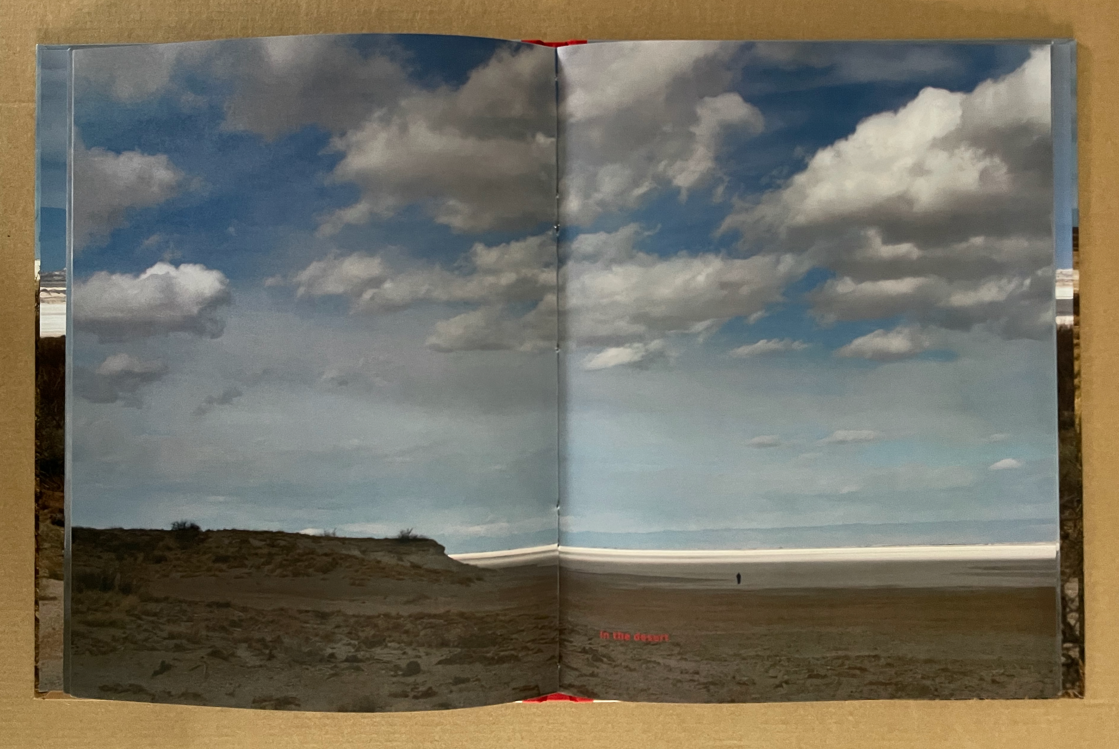
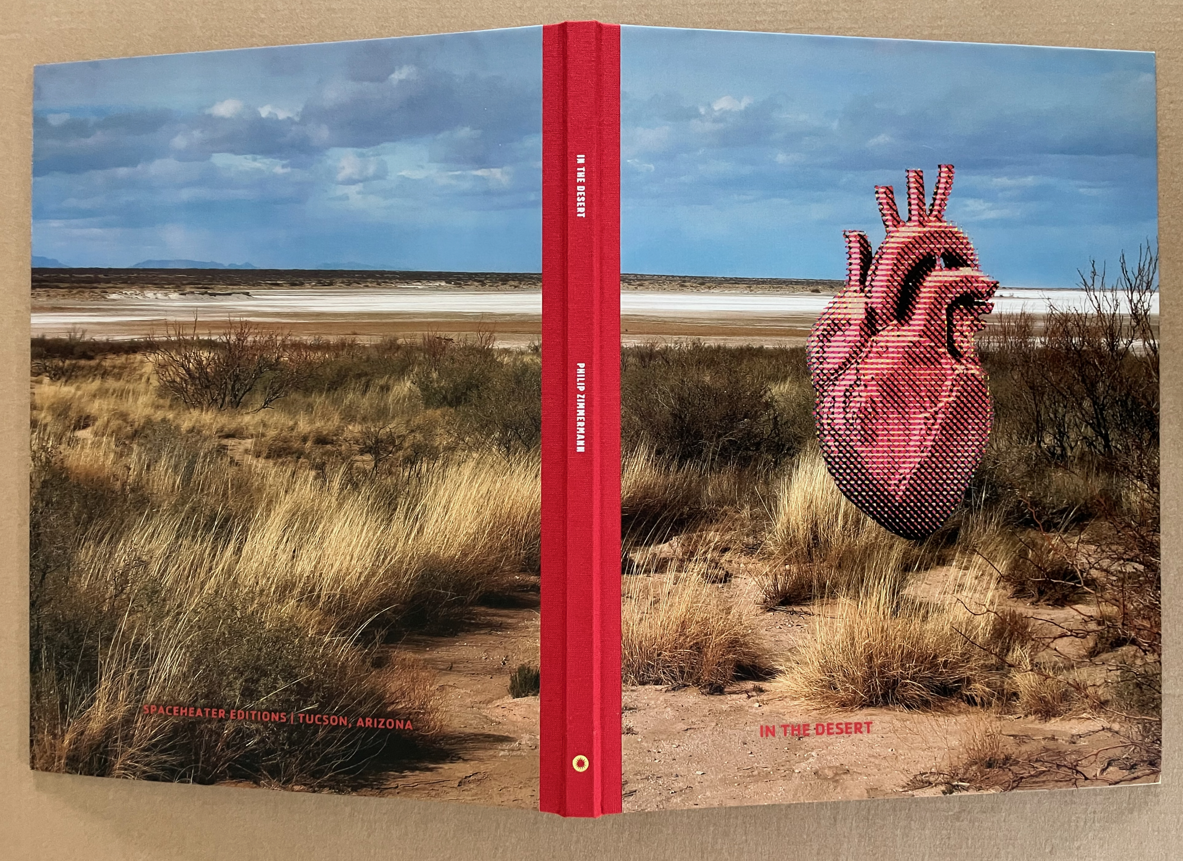
The artist’s book is far from featureless. The images in the book come from Zimmermann’s photographs taken at Lake Lucero, a dry gypsum lake located in the White Sands Missile Range near Las Cruces, New Mexico. His artist’s statement describes it as
… a restricted part of the missile range and open to the public only a few times a year when National Park Service rangers take visitors holding US Passports on closed busses in to visit the dry lake. The dry gypsum crystals from the lake blow to the northeast and are the source of the famous white dunes in White Sands National Park. The park is located, as is the entire Missile Range, in the great Tularosa Basin.
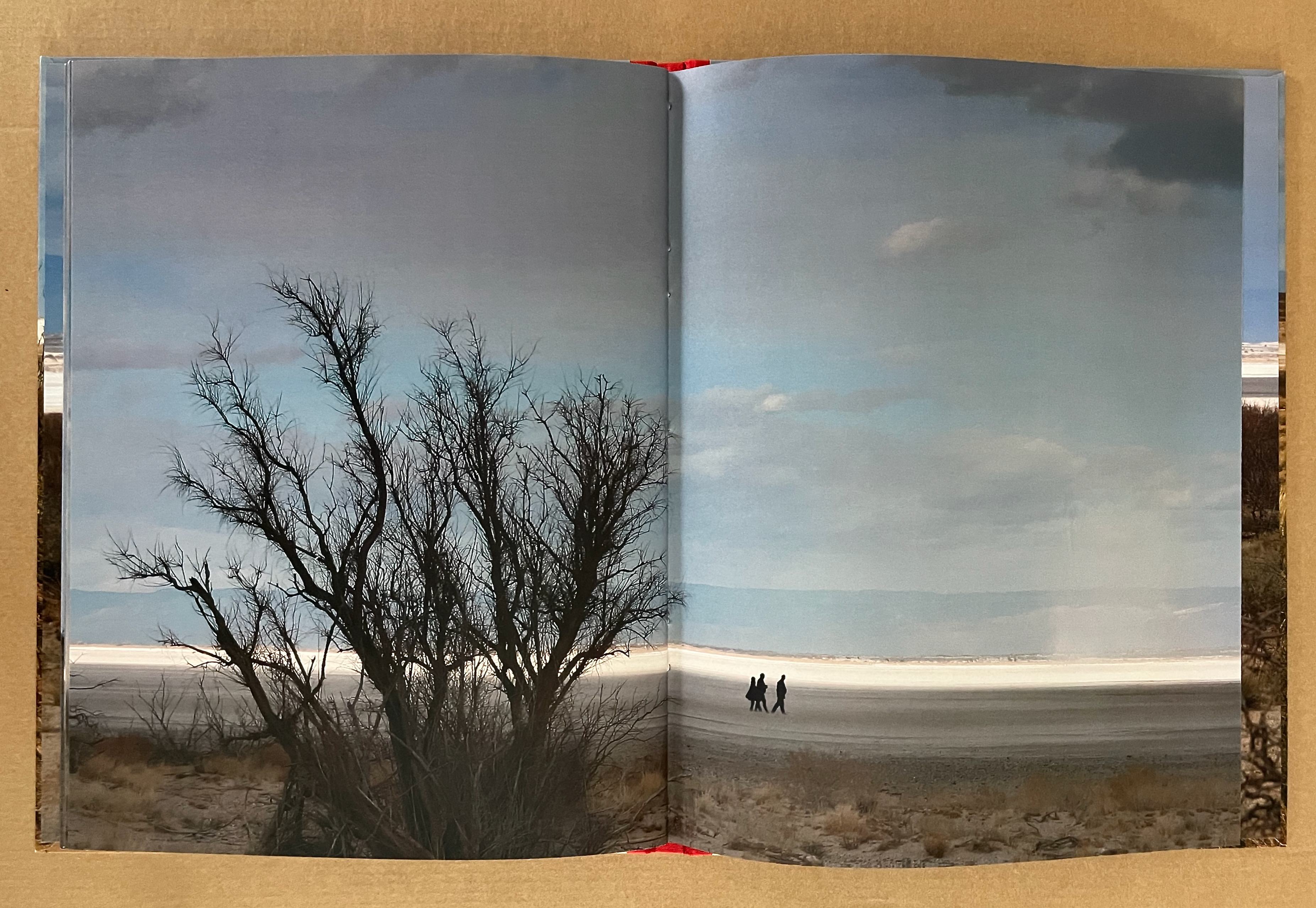
Seven double-page spreads of barren desert scenery lead up to the poem’s first line, which squats in red in the dark foreground of a recto page. In the far foreground, a blurry human figure appears.
Over the next ten spreads, the poem’s two human figures (narrator and creature) gradually inhabit the pages alongside that solitary human figure, who is joined by an increasing then dwindling number of other silhouetted human figures in the far foreground. The last double-page spread is textless. A foregrounded leafless bush looms on the verso page standing in contrast to three human figures walking away in the far foreground on the recto page.
From spread to spread prior to the poem, the only action was the movement of dust from the salt flats in the air. With the poem’s appearance, we have two other sets of action. Like small signposts, the individual lines from Crane’s poem drive the reader’s page-turning as do the gathering and dispersing human figures.
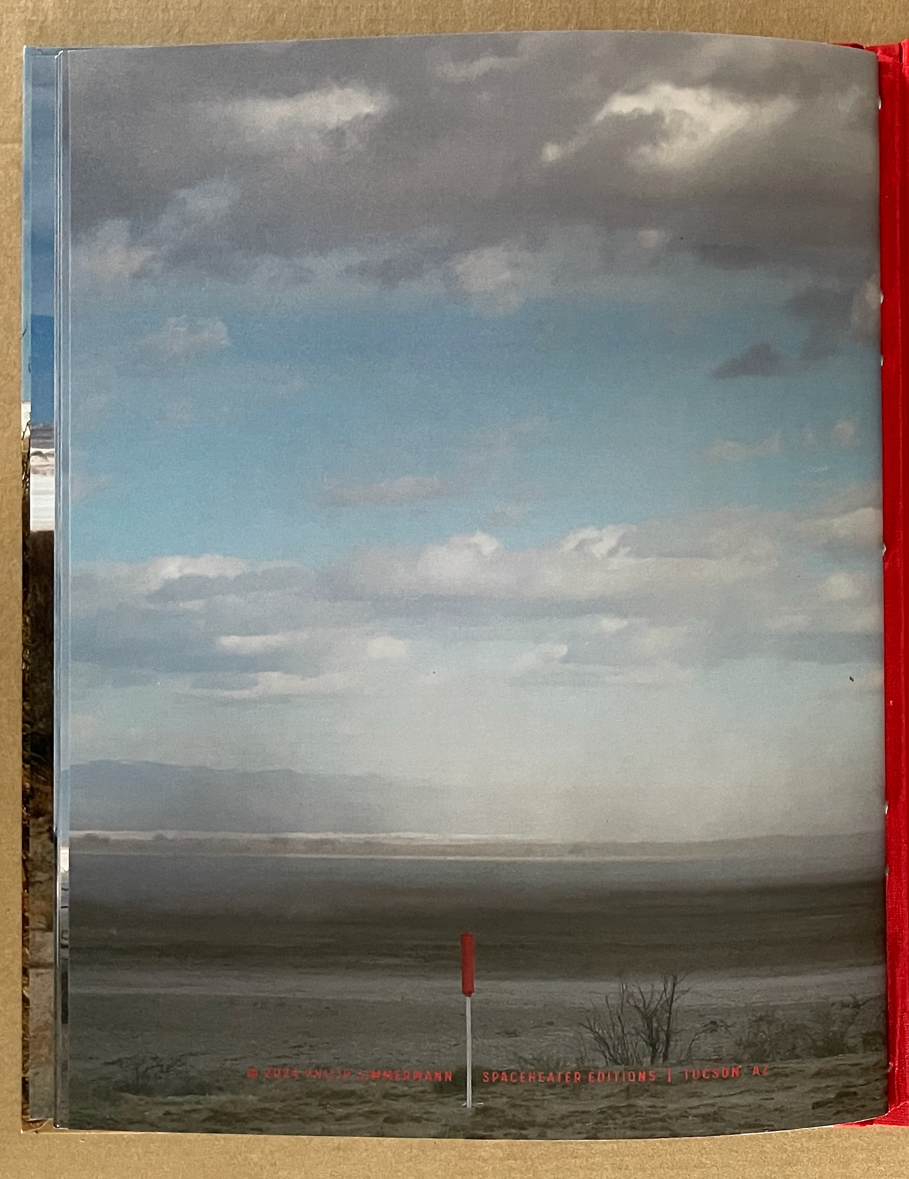
On the book’s last page, the only text is the copyright line. There is no other text. There are no human figures. The foreground is punctuated by a red boundary marker. In the middle ground, dust from the salt flats hovers against the low hills and cloud. Sky and cloud occupy the upper reaches of the background. In its size, that red boundary marker is shriveled in comparison with the heart on the front cover.
“But I like it “Because it is bitter, “And because it is my heart.”
The most beautiful and perfect book in the world is a book with only blank pages, in the same way that the most complete language is that which lies beyond all that the words of a man can say. Every book of the new art is searching after that book of absolute whiteness, in the same way that every poem searches for silence. — Ulises Carrión: “The New Art of Making Books” Kontexts no. 6-7, 1975.
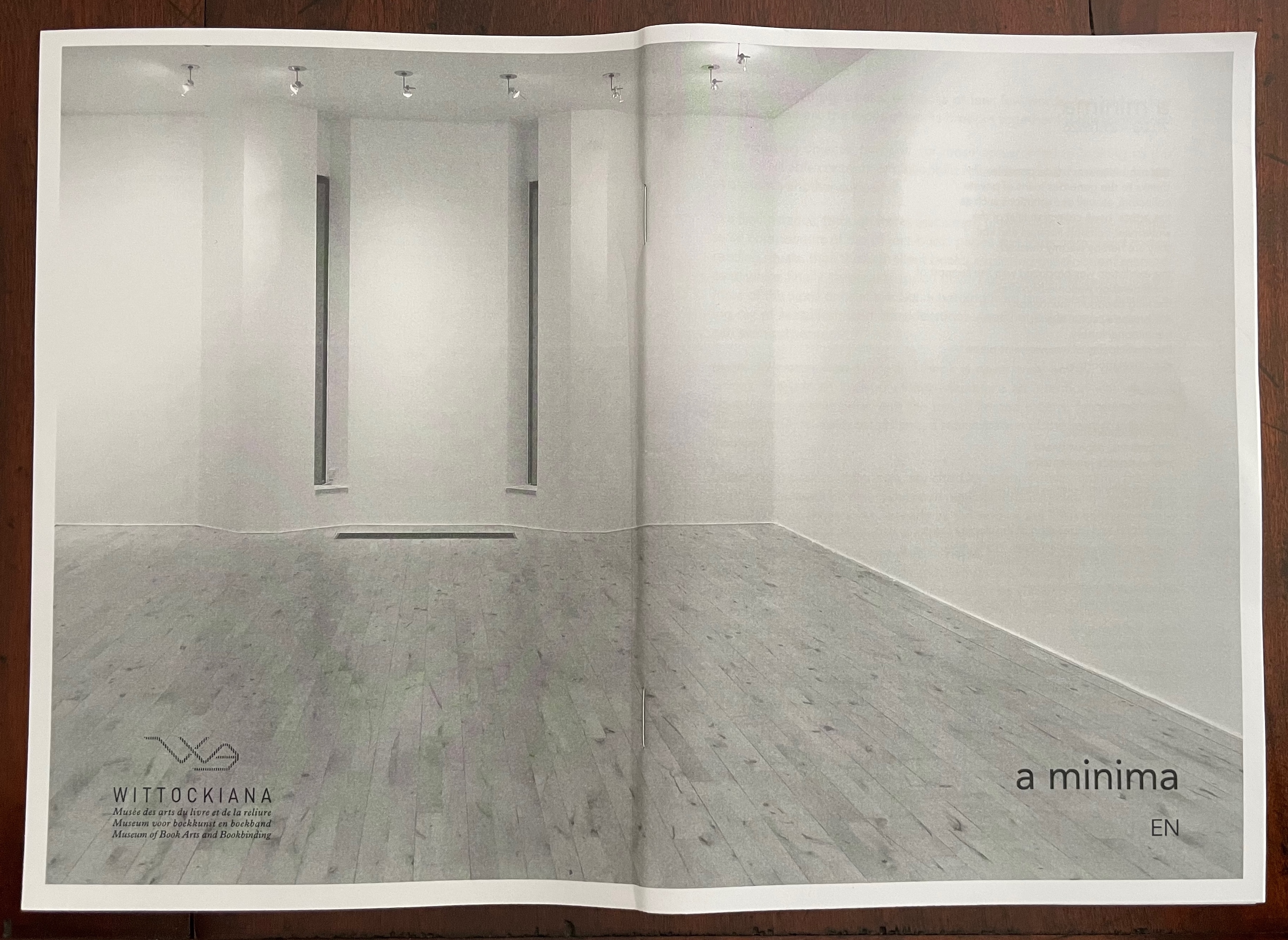
At the entrance to The Wittockiana. Back and front cover of the a minima catalogue.
If, as I did, you missed Moritz Küng‘s exhibition Blank. Raw. Illegible… Artists’ Books as Statements, 1960-2022 at the Leopold-Hoesch-Museum in Düren, Germany, in 2023, Didier Decoux‘s a minima presents an equally well-thought-out gathering of artists’ books that stretches out over 150 years (1876 – 2026). With 4 spacious rooms, 25 vitrines, 2 videos, and over 180 works, a minima requires several hours at a minimum to peruse and enjoy. Information on getting there is available here.
The comments and links below are in no way a substitute for visiting this exhibition, and keep in mind that Wittockiana also has permanent displays of presses, rare fonts, and books that should not be missed.