Ein Würfelwurf kann den Zufall nicht abschaffen
A Throw of the Dice will Never Abolish Chance (2011)

Ein Würfelwurf kann den Zufall nicht abschaffen
A Throw of the Dice will Never Abolish Chance (2011)
Daniela Deeg and Cynthia Lollis
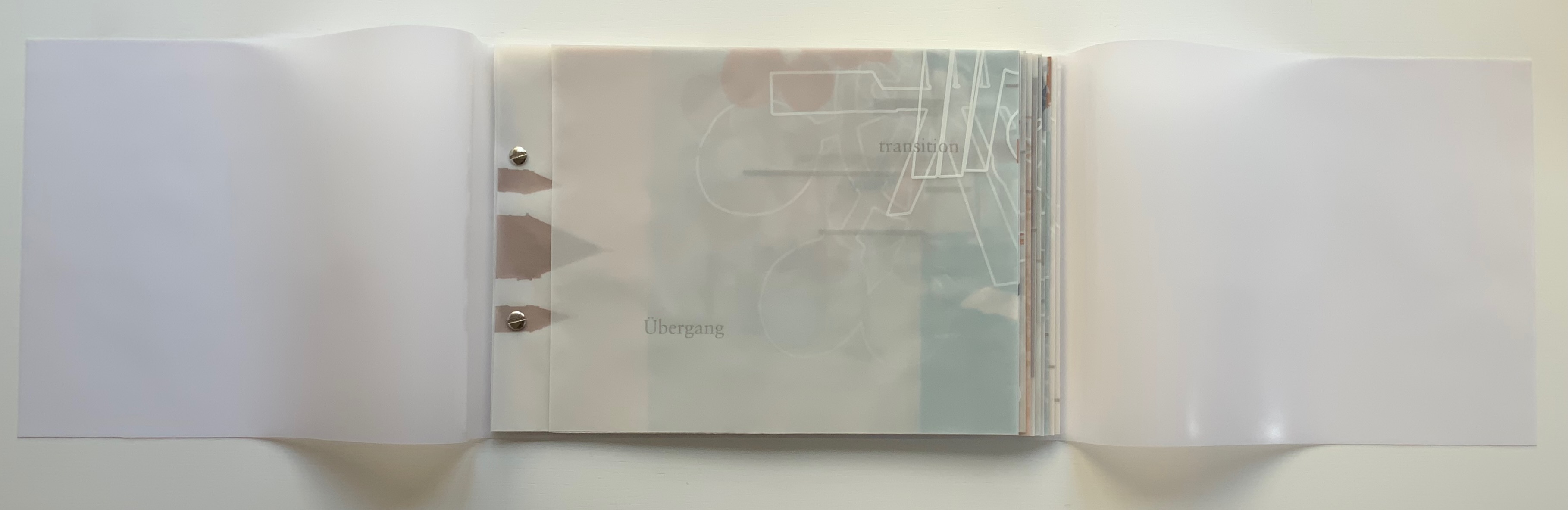
Stab-bound book with added screwpost binding in a vinyl cover, housed in a greyboard box with title stamped on lid. H230 x W345 mm, 40 pages. Edition of 18, of which this is #7. Acquired from Vamp & Tramp, 31 March 2022.
Photos: Courtesy of ETC Press; Books On Books Collection. Video: Books On Books Collection. Displayed with permission of the artists.
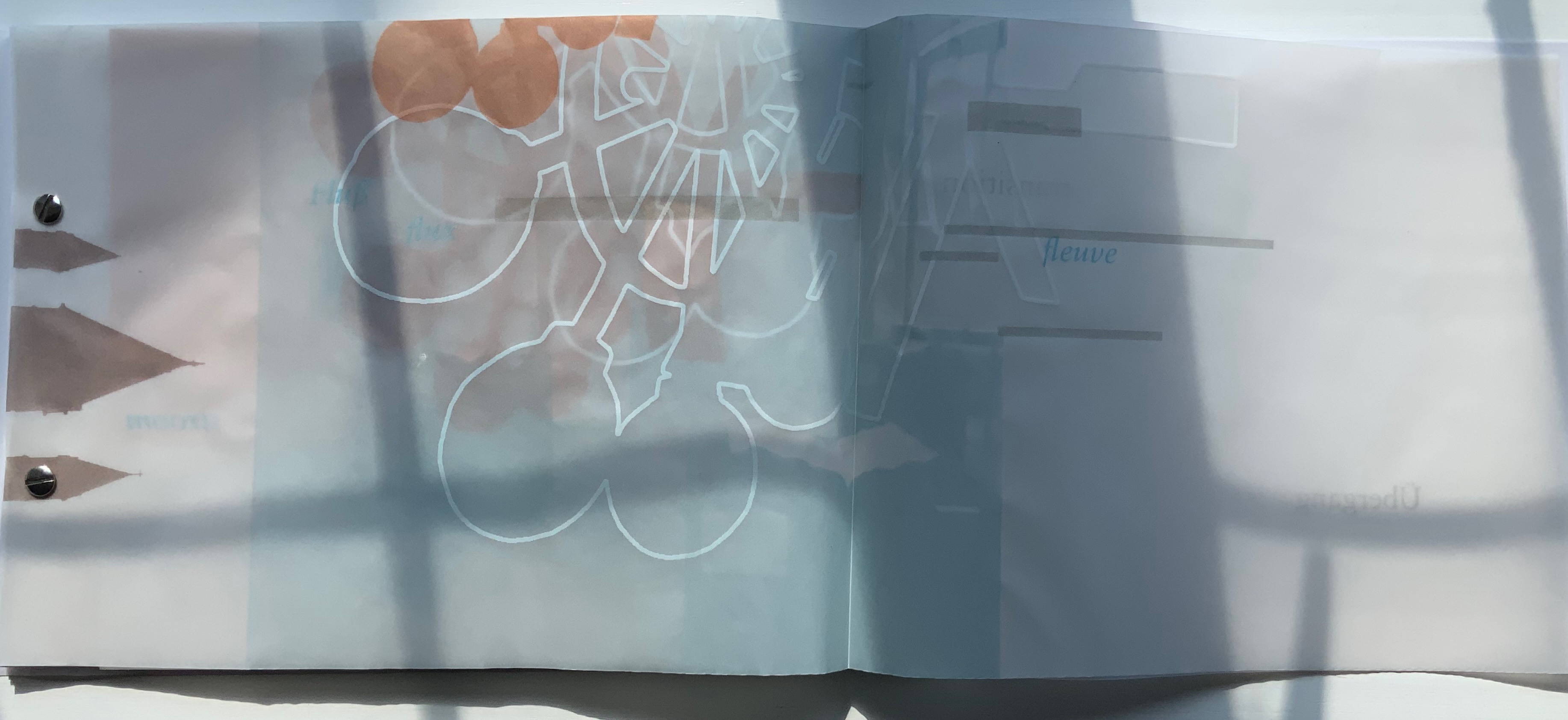
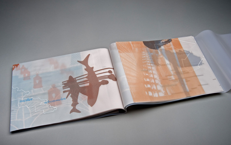
Removed from its greyboard box, this artists’ book by Daniela Deeg and Cynthia Lollis appears clouded by its overlapping layers of vinyl covers. As the top cover turns to the left and the next layer turns to the right, the shine of the covers’ slick side combines with the dull side to create an impression of wet fog, parting to reveal an equally cloudy translucent double-folded leaf of Cristalla paper on which is printed Übergang and transition in the typeface Sabon in roman font and gray. With the Übergang/transition page turned over rightwards, the inner double-page spread shows three words in blue italic: Fluß, flux and fleuve. If the whole Fluß/flux/fleuve spread is turned over leftwards, Übergang/transition reappears on the left along with stroom in blue italic in the center and transition and overgang in gray roman on the right. When the transition/overgang page turns rightwards, the words toeval and Zufall appear in blue italic.


What is going on? To be sure, an artist’s book entitled Ein Würfelwurf kann den Zufall nicht abschaffen / A Throw of the Dice will Never Abolish Chance implies an homage to Stéphane Mallarmé’s famous poem Un Coup de Dés Jamais N’Abolira le Hasard. The most famous homage to date comes from the Belgian Marcel Broodthaers, who replaced the lines of verse with black strips in an edition with translucent paper. Deeg and Lollis do include those redactive bars in their work. But what has that to do with all those gray and blue words?
The bilingual title suggests that questions of language are in play. Even if, however, the words are recognized as German, English, Dutch/Flemish and French — and understood as rough multilingual synonyms for “transition”, “river”, “flux” and “chance” — a few hints about the rules of the game would help. There is no colophon at the end of the book, but with all the turning over this way and that, one might think to turn the box over. And there it is.

So there is a lot going on. About the word list as a starting point, more later. Another starting point — not fully clear from the colophon — lies in the reference to the Frans Masereel Centrum in Belgium. Collaboration at a distance and during joint travels over texts and visuals is part of the artists’ working process.
We often travel to other places to inspire our artists’ books, and we’ll select an author that we admire to act as our guide. Each of our books includes our native languages, English and German, plus the language that represents the place we visited. Ein Würfelwurf was a little different. We’d just completed a decade of making books together. Instead of going somewhere new, this book was to be a look back to places that we had traveled in those ten years. We were printing this book on a residency in Belgium, so this time we looked for a Belgian to lead us. Because our book would be focused on language, its poetic potential, and the translation of words, we chose an artist as our guide. Specifically, we chose one who translated printed words into visual form. Both of us admired Broodthaers’ conceptual work, and we thought that it was fitting to quote his Un Coup de Dés artwork. [Correspondence from Cynthia Lollis with Books On Books Collection, 4 April 2022]
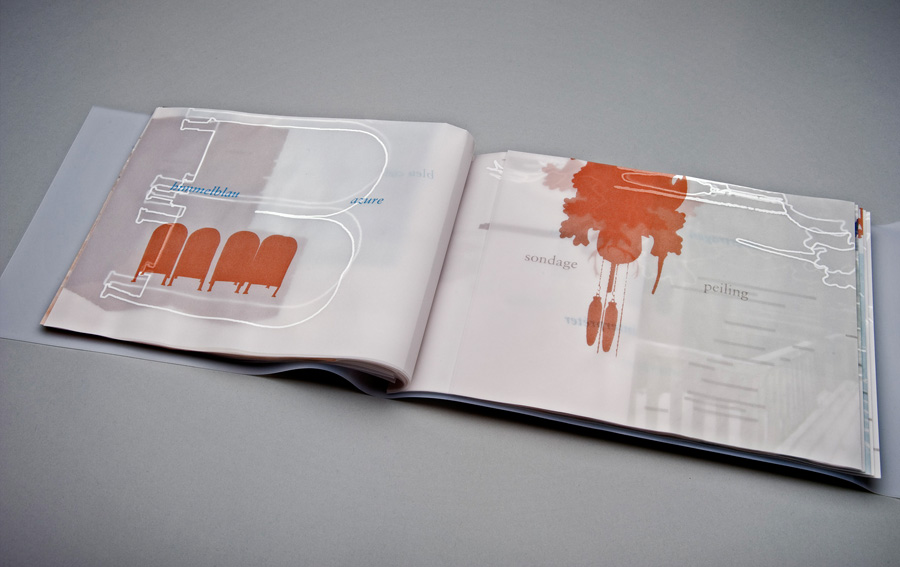
Some of the photographs to which Lollis refers depict buildings from multiple locales, interiors, a desk with an open book, traffic lights, a landscape from on high, and other scenes difficult to recognize because all are rendered in screen prints as backgrounds to words or other photographs rendered as simplified outlines and silhouettes. Most of the outlines and silhouettes such as the ones of a cuckoo clock’s counterweights, a chandelier, mailboxes, crowd control stanchions, human figures, a park bench or buildings are easily recognizable even though they may be turned on their sides, split in two or enlarged. Two recurrent images that require some deciphering are of street lamps and signposts appearing as overlapping outlines and silhouettes from various perspectives and positioned at various angles. On the left below, the silhouette of a street sign topped with a wagon wheel of globe lamps is more easily detected if looked at from the side. On the right below, the silhouette of an ornate streetlamp seen from an angle below is transformed into a white outline, enlarged and turned on its side so that it seems to be a map. (The blue background is a screen printed photo of an interior with windows, tables and chandeliers.)
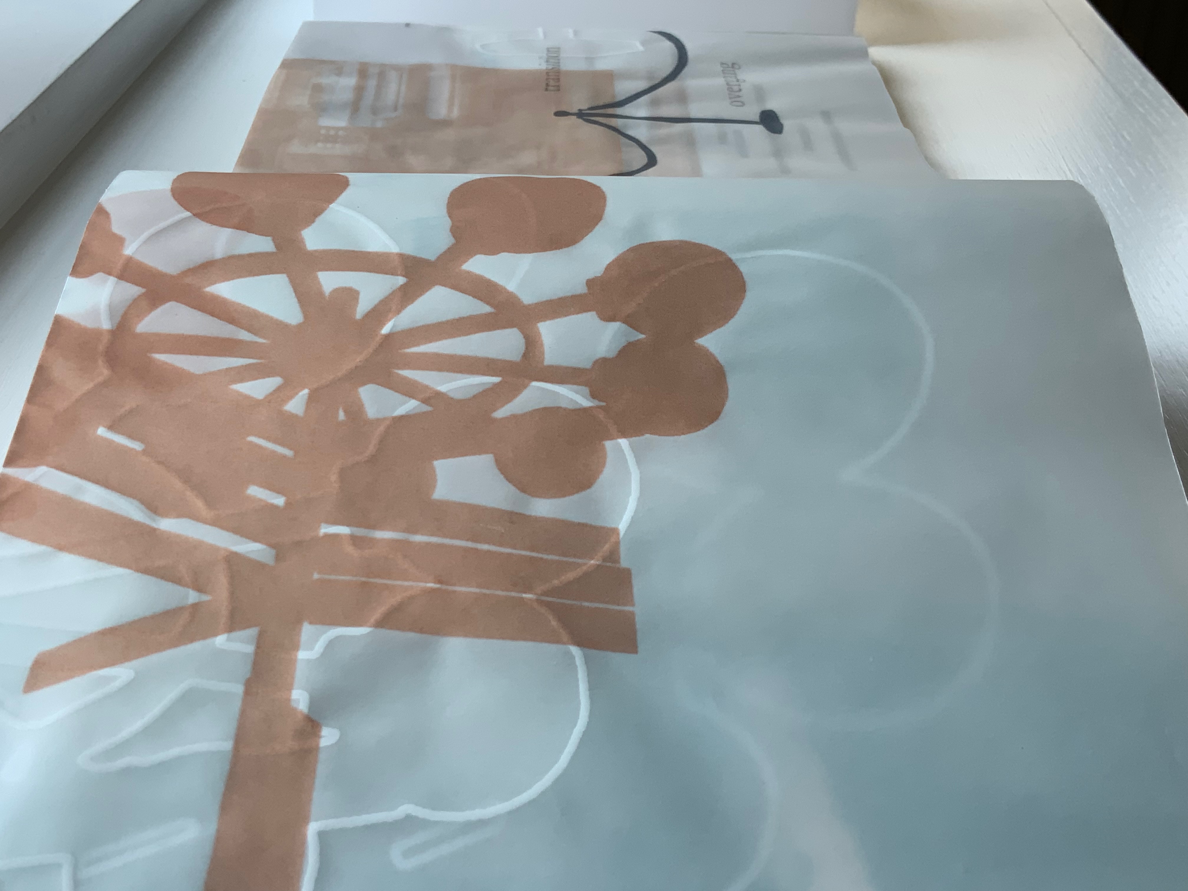

To return to the words scattered throughout, the images have detectible relationships to them — often with ease, sometimes only by pondering the synonyms. The outline of the street sign appears close to Übergang, which can mean “crossroads” as well as transition, which also appears on the same page, but on a double-page spread with the outline of the same street sign, the words Fluß/flux/fleuve appear. Making the connection here between image and words can be as challenging as deciphering Mallarmé’s metaphors, and that could well be the point. Also, there is something Mallarméan about the way the book requires the reader to hold a set of multilingual near-synonyms in suspension — like bated breath — while turning the pages. Sometimes a synonym appears for a set of words some pages later and in the context of other words. For example, stroom (Dutch for “flow”) appears only after the Fluß/flux/fleuve pages have been tucked away, and then it appears across from transition and Overgang.
The reason that some words are set in gray roman and others in blue italic goes back the work’s starting point and creative process. Not sure where it might lead, the artists began creating a list of English words in 2001. In 2011, with the aim of creating this book, Deeg and Lollis arrived at the Frans Masereel Centrum in Belgium with design ideas and three lists in hand: the original set (5 words), another in English (5) and one in German (5). When they began the task of translation to create a final list of 30 (15 pairs), the realities of ambiguity and multiple meanings across and within languages arose. Undaunted, they handed over their lists to Belgian artist colleagues to see what clarification an injection of more perspectives, more languages (Dutch/Flemish and French) and therefore chance might bring. The 2001 list appears in gray roman, the 2011 in blue italic.
Another element of chance entered with the screen printing and folds of the translucent paper. The text and images seem to rise up through the folded pages and through each other to float on the surface. With all of these compositional, conceptual and material aspects, not only must this work be read and looked at carefully, it must be felt and listened to. Even as the book is lifted from its box, its Cristalla Transparent paper rustles inside the slippery covers, and every turn of page emits a symphony.
Additional images courtesy of the artists
Further Reading
“Meet Cynthia Lollis and Daniela Deeg“. 26 March 2019. Voyage ATL. Accessed 30 March 2022.
Annwn, David. 4 August 2020. “Solid Light: Ways Through Transparent Books“. Glasfryn Project: Junction Box. 13. Accessed 30 March 2022.
Chen, Julie. 2013. 500 Handmade Books. Volume 2. New York: Lark. Pp. 136 (Risk/Risiko), 289 (Ein Würfelwurf kann den Zufall Nicht Abschaffen/A Throw of the Dice Will Never Abolish Chance).
College Book Art Association. N.D. “Daniela Deeg and Cynthia Delaney Lollis: Featured Artist“. Accessed 4 April 2022.
Miller, Steve. 2008. 500 Handmade Books : Inspiring Interpretations of a Timeless Form. Edited by Suzanne J. E. Tourtillott. New York: Lark Crafts. Pp. 19 (12:38 – 14:16), 122 (Relinquo), 403 (Nebbia).
Paton, David M., and Jack M. Ginsberg. 2017. Booknesses: artists’ books from the Jack Ginsberg collection. Johannesburg, South Africa : University of Johannesburg Art Gallery. Includes the Deeg and Lollis work, which can be viewed in the online version.
Stark, Trevor. 2020. Total Expansion of the Letter: Avant-Garde Art and Language after Mallarmé. Cambridge, MA: MIT Press.
