William Caslon’s Typographic ABC (1991)
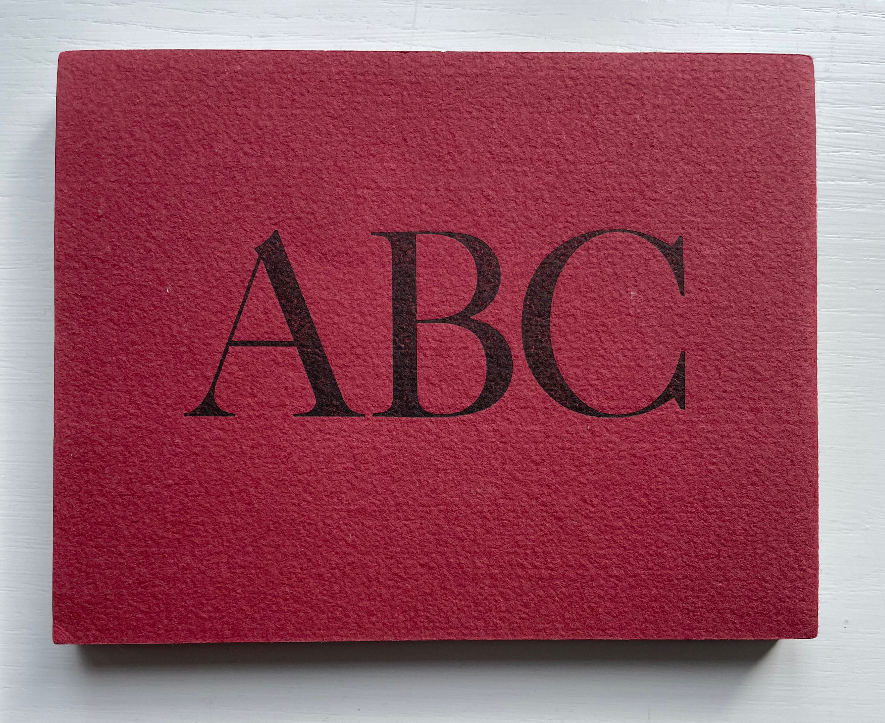
William Caslon’s Typographic ABC (1991)
Marie Dern
Double-sided leporello. H11 x W14 mm. 28 panels. Edition of 55, of which this is #1. Acquired from Bromer’s, 5 February 2023.
Photos: Books On Books Collection.
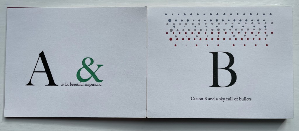
One of the most common precursors to the codex, the leporello, accordion or concertina structure suits this celebration of what is considered the first original English typeface, designed by William Caslon (1692–1766), used to set both the Declaration of Independence and the U.S. Constitution, and so dominant a font since the 18th century that it prompted its own dicta: “When in doubt, use Caslon”. In Marie Dern’s hands, though, the accordion structure is anything but common. Rather than zigzag folding a long strip of paper, she has attached her panels to two parallel strips of linen tape and left just enough space between the pairs of panels to have the hinged leporello fold down into a precise oblong shape.
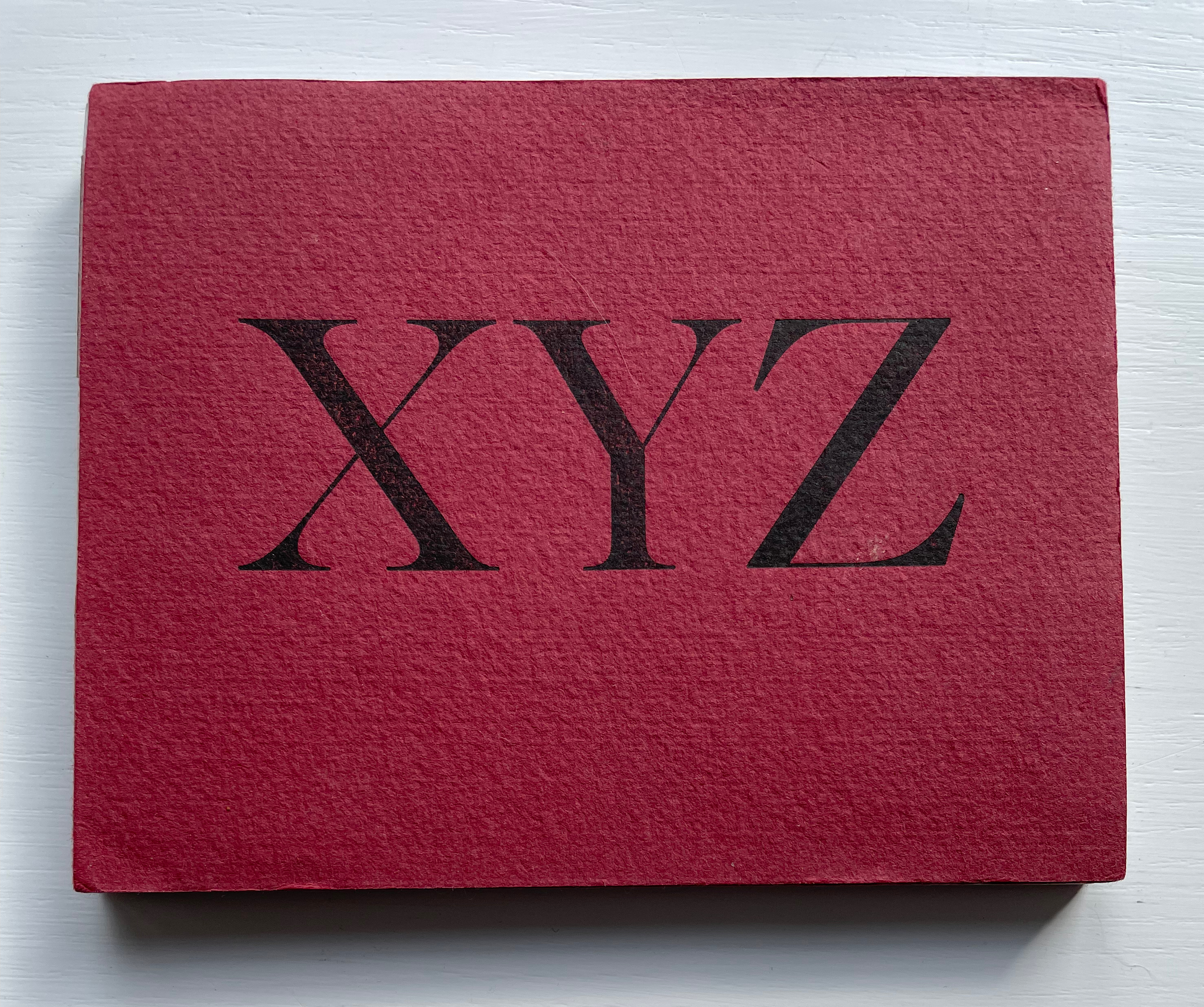
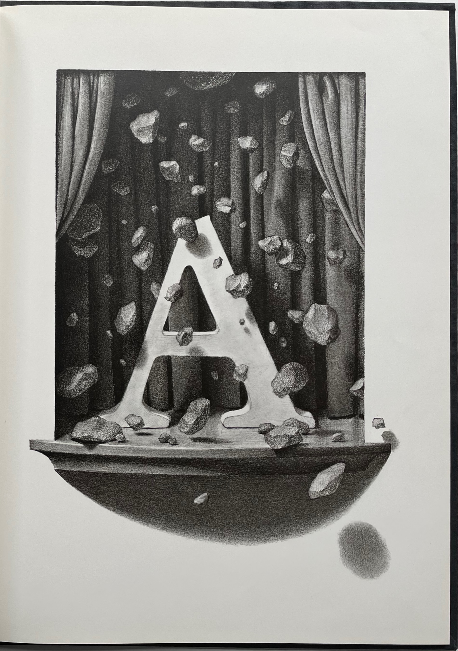
Caslon has featured in such outstanding books as Oliver Byrne’s The First Six Books of the Elements of Euclid: In Which Coloured Diagrams and Symbols Are Used Instead of Letters (1847), nearly an artist’s book in its own right. Dern might have been more immediately inspired, however, by Chris Van Allsburg’s whimsical children’s book The Z was Zapped: A Play in Twenty-six Acts, Performed by the Caslon Players (1987). From the start, bending the alphabet full circle to the ampersand, Dern’s own whimsy extends beyond the letters themselves.
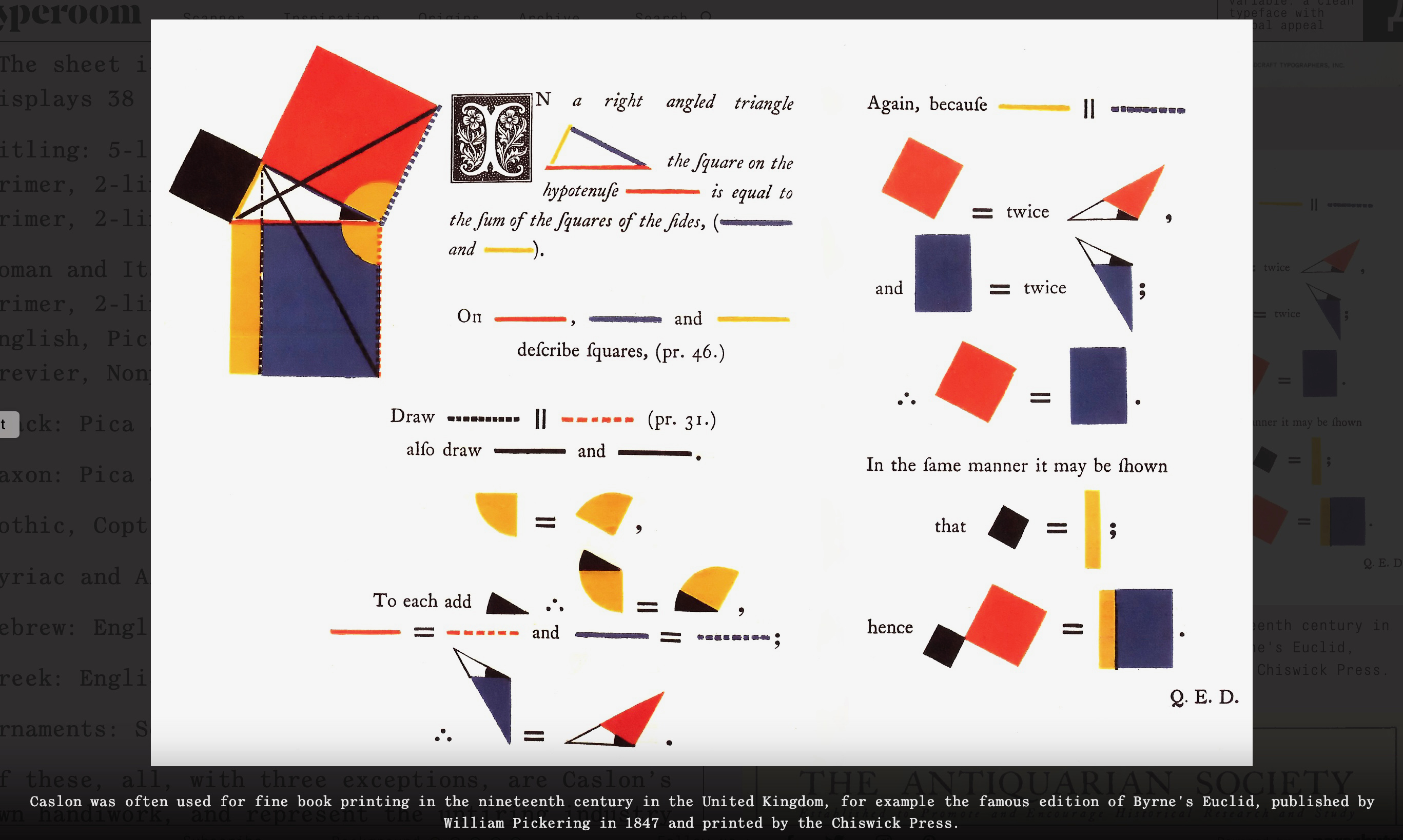
L: from Byrne’s The First Six Books. Typeroom, 23 January 2020. Accessed 8 March 2023.
R: from Van Allsburg’s The Z was Zapped. Photo: Books On Books Collection.
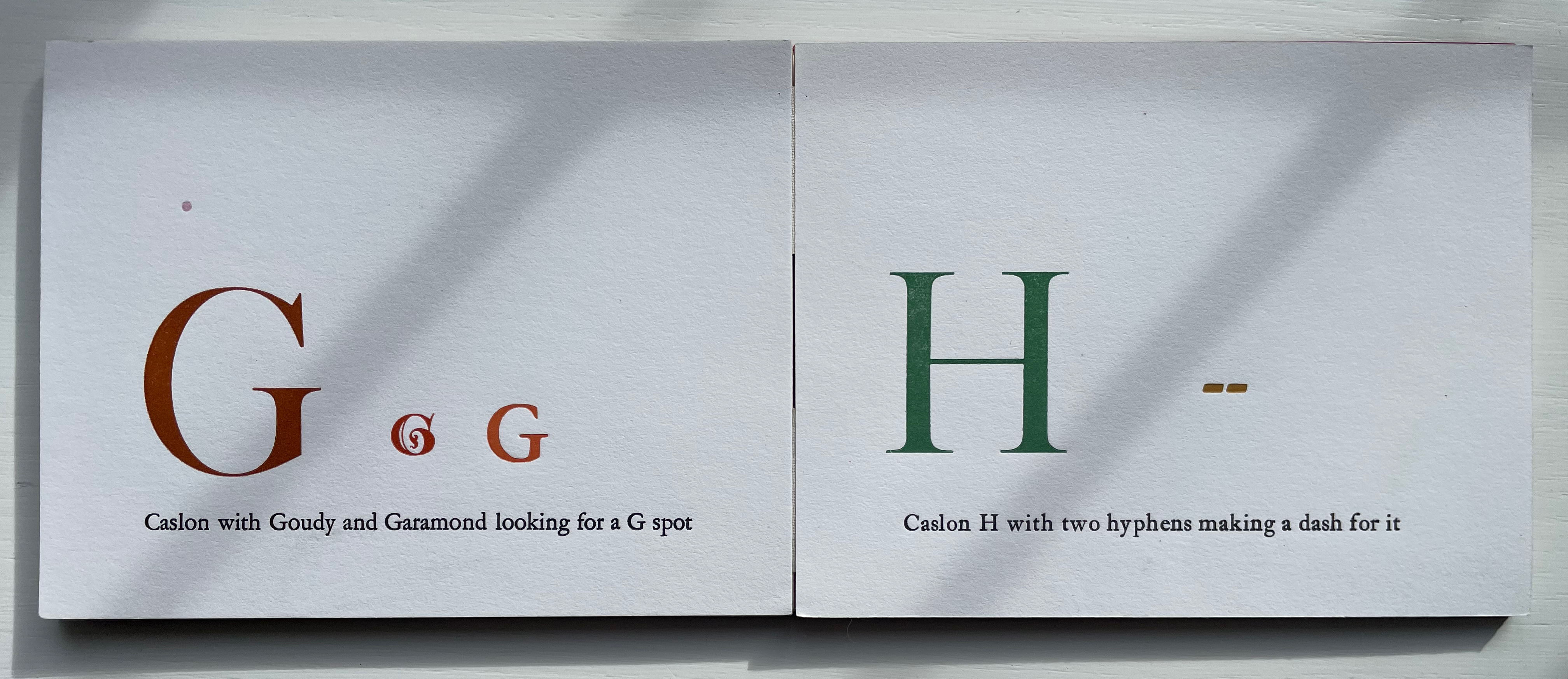
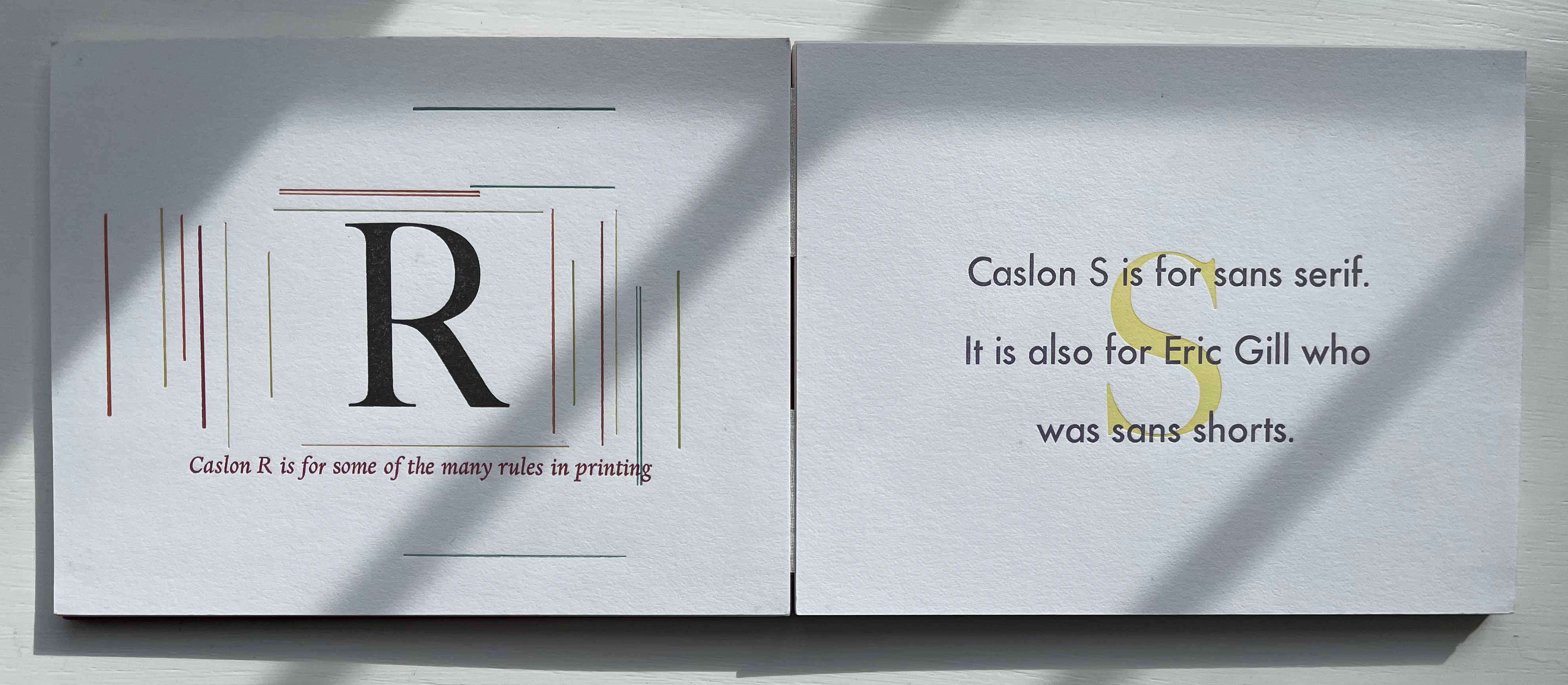
Given its age and dignity, Caslon attracted a fair amount of rock throwing from designers (especially in the 20th century). While Dern may have her own whimsical fun with Caslon, she doesn’t let the rock-throwers off scot free. Her Caslon’s G puts Frederic Goudy on notice that size does matter, and the Caslon S reminds Eric Gill of the emperor’s new clothes.
Other alphabetical typeface celebrations in the Books On Books Collection include Nicolas McDowall’s A Bodoni Charade (1995), Roberto de Vicq de Cumptich’s Bembo’s Zoo (2000) and Sharon Werner & Sharon Forss’ Alphabeasties and Other Amazing Types (2009).
Further Reading
“Abecedaries I (in progress)“. Books On Books Collection.
“Roberto de Vicq de Cumptich“. 12 February 2021. Books On Books Collection.
“Sharon Werner & Sharon Forss“. 20 December 2022. Books On Books Collection.
“Nicolas McDowall”. 10 December 2022. Books On Books Collection.
“Nicholas Rougeux“. 19 November 2022. Books On Books Collection.
“Chris Van Allsburg“. 12 December 2022. Books On Books Collection.
Byrne, Oliver, and William Pickering. 1847. The First Six Books of the Elements of Euclid: In Which Coloured Diagrams and Symbols Are Used Instead of Letters. London: W. Pickering.
Morison Stanley. 1997. Letter Forms : Typographic and Scriptorial : Two Essays on Their Classification History and Bibliography. Point Roberts WA: Hartley & Marks. See pp. 27-28 for the first stones cast in 1937.
Morison, Stanley. 1999. A Tally of Types New ed. [3rd ed.] ed. Boston: D.R. Godine. Caslon is not even included in Morison’s “tally” of seventeen typefaces. It appears on pages 24-27 in his introduction “revised & amplified” by Phyllis M. Handover. Even there they enlist Bruce Rogers, Emery Walker and William Morris to chuck additional rocks in Caslon’s direction on pages 37-38.


