Die Scheuche Märchen(1925, 1965) [The Scare-Crow Fairy Tale] Kurt Schwitters,Kate Steinitzand Theo van Doesberg. English translation by Robert Haas (enclosed, loose). Miniature reprint of the 1925 edition. H123 x W154 mm. 12 pages. Acquired from Plain Tales Books, 12 July 2023. Photos: Books On Books Collection.
The Schwitters-Steinitz Collection held at the National Gallery of Art Library identifies this work as a miniature reprint published in 1965 by Stockholm’s Gallery Samlaaren, owned by Agnes Widlund. The original, measuring H250 x W210 and also in red and blue on light brown paper, was published by Kurt Schwitters, Kate Steinitz and Theo van Doesberg under the imprint APOSS, which is a nonsense word, derived from “A for Active; P for Paradox; OS for Oppose Sentiment; and S for Sensitive” (Paley, p. 267). There have been several other editions, but this one is particularly satisfying for its inclusion of the loose typewritten translation by Robert Haas, who also translated Steinitz’s memoir/biography of Schwitters.
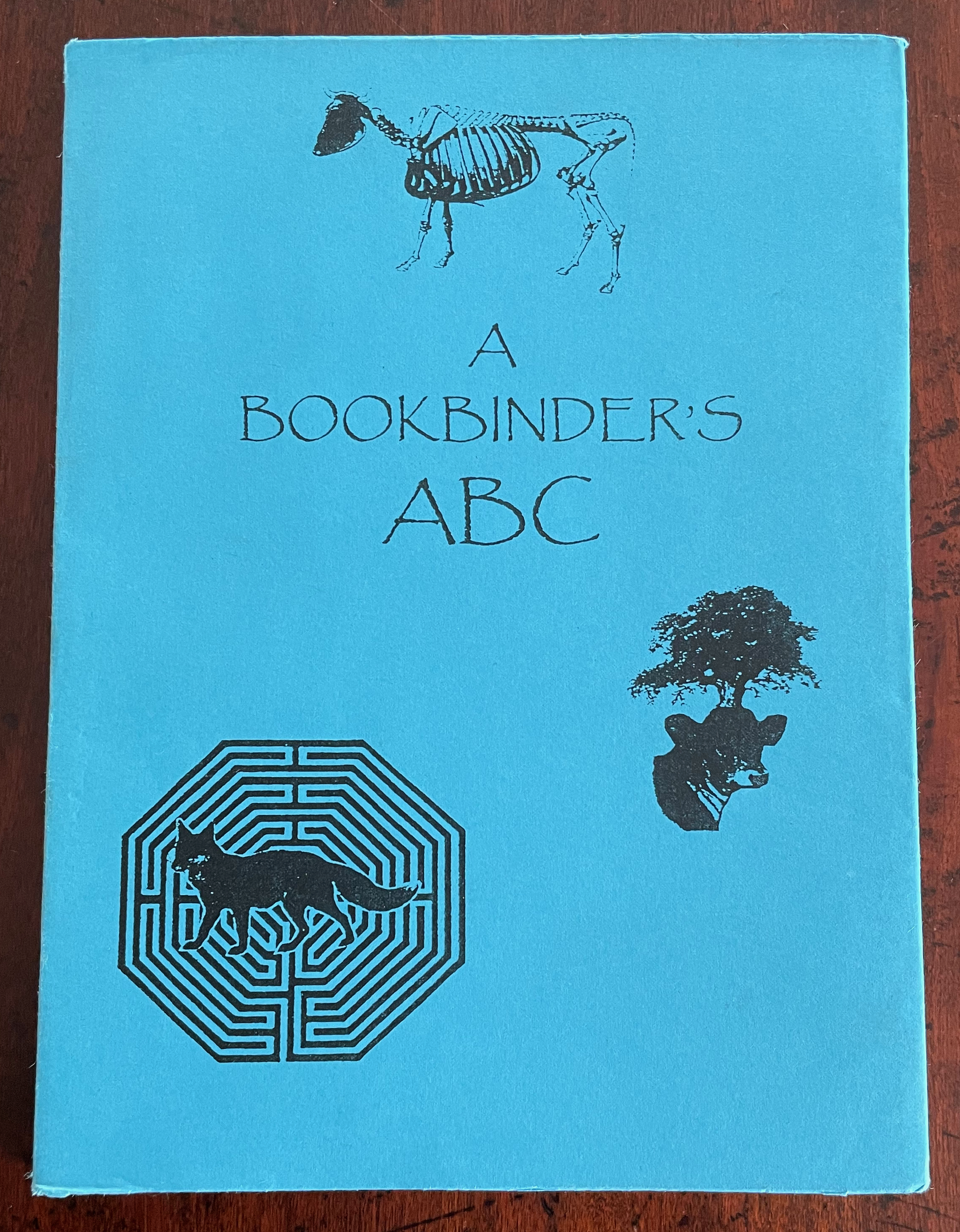
A Bookbinder’s ABC (2003) Christopher Hicks, Leaning Chimney Press Editions Soft cover (buff card, illustrated paper jacket glued to spine, sewn block). H200 x W150 mm. 34 pages. Edition of 75. Acquired from Barter Books, 18 October 2023. Photos: Books On Books Collection.
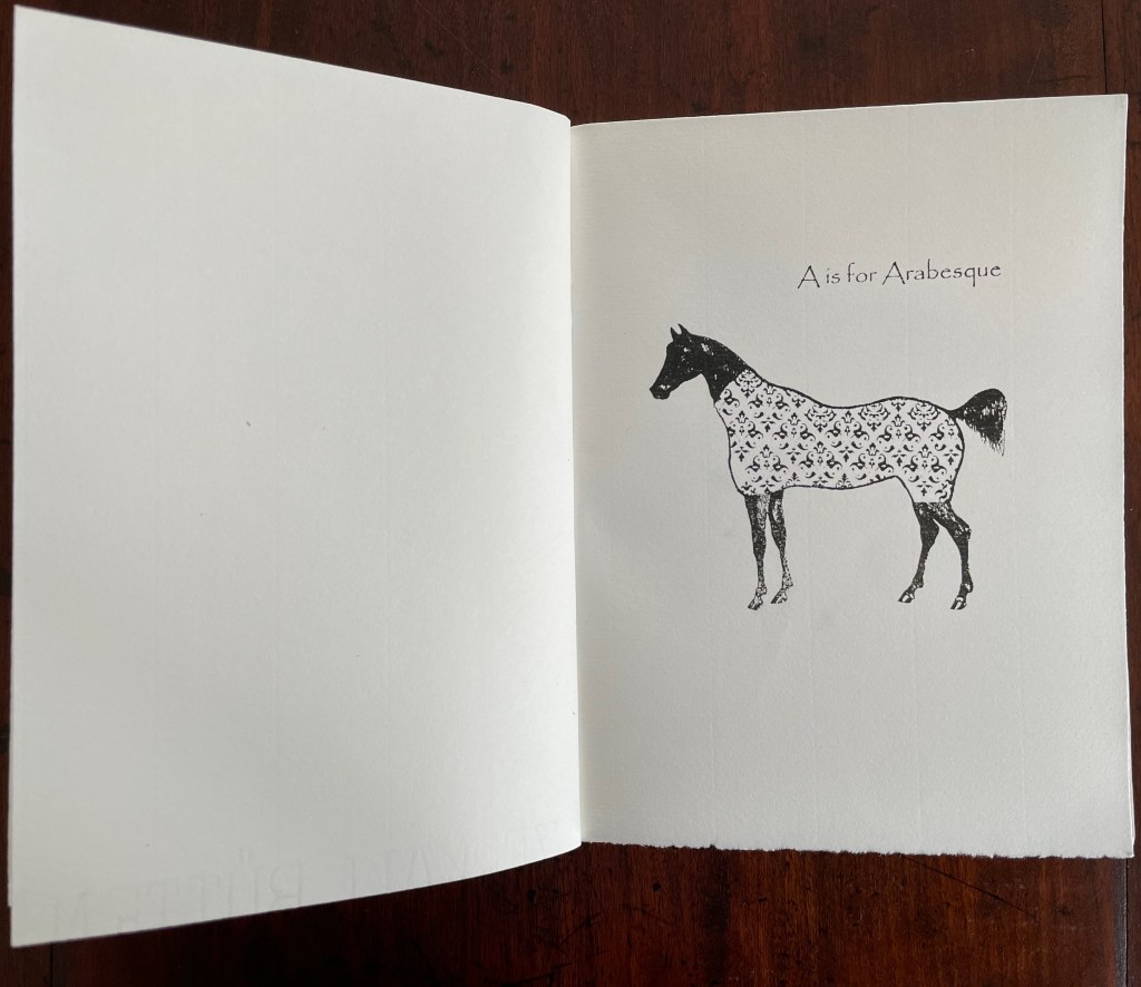
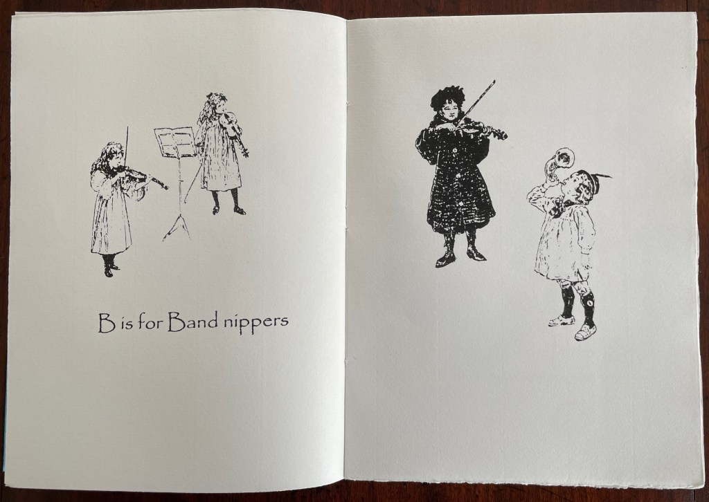
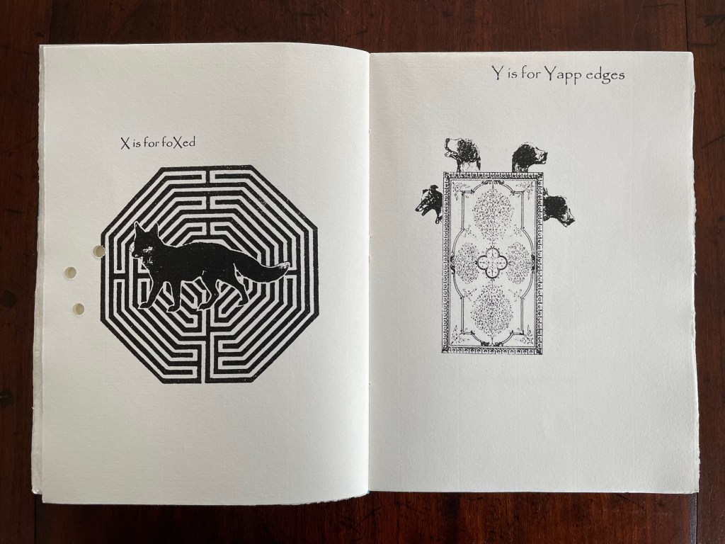
Although Glaister’s Encyclopedia of the Book is the canonical dictionary for book terminology, A Bookbinder’s ABC provides 26 humorous visual reminders.
An Arabian stallion in a decorative onsie for recalling the description of fleurons and other devices derived from Islamic patterns.
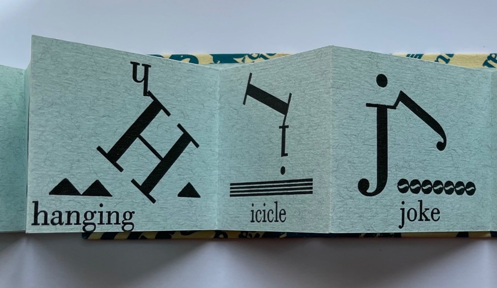
What else would a binder call a children’s orchestra?
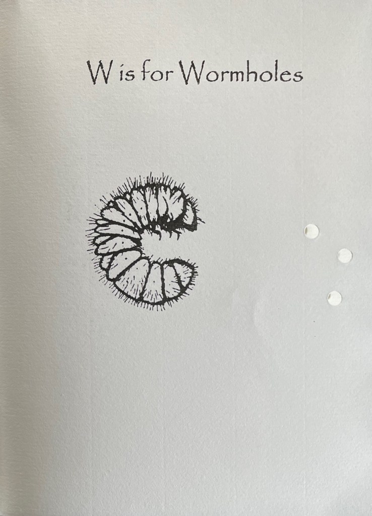
A fox flummoxed by a maze is certainly “foxed”. This one is also likely puzzled by the holes carried over from “Wormholes” on the previous page. Barking dogs springing from a book cover might be a helpful mnemonic for the name of the wide soft edges or flaps for Bible covers devised by the 19th century London bookseller Yapp.
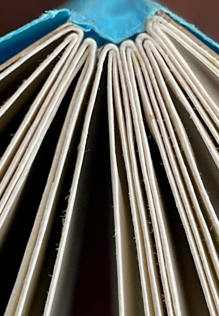
The work’s own binding has simple but interesting features. The front and back covers in buff card are glued to the first and last sewn gatherings, respectively, and the sewn gatherings are glued in between and sewn together. The blue paper jacket’s spine is glued to the spines of the gatherings and its fore edges fold over the fore edges of the buff card. Curious but not as self referential as the features of two nearby birds of a feather from Andrew Morrison’s Two Wood Press.
Detail of uncut top edges and gluing of gatherings and spine.
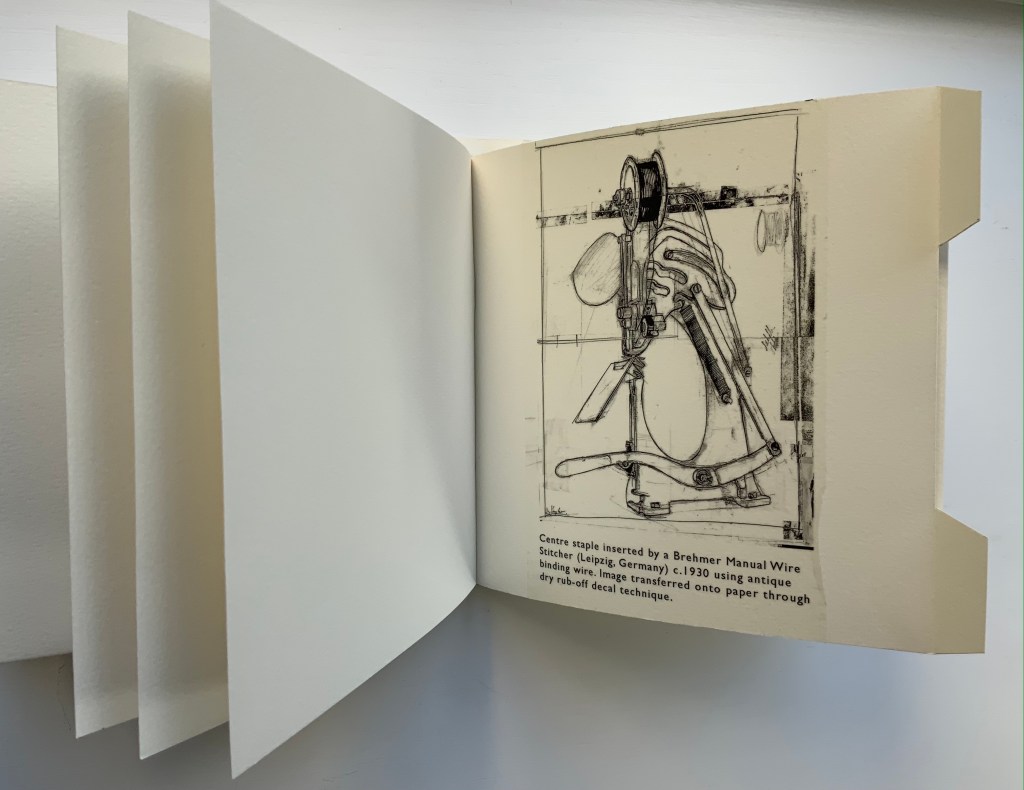
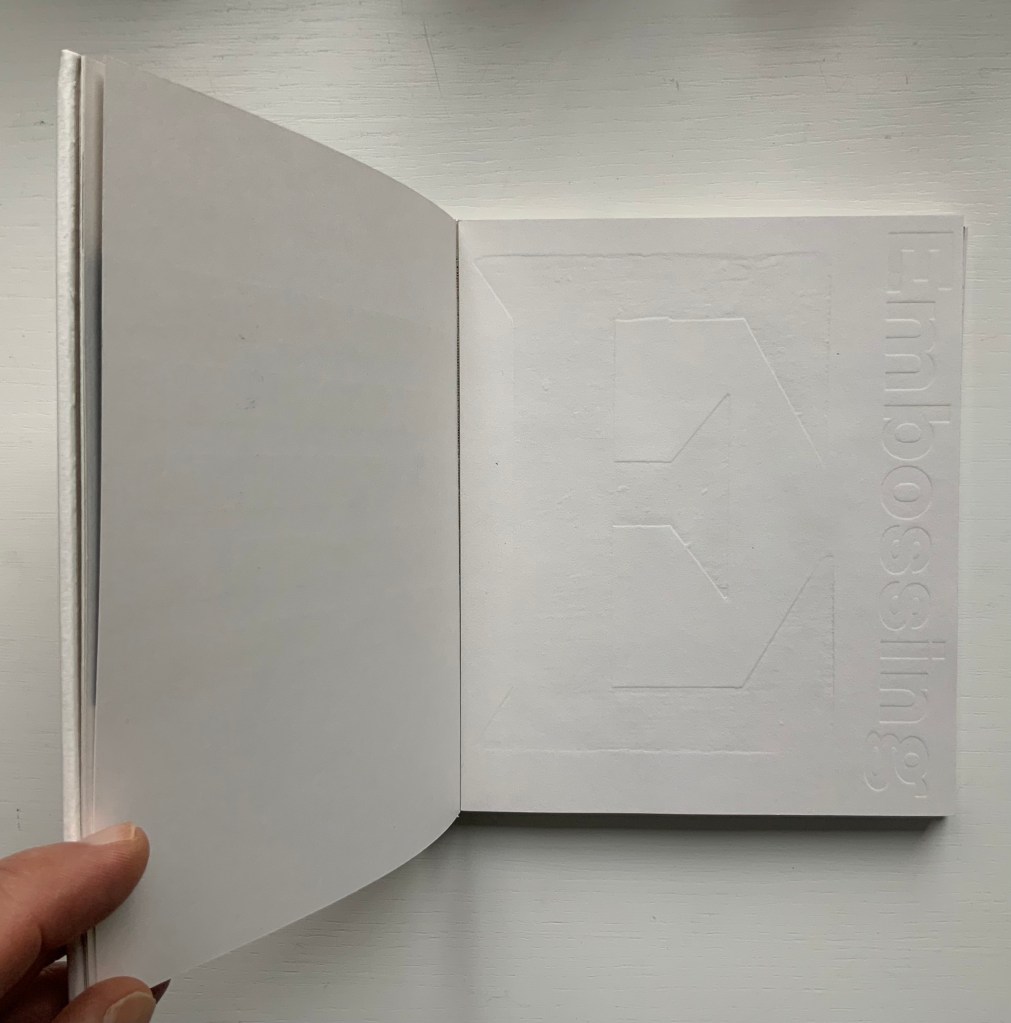
From Morrison’s Provenance (2018), showing an actual wire-stitched gathering and then an illustration of the mechanism; from Morrison’s Two Wood Press A-Z (2003), showing showing an embossed page illustrating E for Embossing. Photos: Books On Books Collection.
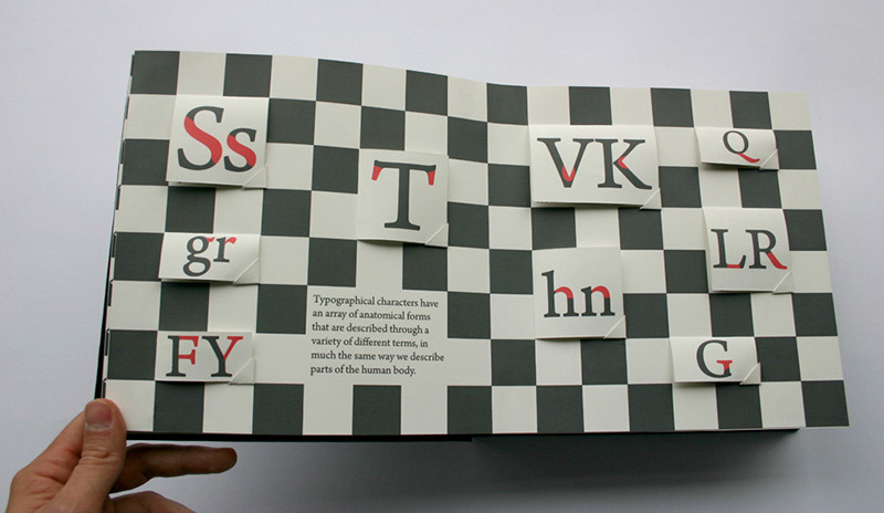
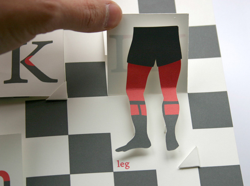
But what would a self-referential binding for A Bookbinder’s ABC look like — especially one that might carry on the punnery of the contents? Presumably because they are closer to the words, entries in letterpress abecedaries such as Morrison’s Two Wood Press A-Z (2003) and Kevin M. Steele’s The Movable Book of Letterforms (2009) have an easier time of the visually self-referential.
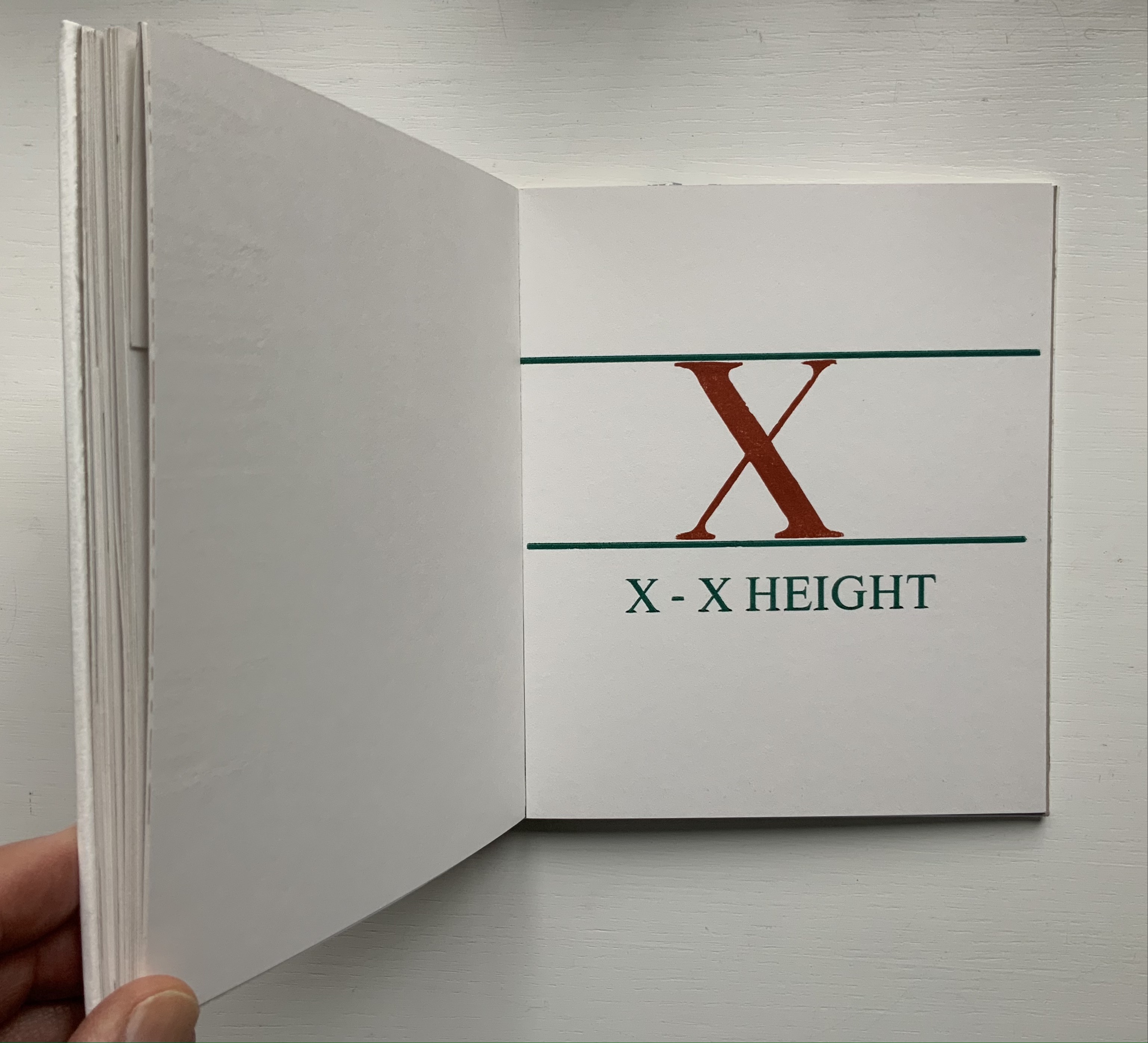
From Steele’s A Movable Book of Letterforms, showing the anatomical term for the red areas of the L & R (a leg lift?); from Morrison’s Two Wood Press A-Z, showing x’s definition of its height.
Closer still to the words are the typographical punsters such as Marie Dern and William Caslon’s Typographic ABC (1991), Nicolas McDowall and A Bodoni Charade (1995) or Sharon Werner & Sharon Forss and Alphabeasties and Other Amazing Types (2009).
From Dern’s William Caslon’s Typographic ABC, McDowall’s A Bodoni Charade and Werner & Forss’ Alphabeasties and Other Amazing Types.
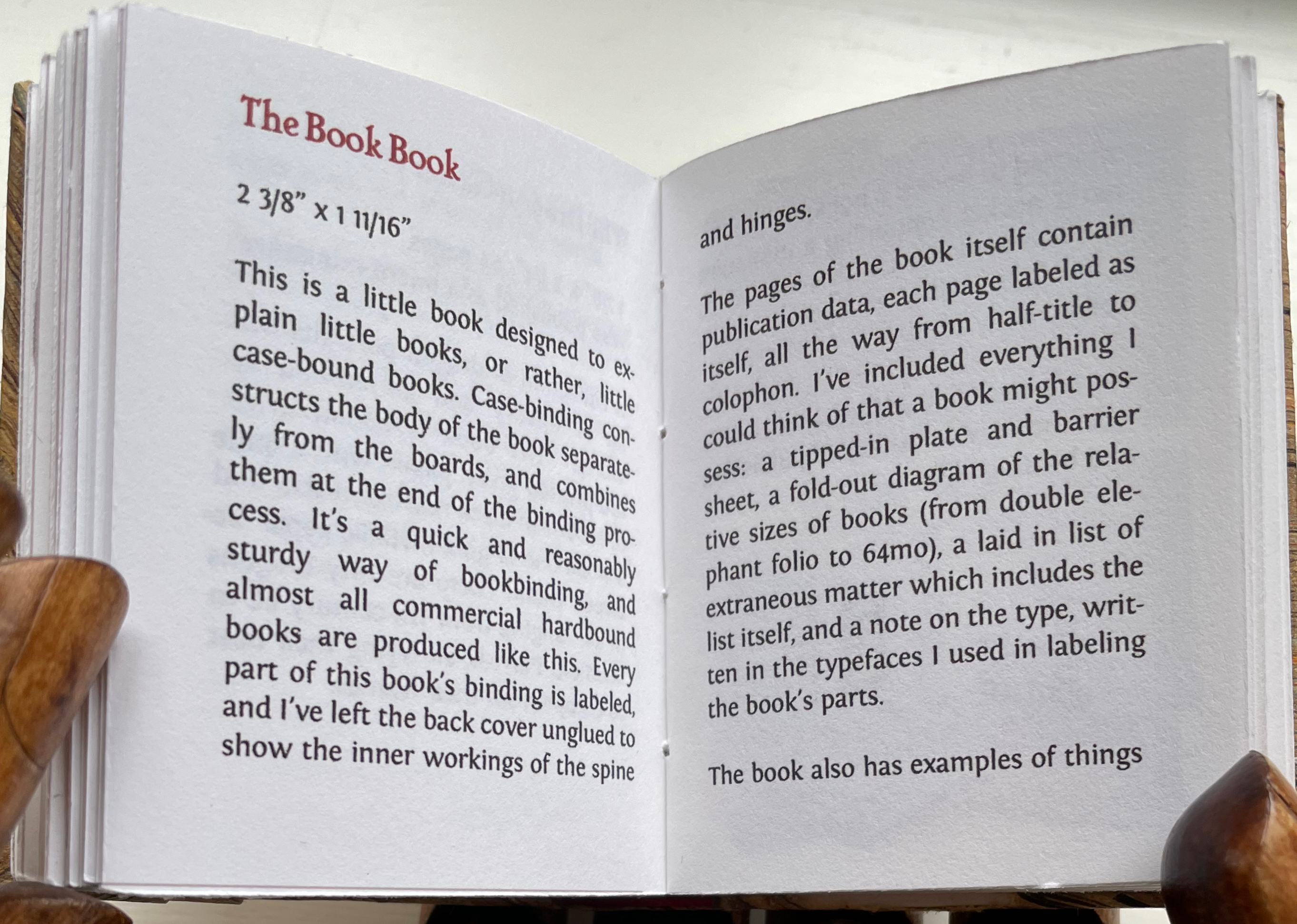
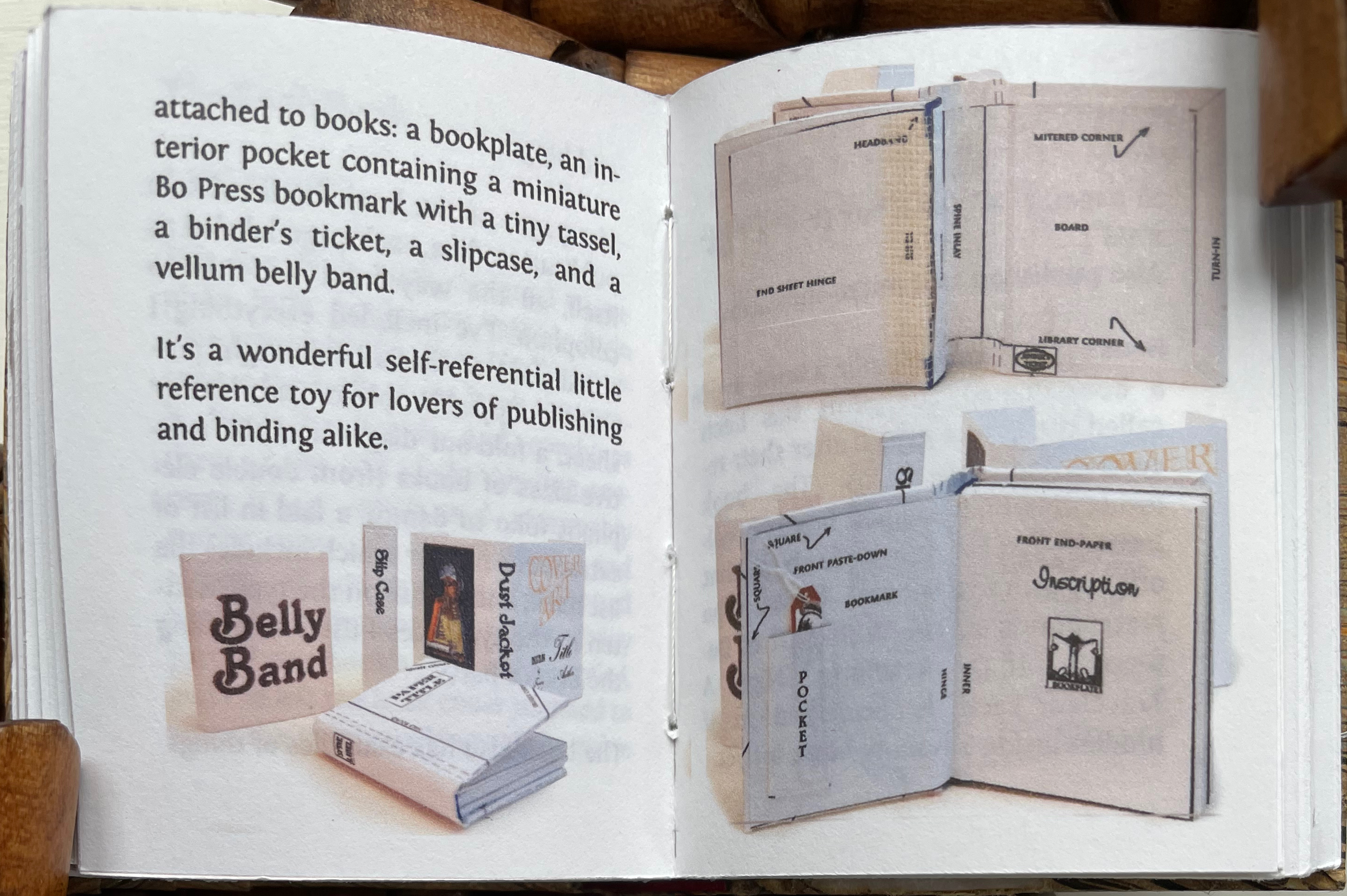
Perhaps Pat Sweet’s miniature The Book Book (2010) comes closest on self-referentiality in a work about binding. For the puns, we will have to wait for another bookbinder to take a stab at it.
Animalphabet (1996) Department of Special Publications, The Museum of Metropolitan Art Hardcover, casebound sewn. H120 x W150 mm, 60 unnumbered pages. Acquired from Aardvark Books, 1 August 2021. Photos: Books On Books Collection.
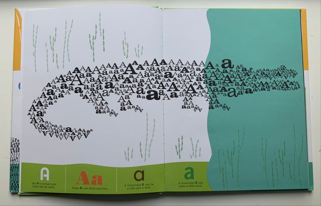
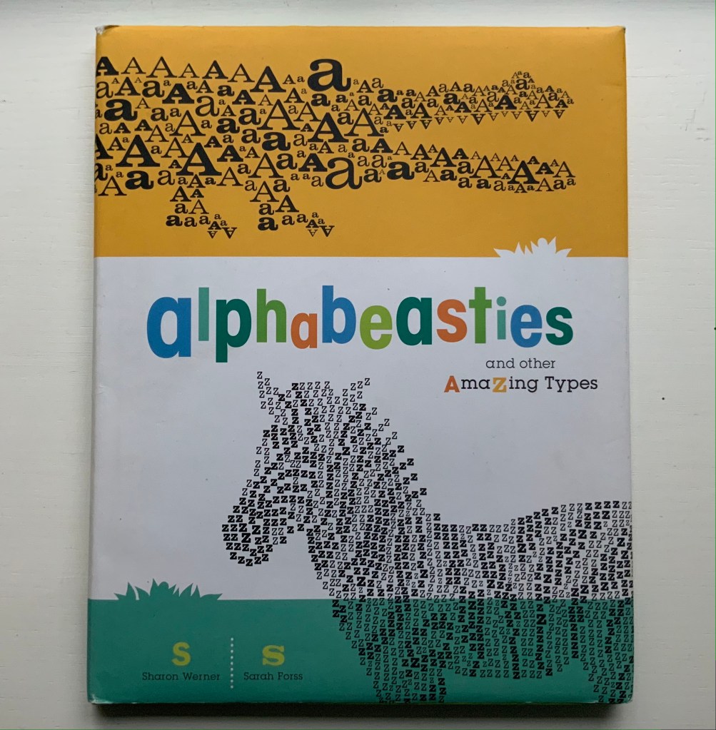
Animalphabet is a reminder of the close connection between animals and alphabet books. Think of the several same-titled works, e.g., Julia Donaldson’s Animalphabet (2018) or Sharon Werner and Sharon Forss’ AlphaBeasties (2009) or Alan James Robinson and Suzanne Moore’s A Fowl Alphabet (1986). It also highlights an aspect of book art.
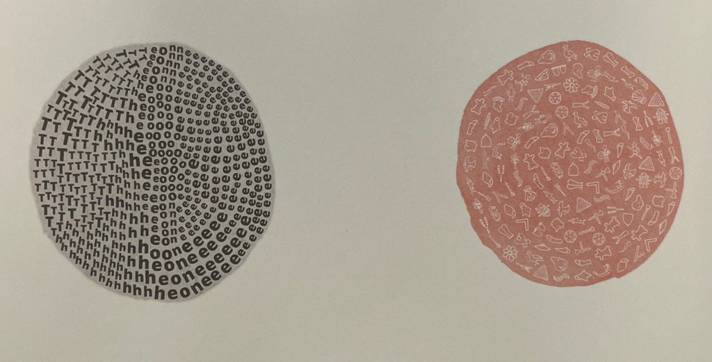
Although the museum’s little book does not rise to the level of art, its self-reflective textual/visual puns are a hallmark of much book art. In it, the museum staff selects an ink scroll depiction of donkeys by Huang Chou for “Ass-embly”, François Pompon’s Polar Bear for “Bear Minimum”, and a 10th-11th-century bookcover carving of the emblem of Luke the Evangelist for “Holy Cow”. The Met’s choice of Pompon’s Minimalist bear to pun on the art movement comes closest to the rampant punning of homages to Ed Ruscha’s “various” iconic works of book art, distilled in Various Small Books (MIT Press, 2013).
Because it is hard to think of a textual/visual/genre pun among artists’ books that is more multilevel than the Met’s final letter, the little book should have the last word.
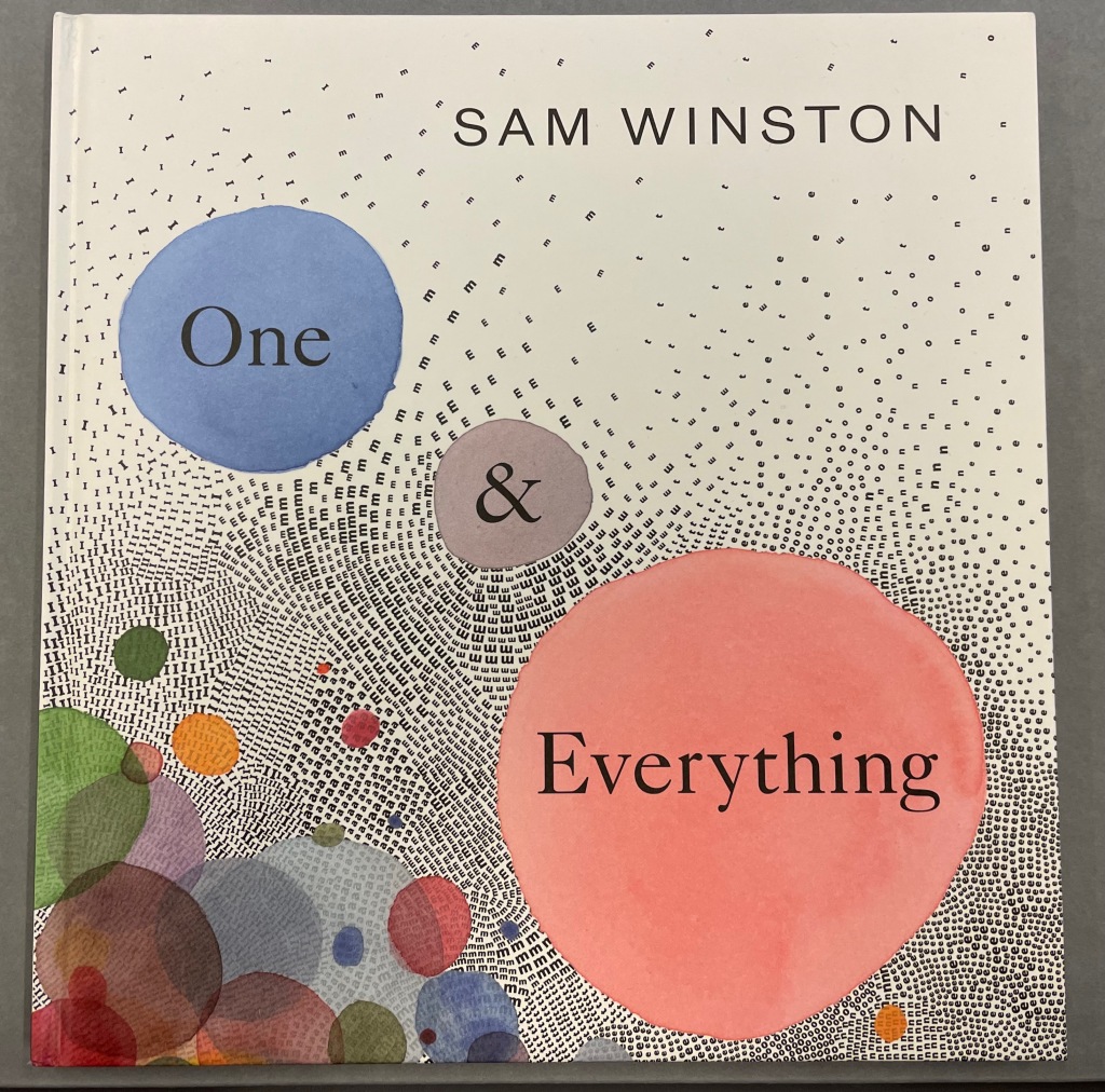
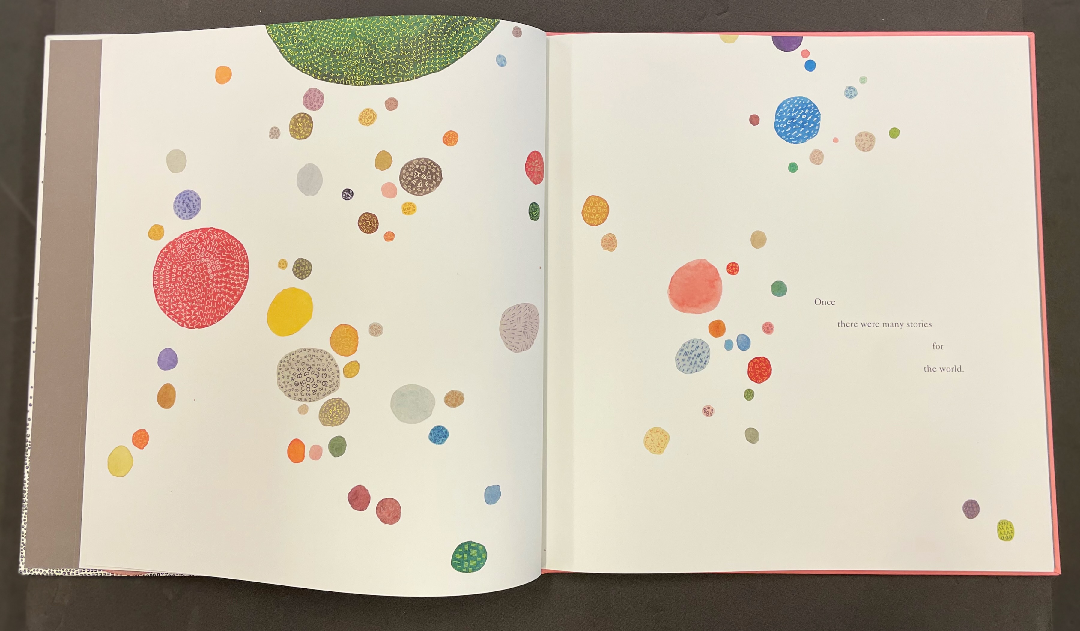
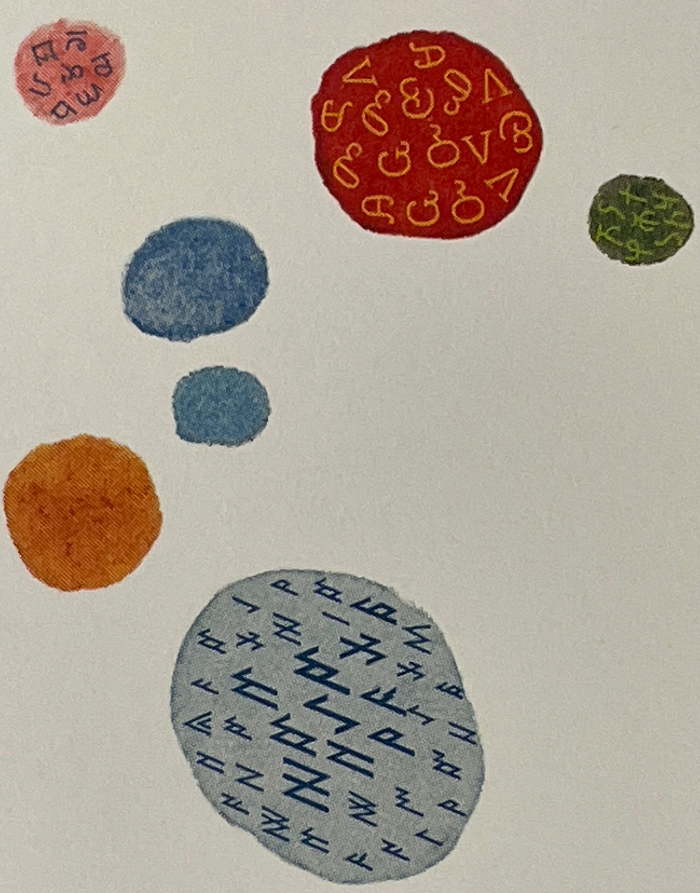
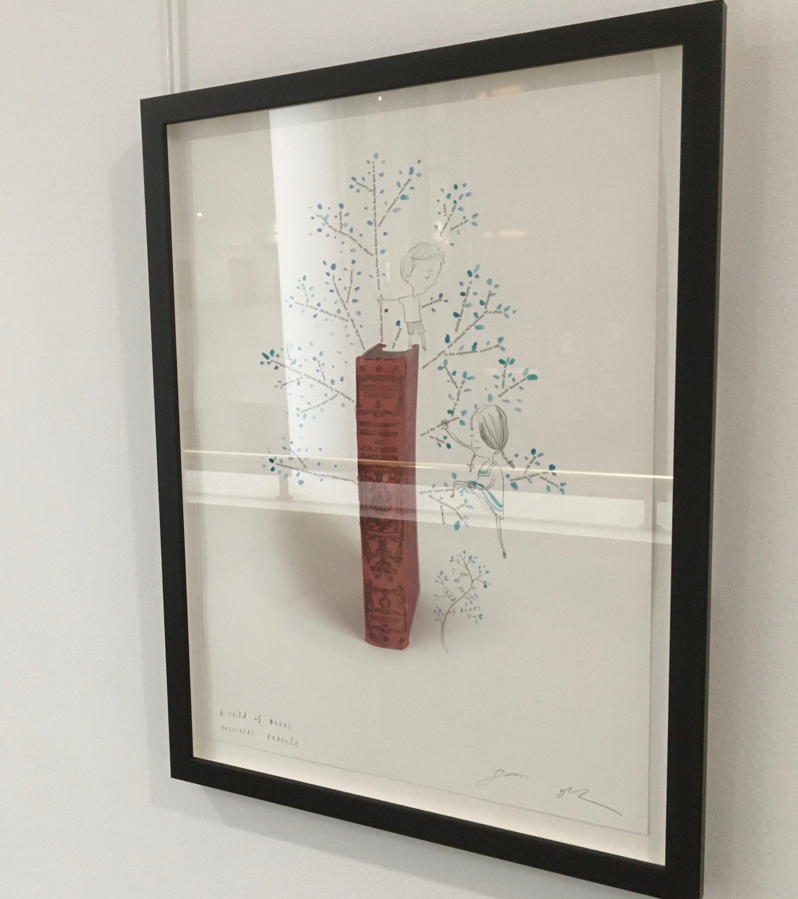
One & Everything(2022) Sam Winston Casebound with illustrated paper over boards. H265 x W255 mm. 48 unnumbered pages. Acquired 23 November 2022. Photos: Books On Books Collection. Displayed with artist’s permission.
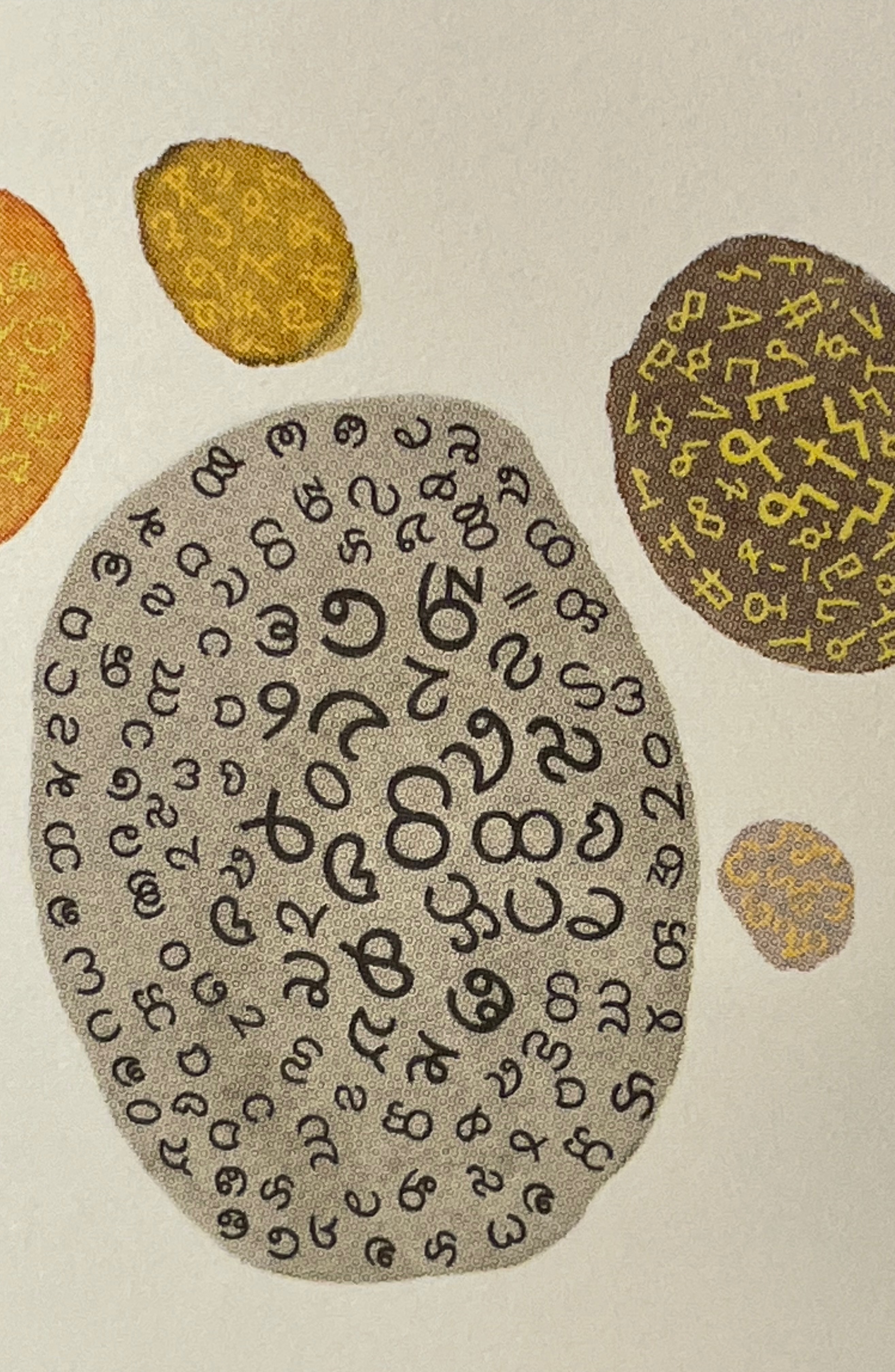
Sometimes you just know that you have read a classic. This is one of those times. Winston and Candlewick Press (Walker Books in the UK) have worked a fresh tale, tone and meaning together with image, color, design and production values to an extraordinary level. Inspired by Tim Brookes’ “Endangered Alphabets Project“, Winston uses the striking shapes of letters and scripts from the Latin, Ogham, Cherokee, Armenian, Hebrew, Tibetan and dozens more alphabets and syllabaries to create the characters in his fable about the story that decides one day that it is the One and Only story.
Shapes like single-celled creatures (each filled with a different alphabet) represent the many stories existing before “The One” arrives.
“The One” is made of the English (i.e., Latin or Roman) alphabet. Will it listen to and make sense of all these other stories?
The fable of One & Everything does more than support the notion that alphabets and languages can be endangered. Implicit in the fate of the “One & Everything” story” is the message that Babel was more of a blessing than a curse.
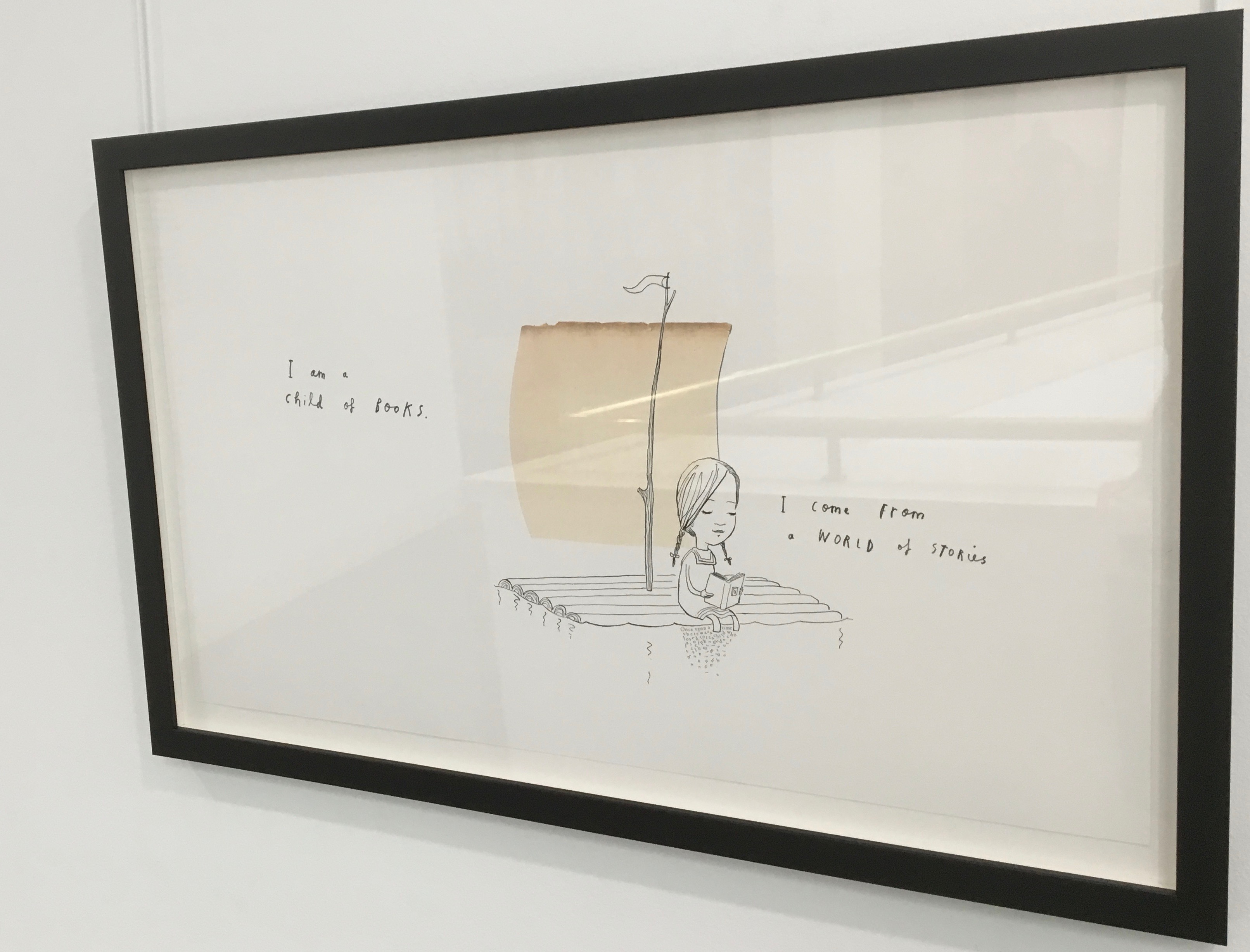
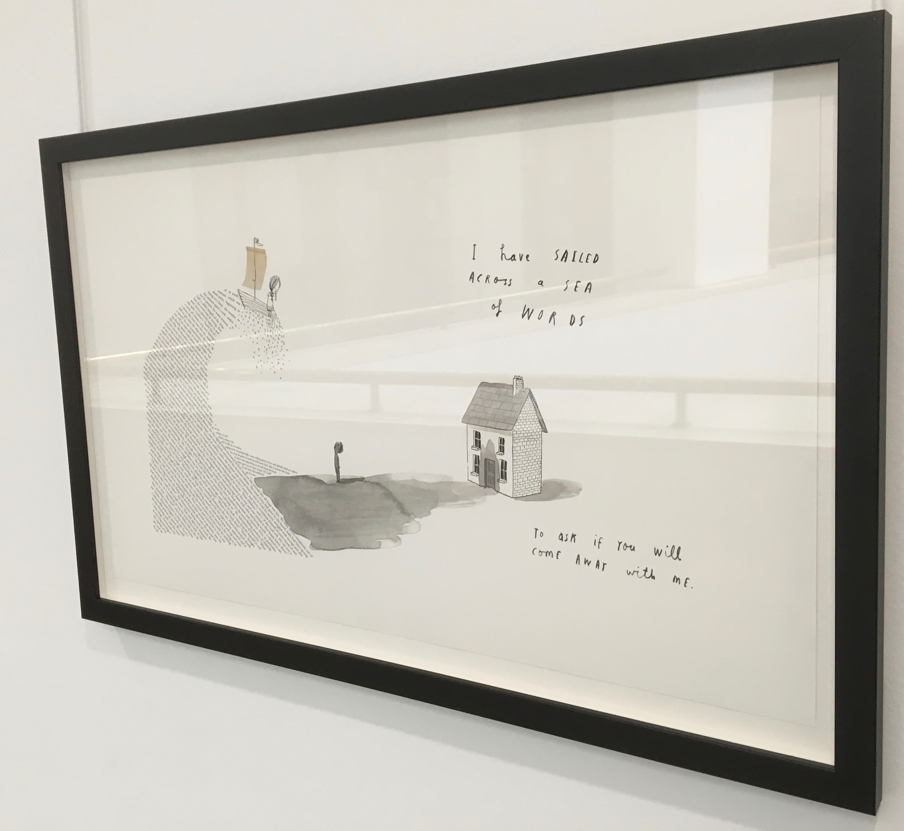
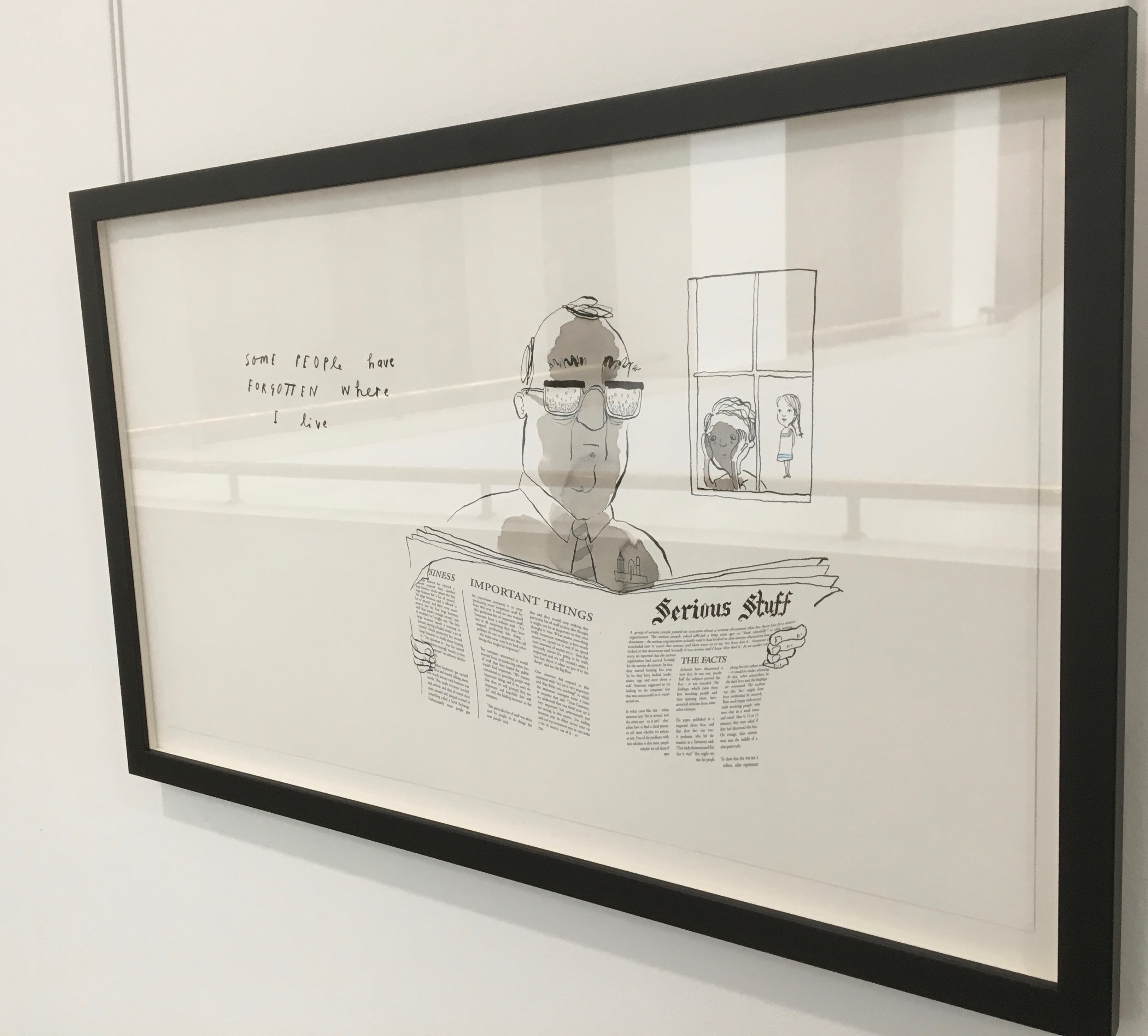
Readers familiar with Winston’s A Dictionary Story and his collaboration with Oliver Jeffers in A Child of Books (both below) will recognize a growing refinement and, now, breadth and depth in Winston’s storytelling. The youngest audience and beginning readers will be held by the shapes, colors and simplicity of the story. Older readers will easily grasp its underlying meanings and be intrigued by the variety of letters and scripts and the idea that languages and alphabets can die. Still older readers and teachers will appreciate the helpful resources following the story’s ending invitation. At all levels, the audience will delight in Winston’s creation of his characterful abstractions with letters from the alphabets and scripts identified in those resources. Those with an eye for such artistry will appreciate Winston’s extension of a tradition embraced by Paul Cox, Roberto de Vicq de Cumptich, Sharon Forss and Nicolas McDowall.
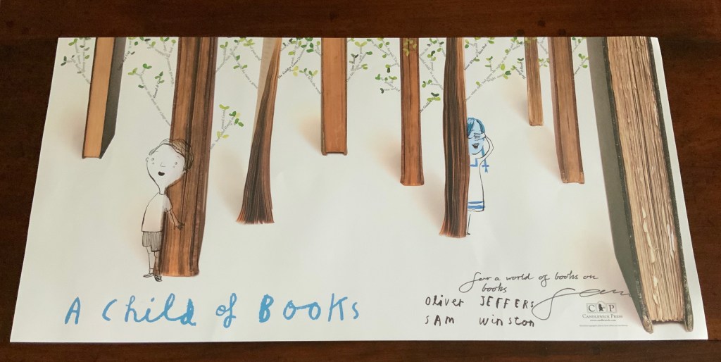
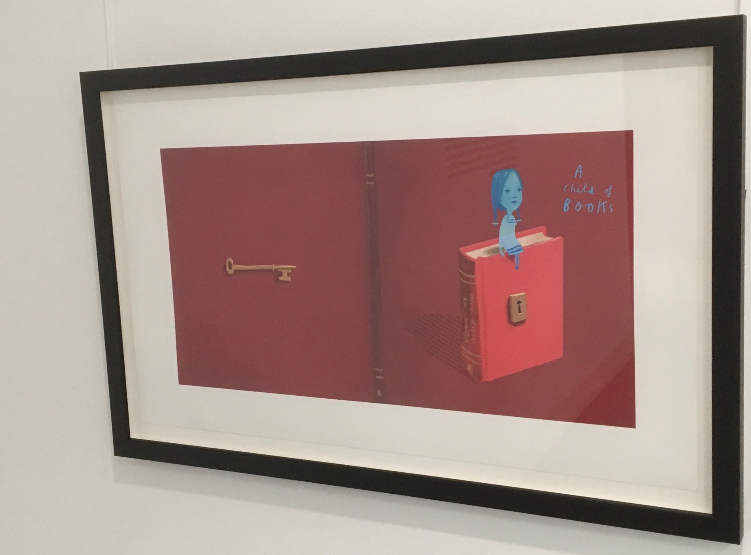
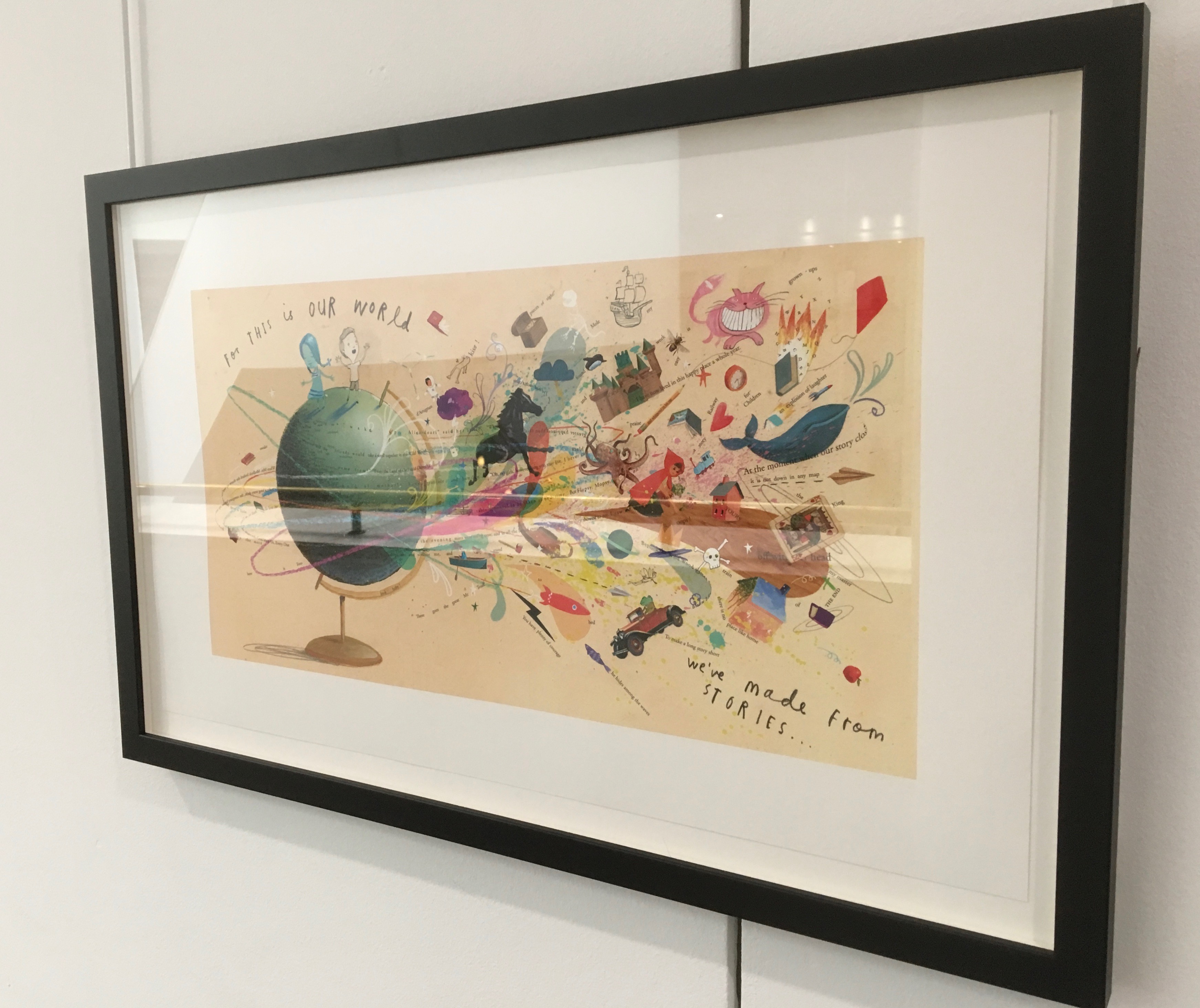
A forest made of fore-edges. A raft made of spines and its sail a book page. A wave and a path made of excerpts from books. In this fabulous world made from the features of books, the simpatico imaginations of Oliver Jeffers and Sam Winston deliver a heroine and an invitation that are hard to resist.
Promotional poster. Displayed with permission of Sam Winston.
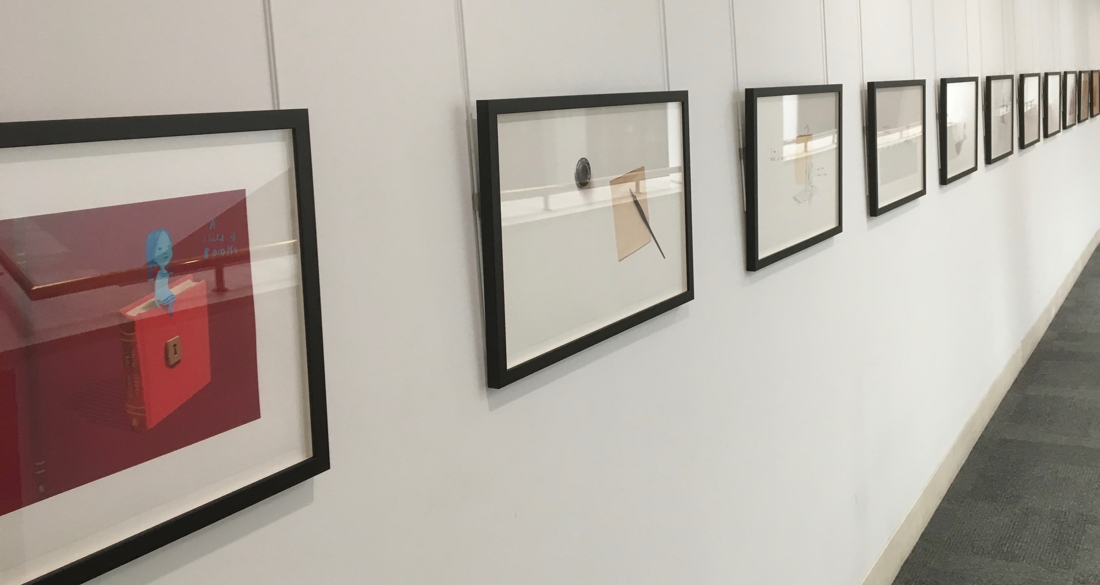
In addition to the poster above and the trade book it promotes, Winston created an artist’s book edition celebrated by this hallway gallery below mounted by the British Library shortly after its appearance.
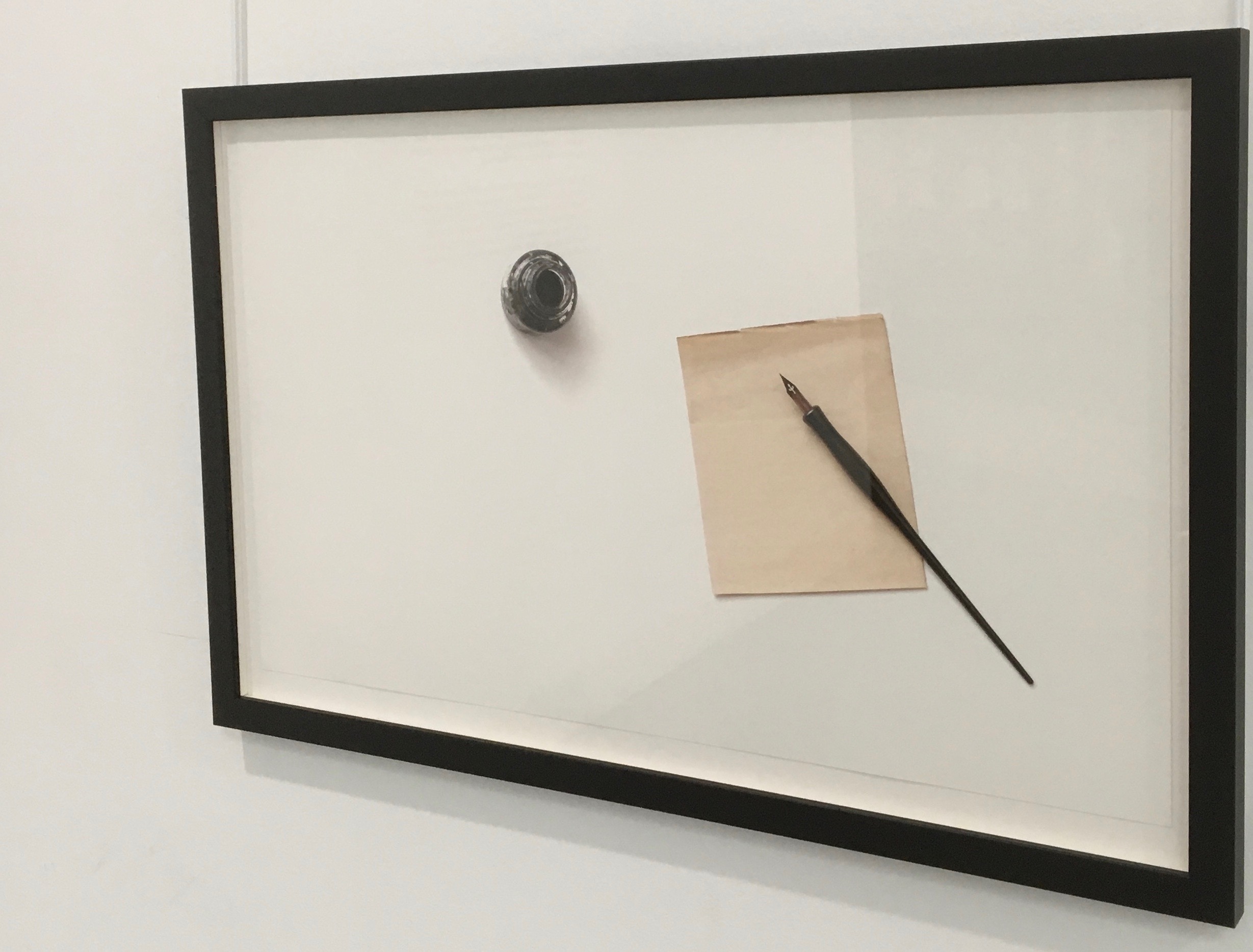
A Child of Books prints displayed at the British Library, 9 August – 27 September 2019.
Winston’s abiding love of letters, words and stories shines through in A Child of Books. Arguably, it has its origins in an earlier work whose story is told by his invention of a very different “child of books”.
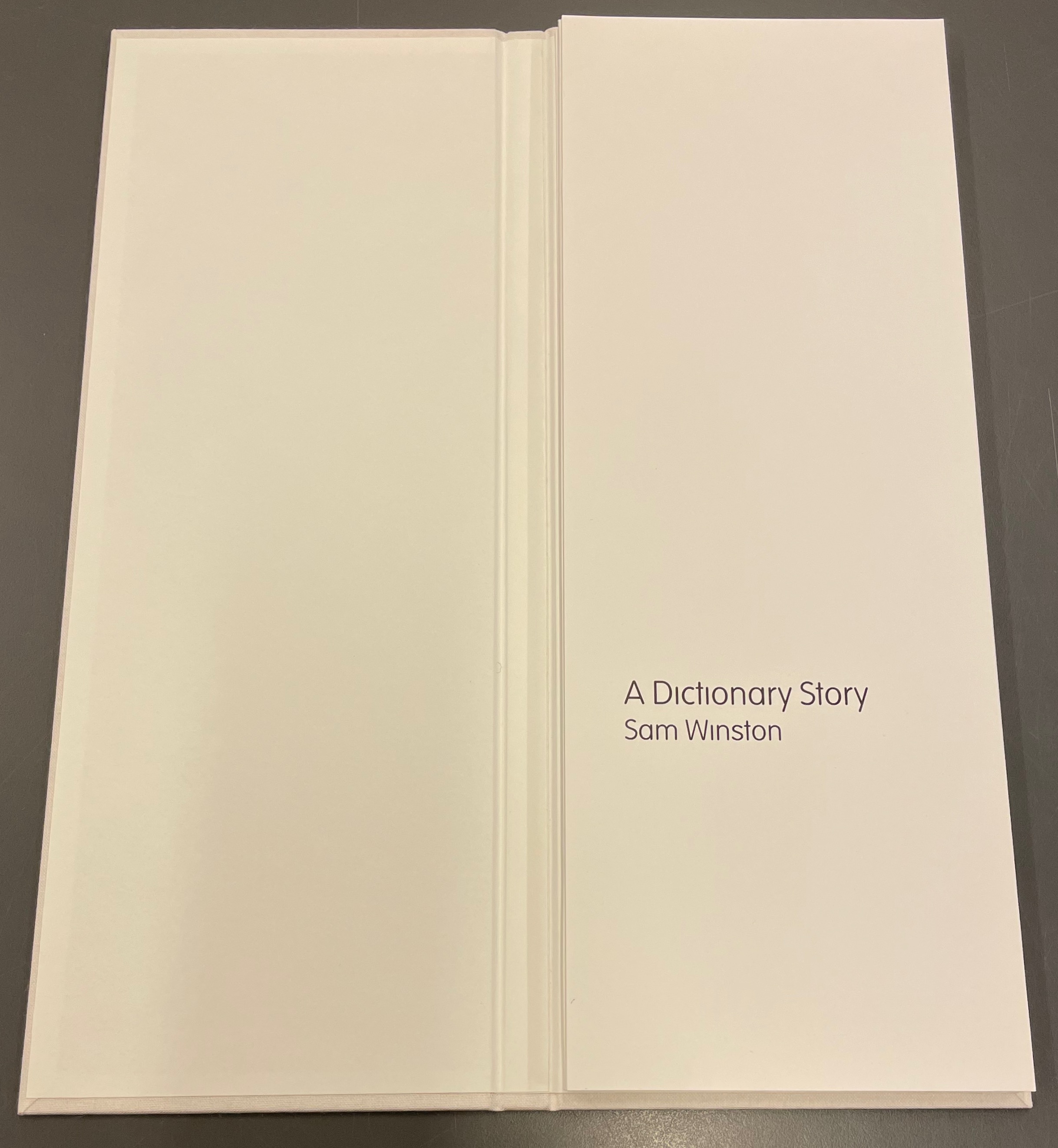
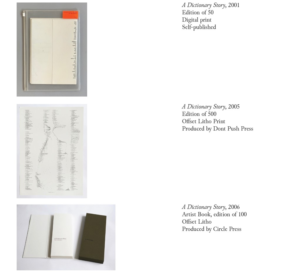
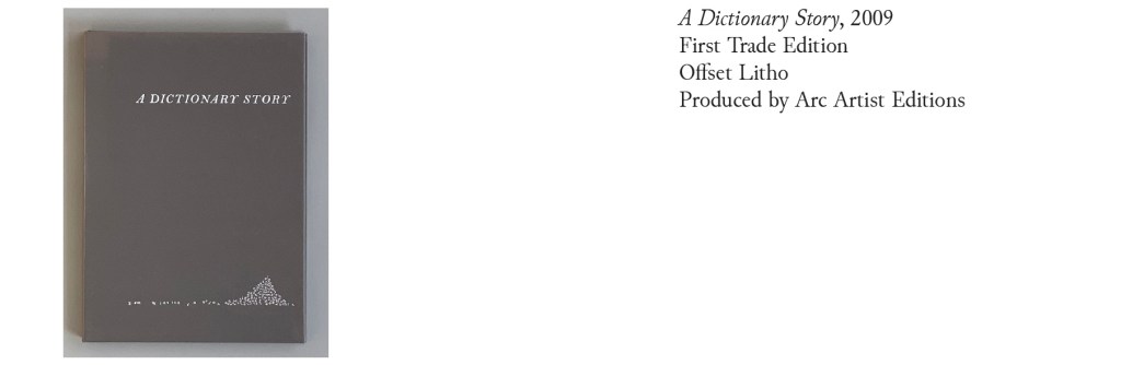
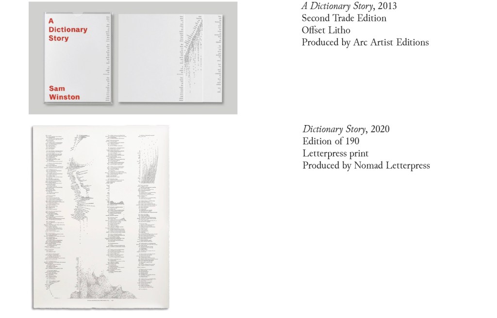
A Dictionary Story (2001 – 2020)
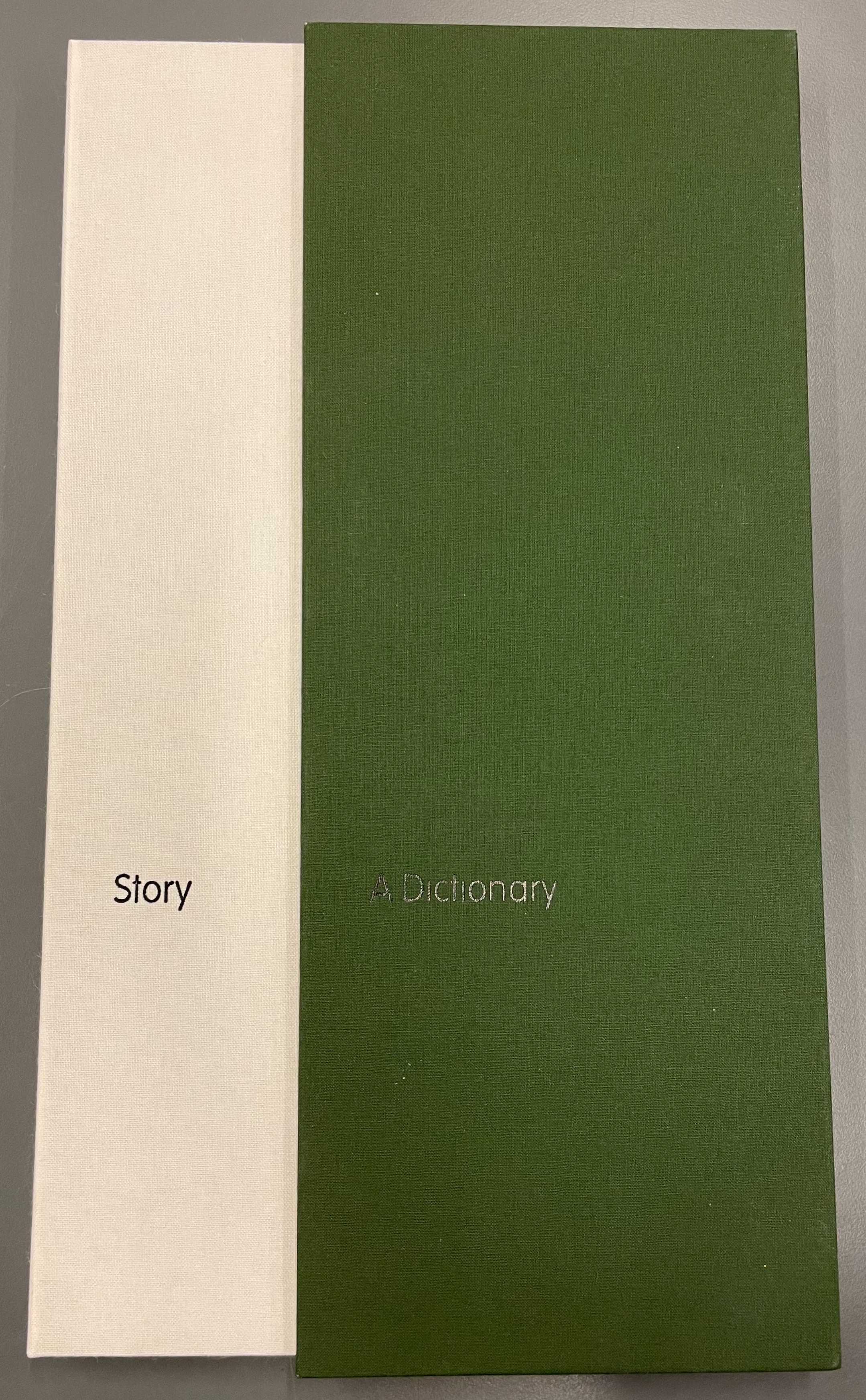
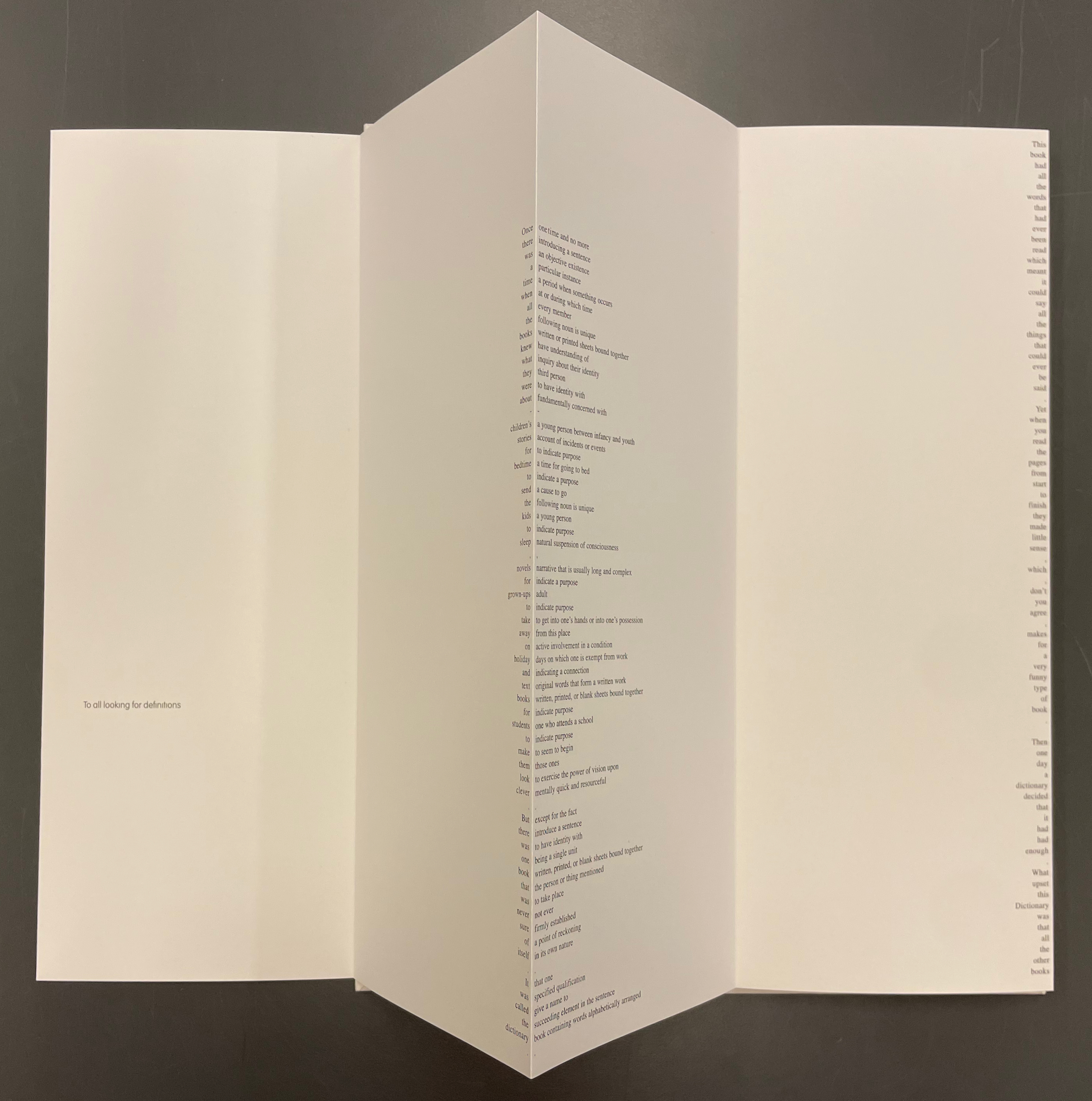
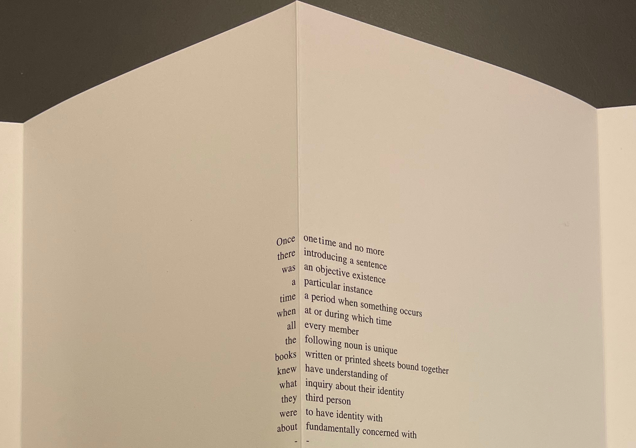
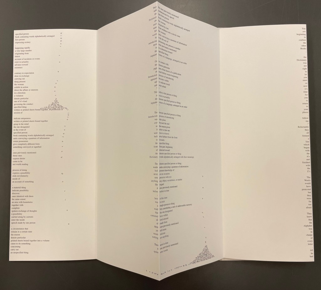
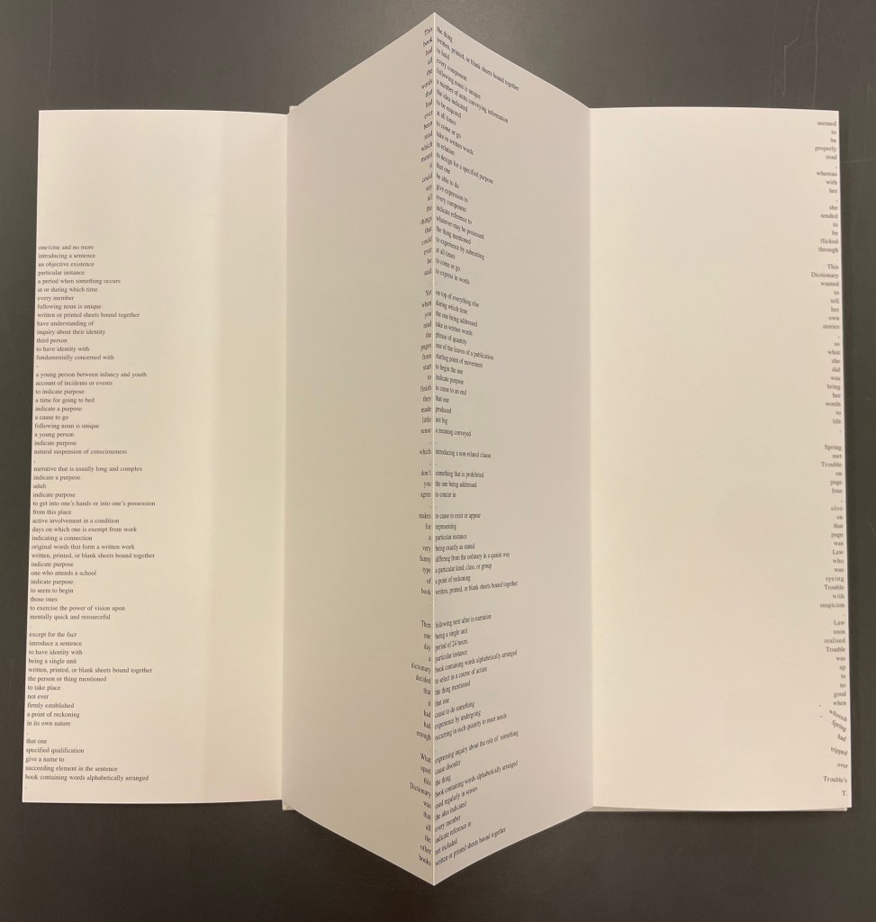
Since its origin as a student project in 2001, A Dictionary Story has appeared in an accordion book form as a fine press edition and two trade editions and as single-sheet prints. The Books On Books Collection holds the fine press edition and the second trade edition, both of which have in common a vertical flush-right single-word column that tells the story and the immediately adjacent vertical flush-left column of definitions of the words in the story. In the fine press edition, the two columns meet at each mountain peaks of the accordion fold.
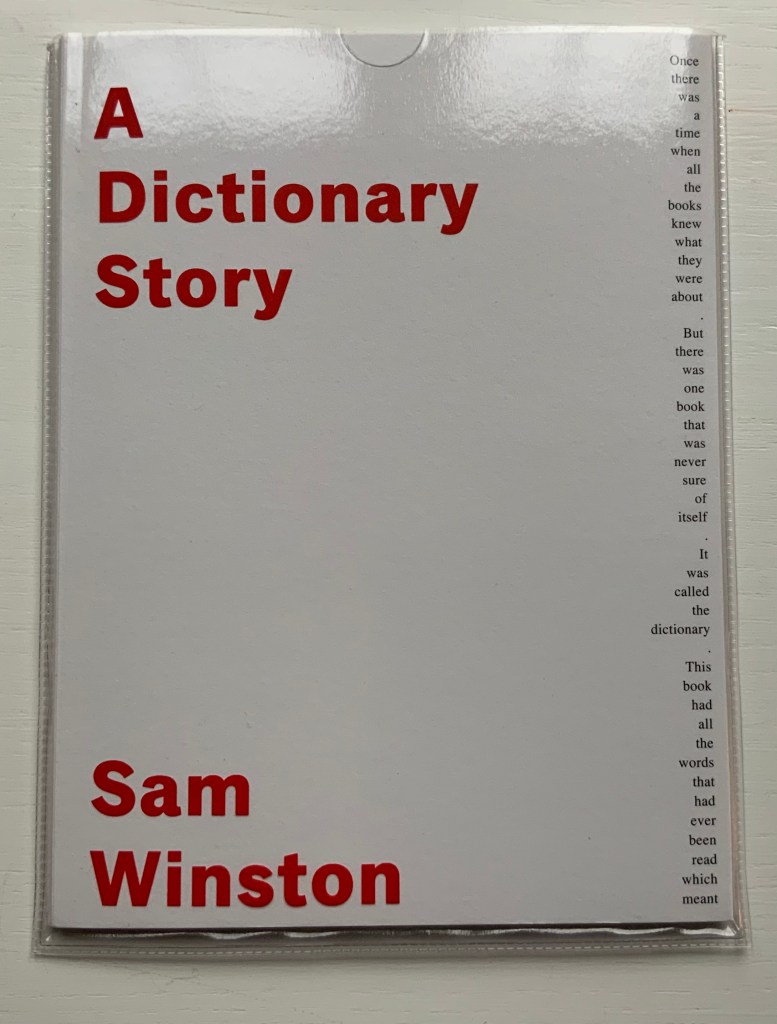
A Dictionary Story (2006) Sam Winston Slipcased leporello between cloth-covered boards.H360 x W140 mm, 25 panels. Story text set in 9 point Times Roman by Sam Winston. Book designed by Richard Bonner-Morgan and Sam Winston. Printed by David Holyday at Trichrom Limited. Bound at Quality Art Reproductions, England. Published by Circle Press. Edition of 100, of which this is #68. Acquired from the artist, 30 May 2018. Photos: Books On Books Collection. Displayed with artist’s permission.
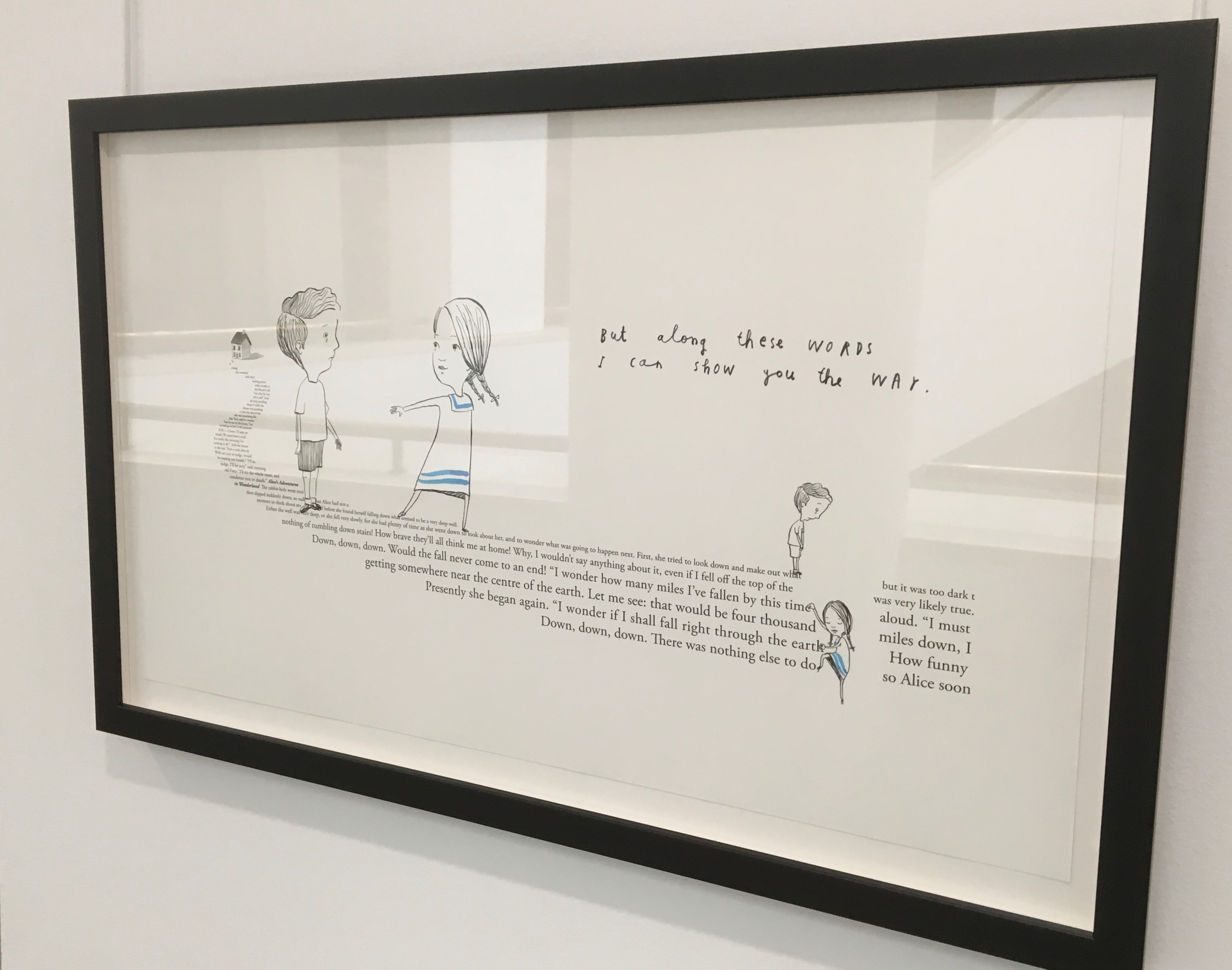
“Once there was a time when all the books knew what they were about. But there was one book that was never sure of itself.”
Panels 2-5 from the fine press edition; detail of panels 2-3.
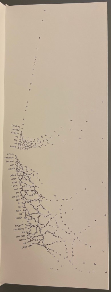
So begins Winston’s tale about this uncertain book. The book never sure of itself is the Dictionary, which of course it must be, otherwise the tale would not be called “A Dictionary Story”. The Dictionary is jealous of all the other books because they are “properly read”, whereas she is just flicked through from time to time. A bit like the “One” in One and Everything, the Dictionary seems to think she contains all the stories imaginable, because she contain all the words — just not in the right order. So she decides to bring her words to life as characters to see what will happen. Words and letters fly about, enacting the story as if in a concrete poem. A meaningful tussle between text and image is a frequent feature for artists’ books as well as visual poetry.
Another defining aspect of book art is its self-referential nature. In an interview with Typeroom, Winston captures this in his response to the question “What is Dictionary Story all about?”:
Dictionary Story is a playful way of exploring some of our presumptions around the printed word. Or you could say that it looks towards a tool we are given at a very young age – the Dictionary – and invites us to actually think about how that works. Here’s a device that is designed to explain a word’s meaning by offering further words in its place – to me that is remarkable. This is a type of knowledge that can only explain itself through referencing itself. As a visual person the image that comes to mind is a giant, never ending, Möbius strip of language twisting back on itself.
Of course for less visual persons, the Dictionary’s whim engenders chaos, which Winston, a dyslexic, can appreciate. So he brings onstage (or “onpage”) the Books, of whom the Dictionary was jealous, to remonstrate that if words become disconnected from their definitions, how will they the Books know what they are about? Insisting that she tame her words, they have the Dictionary’s Introduction introduce her bewildered words to the character “Alphabet”.
Making the journey over the hills and valleys of A Dictionary Story is satisfying, and re-making it is even more satisfying and delightful each time. The making and re-making of A Dictionary Story must also have been satisfying and delightful for Sam Winston; he has done it so many times.
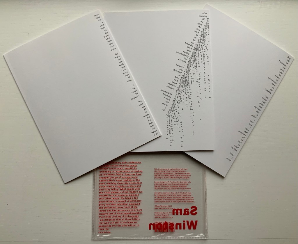
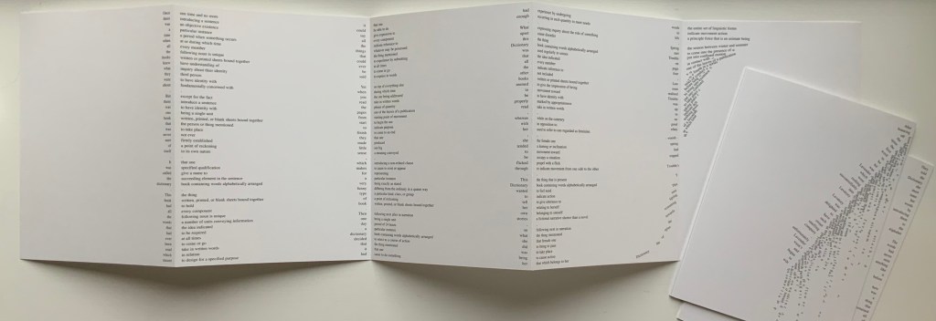
A Dictionary Story (2013) Sam Winston Three five-panel accordion folded sections in a plastic sleeve cover. Second trade edition. Sleeve: H205 x W160 mm. Sections: H200 x W150 mm, 15 panels. Acquired from the artist, 13 December 2020. Photos: Books On Books Collection.
Watching the artist adjust the typography of A Dictionary Story to changing dimensions is like watching a star tennis player who is also a star basketball player and star soccer (football) player. There’s always a ball, there’s always a net, there’s always genius.
The trade edition splits the fine press edition into three less narrow leporellos and nudges some of the two columns (story/definition) into the valley fold. Below, in the trade edition across panels 3 and 4 is where the Dictionary decides to bring her words to life, and on the right side of the fourth panel, the words begin to slip away from the fold.
The same part of the story in the fine press edition occurs on the fourth panel below, and the words tilt against the fold.
These variations create subtly different narrative paces and visual impressions in the two editions. Not one better than the other, just different. The poster variations, however, subordinate narrative pace entirely to visual impression. At present, the posters are not in the collection, but the images below help to make the point. As with movie goers, some will like the prints more than the books, others the books more than the prints, and still others will marvel at the genius in all of them.
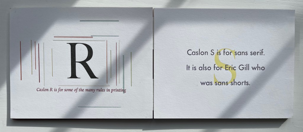
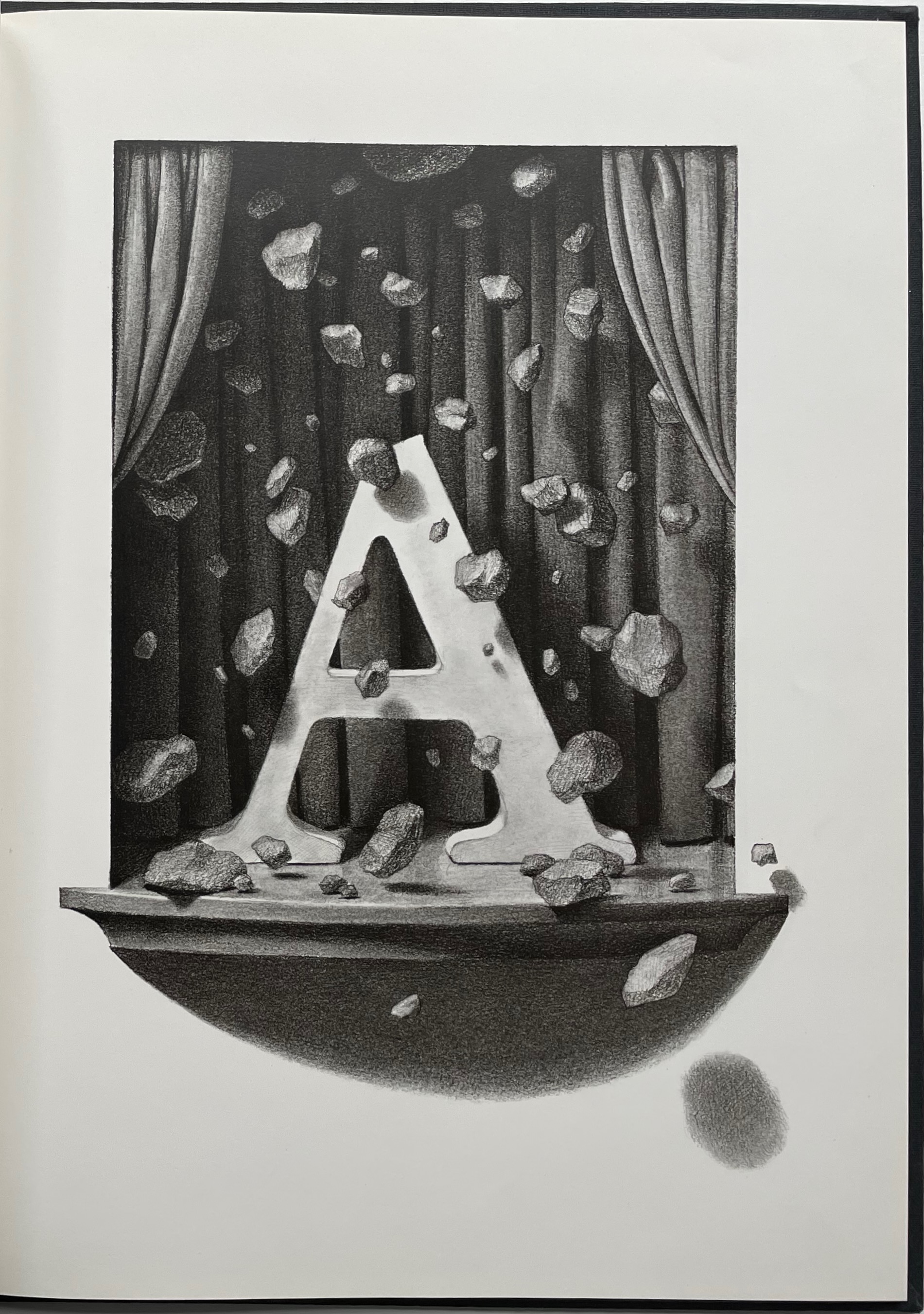
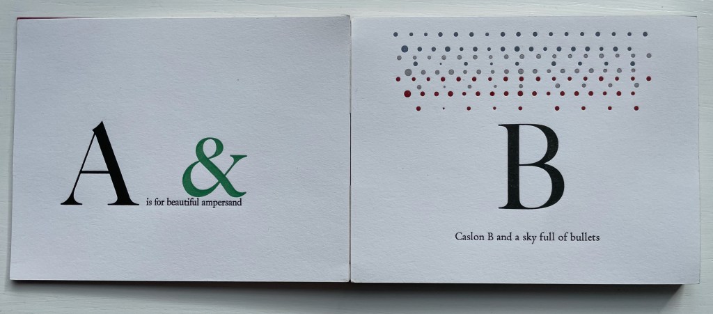
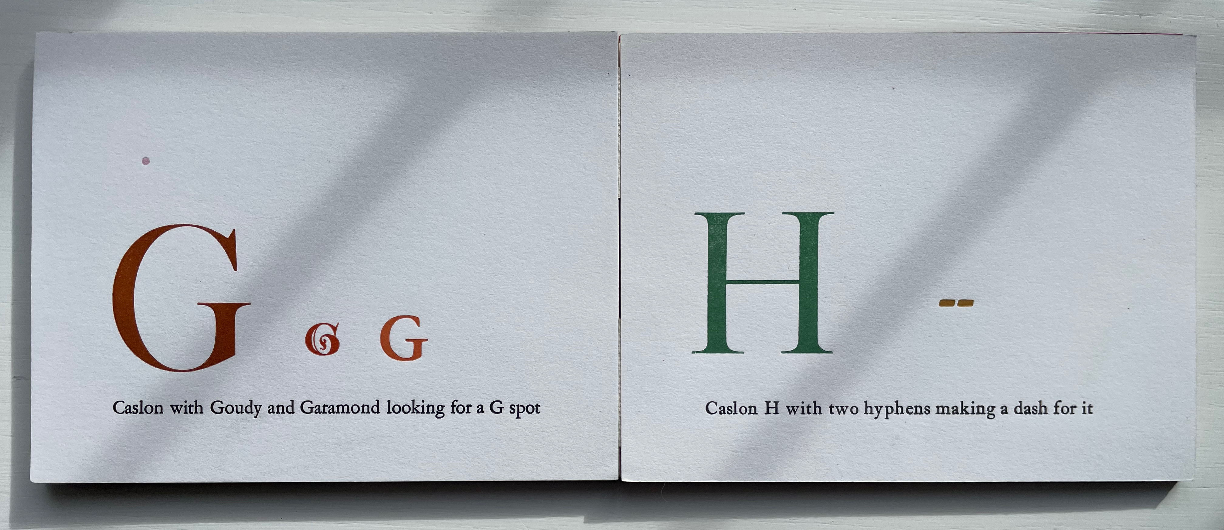
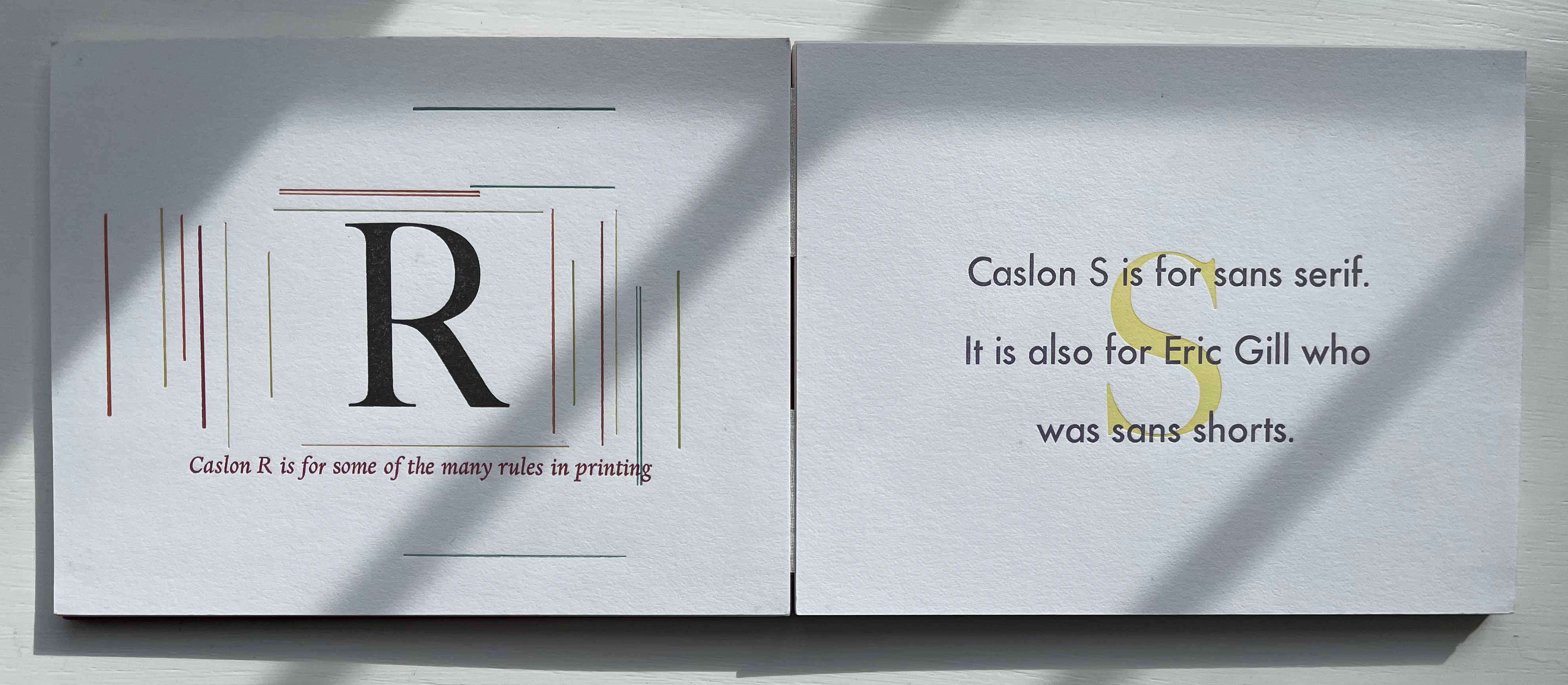
William Caslon’s Typographic ABC (1991) Marie Dern Double-sided leporello. H11 x W14 mm. 28 panels. Edition of 55, of which this is #1. Acquired from Bromer’s, 5 February 2023. Photos: Books On Books Collection.
One of the most common precursors to the codex, the leporello, accordion or concertina structure suits this celebration of what is considered the first original English typeface, designed by William Caslon (1692–1766), used to set both the Declaration of Independence and the U.S. Constitution, and so dominant a font since the 18th century that it prompted its own dicta: “When in doubt, use Caslon”. In Marie Dern’s hands, though, the accordion structure is anything but common. Rather than zigzag folding a long strip of paper, she has attached her panels to two parallel strips of linen tape and left just enough space between the pairs of panels to have the hinged leporello fold down into a precise oblong shape.
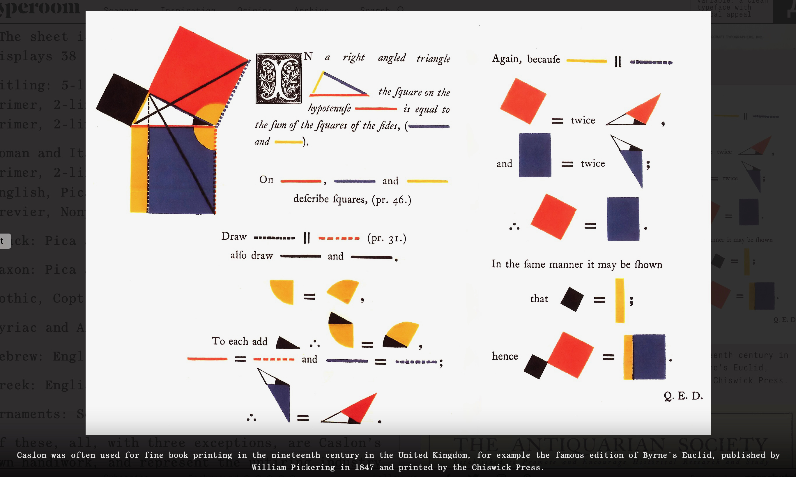
Caslon has featured in such outstanding books as Oliver Byrne’s The First Six Books of the Elements of Euclid: In Which Coloured Diagrams and Symbols Are Used Instead of Letters (1847), nearly an artist’s book in its own right. Dern might have been more immediately inspired, however, by Chris Van Allsburg’s whimsical children’s book The Z was Zapped: A Play in Twenty-six Acts, Performed by the Caslon Players (1987). From the start, bending the alphabet full circle to the ampersand, Dern’s own whimsy extends beyond the letters themselves.
L: from Byrne’s The First Six Books. Typeroom, 23 January 2020. Accessed 8 March 2023. R: from Van Allsburg’s The Z was Zapped. Photo: Books On Books Collection.
Given its age and dignity, Caslon attracted a fair amount of rock throwing from designers (especially in the 20th century). While Dern may have her own whimsical fun with Caslon, she doesn’t let the rock-throwers off scot free. Her Caslon’s G puts Frederic Goudy on notice that size does matter, and the Caslon S reminds Eric Gill of the emperor’s new clothes.
Other alphabetical typeface celebrations in the Books On Books Collection include Nicolas McDowall’s A Bodoni Charade (1995), Roberto de Vicq de Cumptich’s Bembo’s Zoo (2000) and Sharon Werner & Sharon Forss’ Alphabeasties and Other Amazing Types (2009).
Morison, Stanley. 1999. A Tally of Types New ed. [3rd ed.] ed. Boston: D.R. Godine. Caslon is not even included in Morison’s “tally” of seventeen typefaces. It appears on pages 24-27 in his introduction “revised & amplified” by Phyllis M. Handover. Even there they enlist Bruce Rogers, Emery Walker and William Morris to chuck additional rocks in Caslon’s direction on pages 37-38.
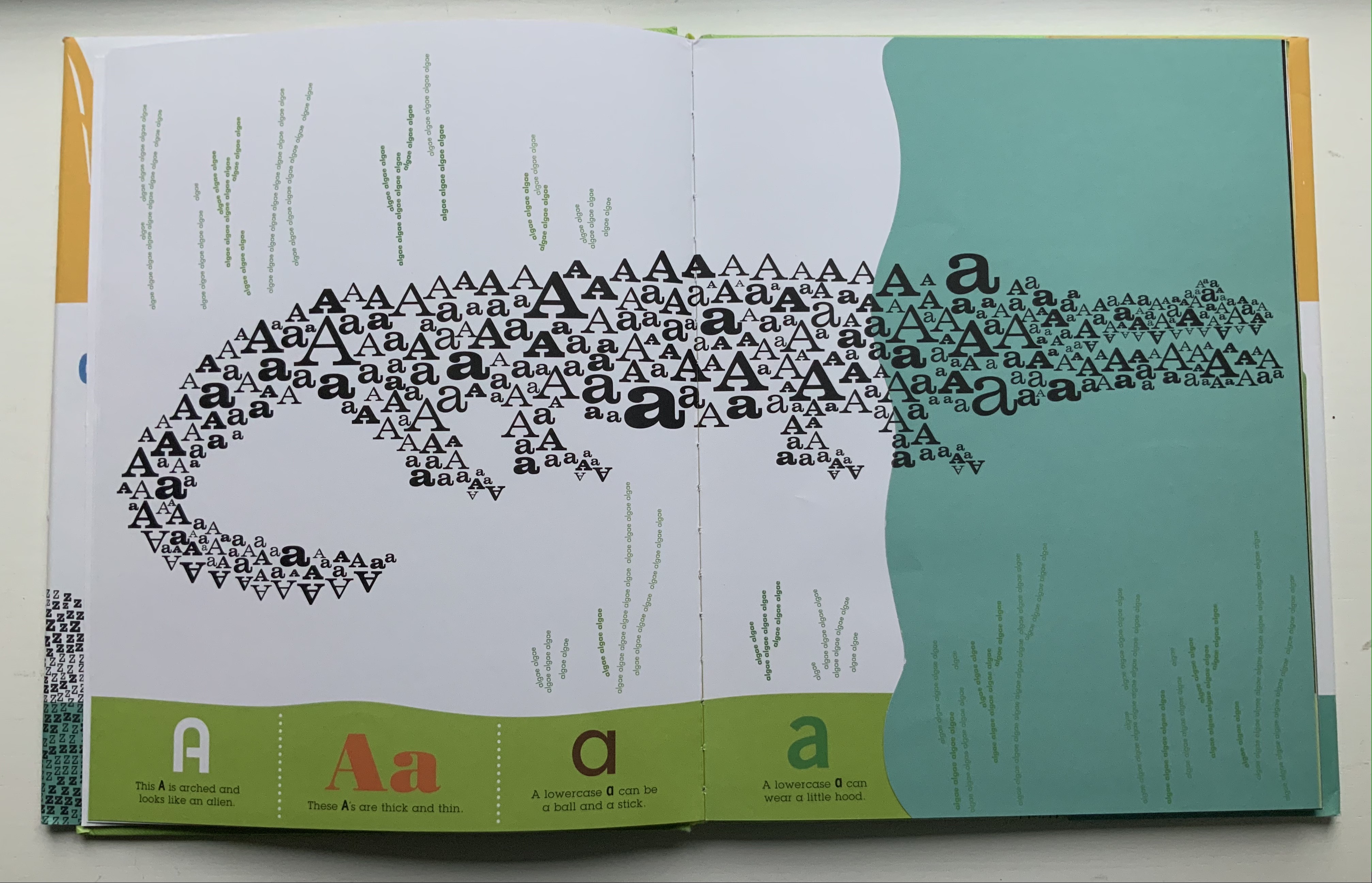
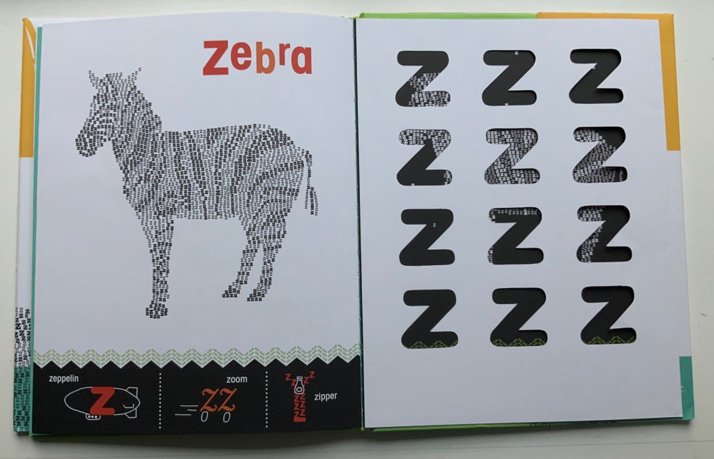
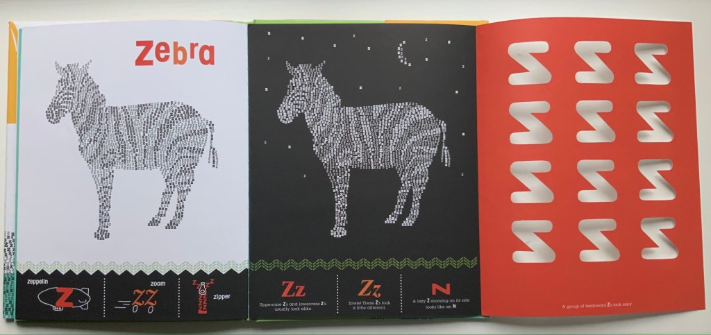
Alphabeasties and Other Amazing Types (2009) Sharon Werner & Sharon Forss Hardcover. H300 xW mm, 56 pages. Acquired from Golden Waves of Books, 7 August 2021. Photos: Books On Books Collection.
Unlike Roberto de Vicq de Cumptich’s Bembo’s Zoo (2000), this book relies on numerous type faces with which to create its alphabeasties, posed above the book’s illustratively shaped chiron that also provides the running information about “other amazing types”. Information is also conveyed from under flaps, through cutouts, across foldouts and by background images constructed of words.
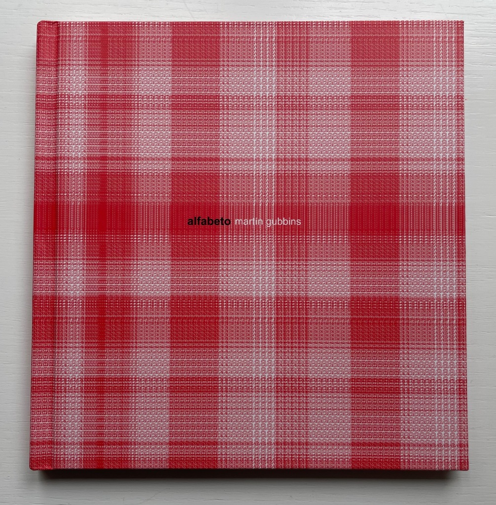
Alfabeto (2017) Martín Gubbins Hardback. 180 x 180 mm. 60 pages. Acquired from Naranja Publicaciones, 28 July 2022. Photos: Books On Books Collection.
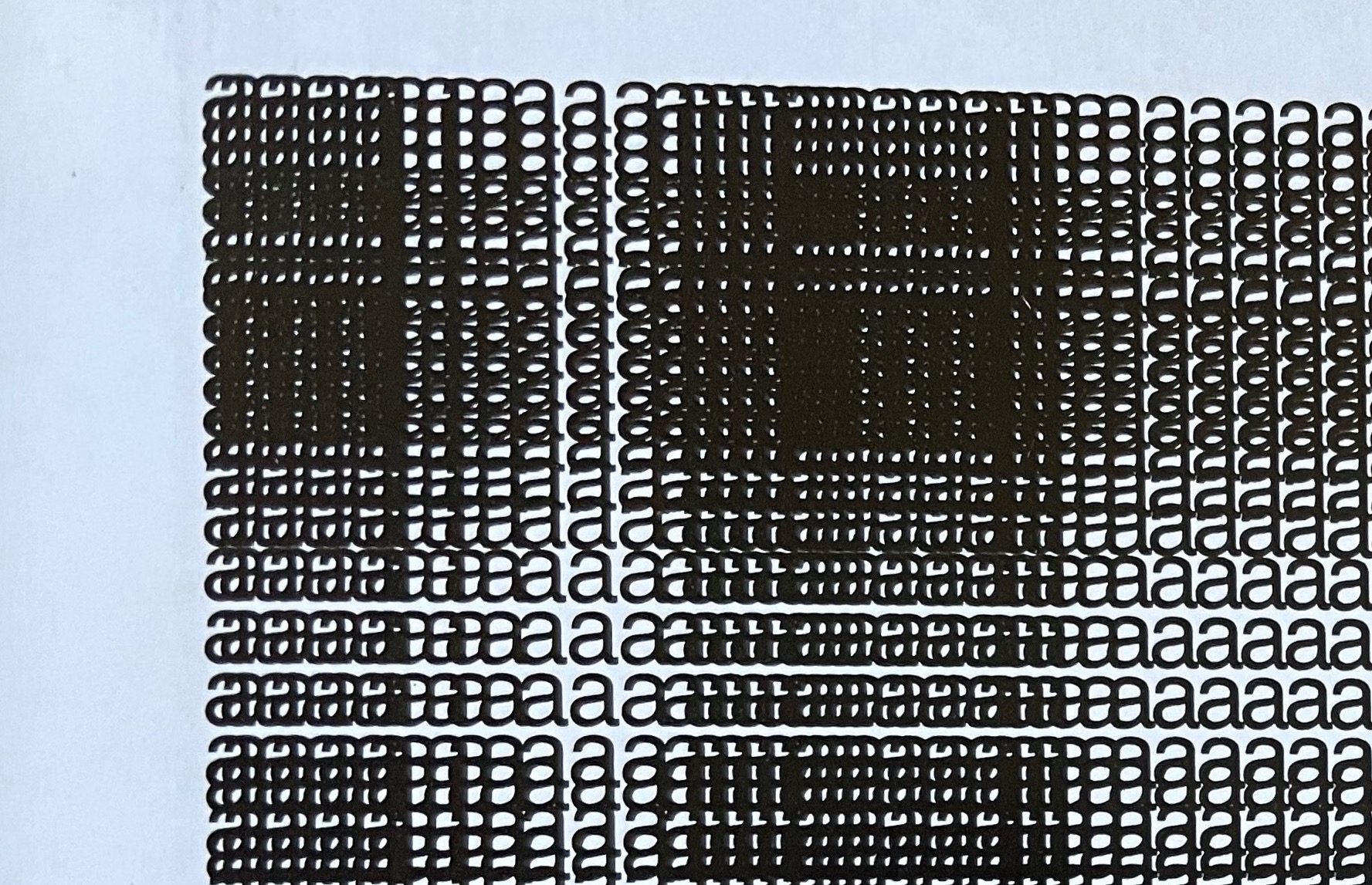
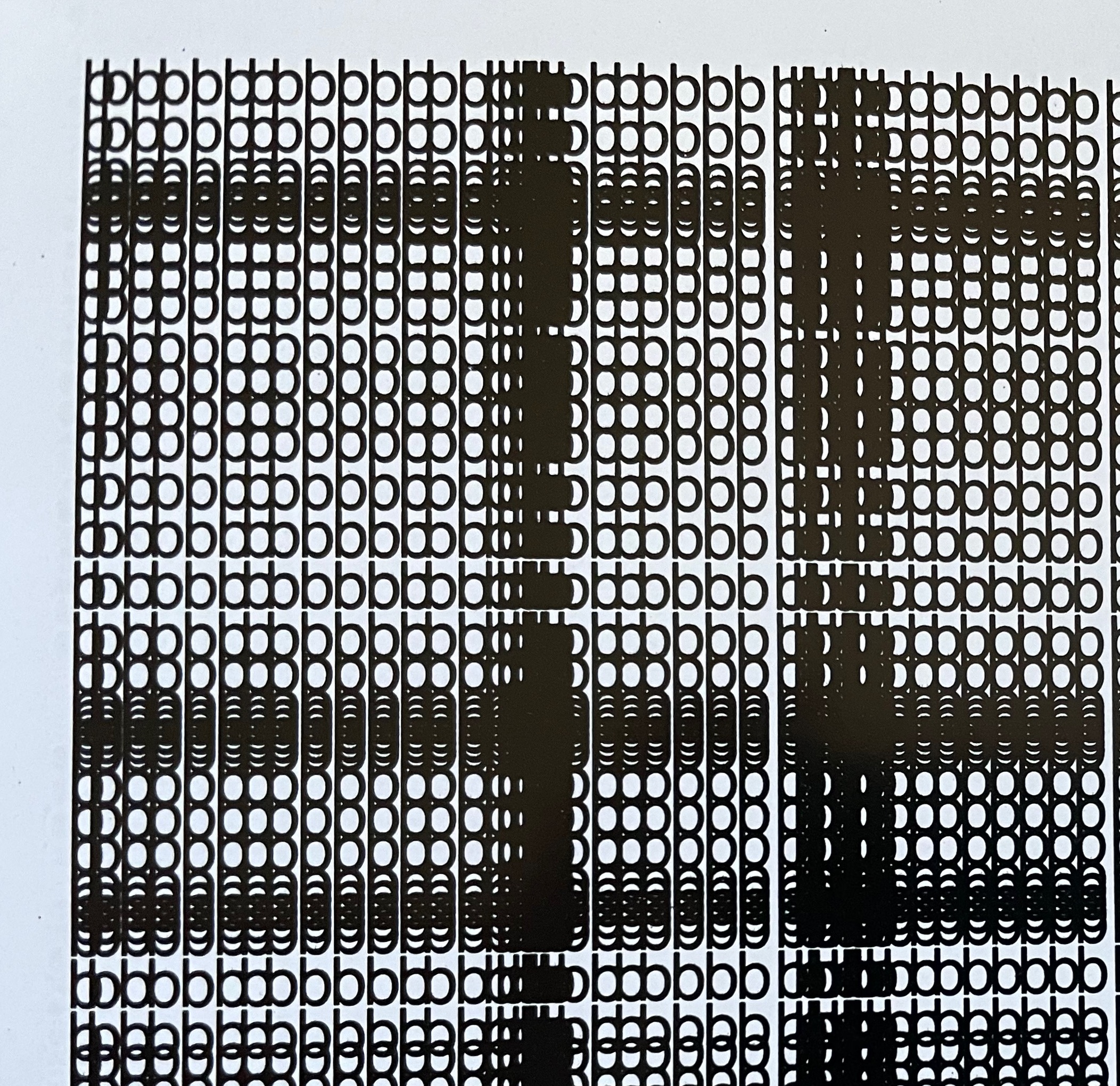
Each letter of the Spanish alphabet is printed in sans serif across a full page to create a grid-like or plaid-like pattern. All letters are printed once in black on white paper and twice in white on black paper; with sheets facing one another. For the English-speaking reader, that’s a bonus of two pages for the ñ.
Held at normal reading length, the double-page spreads do have a plaid effect, but inspected closely, the effect becomes that of wire mesh from which the letters leap out from the less tightly woven spots.
Unsurprisingly the plaids are as distinct from, and similar to, one another as letter shapes are. Sometimes, as with the letter b, an illusion of three dimensionality takes hold.
The most surprising — though they should not be — are the letters i and l. With no crossbar, bowl or curve, they cannot create a plaid pattern. Rather, their black on white, white on black patterns look like barcodes.
Gubbins One of the founding members of the Foro de Escritores (www.fde.cl) Chilean version of Bob Cobbing’s Writers Forum in London, and noted figure in the avant-garde poetry scene in Latin America. Gubbins has collaborated with the American poet and artist John M. Bennett, in whose honor
Some visual artists call this kind of work a “tapuscript“. Some throw it together under the heading of language art or concrete or visual poetry. Karl Kempton prefers the term “visual text art” over any other. Conceding the term to cover the broad genre, works like Alfabeto that cover the entire alphabet in sequence — or even play with its sequence — might deserve the sub generic term “visual alphabet art”. Kempton himself, Roberto de Vicq de Cumptich, Raffaella della Olga, Sharon Werner & Sharon Forss — as well as many of the artists in Victoria Bean and Chris McCabe’s anthology and those in Philip Davenport’s — surely provide a sufficient number of examples.