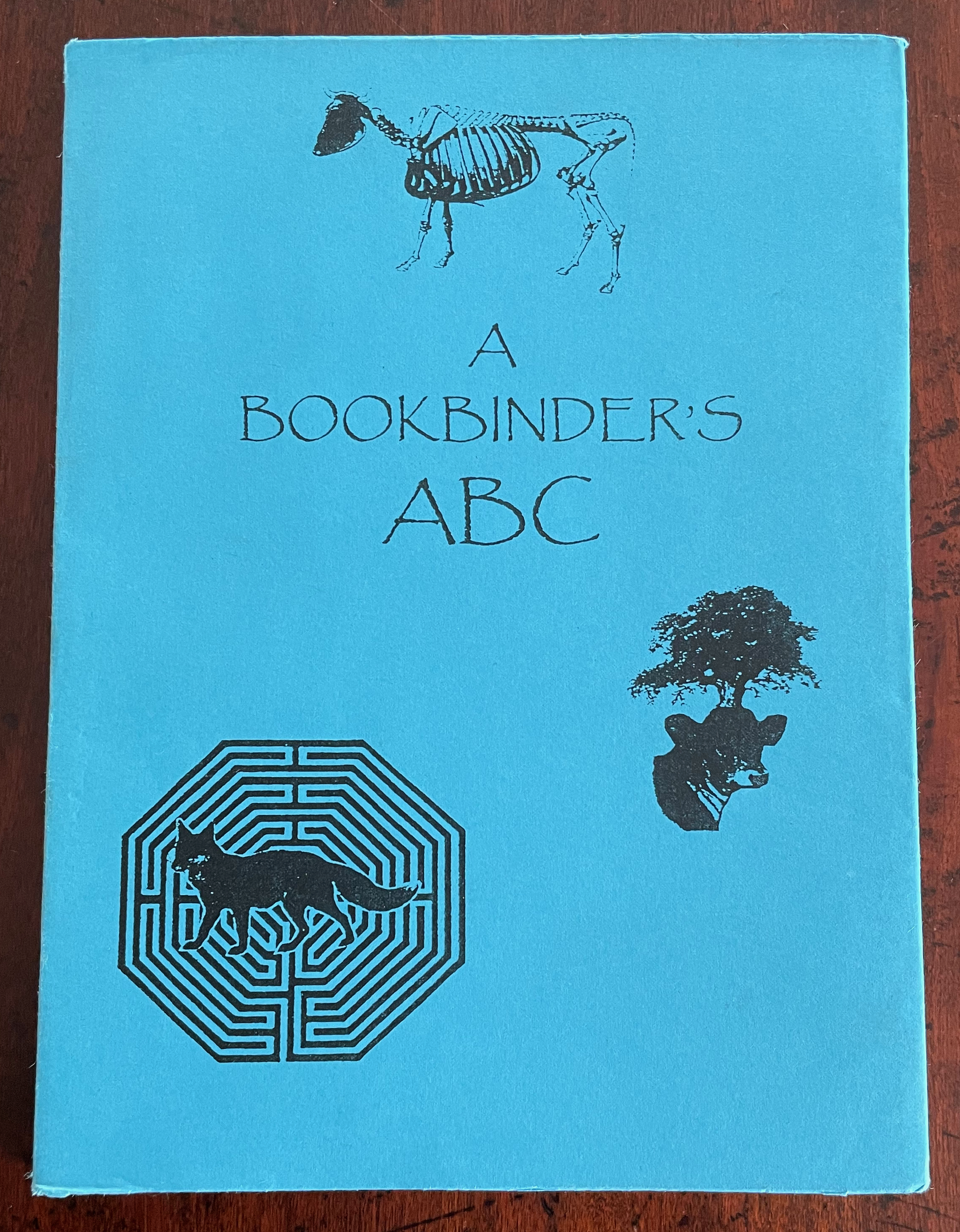
A Bookbinder’s ABC (2003)
A Bookbinder’s ABC (2003)
Christopher Hicks, Leaning Chimney Press Editions
Soft cover (buff card, illustrated paper jacket glued to spine, sewn block). H200 x W150 mm. 34 pages. Edition of 75. Acquired from Barter Books, 18 October 2023.
Photos: Books On Books Collection.
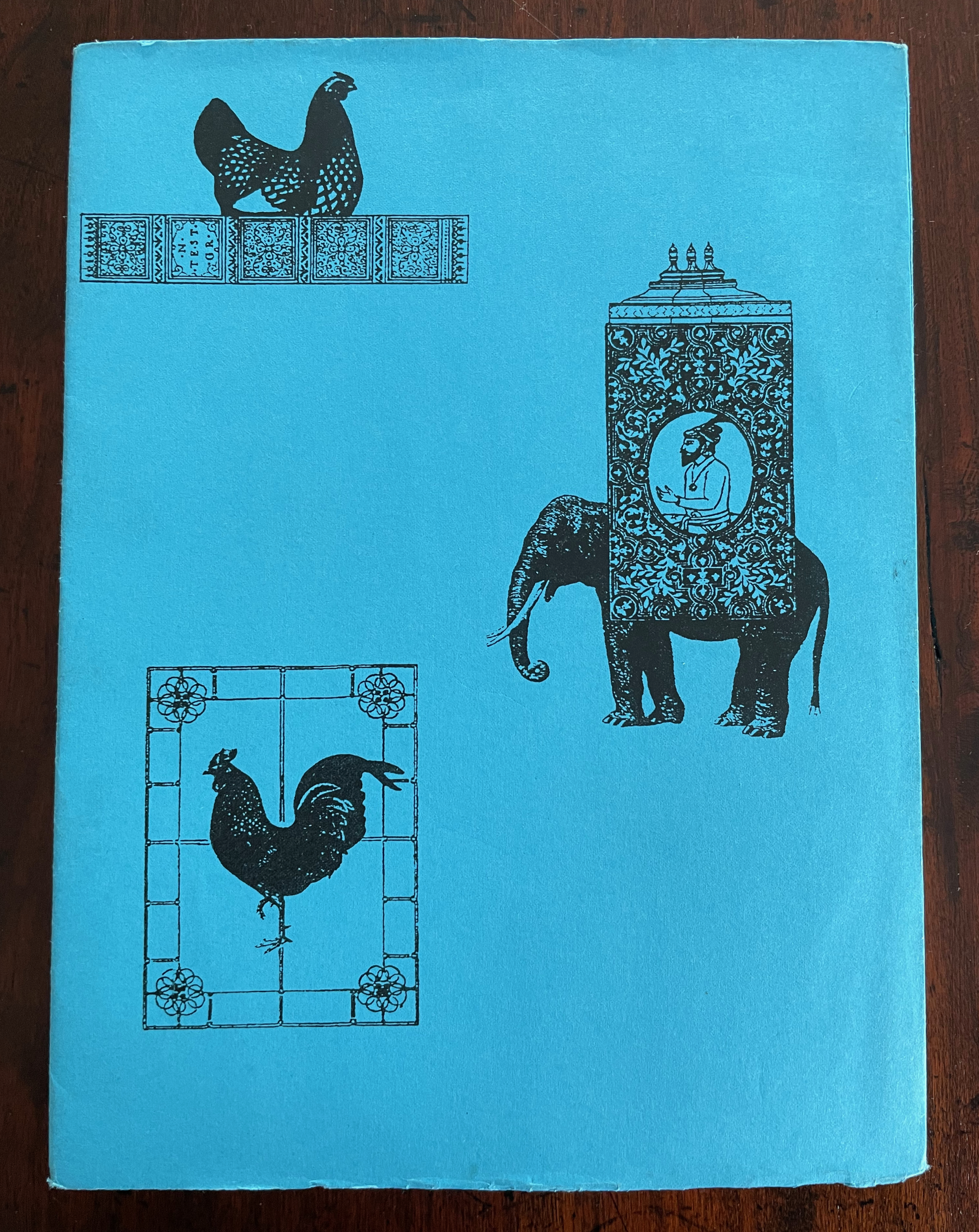
Although Glaister’s Encyclopedia of the Book is the canonical dictionary for book terminology, A Bookbinder’s ABC provides 26 humorous visual reminders.
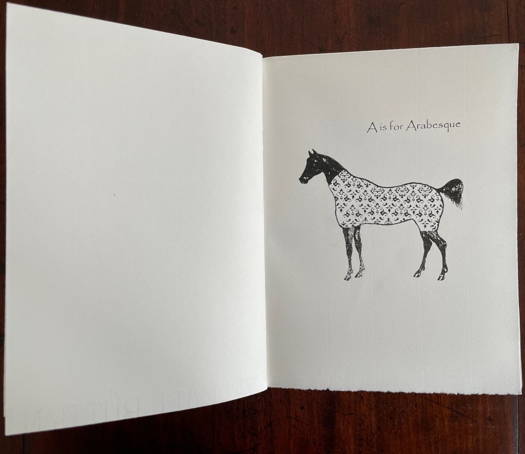
An Arabian stallion in a decorative onsie for recalling the description of fleurons and other devices derived from Islamic patterns.
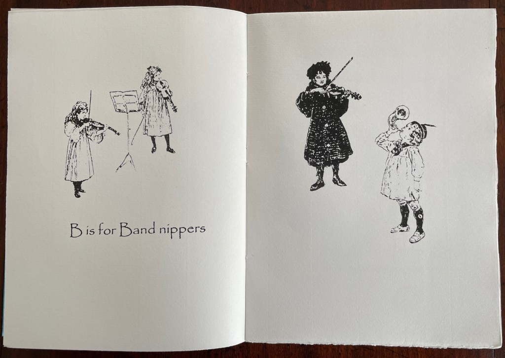
What else would a binder call a children’s orchestra?
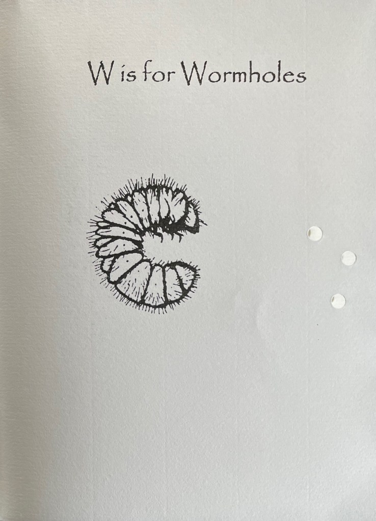
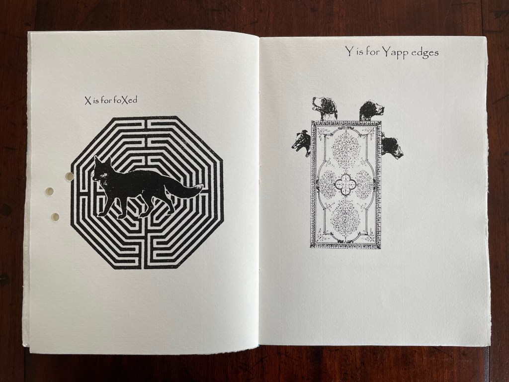
A fox flummoxed by a maze is certainly “foxed”. This one is also likely puzzled by the holes carried over from “Wormholes” on the previous page. Barking dogs springing from a book cover might be a helpful mnemonic for the name of the wide soft edges or flaps for Bible covers devised by the 19th century London bookseller Yapp.
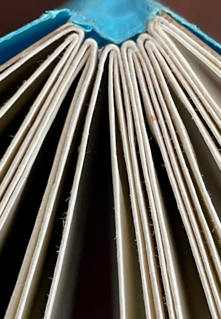
The work’s own binding has simple but interesting features. The front and back covers in buff card are glued to the first and last sewn gatherings, respectively, and the sewn gatherings are glued in between and sewn together. The blue paper jacket’s spine is glued to the spines of the gatherings and its fore edges fold over the fore edges of the buff card. Curious but not as self referential as the features of two nearby birds of a feather from Andrew Morrison’s Two Wood Press.
Detail of uncut top edges and gluing of gatherings and spine.
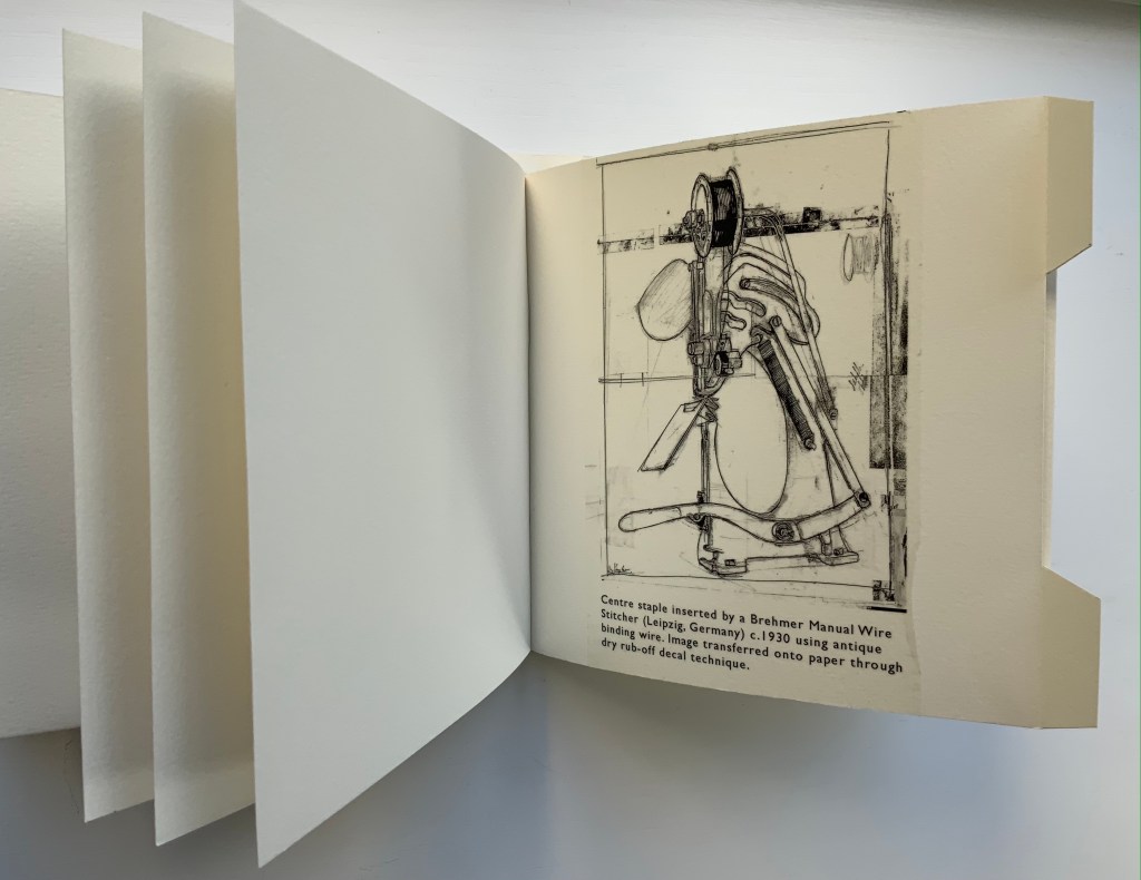
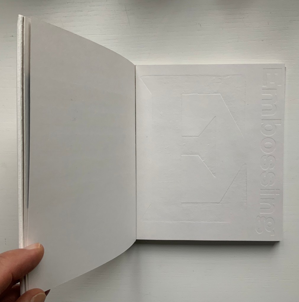
From Morrison’s Provenance (2018), showing an actual wire-stitched gathering and then an illustration of the mechanism; from Morrison’s Two Wood Press A-Z (2003), showing showing an embossed page illustrating E for Embossing. Photos: Books On Books Collection.
But what would a self-referential binding for A Bookbinder’s ABC look like — especially one that might carry on the punnery of the contents? Presumably because they are closer to the words, entries in letterpress abecedaries such as Morrison’s Two Wood Press A-Z (2003) and Kevin M. Steele’s The Movable Book of Letterforms (2009) have an easier time of the visually self-referential.
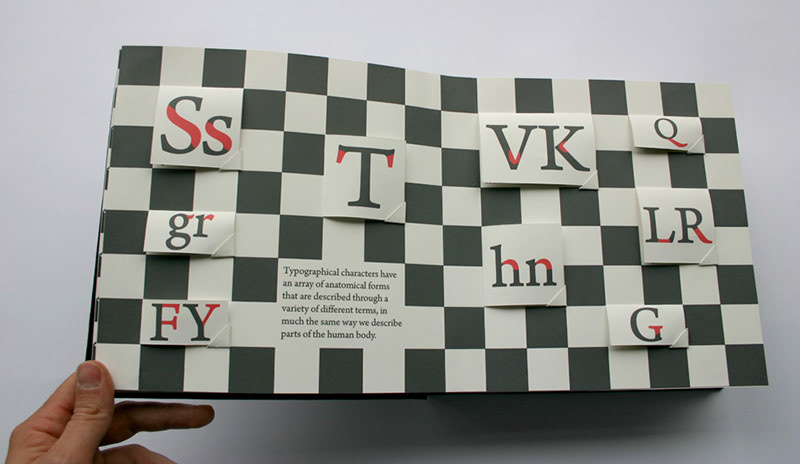
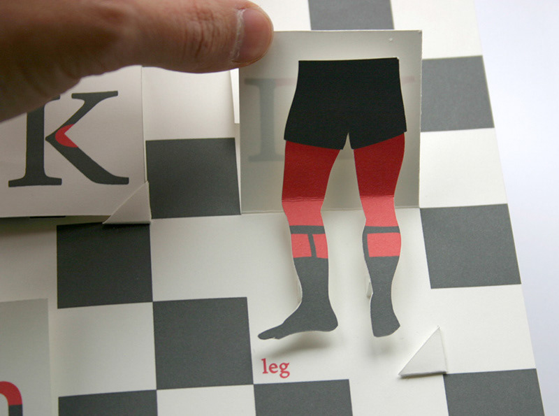
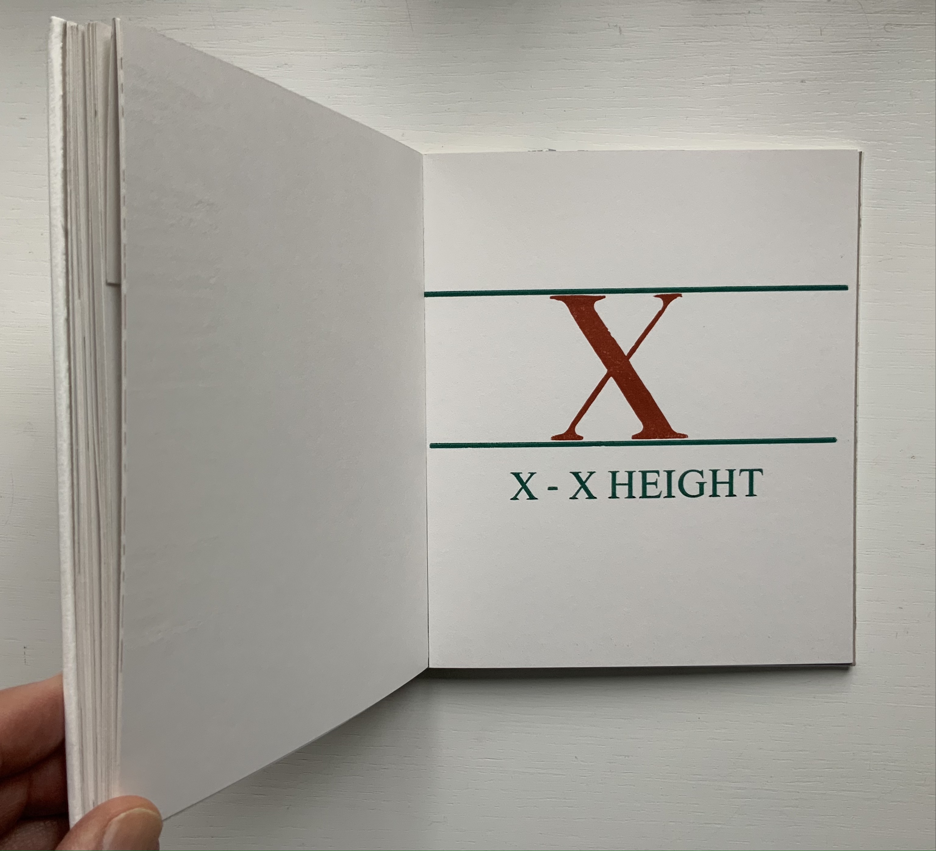
From Steele’s A Movable Book of Letterforms, showing the anatomical term for the red areas of the L & R (a leg lift?); from Morrison’s Two Wood Press A-Z, showing x’s definition of its height.
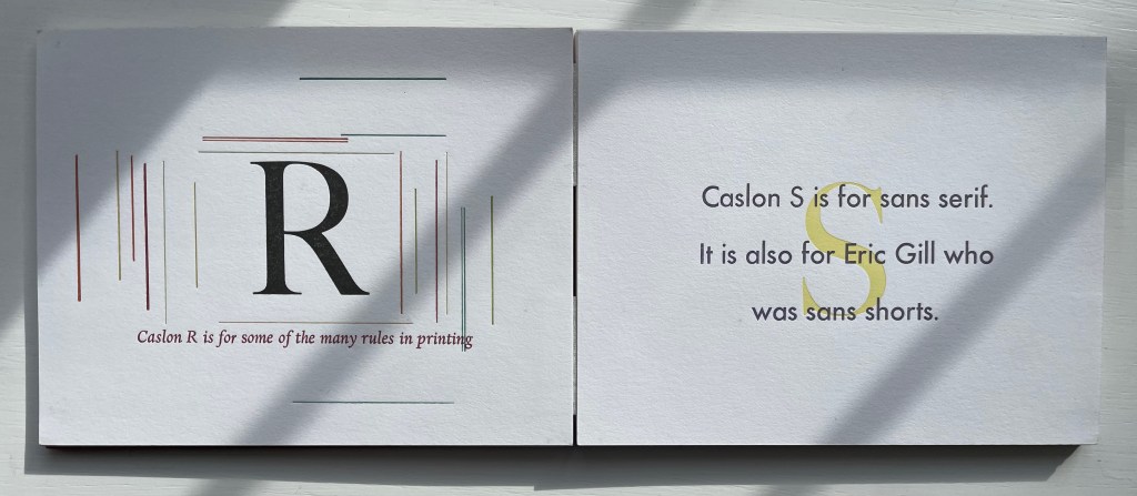
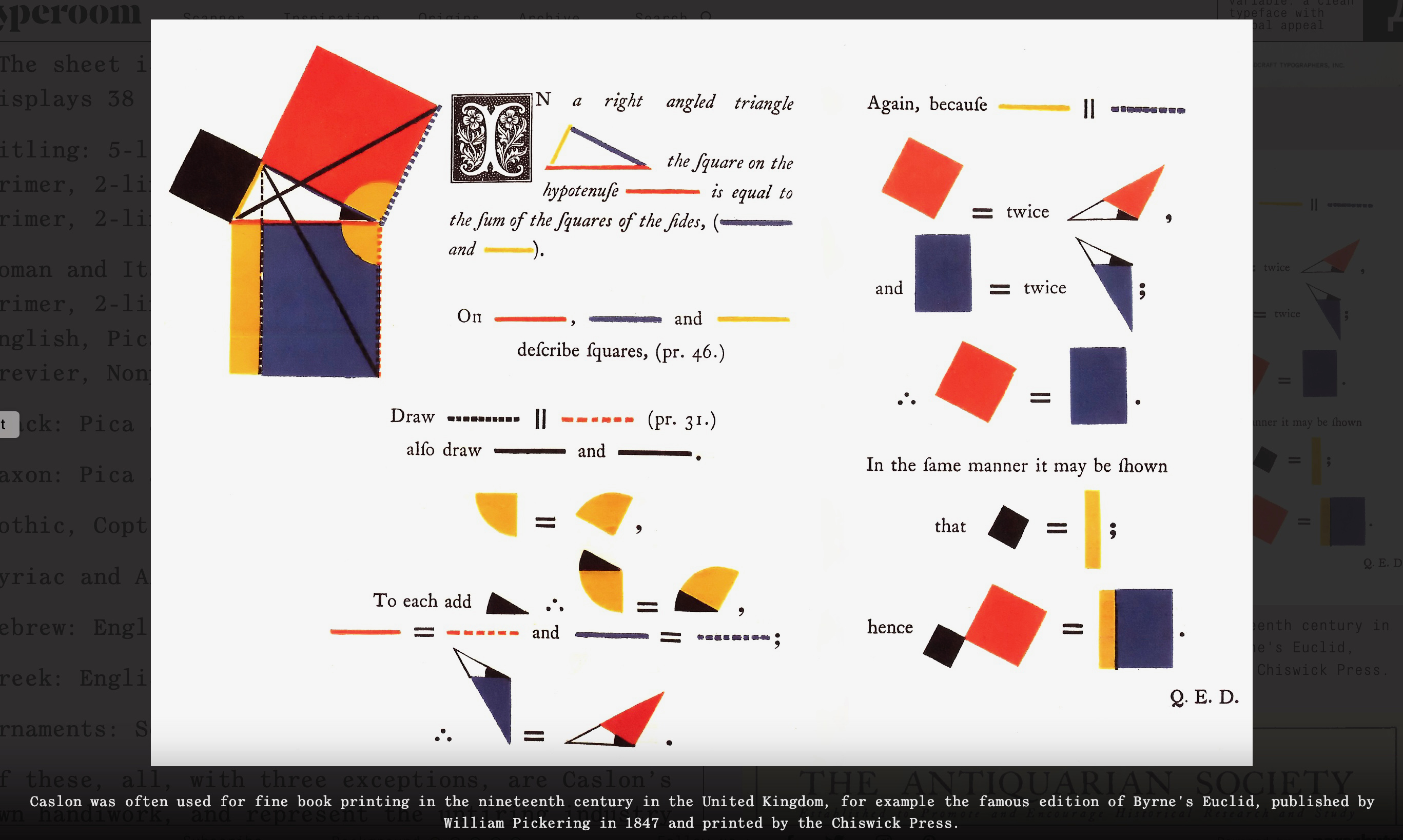
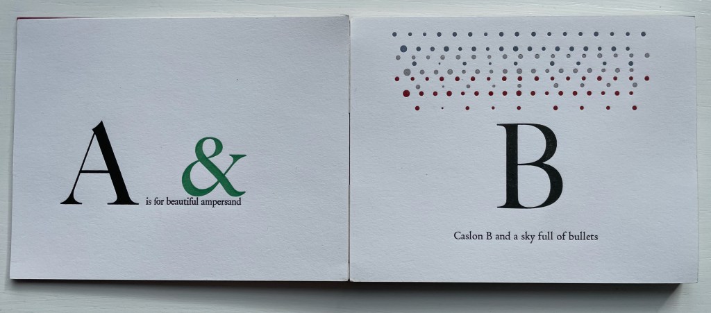
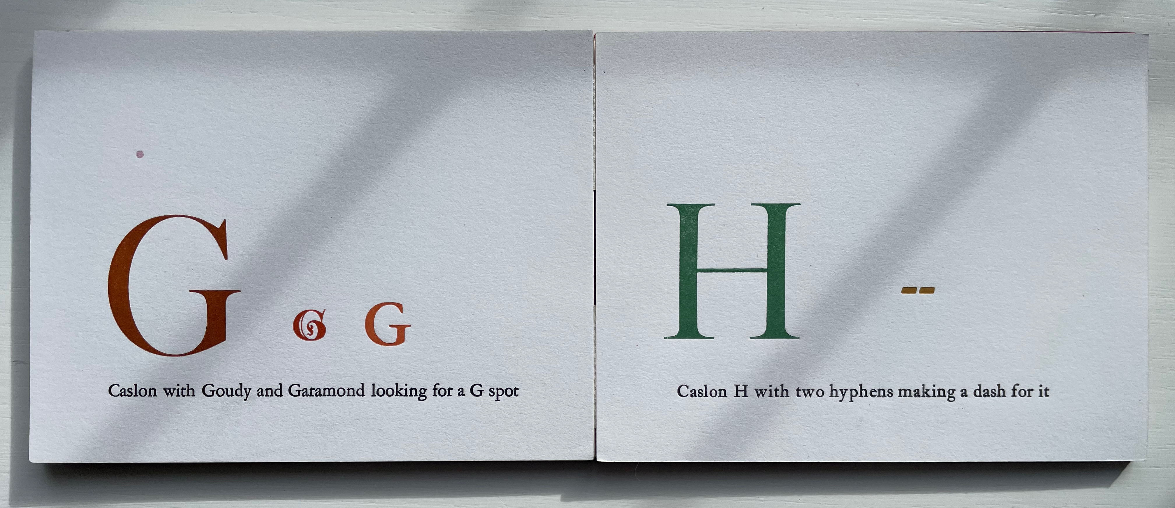
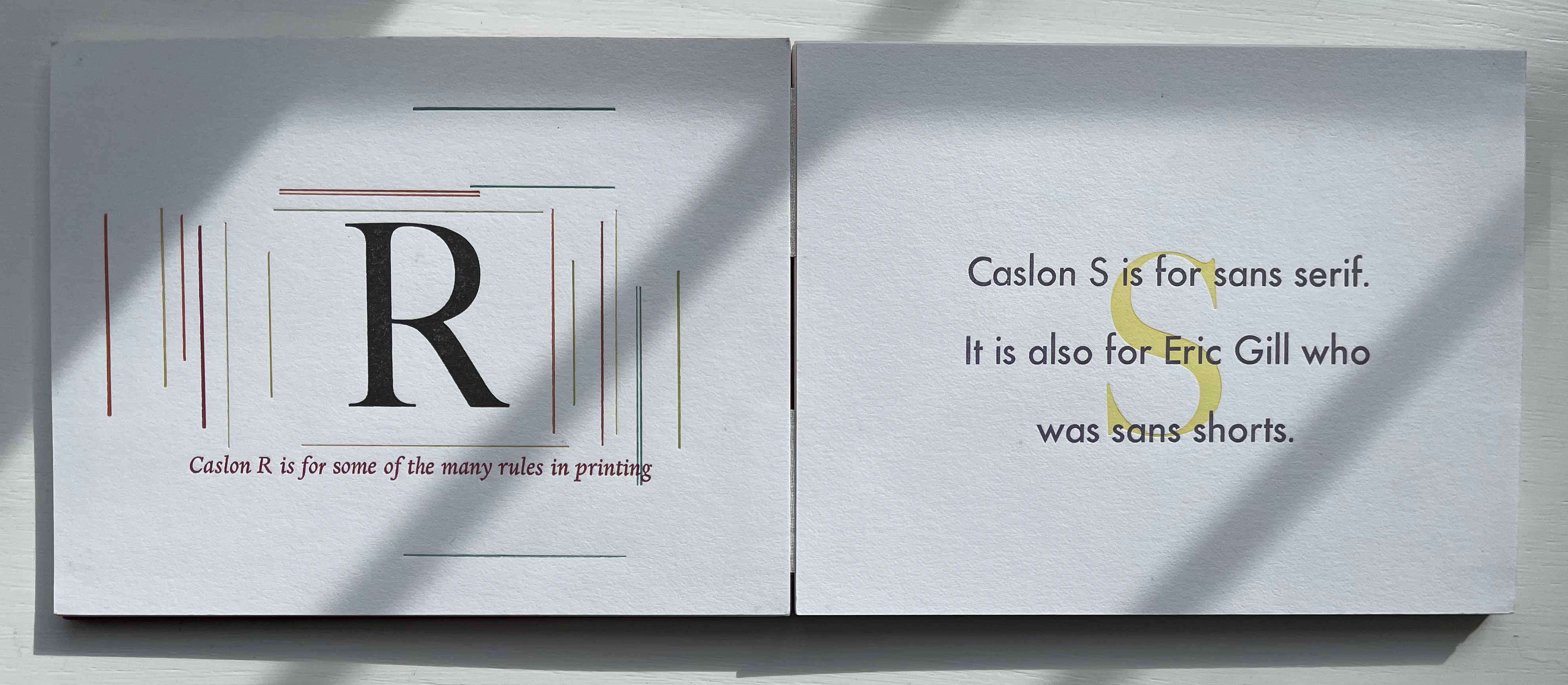
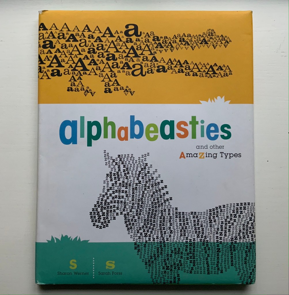
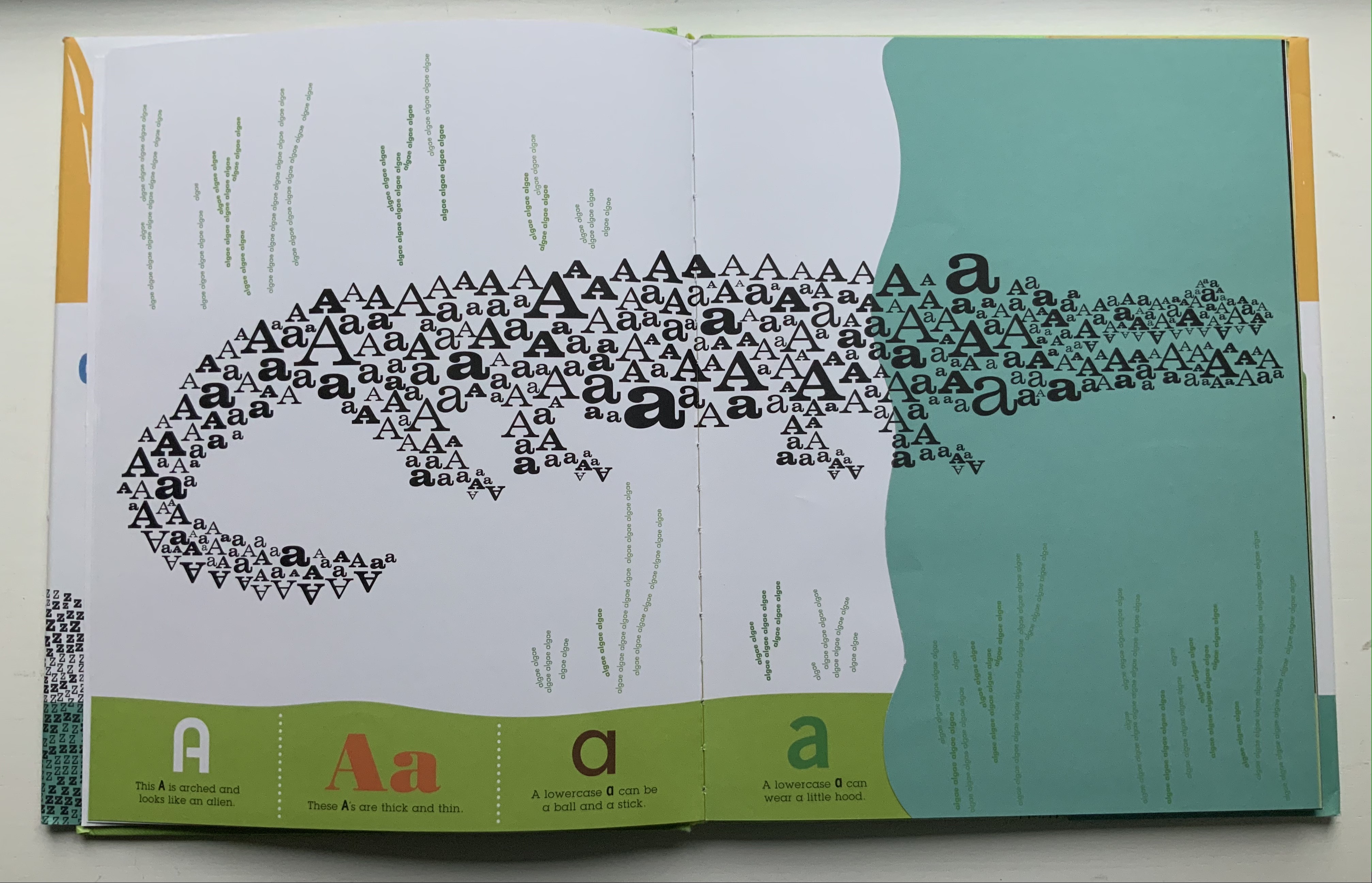
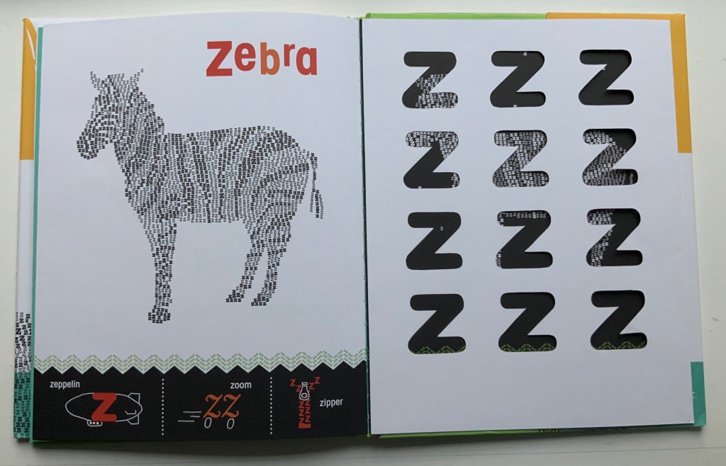
Closer still to the words are the typographical punsters such as Marie Dern and William Caslon’s Typographic ABC (1991), Nicolas McDowall and A Bodoni Charade (1995) or Sharon Werner & Sharon Forss and Alphabeasties and Other Amazing Types (2009).
From Dern’s William Caslon’s Typographic ABC, McDowall’s A Bodoni Charade and Werner & Forss’ Alphabeasties and Other Amazing Types.
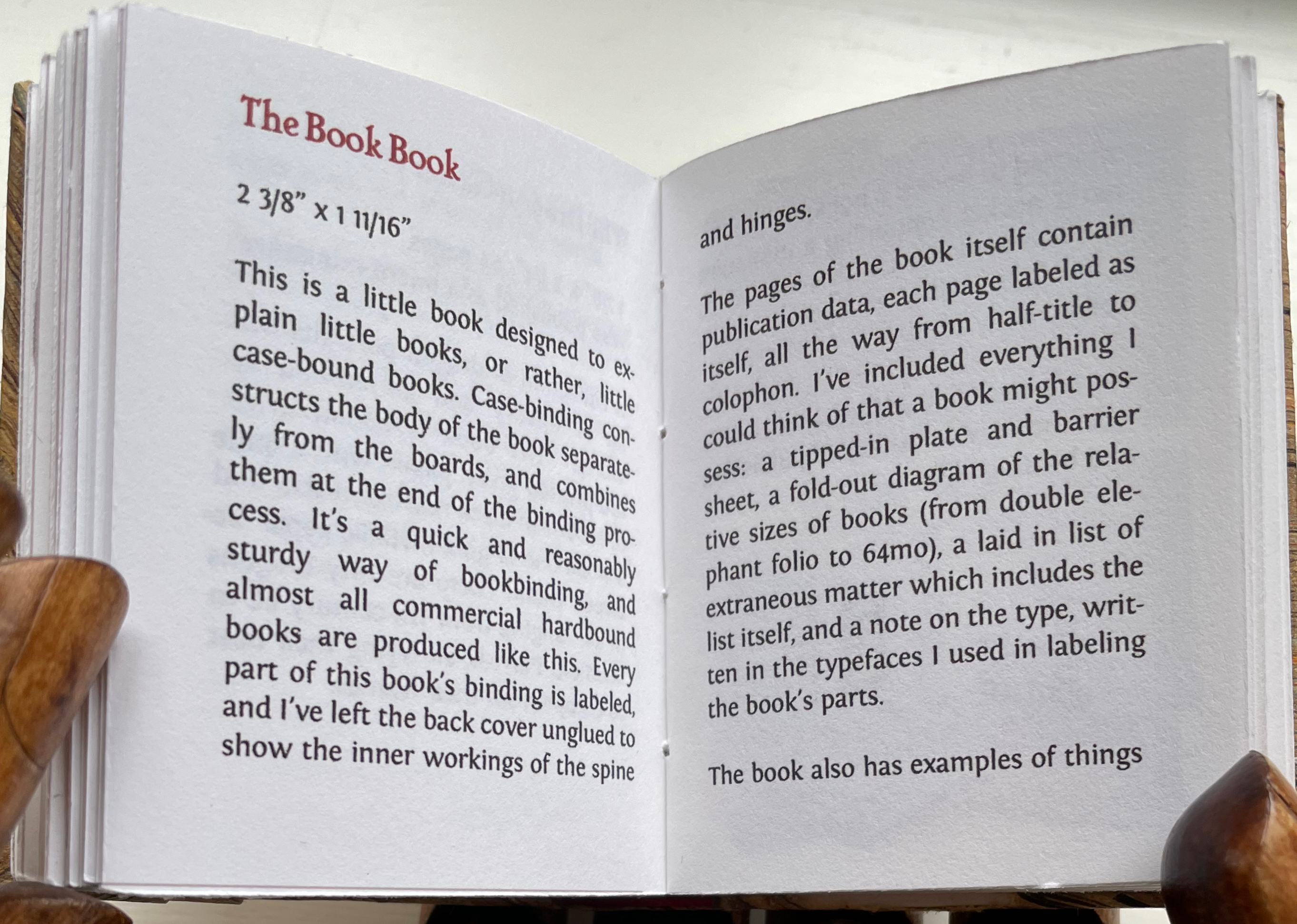
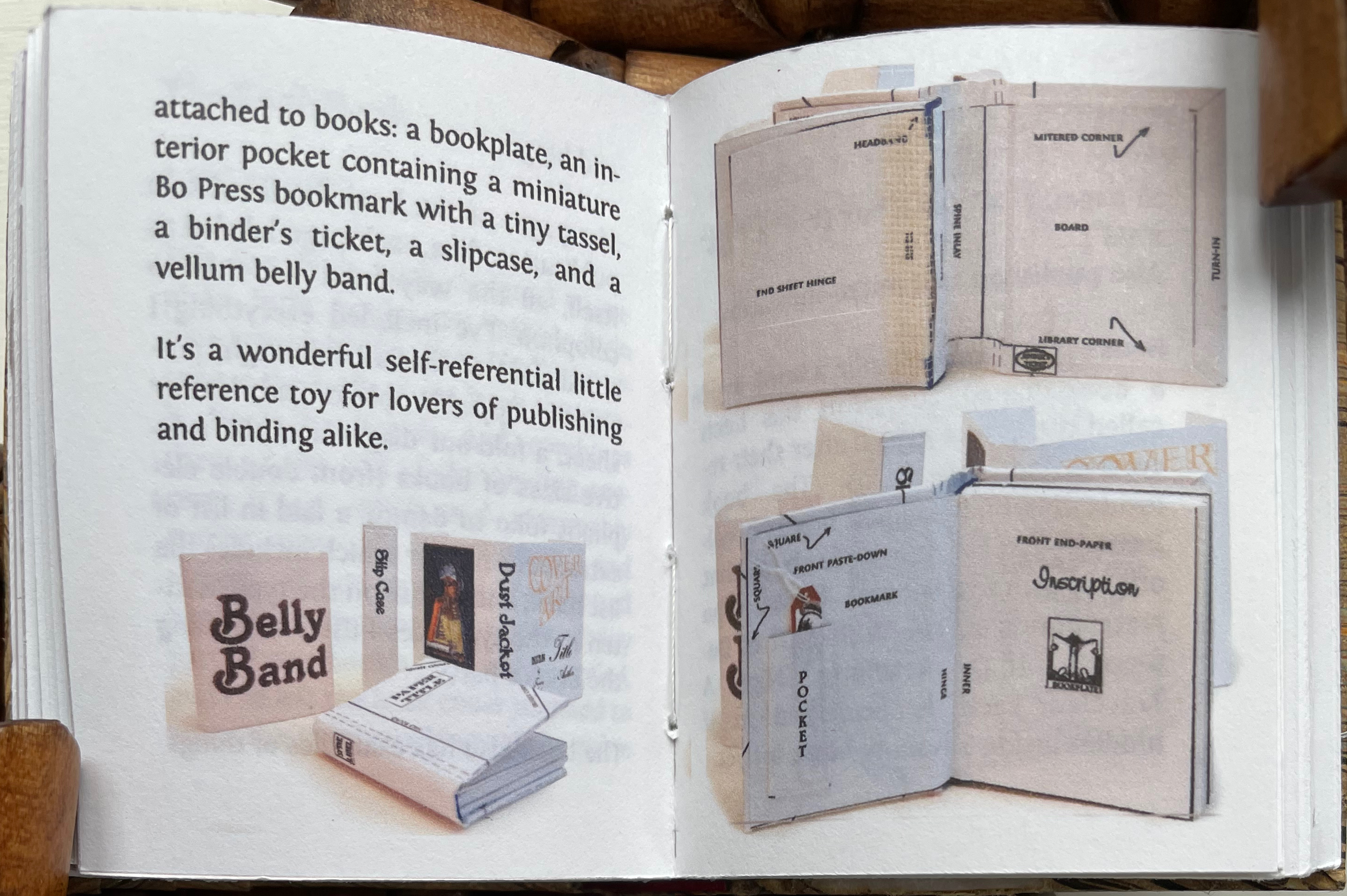
Perhaps Pat Sweet’s miniature The Book Book (2010) comes closest on self-referentiality in a work about binding. For the puns, we will have to wait for another bookbinder to take a stab at it.
From Sweet’s The History of Bo Press (2021).
Further Reading
“Abecedaries I (in progress)“. Books On Books Collection.
“Alphabets Alive!“. 19 July 2023. Books On Books.
“David Clifford“. 15 September 2021. Books On Books Collection.
“Marie Dern“. 8 March 2023. Books On Books Collection.
“Nicolas McDowall“. 10 December 2022. Books On Books Collection.
“Andrew Morrison“. 15 September 2021. Books On Books Collection.
“Kevin M. Steele“. 18 July 2023. Books On Books Collection.
“Pat Sweet“. 18 January 2023. Books On Books Collection.
“Sharon Werner & Sharon Forss“. 20 December 2022. Books On Books Collection.
Frost, Gary. 1996. Teaching set of historical bookbindings. Utopia, Tex: Gary Frost, Dry Frio Bindery.
Hanmer, Karen. 2013. Biblio Tech. Glenview, IL: Karen Hanmer Book Arts.