The Palace of Typographic Masonry (2018)
The Palace of Typographic Masonry (2018)
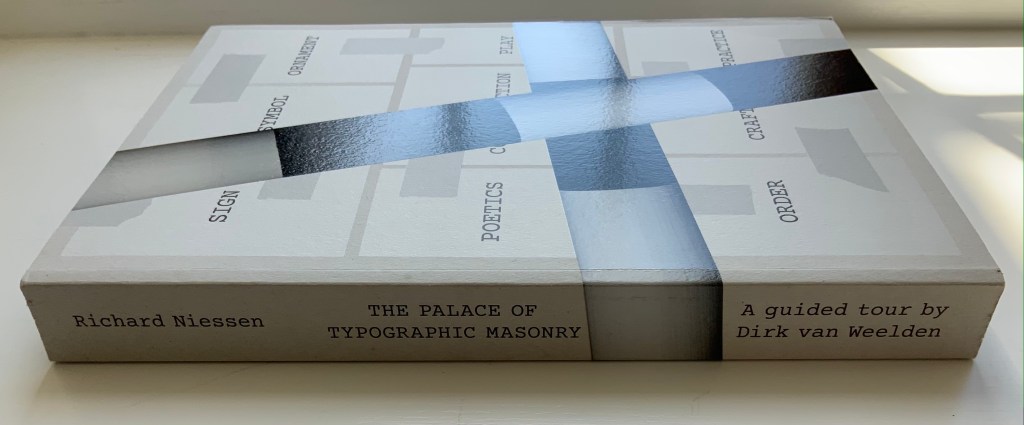
Richard Niessen
Paperback, perfect bound. H300 x W215 mm, 348 pages. Acquired from Wordery, 29 March 2021.
Photos of the work: Books On Books Collection. Displayed with permission of Richard Niessen.
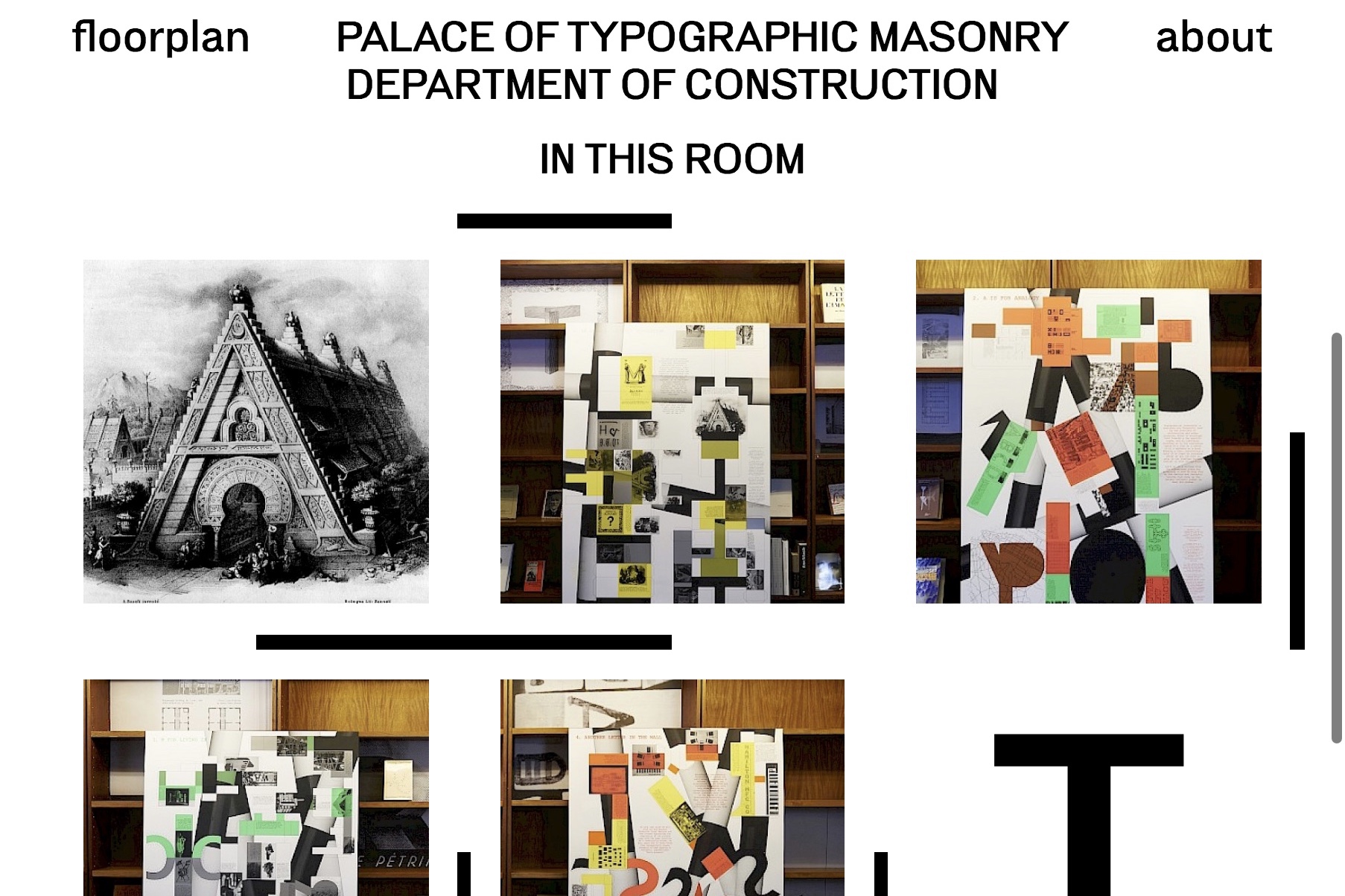
Website, perforated poster, exhibition and paperback, The Palace of Typographic Masonry occupies its place in the Books On Books Collection unlike any other work. The book itself is a shape shifter. Its size competes with those of museum catalogues. In fact, the Palace of Typographic Masonry is like a museum, so much so that it requires a tour guide, which is one shape the book takes. With its nine departments (Sign, Symbol, Ornament, Construction, Poetics, Play, Order, Craft and Practice), it is like a working museum of graphic design, and Dirk van Weelden, our tour guide, often hands us off to departmental “staff” for a lecture or overheard interview.
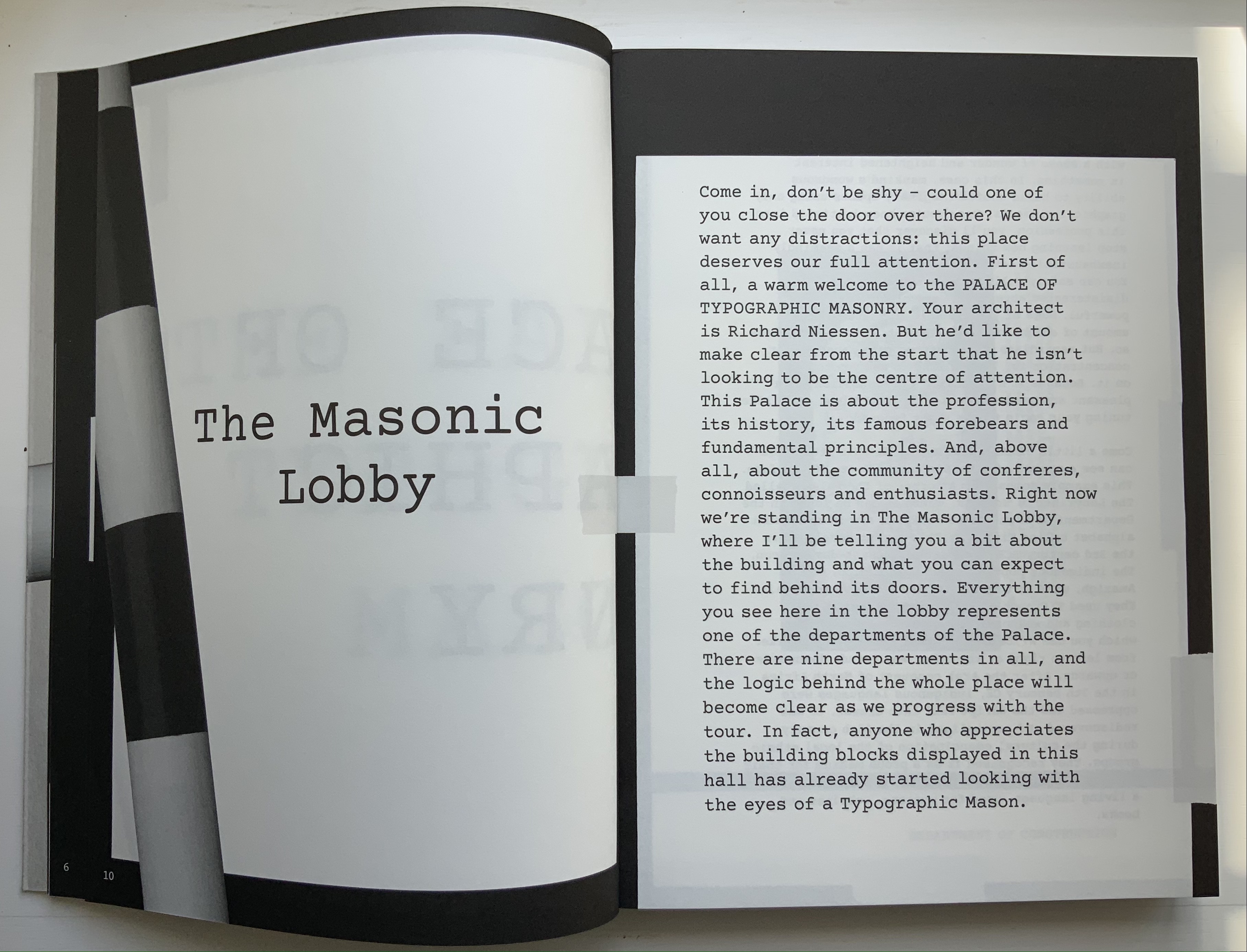
Given the guided-tour premise, the page layouts strangely, or perhaps appropriately, disorient. On almost every page, at almost every turn, we are rubbernecking and twisting to follow text that appears in a typewriter font on sheets and cards that seemingly have been stuck to a black surface with masking tape, photographed and then printed. Some of the text-bearing cards wrap from the recto page to the verso, leading the reader to think that perhaps the pages are on Chinese fold sheets. A card or sheet may be displayed complete on a page, but the next page may show its edge as if an overlapping photo had been taken. On some pages, the items overlap like a collage. At times, the effect is one of moving down a corridor of blackboards that are covered with notices and captioned photos on white, green and fluorescent orange paper. At other times, the page contains multiple cards as if lying on a flat surface — much the same as objects might be arranged in gallery glass cases — and in different orientations so that the book has to be turned clockwise or anti-clockwise to read each item — much the same as having to walk around a glass case to look at each object in it.
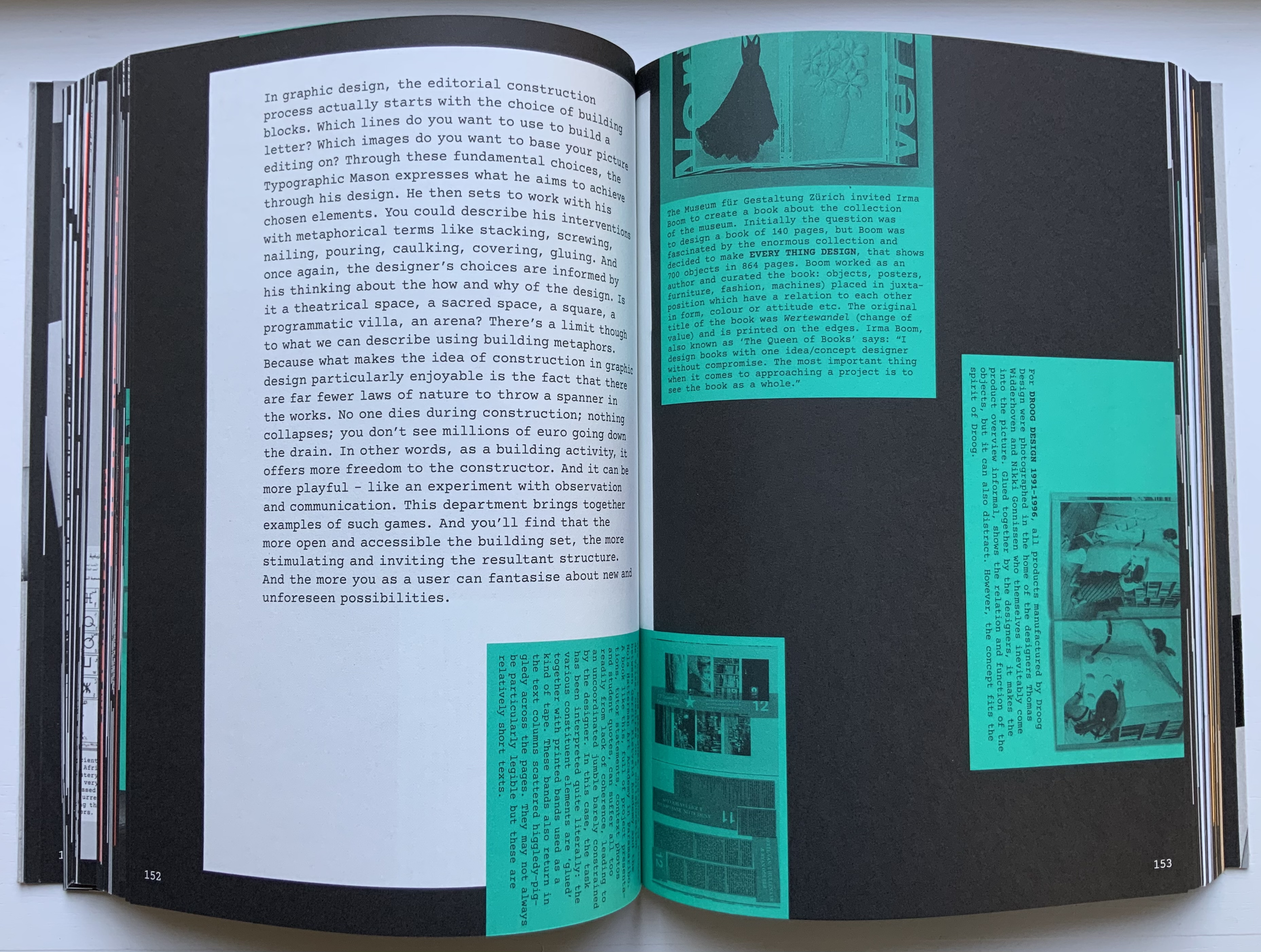
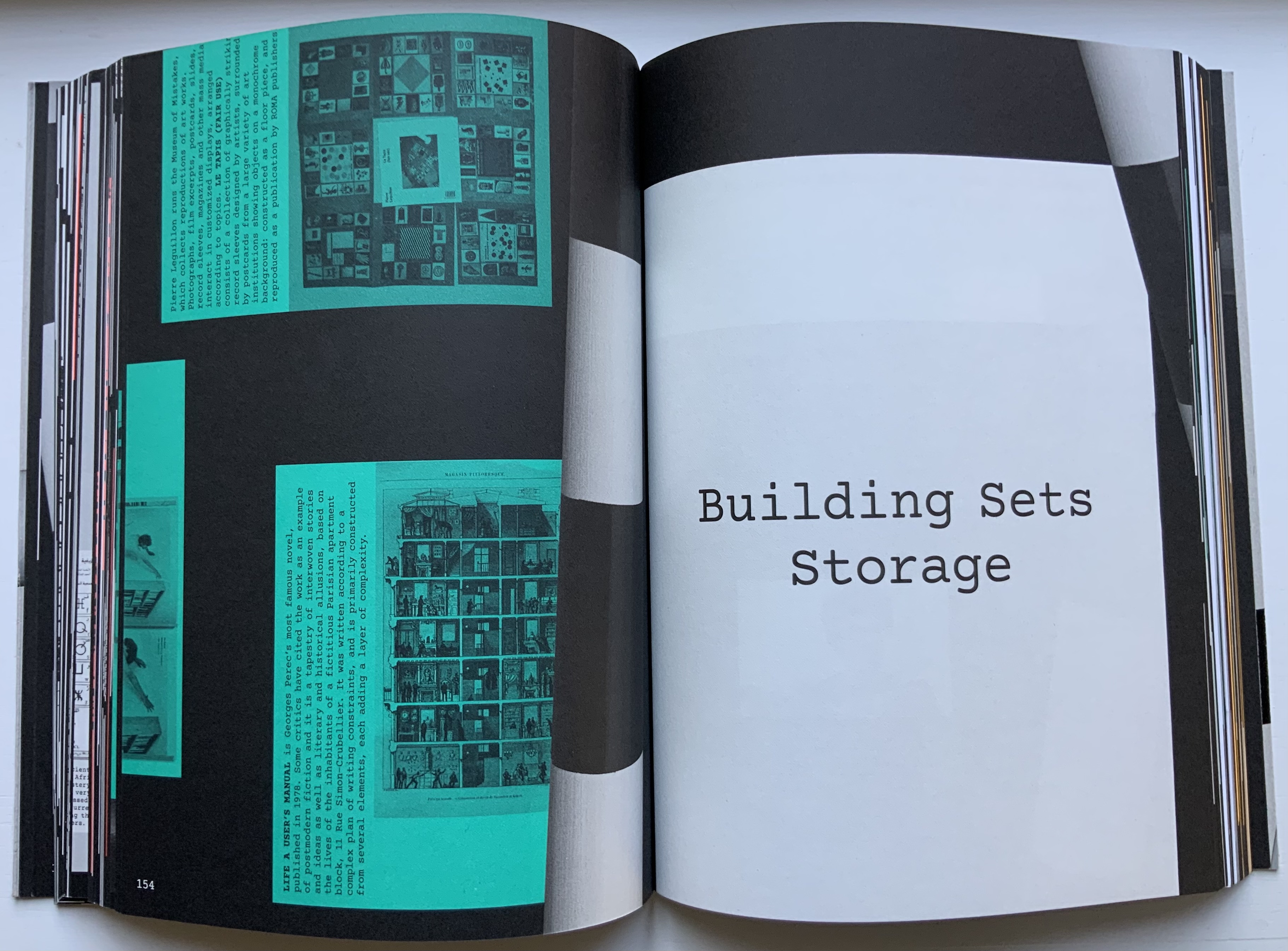
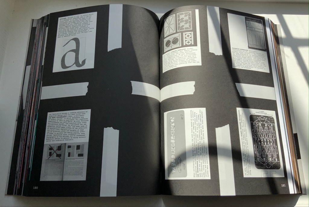
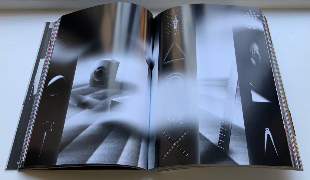
Interspersed glossy sections showcase projects illustrating or responding to the text or the department. For example, Slovenian graphic designer Nejc Prah delivers variations on Masonic tools for Symbols; Paris-based Fanette Mellier, on grid-based design for Poetics; and the Amsterdam-based studio Moniker, “board game cut-ups” for Play. While these sections fit their context in the book, their content and “slippery floor” substrate ratchet up the sense of disorientation. Museum visitors easily tire, and they can be bored in some departments.
Nejc Prah‘s variations on Masonic tools and symbols. Photo: Books On Books Collection. Displayed with artist’s permission.
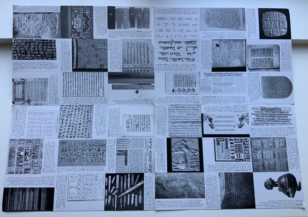
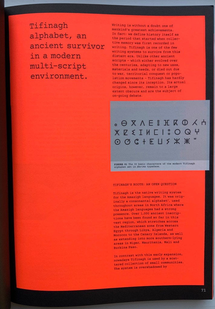
For example, the palace’s labyrinth of scripts — also reproduced separately on the perforated poster — is followed by a discussion of the revival of Tifinagh, the nearly extinct written language of the Tuareg in the Maghreb. The labyrinth presents thirty-six scripts in those varying orientations mentioned above and is wonderful in its breadth but also tiring — especially from the effort required by the font size and orientations. The story of Tifinagh’s revival and integration through typeface design is inspiring, usefully makes the point about the cultural conventionality of alphabets and more, but also makes for a long trek before our guide moves us along into the next department.
With the website for The Palace of Typographic Masonry, Richard Niessen aims for both a collective (imagined) building and an encyclopedic (digital) space, organized into those nine departments or frames. Contributors can add to the source collections or, within the departments and their subdivisions, create new rooms based on the source collections. One contribution particularly appropriate for the Books On Books Collection comes from Tony Côme: “The Typotectural Suites“. Here in one location, the visitor can find those “language towers, typographic islands, cities to decipher, plans in the shape of letters, encrypted walls, speaking bricks, habitable capitals” created by Johann David Steingruber, Antonio Basoli, Antonio and Giovanni Battista de Pian, Paul Noble and others.
The Departments of Sign, Symbol or Order could give more prominence to the role of numbers in the world of typographic masonry. Numerals do appear in the tables for Morse Code and International Maritime Signal Flags, but the visitor would not know that counting and numbers preceded writing and letters. Perhaps the curator could persuade the art historian and archaeologist Denise Schmandt-Besserat to contribute images of those clay tokens to which
The Mesopotamian cuneiform script can be traced furthest back into prehistory to an eighth millennium BC counting system using clay tokens of multiple shapes. The development from tokens to script reveals that writing emerged from counting and accounting. (Schmandt-Besserat, 2015)
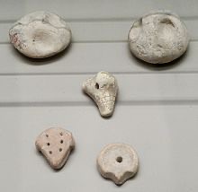
Clay counting tokens and bullae (containers).
Or perhaps the curator could persuade William Joyce to donate some clips from The Numberlys (2012) to the Palace source collection, even preferably some snippets of interactive code with which the visitor can help the five animated characters transform numbers into letters.
Universal languages are highlighted in an Annex, which has been compiled by Edgar Walthert. An update soon to come includes excerpts from Book from the Ground by Xu Bing. A link to Xu’s film The Character of Characters would make a useful addition. It will be interesting to see whether the Annex’s accompanying lecture covers the stir over a “post-text future” and whether typographic masons are returning full circle to pictographic language.
Further Reading
“Architecture“. 12 November 2018. Books on Books Collection
“The Art of Reading in a “Post-Text Future“. 21 February 2018. Bookmarking Book Art.
“Federico Babina“. 20 April 2021. Books On Books Collection.
“Antonio Basoli“. 20 April 2021. Books On Books Collection.
“Giovanni Battista de Pian“. 20 April 2021. Books On Books Collection.
“From a Visit to Art for the People, Xu Bing (Centro del Carme, Valencia, Spain, 2019)”. 22 May 2020. Bookmarking Book Art.
“Jeffrey Morin“. 20 April 2021. Books On Books Collection.
“Paul Noble“. 20 April 2021. Books On Books Collection.
“Johann David Steingruber“. 20 April 2021. Books On Books Collection.
Côme, Tony. “The Typotectural Suites“. The Palace of Typographic Masonry. Accessed 12 March 2021.
de Looze, Laurence. 2018. The Letter and the Cosmos: How the Alphabet Has Shaped the Western View of the World. Toronto: University of Toronto Press.
Macken, Marian. 2018. Binding Space: The Book as Spatial Practice. London and New York: Routledge.
McEwen, Hugh. Polyglot Buildings. 12 January 2012. Issuu. Accessed 13 March 2021.
Schmandt-Besserat, Denise. 2006. How writing came about. Austin, Texas: University of Texas Press.
Schmandt-Besserat, Denise. 2015. “Writing, Evolution of”, in James Wright, ed., International Encyclopedia of Social and Behavioral Sciences, 2d. Edition. New York: Elsevier. Accessed 15 April 2021.
Tsimourdagkas, Chrysostomos. 2014. Typotecture: Histories, Theories and Digital Futures of Typographic Elements in Architectural Design. Doctoral dissertation, Royal College of Art, London. Accessed 13 March 2021.
Xu, Bing, Britta Erickson, and Jay Xu. 2012. The character of characters: an animation by Xu Bing. San Francisco: Asian Art Museum of San Francisco.
Xu, Bing. 2018. Book from the ground: from point to point. Cambridge, MA: MIT Press.
