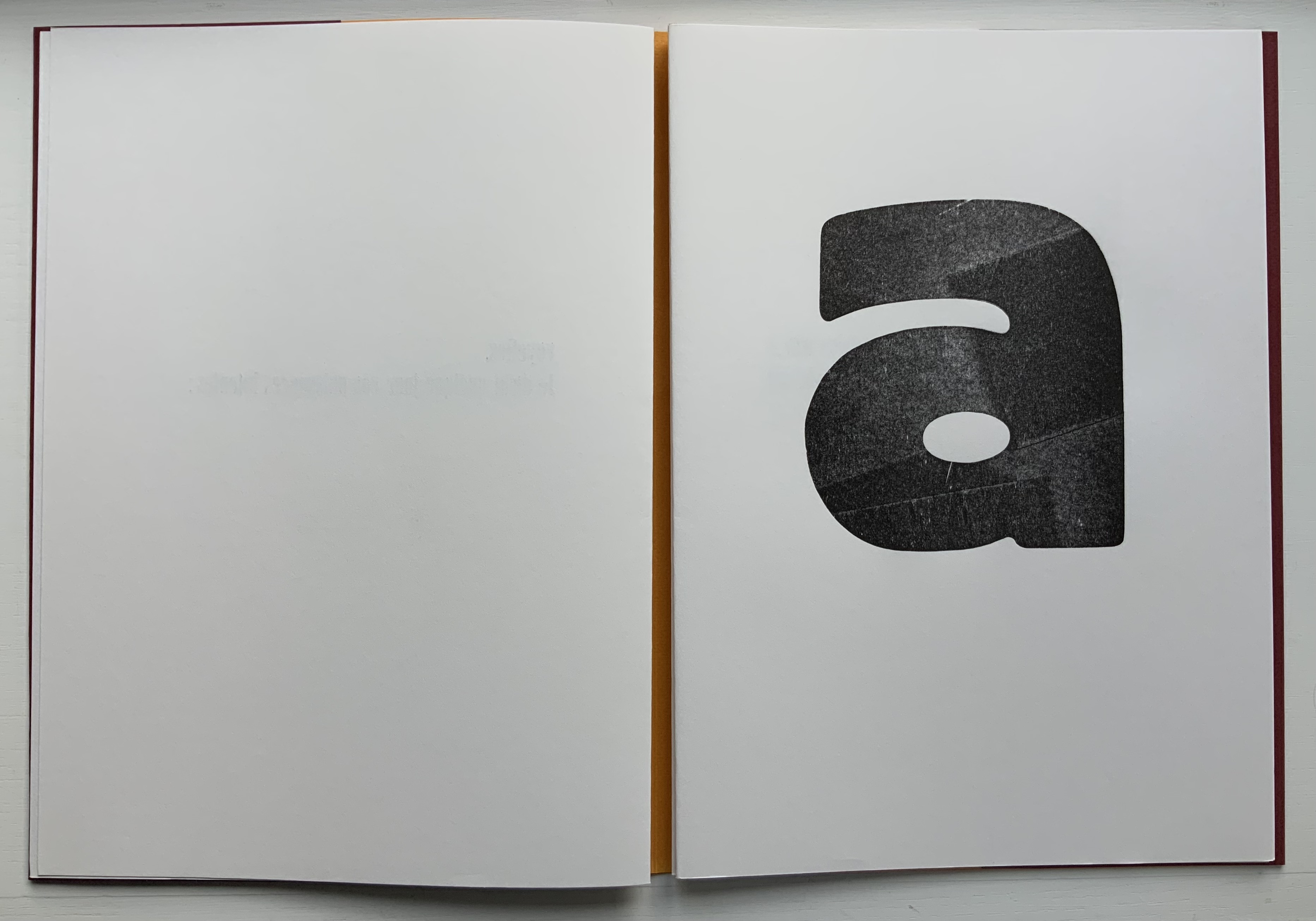
There is gray between what is unknown and known about the invention of shapes and signs for sounds. In the Books On Books collection, one side is reflected by works such as Cari Ferraro’s The First Writing (2004) and William Joyce’s The Numberlys (2014); the other, by Lyn Davies’ A is for Ox (2006) and Tiphaine Samoyault’s Alphabetical Order (1998). One engages myth, artistic extrapolation or fictional representation; the other, the rational, the evidentiary mundane or non-fictional presentation.
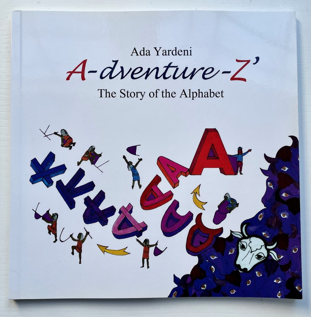
Ada Yardeni’s A- dventure- Z’: The Story of the Alphabet (2003) arches between them. She studied at the Bezalel Academy of Arts and Design in Jerusalem. As a designer at Koren Publishing, she created the font “Ada”, after which she went on to receive her doctorate under Joseph Naveh at Hebrew University in Jerusalem in 1991 and become an acknowledged expert in Hebrew palaeography.
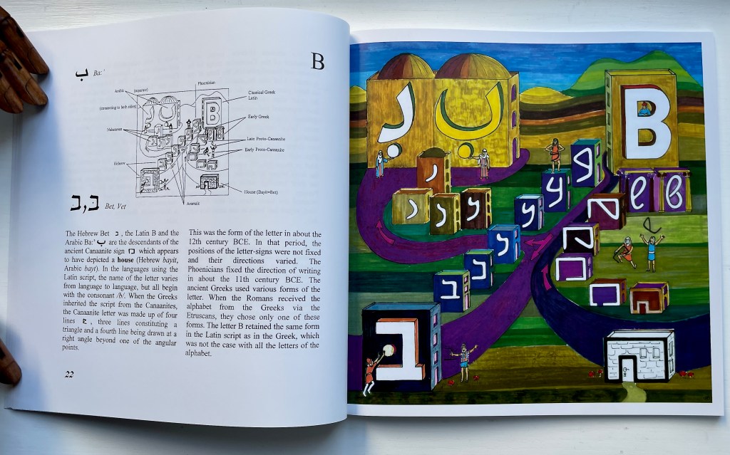
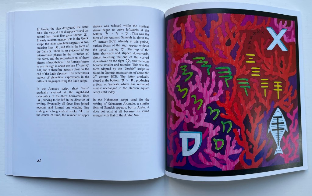
Paired with intricate and annotated black and white diagrams, Yardeni’s illustrations use brilliant colors, an accomplished calligraphic hand and her palaeographic, historical and linguistic understanding of the alphabet to display the evolution of each letter based on its forms as they appear in ancient inscriptions. While most of the illustrations contain the cartoon figures seen below in the display of the Hebrew Bet and Arabic Ba:’, the illustration for the letter Samekh (on which the letter X is based) takes on the aspect of abstract pop art.
Alongside the diagrams, the clear, uncluttered text delivers a scholarly assuredness about the appearance, disappearance and changes of strokes in the early signs found in the Sinai, but the artistry somehow evokes the mystery that continues to envelop the invention of shapes and signs for sounds and the differences in the many writing and alphabetical systems around the world. Yardeni’s still more scholarly works are to be found elsewhere, but A- dventure- Z’: The Story of the Alphabet holds its own as a companion to any of the reference works noted below. With its graphics and its charming tale of a Canaanite king seeking a way to preserve his songs, it also holds its own with any of the children’s books noted below.
Werner, Sharon, and Sharon Forss. Alphabeasties (2009).
Reference works
Clodd, Edward. The Story of the Alphabet (1913). Superseded by several later works, but is freely available online with line illustrations and some black and white photos.
Diringer, David, and Reinhold Regensburger. The alphabet: a key to the history of mankind (1968). A standard, beginning to be challenged by late 20th and early 21st century archaeological findings and palaeographical studies.
Thompson, Tommy. The ABC of our alphabet (1952).Not a fine press publication or artist’s book, but its layout, illustrations and use of two colors bear comparison with the Davies book. It too is out of print and unfortunately more rare.
A fair number of fiction and non-fiction children’s books on the history of the alphabet have made their way into the Books On Books Collection.
Of the fiction variety, there is Rudyard Kipling’s “Just So Story” of the alphabet’s invention: How the Alphabet Was Made (1983), illustrated by Chloe Cheese. Another fiction entry is James Rumford’s retelling of Cadmus’ visit to Crete in There’s a Monster in the Alphabet (2002) and William Joyce’s inventive The Numberlys (2014).
In the non-fiction category are William Dugan’s How Our Alphabet Grew (1972), Tiphaine Samoyault’s Alphabetical Order (1998), Renzo Rossi’s The Revolution of the Alphabet (2009) and the entry here: Don Robb’s and Anne Smith’s Ox, House, Stick.
Ox, House, Stick is scheduled to appear as part of an exhibition at the Bodleian Libraries in Oxford (opening 15 July 2023). “A is for Ox” designates the display case devoted to the question: Where did the alphabet come from? It’s not just a question for archaeologists, historians, linguists and paleographers — or children’s book authors and illustrators. It’s one generating repeated inspiration for book artists as shown by Abe Kuipers’ Letters (1971), Lanore Cady’s Houses & Letters (1977), another rendition of the Kipling tale by Gerald Lange in The Neolithic Adventures of Taffi-Mai Metallu-Mai (1997), designed by Gerald Lange and produced with Robin Price, Dave Wood’s Alphabetica (2002), Cari Ferraro’s The First Writing (2004), and Helen Malone’s Alphabetic Codes (2005).
Artists’ books share much with children’s books in general. They both play with form and structure. They play with words and images, sometimes images without words and sometimes just shapes. Almost always an attention to all the senses. Children’s alphabet books in particular display features that appeal to book artists: play with animals, the Babel of languages, bodies, calligraphy, colors, design (of letters, page and book) and, as above, alphabet origin stories. Viewing and exploring alphabet books and artist’s books side by side heightens the enjoyment and appreciation of both.
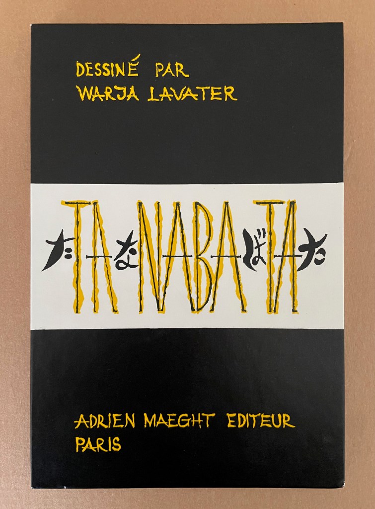
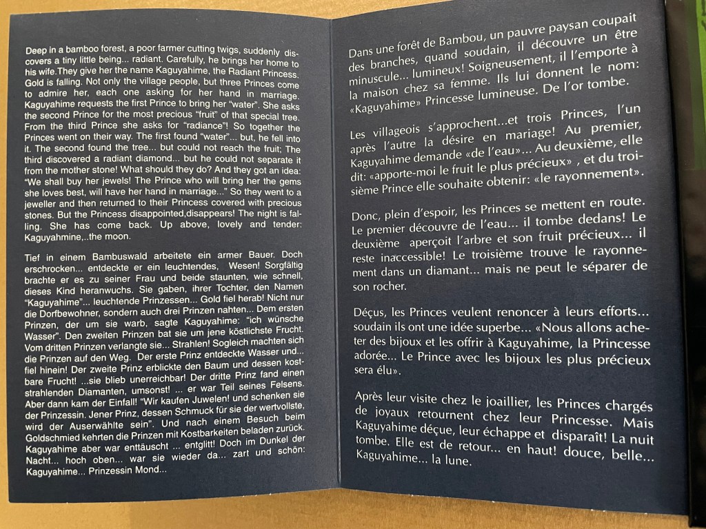
Seven works in the Books On Books Collection represent Warja Lavater’s art: Le Petit Chaperon Rouge (1965), a later tactile version of the same work (2008), Sketchbook: Le Non-obéissant (1968), Spectacle (1990), Ourasima (1991), Tanabata (1994), and Kaguyahime (1998). The French publisher Adrien Maeght was Lavater’s most consistent champion, publishing several of her leporello works, including a now rare boxed set.
Le Petit Chaperon Rouge (1965)
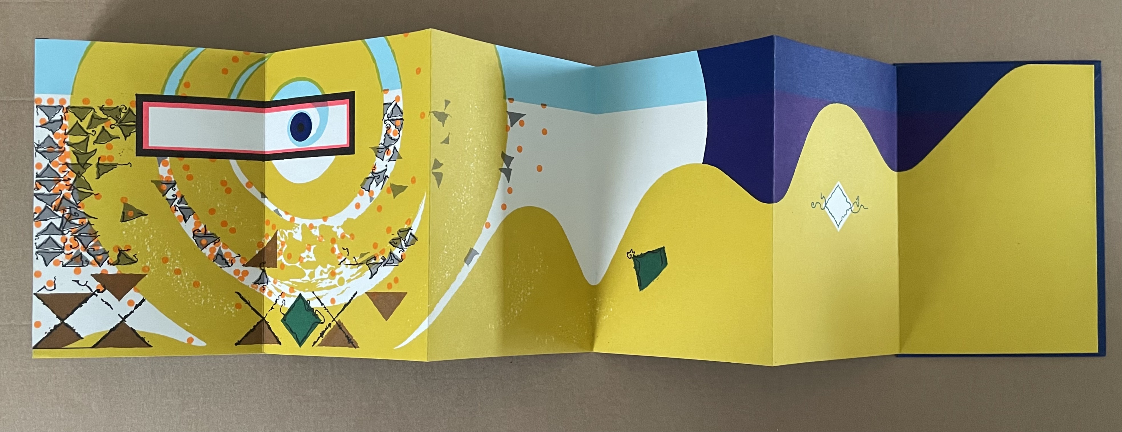
Le Petit Chaperon Rouge (1965) Warja Lavater Accordion book in perspex slipcase. Slipcase: H167 x W117 x D26 mm; Book: H160 x W113 x D20 mm, closed; W4.5 m, open. 40 panels. Acquired from Patrick Wainwright Rare Books, 22 June 2022. Photos: Books On Books Collection.
Abstract shapes stand in for the characters and settings in this retelling of Little Red Riding Hood’s journey through the forest to visit her grandmother. With the only text being that matching symbols to the cast of characters and settings, the tale is told wordlessly.
Knowing the story and having the cast to hand, the reader/viewer easily follows the shapes and colors into a new and artful experience of the folktale. But what if the shapes and colors cannot be seen?
Le Petit Chaperon Rouge (2008)
Le Petit Chaperon Rouge (2008) Warja Lavater and Myriam Colin Accordion book boxed in cloth-covered board box. Box: H190 x W130 x D75 mm; Book: H176 x W122 x D70 mm. closed; W4.3 m, open. 40 panels. Acquired from Les Doigts Qui Rêvent, 30 October 2022. Photos: Books On Books Collection. Displayed with permissions of Les Doigts Qui Rêvent.
Artist Myriam Colin and publisher Les Doigts Qui Rêvent (“Fingers that Dream”) addressed this question with print, Braille, cloths of different texture, leather, blind embossed shapes, plastic filaments and sewing.
Between the printed text and Braille-rendering for the cast of characters and settings, buttons of different cloths and different embossed shapes appear. In the opening scene, the red felt button for Little Red Riding Hood is of course smaller than the orange-brown broadcloth button for Mother, who stands before the raised rectangle for the house and looks over her daughter’s head at the forest of raised dots.
Later, the wolf’s belly becomes a large sewn pouch with the slit cut by the Hunter through which Grandma and Little Red Riding can be felt, ready to escape.
The brown leather button for the Hunter unites the felt Red Riding Hood, nubby-cloth Grandmother and broadcloth Mother in a clearing in the forest. A satisfactory conclusion for the sighted and visually impaired.
Update Lavater
Seven works in the Books On Books Collection represent Warja Lavater’s art: Le Petit Chaperon Rouge (1965), a later tactile version of the same work (2008), Sketchbook: Le Non-obéissant (1968), Spectacle (1990), Ourasima (1991), Tanabata (1994), and Kaguyahime (1998). The French publisher Adrien Maeght was Lavater’s most consistent champion, publishing several of her leporello works, including a now rare boxed set.
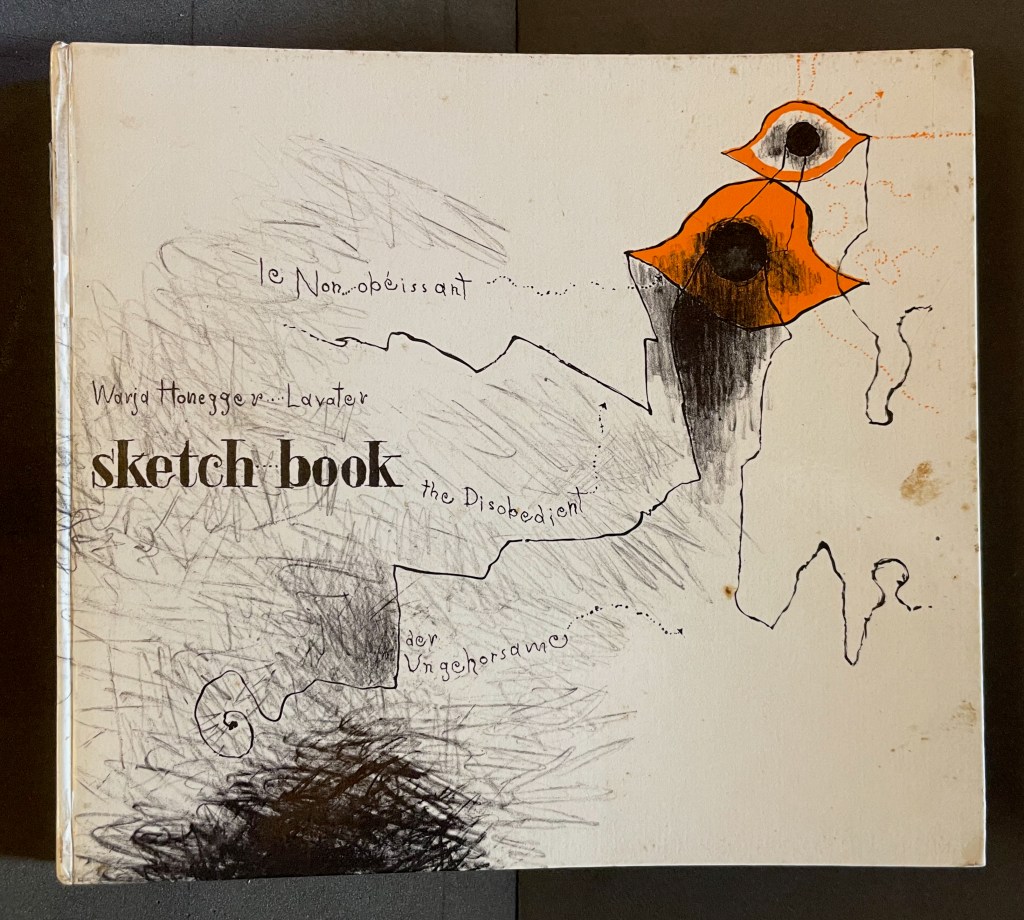
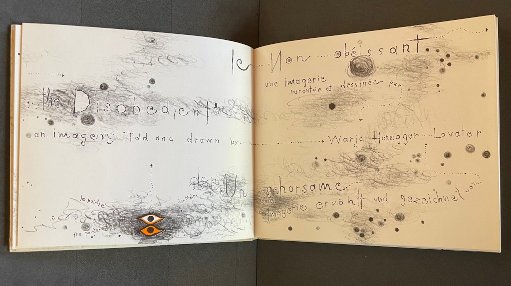
Sketchbook: Le Non-obéissant (1968)
Sketchbook: Le Non-obéissant; The Disobedient (1968) Warja Lavater Casebound, printed gloss paper over boards, plain endpapers and fly leaves. H210 x W235 mm. [45] Chinese fold folios.Acquired from Ken Sanders Rare Books, 18 July 2024. Photos: Books On Books Collection.
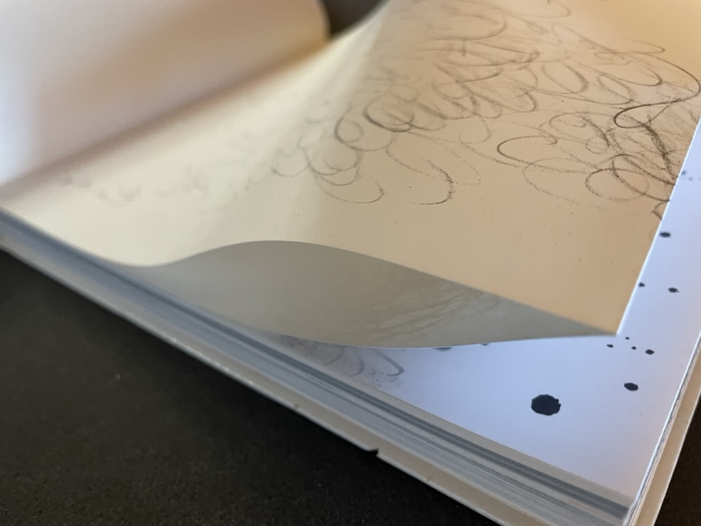
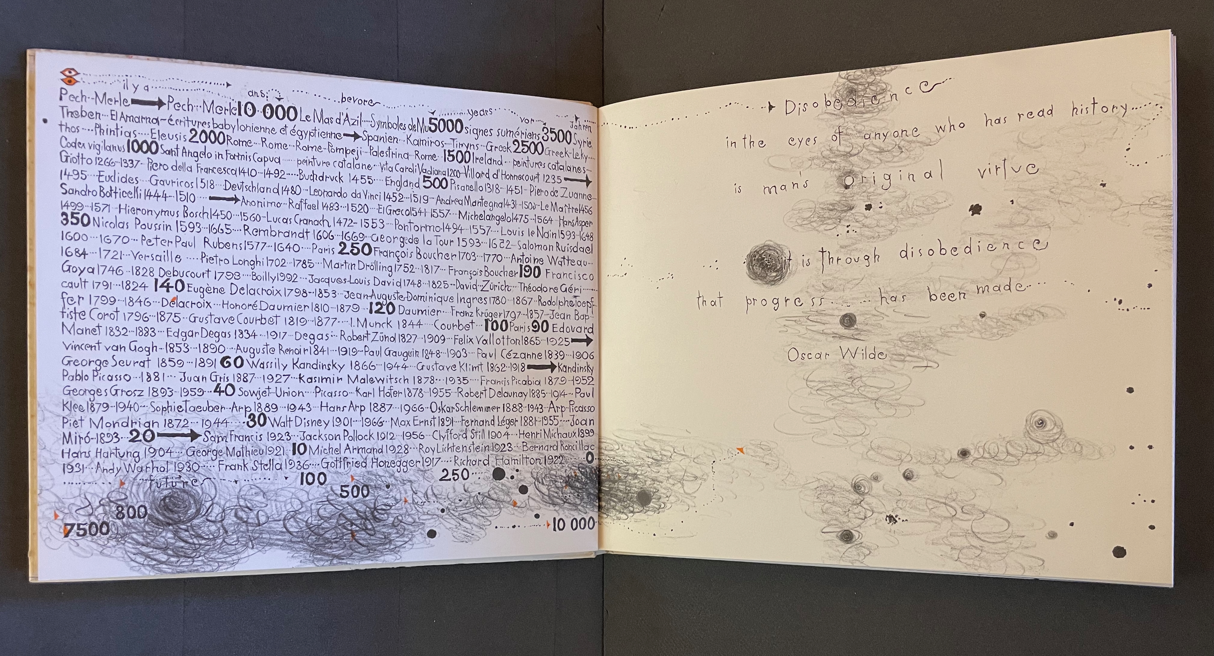
Warja Lavater’s Sketchbook opens with a page of pencil scrawling that wraps from the first side of a Chinese-fold folio, over the fold, and onto the folio’s other side, where a 10,000+ year timeline of artists appears in cramped handprint. The scribbling continues onto the next folio, embroidering Oscar Wilde’s aphorism
Disobedience in the eyes of anyone who has read history is man’s original virtue. It is through disobedience that progress has been made.
The scrawling runs over the fold of the folio and across a double-page spread to become the multilingual title page. Or rather the “subtitle becomes title page”. Look again at the cover. Wasn’t the title Sketchbook? Now it is Le Non-obéissant | The Disobedient | Der Ungehorsam, and it has acquired a new subtitle, and a strange one at that: Une Imagerie Racontée et dessinée par … |An Imagery Told and Drawn by … | Eine Imagerie Erzählt und Gezeichnet von Warja Lavater.
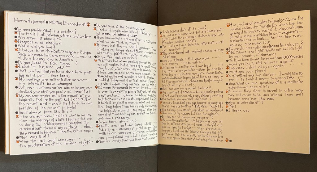
“An imagery told and drawn” captures well Lavater’s technique of abstract pictorial retelling of familiar fairy tales such as Little Red Riding Hood and Cinderella. Now, in this sketchbook, she uses it to create her own fairy tale of art history. As we are about the learn, the doodle labelled le peintre | the painter | der Maler on the left hand page above is the main character named “the Disobedient”. Reminiscent of Mel Brooks and Carl Reiner’s sketch “The 2000 Year Old Man”, the Disobedient, who has been around for almost 12,000 years, has some humorous and cantankerous answers to the interviewer’s questions about her experiences from cave art to Pop art.
“You make a living from this international art market?”
“The international art market makes a living out of me.”
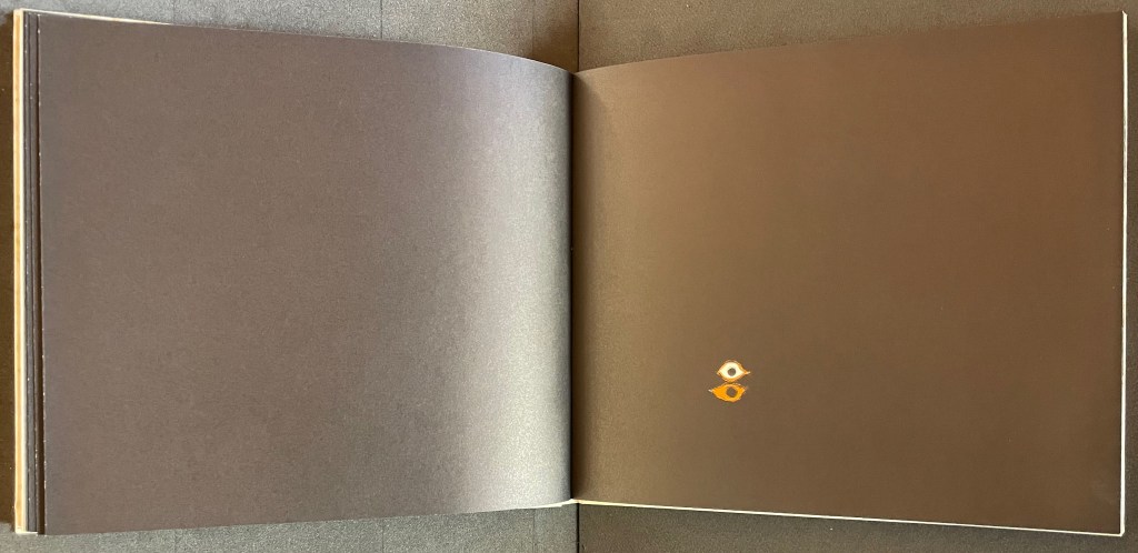
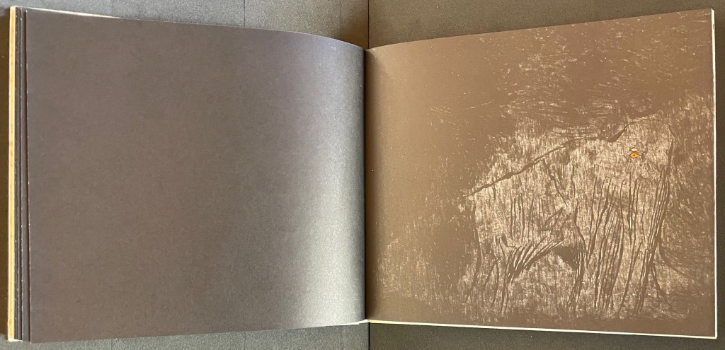
Unlike the Key pages in her fairy tales identifying the images and markings, The Disobedient’s Key page is delivered in her voice. She explains that the eye with white around its iris stands for her “exterior eye with which I look” and the eye with orange around its iris stands for her “interior eye with which I think”. Her techniques or “means of my performance” might be squiggles, geometric objects or figurative drawings. The clearly defined black dots represent her contemporaries. Orange markings represent her emotions, her ferveur and Gefuhl. All the bold numbers mark the “years more or less gone by”. But the story begins in earnest in the dark of four black folios and a fifth in which the artist appears for the first time in history followed by her first work, a drawing of a mammoth.
Spectacle (1990)
Spectacle: Pictoson Mural (1990) Warja Lavater H215 x W296 mm. 22 pages. Acquired from Antiquariat Übü, 3 August 2022. Photos: Books On Books Collection. Displayed with permission of the publisher.
Spectacle is an origin story of shapes, signs, the sounds of language, their alphabetic representation and use to form words. It is similar to the tale in Il était une fois un alphabet (1951/2009) by Souza Desnoyer and Marcelle Marquet. In both, the separate worlds of vowels and consonants join to create the alphabet. In Il était une fois, the letters already exist, have anthropomorphic shapes and engage in familiar activities like voyages, feasts, dances and processions. The narrative has scenes and settings to carry it along. Spectacle‘s origin narrative, however, letters develop from a system of signs created/discovered by a wizard. An abstract shape himself, the wizard presides over the story’s unfolding across an abstract landscape. Even though Lavater maps a written version (in eight languages) of the tale to the panels, the pictorial narrative remains challenging.
Elliptical and shamanic, the written narrative itself is challenging. It may remind the reader of Italo Calvino’s Big Bang story “Sul far del giorno” (“At daybreak”) in his collection Le Cosmicomiche (1965) (“Cosmicomics“1968), to which Shirley Sharoff paid homage in OVI: objets volants identifiés dans le ciel d’Italo Calvino, a work contemporary with Lavater’s. The verticality of Lavater’s extraordinary leporello might also remind the viewer of Blaise Cendrars and Sonia Delaunay’s La Prose du Transsibérien et de la petite Jehanne de France (1913).
Somehow, though, despite its winged emblems of words, the eleventh panel with its regimented alphabet seems visually diminished, not quite the joyous spectacle promised by the text. For that, we would have to turn elsewhere in the collection: William Joyce’s origin story The Numberlys (2014).
The Numberlys (2014) William Joyce and Christina Ellis Hardback, paper on board. H220 x W300 mm, 52 pages. Acquired from London Bridge Books, 15 April 2021. Photos of the book: Books On Books Collection.
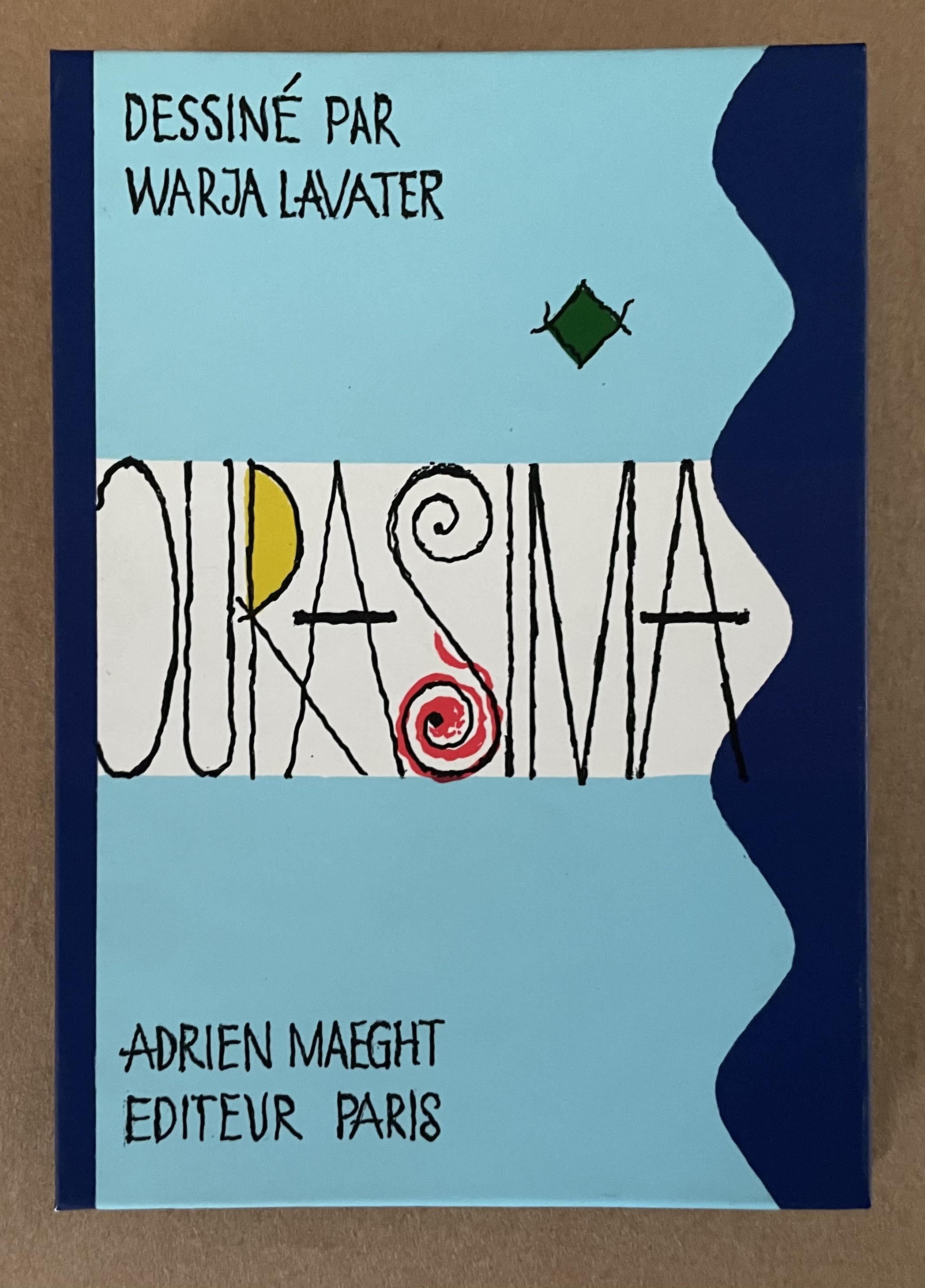
Ourasima (1991)
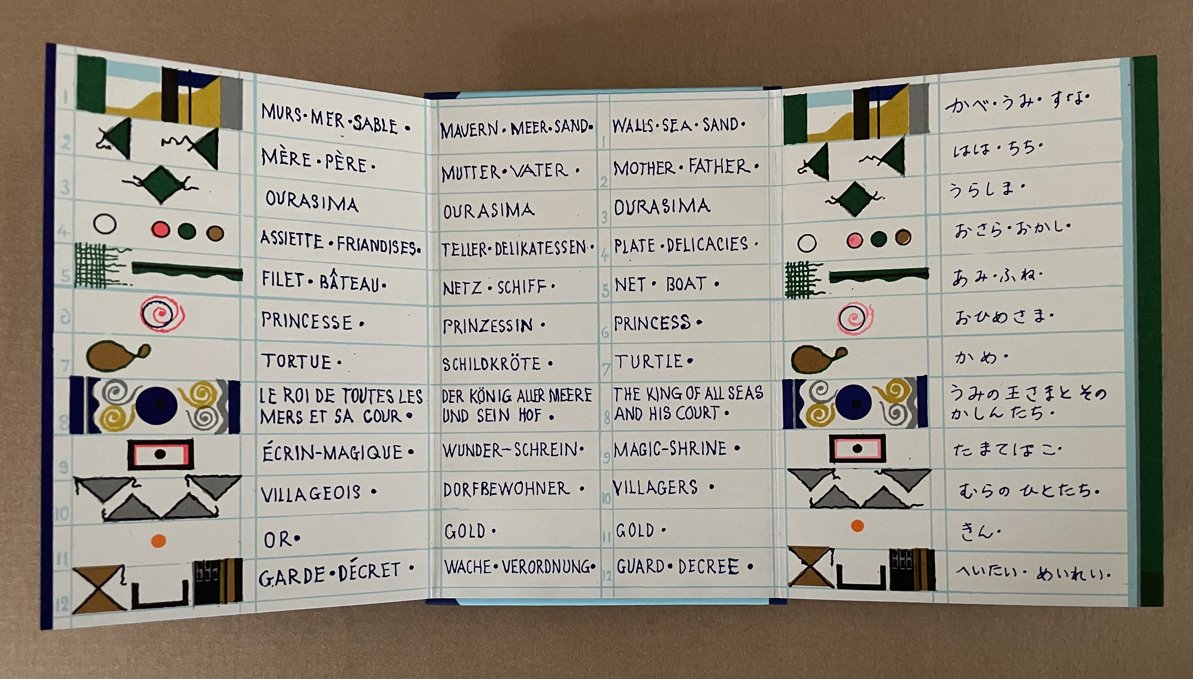
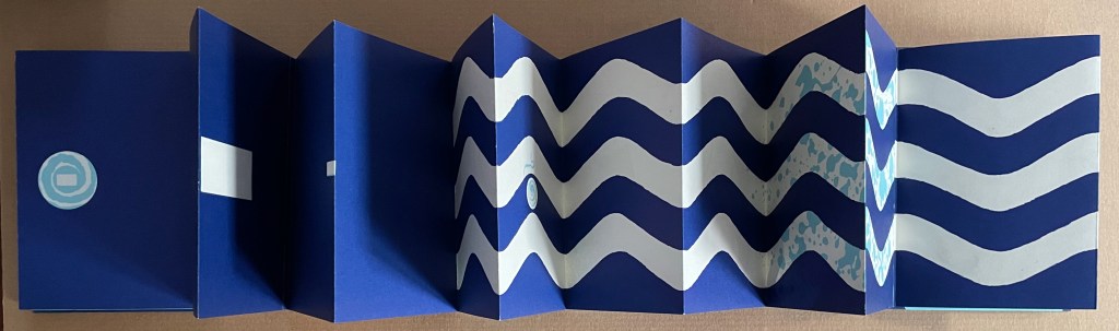
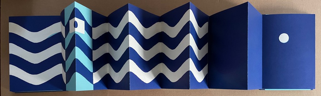
Ourasima: Une imagerie en transparence d’après le conte japonais (1991) Warja Lavater Plexiglas slipcase enclosing a double-sided accordion book. Box: H178 x W118. Closed accordion: H160 x W112 mm. Open accordion: W4624 mm. [86] panels. Acquired from Versand-Antiquariat Rainer Richner, 24 August 2023. Photos: Books On Books Collection.
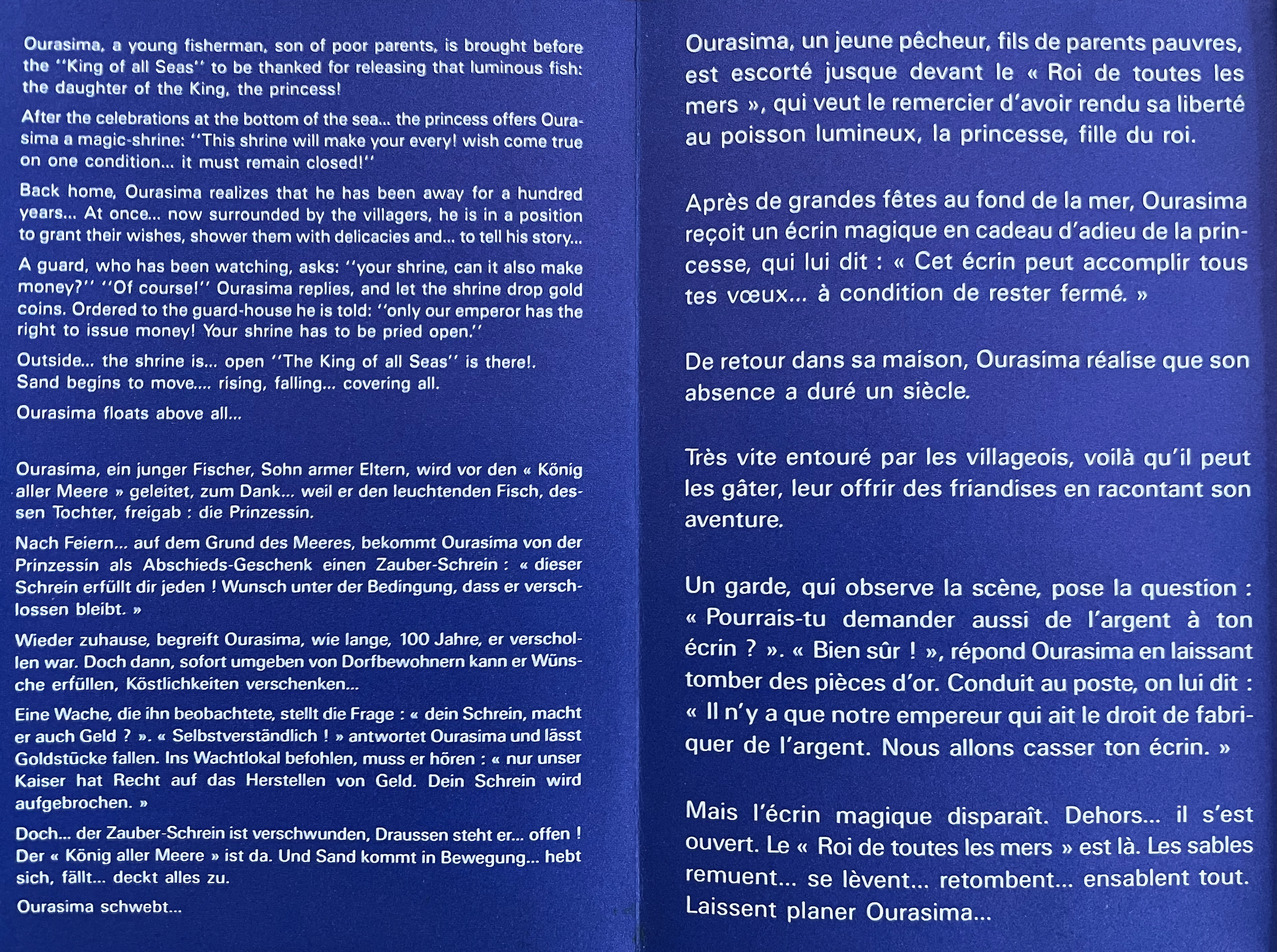
Ourasima, also known as Urasima Taro, is a Japanese folktale that reaches back to the eighth century. Lavater’s version is a cross between the stories of the Golden Goose, Rip Van Winkle and Pandora’s Box. In keeping with her treatments of Western folk and fairy tales, Lavater brackets her wordless retelling with a cast of characters, objects and their corresponding emblems at the beginning and a brief summary of the story at the end — all annotated in French, German, and English, but this time in Kanji as well.
Lavater’s version departs significantly from the traditional versions as described by the Library of Congress:
There are variations to the story depending on the intended audience and the period, and it is still known by its Japanese title Urashima Taro. It tells of a young and kind fisherman named Urashima. One day he catches a large turtle while he is out fishing. Taking pity on the turtle, he releases it back into the sea, whereupon the beautiful daughter of the god of the sea appears and tells him that the turtle was actually the personification of her. To thank him for saving her, she invites Urashima to Ryugu-jo (the Palace of the Dragon God) at the bottom of the sea. He then marries her and lives happily at the palace. Three years later he asks for permission to return to his village for a short time, because he wants to see his family. His wife gives him a box and makes him promise not to open it, as he would never be able to come back if he did. When Urashima returns home, he finds that everything has changed during those three years and that his family and his village have disappeared. He had in fact left his village 400 years before, so his parents, siblings and friends were all dead. Not knowing how to get back to the Palace of the Dragon God, he breaks his promise and opens the box, hoping that its contents can help him. After he opens the box, white smoke appears and Urashima turns into a white-haired old man and dies.
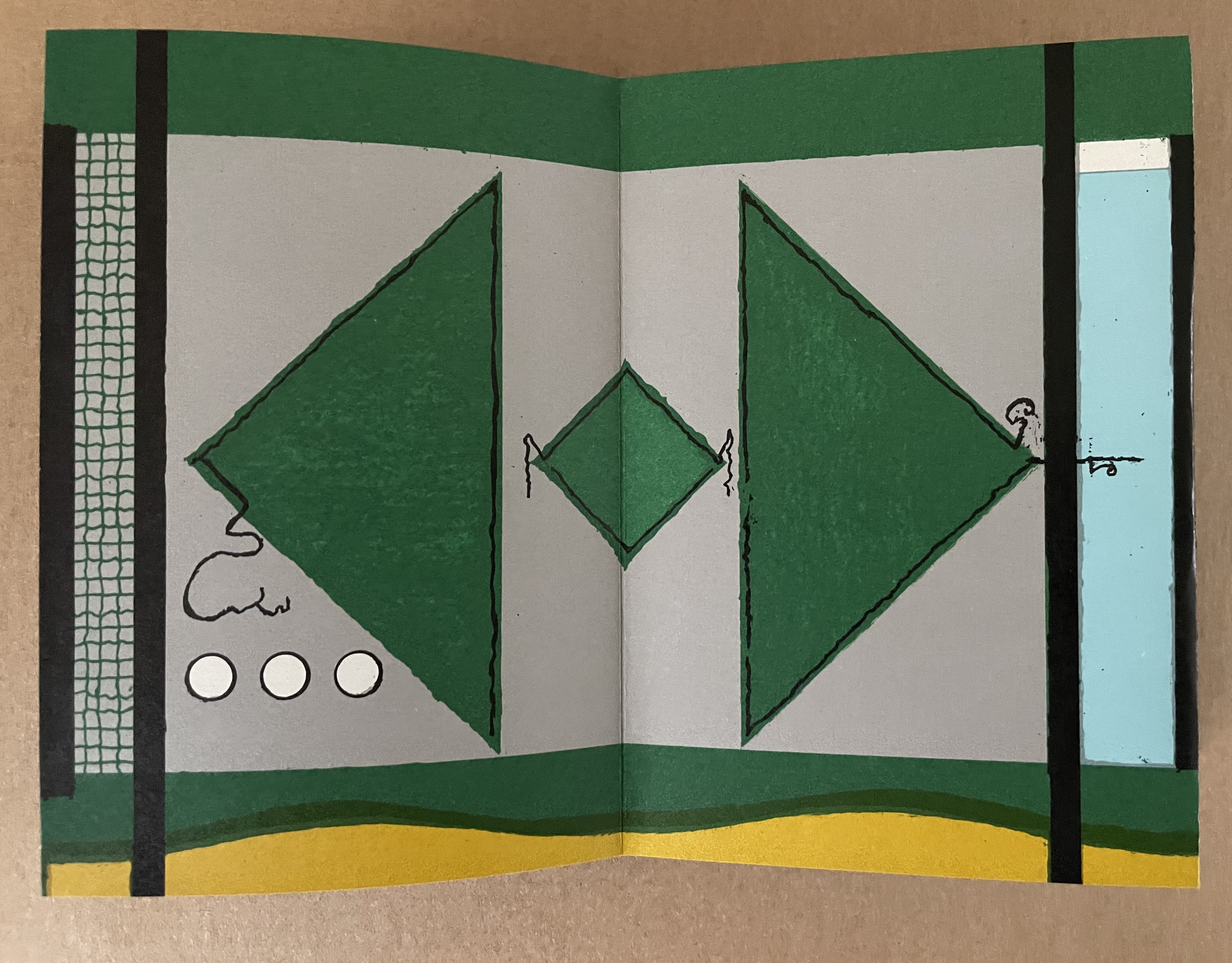
Lavater’s emblematic retelling works well with the basics such as the family home with Ourasima between his mother and father, Ourasima with his boat and fishing net, the capture and release of the princess, the turtle’s arrival and transport of Ourasima to the princess, the marriage, Ourasima’s return on the back of the turtle, and the distribution of delicacies and gold. But the “emblemism” struggles to reflect the verbal instructions of the princess and the guards’ rationale for arresting Ourasima.
Ourasima at home between his mother on the left and father on the right.
With the box forced open, chaos ensues with a whirlwind of sand dispersing everything and freeing Ourasima.Nothing in Lavater’s summary indicates that Ourasima becomes an old man at this point, but his emblem’s shift from green to white in the next panels aligns with the traditional version.
The chaos of sand freeing Ourasima and his becoming an old man.
To find Ourasima floating “above all” as Lavater’s summary indicates, we have to turn to the other side of the leporello, but the “emblemism” is difficult to follow. Has the sand, covering all, yielded to the domain of the sea? Has the empty magic box risen from the depths to float along the waves? Does the King recapture it? Has the white diamond-shaped Ourasima been transformed into a round sea creature?
Of course, text and illustrations went side by side in all the much earlier versions with calligraphy, watercolors, woodblock prints and, in the later Meiji period, with type.
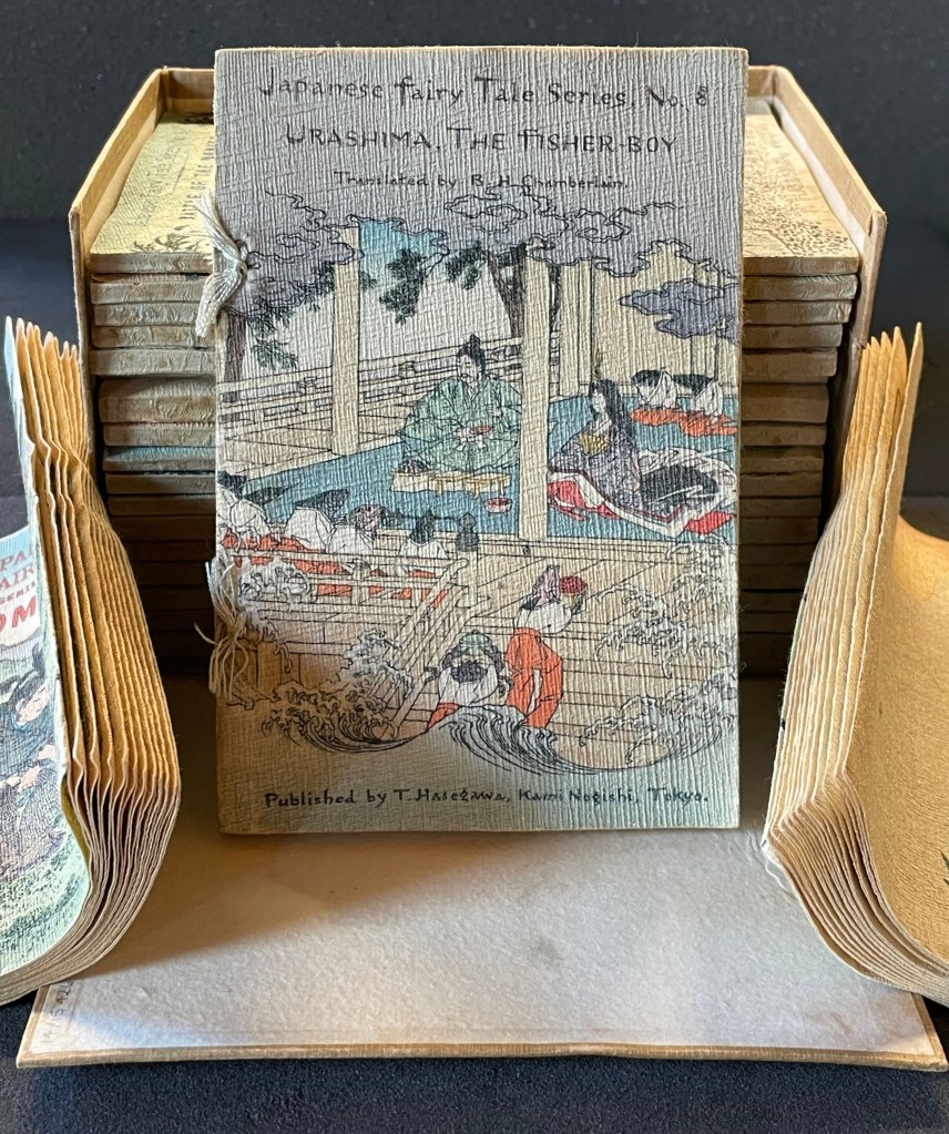
In the same period, the first translation into English appeared within a boxed set of Japanese fairy tales, printed on cloth folios and stab bound.
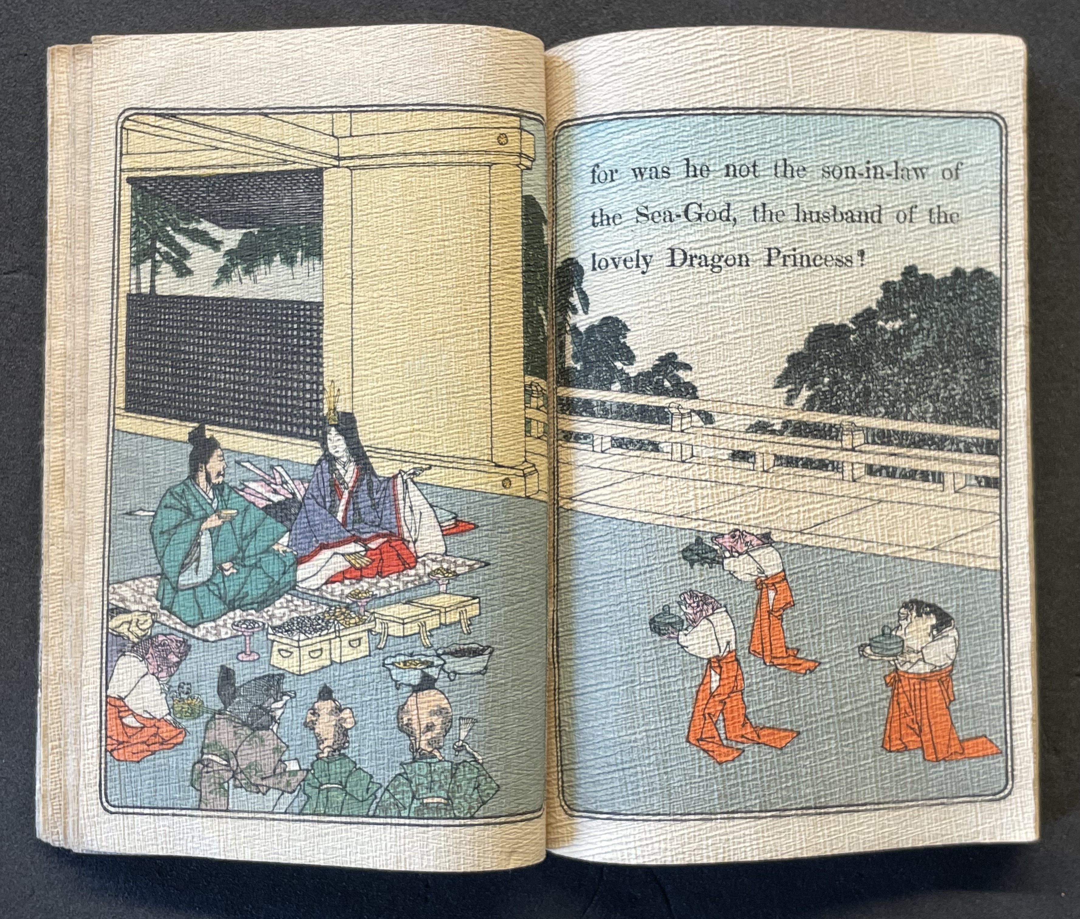
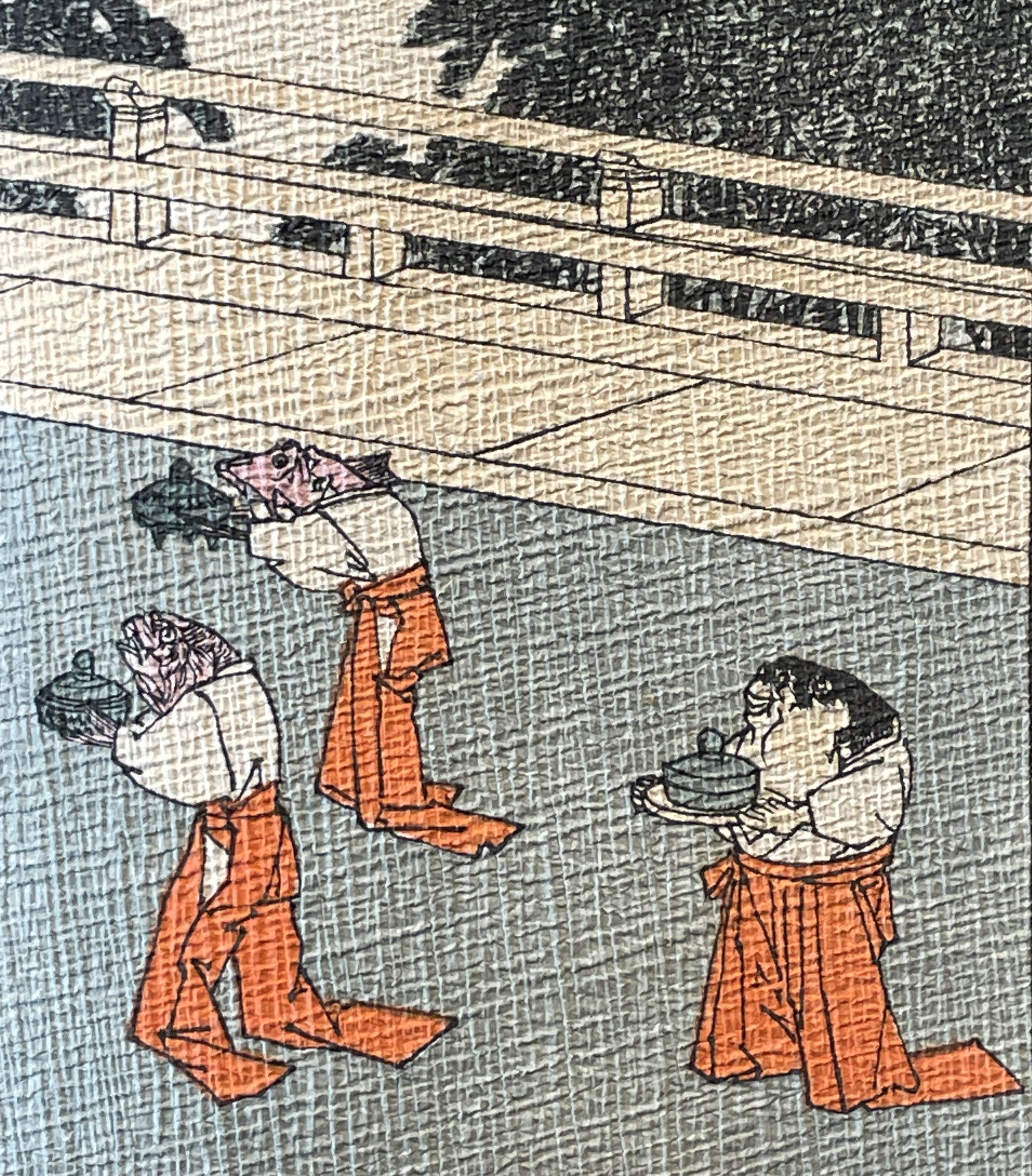
Japanese Fairy Tales Series. Bodleian Libraries. Schorr Collection f.22. The Fisher-boy Urashima, translated by Basil Hall Chamberlain, illustrated by Eitaku Kobayashi, and published by Hasegawa Takejiro (1886).
Ourasima and Otohime served in the palace by undersea servants.
In Lavater’s art, image and abstraction become the primary focus and vehicle for the narrative. As we shall see, this earliest of Lavater’s attempts with Japanese fairly tales is narratively the least straightforward, probably because of the deviations prompted by the inclusion of themes from the Golden Goose and Pandora’s Box.
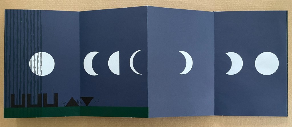
Tanabata (1994)
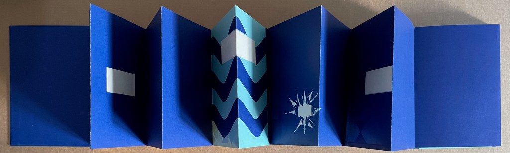
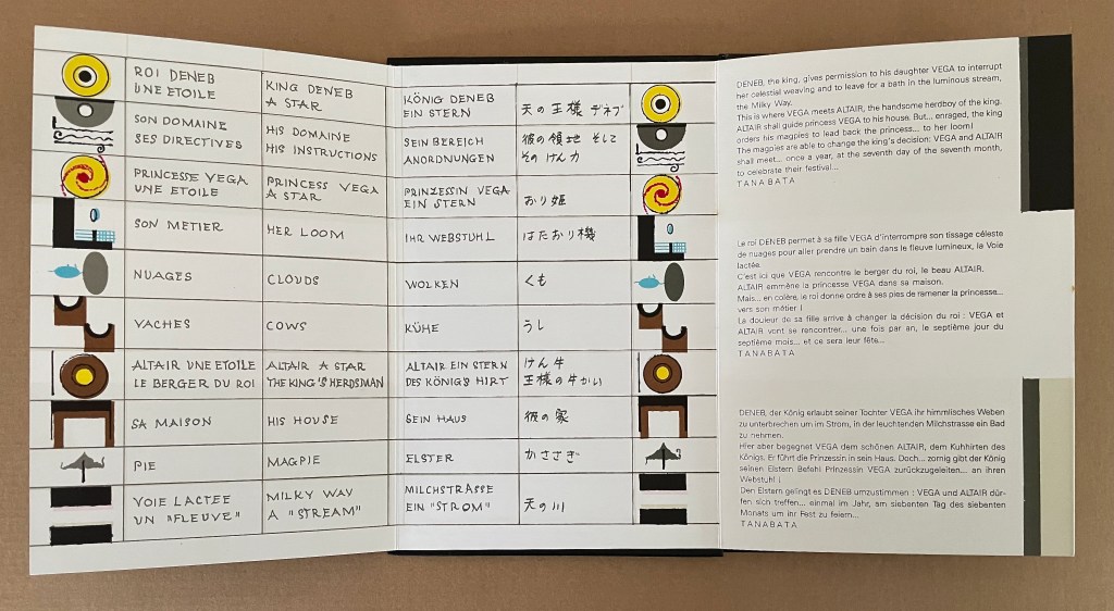
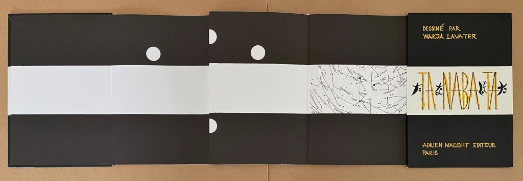
Tanabata(1994) Warja Lavater Acrylic slipcase, double-sided leporello. Slipcase: H216 x W150 mm; Book: H216 x W145 mm. 18 panels, each side, one foldout with 2 panels. Acquired from Dilat, 14 January 2025. Photos: Books On Books Collection.
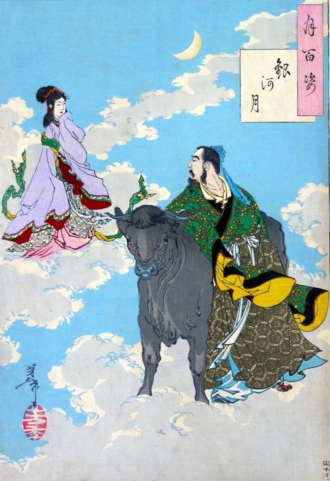
Tanabata is Lavater’s version of a Sino-Japanese constellation myth about the stars Deneb, Vega, and Altair. The story is that the princess Orihime, associated with the star Vega, also known as the weaver star, falls in love with Hikoboshi, associated with the star Altair, also known as the cow-herder star. Her father, Deneb the Sky King, banishes her to one side of the Milky Way and Hikoboshi to the other side. Later he relents and allows them to meet only on the seventh day of the seventh month of the lunar calendar when a flock of magpies form a bridge for their reunion. This has become the date of the annual Star Festival in Japan.
As with Ourasima, Lavater modifies the tale. She has the King permit Orihime to bathe in the Milky Way where she first meets Hikoboshi. Additionally, the King has the magpies drag Orihime back to her weaving, but the birds persuade the King to permit the annual reunion at the Milky Way.
Reading from left to right. Altair (cowherd star) and Vega (weaver star) cross the Milky Way over the “magpie bridge” to unite during Tanabata, the annual Star Festival in Japan.
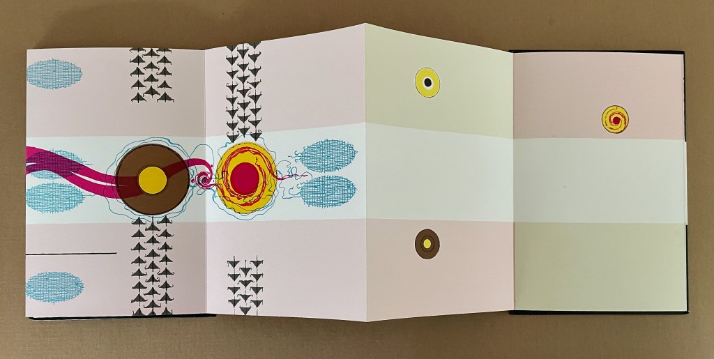
The reverse side of the leporello represents the two lovers as two solid white balls separated by the Milky Way represented as a solid white band, running right to left from the front cover. Over the course of the leporello, the lovers move to join one another on one side of the Milky Way then to separate according to their celestial fate.
Reading from the celestial map right to left: the white dots replicate the positions of Deneb and Vega above the Milky Way and Altair beneath it.
Despite the variations on the traditional tale, Tanabata is narratively more straightforward than Ourasima. With 10 emblems compared to Ourasima‘s 12, Tanabata ought to be visually more straightforward as well, but after the first two panels introducing Deneb, Vega, and Altair, every panel — except for the last two — seems just as busy as the most crowded in Ourasima. This, however, seems intentional. The last two panels stand out all the more in their simplicity mirroring the stars’ positions on the reverse side in the celestial map and the abstraction.
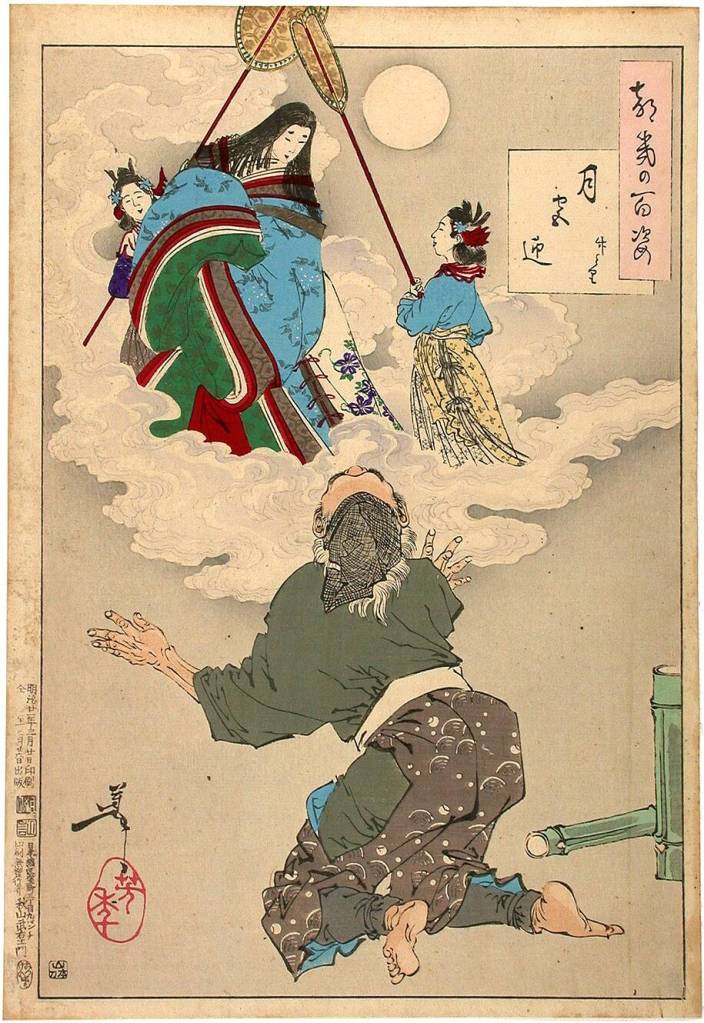
From 100 Aspects of the Moon, by Tsukioka Yoshitoshi. Late 1800’s. (Public Domain). Orihime and Hikoboshi during the night of Tanabata. Photo: Tomo Japan.
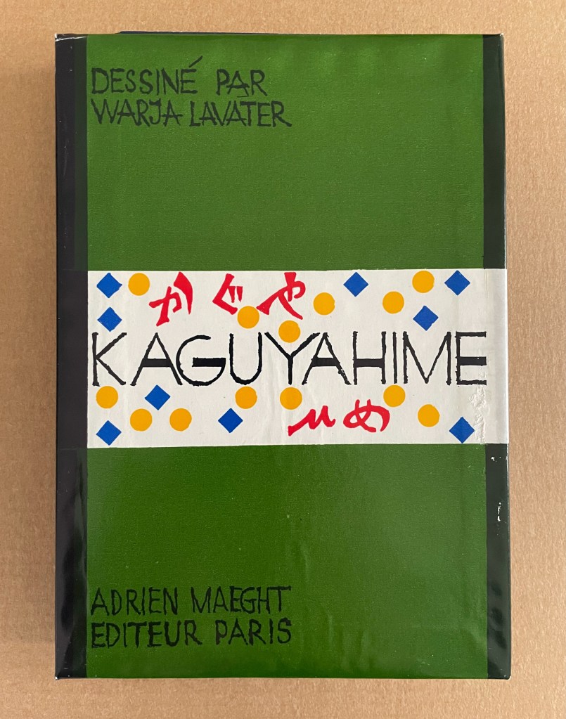
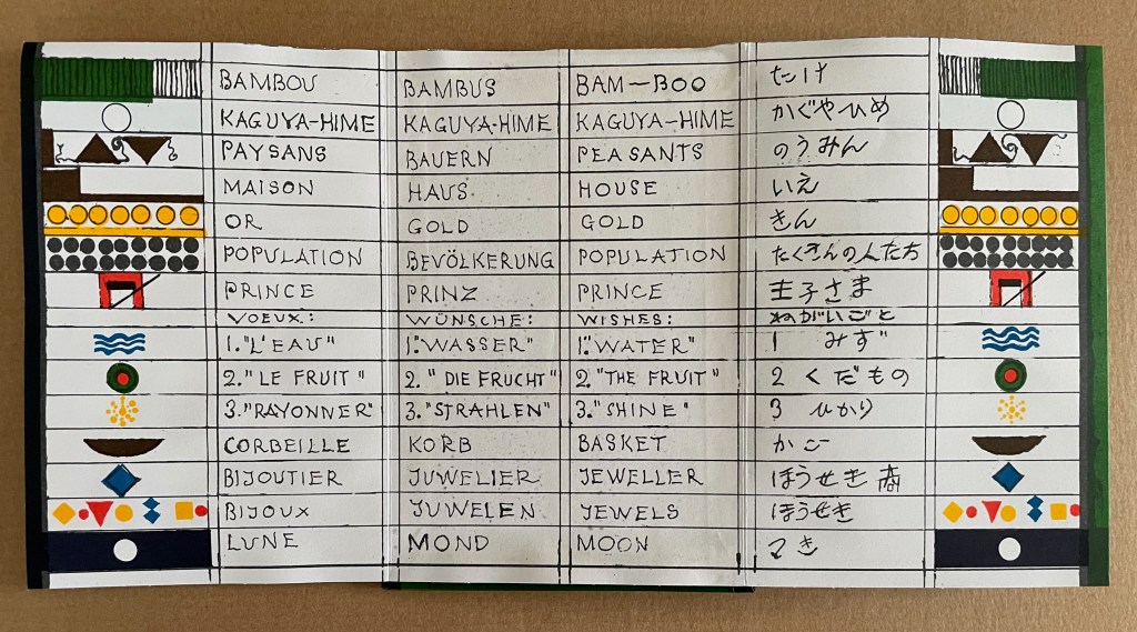
Kaguyahime (1998)
Kaguyahime(1998) Warja Lavater Acrylic slipcase, leporello. H160 x W11 mm. 44 panels. Acquired from Okmhistoire, 24 January 2025. Photos: Books On Books Collection.
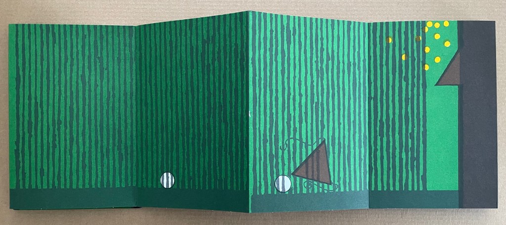
With 14 emblems and with three princes whose emblems are distinguished by subtle variations, Kaguyahime seems bound to be more visually challenging than Ourasima or Tanabata.
Kaguyahime in the bamboo forest. The poor farmer discovers her and takes her home, where already gold is beginning to fall.
Having failed in their quests, the three princes, watched by her guardians and the gathered population, crowd around her to offer jewels and gold instead. But Kaguyahime storms away, scattering the jewels and gold, the princes and their baskets, and her guardians and the population in her wake.
On the other side of the leporello, Kaguyahime, the moon princess, watched by the princes and her guardians, rises through the bamboo forest into night sky where she waxes and wanes ever after.
Like Snow White and Sleeping Beauty embedded for centuries in Western culture, the tale of the moon princesss exerts a similar pull on Japanese culture. The princess and her story have appeared in many media including manga and anime. In 2023, the choreographer Jo Kanamori and the Tokyo Ballet produced Kaguyahime set to the music of Claude Debussy. A hybrid plant (E.acuminatum x E.dolichostemon) has even been named after the tale.
Lavater’s emblems in the Oriental tales do slightly differ from those in the Occidental tales, although the color palette does not vary. Her handling of Ourasima, Tanabata, and Kaguyahime does not seem as sure as that of Snow White and Sleeping Beauty nor of The Disobedient. Nevertheless, Lavater’s engagement across cultures speaks to one of the most recurrent influences on book artists: that of folk tales, fairy tales, and myths.
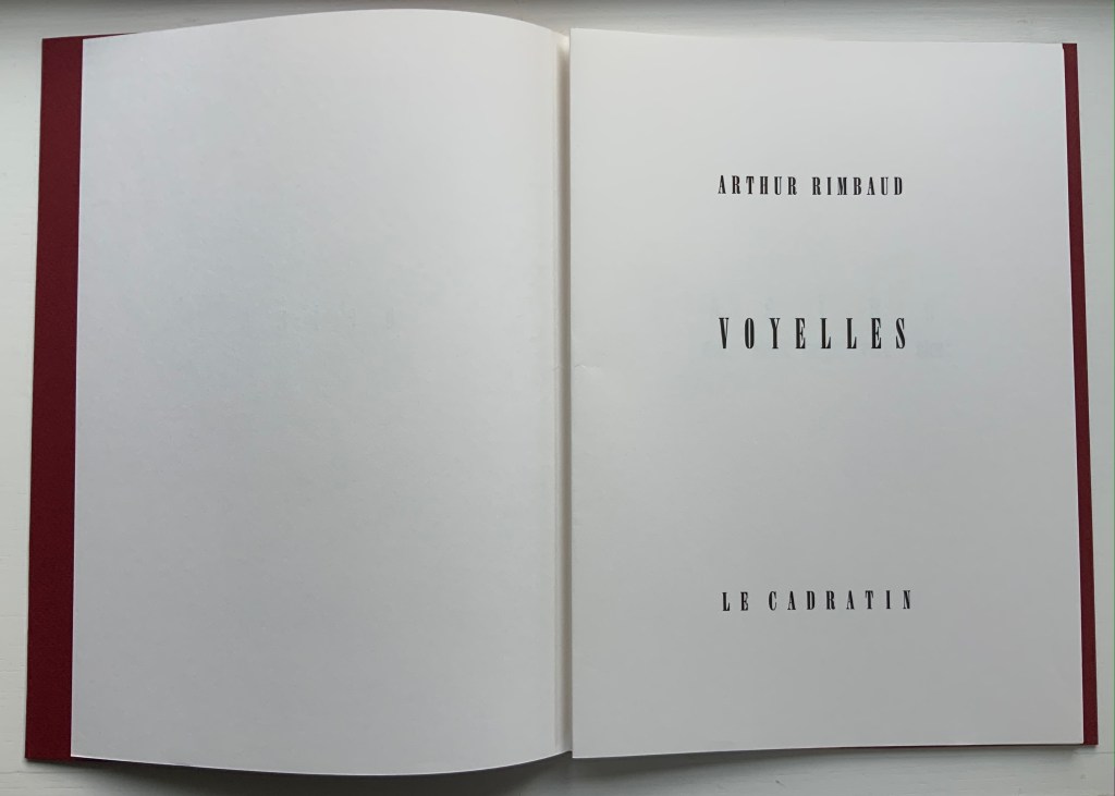
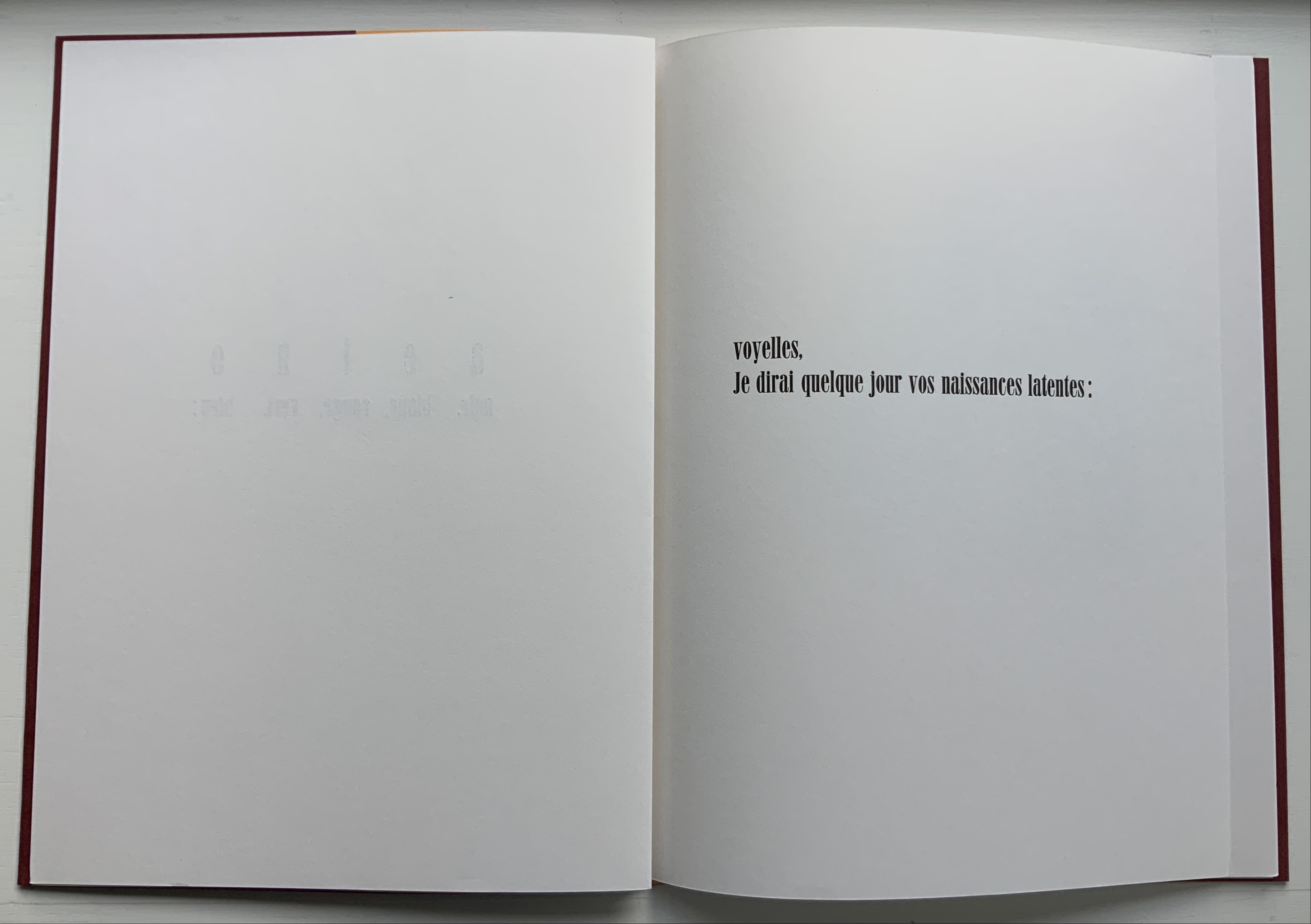
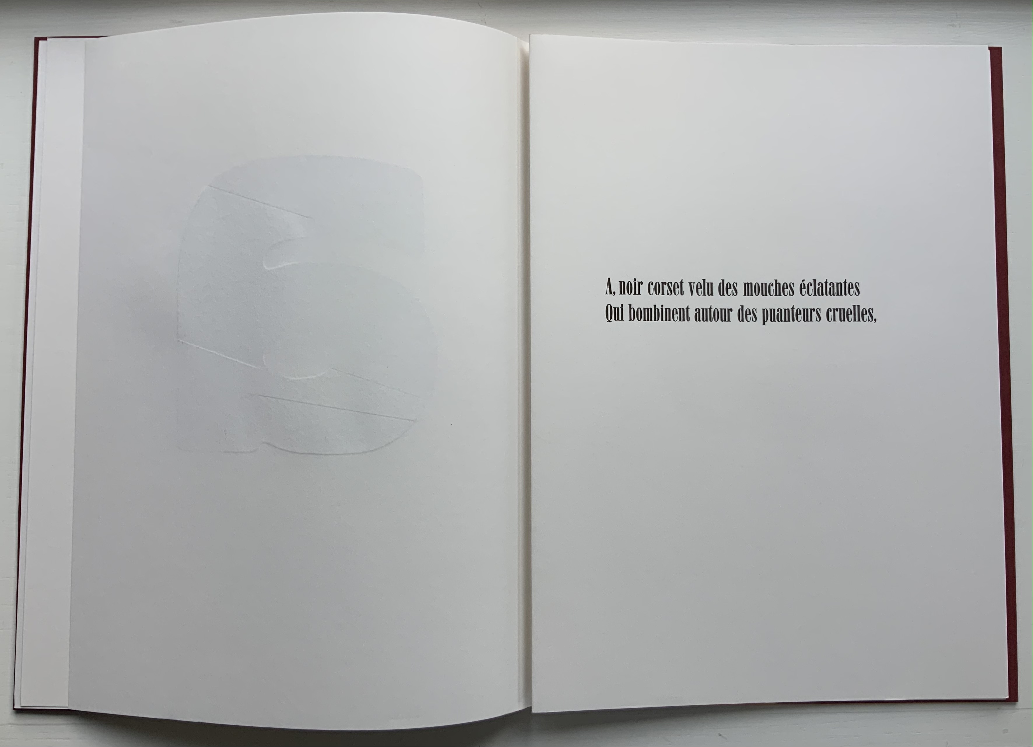
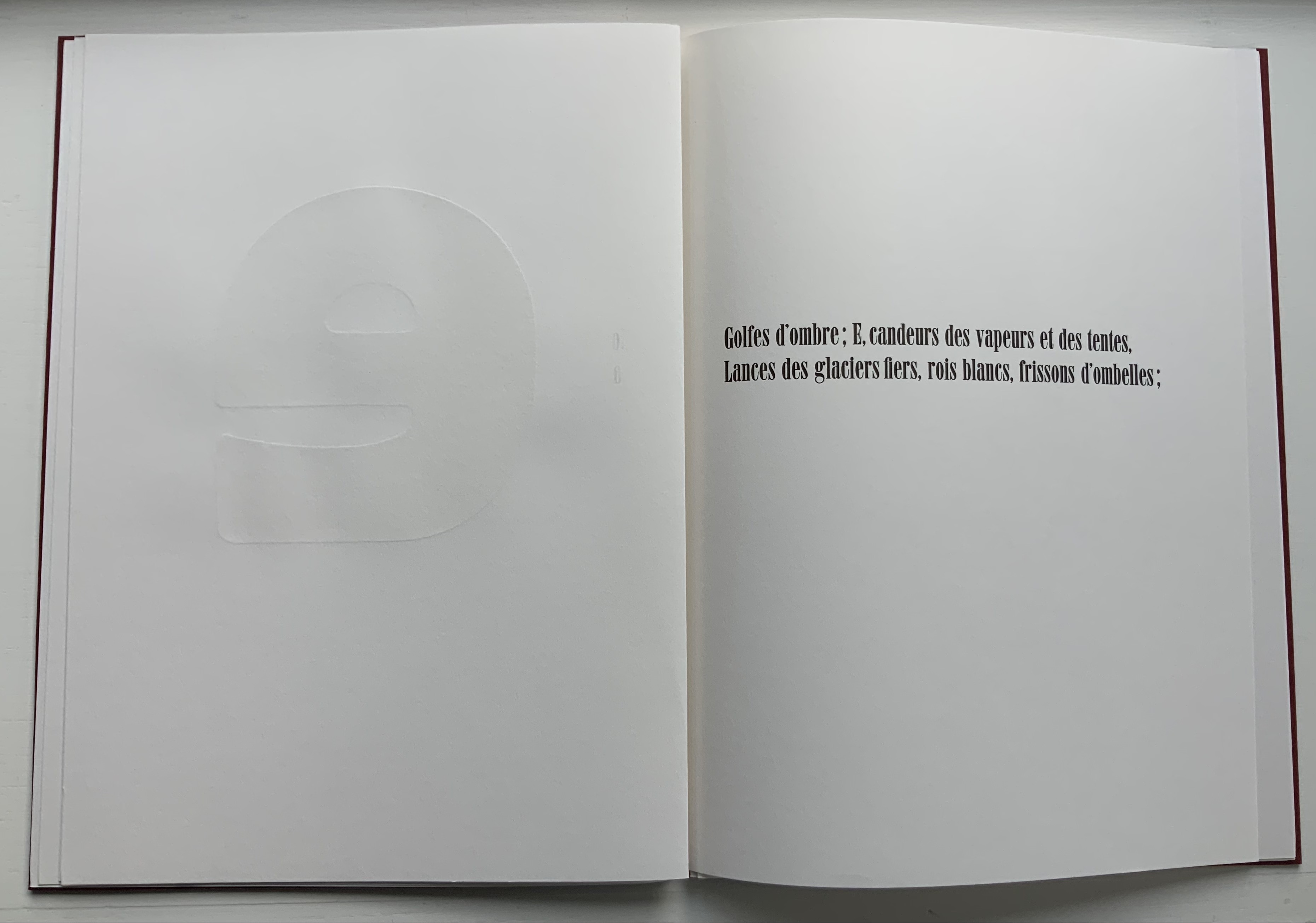
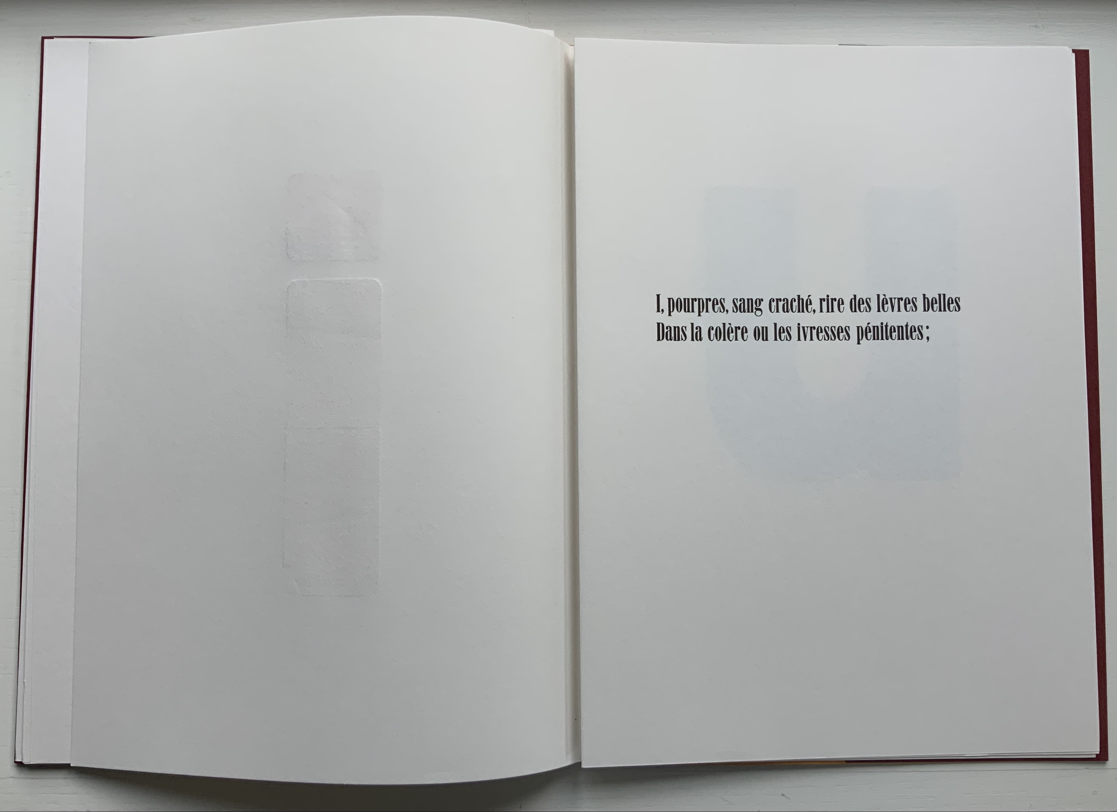
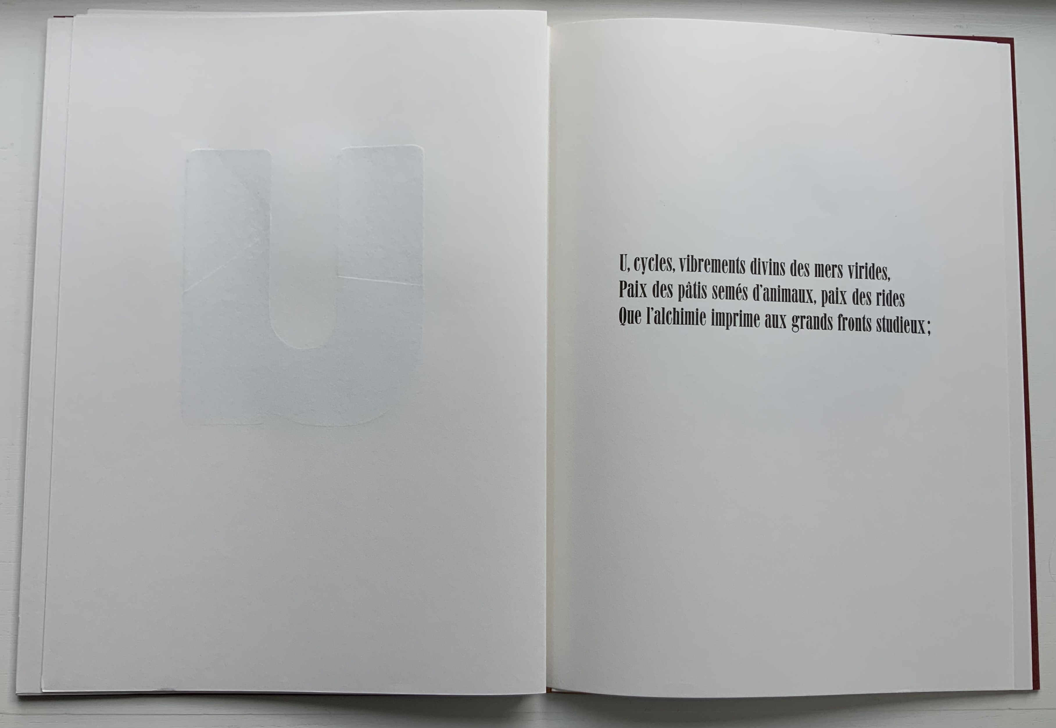
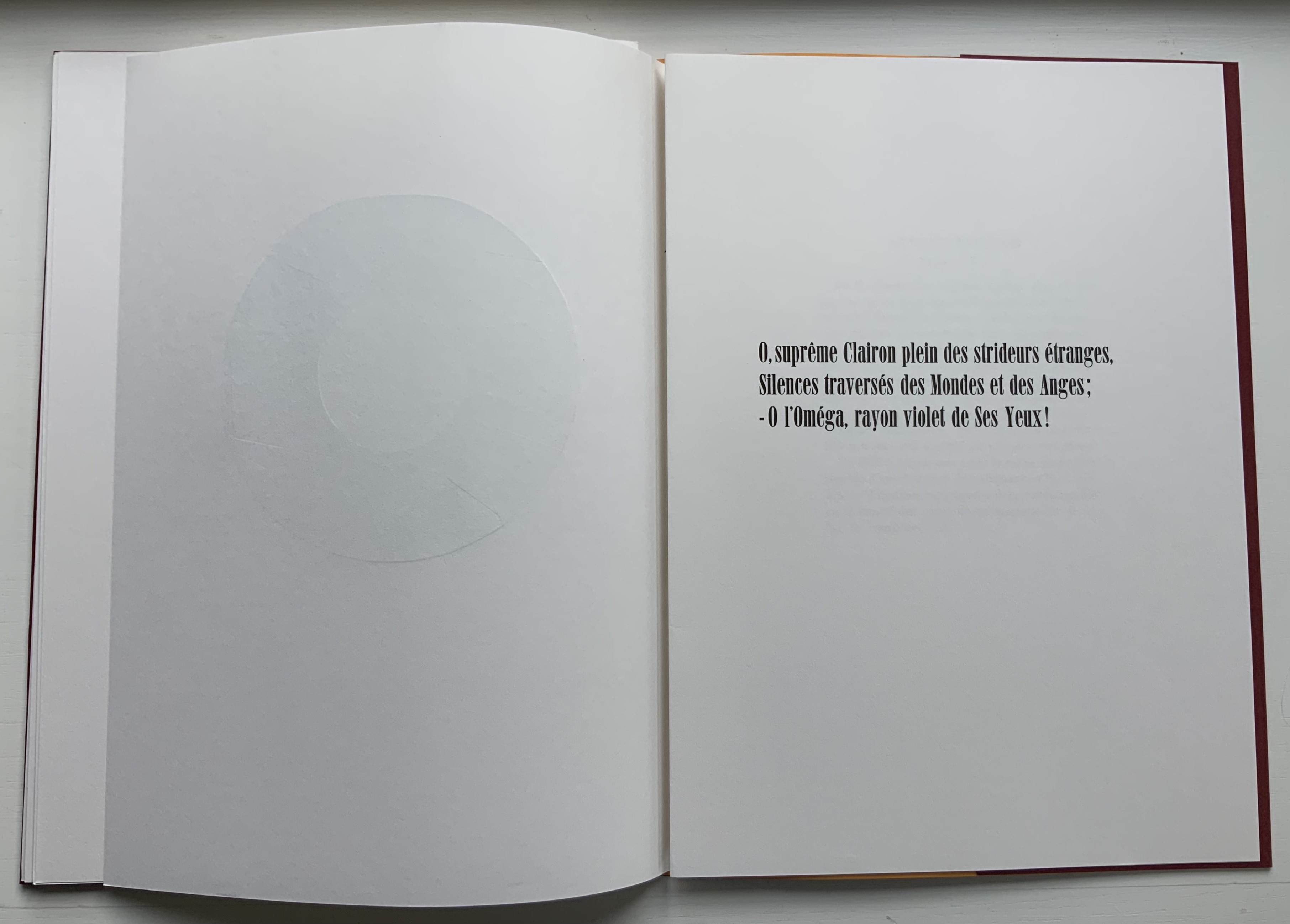
Voyelles (1871/1883/2012) Arthur Rimbaud Design and direction: Jean-Renaud Dagon H325 x W235 mm, 32 unnumbered pages. Edition of 200, of which this is #67. Acquired from Le Cadratin, 6 November 2021. Photos: Books On Books Collection.
Le Cadratin is more than a typesetting and printing house or fine press. An atelier-typographique, founded by Jean-Renaud Dagon, its artists perform tightrope acts in typography, ink, paper and form. Under Dagon’s direction, Joanne Bantick, Hugues Eynard, Nicolas Regamey and Roger Jaunin have composed and printed a rendition of Arthur Rimbaud’s sonnet “Les Voyelles” that deserves applause.
Written in 1871 by Rimbaud and first published in 1883 by Paul Verlaine, the sonnet is one of the better known historic literary examples of graphemic-color synesthesia — strongly associating a color with a letter — and in Rimbaud’s case with strong tones of eroticism. Le Cadratin’s artists leave Rimbaud’s eroticism bound to his text, handset in 28pt Roman Idéal, but deliver their own exuberance with subtle tactility and visual texture in large format wooden type using Heidelberg and Vandercook presses.
Voyelles contributes to other themes in the Books On Books Collection besides the alphabet motif. The handling of wooden type echoes David Clifford’s Letterpress Printing ABC and Andrew Morrison’s Ampersand& (2005) and Two Wood Press A-Z (2013). The synesthesia of letters is shared with Jean Holabird’s Vladimir Nabokov: AlphaBet in Color (2005)
Further Reading
“David Clifford“. 15 September 2021. Books On Books Collection.
“Jean Holabird“. 8 February 2022. Books On Books Collection. For a look at Vladimir Nabokov’s synesthetic alphabet.
“William Joyce“. 18 June 2021. Books On Books Collection. For the more innocent end of literary synesthesia where the cold gray-black of numbers gives way to an alphabet of jelly bean colors.”William Joyce”. 202 Books On Books Collection.
“Andrew Morrison“.15 September 2021. Books On Books Collection.
The art of the alphabet seems to be a rite of passage for graphic artists. Perhaps it is that art and the alphabet find common ground in the urge to make sense of the world. Perhaps it’s that the alphabet’s invention, development and artistic treatment present a rich tradition for artists to follow or challenge. Perhaps it’s that letterforms and the alphabet offer raw material, subject and organizing principle all in one. Semic or asemic. Calligraphic, typographic or even plastic. Representational or abstract. All are options. But most often, something bookish results. From Islam Aly’s 28 Letters(2013) to Ludwig Zeller’s Alphacollage (1979), a significant part of the Books On Books Collection is taken up with artists’ books based on the ABCs and letterforms. The Collection’s two facsimiles of Geofroy Tory’s Champ Fleury provide a useful historical backdrop that throws into relief several of the Collection’s works and their performance of this rite of passage.
It should be no surprise that Geofroy Tory de Bourges (c.1480-1533) serves up such an exemplar. In her Playful Letters, Erika Boeckler writes
An accomplished designer, typographer, printer, poet, author, translator, calligrapher, illustrator, woodcutter, and engraver, he received his education in Italy and ultimately settled in Paris, setting up a bookstore, writing his own works, running a press, and collaborating with or working for Simone de Colines, director of one of the most influential and experimental fine publishing houses of the time. Personally writing the text, designing the woodcuts, and cutting some of them, organizing the layout, perhaps even setting the type, Tory created Champ Fleury as what we might call today an artist’s book. (p. 29)
Tory straddles the letters of the late Middle Ages and Renaissance. Appointed by François I in 1530 as his printer, Tory operated on the Petit Pont under the sign of le Pot cassé (“the broken pot”) and was known for his workshop’s handwritten Book of Hours (1524). Rooted in the horae tradition reaching back to the 13th century, Tory’s Book of Hours is an early-to-mid-Renaissance version of its predecessors. As beautiful as his Book of Hours is, Champ Fleury (1529) became his best known work. Authored and designed by Tory, it was produced by hand typesetting and letterpress printing in Paris with Giles Gourmont. Printed less than 100 years after Gutenberg’s innovation, Champ Fleury represents the printed book toddling out of its incunabula period.
Book of Hours Geofroy Tory (1524) Bound in the 18th century, 113 leaves of vellum. Lessing J. Rosenwald Collection (Library of Congress). Accessed 30 May 2021.
According to Jeremy Norman’sHistory of Informationsite, the first separate printed title page appeared in 1463. Subject indices date back to the 13th century, originating at the University of Paris, and the first printed indices, to 1470. Champ Fleury‘s front matter boasts a title page, two prefaces to the reader, a statement of the King’s Privilege awarded for the book for ten years (a forerunner to the copyright page), a name index without location references and a subject index with folio references. Champ Fleury’s back matter consists of a colophon preceded by a lengthy appendix illustrating various forms of the alphabet (Hebrew, Greek, Latin, etc.).
Tory’s placement of the indices in the front matter rather than the back matter reflects the gradual development of the anatomy of the book towards the structure that would ultimately be codified in reference works like the Chicago Manual of Style. Paratextual elements like the title page, table of contents, page numbers, etc., did not spring up overnight. If, as Eric Havelock and others assert, society, the arts and culture are a superstructure erected on the foundation of the alphabet (see below), Champ Fleury and its “letterology” make for a particularly fitting exemplar of the book as an element of the superstructure arising from the alphabet.
Perhaps book artists sense this, which again leads to that alphabet art rite of passage and the elaborate variations on it. The illustration of various forms of the alphabet in the appendix also draws on another developing tradition: the typesetter/printer’s sample book advertising the firm’s fonts. Abecedaries and artist books have sprung from that tradition, too.
Tory was not the first to propose an art and science behind the letterforms of the alphabet. Predating his efforts were Giovanninno de’ Grassi (1390-1405), Felice Feliciano (1463), the Anonymous Chicagoensis and Anonymous Monachensis (1468?), Damianus Moyllus (1480), Fra Luca Pacioli (1509), Sigismondo Fanti (1514), Francesco Torniello (1517), Ludovico Arrighi (1522), Albrecht Dürer (1525) and Giovanni Battista Verini (1527). Leading up to Champ Fleury, these earlier efforts track the development of humanism. Arguably, Tory’s effort is a capstone, combining myth, allegory, metaphysics, geometry, linguistics, calligraphy, typography and cryptography.
Book One, concerned with the mythical origins of the French language, also addresses the fabled origins of the alphabet: the story of Jove, Io and Mercury behind the letters I and O and their claim to being the first letters and also the tale of Apollo’s accidental murder of Hyacinth explaining the letters A and Y and their similar claim. Two works in the Collection built on alphabet origin stories are Francisca Prieto’s Printed Matter series (2002-2008) William Joyce’s The Numberlys (2014), but many more follow in Champ Fleury’s art and science footsteps.
Tory’s late medieval/early Renaissance perspective gives way to 20th and 21st century poetics and phenomenology in most works of the Collection. Aaron Cohick’s The New Manifesto of the NewLights Press (third iteration) (2017) offers a good example. Another — closer to Tory’s moral and geometric perspective but of a more modern spirituality — is Jeffrey Morin and Steven Ferlauto’s Sacred Space (2003).
Compile all the abecedaries ever created and it would approximate the result of Adam and Eve’s task of naming all the creatures and things of the world. Leonard Baskin echoes that innocence in Hosie’s Alphabet(1972) with its words and animals supplied by his children. If Adam and Eve had had an alphabet, they might have been tempted into pareidolia, which is represented in the Collection by VUES/LUES: Un Abécédaire de Marion Bataille (2018) and Typographic Universe (2014) by Steven Heller and Gail Anderson. Heller and Anderson’s compendium extends to letters formed of natural and drawn objects from the real world, which Champ Fleury’s appendix foreshadows with its floral and fantastic alphabets.
Of course, Tory’s work is not an abecedary. In Books Two and Three, it develops into a full-blown treatise on letterforms whose meaning and appearance are explained allegorically and driven by the compass, rule and geometry expressed within a 10x10x10 cell cube. It would overstate the case to call it “typographic design”. As drawn, Tory’s diagrams would serve poorly for cutting and forming punches or matrices (although it has been done). Nevertheless, his geometric approach foreshadows the grids and algorithms of Wim Crouwel’s New Alphabet (1967), Timothy Epps and Christopher Evans’ Alphabet(1970) and Ji Lee’s Univers Revolved: A Three-Dimensional Alphabet (2004).
Before the age of computers and algorithms, though, the artist and designer Bruce Rogers did bring typographic design to bear on Champ Fleury. The Grolier Club sponsored the printing of George B. Ives’ English translation. Rogers’ design “translates” Champ Fleury just as much as Ives does, perhaps more so. The Grolier Club edition is one of only ten books to be set completely in the Centaur typeface designed by Rogers.
Of course, the translation entails a complete resetting of the text, and Centaur naturally delivers crisper letters. Also, in redesigning with Centaur, Rogers alters the original’s layout and, therefore, the reader’s experience of it. Notice in the OAHK pages above and in the three double-page spreads below how Rogers changes Tory’s flow or jumpiness to something fixed or stately. Attention to the page and its layout offers book artists as well as book designers yet another creative avenue. For proof of that, compare the Collection’s entries for Angel, Baskin and de Cumptich.
Architecture is another of Tory’s well-developed analogies and explanations of the ancients’ thinking behind the letterforms. In his drawings below, he aligns the letters AHKOIS with the parts of a building and letters IL with floor plans. He connects the circularity of the Coliseum’s exterior and the ovalness of its arena with the proper shape of the letter O. In the Collection, the analogy reappears fantastically in Johann David Steingruber’s Architectural Alphabet (1773/1972), Antonio Basoli’s Alfabeto Pittorico (1839/1998) Antonio and Giovanni Battista de Pian’s efforts in 1839 and 1842.
The architectural analogy provides Tory with his segue from plane to solid geometry in aligning the shapes of letters with human anatomy and virtues. His three-dimensional analysis of letterforms also finds contemporary analogues in two of Pieter Brattinga’s Kwadraat Blad series: Crouwel’s, mentioned above, and Anthon Beeke’s Alphabet (1970). Tory’s three-dimensional letterforms foreshadow Crouwel’s investigation of units based on the assembly of organic cells and his later musings on a laser-generated four-dimensional typography (Elliman, 62). And it is hard to evoke anything more humanoid and three-dimensional — albeit far less analytical or prudish — than Beeke’s alphabet formed with naked female models. (Tory comments that in a correctly drawn A, the crossbar will virtuously cover the genitals of Vitruvian man inscribed in the 10×10 grid. Modesty seems to extend to H as well but not so much to O and K.)
The calligraphic impulse that underlies Champ Fleury‘s typographic representations shows itself clearest in the woodcuts for the Cadeaulx alphabet in the appendix. The Books On Books Collection has its share of calligraphic abecedaries such as Marie Angel’s An Animated Alphabet (1996) and Andrew Zega and Bernd Dam’s An Architectural Alphabet (2008) as well as more purely calligraphic alphabets such as Islam Aly’s, mentioned above, and Suzanne Moore’s A Blind Alphabet (1986) .
Two artists whose abecedaries blend the calligraphic and typographic are Robert de Vicq de Cumptich and Cathryn Miller. In de Cumptich’s Bembo’s Zoo (2000), letters and punctuation marks from the Bembo typeface form calligraphic animal shapes. Miller’s L is for Lettering(2011) joins up the alphabetic rite of passage, calligraphy and typography by allying each of her hand-drawn letters with the name of a typeface from “A is for Arial” to “Z is for Zapfino”.
The last page of Tory’s illustration of additional alphabets is not the end of his work. The colophon plays that role. Curiously, Tory misses out the character that plays that role for the alphabet itself: the ampersand. “Curiously” because the character & appears throughout Champ Fleury — even at the end of the colophon’s fourth line in French — and it is after all the most flowery of the alphabet’s characters. Perhaps some book artist will follow Bruce Rogers’ example in his joking Depression-era homage to Tory on the back of Champ Rosé and create an homage to Tory and Rogers of three-dimensional ampersands.
Gelb, Ignace J. 1974. A Study of Writing. Chicago: University of Chicago Press.
Golec, Michael. 2015. “Champ Fleury in the Machine Age”, lecture at the School of Visual Arts, NYC. Uploaded 4 June 2015. Accessed 12 May 2021. Good slides and a comparative look at Tory’s original and Rogers’ resetting.
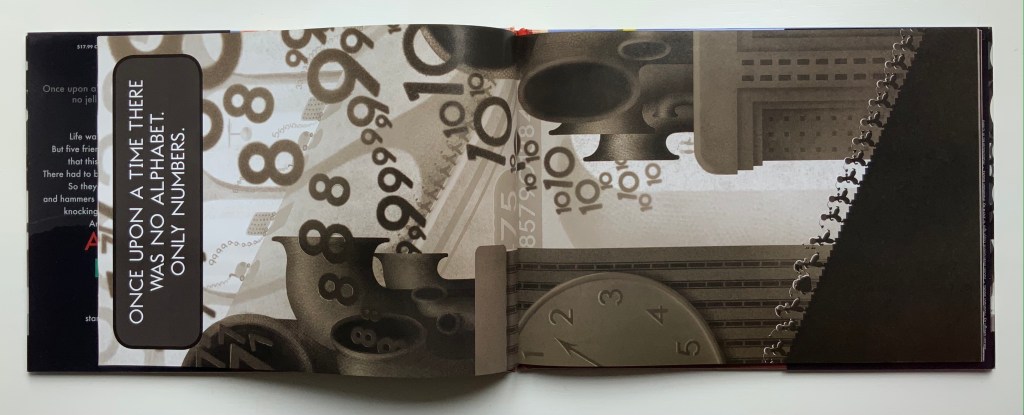
The Numberlys (2014) William Joyce and Christina Ellis Hardback, paper on board. H220 x W300 mm, 52 pages. Acquired from London Bridge Books, 15 April 2021. Photos of the book: Books On Books Collection.
Although bound in landscape, the book reads in portrait … to start and end.
Life was…fine. Orderly. Dull as gray paint. Very…numberly. But our five jaunty heroes weren’t willing to accept that this was all there could be. They knew there had to be more.
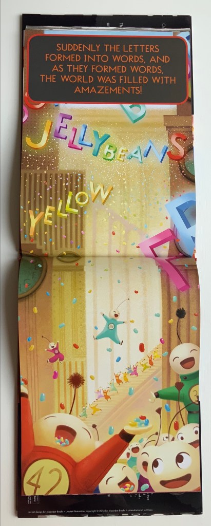
So they broke out hard hats and welders, hammers and glue guns, and they started knocking some numbers together. Removing a piece here. Adding a piece there. At first, it was awful. But the five kept at it, and soon it was…artful! One letter after another emerged, until there were twenty-six. Twenty-six letters—and they were beautiful. All colorful, shiny, and new. Exactly what our heroes didn’t even know they were missing.
And when the letters entered the world, something truly wondrous began to happen…
Based on the award-winning app, this is William Joyce and Moonbot’s Metropolis-inspired homage to everyone who knows there is more to life than shades of black and gray. — from the Moonbot Studios’ website. Accessed 28 April 2021.
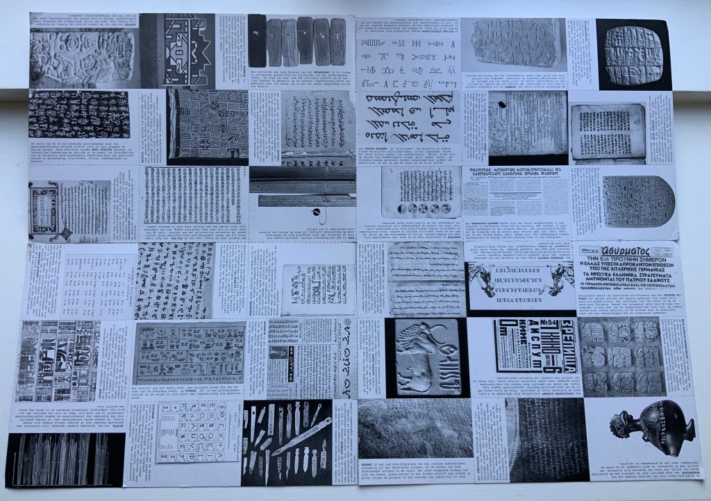
Archaeologists and paleontologists hypothesize that the alphabet evolved from counting. Clay tokens as signs (8000–3500 BC) and then pictographic marks on clay tablets (3500–3000 BC) were used for counting units of things. Around 3000 BC, someone merged pictographic signs and phonetic sounds to begin the invention of the alphabet. Orly Goldwasser (Hebrew University, Jerusalem) has hypothesized that illiterate Canaanite miners may have been the inventors of the alphabet around 1840 B.C.E.
Likewise in The Numberlys, our inventor-heroes (numbers 1-5 or, in their vocalizations, possibly the five vowel sounds?) lead a similarly manual existence, albeit in a more modern industrial setting. They can be viewed at work here in this clip from the award-winning app, no longer available but perilously stored on an early iPad in the Books On Books Collection. As in the app, the book proceeds in gray until the letter Z, when “THINGZ” begin to happen — “Pizza! Jelly beans! Color! Books!”.
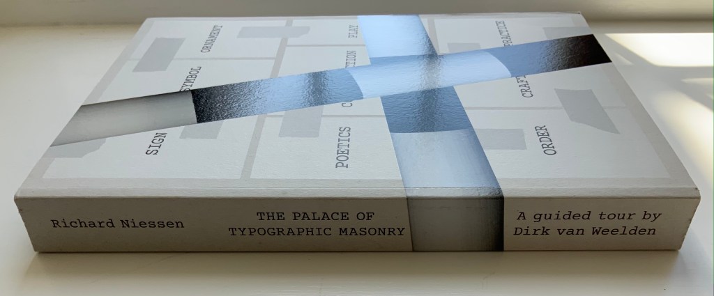
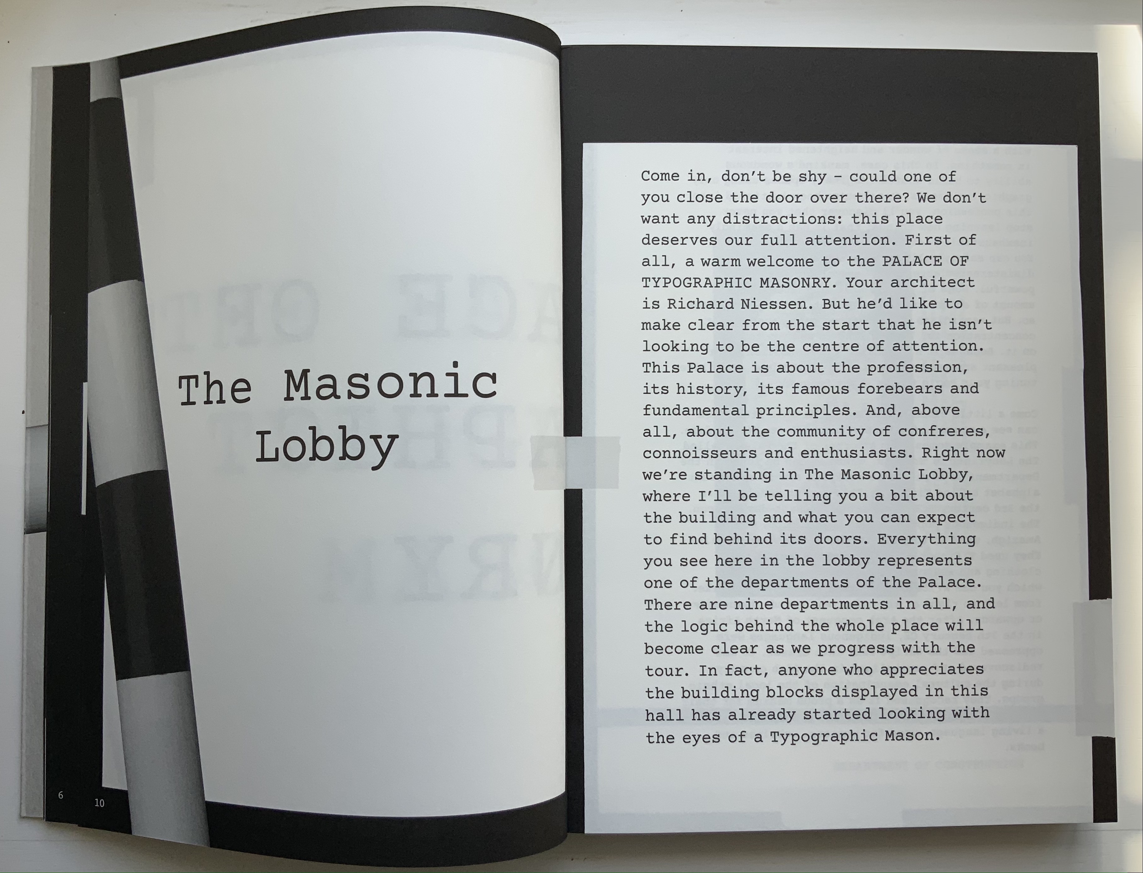
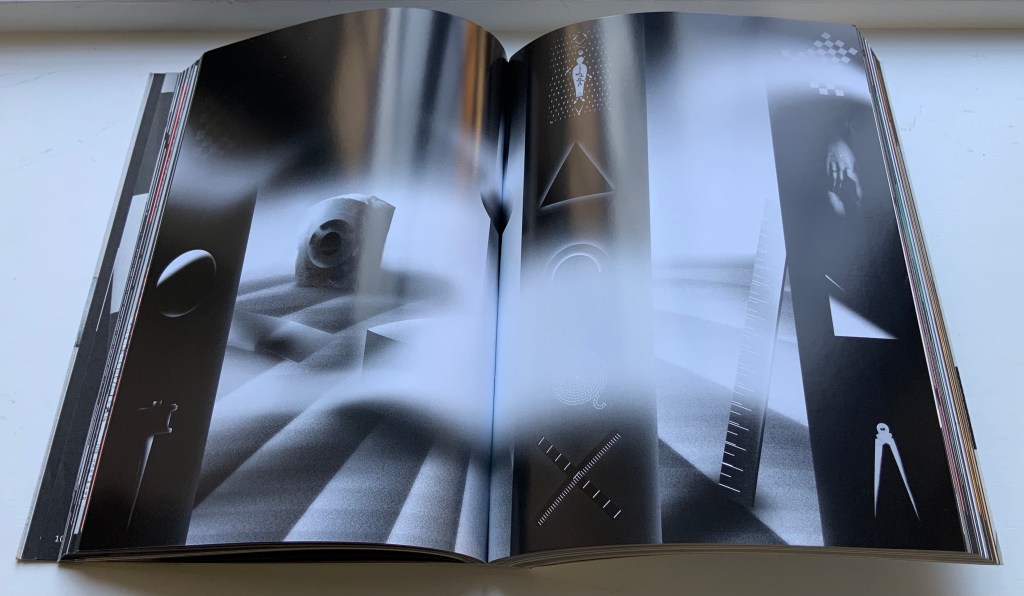
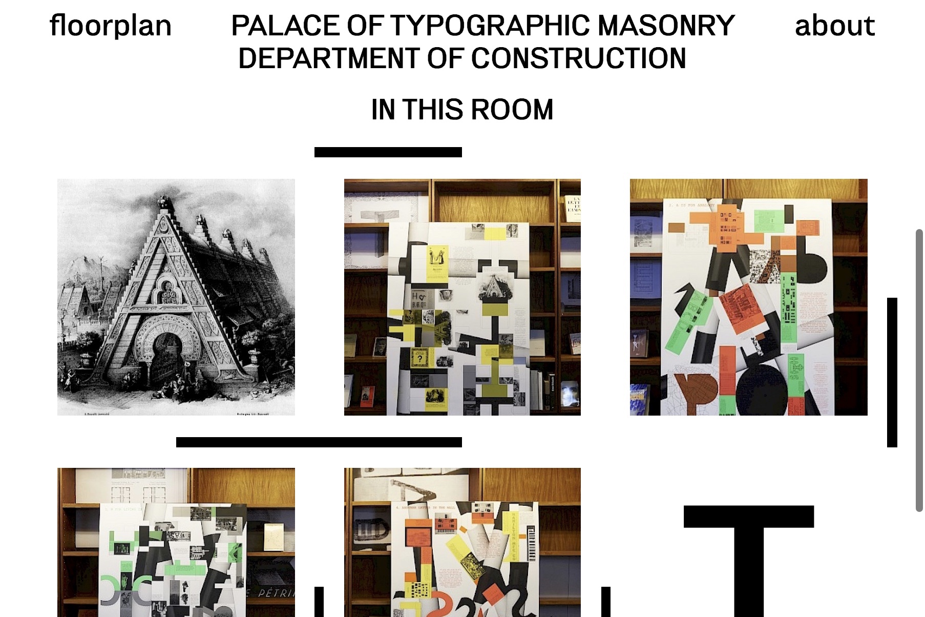
The Palace of Typographic Masonry (2018) Richard Niessen Paperback, perfect bound. H300 x W215 mm, 348 pages. Acquired from Wordery, 29 March 2021. Photos of the work: Books On Books Collection. Displayed with permission of Richard Niessen.
Website, perforated poster, exhibition and paperback, The Palace of Typographic Masonry occupies its place in the Books On Books Collection unlike any other work. The book itself is a shape shifter. Its size competes with those of museum catalogues. In fact, the Palace of Typographic Masonry is like a museum, so much so that it requires a tour guide, which is one shape the book takes. With its nine departments (Sign, Symbol, Ornament, Construction, Poetics, Play, Order, Craft and Practice), it is like a working museum of graphic design, and Dirk van Weelden, our tour guide, often hands us off to departmental “staff” for a lecture or overheard interview.
Given the guided-tour premise, the page layouts strangely, or perhaps appropriately, disorient. On almost every page, at almost every turn, we are rubbernecking and twisting to follow text that appears in a typewriter font on sheets and cards that seemingly have been stuck to a black surface with masking tape, photographed and then printed. Some of the text-bearing cards wrap from the recto page to the verso, leading the reader to think that perhaps the pages are on Chinese fold sheets. A card or sheet may be displayed complete on a page, but the next page may show its edge as if an overlapping photo had been taken. On some pages, the items overlap like a collage. At times, the effect is one of moving down a corridor of blackboards that are covered with notices and captioned photos on white, green and fluorescent orange paper. At other times, the page contains multiple cards as if lying on a flat surface — much the same as objects might be arranged in gallery glass cases — and in different orientations so that the book has to be turned clockwise or anti-clockwise to read each item — much the same as having to walk around a glass case to look at each object in it.
Interspersed glossy sections showcase projects illustrating or responding to the text or the department. For example, Slovenian graphic designer Nejc Prah delivers variations on Masonic tools for Symbols; Paris-based Fanette Mellier, on grid-based design for Poetics; and the Amsterdam-based studio Moniker, “board game cut-ups” for Play. While these sections fit their context in the book, their content and “slippery floor” substrate ratchet up the sense of disorientation. Museum visitors easily tire, and they can be bored in some departments.
Nejc Prah‘s variations on Masonic tools and symbols. Photo: Books On Books Collection. Displayed with artist’s permission.
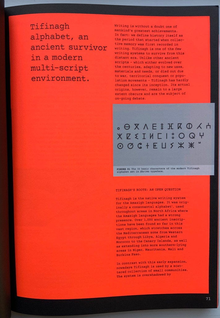
For example, the palace’s labyrinth of scripts — also reproduced separately on the perforated poster — is followed by a discussion of the revival of Tifinagh, the nearly extinct written language of the Tuareg in the Maghreb. The labyrinth presents thirty-six scripts in those varying orientations mentioned above and is wonderful in its breadth but also tiring — especially from the effort required by the font size and orientations. The story of Tifinagh’s revival and integration through typeface design is inspiring, usefully makes the point about the cultural conventionality of alphabets and more, but also makes for a long trek before our guide moves us along into the next department.
With the website for The Palace of Typographic Masonry, Richard Niessen aims for both a collective (imagined) building and an encyclopedic (digital) space, organized into those nine departments or frames. Contributors can add to the source collections or, within the departments and their subdivisions, create new rooms based on the source collections. One contribution particularly appropriate for the Books On Books Collection comes from Tony Côme: “The Typotectural Suites“. Here in one location, the visitor can find those “language towers, typographic islands, cities to decipher, plans in the shape of letters, encrypted walls, speaking bricks, habitable capitals” created by Johann David Steingruber, Antonio Basoli, Antonio and Giovanni Battista de Pian, Paul Noble and others.
The Departments of Sign, Symbol or Order could give more prominence to the role of numbers in the world of typographic masonry. Numerals do appear in the tables for Morse Code and International Maritime Signal Flags, but the visitor would not know that counting and numbers preceded writing and letters. Perhaps the curator could persuade the art historian and archaeologist Denise Schmandt-Besserat to contribute images of those clay tokens to which
The Mesopotamian cuneiform script can be traced furthest back into prehistory to an eighth millennium BC counting system using clay tokens of multiple shapes. The development from tokens to script reveals that writing emerged from counting and accounting. (Schmandt-Besserat, 2015)
Or perhaps the curator could persuade William Joyce to donate some clips from The Numberlys (2012) to the Palace source collection, even preferably some snippets of interactive code with which the visitor can help the five animated characters transform numbers into letters.
Universal languages are highlighted in an Annex, which has been compiled by Edgar Walthert. An update soon to come includes excerpts from Book from the Ground by Xu Bing. A link to Xu’s film The Character of Characters would make a useful addition. It will be interesting to see whether the Annex’s accompanying lecture covers the stir over a “post-text future” and whether typographic masons are returning full circle to pictographic language.
Further Reading
“Architecture“. 12 November 2018. Books on Books Collection