Books On Books Collection – Edmund Fry

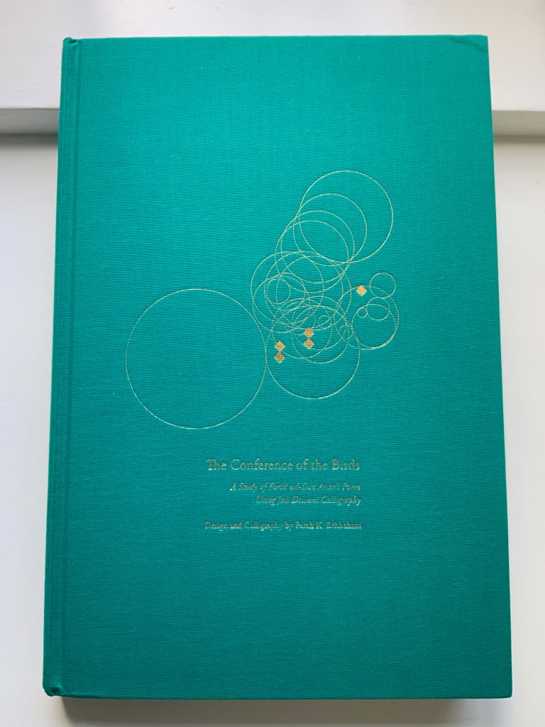
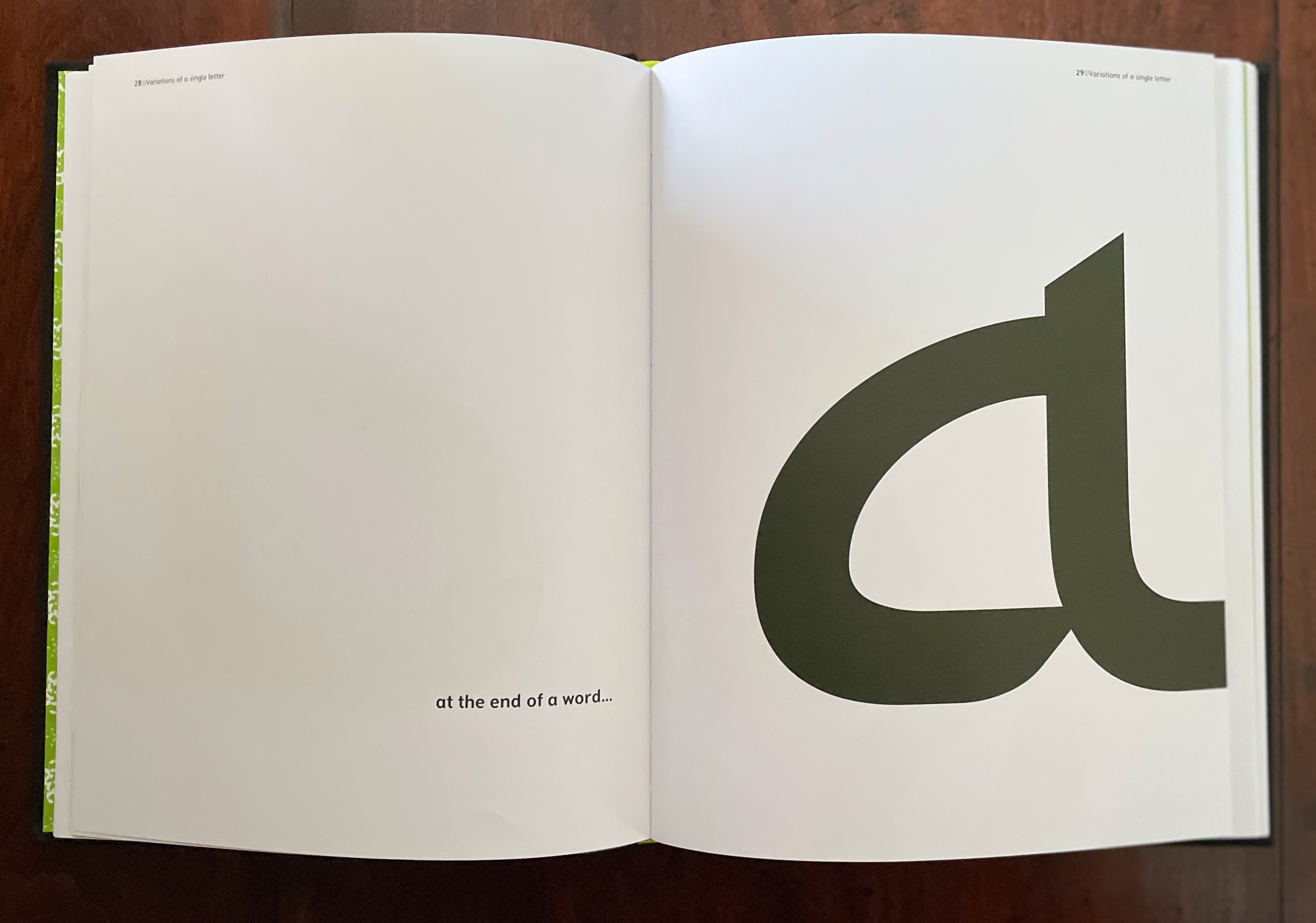
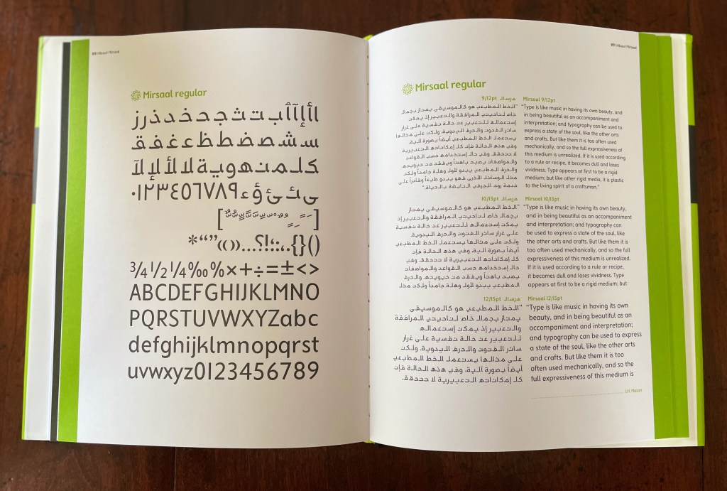
Pantographia (1799/2022)

Pantographia, Containing accurate Copies of all the known Alphabets in the World (1799/2022)
Edmund Fry
Casebound in Italian Fedrigoni Imitlin, sewn book block, black endpapers. H215 x W140 mm. Acquired from Black Letter Press, 1 April 2022.
Photos: Books On Books Collection.

For the Enlightenment, everything that existed was meant to be in an encyclopedia. For Dr. Edmund Fry, scholar, typographer and owner of The Polyglot Foundry, this notion (and the spur of profit) led to his Pantographia (1799). Extraordinarily, Fry made the matrix for each of the roughly 5,000 characters for the 405 alphabet specimens, then handcast each — a monumental sixteen-year accomplishment in craftsmanship. Quite a type sampler for a printer specializing in foreign languages.

Fry was also driven by the importance of the subject: the origin of speech, its being made visible and the varieties of doing so. “The art of drawing ideas into vision, or of exhibiting the conceptions of the mind, by legible characters, may justly be deemed the noblest and most beneficial invention of which human ingenuity can boast — an invention which has contributed, more than all the others, to the improvement of mankind.” (xviii)

Fry is even handed in presenting the arguments and evidence for and against the two possible origins of speech he identifies — divine gift or human invention. He is unequivocal though “that all languages … that have been conveyed in alphabetical characters, have been those of people connected ultimately or immediately with the Hebrews, to whom we are indebted for the earliest specimens of the communication of ideas by writing” and “that there was but one truly original language, from which all others are derivations variously modified”. (xxxviii, xliii)

Plenty has been written about Fry’s accomplishment. Johanna Drucker has explored it in her Alphabetic Labyrinth and more recent Inventing the Alphabet. Even more recently, Hunter Dukes, editor of The Public Domain Review, posted a brief celebration, citing Drucker. Jan Düsterhöft, a German academic now affiliated with the Georg Eckert Institute, provides the publisher’s preface to the Black Letter Press edition shown above. All three identify the two features of Pantographia that echo two other works in the Books On Books Collection: Sam Winston’s One & Everything (2023) and Claire Jeanine Satin’s The Hebrew Alphabet Expressing the Celestial Constellations (2017).

Original at Mansfield College Library, Oxford University

Even in 1799 several of the alphabets displayed by Fry represented extinct languages. Today the Endangered Alphabets Project initiated by Tim Brookes aims rescue languages and their alphabets from that fate. Brookes’ project inspired Sam Winston’s story. More forcibly than Drucker and Dukes, Düsterhöft identifies the imperialist and Western perspective in Fry’s endeavor. Winston’s fable is populated with “story characters”, drawn as various sized and colored blobs, each filled with its distinguishing alphabet. Some are filled with hieroglyphic dogs (presumably for Egyptian shaggy-dog stories), others with Greek, Cherokee and so on. The one story that decides it is the “One and Only story” is filled with the English (Latin or Roman) alphabet and proceeds to eat up all the others.

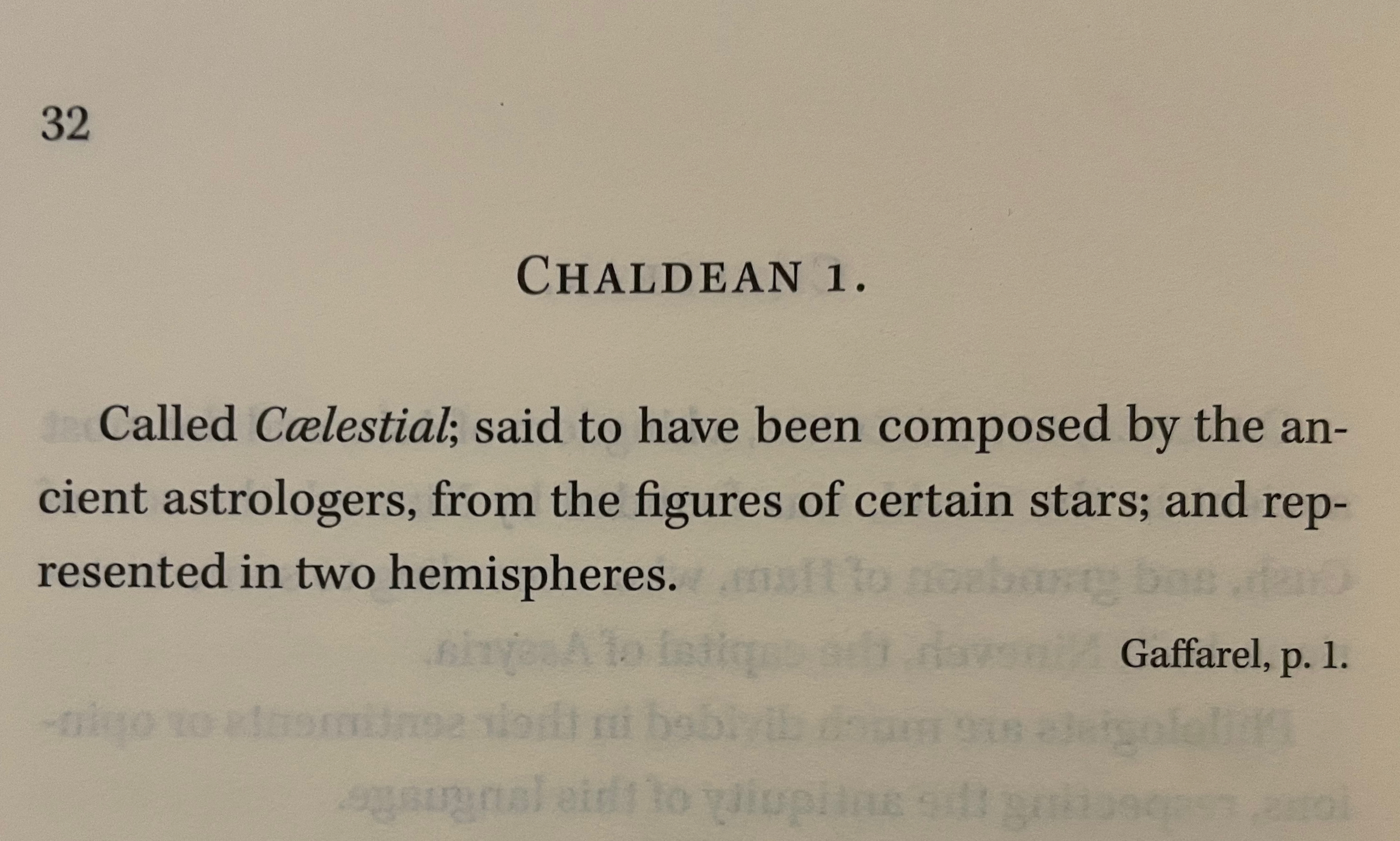
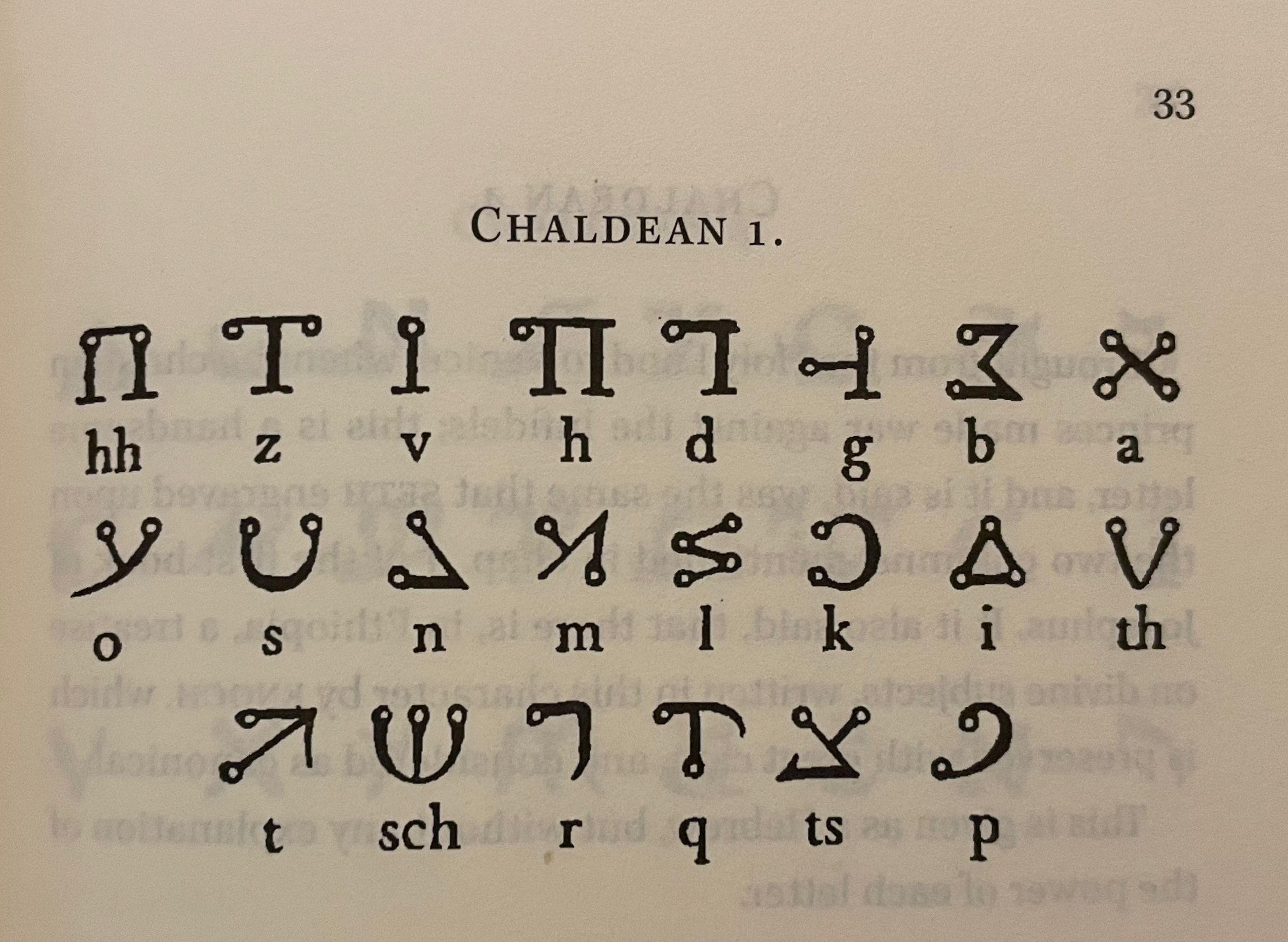
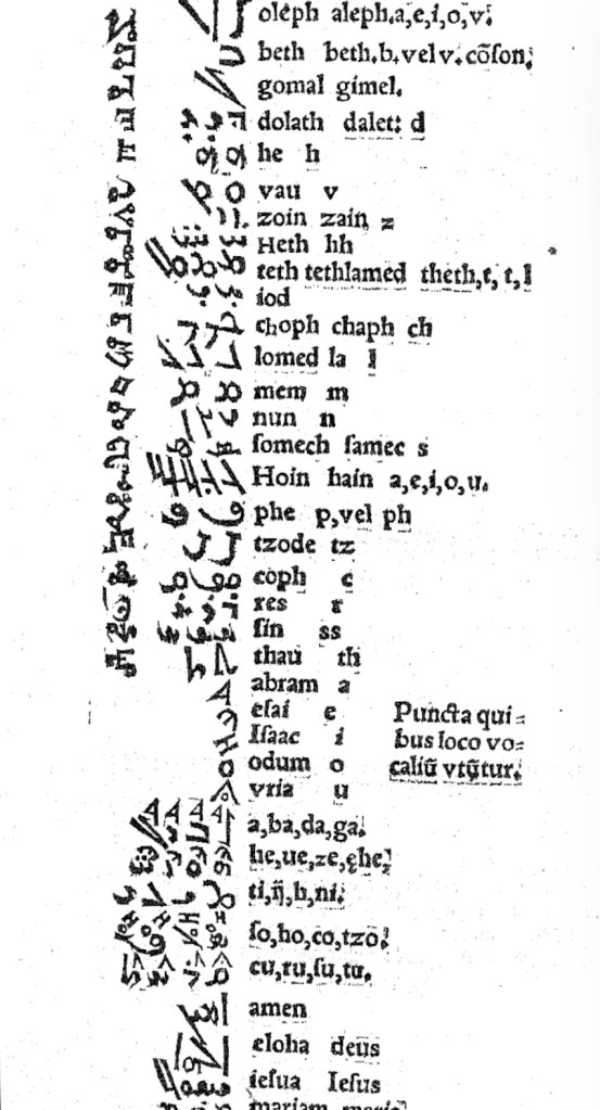
In Pantographia, Chaldean, one of the extinct languages, is a special case, not because Fry includes 20 variant specimens (Greek has 39) but because it is reportedly celestial. The first of Fry’s cited sources for this alphabet is Jacques Gaffarel (1601–1681), a French scholar and astrologer. A bit of digging reveals the source to be more precisely a woodcut from a 1650 translation of Gaffarel’s Curiositez inouyes sur la sculpture talismanique des Persans, horoscope des Patriarches et lecture des estoiles (1629).

From Pantographia (2022)

Unheard-of Curiosities : Concerning the Talismanical Sculpture of the Persians, the Horoscope of the Patriarkes, and the Reading of the Stars (1650)
Jacques Gaffarel

In addition to its astrological character, Gaffarel’s work sits in the traditions of gematria, the Kabbalah and alchemy, which Johanna Drucker has thoroughly explored in Alphabetical Labyrinth (1999) and Inventing the Alphabet (2022). Among the earlier contributors to these traditions is Heinrich Cornelius Agrippa. Like his mentor Johannes Trithemius, Agrippa was a polymath, occultist and theologian as well as physician, legal scholar and soldier. The Latinized Hebrew letters and their corresponding characters in the celestial alphabet seen below come from Agrippa’s De occulta philosophia (1533), which is more legible than Gaffarel’s above.

Henrici Cornelii Agrippae ab Nettesheym à consiliis & archiuis inditiarii sacrae Caesareae maiestatis De occulta philosophia libri tres (1533)
Heinrich Cornelius Agrippa von Nettesheim

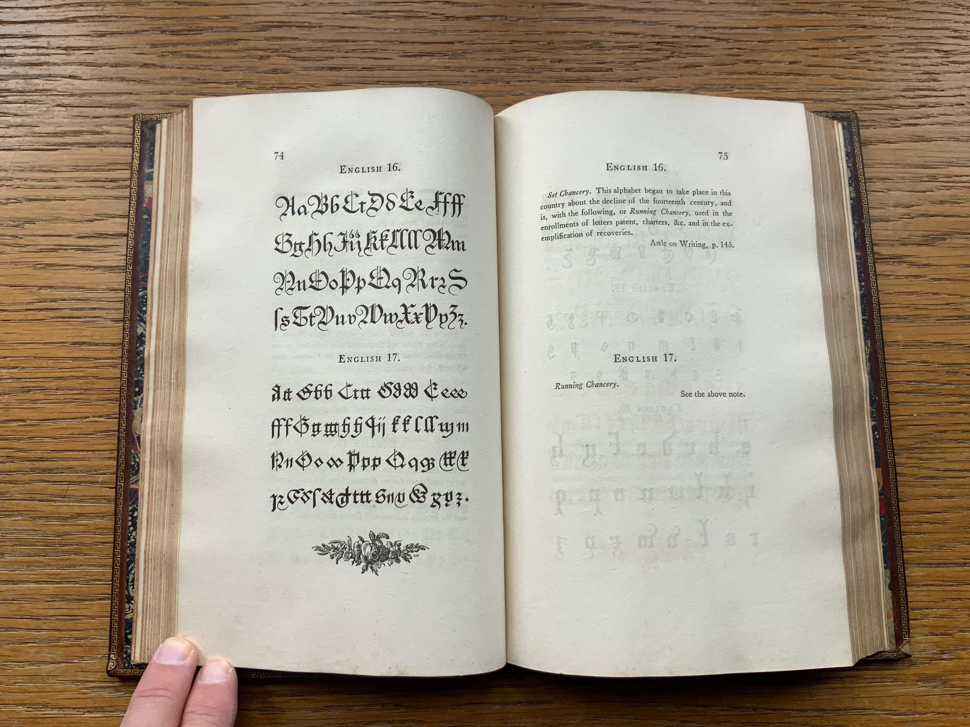
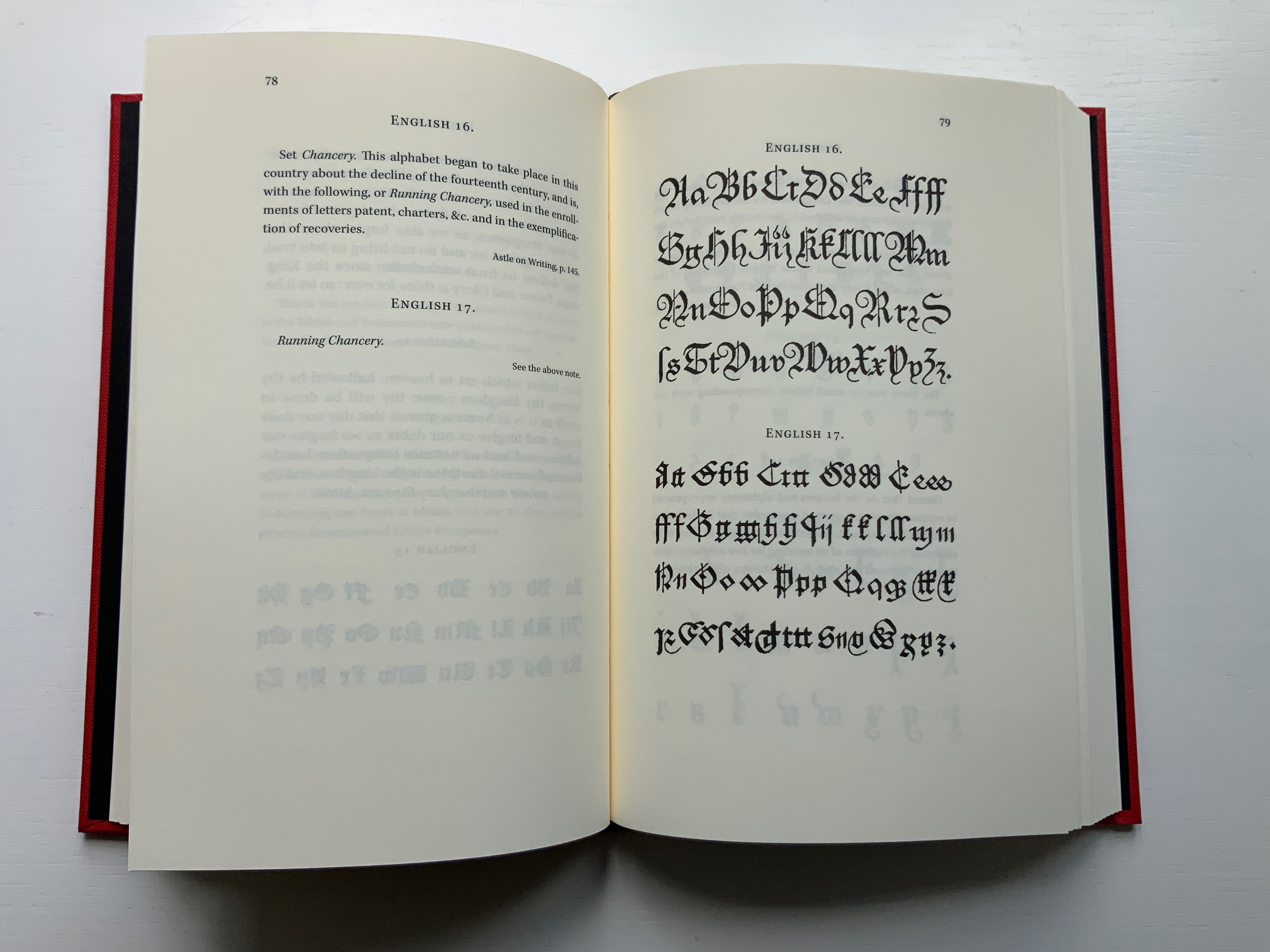
Black Letter Press issued this edition in 2022. As indicated in the caption at the head of this entry, considerable attention to materials was given, including blind debossing and hotfoil printing on the front and spine. The edition is not a photographic facsimile; rather it has been scanned and phototypeset. Scanning in lieu of resetting does not eliminate errors, even if the scan is reviewed carefully. Aside from occurrences of “mod” instead of “most”, “mall” instead of “shall”, and “2ist” instead of “first”, though, the most unusual variation from the original is the deliberate movement of openings on the verso to openings on the recto and, in the specimen section, the reversal of all verso and recto pages. On his verso pages, Fry placed the specimen, and on the recto pages, he placed comments, explanations and sources. For Black Letter Press, the reverse seems to have made more sense. Below are comparisons of pages from the original (left) and the Black Letter Press edition (right).

Left: 1799 original. Right: Black Letter Press facsimile.

Most uncaught scanning errors leap out, so despite the niggling worry about accuracy, the greater legibility and probable accessibility of the 2022 edition is welcome for explorers of alphabets and alphabet-related works. For the Books On Books Collection, its enhancement of the pleasure in Winston’s and Satin’s works and others such as Golnar Adili’s BaaBaa Aab Dad, Islam Aly’s 26 Letters and Ben Shahn’s The Alphabet of Creation (1954), it is more than welcome.

Another 25 images of Fry’s original edition can be found here, courtesy of The Letterform Archive.

Further Reading

Abecedaries I (in progress)“. Books On Books Collection.

Drucker Johanna. 1999. The Alphabetic Labyrinth : The Letters in History and Imagination. London: Thames & Hudson.

Drucker Johanna. 2022. Inventing the Alphabet : The Origins of Letters from Antiquity to the Present. Chicago: University of Chicago Press. Not just another in the long line of histories of the alphabet, rather it explores “Who knew what when about the alphabet?” How did the way they knew it affect how they imagined its identity and origin? For Drucker, Pantographia marks an endpoint and transition. These printed compendia of alphabetic scripts began in 1518 with Johannes Trithemius. Initially spurred by interest in the occult as well as exotic and ancient scripts and a search for the “original” alphabet, compendia gradually became more secular but still eclectic. By 1799, Fry ‘s was an exception by still including the Celestial Alphabet and citing sources in trackable ways. Simultaneously an investment in imagination and a significant step forward for scholarship.

Dukes, Hunter. 10 October 2023. “Pantographia: A Specimen Book of All the Alphabets Known on Earth (1799)“. Public Domain Review. Dukes, editor of the Review, celebrates Pantographia‘s iconic presence in the public domain. In his celebrating, Dukes also notes the presence of the Celestial Alphabet in Pantographia and Drucker’s singling out Fry for taking the antiquarian compendium of alphabets to the earliest stage of specialized, professional research. He also surrounds Fry’s effort with other interesting direct and indirect contexts: the discovery of the Rosetta stone in the same year as Pantographia’s publication and the extinction of several of the languages that Fry’s alphabet represents.

Düsterhöft, Jan. 2022. “Foreword”. In Fry, Edmund. 1799. Pantographia, Containing accurate Copies of all the known Alphabets in the World. Turin, Ialy: Black Letter Press. A German academic now affiliated with the Georg Eckert Institute, Düsterhöft also raises the point about extinction and relates it to the West’s imperial colonial perspective, which Fry displays in his omissions and dismissal of the Chinese mind’s intellectual and rational capacity “as evidenced” by the lack of an alphabet. Düsterhöft also identifies Gaffarel’s source for the celestial alphabet: Guillaume Postel ‘s Linguarum Duodecim Characteribus Differentium Alphabetum Introductio [An Introduction to the Alphabetic Characters of Twelve Different Languages] (1538). Postel (1510 – 1581) was a polyglot French linguist, astronomer, Christian Cabalist, and di­plo­mat.

From Postel, Linguarum

Books On Books Collection – Farah K. Behbehani

The Conference of the Birds (2009)

The Conference of the Birds (2009)
Farah K. Behbehani and Farid ud-Din Attar.
Casebound cloth over boards, stamped in gold foil. H340. 166 pages (56 of them foldouts). Acquired from Saba Books, 5 June 2022.
Photos: Books On Books Collection. Displayed with permission of the artist.

The Conference of the Birds is a twelfth-century Sufi allegorical poem by Farid ud-Din Attar. A gathering of the world’s birds, each representing a different aspect of human nature, debate who should be king of all the birds. Led by the Hoopoe, they agree to seek the advice of the mythological being – the Simorgh. After an arduous and winnowing journey, thirty of them arrive at the home of the Simorgh to find a surprising answer.

Farah Behbehani has selected thirteen of Attar’s stories and interpreted them within a journey-like creation of her own in the calligraphic style called Jali Diwani. As with many enlightening journeys, the destination is the journey itself — learning to read Jali Diwani calligraphy and, thereby, celebrate the beauty of the tale and its telling.

A passage from the story starts each chapter, and an image of the bird whose story it is is rendered in Jali Diwali. A tasseled bookmark provides the key to following the stroke-by-stroke illustration of how to read a representative line from the Arabic version of the story (a literal English translation is provided).

This book’s features (56 foldouts, embossing, gold foil, die-cut pages and that unusual bookmark) place it outside the mainstream output of its traditional commercial publisher Thames & Hudson and is as close to being an artist’s book from such a source as could be imagined. It is certainly available only through rare book dealers and occasionally by auction.

Behbehani’s Conference of the Birds fits in the Books On Books Collection alongside Golnar Adili’s Baabaa Aab Daad (2020), Islam Aly’s 28 Letters (2013), Masoumeh Mohtadi’s Blindness (2020) and Rana Abou Rjeily’s Cultural Connectives. Disregard any implication that these works represent a single aesthetic. The artists hail from different countries and draw on different traditions. Yet each work reaches across the cultural divide between the Near East and the West. Reaching across does not mean eliminating the differences. Consider Behbehani’s work in relation to Brian Goggins ‘ Language of the Birds (2006-2008), a site-specific sculptural light installation for a public plaza in San Francisco; Anselm Kiefer’s Für Fulcanelli – die Sprache der Vögel (2013), a massive sculpture of leaden bird wings and books; and the delicate but weighty cages in Bird Language (2003) by Xu Bing.

If anything draws all of these works together, it is the chord that language and image strike across time and cultures.

Further Reading and Viewing

Golnar Adili“. 2022. Books On Books Collection.

Islam Aly“. 13 January 2020. Books On Books Collection.

Anselm Kiefer“. 16 January 2015. Books On Books Collection.

Masoumeh Mohtadi“. 5 February 2021. Books On Books Collection.

Rana Abou Rjeily“. 21 December 2022. Books On Books Collection.

Xu Bing“. 28 February 2016. Bookmarking Book Art.

Arts AlUla. November 2022. “Interview with Farah K. Behbehani | فنون العلا | سفر | لقاء مع فرح بهبهاني“. Accessed 23 November 2022.

Books On Books Collection – Rana Abou Rjeily

Cultural Connectives تواصل الثقافات  (2011)

Cultural Connectives = تواصل الثقافات / Cultural connectives = Tawaṣṣul al-thaqāfāt (2011)
Rana Abou Rjeily
Dustjacket/poster, casebound, decorative doublures, sewn, endbands. H235 x W195 mm. 112 pages. Acquired from Medimops, 23 November 2022.

Rana Abou Rjeily’s is not the only attempt to adapt Arabic to the printing press as Cecil Hourani and Mourad Boutros note in their preface, but their praise for the book is all the more notable for Boutros’ being the creator with Arlette Boutros of Basic Arabic, a widely accepted typeface alongside Nasri Khattar’s Unified Arabic. Still more notable, however, are the ways in which Rjeily’s design and writing weave together multiple aims. One aim, of course, is to introduce Mirsaal, the typeface designed by the author to adapt the calligraphic styles of the Arabic alphabet to the printing press and still be used for the Latin alphabet. Another is to teach the Arabic alphabet to non-native speakers. And still another is to bridge Arabic and Western cultures. The aims are interwoven not only because Rjeily uses the first as the means to the others but because she invests all three into the design of the book.

The dustjacket offers the most mechanical example of this investment. It unfolds into a poster display of the book’s epigraph from Gibran Khalil Gibran (set in Mirsaal, of course): “We shall never understand one another until we reduce the language to seven words”.

Mechanically more subtle than the dustjacket is Rjeily’s use of partial and full bleeds in the pages below — always in support of the meaning on the page. Using both vertical and horizontal bleeds, this double-page spread illustrates the Latin alphabet’s more vertical orientation compared to Arabic’s more horizontal orientation.

Rjeily keeps the material, haptic aspect of both Arabic and Latin close to hand with parallel pages like the following that highlight their alphabets’ differences but also assert the possibility of harmony through design. The same simple green and black color scheme, the same image of nib and mark, and the same angling of text on the page give a unified presentation of the difference in direction and angle of cuts for Arabic and Western nibs. Another physical aspect that Rjeily highlights is the ductus (the order and direction) of a pen strokes making up a letterform, which is arguably more important for Arabic because the flow of writing demands more pen movement.

Other bold, oversized spreads drive home some of the false cognate forms such as 0 and the number 5 written in Arabic-Indic numerals, or the letter V and the number 7 in Arabic-Indic numerals. Others, in an almost children’s book style, present the unique characteristic of an Arabic letterform’s changing shape depending on its initial, medial or final position in a word — or its appearance in isolation. While teaching these differences and features of Arabic is a fundamental aim, always the differences are laying the groundwork or demonstrating what Mirsaal must deal with to bridge a calligraphic system to a typographic system of writing.

The final section presents the Mirsaal typeface in its various fonts (sizes and weights) in the manner of a traditional type specimen, using the very appropriate words of John Henry Mason (1875-1951) in Arabic and English:

Type is like music in having its own beauty, and in being beautiful as an accompaniment and interpretation ; and typography can be used to express a state of the soul, like the other arts and crafts. But like them it is too often used mechanically, and so the full expressiveness of this medium is unrealized. If it is used according to a rule or recipe, it becomes dull and loses vividness. Type appears at first to be a rigid medium; but like other rigid media, it is plastic to the living spirit of a craftsman. — J.H. Mason

Cultural Connectives is the useful reference work Rjeily intends. In achieving its several aims, it also provides both an accomplished example of the book arts and a means of insight into other works in the Books On Books Collection, such as Golnar Adili’s Baabaa Aab Daad (2020), Islam Aly’s 28 Letters (2013), Farah K. Behbehani’s The Conference of the Birds (2009) and Masoumeh Mohtadi’s Blindness (2020).

Further Reading

Golnar Adili“. 24 November 2022. Books On Books Collection.

Islam Aly“. 13 January 2020. Books On Books Collection.

Farah K. Behbehani“. 10 December 2022. Books On Books Collection.

Masoumeh Mohtadi“. 5 February 2021. Books On Books Collection.

Boutros Mourad. 2017. Arabic for Designers : An Inspirational Guide to Arabic Culture and Creativity. London: Thames & Hudson.

Khoury Nammour, Yara 2014. خوري نمور يارا. . Nasri Khattar : A Modernist Typotect. Amsterdam: Khatt Books.

Books On Books Collection – Golnar Adili

Baabaa Aab Daad (Father Gave Water) (2020)

Baabaa Aab Daad (Father Gave Water) (2020)
Golnar Adili
Wood, felt, board and cloth, 5 x 7 x 1.5 inches (closed). Edition of 25. Acquired from the artist, 1 July 2022
Photos: Books On Books Collection unless indicated otherwise. Displayed with artist’s permission.

Helpfully for a Western audience, the box cover of this homage to the traditional Persian sentence for first-year readers links the right-to-left-reading words with their roman alphabet transcription and English translation. Beyond that, understanding just these few characters and appreciating the artistry involved require some research.

Close-up of box cover.

The character called ‘alef and making an aa sound is آ. From the transcription, we know that the sound should appear four times — twice in “Baabaa” and once in each of “Aab” and “Daad”. The character called be and eliciting a b sound is ب . The transcription indicates it should appear three times — twice in “Baabaa” and once at the end of “Aab”. The character named daal and making a d sound is د . The transcription calls for it to appear twice — at the beginning and end of “Daad”.

As in Arabic, from which Persian adopts most of its characters, some characters’ appearance changes depending on their position in a word or syllable. If a word begins with ‘alef (آ) and is the aa vowel (as opposed to the “o” or “é” vowel), the character for it has a “roof” — as in the word “Aab” — but if the sound falls in the middle of a word — as in “Daad” — the “roof” comes off: (ا). Also as in Arabic script, Persian letters can be linked with one another, altering their appearance. In “Baabaa”, ‘alef (ا) links up with be (ب); so not only does its “roof” disappear, but it squeezes the width of ب  and shifts its diacritic (the dot underneath): با. To Western eyes, the linked characters look like one character. In some typefaces, we have the similar phenomenon of ligatures, in which, for example, the letter f and the letter i will join into the single character fi.

Spine of the box.

Even if Gutenberg’s type mimicked scribal lettering, roman type was not cursive script, which explains in part the hard work by Francesco Griffo da Bologna and Aldus Manutius to come up with italic. For Arabic and Persian or any calligraphically represented language with characters changing shape with position and linkage, with diacritics and a slantable baseline to allow stacking of letter combinations, the development of movable type would be and has been even harder — if not impossible as designers Rana Abou Rjeily and Bahman Eslami explain (see references below).

All of this preamble helps in appreciating the linguistic and cultural bridging that Adili’s artwork performs. The miniaturized shape of traditional alphabet blocks meets pixellated and sculpted Persian in Adili’s modular wooden cubes and recessed felt base. Her invented typography mostly skirts the calligraphic concerns by leaping into the third dimension. Language becomes tactile and three-dimensional not only in this work but in almost all of the work emanating from her studio.

Colophon.

Larger set of letter modules. Photo: Courtesy of the artist.

The Jasmine Scented Ones is a particularly good example. This series of works uses the pixellated shapes from Father Gave Water to screenprint Persian characters and words this time taken from a Hafez poem and exploits the play of light through superimposed sheets of Japanese Rayon Lens paper and across 3D resin prints to embody the tension in the poem’s wordplay with the verbs to sit and to settle. For touch that would see and sight that would touch, Adili offers highly expressive works.

Many thanks from Books On Books — or Ketab bar Ketab (کتاب برکتاب)  — to Golnar Adili and friend for assistance with the crash course in Persian characters. Any errors rest with Books On Books.

Further Reading

Abecedaries I (in progress)“. Books On Books Collection.

Rana Abou Rjeily“. 21 December 2022. Books On Books Collection.

Burney, Sarah. n.d. “One Piece by Golnar Adili, Baabaa Aab Daad (Father Gave Water)“. Kajal. Accessed 6 June 2022.

Center for Book Arts. 14 January – 26 March 2022. “Father Gave Water/Baabaa Aab Daad: An Homage to Childhood, Persian, and Process“. Exhibition. New York: Center for Books Arts Gallery. Accessed 1 March 2022. Center for Book Arts’s description of the work: “Adili drew inspiration from her own childhood education in Iran, where all first graders learn the phrase “Baabaa Aab Daad” (translates to “Father Gave Water”) as a foundational example of the elemental letter and sound composition in the Persian language. As a mother to a multilingual toddler, Adili was further inspired to employ a system of blocks and puzzles within her artist book as a reference to her daughter’s tactile style of play. In conducting research for this project, Adili learned of Iranian educator Seyyed Abbas Sayyahi, who drafted the country’s first-grade curriculum and co-founded a system of schools to serve the nomadic population. Adili could not find any formal recognition of Seyyed Abbas Sayyahi’s immense contributions by Iran’s education department, Sazman é Aamoozesh va Parvaresh, so she decided to celebrate his important work by including him in her book. Ultimately, Adili views her artist’s book as a didactic tool for English readers to fully understand the Persian sentence “Baabaa Aaab Daad.” The book includes an English phonetic key for the Persian alphabet and color-coded diagrams that break the sentence down word-by-word. A bilingual speaker and reader herself, Adili is fascinated by the connections between English and Persian, which are both Indo-European languages, and pursues new formal and visual translations through her art practice.”

Eslami, Bahman. 25 September 2013. “Harir—Reducing Noise in Arabic Script“. I Love Typography. Accessed 21 November 2022.

Rjeily, Rana Abou. 2011. Cultural Connectives = تواصل الثقافات / Cultural connectives = Tawaṣṣul al-thaqāfāt. New York London: Mark Batty Publisher.