The Conference of the Birds (2009)
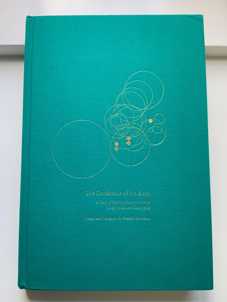

The Conference of the Birds (2009)
Farah K. Behbehani and Farid ud-Din Attar.
Casebound cloth over boards, stamped in gold foil. H340. 166 pages (56 of them foldouts). Acquired from Saba Books, 5 June 2022.
Photos: Books On Books Collection. Displayed with permission of the artist.
The Conference of the Birds is a twelfth-century Sufi allegorical poem by Farid ud-Din Attar. A gathering of the world’s birds, each representing a different aspect of human nature, debate who should be king of all the birds. Led by the Hoopoe, they agree to seek the advice of the mythological being – the Simorgh. After an arduous and winnowing journey, thirty of them arrive at the home of the Simorgh to find a surprising answer.

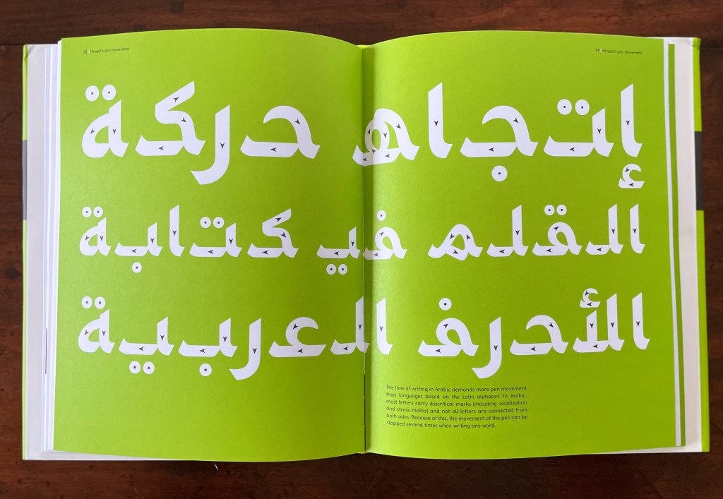
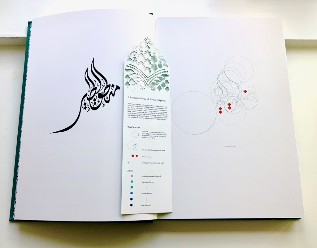
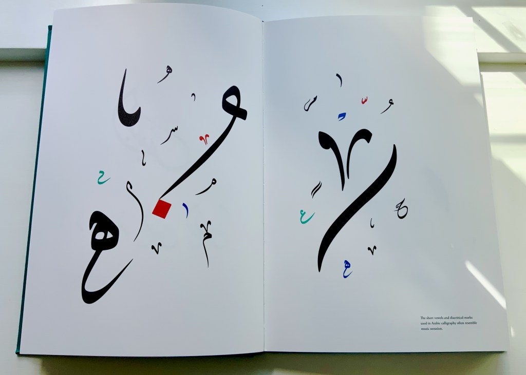
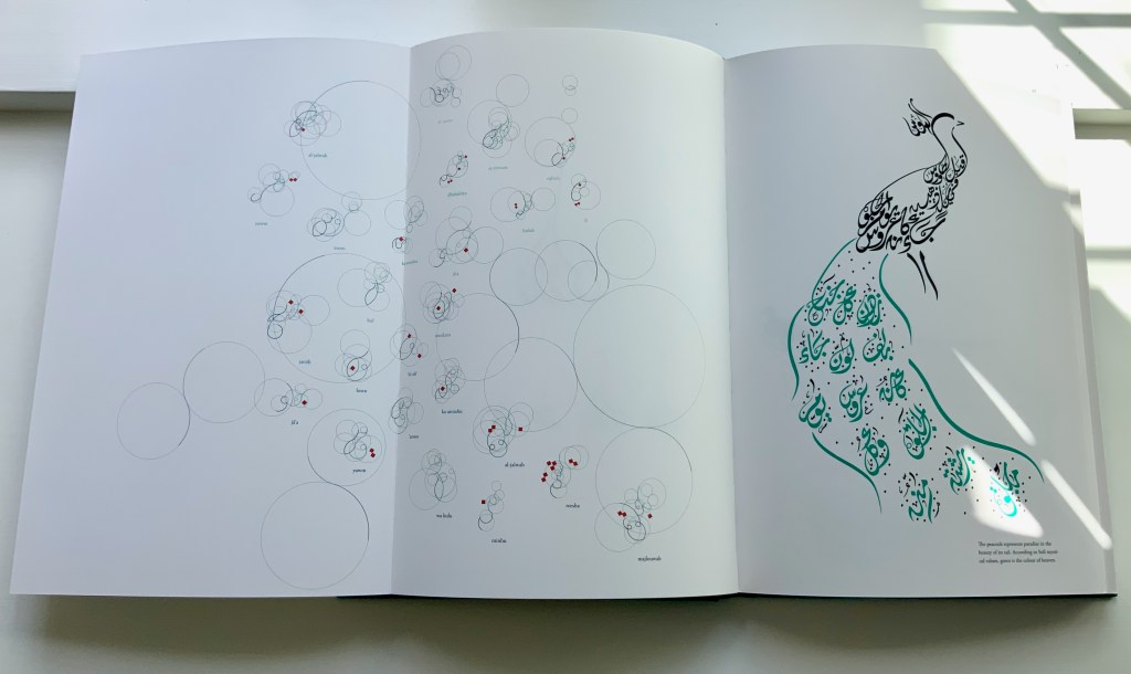
Farah Behbehani has selected thirteen of Attar’s stories and interpreted them within a journey-like creation of her own in the calligraphic style called Jali Diwani. As with many enlightening journeys, the destination is the journey itself — learning to read Jali Diwani calligraphy and, thereby, celebrate the beauty of the tale and its telling.
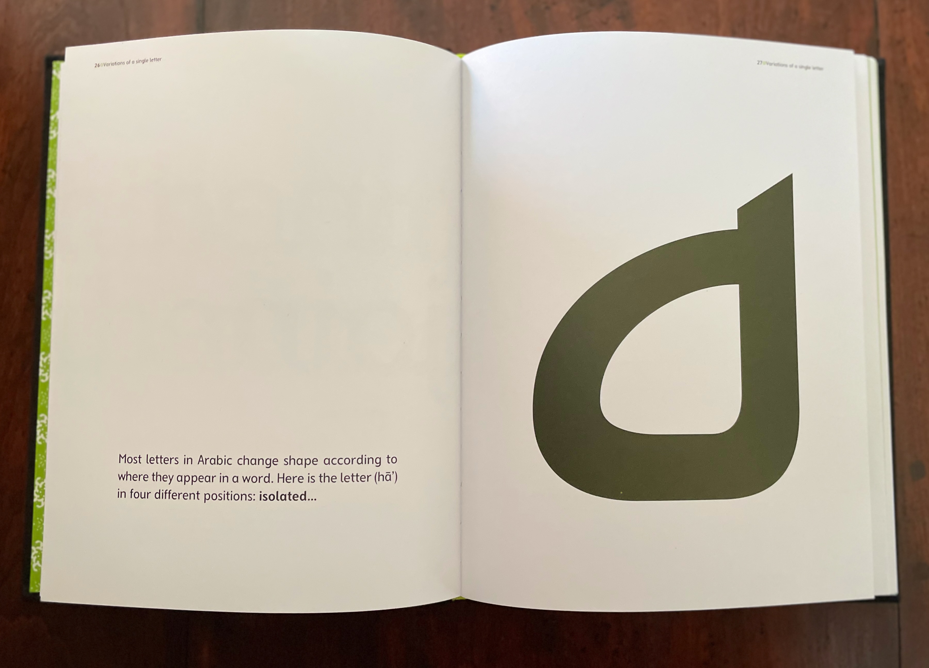
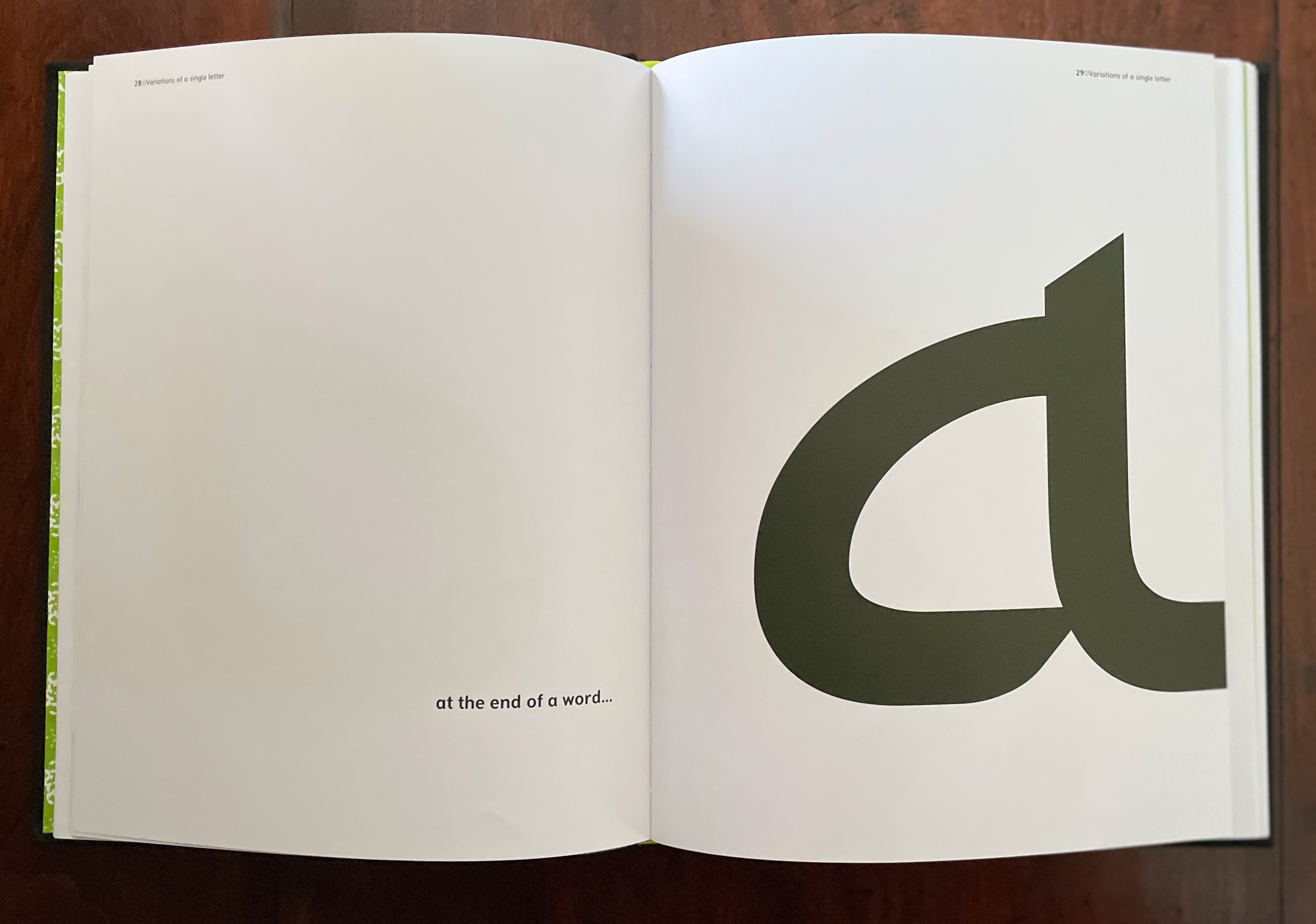
A passage from the story starts each chapter, and an image of the bird whose story it is is rendered in Jali Diwali. A tasseled bookmark provides the key to following the stroke-by-stroke illustration of how to read a representative line from the Arabic version of the story (a literal English translation is provided).
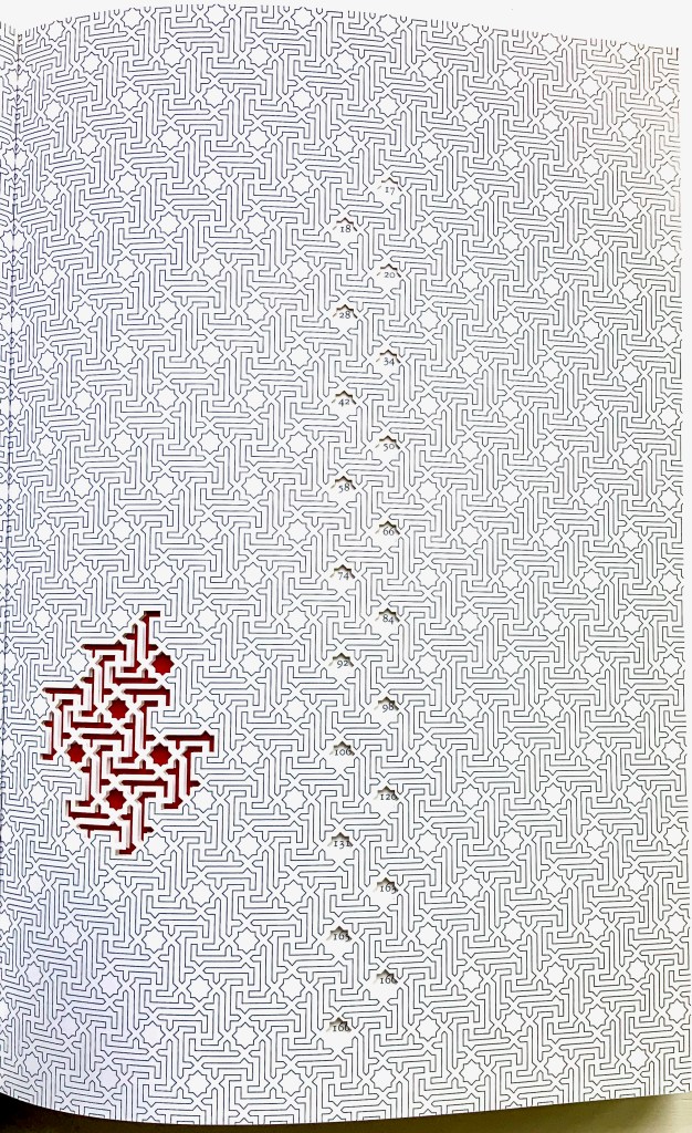
This book’s features (56 foldouts, embossing, gold foil, die-cut pages and that unusual bookmark) place it outside the mainstream output of its traditional commercial publisher Thames & Hudson and is as close to being an artist’s book from such a source as could be imagined. It is certainly available only through rare book dealers and occasionally by auction.
Behbehani’s Conference of the Birds fits in the Books On Books Collection alongside Golnar Adili’s Baabaa Aab Daad (2020), Islam Aly’s 28 Letters (2013), Masoumeh Mohtadi’s Blindness (2020) and Rana Abou Rjeily’s Cultural Connectives. Disregard any implication that these works represent a single aesthetic. The artists hail from different countries and draw on different traditions. Yet each work reaches across the cultural divide between the Near East and the West. Reaching across does not mean eliminating the differences. Consider Behbehani’s work in relation to Brian Goggins ‘ Language of the Birds (2006-2008), a site-specific sculptural light installation for a public plaza in San Francisco; Anselm Kiefer’s Für Fulcanelli – die Sprache der Vögel (2013), a massive sculpture of leaden bird wings and books; and the delicate but weighty cages in Bird Language (2003) by Xu Bing.
If anything draws all of these works together, it is the chord that language and image strike across time and cultures.
Further Reading and Viewing
“Golnar Adili“. 2022. Books On Books Collection.
“Islam Aly“. 13 January 2020. Books On Books Collection.
“Anselm Kiefer“. 16 January 2015. Books On Books Collection.
“Masoumeh Mohtadi“. 5 February 2021. Books On Books Collection.
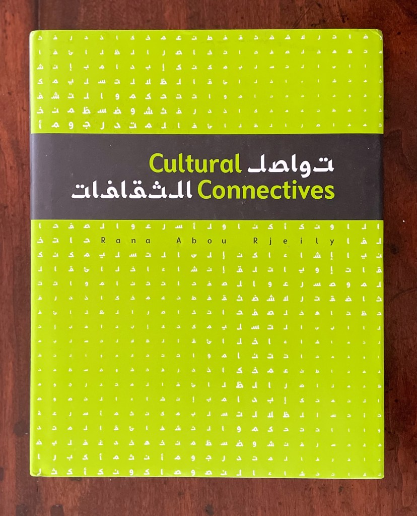
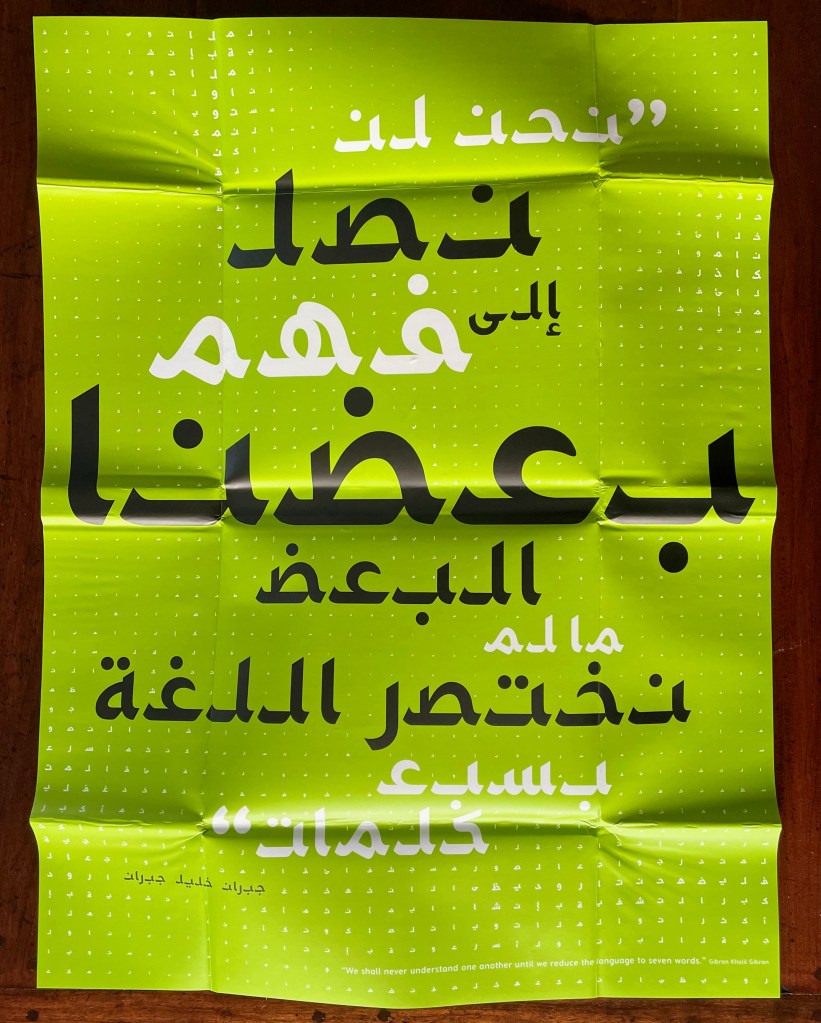
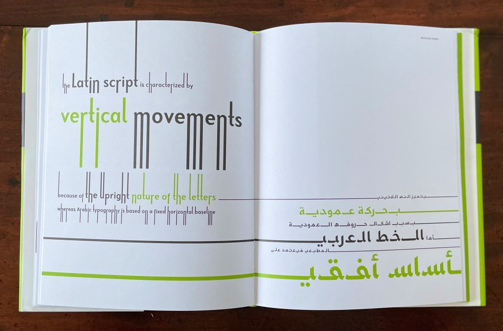
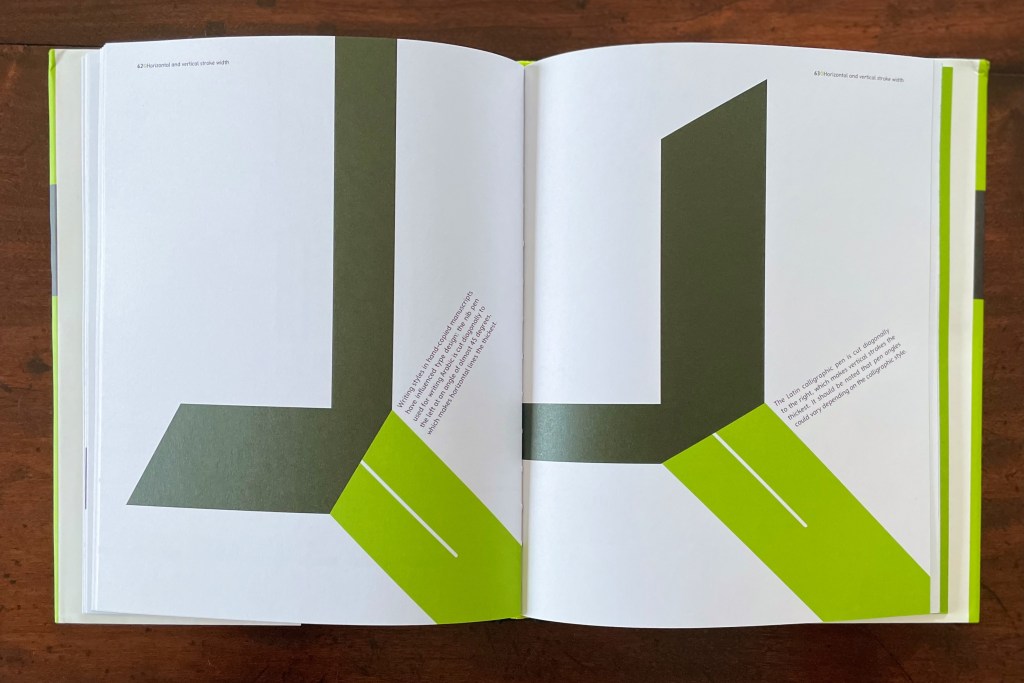
“Rana Abou Rjeily“. 21 December 2022. Books On Books Collection.
“Xu Bing“. 28 February 2016. Bookmarking Book Art.
Arts AlUla. November 2022. “Interview with Farah K. Behbehani | فنون العلا | سفر | لقاء مع فرح بهبهاني“. Accessed 23 November 2022.