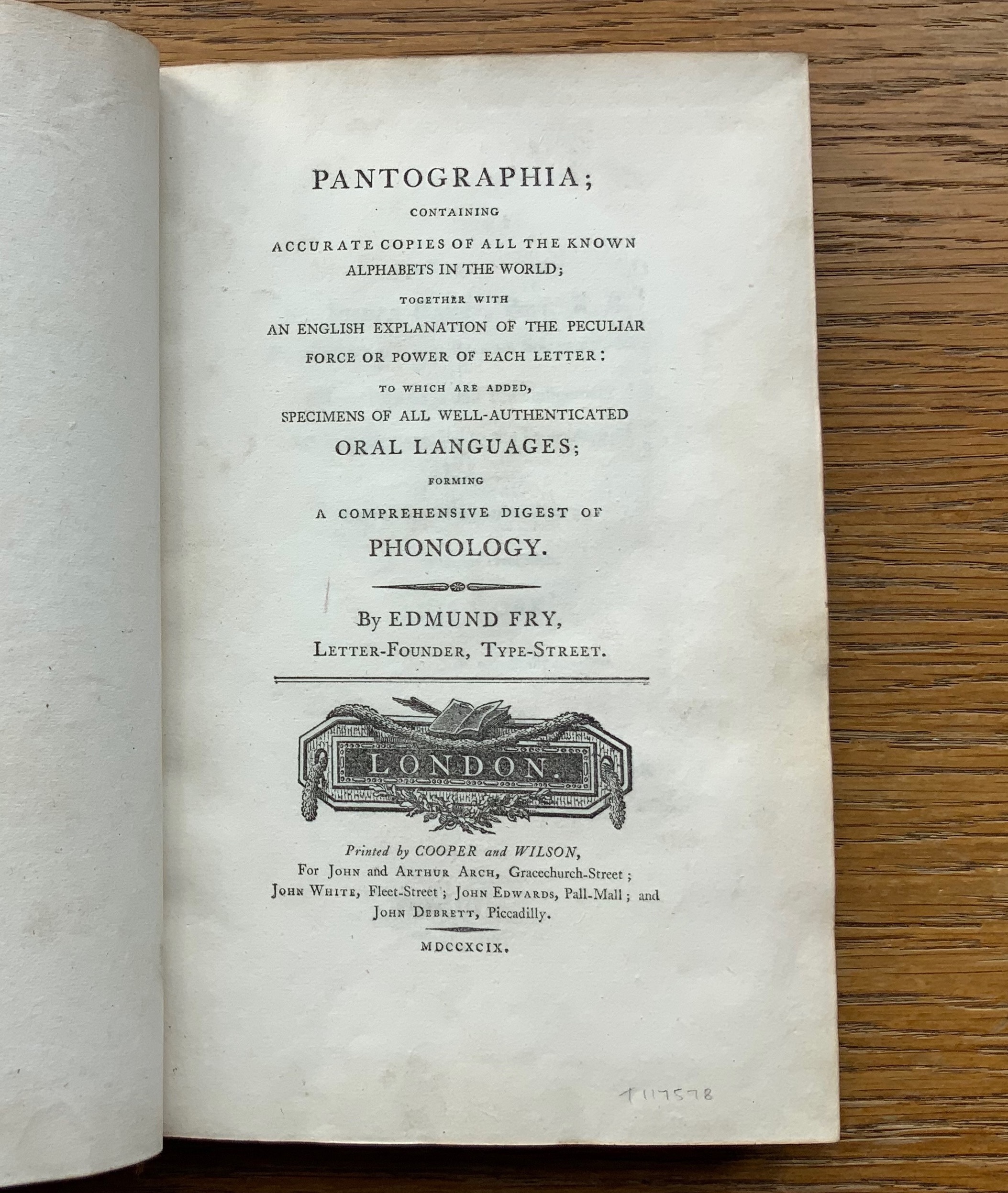
For the Enlightenment, everything that existed was meant to be in an encyclopedia. For Dr. Edmund Fry, scholar, typographer and owner of The Polyglot Foundry, this notion (and the spur of profit) led to his Pantographia (1799). Extraordinarily, Fry made the matrix for each of the roughly 5,000 characters for the 405 alphabet specimens, then handcast each — a monumental sixteen-year accomplishment in craftsmanship. Quite a type sampler for a printer specializing in foreign languages.
Fry was also driven by the importance of the subject: the origin of speech, its being made visible and the varieties of doing so. “The art of drawing ideas into vision, or of exhibiting the conceptions of the mind, by legible characters, may justly be deemed the noblest and most beneficial invention of which human ingenuity can boast — an invention which has contributed, more than all the others, to the improvement of mankind.” (xviii)
Fry is even handed in presenting the arguments and evidence for and against the two possible origins of speech he identifies — divine gift or human invention. He is unequivocal though “that all languages … that have been conveyed in alphabetical characters, have been those of people connected ultimately or immediately with the Hebrews, to whom we are indebted for the earliest specimens of the communication of ideas by writing” and “that there was but one truly original language, from which all others are derivations variously modified”. (xxxviii, xliii)
Plenty has been written about Fry’s accomplishment. Johanna Drucker has explored it in her Alphabetic Labyrinth and more recent Inventing the Alphabet. Even more recently, Hunter Dukes, editor of The Public Domain Review, posted a brief celebration, citing Drucker. Jan Düsterhöft, a German academic now affiliated with the Georg Eckert Institute, provides the publisher’s preface to the Black Letter Press edition shown above. All three identify the two features of Pantographia that echo two other works in the Books On Books Collection: Sam Winston’s One & Everything (2023) and Claire Jeanine Satin’s The Hebrew Alphabet Expressing the Celestial Constellations (2017).
Original at Mansfield College Library, Oxford University
Even in 1799 several of the alphabets displayed by Fry represented extinct languages. Today the Endangered Alphabets Project initiated by Tim Brookes aims rescue languages and their alphabets from that fate. Brookes’ project inspired Sam Winston’s story. More forcibly than Drucker and Dukes, Düsterhöft identifies the imperialist and Western perspective in Fry’s endeavor. Winston’s fable is populated with “story characters”, drawn as various sized and colored blobs, each filled with its distinguishing alphabet. Some are filled with hieroglyphic dogs (presumably for Egyptian shaggy-dog stories), others with Greek, Cherokee and so on. The one story that decides it is the “One and Only story” is filled with the English (Latin or Roman) alphabet and proceeds to eat up all the others.
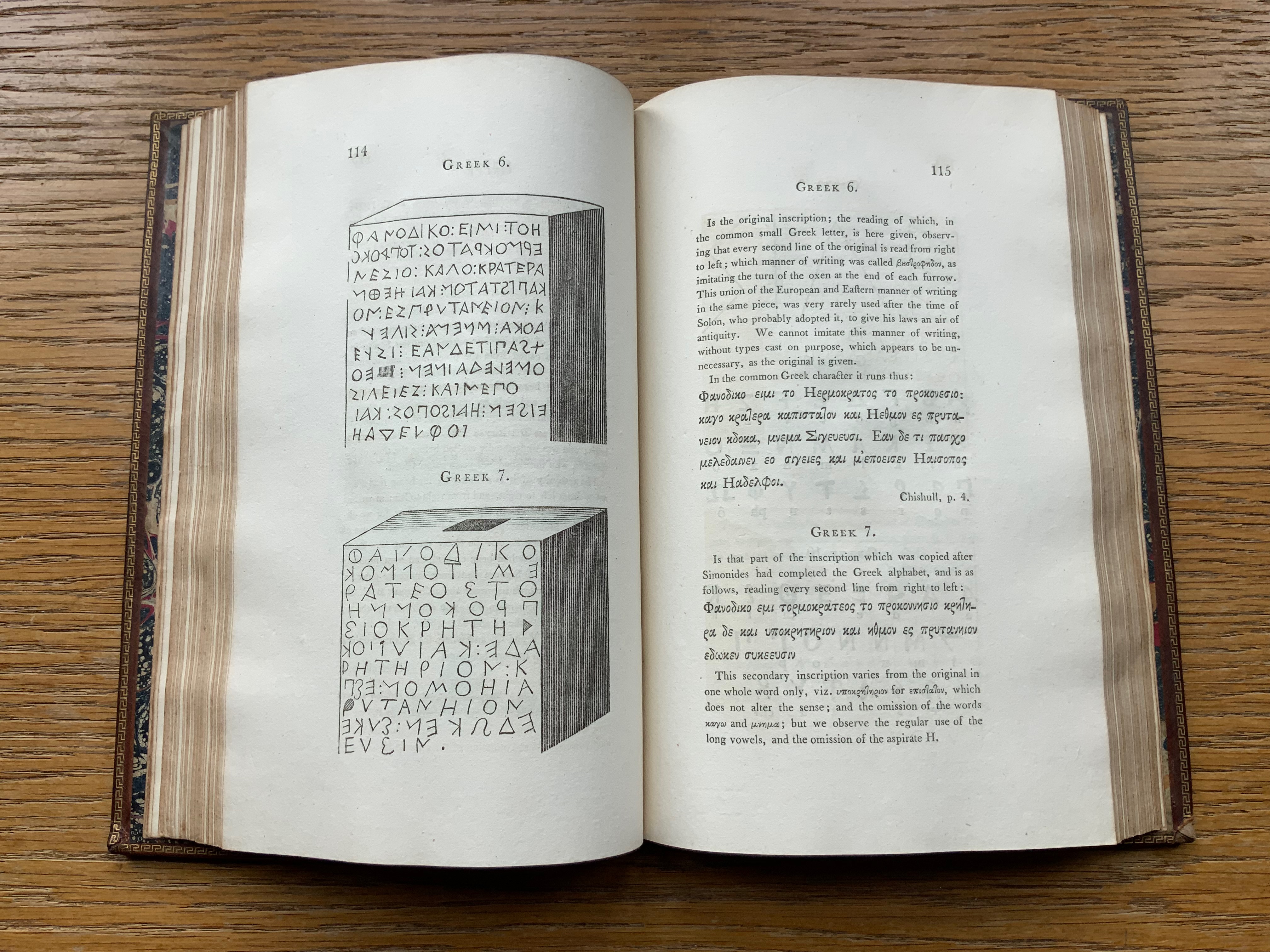
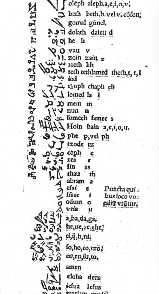
In Pantographia, Chaldean, one of the extinct languages, is a special case, not because Fry includes 20 variant specimens (Greek has 39) but because it is reportedly celestial. The first of Fry’s cited sources for this alphabet is Jacques Gaffarel (1601–1681), a French scholar and astrologer. A bit of digging reveals the source to be more precisely a woodcut from a 1650 translation of Gaffarel’s Curiositez inouyes sur la sculpture talismanique des Persans, horoscope des Patriarches et lecture des estoiles (1629).
In addition to its astrological character, Gaffarel’s work sits in the traditions of gematria, the Kabbalah and alchemy, which Johanna Drucker has thoroughly explored in Alphabetical Labyrinth (1999) and Inventing the Alphabet (2022). Among the earlier contributors to these traditions is Heinrich Cornelius Agrippa. Like his mentor Johannes Trithemius, Agrippa was a polymath, occultist and theologian as well as physician, legal scholar and soldier. The Latinized Hebrew letters and their corresponding characters in the celestial alphabet seen below come from Agrippa’s De occulta philosophia (1533), which is more legible than Gaffarel’s above.
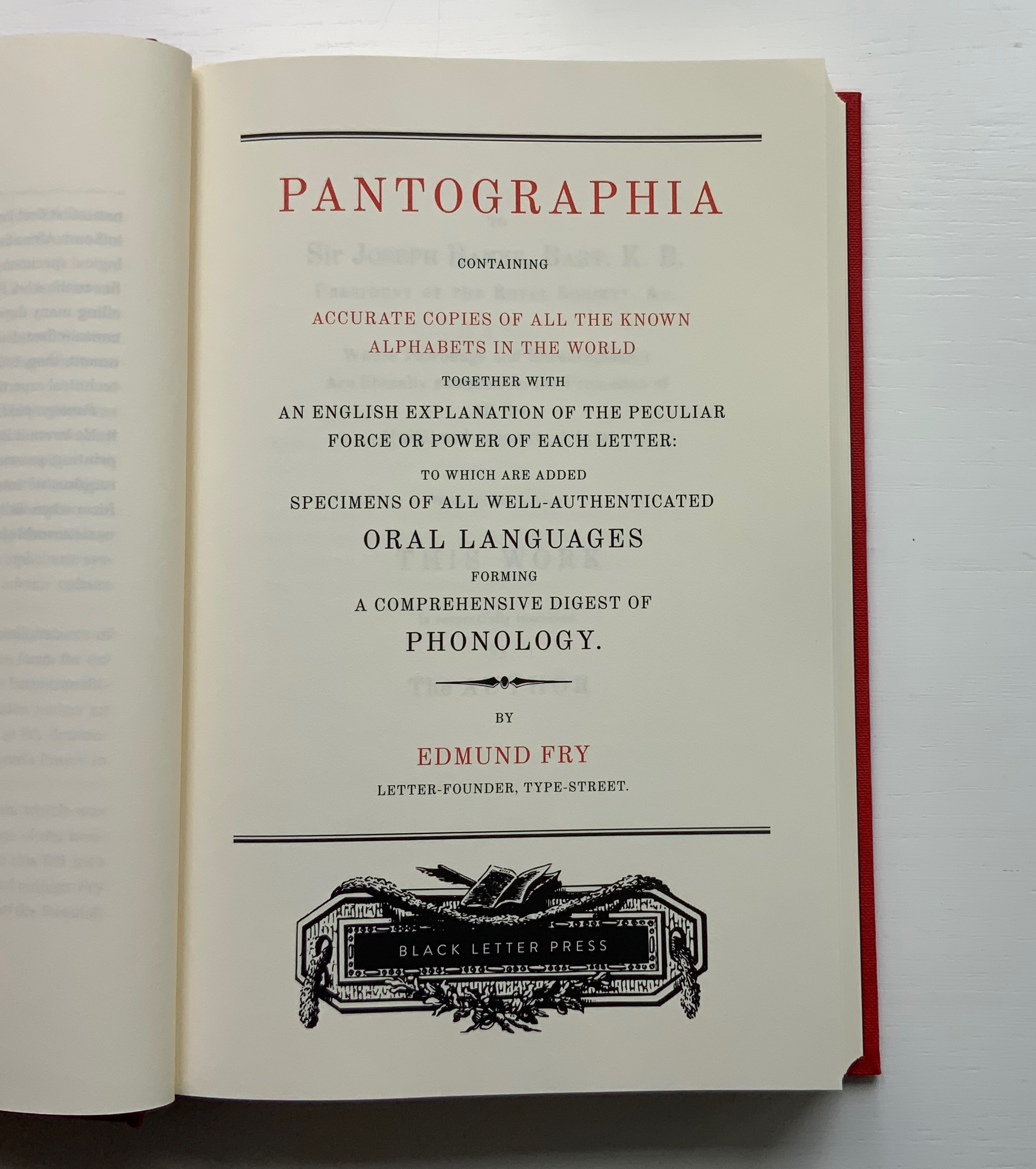
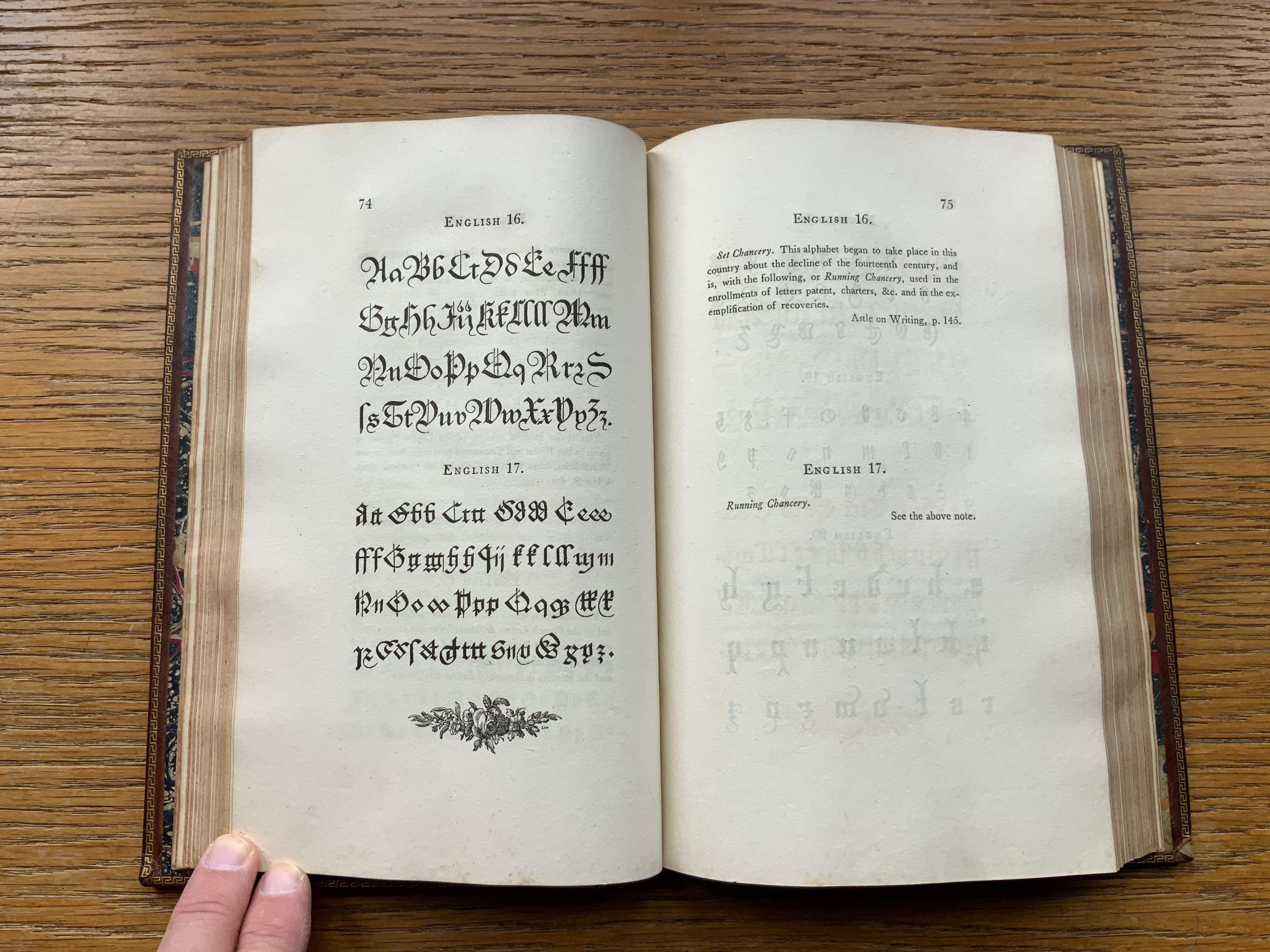
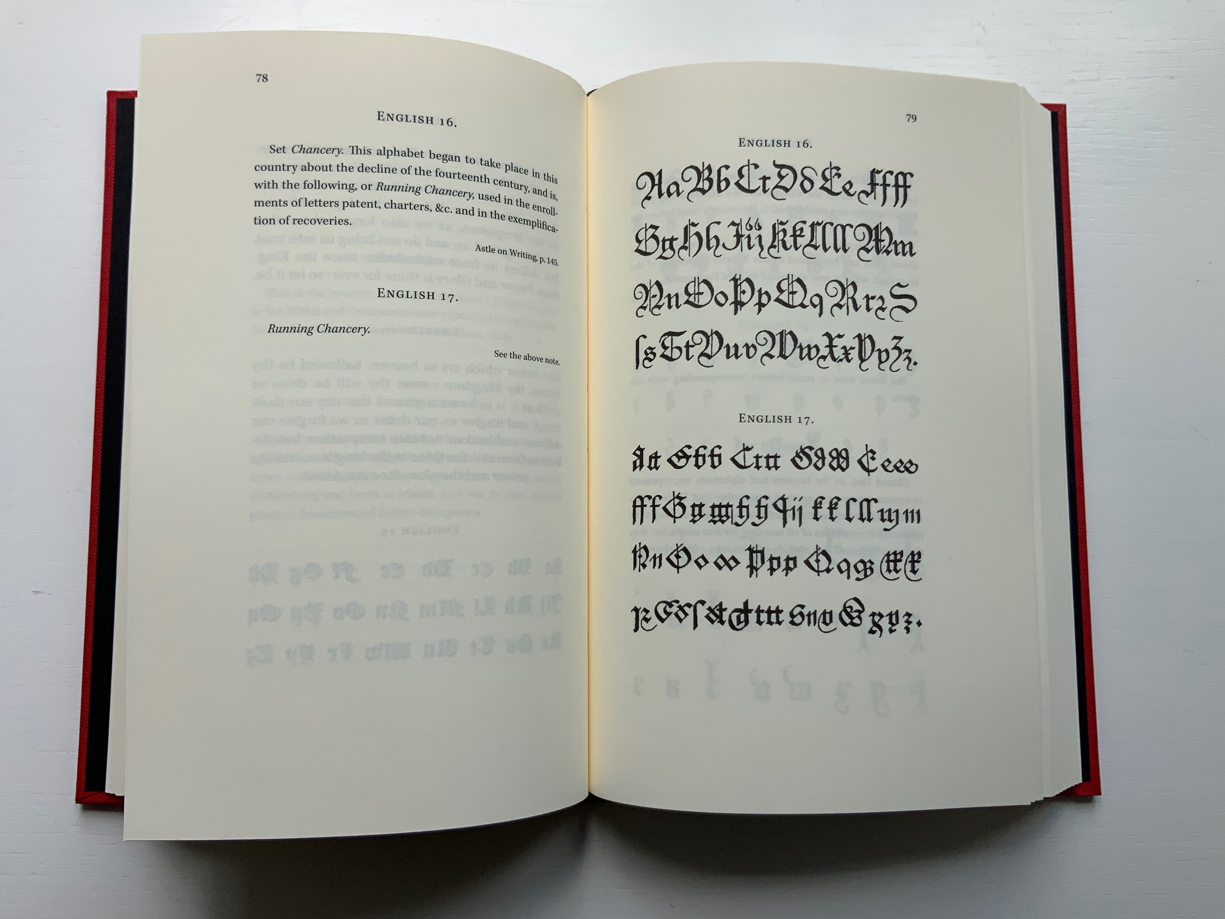
Black Letter Press issued this edition in 2022. As indicated in the caption at the head of this entry, considerable attention to materials was given, including blind debossing and hotfoil printing on the front and spine. The edition is not a photographic facsimile; rather it has been scanned and phototypeset. Scanning in lieu of resetting does not eliminate errors, even if the scan is reviewed carefully. Aside from occurrences of “mod” instead of “most”, “mall” instead of “shall”, and “2ist” instead of “first”, though, the most unusual variation from the original is the deliberate movement of openings on the verso to openings on the recto and, in the specimen section, the reversal of all verso and recto pages. On his verso pages, Fry placed the specimen, and on the recto pages, he placed comments, explanations and sources. For Black Letter Press, the reverse seems to have made more sense. Below are comparisons of pages from the original (left) and the Black Letter Press edition (right).
Left: 1799 original. Right: Black Letter Press facsimile.
Most uncaught scanning errors leap out, so despite the niggling worry about accuracy, the greater legibility and probable accessibility of the 2022 edition is welcome for explorers of alphabets and alphabet-related works. For the Books On Books Collection, its enhancement of the pleasure in Winston’s and Satin’s works and others such as Golnar Adili’s BaaBaa Aab Dad, Islam Aly’s 26 Letters and Ben Shahn’s The Alphabet of Creation (1954), it is more than welcome.
Another 25 images of Fry’s original edition can be found here, courtesy of The Letterform Archive.
Drucker Johanna. 2022. Inventing the Alphabet : The Origins of Letters from Antiquity to the Present. Chicago: University of Chicago Press. Not just another in the long line of histories of the alphabet, rather it explores “Who knew what when about the alphabet?” How did the way they knew it affect how they imagined its identity and origin? For Drucker, Pantographia marks an endpoint and transition. These printed compendia of alphabetic scripts began in 1518 with Johannes Trithemius. Initially spurred by interest in the occult as well as exotic and ancient scripts and a search for the “original” alphabet, compendia gradually became more secular but still eclectic. By 1799, Fry ‘s was an exception by still including the Celestial Alphabet and citing sources in trackable ways. Simultaneously an investment in imagination and a significant step forward for scholarship.
Dukes, Hunter. 10 October 2023. “Pantographia: A Specimen Book of All the Alphabets Known on Earth (1799)“. Public Domain Review. Dukes, editor of the Review, celebrates Pantographia‘s iconic presence in the public domain. In his celebrating, Dukes also notes the presence of the Celestial Alphabet in Pantographia and Drucker’s singling out Fry for taking the antiquarian compendium of alphabets to the earliest stage of specialized, professional research. He also surrounds Fry’s effort with other interesting direct and indirect contexts: the discovery of the Rosetta stone in the same year as Pantographia’s publication and the extinction of several of the languages that Fry’s alphabet represents.
Düsterhöft, Jan. 2022. “Foreword”. In Fry, Edmund. 1799. Pantographia, Containing accurate Copies of all the known Alphabets in the World.Turin, Ialy: Black Letter Press. A German academic now affiliated with the Georg Eckert Institute, Düsterhöft also raises the point about extinction and relates it to the West’s imperial colonial perspective, which Fry displays in his omissions and dismissal of the Chinese mind’s intellectual and rational capacity “as evidenced” by the lack of an alphabet. Düsterhöft also identifies Gaffarel’s source for the celestial alphabet: Guillaume Postel ‘s Linguarum Duodecim Characteribus Differentium Alphabetum Introductio [An Introduction to the Alphabetic Characters of Twelve Different Languages] (1538). Postel (1510 – 1581) was a polyglot French linguist, astronomer, Christian Cabalist, and diplomat.
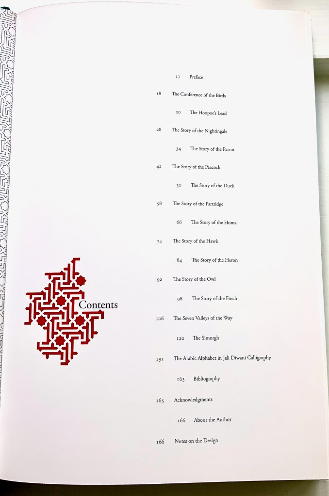
The Conference of the Birds (2009) Farah K. Behbehani and Farid ud-Din Attar. Casebound cloth over boards, stamped in gold foil. H340. 166 pages (56 of them foldouts). Acquired from Saba Books, 5 June 2022. Photos: Books On Books Collection. Displayed with permission of the artist.
The Conference of the Birds is a twelfth-century Sufi allegorical poem by Farid ud-Din Attar. A gathering of the world’s birds, each representing a different aspect of human nature, debate who should be king of all the birds. Led by the Hoopoe, they agree to seek the advice of the mythological being – the Simorgh. After an arduous and winnowing journey, thirty of them arrive at the home of the Simorgh to find a surprising answer.
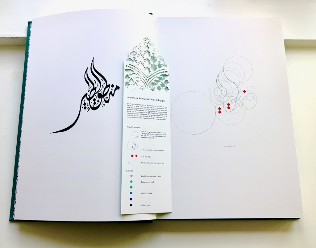
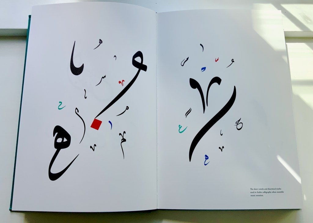
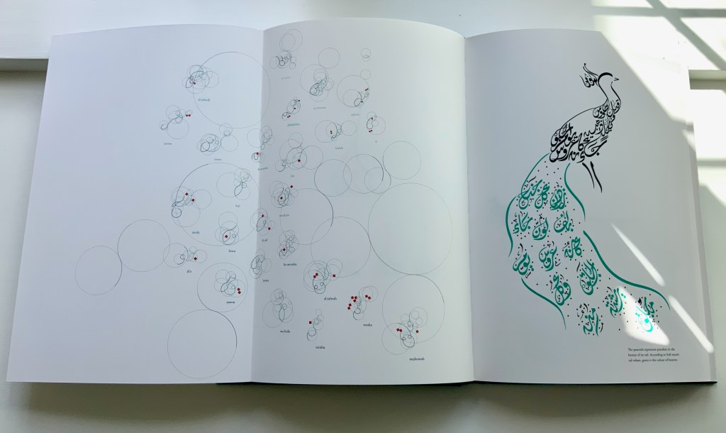
Farah Behbehani has selected thirteen of Attar’s stories and interpreted them within a journey-like creation of her own in the calligraphic style called Jali Diwani. As with many enlightening journeys, the destination is the journey itself — learning to read Jali Diwani calligraphy and, thereby, celebrate the beauty of the tale and its telling.
A passage from the story starts each chapter, and an image of the bird whose story it is is rendered in Jali Diwali. A tasseled bookmark provides the key to following the stroke-by-stroke illustration of how to read a representative line from the Arabic version of the story (a literal English translation is provided).
This book’s features (56 foldouts, embossing, gold foil, die-cut pages and that unusual bookmark) place it outside the mainstream output of its traditional commercial publisher Thames & Hudson and is as close to being an artist’s book from such a source as could be imagined. It is certainly available only through rare book dealers and occasionally by auction.
Behbehani’s Conference of the Birds fits in the Books On Books Collection alongside Golnar Adili’s Baabaa Aab Daad (2020), Islam Aly’s 28 Letters (2013), Masoumeh Mohtadi’s Blindness (2020) and Rana Abou Rjeily’s Cultural Connectives. Disregard any implication that these works represent a single aesthetic. The artists hail from different countries and draw on different traditions. Yet each work reaches across the cultural divide between the Near East and the West. Reaching across does not mean eliminating the differences. Consider Behbehani’s work in relation to Brian Goggins ‘ Language of the Birds (2006-2008), a site-specific sculptural light installation for a public plaza in San Francisco; Anselm Kiefer’s Für Fulcanelli – die Sprache der Vögel (2013), a massive sculpture of leaden bird wings and books; and the delicate but weighty cages in Bird Language(2003) by Xu Bing.
If anything draws all of these works together, it is the chord that language and image strike across time and cultures.
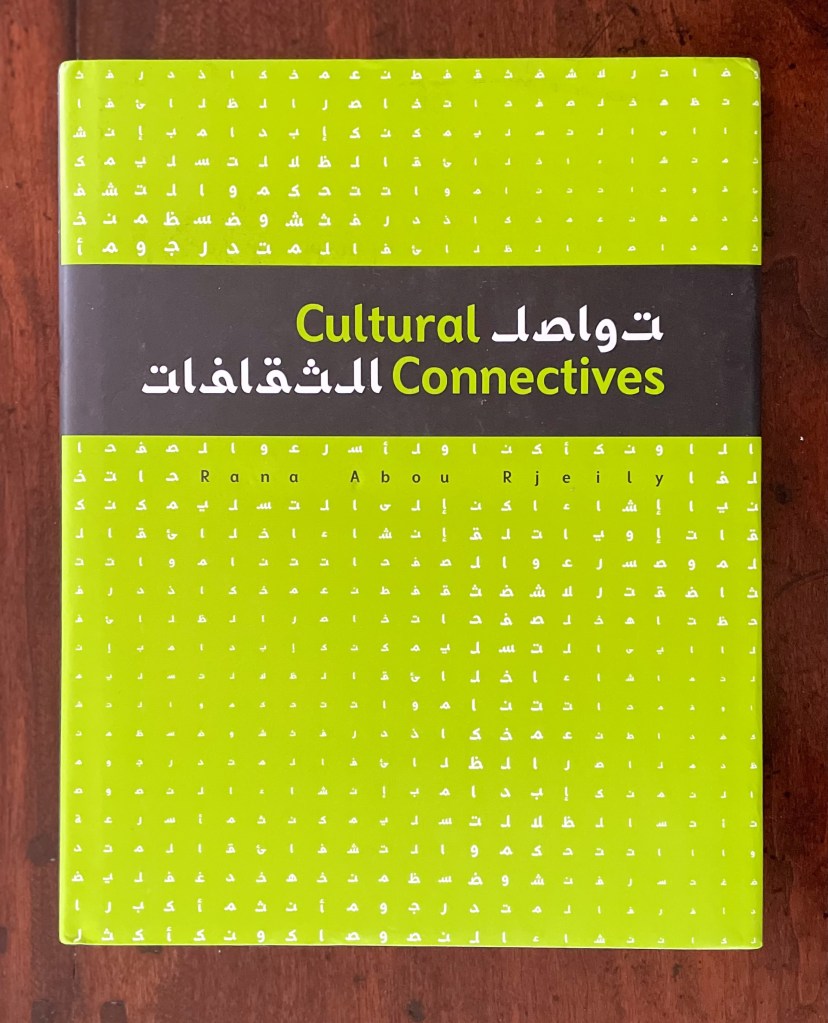
Rana Abou Rjeily’s is not the only attempt to adapt Arabic to the printing press as Cecil Hourani and Mourad Boutros note in their preface, but their praise for the book is all the more notable for Boutros’ being the creator with Arlette Boutros of Basic Arabic, a widely accepted typeface alongside Nasri Khattar’s Unified Arabic. Still more notable, however, are the ways in which Rjeily’s design and writing weave together multiple aims. One aim, of course, is to introduce Mirsaal, the typeface designed by the author to adapt the calligraphic styles of the Arabic alphabet to the printing press and still be used for the Latin alphabet. Another is to teach the Arabic alphabet to non-native speakers. And still another is to bridge Arabic and Western cultures. The aims are interwoven not only because Rjeily uses the first as the means to the others but because she invests all three into the design of the book.
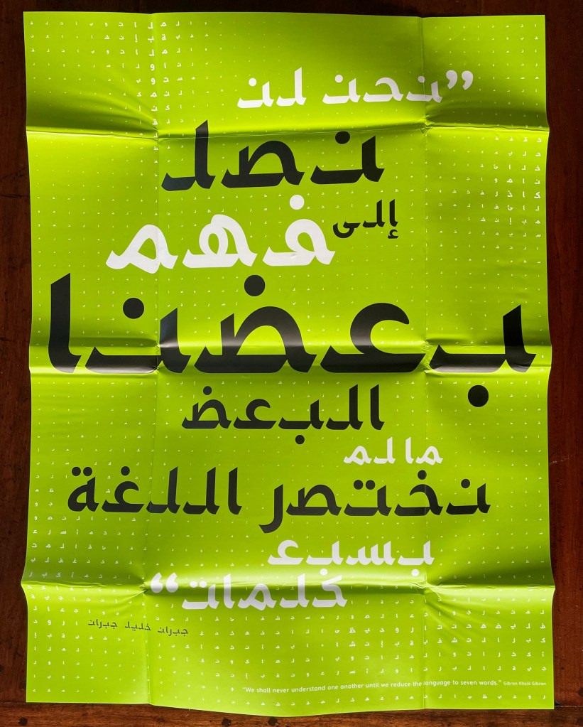
The dustjacket offers the most mechanical example of this investment. It unfolds into a poster display of the book’s epigraph from Gibran Khalil Gibran (set in Mirsaal, of course): “We shall never understand one another until we reduce the language to seven words”.
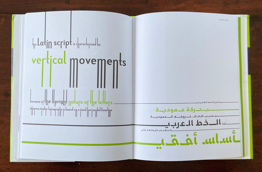
Mechanically more subtle than the dustjacket is Rjeily’s use of partial and full bleeds in the pages below — always in support of the meaning on the page. Using both vertical and horizontal bleeds, this double-page spread illustrates the Latin alphabet’s more vertical orientation compared to Arabic’s more horizontal orientation.
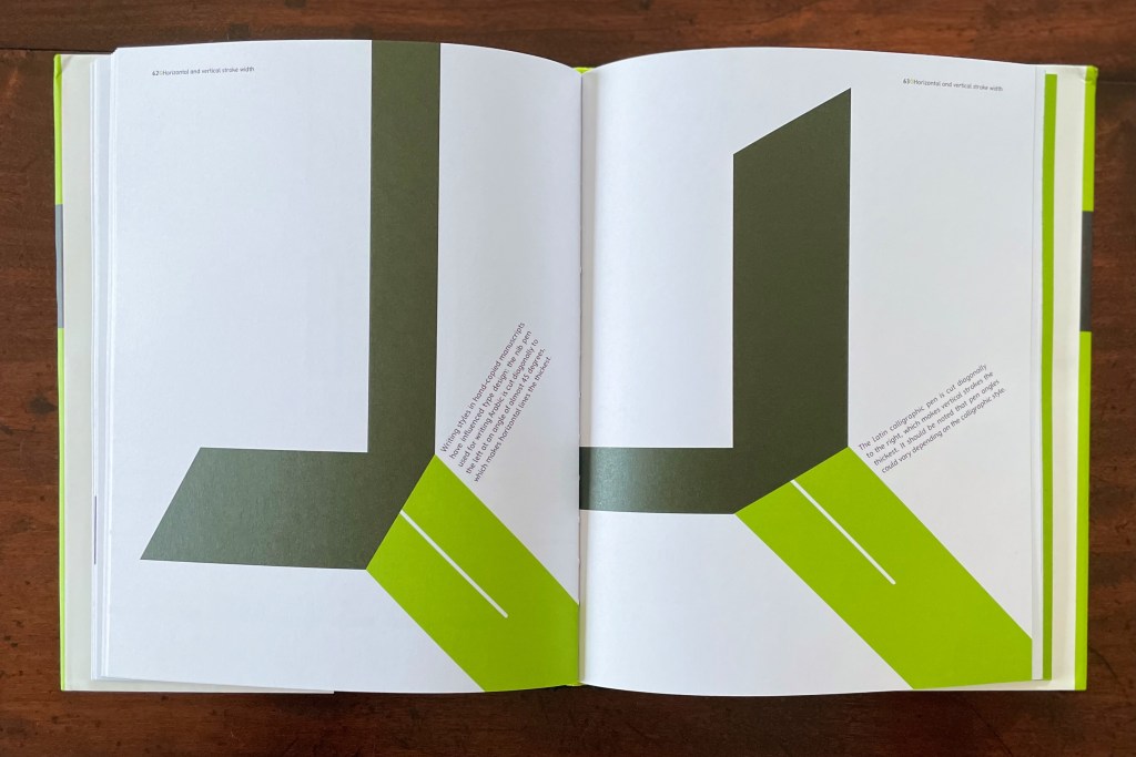
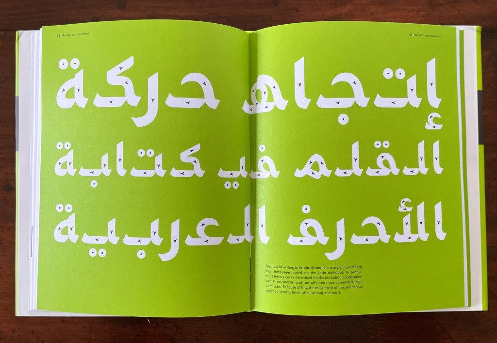
Rjeily keeps the material, haptic aspect of both Arabic and Latin close to hand with parallel pages like the following that highlight their alphabets’ differences but also assert the possibility of harmony through design. The same simple green and black color scheme, the same image of nib and mark, and the same angling of text on the page give a unified presentation of the difference in direction and angle of cuts for Arabic and Western nibs. Another physical aspect that Rjeily highlights is the ductus (the order and direction) of a pen strokes making up a letterform, which is arguably more important for Arabic because the flow of writing demands more pen movement.
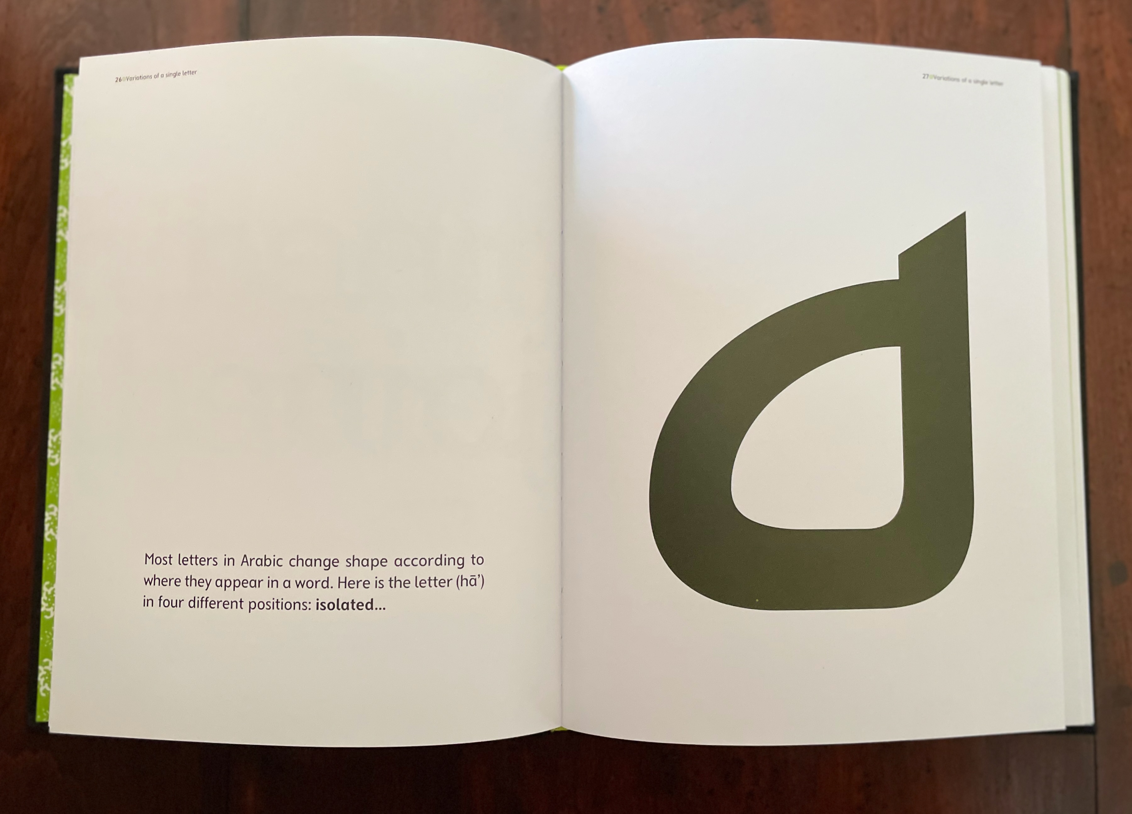
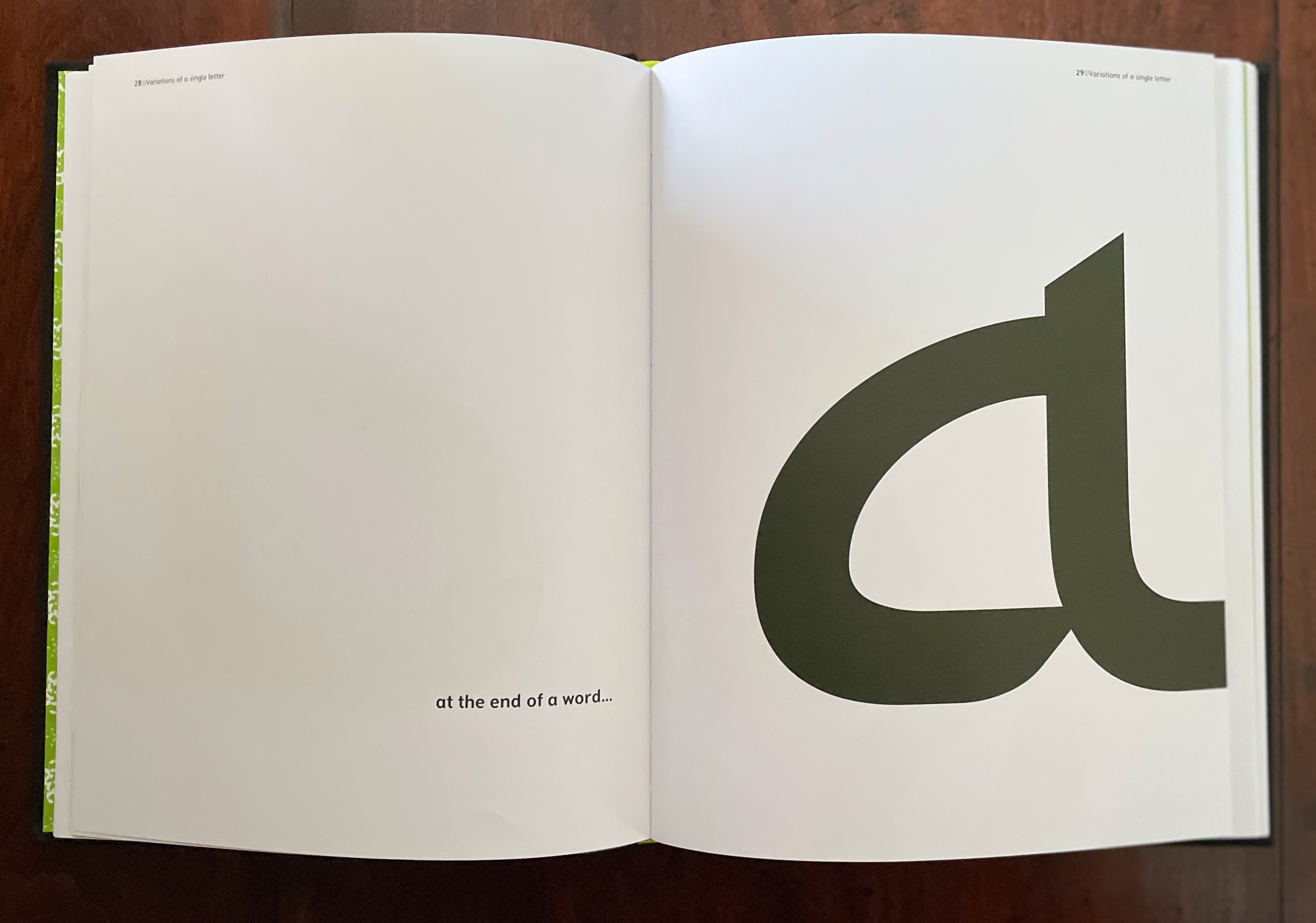
Other bold, oversized spreads drive home some of the false cognate forms such as 0 and the number 5 written in Arabic-Indic numerals, or the letter V and the number 7 in Arabic-Indic numerals. Others, in an almost children’s book style, present the unique characteristic of an Arabic letterform’s changing shape depending on its initial, medial or final position in a word — or its appearance in isolation. While teaching these differences and features of Arabic is a fundamental aim, always the differences are laying the groundwork or demonstrating what Mirsaal must deal with to bridge a calligraphic system to a typographic system of writing.
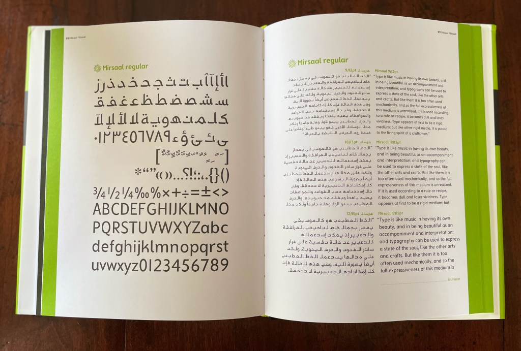
The final section presents the Mirsaal typeface in its various fonts (sizes and weights) in the manner of a traditional type specimen, using the very appropriate words of John Henry Mason (1875-1951) in Arabic and English:
Type is like music in having its own beauty, and in being beautiful as an accompaniment and interpretation ; and typography can be used to express a state of the soul, like the other arts and crafts. But like them it is too often used mechanically, and so the full expressiveness of this medium is unrealized. If it is used according to a rule or recipe, it becomes dull and loses vividness. Type appears at first to be a rigid medium; but like other rigid media, it is plastic to the living spirit of a craftsman. — J.H. Mason
Cultural Connectives is the useful reference work Rjeily intends. In achieving its several aims, it also provides both an accomplished example of the book arts and a means of insight into other works in the Books On Books Collection, such as Golnar Adili’s Baabaa Aab Daad (2020), Islam Aly’s 28 Letters (2013), Farah K. Behbehani’s The Conference of the Birds (2009) and Masoumeh Mohtadi’s Blindness (2020).
Further Reading
“Golnar Adili“. 24 November 2022. Books On Books Collection.
“Islam Aly“. 13 January 2020. Books On Books Collection.
STÉPHANE MALLARMÉ: Un coup de dés jamais n’abolira le hasard (ND)
STÉPHANE MALLARMÉ: Un coup de dés n’abolira le hasard (ND) Estelle J. Self-covering accordion format with three tipped-in pages. H245 x 185 mm closed, 2100 mm open. Twenty-four panels and flap-insert for closing. Edition of 6 variations, of which this #6. Acquired from Studio Montespecchio, 22 February 2022. Photos: Books On Books Collection.
Little information has emerged about this artist or her work that arrived in a shipment from a dealer based in Italy. He seemed to recall that she was young and at a table of her own at an exhibition in … was it Barcelona or Madrid? There is only the artist’s signature at the end of the work and an indication that it is the sixth of six copies. The dealer remembers that each of the six varied due to their handmade nature.
With its three tipped-in pages inside a double-sided accordion structure, with their mix of laser-cut and printed text, with the bright collage of abstract and figurative images (screen printed?), the work speaks for itself. But where in the collection does this work belong? First and foremost, it belongs among the many works of homage to Stéphane Mallarmé’s Un Coup de Dés Jamais N’Abolira le Hasard such as those by Christopher Brennan or Benjamin Lord.
The cover gives the poem’s title in French, but the abridged text is in English, some of it laser-cut and some printed, all on tipped-in pages. The unhappy translation comes from the Oxford University Press’ World Classics. The cuts place it among the “works of homage by redaction”, for example, those by Jérémie Bennequin or Michel Lorand. As the burnt edges suggest, it comes chronologically after the adoption of laser cutting in artists’ books, which has growing representation in the collection, for example, in works by Jaz Graf or Islam Aly. In its combination of letter and geometric shapes, the work falls between Scott McCarney and Aaron Cohick.
A collage of abstract and figurative images, letters and numbers rolls across both sides of the accordion, structurally recollecting the works of Helen Douglas or Sibyl Rubottom and Jim Machacek.
The paper is a heavy card, susceptible to fine cuts and sturdy enough to hold them.Colors of black, yellow, orange, silver and red cover the inner side, while those on the outer side adhere to an orange-gold-yellow palette. Its bright colors place it among the bursts of color from Shirley Sharoff and Andrew Morrison.
Perhaps the mystery artist will stumble across this entry, have a view on where it belongs and share some of its background, technique, process and materials — and what the other five versions look like.
The art of the alphabet seems to be a rite of passage for graphic artists. Perhaps it is that art and the alphabet find common ground in the urge to make sense of the world. Perhaps it’s that the alphabet’s invention, development and artistic treatment present a rich tradition for artists to follow or challenge. Perhaps it’s that letterforms and the alphabet offer raw material, subject and organizing principle all in one. Semic or asemic. Calligraphic, typographic or even plastic. Representational or abstract. All are options. But most often, something bookish results. From Islam Aly’s 28 Letters(2013) to Ludwig Zeller’s Alphacollage (1979), a significant part of the Books On Books Collection is taken up with artists’ books based on the ABCs and letterforms. The Collection’s two facsimiles of Geofroy Tory’s Champ Fleury provide a useful historical backdrop that throws into relief several of the Collection’s works and their performance of this rite of passage.
It should be no surprise that Geofroy Tory de Bourges (c.1480-1533) serves up such an exemplar. In her Playful Letters, Erika Boeckler writes
An accomplished designer, typographer, printer, poet, author, translator, calligrapher, illustrator, woodcutter, and engraver, he received his education in Italy and ultimately settled in Paris, setting up a bookstore, writing his own works, running a press, and collaborating with or working for Simone de Colines, director of one of the most influential and experimental fine publishing houses of the time. Personally writing the text, designing the woodcuts, and cutting some of them, organizing the layout, perhaps even setting the type, Tory created Champ Fleury as what we might call today an artist’s book. (p. 29)
Tory straddles the letters of the late Middle Ages and Renaissance. Appointed by François I in 1530 as his printer, Tory operated on the Petit Pont under the sign of le Pot cassé (“the broken pot”) and was known for his workshop’s handwritten Book of Hours (1524). Rooted in the horae tradition reaching back to the 13th century, Tory’s Book of Hours is an early-to-mid-Renaissance version of its predecessors. As beautiful as his Book of Hours is, Champ Fleury (1529) became his best known work. Authored and designed by Tory, it was produced by hand typesetting and letterpress printing in Paris with Giles Gourmont. Printed less than 100 years after Gutenberg’s innovation, Champ Fleury represents the printed book toddling out of its incunabula period.
Book of Hours Geofroy Tory (1524) Bound in the 18th century, 113 leaves of vellum. Lessing J. Rosenwald Collection (Library of Congress). Accessed 30 May 2021.
According to Jeremy Norman’sHistory of Informationsite, the first separate printed title page appeared in 1463. Subject indices date back to the 13th century, originating at the University of Paris, and the first printed indices, to 1470. Champ Fleury‘s front matter boasts a title page, two prefaces to the reader, a statement of the King’s Privilege awarded for the book for ten years (a forerunner to the copyright page), a name index without location references and a subject index with folio references. Champ Fleury’s back matter consists of a colophon preceded by a lengthy appendix illustrating various forms of the alphabet (Hebrew, Greek, Latin, etc.).
Tory’s placement of the indices in the front matter rather than the back matter reflects the gradual development of the anatomy of the book towards the structure that would ultimately be codified in reference works like the Chicago Manual of Style. Paratextual elements like the title page, table of contents, page numbers, etc., did not spring up overnight. If, as Eric Havelock and others assert, society, the arts and culture are a superstructure erected on the foundation of the alphabet (see below), Champ Fleury and its “letterology” make for a particularly fitting exemplar of the book as an element of the superstructure arising from the alphabet.
Perhaps book artists sense this, which again leads to that alphabet art rite of passage and the elaborate variations on it. The illustration of various forms of the alphabet in the appendix also draws on another developing tradition: the typesetter/printer’s sample book advertising the firm’s fonts. Abecedaries and artist books have sprung from that tradition, too.
Tory was not the first to propose an art and science behind the letterforms of the alphabet. Predating his efforts were Giovanninno de’ Grassi (1390-1405), Felice Feliciano (1463), the Anonymous Chicagoensis and Anonymous Monachensis (1468?), Damianus Moyllus (1480), Fra Luca Pacioli (1509), Sigismondo Fanti (1514), Francesco Torniello (1517), Ludovico Arrighi (1522), Albrecht Dürer (1525) and Giovanni Battista Verini (1527). Leading up to Champ Fleury, these earlier efforts track the development of humanism. Arguably, Tory’s effort is a capstone, combining myth, allegory, metaphysics, geometry, linguistics, calligraphy, typography and cryptography.
Book One, concerned with the mythical origins of the French language, also addresses the fabled origins of the alphabet: the story of Jove, Io and Mercury behind the letters I and O and their claim to being the first letters and also the tale of Apollo’s accidental murder of Hyacinth explaining the letters A and Y and their similar claim. Two works in the Collection built on alphabet origin stories are Francisca Prieto’s Printed Matter series (2002-2008) William Joyce’s The Numberlys (2014), but many more follow in Champ Fleury’s art and science footsteps.
Tory’s late medieval/early Renaissance perspective gives way to 20th and 21st century poetics and phenomenology in most works of the Collection. Aaron Cohick’s The New Manifesto of the NewLights Press (third iteration) (2017) offers a good example. Another — closer to Tory’s moral and geometric perspective but of a more modern spirituality — is Jeffrey Morin and Steven Ferlauto’s Sacred Space (2003).
Compile all the abecedaries ever created and it would approximate the result of Adam and Eve’s task of naming all the creatures and things of the world. Leonard Baskin echoes that innocence in Hosie’s Alphabet(1972) with its words and animals supplied by his children. If Adam and Eve had had an alphabet, they might have been tempted into pareidolia, which is represented in the Collection by VUES/LUES: Un Abécédaire de Marion Bataille (2018) and Typographic Universe (2014) by Steven Heller and Gail Anderson. Heller and Anderson’s compendium extends to letters formed of natural and drawn objects from the real world, which Champ Fleury’s appendix foreshadows with its floral and fantastic alphabets.
Of course, Tory’s work is not an abecedary. In Books Two and Three, it develops into a full-blown treatise on letterforms whose meaning and appearance are explained allegorically and driven by the compass, rule and geometry expressed within a 10x10x10 cell cube. It would overstate the case to call it “typographic design”. As drawn, Tory’s diagrams would serve poorly for cutting and forming punches or matrices (although it has been done). Nevertheless, his geometric approach foreshadows the grids and algorithms of Wim Crouwel’s New Alphabet (1967), Timothy Epps and Christopher Evans’ Alphabet(1970) and Ji Lee’s Univers Revolved: A Three-Dimensional Alphabet (2004).
Before the age of computers and algorithms, though, the artist and designer Bruce Rogers did bring typographic design to bear on Champ Fleury. The Grolier Club sponsored the printing of George B. Ives’ English translation. Rogers’ design “translates” Champ Fleury just as much as Ives does, perhaps more so. The Grolier Club edition is one of only ten books to be set completely in the Centaur typeface designed by Rogers.
Of course, the translation entails a complete resetting of the text, and Centaur naturally delivers crisper letters. Also, in redesigning with Centaur, Rogers alters the original’s layout and, therefore, the reader’s experience of it. Notice in the OAHK pages above and in the three double-page spreads below how Rogers changes Tory’s flow or jumpiness to something fixed or stately. Attention to the page and its layout offers book artists as well as book designers yet another creative avenue. For proof of that, compare the Collection’s entries for Angel, Baskin and de Cumptich.
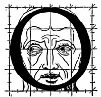
Architecture is another of Tory’s well-developed analogies and explanations of the ancients’ thinking behind the letterforms. In his drawings below, he aligns the letters AHKOIS with the parts of a building and letters IL with floor plans. He connects the circularity of the Coliseum’s exterior and the ovalness of its arena with the proper shape of the letter O. In the Collection, the analogy reappears fantastically in Johann David Steingruber’s Architectural Alphabet (1773/1972), Antonio Basoli’s Alfabeto Pittorico (1839/1998) Antonio and Giovanni Battista de Pian’s efforts in 1839 and 1842.
The architectural analogy provides Tory with his segue from plane to solid geometry in aligning the shapes of letters with human anatomy and virtues. His three-dimensional analysis of letterforms also finds contemporary analogues in two of Pieter Brattinga’s Kwadraat Blad series: Crouwel’s, mentioned above, and Anthon Beeke’s Alphabet (1970). Tory’s three-dimensional letterforms foreshadow Crouwel’s investigation of units based on the assembly of organic cells and his later musings on a laser-generated four-dimensional typography (Elliman, 62). And it is hard to evoke anything more humanoid and three-dimensional — albeit far less analytical or prudish — than Beeke’s alphabet formed with naked female models. (Tory comments that in a correctly drawn A, the crossbar will virtuously cover the genitals of Vitruvian man inscribed in the 10×10 grid. Modesty seems to extend to H as well but not so much to O and K.)
The calligraphic impulse that underlies Champ Fleury‘s typographic representations shows itself clearest in the woodcuts for the Cadeaulx alphabet in the appendix. The Books On Books Collection has its share of calligraphic abecedaries such as Marie Angel’s An Animated Alphabet (1996) and Andrew Zega and Bernd Dam’s An Architectural Alphabet (2008) as well as more purely calligraphic alphabets such as Islam Aly’s, mentioned above, and Suzanne Moore’s A Blind Alphabet (1986) .
Two artists whose abecedaries blend the calligraphic and typographic are Robert de Vicq de Cumptich and Cathryn Miller. In de Cumptich’s Bembo’s Zoo (2000), letters and punctuation marks from the Bembo typeface form calligraphic animal shapes. Miller’s L is for Lettering(2011) joins up the alphabetic rite of passage, calligraphy and typography by allying each of her hand-drawn letters with the name of a typeface from “A is for Arial” to “Z is for Zapfino”.
The last page of Tory’s illustration of additional alphabets is not the end of his work. The colophon plays that role. Curiously, Tory misses out the character that plays that role for the alphabet itself: the ampersand. “Curiously” because the character & appears throughout Champ Fleury — even at the end of the colophon’s fourth line in French — and it is after all the most flowery of the alphabet’s characters. Perhaps some book artist will follow Bruce Rogers’ example in his joking Depression-era homage to Tory on the back of Champ Rosé and create an homage to Tory and Rogers of three-dimensional ampersands.
Gelb, Ignace J. 1974. A Study of Writing. Chicago: University of Chicago Press.
Golec, Michael. 2015. “Champ Fleury in the Machine Age”, lecture at the School of Visual Arts, NYC. Uploaded 4 June 2015. Accessed 12 May 2021. Good slides and a comparative look at Tory’s original and Rogers’ resetting.
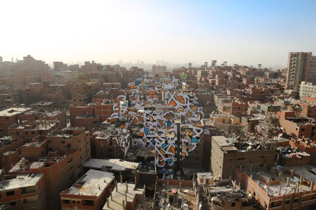
If we were looking for a “Banksy” version of Rachid Koraïchi, we need look no further than eL Seed.
Perception, 2016 Manshiyat Nasr in Cairo, viewed from Moqattam Mountain
In my new project ‘Perception’ I am questioning the level of judgment and misconception society can unconsciously have upon a community based on their differences.
In the neighborhood of Manshiyat Nasr in Cairo, the Coptic community of Zaraeeb collects the trash of the city for decades and developed the most efficient and highly profitable recycling system on a global level. Still, the place is perceived as dirty, marginalized and segregated.
To bring light on this community, with my team and the help of the local community, I created an anamorphic piece that covers almost 50 buildings only visible from a certain point of the Moqattam Mountain. The piece of art uses the words of Saint Athanasius of Alexandria, a Coptic Bishop from the 3rd century …. el Seed
The words of Saint Athanasius referred to above are
‘إن أراد أحد أن يبصر نور الشمس، فإن عليه أن يمسح عينيه’
“Anyone who wants to see the sunlight clearly needs to wipe his eye first.”
As with Camus, Algerian sunlight is strong in eL Seed’s work. As it also is in Koraïchi’s Lettres d’ Argile (Letters of Clay) and other ceramic works and arguably in the copperplates for Les Sept Dormants. As with Koraïchi’s work, humanism, poetry and bridging cultures are strong in eL Seed’s work.
The pseudonymous artist has created more “straightforward” street art installations in Tunisia, New York, Rio de Janeiro and Paris, all marked by the curvilinear linking of word and image that so often characterizes inspired book art. This reverse ekphrasis that book art frequently plays upon literature is heightened by calligraphy’s tight binding of art and craft to text. Perception‘s anamorphic enhancement of this binding is brilliant.
The relationship between word and image is “antagonistic sympathy”, according to the English book artist Telfer Stokes (“The Why and How I Make Books“, JAB 3, Spring 1995). In the hands and eyes of Koraïchi and eL Seed, the relationship — if it is a struggle, an agon — becomes more that of sunlight on water, or wind through a wheat field.
In addition to the installations and his book Lost Walls chronicling his painting of 24 walls in 4 weeks during a journey through Tunisia, eL Seed has produced a colorful body of lithographs and sculpture.
In this sculptural work inspired by a poem from Nizar Qabbani, el Seed says his intention is to invite the viewer to walk through a “conversation between the poem, the language, the form and me”. This may remind you of the influence that northern Africa had on the Finnish architect Juhani Pallasmaa, and how it led to his meditative exhortation to architects in The Eyes of the Skin to pursue a visual experience that offers a tactile and haptic quality, that also appeals to the realms of hearing, smell and taste and yet does not neglect the conceptual and rational. That, too, characterizes inspired book art.
Likewise it is interesting how this lithograph and the “calligraffiti” appearing on those broken walls and buildings touch eloquently on another theme characteristic of much book art — how the passage of time touches us, how we try to touch the passage of time.
Tien-Min Liao, Handmade Type. Compare/contrast with Tauba Auerbach’s Stacking (2007), which is covered in How to Spell the Alphabet (see above).
Poul Webb, “Alphabet Books — Parts 1-8” on Art & Artists. Google has designated this site “A Blog of Note”, well deserved for its historical breadth in examples, clarity of images and insight.
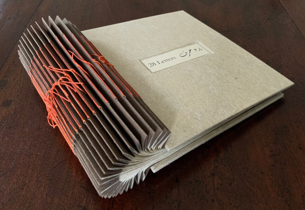
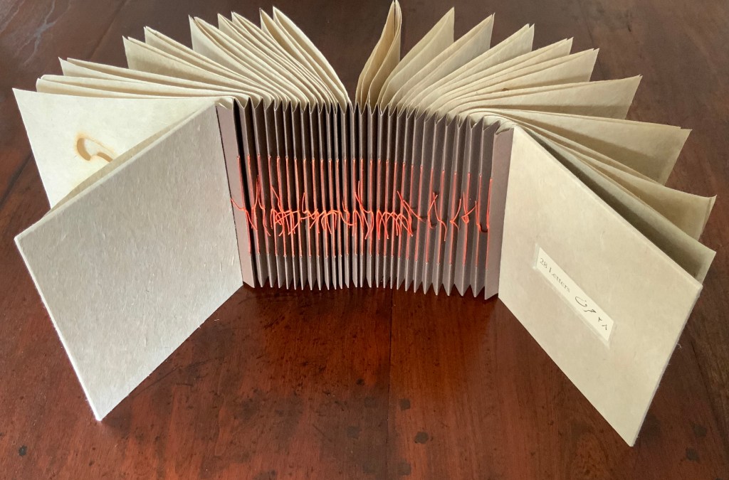
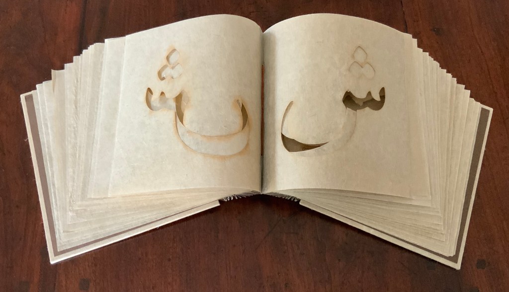
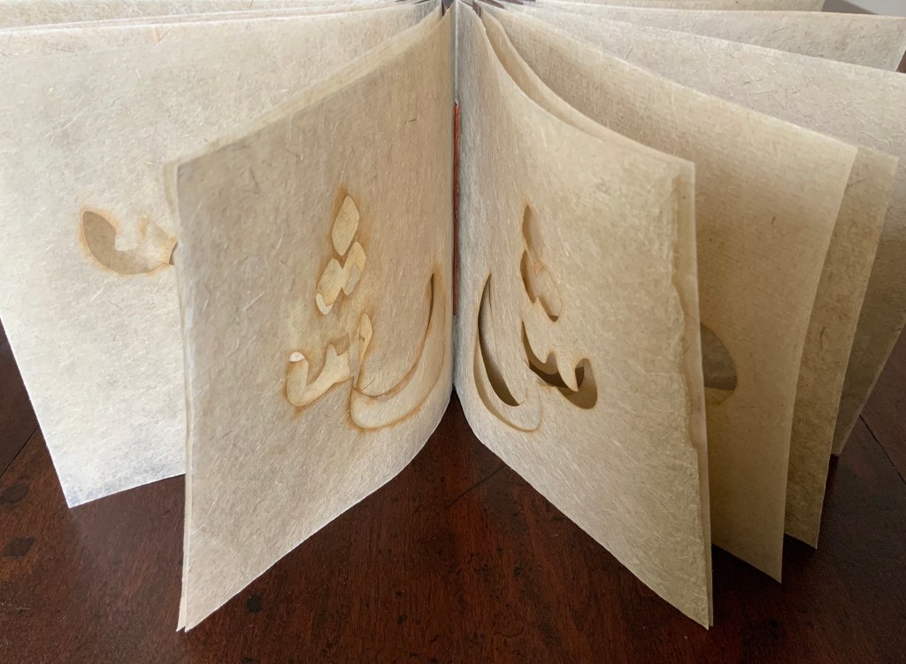
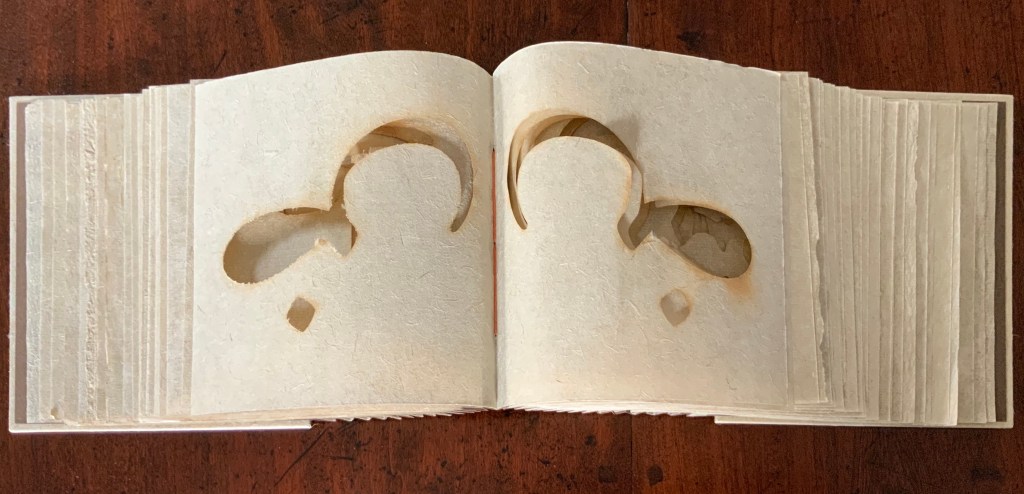
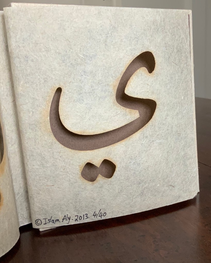
28 Letters (2013) Islam Aly Laser-cut handmade flax paper. Three hole pamphlet binding in an accordion binding. Linen thread, handmade paper covers. Closed H147 x W154 x D15 (fore-edge) D37 (spine) mm; open 845 mm. 28 folios. Edition of 40 of which this is #4. Acquired from the artist, 5 February 2019. Photos: Books On Books Collection.
Each of the 28 letters of the Arabic alphabet is laser-cut on a folio. The binding‘s flexibility allows for exploration and interaction with the letters as well as multiple forms of display.
Further Reading
Interview by Matt Kalasky for TGMR, the Galleries at Moore Radio, Moore College of Art and Design. Suzanne Seesman, Islam Aly, Abdul Karim Awad, and Yaroub Al-Obaidi discuss Friends, Peace, and Sanctuary project, Philadelphia, PA. Podcast 8 May 2019. Accessed 12 January 2020.
Interview for Sheffield Artist’s BookCentre, October 2, 2019. Accessed 12 January 2020.
Interview by Laurence Kesterson, for Friends, Peace, and Sanctuary project, Swarthmore College Library and the Lang Center for Civic and Social Responsibility 2017. Accessed 12 January 2020.
Interview by Spring 2017 Scripps College Art 137 seminar class. This interview was featured in Of Color: Race & Identity in Artists’ Books exhibit catalogue. Accessed 12 January 2020.
Chen, Julie. 2013. 500 Handmade Books. Volume 2. New York: Lark. Pp. 130 (28 Letters).
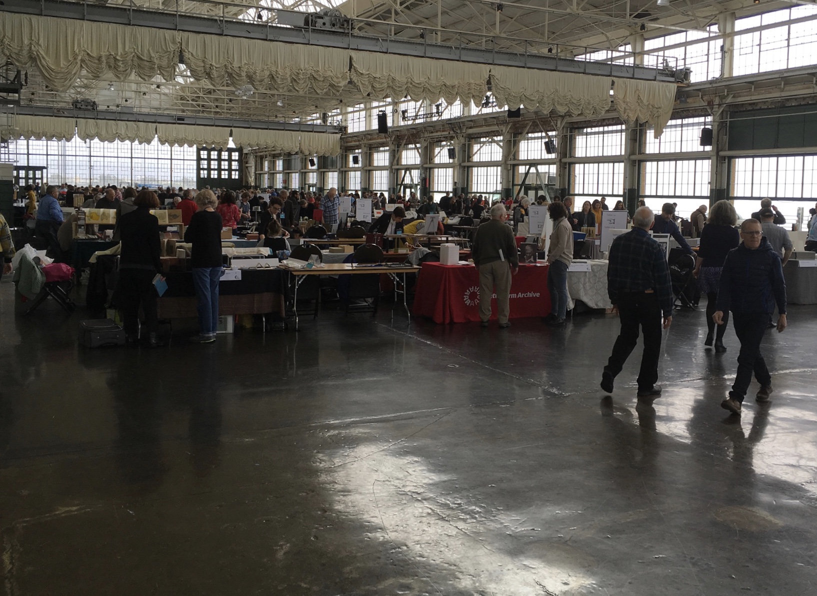
The seventh biennial Codex book fair and symposium in Berkeley and Richmond, California have come to a close. Of what use it is now to explain how to enjoy them, you be the judge. Your first step is to read the story in Mark Twain’s Roughing It of “Jim Blaine and His Grandfather’s Ram”. Being the story of a story — book art being so self-reflexive and all — it is the best way to commence:
Every now and then, in these days, the boys used to tell me I ought to get one Jim Blaine to tell me the stirring story of his grandfather’s old ram—but they always added that I must not mention the matter unless Jim was drunk at the time—just comfortably and sociably drunk.
Not to advise drink before the fair.
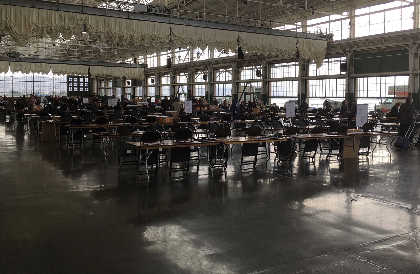
For the start of this Codex, rain and mist hover outside the hangar. The polished concrete floor looks wet but isn’t — so first-time visitors step to avoid slips that won’t really occur. The old-timers though stride from table to table arms wide, bussing each other on the cheek or humping crates around and placing and re-placing their works for the right effect. Arriving early to watch adds a certain enjoyment.
At last, one evening I hurried to his cabin, for I learned that this time his situation was such that … he was tranquilly, serenely, symmetrically drunk—not a hiccup to mar his voice, not a cloud upon his brain thick enough to obscure his memory. As I entered, he was sitting upon an empty powder- keg, with a clay pipe in one hand and the other raised to command silence. … On the pine table stood a candle, and its dim light revealed “the boys” sitting here and there on bunks, candle-boxes, powder-kegs, etc. They said: “Sh—! Don’t speak—he’s going to commence.”
‘I don’t reckon them times will ever come again. There never was a more bullier old ram than what he was. Grandfather fetched him from Illinois—got him of a man by the name of Yates—Bill Yates—maybe you might have heard of him; his father was a deacon—Baptist—and he was a rustler, too; a man had to get up ruther early to get the start of old Thankful Yates; it was him that put the Greens up to jining teams with my grandfather when he moved west.
‘Seth Green was prob’ly the pick of the flock; he married a Wilkerson—Sarah Wilkerson—good cretur, she was—one of the likeliest heifers that was ever raised in old Stoddard, everybody said that knowed her. She could heft a bar’l of flour as easy as I can flirt a flapjack. And spin? Don’t mention it! Independent? Humph! When Sile Hawkins come a browsing around her, she let him know that for all his tin he couldn’t trot in harness alongside of her. You see, Sile Hawkins was—no, it warn’t Sile Hawkins, after all—it was a galoot by the name of Filkins—I disremember his first name; but he was a stump—come into pra’r meeting drunk, one night, hooraying for Nixon, becuz he thought it was a primary …
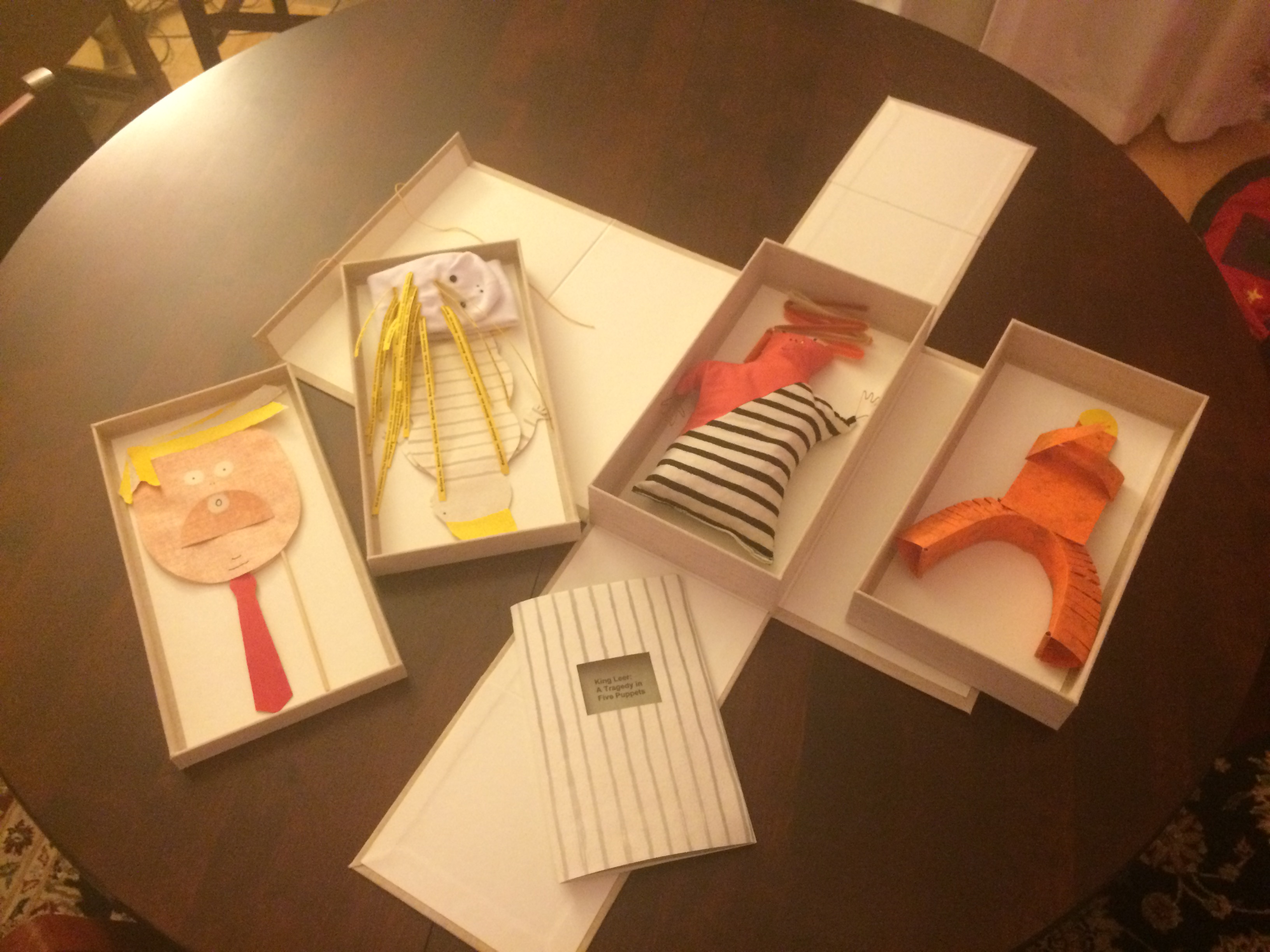
Which reminds me of Emily Martin and her politically biting King Leer —
King Leer: A Tragedy in Five Puppets (2018) Emily Martin
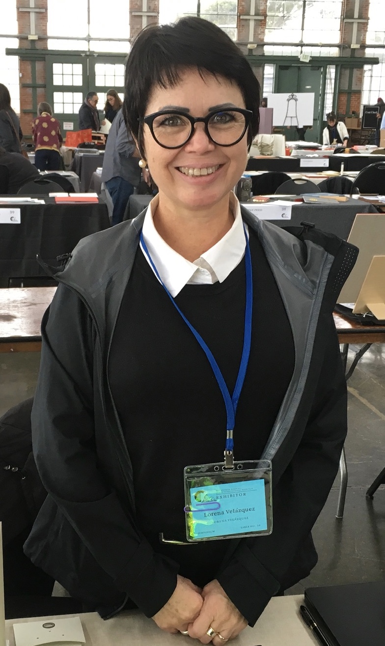
There is plenty more somber work to go around: Lorena Velázquez from Mexico has followed up her powerful Cuarenta y tres with Exit, her hope in our turbulent times;
Barcelona’s Ximena Perez Grobet has 2.10.1968-2018on display, commemorating the 50th anniversary of the Tlatelolco massacre in Mexico City; Sue Anderson and Gwen Harrison from Australia offer Phantomwise Flew the Black Cockatoo, an indictment of a cruel welfare system; and there is Islam Aly from Egypt with Inception, Bedaya, inspired by stories and journeys of refugees. Book art everywhere wears its heart on its cover.
Still, book artists are a convivial bunch and cheerful in their internationality. On Monday evening, Mary Heebner (Simplemente Maria Press) and her husband photographer Macduff Everton are in the Berkeley City Club’s off-limits members’ room settling down to a bottle of Santa Barbara red, and here come upstate New Yorker Leonard Seastone (Tidelines Press), Anglo-German Caroline Saltzwedel (Hirundo Press), Irishman Jamie Murphy (The Salvage Press) and Geordie David Esslemont (Solmentes Press). Macduff is launched on a tale about running into Queen Elizabeth on her horse-riding visit to Ronald Reagan’s ranch, when David remembers rounding down a path in the Lake District during an art residency to find Prince Charles legging it up the same — by which time Macduff has just returned from his room with a bottle of single malt — which reminds Caroline of a stormy weather hike along Hadrian’s Wall, where Macduff diverts onto a tale of nearly being blown off the same and making his shaky, near-death way back to a bed-and-breakfast for a hot bath and terrible food from the grumpy owners, which launches Leonard onto the story about his local Russian butcher/grocer/refugee who refuses to sell him salad but insists on providing chiropractic services one day and adopts Leonard as his only friend in the US with whom he can have true political debate. Jamie still wants to know why the Russian wouldn’t sell Leonard any salad.
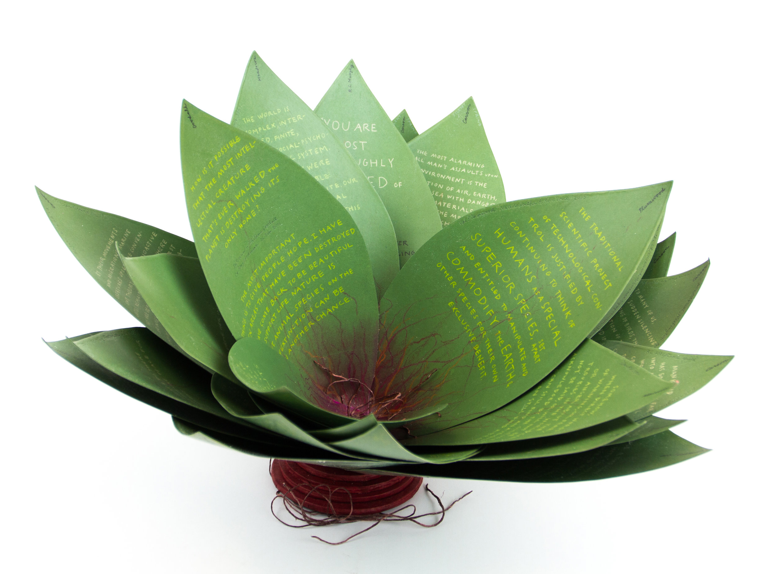
Speaking of greens — Robin Price’s prototype for Witnessing Ecology: the agave plant book again displays that thread of social concern, but this work and Price herself draw attention to another thread of enjoyment to pursue: the recurrence of collaboration among book artists. One artist leads to another.
Witnessing Ecology: the agave plant book (2019) Robin Price Photo: Mike Rhodes
As with the now-famous The Anatomy Lesson by Joyce Cutler-Shaw, Price has joined forces again with Daniel Kelm on the agave plant book, Kelm also collaborated with Ken Botnick on the long-gestating Diderot Project on display here just a few tables away, Botnick collaborated with the novelist and translator William Gass on A Defense of the Book, who in turn with the photographer Michael Eastman — who lives over in Oakland — created the digital-only book Abstractions Arrive: Having Been There All the Time. Whatever the medium, the book just naturally encourages collaboration — and chance. As Price’s book Counting on Chance implies and as so many book artists echo — as does Jim Blaine —
‘… There ain’t no such a thing as an accident. When my uncle Lem was leaning up agin a scaffolding once, sick, or drunk, or suthin, an Irishman with a hod full of bricks fell on him out of the third story and broke the old man’s back in two places. People said it was an accident. Much accident there was about that. He didn’t know what he was there for, but he was there for a good object. If he hadn’t been there the Irishman would have been killed. Nobody can ever make me believe anything different from that. Uncle Lem’s dog was there. Why didn’t the Irishman fall on the dog? Becuz the dog would a seen him a coming and stood from under. That’s the reason the dog warn’t appinted. A dog can’t be depended on to carry out a special providence. Mark my words it was a put-up thing. Accidents don’t happen, boys. Uncle Lem’s dog—I wish you could a seen that dog. He was a reglar shepherd—or ruther he was part bull and part shepherd—splendid animal; belonged to parson Hagar before Uncle Lem got him.’
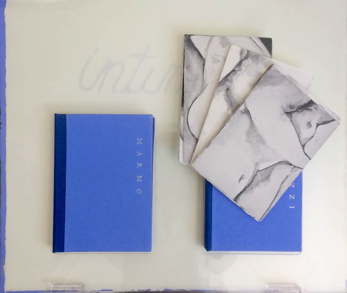
Chance, luck or accident — if you are to enjoy this book fair, you need to count on them, not just allow for them. How likely was it that in pursuit of Mary Heebner’s Intimacy: Drawing with light, Drawn from stone, I would be caught up with that crew in the off-limits members’ club?
Intimacy: Drawing with light, Drawn from Stone (2017) Mary Heebner
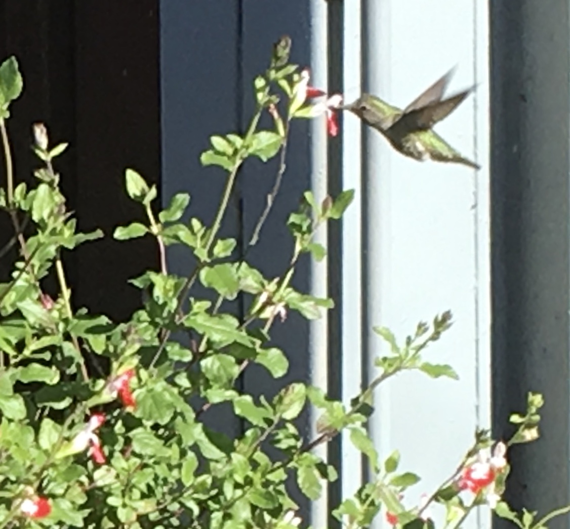
Or if I weren’t staying a good walking distance from the symposium, how would I have come across a hummingbird in the cold of February after being delighted with Sue Leopard’s Hummingbird?
Hagar is a common Nordic name. But how likely was it that Twain would use that particular name in his California mining-camp story and that Codex VII is hosting “Codex Nordica”? Mark my words it was a put-up thing.
That not one of the symposium presenters introducing us to “Codex Nordica” is named Hagar should not be held against the organizers. Their choices — Åse Eg Jørgensen (co-editor of Pist Protta, Denmark’s longest running contemporary artists’ journal), Tatjana Bergelt (multilingual, of German-Russian-Jewish culture and settled in Finland), Thomas Millroth (art historian from Malmö) — are entertaining, informative and good humoured (proof at least for the Danes that they can’t all be Hamlet or Søren Kierkegaard). What they have to say and show speaks to book art’s uncanny rhyming across geographies and times.
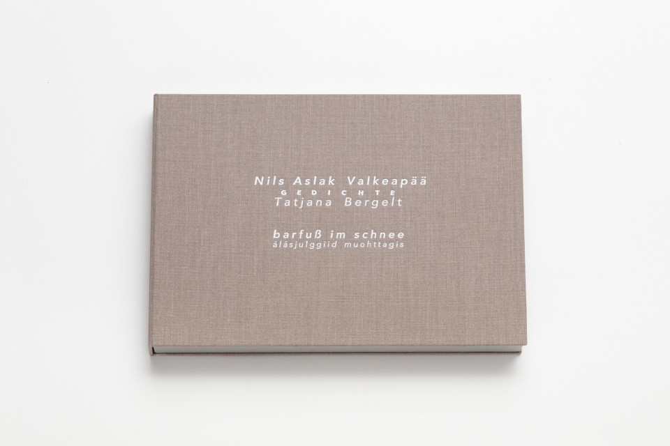
With every issue the outcome of guest editing, artists’ contributions and a mandate to be unlike any previous issue, Pist Protta is a cross between Other Books and So, the collaborative, gallery-challenging venture of Ulises Carrión in the last century, and Brad Freeman’s US-based Journal of Artists’ Books.Printed Matter has faithfully carried every issue of Pist Protta, so there is little excuse to be unaware of it and its liveliness. Fitting for someone who thinks of herself as a collage of cultures, Tatjana Bergelt’s barfuß im Schnee-álásjulggiid muohttagis (“Barefoot in the Snow”) is a photo-collage of old maps, satellite maps, poetic texts, landscapes and portraits of the Sámi, the dwindling inhabitants of the northern parts of Norway, Sweden, Finland and the Murmansk Oblast. It reminds me of UK-based Nancy Campbell’s Vantar/Missing.
Vantar/Missing (2014) Nancy Campbell Digitally printed on Munken Polar, hand-sewn binding with hand-incised design, edition of 300
Both works delve into the vulnerable and disappearance — be it culture, gender or environment. Vantar‘s cold diptychs recording the mountain snow cover and barely perceptible signs of life in the ghost town Siglufjörður chime with Bergelt’s final slide:
“From Finland barefoot in snow”, Codex VII, 4 February 2019 Tatjana Bergelt
barfuß im Schnee-álásjulggiid muohttagis (2015) Tatjana Bergelt 2 books in linen cassette, edition of 4, in each book 6 poems by Nils Aslak Valkeapää in Sámi, Finnish and German languages, translations P.Sammallahti, C.Schlosser
The bus from the symposium in Berkeley to the fair itself in Richmond is another chance for chance to play its role. One day I’m sitting next to Amanda Degener (Cave Paper), who delights in our common acquaintance with Ioana Stoian and Eric Gjerde; the next, it’s Jeanne Drewes (Library of Congress), who introduces me to Mark Dimunation (Library of Congress), who regales us and the collector Duke Collier with tales of the British artist Ken Campbell. But the terrible thing about chance is that it takes up so much time and, at the same time, shows you what you wish you had more time for.
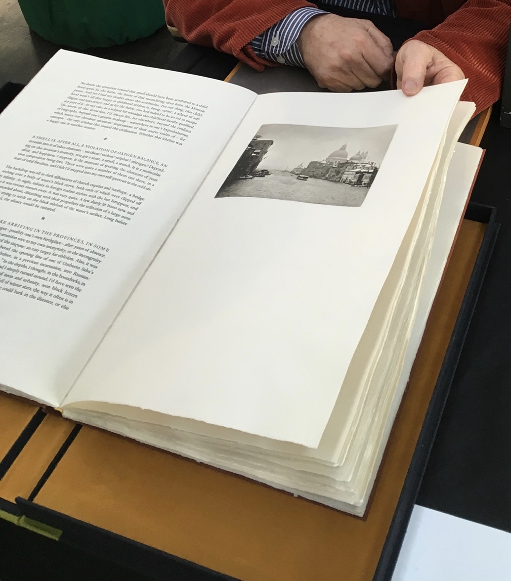
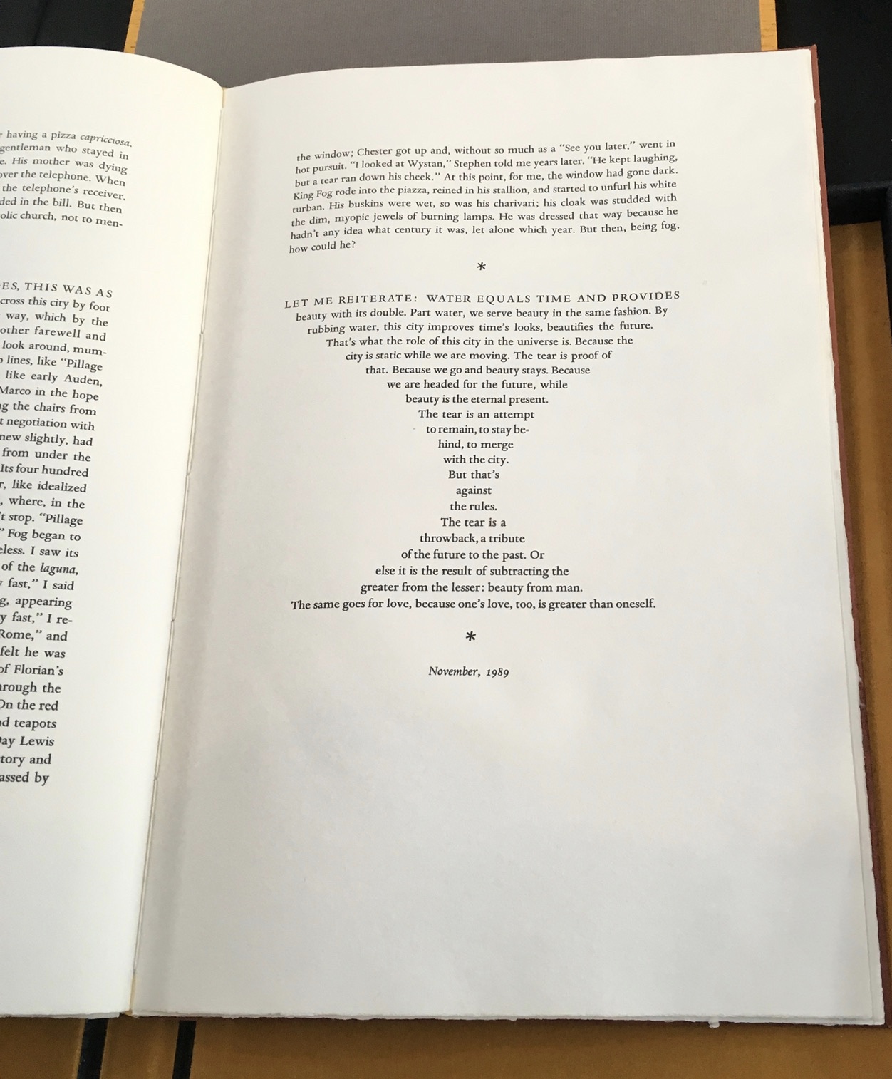
Recto: note the vaporetto in the image.Verso: think of the registration magic.The conclusion to Watermark and Koch’s homage to Aldus Manutius
Or to Russell Maret discussing his work Character Traits and Geoffroy Tory’s Champ Fleury: The Art and Science of the Proportion of the Attic or Ancient Roman Letters, According to the Human Body and Face (1529):
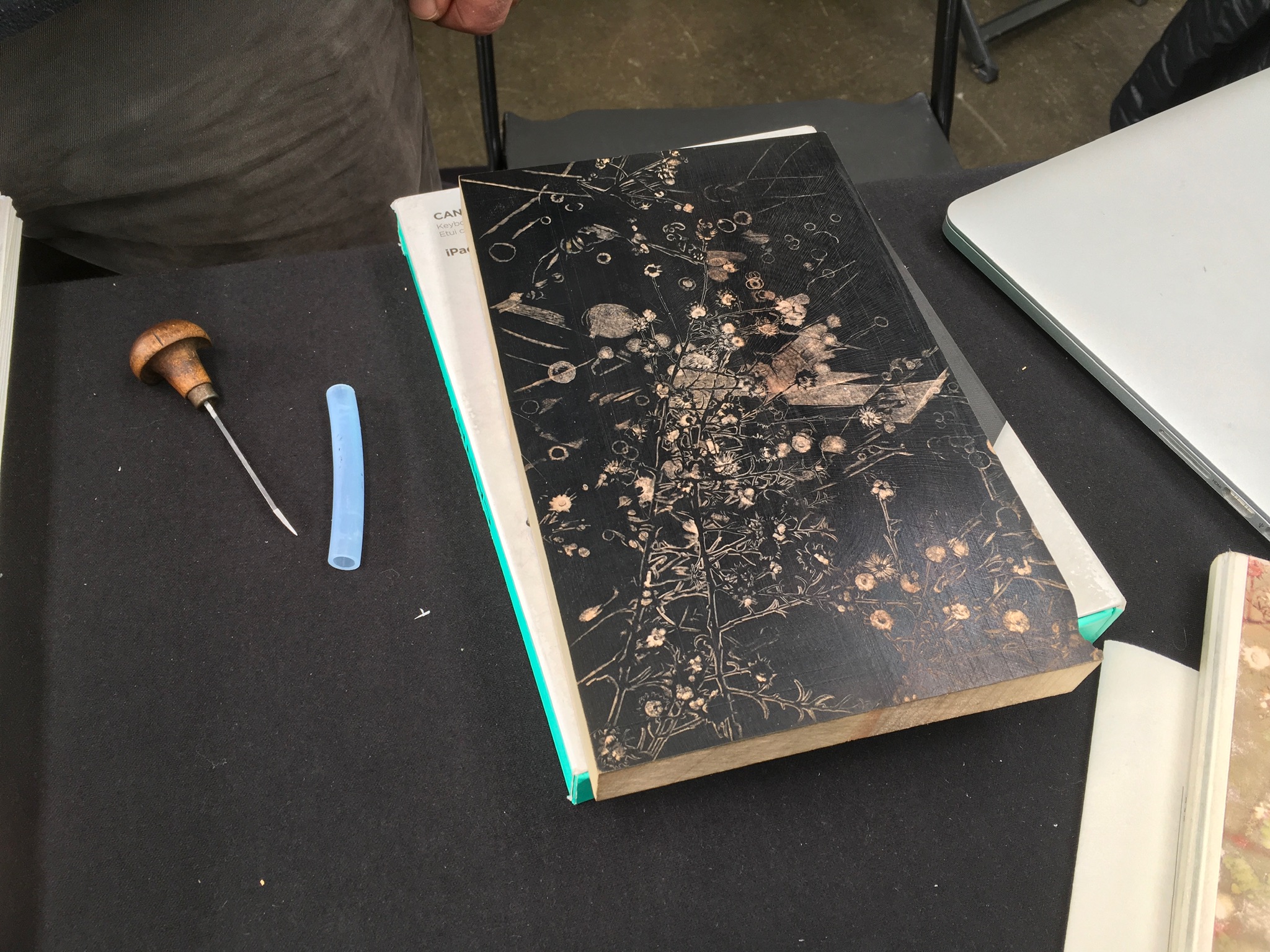
Or to Gaylord Schanilec (Midnight Paper Sales) enjoying his work on a woodblock:
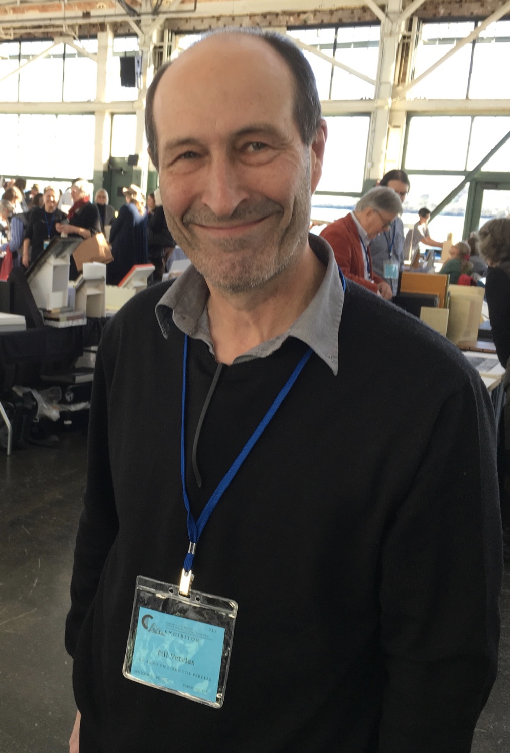
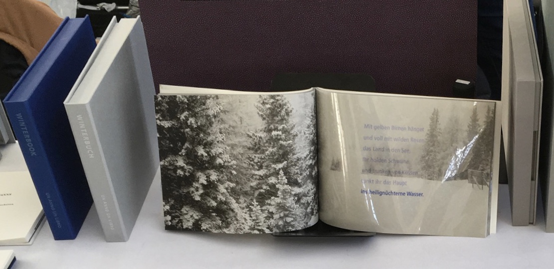
Or to Till Verclas (Un Anno Un Libro) explaining how his children helped achieve the effect of snow falling over Friedrich Hölderlin‘s words in Winterbuch:
Or to Sam Winston (ARC Editions) sharing his Reading Closed Books, which like Darkness Visible, sprang from his 7 Days performance in a blacked-out studio:
Sam is kind enough to introduce me to his colleagues at ARC Editions (Victoria Bean, Rick Myers and Haein Song). Individually and together, they are forces to watch. Myers’ An Excavation, which I’d had the pleasure to see previously in The Hague, can be partly experienced in these videos, and Song’s fine bindings and artist’s books must be seen. Bean’s symposium talk is on Check, her portfolio of typewriter prints featuring fifty writers, from Oscar Wilde to Joan Didion, and the checks they wore, and on Flag, the follow-up series of artist’s books that takes a writer from Check and uses colour, cloth and typewriter prints to explore an individual work by that writer.
Slide from “Flag”, Codex VII, 5 February 2019 Victoria Bean
Typewriter prints from Check by Victoria Bean
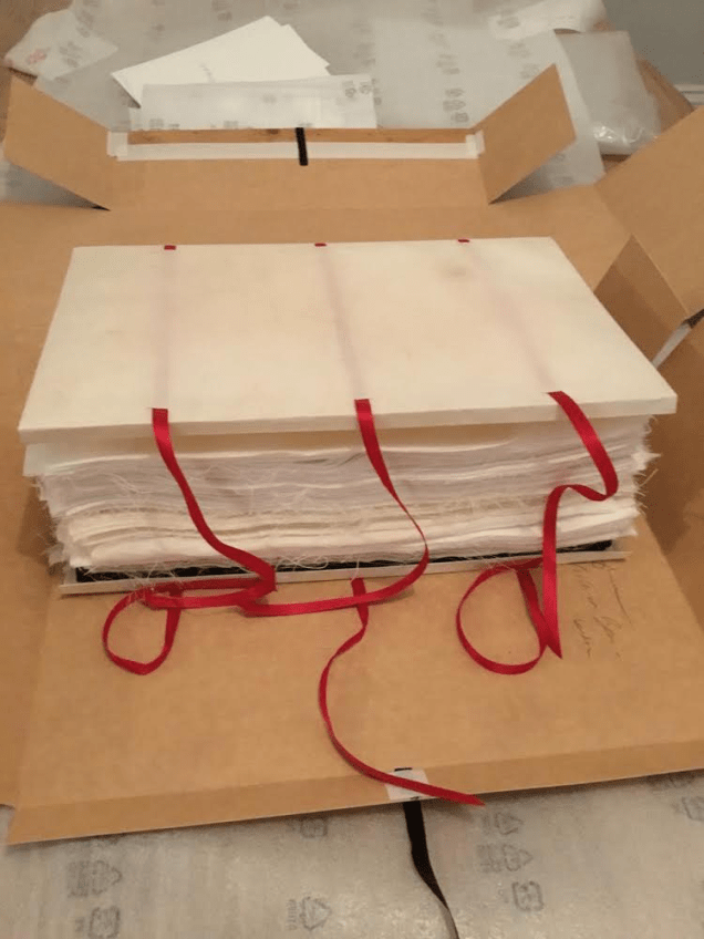
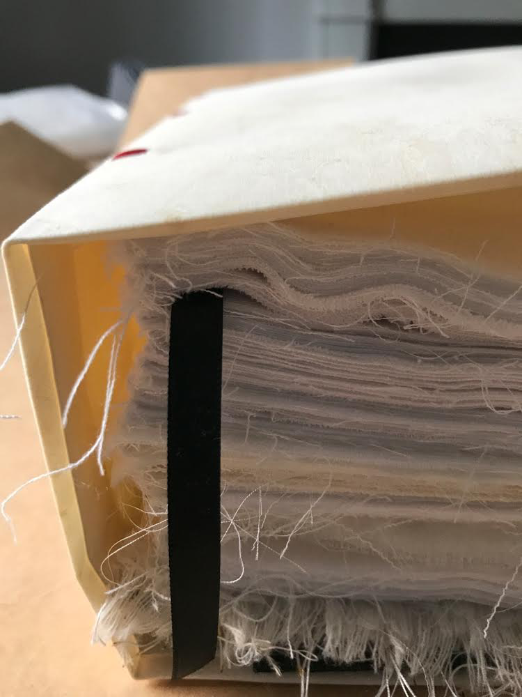
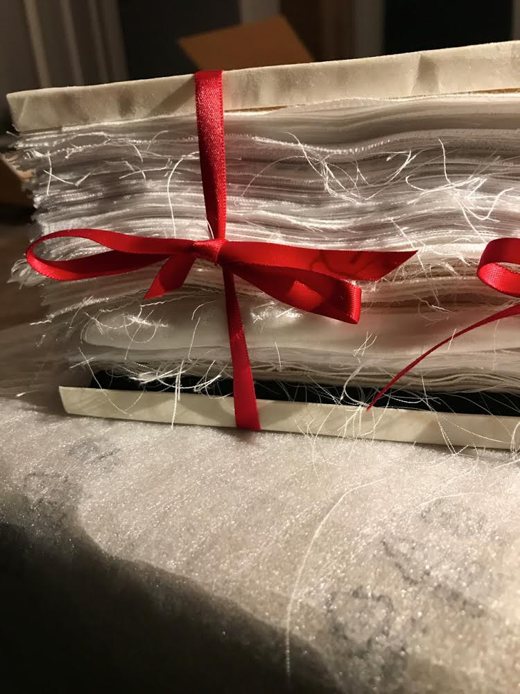
Tess (2019) Victoria Bean The red and black ribbons and white linen are drawn from images in Hardy’s Tess of the D’Urbervilles symbolizing Tess and critical events of her life and death.
Detail of Tess Victoria Bean
Detail of Tess Victoria Bean
Check and Flag illustrate that bright enjoyable thread that shows up again and again at Codex and book art at its prime — the integration of letter, image, material, form, process and subject in a way that self-consciously calls attention to them yet yields a work of art that simply is — on its own terms.
Which, if you have read “Jim Blaine and His Grandfather’s Ram”, ought to remind you that
… Parson Hagar belonged to the Western Reserve Hagars; prime family; his mother was a Watson; one of his sisters married a Wheeler; they settled in Morgan county, and he got nipped by the machinery in a carpet factory and went through in less than a quarter of a minute; his widder bought the piece of carpet that had his remains wove in, and people come a hundred mile to ‘tend the funeral. There was fourteen yards in the piece.
‘She wouldn’t let them roll him up, but planted him just so—full length. The church was middling small where they preached the funeral, and they had to let one end of the coffin stick out of the window. They didn’t bury him—they planted one end, and let him stand up, same as a monument.
With its 222 exhibitors here weaving the threads of book art and the book arts, Codex VII is a monument to enjoy. As for that old ram, you will have to read the story — and prepare for Codex VIII.