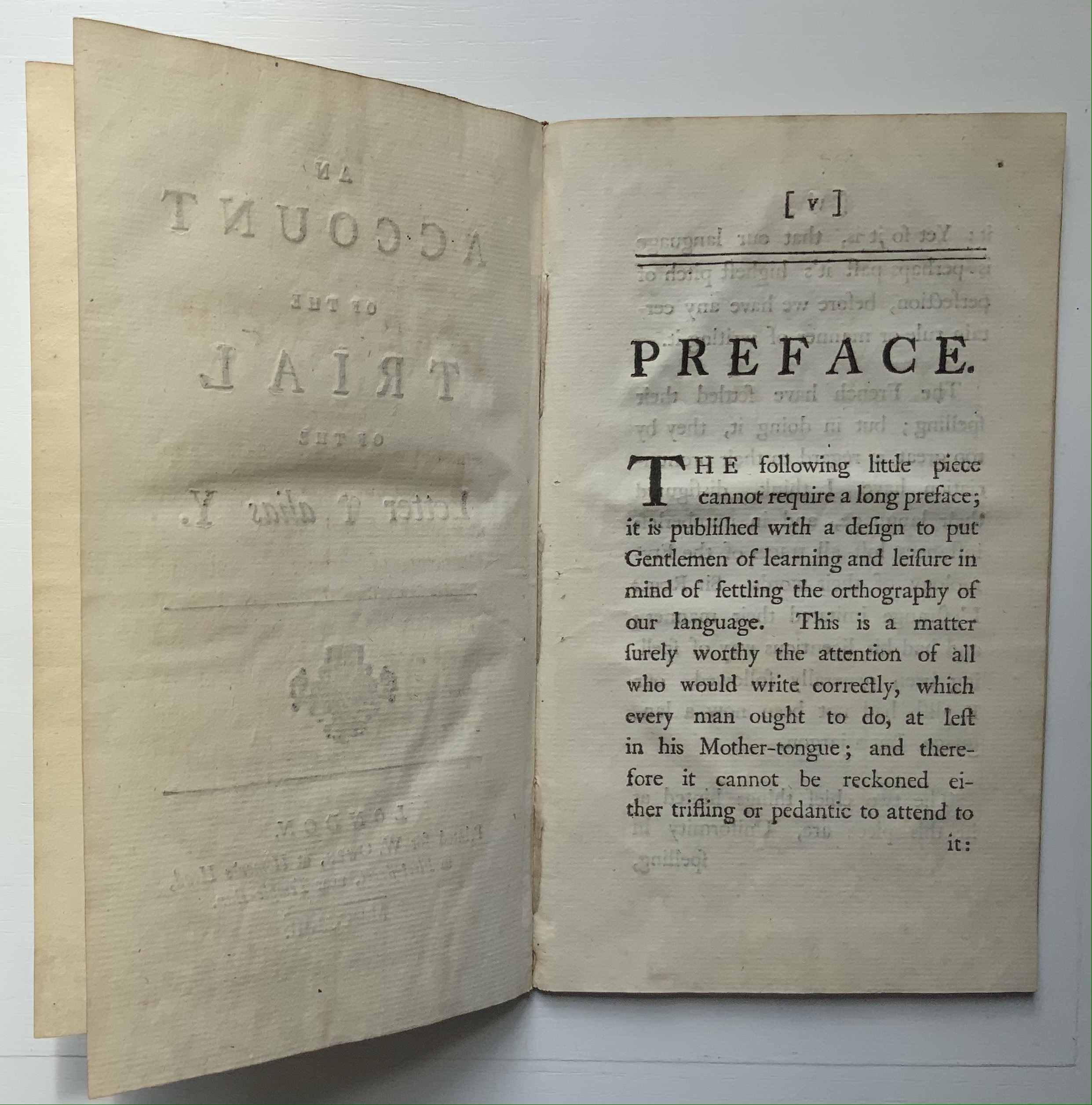
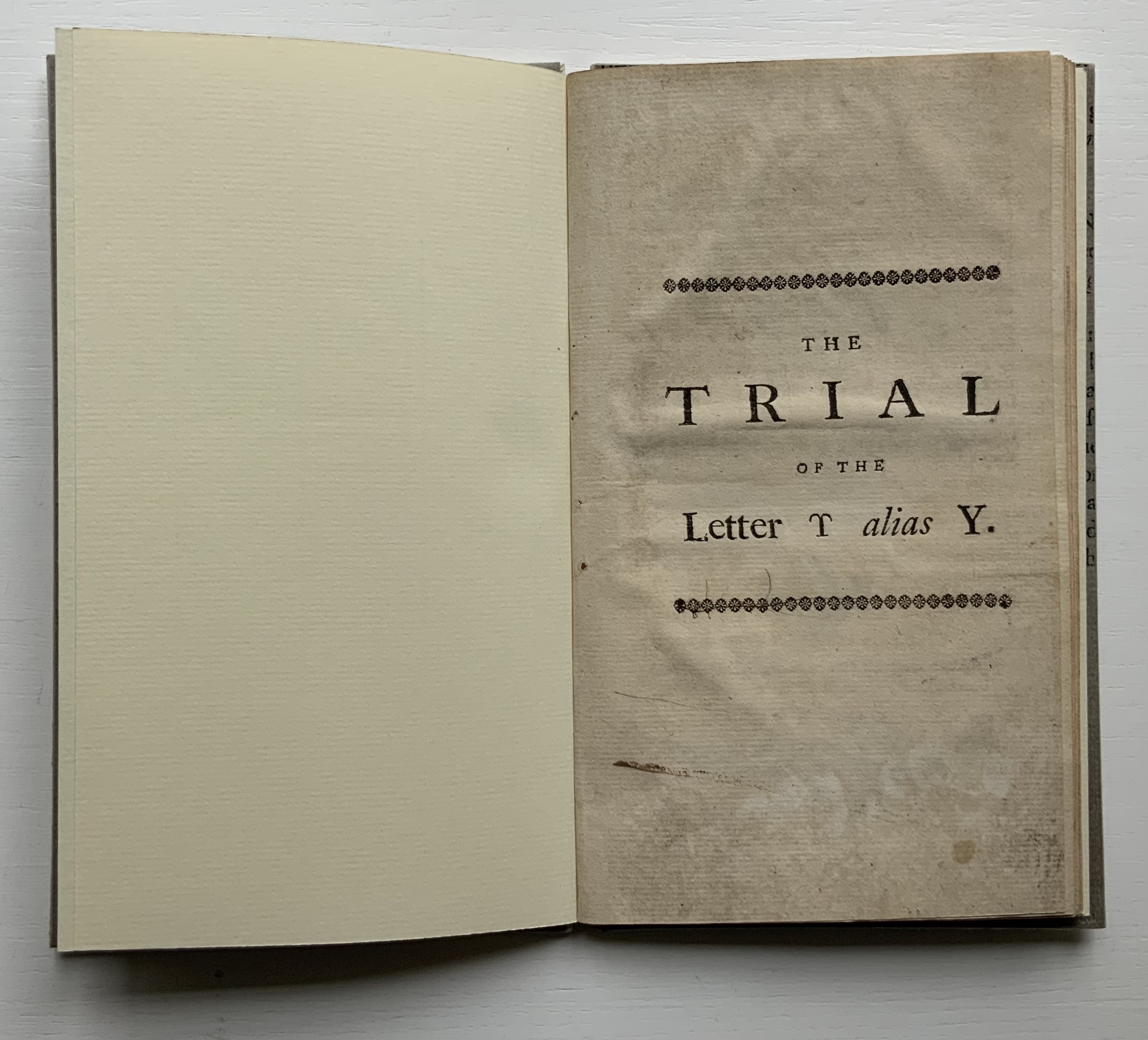
The Trial of the Letter ϒ alias Y (1753)
The Trial of the Letter ϒ alias Y:
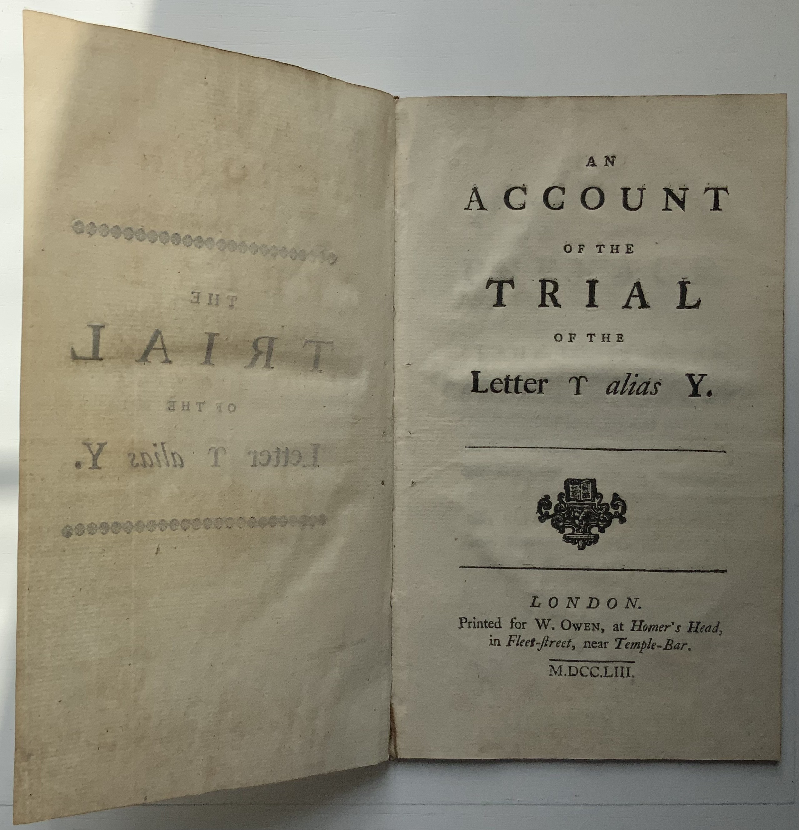
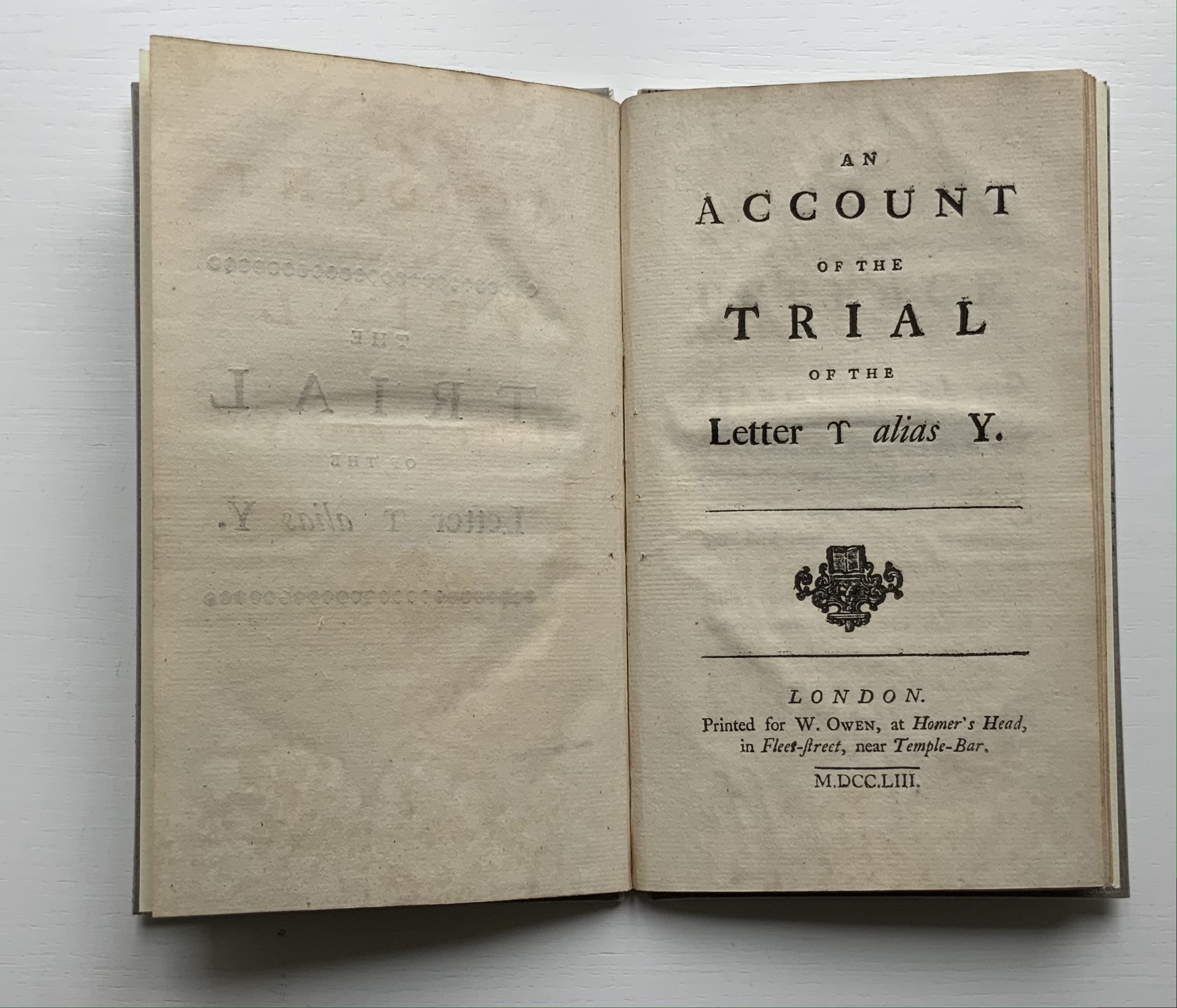
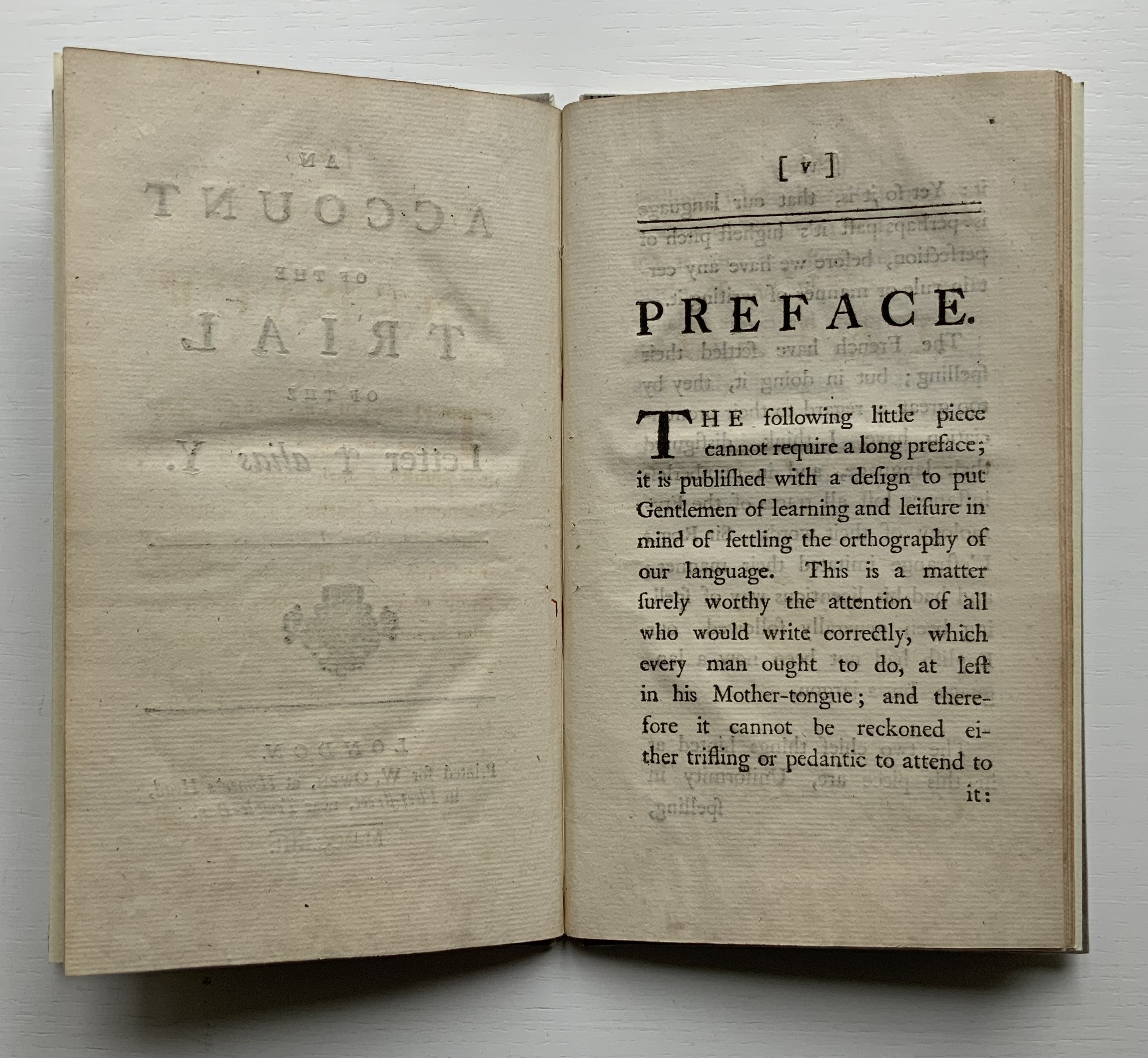
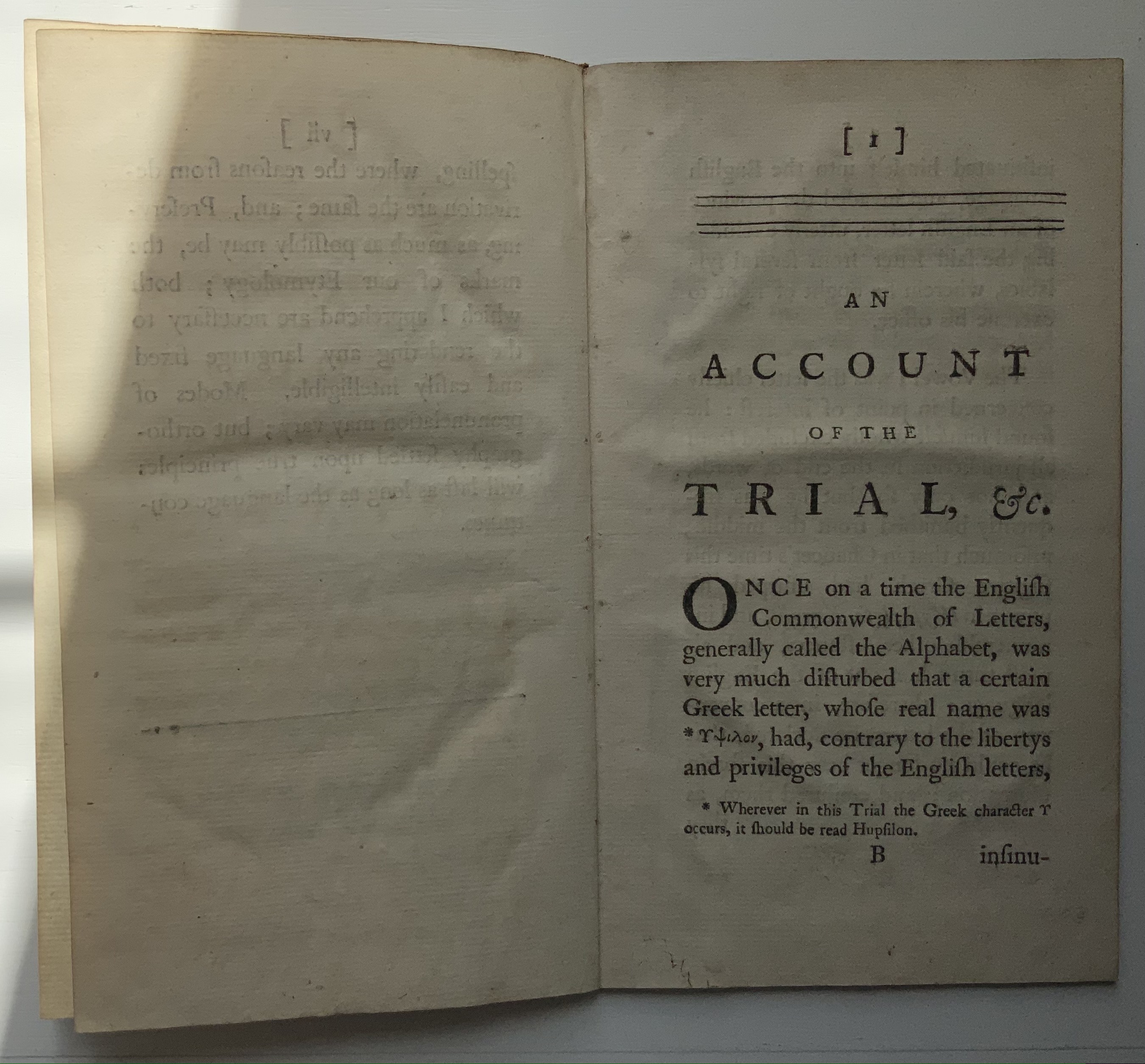
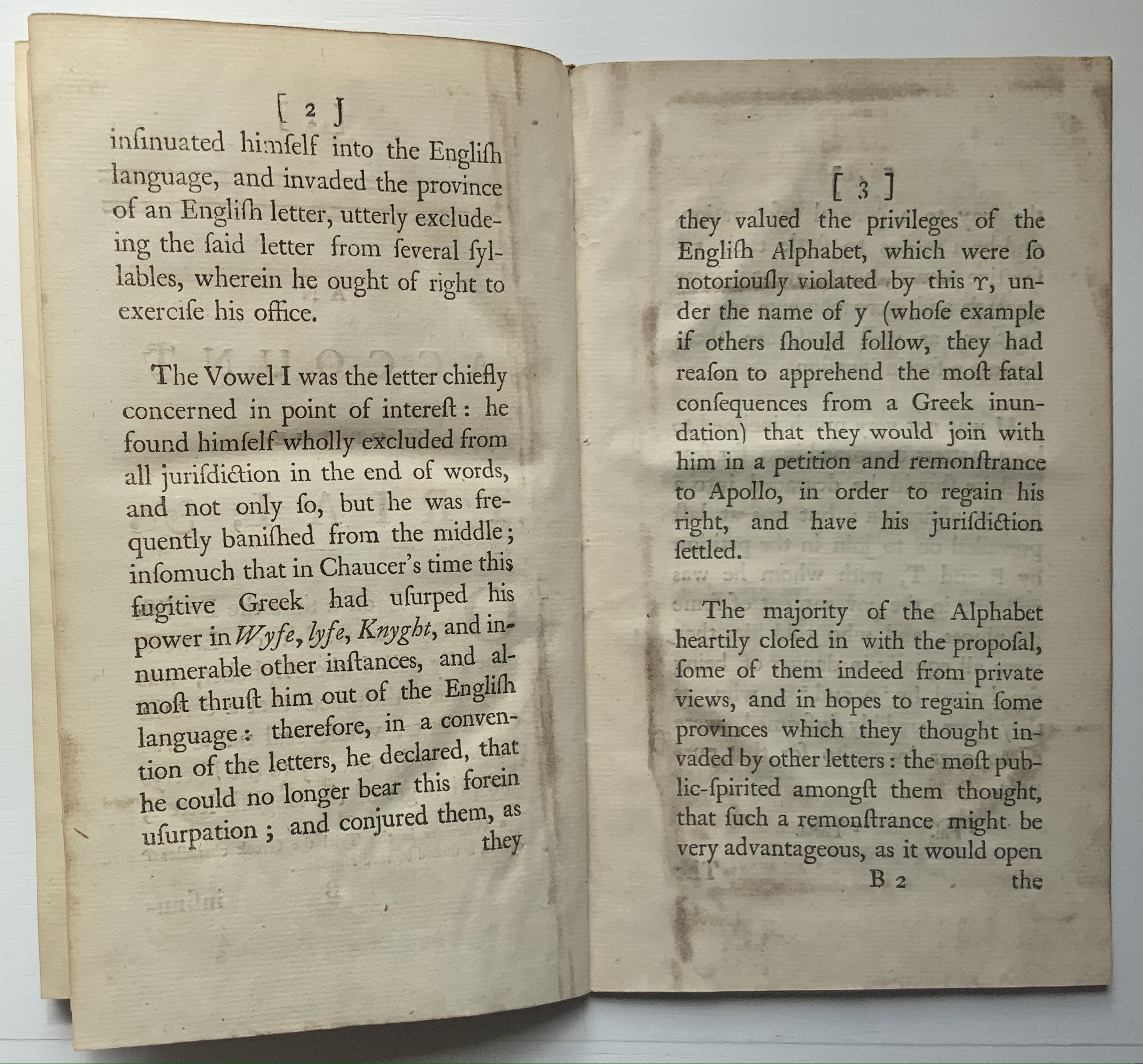
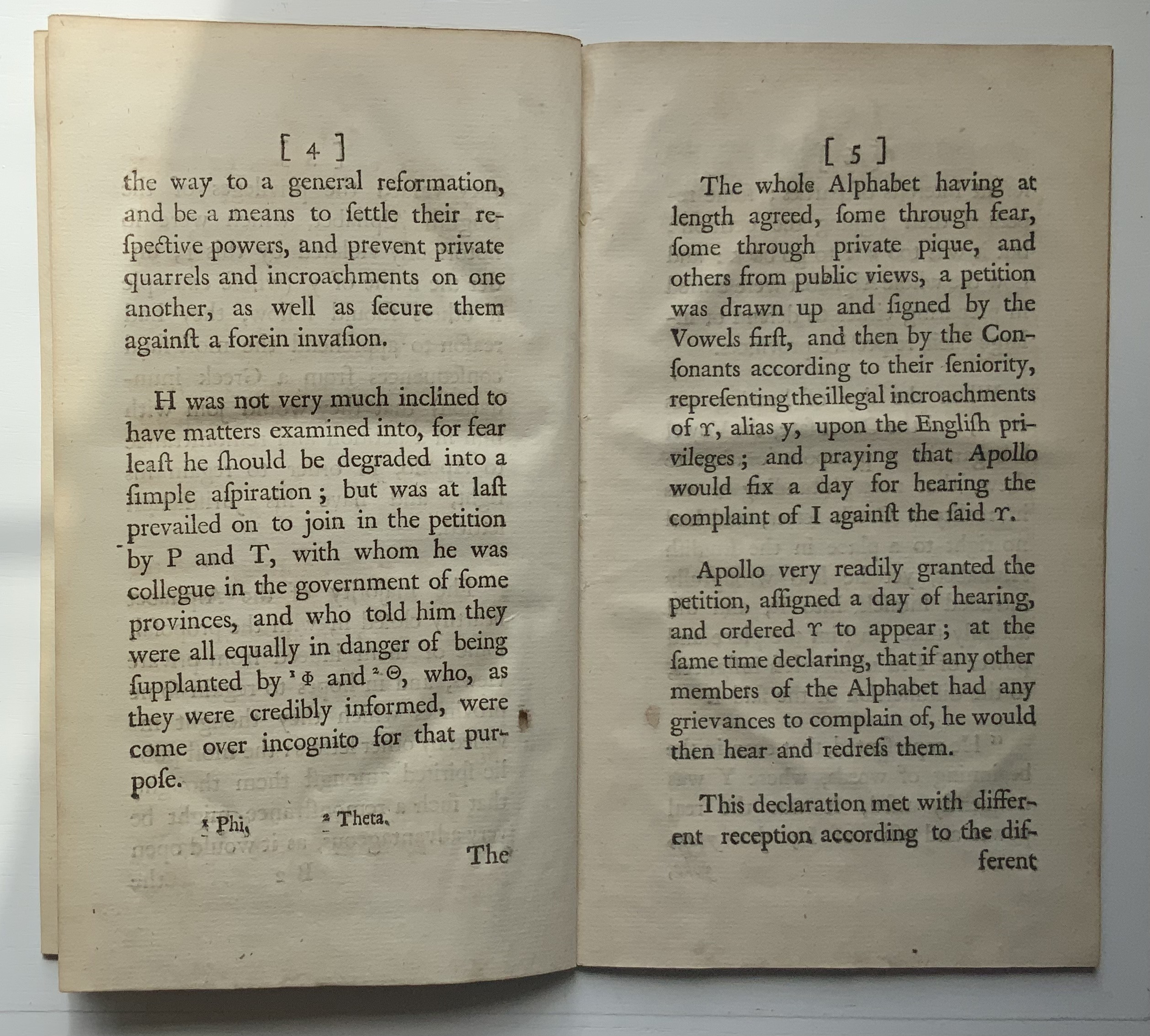
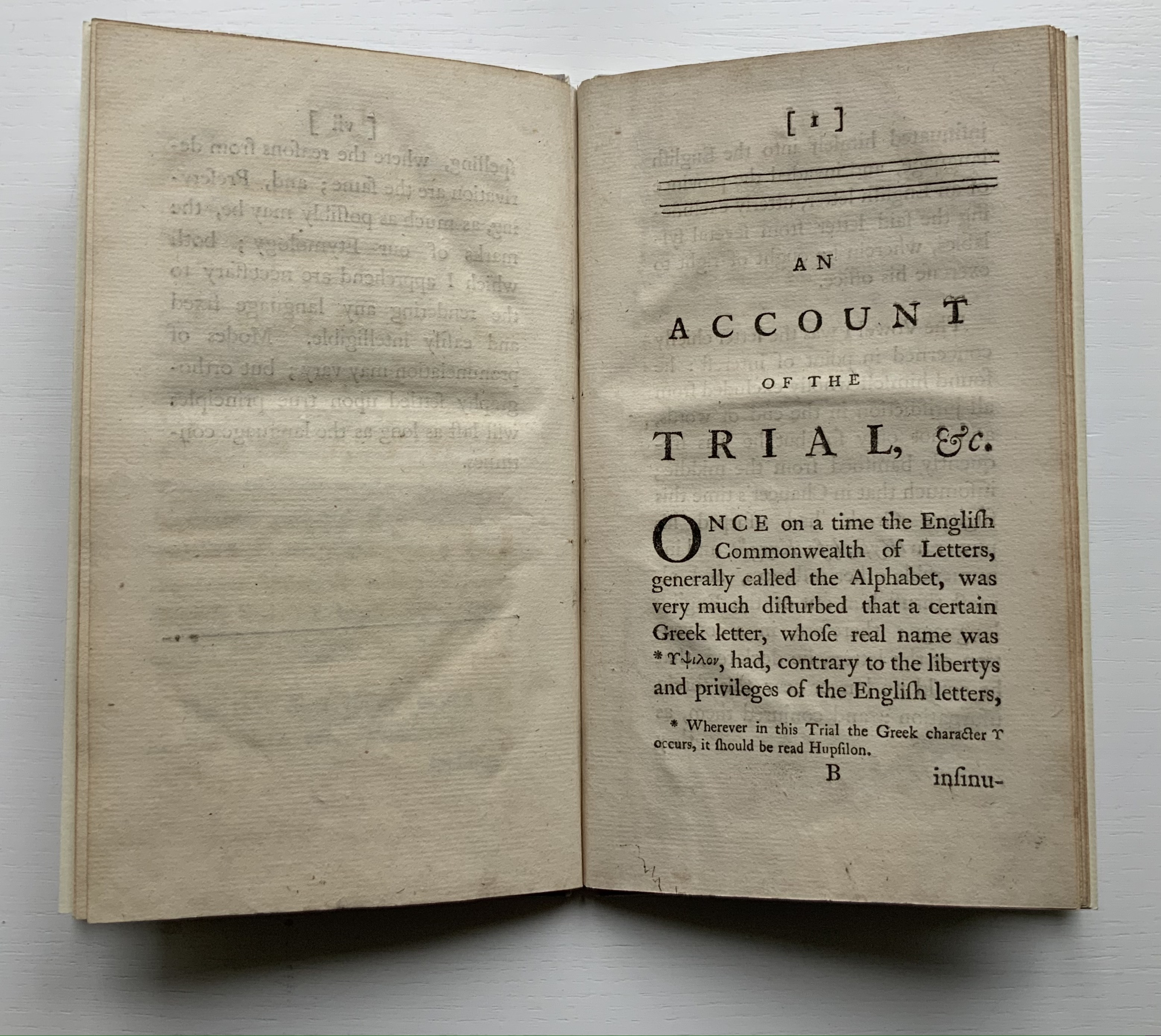
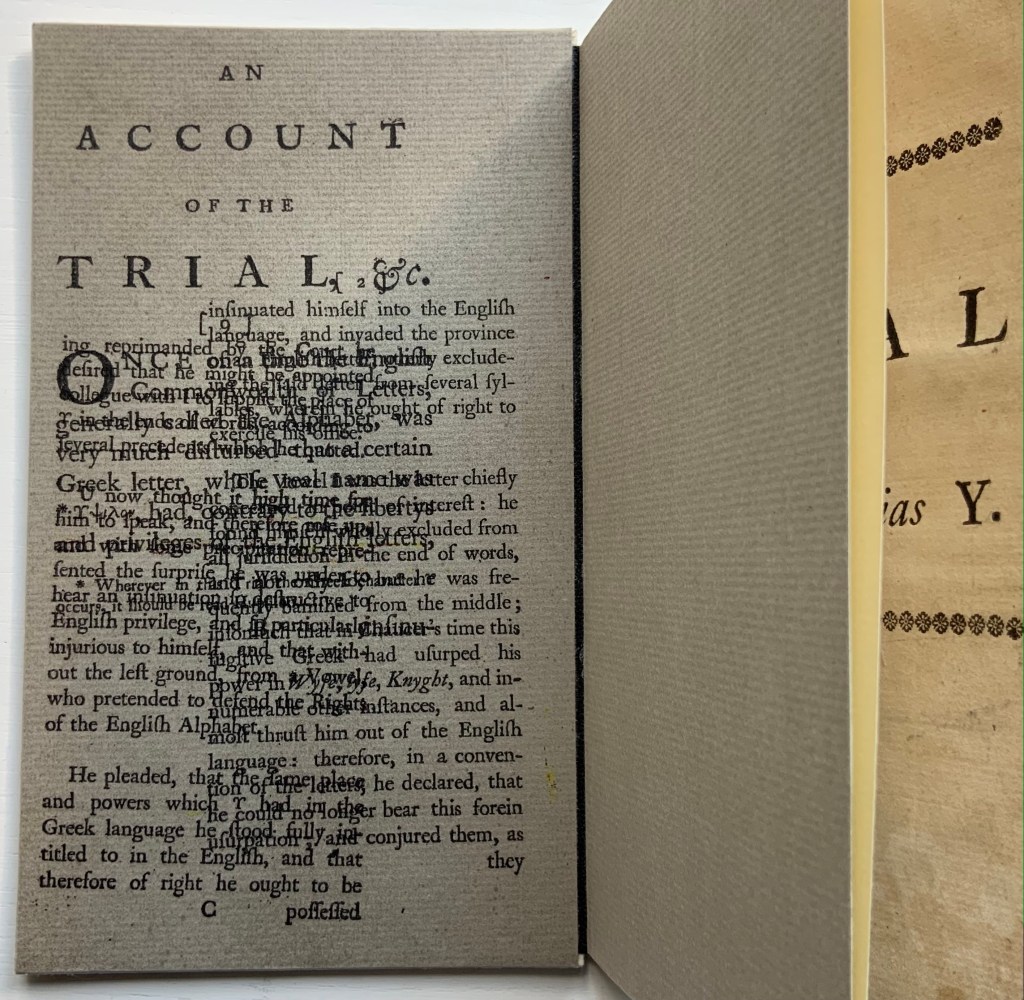
An Account of the Trial of the Letter ϒ [upsilon] alias Y (1753)
Thomas Edwards
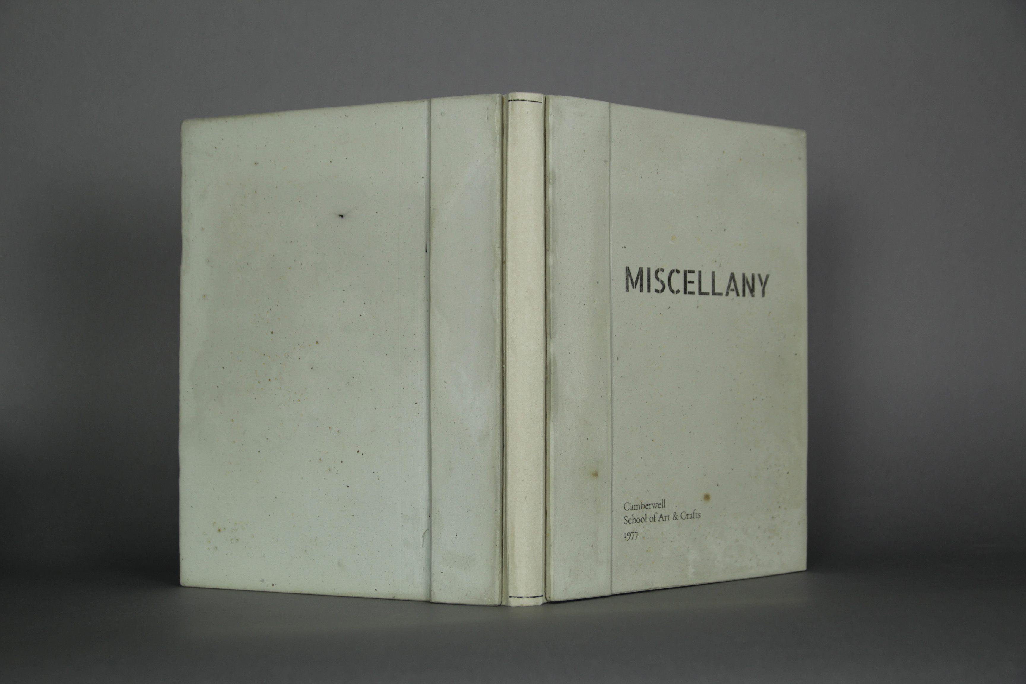
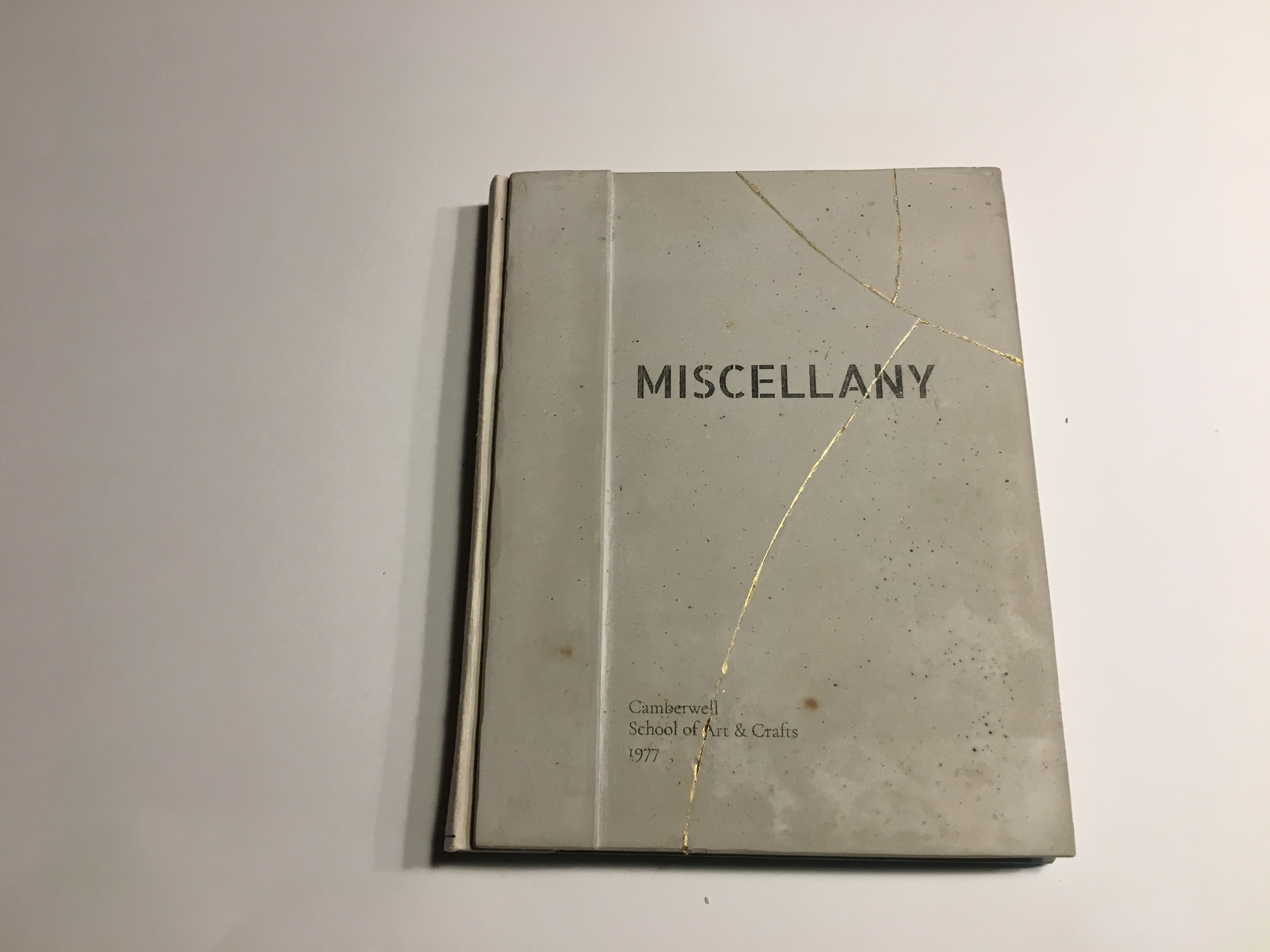
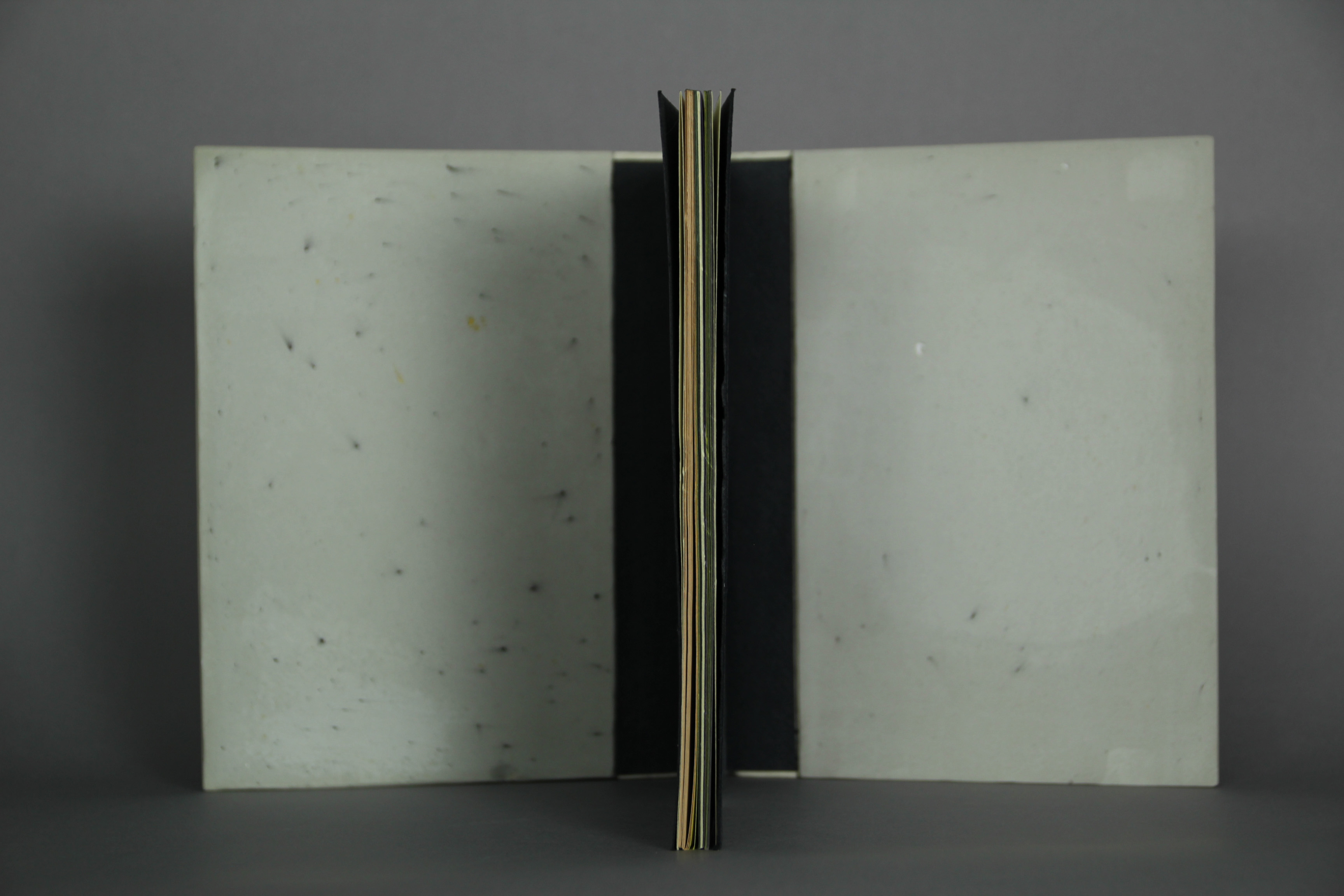
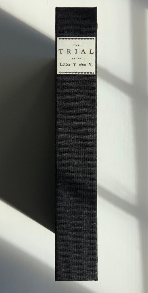
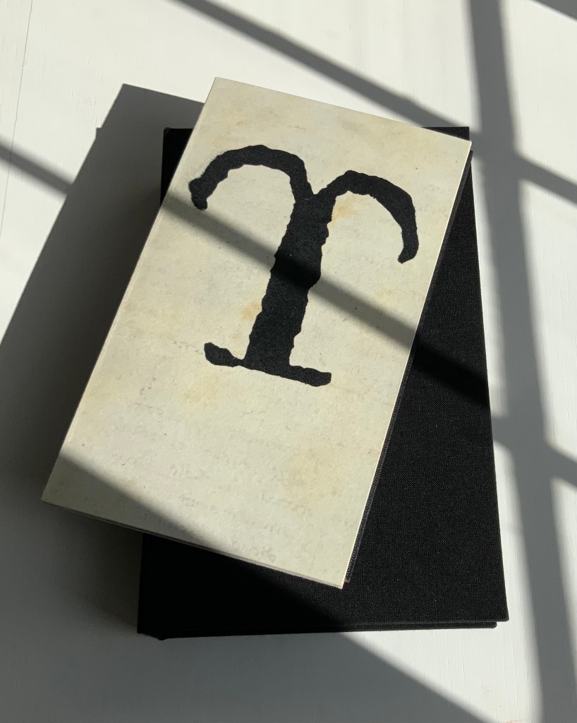
Bound and boxed (2021) by Mark Cockram
Box: H220 x W138; Book: H202 x W120 mm, 16 pages.
Photos: Books On Books Collection.
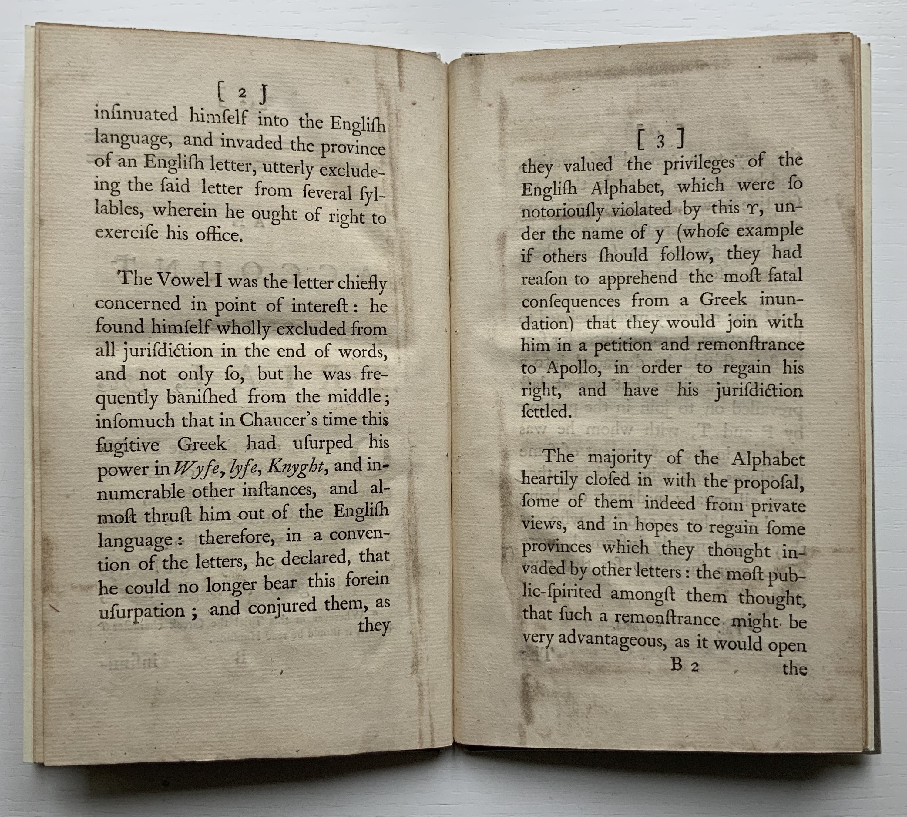
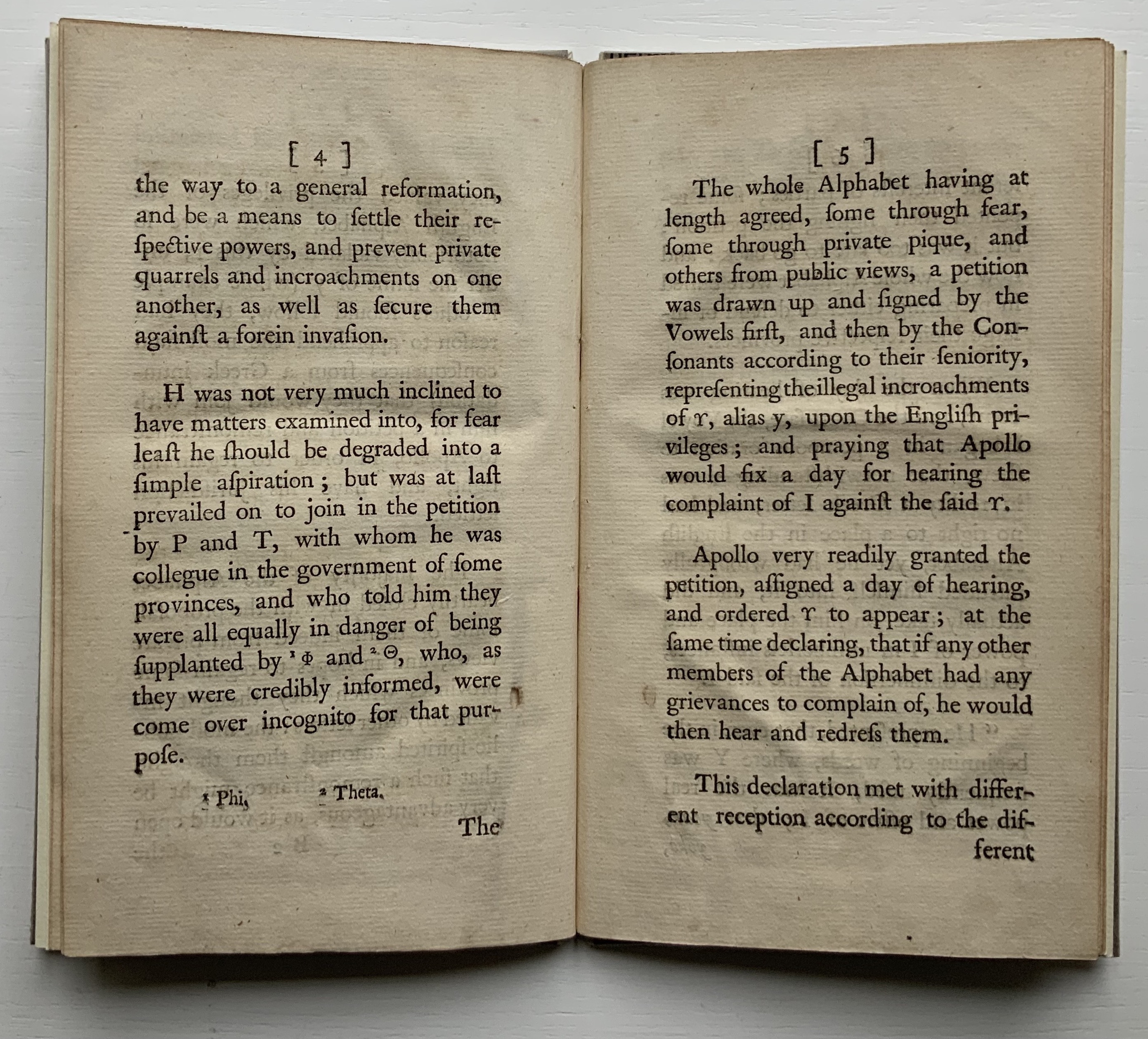
Like the Hebrew fable in which the letters of the alphabet argue their cases for the position of first letter, this short eighteenth century fantasy has the English Commonwealth of Letters rounding on the letter y as a Greek interloper, usurping their brother i’s rightful position at the end and even middle and beginning of words. Why the letters choose Apollo to judge the case is an irony lost on all the characters. But this is no surprise. After Apollo rules in y’s favor, their witless lack of self-awareness explodes into the internecine warfare of a roomful of Brexiteers. The letters d and th come to blows over murder and murther; the letters ugh demand reinstatement at the end of tho and thro; the letters s and c row over defense/defence and pretense/pretence; and so on.
Thomas Edwards (1699-1757) was an English critic and poet. According to the Oxford Dictionary of National Biography, his friend the printer and novelist Samuel Richardson encouraged him to write a book on spelling, which resulted in An Account of the Trial of the Letter ϒ [Upsilon], alias Y. The silliness first appeared in 1753 in two forms: one in the fifth edition of Edwards’ Canons of Criticism printed for the bookseller C. Bathurst (over-against St. Dunstan’s Church in Fleetstreet) and the other as a pamphlet for the bookseller W. Owen (at Homer’s Head, in Fleet-Street, near Temple-Bar).
The quarrelsomeness among the letters reflects the same among the not-so-gentlemanly scholars of the period. Edwards’ Canons of Criticism sets out principles for editing in the guise of a stiff critique of William Warburton’s edition of Shakespeare’s plays. Priest and later bishop of Gloucester, Warburton replied ad hominem, and the feud was on. Even the pompous bully Samuel Johnson joined in, disparaging both (presumably with an eye on elevating his own judgement if not his future edition of Shakespeare):
Soon after Edwards’s ‘Canons of Criticism’ <1748> came out, Johnson was dining at Tonson the Bookseller’s, with Hayman the Painter and some more company. Hayman related to Sir Joshua Reynolds, that the conversation having turned upon Edwards’s book, the gentleman praised it much, and Johnson allowed its merit. But when they went farther, and appeared to put that authour upon a level with Warburton, ‘Nay, (said Johnson,) he has given him some smart hits to be sure; but there is no proportion between the two men; they must not be named together. A fly, Sir, may sting a stately horse and make him wince; but one is but an insect, and the other is a horse still.'” (Dussinger, “Johnson’s unacknowledged debt”)
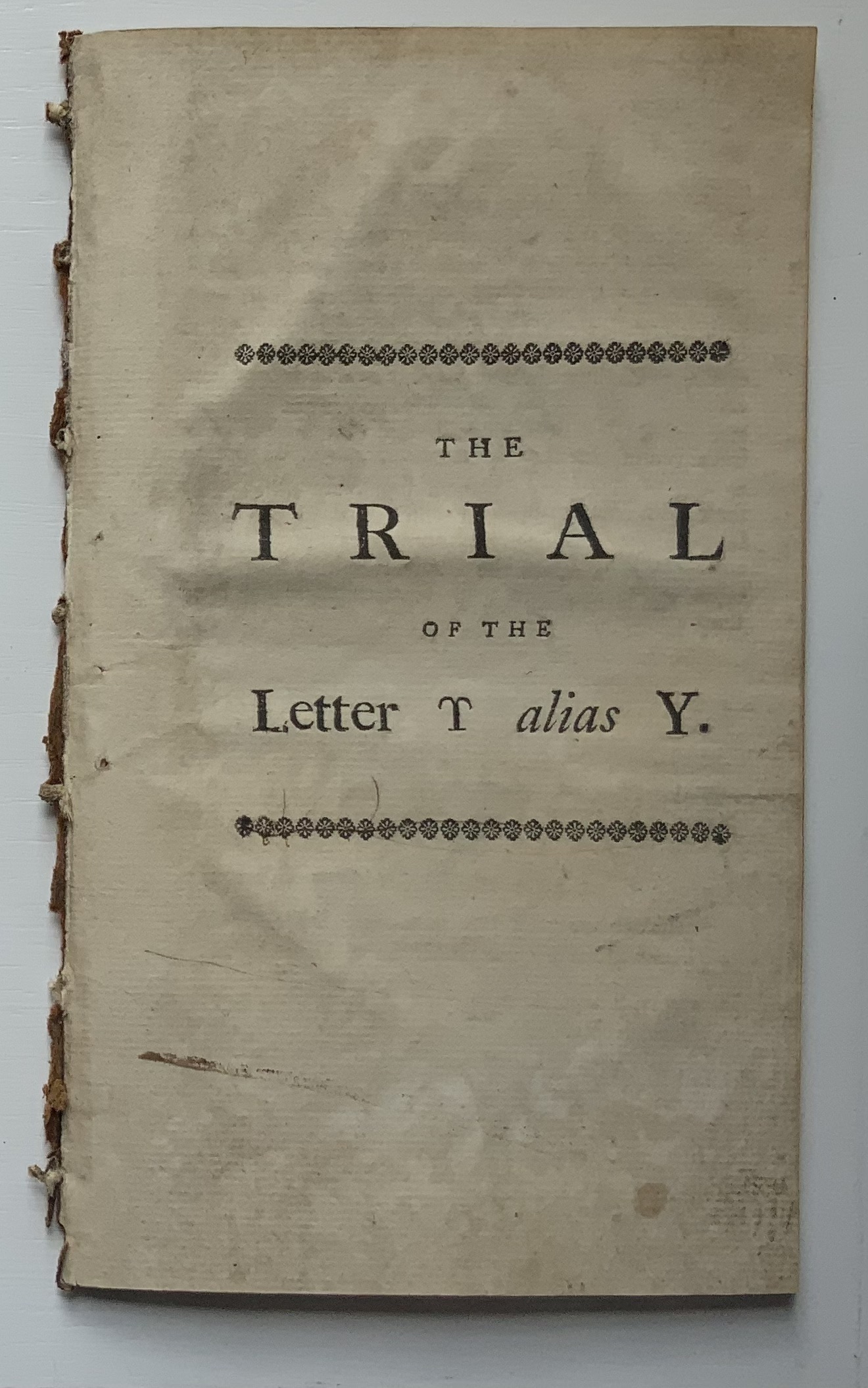
The version in the Books On Books Collection is the pamphlet: ”First and only edition, vii, [1], 23, [1]pp., with half-title, disbound”, as it is described in the British Library’s English Short Title Catalogue. Human petulance aside, the letters’ speechifying and Edwards’ observations about the alphabet’s history place The Trial squarely in the collection between letterpress works and the more trade-oriented alphabet books. As can be seen in the “before” pictures, though, the pamphlet required some attention before joining. That attention, however, would have to suit the nature of the collection.
Before
From a coincidental meeting at a Maggs Brothers exhibition in London, Mark Cockram sprang to mind, and his words here confirmed him as the right choice:
This brings us to the world of book arts. As I progress with my work and life I have begun to engage with this genre in the book making world. I admit that in the past I was a bit of a book snob. Though I produced a number of book works I was unable to cut free of the shackles of the finely bound book, working towards the mastering the complexity of the book… dare I say I was blinkered? In retrospect it is only over the last 15 or so years that I have been able to bring together the various disciplines of the book with the art of the book (though I am sure many who will argue I have neither) It has taken time for me to be able to engage and combine. However I feel that working in this way I am able to be honest with my work, to reflect the now as opposed to rebinding the past. It is a personal journey.
Please note there are other ways of doing things and opinions….. spelling and grammar. Please further note, the opinion of the author may change at any moment. This is due to having an open mind… of sorts. (Mark Cockram, Studio 5 Book Arts, 30 December 2019. Accessed 4 January 2020.)
After

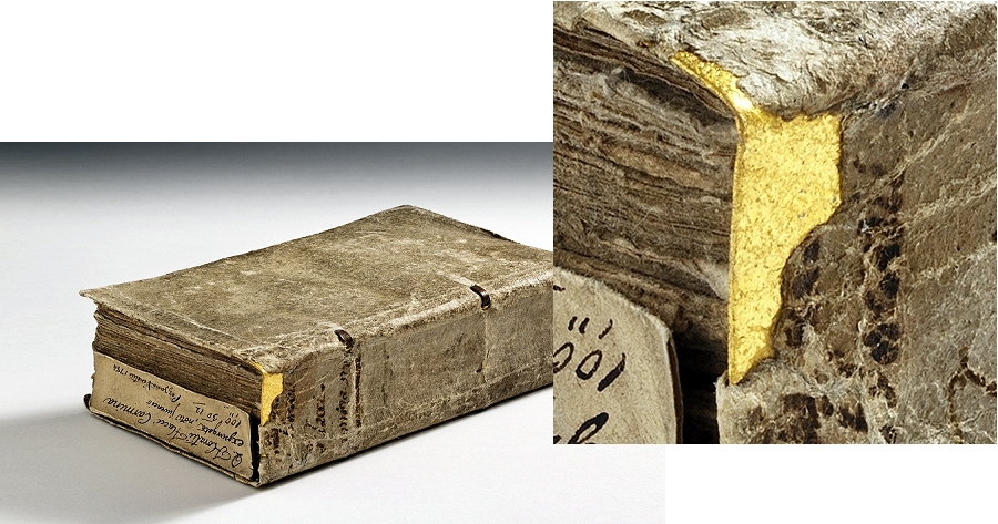
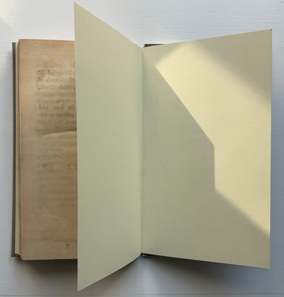
The paper-labelled cloth box has an unusual heft, implying weighty content but opening to reveal the humorously modest-sized pamphlet.
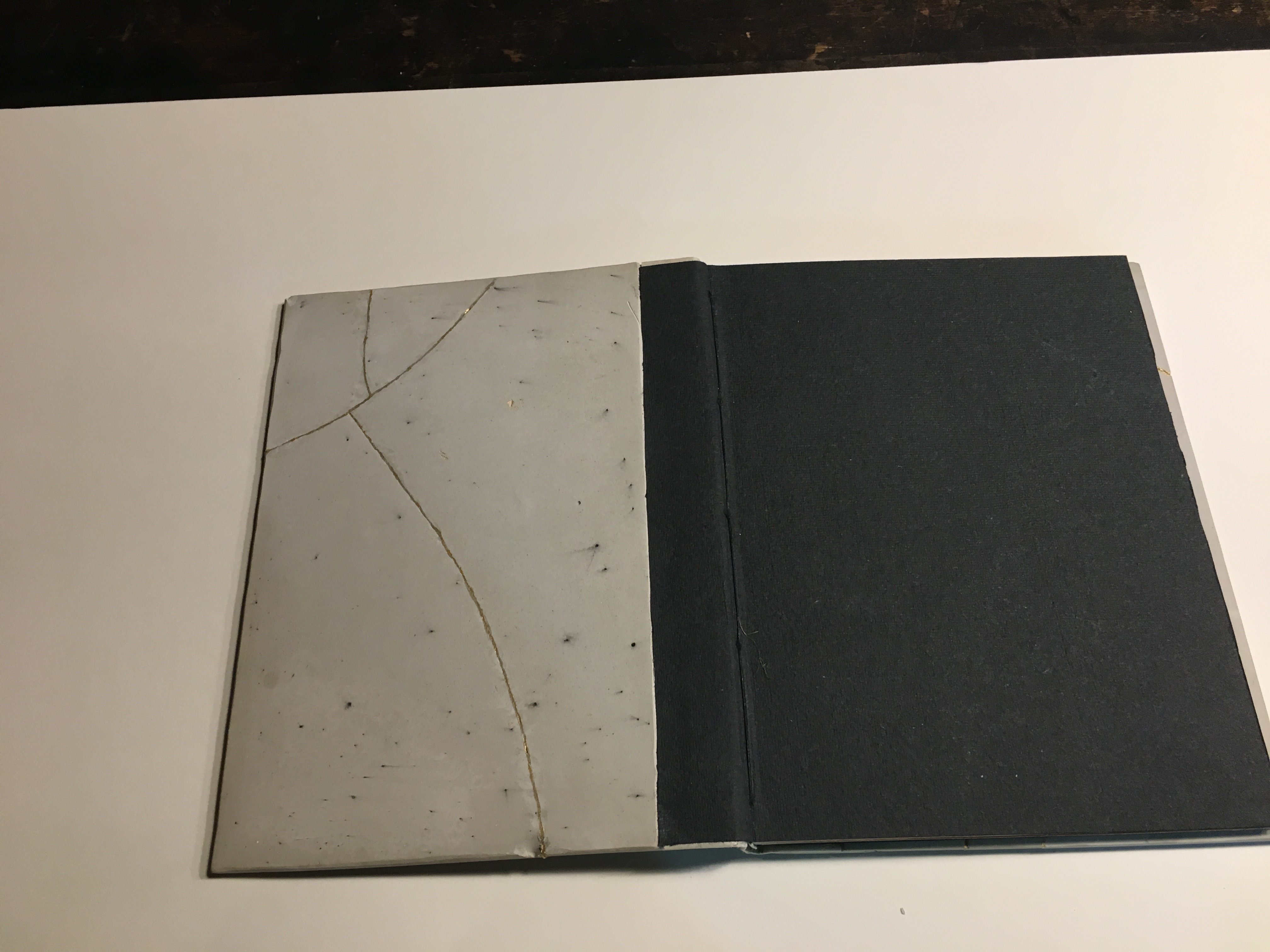
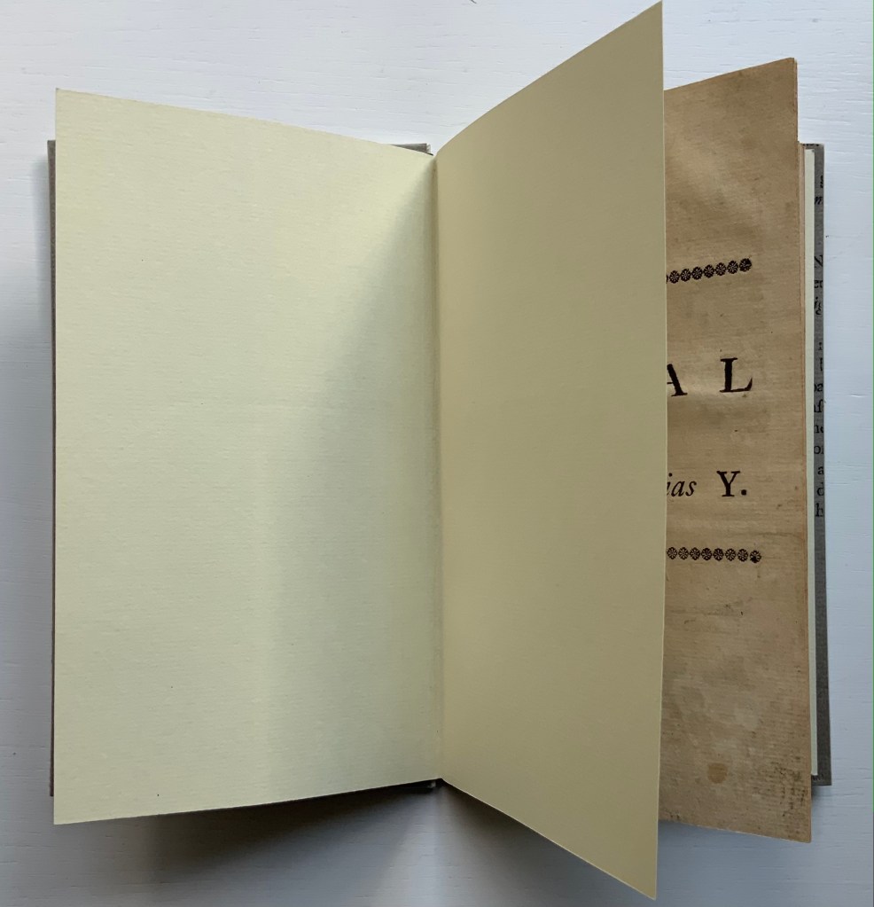
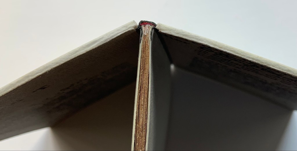
The artist’s binding solution involves two paper-covered boards. These additional “before and after” pictures show further how the artist’s “lay flat” binding solution preserves as full a view as possible of the original’s gutter.
Before
After
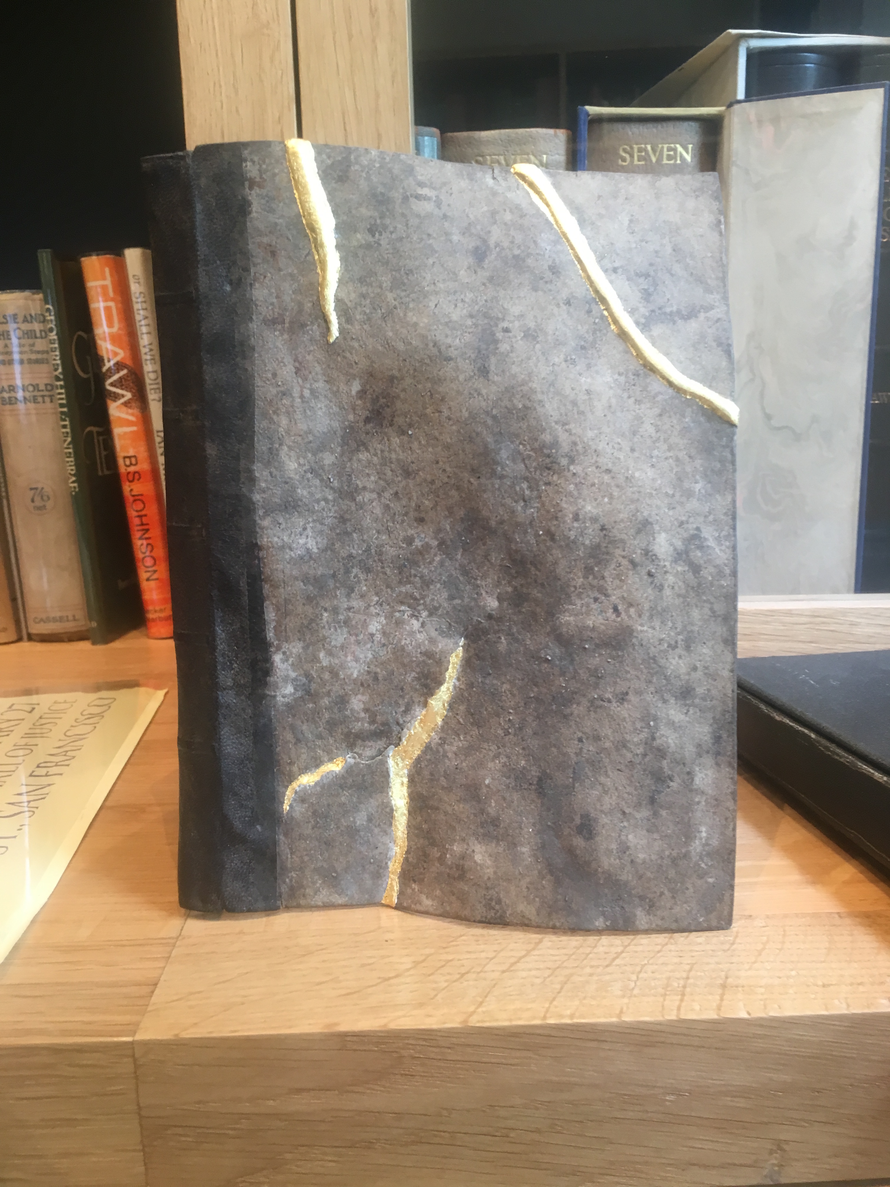
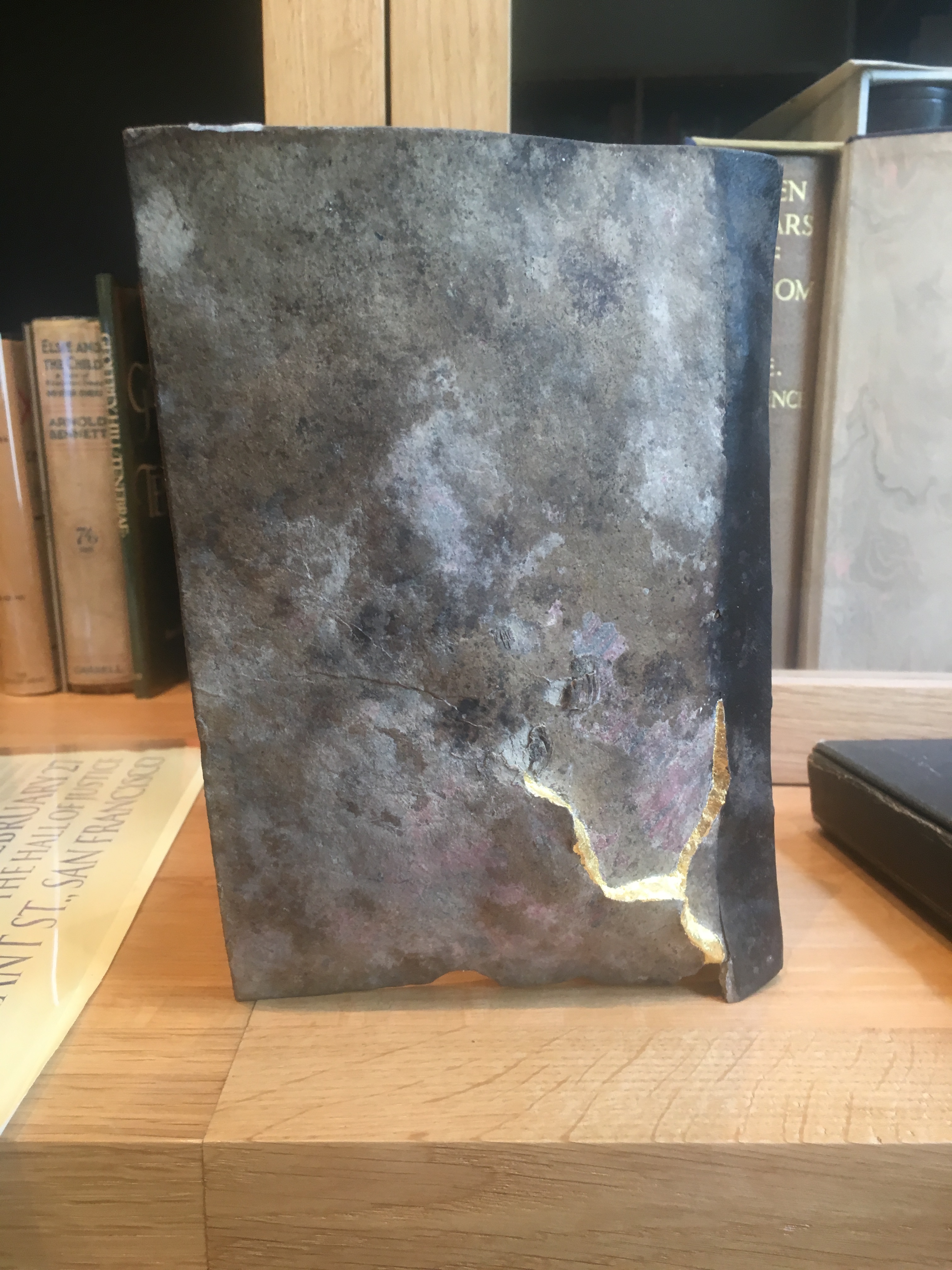
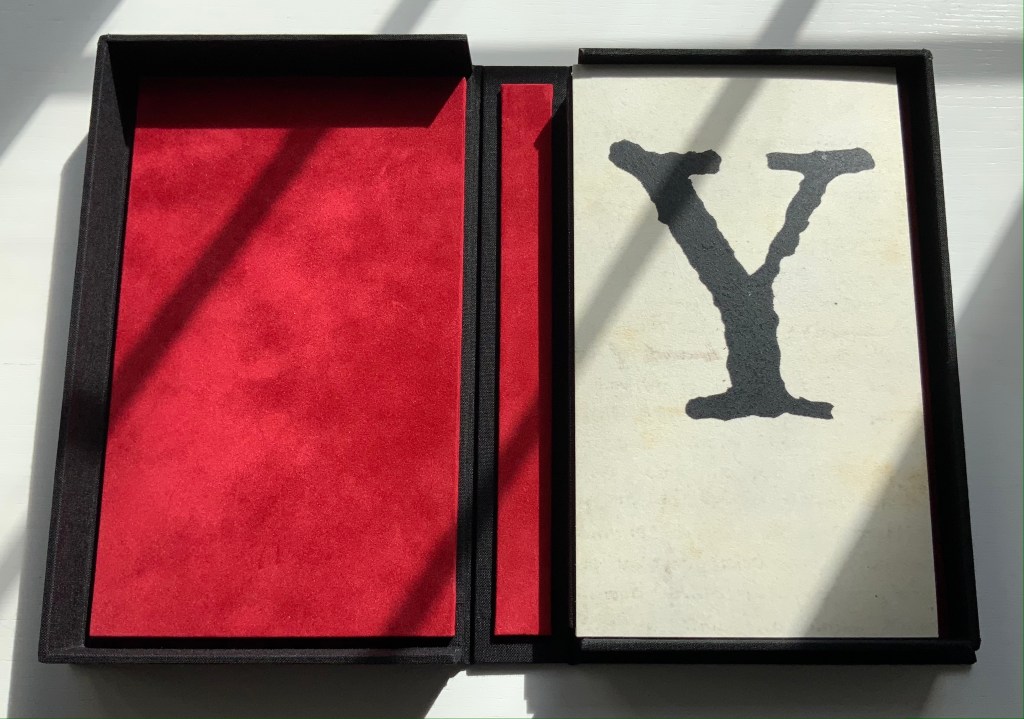
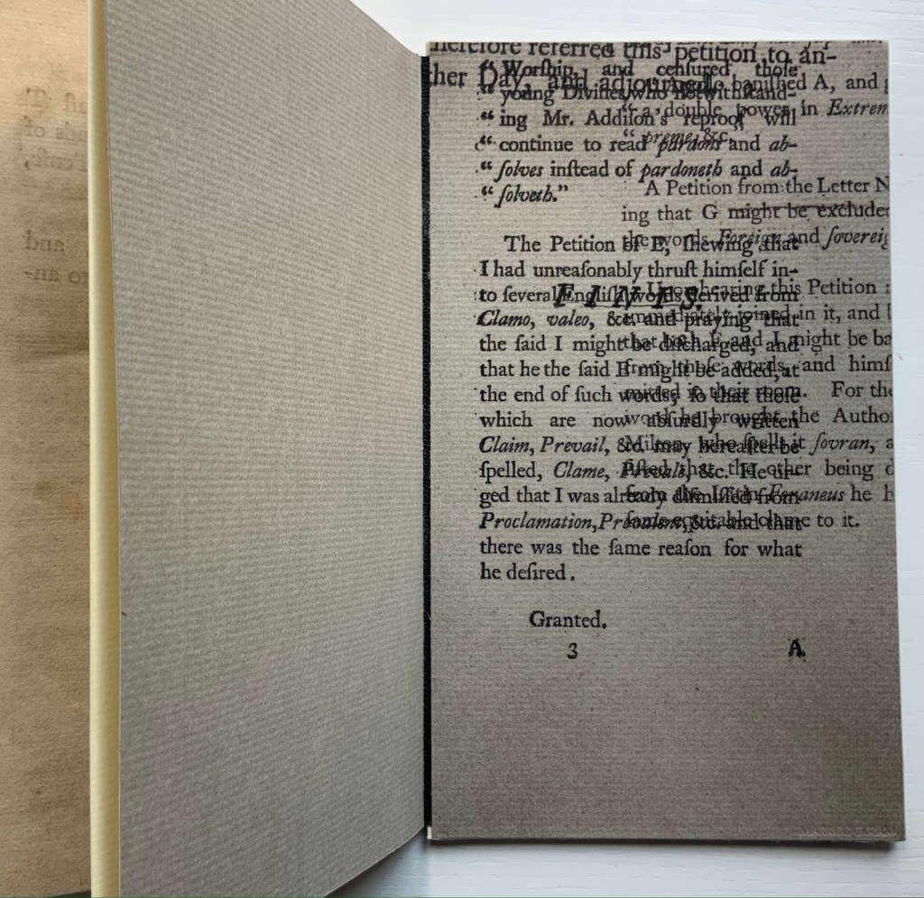
Note also how, inside and out, the front and back boards comment on the contents. The pamphlet’s title is echoed by the enlarged letters Y and ϒ. The faint palimpsest-like printing on the front and back covers (see above and below) and the overprinted inside covers echo the sourcing, disbound from an original binding.
And there is no missing Cockram’s fine press touch in the handling of the end papers and the spine’s red inner backing echoing the interior of the storage box.
Further Reading
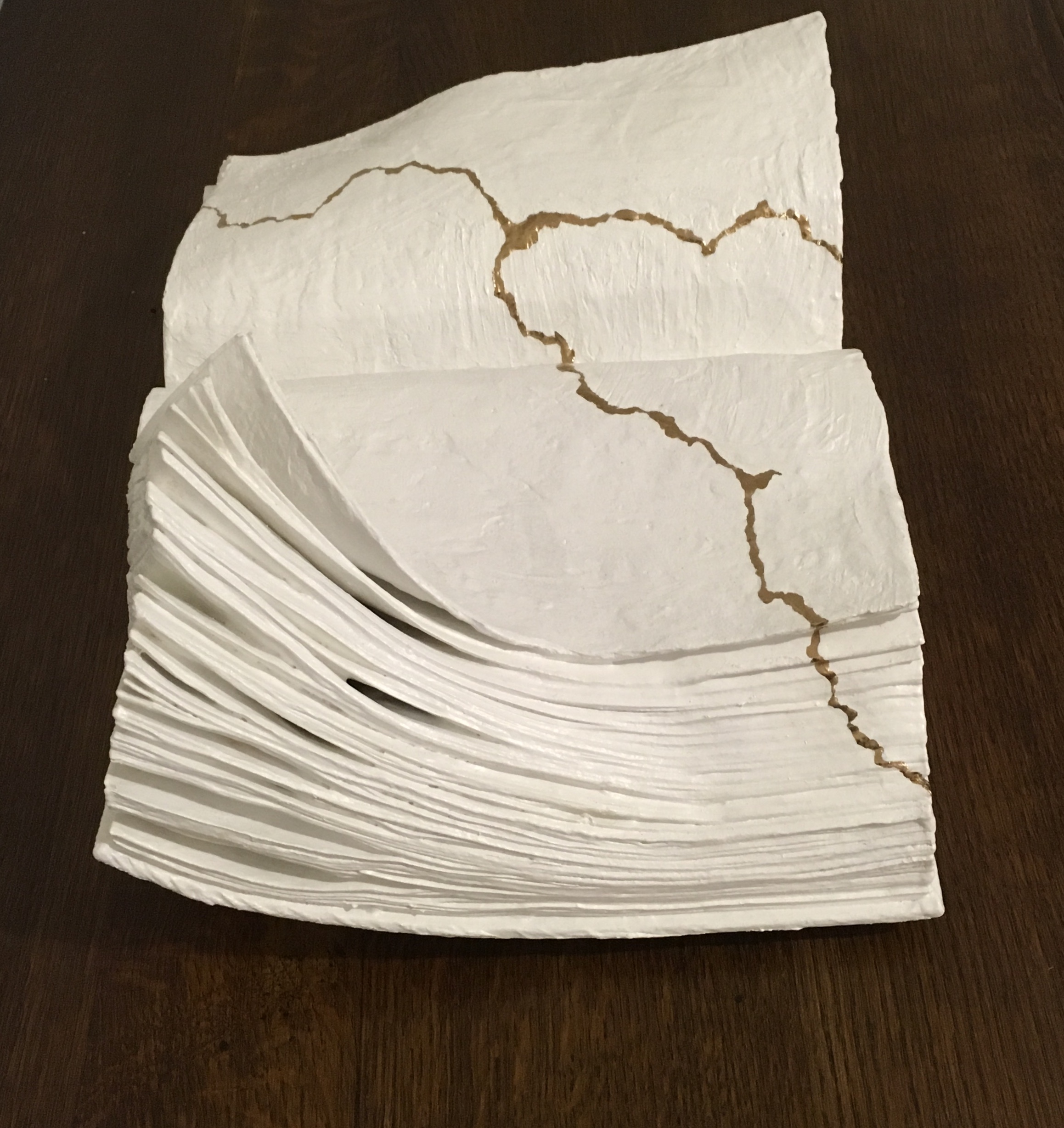
“Kintsugi“. 20 February 2019. Bookmarking Book Art.
Special thanks to William Laywood of Forest Books ABA-ILAB for explaining the notation from the English Short Title Catalogue pointing me down the road to discovering the Canons of Criticism and Professor Dussinger’s insights.
Dussinger, John A. 23 September 2004. “Thomas Edwards“, Oxford Dictionary of National Biography. Accessed 9 October 2021.
Dussinger, John A. 1 January 2016. “Johnson’s unacknowledged debt to Thomas Edwards in the 1765 edition of Shakespeare.” Philological Quarterly. In The Free Library, University of Iowa. Accessed 9 October 2021. Dussinger is quoting James Boswell’s Life of Johnson, ed. G. B. Hill, rev. L. F. Powell, 6 vols. (Oxford U. Press, 1934-1964), l:263n3.
And Viewing


Imre Flores. Showcased at the Weston Library, Oxford University, July – September 2022.

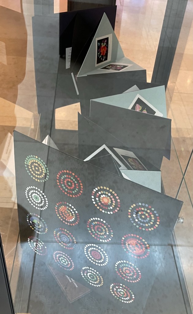
Winter’s Tale. Showcased at the Weston Library, Oxford University, July – September 2022.