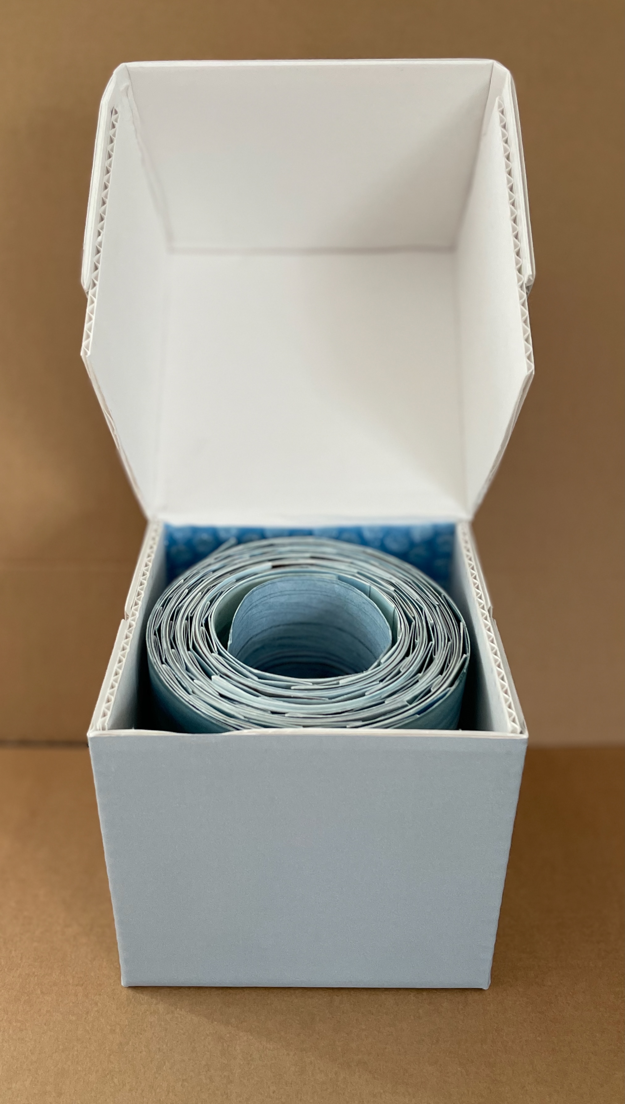
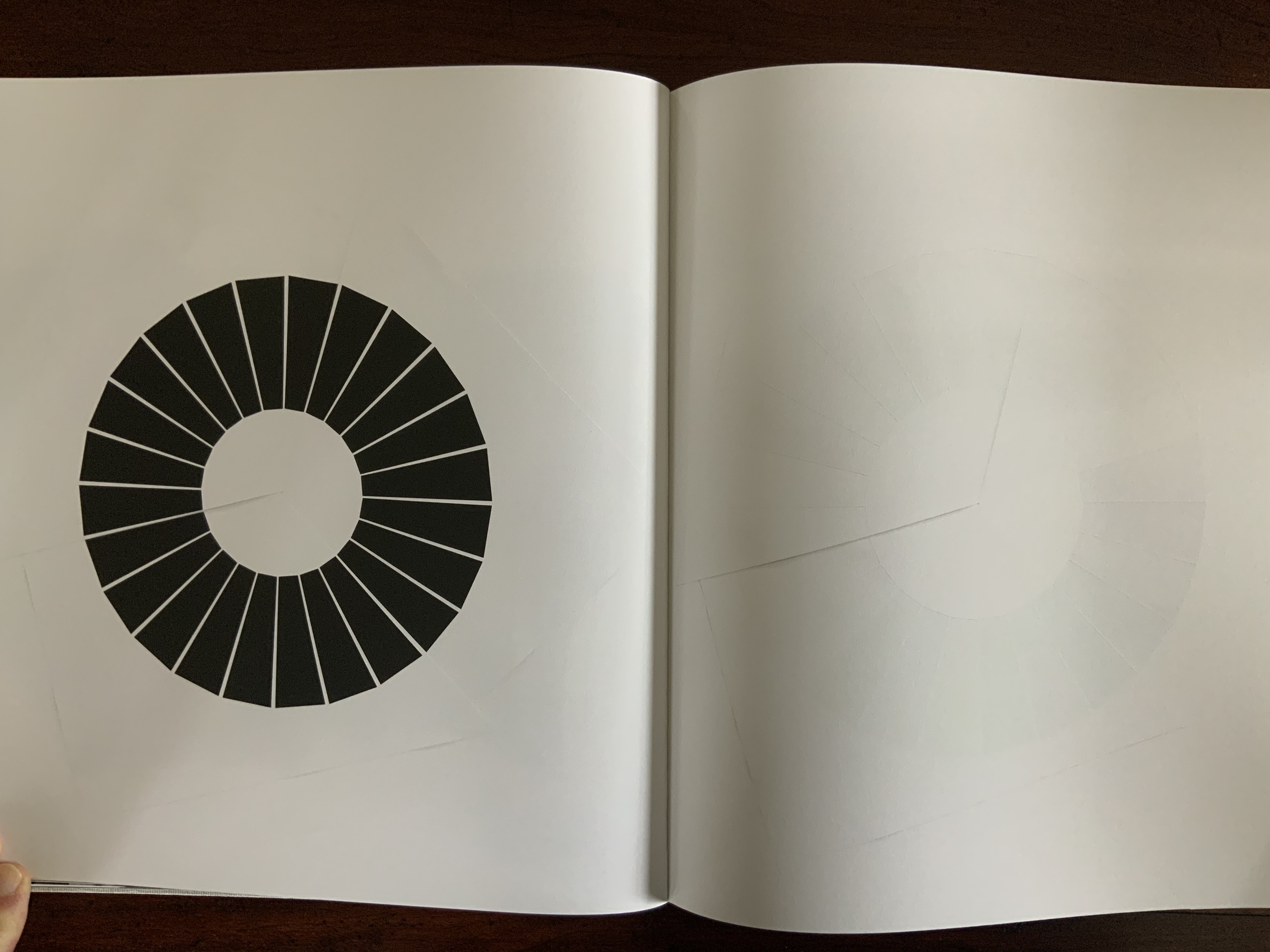
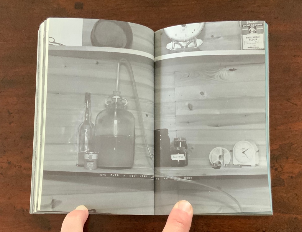
Watercourse I (2022) Barbara Hocker Scroll in variant dragon scale binding. L152 cm (variable) x W12 cm. 64 panels. Unique. Acquired from the artist, 10 February 2024. Photos: Books On Books Collection.
Works evocative of water often invoke a sense of meditative stillness, but Barbara Hocker’s Watercourse I prompts a sense of meditative activity. You can’t stop moving it about. Or if you’re not moving it, you find yourself moving around it to contemplate it. It is the layering of watercolor, sumi ink, photographic prints with archival inks on washi paper, and the ancient Chinese method of bookbinding called dragon scale (sometimes called “whirlwind” or “fish scale” binding) that achieves this. Traditionally, the binding method involves a long scroll of paper to which successively shorter folios are attached at one end, often secured with a bamboo rod. Hocker has modified this structure by attaching folios of the same size with hinges to the underlying long scroll at intervals allowing one folio to overlap the next and so on. In each case, the effect of the overlapping folios creates the appearance of dragon scales.
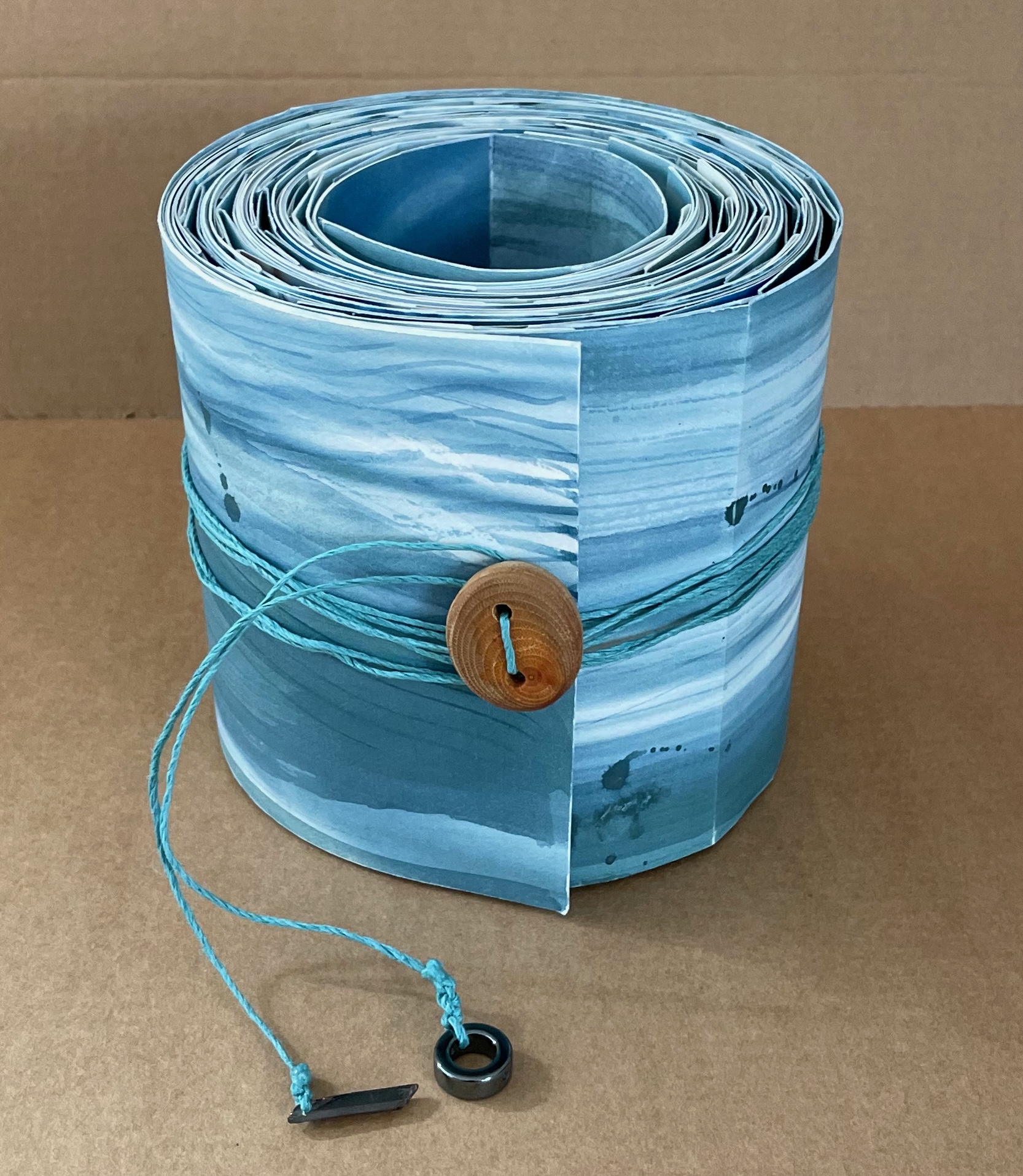
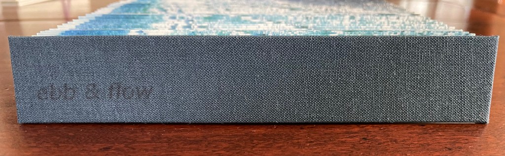
Ebb and Flow (2023) Jane Cradock-Watson Concertina book with cloth hard bound covers. H155 x W27 mm (closed), W680 mm (open). 64 panels. Edition of 20. Acquired from the artist, 21 January 2024. Photos: Books On Books Collection. Displayed with artist’s permission.
An exploration, both visually and physically, the ‘edge’ of the sea where it meets the land, with its continuous ebb and flow of the breaking waves, rhythmically rolling back and forth onto the sand. (Artist’s description)
With the binding and her photography in Ebb and Flow, Jane Cradock-Watson has sculpted and painted the sea’s edge. Four digital photographs printed on Zerkal paper have been spliced together between two cloth-covered boards. The flexibility and extent of the concertinaed paper create an undulating structure that turns seascape stills into mesmerising cinema.
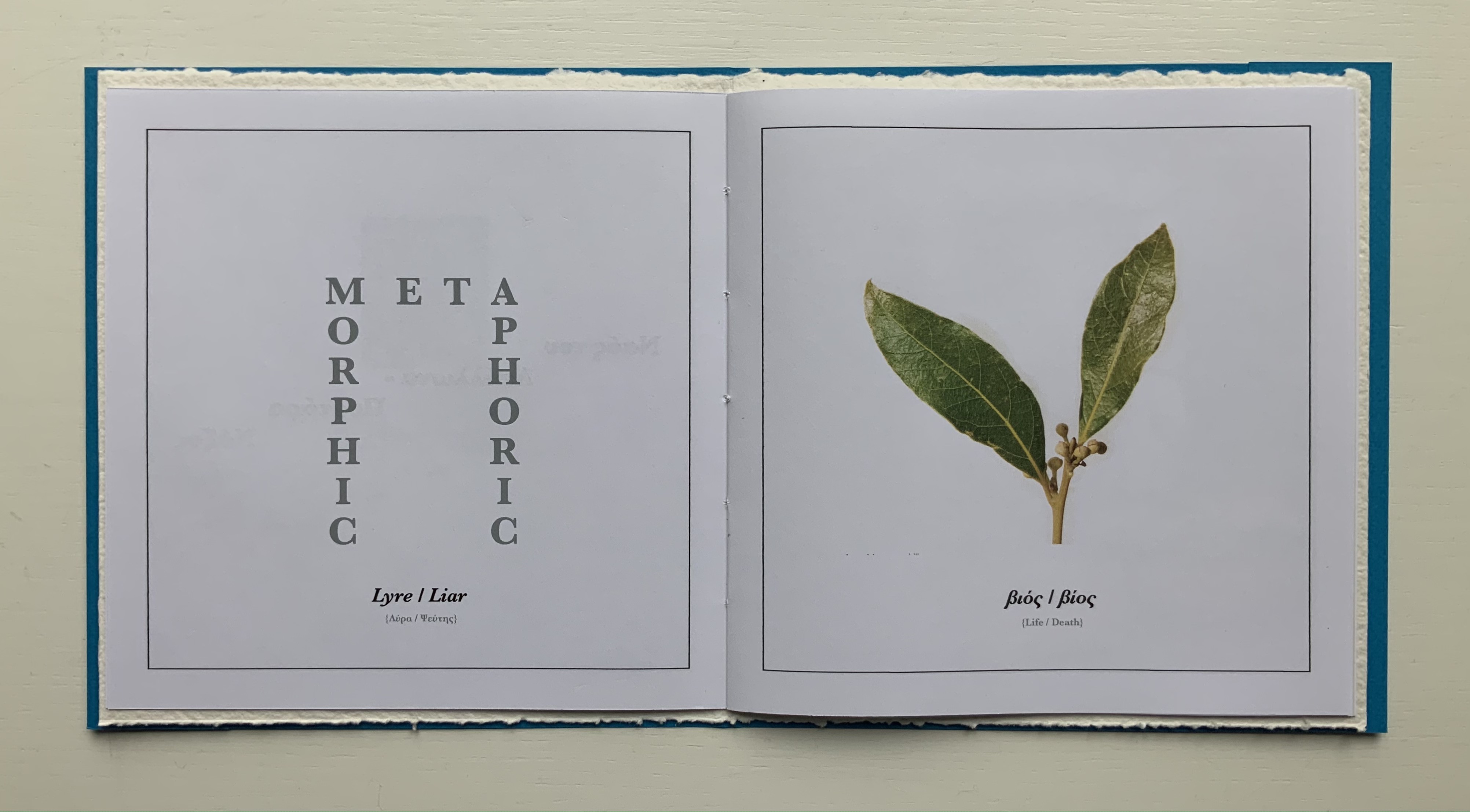
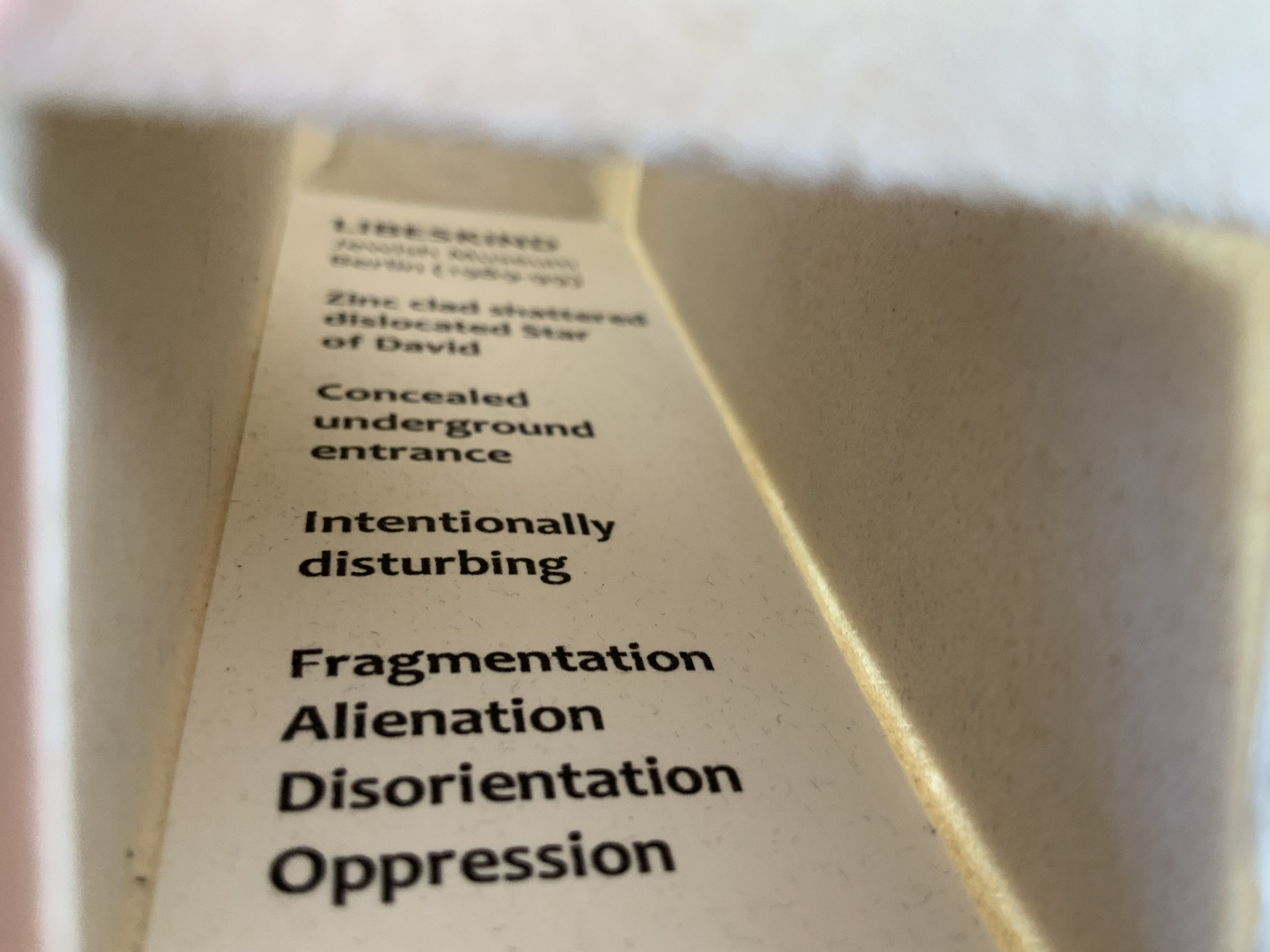
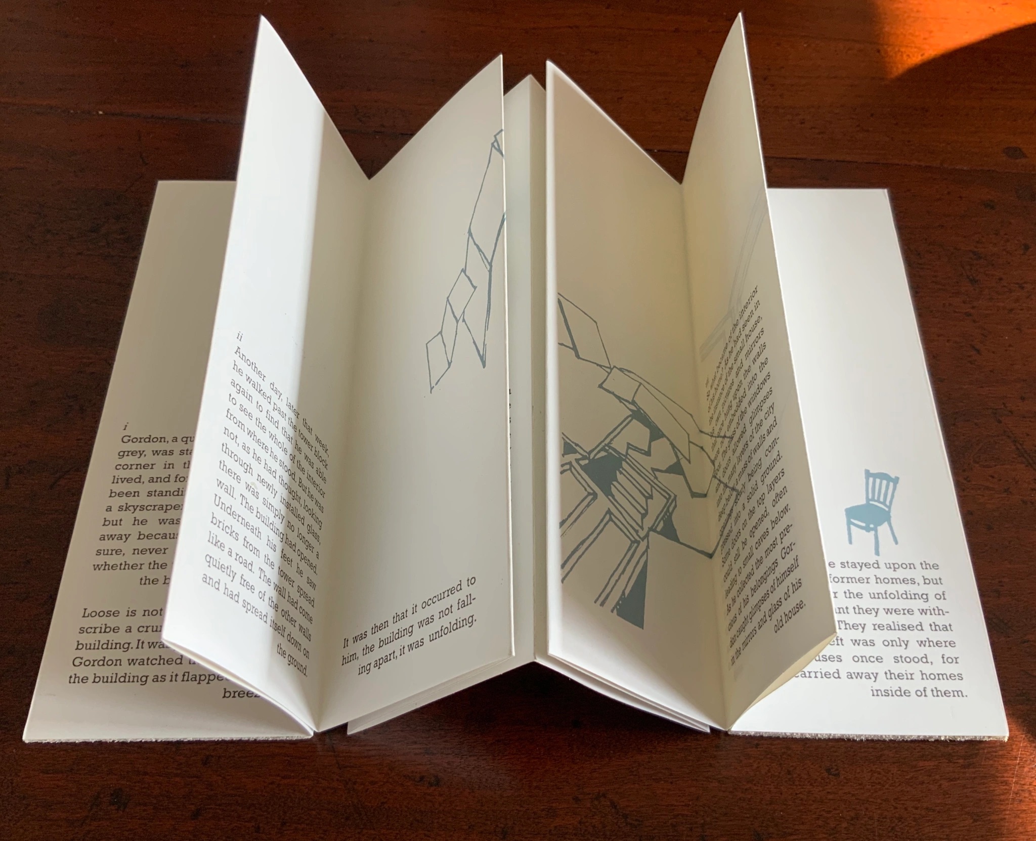
In Memoriam+ (2021) Alastair Noble Booklet thread-bound to HMP boards, cover with cutout. H210 x W205 mm, 12 pages. Edition of 22, of which this is #4. Acquired from the artist, 25 April 2021. Photos of the work: Books On Books Collection. Displayed with permission of the artist.
This work pays tribute to Ian Hamilton Finlay, whose Little Sparta, a garden across seven acres in Scotland, that expresses an artistic vision through typography, sculpture, installations and nature. Noble writes about the origins of his tribute:
I first visited Little Sparta twenty years ago and then again last year in July out of lockdown. Thereafter, coincidentally I found a brick buried in my garden with the work “Temple” embossed on it. Consequently this became the catalyst for a little homage in form of small installation in my garden that used the brick as a foundation to an arch made from white marble fragments that suggests the Portara for Apollo’s Temple Naxos. This installation became the stimulus for this small artist’s book completed during lockdown in my studio in Liverpool, UK. — Entry in Book Arts Newsletter, No. 138 March – mid-April 2021, p. 43.
Noble has expanded and intensified his small garden homage into a slender and rich work of book art. The sculpted structure of it — how the cover, pages, images and text work with each other — rhymes with Finlay’s art, Greek mythology and Nature. Noble’s choice of the portal to Apollo’s Temple to link the found brick and arch of marble fragments to Little Sparta and Finlay’s art finds one of its echoes in the cover’s cutout and the marble-white textured board behind it. Another echo lies in the words “metamorphosis” and “metaphoric” laid out to form an arch on the page below. And just as sonic echoes overlap one another, the words and image themselves echo across the double-page spread with the laurel leaf emblem of Daphne’s transformation to escape the pursuit of the lyre-bearing sun god and mythic patron of poets laureate.
Other overlapping echoes arise from the Greek and English word pairs on the double-page spread below. The presence of the Greek words obviously chime with Apollo’s Temple, but the presence of the English chimes more deeply with the word “metamorphic”. What is a translation if not a metamorphosis? And the rhyming of “lyre” and “liar” chimes even more deeply with “metaphoric”. What is a metaphor if not like a lyre and liar at the same time that tells us Daphne’s death is her translation into life as a tree?
Noble’s use of “meta” for his arch’s lintel also echoes Finlay’s aphoristic concrete poetry, a good example of which is The Errata of Ovid.
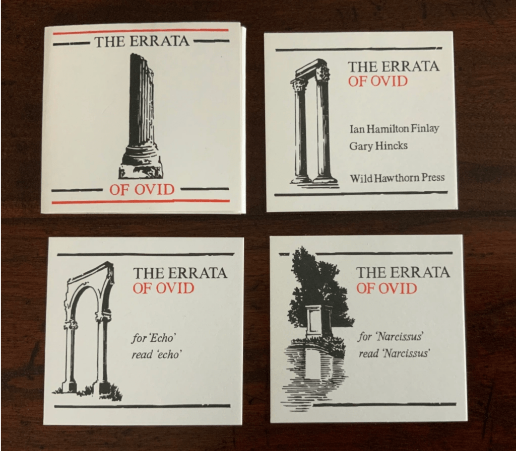
The Errata of Ovid (1983/4) Ian Hamilton Finlay, Gary Hincks Miniature portfolio. H76 x W80 mm. Offset printed in red and black, eight loose cards enclosed in a flap folder. Typeset in Bruce Old Style(?); illustrations by Gary Hincks; card stock unknown. Acquired from Woburn Books, 31 October 2019. Photos: Books On Books Collection
Beyond the tribute of image/word-play, Noble’s artist’s book strikes a performative echo with the history of Finlay and Hincks’ artists’ book. A few years after the publication of The Errata of Ovid, Finlay drew up ”Six Proposals for the Improvement of Stockwood Park Nurseries in the Borough of Luton”, which included a caprice with a wall and plaques. The wall in Stockwood Park stands today, presenting the text of The Errata of Ovid engraved in eight stone plaques (minus the colophon but with the addition of “For ‘Adonis’ read ’Anemone’”). So Noble’s artist’s book followed his garden installation whereas Finlay’s garden installation followed his artist’s book. If only for perfection of that echo, one might wish Finlay’s installation be transported to Little Sparta and let Luton be satisfied with its airport!
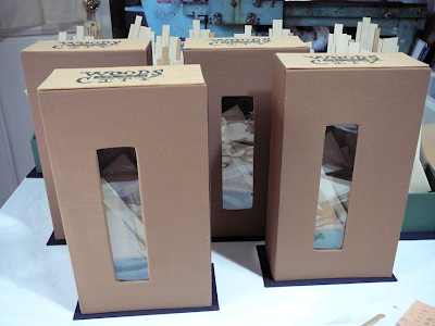
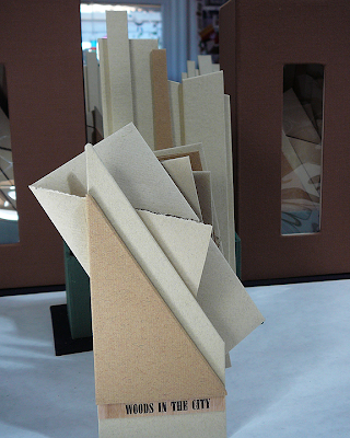
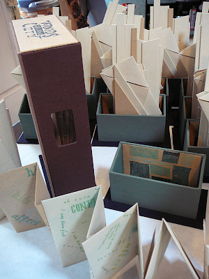
Thresholds (2020)
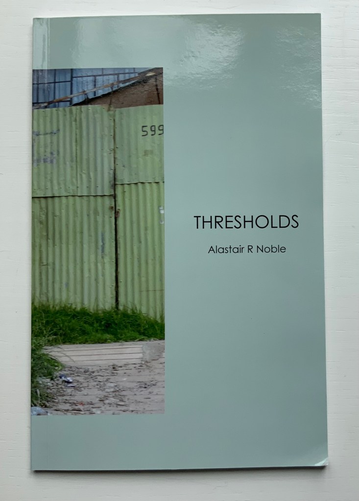
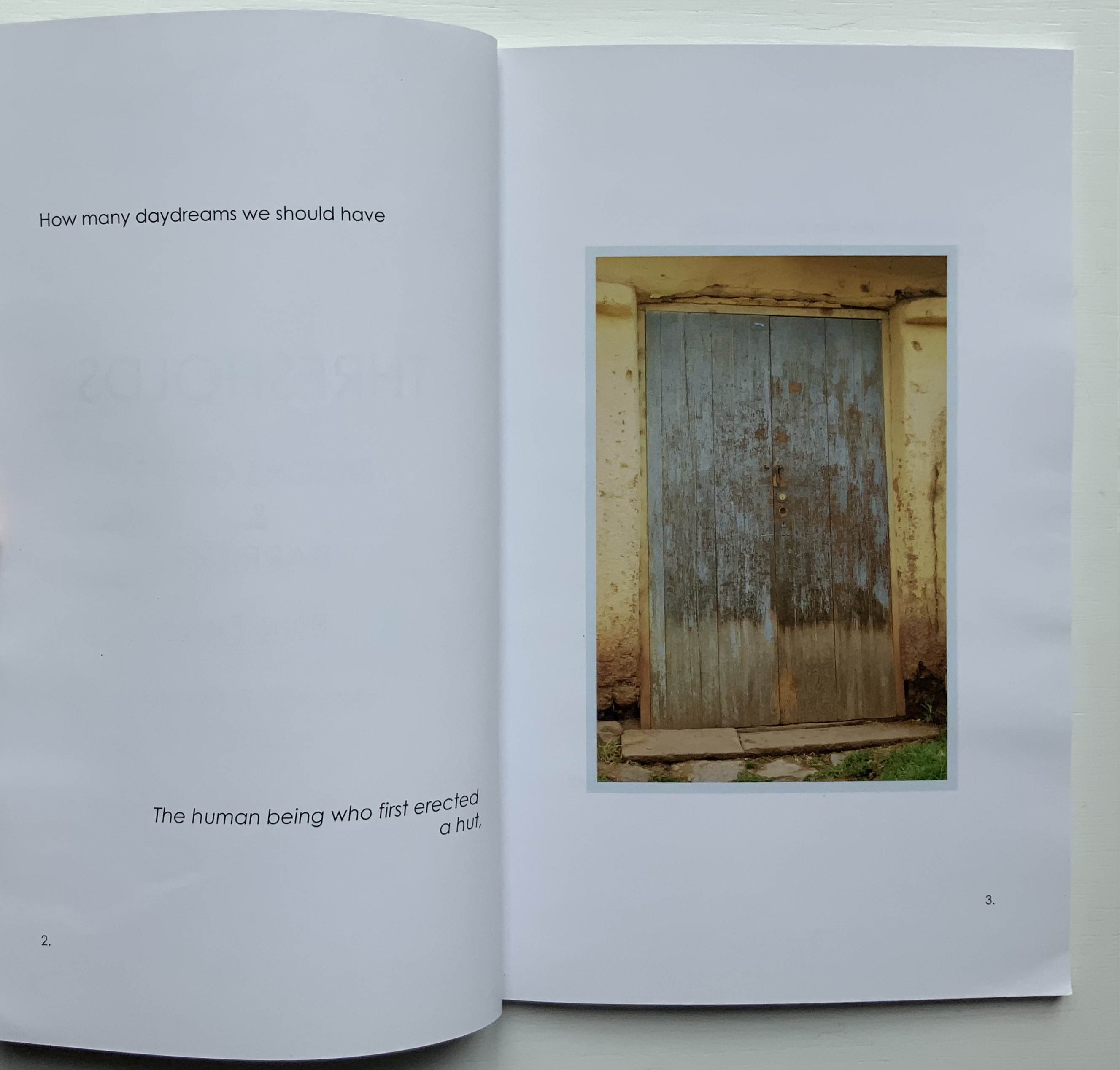
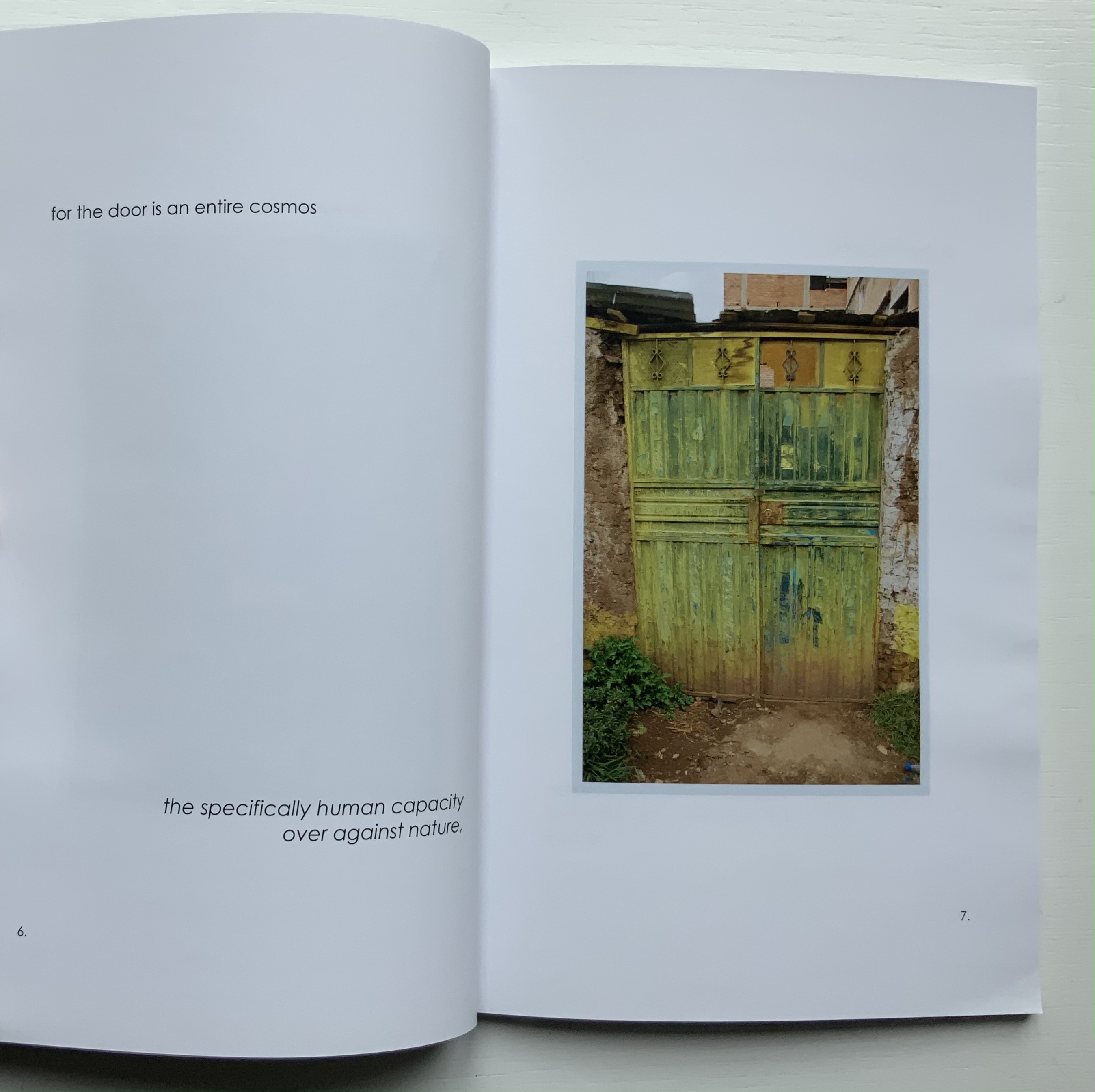
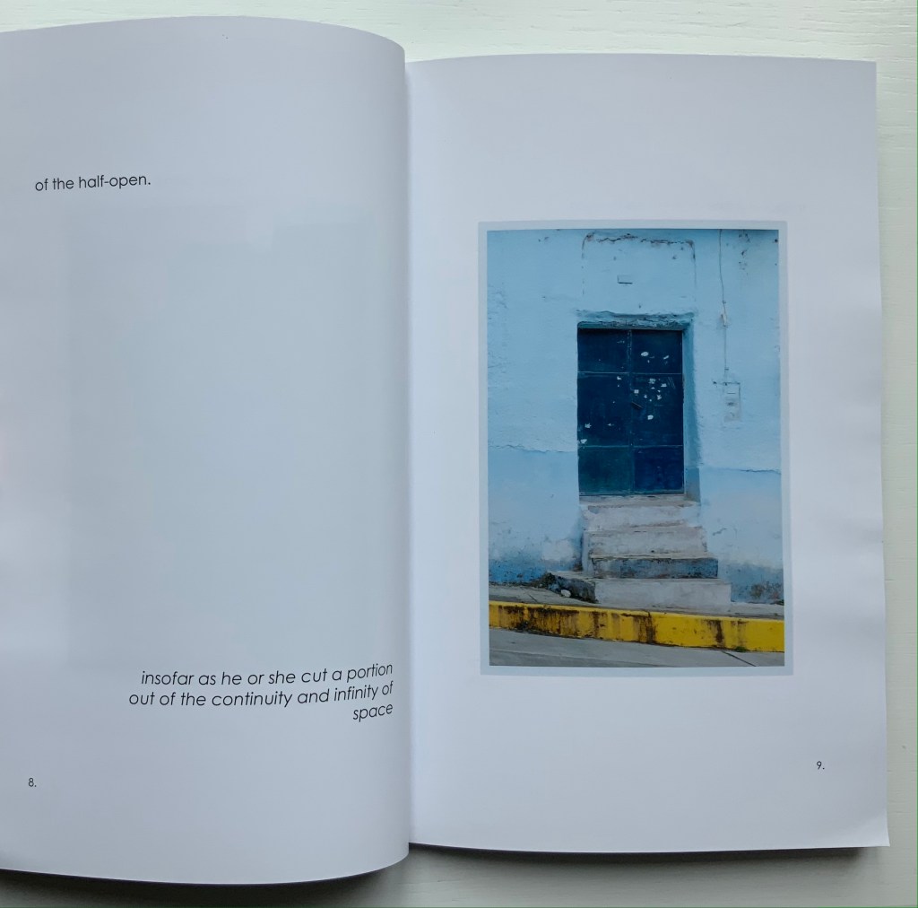
Thresholds: Doors, Gates & Barriers Puno Peru (2020) Alastair Noble Perfect bound paperback. H215 x 140 mm, 48 pages. Acquired from the artist, 11 May 2021. Photos of the work: Books On Books Collection.
Like In Memoriam+, this work has its roots in location and a portal metaphor. While also employing juxtaposition of text and images as a structural device, it relies on images of a category of sought readymades (doors, gates and barriers) rather than a found object (like the garden brick on which the artist builds his arch) for a structuring device that is simultaneously material and metaphor.
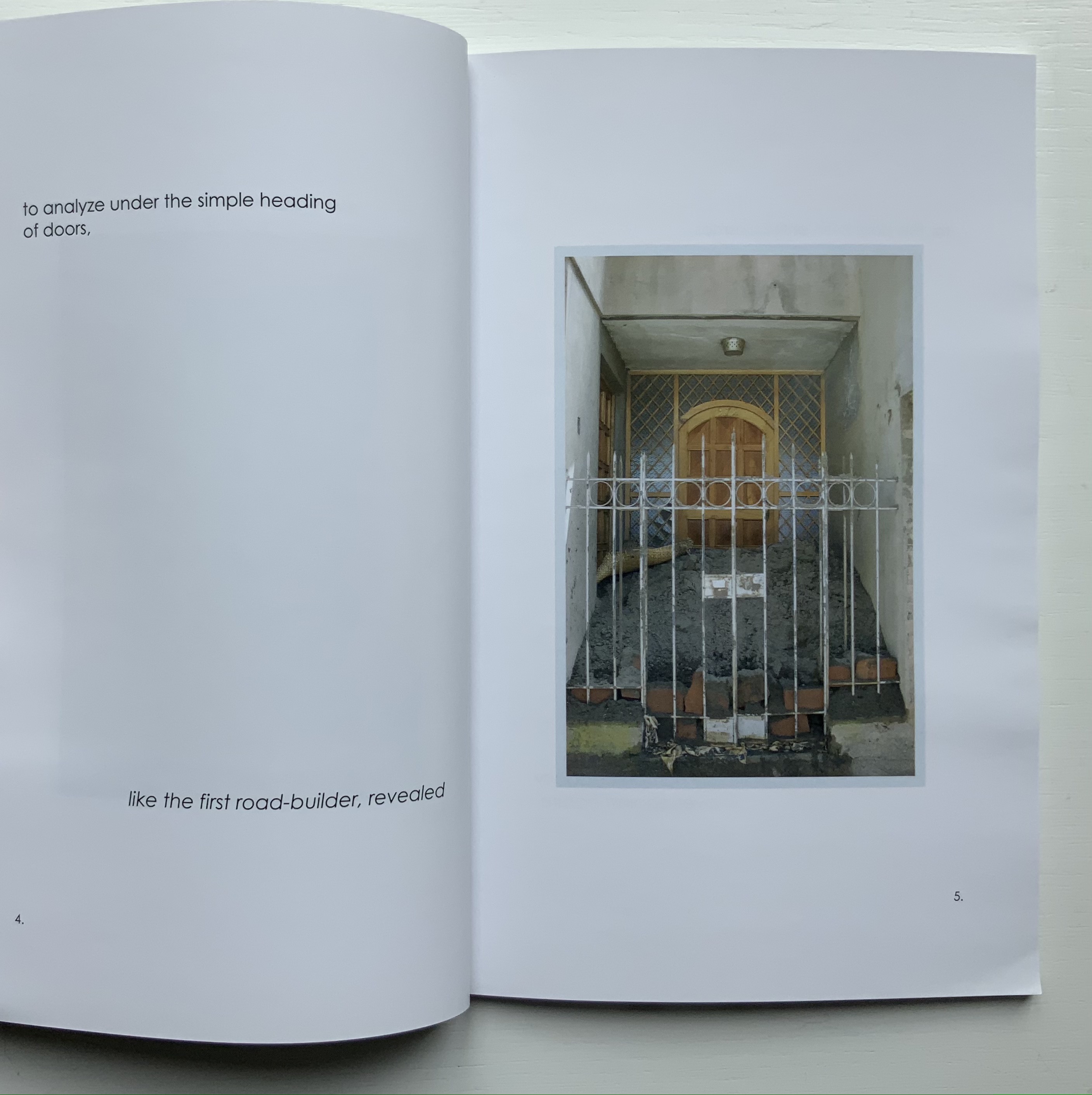
The way Noble uses his sources of text (Gaston Bachelard’s The Poetics of Space, Martin Heidegger’s “Building Dwelling Thinking” and Georg Simmel’s Bridge and Door) causes the reader/viewer to contribute to structure and metaphor. The first sentence of Bachelard’s excerpt begins “How many daydreams” and starts at the top of page 2; Heidegger’s beginning “The threshold” starts in the middle of page 26; and Simmel’s beginning “The human being” starts at the bottom of the page 2. Bachelard’s first sentence ends on page 8, Heidegger’s on page 28, and Simmel’s on page 12. Unless one has the mind of a symphonic composer or connoisseur, it is impossible to attend to all three excerpts simultaneously and turn the pages in one sequence. Instead, it is necessary to turn the pages back and forth along three tracks to absorb the excerpts, and the metaphoric effect is to open and close those doors, gates and barriers repeatedly, which is …
… what Noble’s very last page implies.
But finally, over the course of multiple readings/viewings, the linear photographic sequence on the recto pages seems to shift. Each image takes on a different aspect depending on the excerpt being followed. Combined with the back and forth page-turning, this shifting and break in the linear photographic sequence leaves the reader/viewer with the simulation of walking around, up and down and through Puno and its doors, gates and barriers.
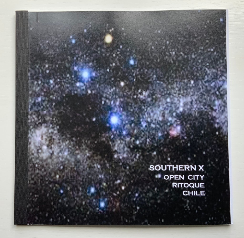
Southern X 2006 : Open City, Ritoque Chile (2006)
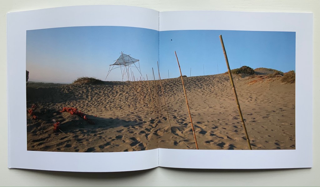
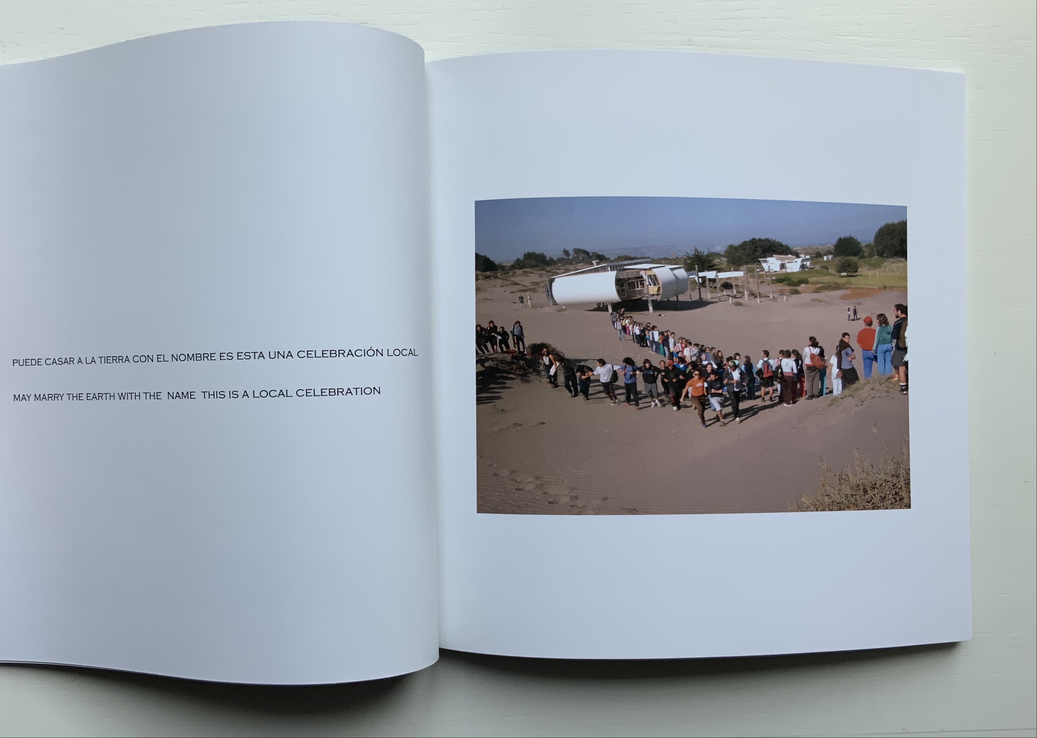
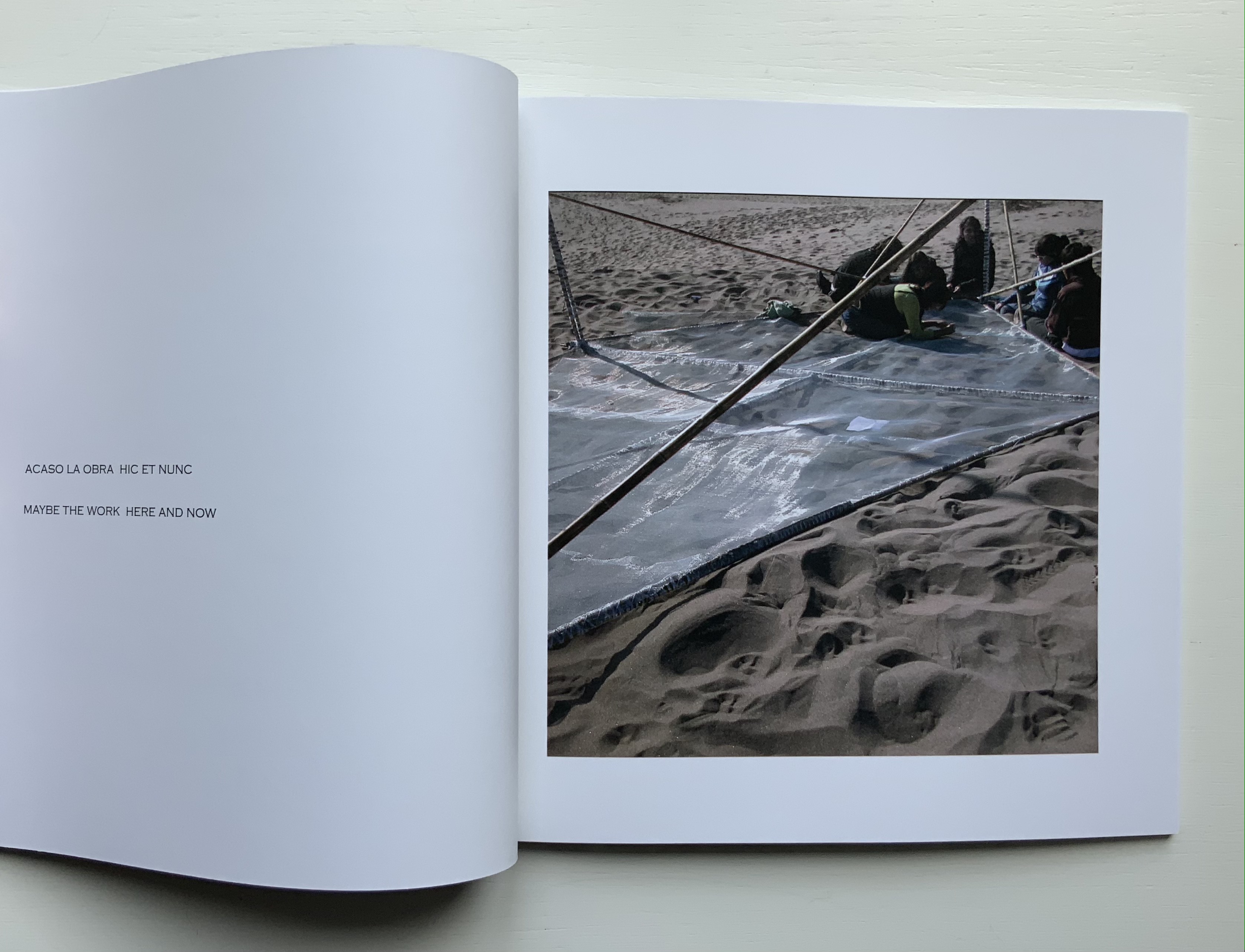
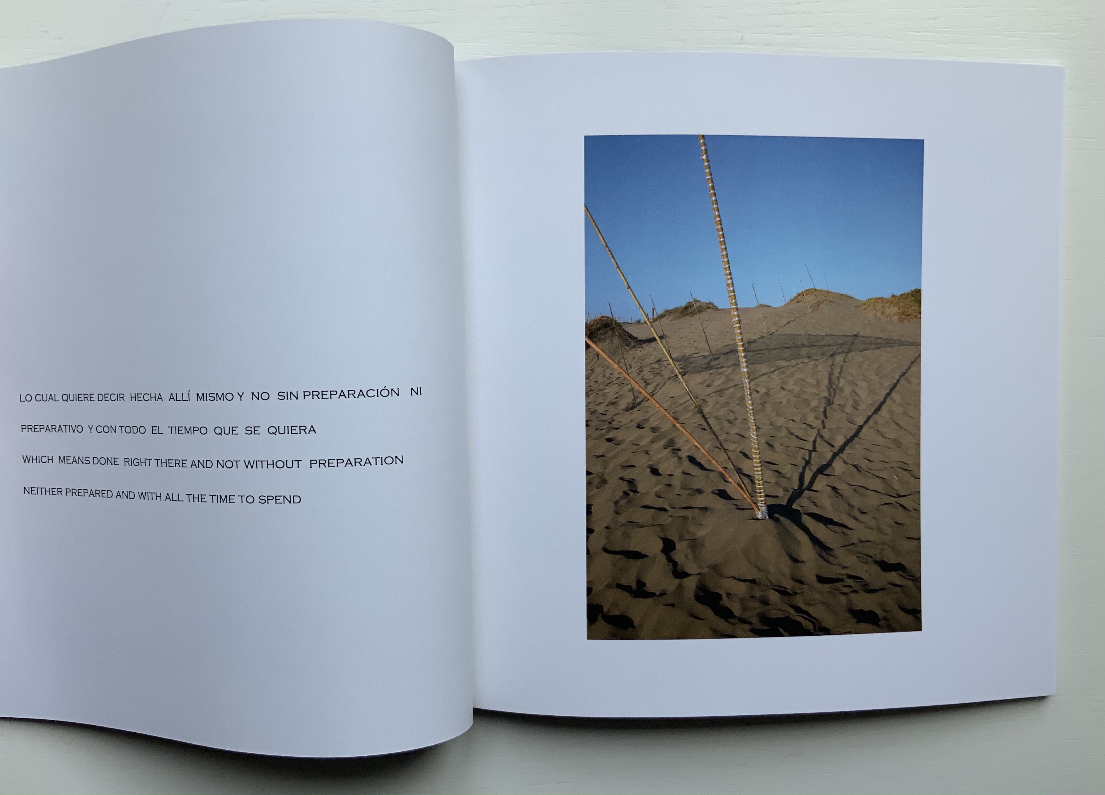
Southern X 2006 : Open City, Ritoque Chile (2006) Alastair Noble Perfect bound paperback, spine taped. H215 x W218 mm, 32 pages. Acquired from Specific Object, 2 May 2021. Photos of the work: Books On Books Collection.
Like Thresholds, this work, too, has its roots in location, but more akin to In Memoriam+, it draws on poetry, installation and performance. Open City is a utopian site affiliated with the School of Architecture of the Catholic University of Valparaíso. Accommodations and buildings have arisen by collective collaboration. There is no plan. One of the traditions associated with construction on the site is the reading of excerpts from the book Amereida (1967), a collective epic poem, which the school describes as “a poetic vision of the American continent”.
Reading the text takes us into the permanent question about being American from the recognition of the appearance of America seen as a discovery or gift. From the first page of the poem, the encounter with the unknown opens the possibility to begin to think of the new world as a gift, a gift. Its main sign: the Southern Cross, the light that goes up the horizon and guides in the north. — “Amereida“
Inspired by the Amereida during a sabbatical visit to the school and Open City, Noble proposed an installation: Southern X 2006. Given that the Amereida takes the Southern Cross for its main sign and that this sign appears across the night sky in the shape of a kite, Noble’s direction for his installation sculpture was set before he began.
The actual sculpture is but a piece of a larger collective artwork consisting of Manuel F. Sanfuentes Vio’s reading from the Amereida, the students’ procession in the shape of the Southern Cross to the site selected by Noble, the collective construction of the kite, the planting of poles and the placement of the kite on them — and of course this book that photographically documents the performance of the installation and textually presents the read passages of the Amereida.
Foldings (1998)
Ephemera for Foldings (1998) Kathy Bruce and Alastair Noble. Poster and staging sketches. Photo: Books On Books Collection.
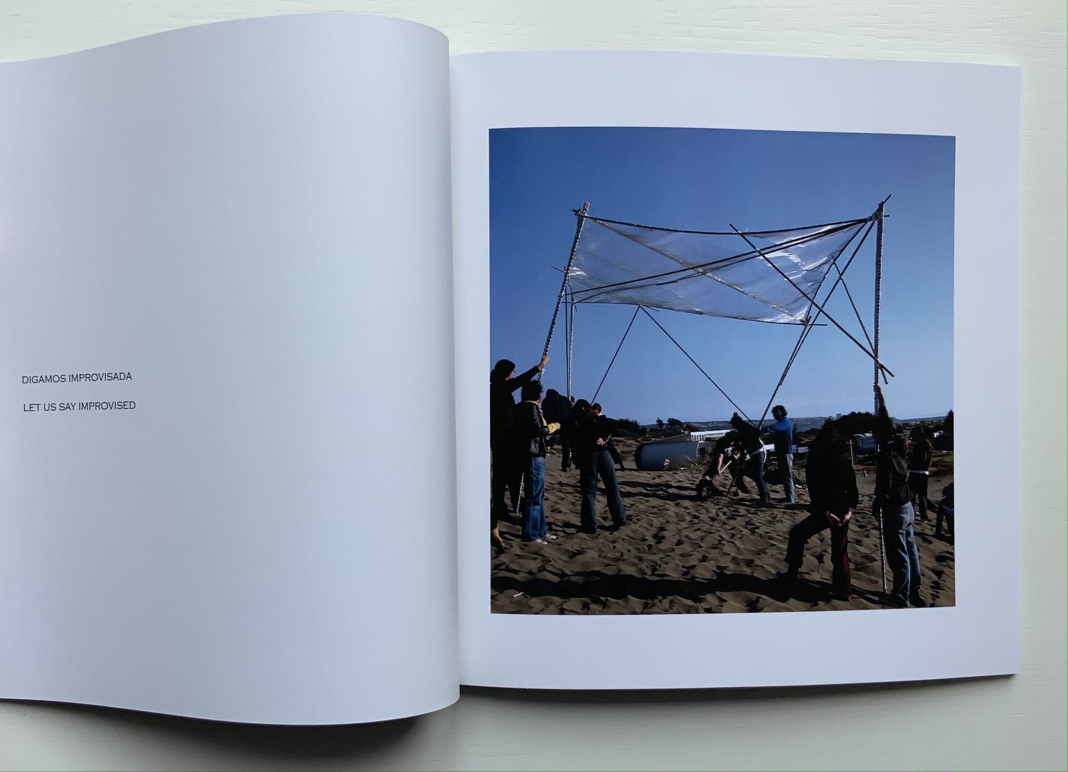
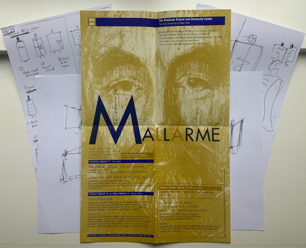
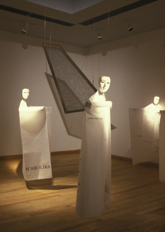
With Foldings, Noble joined forces with Kathy Bruce, his wife. Six masked dancers wear costumes that are in effect human-size folios across which the pages of Un Coup de Dés have been printed front and back in French. As a prerecorded English translation is read by numerous voices corresponding to the changing fonts, the dancers rotate and display the lines being read. A performance was given as part of the exhibition A Painter’s Poet, held at the Leubsborf Art Gallery (Hunter College). This fell under the aegis of the Millennium Mallarmé celebrations in New York, the poster for which can be seen above overlaying the staging sketches for the performance. Later, as part of an installation under the title Navigating the Abyss (Brookdale Community College, Lincroft, New Jersey), the costumes were suspended from the ceiling along with a framed screen mesh reminiscent of Noble’s As if / As If (see above).
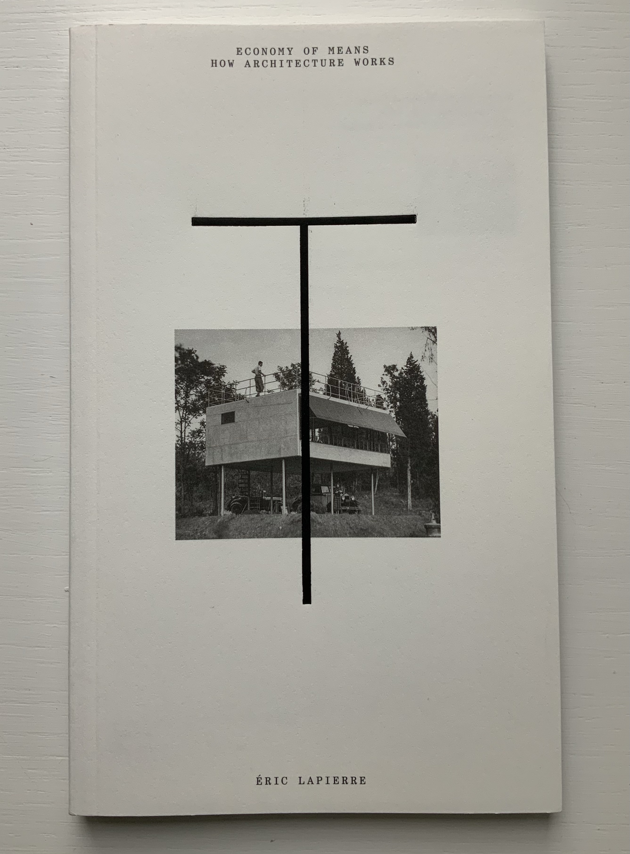
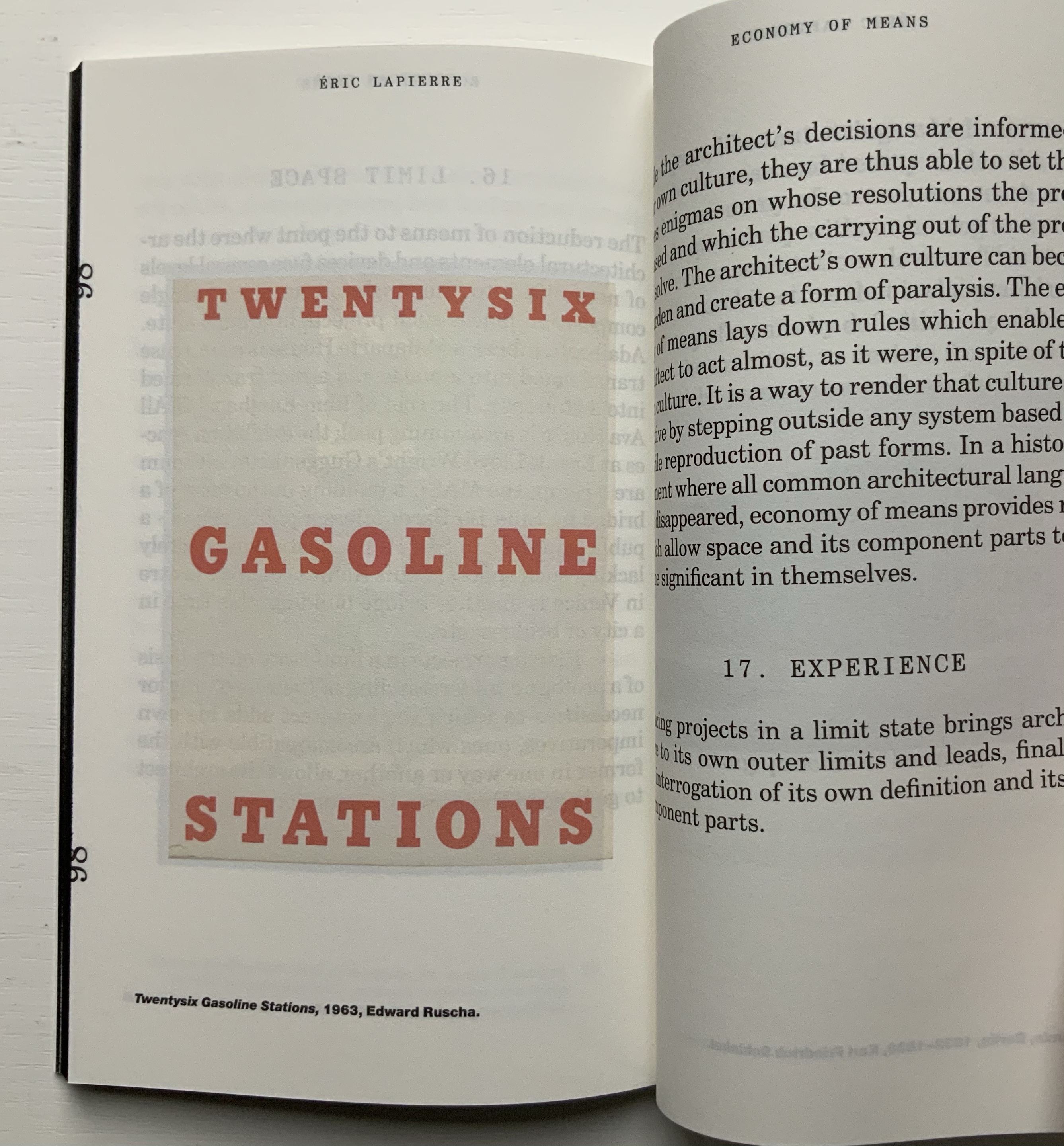
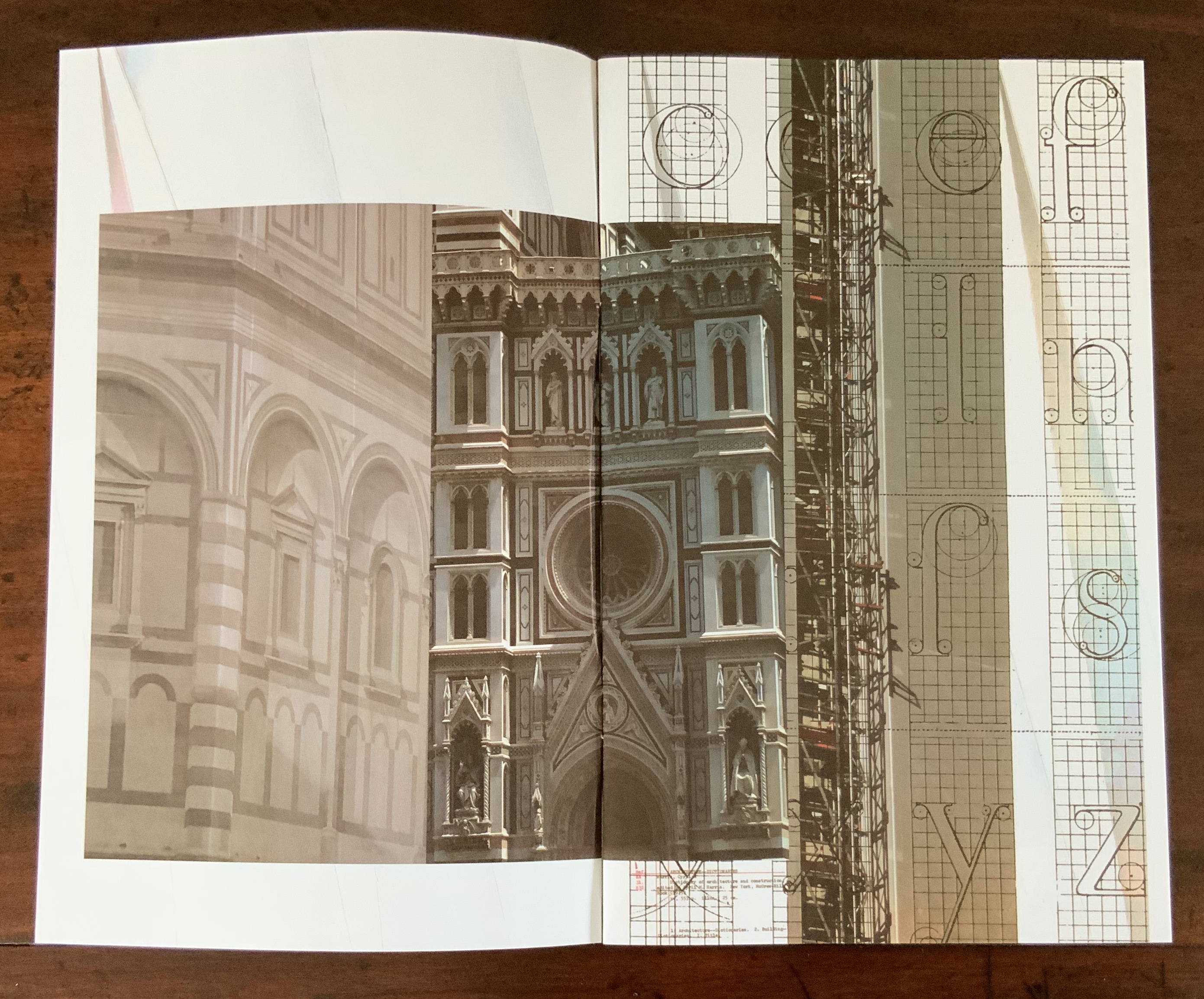
“The Poetics of Reason” was the title and theme for the fifth Lisbon Architecture Triennale in 2019 (the first was in 2007). Awarded the ADG Laus 2020 Golden Prize in the category of editorial graphic design, this work stands well with Bruno Munari’s three small 1960’s books on the square, circle and triangle, now available in a single volume, and calls to mind several works testifying to the relationship between architecture and book art. In the first of the five volumes, Éric Lapierre even interweaves with his text on architectural rationality illustrations from book artists such as Bernd and Hilla Becher, Sol Lewitt and Ed Ruscha — all without comment, in itself conveying their implicit relevance. His similar display of a page from Stéphane Mallarmé’s Un Coup de Dés Jamais N’Abolira le Hasard — that progenitor of modern and post-modern book art — speaks to the role that space — les blancs, as Mallarmé calls it — plays in these adjacent communities.
136 pages
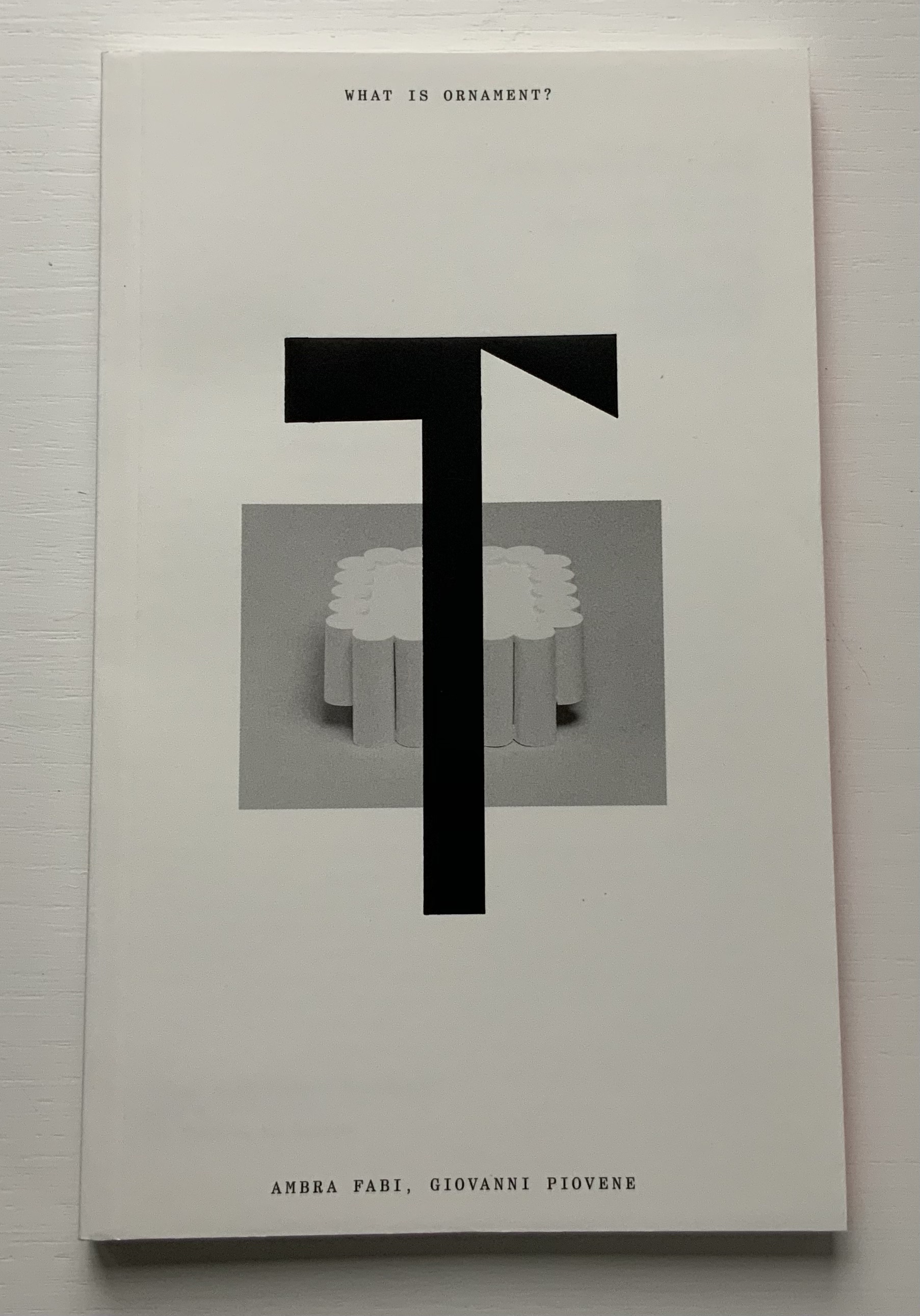
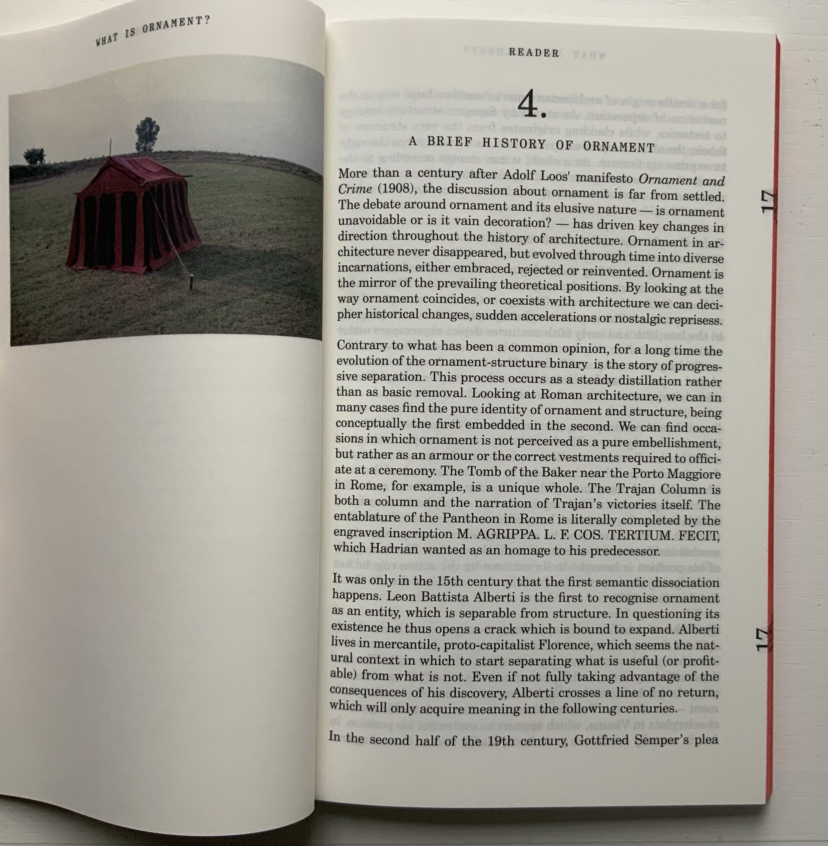
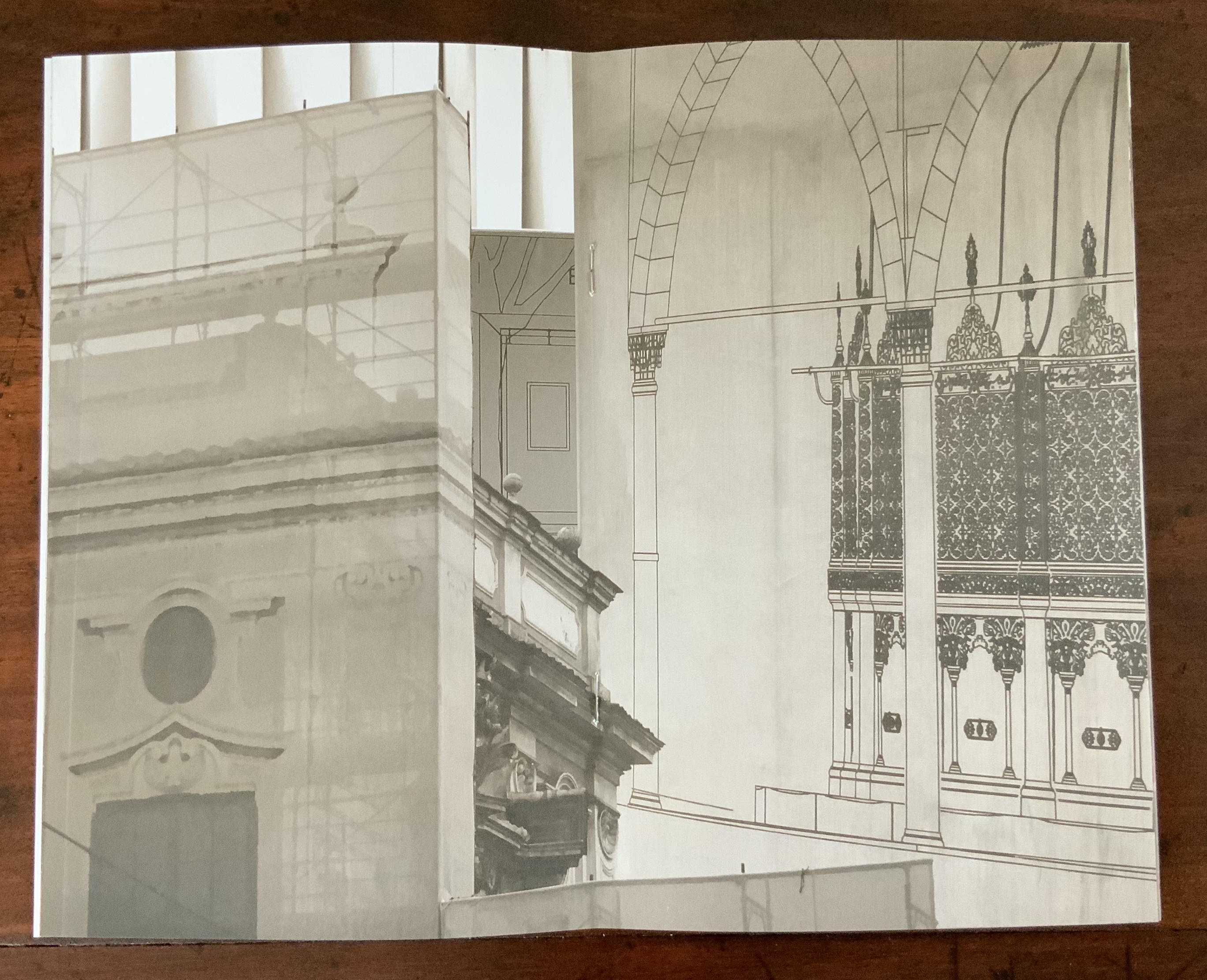
The second volume, by Ambra Fabi and Giovanni Piovene, draws in Leon Battista Alberti, of course, whose columns ornament works by Mari Eckstein Gower, Helen Malone and many other book artists.
136 pages
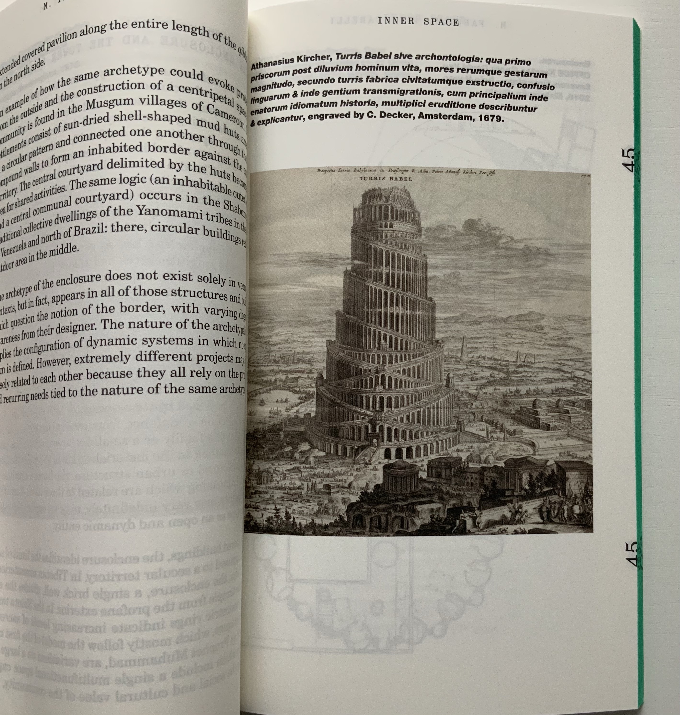
Drawing on Gaston Bachelard and Juhani Pallasmaa as it does, the third volume, by Mariabruna Fabrizzi and Fosco Lucarelli, calls to mind the work of Olafur Eliasson and Marian Macken here in the Books On Books Collection and elsewhere. Anyone familiar with Richard Niessen’s The Typographic Palace of Masonry will appreciate Fabrizzi and Fosco’s exploration of where architecture, imagination and memory intersect.
136 pages
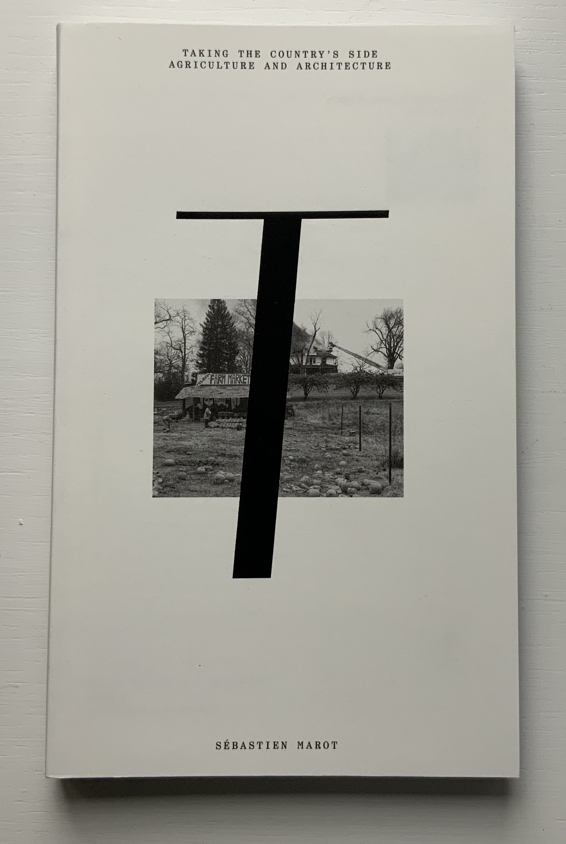
In the lengthiest of the five volumes, Sébastien Marot takes us into the territory of urban architecture and the anthropocene, also occupied by book artists Sarah Bryant, Emily Speed, Philip Zimmermann and many others.
216 pages
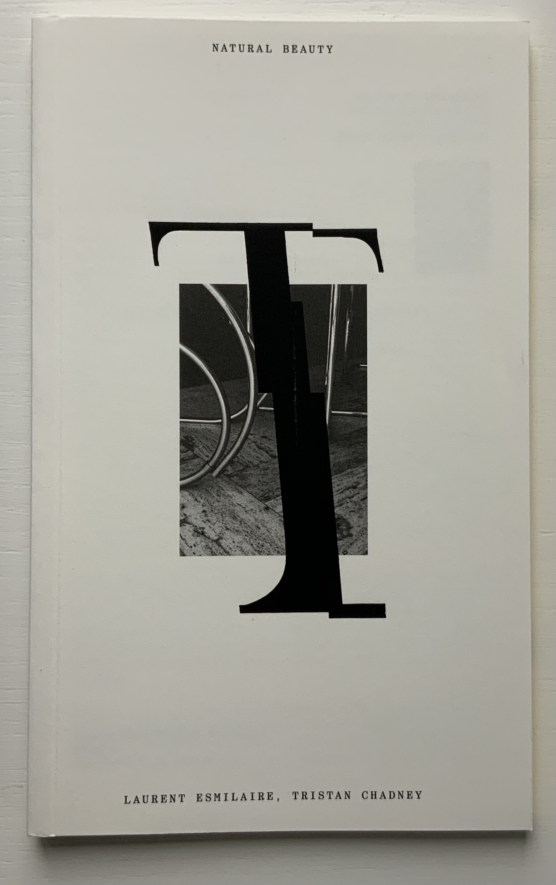
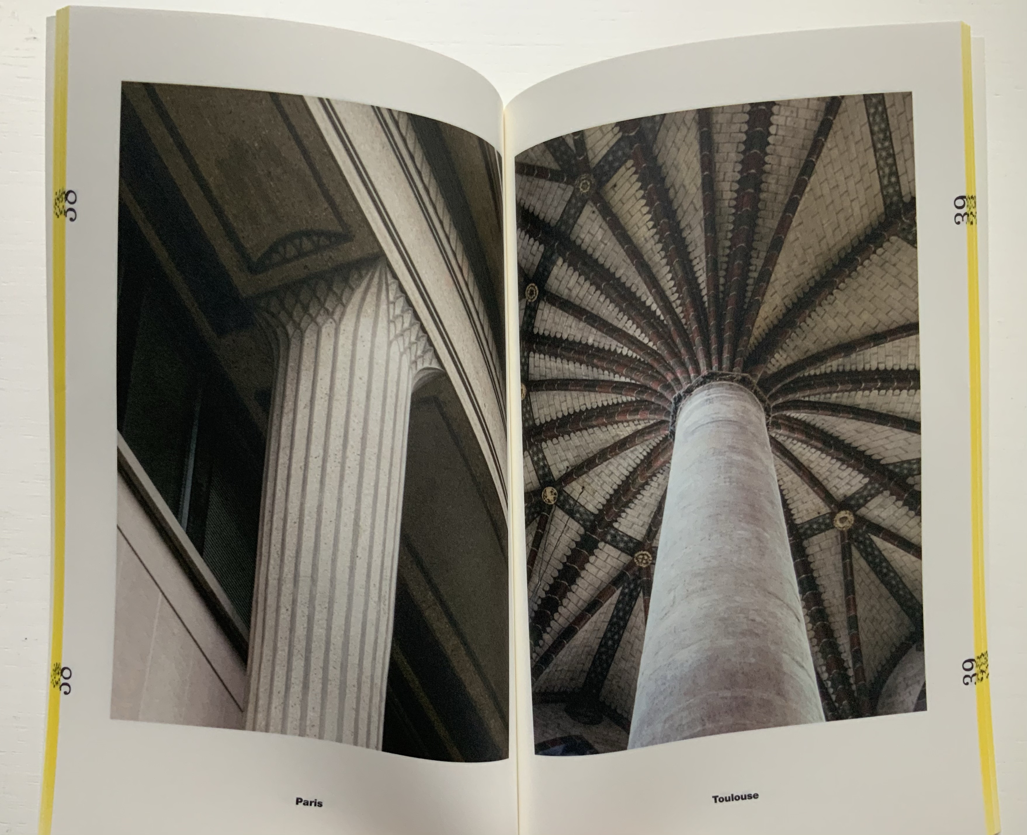
The last and shortest volume, put together by Laurent Esmilaire and Tristan Chadney, consists mostly of photos that may remind the viewer of Irma Boom’s Elements of Architecture, with Rem Koolhaas, or Strip, with Kees Christiaanse — especially in conjunction with the tinted fore edges.
88 pages
Referenced below, Pedro Vada’s review of the Triennale and the five separate sites across which it occurred in Portugal provides more insight into the five volumes themselves. Marco Ballesteros LETRA website provides additional images of the five volumes’ design.
Further Reading
“Architecture“. 12 November 2018. Books On Books Collection.
SOCKS Studio, an extraordinary website run by Fabrizzi and Lucarelli.
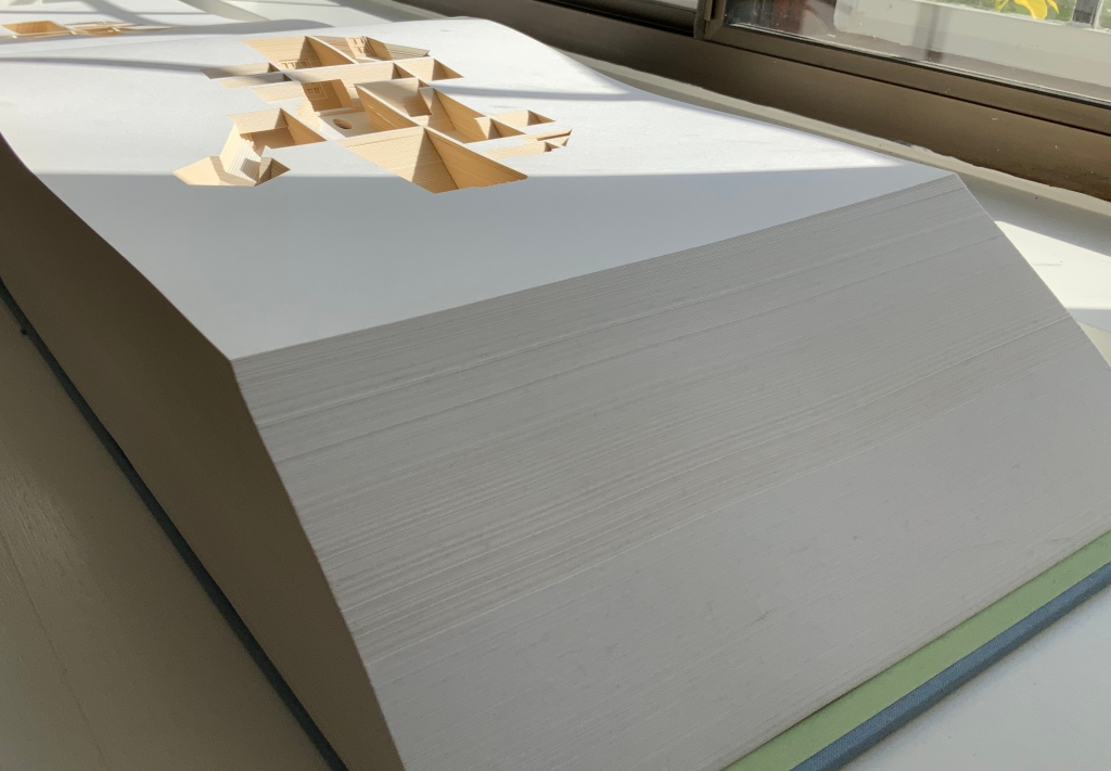
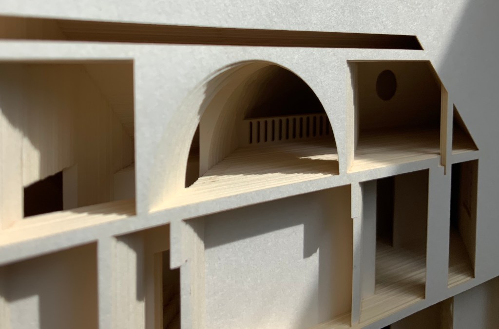
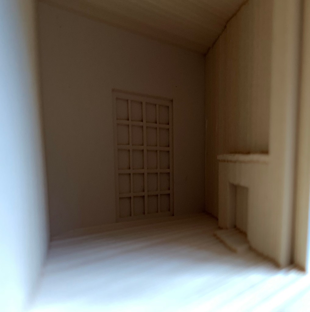
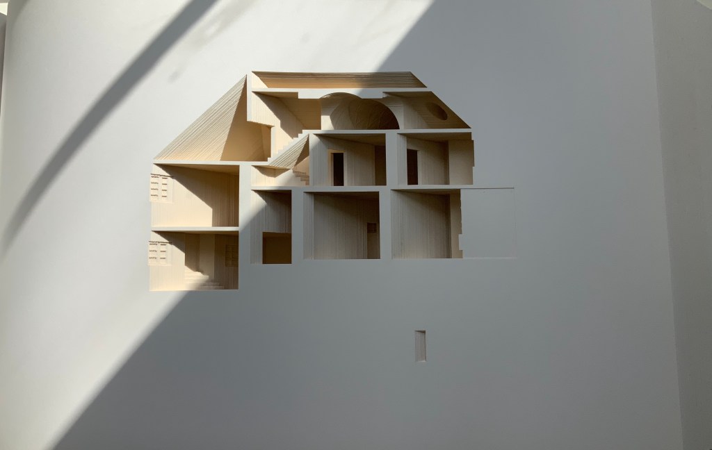
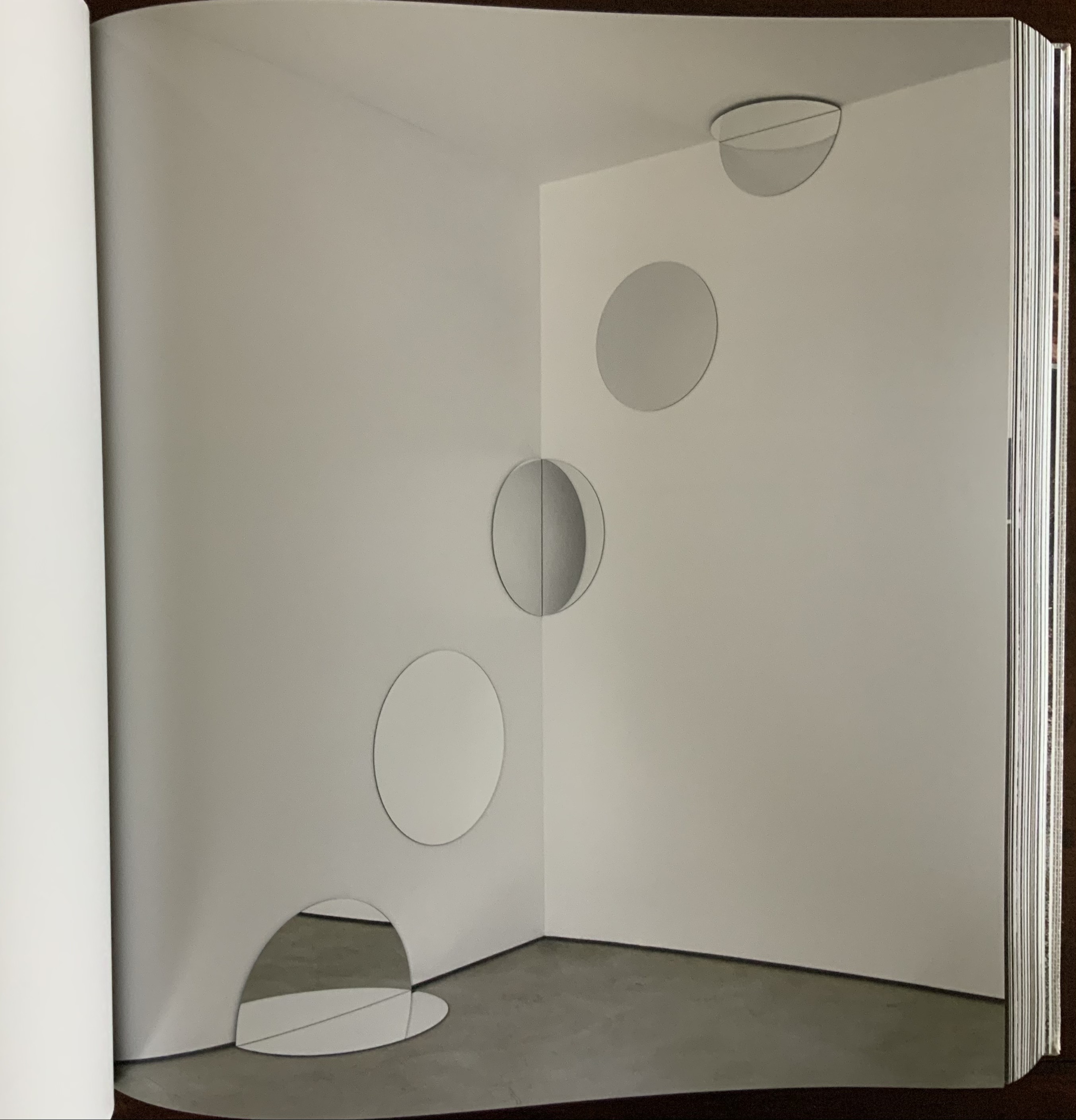
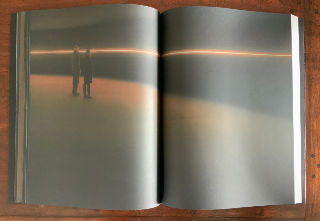
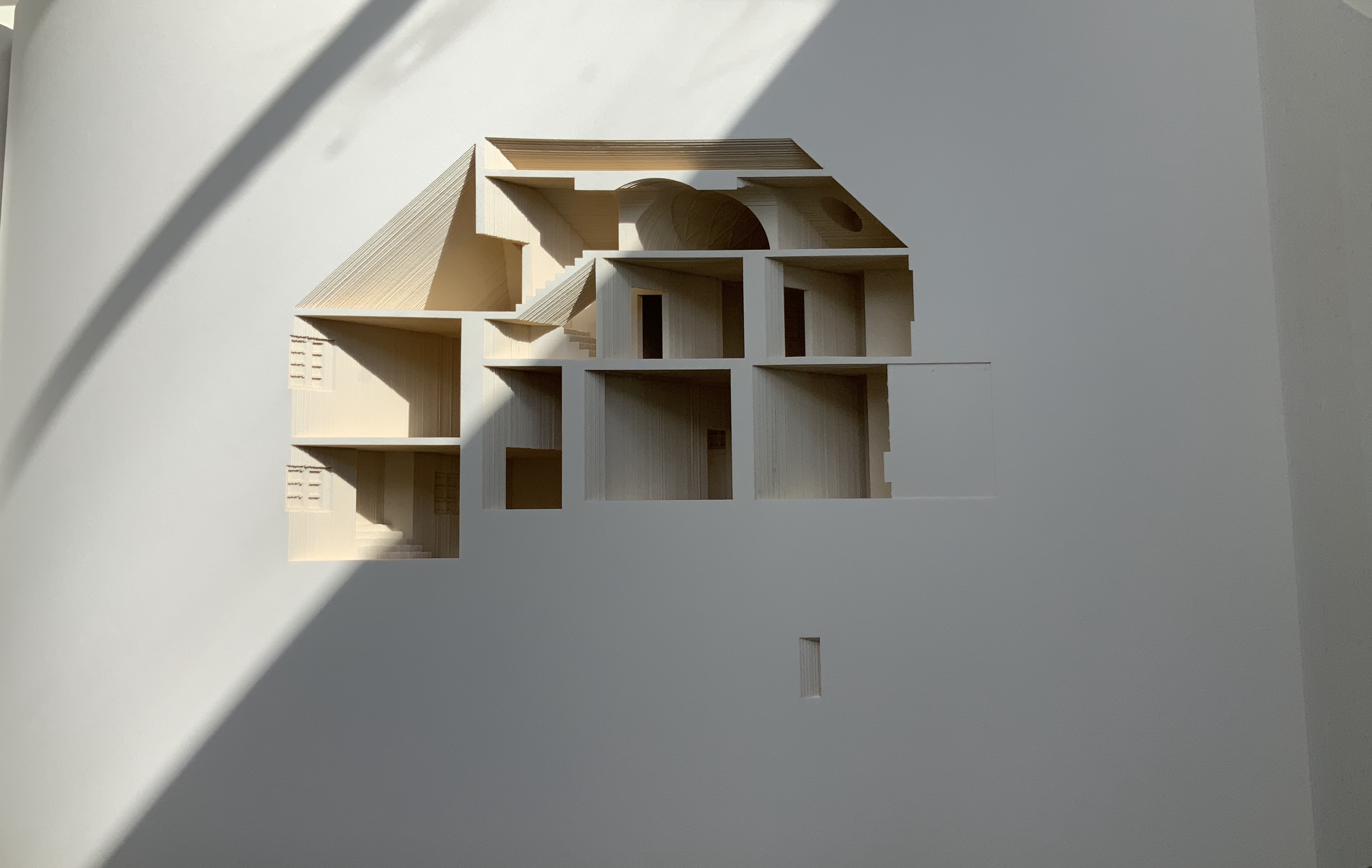
Your House (2006) Olafur Eliasson Hardback handbound with 454 laser cut leaves. H273 × W432 × D114 mm. Edition of 225, of which this is #210. Acquired from Carolina Nitsch Contemporary Art, August 2020. Photos: Books On Books Collection, displayed with permission of the artist.
Your House is a laser-cut model of Olafur Eliasson’s residence in Copenhagen at a scale of 1:85, which means that each page equates to a 220 mm section of the actual house. How do you read a work like this — physically? At the 22″ mark in the video below, the pages fall in a cascade like a flipbook, but for the most part, their size, accumulated bulk and weight — and delicacy — defy that handling. They must be turned slowly and carefully. Your House heeds the task of the arts as posed by the architect Juhani Pallasmaa, “in our age of speed, …to defend the comprehensibility of time, its experiential plasticity, tactility and slowness” (The Embodied Image, p. 78).
As you move from Your House‘s entrance to its exit, the outlines of walls, floors, stairs, doors, domes, windows, fireplaces and bookcases tremble in the air. Is this what Gaston Bachelard calls “the material imagination”? What Juhani Pallasmaa calls “the embodied image”?
Video: Books On Books Collection. Displayed with permission of Studio Olafur Eliasson.
Photos of the work: Books On Books Collection. Displayed with permission of Studio Olafur Eliasson.
There is something meditative about reading Your House properly. The cautious repetitive turning of pages can induce a daydream of inhabiting the space revealed. At some point in turning the pages, the empty shapes begin to become “your house”. Perhaps you see yourself moving through its spaces, and imagined furnishings occupying its rooms.
Photos of the work: Books On Books Collection. Displayed with permission of Studio Olafur Eliasson.
Or perhaps as in the sequence above — the end of one room (or chapter or part) and the start of another — you become a ghost — with all the work’s past and future readers — passing through the walls.
Video: Books On Books Collection. Displayed with permission of Studio Olafur Eliasson.
In The Poetics of Space, Bachelard writes of poetic time and prosodic time. The one is vertical, a spot in time, a frozen moment; the other is horizontal, a narrative, a continuity. But they are not mutually exclusive. Your House is a site where poetic and prosodic time occupy the same space. More than that, it is a site where temporality, as Eliasson puts it, “becomes something you perform by involving yourself physically over time” and thereby you become, “in the end, the createur” (“Not how, but why!”, p. 108).
Eliasson’s house in Hellerup, a suburb of Copenhagen, was advertised for sale in 2024. For comparison with the book, you can see photos of the exterior and interior here. Also, with thanks to Byopia Press, an X-ray documentation of the book can be found here.
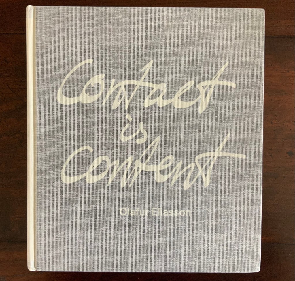
Contact is Content (2014)
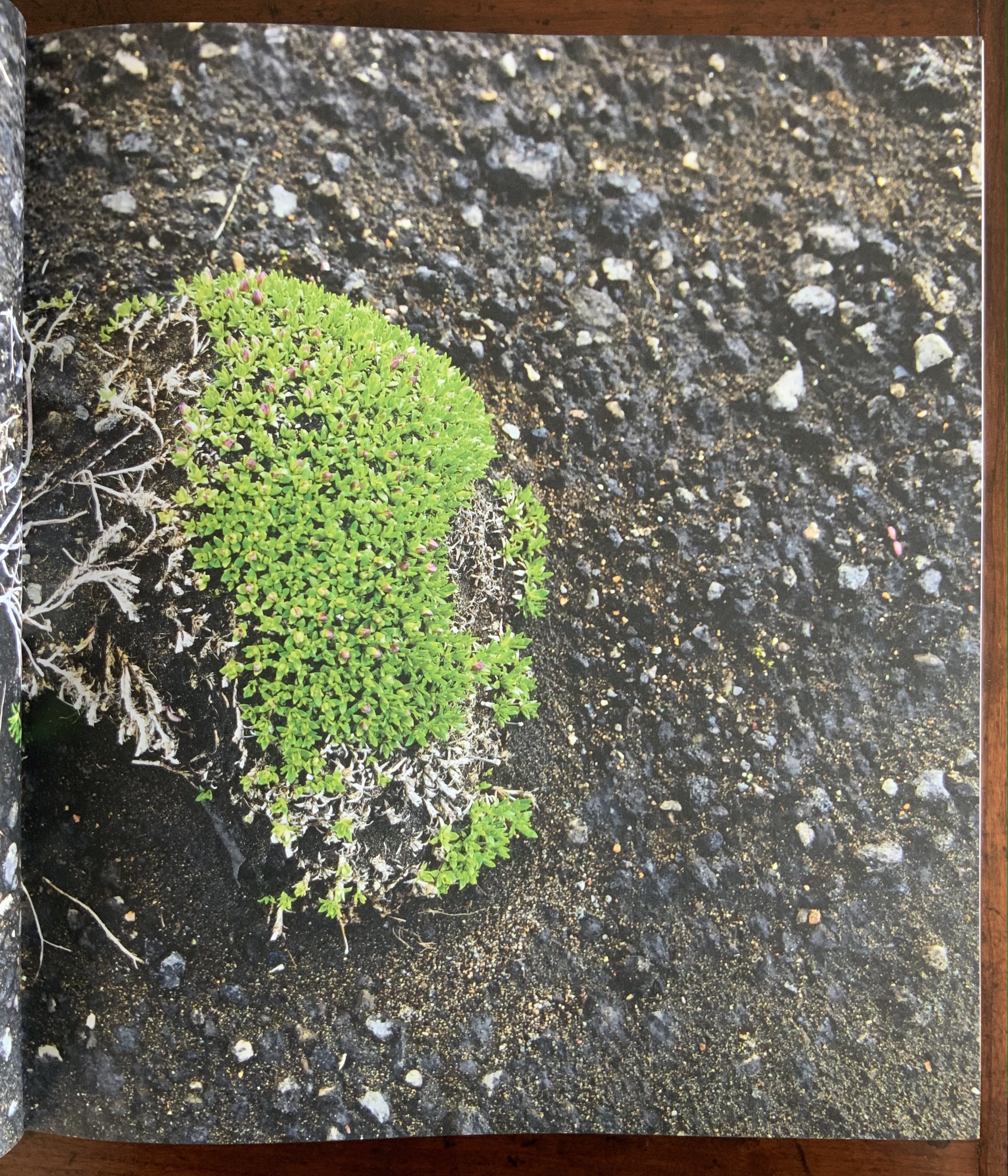
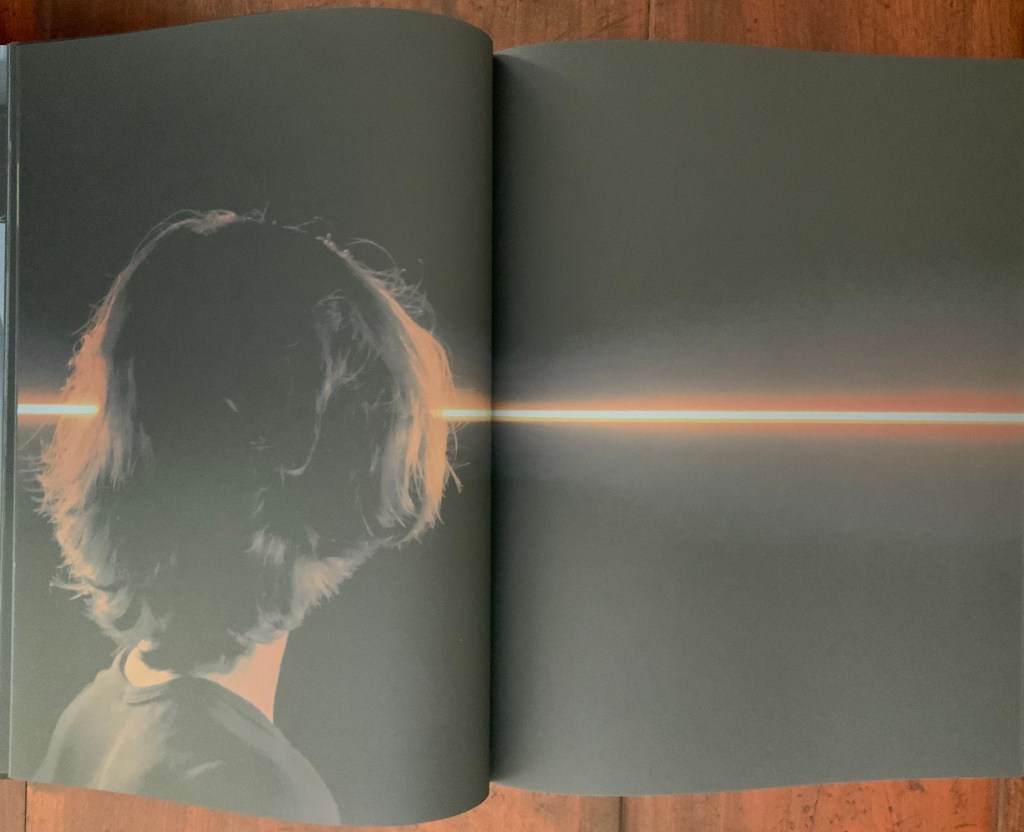
Contact is Content(2014) Olafur Eliasson Casebound, cloth mesh-covered board. H345 x W310 x D50 mm, 416 pages. Photos: Books On Books Collection. Displayed with permission of the artist.
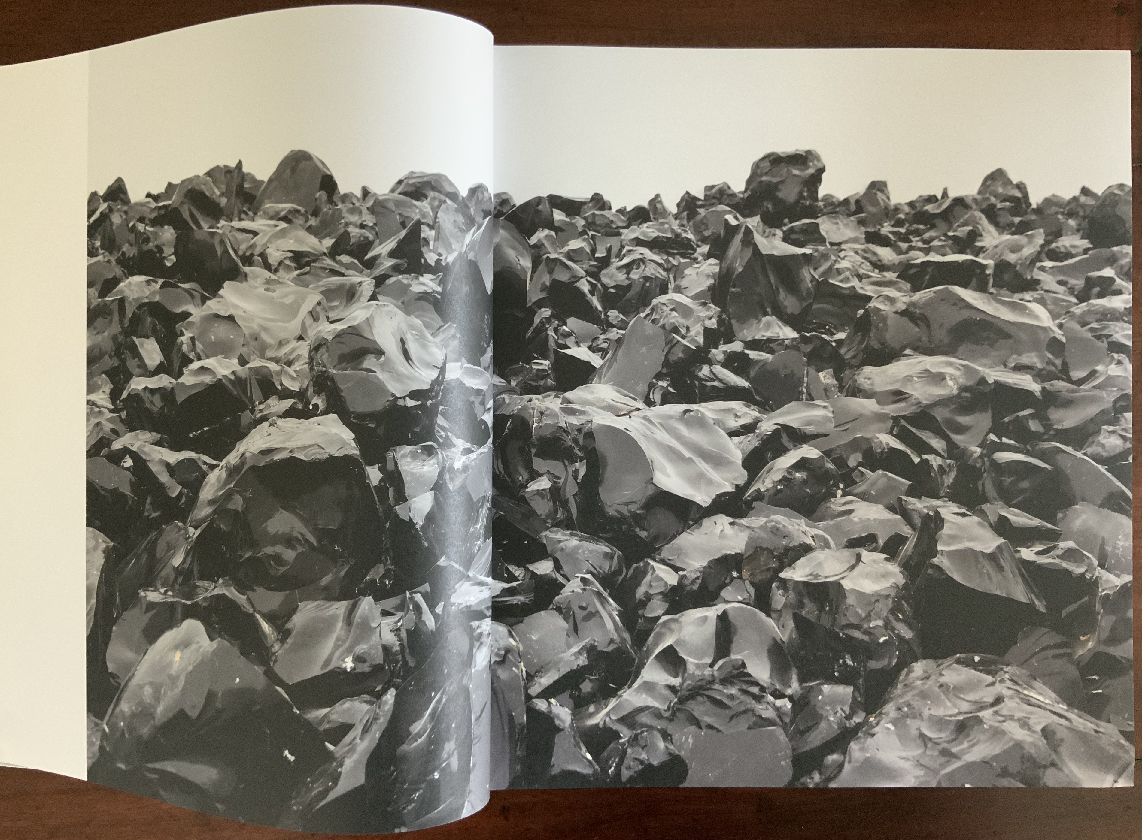
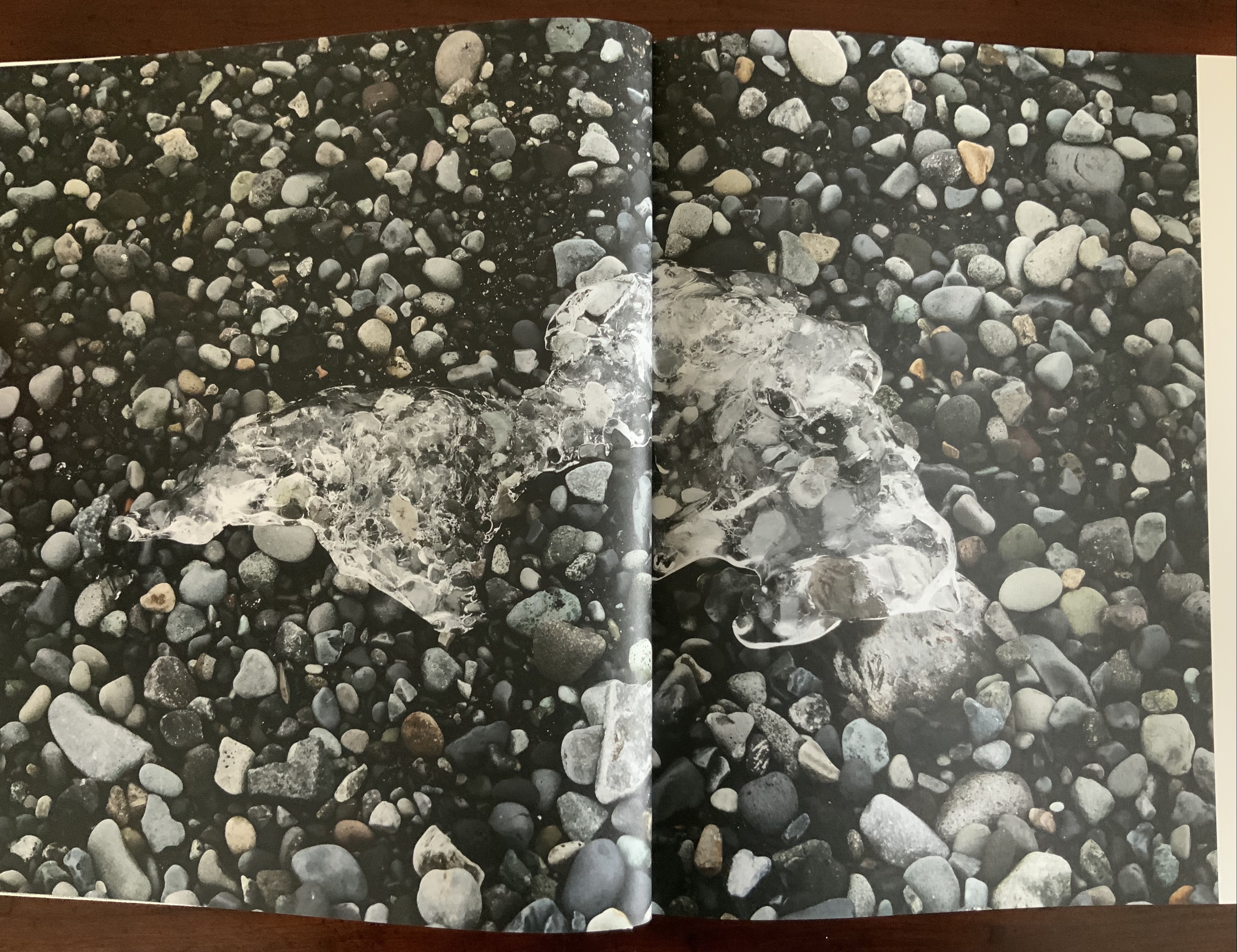
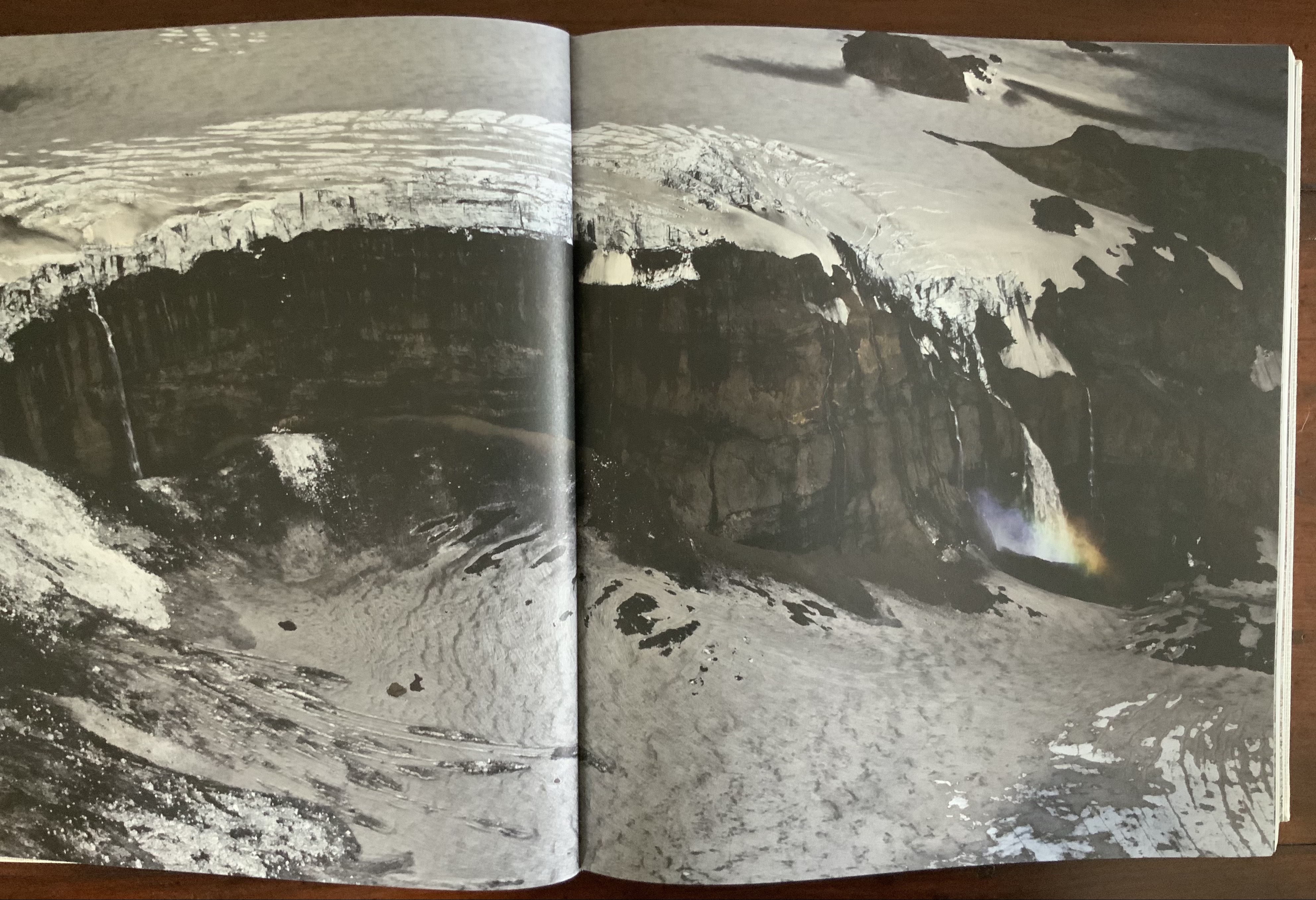
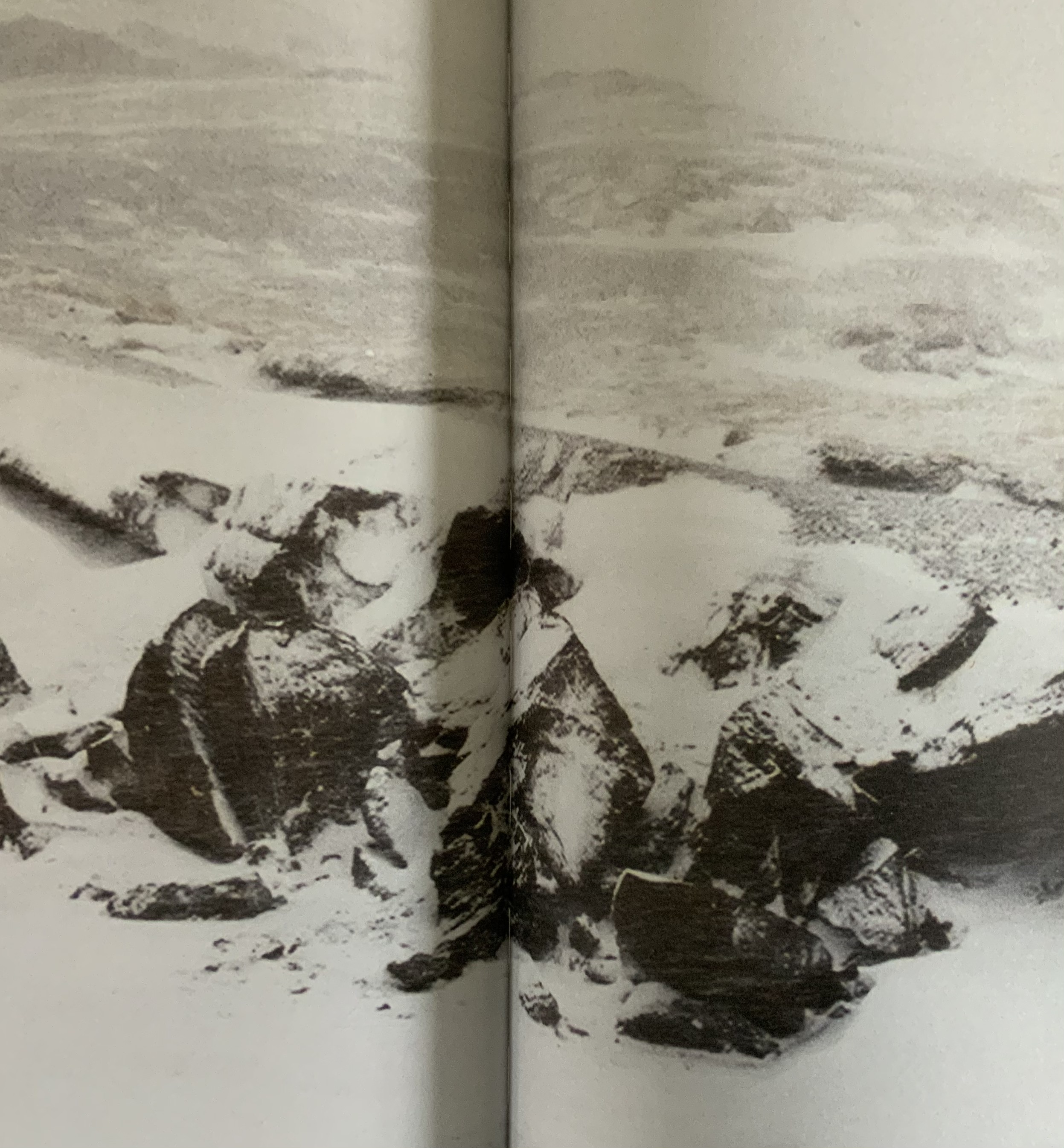
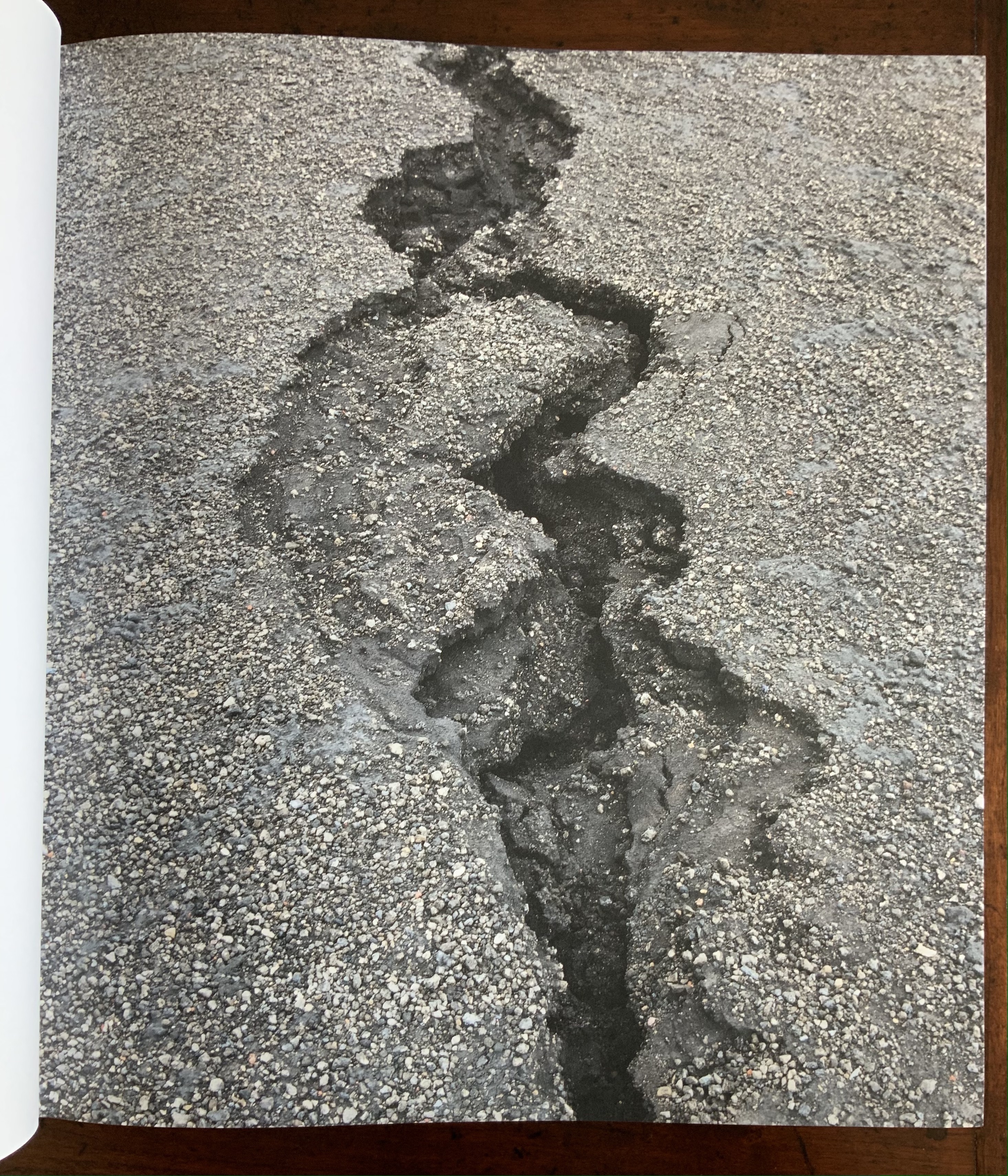
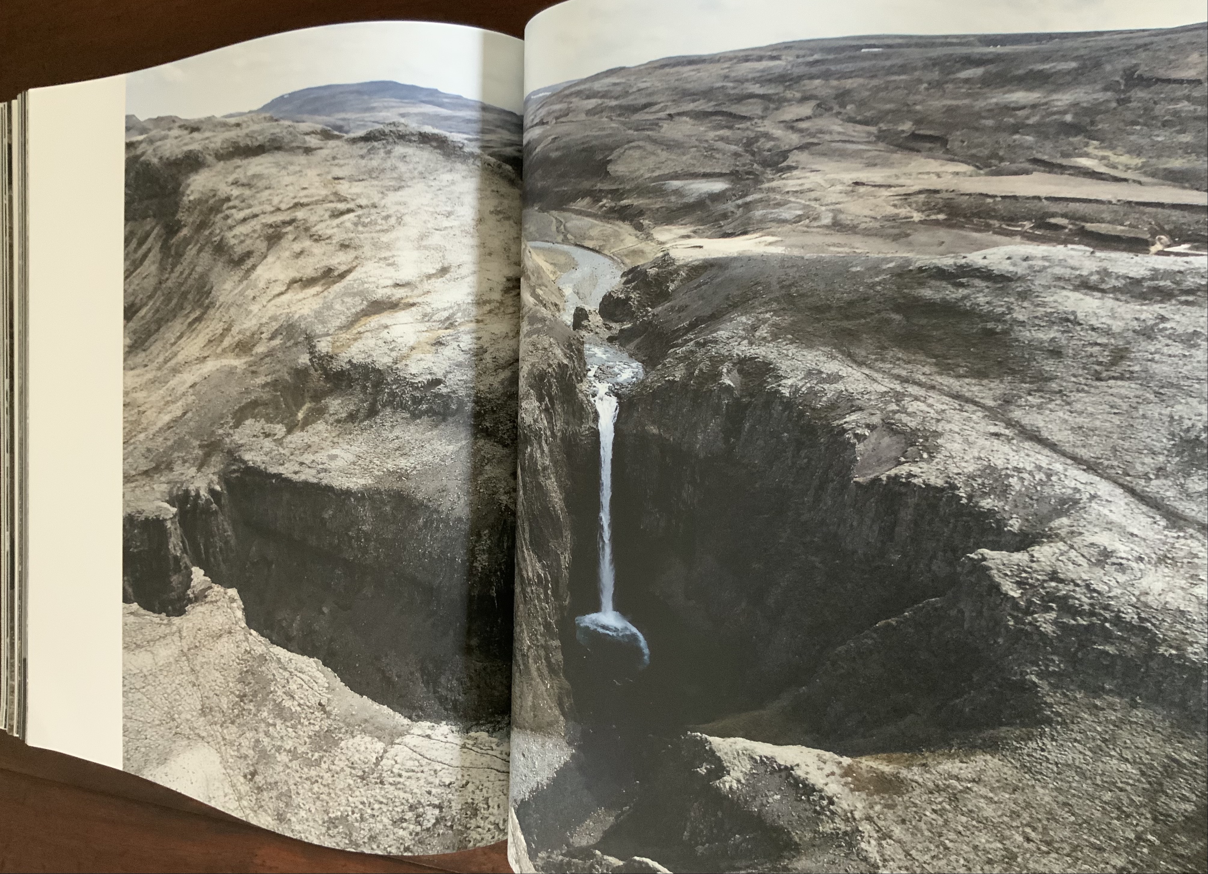
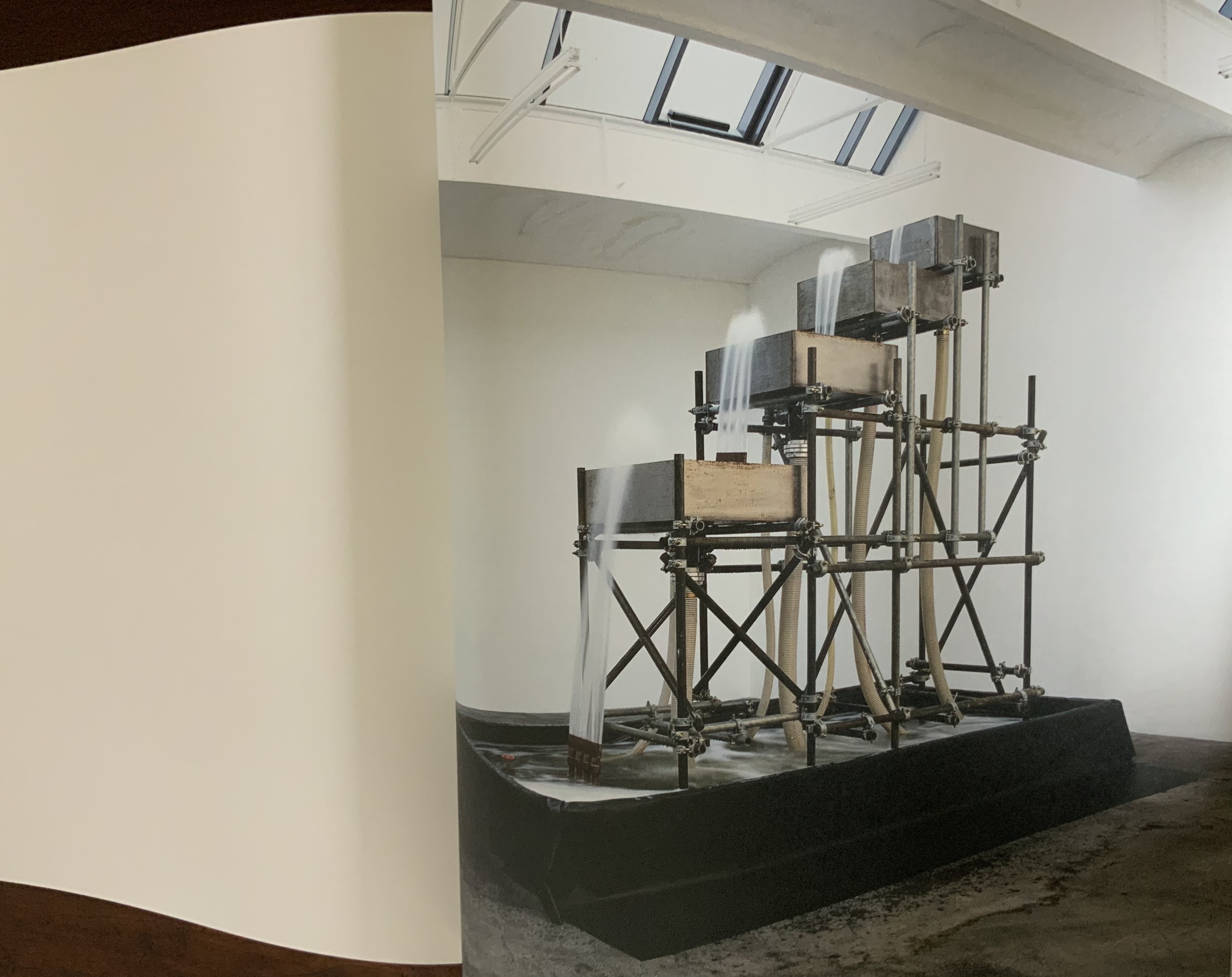
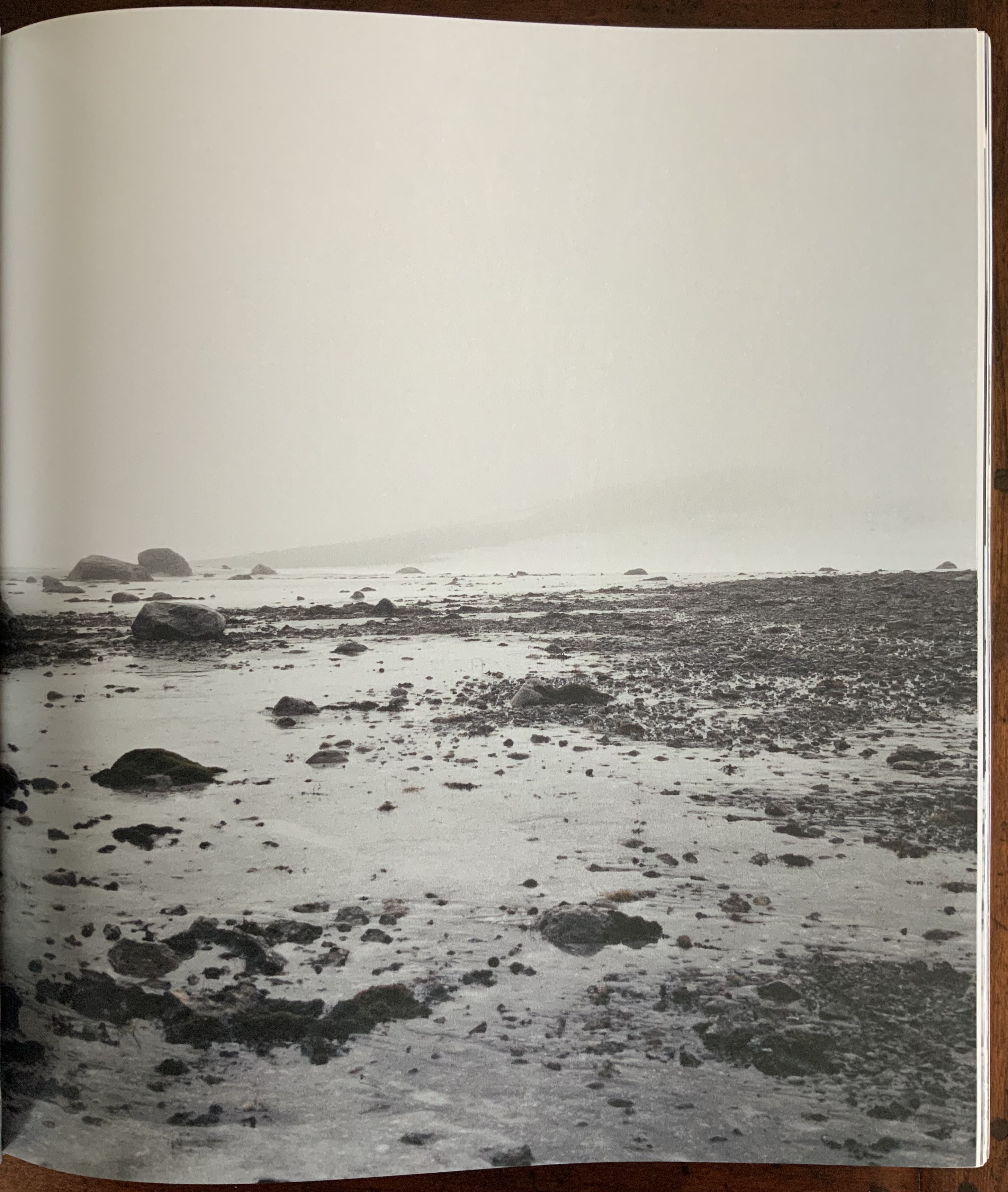
Like Your House, this work requires a slow, careful interaction in which viewing becomes learning the language of Eliasson’s images, discovering its syntax and exploring its rhymes and rhythms — reading the content presented with it. Unlike Your House, which focuses on contact with one source of content, Contact is Content draws on multiple sources: photographs Eliasson took in Iceland between 1986 and 2013 as well as images from his other projects and artworks. Over 80 different series make up the content of this work. The overwhelming number of round images — artificial and natural — in Contact is Content might suggest that Eliasson is completely sold on Bachelard’s pronouncement in The Poetics of Space that all being is round. But Eliasson’s world is spikier.
Within Contact is Content, images converse with one another — over near and far subjects, over aerial and ground level perspectives, over contrasting textures, over colors and their absence or presence, over artifice and nature
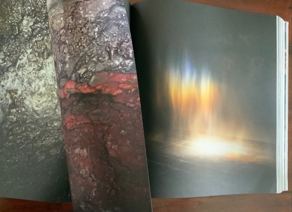
Often the conversations are reverse echoes: the reflective surface of blocks of ice echoes that of basalt.
The echo of near and far becomes a theme in itself: black-and-white aerial views of landscapes elide into black-and-white close-ups.
The absence and presence of color also emerges as a theme in its own right that interweaves with that of “near and far”: waterfalls without color vs waterfalls with the barest hint of color; close-ups of rocky terrain without color vs those dotted with intensely green or blue flora.
Some reverse echoes are the artificial conversing with nature: a gallery room containing a construction pumping water upwards over four levels echoes an Icelandic waterfall; or shorescapes under fog echo human outlines swallowed up in gallery rooms flooded with color-lit mists. Down to up; outside to inside; black-and-white to color; nature to artifice. And back.
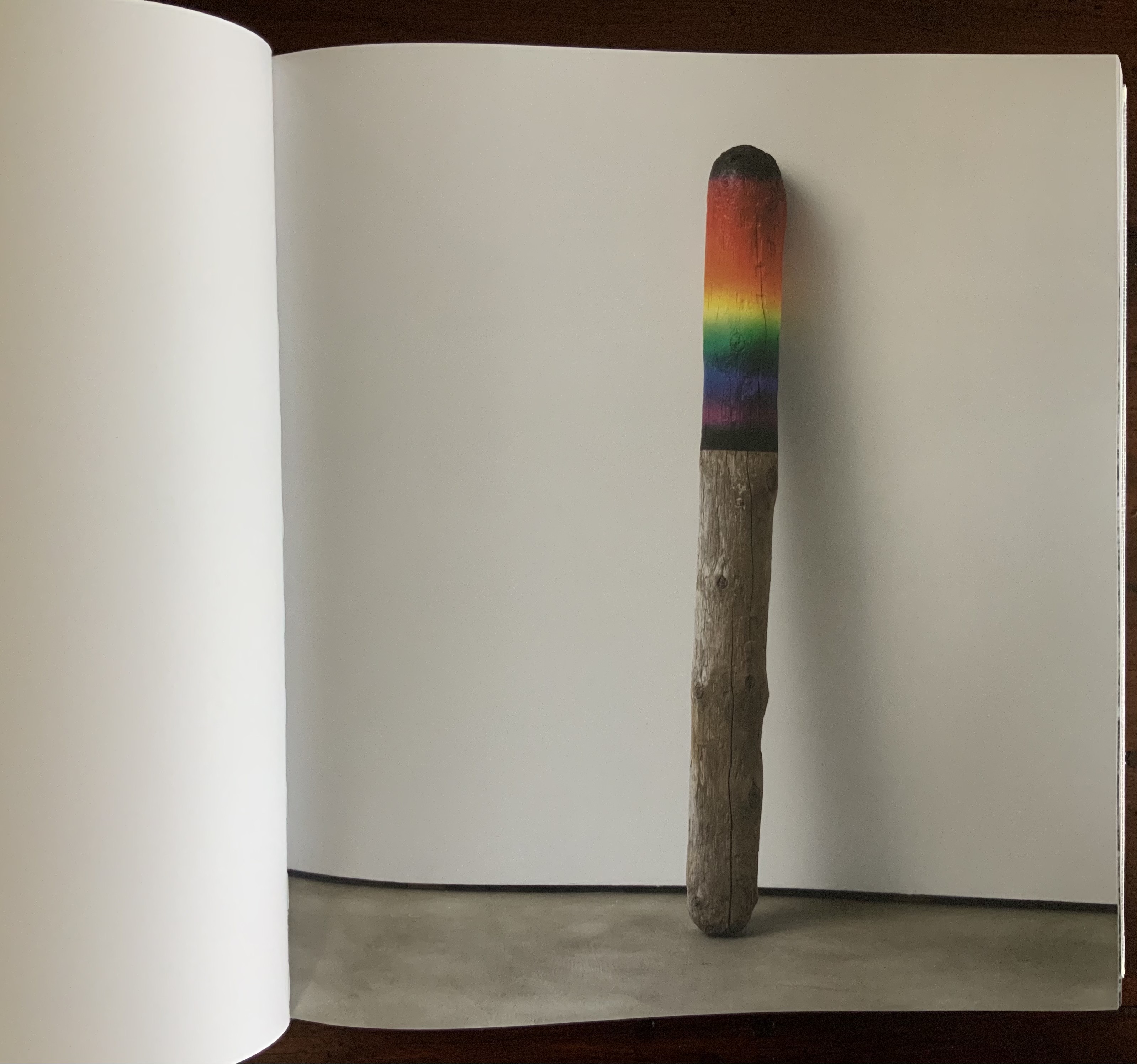
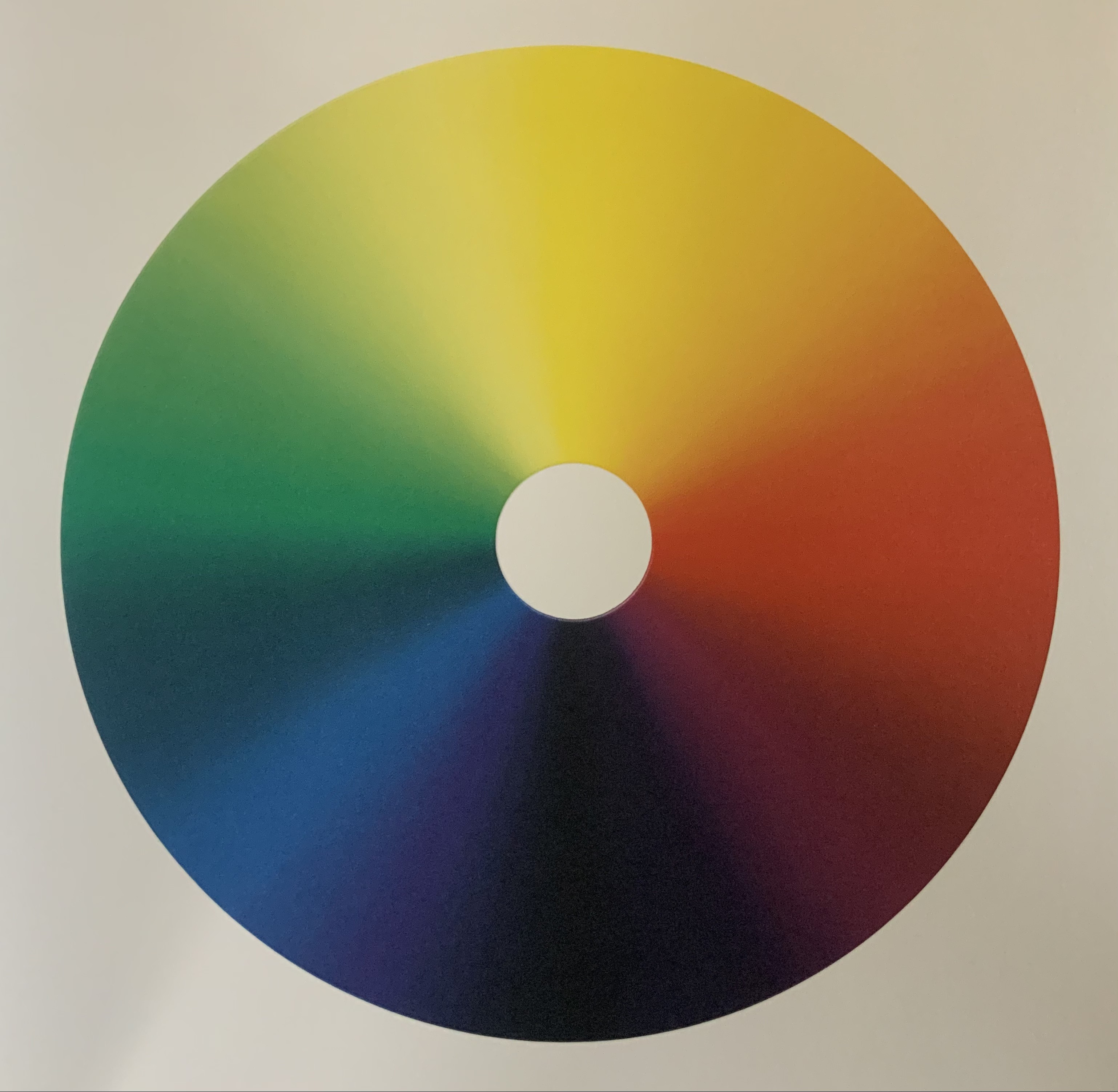
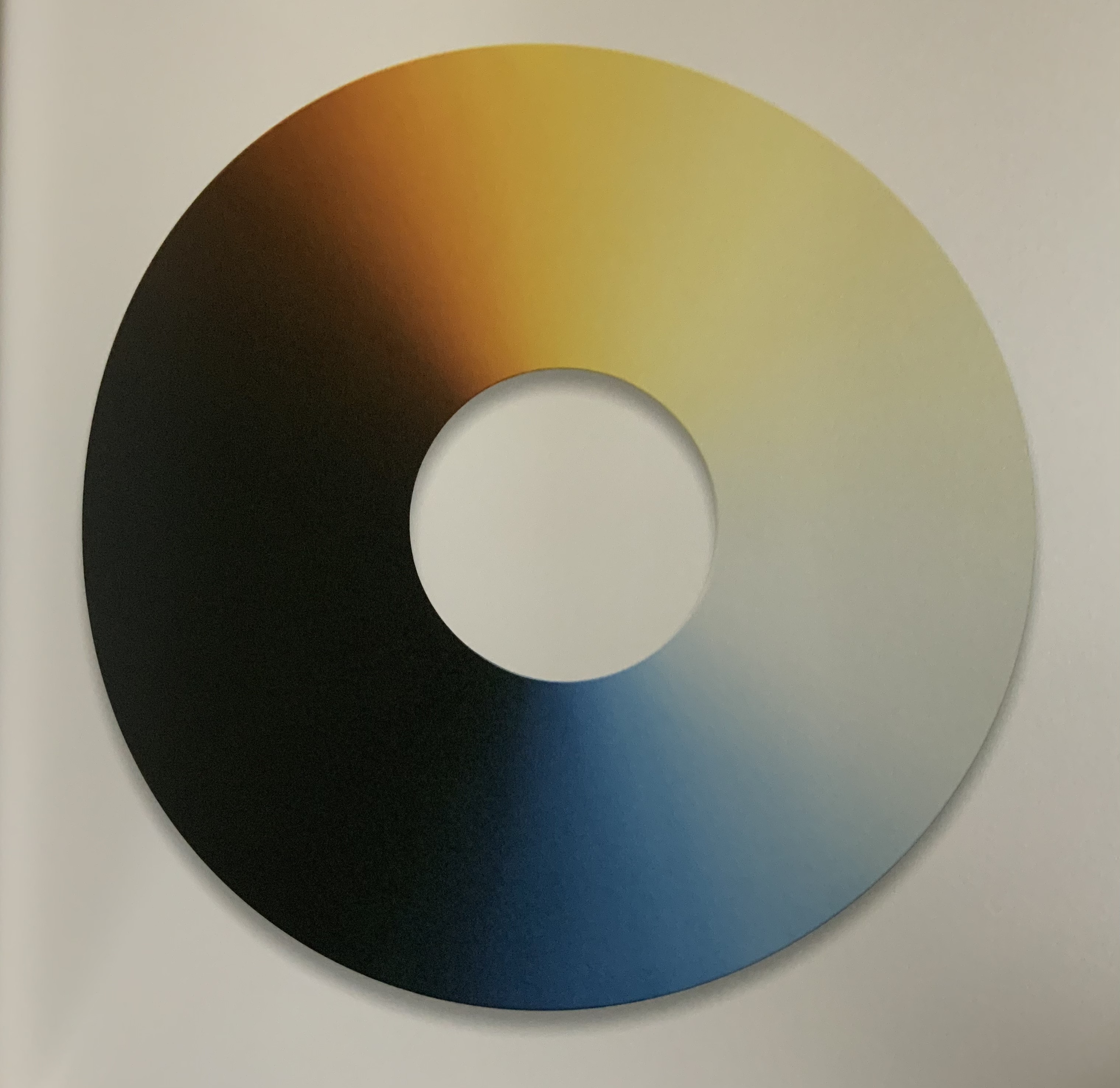
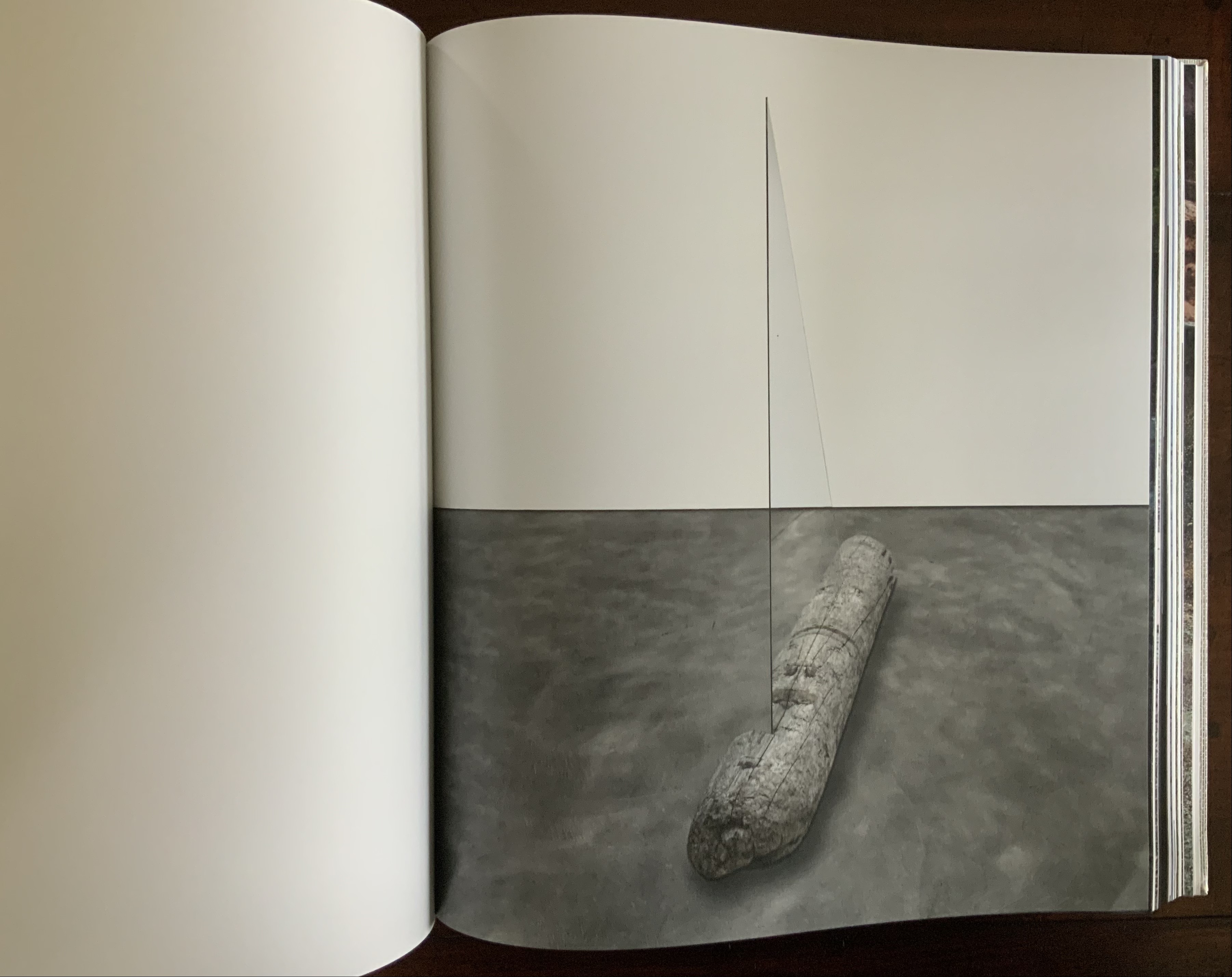
Some of these artifice/nature echoes are compressed into one image: a brightly half-painted stick of driftwood echoes the multiple color wheels used to punctuate the stretches of landscape images.
Other echoes occur within the span of artifice (whole color wheels echoed by sliced black ones) before colliding with nature (a piece of driftwood impaled by a glass triangle) and then jumping back to artifice (round mirrors bisected at floor and wall and cascading upwards to be bisected by wall and ceiling).
Some echoes occur across dozens and dozens of pages. Still others occur in the single turn of a page.
These are but a few of the themes that Eliasson weaves into a narrative with his images, artworks and projects. Every encounter with this book as container seems to reveal a new theme.
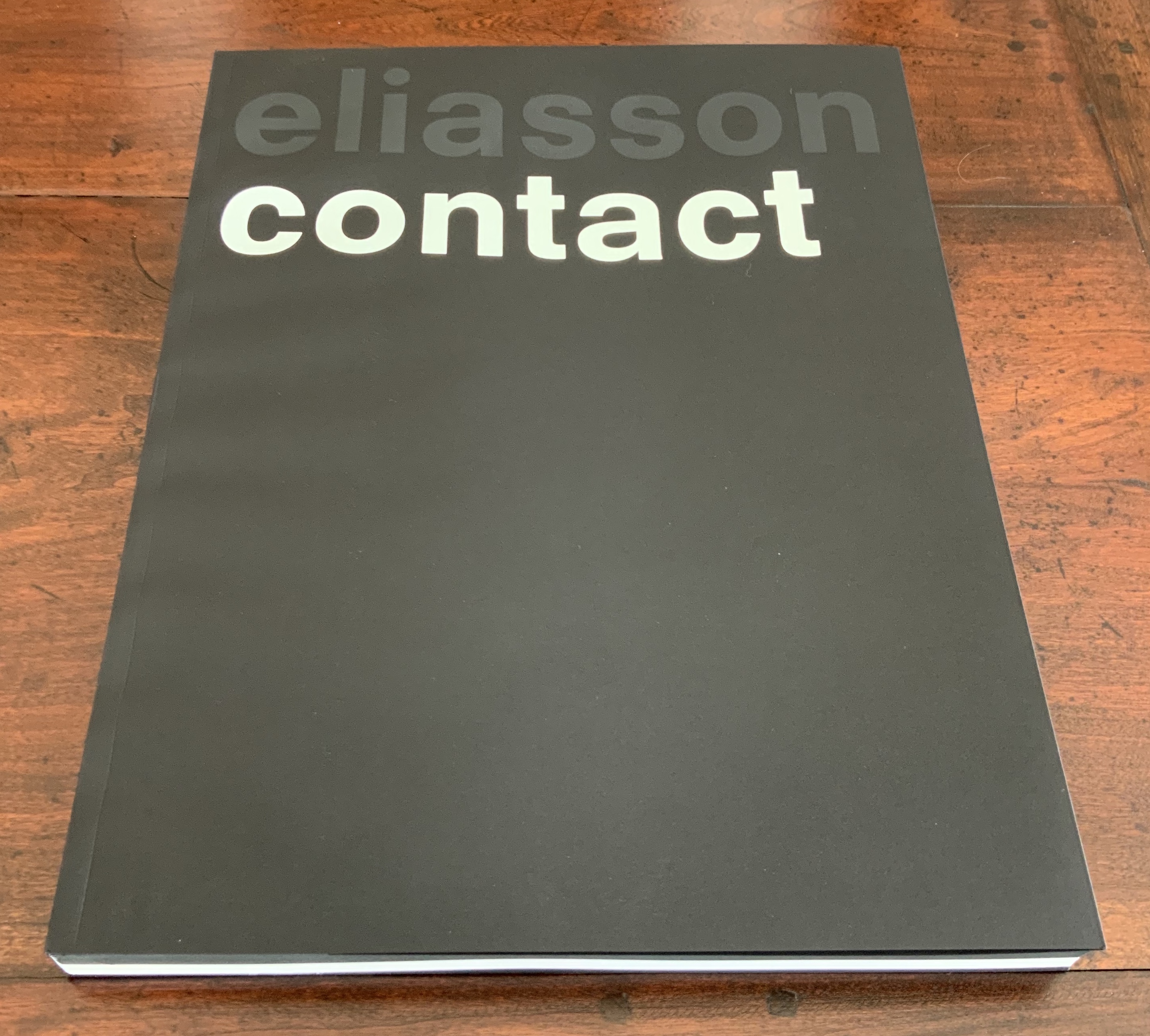
Contact (2014)
Contact (2014) Olafur Eliasson Front and back covers and center spread of exhibition catalogue in paperback. Designed by Irma Boom. Acquired from Artbooksonline.eu, 27 September 2020. Photos of the work: Books On Books Collection. Displayed with permission of Studio Olafur Eliasson.
Contact interprets the eponymous site-specific exhibition, commissioned by the Fondation Louis Vuitton and held in its Frank Gehry-designed building, 17 December 2014 through 23 February 2015. Here is the artist’s statement on Contact:
being in contact is the opposite of being disconnected. to be in contact is to be aware of the consequences that your actions have in and on the world. contact is about experience rather than consumption. to be in contact is to be in touch with the good things in life as well as with the difficult things in life. contact can be a greeting, a smile, the feeling of another person’s hand in your hand. contact is not a picture, it is not a representation; it is about your ability to reach out, connect, and perhaps even put yourself in another person’s place. for me, contact is where inclusion begins. contact is the highest luxury of all. olafur eliasson
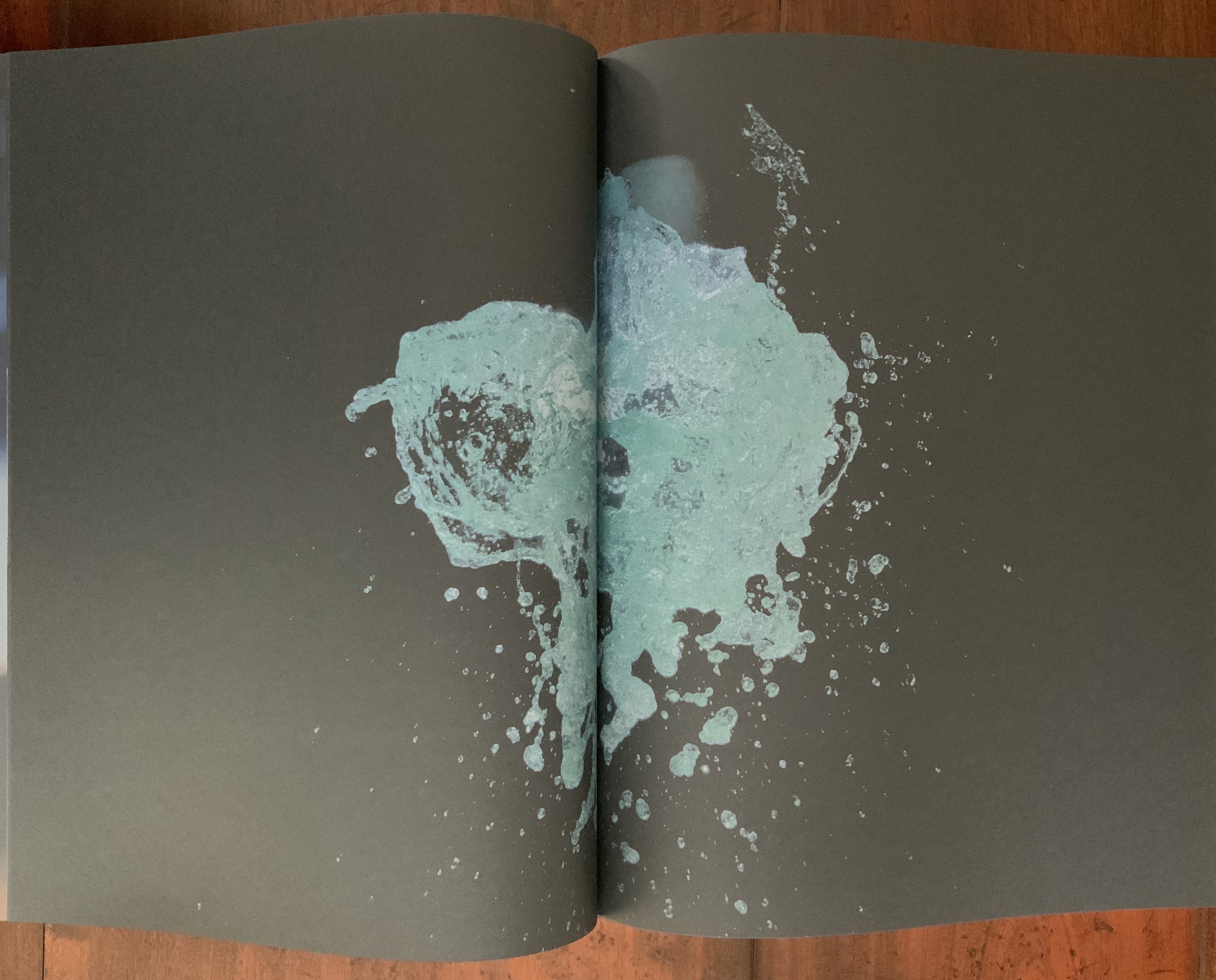
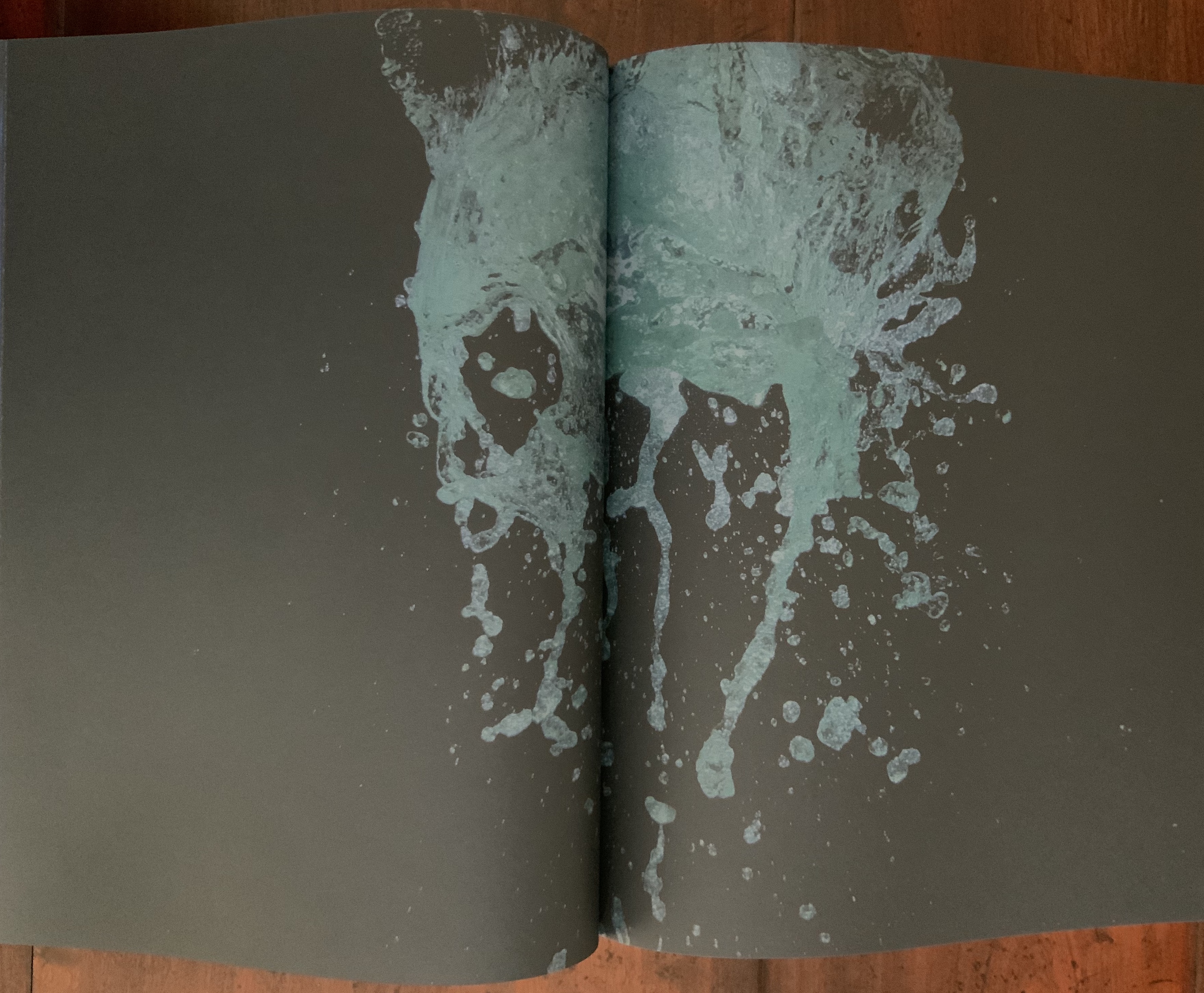
Contact is also between page and page. Eliasson and Irma Boom, “the queen of books”, have worked together on several works. Boom’s mastery of the full bleed, double-page spread and gutter is the perfect match for this volume that brings the virtual into contact with the material.
Contact is also between paper and ink, between black and white as well as between dark and light when the book’s fluorescent title glows in a darkened room. The cover’s fluorescent ink, however, is not integral enough with the rest of the book to rise above an amusing touch; whereas contact between black and white extends to the division of the book into black and white halves.
In the first half of the book, photographs on entirely black paper present a codex-experience of the exhibition. In the second half of the book, drawings take the viewer behind the scenes of the exhibition’s design and, retrospectively, train the eye to read the book as exhibition.
This incorporation of design drawings draws attention to time, and Contact is very much about our perception of time. In her book Binding Space: The Book as Spatial Practice, Marian Macken refers to “the tenses of the book”. Especially when presented in a book, architectural plan drawings “are not fixed in their sequence, but instead may be read and interpreted as existing within a range of times, such as the time of their making, of the present of the reader, the future they may refer to, and the contextual moment of apprehension” (p. 157). In the case of this “book of the exhibition”, published to coincide with the exhibition, the plan drawings and photographs exist in the exhibition’s past and present. For an exhibition attendee, they exist as a reminder of a personal past performance of contact with the exhibition. For attendees and non-attendees, they bring the exhibition’s past and future together in the present in a performance of contact guided by the architecture of the book.
How appropriate it is that, in her essay in the book’s white section, Caroline A. Jones writes, “Personally, I will not have seen the installations that the present text accompanies” — as is/will be the case for many of us experiencing Contact only in its book form. Jones’ essay is entitled “Event Horizon: Olafur Eliasson’s Raumexperimente”, which confirms that contact is not only about perception of time, but of space as well. While Jones teases out how the exhibition will play/plays/played with the astrophysical conundrum, she cites a comment from Eliasson in conversation that captures a simpler view: “There is a tradition of the horizon as a boundary between the known and unknown. But as you approach, it fades in, or comes into your experience. You can think of it as a space” (p. 133).
Space — which brings up the awkward point of the setting in which the exhibition occurred. Since the Renaissance, imagination in art and science has sat sometimes uneasily, sometimes too easily with wealth and privilege. There may be nothing democratic in Eliasson’s expensive, spectacular art, but Contact’s fusion of science, art, nature (Earth-bound and cosmic) and social connectedness contrasts pointedly and paradoxically with its setting in the opulent property of a global luxury brand — “the blandishments of follies and bling” as Jones puts it. As Eliasson’s artist statement asserts: “contact is about experience rather than consumption….is where inclusion begins….is the highest luxury of all”. But without the Fondation’s patronage, the experience of Contact in situ or even in these artfully designed pages would be denied.
Somewhat less reconcilable is the statement “contact is not a picture,… is not a representation”. Placing contact with art (a picture, a representation) in opposition to contact through human touch and empathy is not quite right. Just as Your House resonates with the perspective of the physicist/philosopher/humanist Bachelard, for whom the image is language, so too does the language of Contact as exhibition, images, objects, book — and experience. We cannot have contact without it.
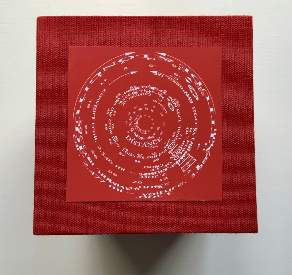
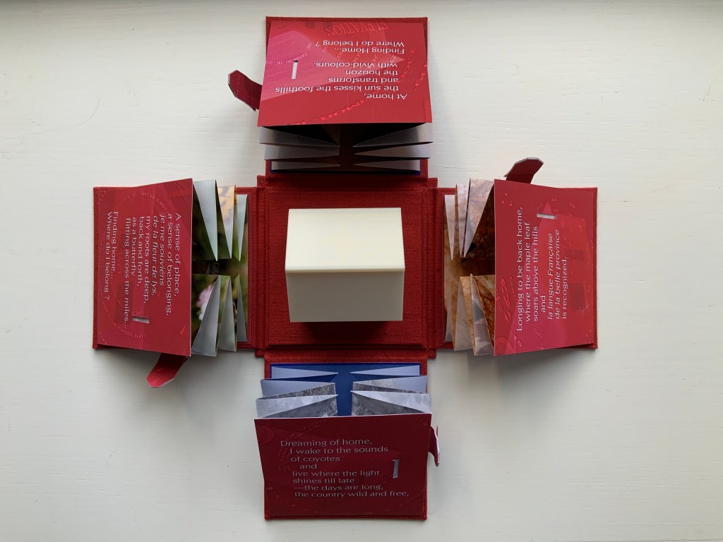
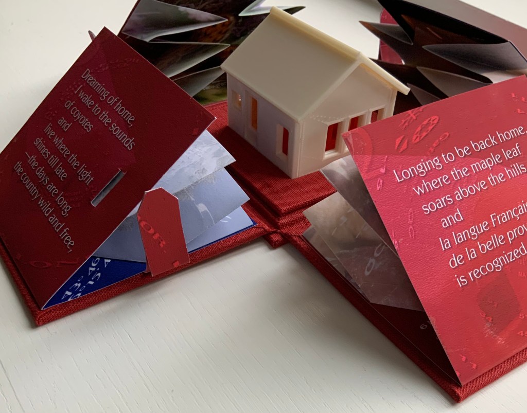
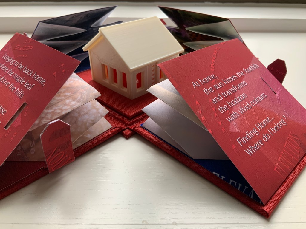
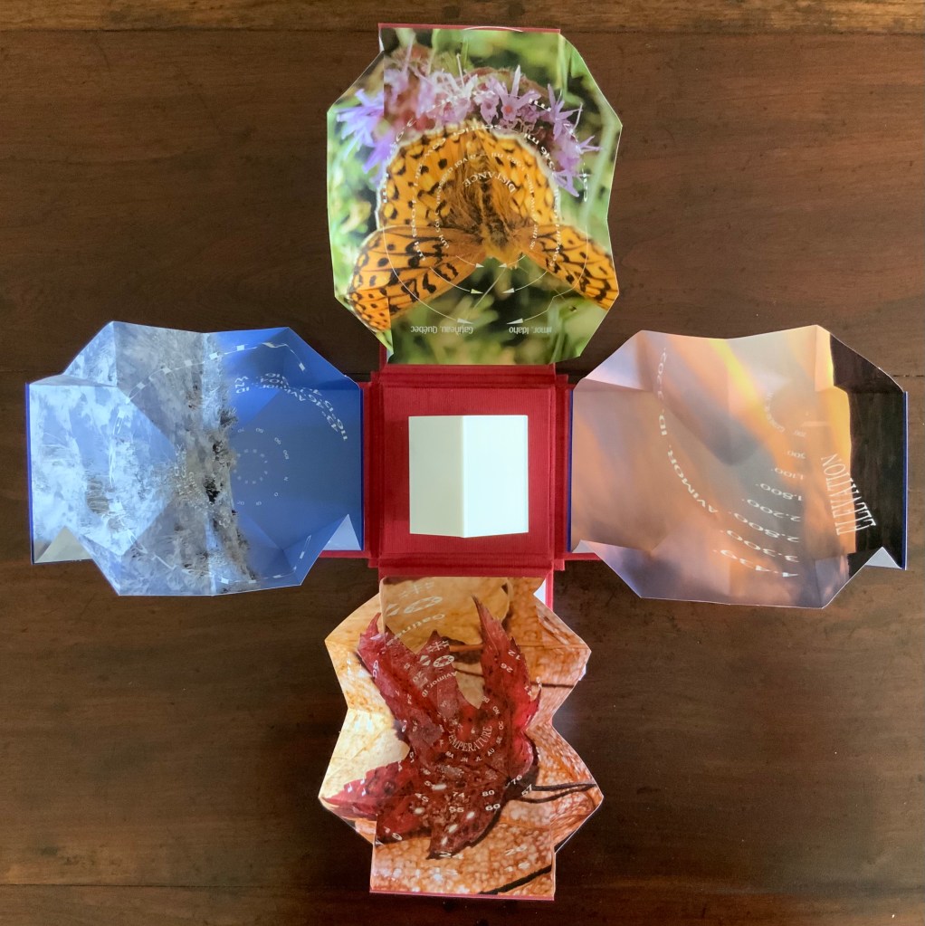
Finding Home (2019) Louise Levergneux Explosion box with cloth over board binding with inkjet printed images (H114 x W115 x D115 mm, closed); 4 Turkish map fold booklets (H95 x W95 mm, closed) inkjet-printed on Lasal paper, each attached to the interior of a box flap; 3D printed house. Third edition of 3 copies, of which this is #2. Acquired from the artist, 5 February 2021. Photos of the work: Books On Books Collection.
An explosion box, Turkish map fold, and small 3D-printed plastic house — the inventive combination reflects the many-featured domain of book art. That alone would warrant adding this work to the collection, but its union of material with content clinched the decision.
The work’s nomadic theme may have its roots in Levergneux’s various places of residence over time, but it also echoes her blog, entitled 1/2 Measure Studio, which began at the end of 2015 with her moving from a 20×12-foot studio into one measuring 10×10. The blog records indefatigable travels and visits with fellow book artists at all points of the compass to which Finding Home‘s four flaps might also allude — just as the small model might also allude to the half-measure studio.
Among the Turkish fold maps, the small house also conveys centrality and both a point of departure and one of arrival. The spirals and concentric circles within the open maps emphasize further the theme of seeking a center. But the work is not only about place. With all the maps open, we have a house surrounded by four blooms of color, which implies a still point in time among the shifting seasonal imagery.
There’s much about this work that recalls Gaston Bachelard’s The Poetics of Space (1969). There is, of course, the miniature house itself, for which Bachelard has entire chapters, but also in the maps, there is the butterfly recalling the chrysalis (pp. 85-86); the sun-kissed foothills, the recurrent theme of the horizon, distance and immensity (passim); the red maple leaf, the autumnal recollections (p. 179); and the prairie snowscape, the paean to snow (p.61); and the longitudinal and latitudinal references, recalling this passage:
Each one of us, then, should speak of his roads, his crossroads, his roadside benches; each one of us should make a surveyor’s map of his lost fields and meadows. Thoreau said that he had the map of his fields engraved in his soul. And Jean Wahl once wrote:
Le moutonnement des haies C’est en moi que je l’ai. Poème, p. 46(The frothing of the hedges I keep deep inside me.)
Thus we cover the universe with drawings we have lived (p. 33).
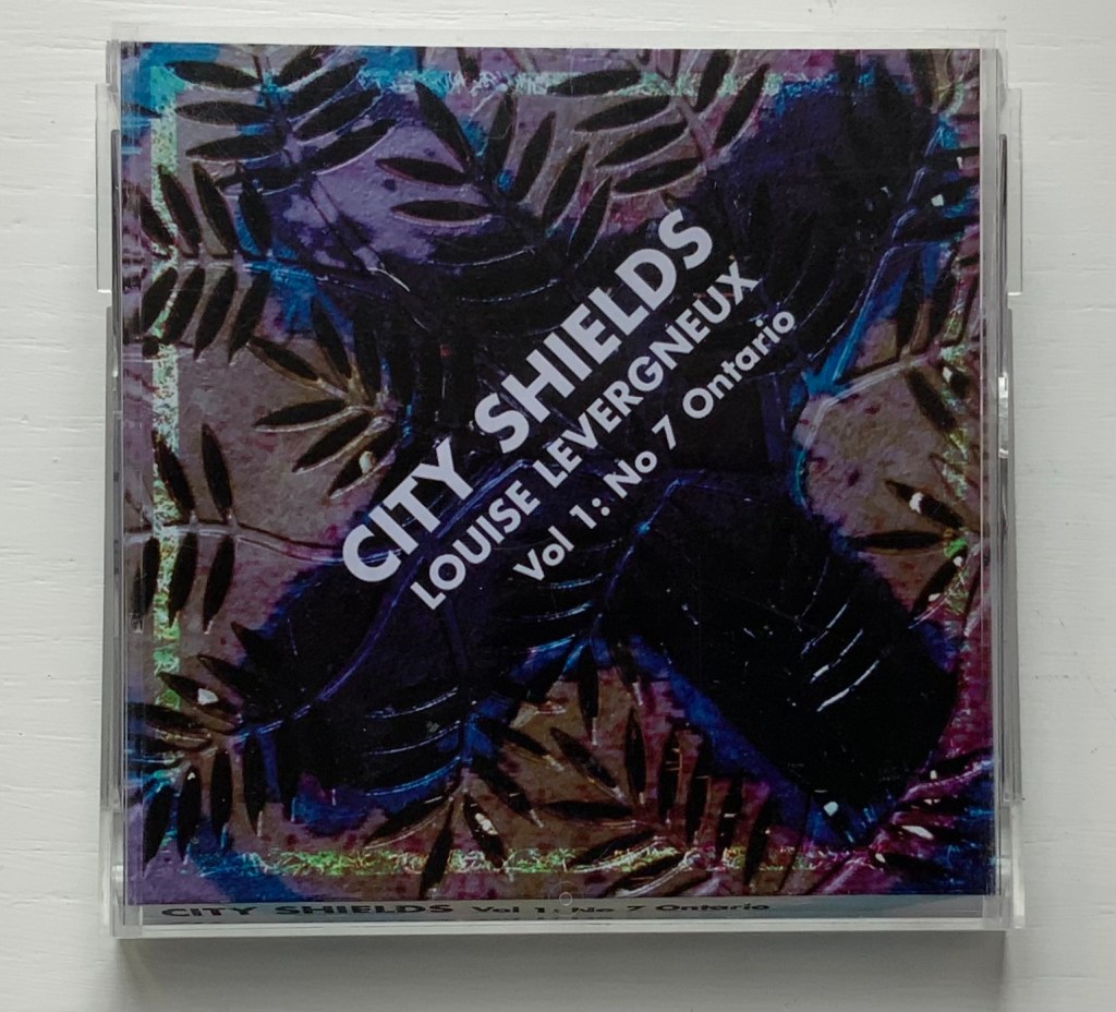
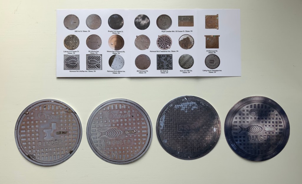
City Shields, Vol 1: No 7 Ontario (2017)
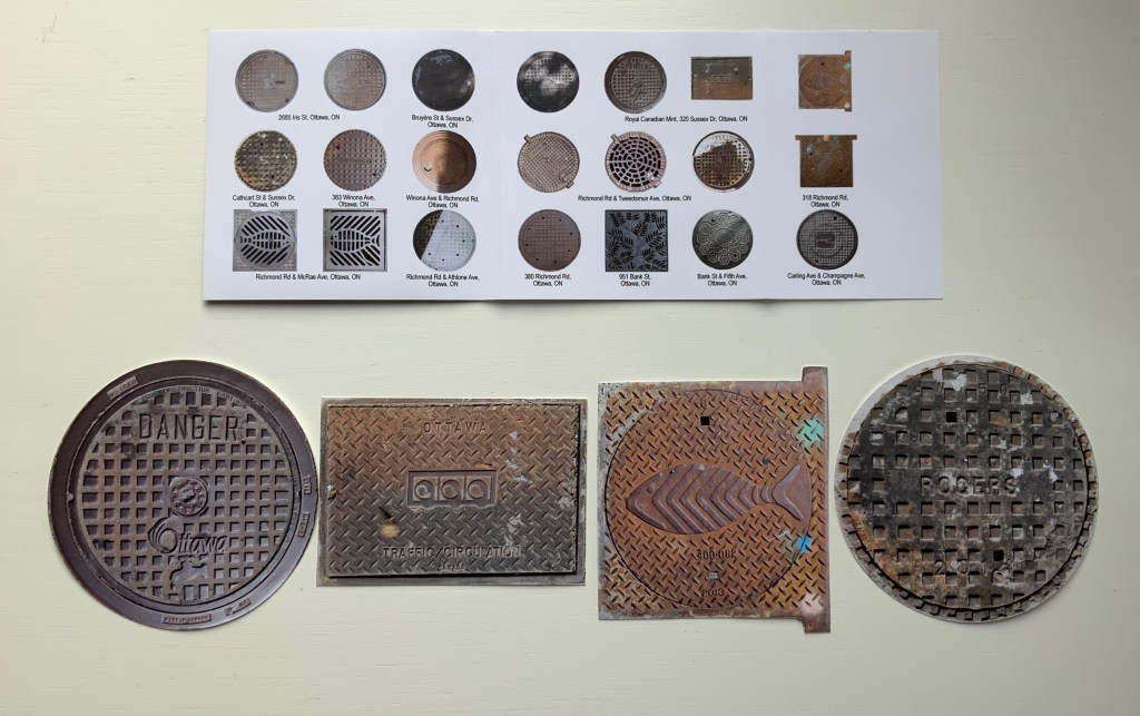
City Shields, Vol 1: No 7 Ontario (2017) Louise Levergneux Jewel case cover (H103 x W105 mm) with insert printed on Inkpress Matte paper holding 21 die-cut photos of manhole covers printed on Generations G-Chrome Lustre paper. Edition of 25 copies. Acquired from the artist, 5 February 2021. Photos of the work: Books On Books Collection.
Like Finding Home, this work is autobiographical, documenting Levergneux’s travels from 1999 to 2020, from Scotland, Canada and the US. As summarized on the insert for this one issue, the shapes and design of the actual manhole covers vary — as do their die-cut photos — some round, some square, rectangular, flanged. Small as they are, their colors and shadows nevertheless entice thoughts of miniature tunnels and drains lying beneath them and winding their way under whatever surface on which the manhole covers rest. City Shields‘ evocation of hidden space and their reminder to look down as well as up at city architecture create a strange and welcome fit with the architectural theme in the Books On Books Collection.
Levergneux celebrated the close of the City Shields project with a 20th Anniversary Edition, described here.
Further Reading
“Architecture“, Books On Books Collection, 12 November 2018.
“Guy Bigland“. 31 August 2023. Books On Books Collection. (See his Square Photographs of White Circle Paintings (2022) for comparison).
Bachelard, Gaston, Maria Jolas, Mark Z. Danielewski, and Richard Kearney. 2014 (1964). The Poetics of Space. New York: Penguin Books.
Chen, Julie. 2013. 500 Handmade Books. Volume 2. New York: Lark. P. 20 (see Will Karp’s 49 Masterpieces of Art (2011) for comparison).
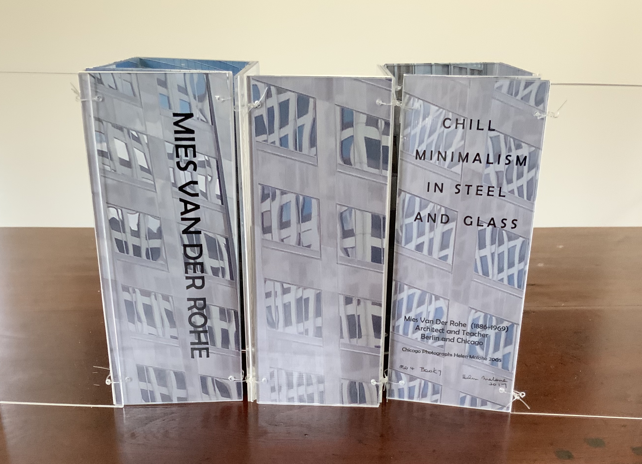
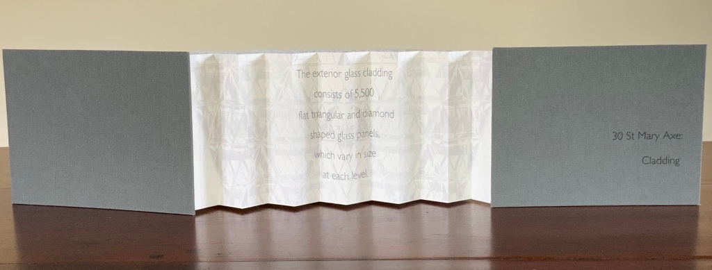
30 St Mary Axe is a skyscraper in London’s main financial district. Designed by Sir Norman Foster architectural studio, built in 2001-2003. (Photo credit: Wikipedia)
London’s 30 St Mary Axe is referred to as “the Gherkin,” which a glimpse of the building on the skyline proves unmistakably appropriate. Mandy Brannan’s bookwork homage to the Gherkin is as architecturally intricate as the building’s cladding, and somehow more satisfying, perhaps because it’s less pickled.
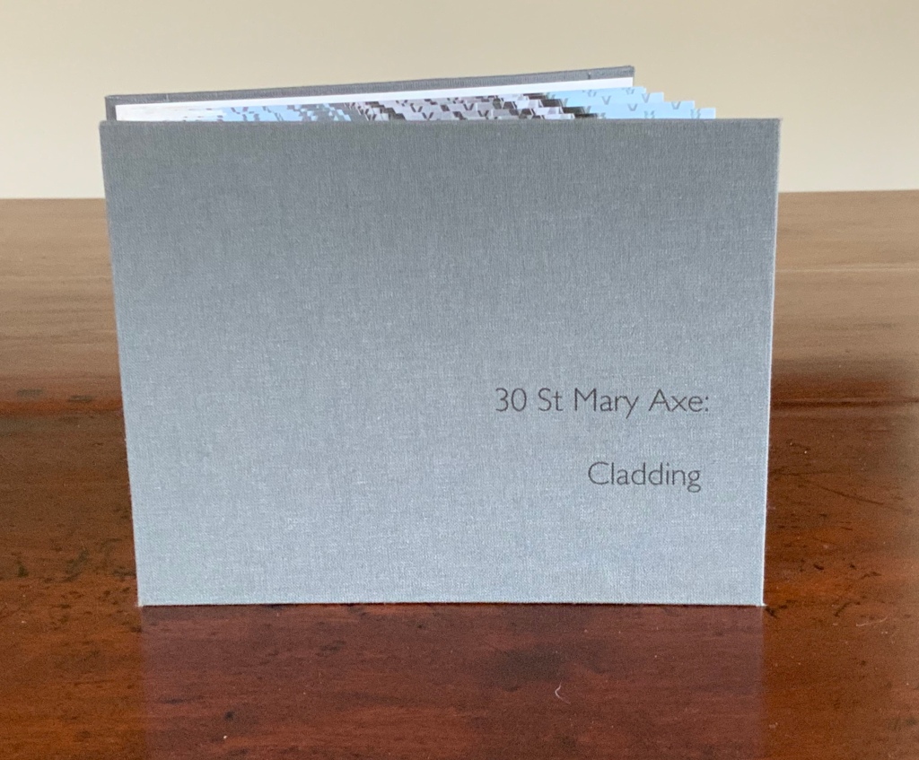
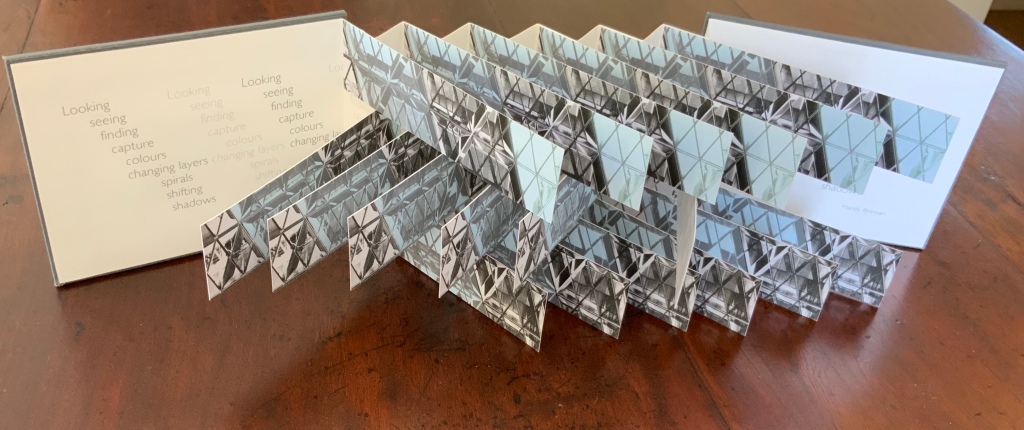
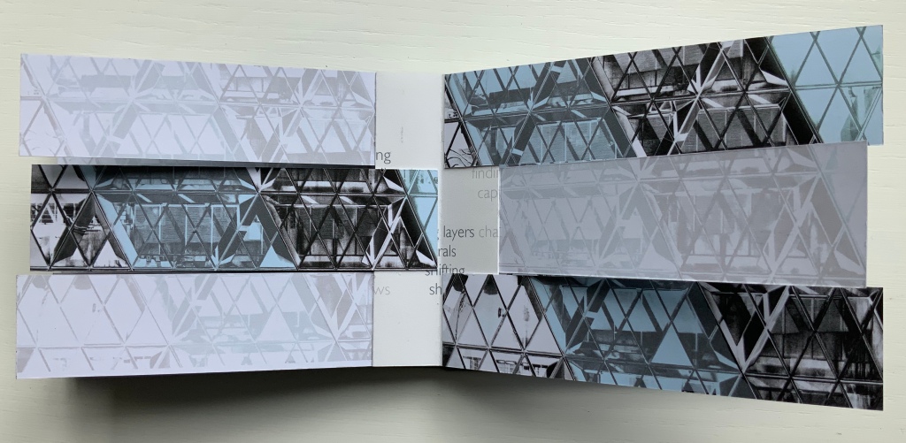
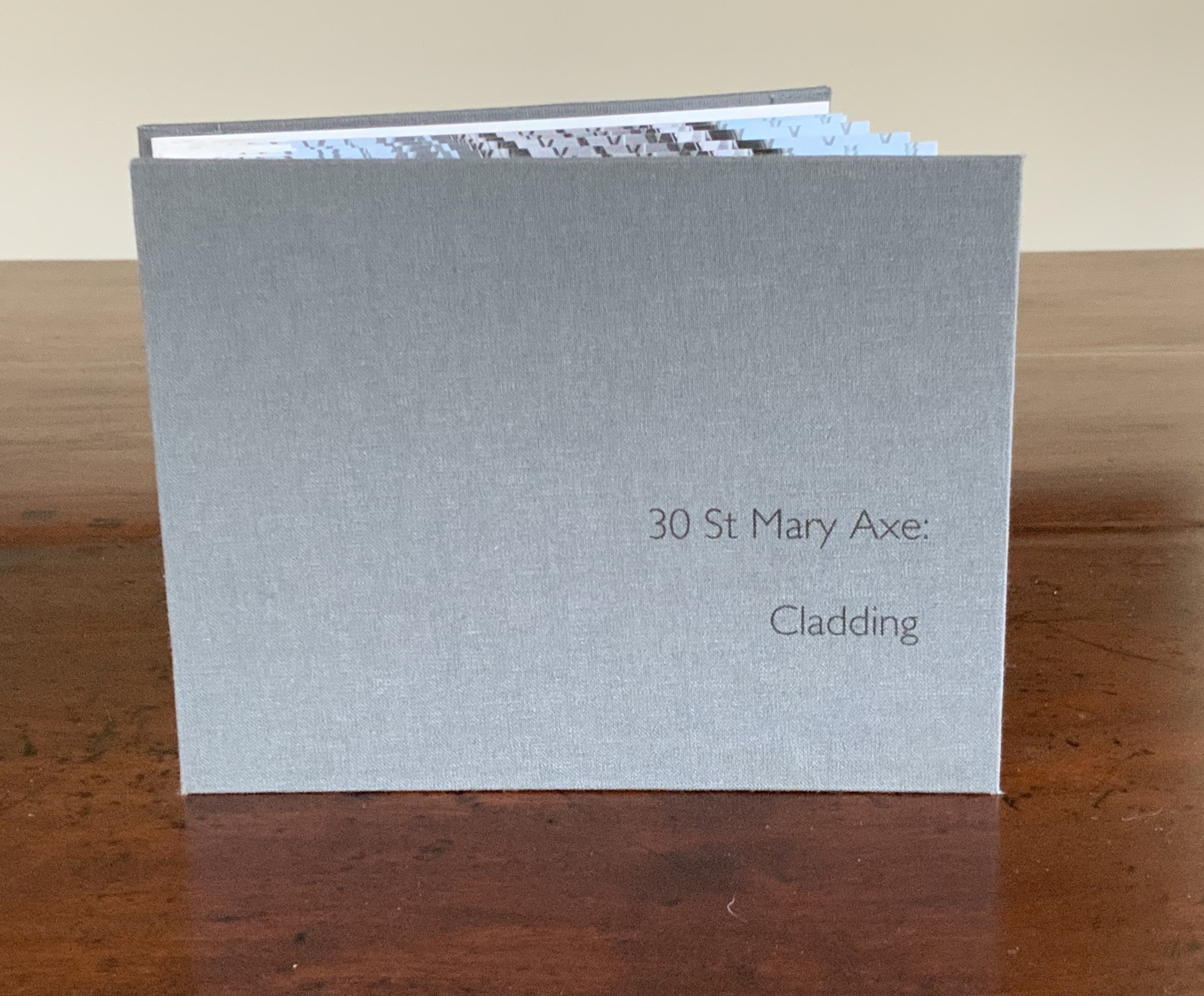
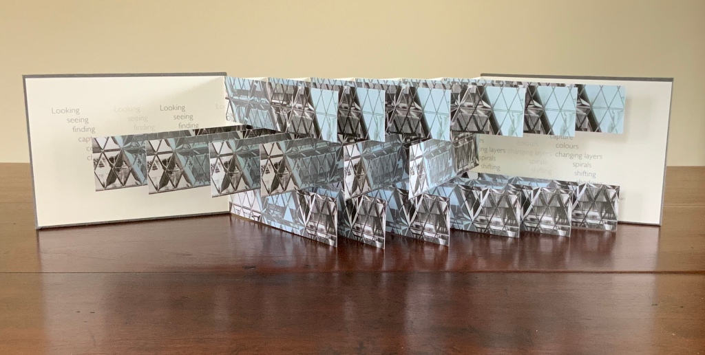
30 St Mary Axe: Cladding (2009)
30 St Mary Axe: Cladding (2009) Mandy Brannan Flagbook. H102 x W134 mm. Edition of 20, unnumbered. Acquired from the artist, 20 March 2019. Photo: Books On Books Collection
This work 30 St. Mary Axe: Cladding(2009) and 30 St Mary Axe: Diagrid (2009) are among several architecture-inspired works of book art that Brannan has created. The text in the one called Situated could have come straight from Pallasmaa, Bachelard or Merleau-Ponty:
Being situated is generally considered to be part of being embodied, but it is useful to consider each perspective individually. The situated perspective emphasizes that intelligent behaviour derives from the environment and the agent’s interactions with it.
Clearly we are not dealing with some mere mimetic piece of craftwork.
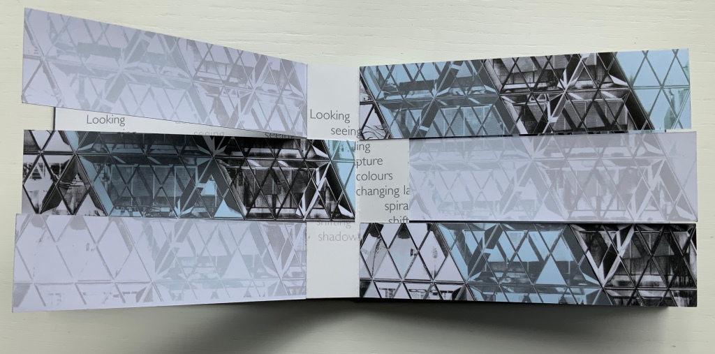
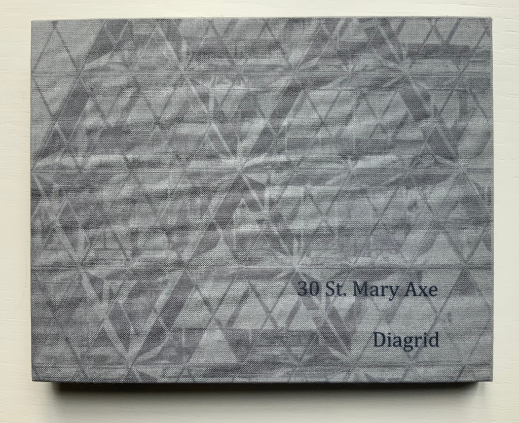
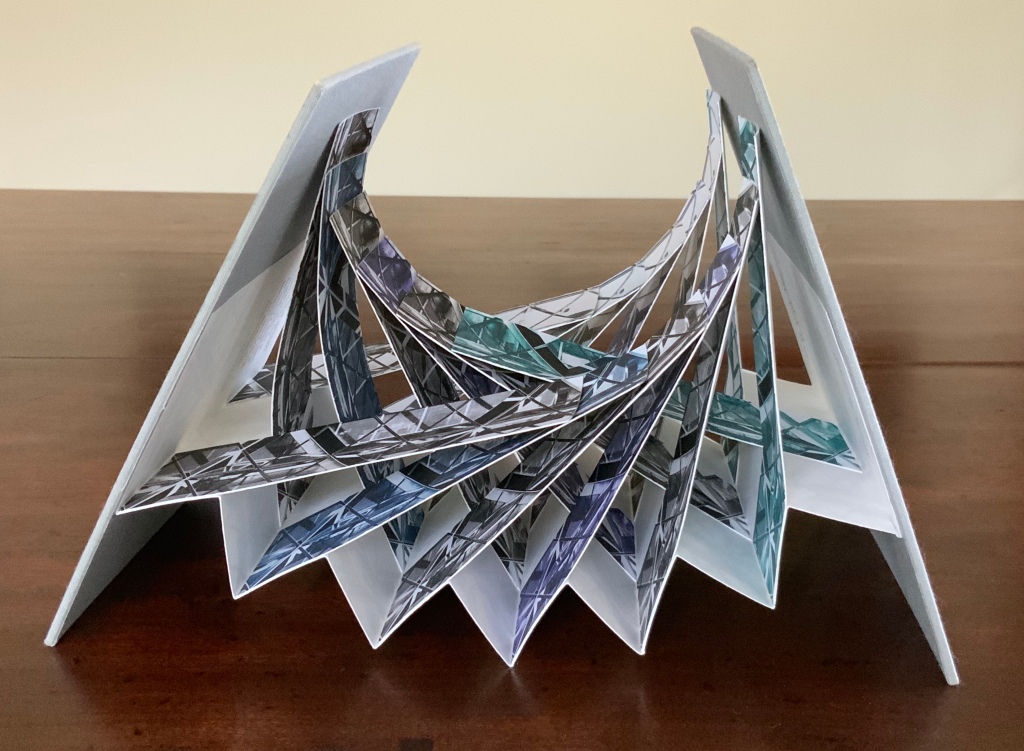
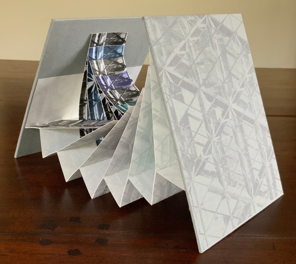
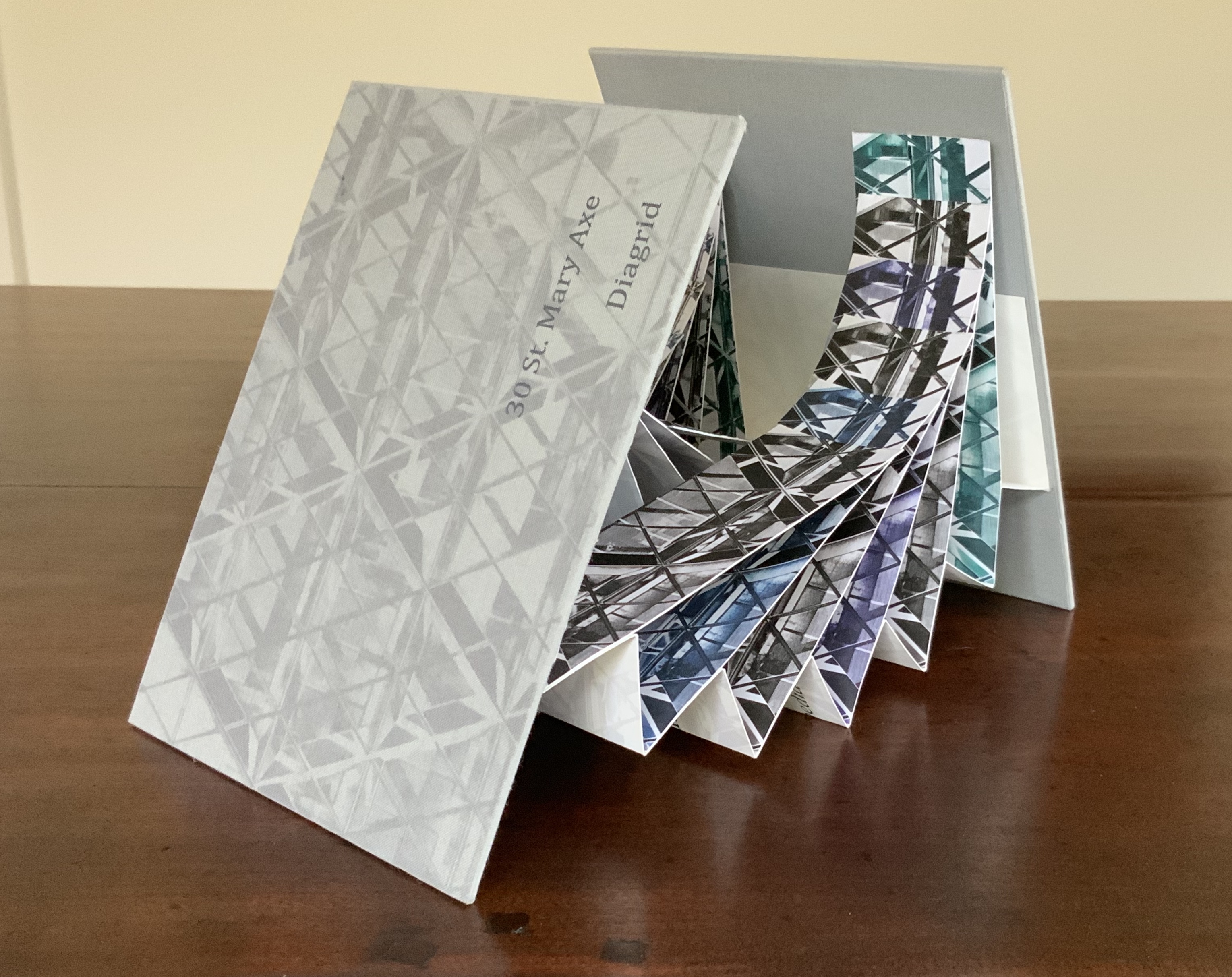
30 St Mary Axe: Diagrid (2009)
30 St Mary Axe: Diagrid (2009) Mandy Brannan Modified flagbook. H121 x W154 mm. Edition of 20, unnumbered. Acquired from the artist, 20 March 2019. Photos: Books On Books Collection
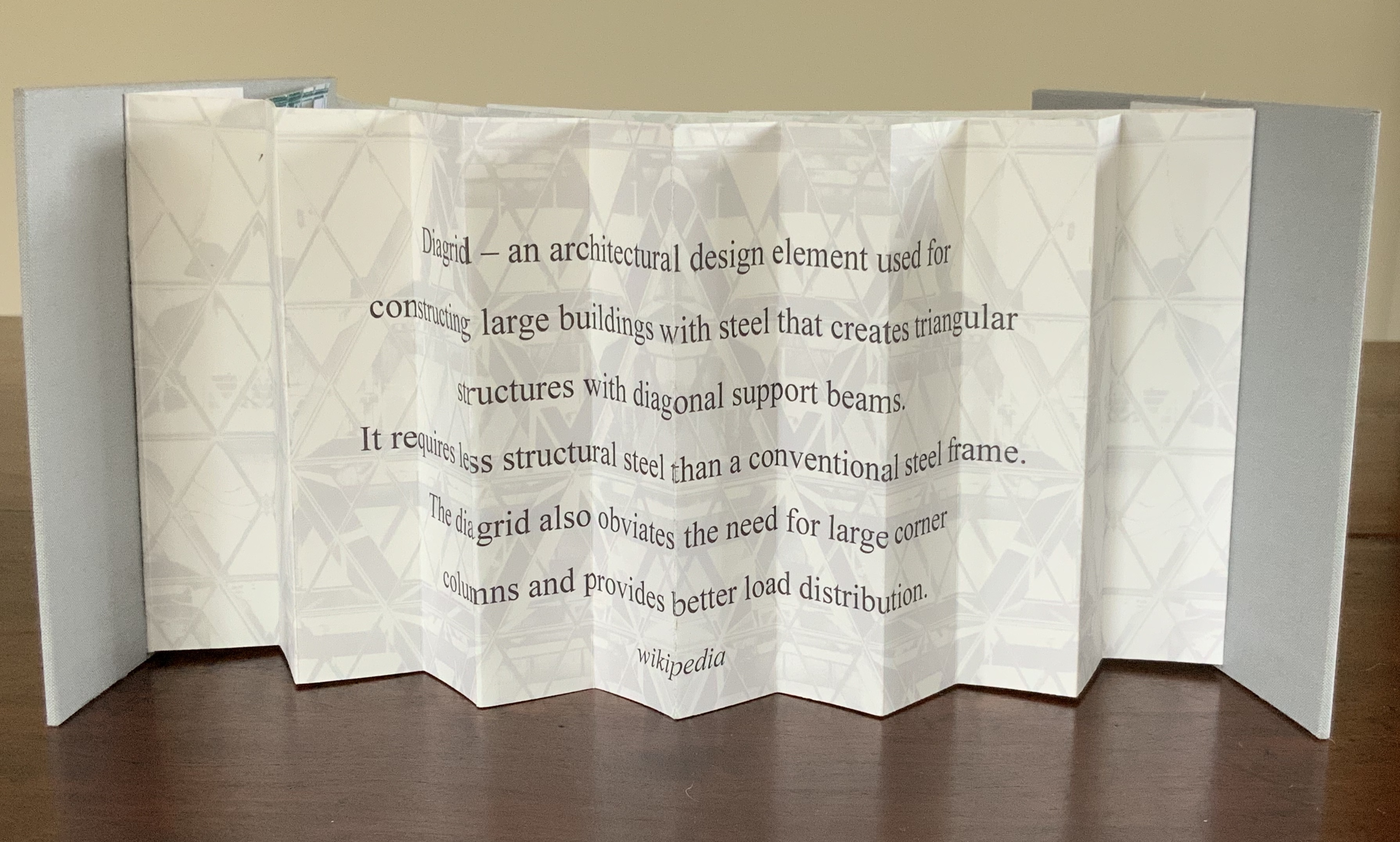
Cladding uses a straightforward flagbook structure, but not only is it double-sided with the architectural photographs, it also places text on the inner side of the accordion support and a statement about the 5,500 panels of glass cladding on the Gherkin. The modification in Diagrid is the inward curving of the flags and their formation of the shape recalling the Gherkin. The wording on the reverse of the accordion is the definition of the architectural term diagrid: “a design element used for constructing large buildings with steel that creates triangular structures with diagonal support beams”.
In addition to the flagbook- and modified-flagbook arrangements of the photos, Brannan has enriched the substance of these works with her manipulation of her photograph of 30 St Mary Axe, reflecting a nearby building. Using several different methods, digital programs and then printer settings for digitally printing, she delivers an almost kaleidoscopic, reflective and self-reflexive effect in each work. In a sense, the work demonstrates the artist’s behavior — her choices of material, subject, text and technique in each work’s making — and how it derives from her environment and her interactions with it. By integration of text, image, color, structure and material, Brannan also situates the “Gherkin’s” architecture in our hands and gives us the opportunity to contemplate, appreciate and perhaps experience the sense of being situated and embodiment.
Further Reading
“Architecture“, Bookmarking Book Art, 12 November 2018.
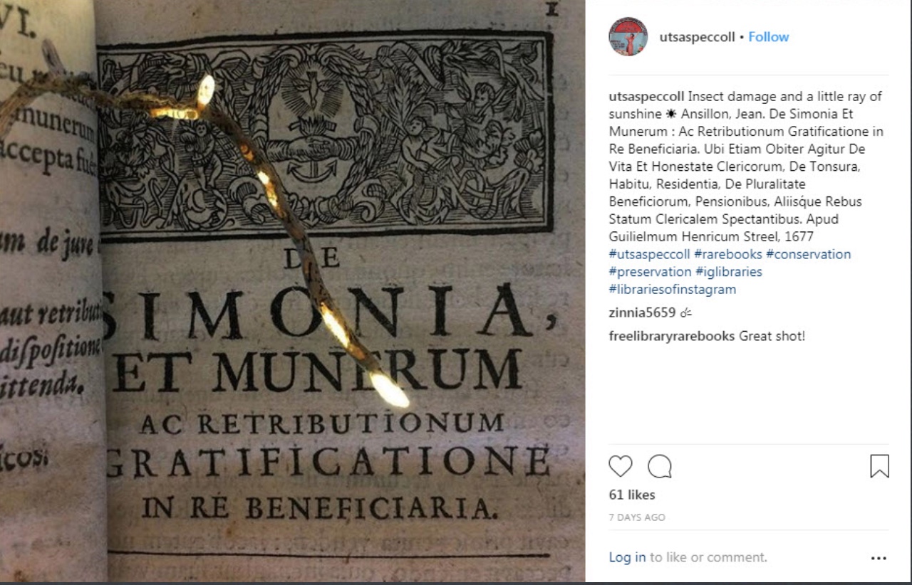
Photo: Agnieszka Czeblakow, University of Texas at San Antonio Special Collections
Staff in Special Collections at the University of San Antonio libraries caught this sudden slant of sunlight on insect-damaged pages. It makes a good start for a serendipitous trek across conservation, book history and book art.
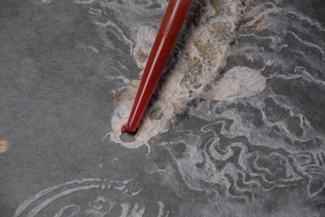
Those dry tunneled pages tear easily with turning, compounding the loss with further damage. To forestall such damage, the areas of loss could be filled page by page with Japanese paper (kozo or gampi) or with paper pulp. The Smithsonian’s book conservation lab illustrates the former method here:
The mending with Japanese paper reminds me of passages in A Degree of Mastery, where the author describes mending rare books with kozo paper under the eagle eye of the late Bill Anthony. The mending with paper pulp though recalls the painstaking art of Pat Gentenaar-Torley.
Working on pulp painting from the front to the back Photo credit: courtesy of Pat Gentenaar-Torley
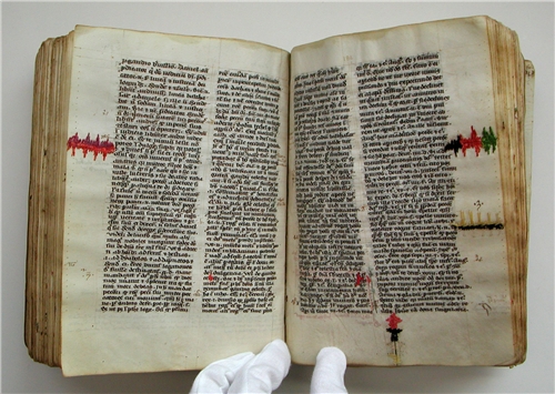
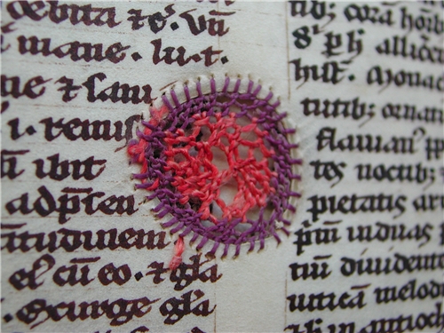
Three centuries before the paper in the San Antonio book was printed, bound and readied for damage in the centuries to follow, parchment — sturdier as it was — had its inherent flaws and elicited peculiar remedies for tears and loss. Erik Kwakkel’s site and books illustrate and celebrate several examples of what he calls “the beauty of the injured book”:
Dreamcatchers spring to mind. What were the thoughts caught in words now missing on these pages, words slipped from the dreamcatching pages? Our medieval “dreamcatcher” conservator seems to have in mind more than the principles of modern conservation — perhaps something more akin to kintsugi.
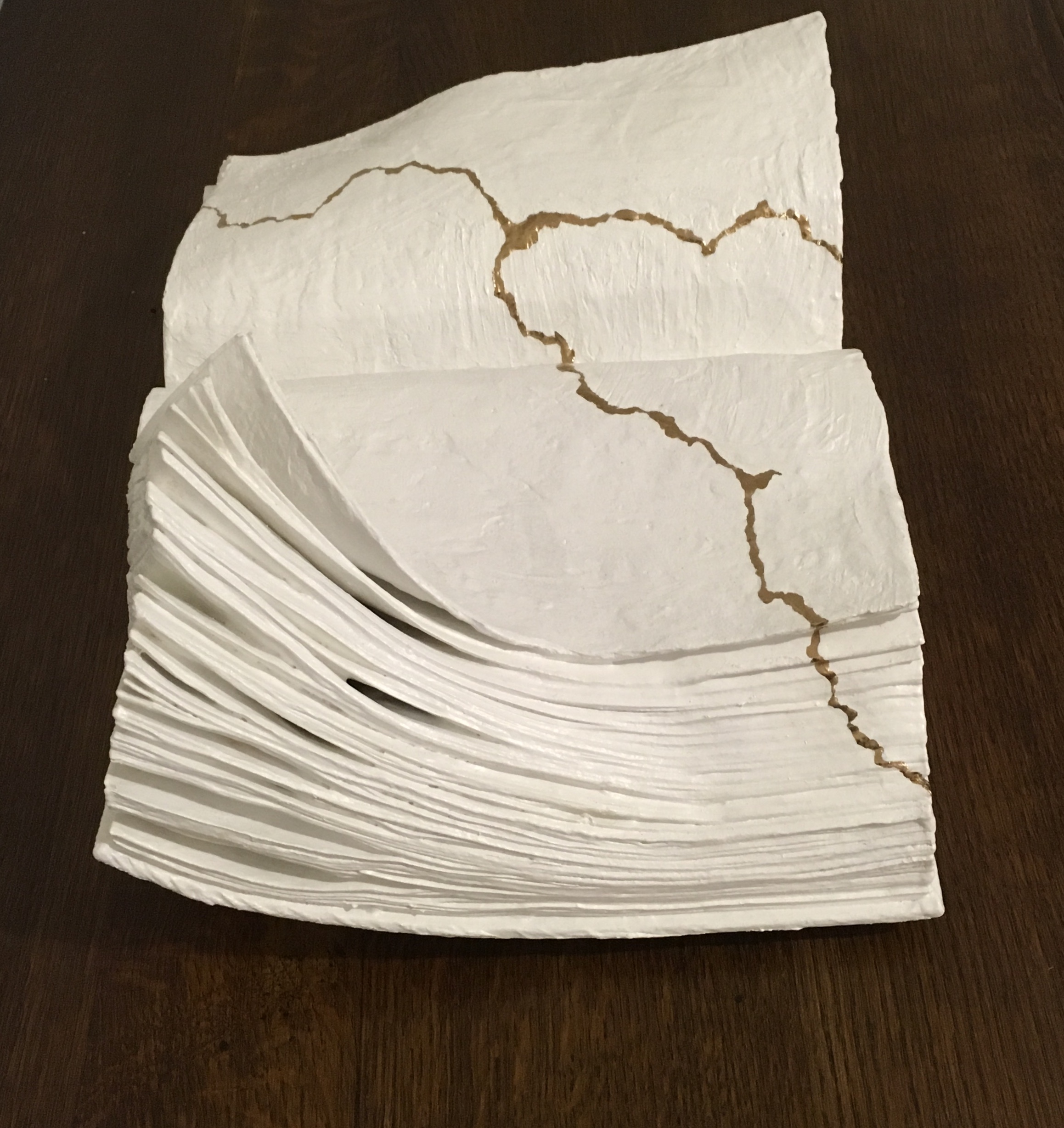
Kintsugi (or kintsukuroi) is a Japanese method for repairing broken ceramics with a special lacquer mixed with gold, silver, or platinum. The philosophy behind the technique is to recognize the history of the object and to incorporate the repair visibly into the new piece instead of disguising it.
Several centuries later, confronted with an 18th century volume of Horace, UK bookbinder Kathy Abbott was similarly inspired. Her story is recounted in Flash of the Hand (13 December 2015) and Skin Deep (Spring 2017).
Q. Horatii Flacci Carmina Expurgata (1784) Conserved binding ‘Kintsugi’ style, 2011 Hand-dyed alum tawed thongs, hand-gilded hand-made paper Kathy Abbott Photo from Skin Deep (Spring 2017). Accessed 31 December 2018.
Whether this is “conservation binding” is a debated point. According to Jeff Peachey, it is “very creative repurposing of existing binding elements that add a new layer of meaning to old books, which is, I submit, more properly considered book arts” [Correspondence with Books On Books, 13 August 2018].
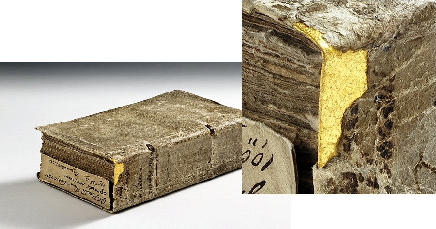
The extensive and well-documented work of Mark Cockram, book artist, master bookbinder and founder of Studio 5 Book Arts in London, bridges the debate. Cockram’s first venture with kintsugi occurred by accident, falling out of a separate, deliberate experiment to collaborate with nature — by burying books with the help of friends around the world and by submitting them to tanks of insects with the help of forensic entomologist Amoret Whitaker. Marc Webb (Park Light Pictures) captures Cockram’s original intent and results in this video created to accompany Cockram’s and nature’s works of art displayed at Pestival (2010). Cockram’s first kintsugi work, entitled Kintsugi (2013), came as a response to cracks appearing after freeze-drying the cover of one of sketchbooks buried in a garden in Bangkok.
Kintsugi (2013) Mark Cockram Unique. Buried book with 23.5 ct gold leaf inclusions. 15cm x 20cm. Courtesy of Maggs Brothers Ltd
So pleased with the outcome of the accident, Cockram produced Kintsugi 2 (2018).
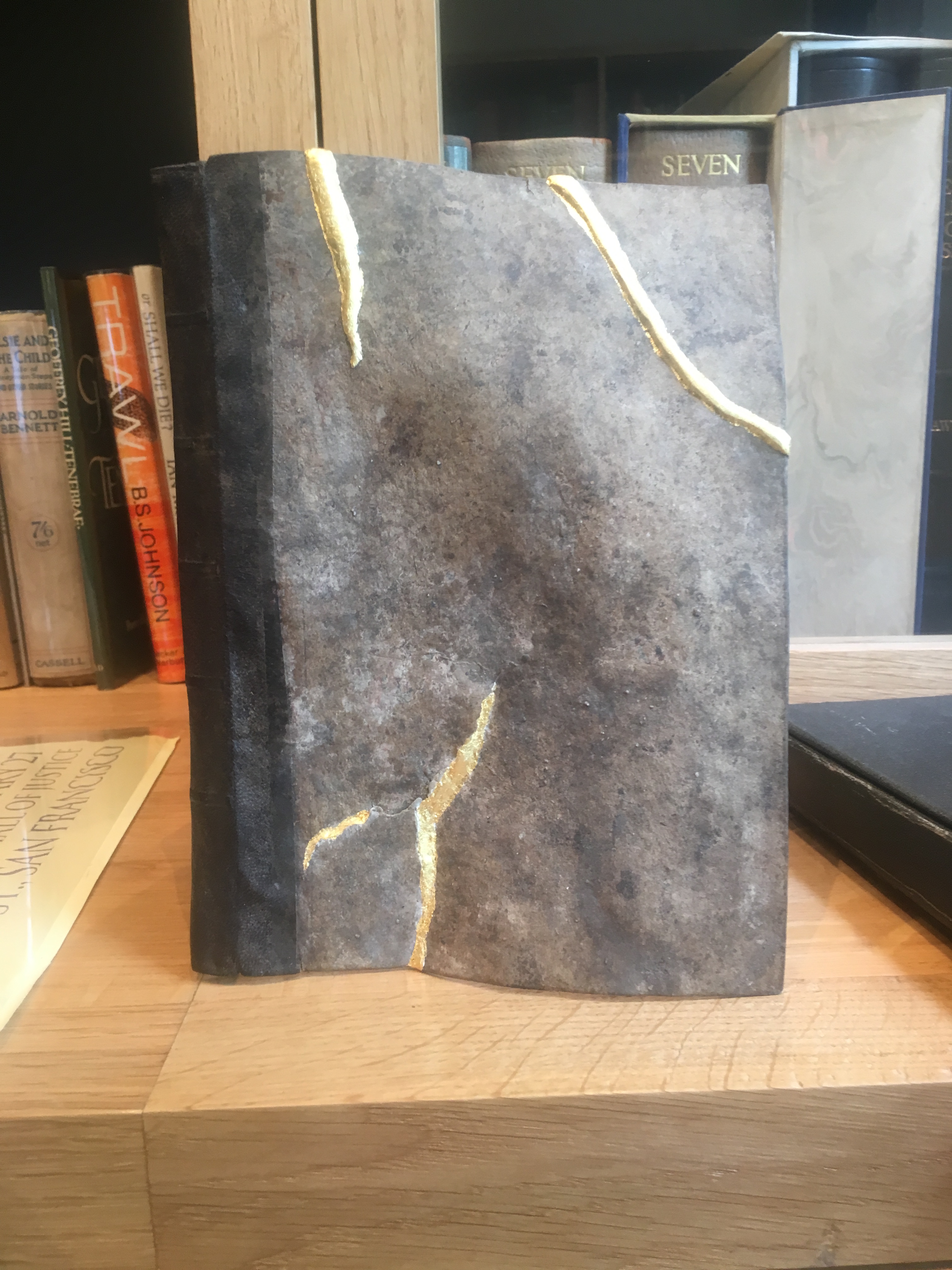
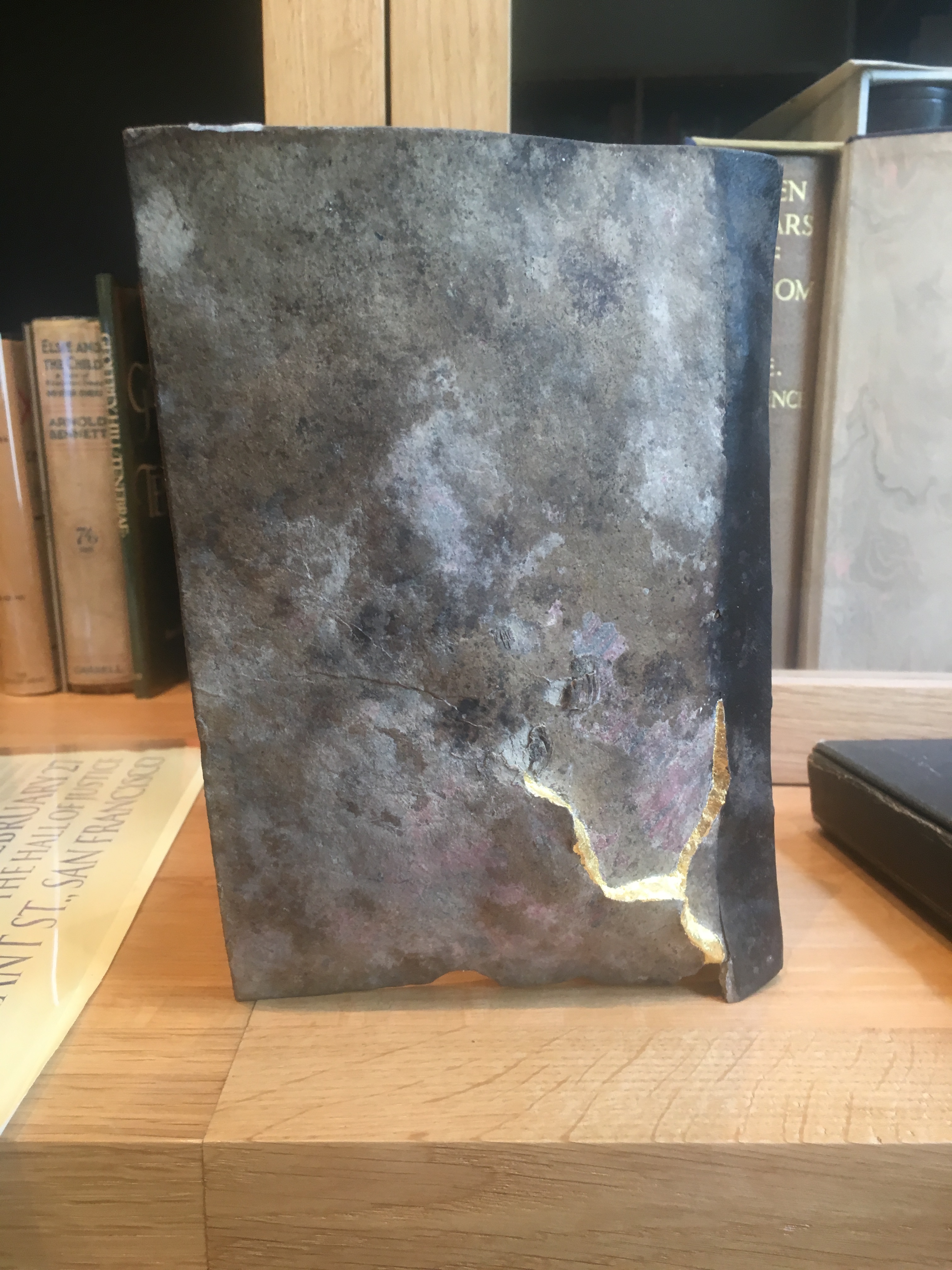
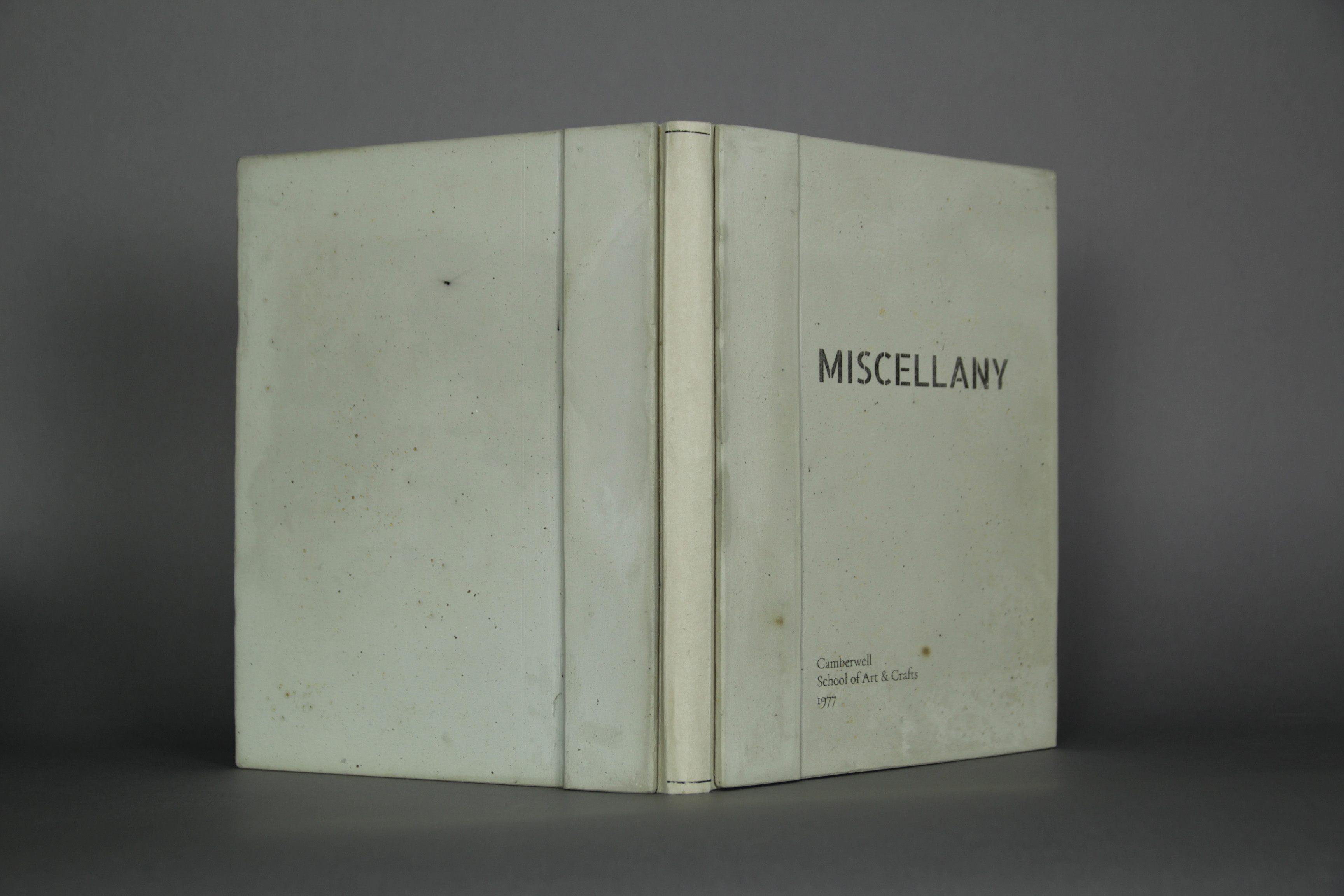
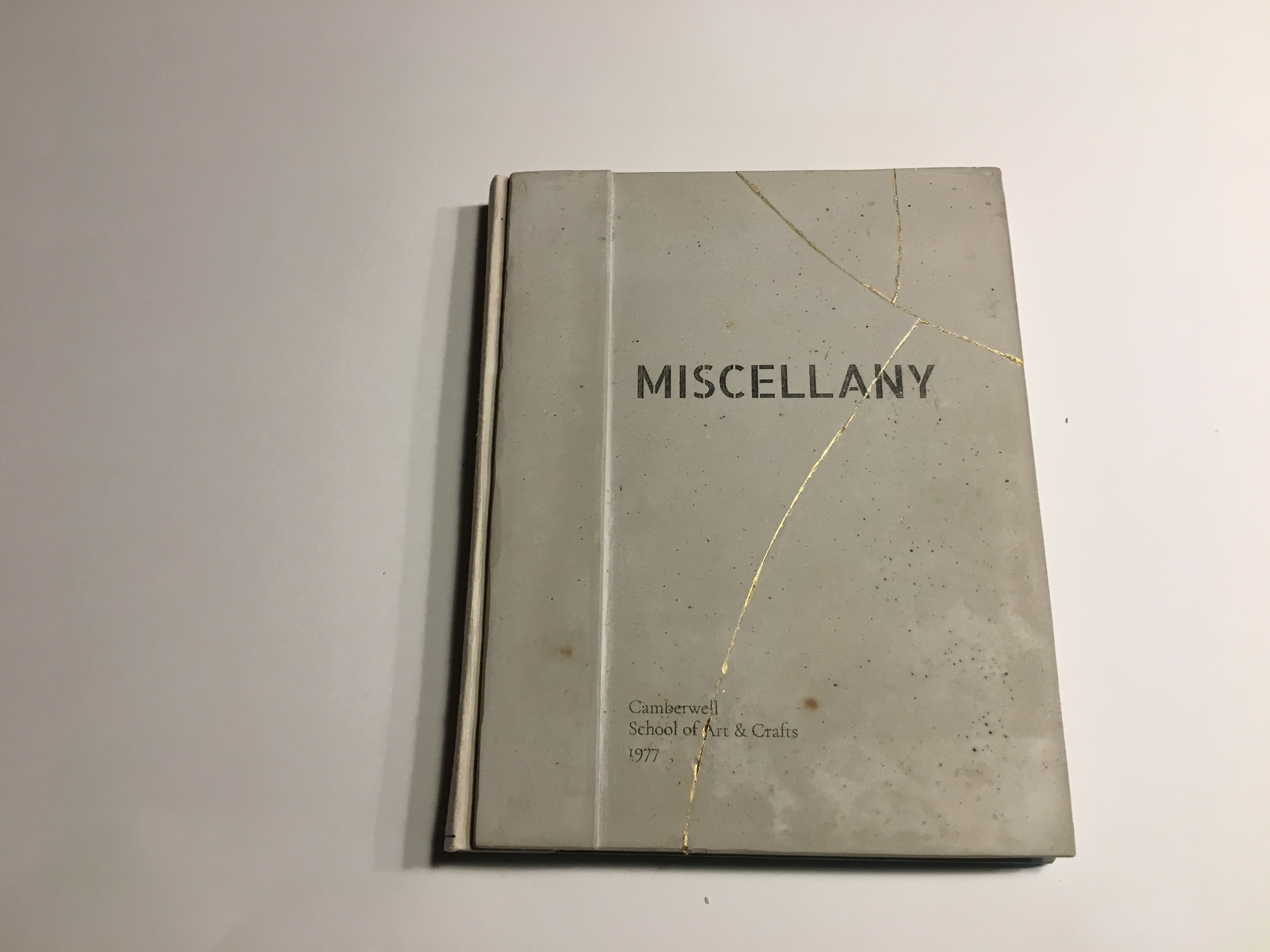
Another work of kintsugi-by-accident is Michele Emerick Brown‘s Miscellany, which began as an entry to the 2016 Guild of Book Workers’ binding exhibition. Sewn with a link stitch and of German paper case construction, it consists of printing examples from the bookbinding and restoration program at the Camberwell School of Art and Crafts, as it was known back in the 70s. Of more interest, its boards are made of Rockite (a concrete mix) and marble dust.
Miscellany (2018) Before breakage Michele Emerick Brown
After its not being accepted to the GBW exhibition, Brown writes,
I decided to enter it in the Artistree exhibit. I have a cottage in NH and thought I’d drop it off the same week-end I was meeting some friends. I took it out of the bag to show them, turned, tripped and dropped the book. Each board broke in several pieces. Very traumatic. It seemed like this book wasn’t meant to be exhibited.
After a couple of weeks I decided to glue it back together using construction adhesive and thought I would use gold leaf to highlight the cracks. While I was thinking about how to do it (what kind of glaire to use etc), someone told me about kintsugi. I ended up using gold acrylic (Golden). I went ahead and submitted it and it was accepted.[Correspondence with Books On Books, ]
Miscellany (2018) After breakage and “kintsugi” repair Michele Emerick Brown
Miscellany (2018) Inside view of concrete boards “before” breakage Michele Emerick Brown
Miscellany (2018) Inside front cover after breakage and “kintsugi” repair Michele Emerick Brown
Another “kintsugi book artist” is Lorenzo Perrone. Much like Werner Pfeiffer, Perrone has focused on the book as unreadable object and, as his site called “Libribianchi” implies, almost completely white.
Kintsugi (2018) Lorenzo Perrone Mixed media: book, plaster, white and gold pigments 42x26x16cm
Evident from this video about Perrone and this one about Pfeiffer, Perrone’s work is more romantic in a literary sense. His recent adoption of bronze and installations adds an elemental, alchemical, even phenomenological feel to his oeuvre. As he puts it, “Before, water was enough to make paper malleable, now I need fire to make bronze compliant.” Despite the disappearance of text in Perrone’s works, they still perform that ekphrastic act of book art and send me back to re-read — this time Bachelard’s Water and Dreams and Fragments of a Poetics of Fire.
Like the pleasure of kintsugi, an increase of enjoyment in something elemental, something fusing the past with the present, the broken with the re-created and the head with the heart.
Architecture — be it theory, principles, practices or instances — inspires book art. Lay the book flat; you have a foundation. Open and turn it on its fore-edge; you have a roof beam or arcade. Stand it upright; you have a column or tower. Turn the front cover; you open a door. Put the text and types under a microscope; you have a cityscape. As the examples in this virtual exhibition show, architecture-inspired book art goes beyond these simple analogies.
There are seemingly unrelated texts that help considerably in going there. The Eyes of the Skin (2005) and The Embodied Image (2010) by Juhani Pallasmaa, architect, teacher and critic, are two of them. He writes as if he were an artist preparing an artist’s statement or descriptions of the book art below. The title of his earlier book gives away his alignment with the visual and tactile nature of book art. Pallasmaa’s two books will enrich anyone’s enjoyment of the works shown and mentioned here.
“Book. Space. House. Space of Movement“. Exhibition curated by Susanne Padberg, 7 May – 26 June 2026. Padberg, Susan (curator). 7 May – 26 June 2026. at Galerie Druck & Buch, Vienna, Austria. Accessed 22 May 2026. “The artist’s book as a three-dimensional space: forming a house, outlining, remembering, mimicking—thinking the human being within space. Between object and narrative, books unfold as architectural structures, as inhabitable thought-spaces, as reflections of individual and collective experience. The exhibition brings together artistic positions that expand the book as a spatial body.”
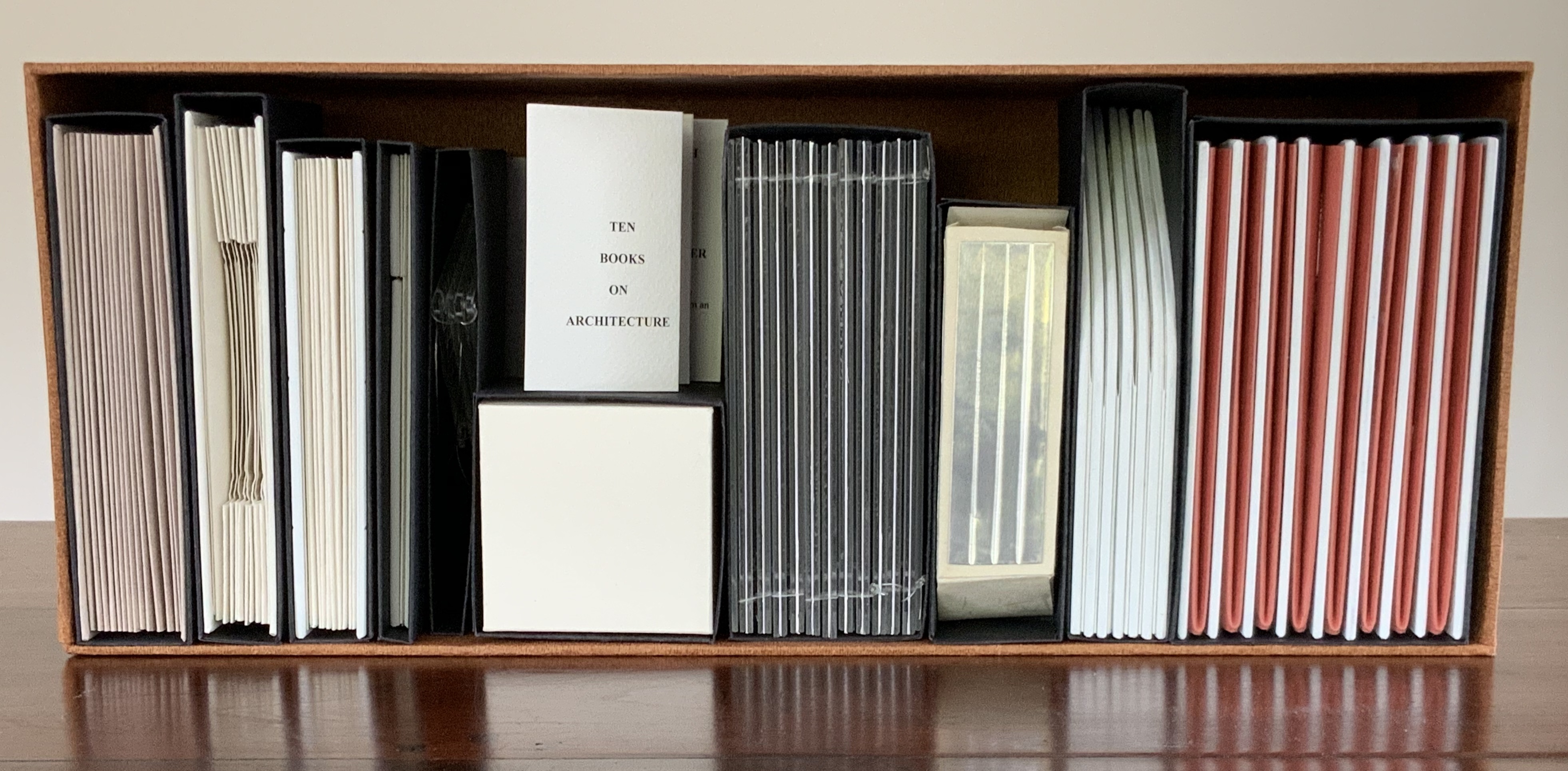
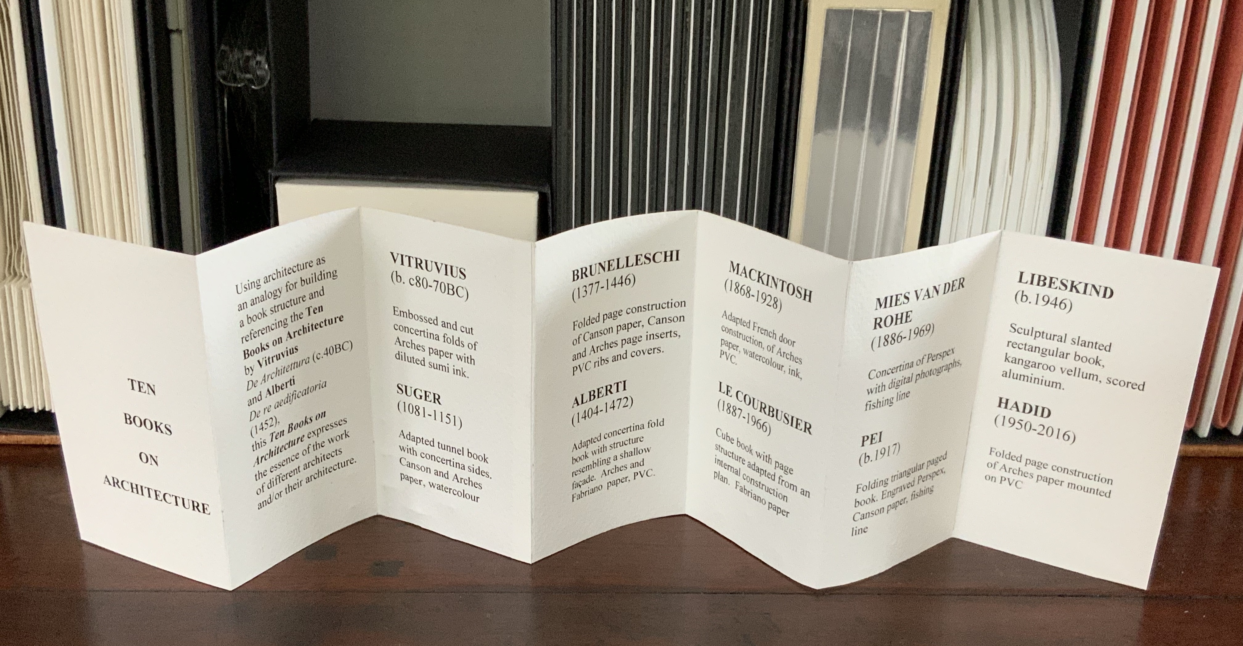
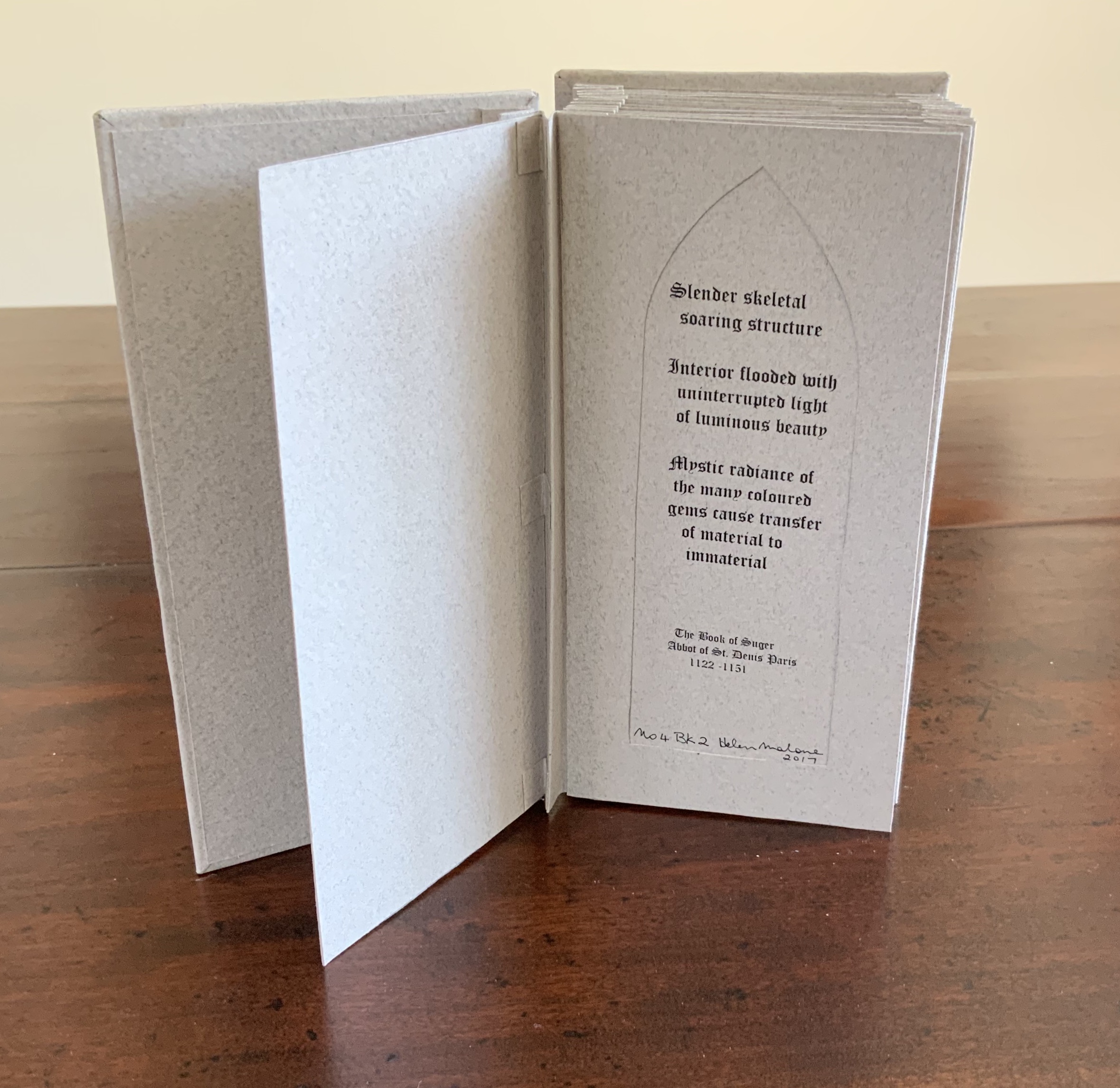
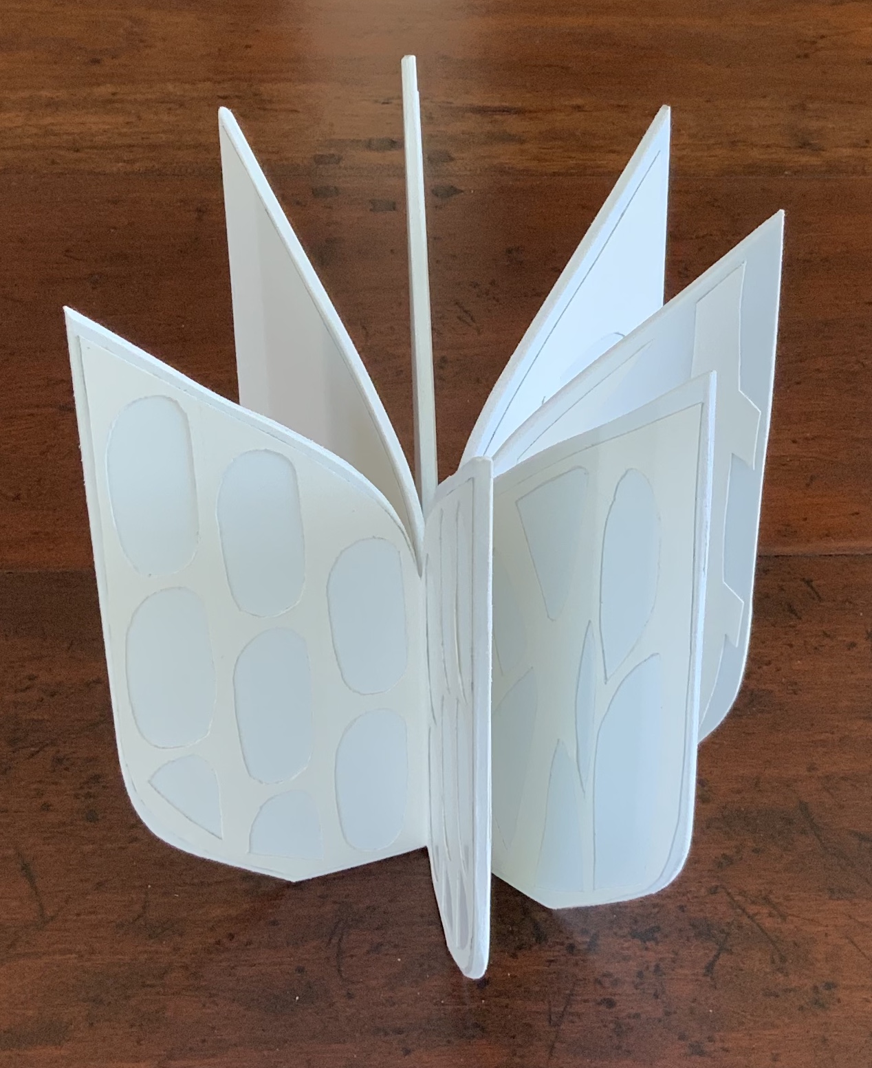
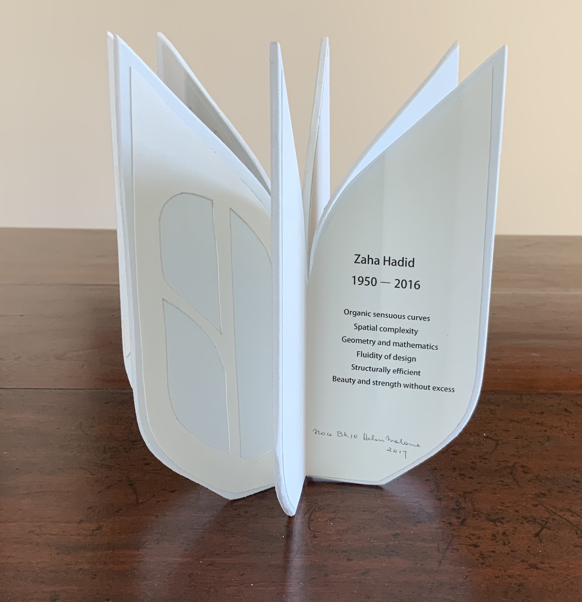
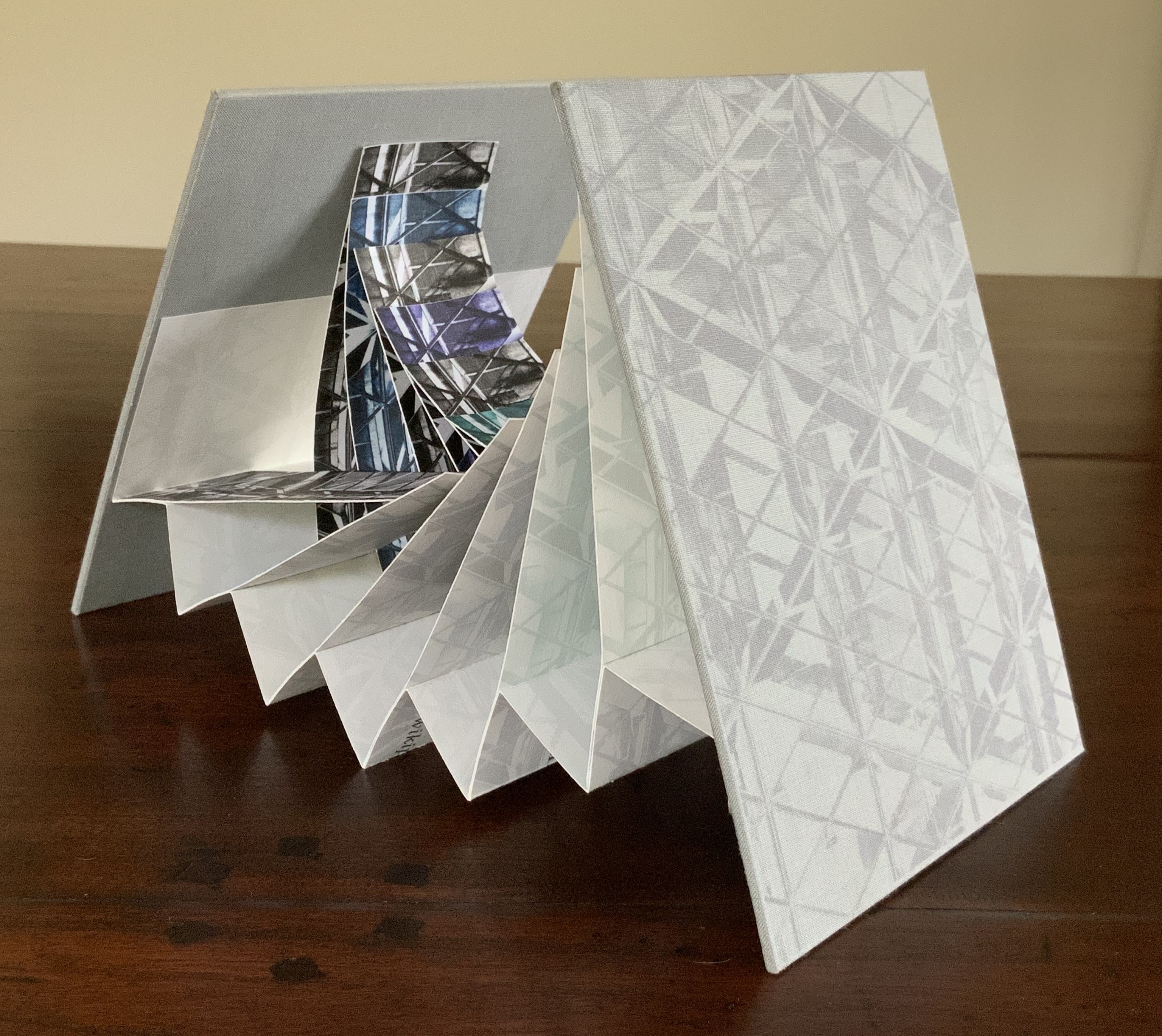
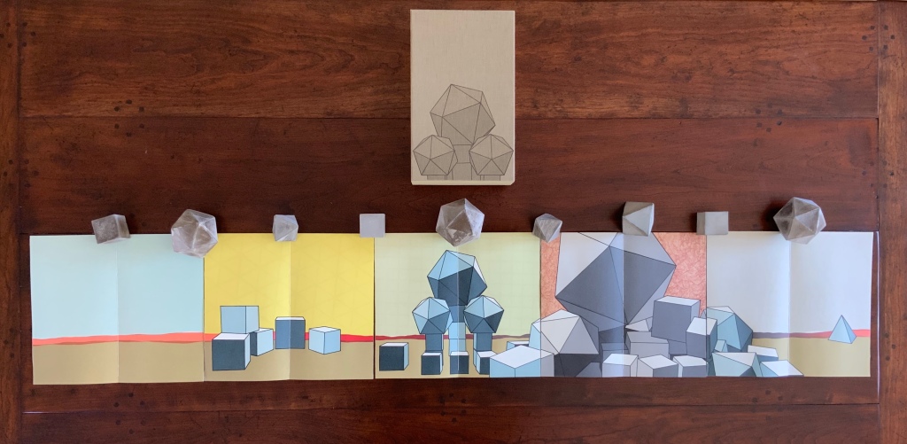
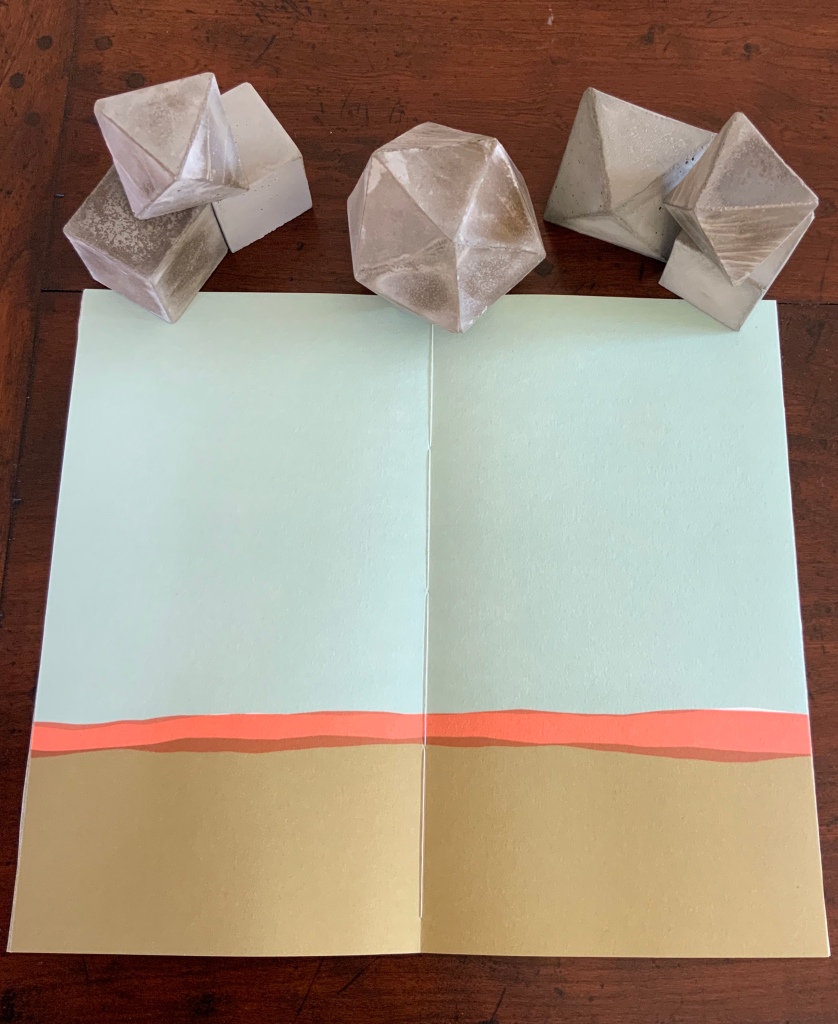
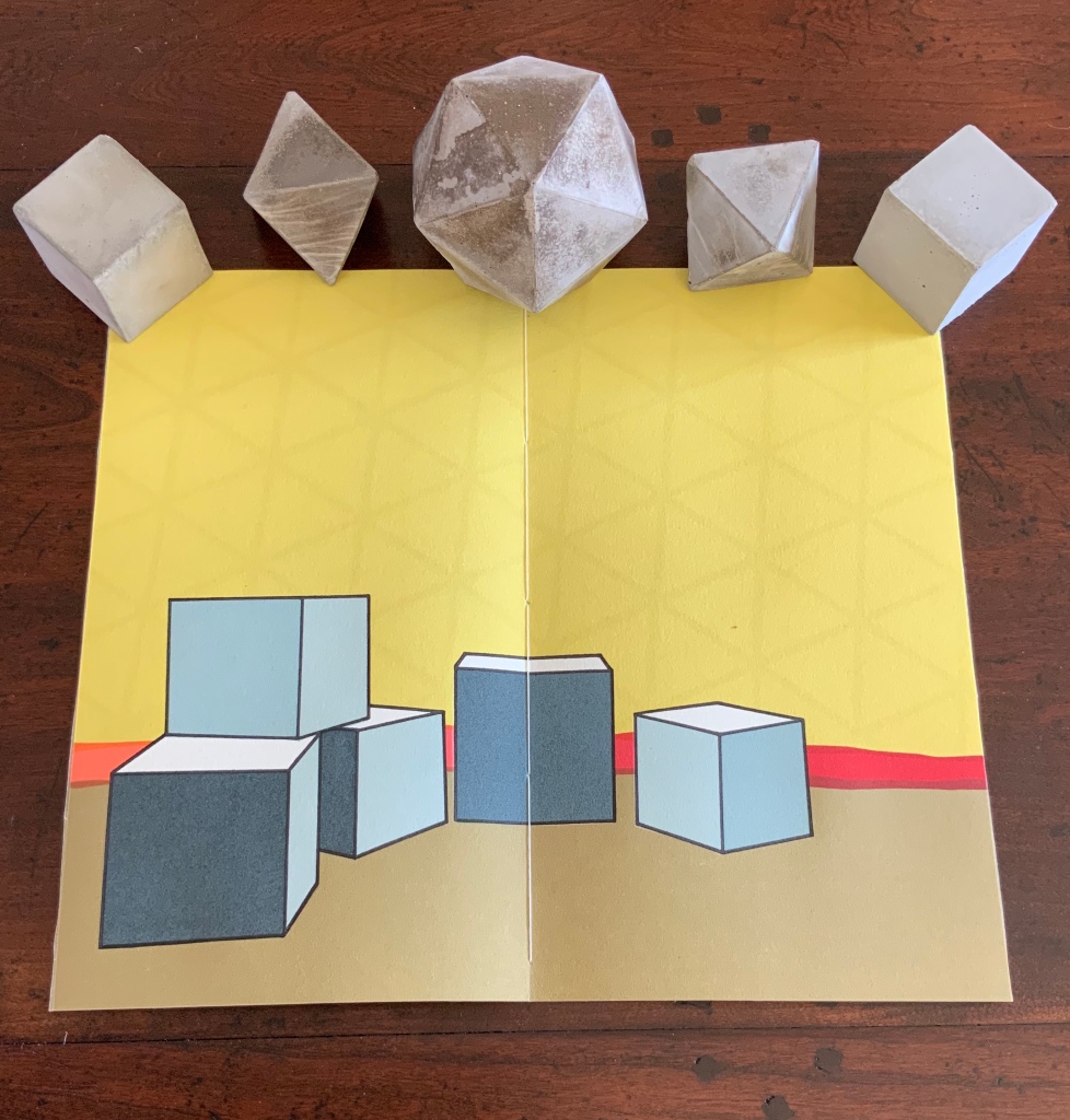
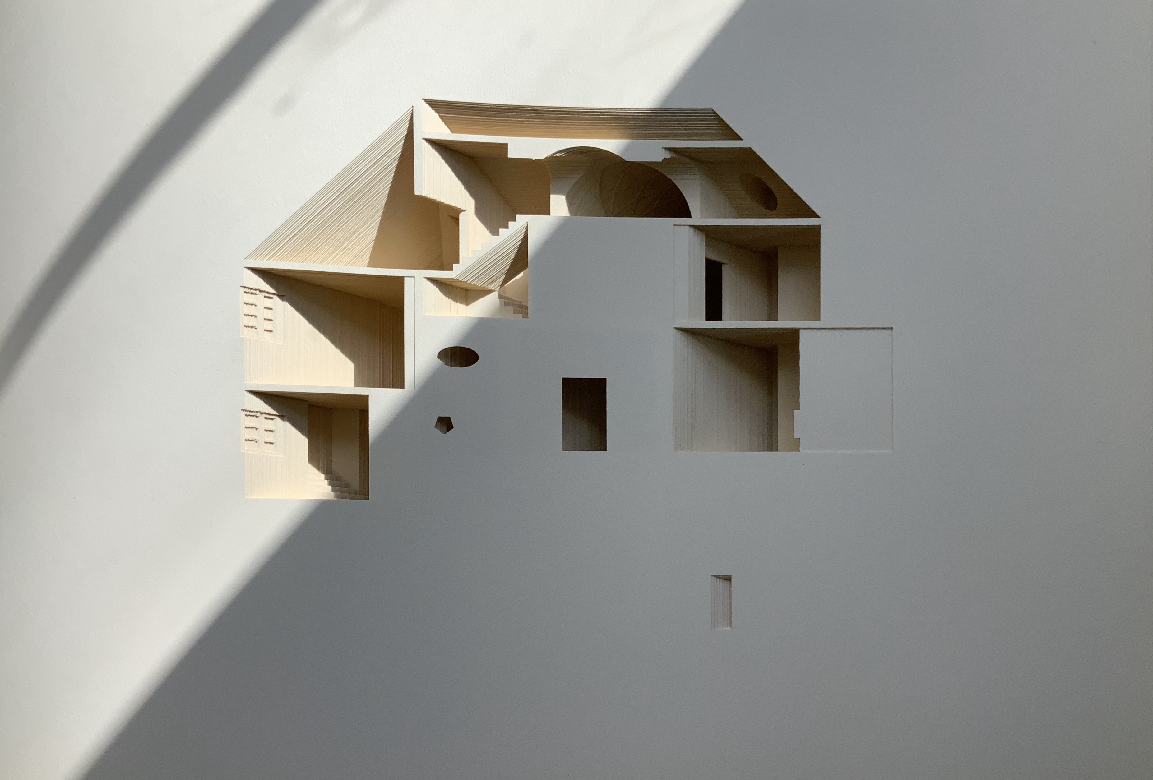
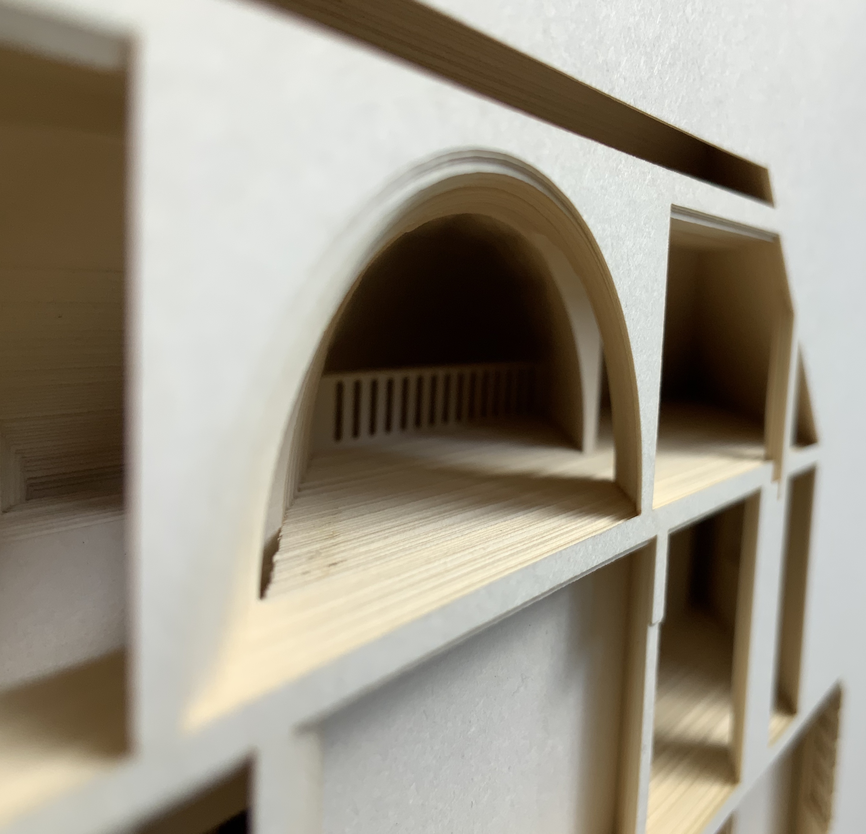
Malone’s Ten Books of Architecture is a good place to start in the collection. Like Pallasmaa, Malone takes a broad historical and, most important, haptic view of architecture from Vitruvius to Hadid. Each of the ten books is a bookwork that exemplifies its subject.
Adapted tunnel book with accordion sides Photo: Books On Books Collection
A watercolour at the tunnel’s end to evoke the stained glass clerestory windows in the Basilique Saint-Denis, Paris Photo: Books On Books Collection
The aspiration to fuse the cosmic and the human, divine and mortal, spiritual and material, combined with the systems of proportion and measure deriving simultaneously from the cosmic order and human figure, gave architectural geometries their meaning and deep sense of spiritual life.The Embodied Image, p. 23.
And further apropos the link between the book and architecture, consider the connection that Vasari drew between Gutenberg and Alberti:
In the year 1457 [sic], when the very useful method of printing books was discovered by Johann Gutenberg the German, Leon Batista [sic], working on similar lines, discovered a way of tracing natural perspectives and of effecting the diminution of figures by means of an instrument, and likewise the method of enlarging small things and reproducing them on a greater scale; all ingenious inventions, useful to art and very beautiful. Lives of the Most Eminent Painters, Sculptors and Architects, vol. 1, trans. Gaston Du C. de Vere (London: Medici Society/ Philip Lee Warner, 1912-1914), 494.
In “An Architectural Confession”, Pallasmaa writes:
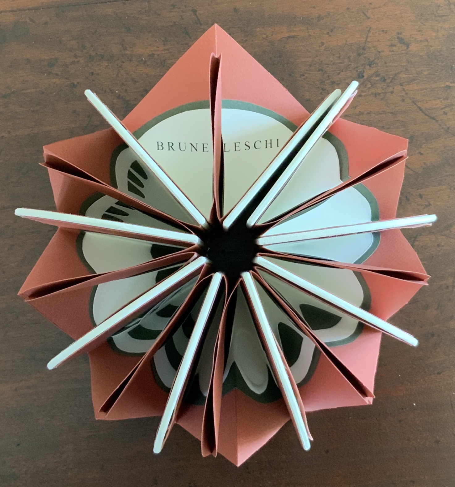
One’s most important teacher may have died half a millennium ago; one’s true mentor could well be Filippo Brunelleschi or Piero della Francesca. I believe that every serious artist — at the edge of his/her consciousness — addresses and offers his/her work to a superior colleague for approval.The Eyes of the Skin, p. 82.
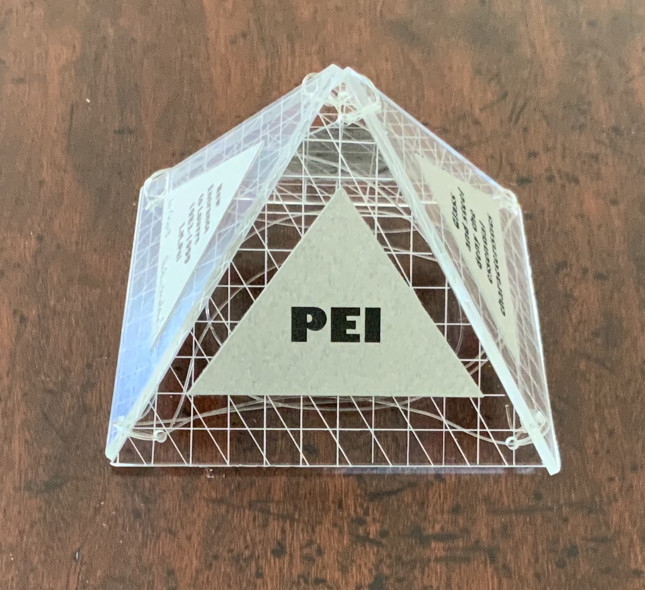
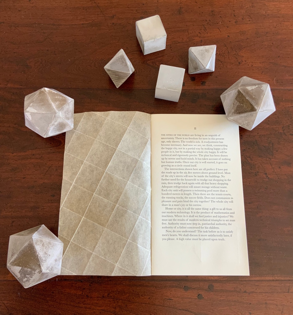
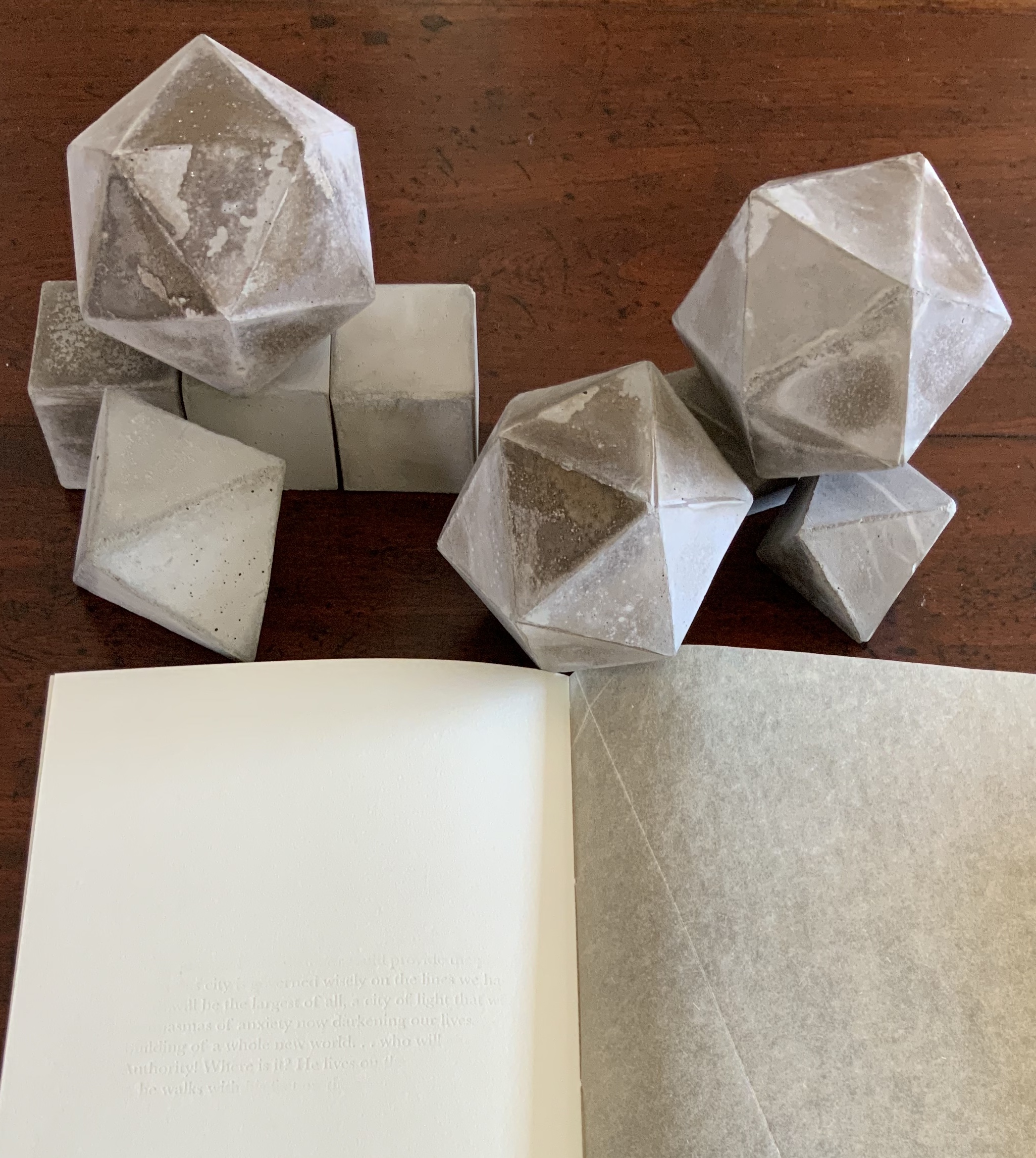
This curiously textured cube sits perfectly alongside Pallasmaa’s observation: “The basic geometric shapes have their symbolic connotations, but more important than their conventional meanings are their conceptual and visual organising powers” (The Embodied Image, p. 58).
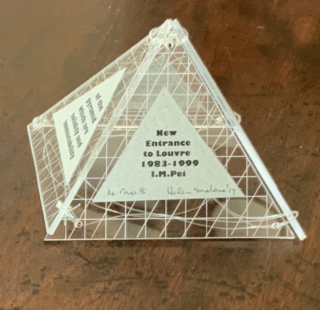
A short trip around this small pyramid as a reminder of the entrances that were always on the far side of museums you visited Photos: Books On Books Collection
This edition of Malone’s Ten Books is unique in its inclusion of Hadid, who is not mentioned in either of Pallasmaa’s books but whose artistry and turn to the organic and curves of nature certainly fit with their spirit. Photo: Books On Books Collection
Malone’s Ten Books has a predecessor in Laura Davidson’s contribution to the 1994 Smithsonian show on book art inspired by its collection of rare science books (see section below). Although there is also Karen Wirth’s sculptural take on the Ten Books as well as Ron Keller’s take (see section below) on Palladio’s Fours Books of Architecture, which is Palladio’s take on Vitruvius, I have not found any other Vitruvian-inspired works of book art. (Pointers welcome.)
These two works — 30 St Mary Axe: Diagrid (2009) and 30 St. Mary Axe: Cladding(2009) — are among several architecture-inspired works of book art that Brannan has created. The text in one of those several — Situated — could have come straight from Pallasmaa, Bachelard or Merleau-Ponty:
Being situated is generally considered to be part of being embodied, but it is useful to consider each perspective individually. The situated perspective emphasizes that intelligent behaviour derives from the environment and the agent’s interactions with it.
30 St Mary Axe: Diagrid(2009) Mandy Brannan London has nicknamed the building at 30 St. Mary Axe “the Gherkin”. Photo: Books On Books Collection
In the The Radiant Republic (2019), Sarah Bryant (Big Jump Press) brings together concrete, wood, glass, paper, ink and embossed printing, sewn binding, box container and texts from Plato and Le Corbusier.
Note the embossed text on the verso. Across the five volumes, the embossed text is the same as that printed in ink, but it runs in fragments backwards from this last page of the last volume to the last page of the first volume. Photo: Books On Books Collection
Bryant’s insightful integration of Plato’s and Le Corbusier’s texts and ideas and her setting them in the physicality of the blond wood, linen cover, embossed type and sewn papers could easily be a response to Pallasmaa’s comment in The Eyes of the Skin: “The current overemphasis on the intellectual and conceptual dimensions of architecture contributes to the disappearance of its physical, sensual and embodied essence.” (p. 35)
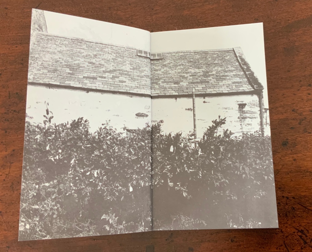
Chinese Whispers (1975) is conceptual, visual and spatial narrative that takes the reader into a “game of embedded games”: a game of Chinese Whispers used by the artists to combine the process of making a book with the process of recovering an old cottage, making a corner cupboard, making jam, making ideas and making an exit.
Chinese Whispers(1975) Helen Douglas and Telfer Stokes Photo: Books On Books Collection
The selection of images above begins with the front cover’s photo of a patch of grass outside an abandoned farm building and ends with the back cover’s photo of the underside of the patch of grass. In between, the pages take the viewer through the trimmed hedge and the doorway into the room, through the building, the stocking of the shelves, using of the stock and closing of the shed cupboard, and so back to the other side of the patch of grass. As Stokes explained in the Journal of Artist’s Books (Vol. 12, 1999):
We started with the corner cupboard, that was the part that occupied our thinking most, that and the two colour vignettes (as we called them) printed on different stock. But then we started to think backward to what might be before the cupboard’s construction. To the thing before that, and the thing before that, and the thing before that which was cutting of the hedge and before that which was the boot brush which we called the hedgehog- that was where the book started. Then we started to photograph from that point forward, through the book.
The work blends the features of book structure, collage and montage to create something that resonates uncannily with Pallasmaa’s approving citations of Bachelard’s central idea of the hearth and domicile as central to our time-bound “being-in-the-world”.
Your House is a laser-cut model of Olafur Eliasson’s residence in Copenhagen at a scale of 1:85, which means that each page equates to a 220 mm section of the actual house. How do you read a work like this — physically? At the 22″ mark in this video, the pages fall in a cascade like a flipbook, but for the most part, their size, accumulated bulk and weight — and delicacy — defy that handling. As in the video below, they must be turned slowly and carefully. Your House heeds the task of the arts as posed by the architect Juhani Pallasmaa, “in our age of speed, …to defend the comprehensibility of time, its experiential plasticity, tactility and slowness” (The Embodied Image, p. 78).
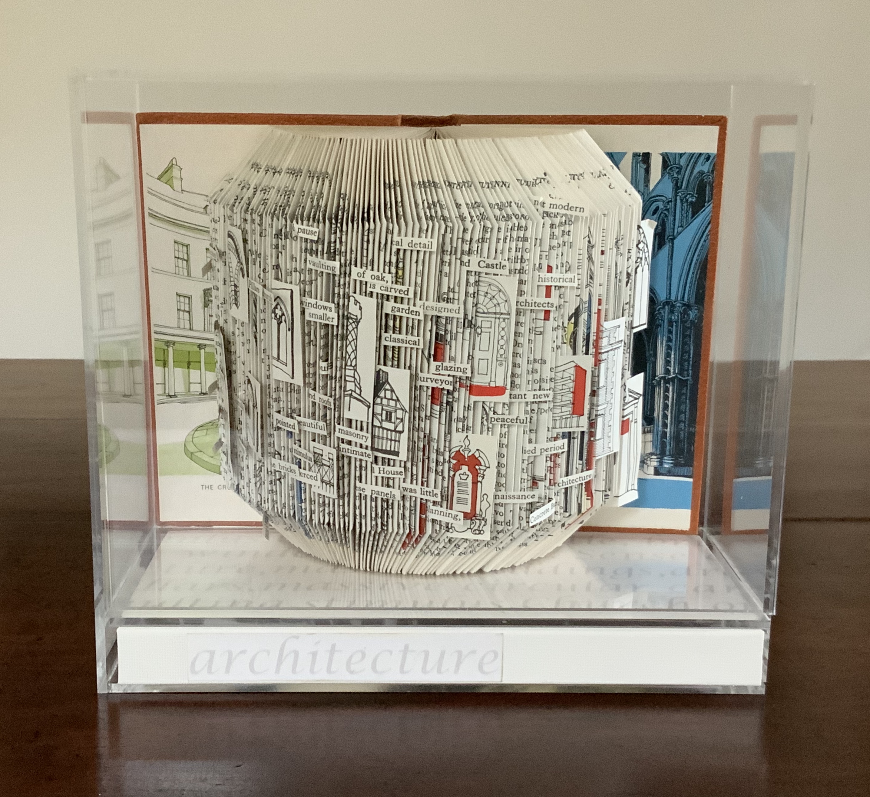
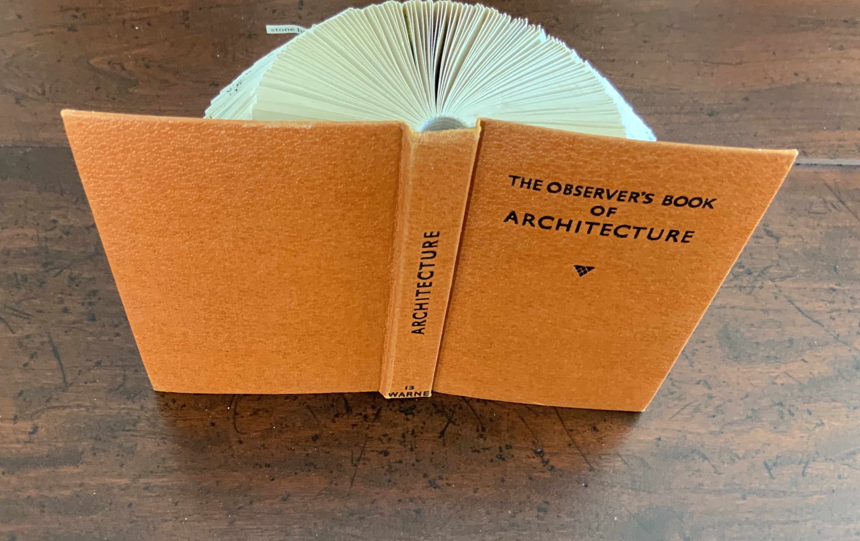
Folded book pages rarely generate a work that rises above mere craft. Heather Hunter’s Observer Series: Architecture (2009) achieves the necessary height. It combines the altered book with an accordion book that incorporates a found poem composed of the words excised and folded outwards from the folded pages of The Observer’s Book of Architecture.
The very fact of a found poem made of excised words that happen to fall at the folds shaping a column from a book on architecture chimes with the title of Bachelard’s The Poetics of Space.
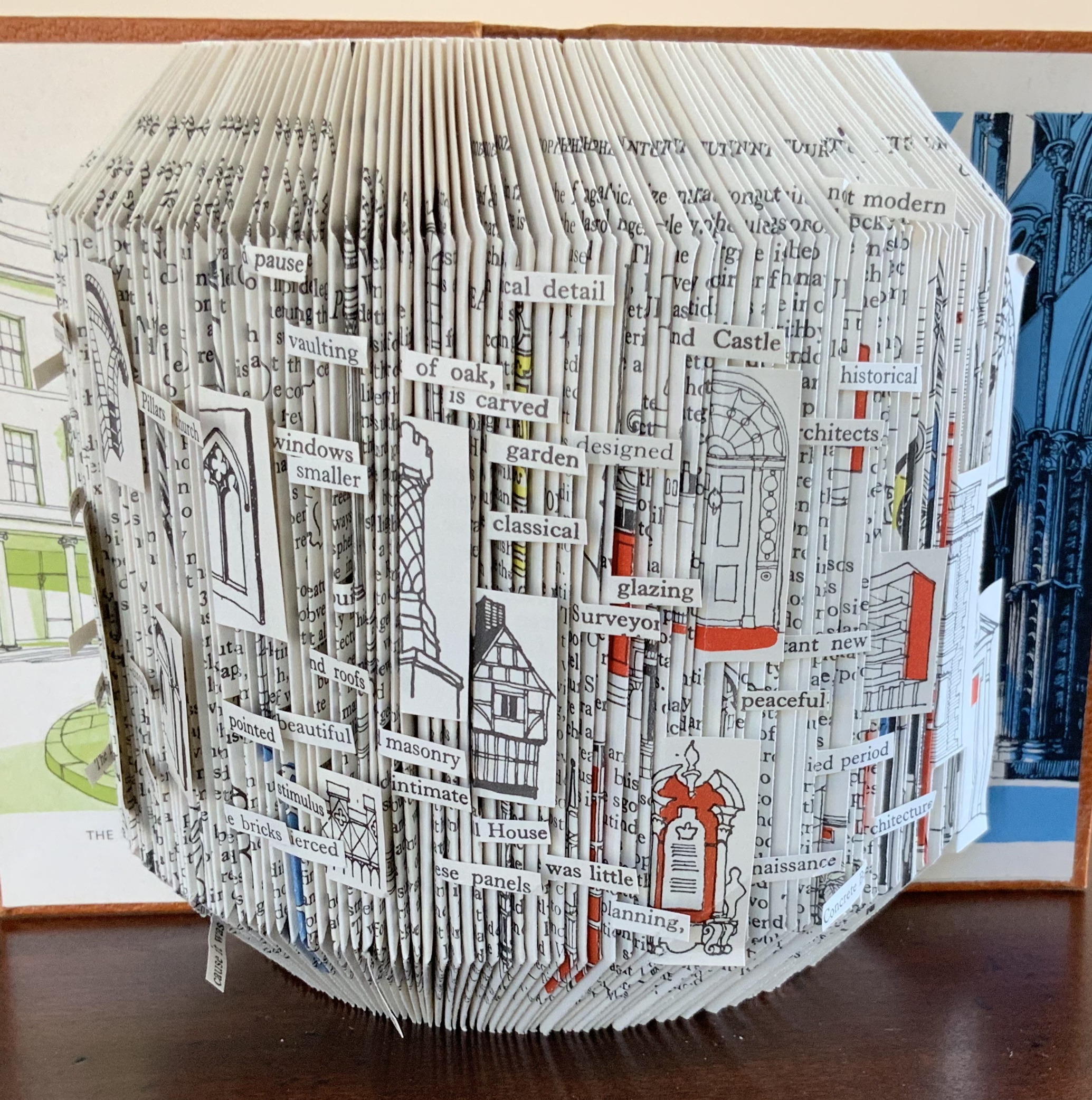
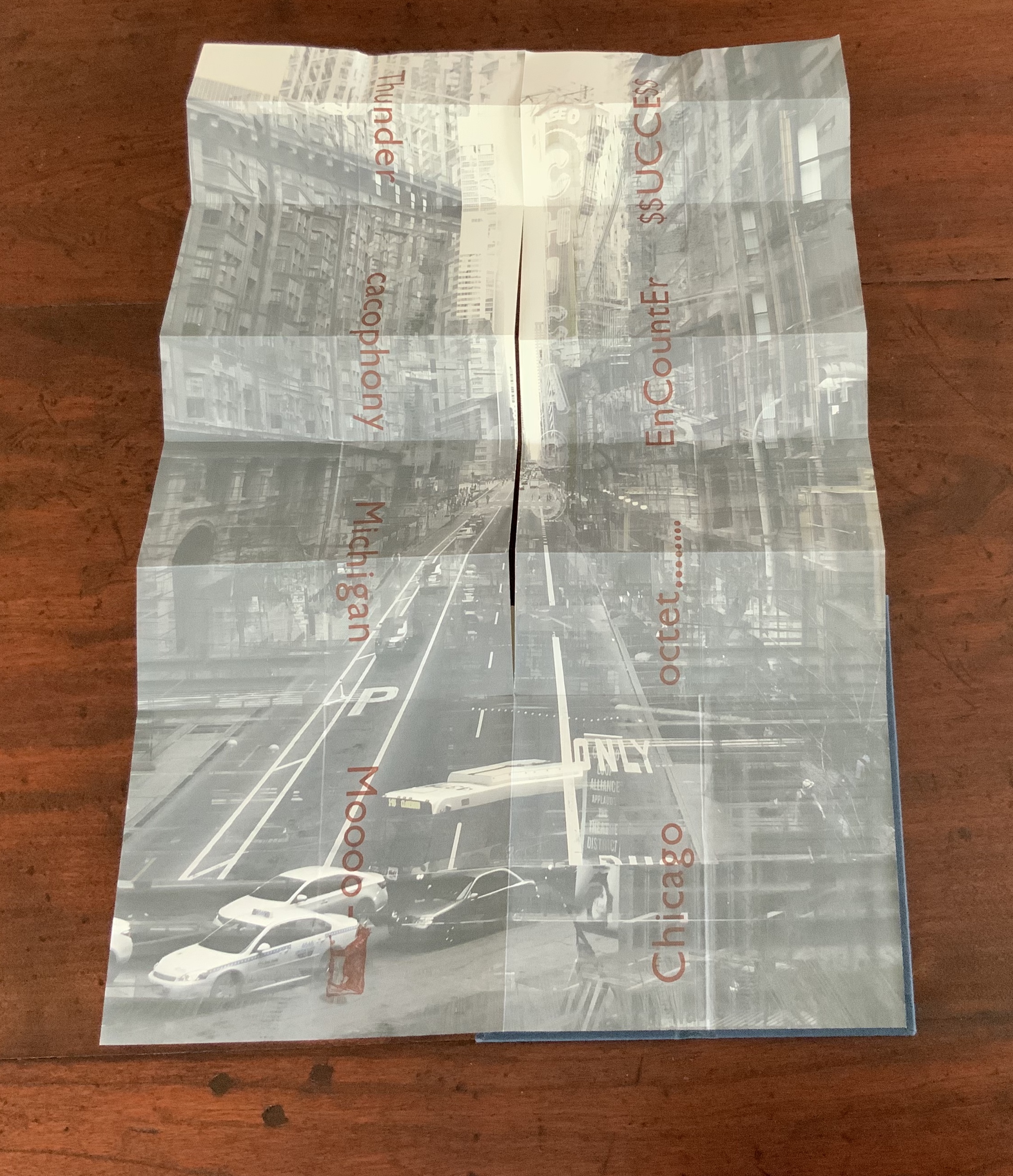
Chicago Octet (2014) byMarlene MacCallum embodies the collaborative creative approach often taken in architects’ practices. Collaborative working arises almost as frequently in book art. Think of Blaise Cendrars and Sonia Delaunay, Helen Malone and Jack Oudyn, Julie Chen and Clifton Meador, Robin Price and Daniel Kelm. Many more can be added. As described by MacCallum:
From May 19 – 26, 2014 a group of eight gathered at the Columbia College Center for Book and Paper Arts for a final collaborative project. This event was organized by Clifton Meador and myself and included David Morrish, Scott McCarney, and four Grenfell Campus BFA (Visual Arts) grads, Stephen Evans, Maria Mercer, Virginia Mitford, and Meagan Musseau…. The letterpress printing consisted of a word selected by each participant printed on one of Scott’s folded structures. The images were a digital layering of every cityscape photograph that I made and then inkjet printed on top of the letterpress. The final folded structure was designed by Mary Clare Butler. The case was designed and built by Scott McCarney, the front cover embossment was by David Morrish and Clifton Meador.
Chicago Octet(2014) Marlene MacCallum Hand bound artist’s book with folded paper structure, letterpress and inkjet printing, 6.5 × 3 × 0.5 inches (closed dimension). Photo: Books On Books Collection
Photo: Books On Books Collection
Chicago Octet fully unfolded, 17.5 × 11.5 inches Photo: Books On Books Collection
Can you hear the traffic and sense the layers of experience? What Pallasmaa writes here of rock art in Africa and Australia reminds me of Chicago Octet (or is it vice versa?): “
At the same time that great works of art make us aware of time and the layering of culture, they halt time in images that are eternally new. … Regardless of the fact that these images may have been painted 50,000 years ago, … we can … hear the excited racket of the hunt.The Embodied Image, p. 109.
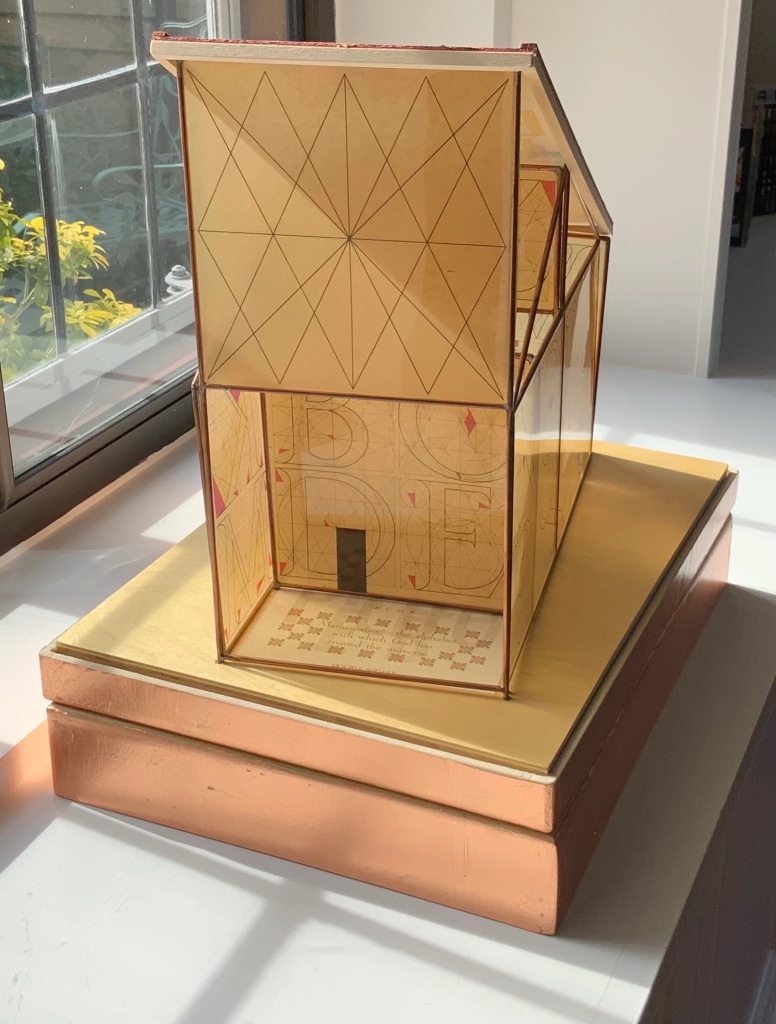
Sacred Space(2003) is an intimate monument of book art. Made intimate by the content and texture of its book, made more intimate by the viewer’s having to construct the chapel. Made monumental by the echo of typographic history, made more monumental in Galileo Galilei’s echo from its floor: Mathematics is the alphabet with which God has created the universe.
Sacred Space (2003) Jeffrey Morin and Steven Ferlauto Book: Reduction linoleum prints with typographic illustrations using overprinting of letterforms; open spine sewn with brown cord binding; brown cloth-covered boards; title and design on front board; endpapers of handmade paper from Nepal. Book: 6 x 14.25″; 17 leaves. Chapel kit: Six walls, roof, base. Walls: copper rod skeleton with Okawara rice paper skin covered with a casting resin. Book and kit housed in wooden box. Roof copper-leafed Davey board. Roof forms the tray in which the book rests. Base: Box lid becomes the base for the chapel. Brass holes in the base allow the rods to fit exactly. Print pattern on the base becomes the floor pattern. Box painted with copper leaf. Sculpture base 15.75 x 11.5″, height 12″. Edition of 35, of which this is #23. Photo: Books On Books Collection.
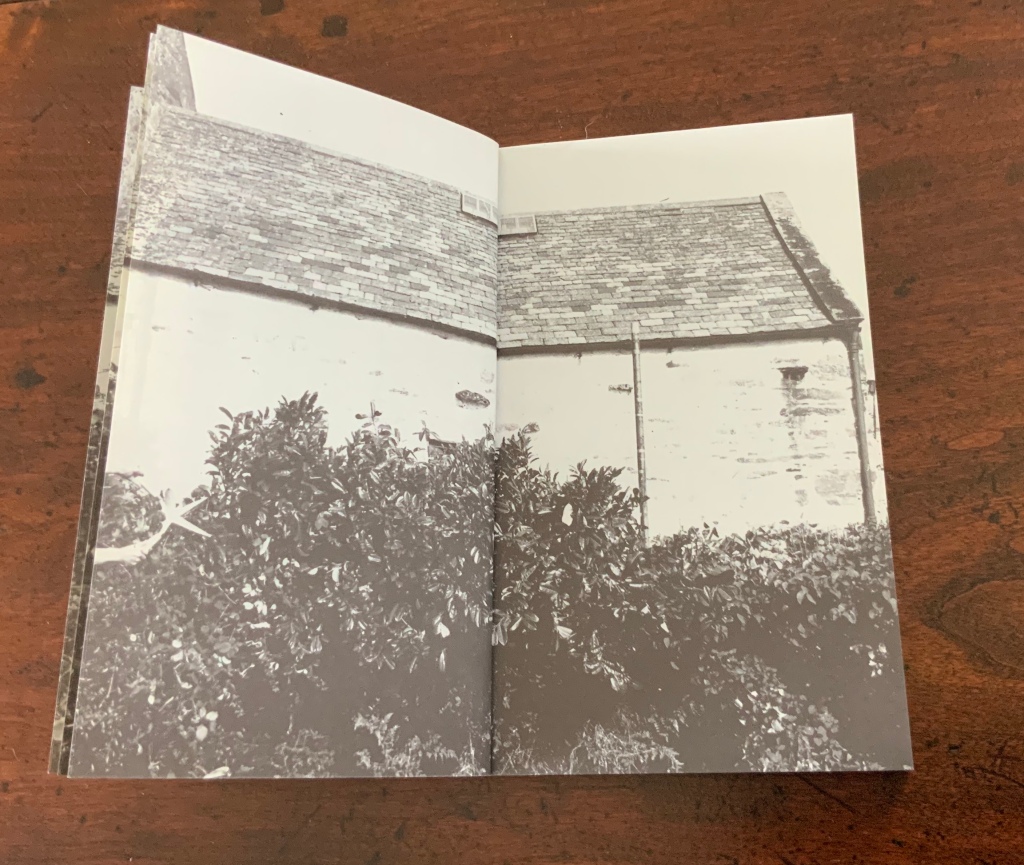
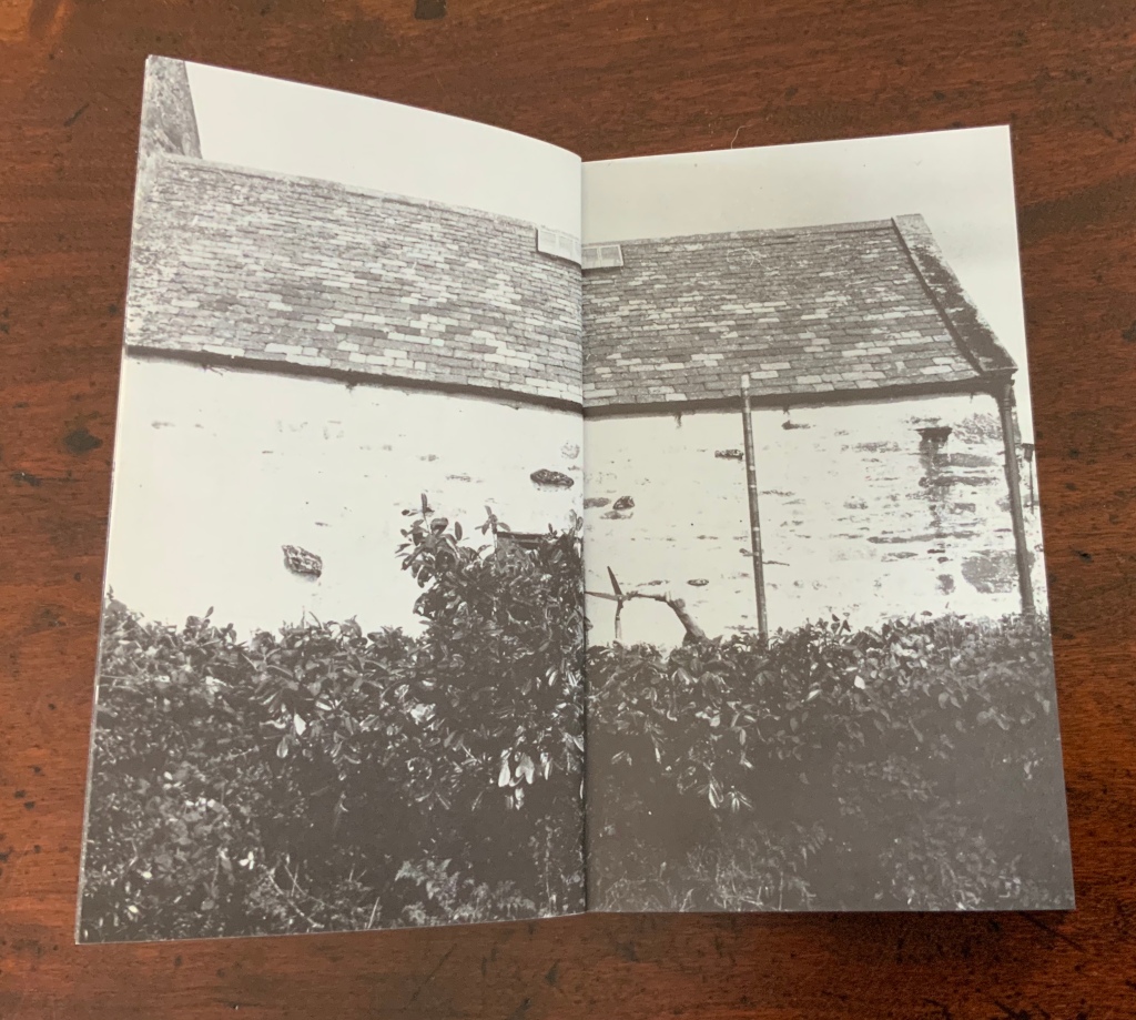
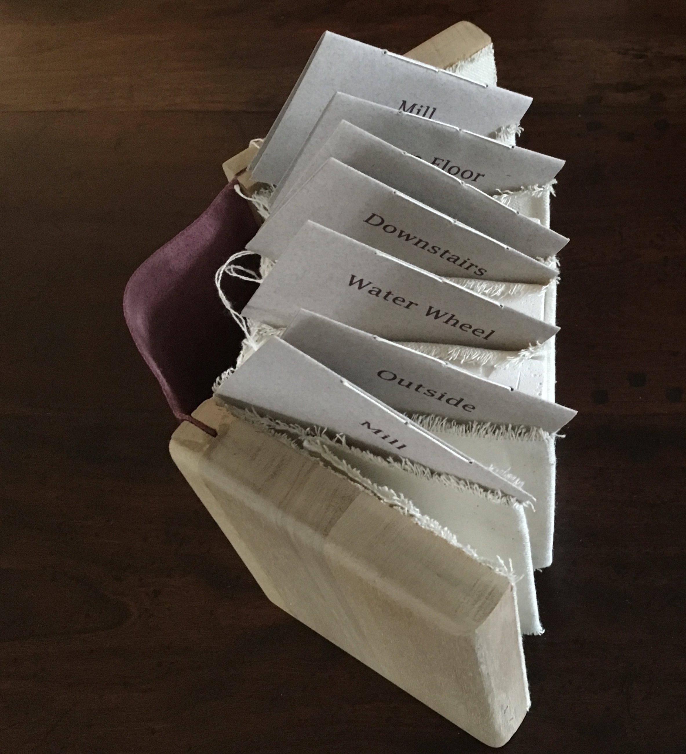
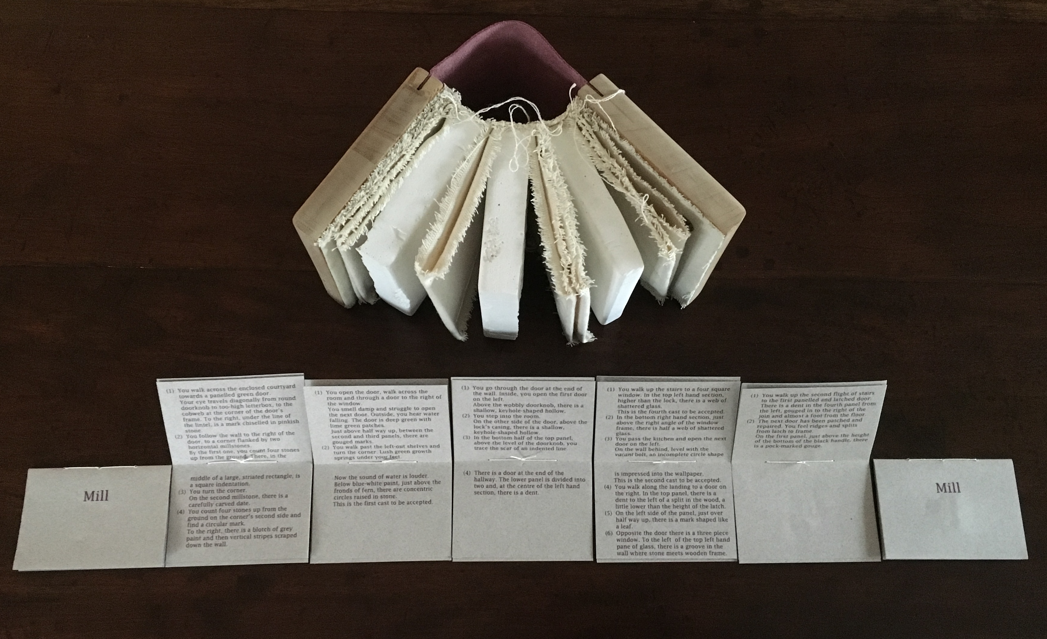
Mill: A journey around Cromford Mill, Derbyshire (2006) is the result of the artists’ exploration of Cromford Mill in Derbyshire, the first water-powered, cotton-spinning mill developed by Richard Arkwright in 1771. Solid, plaster cast blocks are held softly between calico pages containing hidden texts, bound in recycled wooden library shelf covers that indicate there is history to be found within.
Mill: A journey around Cromford Mill, Derbyshire (2006) Salt + Shaw (Paul Salt and Susan Shaw) Photo: Books On Books Collection
Having Mill is like having the building inside your house.
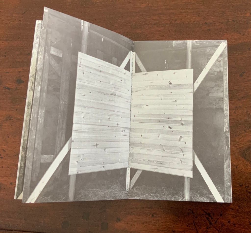
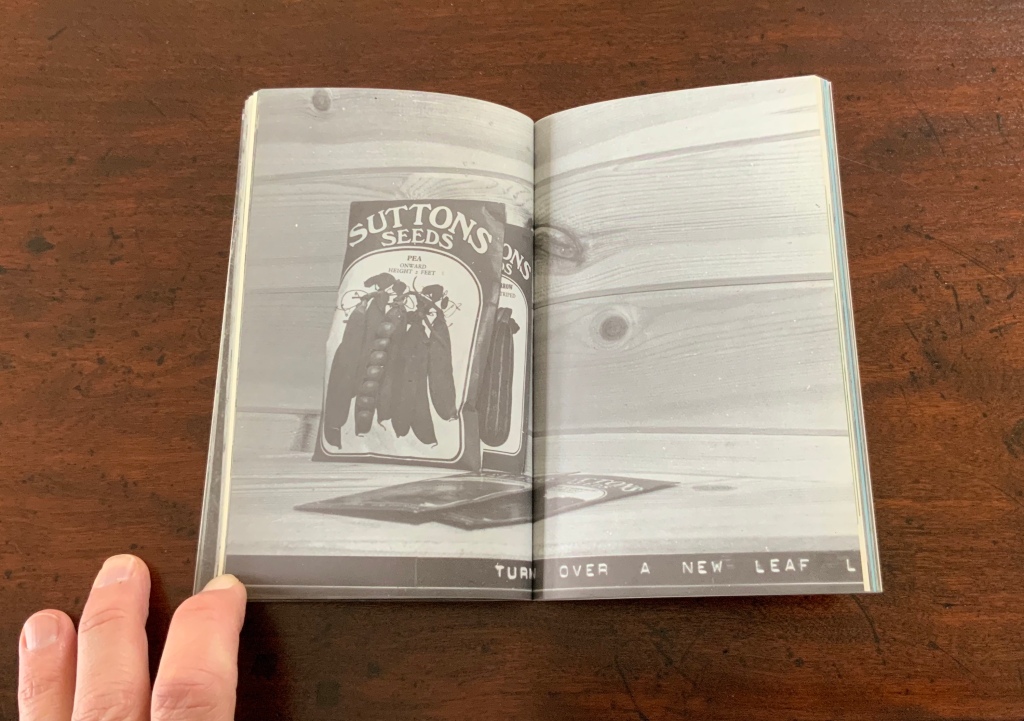
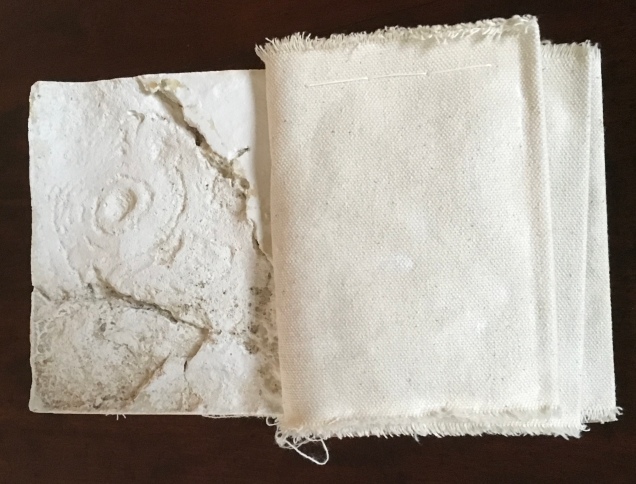
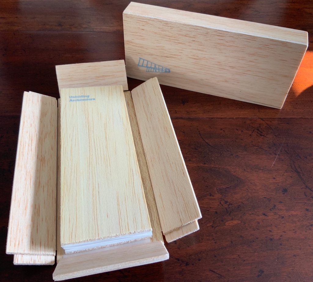
When Emily Speed is not creating architectural costumes for architectural performative art, she creates artist’s books to express her inner edifices. Unfolding Architecture (2007) coheres title, metaphor, narrative, image, technique of silk-screening, letterpress, texture of paper and wood, the workings of the accordion and box enclosure — all — into an artwork about un-cohering.
Unfolding Architecture(2007) Emily Speed Double-sided accordion book, attached to balsa wood covers, housed in a hinged, covered box of balsa wood. Book – H190 x W70 x D18 mm (closed), H190 x ~W2280 (open); Box – H203 x W88 x D63 mm; 24 panels, including cover panels. Edition of 90, of which this is #7. Acquired from the artist, 24 October 2020.
Architecture plays more than an inspirational role in Karen Wirth’s portfolio. As mentioned above, she has created her own take on Vitruvius’ Ten Books. She designed the Gail See Staircase at Open Book and the Hiawatha Light Rail Station, both in Minneapolis. The collage work Paper Architecture is based on an architectural installation at the Minnesota Center for Arts Design and draws on Wirth’s photos of Ayvalik, Amsterdam, Florence, Istanbul, New York City, Rome, San Diego and Venice.
In The Embodied Image, Pallasmaa singles out “the collaged image” as creating “a dense non-linear and associative narrative field through initially unrelated aggregates, as the fragments obtain new roles and significations through the context and dialogue with other image fragments” (pp.71-72). The materially disparate words in the title of Wirth’s work imply the dialogues she creates among paper, designs of letters and architecture, buildings across time and the globe, and photos tinted, four-colour, and black-and-white in palimpsest.
For Wirth’s own comments about the intersection of book art and architecture, see her interview with Betty Bright.
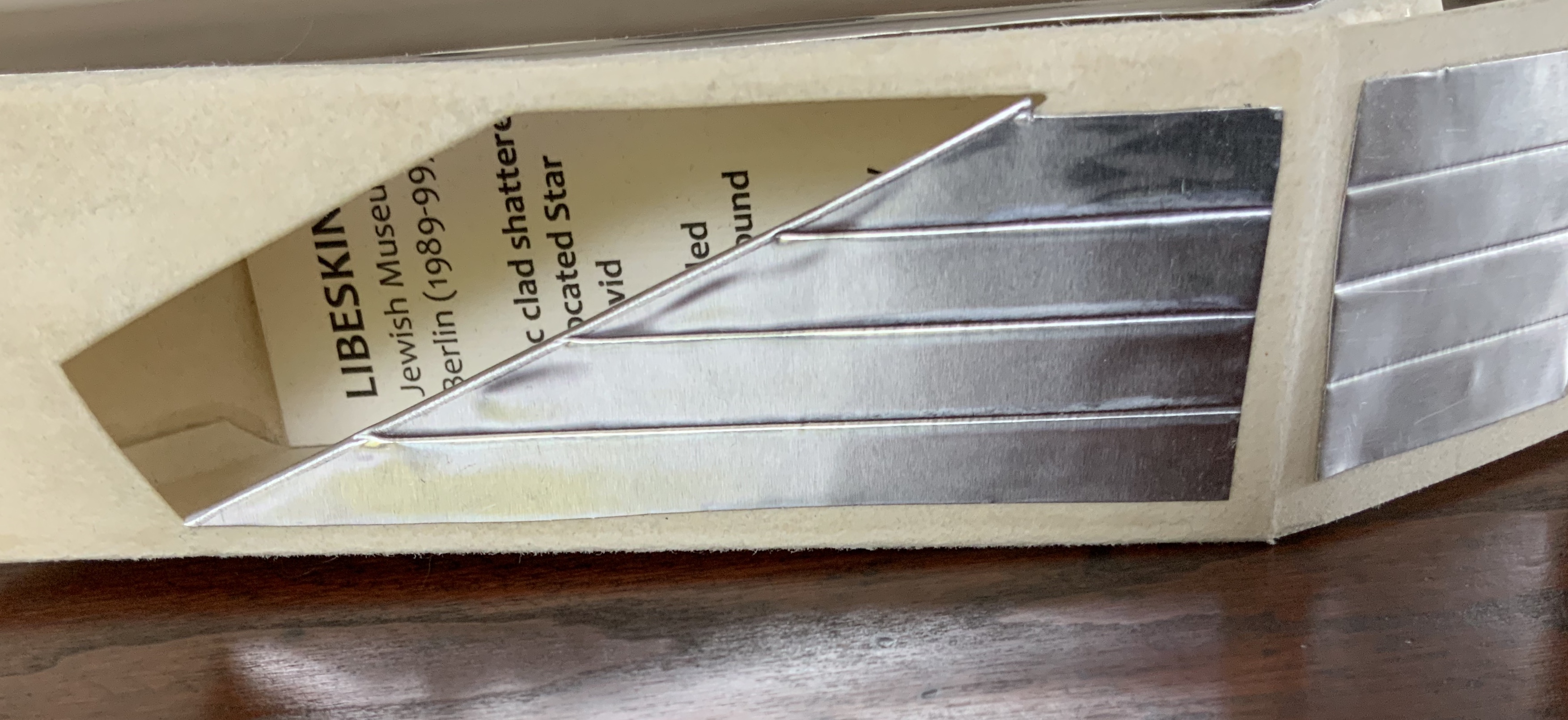
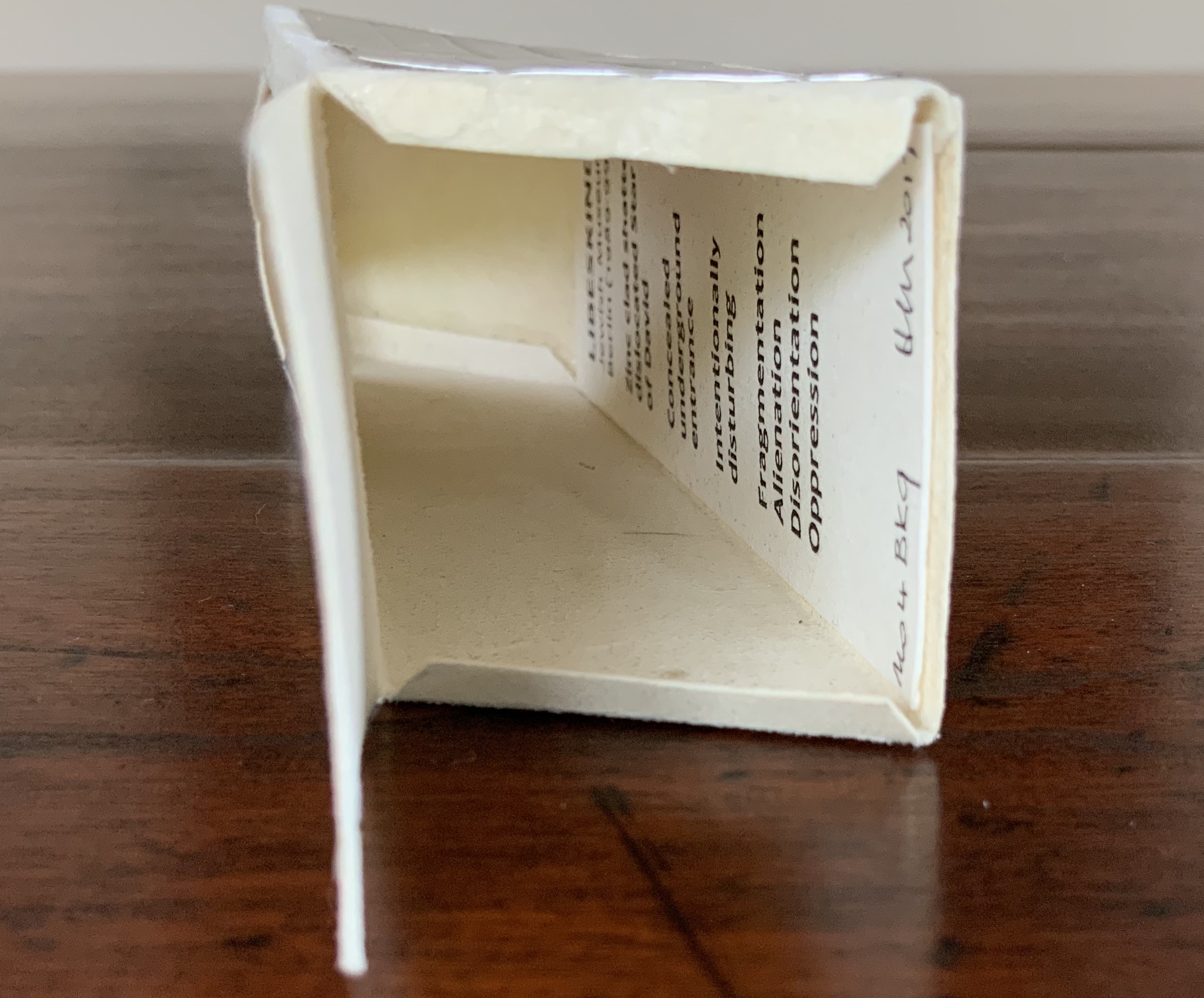
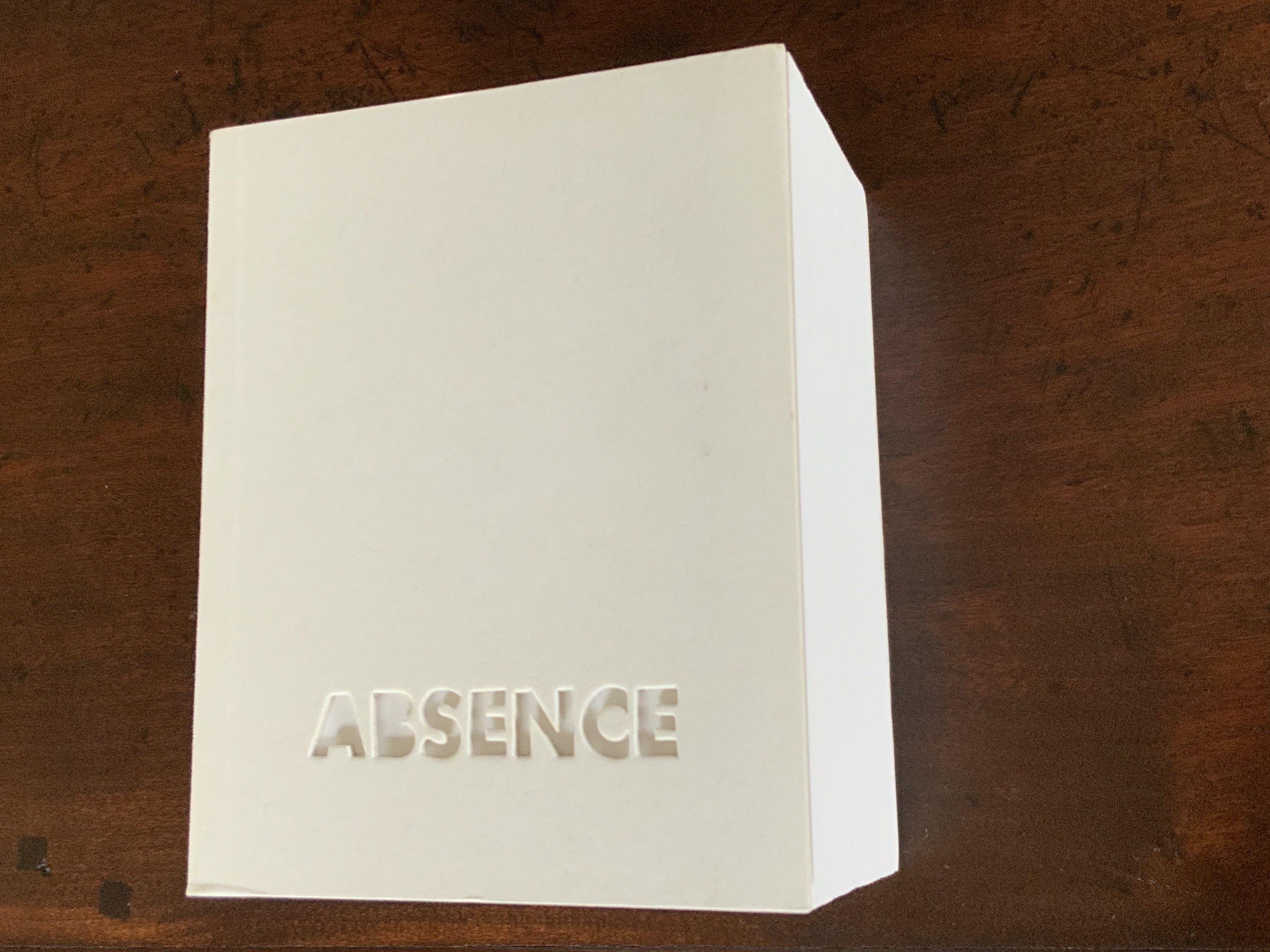
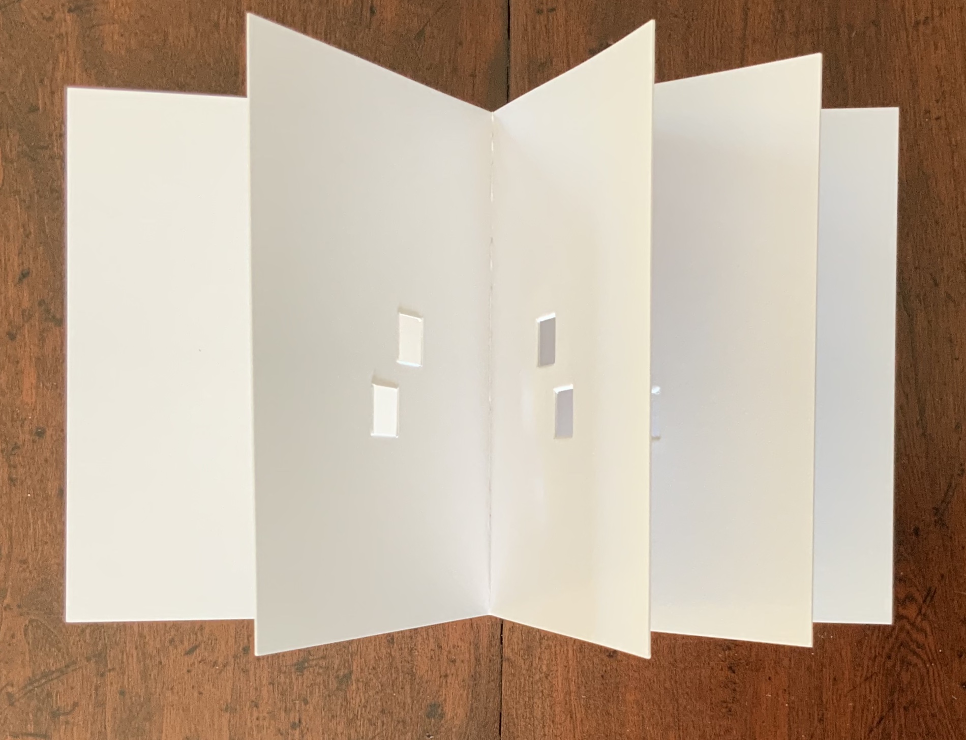
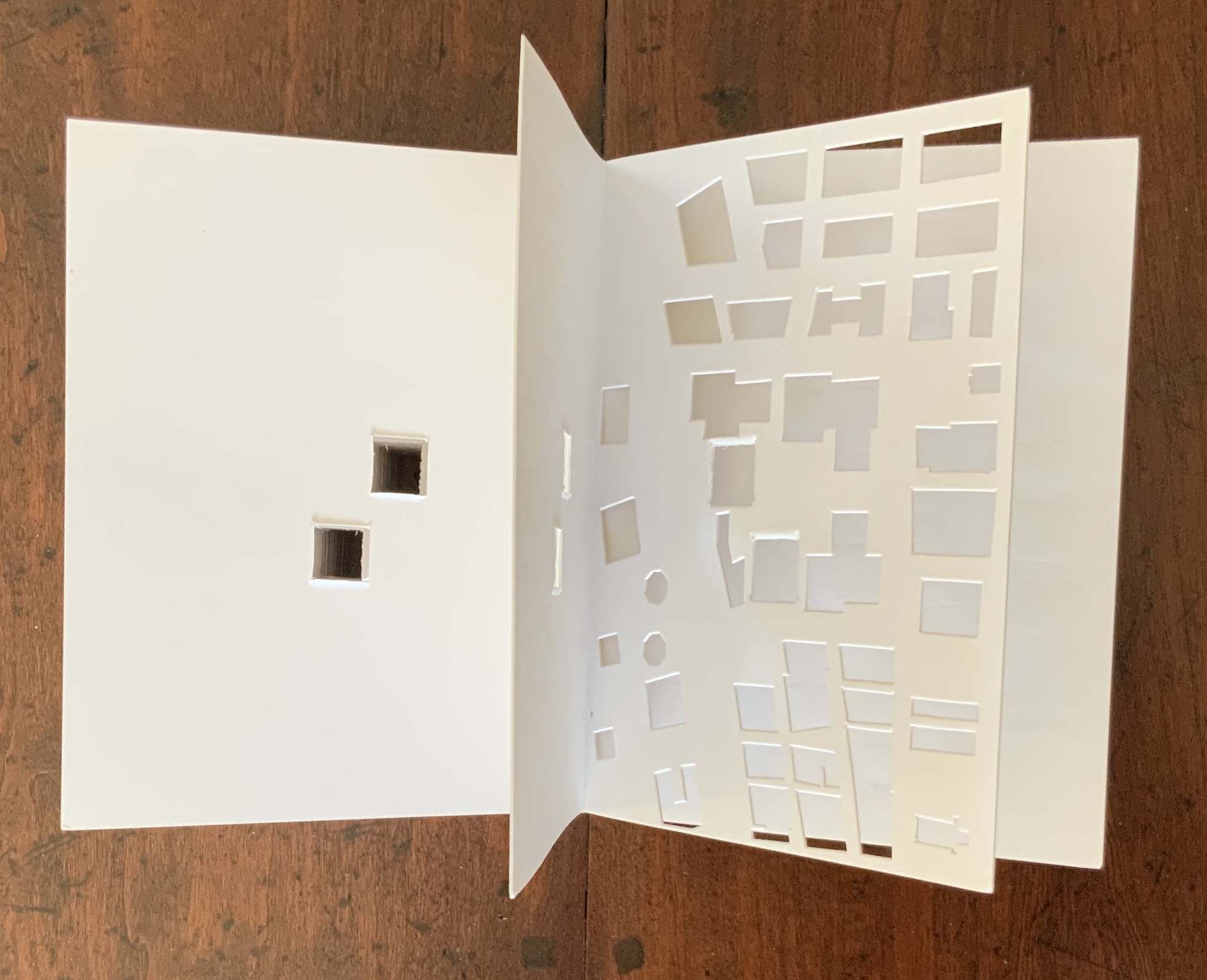
Former professor and head of the Department of Architecture at MIT’s School of Architecture and Planning, Yoon is now Gale and Ira Drukier Dean of the College of Architecture, Art and Planning at Cornell University. She is also cofounder of Höweler + Yoon, a design-driven architecture practice. Absence appears to be her only work of book art so far.
When you hold this small white brick of paper and turn its thick pages, a small pinhole appears on the page. Then two larger square holes emerge, one of which falls over the pinhole. Page after page, the two square holes repeat, creating two small dark wells in the field of white, until on the last page they take their place in the cut-out schematic footprint of the city blocks and buildings surrounding the Twin Towers of New York City. What you hold in your hands at the end is an object of art and book of memorial prayer.
Absence (2003) J. Meejin Yoon Photo: Books On Books
Other sites, other works
Twice a semester, the Environmental Design Library at the University of California, Berkeley hosts “Hands On: An Evening with Artists’ Books”. In 2017, one evening’s theme was “Building on the Built”, illustrated by 25 works of book art. Organised by 23 Sandy Gallery in the same year, “BUILT“ was an international juried exhibition featuring 66 artist books by 51 artists examining the relationship between contemporary book art practices and architecture, engineering, landscape and construction.
Arranged alphabetically by artist’s name, this section provides links to works from these two exhibitions as well as other collections, exhibitions, installations and recommendations from the Book-Arts listserv members.
A Crisis Ethicist’s Directions for Use: Or How to be at Home in a Residence-cum-Laboratory (2003) Inge Bruggeman Photos: Courtesy of the artist
On her site, Bruggeman writes, “This book/box project is built around excerpts from Architectural Body by Madeline Gins and Arakawa…. incorporates a blueprint of their Bioscleave House as part of the imagery….”. Somewhat like A Clockwork Orange or perhaps more like Heideigger’s tomes, the Gins and Arakawa book is a challenge to the reader’s expectations of diction and syntax.
Richard Minsky: Model of Buckminster Fuller’s Tetrascroll (1979). See also Polly Lada-Mocarski, Richard Minsky and Peter Seidler, “Book of the Century: Fuller’s Tetrascroll“, Craft Horizons, October 1977 (Vol. 7, No. 35). For one (very helpful) reading of Tetrascroll see Jessica Prinz’s “The ‘Non-Book’: New Dimensions in the Contemporary Artist’s Book” in The Artist’s Book: The Text and its Rivals, a special two-issue volume of Visible Language, Vol. 25, Nos. 2/3, edited by Renée Riese Hubert (Providence, RI: Rhode Island School of Design, 1991), pp. 286-89.
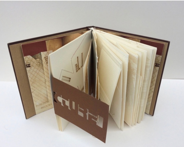
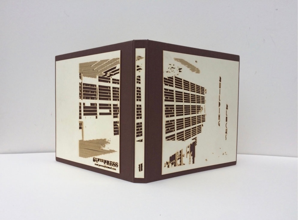
Building Blocks Book XVII (2017) Sumi Perera Photos by artist’s permission
Going against the usual structure of the book, that of a beginning, a middle and an end, Perera provides a space for infinite possibilities and multiple authors, creating “modules that can be re-sequenced and re-aligned to develop variable permutations and encourage participatory involvement, to share the final editorial control with the viewer to transform the ever-evolving work”.These possibilities for variable permutations are no more evident than in her constantly evolving project, Building Blocks Book, and its numerous subsequent iterations including The Negative Space of Architecture and The House That Jack Never Built (2008). Once again we find Perera exploring human interaction, not only with the concepts and her quizzical ideas surrounding architectural and public spaces and how we build between and move within, but also the physical interaction with the artists’ books she produces – the rearrangement and reinsertion of pages which allow the audience and participants new opportunities and pathways to proceed. Through the positive and negative space of the page or the type font, the Underground versus over ground, the artist takes us on journeys that are at once fluid and at other times obstructive. In these cityscapes, the U-turn is as common as the page turn – a necessary rupture in a free-flowing narrative. Chris Taylor, From Book to Book (Leeds: Wild Pansy Press, 2008).
Robbin Ami Silverberg: Home Sweet Home (2006). Artist’s description — “an architectural album of an imaginary middle-class suburban house, … its plans and layout [filled] with the many proverbs I’ve found about women in the home. The book was printed to look like the almost obsolete technique of Diazo printing (blue-printing), but in fact, it is archival inkjet.”
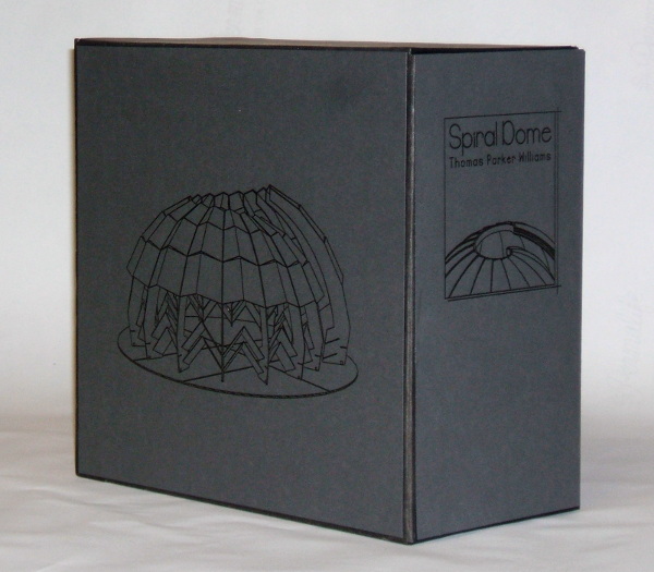
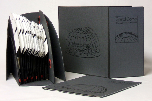
Spiral Dome: Sculptures in Paper and Steel (2016) Thomas Parker Williams Photos: Courtesy of the artist
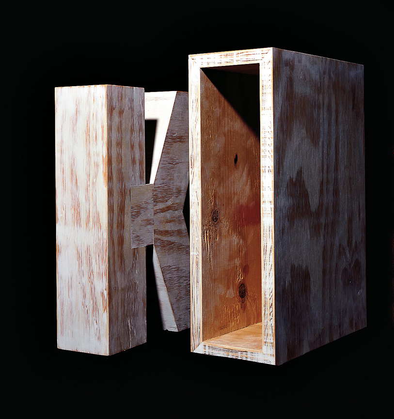
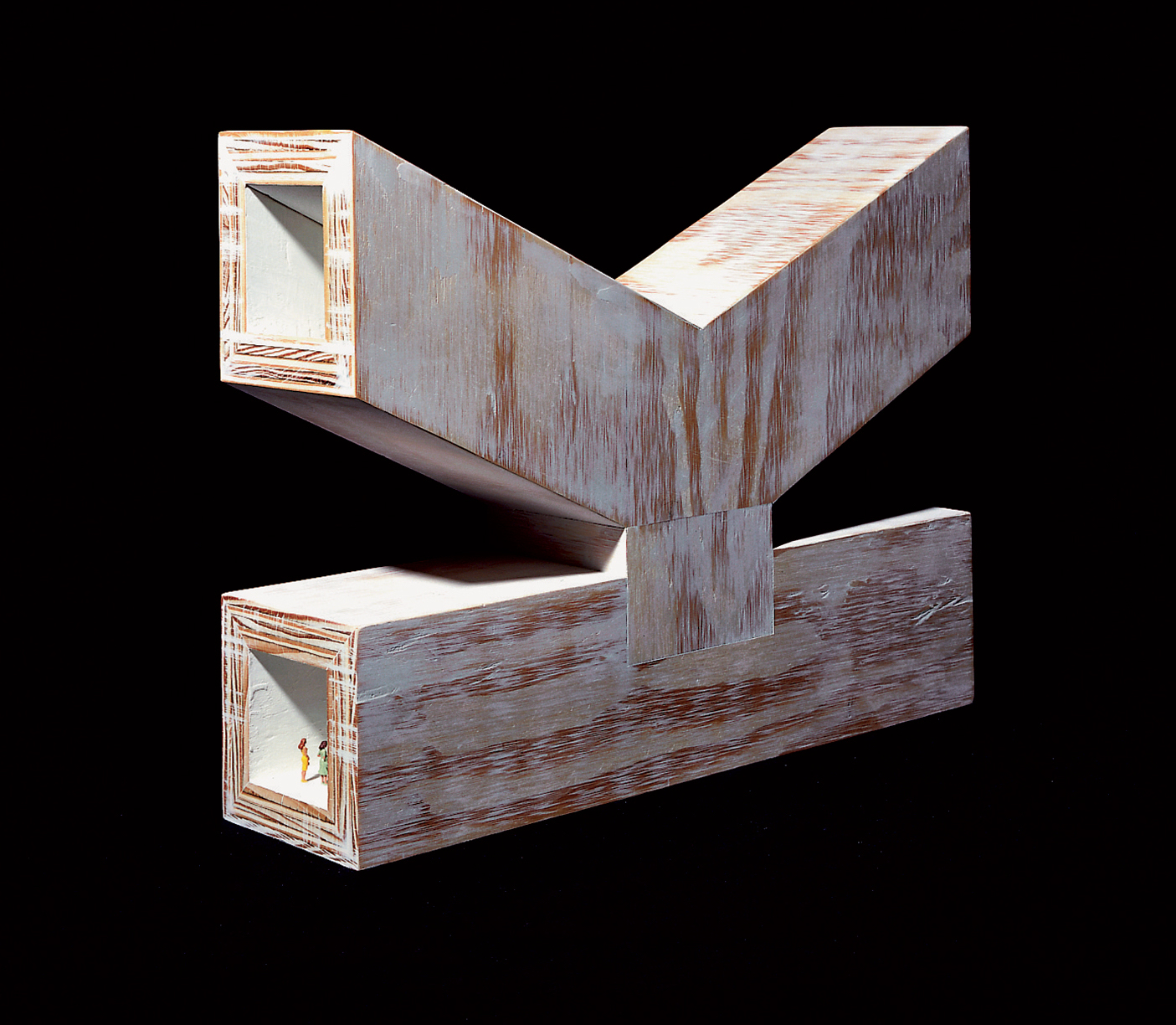
Update: With the addition of Marian Macken’s book Binding Space, mentioned above, comes the Vedute Foundation, a collection of objects/manuscripts by artists/designers/architects created within the constraint that each work has the proportion of the Gutenberg Bible and the relationship of ‘Text’ and ‘Form’ as its subject. For this essay in Books On Books and for the Books On Books Collection’s acquisition of the Merrion edition of Johann David Steingruber’s Architectural Alphabet, the most apropos and favorite work in the Vedute collection is K (1996) by Peter Wilson.
K(1996) Peter Wilson “This contribution (a double volume) is based on the letter ‘K’ (an atom of language), materialised within the Gutenberg proportions in sturdy plywood. It is the responsibility of an architect not only to ‘give form’ but also to explore latent interiorities, potential spatialities. Here the ‘K’ interior has its own inherent geometric agenda − a tunnel, a tube, an inverting telescope (apex mirror). Object becomes instrument (a window to the antipodes even), a trigger for multiple ‘K’ vectors (textural and spatial).” Bolles+Wilson
23 Sandy Gallery. 2017. Built: an international exhibition of contemporary artist books, April 7-May 27, 2017. Portland, Oregon: 23 Sandy Gallery. “… examining the relationship between contemporary book art practices and architecture, engineering, landscape and construction as form, function and structure. Book artists took this opportunity to re-image the ways we as designers, of either books or buildings can inhabit and shape the world around us. Our disciplines have a natural synergy. After all, books and buildings are both kinetic, sequential, structural and time based. BUILT examines the relationship between the built and the book. BUILT features 66 artist books by 51 artists from across the country and as far away as Canada, United Kingdom and Australia.” Publisher’s website.
Sophia Kramer, “Variations of Vitruvius: Four Centuries of Bookbinding and Design”, The Met, 22 August 2018. This essay reviews and illustrates the conservation and rehousing of ninety-five copies of De Architectura libri decem (The Ten Books of Architecture) by Marcus Pollio in the collection of the Department of Drawings and Prints. They are part of a donation of 356 publications from the architect William Gedney Beatty (1869–1941). For book artists, the section on a 1556 edition with double volvelles to display a theater design should be of interest.
Marian Macken, Binding Space: The Book as Spatial Practice (London: Taylor and Francis, 2018). A trained architect and book artist, Macken articulates and illustrates the how and why of the overlap between architecture and book art.
David Sume, The architectural nature of the illustrated books of Iliazd : (Ilia Zdanevich, 1894-1975, University of Montreal, 2019. This dissertation is a reminder that the importance of architecture to book art reaches back to the avant-garde and modernists of the early 20th century — and more important, that its importance may lie beneath the surface.
Elizabeth Williams, “Architects Books: An Investigation in Binding and Building”, The Guild of Book Workers Journal, Volume 27, Number 2, Fall 1989. This essay not only pursues the topic of architecture-inspired book art but turns it on its head. An adjunct professor at the time, Williams set her students the task of reading Ulises Carrión’s The New Art of Making Books (Nicosia: Aegean Editions, 2001) then, after touring a bindery, “to design the studio and dwelling spaces for a hand bookbinder on an urban site in Ann Arbor, Michigan”. But before producing the design, the students were asked “to assemble the pages [of the design brief and project statement] in a way that explored or challenged the concept of binding”. In other words, they had to create bookworks and then, inspired by that, create their building designs. Williams illustrates the essay with photos of the students’ bookworks. [Special thanks to Peter Verheyen for this reference.]


