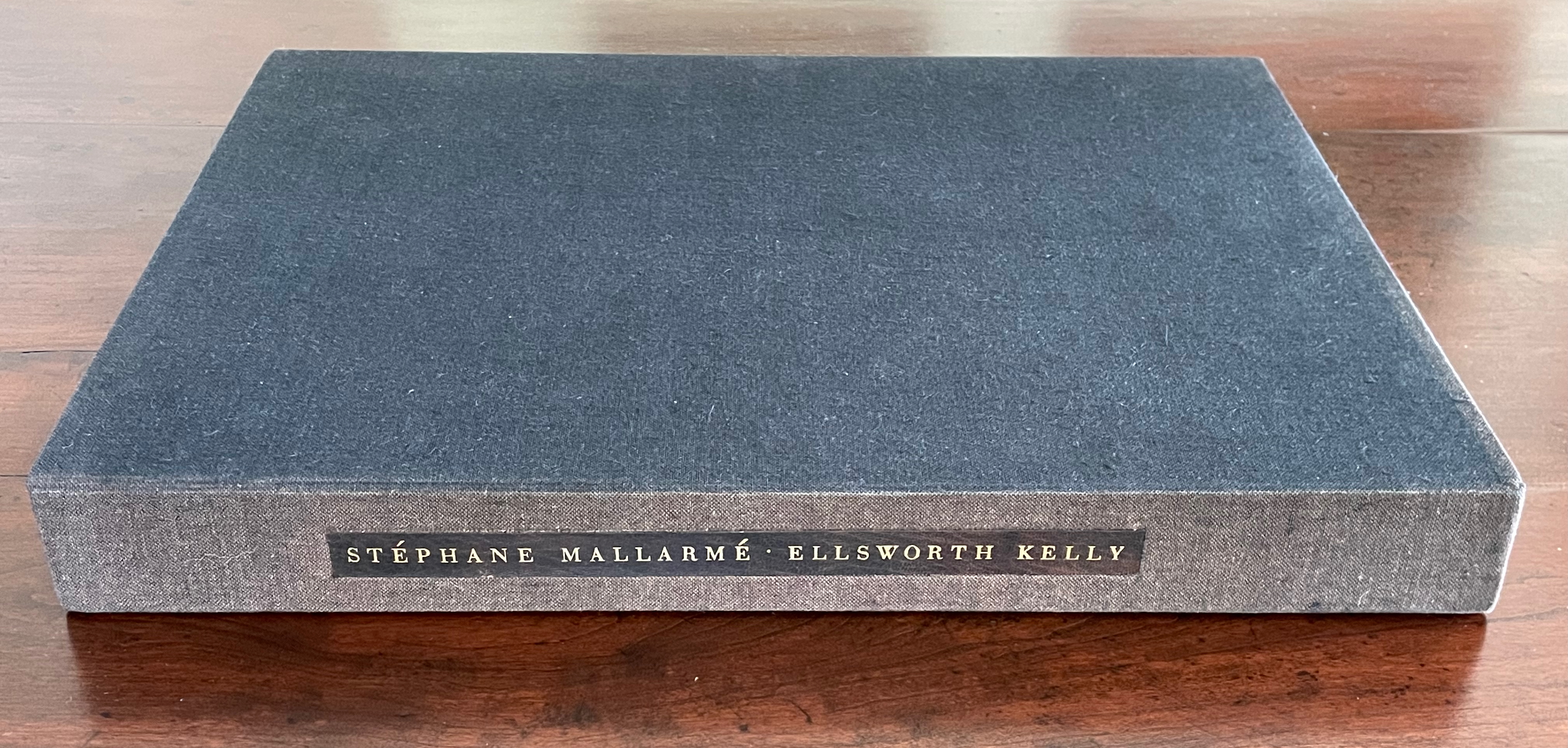
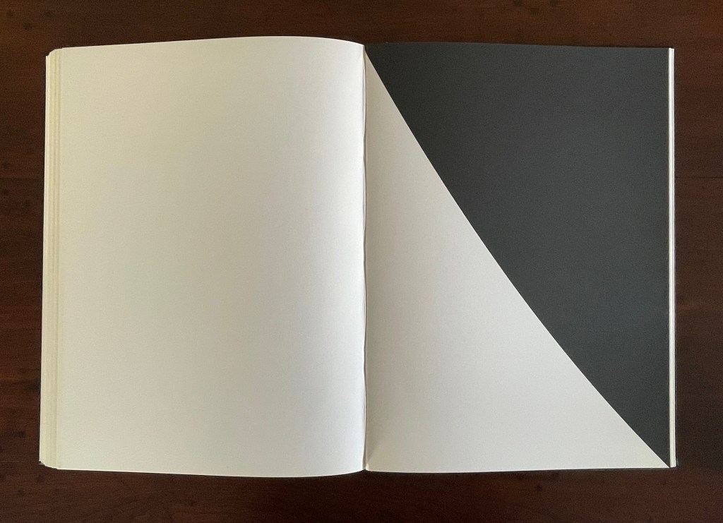
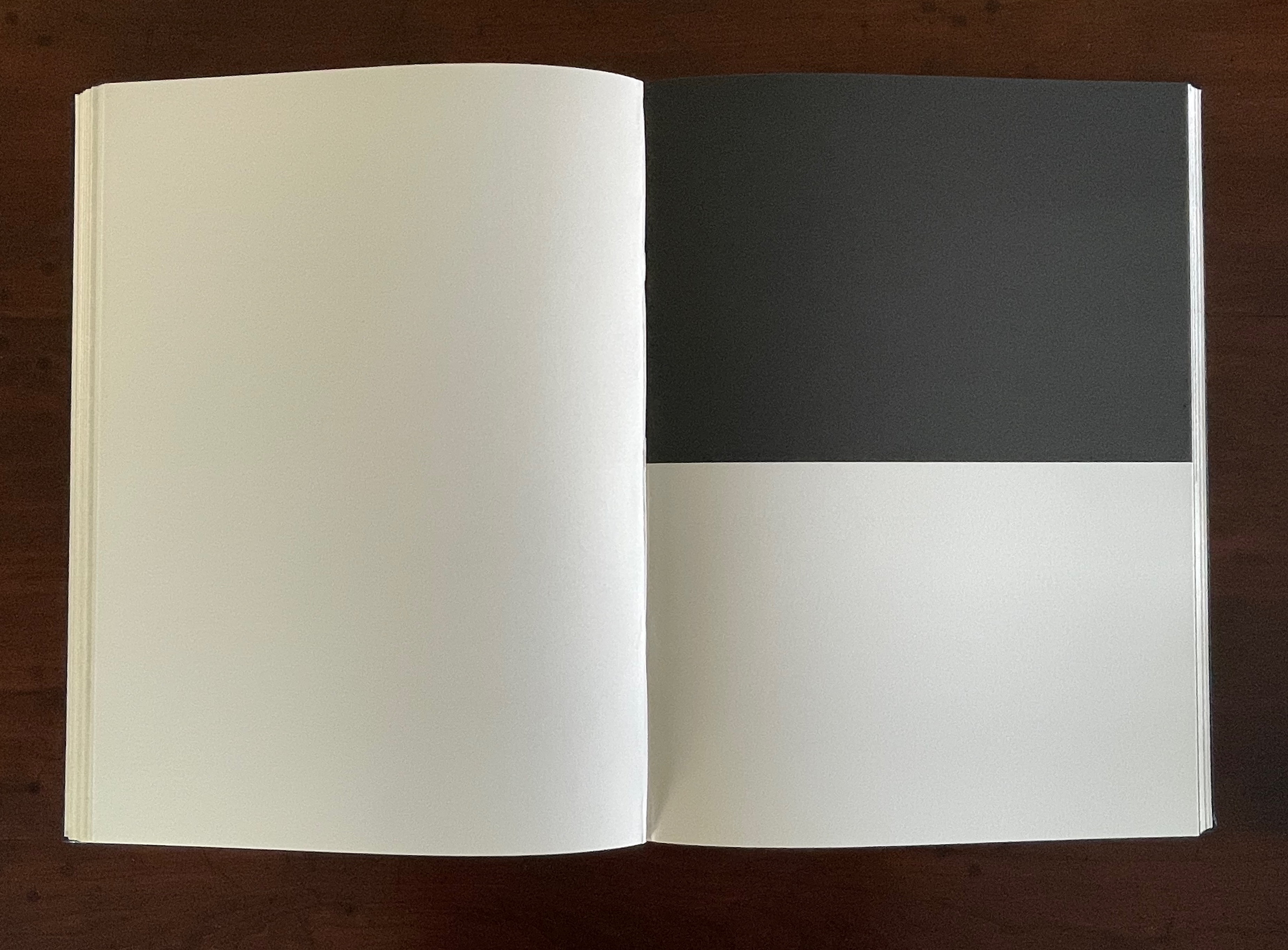
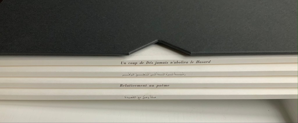
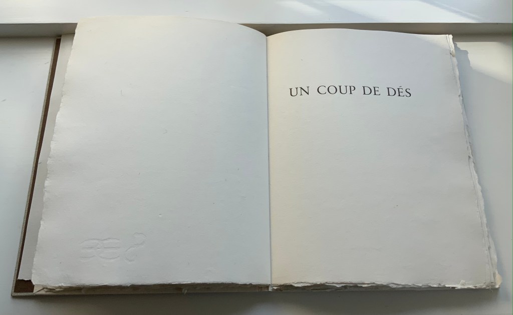
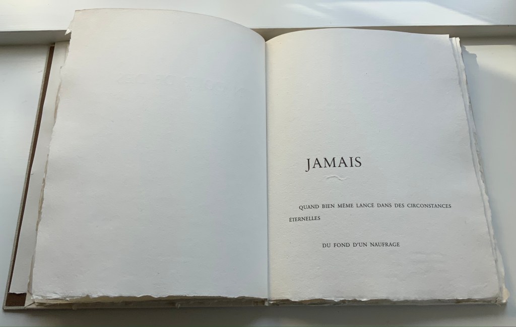
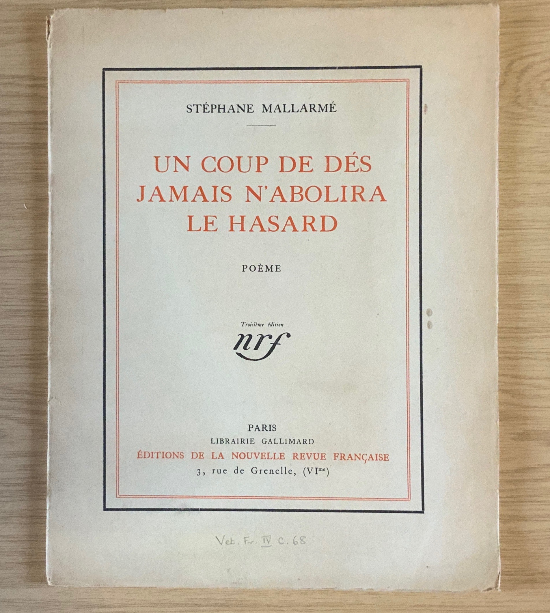
Un Coup de Dés Jamais N’Abolira le Hasard (1992) Ellsworth Kelly and Stéphane Mallarmé Hardback, case bound in full black morocco, spine gilt-lettered. 17 x 12 1/2 in Edition of 300, of which this is #204. Acquired at Swann Auctions, 24 October 2024. Photos: Books On Books Collection. Permission to display, courtesy of Limited Editions.
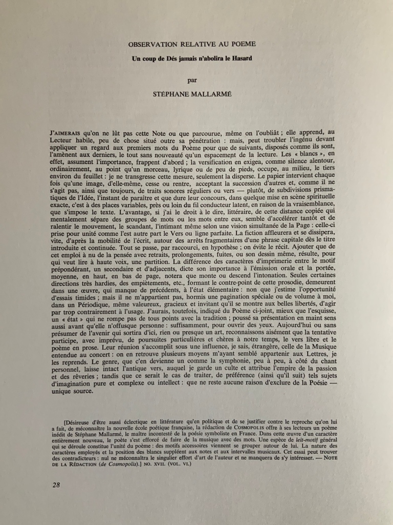
Is Ellsworth Kelly’s homage to Stéphane Mallarmé’s Un Coup de Dés Jamais N’Abolira Le Hasard an illustrated book, a livre d’artiste, or an artist’s book? It certainly resonates with and intensifies the poem’s design and imagery, but without being a spread-for-spread illustration. It is akin to the tributes paid by André Masson (1961), Jean Lecoultre (1975), Ian Tyson & Neil Crawford (1985), Jacques Vernière (1987), Christiane Vielle (1989), Ofer Lellouche (1997), Robert Bononno & Jeff Clark (2015), and Eric Zboya (2018). Some of these kindred spirits like Masson, Vielle, and Bononno & Clark intersperse artwork within the poem that evoke if not illustrate the setting and action of the sea and shipwreck. Some, like Masson, Lecoultre, Vernière, and Lellouche display images that have less to do with the poem’s imagery. Some, like Tyson & Crawford and Zboya, show more interest in capturing the poem’s numerological esotericism (LE NOMBRE). More than the others, though, Kelly builds on Mallarmé’s double-page spread principle and its structural importance for the poem.
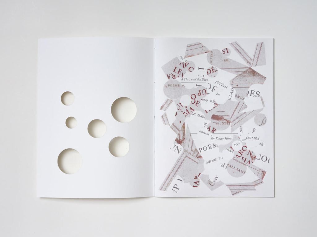
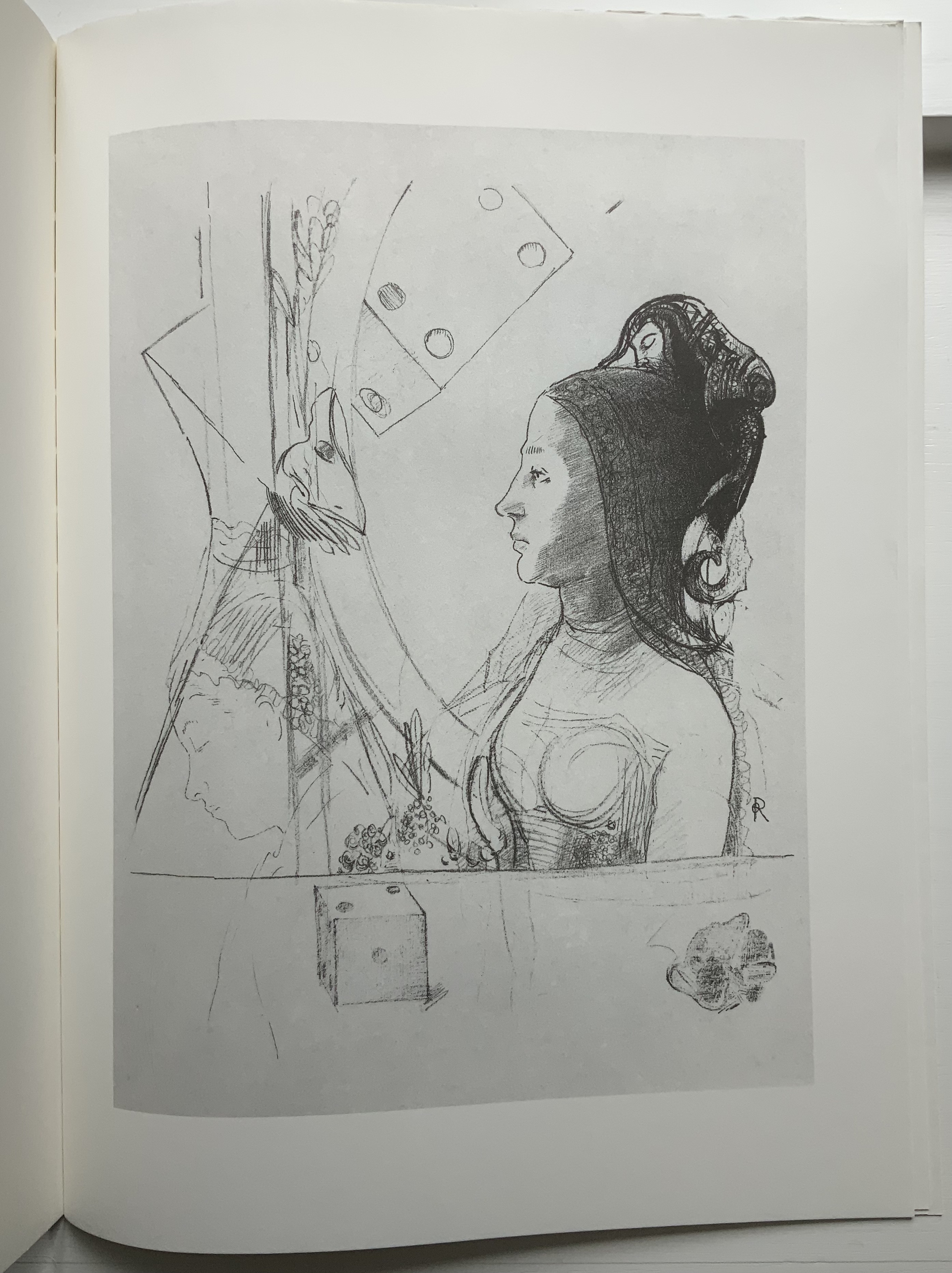
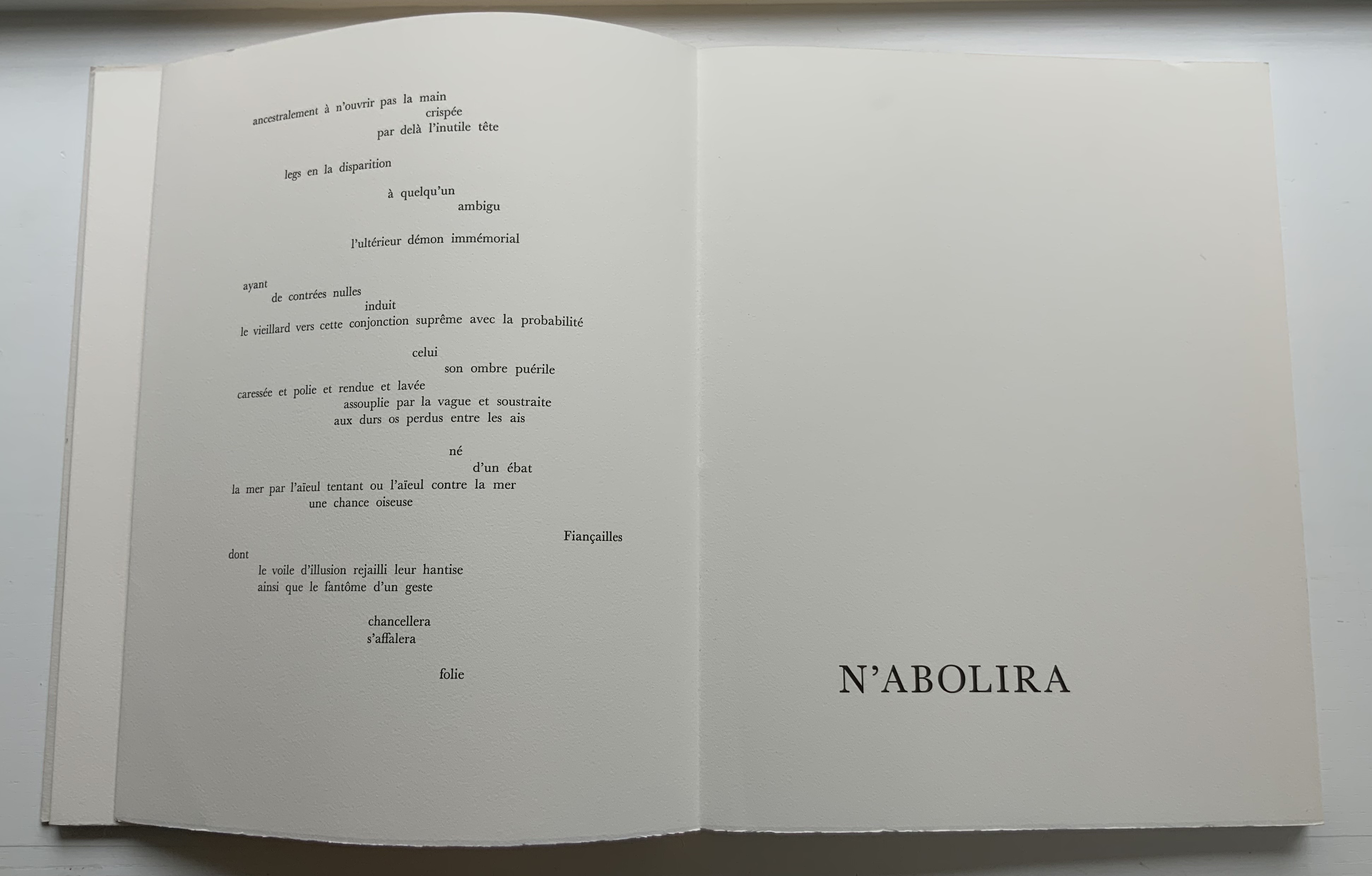
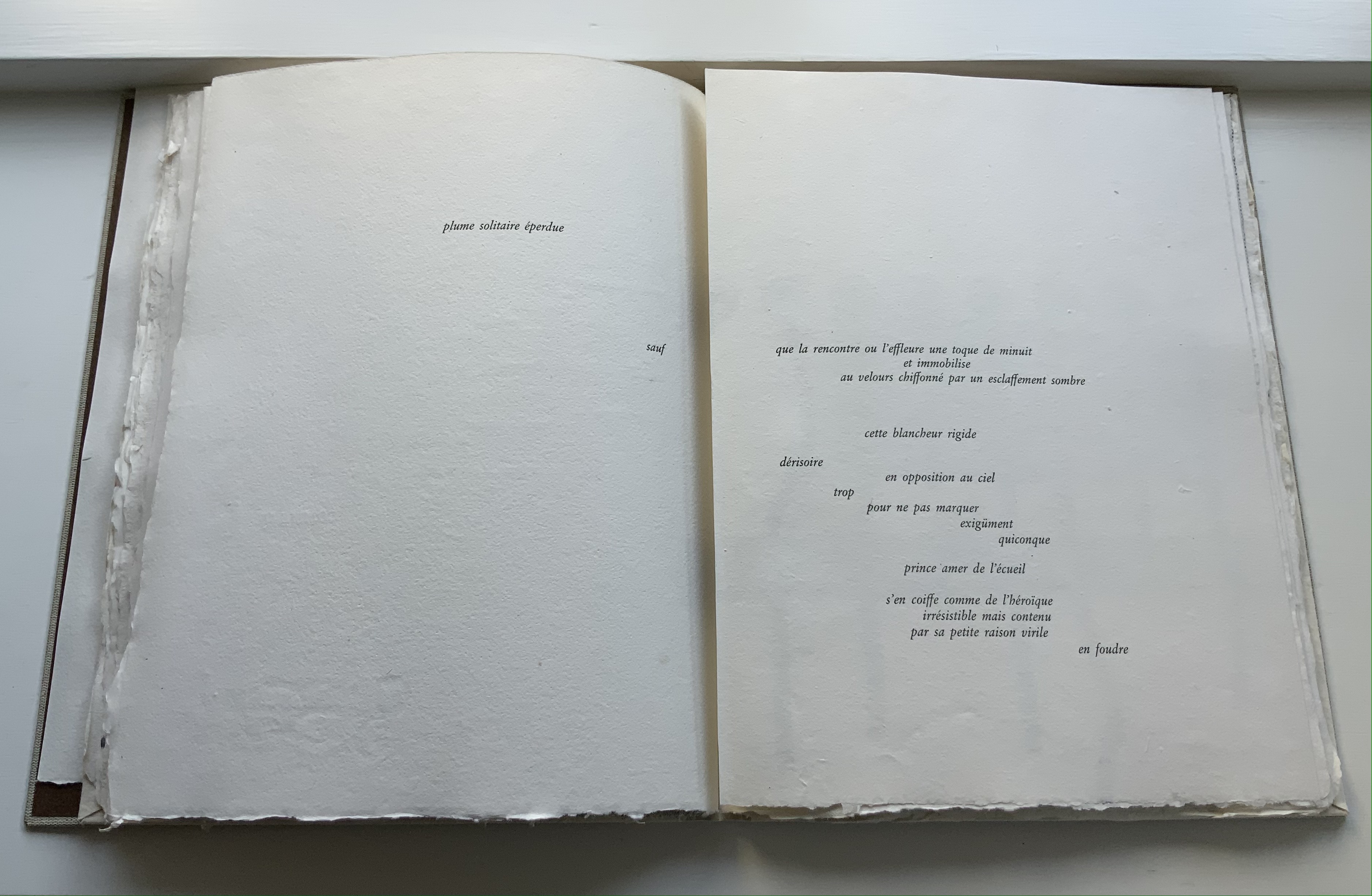
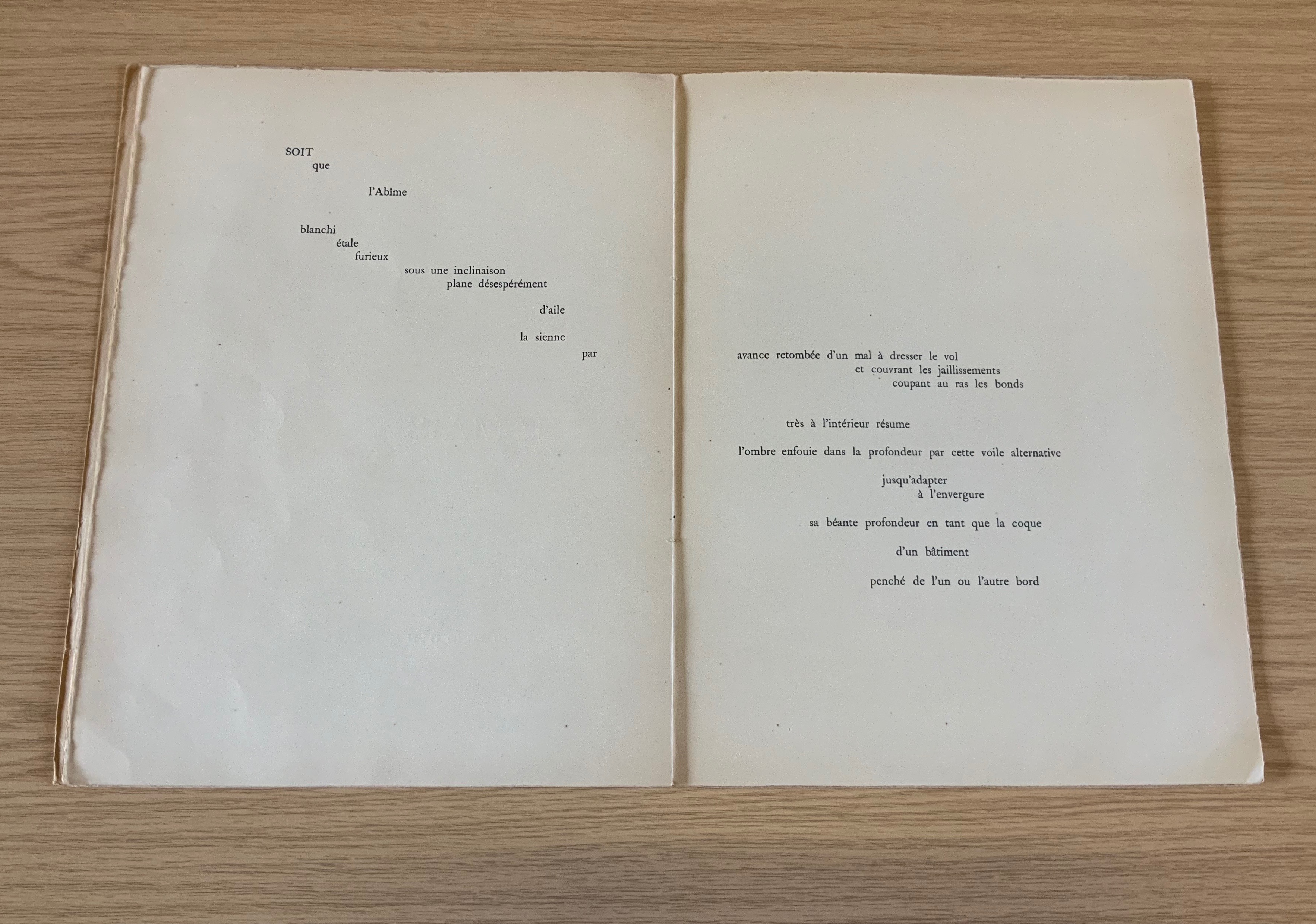
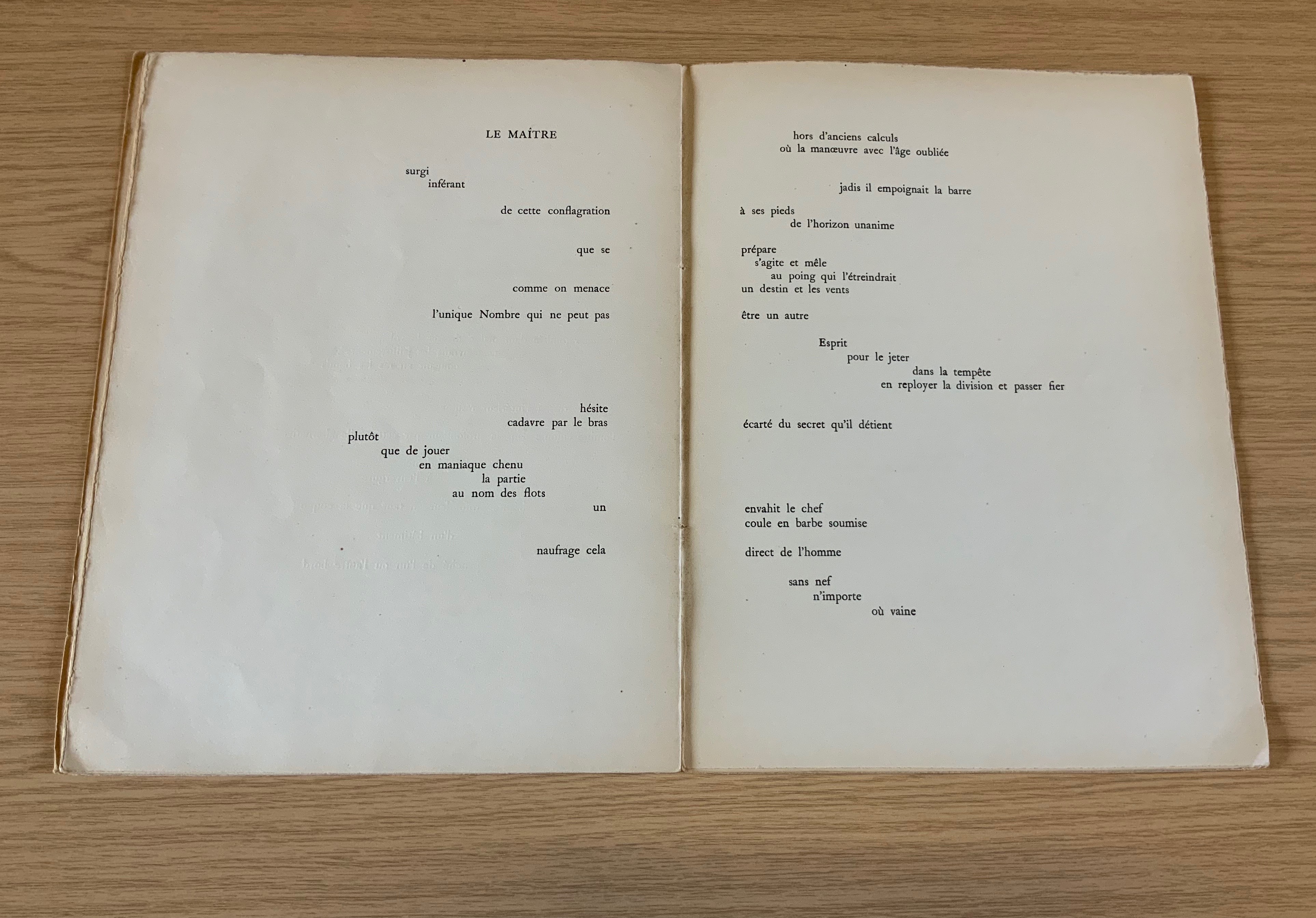
The double-page spread is the chief design structure in Mallarmé’s poem and is essential to its workings. We know this from the differences in layouts between its first publication in Cosmopolis in 1897, its marked-up proofs Mallarmé left behind after his death, and his son-in-law’s effort with Gallimard in 1913 to reflect the poet’s plan. Just before his death, Mallarmé had been working on the volume with Ambroise Vollard, who had commissioned etchings from Odilon Redon to bring it to the status and price of the livre d’artiste, a genre he was shaping. Mallarmé was amenable to this as long as the etchings were grouped at the end of the book. He did not want the artwork to distract the reader from his careful arrangement of the text on and across eleven double-page spreads.
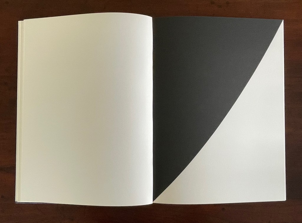
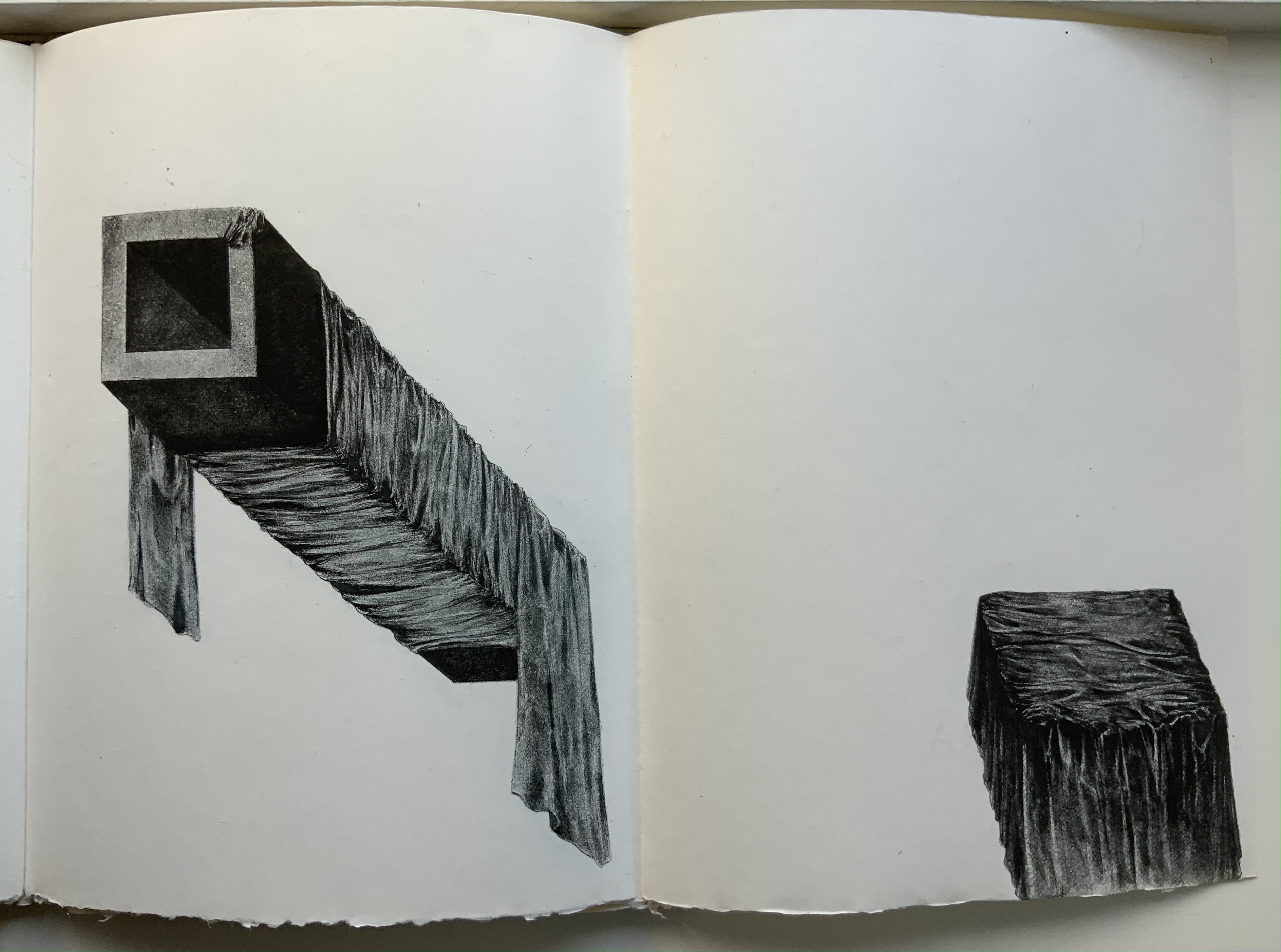
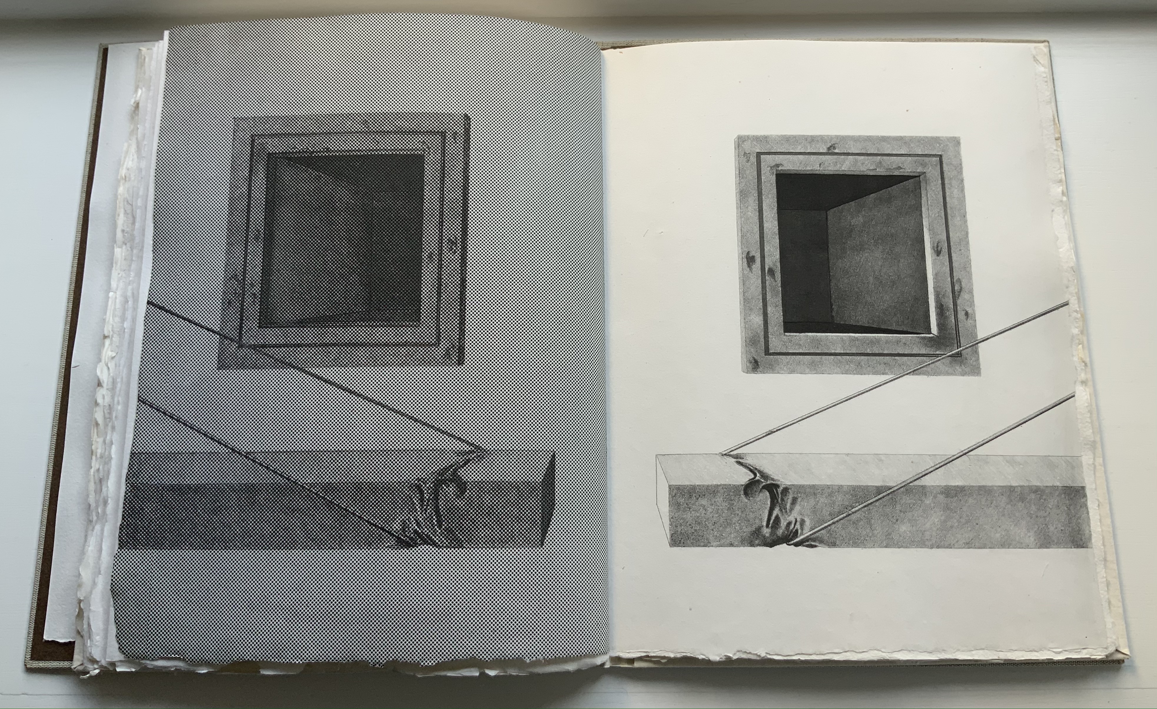
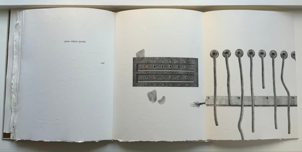
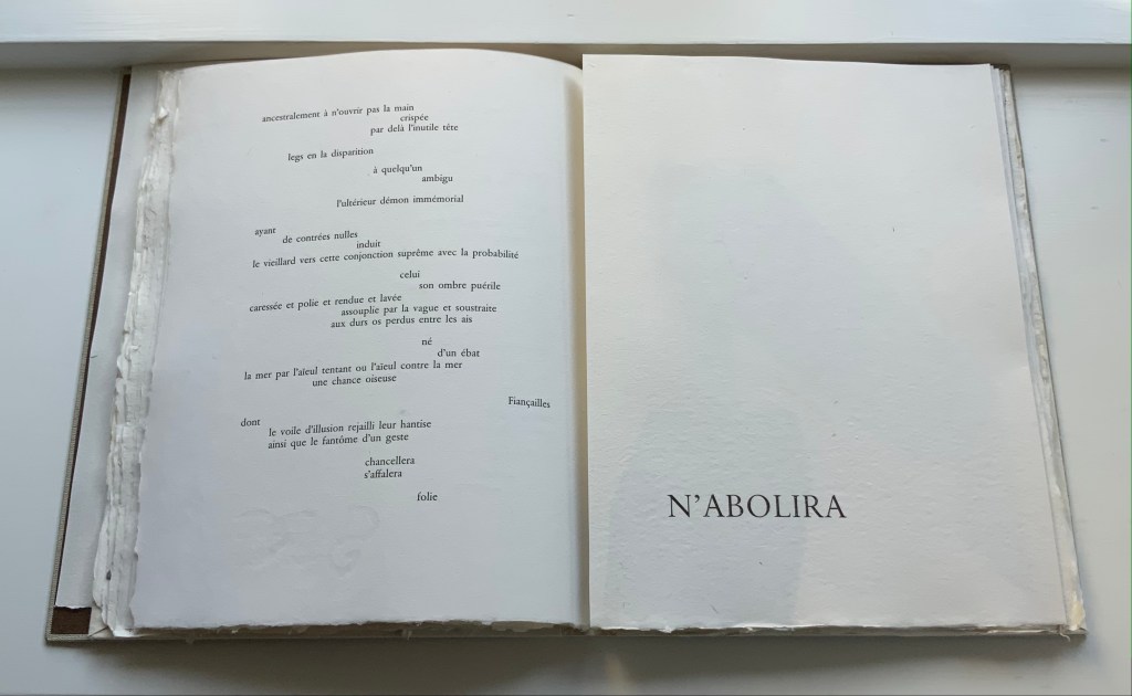
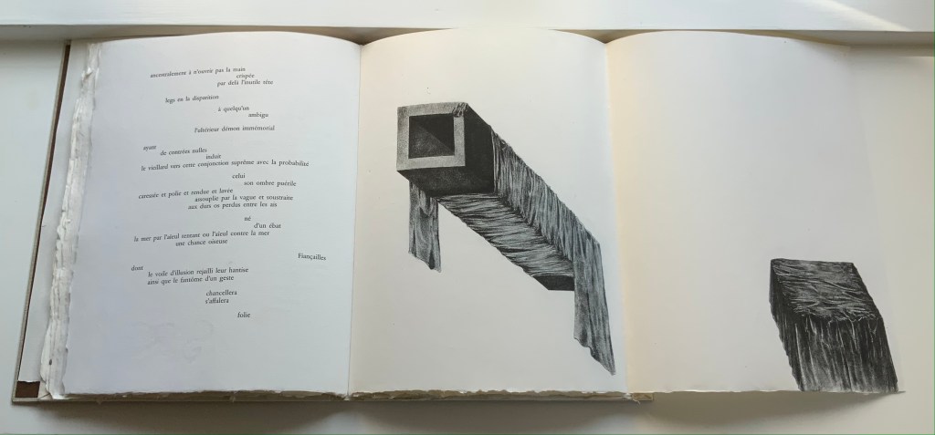
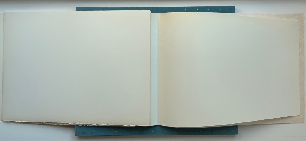
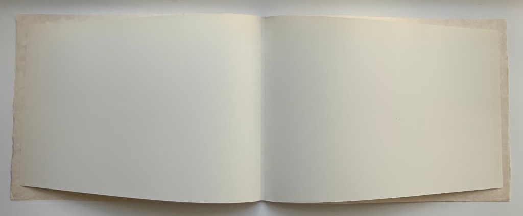
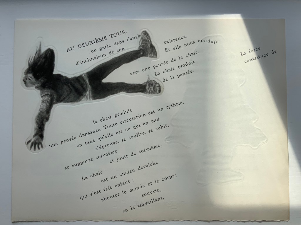
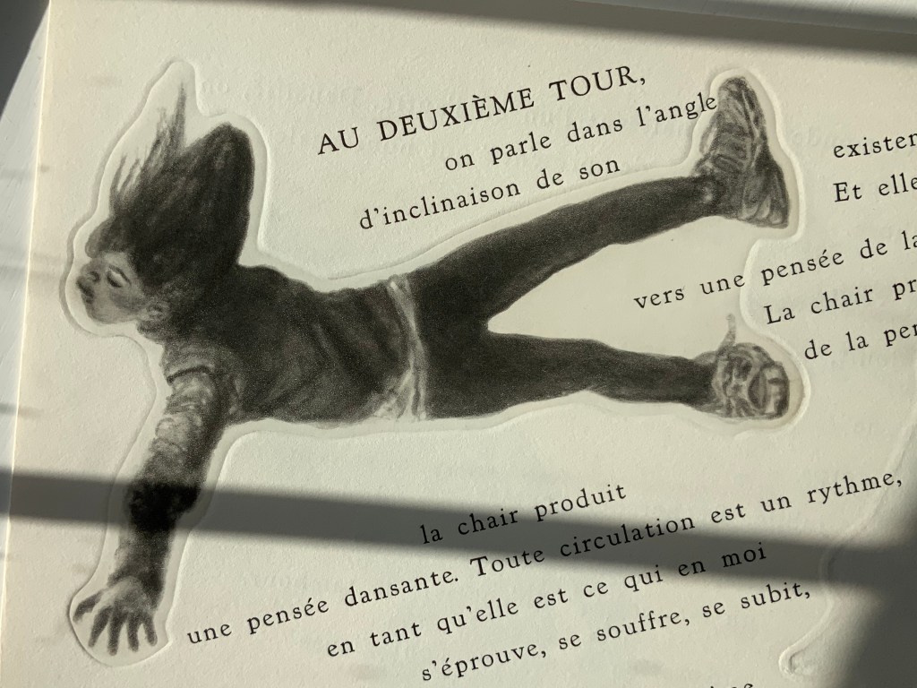
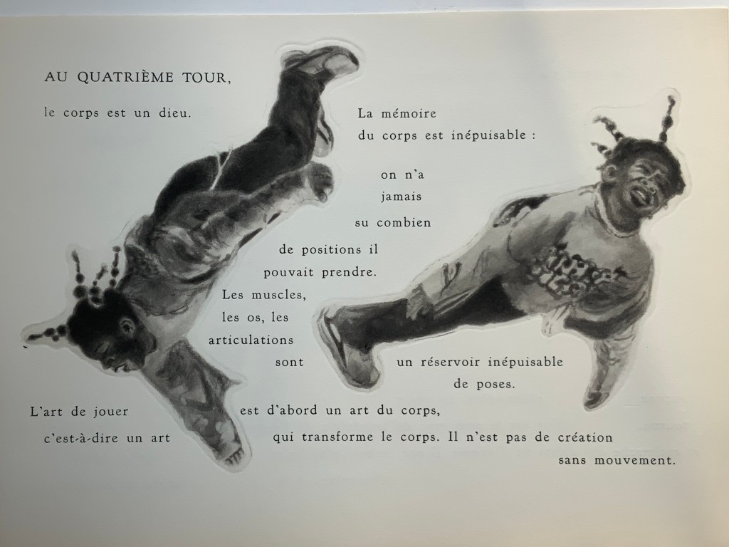
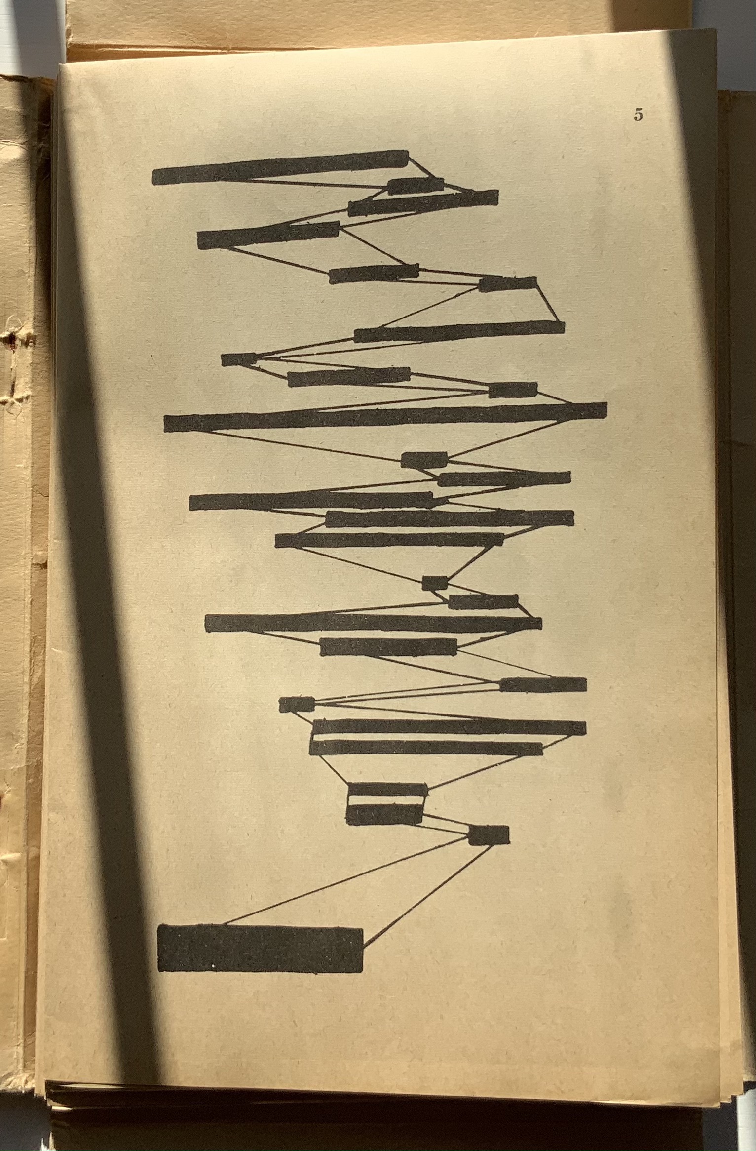
The fact of Ellsworth Kelly’s eleven lithographs aligns with Mallarmé’s plan for eleven double-page spreads of text, but the interweaving of the two sets of spreads runs contrary to Mallarmé’s wishes. To follow the poet’s wishes, Kelly and the book designer hired for The Limited Editions Club’s production could have been grouped at the end of the book, but they didn’t. To double down on the contravention, they added a blank double-page spread after each of the eleven spreads of text and after each of the eleven spreads of lithographs. Someone also decided to begin and end the volume with sets of four blank flyleaves. This is not mere padding to justify a deluxe price. The effect signals and enhances the importance of the double-page spread for Mallarmé’s poem. It underlines the importance of what Mallarmé called “les blancs”. More than underline it, those punctuations of blank space after each spread of text and then after each spread of image add a pace to the sequence and place an additional demand on the memory as it juggles Mallarmé’s interweaving of text in its different sizes, styles, and position across the double-page spread. The lithographs’ nature, their pattern, and their spatial relationship to everything in the book’s structure match Mallarmé’s architectural plans far more than Vollard’s impresario interventions.
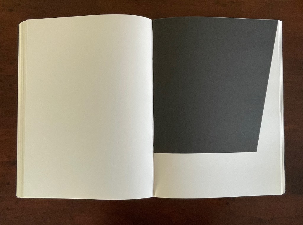
Abstract as they are, Kelly’s lithographs subtly mirror the structure and content of Mallarmé’s poem. Just as Mallarmé’s first sentence begins and his last sentence ends with “un coup de dés”, Kelly reverses the image in his first lithograph to make the image in his last.
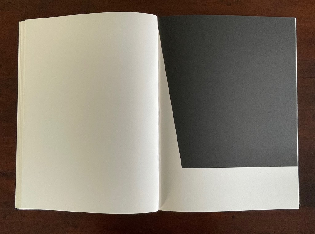
Just as inversions are recurrent in the poem, so they recur in Kelly’s lithographs.
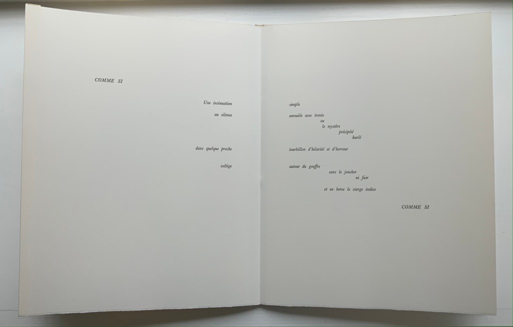
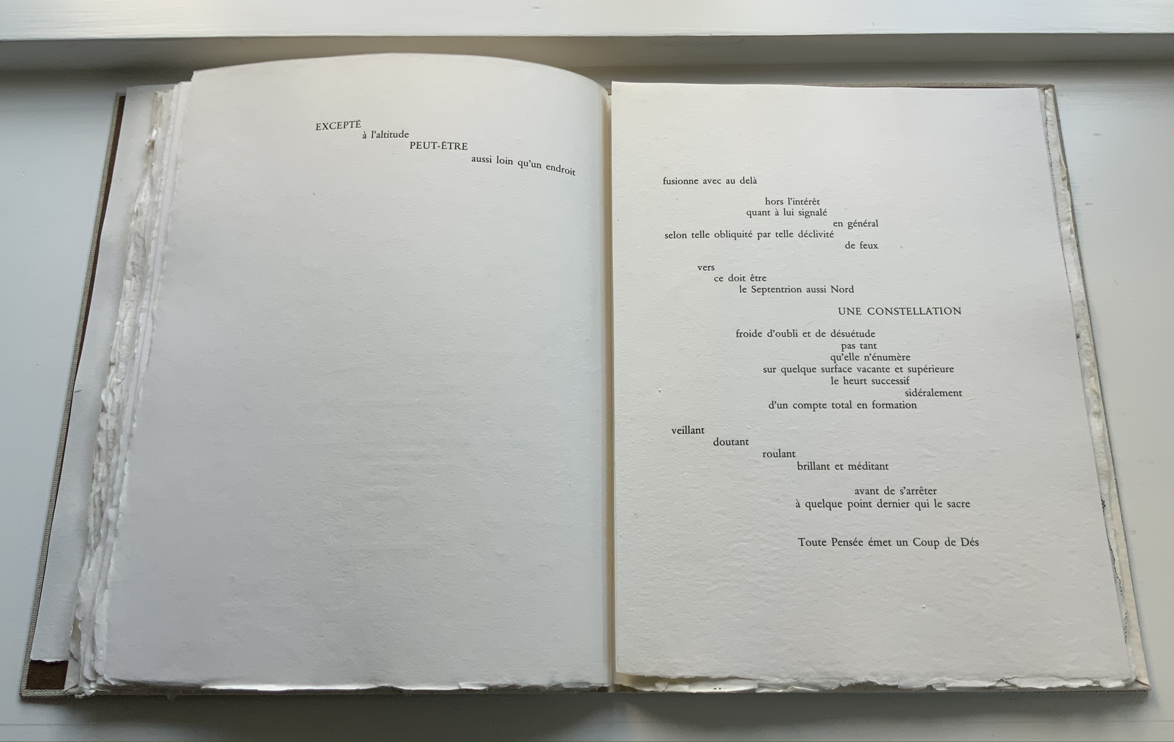
The poem’s spread beginning and ending COMME SI [“AS IF“] is central to the poem physically and thematically. The sixth of the eleven spreads, it is the only one showing this spatial, syntactic, and typographic pattern. Likewise, Kelly’s sixth lithograph splits its page equally. No other lithograph depicts this equilibrium.
Kelly created a separate portfolio of four lithographs: The Mallarmé Suite. This work is meant to be displayed on a wall and arranged precisely according to Kelly ‘s instructions. Despite the four shapes’ replication from the book, the portfolio stands quite apart in its introduction of color and positioning of the shapes (see Bonfitto’s essay). Its mere conjunction with the book does not imbue it with what happens in the book, and that underscores the fact that Kelly’s eleven black-and-white lithographs are not in mere conjunction with Mallarmé’s poem. The reader/viewer can imagine billowing sails, overwhelming waves, or tilting masts in the lithographs, but what matters is how Kelly makes his distinctive shapes play with one another and all the book’s double-page spreads to mirror how Mallarmé makes his words, typography, and double-page spreads play with one another. If self-reflexiveness is one of the key markers for distinguishing an artist’s book from a livre d’artiste, we have here a self-reflexive poem and a self-reflexive visual artwork punctuated by blanks within the canvas of the book structure to create a self-reflexive artist’s book.
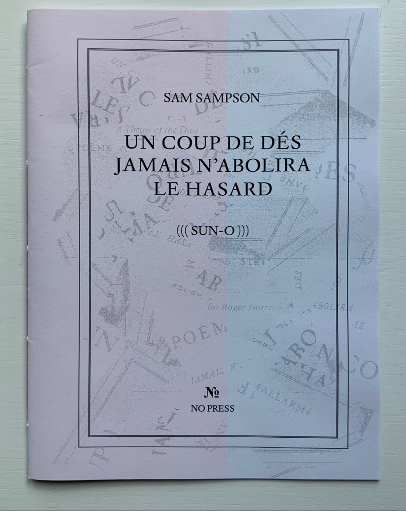
Derek Beaulieu (No Press) first published Sam Sampson’s homage to Un Coup de Dés as a handsewn pamphlet in 2020. To celebrate the 125th anniversary of Mallarmé’s initial publication of “the poem that made us modern”, Sampson enlisted Jacinda Torrance of Verso Visual Communications for design, the firm Centurion for printing, and Louise James of The Binding Studio for hand binding to produce this deluxe edition.
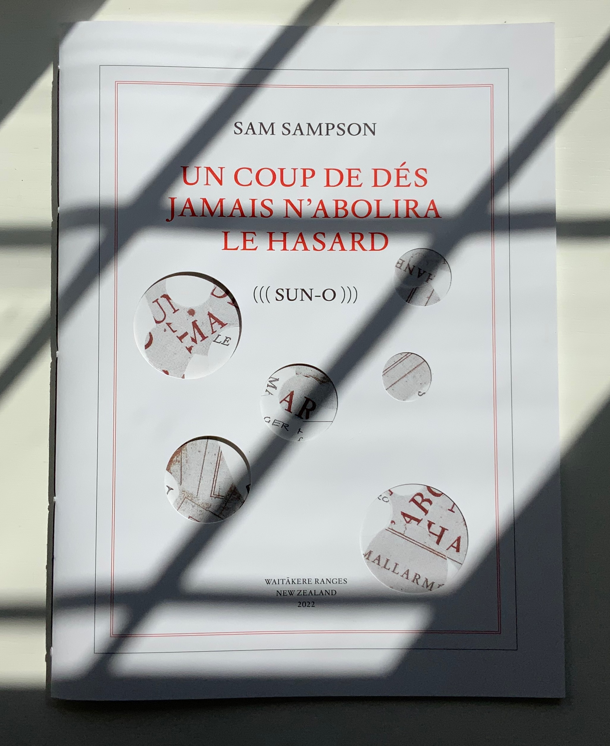
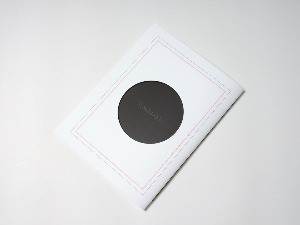
UN COUP DE DÉS JAMAIS N’ABOLIRA LE HASARD (((SUN-O))) (2022)
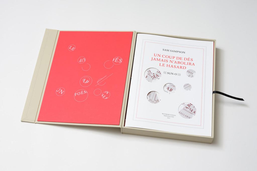
Un Coup de Dés Jamais N’Abolira le Hasard ((( Sun-O ))) (2022) Sam Sampson Handsewn book, H300 x W225 mm, 28 unnumbered pages. Edition of 20 (10, each enclosed in a hinged-lid box with magnetic flap; 10 unboxed), of which this is boxed # 2. Acquired from the artist, 7 April 2022. Photos: Books On Books Collection. Displayed with permission of the artist.
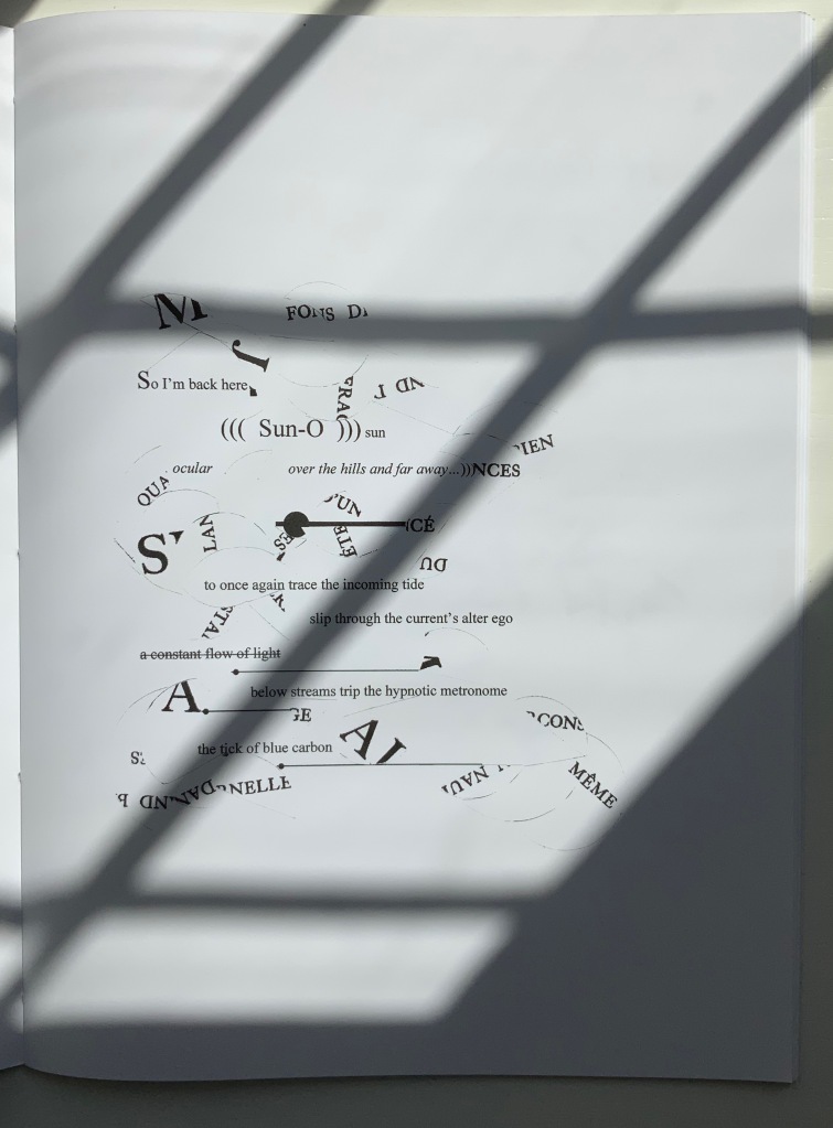
As with most creative works, (((Sun-O))) had multiple points of inception. One of them was an essay Sam Sampson read by Susan Howe and Cole Swensen. They quote Mallarmé’s preface to the poem (“nothing new except a certain distribution of space made within the reading” and speak of his aim to fuse sequential and simultaneous perception, to fully engage the eye and ear, as a result pushing poetry in two directions – toward visual art and toward musical performance. This resonated with a series of poems Sampson was writing and manifests itself in (((Sun-O))):
The physical design and analogy in my rendition is aligned with what I would call the ‘O Poems’. ‘O’ Zero, being the sound that runs through these poems, but I’ve also been interested in the numerical concept of zero: the beginning point, but also the point of departure, the ‘O’ as an ideogram, giving the text a pictorial as well as vocalised movement. [Correspondence with Books On Books Collection, 29 March 2022]
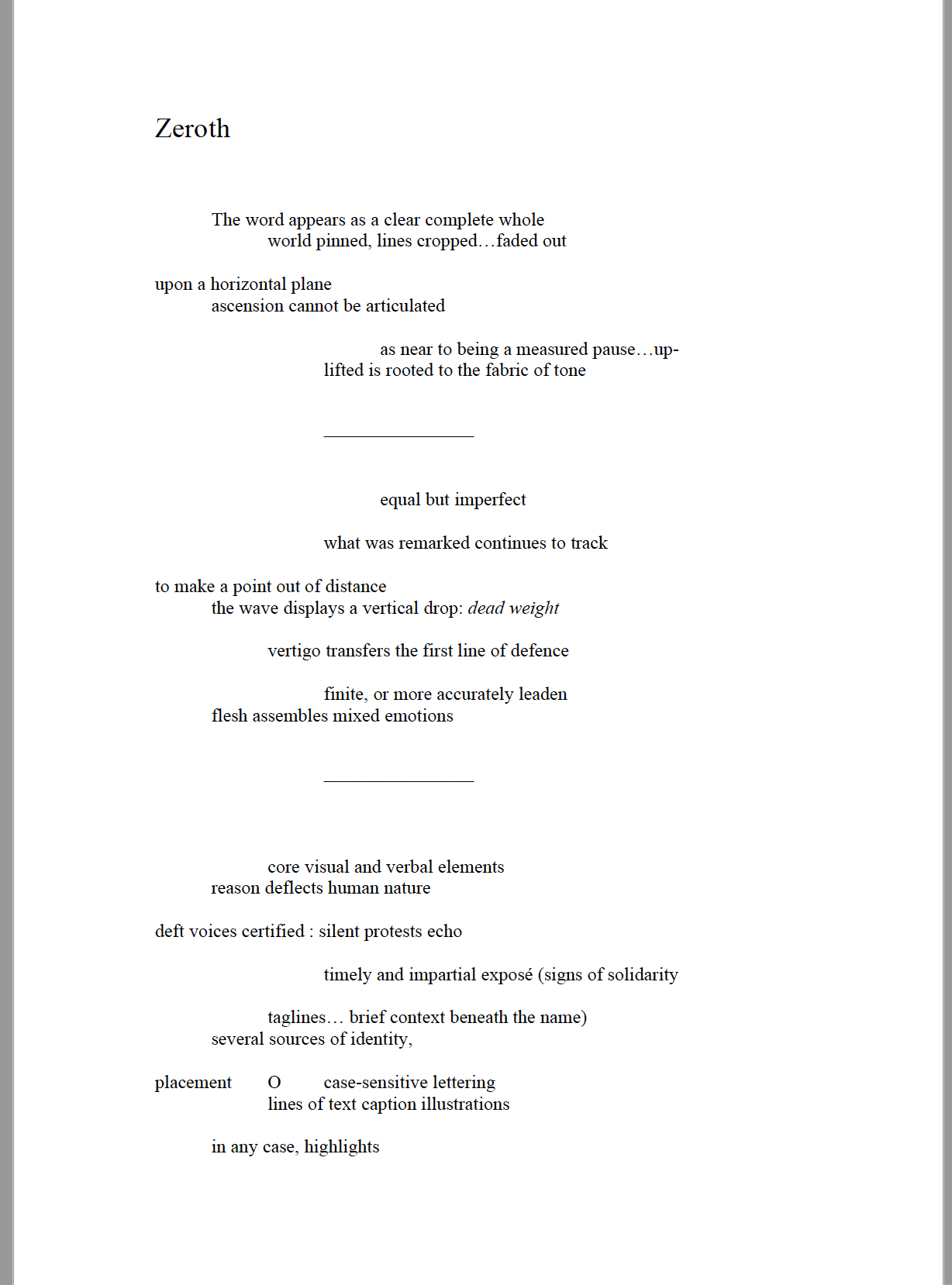
Another of the “O Poems” is Zeroth. Sampson reads it here:
Zeroth leads to another point of inception: a conversation with Roger Horrocks, a New Zealand poet, writer, film-maker, educator and cultural activist, to whom (((Sun-O))) is dedicated. After reading Zeroth, Horrocks told Sampson that it reminded him of his favorite Seattle experimental metal band at the time – Sunn O))). Sampson describes their sound as slow, heavy, blending diverse genres including “drone, black metal, dark ambient and noise rock”. Sampson’s mulling over the very sound of the band’s name led to free associations with the secondary meanings of drone (surveillance, panopticon). Mulling over the name’s compression of word and the letter O led to his hybridized subtitle (((Sun-O))) “with its parentheses radiating out but never closing”. A potent visual and textual image for a poem touching on, if not touching, the sun, the abyss and the human.
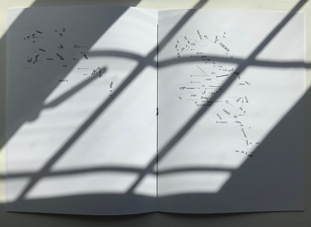
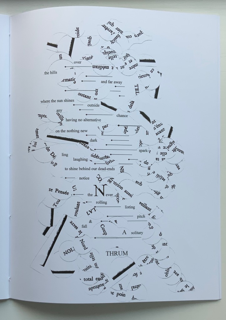
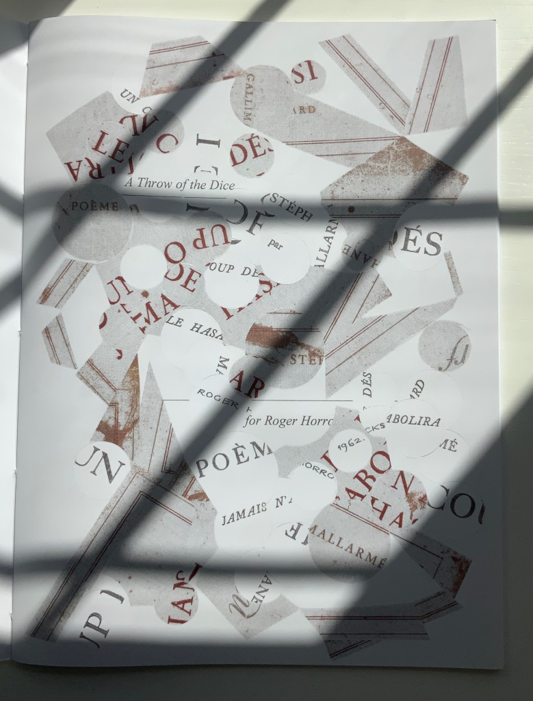
But, of course, the zero point of inception is Un Coup de Dés. On a visually material level, (((Sun-O))) has a scaffolding of bullet-pointed rules, whose lengths are based on measuring each of Mallarmé’s lines, whose weights approximate the variable font sizes, and whose placement matches that in Un Coup de Dés. This lattice serves as the physical structure for the collage of words and O’s that Sampson layers like paint or screenprint onto the page. Some words and lines are upside down like the detritus of a shipwreck. Some words curve and drape between the lines like torn sails. Appropriately, some come from the precisely corresponding pages in Mallarmé’s poem. Faint lines of the circumferences of O’s leap across and down between the lines almost like musical notations.
Within this tangle, Sampson’s own elusive and allusive text plays. Some of its phrases come from traditional song; some fix the geographical location (“blue carbon” places the speaker in a coastal community); some “un-fix” the location (“over the hills and far away”); some are struck through, alerting the reader to be ready to discard and start again; some set the technological time frame (the reference to operating systems like Suse, Symbian and, of course, Solaris). As in Un Coup de Dés, the text’s syntax and placement on the page encourage reading in fits and starts, back and forth. As Sampson puts it:
I wanted [my] poem to somehow capture, as Mallarmé had described it, “the invitation of the great white space”, and the successive, incessant, back-and-forth motions of our eyes travelling from one line to the next, and beginning all over again. [Correspondence with Books On Books Collection, 29 March 2022]
Indeed, before writing Un Coup de Dés, Mallarmé foreshadowed more expansively this phenomenon toward which Sampson strives:
Pourquoi — un jet de grandeur, de pensée ou d’émoi, considérable, phrase poursuivie, en gros caractère, une ligne par page à emplacement gradué, ne maintiendrait-il le lecteur en haleine, la durée du livre, avec appel à sa puissance d’enthousiasme: autour, menus, des groupes, secondairement d’après leur importance, explicatifs ou dérivés — un semis de fioritures. [Oeuvres Complètes, 2, 227]
“Why — couldn’t a considerable burst of greatness of thought or emotion, carried in a sentence in large typeface, gradually placed with one line per page, hold the reader’s bated breath throughout the entire book by appealing to his or her power of enthusiasm: around this [burst], smaller groups of secondary importance, explicating or deriving from the primary phrase — a scattering of flourishes.” [Arnar, 234]
Whereas in Mallarmé’s poem there is a primary sentence in large typeface (“UN COUP DE DÉS JAMAIS N’ABOLIRA LE HASARD”) off which the secondary groups of phrases and sentences play, (((Sun-O)))‘s primary foil is the combination of two things: the collage made from shards of Mallarmé’s poem and that strange, enjambed subtitle (((Sun-O))). After all, the full title of Sampson’s work is UN COUP DE DÉS JAMAIS N’ABOLIRA LE HASARD (((SUN-O))).
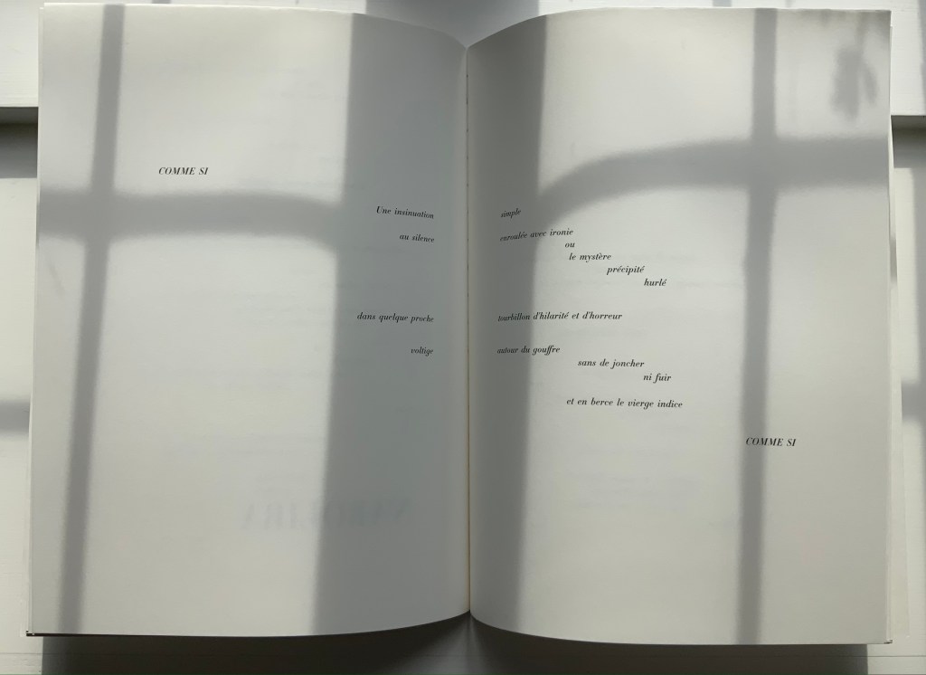
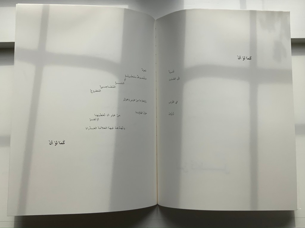
The “Comme si … Comme si” center double-page spread.
Sampson calls Mallarmé’s poem a form of metaphysical gambling, reproducing the sensation of being both in and outside time. Being both in and outside of time — that could be the defining state of human consciousness. Unlike the abstract representation of humanity in Un Coup de Dés, however, (((Sun-O)))‘s representation is concretely personal. The traditional song “Over the Hills and Far Away“, which Sampson cites at the start of (((Sun-O))), can be read as a reference to Horrocks’ departure from New Zealand for the United States in the 1960s. At one point, the speaker addresses Horrocks directly: “Roger / what of these / parallels of blue / sea shanties / masquerading mind-sets / …”. Sampson takes the image of Roger Horrocks’ signature from Horrocks’ copy of an edition of Un Coup de Dés, fragments it and reproduces it on the pages of (((Sun-O))). Did Sampson have in mind the story of René Magritte’s loaning his copy of Un Coup de Dés to Marcel Broodthaers, which led to Broodthaers’ Image version of Mallarmé’s poem? (See Marine Hugonnier’s retelling of the tale here.) The scaffolding of bulleted-pointed lines certainly pays homage to Broodthaers and other “hommageurs by redaction” such as Michalis Pichler, Sammy Engramer and others. (((Sun-O))) is a work of many conversations on many levels across time and time zones.
One of the main topics in (((Sun-O))), however, naturally seems to defy the bridging of the personal and abstract: climate crisis. It is hard to miss the allusions to the global shipwreck that is the climate crisis, engendering rising ocean levels and spastic efforts towards zero carbon emissions based on a computational chaos of competing environmental models and competing economic and political systems. It is clearly of personal concern to the speaker, but that does not take the issue from the abstract to the concretely personal in the way that Horrocks’s signature in a copy of Un Coup de Dés does. Making the climate crisis personal could, of course, run the risk of descending into small talk about the weather.
The references to music and the poem’s demonstration of musicality throughout are also hard to miss, and given its zero point of inception, the poem would be seriously remiss without them. The aim for union of text, sound and graphic image is as central to Sampson’s poem as the manipulation of syntax and les blancs is to Mallarmé’s. The aim’s importance in Sampson’s poem even has the last note and oversized word in the poem:
... the Never / rolling / listing / pitch / & / fall / A solitary / THRUM
The frequency of achieved union may be what puts Sampson’s homage in the front rank.
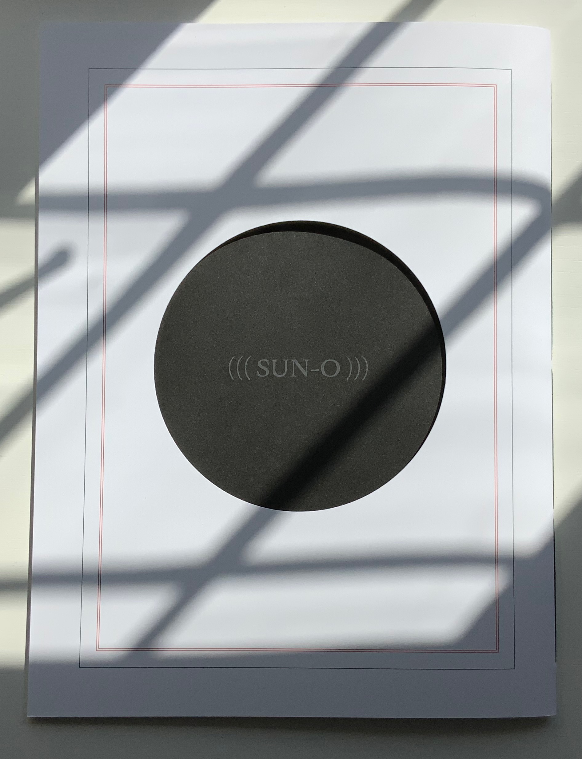
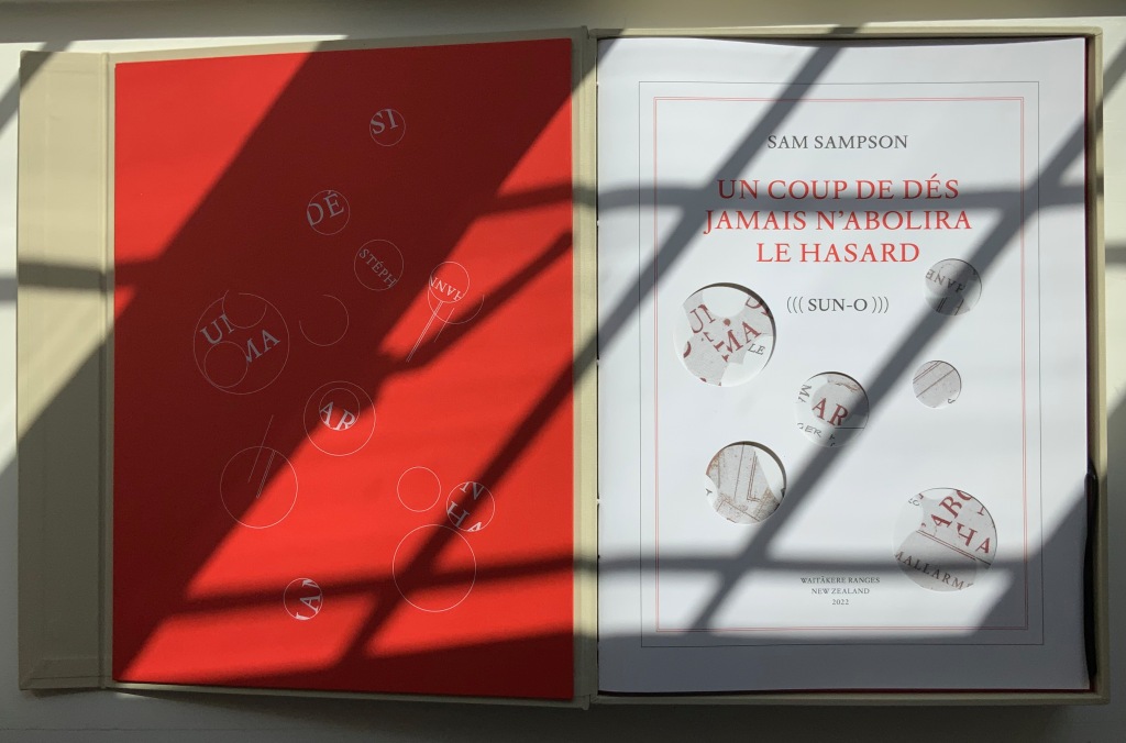
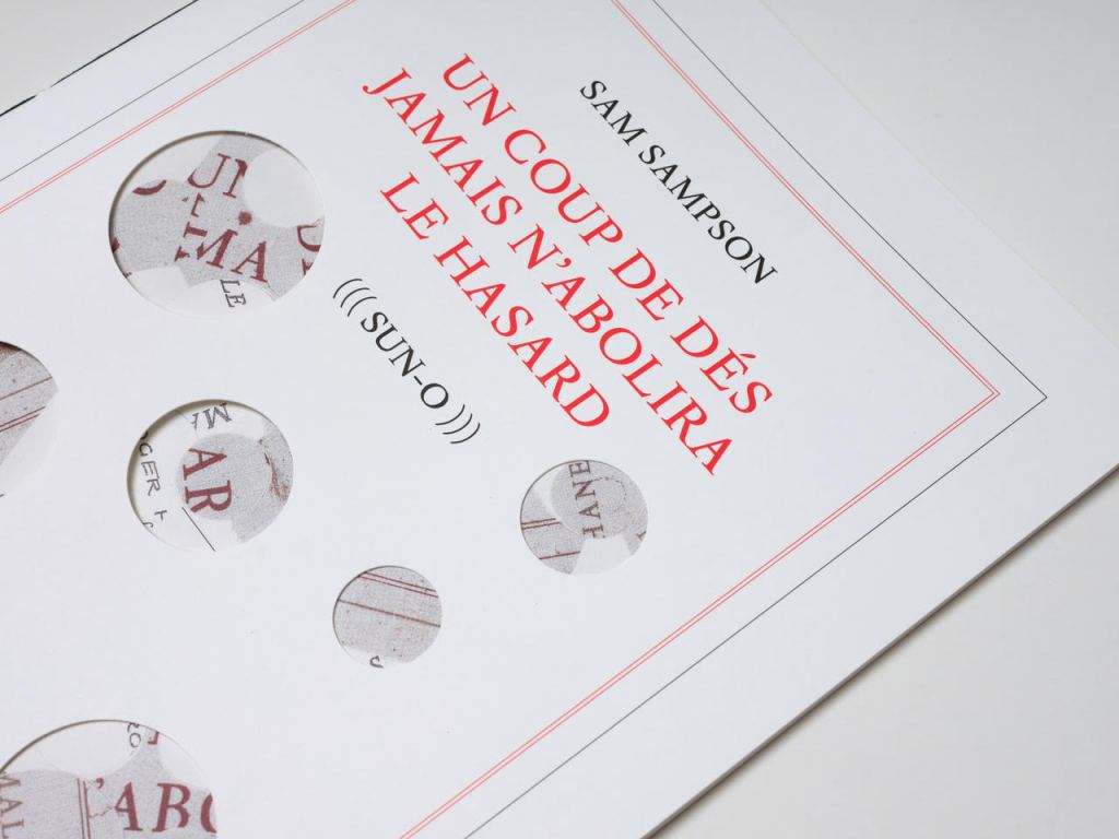
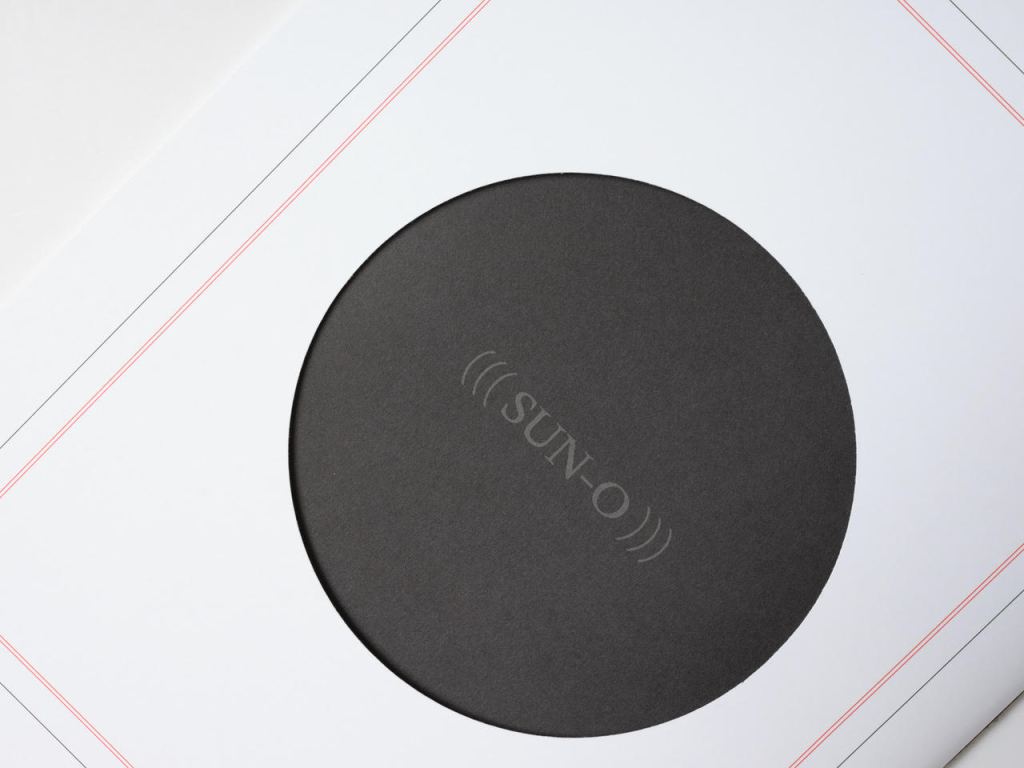
The special edition of (((Sun-O))) enhances that union in material ways. The design and materials play off Sampson’s cutting into and out of, sticking on and sticking through Un Coup de Dés. Six circles foiled in white on the front cover of the box turn the subtitle into an emblem — a mark maker. On the box’s inside lining, a design of circles and broken circles echoing the collage of O’s in the poem (even hinting at musical notation) is used to designate the number of the copy in the edition of 10. For this copy (#2), straight lines cut through 2 of the circles.
Like the white circles, six die-cut circles on the book’s front cover correspond to the six parentheses of the subtitle and likewise one face of a die. They also recall the hemistich of French poetry’s twelve-syllable Alexandrine, which Un Coup de Dés shattered. An image peeks through the die cuts and, as the cover turns, reveals itself as a collage of the cut-up cover of Horrocks’ copy of the poem and pages of (((Sun-O))). On the back cover, a single large die-cut circle centers on a black-hole sun with a faint, almost invisible ((( Sun-O ))) disappearing into blank/blackness.
By chance or by sly humor, the typeface used is DTL Elzevir. (((Sun-O))) is obviously not in the hunt for absolute fidelity to the edition planned by Mallarmé and Ambroise Vollard in 1896-97, which collapsed with the poet’s death. When Mallarmé’s son-in-law Dr. Edmond Bonniot issued an edition with Gallimard/NRF in 1914, the typeface was Elzevir, allegedly a face that Mallarmé detested. With this special edition of (((Sun-O))), Sampson is in the hunt on his own terms for his own more personal Mallarméan prism, constellation or radiant (((Sun-O))) that syntactically, auditorily, visually and physically scatters and focuses his response to the human condition.
UN COUP DE DÉS JAMAIS N’ABOLIRA LE HASARD (((SUN-O))) (2020)
Un Coup de Dés Jamais N’abolira le Hasard: (((Sun-O))) (2020) Sam Sampson Handsewn pamphlet. H255 x W190 mm, 24 pages. Edition of 60. Acquired from No Press, 4 January 2021. Photo of the work: Books On Books Collection. Displayed with permission of the artist.
[Mallarmé’s] work is a constellation and trying to unpack and explicate what went into my response hopefully doesn’t remove the joy of just jumping in. I like what John Ashbery said about his own work: “my work is accessible, if you take the time to access it.” [Sampson in correspondence with Books On Books Collection, 29 March 2022]
Further Reading & Listening
“Derek Beaulieu“. 19 June 2020. Books On Books Collection.
Davenport, Philip. 27 March 2020. “‘France’, or… we are circles of cancelled stars’“, Synapse International: An international visual poetry gathering. Started by Karl Kempton and Davenport in February 2018, Synapse International quickly attracted online works of homage to Un Coup de Dés, including an early appearance in March 2018 of Eric Zboya‘s Translations and later a visually adapted essay by David W. Seaman and as well as an “ADVERTISEMENT” from Derek Beaulieu that links to his 3D rendering of Un Coup de Dés.
POÉME: Un coup de Dés jamais n’abolira le Hasard (2007)
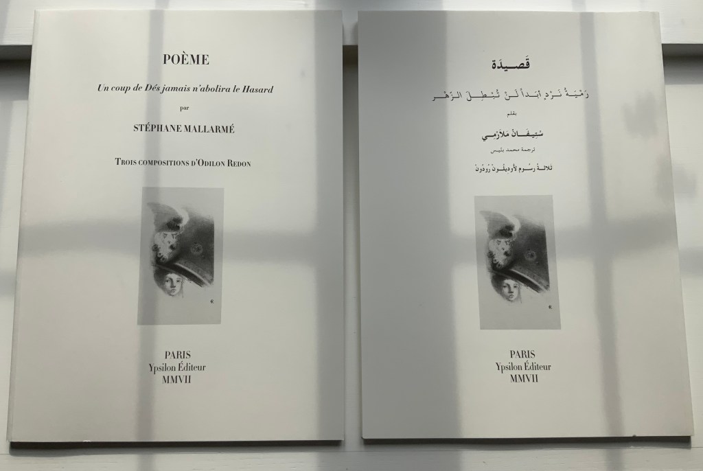
POÉME: Un coup de Dés jamais n’abolira le Hasard (2007) Stéphane Mallarmé, Isabelle Checcaglini and Mohammed Bennis Four volumes in slipcase. H380 x W280 mm, 40 pages per volume. Edition of 99, of which this is #57. Acquired from J.F. Fourcade, 7 January 2022. Photos: Books On Books Collection.
Ypsilon Éditeur’s editions of Un coup de Dés jamais n’abolira le Hasard bring together for the first time the three prints from Odilon Redon with the deluxe edition layout intended by Stéphane Mallarmé. Also for the first time, we have a translation into Arabic. Below, the central double-page spread of the poem is displayed in the French and Arabic editions to show how their mirror images of the layout heighten its movement.
In the additional French volume and its Arabic counterpart, Checcaglini adds a brief history about Mallarmé and Vollard’s plans for the deluxe edition and helpfully includes correspondence among them and Odilon Redon. Although the earlier edition published by Mitsou Ronat & Tibor Papp in 1980 does include Redon’s prints, they are placed in a separate folder along with other visual and textual tributes. The Redon prints may not be among his best, nor do they include the mooted but undiscovered fourth print, still at least we now have the three and the poem in relation to each other more nearly as intended, which makes it possible to compare and contrast this deluxe edition with the outpouring of works of homage to Mallarmé’s poem. Even with the prior absence of that chance, few if any of those hommageurs would be unaware of Redon’s images. Jean Lecoultre (1975) notes how his publisher’s solution to handling his soft varnish etchings honors the intended separation of text and images. By contrast, Christiane Vielle (1989) challenges Mallarmé’s layout and his unit of the double-page spread by altering the spatial relationships among lines, hiding text beneath panels and juxtaposing her artwork with the text.
The added volume with Checcaglini’s synopsis also includes a three-way dialogue among Mohammed Bennis, Isabelle Checcaglini and Bernard Noël about the light that the translation sheds on the poem.
Checcaglini’s edition also claims to have most closely reproduced the Firmin-Didot typeface that Mallarmé wished for his deluxe edition. The search for absolute fidelity to this font that has been unavailable for at least a century has been an obsession since the discovery of the poem’s proofs corrected and annotated in Mallarmé’s hand. The Further Reading provides a start for anyone inclined to join the search.
UN COUP DE DÉS JAMAIS N’ABOLIRA LE HASARD: POÈME (1989)
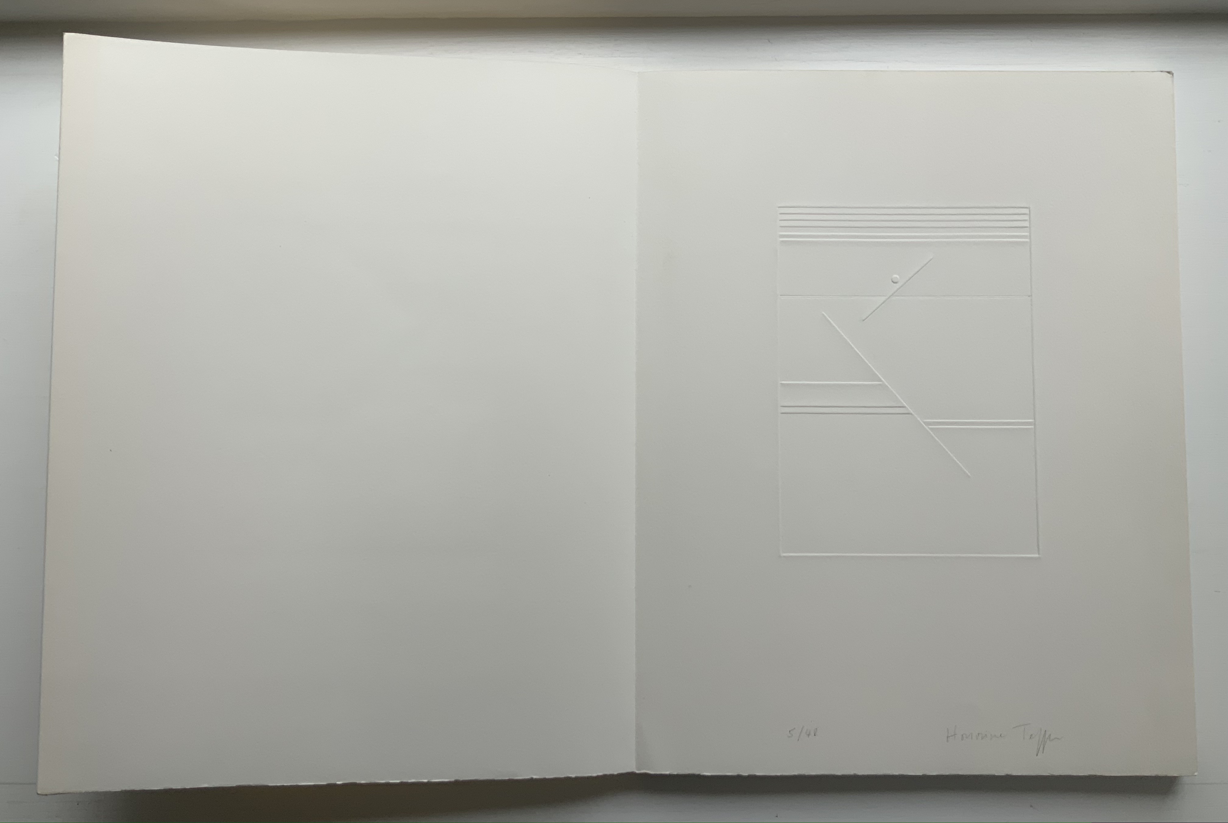
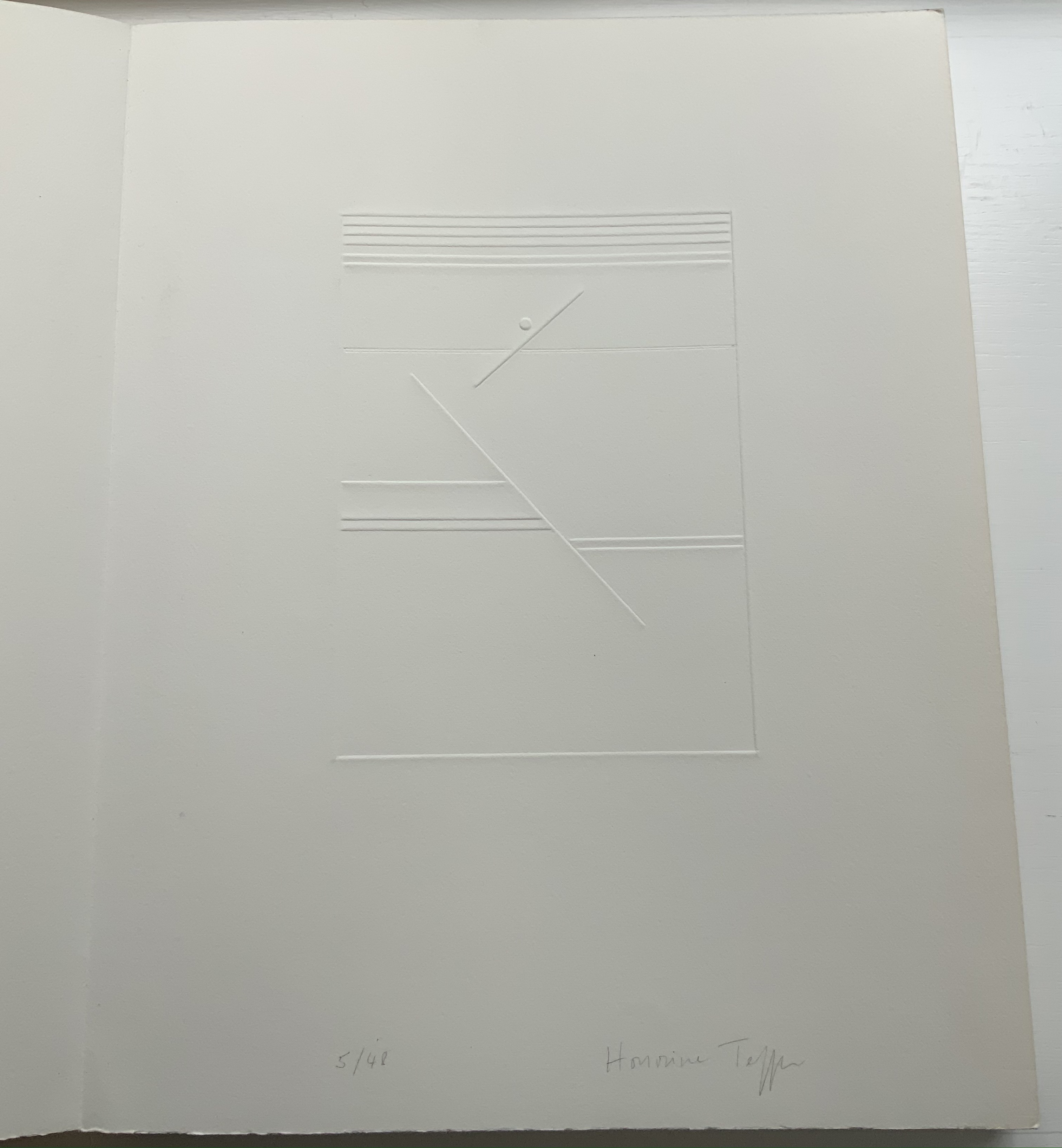
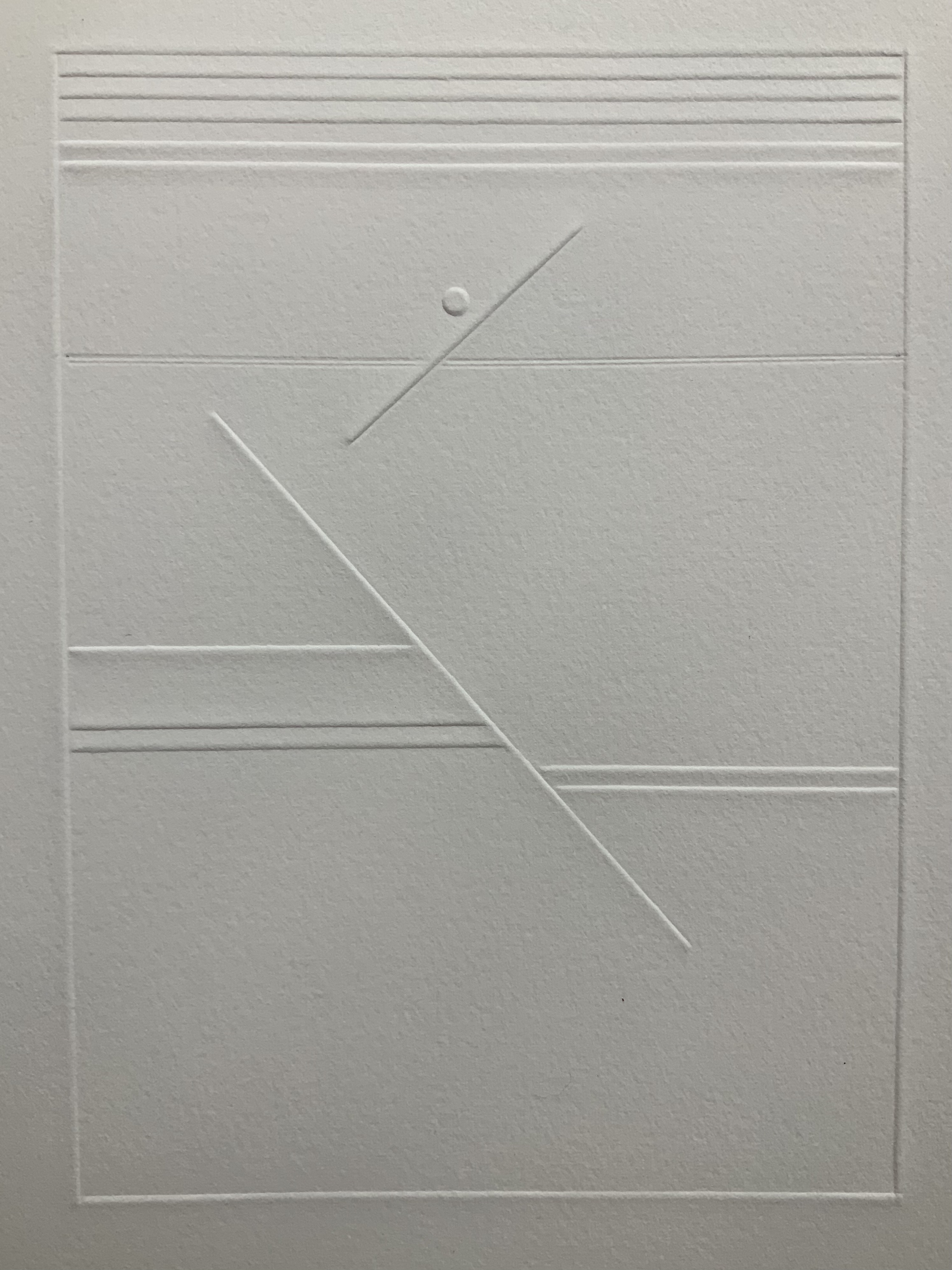
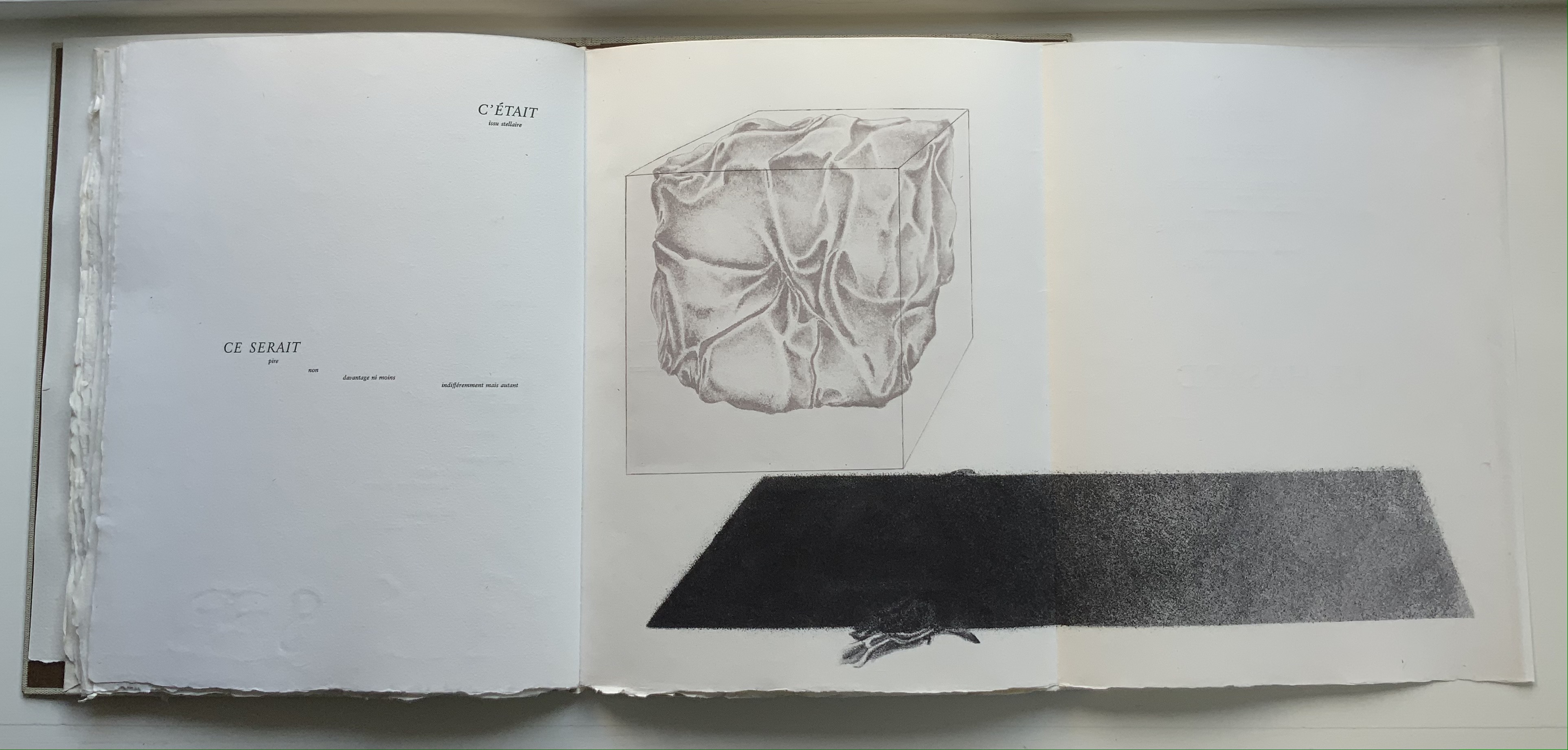
UN COUP DE DÉS JAMAIS N’ABOLIRA LE HASARD: POÈME(1989) Stéphane Mallarmé (text); Honorine Tepfer (art & design) Accordion fold with embossed paper cover. Cover – H325 x W255 mm; Book – H320 x W250 mm, 34 pages. Edition of 48, of which this is #5. Acquired from Studio Montespecchio, 2 February 2022. Photos: Books On Books Collection. Displayed with permission of the artist.
Before his sudden death in 1898, Stéphane Mallarmé was planning a deluxe edition of Un Coup de Dés Jamais N’Abolira le Hasard with Ambroise Vollard, an entrepreneur and publisher. A single-volume version of the poem did not appear until 1914. Issued under the direction of Mallarmé’s son-in-law Dr. Edmond Bonniot through the Nouvelle Revue de France (NRF), it omitted intended prints by Odilon Redon, used the typeface Elzevir rather than the Didot that Mallarmé preferred, and did not precisely follow his layout. We know all this because of correspondence between the poet, Redon and Vollard and because the Sorbonne’s Bibliothèque littéraire Jacques Doucet and Harvard’s Houghton Library hold proofs of the deluxe edition with Mallarmé’s handwritten corrections and instructions.
Mallarmé’s placement of words and lines was intentional and precise. Even before the planning for the deluxe edition, he wrote of what could be achieved with type size and layout:
Pourquoi — un jet de grandeur, de pensée ou d’émoi, considérable, phrase poursuivie, en gros caractère, une ligne par page à emplacement gradué, ne maintiendrait-il le lecteur en haleine, la durée du livre, avec appel à sa puissance d’enthousiasme: autour, menus, des groupes, secondairement d’après leur importance, explicatifs ou dérivés — un semis de fioritures. [Oeuvres Complètes, 2 227]
“Why — couldn’t a considerable burst of greatness of thought or emotion, carried in a sentence in large typeface, gradually placed with one line per page, hold the reader’s bated breath throughout the entire book by appealing to his or her power of enthusiasm: around this [burst], smaller groups of secondary importance, explicating or deriving from the primary phrase — a scattering of flourishes.” [Arnar, 234]
The NRF edition 1914 edition makes quite a few sad missteps as Robert Cohn pointed out in 1967. Tepfer’s inspiration to restore the intended layout follows in the footsteps of Mitsou Ronat & Tibor Papp (1980) and Neil Crawford (1985). She visited the Doucet library to examine the proofs and layout. Following the layout was not difficult, but with the scarcity of Didot, Tepfer needed to select another typeface. She chose Baskerville. Given that Firmin Didot was inspired by John Baskerville’s experimentation with thick and thin strokes, the choice adds historical interest, although Bodoni might have been nearer the mark. Below are Tepfer’s double-page spreads across which Mallarmé’s burst of thought appears one line per page among the “scattering of flourishes”.
The book’s central double-page spread, beginning with COMME SI / “AS IF”) in the upper left and ending with COMME SI / “AS IF” in the lower right, mimics the throw and fall of the dice and provides another example of the semantic and typographic play that Mallarmé describes above.
Like the artists before her — Redon (1897), André Masson (1961), Mario Diacono (1968), Marcel Broodthaers (1969), Jean Lecoultre (1975), Ian Wallace (1979) and Ian Tyson (1985) — Tepfer had to solve the puzzle of relating image to text. This is the difficult path of inverse ekphrasis: what and how the visual, tactile and conceptual works of art that come after Mallarmé’s text can be. We are more used to ekphrasis where the object, painting or sculpture comes before the text — like Achilles’ shield before Homer’s description, or the Grecian urn before Keats’ ode, or Brueghel’s Fall of Icarus before Auden’s Musée des Beaux Arts. Homer, Keats and Auden vie with the art of the crafted object to put that object (and more) in front of us with words. With the inverse, the crafted objects vie without the words to put Mallarmé’s poem (and more — and sometimes less!) in front of us. Tepfer’s solution?
A simple line runs across the debossed front and back covers. As Tepfer wrote in June 1990 about her journey into Un Coup de Dés: La ligne d’horizon était un sujet de ma hantise / “The horizon line was my obsession”. As the folded paper cover opens, a single geometric, abstract image appears — debossed and embossed on blank paper. Except for a single round dot, everything is linear. Two separate lines angle across the space. One cuts through the debossed horizon line that lies beneath a series of closely spaced horizontal lines — suggesting clouds? The other, longer one cuts at a different angle, creating a foreground from two sets of parallel lines that have slipped or shifted like tectonic plates. Could the round dot be the single-dot side of a die rolling down a slanted deck or broken mast? Could the longer slanted line be a broken mast? Could the shifted parallel lines be a broken handrail?
Rather than trying to track back to verbal images in the poem, though, perhaps we should recognize Tepfer’s prefatory image as a kind of substitute for Mallarmé’s preface in 1897 — the one he preferred we not read. He wanted us to look. To see les blancs. To hold thought and emotion like our breath across the space of the book. With her simple rectangle of blank paper, with the absence of ink, with the geometric solidity of the horizontal and slanting lines, and with the velvet softness of the velin d’Arches across her version’s accordion folds, Tepfer encourages us to look, see, hold meaning in abeyance and sense it.
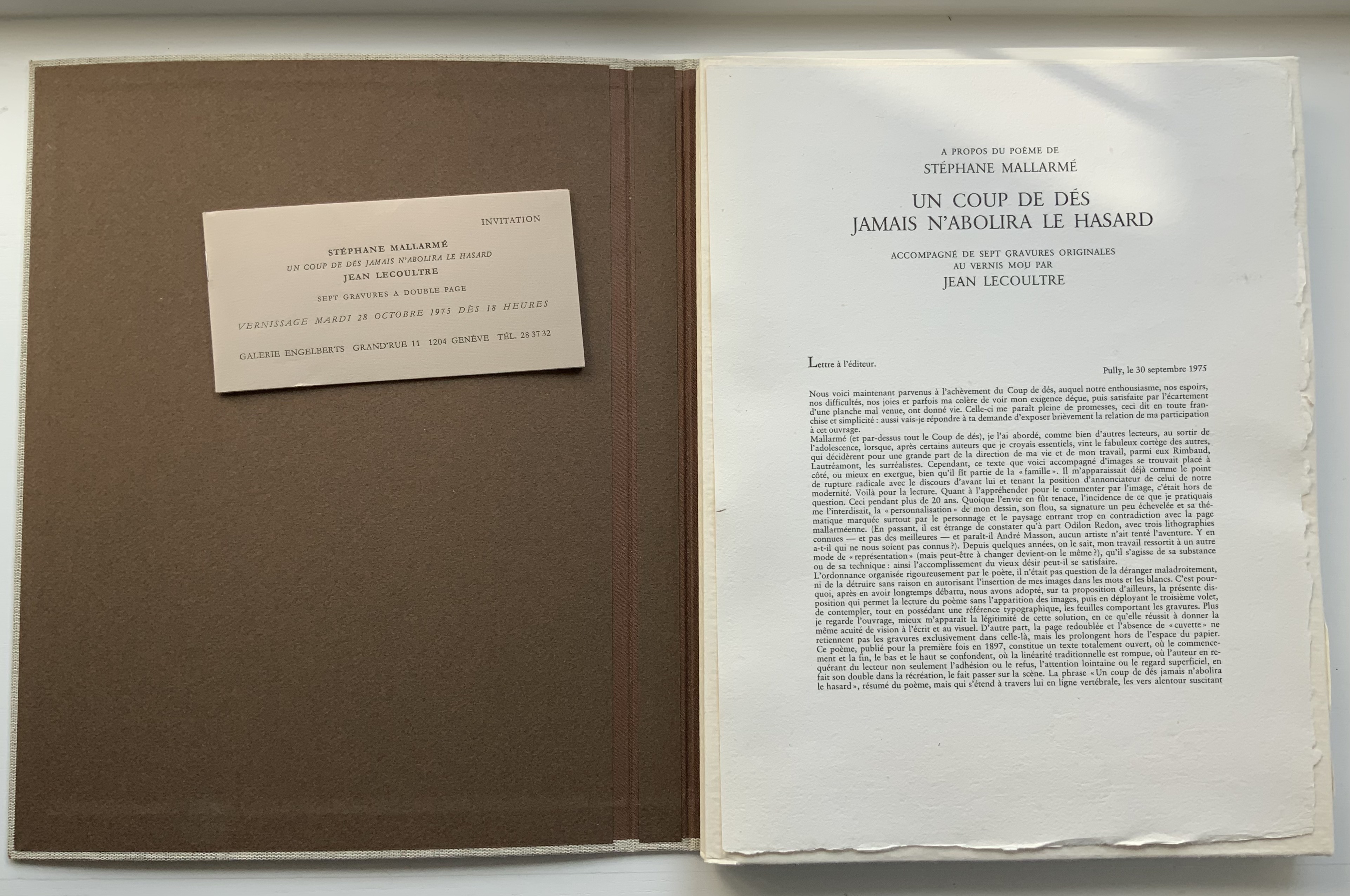
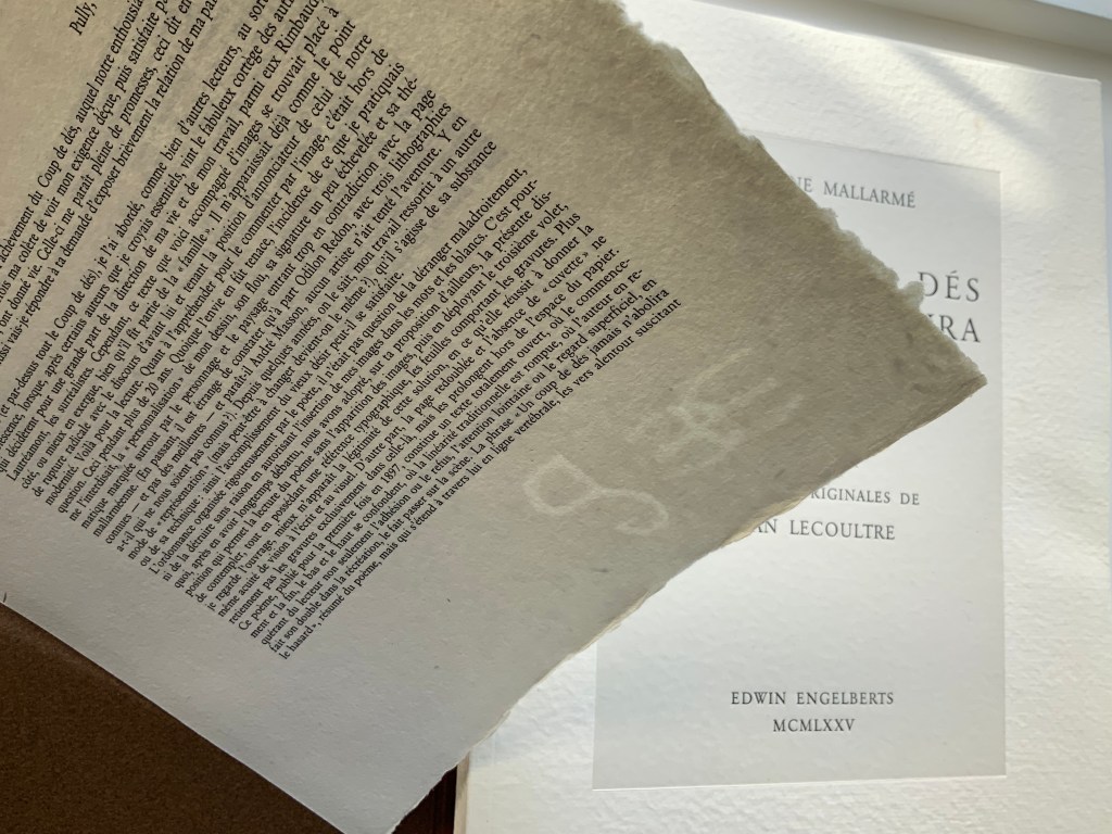
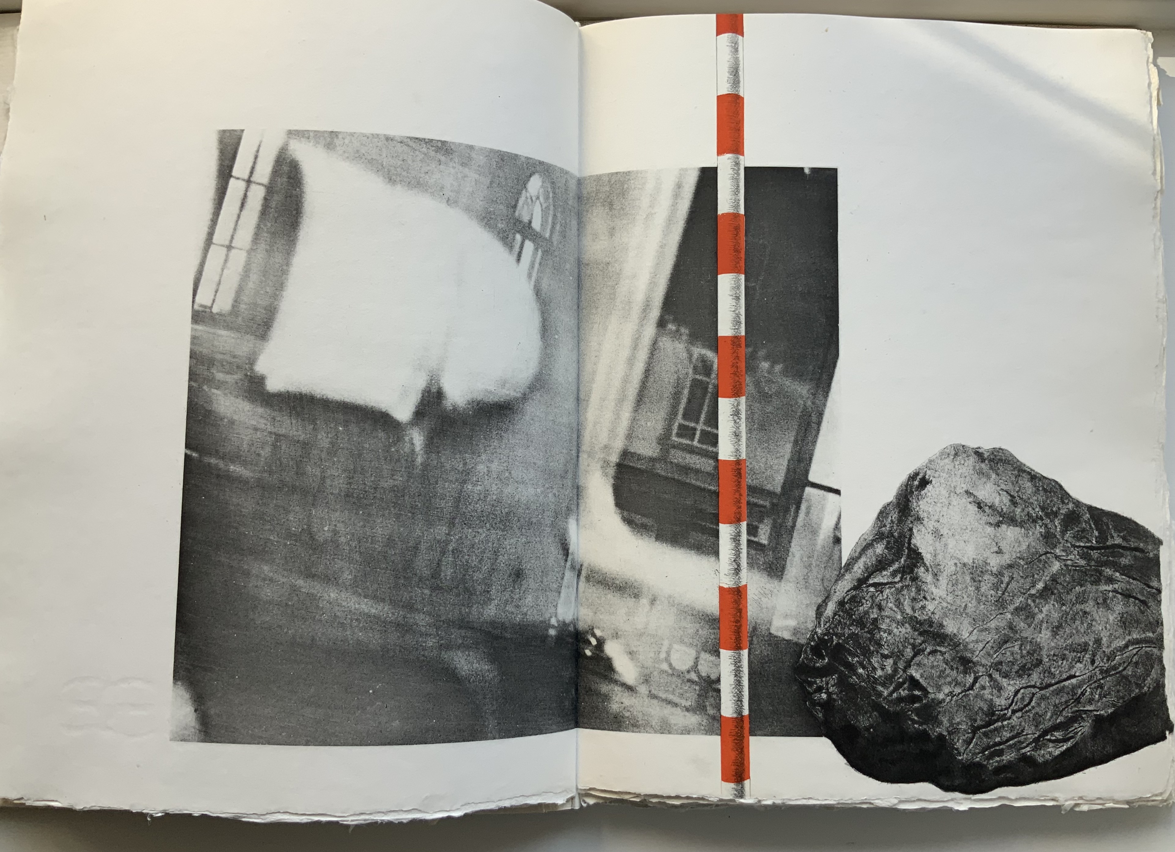
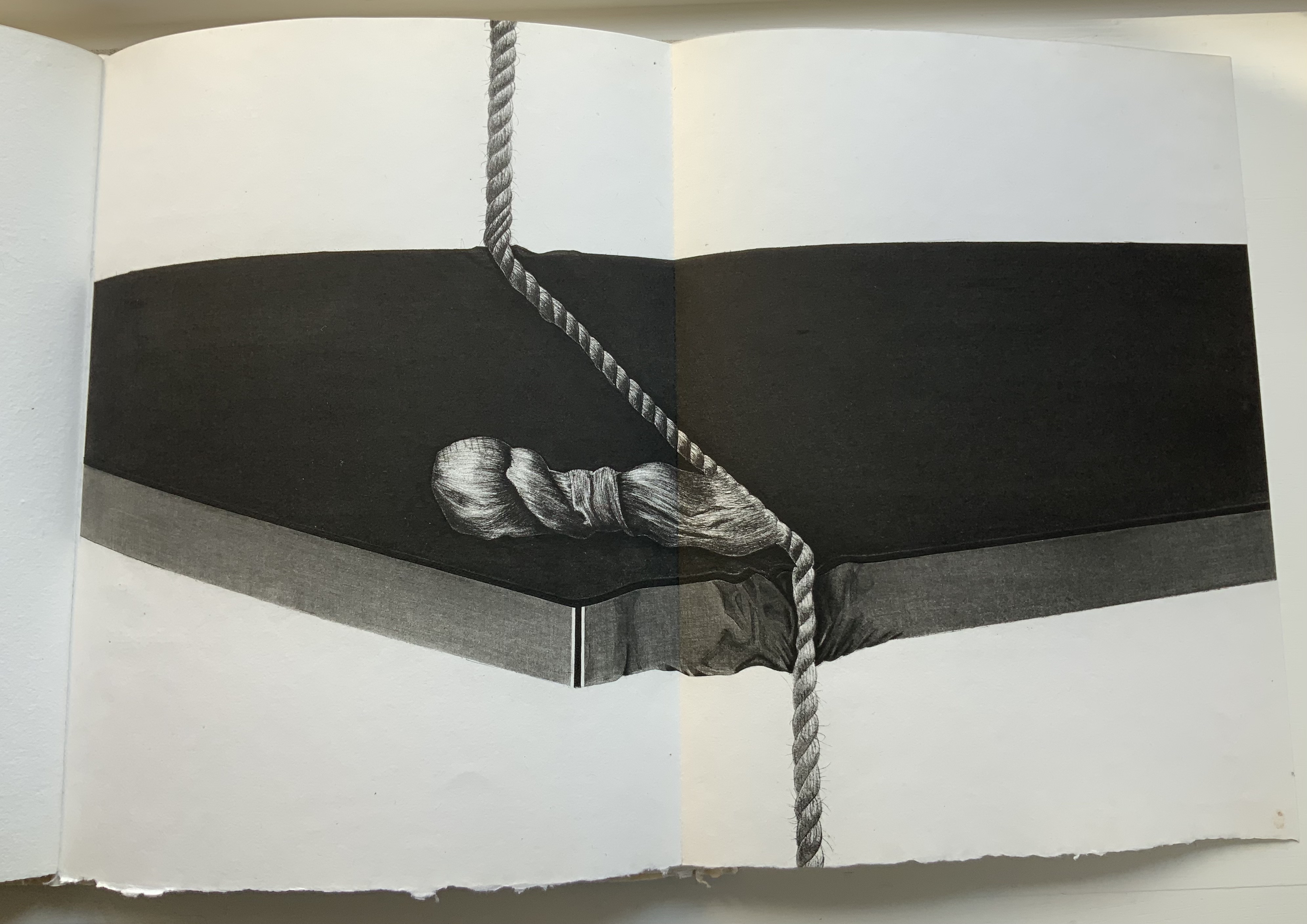
STÉPHANE MALLARMÉ,UN COUP DE DÉS JAMAISN’ABOLIRA LE HASARD: POÈME (1975) Jean Lecoultre Double canvas slipcase/folder enclosing a folded-paperbound book. Slipcase: 340 x 260 mm; Book: 330 x 250 mm, 62 pages inclusive of the 5 foldouts. Edition of 115, of which this is #78. Acquired from OH 7e Ciel, 10 March 2022. Photos: Books On Books Collection. Displayed with permission of Jean Lecoultre
Among the many distinguishing features of Jean Lecoultre’s homage to Stéphane Mallarmé’s poem, three of the most striking are the typeface, the paper and the images. In deliberate ways, each differs from the deluxe edition that Ambroise Vollard and Mallarmé planned after the poem first appeared in 1897.
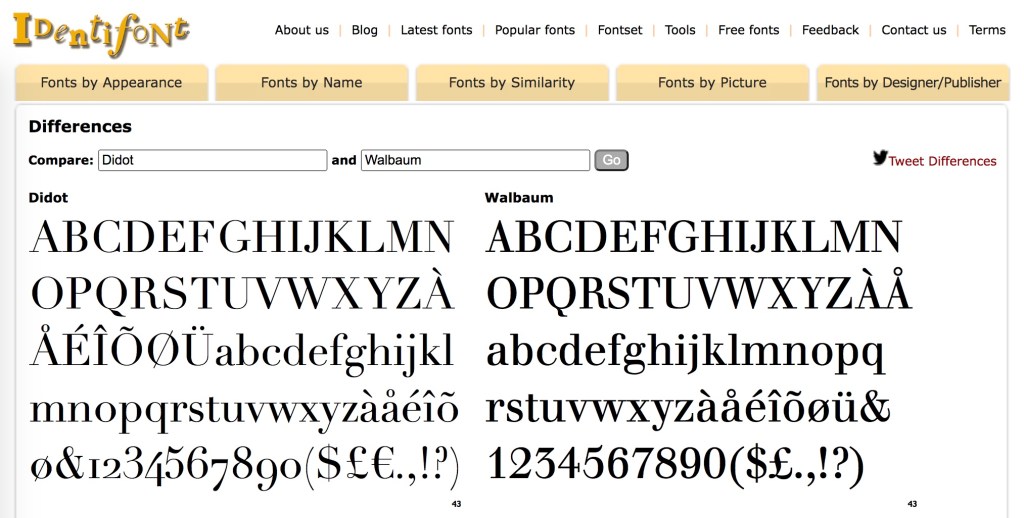
Sabon is the typeface, designed by Jan Tschichold in 1964 under commission from Walter Cunz of Stempel. The Linotype, Monotype and Stempel foundries released it jointly in 1967, which makes its use only eight years later a little bit daring. Only a “little bit” because anything more modern (say, Garamond) would have been preferable to Mallarmé rather than the Elzevir chosen by NRF when it published the 1914 edition. Lecoultre and the publisher Galerie Edwin Engelberts followed the 1914 layout but, thank goodness, not the typeface. Sabon’s thin and thick strokes do not contrast as much as those of Didot, and it does not have the same verticality. Although rooted in Garamond, Sabon comes closer than Garamond to the narrowness of Didot. Walbaum might have been a still closer option, but with its more substantial thin strokes, Sabon has to have been a more suitable choice for the handmade paper in this work.
Georges Duchêne (1926-2012) (Moulin de Larroque and Moulin de Pombié) fabricated the paper (vélin de cuve) especially for the project. The paper bears Duchêne’s watermark as well as a rough “tooth” (surface texture that grips the ink) and uneven deckled edges. With his semantic and typographic innovation, Mallarmé intended to draw attention to les blancs (the spaces around the lines, phrases and single words). With its smoothness interrupted by bumps, its simultaneous softnesss and stiffness, the paper draws the eye and touch even more to the space around the verses.
The surface must have presented a challenge for the technique of “soft varnish” etching used by Lecoultre. Crown Point Press defines it this way:
A process that involves applying a beeswax ground made soft by the addition of tallow or petroleum jelly evenly over a heated plate with a brayer. After the plate has cooled, the artist draws on paper laid over it. The soft wax comes off on the back of the paper exactly where the artist has pressed, exposing the metal in the pattern of the grain of the paper. More pressure in drawing removes more wax and produces a darker line after the plate has been bitten. In general, soft ground lines look like lines made by the drawing instrument, usually a pencil or crayon. Soft ground can also be used to take a direct impression of any flexible material—a fingerprint, a leaf, a piece of cloth, for example.
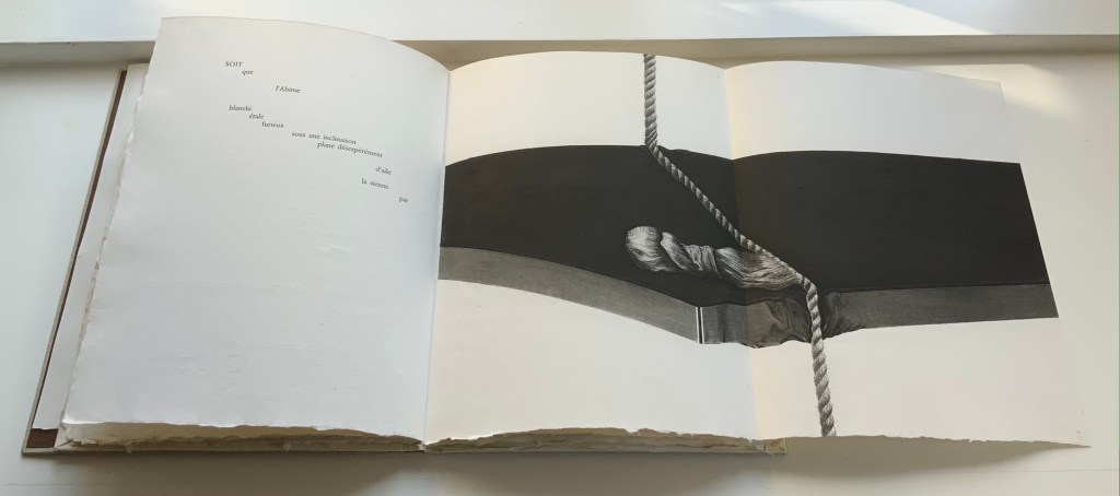
The technique resonates metaphorically with Mallarmé’s dictum peindre non la chose mais l’effet qu’elle produit (“to depict not the object but the effect the object produces”). The technique allows Lecoultre to depict the fine details of easily identifiable objects (a stone, fingerprints, a rope and more) and less easily identifiable ones (a blurred wall and windows, a pair of draped rectangular columns being sliced by a cheese-cutter-like cable and so on). Identifiable or not, the objects yield to the effects their juxtaposition, layering and blurring produce.
Lecoultre is also Mallarméan in his mastery of the technique. In an invitation booklet included with the book, Pietro Sarto, who pulled the prints, points out that, due to its delicacy, the soft varnish technique is most often associated with spontaneity and the chance effect. In Lecoultre’s case, Sarto makes the startling revelation that, for some of the images, the plates went through thirteen states. Thirteen chances for precision to be marred. Lecoultre even extends his chance-taking to the paper in pursuit of effect: note how the image of the rock bleeds across the deckle edge. The strange juxtaposition of objects and the way some objects seem to float on the page (or fall off it) — these also mirror Mallarmé’s arrangement of words and lines among les blancs of the pages, the precision of his images and the suggestiveness of his metaphors.
Finally Lecoultre and his publisher strike out in a novel direction with the number and placement of the prints. Unlike Mallarmé/Vollard’s plan to segregate the poem from Odile Redon’s three to four images, Lecoultre integrates his seven with the poem. This entails “bookending” the poem with two double-page spreads, each taken up entirely by a print: one spread before the half-title and one after the final page of the poem. For the remaining five prints to appear on double-page spreads, the publisher urged the use of five foldout pages. This solution, which Lecoultre approvingly embraced, simultaneously challenges and celebrates Mallarmé’s unit of the double-page spread.
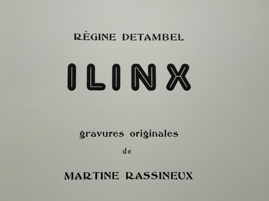
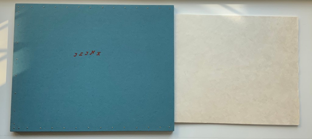
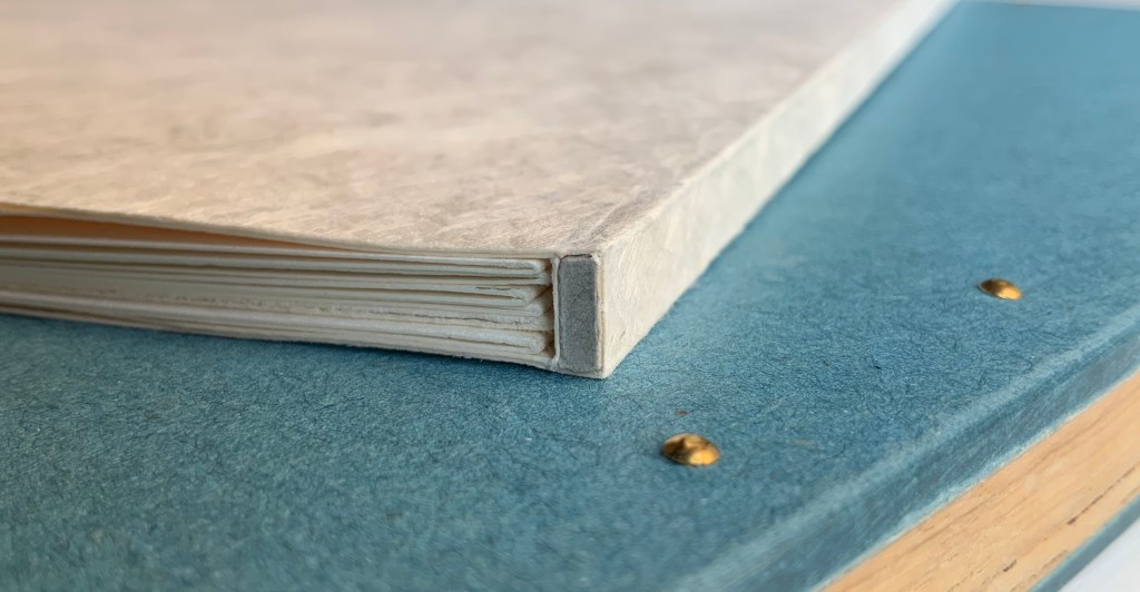
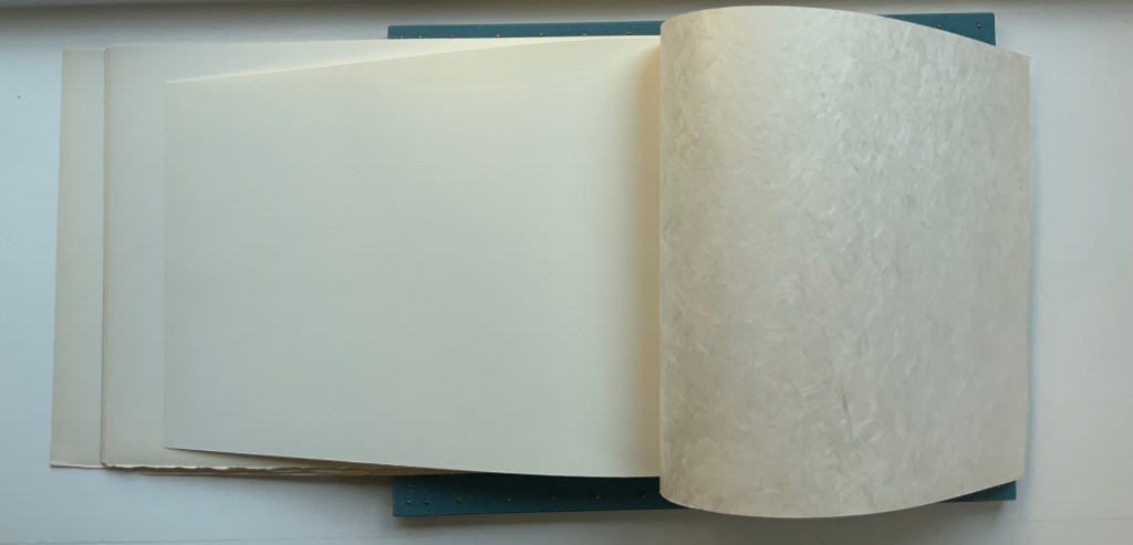
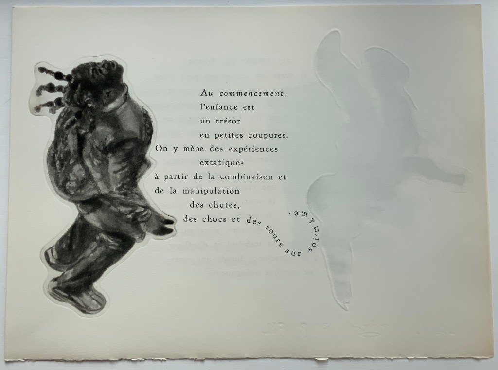
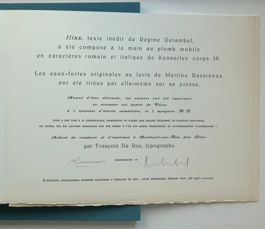
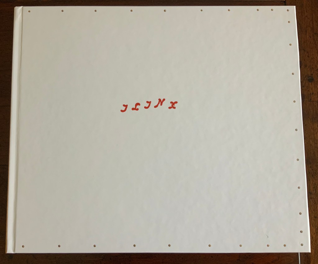
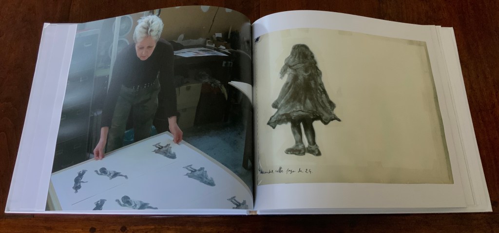
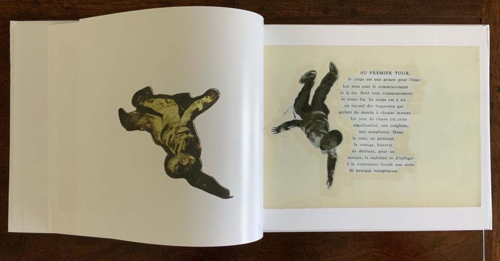
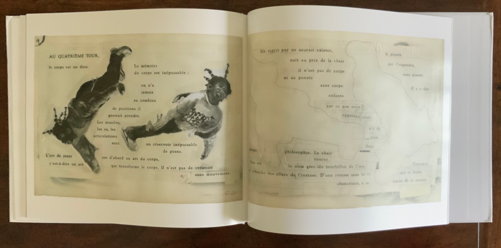
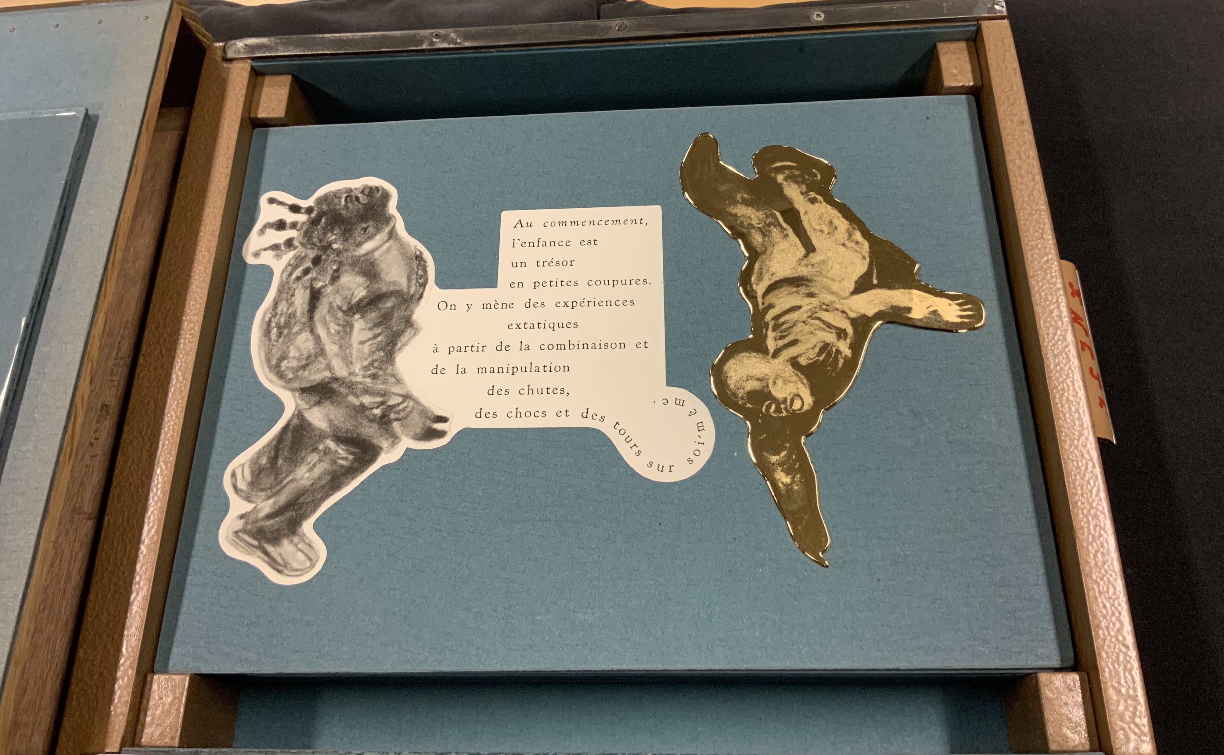
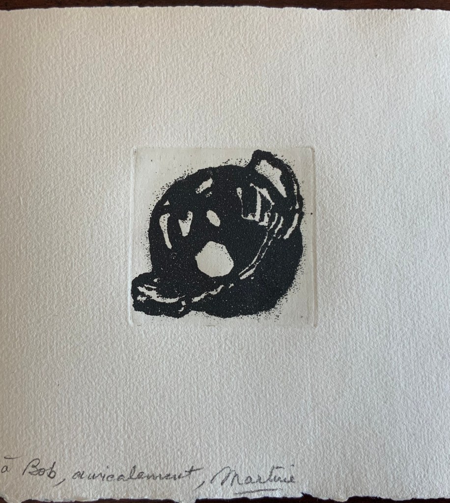
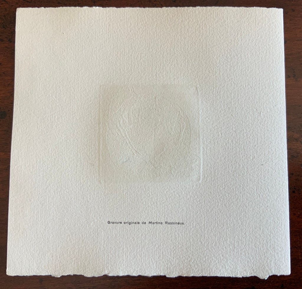
Ilinx (2010) Régine Detambel and Martine Rassineux Slipcase H322 x W406 x D16 mm, Portfolio cover H280 x W385 x D8 mm, Folio H279 x W380, 6 folios. Slipcase made of wood and celloderm, Portfolio cover made of Japon nacré Torinoko Kozu 180 gsm, Folios made of Lana Velin édition blanc supérieur 180 gsm. Edition of 27, of which this is #18. Acquired from the artists, 21 August 2020. Photos of work: Books On Books Collection. Displayed with permission of the artist.
Emerging from its snugly fitting box constructed by François Da Ros, Régine Detambel’s and Martine Rassineux’s livre d’artiste hints at a debt to the legacy of Iliazd with its pearlescent case over a tapered paper cover for the loose folios, although the case’s fixed spine winks at differentiation. With the curling, diagonal and spiralling letterpress, the hint grows stronger. Yet, there is a roundness — almost softness — in the typographical acrobatics, leading away from the hint at the more linear, angular works of Iliazd. That is the mark of François Da Ros, typographer for Ilinx. Rassineux and Da Ros diverge as much from Iliazd as he diverged from the tradition of Ambroise Vollard, Daniel Kahnweiler and Aimé Maeght.
With folios removed. Note the tapering of the inner folder at both ends.
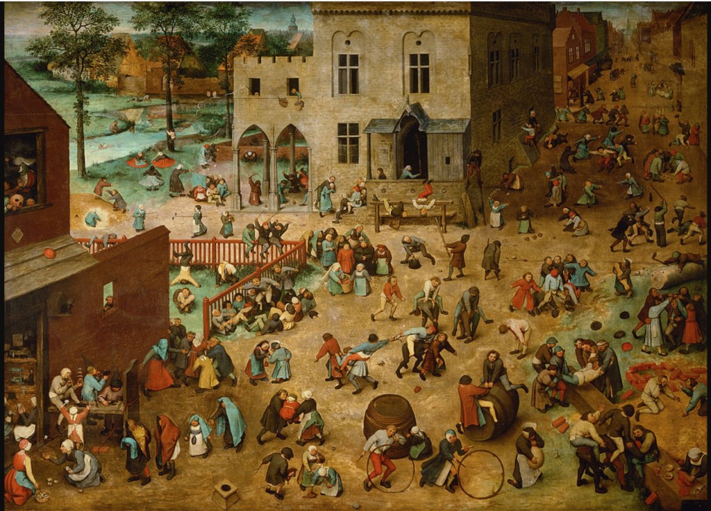
In its text and etchings, Ilinx also shouts and laughs a kinship with Pieter Breugel the Elder’s Children’s Games (1560). Ilinx does not share any tut-tutting at childish foolishness that may reside in Breugel’s depiction; rather it celebrates a shared exuberance and recognition of significance in child’s play. Where Breugel finds that significance in drawing parallels with adult activities and rituals, Detambel’s text and Rassineux’s etchings find it in sheer phenomenological physicality, which Da Ros’s typography enhances.
Just as Breugel must have observed children closely to show the eighty or so games in his painting, so has Rassineux. Ilinx began in a playground where Rassineux watched over her pupils (600 per week) and noticed one of the African girls, the first in Ilinx, turning her face to the sun and spinning in place. Over time, she noticed others, regardless of origin, doing the same — as if something universal were engraved unconsciously in each child. From this, came the Cours series — washes, charcoal drawings and some 40 engravings on rectangular plates.
Presented with some of these works, Régine Detambel introduced Rassineux to Roger Caillois‘ Les jeux et les homines (1958), in which he outlined four basic categories of play or games:
Agon, or competition.
Alea, or chance.
Mimicry, or mimesis, or role playing.
Ilinx (Greek for “whirlpool”), or games inducing vertigo or disorientation.
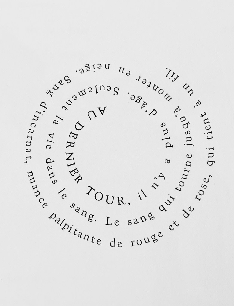
With this background, Detambel insisted that the title of this livre d’artiste must be Ilinx. With their text and images, Detambel and Rassineux follow the children’s spinning games with a beginning and five “turns”, which appear in twelve pages across three folios. Caillois suggests that the spinning games are grounded in both a natural exuberance and need to escape the “tyranny of perception”. Rassineux’s drawings deliberately vary the perspective from which the children are viewed and encourage the viewer, paradoxically, to perceive that escape from the tyranny of perception. Likewise Detambel’s final verse. Likewise Da Ros’s cutting out the children from the etchings and positioning them in action on the page. And, most of all likewise, Da Ros’s spiral setting of lines, “re-enacting” the artist’s drawings, the poet’s words and the Ilinx (whirlpool).
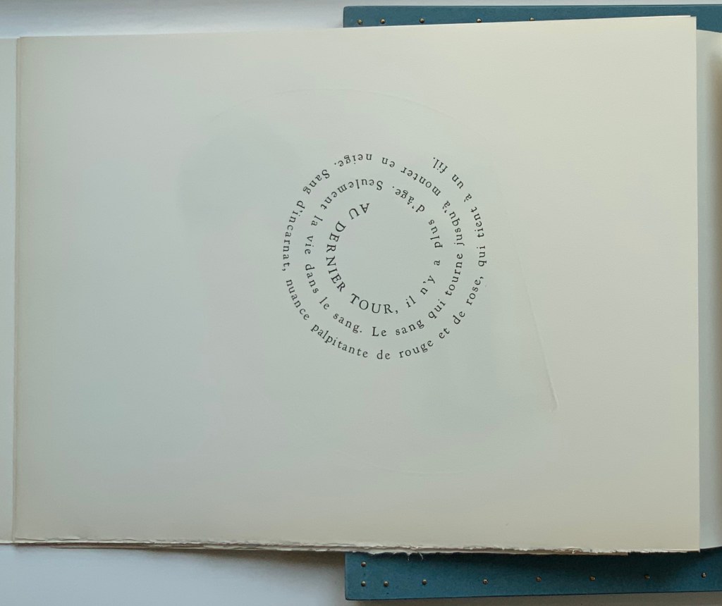
At the last turn, there is no age. Only life in the blood. Flurrying as if into snow. Blood rose-red, flickering red-rose, clinging to a thread.†
Curious about the sixth and blank folio after the colophon folio, I wrote to ask about its purpose. After the opening manipulations — removal of the encased portfolio from its celloderm and wood slipcase and then removal of the portfolio from its cover in Japanese nacré Torinoko Kozu (180 gsm) — there is no further prefacing to the loose folios. There is the title folio, then commencement folio, and the whirling has begun. So that the reader/viewer’s eyes and hands do not leave the book too abruptly, the sixth folio acts as a counterweight, a pause to allow the spinning to stop, a blank on which the pulse behind the eyes can project.
Ilinx – Collection VARIA (2019)
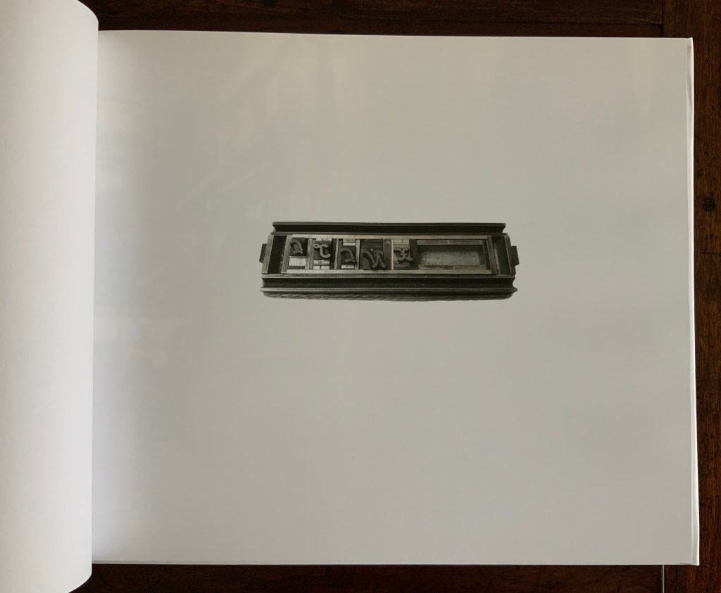
Ilinx – Collection VARIA is a follow-on hardback providing behind-the-scenes insight into the making of Ilinx the portfolio. It shows Rassineux and Da Ros at work in the studio, images of cast and locked type, etching plates juxtaposed with their proofs, paste-up plans. Note how, to have more latitude for the typography and layout, Da Ros cut out the engravings from the plates. The plates have been gilded, which is more elegant than scoring the plates to fix in place the limited edition.
Ilinx – Collection VARIA (2019) François Da Ros and Martin Rassineux H278 x W326 x D12 mm, 60 pages. Edition of 50, of which this is #2. Acquired from the artists, 21 August 2020. Photos of pages: Books On Books Collection, displayed with artists’ permission.
Although printed offset rather than letterpress, Ilinx–Collection VARIA demonstrates the same art-making attention to detail shown in Ilinx. Printed with an HP Indigo offset digital press on Mohawk proPhoto beaded paper semi-gloss 190gsm, the full-color images printed do not mask the texture or surface of the paper as sometimes happens with some toner prints. Instead, the ink is absorbed by the paper as happens with traditional offset lithography. As Rassineux further explained in correspondence with Books On Books,
We chose the photos in relation to the round shape that often comes up in the concerns of François who made mechanics for two years to be able to build and troubleshoot his presses and because he always saw in the mechanical movement a relationship with the universal mechanical. The final image is a wind-up spinning toy that belonged to my mother…. All the elements we use come from our daily lives, and from our experiences, that are a whole. (Correspondence, 11 November 2020)
Colophon page. Photo of page: Books On Books Collection, displayed with artists’ permission.
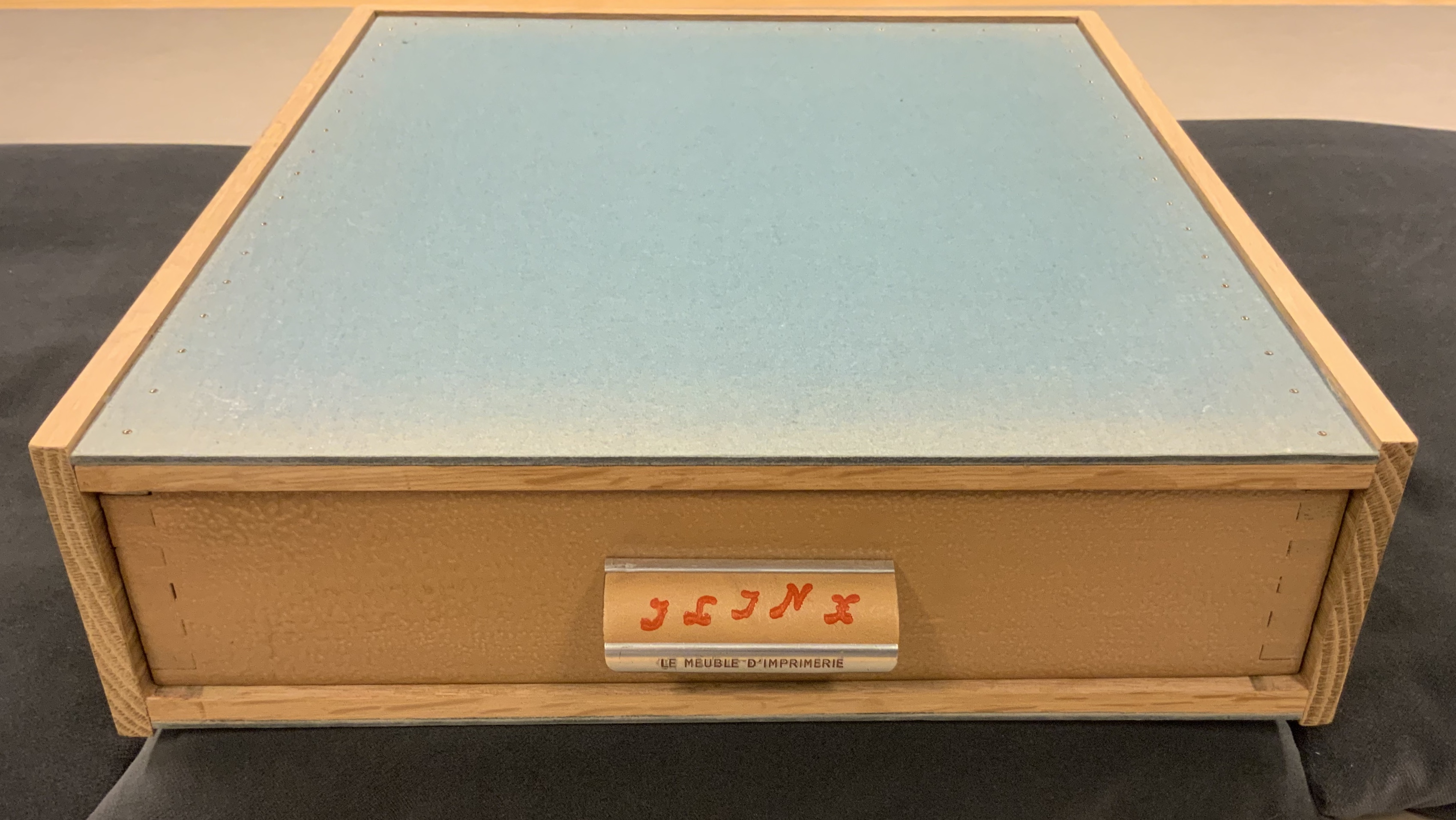
For another example of art driven “from our daily lives”, the reader/viewer can do no better than to visit the Koninklijke Bibliotheek (KB, National Library, The Hague: Koopman Collection) to see the gilded plates mentioned above. They reside in a drawer removed from the Da Ros/Rassineux studio and finished off as a wooden case for the library’s copy of Ilinx.
Photos: Books On Books Collection. Shown with permission of the artists and the Koninklijke Bibliotheek (KB, National Library, The Hague: Koopman Collection).
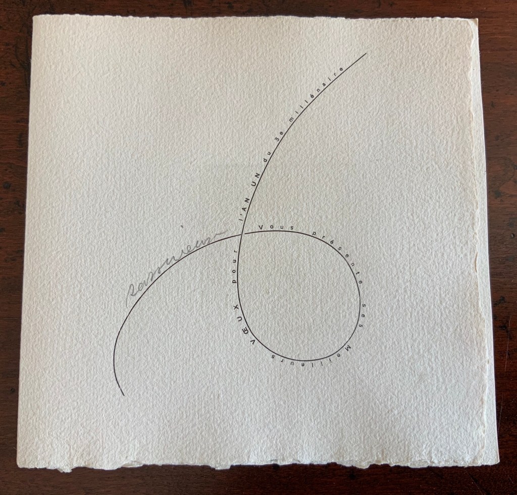
Rassineux sends you best wishes on the first year of the third millennium (2001)
This elegant New Year’s greeting came with the Books On Books purchase of Ilinx. A sweet gift of ephemera that freezes a fresh start in place with the artistry of movable type in motion and a print made by gravure au sucre (sugar etching). Rassineux’s explanation:
The basic technique of the sugar engraving is that on a perfectly degreased copper you draw with a solution of sugar and China ink (which is only used to make your drawing very black near your etching) then it is covered with varnish and the sugar mixture will burst the varnish because the sugar dilates and you will find again the design in copper version that you will have to weave by an aquatint. (Correspondence, 11 November 2020)
† Translation: Books On Books. The phrase “Le sang qui tourne jusqu’a monter en neige” turns on a French culinary expression — jusqu’a monter en neige — for whipping egg whites into a meringue. Régine Detambel prefers the less literal translation, which echoes earlier lines and images in the poem.
Further Reading
Caillois, Roger. Man, play and games (Urbana, Ill. : University of Illinois Press, 2001).
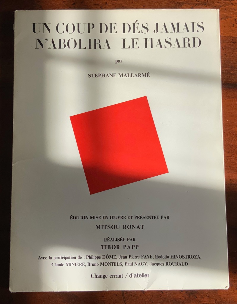
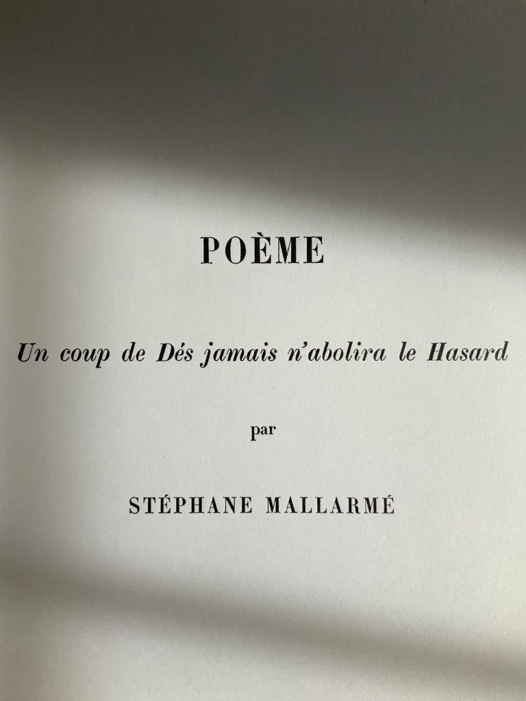
Poème: Un coup de Dés jamais n’abolira le Hasard par Stéphane Mallarmé (1980) Édition Mise en Oeuvre et Présentée par Mitsou Ronat, Réalisée par Tibor Papp. Two sets of folded & gathered folios, enclosed in a portfolio with four flaps; Portfolio: H380 x W285 mm; Folios: H380 x W285 mm; Poème, 24 pages, including the cover; “Le Genre …”, 28 pages, not including cover. Acquired from Latour Infernal, 28 May 2020. Photos: Books On Books Collection.
Described as an “éditionmise en oeuvre“, the Ronat/Papp 1980 publication of Un Coup de Dés is indeed as much a “production” as any theatrical or cinematic mise en scéne. Equally apropos or more so, the phrase calls to mind the French for page layout: mise-en-page. The layout of the work certainly calls attention to itself as much as to the page. While it represents an effort to reflect Mallarmé’s “true” intentions for the page layout of Un Coup de Dés, the Ronat/Papp production delivers the poem in a set of loose F&Gs (folded and gathered folios), paired with another set of F&Gs (artwork, poems and essays) and enclosed in a portfolio.
The first effort to follow Mallarmé’s intention as intimated in his corrected proofs of the abandoned Ambroise Vollard version was the 1914 NRF edition, which also called attention to itself with its oversized format, but it was sewn and bound into its paper cover as usual. Its lay-flat binding eased reading the lines of verse that run across the book’s gutter.
By unbinding that space that usually sinks into the gutter, Ronat and Papp retain the readability across the gutter but introduce an interesting instability. The unitary view of the double-page spread that Mallarmé intended falls prey to physical chance. Lines across pages can fall out of alignment as folios slip up or down. If the folios scatter, the reordering of the unnumbered pages relies on the guidance of the typography and memory. Oddly this forces a more hands-on engagement with the poem. No other edition intended for reading the poem feels as physical. The page and double-page spreads are felt.
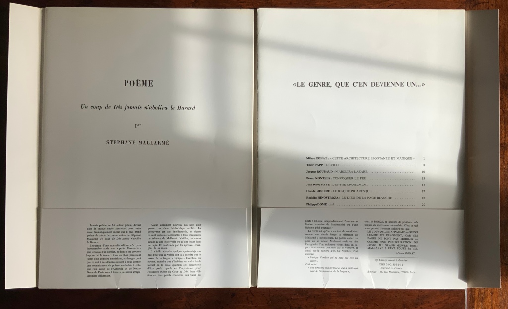
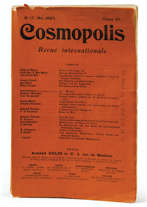
Although also not bound, the order of the artwork, poems and essays in the right-hand set of F&Gs is traditionally fixed with pagination, as the front of its self-covering folio shows. More important is the cover title: “Le genre, que c’en devienne un …” (“the genre, that it becomes one …”). Those words begin the final sentence in the reproduction of Mallarmé’s reluctant note from the poem’s first publication. Cramped into the magazine Cosmopolis, the poem’s layout was still startling enough to the editors to require a preface from Mallarmé. Facetiously and seriously, his note explains how to read the poem. In varied ways, the F&Gs’ content also seriously and facetiously demonstrates how to read the poem. And starting and ending with Mallarmé’s words, the portfolio’s second half reflects the circularity of the poem it faces, which starts and ends with the words un coup de dés. An édition mise en oeuvre indeed.
So forget the debate over who was first to display the poem in the true form as Mallarmé intended. The second portfolio is proclaiming then proving by examples that Un Coup de Dés is a genre.
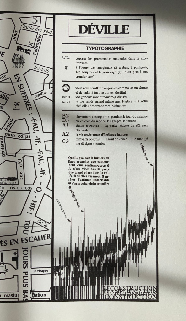
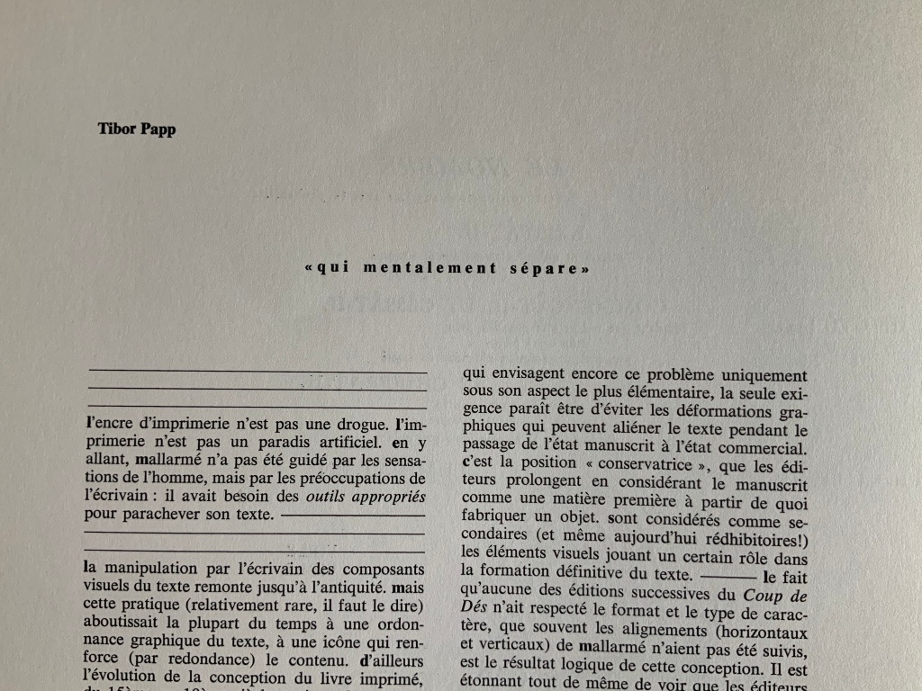
Mitsou Ronat‘s introduction sets the poem’s publishing history in context and explains this edition’s claim to reflect Mallarmé’s wishes for the poem’s presentation. In doing so, she puts forward her hypothesis that le Nombre (“the Number”) mysteriously posed in the poem is 12, the syllable count of each line in the French alexandrine couplet and ties this revelation to the page and double-page spread as units of meaning, culminating in the 24 pages of which the mise en oeuvre consists. Tibor Papp follows with his map of Déville (“Dice-town”). Overlapping inscriptions along the crisscrossing streets remind us of the sometimes overlooked humor in the Mallarmé industry. One street is labelled Saint-Mallarmé de la masturbation. Off one boulevard are the remparts des alexandrins (“battlements of the Alexandrines”), complete with a WC for passers-by. There is even a Métro stop named for Mallarmé’s Igitur, thematic predecessor to Un Coup de Dés. Another recalls the political cast of the times: premières allusions à la lutte des marginaux oubliées (“first allusions to the struggle of the forgotten marginalized”). But most important is the map as map, a poster, a sub-genre of the genre Un coup de Dés and forerunner to future works such as that by Aurélie Noury. In his essay near the end of the F&Gs, Papp asserts that Mallarmé was not preoccupied with print and typography for its haptic properties, rather he was simply seeking the tools appropriate to complete his text. This is Papp’s departure point for discussing the aims of Le Groupe d’atelier, which he founded with Paul Nagy and Philippe Dôme in 1972:
Pour l’écrivain, donc, d’aujourd’hui, l’attitude de mallarmé scrutant les caractères des affiches, travaillant ses épreuves par collage, déplaçant ses mots d’un millimétre, est une attitude parfaitement normale et logique, en même temps que son poème constitue un classique du genre.
Pour nous, l’écrivain assume son rôle jusqu’à la materialité de son texte.
“For today’s writer, then, the Mallarméan scrutiny of type display, working on his proofs by collage, moving his words by one millimeter, is perfectly normal and logical behavior, at the same time that his poem constitutes a classic of the genre.
For us, the writer’s role entails the materiality of the text.”
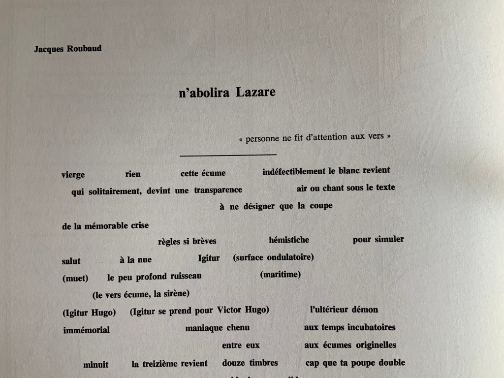
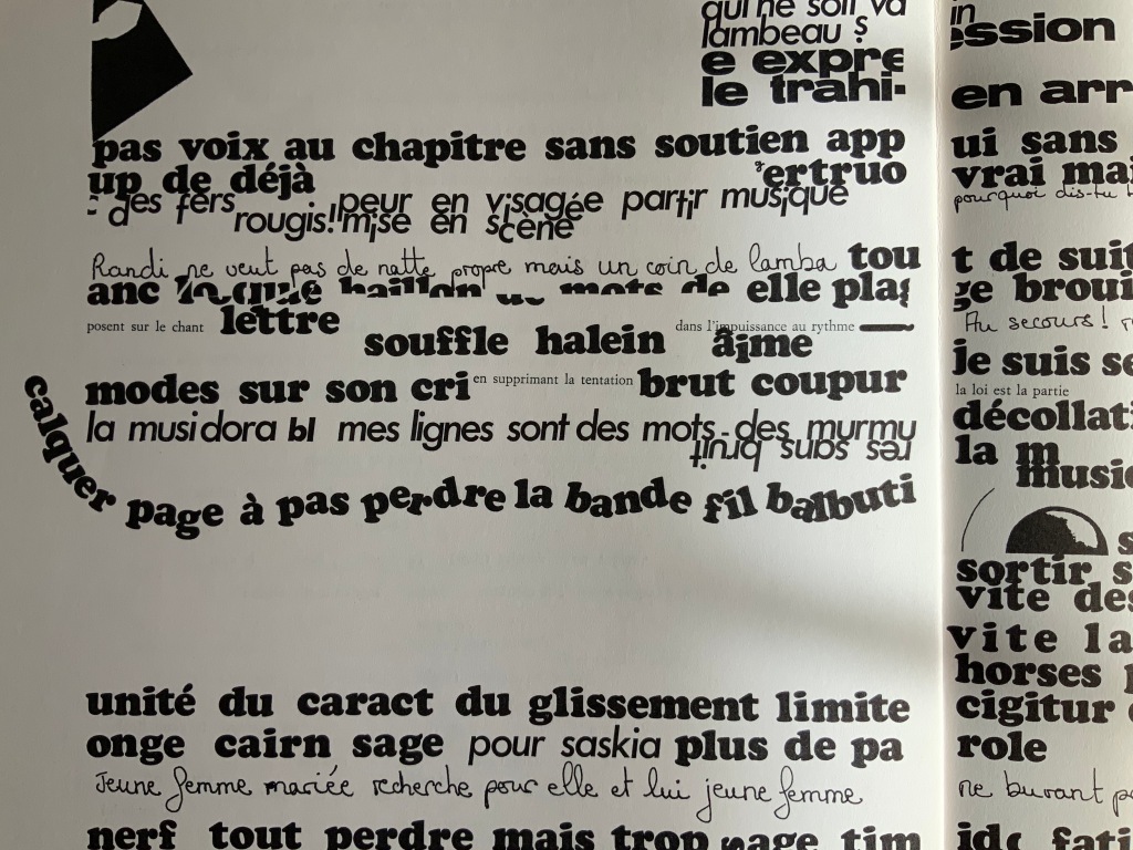
The remaining contributors traverse the ranges of the academic and artistic, the tongue-in-cheek and the serious, that Ronat and Papp establish. A more textual affair, “n’abolira Lazare” by Jacques Roubaud, a member of the OuLiPo movement, delivers an homage to Mallarmé replete with numerical and linguistic puns, appropriate to a professor of mathematics and literature, and a translator of Lewis Carroll. Bruno Montels‘ “Convoquer le peu” displays his signature combination of handwriting and typographic experimentation.
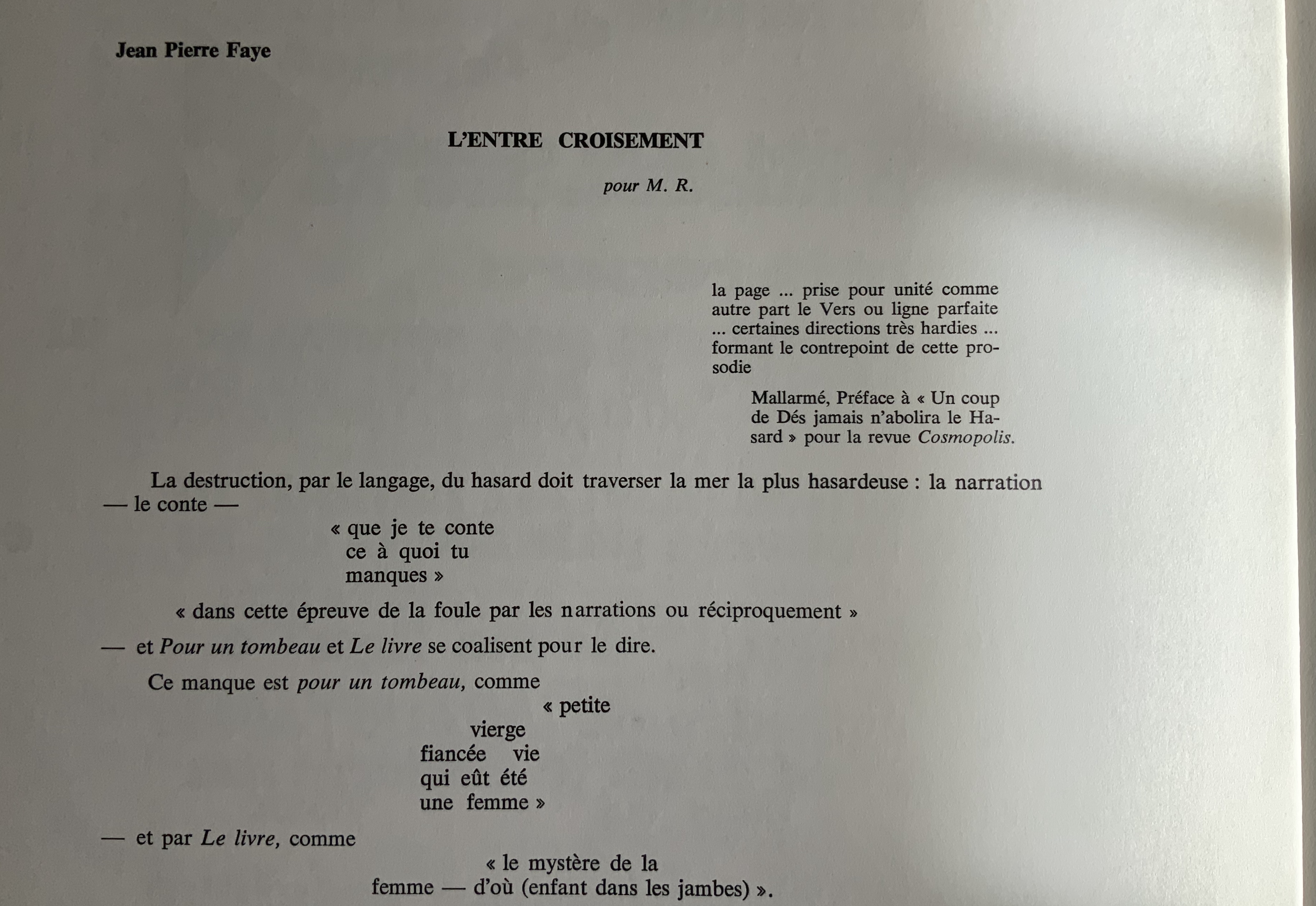
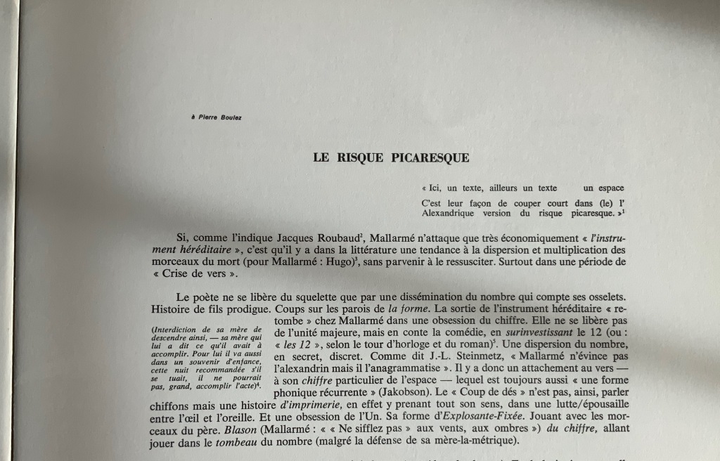
“L’Entre croisement” by Jean Pierre Faye (a visual linguistic pun, “threshold” and “intersection”) reads like notes for an academic lecture but in a free-verse layout. The poet/essayist Claude Minière‘s “Le Risque Picaresque” foreshadows(?) his essay Un Coup de Dés (Tinbad, 2019), which proposes Pascal’s wager and Pensées as a predecessor to Mallarmé.
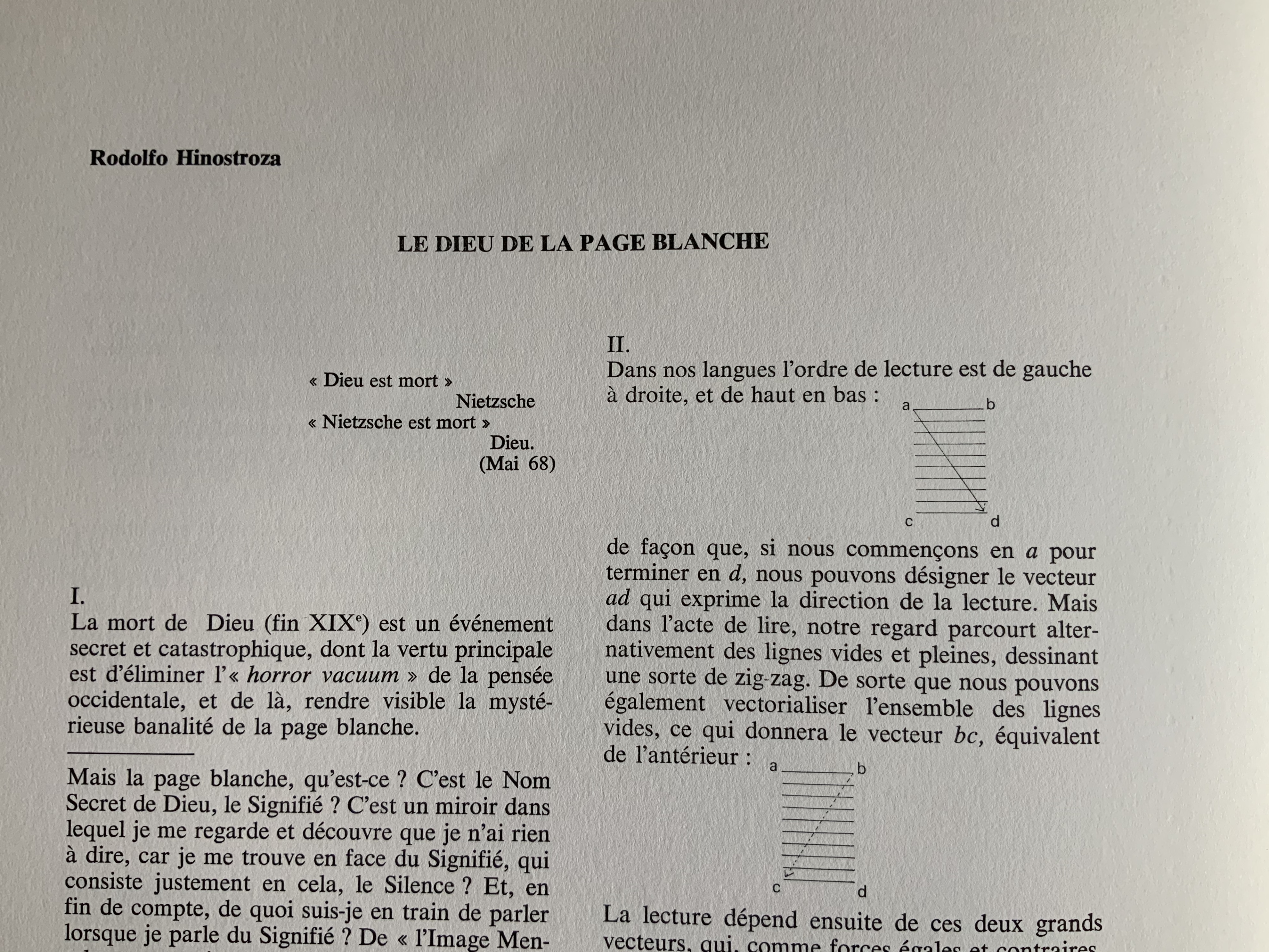
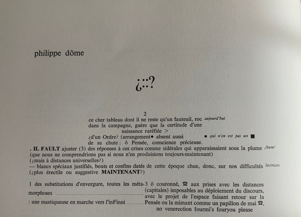
Peruvian poet and writer Rodolfo Hinostroza‘s “Le Dieu de la Page Blanche” (“The God of the Blank Page”) delivers a diagrammatic exploration of the placement of verses on the page in Un coup de Dés, reminiscent of but less abstruse than Ernest Fraenkel’s Rohrschach-like exposition. Philippe Dôme draws on his time as a French and Spanish teacher in London to put together pages of a multilingual study workbook for the reader of Un Coup de Dés. Clearly a lover of puns, he entitles his workbook with Spanish interrogatory marks around the face of a die, the 4 constructed with two colons.
Perhaps the most striking of the visual homages, Paul Nagy‘s contribution is a descendant of Un Coup de Dés by conscious or unconscious way of the earlier typographic and graphic gymnastics of Dada, Marinetti, Iliazd, Gomringer, the Brazilian Noigrandes movement and Fluxus.
In its unbound folios approach to the poem and juxtaposition of it with artistic interpretations of the poem, the Ronat/Papp production marked a pivot for future treatments of Un coup de Dés. Over the decades after it, three new editions — also aimed at reflecting the Master’s wishes — appeared as did dozens of inventive academic and artistic responses to Un Coup de Dés. The three explorations of the “true” edition (in French) are Michel Pierson‘s (2002), Françoise Morel‘s (2007) and Ypsilon Éditeur‘s (2008). Though the artworks paying homage since 1980 are too numerous to list for this entry, note that Books On Books is preparing a virtual 125th anniversary celebration for 2022 that will display images and links for all the homage paid since 1897 that it has uncovered — from Man Ray’s Les Mystères du Château de Dé (1929) to Sylvain Moore’s Troisième Coup de Dés (2019).
Un Coup de Dés Jamais N’abolira le Hasard: Onde/Wave (2009)
Mallarmé’s strange poem, first published in the London-based journal Cosmopolis in 1897, had to wait until 1914 before appearing in a format close to the one Stéphane Mallarmé envisioned with the gallerist and publisher Ambroise Vollard.
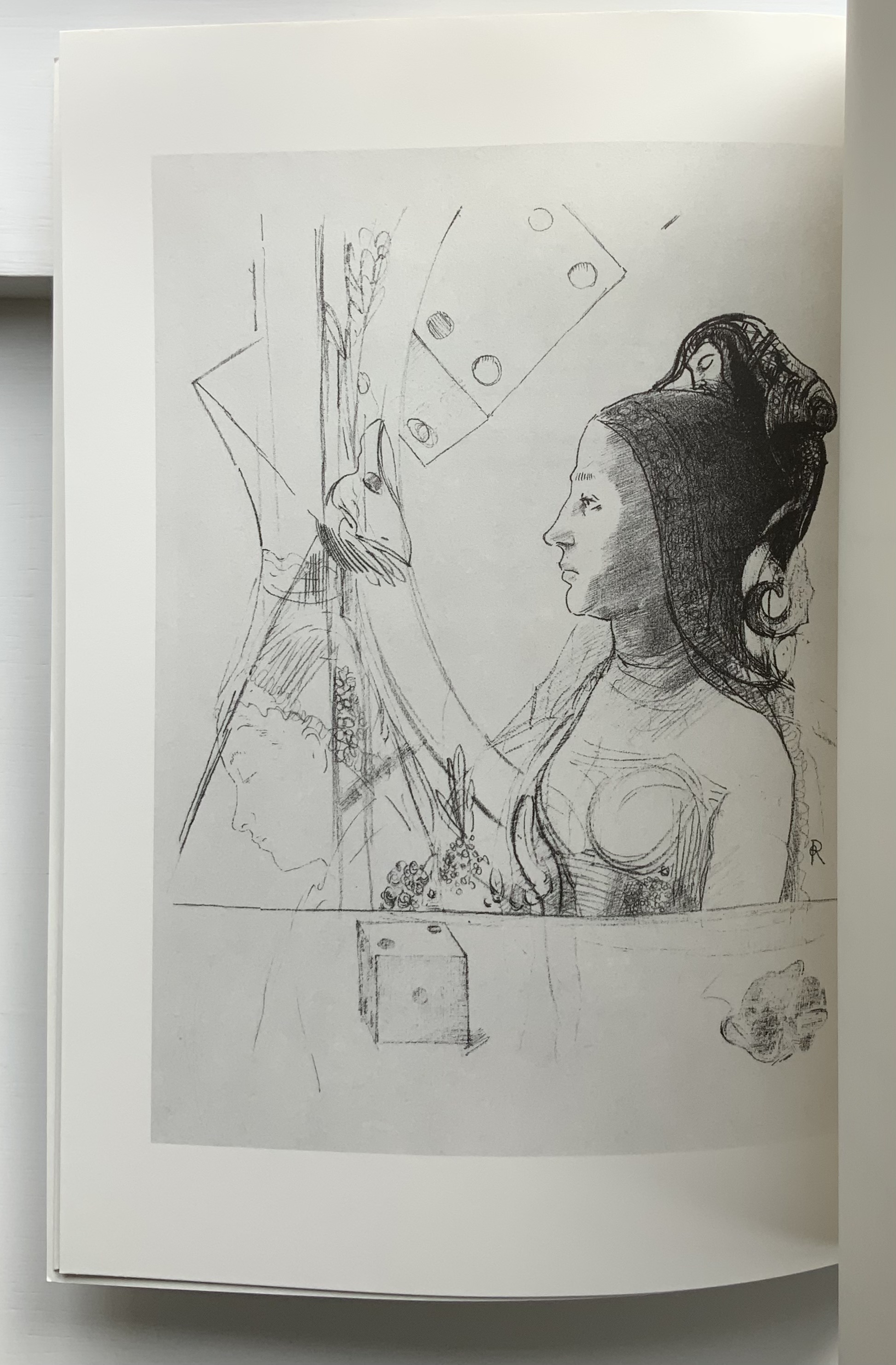
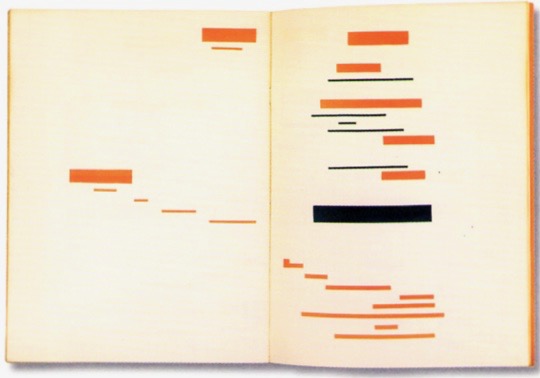
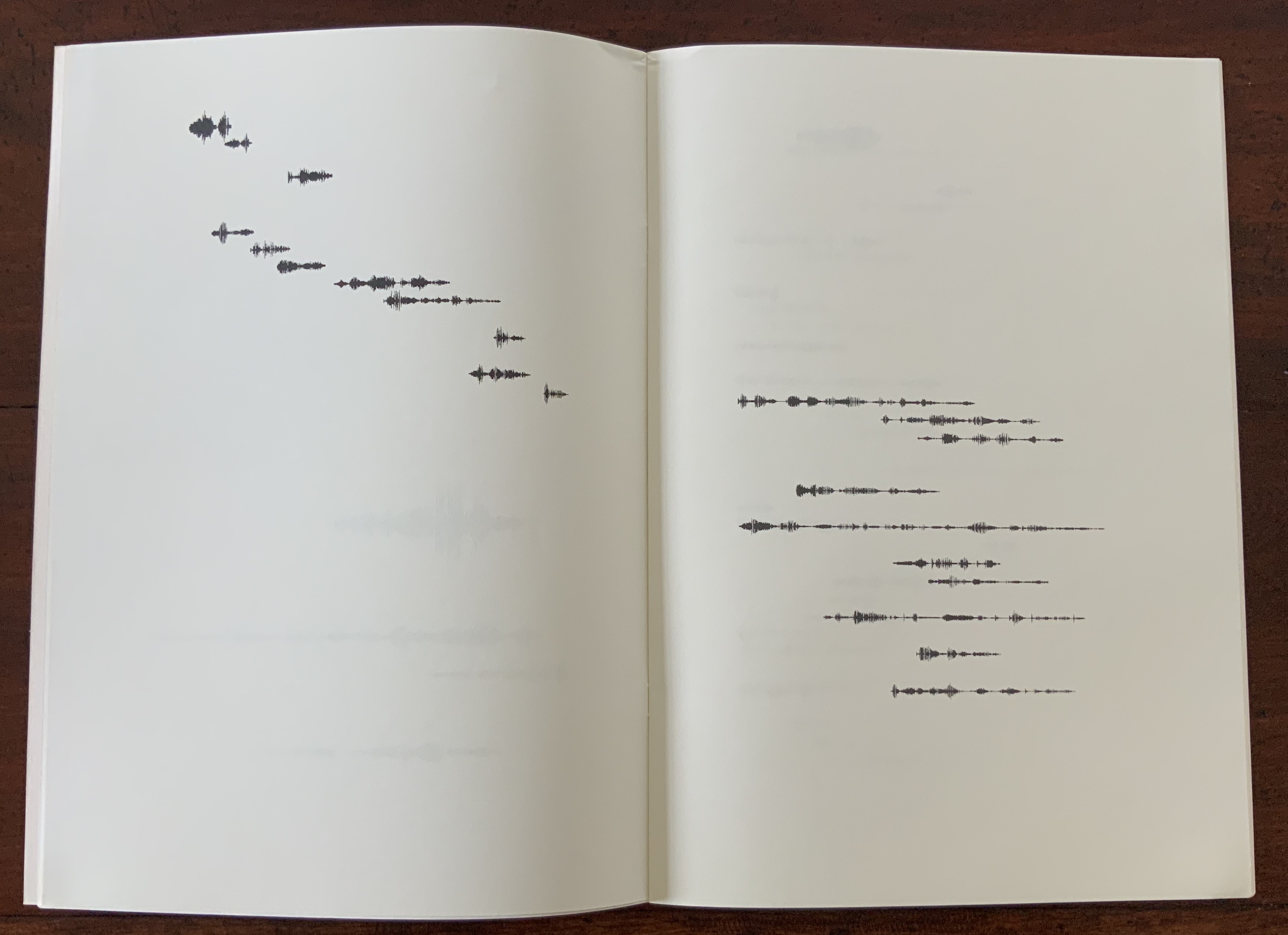
Taking the poem’s self-referential line about its words appearing as a constellation, first Ernest Fraenkel, then Mario Diacono and Marcel Broodthaers transformed the poem into a series of images by substituting solid blocks of ink in place of the poem’s lines of verse.
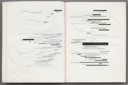
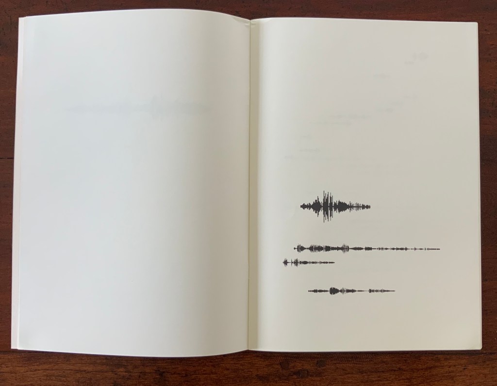
Subsequently, dual homages to Mallarmé and Broodthaers arose. One of them is Engramer’s. Where Fraenkel, Diacono and Broodthaers focused on layout, size and space to generate their visual translations, Engramer added a sonic element, albeit by visual display. Recording his own reading aloud of the poem, Engramer then ran the recording through sonographic equipment. The rendering of each line’s soundwave became his graphic substitute for Mallarmé’s line of verse and, by extension, each black block that Broodthaers used to displace Mallarmé’s text.
In 2010, Engramer took his inspiration one step further and put together an exhibition called “JAMAIS”. As soon as the idea or sensation of visualizing the sound of a poem is mooted, the choice of ink, type, brush, paint, surface, chisel, mold, material, camera, computer and, again, surface opens up. In JAMAIS, Engramer chooses a multiplicity of tools and media (or they choose him): sound recording, computer output, ink, printed book, mold and plastic, camera and animation.
In the video below, pages of the book undulate in a wave along the wall to which they are loosely attached. Alongside them are eighteen 3D PVC renderings of the sonograms. At the end of the hall, a large screen shows a 3D animation of a rolling die whose dots spell out hasard in Braille. The juxtaposition of fluttering pages of sonographs, the physical instantiation of the sonograms and the animated Braille die that cannot be read by touch generates a confounding conundrum for the senses. Text has become sound, sound has become image, and image has become object and animation.
Video: Courtesy of the artist.
Since, according to the artist, his recording of the poem was not played in the exhibition, the conundrum focuses on perception of sound through the eyes. Whether listening/hearing can be performed by seeing a visual or physical representation of what has been listened to/or heard (or is being listened to/or heard) is a neurological question. Rendered in ink and plastic, Engramer’s sonographic images and objects are metaphoric assertions: “hear with your eyes the words no longer printed or carved before you, hear through your eyes the decibels increasing or attenuating according to an unheard recording of those words spoken”.
Further Reading
“Eric Zboya“, Books On Books Collection, 1 June 2020.