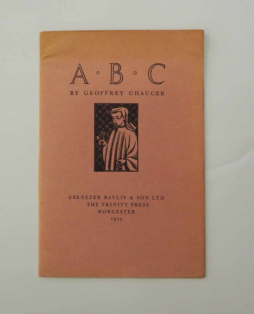
ABC by Geoffrey Chaucer (1934) [Eleanor] Joyce Francis Chapbook, softcover sewn. H250 x W170 mm. 16 pages. Edition of 500? Acquired from Antiquariaat Fokas Holthuis, 30 April 2021. Photos: Emilia Osztafi.*
Chaucer’s ABC (ca. 1369) is an intriguing early work in the history of abecedaries. There are alphabet poems in the Hebrew Bible, but according to the artists’ book collector and scholar Nyr Indictor, this Chaucer lyric seems to be the earliest surviving English “ABC poem” of known authorship. Possibly on commission from Blanche, Duchess of Lancaster, Chaucer cribbed and translated a lyric embedded in Guillaume de Deguilleville’s La pelerinage de vie humaine [“Pilgrimage of Human Life”] (ca. 1330).
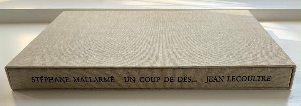
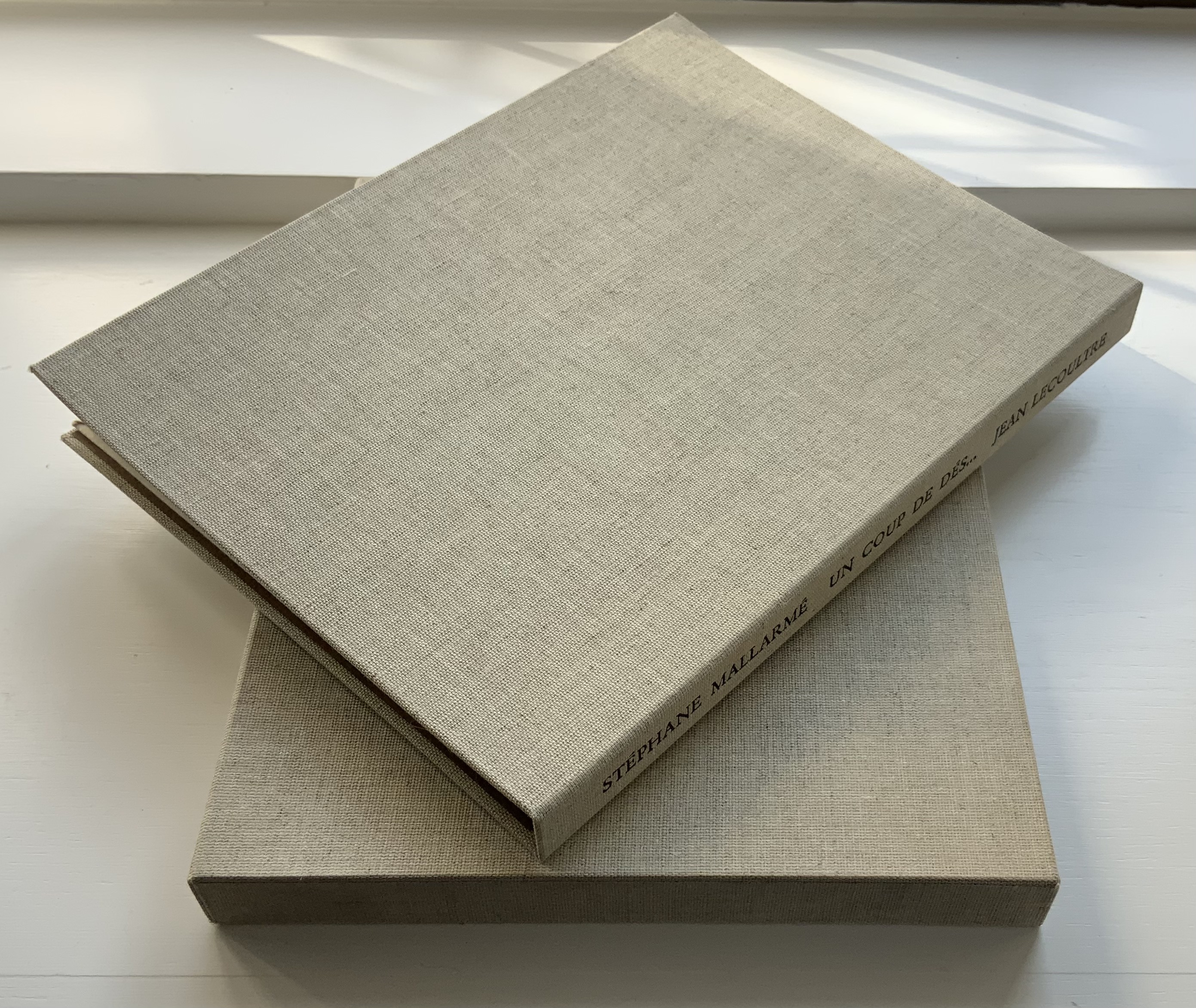
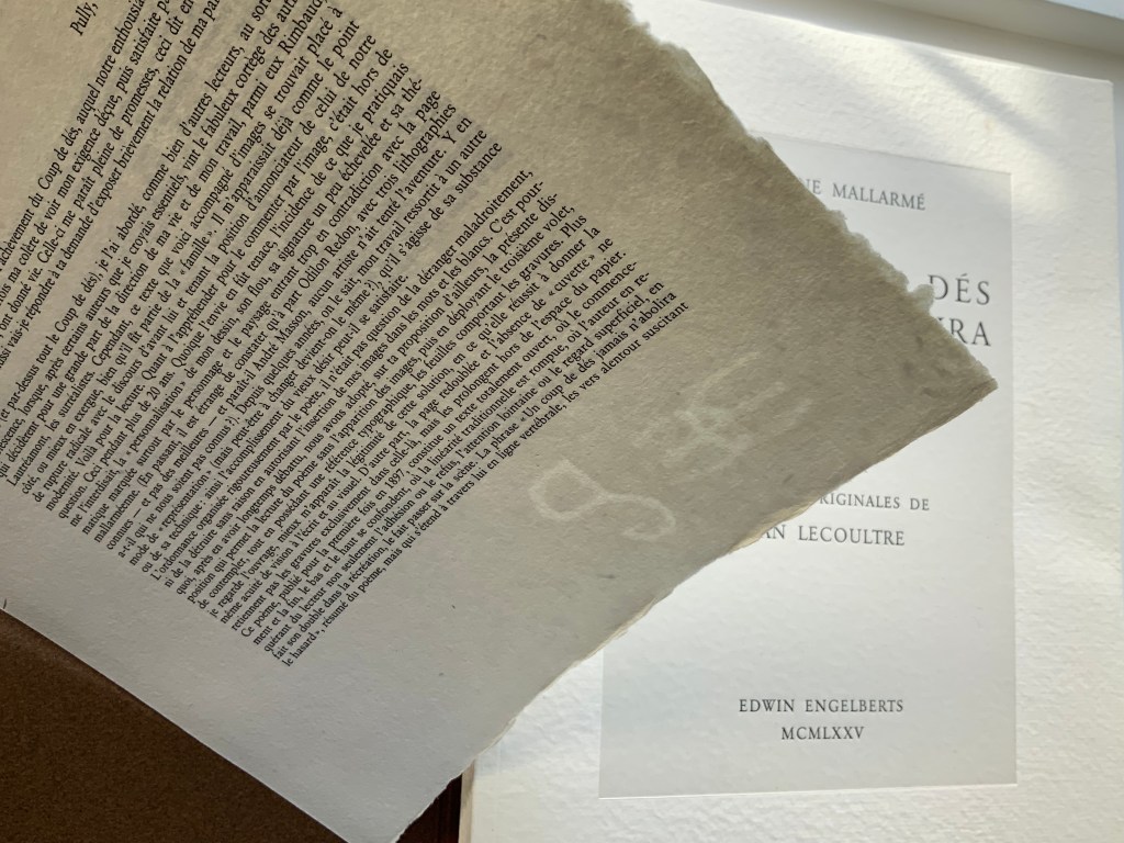
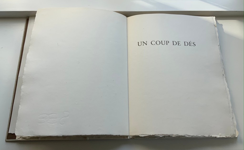
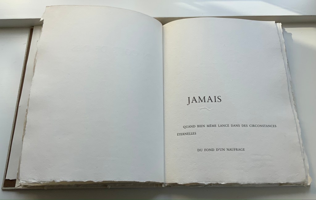
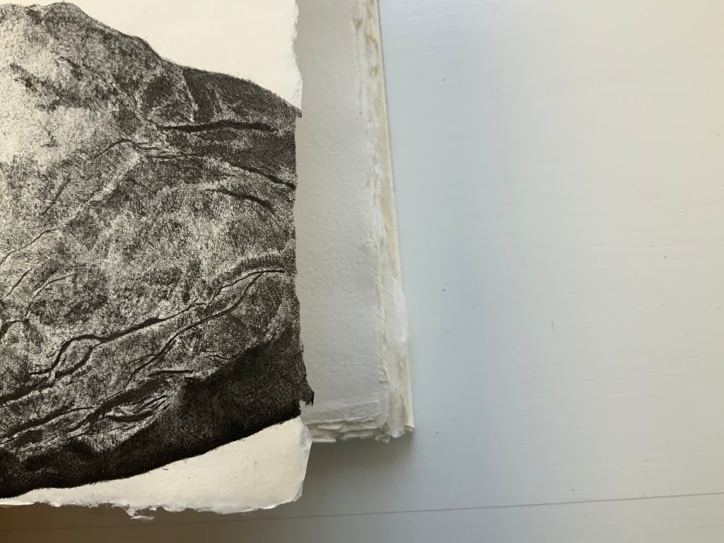
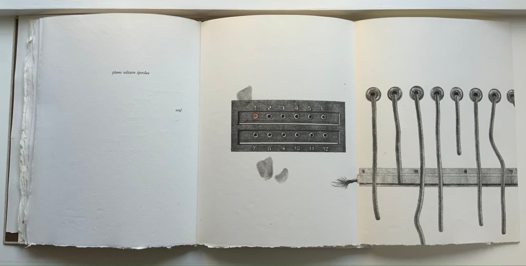
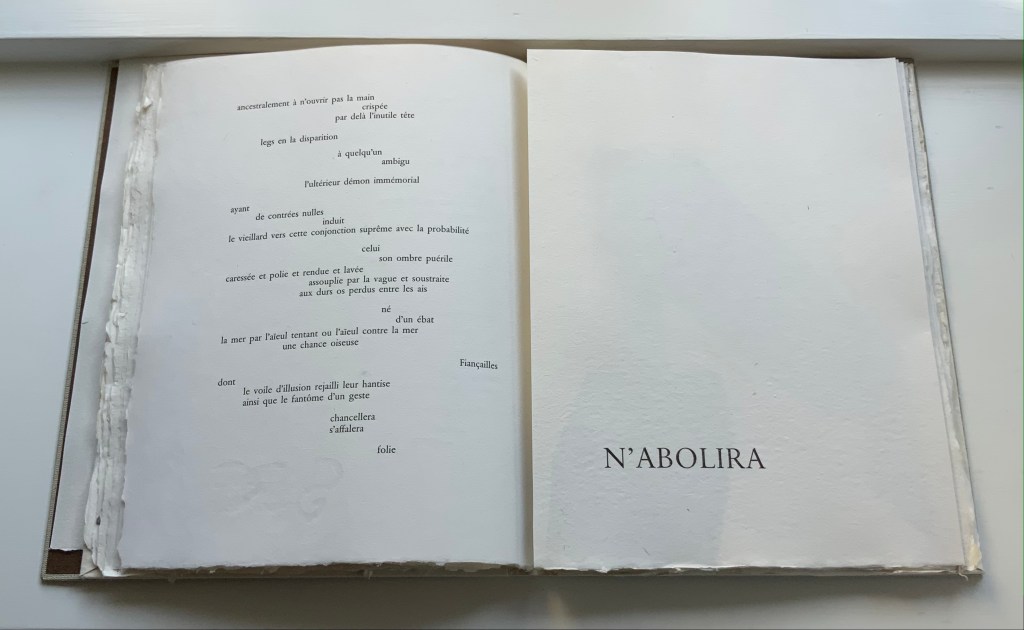
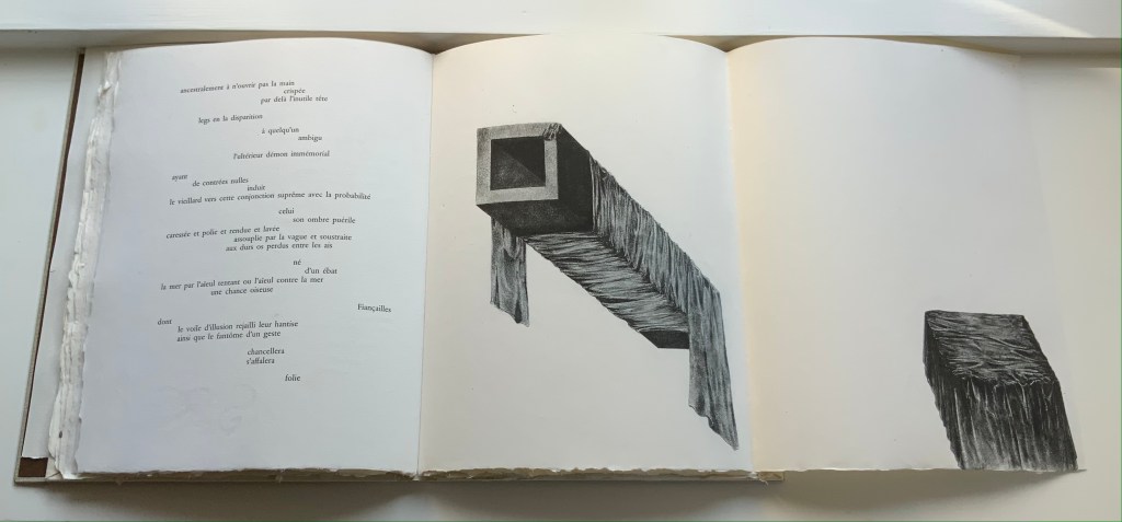
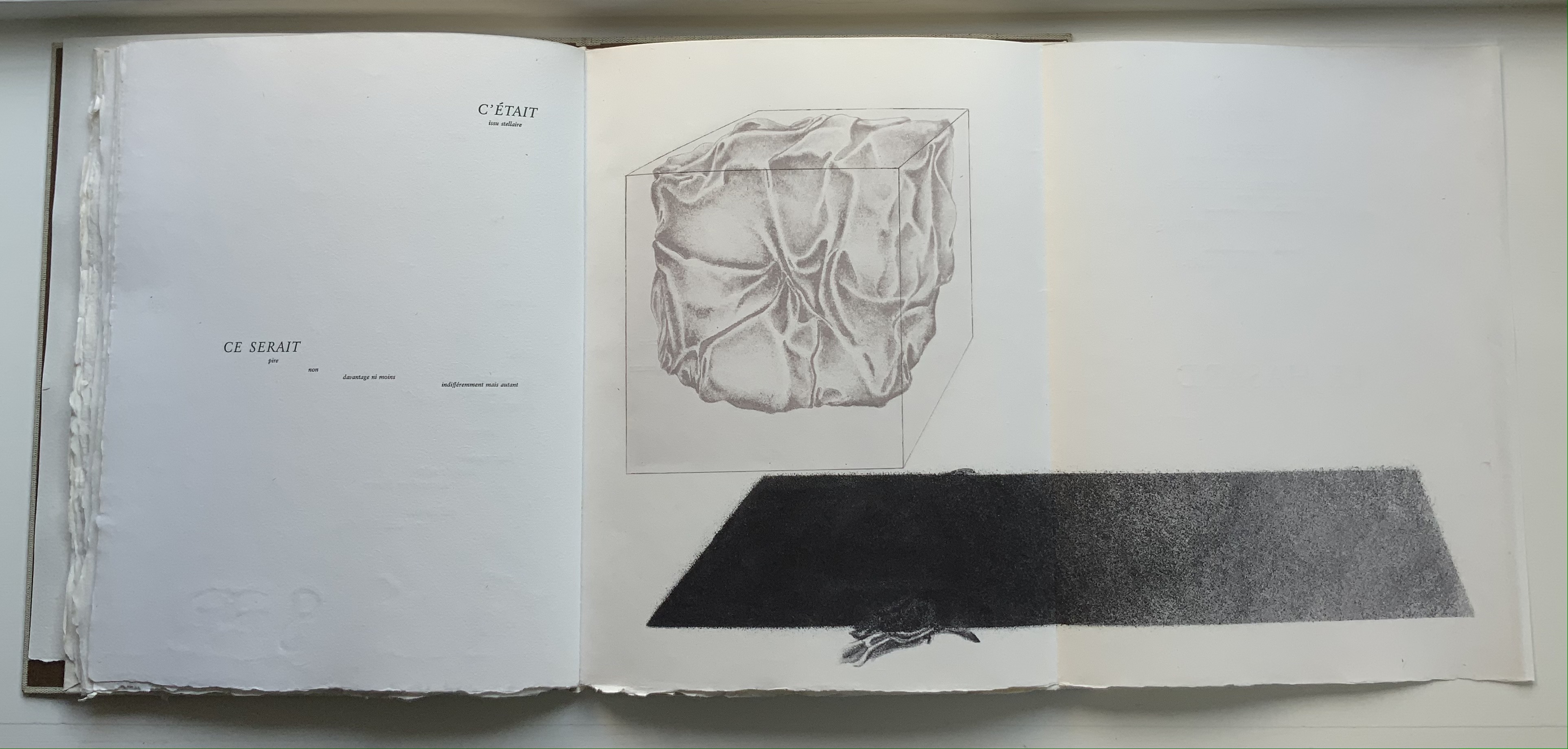
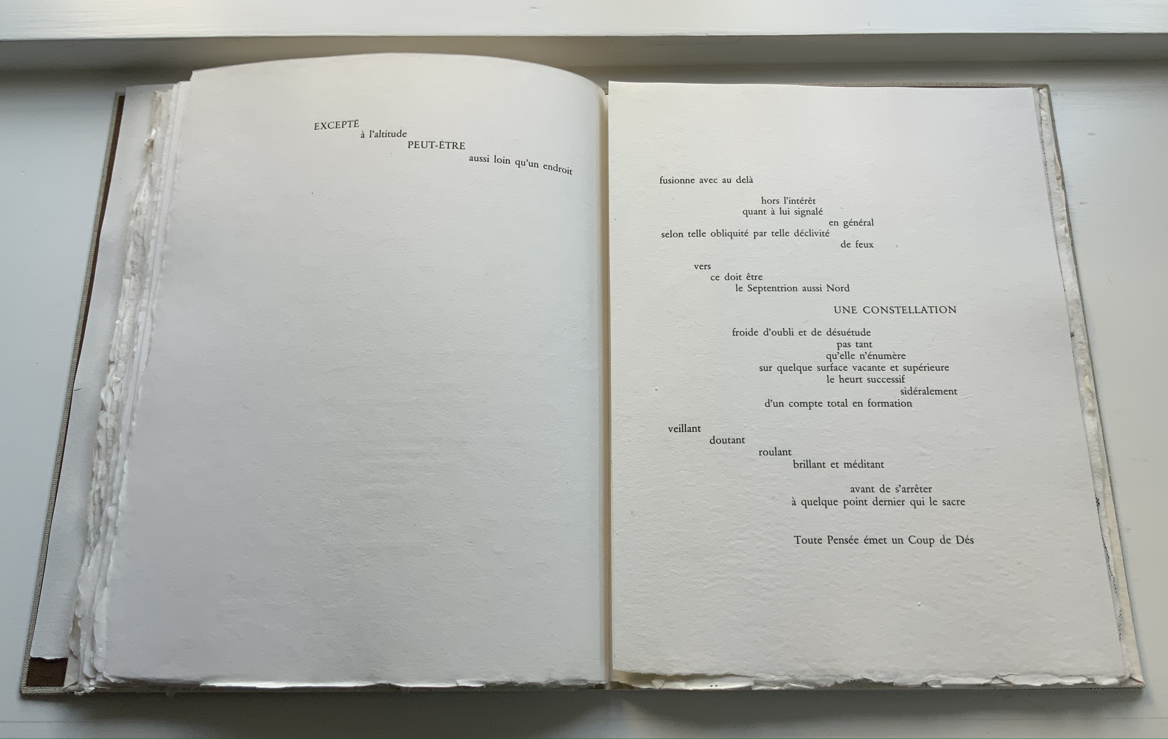
STÉPHANE MALLARMÉ,UN COUP DE DÉS JAMAISN’ABOLIRA LE HASARD: POÈME (1975) Jean Lecoultre Double canvas slipcase/folder enclosing a folded-paperbound book. Slipcase: 340 x 260 mm; Book: 330 x 250 mm, 62 pages inclusive of the 5 foldouts. Edition of 115, of which this is #78. Acquired from OH 7e Ciel, 10 March 2022. Photos: Books On Books Collection. Displayed with permission of Jean Lecoultre
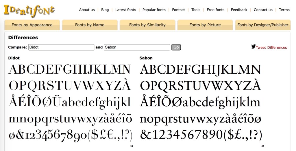
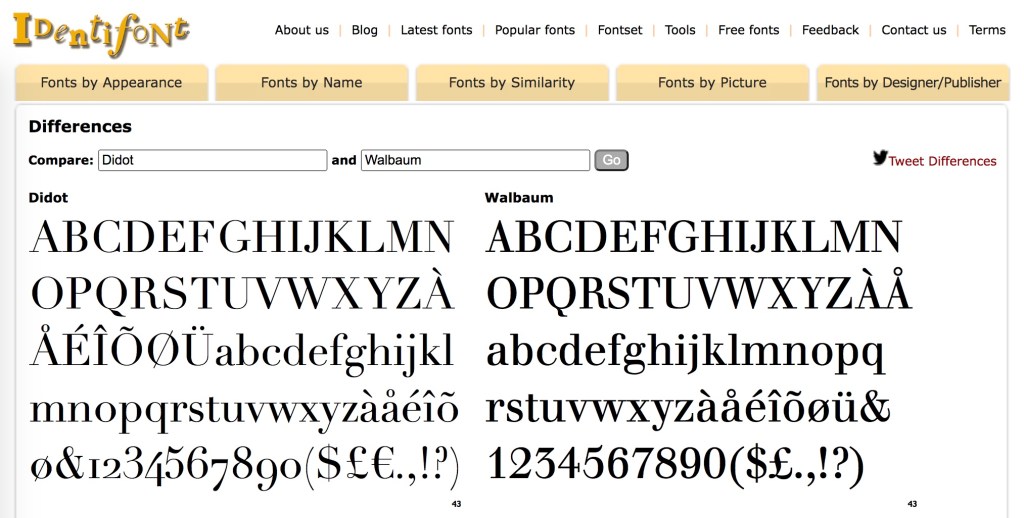
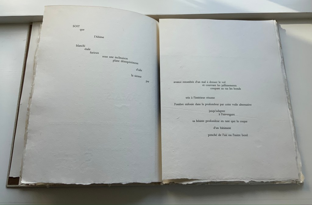
Among the many distinguishing features of Jean Lecoultre’s homage to Stéphane Mallarmé’s poem, three of the most striking are the typeface, the paper and the images. In deliberate ways, each differs from the deluxe edition that Ambroise Vollard and Mallarmé planned after the poem first appeared in 1897.
Sabon is the typeface, designed by Jan Tschichold in 1964 under commission from Walter Cunz of Stempel. The Linotype, Monotype and Stempel foundries released it jointly in 1967, which makes its use only eight years later a little bit daring. Only a “little bit” because anything more modern (say, Garamond) would have been preferable to Mallarmé rather than the Elzevir chosen by NRF when it published the 1914 edition. Lecoultre and the publisher Galerie Edwin Engelberts followed the 1914 layout but, thank goodness, not the typeface. Sabon’s thin and thick strokes do not contrast as much as those of Didot, and it does not have the same verticality. Although rooted in Garamond, Sabon comes closer than Garamond to the narrowness of Didot. Walbaum might have been a still closer option, but with its more substantial thin strokes, Sabon has to have been a more suitable choice for the handmade paper in this work.
Georges Duchêne (1926-2012) (Moulin de Larroque and Moulin de Pombié) fabricated the paper (vélin de cuve) especially for the project. The paper bears Duchêne’s watermark as well as a rough “tooth” (surface texture that grips the ink) and uneven deckled edges. With his semantic and typographic innovation, Mallarmé intended to draw attention to les blancs (the spaces around the lines, phrases and single words). With its smoothness interrupted by bumps, its simultaneous softnesss and stiffness, the paper draws the eye and touch even more to the space around the verses.
The surface must have presented a challenge for the technique of “soft varnish” etching used by Lecoultre. Crown Point Press defines it this way:
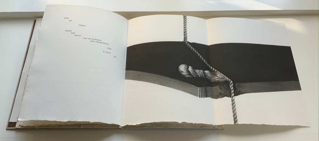
A process that involves applying a beeswax ground made soft by the addition of tallow or petroleum jelly evenly over a heated plate with a brayer. After the plate has cooled, the artist draws on paper laid over it. The soft wax comes off on the back of the paper exactly where the artist has pressed, exposing the metal in the pattern of the grain of the paper. More pressure in drawing removes more wax and produces a darker line after the plate has been bitten. In general, soft ground lines look like lines made by the drawing instrument, usually a pencil or crayon. Soft ground can also be used to take a direct impression of any flexible material—a fingerprint, a leaf, a piece of cloth, for example.
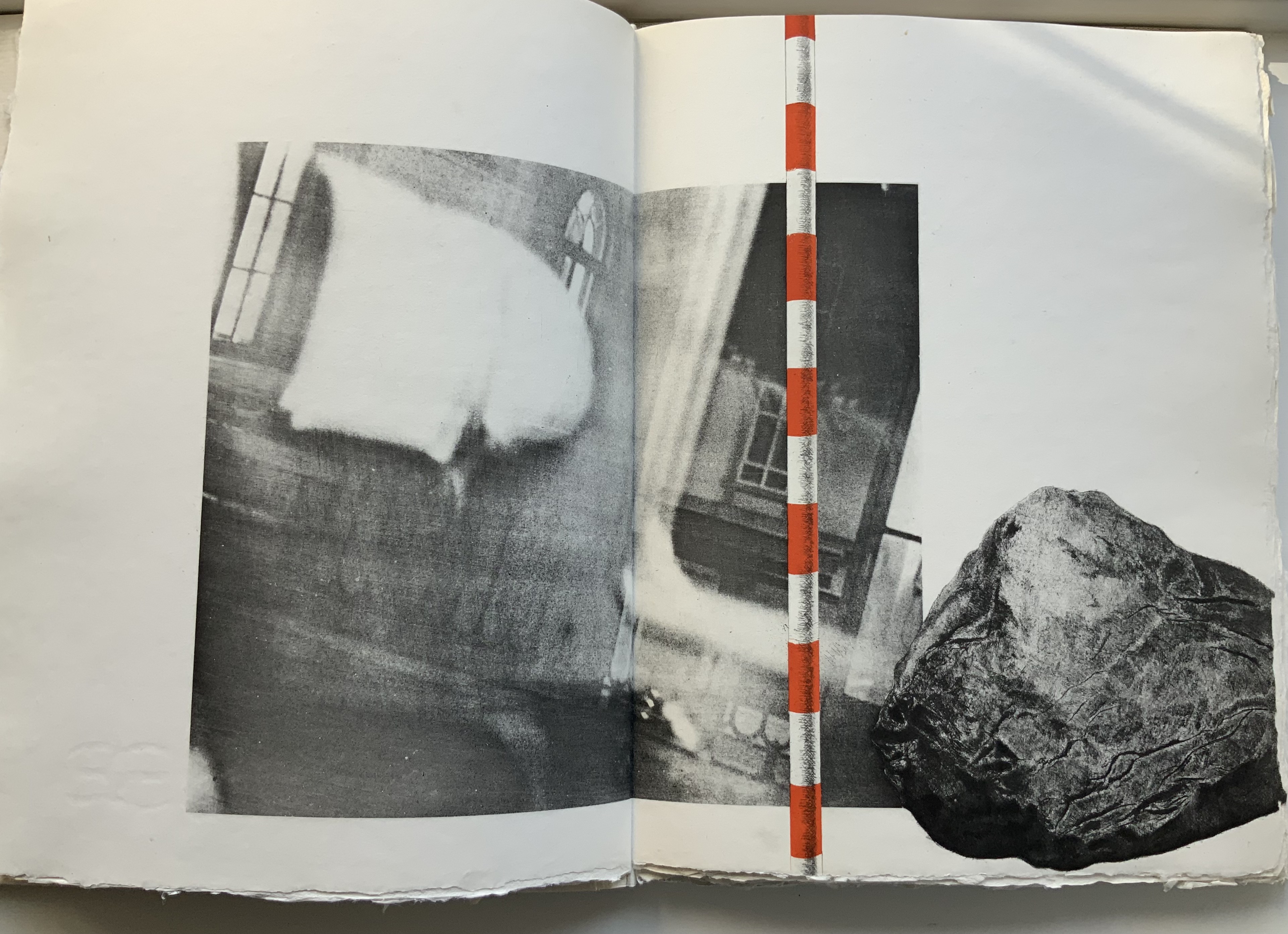
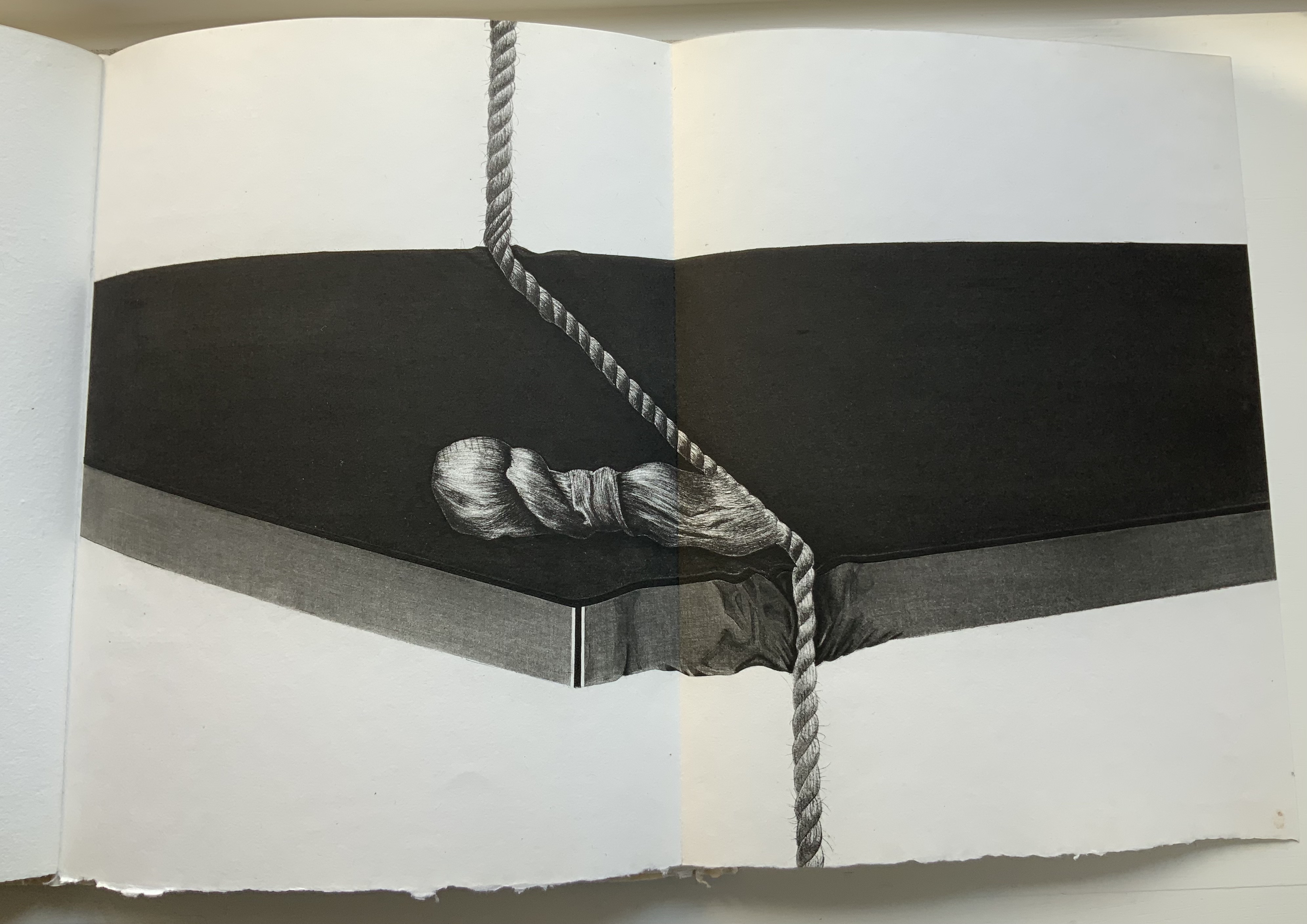
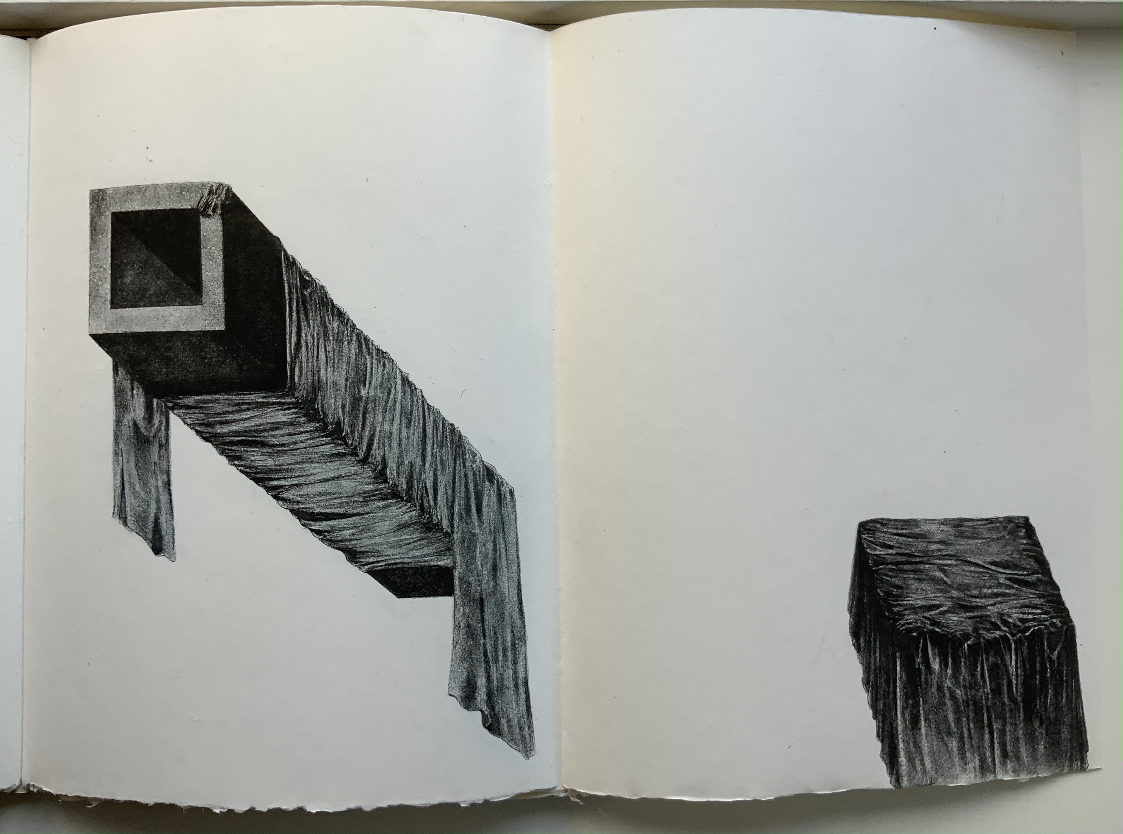
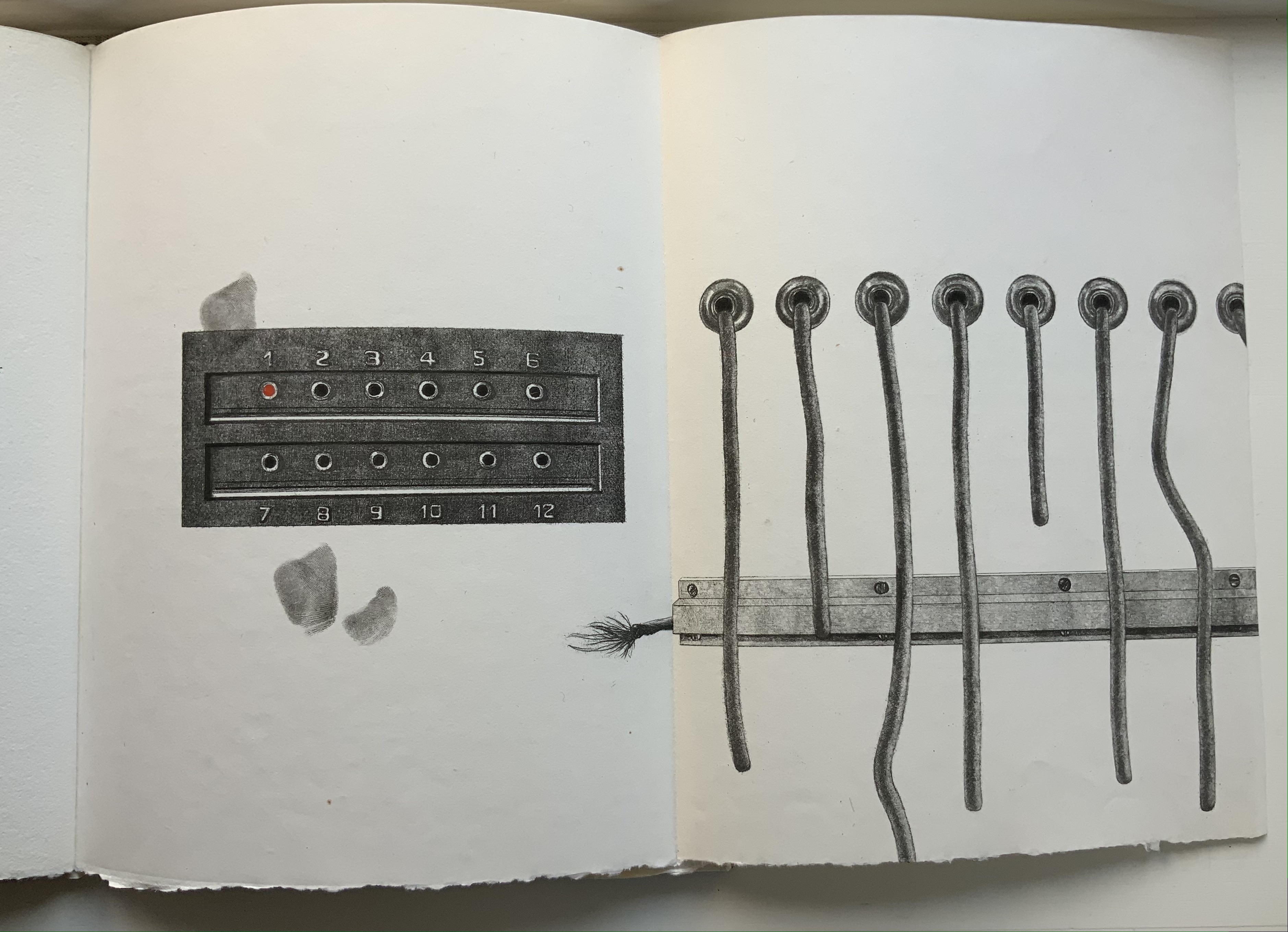
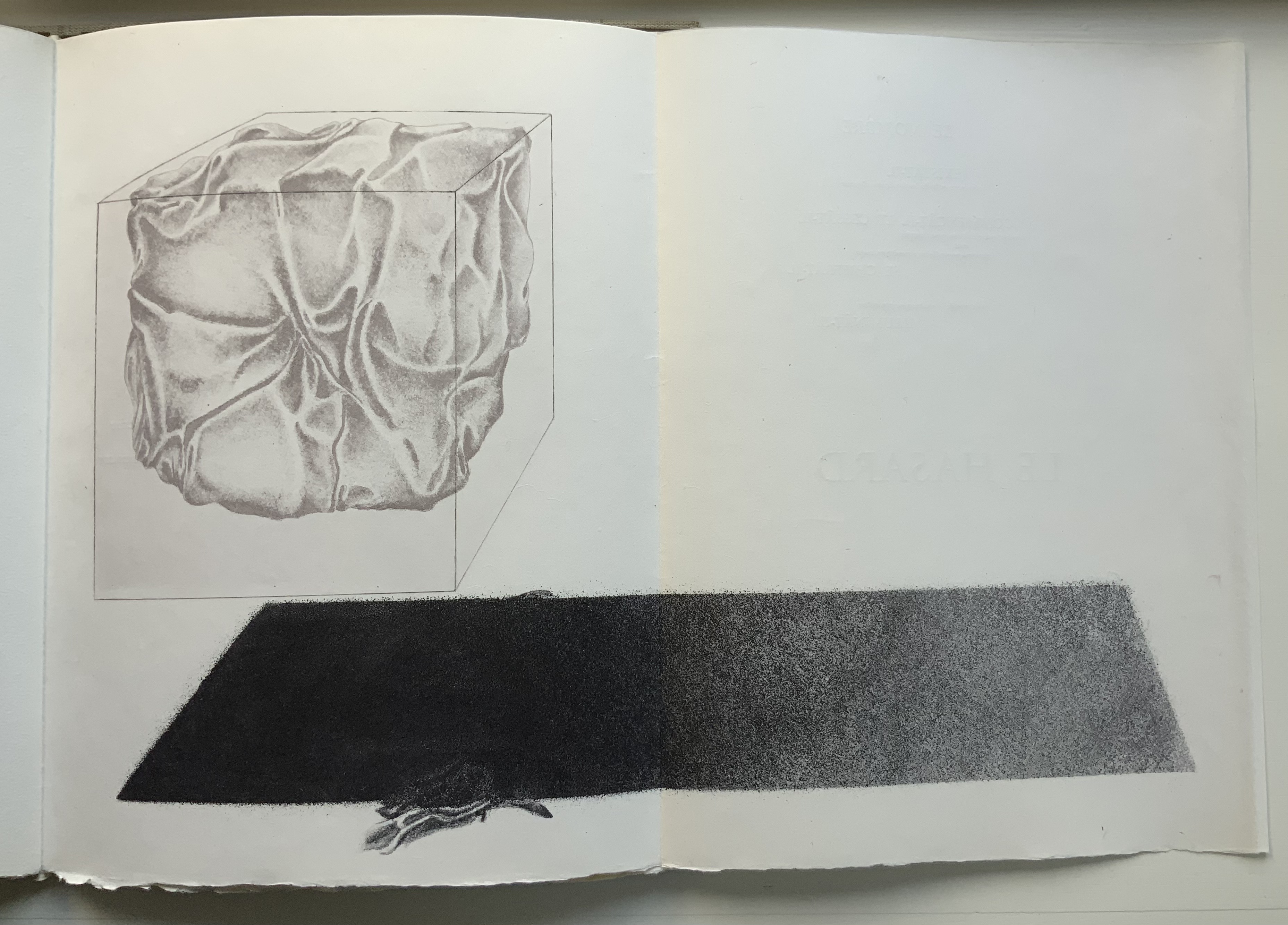
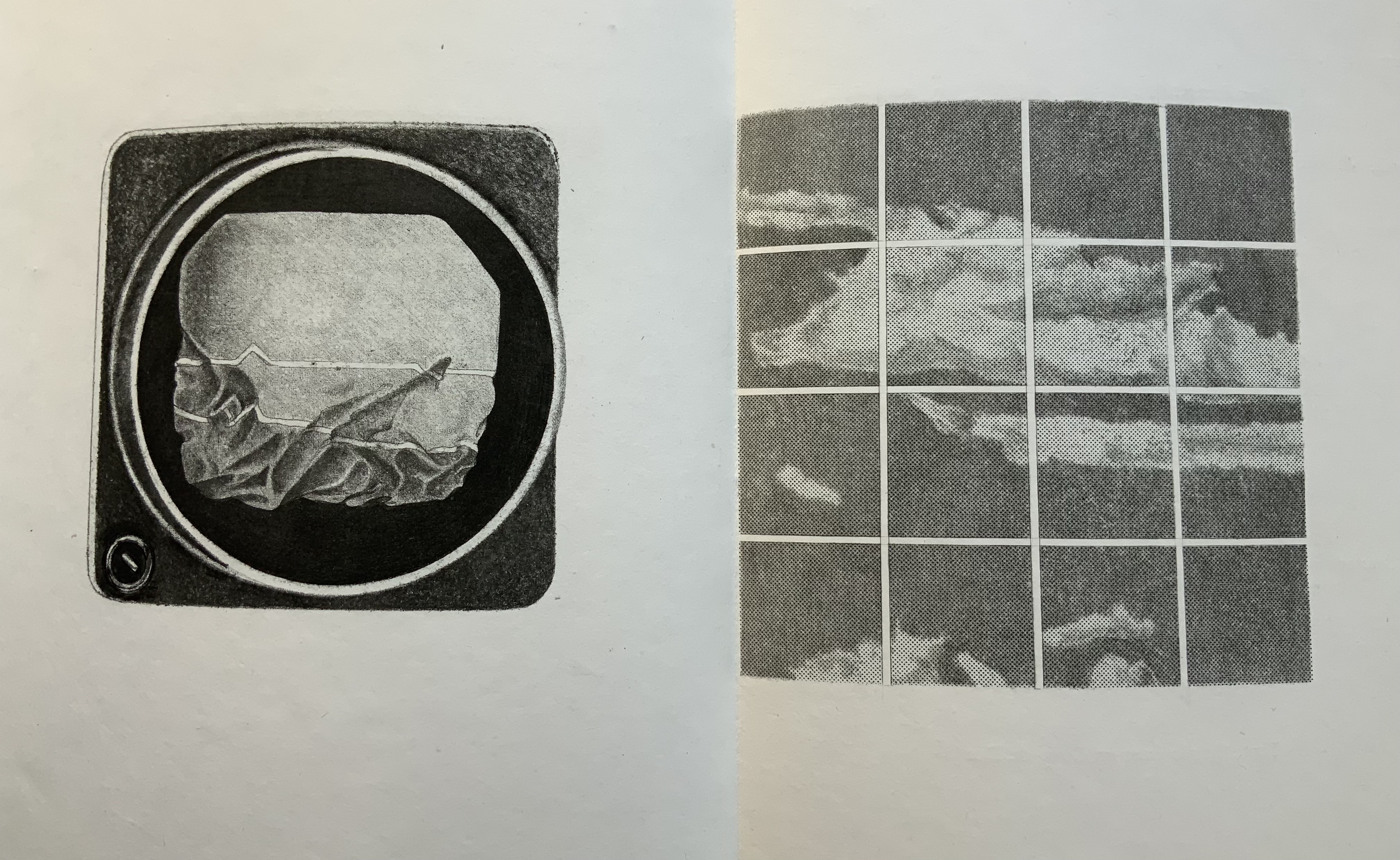
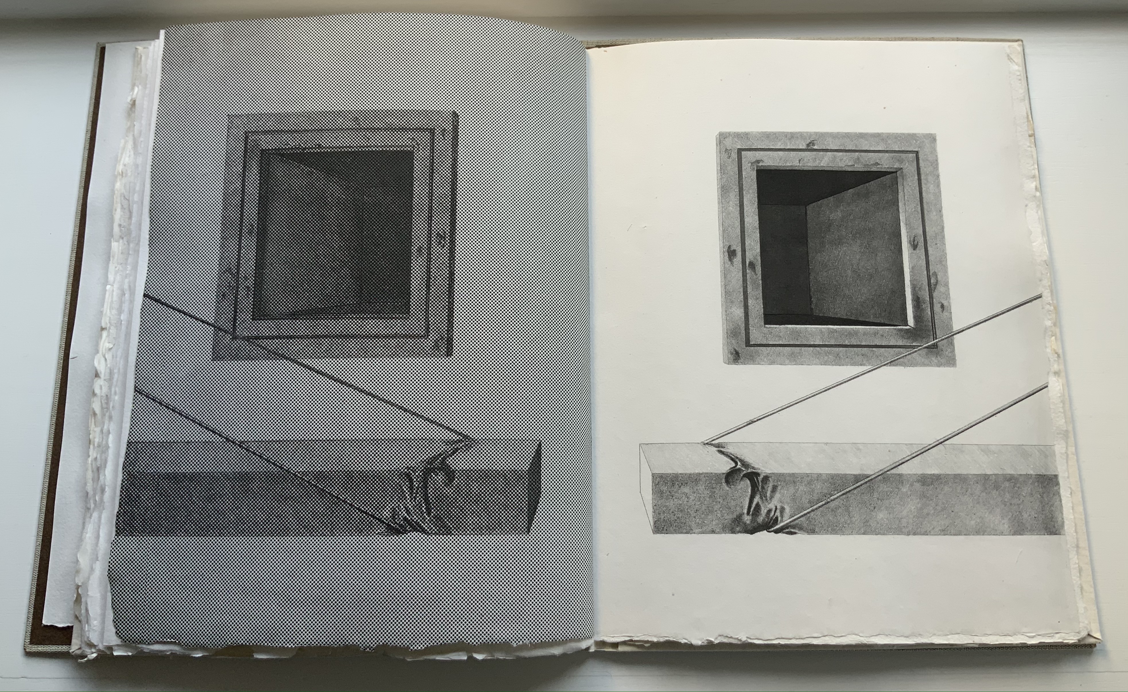
The technique resonates metaphorically with Mallarmé’s dictum peindre non la chose mais l’effet qu’elle produit (“to depict not the object but the effect the object produces”). The technique allows Lecoultre to depict the fine details of easily identifiable objects (a stone, fingerprints, a rope and more) and less easily identifiable ones (a blurred wall and windows, a pair of draped rectangular columns being sliced by a cheese-cutter-like cable and so on). Identifiable or not, the objects yield to the effects their juxtaposition, layering and blurring produce.
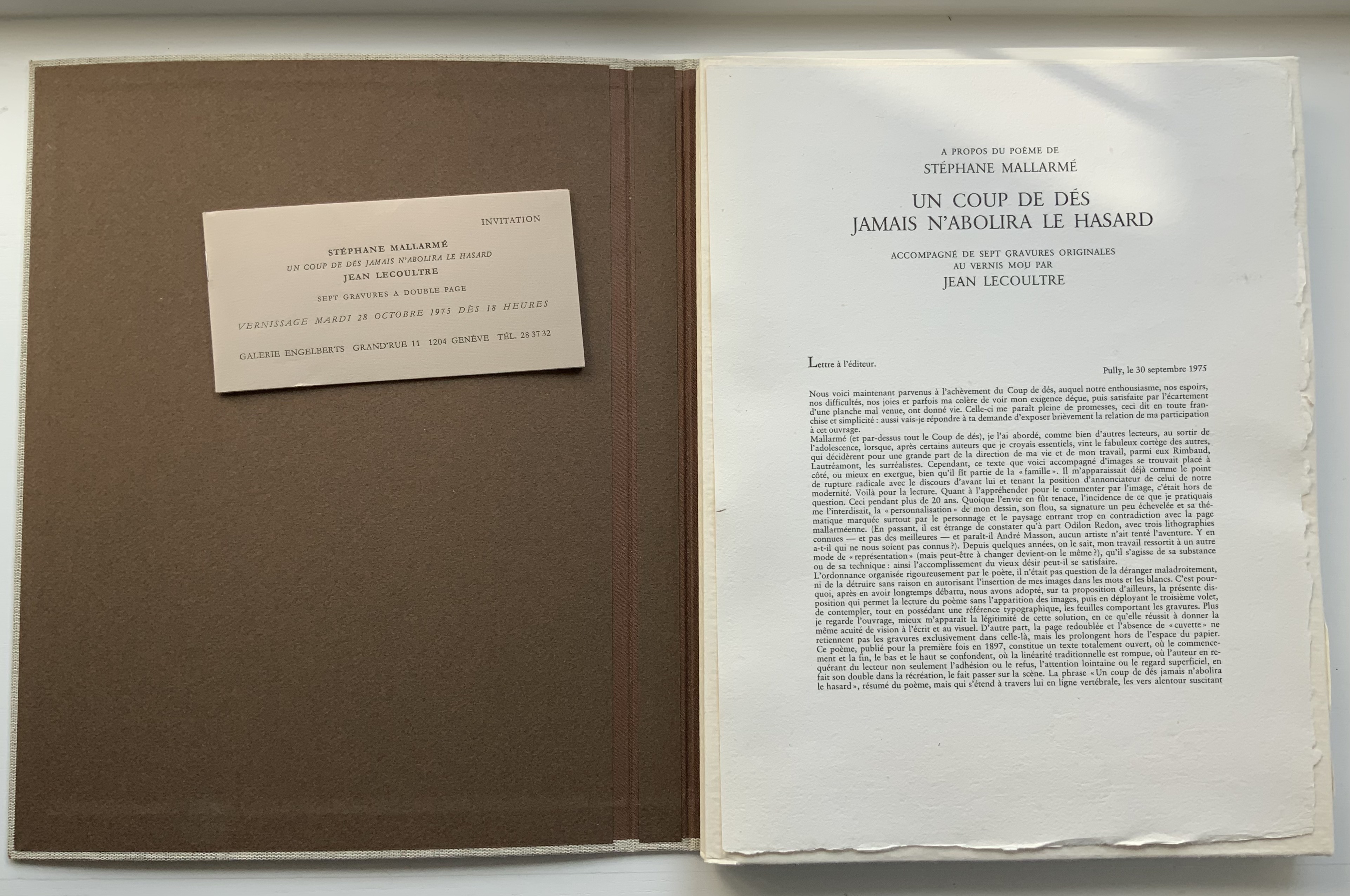
Lecoultre is also Mallarméan in his mastery of the technique. In an invitation booklet included with the book, Pietro Sarto, who pulled the prints, points out that, due to its delicacy, the soft varnish technique is most often associated with spontaneity and the chance effect. In Lecoultre’s case, Sarto makes the startling revelation that, for some of the images, the plates went through thirteen states. Thirteen chances for precision to be marred. Lecoultre even extends his chance-taking to the paper in pursuit of effect: note how the image of the rock bleeds across the deckle edge. The strange juxtaposition of objects and the way some objects seem to float on the page (or fall off it) — these also mirror Mallarmé’s arrangement of words and lines among les blancs of the pages, the precision of his images and the suggestiveness of his metaphors.
Finally Lecoultre and his publisher strike out in a novel direction with the number and placement of the prints. Unlike Mallarmé/Vollard’s plan to segregate the poem from Odile Redon’s three to four images, Lecoultre integrates his seven with the poem. This entails “bookending” the poem with two double-page spreads, each taken up entirely by a print: one spread before the half-title and one after the final page of the poem. For the remaining five prints to appear on double-page spreads, the publisher urged the use of five foldout pages. This solution, which Lecoultre approvingly embraced, simultaneously challenges and celebrates Mallarmé’s unit of the double-page spread.
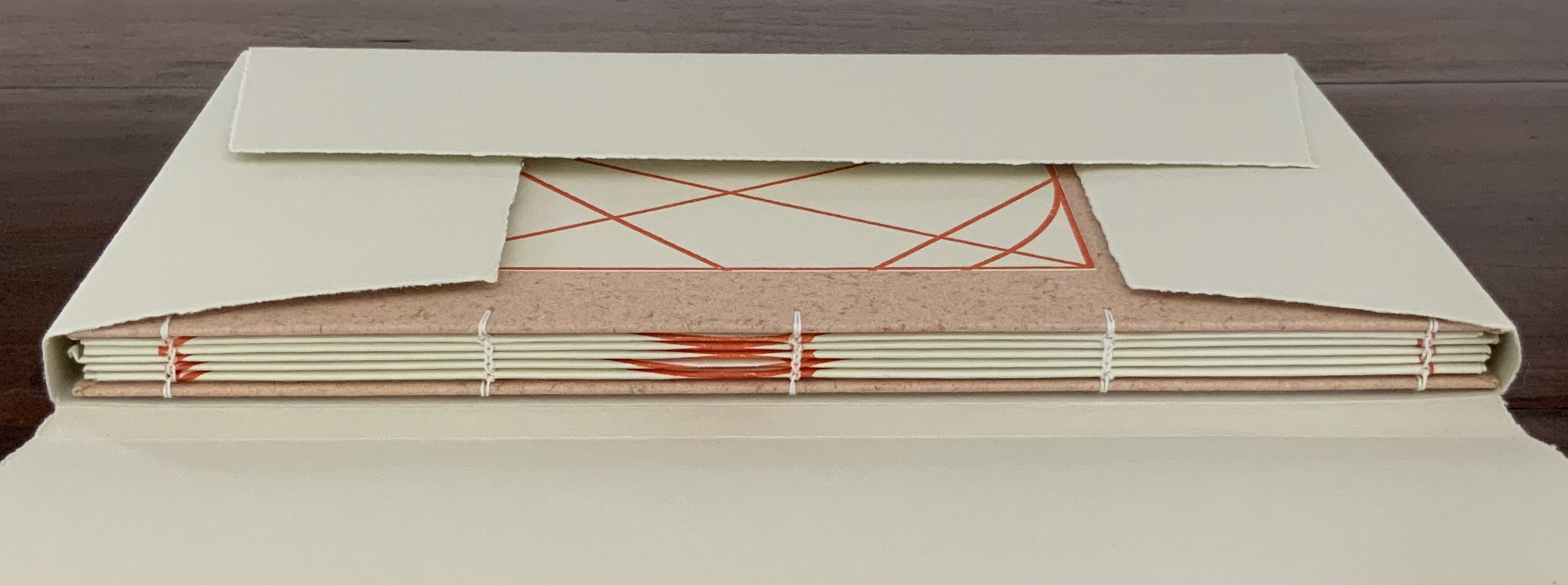
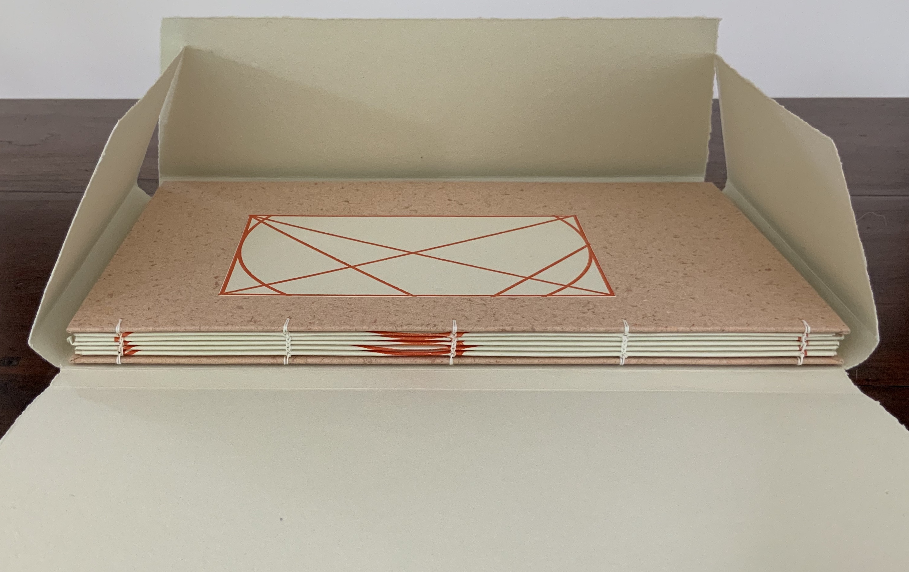
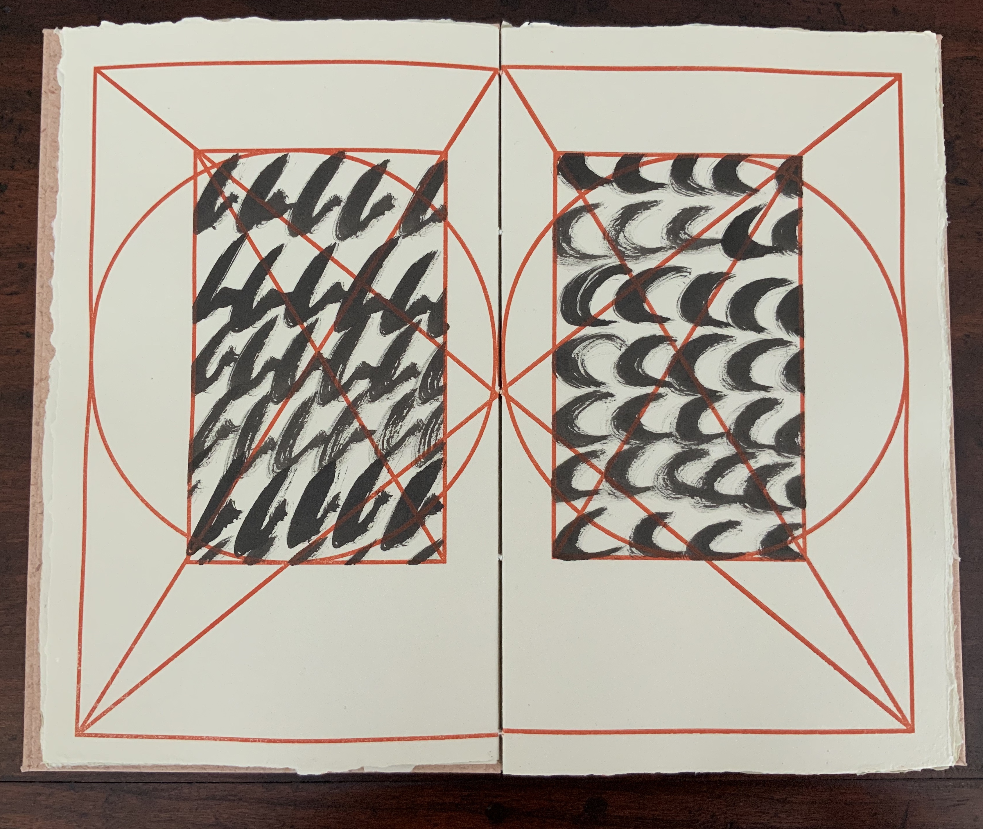
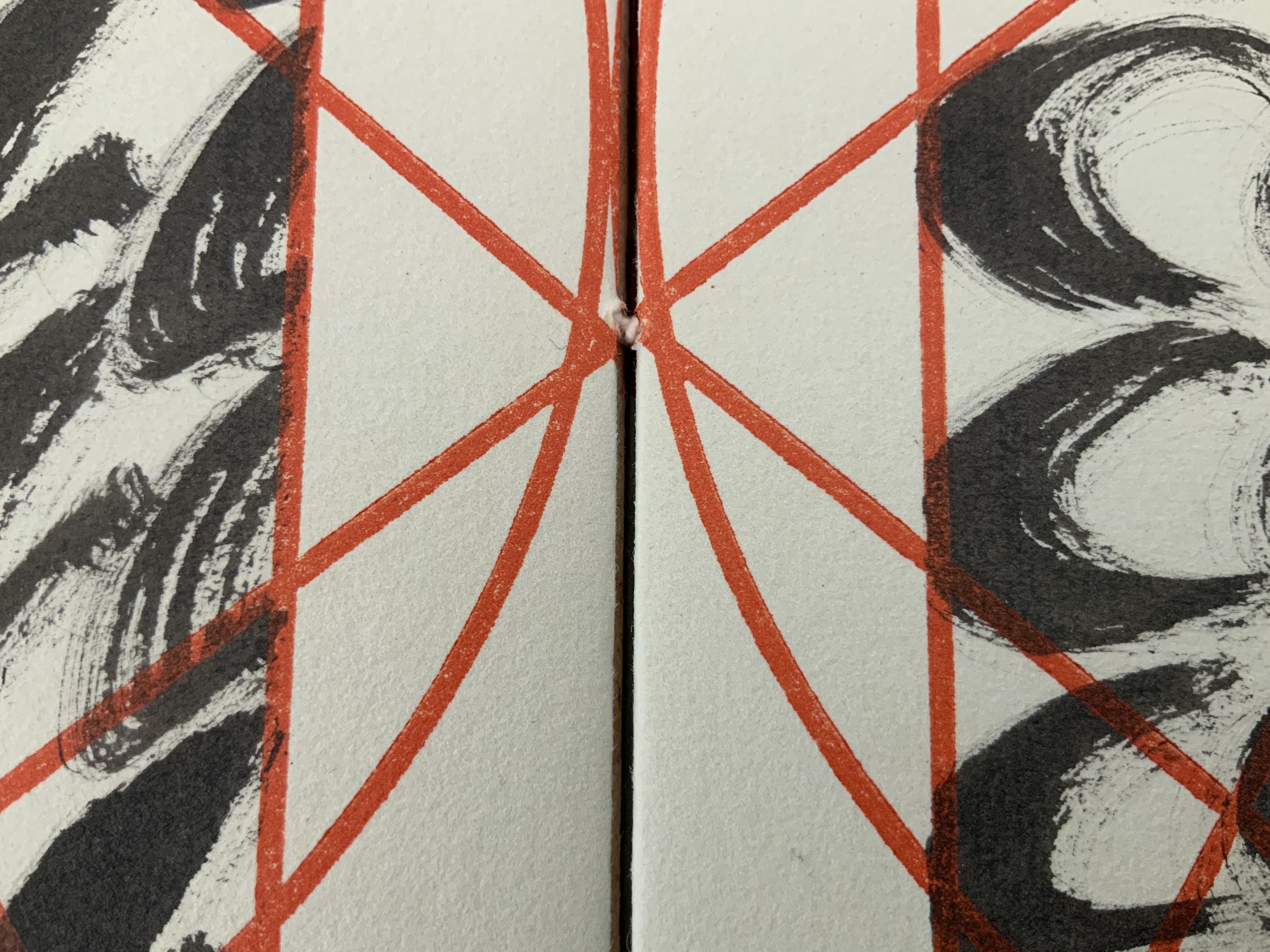
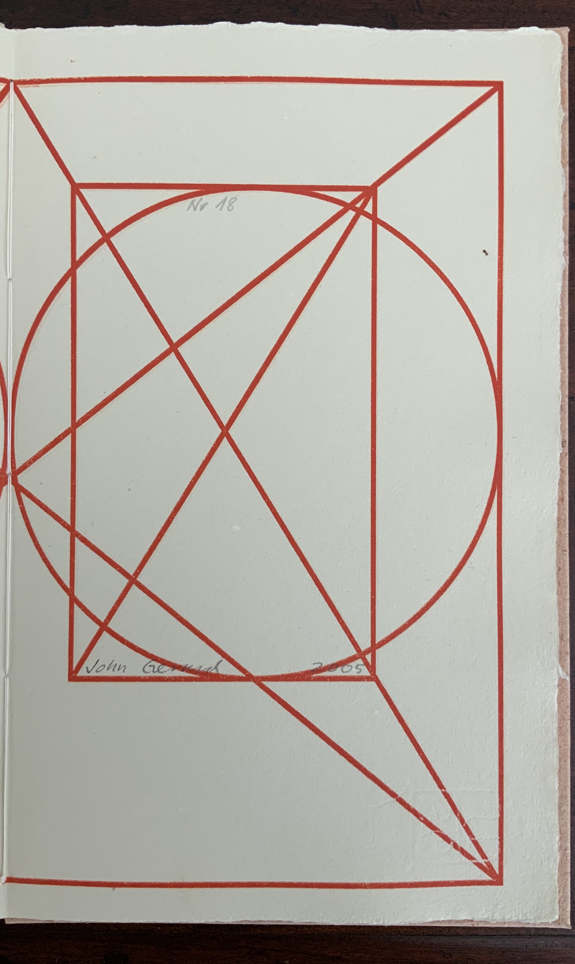
Small quarto book chain-stitched in boards, with a paper label to the upper cover, 40 pages, H275 x W272 x D15 mm, housed in a paper four-flap enclosure H175 x W278 x D16 mm. Signed edition of 20, of which this is #18. Acquired from the artist, 29 July 2020. Photos: Books On Books Collection.
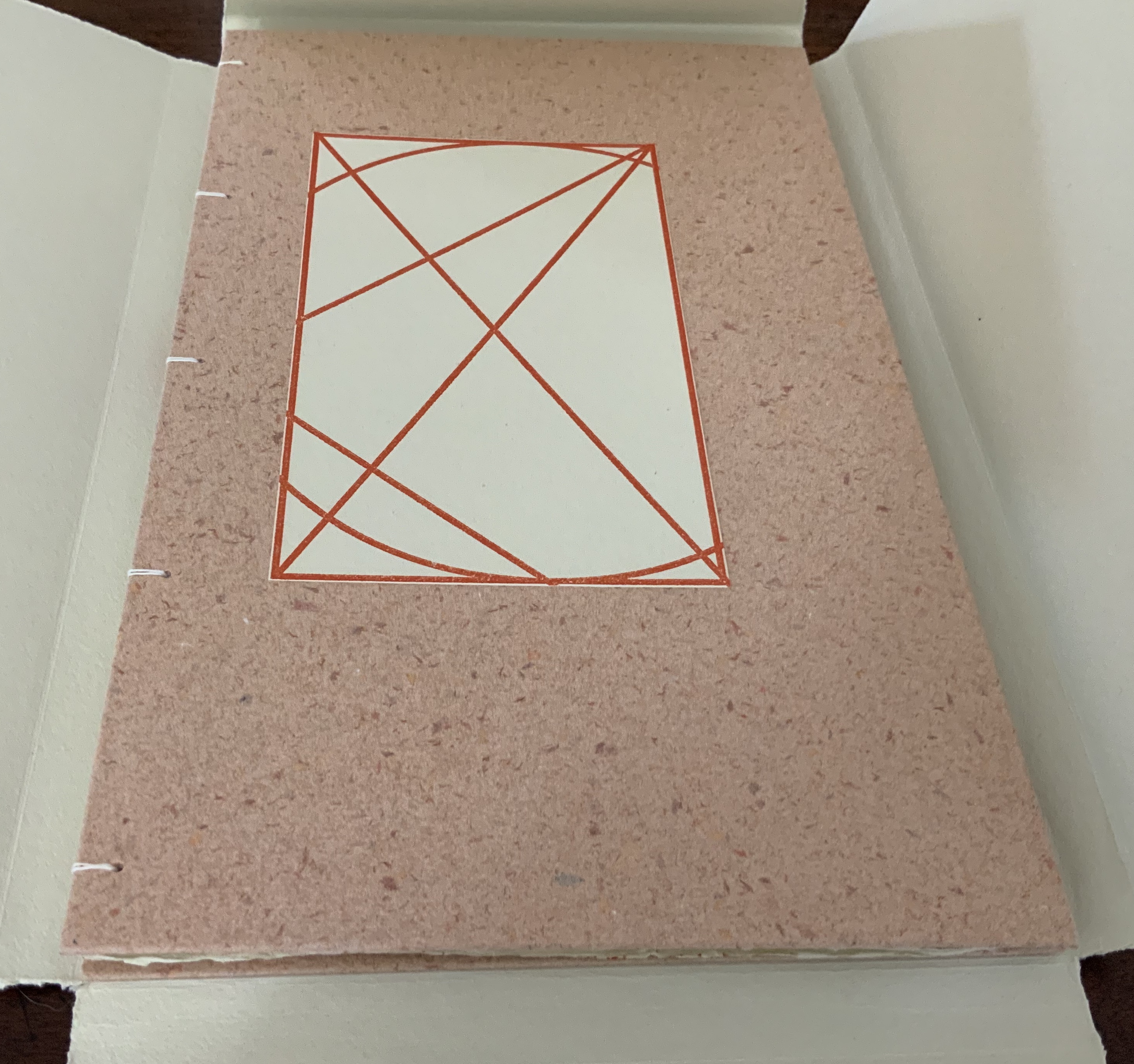
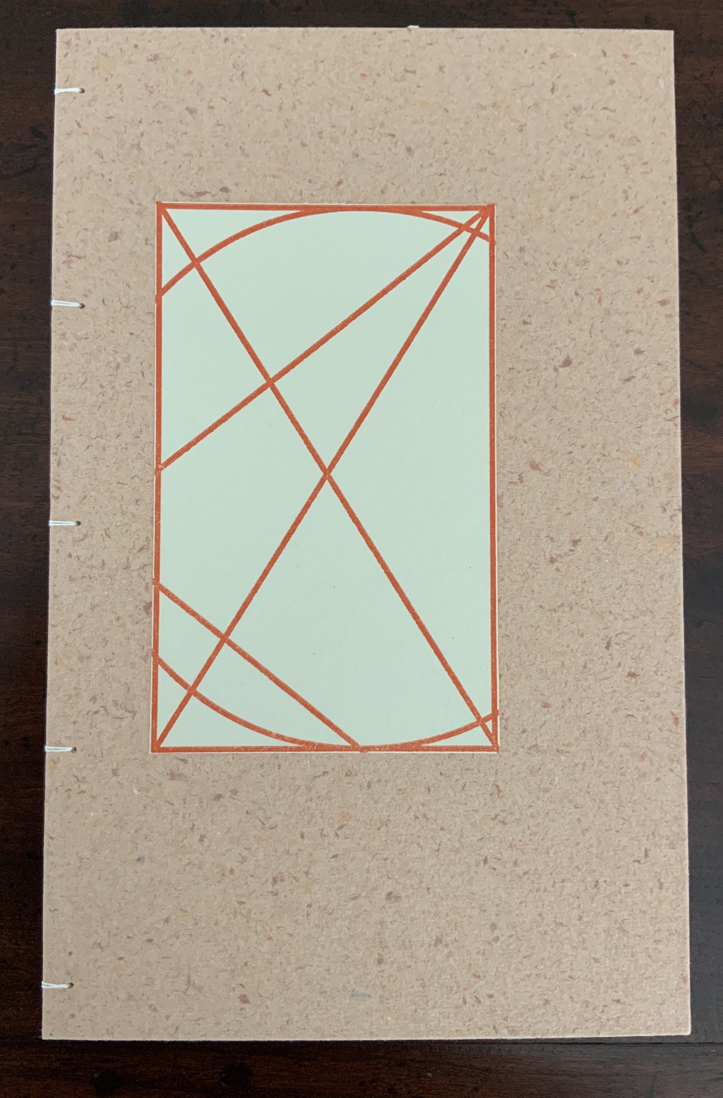
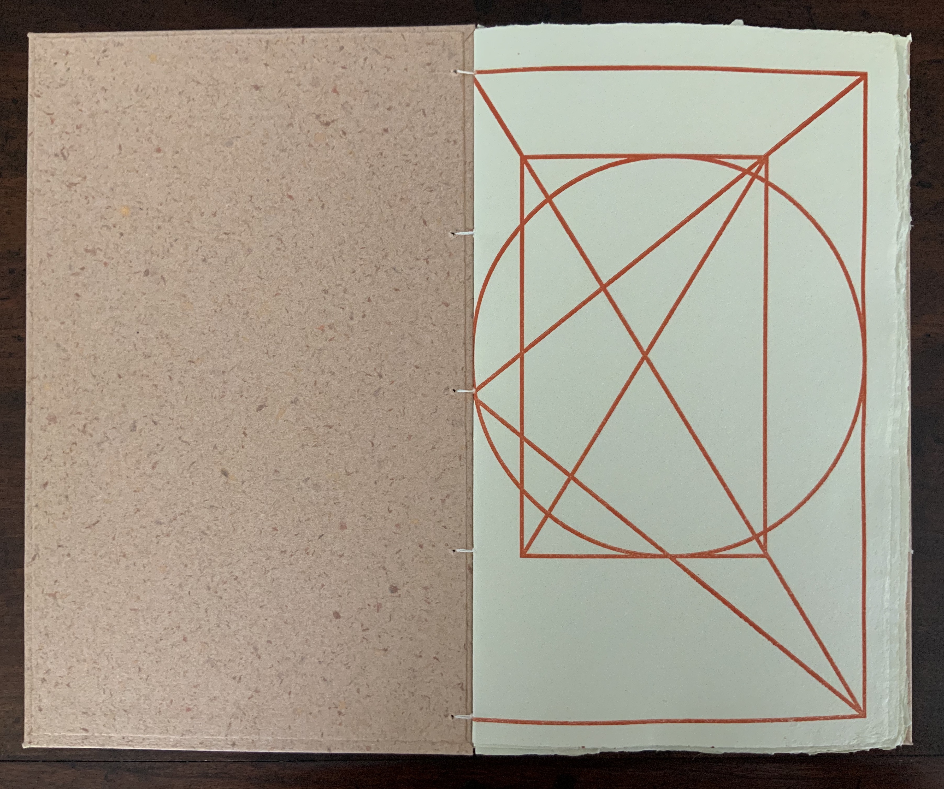
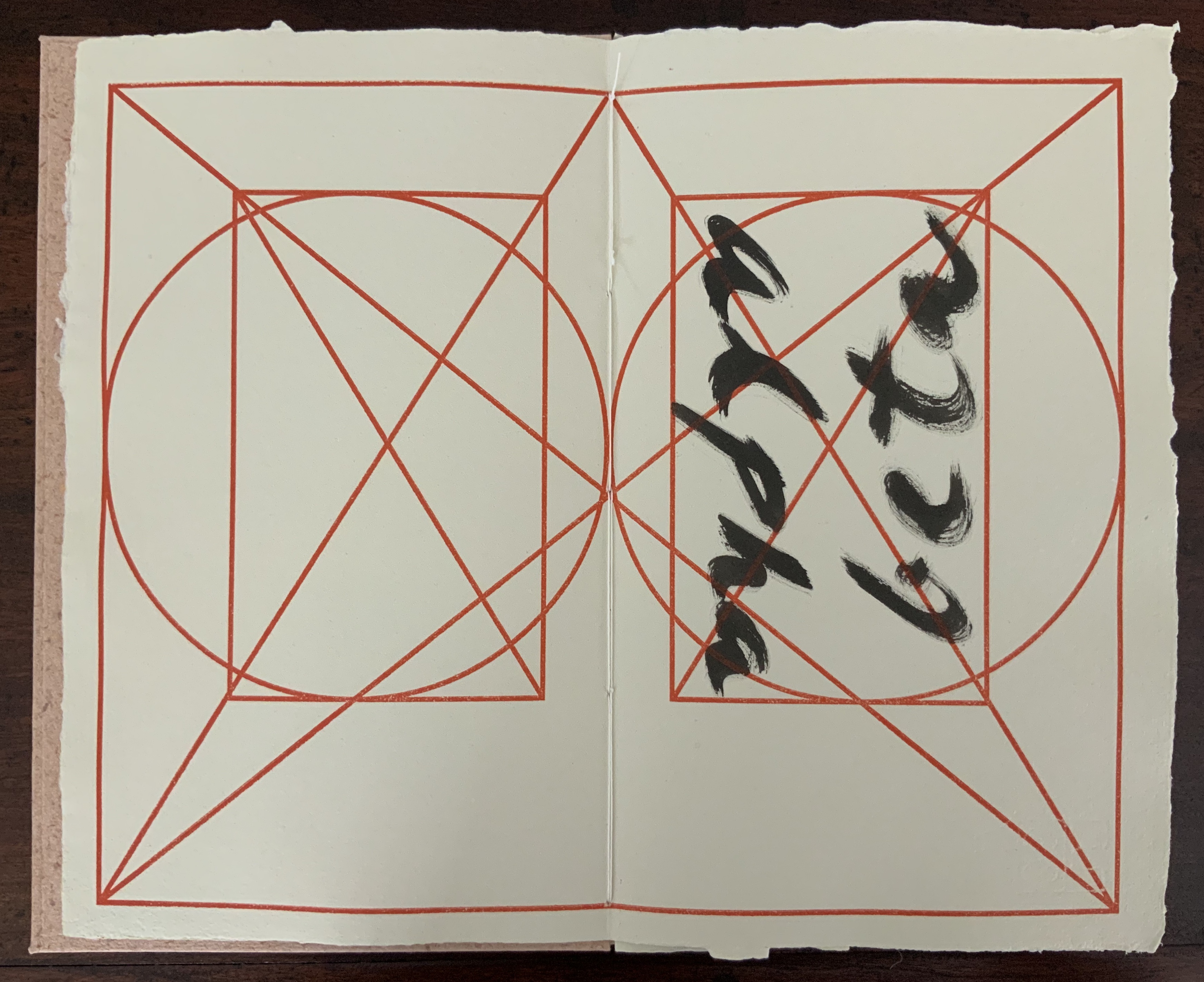
In the playground of the alphabet, papermaking, calligraphy, page design and layout, image and text, printing and binding, John Gerard has created an outstanding and contemplative work of book art and the book arts. Eastern and Western traditions meet on the page and in the material and structure: Coptic-style binding, handmade paper and spirited brushing of the letters right up against the geometric constraints of Jan Tschichold’s diagram for deriving the text block’s ideal space and positioning from the Golden Ratio.
The cover’s paper label shows the image of Jan Tschichold’s canon for page layout, which is reproduced on every page of the work. Each letter of the alphabet is messily brushed in black over and over to fill the mathematically precise text area defined by Tschichold’s canon.
The text and label papers for Alpha Beta are handmade from cotton and hemp using a velin mould with Gerard’s early watermark depicting the Eifeltor Mühle (Eifeltor Mill) and the letters S and G (Studio John Gerard). The weight of the paper is about 150-180gsm. The lettering is done with Indian ink, and the printing of Tschichold’s diagram, with a proofing press using a photo-sensitive nylon plate. The cover papers are also made with cotton and hemp using a coagulant with slightly different pigmented pulps, which creates the decorative speckled look. The sewing thread is linen.
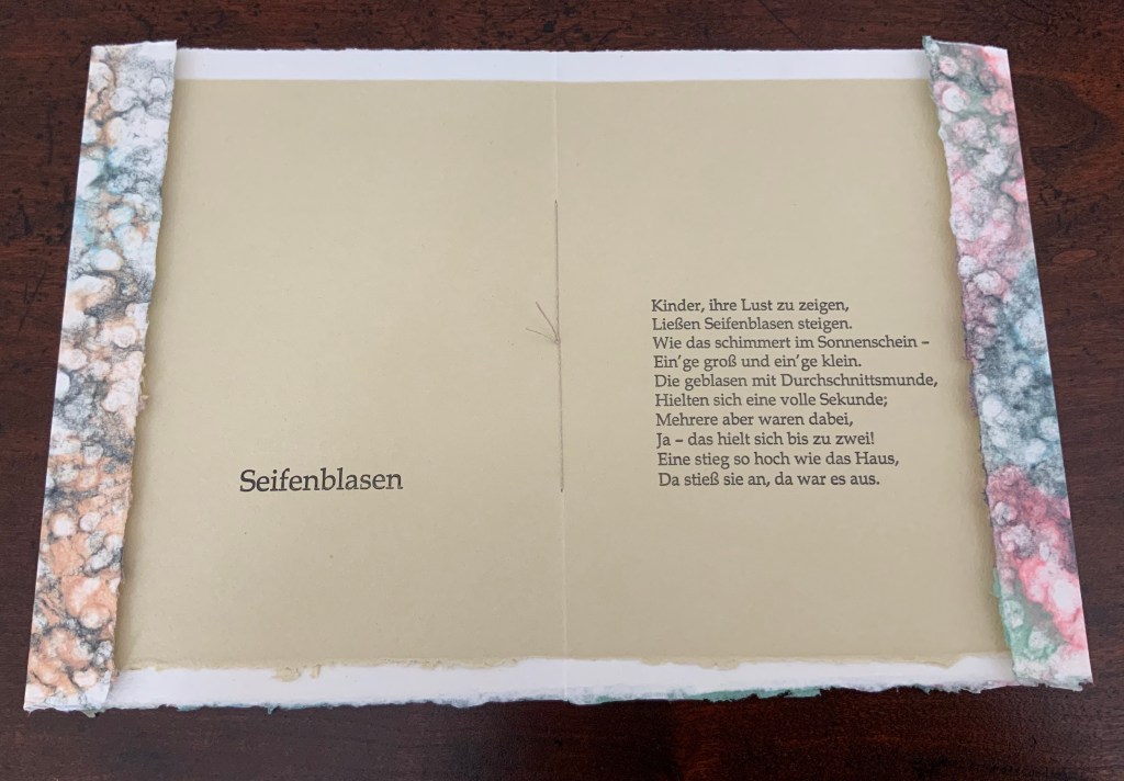
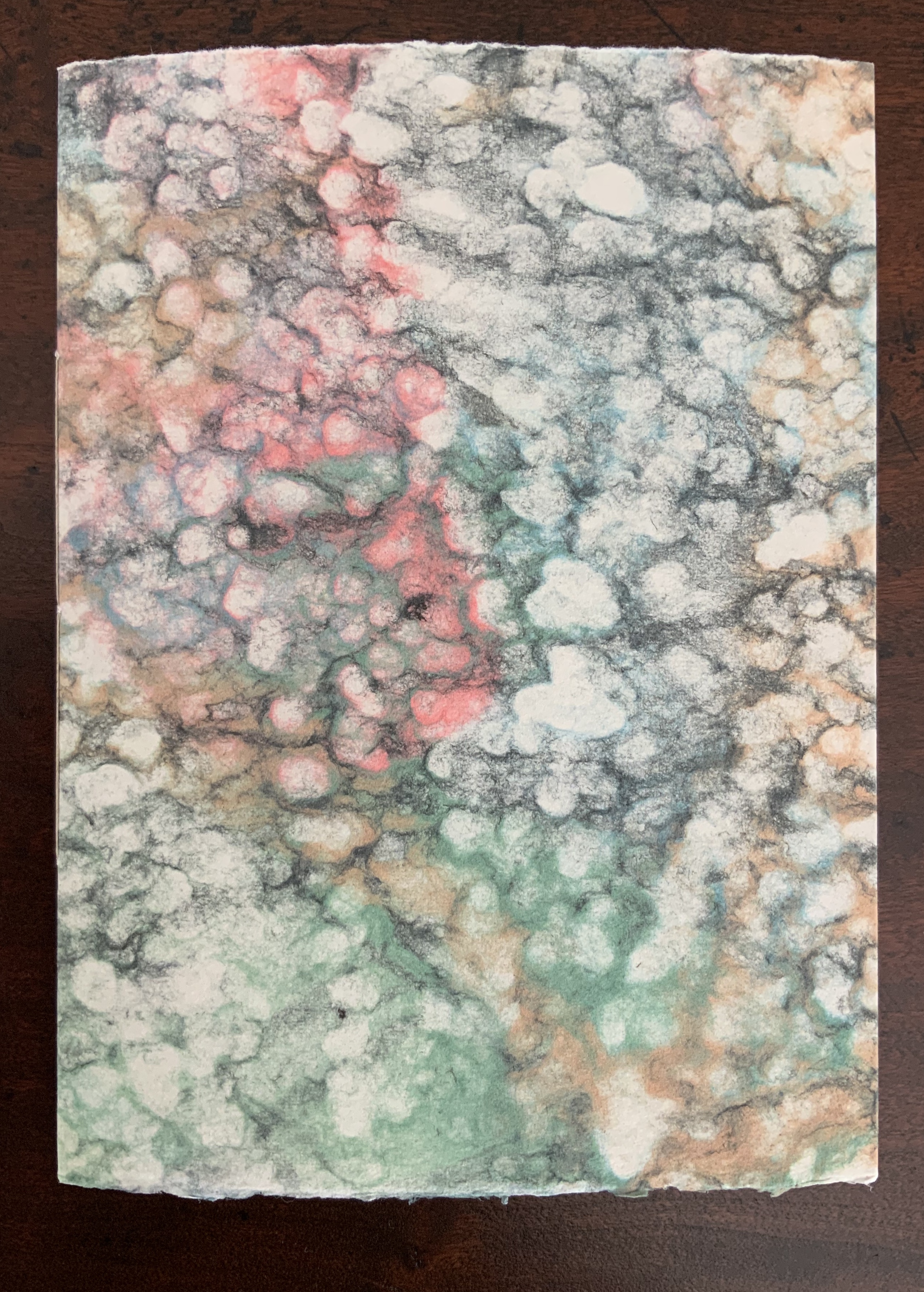
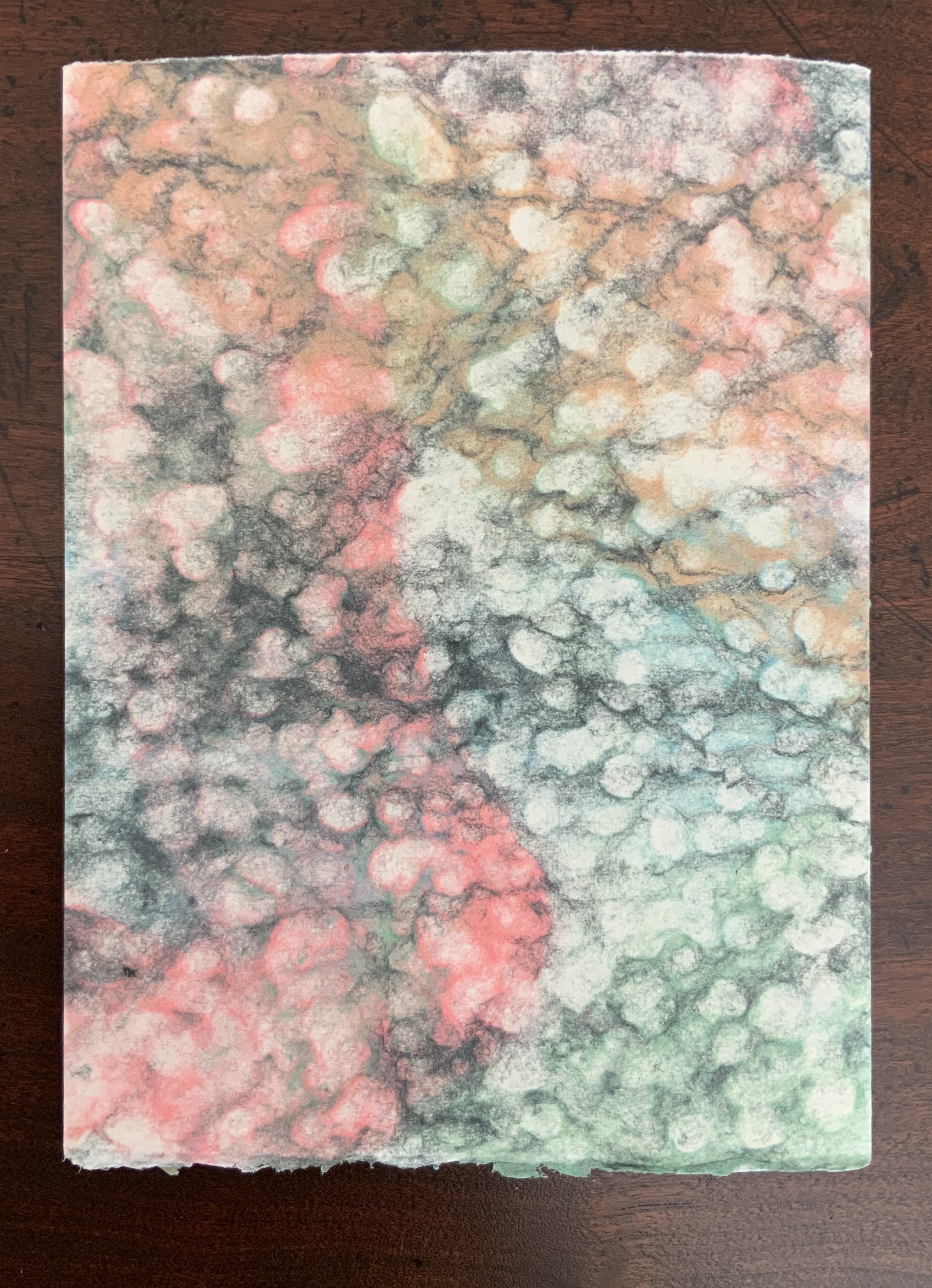
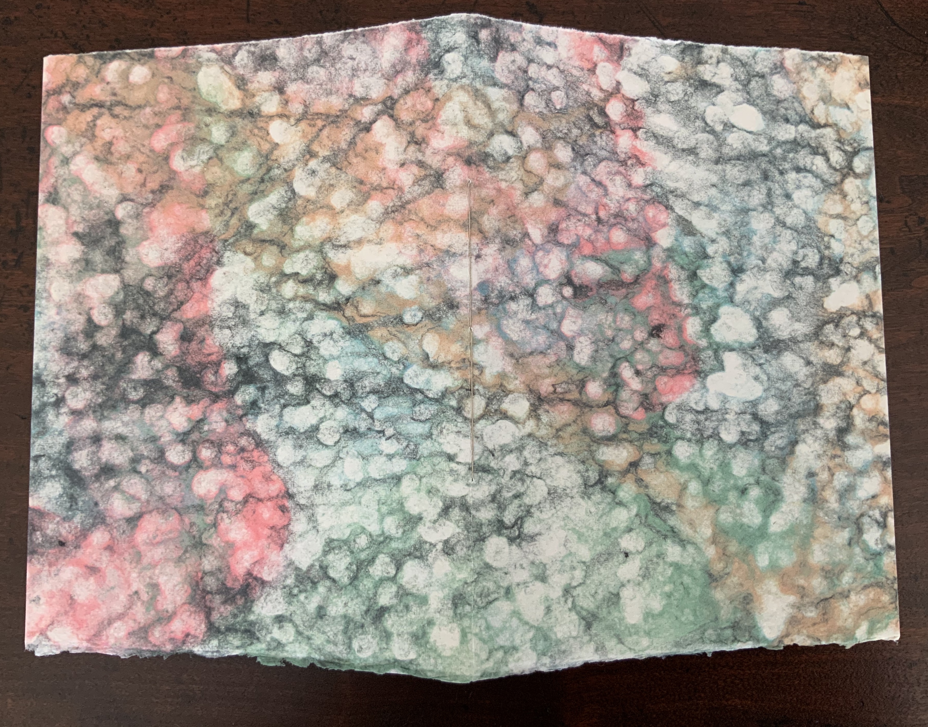
Artist booklet, stitched with linen thread, two sheets hand-made of cotton and abaca fibers, the cover sheet being double couched using a layer of colored pulps, the inner sheet printed in 14p Book Antiqua in relief printing. H200 x W150 mm. Edition of 100 unnumbered copies. Acquired from the artist, 29 July 2020. Photos: Books On Books Collection.
Inspired by the 19th century poem “Seifenblasen” (“Soap Bubbles”) by Theodor Fontane, John Gerard uses pulp painting to create the shifting prismatic colors displayed on the surface of a soap bubble. By layering different colored pulps on a sheet of plain wet pulp, he evokes the same pleasure, color and lightness evoked by the words.Here is a loose translation:
Soap Bubbles

Children to show their delight
Send soap bubbles up to the light.
How they shimmer in the sun —
Some big, some small.
Blown with a mouth just so, some
Hold out a whole second —
But several there —
Yes! — hold on for two.
One rises as high as the house —
Bumps there — then it’s over.
Gerard seems drawn to respond to things displaying a tension between spirit and form, be it the tension of soap bubbles or the tension between repeatedly scrawled letters constrained by a canonical grid.
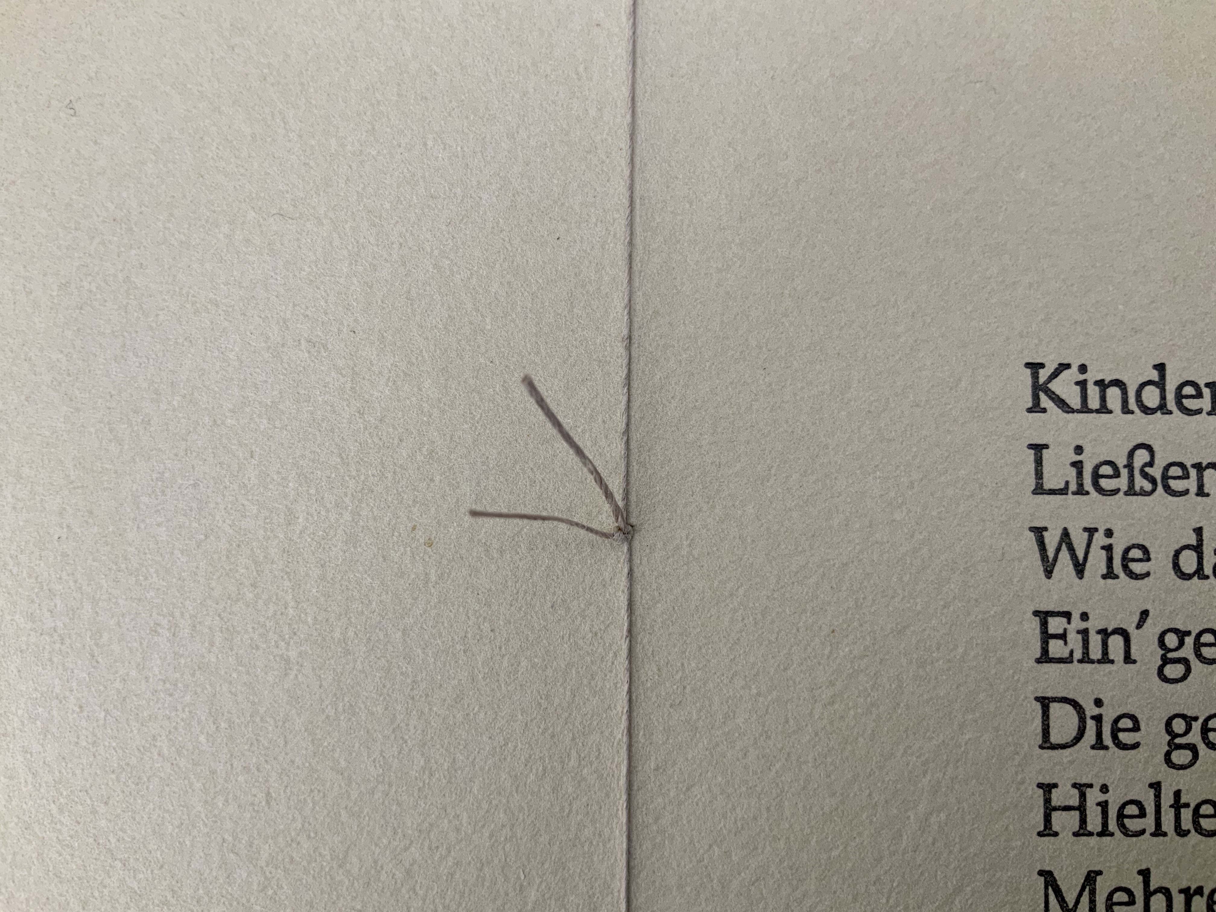
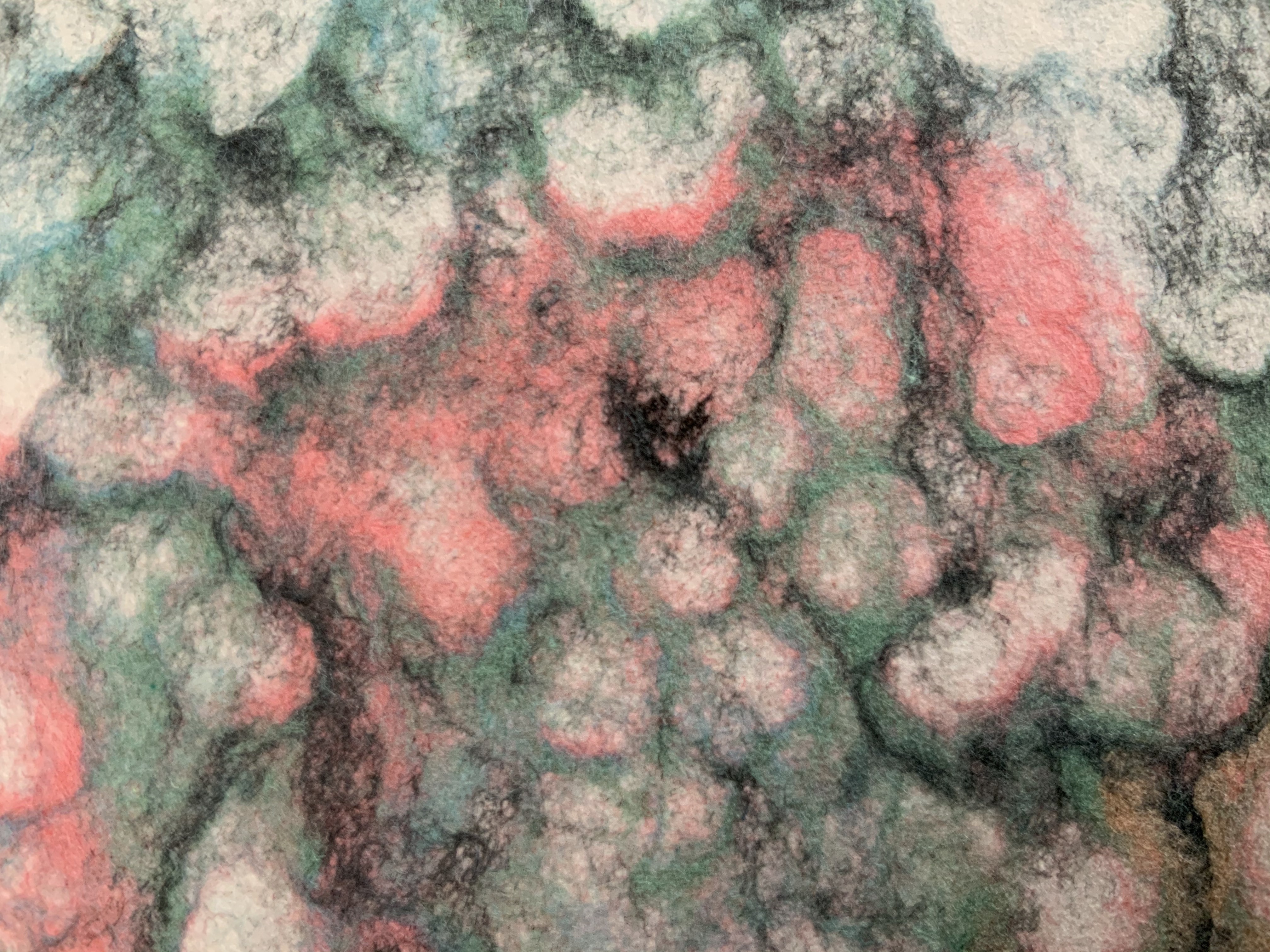
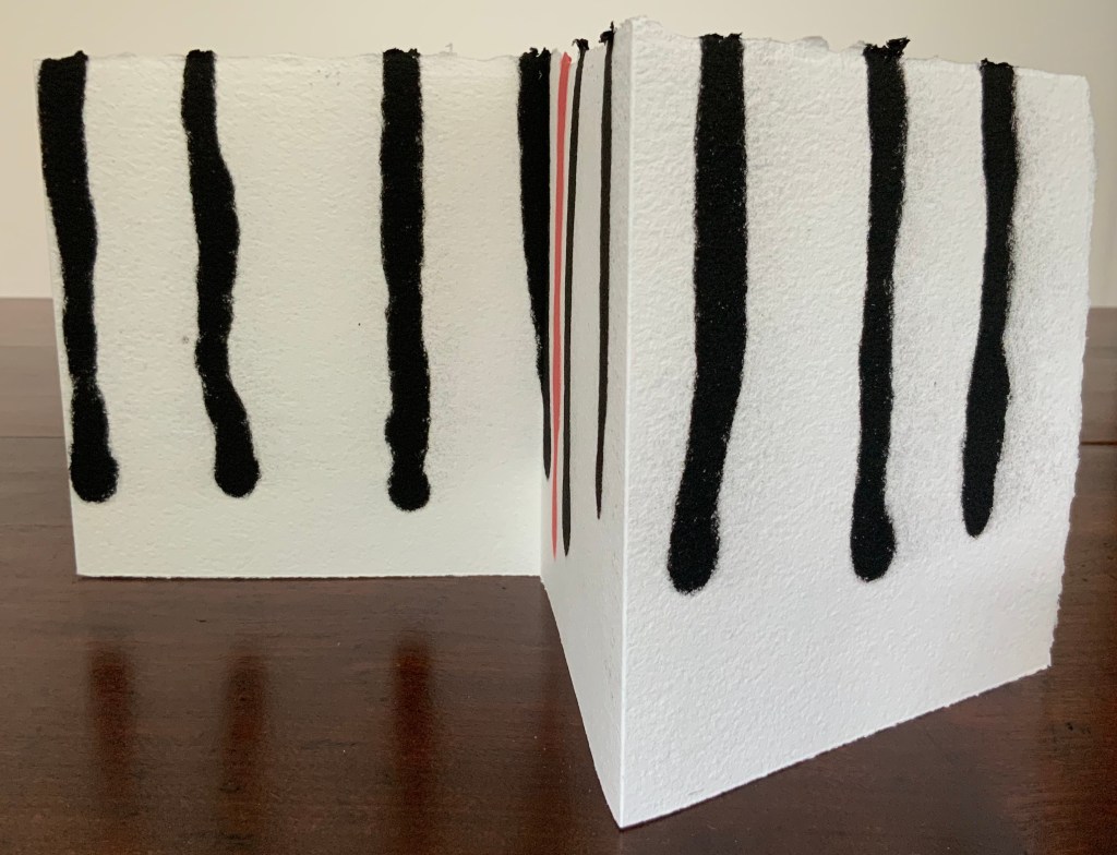
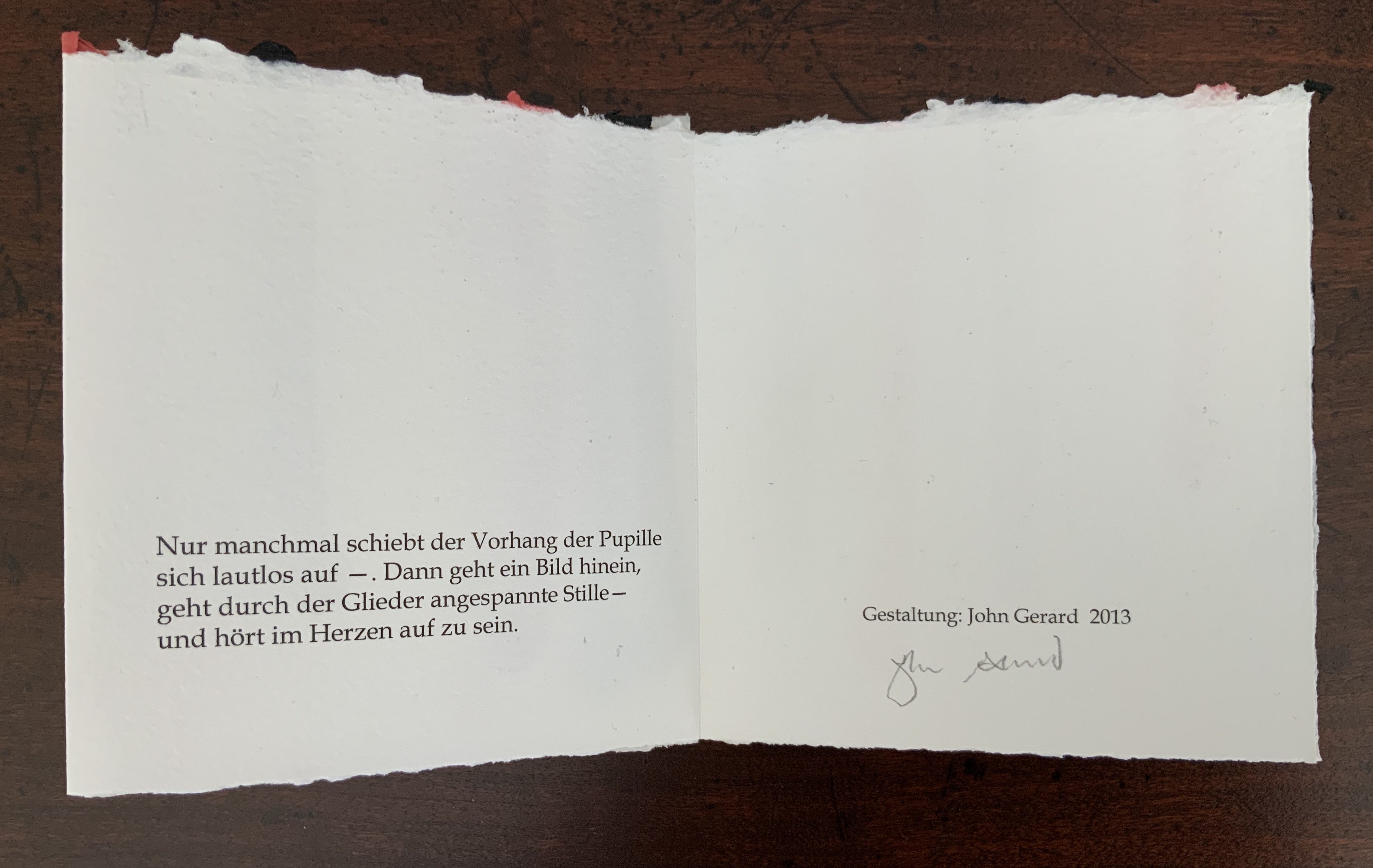
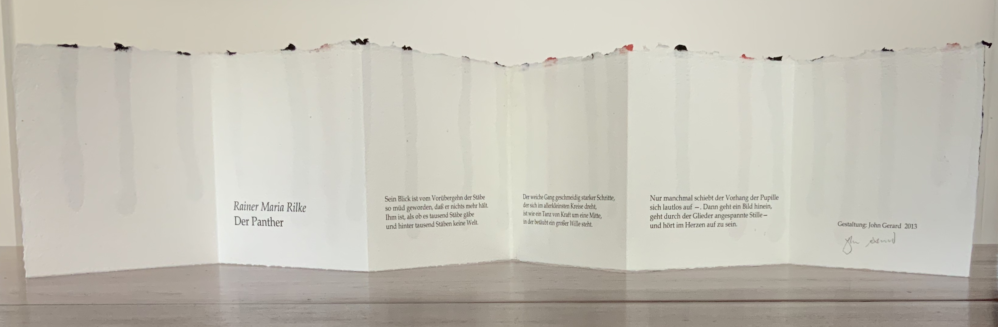
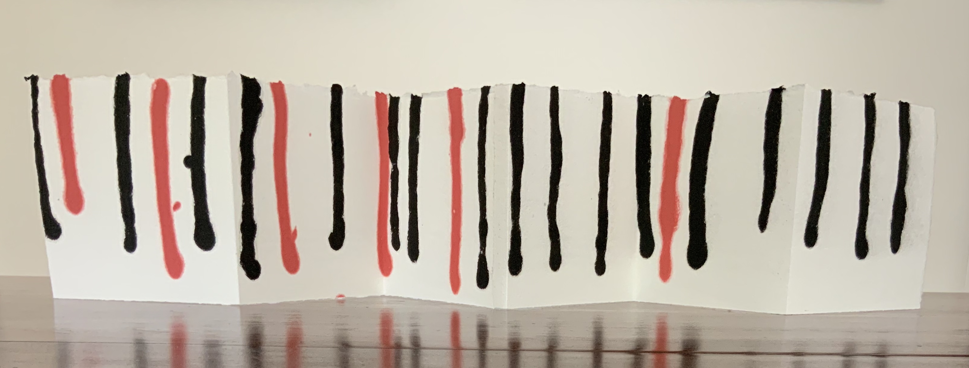
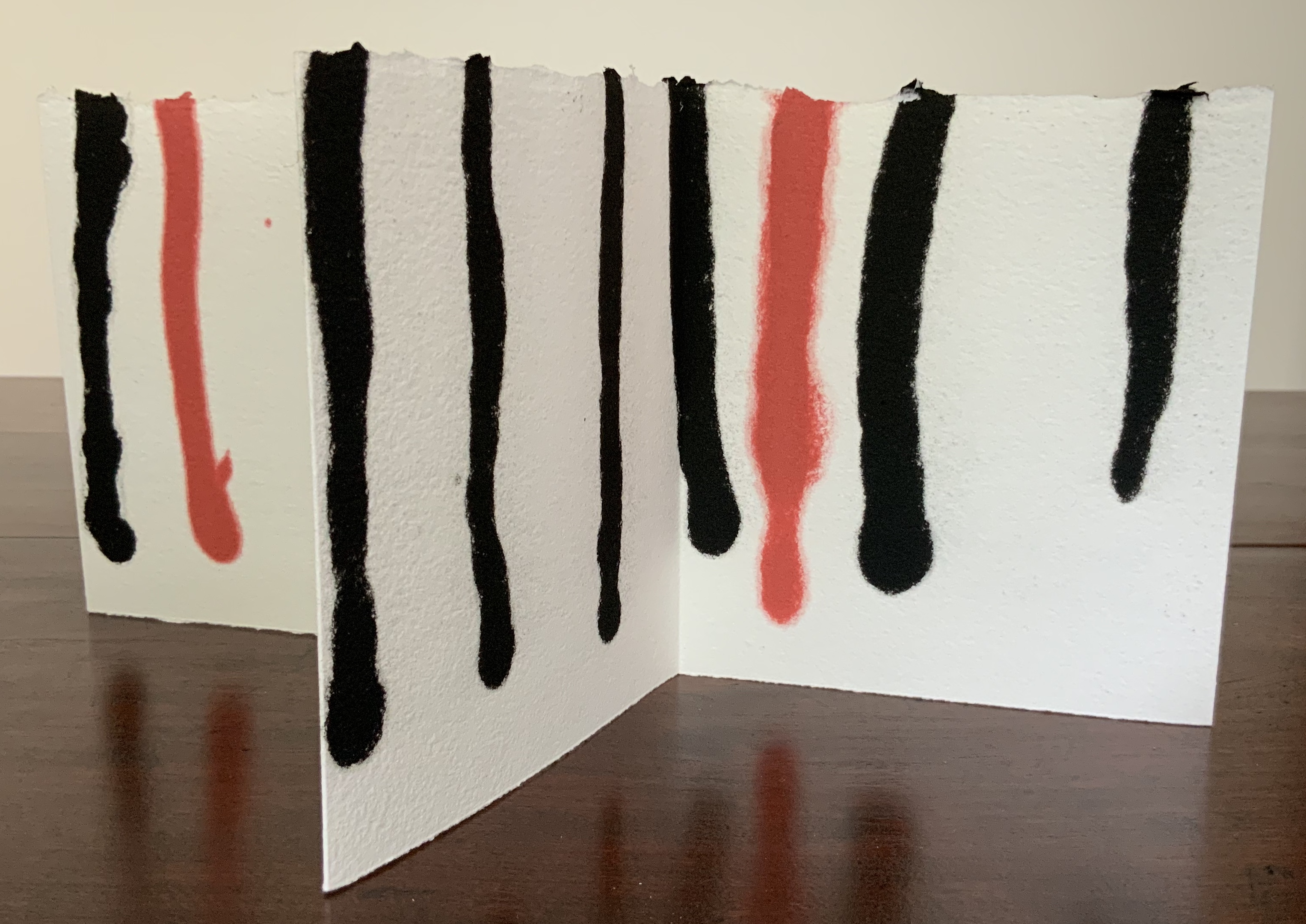
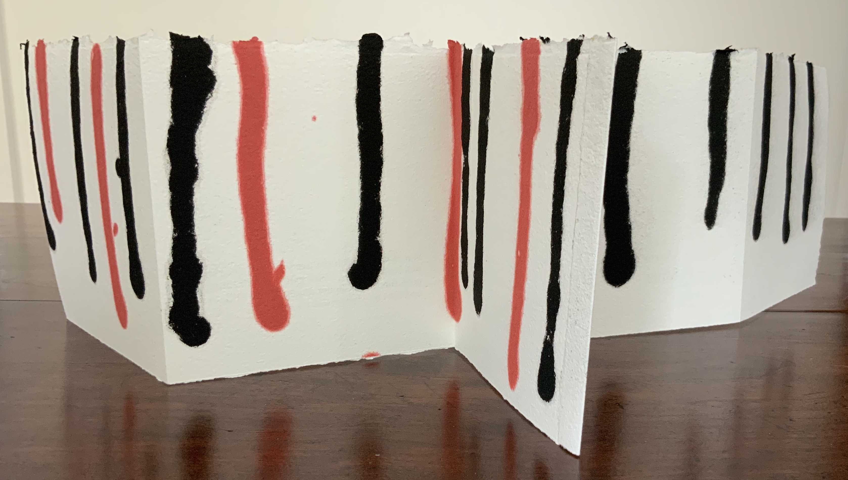
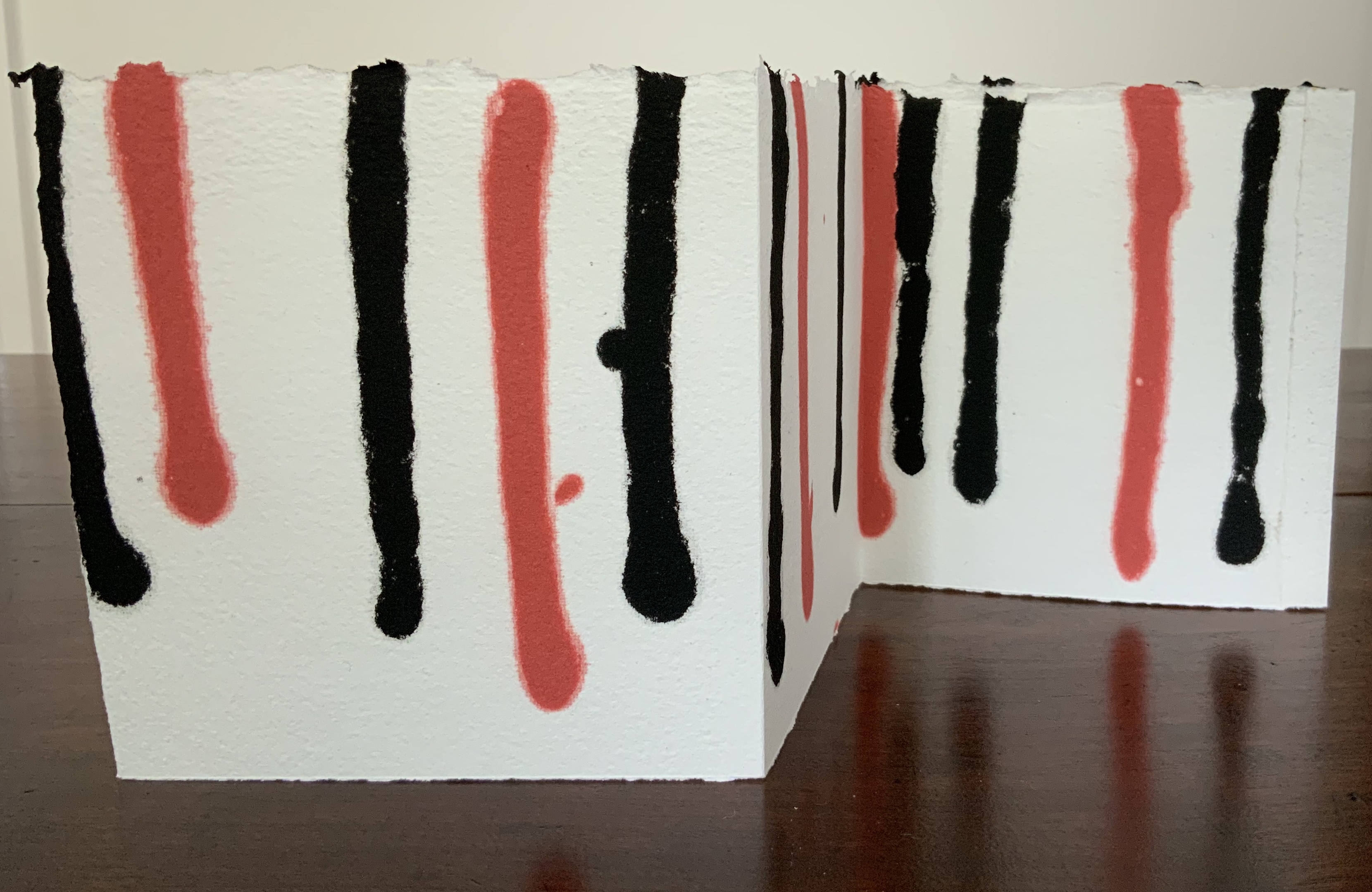
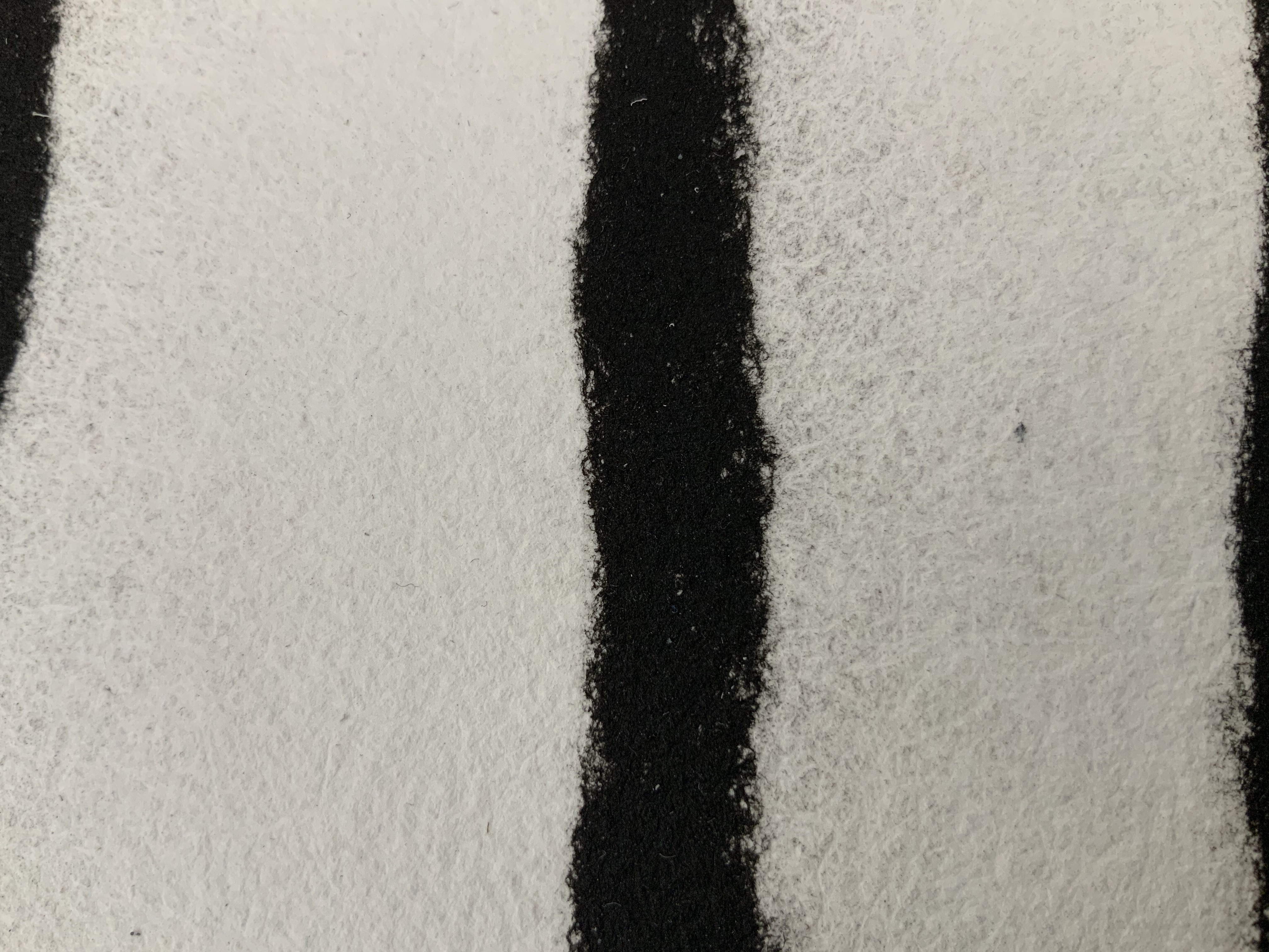
Leporello of two connected sheets of hand-made cotton and hemp paper, pulp-painted with red and black lines. H140 x W130 mm (unfolded approx. 770 mm). Unnumbered, signed edition of 25 copies. Acquired from the artist, 29 July 2020. Photos: Books On Books Collection.
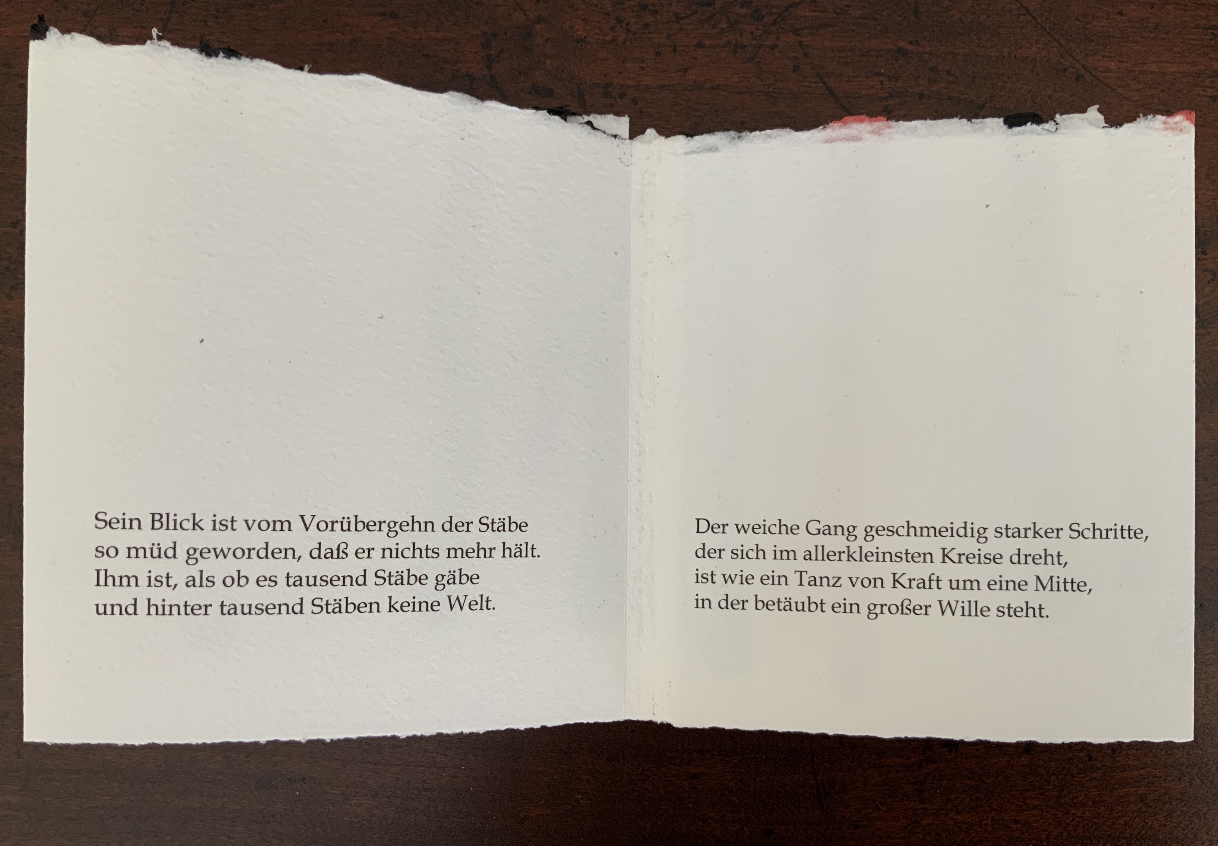
Rainer Maria Rilke’s poem “The Panther” embodies the tension that Gerard seems to love. Three stanzas in black 12 pt Book-Antiqua pace across the leporello like the panther behind what seem to him “a thousand bars”, which Gerard evokes in black and red pulp painting on the reverse of the leporello. Fully open, the torn top edge slopes and rises like the back and shoulders of the panther as it strides and turns in the smallest circle it can make. The bars behind, or in front of it, end above the lower edge in rounded shapes like the panther’s paws, whose texture the soft and rough handmade paper mimics.
The alternation of black and red pulp echoes the tension between the cage and panther’s heart in the poem, and the leporello opens and closes on the panther just as its own pupil’s nictitating membrane slides open, then closes on its world. Reportedly, at Augusta Rodin’s behest, Rilke stood before the animal’s cage in the Jardins des Plantes in Paris for nine hours. At the end of the poem, he has placed the reader/viewer inside the animal, absorbed the reader/viewer through the animal’s movement and gaze. Gerard’s artist booklet — by giving the reader/viewer a chance to see through the panther’s eyes — makes Rilke’s poem just as tangible as Rilke’s poem makes the panther and its world.
Gerard’s three works belong with the Books On Books Collection’s first seven books of the Rijswijk Biennial. His Alpha Beta even features in that series’ Papier op de vlucht = Paper takes flight (2006) and contributes to two of the collection’s sub themes: abecedaries as well as the technique of pulp painting. Seifenblasen and De Panther exemplify the sub theme of “reverse ekphrasis” represented by works such as Barbara Tetenbaum’s version of Michael Donaghy’s poem “Machine” or herman de vries’ argumentstellen 1968 / 2003 (de wittgenstein — tractatus — ) (2003). Gerard’s two works are, in fact, the epitome of transforming a literary text into an artwork.
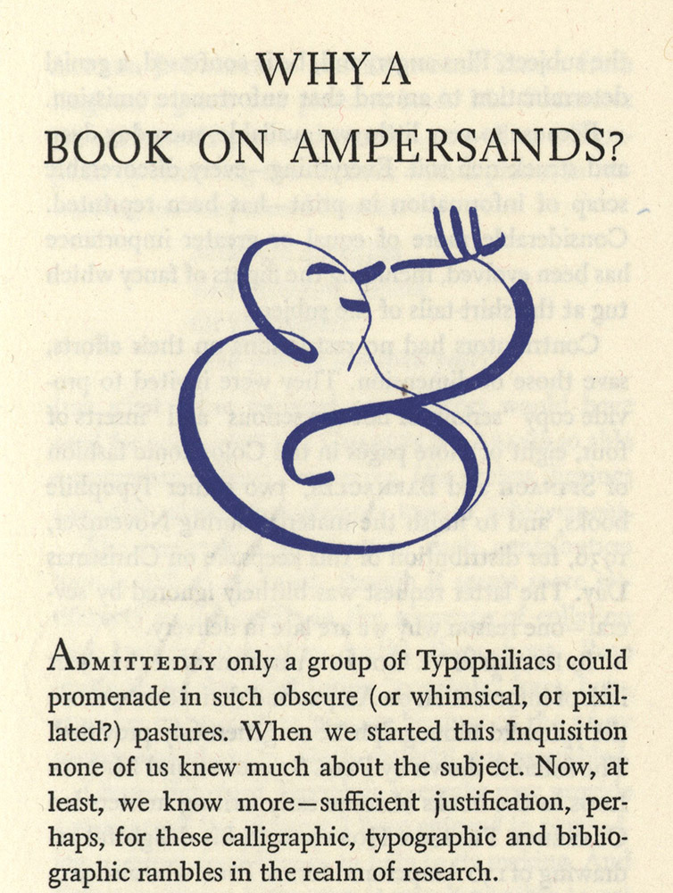
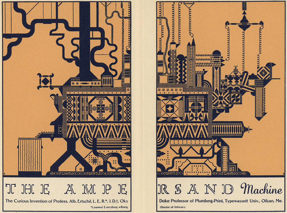
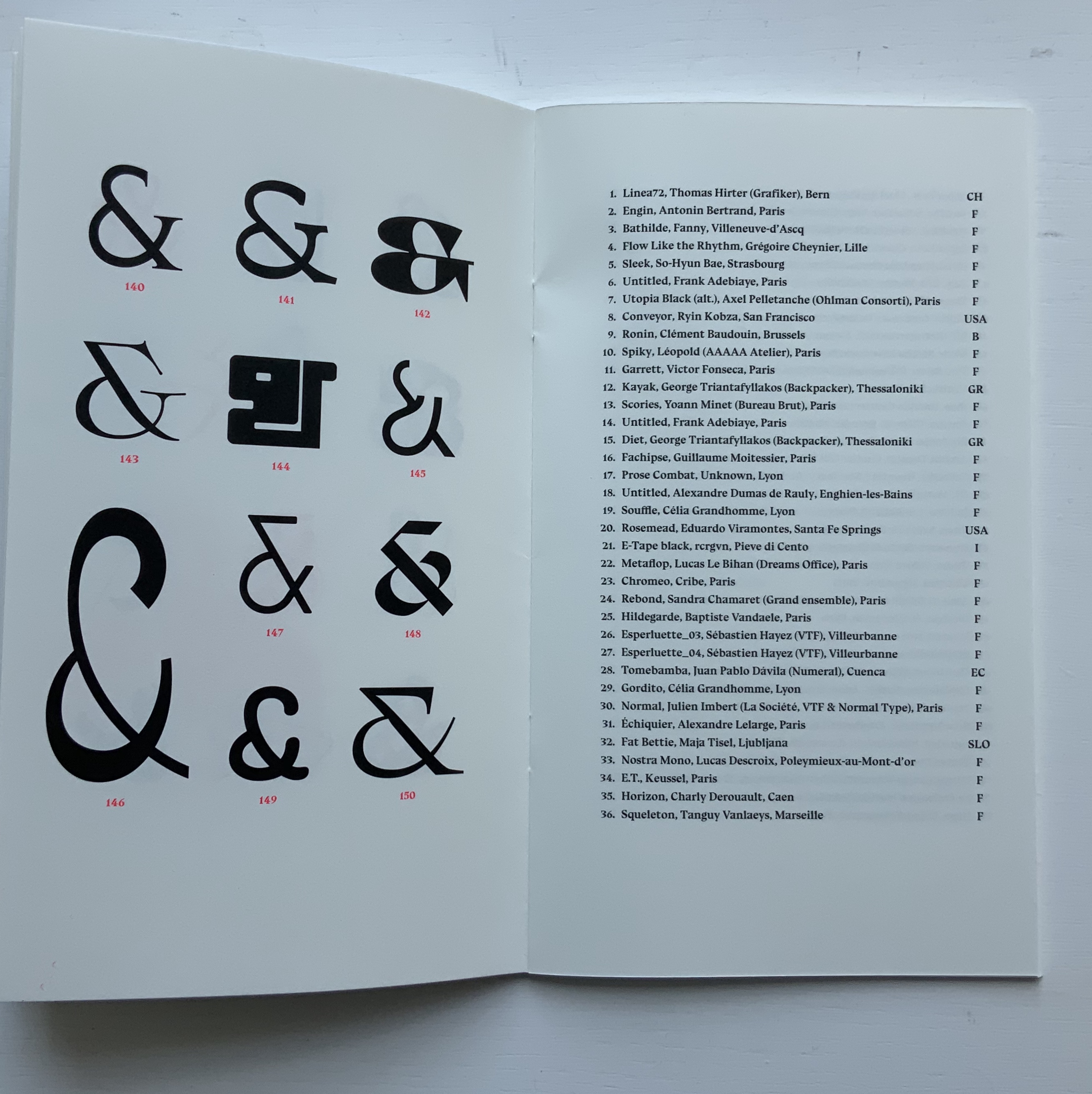
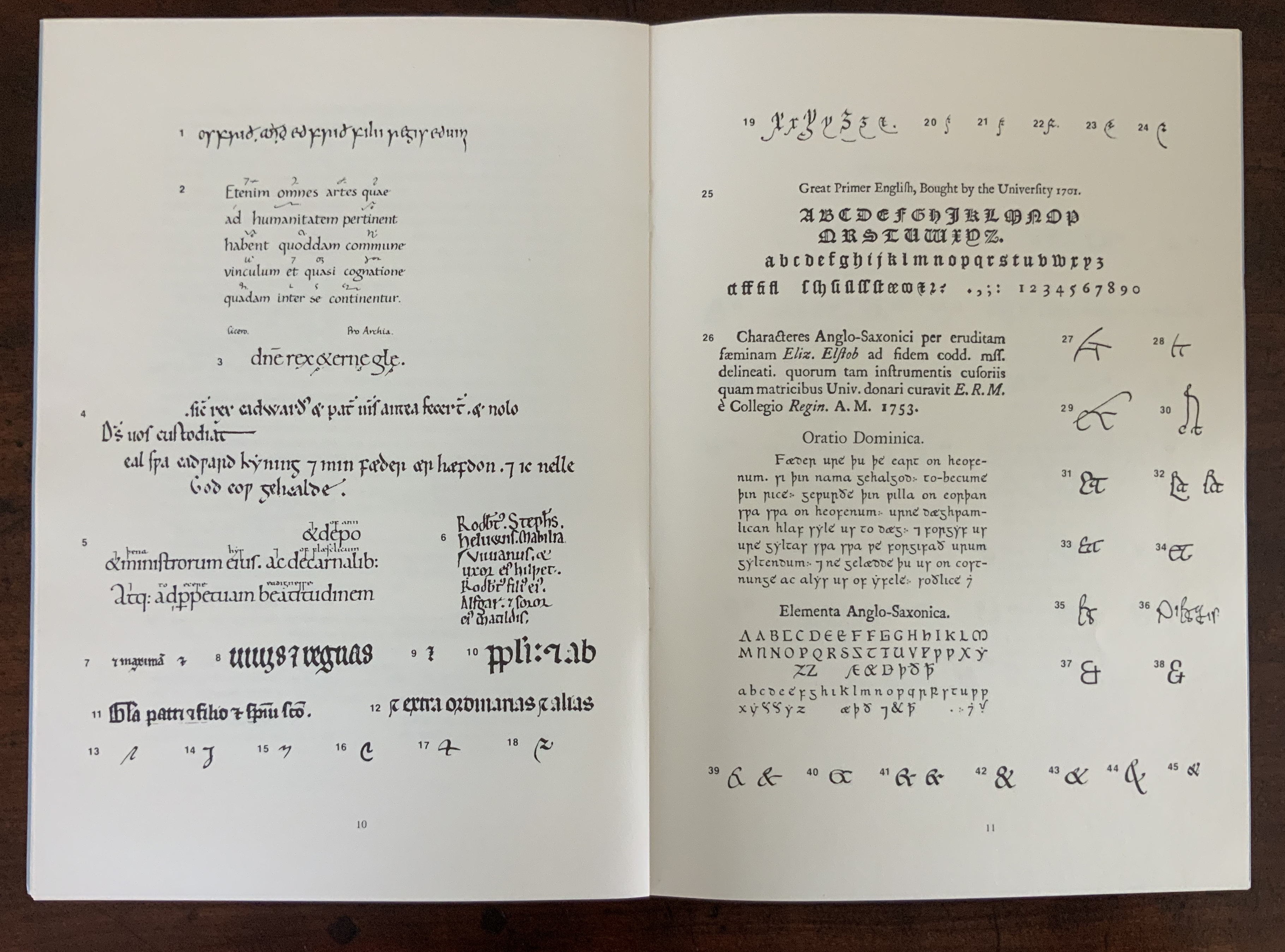
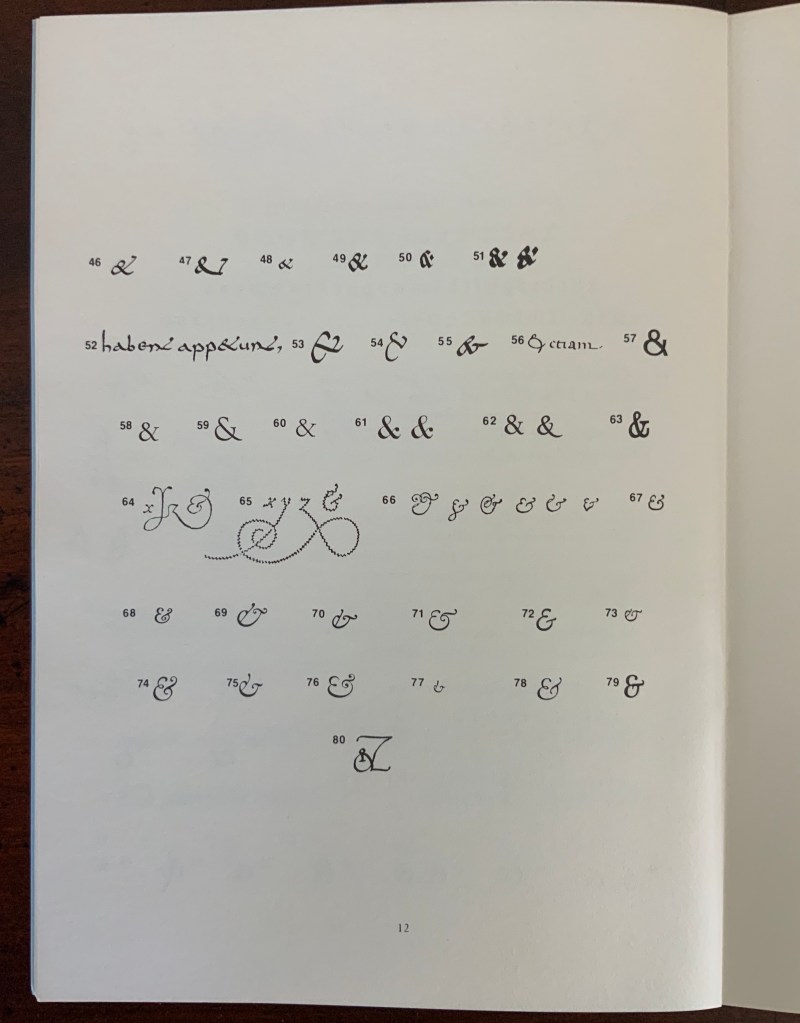
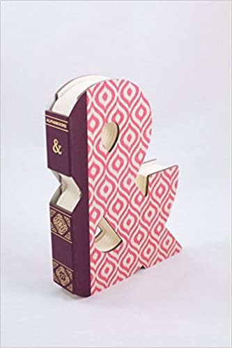
Isn’t it surprising that, given the greater frequency in human discourse of “yeah, but” over “yeah, and”, we can write “yeah, &”, but there is no logogram for “but”? No one can say that the last word has been said, written, printed or had about the ampersand. Someone will always be ready to append an & … but that has not stifled many an attempt. Apparently they have occurred every twenty years or so since 1936.
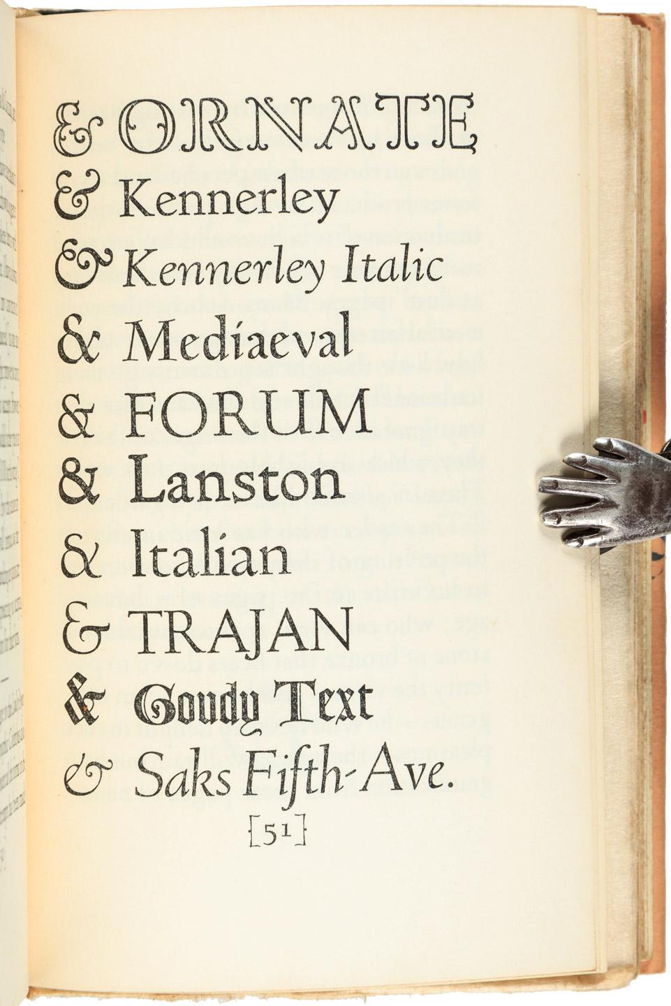
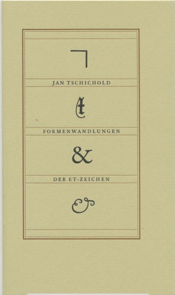
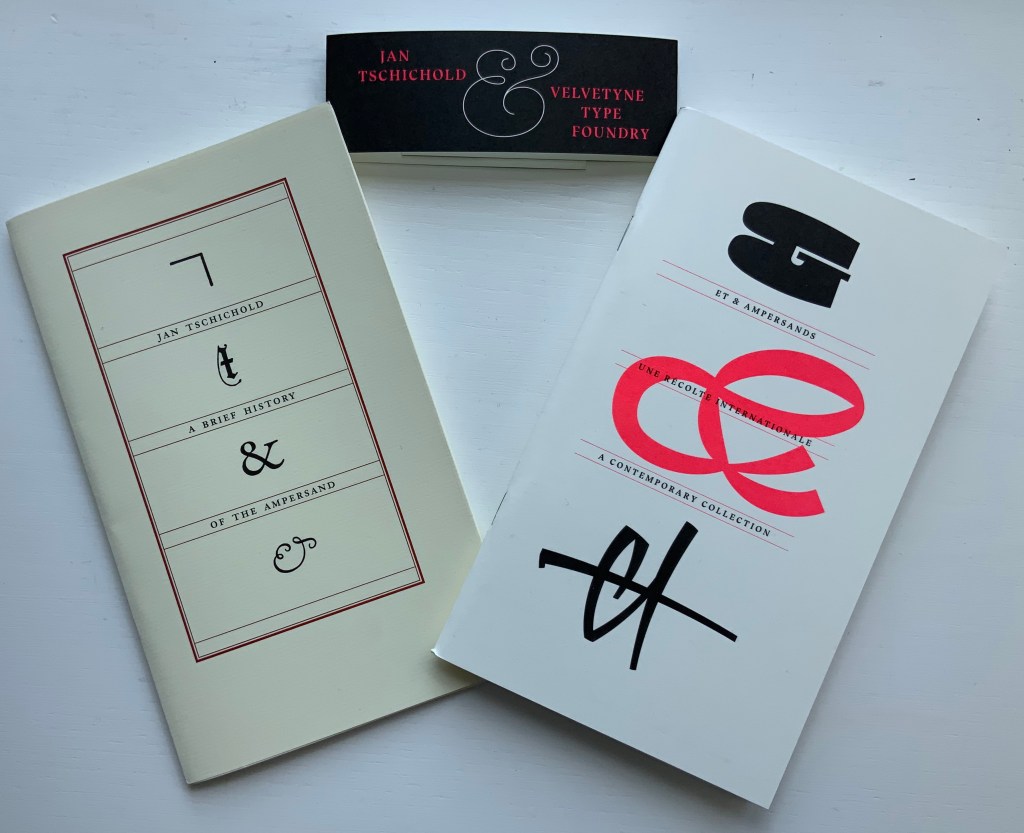
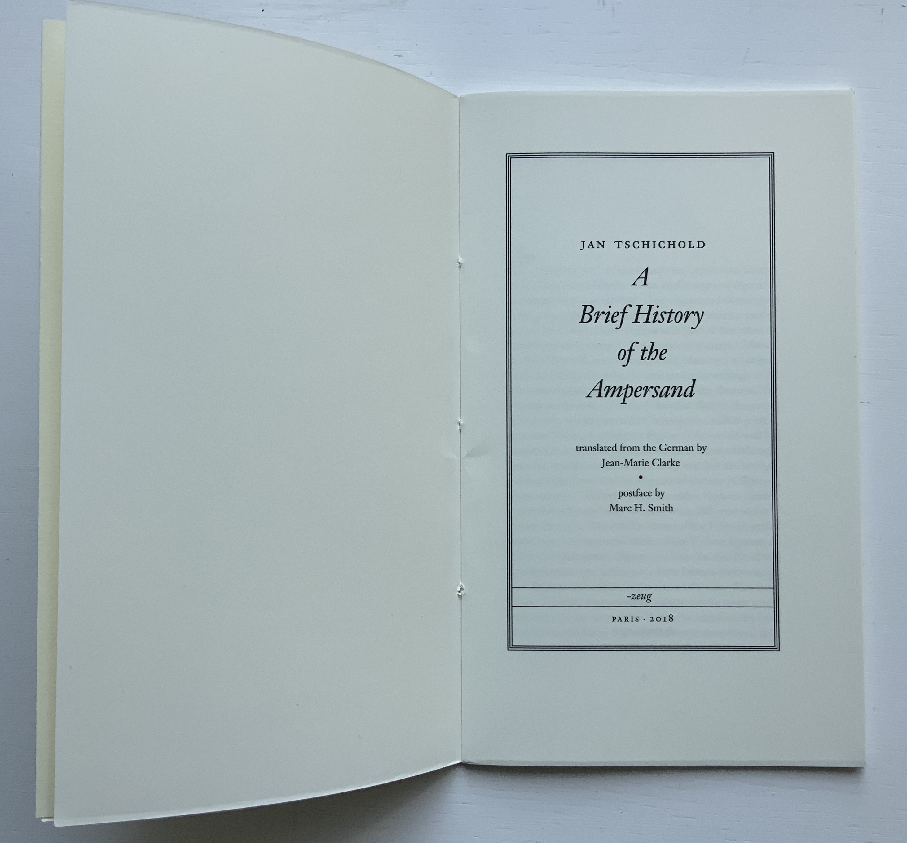
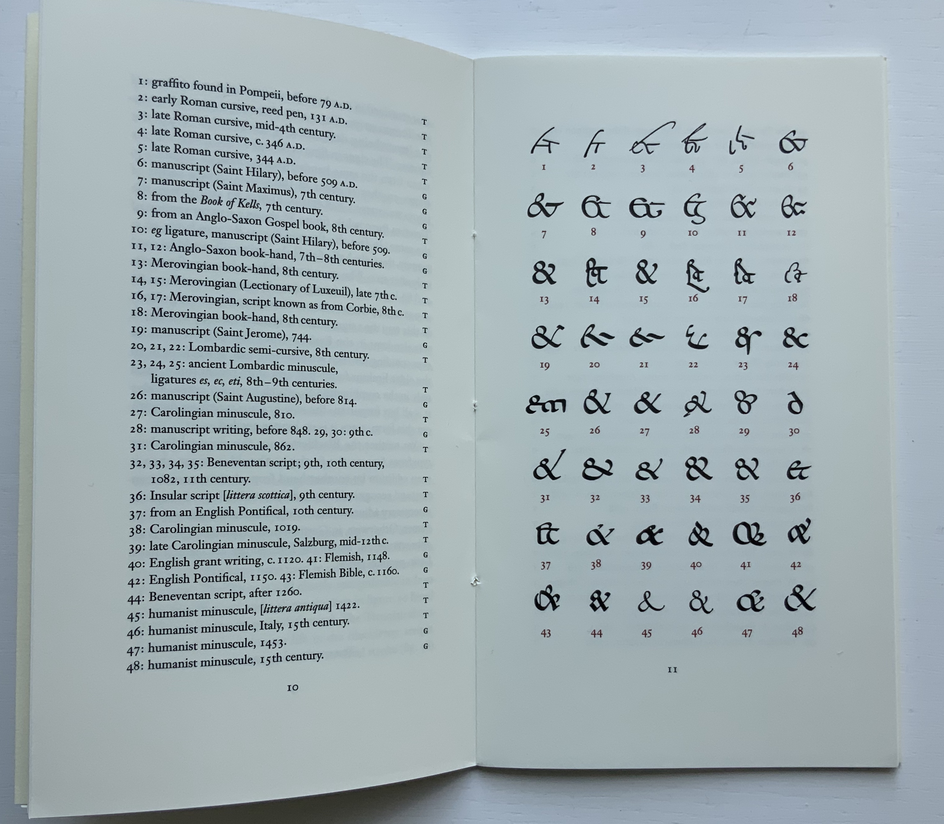
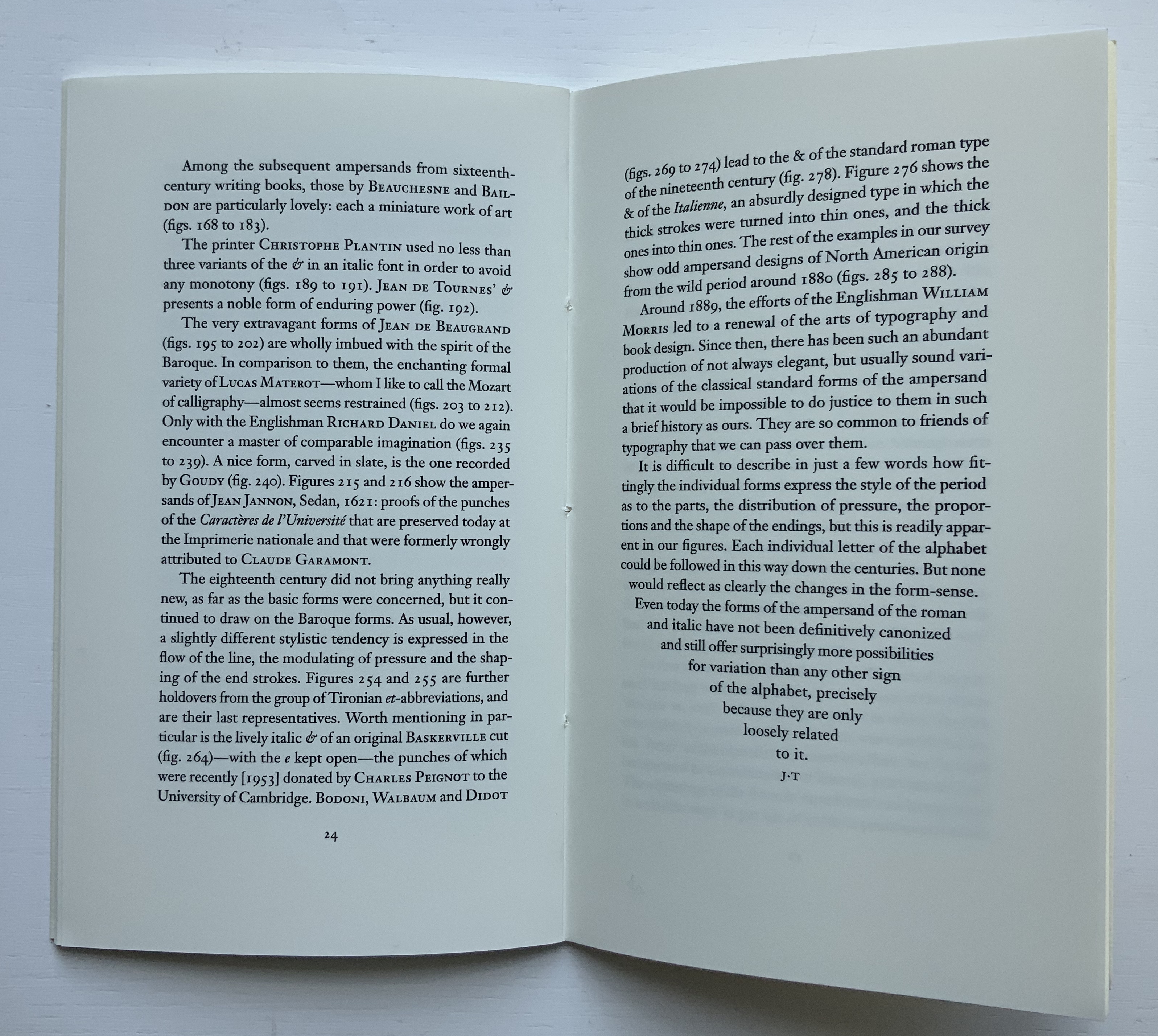
Some twenty years later along comes Jan Tschichold’s A Brief History of the Ampersand (1957), initially in German in 1953), which reproduced and updated Goudy’s set of examples and deepened the scholarship on the subject.
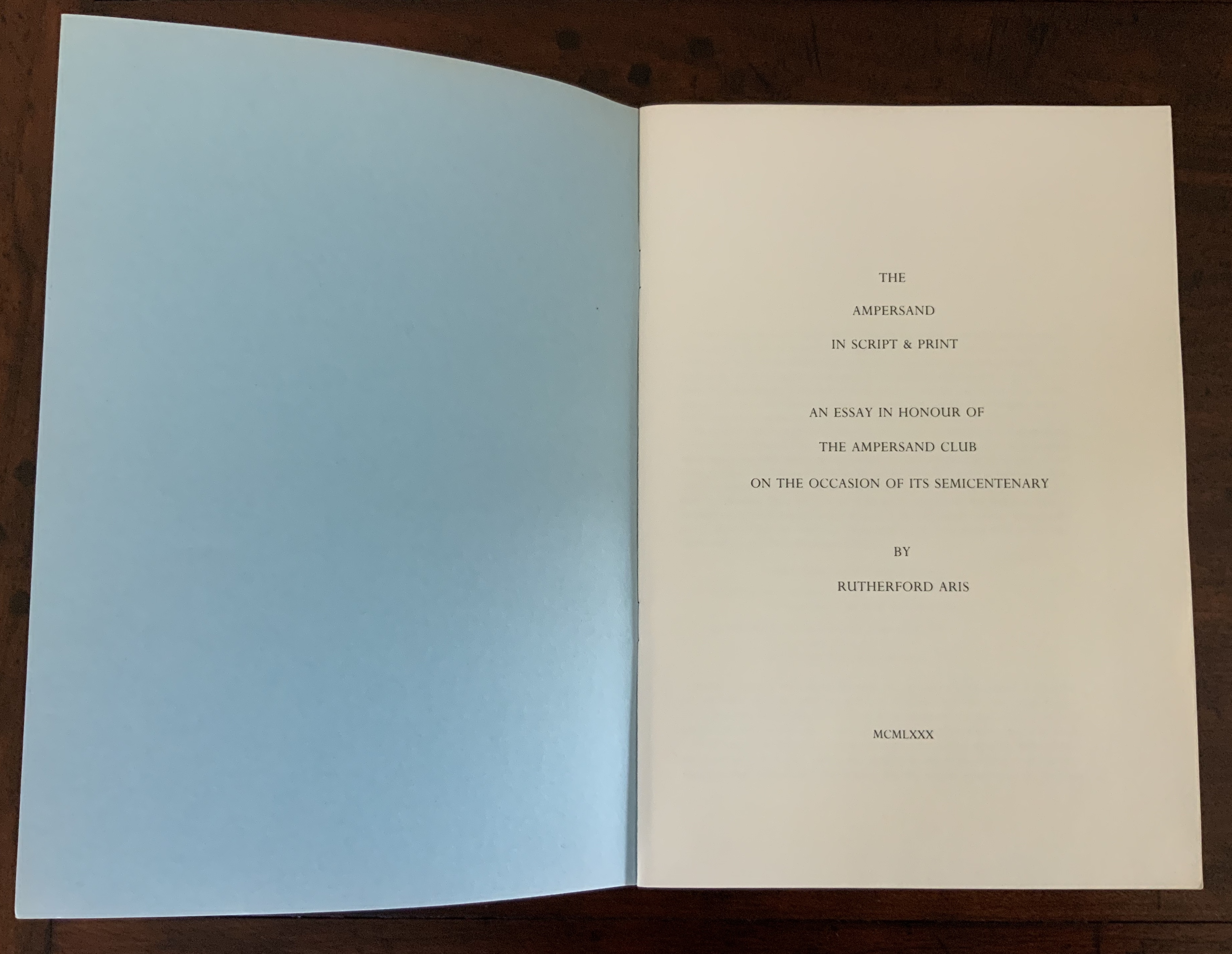
After Tschichold’s “last word”, The Ampersand Club (yes, there is one) invited one of its distinguished members — Rutherford Aris, Professor of Chemical Engineering (and Classics!) at the University of Minnesota — to attempt another “last word” in 1980.
While there are a few publications falling around 1999/2000, nothing approaches the colophonic status of the Typophiles’, Tschichold’s or the Ampersanders’ efforts. It’s not as if ampersand aficionados were running out of &s. Consider Robert Slimbach’s Poetica™️ (1992), his family of type that boasts 62 different ampersands.
Robert Slimbach’s 62 ampersands in the Poetica™️ family
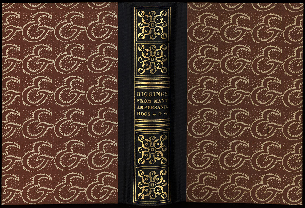
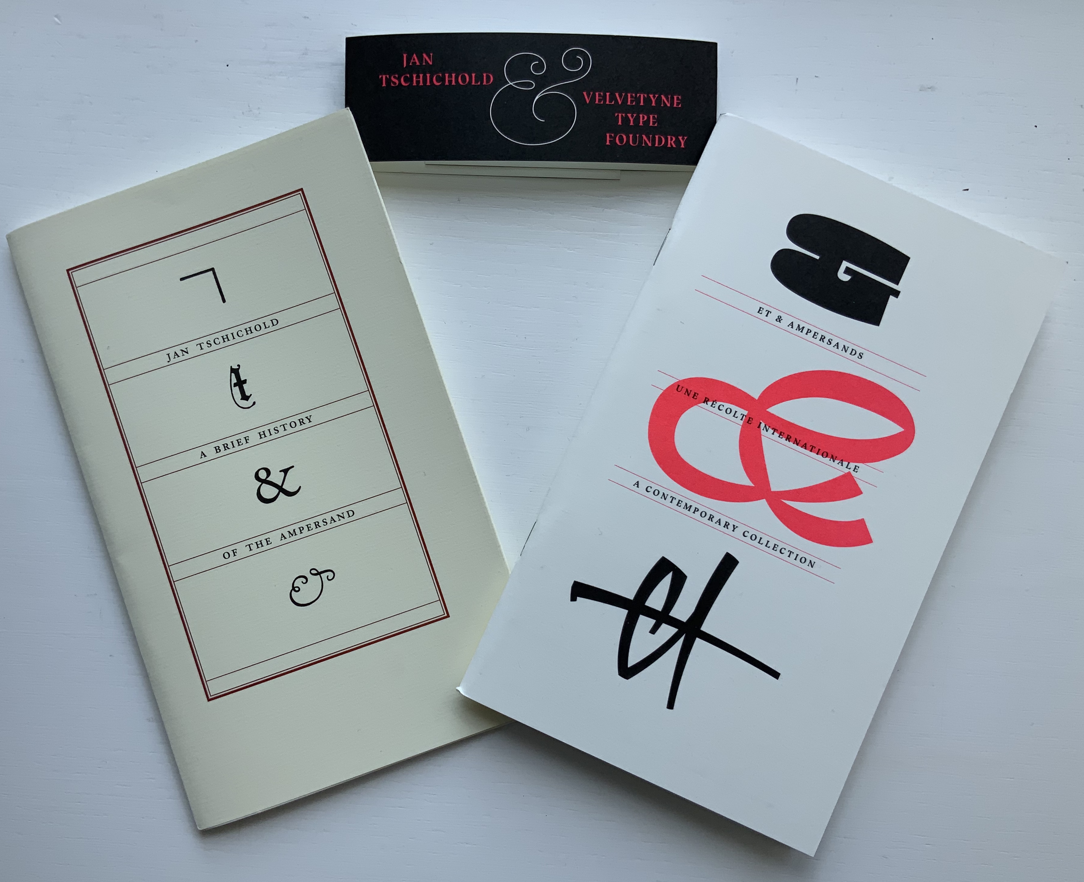
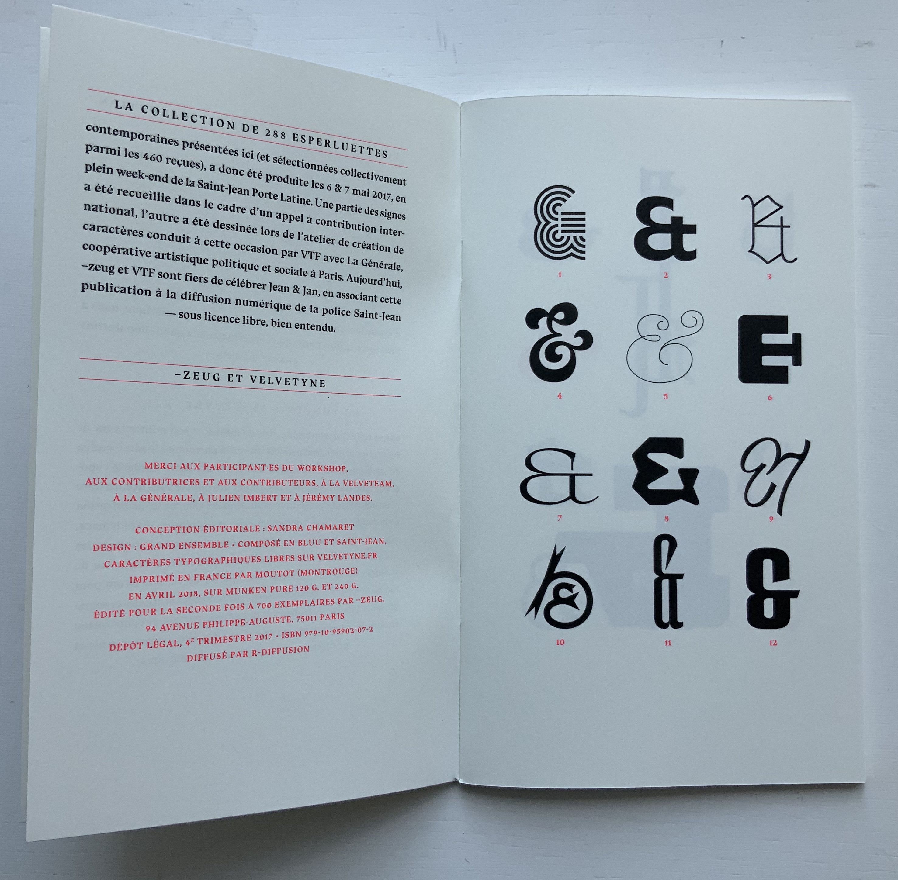
Jumping the gun on 2020, we have both the 2018 reissued edition of Tschichold’s “last word” on the subject and Ray Czapkowski‘s 2019 celebration of the Diggings of Many Ampersandhogs. It is somewhat fitting that the publisher of the reissue of Tschichold is named ~zeug, which is the German suffix appended to a verb to indicate the instrument for carrying out the verb’s activity — e.g., Spielen (to play), Spielzeug (toy). And entirely fitting, too, that ~zeug could not resist the urge to make up a deluxe version by adding Et & Ampersands: A Contemporary Collection to Tschichold’s A Brief History.
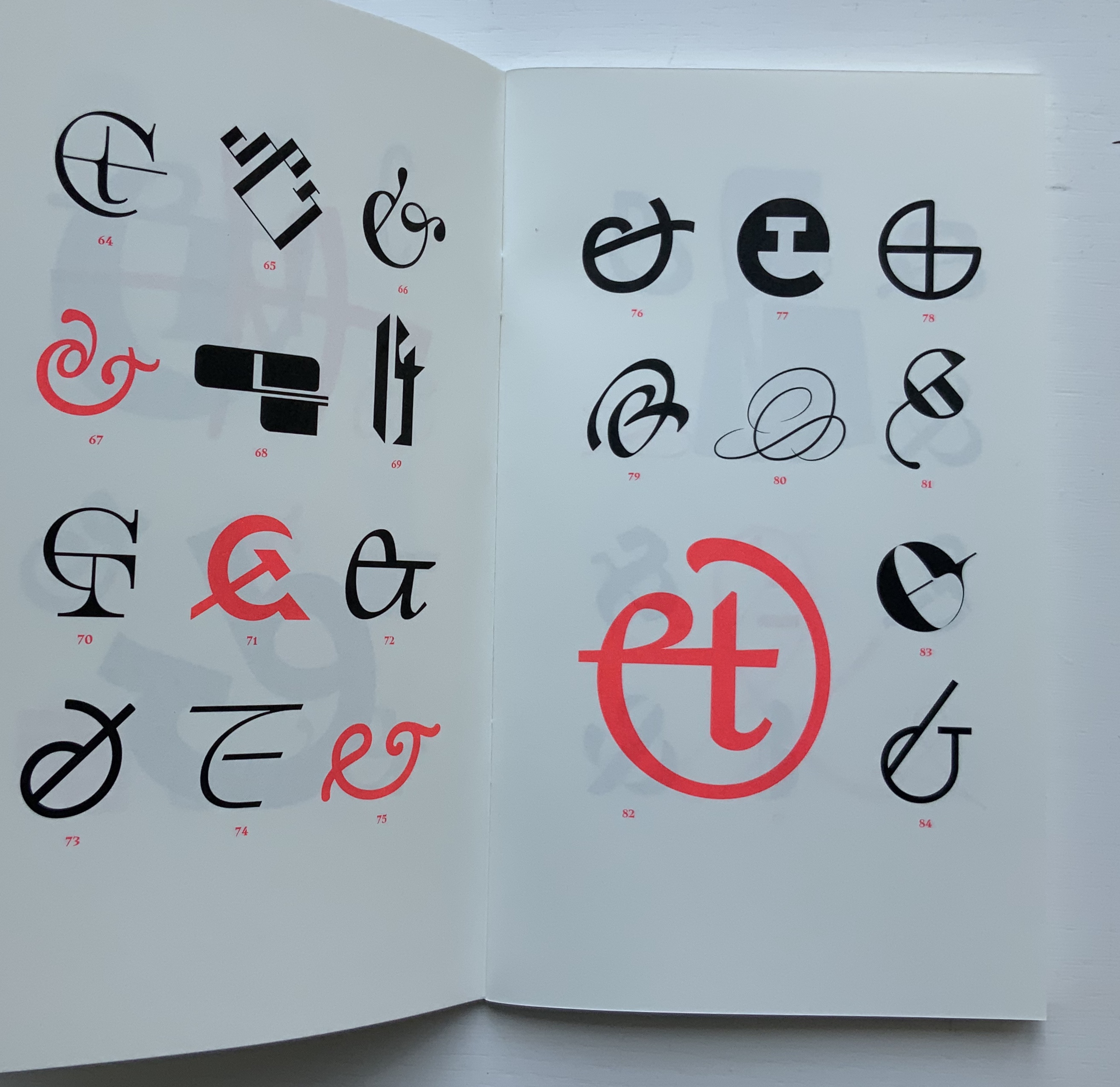
By definition, the Velvetyne/~zeug catalogue is not a last word, and its cataloging of newly designed ampersands attests to the ongoing “and-ness” of letter design, which brings us to the first item in this sub-collection within Books On Books …
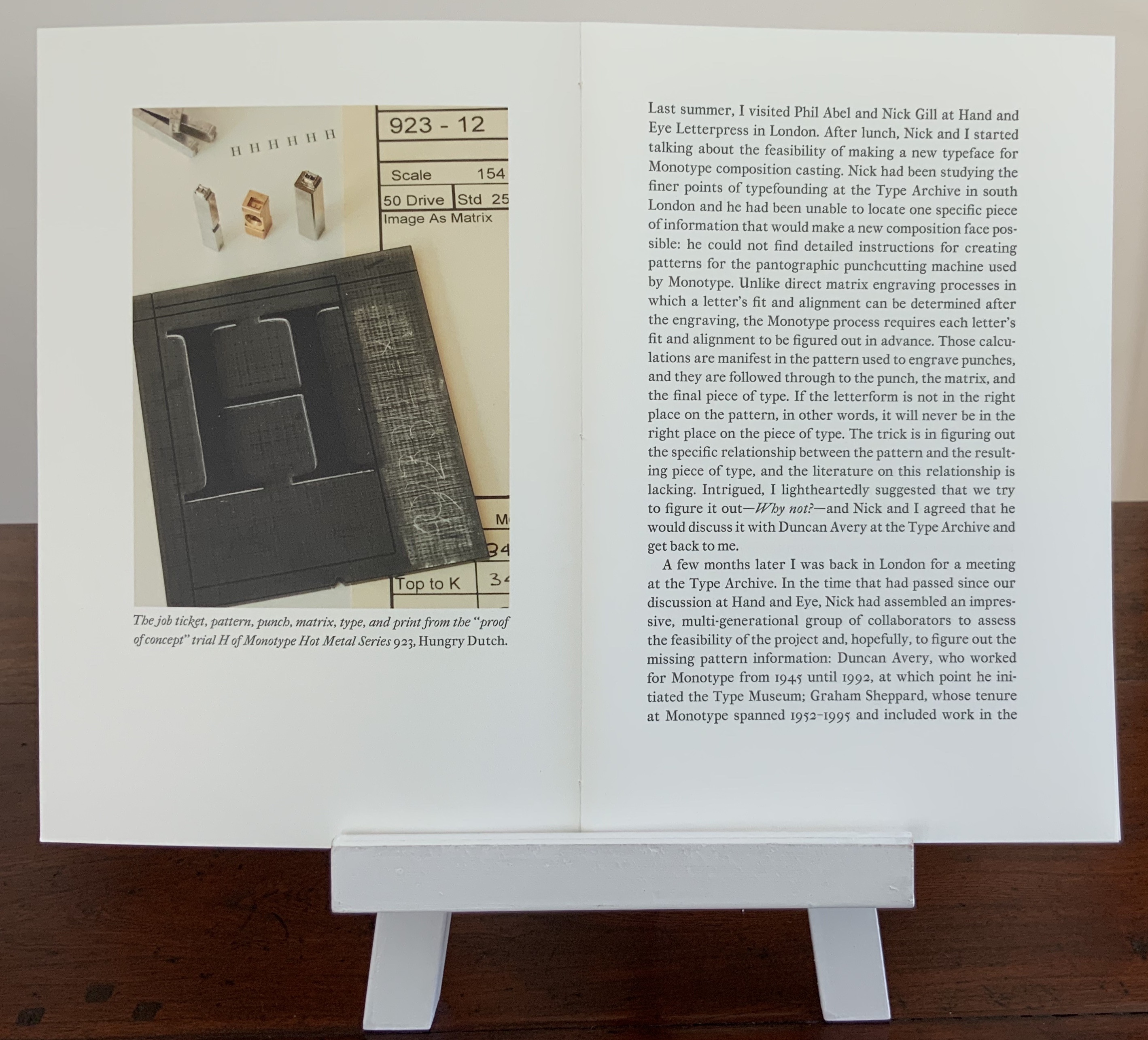
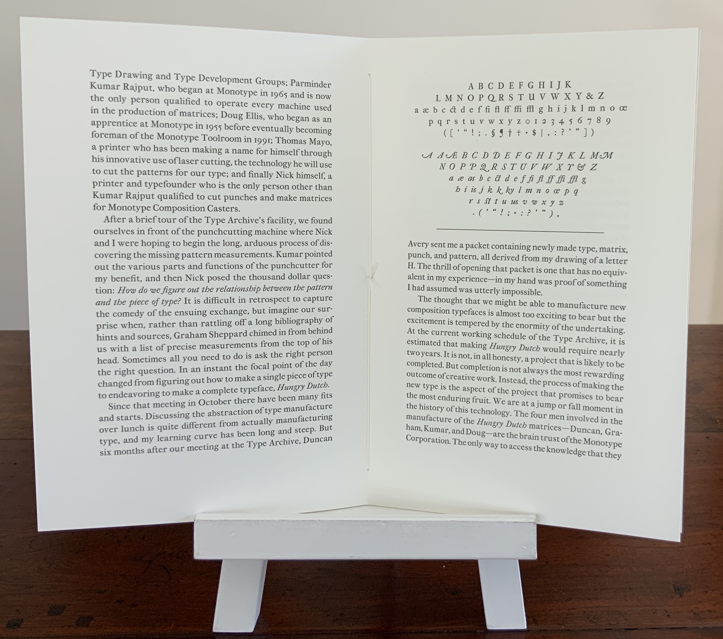
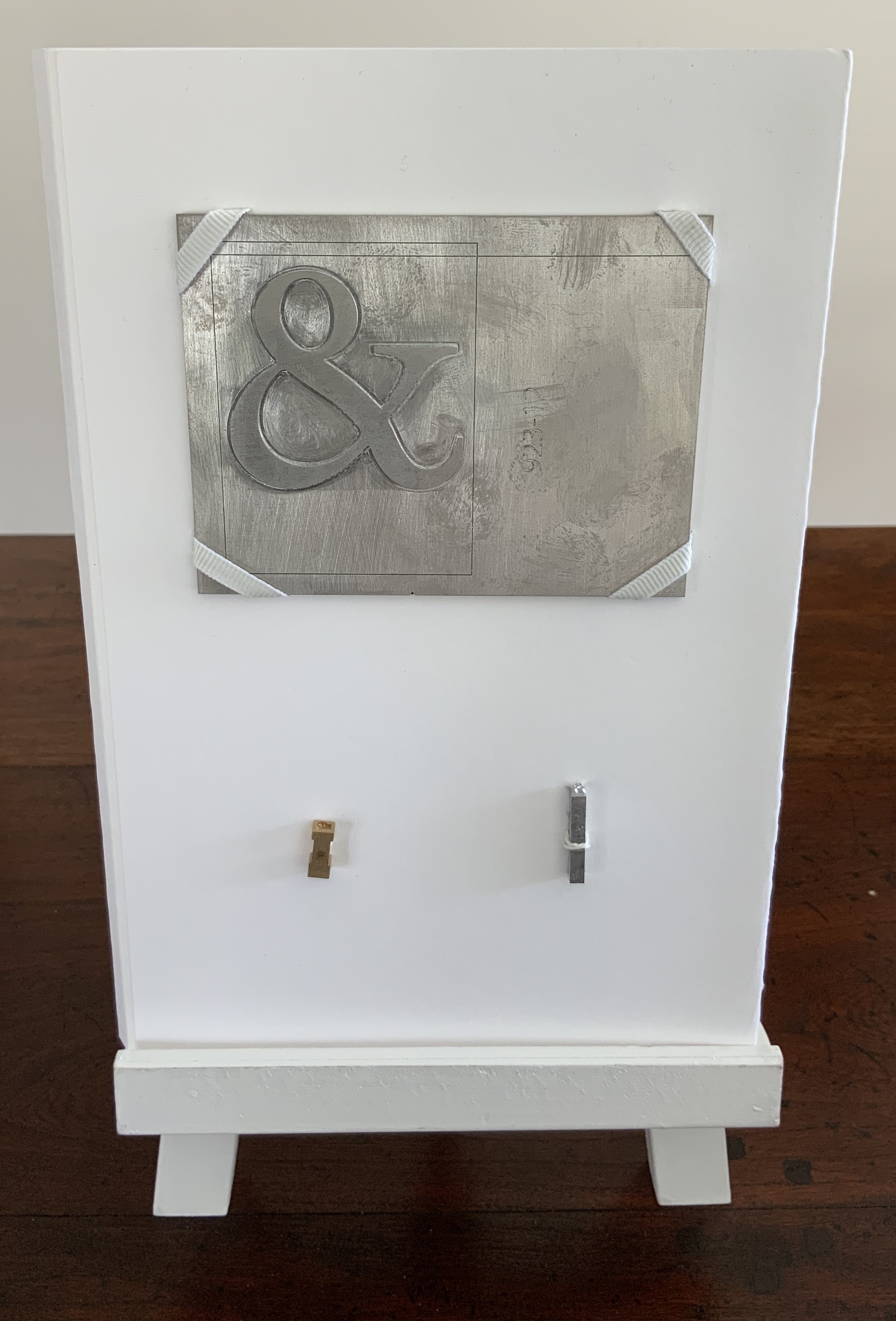
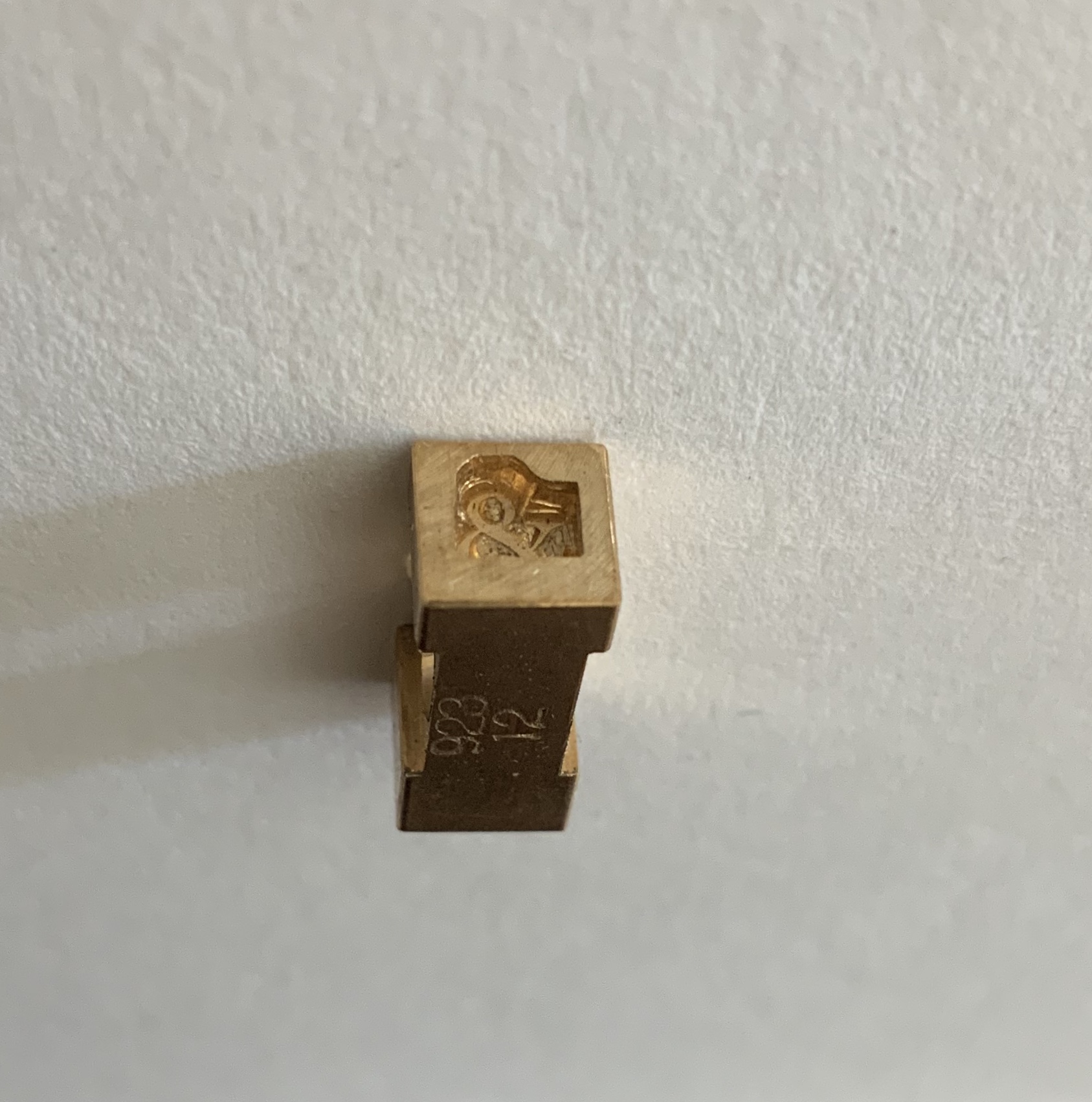
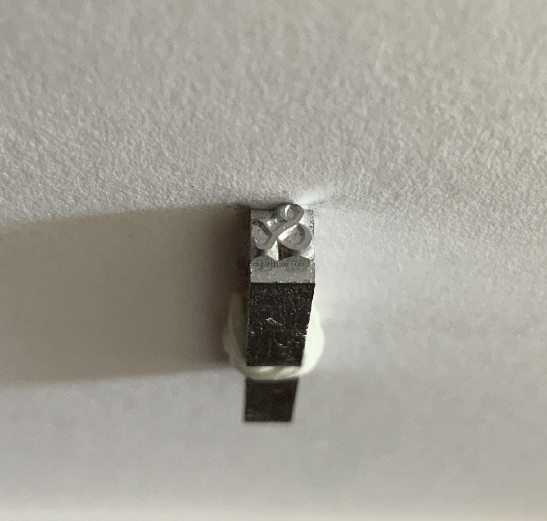
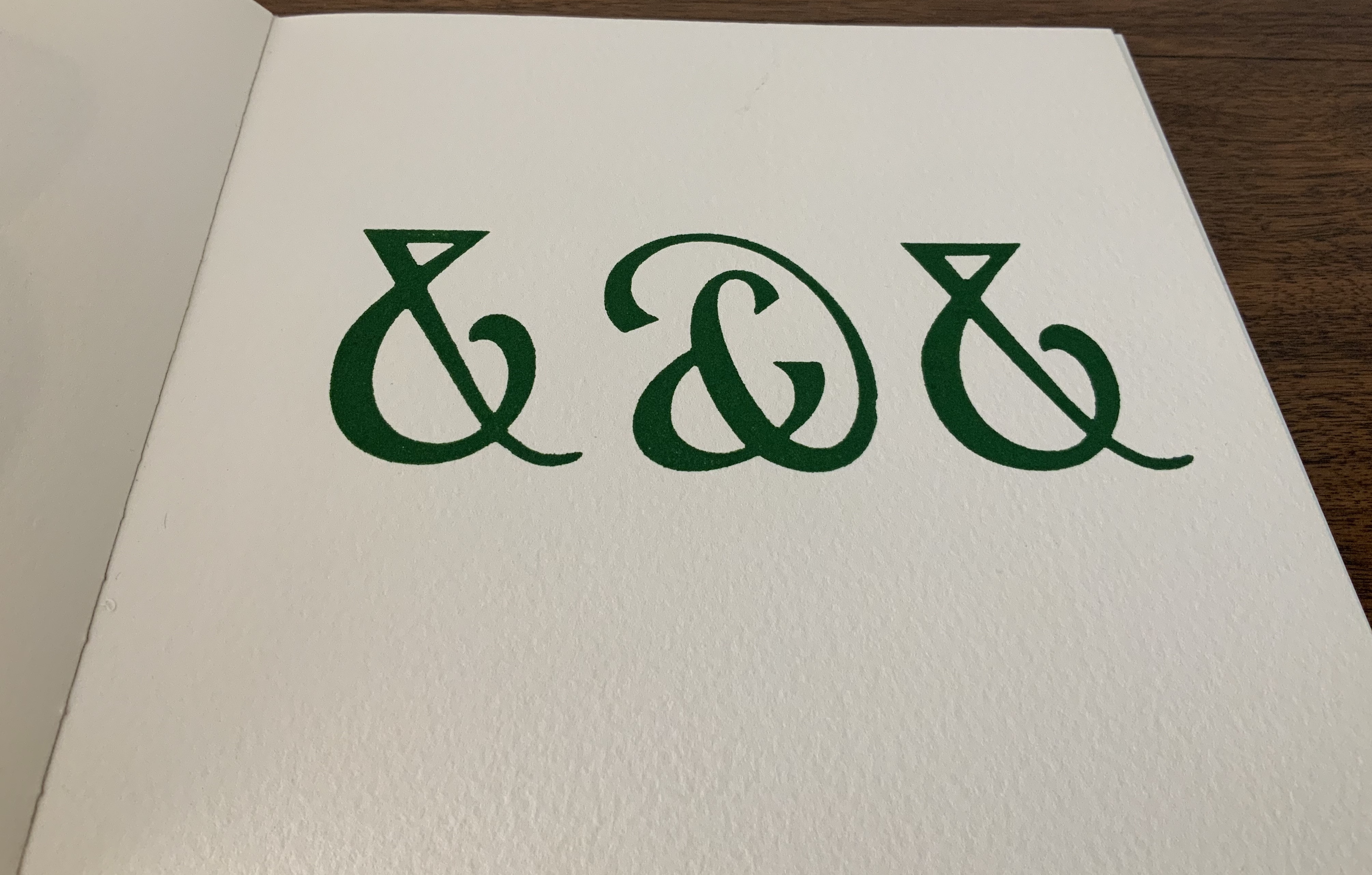
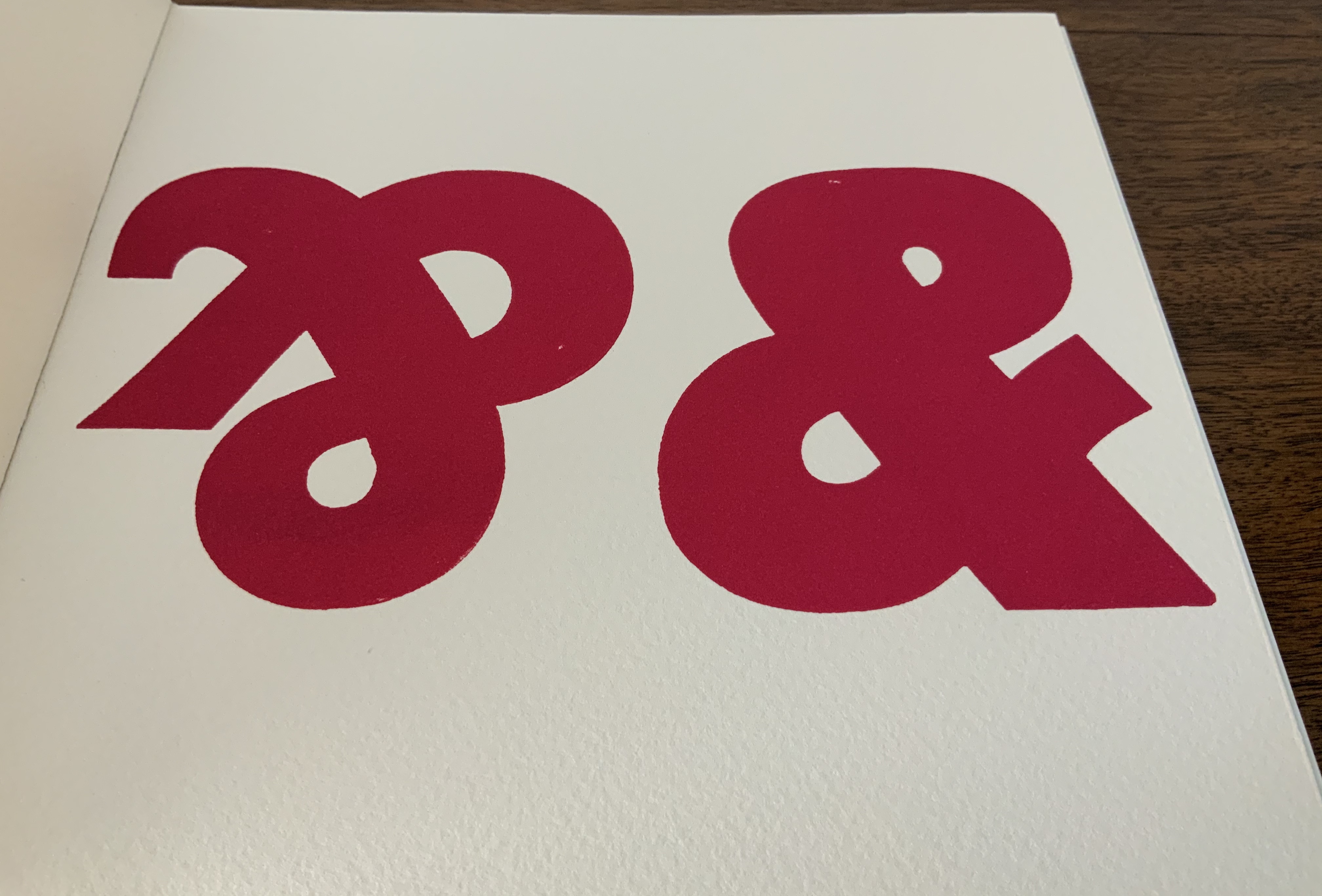
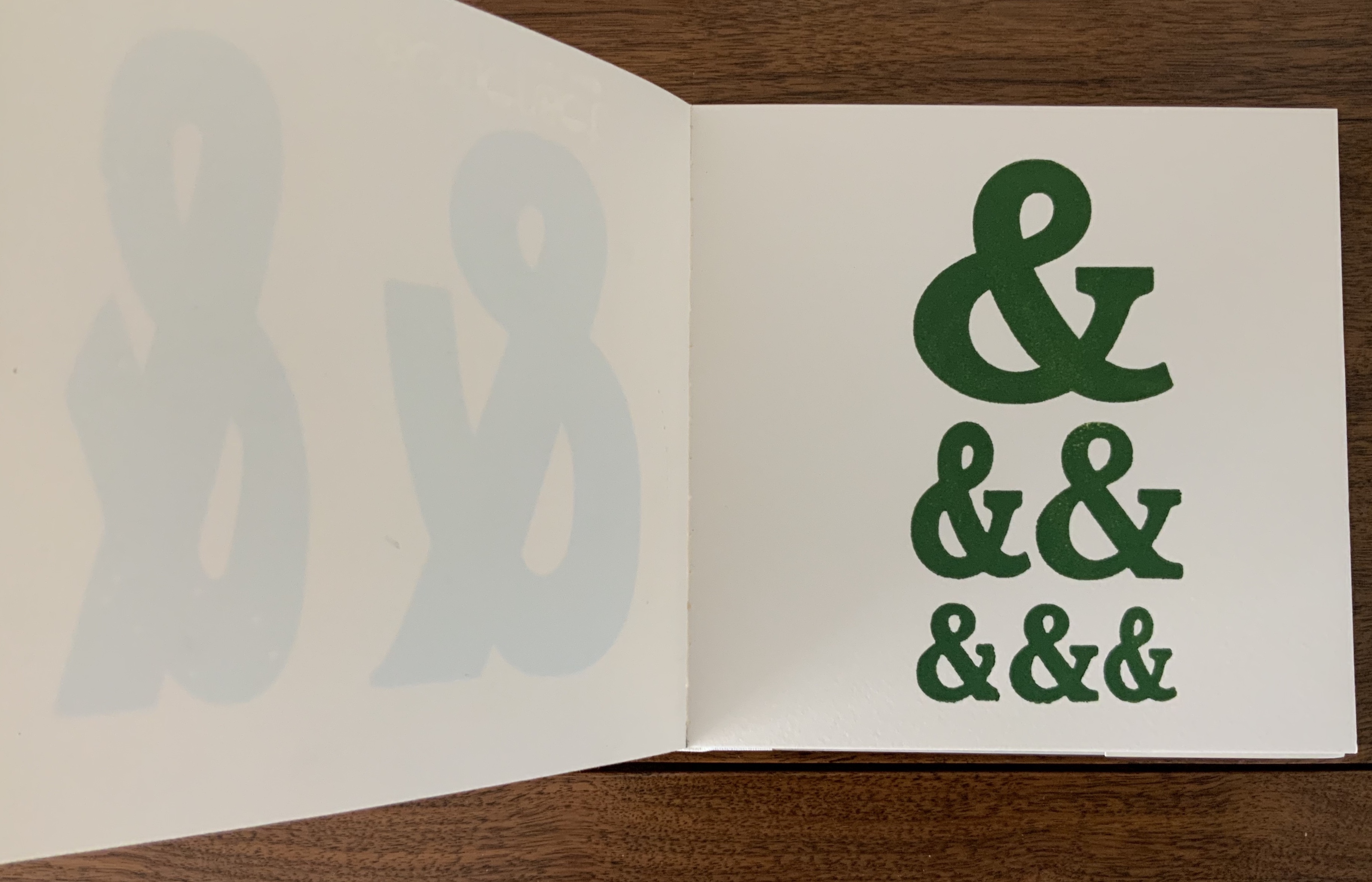
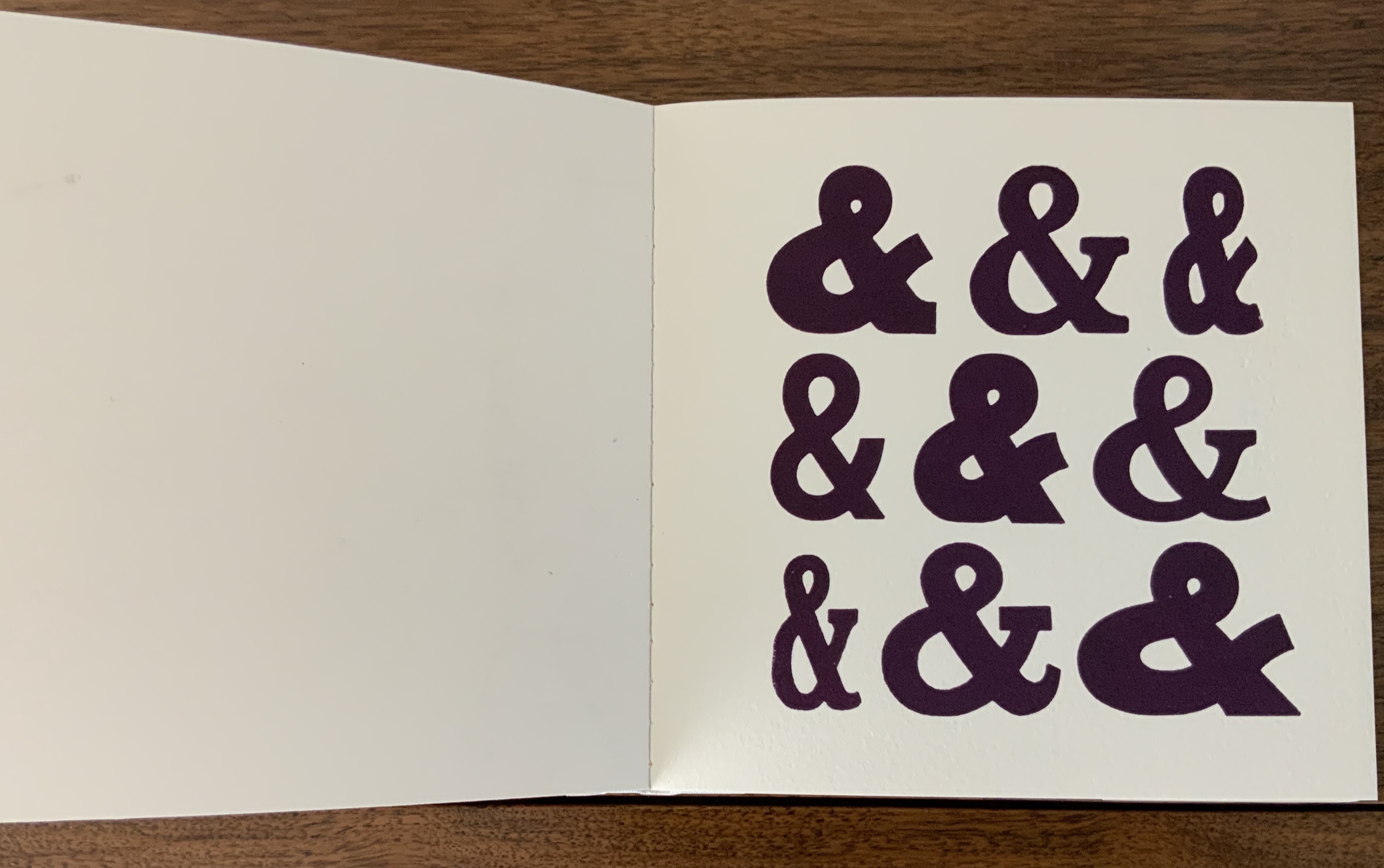
Maret’s pattern, matrix and punch for the Hungry Dutch ampersand came into the collection in 2020 as recognition of Books On Books’ contributing sponsorship of the design and manufacture of the typeface.
The endnoting to the pages displaying the numbered ampersands suits the publication of this scholarly “after-dinner” speech, which has one rocking back & forth between typographical puns and paleographical insights.
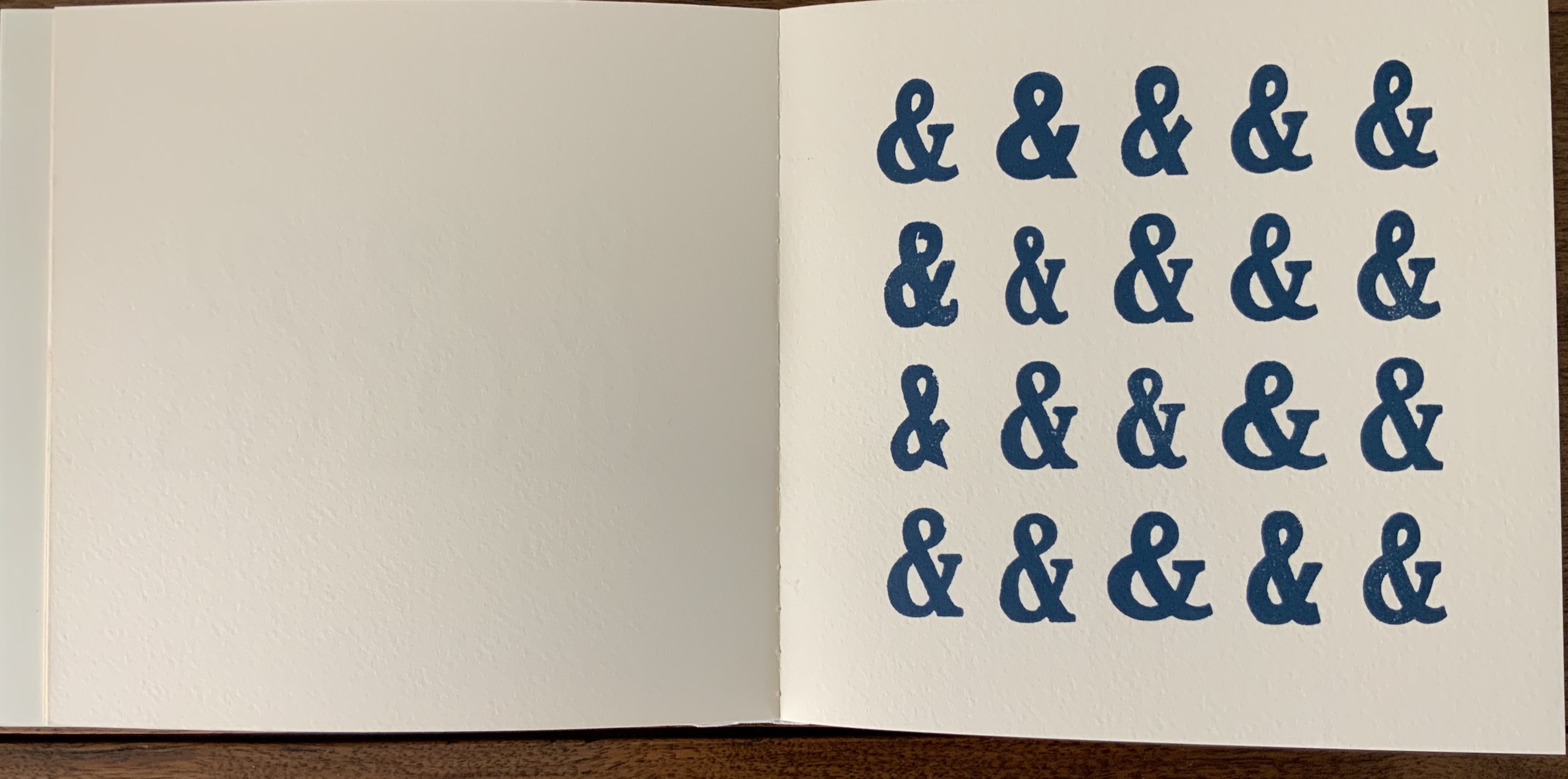
Board covers with a Caslon paper wrapper, cased over eleven linen-taped handsewn leaves of Somerset 300gsm, eleven images printed on a Vandercook proofing press. H175 x W180 mm. Acquired from the artist, 5 May 2020.
Printers have affection for the ampersand, not just because of its usefulness in shortening lines and in embellishing spaces, but also, I believe, because of its uniquely human shape; in one stroke it describes us, becomes a human pictogram. Placed together, ampersands appear endlessly various and take on human characteristics of slovenliness, arrogance, timidity and flamboyance. Ben Shahn said that the letters of the alphabet have an “austere dignity”, the ampersand in woodblock form, by contrast, is avuncular and buoyant. The book is a small celebration of the alphabet’s twenty-seventh letter and of design improvisation and characterisation within one simple symbolic form. It’s hard to identify all the fonts used as many wooden fonts are local variations of standard faces but the book includes Cheltenham, Windsor, Gill, Grotesque and Caslon as well as some ampersands hand cut for this production. The text on the final page is hand set in Albertus. — Information provided by the artist.
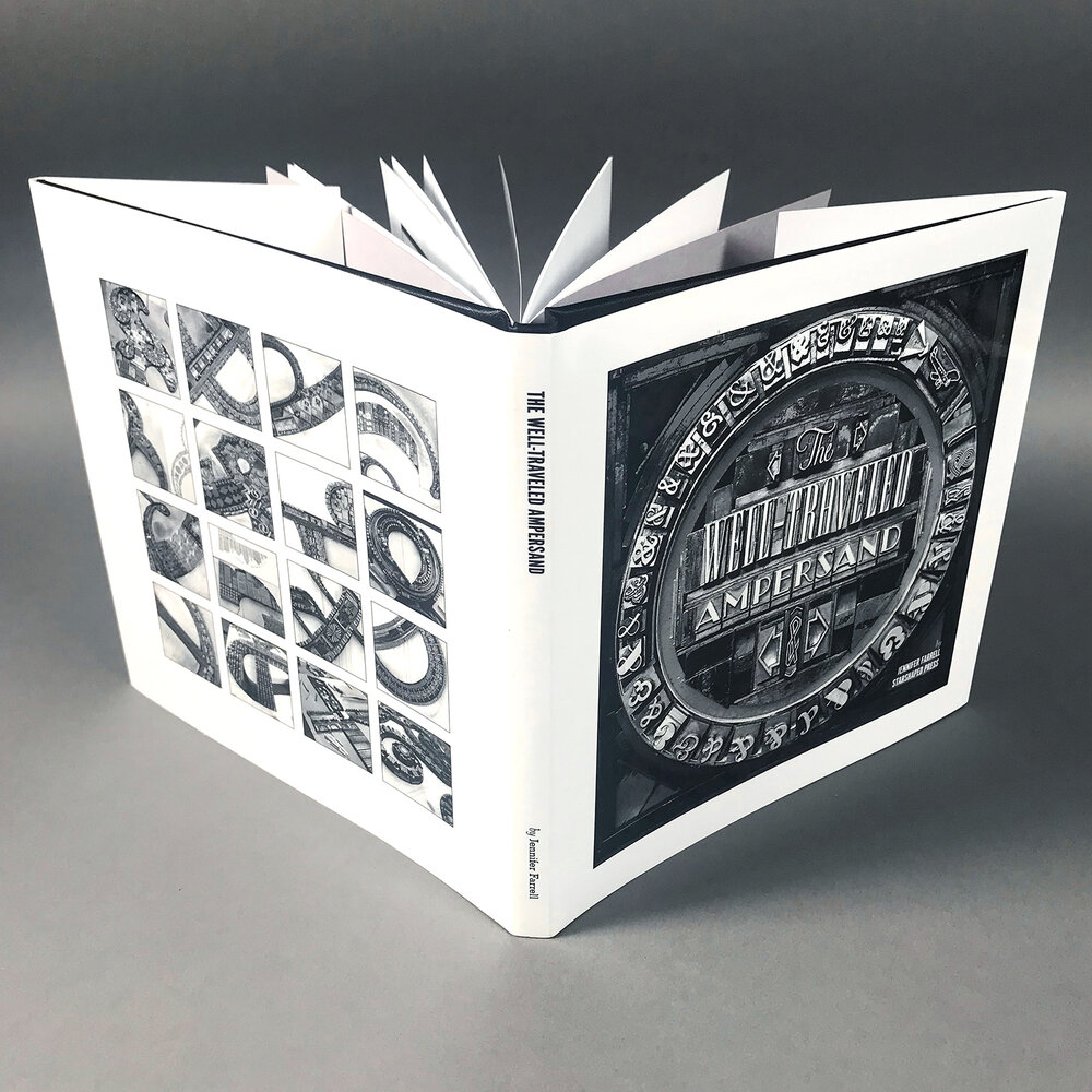
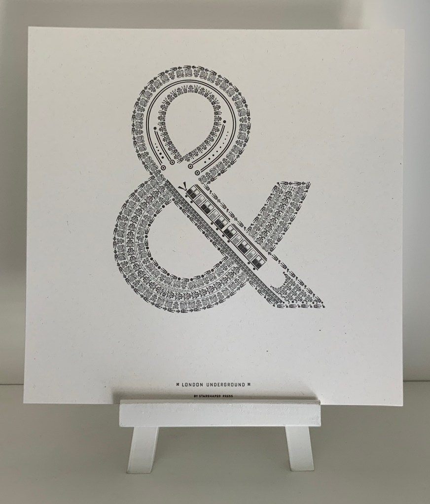
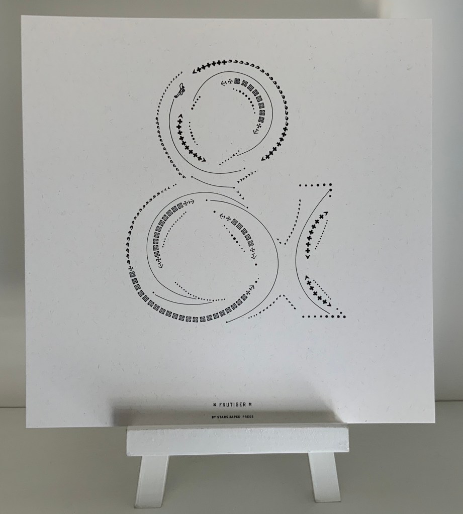
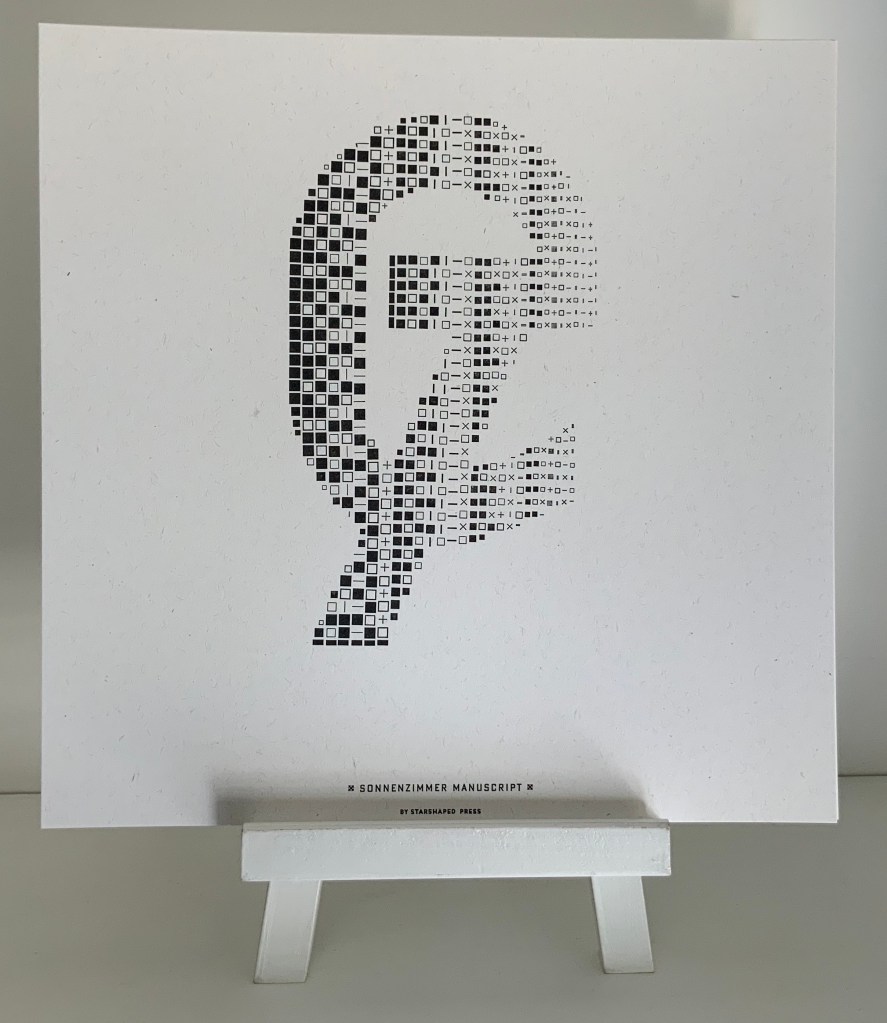
Book: Dustjacket and case over perfect binding of 34 pages, offset, multiple edition. 178 x 178 mm. Portfolio: Sleeve of gray French Kraftone encasing 16 prints on white French Kraftone. 305 x 305 mm. Edition of 50, of which this is #42. Acquired from the artist, 5 May 2020. Photos: Courtesy of the artist.
The book (2017) comes in response to interest in Farrell’s portfolio of sixteen prints of celebrated designers’ ampersands (2015-17). Farrell has constructed each designer’s ampersand with ornaments and flourishes carefully locked into shape with typesetting furniture forms. Each also contains images composed of ornaments, and each conveys the city or country associated with the original designer or typeface. The artist has provided extensive commentary and numerous photos here and here.
London: Johnston Underground (1916) Edward Johnston. Photo: Books On Books Collection.
Paris: Frutiger (1976) Adrian Frutiger. Photo: Books On Books Collection.
Switzerland: Sonnenzimmer (2015) Nick Butcher & Nadine Nakanishi. Photo: Books On Books Collection.
Further Reading (& Viewing)
“300&65 Ampersands” (NL: Ampersandampersand, ND). Accessed 19 June 2020.
Luse, Karen. An experiment in literary excavation (Portland, ME: Karen Luse, 2005). Cavity created in textblock within which sections of pages are removed to form an ampersand. book attached to painted wooden board.
With apologies to the preacher: Of making many books [on books] there is no end.
(Ecclesiastes 12:12)
With the choir of its forebearers, Amaranth Borsuk’s The Book (MIT Press, 2018) sounds an “amen” to that truth. The proliferation of degree programs in book studies covering the history of the book, the book arts and even book art ensures The Book will not be the last. What distinguishes Borsuk’s book are her perspective as an artist and the book’s breadth and depth despite its brevity.
The book has a long history of existential crises. What is a book? Is the end of the book nigh? For more than a century, those questions have returned again and again. The most recent recurrence stems from the ebook’s threat to dematerialize the book and the online world’s threat to take us into a post-text future. Even before these latest threats, book artists have long lived and worked with their own existential questions, a kind of higher existential calculus, or derivative of, the book’s crises: What is an artist’s book? What is book art? Stephen Bury, Riva Castleman, Johanna Drucker, Joan Lyons, Stefan Klima, Clive Philpott and many others in the last quarter of the 20th century dwelt on defining and categorizing book art.
Borsuk belongs to a later generation of book artists that has embraced these existential crises and recognized that the book’s existential crises are what make the book a rich medium in which and with which to create art — from bio-art miniature to the biblioclastic human-scale to large-scale installations and performances. Even to the digital.
The Origin of Species (2016) Dr. Simon Park, Guildford, Surrey “The small book shown here was grown from and made entirely from bacteria. Not only is the fabric of its pages (GXCELL) produced by bacteria, but the book is also printed and illustrated with naturally pigmented bacteria. ” Posted 27 March 2016. Photo credit: Dr. Simon F. Park
Silenda: Black Sea Book (2015) Jacqueline Rush Lee Transformed Peter Green‘s translation of Ovid’s Tristia and the Black Sea Letters H9.5″ x W12″ x D6.5.” Manipulated Text, Ink, Graphite Photo credit: Paul Kodama. In Private Collection, NL
Field (2015) Johannes Heldén Produced, and premiered, at HUMlab, Umeå University Reproduced with permission of the artist
Performance artist and academic as well, Borsuk brings that later generational and creative perspective to the existential question — What is the book? — and, with an artist’s perception of her medium of choice, displaces the old companion existential question — Is the end of the book nigh? — with an altogether more interesting one — Where next for the book?
To see where books might be going, we must think of them as objects that have experienced a long history of experimentation and play. Rather than bemoaning the death of books or creating a dichotomy between print and digital media, this guide points to continuities, positioning the book as a changing technology and highlighting the way artists in the twentieth and twenty-first centuries have pushed us to rethink and redefine the term. (pp. xiii-xiv)
In The Book, the future is not far from the physical past. Where once we had text on scrolls, now we scroll through text (albeit more vertically than horizontally). Where once human consciousness changed with the invention of the alphabet and writing, now it may be altering with our reading and writing through networked digital devices. Like the many historians before her, Borsuk starts with cuneiform (those wedge-shaped accounting marks on baked clay), hieroglyphics and the invention of the alphabet to set the scene for the advent of the book and its ongoing physicality:
its shape (scroll, accordion, codex)
its material (papyrus, vellum, paper, charcoal or mineral-based watercolor and ink)
its manufacture (scribing, printing by woodblock and movable type, design and typography, illumination and illustration, folding into pages, methods of binding)
its constituent and navigational parts (cover, book block, title page, table of contents, page numbering, index).
But Borsuk reminds us — from Sumer’s clay to Amazon’s Kindle, from Johannes Gutenberg to Project Gutenberg — the book as human artifact exists in a social, political, technological, economic and even ecological context. Who is allowed to make it, how it is transacted, how and where we use it, how we perceive and speak of it — all have affected the physicality of the book object and are reflected in it.
In the first half of The Book, Borsuk steers us through these interdependencies to a turning point. That turning point is where the pinnacle of the book arts — Beatrice Warde‘s and Jan Tschichold‘s vision of the book as a crystalline container of content — and the book’s commodification combine to cause the book’s physicality to disappear because it is so taken for granted, leaving us with “the book as idea”.
With the perception that books are ideas bestowed on readers by an authorial genius whose activity is purely intellectual, the book’s object status vanished for much of the reading public as we raised a glass to happily consume its contents…. Even though innumerable material elements come together to make the book, these features have been naturalized to such a degree that we now hardly notice them, since we have come to see content as the copyrightable, consumable, marketable aspect of the work. (pp. 106-9)
At this turning point — where “the historic relationship between materiality and text is severed” (p. 112) — the second half of The Book introduces book art. It is telling that the longest chapter in the book begins the second half, that it is called “The Book as Idea” and that it comes before any extended engagement with the digital dematerialization of the book. It is a wry pivot: the artistic genius supplants the authorial genius; what the latter takes as invisible background, the former re-makes as self-regarding foreground. As Borsuk shows and her book’s cover neatly demonstrates, works of book art are inevitably self-referential and self-aware.
As such, works of book art
have much to teach us about the changing nature of the book, in part because they highlight the “idea” by paradoxically drawing attention to the “object” we have come to take for granted. They disrupt our treatment of the book as a transparent container for literary and aesthetic “content” and engage its material form in the work’s meaning. (p. 113)
Rather than offer a chronological history of book art to explore what “artists’ books have to teach us about a path forward for the book”, Borsuk offers “flashpoints” that represent “the energies motivating artwork in book form”(p. 117). These “flashpoints” are William Blake, Stéphane Mallarmé, Ed Ruscha and Ulises Carrión. Following these flashpoints, Borsuk organizes the rest of the chapter into “key themes that recur throughout artists’ books of the twentieth century: spatiotemporal play, animation, recombinant structures, ephemerality, silence, and interactivity” (pp. 146-47).
Oddly, Blake as flashpoint does not illuminate these six particular themes. Rather Borsuk notes three other recurrent themes or “energies motivating artwork in book form” that Blake and his work represent: centering or re-centering the production processes on the author/artist; using the book as a sociopolitical and visionary platform; and redefining, developing and challenging the relationship between word and image.
Blake refers to himself as “The Author & Printer W. Blake,” making clear the union of creativity and craft in his work. (p. 121)
Blake’s engagement with the social issues of his day, and his use of book form to respond to child labor, urban squalor, and slavery, established an important trend in both artists’ books and independent publishing—the utility of the book as a means of spreading social justice. (pp. 121, 124)
Blake used his craftsmanship to develop the relationship between word and image (p. 140)
One need not look far among twentieth and twenty-first century book artists for resonance with those themes. That Blakean union of creativity and craft resurfaces in artists such as Ken Campbell (UK), Cathryn Miller (Canada), Pien Rotterdam (Netherlands), Barb Tetenbaum (US) and Xu Bing (China) — some of them even to the point of carving or setting their own type, making their own paper, pulp printing on it themselves or binding the finished work themselves. Vision and sociopolitical observation have risen up in the works of artists such as Doug Beube (Canada), Julie K. Dodd (UK), Basia Irland (US), Diane Jacobs (US), Anselm Kiefer (Germany) and Chris Ruston (UK). Blake’s redefining the relationship of word (or text) to image often reappears book artists’ abecedariesand their children’s books such as A Dictionary Storyby Sam Winston (UK).As for emulators of Blake in technical innovation, consider the analogue example of Australian Tim Mosely’s works created with his patented pulp printing process, where the “ink” is actually colored pulp, or the digital example of Borsuk’s work Between Page and Screen, where the pages contain no text—only QR codes that, when scanned with a webcam, activate the text’s appearance on the reader’s browser screen.
For her second flashpoint, Borsuk selects another visionary, Stéphane Mallarmé, who like Blake was reacting to his own perceived Satanic mills draining poetry of its spirituality. Mallarmé’s Satanic mills dispensed rigid columns of newsprint to the masses and bland expanses of poetry and fiction set by Linotype machines in the neo-classical Didot font. With his famous visionary dictum — “everything in the world exists in order to end up as a book” (p. 135) — Mallarmé nudged the book toward pure concept and opened its mystical covers to the Dadaists, Surrealists, Futurists, Vorticists, Lettrists, Conceptualists and biblioclasts. With spatiotemporal play — mixing type sizes and fonts, breaking up the line and even breaking the page — Mallarmé used text to evoke image and, in his view, remake the book as a “spiritual instrument”. His post-humous book-length poem Un coup de Dés jamais n’abolira le Hasard (A Throw of the Dice Will Never Abolish Chance), published in 1897, embodies that vision and continues to cast its flashpoint light across multiple generations of book artists’ efforts. From Marcel Broodthaers in 1969, we have his homage to Un Coup de Dés. From Jérémie Bennequin in 2014, we have his serial “omage” to Broodthaers’ homage. And, most recently, we have the 2015 new bilingual edition A Roll of the Dice by Jeff Clark and Robert Bononno, for which Borsuk provides a perceptive reading.
Where Mallarmé’s flashpoint enlisted his vision alongside the cry “épater le bourgeois” from Baudelaire and other late nineteenth-century poets, Ed Ruscha’s later flashpoint illuminates a democratic counterpoint, a Zen-like vision and a very different way of changing the relationship of text to image. Ruscha’s self-published photobooks were cheap and distributed outside the gallery-controlled channels of art. As Borsuk shows — directly with Ruscha and indirectly with the many book artists influenced by him — the text is restricted to the book’s title, which interacts with a series of deadpan photos and their layout to deliver a wry, tongue-in-cheek work of book art. Ruscha’s spatiotemporal play manifests itself across the accordion book format and out-of-sequence juxtapositions. Ironically Ruscha’s works now command thousands of dollars per copy, and one has more chance of seeing them in an exhibition than in a roadside stop’s rack of newspapers, magazines and mass-market paperbacks.
Mexico’s Ulises Carrión — polemicist, European bookshop owner, conceptual artist and Borsuk’s fourth choice of flashpoints — is a counter-flashpoint to Ruscha. Where Ruscha reveled in self-publishing commodification, Carrión sneered at the book in its traditional commercial form. Where Ruscha has resisted the label “conceptual artist”, Carrión played the role to the hilt. Where Ruscha’s work has elicited numerous homages (see Various Small Books from MIT Press in 2013) and achieved a high profile, Carrión’s work, much lower in profile, has provided a more compelling range of hooks or influences on which to hang many different manifestations of book art (or bookworks as Carrión preferred). In fact, Borsuk’s six stated key themes or “energies motivating artwork in book form” come from Carrión’s manifestos (pp. 146-47).
The first theme — “spatiotemporal play” — comes from Carrión’s initial definition of the book as a “sequence of spaces”, which Borsuk traces to tunnel books, pop-ups and even large-scale constructs, the latter illustrated by American Alison Knowles‘ inhabitable The Big Book (1968). One more possible future of the book implied by spatiotemporal play manifests itself in Borsuk’s own augmented-reality (AR) works, those of Caitlin Fisher (Canada) and Carla Gannis’ Selfie Drawings (2016), in which portraits on the hardcover book’s pages animate and change when viewed through smartphone or tablet.
Borsuk takes the second theme, that of “animation”, from Carrión’s dictum: “Each of these spaces is perceived at a different moment— a book is also a sequence of moments”. As her several examples illustrate, much book art is cinematic. Borsuk’s exposition of Canadian Michael Snow‘s Cover to Cover (1975) comes closest to reproducing the experience I enjoyed of “watching” that photo bookwork from cover to cover several times at the now closed Corcoran Art Gallery. Borsuk is quick and right to remind that the cinematic future of the book has been with us for a long time, even before the cinema. She bookends her exposition of Snow’s book and the text animation of American Emmett Williams‘ Sweethearts (1967) on one side with Victorian flip-books and on the other with American Bob Brown‘s 1930s The Readies (presumably pronounced “reedies” to follow Brown’s comparison of his scrolling one-line texts with the cinema’s “talkies”).
A forgotten modernist, Brown declared the obsolescence of the book, predicted a new form of reading and technology to enable it, an optical projector emitting text into the ether and directly into the eyeball. But what does this tell us about the future of the book? Borsuk notes Craig Saper‘s resurrection of Brown’s Roving Eye Press and how he even put together a website that emulates Brown’s reading machine. In her phrase describing the machine’s effect of “turning readers themselves into a kind of machine for making meaning” (p. 168), Borsuk hints at a future of digitally interactive books, which she takes up in the next section and more extensively in the next chapter. At this point, however, the reader could use a hint of practicality and skepticism. Linear-one-word-at-a-time reading, however accelerated, eliminates affordances of the page, ignores graphics and strains against the combination of peripheral vision and rapid eye movement we unconsciously (even atavistically?) deploy as we “read” whatever we see. Although in the next section Borsuk does bring on more likely examples of the book’s future exploitation of its cinematic affordances (manga, graphic novels and children’s books), this section’s treatment of animation misses the chance to cite actual recent successes like Moonbot Studios‘ The Fantastic Flying Books of Mr. Morris Lessmore (2012) and others.
Once into the third theme — “recombinant structure” — it is clear that Borsuk’s chosen Carriónesque themes overlap one another. Like the cinematic, the recombinant structure manifests itself in accordion books. It extends, however, to something more interactive: volvelles (or medieval apps as Erik Kwakkel calls them), interactive pop-ups, harlequinades (flap books) and more. Borsuk uses Raymond Queneau‘s harlequinade Cent mille milliards de poèmes ( One hundred thousand billion poems, 1961), Dieter Roth‘s slot books and works by Carolee Schneemann to illustrate book art’s celebration of the concept. The fact that Queneau’s book is still easily available on Amazon vouches for book art’s predictive qualities. The example of Marc Saporta’s Composition No.1 (Éditions du Seuil, 1962), “a box of 150 leaves printed on only one side that the reader is instructed to shuffle at the outset”, goes Queneau one better —ironically. In 2011, Visual Editions reissued Composition No. 1 in print and app forms. Alas, the former is out of print, and the latter is no longer available for download (although a video of it is available here).
Composition No. 1 (2011) Marc Saporta Translation by Richard Howard, Introduction by T.L. Uglow, Google Creative Lab, Diagrams by Salvador Plascencia and Designed by Universal Everything Photo credit: Books On Books
Borsuk draws her fourth theme — ephemerality — from Carrión’s dictum:
I firmly believe that every book that now exists will eventually disappear. And I see here no reason for lamentation. Like any other living organism, books will grow, multiply, change color, and, eventually, die. At the moment, bookworks represent the final phase of this irrevocable process. Libraries, museums, archives are the perfect cemeteries for books. (p. 145)
To illustrate, Borsuk begins with the physical biblioclasts — those who in Doug Beube‘s phrase are “breaking the codex“. They include Beube himself, Bruce Nauman (see above), Brian Dettmer, Cai Guo-Qiang, Marcel Duchamp, Dieter Roth and Xu Bing. While some of these artists reflect a twenty-first century surge of interest in altered books and book sculpture, “facilitated by the overarching notion that the book is an artifact not long for this world” (pp.82-84), others have taken a more generative archaeological approach — erasing or cutting away a book’s words to reveal another. Examples include Tom Phillips‘ A Humument (1966-2014) and Jonathan Safran Foer‘s Tree of Codes(2010). Phillips’ bookwork serves multiple purposes for Borsuk’s arguments. Not only does it represent the book art of “erasure”, its success across multiple editions, digital formats and presence in art galleries supports her notion of book art’s predictive qualities.
There is a variant on her theme that Borsuk does not illustrate and is worth consideration for her next edition: the self-destructing yet regenerative work of book art. Examples could include American Basia Irland‘s series ICE BOOKS: Ice receding/Books reseeding (2007-), which gives a formidably tangible and new meaning to “publishing as dissemination”; and Canadian Cathryn Miller‘s tail-chasing Recomp (2014); and Argentinian Pequeño Editor‘sMi Papa Estuvo en la Selva (2015), which after reading can be planted to grow into a jacaranda tree.
Recomp (2014) Cathryn Miller Copy of Decomp, Collis and Scott (2013) nailed to a tree. Photo credit: David G. Miller
Recomp (2015) Photo credit: David G. Miller
Recomp vandalized (2015) Photo credit: David G. Miller
The last section in this chapter expands on the fifth theme — silence — drawn from Carrión’s statement:
The most beautiful and perfect book in the world is a book with only blank pages, in the same way that the most complete language is that which lies beyond all that the words of a man can say. Every book of the new art is searching after that book of absolute whiteness in the same way that every poem searches for silence. Ulises Carrión, Second Thoughts (1980), pp. 15-16.
Among her several examples are Pamela Paulsrud‘s Touchstones (2007-10), which look like stones but are books sanded-down into stone-like shapes, and Scott McCarney‘s 1988 Never Read(Opposed to Ever Green), a sculpture composed of stacked library discards that narrows as it ascends. Paulsrud’s, McCarney’s, Irland’s and Miller’s works are what Borsuk calls “muted objects”, but they speak and signify nevertheless:
Muted books take on a totemic [metaphoric] significance…. The language of the book as a space of fixity, certainty, and order reminds us that the book has been transmuted into an idea and ideal based on the role it plays in culture…. Defining the book involves consideration for its use as much as its form. (pp. 193-95)
Never Read (Opposed to Ever Green) (1988) Scott McCarney Reproduced with permission of the artist
Never Read (Opposed to Ever Green) (1988) Scott McCarney Reproduced with permission of the artist
Never Read (Opposed to Ever Green) (1988) Scott McCarney Reproduced with permission of the artist
Borsuk is a superb stylist of the sentence and expository structure. The words above, concluding chapter three, launch the reader into Borsuk’s final theme of interactivity and her unifying metaphor: “the book as interface”. Owners of Kindles, buyers from Amazon, perusers of Facebook — we may think we know what’s coming next in The Book and for the book, but Borsuk pushes the reader to contemplate the almost real-time evolutionary change we have seen with ebook devices and apps, audiobooks, the ascension of books to the cloud via Project Gutenberg, the Internet Archive and Google Books, and their descent to Brewster Kahle‘s physical back-up warehouse (to be sited in Canada in light of recent political events) and into flattening ebook sales of late. Chapter 4 is a hard-paced narrative of the book’s digital history from the Memex in Vannevar Bush‘s 1945 classic “As we may think” to T.L. Uglow‘s 100-author blockchain collaboration in 2017, A Universe Explodes from Visual Editions’ series Editions at Play.
Borsuk reminds us:
Our current moment appears to be much like the first centuries of movable type, a cusp. Just as manuscript books persisted into the Gutenberg era, books currently exist in multiple forms simultaneously: as paperbacks, audiobooks, EPUB downloads, and, in rare cases, interactive digital experiences. (p. 244)
Borsuk weaves into this moment of the book’s future a reminder that print affordances such as tactility (or the haptic) and the paratextual (those peripheral elements like page numbers, running heads, ISBNs, etc., that Gary Frost argues “make the book a book”) have been finding fresh ways into the way we read digitally. The touchscreen enables us to read between the lines literally in the novella Pry (2014) by Samantha Gorman and Danny Cannizaro (2014). Breathe (2018) by Kate Pullinger, another work in the Editions at Play series, uses GPS to detect and insert the reader’s location, the time and weather, and when the reader tilts the device or rubs the screen, hidden messages from the story’s (the reader’s?) ghosts appear.
At this point, an earlier passage from The Book should haunt the reader:
Artists’ books continually remind us of the reader’s role in the book by forcing us to reckon with its materiality and, by extension, our own embodiment. Such experiments present a path forward for digital books, which would do well to consider the affordances of their media and the importance of the reader, rather than treating the e-reader as a Warde-ian crystal goblet for the delivery of content. (p. 147)
Borsuk convinces. Art, artifact, concept — wrought by hand and mind, hands and minds — the book is our consensual tool and toy for surviving beyond our DNA. So now what? Metaphor, hints and historical flashpoints may illuminate where we have been, how it shows up in contemporary books and book art and where we may be going with it. In ten or one hundred years though, how will a book publisher become a book publisher? Given the self-publishing capability today’s technology offers, will anyone with a file on a home computer and an internet connection consider himself or herself a book publisher? Borsuk thinks not:
The act of publication — of making public — is central to our cultural definition of the book. Publication might presume some cultural capital: some editorial body has deemed this work worthy of print. It might also presume an audience: a readership clamors for this text. But on a fundamental level, publication presumes the appendage of elements outside the text that help us recognize it as a book, even when published in digital form. (pp. 239-40)
How will future book publishers learn to master the appendage of these elements outside the text (the paratext) that make a book a book “even when published in digital form”? Borsuk’s commentary on the ISBN as one of these elements sheds oblique light on that. She points to the artist Fiona Banner’s uses of the ISBN under her imprint/pseudonym Vanity Press — tattooing one on her lower back, publishing a series Book 1/1(2009) consisting of sixty-five ISBN’d pieces of mirrored cardstock and then collecting them in a photobook entitled ISBN 978-1-907118-99-9 in order to deposit those one-offs with the British Library as required by the UK’s Legal Deposit Libraries Act. What can a future ebook publisher deduce from this?
That the use of a globally unique identifier (GUID) matters.
The backstory of the transition from ISBN10 to ISBN13 and that of ebooks, ISBNs and Digital Object Identifiers (DOIs) might provide interesting fodder. The notion that the book industry was running out of 10-digit ISBNs was a red herring used to convince industry executives to adopt the more widely used format of unique identifiers overseen by GS1. The real reason for moving to ISBN13 — reduced friction in the supply chain — was too hard to sell. About the same time, some major publishers proposed incorporating the ISBN into the DOI for an industry-standard ebook identifier. The DOI offered an existing digital, networked infrastructure already being used by most of the world’s scientific, technical and medical journals publishers. It is an offshoot of the Handle System, established by Robert Kahn. Sad to say, few book publishers adopted the DOI for their ebooks; still fewer used the DOI’s application- and network-friendliness to enable their ebooks to take advantage of the network’s digital affordances.
The DOI shares with the ISBN a feature that Borsuk points out as a limitation to more widespread use: it is not free. A significant percentage of ebooks exist without ISBNs, much less DOIs. If a digital GUID is to be used in ways that help us recognize the identified digital object as a book, future book publishers and their providers of a network ecosystem supporting ebooks, linking with the print ecosystem and reducing friction in the supply chain still have wide gaps in commerce and knowledge to close. Perhaps this particular paratextual element is unnecessary for the book’s digital future, but until those gaps are narrowed, the ecosystem for eBooks will remain balkanized by Amazon, Apple, Google, Lulu and the more digitally literate denizen of the print publishing industry. In the meantime, as Borsuk’s examples throughout her book show, there are boundless other print and digital affordances with which publishers, authors, editors, designers, typographers, developers and readers can play as they continue to shape the book.
The Book‘s publication month, June 2018, is auspicious, being the same for the Getty Center’s exhibition “Artists and Their Books/Books and Their Artists“, June 26 – October 28. The Center and MIT Press would do well to have stacks of The Book on hand. The Book will also serve as an excellent introductory textbook for courses on book art or the history of the book. And by virtue of its style and artist’s perspective, Borsuk’s book will appeal to anyone with even a passing interest in this essential technology of civilization and its growing role as a material and focus of art in the twentieth and twenty-first centuries.
Craig Mod modulates on margins here in Medium (18 August 2014).
Text printed on the best paper with no margins or unbalanced margins is vile. Or, if we’re being empathetic, sad. (For no book begins life aspiring to bad margins.) I know that sounds harsh. But a book with poorly set margins is as useful as a hammer with a one inch handle. Sure, you can pound nails, but it ain’t fun. A book with crass margins will never make a reader comfortable. Such a book feels cramped, claustrophobic. It doesn’t draw you in, certainly doesn’t make you want to spend time with the text….
On the other hand, cheap, rough paper with a beautifully set textblock hanging just so on the page makes those in the know, smile (and those who don’t, feel welcome). It says: We may not have had the money to print on better paper, but man, we give a shit. Giving a shit does not require capital, simply attention and humility and diligence. Giving a shit is the best feeling you can imbue craft with. Giving a shit in book design manifests in many ways, but it manifests perhaps most in the margins.
Reiterating his point by analogy, Mod channels the late designer George Nakashima: “in order to produce a fine piece of furniture, the spirit of the tree must live on. You give it a second life … You can make an object that lives forever, if used properly.
For the fundamentals underlying Mod’s scatologically and poetically emphatic truth, you cannot find much better than Alexander Ross Charchar’s essay on the craft and calculations of “page canons” by Villard de Honnecourt (13th century!) , J.A. Van de Graaf, Raúl Rosarivo and Jan Tschichold: “The Secret Law of Page Harmony“. Most delightful is Charchar’s dynamic diagram “The Dance of the Four Canons” illustrating the workings of each page canon:
Copyright 2010, Alexander Ross Charchar.
The Further Reading suggested by Charchar and his commenters is excellent, and I would only add Marshall Lee’s Bookmaking. For those who are irritated with the imposition of the print paradigm on the digital reading experience, there is a useful pointer to applying the page canons to website design that will cause a rethink of that irritation and equally make the imposers think harder as well.
For those who care about the book, what it is evolving into and the role that heart, mind and design still play in that process, read Charchar’s”The Secret Law of Page Harmony” –again and again.