Defining the Rainbow (2018)
Defining the Rainbow (2018)
Rebecca Bingham
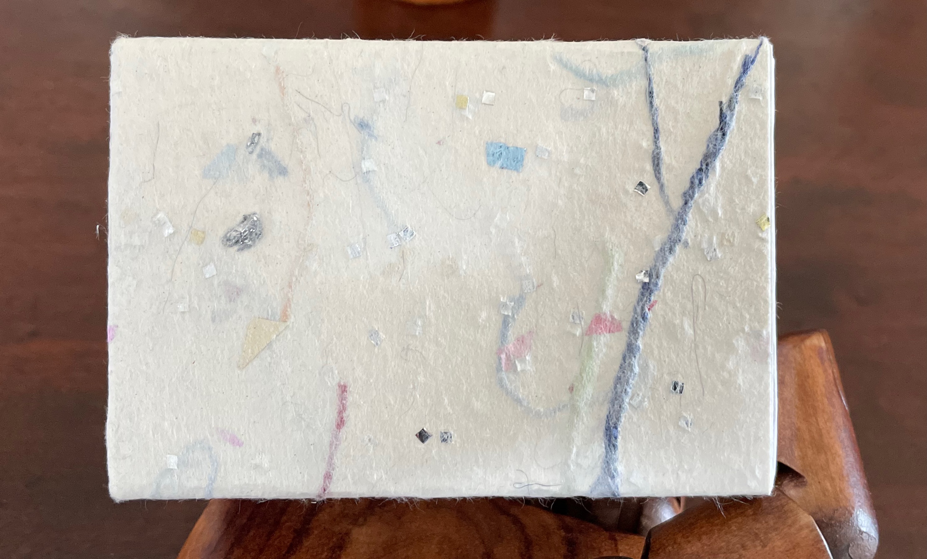
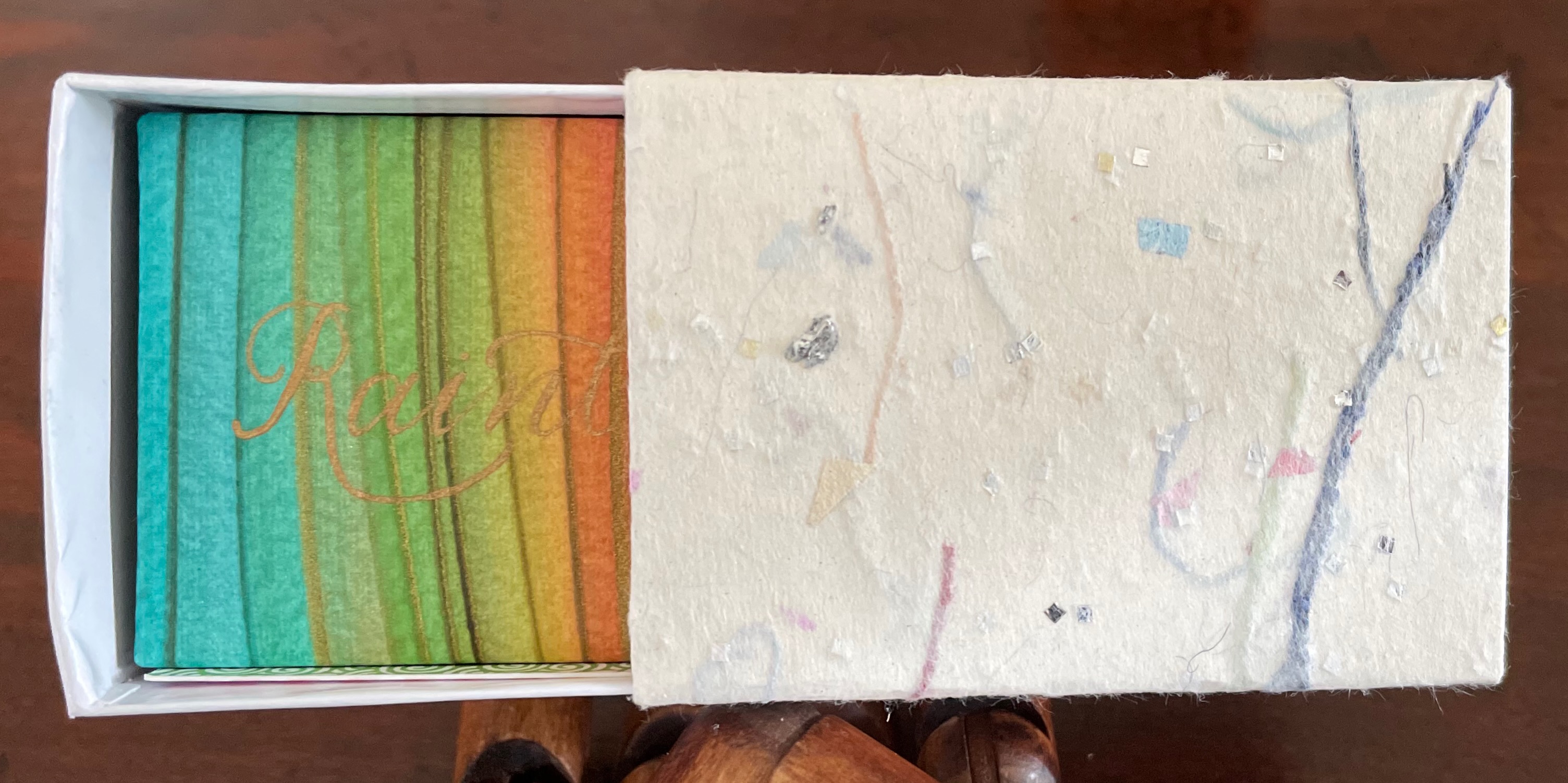
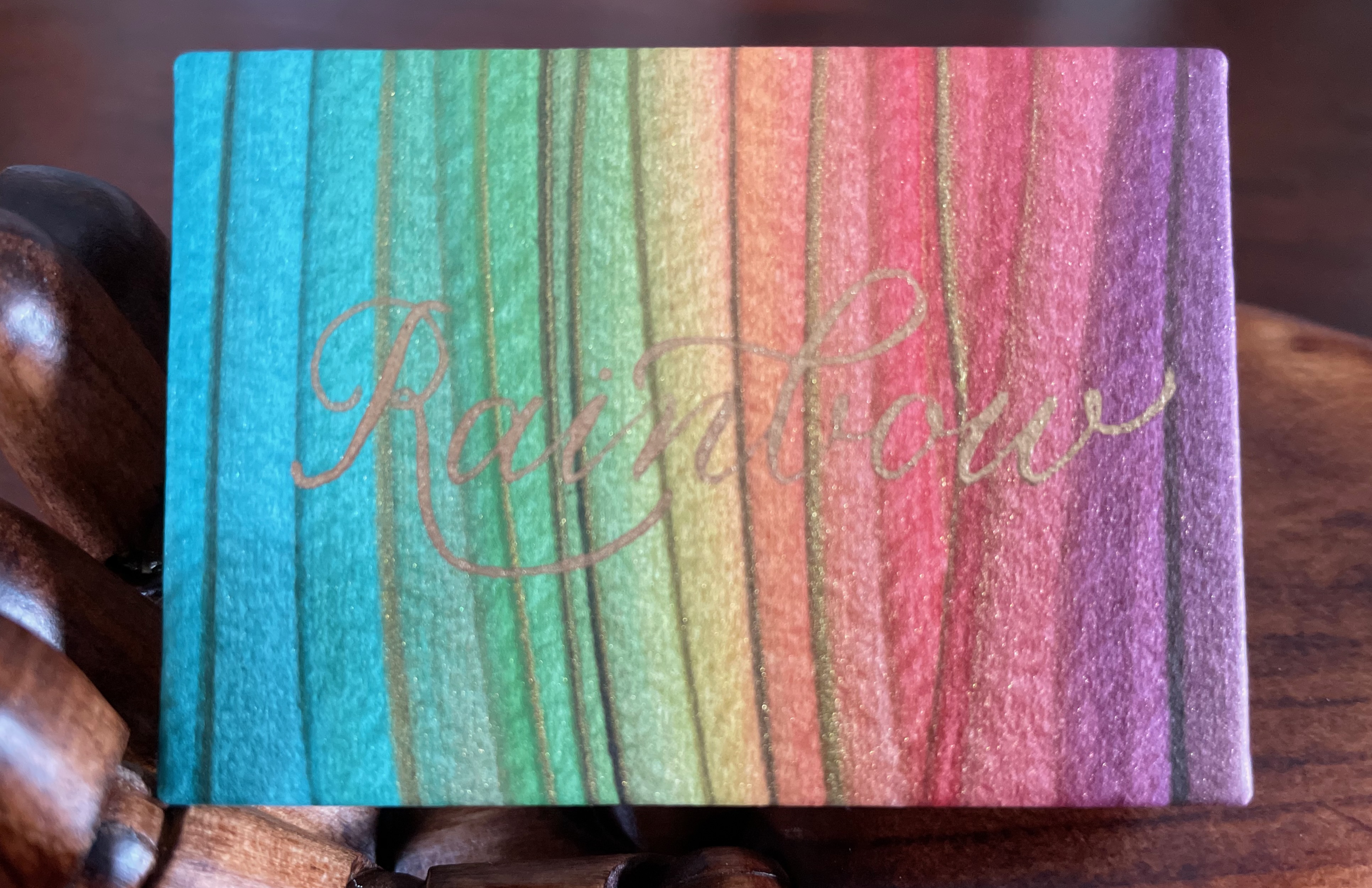
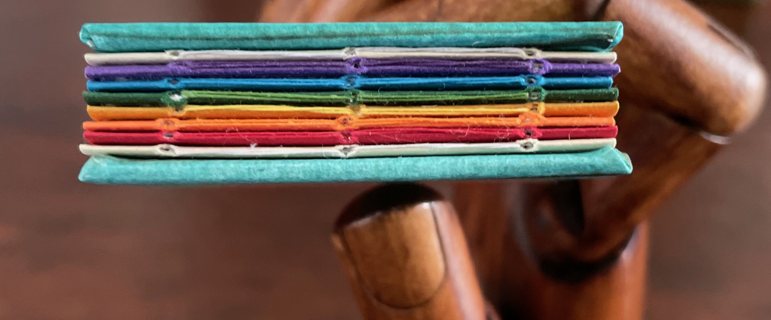
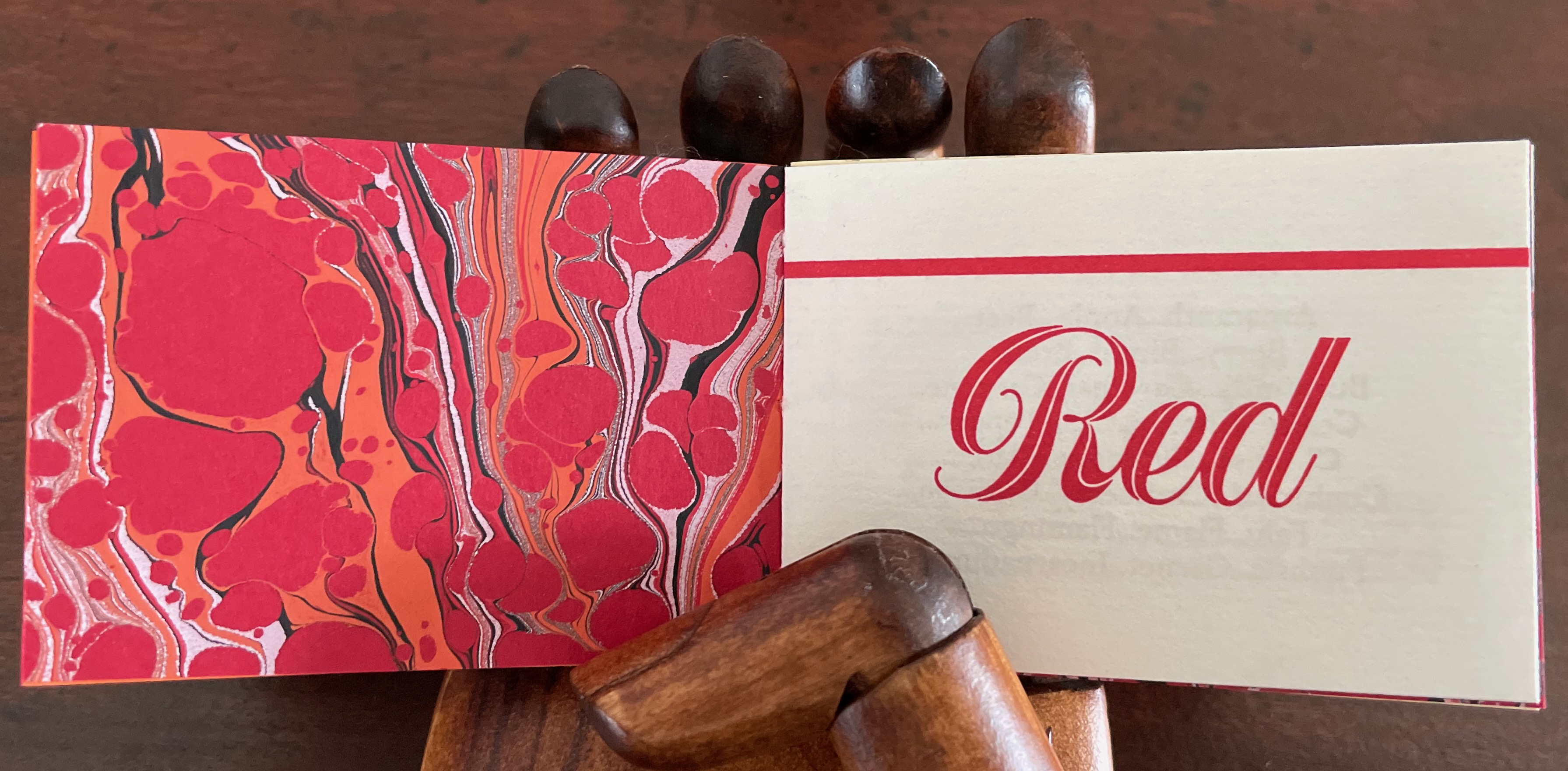
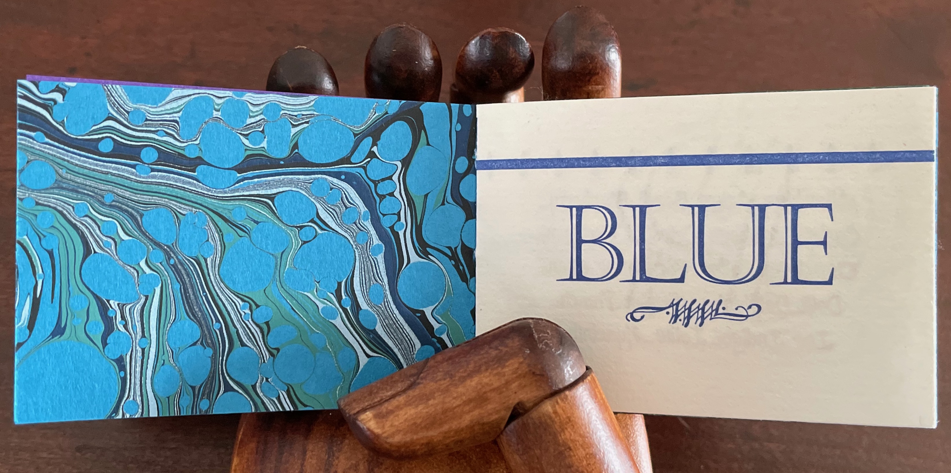
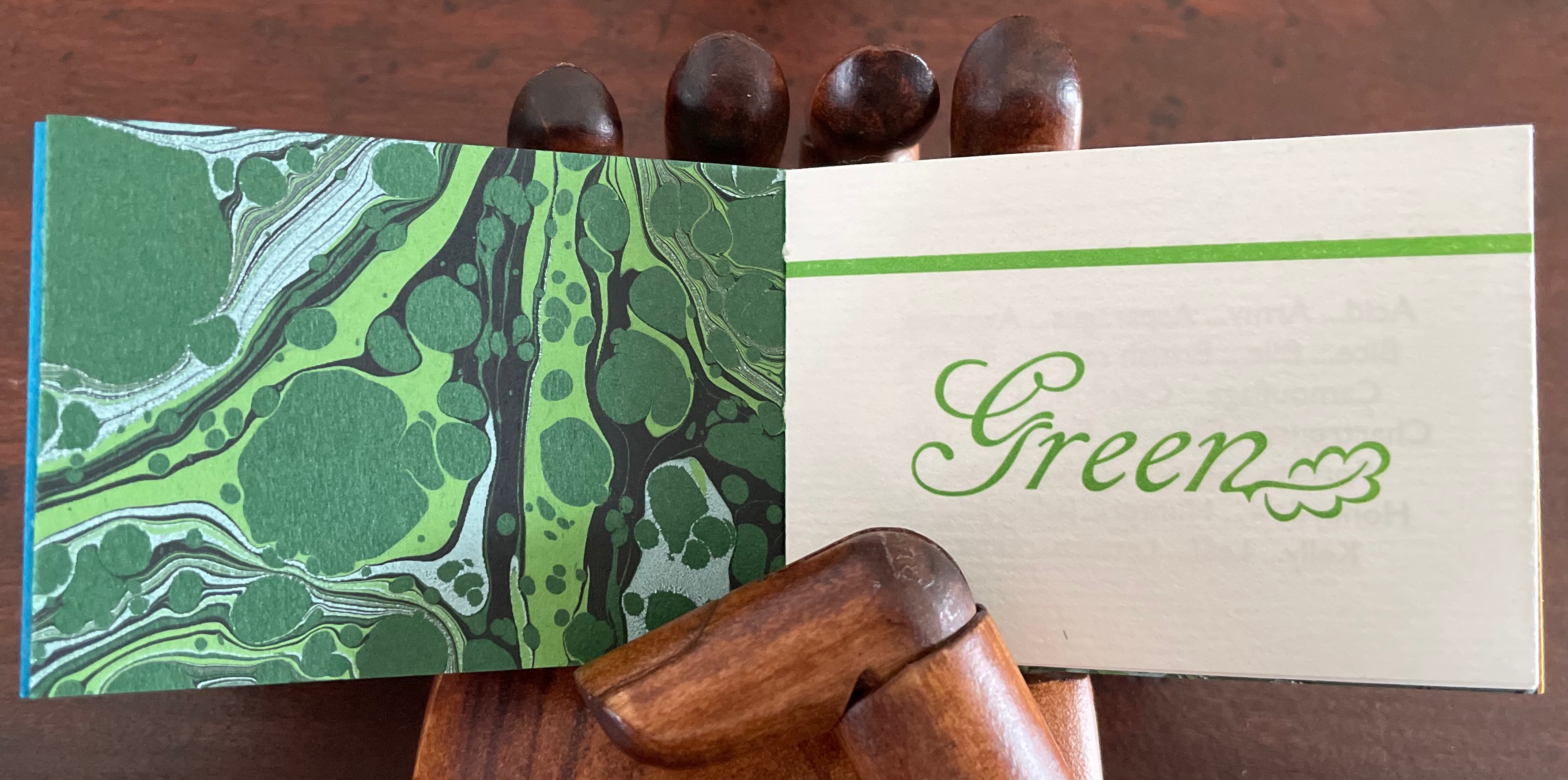
Matchbox-style box containing a miniature open spine book with paper over board covers. Box: H57 x W82 x D35 mm. Book: H51 x W73 mm. 46 pages. Edition of 81 (50 regular and 26 deluxe), of which this is #34. Acquired from Rebecca Press, 23 November 2022.
Photos: Books On Books Collection. Displayed with the artist’s permission.
Defining the Rainbow is the product of a rainbow of talent. Madeleine Durham made the paste papers for the box and covers of the book. Leonard Seastone of Tideline Press printed the book on his VanderCook from polymer plates made by Boxcar Press. Two four-page signatures for the front matter and colophon sandwich six four-page signatures of text listing shades and hues of Purple, Blue, Green, Yellow, Orange and Red. Between those signatures of handmade Hayle paper are back-to-back dividers made of marbled papers, hand-marbled by Jemma Lewis meeting several requirements: a scaled-down pattern and very specific color needs for the marbling to extend the idea of many-hued colors. Having collected and squirreled away names of shades and hues such as Byzantium, Zaffre, Smaragdine, Gamboge, Tangelo and Thulian (and researched them) and having waited for 30 years for the right project on which to expend a hoard of the handmade Hayle paper, Rebecca Bingham conceived and designed the project, convened the above-mentioned talents, spelled out their requirements, then hand-sewed and bound the results of their efforts.
On the Rebecca Press site, Bingham provides an engaging and enlightening description of the book’s letterpress printing “for those who are more familiar with the near-immediate gratification of digital printing”:
Each side of the page is printed separately (in this case, with the sheets being hand-placed into the press), after the ink has been applied (manually) to the type or (in this case) polymer plates. For something printed in one color, this means each sheet of paper passes through the press twice (front and back and alignment is not automatic — it’s fiddly work). In between, the ink needs several hours to dry. If you want a second color (for example, in my “green” section, both black and green inks are used), then the sheet must go through the press again (if color on 2 sides, then that means twice). I remind you of the alignment challenge. If you remember how hard it was to reinsert a typewriter page when corrections were needed (well, if you’re pretty old or are freakishly fascinated by ancient tech), you’ll have an idea of what this means. Plus, if you are changing the color on the press then the press needs to be thoroughly washed down so that the new color is crisp and clean (in the case of a light color like yellow, this can require more than one washing). Of course, this is a book about color, so 6 of the sections have their own second color and must go through the press 4 times (multiplied by the number of copies, of course). With the washing up and the aligning and the waiting for things to dry…
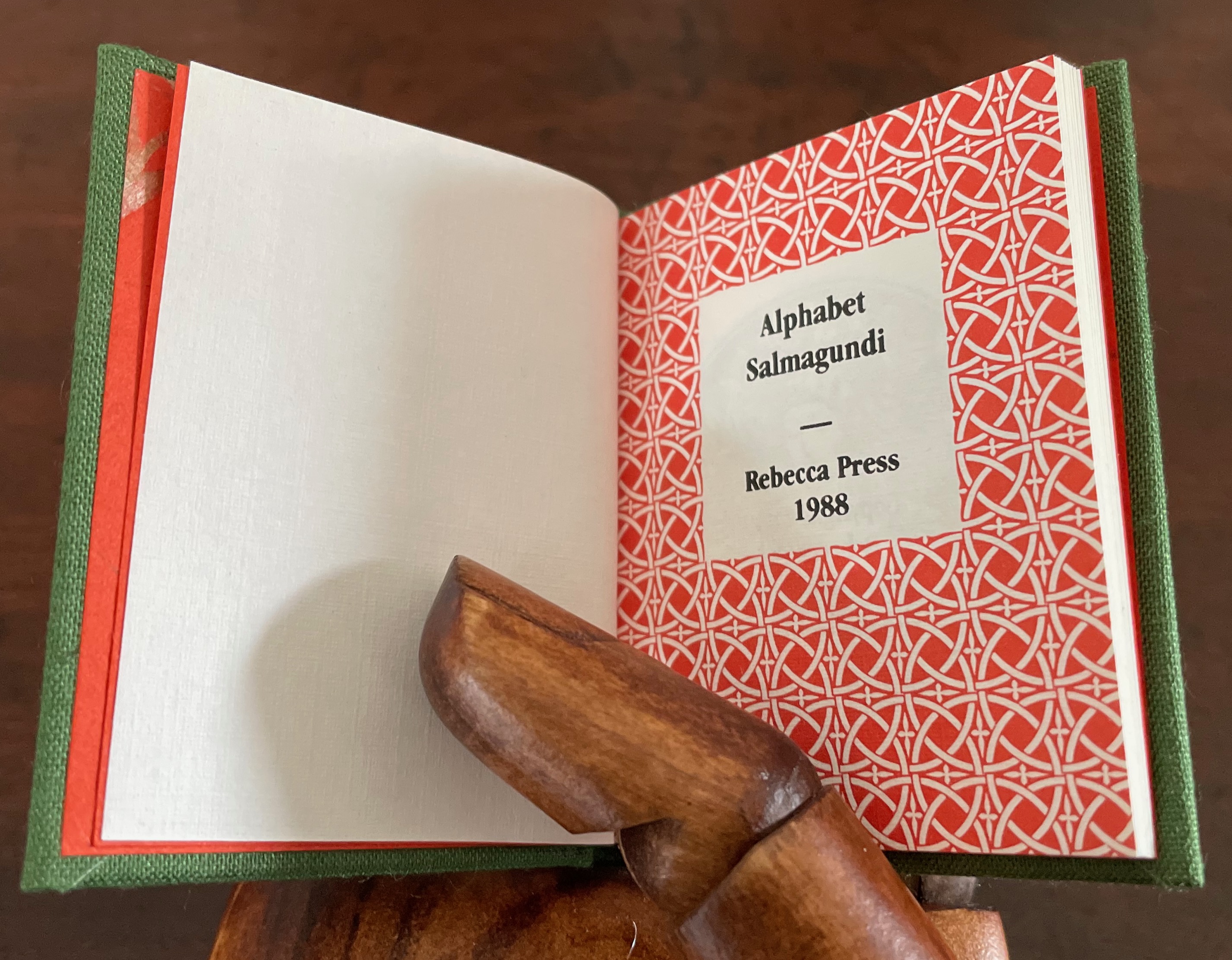
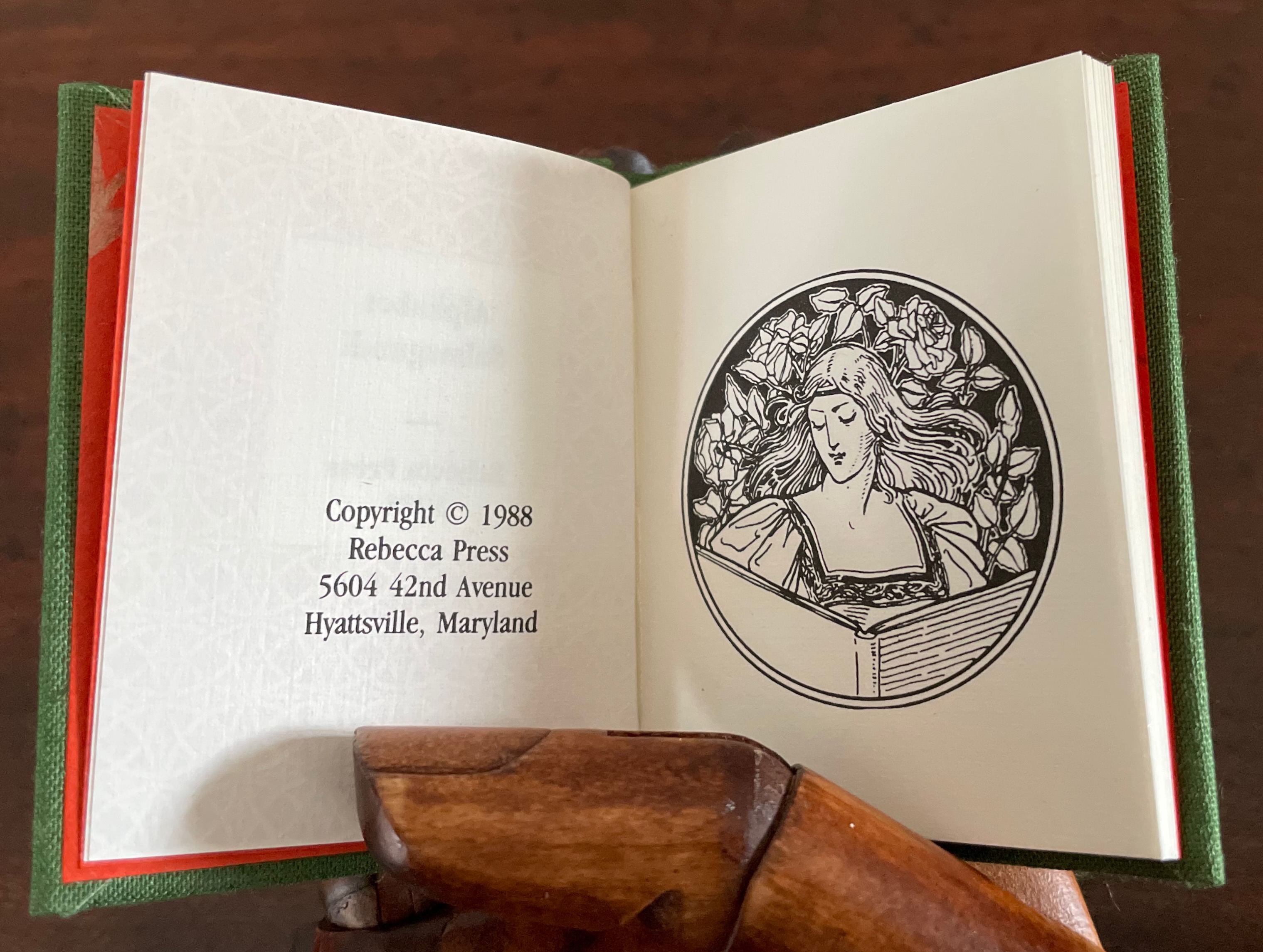
Alphabet Salmagundi (1988)
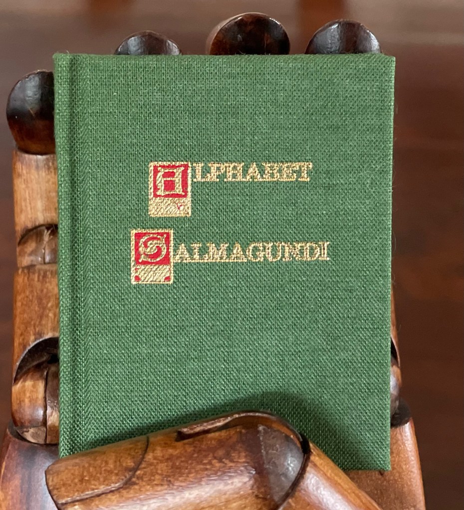
Alphabet Salmagundi (1988)
Rebecca Bingham
Miniature casebound, cloth over boards, colored decorated doublures, perfect bound book block. H66 x W57 mm. 40 unnumbered pages. Edition of 200, of which this is #150. Acquired from Rebecca Press, 23 November 2022.
Photos: Books On Books Collection. Displayed with the artist’s permission.
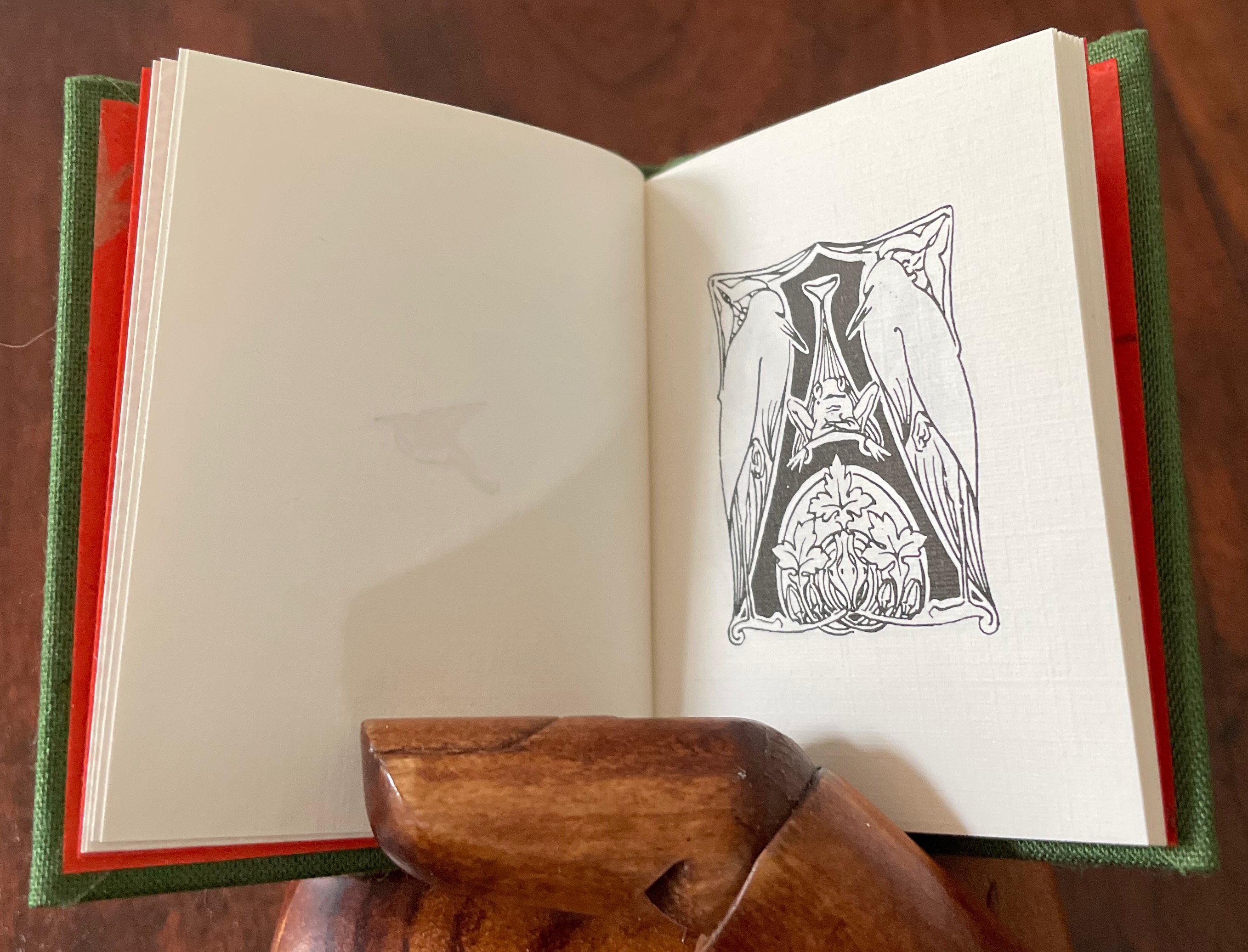
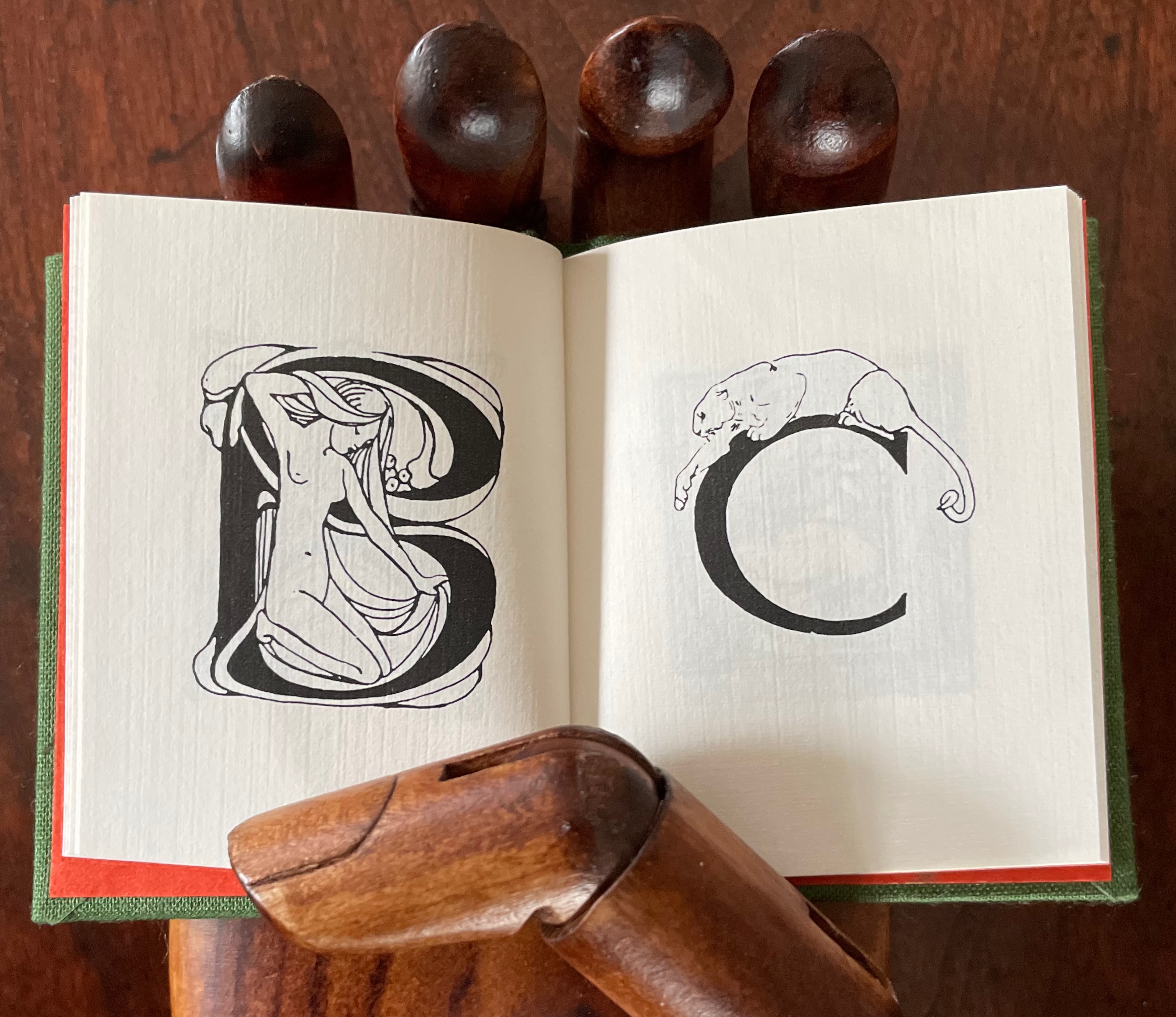
This alphabet book is a miscellany of letter styles and images, some of which clearly reflect the letters with which they are associated and some of which are less clear. For instance, C is clearly associated with cat, but the big cat depicted looks like a lioness. The letter B has a bare-breasted young lady bathing, so the usual one-to-one association is elusive. And for the letter A, any association between it and two birds eying a nervous frog — unless the scene stands for “Appetite” — is downright obscure.
The relation of the letters X, Y and Z with their images is just as loose. X for oak or acorn? Y might be for youngsters. Does the decoration of letter Z suggest a zephyr?
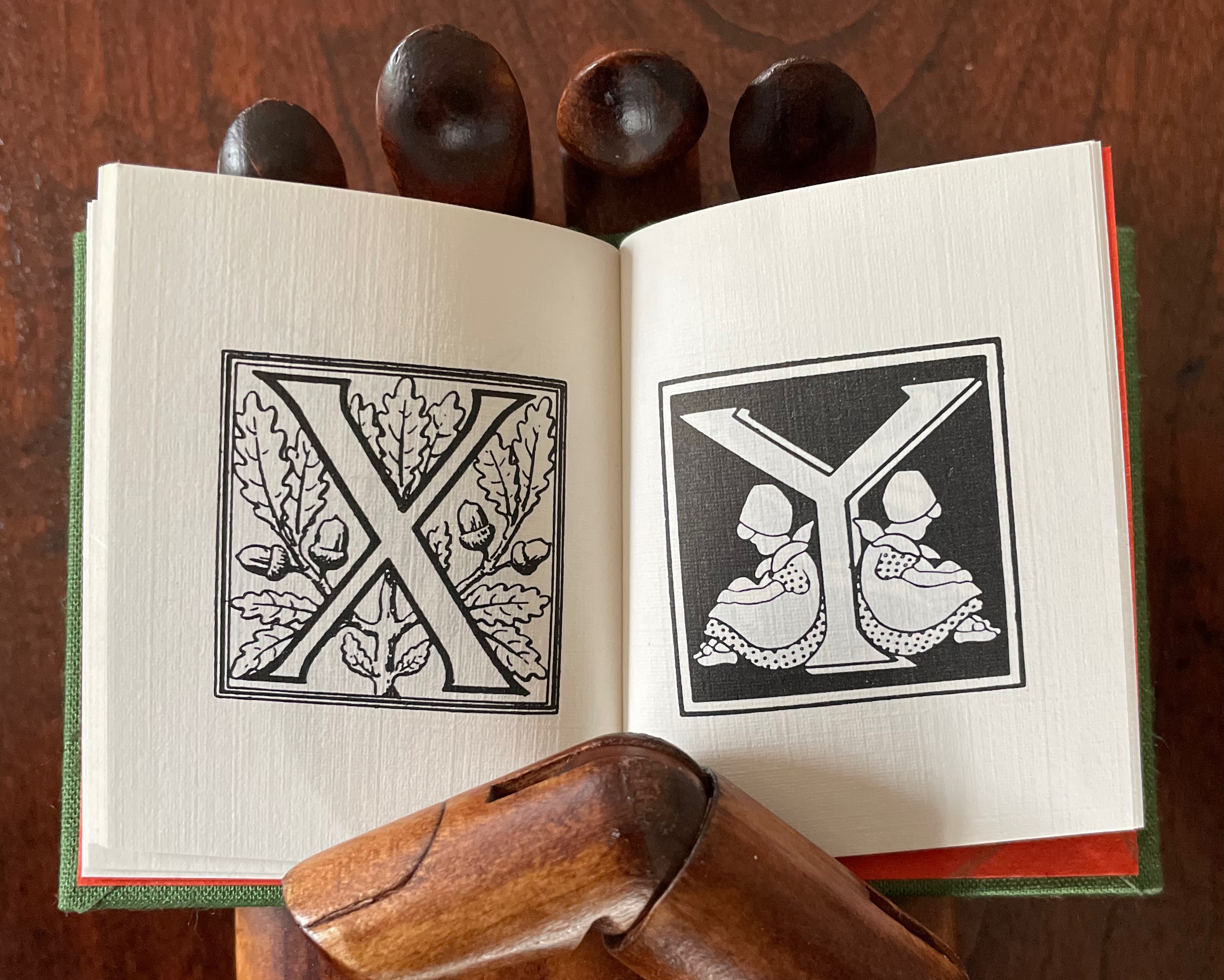
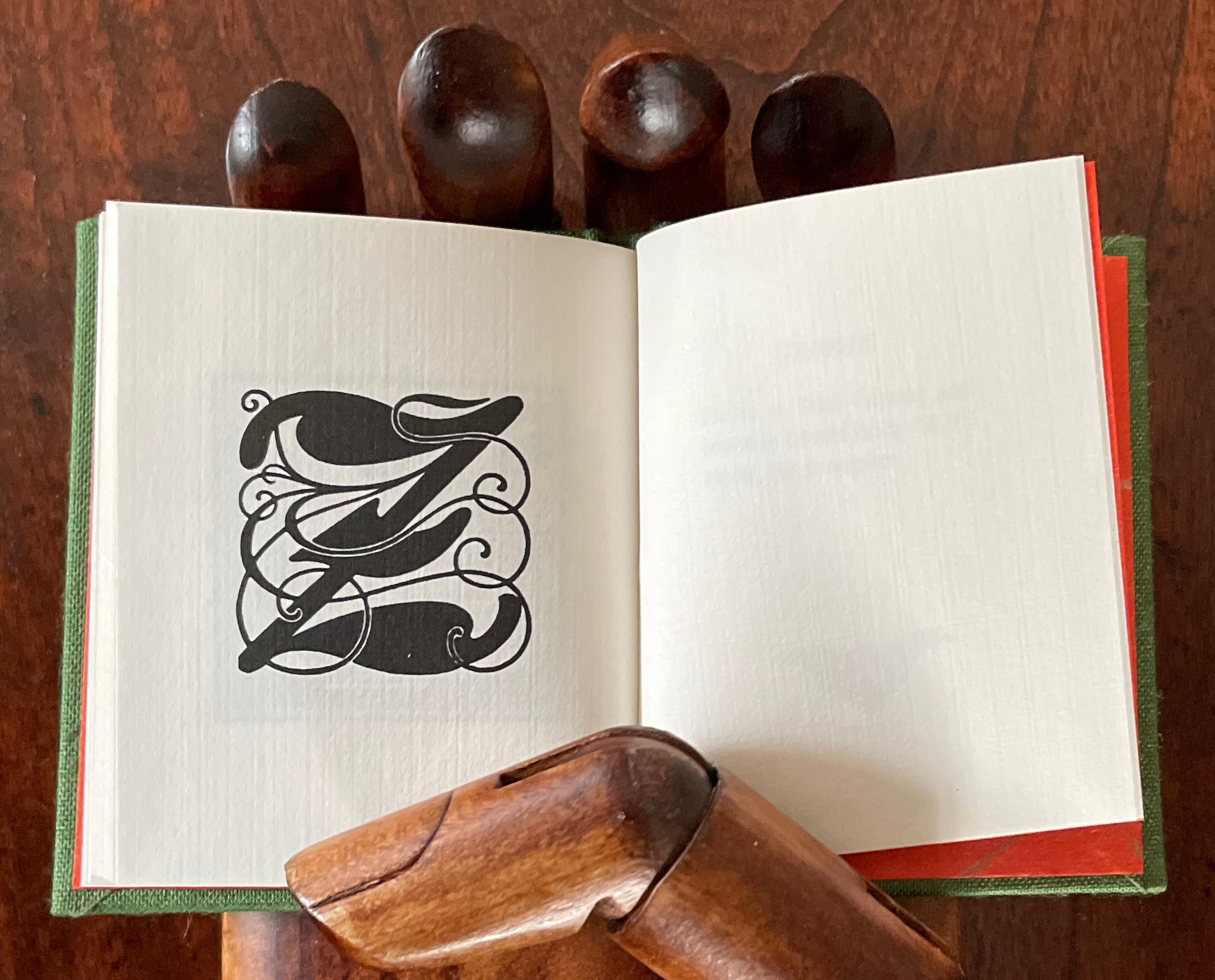
If “salmagundi” implies a loose collection, a mélange, a potpourri, an olio, then this little book lives up to its name.
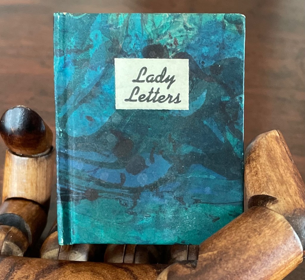
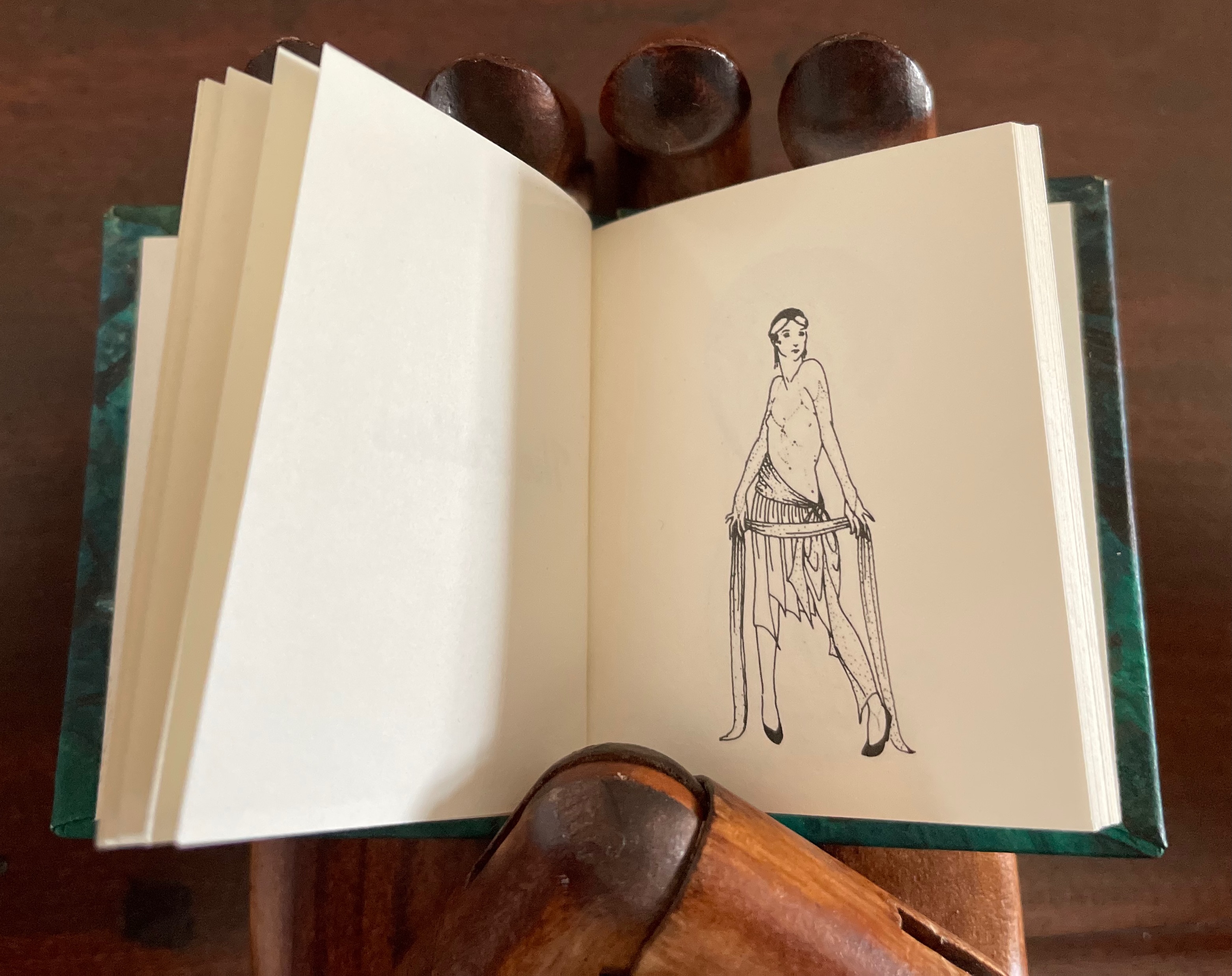
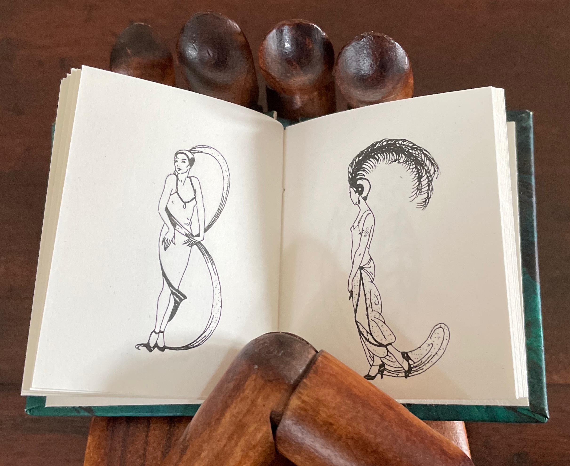
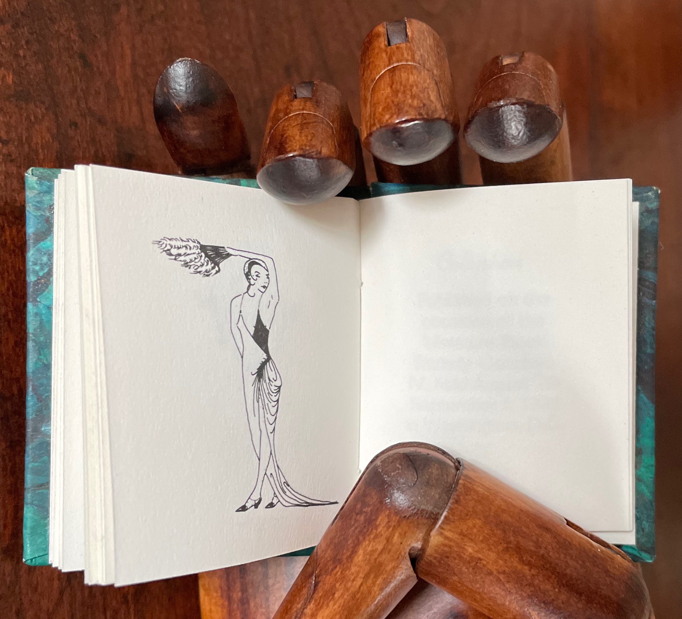
Lady Letters (1986)
June Sidwell designed, modelled and illustrated the haute couture alphabet for which Rebecca Bingham designed this book. Sidwell’s “lady letters” will likely remind the viewer of Erté’s alphabet, although his ladies take more risqué poses than Sidwell’s. Bingham actually met Erté, and on her site, she relates how she met him and presented him with a miniature version of his alphabet.
Lady Letters (1986)
June Sidwell and Rebecca Bingham
Miniature casebound, plain doublures, sewn book block. H58 x W48 mm. 40 unnumbered pages. Edition of 200, of which this is #33. Acquired from Rebecca Press, 23 November 2022.
Photos: Books On Books Collection. Displayed with the artist’s permission.

The tradition of anthropomorphic abecedary reaches back at least as far as biblical manuscripts. The Bodleian Libraries’ “Kennicott Bible” is one example.
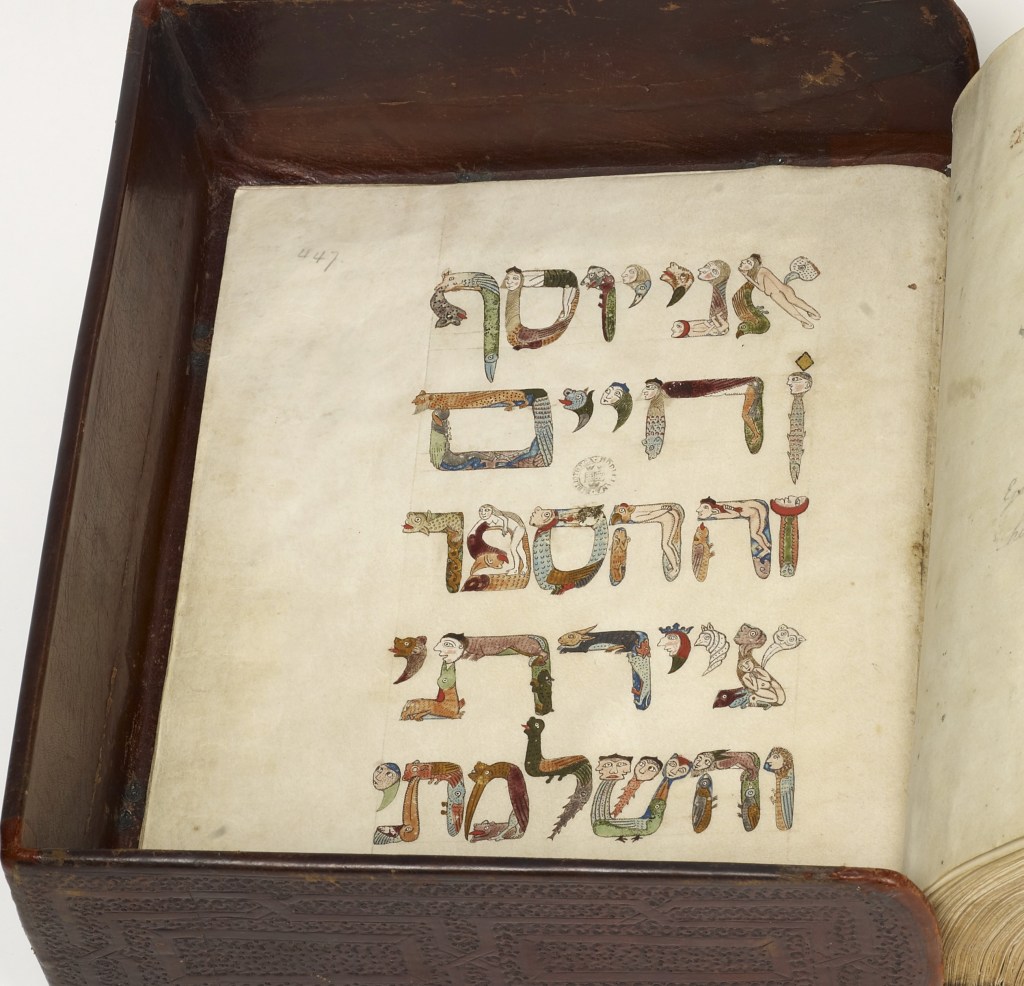
(Hebrew Bible with David Kimhi’s Sefer Mikhlol) MS. Kennicott 1 (1476). 447r. Oxford, Bodleian Library.
Photo: © Bodleian Libraries, University of Oxford.
Other examples in the Books On Books Collection that compare enjoyably with Lady Letters are
Anthon Beeke, Alphabet (1970)
Anthon Beeke & René Knip, Body Type (2011)
Toshifumi Kawahara, Dancing Alphabet (1991) [entry in progress]
Marie Lancelin, Gestes Alphabétiques (2014) [entry in progress]
Lisa Merkin, Bodies of Language (2021)
Annette Messager, Mes Enluminaires (1988)
Vítězslav Nezval, Abeceda/Alphabet (1926/2001)
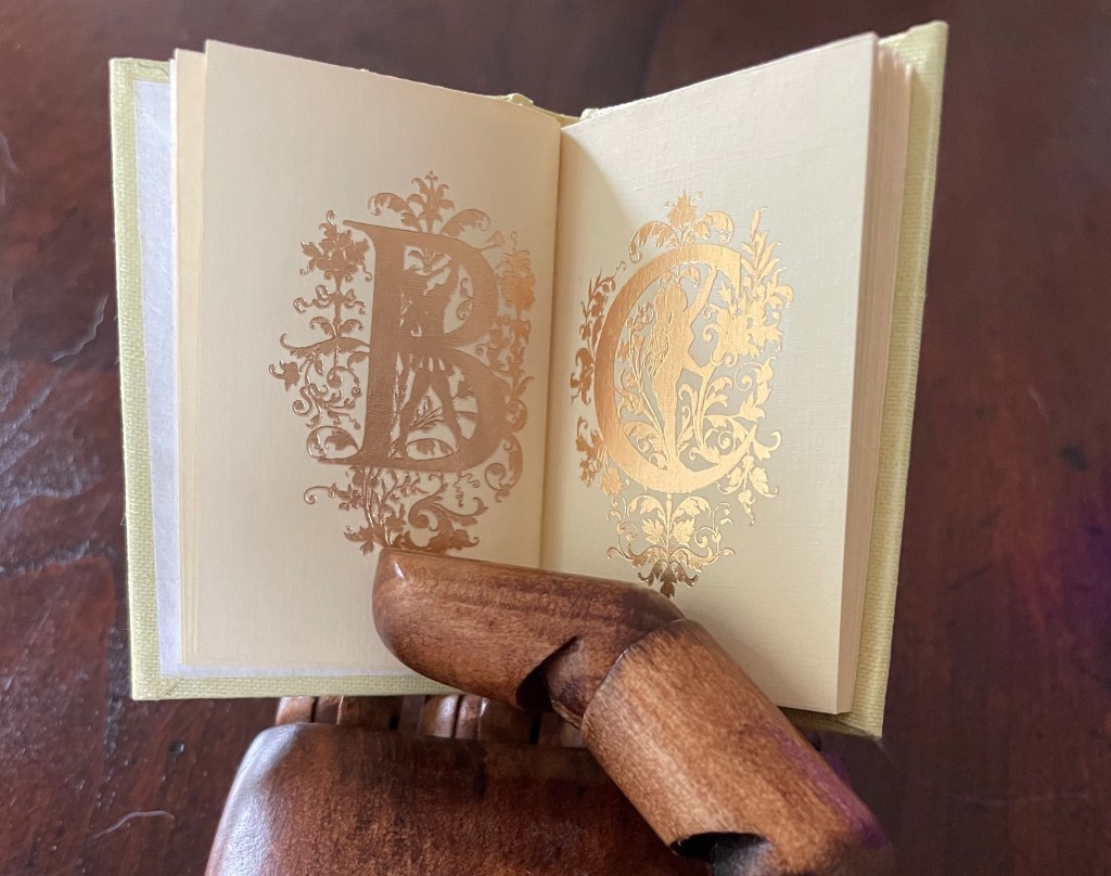
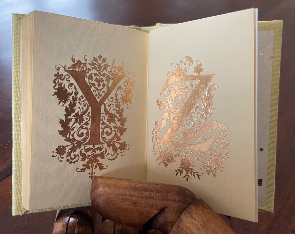
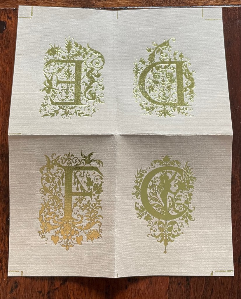
Golden Alphabet (1986)
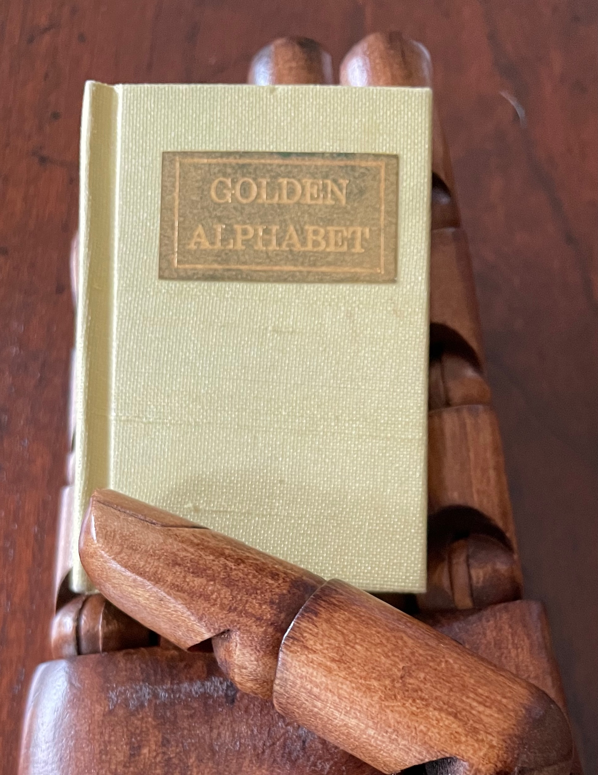
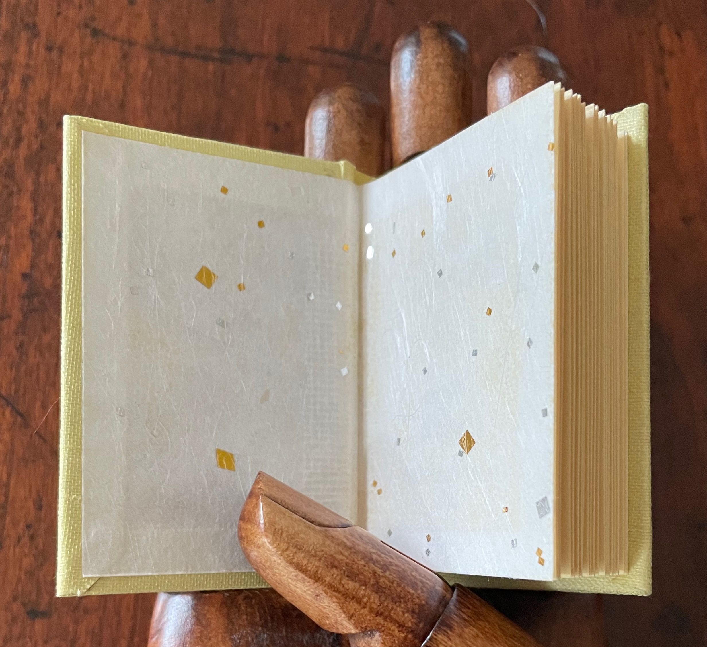
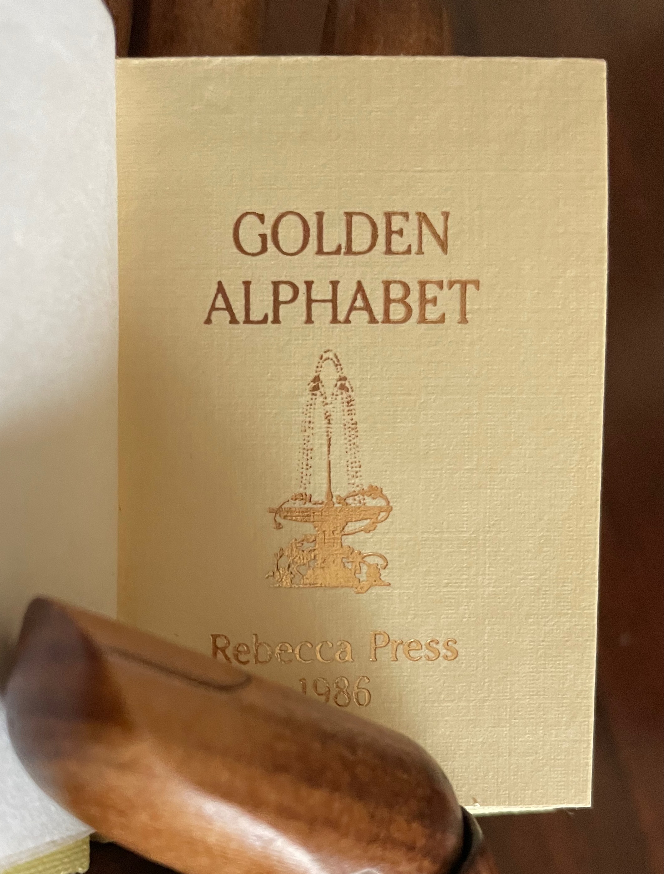
Golden Alphabet (1986)
Rebecca Bingham
Miniature casebound, gilt-titled leather front cover label, decorative doublures, sewn. H68 x W38 mm. 28 unnumbered pages. Edition of 200, of which this is #96. Acquired from John Howell for Books, 31 October 2022.
Photos: Books On Books Collection. Displayed with the artist’s permission.
Although each letter has its own artistic treatment, this alphabet of gilt letters with their rococo decoration is no salmagundi. The folios are uncut at the top edge (the inner pages not printed on or included in the pagination), which would have been necessary for the application of the gilt foil. In a separate order, the artist sent a gratis loose folio, shown below.
Further Reading
“Abecedaries I (in progress)“. Books On Books Collection.
“Carol DuBosch“. 13 December 2022. Books On Books Collection. For another rainbow alphabet.
“Karen Hanmer“. 25 October 2021. Books On Books Collection. For another rainbow alphabet and another miniature.
“Amy Lapidow“. 30 December 2022. Books On Books Collection. For another rainbow alphabet.
Bingham, Rebecca. 5 October 2015. “Collecting Miniature Books“. Mood Swings & Other Furniture. Accessed 1 October 2022.
