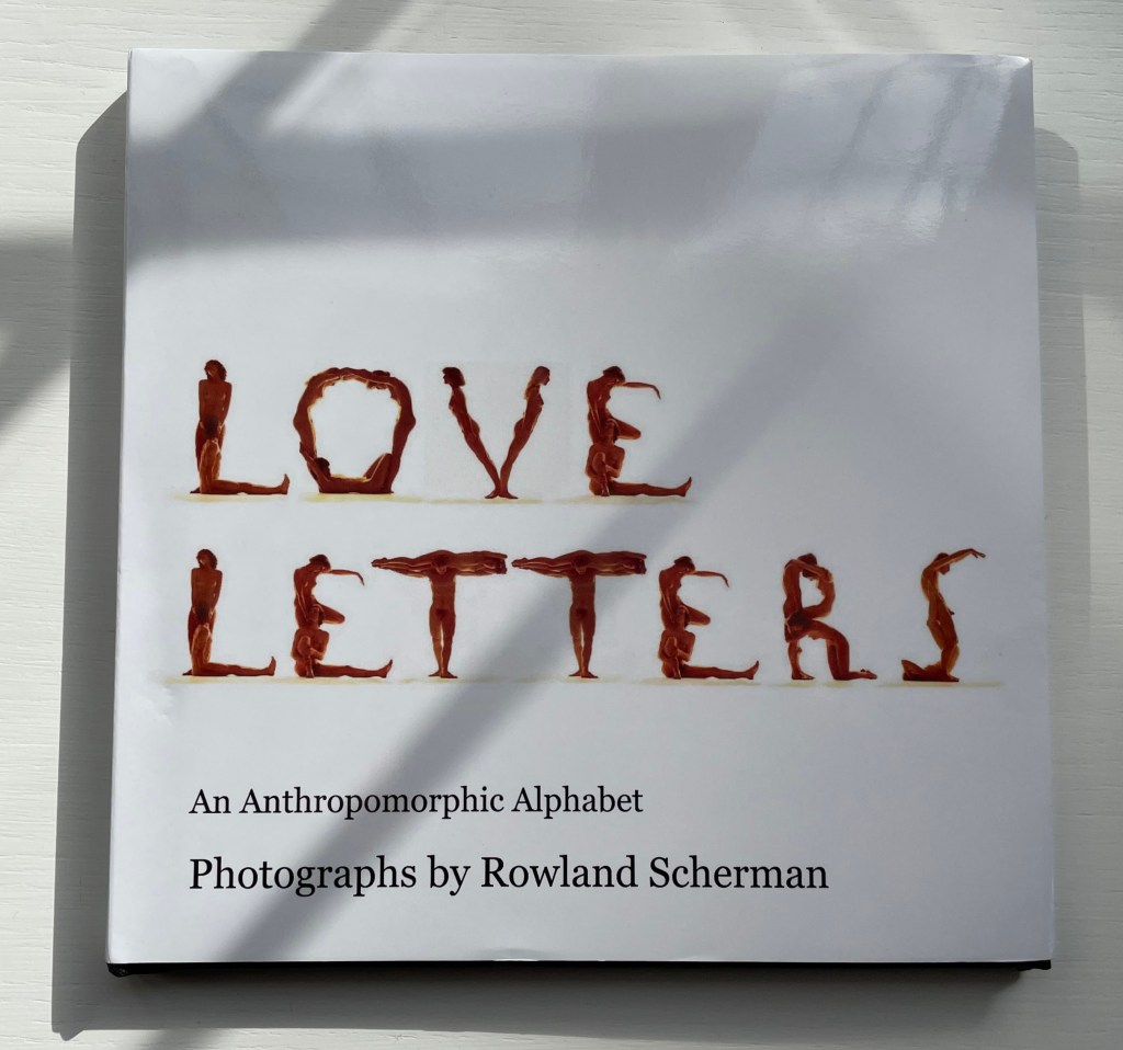
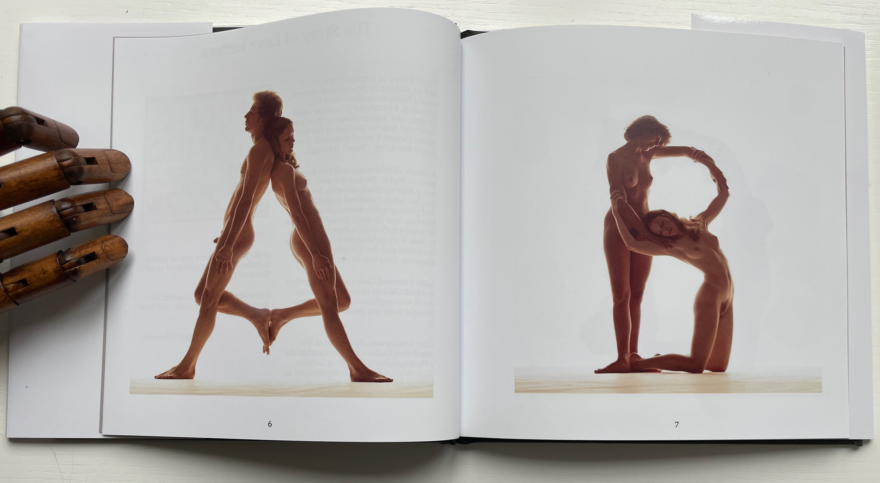
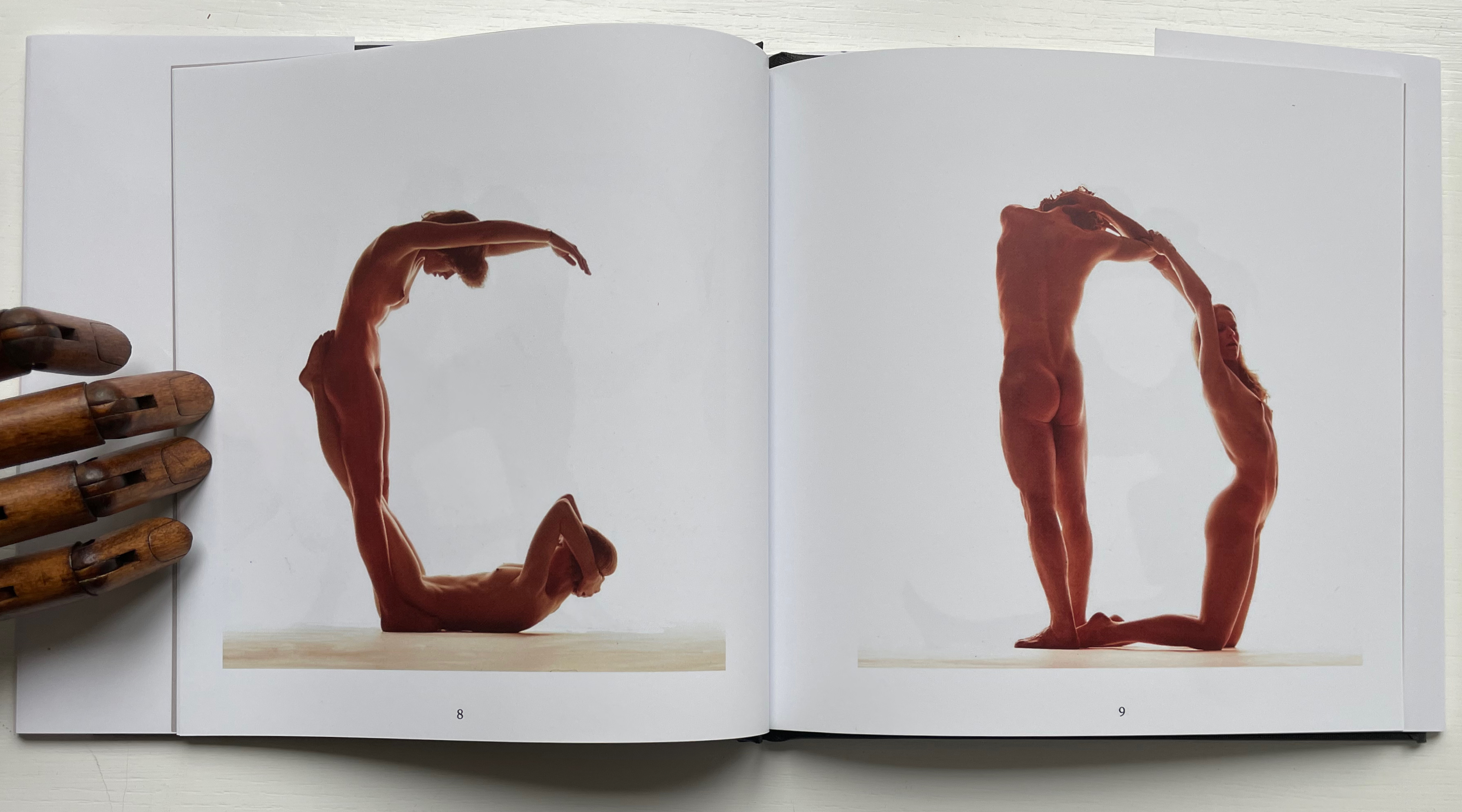
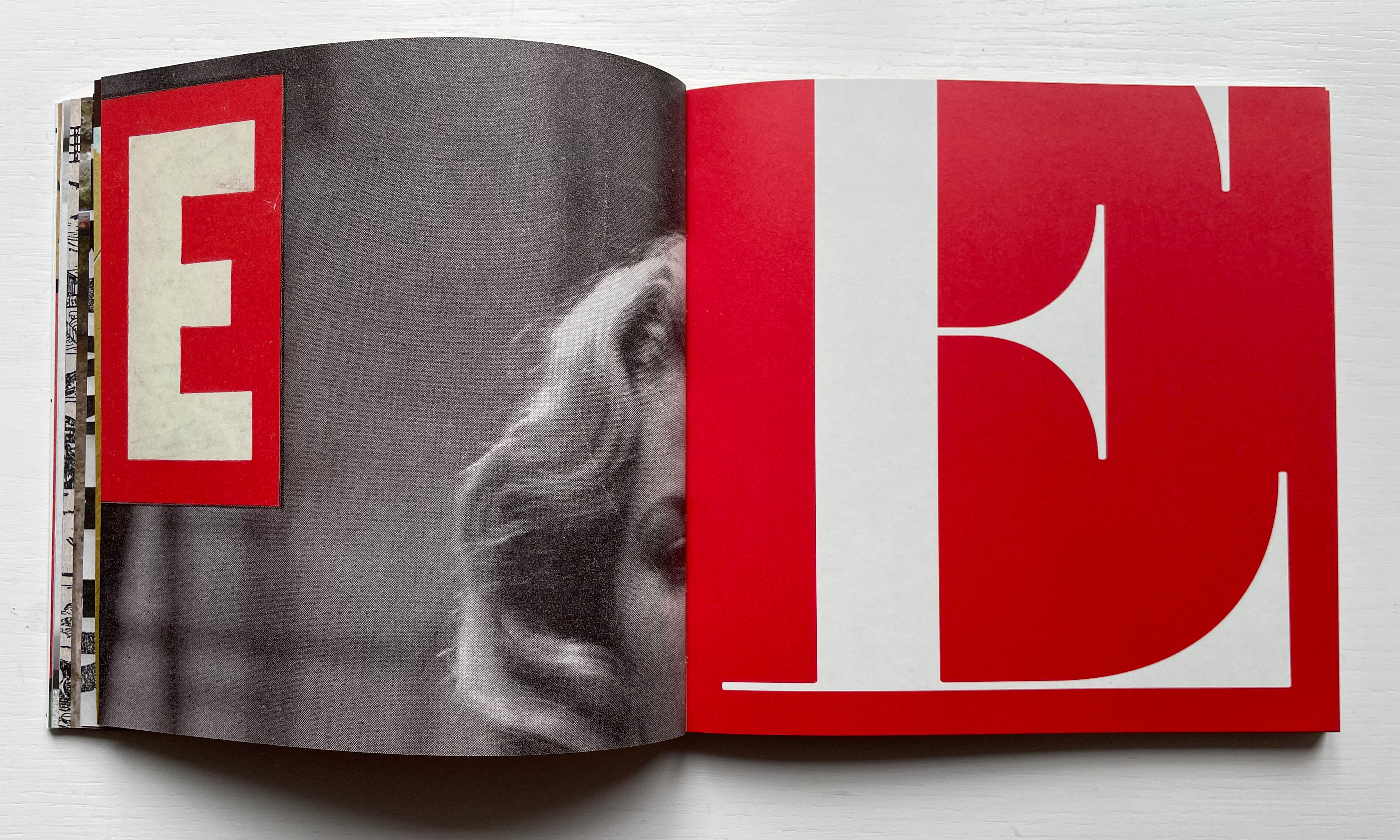
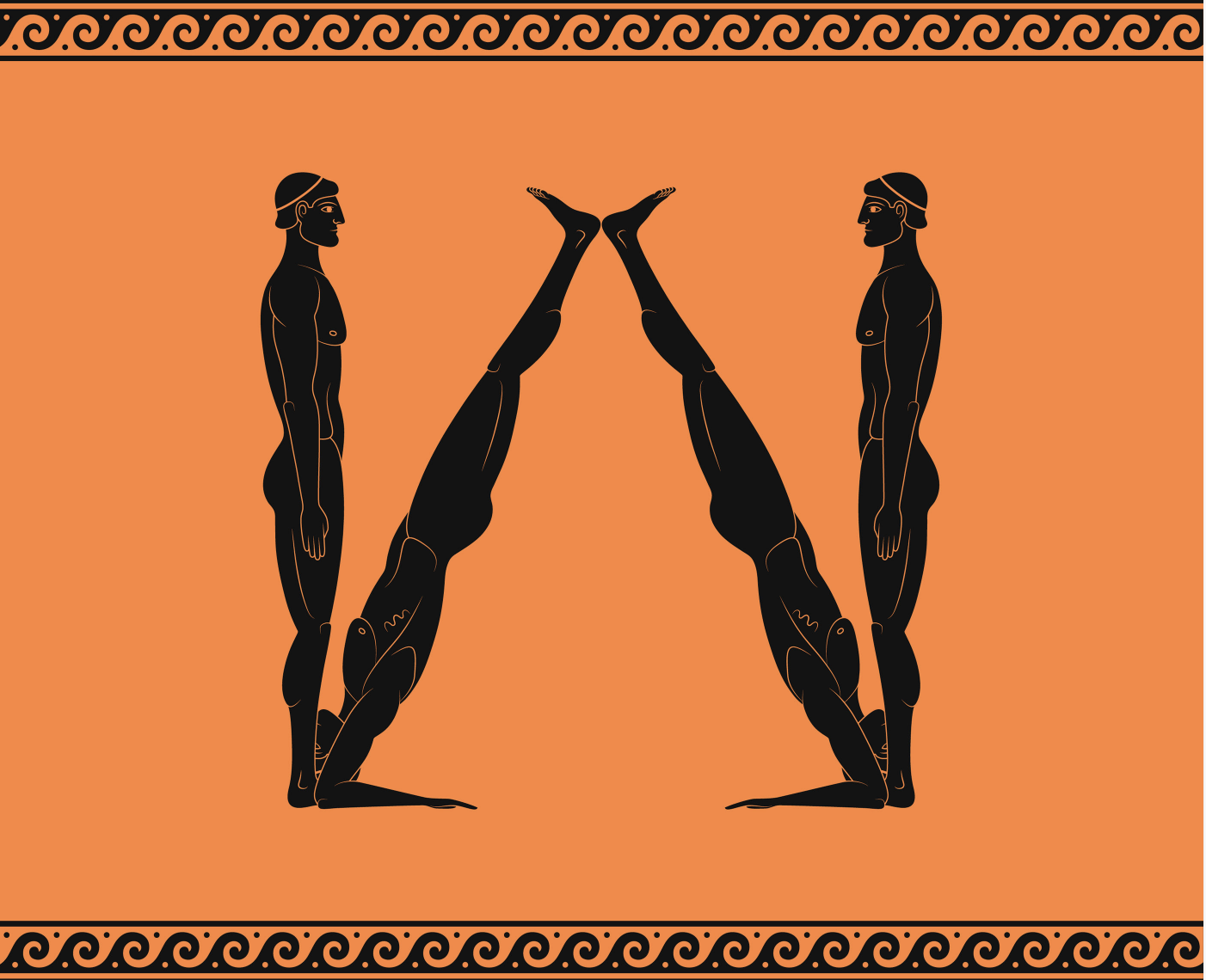
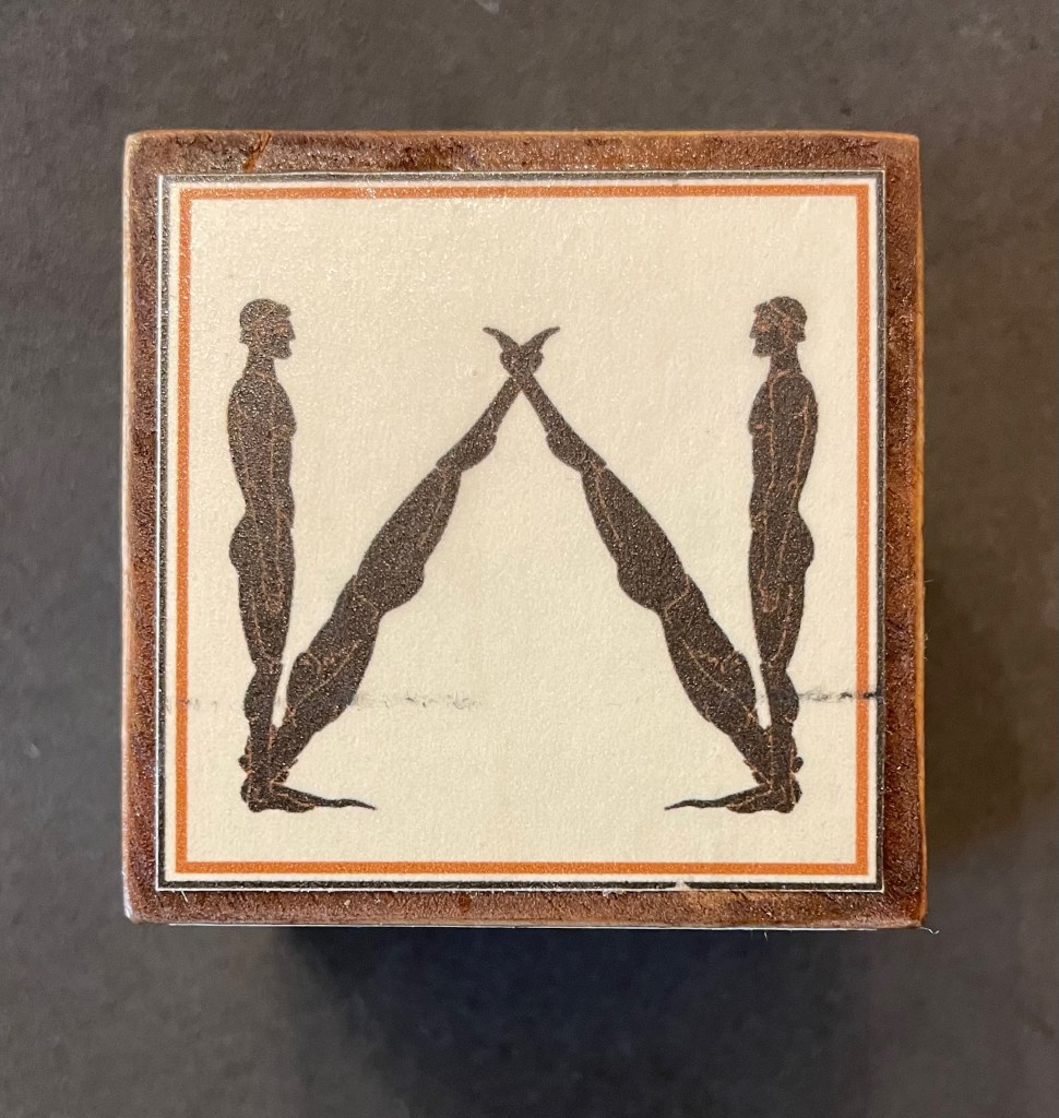
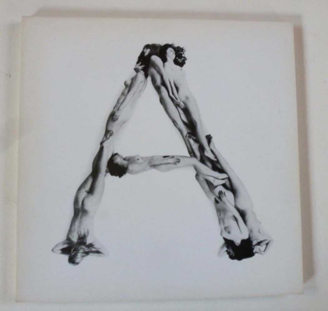
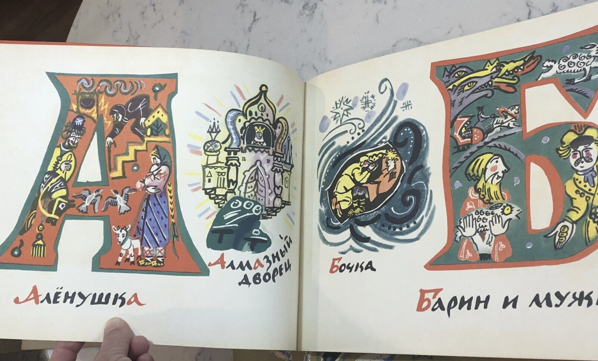
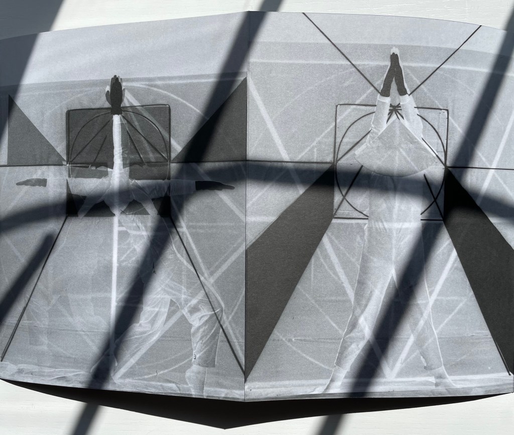
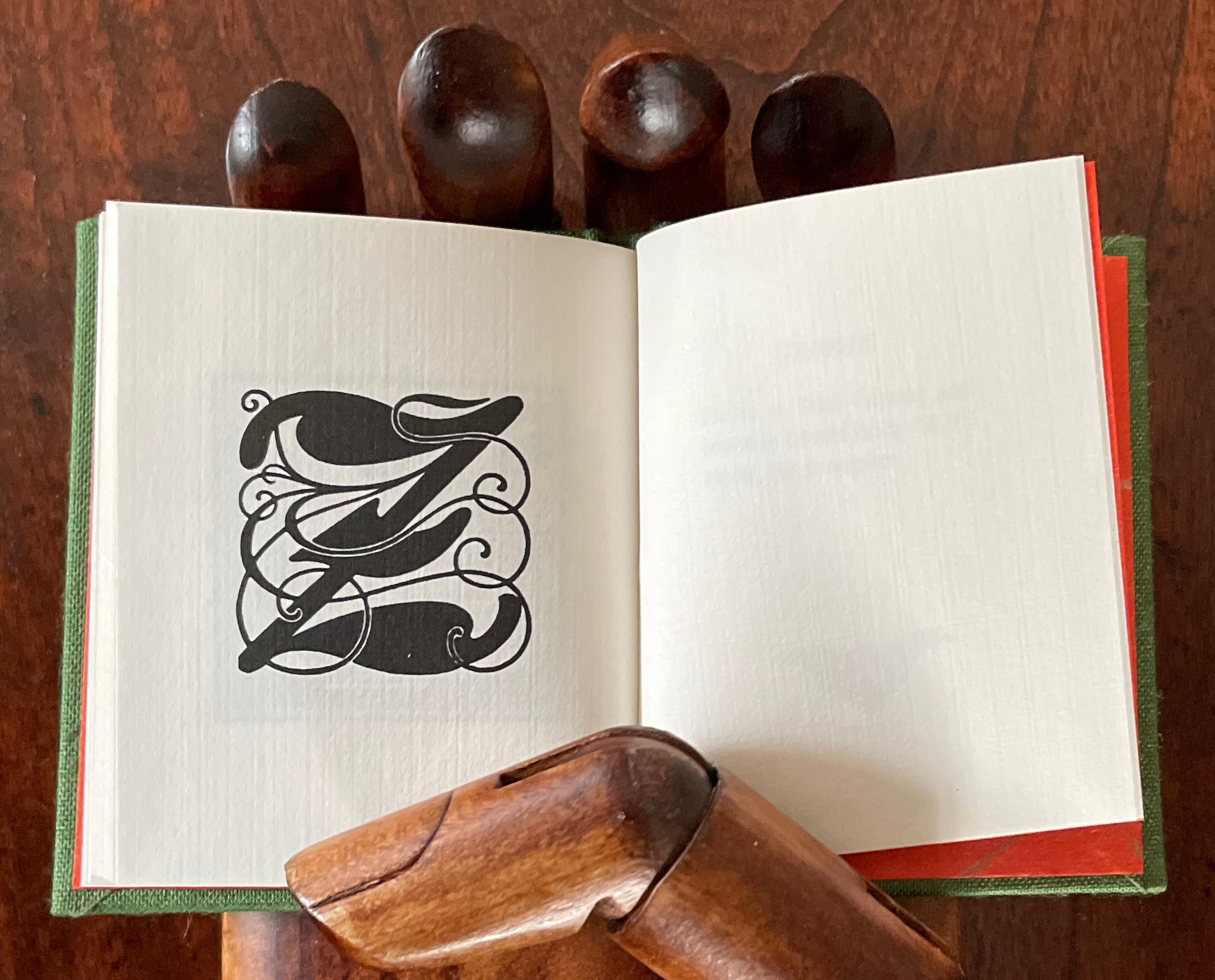
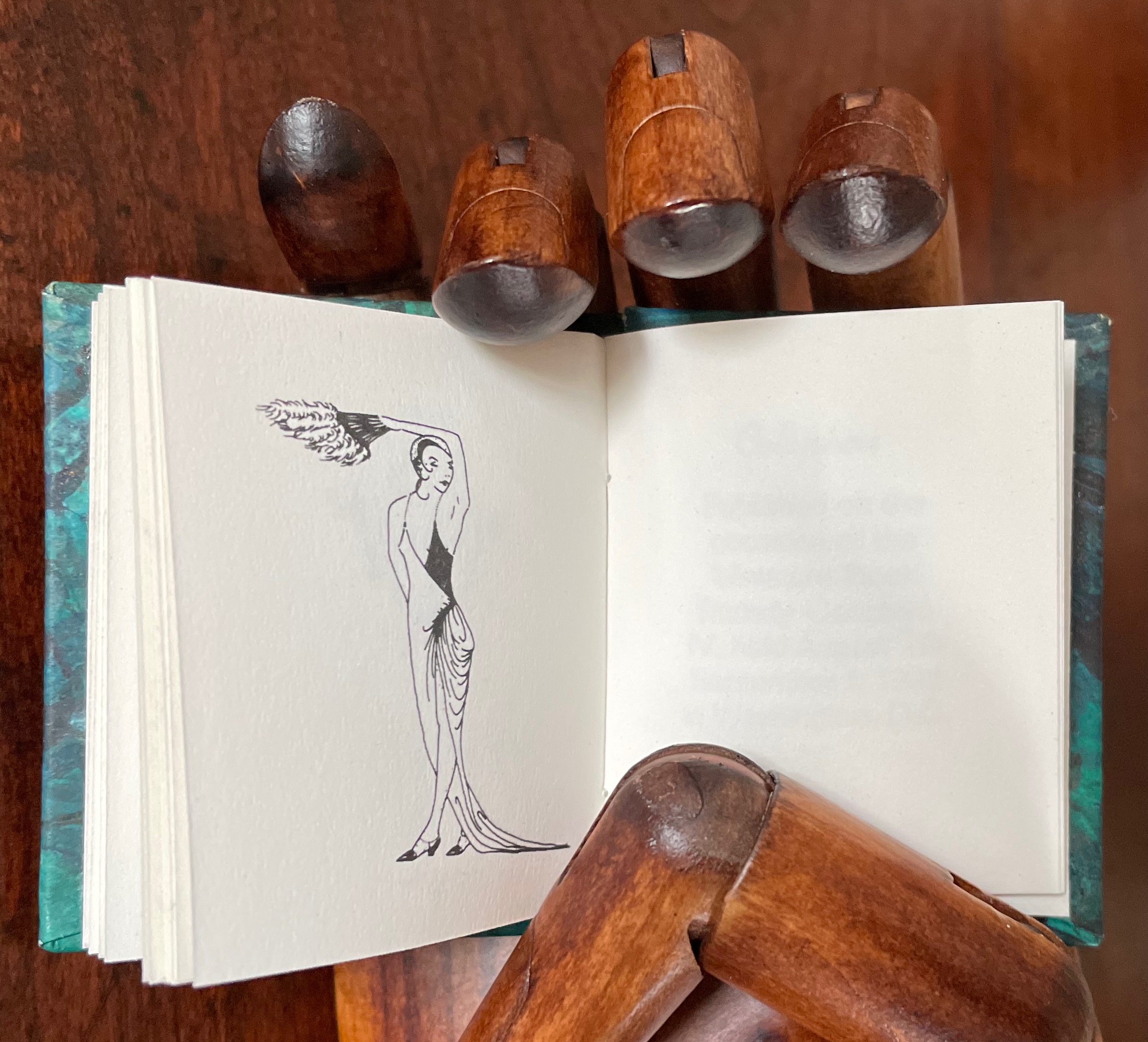
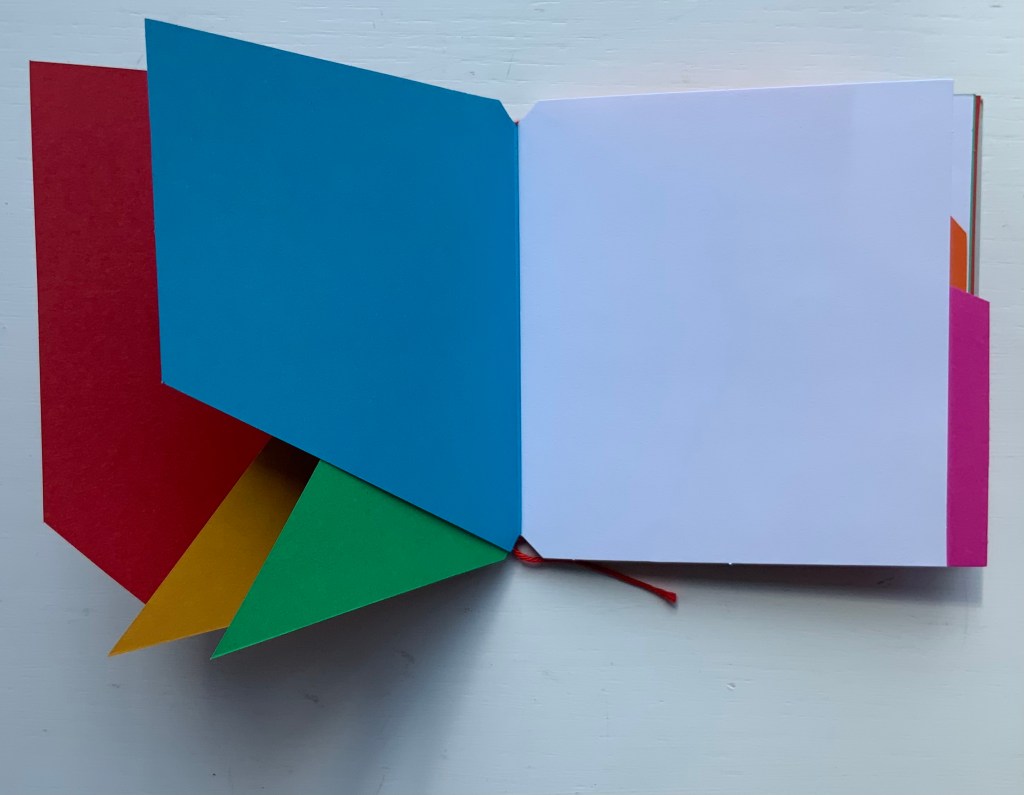
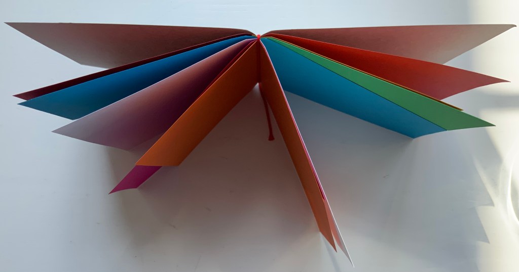
Love Letters: An Anthropomorphic Alphabet (2008) Rowland Scherman Casebound, doublures, perfect bound. H178 x W180 mm. 34 pages. Acquired from Rowland Scherman, 3 March 2023. Photos of the book: Books On Books Collection. Displayed with permission of Rowland Scherman.
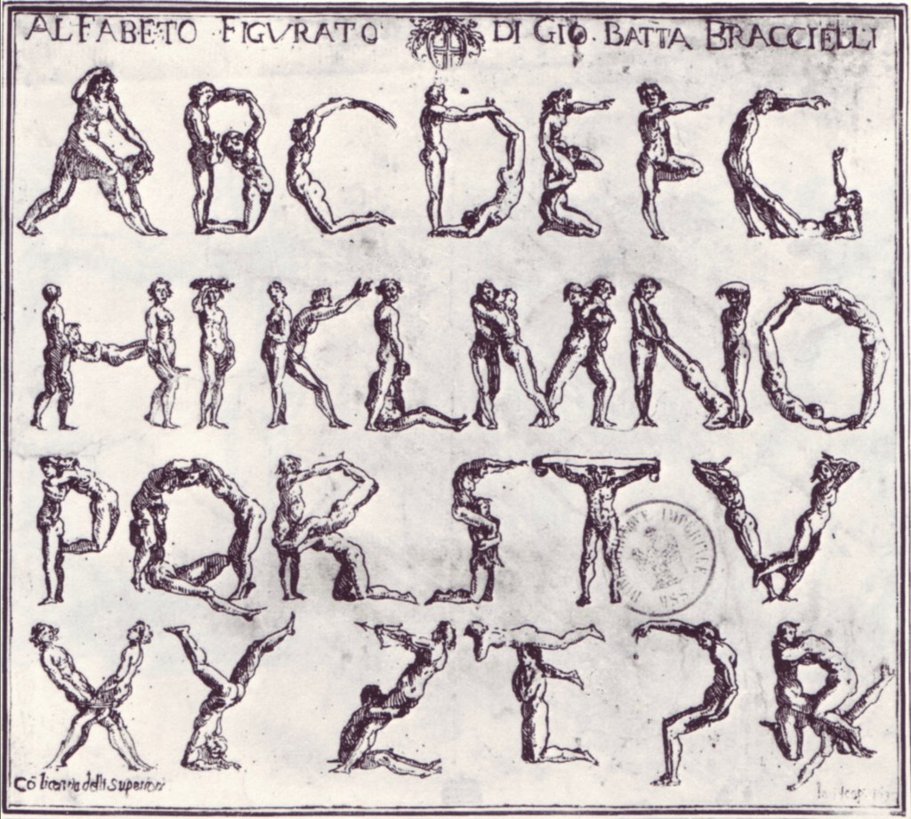
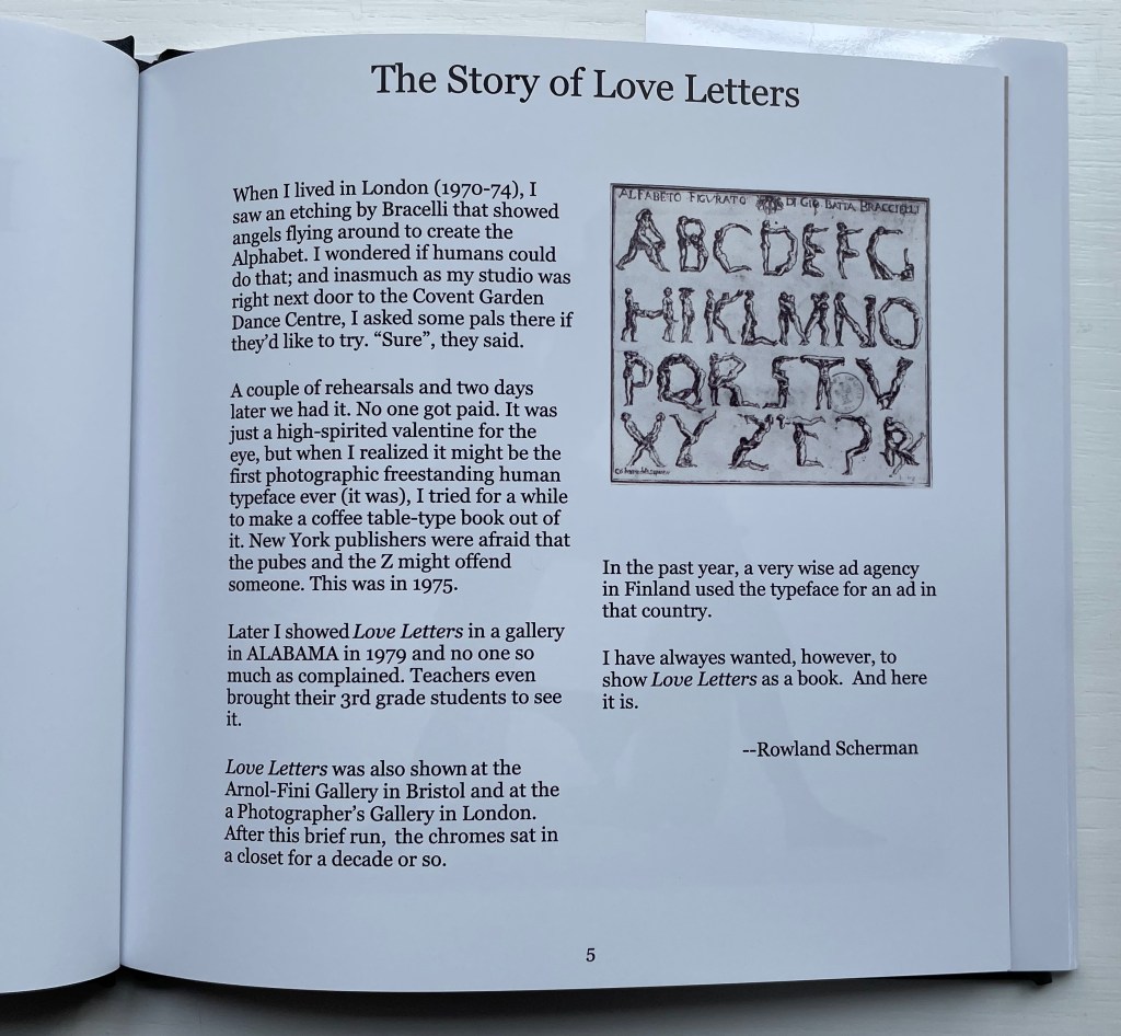
Giovanni Battista Bracelli’s “Alfabeto Figurato”, a single-sheet etching, occurred well after Carravagio’s presence there earlier in the century but well within the sphere of his ongoing influence. The print’s contortions of human bodies to display that most human of inventions — the alphabet — would probably have pulled a sneer of admiration from him. Maybe Bracelli had heard of the 5th-century comic playwright Kallias, who had his chorus dance (no doubt “cheek to cheek”) the shapes of the Ionian contenders for letterforms. In 1969, Anthon Beeke and Ed van der Elsken had their naked models arrange themselves into the alphabet on the studio floor and took photos from above. When Rowland Scherman saw Bracelli’s print on a London bus 340 years later, he wondered if human bodies could actually hold those poses or ones like them.
In the third decade of the 21st century, when book bannings and body shaming have reached new heights (or depths), Scherman’s “Story of Love Letters” might leave the reader wondering if we are now running headlong past Kallias and the 5th century into the pre-alphabetic world.
Dukes, Hunter. 27 April 2023. “Punctuation Personified (1824)“. The Public Domain Review. Not only could letters be formed with the human body, so could quotation marks and square brackets.
A Typographic Abecedarium(2015) Ornan Rotem Perfect bound in a softcover case. H174 x W176 mm. 136 pages 1 poster (64 x 48 cm, folded to 16 x 16 cm). Acquired from Devils in the Detail Ltd, 14 March 2023. Photos of the book: Books On Books Collection. Displayed with permission of the artist.
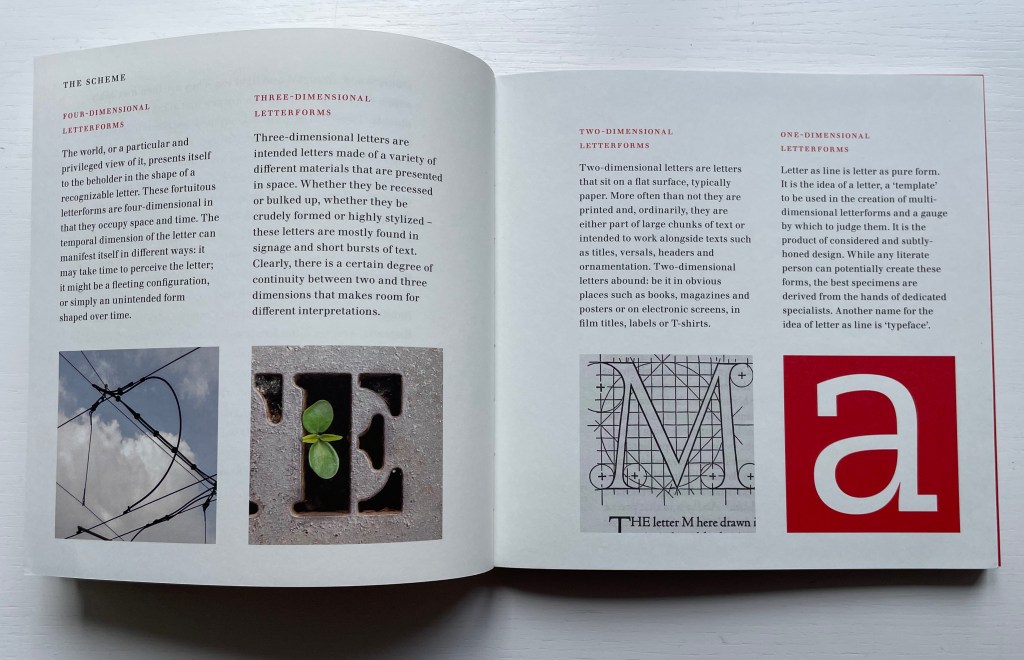
Ornan Rotem calls his book a “photo-typographic essay … a meditation … [e]xploring the relationship between typography and the visual world around us ….” As shown in the double-page spread below, his meditation is shaped across a four dimensional views of the letterform: the four-dimensional, three-dimensional, two-dimensional and the one-dimensional. At the end of the essay, there are 26 miniature essays that will send the reader back to enjoy each letter’s four dimensional entries again.
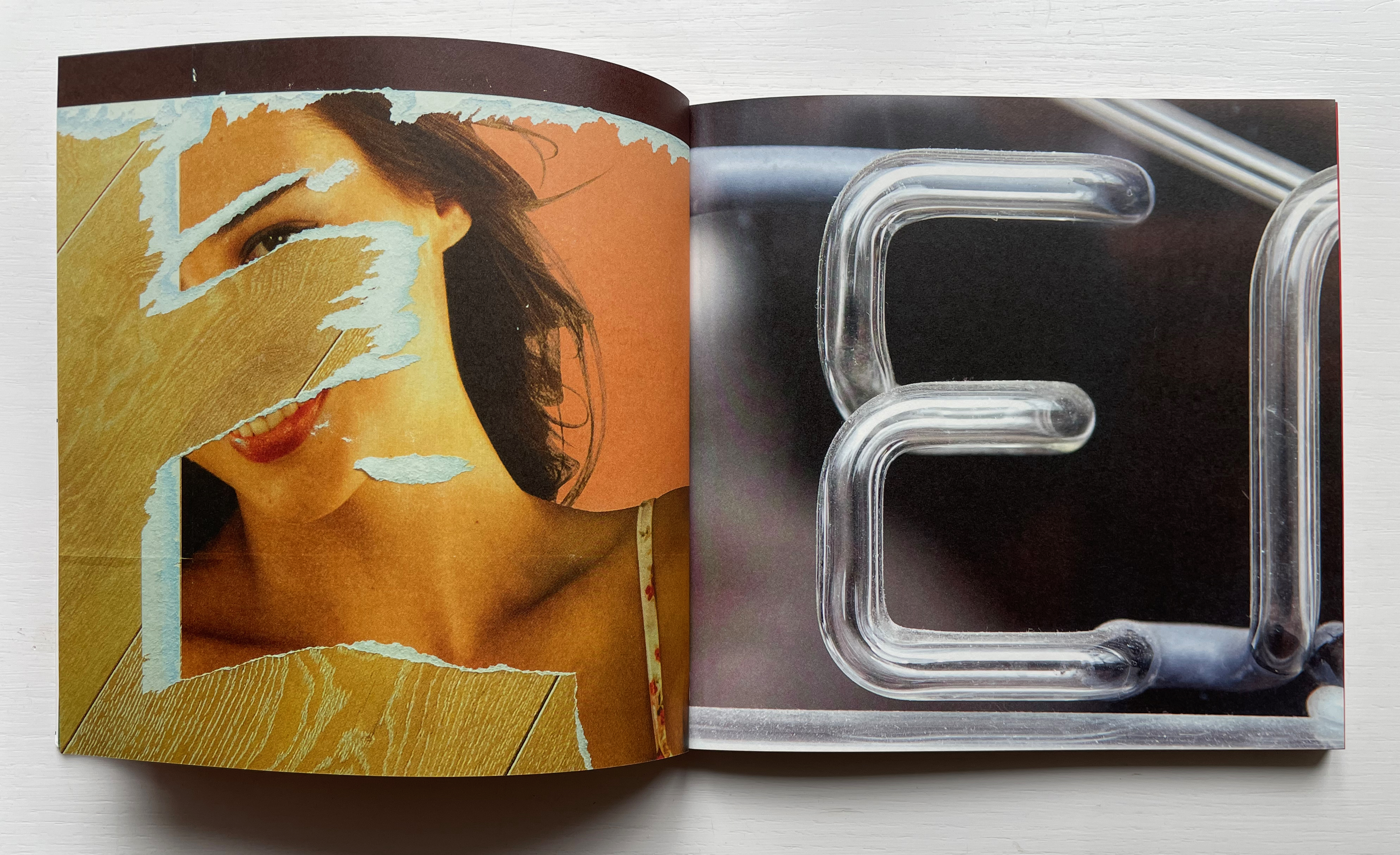
Everywhere you look you can see an E smiling at you (just saying it induces a smile). In 1969, Georges Perec, whose own name has four Es, tried exorcising the E by writing an esoteric 300-page novel, La disparition, without ever using one. I wonder how he would have felt had he come across this E — which was shot in Paris — when he was writing the novel. ¶ If you want to endow letters with character, then I suppose E would be the lively sort, hence the printed form comes from a 1948 cover of LIFE magazine.
Much is packed into these miniature essays. Naturally for an artist’s book celebrating type, there are the necessary self-referential typographic puns in the one above: character and sort. In all, there is the evidence of the long, multi-place, multi-source contemplative gestation of the work. In the example above, the allusion to Perec’s novel leads to the 1969 photo in Paris (or was it vice versa?). The typographic puns lead to a search for an E from a LIFE cover (again, or was it vice versa?). This circular connectedness over time, text and image highlights the self-referentiality of the genre of the artist’s book.
While the dense allusiveness might suggest that this is a work limited to an adult audience, A Typographic Abecedarium does find favor with a younger audience — no doubt because it speaks to the phenomenon of seeing letters everywhere and in multiple dimensions.
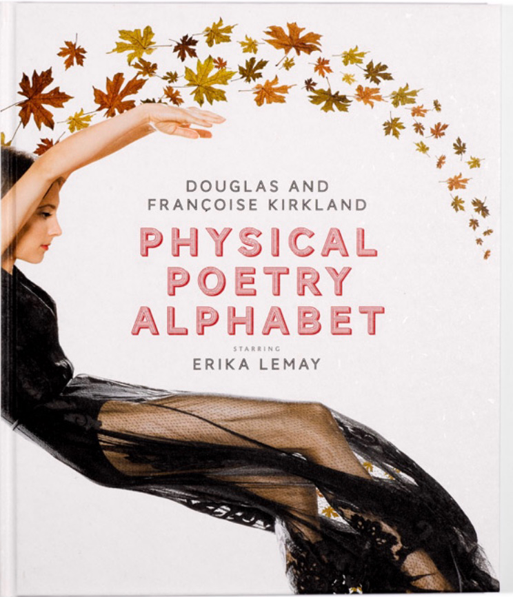
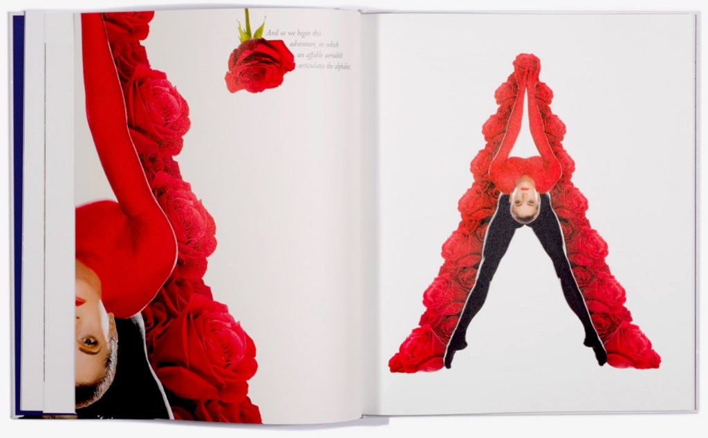
Physical Poetry Alphabet (2018) is a curious work. The Thames & Hudson-style production values combined with the knowledgeable essay in it by Ornan Rotem makes one think of Andrew Robinson’s The Story of Writing, an actual Thames & Hudson book. While the acrobatics of Erika Lemay echo the longstanding tradition of modeling the letters with the human body, followed by Erté, Vítězslav Nezval, Anthon Beeke and Rowland Scherman and so ingeniously summarized by Lisa Merkin, Lemay’s elaborate costumes and the scene design echo the traditions of Hollywood, Las Vegas and the fashion industry, which is not surprising given the involvement of Douglas Kirkland, portrait photographer to the stars. A Typographic Abecedarium strikes its singular target of “photo-typographic essay”. Having too many targets, Physical Poetry Alphabet perhaps misses its several bull’s eyes, but to follow along with its mixed metaphors, it undeniably delivers a shop full of eye candy.
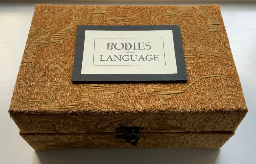
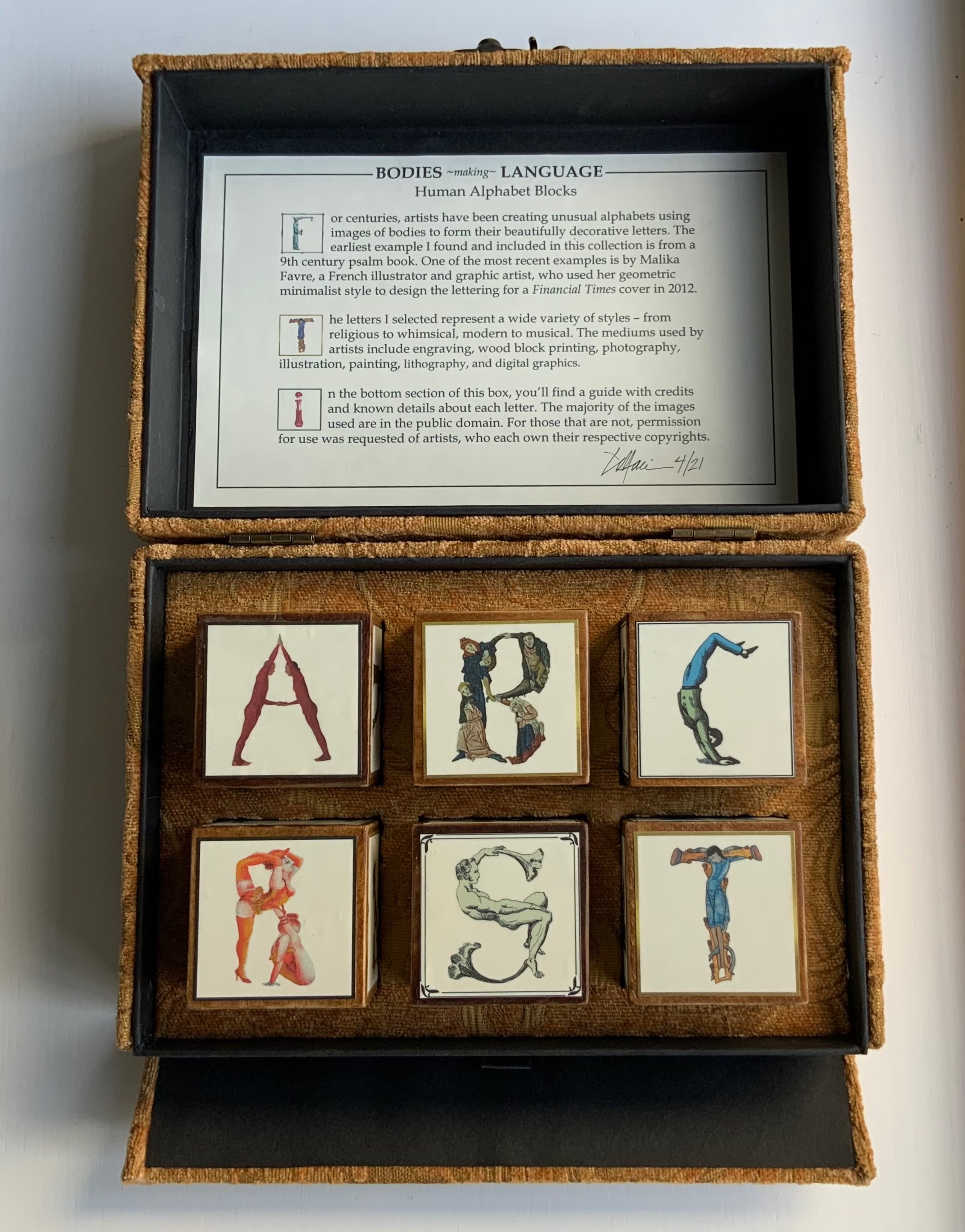
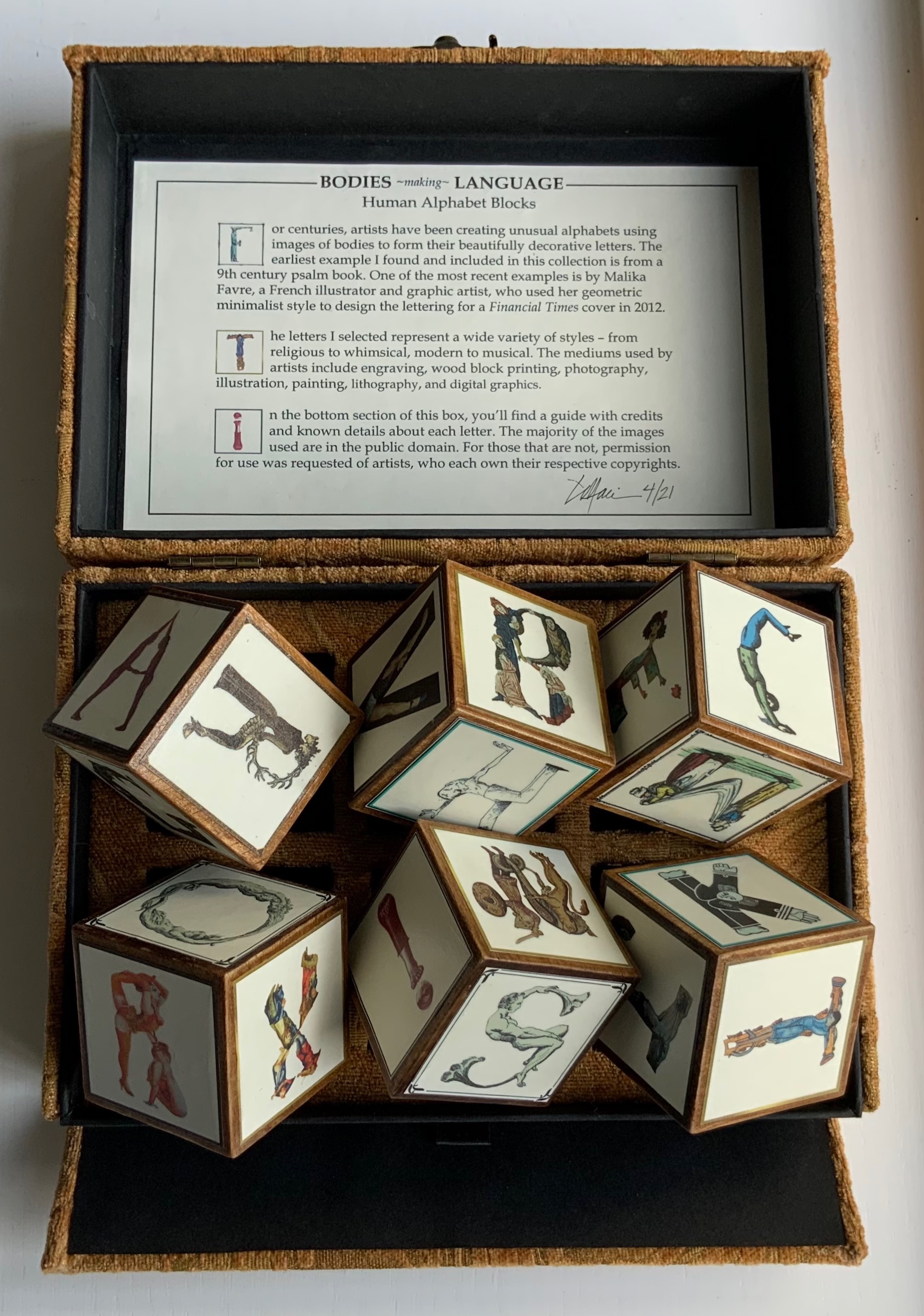
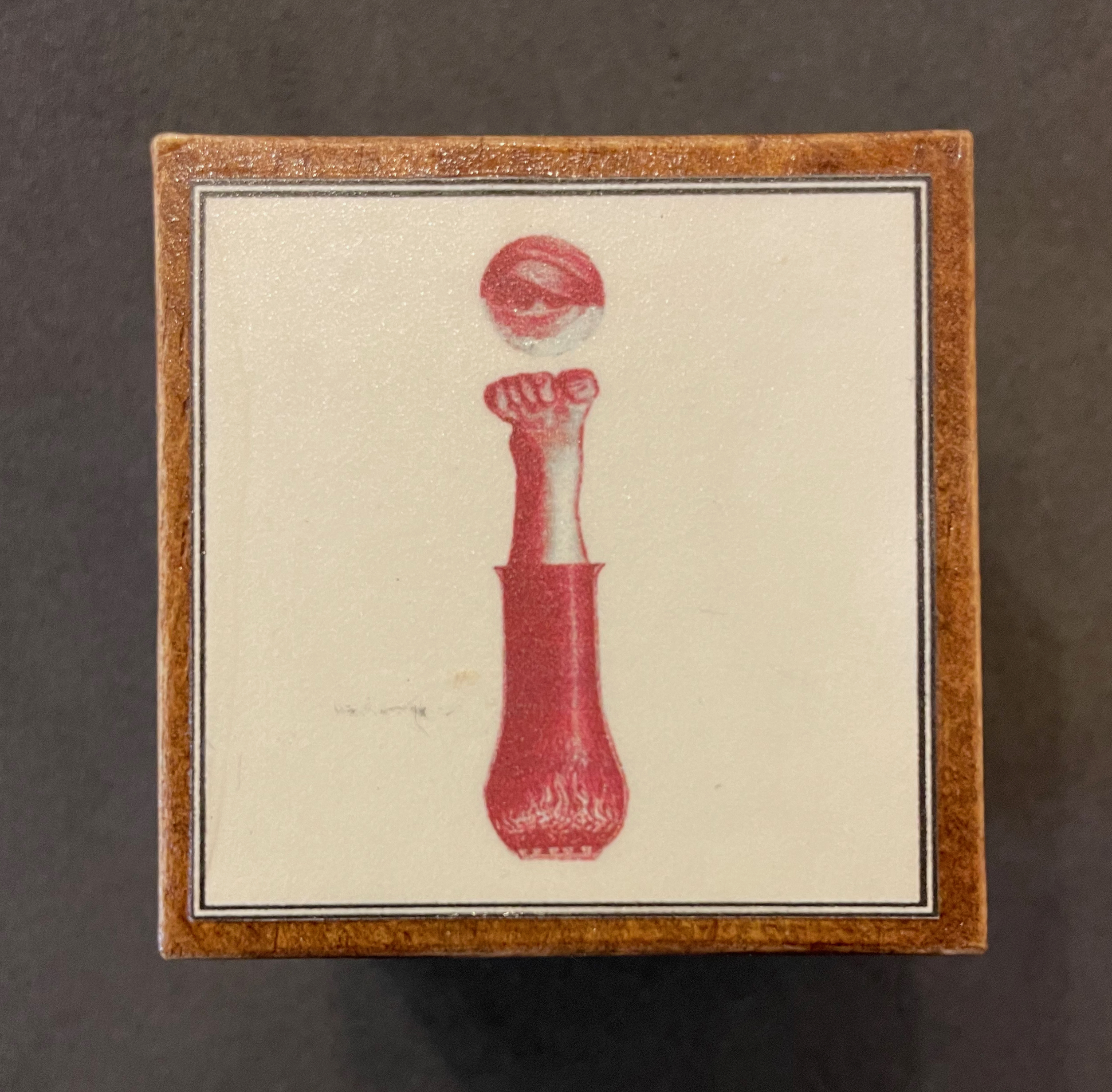
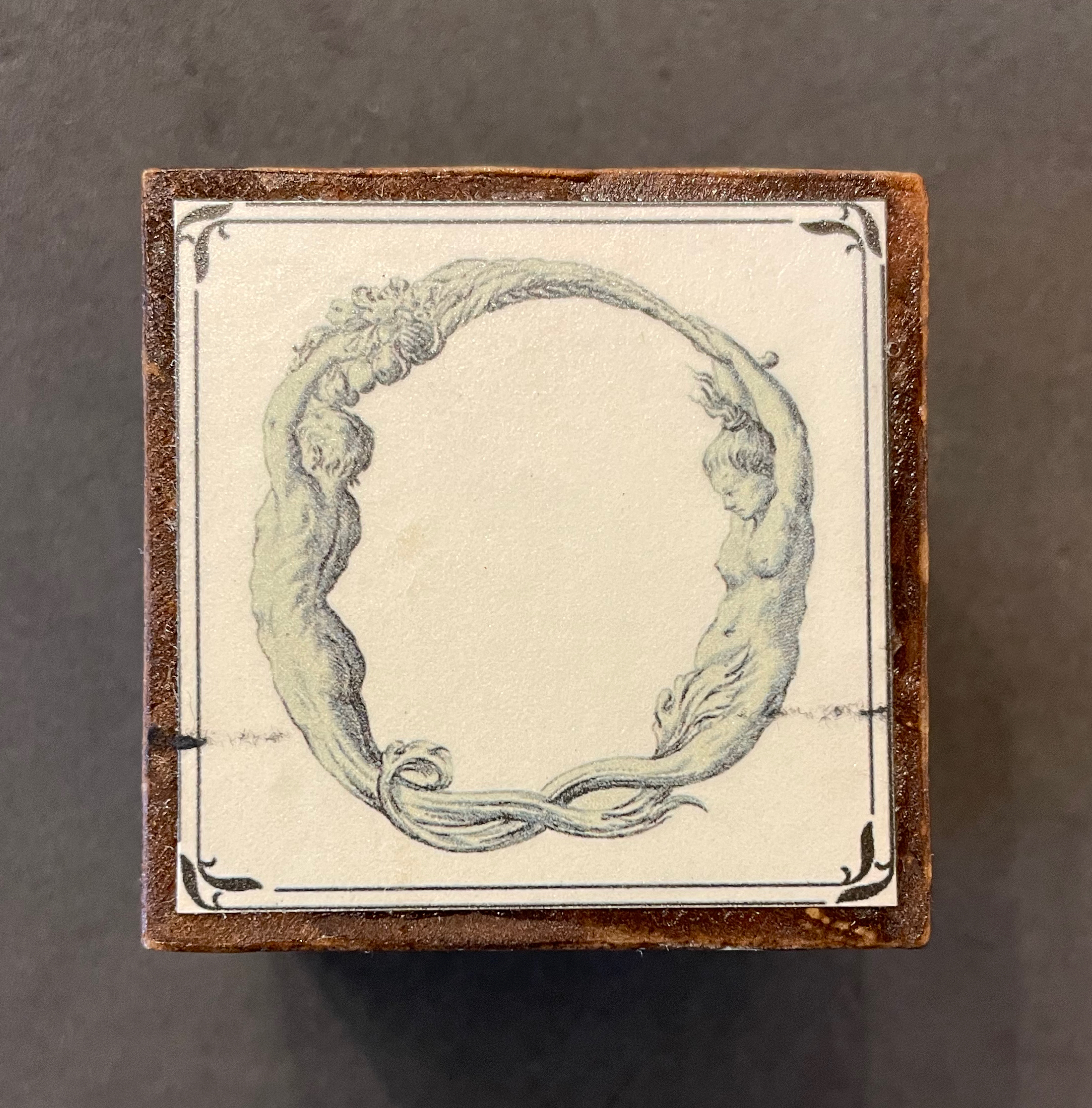
Bodies Making Language (2021) Lisa Merkin Brocade-covered box containing six blocks and compartment with three cards. Box: H95 x W225 x D155 mm. Blocks: cube 50 mm. Cards: H105 x W205 mm. Unique work. Acquired from the artist, 20 September 2021. Photos: Books On Books Collection. Displayed with permission of artist.
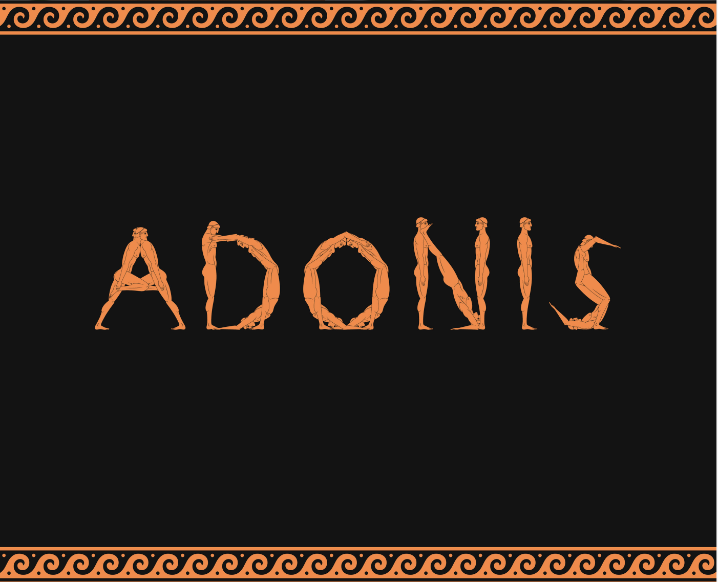
In a play known from fragments as the Alphabet Tragedy (although it sounds more of a comedy), the ancient Greek playwright Kallias had his chorus and actors mime and dance the letters of alphabet. Lisa Merkin’s book of blocks in a box shows that bending bodies to make letters has never grown old. Appropriately, her most recent image comes from Diego Rodas Feroni’s typeface Adonis (2018), which seems to recall the Greek playwright’s actors. Also in the Books On Books Collection, Vítězslav Nezval & Karl Teige’s Abeceda (1926), Pilobolus Dance Company’s Human Alphabet (2010) and Marie Lancelin, Gestes Alphabétiques (2014) have carried on the tradition of the alphabet dance.
Block 6: During his studies at UFRJ Universidade Federal do Rio de Janeiro, Diego Rodas Feroni designed the Greek God figurine typeface Adonis (2017).
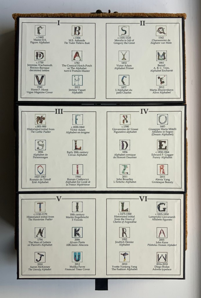
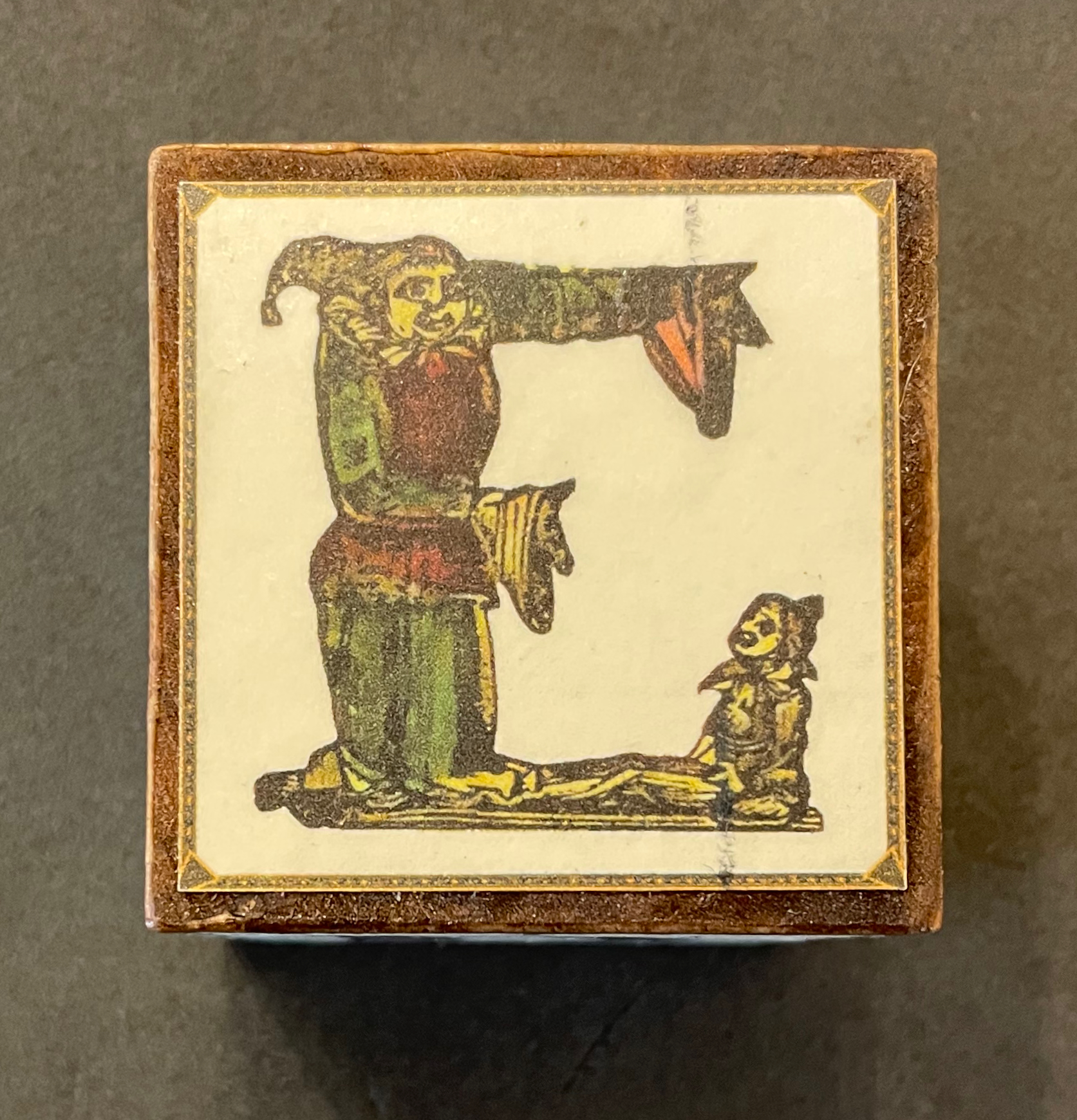
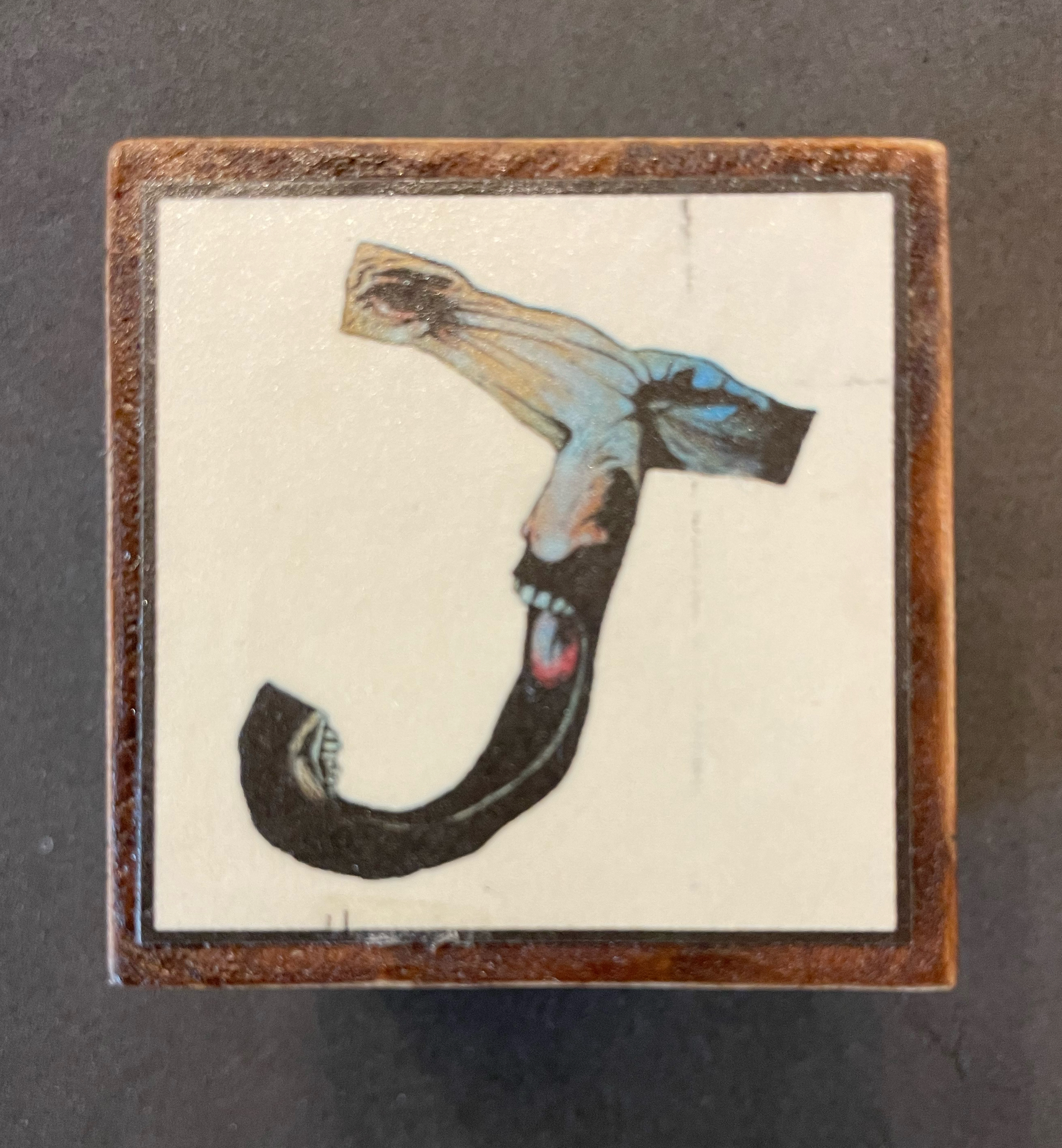
Many of Merkin’s choices celebrate the more comic aspects of anthropomorphic letters: Carington Bowles’ The Comical Hotch-Potch (1782), Bowles & Carver’s The Man of Letters, or Pierrot’s Alphabet (1794), Honoré Daumier’s Alphabet comique (1836), Edward P. Cogger’s Funny Alphabet (c. 1850-64), Aaron McKinney’s The Unruly Alphabet (2010) and Jérôme Viguet’s caricatures Alphabet (2013).
Block 4: Funny Alphabet (c.1850 – 1864) by illustrator and engraver Edward P. Cogger. McLoughlin Brothers Publishing, NY. Block 5: The Unruly Alphabet is a “lively and haunting abecedary“ book created in 2010 by the English illustrator Aaron McKinney, who sets the alphabet against a backdrop of rebellious behavior showcasing human nature.
Maybe the human body and the perfect letter have something in common. Geofroy Tory (1529) and Anthon Beeke (1970) certainly thought so — the former in a neo-Platonic, religious way and the latter in a more secular way. Although Beeke is not represented among Merkin’s blocks, she does not neglect celebrations of the female form. Most of them come from the realm of fashion: Erté’s Alphabet (1927-67), Horst P. Horst’s Vogue cover (1940), Yvette Yang’s The Fashion Alphabet (2010) and Alexia Yang’s Grotesque Beauty (2011). From the collection, Rebecca Bingham’s miniature Lady Letters (1986) could qualify for the catwalk.
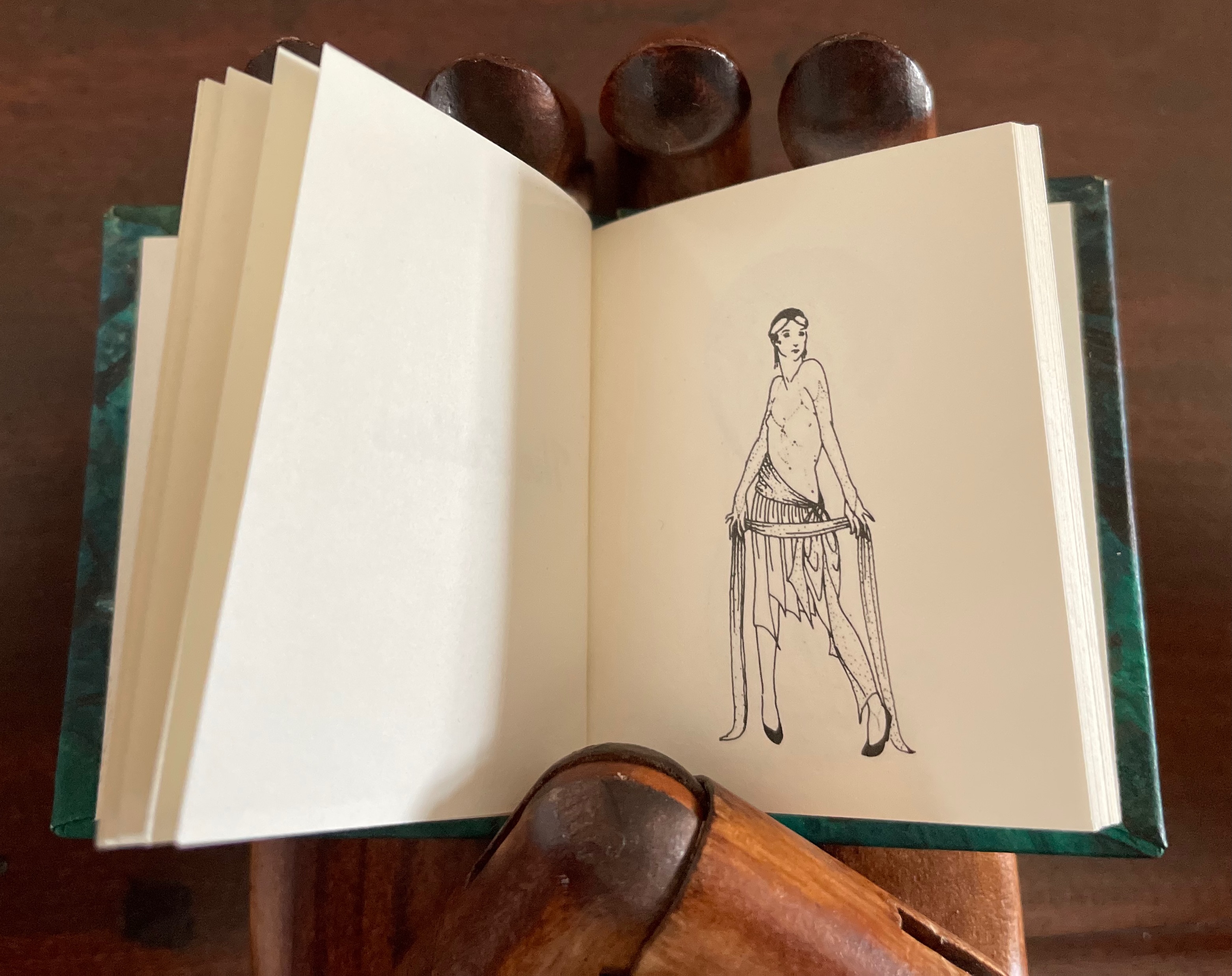
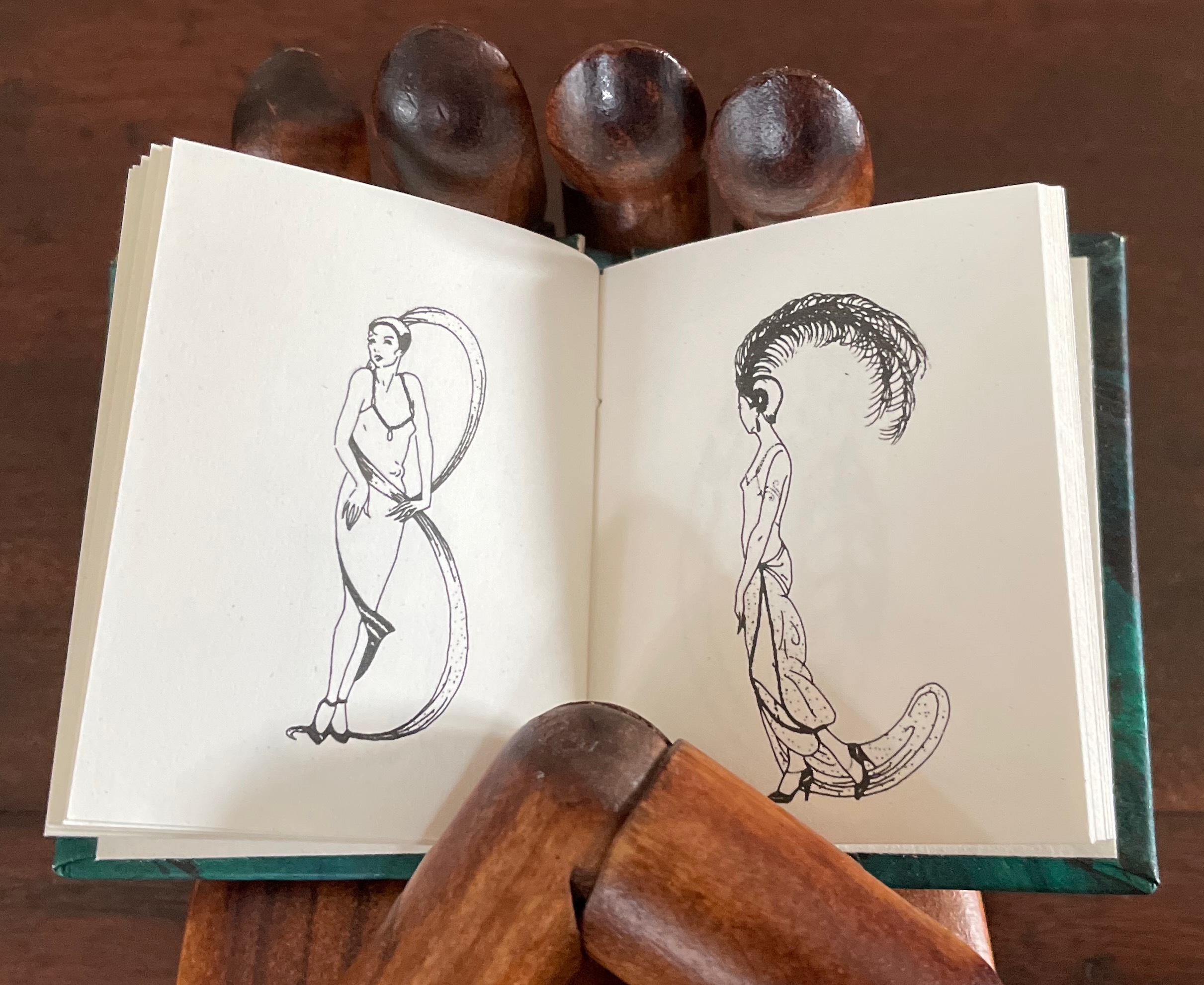
Block 6: The Fashion Alphabet by Korean-born, Dutch-educated, and Paris-based artist, Yvette Yang. In 2007, Yang began creating her font fashion series with bits and pieces from the runways and magazines. This T is from her interpretation of Spring/Summer 2010. Lady Letters (1986) by June Sidwell and Rebecca Bingham. The miniature book captures Sidwell’s designs and poses.
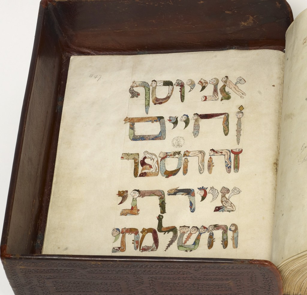
Historiated and figurative letters from the 6th to 15th centuries so well represent the Latin alphabet in Merkin’s box of blocks it would be greedy and thematically problematic to wish for one of the Hebrew letters from the Kennicott Bible. If there is ever a second Merkin volume to celebrate anthropomorphic letters, though, another range of languages beckons. For Ukrainian, there are the letters of Tatyana Mavrina. For Arabic, there are Mahmoud Tammam’s inventions, but then the volume would have to admit the zoomorphic, which suggests perhaps a third Merkin volume of animal alphabets.
Block 6: Horae ad usum Parisiensem (Hours of Charles of Angoulême) (ca. 1475-1500) by the French illuminator and painter Robinet Testard (fl. 1470–1531). Bibliothèque nationale de France, Paris. Block 2: Moralia in Job by Pope Gregory the Great (590-604). The Abbaye Notre-Dame, Cîteaux, France.
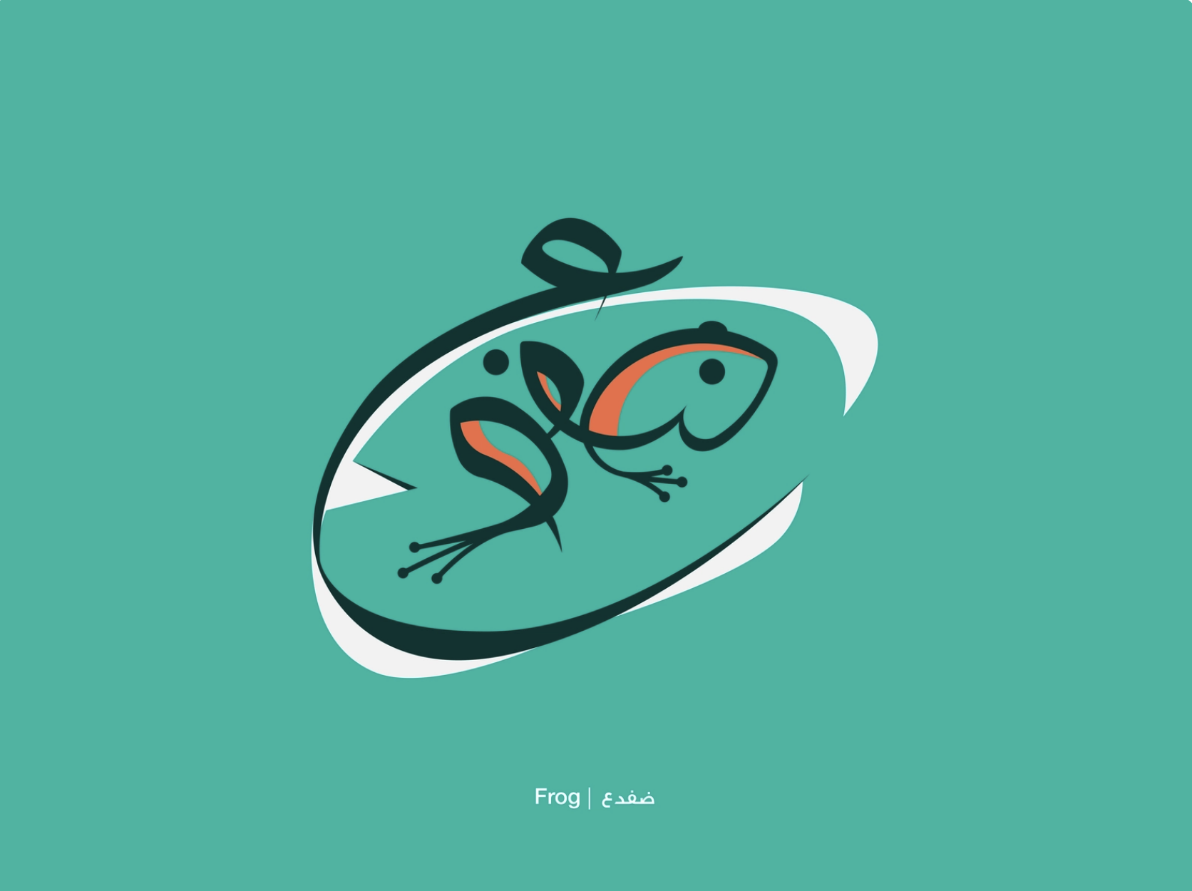
Hebrew Bible with David Kimhi’s Sefer Mikhlol (“Kennicott Bible“) (1476). Neubauer 2322. Bodleian Libraries, Oxford. Сказочная Азбука / Skazochnaia Azbuka / A Fairy Tale Alphabet (1969) by Tatyana Mavrina. In his Arabic letters project, Mahmoud Tammam manipulates the Arabic script ضفدع meaning “frog” to illustrate its meaning.
As shown with the Adonis letter W, Merkin’s blocks remind us of the influence of past art on the alphabets of 20th- and 21st-century designers and artists. Among the modern alphabetic variants, Dada and Surrealism make a strong showing of influence on Yvette Yang’s letter T (above) and Roman Cieślewicz’s letter i (below), and who knows, perhaps Giuseppe Maria Mitelli’s letter O influenced the Dadaists and Surrealists themselves. More than a strong showing, these styles highlight something fundamental about the alphabet and art. Both the alphabet and art ask, Are we discovering meaning or making meaning?
Block 4: Alfabeto in Sogno (1683), etchings by Giuseppe Maria Mitelli (1634-1718). Block 3: From the fantastical alphabet created by Roman Cieślewicz (1930 -1996) for Guide de la France Mystérieuse” (1964).
Every history of letters or script begins with the figuratively pictographic. Someone somewhere at some time scrawled a shape tied to a sound tied to an object — A is for Ox — and some other(s) in the same place and time recognized and accepted the discovery that this handmade shape could conjure up that object in the mind. It would have seemed magical, and they imagined that somehow meaning and reality inhered in that shape or sound waiting to be discovered.
Yet, the shapes of characters — whether Latin or Chinese or Arabic or any language — and their relationship to the sound or meaning they represent is arbitrary, a prehistorical and historical function of social convention, a collective making by individuals. That arbitrariness provides the opening for artists to use the alphabet to question our meaning-seeking behavior and our assumptions about reality, and modern artists’ anthropomorphizing the alphabet pokes fun at that behavior and those assumptions. Perhaps a fourth Merkin box — one for bodies making “asemic alphabets”?
Clodd, Edward. 1913. The Story of the Alphabet. London: Hodder and Stoughton. 1913. Superseded by several later works, but is freely available online with line illustrations and some black and white photos.
Diringer, David, and Reinhold Regensburger. 1968. The alphabet: a key to the history of mankind. London: Hutchinson. A standard, beginning to be challenged by late 20th and early 21st century archaeological findings and palaeographical studies.
Dukes, Hunter. 27 April 2023. “Punctuation Personified (1824)“. The Public Domain Review. Not only could letters be formed with the human body, so could quotation marks and square brackets.
Gagné, Renaud. 2013. “Dancing Letters: The Alphabetic Tragedy of Kallias”. In Choral Mediations in Greek Tragedy, ed. R. Gagné and M. Hopman, Cambridge University Press 282-307.
Goetz, Sair. 11 June 2020. “Letterforms / Humanforms“. Letterform Archive News. Accessed 30 January 2022.
Letters(1971) Abe Kuipers Self-covered set of folios. H257 x W190 closed, W380 open. 8 folios. Edition of 80. Acquired from Bubb Kuypers Auction, 22 November 2022.
In the late 1960s and early ’70s, Pieter Brattinga‘s 250×250 mm Kwadraat Blad series championed the innovative typographic designs of Wim Crouwel, Gerard Unger, Timothy Epps and Christopher Evans. Theirs were radical explorations of the letterform. Even “bad boy” Anthon Beeke‘s cheeky Alphabet was based on the Baskerville typeface — at least as far as the nude female models could be posed to approximate it. At the same time, further north in The Netherlands, Abe Kuipers was pursuing a very different kind of offbeat presentation of the alphabet.
As far back as the ’40s and ’50s, Kuipers had been interested in the alphabet’s origins. In 1951, he had organized the Fifty Years of ABC for the Prinsenhof in Groningen and years later published a book based on it with Wolters-Noordhoff (Groningen). In 1971, drawing on that activity, he participated in the “Létteretét projekt”, aimed at educating the people of Groningen about letters and their origins. Like the enterprise and its manifestations, the name Létteretét is an offbeat construction. Office rooms in high rises were lit to form letters at night. A poster illustrating the origin of letters (and promoting his 1968 book) was posted on billboards, in shop windows and in schools and libraries.
Image removed. Fair use not accepted.
The bottom right corner panel reads: this history of the letter was written and drawn by abe kuipers in may 1971. printed in silkscreen by De Ark this print is part of the Létteretét project in Groningen.
Kuipers reconfigured this poster into an artist’s book of 80 copies. Its bright colors, ad-like images, cartoonish drawings, photos, typewriter lettering and hand-scrawled text pull the ancestors of A, B, C and D (aleph, beth, gimel and daleth) into the present in folios folded in half and loosely held by a folio formed from the poster’s title panel. Articulating aleph into the face of a cow, a cartoon businessman re-enacts the ancient Semitic sound’s naming of the animal, which wears an inverted A bridle recalling the letter’s first discovered shape. The be-suited cartoon character alludes to paleographical theory that the alphabet had its roots in signs for accounting and inventories. The letter B receives similar treatment in the vacation postcard. The character in desert clothing says beth at the pair of pup tents forming the letter B on its side, the swimsuited man explains that “tent” equals “house”, which beth designated, and, having drawn the development of the sign into its modern form, the swimsuited woman articulates the letter. And so on for all the letters of the alphabet.
Certainly Kuipers knew that there were books and exhibitions for educating the general populace about the origins of the alphabet. He had been there and done that. But it is a wonderful proposition that art and design should confront the general populace with it and that they should be aware of it in everyday life.
Diringer, David, and Reinhold Regensburger. 1968. The alphabet: a key to the history of mankind. London: Hutchinson. A standard, beginning to be challenged by late 20th and early 21st century archaeological findings and palaeographical studies.
Van Genderen, Ans. 2022. “Abe Kuipers“. Dutch Graphic Roots. Eindhoven: [Z]OO producties. Accessed 20 November 2022. Also available in print from [Z]OO producties.
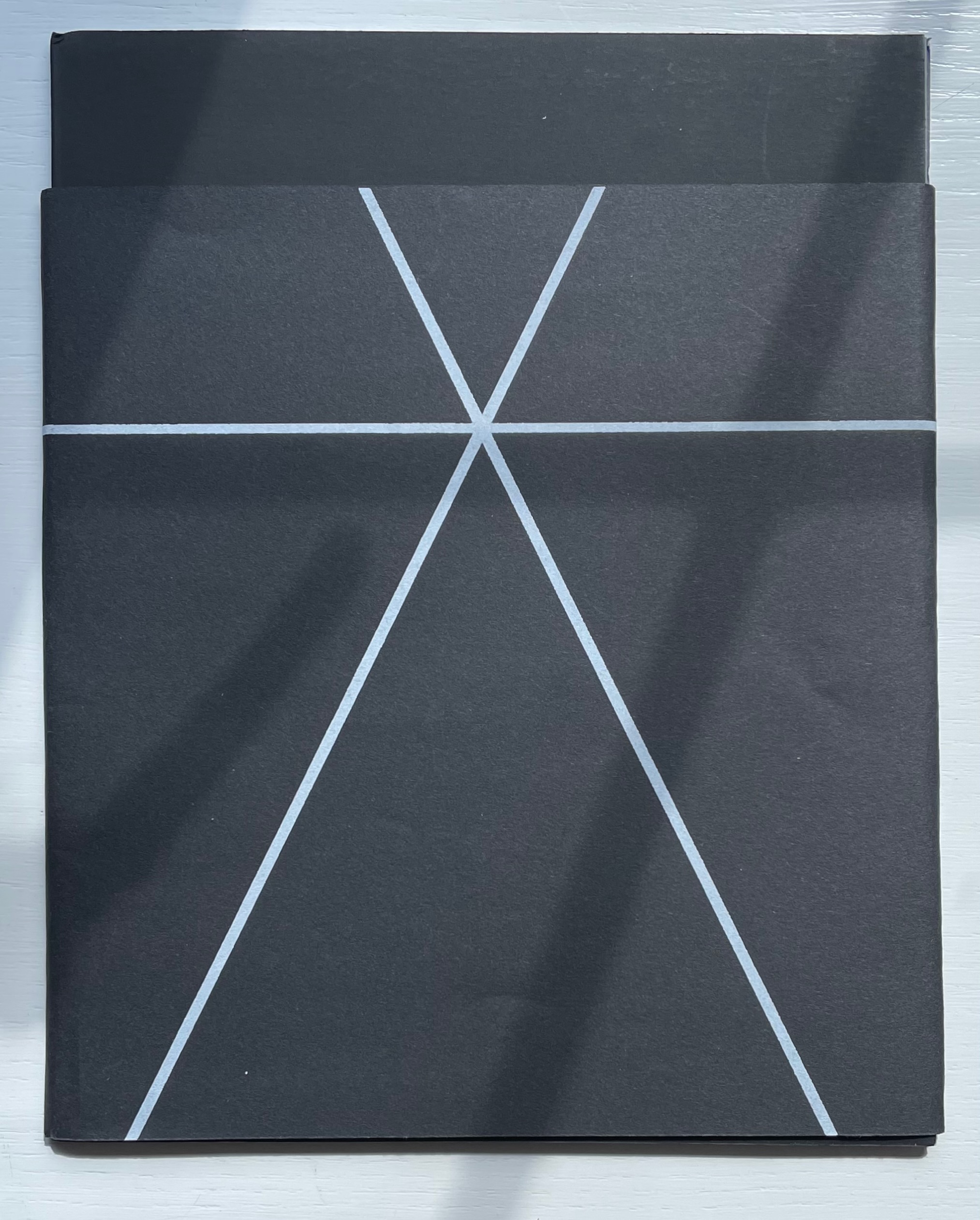
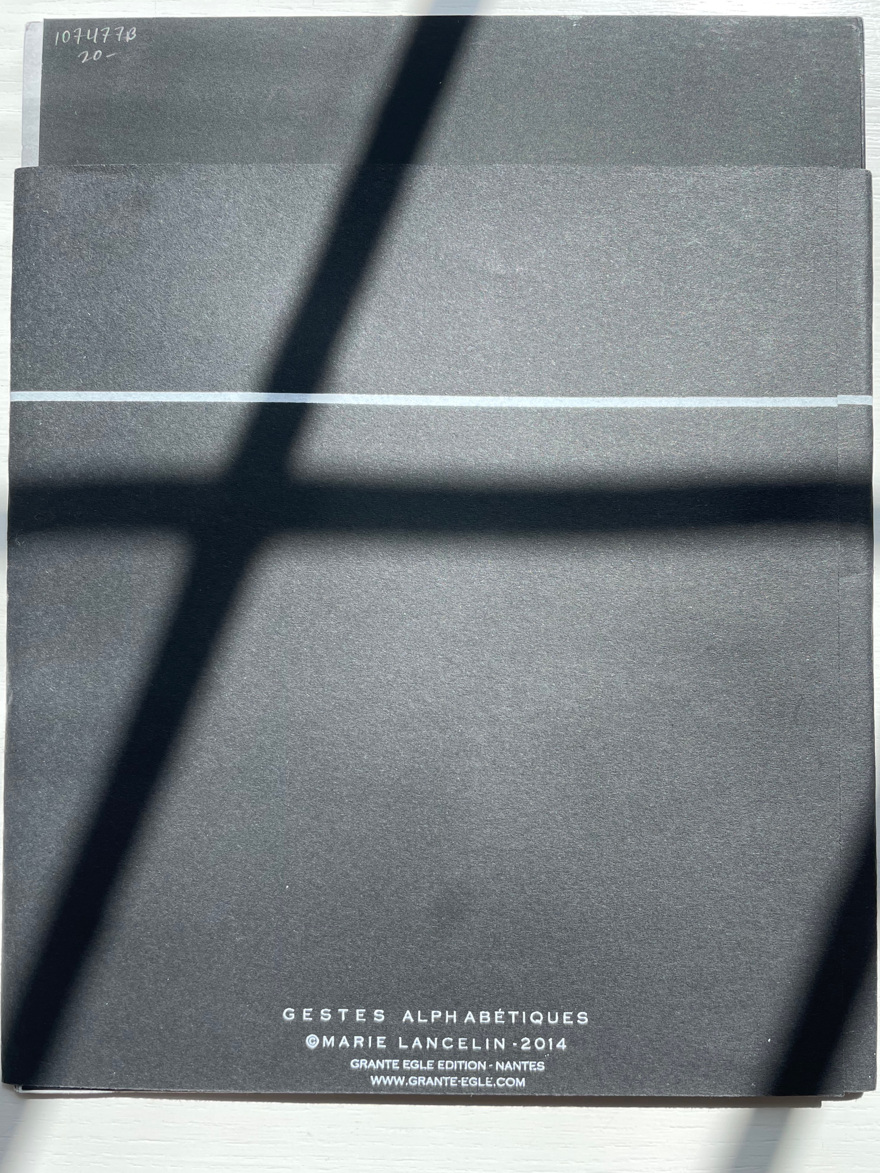
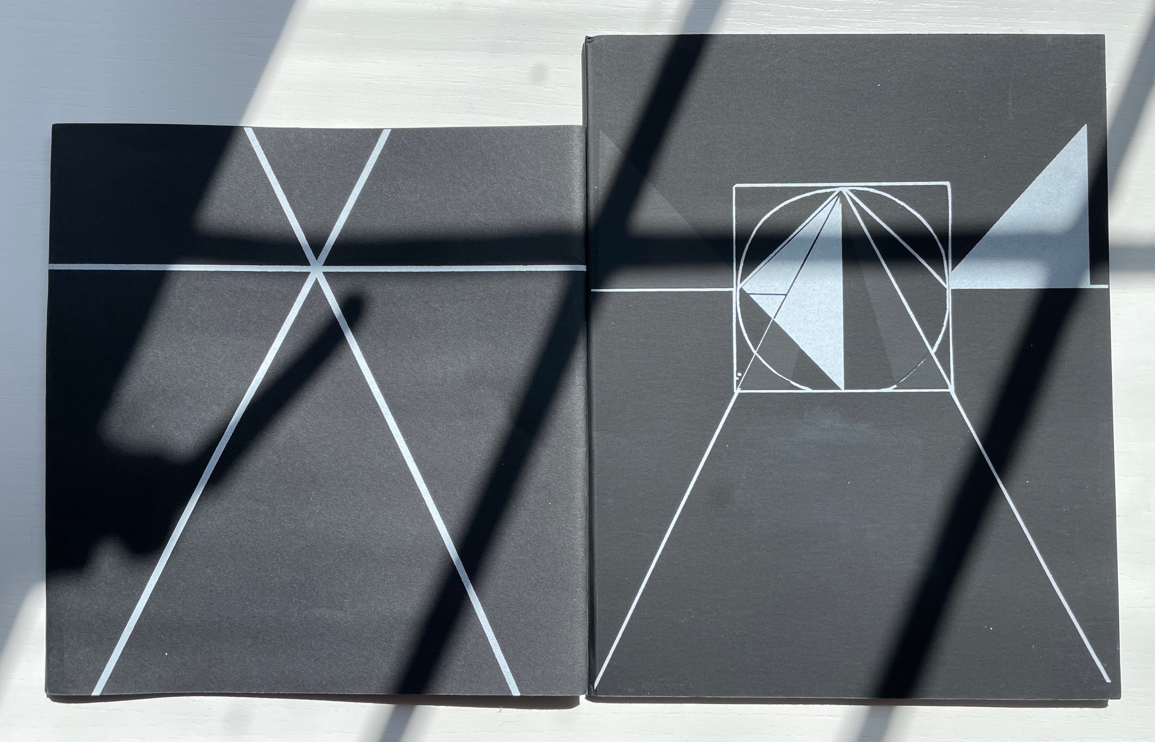
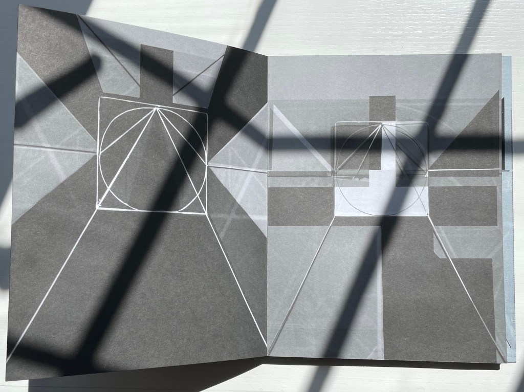
Gestes Alphabétiques (2014) Marie Lancelin Double-sided leporello with sleeve. H200 x W170 mm (closed). 14 panels. Laser-printed, screen print. Interior: offset on Arcoset Extra White 170 gsm. Cover and band: serigraphy on Curious Skin 270 gsm. Edition of 100. Acquired from Printed Matter, Inc., 31 July 2022. Photos: Books On Books Collection. Displayed with permission of the publisher, Grante Ègle (Nantes, France).
There is a long-standing tradition of “dancing the alphabet”. In his satyr play Amphiaraus, Sophocles brings in an actor dancing the letters. A more extended instance comes from 5th century Greek dramatist Kallias; his entire play Grammatike Theoria (“ABC Show” or “The ABC Tragedy“) presents the alphabet and pronunciation exercises. Apparently in acting out the letters psi and omega, the chorus member’s performance tended to the erotic, a phenomenon still to be found in Erté’s alphabet suite (1927/1978) and Anthon Beeke’s Alphabet (1970). Less suggestive are Vítězslav Nezval’s Abeceda (1926), Toshifumi Kawahara’s Dancing Alphabets (1991) and, most recently, Marie Lancelin’s Gestes Alphabétiques (its publisher issued two editions of 100 copies each in 2008 and 2014).
All the media and techniques that Lancelin engaged to make Gestes Alphabétiques — photograms, photomontage, laser printing, serigraphy, staging, lighting, drawing, printing — take her gestures beyond the alphabet and geometric abstractions we can easily see. Also apparent is her grounding in filming; the overlaying of the model’s poses transform that side of the leporello into a dance sequence. With the combined techniques, the ink and paper create the effect of displaying the dance through transparencies or glass or within some black and white computer graphic setting.
Fundamentally, through these media, techniques and the double-sided leporello form, Lancelin translates gesture, symbol, shape and light into one another and back again, offering the viewer the opportunity to see the artist explore the making of meaning.
Gagné, Renaud. 2013. “Dancing Letters: The Alphabetic Tragedy of Kallias”. In Choral Mediations in Greek Tragedy, ed. R. Gagné and M. Hopman, Cambridge University Press 282-307.
Goetz, Sair. “Letterforms / Humanforms“. 11 June 2020. Letterform Archive. Accessed 7 June 2021.
Lancelin, Marie. 29 October – 19 December 2015. “My Models“. Exhibition. In Extenso. Accessed 1 January 2023.
Lawler, Lillian. April 1941. “The Dance of the Alphabet”. The Classical Outlook, 18: 7, pp. 69-71.
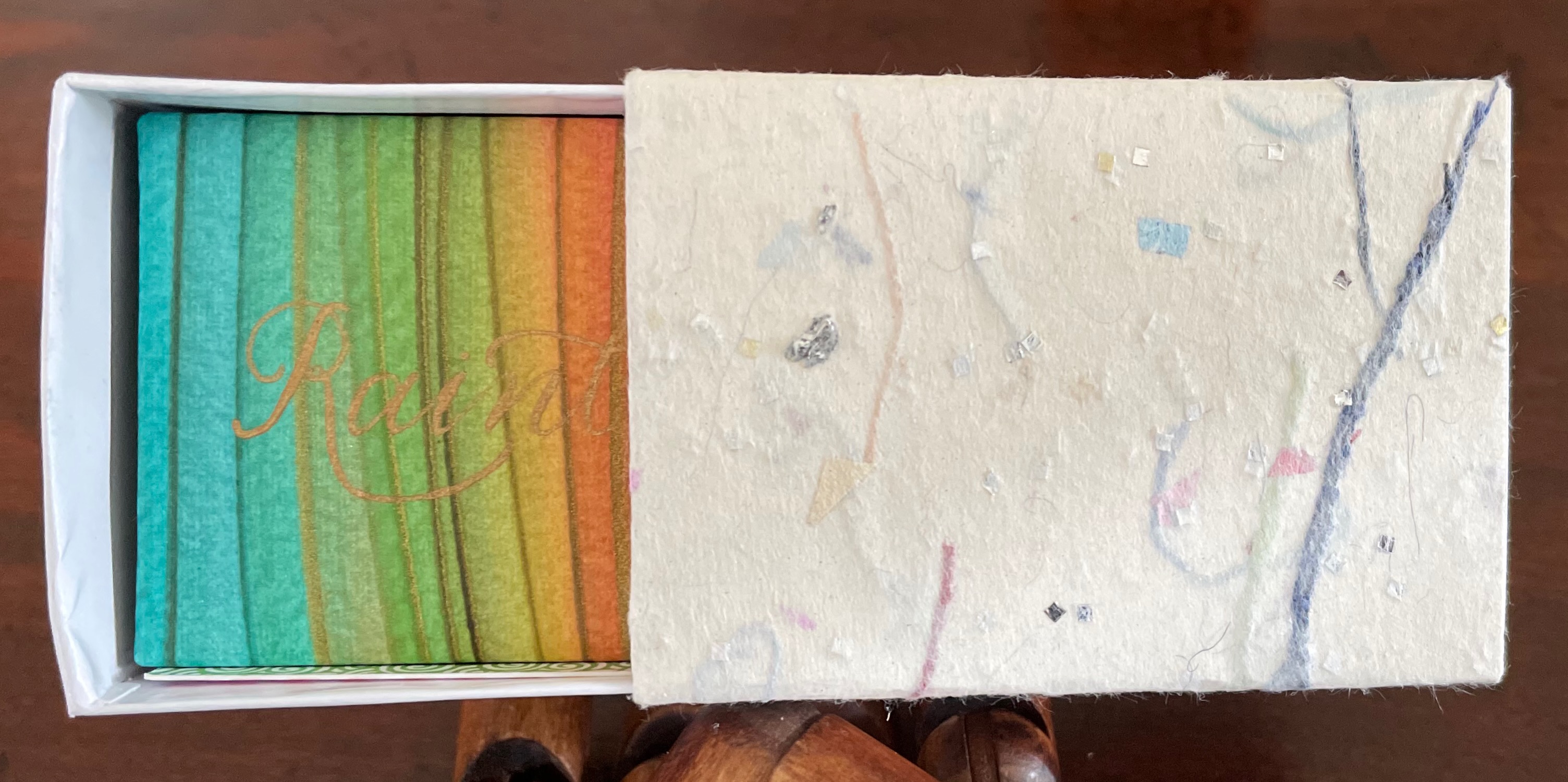
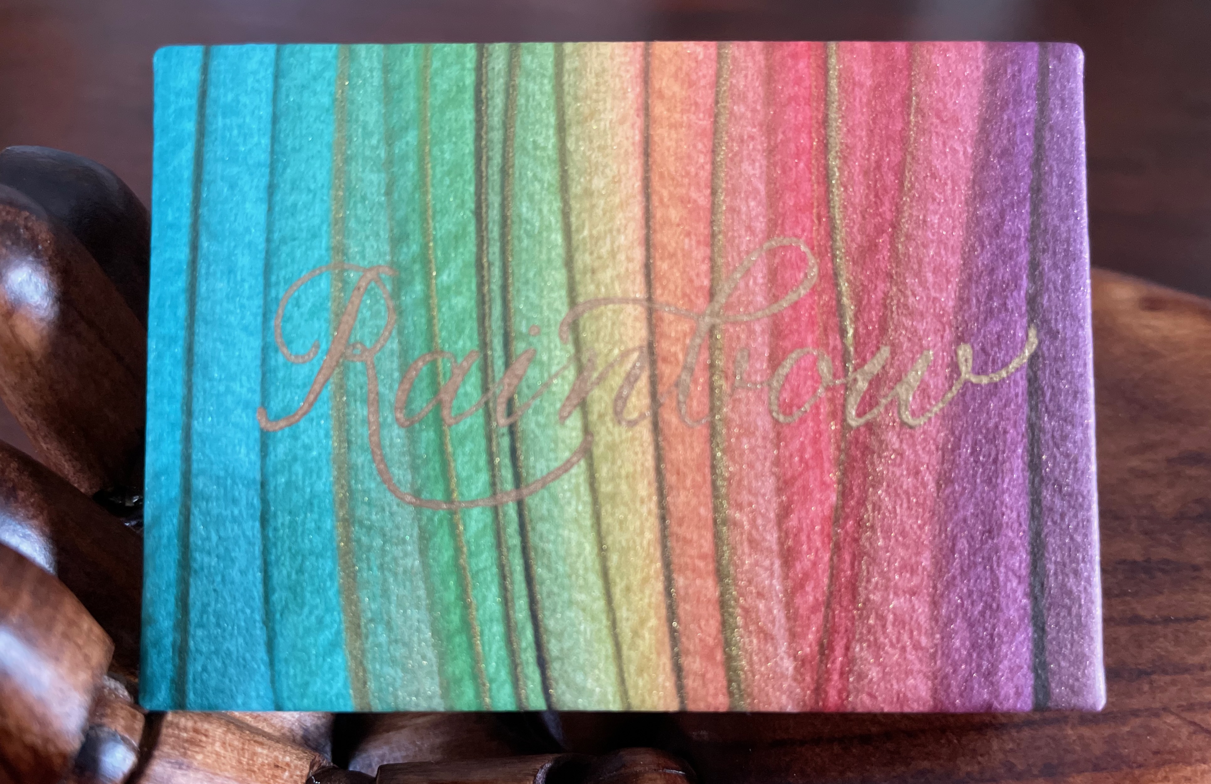
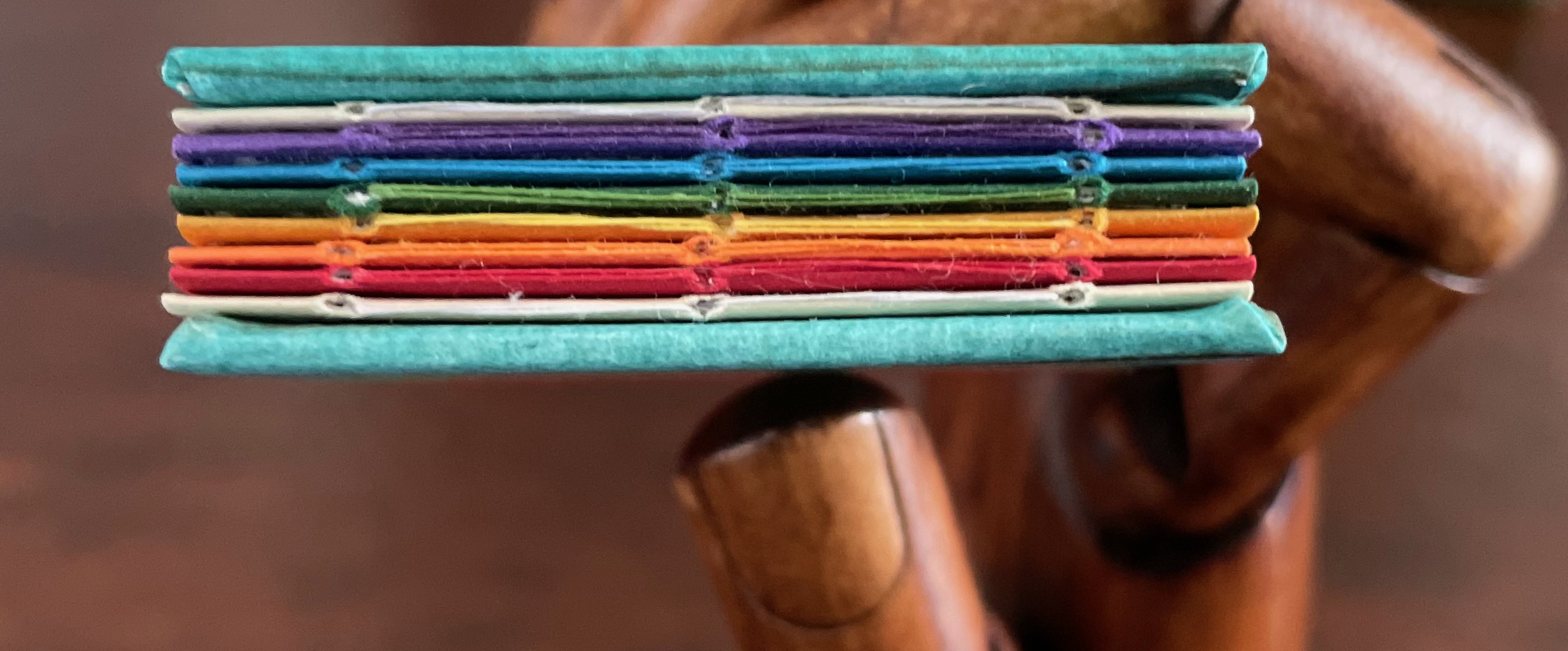
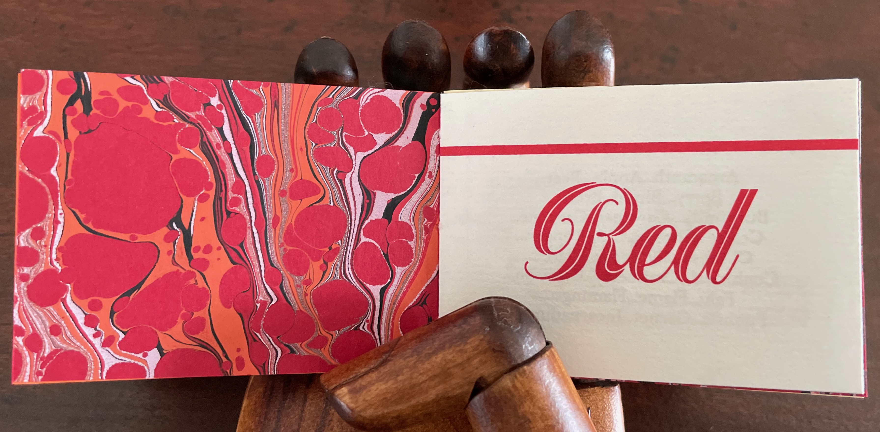
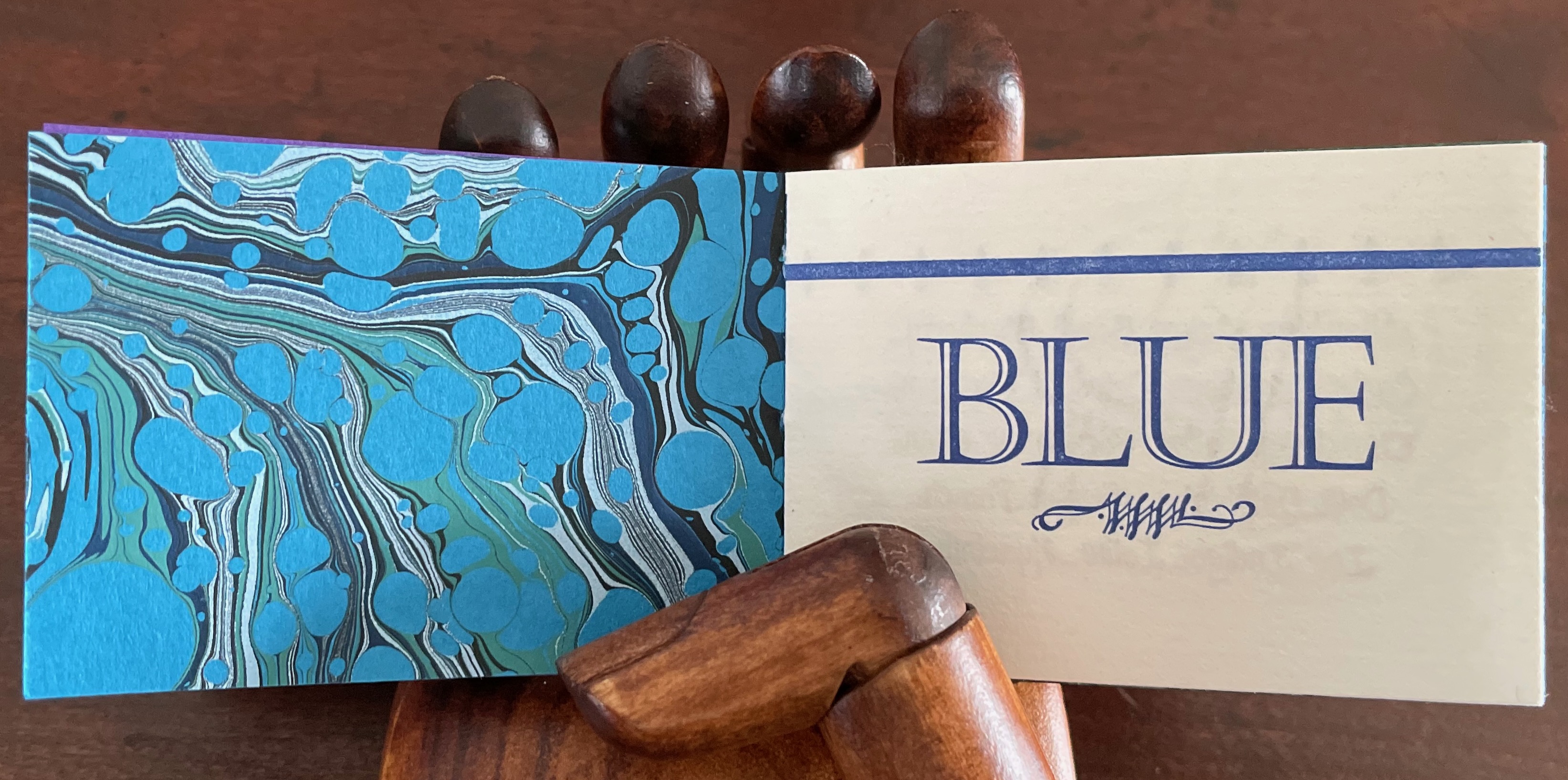
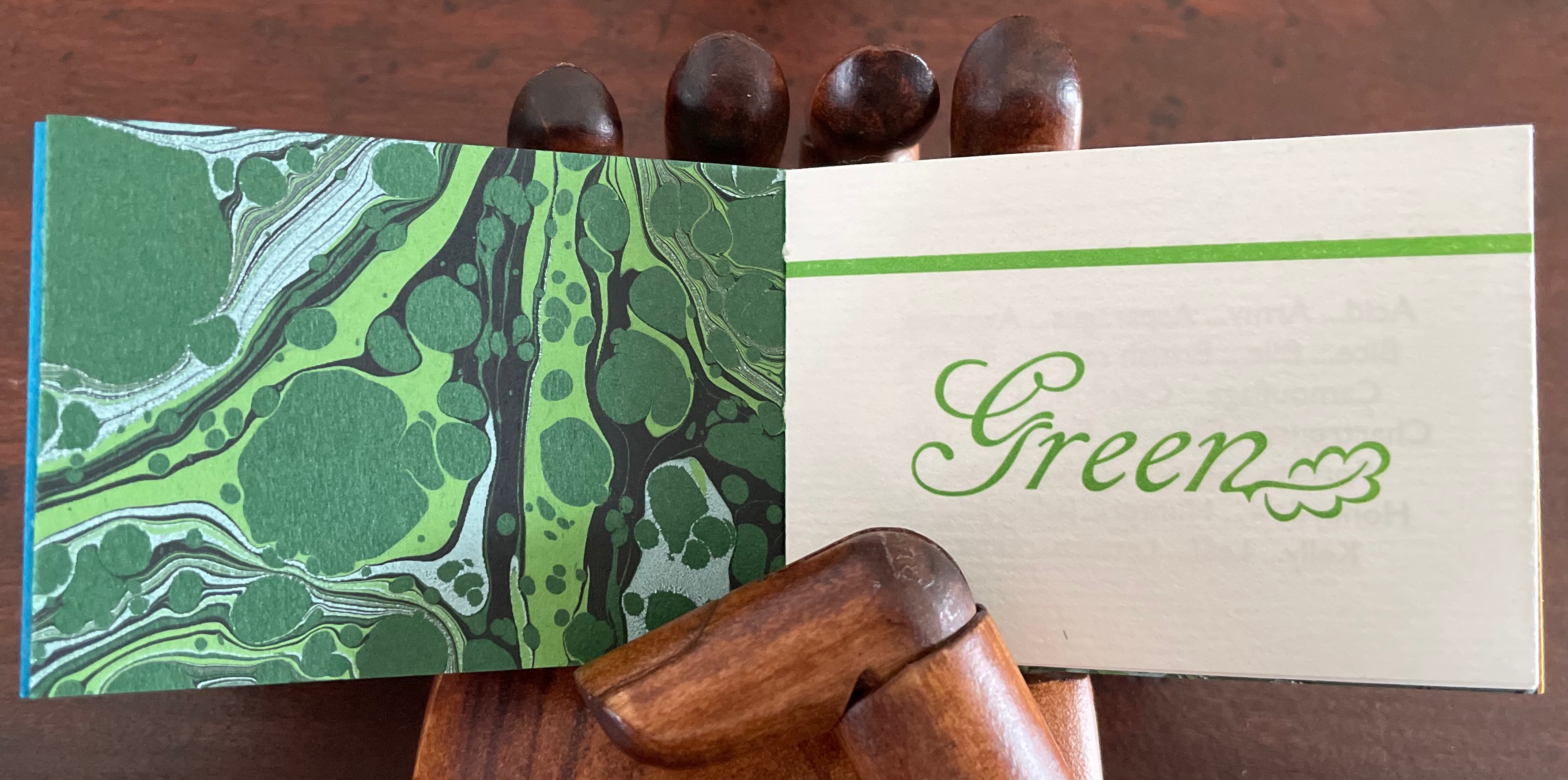
Defining the Rainbow(2018) Rebecca Bingham Matchbox-style box containing a miniature open spine book with paper over board covers. Box: H57 x W82 x D35 mm. Book: H51 x W73 mm. 46 pages. Edition of 81 (50 regular and 26 deluxe), of which this is #34. Acquired from Rebecca Press, 23 November 2022. Photos: Books On Books Collection. Displayed with the artist’s permission.
Defining the Rainbow is the product of a rainbow of talent. Madeleine Durhammade the paste papers for the box and covers of the book. Leonard Seastone of Tideline Press printed the book on his VanderCook from polymer plates made by Boxcar Press. Two four-page signatures for the front matter and colophon sandwich six four-page signatures of text listing shades and hues of Purple, Blue, Green, Yellow, Orange and Red. Between those signatures of handmade Hayle paper are back-to-back dividers made of marbled papers, hand-marbled by Jemma Lewismeeting several requirements: a scaled-down pattern and very specific color needs for the marbling to extend the idea of many-hued colors. Having collected and squirreled away names of shades and hues such as Byzantium, Zaffre, Smaragdine, Gamboge, Tangelo and Thulian (and researched them) and having waited for 30 years for the right project on which to expend a hoard of the handmade Hayle paper, Rebecca Bingham conceived and designed the project, convened the above-mentioned talents, spelled out their requirements, then hand-sewed and bound the results of their efforts.
On the Rebecca Press site, Bingham provides an engaging and enlightening description of the book’s letterpress printing “for those who are more familiar with the near-immediate gratification of digital printing”:
Each side of the page is printed separately (in this case, with the sheets being hand-placed into the press), after the ink has been applied (manually) to the type or (in this case) polymer plates. For something printed in one color, this means each sheet of paper passes through the press twice (front and back and alignment is not automatic — it’s fiddly work). In between, the ink needs several hours to dry. If you want a second color (for example, in my “green” section, both black and green inks are used), then the sheet must go through the press again (if color on 2 sides, then that means twice). I remind you of the alignment challenge. If you remember how hard it was to reinsert a typewriter page when corrections were needed (well, if you’re pretty old or are freakishly fascinated by ancient tech), you’ll have an idea of what this means. Plus, if you are changing the color on the press then the press needs to be thoroughly washed down so that the new color is crisp and clean (in the case of a light color like yellow, this can require more than one washing). Of course, this is a book about color, so 6 of the sections have their own second color and must go through the press 4 times (multiplied by the number of copies, of course). With the washing up and the aligning and the waiting for things to dry…
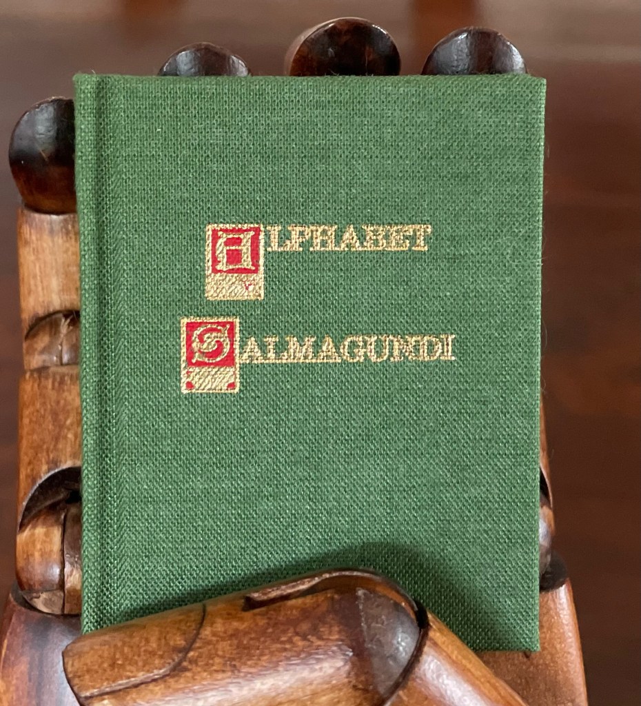
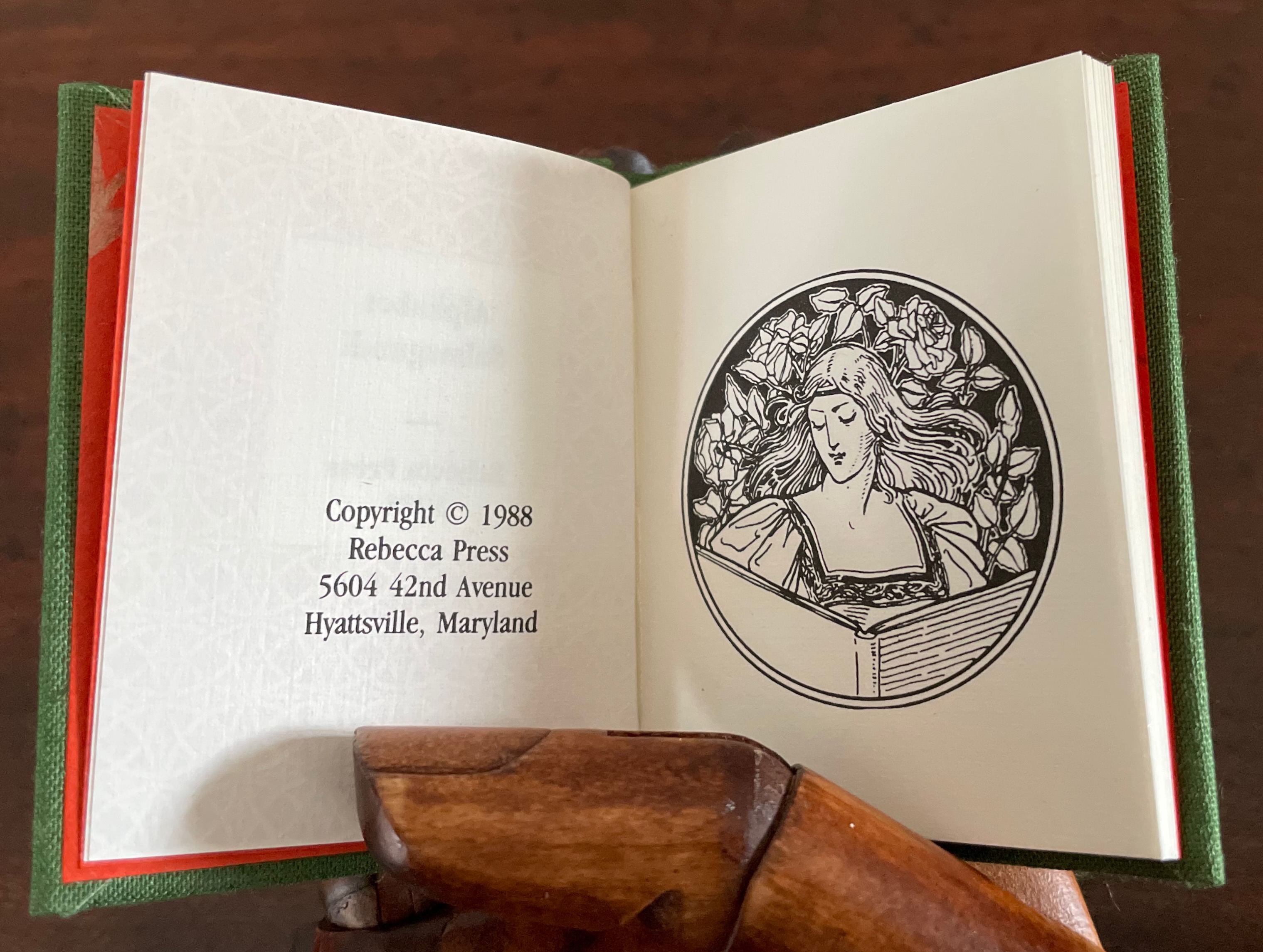
Alphabet Salmagundi (1988)
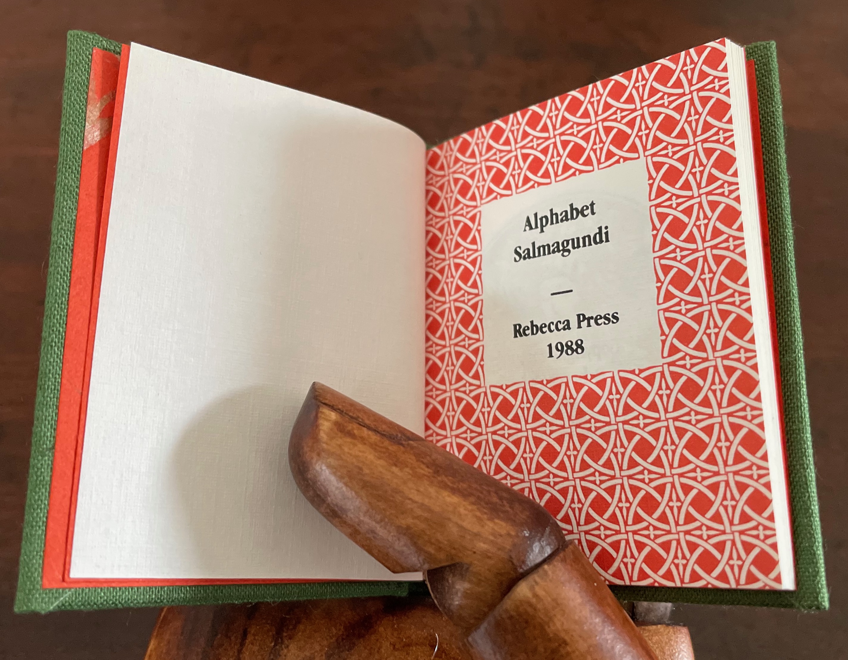
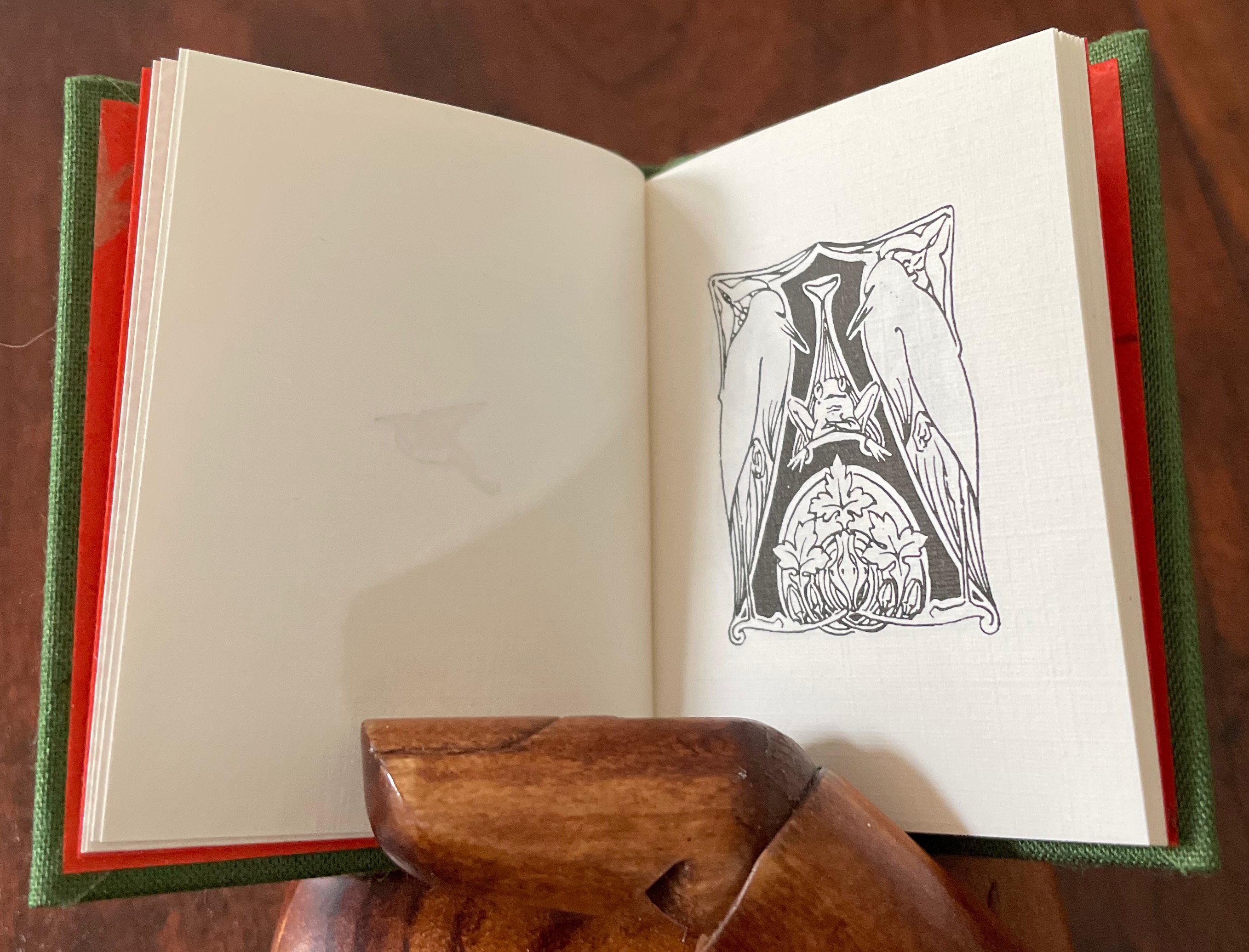
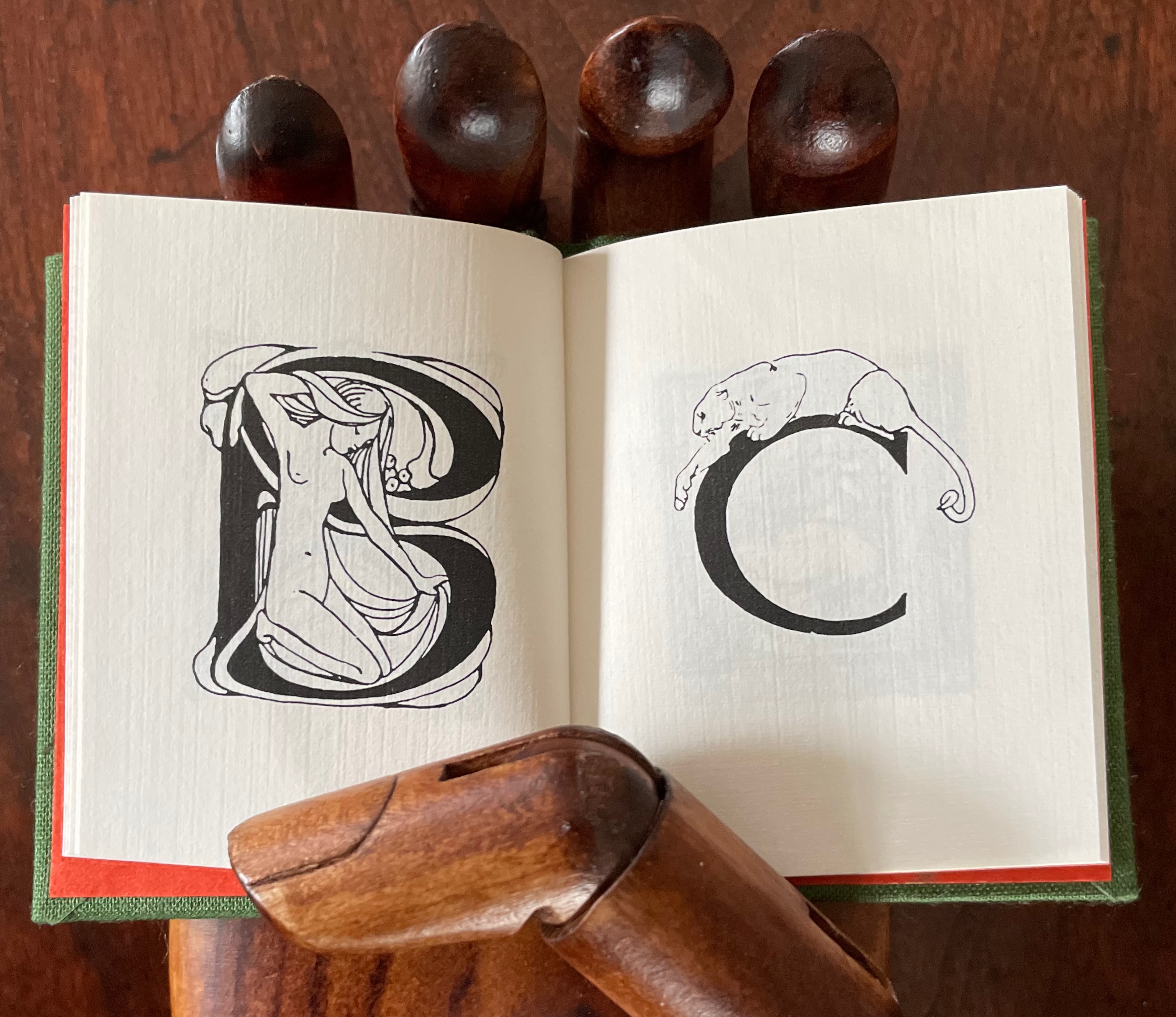
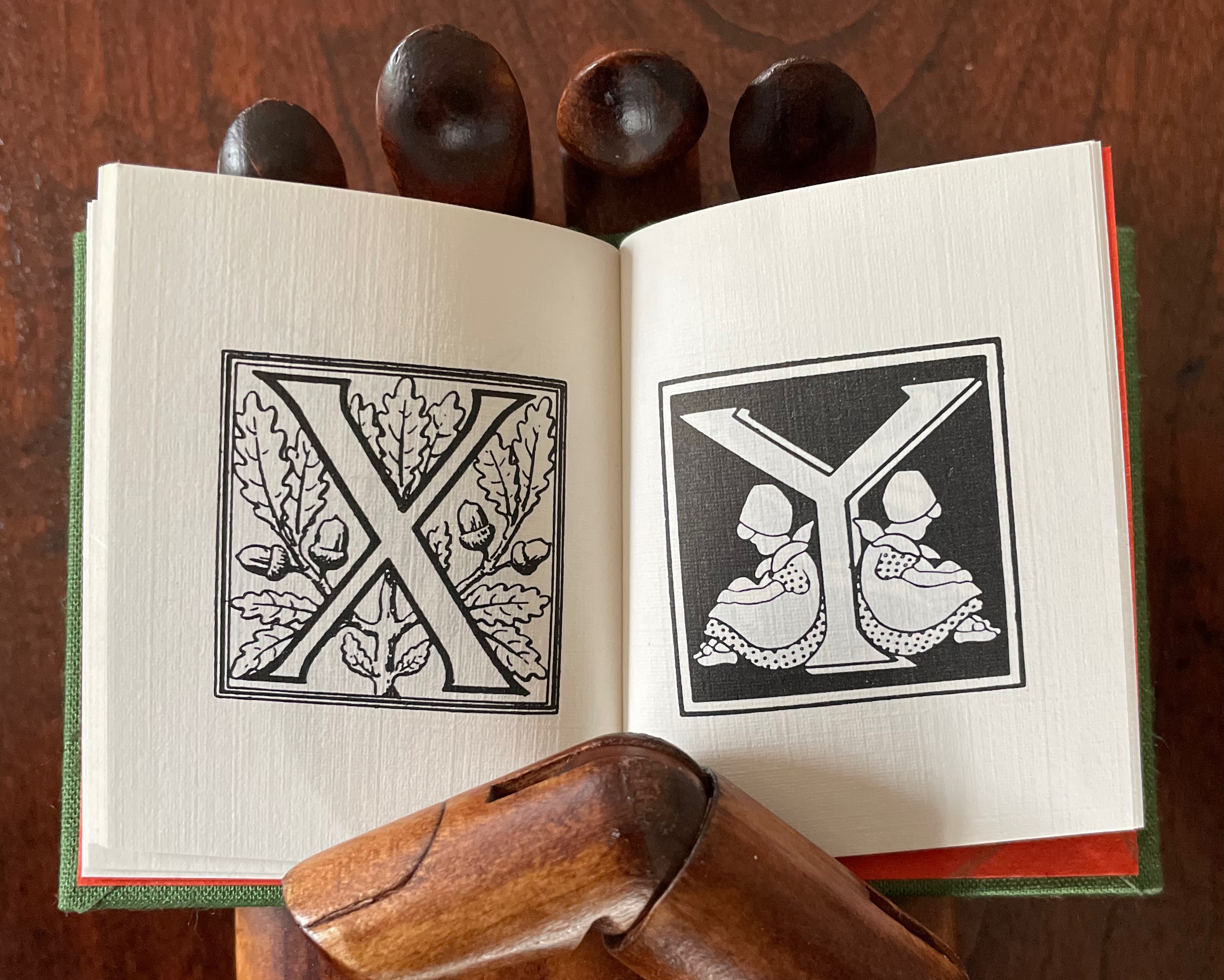
Alphabet Salmagundi (1988) Rebecca Bingham Miniature casebound, cloth over boards, colored decorated doublures, perfect bound book block. H66 x W57 mm. 40 unnumbered pages. Edition of 200, of which this is #150. Acquired from Rebecca Press, 23 November 2022. Photos: Books On Books Collection. Displayed with the artist’s permission.
This alphabet book is a miscellany of letter styles and images, some of which clearly reflect the letters with which they are associated and some of which are less clear. For instance, C is clearly associated with cat, but the big cat depicted looks like a lioness. The letter B has a bare-breasted young lady bathing, so the usual one-to-one association is elusive. And for the letter A, any association between it and two birds eying a nervous frog — unless the scene stands for “Appetite” — is downright obscure.
The relation of the letters X, Y and Z with their images is just as loose. X for oak or acorn? Y might be for youngsters. Does the decoration of letter Z suggest a zephyr?
If “salmagundi” implies a loose collection, a mélange, a potpourri, an olio, then this little book lives up to its name.
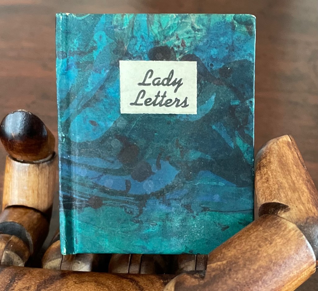
Lady Letters (1986)
June Sidwell designed, modelled and illustrated the haute couture alphabet for which Rebecca Bingham designed this book. Sidwell’s “lady letters” will likely remind the viewer of Erté’s alphabet, although his ladies take more risqué poses than Sidwell’s. Bingham actually met Erté, and on her site, she relates how she met him and presented him with a miniature version of his alphabet.
Lady Letters (1986) June Sidwell and Rebecca Bingham Miniature casebound, plain doublures, sewn book block. H58 x W48 mm. 40 unnumbered pages. Edition of 200, of which this is #33. Acquired from Rebecca Press, 23 November 2022. Photos: Books On Books Collection. Displayed with the artist’s permission.
The tradition of anthropomorphic abecedary reaches back at least as far as biblical manuscripts. The Bodleian Libraries’ “Kennicott Bible” is one example.
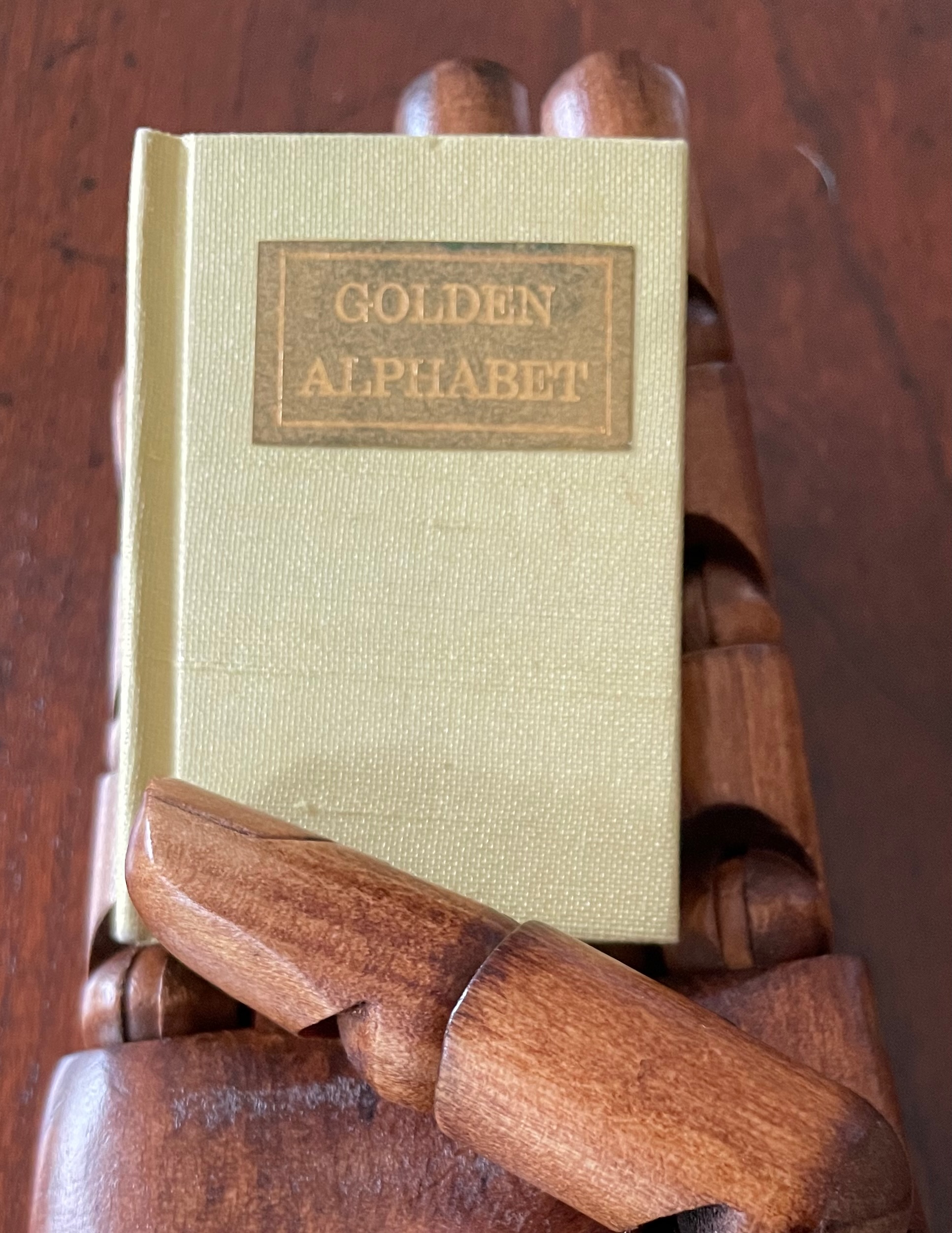
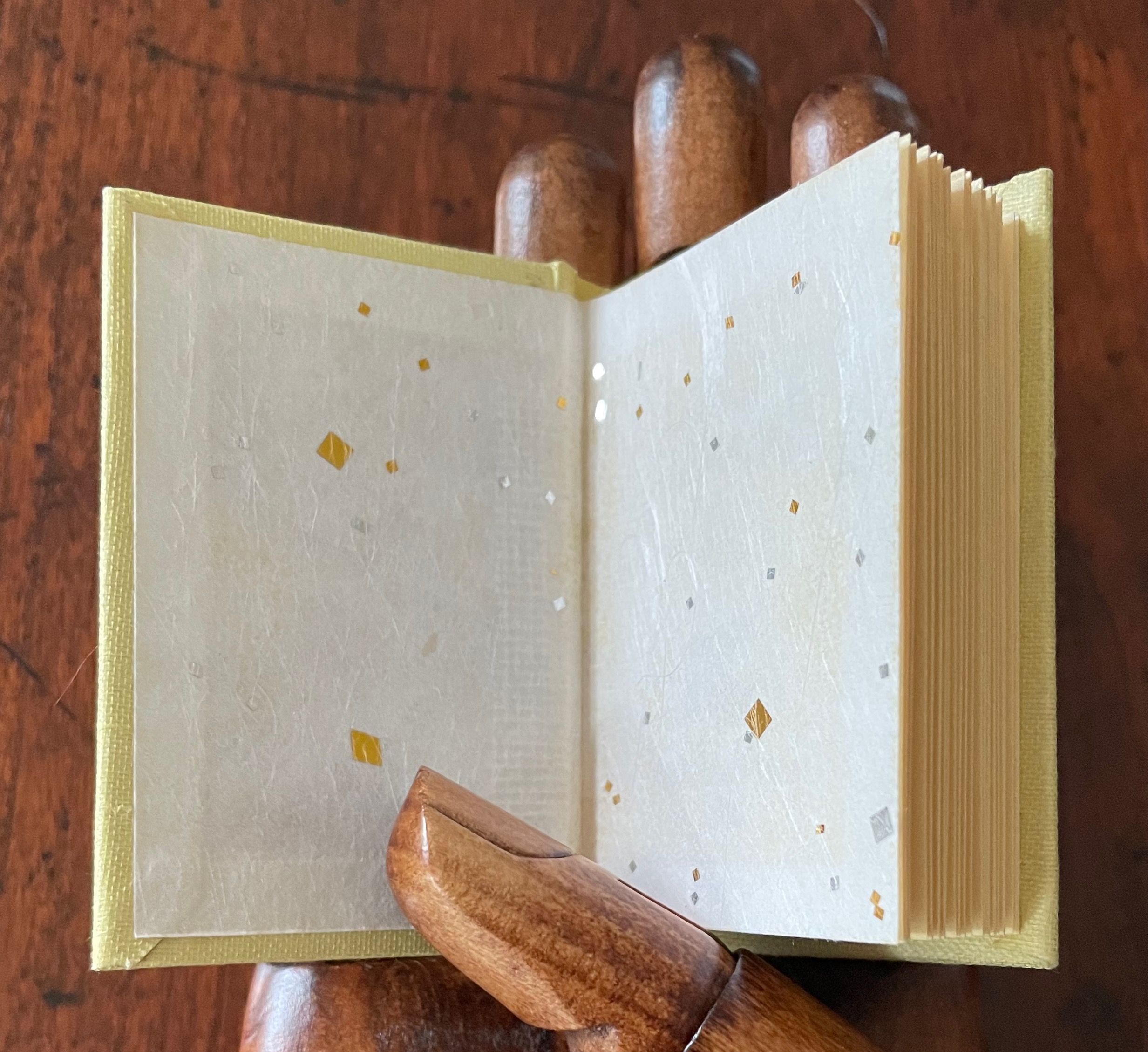
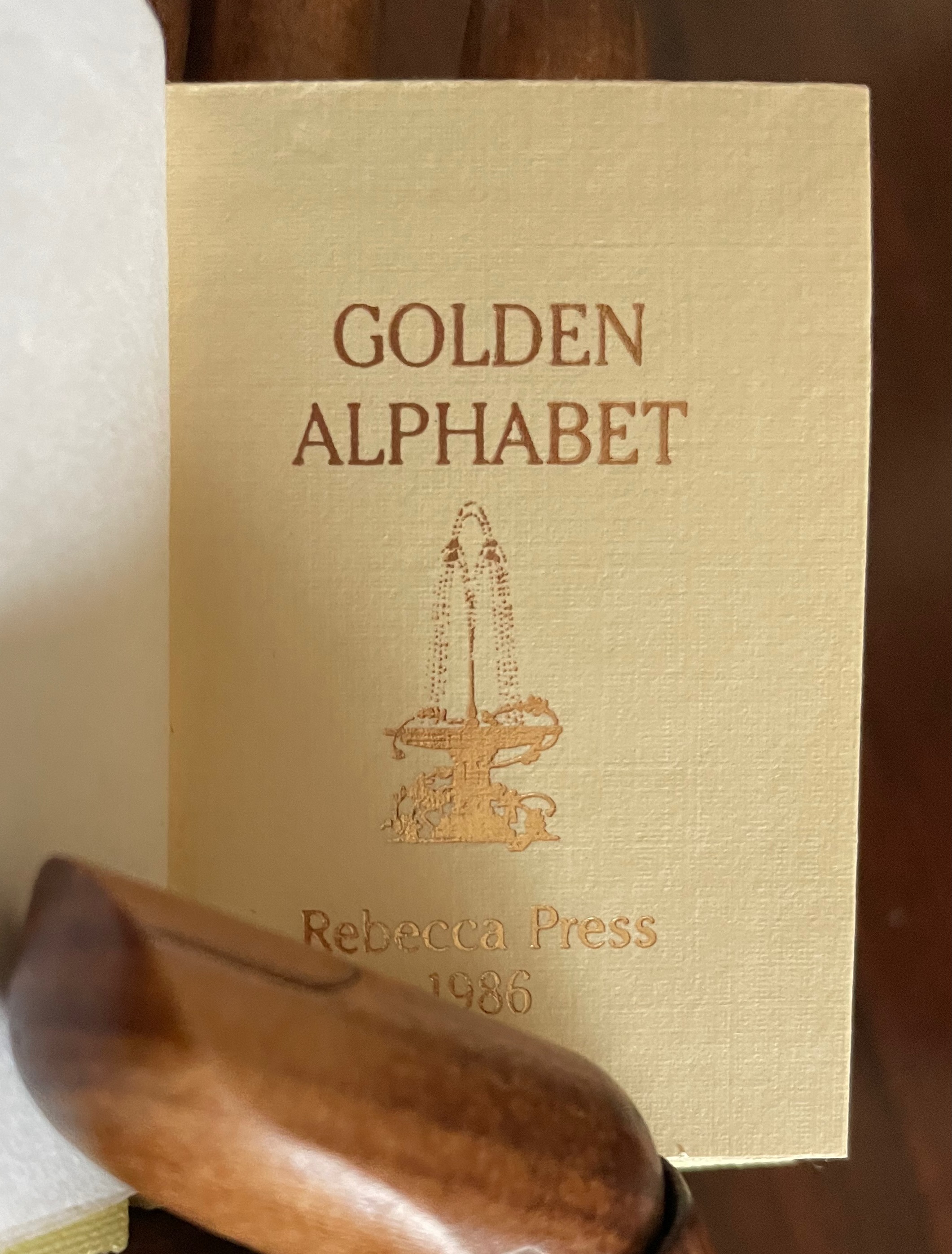
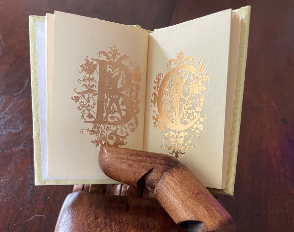
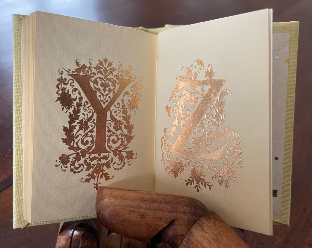
Golden Alphabet (1986) Rebecca Bingham Miniature casebound, gilt-titled leather front cover label, decorative doublures, sewn. H68 x W38 mm. 28 unnumbered pages. Edition of 200, of which this is #96. Acquired from John Howell for Books, 31 October 2022. Photos: Books On Books Collection. Displayed with the artist’s permission.
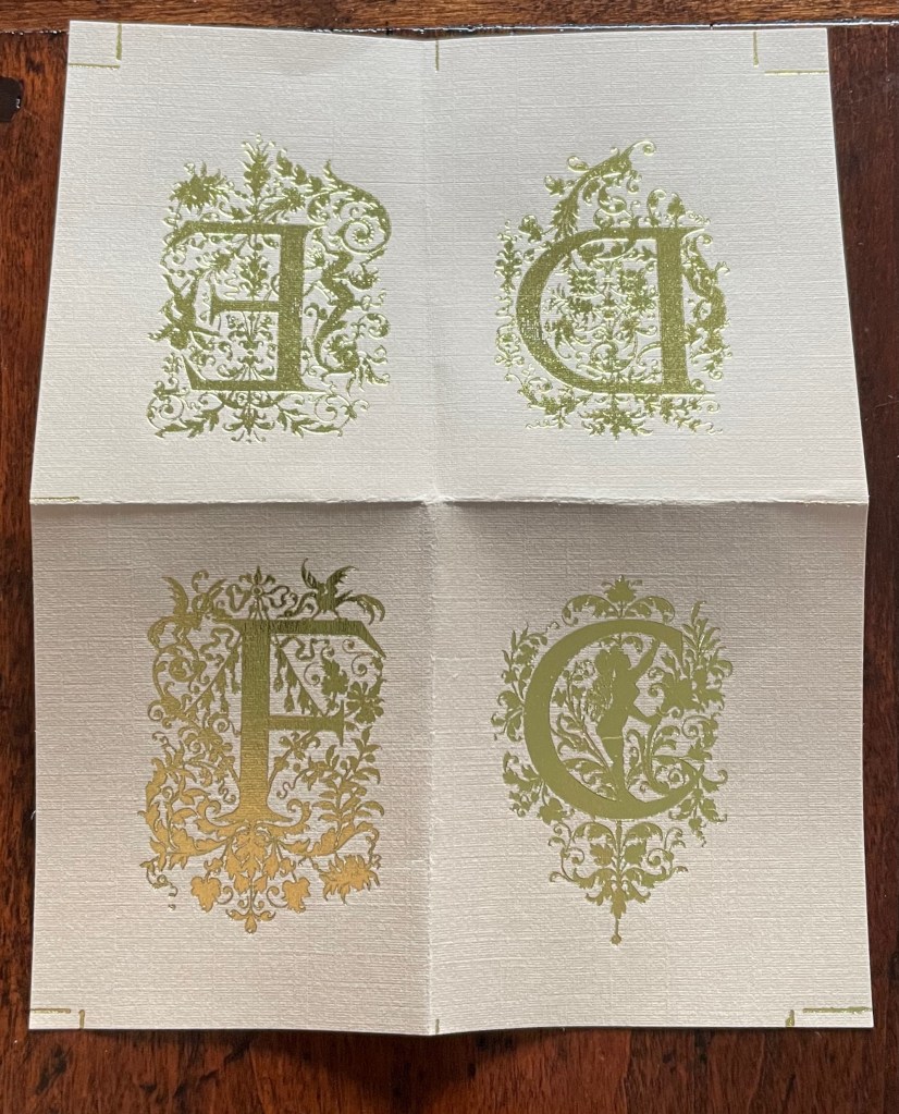
Although each letter has its own artistic treatment, this alphabet of gilt letters with their rococo decoration is no salmagundi. The folios are uncut at the top edge (the inner pages not printed on or included in the pagination), which would have been necessary for the application of the gilt foil. In a separate order, the artist sent a gratis loose folio, shown below.
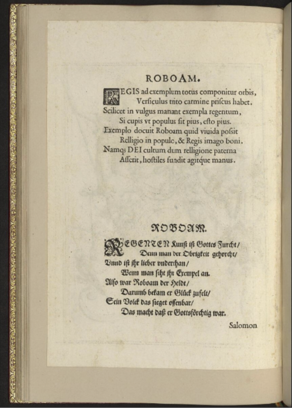
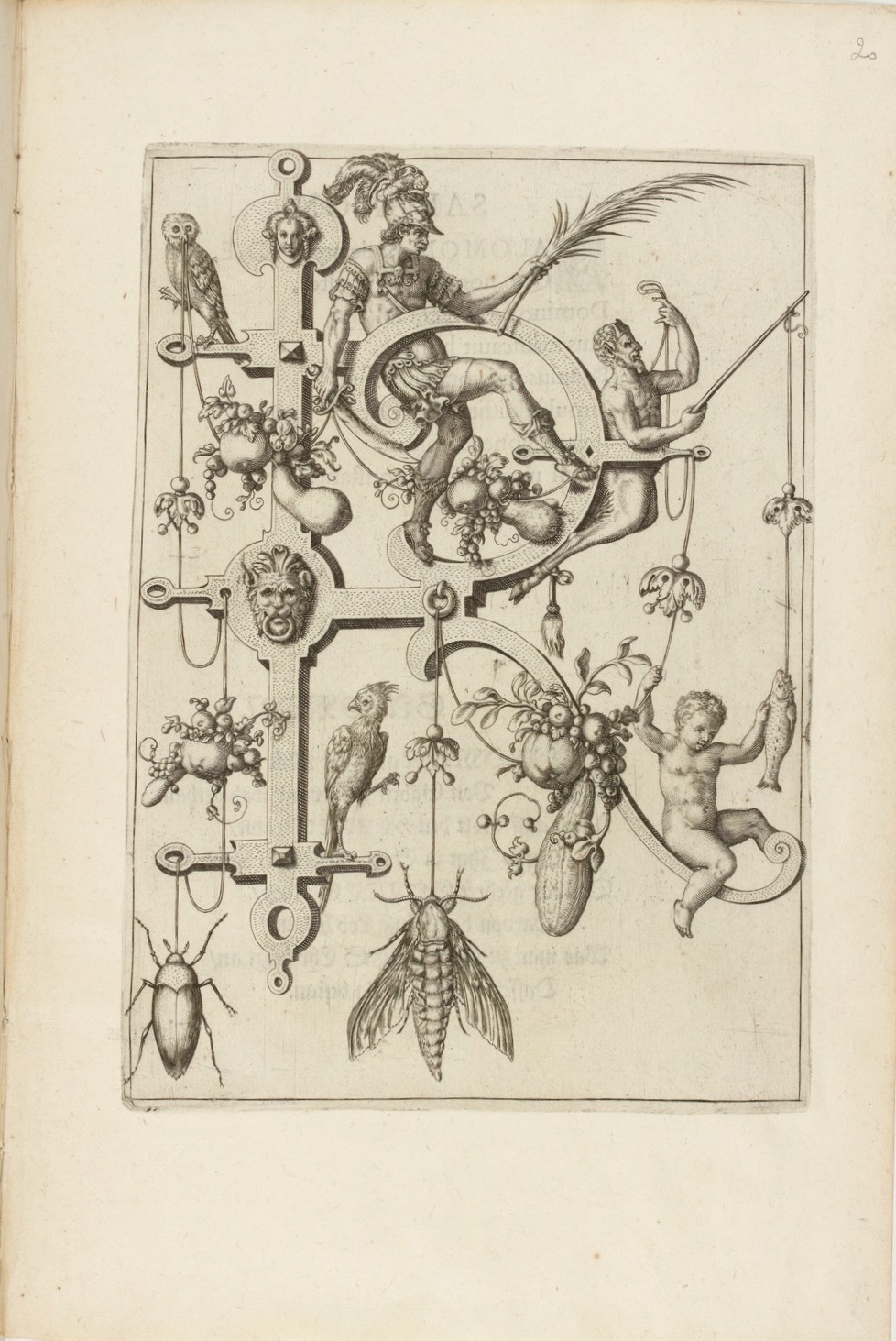
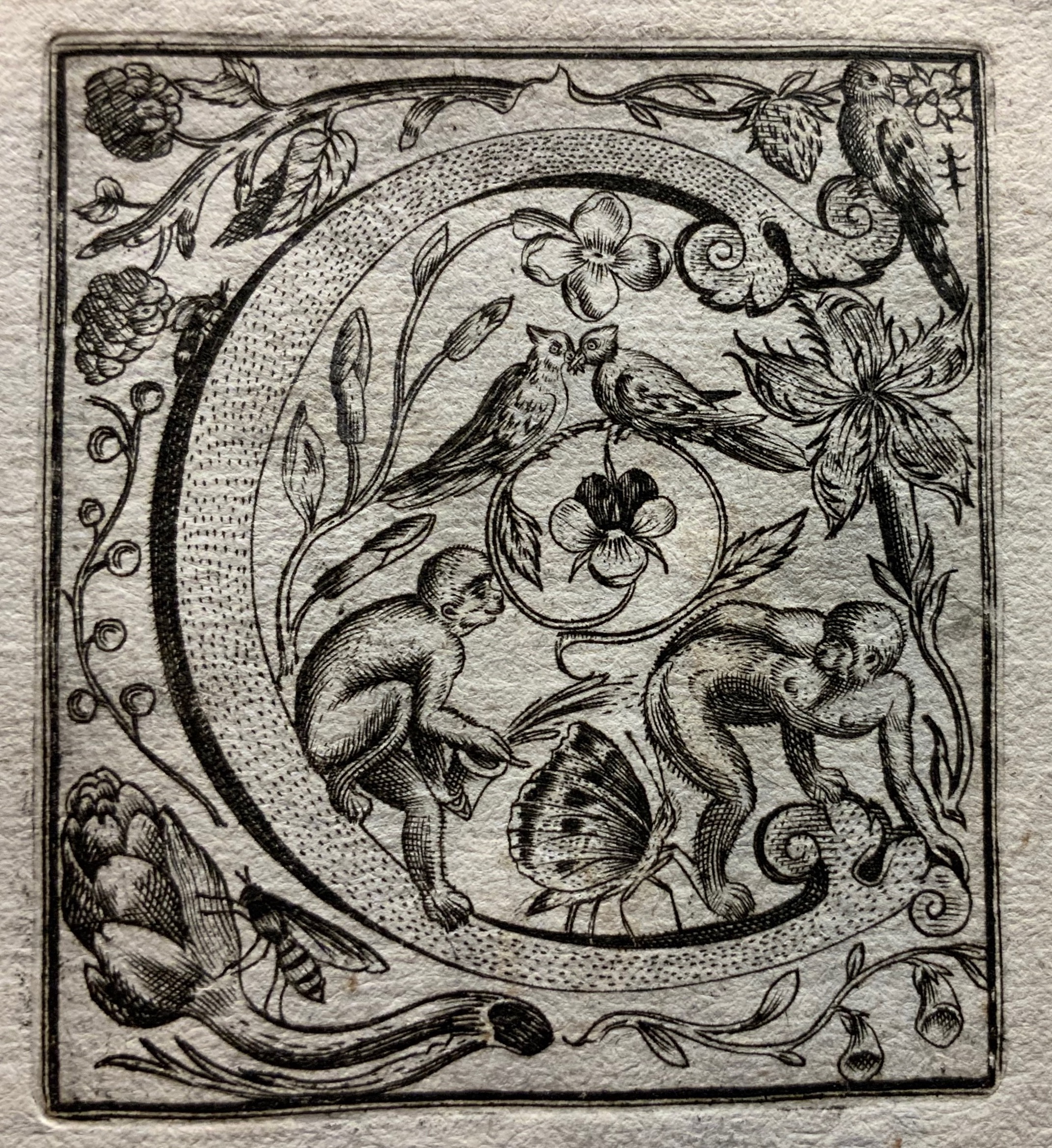
Neiw Kunstliches Alphabet (1595/1995) Johann Theodor de Bry Facsimile edition created by Joseph Kiermeier-Debre and Fritz Franz Vogel as part of the boxed set Alphabets Buchstaben Calligraphy, published by Ravensburger Buchverlag (1998). H275 x W255 mm, 80 pages. Acquired from Antiquariat Terrahe & Oswald, 14 March 2021. Photos: Books On Books Collection.
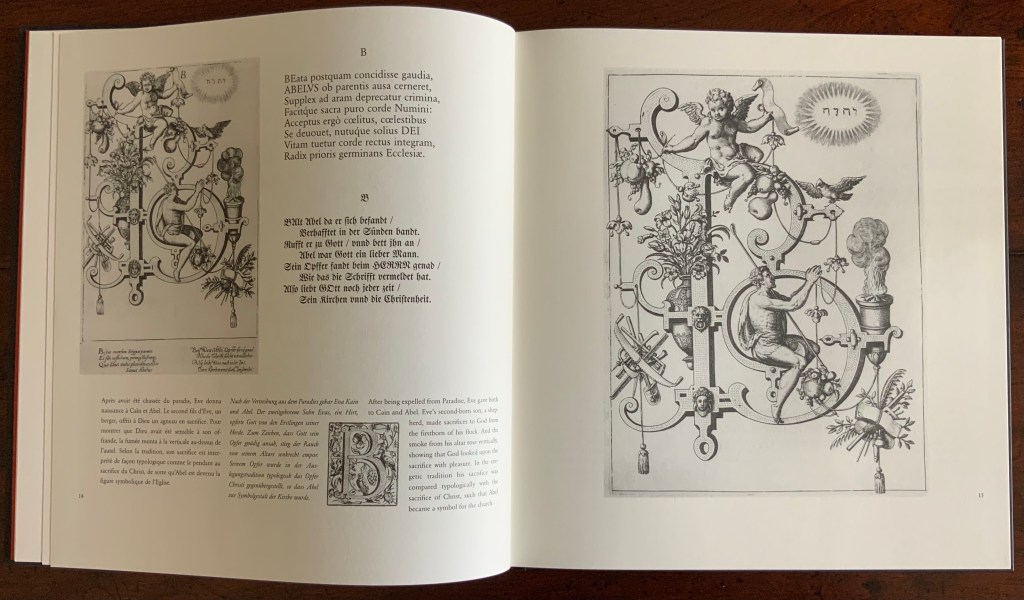
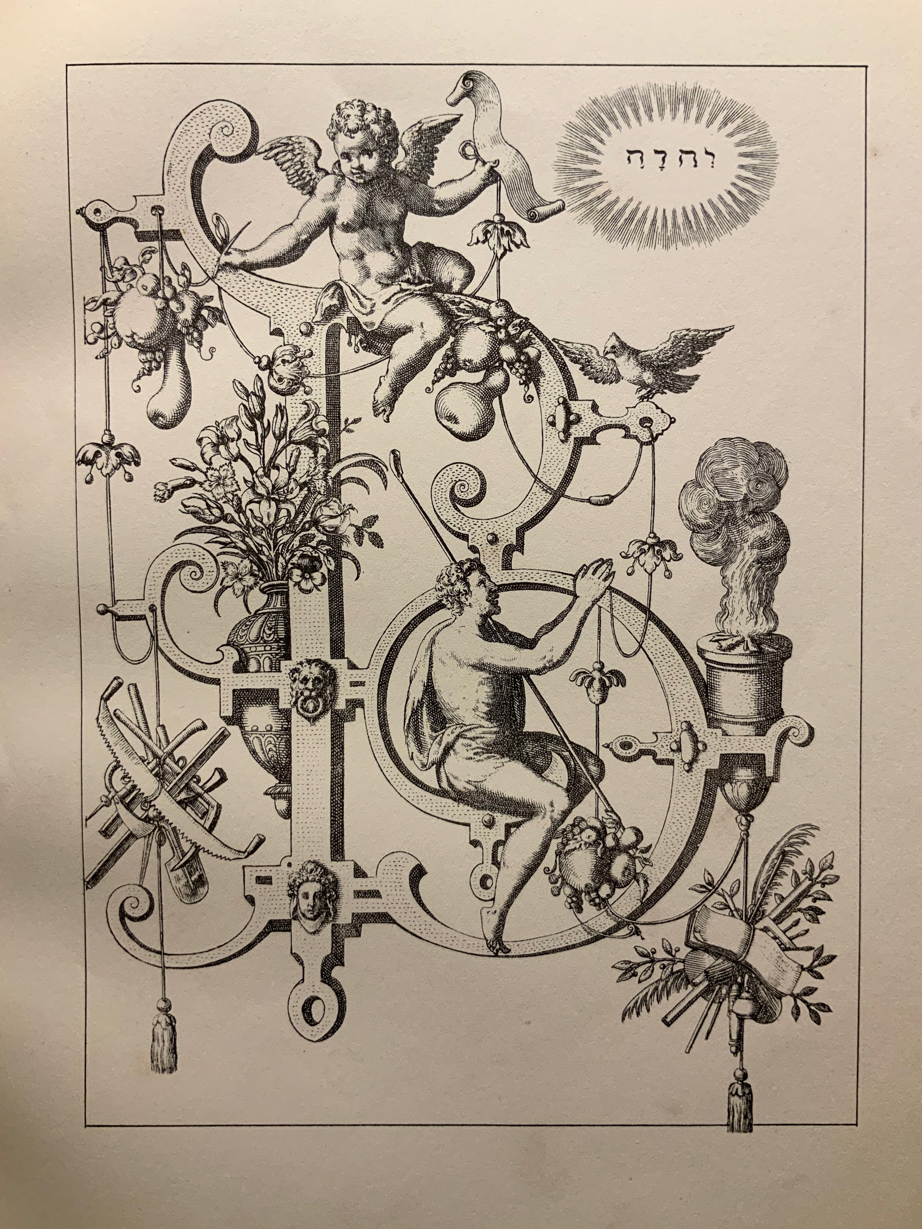
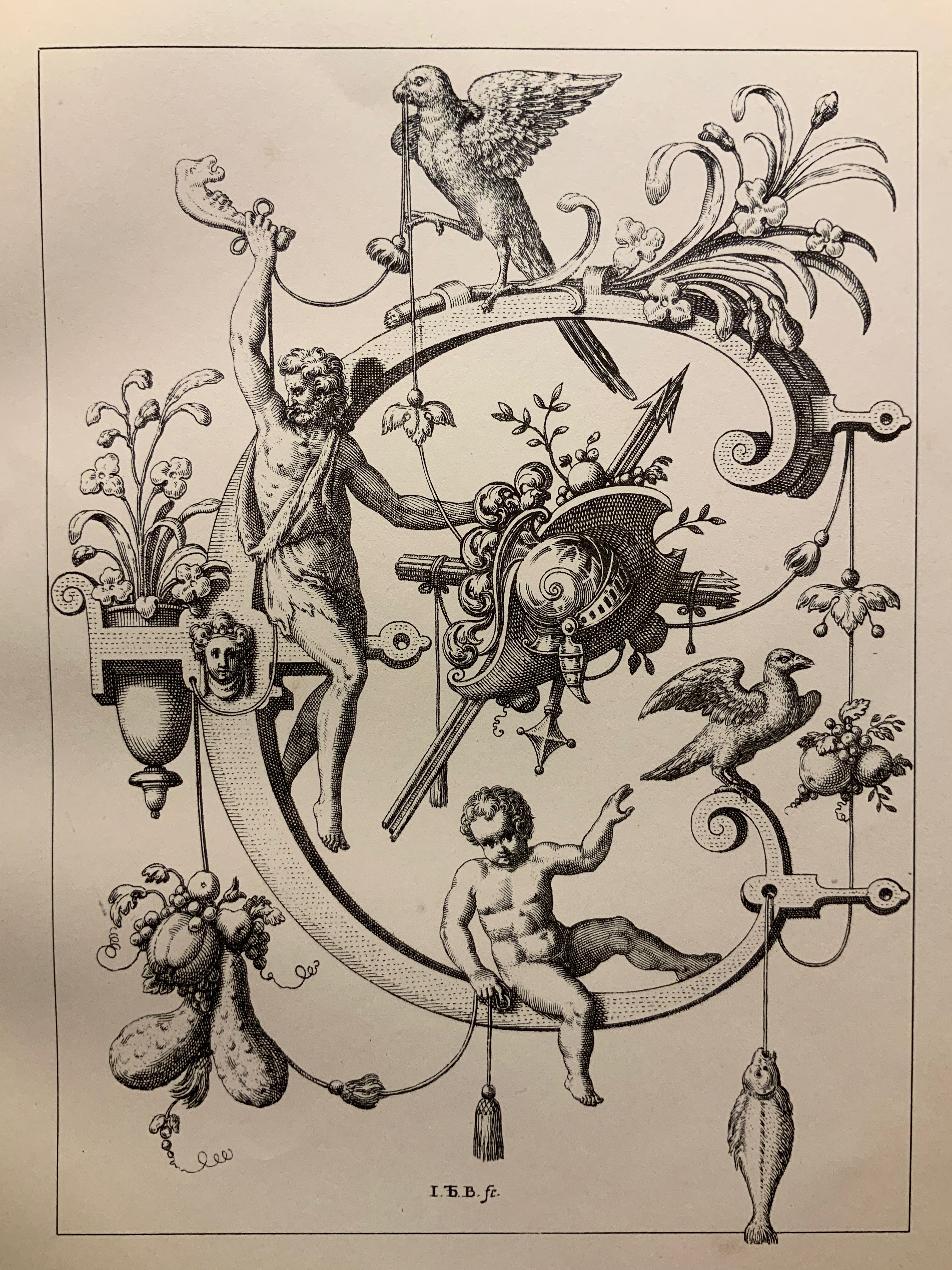
Johann Theodor de Dry and his sons were copperplate engravers, best known for their Grands and Petits Voyages (1590-1634) of 57 separate parts, containing over 500 different engravings illustrating the explorations of the world beyond the shores of 16th and 17th century Europe. While the De Brys’ place in the history of book art might be traced from their illustrations of Hans Staden’s tales of Brazilian cannibals to Oswald de Andrade’s “Manifesto Antropófago” [Cannibal Manifesto] (1928) and Moussa Kone’s Nowhere Land (2017), their equally strong, if not better, claim rests on the Neiw Kunstliches Alphabet (1595) and the Alphabeta et characteres (1596).
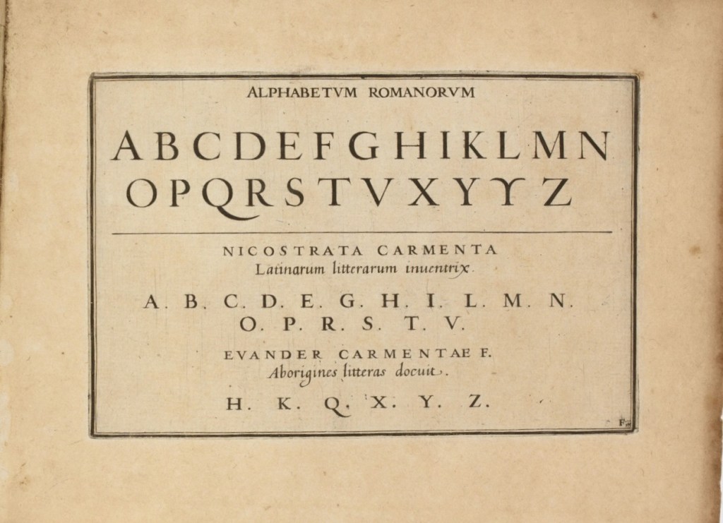
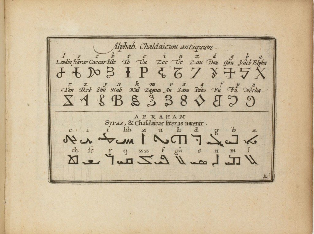
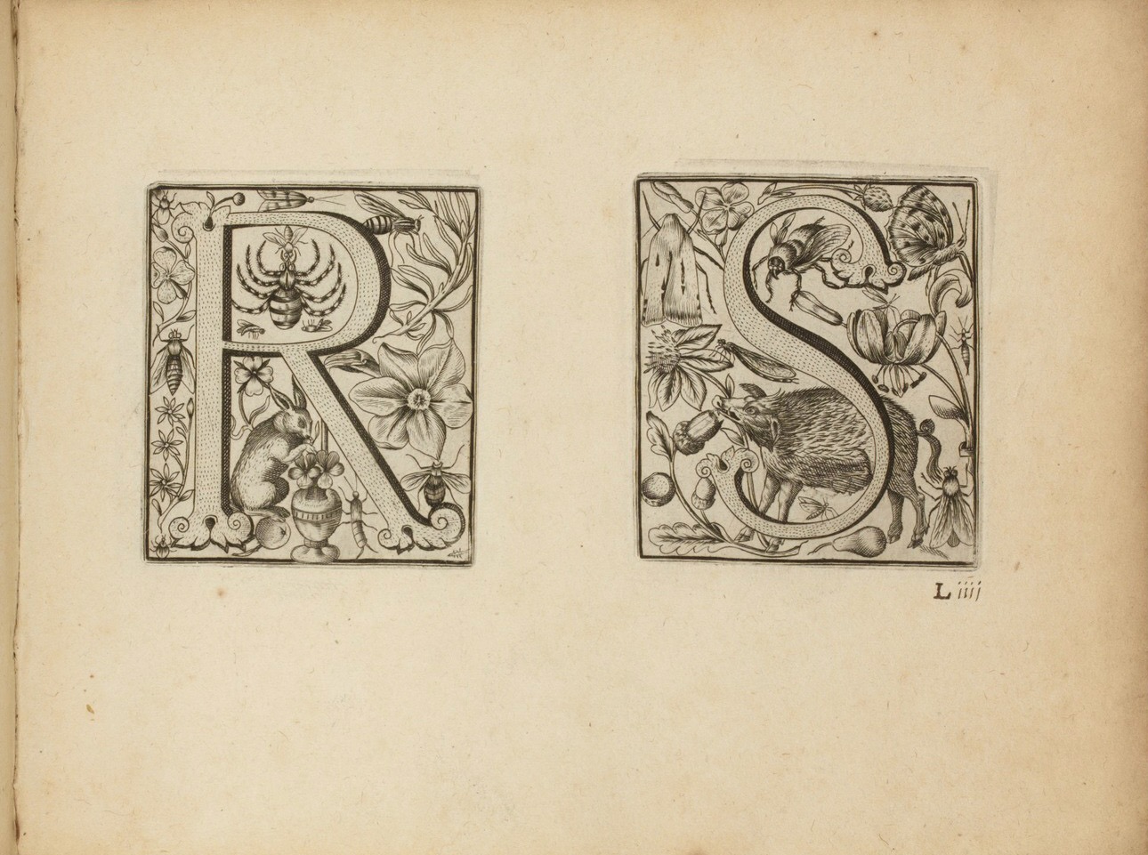
The Neiw Kunstliches Alphabet presents the letters of the alphabet adorned with Judaeo-Christian allegorical figures, vegetation, birds and animals, instruments, implements, weapons and regal emblems. An octave in Latin and one in German provide hints for identifying the allegorical and emblematic references. At the end of the De Brys’ alphabet atlas Alphabeta et characteres, iam inde a creato mundo ad nostra usq. tempora, apud omnes omnino nationes usurpat (1596) depicting dozens of alphabets — the Chaldaic, Egyptian, Hebrew, Greek, Slavonic, Hispanic, Latin and so on — another decorated alphabet and an alphabet formed of human figures make their appearance.
Letters R&S and the human alphabet from Alphabeta et characteres, iam inde a creato mundo ad nostra usq. tempora, apud omnes omnino nationes usurpat (1596). Images: Bibliothèque nationale de France.
Kiermeier-Debre and Vogel reproduce to scale the letters from the Neiw Kunstliches Alphabet and present thumb-nail versions of the alphabets as well as the decorated letters from Alphabeta et characteres. Their facsimile is not the first for these works. J.N. Stoltzenberger printed Alphabeta et characteres in translation for William Fitzer in 1628, and George Waterston & Sons published Neiw Kunstliches Alphabet as The New Artistic Alphabet in 1880 (albeit without the original’s text and verses). By juxtaposing all these originals, Kiermeier-Debre and Vogel provide a concentration of what makes the De Brys partial forerunners in the history of book art: images embracing letters (and letters embracing images).
Joseph Kiermeier-Debre and Fritz Franz Vogel facsimile (1995) of Neiw Kunstliches Alphabet (1595), pp. 12-13. Photos: Books On Books Collection.
Other abecedaries in the Books On Books Collection that strike the Baroque note or blend image and letter in ways that argue a descendancy from the De Brys include
De Bry also published Michael Maier’s Atalanta Fugiens or Emblemata Nova (1618), which is represented in the Books On Books Collection by Daniel E. Kelm’s Möbius version Neo Emblemata Nova (2005).
Further Reading
“Paulus Franck“. 22 March 2022. Books On Books Collection.
“Richard Niessen“. 23 April 2021. Books On Books Collection.
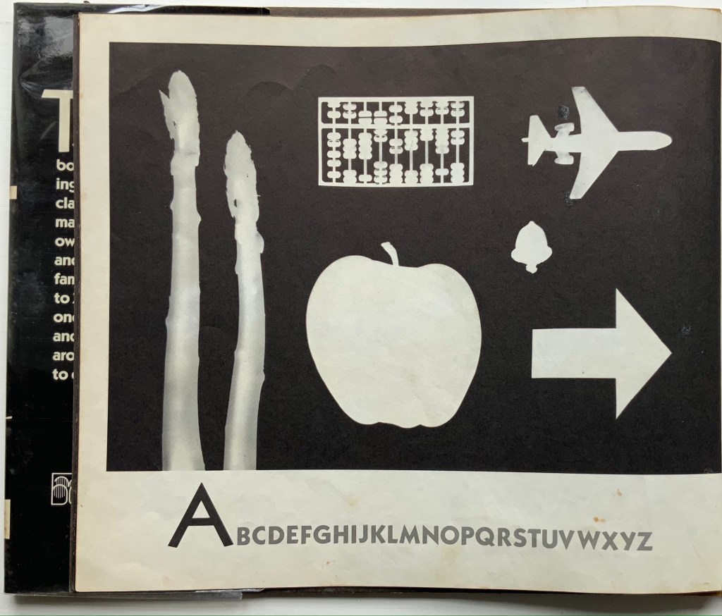
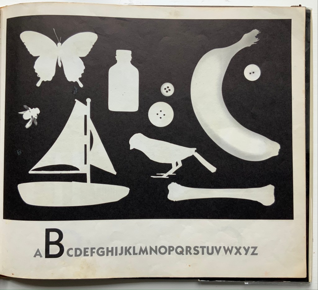
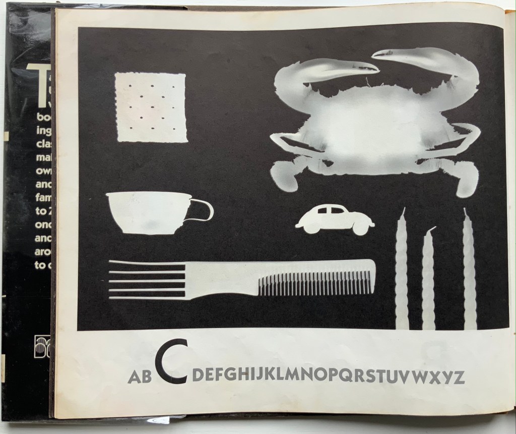
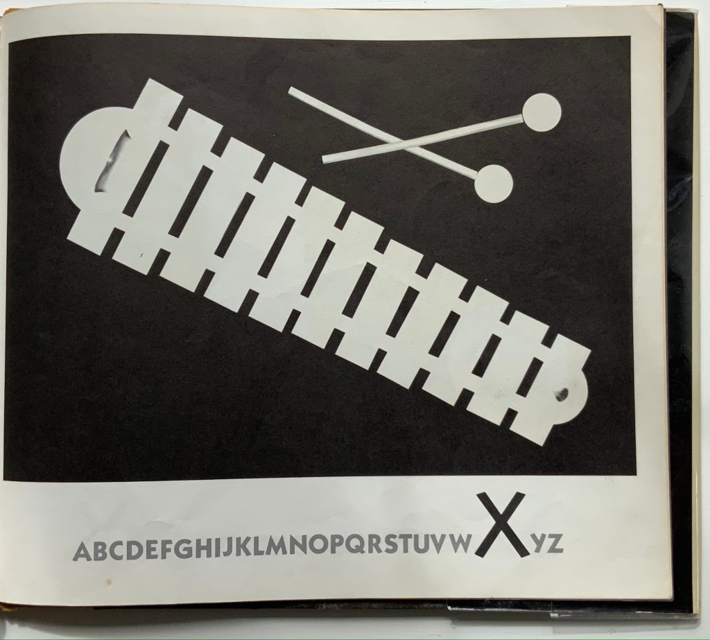
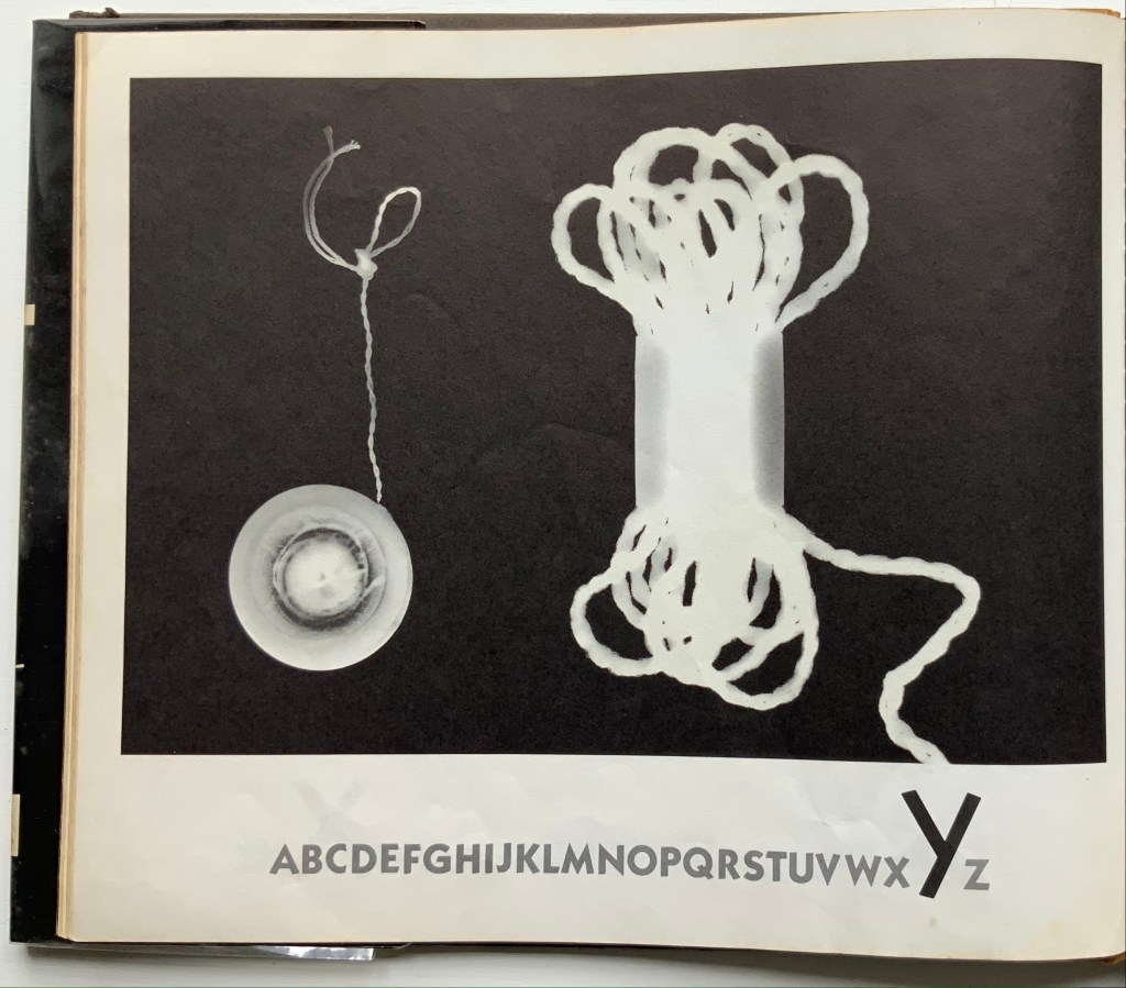
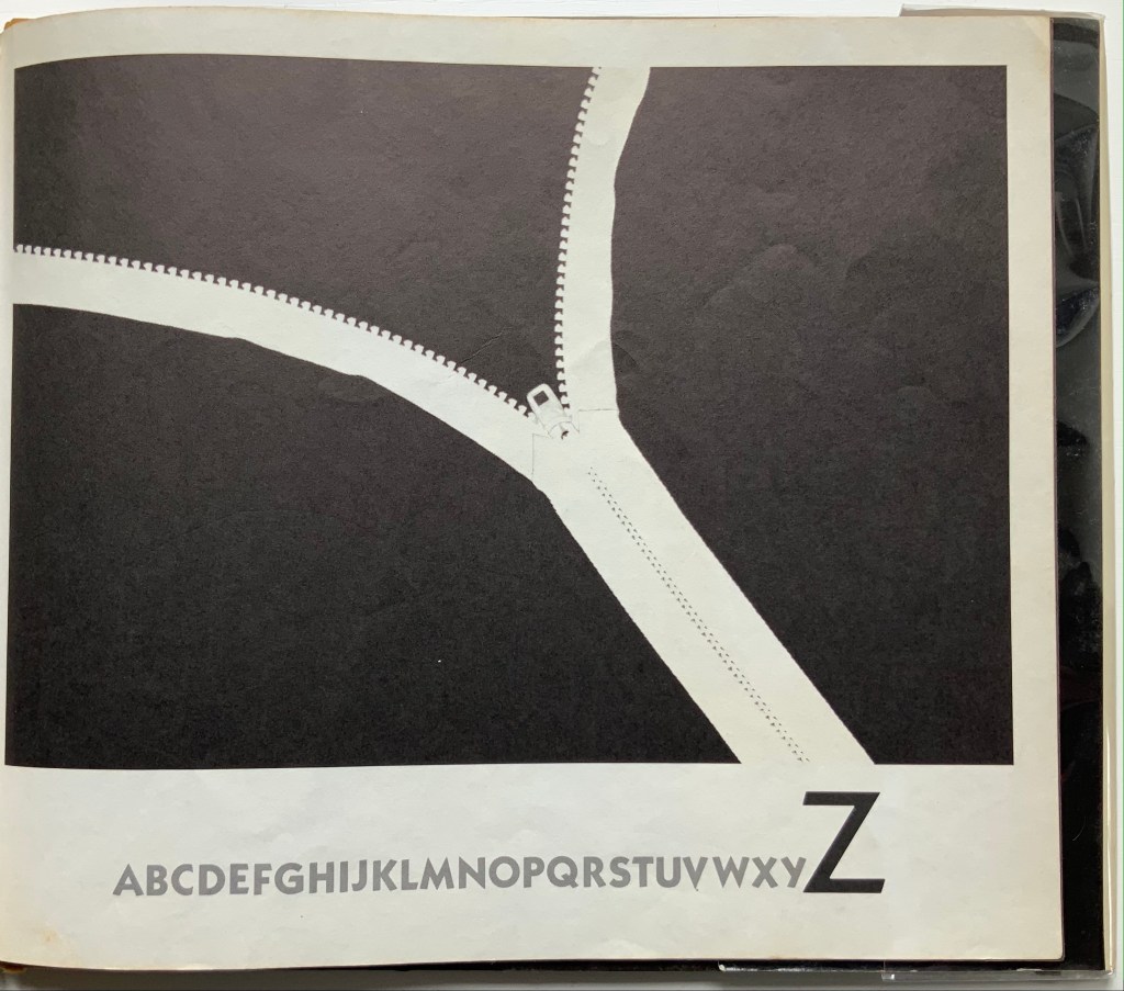
A, B, See! (1982) Tana Hoban Hardcover, casebound. H252 x W286 mm, 32 pages. Acquired from Cattermole 20th Century Children’s Book, 7 August 2021. Photos of the work: Books On Books Collection.
Made in dark-room conditions with light-sensitive paper, actual objects and cutouts, these photograms lift this simple ABC book to the plane of object recognition and to the level of art. Other artists who have applied photographic techniques to the abecedary are Anthon Beeke, Eileen Hogan, Peter Hutchinson, Simon Jennings or Stephen T. Johnson. Each has a distinctiveness of eye, technique or conceptualizing. Hoban’s seems to lie in extracting something more from that simple imposition of white on black.
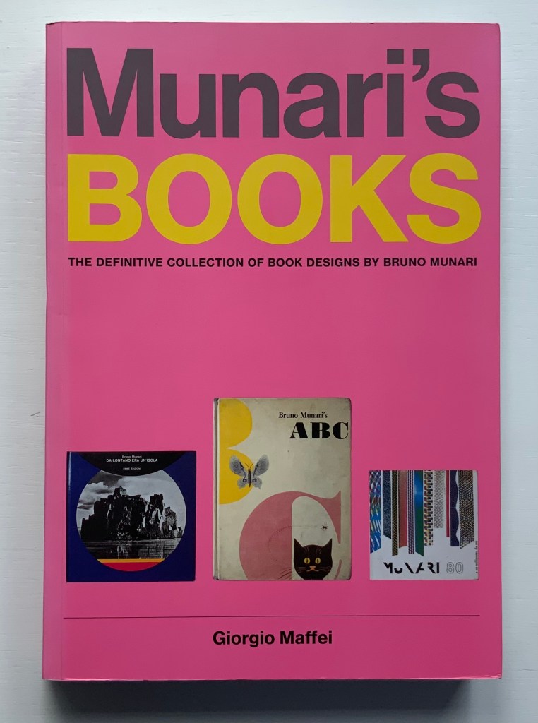
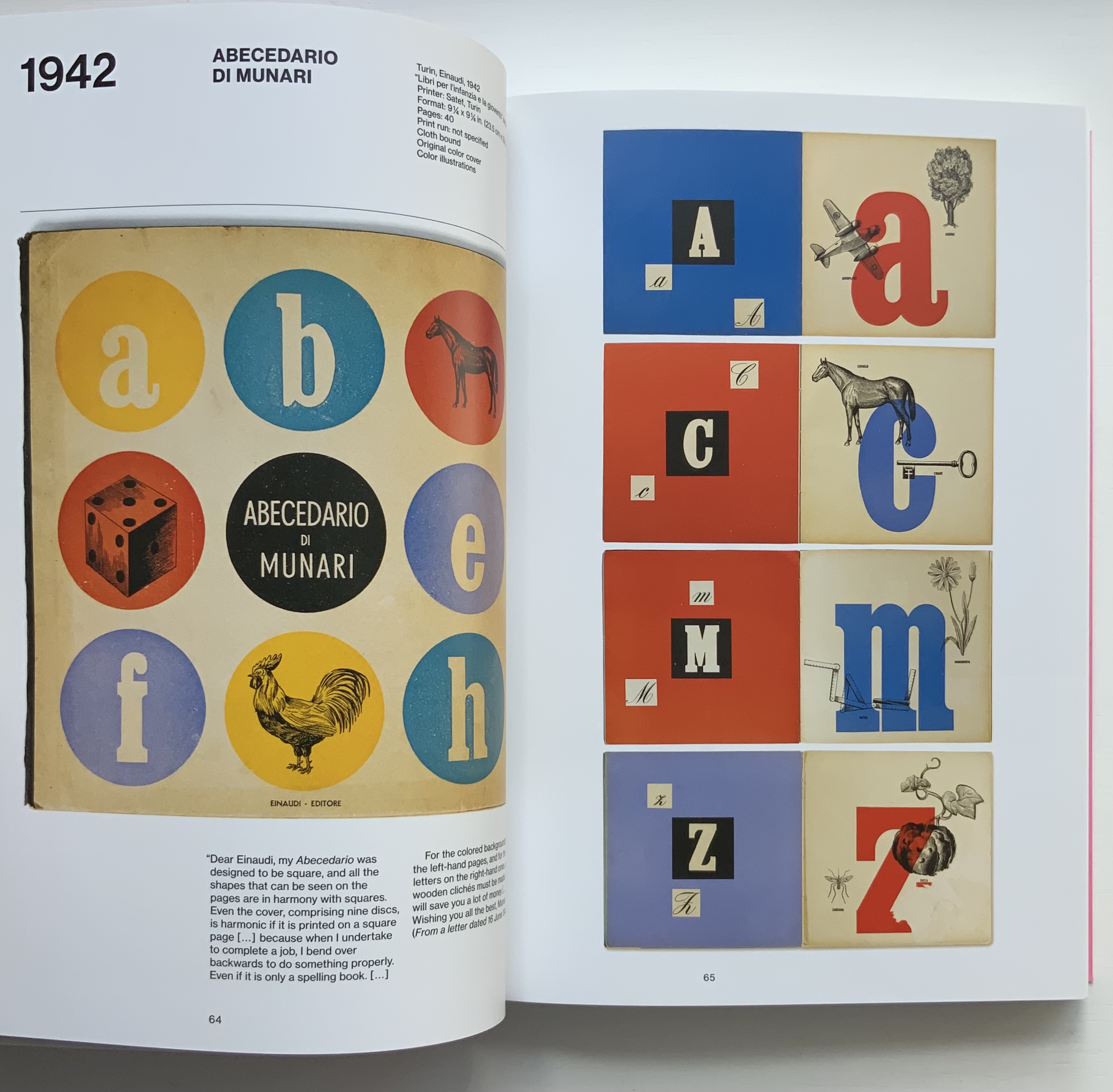
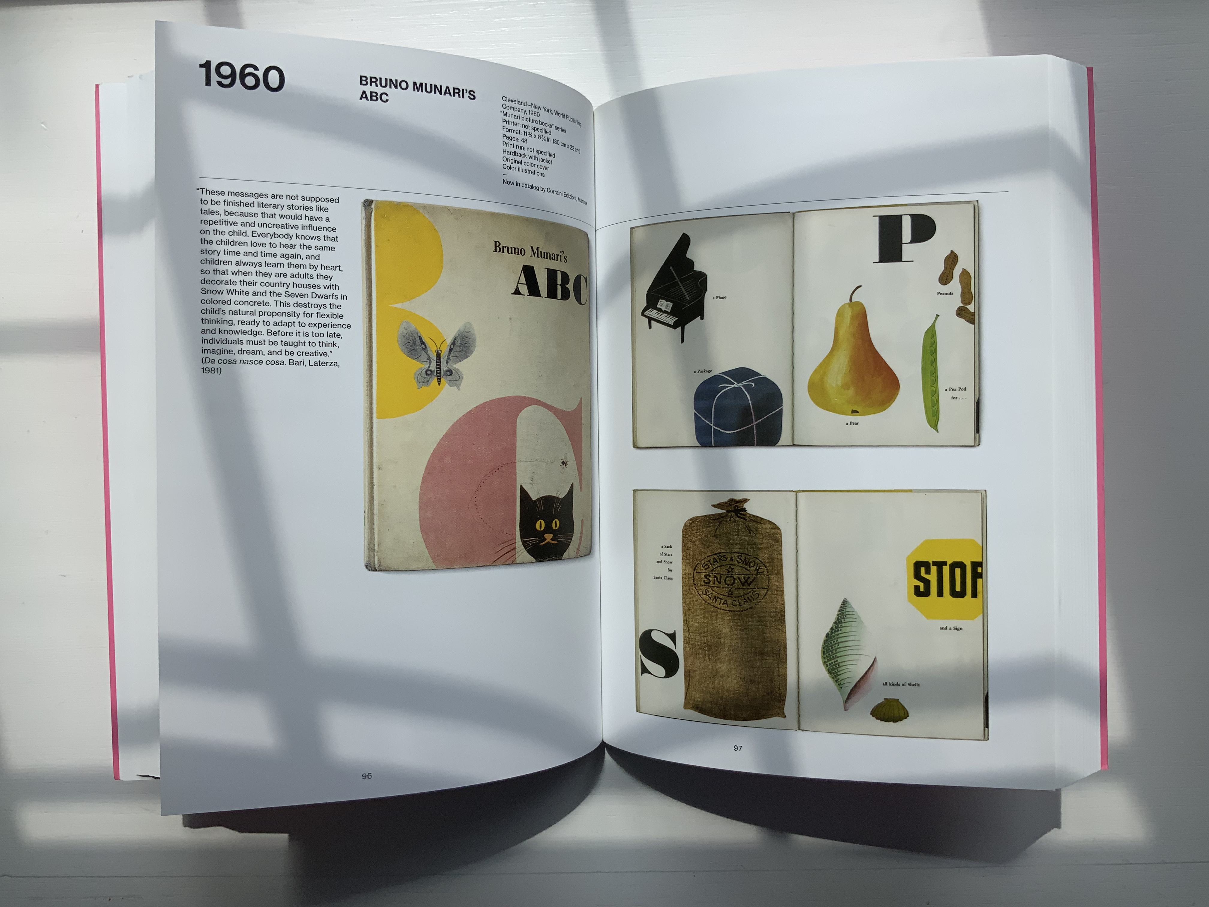
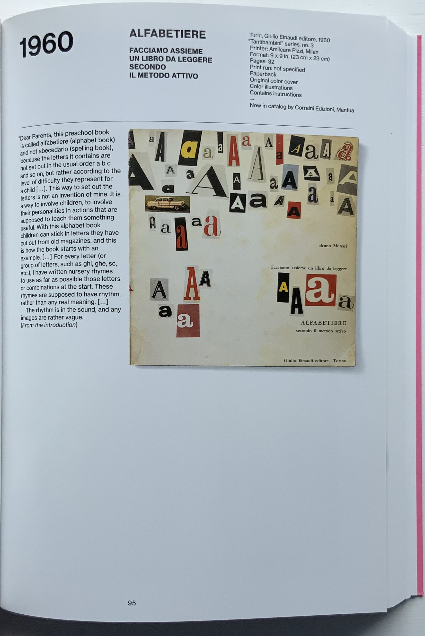
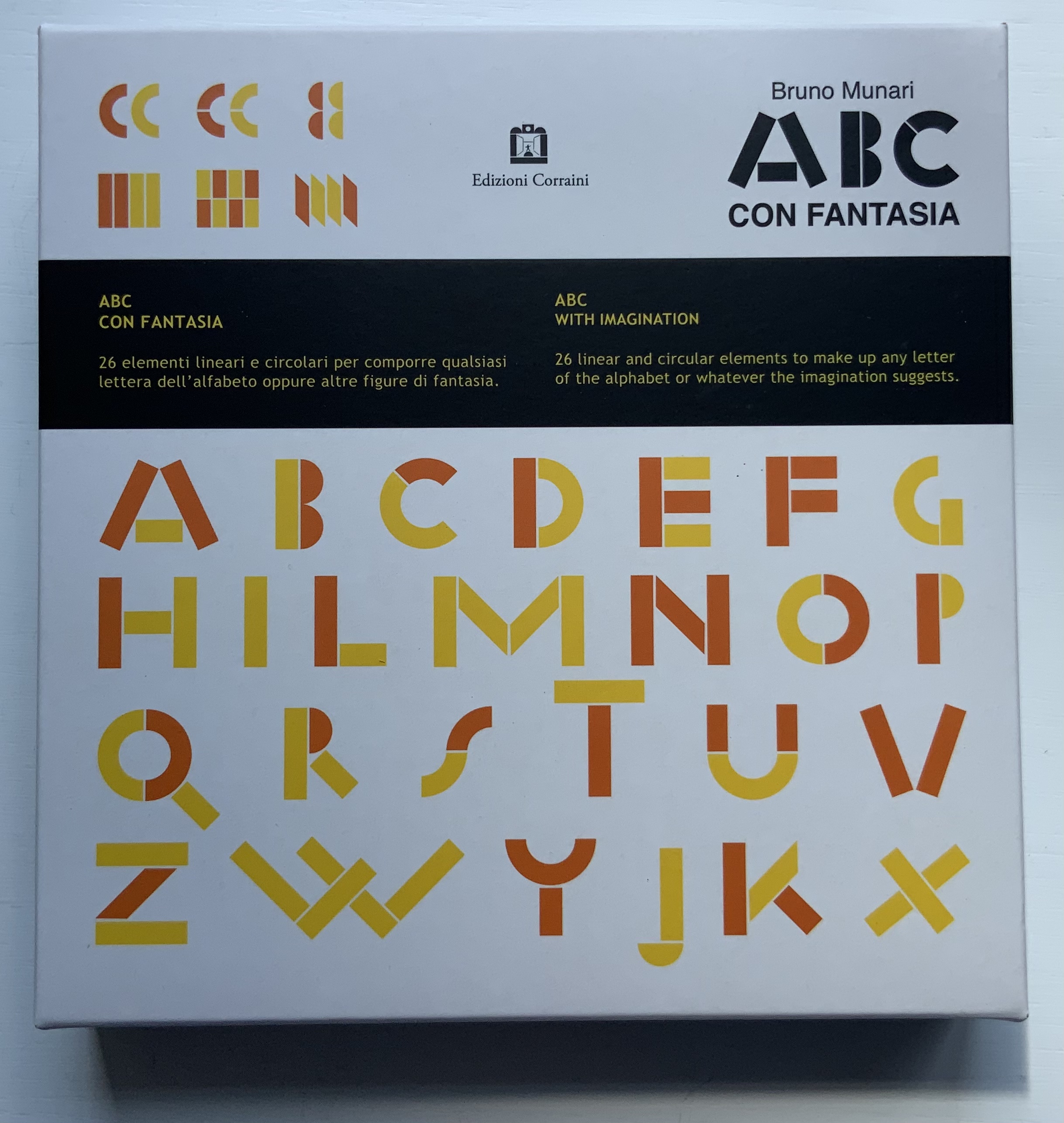
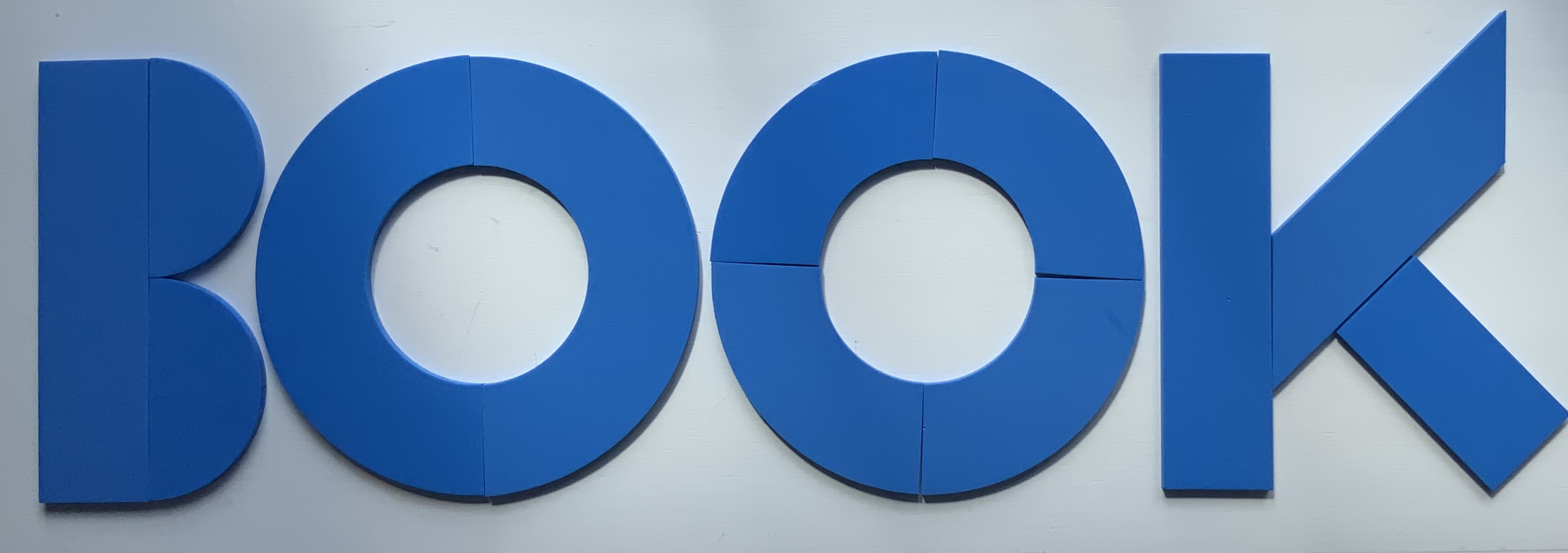
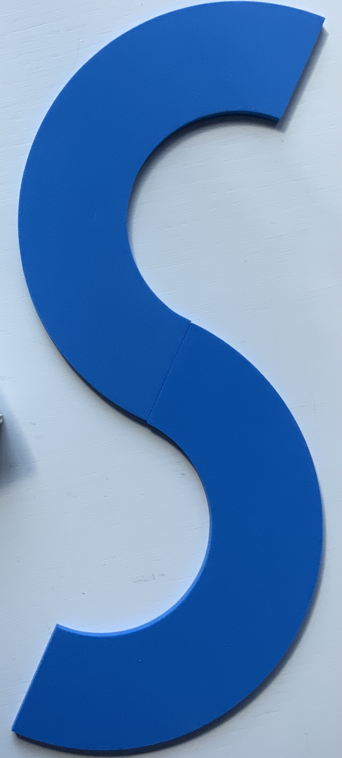
Giorgio Maffei’s 2008 definitive collection of book designs by Bruno Munari brings together two of Italy’s renowned book artists. Giorgio Maffei’s own work, his writing and gallery/bookshop (highlighted by his son Giulio Maffei’s extraordinary video catalogues Le vite dei libri) warrant a catalogue raisonné in their own right. The Italian edition published by Munari’s long-time publisher Maurizio Corraini was followed up in 2015 by this translation by Martin John Anderson and Thomas Marshall in 2015. For the Books On Books Collection, one of the great pleasures of Munari’s works is its attention to the alphabet, which this book documents.
Although not shown in Munari’s Books, an alphabet-related work that underscores Picasso’s calling Munari “our Leonardo” is ABC con fantasia (1973/2000). If we are to believe Fra Luca Pacioli, it was Leonardo da Vinci who inspired his “straight lines and curves” exposition for creating letters. Following in their footsteps, Munari provides the linear and curvilinear basics for the collector and offspring to join the game.
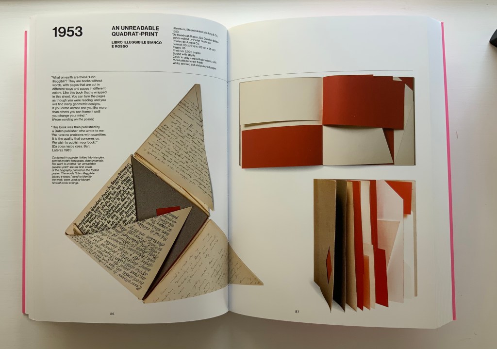
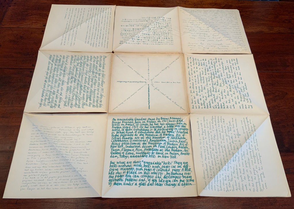
Another pleasure is how Munari’s works lead to other works in the collection. Just by preceding them in Pieter Brattinga’s Kwadraatblad/Quadrat-prints series, Munari’s An Unreadable Quadrat-Print (1953), below, conjures up Wim Crouwel‘s, Gerard Unger‘s, Timothy Epps and Christopher Evans‘, and Anthon Beeke‘s more alphabetical contributions.
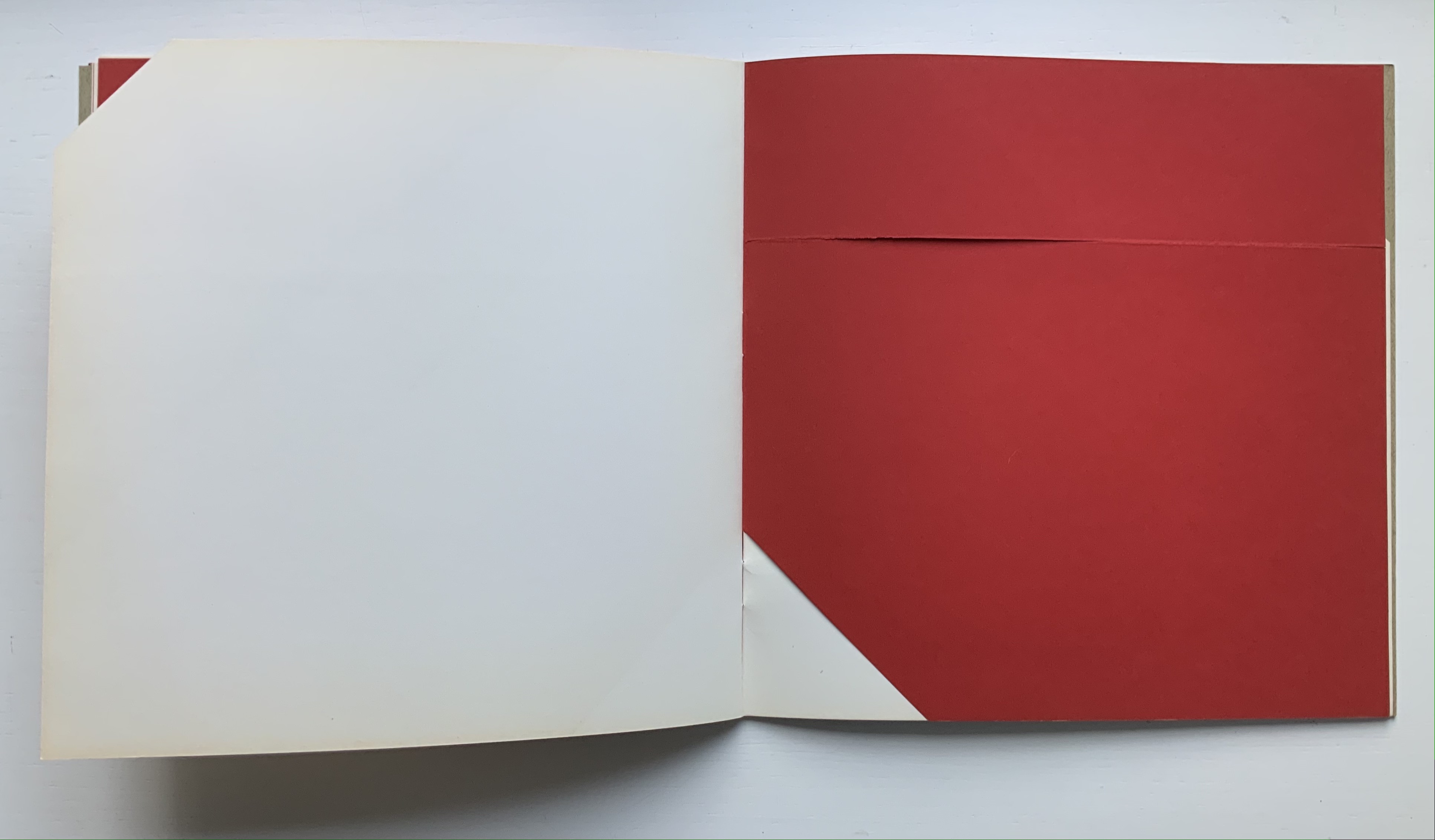
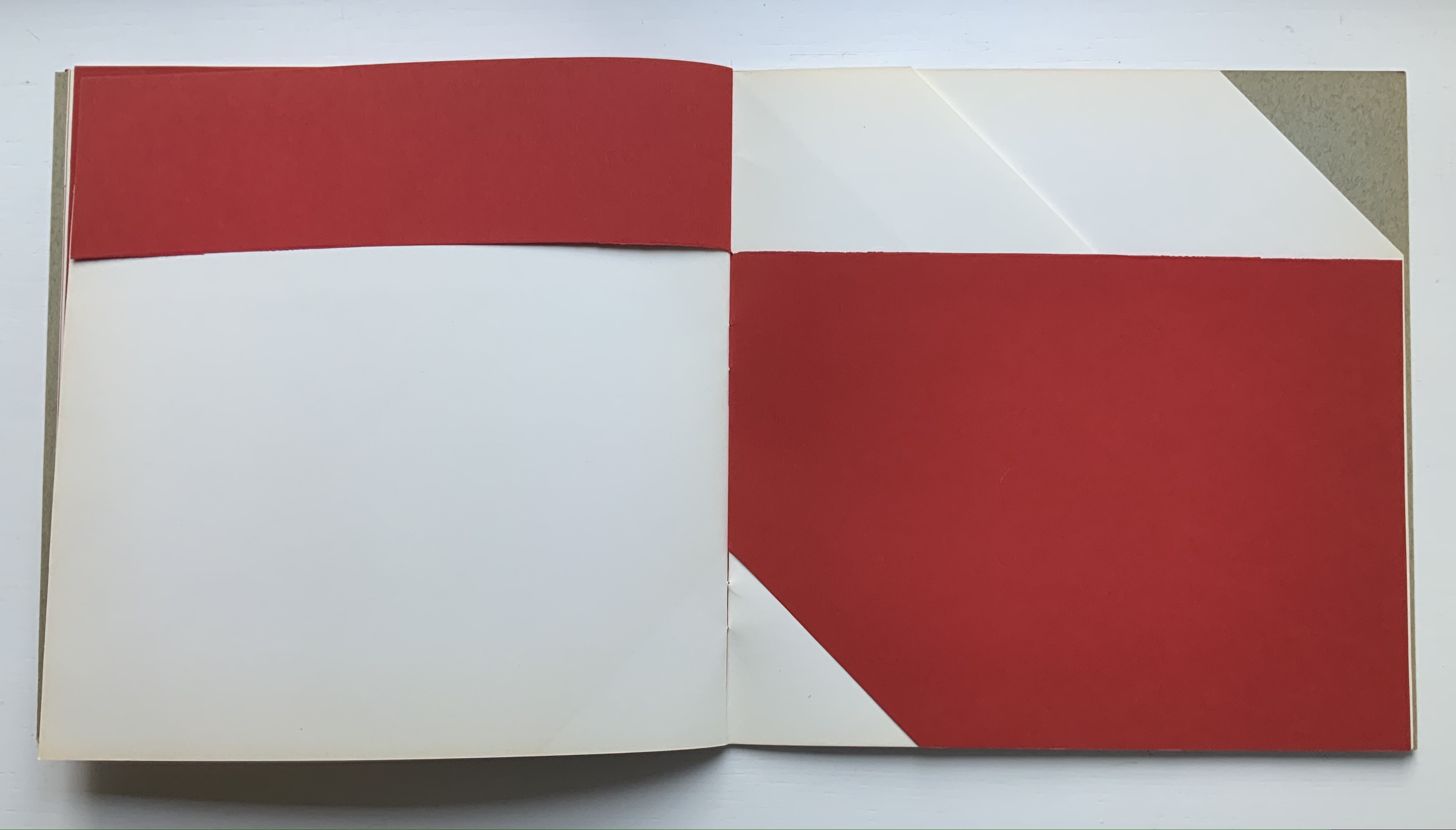
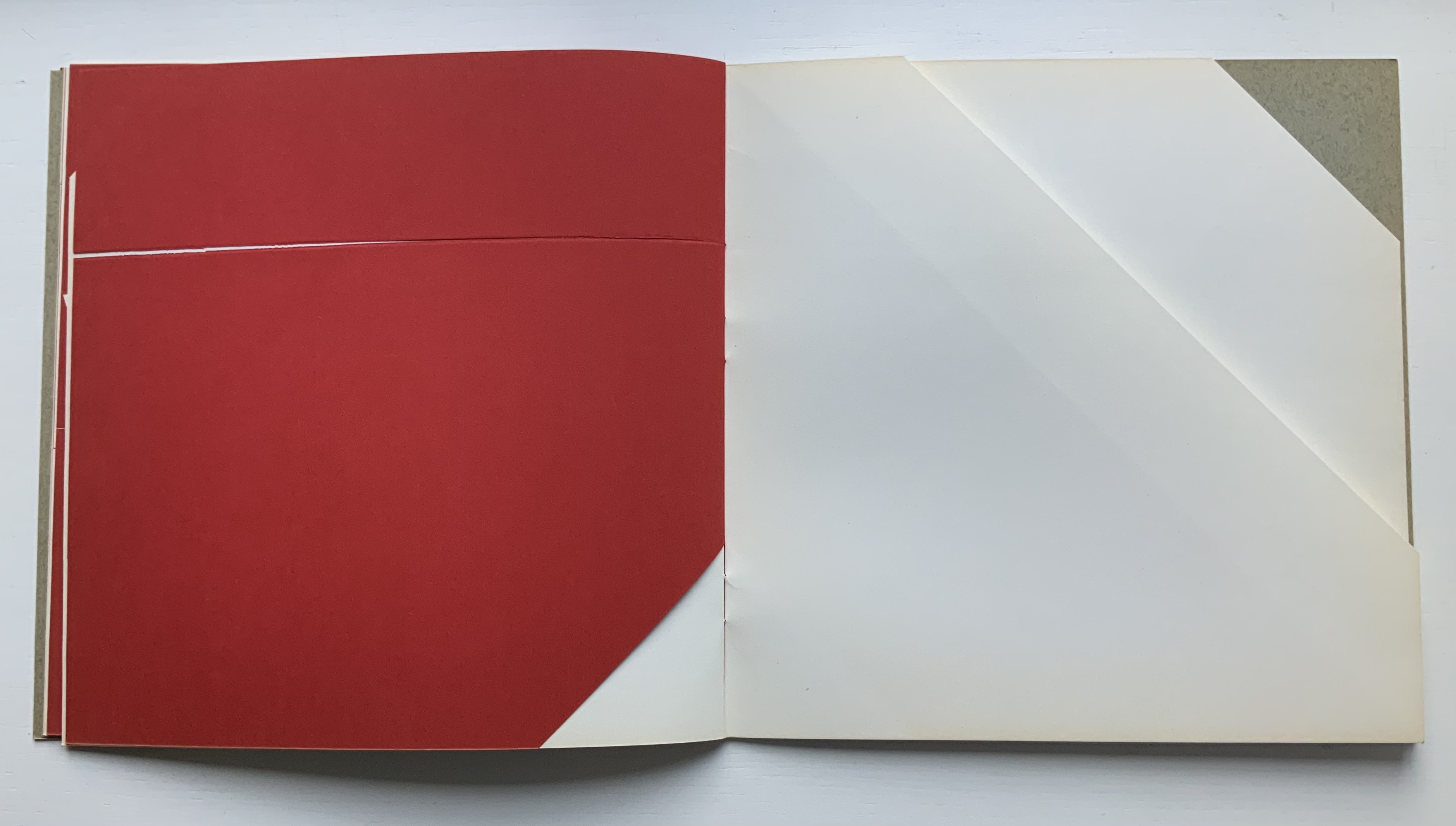
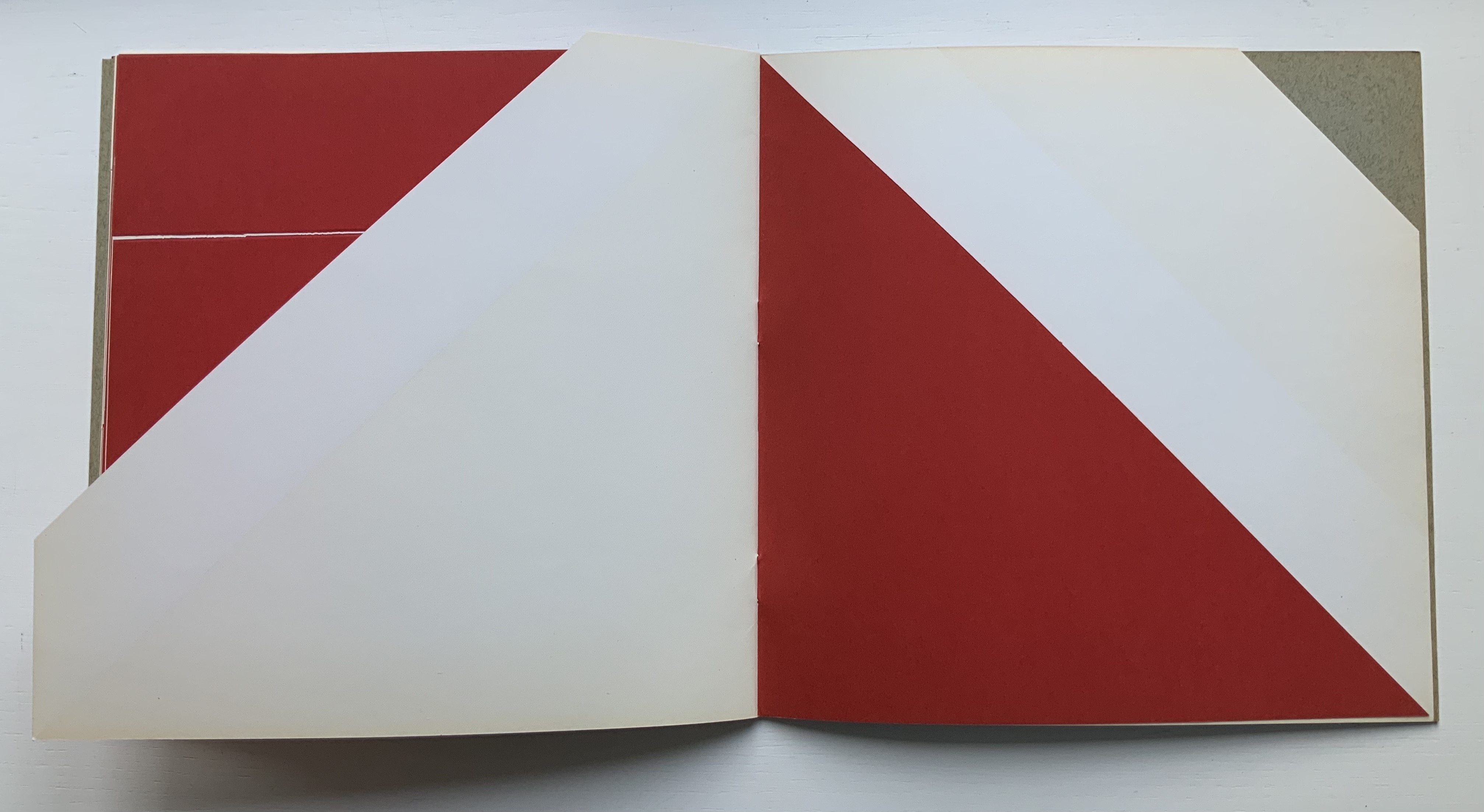
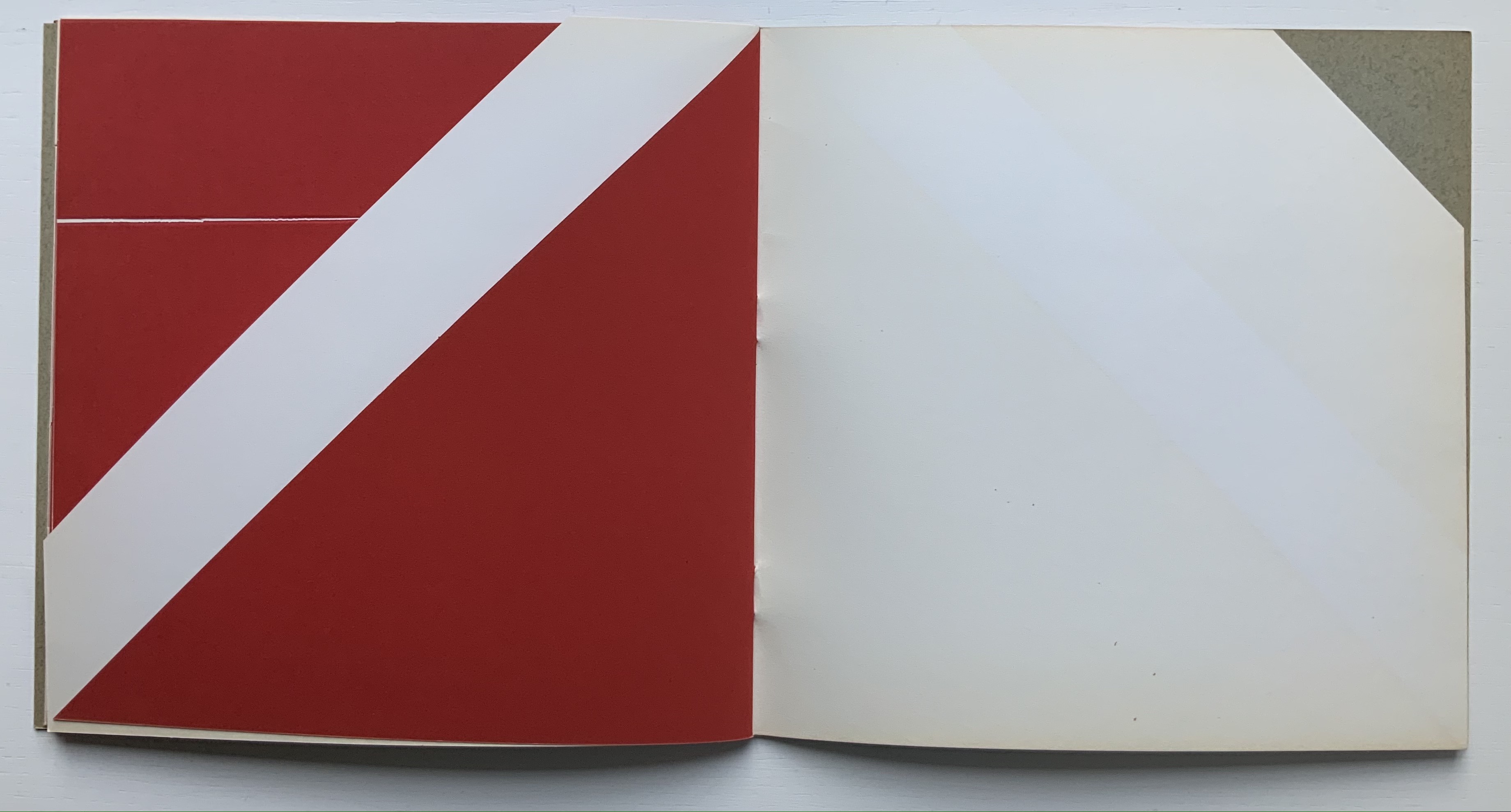
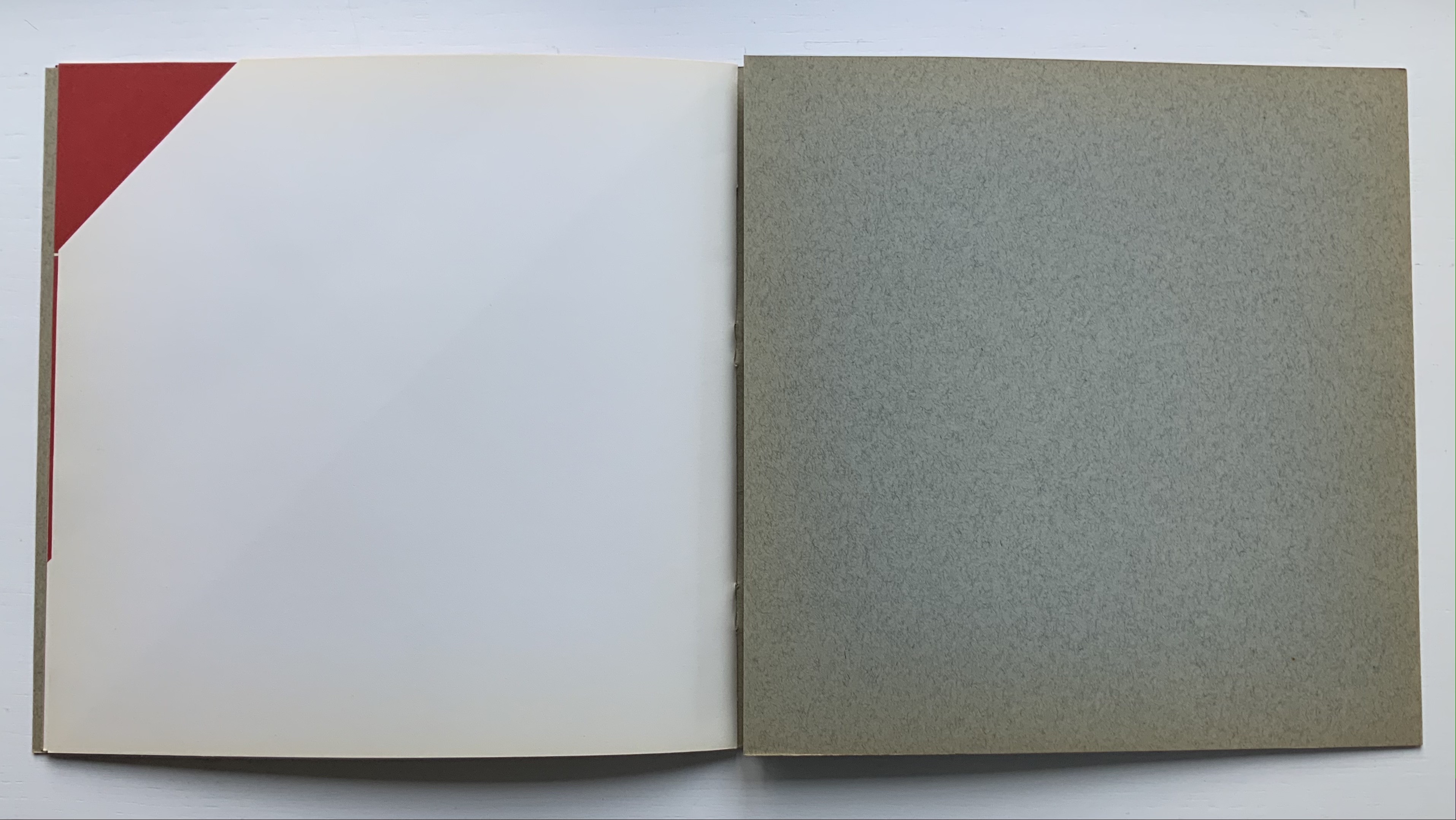
Libro illeggibile bianco e rosso / An unreadable Quadrat-Print / Een onleesbaar kwadraat blad / Ein unlesbares Quadrat-Blatt (1953)
Although there are no words on numbered pages that have to fall in the right order, An Unreadable Quadrat-Print still presents the author/printer/binder with a challenge in imposition. White and red alternate, which is easy enough, but to cut or not cut a folio on the left and right, how to cut it, how to place the differently cut folios in the right order to achieve the variation in images when the pages turn, how to ensure a sewable area down the center for each folio whether it has a horizontal cut extending into the spine or a diagonal one extending from some point along the spine — that is impressive. It speaks to the sculptural process and result in making books, as well as the sculptural process of reading them.
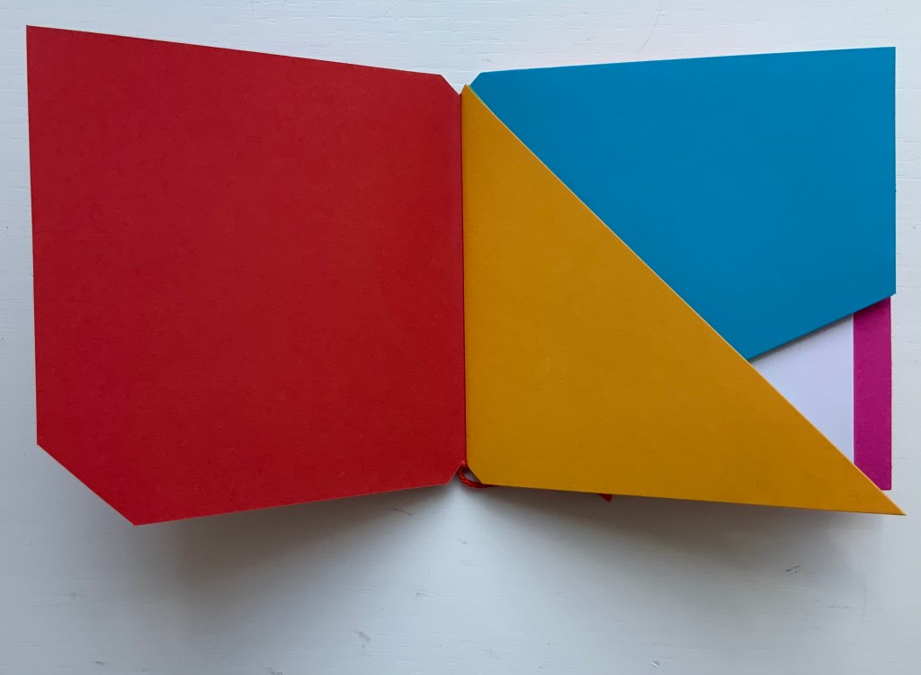
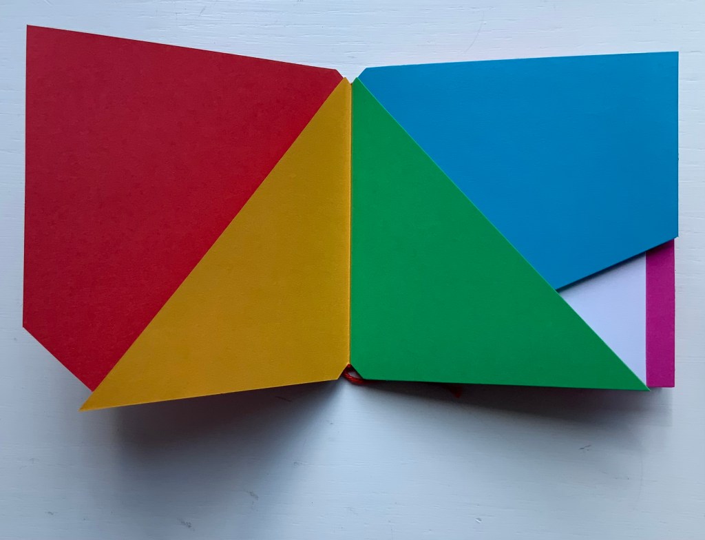
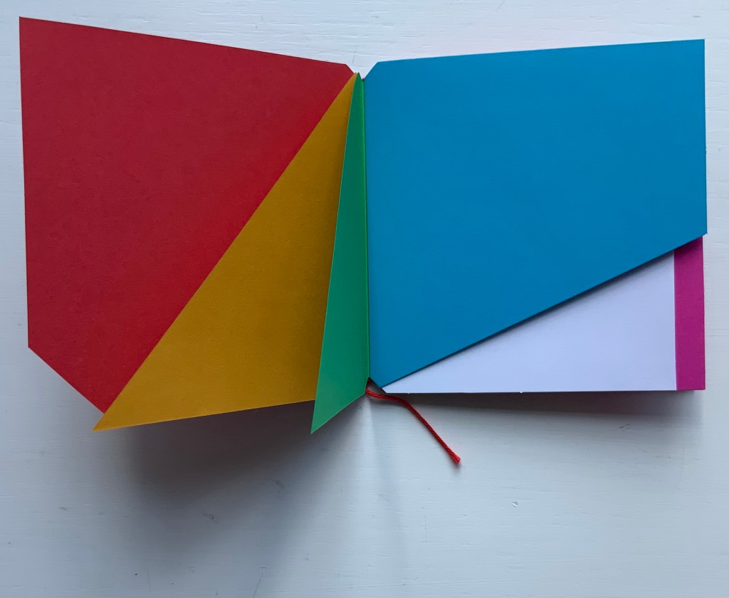
The following sequences — the book’s first five double-page spreads and then its last six — take a normal page-turning approach, always turning from the upper right corner of whatever shape/page is available. Note how, in the last six double-page spreads, the pages and shapes become more complex.
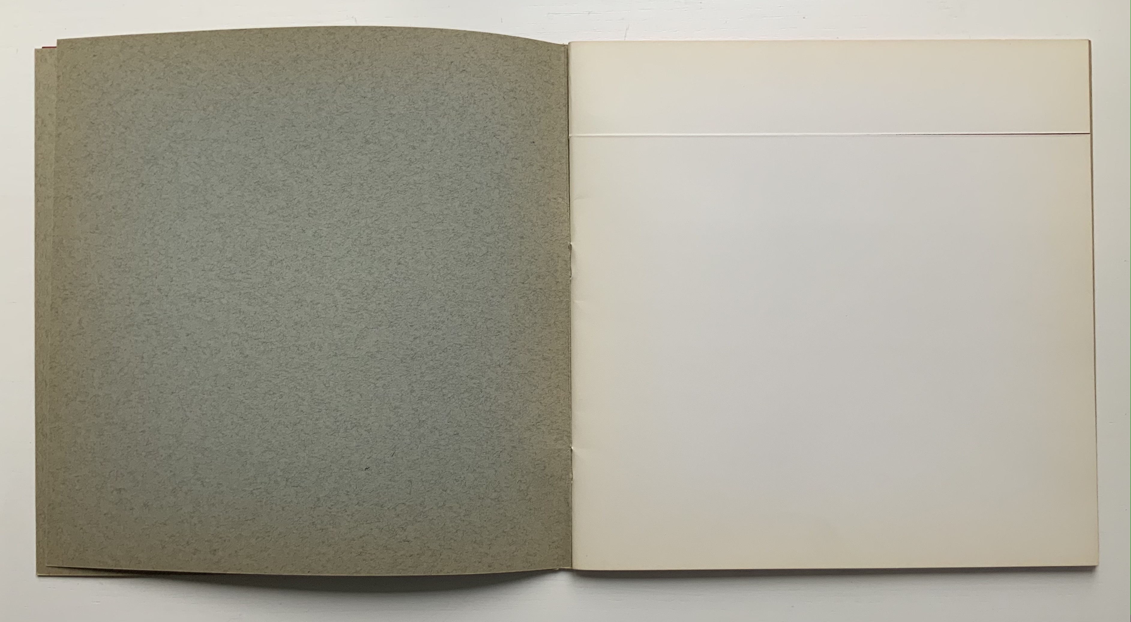
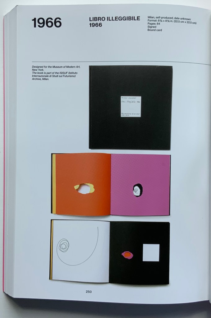
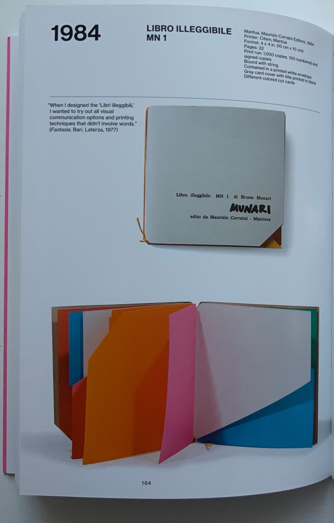
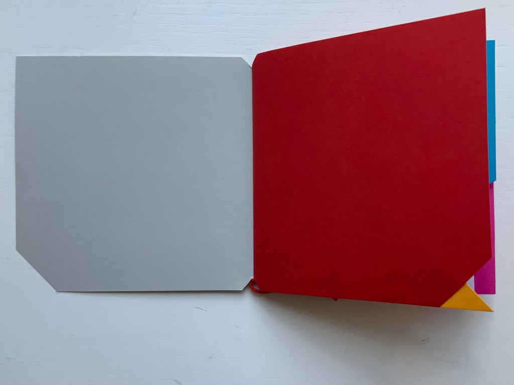
Libro illeggibile (1966), below left, calls to mind Katsumi Komagata’s A Cloud (2007), and the one in the middle foreshadows Eleonora Cumer’s subtle artistry with transparent paper in Circoscrivere lo spazio No. 3 (2021). While Munari’s rare works press modest budgets, some of it — in its simplicity and popular appeal — has led Corraini Edizionito put it within easier reach. Numerous reissues of the 1984 Libro illeggibile MN 1 have pushed its price to €5. Short of the artist’s signature (which would likely obstruct the aesthetic intention), a copy from the latest 5000-copy print run will “perform” and deliver the same experiential value as one from the earliest run.
Munari’s many series of illegible books tap into book artists’ longstanding and ongoing preoccupation with whether a book without words can communicate information, narrative, sensations or feelings through material, shape or color and their permutations. The colors, shape, feel and binding of Libro illeggibile MN 1 evoke simple and sophisticated pleasure in their juxtaposition and sequence. The unchanging straightness of the top edge and the anchoring red thread of the binding set off the changeability of shapes and colors.
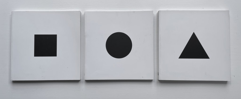
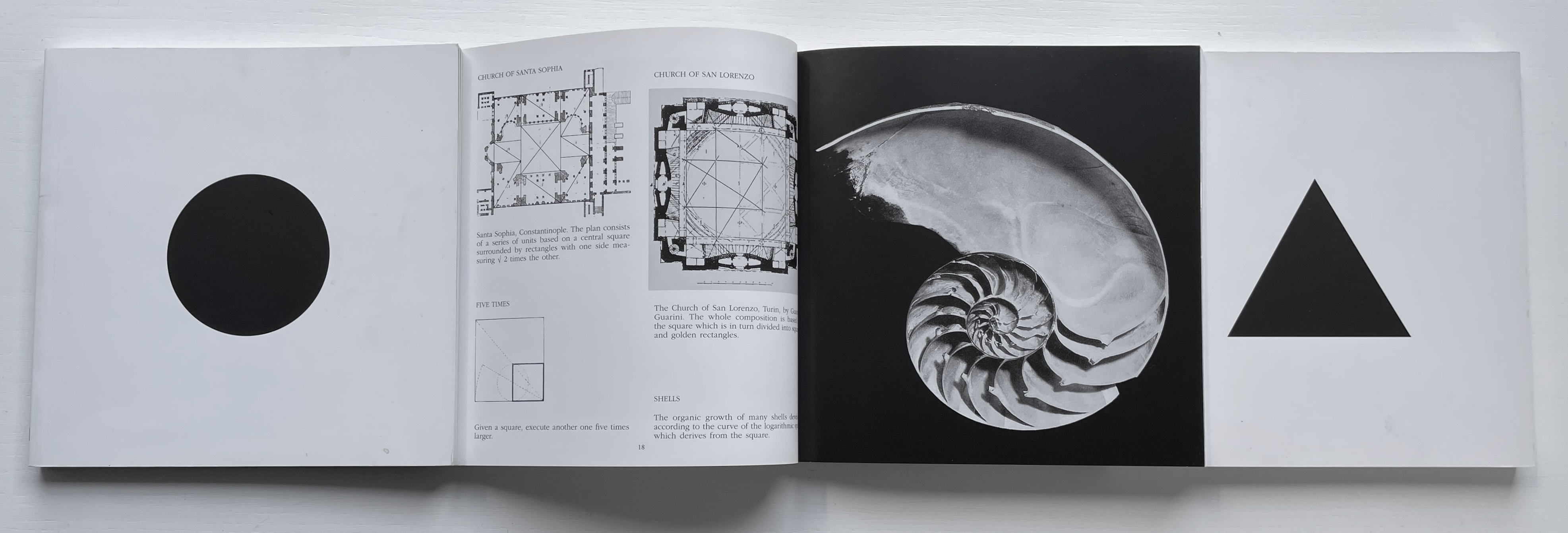
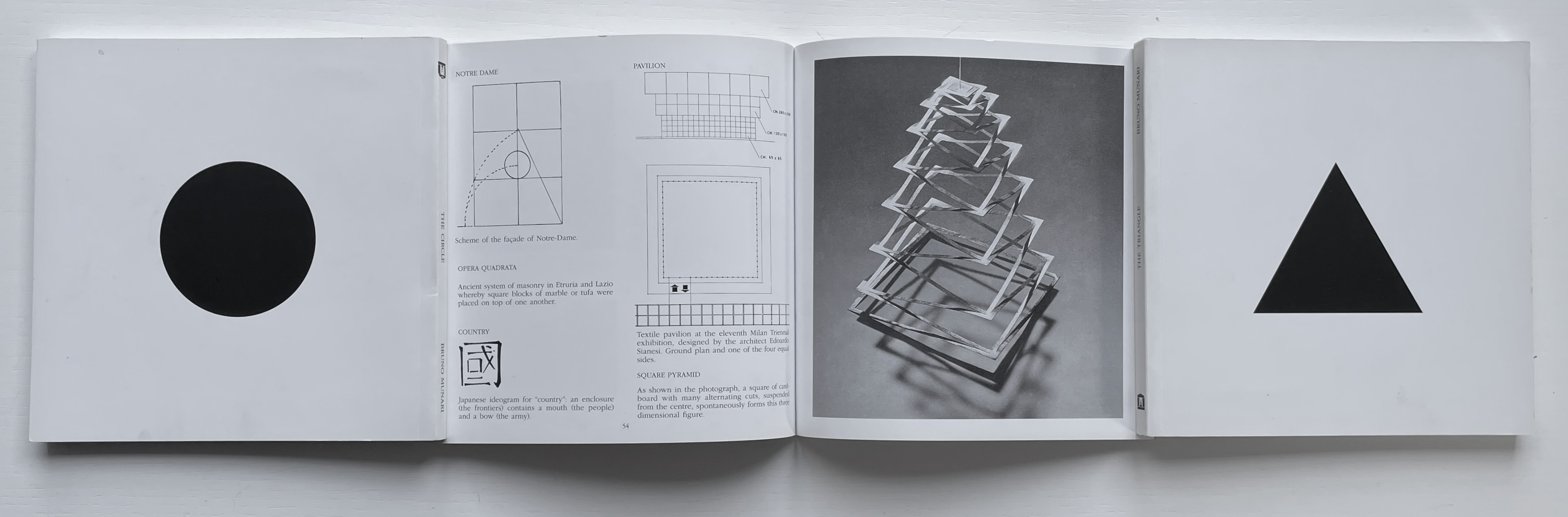
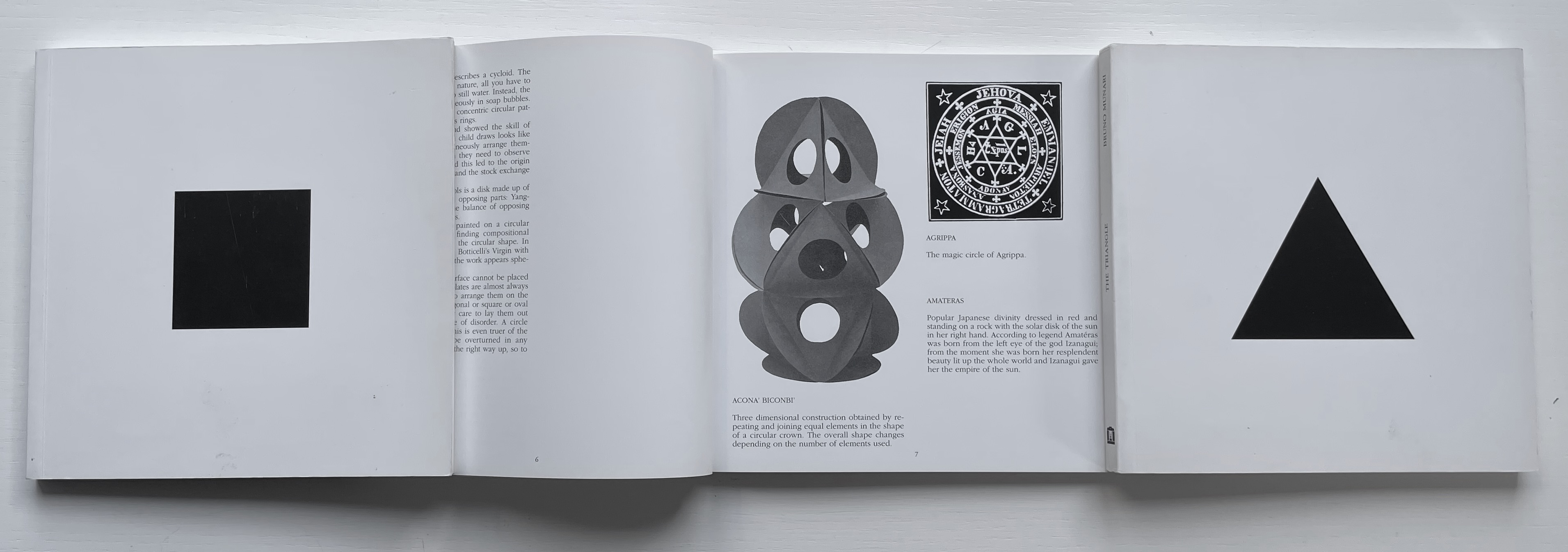
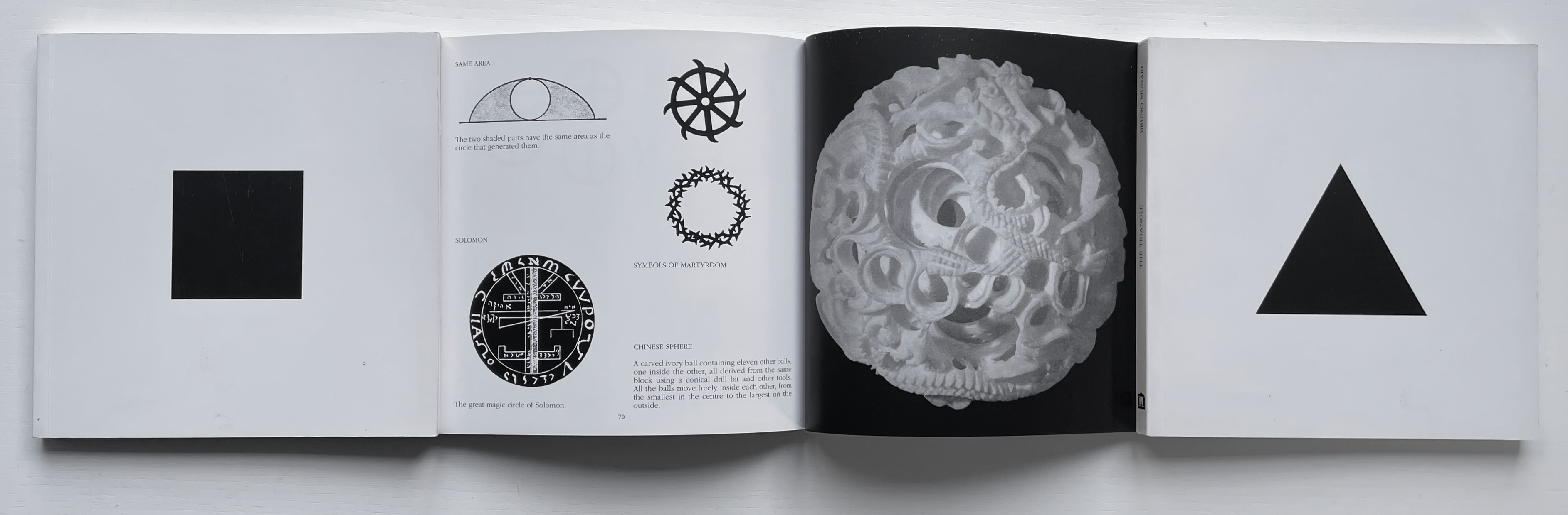
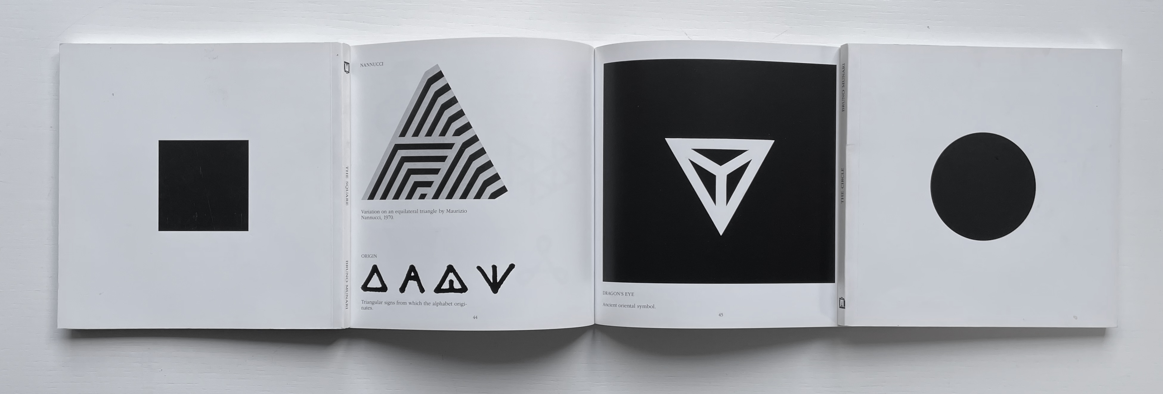
The Square (1960), The Circle (1964) and The Triangle (1976)
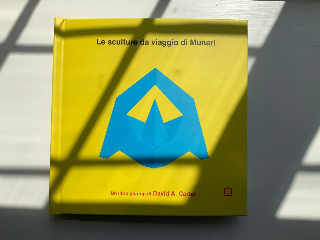
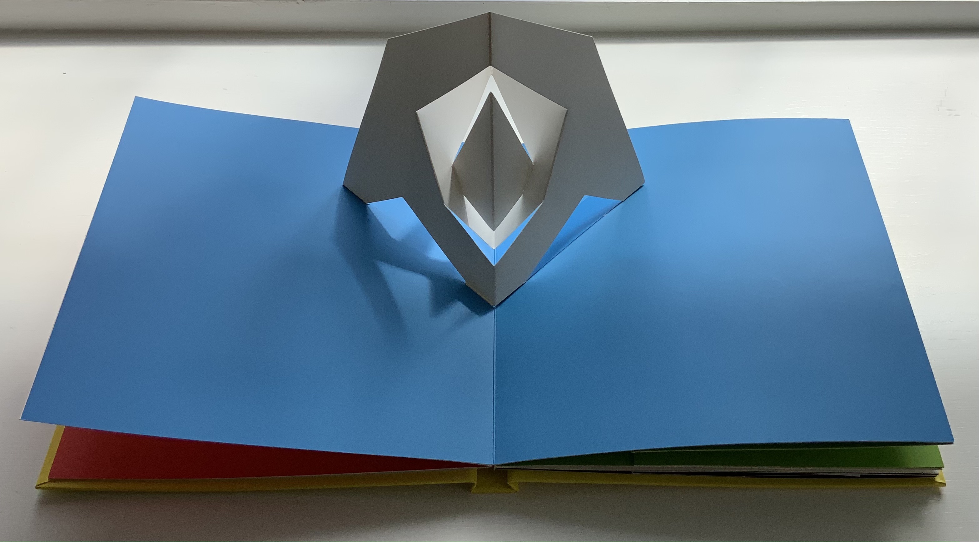
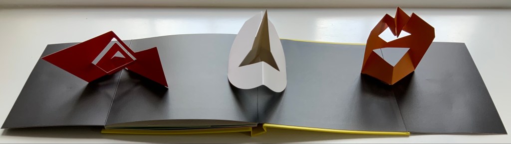
Although not a book of Munari’s making, David A. Carter’s Le sculture da viaggio di Munari is one way of bringing the spirit of Munari’s “travel sculptures” into the collection. Carter’s homage carries the blessing of Corraini Edizioni, further justifying its inclusion.
Travel sculptures started off as small sculptures (some even pocket-sized) to carry with you, so you could take part of your own culture to an anonymous hotel room. Later they were turned into ‘travel sculptures’, five or six metres tall and made of steel. One of these was seen for a few months in Cesenatico, another one in Naples. Others are sleeping among huge trees in the Alto Adige region.’ This is how Italian designer Bruno Munari (1907-1998) described his ‘travel sculptures’, which in turn inspired American illustrator and designer David A. Carter for this pop-up book. –Corraini Edizioni website. Accessed 3 August 2021.
Munari’s travel sculptures also recall works in the collection like Cumer’s scultura da viaggio dipinta n.2(2017), Komagata’s「Ichigu」(2015) and, albeit less portable, Ioana Stoian’s Nous Sommes (2015).
The art of the alphabet seems to be a rite of passage for graphic artists. Perhaps it is that art and the alphabet find common ground in the urge to make sense of the world. Perhaps it’s that the alphabet’s invention, development and artistic treatment present a rich tradition for artists to follow or challenge. Perhaps it’s that letterforms and the alphabet offer raw material, subject and organizing principle all in one. Semic or asemic. Calligraphic, typographic or even plastic. Representational or abstract. All are options. But most often, something bookish results. From Islam Aly’s 28 Letters(2013) to Ludwig Zeller’s Alphacollage (1979), a significant part of the Books On Books Collection is taken up with artists’ books based on the ABCs and letterforms. The Collection’s two facsimiles of Geofroy Tory’s Champ Fleury provide a useful historical backdrop that throws into relief several of the Collection’s works and their performance of this rite of passage.
It should be no surprise that Geofroy Tory de Bourges (c.1480-1533) serves up such an exemplar. In her Playful Letters, Erika Boeckler writes
An accomplished designer, typographer, printer, poet, author, translator, calligrapher, illustrator, woodcutter, and engraver, he received his education in Italy and ultimately settled in Paris, setting up a bookstore, writing his own works, running a press, and collaborating with or working for Simone de Colines, director of one of the most influential and experimental fine publishing houses of the time. Personally writing the text, designing the woodcuts, and cutting some of them, organizing the layout, perhaps even setting the type, Tory created Champ Fleury as what we might call today an artist’s book. (p. 29)
Tory straddles the letters of the late Middle Ages and Renaissance. Appointed by François I in 1530 as his printer, Tory operated on the Petit Pont under the sign of le Pot cassé (“the broken pot”) and was known for his workshop’s handwritten Book of Hours (1524). Rooted in the horae tradition reaching back to the 13th century, Tory’s Book of Hours is an early-to-mid-Renaissance version of its predecessors. As beautiful as his Book of Hours is, Champ Fleury (1529) became his best known work. Authored and designed by Tory, it was produced by hand typesetting and letterpress printing in Paris with Giles Gourmont. Printed less than 100 years after Gutenberg’s innovation, Champ Fleury represents the printed book toddling out of its incunabula period.
Book of Hours Geofroy Tory (1524) Bound in the 18th century, 113 leaves of vellum. Lessing J. Rosenwald Collection (Library of Congress). Accessed 30 May 2021.
According to Jeremy Norman’sHistory of Informationsite, the first separate printed title page appeared in 1463. Subject indices date back to the 13th century, originating at the University of Paris, and the first printed indices, to 1470. Champ Fleury‘s front matter boasts a title page, two prefaces to the reader, a statement of the King’s Privilege awarded for the book for ten years (a forerunner to the copyright page), a name index without location references and a subject index with folio references. Champ Fleury’s back matter consists of a colophon preceded by a lengthy appendix illustrating various forms of the alphabet (Hebrew, Greek, Latin, etc.).
Tory’s placement of the indices in the front matter rather than the back matter reflects the gradual development of the anatomy of the book towards the structure that would ultimately be codified in reference works like the Chicago Manual of Style. Paratextual elements like the title page, table of contents, page numbers, etc., did not spring up overnight. If, as Eric Havelock and others assert, society, the arts and culture are a superstructure erected on the foundation of the alphabet (see below), Champ Fleury and its “letterology” make for a particularly fitting exemplar of the book as an element of the superstructure arising from the alphabet.
Perhaps book artists sense this, which again leads to that alphabet art rite of passage and the elaborate variations on it. The illustration of various forms of the alphabet in the appendix also draws on another developing tradition: the typesetter/printer’s sample book advertising the firm’s fonts. Abecedaries and artist books have sprung from that tradition, too.
Tory was not the first to propose an art and science behind the letterforms of the alphabet. Predating his efforts were Giovanninno de’ Grassi (1390-1405), Felice Feliciano (1463), the Anonymous Chicagoensis and Anonymous Monachensis (1468?), Damianus Moyllus (1480), Fra Luca Pacioli (1509), Sigismondo Fanti (1514), Francesco Torniello (1517), Ludovico Arrighi (1522), Albrecht Dürer (1525) and Giovanni Battista Verini (1527). Leading up to Champ Fleury, these earlier efforts track the development of humanism. Arguably, Tory’s effort is a capstone, combining myth, allegory, metaphysics, geometry, linguistics, calligraphy, typography and cryptography.
Book One, concerned with the mythical origins of the French language, also addresses the fabled origins of the alphabet: the story of Jove, Io and Mercury behind the letters I and O and their claim to being the first letters and also the tale of Apollo’s accidental murder of Hyacinth explaining the letters A and Y and their similar claim. Two works in the Collection built on alphabet origin stories are Francisca Prieto’s Printed Matter series (2002-2008) William Joyce’s The Numberlys (2014), but many more follow in Champ Fleury’s art and science footsteps.
Tory’s late medieval/early Renaissance perspective gives way to 20th and 21st century poetics and phenomenology in most works of the Collection. Aaron Cohick’s The New Manifesto of the NewLights Press (third iteration) (2017) offers a good example. Another — closer to Tory’s moral and geometric perspective but of a more modern spirituality — is Jeffrey Morin and Steven Ferlauto’s Sacred Space (2003).
Compile all the abecedaries ever created and it would approximate the result of Adam and Eve’s task of naming all the creatures and things of the world. Leonard Baskin echoes that innocence in Hosie’s Alphabet(1972) with its words and animals supplied by his children. If Adam and Eve had had an alphabet, they might have been tempted into pareidolia, which is represented in the Collection by VUES/LUES: Un Abécédaire de Marion Bataille (2018) and Typographic Universe (2014) by Steven Heller and Gail Anderson. Heller and Anderson’s compendium extends to letters formed of natural and drawn objects from the real world, which Champ Fleury’s appendix foreshadows with its floral and fantastic alphabets.
Of course, Tory’s work is not an abecedary. In Books Two and Three, it develops into a full-blown treatise on letterforms whose meaning and appearance are explained allegorically and driven by the compass, rule and geometry expressed within a 10x10x10 cell cube. It would overstate the case to call it “typographic design”. As drawn, Tory’s diagrams would serve poorly for cutting and forming punches or matrices (although it has been done). Nevertheless, his geometric approach foreshadows the grids and algorithms of Wim Crouwel’s New Alphabet (1967), Timothy Epps and Christopher Evans’ Alphabet(1970) and Ji Lee’s Univers Revolved: A Three-Dimensional Alphabet (2004).
Before the age of computers and algorithms, though, the artist and designer Bruce Rogers did bring typographic design to bear on Champ Fleury. The Grolier Club sponsored the printing of George B. Ives’ English translation. Rogers’ design “translates” Champ Fleury just as much as Ives does, perhaps more so. The Grolier Club edition is one of only ten books to be set completely in the Centaur typeface designed by Rogers.
Of course, the translation entails a complete resetting of the text, and Centaur naturally delivers crisper letters. Also, in redesigning with Centaur, Rogers alters the original’s layout and, therefore, the reader’s experience of it. Notice in the OAHK pages above and in the three double-page spreads below how Rogers changes Tory’s flow or jumpiness to something fixed or stately. Attention to the page and its layout offers book artists as well as book designers yet another creative avenue. For proof of that, compare the Collection’s entries for Angel, Baskin and de Cumptich.
Architecture is another of Tory’s well-developed analogies and explanations of the ancients’ thinking behind the letterforms. In his drawings below, he aligns the letters AHKOIS with the parts of a building and letters IL with floor plans. He connects the circularity of the Coliseum’s exterior and the ovalness of its arena with the proper shape of the letter O. In the Collection, the analogy reappears fantastically in Johann David Steingruber’s Architectural Alphabet (1773/1972), Antonio Basoli’s Alfabeto Pittorico (1839/1998) Antonio and Giovanni Battista de Pian’s efforts in 1839 and 1842.
The architectural analogy provides Tory with his segue from plane to solid geometry in aligning the shapes of letters with human anatomy and virtues. His three-dimensional analysis of letterforms also finds contemporary analogues in two of Pieter Brattinga’s Kwadraat Blad series: Crouwel’s, mentioned above, and Anthon Beeke’s Alphabet (1970). Tory’s three-dimensional letterforms foreshadow Crouwel’s investigation of units based on the assembly of organic cells and his later musings on a laser-generated four-dimensional typography (Elliman, 62). And it is hard to evoke anything more humanoid and three-dimensional — albeit far less analytical or prudish — than Beeke’s alphabet formed with naked female models. (Tory comments that in a correctly drawn A, the crossbar will virtuously cover the genitals of Vitruvian man inscribed in the 10×10 grid. Modesty seems to extend to H as well but not so much to O and K.)
The calligraphic impulse that underlies Champ Fleury‘s typographic representations shows itself clearest in the woodcuts for the Cadeaulx alphabet in the appendix. The Books On Books Collection has its share of calligraphic abecedaries such as Marie Angel’s An Animated Alphabet (1996) and Andrew Zega and Bernd Dam’s An Architectural Alphabet (2008) as well as more purely calligraphic alphabets such as Islam Aly’s, mentioned above, and Suzanne Moore’s A Blind Alphabet (1986) .
Two artists whose abecedaries blend the calligraphic and typographic are Robert de Vicq de Cumptich and Cathryn Miller. In de Cumptich’s Bembo’s Zoo (2000), letters and punctuation marks from the Bembo typeface form calligraphic animal shapes. Miller’s L is for Lettering(2011) joins up the alphabetic rite of passage, calligraphy and typography by allying each of her hand-drawn letters with the name of a typeface from “A is for Arial” to “Z is for Zapfino”.
The last page of Tory’s illustration of additional alphabets is not the end of his work. The colophon plays that role. Curiously, Tory misses out the character that plays that role for the alphabet itself: the ampersand. “Curiously” because the character & appears throughout Champ Fleury — even at the end of the colophon’s fourth line in French — and it is after all the most flowery of the alphabet’s characters. Perhaps some book artist will follow Bruce Rogers’ example in his joking Depression-era homage to Tory on the back of Champ Rosé and create an homage to Tory and Rogers of three-dimensional ampersands.
Gelb, Ignace J. 1974. A Study of Writing. Chicago: University of Chicago Press.
Golec, Michael. 2015. “Champ Fleury in the Machine Age”, lecture at the School of Visual Arts, NYC. Uploaded 4 June 2015. Accessed 12 May 2021. Good slides and a comparative look at Tory’s original and Rogers’ resetting.