Inscription: The Journal of Material Text, Issue 5 (2025)
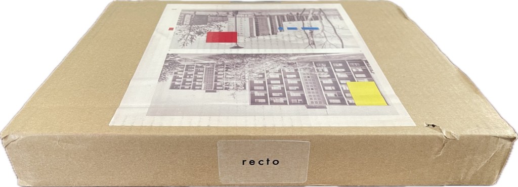
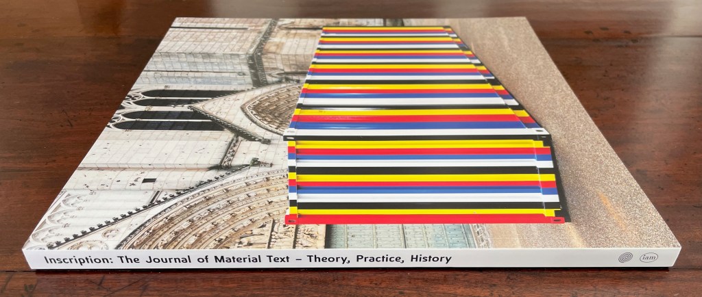
Although Theodore Roethke had a woman in mind when he wrote “The shapes a bright container can contain!”, the phrase readily comes to mind for this issue of Inscription once you’re past the difficult-to-open-up cardboard packaging. Not that you should rip through and discard it. The clues to proceed patiently are the label “recto” on one edge of the box and the page cut from a book and pasted on the box’s top. Is “recto” some sort of “this side up” label? If so, it seems topsy-turvy. Recto (or right-hand) pages are usually have odd-numbered, but the pasted-down book page is numbered 20. Wait a second; those random colored rectangles have been printed over the book page as if meant to draw attention to the “gridness” of the apartment blocks. Maybe this box is meant to be preserved and framed (after all, Toulouse-Lautrec drew on cardboard).
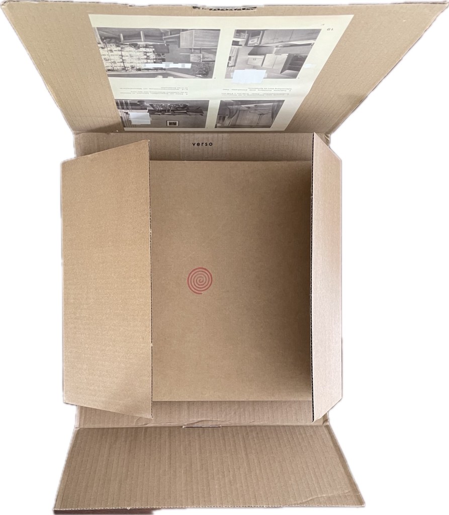
Careful opening rewards and teases patience. There’s the logo for Inscription, but there’s a verso label on the inside edge and another book page pasted down. This is as much, if not more, a tease than reward. The “verso” label and page are upside down to one another, and the page is an even-numbered recto book page. At least the two book pages on either side of the box top are oriented the same. Maybe this box top is meant as an artwork like those included with the previous issues of Inscription. If you are inclined to preserve and frame it though, it will have to be a box frame, the kind that museums use to display a double-sided portrait or a medieval triptych’s detached wing illustrated on both sides.
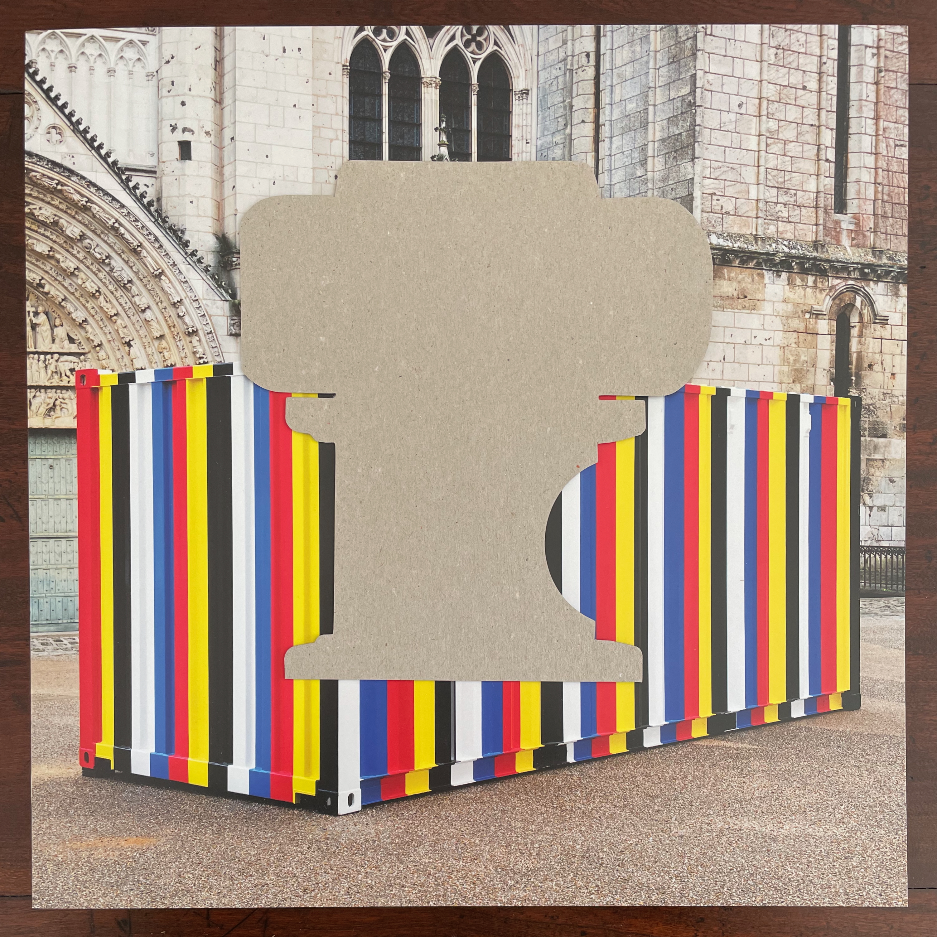
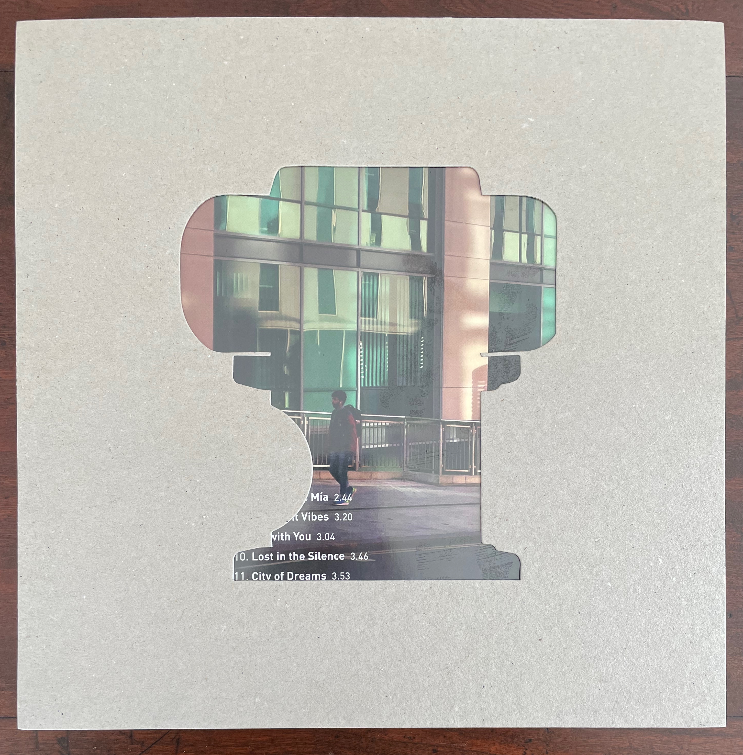
Inside the cardboard wrapper is the latest issue of Inscription as promised by the logo, but now there’s a new mystery — a loose cut-out atop the front cover and, on the reverse, the card from which the cut-out came. That’s the back cover of an LP peeking through the cut-out’s shape. But what is that cut-out? Being outside the journal’s covers, the inserts that come with each issue are really “outserts” and naturally are always clues to the issue’s theme. This time, the issue’s cover is also a clue to identifying this cut-out.
Inscription: The Journal of Material Text, Issue 5 (2025)
Simon Morris, Gill Partington and Adam Smyth (eds.)
Cased perfect bound paperback, printed paper cover. 313 x 313 mm. 168 pages. ISSN: 2634-7210. Acquired from Information as Material, 10 May 2025.
Photos: Books On Books Collection.
That multicolored shipping container outside the Cathédrale Saint-Pierre de Poitiers is Kimsooja‘s Bottari 1999–2019 (2019). Bottari are traditional Korean bed-covers also used to bundle up “one’s most important belongings during transit, often when moving from one’s place of origin.” Purportedly, the freight container holds Kimsooja’s personal belongings from her apartment in New York.
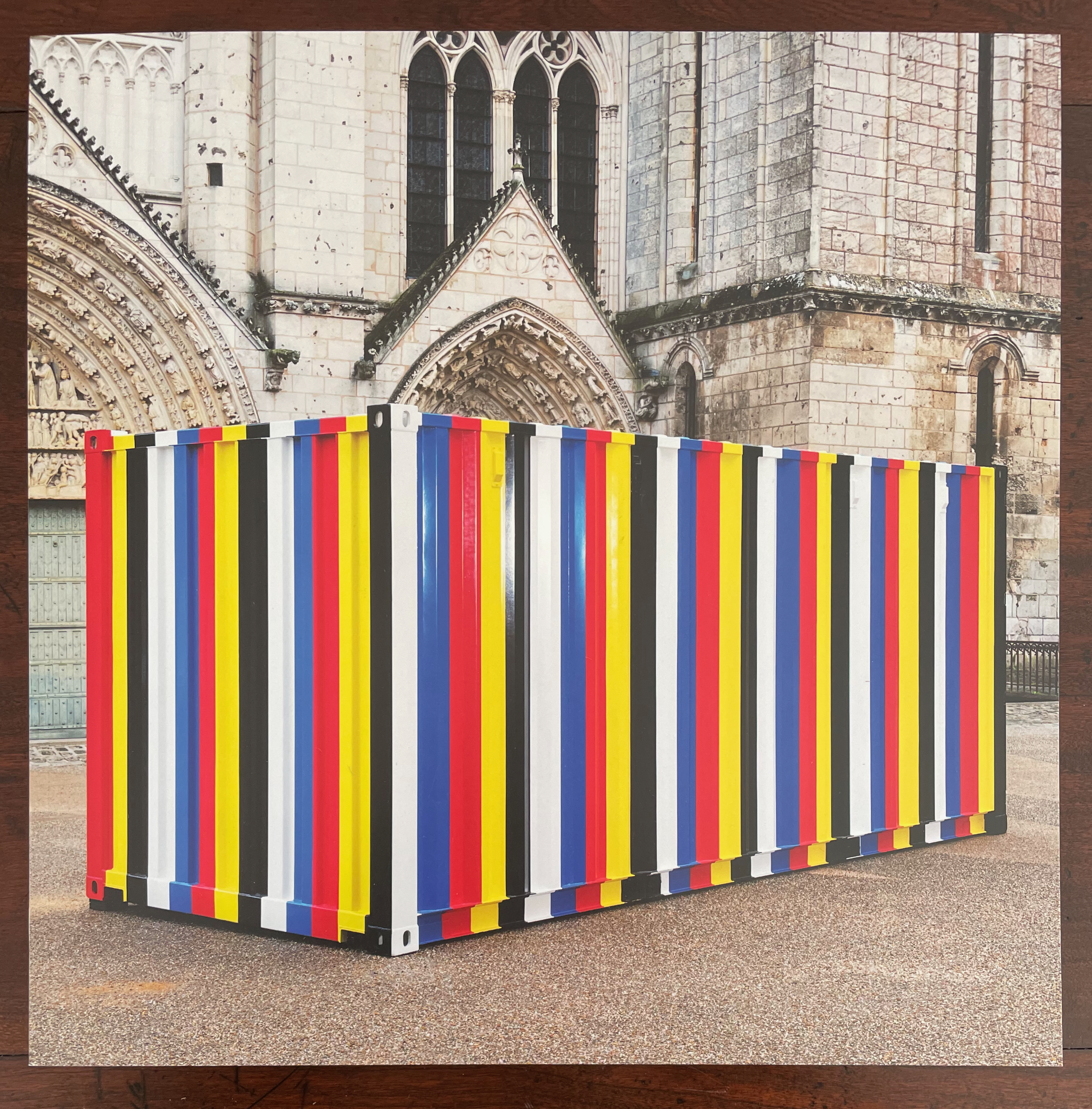
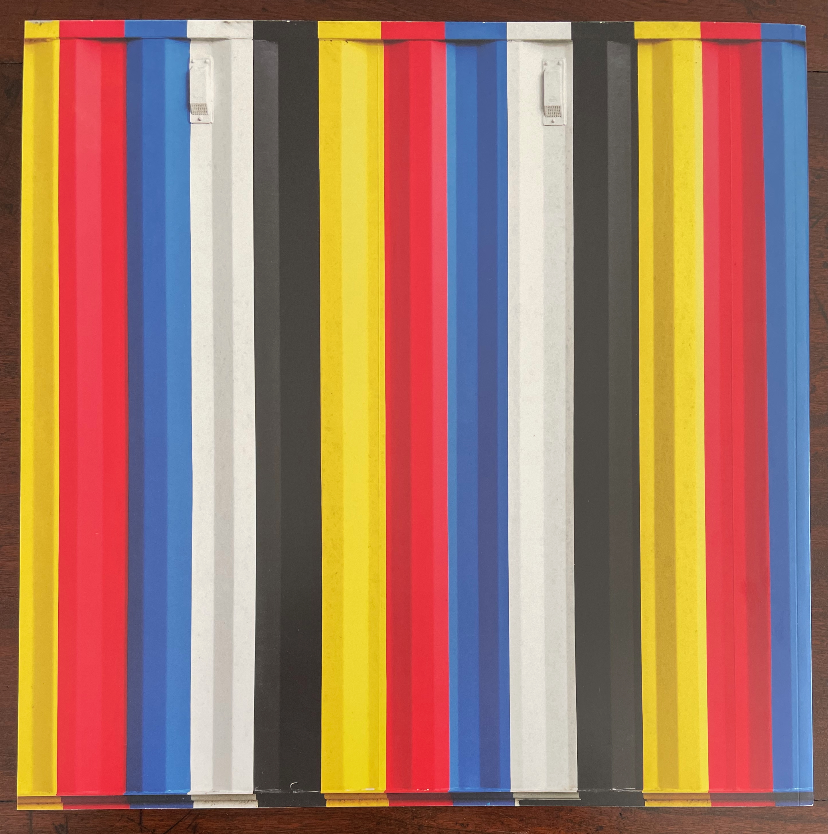
But back to the clues for the cut-out. So far we’ve had superimposed colors on the pages from inside of a book pasted on the box outside the journal issue. Now we have a shipping container painted in the colors of the traditional Korean Obangsaek spectrum (white, black, yellow, blue, and red). Could the flat cut-out be something that should be 3D and related to colors even though it’s blank?
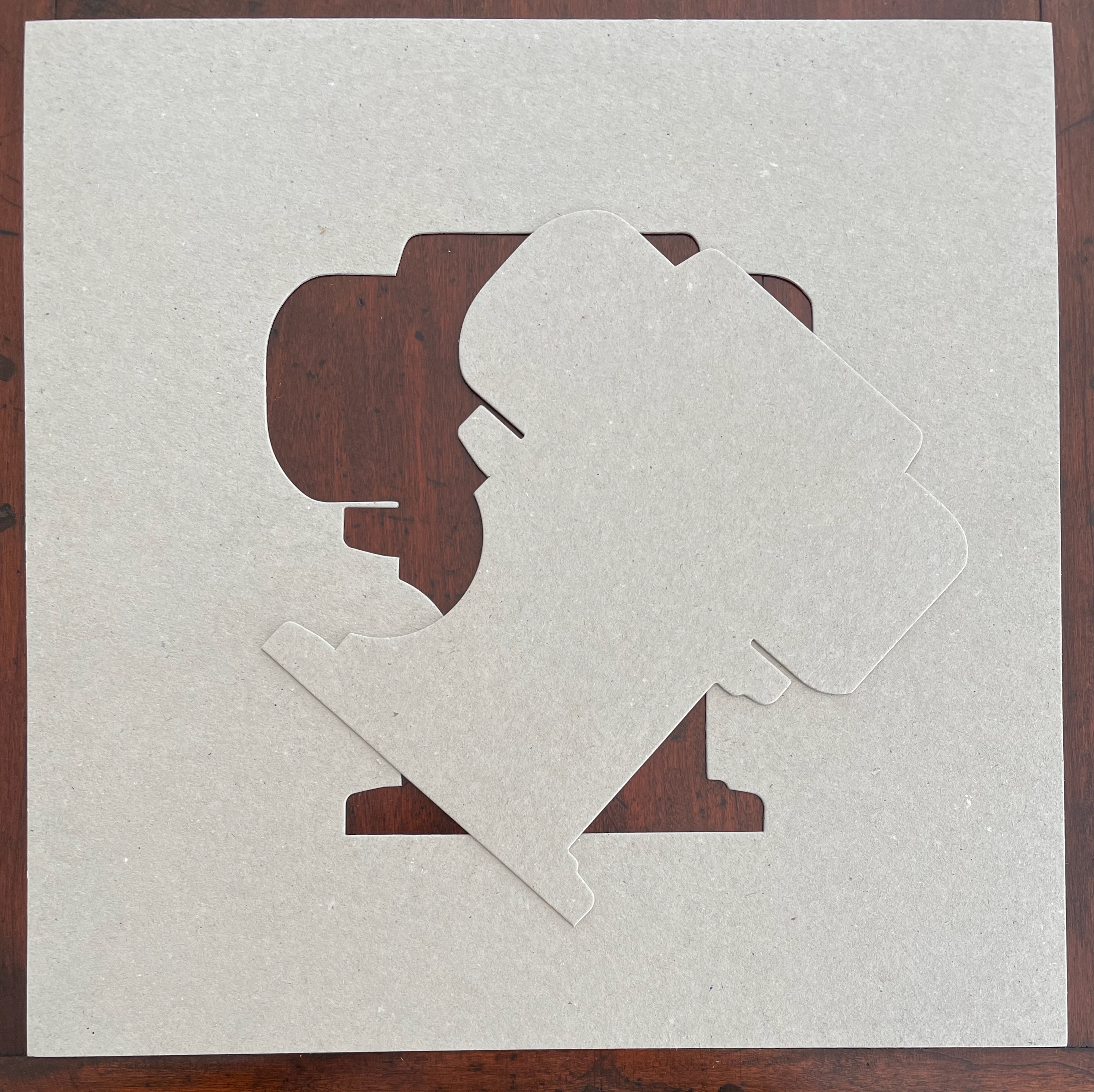
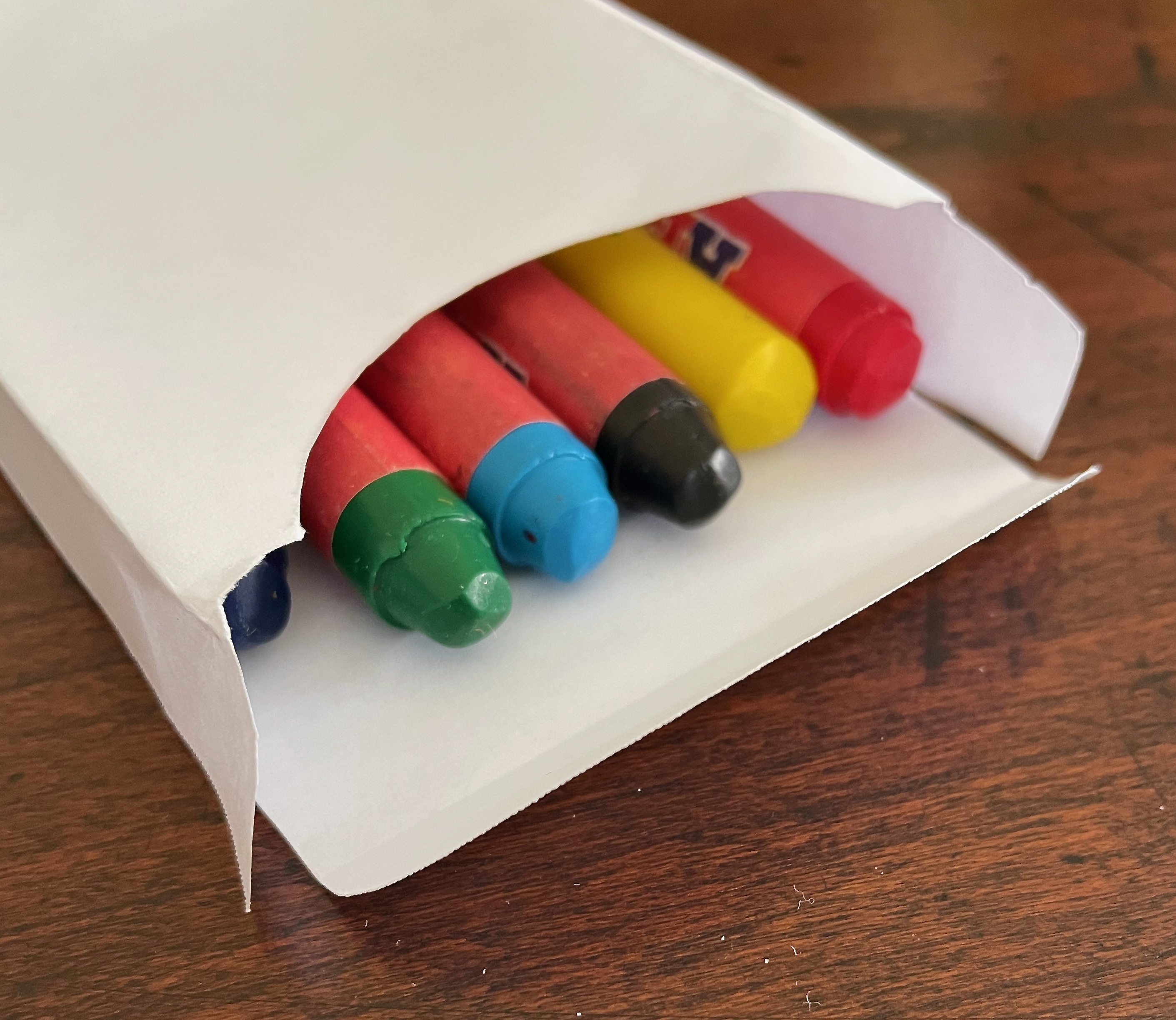
The cut-out and its source; a box clumsily made with the template and loaded with crayons.
Of course, Gill Partington and Adam Smyth’s introduction and the backmatter credits spill the beans that the card template comes from Joel Swanson‘s Crayola Box: 16 (2019) and that the pasted book pages come from Michalis Pichler‘s Untitled (Mondrian)/Ablata at alba #20 (2025). The box top is an intended “outsert”. By then, you know that the theme of this issue is containers. Still, until you get there, the self-referential teasing reminds you that each issue of Inscription has been an artist’s book in itself, and so this issue prods you to think outside and inside its box as well as the book.
Like a narrative that embeds a flashback or prequel in the middle of things, this issue includes the “origin story” of Inscription. Can it be an accident that it arrives as the sixth essay out of eleven and in the guise of Simon Morris‘s contribution “Encountering Daniel Buren”? Here is one of the editors reintroducing the journal and one of its star artists smack in the middle of ten other essays. Morris neatly ties Inscription‘s origin story to Buren via the historical precedents the editors had in mind as they shaped their project. One of them was Seth Siegelaub‘s guest-edited Studio International (July-August 1970), and in the middle of all that issue’s gray were eight pages of Daniel Buren‘s 8.7 cm trademark stripes all in “zingy lemon yellow” (p.70). Morris reproduces all eight of them and other images of Buren’s work that speak to his play “in the space between painting and architecture whilst questioning the relationship between inside and outside of the museum” (p. 77). Buren’s contribution to this issue spreads out from the center in both directions, introducing each of the issue’s essays with a passe-partout.
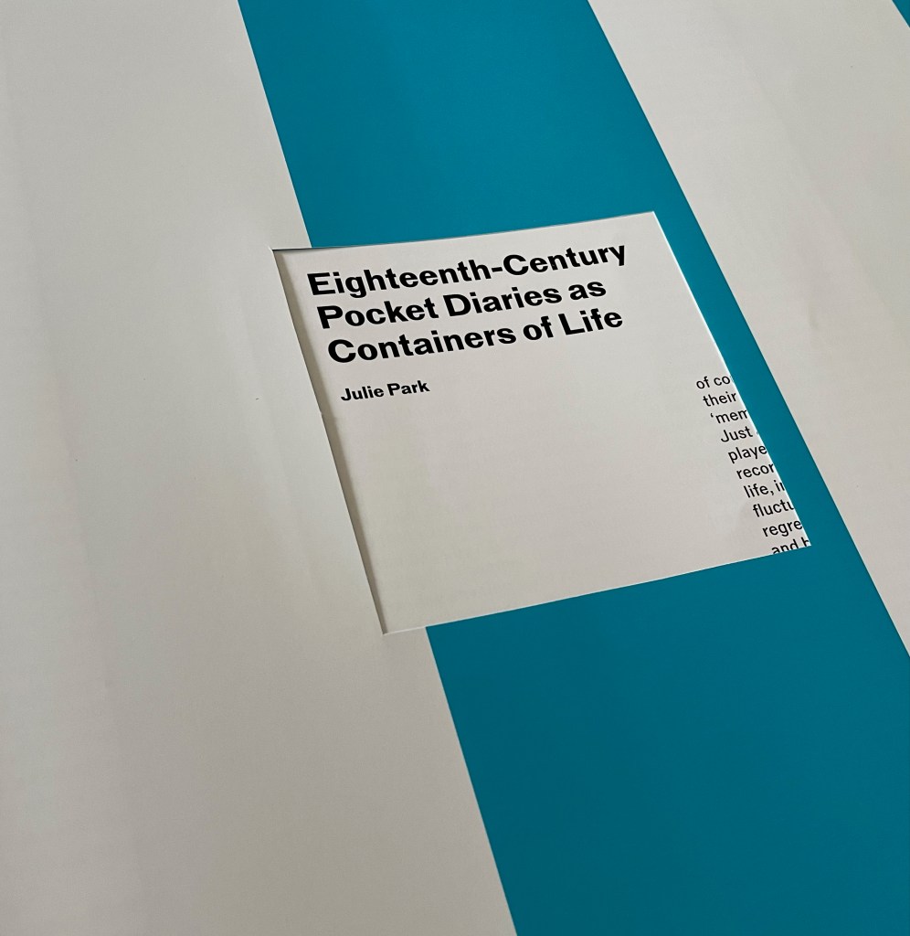

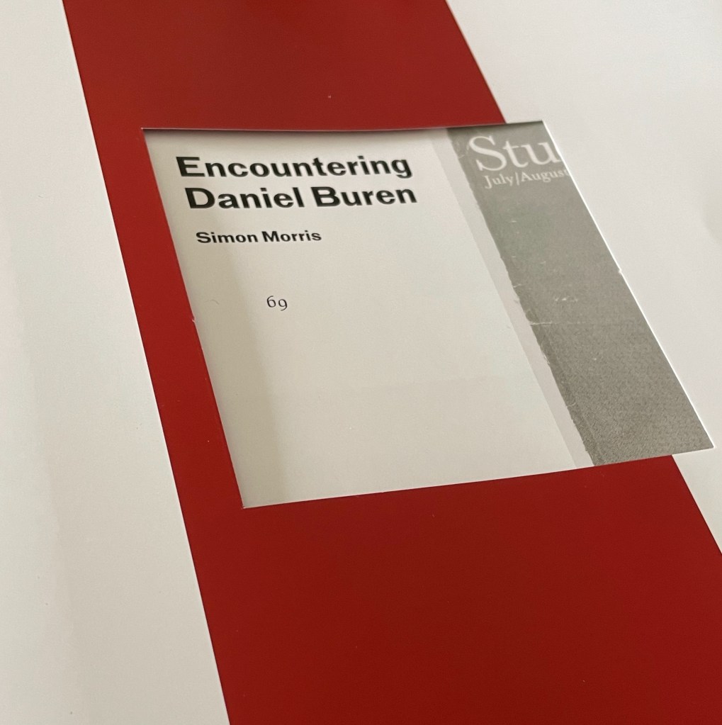
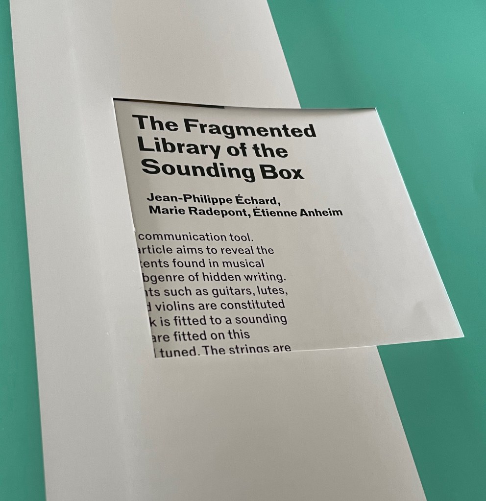
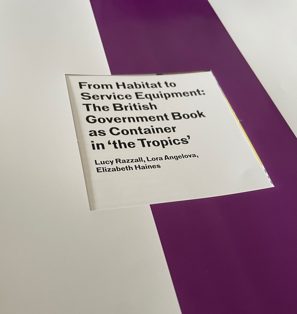
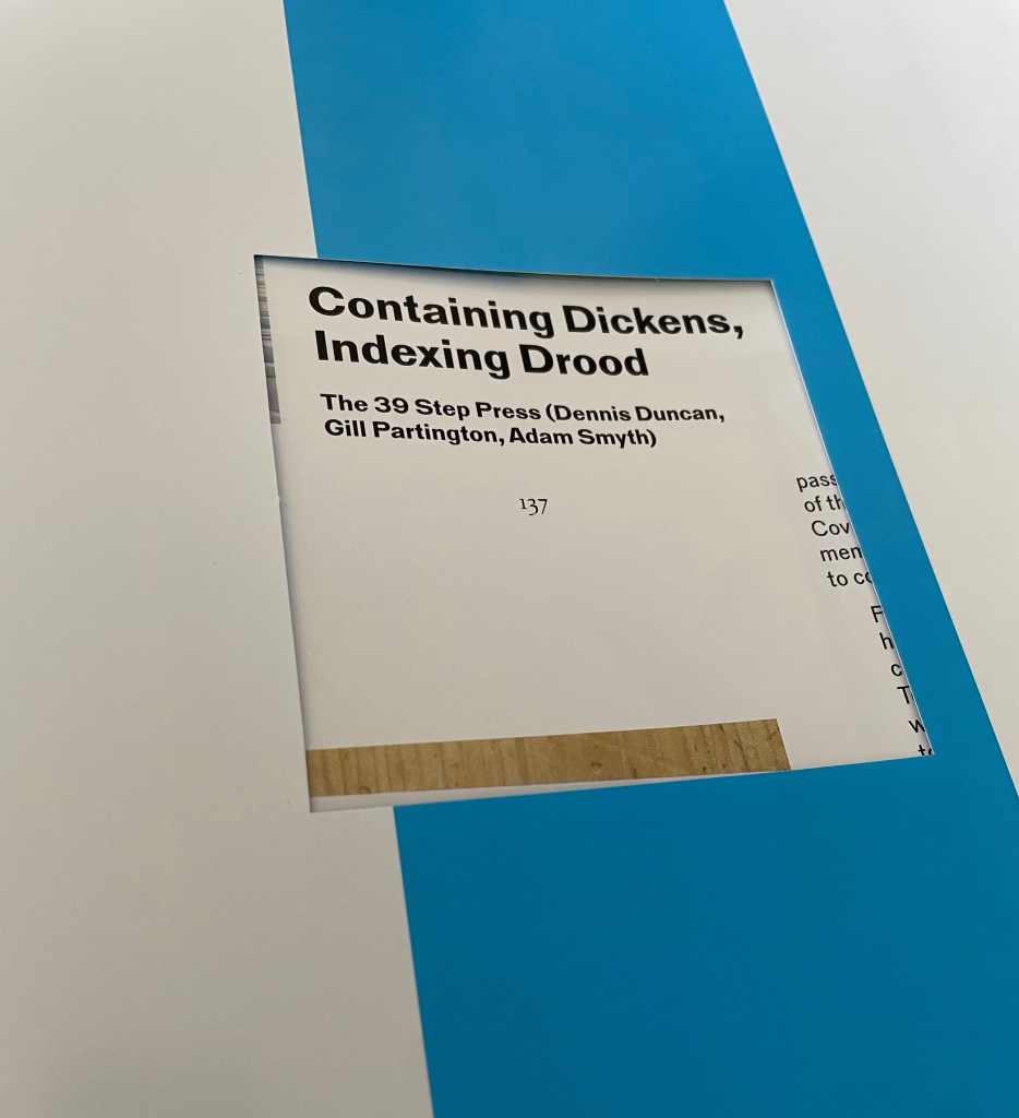

The authors in order of appearance: Gill Partington and Adam Smyth; Felicity Brown; Felipe Cussen; Julie Park; Beth Driscoll and Claire Squires; Simon Morris; Jean-Phillippe Échard, Marie Radepont, and Étienne Anheim; Lucy Razzall, Lora Angelova, and Elizabeth Haines; Joanna Kavenna; Dennis Duncan; and Christian Bök.
Another historical precedent to Inscription that Morris mentions is Aspen: The Magazine in a Box, edited by Phyllis Johnson. It ran for ten issues, which seems to lay down a marker on which this fifth issue of Inscription has its eye. In his Substack site Text!, fellow editor Smyth shows that it has been on his mind from the start:
What happens when we imagine a magazine as a box? In her introductory letter to edition 1, Johnson wrote that by using the term ‘magazine’,
“we are harking back to the original meaning of the word as ‘a storehouse, a cache, a ship laden with stores.’ That’s what we want each issue to be. Since it comes in a box, our magazine need not be restricted to a bunch of pages stapled together… [and we] can put in all sorts of objects and things to illustrate our articles.”
A box enables a level of coherence – hence the themed issues – but, within this, an in-flux miscellaneity. Shake the box and the contents rattle. Empty the box and the parts fall in a random order. Remove an item and you can keep it apart. Place them back, one by one, like you’re packing a lunch. Add a component of your own. Close the lid knowing they’ll still be there, waiting until next time. — Smyth, 22 January 2021.
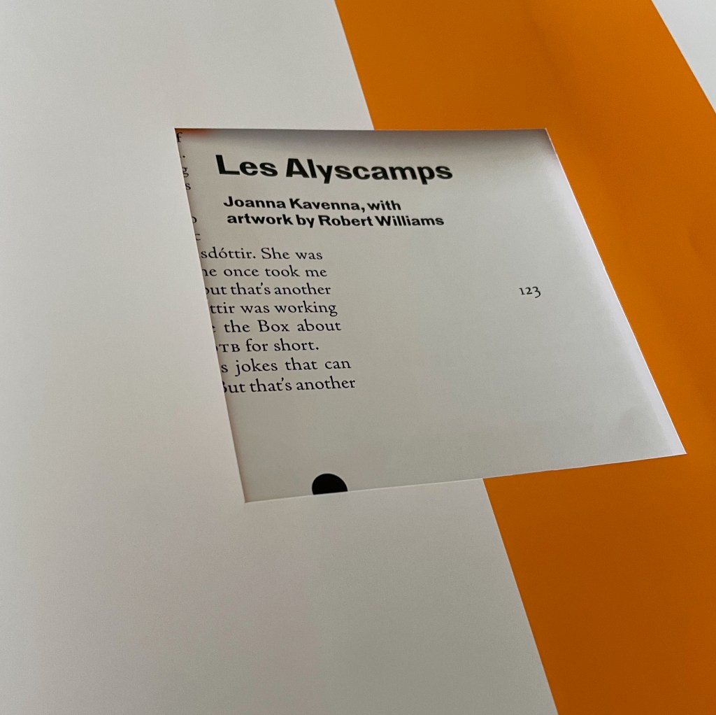
It is fascinating how the the editors, authors and artists create within, around and through the constraints of the 313 x 313 mm container. Equally fascinating are the conversations that the contributions strike up with one another. The poster from Jérémie Bennequin that unfolds from its neat 313 mm square into its H626 x W939 mm double-sided self echoes the double-sided appropriating box top from Pichler, which has already begun its conversation with Kimsooja’s container and colors, which carries on a conversation of its own with Buren’s stripes — “or not” as the catchphrase in Joanna Kavenna‘s short story about a box-related scandal arising from a philosophy project called “Thinking outside the Box about Thinking outside the Box or TOTBATOTB for short” would have it. Kavenna’s is the first fiction contributed to Inscription.
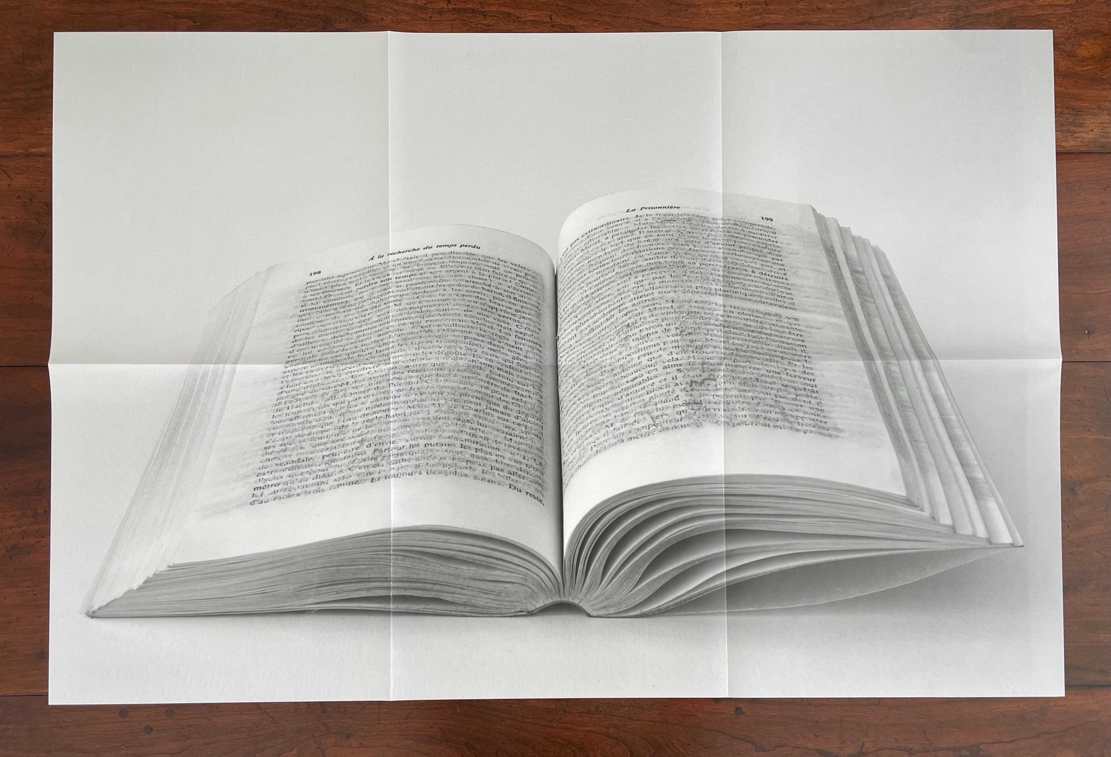

La Prisonnière (2025)
Jérémie Bennequin
Front: B&W photo by Jérémie Bennequin of Tom(b)e 5, La Prisonnière La Prisonnière (2012-2013), 205 x 140 mm, book 5 from Marcel Proust’s In Search of Lost Time, which has been effaced with an ink eraser. Reverse: Color photo by Jérémie Bennequin of Mo(n)t, La Prisonnière (2012-2013), ink eraser dust.
Photos of poster: Books On Books Collection.
Actually, Kavenna’s tale has a bit of a side conversation going on with Jérémie Bennequin‘s La Prisonnière. Kavenna’s box-related scandal involves the mysterious scandal-creating artist Mustérion Mōrós selling BRTs (BetterRealityTokens, like NonFungibleTokens but better) in honor of Les Alyscamps, a previously unknown painting by Van Gogh, along with a limited edition of tiny boxes containing some of the ashes of the Van Gogh painting seemingly burnt by Mōrós as shown in an online video promotion for the BRTs and VBS (ValidatedBySynecdoche) edition. (Dust to dust, ashes to ashes?)
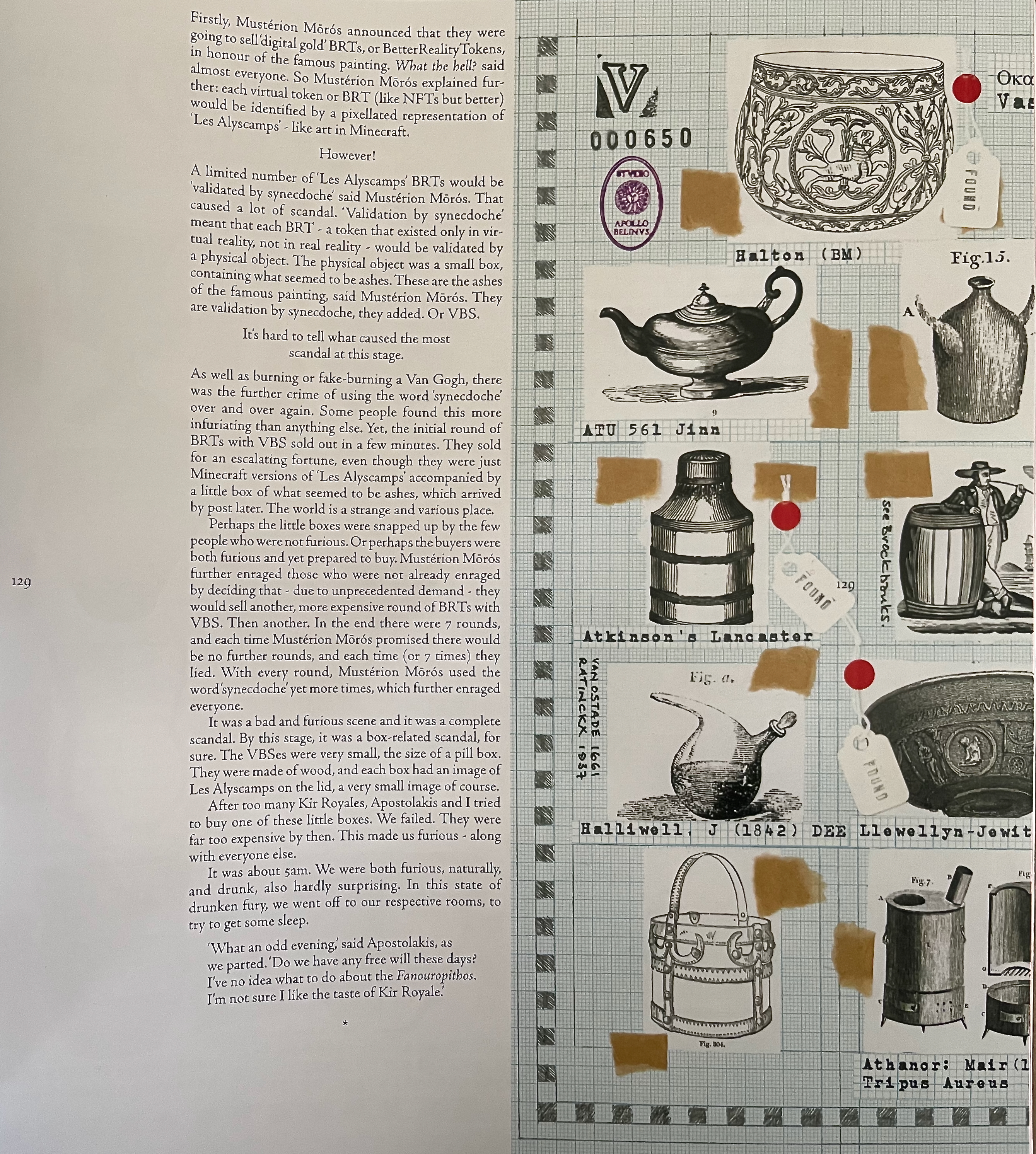
Page of “Les Alyscamps” Joanna Kavenna, with artwork by Robert Williams. Photo: Books On Books Collection.
Like good dinner party hosts, the editors have seated the Kavenna/Bennequin conversationalists next to Daniel Jackson‘s Inside of (2025), a geometric, augmented reality conversation with Kimsooja’s Bottari. Below are a few iPhone screen grabs from Jackson’s AR work conversing with the cover of issue 5.

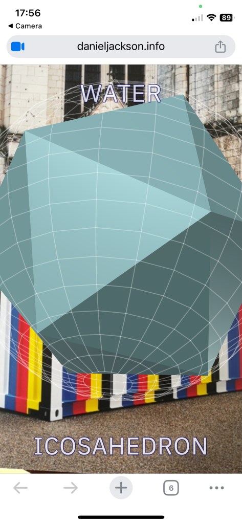
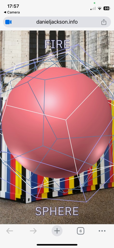
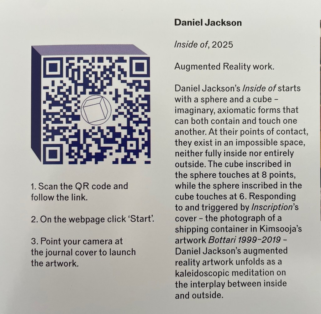
It turns out that if you follow the instructions above but point your camera at this review’s photo of the Inscription cover, you, too, can experience the conversation directly — raising the questions, “Are you inside this review or inside the issue?” and “Are you outside Bottari on the cover, or Bottari on the cover online, or Bottari on the cover in your phone camera lens?” Or not, as Kavenna’s tale could add.
Experiencing this issue of Inscription might remind you of Walt Whitman’s declaration: “I contain multitudes” (Song of Myself, 51). In addition to the party guests noted above and those framed in Buren’s stripes, you will find artists Kiff Bamford, Erica Baum, Claude Closky, Jeremy Deller, Michael Kelly and James Misson, and Harold Offeh. By the time you reach the final paragraph in the smallest size of dwindling type in Christian Bök‘s “The Minimal Element of Writing”, this issue’s last essay, the multitude of conversations will have taken on the centrifugal and centripetal cacophony you might expect to hear in Bök’s concluding source: Jorge Luis Borges’ “The Library of Babel”.
From “The Minimal Element of Writing” by Christian Bök, in which the last footnote’s type is larger than the last paragraph’s!
As you nudge issue 5 and its overlapping conversations back into your carefully preserved packaging, pause for a second again over outside-the-box contributor Michalis Pichler. Just last year, Pichler published COUP DE DÉS (COLLECTION): Books and Ideas after Mallarmé in connection with an exhibit for the New York Center for Book Arts. The bracketed “(COLLECTION)” of the title signals as it has for so many hommageurs of Mallarmé’s poem (see Broodthaers’ (IMAGE), Noury’s (RUBIK’S CUBE), della Olga’s (CONSTELLATION), Nash’s (ESPACE), e al.) that this work, too, is an artist’s book. Moreover, it signals that the act of collecting (like that of appropriating) can be an artistic performance, and its result, the collection should be considered a work of art. One of the excerpts in Pichler’s (COLLECTION) comes from Luc Boltanski and Arnaud Esquerre’s Enrichment: A Critique of Commodities. He enlists them to establish what distinguishes a collection from a heap on the one hand and a stockpile on the other, not merely accumulating items but curating according to governing principles, similarities, differences, and the feel for what is missing. Of course, because of this, a collection has a way of growing outside the box, and yet, the collection is the box is the container … or not?
Further Reading & Viewing
“Cor Aerssens“. 26 September 2019. Books On Books Collection. Bookbinder and engineer of boxes.
“Alphabets Alive! – The ABCs of Form & Structure“. 19 July 2023. Books On Books Collection. Containers of the alphabet.
“Hedi Kyle’s The Art of the Fold: How to Make Innovative Books and Paper Structures (2018)“. 24 September 2018. Bookmarking Book Art. Kyle has been a preeminent source of many of the innovations in book structure and containers.
“Inscription 1“. 15 October 2020; “Inscription 2“. 29 May 2022; “Inscription 3“. 21 February 2024; “Inscription 4“. 21 February 2024. Books On Books Collection.
“Chris Ruston (I)“. 22 January 2020. Books On Books Collection. See the collection of containers for Holuhraun, The Great Gathering, and The Captain’s “Ditty Box”.
“Claire Van Vliet“. 3 July 2022. Books On Books Collection. See for the array of inventive containers of book art.
“Rutherford Witthus“. 28 October 2021. Books On Books Collection. See TRAIANUS for a complex of containers.
Vallés Vílchez, Laura . 2013. “Aspen: the magazine in a box (1965-1971)“. Concreta.
Roethke, Theodore. 1954. “I knew a woman“. Poetry Foundation.
Smyth, Adam. 22 January 2021. “Aspen: the magazine in a box: When information is brushed against information“. Text! Substack site.
Yiakoumaki, Nayia. 5 December 2012. “Archive Curator Nayia Yiakoumaki introduces Aspen Magazine“. Whitechapel Gallery. Video.
