Altered books as artists’ books present a seemingly endless variety.
Some may be the conversion of old books into just-legible new ones as in A Humument redacted with ink, paint, excision, and collage by Tom Phillips, Tree of Codes mechanically excised by Jonathan Safran Foer, or The Eaten Heart scalpeled into existence by Carolyn Thompson. They give us a new work to read page by page extracted page by page from the earlier work, which remains more or less (mainly less) present in our hands.
Others like Marcel Broodthaers’ page-by-page redactions of Mallarmé’s Un Coup de Dés by ink in one case and excision in another or Michalis Pichler’s similar reformatting and excision of the same poem in clear acrylic or Jérémie Bennequin’s page-by-page erasures of Proust’s Remembrance of Things Past give us artists’ books that make the altered books illegible but still accessible page by page.
Other altered books as artists’ books are mainly one-off spatial objects that can be taken in in one go — not necessarily in just a glance but in the look or gaze given to a sculpture or painting. The ground up and encased works in Literaturwurst by Dieter Roth. The sealed, painted, nailed, and “hairied” works of Barton Lidice Beneš. The torn works of Buzz Spector. The sandblasted works of Guy Laramée. The glued and carved works of Brian Dettmer. The bullet-hole-ridden Point Blank by Kendell Geers. The pun-packed moebius-sculpted Red Infinity #4 by Doug Beube. They give us artists’ books that make the altered books illegible and inaccessible as books.
Inscription: The Journal of Material Text, Issue 5 (2025)
Although Theodore Roethke had a woman in mind when he wrote “The shapes a bright container can contain!”, the phrase readily comes to mind for this issue of Inscription once you’re past the difficult-to-open-up cardboard packaging. Not that you should rip through and discard it. The clues to proceed patiently are the label “recto” on one edge of the box and the page cut from a book and pasted on the box’s top. Is “recto” some sort of “this side up” label? If so, it seems topsy-turvy. Recto (or right-hand) pages are usually have odd-numbered, but the pasted-down book page is numbered 20. Wait a second; those random colored rectangles have been printed over the book page as if meant to draw attention to the “gridness” of the apartment blocks. Maybe this box is meant to be preserved and framed (after all, Toulouse-Lautrec drew on cardboard).
Artists ‘ book s are often self-conscious about the elements of book structure. This can involve self-reflexive humor or serious philosophical interrogations of a book’s identity. Disturbing conventions of reading by calling attention to these structures is often a feature of artists ‘ books through an emphasis on the features of the page and pointing to the book as a whole. But a book can also be a self-conscious record of its own production – it can simply examine itself as a proposition – one laden with specific ideas about the ways a book can embody an idea through its material forms. There are really two subtexts here. One is the “idea of the book as Idea” – the self-reflexive creation of books · which are about being books, or what a book can be as an idea in form. The other is the “idea of the book as art idea” – which takes these investigations of the book into a dialogue with the concept of art, and shows that books are an art idea. — Drucker, 2004.
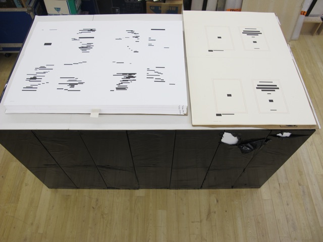
Books on Books (2011)
Books on Books (2011) Jérôme Saint-Loubert Bié, Yann Sérandour & Jonathan Monk Perfect bound paperback. H160 x W115. 260 pages. Acquired from Chapitre.com, 29 November 2023. Photos: Books On Books Collection.
Why should an obscure poem like Stéphane Mallarmé’s groundbreaking Un Coup de Dés Jamais N’Abolira le Hasard: Poème (1897) have become the cornerstone of an art-industrial complex of literary, critical and artistic responses ranging from essays, books, edited collections, countless editions, and appropriations in the form of fine press livres d’artiste, book art and sculptures, films and theater, ballets and fado, musical compositions, digital programs and installations, and even pavement art?
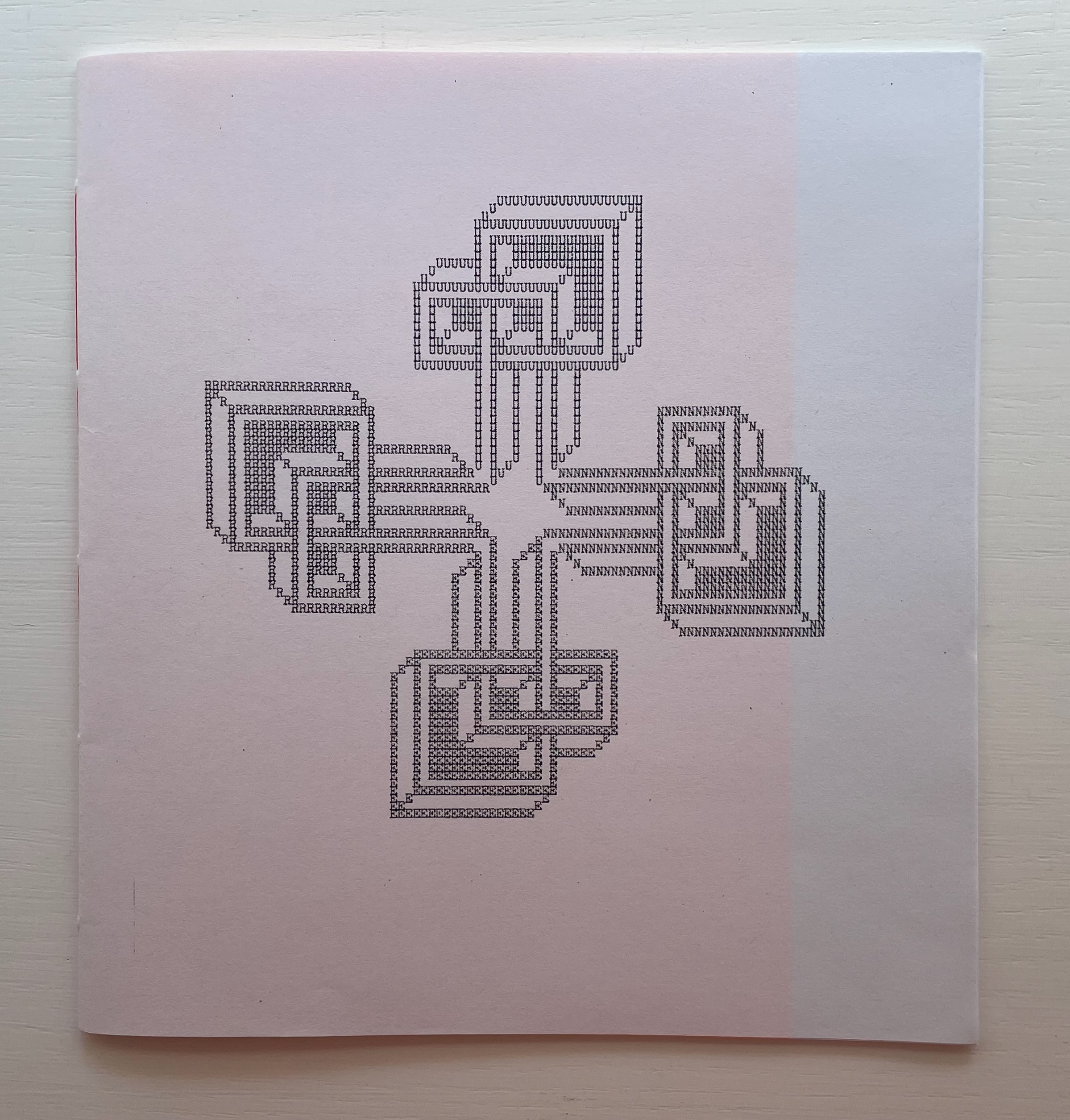
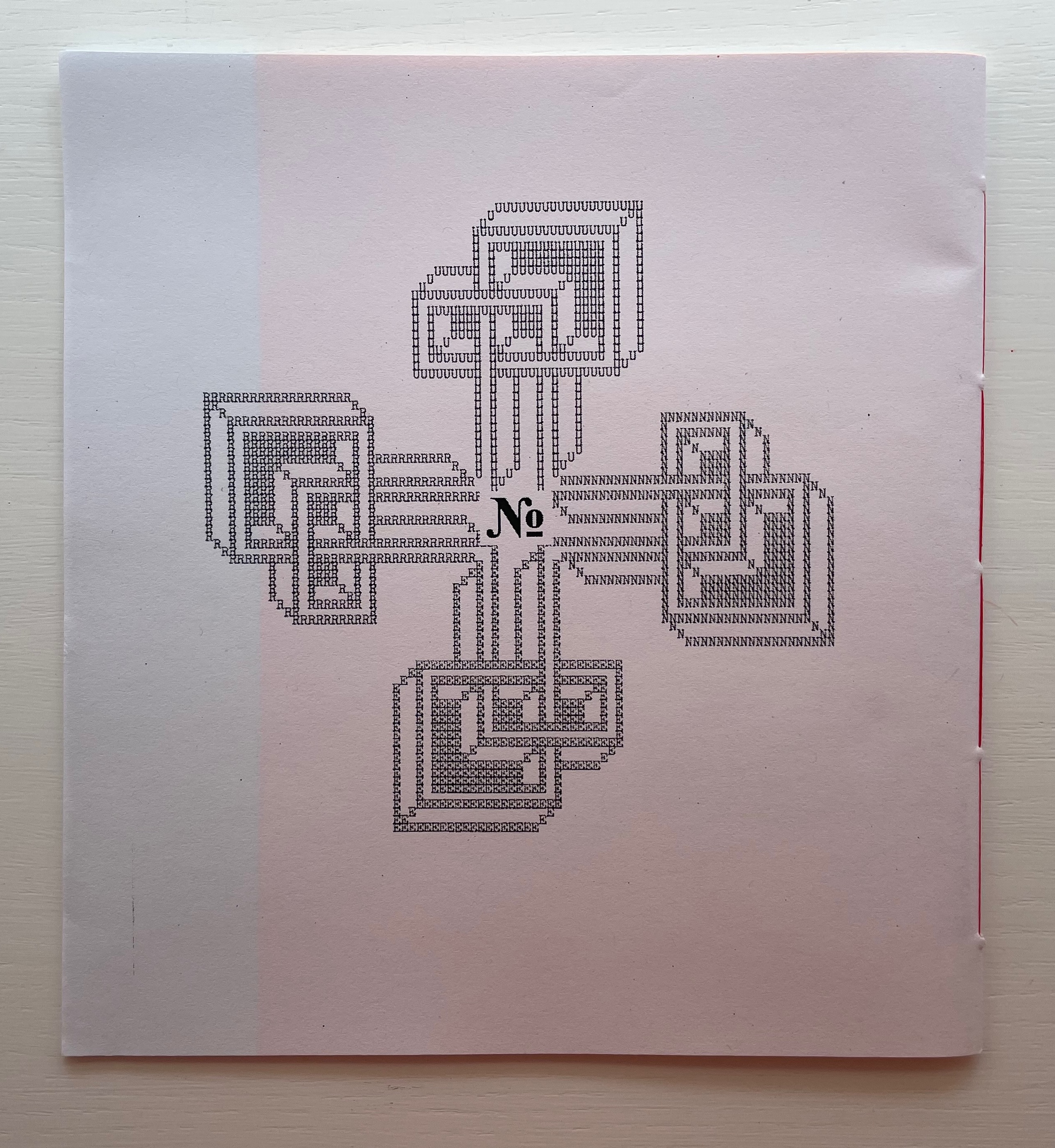
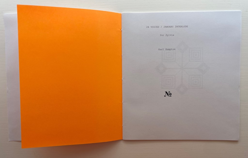
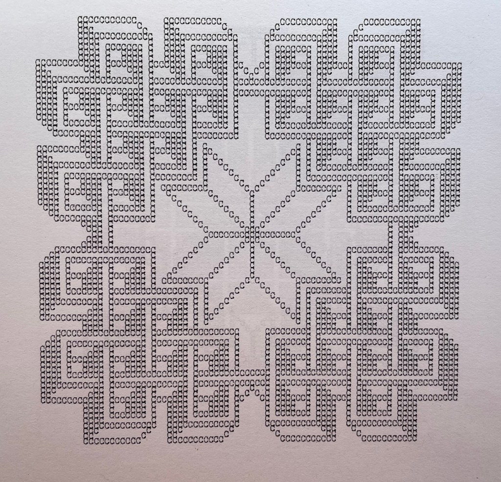
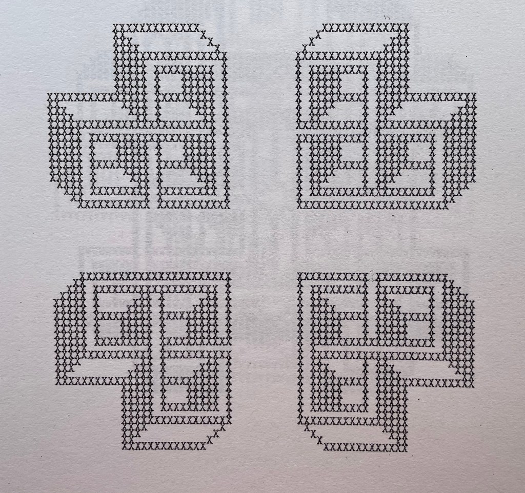
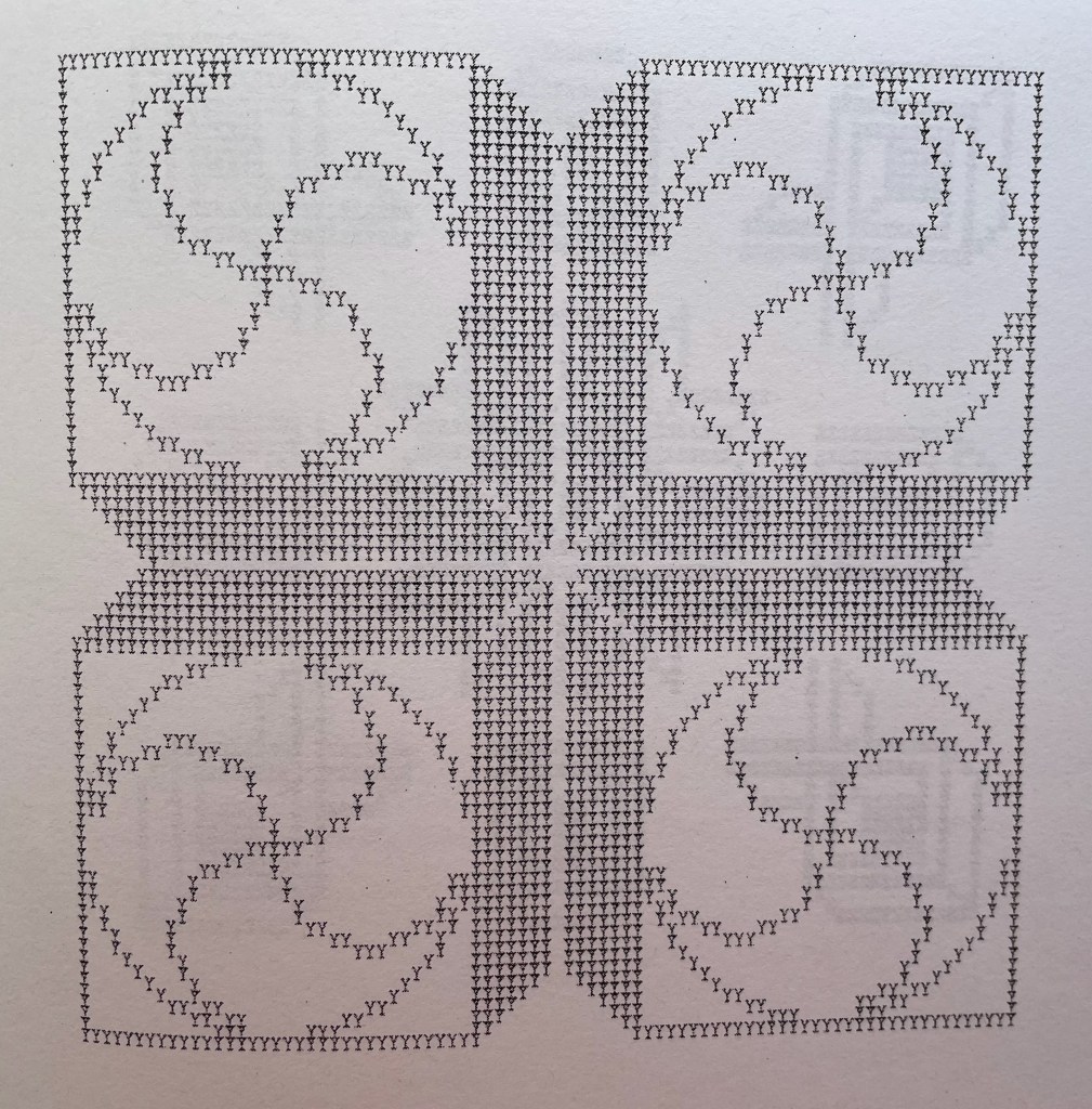
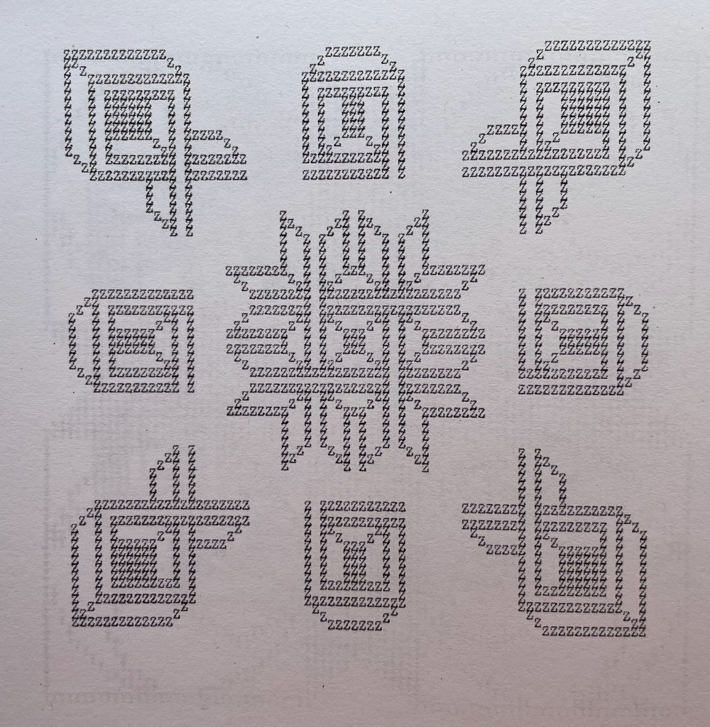
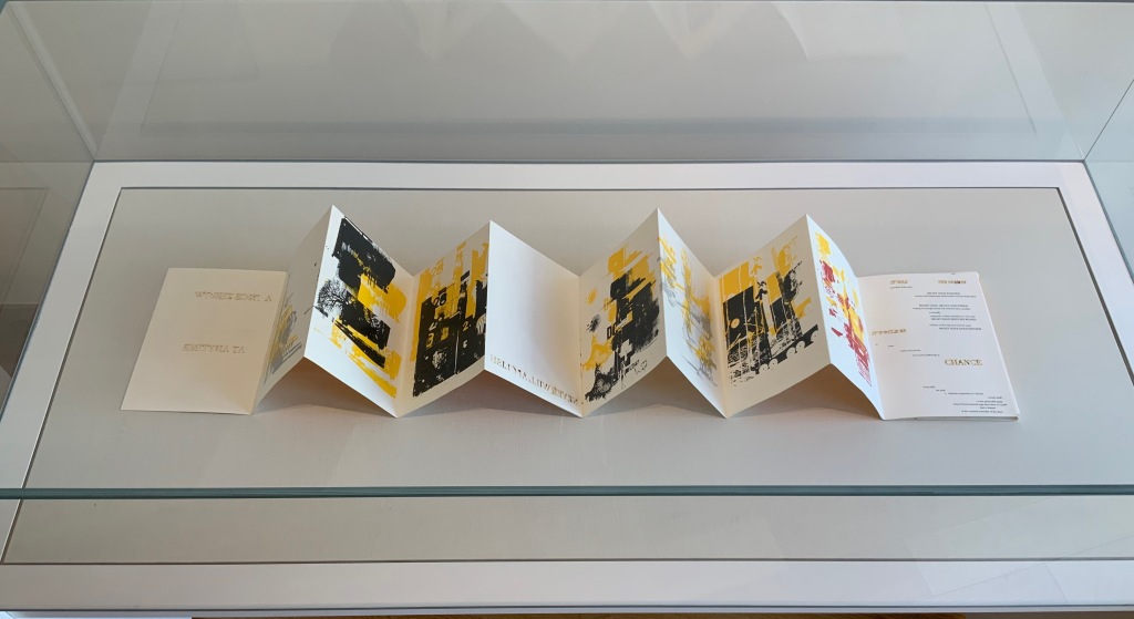
26 Voices / January Interlude (2020) Karl Kempton Sewn booklet. H190 x W177 mm. 28 pages. Edition of 60 unnumbered. Acquired from Derek Beaulieu, 4 January 2021. Photos of the work: Books On Books Collection. Displayed with permission of the artist.
Derek Beaulieu deserves a vote of thanks for bringing this work back into print, even if for a limited edition. 26 Voices / January Interlude first appeared under the title Rune 2: 26 voices/ january interlude as number 10 in Robert Caldwell’s Typewriter series, published by Bird in the Bush Press (1980). In the Acknowledgements, Kempton writes that the series “was composed in January, 1978 in 28 days. After the letter K the flow stopped until a dream of L’s form arrived unblocking the flow”.
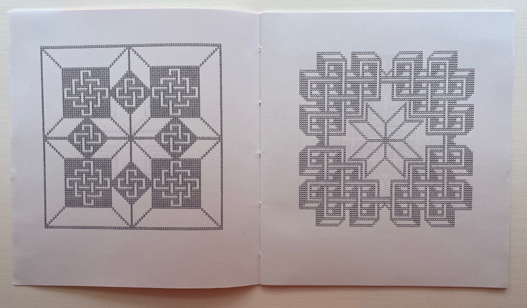
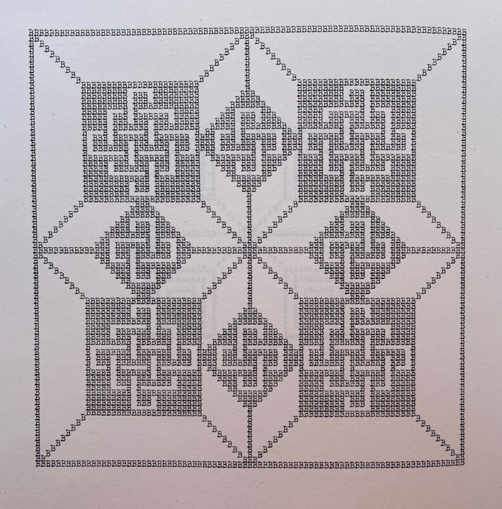
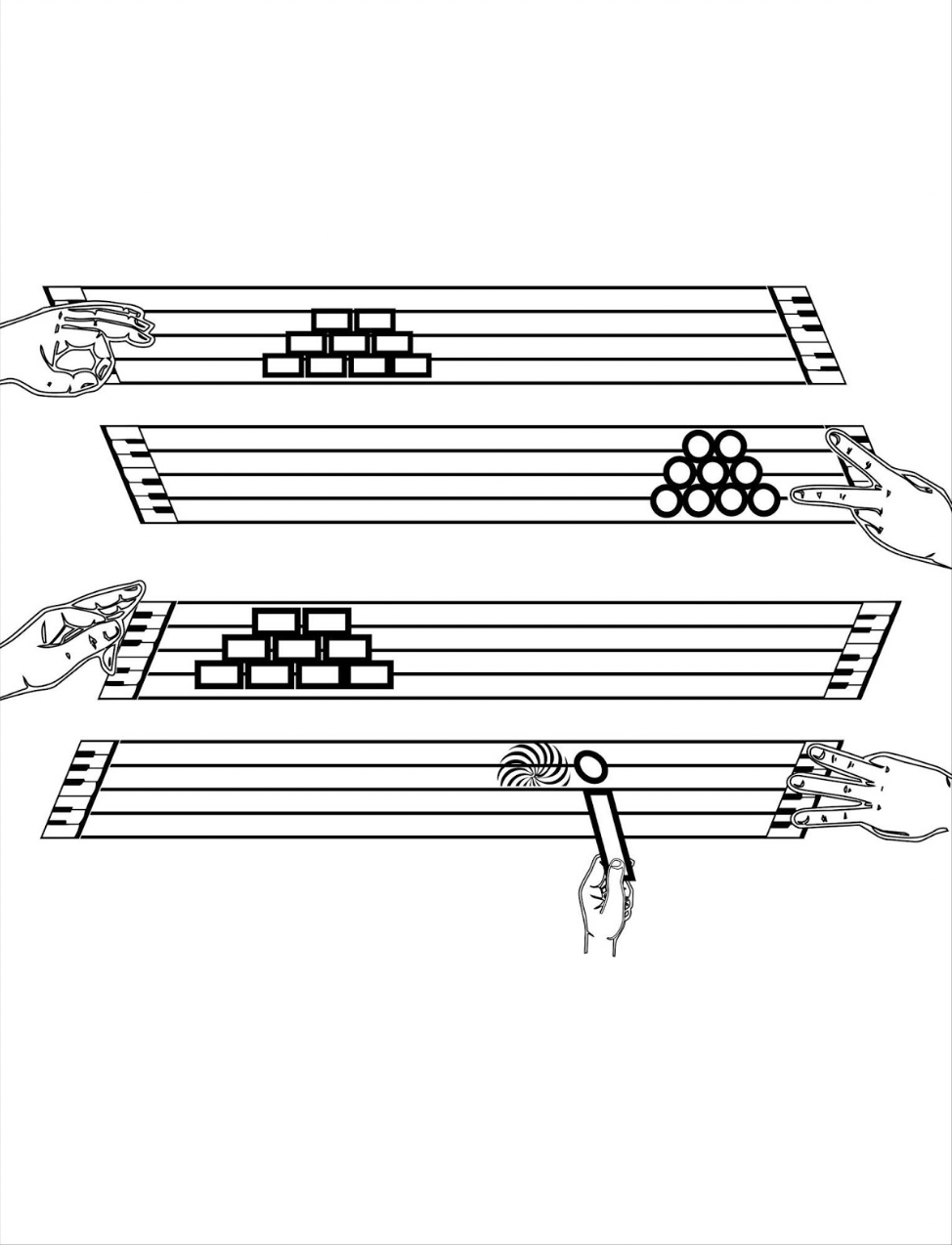
The series of patterns, each made from an upper case letter of the alphabet typed over and over, range in appearance — some like Amish quilts, some like Byzantine rugs, some like Celtic knots, but like snowflakes, no two alike. Given how some pairs of letters are mirror images of each other (bd, pq) or inverse (bp, dq), you would expect some close affinity in their two patterns, but no. No pairs of those patterns look at all alike. You would also be mistaken to expect a pattern to reflect the letter that constitutes it. Instead, you find one pattern resembling the letter X, but it is made of letter U’s. There are naturally some similarities between patterns at the broadest level — E and N, L and M or R and S — but these have little to do with the letters themselves, and the similarity recedes as details come to the fore or falls into the background with illusory three dimensionality. The shapes are not rune like, but individually and sequentially, they have the associative dream-like qualities of runes.
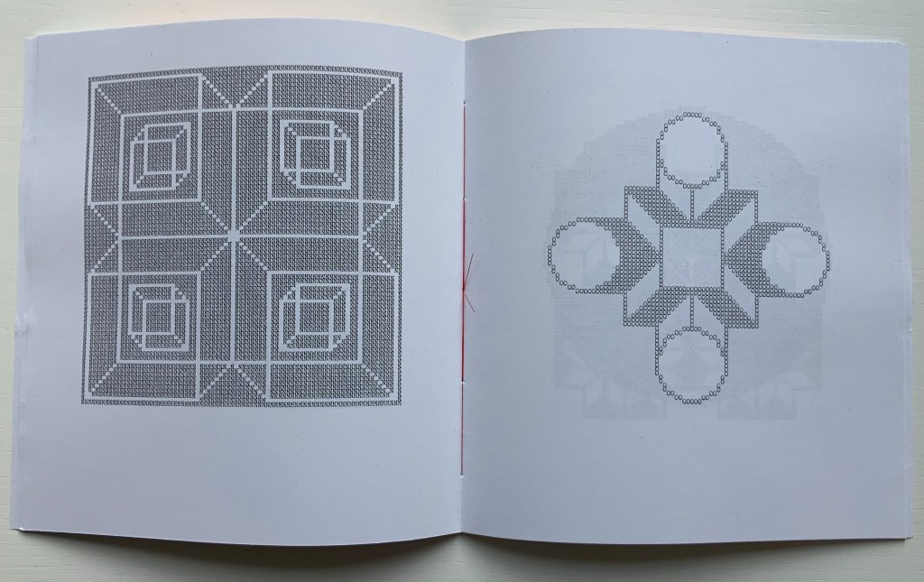
A close up
Double-page spread B&C
B close up
C close up
Center double-page spread N&O
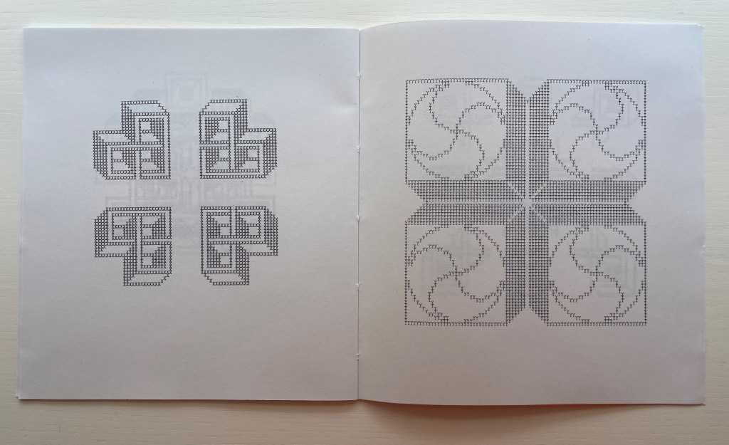
Double-page spread X&Y
X close up
Y close up
Z close up
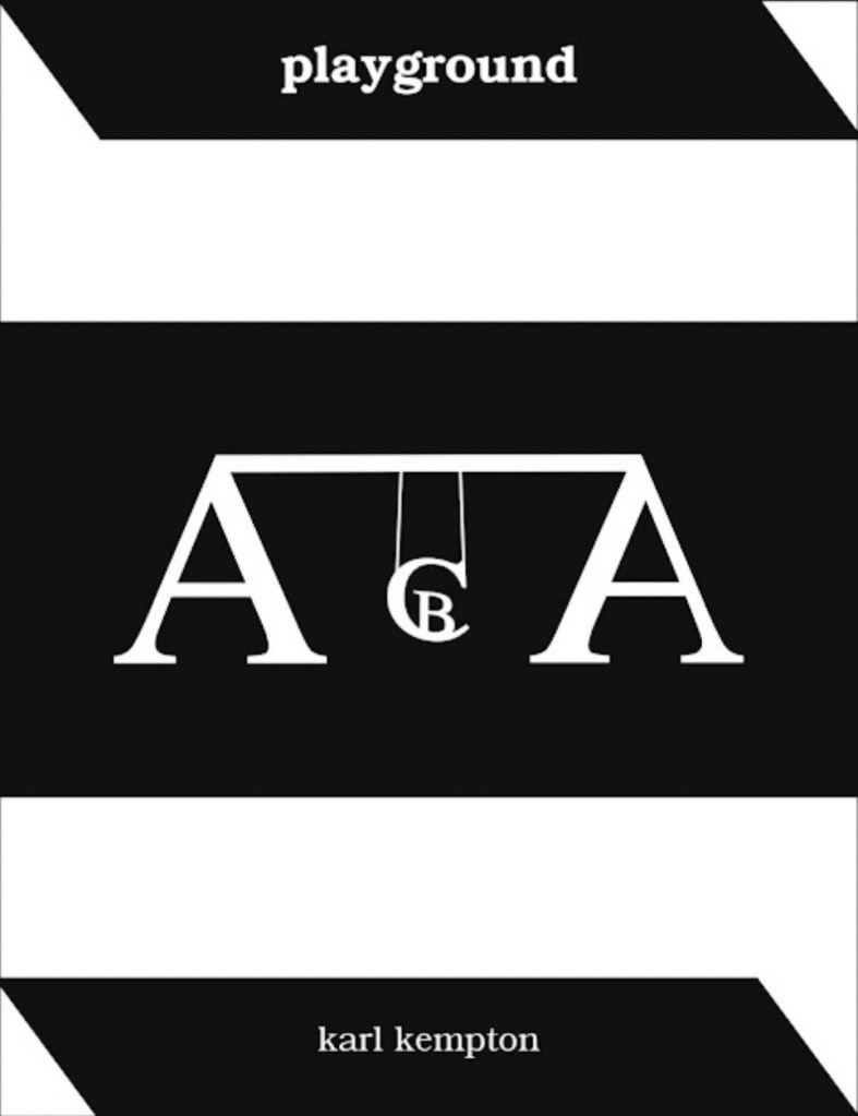
Actual runes appear in the following work, similarly in black and white and with similarly illusory three dimensionality. Not technically in the Books On Books Collection, playground (2013-14) can be found online. Surprisingly, it has not been in print.
playground (2013-14)
playground (2013-14) karl kempton Online, 78 pages (screens). Accessed 7 August 2022. Screenshots reproduced with permission.
What an opportunity for collaborators to join with Kempton to produce playground in different editions varying in color (black and white, red and white, green and white, blue and white, etc.), in paper (handmade, watercolor, washi, high gloss, matte, etc.) and in binding (accordion, stab binding, case bound, scroll, etc.). Perhaps such an extravaganza is not in keeping with Kempton’s style and approach over the years, but this playground is such an invitation to play.
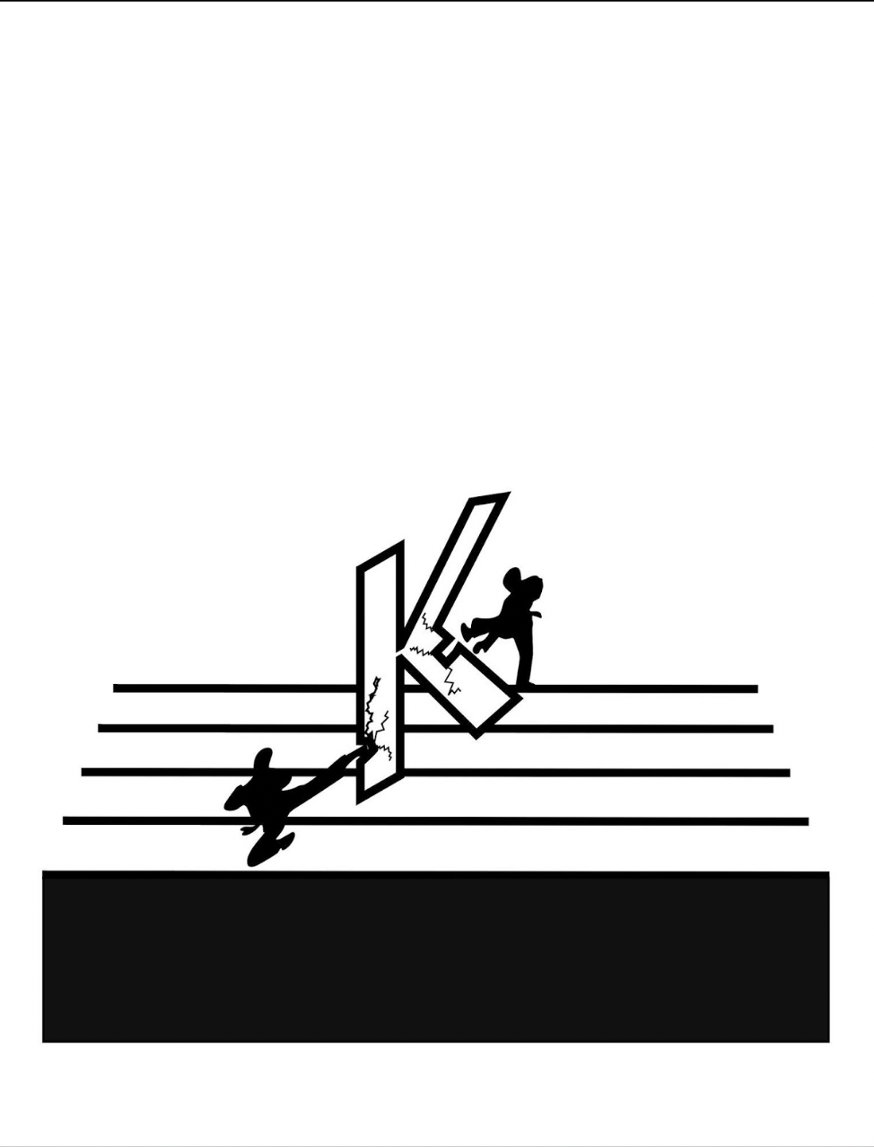
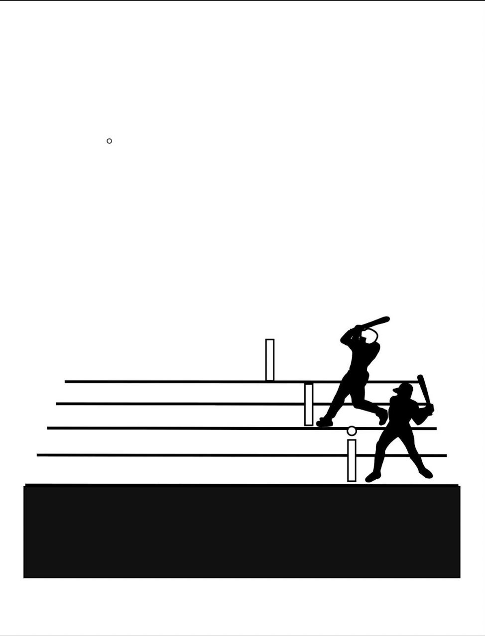
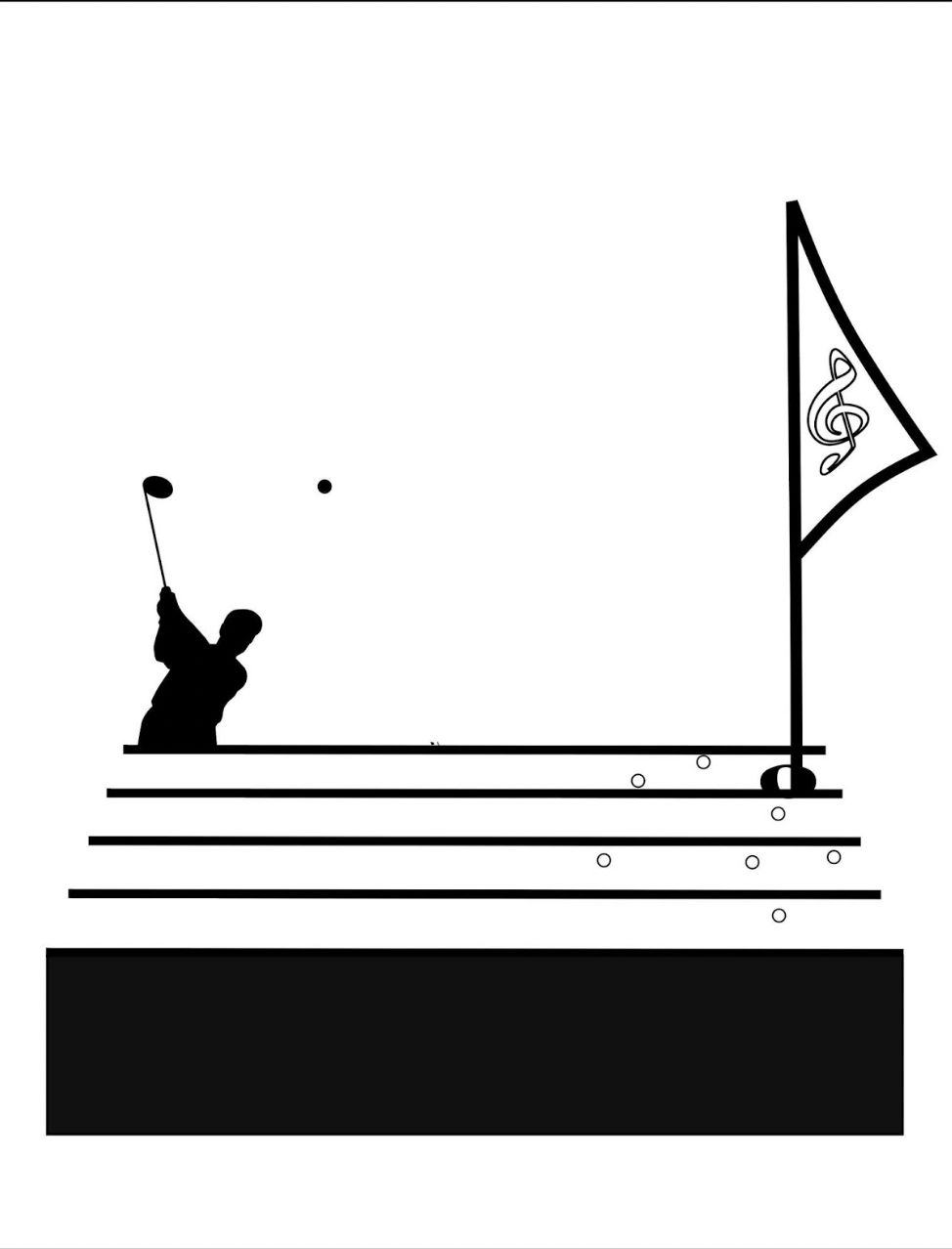
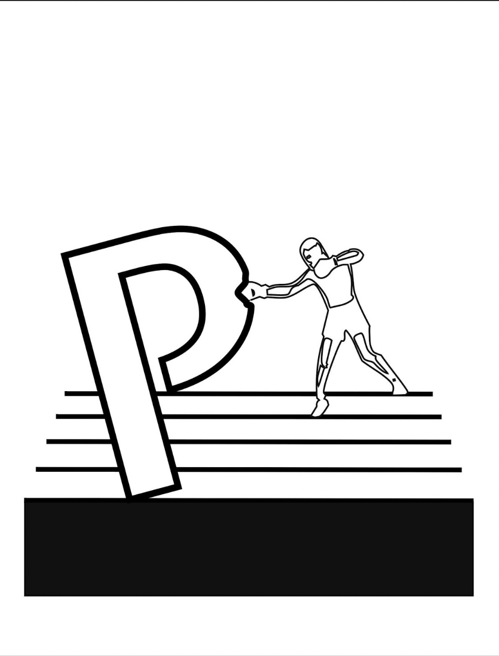
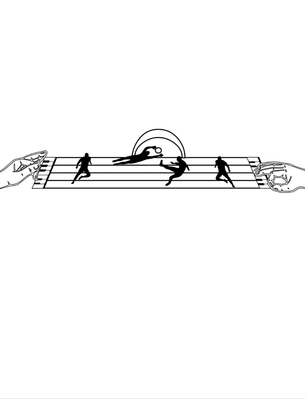
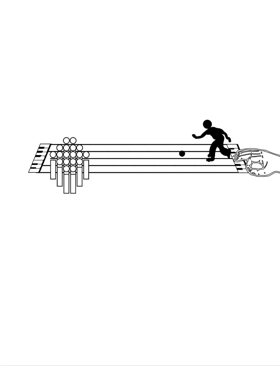
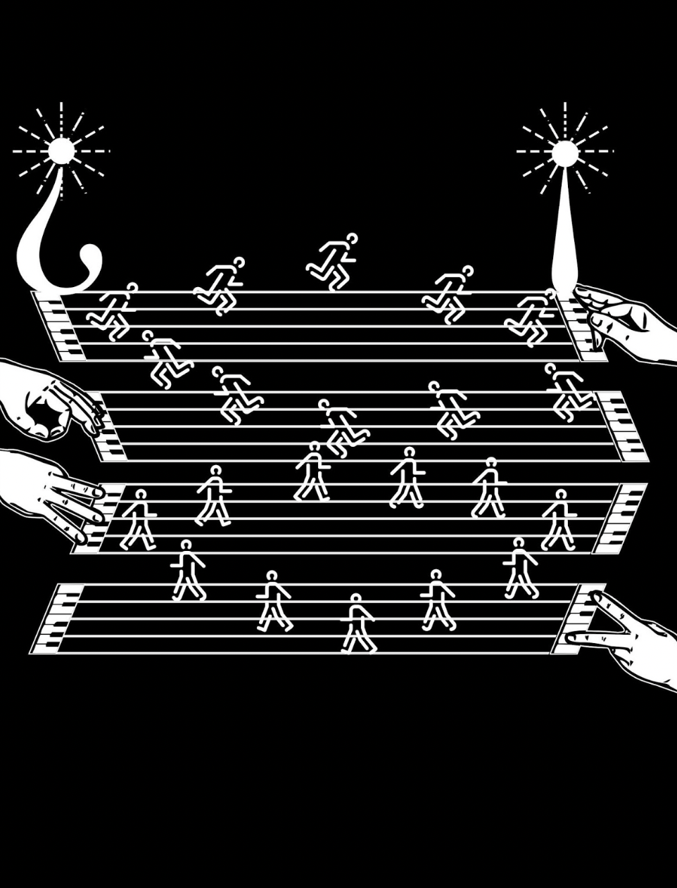
Games and sports are depicted together with letters and punctuation marks on platforms made of the musical staff or stave, all of which offer Kempton multiple means of metaphor. FIrst, inked martial arts figures break a K of karate boards. Then, a baseball player bats the dot of a lowercase i into the air. A basketball player jumps and aims at a basket formed of a half note. A golfer chips toward a half-note hole flagged with a pennant bearing the treble clef G. A boxer punches the bowl of a large P.
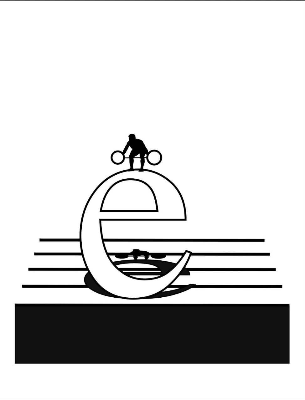
The images become more worked as the book proceeds. A weightlifter atop a lowercase e lifts a set of weights composed of the umlaut above the e, and the shadow of the image is cast across the stave lines behind the letter. Shadows of gymnasts appear behind an uppercase G, lowercase o and lowercase i.
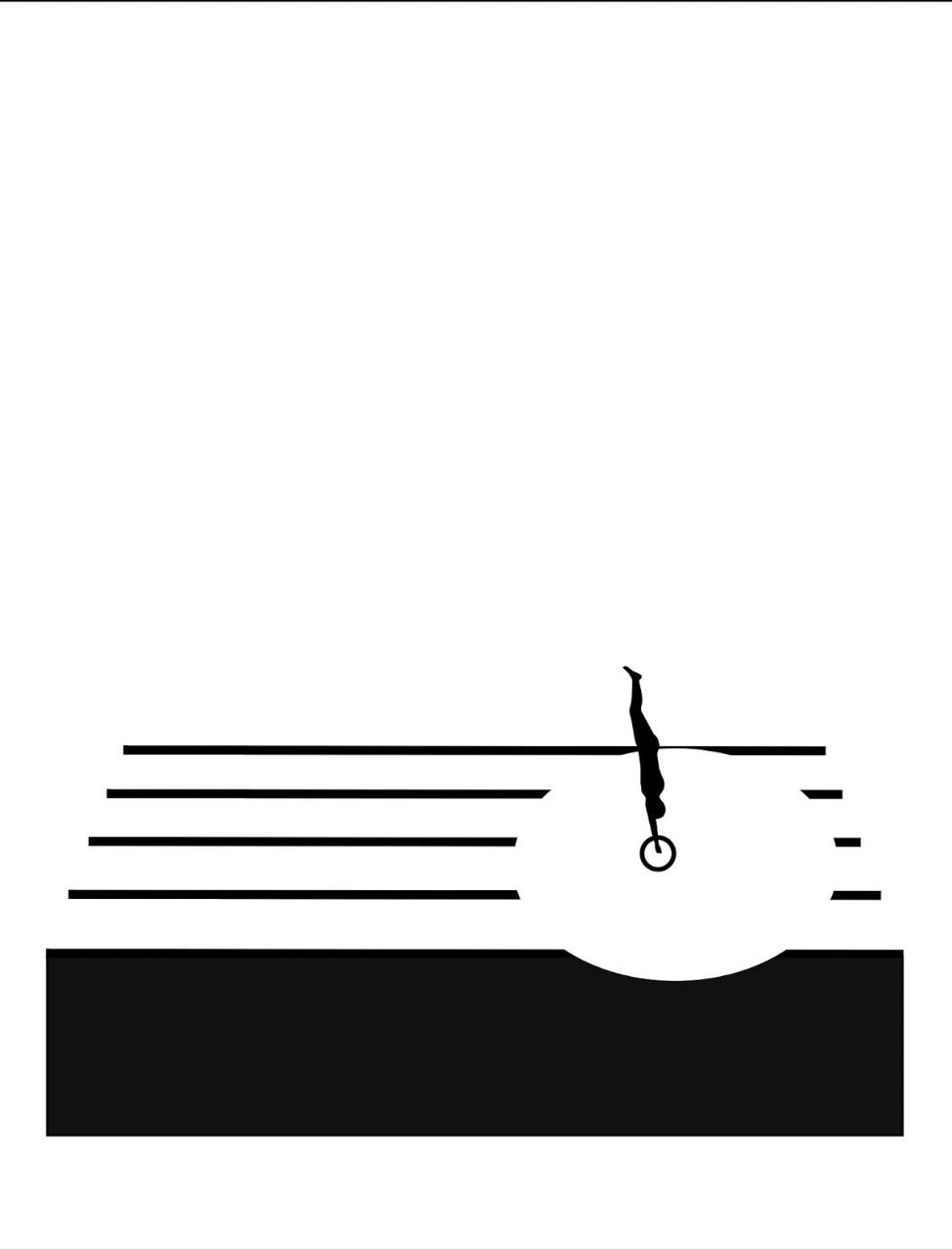
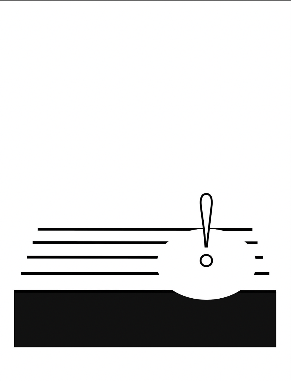
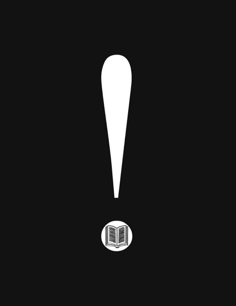
Animation sequences occur, such as the platform diver leaping from the body of a lowercase i and creating an exclamation-point splash in a pool formed by a circle that widens across the stave as the diver submerges.
Around the same time of playground‘s inception, this combination of letters and musical notation found expression among other artists: for example, Jim Avignon & Anja Lutz in Neoangin: Das musikalische ABC (2014) and Bernard Heidsieck in Abécédaire n° 6 clef de sol : été 2007 (2015). Metaphorically linking textual expression, if not individual letters of the alphabet, with musical scores goes back at least as far as Stéphane Mallarmé’s Un Coup de Dés Jamais N’Abolira le Hasard (1897) and carries forward into explicit linkage by Michalis Pichler (2009) and Rainier Lericolais (2009) in their works of homage to Un Coup de Dés.
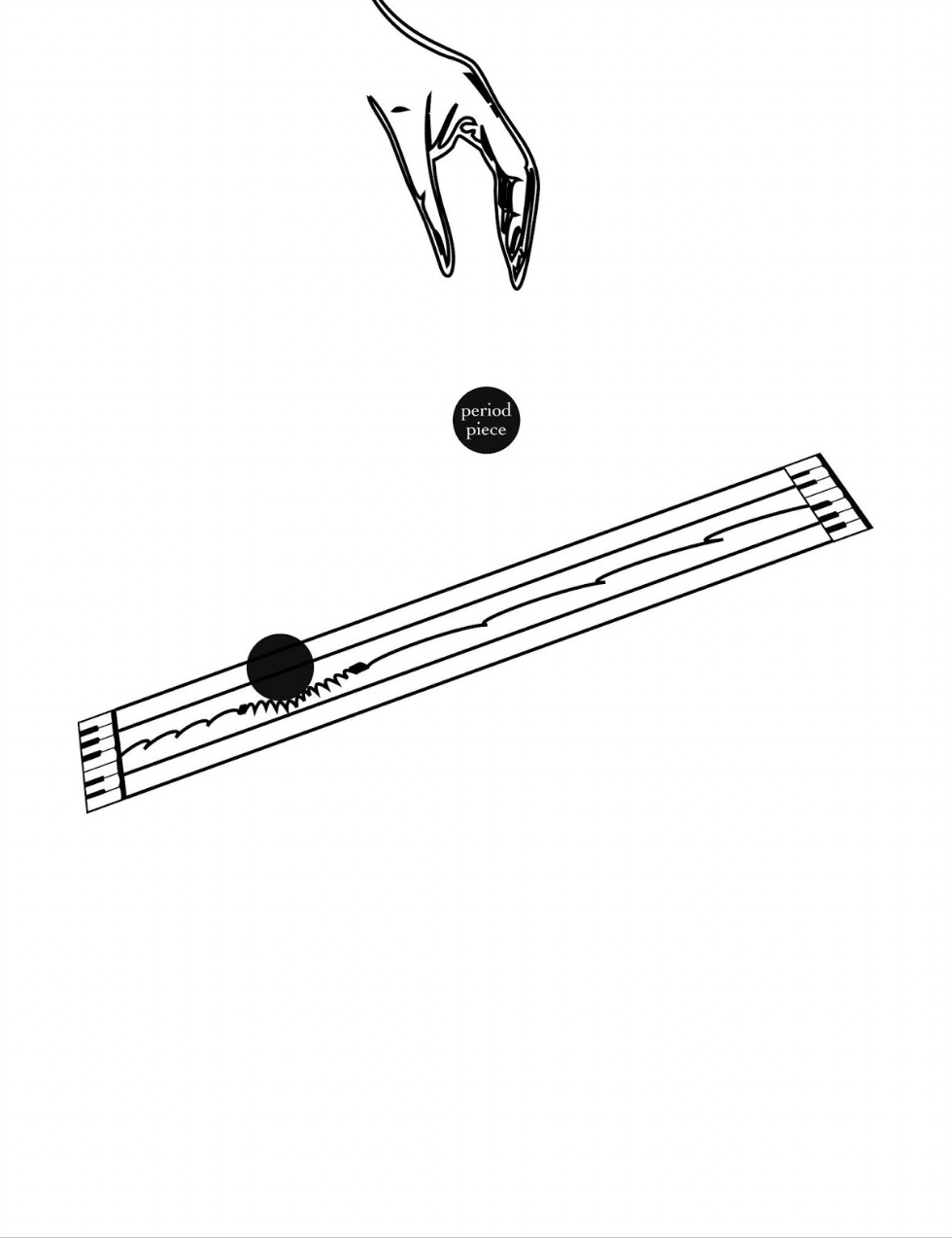
To return to Kempton’s playground, an interlude occurs to associate the alphabet with magnetism, then breaks off to return to the games motif, this time in the form of winter sports. The musical notation motif is still there, but Kempton modifies it with a piano keyboard at both ends of the stave and with manicules fingering the keyboards at both ends while articulating a variation on sign language. Musically and metaphorically, matters become more complex with the introduction of two pairs of staves, pyramids of squares and circles and one manicule using the lowercase i to bring back the magnetism interlude.
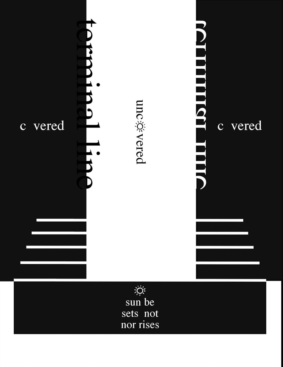
From here on, additional motifs are developed, and words and phrases appear: a physics experiment punningly labeled “period piece”, a night game lit by inverted question and exclamation marks, and juxtaposed opposites (“covered/uncovered” and “sunrise/sunset”).
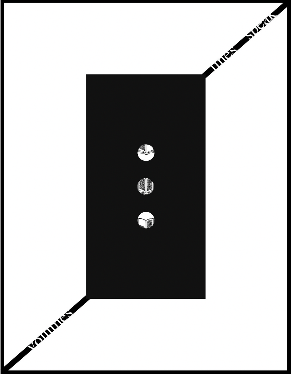
All these motifs, textual and visual puns, and images seem concerned with the development of symbols for interpreting the world and communicating that interpretation. With the appearance on black background of an exclamation mark with an open book inside its point, then a pair of rectangles each suspended by the sentence “volumes lines speak / lines speak volumes”, an animated sequence begins an extended narrative drawing everything together.
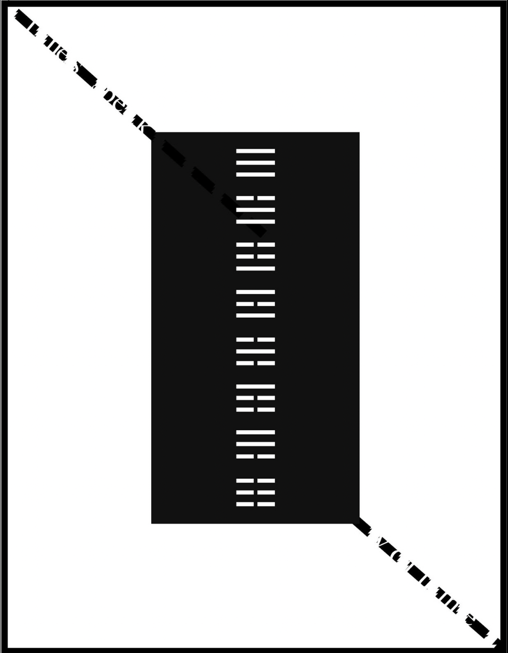
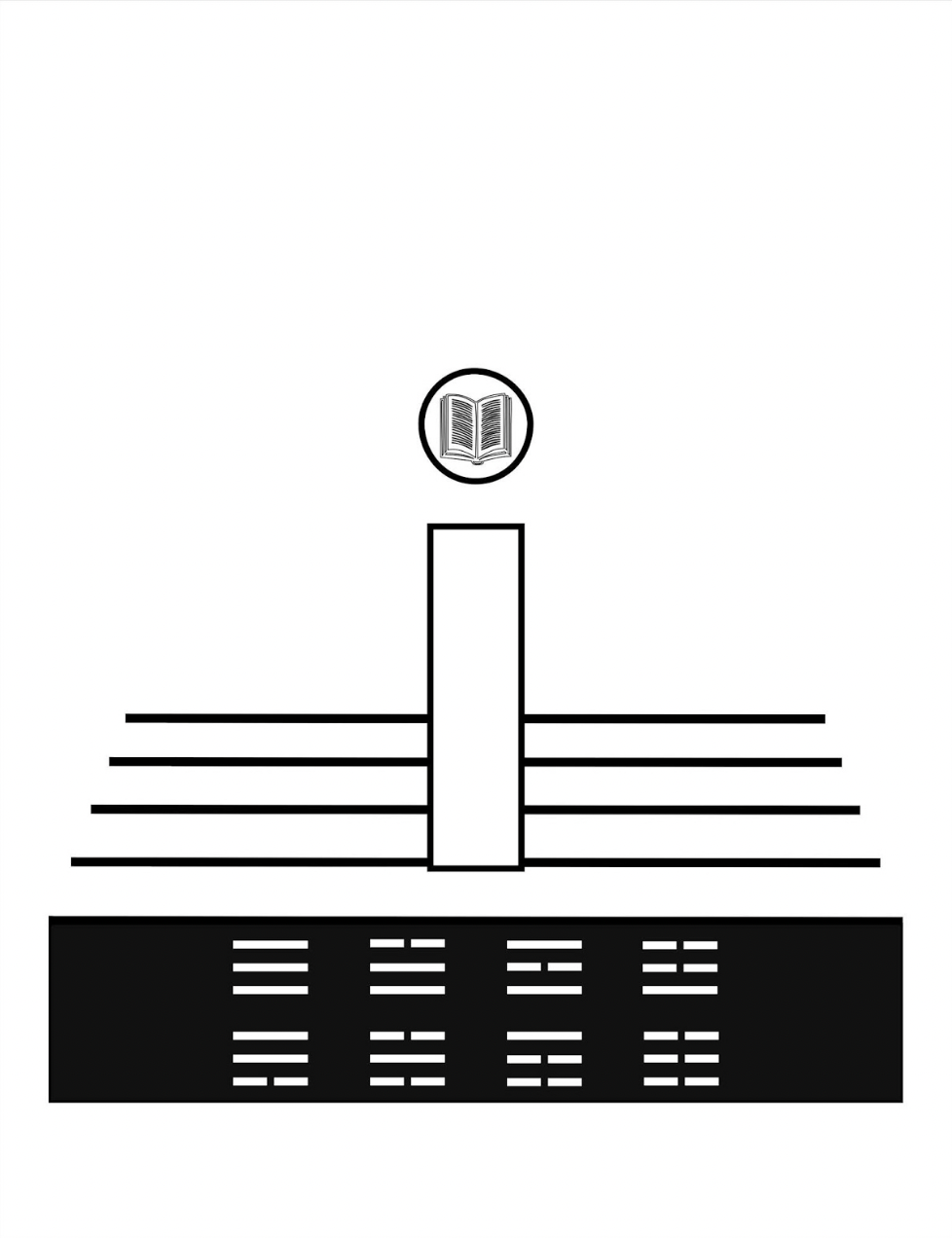
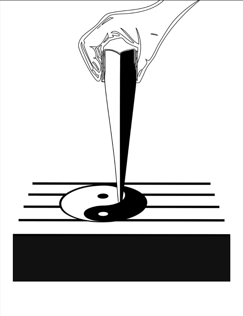
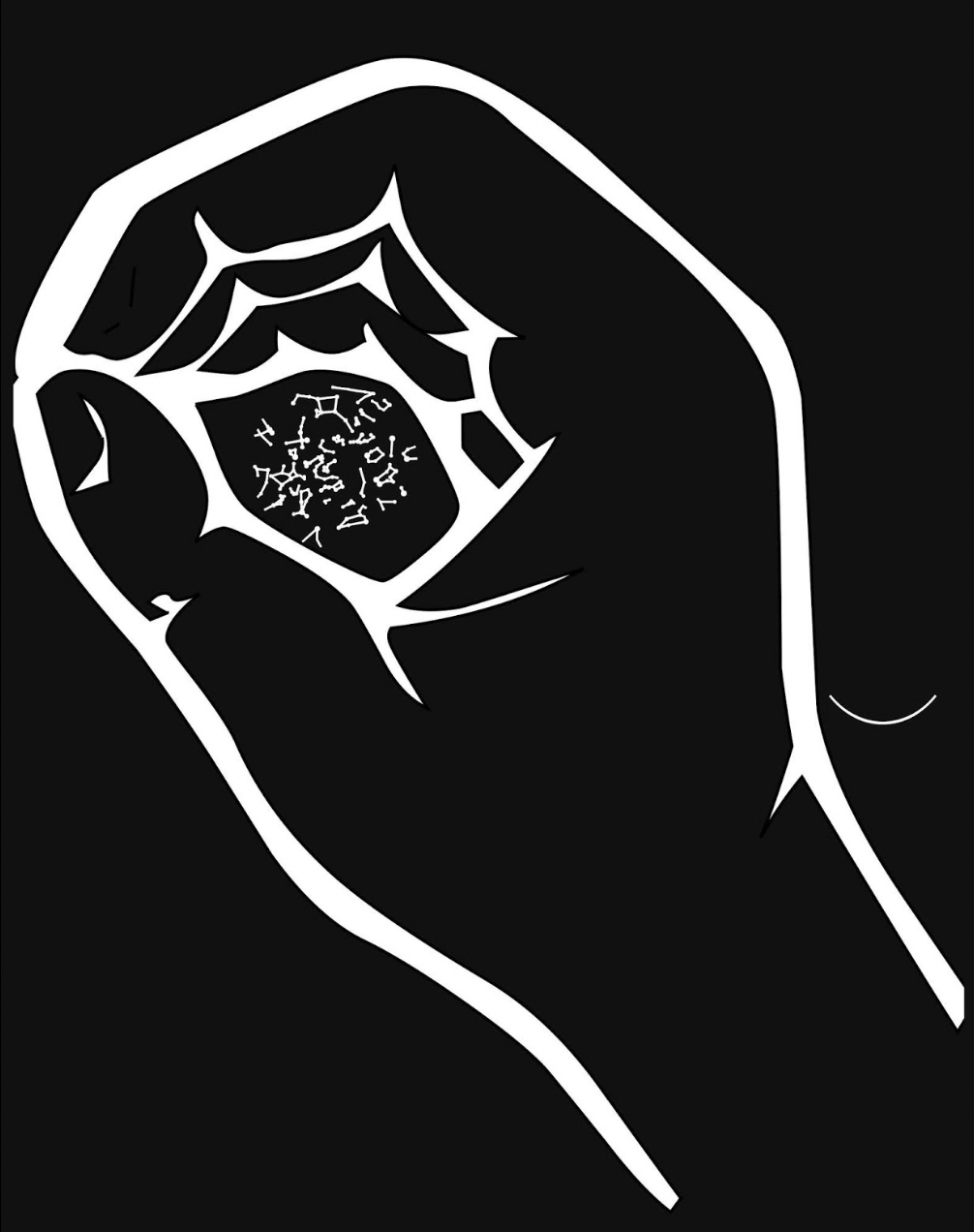
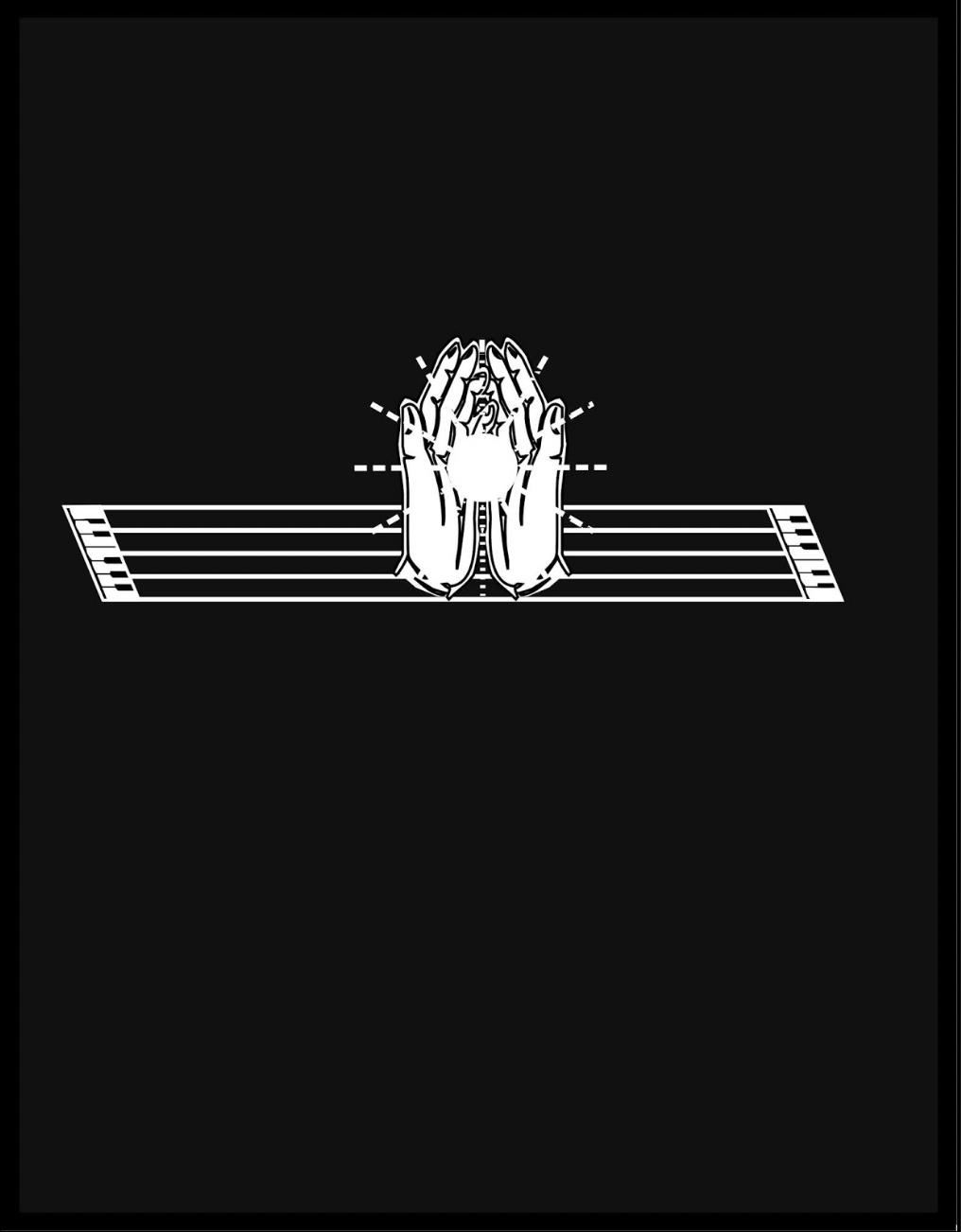
After the descending hand squeezes out the yin yang symbol onto the stave from the image of an open book, Kempton joins this theme of interconnected opposite forces with the development of language, which is where the runes come in, held in an unclosed fist. Eventually the book concludes with an open pair of hands, centered on reversed-out stave/keyboards and holding a point of light radiant against the blackness.
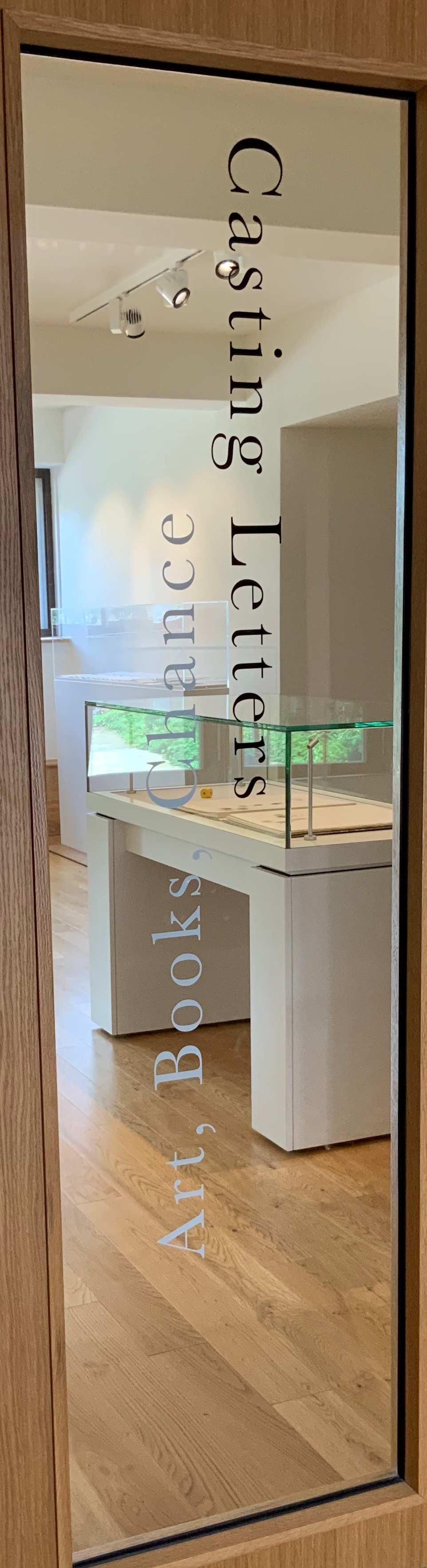
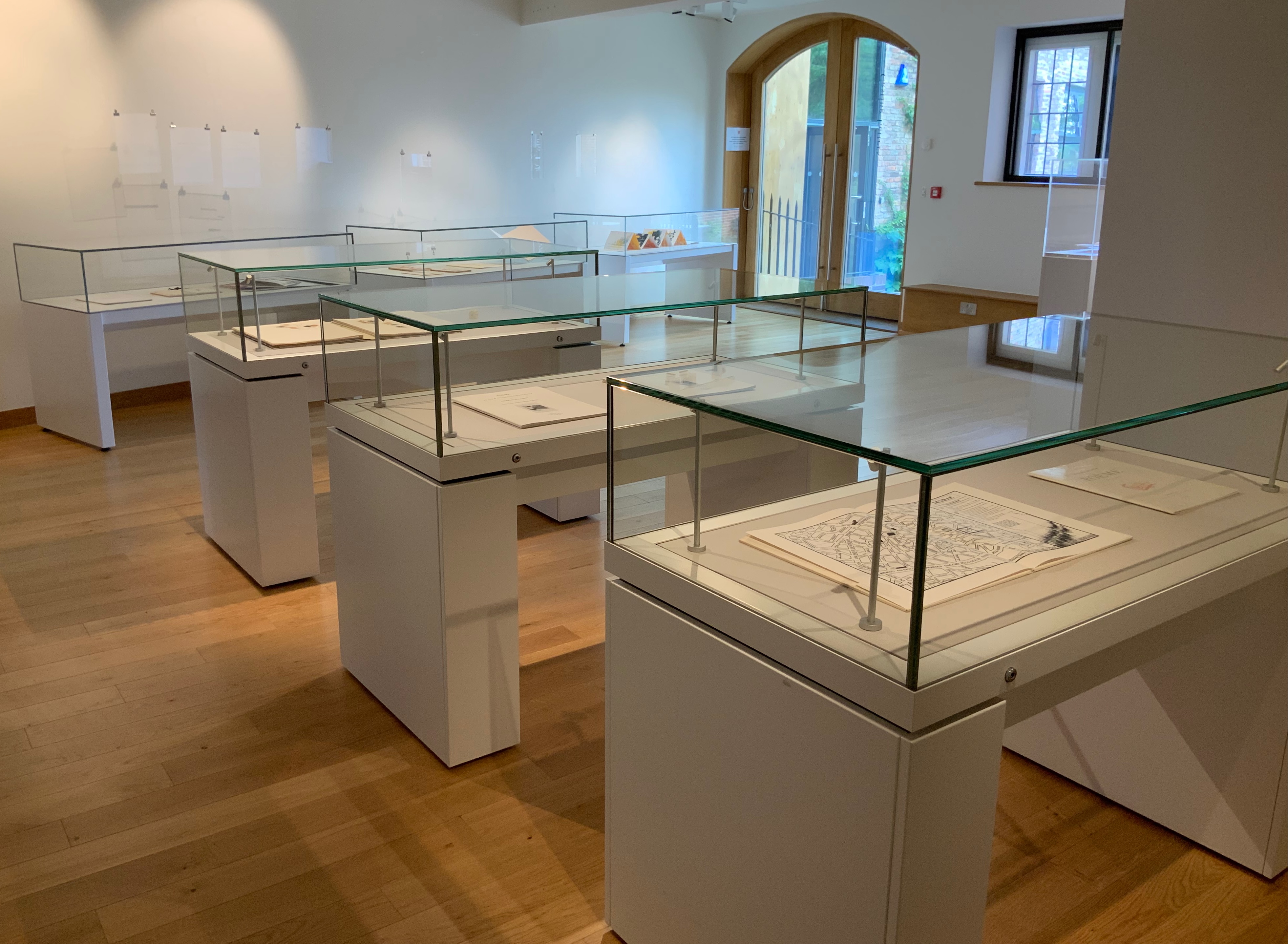
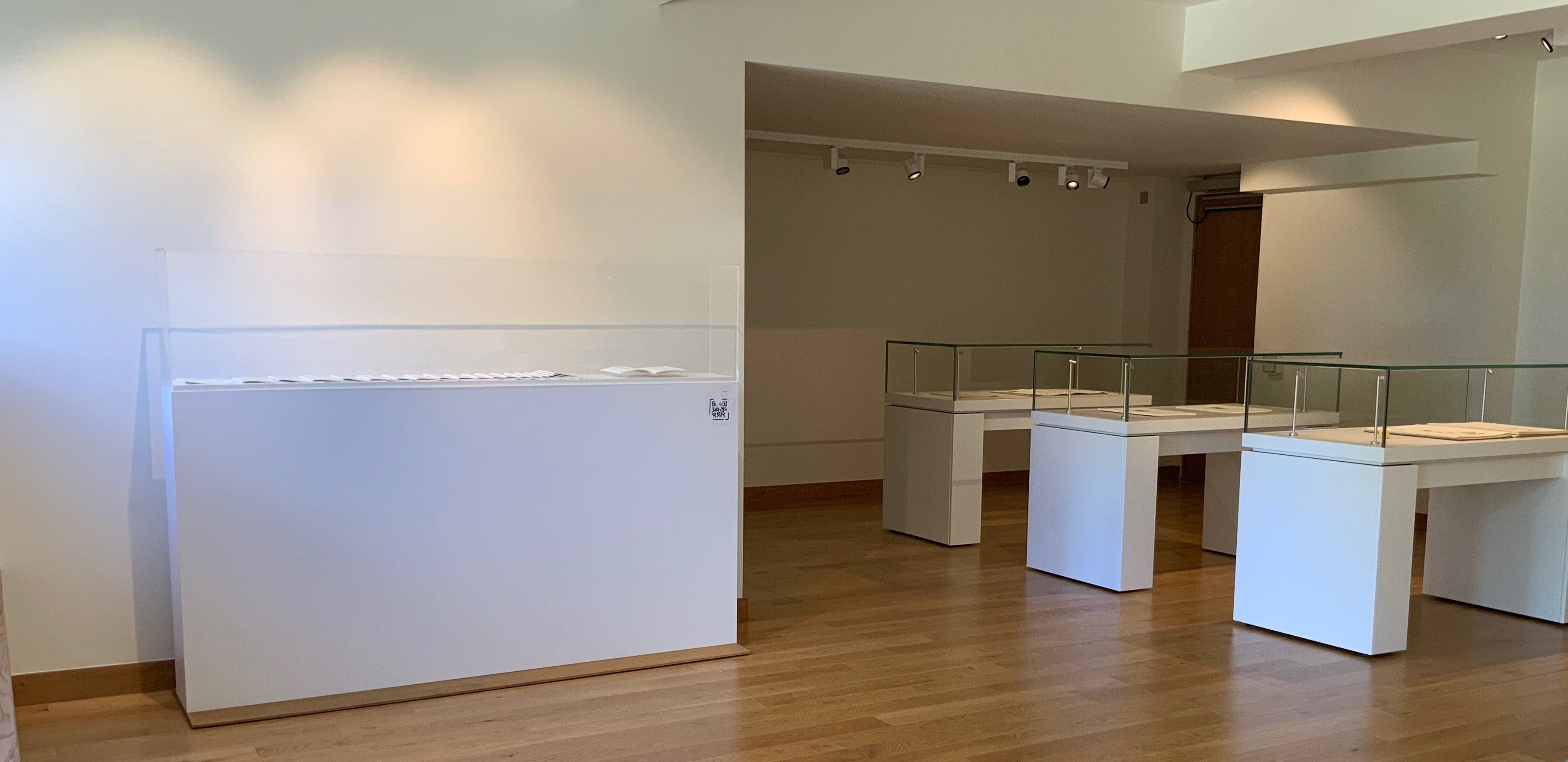
Jessica Berenbeim, a University Lecturer at the Faculty of English and a Fellow of Jesus College, has selected works from the Books On Books Collection for this exhibition. With the assistance of Justine Provino, a doctoral student at Cambridge, Berenbeim has arranged the works to effect a certain conversation. As she writes,
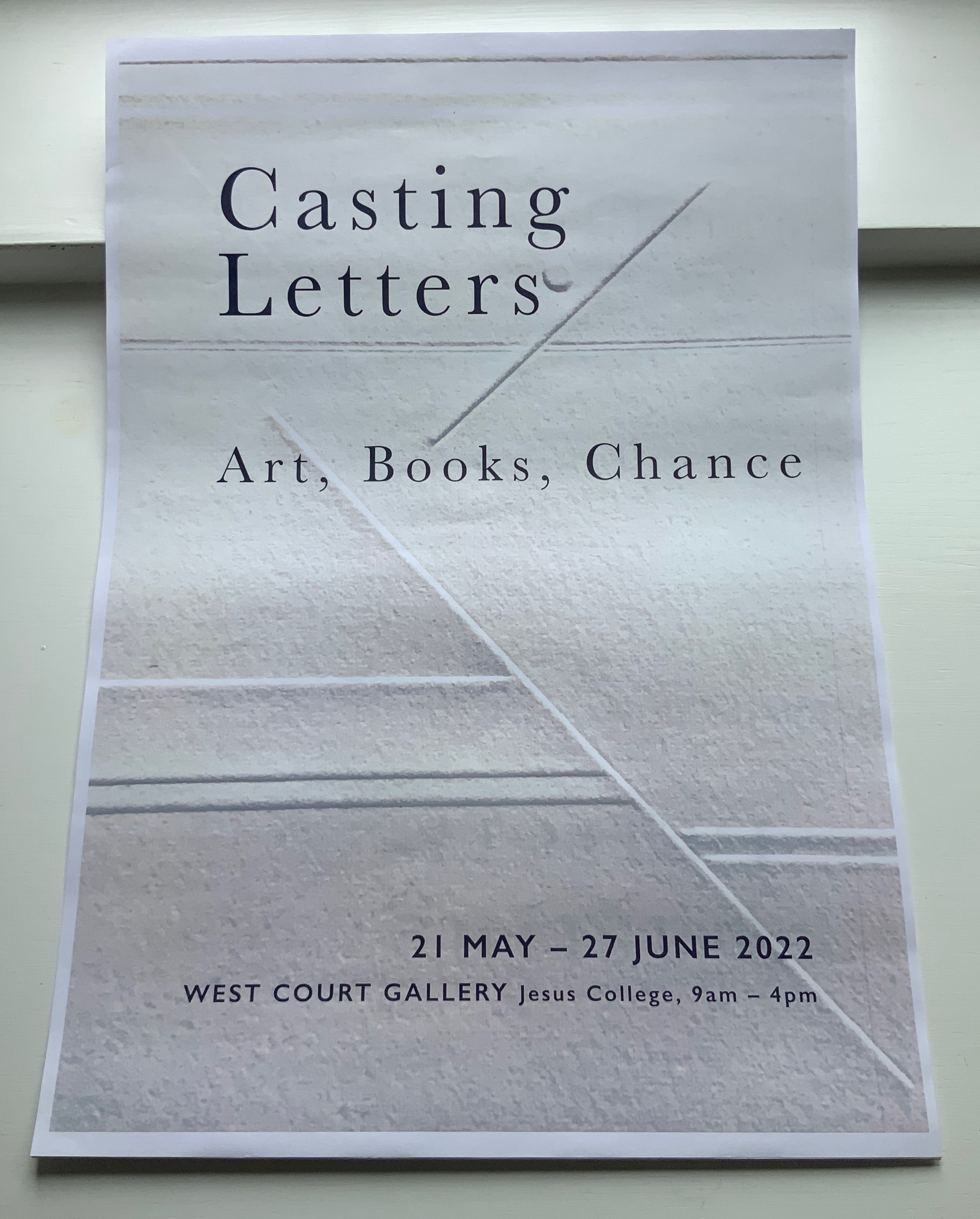
Artists’ experiments with books and letters have taken many forms, some of which look more like books than others. This exhibition of book art, and book-inspired art, opens a view of one of its most intriguing stories: the tradition of reflections, riffs, and responses to one seminal work, Stéphane Mallarmé’s A Roll of the Dice Never Will Abolish Chance (Un Coup de dés jamais n’abolira le hasard). Mallarmé’s experimental work celebrates its 125th anniversary in May 2022, when this exhibition opens. The particular objects on display here, and on view at the screening events, play on two central ideas inspired by this work: chance and visible language. The works in the exhibition are in effect a conversation about the intersection of those themes. What part does chance have to play in the way language is depicted on (or off) the page, and how might accidents of language determine how it looks? How does meaning settle throughout the forms of letters, words, lines, pages, and books, as well as in what the words say?
The exhibition and screenings include works by Jérémie Bennequin, Isabella Checcaglini & Mohammed Bennis, Robert Filliou, Ernest Fraenkel, Rodney Graham, ‘Estelle J.’, Michel Lorand, André Masson, Reinhold Nasshan, Michalis Pichler, Man Ray, Mitsou Ronat & Tibor Papp, and Honorine Tepfer.
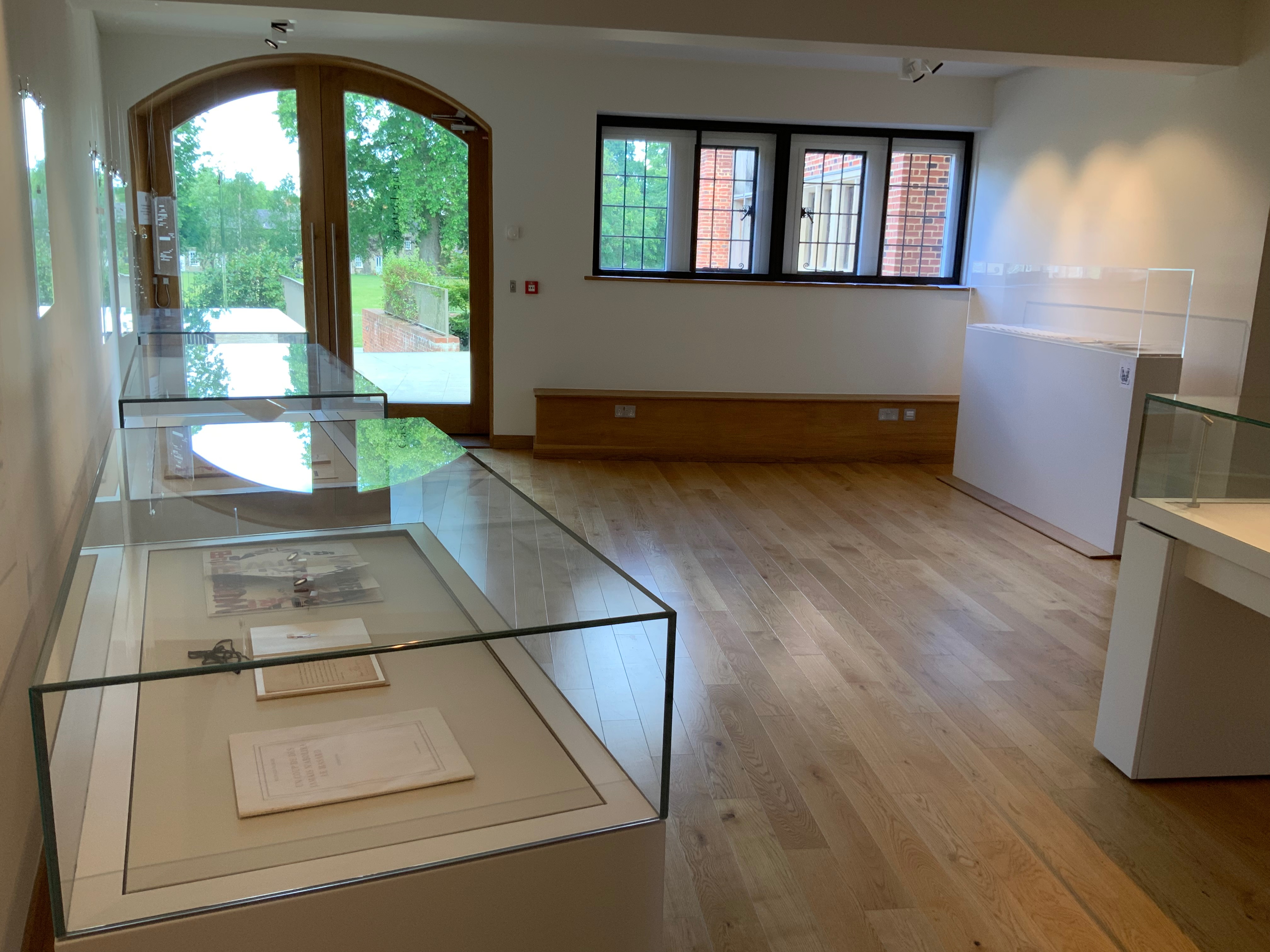
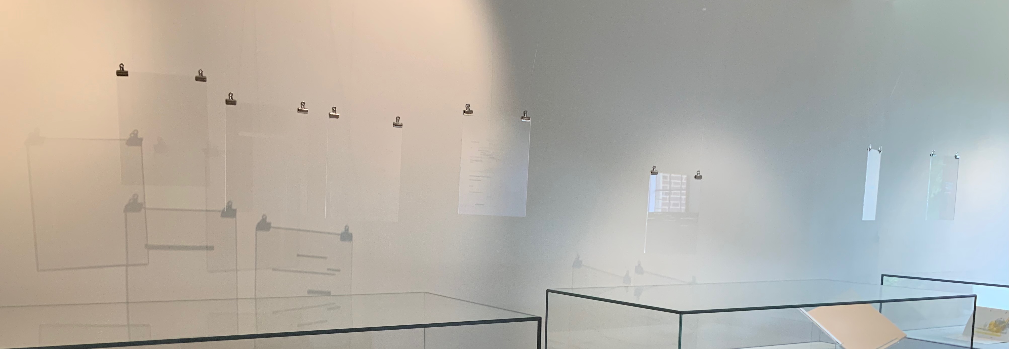
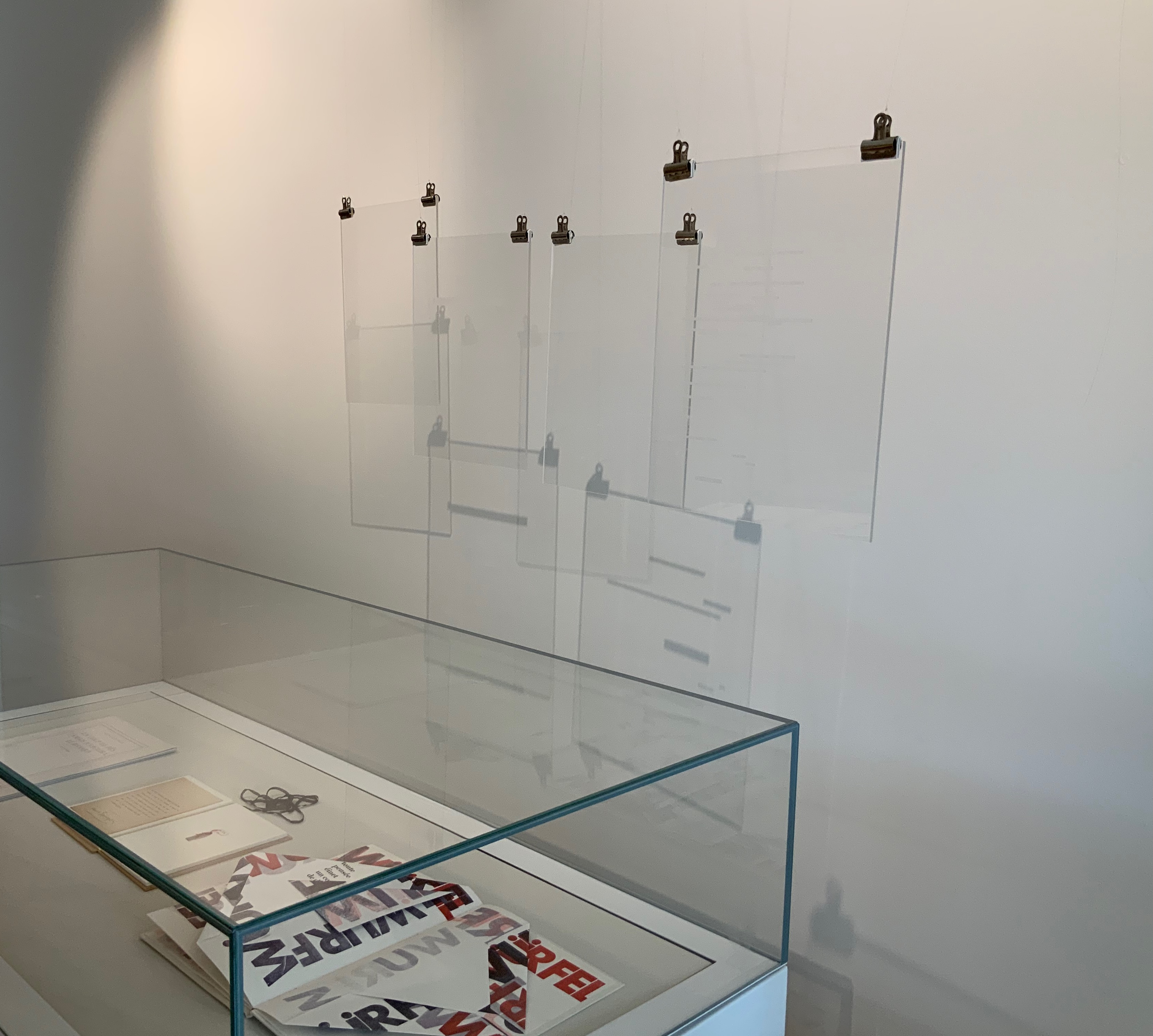
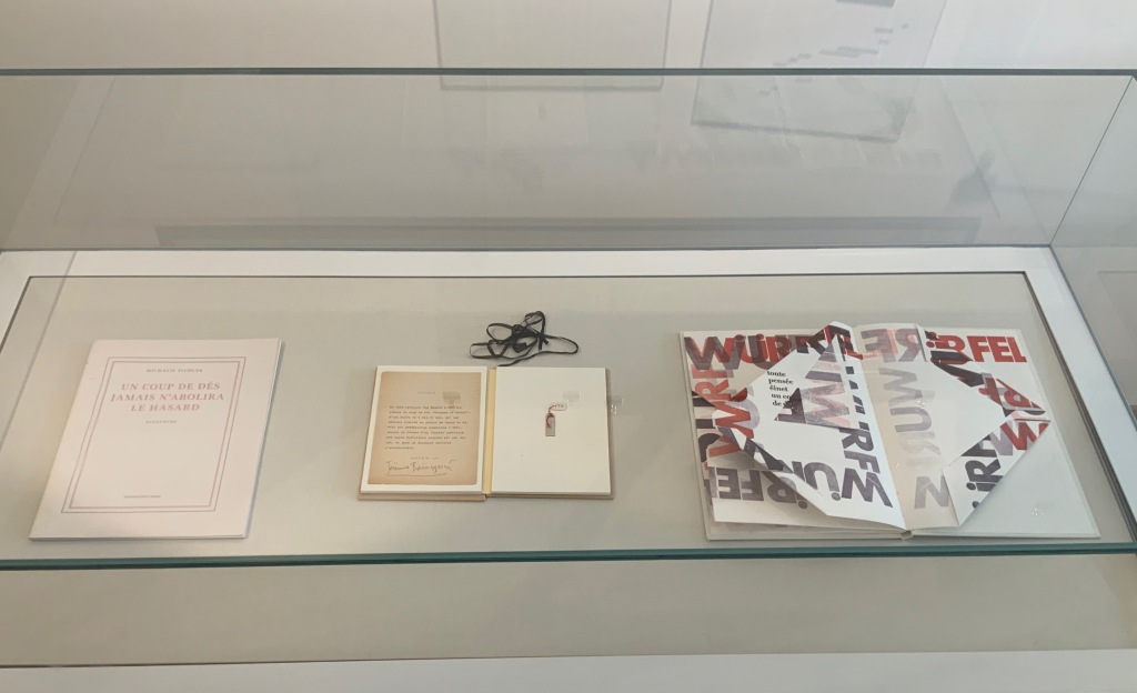
Berenbeim and Provino have suspended seven plates from Pichler‘s homage to hang over the cases containing works by Bennequin, Nasshan, Lorand, Tepfer and Estelle J.. and quietly cast shadows to pun with those works and the exhibition’s title.
L-R: Michalis Pichler, Un Coup de Dés Jamais N’Abolira le Hasard: Sculpture (2008); Jérémie Bennequin, Le Hasard N’Abolira Jamais Un Coup de Dés (Changes of Music) (2020); Reinhold Nasshan, Würfelwurf: fragmentarische Annäherung an Stéphan Mallarmé (1992).
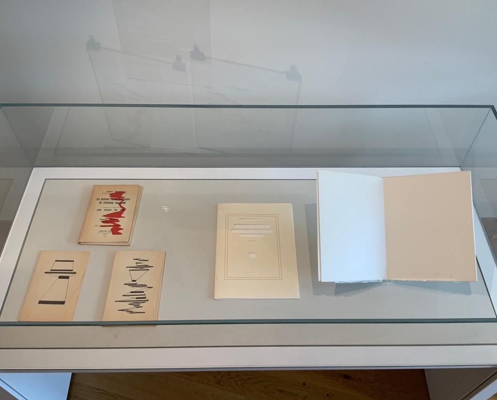
L-R: Ernest Fraenkel, Les Dessins Trans-conscients de Stéphane Mallarmé, à propos de la Typographie de Un Coup de Dés (1960); Michel Lorand, Après Un Coup de Dés (2015); Honorine Tepfer, Un Coup de Dés Jamais N’Abolira le Hasard: Poème (1989)
Estelle J., STÉPHANE MALLARMÉ: Un coup de dés n’abolira le hasard (ND)
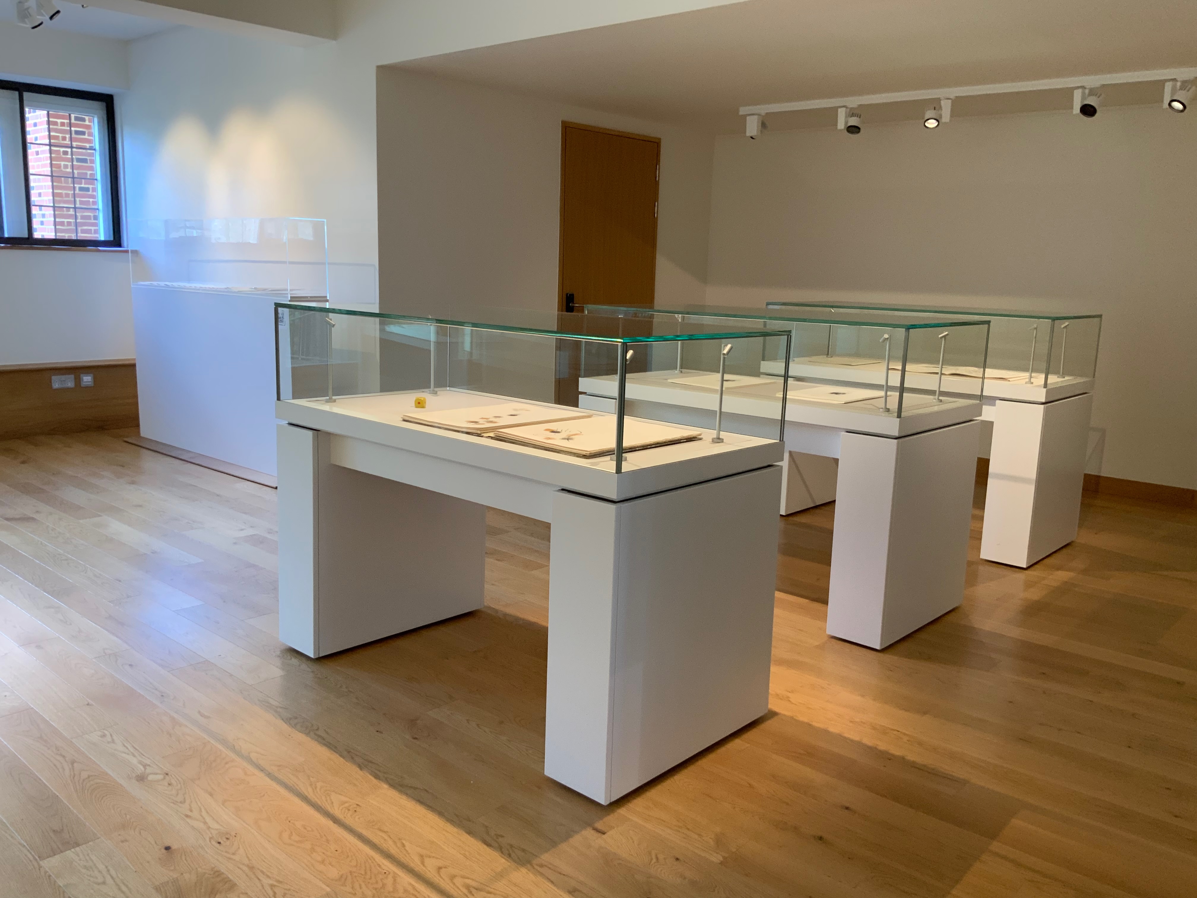
Three other cases across from those above present a conversation of dice between Masson and Filliou, then a French and Arabic conversation between Checcaglini and Bennis, and then Tibor Papp and Rodney Graham joking with one another.
L-R: André Masson, Poéme: Un Coup de Dés Jamais N’Abolira le Hasard by Stéphane Mallarmé (1961); Robert Filliou, Eins. Un. One. (1984)
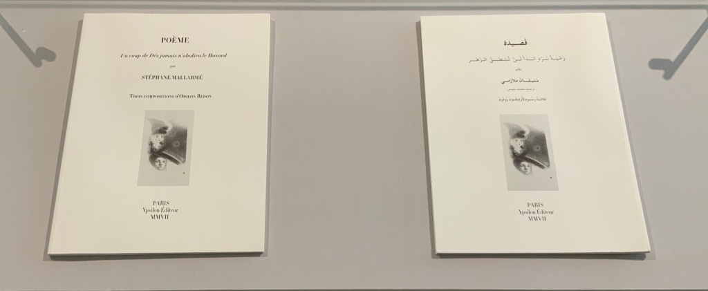
L-R: Isabella Checcaglini, POÉME: Un coup de Dés jamais n’abolira le Hasard (2007); Mohammed Bennis, صلة وصل مع قصيدة ” رمية نرد أبدا لن تبطل الزهر” /Ṣilat waṣl maʻa qaṣīdat Ramyat nard abadan lan tubṭila al-zahr (2007)
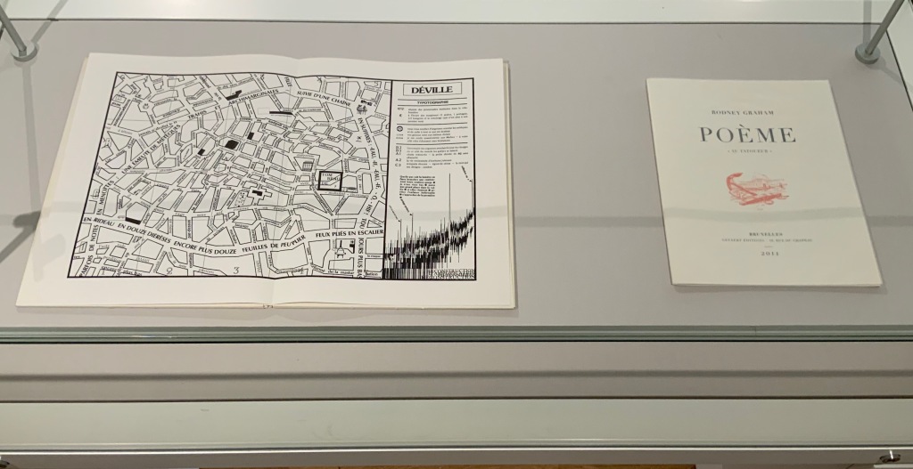
L-R: Tibor Papp, Déville in Mitsou Ronat & Tibor Papp, eds., Poème: Un coup de Dés jamais n’abolira le Hasard par Stéphane Mallarmé (1980; )Rodney Graham, Poème : “Au Tatoueur” (2011)
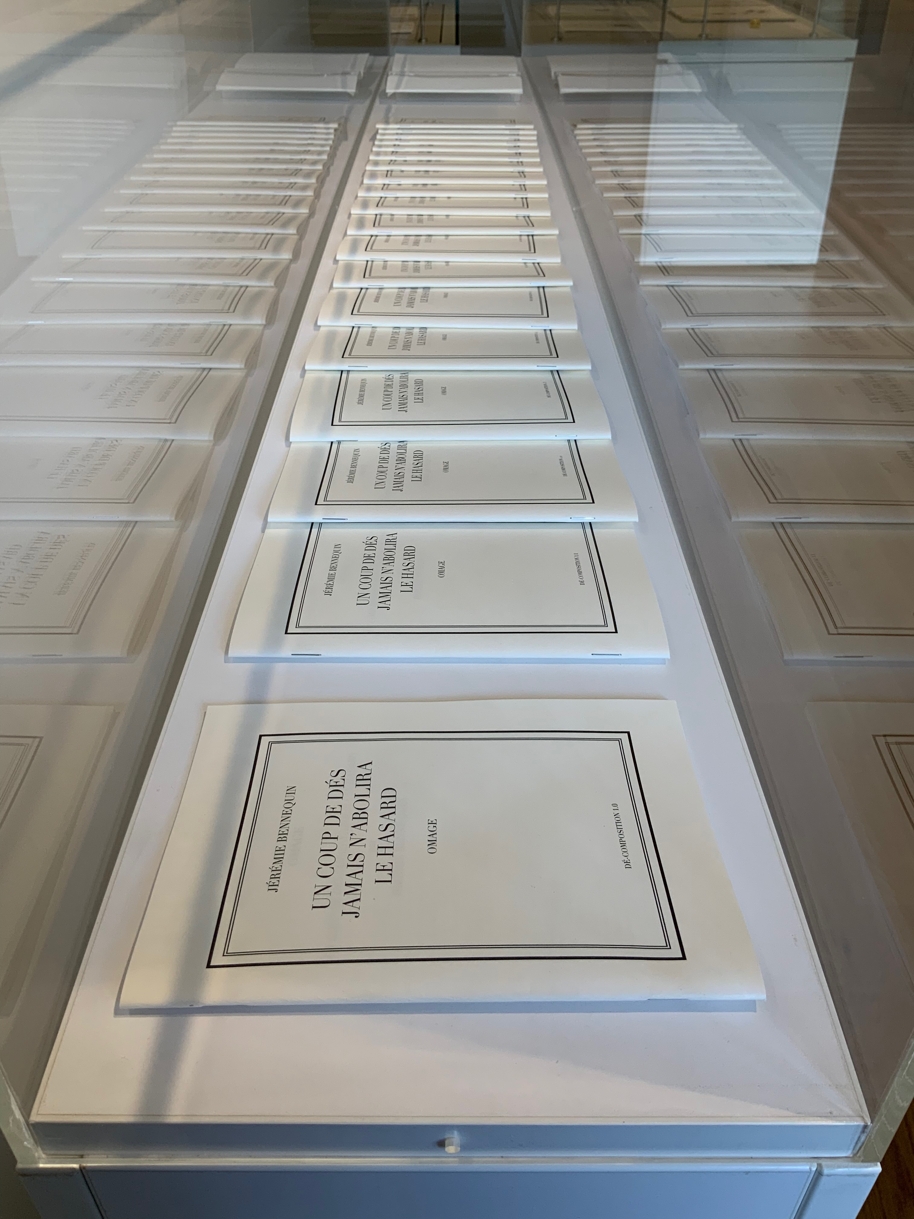
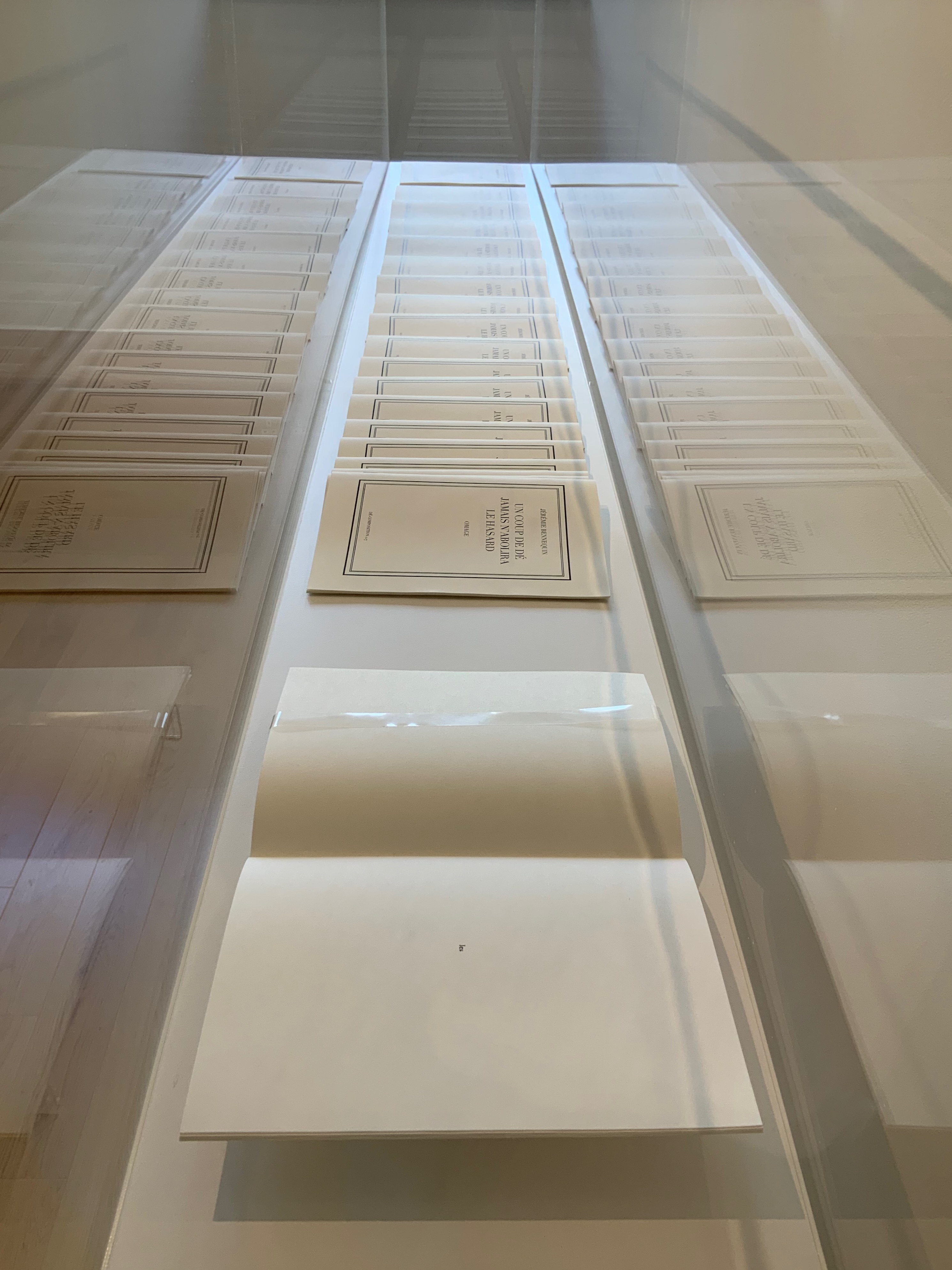
In a display case seemingly made for his particular work, the result of Bennequin’s long-distance performances of erasure with his colleague and publisher Antoine Lefebvre calls across the room to all the other works of chance and visible language.
Jérémie Bennequin, Un Coup de Dés jamais n’abolira le Hasard, Dé-composition (2009-2013)
With the sun streaming into West Court Gallery, the only things missing from the buzz of these conversations were perhaps canapés, champagne and name tags to celebrate the 125th anniversary of this strange poem’s publication.
Bernadette O’Toole follows in a long line of distinguished “serial hommageurs”: Ian Wallace, Jérémie Bennequin, Marcel Broodthaers, Kathy Bruce, Marine Hugonnier, Jorge Méndez Blake, Alastair Noble, Michalis Pichler, Raffaella della Olga and Joëlle Tuerlinckx. Like many of them, she extends her work across multiple media. Like all of them, she is driven by the metaphysics and motifs expressed in Un Coup de Dés.
Variant Sail (2015); As If (2016)
Variant Sail (2015) and As If(2016) Bernadette O’Toole Presentation box. H240 x W172 mm. Acquired from the artist, 1 April 2022. Photos: Books On Books Collection. Displayed with permission of the artist.
Bernadette O’Toole’s two small booklets first appeared in Sharon Kivland’s MA Bibliothèque and are now out of print. The presentation case in which they arrived conveys her recurrent practice or technique of recontextualizing. A copy or copies from an edition may be re-presented so as to create a new work or works. Variant Sail and As If constitute a case in point.
Variant Sail (2015)
Variant Sail (2015) Bernadette O’Toole Booklet, two-staple saddle-stitch. H190 x W130 mm, 24 pages. Edition of 25, of which this is #6. Photos: Courtesy of Bernadette O’Toole. Books On Books Collection. Displayed with permission of artist.
The booklet Variant Sail contains reproductions of twelve digital prints (H38 x W57 cm). The prints were created by scanning and digitally manipulating each of the double-page spreads of Un Coup de Dés in Photoshop, producing twelve variants with each one foregrounding the gutter in a different way. The manipulation has made Mallarmé’s text faintly detectable but indecipherable and rendered the double-page spreads as entire blancs — variants, as it were, of the white spaces (les blancs) to which Mallarmé refers in his poem’s preface.
[From the NRF/Gallimard 1914 edition]
The ‘blanks’ indeed take on importance, at first glance; the versification demands them, as a surrounding silence, to the extent that a fragment, lyrical or of a few beats, occupies, in its midst, a third of the space of paper: I do not transgress the measure, only disperse it. The paper intervenes each time as an image, of itself, ends or begins once more, accepting a succession of others, and, since, as ever, it does nothing, of regular sonorous lines or verse – rather prismatic subdivisions of the Idea, the instant they appear, and as long as they last, in some precise intellectual performance, that is in variable positions, nearer to or further from the implicit guiding thread, because of the verisimilitude the text imposes.
From Mallarmé’s marked-up proofs for his planned deluxe edition, we know that he viewed the double-page spread, not the single page, as the poem’s primary structural unit. Each of O’Toole’s blank double-page spreads can be seen as a voile alternative (“variant sail”), a phrase appearing on the NRF/Gallimard edition’s second double-page spread. With a different foregrounding of the gutter in each of her double-page spreads, O’Toole underscores both the variance within her Variant Sail and the important constancy of the double-page spread in the poem to which she is paying homage.
A bit more esoterically, the double-page spread suggests the quantity 2, an allusion to the result of thrown dice, their two faces up. It may also allude to the poem’s revolutionary versification, challenging French poetry’s Alexandrine, the traditional measure of 12 syllables usually divided into two hemistichs. It seem no accident that O’Toole has chosen a pattern of two-word titles for her booklets.
As If (2016)
As If (2016) Bernadette O’Toole Booklet, two-staple saddle stitch. H205 x W140 mm, 16 pages. Edition of 25, of which this is #6. Photo: Courtesy of Bernadette O’Toole; Books On Books Collection. Displayed with permission of artist.
The prints for Variant Sail in turn inspired paintings (same dimensions) that are reproduced in the second booklet As If, which takes its two-word title from the poem’s central double-page spread, the one beginning and ending COMME SI (“as if”). Mallarmé’s words are no longer detectable. What is detectable instead is each brushstroke on the painted surfaces. It is as if the work As If appropriates the work Variant Sail, just as Variant Sail appropriates Un Coup de Dés.
“Appropriation” may not be the right characterization. Re-contextualizing, re-purposing or re-cycling perhaps. Consider where O’Toole goes next with these two other works not in the Books On Books Collection at the moment.
Variant Sail II (2016)
For Variant Sail (II), O’Toole incorporates an inventive sculptural work that she calls a “gesture”. In a black presentation box, a translation of Un Coup de Dés rests beside a small painted gesture, oil on plaster. Here is her description of the process by which a gesture is created:
The process of making the work involved tracing my brush-stroke into a bed of clay, pushing into the surface which proved resistant at first. Plaster was poured into the indent, casting the absent gesture [brush-mark]. Once the form had set, I separated it from the bed of clay and took hold of the object. The absent gesture [brush-mark] had become embodied. The form was simultaneously liberated from the mould, and from the limitation of the painting surface. It was cast out, recalling the Japanese practice known as, ‘flung-ink’, which Norman Bryson observes is ‘thrown’ as one throws dice. — [Interview with Josie Jenkins, 22 November 2020]
Variant Sail II has appropriated, re-cycled, re-purposed or re-contextualized the works Variant SailandAs If in several ways — by transforming the surface brushstroke into a three-dimensional object, by juxtaposing those two works (through the gesture) with the translation
A Rare State (2018)
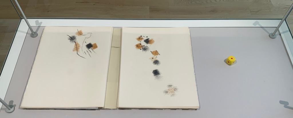
A Rare State consists of 12 booklets (H38 x W57 cm), each with its own cover and title. Each encloses 12 loose interchangeable folios. Each captures images from different performative readings (by the artist) of Un Coup de Dés or fromanimated patterns of marks and numbers appearing and disappearing. Some of the patterns occupy the positions of Mallarmé’s text on his double-page spreads. Others appear in sequences of 1-6 within a square or diamond suggesting the face of a die.
A Rare State expands on the idea of a numerical or mathematical principle at play — be it 1-6 on the face of a die, the 12 syllables of the Alexandrine that the poem explodes, the 2 of the double-page spread, or the 4 triangles constituting the face of a die across the double-page spread. This expansion is also an expansion of O’Toole’s technique of appropriation, re-cycling, re-purposing or re-contextualizing to create new artwork. It is as if her every thought emits a throw of the dice.
Cohn, Robert G. 1966. Mallarme’s Masterwork: New Findings. The Hague: Mouton. Contains the photographs that inspired Neil Crawford’s typographic translation.
Cohn, Robert Greer. 1965.Toward the poems of Mallarmé. Berkeley: University of California Press. See in particular for his analysis of the relationship between Un Coup de Dé and the sonnet À la Nue Accablante Tu (pp. 229-36).
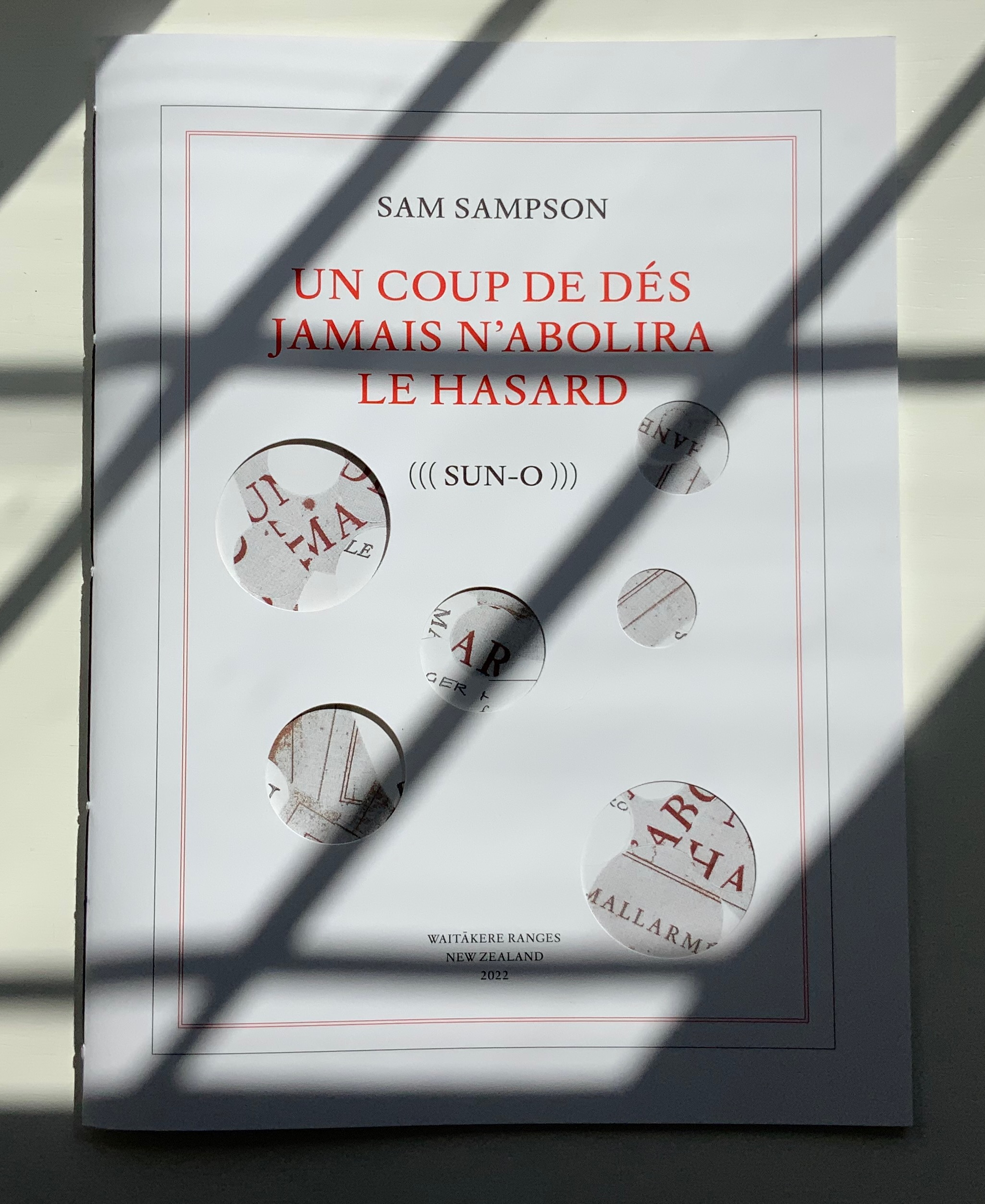
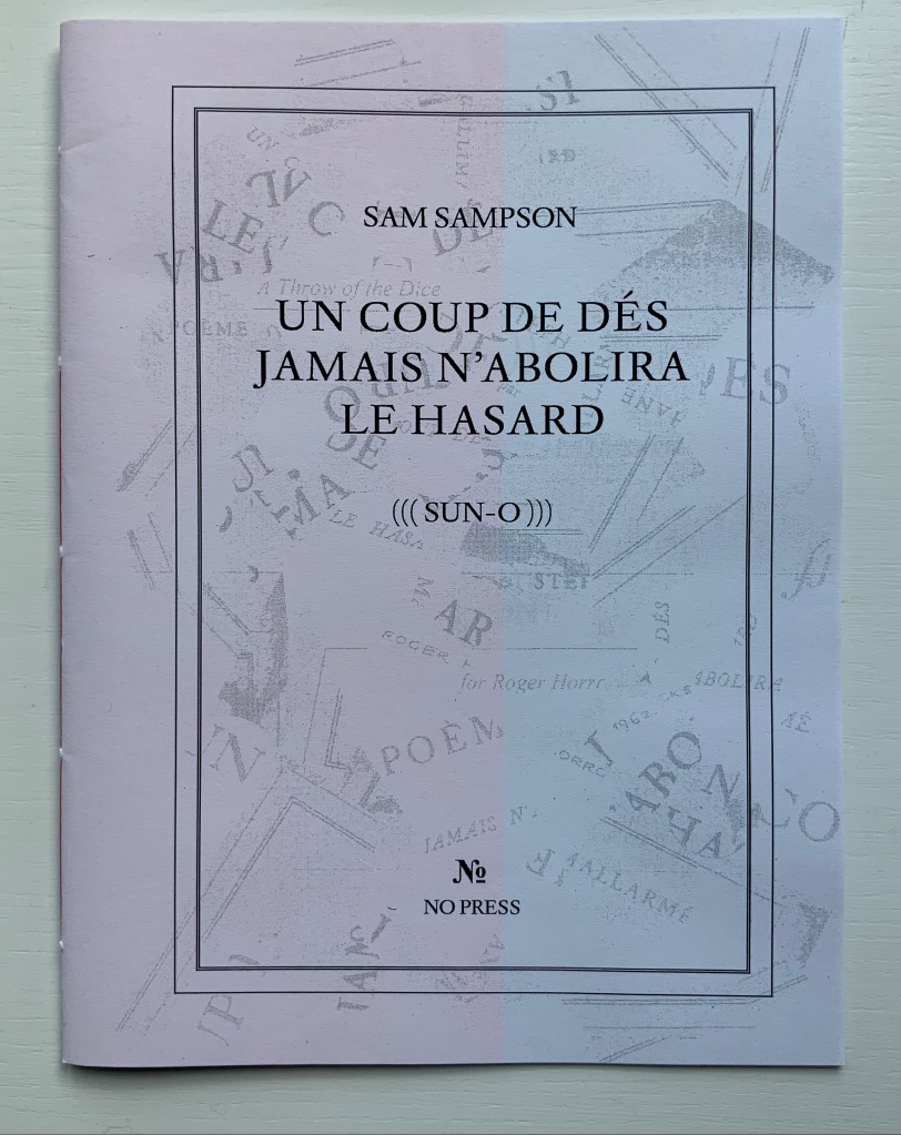
Derek Beaulieu (No Press) first published Sam Sampson’s homage to Un Coup de Dés as a handsewn pamphlet in 2020. To celebrate the 125th anniversary of Mallarmé’s initial publication of “the poem that made us modern”, Sampson enlisted Jacinda Torrance of Verso Visual Communications for design, the firm Centurion for printing, and Louise James of The Binding Studio for hand binding to produce this deluxe edition.
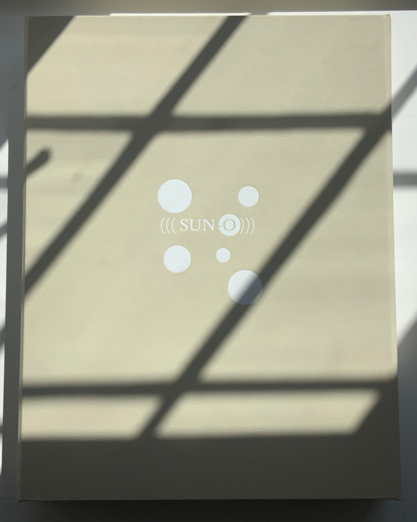
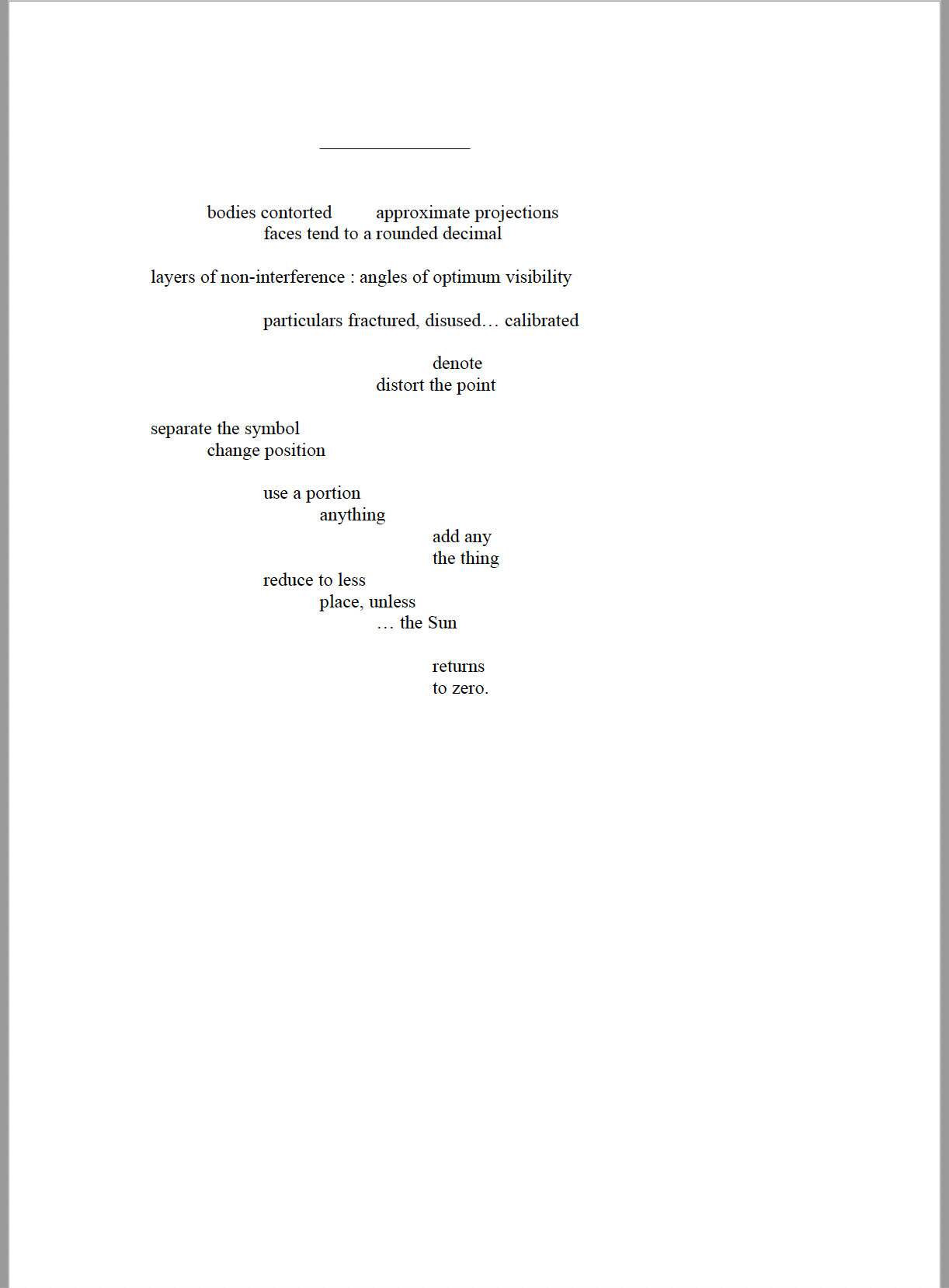
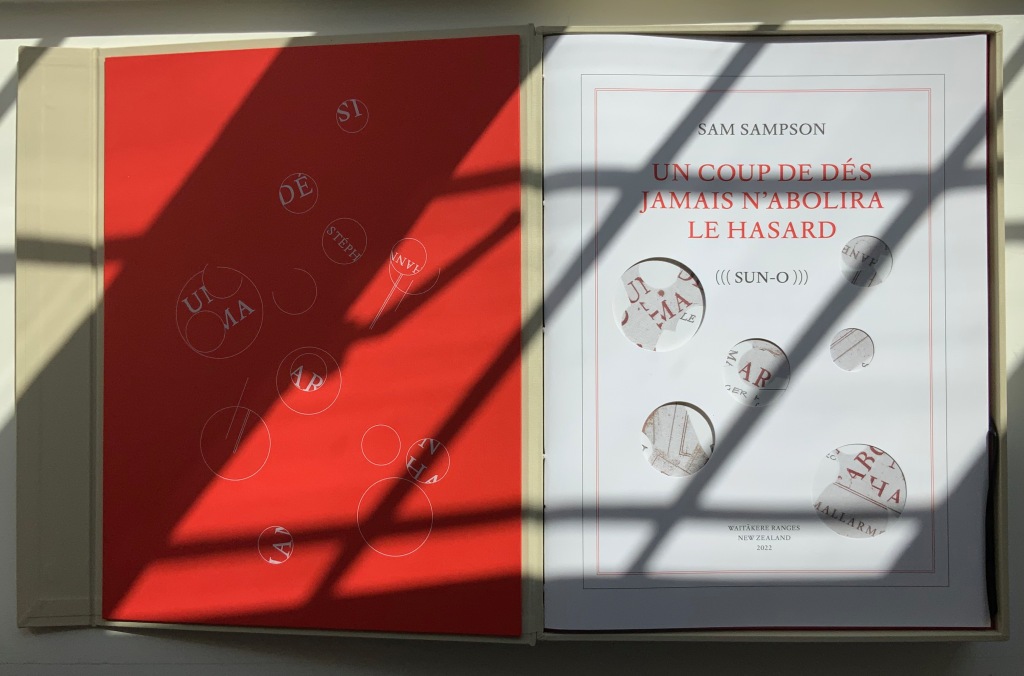
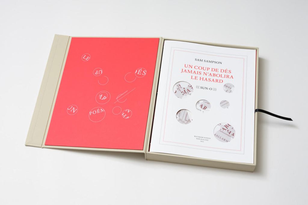
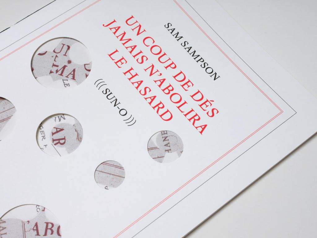
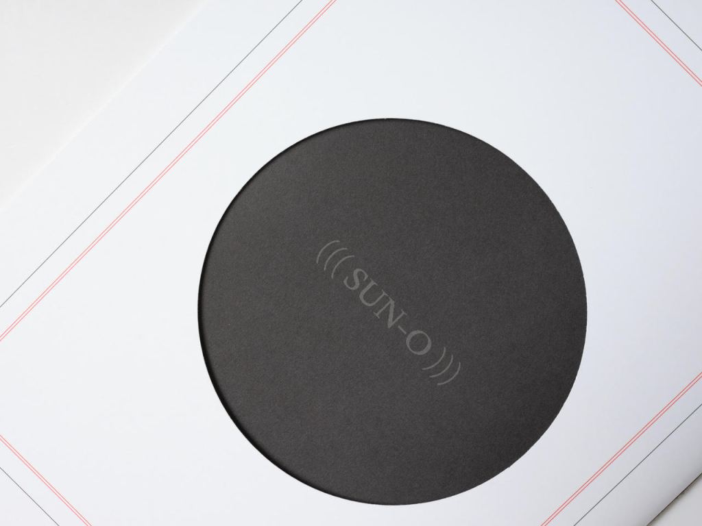
UN COUP DE DÉS JAMAIS N’ABOLIRA LE HASARD (((SUN-O))) (2022)
Un Coup de Dés Jamais N’Abolira le Hasard ((( Sun-O ))) (2022) Sam Sampson Handsewn book, H300 x W225 mm, 28 unnumbered pages. Edition of 20 (10, each enclosed in a hinged-lid box with magnetic flap; 10 unboxed), of which this is boxed # 2. Acquired from the artist, 7 April 2022. Photos: Books On Books Collection. Displayed with permission of the artist.
As with most creative works, (((Sun-O))) had multiple points of inception. One of them was an essay Sam Sampson read by Susan Howe and Cole Swensen. They quote Mallarmé’s preface to the poem (“nothing new except a certain distribution of space made within the reading” and speak of his aim to fuse sequential and simultaneous perception, to fully engage the eye and ear, as a result pushing poetry in two directions – toward visual art and toward musical performance. This resonated with a series of poems Sampson was writing and manifests itself in (((Sun-O))):
The physical design and analogy in my rendition is aligned with what I would call the ‘O Poems’. ‘O’ Zero, being the sound that runs through these poems, but I’ve also been interested in the numerical concept of zero: the beginning point, but also the point of departure, the ‘O’ as an ideogram, giving the text a pictorial as well as vocalised movement. [Correspondence with Books On Books Collection, 29 March 2022]
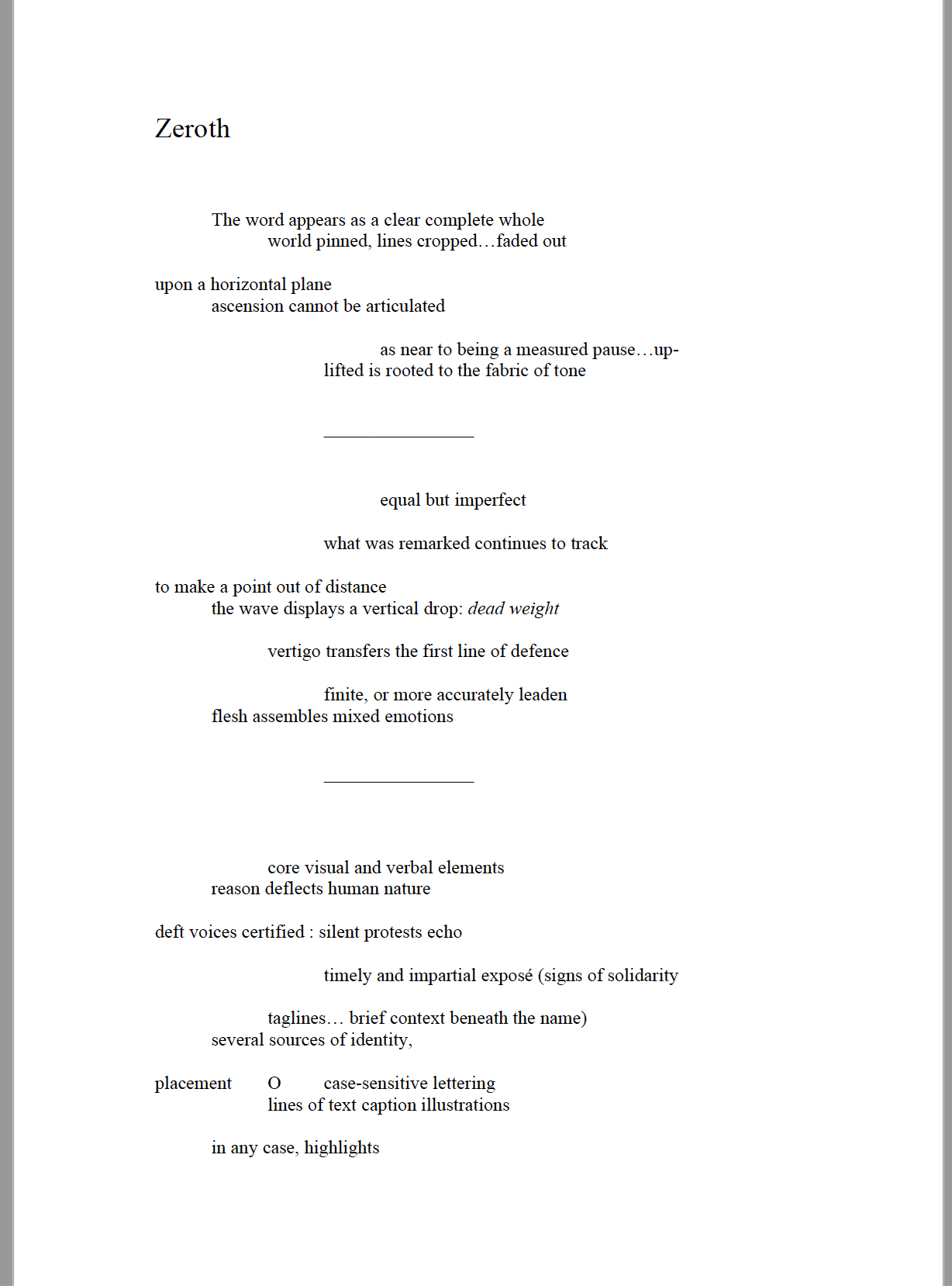
Another of the “O Poems” is Zeroth. Sampson reads it here:
Zeroth leads to another point of inception: a conversation with Roger Horrocks, a New Zealand poet, writer, film-maker, educator and cultural activist, to whom (((Sun-O))) is dedicated. After reading Zeroth, Horrocks told Sampson that it reminded him of his favorite Seattle experimental metal band at the time – Sunn O))). Sampson describes their sound as slow, heavy, blending diverse genres including “drone, black metal, dark ambient and noise rock”. Sampson’s mulling over the very sound of the band’s name led to free associations with the secondary meanings of drone (surveillance, panopticon). Mulling over the name’s compression of word and the letter O led to his hybridized subtitle (((Sun-O))) “with its parentheses radiating out but never closing”. A potent visual and textual image for a poem touching on, if not touching, the sun, the abyss and the human.
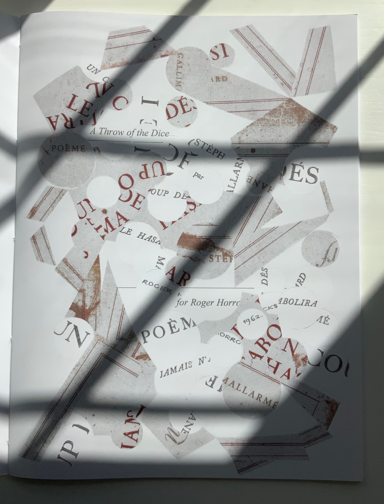
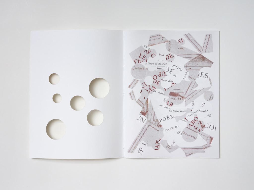
But, of course, the zero point of inception is Un Coup de Dés. On a visually material level, (((Sun-O))) has a scaffolding of bullet-pointed rules, whose lengths are based on measuring each of Mallarmé’s lines, whose weights approximate the variable font sizes, and whose placement matches that in Un Coup de Dés. This lattice serves as the physical structure for the collage of words and O’s that Sampson layers like paint or screenprint onto the page. Some words and lines are upside down like the detritus of a shipwreck. Some words curve and drape between the lines like torn sails. Appropriately, some come from the precisely corresponding pages in Mallarmé’s poem. Faint lines of the circumferences of O’s leap across and down between the lines almost like musical notations.
Within this tangle, Sampson’s own elusive and allusive text plays. Some of its phrases come from traditional song; some fix the geographical location (“blue carbon” places the speaker in a coastal community); some “un-fix” the location (“over the hills and far away”); some are struck through, alerting the reader to be ready to discard and start again; some set the technological time frame (the reference to operating systems like Suse, Symbian and, of course, Solaris). As in Un Coup de Dés, the text’s syntax and placement on the page encourage reading in fits and starts, back and forth. As Sampson puts it:
I wanted [my] poem to somehow capture, as Mallarmé had described it, “the invitation of the great white space”, and the successive, incessant, back-and-forth motions of our eyes travelling from one line to the next, and beginning all over again. [Correspondence with Books On Books Collection, 29 March 2022]
Indeed, before writing Un Coup de Dés, Mallarmé foreshadowed more expansively this phenomenon toward which Sampson strives:
Pourquoi — un jet de grandeur, de pensée ou d’émoi, considérable, phrase poursuivie, en gros caractère, une ligne par page à emplacement gradué, ne maintiendrait-il le lecteur en haleine, la durée du livre, avec appel à sa puissance d’enthousiasme: autour, menus, des groupes, secondairement d’après leur importance, explicatifs ou dérivés — un semis de fioritures. [Oeuvres Complètes, 2, 227]
“Why — couldn’t a considerable burst of greatness of thought or emotion, carried in a sentence in large typeface, gradually placed with one line per page, hold the reader’s bated breath throughout the entire book by appealing to his or her power of enthusiasm: around this [burst], smaller groups of secondary importance, explicating or deriving from the primary phrase — a scattering of flourishes.” [Arnar, 234]
Whereas in Mallarmé’s poem there is a primary sentence in large typeface (“UN COUP DE DÉS JAMAIS N’ABOLIRA LE HASARD”) off which the secondary groups of phrases and sentences play, (((Sun-O)))‘s primary foil is the combination of two things: the collage made from shards of Mallarmé’s poem and that strange, enjambed subtitle (((Sun-O))). After all, the full title of Sampson’s work is UN COUP DE DÉS JAMAIS N’ABOLIRA LE HASARD (((SUN-O))).
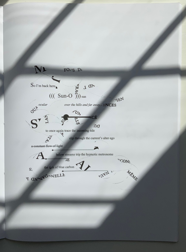
The “Comme si … Comme si” center double-page spread.
Sampson calls Mallarmé’s poem a form of metaphysical gambling, reproducing the sensation of being both in and outside time. Being both in and outside of time — that could be the defining state of human consciousness. Unlike the abstract representation of humanity in Un Coup de Dés, however, (((Sun-O)))‘s representation is concretely personal. The traditional song “Over the Hills and Far Away“, which Sampson cites at the start of (((Sun-O))), can be read as a reference to Horrocks’ departure from New Zealand for the United States in the 1960s. At one point, the speaker addresses Horrocks directly: “Roger / what of these / parallels of blue / sea shanties / masquerading mind-sets / …”. Sampson takes the image of Roger Horrocks’ signature from Horrocks’ copy of an edition of Un Coup de Dés, fragments it and reproduces it on the pages of (((Sun-O))). Did Sampson have in mind the story of René Magritte’s loaning his copy of Un Coup de Dés to Marcel Broodthaers, which led to Broodthaers’ Image version of Mallarmé’s poem? (See Marine Hugonnier’s retelling of the tale here.) The scaffolding of bulleted-pointed lines certainly pays homage to Broodthaers and other “hommageurs by redaction” such as Michalis Pichler, Sammy Engramer and others. (((Sun-O))) is a work of many conversations on many levels across time and time zones.
One of the main topics in (((Sun-O))), however, naturally seems to defy the bridging of the personal and abstract: climate crisis. It is hard to miss the allusions to the global shipwreck that is the climate crisis, engendering rising ocean levels and spastic efforts towards zero carbon emissions based on a computational chaos of competing environmental models and competing economic and political systems. It is clearly of personal concern to the speaker, but that does not take the issue from the abstract to the concretely personal in the way that Horrocks’s signature in a copy of Un Coup de Dés does. Making the climate crisis personal could, of course, run the risk of descending into small talk about the weather.
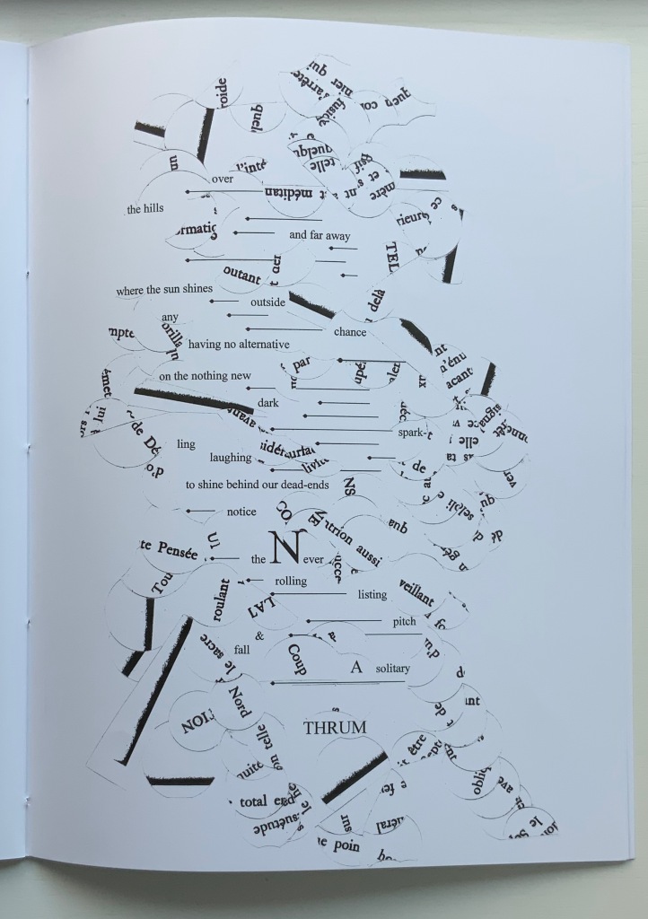
The references to music and the poem’s demonstration of musicality throughout are also hard to miss, and given its zero point of inception, the poem would be seriously remiss without them. The aim for union of text, sound and graphic image is as central to Sampson’s poem as the manipulation of syntax and les blancs is to Mallarmé’s. The aim’s importance in Sampson’s poem even has the last note and oversized word in the poem:
... the Never / rolling / listing / pitch / & / fall / A solitary / THRUM
The frequency of achieved union may be what puts Sampson’s homage in the front rank.
The special edition of (((Sun-O))) enhances that union in material ways. The design and materials play off Sampson’s cutting into and out of, sticking on and sticking through Un Coup de Dés. Six circles foiled in white on the front cover of the box turn the subtitle into an emblem — a mark maker. On the box’s inside lining, a design of circles and broken circles echoing the collage of O’s in the poem (even hinting at musical notation) is used to designate the number of the copy in the edition of 10. For this copy (#2), straight lines cut through 2 of the circles.
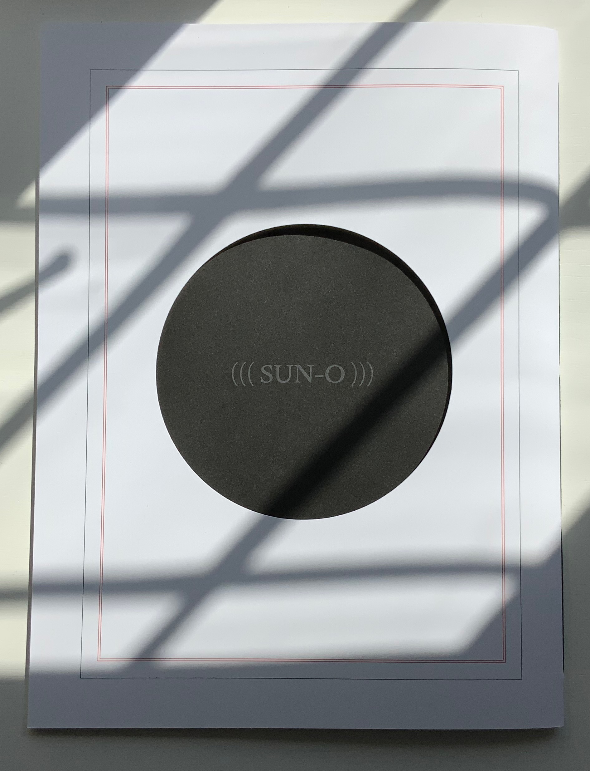
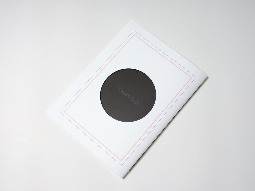
Like the white circles, six die-cut circles on the book’s front cover correspond to the six parentheses of the subtitle and likewise one face of a die. They also recall the hemistich of French poetry’s twelve-syllable Alexandrine, which Un Coup de Dés shattered. An image peeks through the die cuts and, as the cover turns, reveals itself as a collage of the cut-up cover of Horrocks’ copy of the poem and pages of (((Sun-O))). On the back cover, a single large die-cut circle centers on a black-hole sun with a faint, almost invisible ((( Sun-O ))) disappearing into blank/blackness.
By chance or by sly humor, the typeface used is DTL Elzevir. (((Sun-O))) is obviously not in the hunt for absolute fidelity to the edition planned by Mallarmé and Ambroise Vollard in 1896-97, which collapsed with the poet’s death. When Mallarmé’s son-in-law Dr. Edmond Bonniot issued an edition with Gallimard/NRF in 1914, the typeface was Elzevir, allegedly a face that Mallarmé detested. With this special edition of (((Sun-O))), Sampson is in the hunt on his own terms for his own more personal Mallarméan prism, constellation or radiant (((Sun-O))) that syntactically, auditorily, visually and physically scatters and focuses his response to the human condition.
UN COUP DE DÉS JAMAIS N’ABOLIRA LE HASARD (((SUN-O))) (2020)
Un Coup de Dés Jamais N’abolira le Hasard: (((Sun-O))) (2020) Sam Sampson Handsewn pamphlet. H255 x W190 mm, 24 pages. Edition of 60. Acquired from No Press, 4 January 2021. Photo of the work: Books On Books Collection. Displayed with permission of the artist.
[Mallarmé’s] work is a constellation and trying to unpack and explicate what went into my response hopefully doesn’t remove the joy of just jumping in. I like what John Ashbery said about his own work: “my work is accessible, if you take the time to access it.” [Sampson in correspondence with Books On Books Collection, 29 March 2022]
Further Reading & Listening
“Derek Beaulieu“. 19 June 2020. Books On Books Collection.
Davenport, Philip. 27 March 2020. “‘France’, or… we are circles of cancelled stars’“, Synapse International: An international visual poetry gathering. Started by Karl Kempton and Davenport in February 2018, Synapse International quickly attracted online works of homage to Un Coup de Dés, including an early appearance in March 2018 of Eric Zboya‘s Translations and later a visually adapted essay by David W. Seaman and as well as an “ADVERTISEMENT” from Derek Beaulieu that links to his 3D rendering of Un Coup de Dés.
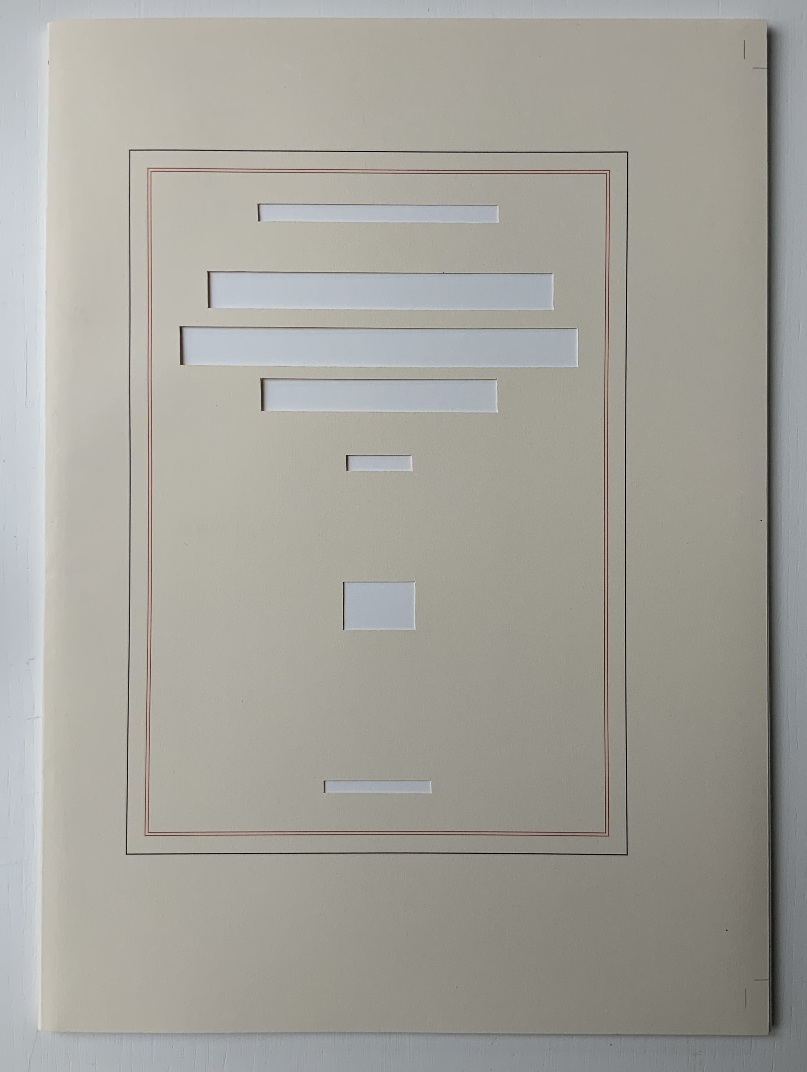
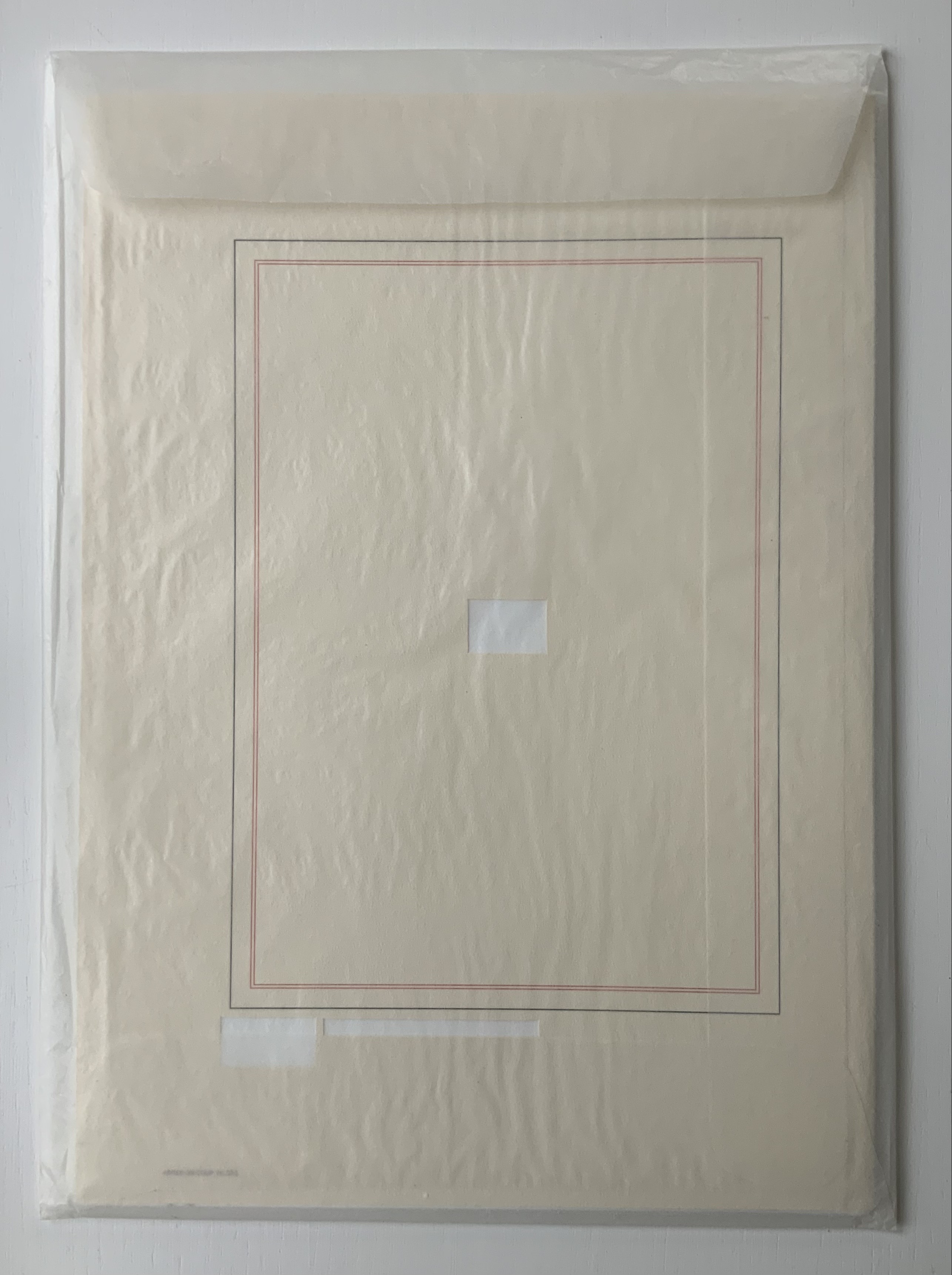
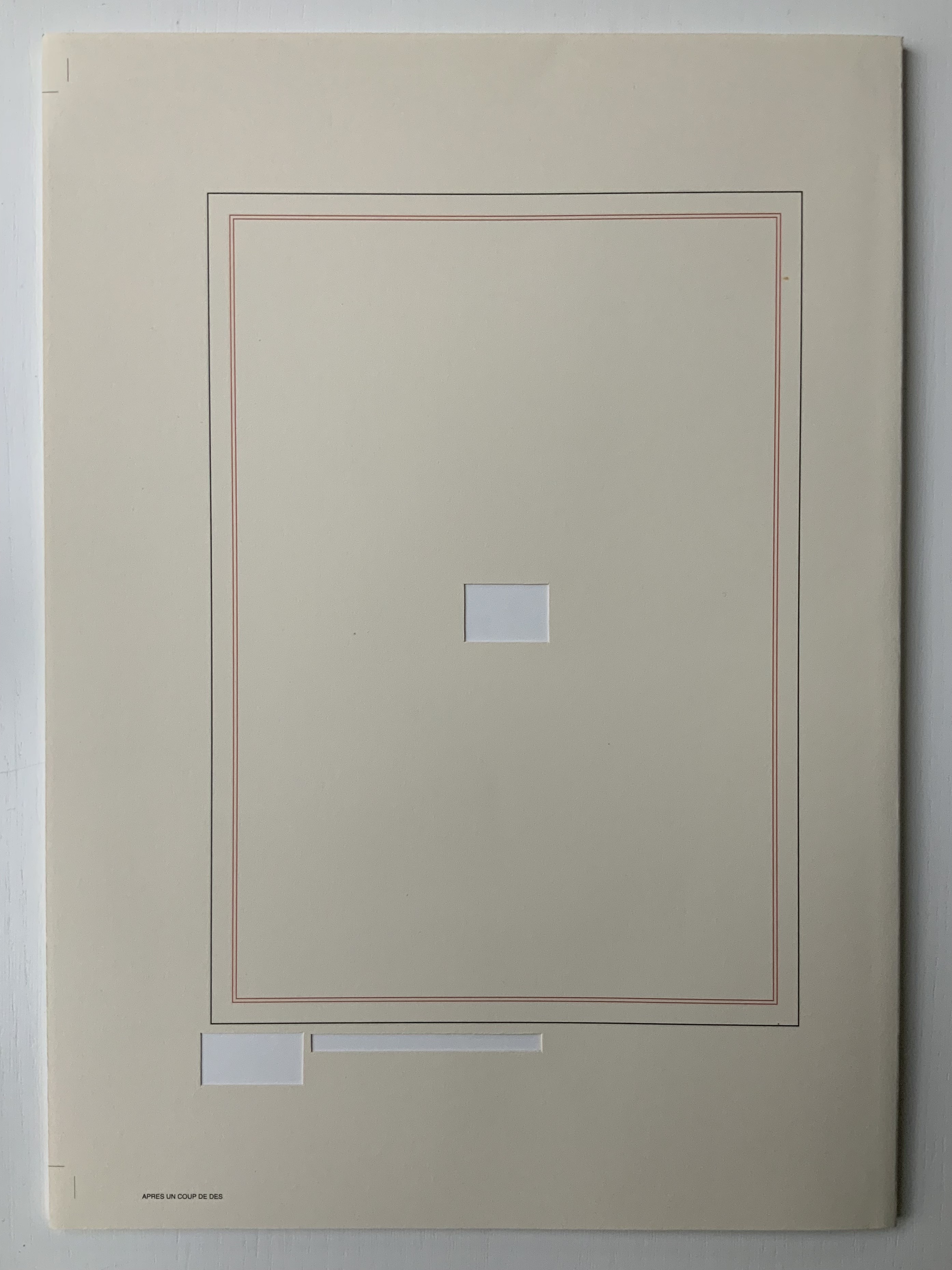
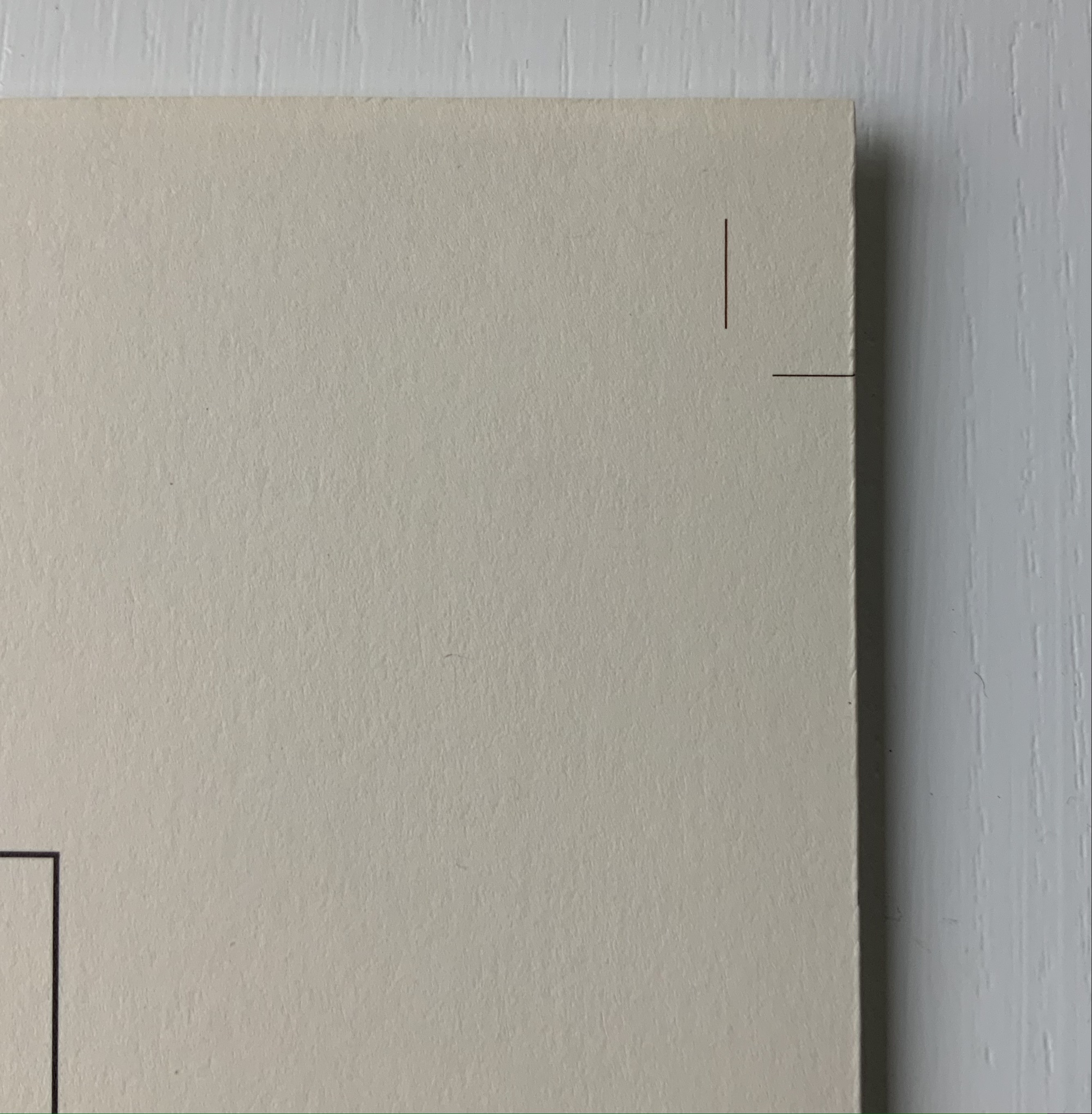
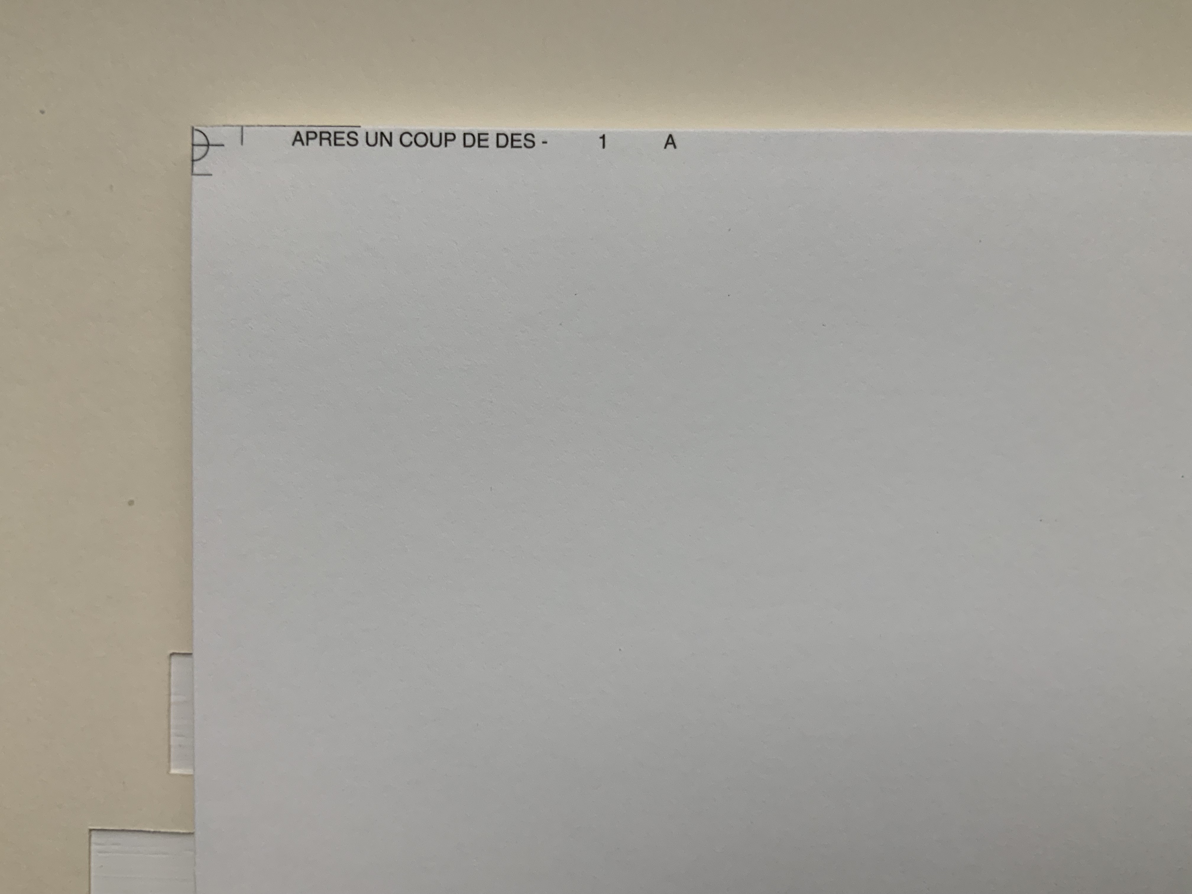
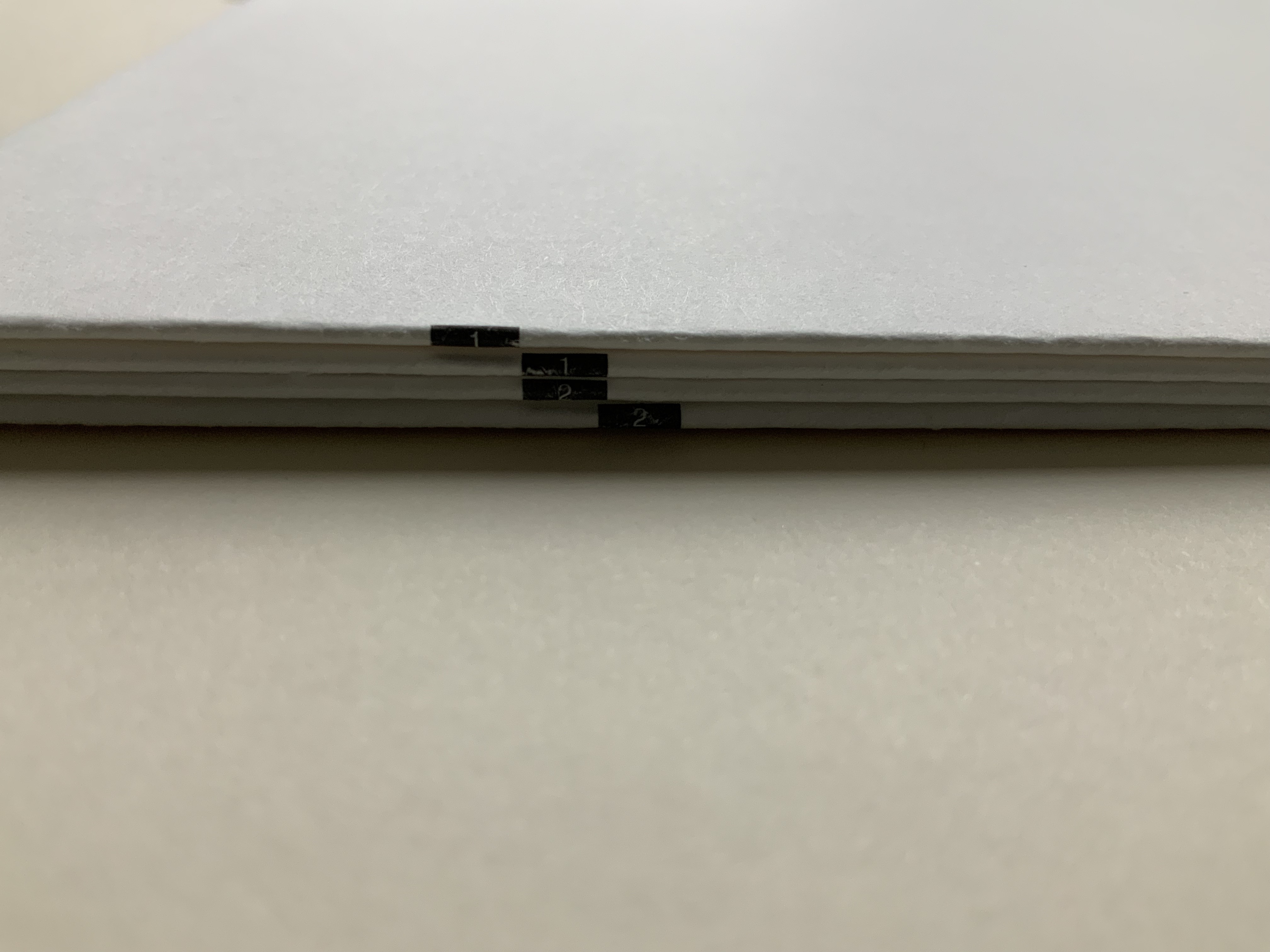
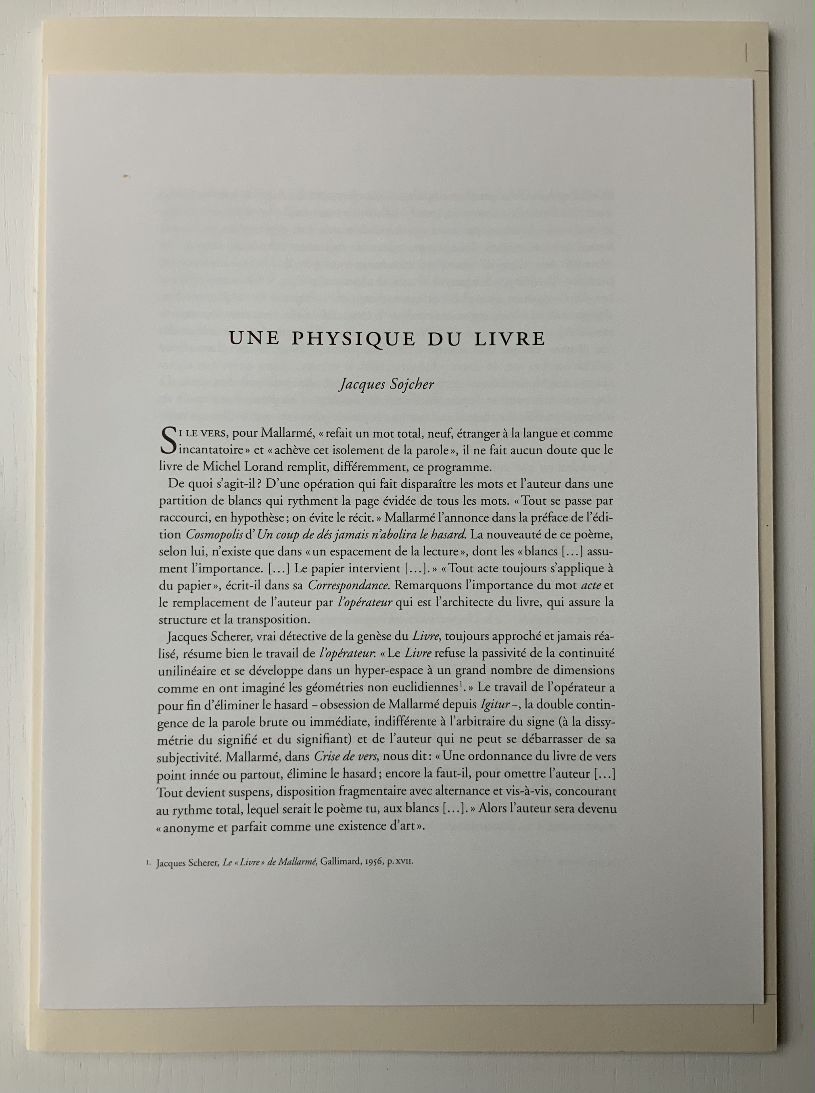
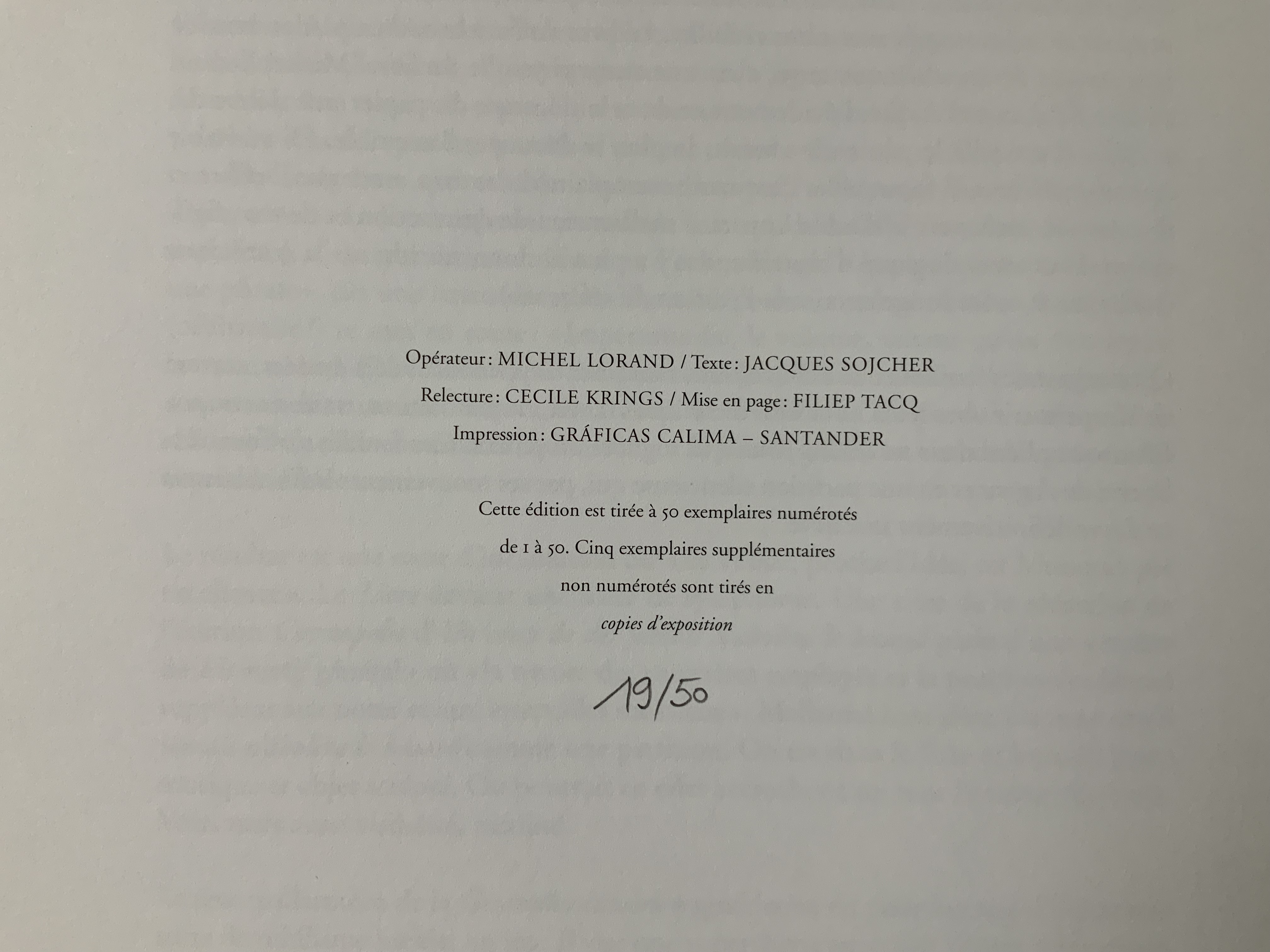
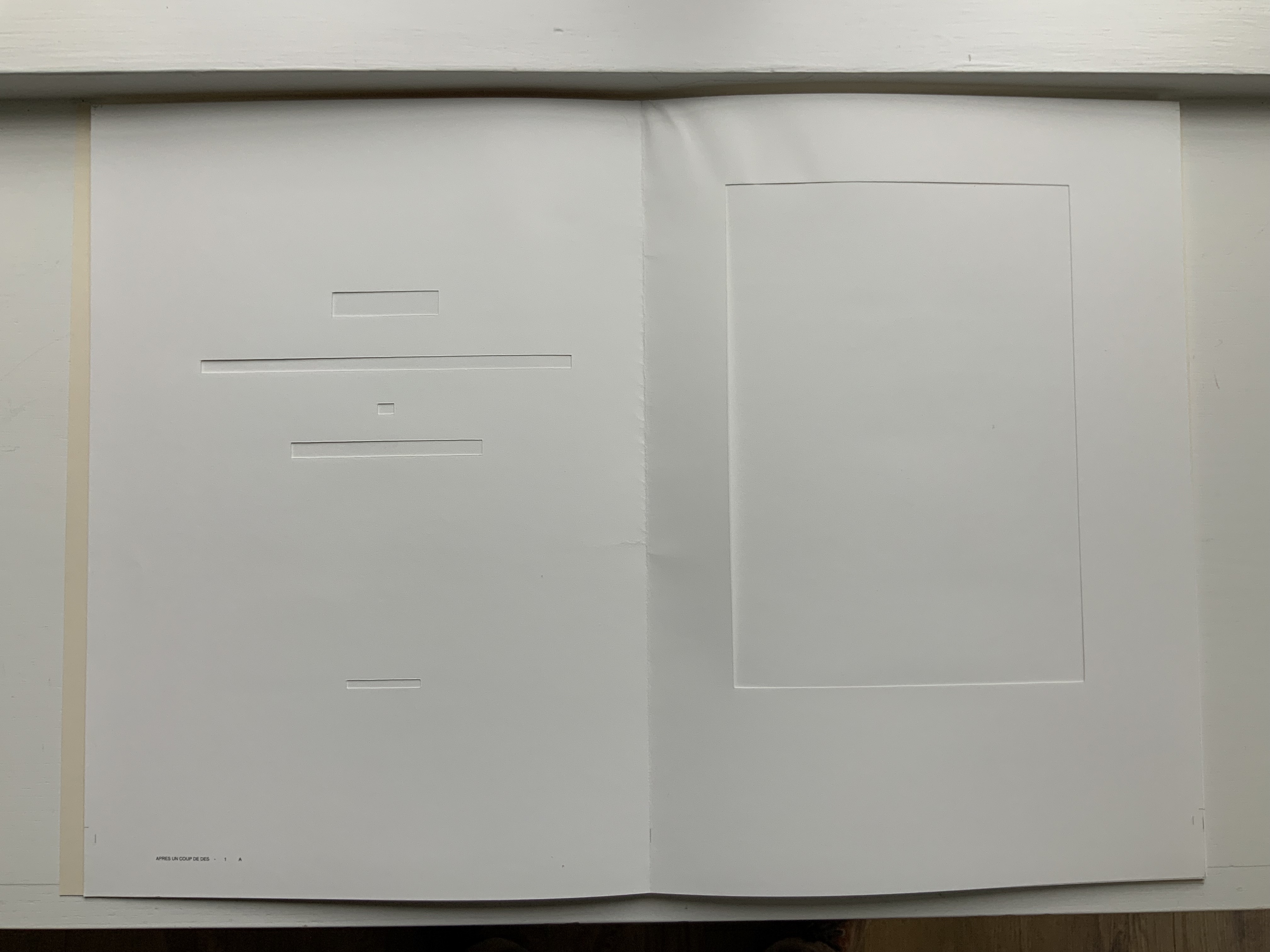
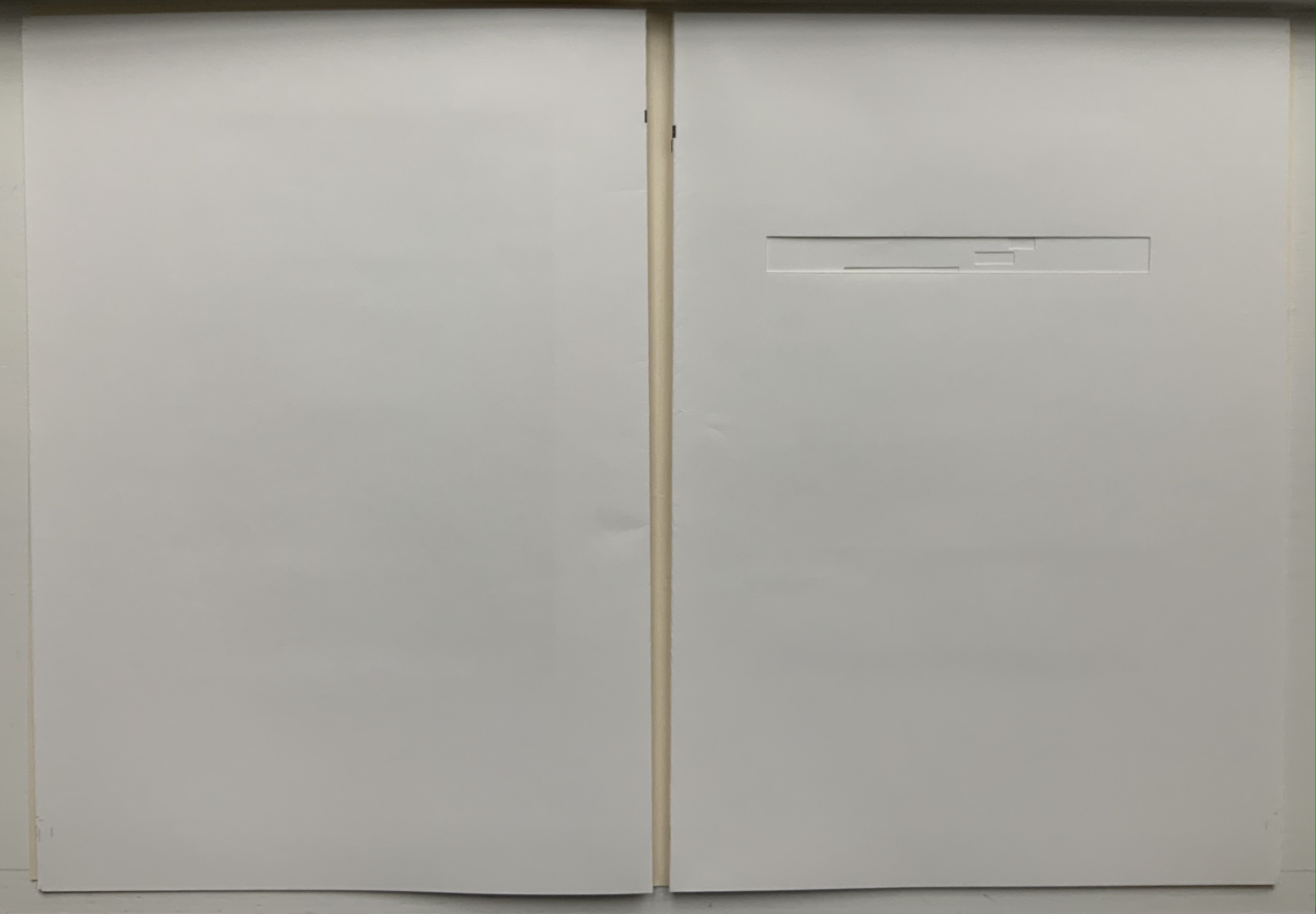
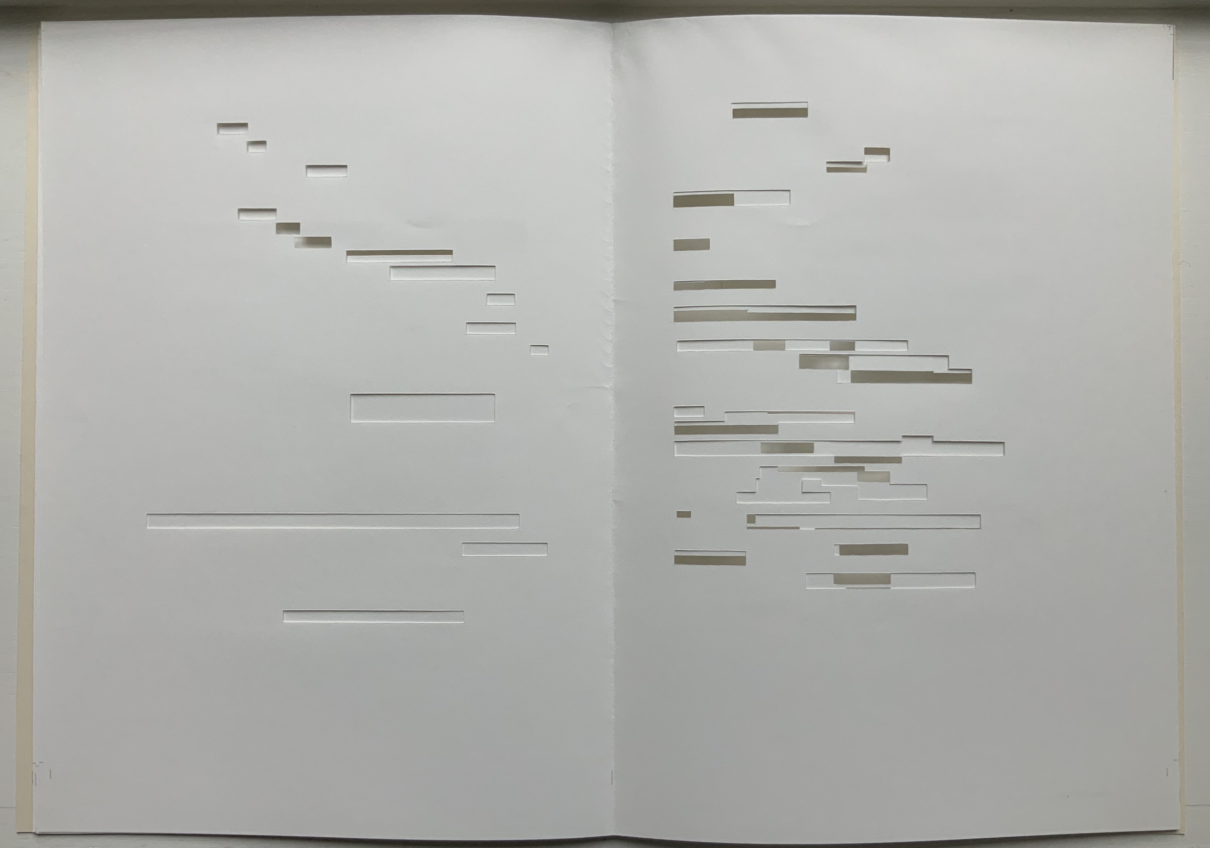
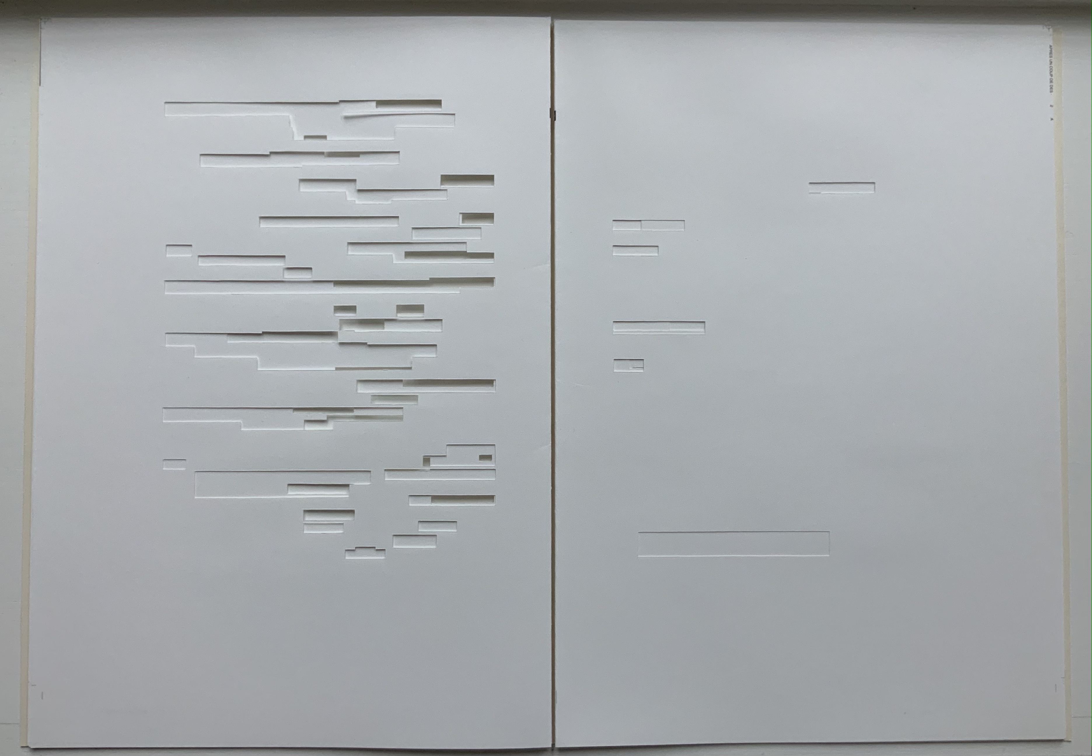
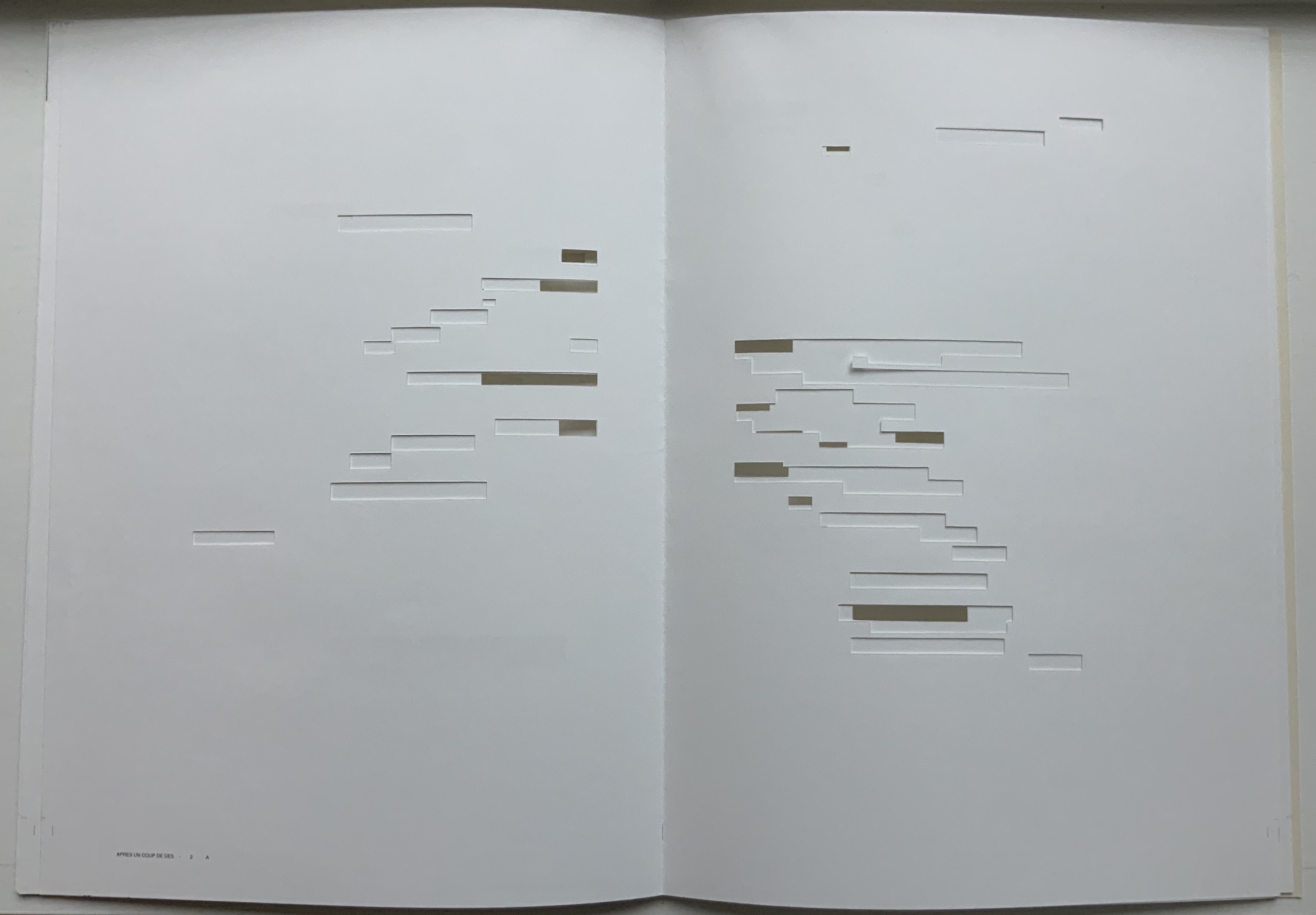
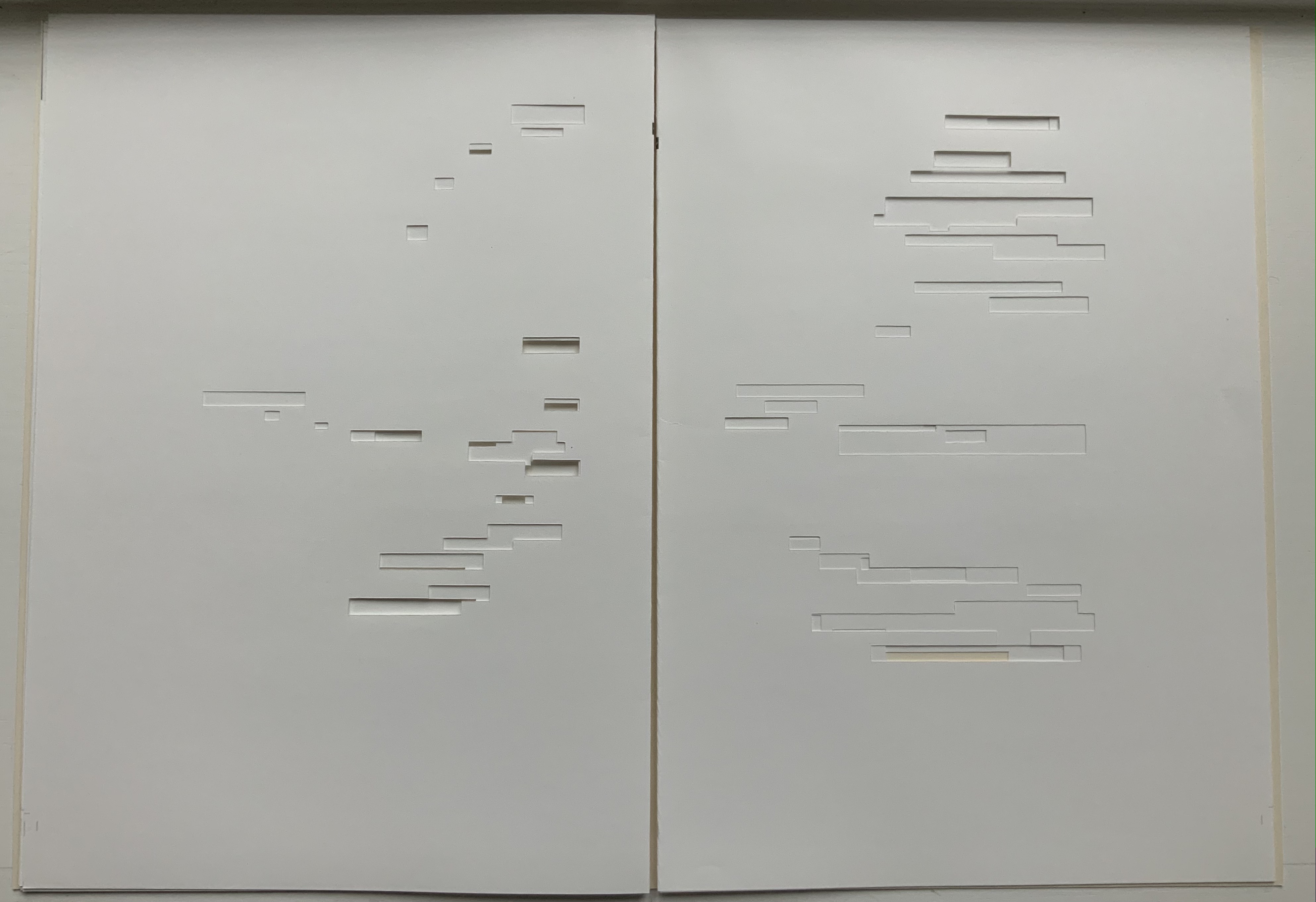
Après Un Coup de Dés (2015) Michel Lorand Cover and gatherings, untrimmed and unbound, in glassine envelope. Cover: H362 x W260; gatherings: H362 x W256 mm; 32 unnumbered pages. Edition of 50, of which this is #19. Acquired from the artist, 22 October 2021. Photos: Books On Books Collection. Displayed with the artist’s permission.
Since the 1960s when Ernest Fraenkel, Mario Diacono and Marcel Broodthaers blotted out the text of Mallarmé’s poem Un Coup de Dés Jamais N’Abolira le Hasard (1897) to create their works of homage, numerous others have expanded on the technique: substituting images of sonograms (Sammy Engramer, 2009) or algorithmically generated abstractions (Eric Zboya, 2018, and Benjamin Lord, 2019), or excising the text (Michalis Pichler, 2008, and Cerith Wyn Evans, 2008) or algorithmically erasing it (Jérémie Bennequin, 2009) — just to name a few.
In Après Un Coup de Dés (2015), the only printed marks are the cover’s traditional black and red borders and the printer’s registration and gathering marks on the sheets. Wherever else Mallarmé’s text would have been printed has been excised. In reply to a question about the process involved, Lorand explains that he had asked the designer Filiep Tacq to create a layout that would cover in black exactly the blocks of text as it appears in the current Gallimard book edition of Mallarmé’s poem, including the front and back covers (correspondence with the artist, 1 November 2021). Lorand took a scalpel to the offset printed sheets, removed the blackened blocks, folded the sheets by hand into the four gatherings, assembled them in the correct order and laid them untrimmed and loose inside the cover. Each of fifty copies was placed inside its own handmade glassine envelope along with a flyer including introductory text by Jacques Sojcher (emeritus professor, University of Brussels) and the colophon for the work. It is a book that is not-yet a book.
Lorand’s and all of these other works of homage give us inverse ekphrasis. They are the visual, tactile and conceptual works of art that come after Mallarmé’s text. We are more used to ekphrasis where the object, painting or sculpture comes before the text — like Achilles’ shield before Homer’s description, or the Grecian urn before Keats’ ode, or Brueghel’s Fall of Icarus before Auden’s Musée des Beaux Arts. Homer, Keats and Auden vie with the art of the crafted object to put that object (and more) in front of us with words. With the inverse, the crafted objects vie without the words to put Mallarmé’s poem (and more — and sometimes less!) in front of us.
Many of the hommageurs hint at the “and more” with a subtitle to Un Coup de Dés Jamais N’Abolira le Hasard. With Broodthaers, it is Image; with Pichler, Sculpture; with Engramer, Onde (Wave as in soundwave); and with Bennequin, Omage (as in hommage with the “h” and “m” missing). With Lorand, there is no subtitle. Instead, we have the word après prefacing the truncated title of the poem. But, “after” Mallarmé’s poem, what is Lorand proposing? An homage in the form of something that restates, reproduces the poem but without the words? An homage in the form of something else presented in the manner of Un Coup de Dés but without the words? Or something else that simply occurs after the poem’s roll of the dice? As it turns out, all that and more.
Paul Valèry was probably the first of Mallarmé’s circle to see and hear Un Coup de Dés. His reaction picks out one of the themes that make up Lorand’s “and more”:
It seemed to me that I was looking at the form and pattern of a thought, placed for the first time in a finite space. Here space itself truly spoke, dreamed, and gave birth to temporal forms. Expectancy, doubt, concentration, all were visible things. With my own eye I could see silences that had assumed bodily shapes. Inappreciable instants became clearly visible: the fraction of a second during which an idea flashes into being and dies away; atoms of time that serve as the germs of infinite consequences lasting through psychological centuries — at last these appeared as beings, each surrounded with a palpable emptiness…. there in the same void with them, like some new form of matter arranged in systems or masses or trailing lines, coexisted the Word! — Paul Valéry, Collected Works of Paul Valery, Volume 8: Leonardo, Poe, Mallarmé (1972).
Lorand writes:
My <<Après un Coup de Dés>> introduces a corpus of approaches to what might be “the movement” that constitutes speech: “A language that speaks” as Martin Heidegger calls it (Unterwegs zur Sprache, Verlag Günther Jeske, Pfullingen, FRG, 1959).
How can we think, how can we imagine this movement within language itself? What path to take to allow us to experience this movement, the one that constitutes the word itself. This word is sound. The object of all my work is the identification of what could be the image of this movement, of this word. This exploration attempts to approach the nature of this movement: a word beyond language when the latter is silent. (Correspondence with the artist, 1 November 2021.)
Like his others, Heidegger’s On the Way to Language is a dense book; more than the others, it is poetical, an invitation to experience language. In it is a series of lectures entitled “The Nature of Language” in which Heidegger uses two poems, one by Stefan George and one by Gottfried Benn, to question language about its nature. Although George’s poem is the one that Heidegger deeply explicates, Benn’s is the one that, echoing Valèry, sheds the most light on Lorand’s Après Un Coup de Dés — especially with its last two lines.
A Word
A word, a phrase –: from cyphers rise Life recognized, a sudden sense, The sun stands still, mute are the skies, And compacts it, stark and dense.
A word — a gleam, a light, a spark, A thrust of flames, a stellar trace — And then again — immense — the dark Round world and I in empty space.
Après Un Coup de Dés seems to be a wordless invitation to experience language. But in a sense, Mallarmé’s words have not disappeared, not entirely. Their shapes — embodied in the voids — move silently and rhythmically across the unfolded sheets; in the gatherings, they cascade over one another much as they do syntactically and typographically in print. And even though the text is not before (in front of) us, Lorand’s artwork delivers a wordless experience of a key paradox of language with which Mallarmé sought to imbue his poem: the language of the void or abyss — the void or abyss of language. One of the ways in which the poem presents this self-enveloping paradox is that it begins and ends with the words un coup de dés, the act that can never abolish chance and the act that all thought emits. Similarly, Après un Coup de Dés displays the presence of language by displaying the absence of language, or les blancs defined by and defining empty space.
Mallarmé’s invitation in Un Coup de Dés, however, beckons us to a slightly different concept of language than that articulated by Heidegger. For Mallarmé, chance plays a prominent role in what Heidegger would call the “neighborhood of poetry and thought”. But chance, hazard or a roll of the dice plays a much less prominent role for Heidegger, and in Lorand’s work of art, with its registration and gathering marks and glassine enclosure, there seems little allusion to it — perhaps naturally so since Lorand’s work comes after the dice have been rolled.
Even though it comes after Mallarmé’s completed poem and after the Gallimard book edition, Après presents as an unfinished work, a book not yet trimmed and bound, which reflects not only Mallarmé’s unfinished realization of the poem as a book but also his unfinished life’s pursuit: le Livre, the thing in which everything in the world would end up — the thing that, by virtue of a spacious mobility of typographic layout and the interplay of its elements, would be “the total expansion of the letter”. Lorand’s attention and manual precision in excising the blackened blocks where the text would otherwise appear evoke Mallarmé’s attention to the minute details of typeface, size and font shown in his handwritten mark-up of the proofs for the book edition he was planning before he died.
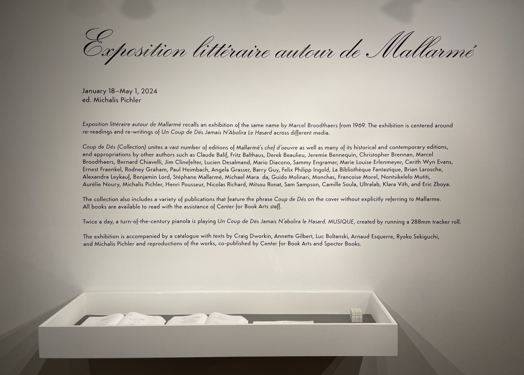
Après also comes after the efforts of Broodthaers and Pichler, both of whom organized exhibitions for their works of homage. In fact, Pichler paid homage to Broodthaers by naming his exhibition “Pichler: Exposition Littéraire autour de Mallarmé” (Milan, December 2016) after “Broodthaers: Exposition littéraire autour de Mallarmé” (Antwerp, December 1969). Pichler’s exhibition was also daring in its exposure of the works to the visitors.
In the 2018 display of Après Un Coup de Dés, the previously gathered but now unfolded sheets and cover lie side by side under glass. Often this is cause for complaint about the distanced display of artist books. In the case of Après Un Coup de Dés, the distance effectively draws point-blank attention to what the privileged reader gradually discovers in handling the work. The unprivileged reader may have to imagine the making, unmaking and remaking of the book but, confronted with the gestalt of the undone gatherings and their registration marks, that reader immediately sees/witnesses the void defined by a void.
Après Un Coup de Dés in the group exhibition Reading Hand Writing Bodies at Les Abattoirs de Bomel, Centre d’art de Namur, Belgium, 8 February – 11 March 2018. Photo: Courtesy of the artist.
In relation to Broodthaer’s Image and Pichler’s Sculpture, Après comes both before and after. The positioning of the words après, image and sculpture vis à vis the poem’s title has been noted already. Of all three visual, tactile and conceptual works, Lorand’s stands as the chronologically “after” yet unfinished “before” to Broodthaers’ and Pichler’s finished works. In yet another “afterness” to Mallarmé’s poem, Lorand likens Après to a silent score of music or a piano roll (correspondence with the artist, 1 November 2021). This echoes — if that is not too perverse a verb — Mallarmé’s reference to “score” in his preface to Un Coup de Dés. In premonitory, if not coincidental, irony, Lorand’s piano-roll-like 2015 work precedes a work that Michalis Pichler created for his 2016 Milan exhibition: a piano roll playable on a foot-pumped pianola and entitled Un Coup de Dés Jamais N’Abolira le Hasard: Musique (see video above).
The interplay of its philosophical roots with its mechanically produced print and its manual cuts makes Lorand’s AprèsUn Coup de Dés one of the more challenging works of homage to Mallarmé’s poem. To “hear” it side by side with the others in the Books On Books Collection (see below) is rewarding.
Further Reading
“Derek Beaulieu“. Books On Books Collection. 19 June 2020.
“Eric Zboya“. Books On Books Collection. 01 June 2020.
Heidegger, Martin, and Peter D. Hertz, trans. 1959/2009. On the Way to Language. San Francisco: HarperOne. Reprint. “No matter how we put our questions to language about its nature, first of all it is needful that language vouchsafe itself to us. If it does, the nature of language becomes the grant of its essential being, that is, the being of language becomes the language of being” (p. 72).
With the exception of Unpacking my Library and Between the Sheets, Spector’s works in the Books On Books Collection fall into the category of ephemera. More than most book artists’ ephemera such as invitations, broadsides and the like, however, Buzz Spector’s ephemera have that self-reflexiveness so characteristic of book art.
Artist, curator and historian Jeffrey Abt wrote that the “irresistible” idea of placing an exhibition of artists’ books alongside the University of Chicago Library’s collection “broadly representative of the history of the book” started with a visit to famed art dealer Tony Zwicker‘s studio. It was also, however, almost as if he were taking a cue from this statement by artist-printers Betsy Davids and Jim Petrillo just the year before:
A representative collection of artists’ books often does not seem visually remarkable in a gallery, where a wide range of visual experience is the norm. The same collection, installed in a library or bookstore, can seem visually startling almost beyond the limits of decorum. — “The Artist as Book Printer: Four Short Courses”).
While Abt’s introductory essay rings the historical changes on the roots of book art — once there was Mallarmé’s Un Coup de Dés Jamais N’Abolira Le Hasard, but before Mallarmé, there was William Blake — the works included and the catalogue’s design ring some chimes of their own about book art. One way or another, all book art self-consciously draws attention to some particularly bookish element. For the most part, the 49 works listed in this catalogue ring true. The catalogue’s design itself, however, not only chimes to that notion of self-reflexiveness but also to wider notions about the nature of book art within contemporary art.
Not long after this exhibition, Spector wrote of “the language of the book” and all its parts — pages, signatures, cover, letter forms and their placement on the page, etc. — as having a syntax (“Going Over the Books”). With its pencil-circled numbers, alignment guides, pastedowns and other designer’s marks appearing throughout — as if a printer’s devil had run amok and let the marked-up proofs go to press unchanged — the catalogue draws attention to that syntax, the underlying processes of bookmaking and, therefore, this object’s “bookness”. The colophon’s note initialed by Jeffrey Abt to Buzz Spector and “pasted” on the last page jokingly rings the self-reflexive chime of the markings throughout the catalogue.
The second chime comes in the catalogue’s verbal and visual punning. Like book art, punning is self-reflexive, words playing on words. The title ”the book made art” can be read with different meanings: “the book made into art”, “art that is bookish” and so on. The catalogue’s trim and two-dimensional representation of three-dimensions create the visual pun of a glass or white cube. The verbal and visual puns also play with Abt’s “irresistible” context. Here in the Joseph Regenstein Library was an exhibition catalogue, teasing the viewer with a reminder that vitrines separated them from the bookworks. Reviewing two other exhibitions of book art, Spector elaborated explicitly on his visual tongue-in-cheek irony:
The dilemma in staging exhibitions of books as art objects is the denial of access to the work that conservation necessarily demands. … and it is a morethan passing irony that implications of hermeticism and elitism should surround books shown to a public using the library as a means of gaining access to texts. — “Art Readings”.
The catalogue also teases with its title and design by suggesting that once books have been placed on display like this, the setting is no longer a library but a “white cube gallery“. As the catalogue progresses, black-and-white photos of items from the exhibition appear on the verso page in frames that appear to be hanging on the trompe l’oeil cube’s rear wall.
Poster distributed on the University of Chicago campus. The image combines Michael Kostiuk’s Airplane Shadow Book (1981/82) with a variation of the catalogue cover. Photo: Courtesy of the artist.
But a viewer standing in the “brutalist” construct of the Regenstein Library and holding the finished catalogue might have asked, “What makes these objects I cannot touch — or, in some cases even if I could, cannot read — art?” There is the catalogue’s third chime. From the start, book art has faced a constant definitional or identity crisis and even the challenge “but is it art?” The catalogue’s title echoes Lucy Lippard’s Duchampian proposition: “It’s an artist book if an artist made it, or if an artist says it is”. The catalogue’s design says, “This is the gallery, these are the objects on display in it, they are art”.
The “white cube gallery” brings on a fourth and final ironic chime. In the 1970s and early ‘80s, artists’ books were pitched as a “democratic” medium and means by which art could escape the clutches of the gallery and reach a wider public. In another catalogue — the one for the 1973 Moore College exhibition, nominated as the first of book art — John Perreault writes:
Books as art, from the artist’s point of view and the viewer’s point of view, are practical and democratic. They do not cost as much as prints. They are portable, personal, and, if need be, disposable. Because books are easily mailed, books as art are aiding in the decentralisation of the art system. — “Some Thoughts on Books as Art”.
By the mid-80s, lo and behold, The Book Made Art’s catalogue-cum-gallery jokingly recaptures “books as art”. And in a further irony, by the mid-80s and since, the increased rareness and price of such bookworks have made them into galleries‘ and museums’ expensive objects of desire. Including this catalogue.
The Library of Babel (1991)
The Library of Babel Curated and edited by Todd Alden; catalogue designed by Buzz Spector. Dos-à-dos binding, offset. H241 x 177 mm Buffalo, NY: Hallwalls Contemporary Art Center, Hallwalls Inc., 1991. Photo of the work: Books On Books Collection.
As with The Book Made Art, Spector uses the cover (this time with a photograph of The Library of Babel) to introduce the self-reflexivity so characteristic of book art, but he does not stop there. Pagination and the back-to-back binding structure work together to evoke a mirror’s reflection; the last page of the first half “faces” the last page of the second half.
Photo of the work: Books On Books Collection.
The first half contains Todd Alden’s essay “The Library of Babel: Books to Infinity”, Paul Holdengräber’s “Unpacking Benjamin’s Library: Bibliomania in Dark Times”, and a checklist of the 34 works by their 10 artists.
Photo of the work: Books On Books Collection.
The second half contains half-tones of selected works and brief CVs of the artists. Among the half-tones are also photographs of works referenced by Alden (one by Jasper Johns, two by Marcel Broodthaers). Notice how the rules change position in the footers of the two halves, again evoking the back-to-front theme of the dos-à-dos binding.
Photo of the work: Books On Books Collection.
As in The Book Made Art, Spector had an entry in “The Library of Babel“ exhibition. With its torn pages, North Sea (for M.B.) (1990) echoes Altered LeWitt (1985), further below, but it is instead a work 10 feet long and presented on a table appropriately jutting out from the wall like a pier. “M.B.” is Marcel Broodthaers, to whose works there are multiple and layered references. The eleven “waves” of torn pages placed in a row on top of the steel shelf come from eleven copies of the Walker Art Center’s 1987 catalogue to Broodthaers’s first U.S. retrospective. Spector had all the pages in each copy painted with white gesso before tearing out the pages.
Marcel Broodthaers (1990) Buzz Spector An altered copy of: Marcel Broodthaers (Minneapolis/New York: Walker Art Center/Rizzoli, 1989). Photos: Courtesy of Buzz Spector.
He saved the excised “wedges” and bound them at the fore edges. Because the gesso does not completely obscure the text and images from the catalogues, viewers who come close to the work can see slivers of some of Broodthaers’ works along with the word fragments typical of Spector’s altered books.
North Sea (for M.B.) (1990) Buzz Spector Books, steel, gesso, 25 x 96 x 10 inches Collection Orange County Museum of Art,CA; Museum purchase with additional funds provided by Peter and Eileen Norton and the National Endowment for the Arts, a federal agency. Photo: Courtesy Orange County Museum of Art.
Spector’s library contains a copy of Broodthaers’ 1974 artist book, A Voyage on the North Sea. These layered references and self-references — direct references to Broodthaers’ A Voyage, indirect references through the self-reference to Spector’s Marcel Broodthaers (1990) — bring into sparkling focus two features of book art and, in particular, late 20th century book art: reverse ekphrasis and bookworks in conversation with one another.
When a visual work of art inspires poetry or prose, the literary result is called ekphrastic: “the verbal representation of visual representation”. But where the poets Keats, Auden and Jarrell, for example, use words to “recreate”, re-present, evoke or respond to works of art — an antique urn, a painting by Brueghel and Donatello’s sculpture of “David” — book artists have in turn used the letter, words, actual books, the physical materials of the book or even the shape of books, their functions or processes of making them to create works of art. A kind of ekphrasis in reverse.
Not only does Spector perform this reverse ekphrasis with exhibition catalogues in North Sea (M.B.), he does it in conversation with a multimedia work by Broodthaers. Works in conversation with one another is also a common occurrence in poetry. An entire anthology showcases these poems that talk to other poems. The later work not only evokes the earlier work, it illuminates and adds to it. In book art, other instances include Bruce Nauman’s Burning Small Fires (1968), a one-sheet folded book of photos of Ed Ruscha’s Various Small Fires and Milk (1964) being set on fire and burning to ash, and Dennis Oppenheim’s Flower Arrangement for Bruce Nauman (1970), a leporello which refers to Nauman’s Flour Arrangements (1967), a video in which the artist pours over 50 pounds of flour on a mock talk-show studio floor and then sculpts it into ephemeral shapes. Nauman’s shift to an ingenious folded single-sheet structure and Oppenheim’s shift (and pun) to an accordion view of flowers are part of the addition to their conversations with their very structurally different counterparts. Spector’s shift to the sculptural is part of the addition to his conversation with Broodthaers’ book and video. Consider not only Spector’s gessoed sea of pages and the pier, but also those two 19th century black bronze sailing ship bookends evoking the 19th century nautical painting that Broodthaers appropriated in A Voyage on the North Sea.
North Sea (for M.B.) (1990) Buzz Spector Books, steel, gesso, 25 x 96 x 10 inches Collection Orange County Museum of Art,CA; Museum purchase with additional funds provided by Peter and Eileen Norton and the National Endowment for the Arts, a federal agency. Photo: Courtesy Orange County Museum of Art.
Unpacking my Library (1994-95) Buzz Spector Leporello full-colour offset printed; folded H100 x W155 mm, unfolded W3600 mm; Cleveland Center for Contemporary Art. Installation exhibited at the San Diego State University Art Gallery, 1-31 October 1994. Photo of the work: Books On Books Collection.
Clearly from his entry in The Library of Babel, Spector’s artistic output extends beyond altered books and catalogue design to larger scale installations. One of the more well-known, Unpacking my Library imposes multiple orders on what Walter Benjamin called “the chaos of memories”. How “multiple orders”? First, because of its subtleties; second, because of its several forms.
From the start at the San Diego State University Art Gallery, 1-31 October 1994, the installation imposed the order of “descending height” on Spector’s library, unpacked and displayed across one shelf attached along the white walls of a room in the gallery. The single shelf ran 188 feet.
Although Spector is rejecting the library’s traditional method of making sense of a collection of books — ordering by academic category — in favor of a physical criterion, the title imposes another method of making sense — allusion. The installation makes “more” sense if you have read Walter Benjamin’s essay “Unpacking My Library — A Talk on Collecting” (1931). If you haven’t, then, on the reverse of the leporello produced with the Cleveland Center for Contemporary Art, are these two sentences from the essay:
This or any other procedure is merely a dam against the spring tide of memories which surges toward any collector as he contemplates his possessions. Every passion borders on the chaotic, but the collector’s passion borders on the chaos of memories.
So what has ordering by height to do with the chaos of memories? Well, if the order of the personal library had been chronological by acquisition, that would be an assertion against chaos, a kind of aide- mèmoire. If the order had been by the library’s traditional method, again that would be an assertion against chaos. Benjamin and Spector embrace the chaos. Spector’s at-first amusing and puzzling organization of his library prods the viewer into the chance to do somewhat the same — to wander along the shelf with that phrase of process hovering in the mind and be reminded of books once read (when? where?), familiar and almost-familiar names and places (from when or where?) and subjects studied (what did that cover?). But the viewer also experiences a surge of unknown names, places and subjects, and spines that mystify.
The allusion to Benjamin’s essay offers another way of making sense of this experience into which the viewer is prodded. If a personal library is a kind of self portrait you can detect from the clues that its usual groupings into fiction, biographies, history, science, etc., give us about the owner, then here the order by height washes them and the portrait away. And if the viewer knows the essay, Benjamin’s last sentence may come to mind:
So I have erected one of [the real collector’s] dwellings, with books as the building stones, before you, and now he going to disappear inside, as is fitting. — Walter Benjamin, “Unpacking My Library”
Spector mentions this disappearance in a video record of the making and showing of the installation. Whether or not the installation’s spectator knows Benjamin’s essay, the installation’s title is a clue to the imposition of a fictional order. “Unpacking my library” is a phrase implying an activity that is just getting going. For his essay, Benjamin created the fiction of the reader’s being present as the library is being unpacked. Likewise for Spector’s installation, any spectator walking into it has entered a fiction. Spector’s library has already been unpacked, sorted on the floor and placed on the single shelf running around the room.
Of course, however, the owner of the leporello form of Unpacking my Library does not experience this fiction as directly. The opening and arranging of the leporello is a hands-on activity; the unpacking of Spector’s library occurs panel by panel in the reader’s hands. The library’s arrangement by height appears more gradually than in the gallery. Once the bookwork is fully extended, the installation’s fiction then becomes more readily available to the leporello’ s reader/viewer.
Photo of the work: Books On Books Collection.
As fictions, Benjamin’s essay and Spector’s installation need an ending. Benjamin’s technique is to disappear into his collection. Spector chooses a different technique. In correspondence with Books On Books, he writes:
The length of all the publications in my library was 165 feet; the single shelf, at the UCSD Art Gallery, on which they were placed ran 188 feet. That additional space implied a future, and life-affirming, growth of my collection. — Buzz Spector, 26 March 2020.
Photo of the work: Books On Books Collection.
Whether it is leporello or installation, the reader/viewer of Unpacking my Library is launching and launched on this open-ended ending.
The Book Maker’s Desire (1995)
The Book Maker’s Desire: Writings on the Art of the Book Buzz Spector Pasadena, CA: Umbrella Editions, 1995. 2nd printing. Cover design by Buzz Spector. Image: History of Europe (1983) by Buzz Spector; plaster over found book, 10.5 x 12 x 15 inches. Photo of the work: Books On Books Collection.
Spector’s essays are tonic. His comments on Margaret Wharton’s bookworks could refresh any reader and viewer lucky enough to see her works (Union League Club-Chicago or Yale) or remind the viewer of them when looking at works by later artists such as Thomas Wightman or the “Mystery Book Artist of Edinburgh”. In the past few months, Walter Hamady and John Baldessari have died, and Spector’s essays on them bring them both and particular works of theirs to present life. His essay and letter on Broodthaers would enhance any reading of the artists who have stood on Broodthaers’ shoulders to address Mallarmé’s Un Coup de Dés: Bennequin, Mutel, Pichler, Wyn Evans, Zboya. The essay “Going Over the Books” may have inspired Alden’s curation of ‘The Library of Babel” exhibition.
The essays are not entirely the point of having The Book Maker’s Desire in the Books On Books Collection. What completes the point is the cover design. The object on the book’s front cover is Spector’s own work History of Europe (1983), which pays homage to Broodthaers’ Pense-Bête (1964). But look closer. The cover stock has elements of text and colour seeping through, almost as if it were made of shredded books. The aptness and artistry of the cover design make The Book Maker’s Desire an object of desire in and of itself.
Detail of cover: Books On Books Collection.
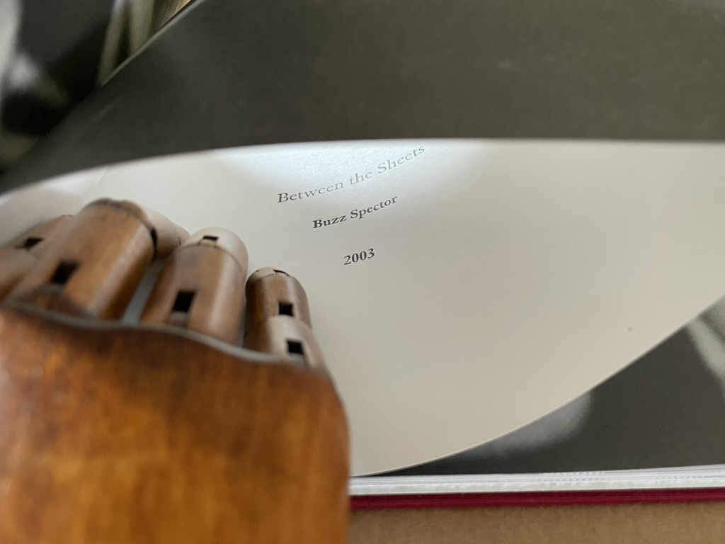
Along with Unpacking my Library, Between the Sheets (2003) is the only other of Spector’s limited edition artist’s books in the Books On Books Collection. It is the solo exhibition to the joint exhibition of The Book Made Art (1986), described at the outset of this entry. In Between the Sheets, Spector again shows the self-reflexiveness of book art but also demonstrates how originality can spring from it.
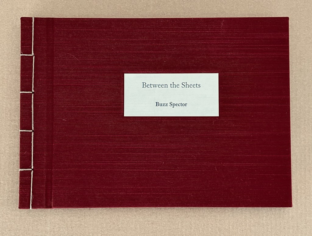
Between the Sheets (2003)
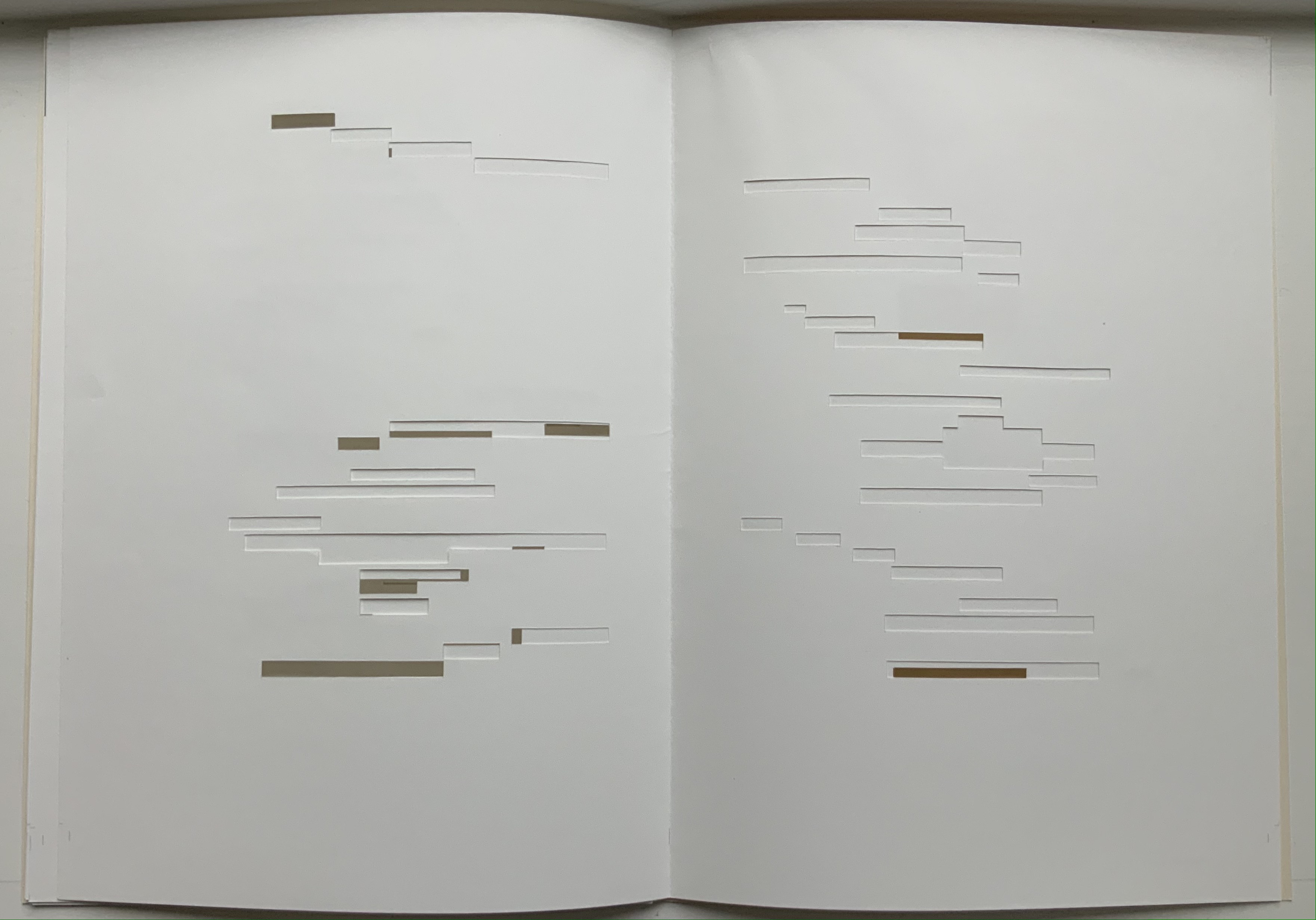
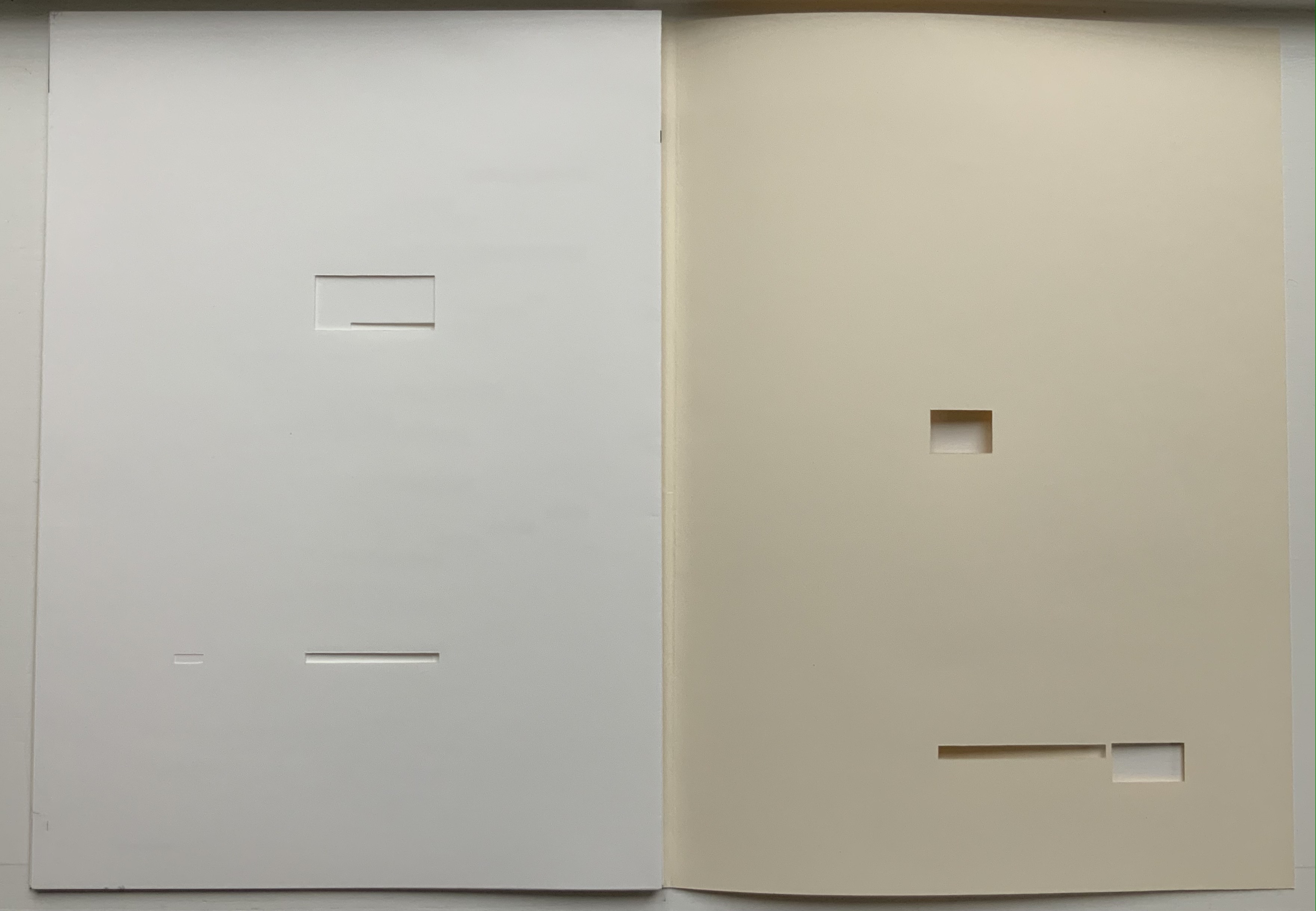
Between the Sheets (2003) Buzz Spector Cloth over boards, Japanese stab binding, 15 folded sheets, outer sides offset printed with enlarged “authors’ photos” clipped from dust jackets of art books repurposed by Spector for his bookworks, inner side printed (recto only) with text by and selected by Spector. H157.5 x W216 x D12.7 mm. Edition of 40, of which this is #40. Acquired from Olive Branch Press, 26 June 2020. Photos of the work: Books On Books Collection.
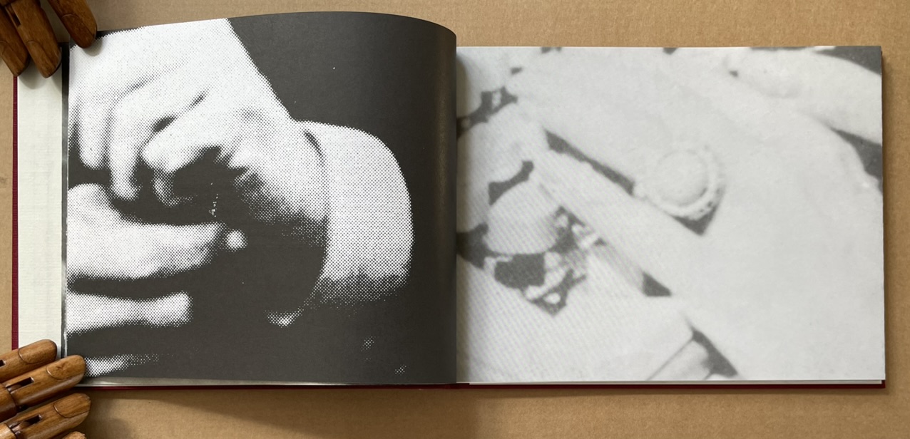
Unlike Altered Lewitt (1985) and North Sea (for M.B.) (1990), which appropriate and alter named works, Between the Sheets is made at two or three removes from its source material. In the first instance, Spector clipped authors’ photos from the dust jackets of their books (unnamed), then rephotographed and printed them at enlarged scale in offset editions. These prints were then bound together to make books. As with Altered Lewitt and other works, Spector then tore strips in a sequence of decreasing increments from the spreads so as to form a wedge-shaped cross section of the image block. In the next remove, this process left a pile of torn strips, and from these torn strips, Spector has proceeded to create Between the Sheets. With images on one side and text imposed on the reverse, these folios are folded and bound at their open ends with Japanese stab binding.
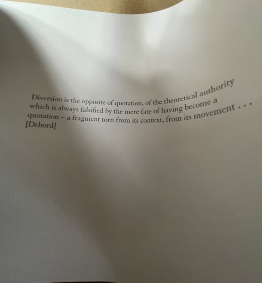
The work’s main thrust is philosophically, artistically and self-reflexively aesthetic. It quotes from the French philosopher Guy Debord, the Belgian artist Marcel Broodthaers and Spector himself. The quotation from Debord comes early on, the first after the title page and two of prefatory explanation, and very much sets the tone.
Diversion is the opposite of quotation, of the theoretical authority which is always falsified by the mere fate of having become a quotation — a fragment torn from its context, from its movement … [Debord]
With Between the Sheets, we have on our hands a decidedly multi-layered diversion. At one layer, it diverts by questioning Debord’s own words, consigning their “theoretical authority” to a fate of falsification by “having become a quotation — a fragment torn from its context”. Like a fun-house mirror, the page bows to give this distorted reflection of Debord’s words.
But is it a diversion? After all, the “truth” of Between the Sheets rests at least in part in its composition from fragments. At this other layer, Between the Sheets “quotes” the fragments torn from the context of another of Spector’s artwork. In turn, that other artwork was composed of prints of photographic “quotations”, the fragments torn from authors’ images on dust jackets (the coverlets for the source books and their sheets). It is no accident that, when the sheets of Between the Sheets are bowed to permit a look inside, the images bracket the text pages like single quotation marks.
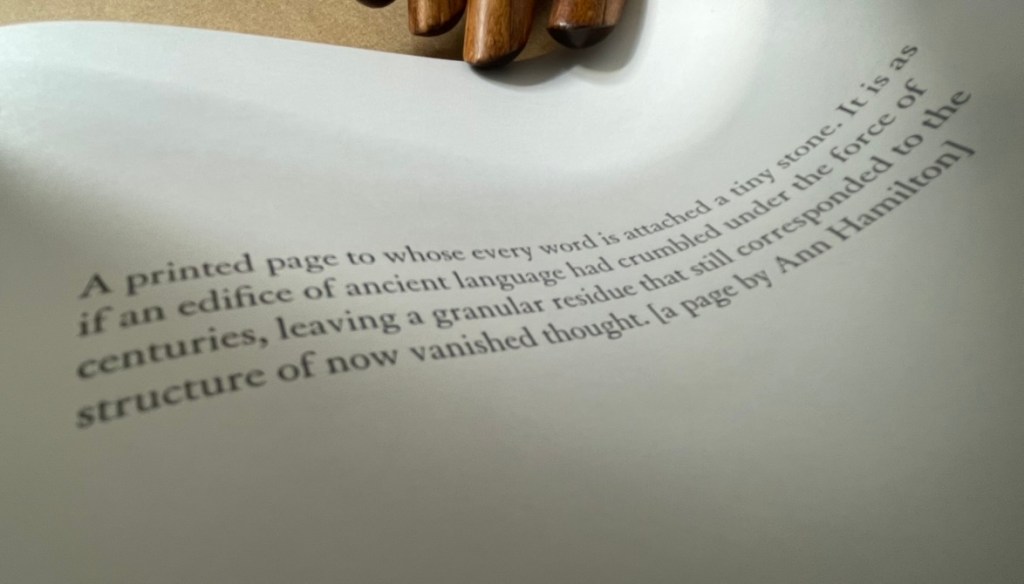
Another quotation resting between the sheets comes from Spector’s own essay on Ann Hamilton in The Book Maker’s Desire (p.63):
A printed page to whose every word is attached a tiny stone. It is as if an edifice of ancient language had crumbled under the force of centuries, leaving a granular residue that still corresponded to the structure of now vanished thought. [a page by Ann Hamilton]
Spector runs the risk of “Debord-ing” himself here with his self-quotation, but he only succeeds in diverting this reader back to the essay on Hamilton’s work and specifically the four works commissioned to benefit The New Museum of Contemporary Art in New York:
The artist chose a total of fifty four volumes (40 in the edition, plus 14 artist’ proofs) for the untitled project. These found books, mostly old novels or poetry, were selected for a variety of physical characteristics –size, wear, and paper quality — and for their typographic layout. Each book was opened to its middle, where six or eight pages were cut from the text block and reattached, edge-to-edge, to the right-hand side of the opened page spread, making an accordian-fold [sic] extension from the book. The eight pages thus displayed were meticulously rendered unreadable by Hamilton and several attendants who glued tiny stones over every word on the visible side. (p. 63)
Is it a coincidence that Between the Sheets also consists of 40 in the edition just like Hamilton’s commission? Spector quotes not only images and words from others’ works and his own, he quotes the details of their production and form. It is certainly no coincidence that Between the Sheets quotes the stab bound structure of Marcel Broodthaers’ A Voyage on the North Sea. After all, in his hidden prefatory explanation, Spector makes no bones about the fact that Between the Sheets arose in part from his astonishment at finding the page numbers hidden within the bound edge of A Voyage. But how did he find them? In the process of creating his own North Sea (for M.B.) (1990). So yet another self-quotation of production process.
Spector’s forthright quotations are divertingly sly. When he cites Broodthaers between these sheets,
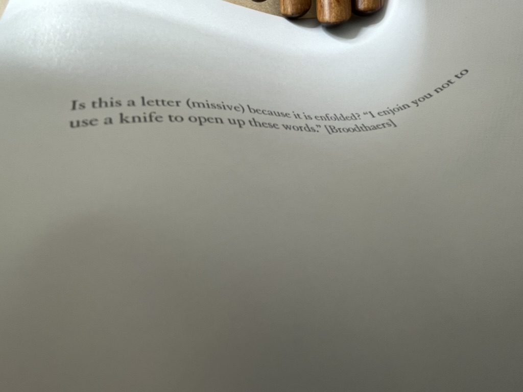
he is also echoing Broodthaers’ injunctions in A Voyage on the North Sea:
Before cutting the pages the reader had better beware of the knife he will be wielding for the purpose. Sooner than make such a gesture, I would prefer him to hold back that weapon, dagger, piece of office equipment which, swift as lightning, might turn into an indefinite sky. … These pages must not be cut.
Of course, Spector did not cut the pages; he tore them.
Another sly diversion is sex. By using photos of male and female authors and by interposing suggestive phrases inside the folds (“a movement of bodies together as one body” and “peek between the sheets”), Spector spices up the obvious diversion of sex in his work’s title. But the slyness re-diverts via Broodthaers to Mallarmé, whose poem Un Coup de Dés Jamais N’Abolira le Hasard (1897) Broodthaers “knifed up” at the very level of the words and whose contemplations of the letter, the page and the fold have taken on an erotic tone that Spector embraces in A Book Maker’s Desire:
When Stéphane Mallarmé described the folded and uncut signatures of books as “virginal,” awaiting the penetration of the “paper knife,” he identified an erotics of reading. (p.15)
The topography of an open book is explicit in its erotic associations: sumptuous twin paper curves that meet in a recessed seam. Page turning is a series of gentle, sweeping gestures, like the brush of fingers on a naked back. Indeed, the behavior of readers has more in common with the play of intimacy than with the public decorum of art viewing or music listening. Most of us read lying down or seated and most of us read at least partially unclothed. We dress up to go out and look at art; undressed, in bed, we read. We seek greater comfort while reading than the furnishings of museums or concert halls will ever grant us. When we read — the conventional distance between eye and page is around fourteen inches — we often become the lectern that receives the book: chest, arms, lap, or thighs. This proximity is the territory of embrace, of possession; not to be entered without permission. (p.17)
There is much more between the sheets of Between the Sheets. I wish that the 40 copies could find many more readers/lovers to embrace its diversions.
Buzz Spector: Alterations (2020)
Buzz Spector: Alterations (2020) Buzz Spector Gretchen L. Wagner; Elizabeth Wyckoff; Andrea Ferber Brochure. H254 x W256 mm, 4 unnumbered pages. Acquired from the artist, 23 June 2020. Photos of the work: Books On Books Collection.
Three items of ephemera conclude this entry. The first is a pristine copy of the announcement for Spector’s retrospective at the Saint Louis Art Museum, held 20 November 2020 through 31 May 31 2021, along with a copy of it with the front cover hand torn by the artist. The second is the catalogue from his show in 2021 Between the Lines. With both, Spector makes an ephemeral piece echo the works in the exhibition. The third item is a hand torn postcard reproducing his drawing Torn Flag (2022).
Between the Lines (2021)
Between the Lines (2021) Buzz Spector Elizabeth Wyckoff, Gretchen L. Wagner, Meredith Malone, Michael Garzel, Jane E. Neidhardt Perfect bound paperback. H268 x W 230 mm, 81 pages. Acquired from the artist, 10 March 2021. Photo of the work: Books On Books Collection.
The Zolla/Lieberman Gallery, which has supported Spector’s work since 1995, sponsored this monograph following 2020/21 retrospective held at the Saint Louis Art Museum. As a slightly less ephemeral item, it neatly rounds off this entry. Its cover image shows one of Spector’s well-known alterations: Altered LeWitt (1985), one of five of the found and hand-torn catalogue: Sol LeWitt, Drawing Series I, II, III, IIII A & B (Turin, Italy, at the Galleria Sperone, 1974). Compare it with North Sea (for M.B), above, which Spector created five years after Altered LeWitt. Spector extends the technique and concept across the two works in distinctive ways to echo two distinctive artists and yet also speak to commonalities and originality among the three artists.
Photo of Between the Lines (pp. 12-13): Books On Books Collection.
Between the Lines‘ presentation of the works is spectacular. Recalling the effect in The Book Made Art (above), they seem to float three dimensionally on the page. The detail photo of Unpacking my Library across a double-page spread offers a good example, especially when compared with the images above.
Photo of Between the Lines (pp.16-17): Books On Books Collection.
Between the Lines also provides the opportunity to end this entry with an image of the work incorporating an image of the author and his generosity toward his fellow bookworkers. Note in particular the reference to Michael Garzel, the monograph’s designer and creator of the typeface used so strikingly on the cover, for chapter titles and here in the heading “Acknowledgments”.
Photo of Between the Lines (pp. 4-5): Books On Books Collection.
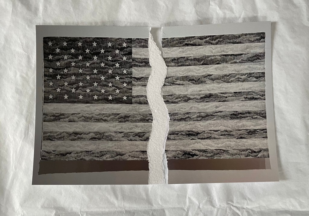
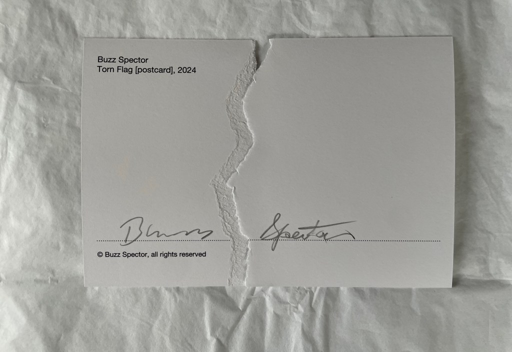
Torn Flag (2024)
Torn Flag(2024) Buzz Spector Postcard. Acquired from the artist, 26 February 2024. Photos: Books On Books Collection.
Revisiting Spector’s works this time was prompted by an invitation from the Center for Book Arts to “BookTalk: Full Dress or Half Dress, Not Casual with Buzz Spector” on 8 October 2024. The postcard reproduces the drawing Torn Flag (2022), a 565 × 1118 mm drawing (graphite on paper) that appeared in the Zolla/Lieberman Gallery. Spector describes the postcard as an “(informal) edition … Elegy to the Divided States”. Ephemeral though the postcard may be, its tearing makes a self-reflexive artistic gesture. But it also serves as an injunction: Vote. Always.
Revised entry: 7 October 2024; 24 September 2021; original entry, 31 March 2020.
Further Reading
“Buzz Spector“, Bookmarking Book Art, 12 March 2016.
Davids, Betsy, and Jim Petrillo. “The Artist as Book Printer: Four Short Courses” in Artists’ Books: A Critical Anthology and Sourcebook, edited by Joan Lyons (Rochester, NY: Visual Studies Workshop Press, 1985), p. 160.
Drucker, Johanna. 2004. The Century of Artists’ Books [Second edition] ed. New York City: Granary Books. See pages 118-19 for perceptive comments on Spector’s A Passage (1994) and his method of torn pages.
Lippard, Lucy. “New Artist’s Books” in Artists’ Books. A Critical Anthology and Sourcebook, edited by Joan Lyons (Rochester, NY: Visual Studies Workshop Press,1985), p. 53.
Mathews, Emily, and Sylvia Page. “Off the Shelf and Into the Gallery: Librarians on Spector”, Buzz Spector: Off the Shelf, Grunwald Gallery of Art, October 19 — November 16, 2012 (Bloomington, IN: Grunwald Gallery of Art, Indiana University, 2012), pp. 9-15.
Otten, Liam. “A sea of torn pages“, The Source, Washington University in St. Louis, 26 February 2010. Accessed 26 March 2020.
Perloff, Nancy. 2016. Explodity : Sound, Image, and Word in Russian Futurist Book Art. Los Angeles, California: Getty Research Institute. See pages 179-81 for perceptive comments on Spector’s A Passage (1994), a variant on biblioclasm and example of what Spector calls “a ‘conceptual purity’ because it engages completely with the book as a book.” (p.180)
Perrault, John. “Some Thoughts on Books as Art” in Artists Books, Moore College of Art, 23 March – 20 April 1973, curated by Dianne Perry Vanderlip (Philadelphia, PA: Moore College of Art, 1973), p. 21.
Schlesinger, Kyle. “The Missing Book”, Buzz Spector: Off the Shelf, Grunwald Gallery of Art, October 19 — November 16, 2012 (Bloomington, IN: Grunwald Gallery of Art, Indiana University, 2012), pp. 17-25.
Spector, Buzz. “Going Over the Books” in The Book Maker’s Desire (Pasadena, CA: Umbrella Editions, 1995), p. 8.
Spector, Buzz. “Art Readings” in The Book Maker’s Desire (Pasadena, CA: Umbrella Editions, 1995), p. 13.
Spector, Buzz. “I stack things. I tear stuff up”, Buzz Spector: Shelf Life: selected works, Bruno David Gallery, January 22 — March 6, 2010 (Saint Louis, MO: Bruno David Gallery, 2010).
Spector, Buzz. 25 March 2021. “Art Speaks“. Saint Louis Art Museum. Video series of artists’ talks. Accessed 23 August 2021.