Bookmarking Book Art — British Academy

News Item – British Academy.  Part of Literature Week at the British Academy for the Humanities and Social Sciences, an exhibit called “Turning the Page” and presenting the book sculptures of Justin Rowe, a bookseller in Cambridge, is being held from 20 May through 24 May.   The works are in the  “reverse ekphrastic” mode:  the bookwork is an expression of, or meditation on, the text of the book from which it is made.  The exhibit has attracted attention from the BBC and even the free Metro paper.  Looks and sounds worth a visit if you can skive work for one of the lectures and a browse round the exhibit.

Turning the Page, Justin Rowe
© Justin Rowe


Bookmark — Anniversary of the Book’s Freedom from Taxation

Louis-xii-roi-de-france
Louis XII, Roi de France, 1498-1515

In 1513, Louis XII of France issued an edict praising printing, exempting it from a large impost and removing a tax on books.  Louis declared that “the printer-booksellers … ought to be maintained in their privileges, liberties, franchises, exemptions, and immunities, in consideration of the great benefits which have been conferred upon our kingdom by means of the art and science of printing, the invention of which seems rather divine than human ….”  Two years later, Louis was dead, and the lot of books and printer-booksellers fell under the shadow of France’s so-called Father of Letters, François I, who issued an edict in 1535


Francis1-1
François I, Roi de France, 1515-1547  


banning the use of the printing press and permitted books and printers to be consigned to the flames for blasphemy.   (Richard Christie, Etienne Dolet: The Martyr of the Renaissance, 1508-1546, 1899. Pp. 330-31).    Which might be said to challenge the certainty of taxes while confirming that of death.


Bookmark — Anniversary of The Imprint and Its Font

Gerard Meynell's The Imprint
Gerard Meynell’s The Imprint

The Imprint

This year is the centenary of Gerard Meynell’s trade periodical The Imprint, which was the scene of Stanley Morison’s first appearance in print. How appropriate then that Morison’s book A Tally of Types tells the story of the journal’s founding and, equally important, how the historic font called Imprint Old Face came into being. The font’s importance is that “the design had been originated for mechanical composition. … the first design, not copied or stolen from the typefounders, to establish itself as a standard book-face.”(p.21) Ironically, Meynell and his colleagues intended for the font to be freely available to the trade, but eventually it came into the ownership of Monotype Imaging, where it can be obtained today under the OpenType family.

As the world of print morphs into its digital incarnation, we see the same impetus behind the new generation of typographers, the ones born digital, but we see varying degrees of adherence to the “type wants to be free” movement.

Bookmarking Book Art — Wendy Williams, updated 20180922

Update: Williams participated in “Frankenstein 2018, The Liverpool & Knowsley Book Art Exhibition”

Wendy Williams ‘Notes on Nature’ portrays ‘the Monster’ as a ‘lover of nature, sensitive and curious’, something that Shelly hinted at in her original manuscript. Again, a very emotional angle to explore and one that really does make you want to reach into the display box and leaf through it.

Review by Moira Leonard – May 17, 2018
Declaration, Wendy Williams

The “starflies” — those butterfly-shaped, W-shaped sheets of printed paper — are Wendy Williams’ signature (see the installation “King“).

In her 2010-11 “Travel Project,” she reached out to those who appreciate her work to put her signature to use with the Internet’s version of “Kilroy was here” as variously practiced by Travelocity and others in the “roaming gnome prank” and by film-maker Patrick Keiller and others with the fictional character Robinson.  Not that she cited those examples, which I mention here to suggest how the “Travel Project” speaks to the “intentional fallacy” anyway.

The intentional fallacy, which those educated in the latter half of the 20th century learned at W.K. Wimsatt’s and Monroe Beardsley’s knees, rests on the premise that “the design or intention of the author is neither available nor desirable as a standard for judging the success of a work of literary art.”  Sounds reasonable, but artists do have intentions, and if they state explicitly that those intentions are woven into the work at hand, what then?  How should we interpret the work?  

In one of her blog entries in 2010, Williams writes, “The travel project is going OK. People are so hesitant to take a photo of something that isn’t theirs.  I have got a few back, which is good as I can use them as examples to show what I’m after. I suppose February is a while off yet so there is plenty of time.”  What is Williams “after”?

No one has stolen her “gnome” to take it on a global trek.  The viewers of her art are not an army of enlistees or draftees intent on “marking” every tree, lampost and view with their cultural scent.  The artist recognizes that there may be discomfort and hesitation in her viewer/artist arising from the boundaries of intellectual property lines. Even in the face of stated intention, the viewer/critic hesitates.   In placing Williams’ starflies within the frame of photos taken around the world, what do the contributing participants become:  the brush and maulstick of the artist?  artists in our own “right” as well?

If the non-participating viewer or critic deems “Travel Project” a meaningful, artistic success, on what criteria is that success measured?   Its reflection of Williams’ intention? The quality of Williams’ curation — how does the critic measure that quality if the critic is not privy to the elements “curated out”?  The degree to which Williams’ signature integrates the many contributing hands or voices into the implicit hand or voice of a Robinsonian perspective?

By the standard of whether a work of art makes us think and whether it draws us back to itself, the “Travel Project” lays a fair claim.

Bookmarking Book Art — Kat Buckley

625ebe542a9f89603b5979d200cc6158
Eight Points to Eternity
Kat Buckley
Photo by Keristin Gaber

The artist describes Eight Points to Eternity, created from a medical dictionary, as a “Continuous eight pointed star”.   The description seems unnecessary.   “Continuous” — yes, well, the title is “points to Eternity,” and the viewer can grasp that the bindings are linked in a circle.  It rather over-explains the pun of the title (an 8 on its side is the symbol for — points to — eternity).

Bookworks can be over-titled and over-explained.  Equally often, artists swing the other way, entitling works “Untitled” or simply giving them a number.  The latter has the advantage of making the work stand on its own and, equally, forcing the viewer to stand on his or her own before the art object, and perhaps giving up.

“Altered books,” “bookwork” or “book art” — whether as mere craft or meaningful art — almost inevitably carry the freight of the original work’s content, structure and paratextual apparatus as well as their own “meaning.”  Some bookworks may be a kind of ekphrasis in reverse.    Rather than text playing off a work of art, the bookwork plays off the original book.   The tunnel book showing cut-out characters or a collage of elements from the actual content of the altered book is the most evident  example of this inverse ekphrasis.

Here, with Eight Points to Eternity, the artist strains a bit for an ekphrastic connection when she explains how the “medical freight” of the dictionary fits into the meaning of her bookwork:

Where do our modern medical ideas truly come from, and how much of it can we attribute to the past?

Buckley fares better with her bookwork entitled Good Intentions, in which she has excised the content from an old edition of Ogden Nash’s poetry and left only certain lines.  The work reminds me of Ros Rixon‘s How we understand sculpture, a title that stems from the original book’s being a book about sculpture.  Good Intentions and How we understand sculpture are subtle and conspire with the subject matter of the raw material with which Buckley and Rixon have worked.

How to understand sculpture, Ros Rixon
How to understand sculpture
Ros Rixon
2871824179a536656b49ef5cd856a822
Good Intentions
Kat Buckley
Photo by Keristin Gaber

Further Reading

Buckley, Kat. “It Will Arise from the Ashes, or Exploring the Aesthetics of Postmodern Ruin Photography in Detroit“. Kritikos, Volume 13, Winter 2016/2017. A brilliant essay that strangely resonates with many works of book art such as Phil Zimmermann’s Landscapes of the Late Anthropocene (2017). See also Kate Flint’s essay “The Aesthetics of Book Destruction“, which mentions Ros Rixon.

Bookmarking Book Art: Mystery Book Artist of Edinburgh

5564043403_bfda358326Book Patrol‘s coverage of the Guardian‘s story dates back to July 2011, but because it is one of the most frequently viewed entries at Book Patrol and the artist has been frequently cited here, BOB cannot pass it up.

Last month, the book art piece above was found at the National Library of Scotland. It was the fourth piece found since March in a book-friendly location in Scotland. All references are devised from the work of Scottish mystery writer Ian Rankin and include a note professing  some book love.

First it was the Scottish Poetry Library where  a ‘poetree’ was discovered on a bookshelf. The ‘poetree,’ comprised of intricately cut pages, had a note attached referencing a Patrick Geddes quote and the library’s Twitter name,@byleaveswelive.

Next up was a piece left at in the box office of Filmhouse Cinema with the following note ““For @filmhouse – a gift – In support of Libraries, Books, Words, Ideas…&; All things *magic*.”
and then one was found in the Robert Louis Stevenson room at the Scottish Storytelling Centre …”   via  Book Patrol: Banksy of the Book Art World.

Bookmarking Book Art — Holly Senn

Bursm2“I transform books–recognizable symbols of recorded and shared information–and their pages into new forms, using the iconic materials to consider the recursive nature of ideas, regardless of how they were recorded e.g., in manuscripts, books, digital formats. Because I look at gain and loss, remembrance and lapses, permanence and impermanence, images of trees, plants and other organisms that have visible regeneration cycles, as well as the materials derived from them, are interpreted in my art.”

via Holly Senn – installation art, sculpture, conceptual art.

Senn is known for these sculptures and installations created from discarded library books.   Through forms like the chestnut burr above, her art represents how ideas are generated and dispersed, or through the transformation of books into empty hornets’ nests, how they are abandoned and forgotten.  

The craft and artistry is superlative.  Do these bookworks reward re-viewing and contemplation the way the bookworks of

new-carved-book-landscapes-by-guy-laramee

Guy Laramee,

Karen, 2012 Hand-cut books and hardwood base
Karen, 2012
Hand-cut books and hardwood base

Kylie Stillman

m6HDl4-q6ZZ1PGSseaz4rDl72eJkfbmt4t8yenImKBVaiQDB_Rd1H6kmuBWtceBJor the mystery Edinburgh book artist do?

She is on her way to finding out:  “Recent installations include “Inhabit” at Gallery @ the Jupiter in Portland; “Link” at Tollefson Plaza in Tacoma; “Cover” at Doppler PDX in Portland; “Re-Present” at Spaceworks in Tacoma; “Tale” at 23 Sandy Gallery in Portland; and “Windows on Nature and Knowledge” at Brooklyn Public Library, Brooklyn. Awards include the Artist Trust Grant for Artists Projects and a Tacoma Arts Commission Tacoma Artists Initiative Program grant.”


Bookmarking Book Art — Nicholas Jones

img_5967The artist and his bookworks, Nicholas Jones from Melbourne, Australia.

Extract from “The World of the Book” by Des Cowley & Clare Williamson, pp 218

The beauty inherent in a book’s form has often been revealed by artists who change and modify books. Nicholas Jones’s altered books are made with surgical precision, as he rips, tears, cuts and folds them into new shapes. His work attempts to highlight the beauty of the book through a process of changing it.

Instead of considering the book as a vehicle for narrative or ideas, we are instead confronted by the abstract quality of the book’s shape. Its original text is almost irrelevant to the final sculptural form, except as a fragmented pattern that peers out from beneath the finished folds or cuts. Jones’s father is a surgeon, and it is the very implements of this trade- scalpel, surgeon’s needle- that he uses to alter books. The act of defacement is the process whereby Jones renews the physical form of the book, divesting it of its original intent and allowing the viewer to ‘read’ it in an entirely new way.

via Selected Writings.

Bookmarking Book Art — Julie Dodd (2013), updated (2017)

2504457-4
Can’t See the Trees for the Forest, Julie Dodd
© a-n The Artists Information Company. All rights reserved.

“Can’t See the Trees for the Forest” by Julie Dodd is an installation of book pages cut in the shape of trees and suspended from the ceiling.  The installation last appeared at the Bridewell in Liverpool. The oak trees in the back rank are clean and clearly readable while the firs in the front rank obscuring them are blackened.  Dodd’s art is art with a green message, protesting the replacement of England’s native trees with non-native quick-growing species.

“The process of installing this work was more important than the finished piece to me.  The indigenous trees although similar in shape, colour and content are all individual whilst the addition of the invasive fir trees obscuring the view left me wanting to tear them down to reveal the beauty behind.”  “Can’t See the Trees for the Forest,” Julie Dodd

Since the installation above in 2013, Dodd has mounted installations at the CODA Museum in Apeldoorn, the Beeldentuin Achter de Westduinen in Ouddoorp and the Liverpool Book Art Exhibition.

Out of Palms Way © Julie K. Dodd
Out of Palms Way
© Julie K. Dodd

On her site, Dodd writes of “Out of Palms Way”:

The clearing of large areas of forest, plantations and peat land in Indonesia, Malaysia and Africa is having a detrimental impact on our planet. This is happening in order to sustain the demand for the production of palm oil and is causing terrible environmental damage.

Coral Colony © Julie K. Dodd
Coral Colony
© Julie K. Dodd

“Coral Colony”, stripped back to basic shapes in paper and stripped of color in bleached paper, demonstrates the loss that is occurring in coral beds around the world as pollution and rising sea temperatures caused by climate change kill off the algae that gives the coral its hues.

Fungal Spores © Julie K. Dodd
Fungal Spores
© Julie K. Dodd

Fungal Spores © Julie K. Dodd
Fungal Spores
© Julie K. Dodd

Dodd writes:

The fungal spores series is an ever changing project that sees new spores develop from the last through experimentation with different ways of rolling paper from old books.

 The project started after throwing away some books that hadn’t been stored properly over the winter in my studio which had left the books with that damp old book smell. Which led to researching images of fungal spores under the microscope.  

The destruction of the book will eventually produce many spores of various shapes and size to form a large installation.

“Fungal Spores” and the work depicted here place Dodd squarely in the tradition of environmental book art by artists such as Lucy Lippard, Basia Irland, Hans Haacke, Doug Beube, Ann Marie Kennedy, Maggie Puckett and Do Myoung Kim.

Bookmarking Book Art — Fore-edge Printing and Painting: Book Art and the Book Arts Revealed

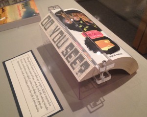
Chip Kidd’s novel The Cheese Monkeys, designed as well by him, sports a printed fore-edge. When the book is closed, the fore-edge is blank.  Fanned in one direction, it shows the sentence as seen in the photo below.

Chip Kidd, The Cheese Monkeys: A Novel in Two Semesters, 2008

Chip Kidd, The Cheese Monkeys: A Novel in Two Semesters, 2008, from the Chip Kidd Archives, on display Jan. 12 through April 24, 2015, in The Eberly Family Special Collections Library, Penn State University. Reproduced with permission of the Library

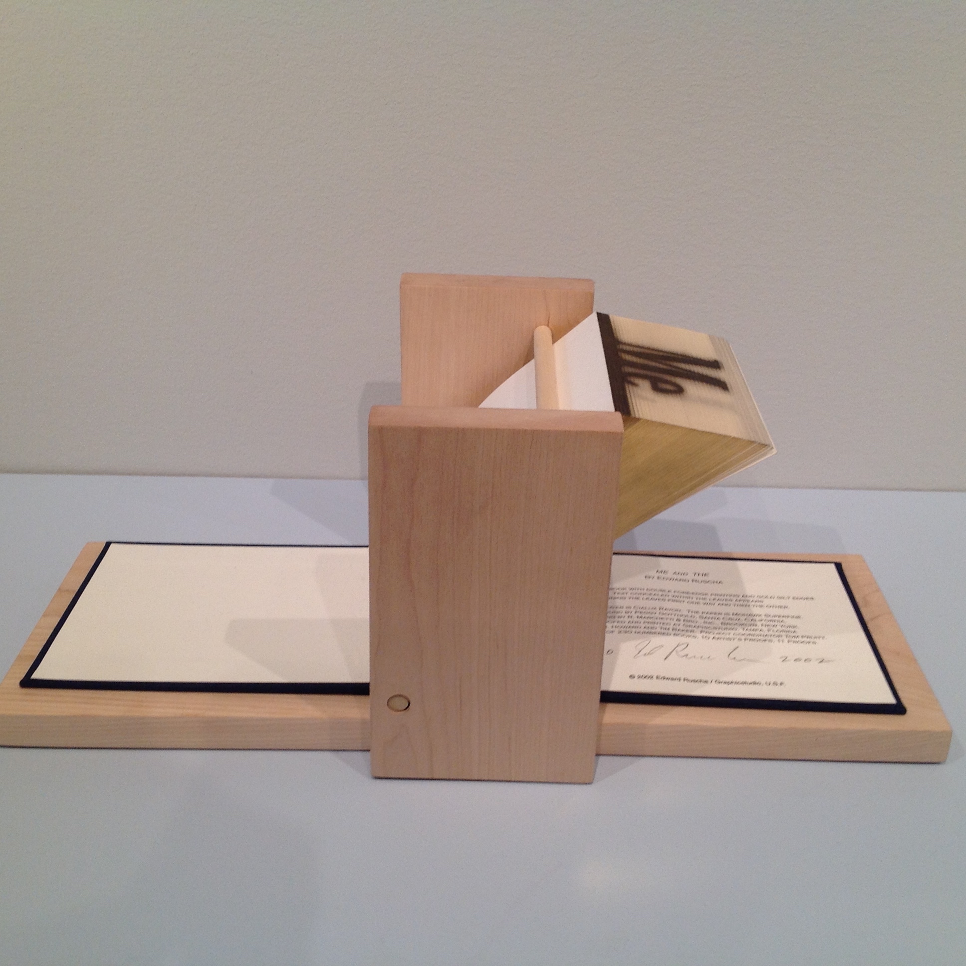
Fanned in the opposite direction, the fore-edge displays another phrase: “Good Is Dead”. The printing process is well described in a 2004 video by Graphics Studio|Institute for Research in Art, prepared about the making of Ed Ruscha’s fore-edge book Me and The.

Ed Ruscha, Me and The, 2002 Allan Chasanoff Collection, Yale University Art Gallery

Ed Ruscha, Me and The, 2002
Allan Chasanoff Collection, Yale University Art Gallery

This is similar to traditional fore-edge painting.  Much of what is worth knowing about fore-edge painting can be learned from Martin Frost’s QuickTime Movie-rich website, but if you are a fan of the Folger Shakespeare Library, its holdings yield some outstanding examples under the hand of Erin Blake.   

Double-fore-edge-painting-showing-half-of-each-painting

Jeff Weber’s book Annotated Dictionary of Fore-edge Painting Artists & Binders is probably the lengthiest treatment available on the subject. Hear him discuss his work here.  Weber, who commissioned artwork from Frost, Margaret Allport (Costa) and Clare Brooksbank, has a particularly well-written article at the International League of Antiquarian Booksellers’ site.     

Phillip J. Pirages, an antiquarian bookseller, provides an enlightening and entertaining talk on fore-edge painting of the 18th century and shows a superb example of the London binders Taylor & Hessey’s work — a two-volume set of the works of Alexander Pope, bound in red morocco leather and decorated on the fore-edges with scenes of Twickenham and Windsor.   

The point of this bookmark is not merely to share a curiosity but to use that narrow, hidden curiosity as an illustration of the boundaries of book art and the book arts.        

Updates

Thanks to Ann Kronenberg for this link to a 1940s film on the topic.

Thanks to Merike van Zanten of DoubleDutch-Design.com for this link from 4GIFS.com showing what appear to be biblical scenes painted on the fore-edge of a book.

Thanks to Peter Verheyen for this link to a history of decorating book edges with examples from the Maurits Sabbe Library and other Leuven and Belgian collections.

Weber, Carl. Fore-edge painting : a historical survey of a curious art in book decoration (Irvington-on-Hudson, New York: Harvey House, 1976.).

See also 21 July 2018 article on Martin Frost in The Times.