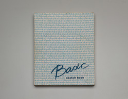
TRAIANUS (2023)
TRAIANUS (2023)
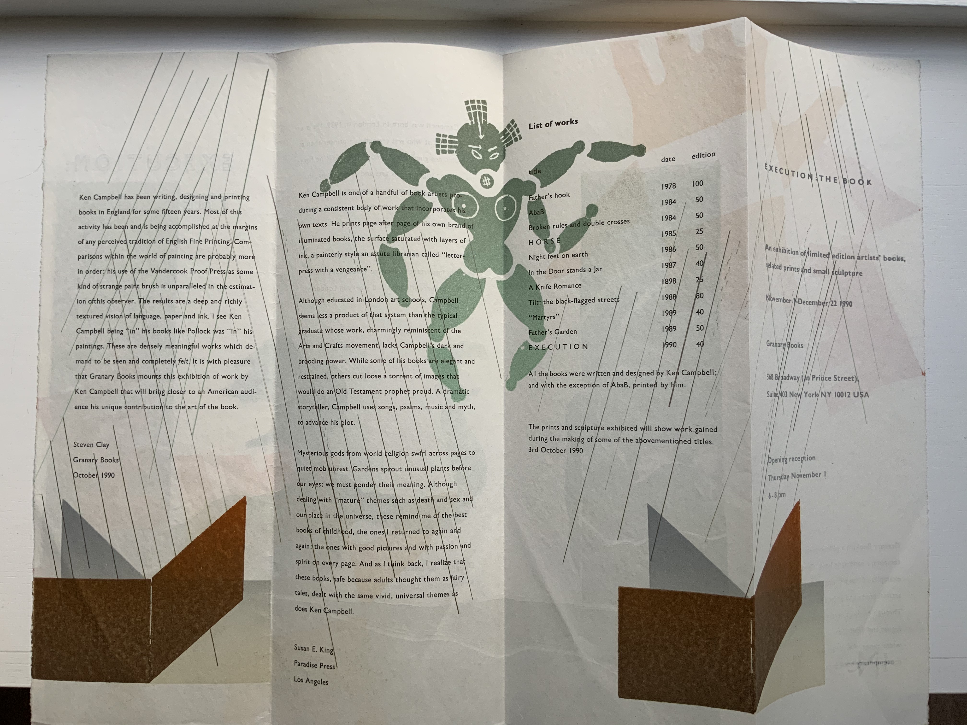
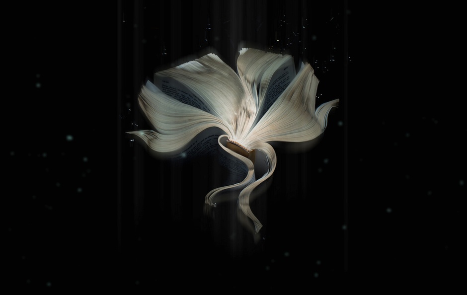
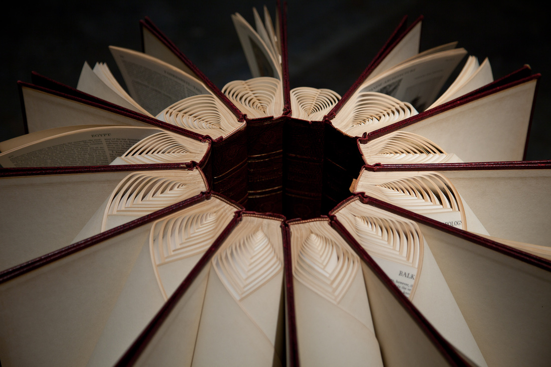
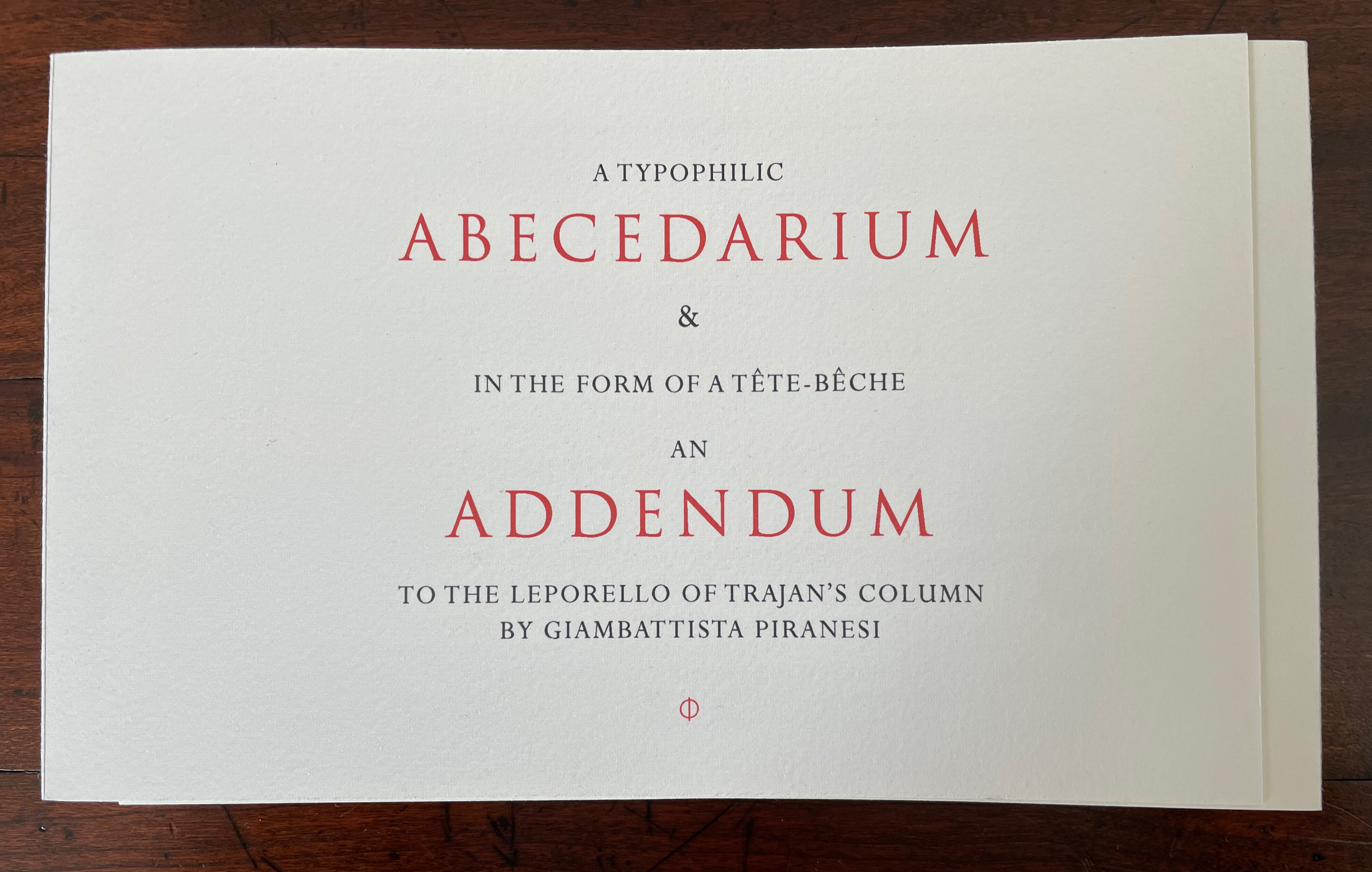
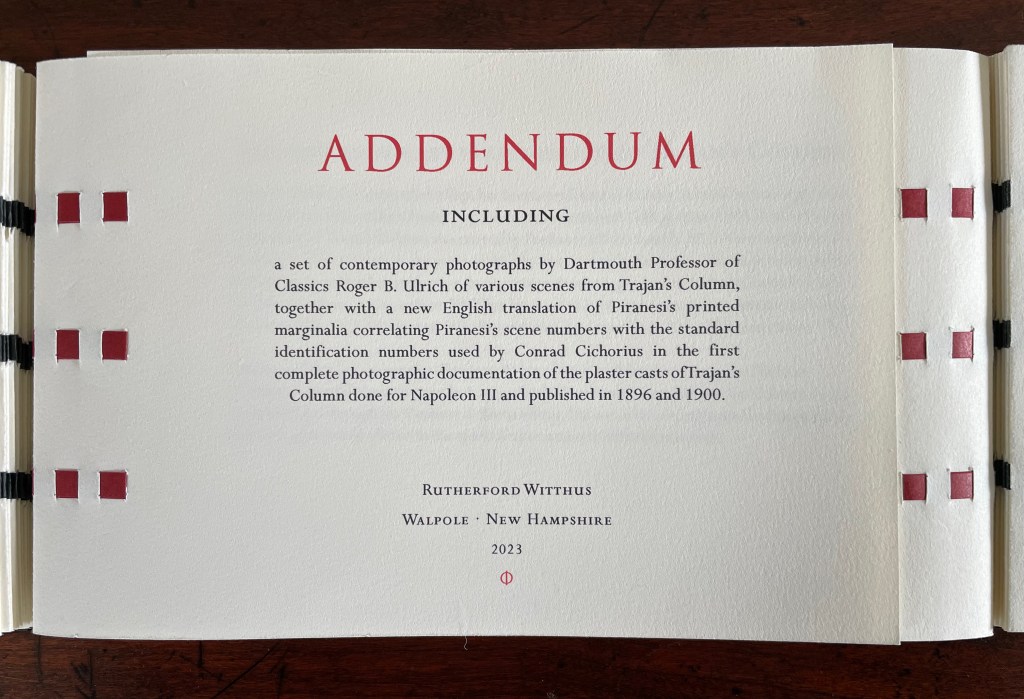
A Folly for Bibliophiles celebrating the epigraphy, iconography and the architecture of the COLUMN OF TRAJAN through Giambattista Piranesi’s etchings from his Vedute di Roma in the form of a leporello with a hidden tête-bêche woven binding containing an Abecedarium that reveals the work of L.C. Evetts in his study of the letters of the inscription at the base of Trajan’s Column & a set of contemporary photographs by Dartmouth Professor of Classics Roger B. Ulrich of various scenes from Trajan’s Column correlating the Piranesi etchings with the standard identification numbers used by Conrad Cichorius in the first complete photographic documentation of the plaster casts of Trajan’s Column done for Napoleon III and published in 1896 and 1900
Rutherford Witthus
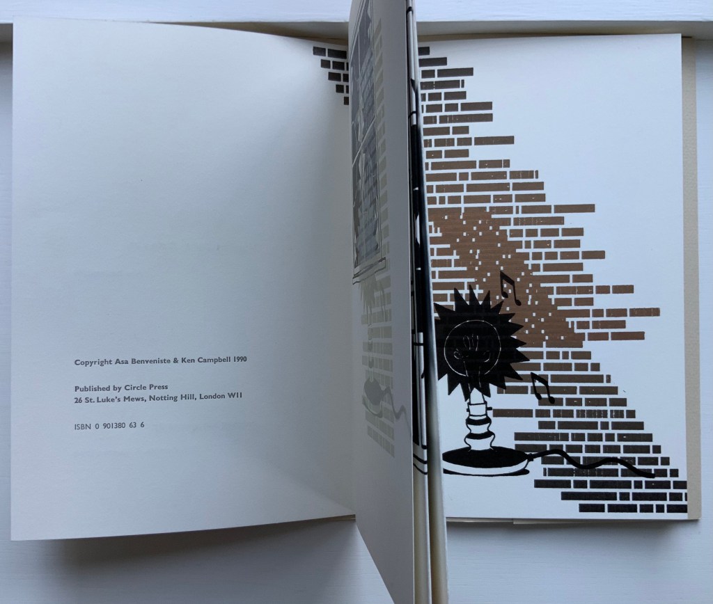
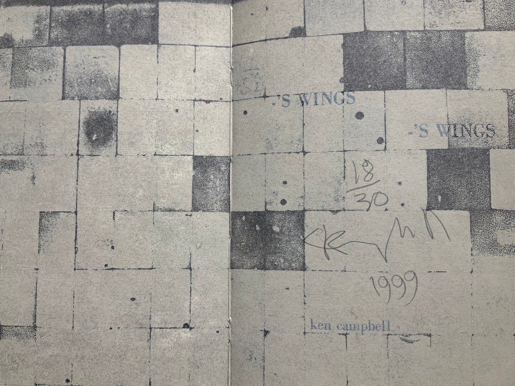
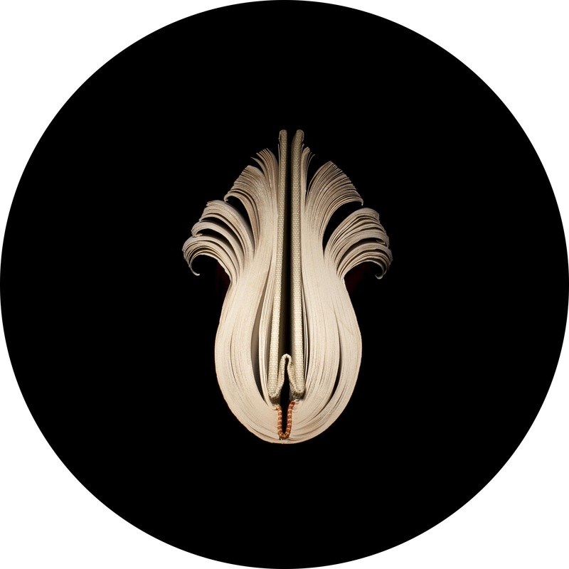
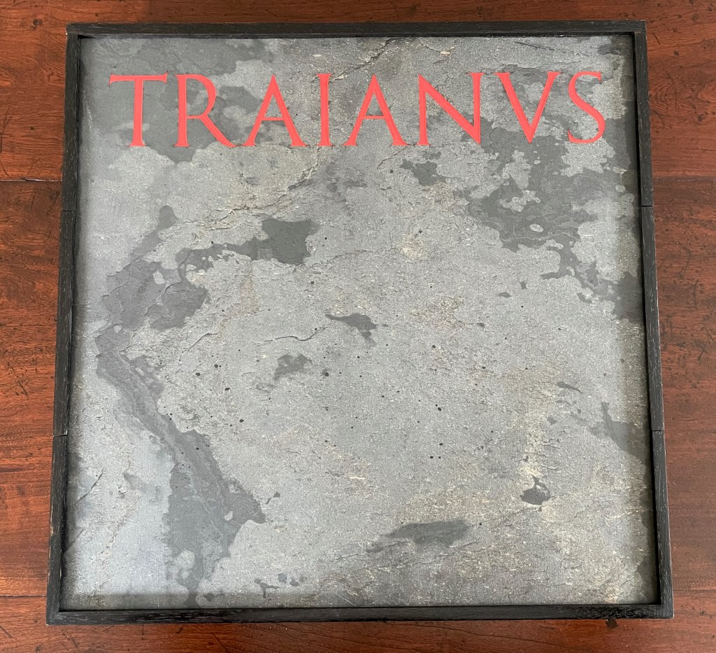
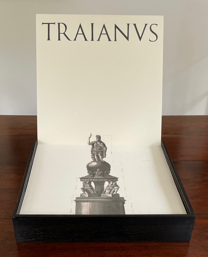
Ebonized walnut box with stone-leaf covered sliding metal cover and hidden central compartment. Double leporello of 7 panels, including title, on front; 3 panels (diagrams) on back. Double-spined Abecedarium of 38 pages and double-spined Addendum of 20 pages, bound tête-bêche together. Box: 392 x 392 x D75 mm. Leporello: closed 374 x 374 mm; extended 2224 mm (7th panel appears 20 mm deep in the base. Abecedarium & Addendum: closed H147 x W245 mm; open W760 mm. Edition of 5, of which this is #1. Acquired from the artist, 1 May 2023.
Photos: Books On Books Collection (and, where noted, Peter Roos; courtesy of the artist).
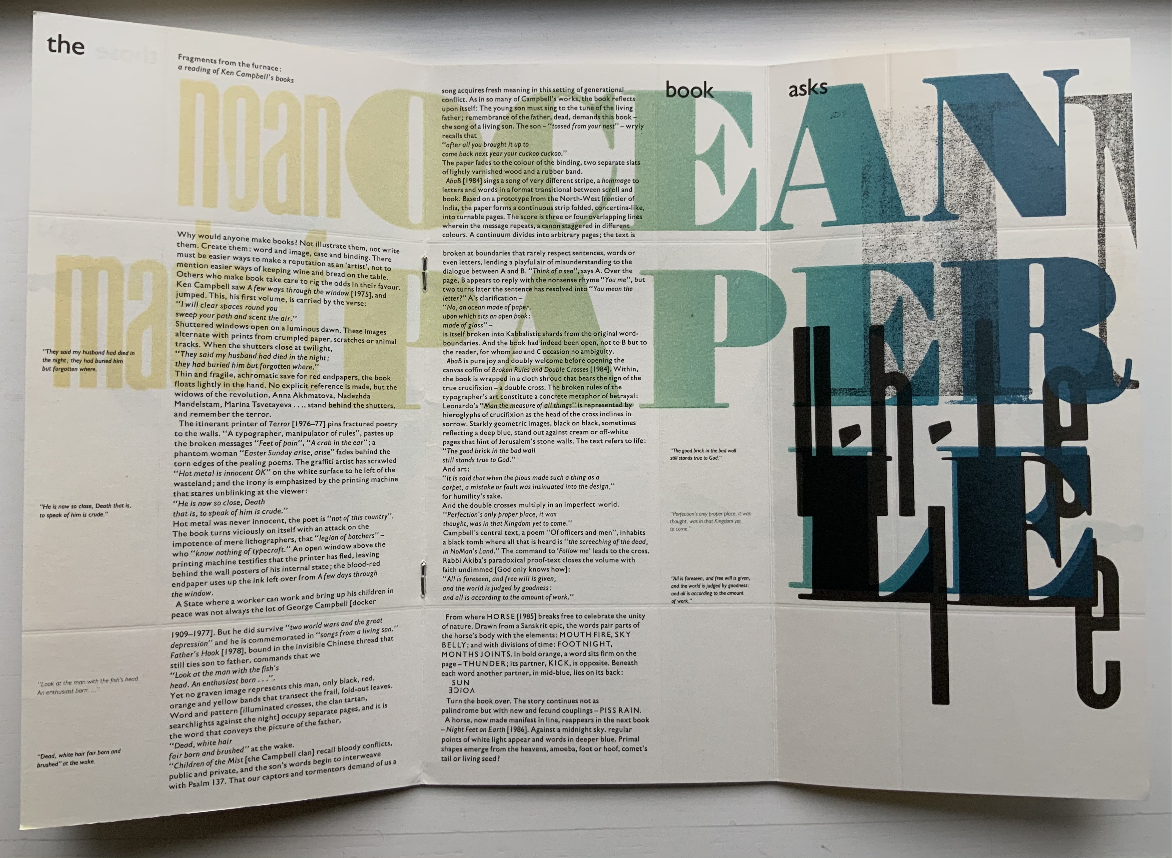
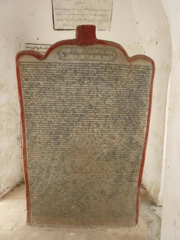
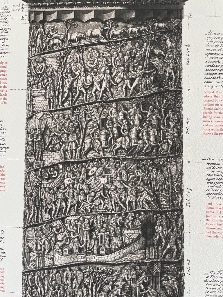
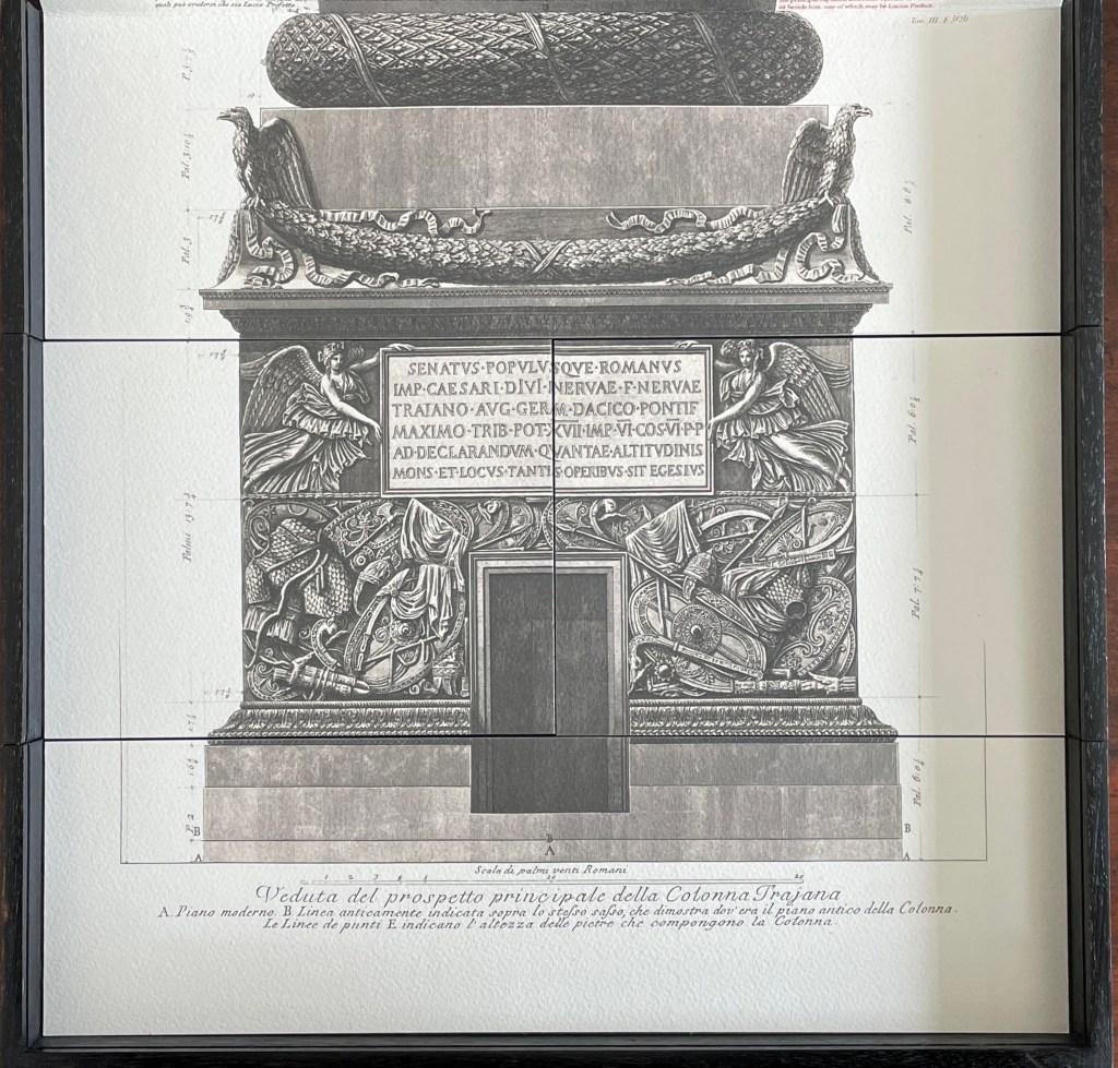
At almost 30m high with roughly 2,500 figures in a spiralling marble relief stretching 200 meters long, Trajan’s Column celebrates the Roman emperor’s military campaigns in Dacia (southern Romania). The story circles up the column from the bottom, but you’d need wings to read it. Just as important (and easier to reach) is the inscription at the base of the column. Here, the letter forms are said to show the Roman alphabet’s height of perfection. These letters may have had greater impact than all Trajan’s campaigns, and certainly influenced artists and typographers down to the present day.
One such artist was 18th-century artist, architect and archaeologist Giambattista Piranesi. Making the column more accessible, he created an etching — Veduta del prospetto principale della Colonna Trajana / View of the main elevation of Trajan’s Column (1774/79) — over six sheets and 2.6 meters tall with marginalia spelling out the panels’ story. Piranesi also included a smaller prospect in his Vedute di Roma / Views of Rome (1750/59), which help to start the Grand Tour phenomenon of the 18th century.
In the 21st century, we have Rutherford Witthus, professional librarian and, now, book artist. In TRAIANUS, his intricate “folly for bibliophiles”, Witthus pays homage to the column, the etching and the Roman alphabet.

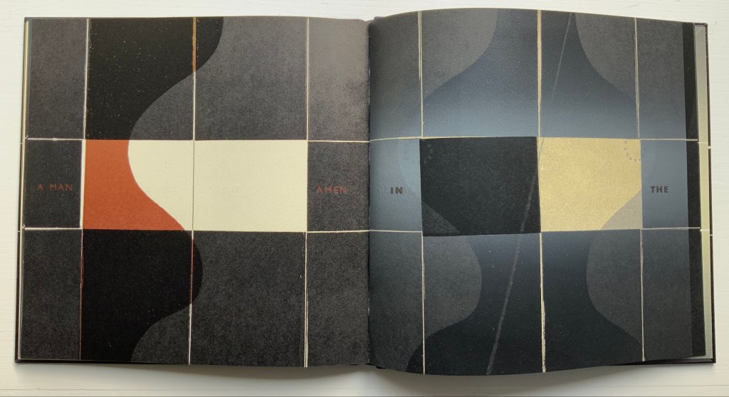
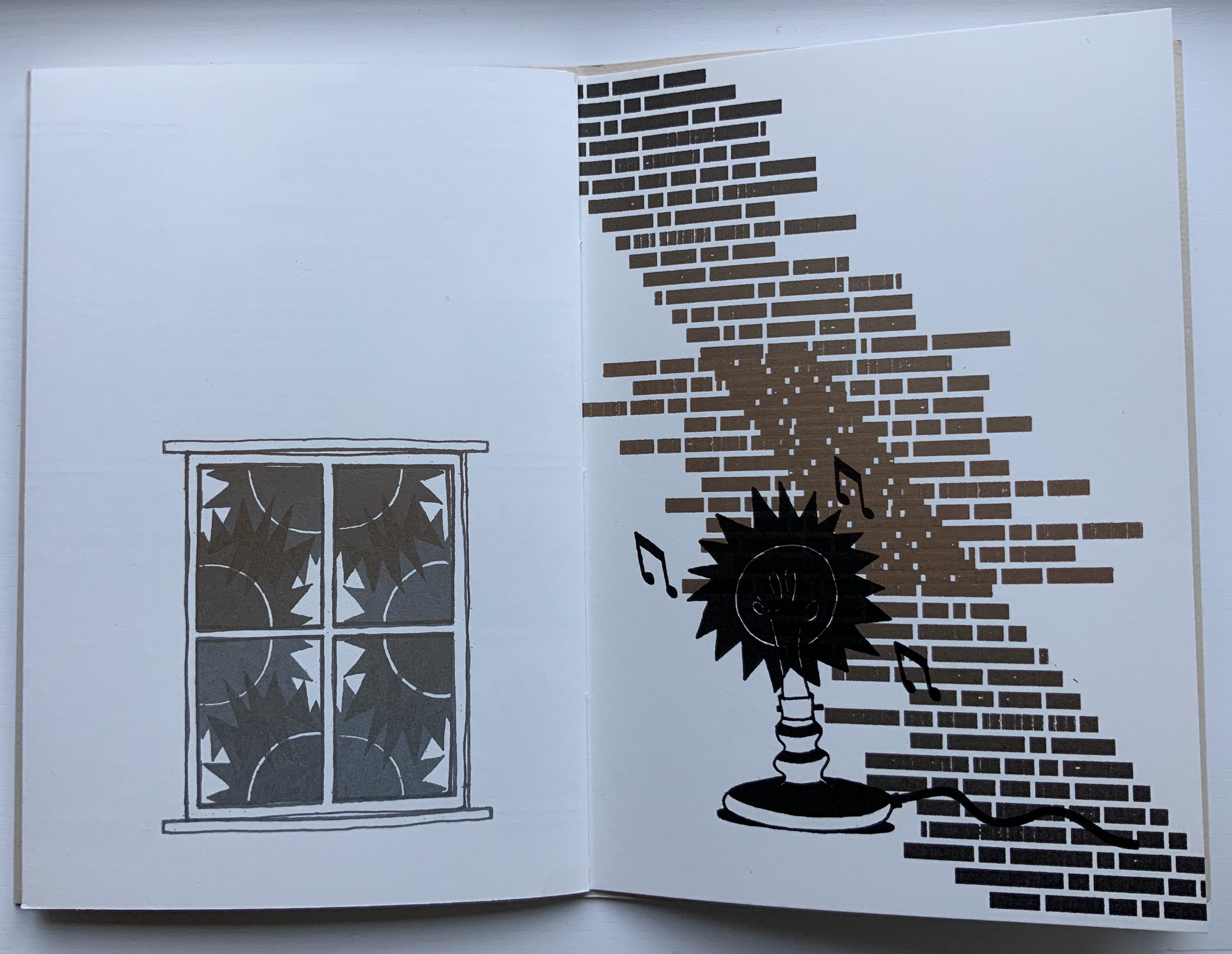
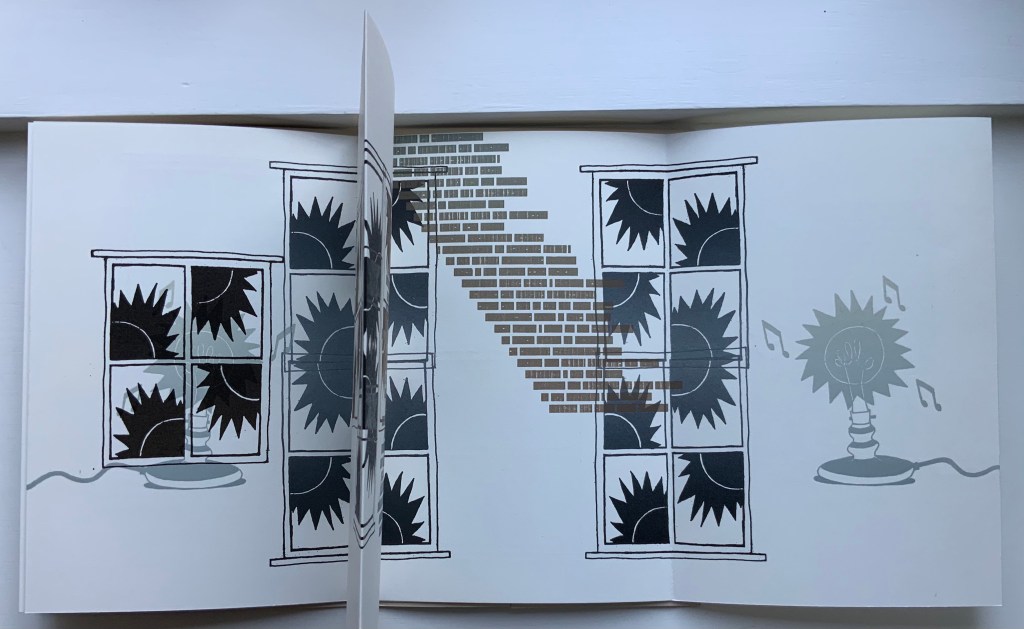
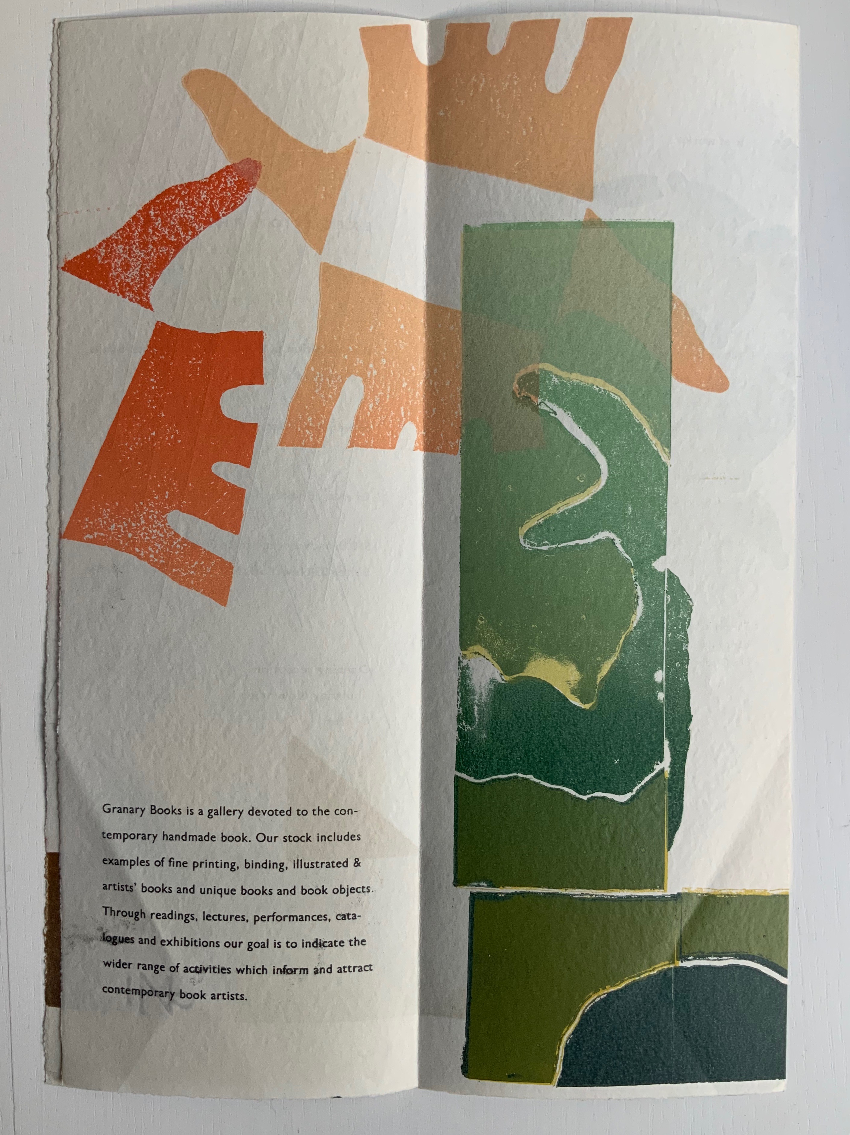
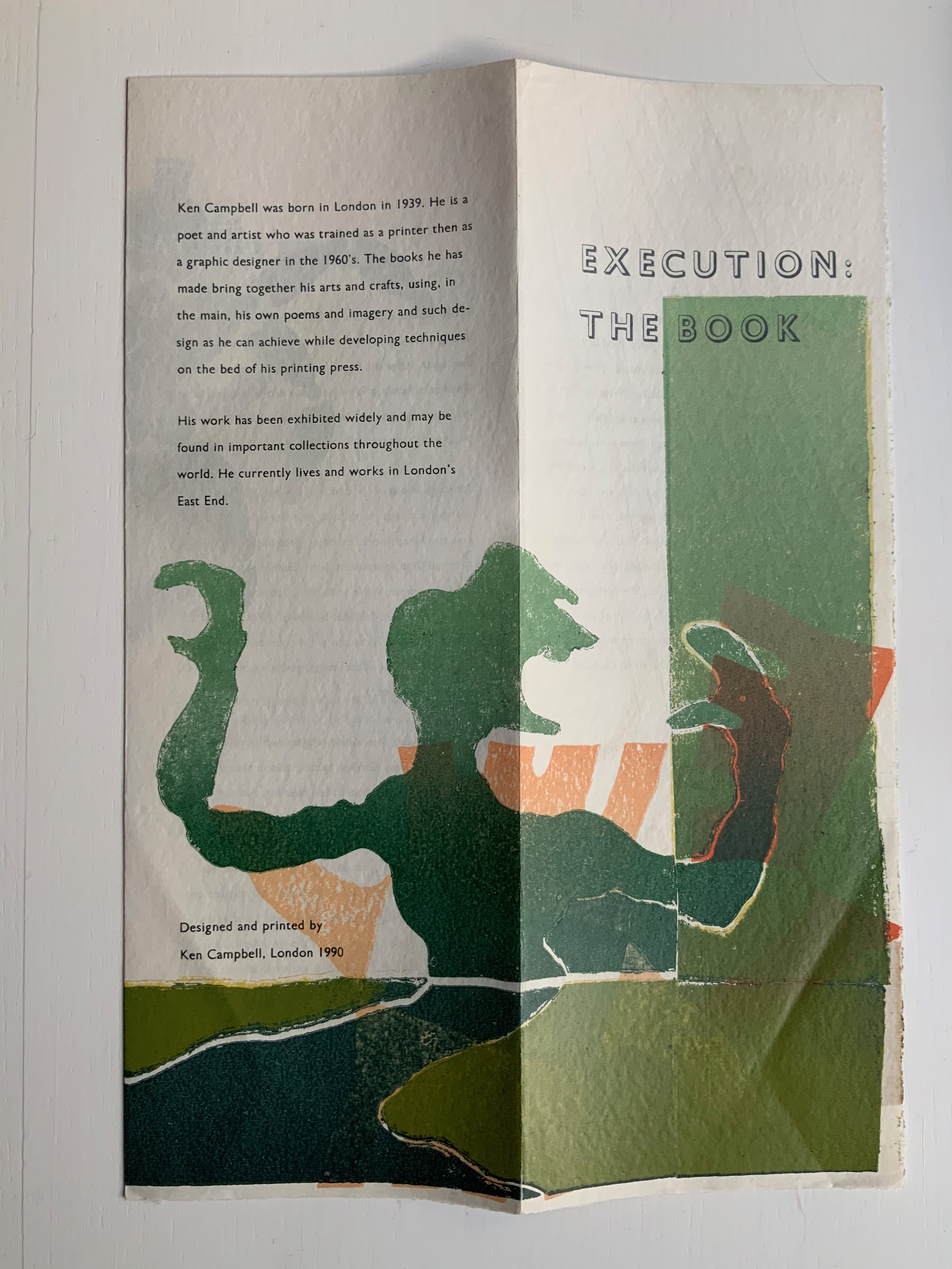
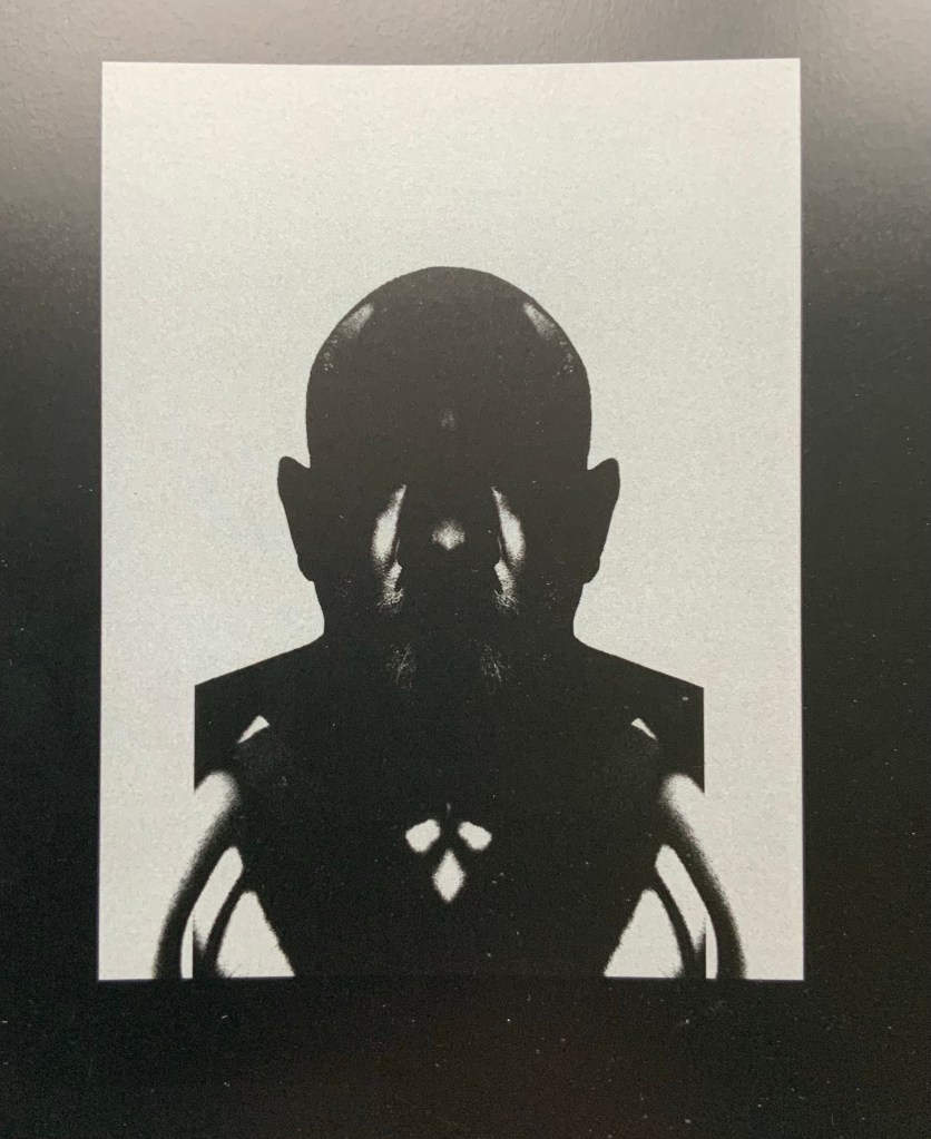
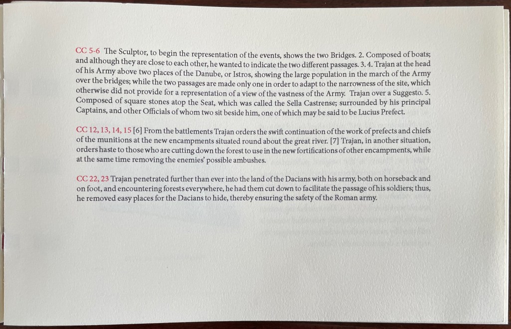
At the dedication in 113 CE, the inscription would likely have been painted red, to which Witthus nods with the box’s slate cover. The leporello beneath that cover extends upwards, reproducing Piranesi’s etching and enriching it with Dr. Marie Orton’s new English translation of Piranesi’s marginalia.


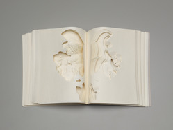
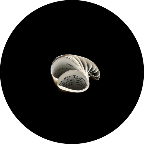
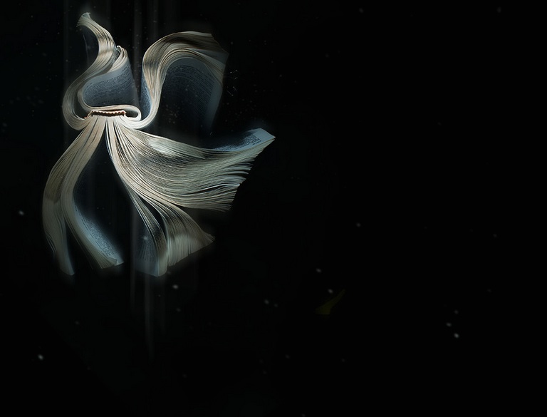
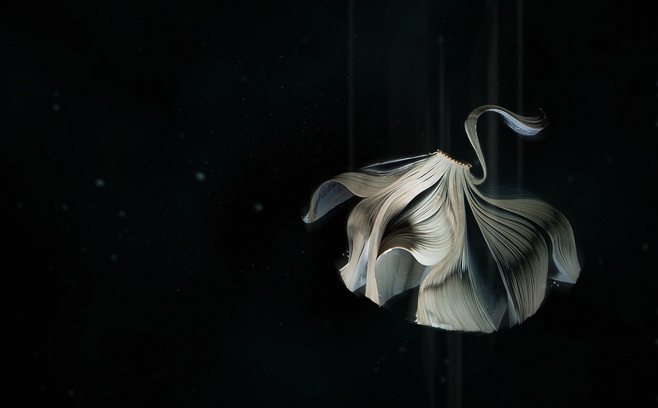
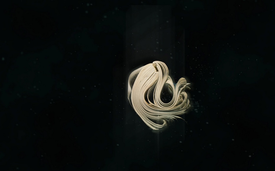
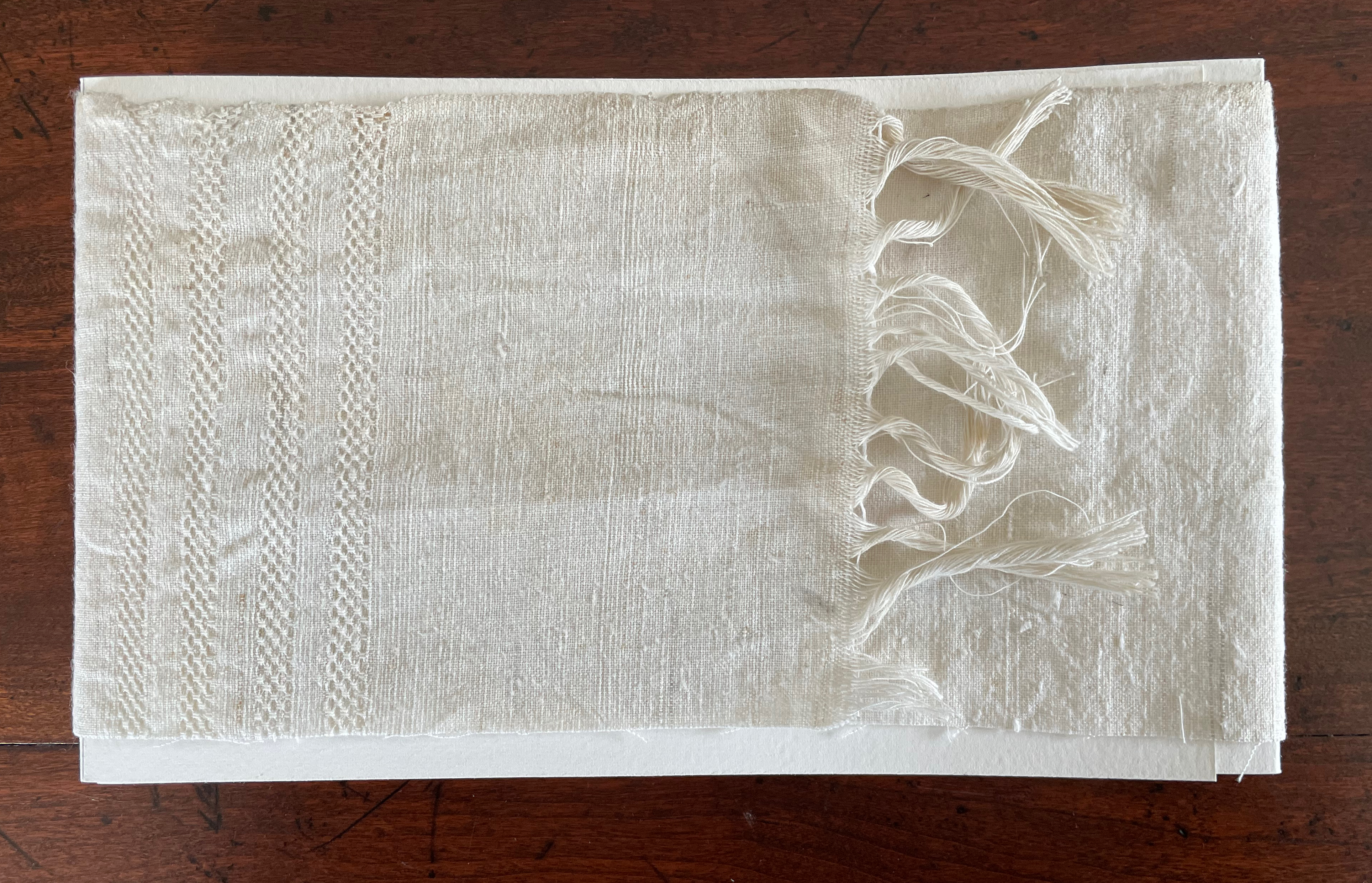
In a compartment beneath the base’s etching, Witthus deposits two books bound together in the unusual structure called tête-bêche and swathed in a fringed linen cloth. A tête-bêche attaches two books in dos-à-dos fashion but turns the books 180º to each other. These books individually have the equally unusual structure of a double-spined gate-fold (the pages overlap, meeting in the middle, and page turning proceeds with a turn to the left, a turn to right and so on).

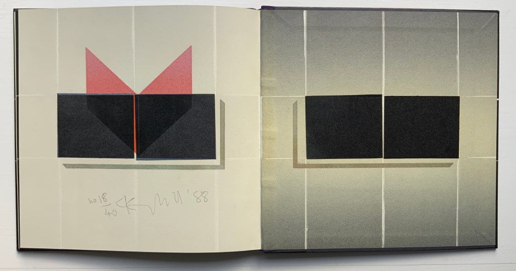
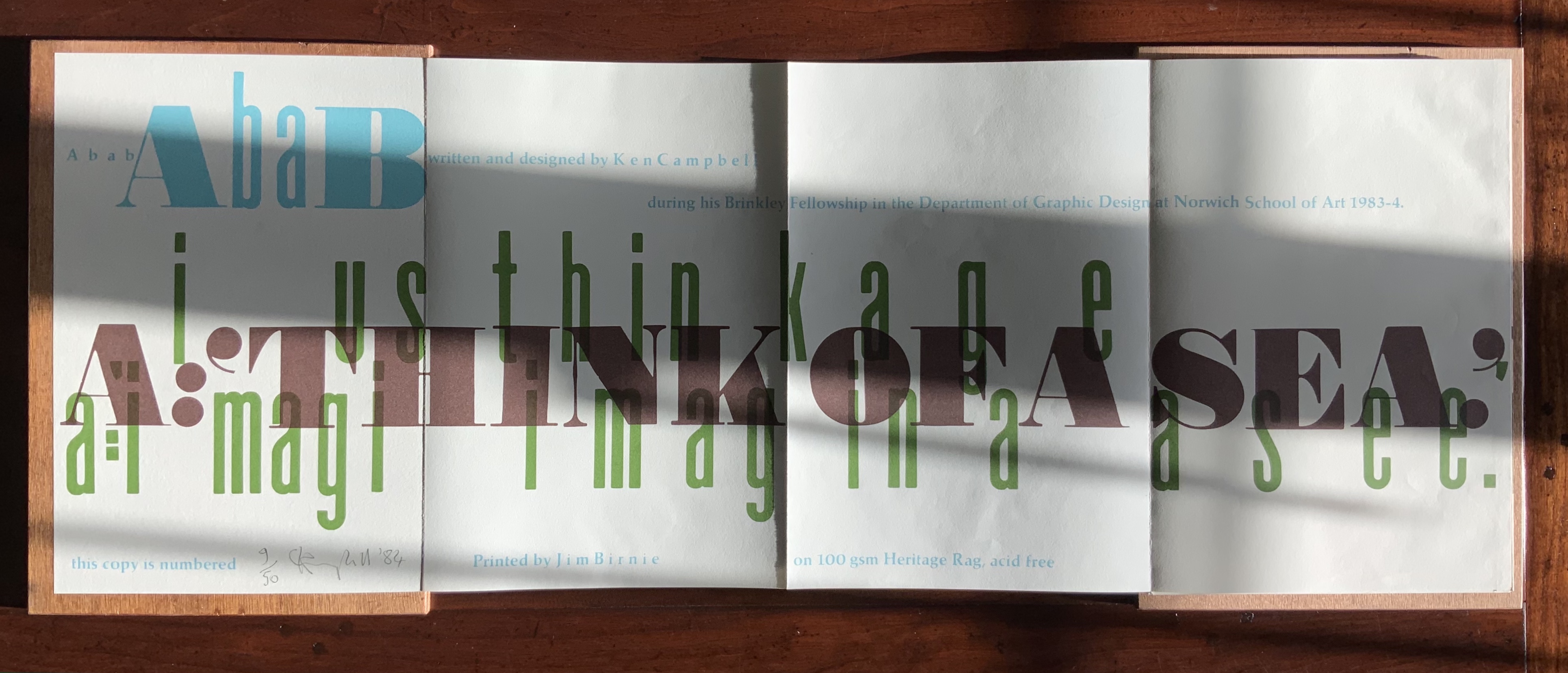
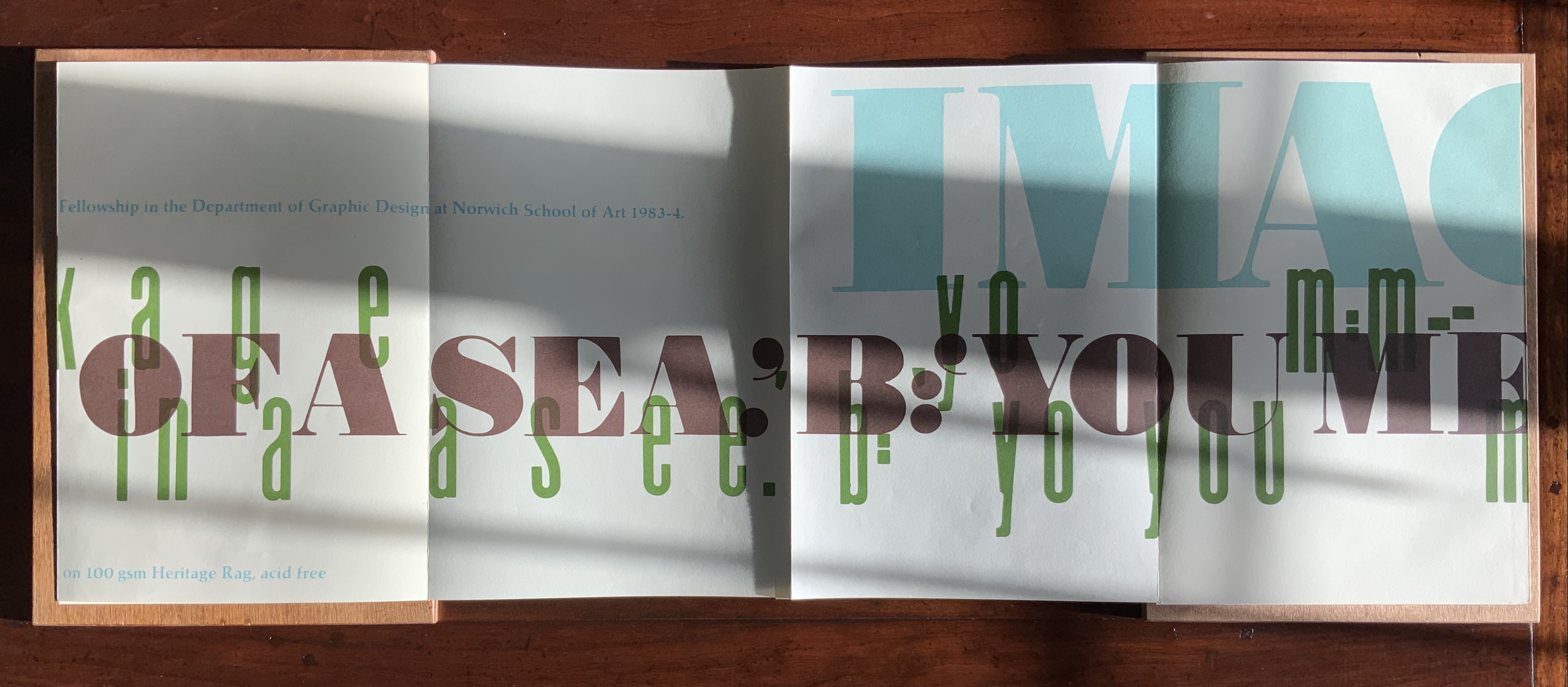
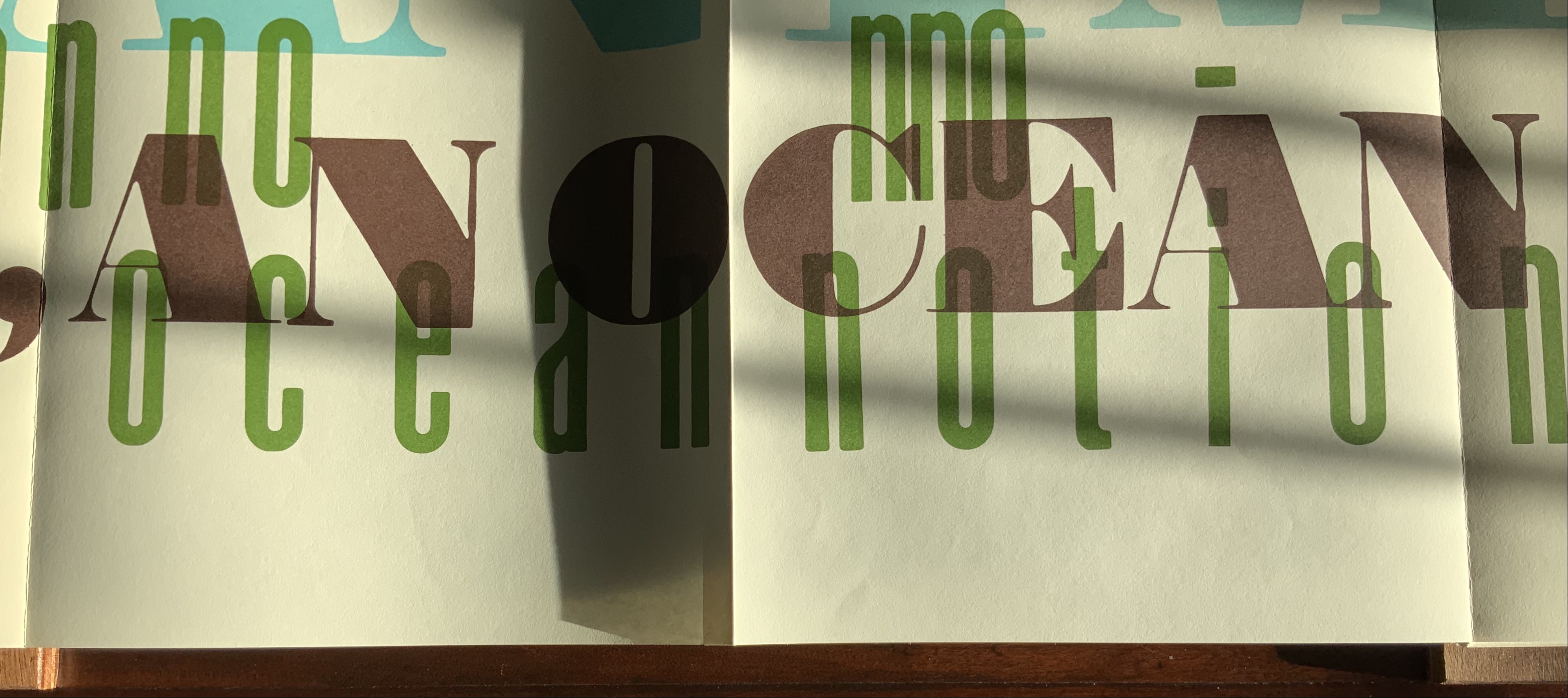
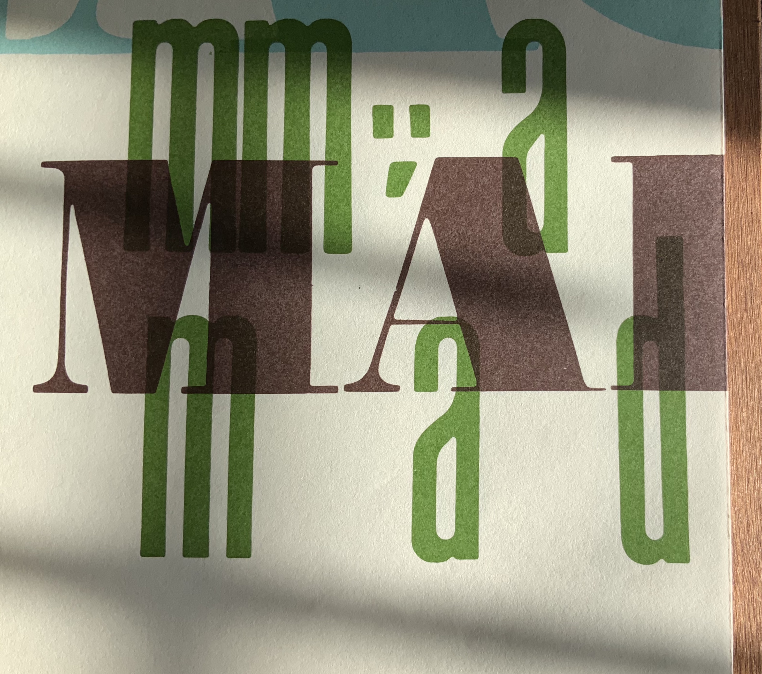
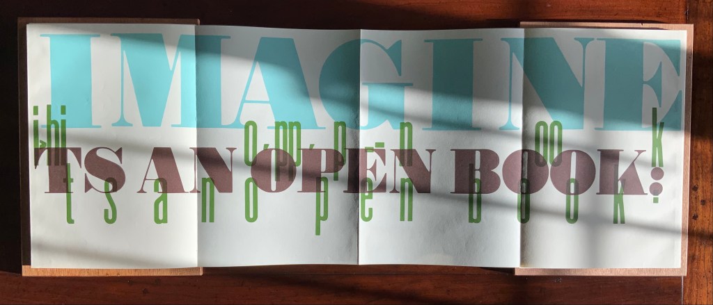
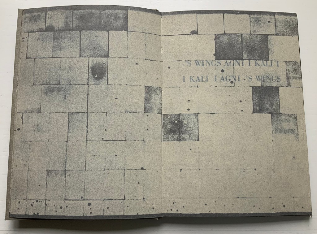
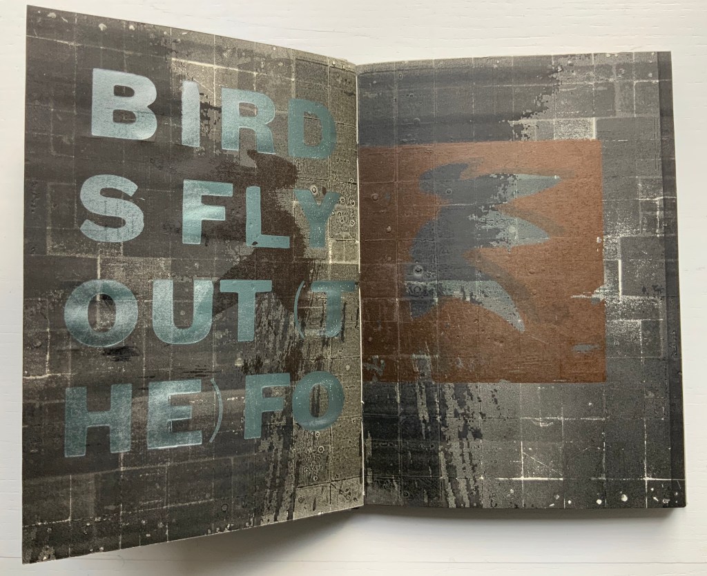
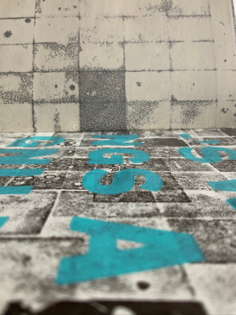
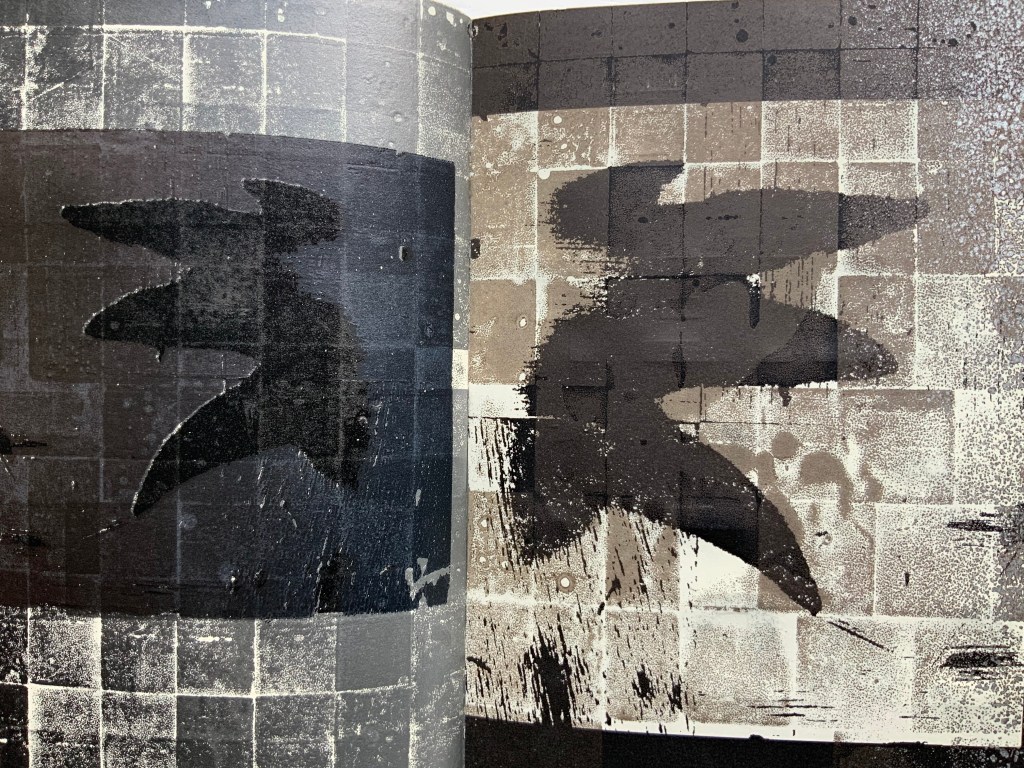
While researching the column, Witthus found in L. C. Evetts’ Roman Lettering a ready-made Latin alphabet book, including Evetts’ “magnificent drawings of the letters, along with his charming and informative descriptions”. Witthus reproduces this alphabet book in the first side of the tête-bêche under the title A Typophilic Abecedarium.
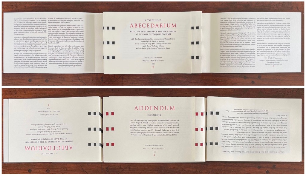
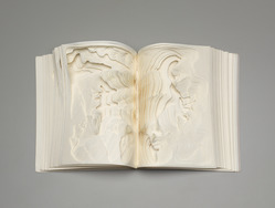
A Typophilic Abecedarium performs a variation on the gate-fold structure that brilliantly serves the homage Witthus is paying. A recurring image of the column’s inscription runs on the left alongside Evetts’ drawings and description of the Roman letters. This is achieved with a half page that turns to the left. Below, when the half page bearing the description of A’s characteristics turns to the left, its reverse side will repeat the side of the inscription it covers up. When the full page bearing the letter A turns to the right, it reveals the half page bearing the description of B’s characteristics, the letter B itself and the full page on the right explaining the construction of the letter B.


Just for its swash’s daring cross over the gutter and the registration needed to align the image of the inscription, here’s the letter Q before and after the turning of the half page to the left and just before turning the page bearing the letter Q to the right to reveal the letter R.

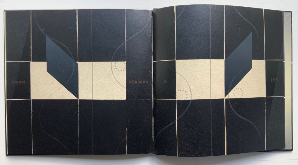
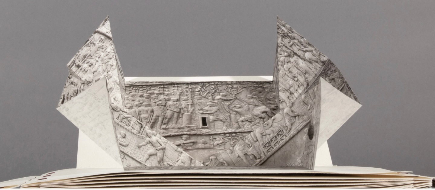
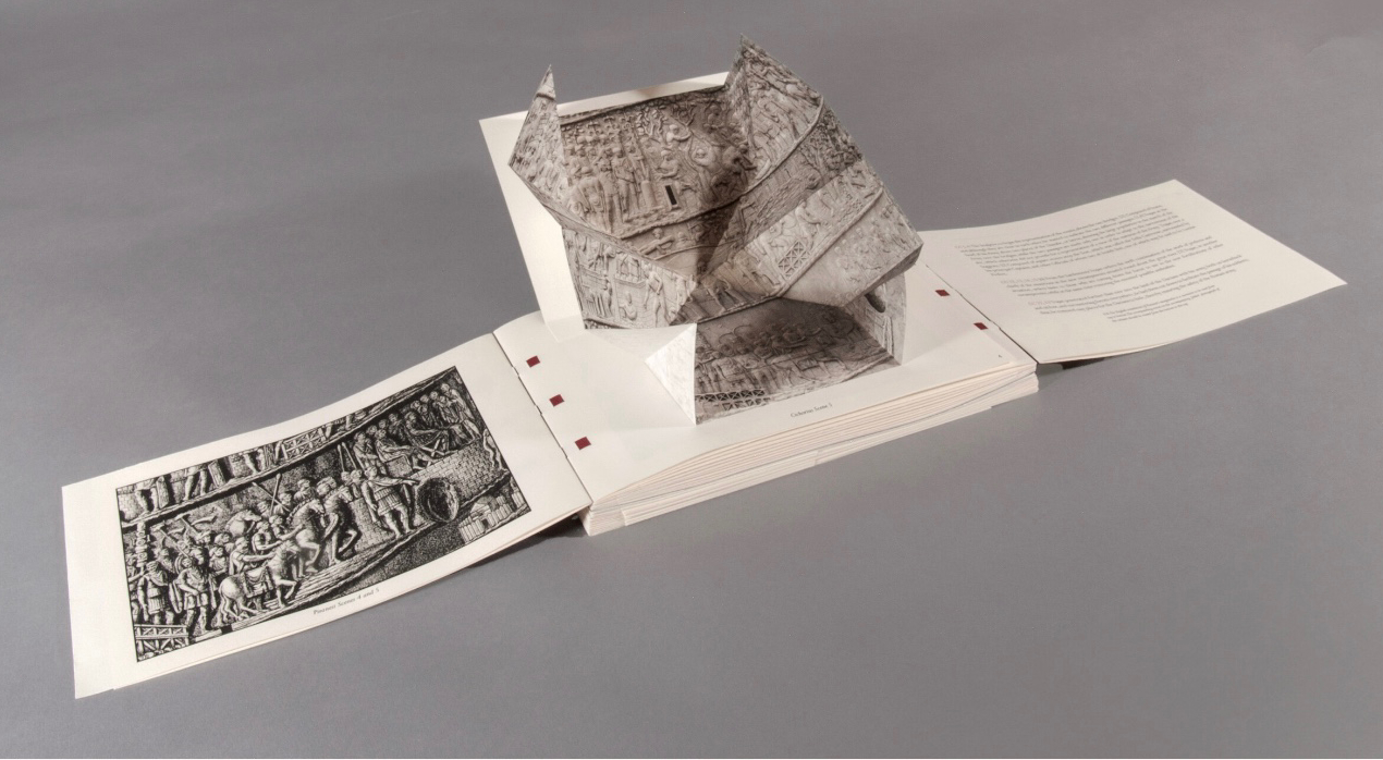
On the other side of the tête-bêche lies An Addendum to the Leporello of Trajan’s Column by Giambattista Piranesi. Professor Roger B. Ulrich‘s photographs of the column expand from Turkish map folds alongside a reprise of Dr. Orton’s translation of Piranesi’s marginalia.

Photos: Peter Roos. Courtesy of the artist.
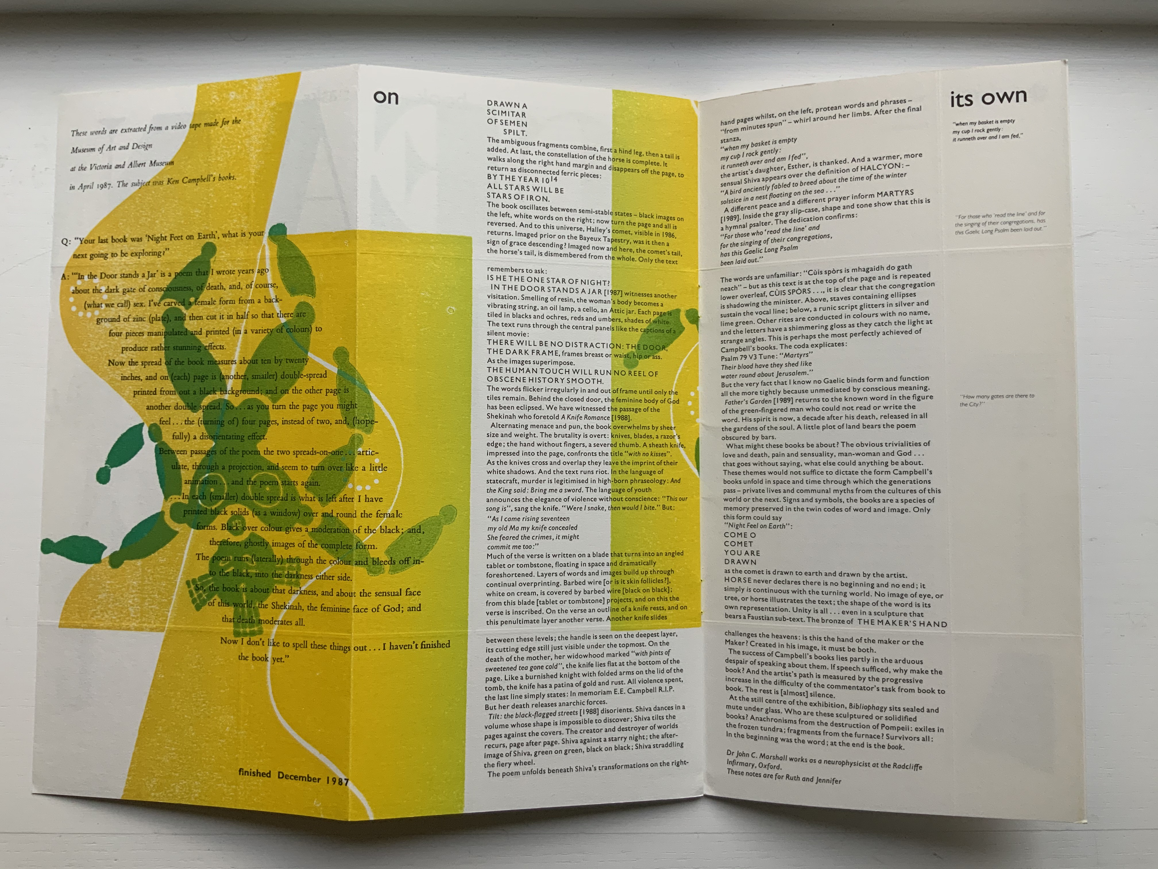
With all these features, TRAIANUS the artist’s book nods elegantly to a monumental marker in history, art and the alphabet’s journey to its Roman letter shapes. Professional photographer Peter Roos has created several images of the work. They can be found on the Witthus site. Here are just a few.
Photos: Peter Roos
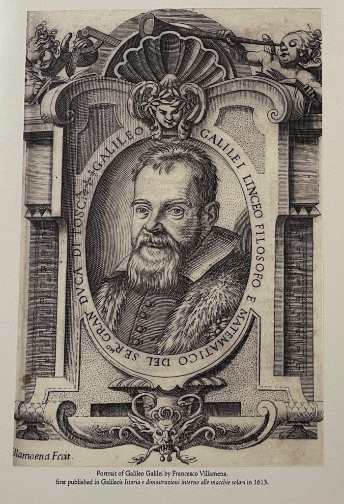
Galileo Galilei (2018)
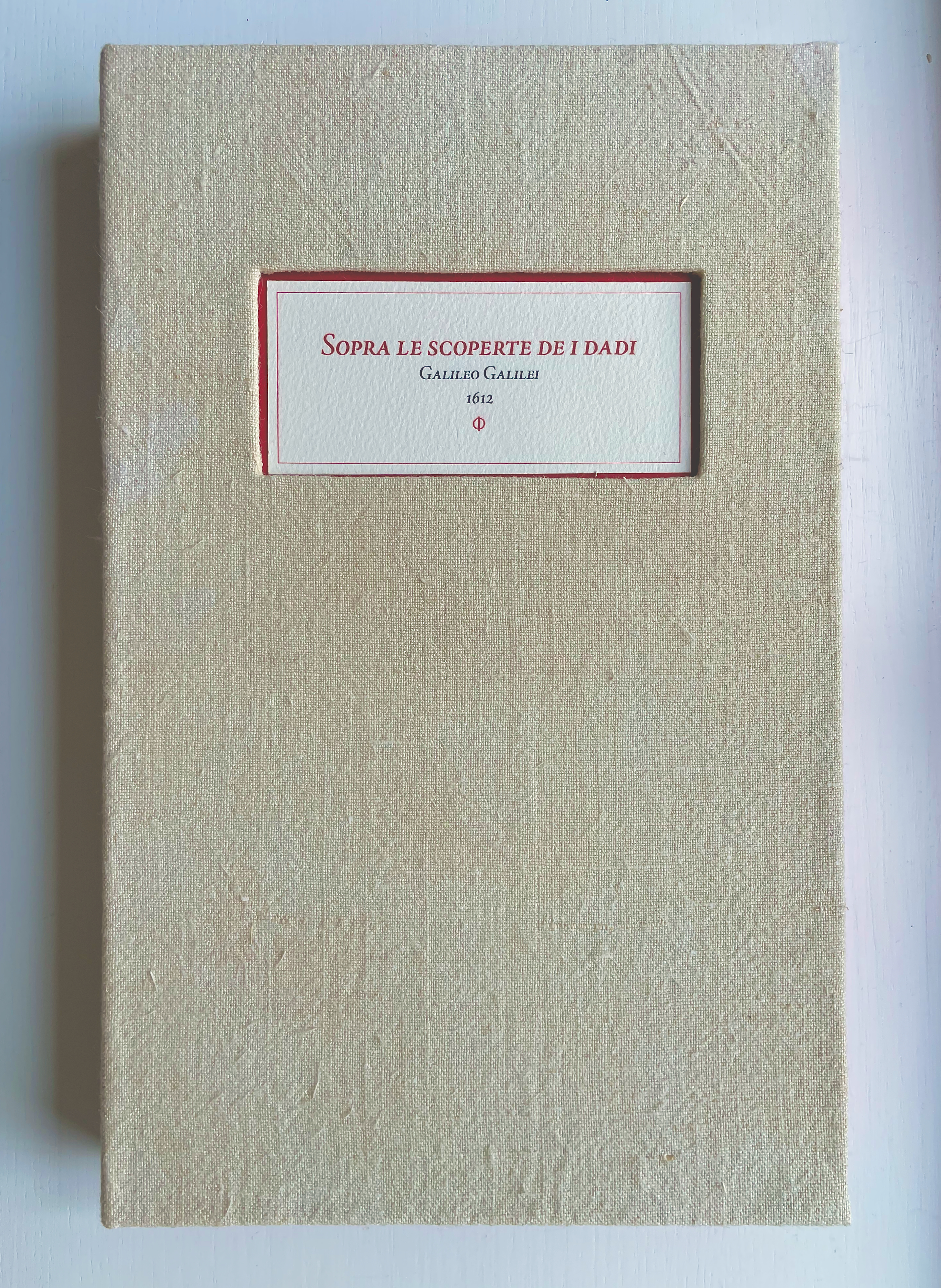

Galileo Galilei: Sopra le scoperte de i dadi/Concerning an investigation on dice (2018)
Rutherford Witthus
Panorama concertina structure. H330 x W203 x D35 mm (13 × 8 × 1.375 inches). Edition of 5, of which this is # 2. Acquired from the artist, 27 January 2022.
Photos: Books On Books Collection. Permission to display from the artist.
Forget about “artist’s book”, “bookwork”, “book art” and all that terminological fol de rol. Rutherford Witthus offers a new categorical puzzle: scholarship as art, art as scholarship. Like TRAIANUS (2023), this homage to Galileo finds a form that not only reproduces an image of his writing but also recapitulates, annotates and explores the historical artifact and its substance and, in doing so, becomes a work of art itself.
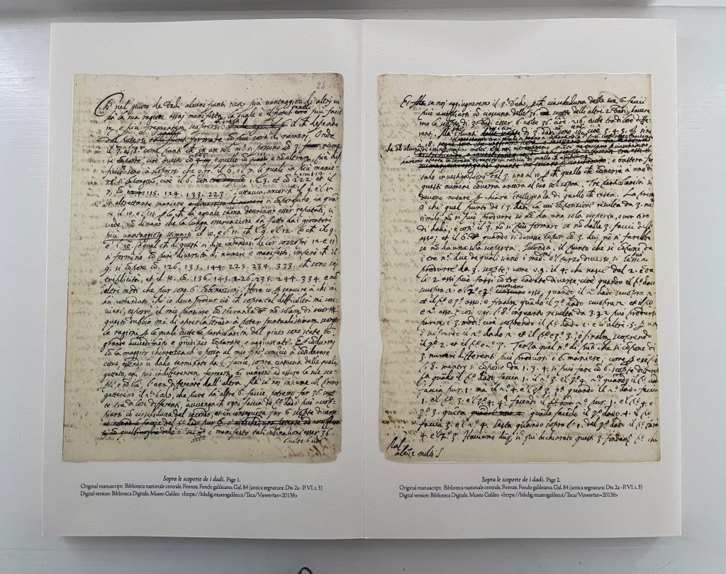
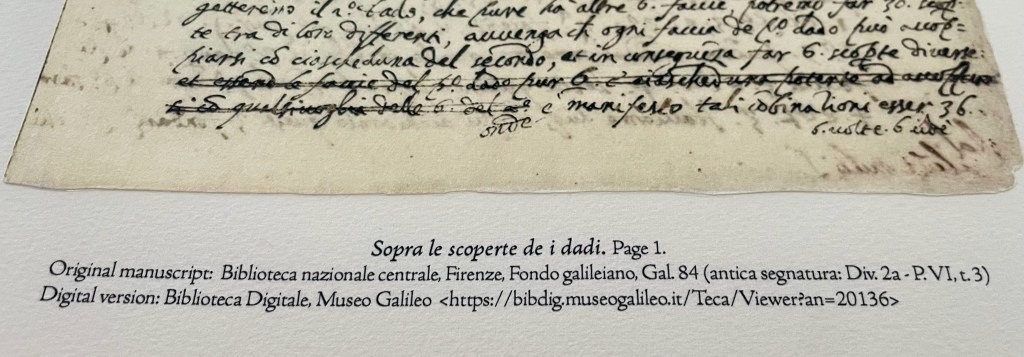
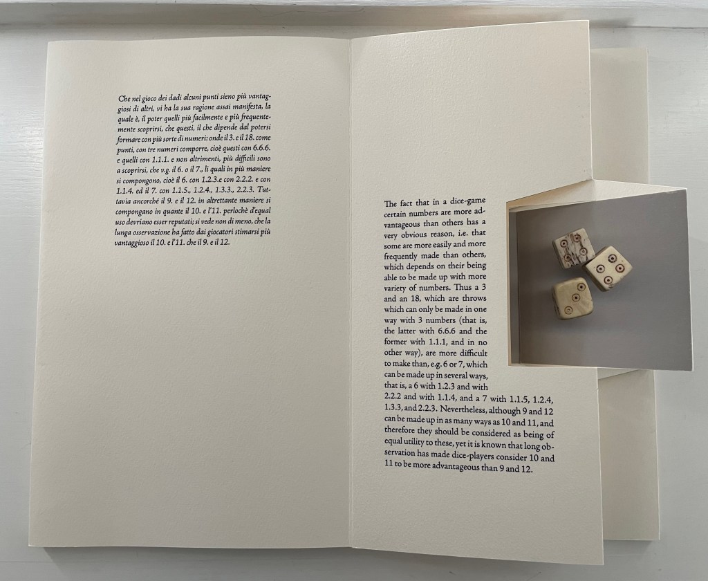
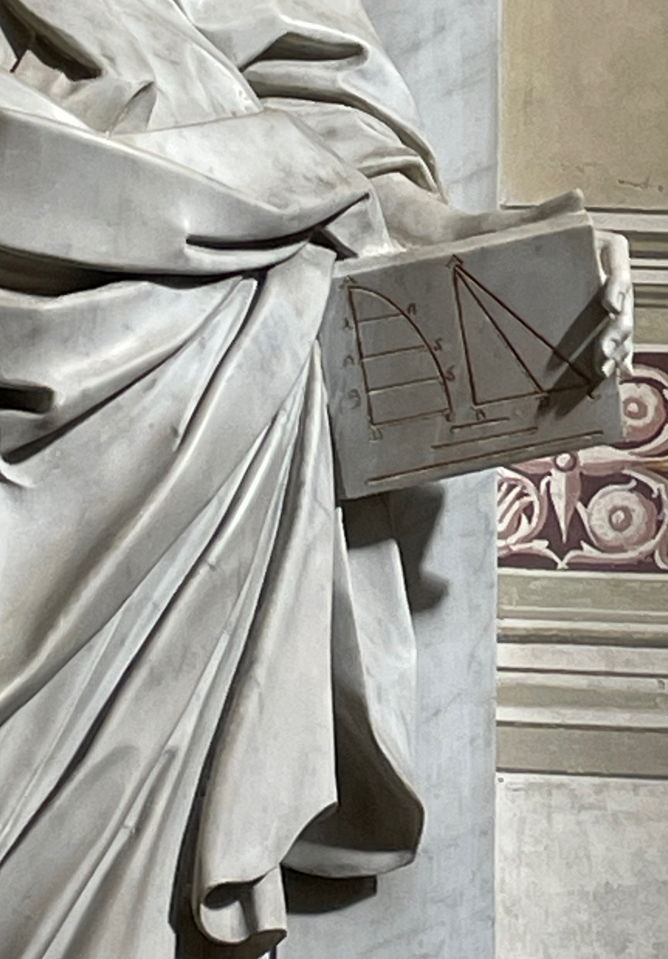
In 1612, Cosimo II, Grand Duke of Tuscany, had a burning question: since, in the three-die game Zara, there were the same number of possible combinations to throw a 9 or an 11 as there were to throw a 10 or 12, why did the 9 and 12 come up less often? Who better to answer than his former tutor Galileo Galilei? It took Galileo only four pages to give the probabilistic rationale, four pages that now reside in the Bibilioteca nazionale centrale, Firenze. A less thorough answer might have sufficed. A 9 can be rolled with a 3.3.3 triple, and 12 with a 4.4.4, but across all the possible outcomes of rolling three dice, rolling a triple is rarer than combinations of a double and one other number or of three different numbers. In fact, there are only six potential triples — 3, 6, 9, 12, 15 and 18. Since 10 and 11 have no possible triples, they are not lumbered with that rarity and so have the advantage over 9 and 12.
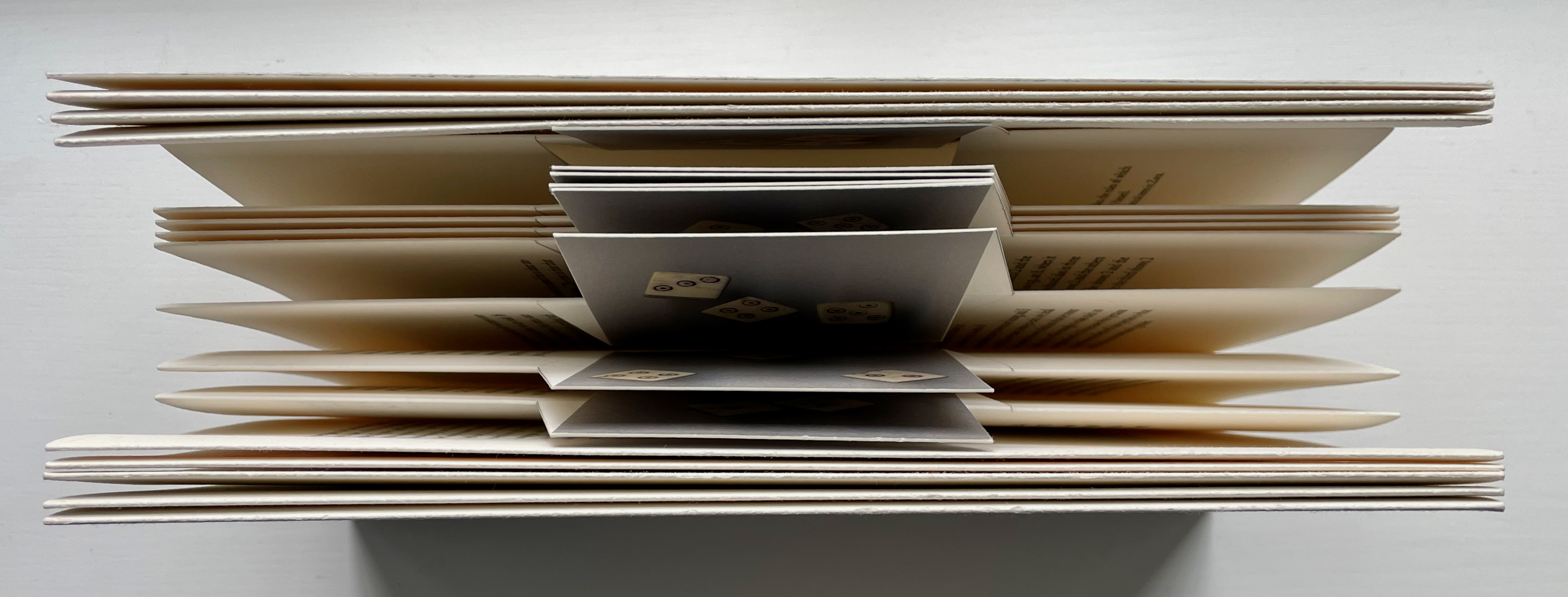
But fewer pages might have left the duke dissatisfied, and it would certainly have hampered the creative results of Rutherford Witthus. The multipage sculptural structure he has chosen is an innovation associated with Hedi Kyle called a panorama concertina. Notice how he uses it to illustrate one of Galileo’s key points and to suggest a bouncing roll of the dice. Arising from throwing the bone dice repeatedly and photographing the more aesthetically pleasing results, the eight images show the three types of possible combinations: 1) three different numbers, 2) a double and another number and 3) a triple. The static photos are dry mounted to floating panels aligned on one level, but the text around them rises and falls to generate a sense of motion additional to the pivoting of the floating panels.
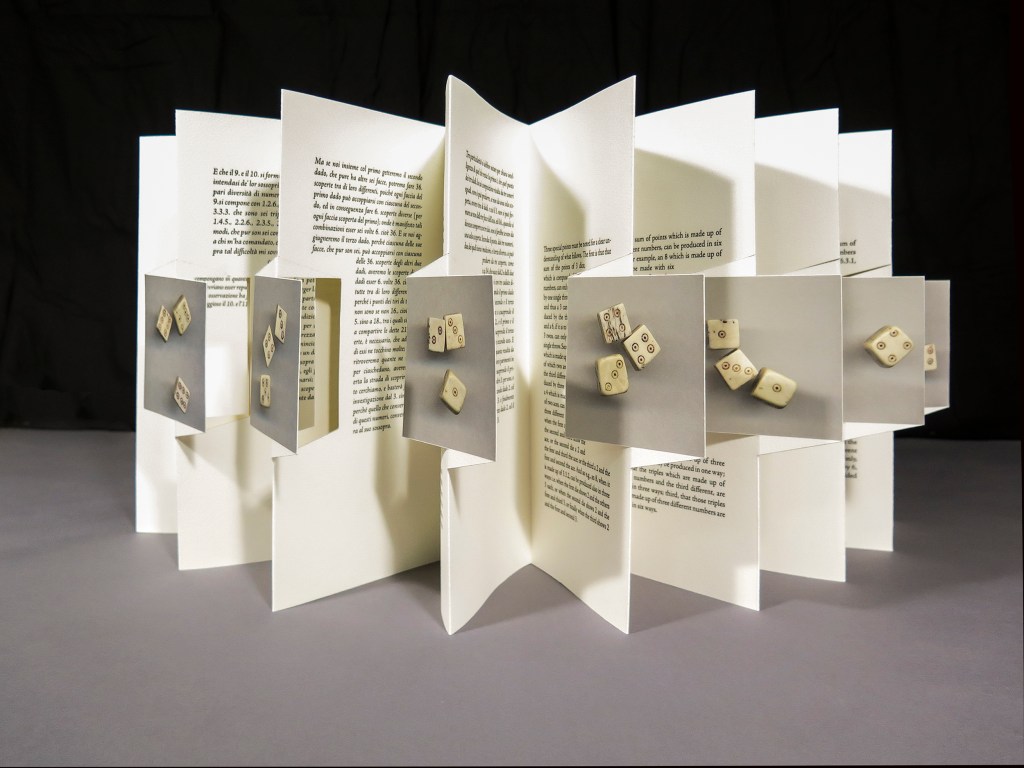
Photo: Peter Roos.
Here is a closer horizontal look at one of the pivoting panels and, below it, four of them stretched out for a different view of the text’s motion around them. Notice how the diagonal cuts that form the floating panels create a tilt around the square photos, increasing the impression of a tumbling motion.

Views of the spine edge and the fore edge tight and slightly open offer another angle on the engineering.
Witthus further enriches the document with relevant layers of history from other periods: a 14th-century psaltery’s illumination showing two apes playing dice, an image of 15th century bone dice, a thumbnail of a 17th-century oil painting of soldiers playing dice over Christ’s tunic, and an excerpt on medieval gambling from William Heywood’s The “Ensamples” of Fra Filippo (1901).
When the colophon relates that the images of Galileo’s manuscript and the individual dice throws were printed on Asuka paper, or that the typeface used throughout is Adobe Jenson Pro, drawn by Adobe’s chief type designer Robert Slimbach from a face cut by Nicolas Jenson in Venice around 1470, or that astronomical calculations from Galileo notebooks appear on the verso of the sheets — Witthus brings present and past together. He is making Galileo’s document tangible — not in the sense of handling the treatise in the Biblioteca but in the tactility afforded by the tools and techniques of book art.
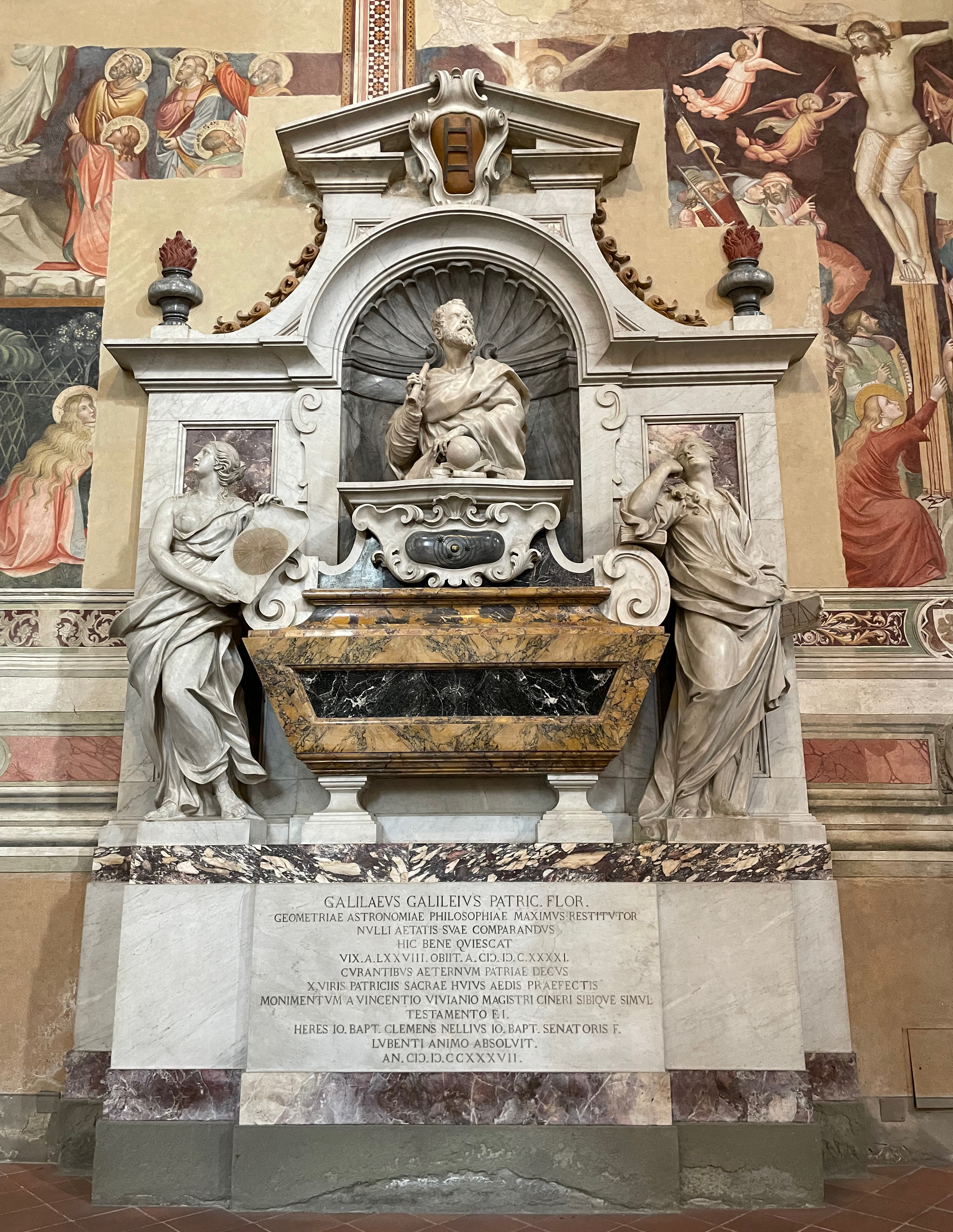
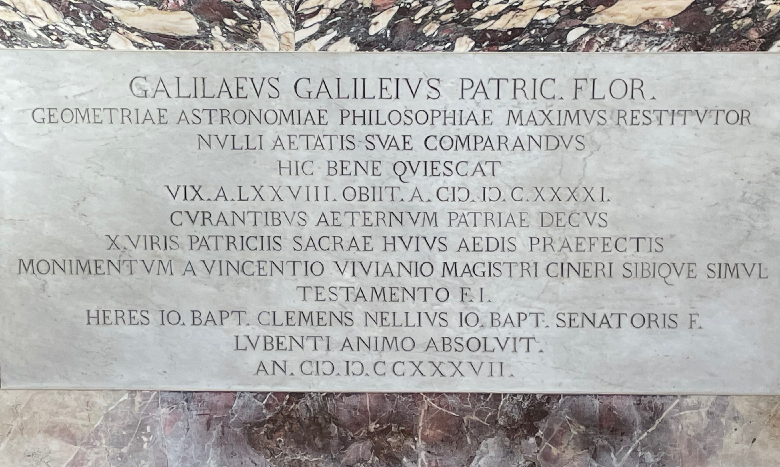
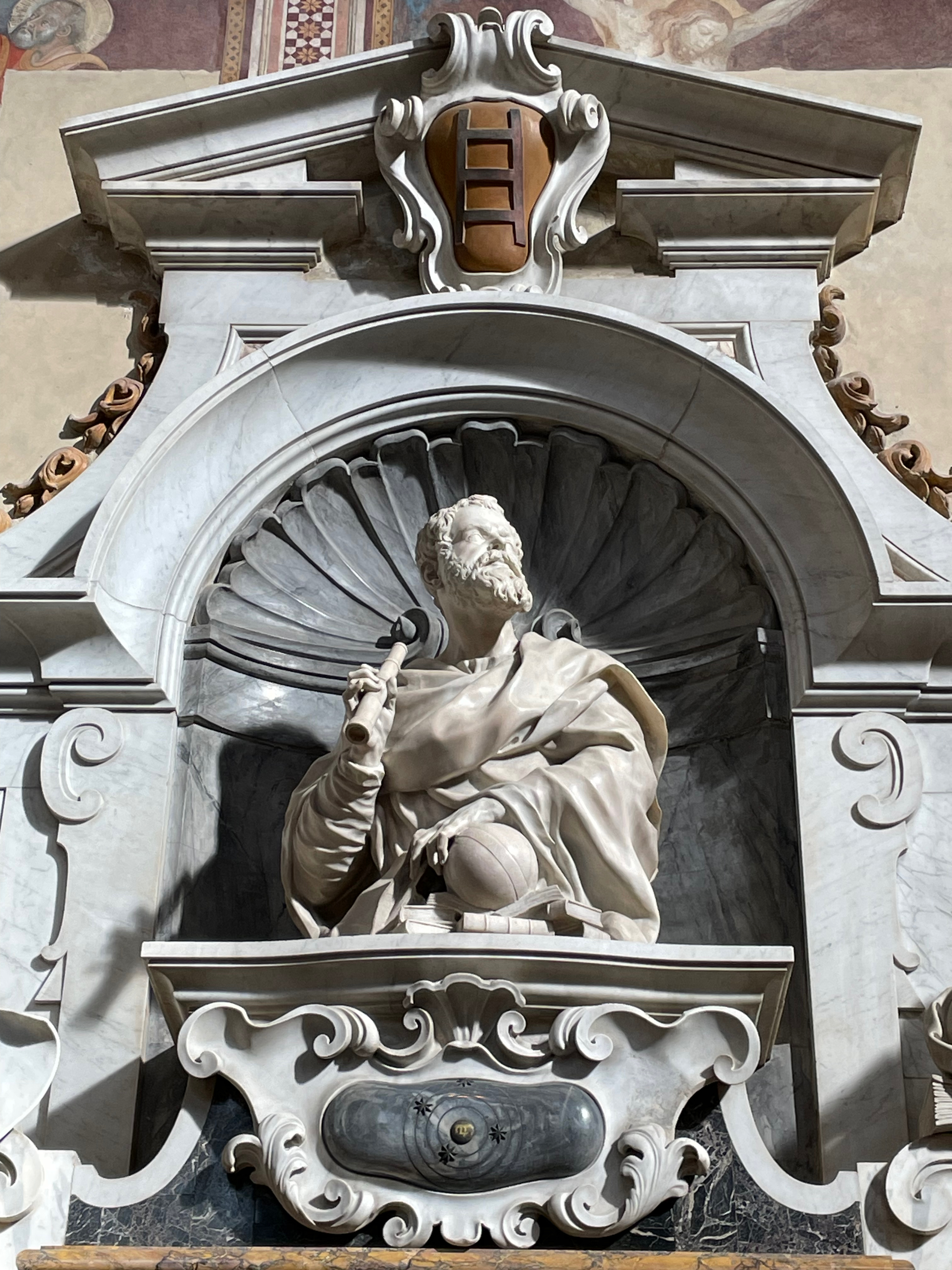
Galileo’s tomb, Santa Croce, Florence. Photos: Books On Books.
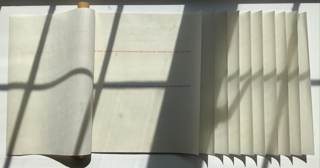
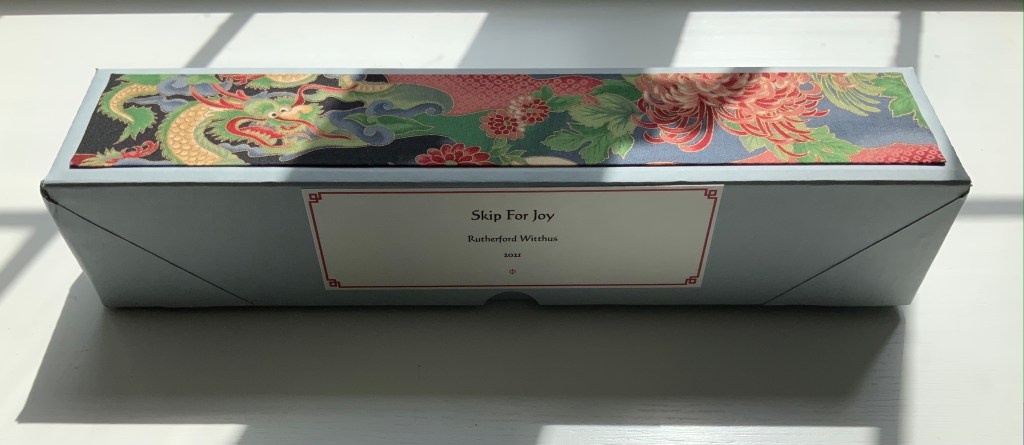
Skip for Joy (2021)
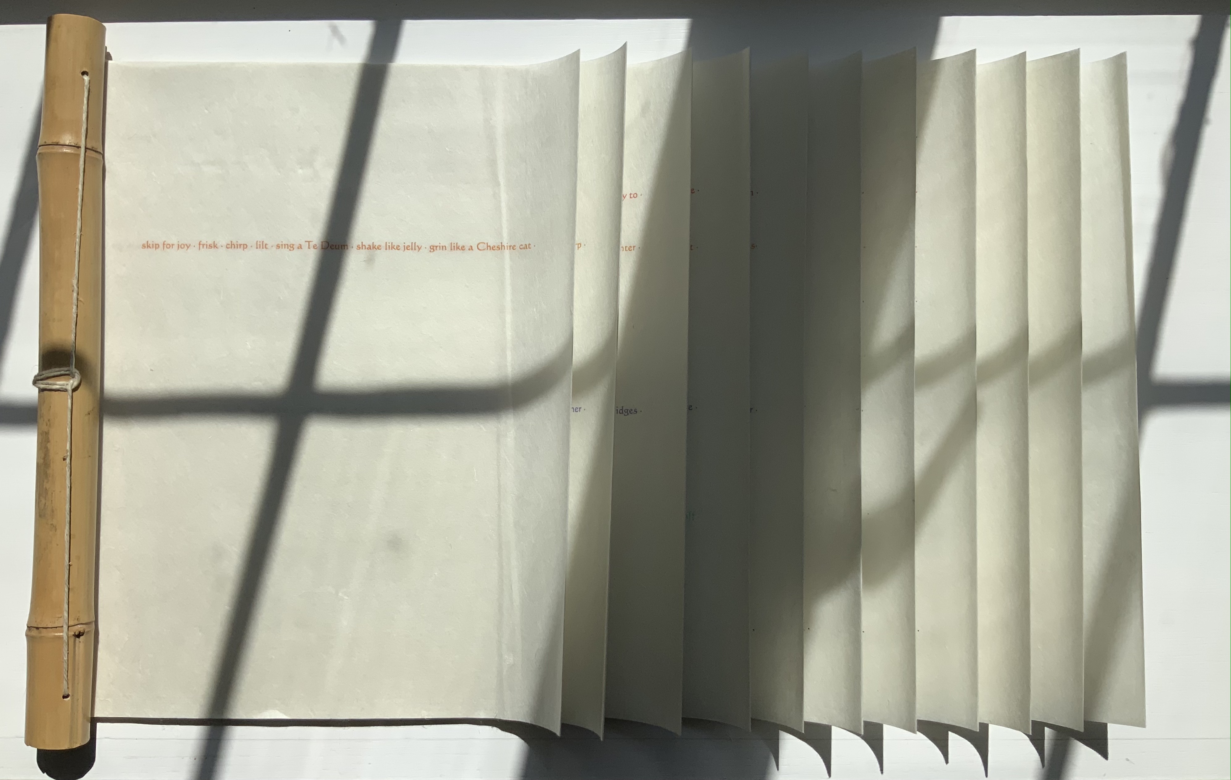
Skip for Joy (2021)
Rutherford Witthus
Dragon-scale scroll bound to bamboo rod. H306 x W477 mm, 11 panels. Edition of 5, of which this is #1. Acquired from the artist, 18 August 2021.
Photos of the work: Books On Books Collection. Displayed with permission of the artist.
Rutherford Witthus’ work is strong, quiet, broad and distinctive. It blends Eastern and Western traditions of the book arts. It joins the blackletter fonts of the Cistercian monks with the typography of Hermann Zapf. It joins John Cage’s chance-determined selection in the creation of art with a group of physicists’ fascination with the crumpling of paper. It experiments with abstract art and Japanese fore-edge illustration and binding. It offers a meditation on Gilles Deleuze’s The Fold: Leibniz and the Baroque through an intricately folded reprinting. The artist’s eclectic appreciation of the work of Sappho, Walt Whitman, St. Francis, Gilles Deleuze, Søren Kierkegaard, Ernst Haeckel, Robert Herrick, Miguel de Unamuno and others finds an impressive unity across his body of work. Skip for Joy is the first of his works to be added to the Books On Books Collection.
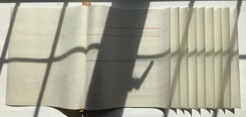
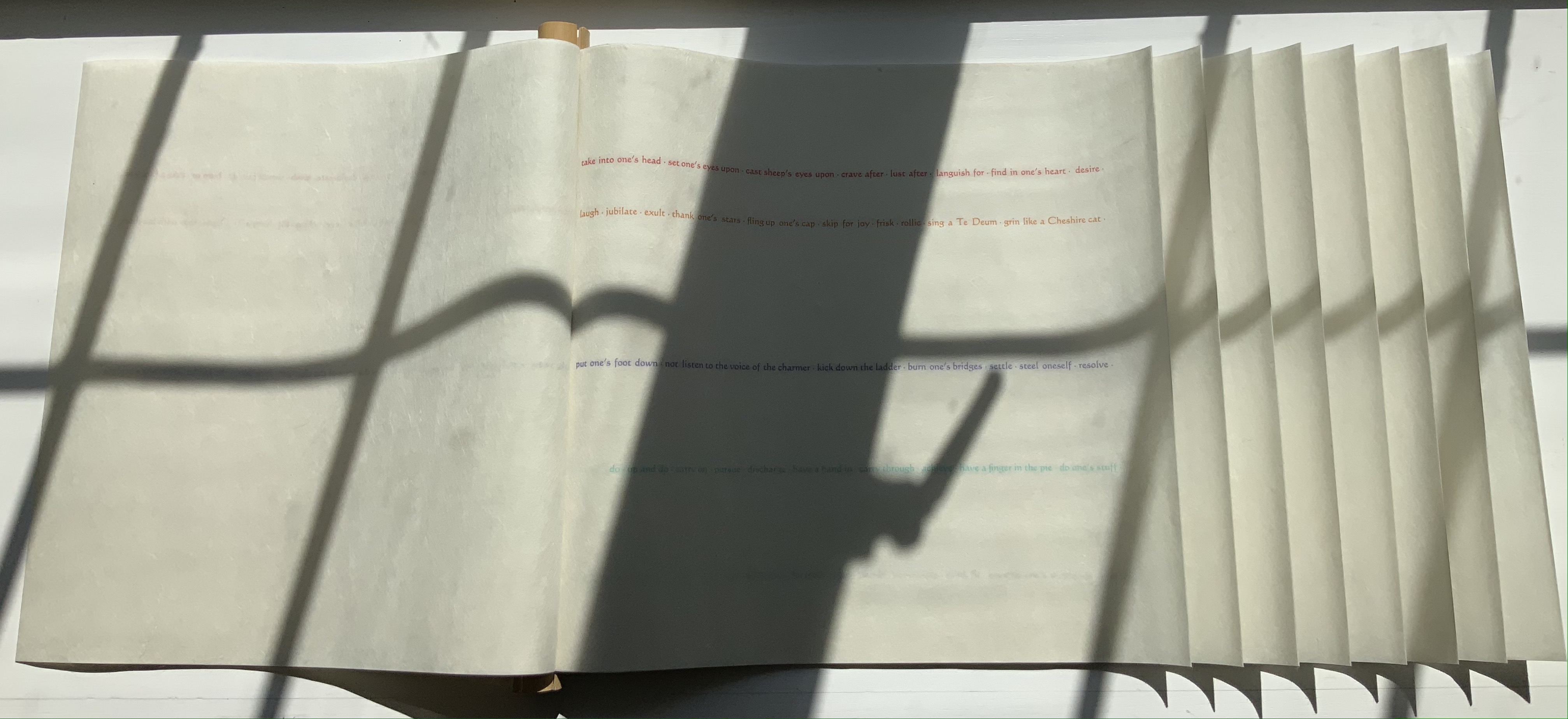
Compounding its compelling structure, Skip for Joy displays accumulating lines of text one by one until there are ten lines of text on the tenth panel. For each line, Witthus draws its words and expressions from an entry in Roget’s Thesaurus. As each panel grows in width to play its part in the dragon-scale binding, each line grows, too, repeating words and adding more synonyms from its entry in Roget’s. Compounding the scaling of structure and text, Witthus varies his lines in color and position. Starting with the phrase “skip for joy” in orange on the first panel, he then adds the phrase “grit one’s teeth” in violet on the second panel beneath the orange line; then “desire” in red on the third above the orange line; then “do up and do” in turquoise on the fourth; and so on.
Second panel
Third panel
Fourth panel
What does Roget’s Thesaurus have to do with dragon-scale binding? The scroll’s first phrase and title provide a clue: an imperative to play. Anyone interested in playing with the dragon-scale (or whirlwind) binding usually goes to the site of the International Dunhuang Project: The Silk Road Online. Among its descriptions so far of the forty thousand works found in the Buddhist cave library near China’s Dunhuang on the western edge of the Gobi desert in 1900, there is this passage:
Old Chinese accounts of whirlwind binding are very rare. However, there was a trail of clues left by a Tang dynasty (AD 618-907) rhyme dictionary called Kanmiu buque qieyun (Corrected rhymes), by Wang Renxu. … From the earliest accounts from the Song dynasty up to the Qing dynasty (AD 1644-1911), references to whirlwind bound books have always been connected with this text. … / Several examples of what is believed to be whirlwind binding have now been discovered in the Dunhuang collections of the Bibliothèque nationale de France and the British Library. Most of these have not been rebound, so it is possible to get a clear impression how these manuscripts were bound and why they were bound in this manner. — IDP
Where Western reference works are organized alphabetically, the Qièyùn rhyming dictionary is organized phonologically. But that phonological organization is complex: starting first by grouping characters according to the five tones, then grouping them into rhyming groups according to a character’s initial consonant, and then into groups according to the rhyme of a character’s final consonant. And determining those rhymes requires instructions — the fanqie method that explains via other characters how a character entry should be pronounced. In short, organization by phonological similarities — of tone, initial rhyming consonant and final rhyming consonant.
So to follow the lead of the dragon-scale bound Qièyùn, Witthus picks an English-language reference work whose entries offer plenty of content based on similarities — such as synonyms. Skip for Joy is playful art. Its “rhymes” are the repetitions and synonyms in a line of text. Its lines of text jump into the panels where they will and in whatever color that suits. In the tenth panel, the seventh line even breaks into a dragon-like undulation.
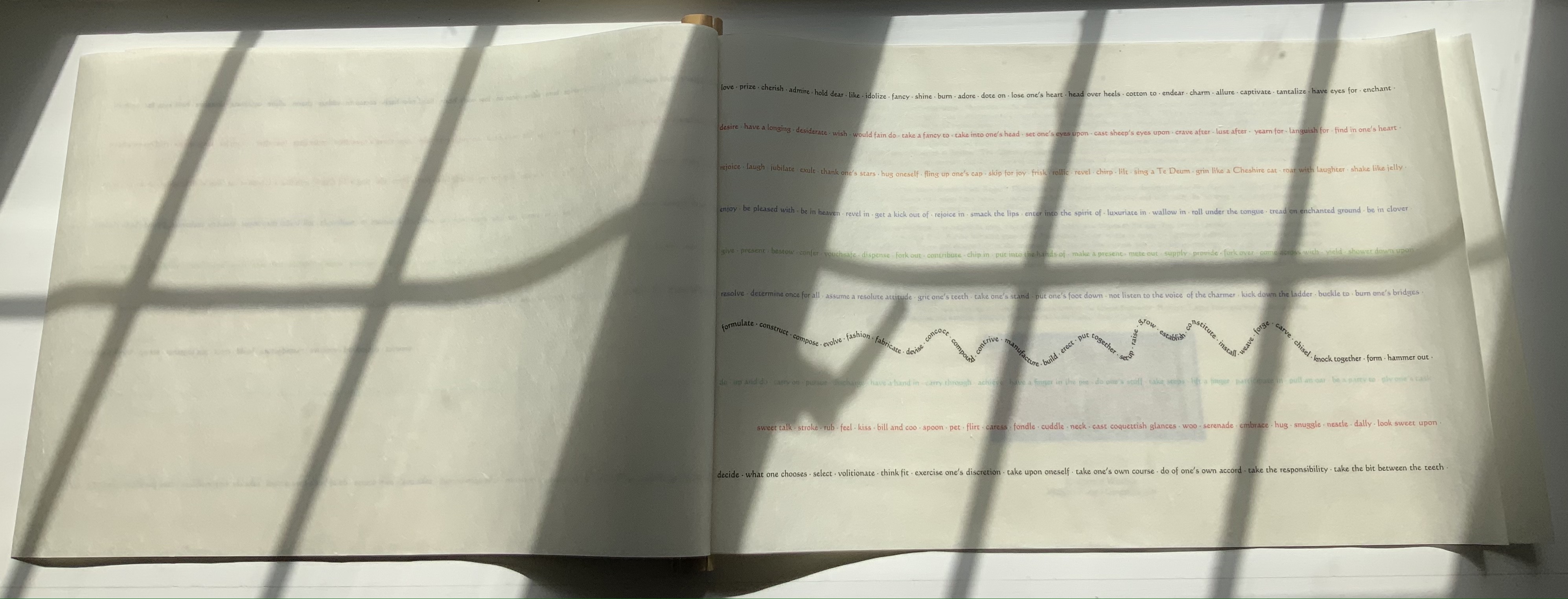
Tenth panel
As the dragon-scale scroll returns to its archival box, its colors and undulating line unite with the dragon in the box’s silk onlay.
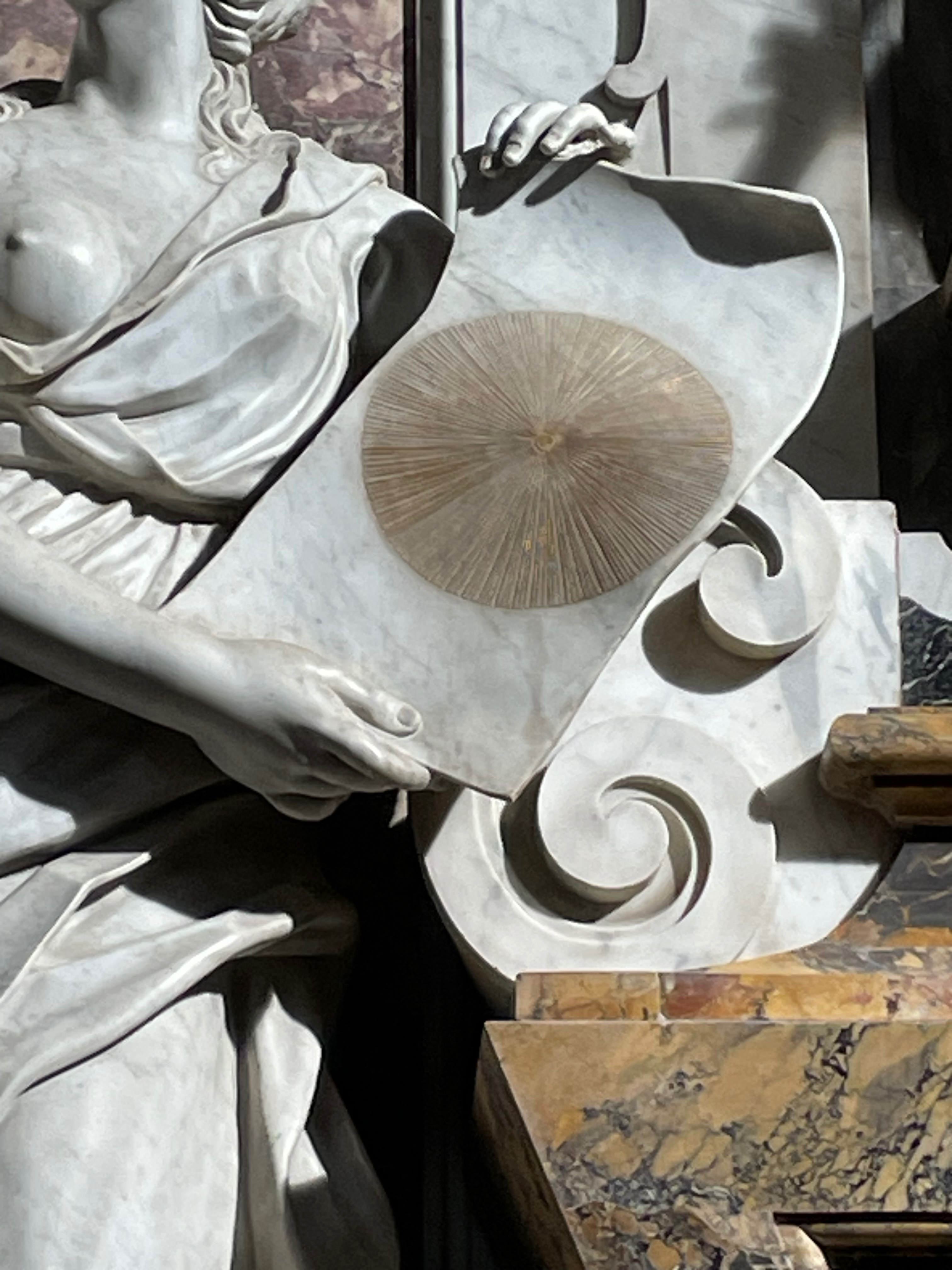
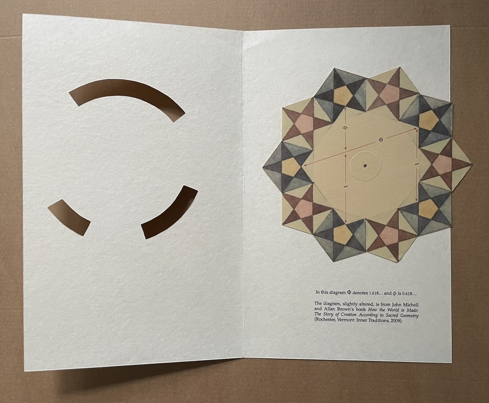
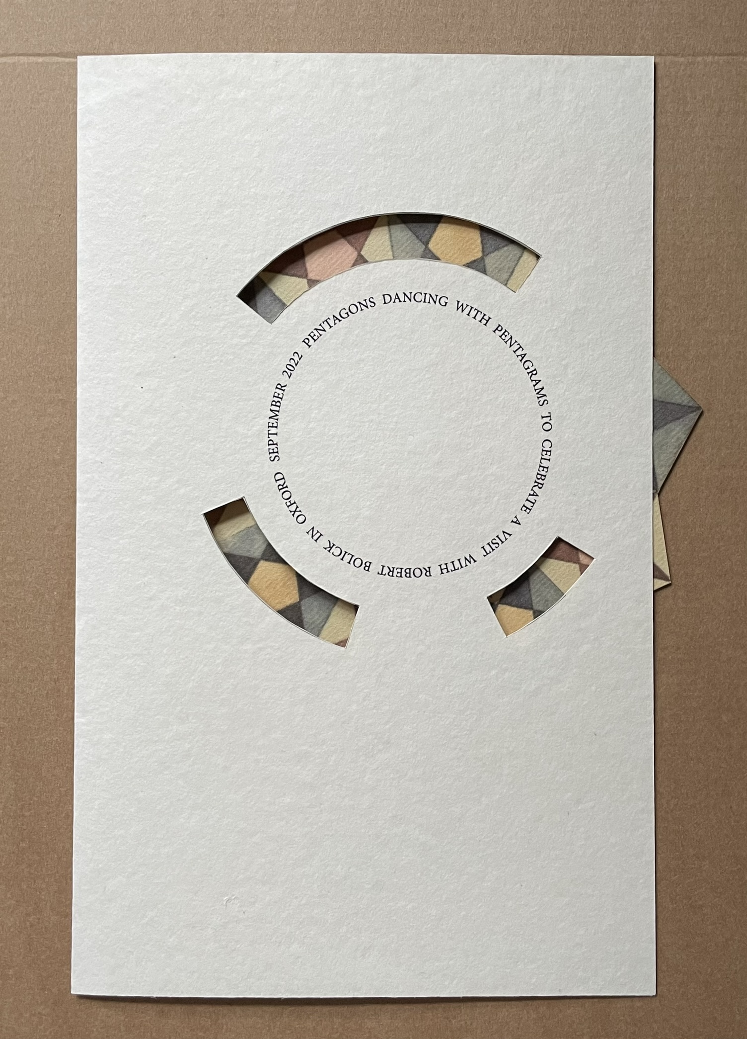
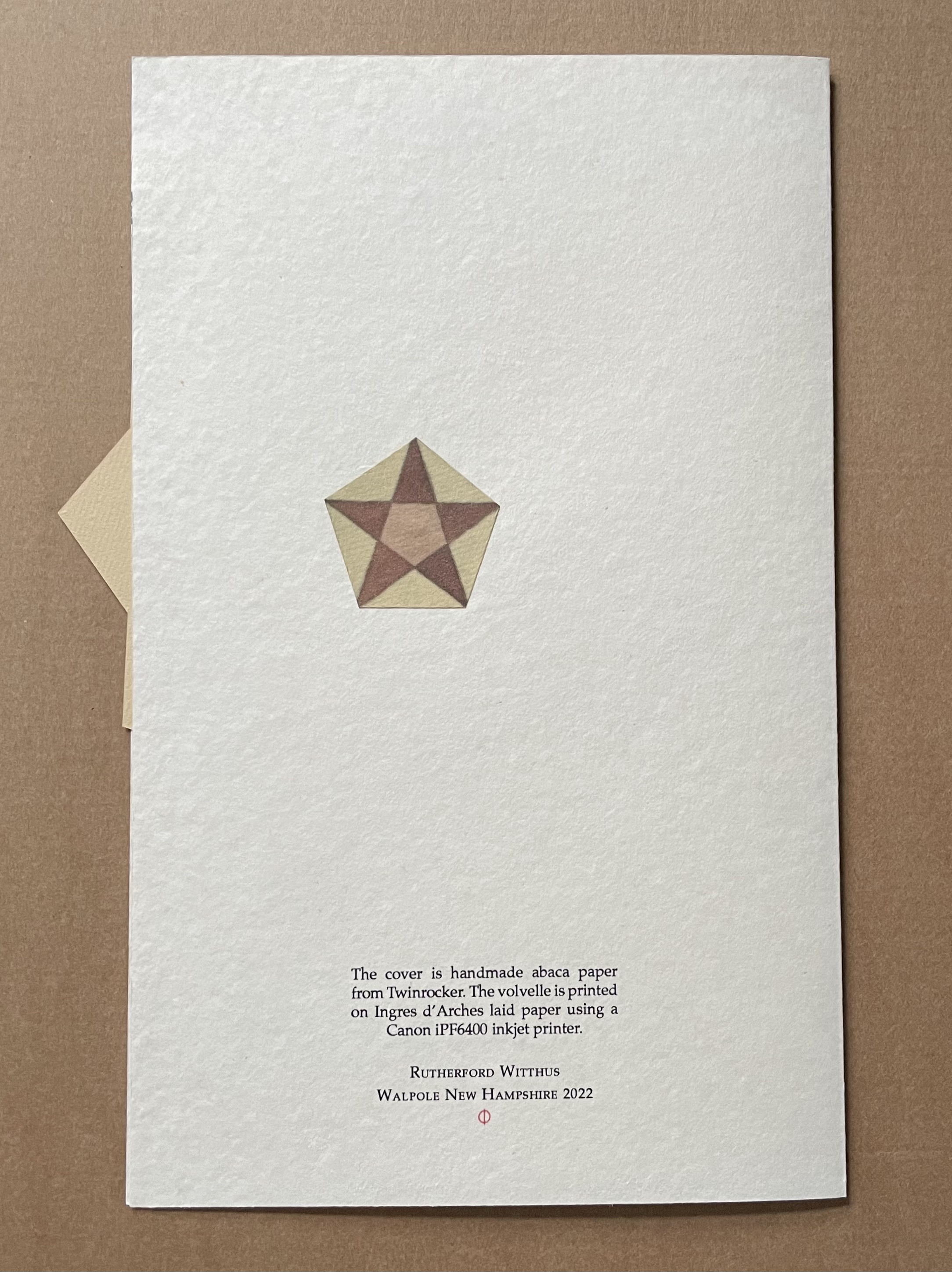
Pentagons Dancing with Pentagrams (2022)
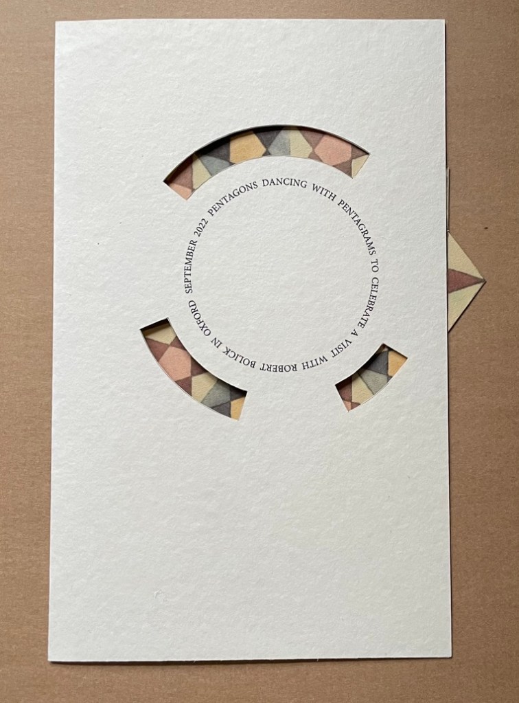
Pentagons Dancing with Pentagrams (2022)
Rutherford Witthus
Single-fold die-cut card with volvelle. H266 x W180 mm. Unique. Acquired from the artist, 2022.
Photos: Books On Books Collection.
Further Reading
“Abecedaries I (in progress)“. Books On Books Collection.
“Nif Hodgson“. 27 October 2021. Books On Books Collection.
“Hedi Kyle’s The Art of the Fold: How to Make Innovative Books and Paper Structures“. Bookmarking Book Art.
“Zhang Xiaodong“. 7 August 2025. Books On Books Collection.
Chinnery, Colin. “Whirlwind binding (xuanfeng zhuang)“. The International Dunhuang Project. Site last revised: September 2016. Accessed 21 October 2021.
Evetts, L. C. 1938. Roman Lettering. a Study of the Letters of the Inscription at the Base of the Trajan Column with an Outline of the History of Lettering in Britain … Diagrams and Illustrations by the Author. London: Pitman.
Michell, John, and Allan Brown. 2009. How the World Is Made : The Story of Creation according to Sacred Geometry. London: Thames & Hudson.
Nash, John R. nd. “In Defence of the Roman Letter”. EJF Journal, 11. The Edward Johnston Foundation, Ditchling, West Sussex. pp. 11-31.
Swetz, Frank J. 1996. “The Mathematical Quest for the Perfect Letter,” Humanistic Mathematics Network Journal. No. 13, Article 3. Accessed 10 June 2023.
Ulrich, Roger B. 2013 ~. Trajan’s Column in Rome. Accessed 1 May 2023.
Victoria & Albert Museum. n.d. “Trajan’s Column“. Website. Accessed 10 June 2023. Article on the column and its 1864 plaster cast now in the center of the V&A Cast Courts.