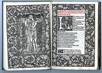
Hollie Berry has two brief posts on book art at Book Arts at The Open Press (BA@TOP), a supportive community of book artists in Chattanooga, Tennessee, for whom The Open Press provides access to printmaking, book arts, and letterpress classes, workshops and equipment. Her first post offers as examples of the breadth of book art: Dan Essig, Sandy Webster, Brian Dettmer and Maddy Rosenberg. A good start, if light on installation book artists (say Alicia Martín).
The Open Press is 225 miles from Elizabethton, TN, where Wallace Stevens wrote “Anecdote of the Jar” in 1918 and which is only 67 miles from Asheville Bookworks in West Asheville, NC, where Landon Godfrey hosts Vandercooked Poetry Nights dispatching listeners into the mountain air clutching poems printed on broadsheets from the resident Vandercook Press, on which the authority Paul Moxon lectured in March this year at The Open Press, 199 miles away by the backroads across the Appalachians. …”And round it was, upon a hill.”
English: Comparative Bauer Bodoni versus Bodoni Català: Comparativa Bauer Bodoni vs Bodoni (Photo credit: Wikipedia)
This year marks the 200th anniversary of the passing of a great contributor to the linked histories of the book and typography: Giambattista Bodoni (1740-1813). Bodoni among others such as Fournier and Didot established the “Modern” fonts, typefaces characterized by the extreme contrast of their thick and thin strokes, delicate and sharp serifs and a chilly sparkling engraving-like quality heightened by generous leading and made possible by improvements in 18th and 19th century typecasting and manufacture of ink and paper. Bodoni planned and formed the royal printing house for the Duke of Parma in the Palazzo della Pilotta, where the Museo Bodoniano resides today. Associated with Pope Sixtus V, Carlos III of Spain and the Duke of Parma, Bodoni became one of the most celebrated printers in Europe.
View of Palazzo della Pilotta. (Photo credit: Wikipedia)
Although Bodoni’s fame in his lifetime was of a piece with that of the Romantic figures Chopin, Liszt, Byron, Goethe and Shelley, his output was Neoclassical with editions of Homer, Catullus, Virgil, Horace and the English poets Thomas Gray and James Thomson. His two-volume Manuale Tipografico (1788, 1818) is a meticulous monument of typographic art with more than 14 sets of roman and italic typefaces, a wide selection of decorative designs and symbols and alphabets from the Greek, Hebrew, Russian, Arabic, Phoenician, Armenian, Coptic, and Tibetan languages. The 1818 two-volume edition can be viewed online at the Bibiloteca Bodoni.
Portrait of Bodoni (c. 1805-1806), by Giuseppe Lucatelli. Museo Glauco Lombardi. (Photo credit: Wikipedia)
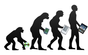
This flowering of typography and design – reflective of the age and technical developments of book printing – prompts a thought toward the impact of today’s technology – screen display, ereaders, XML and HTML, cascading style sheets, etc. – not only on type and design but their purpose as well.
“The type and pages beg to be admired – that is looked at – which is well and good, except that looking and reading are quite different, actually contradictory, acts…. To look at things, we either disengage and let them flow by on their own or we stop them in their tracks. To look we hold our breath or (in the worst of cases) pant. To read we breathe.” So say Warren Chappell and Robert Bringhurst in their critical comments on Bodoni and the Moderns. (A Short History of the Printed Word, pp. 173-74; 1970,1999.)
Perhaps we are still in the age of e-incunabula and have not reached the point where type and design on the screen beg to be admired. The improvements delivered by Readmill and Readability have been welcome for their contribution to ease of reading. It may be perverse to wish for developments that may interfere as Chappell and Bringhurst assert the Modern faces interfere with reading. But that assumes that they are right in their hieratic statement “To read we breathe.” Might it be as legitimate to assert “To read we click. To read we link. To read we dim or brighten. To read we tilt from portrait to landscape causing the page to reflow.”?
Will High Definition play the role that improved paper surfaces played to allow those thinner strokes and delicate serifs in the 18th and 19th centuries? And if it does, what on-screen design, comparable to Bodoni’s increased leading, will perform the same heightening effect for new faces and design that beg to be admired?
Bodoni Ornaments (Photo credit: Bene*)
For more on the subject of Bodoni, see “Biblioteca Bodoni Launched on Bicentennial Anniversary of Giambattista Bodoni’s Death” by Yves Peters, The Font Feed, 11 December 2013.
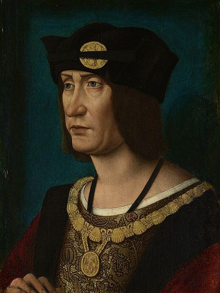
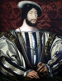
In 1513, Louis XII of France issued an edict praising printing, exempting it from a large impost and removing a tax on books. Louis declared that “the printer-booksellers … ought to be maintained in their privileges, liberties, franchises, exemptions, and immunities, in consideration of the great benefits which have been conferred upon our kingdom by means of the art and science of printing, the invention of which seems rather divine than human ….” Two years later, Louis was dead, and the lot of books and printer-booksellers fell under the shadow of France’s so-called Father of Letters, François I, who issued an edict in 1535
François I, Roi de France, 1515-1547
banning the use of the printing press and permitted books and printers to be consigned to the flames for blasphemy. (Richard Christie, Etienne Dolet: The Martyr of the Renaissance, 1508-1546, 1899. Pp. 330-31). Which might be said to challenge the certainty of taxes while confirming that of death.
This year is the centenary of Gerard Meynell’s trade periodical The Imprint, which was the scene of Stanley Morison’s first appearance in print. How appropriate then that Morison’s book A Tally of Types tells the story of the journal’s founding and, equally important, how the historic font called Imprint Old Face came into being. The font’s importance is that “the design had been originated for mechanical composition. … the first design, not copied or stolen from the typefounders, to establish itself as a standard book-face.”(p.21) Ironically, Meynell and his colleagues intended for the font to be freely available to the trade, but eventually it came into the ownership of Monotype Imaging, where it can be obtained today under the OpenType family.
As the world of print morphs into its digital incarnation, we see the same impetus behind the new generation of typographers, the ones born digital, but we see varying degrees of adherence to the “type wants to be free” movement.
What might be remarkable — or book-markable — is whether the surge in objectifying the book through sumptuous illumination, miniaturization or the creation of book art occurs at definitive moments of shifting media. One-off illuminated manuscripts preceded the invention of moveable type, but was there a definable surge of them in the decades either side of 1450?
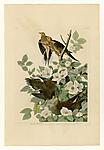
The Audubon double elephant folio books appeared in 1820 about the time of Frederick Koenig‘s invention of the steam-driven letterpress.
Are William Morris’s fine editions from Kelmscott Press in 1890 a datum in a surge of book objectification either side of Mergenthaler‘s invention of linotype in 1884?
A Visual Odyssey across the Last Himalayan Kingdom, the world’s largest book according to Guinness.
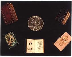
Last week, the New York Times ran an article about Neale Albert‘s collection of miniature books. Is this popular interest in unreadable books and the surge in altered and sculpted books an anxious reflection of another shift in media?
Ferris Jabr’s article “The Reading Brain in the Digital Age: The Science of Paper versus Screens” in Scientific American (April 11, 2013) revisits the themes raised in Maryanne Wolf’s Proust and the Squid mentioned in the previous posting. Jabr highlights much insightful writing on the neuroscience of reading, on which more in a bit. He begins, however, with a “haptic” anecdote that will resonate with parents and grandparents of children who are learning to read now or have learned in the last 3-5 years.
In a viral YouTube video from October 2011 a one-year-old girl sweeps her fingers across an iPad’s touchscreen, shuffling groups of icons. In the following scenes she appears to pinch, swipe and prod the pages of paper magazines as though they too were screens. When nothing happens, she pushes against her leg, confirming that her finger works just fine—or so a title card would have us believe.
Earlier the same year, I was lying in bed with an iPad reading Death and the Penguin by Andrey Kurkov. As the story drew me in and admittedly as the hour grew late, I found myself repeatedly reaching into the upper right-hand corner of the screen with my left forefinger and thumb to pick up and “turn the page.” I had not developed the habit of “sweeping” or “tapping” to move through the book. These real-life mirror images of the haptic habits of a young soon-to-be reading brain and an old reading brain bring Wolf’s speculations alive.
Numerous studies cited by Jabr suggest different areas of the brain at work in screen reading vs print reading and connect that to poorer retention and comprehension in screen reading than print reading. But one of the more recent ones (“Metacognitive regulation of text learning: On screen versus on paper,” by Ackerman and Goldsmith) shows that where readers
studied expository texts of 1000–1200 words in one of the two media and for each text […] provided metacognitive prediction-of-performance judgments with respect to a subsequent multiple-choice test[,] [u]nder fixed study time (Experiment 1), test performance did not differ between the two media, but when study time was self-regulated (Experiment 2) worse performance was observed on screen than on paper. The results suggest that the primary differences between the two study media are not cognitive but rather metacognitive—less accurate prediction of performance and more erratic study-time regulation on screen than on paper.
So the reading brain may not be rewiring itself, but print and screen do demand different strategies of reading and study. Might the “haptic habits” of physically turning the page or recalling three dimensionally the place in the book and on the page where a sentence occurs (or pinching, swiping and prodding) be clues to how we learn to learn what we read? What we may be seeing in the one-year old are the beginnings of the metacognitive cues that will raise the performance of tomorrow’s screen reading brains, and in Ackerman’s and Goldsmith’s subjects, the familiarity of today’s reading brains with the metacognitive cues so key to studying from print that the students print out the relevant ebook chapter.
As Jabr concludes, “When it comes to intensively reading long pieces of plain text, paper and ink may still have the advantage. But text is not the only way to read.”
Which harks back to the conclusion of the previous post and Jerome Bruner’s apt observation of Vygotsky’s fondness for Bacon’s epigram, “Nec manus, nisi intellectus, sibi permissus, multum valent” (Neither hand nor intellect left each to itself is worth much)” (247). Perhaps neither print nor digital left each to itself is sufficient.
The Harry Ransom Center at the University of Texas at Austin has updated its site displaying one of the only five copies of the Gutenberg Bible in the US. There is much to admire here, and much to be curious about. The illustration of the watermarks that distinguish the Pforzheimer Bible, the map of locations of other copies (complete and incomplete), the page-turning interactivity and the inclusion of a kids section are welcome.
The interactive map showing the spread of printing, however, does not compare well with those at Jeremy Norman’s From Cave Paintings to the Internet Database Maps, and an explanation of how the Center’s Bible was digitized, something on the order of Ann Tomalak’s informative essay at the British Library’s site describing what conservators must do to prepare fragile manuscripts for digitization, would enrich the Ransom Center’s offering.
Equally the history of Gutenberg the man and his work with Johann Fust could have been more detailed as could the history of printing and its spread. Jeremy Norman’s site is still hard to rival. Other related sites worth a bookmark:
Aristotle, a 4th-century-BCE philosopher, portrayed in 1493 Nuremberg Chronicle as a 15th-century-CE scholar (Photo credit: Wikipedia)
LiveInk® cleverly demonstrates how the display of writing has developed by presenting the following quotation from Aristotle’s On Interpretation in the forms in which it would have appeared in the different stages of theA Brief History of Reading.
“Spoken words are the symbols of mental experience, and written words are the symbols of spoken words.” — Aristotle, On Interpretation
For example,
In 2000 BC, the Phoenicians developed the first methods to represent spoken language – an alphabet consisting entirely of consonants:
LiveInk® must hope for a place on the timeline for its re-formatting process (Visual-Syntactic Text Formatting (VSTF), which breaks up blocks of traditionally laid out text (flush left, ragged right or justified) and presents them in a more readable form, reminiscent of 20th century free verse. The claim of increased readability is based on eye movement studies by Randall Walker, Charles Vogel, Stan Walker, Phil Schloss, Charles R. Fletcher, Youngmin Park and Mark Warschauer.
Last September, BOB picked up an article by Michael Kozlowski on the Kindle feature of synching an ebook with its counterpart audiobook and explored the question, “What can the physiology, neuropsychology and sociology of reading tell us about ourselves?” The research behind LiveInk® is worth bookmarking for the reading list (see below) concluding BOB’s September 2012 entry if only to experience the “melon twisting” that comes from trying to accommodate these disparate yet related perspectives on the act of reading.
Under the blog name “Wynken de Worde,” Sarah Werner writes about books, early modern culture, and those of us who may be postmodern readers — when she is not preparing the syllabus for her course at the Folger Shakespeare Library. Wynken (not related to Blynken or Nod) was the primary assistant to William Caxton the first printer of English-language books — Malory’s Morte d’Arthur, Chaucer’s Canterbury Tales, and The Golden Legend.
If Sarah Werner channels Wynken de Worde in her classroom as well as she does through her website, her students are to be envied. She makes what she writes tangible, palpable, haptic. Three brief examples, the last of which prompts this bookmark:
Imposition is “the arranging of pages in a chase [a steel or iron frame for holding them tightly for the letterpress] in a particular sequence . . . so that when folded the printed pages will be in consecutive order.” Glaister, Encyclopedia of the Book (2001). But the earliest books did not have page numbers, so how were old Bill and Wynk to know which to place where? Here’s Werner:
Lerner’s newsbook ready for folding.
Above is a numbered example of the same newsbook that I used as an image in my last post. The red numbers are page numbers: folded in the right way, you’d get an 8-page booklet in the order indicated. But if you look closely, you’ll see that the actual news sheet doesn’t have page numbers. Instead, there are signatures: at the bottom of the first page is a tiny, blotted “L”; at the bottom of the 5th page is a tiny “L3″ (the “L2″ has been cut off at some point when the page was trimmed). These are signature marks that count off by leaves. What’s a leaf, you ask? It’s a physical unit of paper: when you turn the page in a book, you are actually turning a leaf of paper. Early modern printers would have thought in terms of sheets and leaves, not pages, when they were figuring out how to print a work. Depending on the imposition (how the text is laid out on the sheet), you could end up with different numbers of leaves: 1, 2, 4, 8, 12, 16, 24. A quarto imposition results in a sheet of paper being turned into 4 leaves; there are 2 pages to each leaf (a recto side and a verso side), so there are 8 pages in all. The blue letters and numbers show the signatures. One thing that throws off beginners is understanding how recto and verso relate to each other. They do not mean right and left but front and back.
Providing a downloadable PDF with which to follow along, Werner walks the reader through the exercise and proves her point: “it’s a handy way to understand and demonstrate to others the general principle of early modern format: multiple pages are printed onto a single sheet in the correct order so that when folded, they appear sequentially.”
The second example of the pedagogically palpable or the palpably pedagogic comes in the same posting:
“When you’re done, you can try folding it into a tiny little pressman’s cap, following the instructions that appear in this lovely piece, “The Newspaper Man is Defunct,” from The Cape Cod today.”
That bit of fun was two years ago. The brilliance is undiminished today; if anything it’s brighter. For this year’s course, Werner is handing out her syllabus in unpaginated quarto format. To figure out the syllabus, the students have to fold the imposition correctly! Try it yourself and grasp the meaning of the “book arts.”
Ah, the books arts. Imposition. The dying arts? You need look no further than the end of your Proboscis to see that that is not true. Proboscis is a London-based non-profit studio that commissions and facilitates new works and publications, some of which can be found in the DIFFUSION library.
DIFFUSION ebooks are hybrid digital/material publications. They bring together the “tactile pleasures of tangible objects with the ease of sharing via digital media.” Shareable paper books, free to download as PDFs, print and make up, DIFFUSION eBooks “can be shared electronically or as material objects – scanned, photocopied, emailed or posted. The eBooks bridge analogue and digital media by taking the reader away from the computer screen and engaging them with the handmade.”
And just a bit further along the continuum is Francisca Prieto, also in London. Inspired by the serio-comical poet Nicanor Parra’s “antipoems,” Prieto offers up The ANTIBOOK.
The reader must fold the pages of the book (20.5 x 10.5cm) to form the icosahedron (15 x 17 x 19cm) in order to read Parra’s antipoems in order.
Whether Prieto’s ANTIBOOK or the DIFFUSION ebooks are book, art, both or neither, they and Wynken de Worde make us think with our hands as well as our minds about what can be done with the form and concept of the book. And that makes the concept of imposition worth a bookmark.
PS: “Books On Books” acknowledges David Pearson‘s Books as History (New Castle, DE: Oak Knoll, 2008 and 2011), p. 75, for the inspiration of the wording of the conclusion here.
PPS: Another opportunity to learn by doing can be found at the end of a short and witty book called A Dodo at Oxford: An Unreliable Account of a Student and His Pet Dodo. Under the guise of explaining, presenting and annotating a diary found in a charity shop, Philip Atkins and Michael Johnson deliver a history of the book. Appendix 7 provides the offer to engage in imposition.
PPPS (6 January 2021): Weeks into a third Corona virus lockdown, another contribution for learning imposition by doing has appeared. Appropriately this time in the Quarantine Public Library started by Katie Garth and Tracy Honn in May 2020. It comes from Barb Tetenbaum; check out the download and instruction video here.
Untitled Barbara Tetenbaum Chemistry stencils (Prague, 1993); colored pencils (Madison, WI, 1975); and press-on letters from the model train industry are combined with a 100-year old Encyclopedia Brittanica page.
Here’s a previously missed infographic for the evolution of the book – a bit skeletal but with the elegance of the format. And while we are at it, let’s add some bibliographic and webographic “evolution” entries:
Feel free to suggest new additions to the timeline!
Ebook Timeline Updated – 20120812
Yesterday, the 11th of August 2012 marked the twenty-fifth anniversary of Hypercard. Alerted by Matthew Lasar in Ars Technica in May, gurus lined up to comment on Bill Atkinson‘s contribution in the 80s to Apple and the basics of hyperlinking techniques we now take for granted.
David Weinberger and Roy Tennant celebrated the anniversary with engaging and personal posts linked from their names here.
With the publication of The Cluetrain Manifesto, Weinberger became one of the Web’s leading light-shedders (gurus) and provocateurs. Most important in this context, he was in the audience when Bill Atkinson presented Apple’s Hypercard to the MacWorld conference in 1987. Weinberger writes, “HyperCard was a groundbreaking, beautiful, and even thrilling app. Ahead of its time for sure. But the time it was ahead of seems to me to be not so much the Age of the Web as the Age of the App. I don’t know why there isn’t now an app development environment that gives us what HyperCard did. Apparently HyperCard is still ahead of its time.”
Tennant, too, has written several books and a monthly column on digital libraries for Library Journal for a decade and currently works at OCLC. Most important, he “was there” as an early user of the Hypercard system and HyperTalk programming language on which it is based. As Tennant puts it, “HyperCard was where I learned how to DO the Web. It was where I learned the importance of screen real estate. It was where I learned the law of 7, plus or minus 2. It was where I learned how important graphics are in creating an engaging site. It was where I cut my teeth on interactivity.”
Apps, screen real estate, Miller’s law, graphics and “cutting teeth” on interactivity — all are part of the new toolkit for making books.
Timelines are, of course, for looking further back as well as forward. Earlier this year, April 2012 marked the fifteenth anniversary of the publication of Liane Lefaivre’sLeon Battista Alberti’sHypnerotomachia Poliphili: Re-Configuring the Architectural Body in the Early Italian Renaissance (Cambridge, MA: MIT Press, 1997) and the online publication of The Electronic Hypnerotomachia, which contains the facsimile text and illustrations. The online publication of extracts from Lefaivre’s book illustrates the linking prefigured by the “card stack” approach of HyperCard. What MIT Press and TU Delft, Lefaivre’s affiliation, host on their servers are not ebooks or even e-incunabula of the sort we experience today, but they are clearly forerunners to them.
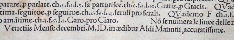
In twenty-eight more months, December 2014, we will see the 515th anniversary of the original work’s publication by Aldine Press (Venice, December 1499). The founder Aldus Manutius did not normally publish heavily illustrated books. The Hypnerotomachia Poliphili was the exception and the only commissioned work that Manutius undertook. The exception reflects favorably on the overall success of his business and supports the view that Venice had become the capital of printing and publishing very shortly after the invention of printing by moveable type.
The book unveils an inscrutable, almost comic-book-illustrated story, glittering with made-up words in Greek, Latin, Hebrew and Arabic (including proto-Greek, -Hebrew and -Arabic fonts). In addition to the page displays sculpted into shapes such as goblets, this one volume displayed the technological mastery of and improvement on the new Roman (as opposed to the heavy Gothic) typeface Bembo. According to Norma Levarie in The Art & History of Books (New York, 1968), this singular volume revolutionized typography in France in less than twenty-five years.
Somewhat like software releases, though, the 1499 edition came with bugs. The colophon to the Hypnerotomachia Poliphili falls at the end of a full page of errata.
“Venice Month December. 1499. in the house of Aldus Manutius, most accurately done.”
“The Book Industry Study Group (BISG), a leading U.S.-based trade association representing the entire book supply chain, announced today the publication of a new Policy Statement endorsing EPUB 3 as the accepted and preferred standard for representing, packaging, and encoding structured and semantically enhanced Web content — including XHTML, CSS, SVG, images, and other resources — for distribution in a single-file format.”
For the record and from the Library of Congress:
“The Open eBook Publication Structure or “OEB,” originally produced in 1999, was the precursor to EPUB. Version 1.0 of the Publication Structure was created in the winter, spring, and summer of 1999 by the Open eBook Authoring Group. Following the release of OEBPS 1.0, the Open eBook Forum (OeBF) was formally incorporated in January 2000. OEBPS Version 1.0.1 [OEBPS_1_0], a maintenance release, was brought out in July 2001. OEBPS Version 1.2 [OEBPS_1_2], incorporating new support for control by content providers over presentation along with other corrections and improvements, was released as a Recommended Specification in August 2002. EPUB 2 was initially standardized in 2007. EPUB 2.0.1 was approved in 2010. EPUB, Version 3, was approved as an IDPF Recommendation in October 2011. It is substantially different from EPUB, Version 2, both in using only a single form for textual content and in having support for audio, video, and scripted interactivity (through Javascript). No longer supported are the EPUB_2 formats for text content, one based on the Digital Talking Book [DTB_2005] format and a second form based on XHTML 1.1 compatible with OEBPS_1_2. A single new encoding for textual Content Documents is based on HTML5/XHTML and CSS3, despite the fact that both of these W3C standards are still works in progress. SVG is supported for graphics and it is possible to have an EPUB_3 document whose “pages” consists [sic] only of graphics, for example for a graphic novel. Several legacy features are deprecated. Some legacy structures may be included for compatibility of EPUB_3 documents with existing EPUB_2 readers. EPUB_3 readers are expected to render publications using version 2 and version 3.”
Coincidentally, Amazon UK reported today that it is now selling 114 Kindle ebooks for every 100 print books it sells.
The EPUB format is not natively readable on the Kindle device or in the Kindle application. Customers can add conversion apps easily to their devices to make EPUB readable on a Kindle, but as consumers seek the advantages of an industry standard, how will Amazon respond?
Feel free to suggest new additions to the timeline!
Added 20120806.
Ebook Timeline Updated – 20120725
As we are still in the Age of e-Incunabula, what better than a trip half way around the world to Japan to see one of the world’s largest collections of Western incunabula — and an excellent site to bookmark?
The National Diet Library’s site refers to itself as an exhibition based on the book “Inkyunabura no Sekai” (The World of Incunabula) / written by Hiroharu Orita, compiled by the Library Research Institute of the National Diet Library. Tokyo: Japan Library Association, July 2000 (in Japanese).
The exhibition provides a timeline of incunabula from the second half of the 4th century when the shift to the codex occurred to 1980 when the British Library began entering data on its collection of incunabula into the ISTC. The site provides much more than this chronology.
Images from the collection, statistics on the type fonts used, coverage of design and how the quires (sheets of paper folded, forerunner of book signatures and files in EPUB!) were arranged, and the binding process — all are covered straightforwardly and often in entertaining detail. Look on this site and consider how far we have to go with our ebooks and apps!
Added 20120725.
Ebook Timeline Updated – 20120719
Not as interactive as the Counterspace timeline for typography below, but certainly as densely informative, and it extends to typography online.
Added 20120719.
Ebook Timeline Updated – 20120717
Another timeline, this one focused on bookbinding. Is .zip the binding for an ebook?
Added 20120717.
Ebook Timeline Updated – 20120710
On the heels of the question above comes an outstanding interactive infographic on a critical element of the book and ebook: typography.
Added 20120710.
Ebook Timeline Updated – 20120706
Yet another ebook timeline, and this one is broken down into interpretive categories, “The Age of Writing” and “The Network Era,” which is thought-provoking. Are we in “The Age of the Tablet”?
Added 20120706.
Start of the Ebook Timeline
In 1936, “Chronology of Books & Printing” appeared in its revised edition, published by Macmillan in New York. In 1996, Cor Knops picked up the torch and started a Book History Timeline from Sumerian clay tablets (he could have started with the caves at Lascaux!) through to 1997 with the first issue of “Biblio Magazine” but with little acknowledgment of ebooks.
Now in 2012, looking back to 2002, we find this journalistic stab at a timeline for ebooks.
Forged together, the chronologies would have to include “As we may think” by Vannevar Bush in 1945, Ted Nelson’s coining of “hypertext” in 1963-65, the Apple Newton in 1993 (how many publishers and authors have kept track of the free downloads of their Newton ebooks?) and much more.
Another extension of the ebook timeline appears in this book by Marie Lebert, which fills in important gaps, misses others and offers more than a few overemphasized continental developments. Her timeline takes us through 2009, which means that the signal events in 2011/12 of ebook sales’ outstripping those of print in some markets are still to be added.
 Hollie Berry has two brief posts on book art at Book Arts at The Open Press (BA@TOP), a supportive community of book artists in Chattanooga, Tennessee, for whom The Open Press provides access to printmaking, book arts, and letterpress classes, workshops and equipment. Her first post offers as examples of the breadth of book art: Dan Essig, Sandy Webster, Brian Dettmer and Maddy Rosenberg. A good start, if light on installation book artists (say Alicia Martín).

, by Giuseppe...")