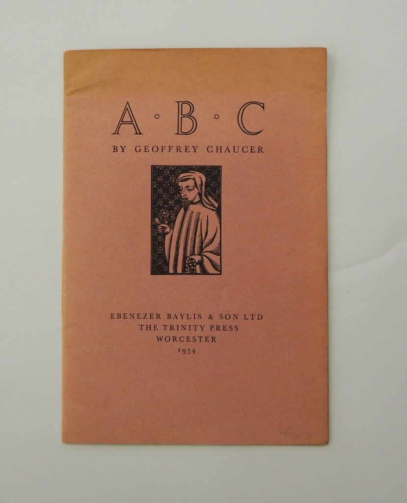
ABC by Geoffrey Chaucer (1934) [Eleanor] Joyce Francis Chapbook, softcover sewn. H250 x W170 mm. 16 pages. Edition of 500? Acquired from Antiquariaat Fokas Holthuis, 30 April 2021. Photos: Emilia Osztafi.*
Chaucer’s ABC (ca. 1369) is an intriguing early work in the history of abecedaries. There are alphabet poems in the Hebrew Bible, but according to the artists’ book collector and scholar Nyr Indictor, this Chaucer lyric seems to be the earliest surviving English “ABC poem” of known authorship. Possibly on commission from Blanche, Duchess of Lancaster, Chaucer cribbed and translated a lyric embedded in Guillaume de Deguilleville’s La pelerinage de vie humaine [“Pilgrimage of Human Life”] (ca. 1330).
Alphabetical Order: How the Alphabet Began (1998) Tiphaine Samoyault Casebound, illustrated glossy paper over boards, decorated doublures. H270 x W195 mm. 32 unnumbered pages. Acquired from World of Books, 15 August 2022. Photos: Books On Books Collection.
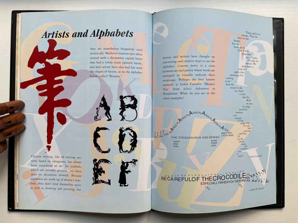
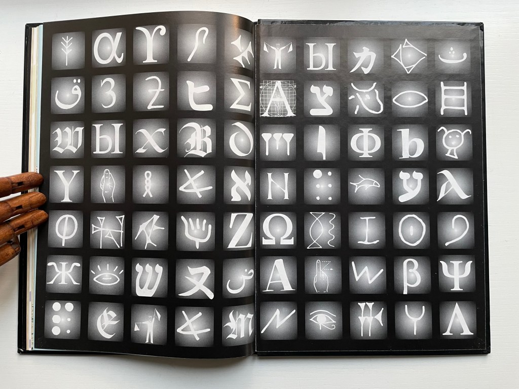
Alphabetical Order is a translation. Its original title — Le Monde des pictogrammes (Paris: Circonflexe, 1996) — better reflects the well-illustrated character of the book. The images, the hand lettering, the ghost-printed background and handling of color are constant reminders of the pictographic roots of most alphabets and writing systems. The final section — Artists and Alphabets — punctuates those reminders. In fact, the book’s endpapers act as quotation marks around the point.
Diringer, David, and Reinhold Regensburger. 1968. The alphabet: a key to the history of mankind. London: Hutchinson. A standard, beginning to be challenged by late 20th and early 21st century archaeological findings and palaeographical studies.
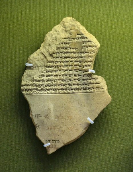
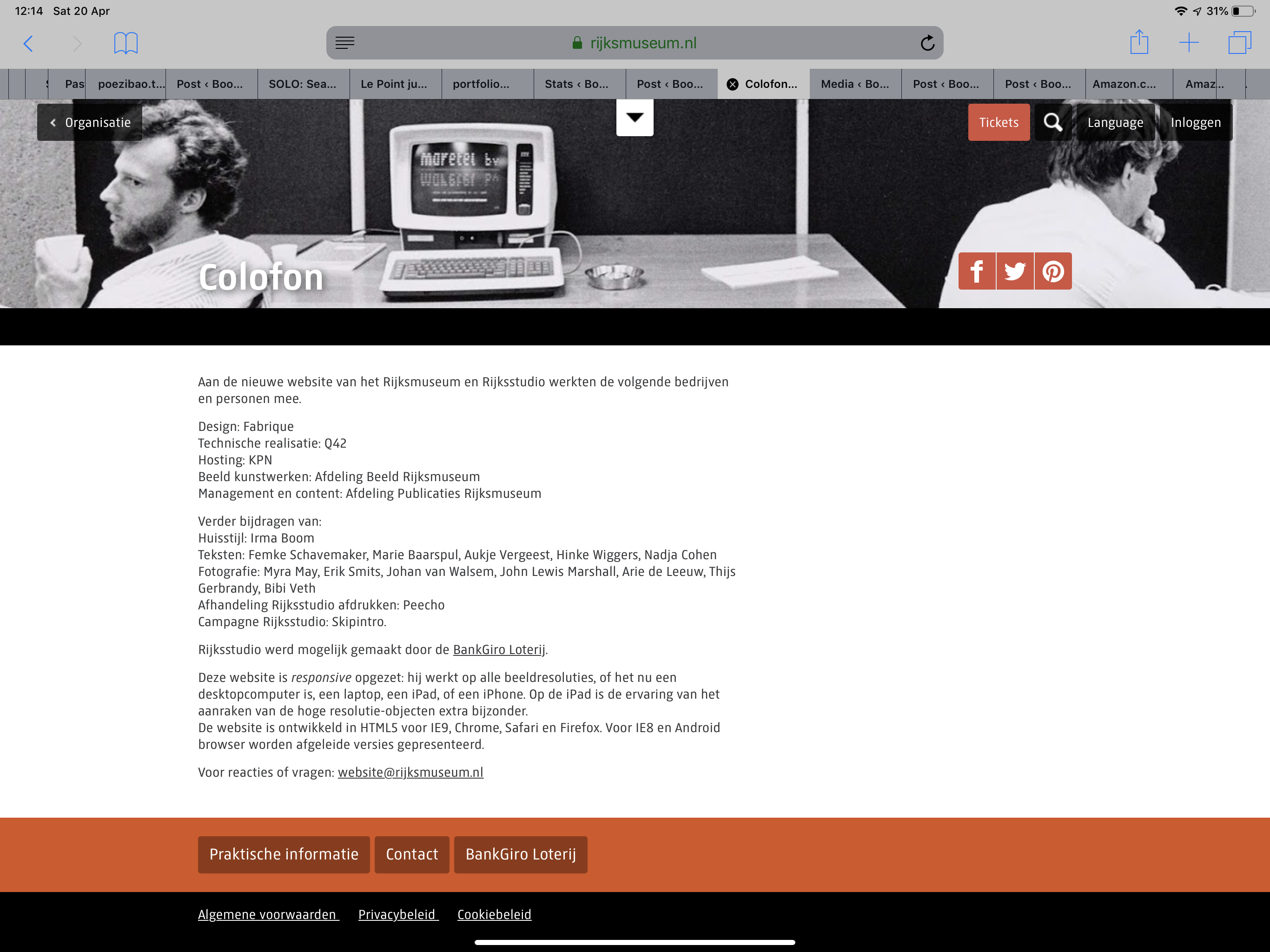
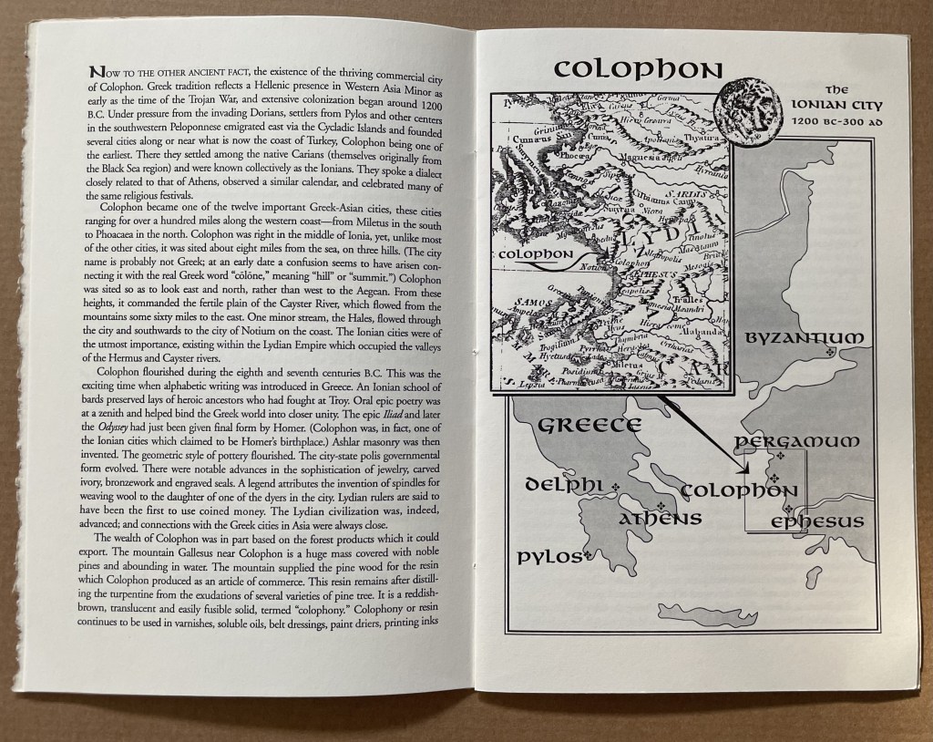
This tale comes from J. S. Kennard’s short 1901 tome on the colophon — that last page at the end of a manuscript or book. The colophon has served many purposes: giving the title of the work, identifying the scribe or printer, naming the place and date of completion or imprint, thanking and praising the patron, bragging, blaming, apologizing, entreating, praying and much more. Examples can be traced back to clay tablets and forward to websites.
Cuneiform tablet from the Library of Ashurbanipal, British Museum. Interesting that the colophon was added in ink after the clay had dried.
Its presence on websites may be one of those decried skeuomorphic hangovers from book publishing, but perhaps the colophon has an underlying value or purpose to serve in both the analogue and digital worlds. The late Bill Hill, who wrote the 1999 Microsoft white paper “The Magic of Reading” and was an early contributor to online typography, suggested making colophons a compulsory standard for website design and asked:
Why not introduce the venerable concept of the colophon to the Web? Could it be used to drive a new business model for fonts which would benefit the font industry, web developers and designers – and the people who visit their sites? [Sadly this page at the Bill Hill’s site is no longer available.]
Fanciful? Perhaps, but not much more fanciful than Erasmus’ proffered explanation of the word “colophon”. His expanded edition of Adagia printed by Manutius in 1508 includes this adage:
Colophonemaddidit He added the colophon. This came to be used when the finishing touch is added to something, or when some addition is made without which a piece of business cannot be concluded. The origin of the adage is pointed out by Strabo in … his Geography, …
And here is Strabo from the Loeb Classical Library online; scroll down to paragraph 28:
As venerable a publishing custom as the colophon may be, it is more honoured in the breach than the observance. Book artists tend to be more observant, but not religiously so, and of course some works of book art might be disfigured by a colophon. Still, there are sound reasons why book artists should bother themselves with a colophon — even if it stands apart from the work. In her review of Book Artists and Artists Who Make Books (2017), India Johnson gives one of those sound reasons:
It’s probably impossible to include every detail of production in a colophon—but some give it their best stab, exhaustively listing everyone that took part in a project. More concise colophons recap only the most relevant details of making—perhaps those the primary creator feels will factor saliently into making meaning of the book.
The convention of the colophon in our field exposes an assumption that the meaning of an artwork is informed not only by the finished product, but by the specifics of artistic labor. “Book Artists and Artists Who Make Books“, CBAA, 1 October 2018. Accessed 3 October 2018.
If craft does figure in a work’s meaning, then the more we can see how it figures, the greater our ability to appreciate and understand the work. For conveying insight — what materials and from what sources, what processes, what tools, who contributed, where and when the work occurred — the colophon stands ready. But where does it stand?
A contemporary of Kennard, A.W. Pollard declared that, to be a proper colophon, it had to appear at the conclusion or summit of the work. Artful as are some of the manuscripts and books that Kennard and Pollard cite, none push the envelope in the manner that works of contemporary book art do. Which brings us to another reason for book artists to consider the colophon: inspiration from history or tradition.
The last page of the codex may be a rightful spot for placing the codex, but what if the bookwork’s shape is challenging or musing about the shape of the book? Finishing touches might go anywhere. Think of Van Eyck’s self-portrait hidden in a reflection in The Arnolfini Portrait, or that of Vélazquez in Las Meninas.
Historians’ diligent cataloging of the “hands” of the scribes has enriched the self-identifications in colophons and connected those craftspersons with additional manuscripts. Book artists who use calligraphy or involve calligraphers should ponder the implications of this tool historians use to identify scribes by the style of their “hands”.
What potential, meaningful “tells” in a work’s colophon might the book artist or calligrapher leave to enrich the work — and provide insights for historians and connoisseurs poring over the finishing touch?
The colophon’s underlying value or purpose warrants book artists’ thinking about recording it offline and online, though this might be stretching the definition of the colophon. Our enjoyment of Kitty Maryatt’s 2018 reconstruction of La prose du Transsibérien et de la Petite Jehanne de France (1913) by Blaise Cendrars and Sonia Delaunay is certainly enhanced by the “colophonic” booklet she included with the work and the “About” page online.
Perhaps the story of the little “i” left over – the colophon – will prod the future historians of book art to examine bookworks and their artists’ websites for those finishing touches and stir artists to bestow that last finishing touch for the sake of the work’s soul if not their own.
A Prospect of Colophons
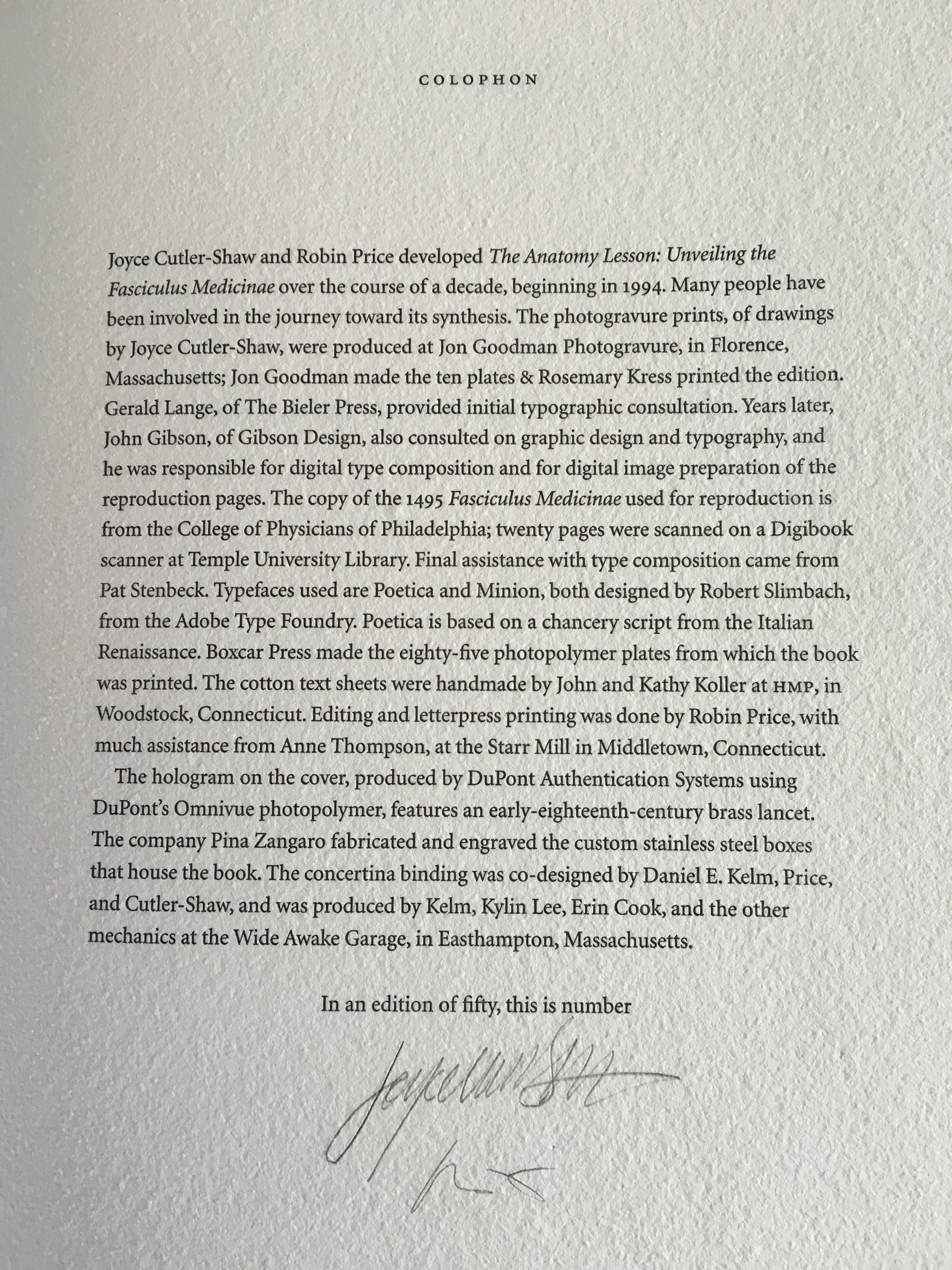
The Anatomy Lesson: Unveiling the Fasciculus Medicinae (2004) Joyce Cutler-Shaw The careful reader will notice that the edition number is missing. This instance of the work is one of the binder’s signed but unnumbered copies, having been acquired directly from Daniel E. Kelm.
Lyn Dillin, The Ballad of the Self Same Thing (2019) Can this be the first rhyming colophon?
Finding Home (2016) Louise Levergneux This may not be the first bilingual colophon I have seen, but its being inside the top of the box enclosing the work makes it the first to occupy the physical summit a work.
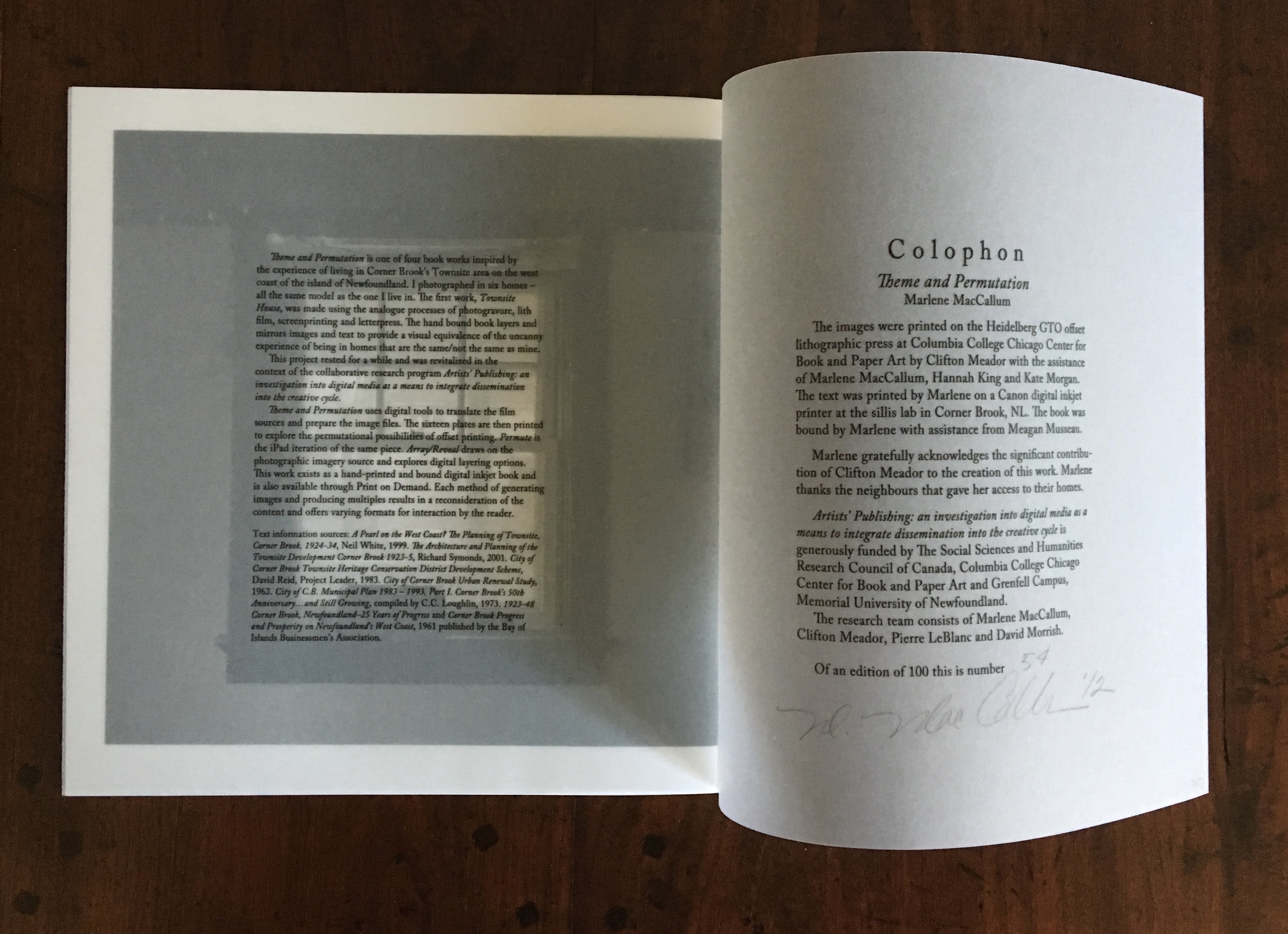
Theme and Permutation (2012) Marlene MacCallum This double-page spread reveals process information about the work that adds to the reader/viewer’s appreciation of the themes and permutations occurring in the pages.
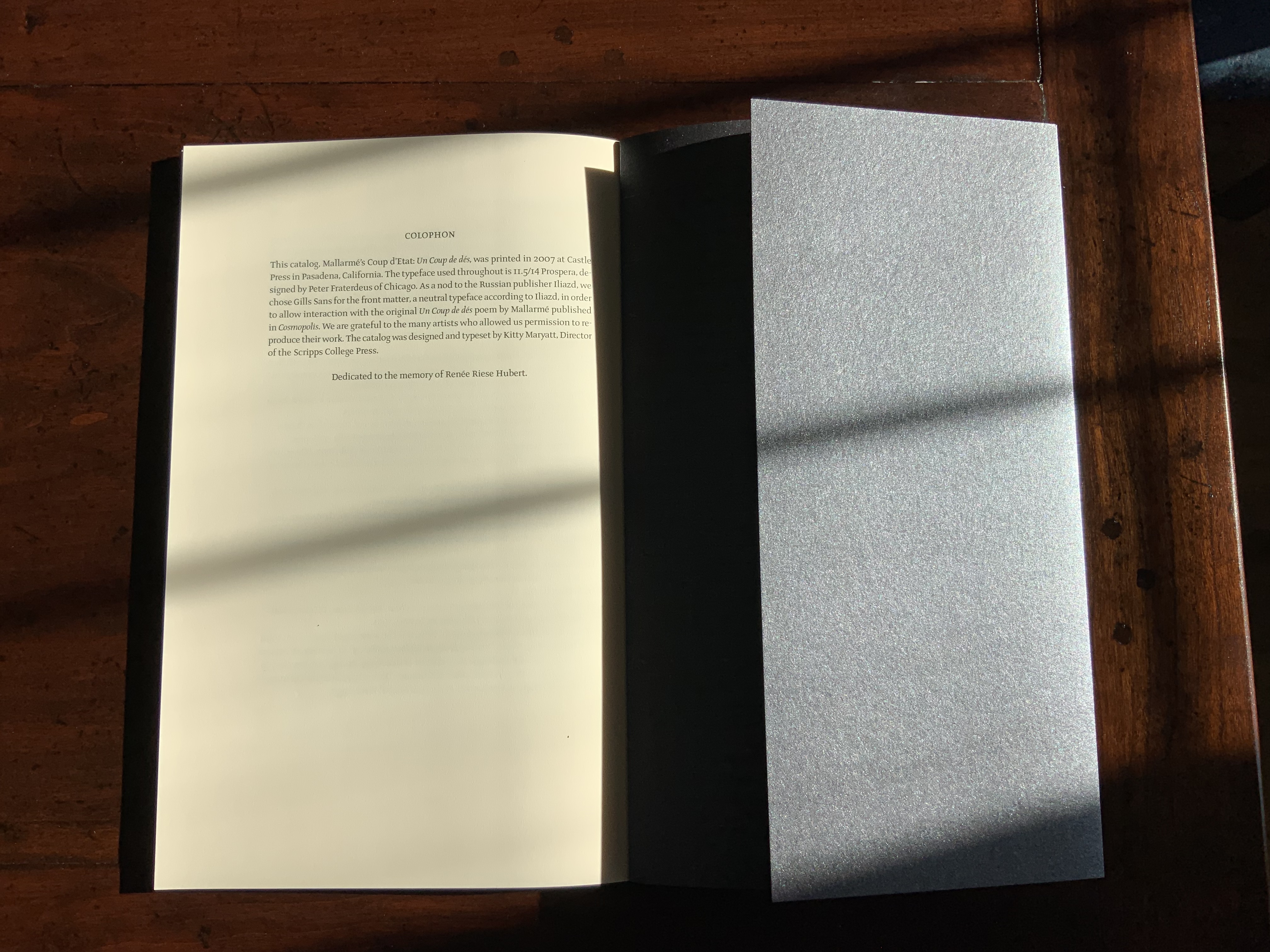
Mallarmé’s Coup d’État (2007) Kitty Maryatt The colophon’s nod to Iliazd sends the reader/viewer back to the start of this catalogue that is a bookwork in its own right.
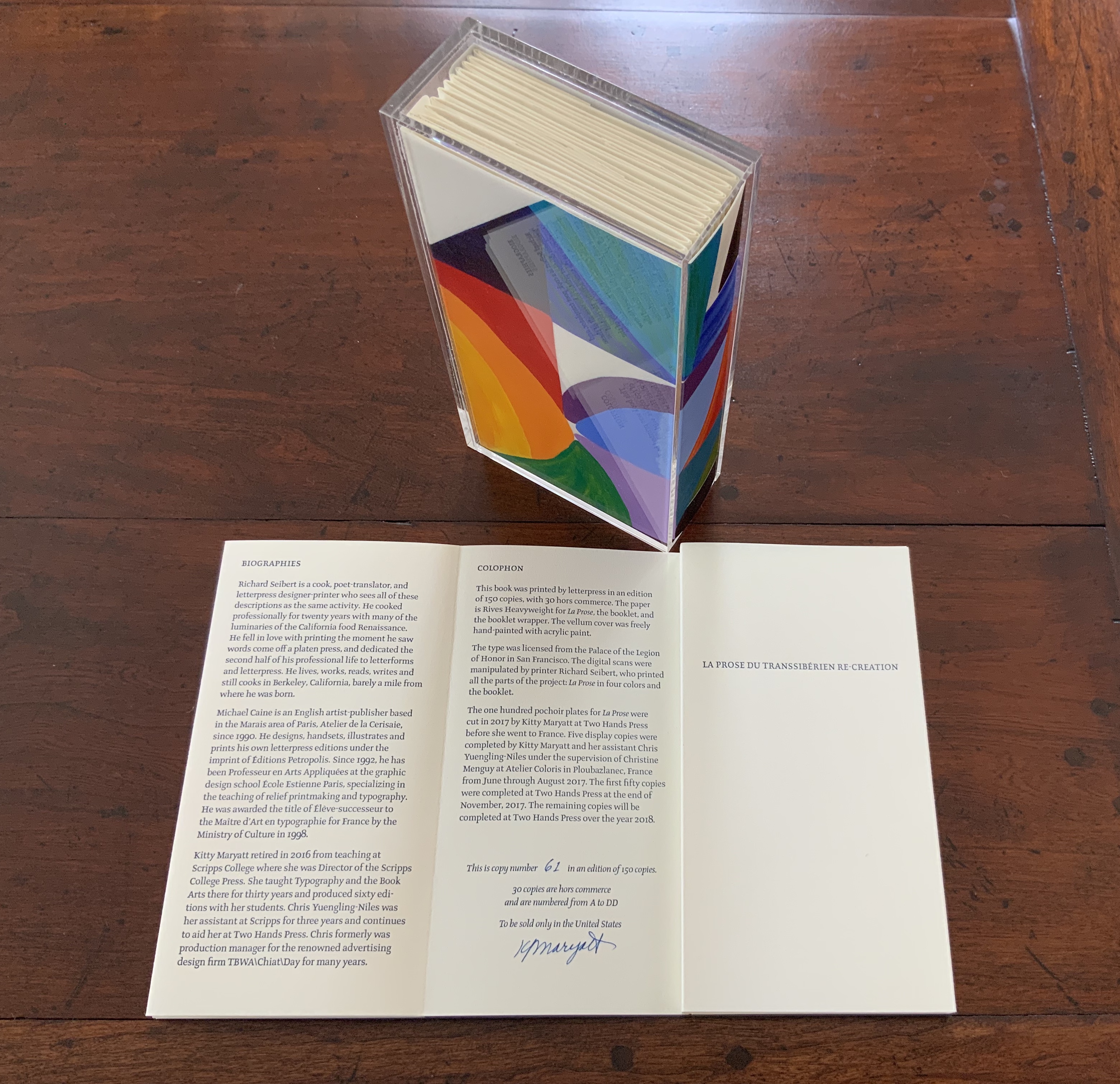
La prose du Transsibérien Re-Creation (2019) Kitty Maryatt A “colophon within a colophon”. The booklet providing details about the original work and Maryatt’s re-creation has an accordion structure and collapses into its own tri-fold wallet, which fits within the cover of the main work, seen here in its acetate holder.
L is for Lettering (2011) Cathryn Miller This hilarious and touching abecedary parades as a marked work handed in for a course, a portrait of the artist within a contemplation of the past and future of typography and letterpress. This colophon embodies the finishing touch.
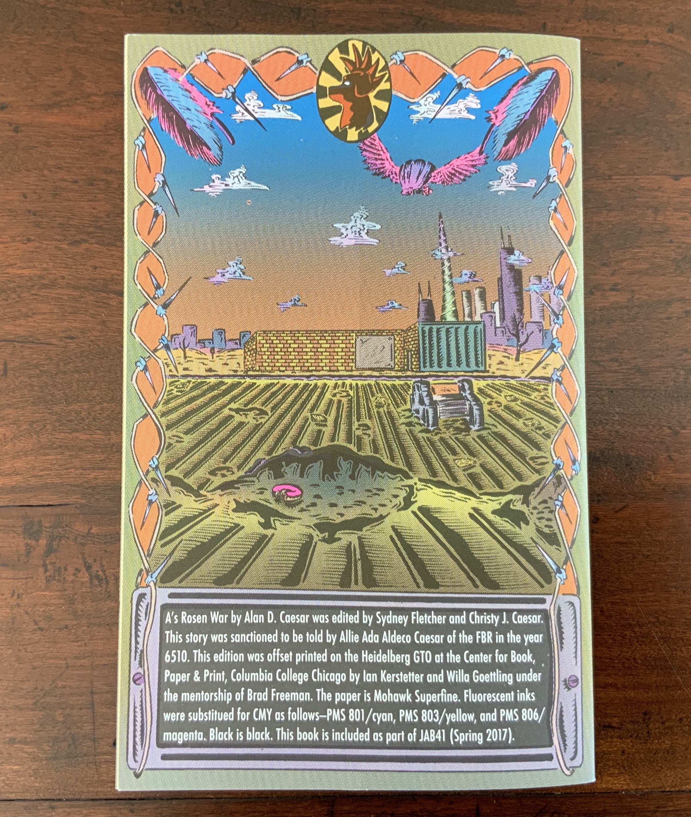
A’s Rosen War (2017) Alan Caesar This colophon continues the premised date with which this work of science fiction book art begins.
Richard Gameson. The Scribe Speaks? Colophons in Early English Manuscripts. Cambridge: Cambridge University Press, 2001. (See for the human interest: “I, Aelfric, wrote this book in the monastery of Bath”; “Pray for Wigbald”; “Just as the port is welcome to sailors, so is the final verse to scribes”.)
Hurtig, Alain. “Les colophons“. L’outil typographique. Accessed 26 January 2022. (Seventeen brilliantly designed and shaped colophons.)
Joseph Spencer Kennard. Some early printers and their colophons. Philadelphia : G.W. Jacobs and Co., 1902. (Less academic but just as interesting and typographically more fun than Gameson.)
Ming-Sun Poon, “The Printer’s Colophon in Sung China, 960-1279”, The Library Quarterly,43:1 (January 1973). (See for the 34 calligraphic inscriptions and the colophon to the Diamond Sutra: “On the 15th of the 4th moon of the 9th year of Hsien-t’ung [May 11, 868], Wang Chiek on behalf of his two parents reverently made this for universal free distribution.”)
The intriguing derivation of the word “Colophon” (1994) David C. Weber Sewn booklet. H230 x W155 mm. [16] pages. Acquired from Cotswold Internet Books, 7 May 2023. Photos: Books On Books Collection.
Pollard, Alfred W. Last Words on the History of the Title-Page, with Notes on Some Colophons and Twenty-Seven Fac-Similes of Title-Pages. Burt Franklin Research & Source Works Series, 668. B. Franklin, 1971. Pollard, Alfred W. 1859-1944. Last Words on the History of the Title-Page, with Notes on Some Colophons and Twenty-Seven Fac-Similes of Title-Pages, by Alfred W. Pollard. J.C. Nimmo, 1891. Pollard, Alfred W. 1859-1944. An Essay on Colophons, with Specimens and Translations, by Alfred W. Pollard, and an Introduction by Richard Garnett. The Caxton Club, 1905. Pollard, Alfred W., and Richard Garnett. An Essay on Colophons : With Specimens and Translations. Burt Franklin Bibliography and Reference Series ; #142. Burt Franklin, 1968. Van Elverdinghe, Emmanuel. “Modèles et Copies : Étude d’une Formule Des Colophons de Manuscrits Arméniens (VIIIe – XVIIIe Siècles).” Dissertation, 2017.
Last November, the post below appeared under the title “Saving the John Jarrold Printing Museum”. News has arrived that the museum will be renamed the “Norwich Printing Museum” and moved to St. Peter Parmentergate in King Street, Norwich. The Norwich Printing Museum’s volunteer supporters aim to open it in the summer 2020.
How fitting it would be if the organisers of the Leiden Book Arts Fair, held in St Pieterskirche, Leiden, every November, were to celebrate the event next year. The connections between The Netherlands and Norwich/Norfolk run deep. And, given that the great-great-grandson of John Folger who came to America from Norwich in 1635 and settled in Watertown, MA, was Benjamin Franklin, arguably America’s “uncle of printing”, how fitting it would be if the members of the New England chapter of the American Printing History Association played printer’s devil to the affair.
The John Jarrold Printing Museum in Norwich, England, is one of the few working print museums in the world. Here’s a selection of ten from among its hundreds of holdings:
Star wheel etching press. Wood & Company, West Smithfield, London. 1858. No.1250. Donated by Midlands Art Centre, Birmingham, June 2010.
Albion. Hopkinson & Cope, Finsbury. 1845. No. 1900. From Mr Gott of Watts & Rowe, King’s Lynn.
Albion. Hopkinson. Jonathan & Jeremiah Barrett, executors of R. W. Cope, Finswbury, London. 1840. No. 1273. From William Booth, Woodbridge.
Columbian. Probably George Clymer. c.1845. Was purchased new by Jarrold & Sons Ltd, and was their longest serving machine. (Lent to the Norwich School of Art for the Caxton Quincentenary).
Stanhope. 1825. Donated by Cambridge University Press.
Side-lever lithographic hand press. Hughes & Kimber. ex Norwich College of Art & Design.
Top lever lithographic hand press. D. & J. Greig, Lothian Road, Edinburgh. c.1840. 24 x 17 in. Presented to John Jarrold Printing Museum, May 1999 by Geoffrey Dunn, 22 Henry Drive, Leigh on Sea, Essex, SS9 3QQ.
Ratcliff direct lithographic press. John Ratcliff & Sons Ltd, Wortley & Leeds. 1927. Double demy. Donated by Curwen Studios, London. Thought to be the only surviving example.
Furnival stop-cylinder. 1984. Double demy. Donated by H. Hawes, Elmswell.
Heidelberg one-revolution cylinder press, c.1950. Donated by Jarrold & Sons Ltd. Heidelberg. Schnellpressenfabrik A.G. Heidelberg, Germany.
The developers aiming to tear down the building that houses the John Jarrold Printing Museum have mooted keeping some of the older printing presses now there and using them as mood or accent pieces for the café to be built as part of their residential development plans.
With apologies to the preacher: Of making many books [on books] there is no end.
(Ecclesiastes 12:12)
With the choir of its forebearers, Amaranth Borsuk’s The Book (MIT Press, 2018) sounds an “amen” to that truth. The proliferation of degree programs in book studies covering the history of the book, the book arts and even book art ensures The Book will not be the last. What distinguishes Borsuk’s book are her perspective as an artist and the book’s breadth and depth despite its brevity.
The book has a long history of existential crises. What is a book? Is the end of the book nigh? For more than a century, those questions have returned again and again. The most recent recurrence stems from the ebook’s threat to dematerialize the book and the online world’s threat to take us into a post-text future. Even before these latest threats, book artists have long lived and worked with their own existential questions, a kind of higher existential calculus, or derivative of, the book’s crises: What is an artist’s book? What is book art? Stephen Bury, Riva Castleman, Johanna Drucker, Joan Lyons, Stefan Klima, Clive Philpott and many others in the last quarter of the 20th century dwelt on defining and categorizing book art.
Borsuk belongs to a later generation of book artists that has embraced these existential crises and recognized that the book’s existential crises are what make the book a rich medium in which and with which to create art — from bio-art miniature to the biblioclastic human-scale to large-scale installations and performances. Even to the digital.
The Origin of Species (2016) Dr. Simon Park, Guildford, Surrey “The small book shown here was grown from and made entirely from bacteria. Not only is the fabric of its pages (GXCELL) produced by bacteria, but the book is also printed and illustrated with naturally pigmented bacteria. ” Posted 27 March 2016. Photo credit: Dr. Simon F. Park
Silenda: Black Sea Book (2015) Jacqueline Rush Lee Transformed Peter Green‘s translation of Ovid’s Tristia and the Black Sea Letters H9.5″ x W12″ x D6.5.” Manipulated Text, Ink, Graphite Photo credit: Paul Kodama. In Private Collection, NL
Field (2015) Johannes Heldén Produced, and premiered, at HUMlab, Umeå University Reproduced with permission of the artist
Performance artist and academic as well, Borsuk brings that later generational and creative perspective to the existential question — What is the book? — and, with an artist’s perception of her medium of choice, displaces the old companion existential question — Is the end of the book nigh? — with an altogether more interesting one — Where next for the book?
To see where books might be going, we must think of them as objects that have experienced a long history of experimentation and play. Rather than bemoaning the death of books or creating a dichotomy between print and digital media, this guide points to continuities, positioning the book as a changing technology and highlighting the way artists in the twentieth and twenty-first centuries have pushed us to rethink and redefine the term. (pp. xiii-xiv)
In The Book, the future is not far from the physical past. Where once we had text on scrolls, now we scroll through text (albeit more vertically than horizontally). Where once human consciousness changed with the invention of the alphabet and writing, now it may be altering with our reading and writing through networked digital devices. Like the many historians before her, Borsuk starts with cuneiform (those wedge-shaped accounting marks on baked clay), hieroglyphics and the invention of the alphabet to set the scene for the advent of the book and its ongoing physicality:
its shape (scroll, accordion, codex)
its material (papyrus, vellum, paper, charcoal or mineral-based watercolor and ink)
its manufacture (scribing, printing by woodblock and movable type, design and typography, illumination and illustration, folding into pages, methods of binding)
its constituent and navigational parts (cover, book block, title page, table of contents, page numbering, index).
But Borsuk reminds us — from Sumer’s clay to Amazon’s Kindle, from Johannes Gutenberg to Project Gutenberg — the book as human artifact exists in a social, political, technological, economic and even ecological context. Who is allowed to make it, how it is transacted, how and where we use it, how we perceive and speak of it — all have affected the physicality of the book object and are reflected in it.
In the first half of The Book, Borsuk steers us through these interdependencies to a turning point. That turning point is where the pinnacle of the book arts — Beatrice Warde‘s and Jan Tschichold‘s vision of the book as a crystalline container of content — and the book’s commodification combine to cause the book’s physicality to disappear because it is so taken for granted, leaving us with “the book as idea”.
With the perception that books are ideas bestowed on readers by an authorial genius whose activity is purely intellectual, the book’s object status vanished for much of the reading public as we raised a glass to happily consume its contents…. Even though innumerable material elements come together to make the book, these features have been naturalized to such a degree that we now hardly notice them, since we have come to see content as the copyrightable, consumable, marketable aspect of the work. (pp. 106-9)
At this turning point — where “the historic relationship between materiality and text is severed” (p. 112) — the second half of The Book introduces book art. It is telling that the longest chapter in the book begins the second half, that it is called “The Book as Idea” and that it comes before any extended engagement with the digital dematerialization of the book. It is a wry pivot: the artistic genius supplants the authorial genius; what the latter takes as invisible background, the former re-makes as self-regarding foreground. As Borsuk shows and her book’s cover neatly demonstrates, works of book art are inevitably self-referential and self-aware.
As such, works of book art
have much to teach us about the changing nature of the book, in part because they highlight the “idea” by paradoxically drawing attention to the “object” we have come to take for granted. They disrupt our treatment of the book as a transparent container for literary and aesthetic “content” and engage its material form in the work’s meaning. (p. 113)
Rather than offer a chronological history of book art to explore what “artists’ books have to teach us about a path forward for the book”, Borsuk offers “flashpoints” that represent “the energies motivating artwork in book form”(p. 117). These “flashpoints” are William Blake, Stéphane Mallarmé, Ed Ruscha and Ulises Carrión. Following these flashpoints, Borsuk organizes the rest of the chapter into “key themes that recur throughout artists’ books of the twentieth century: spatiotemporal play, animation, recombinant structures, ephemerality, silence, and interactivity” (pp. 146-47).
Oddly, Blake as flashpoint does not illuminate these six particular themes. Rather Borsuk notes three other recurrent themes or “energies motivating artwork in book form” that Blake and his work represent: centering or re-centering the production processes on the author/artist; using the book as a sociopolitical and visionary platform; and redefining, developing and challenging the relationship between word and image.
Blake refers to himself as “The Author & Printer W. Blake,” making clear the union of creativity and craft in his work. (p. 121)
Blake’s engagement with the social issues of his day, and his use of book form to respond to child labor, urban squalor, and slavery, established an important trend in both artists’ books and independent publishing—the utility of the book as a means of spreading social justice. (pp. 121, 124)
Blake used his craftsmanship to develop the relationship between word and image (p. 140)
One need not look far among twentieth and twenty-first century book artists for resonance with those themes. That Blakean union of creativity and craft resurfaces in artists such as Ken Campbell (UK), Cathryn Miller (Canada), Pien Rotterdam (Netherlands), Barb Tetenbaum (US) and Xu Bing (China) — some of them even to the point of carving or setting their own type, making their own paper, pulp printing on it themselves or binding the finished work themselves. Vision and sociopolitical observation have risen up in the works of artists such as Doug Beube (Canada), Julie K. Dodd (UK), Basia Irland (US), Diane Jacobs (US), Anselm Kiefer (Germany) and Chris Ruston (UK). Blake’s redefining the relationship of word (or text) to image often reappears book artists’ abecedariesand their children’s books such as A Dictionary Storyby Sam Winston (UK).As for emulators of Blake in technical innovation, consider the analogue example of Australian Tim Mosely’s works created with his patented pulp printing process, where the “ink” is actually colored pulp, or the digital example of Borsuk’s work Between Page and Screen, where the pages contain no text—only QR codes that, when scanned with a webcam, activate the text’s appearance on the reader’s browser screen.
For her second flashpoint, Borsuk selects another visionary, Stéphane Mallarmé, who like Blake was reacting to his own perceived Satanic mills draining poetry of its spirituality. Mallarmé’s Satanic mills dispensed rigid columns of newsprint to the masses and bland expanses of poetry and fiction set by Linotype machines in the neo-classical Didot font. With his famous visionary dictum — “everything in the world exists in order to end up as a book” (p. 135) — Mallarmé nudged the book toward pure concept and opened its mystical covers to the Dadaists, Surrealists, Futurists, Vorticists, Lettrists, Conceptualists and biblioclasts. With spatiotemporal play — mixing type sizes and fonts, breaking up the line and even breaking the page — Mallarmé used text to evoke image and, in his view, remake the book as a “spiritual instrument”. His post-humous book-length poem Un coup de Dés jamais n’abolira le Hasard (A Throw of the Dice Will Never Abolish Chance), published in 1897, embodies that vision and continues to cast its flashpoint light across multiple generations of book artists’ efforts. From Marcel Broodthaers in 1969, we have his homage to Un Coup de Dés. From Jérémie Bennequin in 2014, we have his serial “omage” to Broodthaers’ homage. And, most recently, we have the 2015 new bilingual edition A Roll of the Dice by Jeff Clark and Robert Bononno, for which Borsuk provides a perceptive reading.
Where Mallarmé’s flashpoint enlisted his vision alongside the cry “épater le bourgeois” from Baudelaire and other late nineteenth-century poets, Ed Ruscha’s later flashpoint illuminates a democratic counterpoint, a Zen-like vision and a very different way of changing the relationship of text to image. Ruscha’s self-published photobooks were cheap and distributed outside the gallery-controlled channels of art. As Borsuk shows — directly with Ruscha and indirectly with the many book artists influenced by him — the text is restricted to the book’s title, which interacts with a series of deadpan photos and their layout to deliver a wry, tongue-in-cheek work of book art. Ruscha’s spatiotemporal play manifests itself across the accordion book format and out-of-sequence juxtapositions. Ironically Ruscha’s works now command thousands of dollars per copy, and one has more chance of seeing them in an exhibition than in a roadside stop’s rack of newspapers, magazines and mass-market paperbacks.
Mexico’s Ulises Carrión — polemicist, European bookshop owner, conceptual artist and Borsuk’s fourth choice of flashpoints — is a counter-flashpoint to Ruscha. Where Ruscha reveled in self-publishing commodification, Carrión sneered at the book in its traditional commercial form. Where Ruscha has resisted the label “conceptual artist”, Carrión played the role to the hilt. Where Ruscha’s work has elicited numerous homages (see Various Small Books from MIT Press in 2013) and achieved a high profile, Carrión’s work, much lower in profile, has provided a more compelling range of hooks or influences on which to hang many different manifestations of book art (or bookworks as Carrión preferred). In fact, Borsuk’s six stated key themes or “energies motivating artwork in book form” come from Carrión’s manifestos (pp. 146-47).
The first theme — “spatiotemporal play” — comes from Carrión’s initial definition of the book as a “sequence of spaces”, which Borsuk traces to tunnel books, pop-ups and even large-scale constructs, the latter illustrated by American Alison Knowles‘ inhabitable The Big Book (1968). One more possible future of the book implied by spatiotemporal play manifests itself in Borsuk’s own augmented-reality (AR) works, those of Caitlin Fisher (Canada) and Carla Gannis’ Selfie Drawings (2016), in which portraits on the hardcover book’s pages animate and change when viewed through smartphone or tablet.
Borsuk takes the second theme, that of “animation”, from Carrión’s dictum: “Each of these spaces is perceived at a different moment— a book is also a sequence of moments”. As her several examples illustrate, much book art is cinematic. Borsuk’s exposition of Canadian Michael Snow‘s Cover to Cover (1975) comes closest to reproducing the experience I enjoyed of “watching” that photo bookwork from cover to cover several times at the now closed Corcoran Art Gallery. Borsuk is quick and right to remind that the cinematic future of the book has been with us for a long time, even before the cinema. She bookends her exposition of Snow’s book and the text animation of American Emmett Williams‘ Sweethearts (1967) on one side with Victorian flip-books and on the other with American Bob Brown‘s 1930s The Readies (presumably pronounced “reedies” to follow Brown’s comparison of his scrolling one-line texts with the cinema’s “talkies”).
A forgotten modernist, Brown declared the obsolescence of the book, predicted a new form of reading and technology to enable it, an optical projector emitting text into the ether and directly into the eyeball. But what does this tell us about the future of the book? Borsuk notes Craig Saper‘s resurrection of Brown’s Roving Eye Press and how he even put together a website that emulates Brown’s reading machine. In her phrase describing the machine’s effect of “turning readers themselves into a kind of machine for making meaning” (p. 168), Borsuk hints at a future of digitally interactive books, which she takes up in the next section and more extensively in the next chapter. At this point, however, the reader could use a hint of practicality and skepticism. Linear-one-word-at-a-time reading, however accelerated, eliminates affordances of the page, ignores graphics and strains against the combination of peripheral vision and rapid eye movement we unconsciously (even atavistically?) deploy as we “read” whatever we see. Although in the next section Borsuk does bring on more likely examples of the book’s future exploitation of its cinematic affordances (manga, graphic novels and children’s books), this section’s treatment of animation misses the chance to cite actual recent successes like Moonbot Studios‘ The Fantastic Flying Books of Mr. Morris Lessmore (2012) and others.
Once into the third theme — “recombinant structure” — it is clear that Borsuk’s chosen Carriónesque themes overlap one another. Like the cinematic, the recombinant structure manifests itself in accordion books. It extends, however, to something more interactive: volvelles (or medieval apps as Erik Kwakkel calls them), interactive pop-ups, harlequinades (flap books) and more. Borsuk uses Raymond Queneau‘s harlequinade Cent mille milliards de poèmes ( One hundred thousand billion poems, 1961), Dieter Roth‘s slot books and works by Carolee Schneemann to illustrate book art’s celebration of the concept. The fact that Queneau’s book is still easily available on Amazon vouches for book art’s predictive qualities. The example of Marc Saporta’s Composition No.1 (Éditions du Seuil, 1962), “a box of 150 leaves printed on only one side that the reader is instructed to shuffle at the outset”, goes Queneau one better —ironically. In 2011, Visual Editions reissued Composition No. 1 in print and app forms. Alas, the former is out of print, and the latter is no longer available for download (although a video of it is available here).
Composition No. 1 (2011) Marc Saporta Translation by Richard Howard, Introduction by T.L. Uglow, Google Creative Lab, Diagrams by Salvador Plascencia and Designed by Universal Everything Photo credit: Books On Books
Borsuk draws her fourth theme — ephemerality — from Carrión’s dictum:
I firmly believe that every book that now exists will eventually disappear. And I see here no reason for lamentation. Like any other living organism, books will grow, multiply, change color, and, eventually, die. At the moment, bookworks represent the final phase of this irrevocable process. Libraries, museums, archives are the perfect cemeteries for books. (p. 145)
To illustrate, Borsuk begins with the physical biblioclasts — those who in Doug Beube‘s phrase are “breaking the codex“. They include Beube himself, Bruce Nauman (see above), Brian Dettmer, Cai Guo-Qiang, Marcel Duchamp, Dieter Roth and Xu Bing. While some of these artists reflect a twenty-first century surge of interest in altered books and book sculpture, “facilitated by the overarching notion that the book is an artifact not long for this world” (pp.82-84), others have taken a more generative archaeological approach — erasing or cutting away a book’s words to reveal another. Examples include Tom Phillips‘ A Humument (1966-2014) and Jonathan Safran Foer‘s Tree of Codes(2010). Phillips’ bookwork serves multiple purposes for Borsuk’s arguments. Not only does it represent the book art of “erasure”, its success across multiple editions, digital formats and presence in art galleries supports her notion of book art’s predictive qualities.
There is a variant on her theme that Borsuk does not illustrate and is worth consideration for her next edition: the self-destructing yet regenerative work of book art. Examples could include American Basia Irland‘s series ICE BOOKS: Ice receding/Books reseeding (2007-), which gives a formidably tangible and new meaning to “publishing as dissemination”; and Canadian Cathryn Miller‘s tail-chasing Recomp (2014); and Argentinian Pequeño Editor‘sMi Papa Estuvo en la Selva (2015), which after reading can be planted to grow into a jacaranda tree.
Recomp (2014) Cathryn Miller Copy of Decomp, Collis and Scott (2013) nailed to a tree. Photo credit: David G. Miller
Recomp (2015) Photo credit: David G. Miller
Recomp vandalized (2015) Photo credit: David G. Miller
The last section in this chapter expands on the fifth theme — silence — drawn from Carrión’s statement:
The most beautiful and perfect book in the world is a book with only blank pages, in the same way that the most complete language is that which lies beyond all that the words of a man can say. Every book of the new art is searching after that book of absolute whiteness in the same way that every poem searches for silence. Ulises Carrión, Second Thoughts (1980), pp. 15-16.
Among her several examples are Pamela Paulsrud‘s Touchstones (2007-10), which look like stones but are books sanded-down into stone-like shapes, and Scott McCarney‘s 1988 Never Read(Opposed to Ever Green), a sculpture composed of stacked library discards that narrows as it ascends. Paulsrud’s, McCarney’s, Irland’s and Miller’s works are what Borsuk calls “muted objects”, but they speak and signify nevertheless:
Muted books take on a totemic [metaphoric] significance…. The language of the book as a space of fixity, certainty, and order reminds us that the book has been transmuted into an idea and ideal based on the role it plays in culture…. Defining the book involves consideration for its use as much as its form. (pp. 193-95)
Never Read (Opposed to Ever Green) (1988) Scott McCarney Reproduced with permission of the artist
Never Read (Opposed to Ever Green) (1988) Scott McCarney Reproduced with permission of the artist
Never Read (Opposed to Ever Green) (1988) Scott McCarney Reproduced with permission of the artist
Borsuk is a superb stylist of the sentence and expository structure. The words above, concluding chapter three, launch the reader into Borsuk’s final theme of interactivity and her unifying metaphor: “the book as interface”. Owners of Kindles, buyers from Amazon, perusers of Facebook — we may think we know what’s coming next in The Book and for the book, but Borsuk pushes the reader to contemplate the almost real-time evolutionary change we have seen with ebook devices and apps, audiobooks, the ascension of books to the cloud via Project Gutenberg, the Internet Archive and Google Books, and their descent to Brewster Kahle‘s physical back-up warehouse (to be sited in Canada in light of recent political events) and into flattening ebook sales of late. Chapter 4 is a hard-paced narrative of the book’s digital history from the Memex in Vannevar Bush‘s 1945 classic “As we may think” to T.L. Uglow‘s 100-author blockchain collaboration in 2017, A Universe Explodes from Visual Editions’ series Editions at Play.
Borsuk reminds us:
Our current moment appears to be much like the first centuries of movable type, a cusp. Just as manuscript books persisted into the Gutenberg era, books currently exist in multiple forms simultaneously: as paperbacks, audiobooks, EPUB downloads, and, in rare cases, interactive digital experiences. (p. 244)
Borsuk weaves into this moment of the book’s future a reminder that print affordances such as tactility (or the haptic) and the paratextual (those peripheral elements like page numbers, running heads, ISBNs, etc., that Gary Frost argues “make the book a book”) have been finding fresh ways into the way we read digitally. The touchscreen enables us to read between the lines literally in the novella Pry (2014) by Samantha Gorman and Danny Cannizaro (2014). Breathe (2018) by Kate Pullinger, another work in the Editions at Play series, uses GPS to detect and insert the reader’s location, the time and weather, and when the reader tilts the device or rubs the screen, hidden messages from the story’s (the reader’s?) ghosts appear.
At this point, an earlier passage from The Book should haunt the reader:
Artists’ books continually remind us of the reader’s role in the book by forcing us to reckon with its materiality and, by extension, our own embodiment. Such experiments present a path forward for digital books, which would do well to consider the affordances of their media and the importance of the reader, rather than treating the e-reader as a Warde-ian crystal goblet for the delivery of content. (p. 147)
Borsuk convinces. Art, artifact, concept — wrought by hand and mind, hands and minds — the book is our consensual tool and toy for surviving beyond our DNA. So now what? Metaphor, hints and historical flashpoints may illuminate where we have been, how it shows up in contemporary books and book art and where we may be going with it. In ten or one hundred years though, how will a book publisher become a book publisher? Given the self-publishing capability today’s technology offers, will anyone with a file on a home computer and an internet connection consider himself or herself a book publisher? Borsuk thinks not:
The act of publication — of making public — is central to our cultural definition of the book. Publication might presume some cultural capital: some editorial body has deemed this work worthy of print. It might also presume an audience: a readership clamors for this text. But on a fundamental level, publication presumes the appendage of elements outside the text that help us recognize it as a book, even when published in digital form. (pp. 239-40)
How will future book publishers learn to master the appendage of these elements outside the text (the paratext) that make a book a book “even when published in digital form”? Borsuk’s commentary on the ISBN as one of these elements sheds oblique light on that. She points to the artist Fiona Banner’s uses of the ISBN under her imprint/pseudonym Vanity Press — tattooing one on her lower back, publishing a series Book 1/1(2009) consisting of sixty-five ISBN’d pieces of mirrored cardstock and then collecting them in a photobook entitled ISBN 978-1-907118-99-9 in order to deposit those one-offs with the British Library as required by the UK’s Legal Deposit Libraries Act. What can a future ebook publisher deduce from this?
That the use of a globally unique identifier (GUID) matters.
The backstory of the transition from ISBN10 to ISBN13 and that of ebooks, ISBNs and Digital Object Identifiers (DOIs) might provide interesting fodder. The notion that the book industry was running out of 10-digit ISBNs was a red herring used to convince industry executives to adopt the more widely used format of unique identifiers overseen by GS1. The real reason for moving to ISBN13 — reduced friction in the supply chain — was too hard to sell. About the same time, some major publishers proposed incorporating the ISBN into the DOI for an industry-standard ebook identifier. The DOI offered an existing digital, networked infrastructure already being used by most of the world’s scientific, technical and medical journals publishers. It is an offshoot of the Handle System, established by Robert Kahn. Sad to say, few book publishers adopted the DOI for their ebooks; still fewer used the DOI’s application- and network-friendliness to enable their ebooks to take advantage of the network’s digital affordances.
The DOI shares with the ISBN a feature that Borsuk points out as a limitation to more widespread use: it is not free. A significant percentage of ebooks exist without ISBNs, much less DOIs. If a digital GUID is to be used in ways that help us recognize the identified digital object as a book, future book publishers and their providers of a network ecosystem supporting ebooks, linking with the print ecosystem and reducing friction in the supply chain still have wide gaps in commerce and knowledge to close. Perhaps this particular paratextual element is unnecessary for the book’s digital future, but until those gaps are narrowed, the ecosystem for eBooks will remain balkanized by Amazon, Apple, Google, Lulu and the more digitally literate denizen of the print publishing industry. In the meantime, as Borsuk’s examples throughout her book show, there are boundless other print and digital affordances with which publishers, authors, editors, designers, typographers, developers and readers can play as they continue to shape the book.
The Book‘s publication month, June 2018, is auspicious, being the same for the Getty Center’s exhibition “Artists and Their Books/Books and Their Artists“, June 26 – October 28. The Center and MIT Press would do well to have stacks of The Book on hand. The Book will also serve as an excellent introductory textbook for courses on book art or the history of the book. And by virtue of its style and artist’s perspective, Borsuk’s book will appeal to anyone with even a passing interest in this essential technology of civilization and its growing role as a material and focus of art in the twentieth and twenty-first centuries.
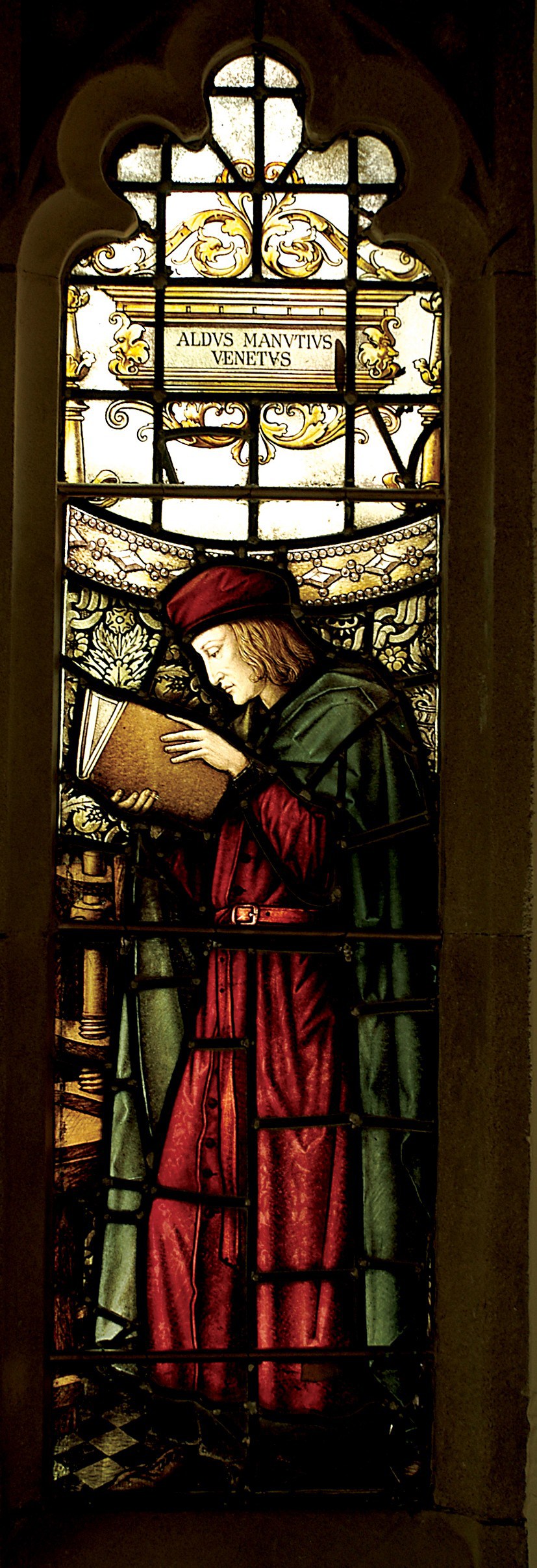
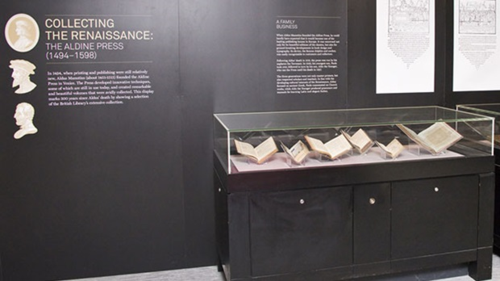
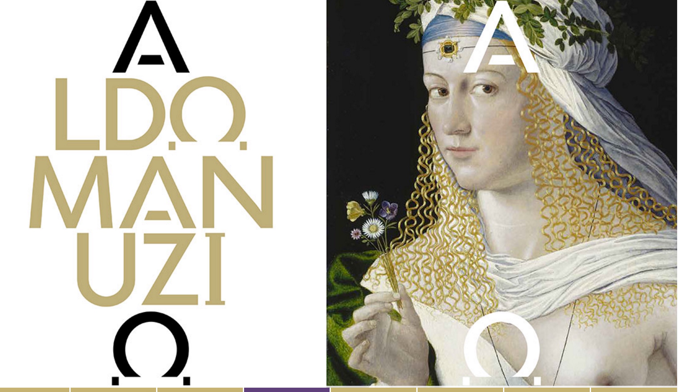
Aldus Manutius, John Rylands Library, University of Manchester
Merchants of Print from Venice to Manchester, 29 January to 21 June 2015, John Rylands Library, University of Manchester, UK:
This exhibition celebrates the legacy of Aldus Manutius (1449 – 1515), an Italian humanist scholar who founded the Aldine Press at Venice. His publishing legacy includes scholarly editions of classical authors, the introduction of italic type, and the development of books in small formats that were read much like modern paperbacks. The firm was continued after his death by his son and grandson until 1598. John Rylands Library, University of Manchester website, accessed 17 May 2015
Back in February as I enjoyed Oxford’s recognition of the 500th anniversary of the death of Teobaldo Manucci, the Manchester exhibition was already running. Where the Oxford event focused on the more architectural motifs distinguishing early Venetian from Roman printing, the Manchester event dwelt more on the educational thrust, technical and business aspects of the Aldine legacy and provenance of the Manchester collection.
The Manchester focus on provenance wends its way back through the library’s donors dedicated to the cause of education (if not to impressing its practitioners with the importance of the woolen industry’s contribution to it) to the Renaissance circle on which Manutius depended:
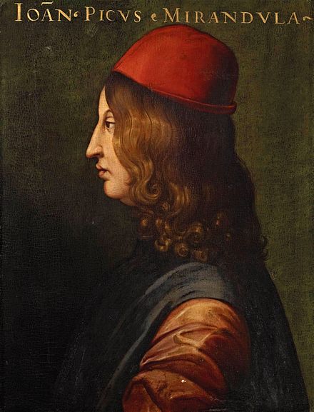
Giovanni Pico della Mirandola, 1463-1494 Uffizi Gallery, Florence
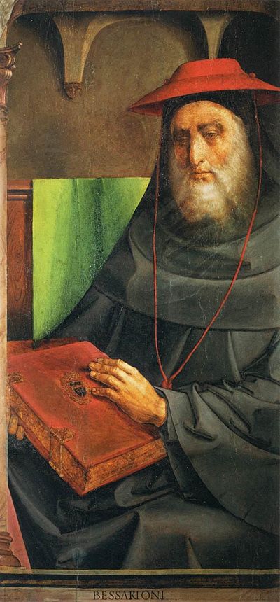
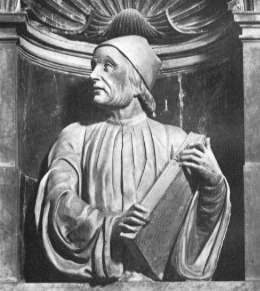
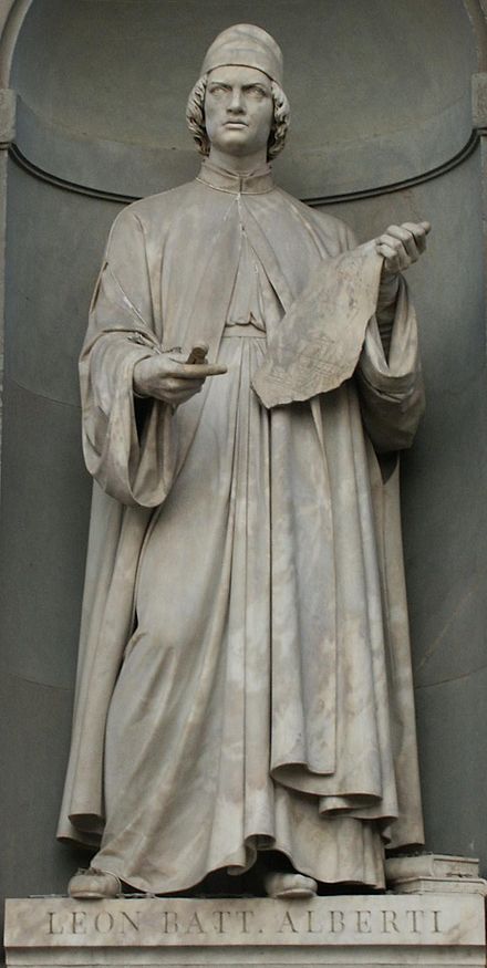
In 1482 Manutius lived with Pico della Mirandola and served as tutor to his nephews, the sons of the Princess of Carpi. Like the later, beneficent Manchester merchants, Pico’s family contributed financially to the cause: they funded the opening of the Aldine printing office in Venice in 1494. Of course, Pico made more than a patron’s financial contribution to the cause. Along with Cardinal Bessarion, Marsilio Ficino, Leon Battista Alberti and Erasmus – all known intimately to Manutius – Pico drove the revival of learning embodied in the output of the Aldines and numerous other printers (John Addington Symonds, Renaissance in Italy, Volume 2 (of 7): The Revival of Learning, John Murray, 1914).
Cardinal Bessarion, Justus van Gent and Pedro Berruguete , (Les Hommes Illustres)
Marsilio Ficino, Duomo, Florence
Leon Battista Alberti, Piazza degli Uffizi, Florence
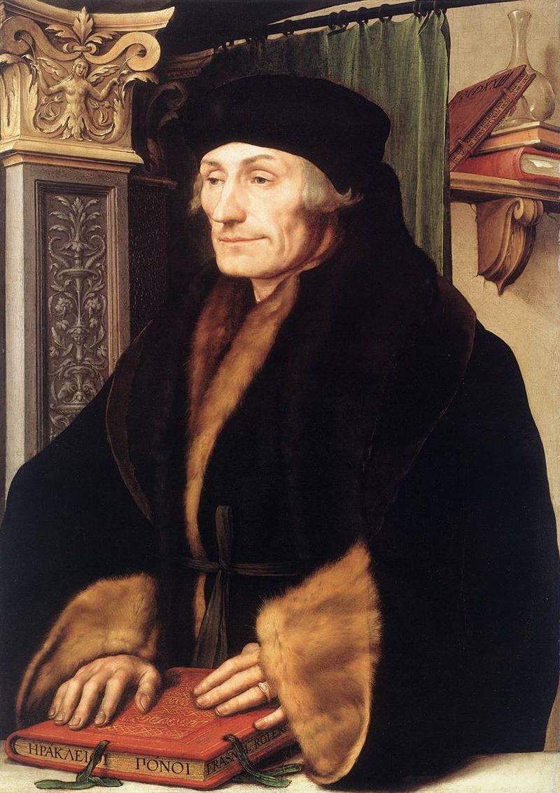
Desiderius Erasmus, 1523?, Hans Holbein the YoungerThe Manchester exhibition closes this month.
The next major Aldine event is the summer school hosted by The Catholic University in Siena (31 August – 3 September) and jointly organized by the Centro di ricerca europeo libro editoria biblioteca (CRELEB). Other events with dates still to be confirmed are planned in Brighton, Treviso, Milan and Arezzo.
Late afternoon before the long worn wooden benches in the Bodleian’s Convocation Hall, 500 years after the death of Aldus Manutius, Oren Margolis served his audience well, providing them with a richer appreciation of the “finest printed book of the entire Renaissance”* – the Hypnerotomachia Poliphili – and of its publisher Aldus Manutius.
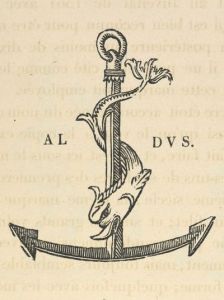
Drawing our attention to the more sculptural qualities of Venetian Renaissance printed books over the Florentine and to the evidence of the humanist agenda that drove Manutius, he led us to the page where Poliphilo (lover of all things, but in particular Polia, the ideal woman pursued to the end of the book) stands before a carving that foreshadows the Aldine Press device: a dolphin entwined around the shank of an anchor. The Aldine Press device was inspired by a similar image on an ancient Roman coin given by Pietro Bembo to Aldus, who wrongly associated it with Augustus and his proverb Festina lente (“Make haste slowly”) and adopted both for his printing and publishing business.
Erasmus praised Aldus, saying that he was “building a library which knows no walls save those of the world itself”.
For all of 2015, the world enjoyed a multitude of celebrations of the contribution of Aldus Manutius to publishing, printing and the book. After Gutenberg, Fust and Schoeffer, Aldus Manutius was perhaps the most important printer of the Renaissance. His portable books are still here, although locked away or displayed under glass, no longer so portable. Until now.
The Manutius Network 2015 provides a running list, links for some of which are provided below, including the online exhibition associated with Margolis’s talk. See also below, added in May 2016, the belated exhibition “Aldo Manutius: The Renaissance in Venice” at the Gallerie dell’Accademia in Venice.
From Crispin Elsted’s review of the Thames & Hudson facsimile edition of the Hypnerotomachia Poliphili. Parenthesis, December 2000, No. 5:
I once spent three hours in a library with a copy of the Aldine edition of Hypnerotomachia Poliphili, and I have never known a book take my breath away so consistently. Every page is a masterpiece: the dance of text with the more than 170 woodcuts; the firm, male stature of the typeface; the crisp spring of the impression; the elegant proportion of the page — all combine to an end in which the craft of printing and design carry the text into an atmosphere not of its own making. This new edition has the appearance of a fine actor in a part lately played by a great one. Here are the signs of the grace that greatness lent the commonplace five centuries ago; and in these signs, the commonplace finds here another advocate for its small claims to our time.
Timelines are, of course, for looking further back as well as forward. Earlier this year, April 2012 marked the fifteenth anniversary of the publication of Liane Lefaivre’sLeon Battista Alberti’sHypnerotomachia Poliphili: Re-Configuring the Architectural Body in the Early Italian Renaissance (Cambridge, MA: MIT Press, 1997) and the online publication of The Electronic Hypnerotomachia, which contains the facsimile text and illustrations. The online publication of extracts from Lefaivre’s book illustrates the linking prefigured by the “card stack” approach of HyperCard. What MIT Press and TU Delft, Lefaivre’s affiliation, host on their servers are not ebooks or even e-incunabula of the sort we experience today, but they are clearly forerunners to them.
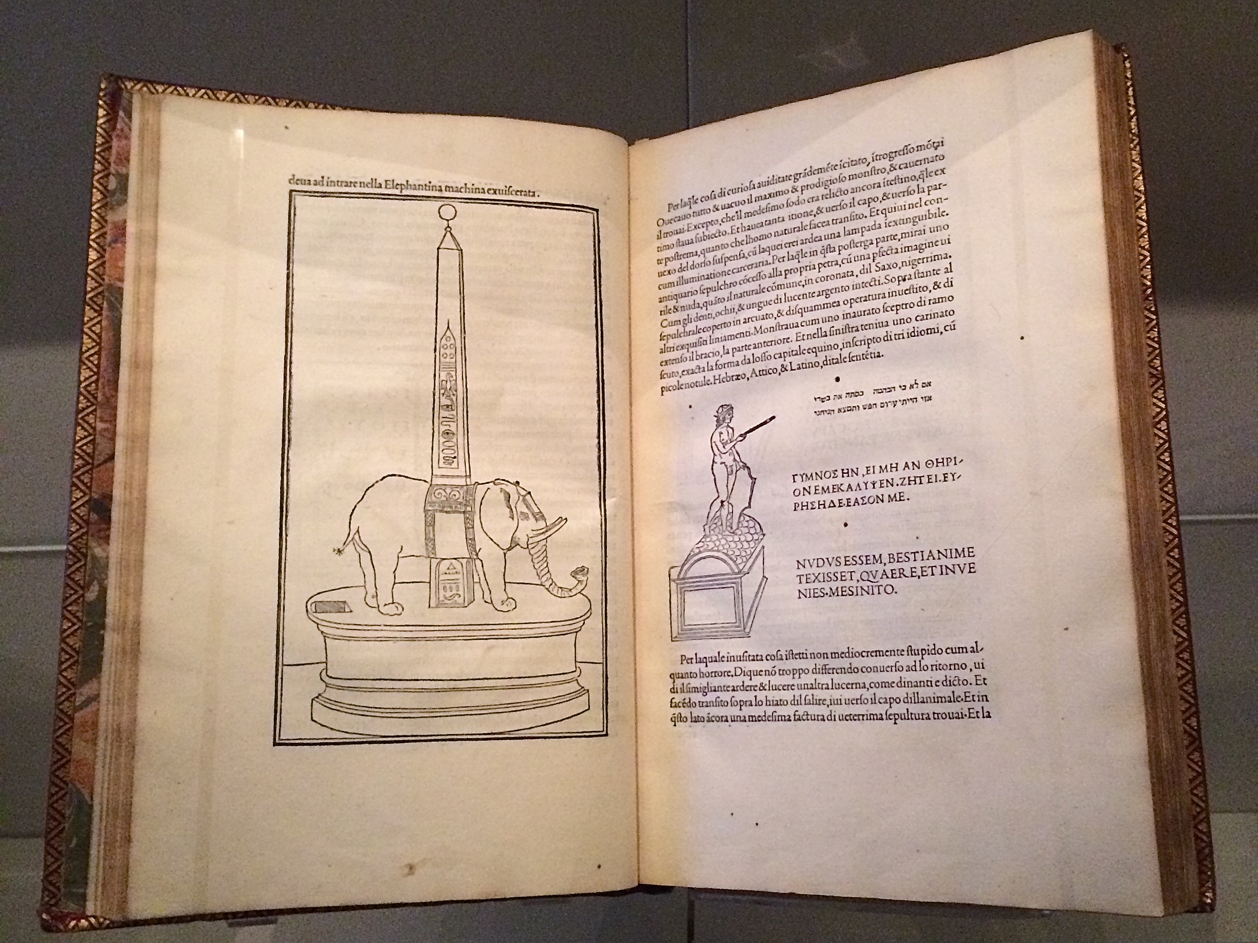
In twenty-eight more months, December 2014, we will see the 515th anniversary of the original work’s publication by Aldine Press (Venice, December 1499). The founder Aldus Manutius did not normally publish heavily illustrated books. The Hypnerotomachia Poliphili was the exception and the only commissioned work that Manutius undertook. The exception reflects favorably on the overall success of his business and supports the view that Venice had become the capital of printing and publishing very shortly after the invention of printing by moveable type.
The book unveils an inscrutable, almost comic-book-illustrated story, glittering with made-up words in Greek, Latin, Hebrew and Arabic (including proto-Greek, -Hebrew and -Arabic fonts). In addition to the page displays sculpted into shapes such as goblets, this one volume displayed the technological mastery of and improvement on the new Roman (as opposed to the heavy Gothic) typeface Bembo. According to Norma Levarie in The Art & History of Books (New York, 1968), this singular volume revolutionized typography in France in less than twenty-five years.
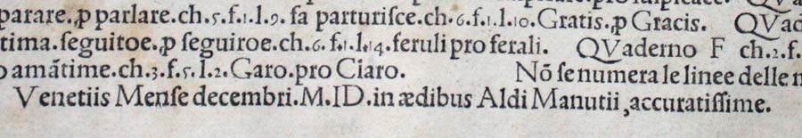
Somewhat like software releases, though, the 1499 edition came with bugs. The colophon to the Hypnerotomachia Poliphili falls at the end of a full page of errata.
“Venice Month December. 1499. in the house of Aldus Manutius, most accurately done.”
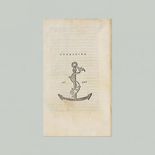
Initiated in 2015 in celebration of the anniversary and acknowledgement of the more than 100 Aldine editions in the Wosk McDonald Collection, Simon Fraser University’s Aldus@SFU is the digitization of 21 Aldine volumes published between 15011 and 1515. The image above is the edition of Lucretius’ De rerum naturam, published just after Manutius’ death in 1515.
Hollie Berry has two brief posts on book art at Book Arts at The Open Press (BA@TOP), a supportive community of book artists in Chattanooga, Tennessee, for whom The Open Press provides access to printmaking, book arts, and letterpress classes, workshops and equipment. Her first post offers as examples of the breadth of book art: Dan Essig, Sandy Webster, Brian Dettmer and Maddy Rosenberg. A good start, if light on installation book artists (say Alicia Martín).
The Open Press is 225 miles from Elizabethton, TN, where Wallace Stevens wrote “Anecdote of the Jar” in 1918 and which is only 67 miles from Asheville Bookworks in West Asheville, NC, where Landon Godfrey hosts Vandercooked Poetry Nights dispatching listeners into the mountain air clutching poems printed on broadsheets from the resident Vandercook Press, on which the authority Paul Moxon lectured in March this year at The Open Press, 199 miles away by the backroads across the Appalachians. …”And round it was, upon a hill.”
English: Comparative Bauer Bodoni versus Bodoni Català: Comparativa Bauer Bodoni vs Bodoni (Photo credit: Wikipedia)
This year marks the 200th anniversary of the passing of a great contributor to the linked histories of the book and typography: Giambattista Bodoni (1740-1813). Bodoni among others such as Fournier and Didot established the “Modern” fonts, typefaces characterized by the extreme contrast of their thick and thin strokes, delicate and sharp serifs and a chilly sparkling engraving-like quality heightened by generous leading and made possible by improvements in 18th and 19th century typecasting and manufacture of ink and paper. Bodoni planned and formed the royal printing house for the Duke of Parma in the Palazzo della Pilotta, where the Museo Bodoniano resides today. Associated with Pope Sixtus V, Carlos III of Spain and the Duke of Parma, Bodoni became one of the most celebrated printers in Europe.
View of Palazzo della Pilotta. (Photo credit: Wikipedia)
Although Bodoni’s fame in his lifetime was of a piece with that of the Romantic figures Chopin, Liszt, Byron, Goethe and Shelley, his output was Neoclassical with editions of Homer, Catullus, Virgil, Horace and the English poets Thomas Gray and James Thomson. His two-volume Manuale Tipografico (1788, 1818) is a meticulous monument of typographic art with more than 14 sets of roman and italic typefaces, a wide selection of decorative designs and symbols and alphabets from the Greek, Hebrew, Russian, Arabic, Phoenician, Armenian, Coptic, and Tibetan languages. The 1818 two-volume edition can be viewed online at the Bibiloteca Bodoni.
Portrait of Bodoni (c. 1805-1806), by Giuseppe Lucatelli. Museo Glauco Lombardi. (Photo credit: Wikipedia)
This flowering of typography and design – reflective of the age and technical developments of book printing – prompts a thought toward the impact of today’s technology – screen display, ereaders, XML and HTML, cascading style sheets, etc. – not only on type and design but their purpose as well.
“The type and pages beg to be admired – that is looked at – which is well and good, except that looking and reading are quite different, actually contradictory, acts…. To look at things, we either disengage and let them flow by on their own or we stop them in their tracks. To look we hold our breath or (in the worst of cases) pant. To read we breathe.” So say Warren Chappell and Robert Bringhurst in their critical comments on Bodoni and the Moderns. (A Short History of the Printed Word, pp. 173-74; 1970,1999.)
Perhaps we are still in the age of e-incunabula and have not reached the point where type and design on the screen beg to be admired. The improvements delivered by Readmill and Readability have been welcome for their contribution to ease of reading. It may be perverse to wish for developments that may interfere as Chappell and Bringhurst assert the Modern faces interfere with reading. But that assumes that they are right in their hieratic statement “To read we breathe.” Might it be as legitimate to assert “To read we click. To read we link. To read we dim or brighten. To read we tilt from portrait to landscape causing the page to reflow.”?
Will High Definition play the role that improved paper surfaces played to allow those thinner strokes and delicate serifs in the 18th and 19th centuries? And if it does, what on-screen design, comparable to Bodoni’s increased leading, will perform the same heightening effect for new faces and design that beg to be admired?
Bodoni Ornaments (Photo credit: Bene*)
For more on the subject of Bodoni, see “Biblioteca Bodoni Launched on Bicentennial Anniversary of Giambattista Bodoni’s Death” by Yves Peters, The Font Feed, 11 December 2013.
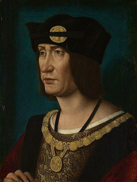
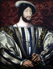
In 1513, Louis XII of France issued an edict praising printing, exempting it from a large impost and removing a tax on books. Louis declared that “the printer-booksellers … ought to be maintained in their privileges, liberties, franchises, exemptions, and immunities, in consideration of the great benefits which have been conferred upon our kingdom by means of the art and science of printing, the invention of which seems rather divine than human ….” Two years later, Louis was dead, and the lot of books and printer-booksellers fell under the shadow of France’s so-called Father of Letters, François I, who issued an edict in 1535
François I, Roi de France, 1515-1547
banning the use of the printing press and permitted books and printers to be consigned to the flames for blasphemy. (Richard Christie, Etienne Dolet: The Martyr of the Renaissance, 1508-1546, 1899. Pp. 330-31). Which might be said to challenge the certainty of taxes while confirming that of death.


, by Giuseppe...")