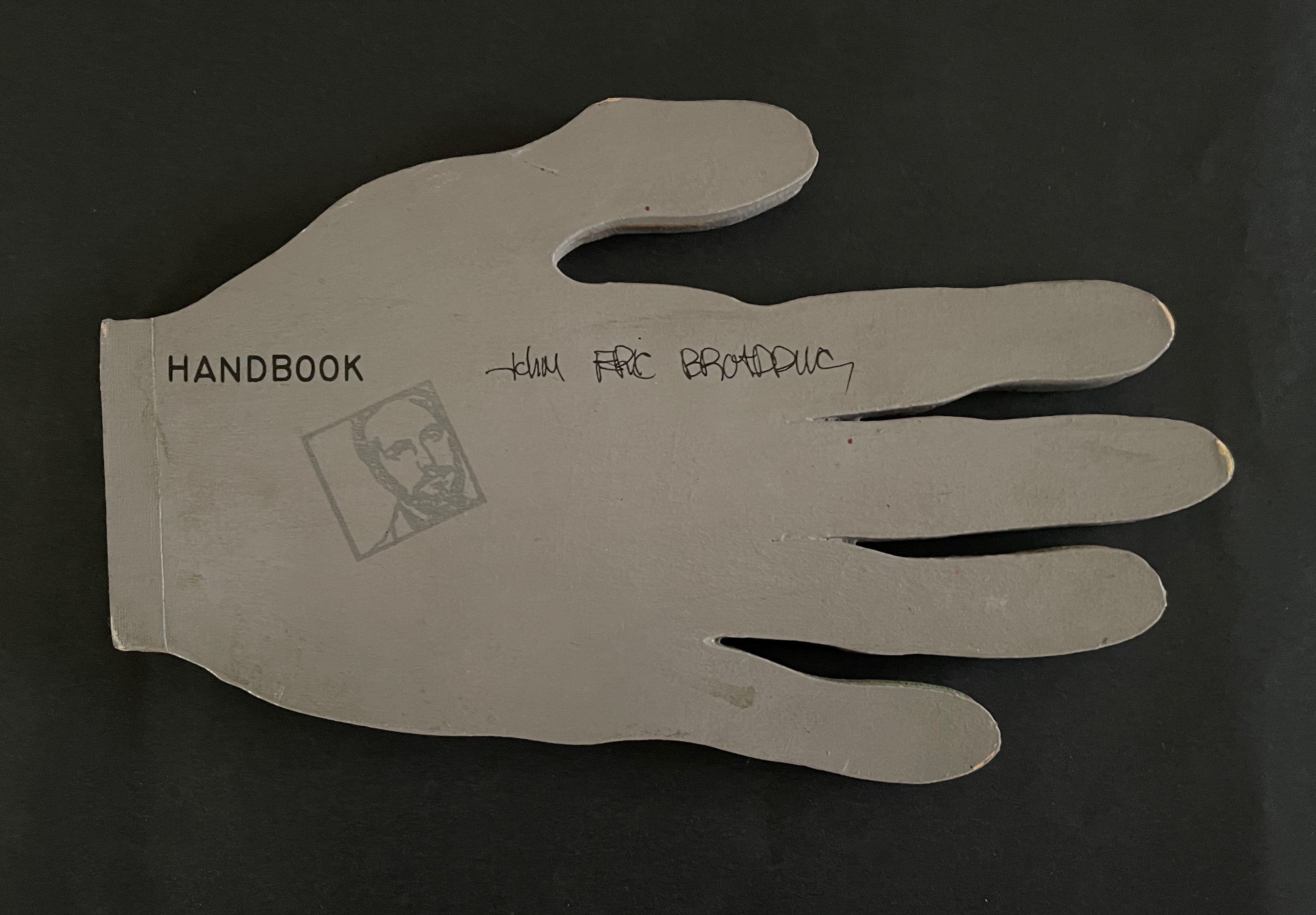
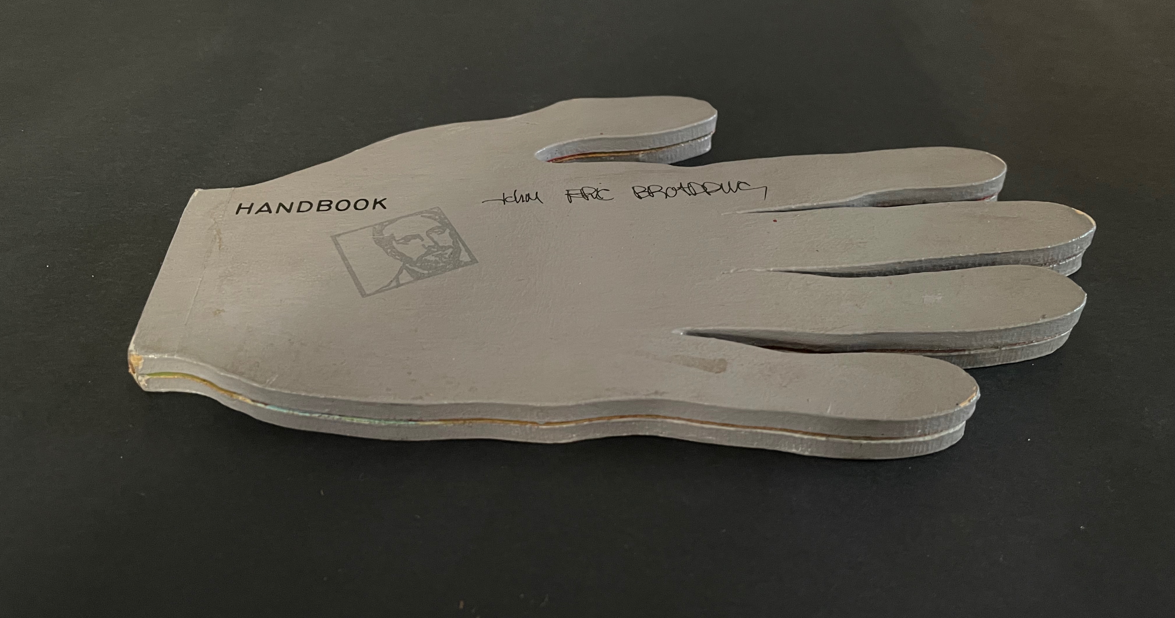
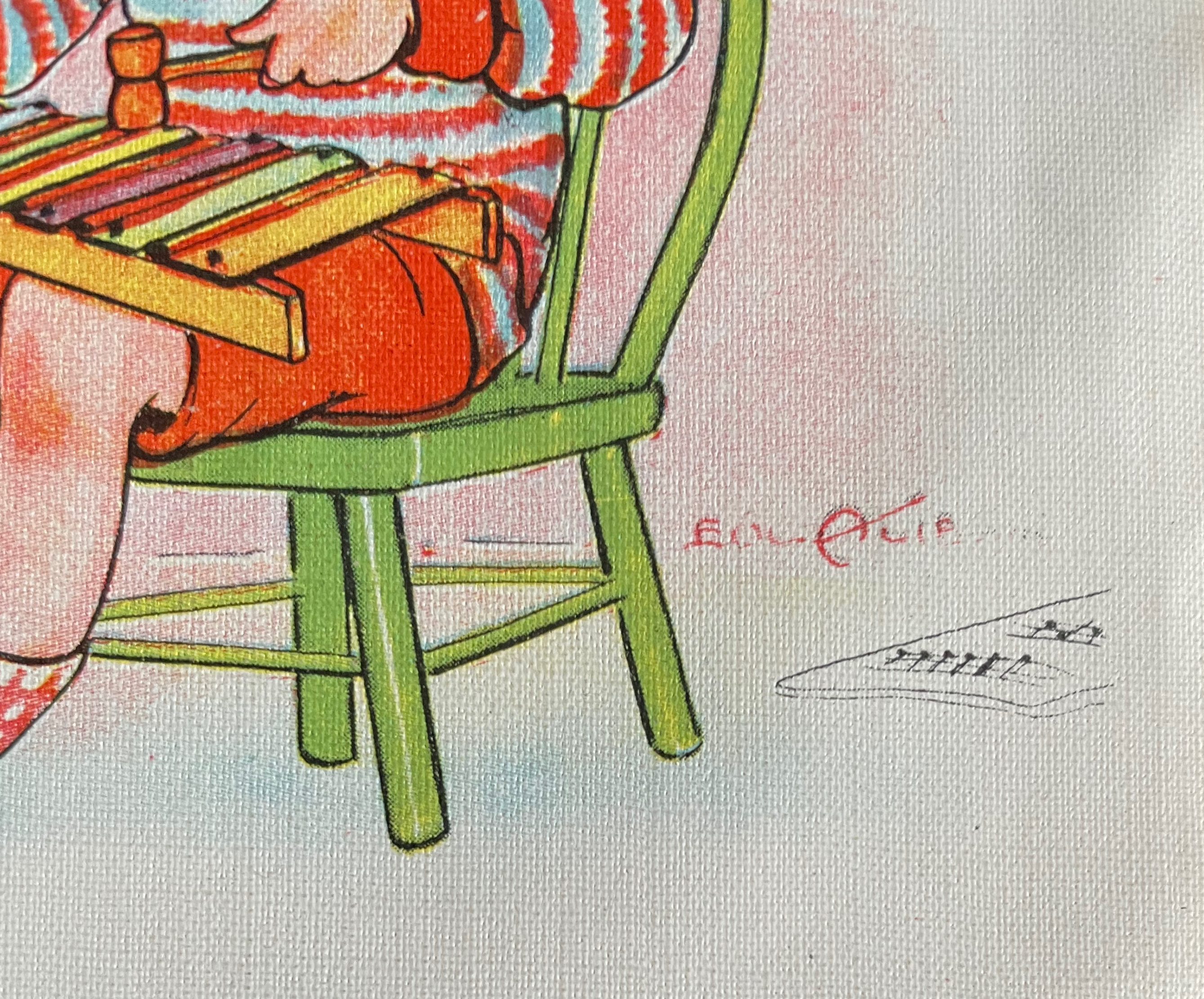
John Eric Broaddus (1943 1990) was perhaps one of the most inventive and creative artists to approach the book form. He was a prominent figure in the New York City art scene in the 1970s and 1980s, creating books before the book form even had a suggestion of acceptance in the art world. He also created one-of-a-kind costumes that he wore out on the streets of New York and in iconic places like Studio 54. He was vibrant, outlandish, and did much to contribute to the world of artistic interplay in New York City of that time. His inspired life was cut short by AIDS in 1990. but his legacy lives on in the work he left behind, a muse in itself for book artists even twenty years later.” Visual AIDS
Since first seeing references to and images of John Broaddus’ artist’s books in 2012, I have watched for opportunities to add his work to the Books On Books Collection. So many of his artist’s books were unique works and already in institutional collections or private hands, it would be a long watch. In late 2025, this appeared: “Achingly scarce work from a major figure in the early book arts movement. Minimal shelf/edge wear, else tight, bright, and unmarred. Shape book (human hand), grey painted boards, black ink lettering, cut paper forms.”
Handbook (1980) John Eric Broaddus Hand-shaped boards over hand-shaped painted and cut pages, nailed tape hinge. Variable: H123 x W205 mm. [10] pages. Limited edition, unknown quantity. Acquired from Lux Mentis, 3 December 2025. Photos: Books On Books Collection.
First, the back-dating. This comes from the delightfully annoying or annoyingly delightful belated discovery of Erik Kwakkel’s 2015 entry on the history of the horn-book “Book on a Stick” in Medievalbooks. Delightful and annoying to find the truly earliest appearance of a horn-book right under my nose in the Bodleian Libraries but too late to include it in the Alphabets Alive! exhibition at the Bodleian in 2023.
Andrew White Tuer’s History of the Horn-Book (1897) came close with its dating of the horn-book’s first appearance as 1450, but as Kwakkel writes:
The image shows Christ being brought to school by his mother. He is bringing his “textbook” to class: a hornbook, which dangles from his wrist by a string, just like many of the later specimens did … Quite intriguingly, we are shown a real medieval snapshot of how children carried their hornbook to and at school. More importantly, it shows that the hornbook was indeed a medieval invention….While no actual hornbooks appear to survive from the medieval period, these visual representations show that educating young children was also the driving force behind the production of hornbooks in the age before print.
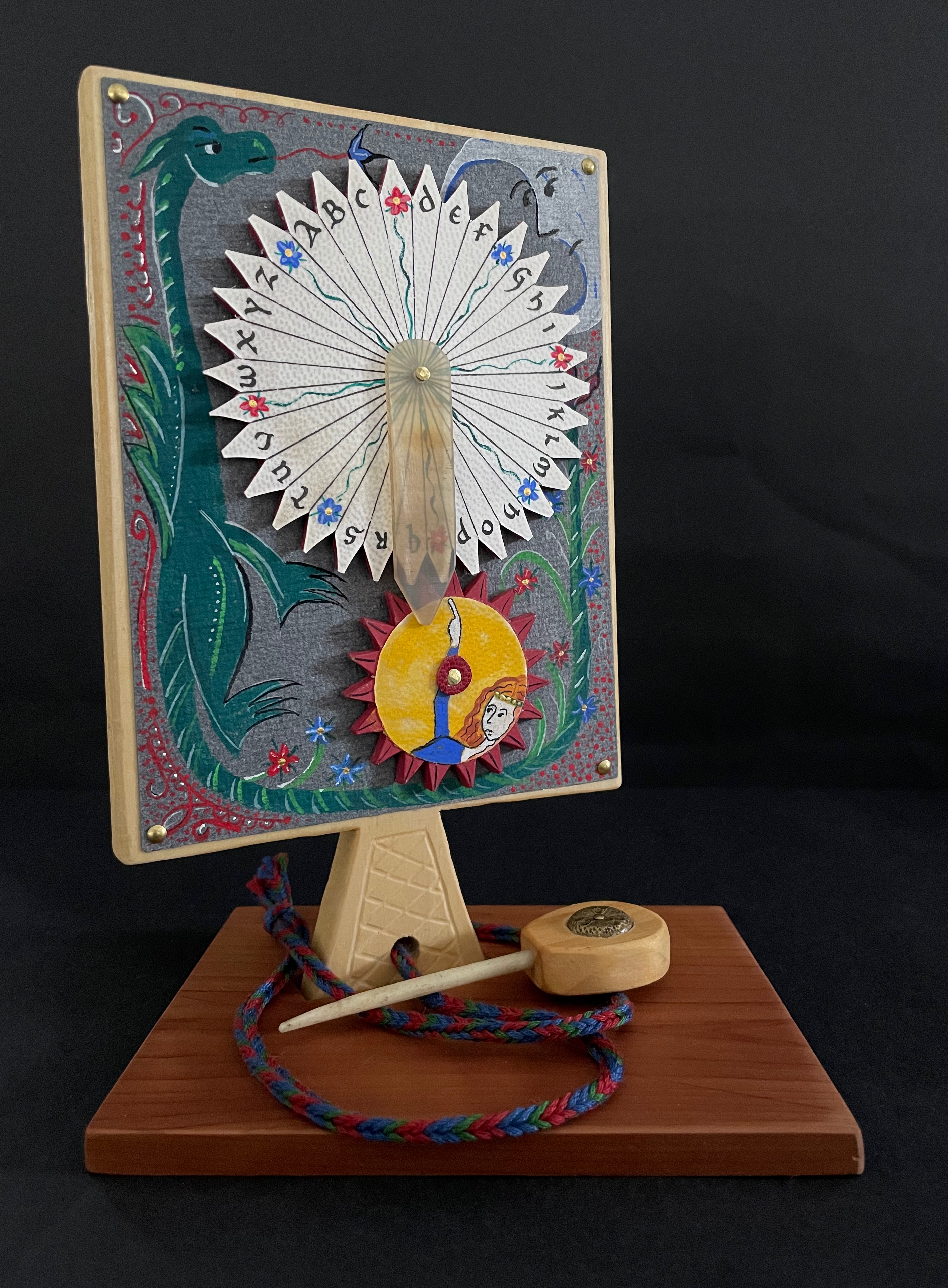
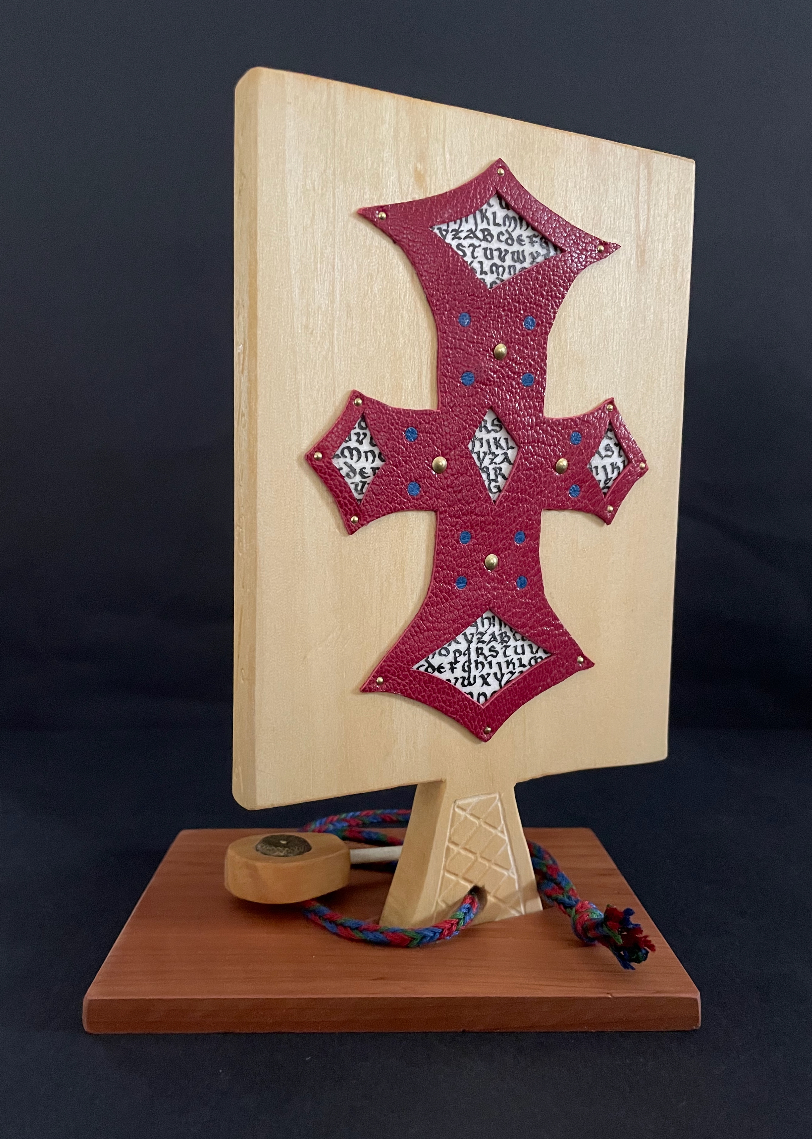
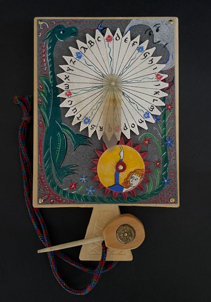
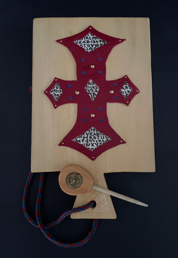
And for the updating, here is Ashley Thayer’s Mechanical Horn-book (2025) just arrived in the Books On Books Collection.
Mechanical Horn-book (2025) Ashley Rose Thayer Horn-book. On stand: H192 x W160 mm. Off stand: H192 x W115 mm. Unique. Acquired from the artist, 17 October 2025. Photos: Courtesy of the artist. Books On Books Collection.
The paddle is made of pine wood, the gears of vellum-covered bookboard, the spinning “arm” of authentic cow horn, and the wrist loop of embroidery thread by a medieval finger loop braiding technique. On dark grey-blue Khadi paper, Thayer has painted a border of the moon, a berried floral garland, and a wyvern, the heraldic emblem associated with Wessex, the Anglo-Saxon kingdom from which Alfred the Great emerged in the 9th century. On the reverse, a cross of cut red leather with five inserts of calligraphed vellum alluding to Christ’s five wounds reflects the horn-book tradition of combining religion with learning the alphabet. It also makes this horn-book reflective of Alfred’s Anglo-Saxon and Christian background.
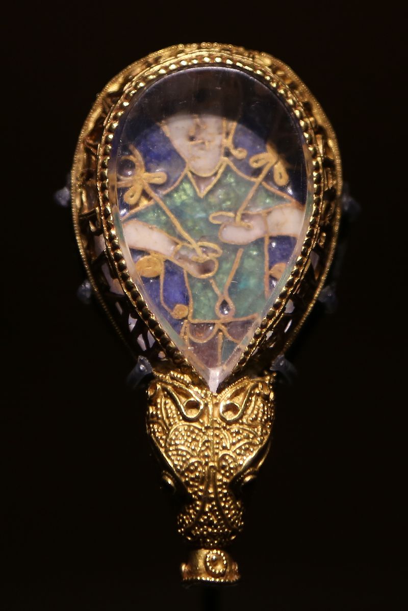
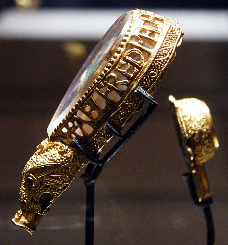
The pointer, called an aestel in Old English, is made from poplar wood, an antique button, and antique bone. Its inclusion isn’t simply functional. Appearing alongside the Wessex wyvern, it points to that famous aestel on display at the Ashmolean in Oxford: the Alfred Jewel.
The Alfred Jewel, Ashmolean Museum, Oxford. Photo taken from the front by Geni CC BY-SA 4.0. Photo taken from the side by Richard M Buck CC BY SA 3.0.
If there’s ever an Alphabets Alive! redivivus, Erik Kwakkel and Ashley Thayer have provided the pointers to the other treasures in Oxford that should be included.
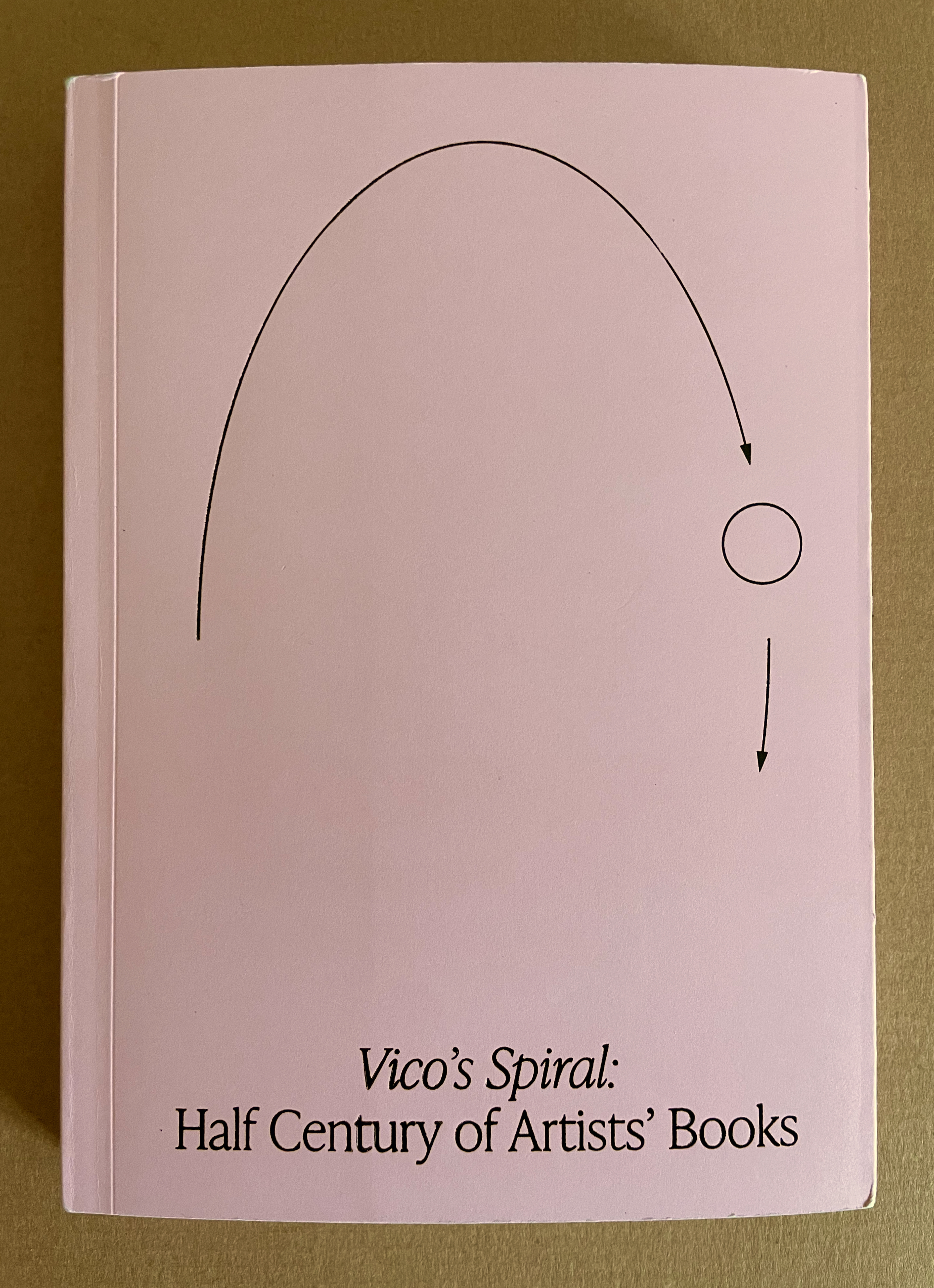
With Vico’s Spiral, Robbin Ami Silverberg, Carole Naggar, and Kinohi Nishikawa have made a significant contribution to how we can better appreciate artists’ books. The publication accompanied the exhibition by the same name celebrating the 50th anniversary of New York’s Center of Book Arts from 26 September through 14 December 2024.
The exhibition’s curators — Silverberg and Naggar — chose their organizing metaphor well. The 16th century philosopher Giambattista Vico proposed that history did not proceed in a straight line but instead spiraled, with patterns of events recurring with near similarity in different periods and even different regions. Naggar writes, As in Vico’s Spiral, artists’ books disregard linear chronology and geographies. Based on recurrent concepts and forms, they “meet” in vastly different time-spaces.
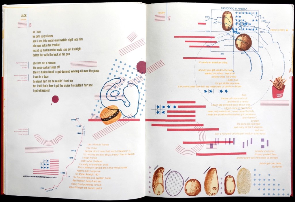
To prove the aptness of Vico’s model of history for book art, the curators paired art works from different times and places. For example, New York-born Warren Lehrer’s French Fries (1984) is paired with Israeli-born Uriel Cidor’s Greetings from America (2018).
Lehrer’s satiric take on “what is America” aims to visualize the text of a ten-part play set in a DREAM QUEEN restaurant with its “core of regulars: four faithful customers, three employees and one mobile juke-box on wheels”. He calls it a “psycho-acoustic” translation in which “each character is typecast into a distinct color and typographic arrangement”. On the pages, “an array of images and marks accompany the text, evoking an appropriate ambiance, and further serving to chart the cacophony of shifting internal projections that make up the characters’ collective consciousness”.
If the satiric target of French Fries isn’t clear, consider the A assembled on the double-page spread by the text’s layout and the stars-bars-and-stripes.
Cidor’s abecedary is populated with words that are the artist’s answers to the question “what is America?”. Each letter of the Hebrew alphabet appears on a recto page, and a word beginning with that letter is worked into an abstract image on the facing verso page. At a further level of abstraction, all the letters are formed with Cidor’s stylized Hebrew font Octavk’tav.
From right to left, the Octavk’tav version letter ayin (ע) is for shem’at ha’omes (שְׁעַת הַעוֹמֶס) or “rush hour”. The words’ letters sprawl in brown across an intersection gridlocked with ayins.
As Lehrer does in French Fries, Cidor uses the arbitrary abstraction of letters and page order along with not-so-arbitrary typographical layout and words in translation (for example, Resh for the Hebrew for Rocknroll and Ronald Reagan, Tsade for Extra large Cheezburger with fries and a soda) to capture his satirical target: the big Aleph (New York and America).
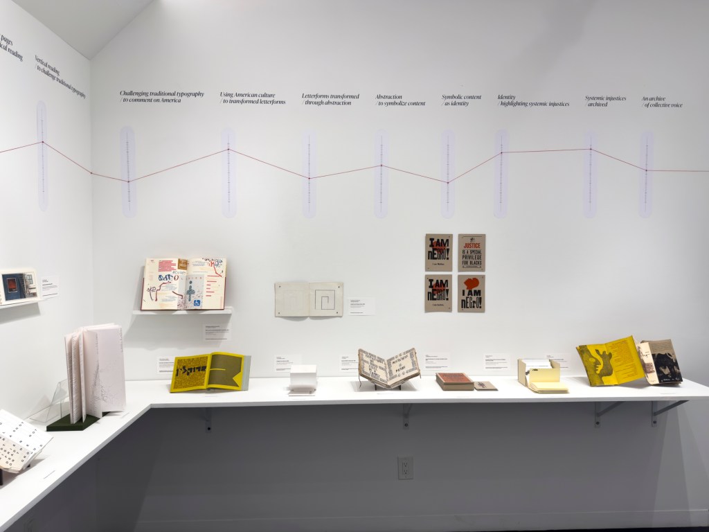
Above or beside each work displayed, a vertical time scale showing the exhibition’s span (1964-2024) was repeated on the walls. A red pin designated the nearby item’s year of publication, and a red thread ran from pin to pin around the room. Along with the spiral of tables displaying past exhibition catalogues, this fluctuating red line evoked Vico’s Spiral for visitors.
“Vico’s Spiral” at the Center for Book Arts, New York. Photo: Daniel Wang.
“Vico’s Spiral” at the Center for Book Arts, New York. Photo: Daniel Wang.
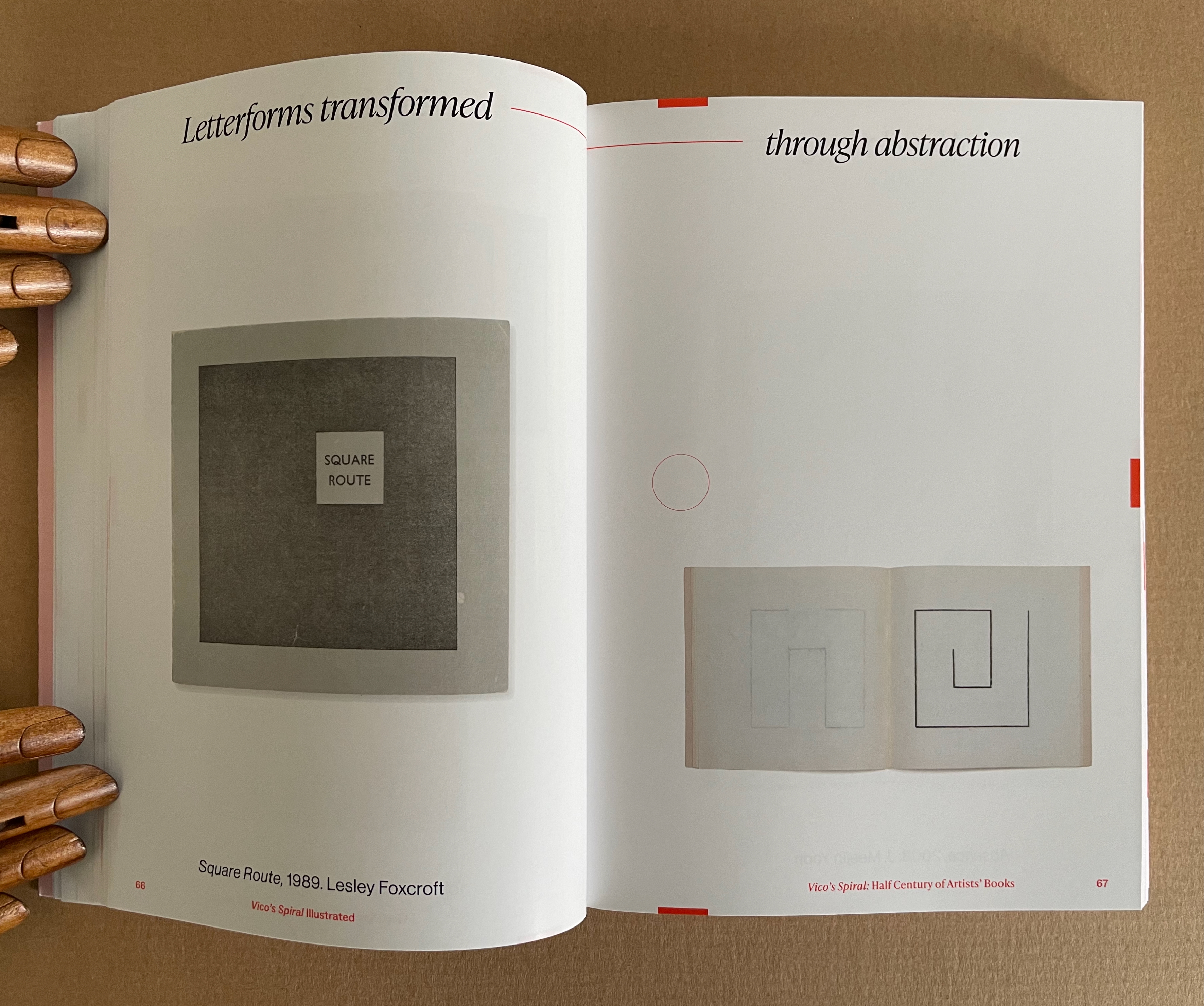
The exhibition’s catalogue emulates some of this design across pages 17-120, and what can be seen more clearly is how the curators daisy-chain their pairs with the headings used on the exhibition walls. Below are the two pairs that follow Lehrer, whose heading is “Challenging typography … to comment on America”, and Cid0r, whose heading is “Using American culture … to transform letterforms”. Foxcroft’s Square Route picks up the chain …
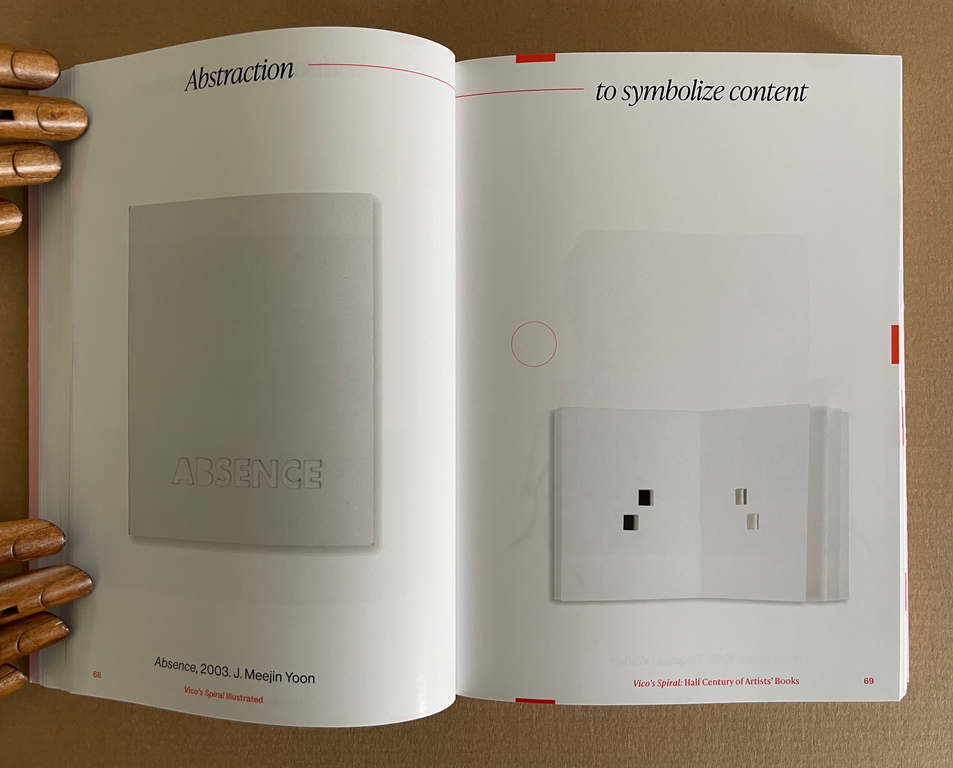
Pages 66-69. Photos: Books On Books Collection.
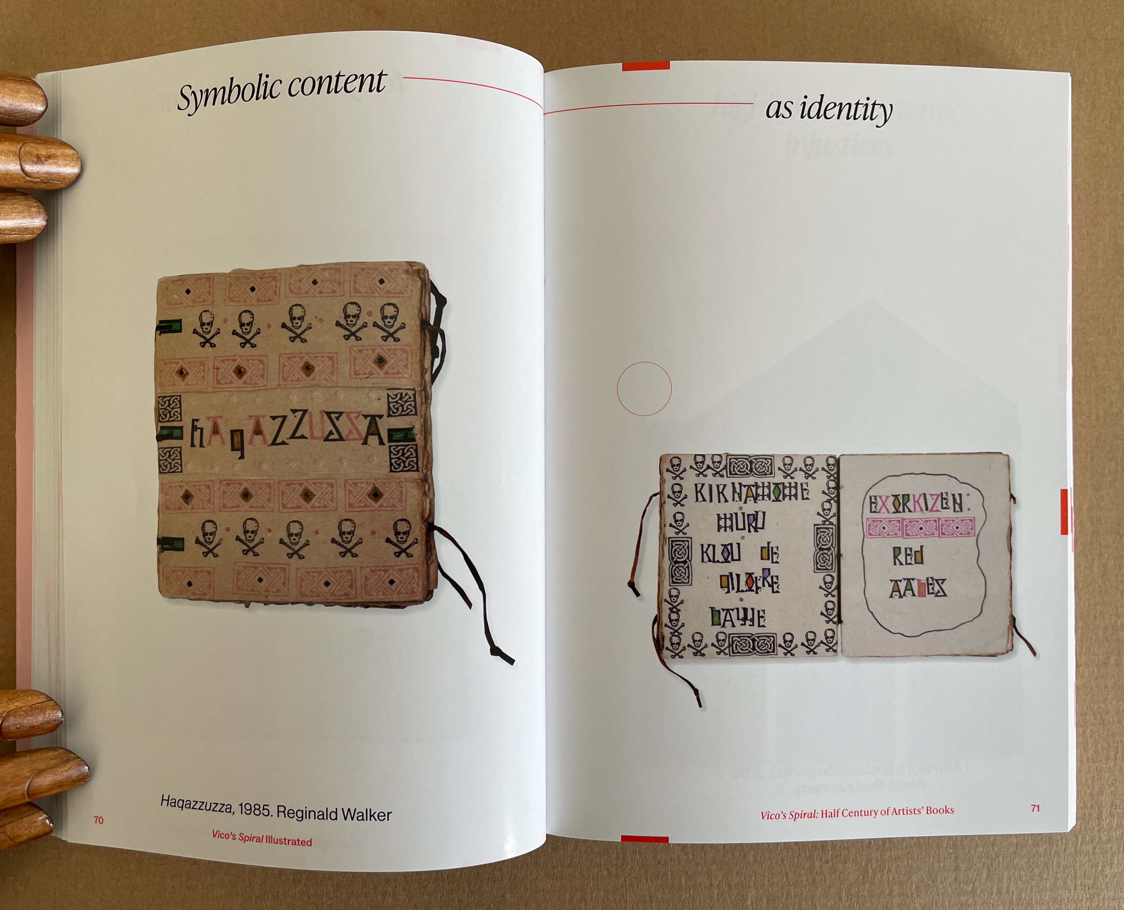
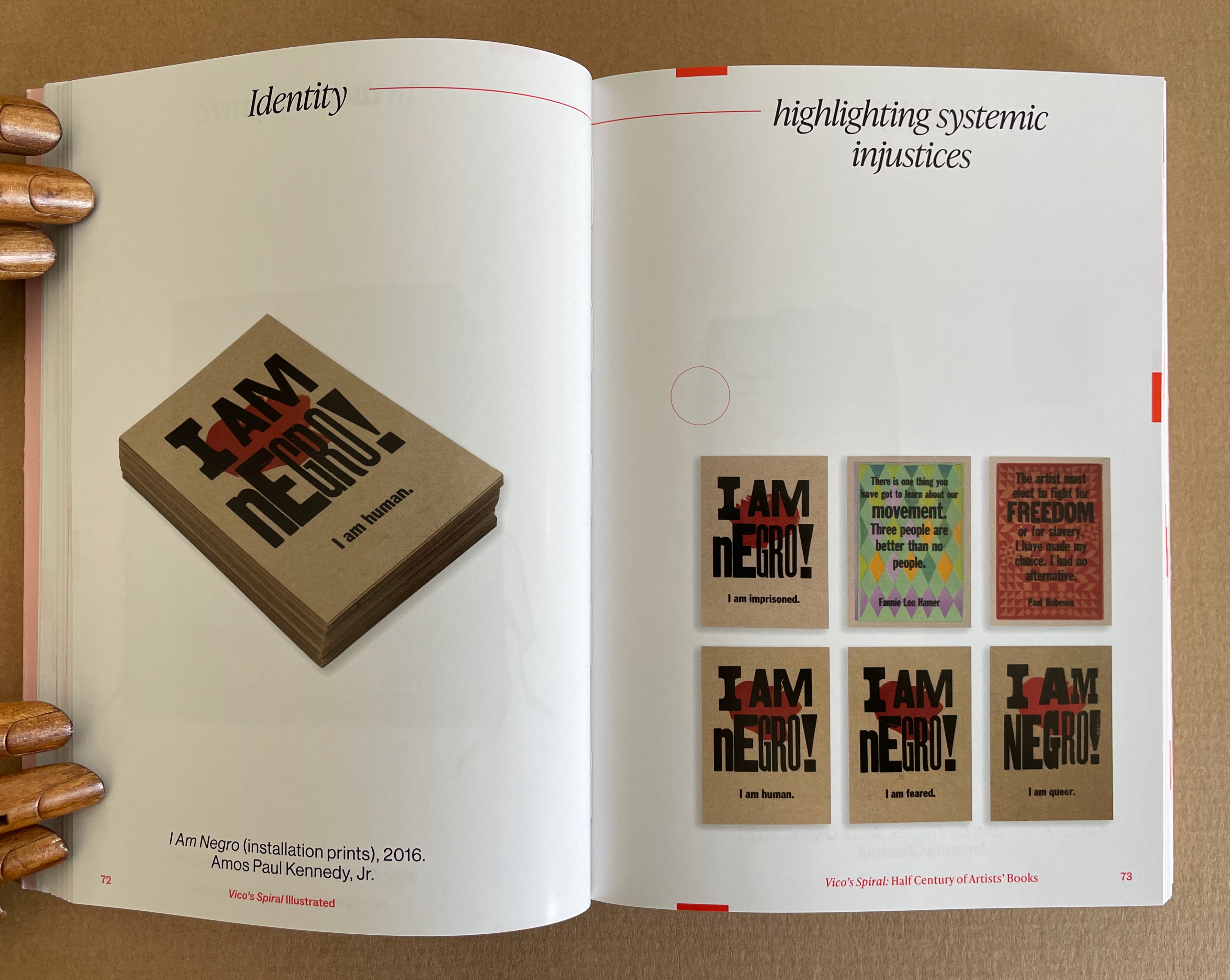
Pages 70-73. Photos: Books On Books Collection.
Kinohi Nishikawa’s essay “Strange Loops” brings a related metaphor to the party. He begins with another anniversary: the 2oth anniversary edition of Douglas R. Hofstadter’s Gödel, Escher, Bach: The Eternal Golden Braid (1979/1999).
At the heart of GEB, as devoted readers call it, is an exploration of how selfhood emerges from repeating patterns of cognition that mirror repeating patterns of the natural world, only for the cognitive patterns to turn inward and mirror themselves. GEB’s thesis is derived from Austrian mathematician Kurt Gödel’s incompleteness theorem, which contends, “All consistent axiomatic formulations of number theory include undecidable propositions.” Gödel’s theorem defines the constitutive externality of any set and, in so doing, identifies the minimal gap within a system for self-awareness to emerge. Crucially, Hofstadter does not limit his account of selfhood to the operation of cognitive processes. The metaphor of strange loops suggests how patterns that fold on themselves are perceived, felt, and, indeed, experienced by an embodied being. (p. 175)
Nishikawa’s immediate task in Vico’s Spiral is to survey the CBA’s previous half century of exhibitions, and he uses the strange loops metaphor to understand the CBA through the “set” of its exhibitions. All well and good, it is a brilliantly written and insightful essay. But if only he had also been asked to apply the metaphor to the set of artists’ books in the CBA’s archive or the set selected by Silberberg and Naggar!
In The Century of Artists’ Books, Johanna Drucker highlighted the self-interrogatory nature of the artist’s book as its defining characteristic. The application of these metaphors of Vico’s Spiral and strange loops to the history of artists’ books adds a new sense to that. The self-interrogatory nature of the artist’s book is a pattern recurring similarly but differently across time and space in those works of art created by artists who play with the book whether as material object as a whole or in its parts, as vehicle, as site of performance, as a tool-made and tool-making technology, or as concept. As each of those aspects yield fresh artists’ books with differences, we have new opportunities to perceive, feel, and experience an artwork’s pursuit of its self, the artists’ pursuit of their selves and our pursuit of our selves.
Nishikawa comes tantalizingly close to applying the strange loops metaphor to the domain of artists’ books when he writes, “Book arts is about discovering the self at the edge (fold, seam, spine) of insight and creation” and, when he writes, “… the essential question of selfhood isn’t What? or Why? but How? How do these patterns work, how do I know myself better through them?”
Indeed, “how?” is the question to be brought to each artist’s book. How do I encounter this artwork? How is it manifesting its patterns? And then to bring ourselves full circle back to Vico’s Spiral, How are those patterns manifest in other works in other times and other places?
Nishikawa’s approach to the CBA’s catalogues also offers a baton that we can hope others will carry forward. The CBA’s exhibitions provided not only a way into understanding the CBA itself but one into researching the world of artists’ books. Aware of this opportunity, Silberberg concludes the volume with a listing of artists’ books exhibitions from around the world. Who will grasp this baton next in the race along Vico’s Spiral?
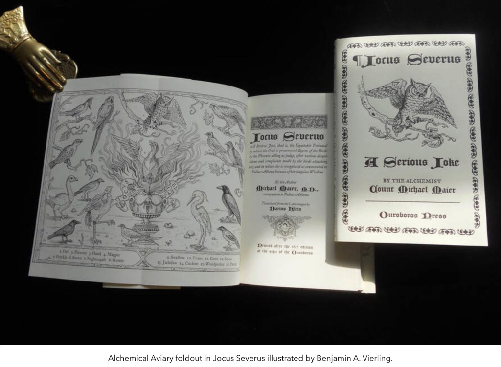
William Kiesel, founder of Ouroboros Press, has an insightful essay with impressive examples of the “fold out” device here. Among the examples are
Manly P. Hall’s The Secret Teachings of All Age and Codex Rosicrucis
Elias Ashmole’s Theatrum Chemicum Britannicum
Zoroaster’s Telescope: The Key to the great divinatory Kabbala of the Magi
Napoleon’s Book of Fate
Heinrich Cornelius Agrippa von Nettesheim’s De Occulta Philosophia
Semiphoras et Shemhamphoras Solomon Regis
E. A. Budge’s The Book of the Dead
Don’t let the occultism of the examples put you off. After all, the earliest forays into movable books occurred in alchemical and Kabbalistic tomes. As Kiesel, also a book maker, points out:
Opening a folding plate causes an interruption in the reading process. It offers the reader an opportunity to think about what was read while contemplating the materials on the printed sheet. Again alchemy and mysticism share this meditative approach, a kind of inner reading read through the visual language of the birds or abecedarium.
From the screenshot of one of his productions above, you may be able to make out the book’s author: Count Michael Maier, whose more famous emblem book Atalanta Fugiens Daniel E. Kelm transformed into the Möbius version Neo Emblemata Nova.
In July this year, a video was posted as if in response to the conclusion of Kyle Olmon’s “Movable Book Artists” in Parenthesis 31 (2020):
There is little in the way of scholarship and criticism in regard to pop-up and movable books. Part of this is the stigma of being represented as a commercial novelty product or kiddie book by twentieth-century publishers. The explosion of artists’ books in the 1970’s gave rise to a subset of book artists that moved beyond the standard textblock to explore the book form in ways that surpassed commercial novelty publishing efforts. To date there is no consensus within the community on the classification of the types of book formats or even the terminology used when describing pop-up and movable elements in a work. Hopefully this will change when articles about pop-up artists’ books appear with more frequency and more scholarship is undertaken.
The Newberry Library’s Curator of Rare Books and Manuscripts Suzanne Karr Schmidt gave the Book Club of Washington a reprise of her 2023 exhibition “Pop-Up Books through the Ages”:
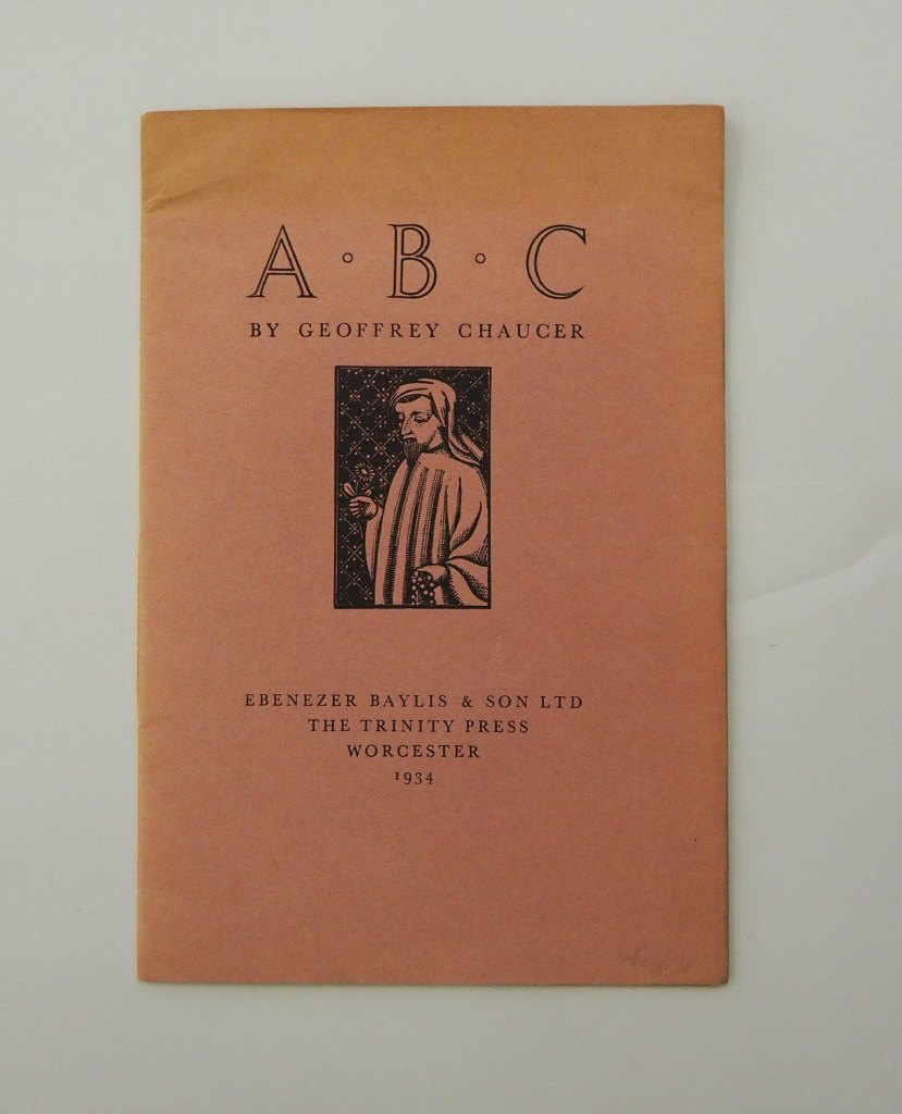
ABC by Geoffrey Chaucer (1934) [Eleanor] Joyce Francis Chapbook, softcover sewn. H250 x W170 mm. 16 pages. Edition of 500? Acquired from Antiquariaat Fokas Holthuis, 30 April 2021. Photos: Emilia Osztafi.*
Chaucer’s ABC (ca. 1369) is an intriguing early work in the history of abecedaries. There are alphabet poems in the Hebrew Bible, but according to the artists’ book collector and scholar Nyr Indictor, this Chaucer lyric seems to be the earliest surviving English “ABC poem” of known authorship. Possibly on commission from Blanche, Duchess of Lancaster, Chaucer cribbed and translated a lyric embedded in Guillaume de Deguilleville’s La pelerinage de vie humaine [“Pilgrimage of Human Life”] (ca. 1330).
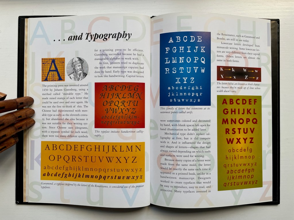
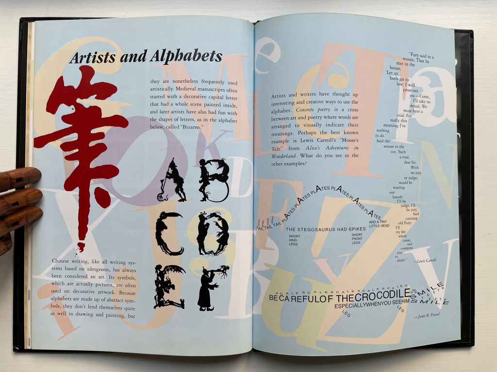
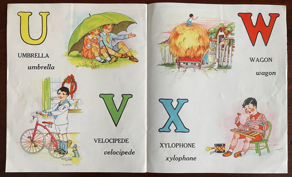
Alphabetical Order: How the Alphabet Began (1998) Tiphaine Samoyault Casebound, illustrated glossy paper over boards, decorated doublures. H270 x W195 mm. 32 unnumbered pages. Acquired from World of Books, 15 August 2022. Photos: Books On Books Collection.
Alphabetical Order is a translation. Its original title — Le Monde des pictogrammes (Paris: Circonflexe, 1996) — better reflects the well-illustrated character of the book. The images, the hand lettering, the ghost-printed background and handling of color are constant reminders of the pictographic roots of most alphabets and writing systems. The final section — Artists and Alphabets — punctuates those reminders. In fact, the book’s endpapers act as quotation marks around the point.
Diringer, David, and Reinhold Regensburger. 1968. The alphabet: a key to the history of mankind. London: Hutchinson. A standard, beginning to be challenged by late 20th and early 21st century archaeological findings and palaeographical studies.
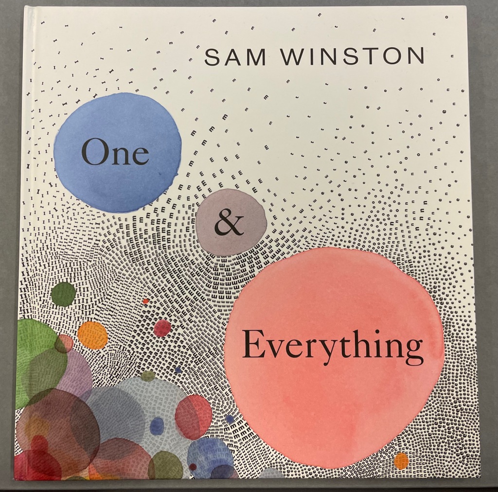
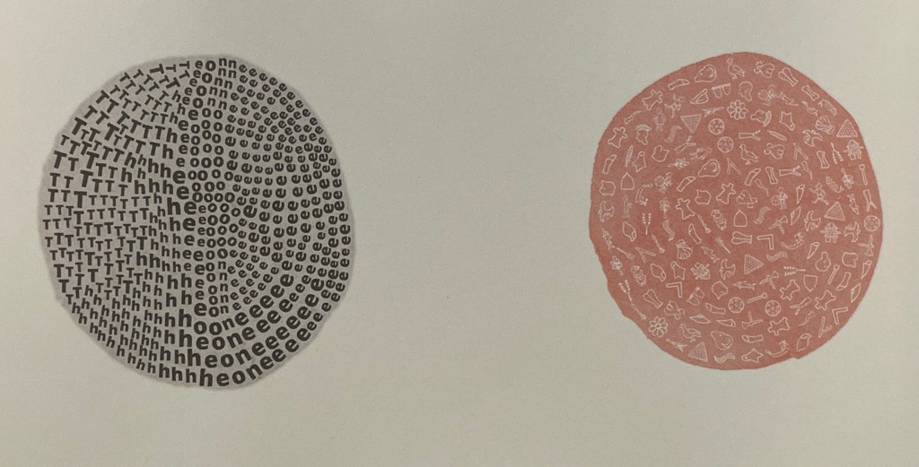
One & Everything(2022) Sam Winston Casebound with illustrated paper over boards. H265 x W255 mm. 48 unnumbered pages. Acquired 23 November 2022. Photos: Books On Books Collection. Displayed with artist’s permission.
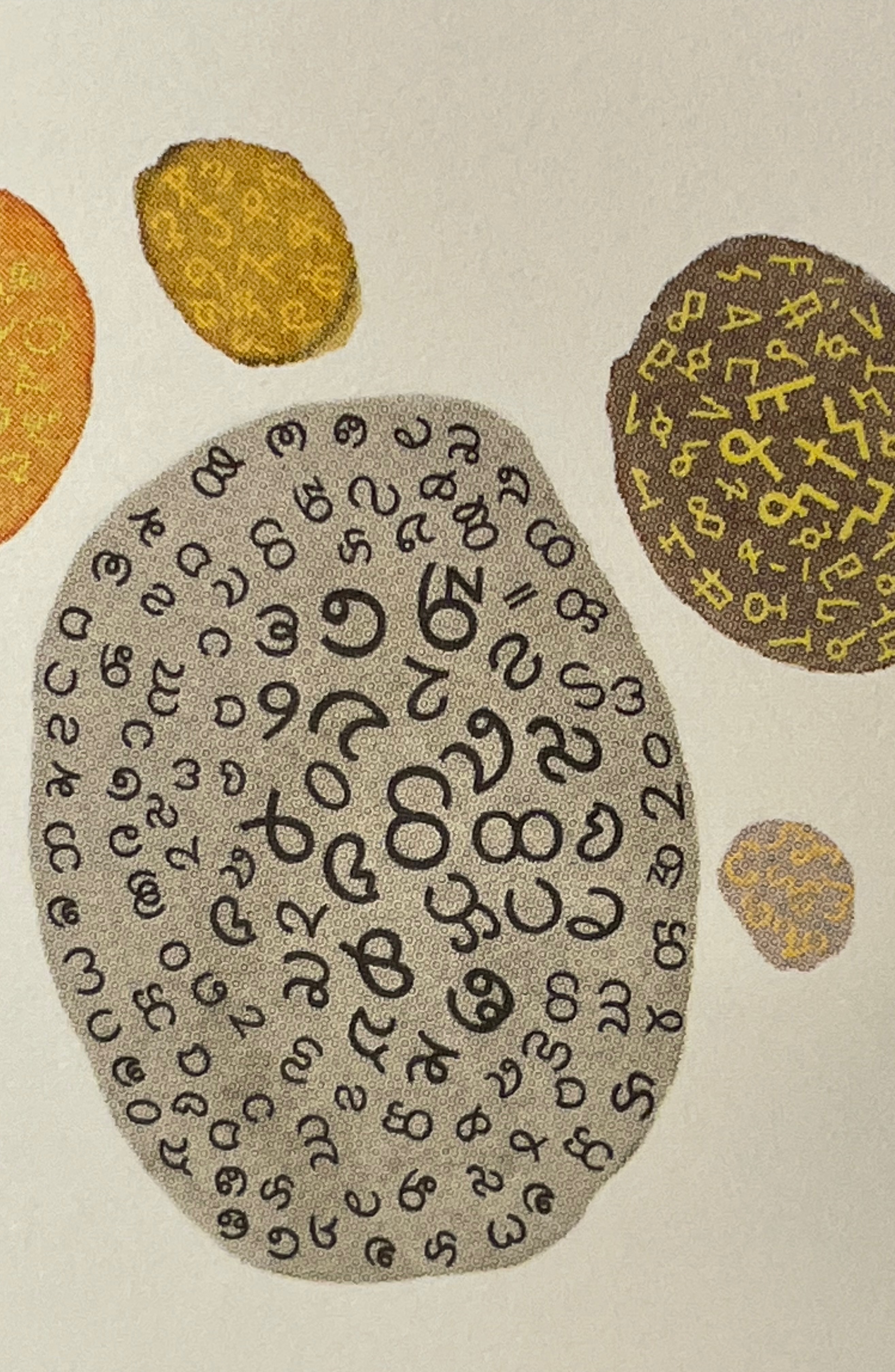
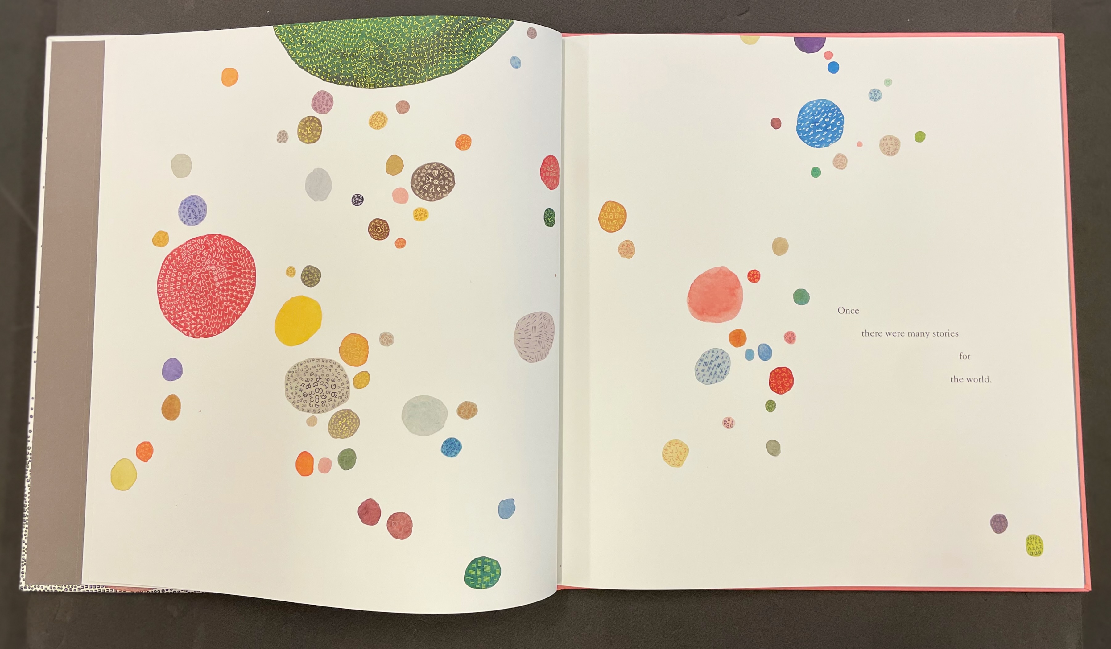
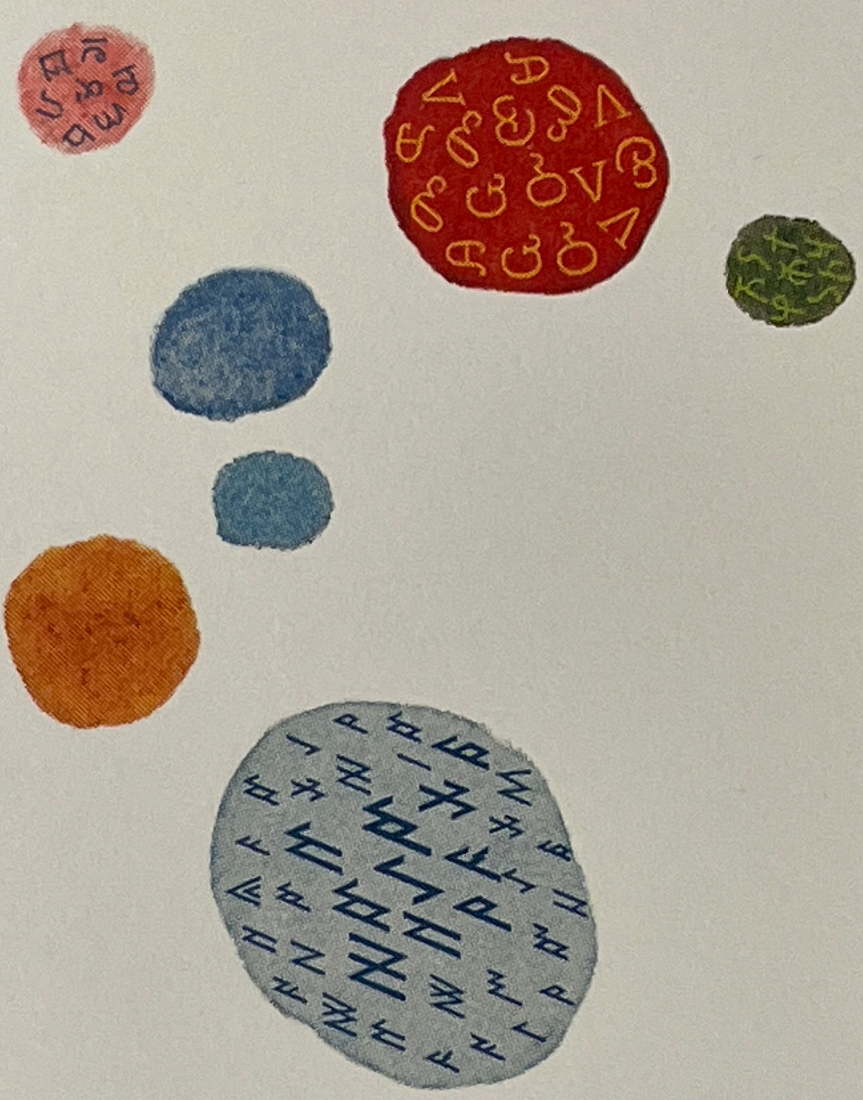
Sometimes you just know that you have read a classic. This is one of those times. Winston and Candlewick Press (Walker Books in the UK) have worked a fresh tale, tone and meaning together with image, color, design and production values to an extraordinary level. Inspired by Tim Brookes’ “Endangered Alphabets Project“, Winston uses the striking shapes of letters and scripts from the Latin, Ogham, Cherokee, Armenian, Hebrew, Tibetan and dozens more alphabets and syllabaries to create the characters in his fable about the story that decides one day that it is the One and Only story.
Shapes like single-celled creatures (each filled with a different alphabet) represent the many stories existing before “The One” arrives.
“The One” is made of the English (i.e., Latin or Roman) alphabet. Will it listen to and make sense of all these other stories?
The fable of One & Everything does more than support the notion that alphabets and languages can be endangered. Implicit in the fate of the “One & Everything” story” is the message that Babel was more of a blessing than a curse.
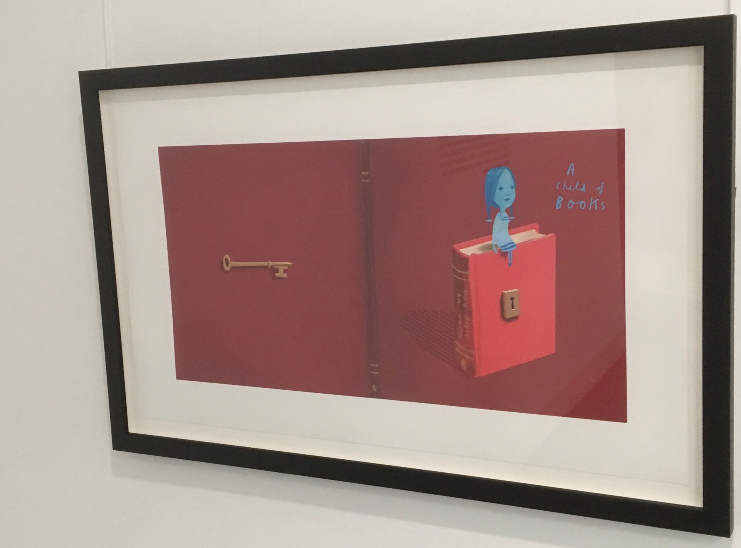
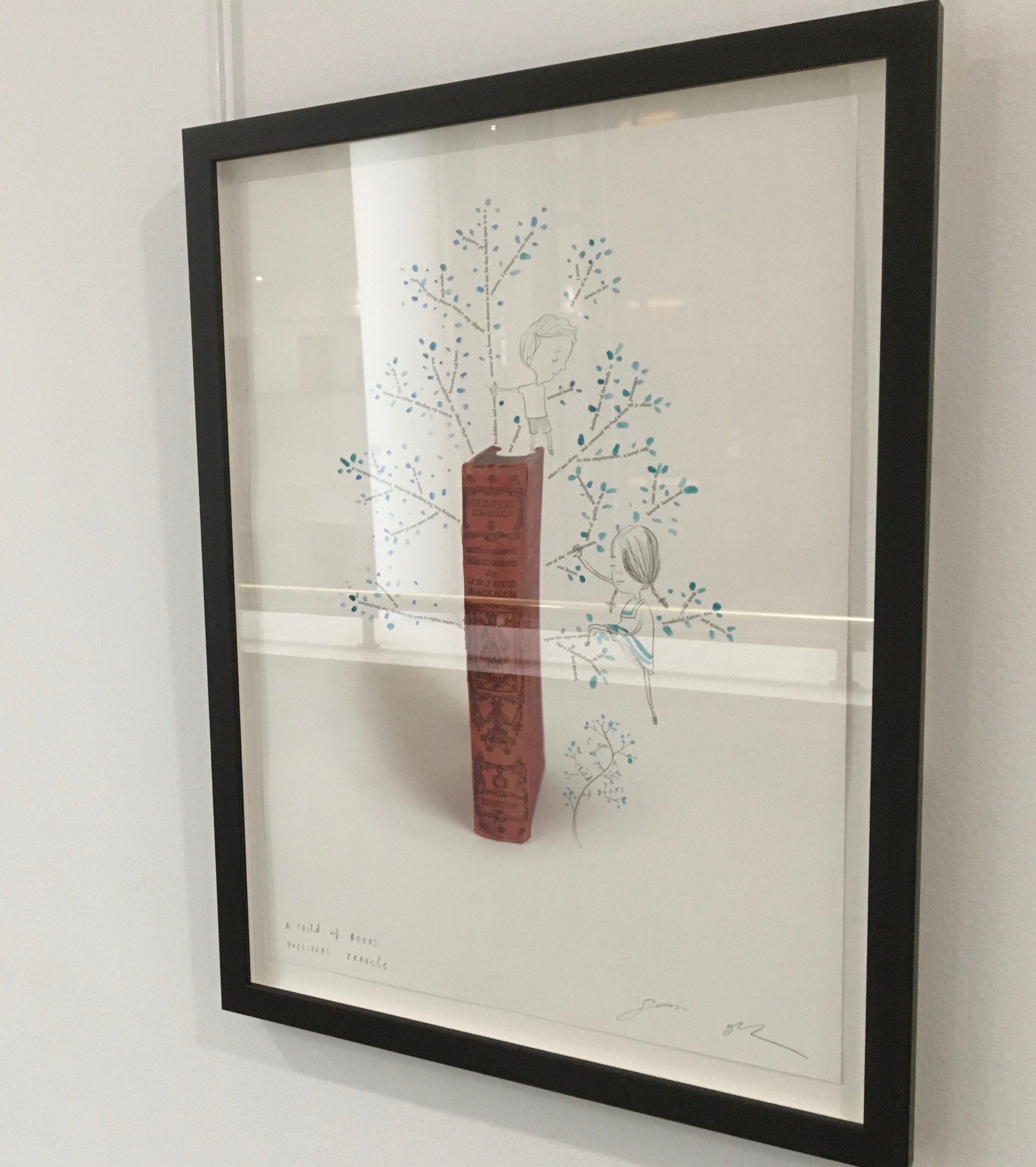
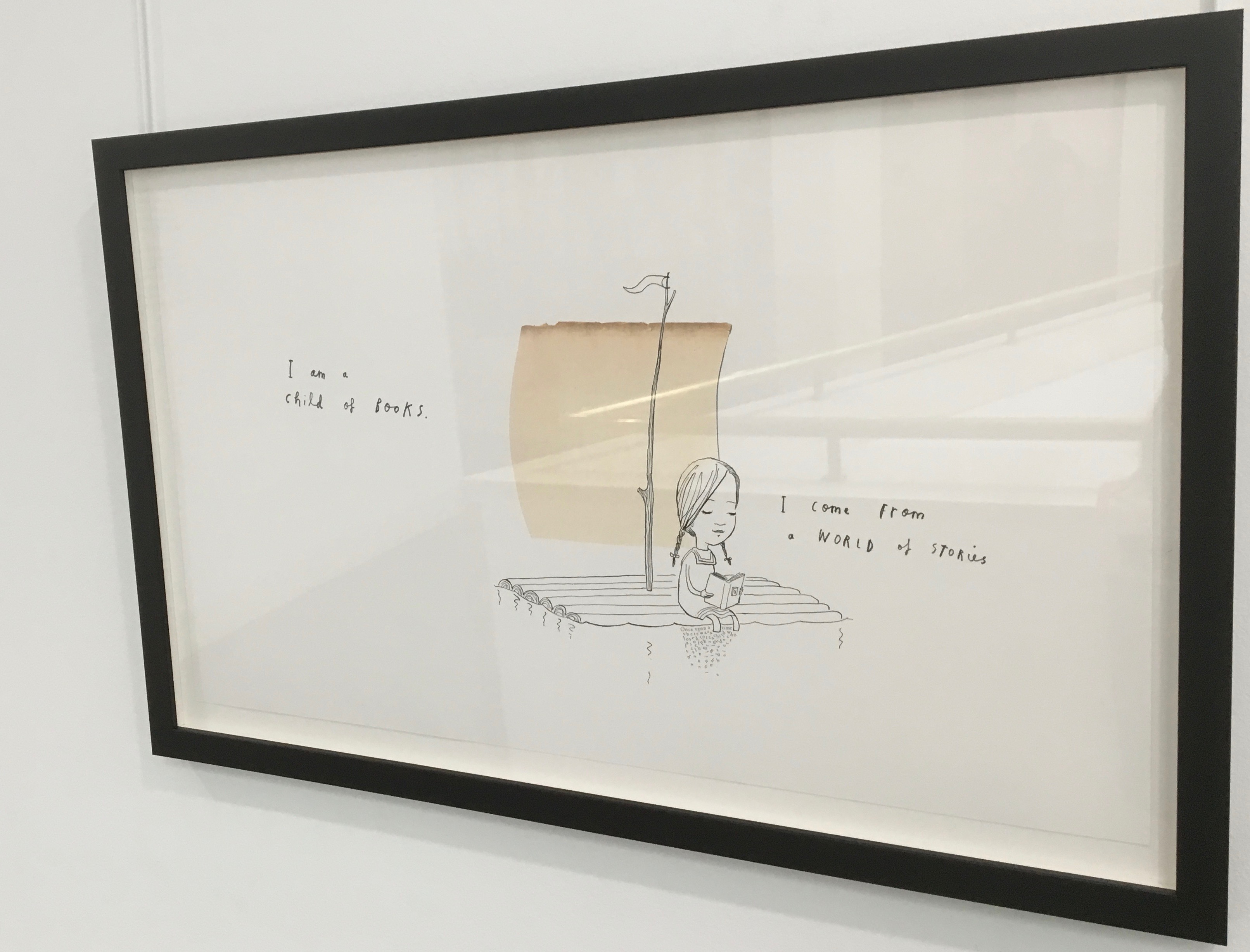
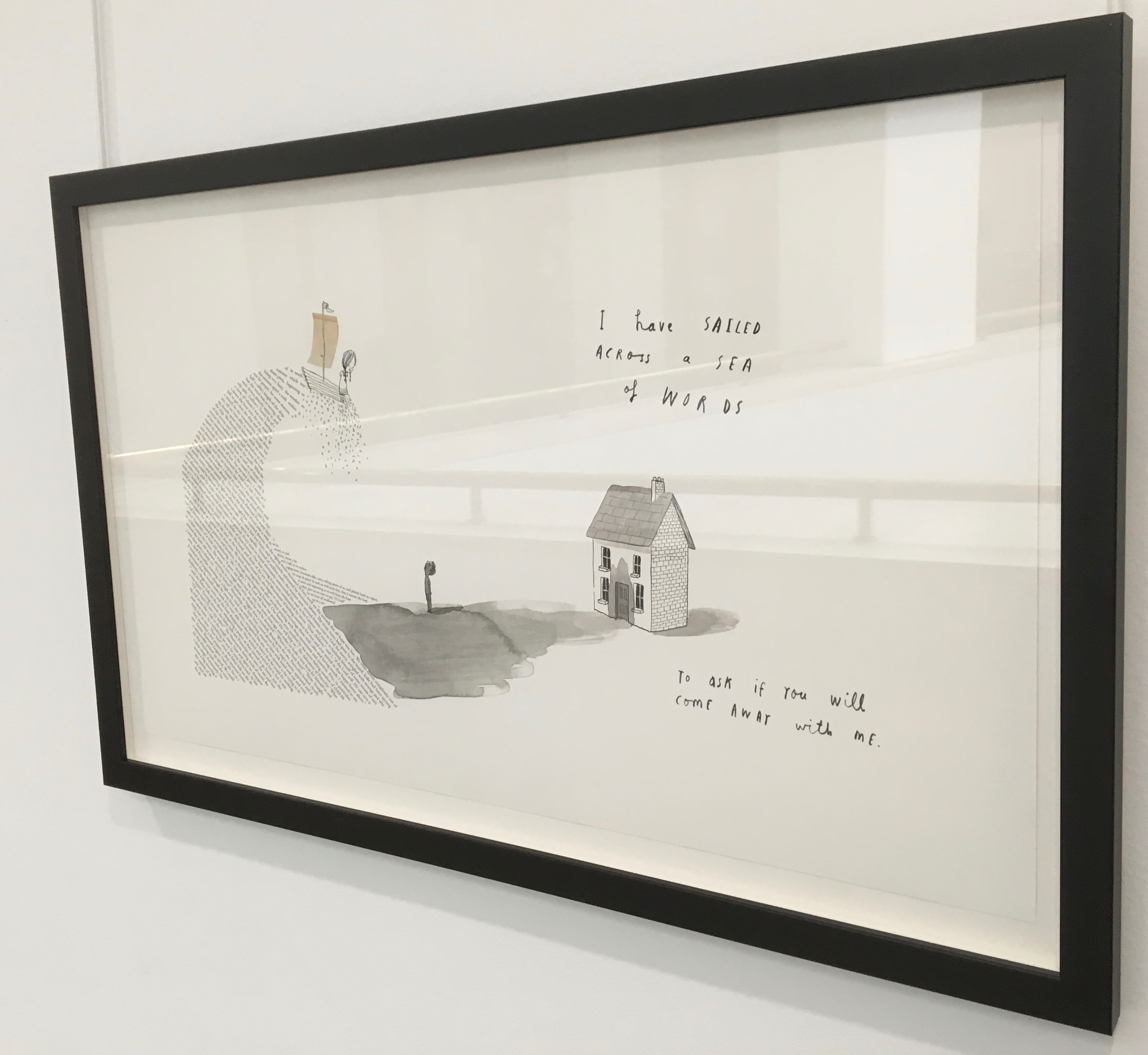
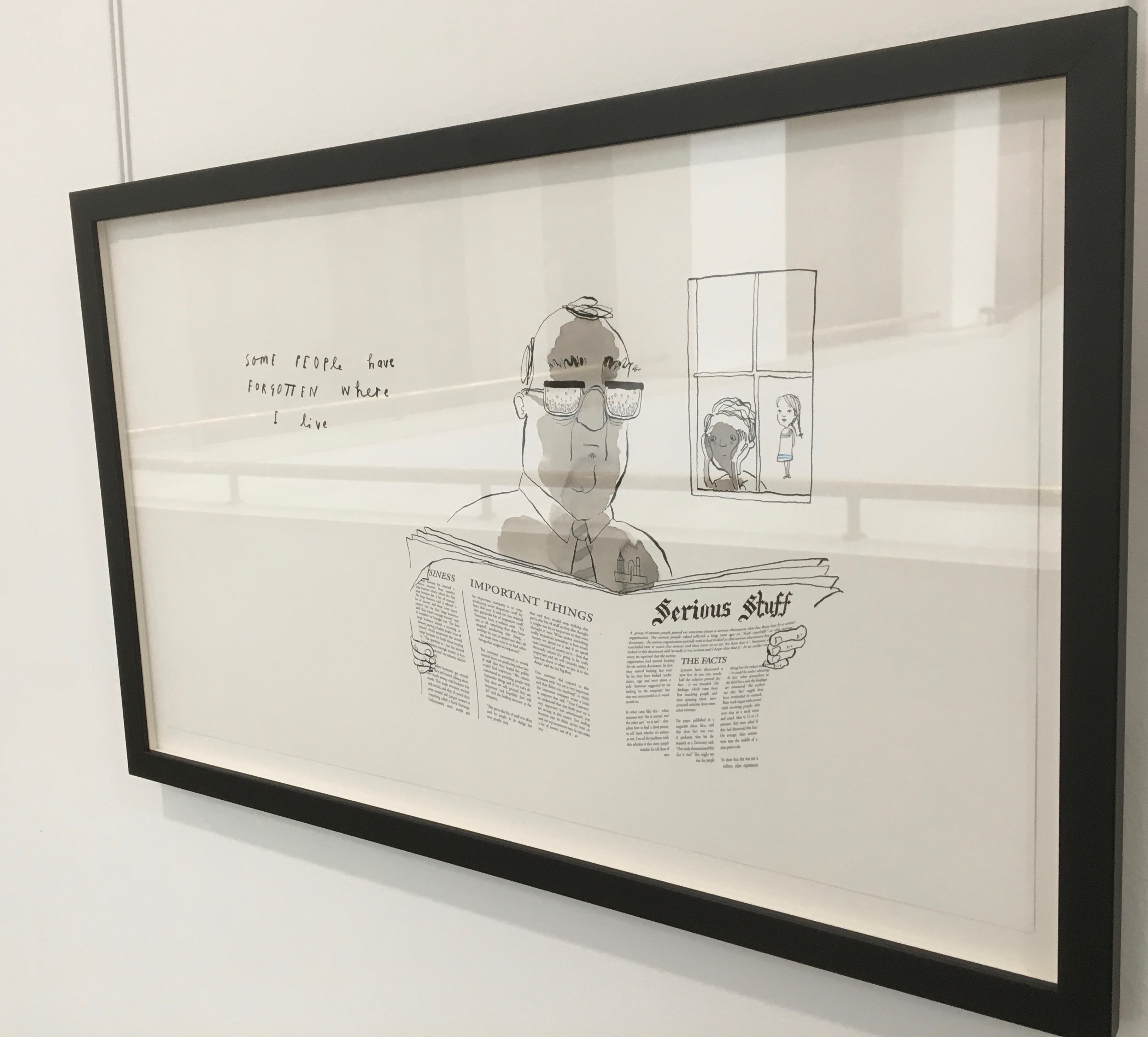
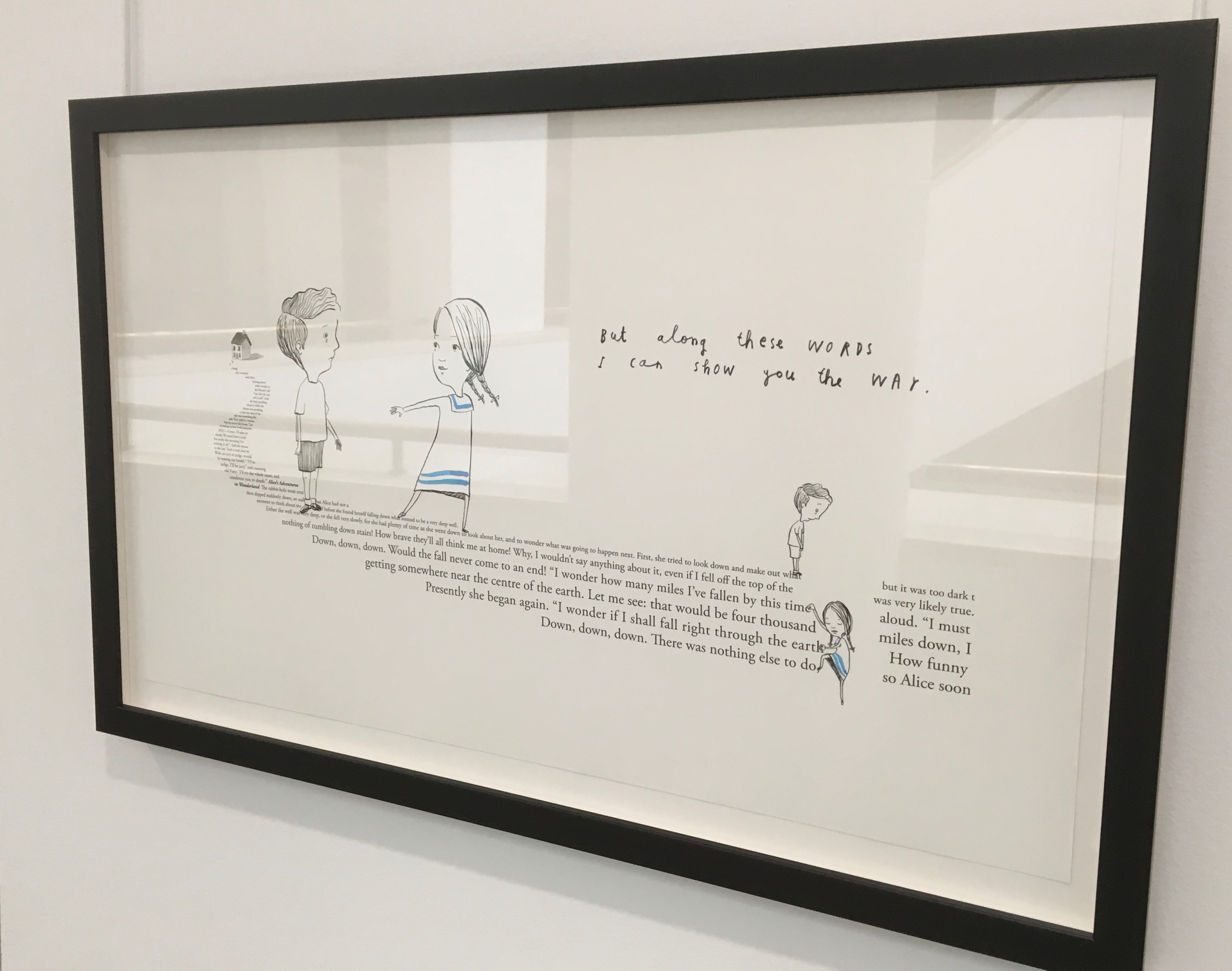
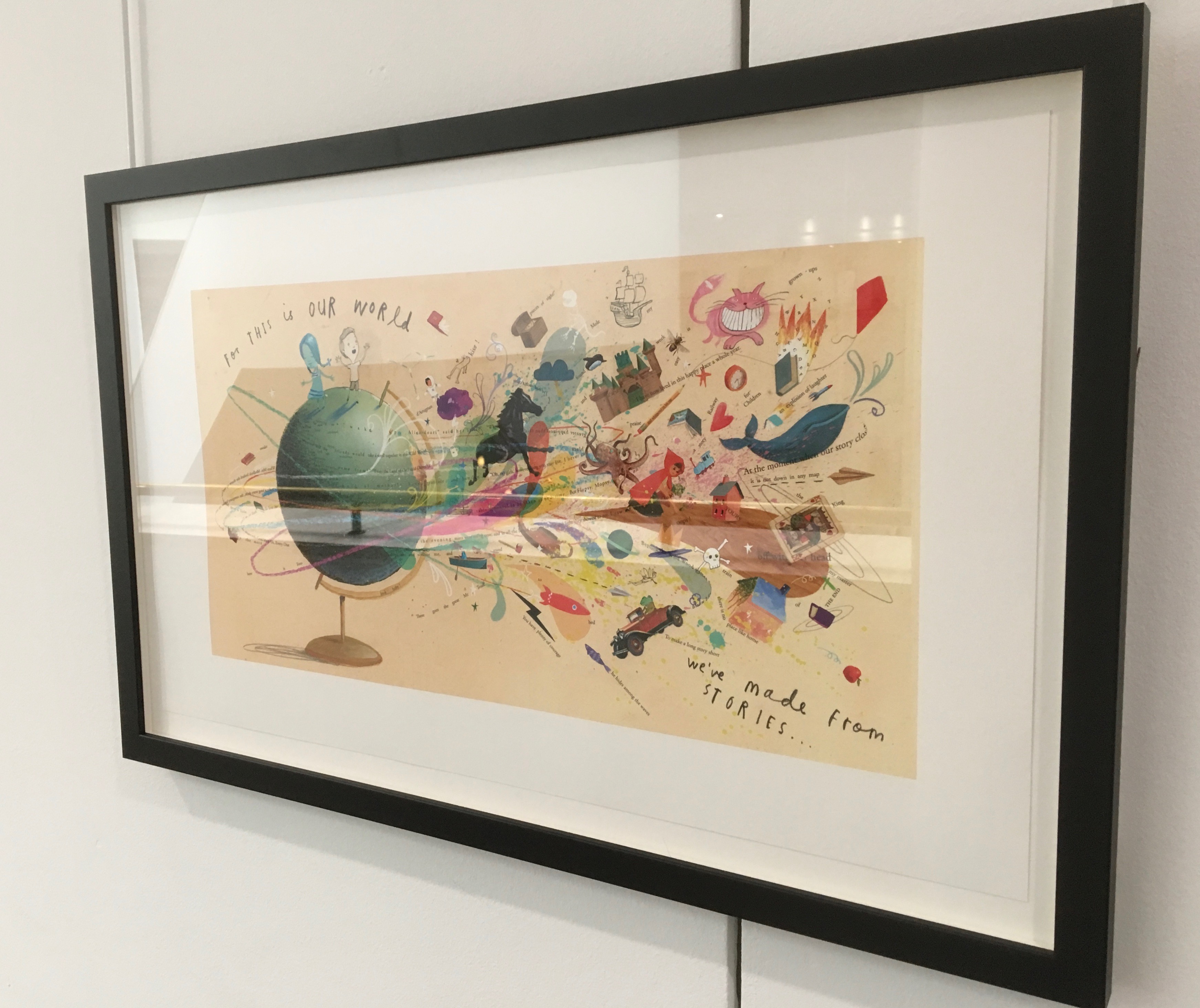
Readers familiar with Winston’s A Dictionary Story and his collaboration with Oliver Jeffers in A Child of Books (both below) will recognize a growing refinement and, now, breadth and depth in Winston’s storytelling. The youngest audience and beginning readers will be held by the shapes, colors and simplicity of the story. Older readers will easily grasp its underlying meanings and be intrigued by the variety of letters and scripts and the idea that languages and alphabets can die. Still older readers and teachers will appreciate the helpful resources following the story’s ending invitation. At all levels, the audience will delight in Winston’s creation of his characterful abstractions with letters from the alphabets and scripts identified in those resources. Those with an eye for such artistry will appreciate Winston’s extension of a tradition embraced by Paul Cox, Roberto de Vicq de Cumptich, Sharon Forss and Nicolas McDowall.
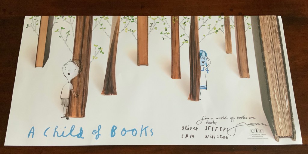
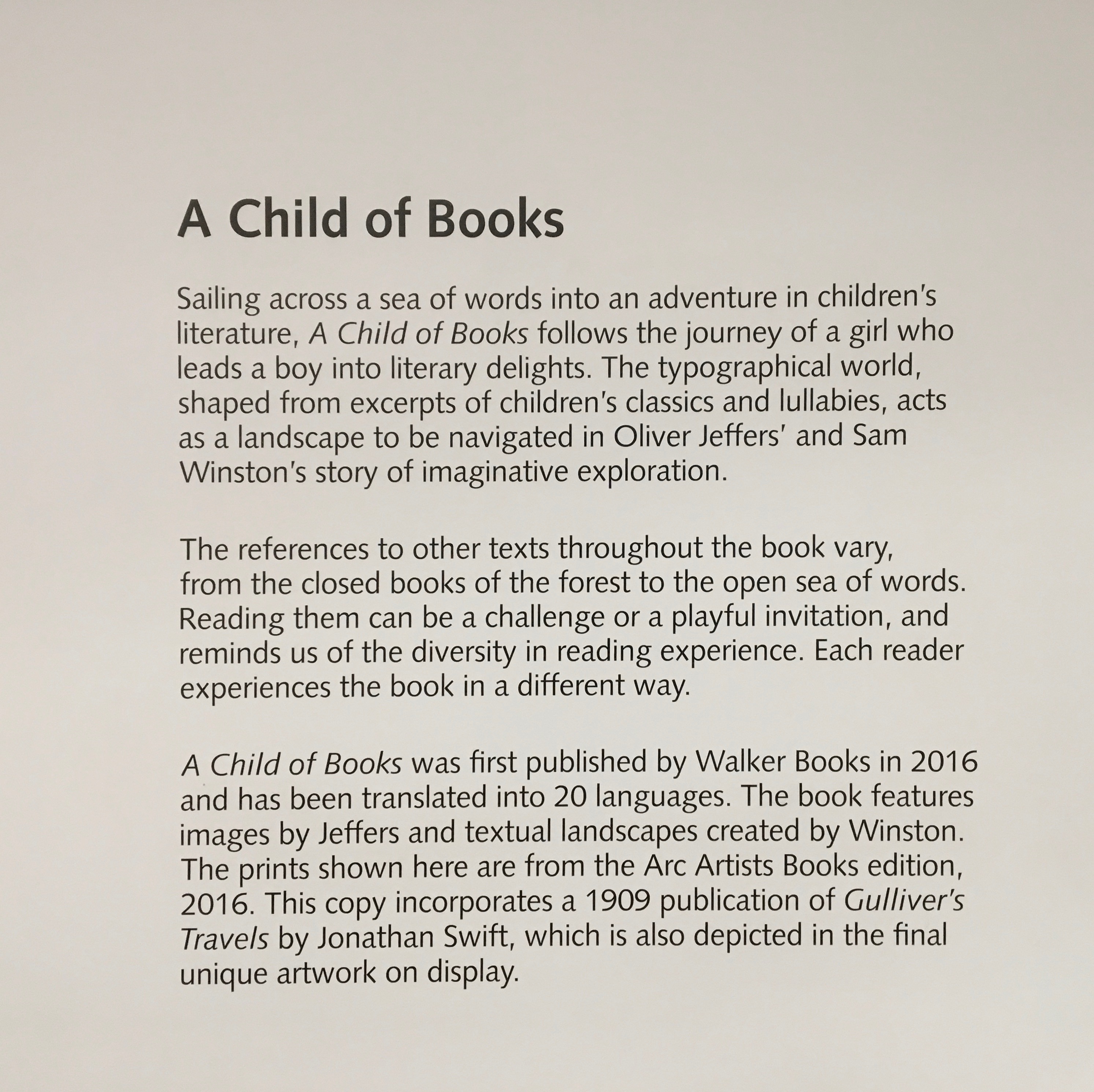
A forest made of fore-edges. A raft made of spines and its sail a book page. A wave and a path made of excerpts from books. In this fabulous world made from the features of books, the simpatico imaginations of Oliver Jeffers and Sam Winston deliver a heroine and an invitation that are hard to resist.
Promotional poster. Displayed with permission of Sam Winston.
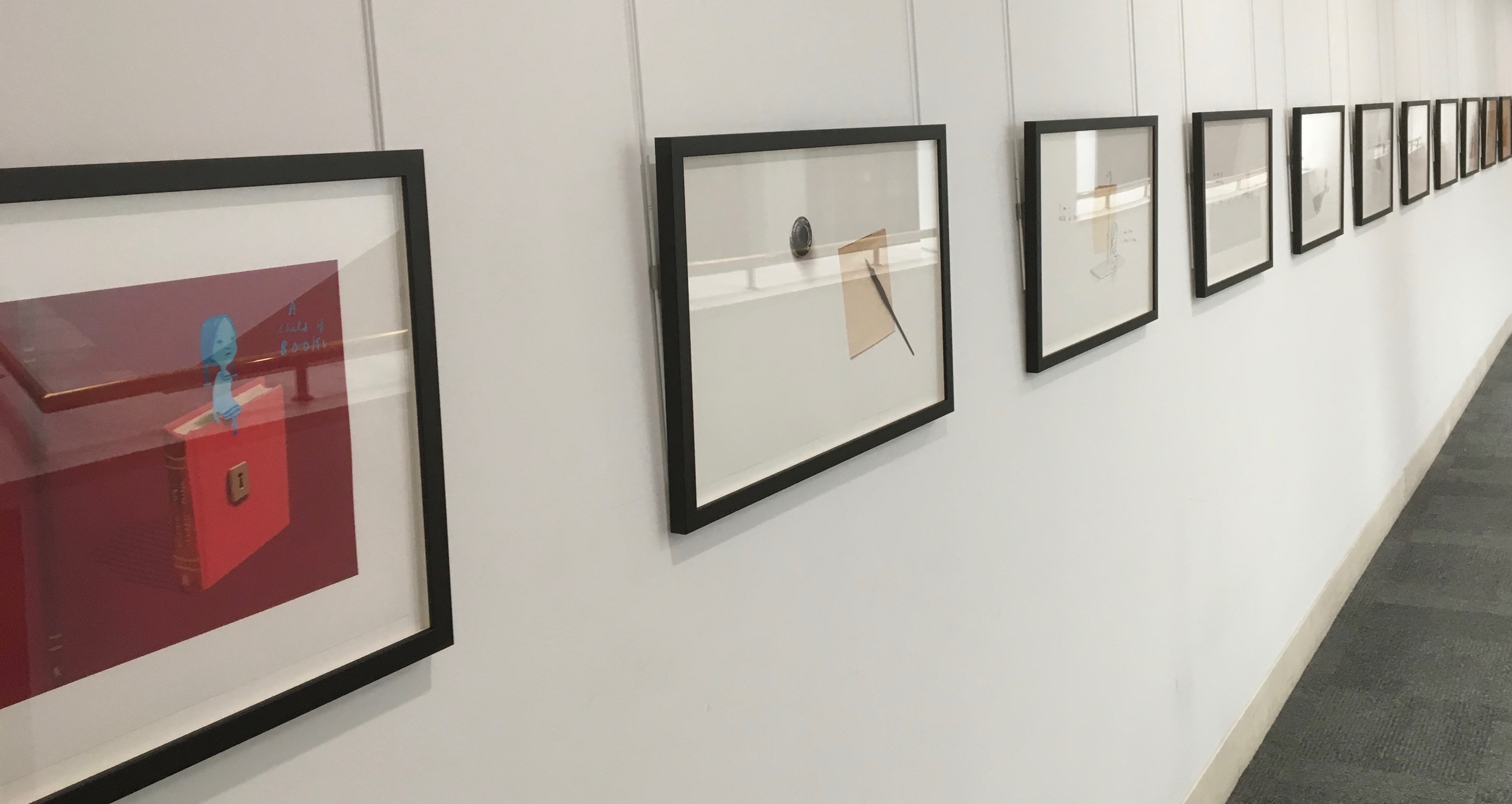
In addition to the poster above and the trade book it promotes, Winston created an artist’s book edition celebrated by this hallway gallery below mounted by the British Library shortly after its appearance.
A Child of Books prints displayed at the British Library, 9 August – 27 September 2019.
Winston’s abiding love of letters, words and stories shines through in A Child of Books. Arguably, it has its origins in an earlier work whose story is told by his invention of a very different “child of books”.
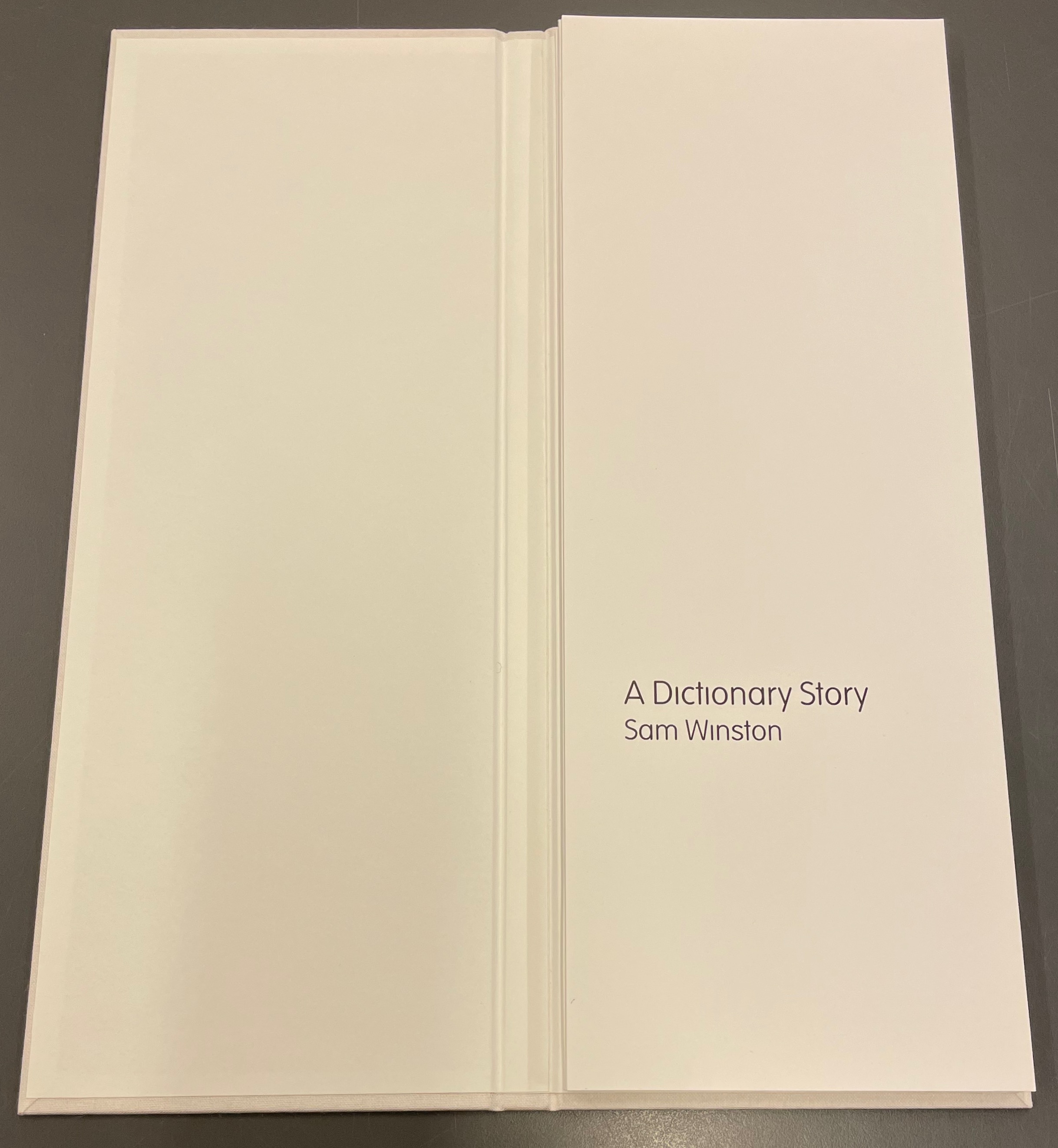
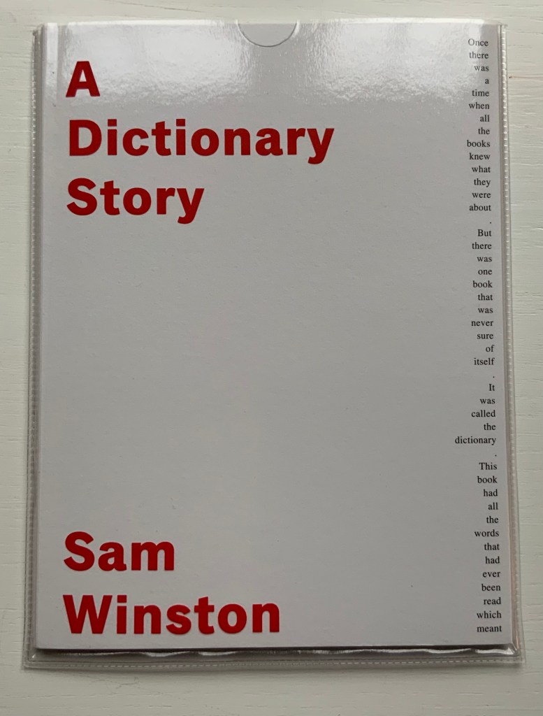
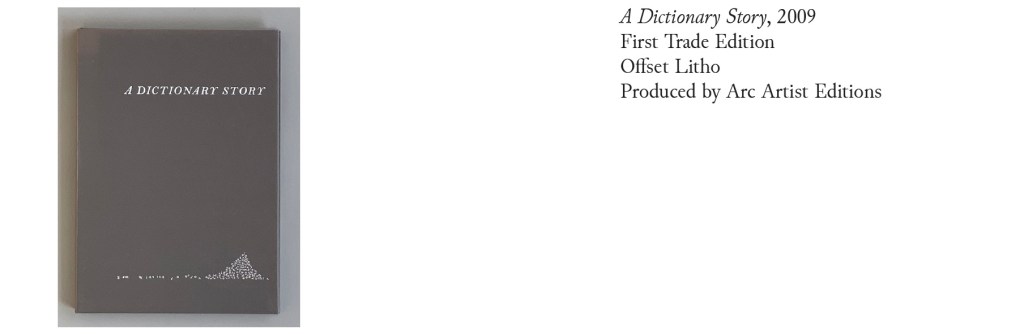
A Dictionary Story (2001 – 2020)
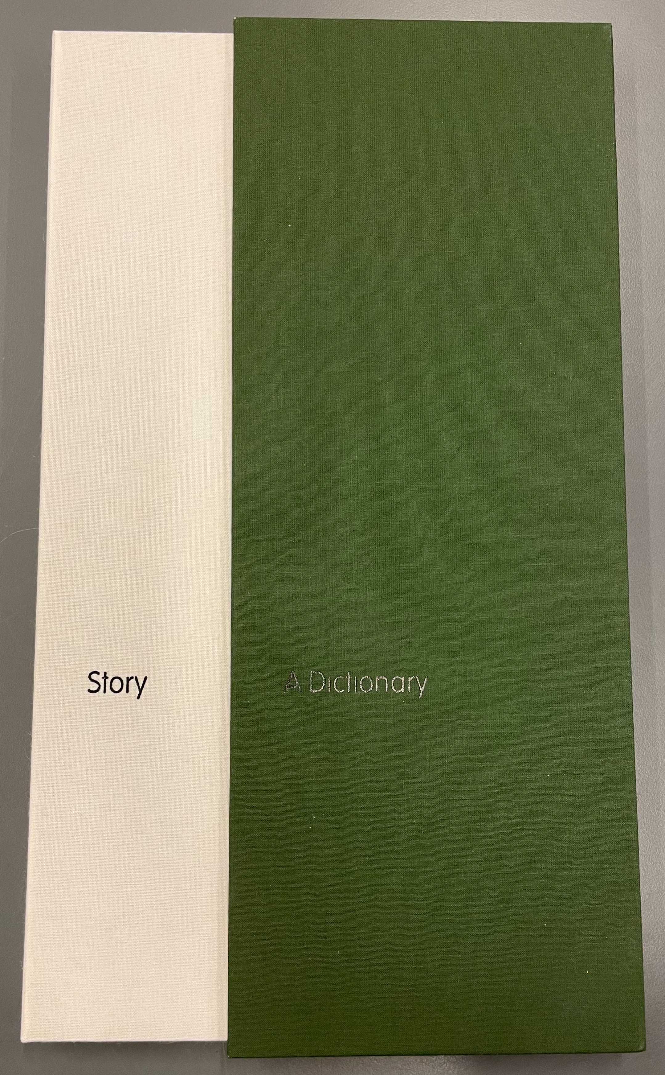
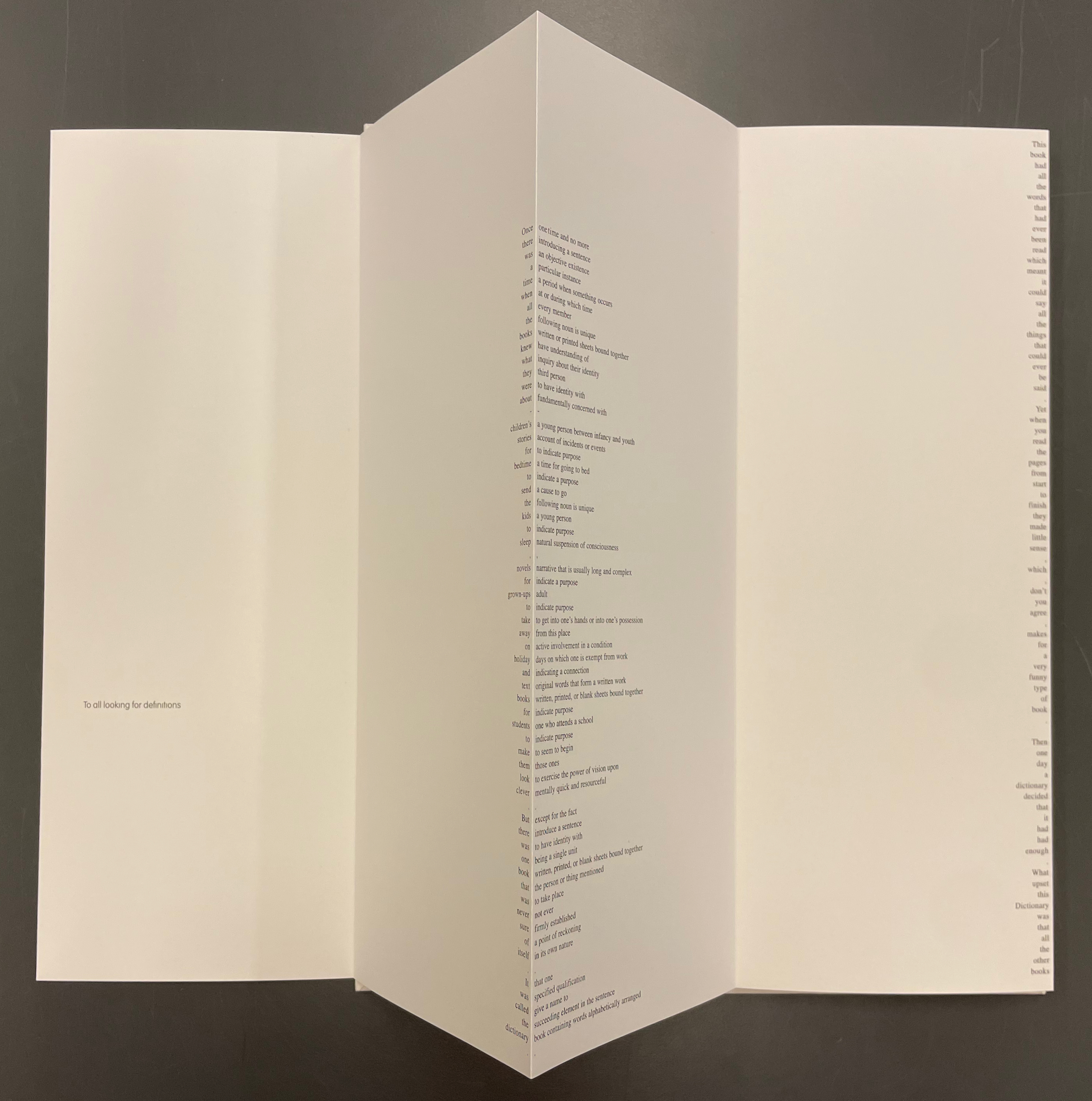
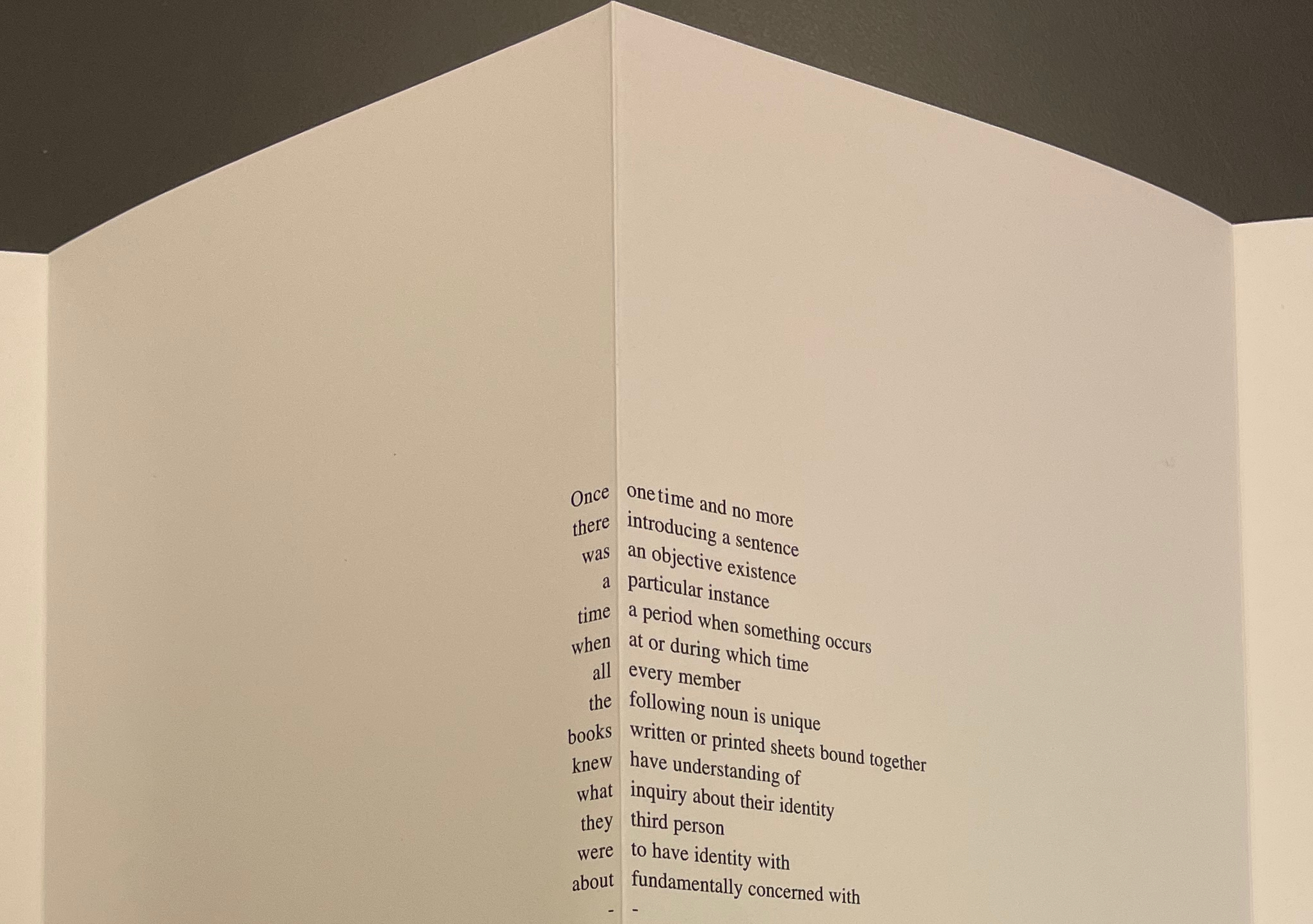
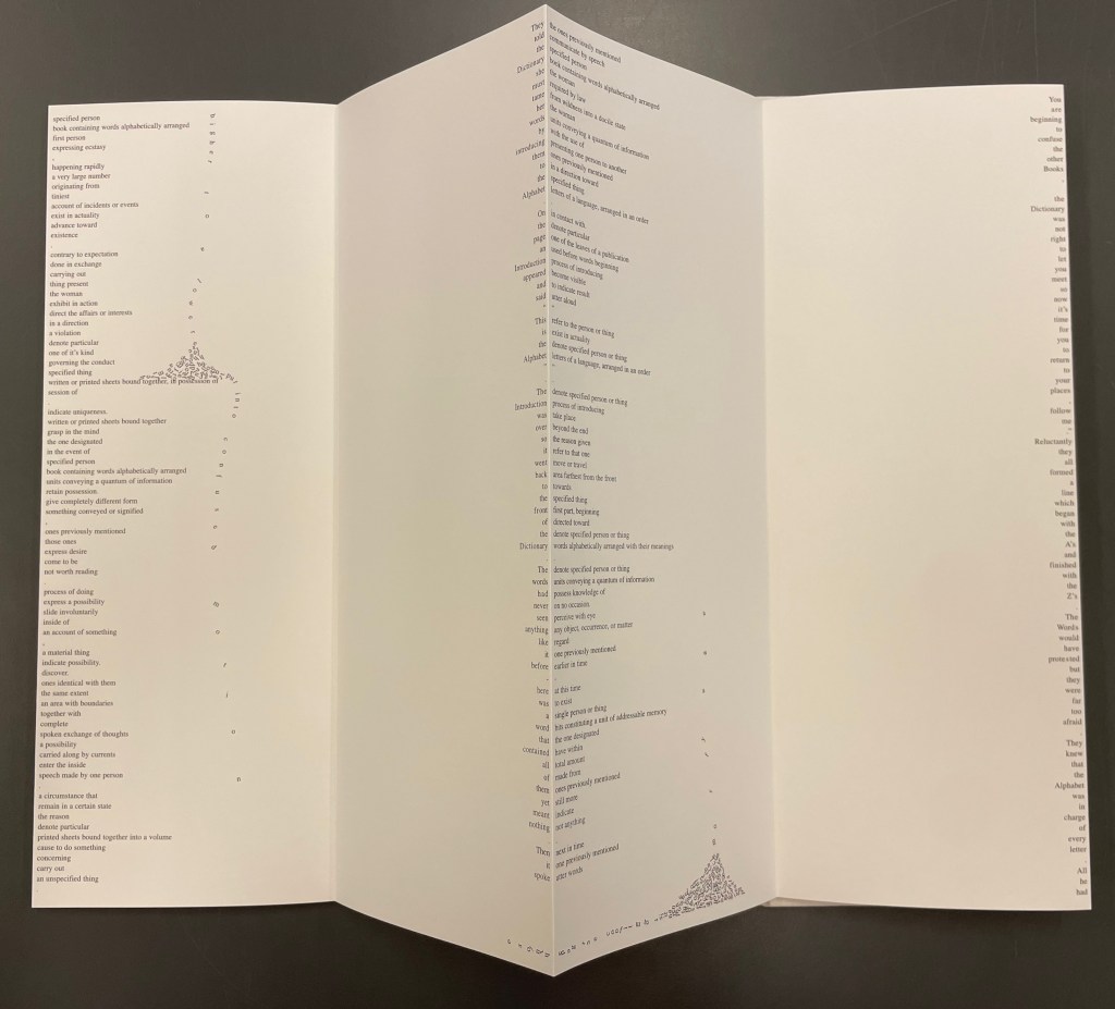
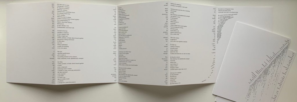
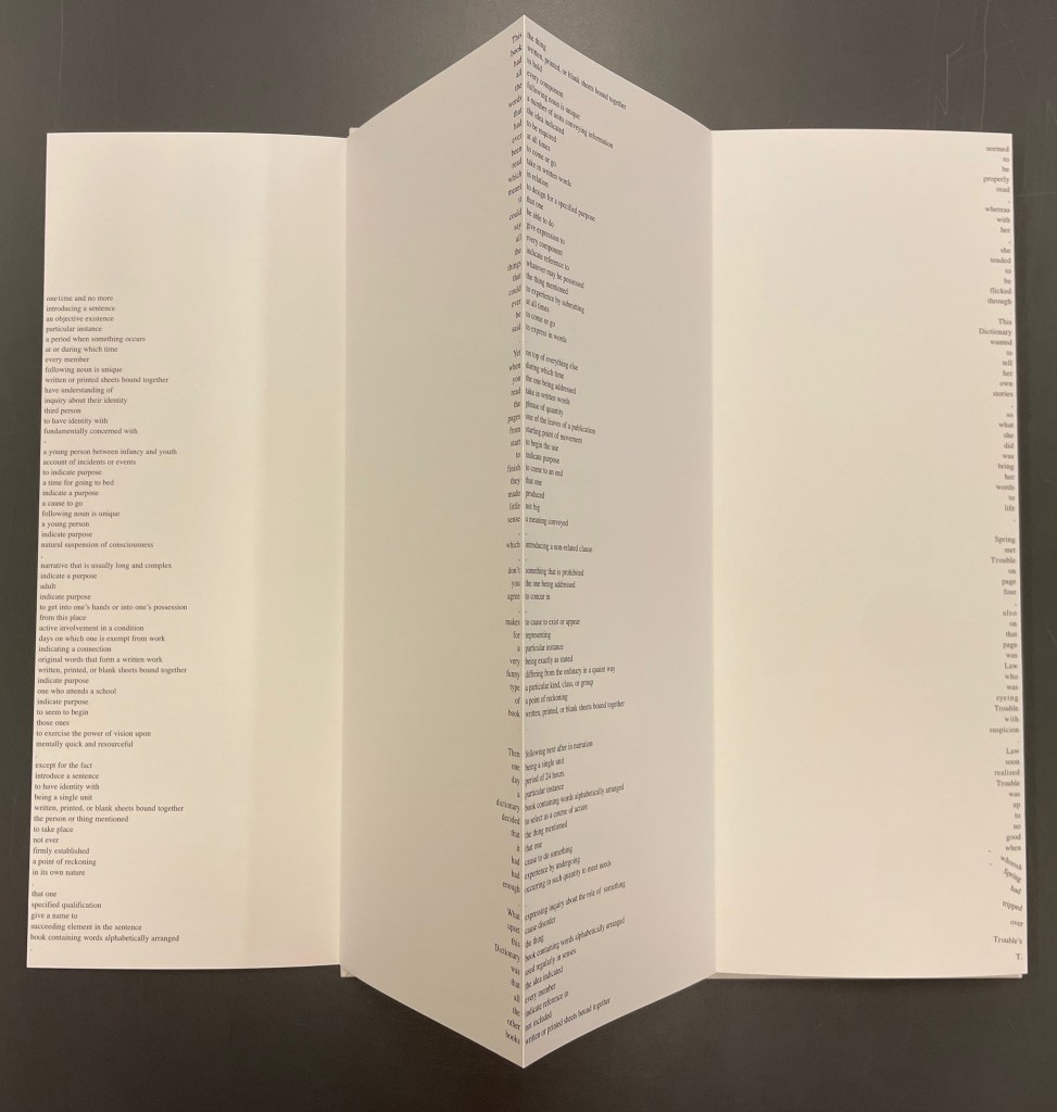
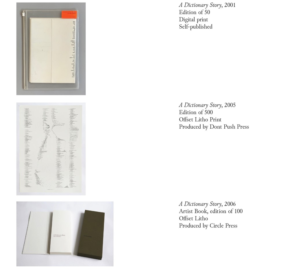
Since its origin as a student project in 2001, A Dictionary Story has appeared in an accordion book form as a fine press edition and two trade editions and as single-sheet prints. The Books On Books Collection holds the fine press edition and the second trade edition, both of which have in common a vertical flush-right single-word column that tells the story and the immediately adjacent vertical flush-left column of definitions of the words in the story. In the fine press edition, the two columns meet at each mountain peaks of the accordion fold.
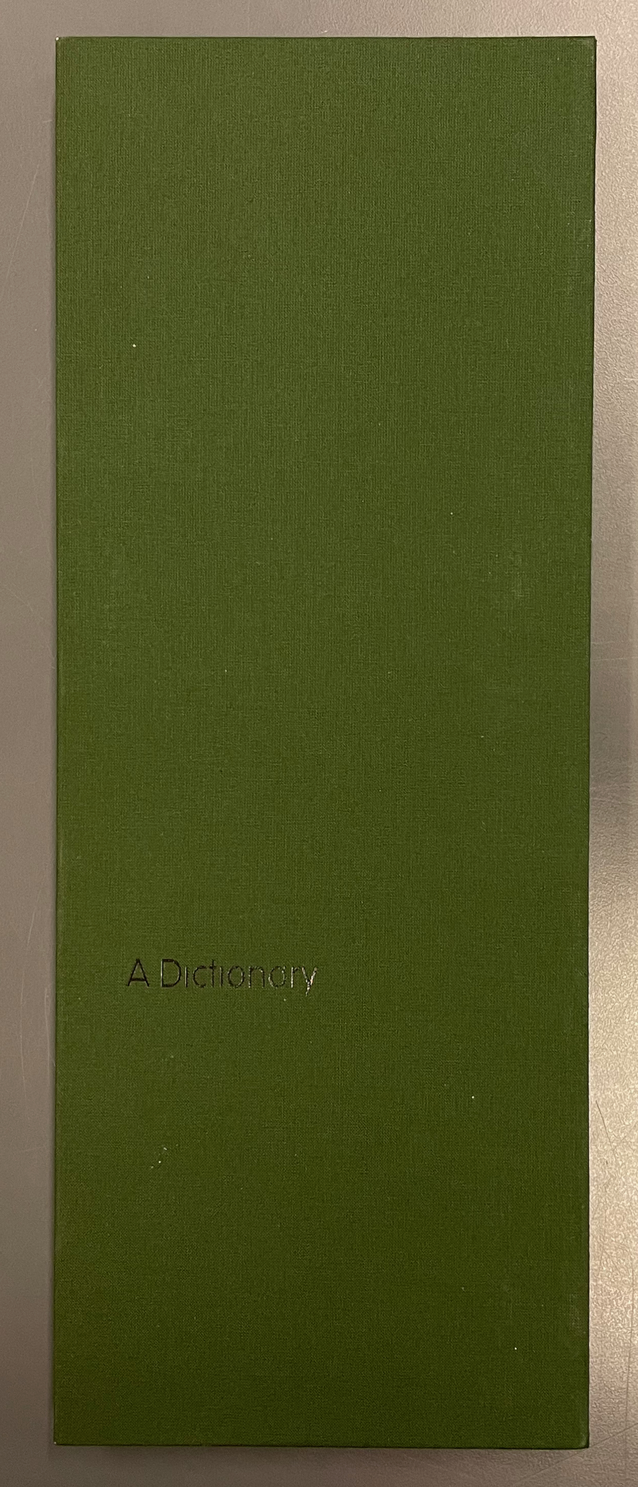
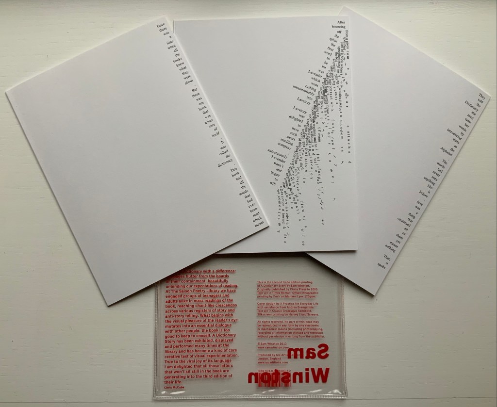
A Dictionary Story (2006) Sam Winston Slipcased leporello between cloth-covered boards.H360 x W140 mm, 25 panels. Story text set in 9 point Times Roman by Sam Winston. Book designed by Richard Bonner-Morgan and Sam Winston. Printed by David Holyday at Trichrom Limited. Bound at Quality Art Reproductions, England. Published by Circle Press. Edition of 100, of which this is #68. Acquired from the artist, 30 May 2018. Photos: Books On Books Collection. Displayed with artist’s permission.
“Once there was a time when all the books knew what they were about. But there was one book that was never sure of itself.”
Panels 2-5 from the fine press edition; detail of panels 2-3.
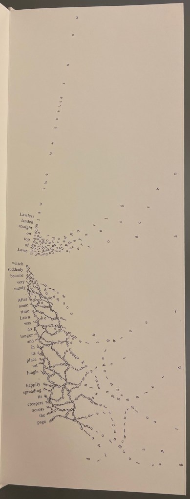
So begins Winston’s tale about this uncertain book. The book never sure of itself is the Dictionary, which of course it must be, otherwise the tale would not be called “A Dictionary Story”. The Dictionary is jealous of all the other books because they are “properly read”, whereas she is just flicked through from time to time. A bit like the “One” in One and Everything, the Dictionary seems to think she contains all the stories imaginable, because she contain all the words — just not in the right order. So she decides to bring her words to life as characters to see what will happen. Words and letters fly about, enacting the story as if in a concrete poem. A meaningful tussle between text and image is a frequent feature for artists’ books as well as visual poetry.
Another defining aspect of book art is its self-referential nature. In an interview with Typeroom, Winston captures this in his response to the question “What is Dictionary Story all about?”:
Dictionary Story is a playful way of exploring some of our presumptions around the printed word. Or you could say that it looks towards a tool we are given at a very young age – the Dictionary – and invites us to actually think about how that works. Here’s a device that is designed to explain a word’s meaning by offering further words in its place – to me that is remarkable. This is a type of knowledge that can only explain itself through referencing itself. As a visual person the image that comes to mind is a giant, never ending, Möbius strip of language twisting back on itself.
Of course for less visual persons, the Dictionary’s whim engenders chaos, which Winston, a dyslexic, can appreciate. So he brings onstage (or “onpage”) the Books, of whom the Dictionary was jealous, to remonstrate that if words become disconnected from their definitions, how will they the Books know what they are about? Insisting that she tame her words, they have the Dictionary’s Introduction introduce her bewildered words to the character “Alphabet”.
Making the journey over the hills and valleys of A Dictionary Story is satisfying, and re-making it is even more satisfying and delightful each time. The making and re-making of A Dictionary Story must also have been satisfying and delightful for Sam Winston; he has done it so many times.
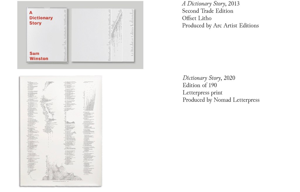
A Dictionary Story (2013) Sam Winston Three five-panel accordion folded sections in a plastic sleeve cover. Second trade edition. Sleeve: H205 x W160 mm. Sections: H200 x W150 mm, 15 panels. Acquired from the artist, 13 December 2020. Photos: Books On Books Collection.
Watching the artist adjust the typography of A Dictionary Story to changing dimensions is like watching a star tennis player who is also a star basketball player and star soccer (football) player. There’s always a ball, there’s always a net, there’s always genius.
The trade edition splits the fine press edition into three less narrow leporellos and nudges some of the two columns (story/definition) into the valley fold. Below, in the trade edition across panels 3 and 4 is where the Dictionary decides to bring her words to life, and on the right side of the fourth panel, the words begin to slip away from the fold.
The same part of the story in the fine press edition occurs on the fourth panel below, and the words tilt against the fold.
These variations create subtly different narrative paces and visual impressions in the two editions. Not one better than the other, just different. The poster variations, however, subordinate narrative pace entirely to visual impression. At present, the posters are not in the collection, but the images below help to make the point. As with movie goers, some will like the prints more than the books, others the books more than the prints, and still others will marvel at the genius in all of them.
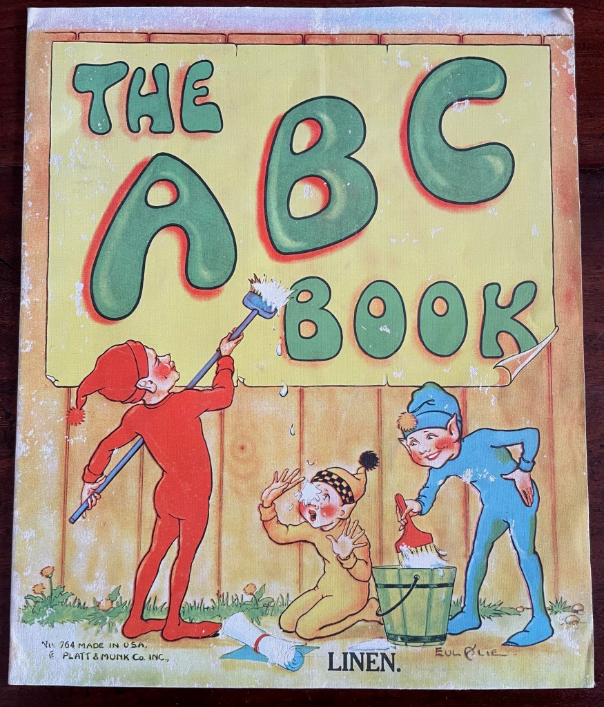
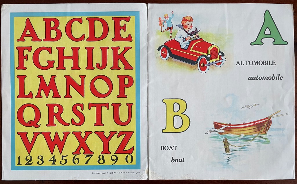
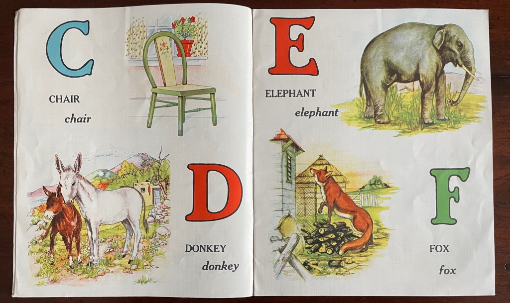
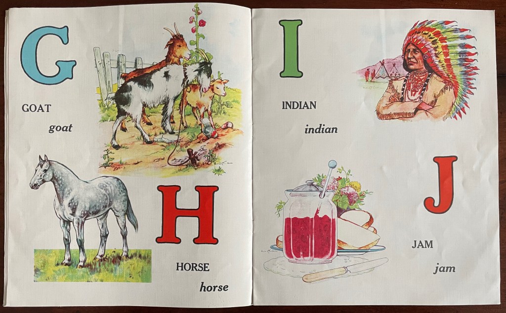
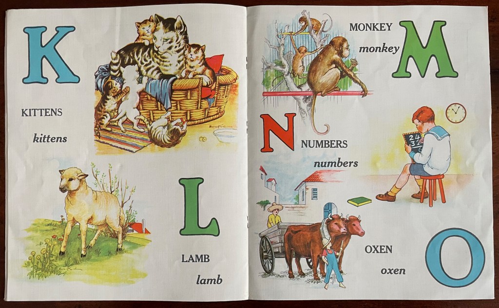
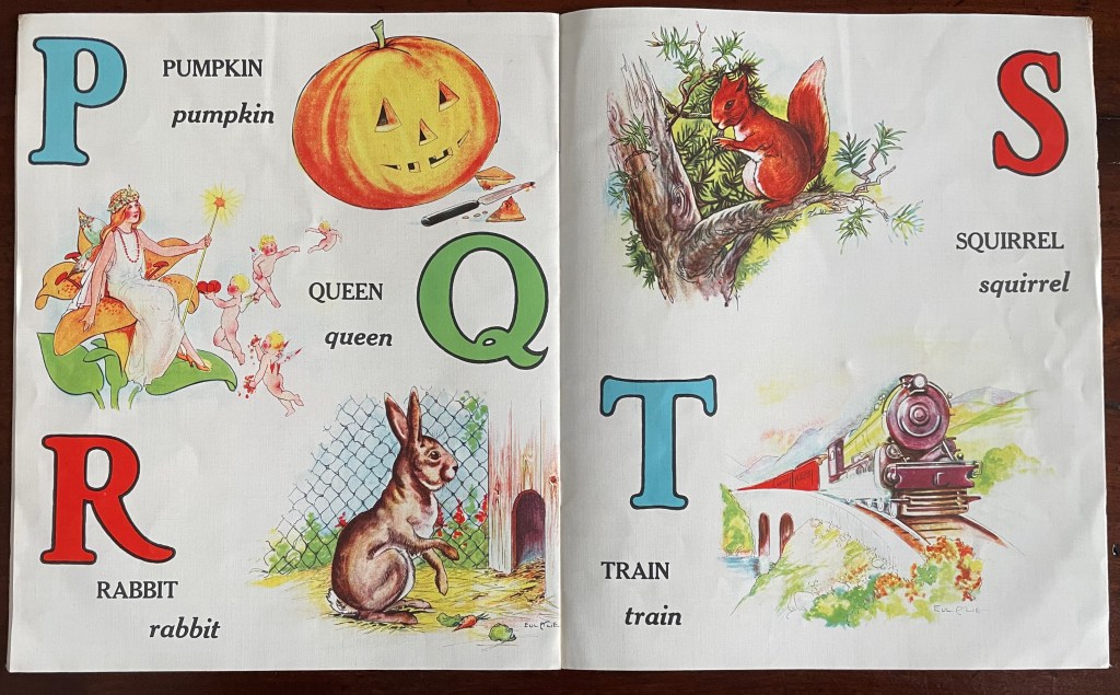
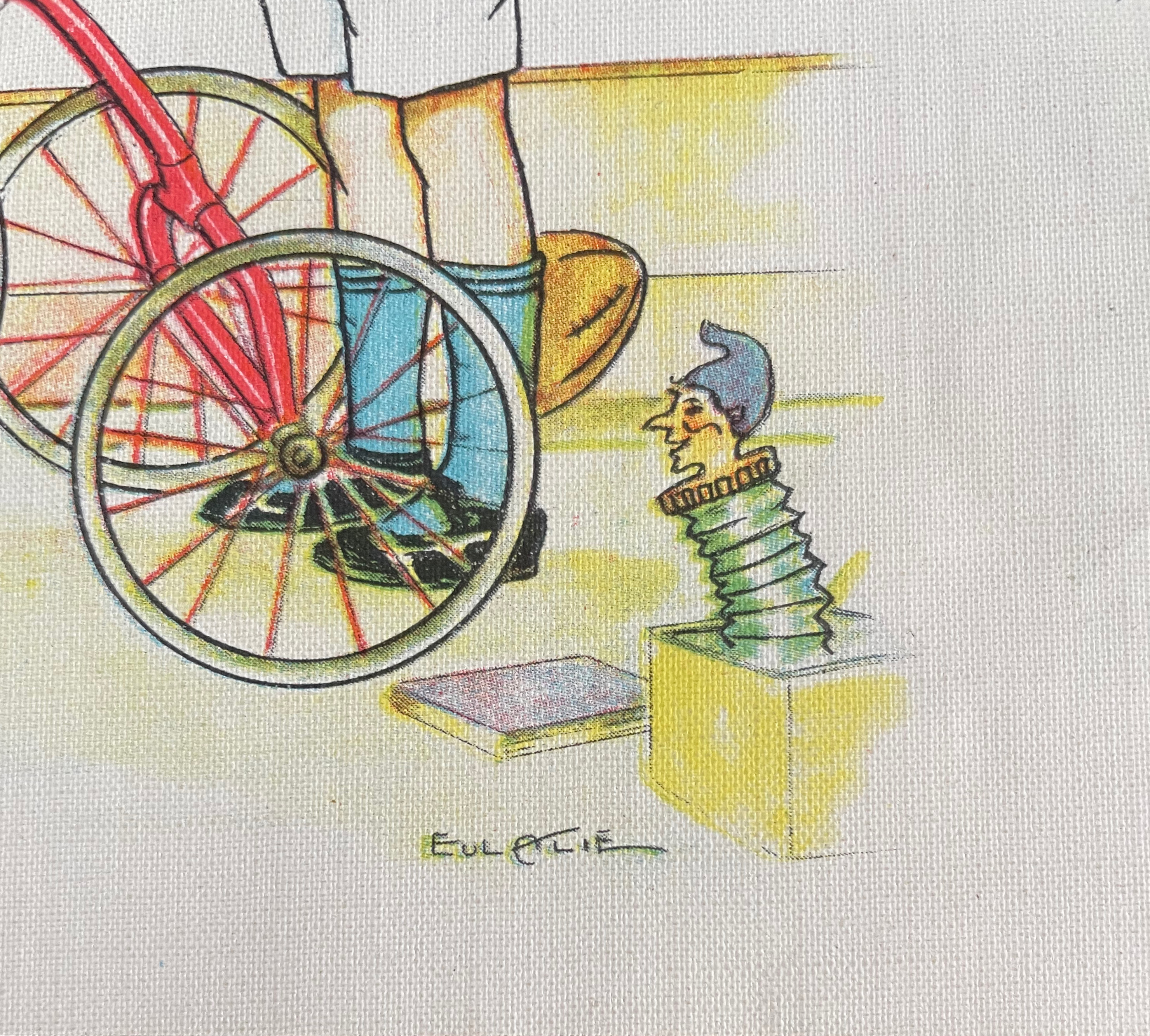
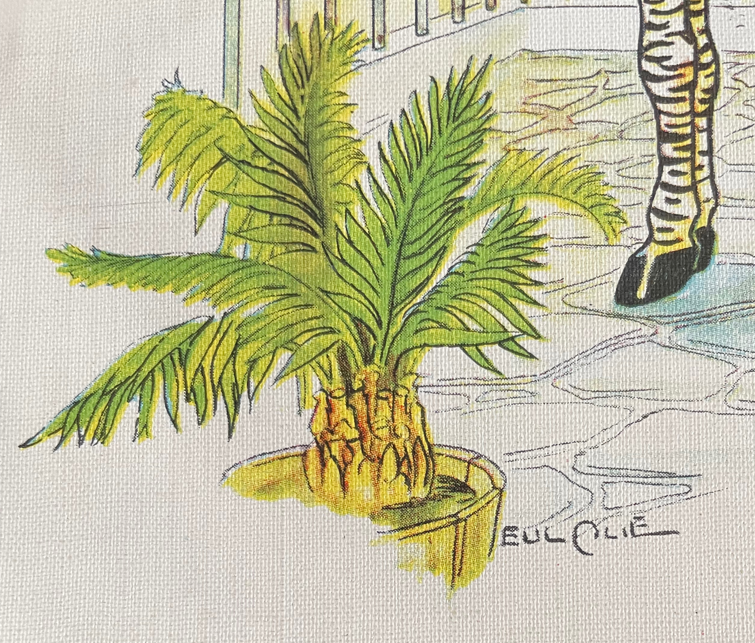
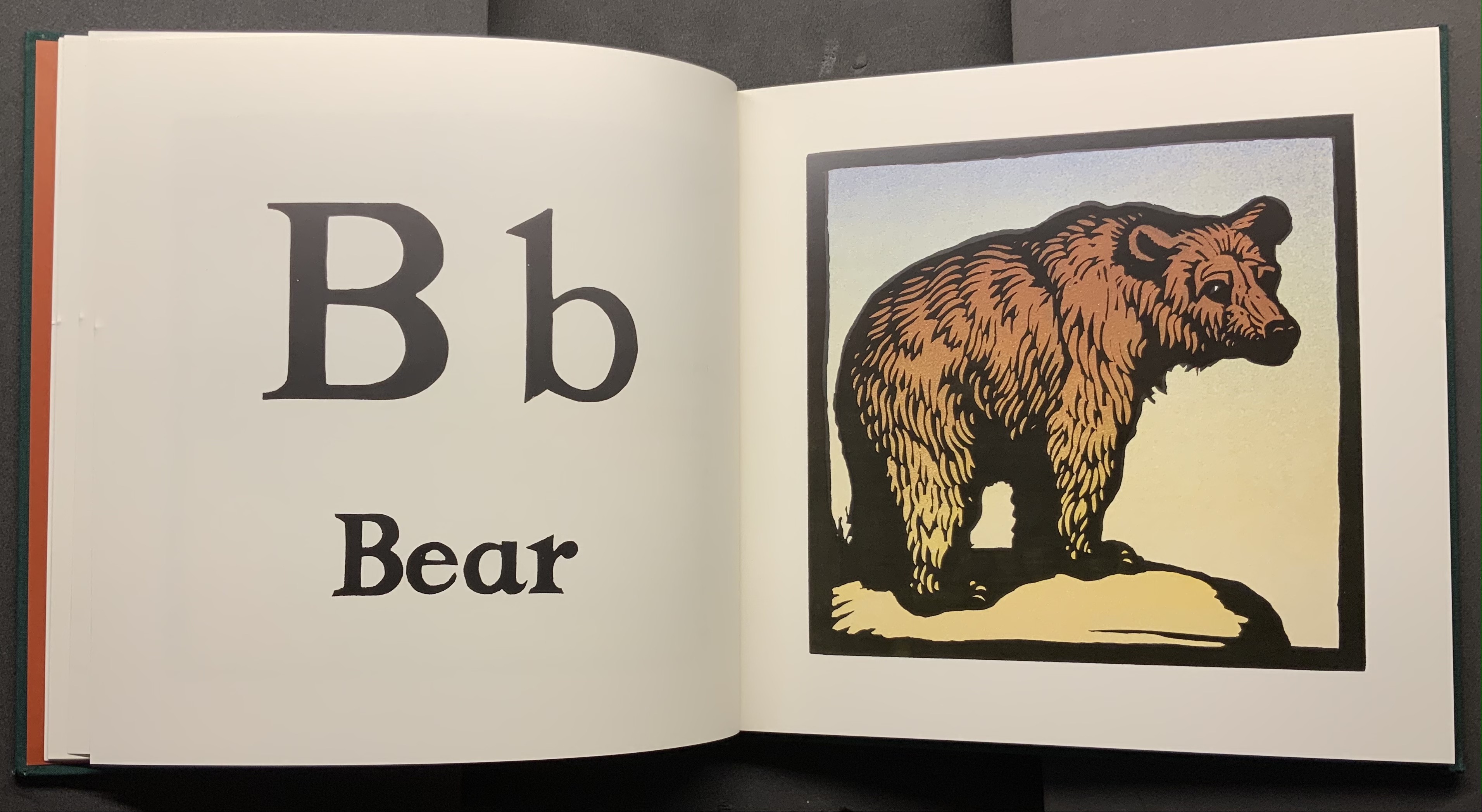
The ABC Book No. 764 (1927-29) Eulalie Minfred Banks Linen book. Saddle-stitch, staples. H307 x w255 mm. 8 linen leaves including cover. Acquired 19 January 2023. Photos: Books On Books Collection.
The cloth alphabet book is the successor to the hornbook and battledore in the aim to provide learning material able to withstand sticky fingers, tantrums and other hard usage. The publisher Platt & Munk, eventually acquired by Grosset & Dunlap, had a strong line of cloth books for children and an equally strong host of competitors on both sides of the Atlantic: Dean’s Rag Books, Samuel Gabriel & Sons, McLoughlin Brothers, Routledge & Warne, Saalfield, Raphael Tuck & Sons, and many others.
Creating a competitive edge for one alphabet book over another was a challenge. The pedagogical features, choice of images, style of drawing, the colors, the quality of printing as well as the sturdiness of the material all played a role. For decades and numerous works for Platt & Munk, illustrator Eulalie Minfred Banks provided an edge. For this alphabet book, she served as author as well as illustrator, signing every page with her distinctive signature — “Eulalie”. She will probably be better remembered for her illustration of Watty Piper’s The Three Little Pigs, The Gingerbread Boy, The Little Engine that Could and The Story of Little Black Sambo (authored by Helen Bannerman, edited by Piper).
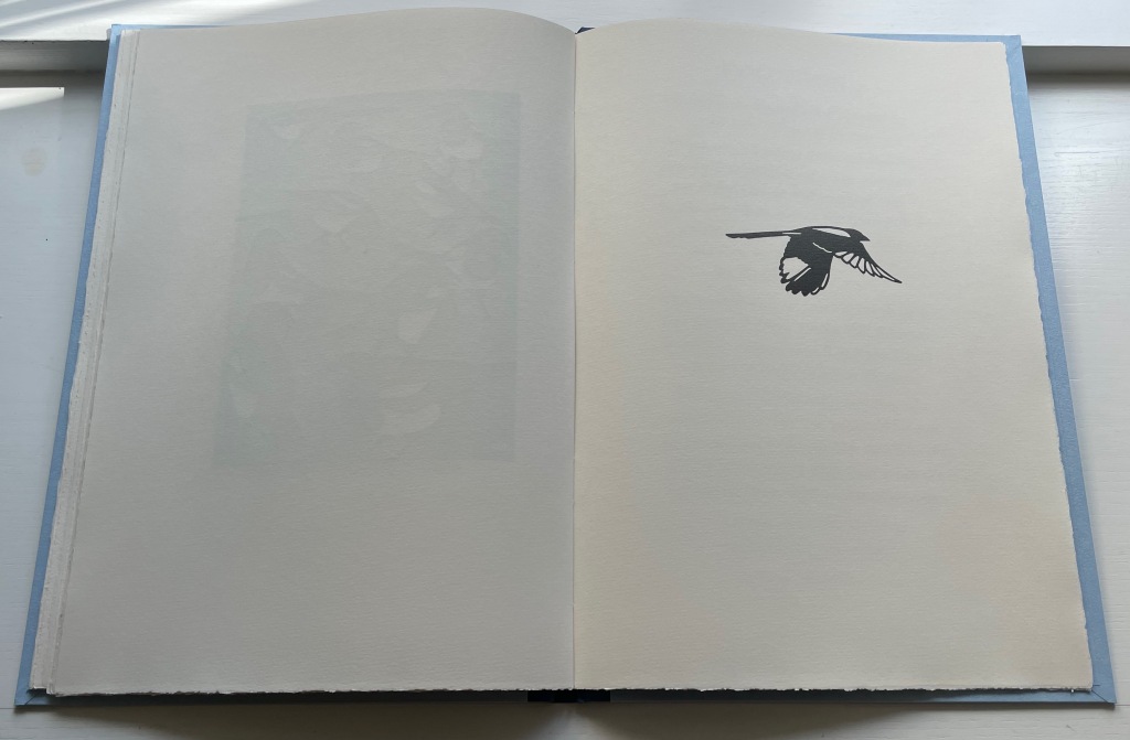
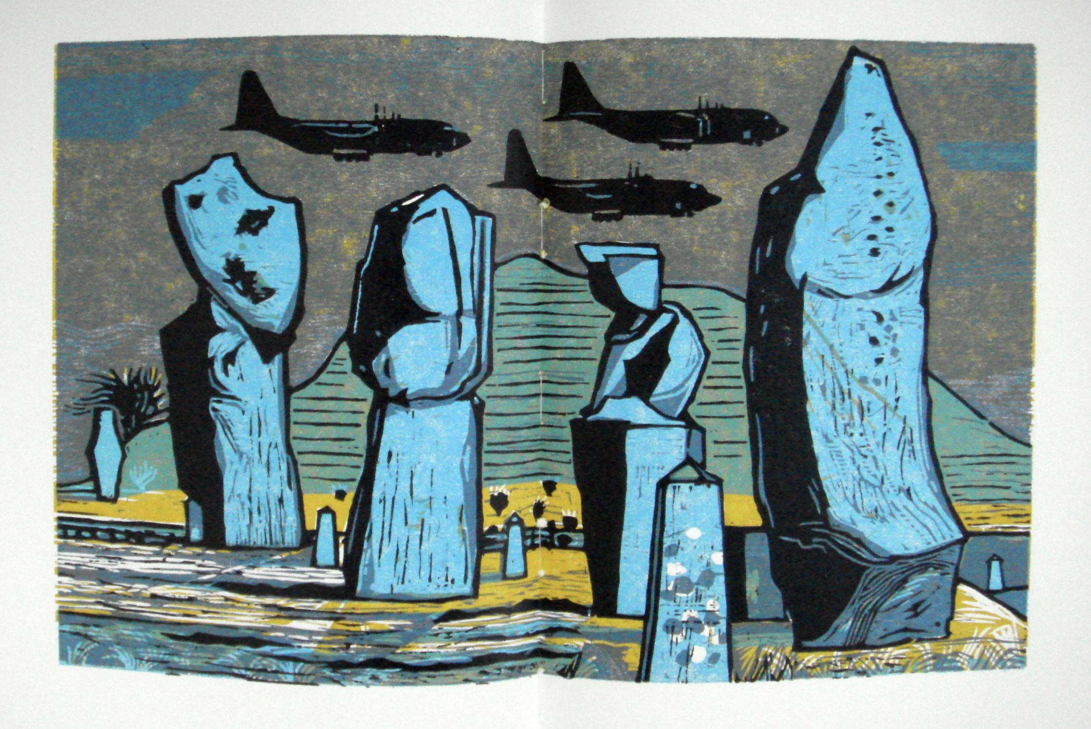
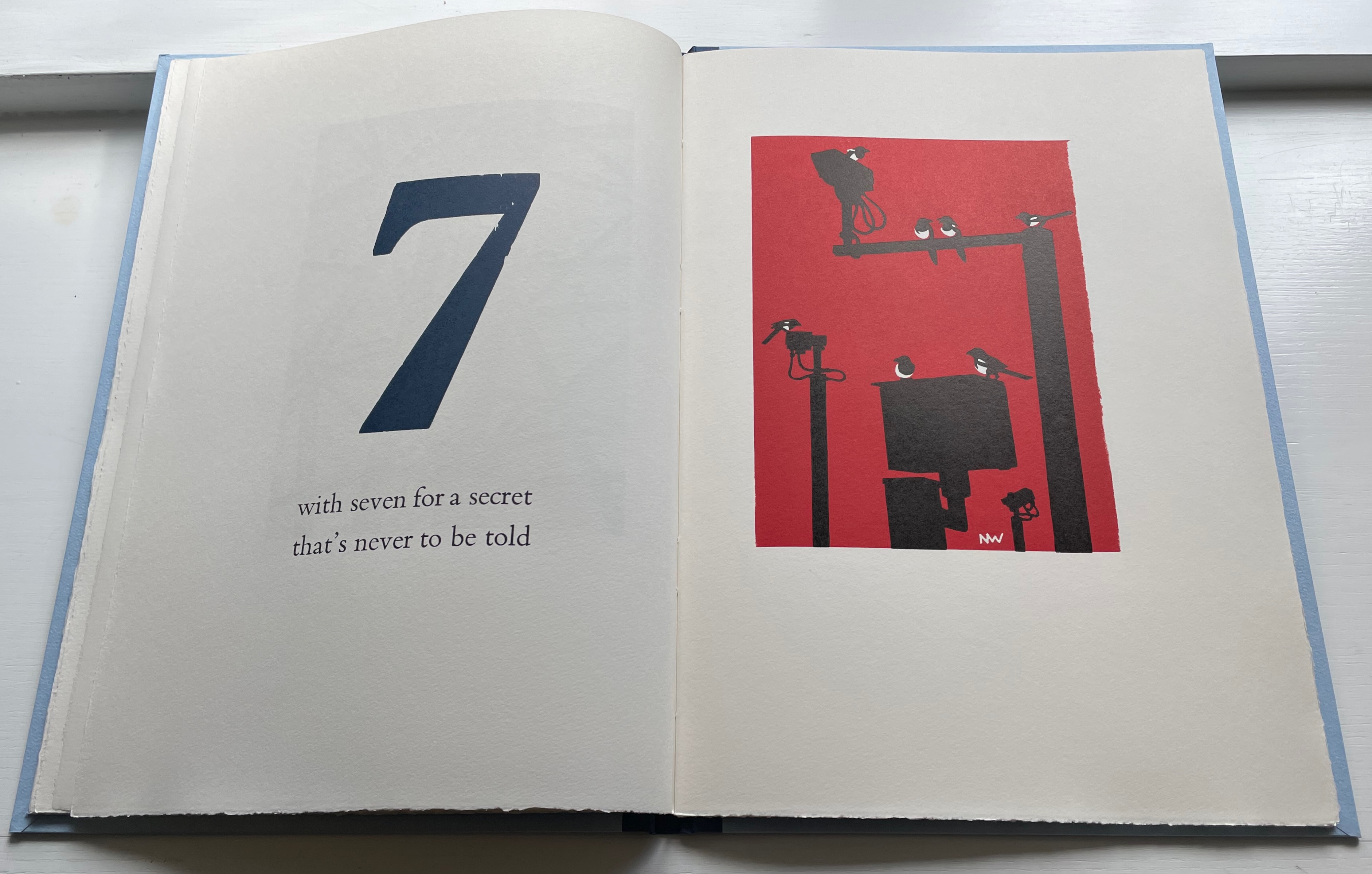
The Charm of Magpies (2018) Nick Wonham Casebound, cloth spine and paper over boards with specially printed flyleaves from Roger Grech at his Papercut Bindery. H370 x W260 mm. 27 pages unnumbered. Edition of 160 copies, of which this is #98. Acquired from Incline Press, 1 August 2022. Photos: Books On Books Collection.
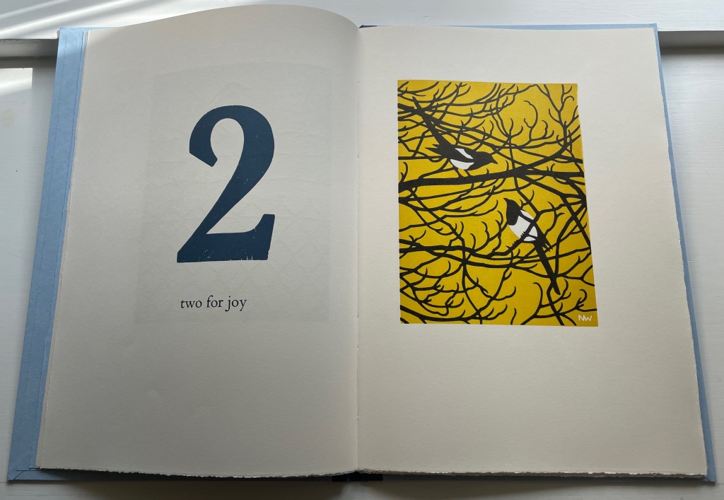
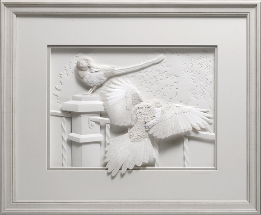
A long admiration for magpies has always threatened to crowd the Books On Books Collection beyond this beautiful work from Nick Wonham and Incline Press and the relief sculpture in paper by Calvin Nichols below. But one pair of works will have to be enough for joy.
Iridescence(2016) Calvin Nicholls Acquired from the artist, 1 September 2016. Photo: Courtesy of the artist.
On the Incline Press website, Graham Moss and his team write:
Collective nouns … A parliament of magpies has to be a favourite, especially if you’ve heard a group of them cackling together in the Springtime. But we prefer the alternative, a charm of magpies, which certainly suits this poem better. It is one version of a folk rhyme which has many local variants, all superstitiously foretelling the future through random occurrence.…
Magpies are often known a thugs in the garden, stealing eggs and chasing off their more delicate rivals. As printers, though, we have a fondness for them because of their “ink on paper” plumage and their latin name pica pica, which recalls the printshop unit of measure.
Left to right: Joseph Crawhall (1884), William Nicholson (1898), C.B. Falls (1930) and Christopher Wormell (1995).
As Moss and team point out on their site, the Oxford Dictionary of Nursery Rhymes does not include the magpies among the counting rhymes, which is odd with so many versions to be had. Birdspot, formerly British Bird Lovers, favors Nick Wonham’s chosen version. For magpies interested in shiny trivia, the site also provides a link to a BBC television program whose theme song was based on the magpie rhyme. It was “composed and played by the Spencer Davis Group under the alias The Murgatroyd Band, just after Steve Winwood had left to join the supergroup Blind Faith with Eric Clapton, Ginger Baker, and Ric Grech”.
And to note just one touch of Nick Wonham’s subtlety, here is the page before the colophon. In all the other images, the magpies are roosting. This one in flight is also the only one in black and white. A brilliant “The End”.
Postscript: In correspondence, the artist has provided further insight on influences and his handling of color:
A note on the colour – the biggest influence on this was Rigby Graham, whose work Graham Moss introduced me to through the Old Stile Press book Kippers and Sawdust. Graham had just printed my first book, which had black and white linocuts, and was trying to inspire me to try colour. It worked; I was blown away by the majestic woodcuts and aspired to create books in a similar vein. Rigby liked an unusually coloured sky, he also liked to position his illustrations through the book so that the colours of prints on adjacent pages contrasted with each other to create dynamism and visual interest, something I have attempted in my book. Correspondence with Books On Books Collection, 9 September 2022.
Wonham also adopts and owns a compositional feature from Rigby Graham’s Kippers and Sawdust: the juxtaposition of the mechanical and the natural. His ownership is particularly apparent in his setting for the rhyme’s seventh verse.