Untitled (I) (2012)
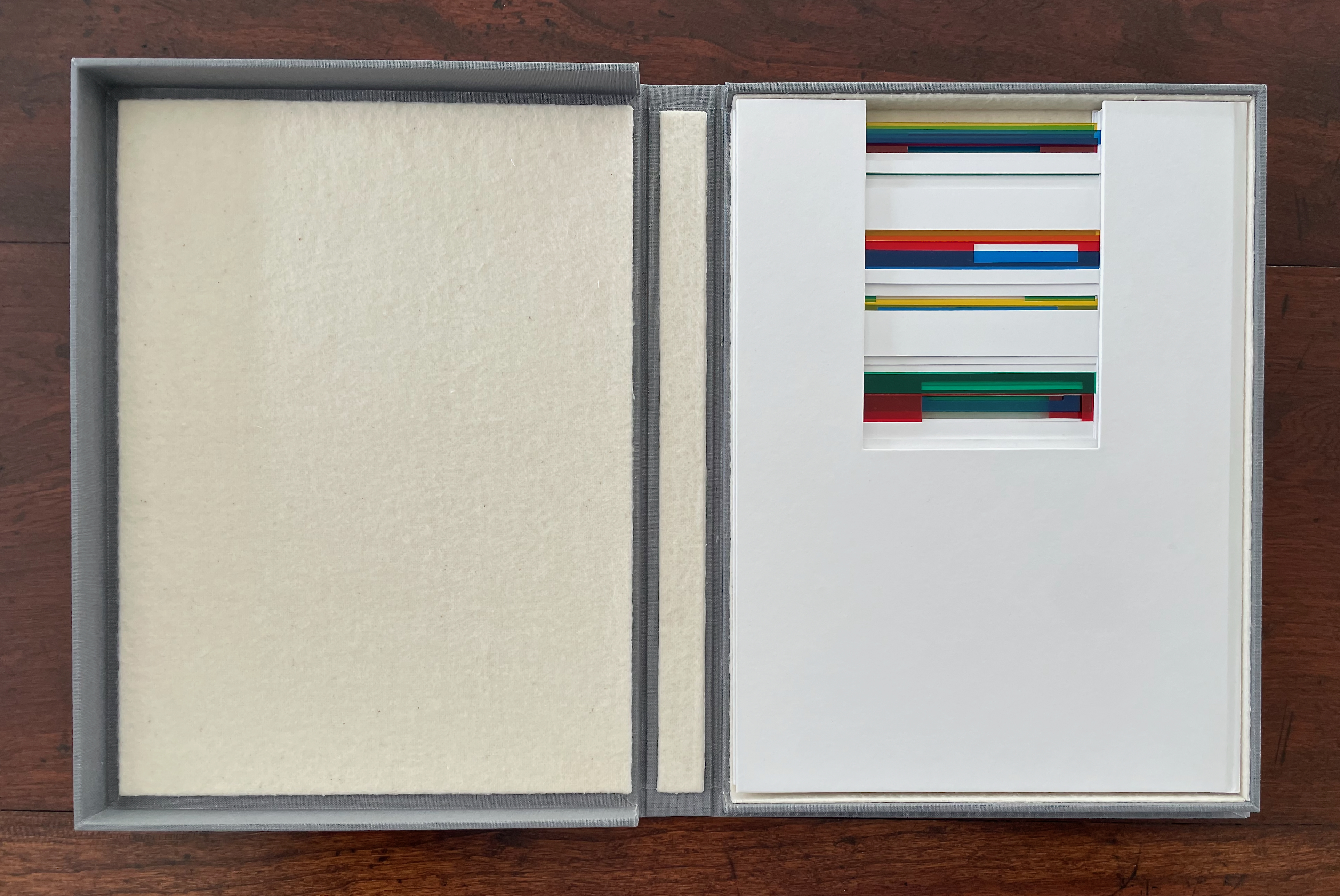
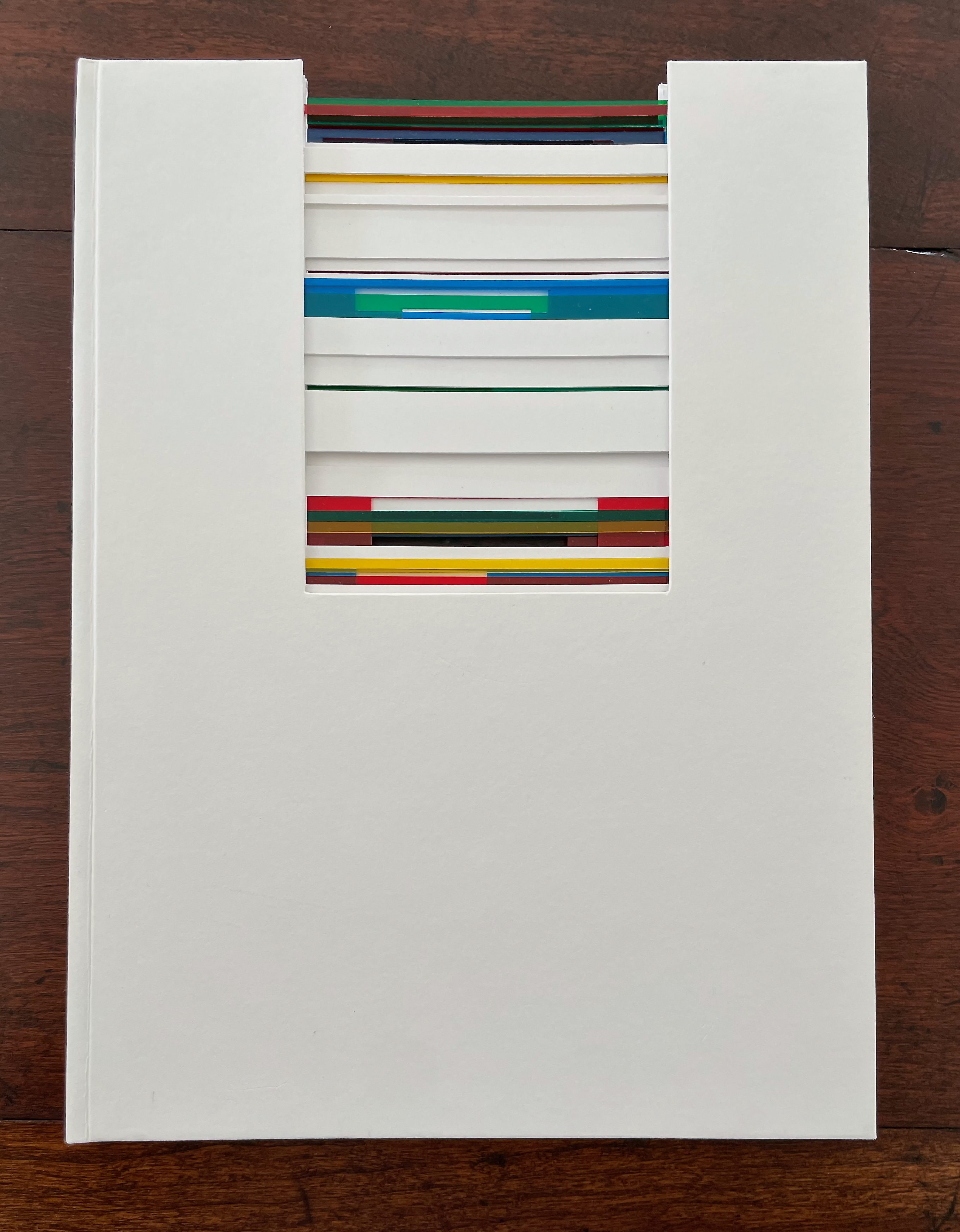
Untitled (I) (2012)
Eva Evrard
Cloth-covered, lined conservation box. Hardcover, case bound, tab binding, head- and tailbands, colored transparent PVC strips, Letraset Letraline adhesive tape. Box: H255 x W190 x D25 mm. Book: H232 x W171 mm. 4 gatherings, [32] pages. Unique work, acquired from the artist, 5 September 2026.
Photos: Books On Books Collection.
With its tab binding structure and gatefold folios, Eva Evrard’s artist’s book revels across two and three dimensions in color, surface, and structure. In each gathering of scalpel-cut blank white pages, colored transparent PVC strips of vibrant reds, greens, blues, and yellows stand out. Air and space, too, are used as much as whiteness to contrast with those colors. The handling of color, the meticulous scalpel work, and the binding give a simultaneous painterly, sculptural, and architectural feeling to the piece.
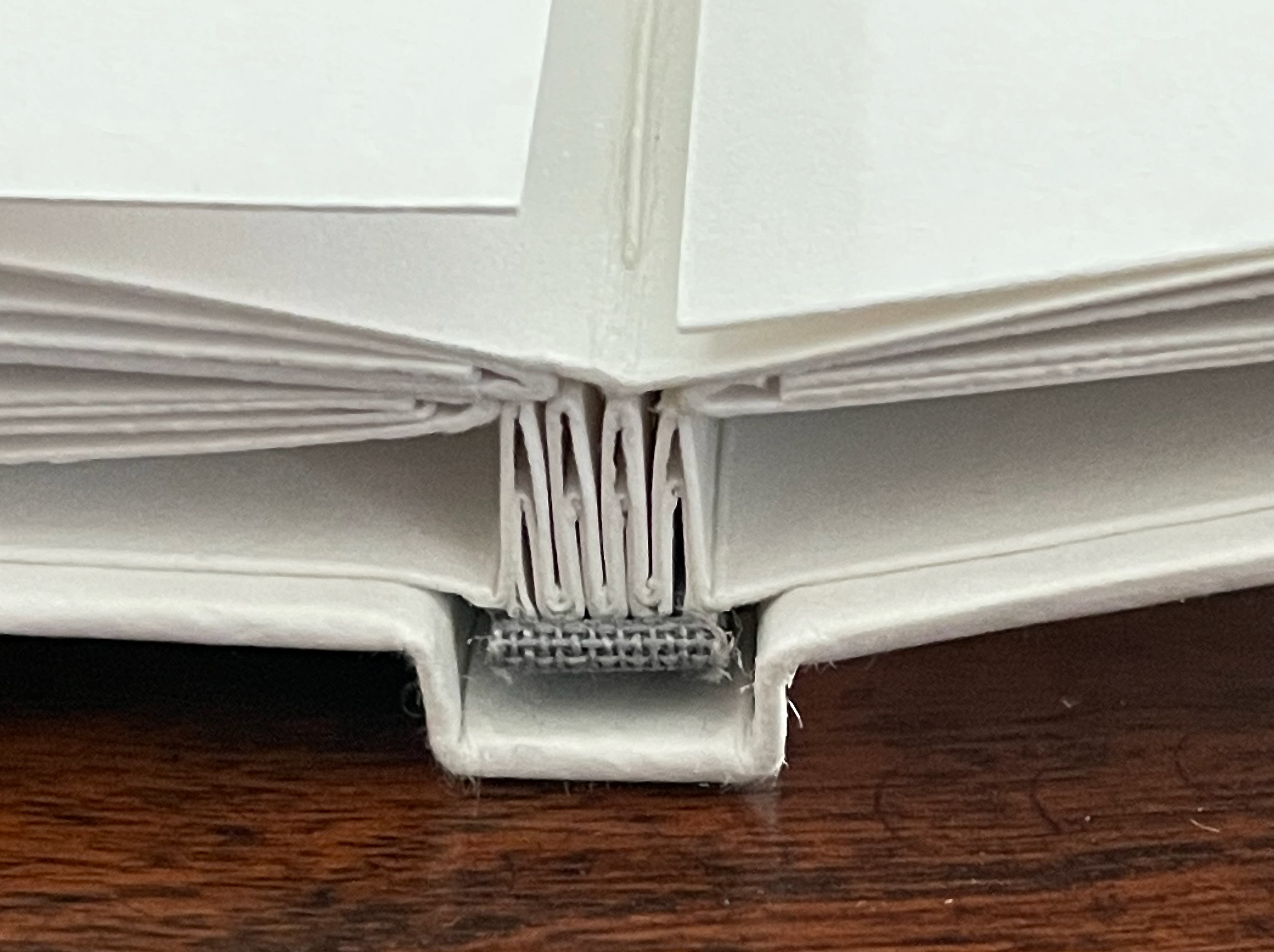
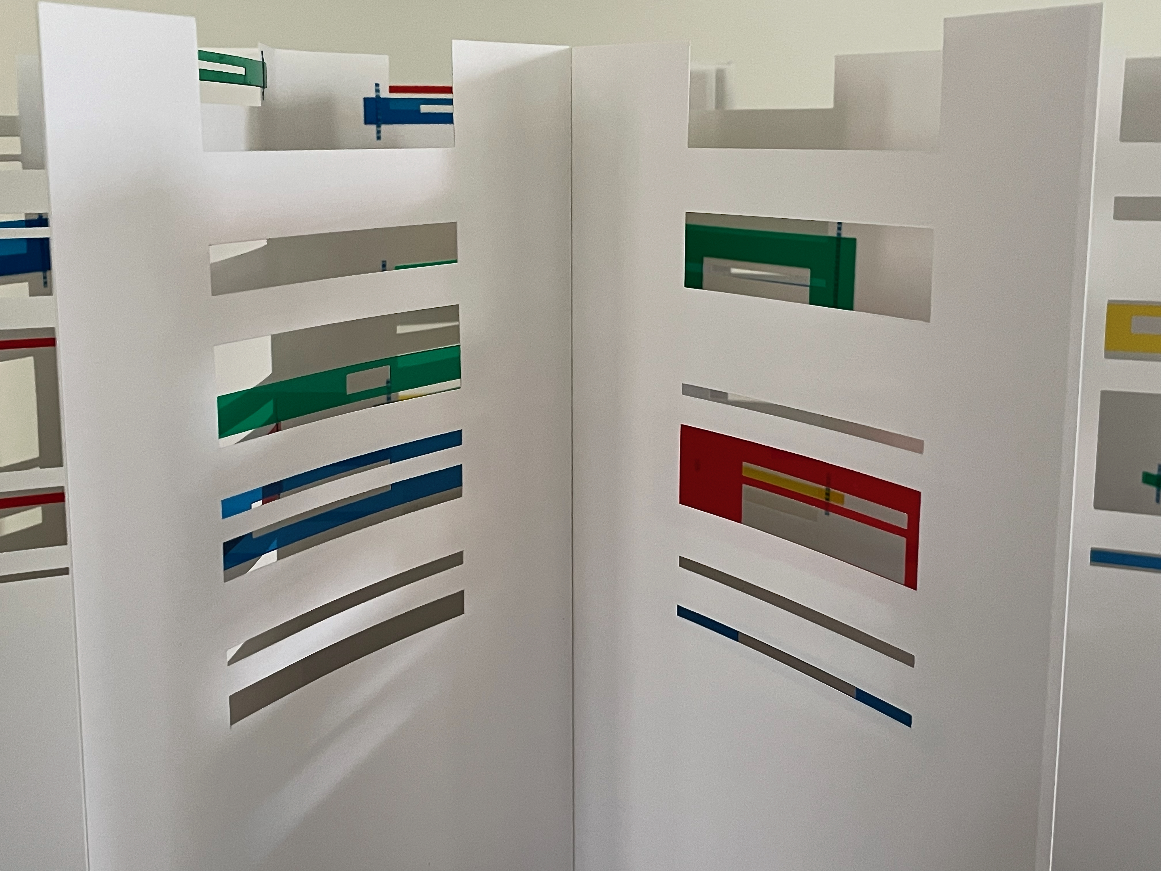
Each tab in the binding structure supports a gatefold sheet that opens first into a diptych of layered colored transparent PVC stripsand excised rectangles and then into a quadriptych showing narrowly cut slips of Letraset Letraline adhesive tape securing the PVC strips to the sheet.
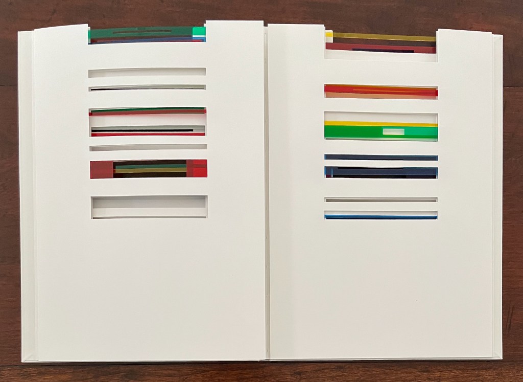
The diptych view opens …
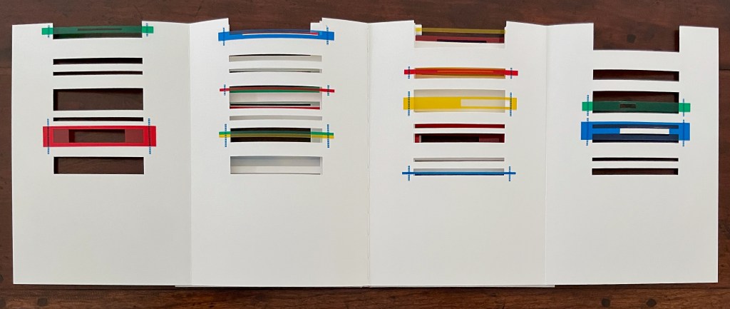
… into a quadriptych view.
The tab and gatefold structures combine to offer a variety of standing positions for display. Each of them delivers a layered multicolor interior view as if through louvred windows into angular rooms.
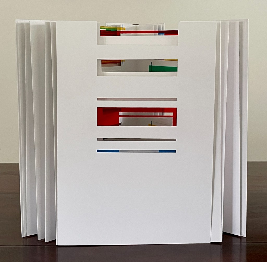
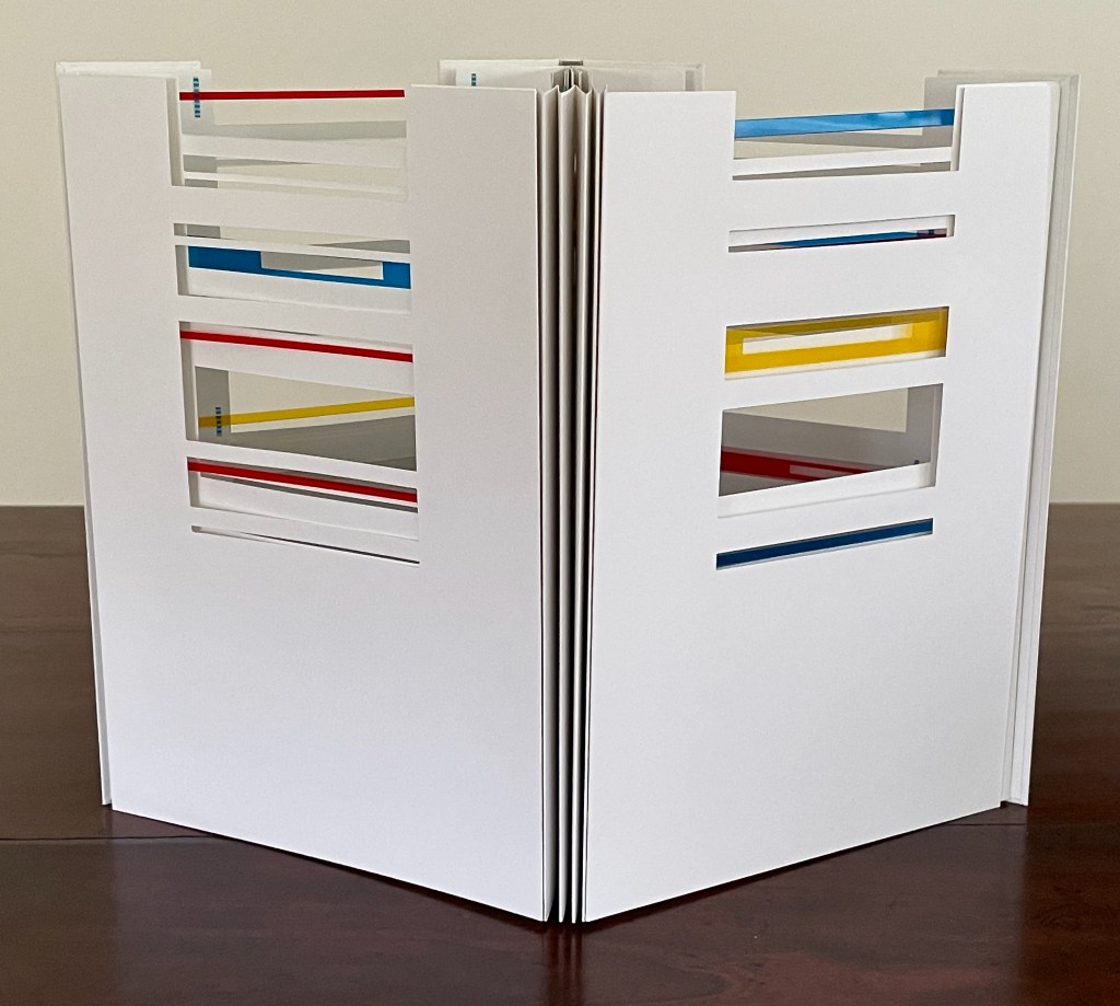
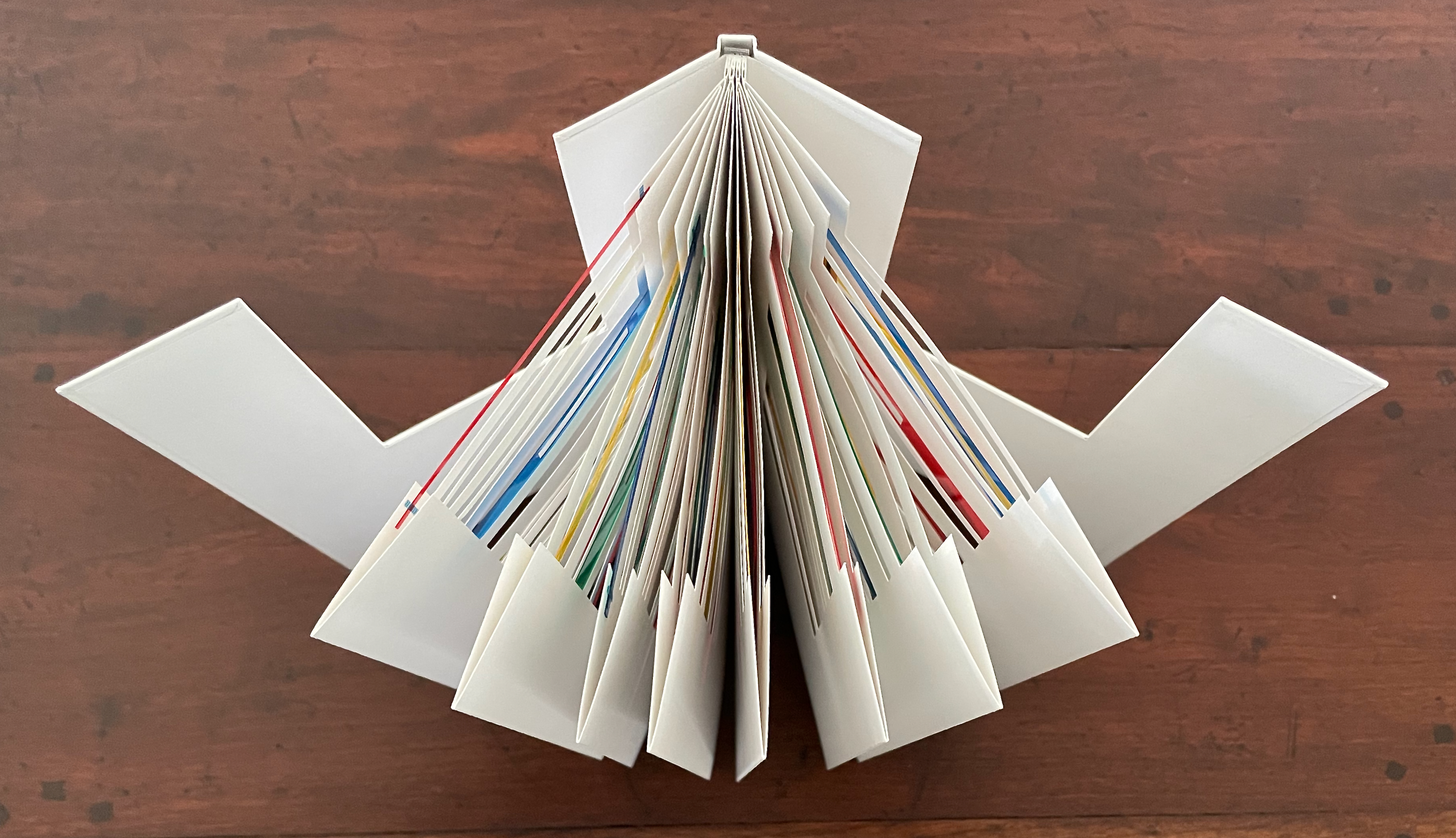
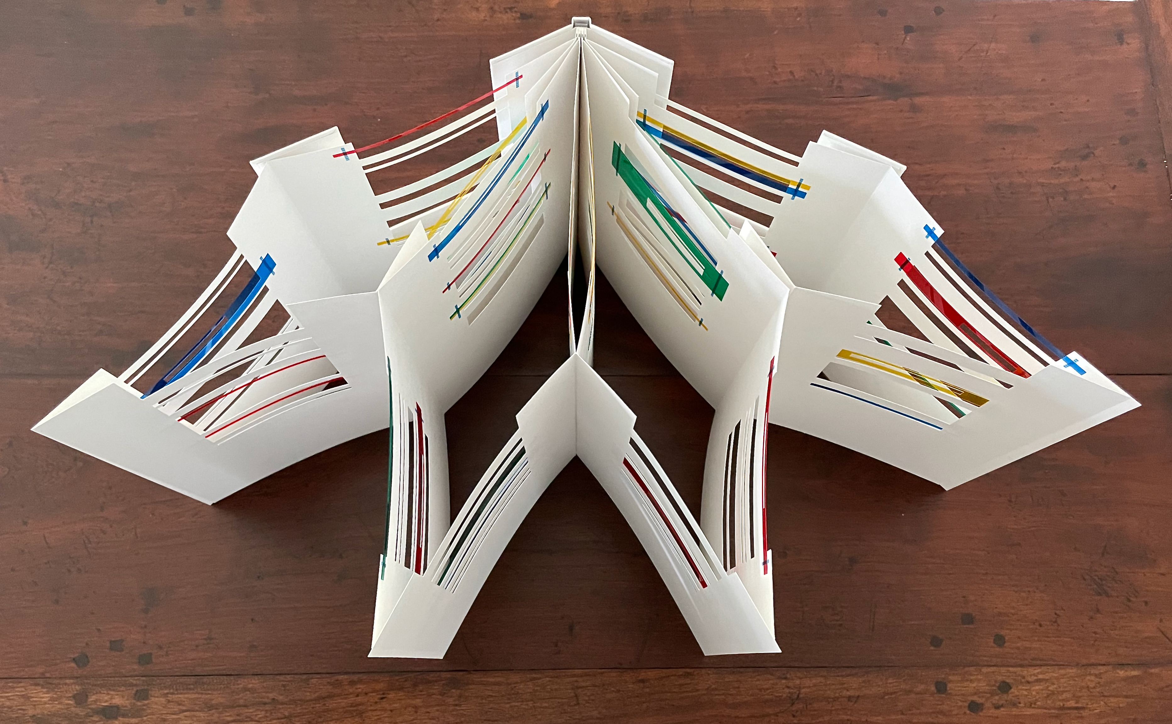
If all of the gatefolds are opened outwards at once, the tension from the folds and binding forms a crenellated structure.
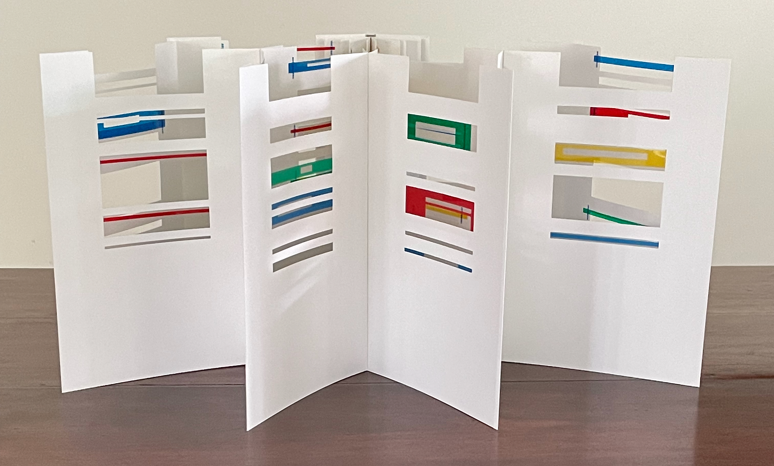
The lateral view compounds through and across the several interiors formed.
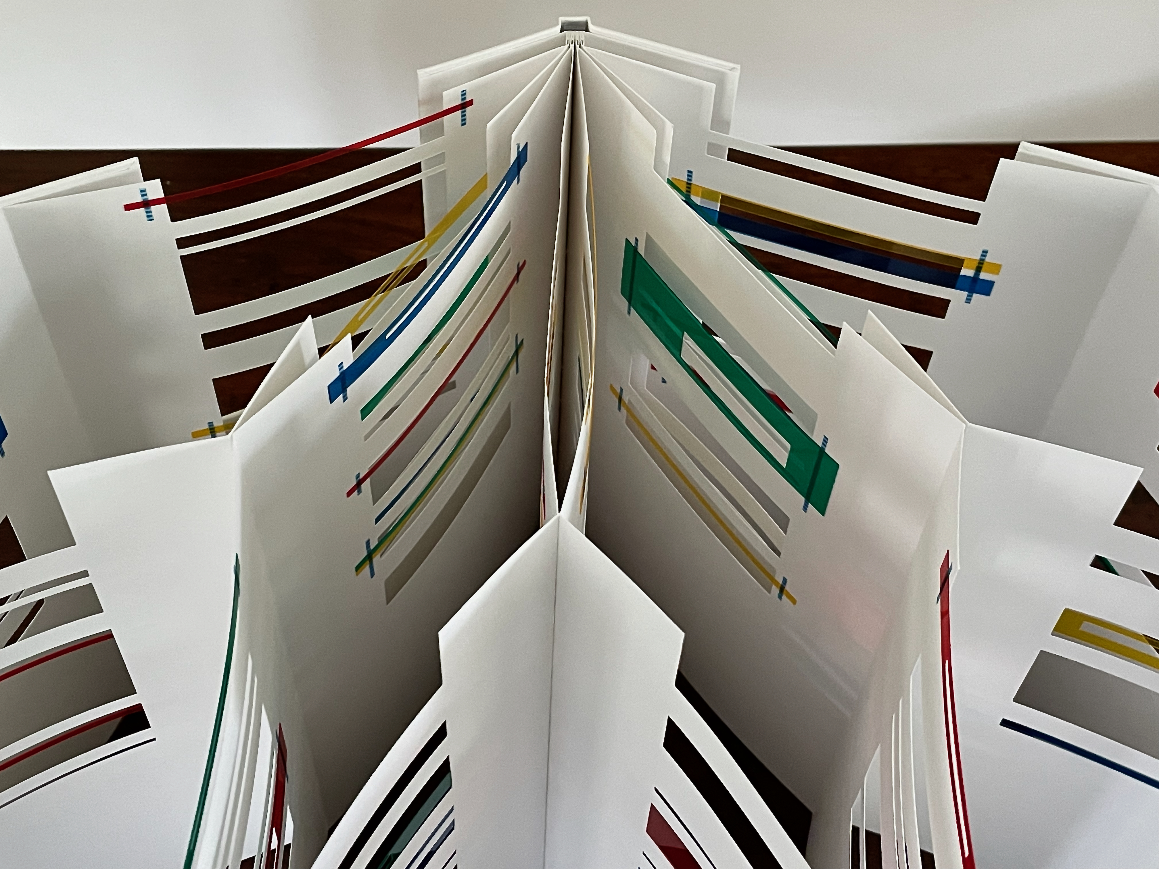
The view from above yields further complexity arising from simplicity.
In the bookbinder Tatsuya Inuikawa, Evrard has found a kindred spirit who can sculpt board, paper, and cord into the tab binding that emphasizes her use of whiteness and her painterly, sculptural, and architectural themes. Together they have created a baroque minimalism.
Untitled (II) (2012)

Untitled (II) (2012)
Eva Evrard
Cloth-covered, lined conservation box. Hardcover, case bound, tab binding, head- and tailbands.Box: H255 x W190 x D25 mm. Book: H232 x W171 mm. [40] pages. Edition of 3, of which this is #2. Acquired from the artist, 5 September 2026.
Photos: Book On Books Collection.
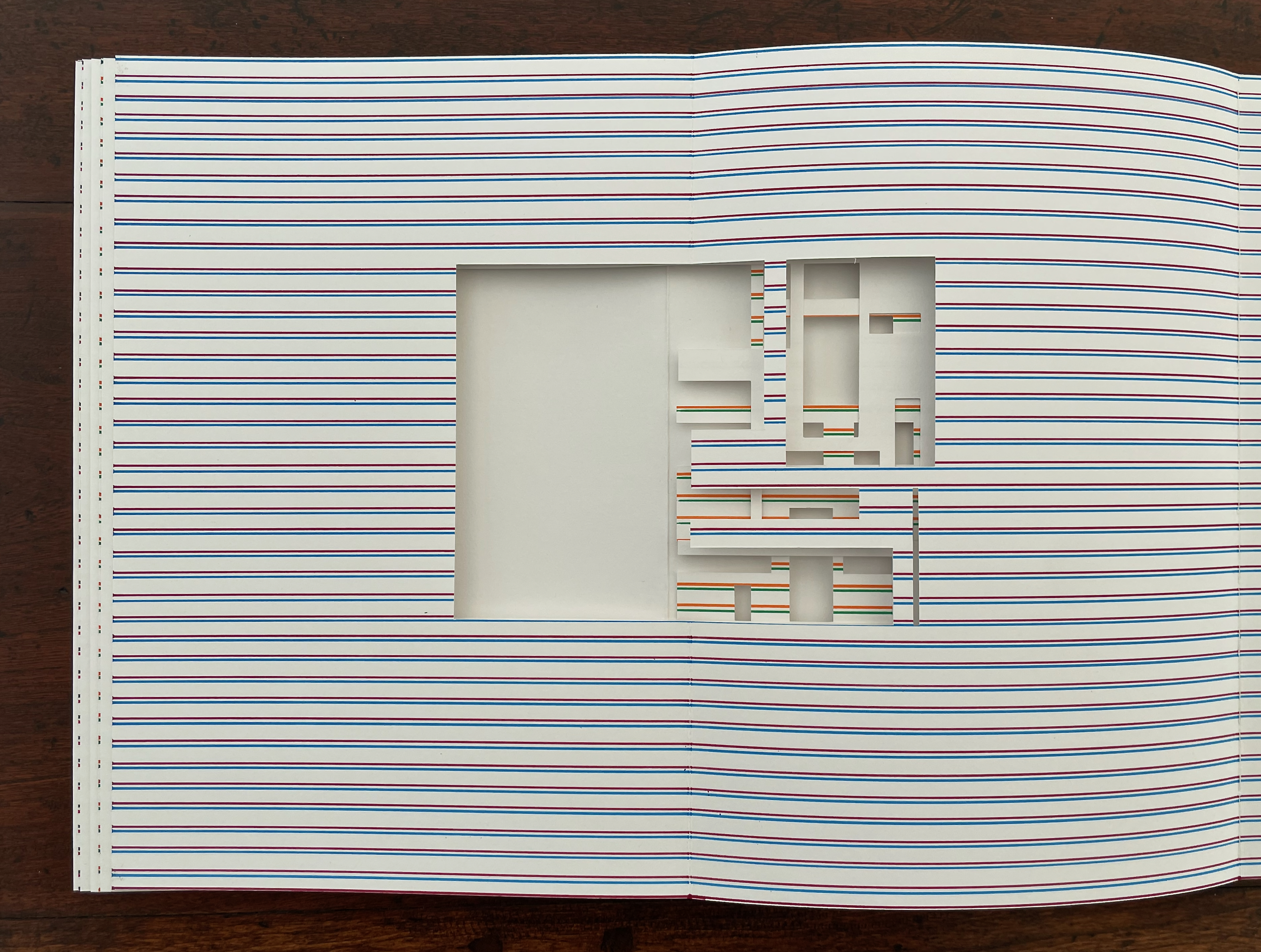
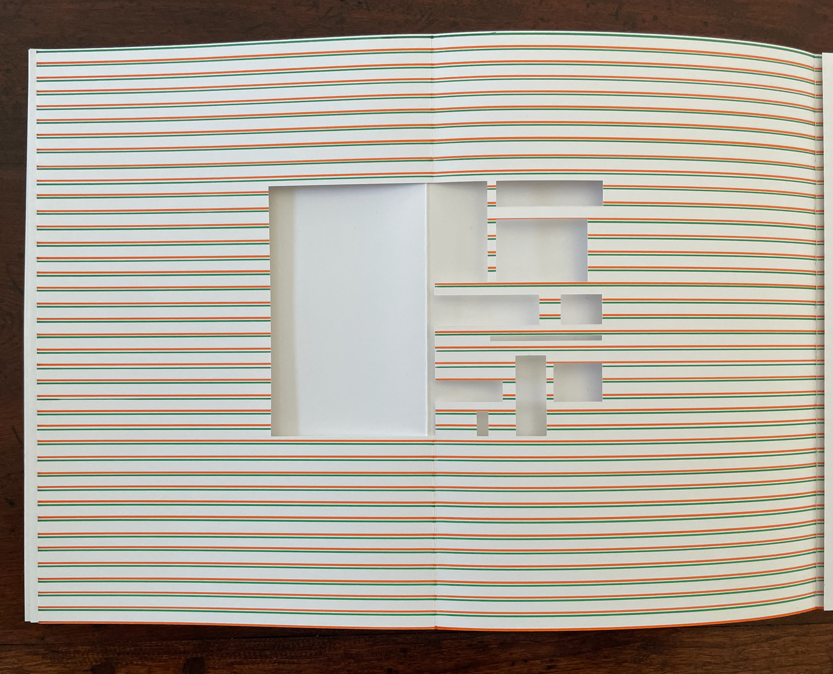
The ways in which this artist’s book resembles and differs from the one displayed above demonstrate Evrard’s creative depth. Instead of four tabs and four gatefold gatherings, there are five, and tellingly, the center tab and gathering is uncut and white.
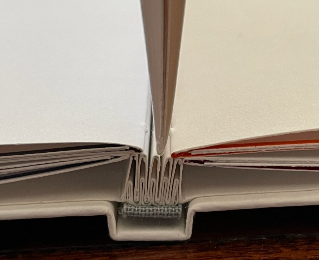
The whiteness and space work differently with each other and with the presentation of colors than they do in the artist’s book shown above. Where whiteness framed the color on both sides of the gatefold sheets in the work above, it does so only on one side of the sheet in this work. Where excision “bled off” the top edge in the work above, the excised areas are surrounded in this work — by whiteness on one side of the sheet and by lines of color made by hand, using a ruler and markers on the other side.
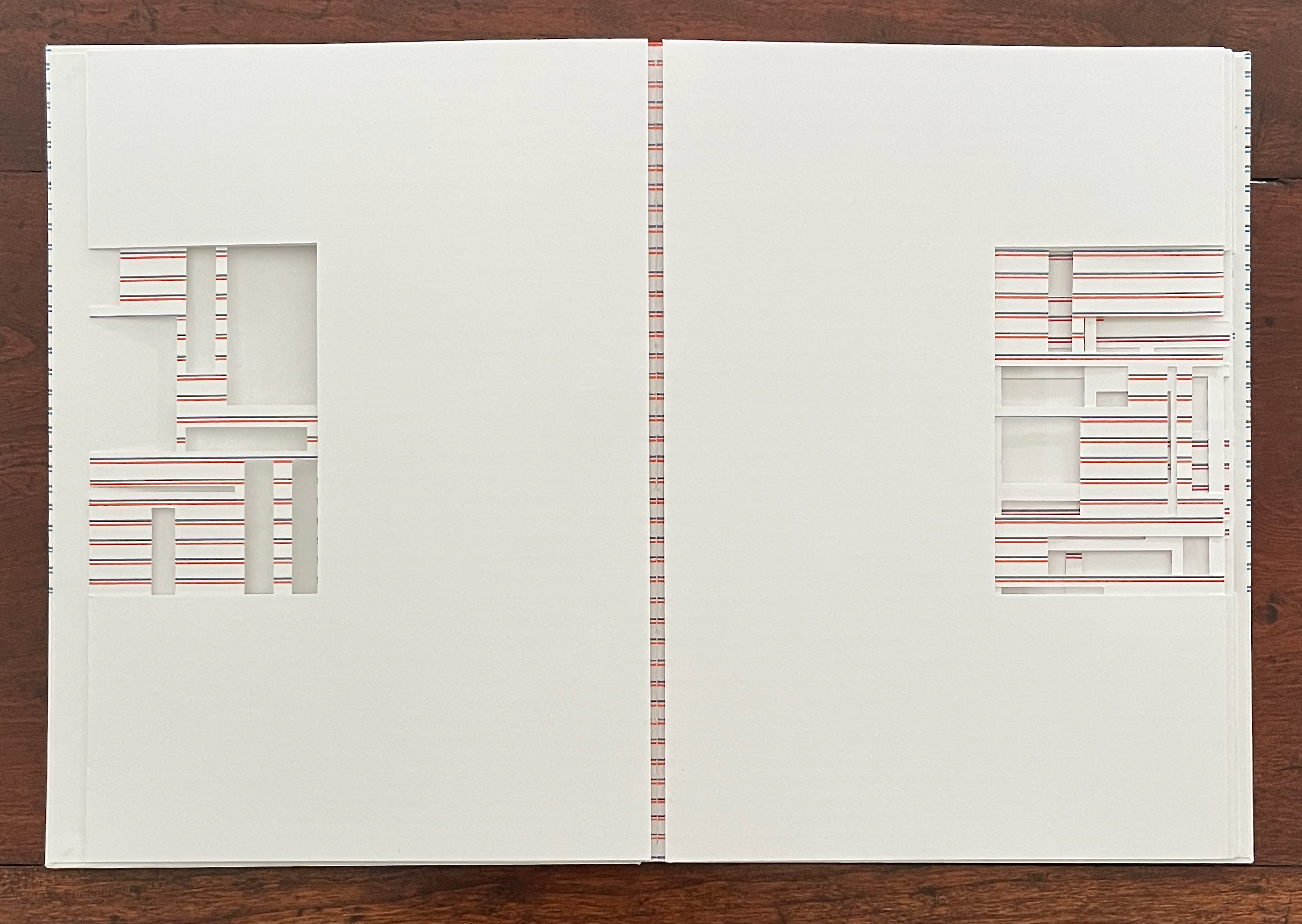
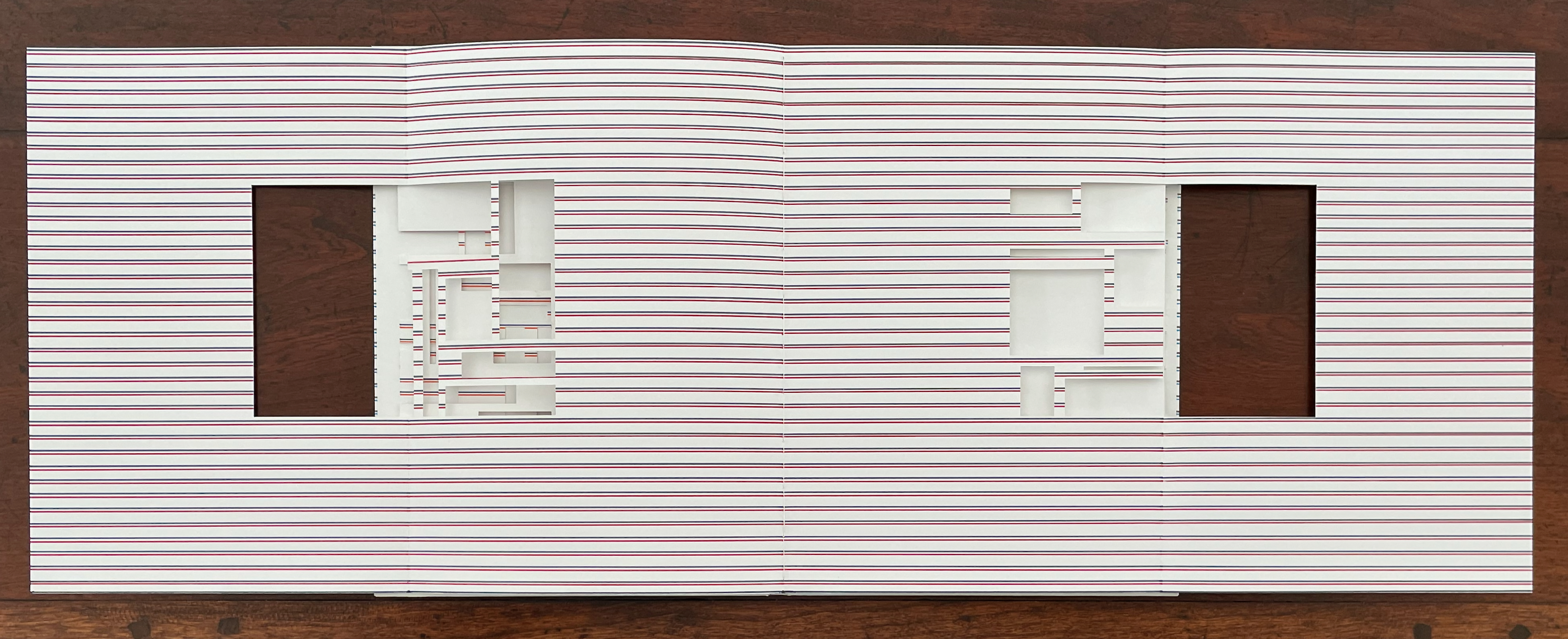
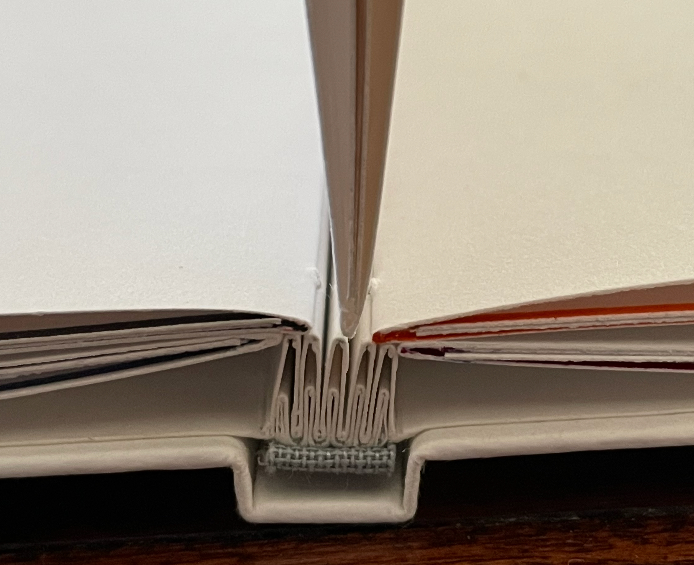
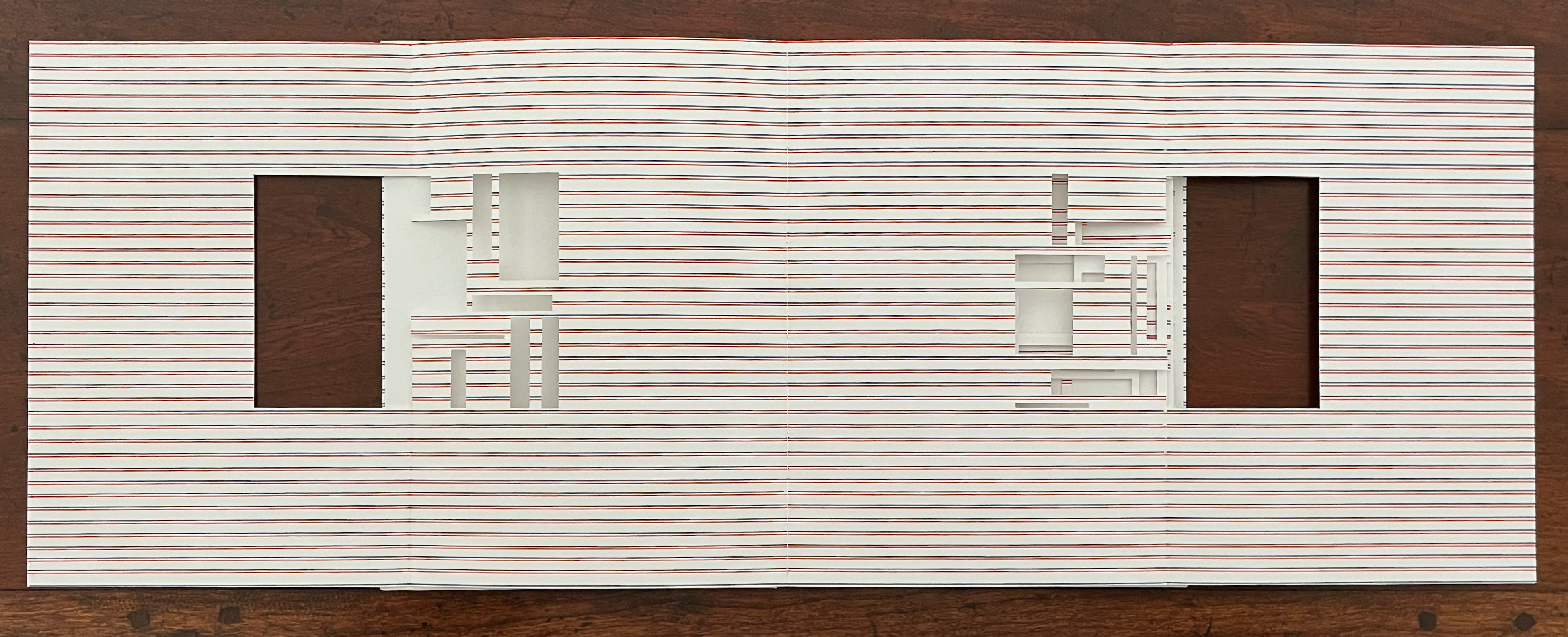
As we move closer to the center tab, it comes into play — if fully extended — as background to the colors. And if viewed standing with all of the gatefolds extended, the book’s very different expression of color, whiteness, space, and shape stands out clearly as our view pivots to either side of the entirely white center tab and gathering .
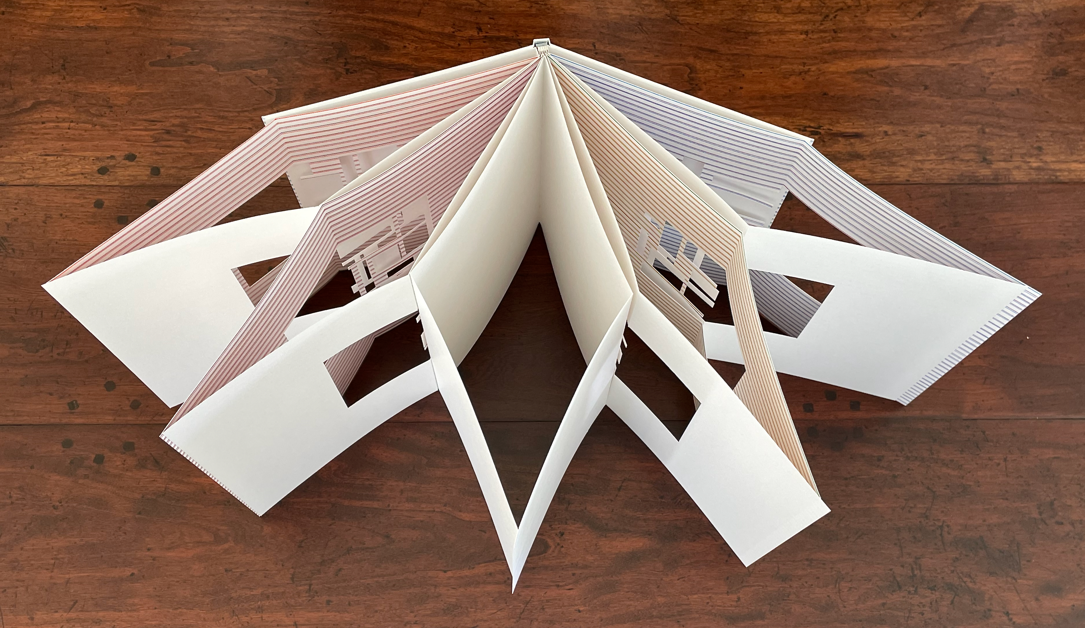
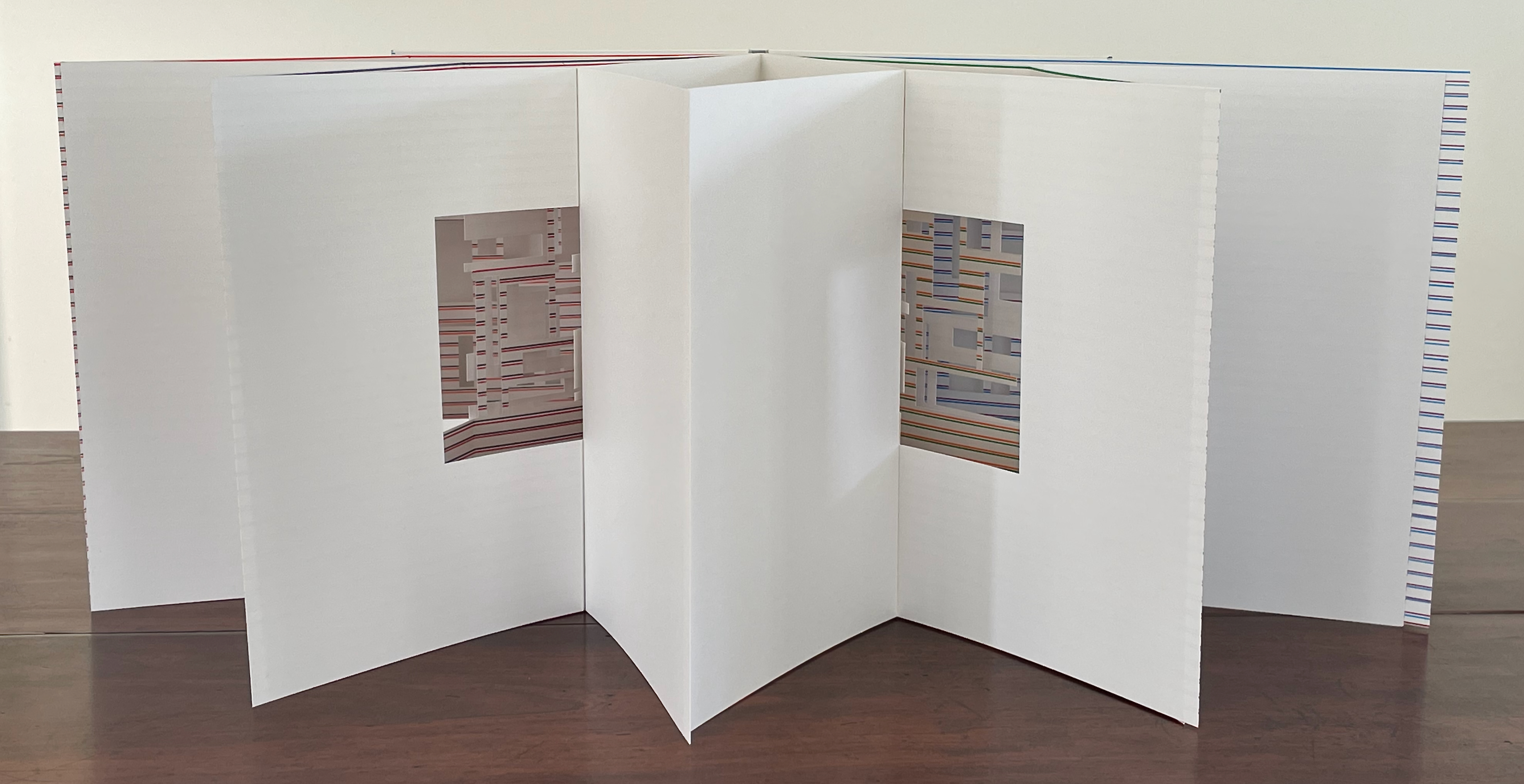
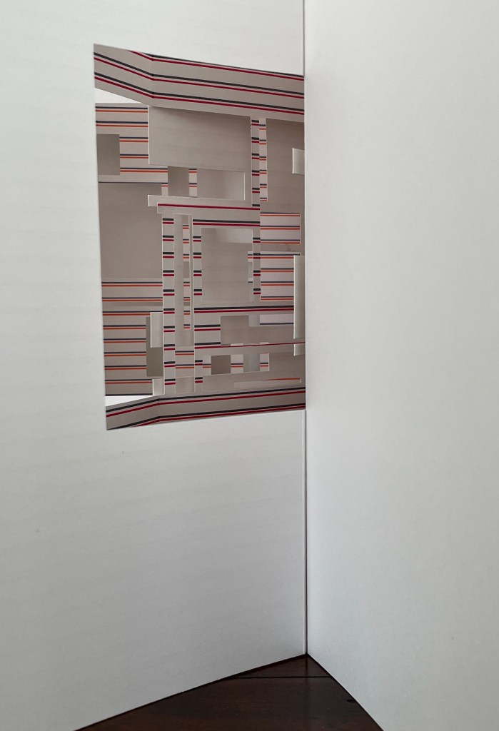
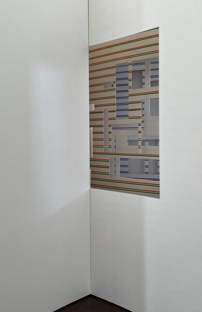
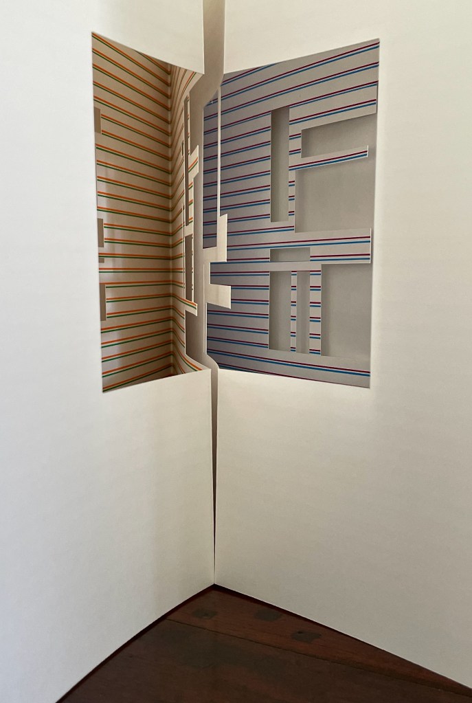
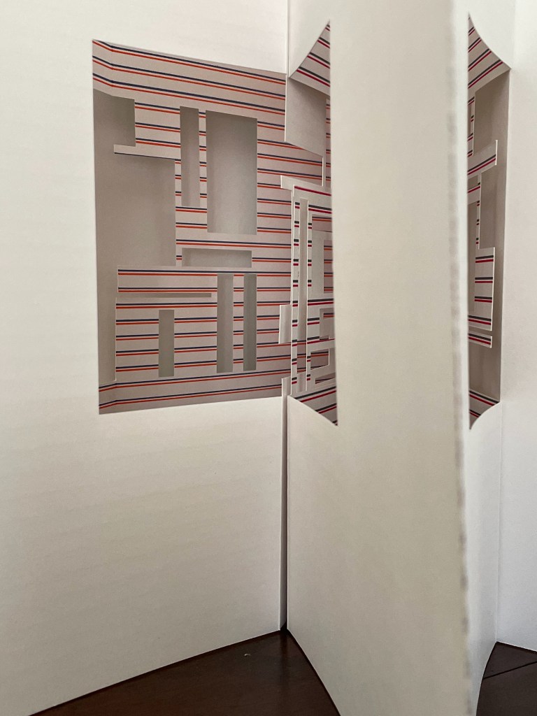
As with the previous book, this one is painterly, sculptural, and architectural, but if the striped side of any one of the gatefolds is opened wide and stood on its edge, another difference becomes clear. This artist’s book orients more toward an interior view. It is almost as if we are looking into the corner of a room with large paintings or windows centered on the abutting walls.
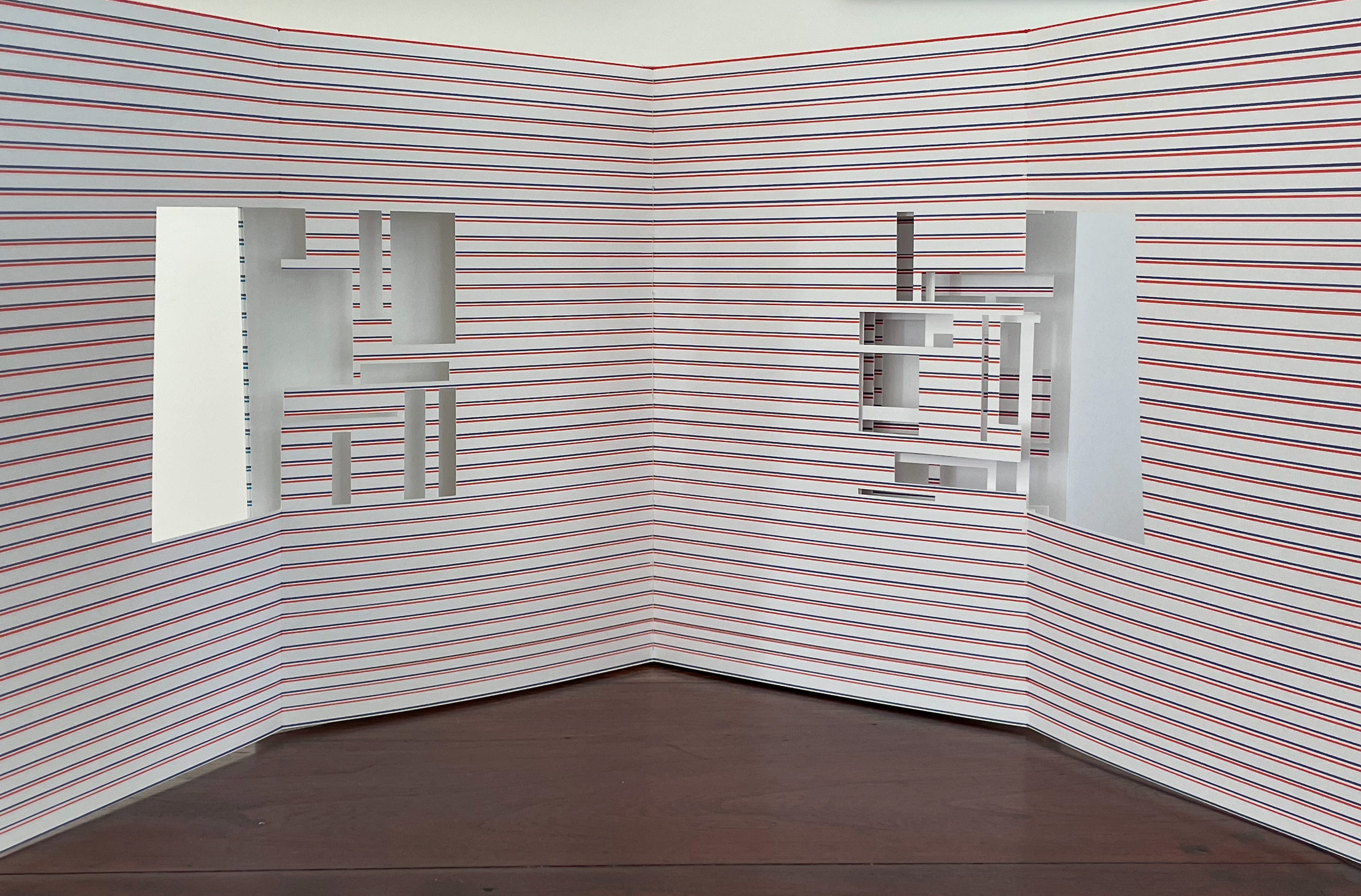
If extended and laid flat, the gatefolds lean toward a diptych view. Or we might be looking at the edges, walls, and windows of other buildings outside the half-shuttered windows on the long interior walls facing us.
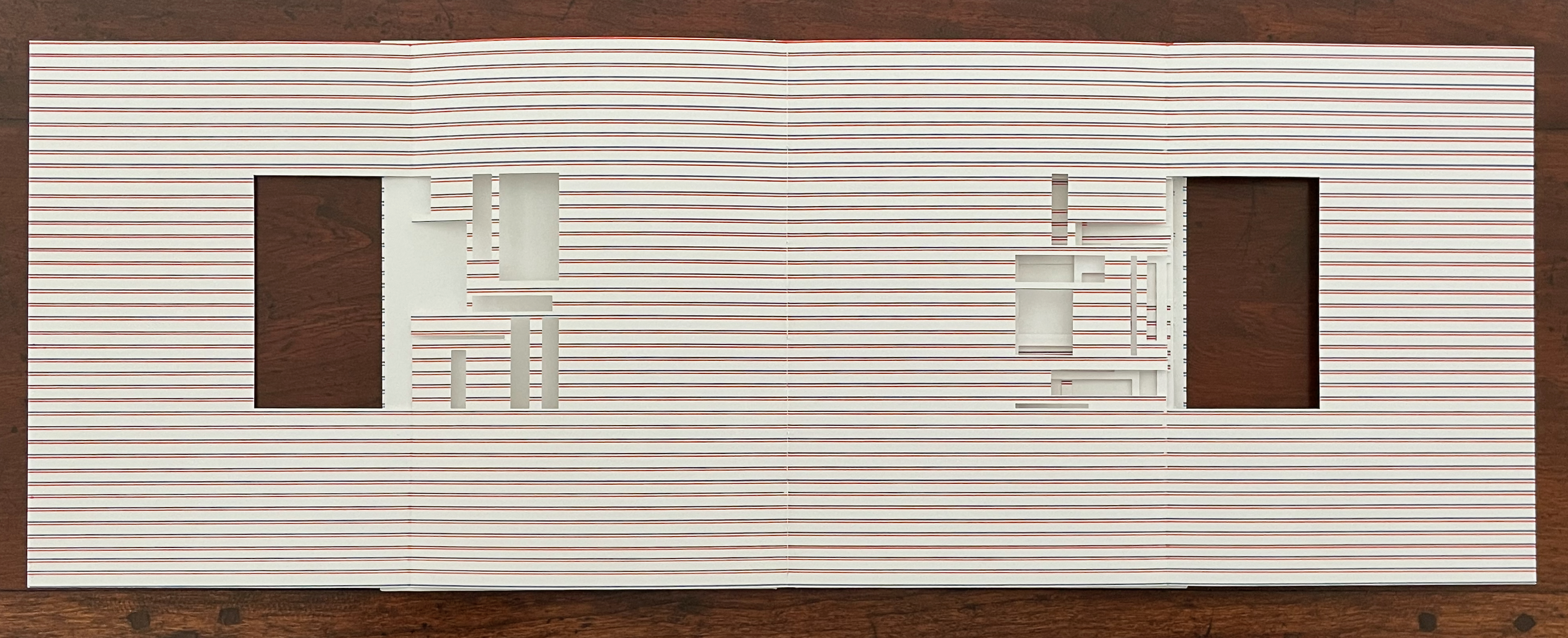
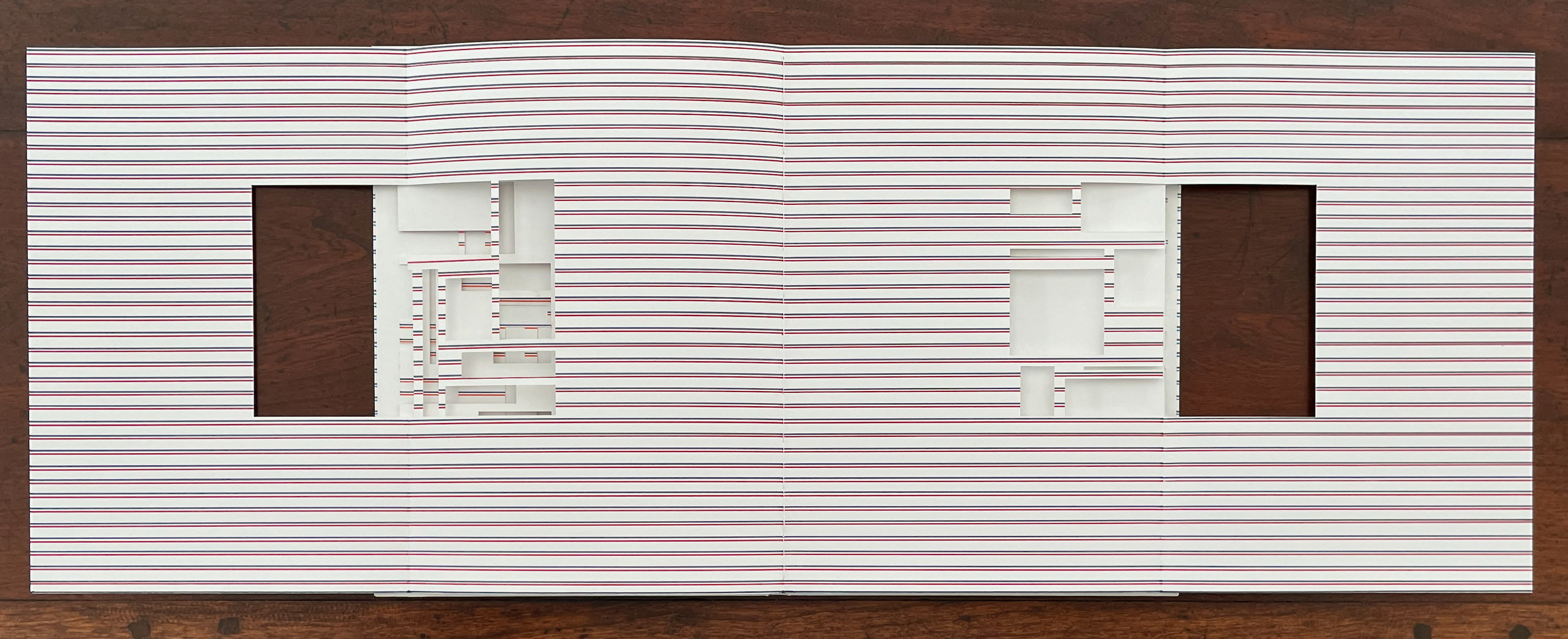
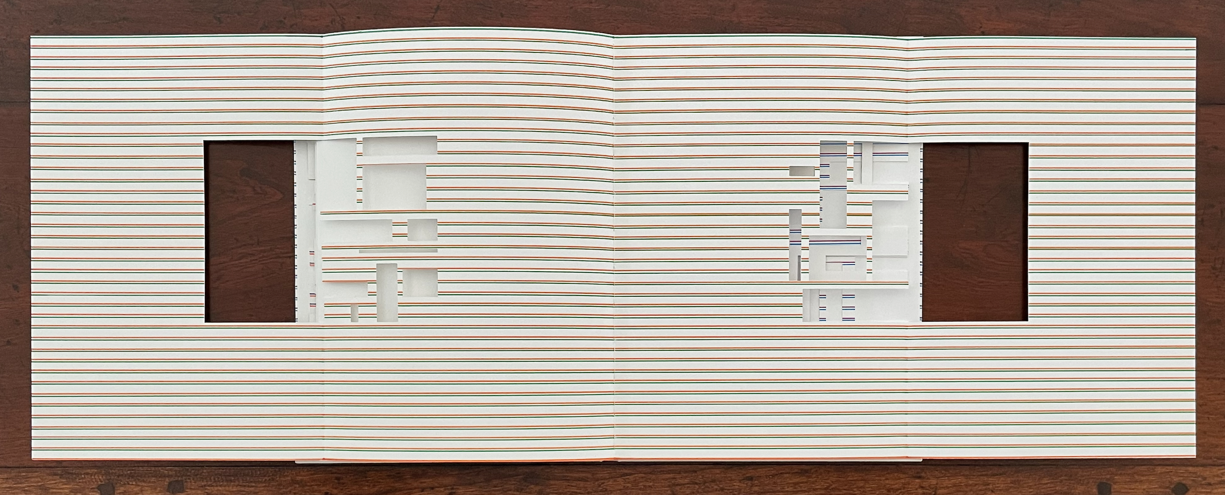
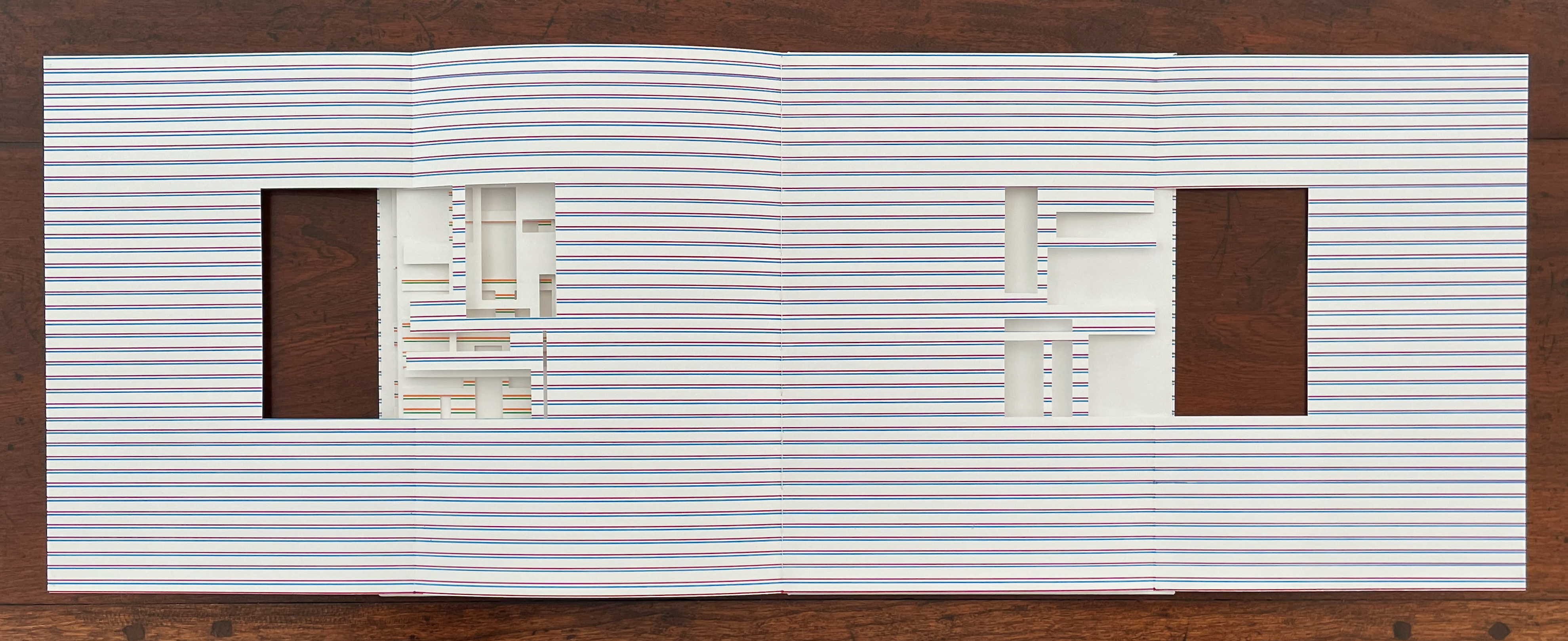
Or we can extend the blank gatefold behind a diptych panel and enjoy a more abstract presentation.
Untitled (III) (2011)
Untitled (III) (2011)
Eva Evrard
Cloth-covered, lined conservation box. Hardcover, case bound, tab binding, head- and tailbands, Letraset Letraline adhesive tape. Box: H255 x W190 x D25 mm. Book: H232 x W171 mm. [32] pages. Unique work, acquired from the artist, 5 September 2026.
Photos: Books On Books Collection.
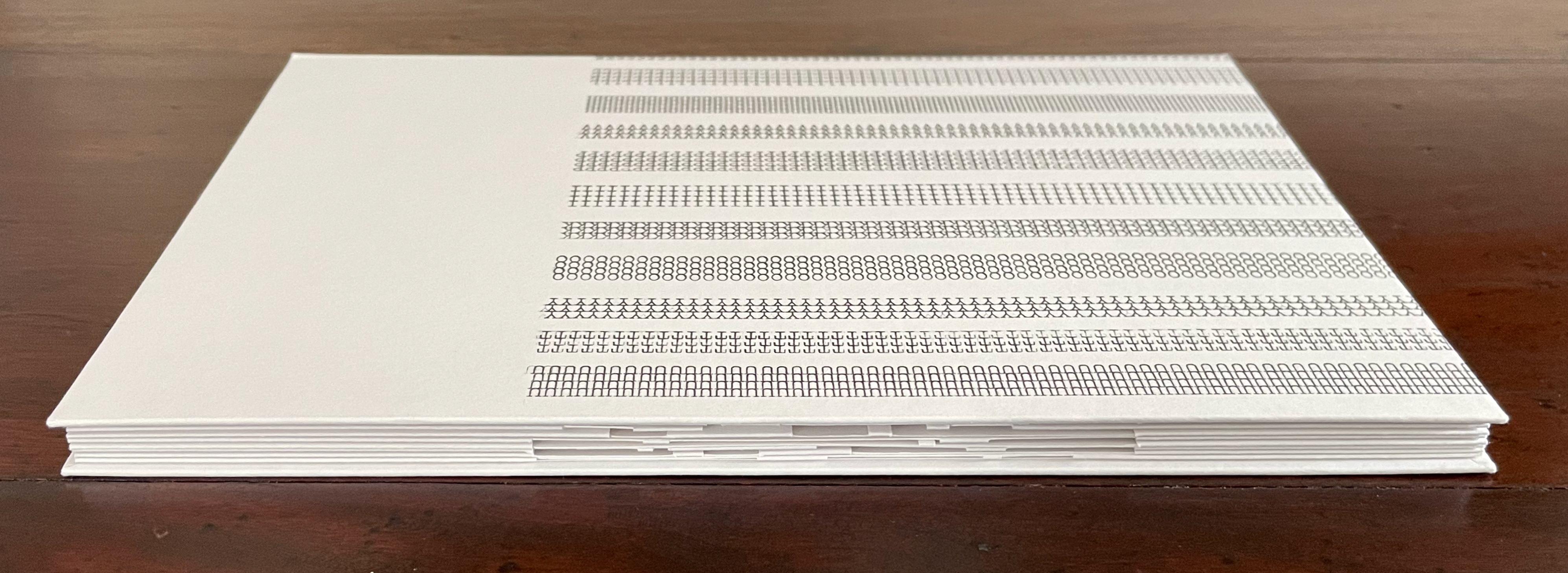
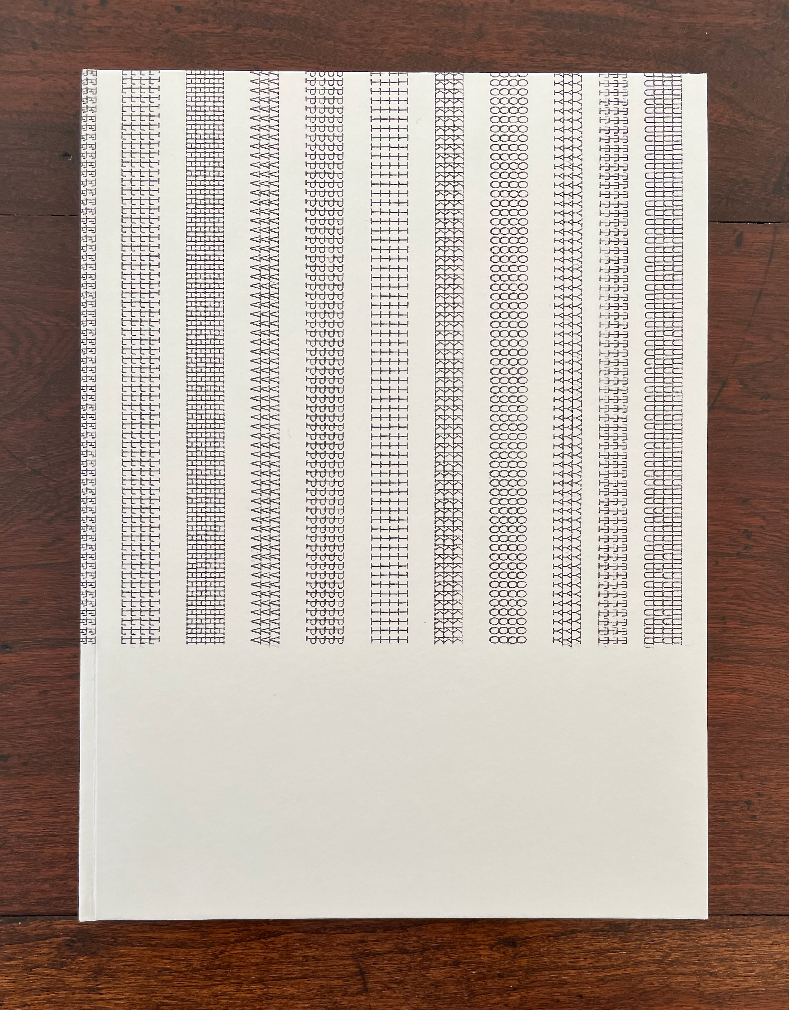
This artist’s book reverts to four tabs and gatefold gatherings. Except for its red head- and tail-bands, it is entirely black and white, unlike the two works displayed above. Also unlike them, it introduces typewriter-written letters. In art historical terms, it leans less toward Piet Mondrian and more toward Theo Van Doesburg and Vilmos Huszár. The grid in the image of Huszár’s De Stijl cover and the images from Van Doesburg’s monument design, architectural analysis, and his 1919 typeface design “Architype” echo among Evrard’s construction.
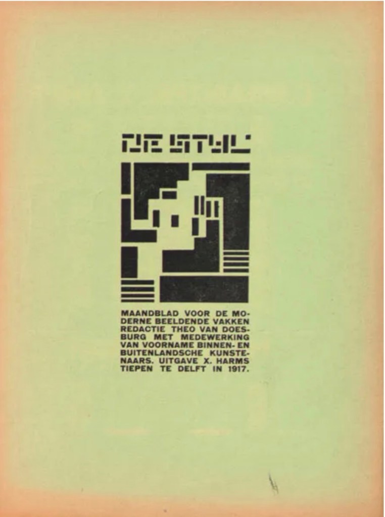
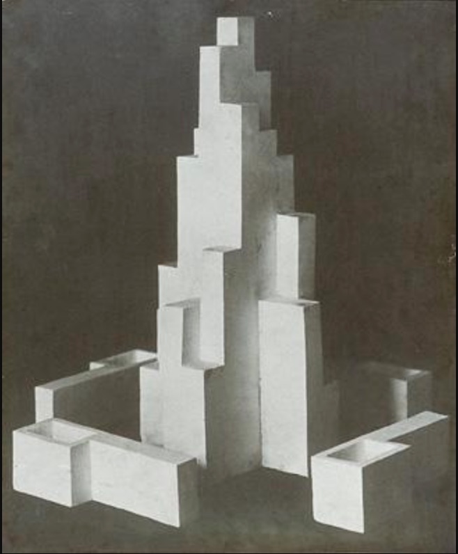
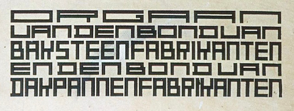
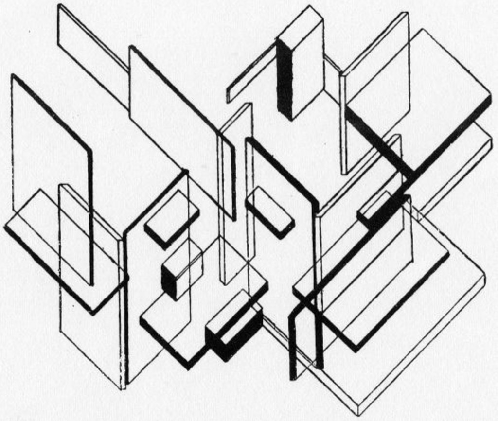
Cover for De Stijl (Oct 1917). Vilmos Huszár . Design for a monument in Leeuwarden (1917), Lettering for the ‘Klei’ magazine (1919), Architectural analysis (1923). Theo van Doesburg.
Displayed flat, Evrard’s Untitled (2011) has the feel of an architectural design drawing. Displayed upright, it has the feel of an architectural model.
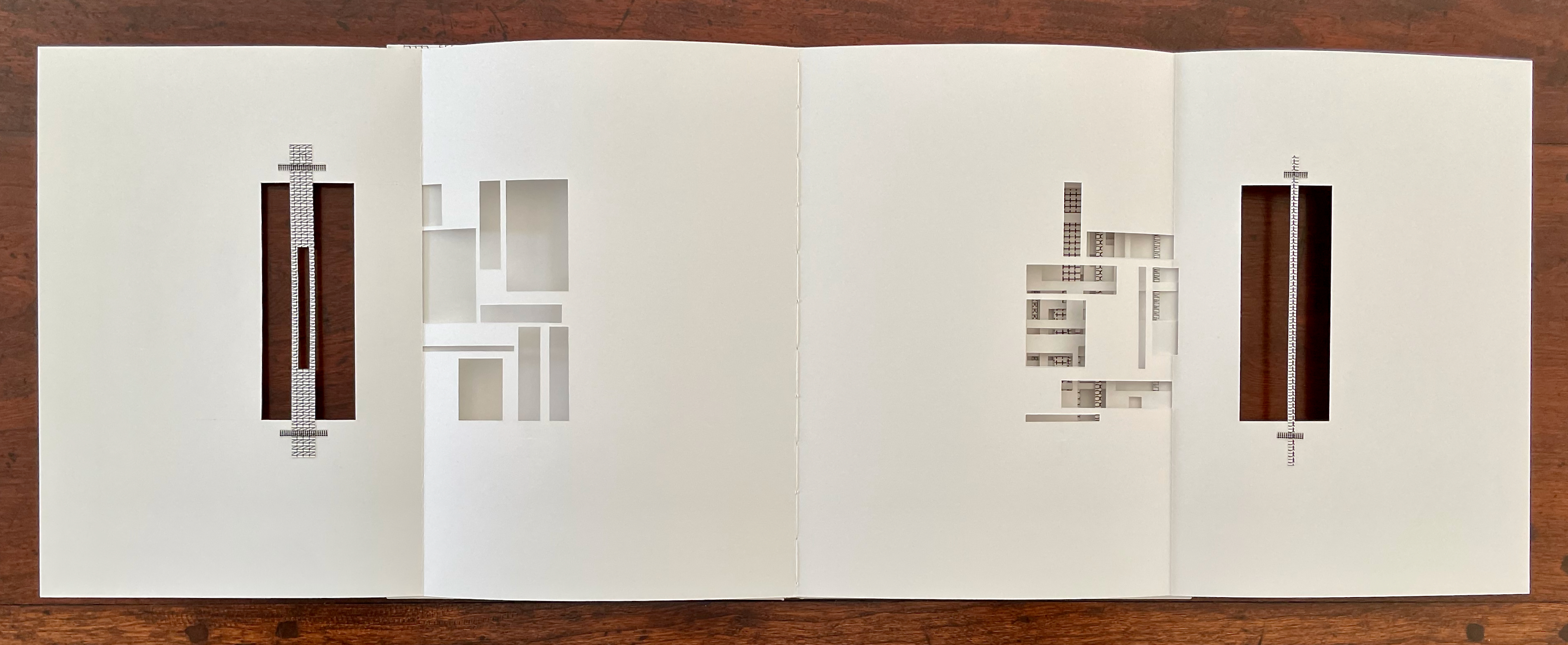
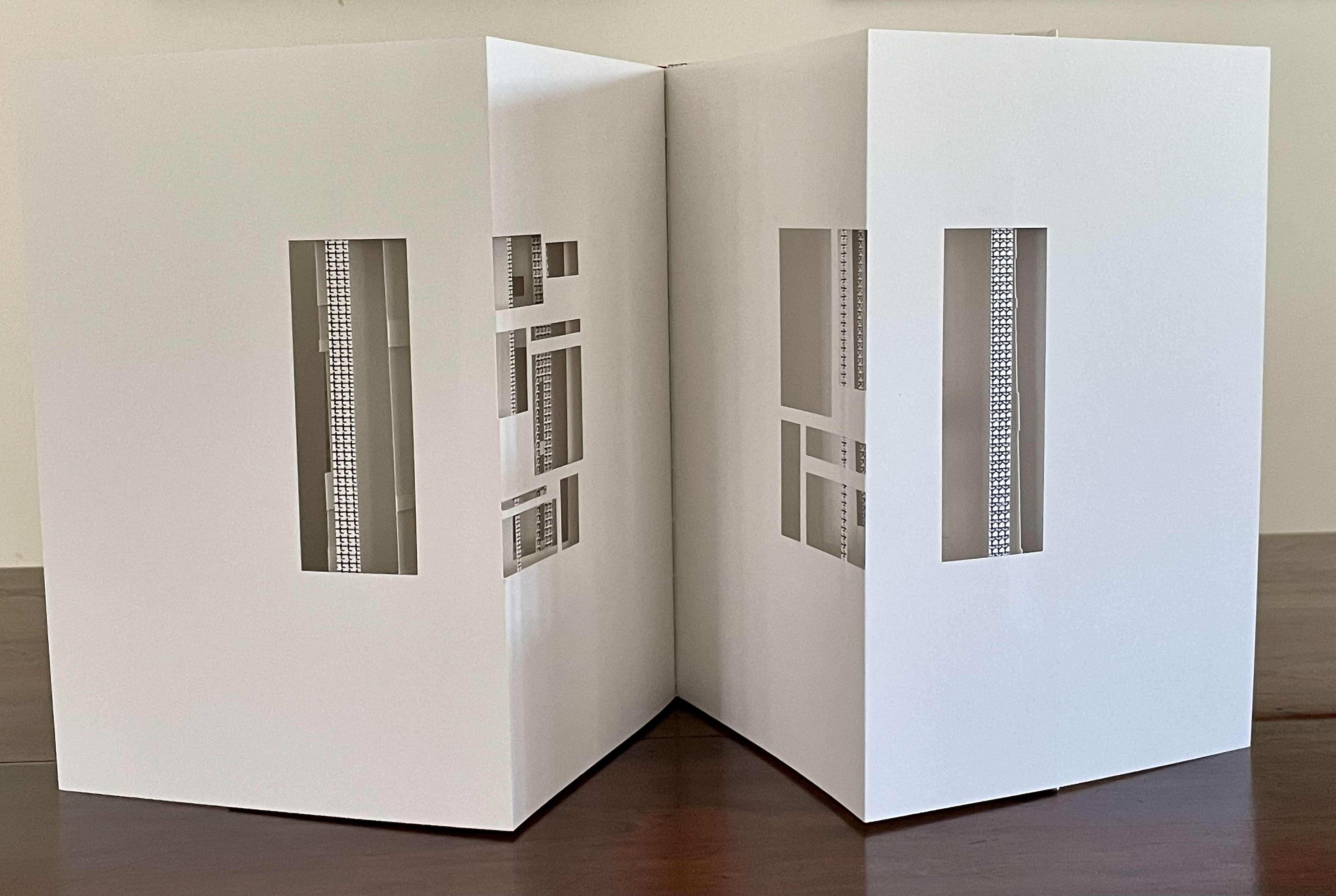
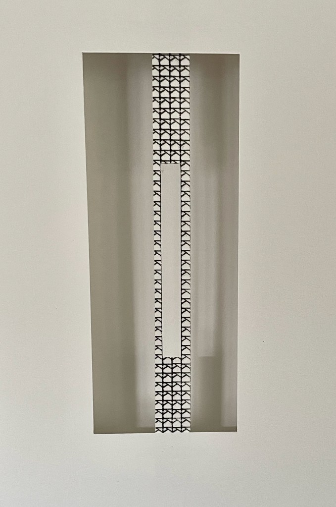
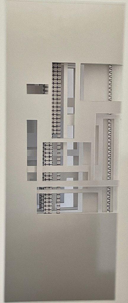
Her black and white composition with scalpel, fold, space, and Letraline adhesive tape is captivating. A window cut in a strip of tape floating in the window of space excised from the page casts its light through the space beyond and onto the page behind. A multi-grid cutout could be giving a bird’s-eye view onto street markings and tram tracks or a view through the walls of a high-rise construction with girders, rebar, and sheetrock.
Ken Botnick was right when he said, “Artist books are to the world of books as poetry is to the field of writing.” Reading each of these three artist’s books is like reading a well-crafted poem. Each requires close attention, re-reading, and shifts of perspective. The reward is a world of views within views.
Further Reading
Berry, Craig. 28 December 2017. “1917–2017, 100 Years of De Stijl“. Medium.
Botnick, Ken. 23 April 2015. Transcription of talk given as the annual Enid Mark Lecture. Smith College.
Brook, Tony, and Adrian Shaughnessy, eds. 2023. Letraset : The DIY Typography Revolution. London: Unit Editions.
Meggs, Philip B., and Alston W. Purvis. 2016. Meggs’ History of Graphic Design. John Wiley & Sons.

