A-Z: Robert Cottingham: An American Alphabet (1997-2012)
A-Z: Robert Cottingham: An American Alphabet (1997-2012) Robert Cottingham Hardcover. H x W mm, pages. Edition of 100. Acquired from Tandem Press, 10 September 2021. Photos of the book: Books On Books Collection. Displayed with permission of the artist and Tandem Press.
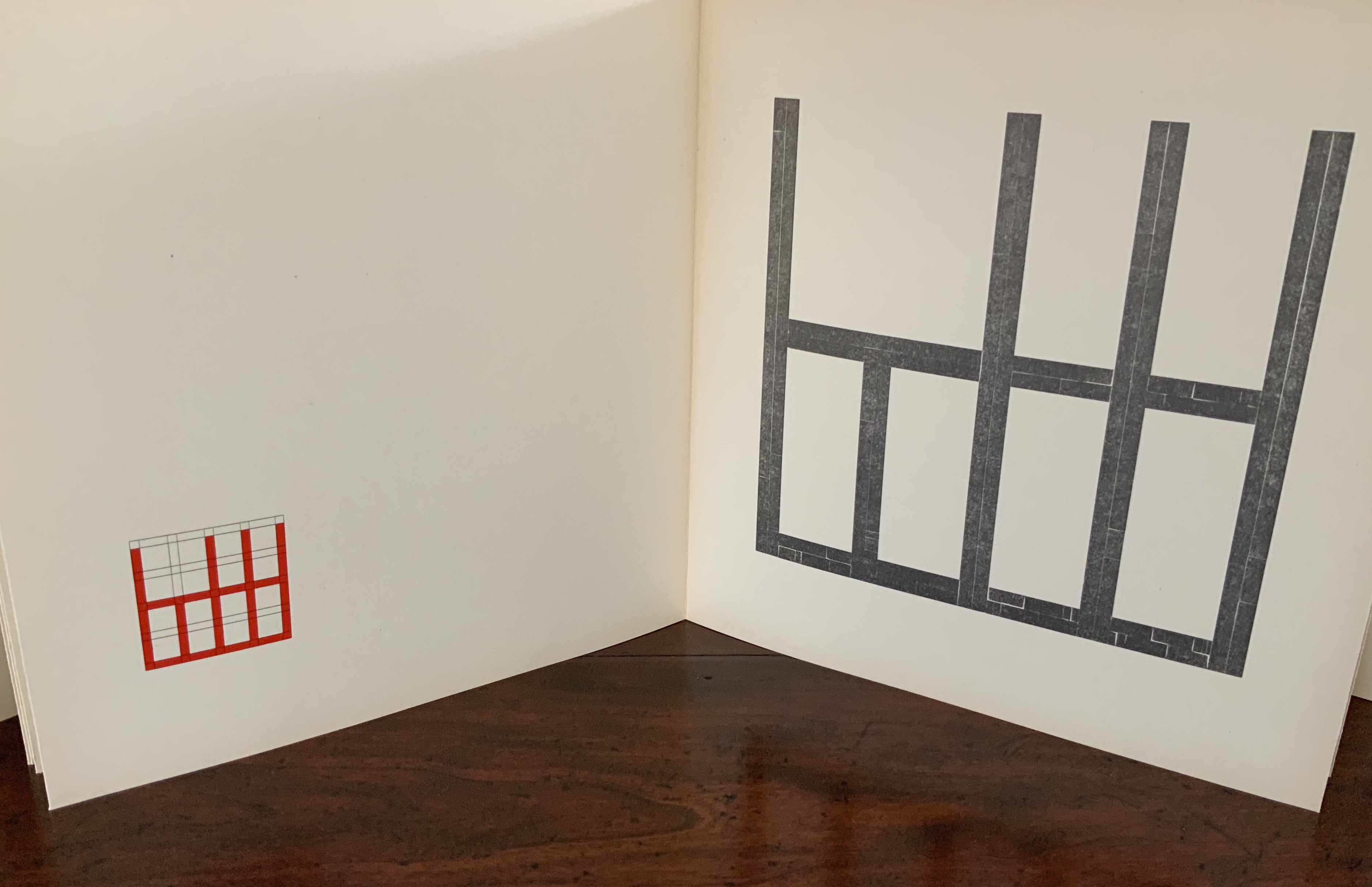
I had completed a number of canvases for AN AMERICAN ALPHABET and began to experience storage problems. The paintings were leaning against all available walls and were in danger of being damaged. For protection, I hung them as a group on one wall, stacking them four high by four across, … sixteen canvases that reached to the ceiling and formed a monumental mosaic of letterforms. This arrangement of tightly packed images created an energy I hadn’t anticipated. As I looked up at it for the first time from my studio floor, I was immediately transported back to those moments when my father and I ascended from the 42nd Street subway station. The sight lines in my studio matched the ones I’d experienced as a child looking up at the signs and lights of Times Square. (Cottingham, A-Z)
Cottingham’s time travel creates a longing in the viewer for travel in time and space. What that wall must have looked like. Those who might have enjoyed the 1996 show at the Forum Gallery in New York or the installation at the New York Print Fair in November 2011 or the Tandem Press exhibition at Madison, WI, in 2018 would have a limited idea (the images were not stacked four high). A-Z: An American Alphabet is as close as the rest of us will come to visualizing it. The artist book does have the advantage of letter by letter commentary from Cottingham.
Another plus in the book is Cottingham’s exploration of his process, tools and material:
The photograph is the starting point. Once I’ve chosen a specific image, I’ll do at least one preliminary sketch in black and white. This drawing familiarizes me with the image and allows me to make the first formal adjustments. The drawing acts as a value study — a sketch that helps determine the tonal range of the image, how dark or light the various elements should be. …/ Next comes the preliminary color study. This may be a watercolor or a gouache, sometimes handled loosely, sometimes treated as a more finished work. …/ I can now move on to the canvas. My preferred medium is oil. … The painting quickly takes on a life of its own, demanding further adjustments to color, tonal value, and form. But the preliminary work, like a map, guides me towards the new and always unexpected version of my original concept./ … / I consider printmaking an important adjunct to my painting. Many times, when I’ve completed a painting, I feel the need to do more work with the image — to dig deeper, exploring other aspects of its structure. Printmaking offers this opportunity. … / … An old world sensibility and craftsmanship is brought to the selection of paper (often hand-made), the mixing of inks, the preparation of plates or lithographic stones, and other steps in the process.
Cottingham also draws out the collaborative nature of printmaking, which in this case involved four Master Printers (Andy Rubin, Bruce Crownover, Joe Freye and, for the digital, Jason Ruhl) and, for the book design and layout, Linda Endlich. Another form of collaboration is influence, and Cottingham is generously open about his debts: Charles Demuth, Edward Hopper, René Magritte, Piet Mondrian and, of course, the design of the signs from which the letters come. Along with his contemporaries such as Chuck Close, Don Eddy, Richard Estes, Audrey Flack and John Salt, Cottingham represents the movement of Photo-Realism.
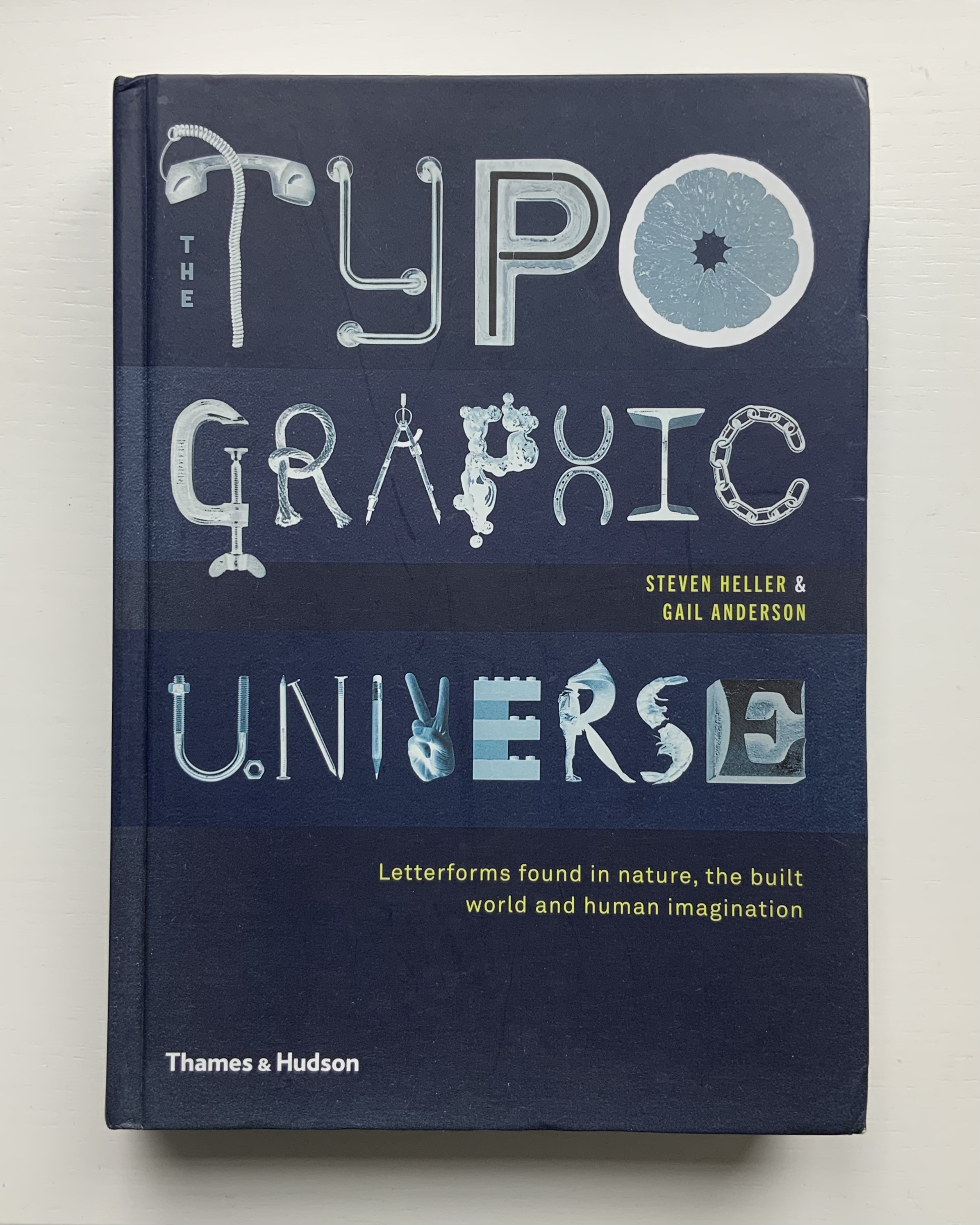
An American Alphabet also finds cousins in the Books On Books Collection. For found letters as objects, there is The Typographic Universe (2014), compiled by Steven Heller and Gail Anderson. For found letters recreated with pastels and watercolor, there is Stephen T. Johnson’s Alphabet City(1995). For color and form (albeit in totally different media), there are Karen Hanmer’s The Spectrum A-Z (2003) and Tara McLeod’s ABC (2015).
Left: The Spectrum A-Z (2003) by Karen Hanmer. Right: ABC (2015) by Tara McLeod. Photos of the works: Books On Books Collection.
The artist and Tandem Press have been kind enough to provide images of the letters A and Z to compare with those in the book, a comparison that underscores the quality of the book and Cottingham’s art.
An American Alphabet: A (2001) Robert Cottingham Lithography, Edition of 40, 32 x 23 inches Image courtesy of Robert Cottingham and Tandem Press
An American Alphabet: Z (2008) Robert Cottingham Lithography, Edition of 40, 30 1/2 x 23 inches Image courtesy of Robert Cottingham and Tandem Press
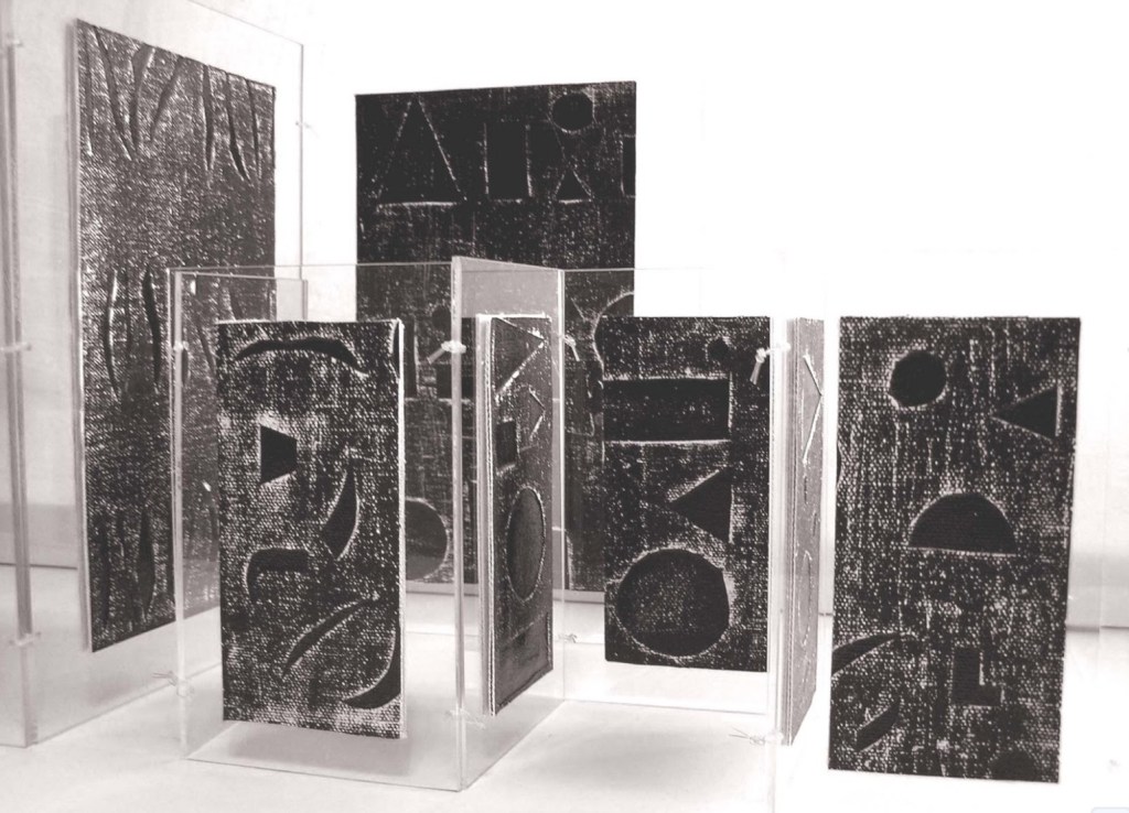
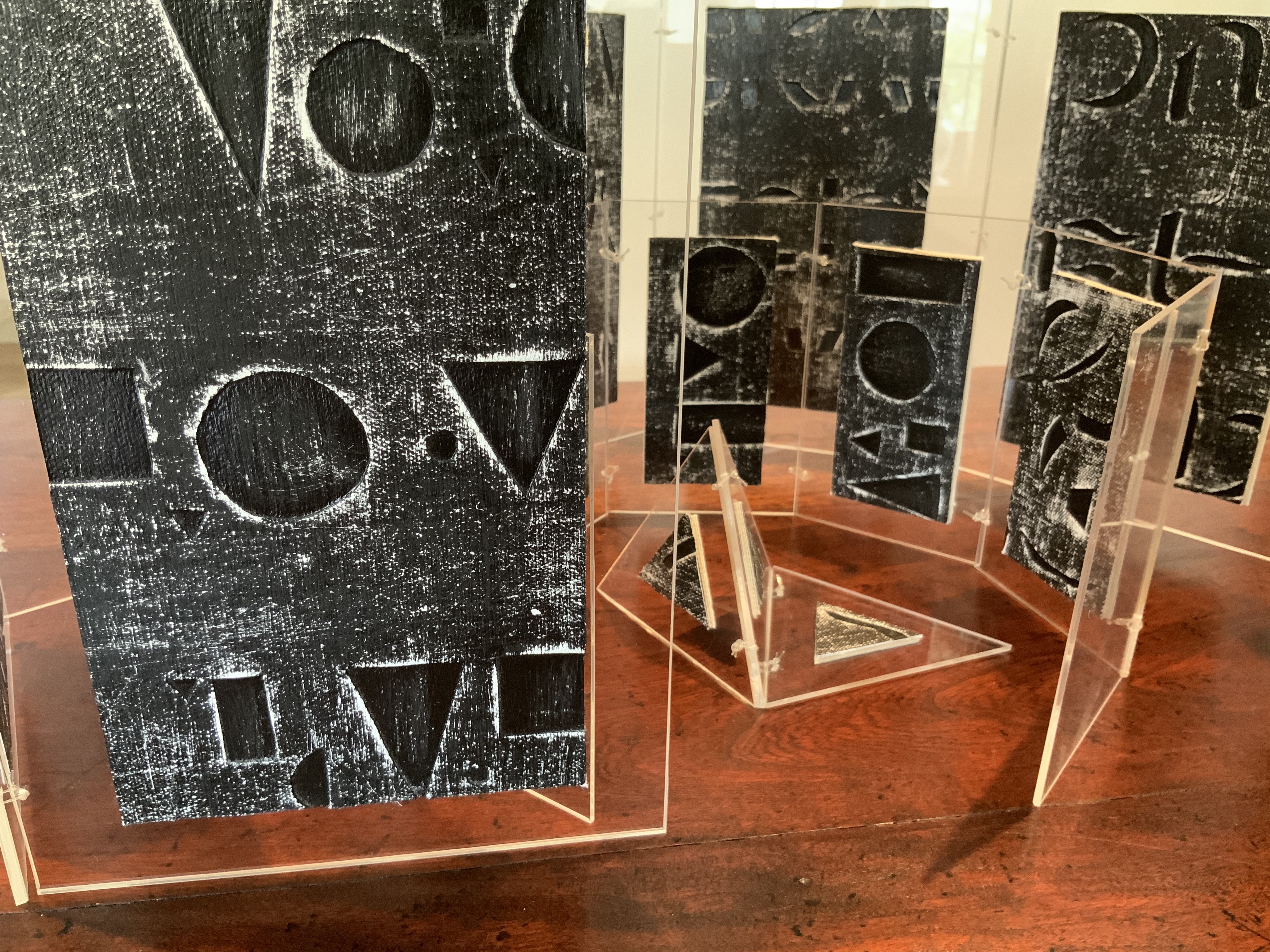
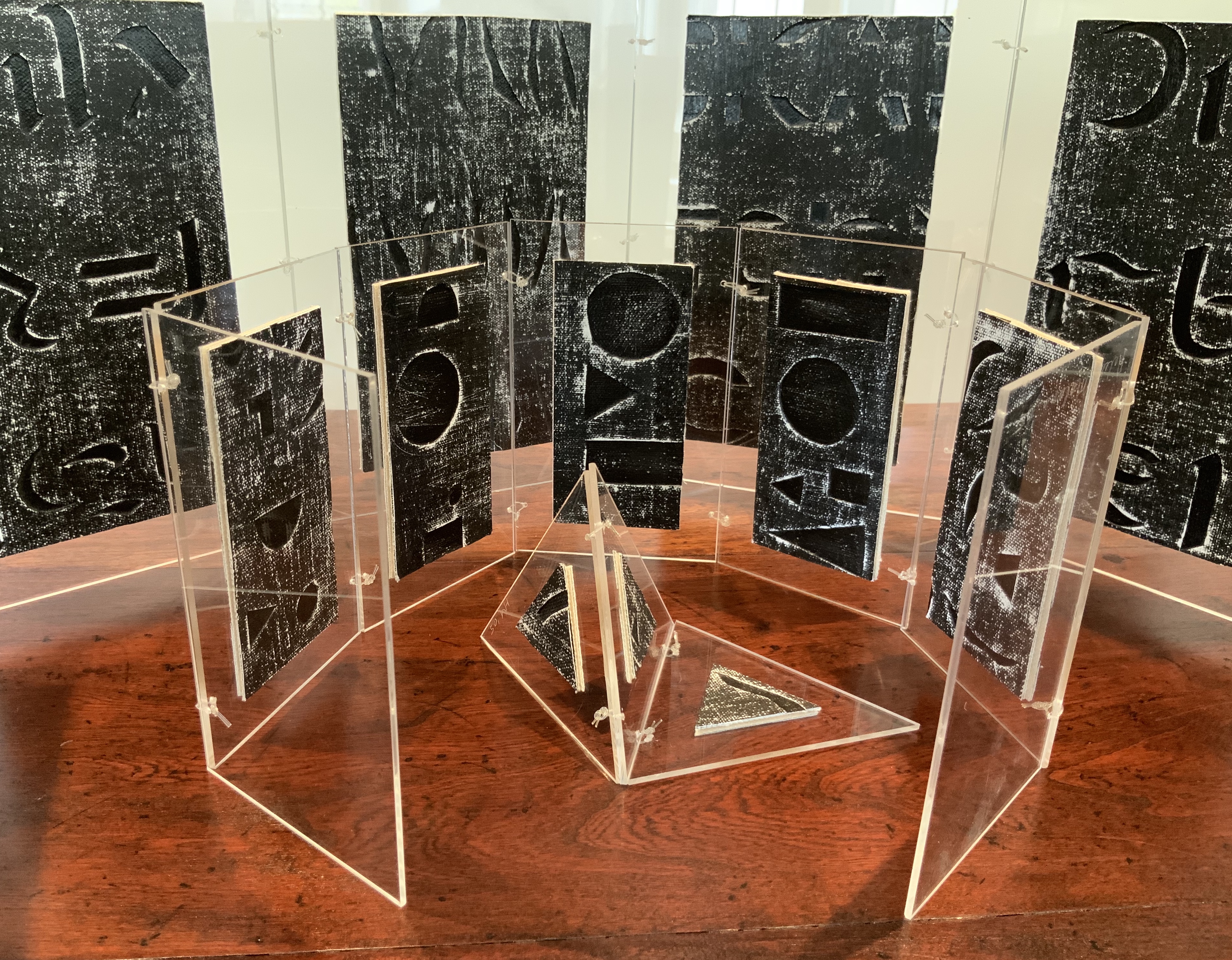
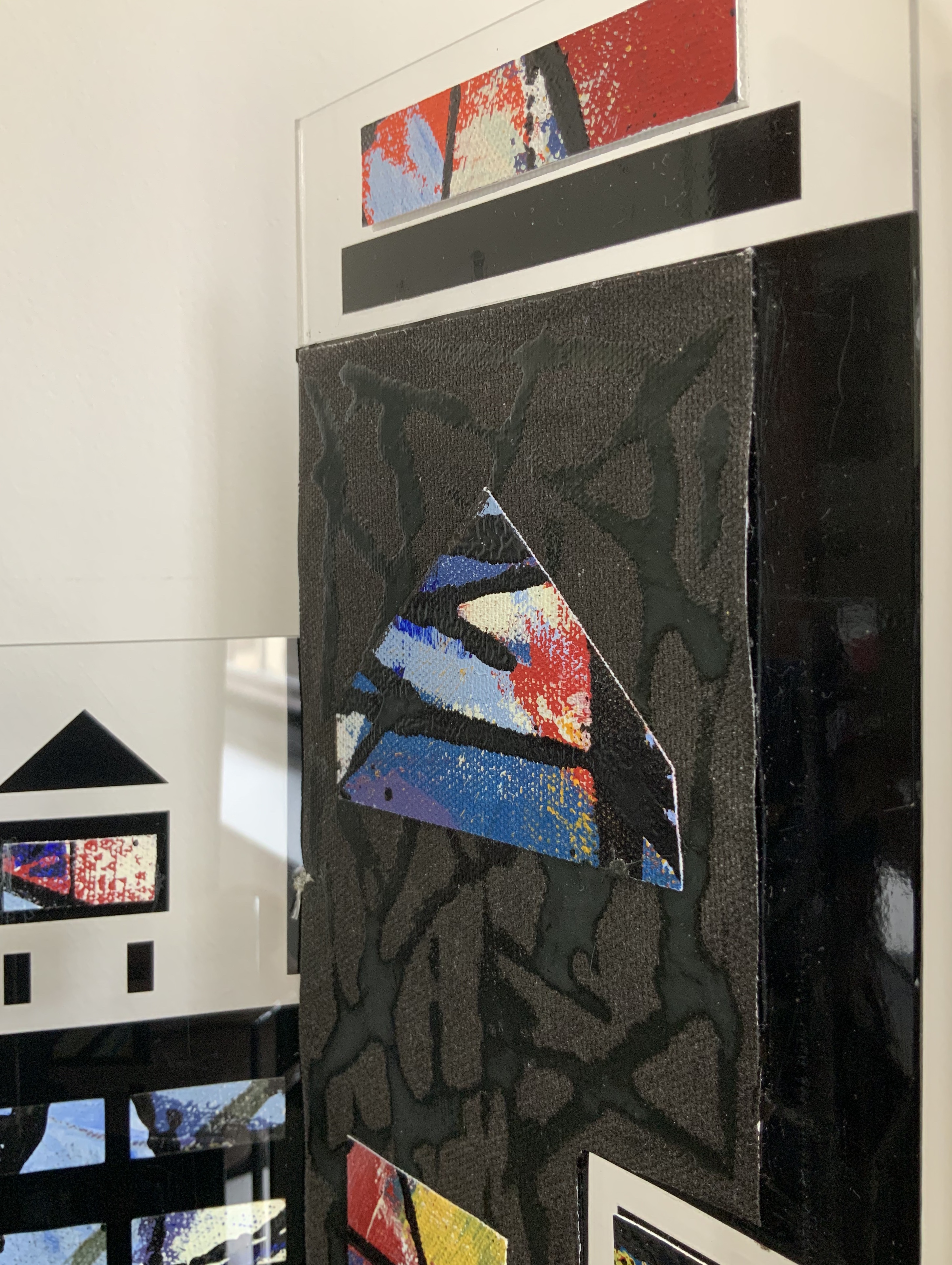
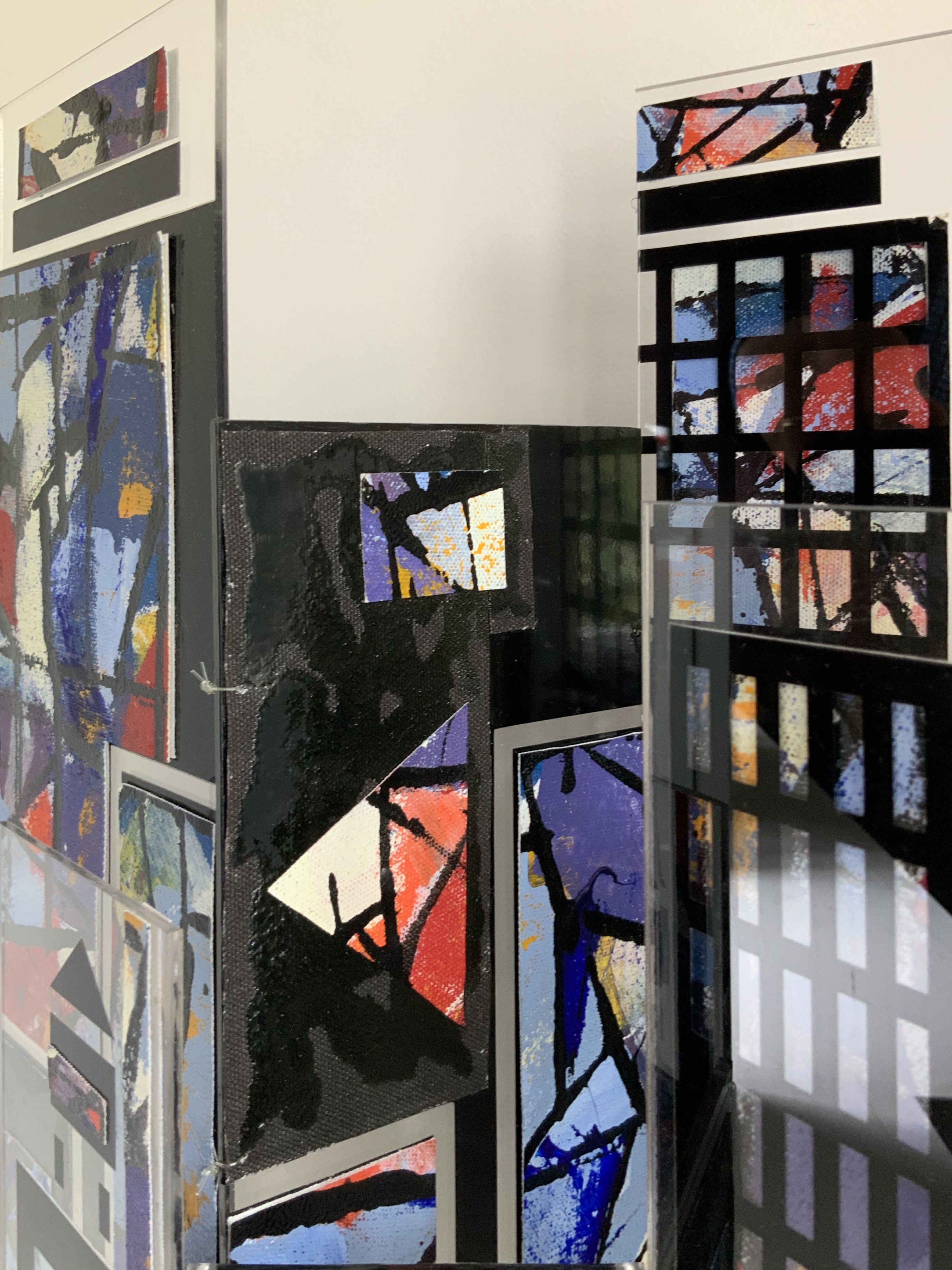
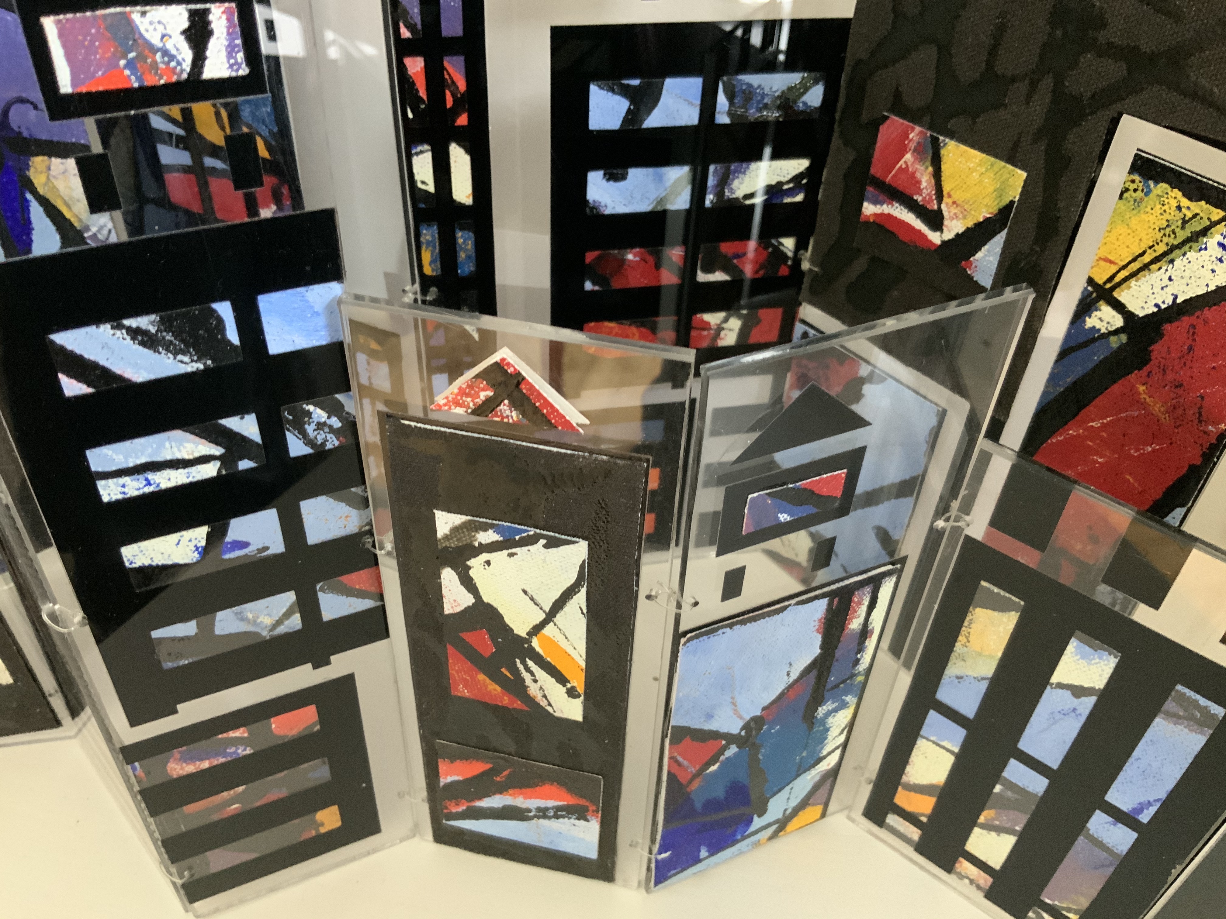
Box containing three books: two concertina books of different sizes and one tetrahedron shape of three pages. Two layered canvases painted with acrylic paint mounted on both sides of Perspex pages in Perspex box. Box: H230 x W160 x D80 mm. Unique edition. Acquired from the artist, 2 July 2020. Photos above: Courtesy of the artist. Photos below: Books On Books Collection.
Artist’s description:
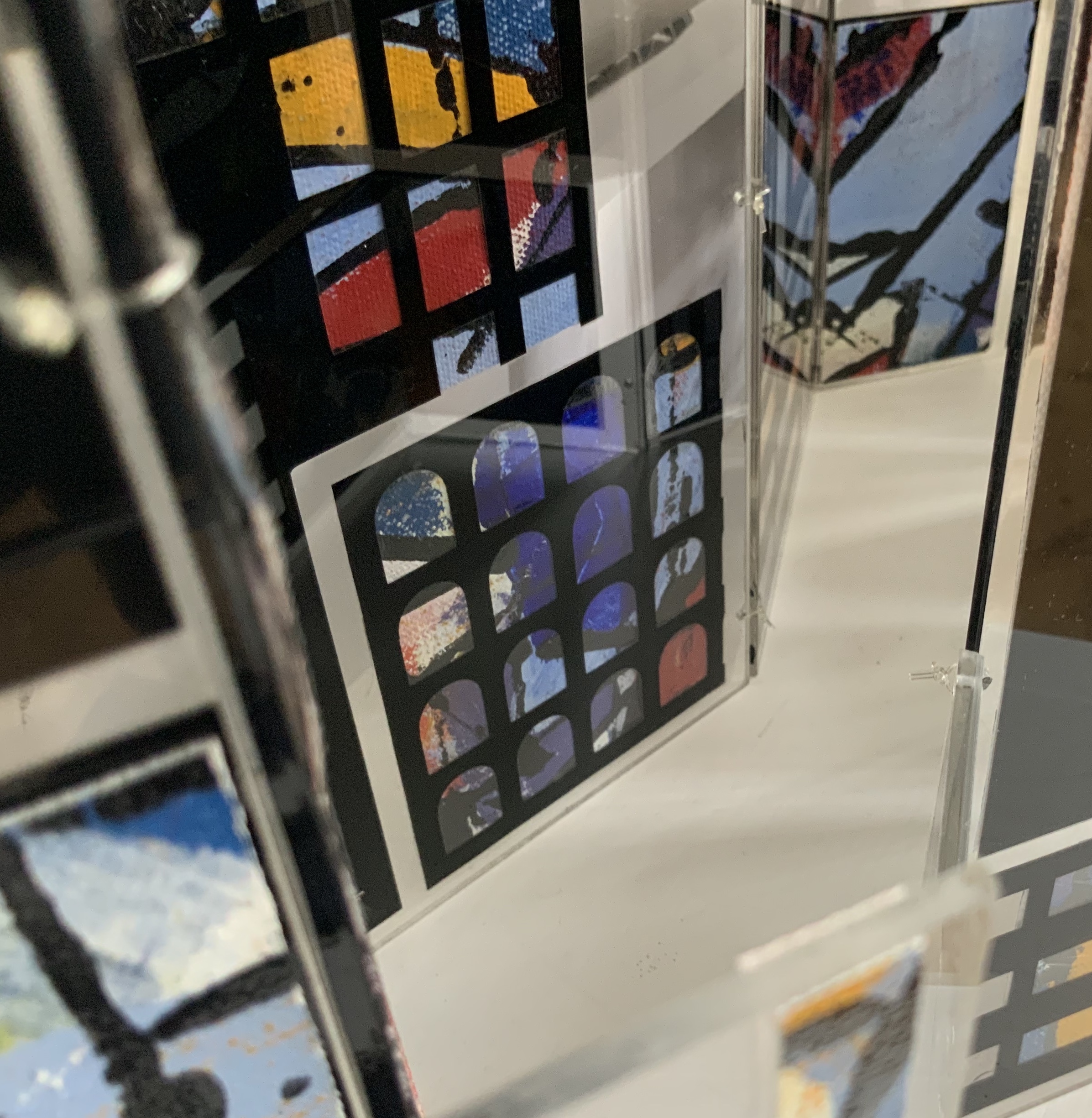
Referencing ancient writing systems, hieroglyphs and engravings, this book is an investigation of sign systems and shared cultural knowledge. Fragmented coded images derived from familiar letterforms lie beneath the surface of the canvas and although visible remain undecipherable and incomprehensible.
The alphabet has traditionally served as calligraphic and typographic seed for book art, perhaps with roots of expression in illuminated letters, the Kabbalah, tomes on penmanship and calligraphy and typography specimen books. In its material and technique, Alphabetic Codes has a rough and smooth tactility; the former pointing to ancient, haptic forms, the latter to current, screen-generated forms. It enriches the subset of alphabet books and abecedaries in the Books On Books Collection.
Exhibitions:
Books 05 Image as Text as Image, Noosa Regional Gallery 9 September – 17 October 2005.
Botanical Books, Coffs Calligraphers, Botanic Garden, Coffs Harbour, 29 September 29 – 7 October 2007.
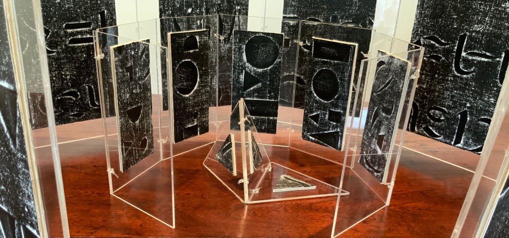
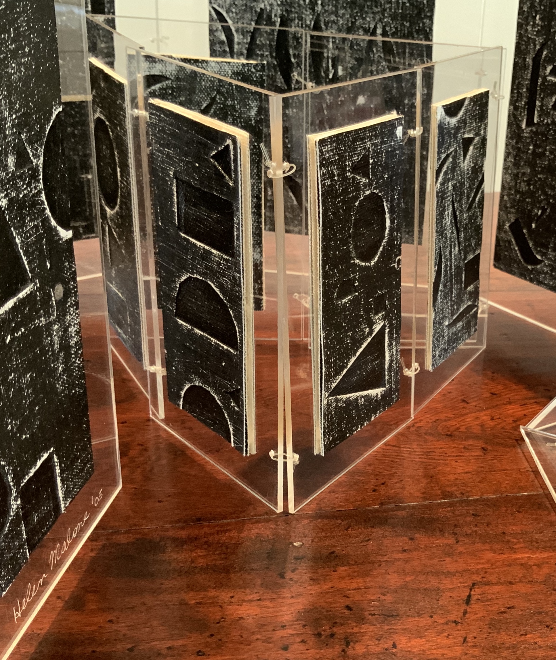
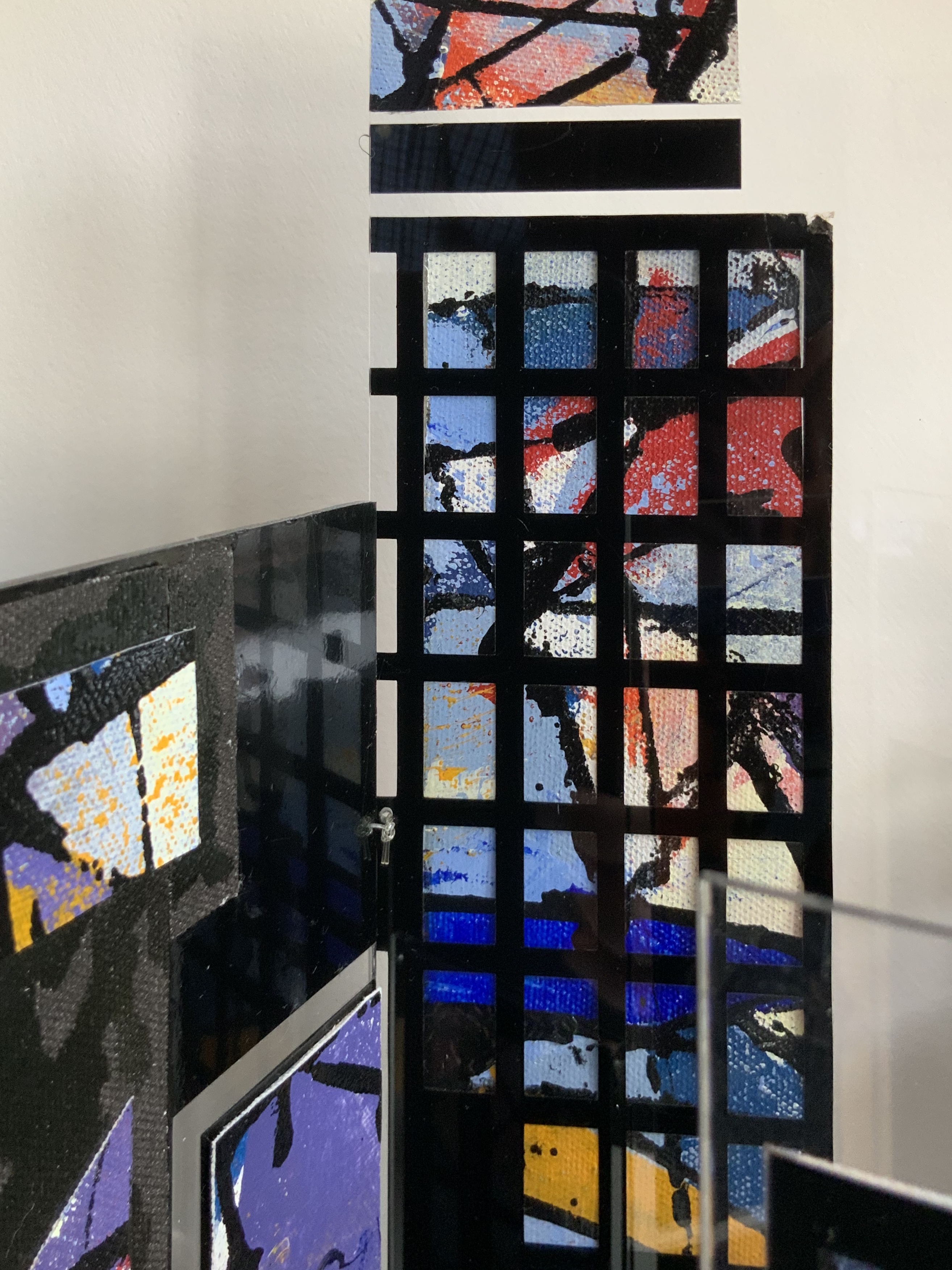
Perspex box containing two concertina books of different sizes made of recycled Perspex panels with mounted canvas painted with acrylics. Box: H360 x W125 x D75 mm. Unique edition. Acquired from the artist, 2 July 2020. Photo: Books On Books Collection.
Photos: Books On Books Collection.
Artist’s description:
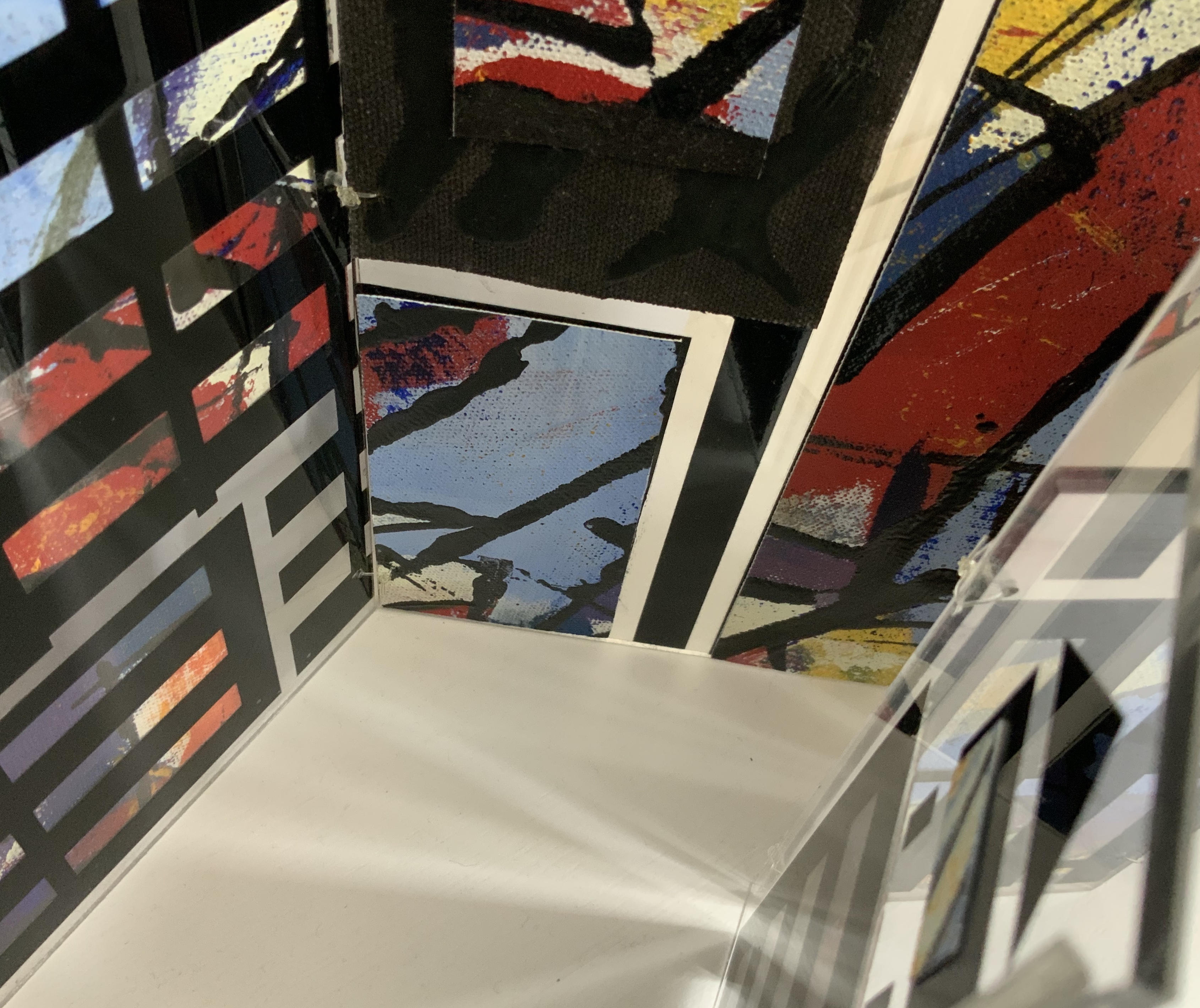
Technological illuminations such as television screens, computer screens, big screens and advertising visually transmit images and act as carriers of global information, education and entertainment. The medieval purpose of stained glass windows, besides aesthetic and mystical was to visually educate and enlighten.
Purely in color, Windows on the World recalls Albers, Chagall, Mondrian (even though he hated stained glass) or Joep Nicolas. In material, technique and theme, it may echo Alphabetic Codes and its allusion to computer-screen-based windows, but Windows has a more architectural feel that can also be found in the I.M. Pei and Mies van der Rohe “volumes” of Ten Books on Architecture (2017) further enriching the architectural subset of the Books On Books Collection.
Exhibition:
Books 05, Image as text as Image, Noosa Regional Gallery, 9 September – 17 October 2005.
Beautiful One Day, Blown Away the Next (2011)
Beautiful One Day, Blown Away the Next (2011)
Helen Malone
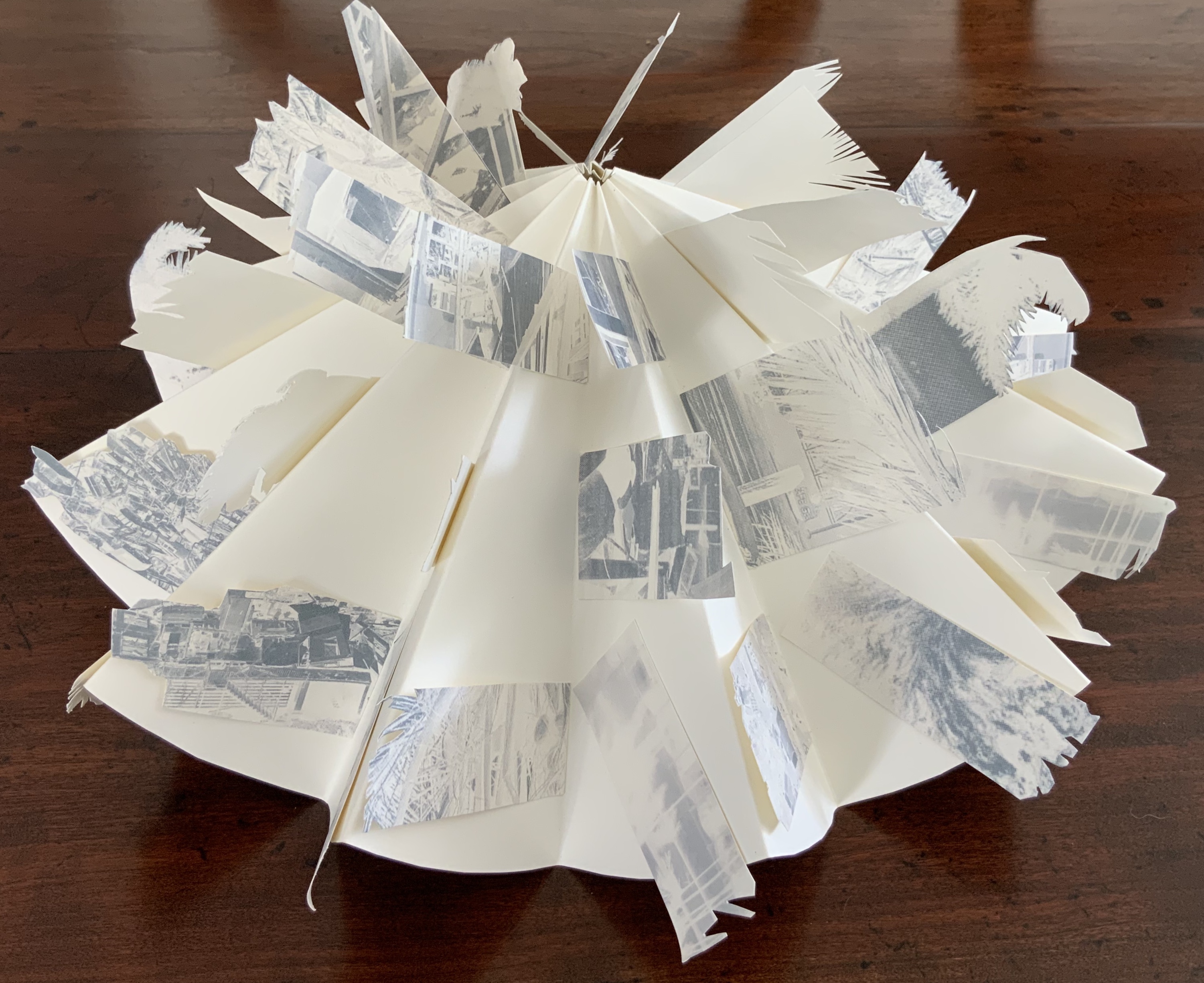
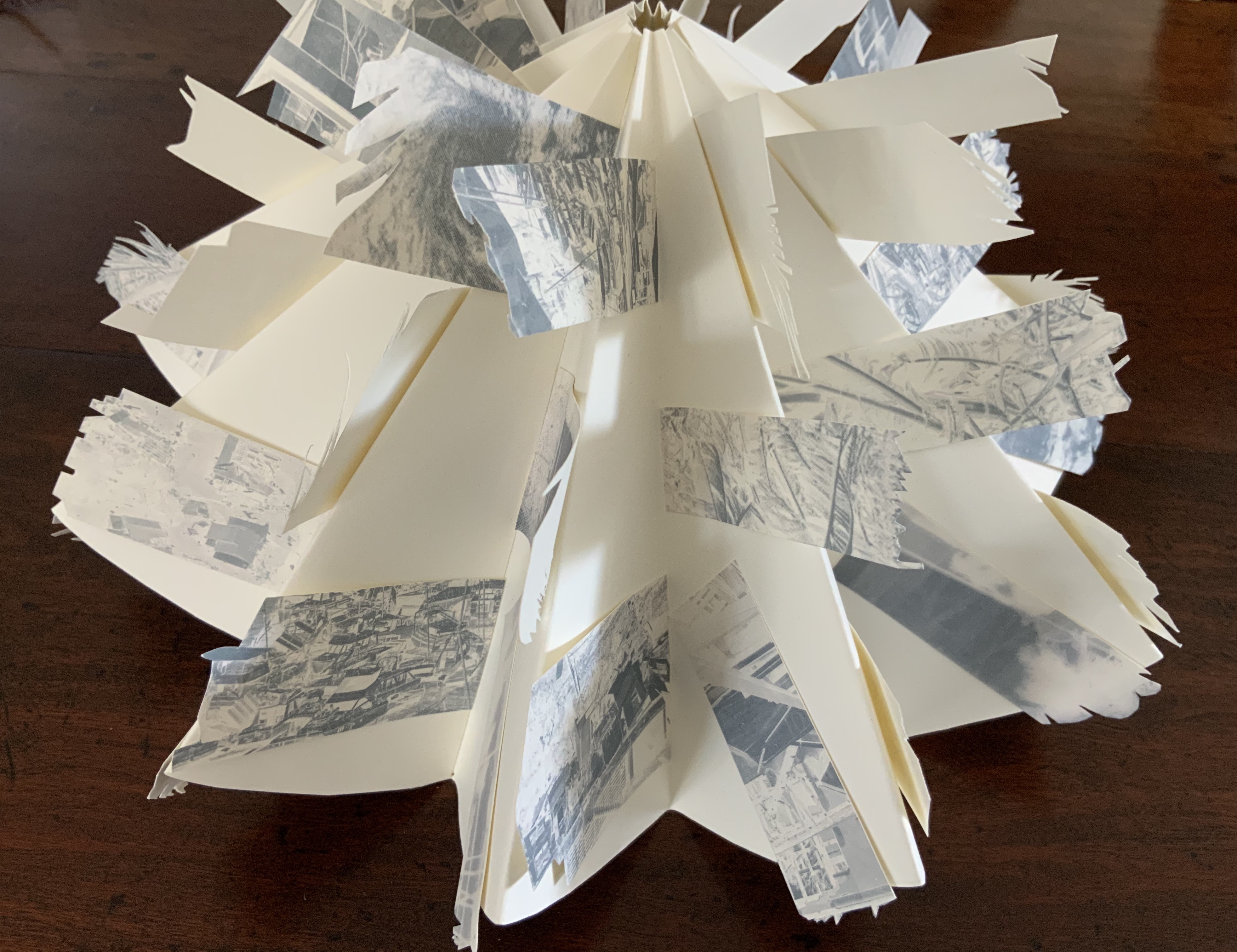
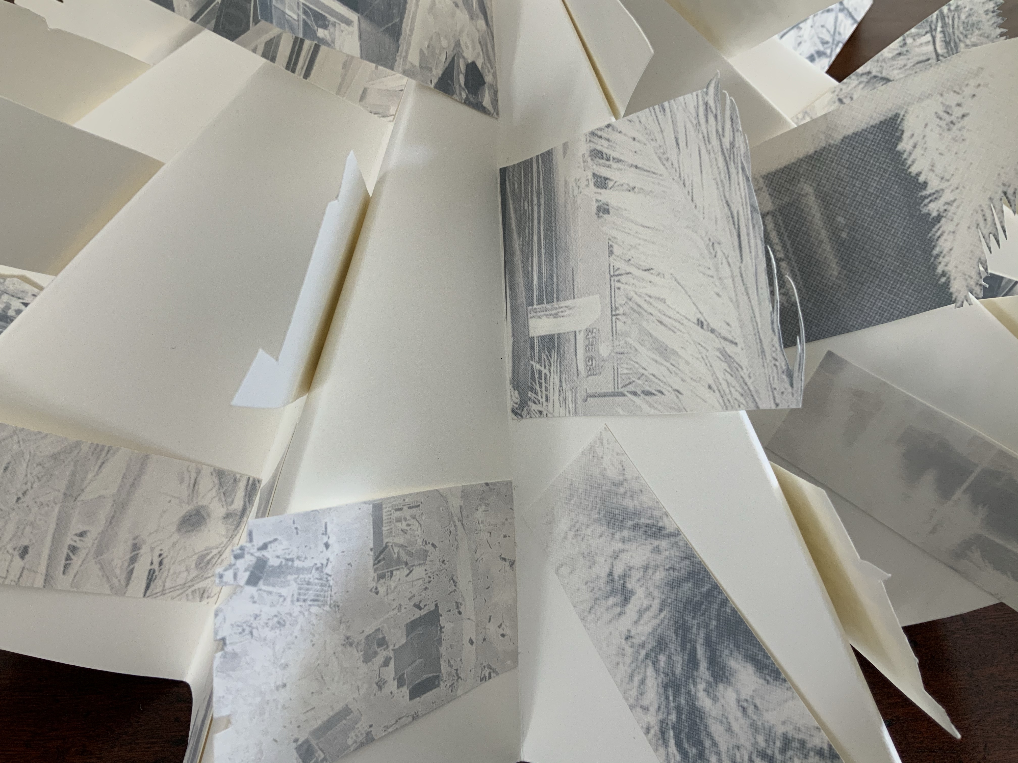
Box containing circular concertina flag book of Fabriano paper, manipulated digital photographs cut and transferred to flags. H90 x W190 x D55 mm closed, 380 mm diameter open. Unique edition. Acquired from the artist, 2 July 2020. Photo: Books On Books Collection.
Artist’s description:
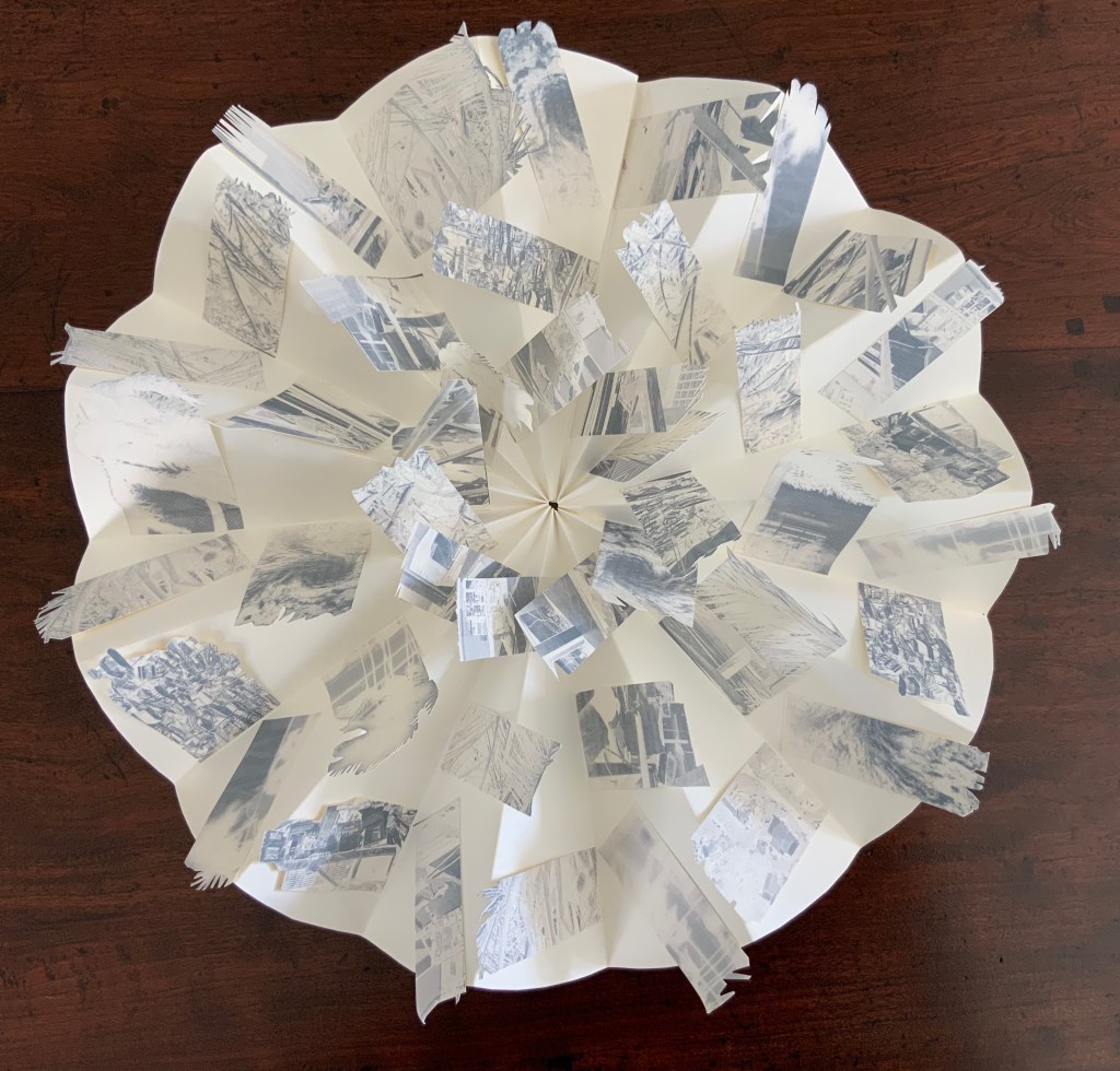
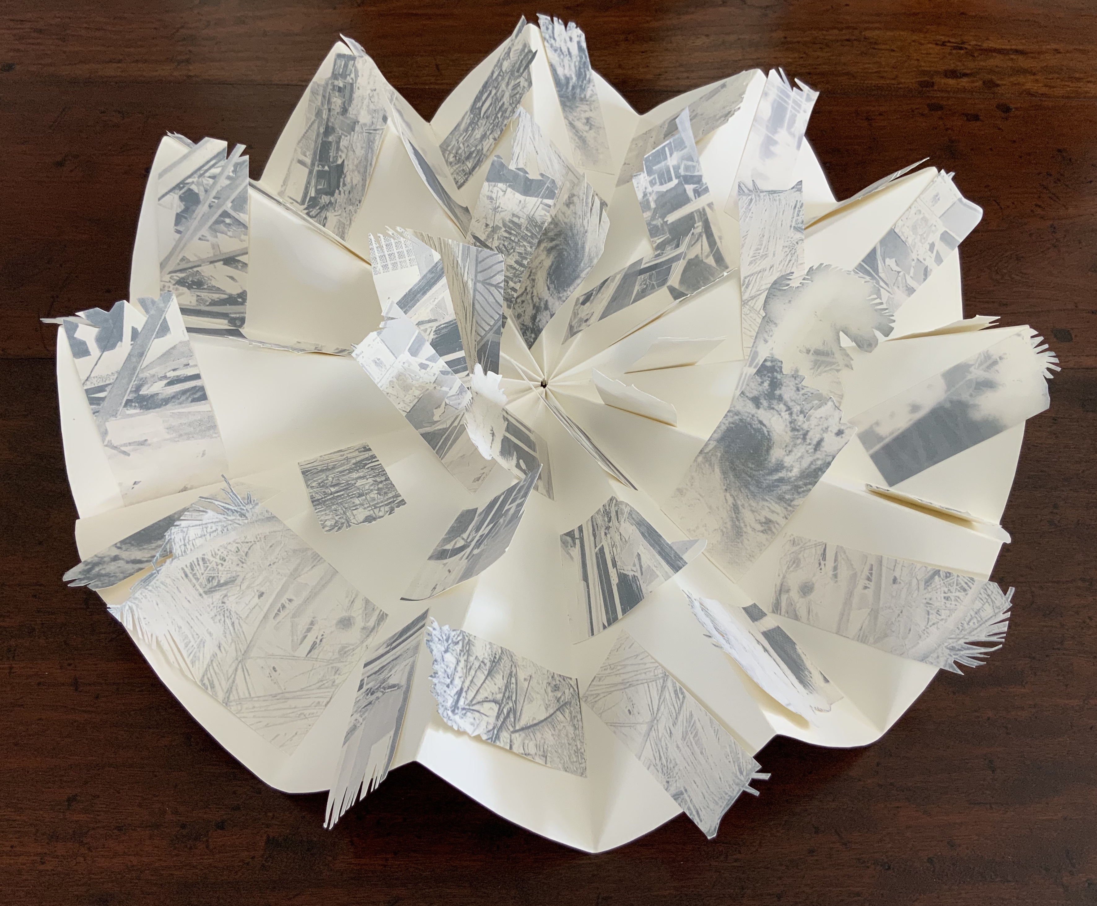
On the eve of 2 February 2011 Cyclone Yasi made landfall on the coast of Queensland. Sweeping through the coastal communities, the Category 5 Tropical Storm of historic proportions left a trail of mayhem and destruction that inspired the artist Malone to create this piece.
Photos: Books On Books Collection.
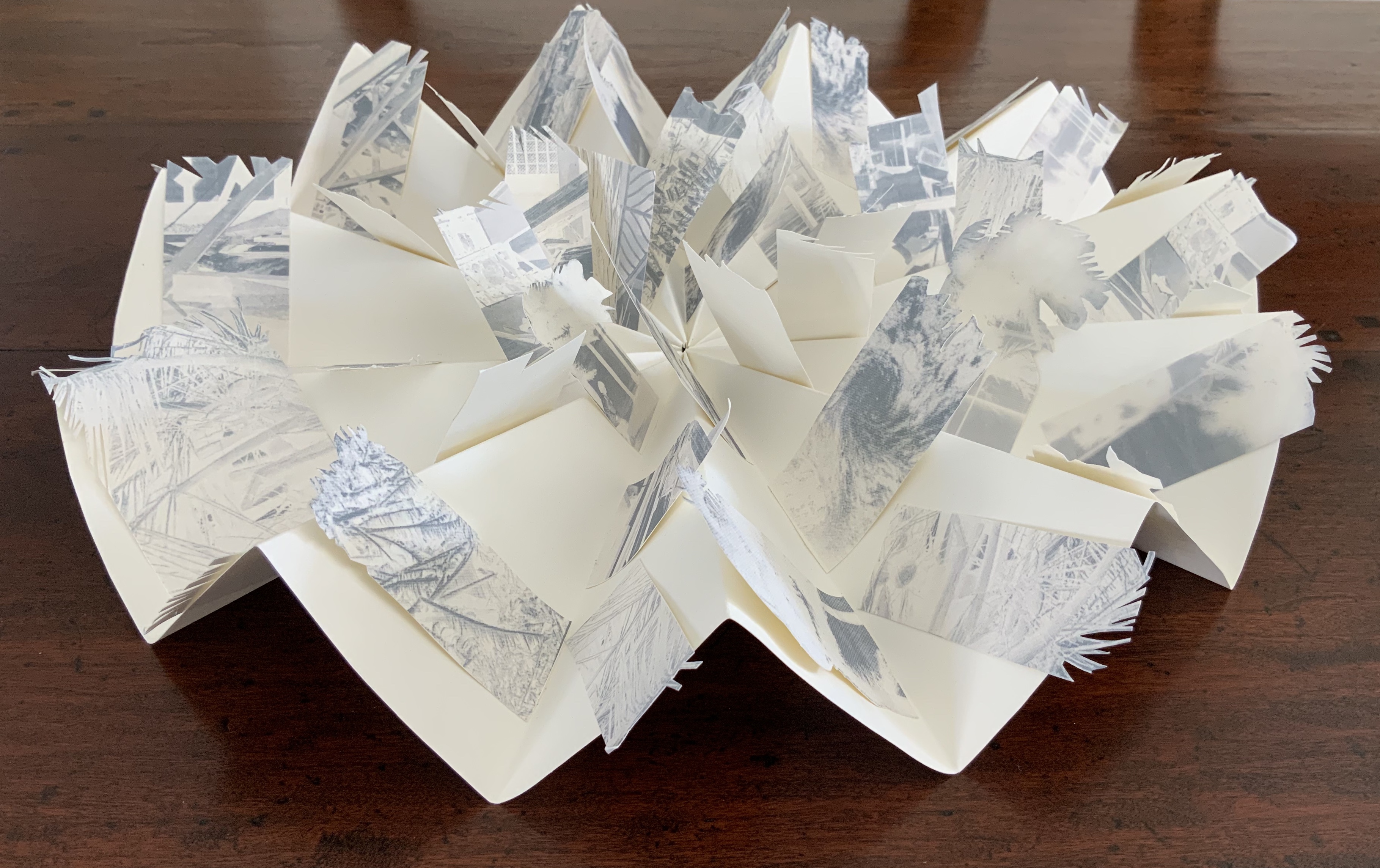
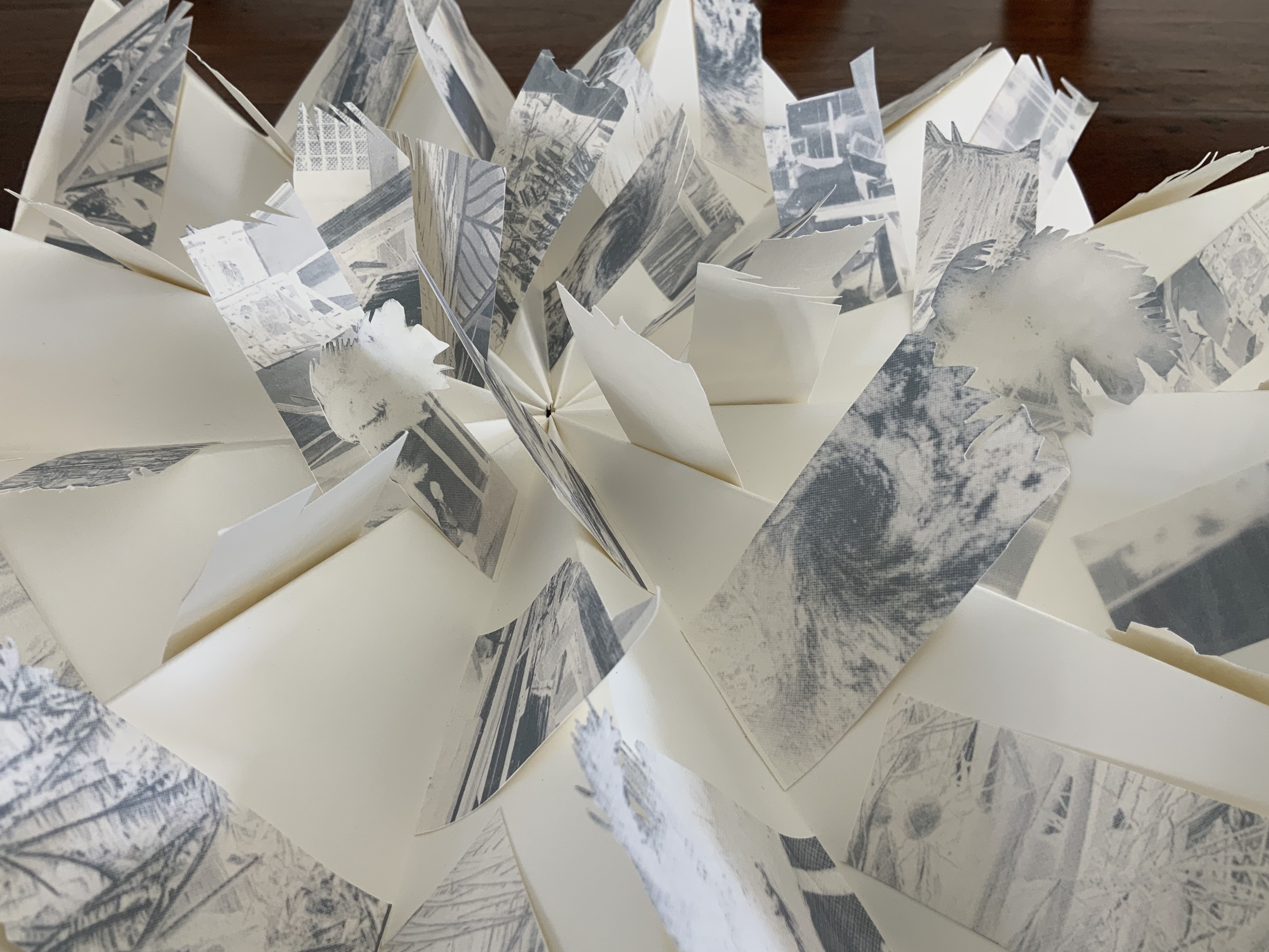
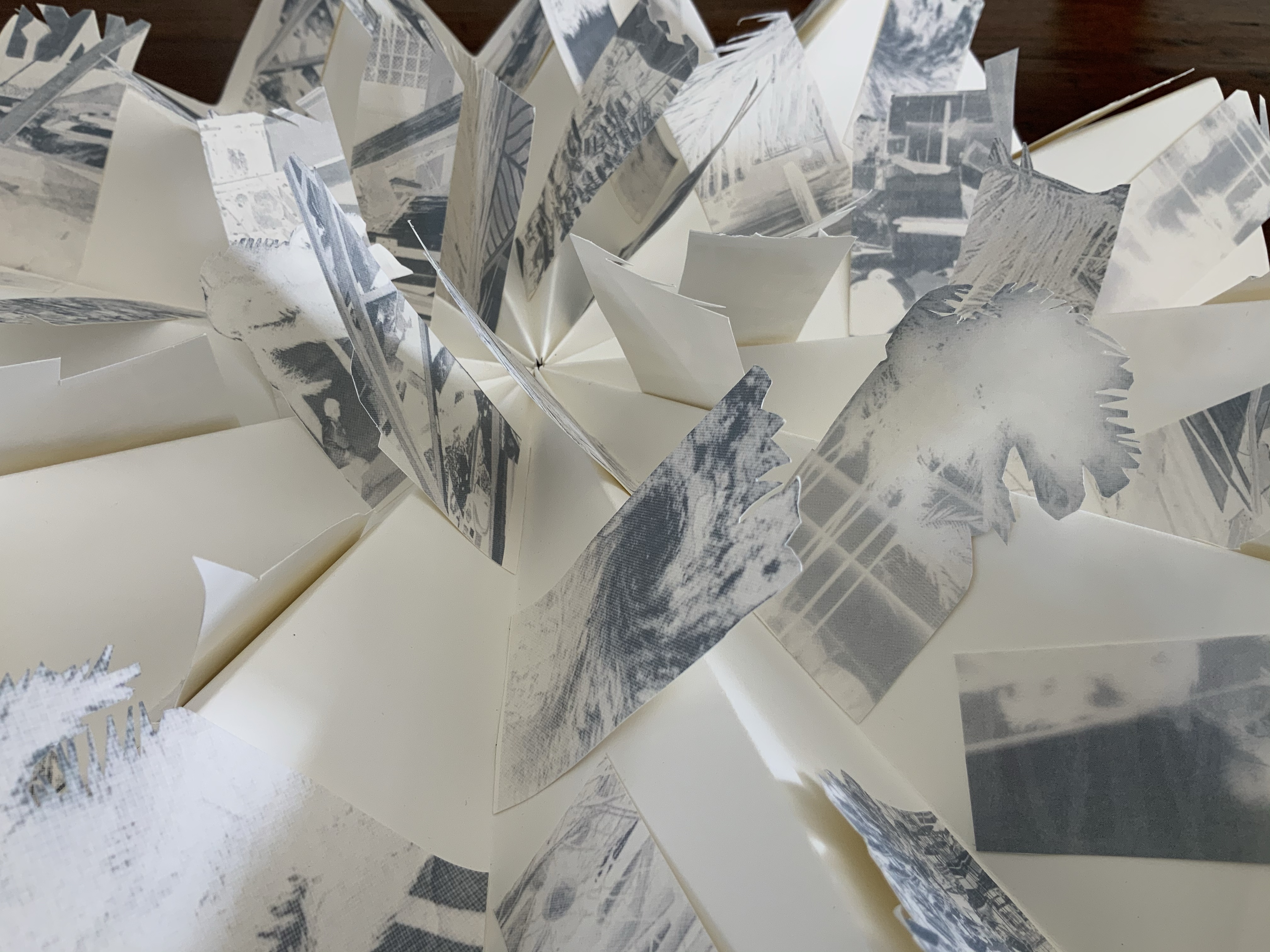
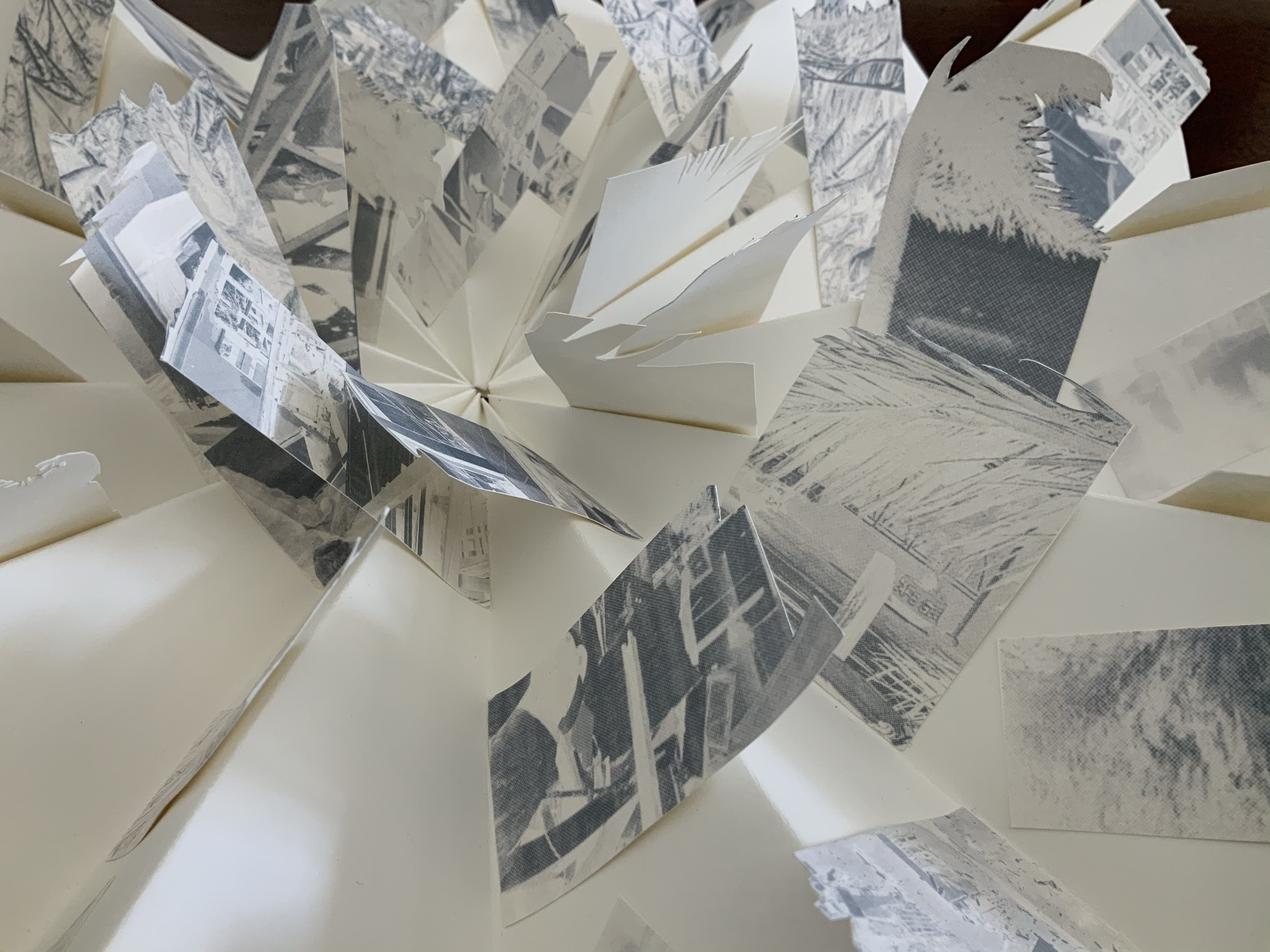
Bringing together a flag book, concertina and tab-and-lot closure, Malone engineers an ideal structure to evoke the meterological pattern and order of the cyclone. The shattered, blue-filtered photographic images transferred to the flags contribute a kaleidoscopic chaos. The theme of the environment and the struggle between the human race and natural forces is a subset of the Books On Books Collection well represented by this work, Tsunami (below) and others such as Holuhraun by Chris Ruston and Landscapes of the Late Anthropocene by Philip Zimmerman.
Exhibition:
Books…beyond words evolution, East Gippsland Art Gallery, Bairnsdale,Vic., 6 August – 3 September 2011.
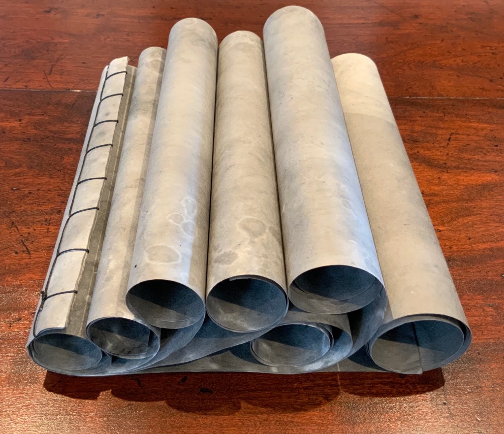
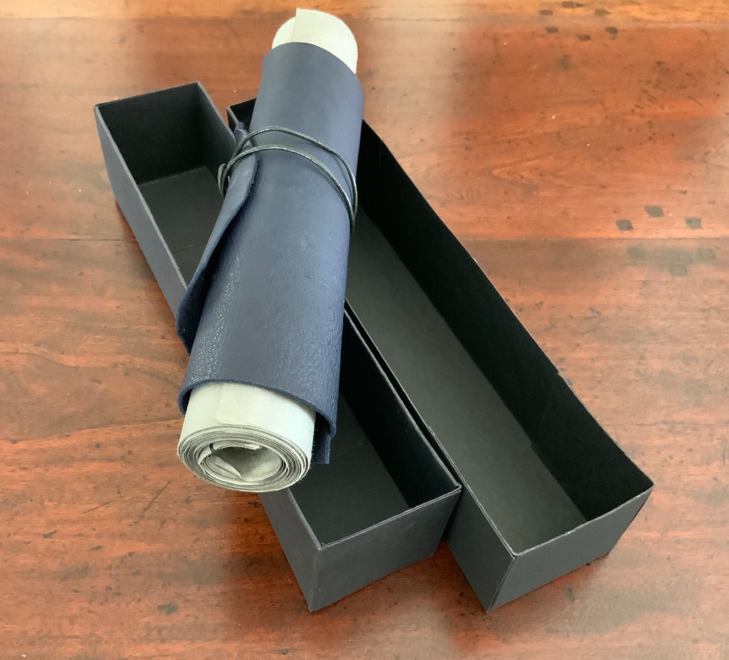
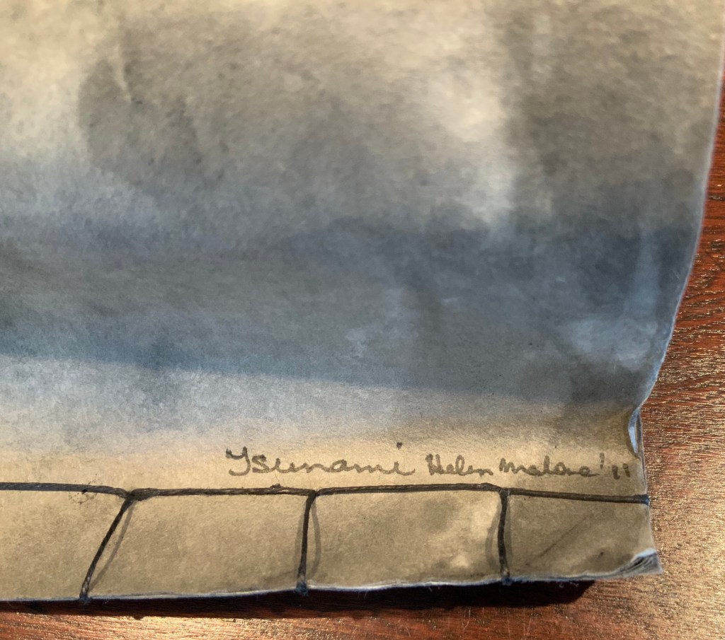
Tsunami (2011)
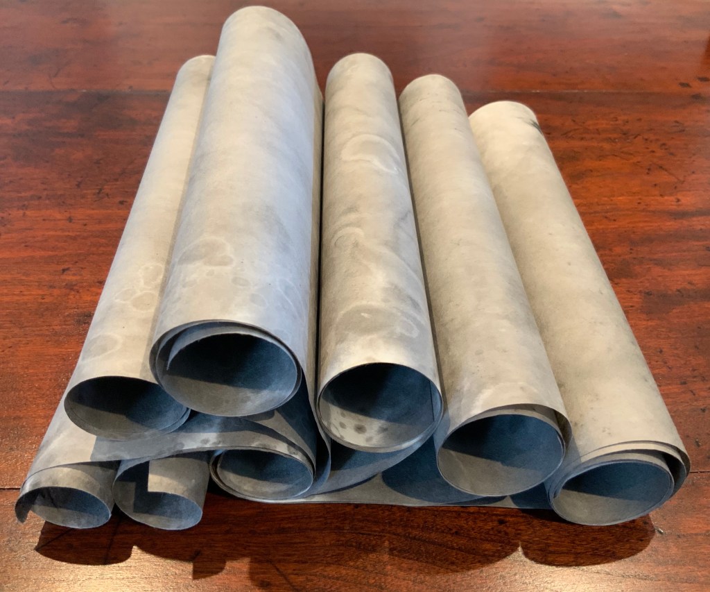
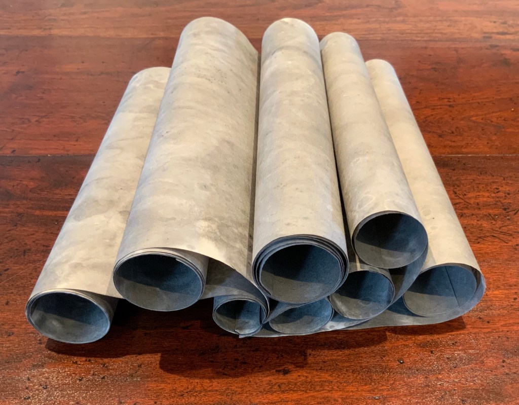
Tsunami (2011) Helen Malone Box containing “whirlwind” book of Japanese paper washed with sumi ink and water, Japanese stab binding, leather roll. H230 mm, variable width. Unique edition. Acquired from the artist, 2 July 2020. Photo: Books On Books Collection.
Photos: Books On Books Collection.
Artist’s description:
Part of the series of disasters explored by Malone through her art, this piece is her interpretation of the catastrophic tsunami that followed the massive earthquake that struck Japan in 2011.
The earthquake and tsunami were so powerful that their effects were felt around the globe: from Antarctica’s ice sheet to the fjords of Norway. Indeed the debris from the monstrous wave continues to wash up on North American shores nearly a decade later.
The combination of Japanese paper and mottled color of sumi ink and water, the way the work “fights back” as the scrolls are manipulated to display the work, the multiple displays generated by the piling wave-like scrolls — all evoke the picture of inescapable, roiling force of the 2011 tsunami.
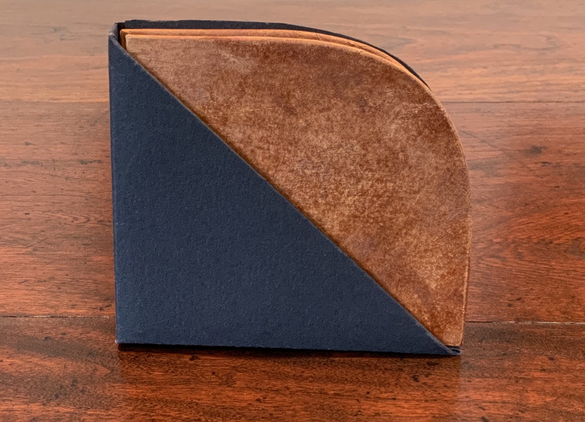
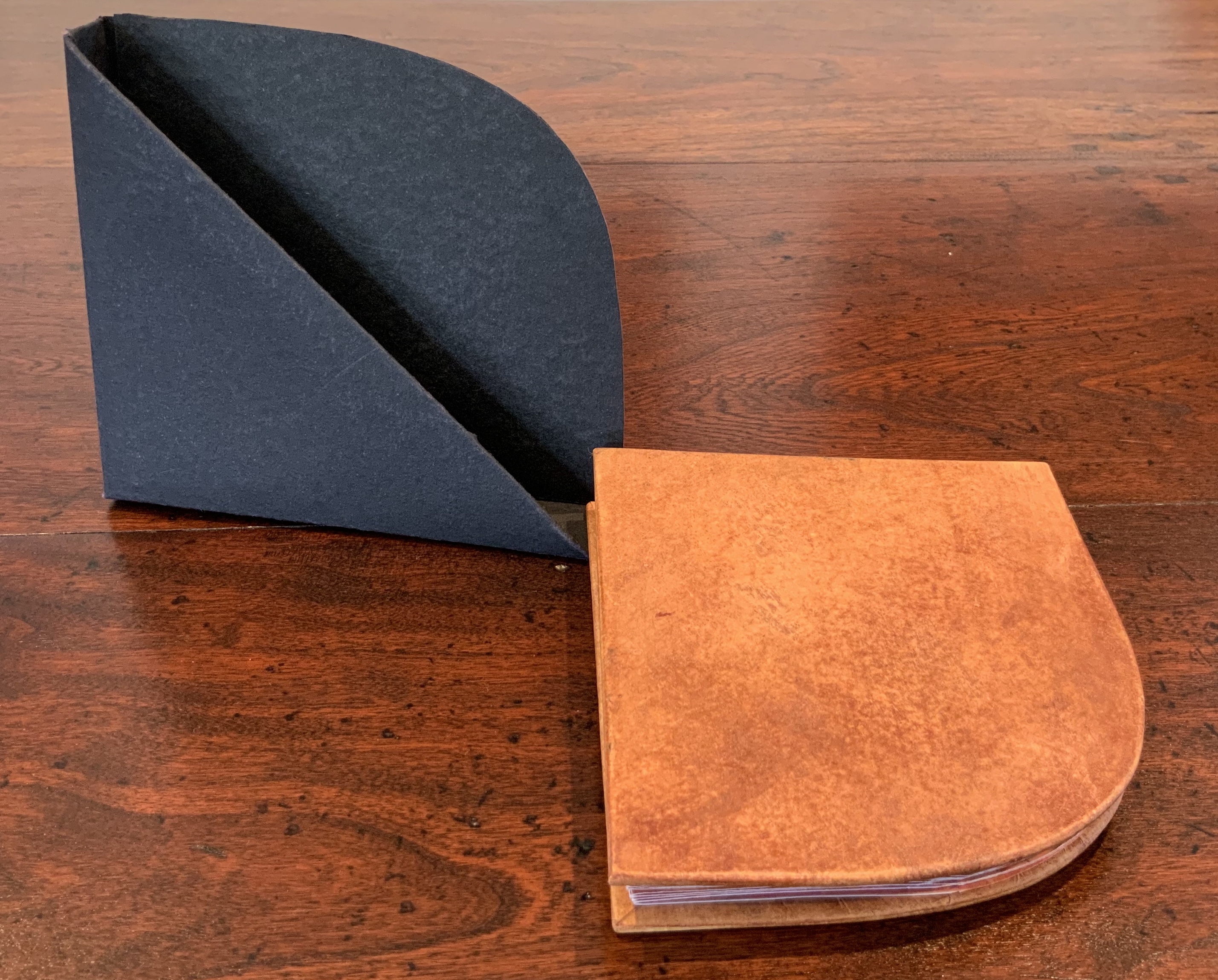
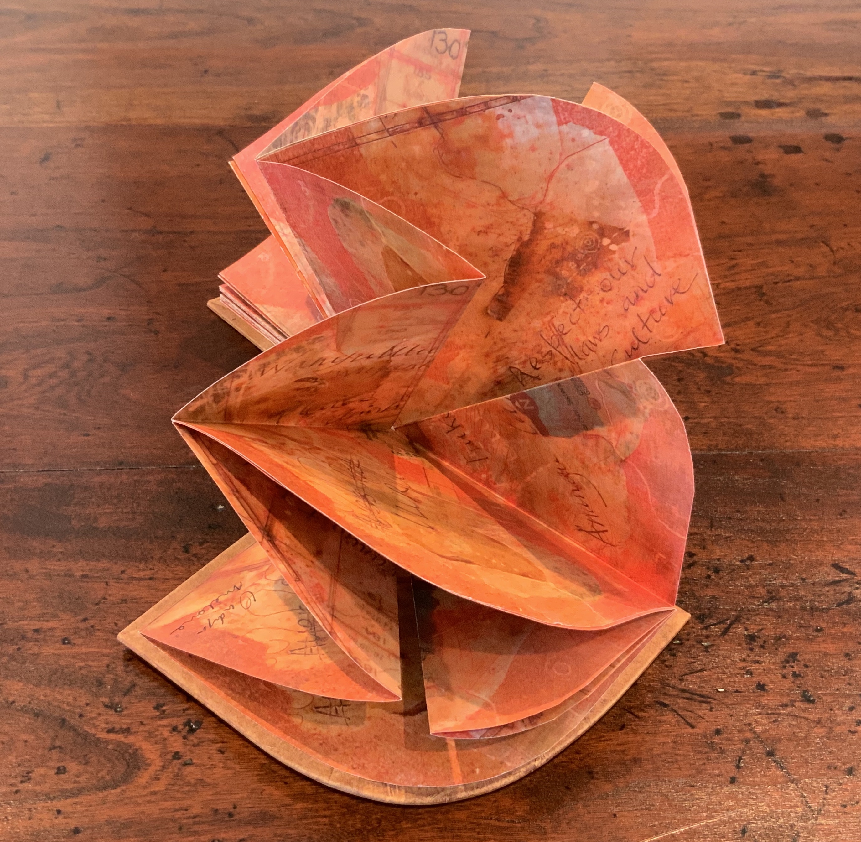
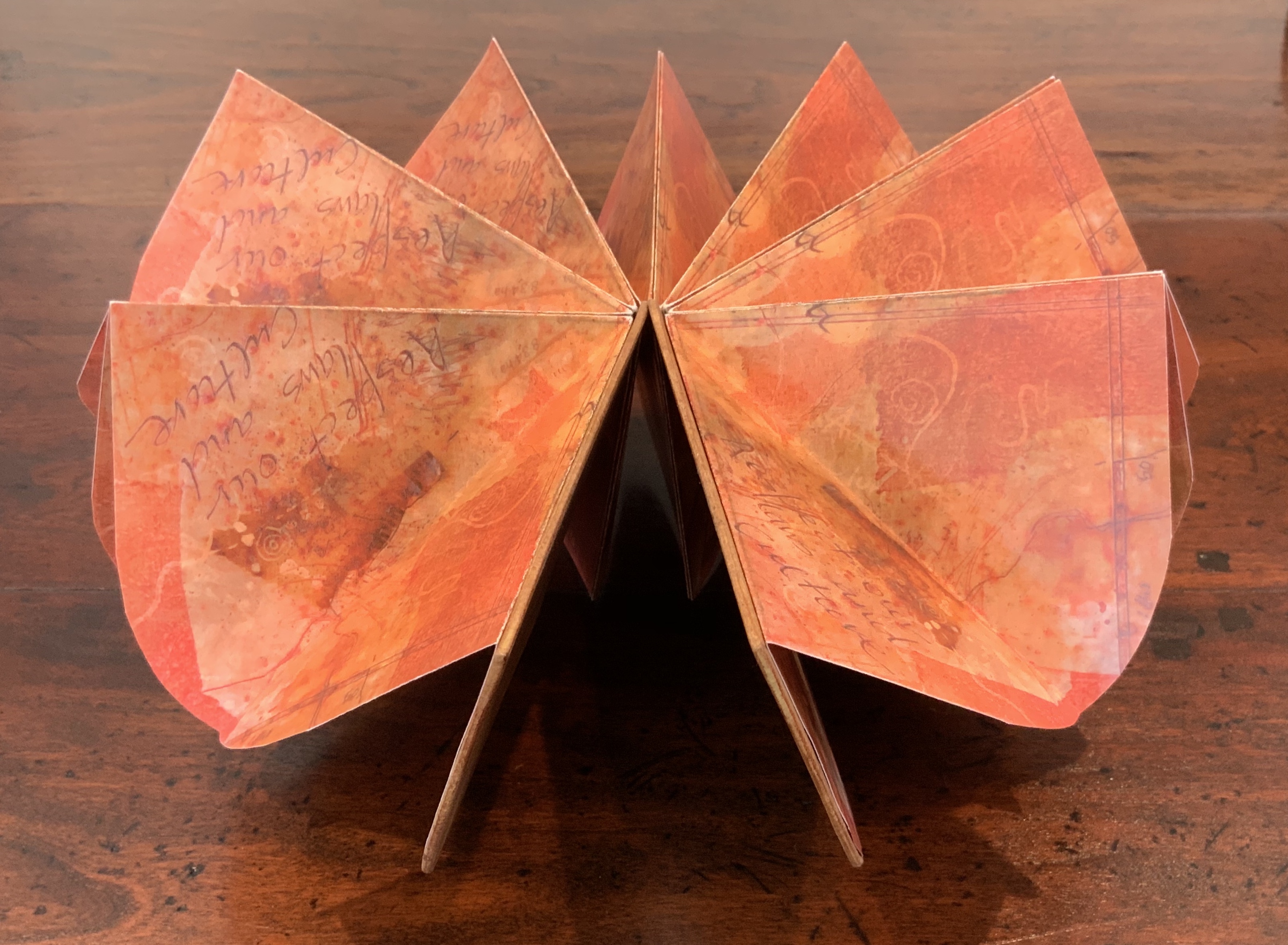
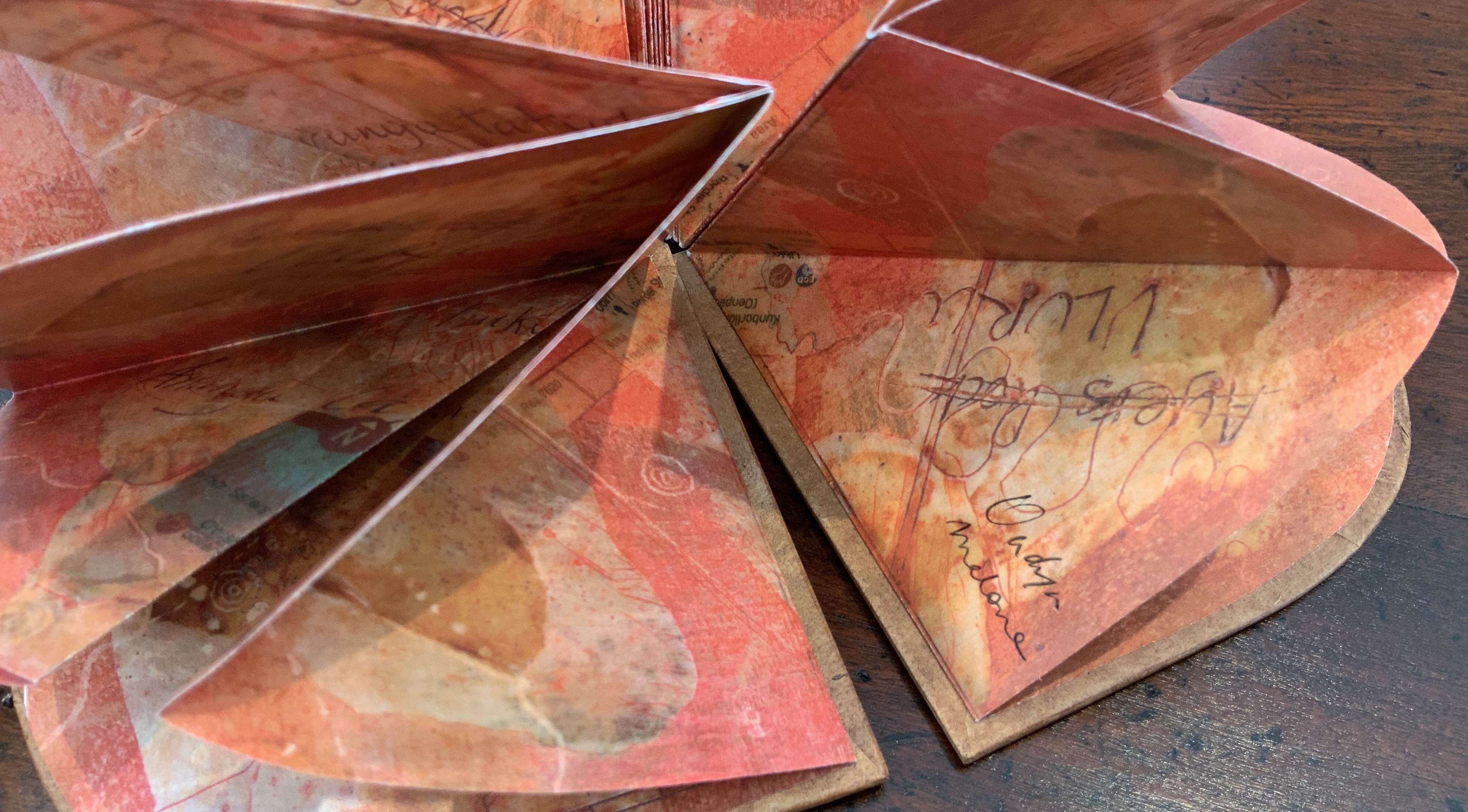
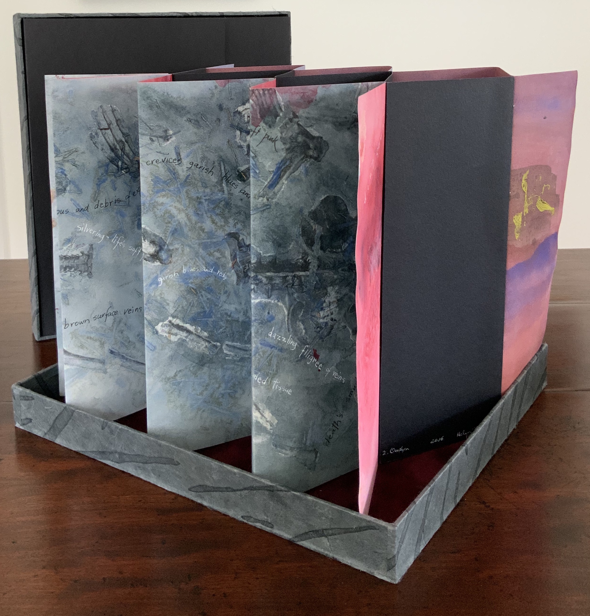
Laser printed images of waxed drawing, collage, painting and Chinese paper covered boards painted by Jack Oudyn with earth pigments, acrylic and xanthorrhoea resin. Sculptural folded page book structure and box by Helen Malone. H105 x W95 x D15 mm. Editions: 6 and 1 A/P. Acquired from Helen Malone, 2 July 2020. Photos: Books On Books Collection.
Photos: Books On Books Collection.
Artist’s description:
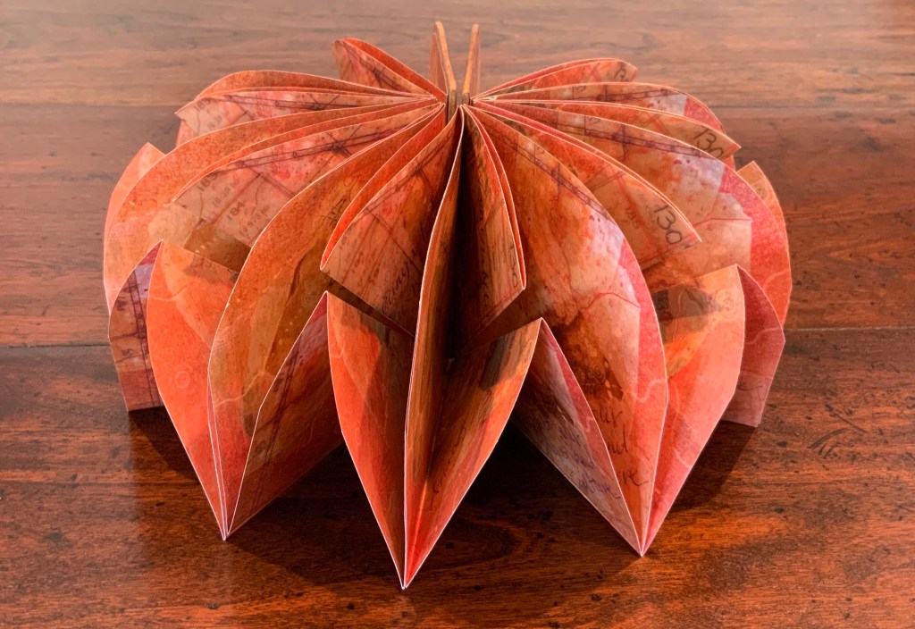
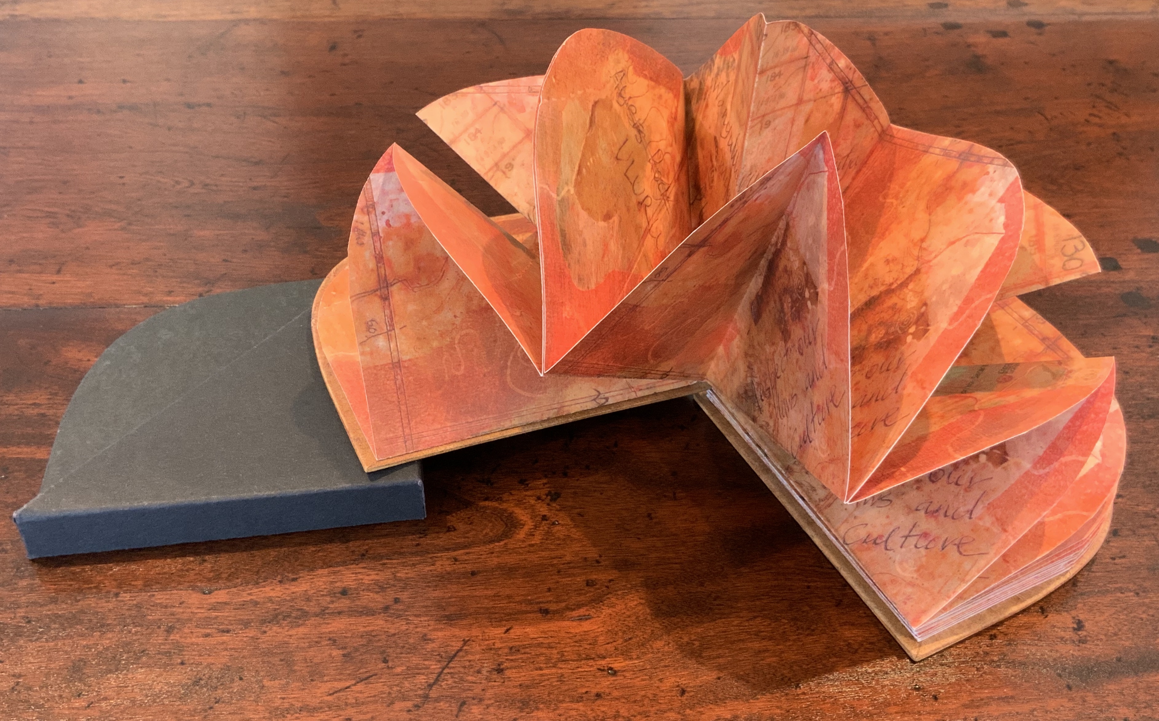
Malone and Jack Oudyn collaborated to create this representation of Uluru to resonate with the pleas of the indigenous Anangu people of the Northern Territory in Australia to “Wanyu Ulurunya Tatintja Wiyangku Wantima” (Respect our laws and culture).
For the Anangu the massive sandstone monolith is so sacred that they will not climb it nor photograph it. They ask visitors to respect the spirituality of the site and to follow their customs.
The blend of laser prints of wax drawings, Chinese paper, collage and painting seeks to capture the changing light of the rock as the sun passes over it throughout the day. The boards painted by Oudyn with earth pigments, acrylic and xanthorrhoea resin contribute a glowing depth of color to this homage to the Anangu. As with The Future of an Illusion (below), this collaboration presents an unusual unity of vision and integration of technique, materials and process with structural “rightness” for the subject at hand.
Exhibitions:
Art on Show Awards, Artspace Mackay Artist Book Award, Mackay Show Association, Mackay Qld, 16-19 June 2014.
Sheffield International Artists Book Prize, Bank Street Arts, Sheffield UK, 7-31 October 2015.
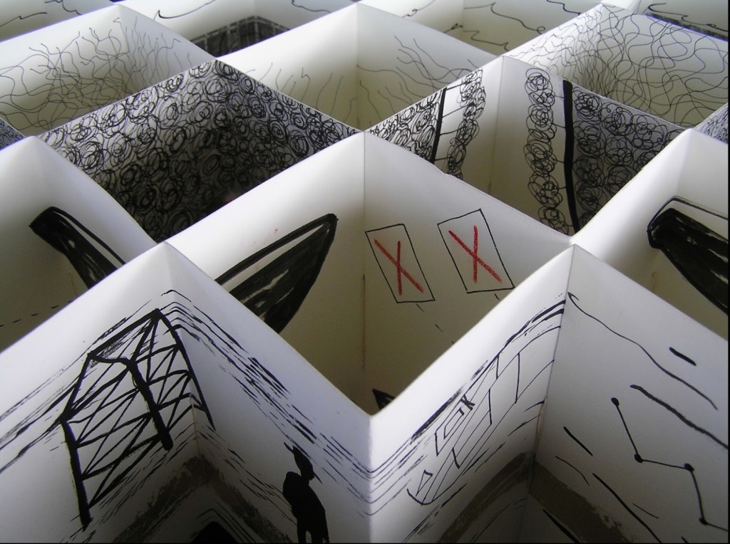
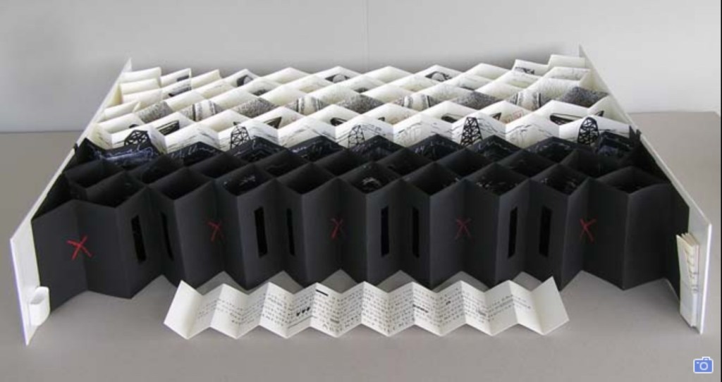
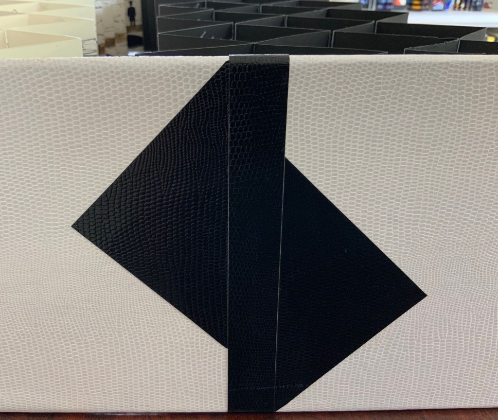
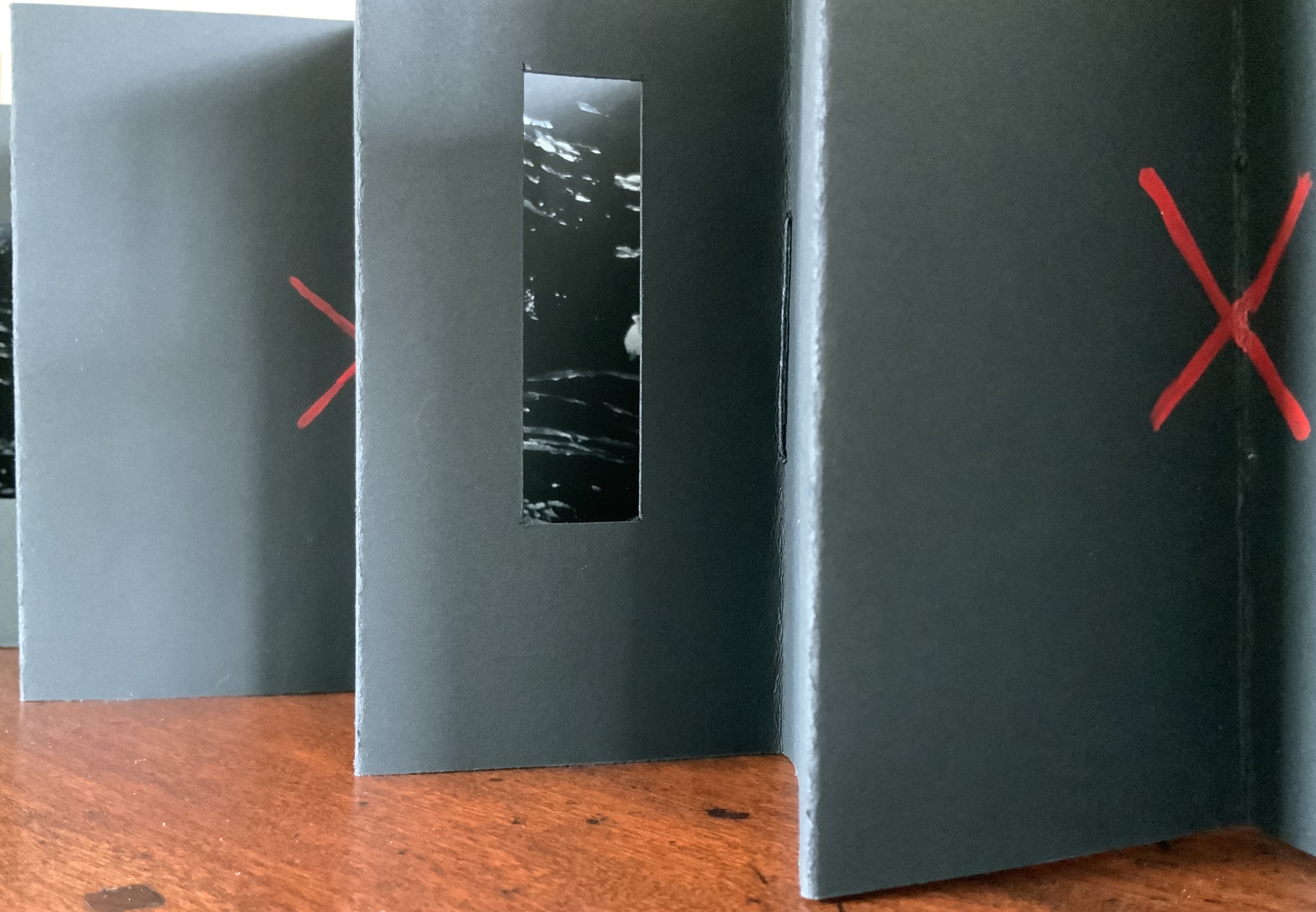
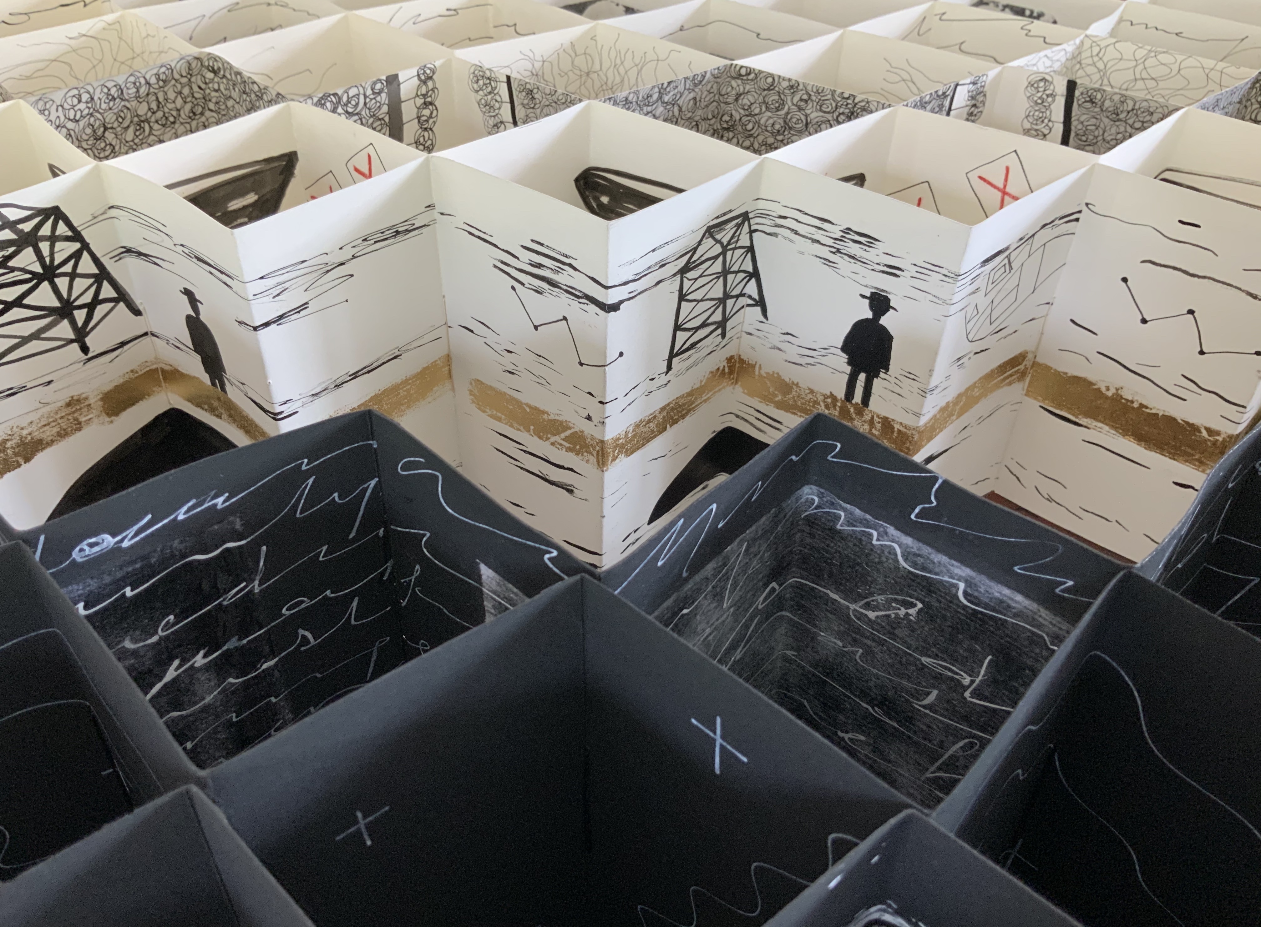
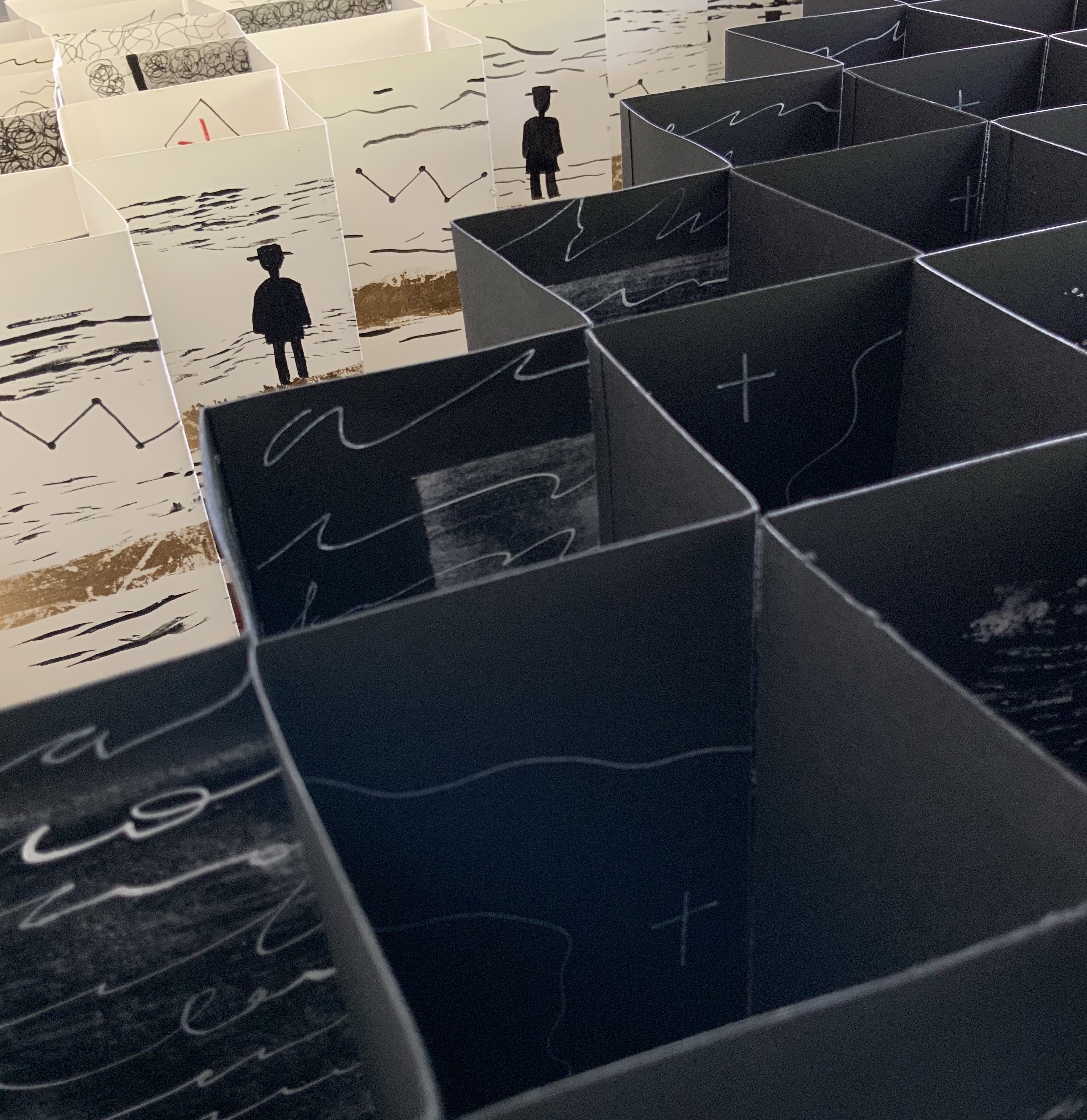
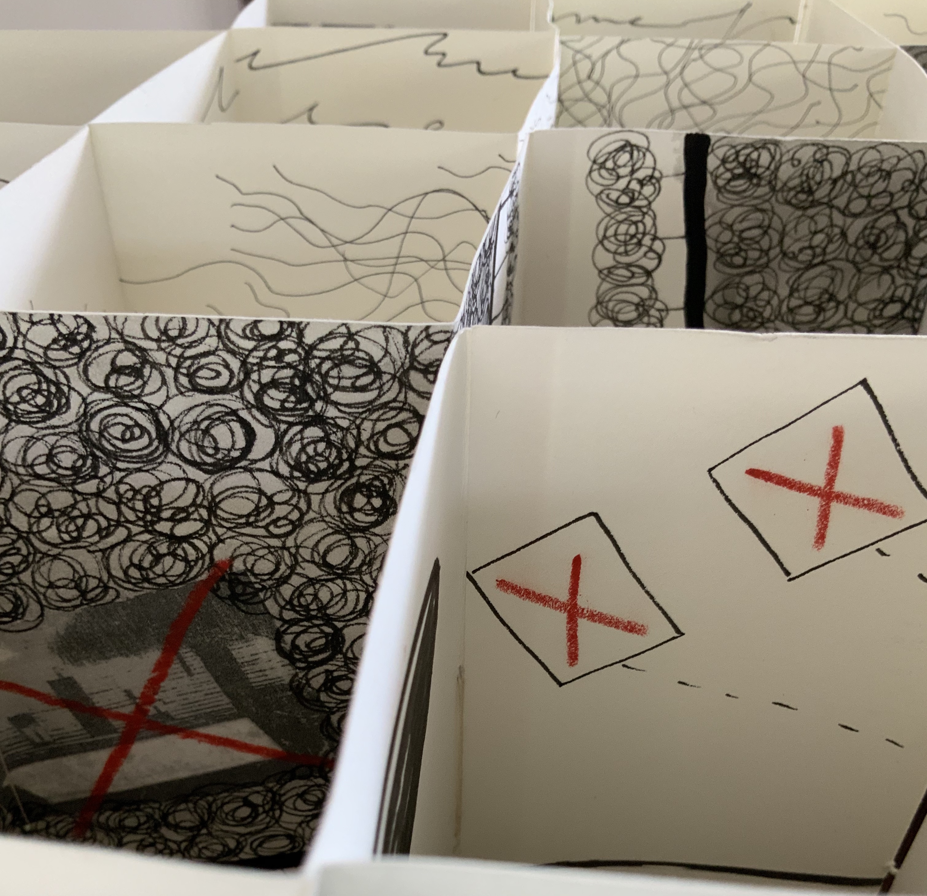
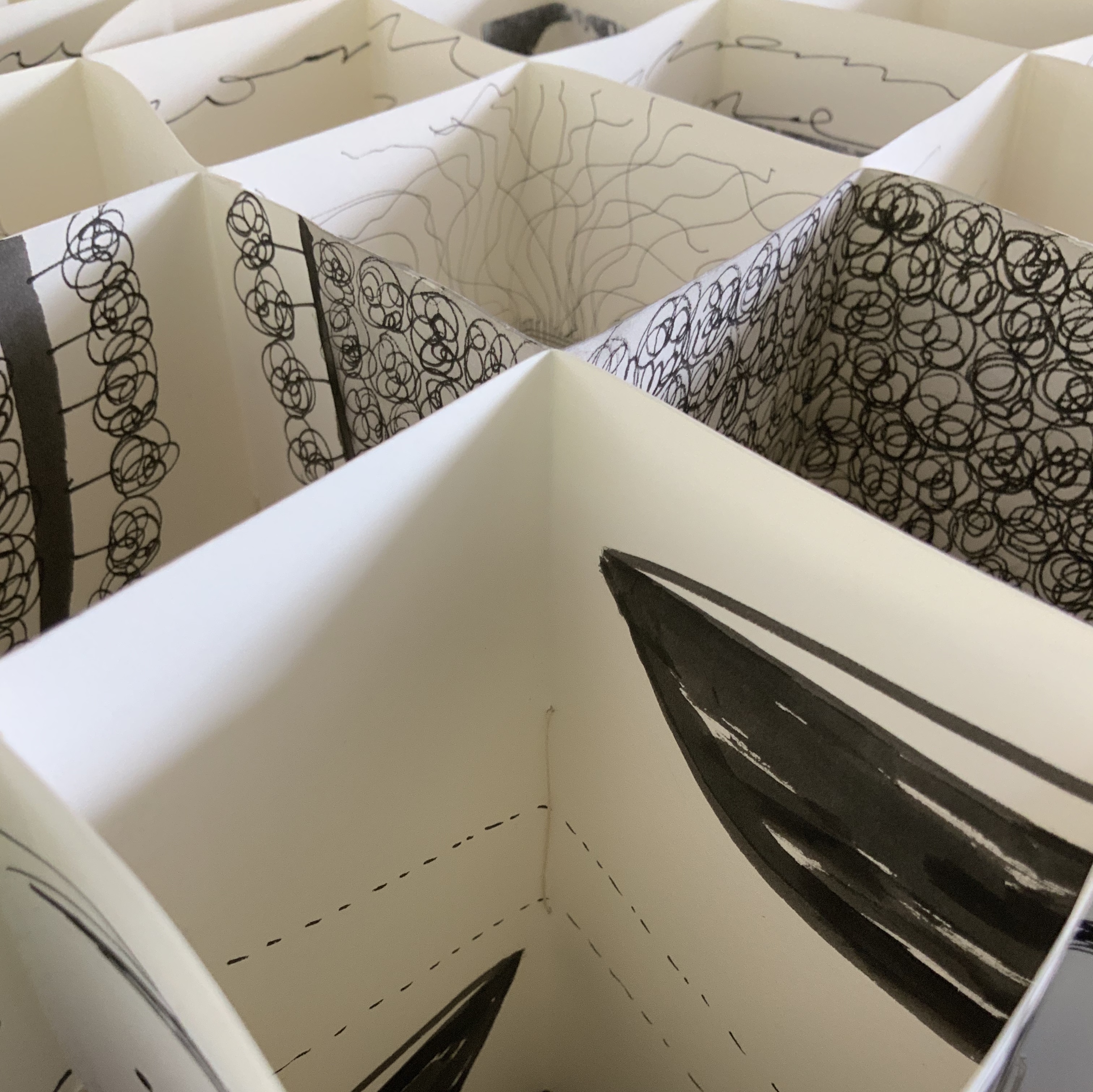
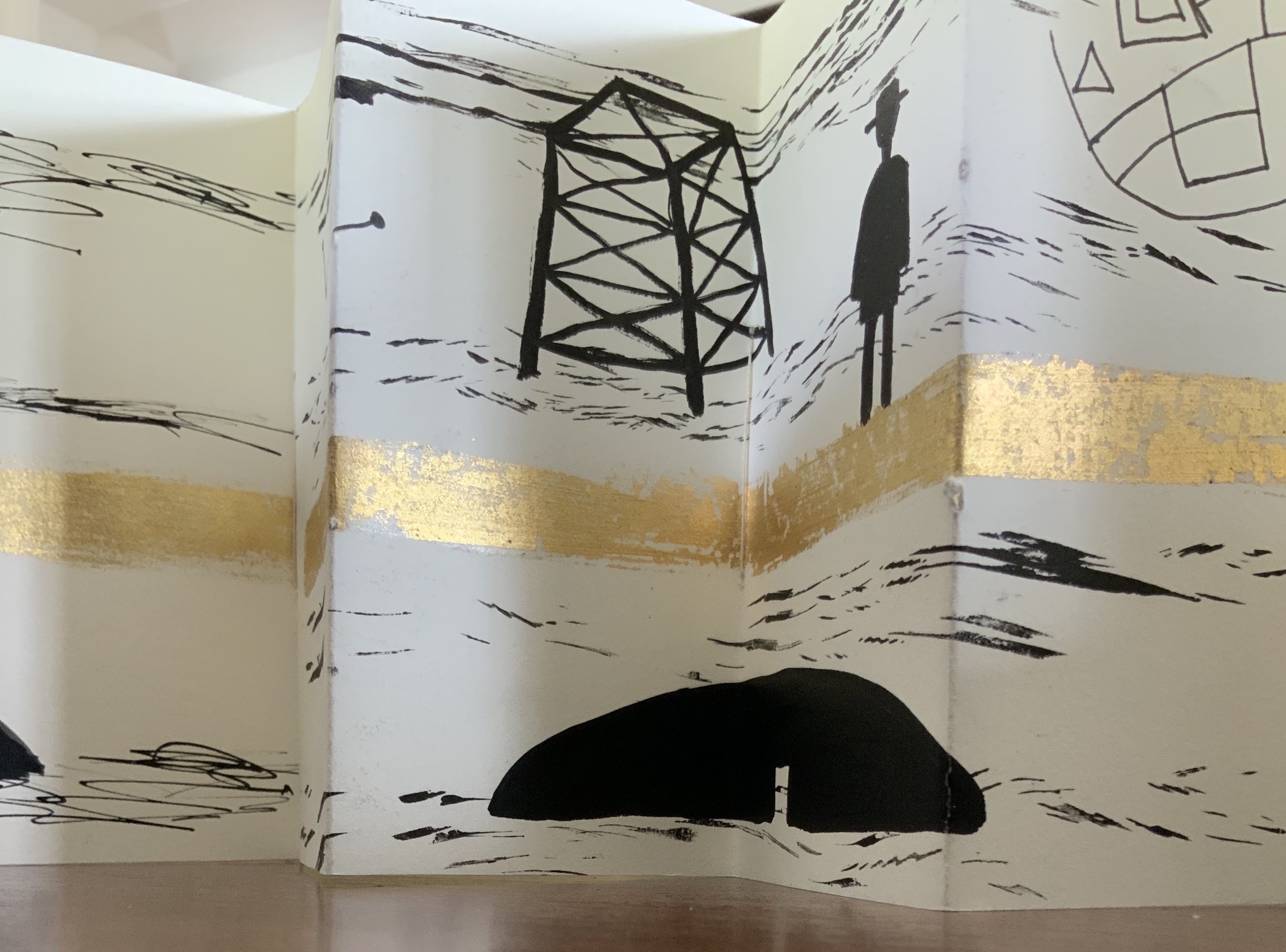
Binding of French faux leather. Multiple accordions in Fabriano 200gsm HP paper and Strathmore papers, pigmented ink, acrylic ink, printing ink, gold leaf, chinagraph pencil and image transfers. Closed: H780 x W50 x D150mm; Open: W750 mm. Unique edition. Acquired from the artist, 2 July 2020. Photos: Courtesy of the artist.
Artist’s description:
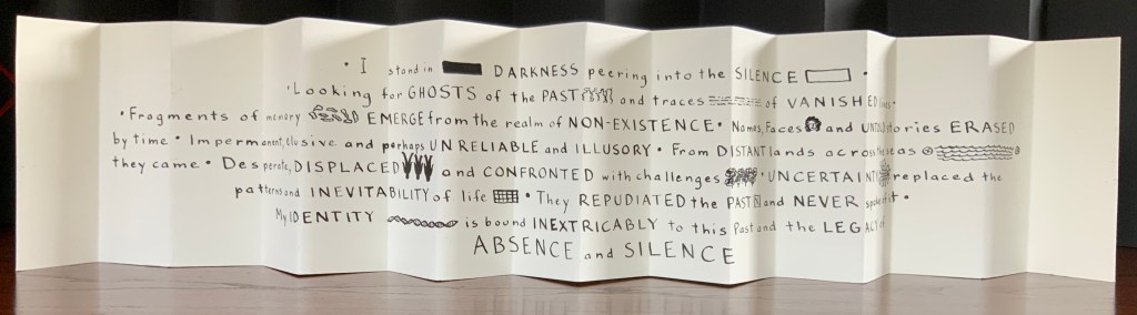
The Legacy of Absence and Silence refers to the present-day Australians whose forbears were immigrants to the continent in the nineteenth century. Many of those who came to Australia during that period made such an effort to assimilate that they have left no clues for their descendants to discover their origins. In fact some immigrants went to great lengths to eradicate their beginnings.In this work Malone has designed the structure of the book to reflect the effort of a search for meaning. The black foreground requires the viewer to struggle to peer inside the construction to glimpse details. Beyond the visual obstruction the white pages reveal snippets of information but never the full story.
Photos: Books On Books Collection.
This is a work that demands display in-the-round on a table allowing viewers to lean far enough over to catch the details within the cells formed by the joined accordions, to circle it to see how emblems and signs emerge and disappear, and to move closer and step back to experience the shifting geometric patterns.
Exhibition:
Libris Awards, Artspace Mackay, Queensland, from 26 August – 16 October 2016.
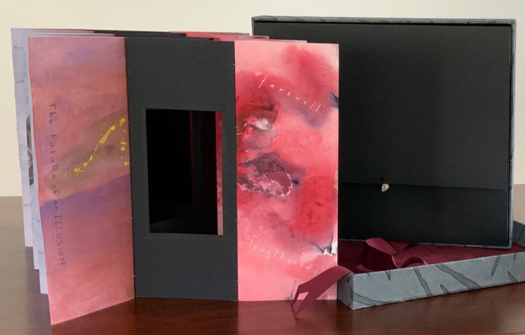
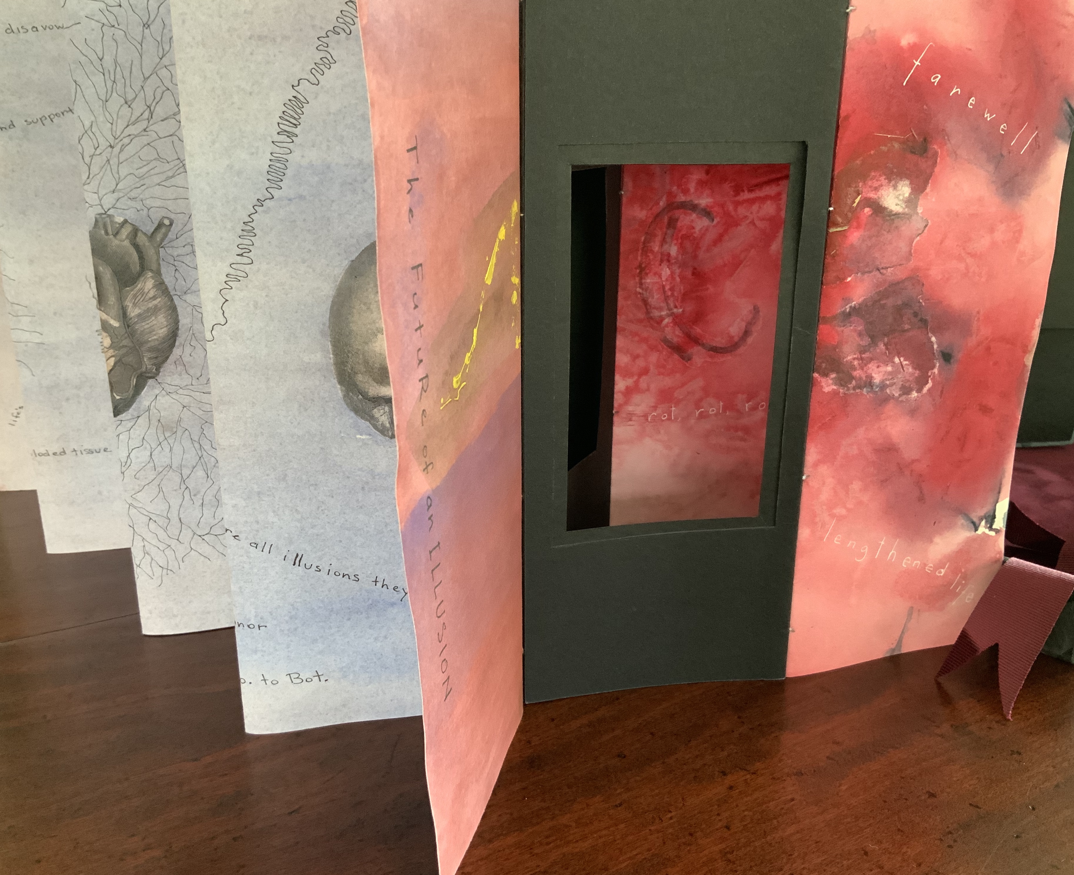
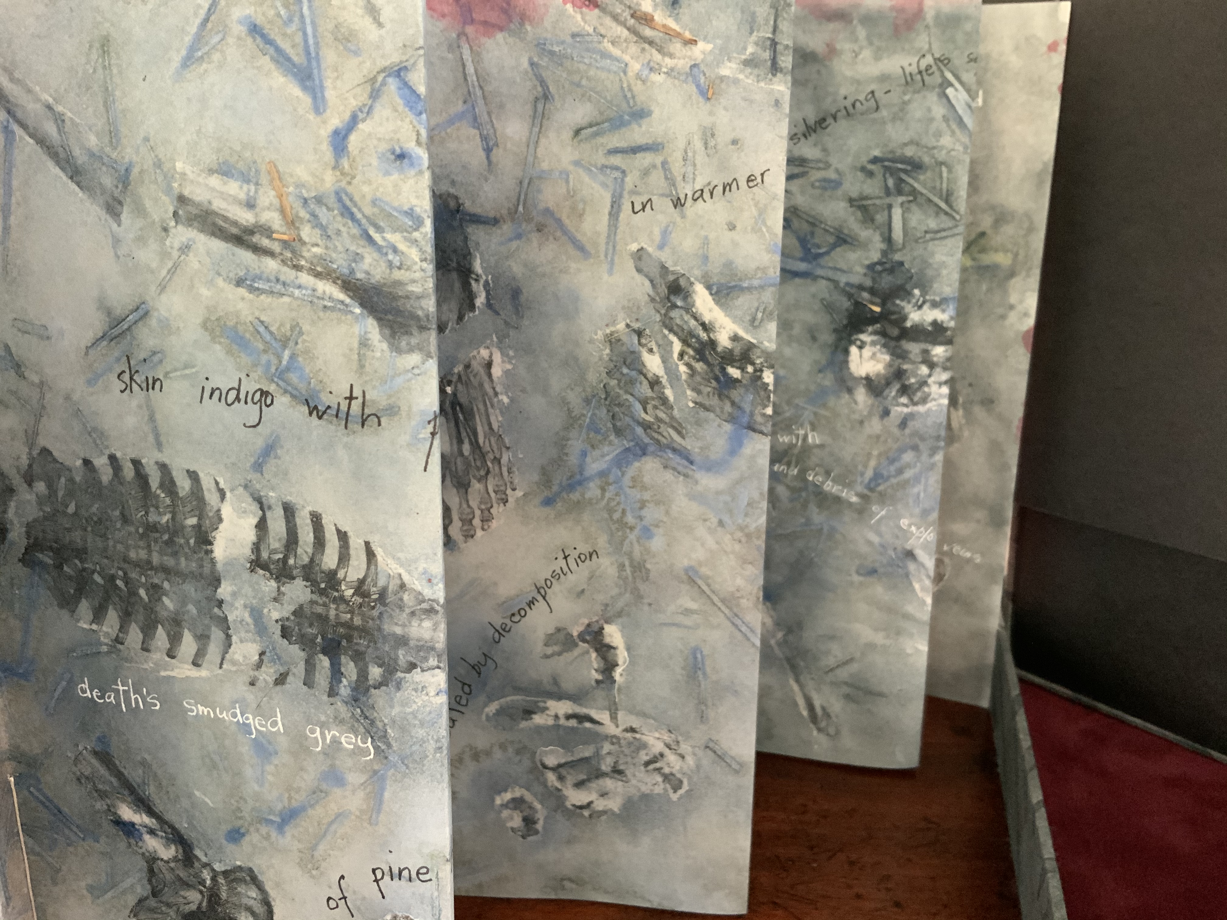
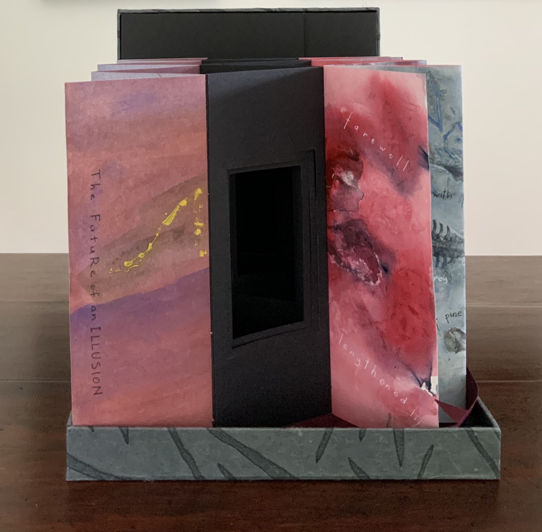
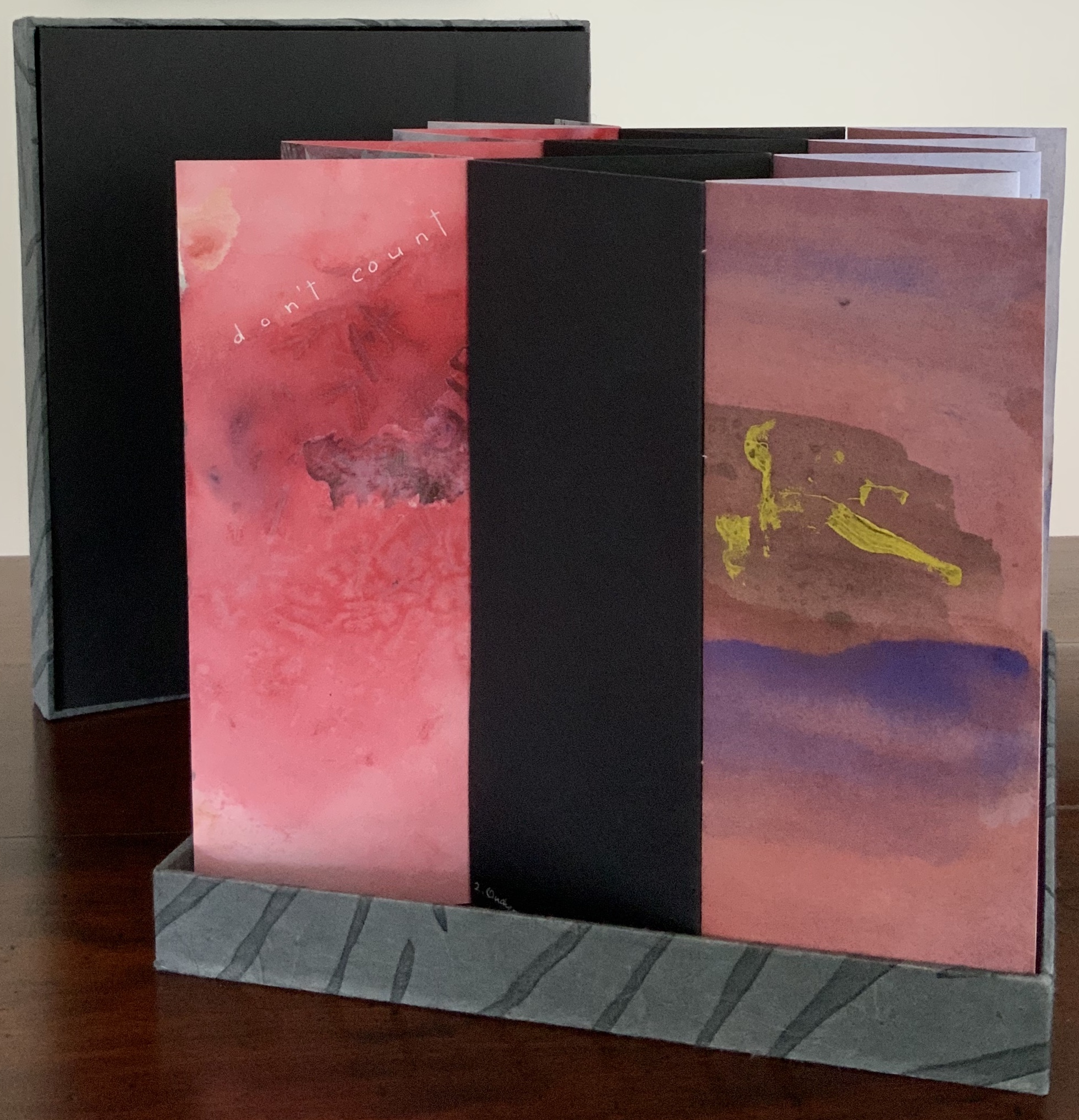
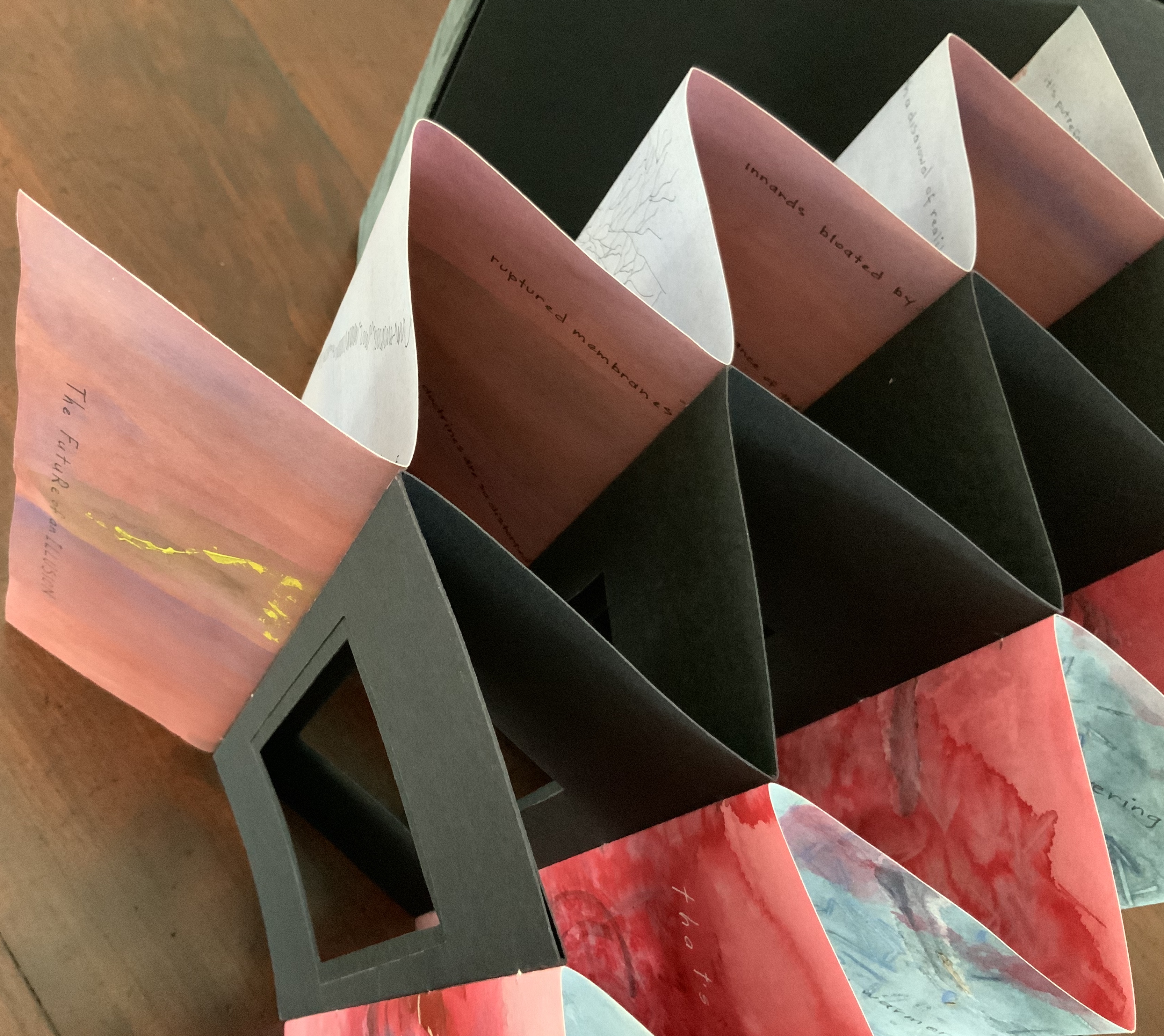
Sculptural tunnel book structure (three joined four-fold leporellos) enclosed in a folder and protective boxin a box,. Box made with Lamali handmade paper, suede paper (lining), silk ribbon and Somerset Black 280 gsm; Folder: Canson black 200gsm, skull button and waxed thread; Leporello: center leporello made of Canson black 200 gsm, adjoining leporellos made of Arches watercolour paper 185 gsm with acrylic, soluble carbon, gouache and transfer ink jet images. Box: H275 x W313 x D34 mm; Folder: H258 x W295 x D21 mm; Book: H250 x W290 x D16 mm closed, D770 mm. One of an unnumbered, signed edition of 4. Acquired from Helen Malone, 12 September 2017. Photo: Books On Books Collection.
Photos: Books On Books Collection.
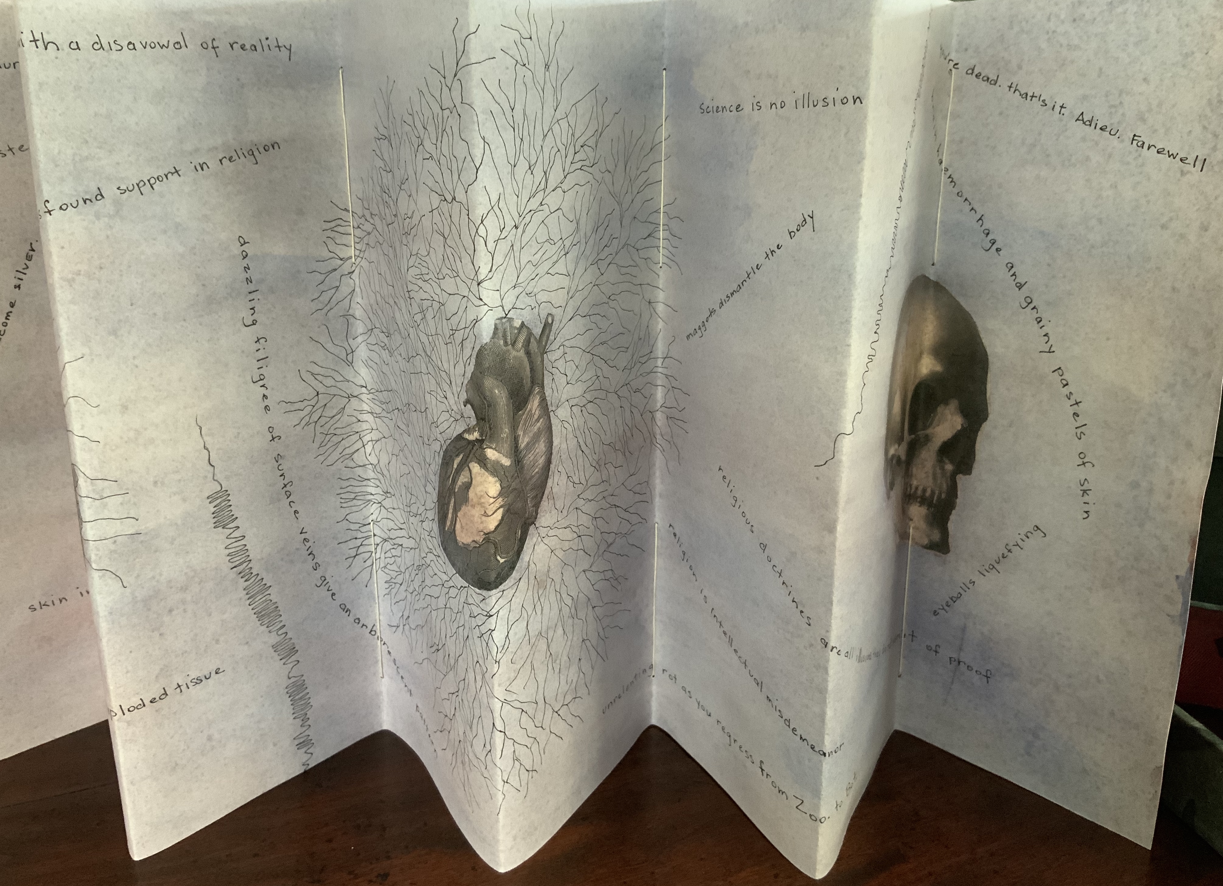
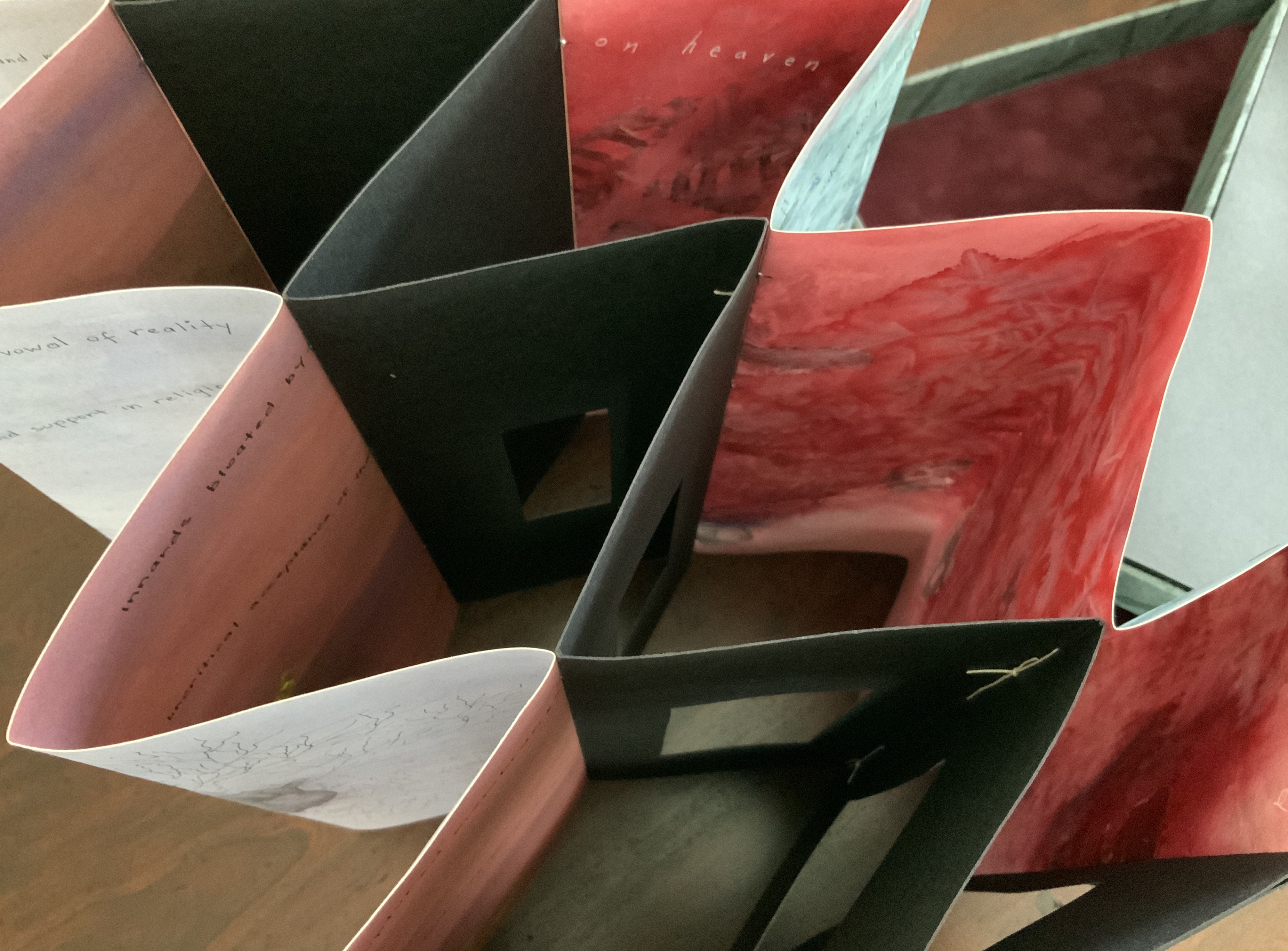
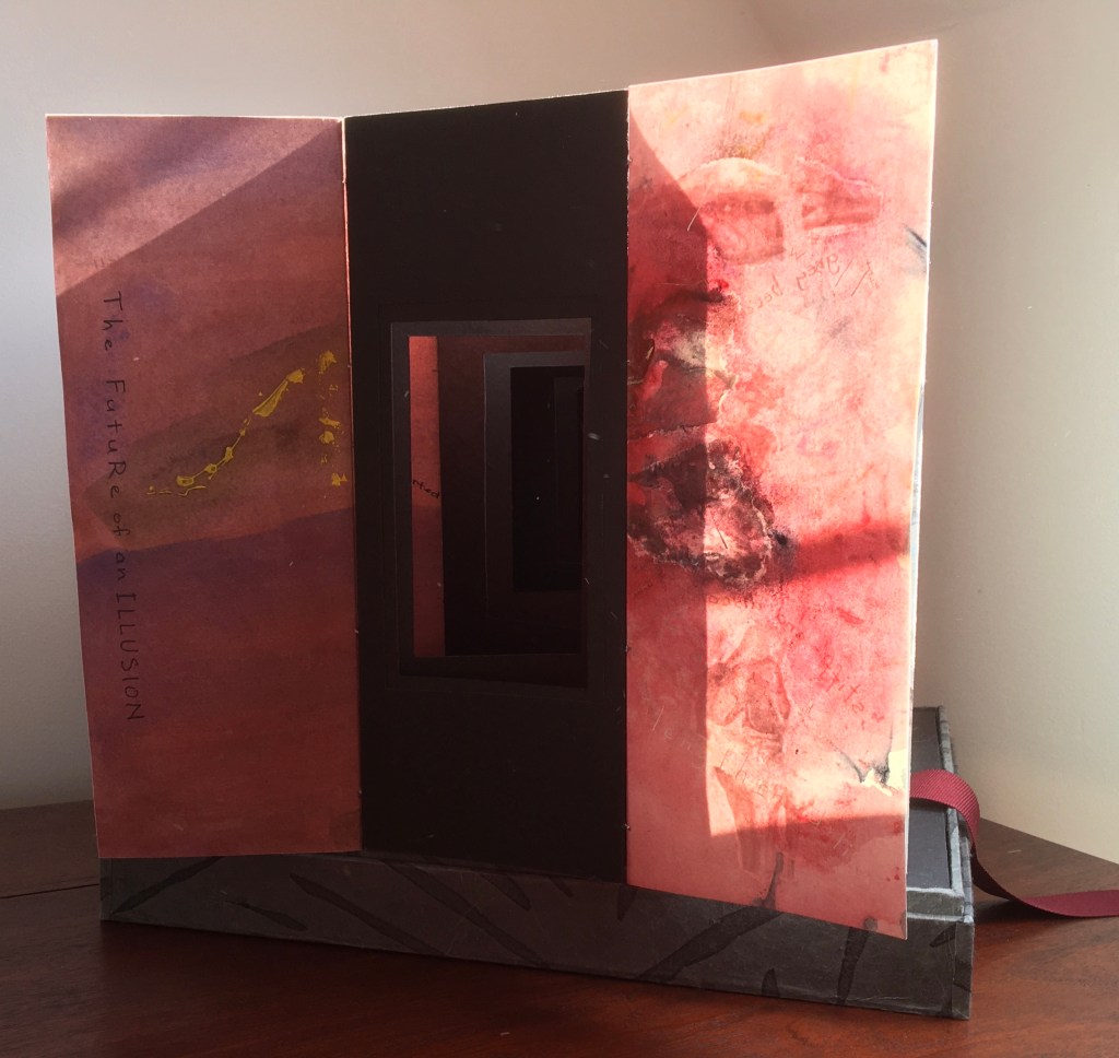
Like The Legacy of Absence and Silence, this work uses joined accordions, but builds on the cut-outs in the former to construct a tunnel book down the middle. The integration of structures here is further remarkable as a result of another collaboration between Malone and Jack Oudyn. Selected for the 2017 Manly Library Artists’ Book Award exhibition in New South Wales, Australia, The Future of an Illusion demonstrates an effective collaboration in a field of art densely populated with — almost defined by — collaborative efforts. One pair of artists to compare with Malone and Oudyn is Sonia Delaunay and Blaise Cendrars. Over a century ago and half a world away, they collaborated on La Prose du Transsibérien et de la Petite Jehanne de France, also in an accordion format modified perfectly to its subject with an aim to create a work in which color, image and words are experienced simultaneously. Malone writes that it “has always been very influential generally on my work” (correspondence with Malone, 24 September 2017).
Rather than springing from an interaction over one poem, The Future of an Illusion springs from two imaginations struck by two literary works: Sigmund Freud’s eponymous book arguing against belief in an afterlife and Jim Crace’s novel Being Dead documenting the decomposition of a dead body left in nature. The choice of the two texts, the colors of putrescence, the void toward which the central tunnel leads, the coffin-like box in which the work is stored, locked with a button skull — all create a simultaneous tension of several emotions — fear, humor, sorrow, hope, despair, revulsion and aesthetic pleasure.
Photo: Books On Books Collection.
Exhibitions:
Between the Sheets, Central Gallery, Perth , WA, 18 March – 8 April 2017.
Second venue for Between the Sheets, Australian Galleries, Collingwood, Melbourne, Vic, 13 June – 2 July 2017.
Manly Library Artists Book Award, The Creative Space, North Curl Curl, NSW, 30 March – 2 April 2017.
Art on Show Awards, Artspace Mackay in association with Mackay Show Association, 11-22 June 2017.
6th Artists Books Fair, Grahame Galleries in association with Griffith University, Brisbane, 7 – 9 July 2017.
Collections:
Artists (1/4 & 3/4), State Library of Queensland Artists Book Collection, Brisbane (4/4).
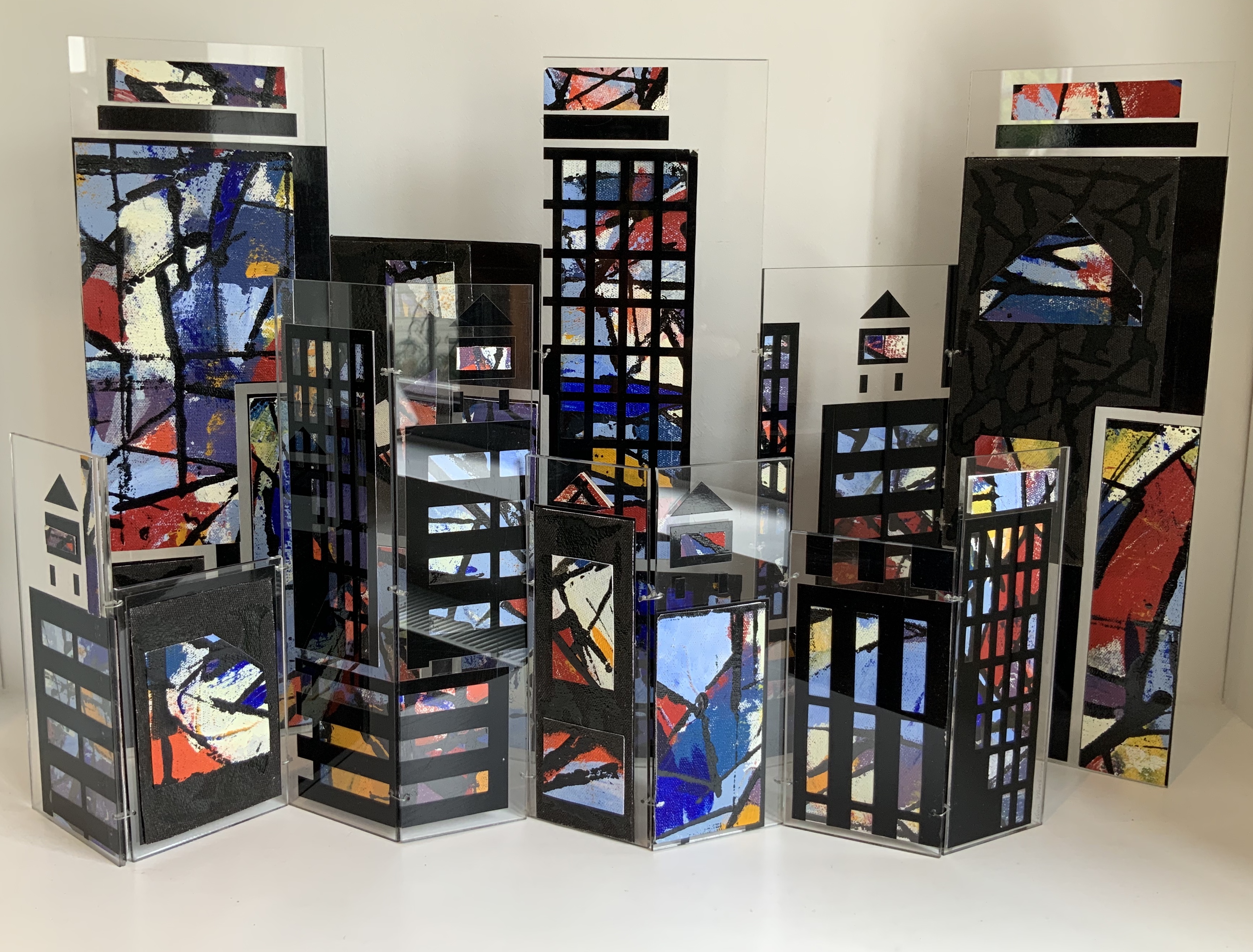
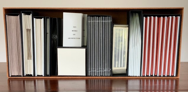
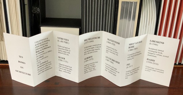
Open-sided box containing ten individual adapted book structures. Closed: H175 x W440 x D110 mm; Open: H500 x W600 mm. Version 4. Acquired from the artist, 24 November 2017. Photo: Books On Books Collection.
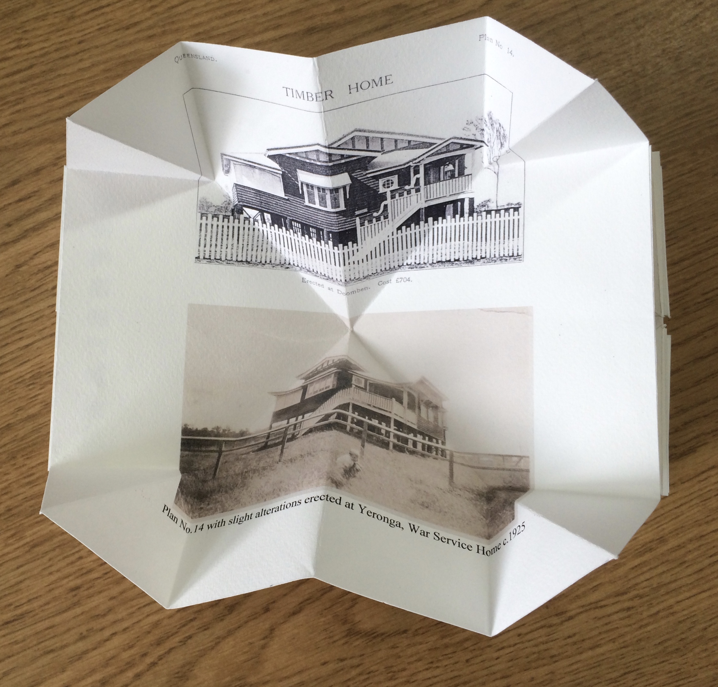
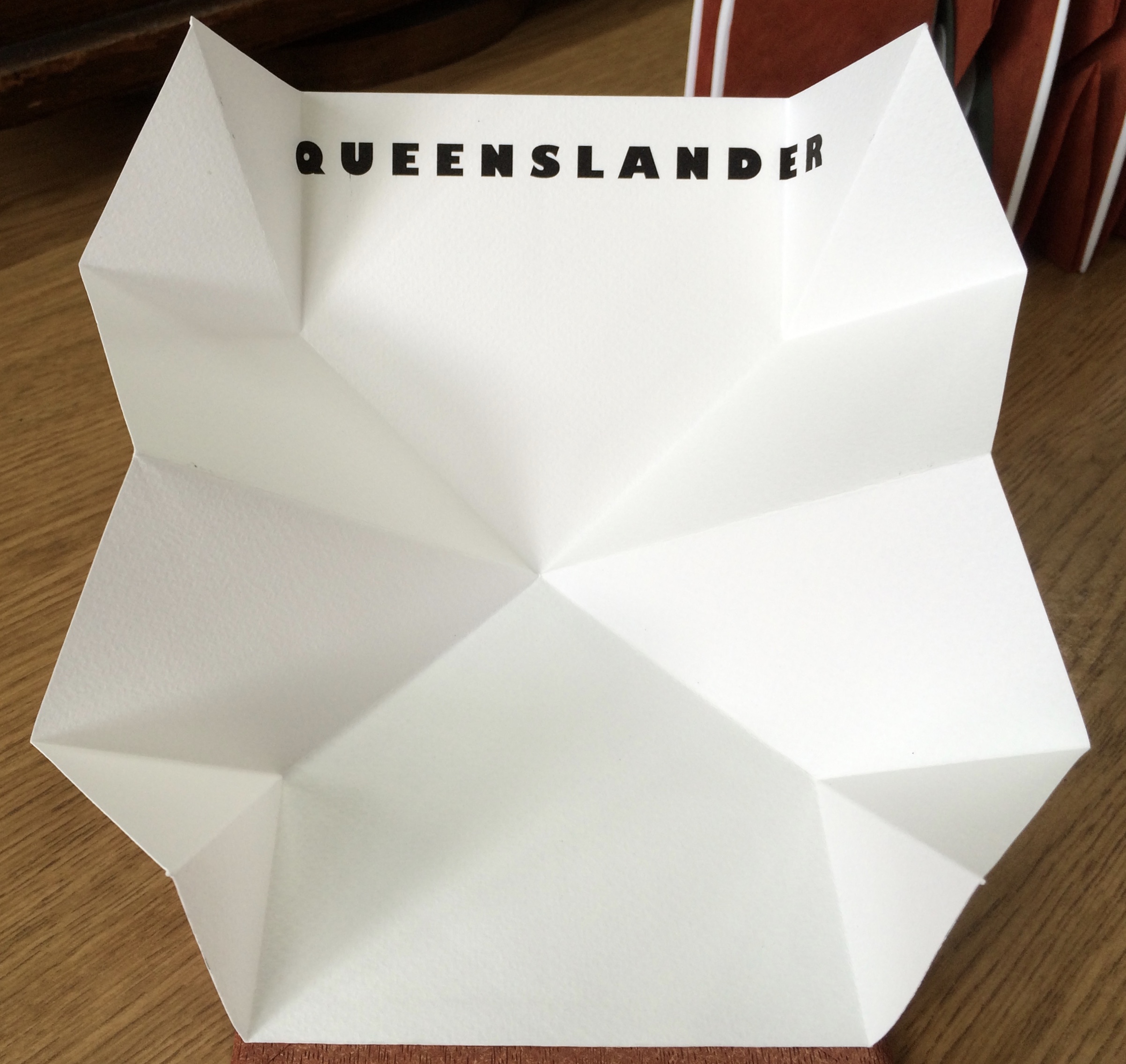
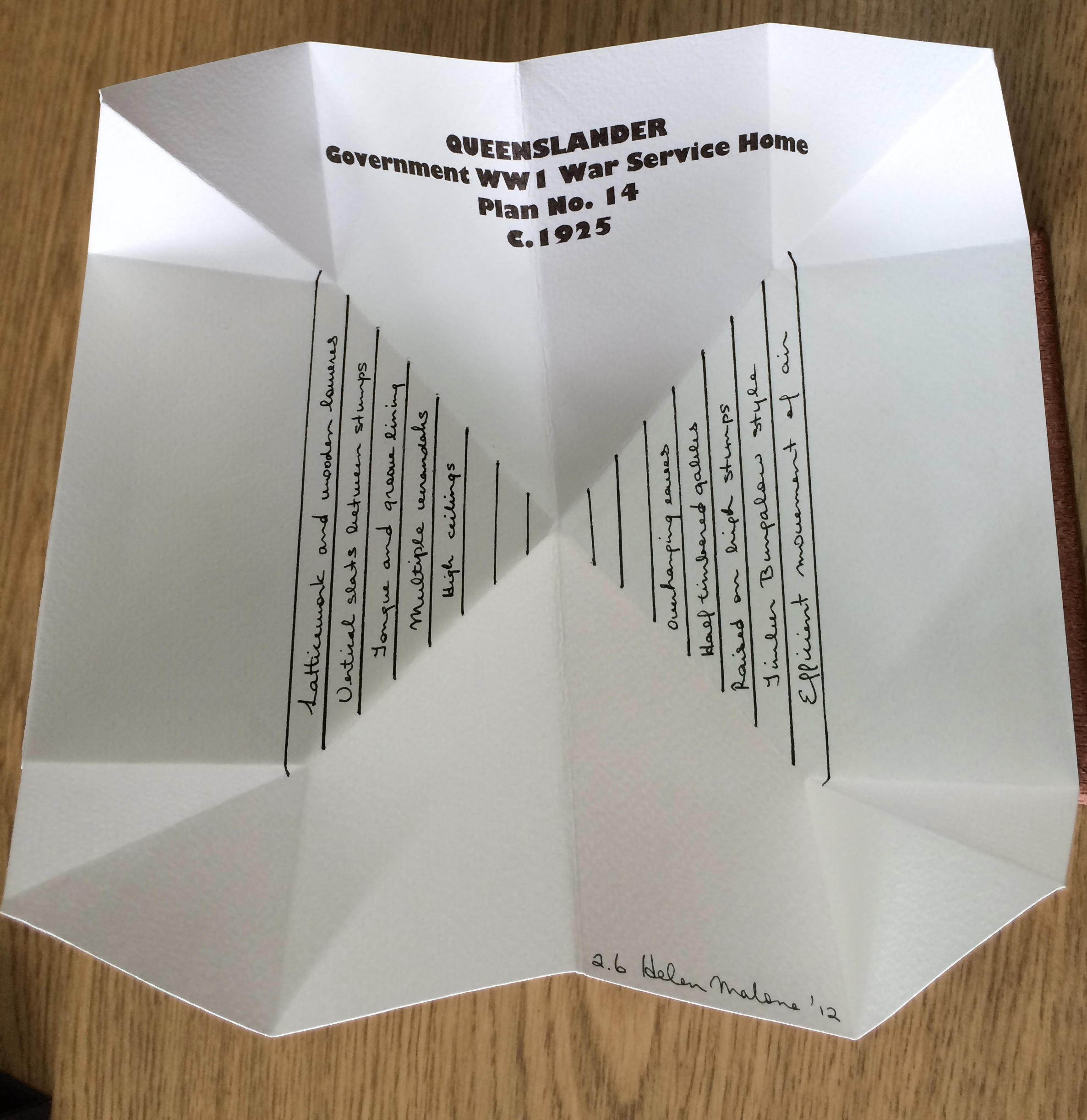
Inspired by De Architettura by Vitruvius and De Re Aedificatoria by Leon Battista Alberti, Malone created her first version of this work in 2006. Three others followed: in 2012, for the Pratt Institute; in 2013, for the State Library of Queensland; and in 2017, for this collection. In the 2012 version, the sixth book — Queenslander — differentiates that version from the others. The 2017 version is differentiated by its tenth book — Zaha Hahid.
These differentiators signal the abundant variety of structures within each version. Their unerring “rightness” for the subject of each “volume” astounds.
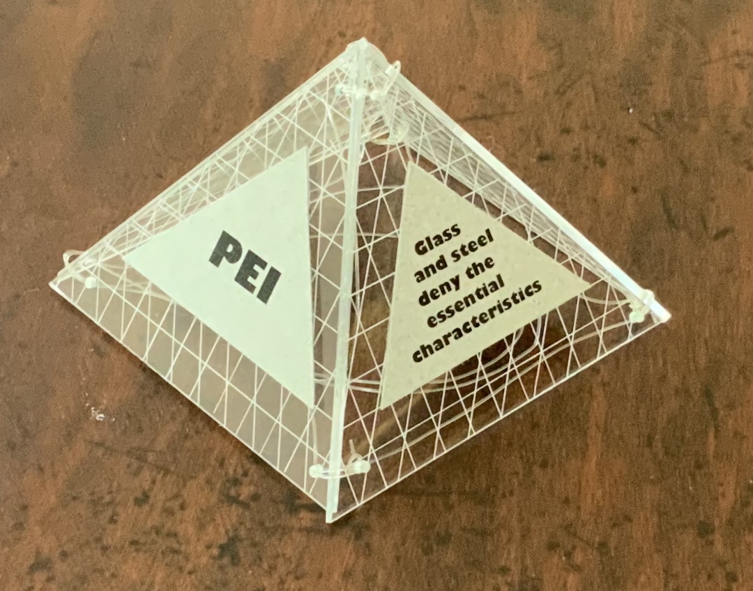
Book One — Vitruvius — consists of embossed and cut concertina folds of Arches paper with diluted sumi ink; when displayed, the line of columns suggests a Roman temple. Book Two — Suger — celebrates the French patron of Gothic architecture with an adapted tunnel book with cut concertina sides in Canson and Arches paper, ink and watercolor; when displayed, the structure suggests the stained glass windows of St. Denis. Book Three — Brunelleschi — is a folded page construction of Canson paper with page inserts of Canson and Arches paper, PVC ribs and covers; when displayed, it references the dome of the Cathedral of Santa Maria del Fiore in Florence, the internal colors of the cathedral and Brunelleschi’s credited invention of linear perspective. Book Four — Alberti — is a concertina fold book in Fabriano and Arches paper with PVC covers; its gutters and collaged pages make a structure resembling shallow facades on which several of Alberti’s statements elaborating Vitruvian principles are printed. Book Five — Mackintosh — adapts a French door construction in Arches paper, watercolor, ink and PVC to celebrate the Scottish architect and designer; when displayed, it echoes his design and its Japanese influences. Book Six — Le Corbusier — is a cube book of Fabriano paper and resembles a white concrete box; its page structure is adapted from Corbu’s internal construction plans with mezzanine floors. Book Seven — Mies van der Rohe — consists of a concertina of double Perspex pages linked with fishing line and containing digital photo images of Chicago taken by the artist; it can be manipulated to form various displays, with multiplying reflections suggesting the spread of the architect’s influence on twentieth-century cityscapes. Book Eight — Pei — is a folding triangular paged book made of Perspex and Canson paper, linked with fishing line; when displayed, the pyramid pays homage to Pei’s dome over the entrance to the Louvre. Book Nine — Libeskind — echoes the architect’s intentionally disorienting Jewish museum in Berlin; a slanted rectangular box book, made of kangaroo vellum and scored aluminum, presents its text in a way intentionally difficult to access and read. Book Ten — Zaha Hadid — consists of organic shapes and patterns on a folded pages construction of Arches paper mounted on PVC; when displayed, the book takes on a shape that echoes that of Hadid’s architectural designs.
Additional commentary and images for Ten Books of Architecture (2017) can be found here.
Exhibitions and collections:
2006 version was exhibited in Books.06, Ten and Beyond, Noosa Regional Gallery, 22 September – 22 October 2006 and was purchased from this exhibition by a private collector.
2012 version commissioned by The Pratt Institute, New York.The Collections on View at the Brooklyn Campus of the Pratt Institute and online, May – August 2013. Image published in 500 Handmade Books, Lark Publishers USA, September 2013.
2013 version commissioned by the State Library of Queensland, Brisbane.
2017 version commissioned by Books On Books Collection.
Bruce, Joan. 20 March 2023. “‘The River City’ by Helen Malone“. Queensland Memory. John Oxley Library, State Library of Queensland. Accessed 24 March 2023.
Cascio, Davide. Travel Architecture (2006). Compare with The Legacy of Absence and Silence.
Chen, Julie. 2013. 500 Handmade Books. Volume 2. New York: Lark. P. 144 (Ten Books).
Salamony, Sandra, and Peter and Donna Thomas. 2012. 1,000 Artists’ Books : Exploring the Book as Art. Minneapolis: Quarto Publishing Group USA. Pp. 95 (Tsunami), 170 (Shattered in the Shaky City).
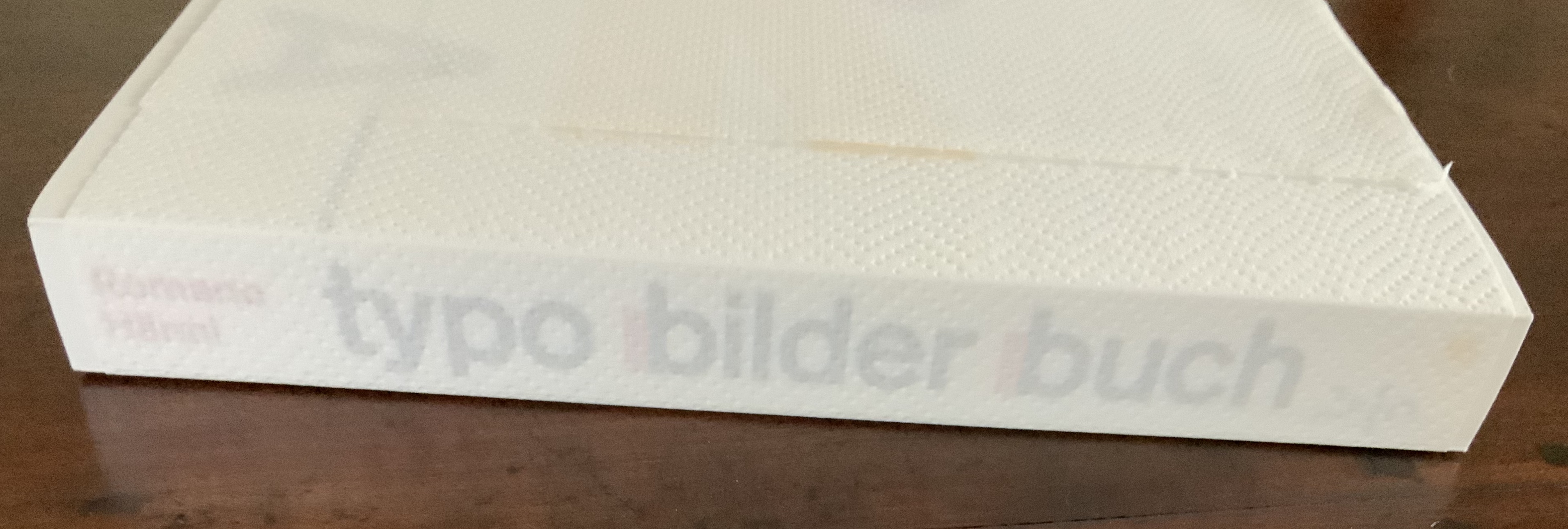
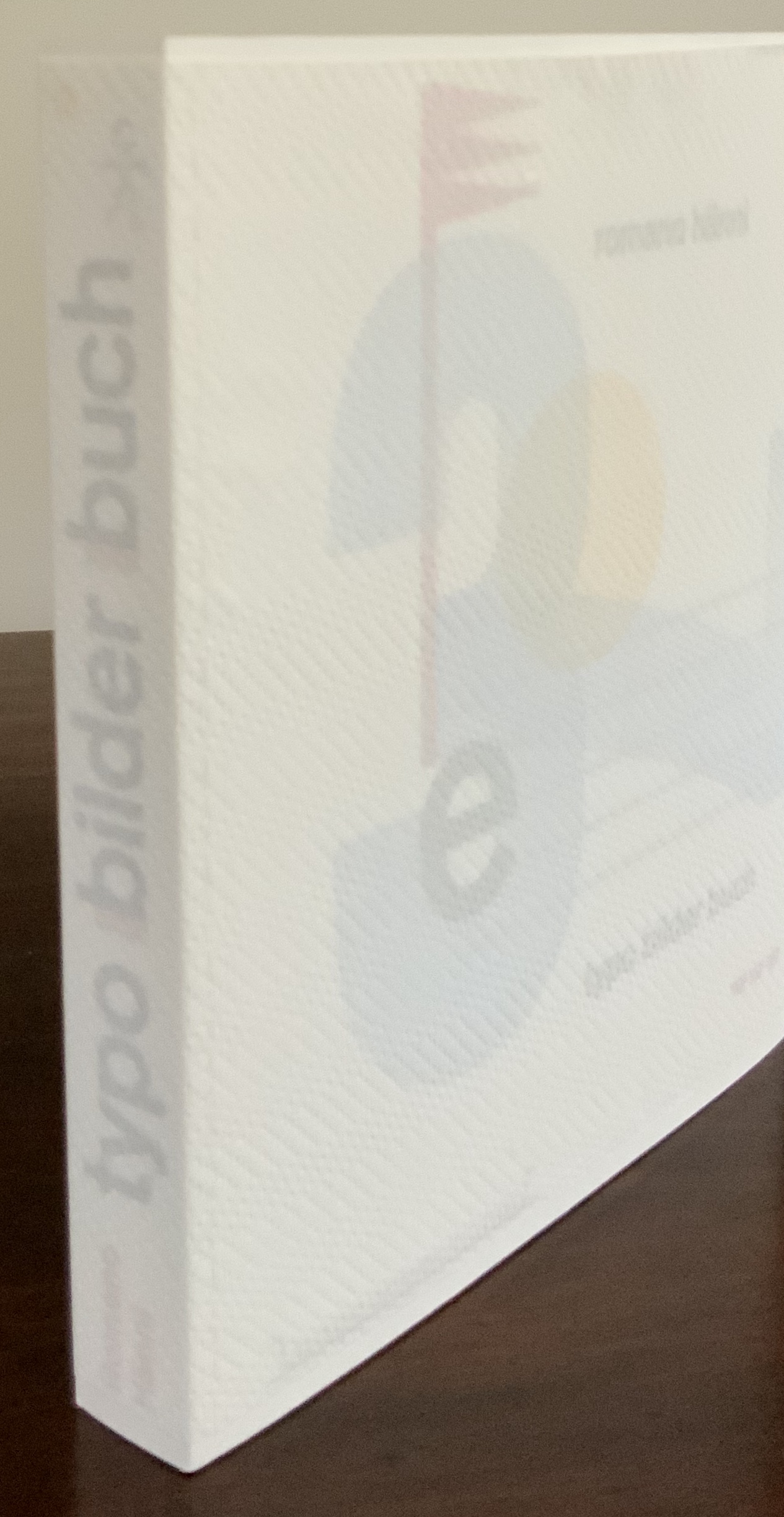
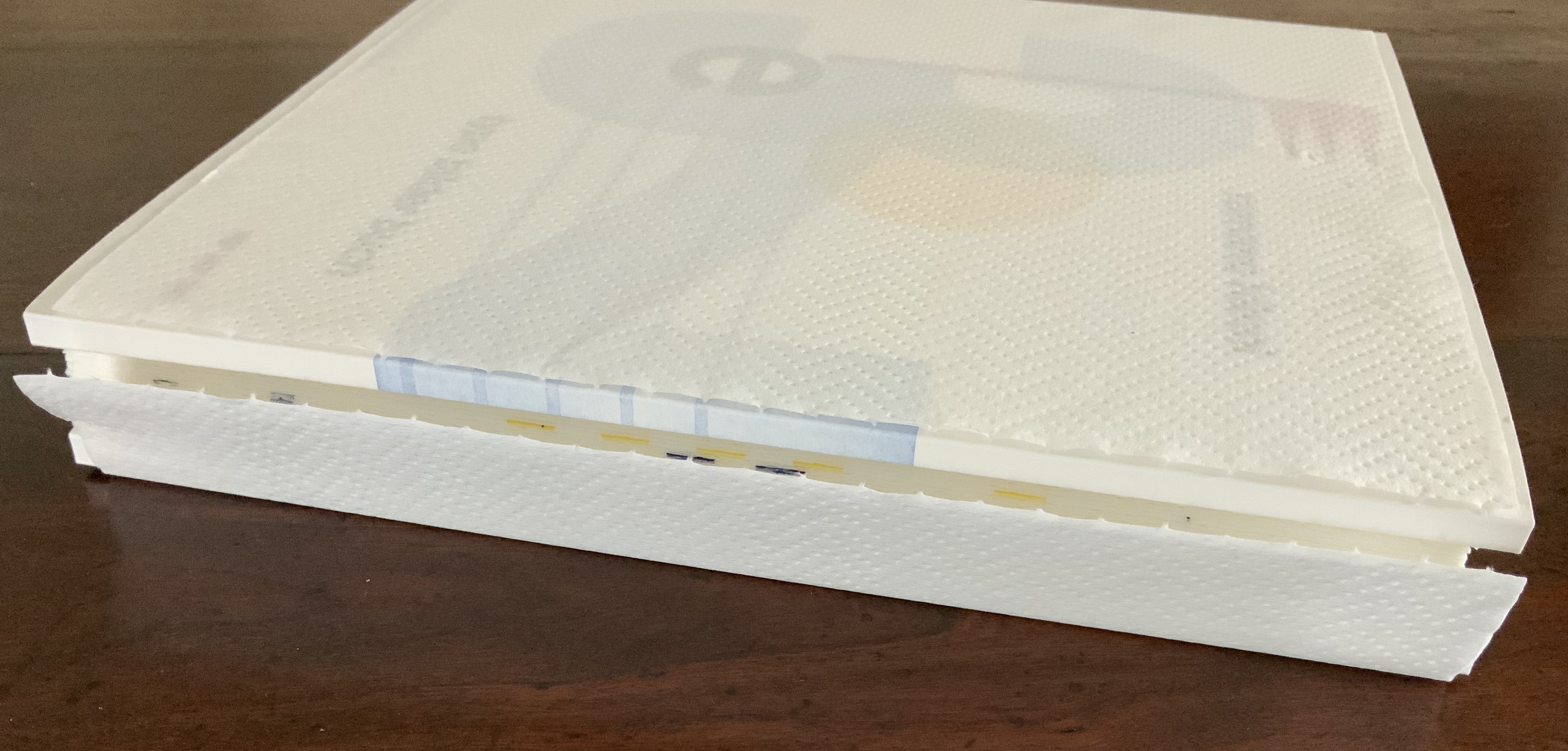
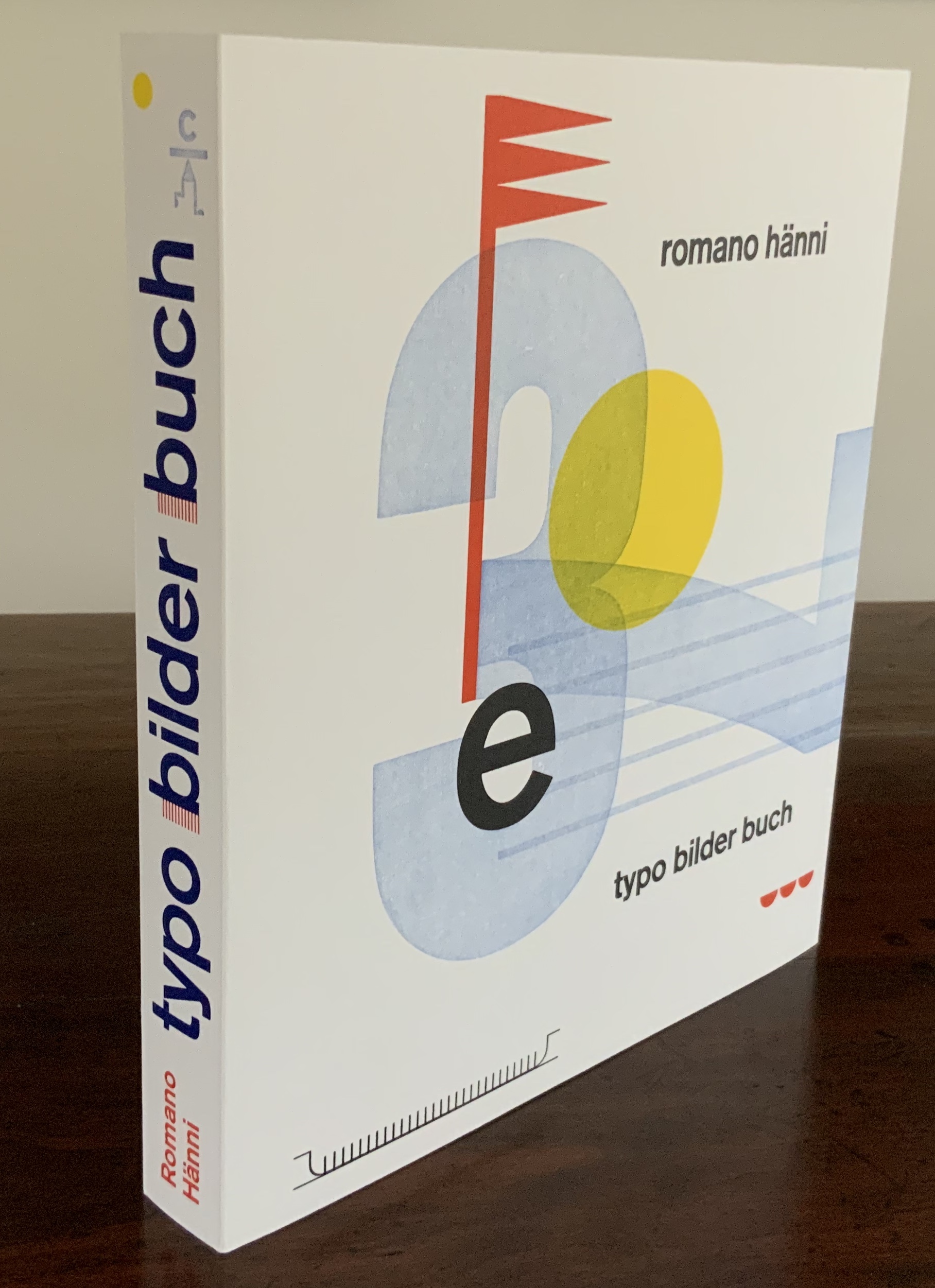
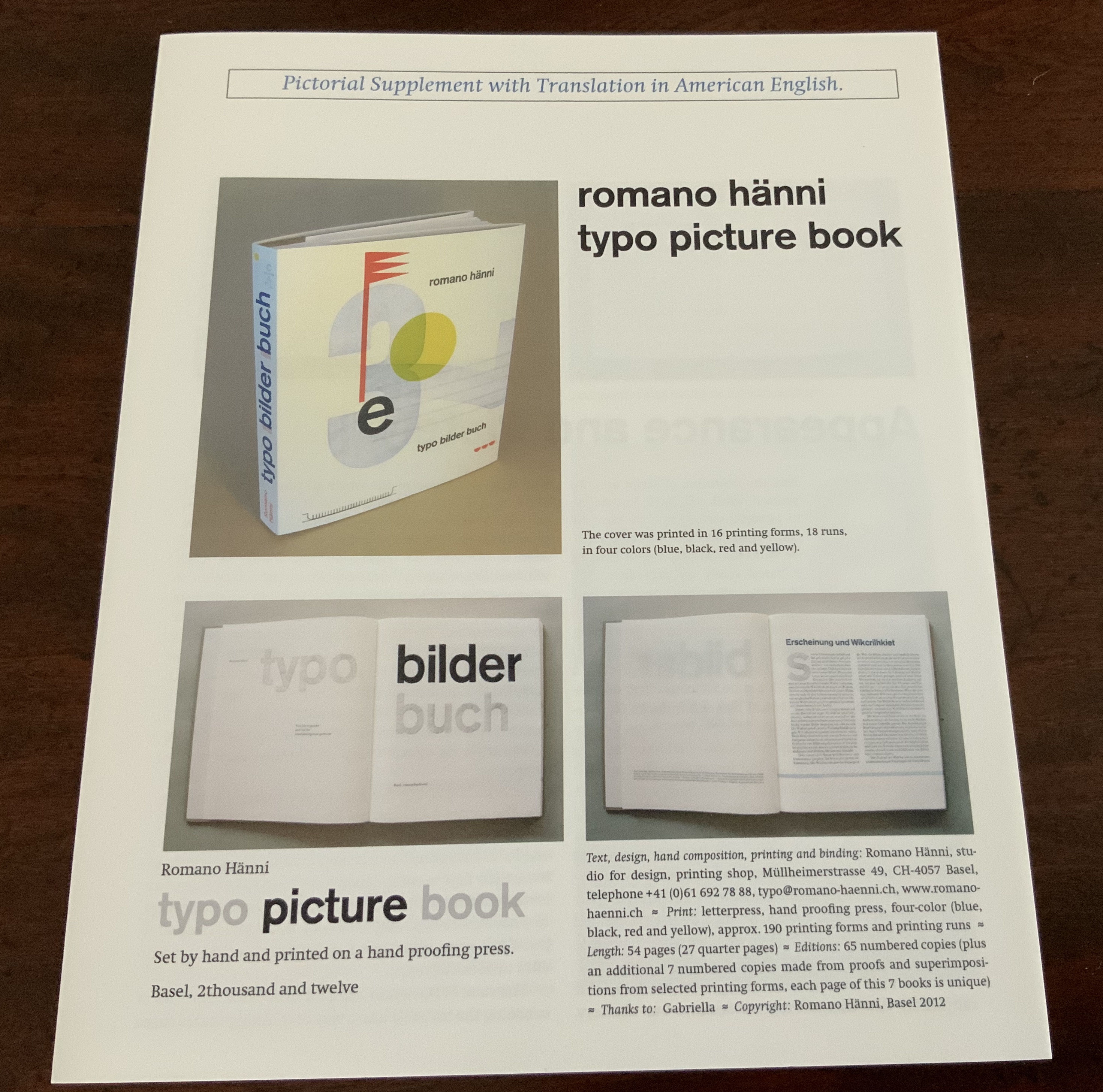
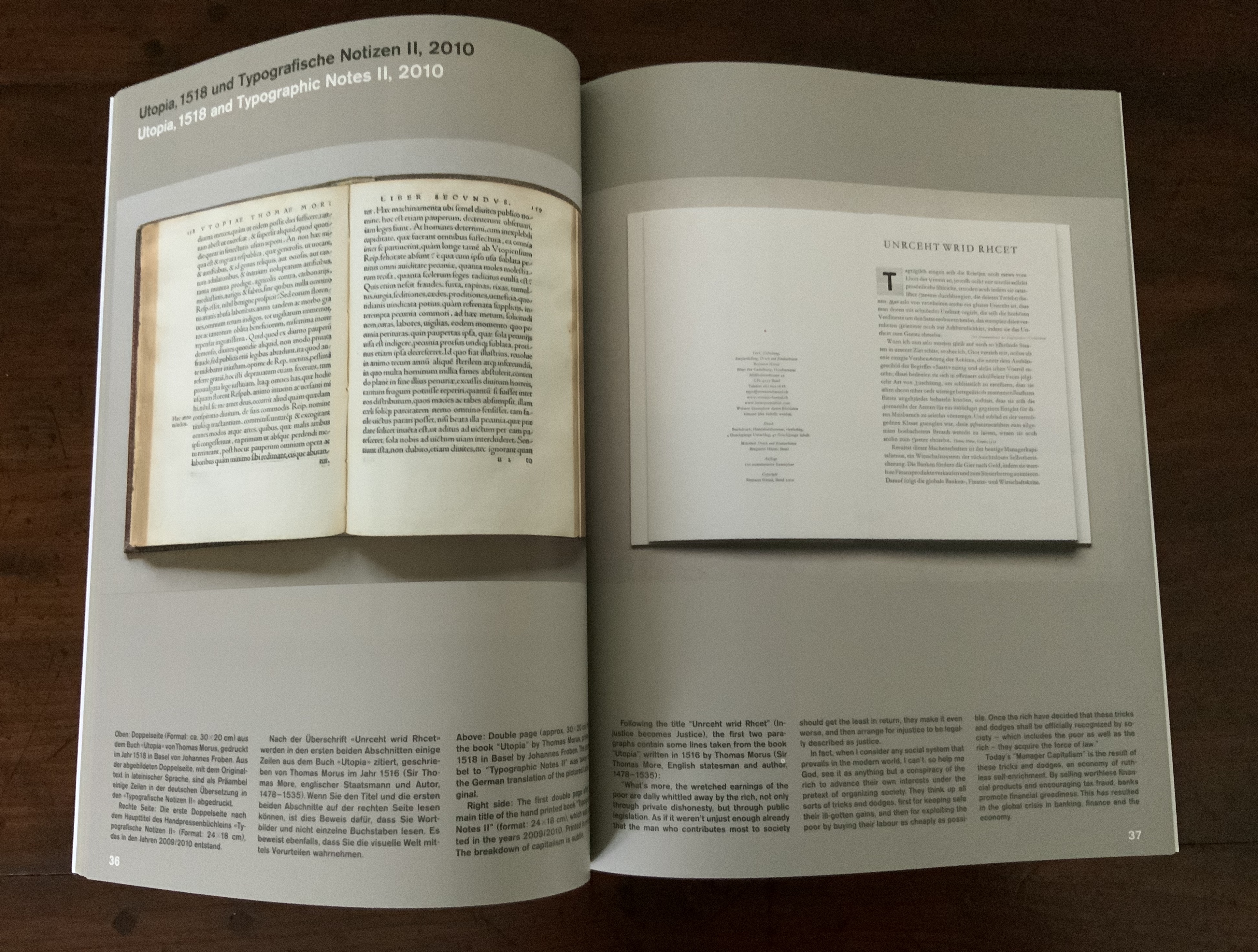
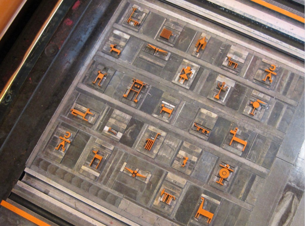
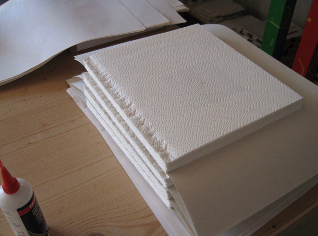
typo bilder buch (2012) Romano Hänni Printing: Letterpress on hand-proofing press. Binding: paper over cardboard glued to end papers glued to handsewn book block. Pages: 54. H268 x W237 x D30 mm. Edition of 65, of which this is #62. Acquired from the artist, 26 February 2020.
Appearance vs reality — one of the ancient standbys for philosophical conversation and disputation. But also for stimulating art. Romano Hänni’s typo bilder buch (2012) is a case in point.
Tightly encased in its banderole, typo bilder buch deceives. Large and thick, it appears weighty, hefty, but is light. Too snug to slide off, the banderole requires breaking a perforated edge. Appearance must be penetrated to get at reality. The cover, made of stiff heavyweight paper, is precisely creased around the front and back boards, made of waffled cardboard, not the usual dense binders boards. The text on the flyleaves is scrambled, the letters in reverse and sometimes in the wrong order (deliberately), sometimes inverted, the uppercase sometimes aligned to drop below the line, the lowercase sometimes aligned to rise above the line. Reconstituted from its mirror appearance (and translated), the text declares:
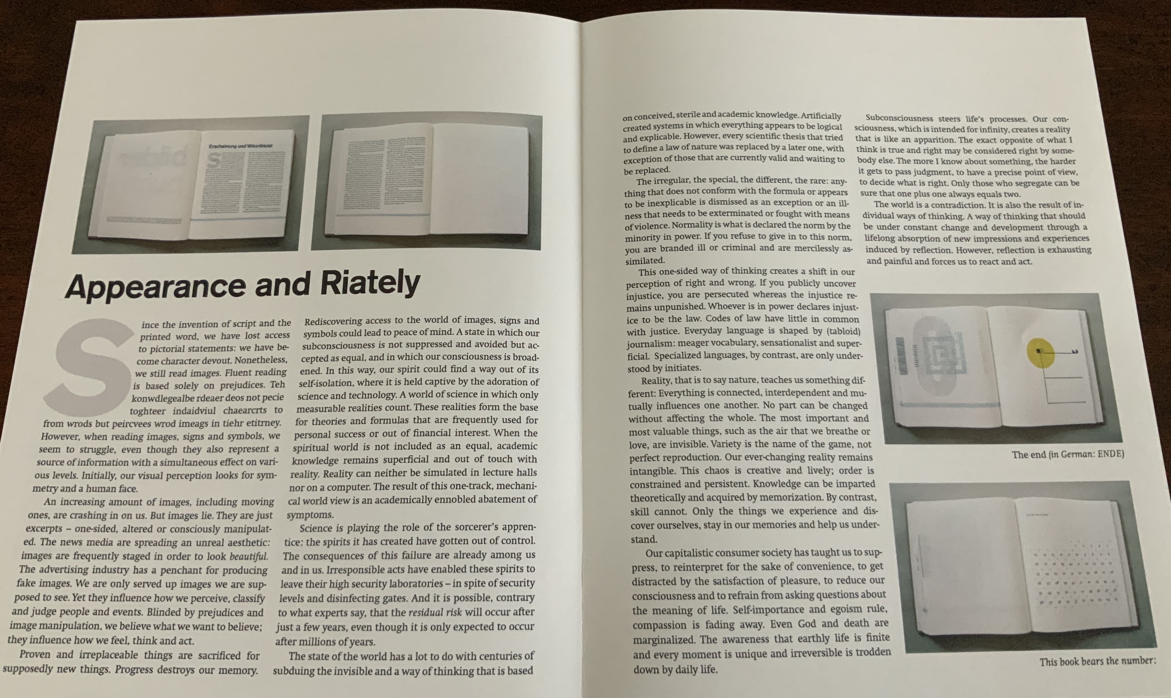
Appearance and Riately
Since the invention of script and the printed word, we have lost access to pictorial statements: we have become character devout. Nonetheless, we still read images. … However, when reading images, signs and symbols, we seem to struggle, even though they also represent a source of information with a simultaneous effect on various levels. Initially, our visual perception looks for symmetry and a human face.
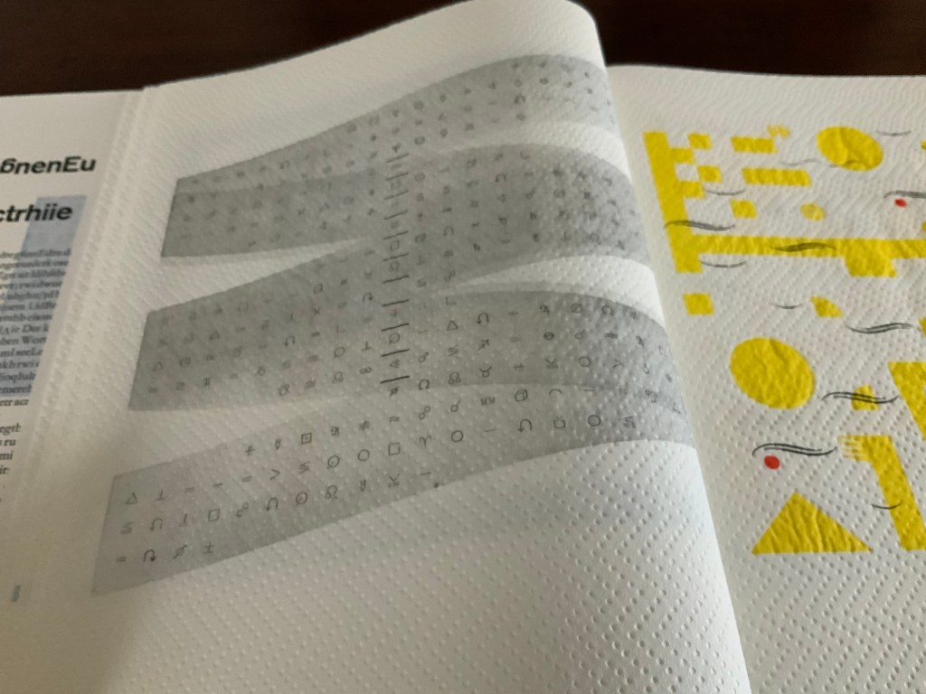
The book block’s first image: a small face in a white sea of embossed diagonals running from left to right, or is it from right to left, or downwards or upwards?
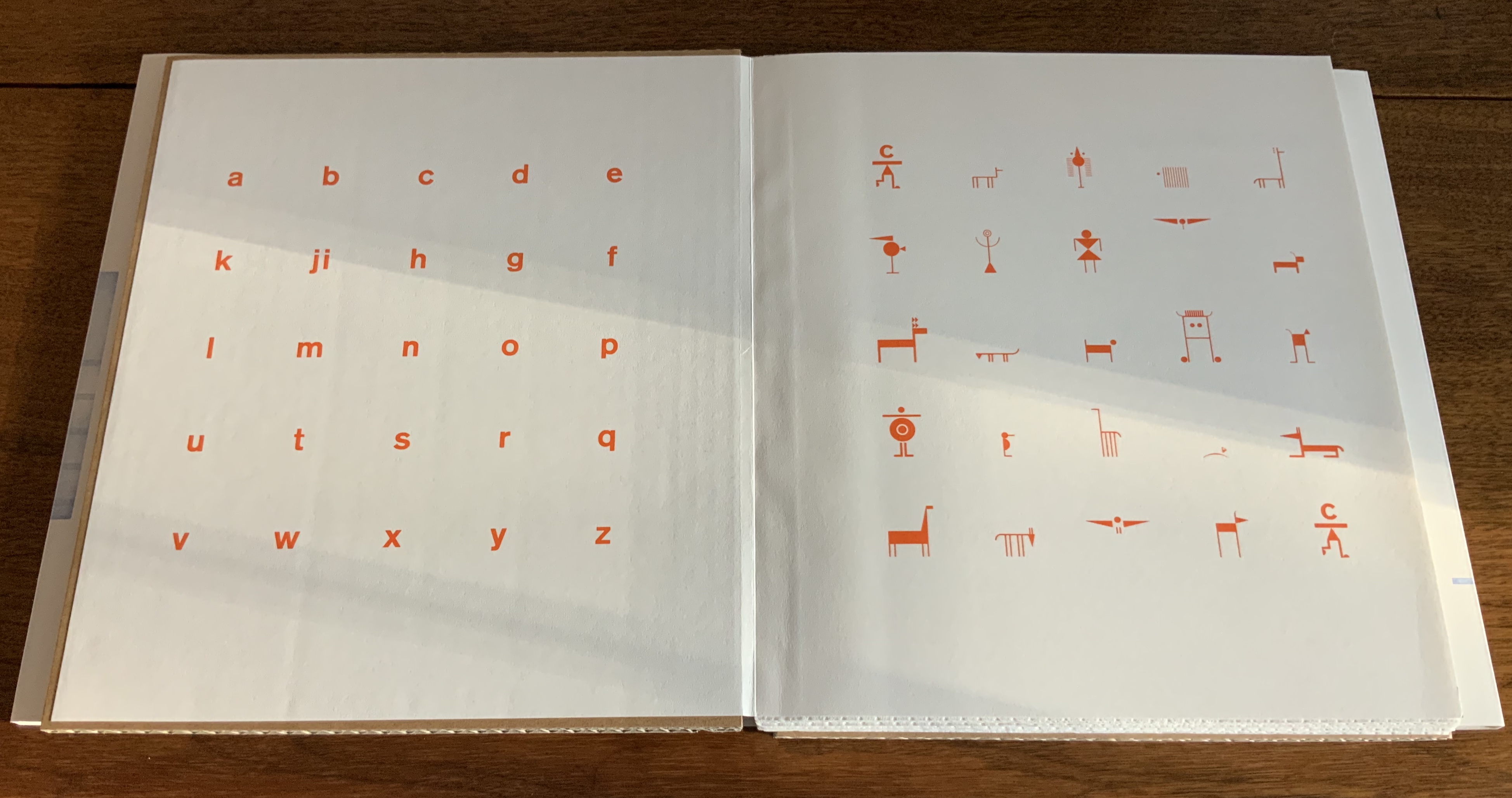
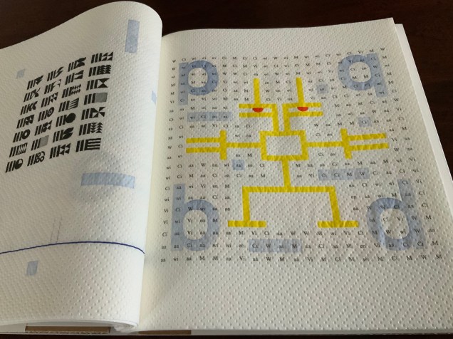
The book’s title and even its endpapers (the papers glued to the boards and attached to the book block) declare that typo bilder buch (“typo picture book”) will address this split between script and printed words (or letters) on the one hand and images on the other. On the pastedown is a bright orange lowercase alphabet; on the free endpaper are twenty-five signs, ornaments and images arranged in five rows and five columns. The alphabet’s twenty-six letters arrange themselves to match the five-by-five square of images by squeezing j and i together. Yes, in that order because the alphabet is set boustrophedon style (“as the ox plows”), which is at least the third or fourth clue that typo bilder buch wants us to play with our notions of books, reading and, as Hänni puts it, “appearance and riately”.
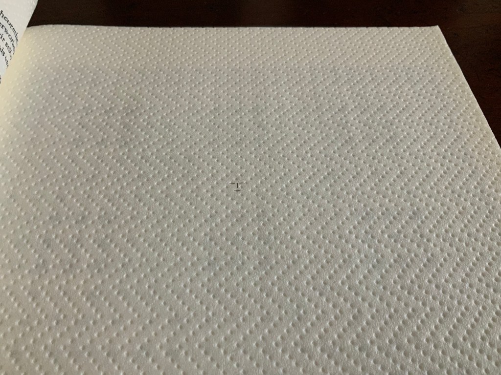
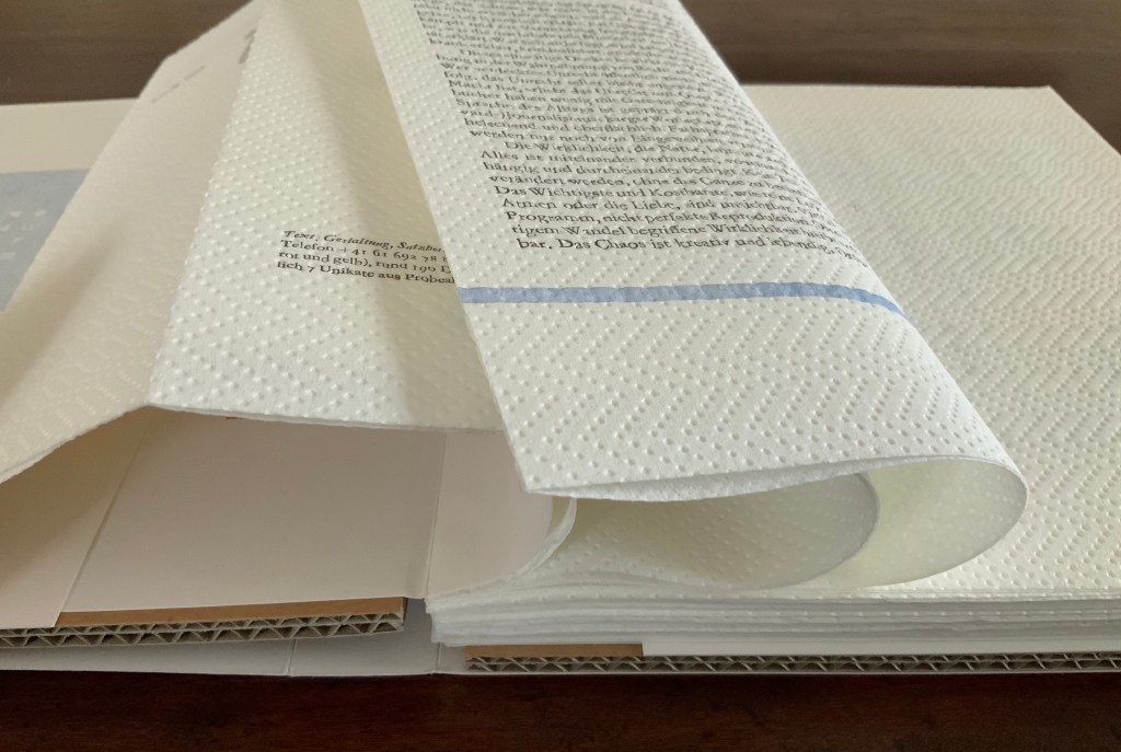
Spacing and layout are not the only toys at work here. To paraphrase Ellen Lupton: “Spacing, framing, punctuation, type style, layout, and other non-phonetic marks of difference [as well as the surface on or in which they appear] constitute the material interface of writing.” When any book opens, the fingers expect a firm block of pages for turning, but with typo bilder buch, the thumb on the free end paper sinks into the book block. All the leaves beneath the end paper, like the one with the tiny image of a human face, are two sheets of paper towel. These pages, this paper, are not merely a surface on which to print; the ink is not merely a medium. They play a physical and intellectual role in the composition of the work.
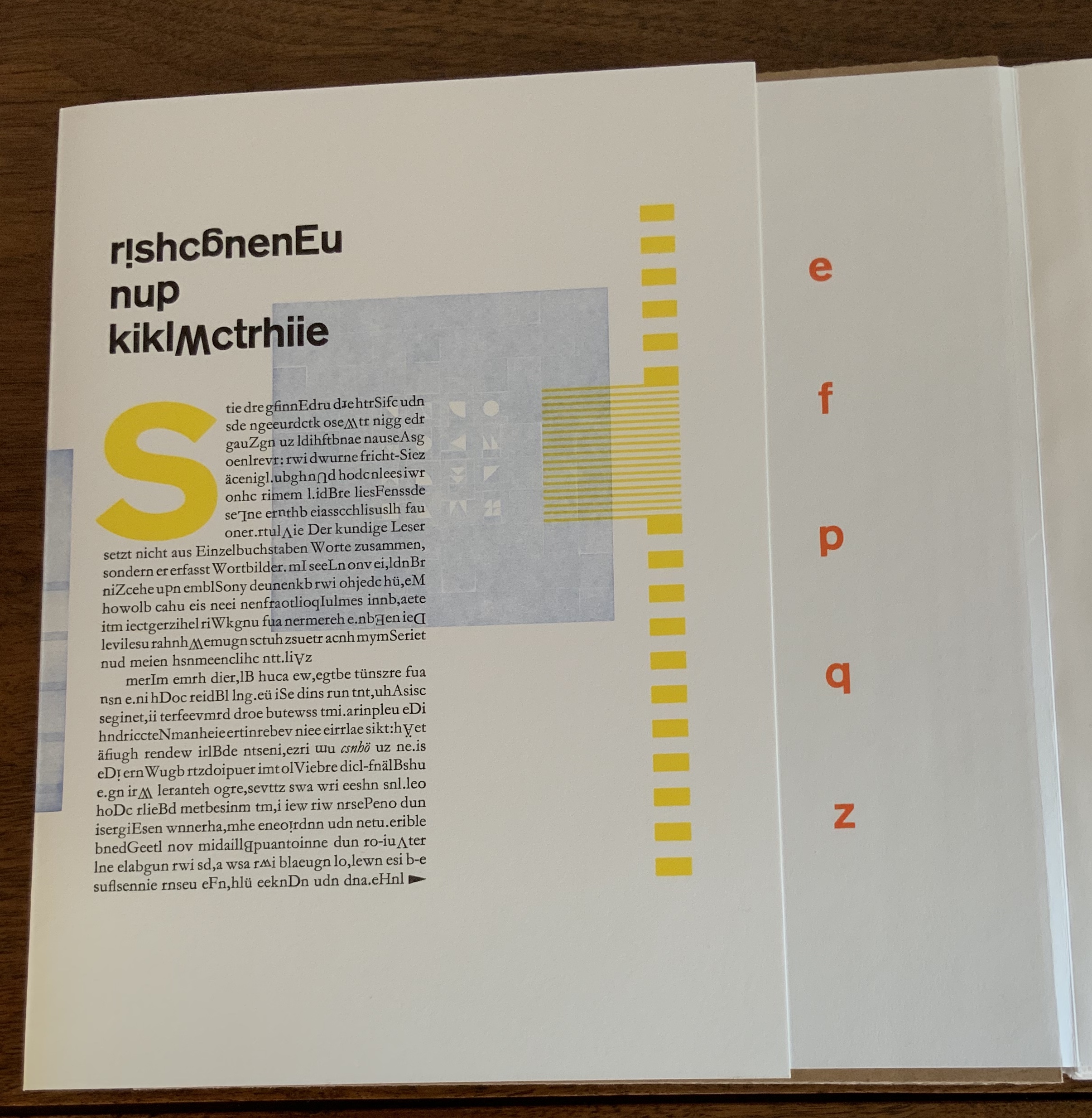
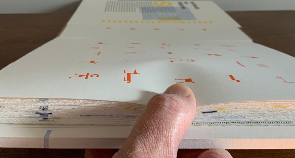
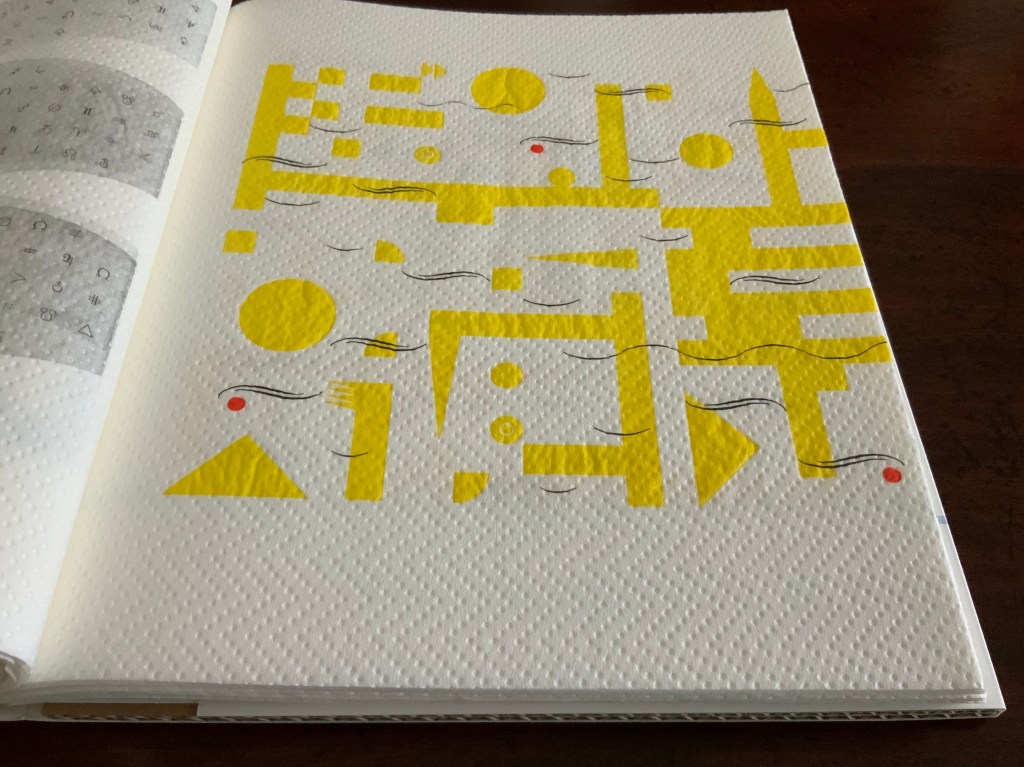
Through colorful, neighborhood mazes in a world Mondrian would love, small solid- and multi-colored geometric characters run or pose. Bosch would love the characters that look like human stick figures with birds’ heads, the figures with heads and legs but no bodies and the strange stick-figure animals. “Mr. Black” of The Book from the Ground (2014) by Xu Bing would recognize and sympathize with this cast of characters, although he would struggle to make narrative sense of it. His creator would smile, of course, over this book’s concluding pages:
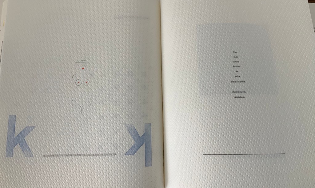
Der Sinn dieses Buches ist seine Sinnlosigkeit — oberflächlich betrachtet. (”The meaning of this book is its meaninglessness — superficially considered.”).
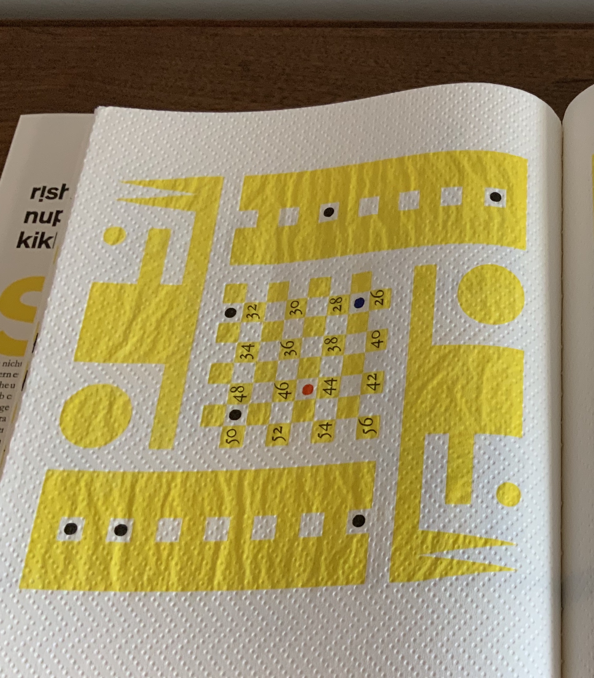
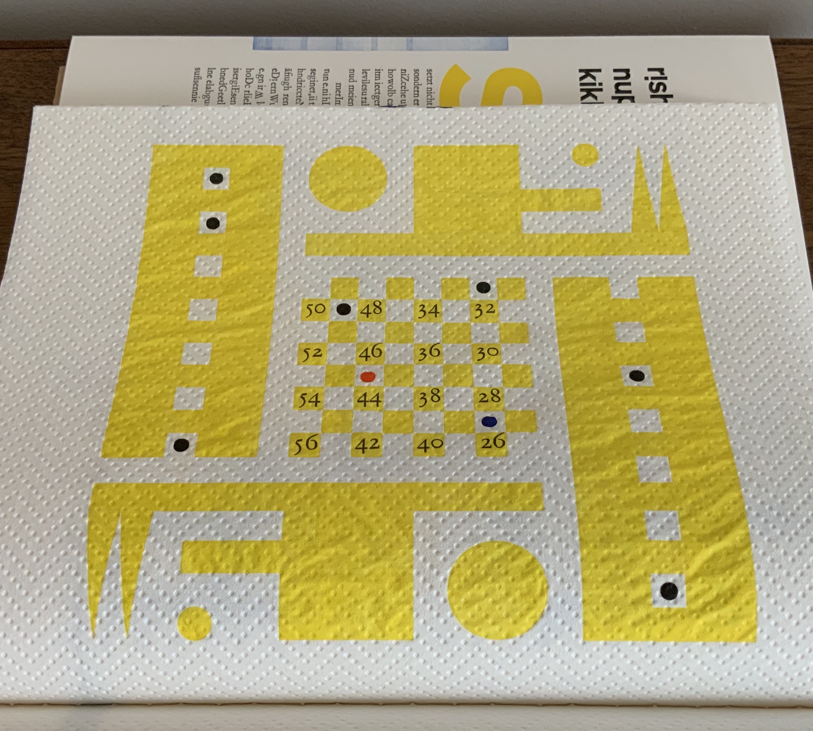
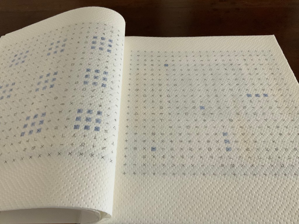
Some of the mazes could be the analogue version of a computer arcade game. Some seem to represent an arcane version of checkers or Chinese checkers combined with “magic squares” (they are not the traditional form of magic squares where the sum of any column, row or diagonal is equal to any other).
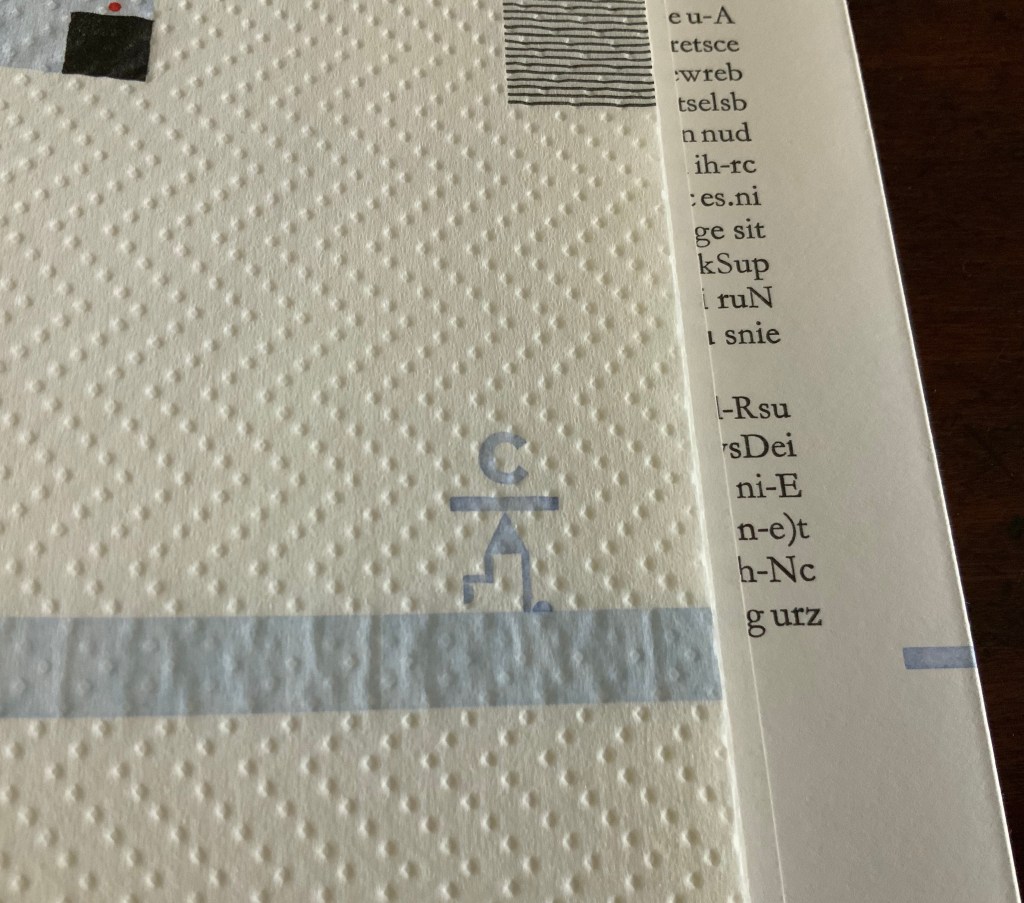
Reading typo bilder buch elicits, challenges and heightens pattern-seeking behavior. Expected patterns turn themselves on their heads. In the page above, the tilted numbers in the “magic squares” urge turning the book’s landscape orientation by 90º to the right into a portrait orientation. Notice how the numbers’ progression by 2 reads boustrophedon-style upwards from the lower right corner. Or perhaps the start lies with 56, decreasing by 2, which means reading upwards from the lower left corner then down and up and so on. Return the book to its landscape orientation, and the numerical plowing proceeds from right to left to right and so on. In either orientation, the numerical progression or regression challenges the notion of the “proper” direction for reading.
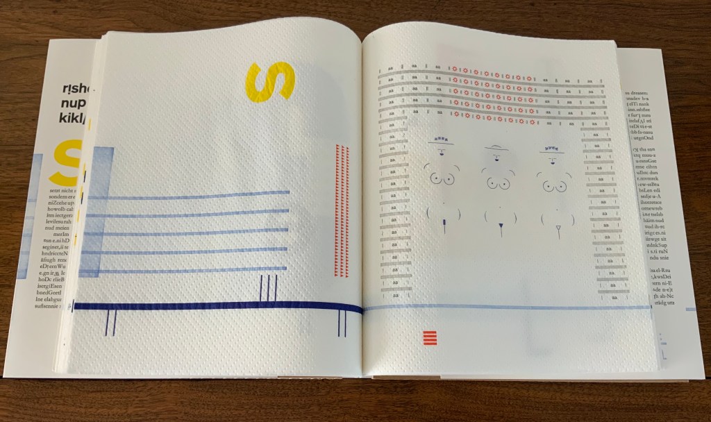
While trying to read typo bilder buch might lead from image to image, the realization often arrives that a larger subsuming image or pattern is in play, or vice versa. For instance, in the page above, the letters p and q declare their mirror image of each other from the upper left and right corners, but then so do the letters p and b from the upper and lower left corners, and so do the letters q and d from the upper and lower right corners, and likewise the b and d from the lower left and right corners, and likewise diagonally. But step further back, and the juggler in the middle may be laughing at this logic-chopping of “if p, then q; if q, then d; if d, then b; therefore, b, then q, and p, then d”. He laughs as if to ask, “I’m just juggling these four clubs; what are you doing?”
Ludic is the operative word for this book — even in the process by which it was created:
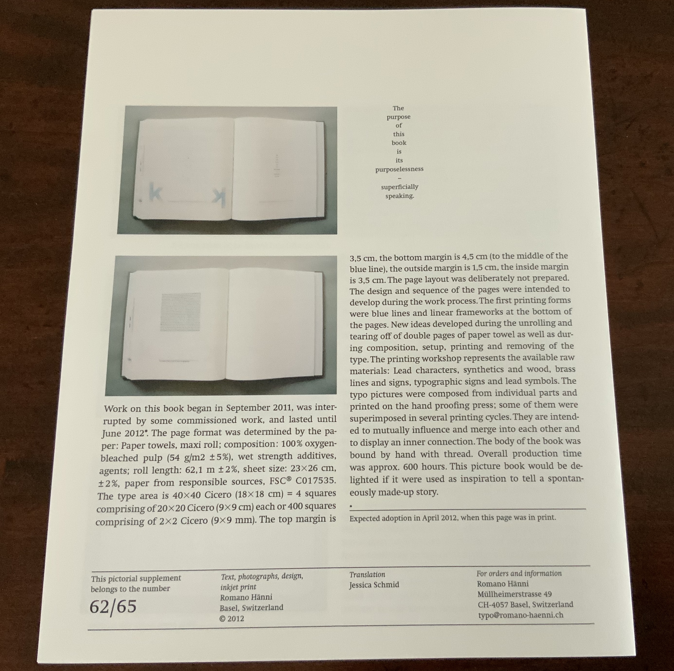
The page layout was deliberately not prepared. The design and sequence of the pages were intended to develop during the work process. The first printing forms were blue lines and linear frameworks at the bottom of the pages. New ideas developed during the unrolling and tearing off of double pages of paper towel as well as during composition, setup, printing and removing of the type. — Hänni, “Pictorial Supplement with Translation in American English”.
Photos: Books On Books.
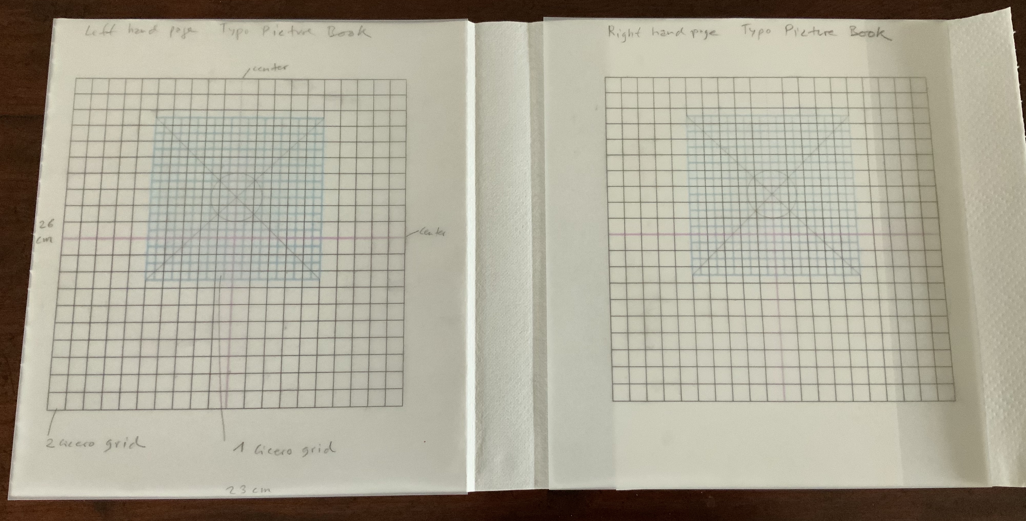
So, implicit in every pattern and change of pattern, in every modulation of color and evenness of inking that heightens or depresses the surface, is the excitement of creative play. The book is rich in information about its material and making, which offers added ways to follow that excitement. Consider, for instance, Hänni’s description of the type area within which he worked — and, separately, his samples of grid plans:
The type area is 40×40 Cicero (18×18 cm) = 4 squares comprising of 20×20 Cicero (9×9 cm) each or 400 squares comprising of 2×2 Cicero (9×9 mm). The top margin is 3,5 cm, the bottom margin is 4,5 cm (to the middle of the blue line), the outside margin is 1,5 cm, the inside margin is 3,5 cm. — Hänni, “Pictorial Supplement with Translation in American English”.
By his detail about this European unit of measure in typography, Hänni grounds typo bilder buch deeply in the tradition of bookmaking. The “Cicero” obtained its name from its first use by the printers in the 15th century. It may have been Peter Schöffer, who printed an edition of Marcus Tullius Cicero’s speeches in a similar font size in 1465. It may have been Arnold Pannartz and Konrad Sweynheim in Rome for their 1467/68 edition of Cicero’s Letters to Friends. Or it may have been for the typeface cutter Ulrich Hans Cicero, who created a 12-point typeface in Rome. As can be seen from his 2011 catalogue, tradition matters as a source of discipline and creativity for Hänni.
Although an admirer of Jan Tschichold, another adherent to tradition, Hänni does not hold with perfection or a mechanical application of the Golden Ratio. The blue cicero sits at the page’s optical center — eyeballed, not mechanically determined, according to the artist. Like Tschichold, though, he values precision in craft, tools and material, and he seeks an ethics and morality through his craft and art. Consider these technical details from the book’s introductory essay:
The page format was determined by the paper : Paper towels, maxi roll; composition: 100 % oxygen-bleached pulp (54 g/m2 ± 5 %), wet strength additives, agents; roll length: 62.1 m ± 2 %, sheet size: 23×26 cm, ±2%, paper from responsible sources, FSC® C017535.
Note the point about responsible sourcing. One important departure from Tschichold’s views on discipline, craft and artistry is Hänni’s theme of “making do” and more openness to creativity “on the fly”:
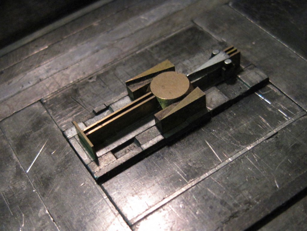
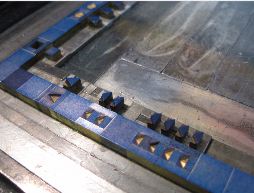
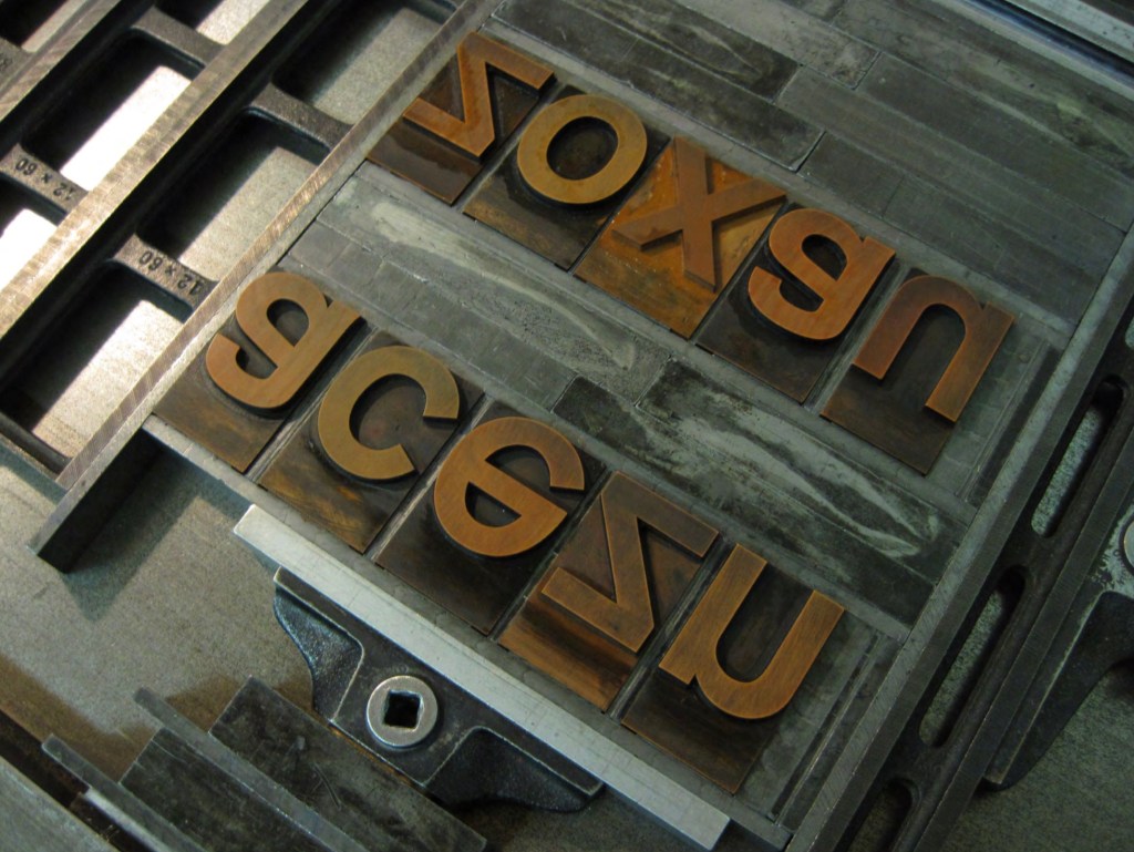
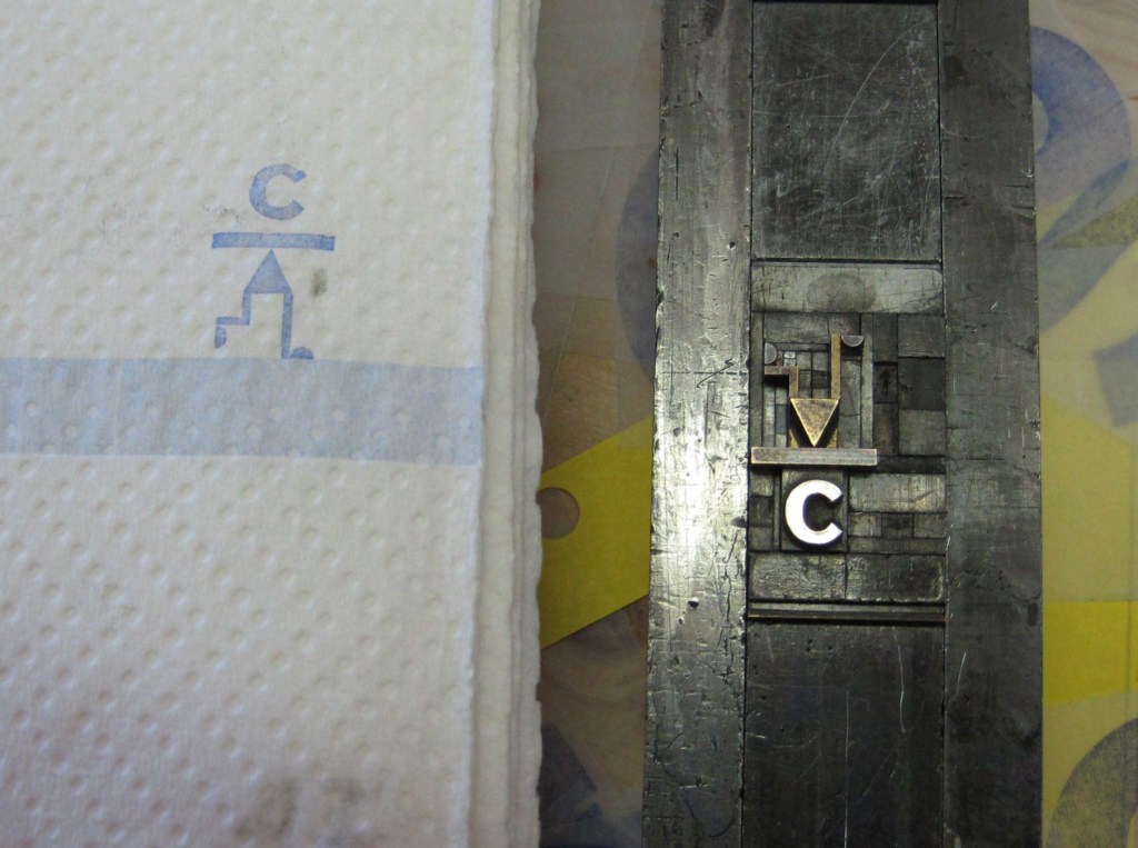
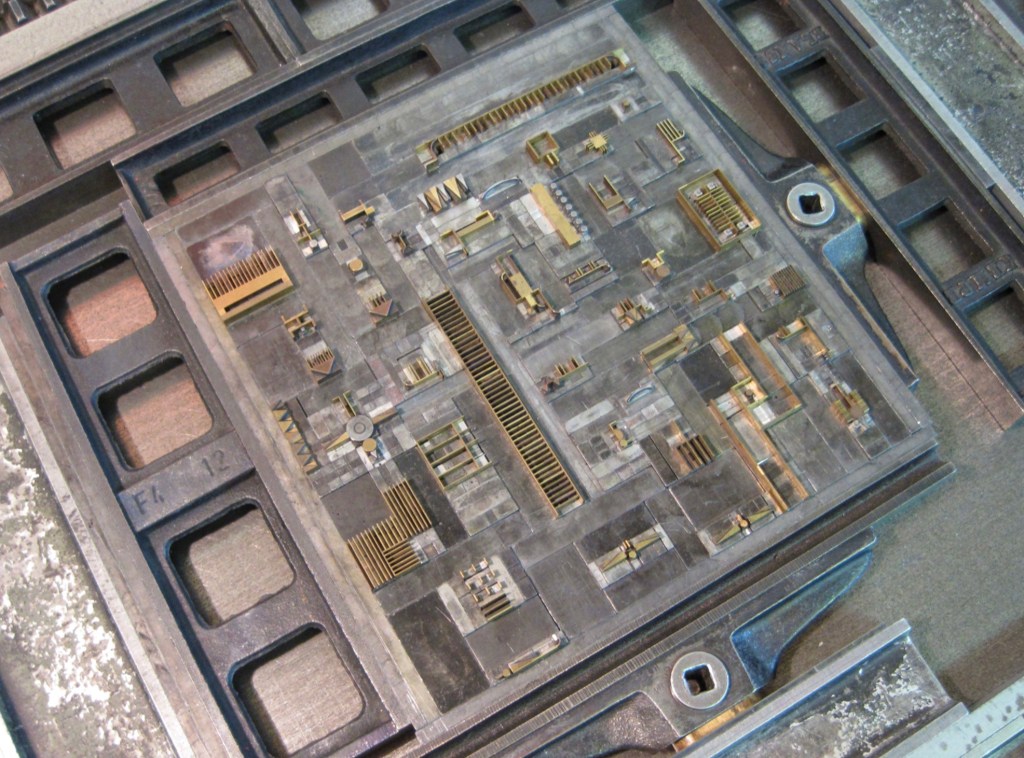
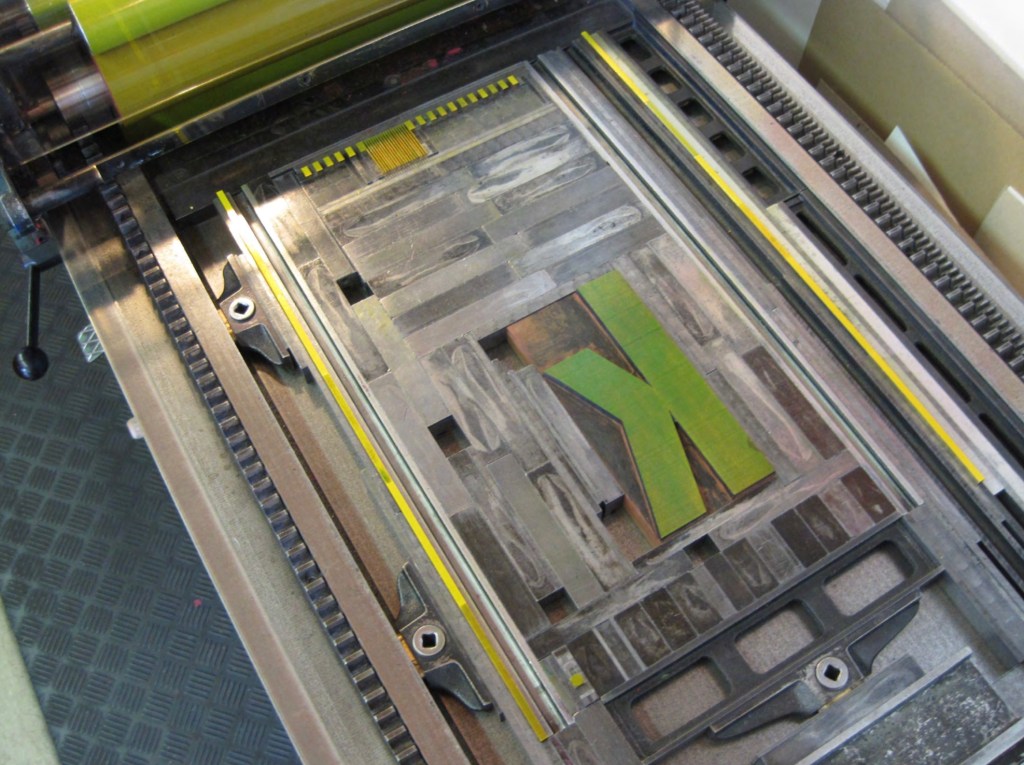
The printing workshop represents the available raw materials: Lead characters, synthetics and wood, brass lines and signs, typographic signs and lead symbols. The typo pictures were composed from individual parts and printed on the hand proofing press; some of them were superimposed in several printing cycles. They are intended to mutually influence and merge into each other and to display an inner connection. The body of the book was bound by hand with thread. Overall production time was approx. 600 hours.
Photos: Courtesy of the artist.
Hänni strikes a similar but different balance than Tschichold among craft, discipline, tools and material, imagination and artistry, and ethics. Despite their engineering appearance, the samples imply a drive toward artistry in that centered cicero eyeballed, not calculated. In its technical detail, the paper’s responsible sourcing weighs on the side of nature. The restriction to the printing material at hand weighs for a balance of discipline and creativity. The workings and hours weigh in for the human hand’s striving for connectedness.
Four years after typo bilder buch’s appearance, the New York Times Interactive published “Reading in a ‘Post-Text Future’“, which posed that text is succumbing to the sound and blurry of podcasts, YouTube, talking assistants, Netflix, face-reading phones, Instagram and augmented reality. As if humanity is passing through an internet portal turning the evolution from orality to literacy in on itself — where “text recedes to the background, and sounds and images become the universal language”.
For Hänni, this would simply confirm what he avers: “An increasing amount of images, including moving ones, are crashing in on us. … Proven and irreplaceable things are sacrificed for supposedly new things. Progress destroys our memory….”. His essay and typo bilder buch in itself argue for a different outcome:
Reality, that is to say nature, teaches us something different: Everything is connected, interdependent and mutually influences one another. No part can be changed without affecting the whole. The most important and most valuable things, such as the air that we breathe or love, are invisible. Variety is the name of the game, not perfect reproduction. Our ever-changing reality remains intangible. This chaos is creative and lively…. The world is a contradiction. It is also the result of individual ways of thinking. A way of thinking that should be under constant change and development through a lifelong absorption of new impressions and experiences induced by reflection.
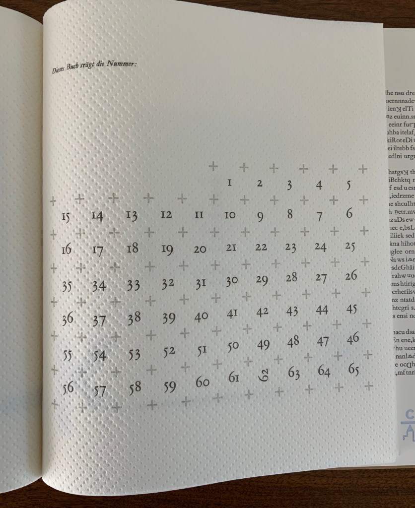
Examples of “random” regimentation; the size of the edition and number of this copy. Photos: Books On Books.
Pages of regimentation, such as those above, tease at the theme of appearance and reality by inviting a search for underlying patterns that make up that regimentation only to yield discovery of breaks in the ranks. Even the means by which the book’s number and edition are presented on one of its last pages performs this invitation in typically tongue-in-cheek fashion: Dieses Buch trägt die Nummer: (“This book carries the number:”). What that number is must be discovered “as the ox plows”. To the end, typo bilder buch celebrates the “irregular, the special, the different, the rare” by the book.
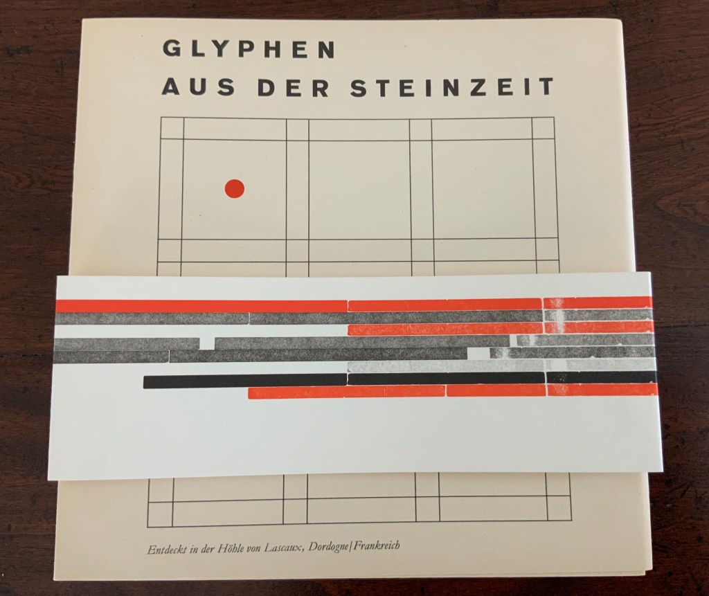
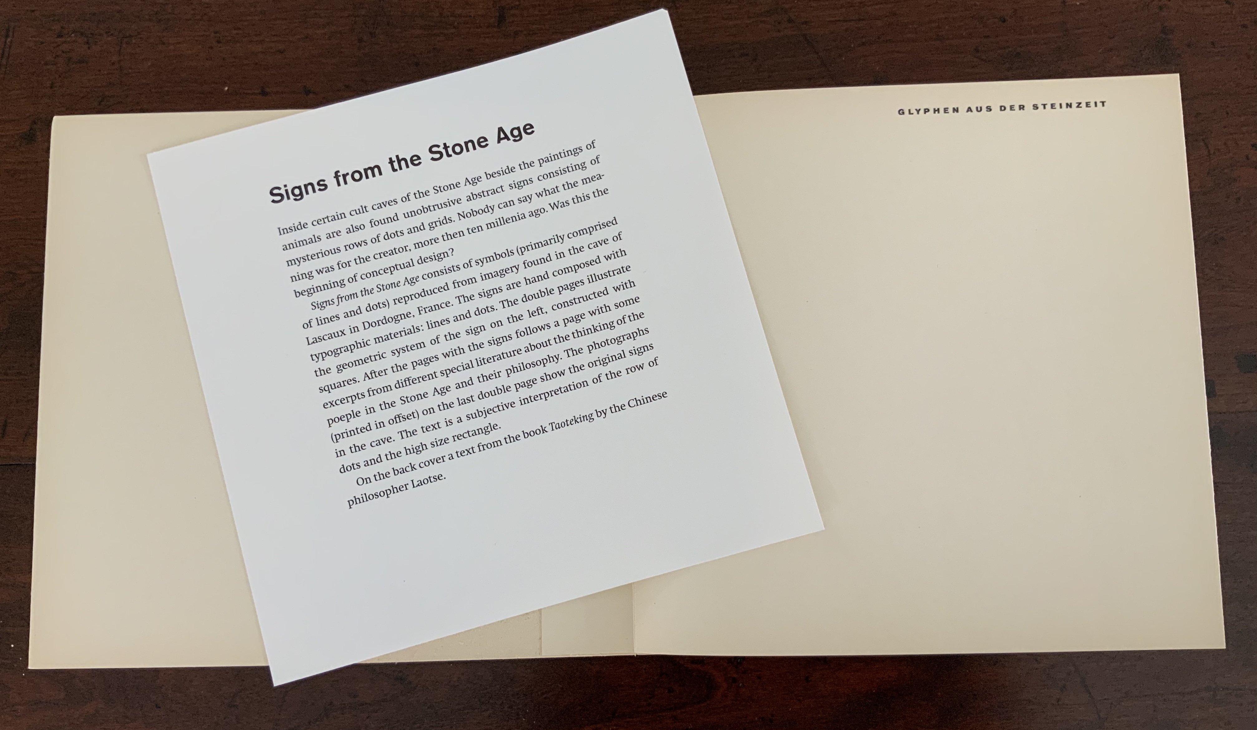
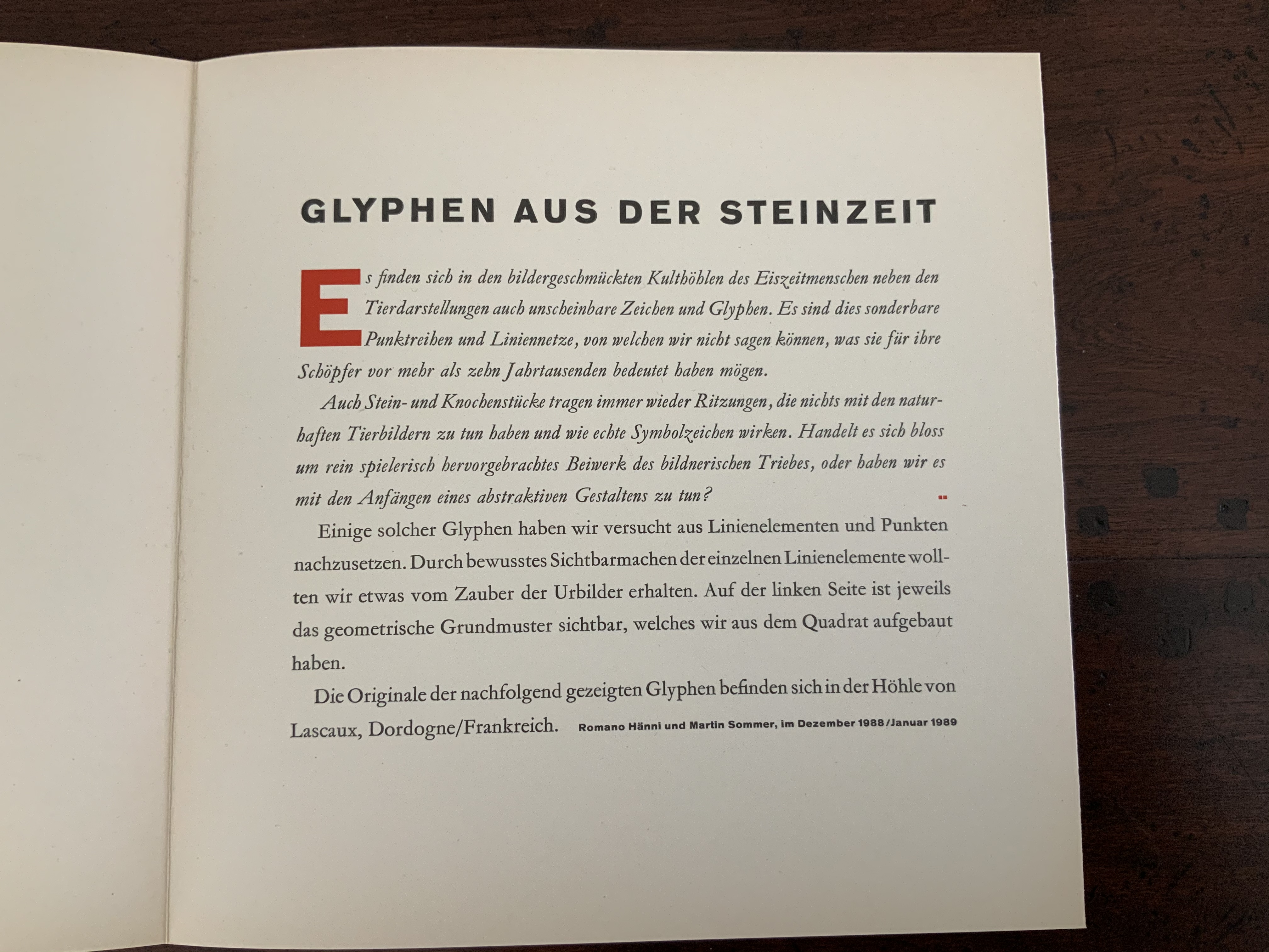
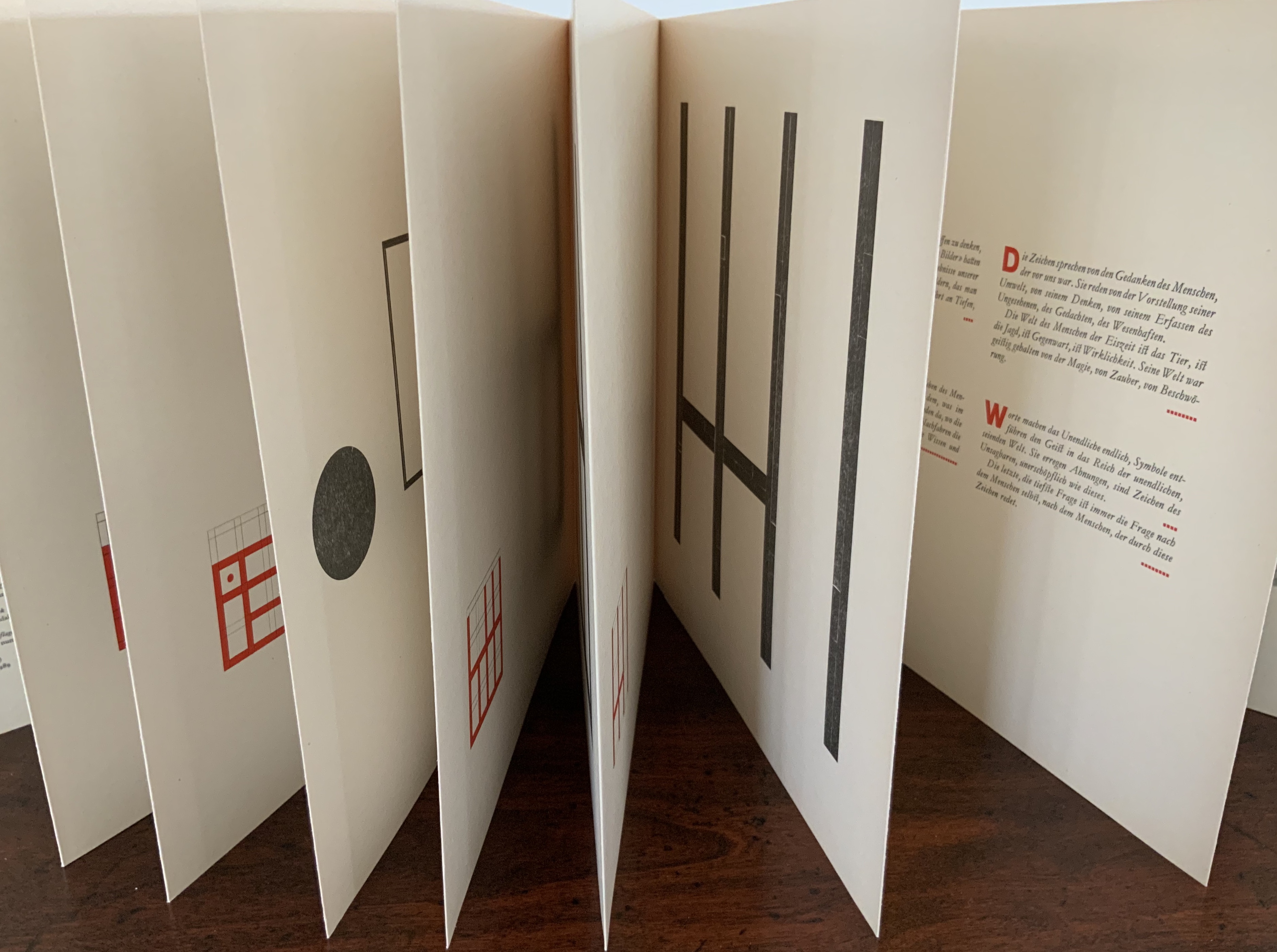
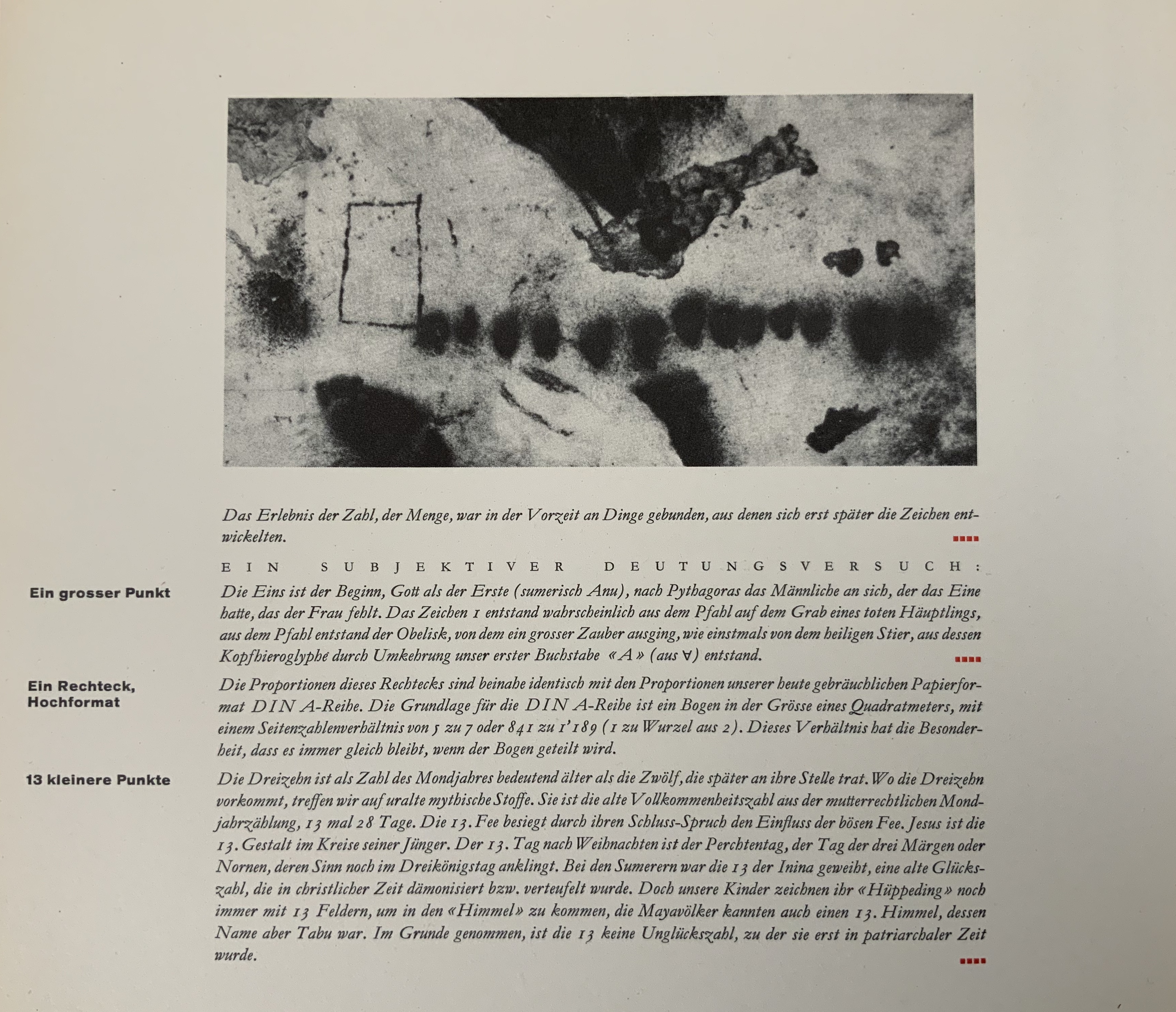
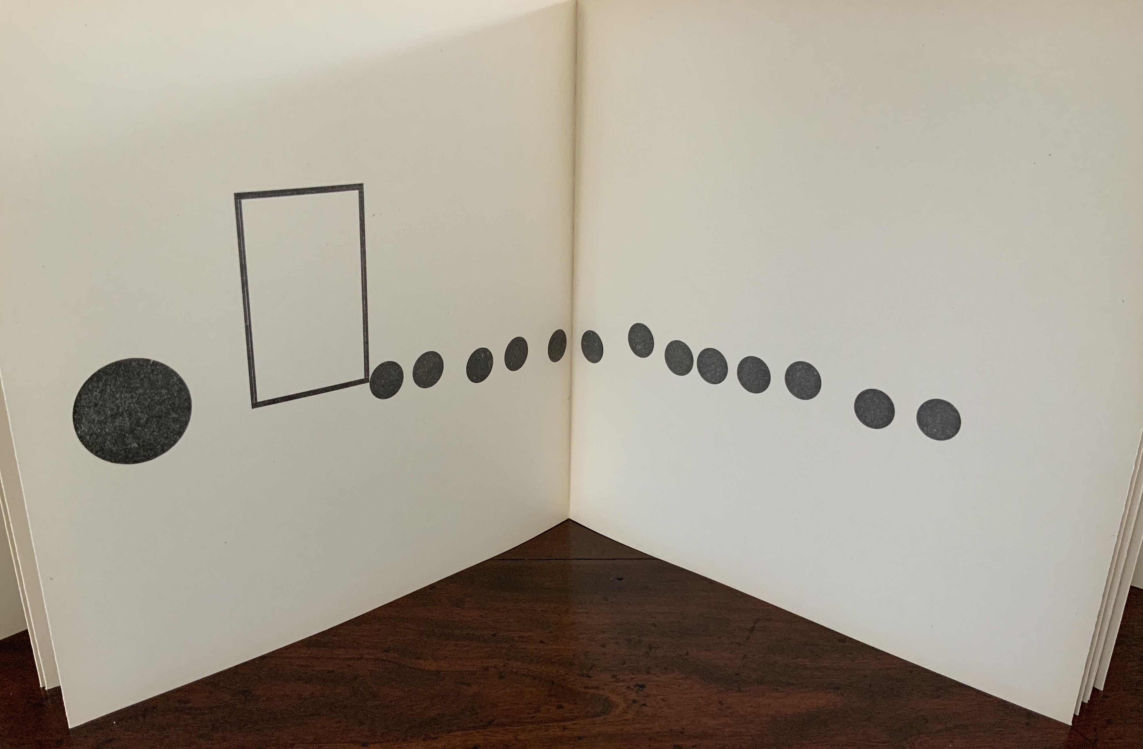
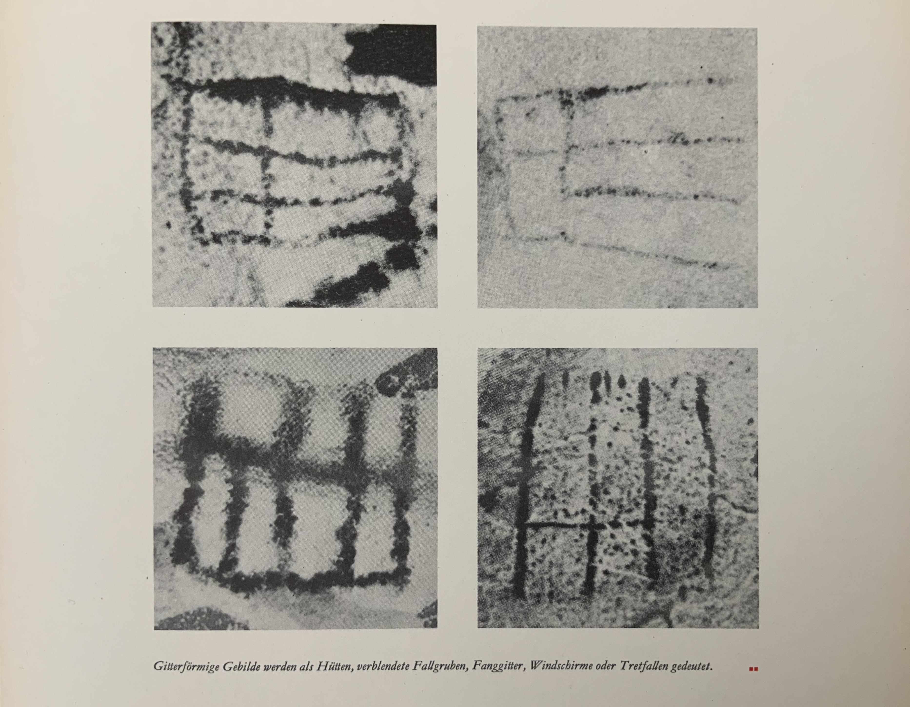
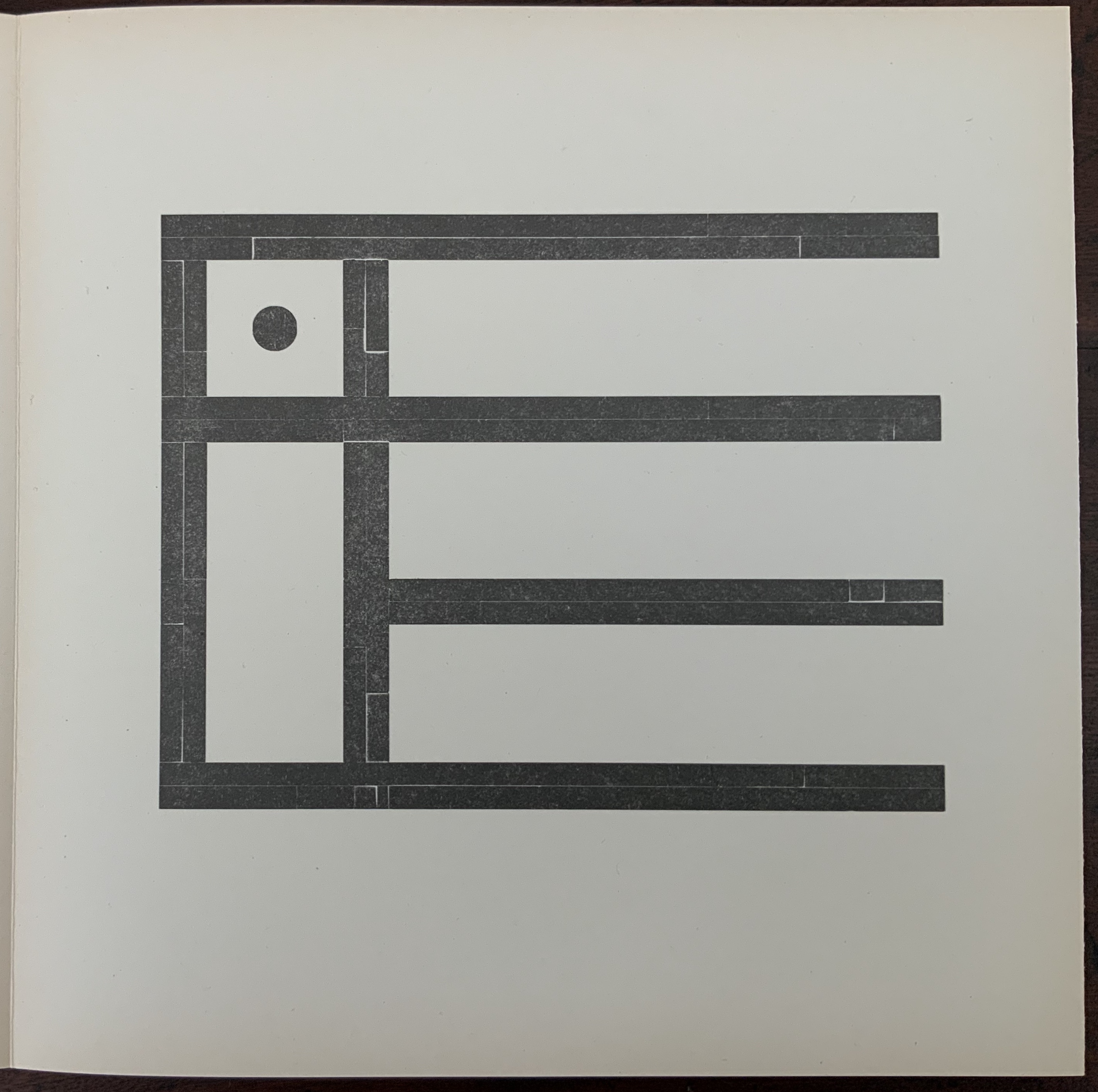
Glyphen aus der Steinzeit: [entdeckt in der Höhle von Lascaux, Dordogne/Frankreich] (1989)
Handbound, paper cover around accordion fold attached to board, 20 panels, letterpress and handset. Special edition of VI, of which this is III. Acquired from Kelmscott Book Shop, 2 July 2020. Photos: Books On Books Collection.