Books On Books Collection – Inscription: The Journal of Material Text, Issue 4 on Touch

Inscription: The Journal of Material Text, Issue 4 on Touch
Simon Morris, Gill Partington and Adam Smyth (eds.)
Cased perfect bound paperback, printed paper cover. 313 x 313 mm. 120 pages. ISSN: 2634-7210. Acquired from Information as Material, 29 November 2023.
Photos: Books On Books Collection.

Different readers will come to different conclusions on whether Inscription #4 dedicated to the subject of touch evokes the level of tactility in Melville’s famous Chapter 94 “A Squeeze of the Hand”. But all can agree that they share a certain seminality. Like Herman Melville with his preliminaries to Moby Dick, the editors of Inscription lead their fourth issue with definitions and choice quotations on the subject of “touch”, as much a Leviathan subject as that of Melville’s novel. Where Melville merged scholarly apparatus with narrative fiction to create a novel literary work, Simon Morris, Gill Partington and Adam Smyth have merged photography, poetry, augmented reality and audio with academic and critical essays to create a novel form of scholarship.

As noted in the review of Issue 2 on Holes, Inscription‘s composition is close to that of Aspen produced by Phyllis Johnson, and to this should be added the Fluxus productions inaugurated by George Maciunas, the AR Fluxus Box initiated by Art is Open Source (AOS) and Fake Press Publishing in 2010, and Franticham’s Assembling Box published by Redfoxpress (57 of them since 2010). Inscription‘s juxtaposition (sometimes fusion) of the imaginative with critical rigor continues to set it apart. In this particular issue, the contribution that most sets it apart from the preceding three is the editors’ reproduction of Robert Rauschenberg’s Automobile Tire Print (1953), with permission of the San Francisco Museum of Modern Art. The original consists of twenty attached sheets of paper over the length of which John Cage drove his car at Rauschenberg’s direction. Rauschenberg had placed a pool of sticky black paint in the car’s path. Here is the editor’s description of their use of the print:

To make the journal operate as an artist’s book for issue 4 of Inscription, we used Robert Rauschenberg’s Automobile Tire Print from 1953 to allow metaphorically John Cage to drive right through our journal, from left to right, following the direction of type and providing breaks (pun intended) that demarcate the space between different sections. (p. 111).

How is it that this makes the journal “operate as an artist’s book”? Well, perhaps as an Oulipean artist/editor’s book. The 726.4 cm of the Rauschenberg/Cage artwork is divided into double-page spreads of 62.6 cm (the journal’s trim size is 31.3 x 31.3) and thereby takes up 24 pages, leaving the editors 96 pages of the 120-page issue to allocate to the rest of the journal’s content. It is the internal frame for the artist’s book. The tire tread print provides a unifying thread and spatial constraint for the remaining contributions the artists/editors can accommodate. Some would-be contributor has to be left on the side of the road, or parts have to be ganged together into the trunk (or boot), or someone has to deliver urgent roadside assistance to fill in for a missing part. All to work with the Rauschenberg/Cage tire tread frame.

If this seems metaphorically far-fetched, consider the framing allusions in two of the issue’s sections: the table of contents and “The Grid” from the Fraser Muggeridge Studio. The former is the usually expected front matter signaling what’s to come, except for its unusual cross-hatch, frame-like layout; the second is the unusually extant appearance of the usually invisible set of guidelines for the layout of the pages, presumably offered up as the visible touchpoints or tracks that the rest of the issue follows and fills in. So the two standard unifying frames for any book allude with their line-crossing to that page-crossing, book-crossing internal frame of tire treads. And if, up to this point, the reader still doubts the allusion, a handprint and fingerprints in sticky black ink conclude the Muggeridge grid. This self-reflexivity is quintessentially how artists’ books operate.

Aside from the table of contents, the introductory Melvillean definitions and quotations, the Grid and the colophon, there are thirteen internal components to this issue of Inscription to be interspersed among the Rauschenberg/Cage skids. Most of them evoke the issue’s theme of touch visually, metaphorically and conceptually.

“Marking Readers: Pain, Pleasure, and the Nineteenth-Century Tactile Book” by Taylor Hare and John Gulledge explores the history of reading by touch “to argue that reading by touch … constituted an event in which reader and book each took the position of marker as well as marked, subject as well as object” and that “haptic encounters between books and readers … layered pain and pleasure overtop of one another in ways that scholars have yet to fully appreciate” (p. 6). Just as the body of the book can be studied to learn about humans’ reading, the bodies of readers by touch can be studied to learn about the body of the book.

“Make the Poem aka Language Fabric” by Ben Miller is a four-section extract from the long hand-scribed visual-textual poem Make, which has been excerpted in several literary magazines. Its thick lettering and doodles and its multidirectional, multipositioned text bleed across the gutter and off the top and bottom of the pages. On the lead-in page, there is a typeset “Aside to the kind reader” that instructs “Pick a point on the edge of each spread and slowly move a finger across the terrain at any angle. The action, repeated three times, is how I re-read for editing” (p. 21).

“‘The Divell’s Hand’: Touching Special Collections” by Matthew Shaw provides a special collection librarian’s and curator’s mixed views and metaphors on touch in an entertaining scroll from the anecdote about Charles II’s touching a purported demonic invocation inscribed in a 1539 linguistic history in the “divell’s hand” to anecdotes about the role of touch in the coronation of Charles III.

“All Fingers & Thumbs: Reading/Handling/Editing: Nabokov’s Pale Fire” by Gill Partington combines her exposition of her own altered-book revision of Vladimir Nabokov’s Pale Fire with a rumination on touch and reading.

Reading/Handling/Editing: Nabokov’s Pale Fire
Gill Partington

“Measuring the Sun –, 2023” by Jen Bervin and Deborah D. Mayer presents magnified photographs of embossments in packet VI of Fascicle 18 of Emily Dickinson’s poems held at the Harvard Houghton Library.

“The Felt Dimension: The Haptic Intuition of Hansjörg Mayer” by Bronac Ferran digs into the deep indentations that Mayer created in his Sixties works and makes the case that “we find traces of an early digital heritage embedded within the felt textures of print, given life within our fingers”.

“Sequences of Touch: Dried Flowers; Linen Rags; Rotten Potatoes; Wool Roving” by Sheryda Warrener, Claire Battershill, Amy E. Elkins, and Jayme Collins is a collaborative presentation of four hands-on engagements in craftwork: a poetry workshop based on the textile and matière-inspired work of Black Mountain artists Anni Albers, Josef Albers, Eva Hesse, Ruth Asawa and Sheila Hicks; an exploration of offcuts and hand papermaking; a revel in homemade inks potato prints; and a textile-production approach to Cecilia Vicuña’s poetry.

“Taction”, a poem by Vona Groarke, that challenges the reader: “bring your bare skin/ to the flesh of the words.”

“Letter as Monument: The Architectural Majuscule, the Inscriptional Page, and the Rise of Roman Type” by Katy Nelson makes a convincing case that the physicality of engraved Roman majuscules as well as their later ideal-driven geometric derivation secured their combination with the humanist miniscules in painting, manuscripts and printing.

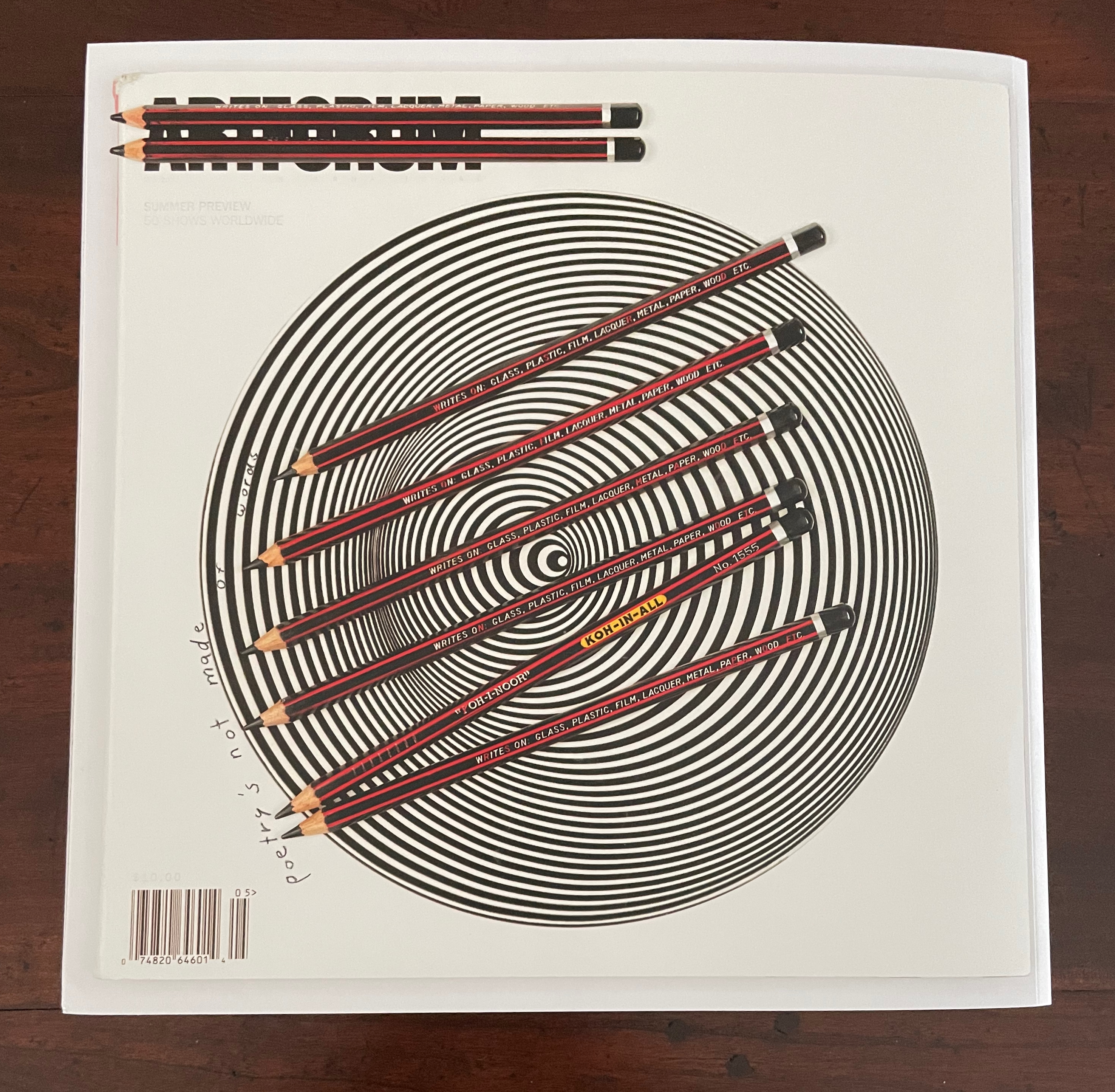
“A Play Between Illusion and Awareness of Illusion” by the editors — Simon Morris, Gill Partington, and Adam Smyth — explores Natalie Czech’s prints that appear on the front and back covers as well as pages 84, 87-89 and 91-93. The prints’ trompe l’oeil character not only provides the theme of the essay, it prompts the shift from matte to coated paper. The Zephyr and Koh-In-All pencils look three-dimensional enough to roll off the covers and page if the issue is tilted.

This change of paper is surprisingly the only distinctive use of paper in the bound issue. There’s no other change of surface nor any use of embossing or debossing in the printing to address the reader’s sense of touch. Only two of the items included separately and shrink-wrapped with issue 4 do more than flirt with the physical sense of touch: Fraser Muggeridge Studio’s embossed card and Steve Ronnie’s and for you (love), which was originally produced with a Perkins mechanical Brailler.

Foilblock on 360 gsm Materica Gesso. Fraser Muggeridge Studio

Fabriano 5 300 gsm watercolor card with the characters “and for y” repeating over nine lines to surround the characters “love” in the fifth. Steve Ronnie.

Although all of the other items each vary in weight and finish, they primarily evoke the sense of touch visually, metaphorically or conceptually — like the bound issue except for its aforementioned one switch from matte to coated paper. There is one item, or rather feature, that has no weight or finish: a pair of QR codes, engineered by Katarina Rankovic and Ian Truelove, that enable the reader’s smartphone to activate the augmented reality features of Instagram when pointed at the front and back covers of Inscription 4 — and, of course, tapped with a finger.

First row, left to right: Leonora Barros, POEMA; Yoko Ono, Touch Poem for a Group of People; Harold Offeh, Holding On.
Second row: Alice Attie, Roland Barthes (from the series Annotations); Mohammed Hafeda, The touching of borders; Erica Baum, untitled (Finger-prints).
Third row: Graham Ellard & Stephen Johnstone, Geneva Express side of LP vinyl jacket; Geneva Express side of LP sleeve; jacket insert showing photo of Geneva Express installation; reverse of jacket insert showing photo of Wall of Death installation.
Fourth row: Ellard & Johnstone, Wall of Death side of LP vinyl record jacket; Wall of Death side of LP sleeve.

Papers made of stone, glass, plastic, metal, fabric and all sorts of vegetal material could have increased the variety of tactile sensations. Budget permitting, perhaps a future issue of Inscription will take the theme of “substrate” and demonstrate physically — as well as discuss and depict — how the surface of inscription contributes materially to the meaning of the inscribed. Nevertheless, like the previous three issues, Inscription 4 — as is — bursts with academic insights to appreciate and pursue, art and literature to enjoy and ponder, and production artistry at which to marvel.*

*In correspondence (21 February 2024), Simon Morris has mentioned a philatelic touch to be found in Jen Bervin and Deborah D. Mayer’s contribution on Emily Dickinson. To provide further clues would rob the feeling reader of the hunt and, perhaps, the editors of a subscription from a library yet to have recognized that any serious collection of works on art and literary theory or the history of the book or artists’ books must have these four issues (and those to come) on board.

Further Reading

Inscription 1“. 15 October 2020. Books On Books Collection.

Inscription 2“. 29 May 2022. Books On Books Collection.

Inscription 3“. Books On Books Collection.

Peter and Pat Gentenaar-Torley“. 10 October 2019. Editors of the seven Rijswijk Paper Biennial books. Books On Books Collection.

Fred Siegenthaler“. 10 January 2021. Books On Books Collection. Strange Papers presents dozens of sample papers made of exotic materials such as glass and asbestos as well as a wide range of vegetal sources.

Till Verclas“. 12 October 2019. Books On Books Collection. See Winterbook for an outstanding use of acetate as substrate.

Pallasmaa, Juhani. 1996. The Eyes of the Skin. London: Academy Editions.

Pallasmaa, Juhani. 2009. The Thinking Hand. Chichester, UK: Wiley.

Pallasmaa, Juhani. 2011. The Embodied Image. Chichester, UK: Wiley.