Here are two works that show how the substrate of the book can be the primary element of making art and meaning. When it comes to paper, the fireworks in most artists’ books focus on printing or structural displays. Susan Mills describes herself as not just a book artist but “a conceptual rural urban bookbinding poet artist working in book form” (Mills, 2025). She does not practice printing or printmaking. She produces her books without the use of a printing press and handbinds them using innovative structures, bindings, and materials. She lets the paper itself shine — as surface and as “paint”.
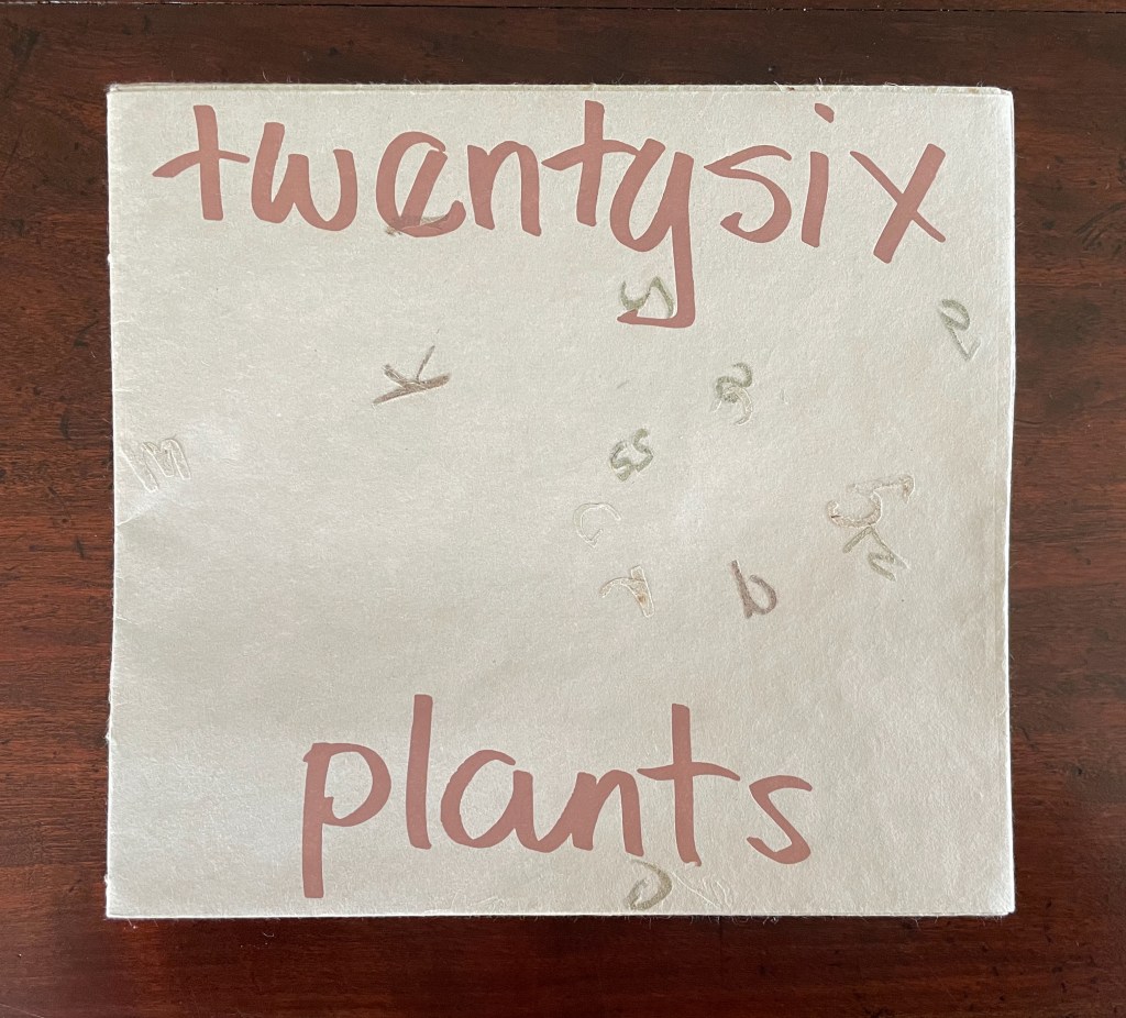
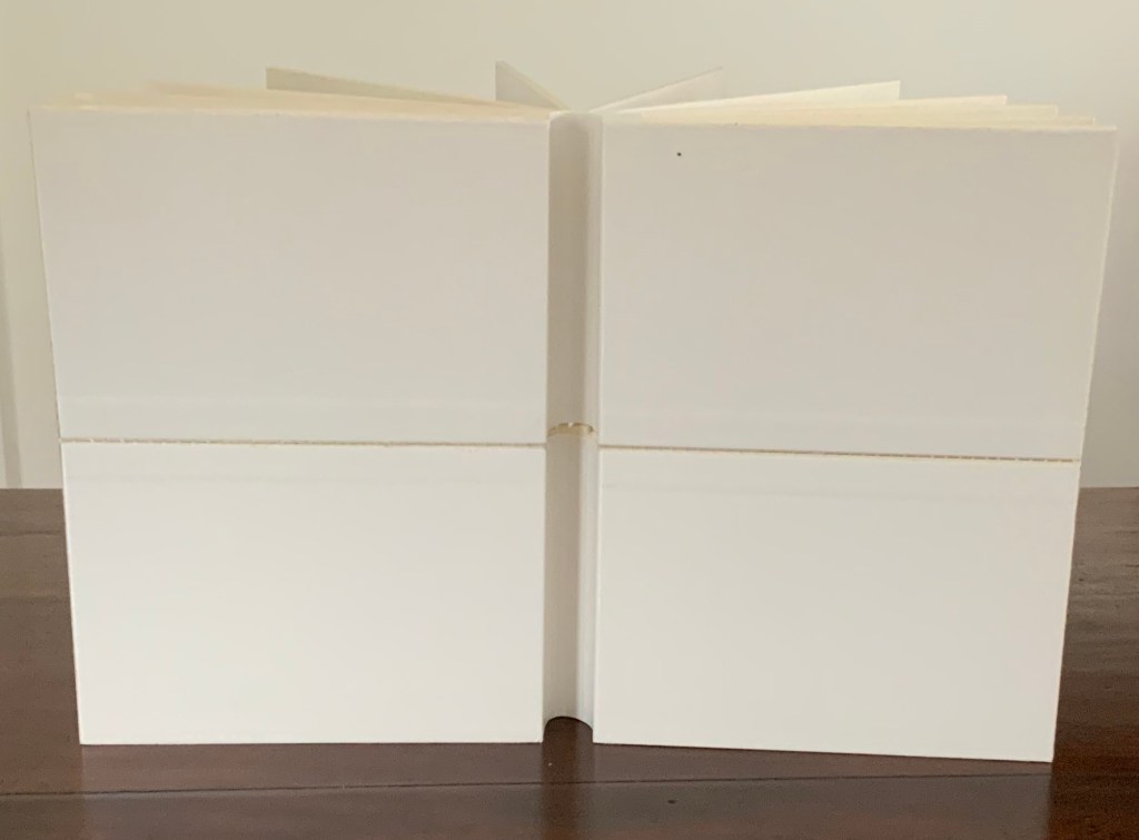
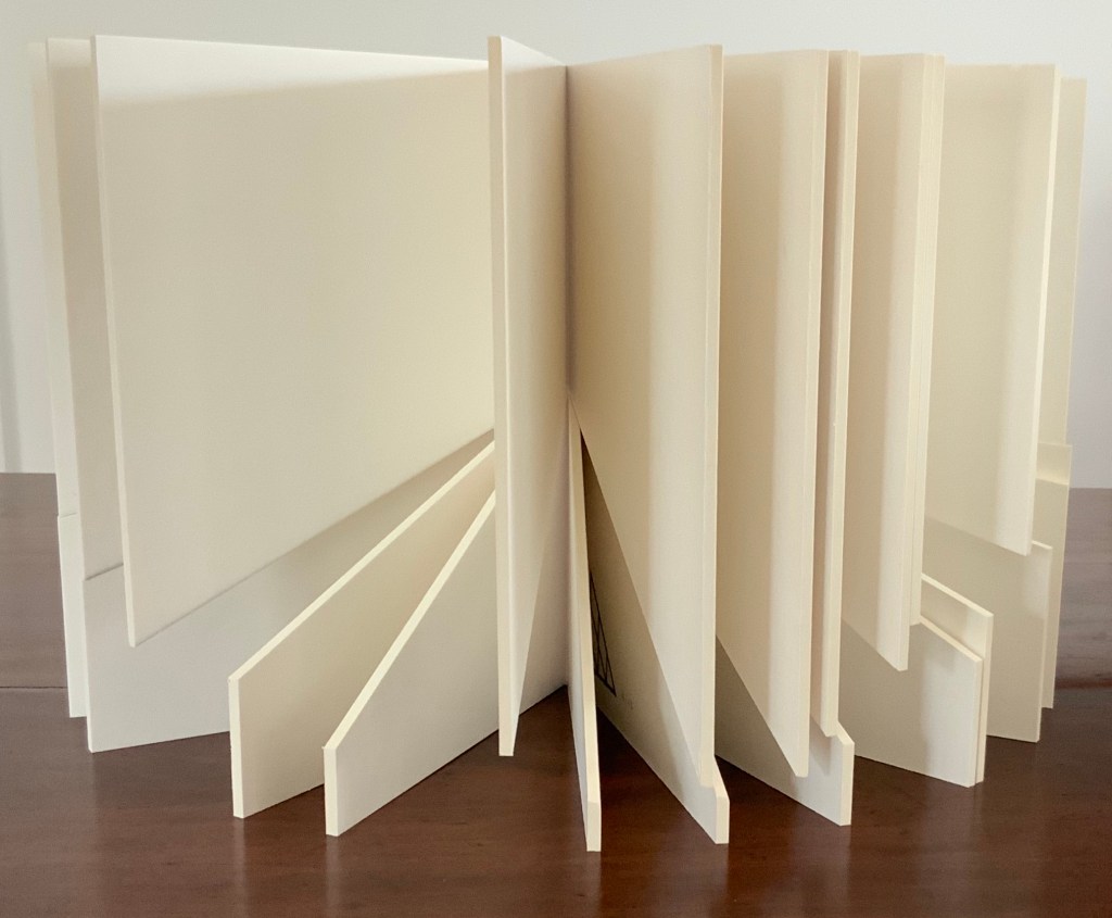
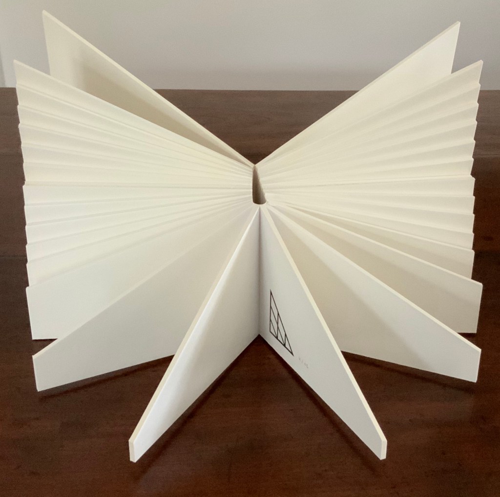
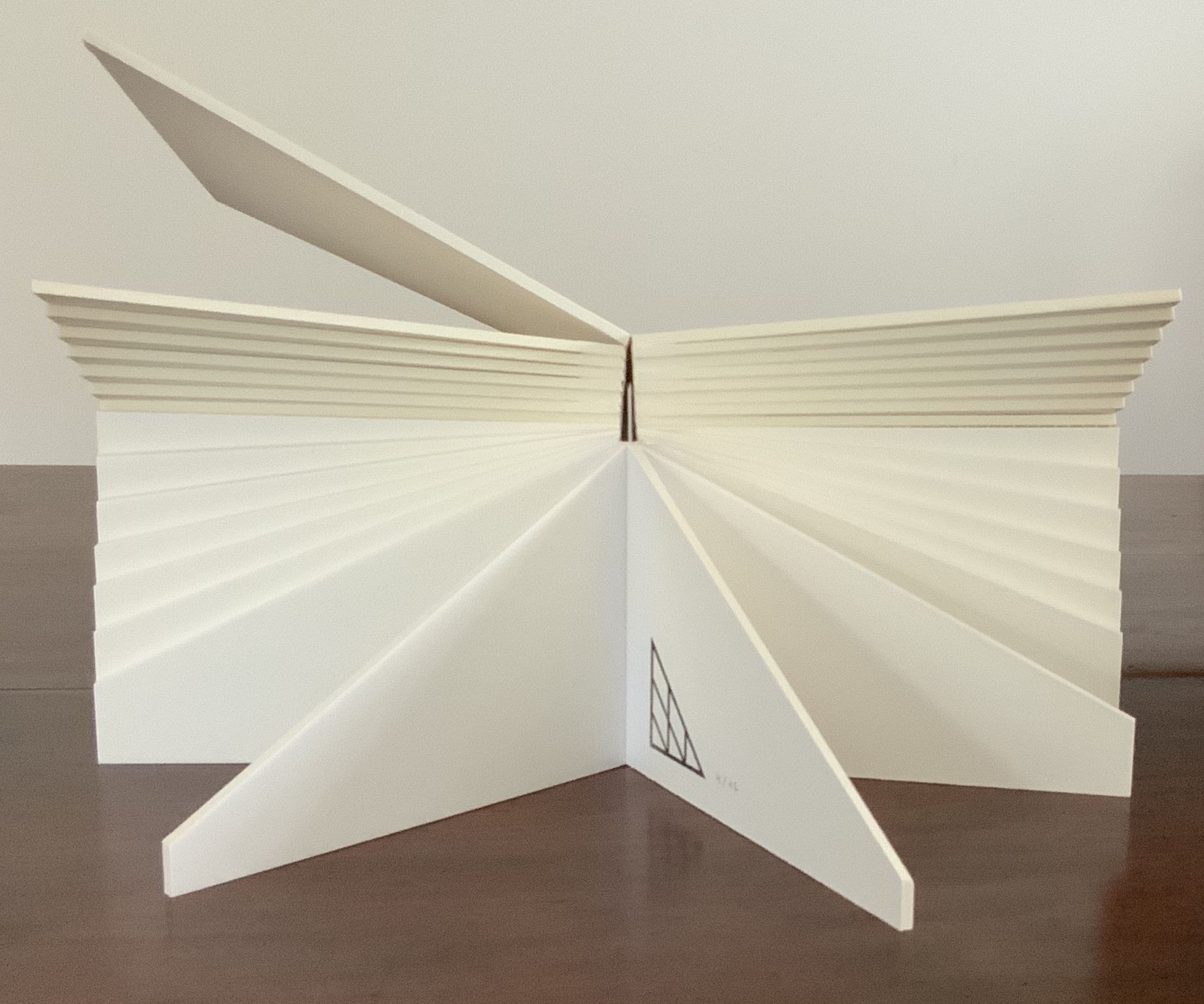
Twentysix Plants (2013)
Susan Mills’ Twentysix Plants puts handmade paper at the center of its artistry as it nods to Ed Ruscha’s Twentysix Gasoline Stations (1963). It consists of twenty-seven different papers. Twenty-six of them were each made from one of twenty-six different plants. A small amount of abaca was added to the different pulps to ease them through the Hollander Beater. After the sheets were couched, dried, and readied for use, Mills “labeled” them by cutting out the name of the constituent plant in distinctive callitomic letters. For the cover paper, the twenty-seventh paper, the twenty-six cut-out scripts went into the vat.
If Twentysix Plants were an abecedarium, it would be arguable that, just as our words are made from the alphabet’s letters, so the cover of Twentysix Plants is made from all the plants used in the book. There they are, embodied in their fragmented names, embedded in the cover. But neither Twentysix Plants nor Twentysix Gasoline Stations is an A-Z.
Twentysix Plants (2013) Susan Mills Softcover with exposed spine, link-stitch and kettle-stitch sewn, and non-adhesive interlocking folios. H205 x W225 mm. [26] pages. Edition of 50, of which this is #4. Acquired from the artist, 9 February 2026. Photos: Books On Books Collection.
Inscription: The Journal of Material Text, Issue 4 on Touch Simon Morris, Gill Partington and Adam Smyth (eds.) Cased perfect bound paperback, printed paper cover. 313 x 313 mm. 120 pages. ISSN: 2634-7210. Acquired from Information as Material, 29 November 2023. Photos: Books On Books Collection.
Different readers will come to different conclusions on whether Inscription #4 dedicated to the subject of touch evokes the level of tactility in Melville’s famous Chapter 94 “A Squeeze of the Hand”. But all can agree that they share a certain seminality. Like Herman Melville with his preliminaries to Moby Dick, the editors of Inscription lead their fourth issue with definitions and choice quotations on the subject of “touch”, as much a Leviathan subject as that of Melville’s novel. Where Melville merged scholarly apparatus with narrative fiction to create a novel literary work, Simon Morris, Gill Partington and Adam Smyth have merged photography, poetry, augmented reality and audio with academic and critical essays to create a novel form of scholarship.
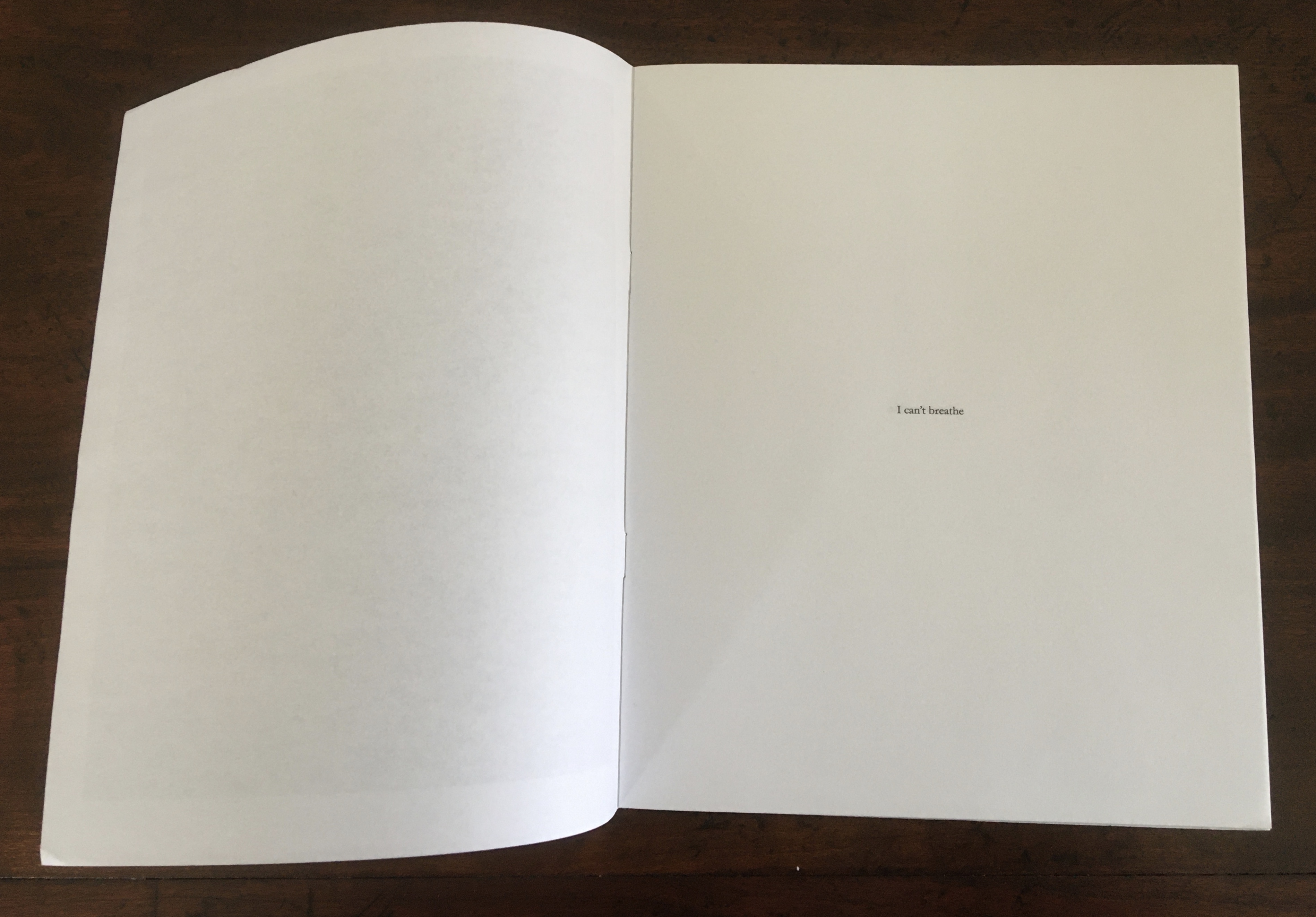
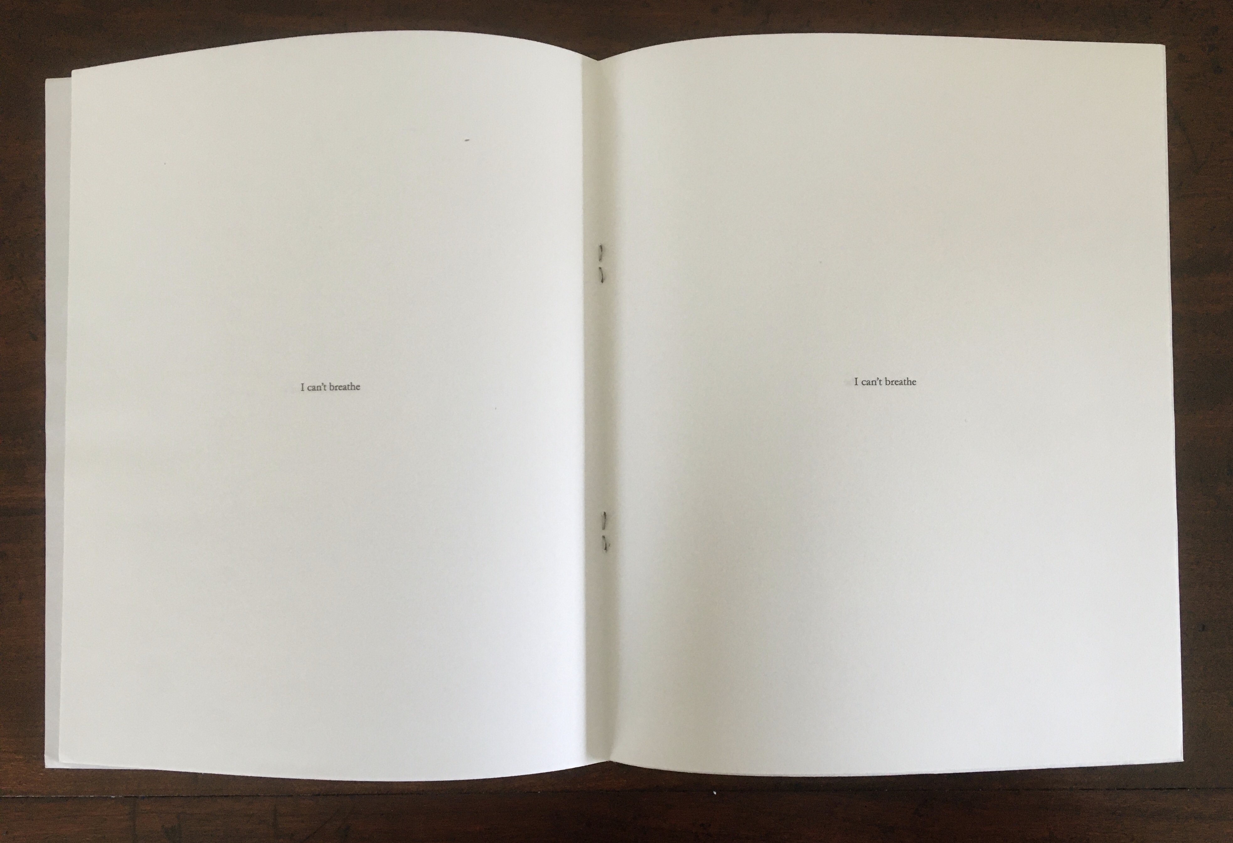
I Can’t Breathe (2015) Antoine Lefebvre Éditions Saddle-stitched with staples. Digital print. 16 pages. H218 x W178 mm. Edition of 100 copies. Acquired from the artist, 29 August 2020. Photos: Books On Books Collection. Displayed with permission of the artist.
I Can’t Breathe is the first publication made under Lefebvre’s imprint. He labels it a “zine” and calls it a “gut reaction” to the murder of Eric Garner. Lefebvre is one of several book artists who have lifted up Garner’s last words or his name since 17 July 2014. The work makes its simple but powerful statement by bordering the cover’s monumental black square with white and enveloping the eleven utterances of Garner’s last words in a field of white.
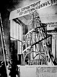
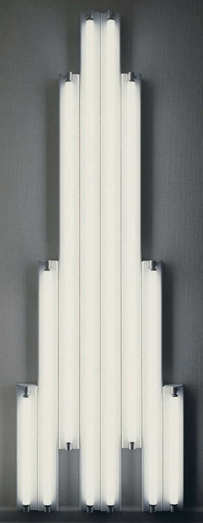
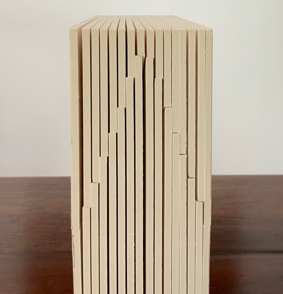
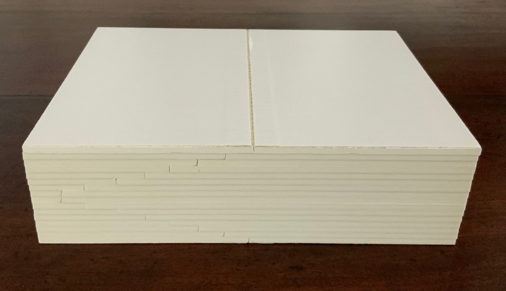
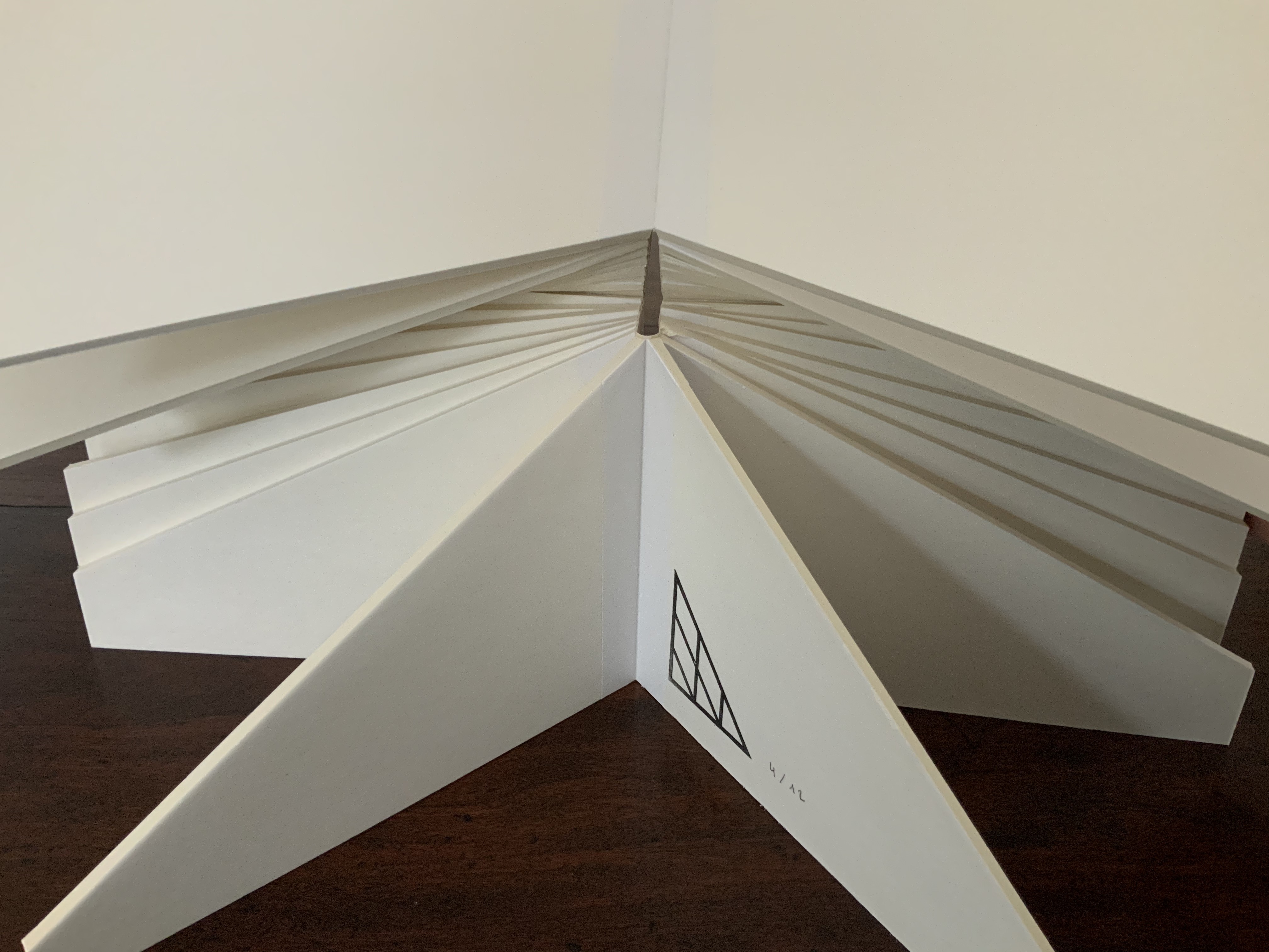
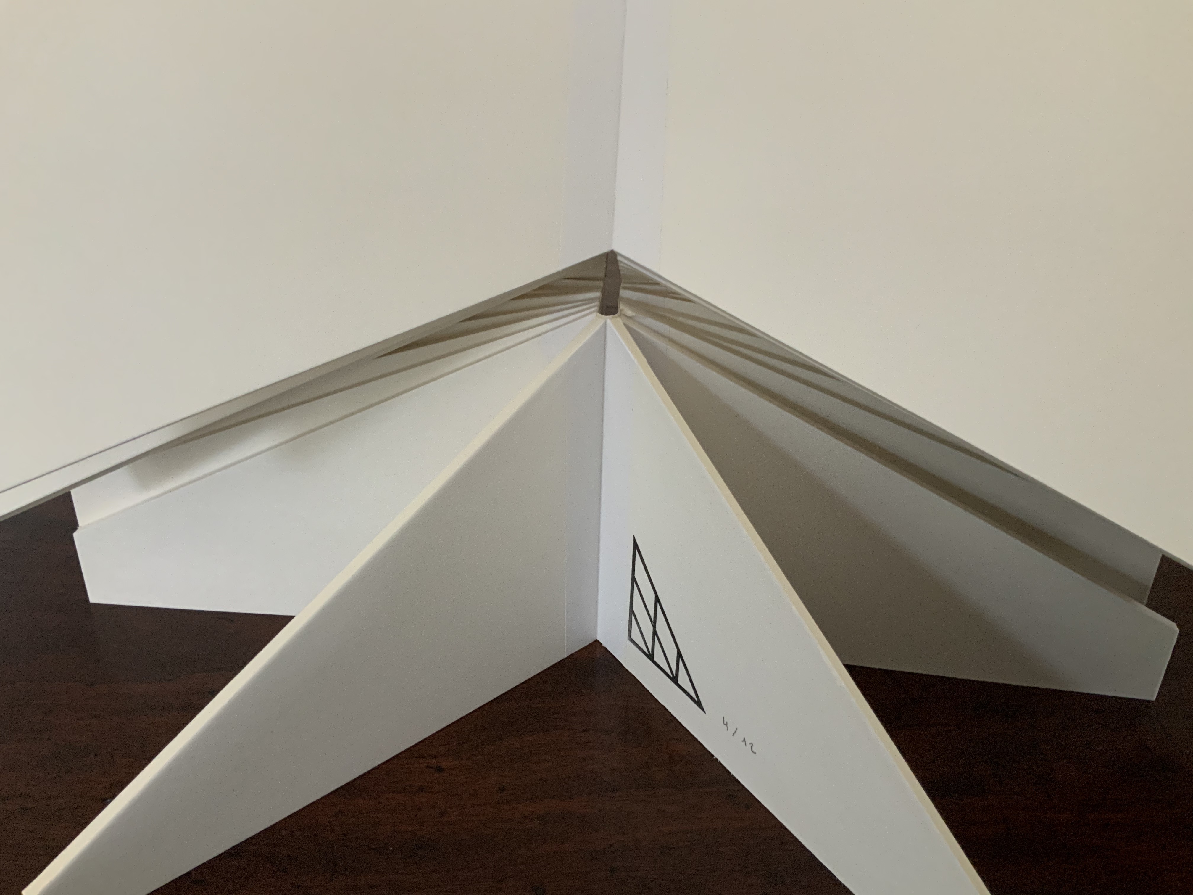
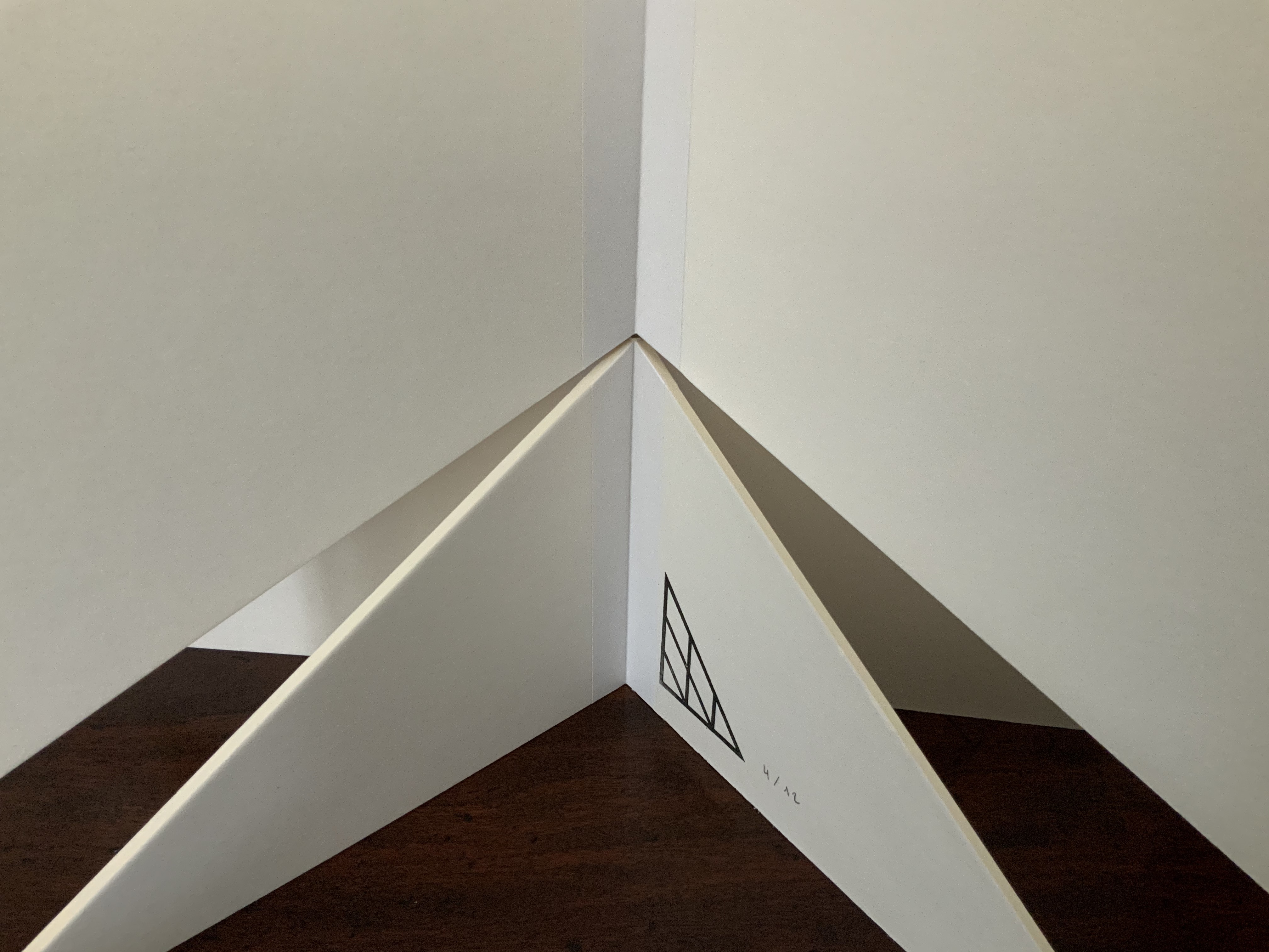
Monument to the Third International (2015)
Monument to the Third International (2015) Antoine Lefebvre Éditions Book object, 200 x 150 x 50 mm (closed), 350 mm diameter (open). Edition of 12 + 4 AP, of which this is #4. Acquired from the artist, 29 August 2020. Photos: Books On Books Collection. Displayed with permission of the artist.
The second work under his own imprint, this sculptural artist’s book pays homage to Vladimir Tatlin’s Constructivist tower design for a monument to the Communist International, known as the Comintern or Third International, which lasted from 1919 to 1943.
When opened along its horizontal axis, the work echoes the shape of Tatin’s tower design. Also, when closed, the book’s fore-edge mimics the 1964 version of Dan Flavin’s “Monument” For V. Tatlin, bringing it into the category of “homage to an homage”, such as Michalis Pichler’s homage to Marcel Broodthaers’ homage to Stéphane Mallarmé or, from genres other than book art, Johan Karlsson’s homage to Vera Molnár’s homage to Albrecht Durer or, to stretch a point, Nam June Paik’s homage to Albers’ Homage to the Square or Andrew Wenrick’s homage to the same.
Lefebvre’s Monument is a ludic masterpiece to be read with the hands as well as the eyes. Its physicality and whiteness might remind the viewer of “The White Heat”, organized by Marc Straus. Held, or looked at, in its closed state, it might recall the more somber Absence by J. Meejin Yoo.
Opening the work.
Closing the work.
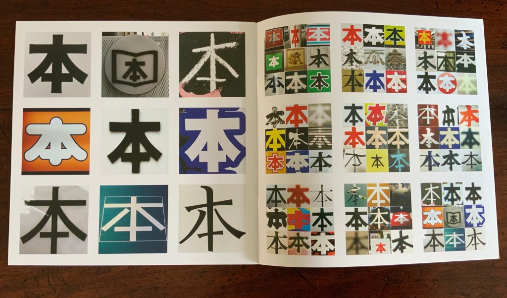
本 (2016)
木 (2016) Antoine Lefebvre Éditions H209 x W209 mm, 12 pages. Unnumbered edition of 250. Acquired from the artist, 2 October 2020. Photos: Books On Books Collection. Displayed with permission of the artist.
The kanji sign 本 on its own means “book”. During his residency at the Palais de Paris in Takasaki, Japan, Lefebvre became obsessed with the character and photographed it whenever he could. Eventually he not only created this work, influenced by Sol LeWitt’s PhotoGrids (1977), but used it to name his bookshop in Paris.
Photos: Books On Books Collection. Displayed with permission of the artist.
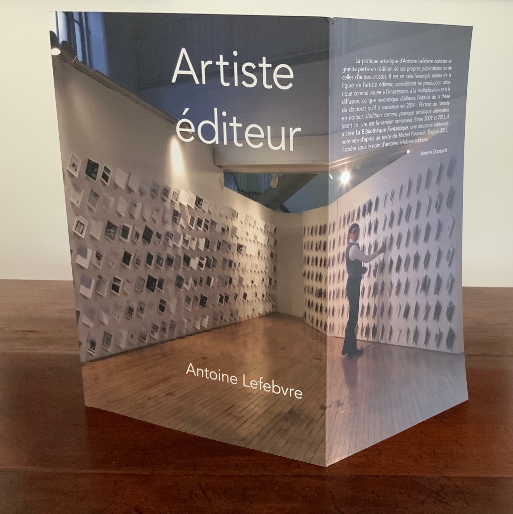
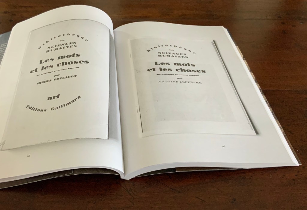
Lefebvre thinks of himself not as an artist and publisher but rather as an “artist publisher” — artiste éditeur — which is the title of the book based on his dissertation. Lefebvre not only expounds his thesis in the pages of the book, he demonstrates — or rather realizes — it in La Bibliothèque Fantastique (LBF).
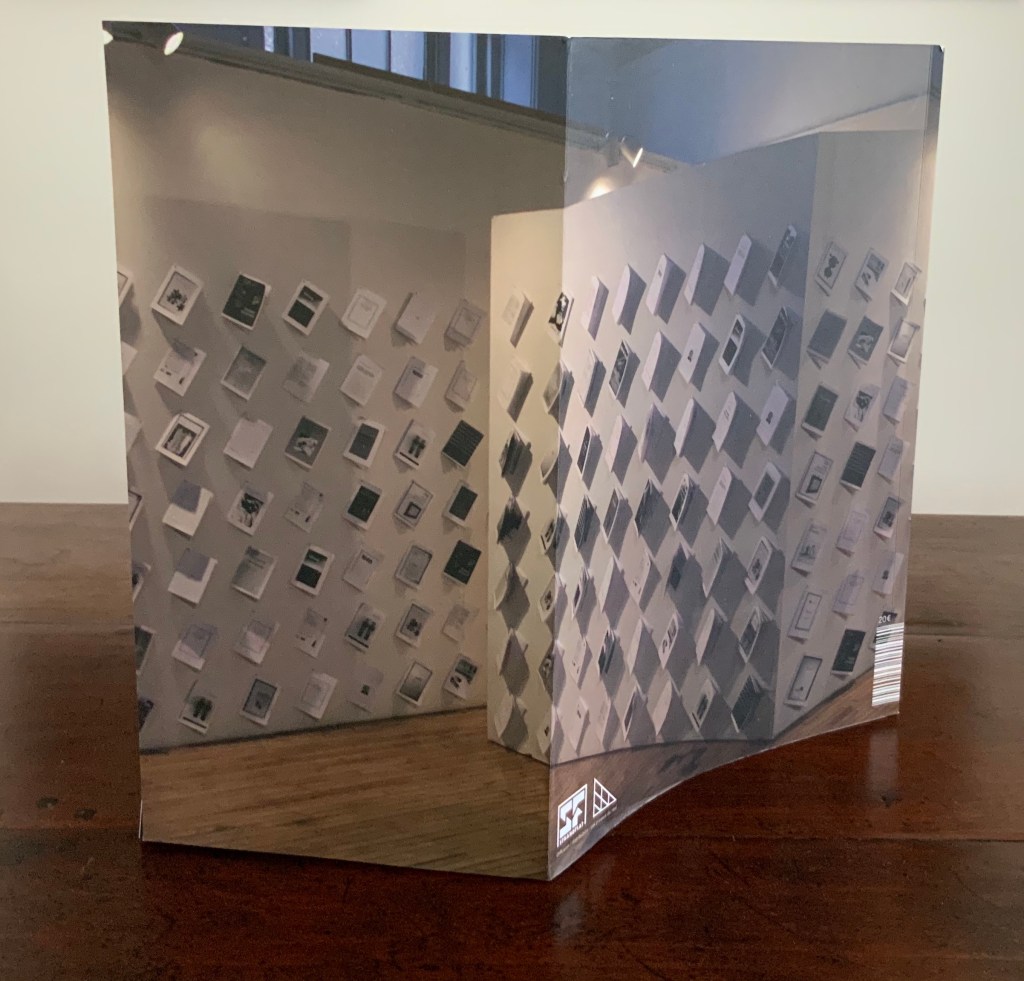
Artiste Éditeur (2018) Antoine Lefebvre Éditions H297 x W210 mm, 176 pages.
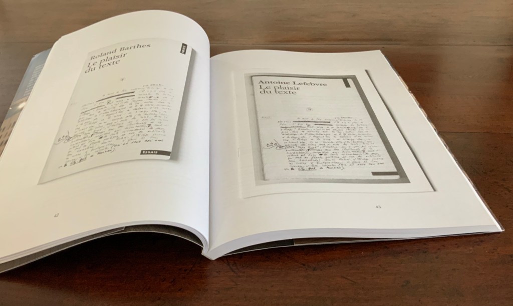
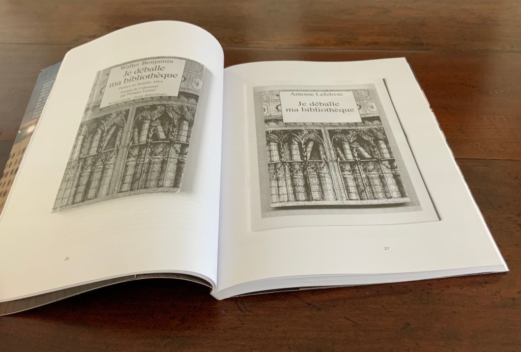
The works in LBF appropriate covers, titles, images and arguments in a way to enacts conversations among the appropriated, with Lefebvre and with the reader. The works draw on a wide variety of artists and writers: Roland Barthes, Walter Benjamin, Joseph Beuys, Jorge Luis Borges, Ulises Carrión, Noam Chomsky, August von Cieszkowski, Guy Debord, Jacques Derrida, Marcel Duchamp, Michel Foucault, Ernst Gombrich, Georg Wilhelm Hegel, Joseph Kosuth, Jacques Lacan, Marshall McLuhan, Stéphane Mallarmé, A. Mœglin-Delcroix, Jean-Luc Nancy, Jean Paul Sartre, Ferdinand de Saussure, Ludwig Wittgenstein and many others.
Photos of book: Books On Books Collection. Displayed with permission of the artist.
More than “drawing on” the appropriated, LBF draws their thoughts into the digital twentieth and twenty-first centuries conversation about artists’ books and book art. Two of Lefebvre’s more discursive contributions to LBF constitute an “artist publisher” statement and a manifesto for LBF and himself:
… the books of LBF have no predetermined physical existence, they exist in a state of potentiality on the web, awaiting to become. They cost nothing, you can get them without spending a penny. They have no ISBN either, because they are works of art. They have no color, so that they can be printed in any printer. That’s what LBF books don’t have, which is almost more important than what they do, because our approach is conceived as a negative of that which is habitually proposed by the market spectacle society. The idea is to show various poetic singularities as opposed to the flashy commodities which our society feeds us.
What the LBF books do have is above all a great freedom of content, revealing a very large and global conception of art. They contain all forms of expression usually found in print, i.e., drawing and photographs, as well as essays, novels, journalistic investigations etc.
The covers of LBF books are invariably appropriated from existing sources, the published artists just select one and use it as a cover for their book. The author’s name is deleted and replaced by the name of the artist, the name of the original publisher is also cleared since the new book is no longer its property. The artist can also change the title of the book to enhance it. The content of the book is completely open, the artist develops it through the pages to meet his or her project. The books are produced with bits and pieces from other books, developing a discourse on the ontology of the book. This project seeks to examine the nature of the book by submitting it to the approaches similar to those used by minimalist artists to test the limits of painting and art. The purpose of LBF is to explore the boundaries of what is a book and and what is not.
In 2015, Lefebvre chose Antoine Lefebvre Éditions as the name of his imprint and his artist name, but 2018 must have felt like his true annus natalis if not mirabilis. Not only did LBF appear in the Vienna exhibition and Artiste Éditeur arrive, he opened a shop in Paris and called it 本 \hon\ books. Even in his entrepreneurship, Lefebvre is an appropriator/hommageur. The name 本 \hon\ books pays homage to Japanese second-hand bookstores but also, and not surprisingly, to Joseph Kosuth’s One and Three Chairs (1965). Like Kosuth’s work, the shop’s name provides the same information in three formats: an ideogram, its Japanese pronunciation, and its translation (本 = book).
Perhaps it is because he works, thinks and creates with equal comfort in the digital and physical worlds or that he is international in outlook and language or that he happily inhabits the multiple roles of artist publisher, collaborator, appropriator, impresario and entrepreneur — for whatever reason, Antoine Lefebvre and his work bring a welcome élan to book art and this collection.
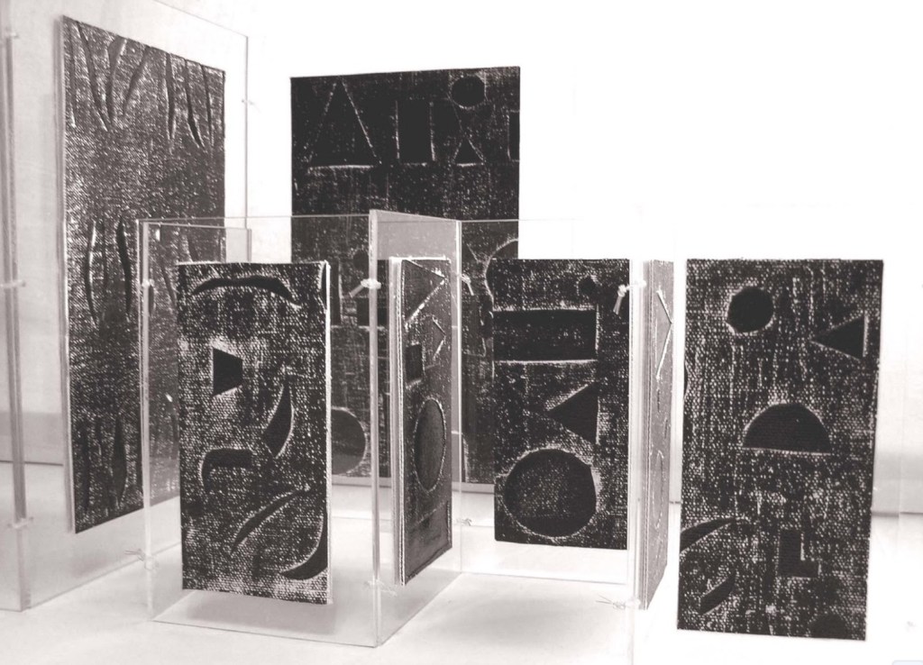
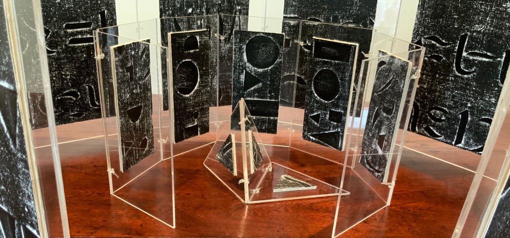
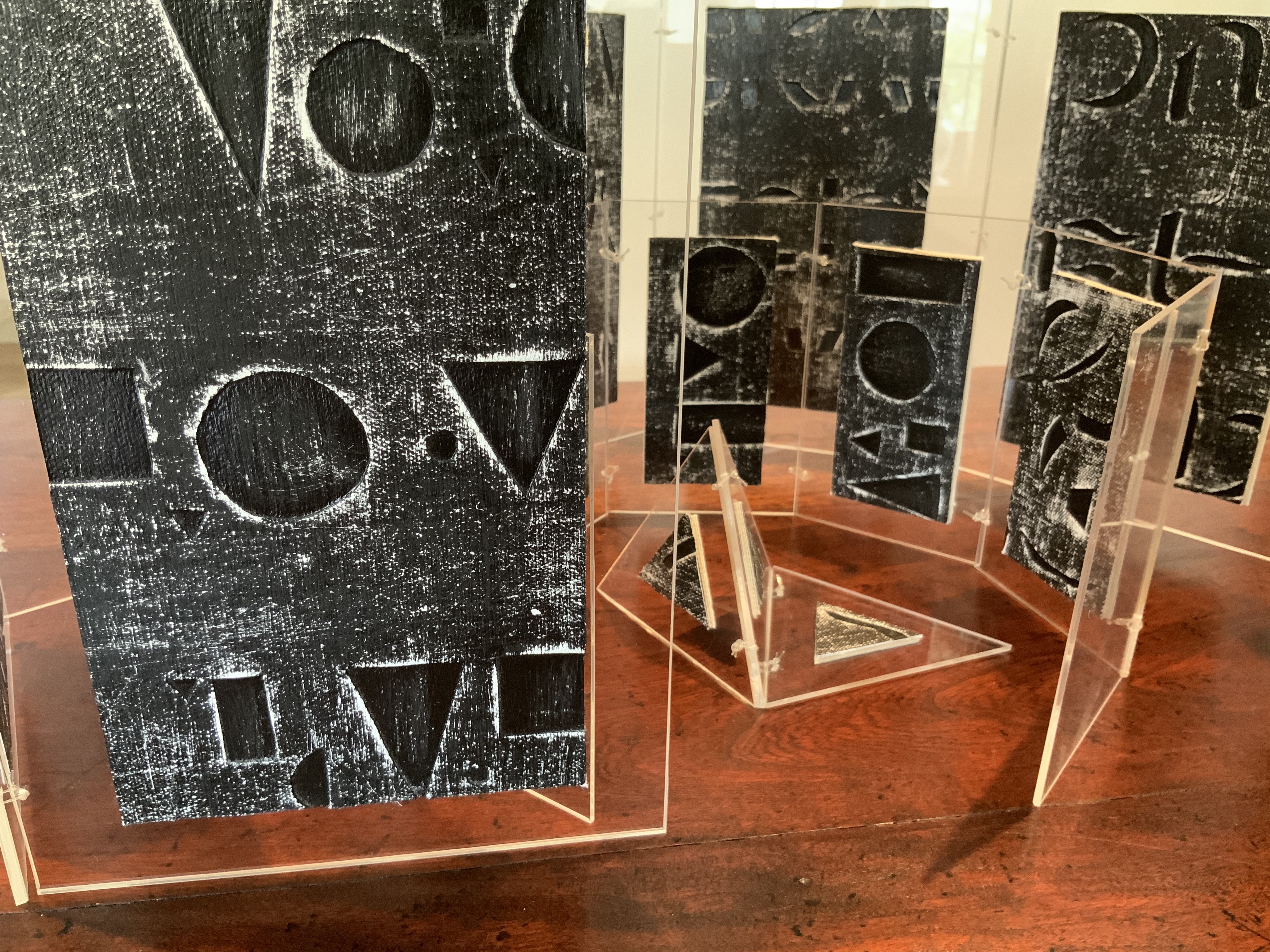
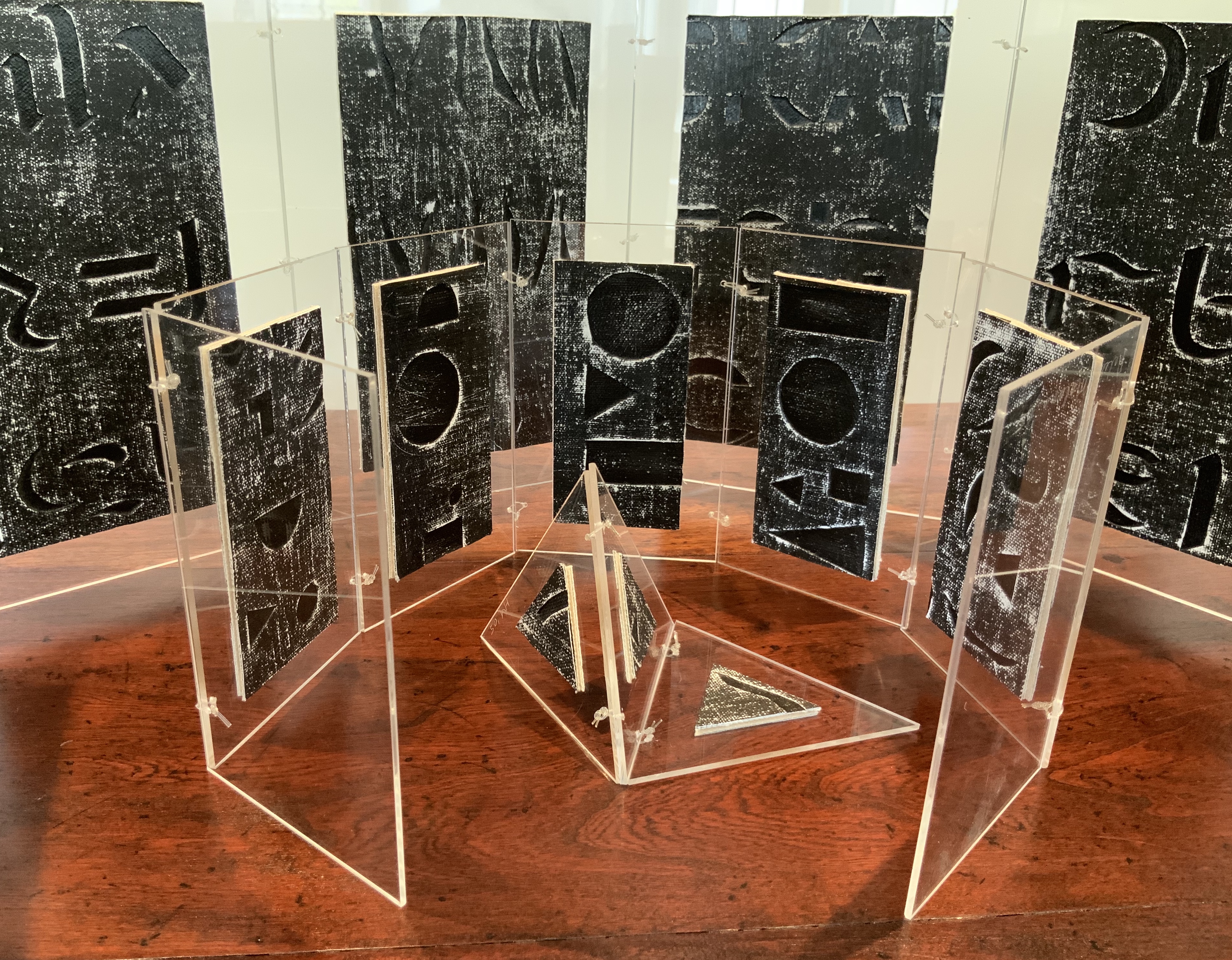
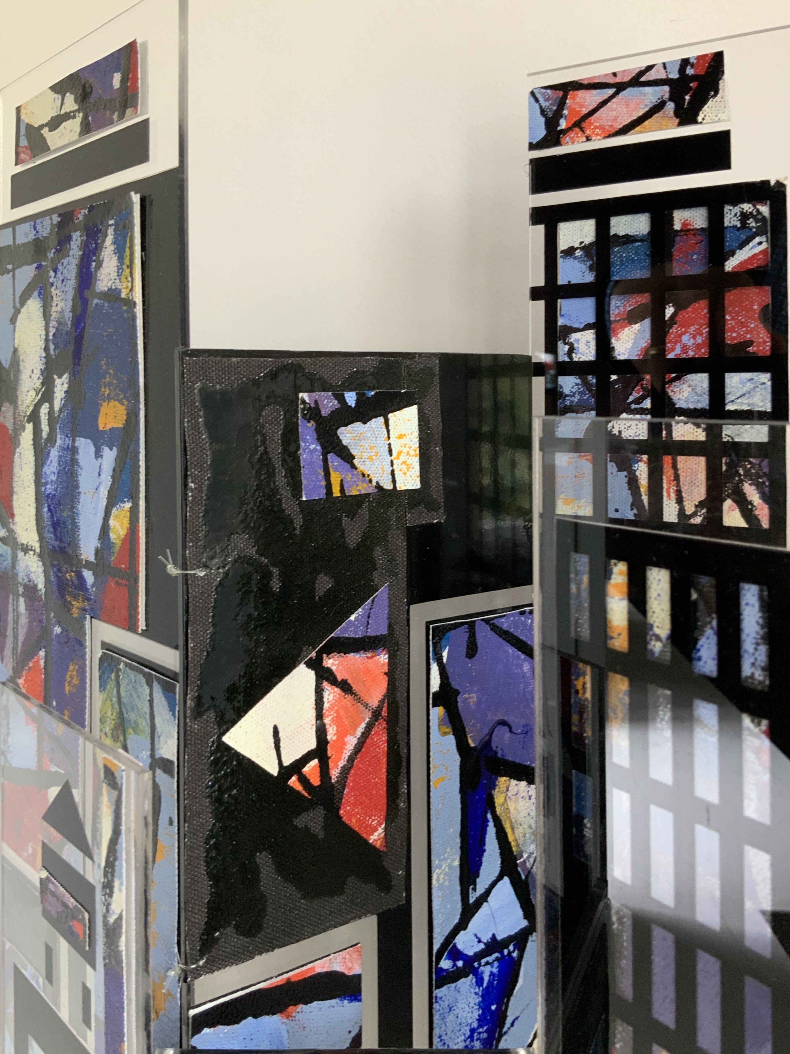
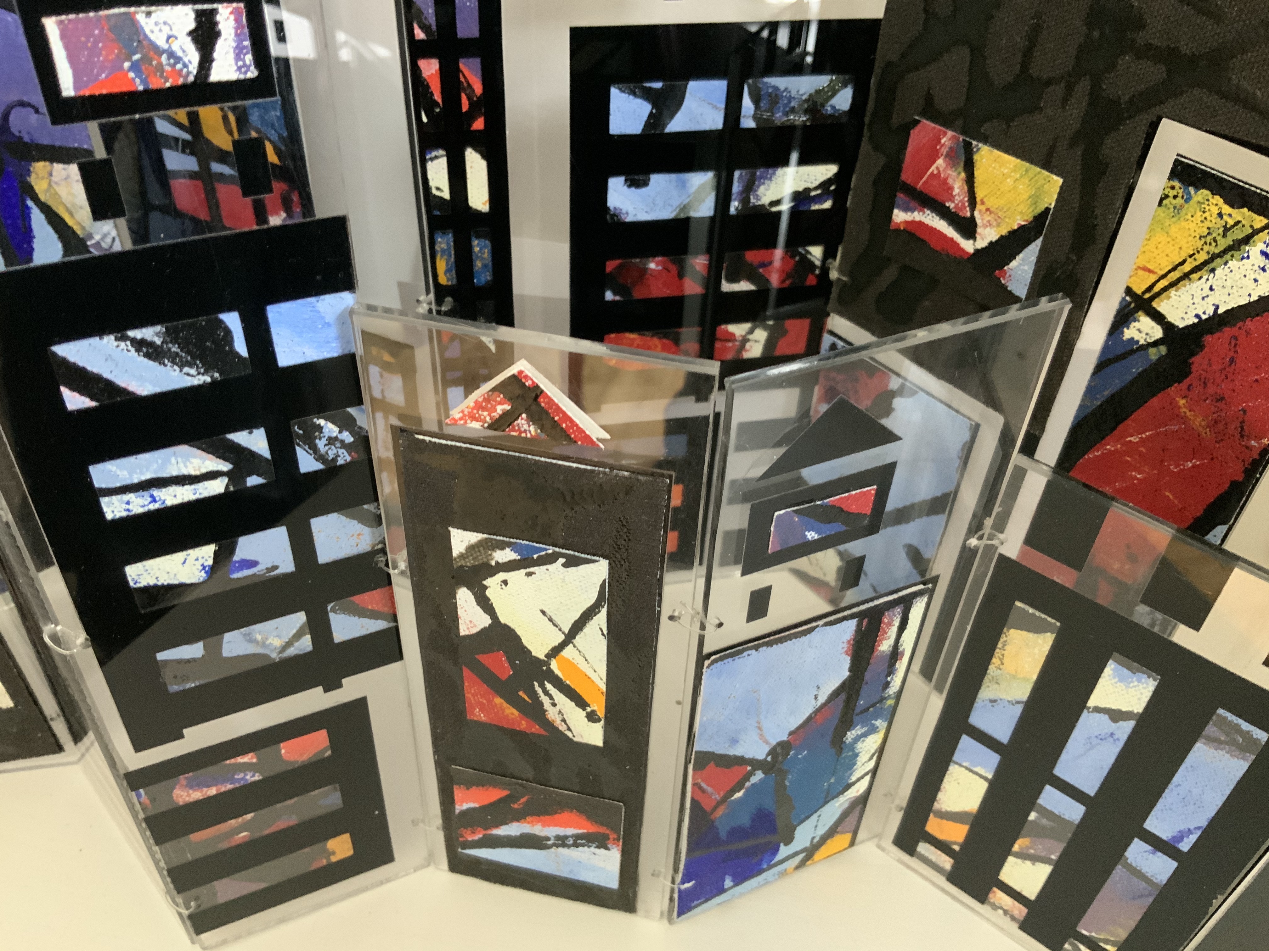
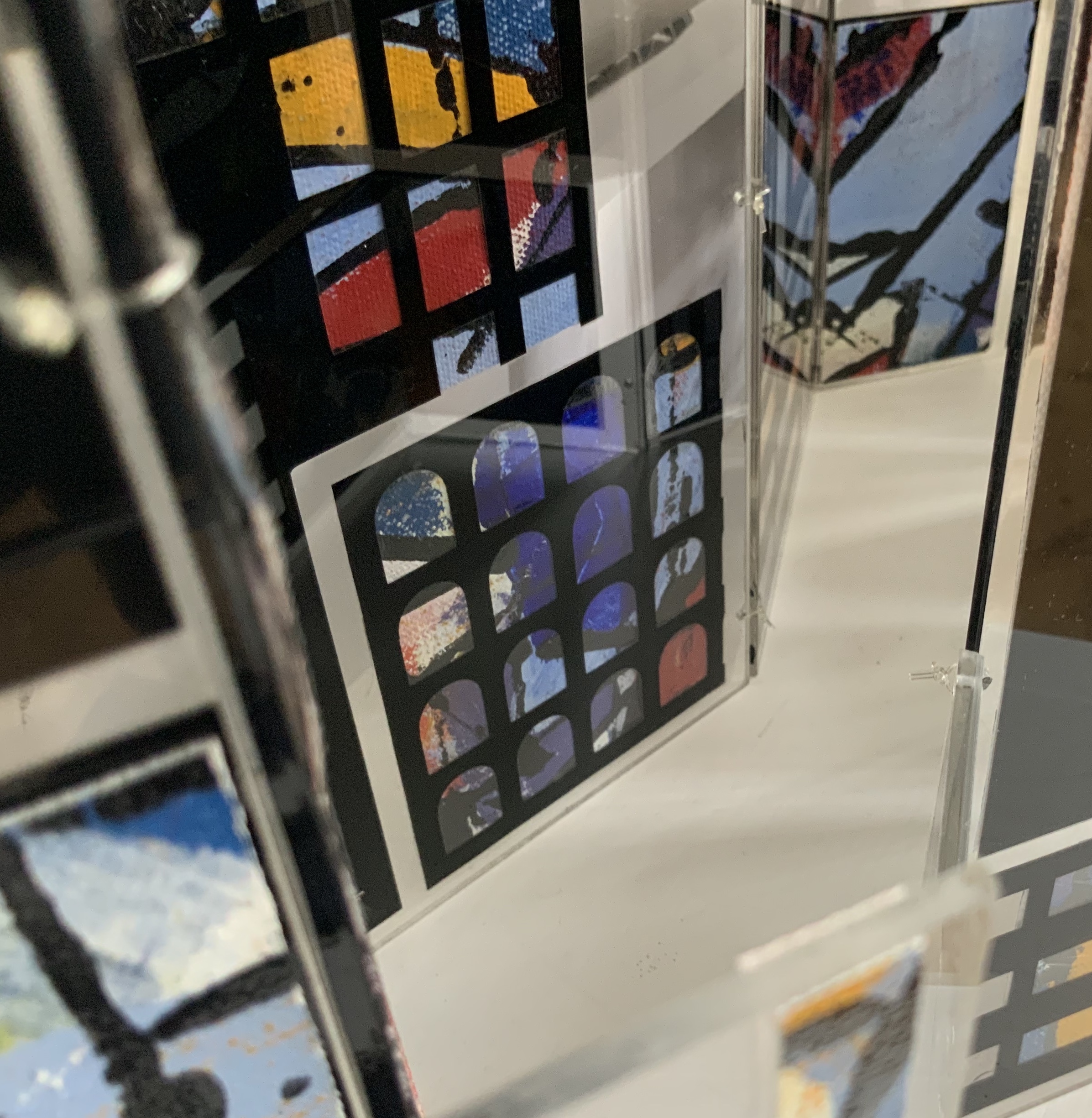
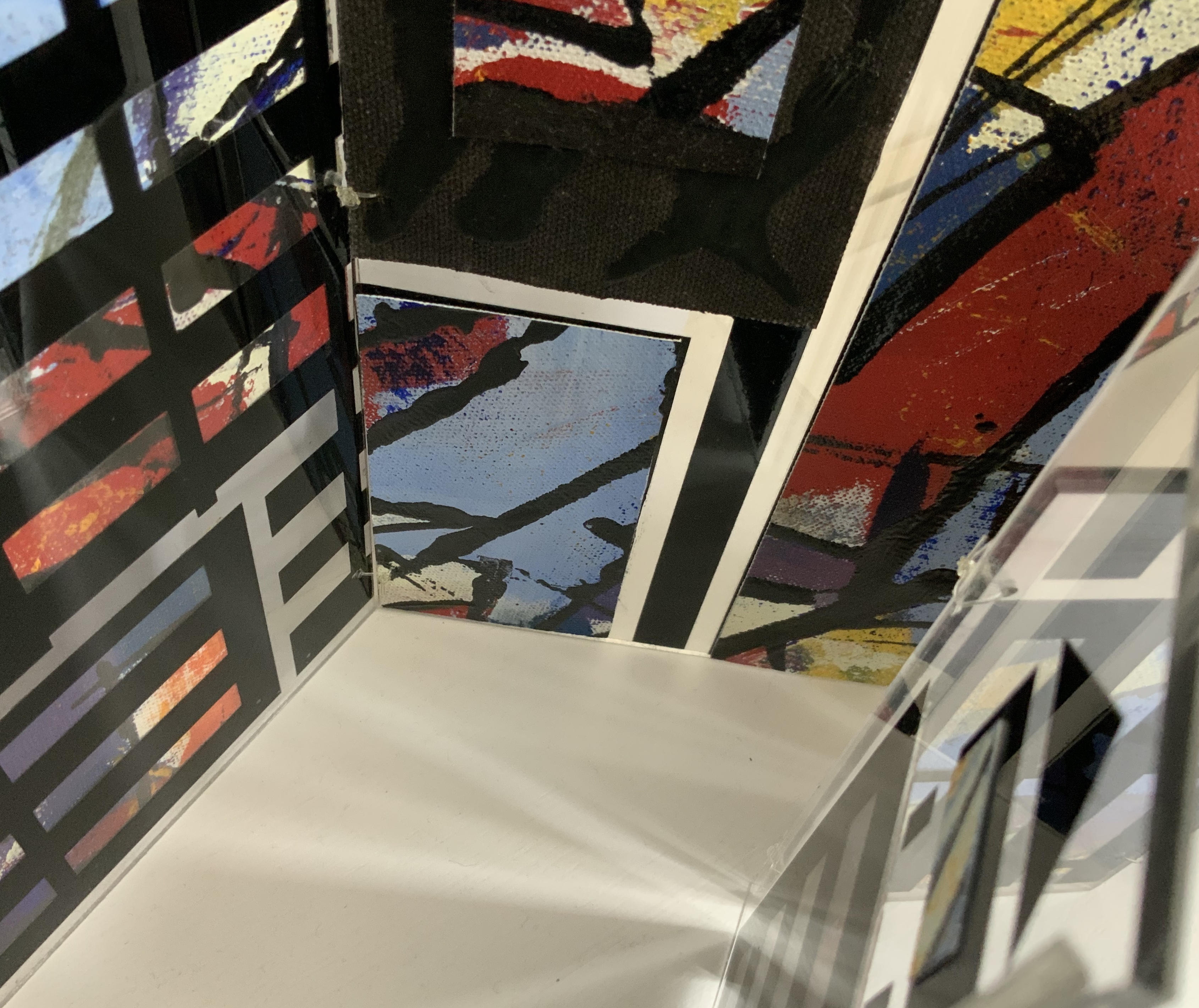
Box containing three books: two concertina books of different sizes and one tetrahedron shape of three pages. Two layered canvases painted with acrylic paint mounted on both sides of Perspex pages in Perspex box. Box: H230 x W160 x D80 mm. Unique edition. Acquired from the artist, 2 July 2020. Photos above: Courtesy of the artist. Photos below: Books On Books Collection.
Artist’s description:
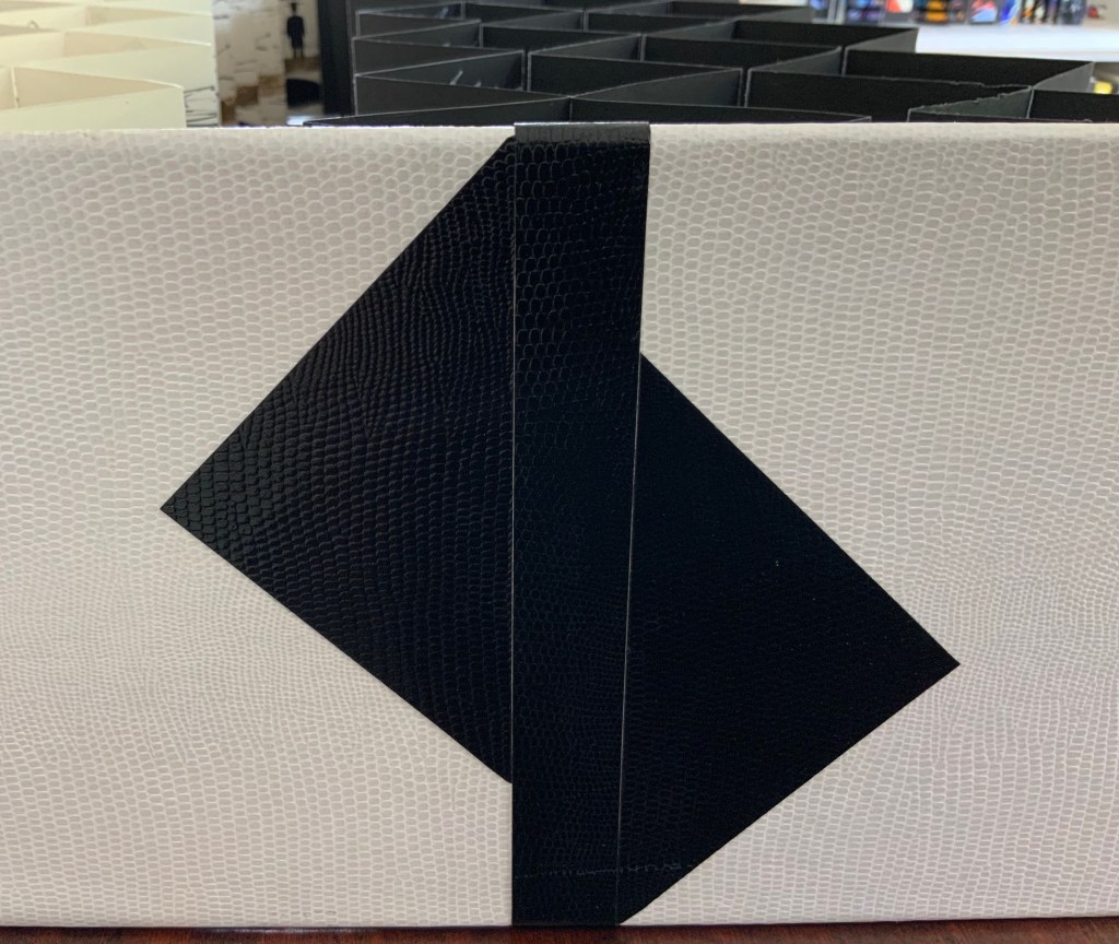
Referencing ancient writing systems, hieroglyphs and engravings, this book is an investigation of sign systems and shared cultural knowledge. Fragmented coded images derived from familiar letterforms lie beneath the surface of the canvas and although visible remain undecipherable and incomprehensible.
The alphabet has traditionally served as calligraphic and typographic seed for book art, perhaps with roots of expression in illuminated letters, the Kabbalah, tomes on penmanship and calligraphy and typography specimen books. In its material and technique, Alphabetic Codes has a rough and smooth tactility; the former pointing to ancient, haptic forms, the latter to current, screen-generated forms. It enriches the subset of alphabet books and abecedaries in the Books On Books Collection.
Exhibitions:
Books 05 Image as Text as Image, Noosa Regional Gallery 9 September – 17 October 2005.
Botanical Books, Coffs Calligraphers, Botanic Garden, Coffs Harbour, 29 September 29 – 7 October 2007.
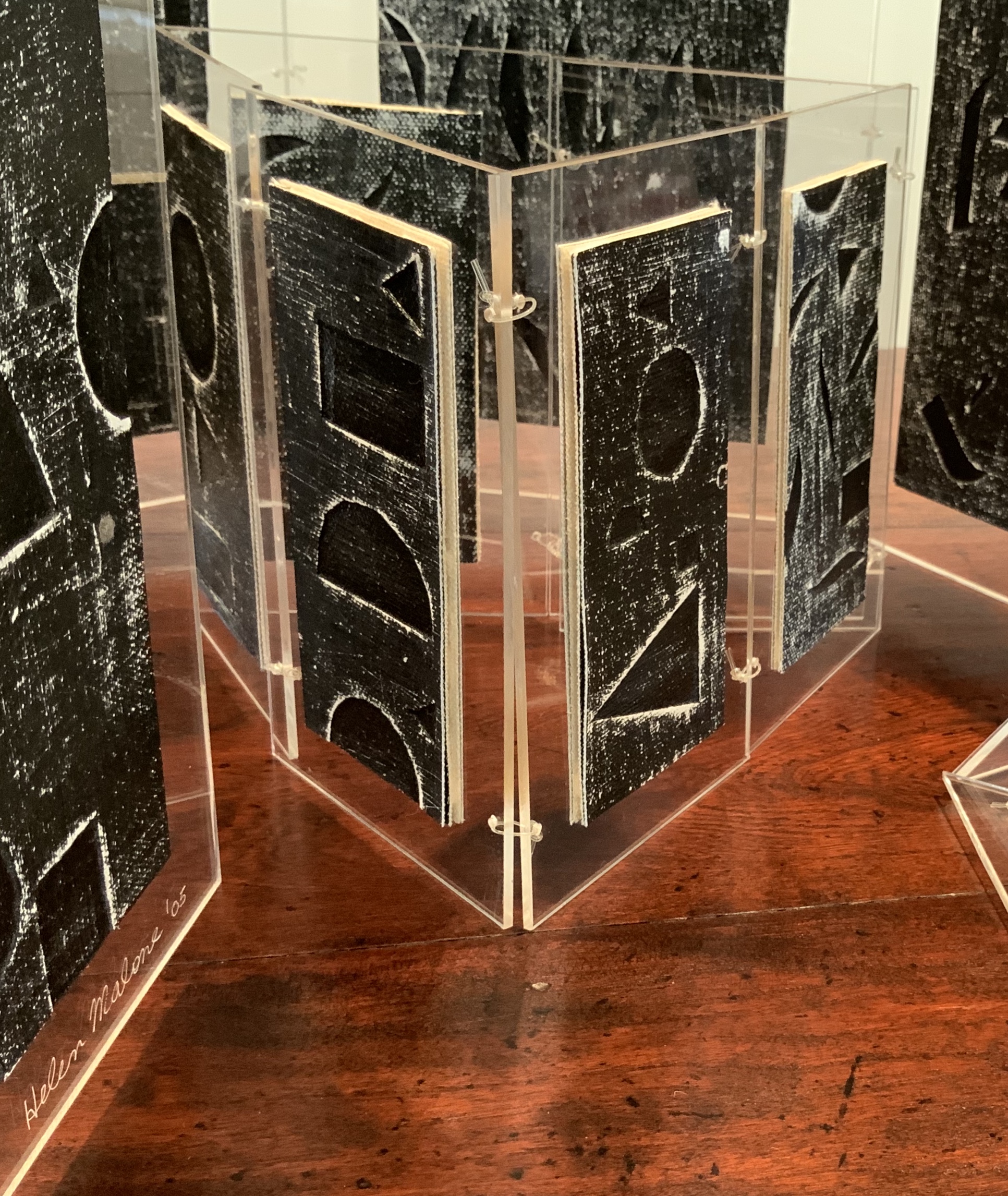
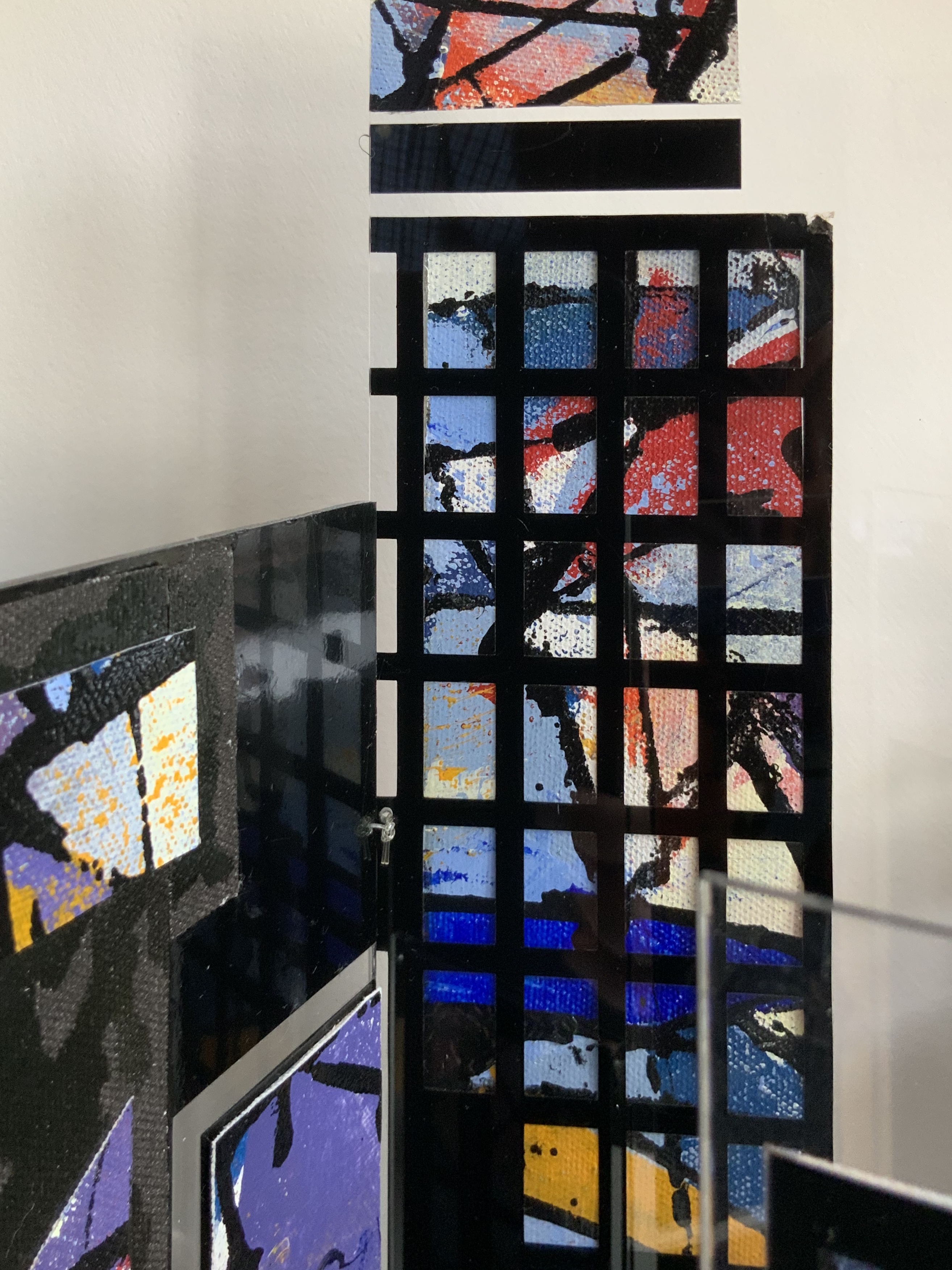
Perspex box containing two concertina books of different sizes made of recycled Perspex panels with mounted canvas painted with acrylics. Box: H360 x W125 x D75 mm. Unique edition. Acquired from the artist, 2 July 2020. Photo: Books On Books Collection.
Photos: Books On Books Collection.
Artist’s description:
Technological illuminations such as television screens, computer screens, big screens and advertising visually transmit images and act as carriers of global information, education and entertainment. The medieval purpose of stained glass windows, besides aesthetic and mystical was to visually educate and enlighten.
Purely in color, Windows on the World recalls Albers, Chagall, Mondrian (even though he hated stained glass) or Joep Nicolas. In material, technique and theme, it may echo Alphabetic Codes and its allusion to computer-screen-based windows, but Windows has a more architectural feel that can also be found in the I.M. Pei and Mies van der Rohe “volumes” of Ten Books on Architecture (2017) further enriching the architectural subset of the Books On Books Collection.
Exhibition:
Books 05, Image as text as Image, Noosa Regional Gallery, 9 September – 17 October 2005.
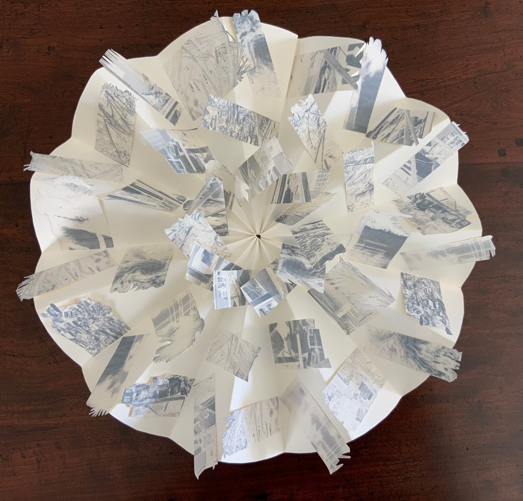
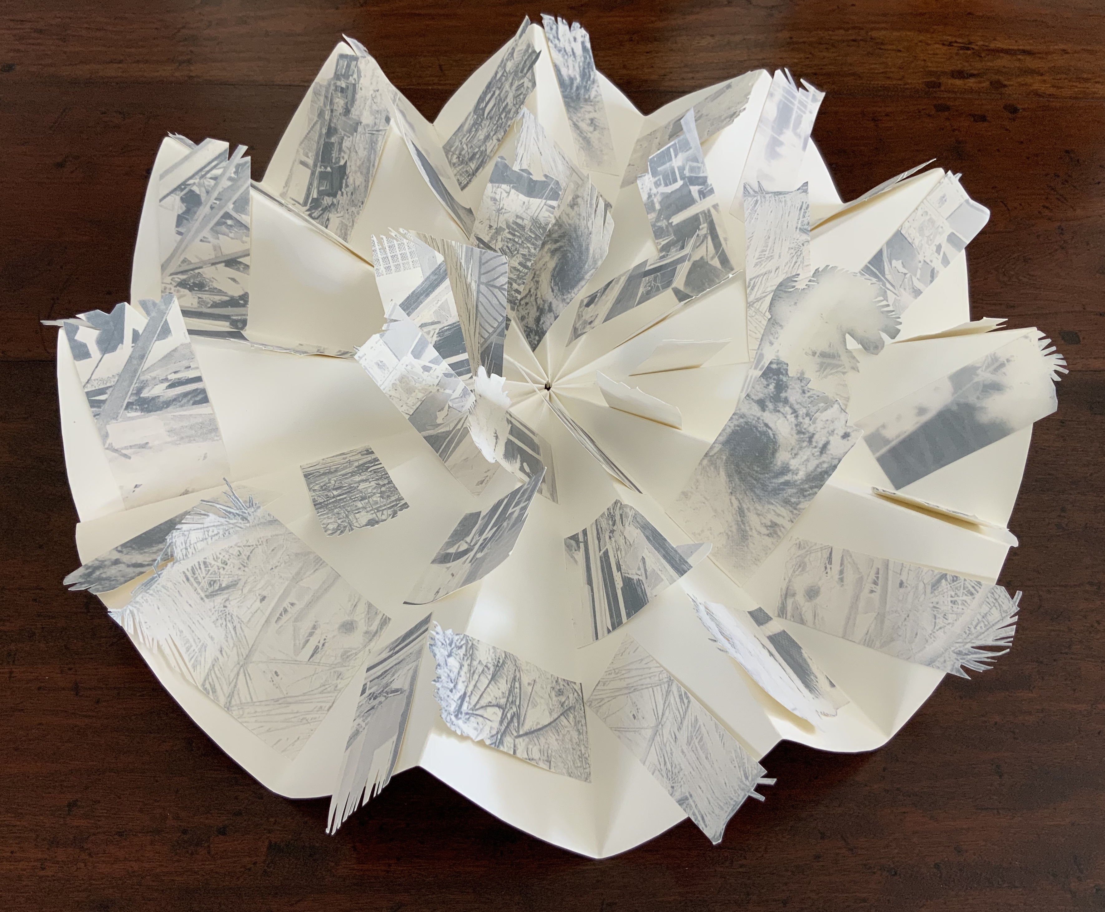
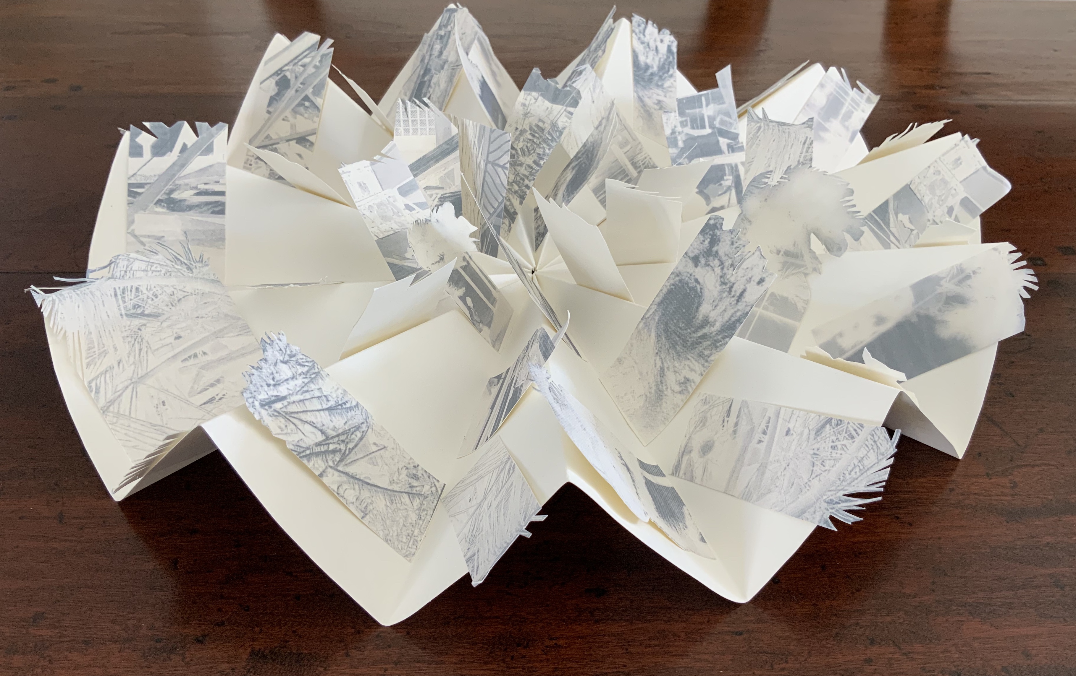
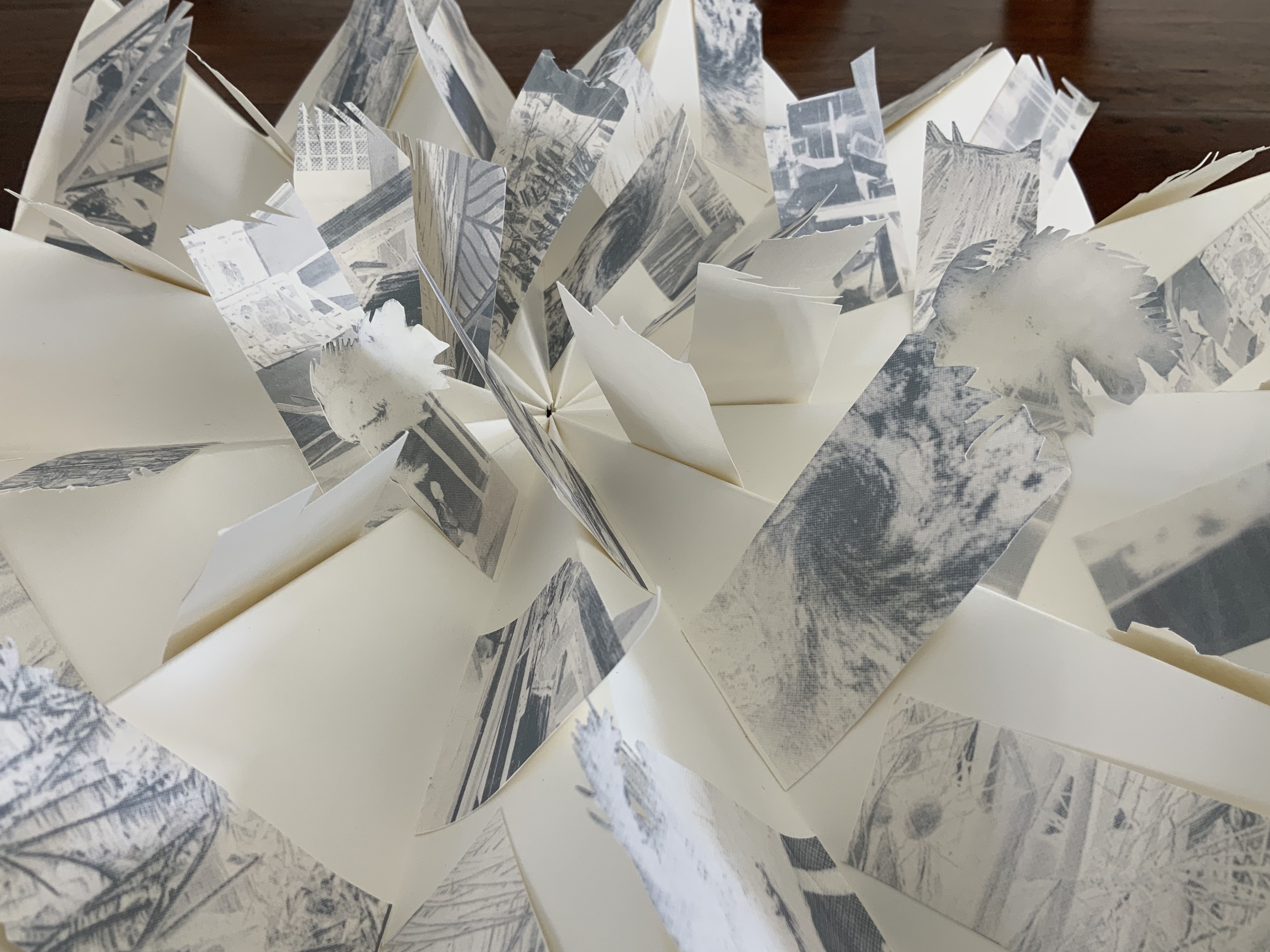
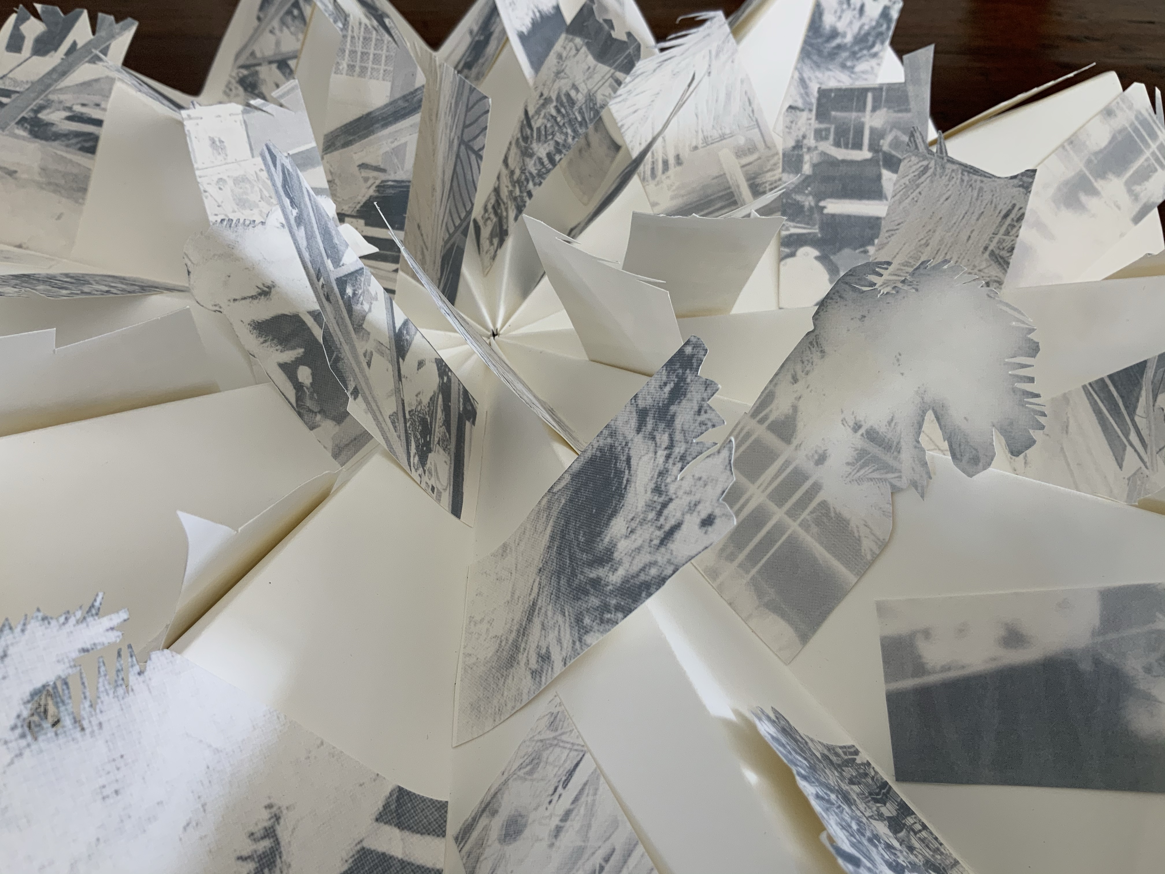
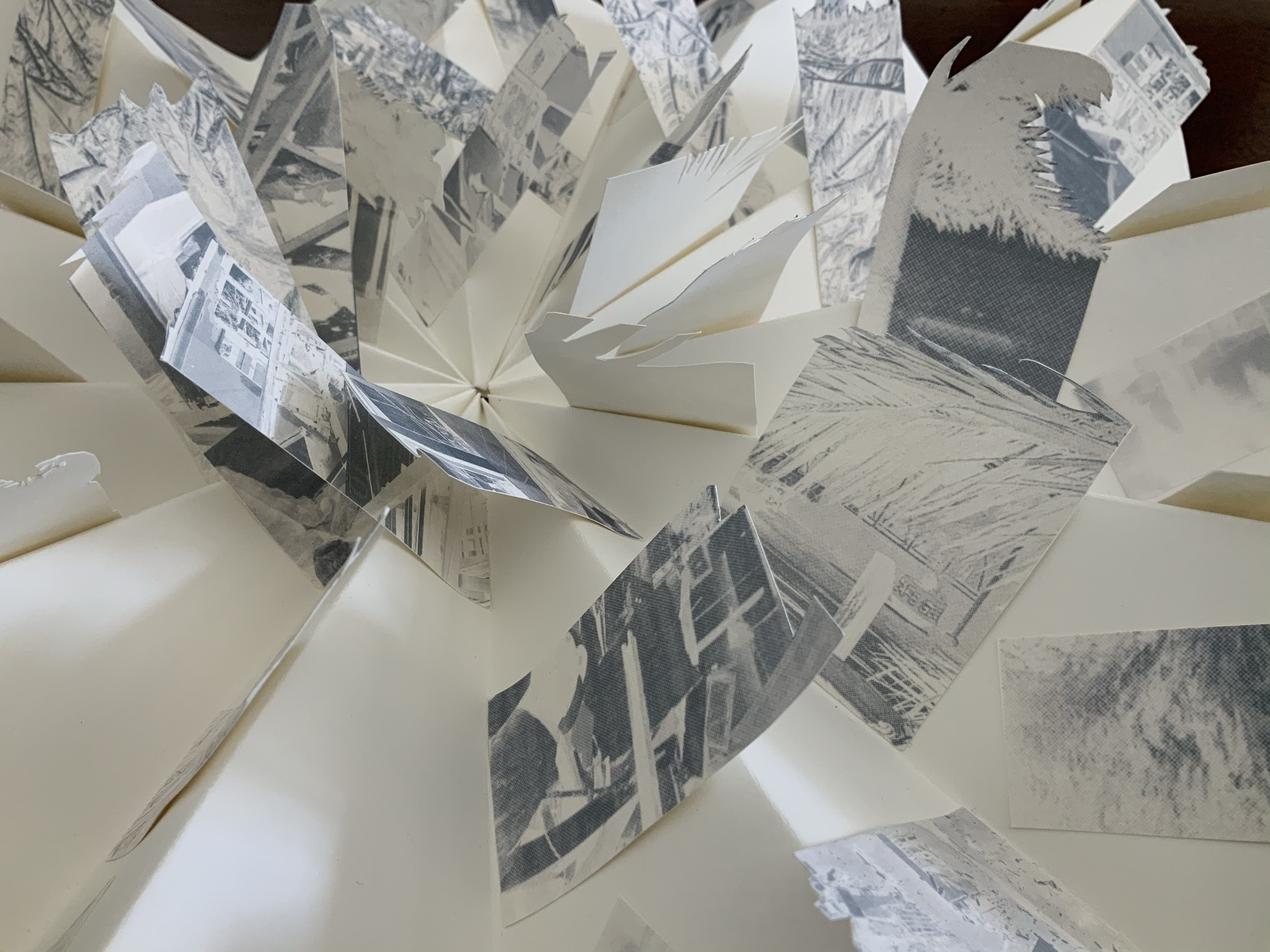
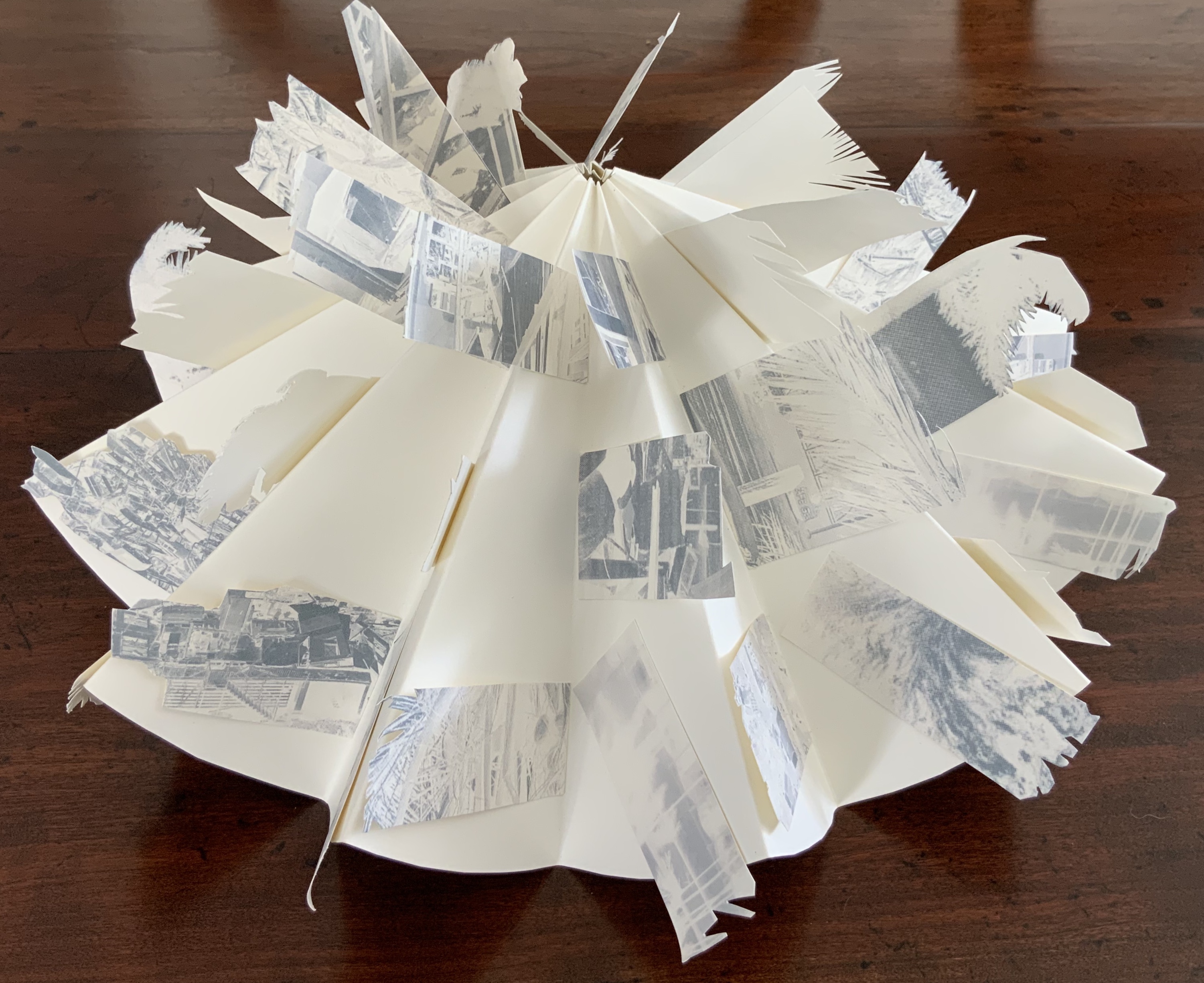
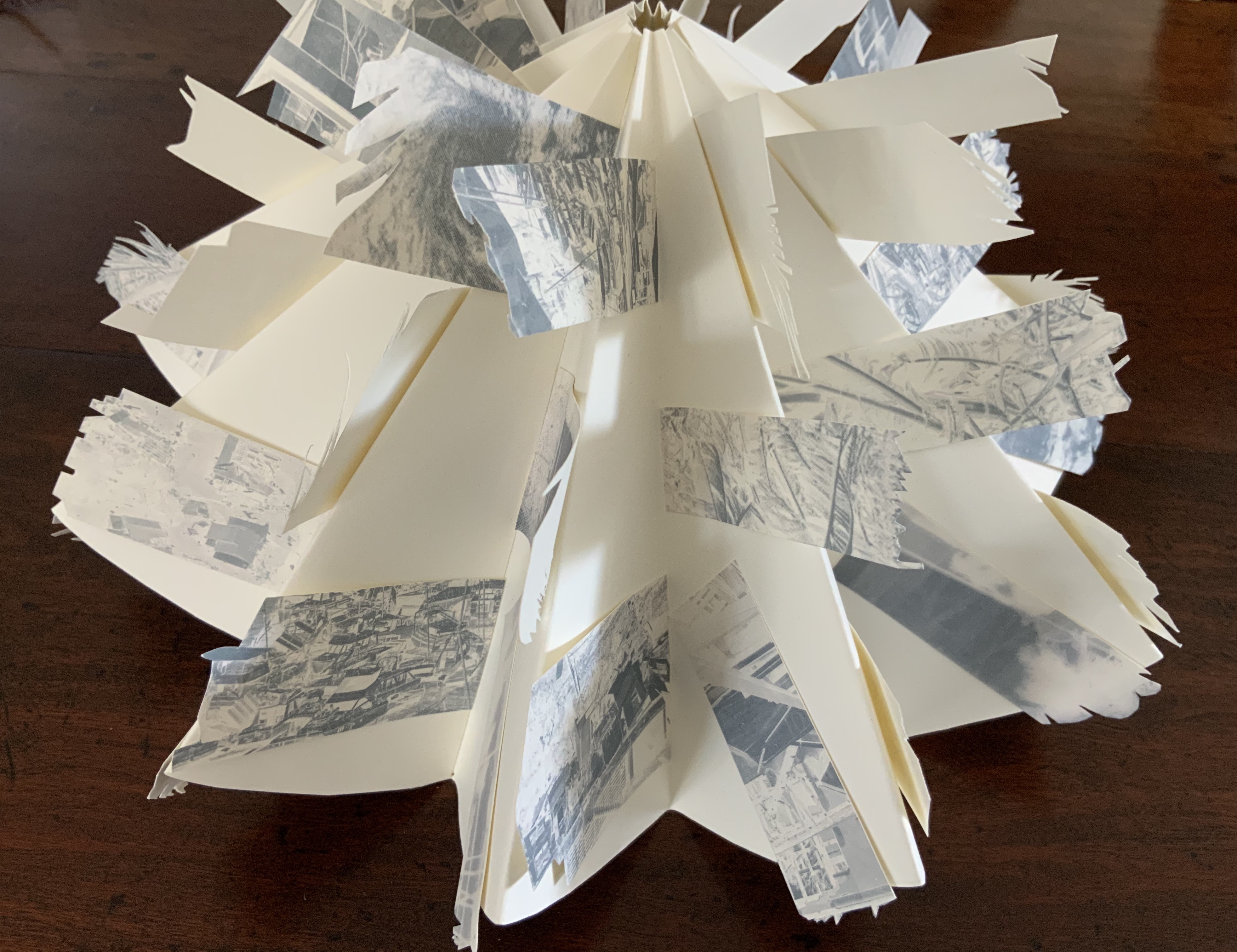
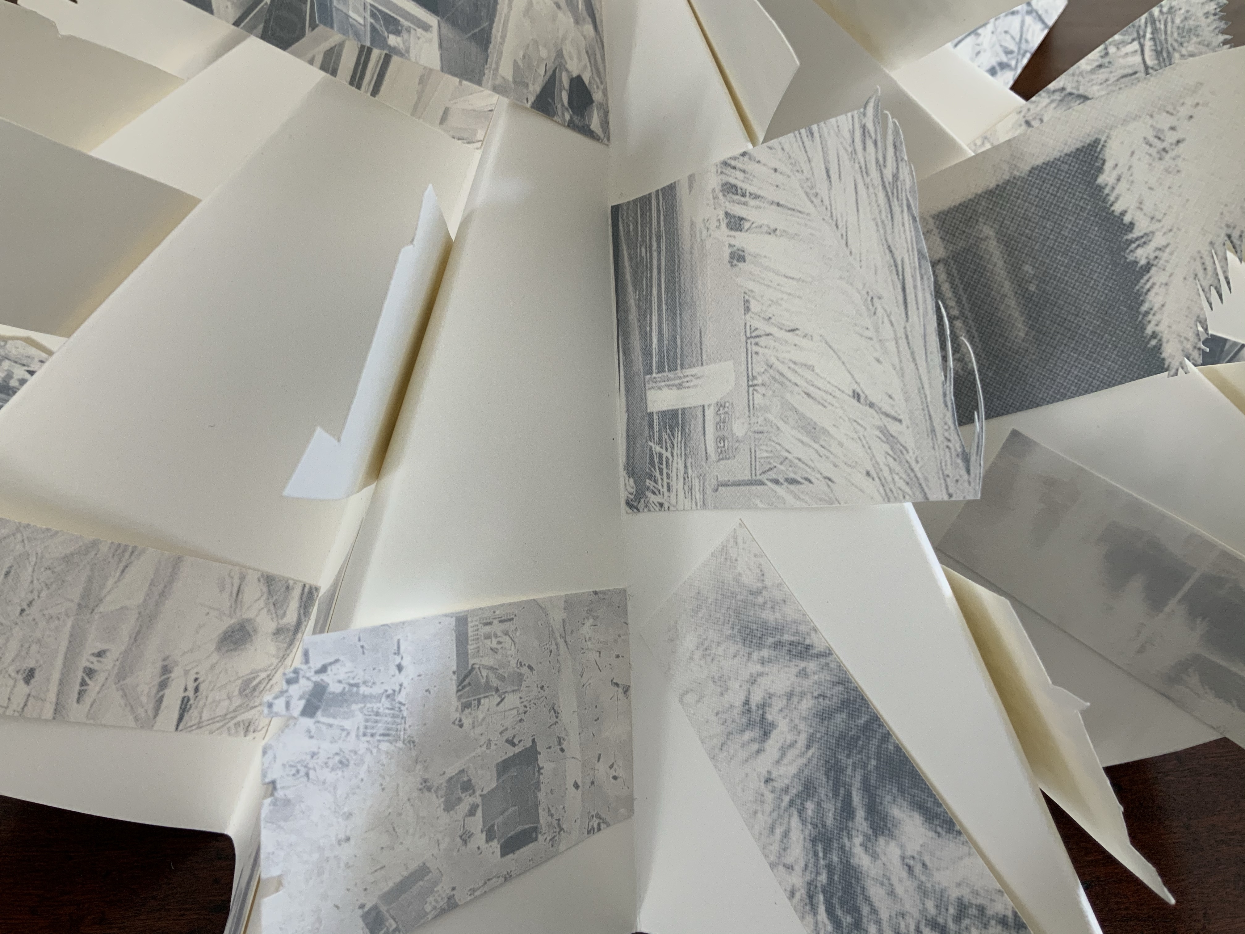
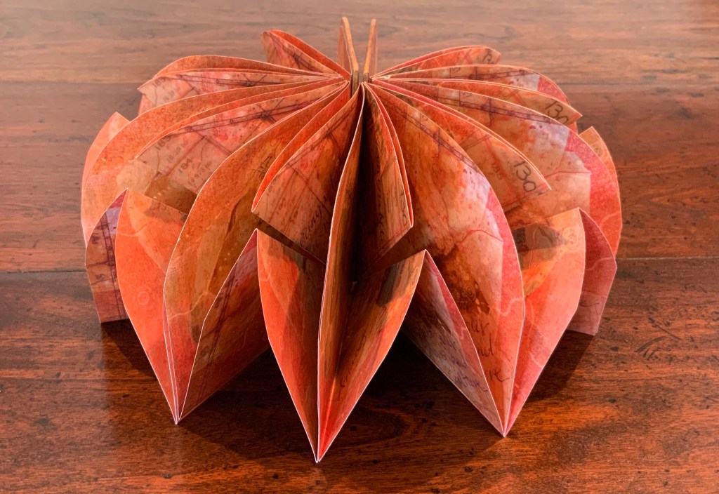
Beautiful One Day, Blown Away the Next (2011)
Beautiful One Day, Blown Away the Next (2011)
Helen Malone
Box containing circular concertina flag book of Fabriano paper, manipulated digital photographs cut and transferred to flags. H90 x W190 x D55 mm closed, 380 mm diameter open. Unique edition. Acquired from the artist, 2 July 2020. Photo: Books On Books Collection.
Artist’s description:
On the eve of 2 February 2011 Cyclone Yasi made landfall on the coast of Queensland. Sweeping through the coastal communities, the Category 5 Tropical Storm of historic proportions left a trail of mayhem and destruction that inspired the artist Malone to create this piece.
Photos: Books On Books Collection.
Bringing together a flag book, concertina and tab-and-lot closure, Malone engineers an ideal structure to evoke the meterological pattern and order of the cyclone. The shattered, blue-filtered photographic images transferred to the flags contribute a kaleidoscopic chaos. The theme of the environment and the struggle between the human race and natural forces is a subset of the Books On Books Collection well represented by this work, Tsunami (below) and others such as Holuhraun by Chris Ruston and Landscapes of the Late Anthropocene by Philip Zimmerman.
Exhibition:
Books…beyond words evolution, East Gippsland Art Gallery, Bairnsdale,Vic., 6 August – 3 September 2011.
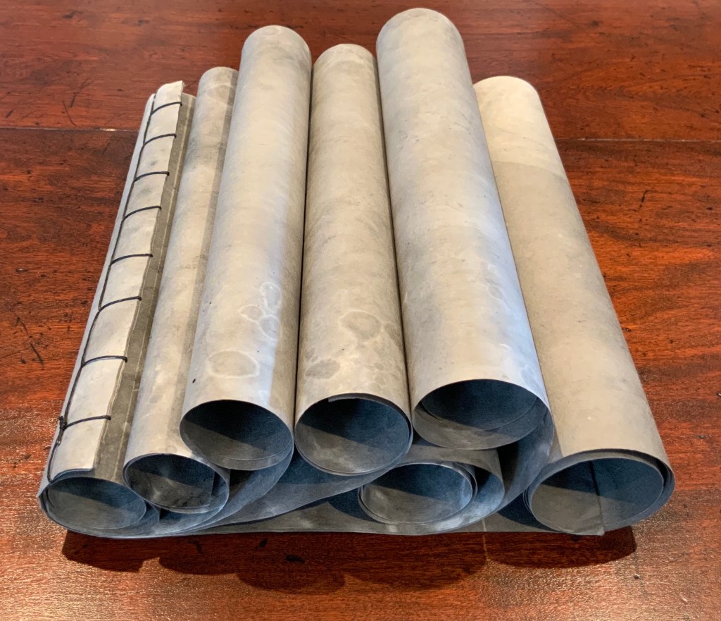
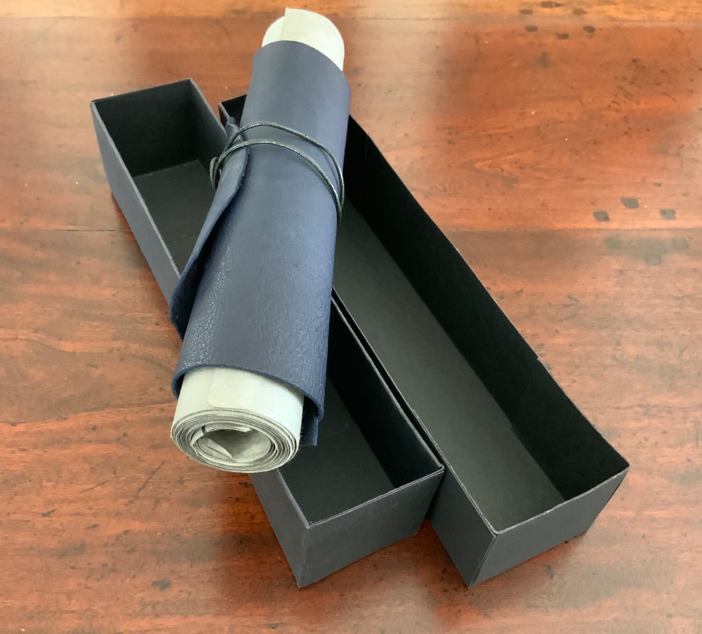
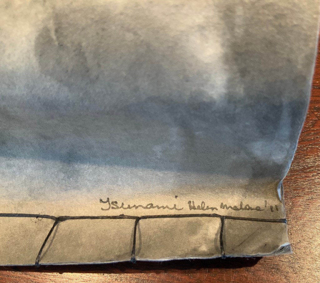
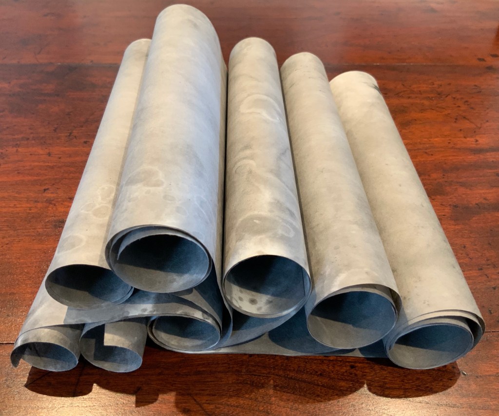
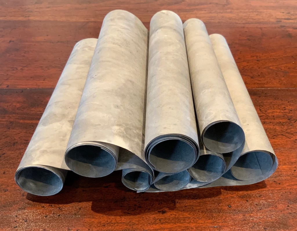
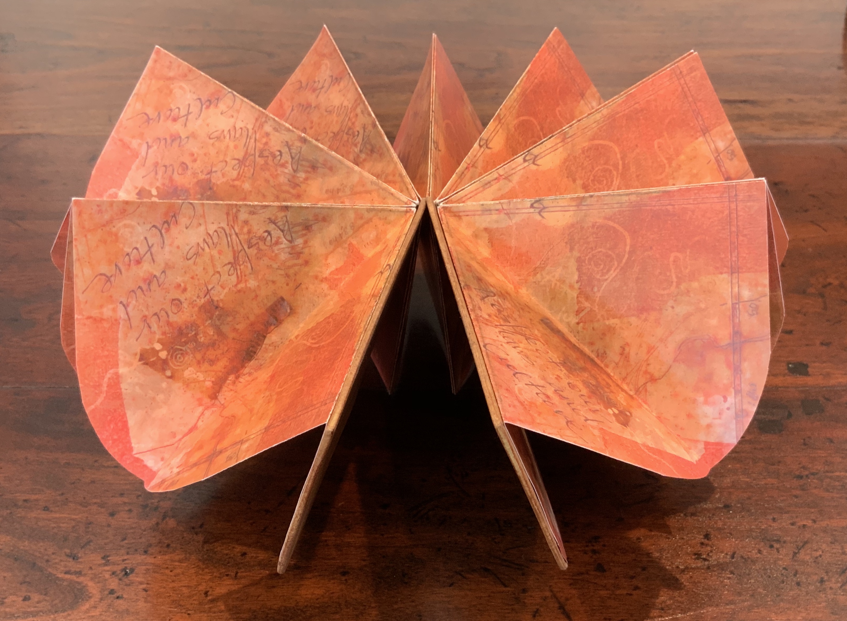
Tsunami (2011)
Tsunami (2011) Helen Malone Box containing “whirlwind” book of Japanese paper washed with sumi ink and water, Japanese stab binding, leather roll. H230 mm, variable width. Unique edition. Acquired from the artist, 2 July 2020. Photo: Books On Books Collection.
Photos: Books On Books Collection.
Artist’s description:
Part of the series of disasters explored by Malone through her art, this piece is her interpretation of the catastrophic tsunami that followed the massive earthquake that struck Japan in 2011.
The earthquake and tsunami were so powerful that their effects were felt around the globe: from Antarctica’s ice sheet to the fjords of Norway. Indeed the debris from the monstrous wave continues to wash up on North American shores nearly a decade later.
The combination of Japanese paper and mottled color of sumi ink and water, the way the work “fights back” as the scrolls are manipulated to display the work, the multiple displays generated by the piling wave-like scrolls — all evoke the picture of inescapable, roiling force of the 2011 tsunami.
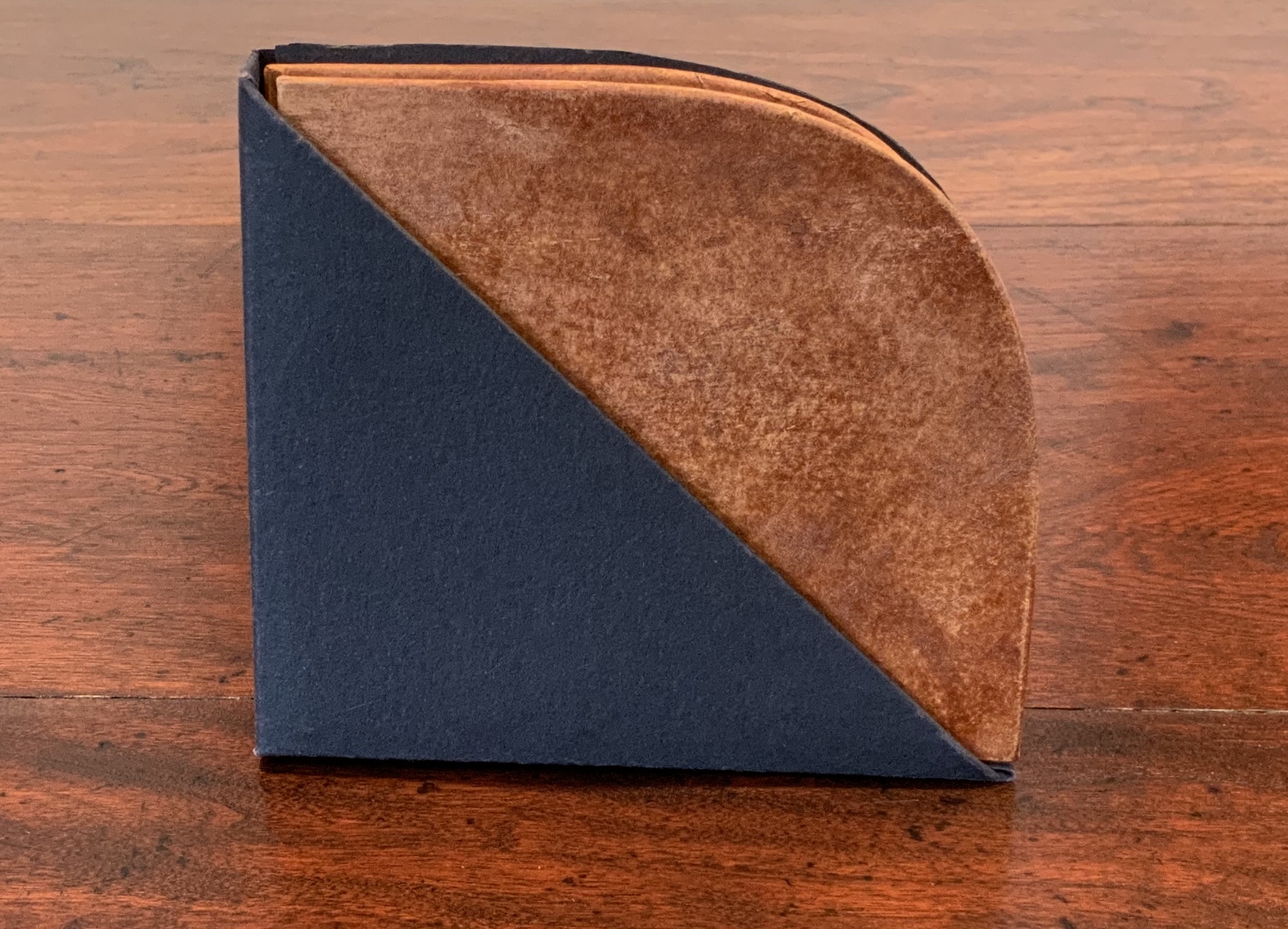
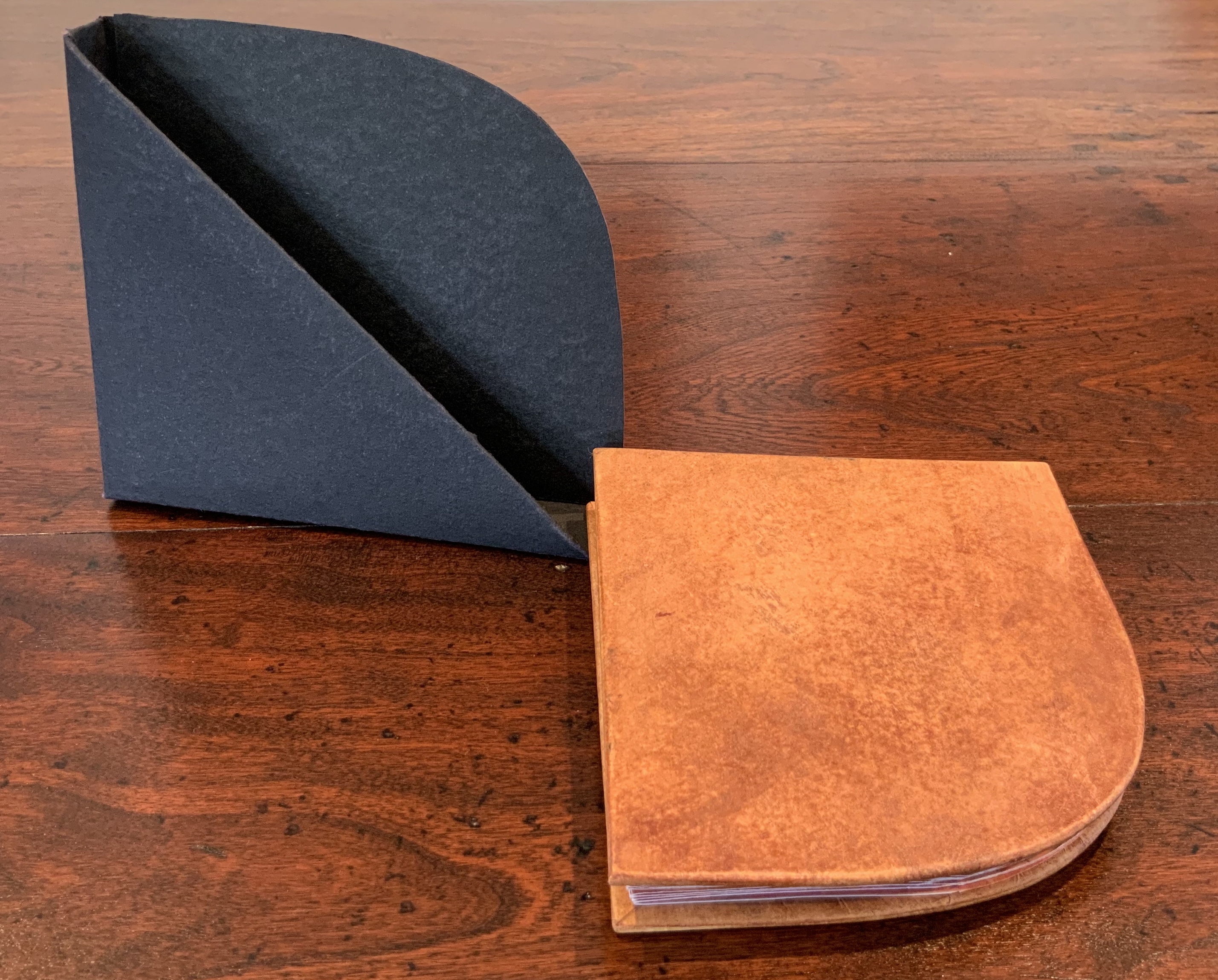
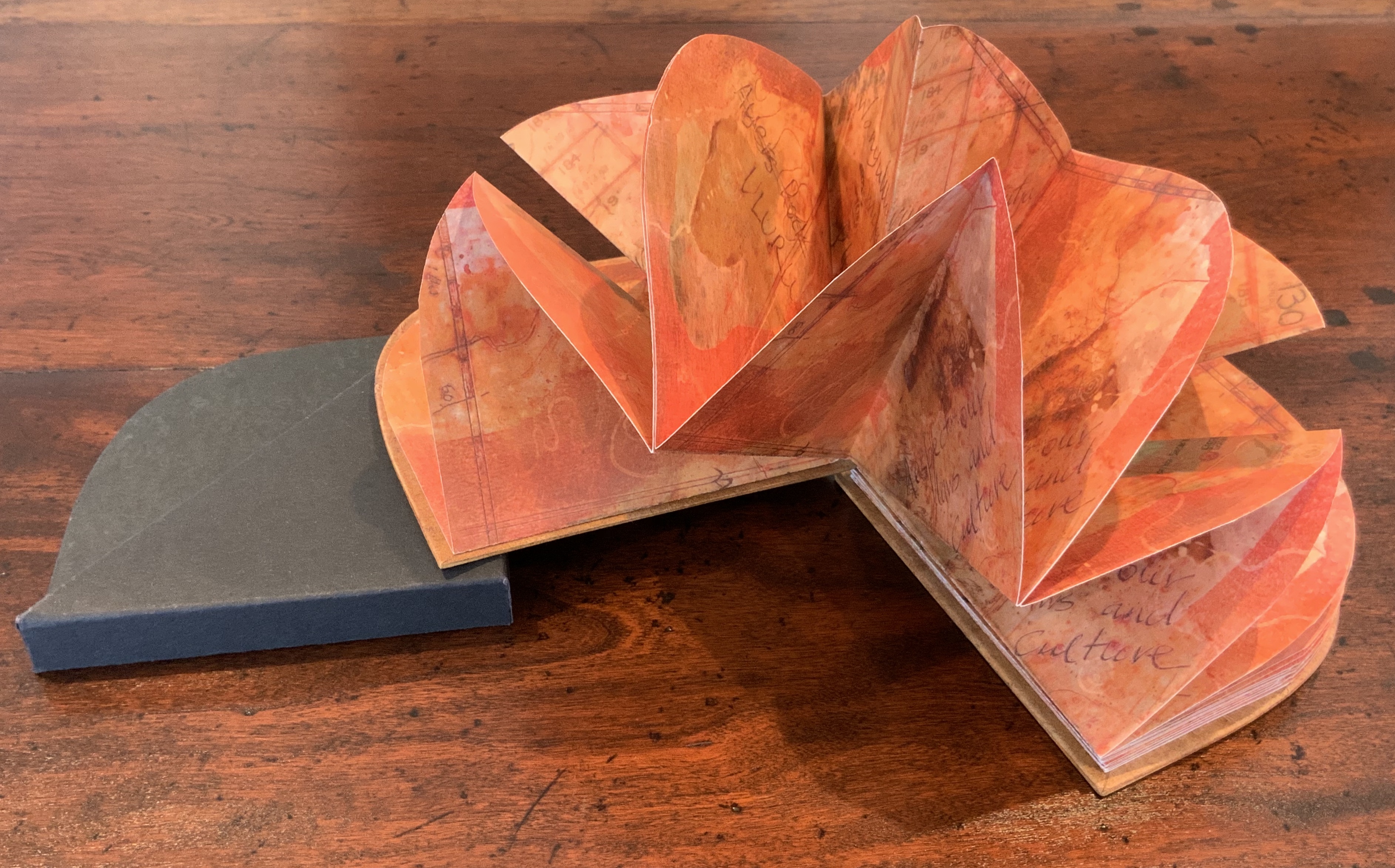
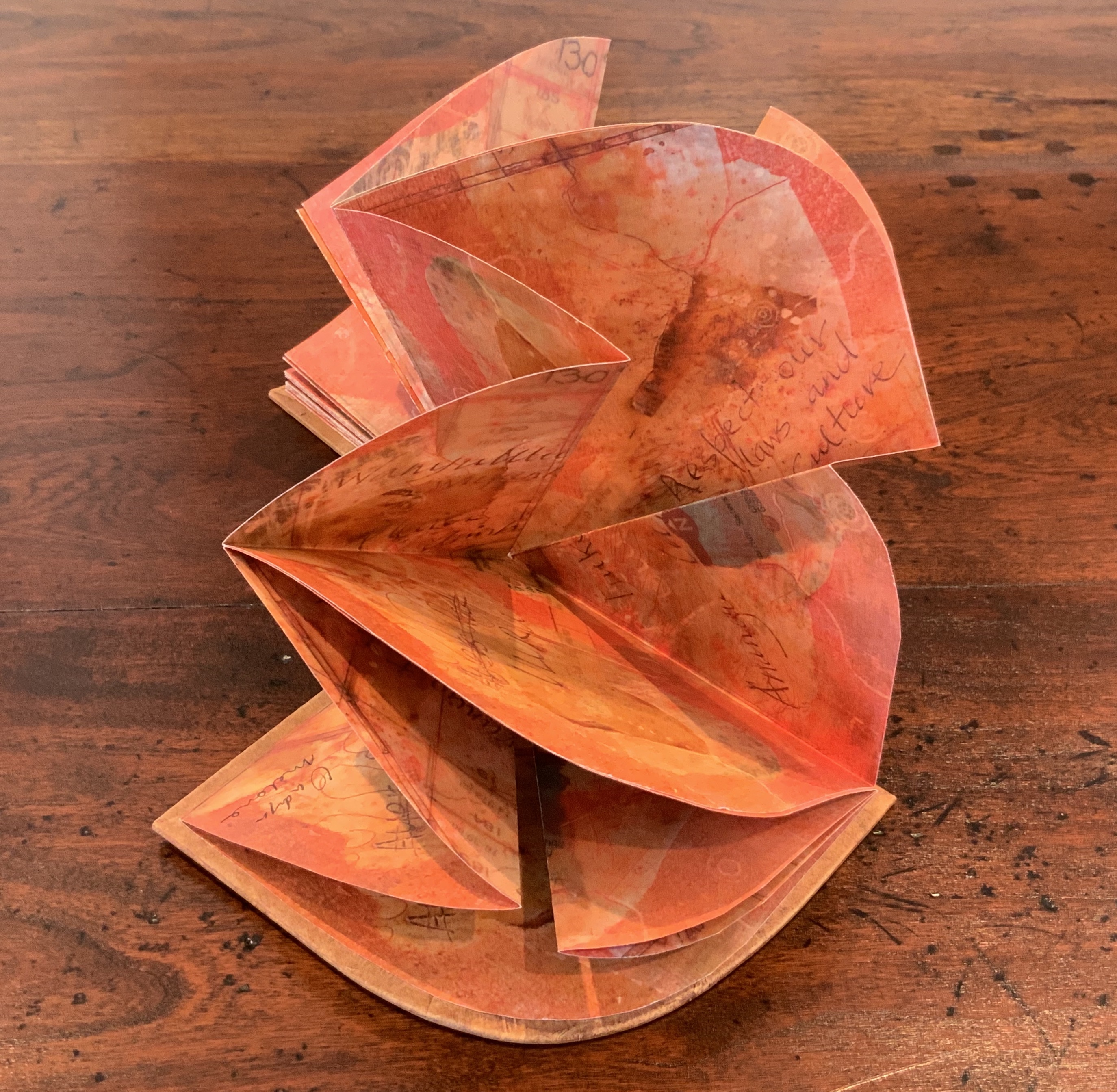
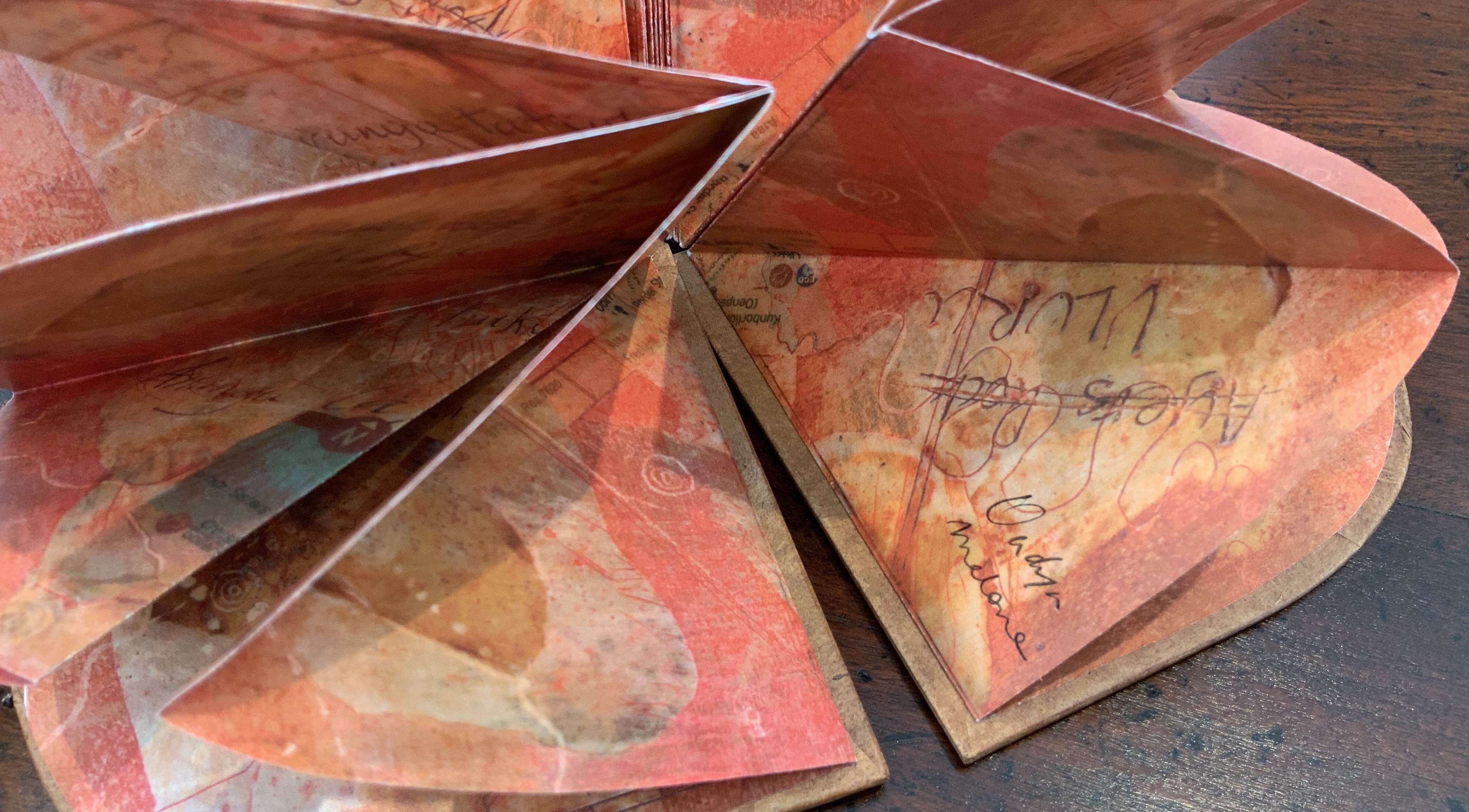
Laser printed images of waxed drawing, collage, painting and Chinese paper covered boards painted by Jack Oudyn with earth pigments, acrylic and xanthorrhoea resin. Sculptural folded page book structure and box by Helen Malone. H105 x W95 x D15 mm. Editions: 6 and 1 A/P. Acquired from Helen Malone, 2 July 2020. Photos: Books On Books Collection.
Photos: Books On Books Collection.
Artist’s description:
Malone and Jack Oudyn collaborated to create this representation of Uluru to resonate with the pleas of the indigenous Anangu people of the Northern Territory in Australia to “Wanyu Ulurunya Tatintja Wiyangku Wantima” (Respect our laws and culture).
For the Anangu the massive sandstone monolith is so sacred that they will not climb it nor photograph it. They ask visitors to respect the spirituality of the site and to follow their customs.
The blend of laser prints of wax drawings, Chinese paper, collage and painting seeks to capture the changing light of the rock as the sun passes over it throughout the day. The boards painted by Oudyn with earth pigments, acrylic and xanthorrhoea resin contribute a glowing depth of color to this homage to the Anangu. As with The Future of an Illusion (below), this collaboration presents an unusual unity of vision and integration of technique, materials and process with structural “rightness” for the subject at hand.
Exhibitions:
Art on Show Awards, Artspace Mackay Artist Book Award, Mackay Show Association, Mackay Qld, 16-19 June 2014.
Sheffield International Artists Book Prize, Bank Street Arts, Sheffield UK, 7-31 October 2015.
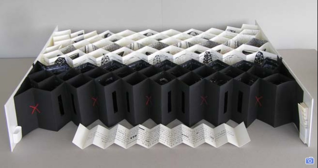
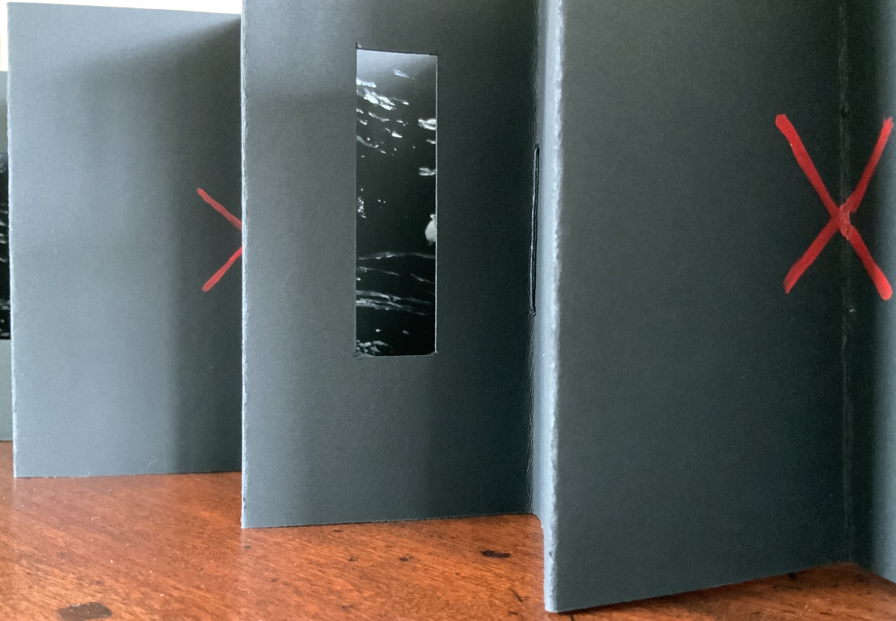
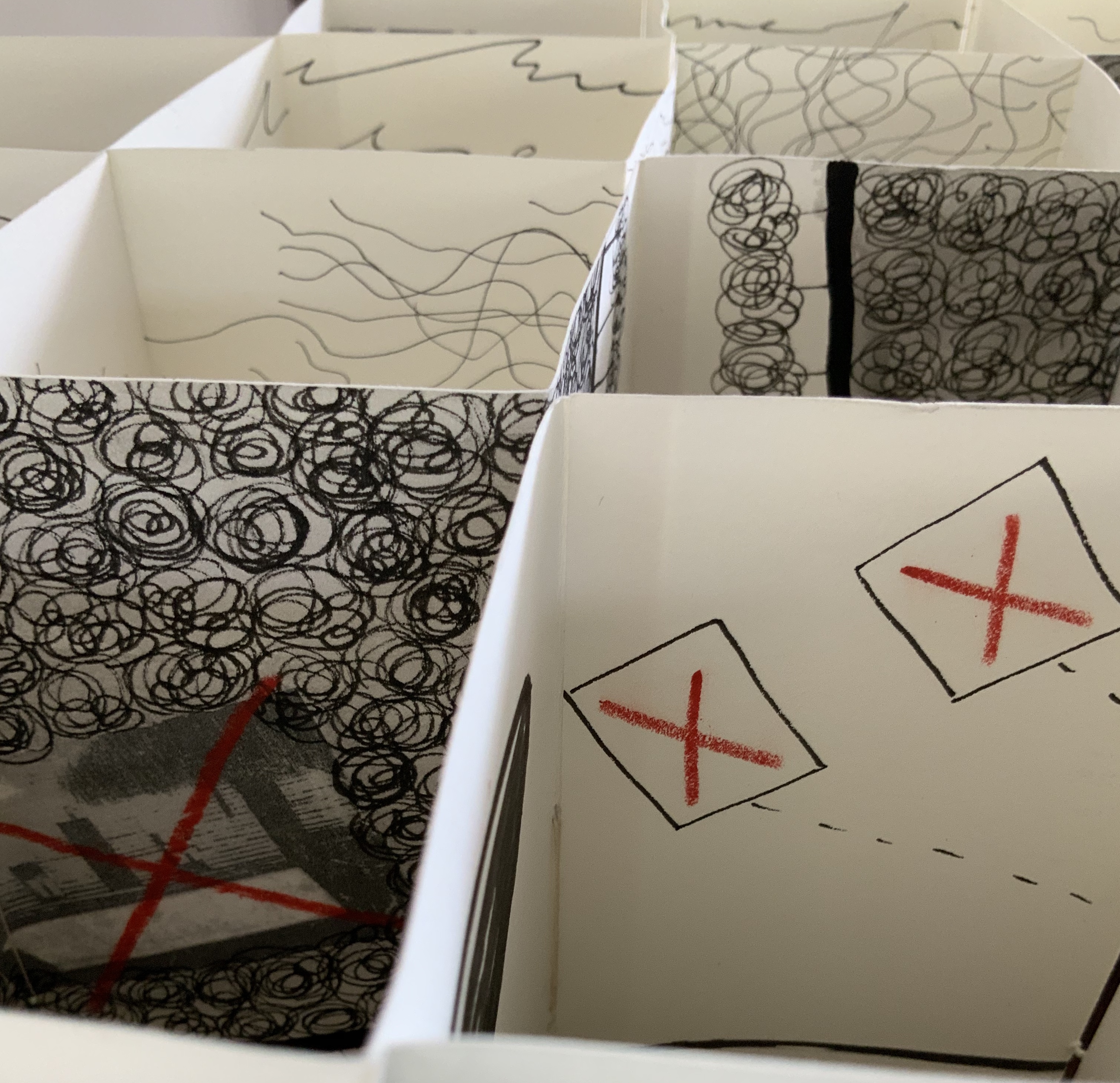
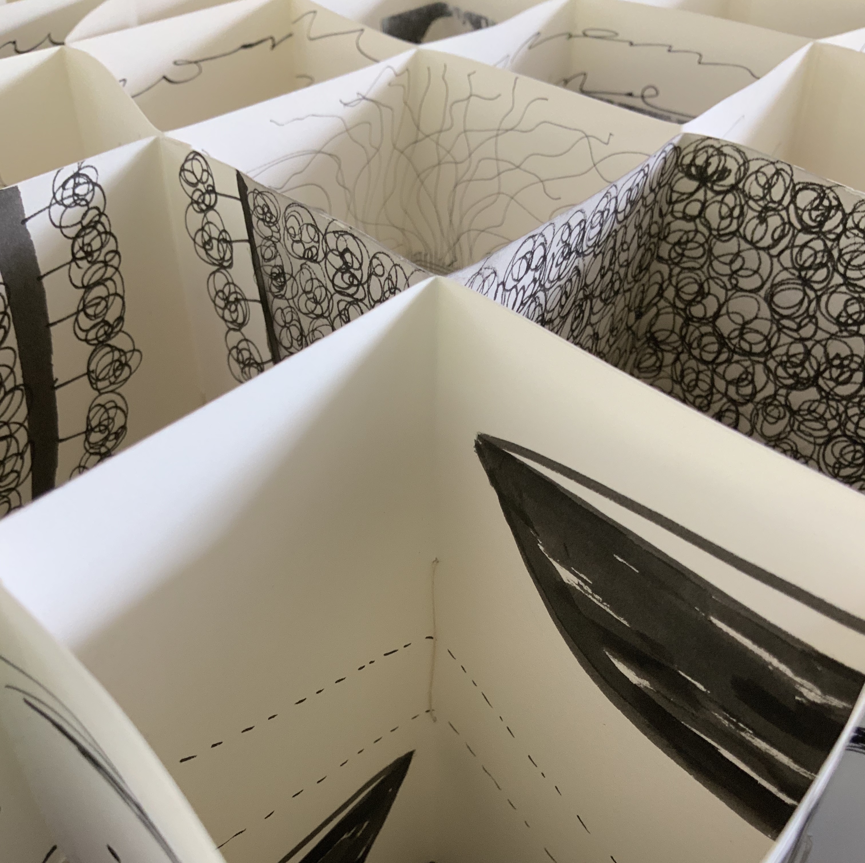
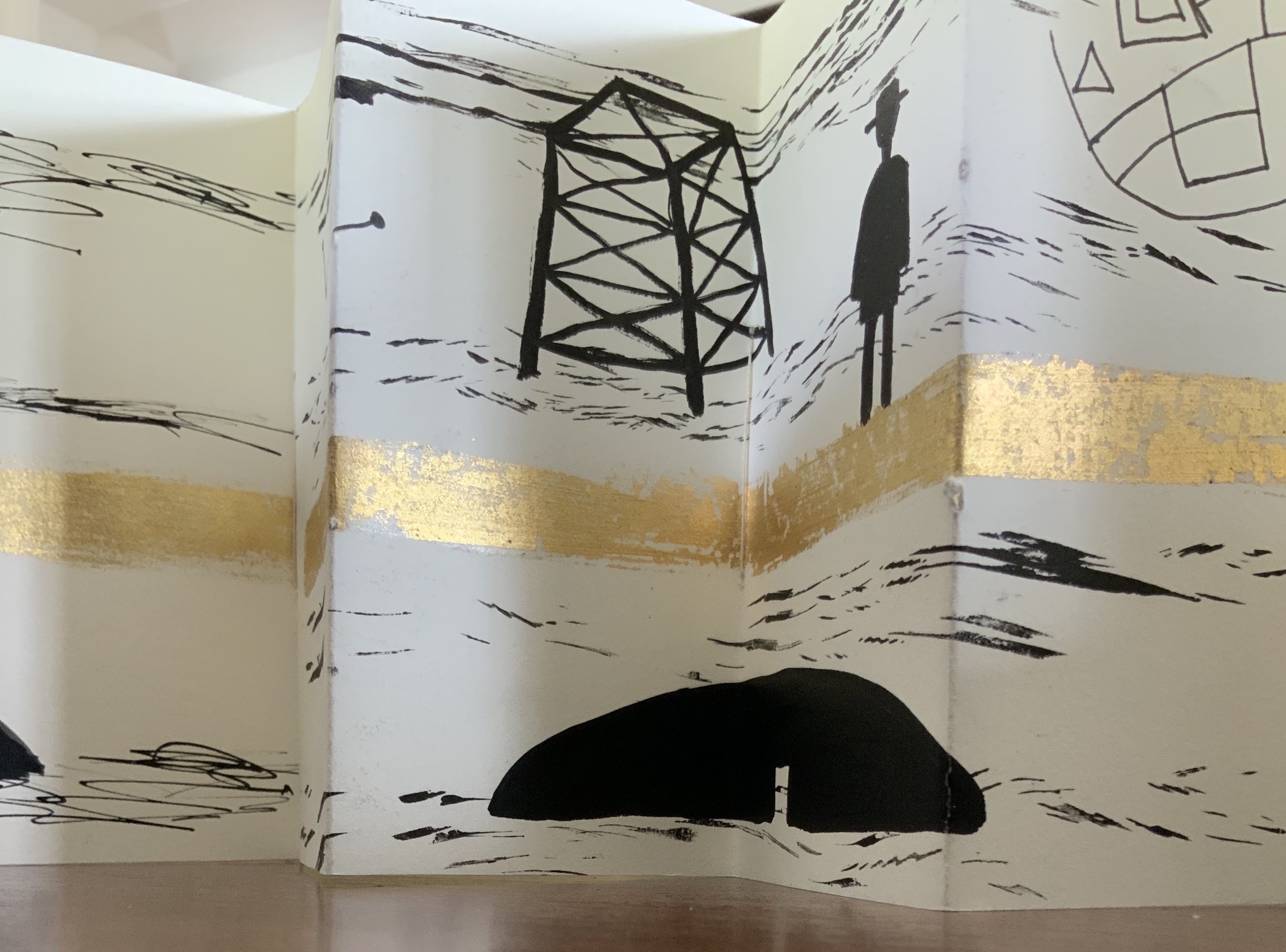
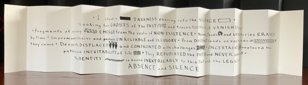
Binding of French faux leather. Multiple accordions in Fabriano 200gsm HP paper and Strathmore papers, pigmented ink, acrylic ink, printing ink, gold leaf, chinagraph pencil and image transfers. Closed: H780 x W50 x D150mm; Open: W750 mm. Unique edition. Acquired from the artist, 2 July 2020. Photos: Courtesy of the artist.
Artist’s description:
The Legacy of Absence and Silence refers to the present-day Australians whose forbears were immigrants to the continent in the nineteenth century. Many of those who came to Australia during that period made such an effort to assimilate that they have left no clues for their descendants to discover their origins. In fact some immigrants went to great lengths to eradicate their beginnings.In this work Malone has designed the structure of the book to reflect the effort of a search for meaning. The black foreground requires the viewer to struggle to peer inside the construction to glimpse details. Beyond the visual obstruction the white pages reveal snippets of information but never the full story.
Photos: Books On Books Collection.
This is a work that demands display in-the-round on a table allowing viewers to lean far enough over to catch the details within the cells formed by the joined accordions, to circle it to see how emblems and signs emerge and disappear, and to move closer and step back to experience the shifting geometric patterns.
Exhibition:
Libris Awards, Artspace Mackay, Queensland, from 26 August – 16 October 2016.
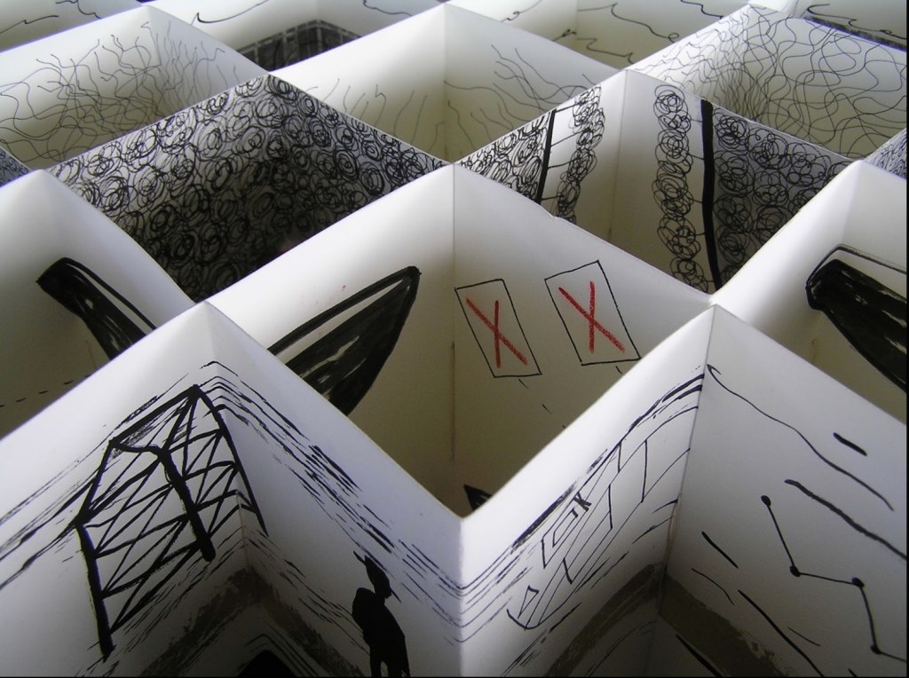
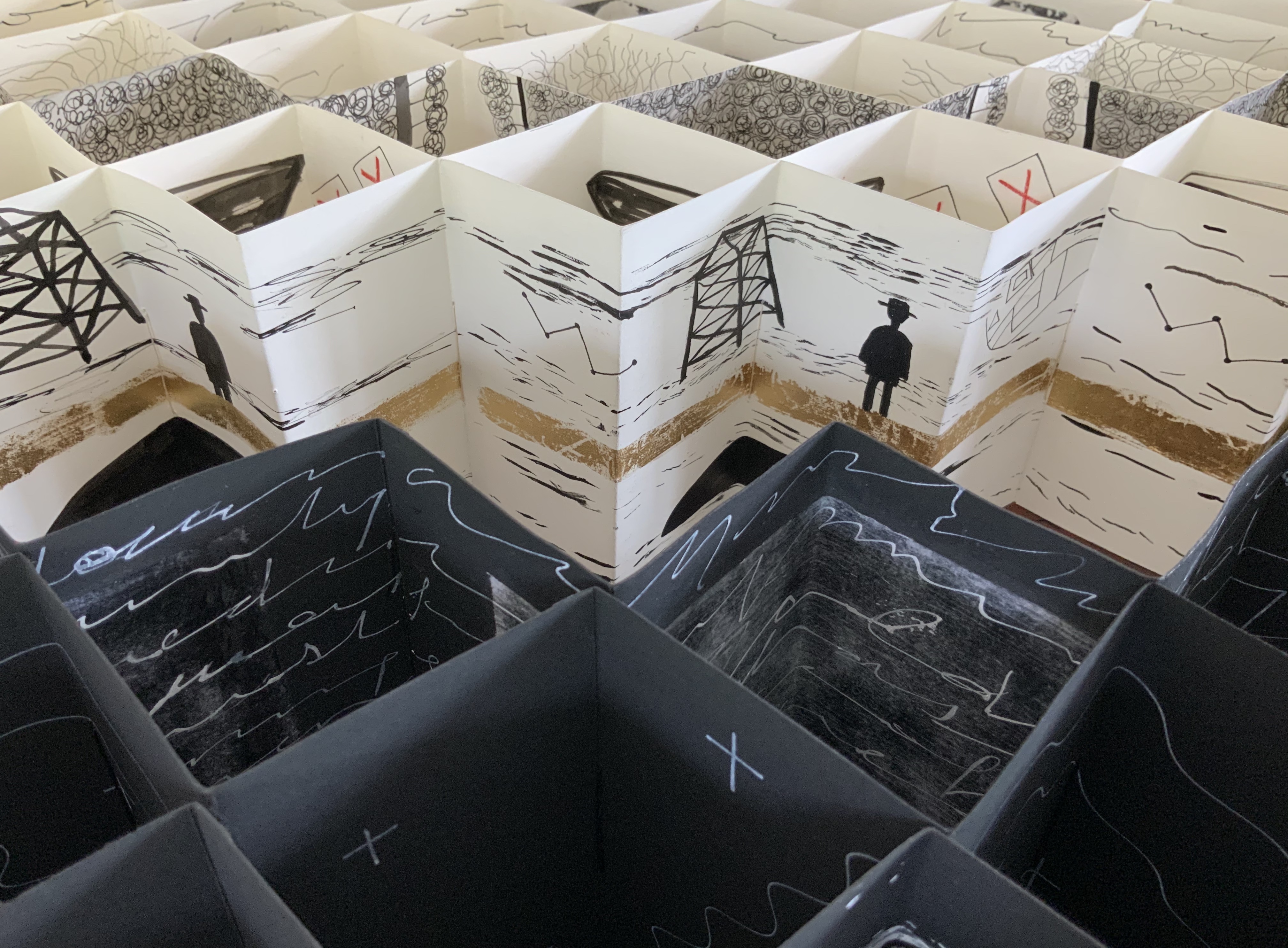
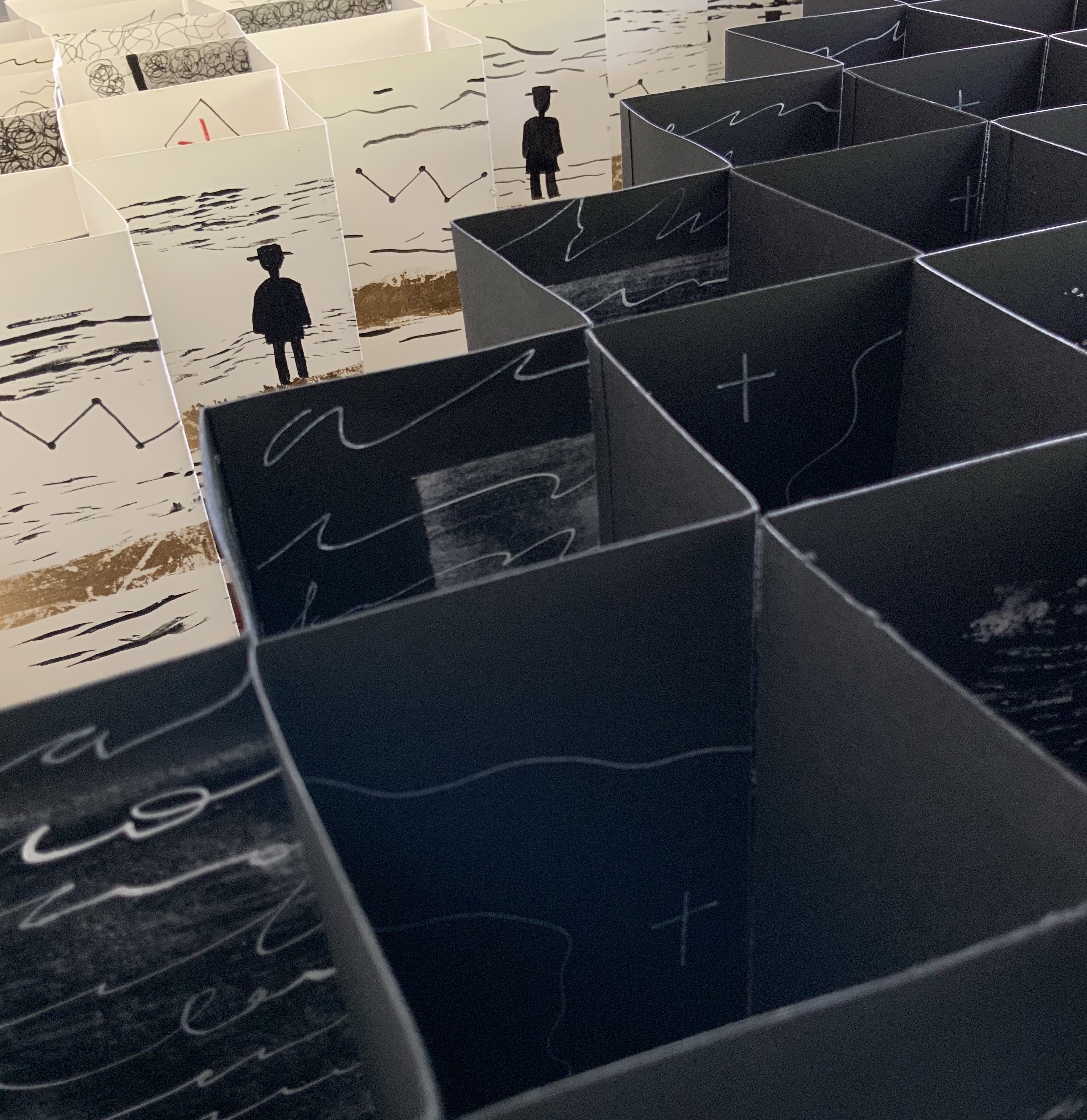
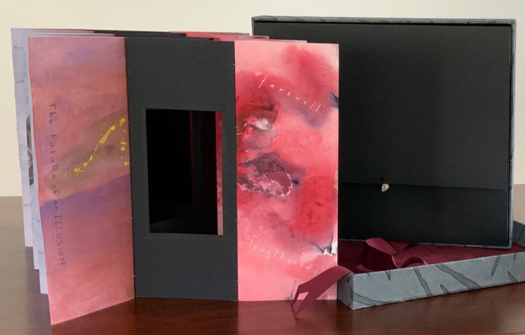
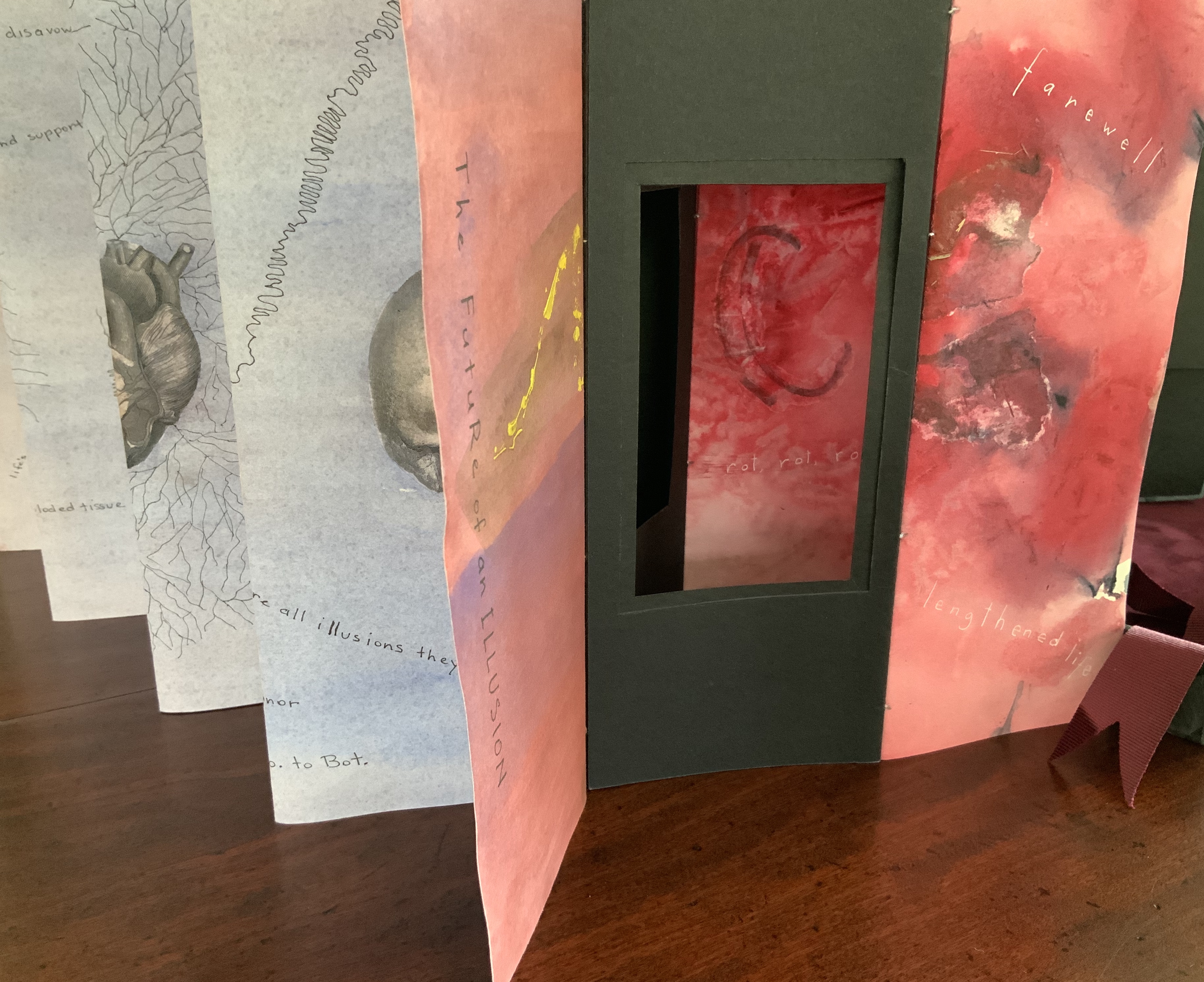
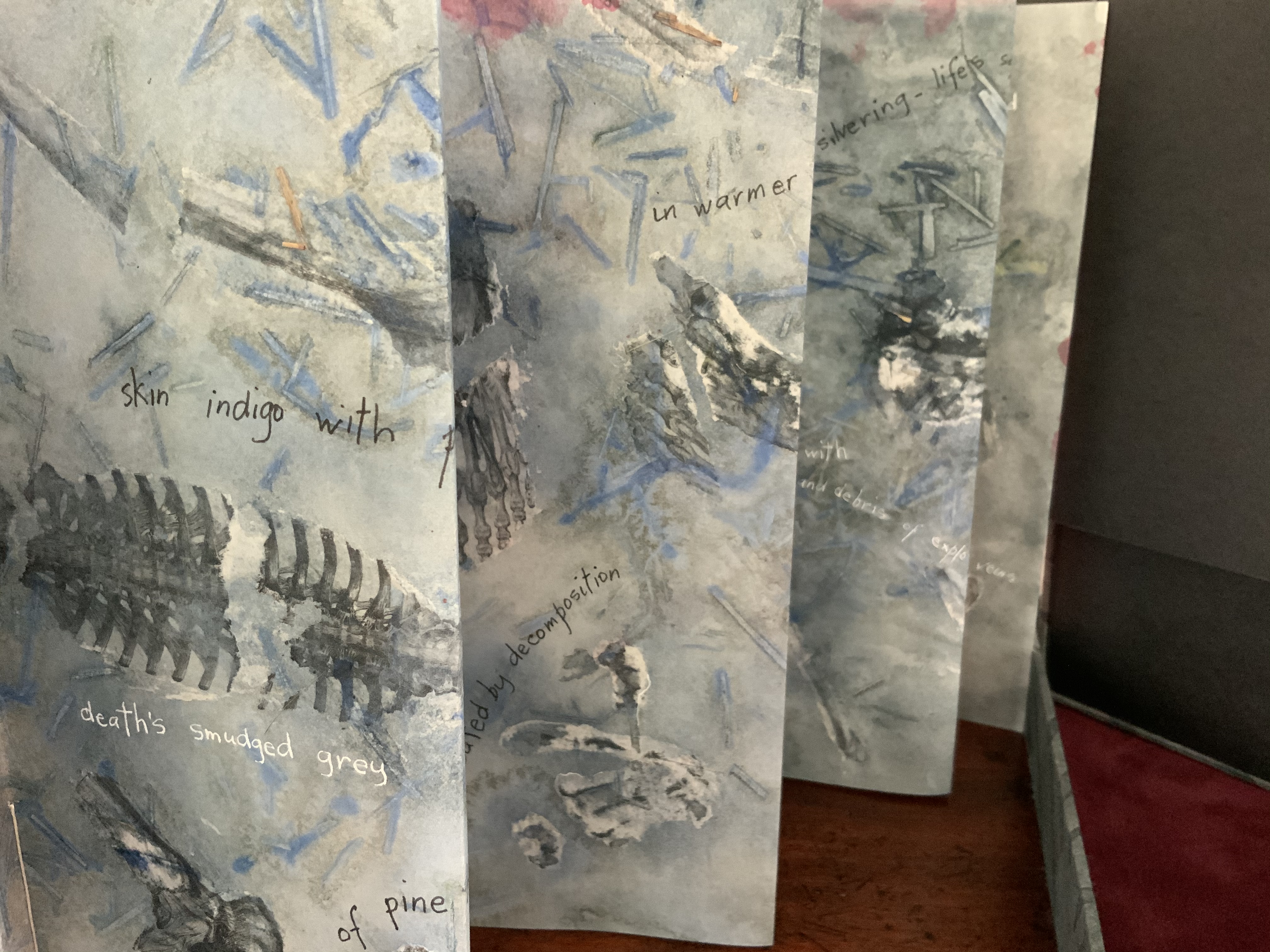
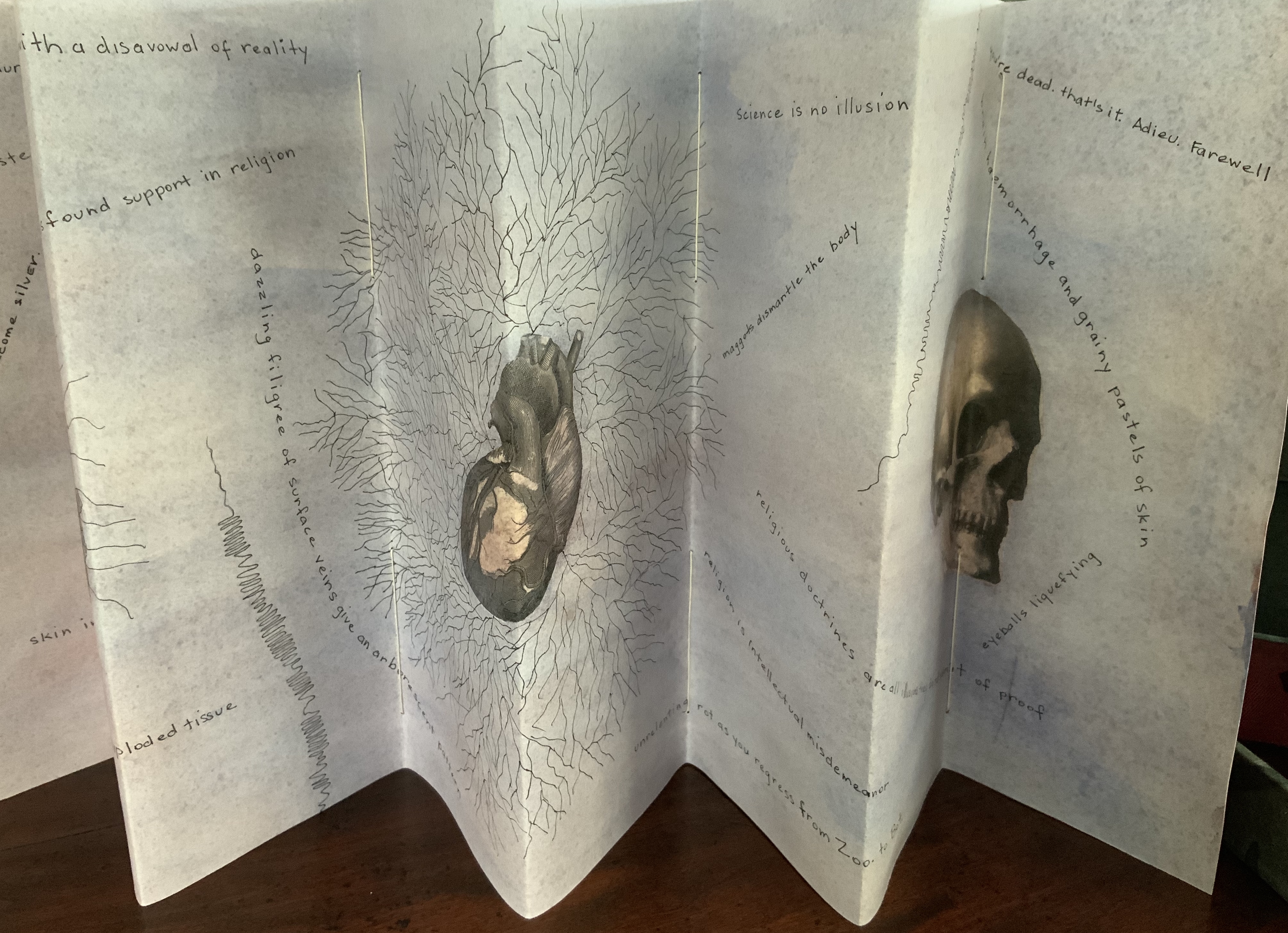
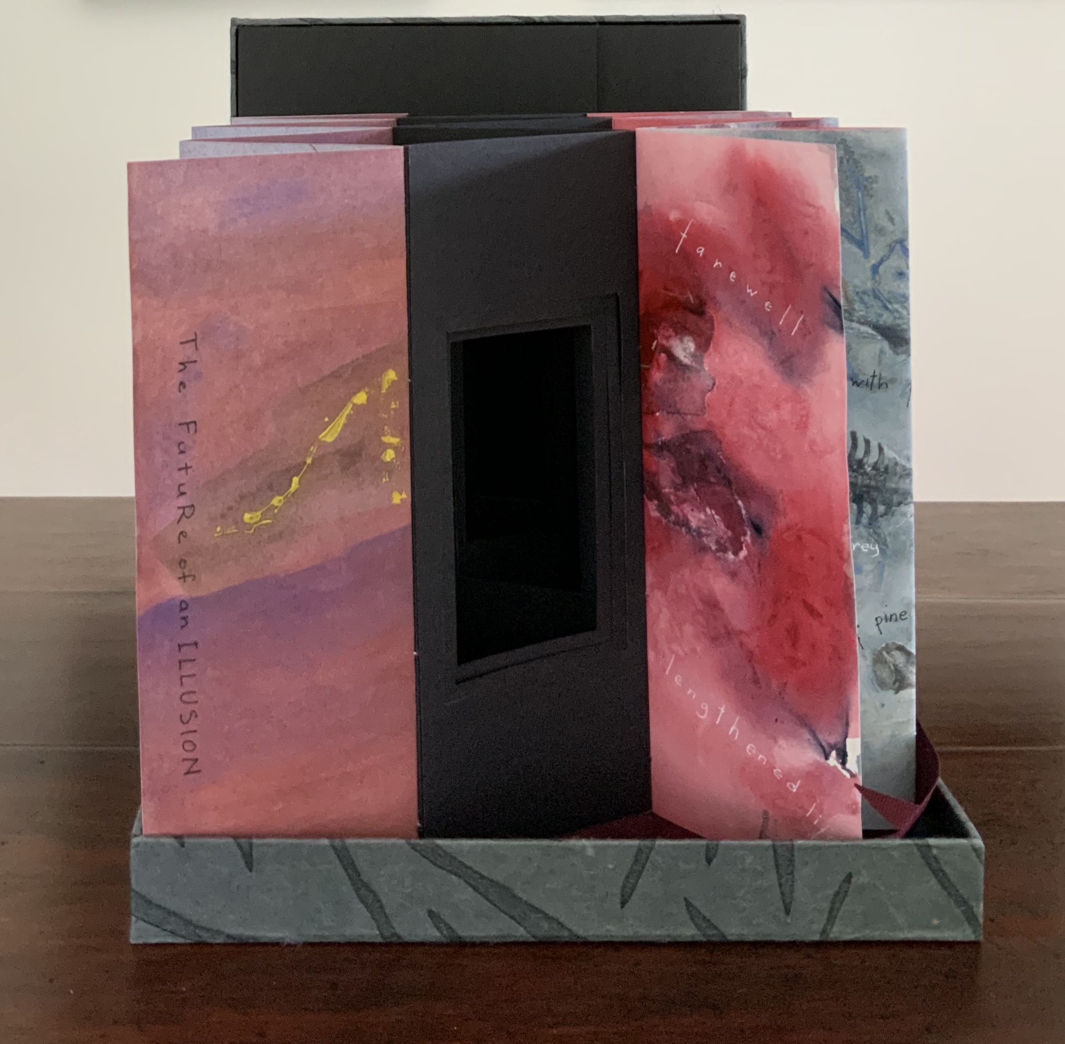
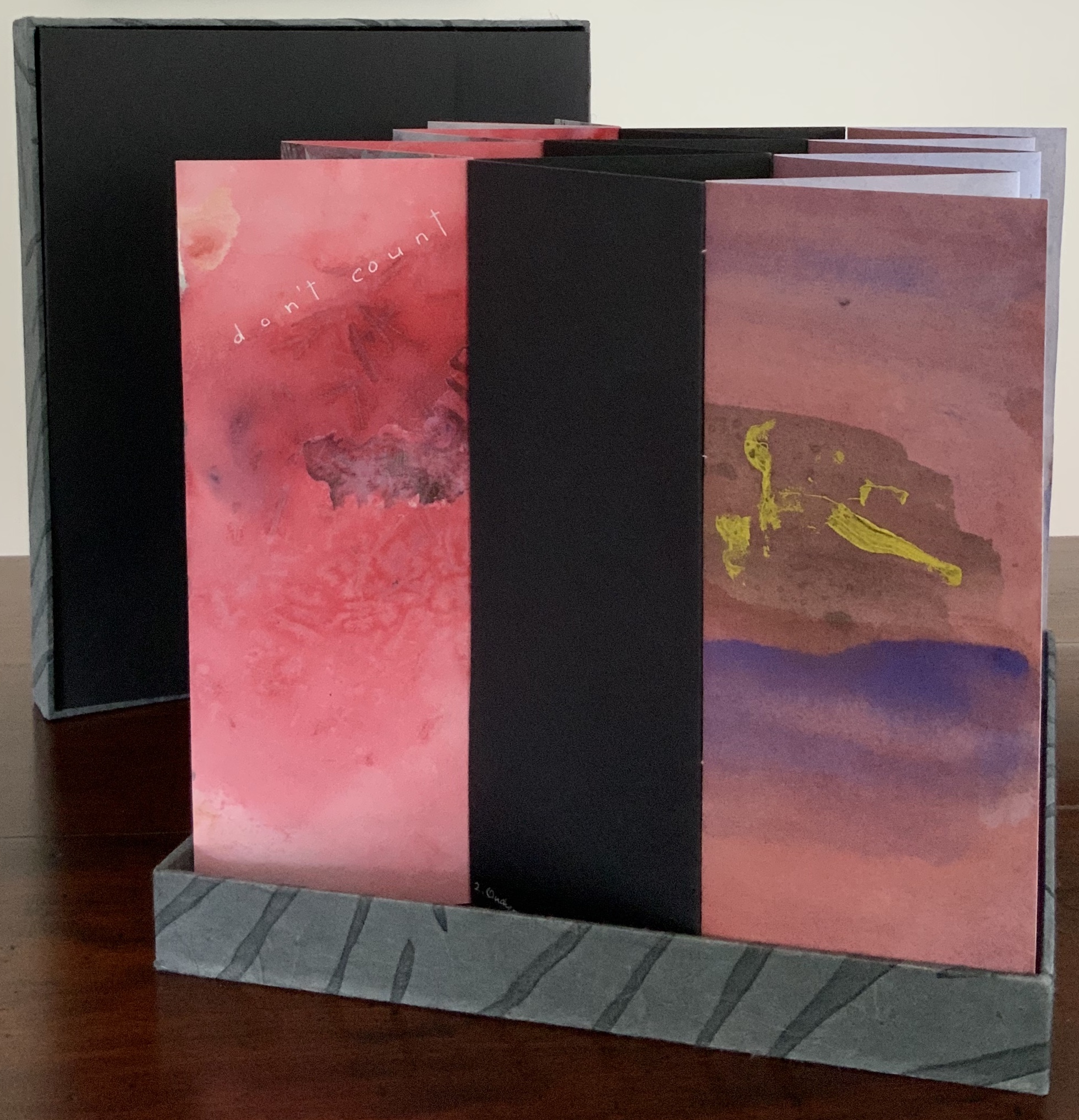
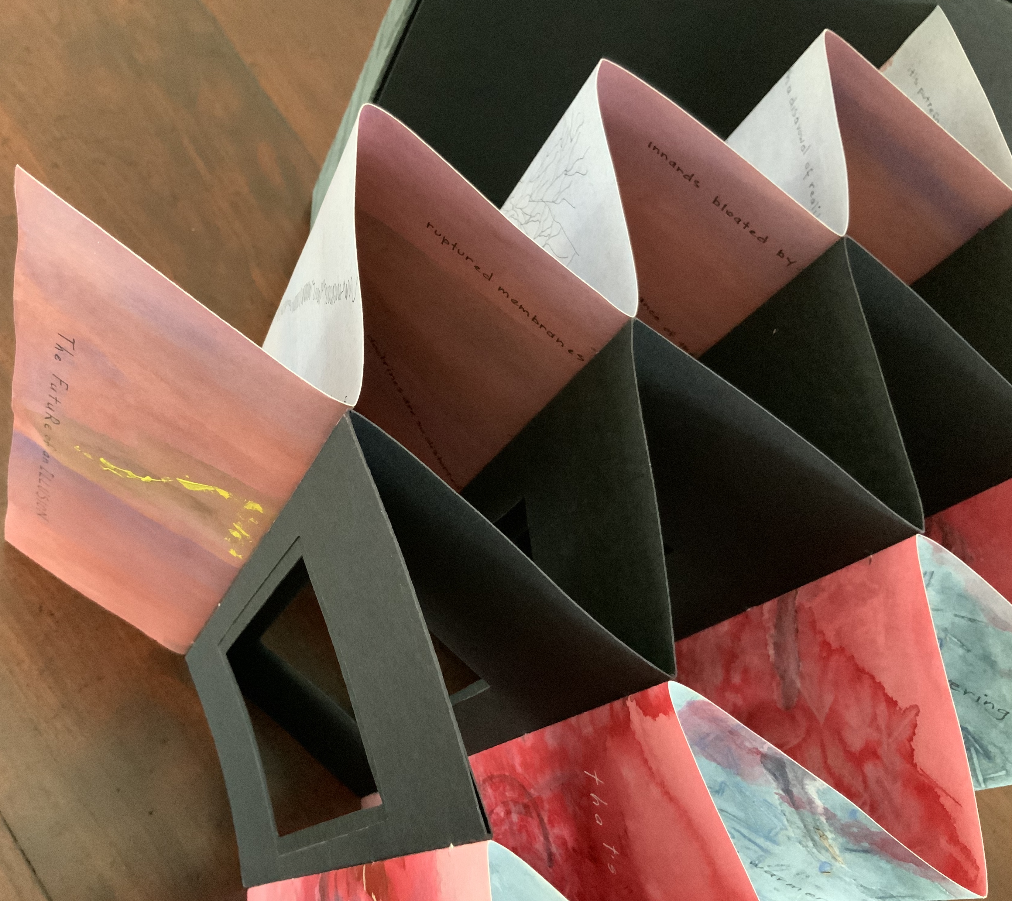
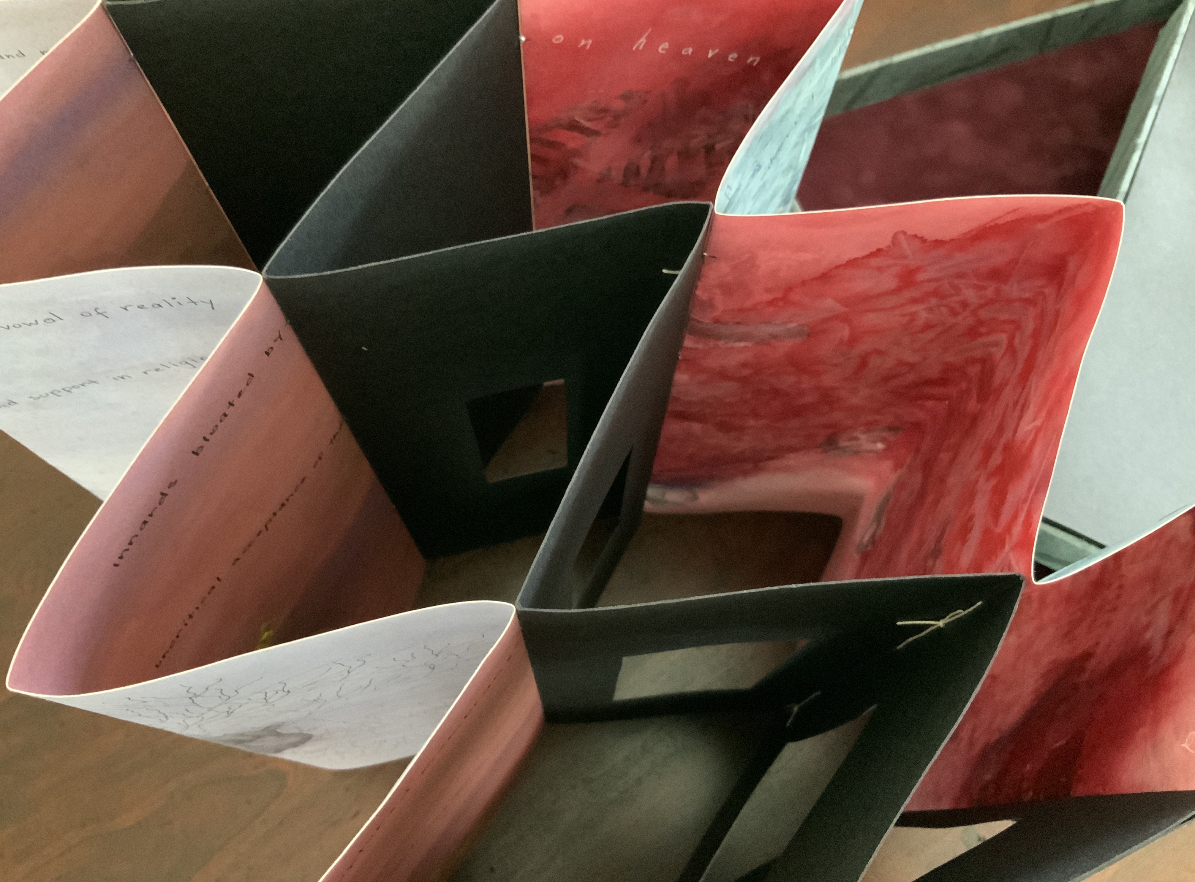
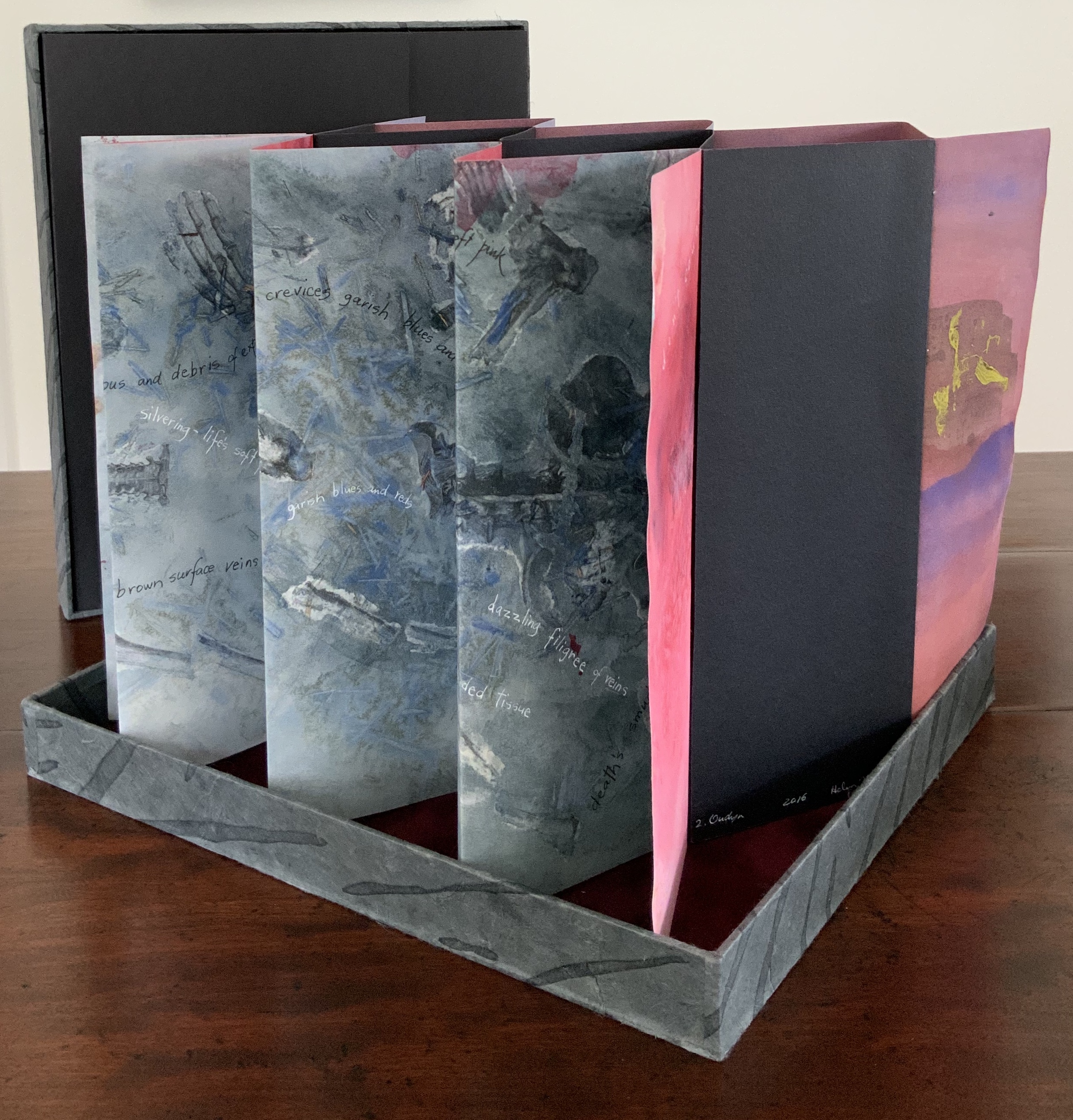
Sculptural tunnel book structure (three joined four-fold leporellos) enclosed in a folder and protective boxin a box,. Box made with Lamali handmade paper, suede paper (lining), silk ribbon and Somerset Black 280 gsm; Folder: Canson black 200gsm, skull button and waxed thread; Leporello: center leporello made of Canson black 200 gsm, adjoining leporellos made of Arches watercolour paper 185 gsm with acrylic, soluble carbon, gouache and transfer ink jet images. Box: H275 x W313 x D34 mm; Folder: H258 x W295 x D21 mm; Book: H250 x W290 x D16 mm closed, D770 mm. One of an unnumbered, signed edition of 4. Acquired from Helen Malone, 12 September 2017. Photo: Books On Books Collection.
Photos: Books On Books Collection.
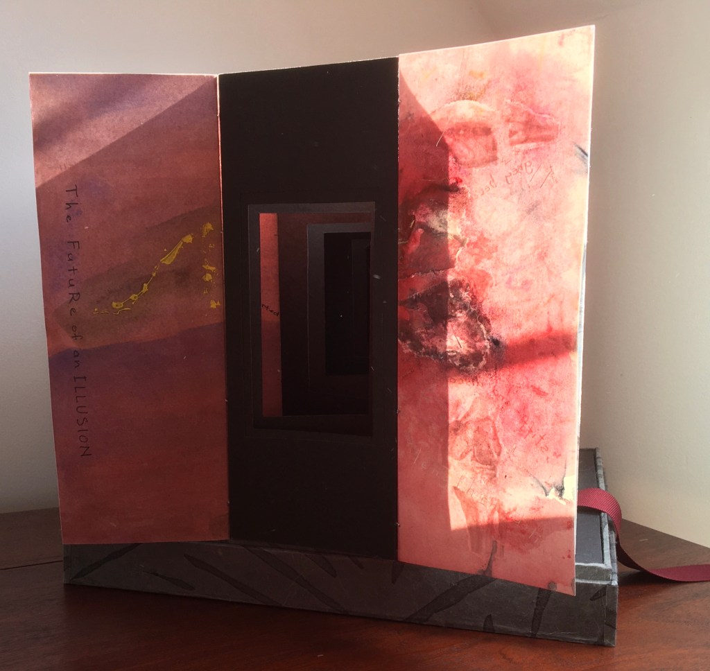
Like The Legacy of Absence and Silence, this work uses joined accordions, but builds on the cut-outs in the former to construct a tunnel book down the middle. The integration of structures here is further remarkable as a result of another collaboration between Malone and Jack Oudyn. Selected for the 2017 Manly Library Artists’ Book Award exhibition in New South Wales, Australia, The Future of an Illusion demonstrates an effective collaboration in a field of art densely populated with — almost defined by — collaborative efforts. One pair of artists to compare with Malone and Oudyn is Sonia Delaunay and Blaise Cendrars. Over a century ago and half a world away, they collaborated on La Prose du Transsibérien et de la Petite Jehanne de France, also in an accordion format modified perfectly to its subject with an aim to create a work in which color, image and words are experienced simultaneously. Malone writes that it “has always been very influential generally on my work” (correspondence with Malone, 24 September 2017).
Rather than springing from an interaction over one poem, The Future of an Illusion springs from two imaginations struck by two literary works: Sigmund Freud’s eponymous book arguing against belief in an afterlife and Jim Crace’s novel Being Dead documenting the decomposition of a dead body left in nature. The choice of the two texts, the colors of putrescence, the void toward which the central tunnel leads, the coffin-like box in which the work is stored, locked with a button skull — all create a simultaneous tension of several emotions — fear, humor, sorrow, hope, despair, revulsion and aesthetic pleasure.
Photo: Books On Books Collection.
Exhibitions:
Between the Sheets, Central Gallery, Perth , WA, 18 March – 8 April 2017.
Second venue for Between the Sheets, Australian Galleries, Collingwood, Melbourne, Vic, 13 June – 2 July 2017.
Manly Library Artists Book Award, The Creative Space, North Curl Curl, NSW, 30 March – 2 April 2017.
Art on Show Awards, Artspace Mackay in association with Mackay Show Association, 11-22 June 2017.
6th Artists Books Fair, Grahame Galleries in association with Griffith University, Brisbane, 7 – 9 July 2017.
Collections:
Artists (1/4 & 3/4), State Library of Queensland Artists Book Collection, Brisbane (4/4).
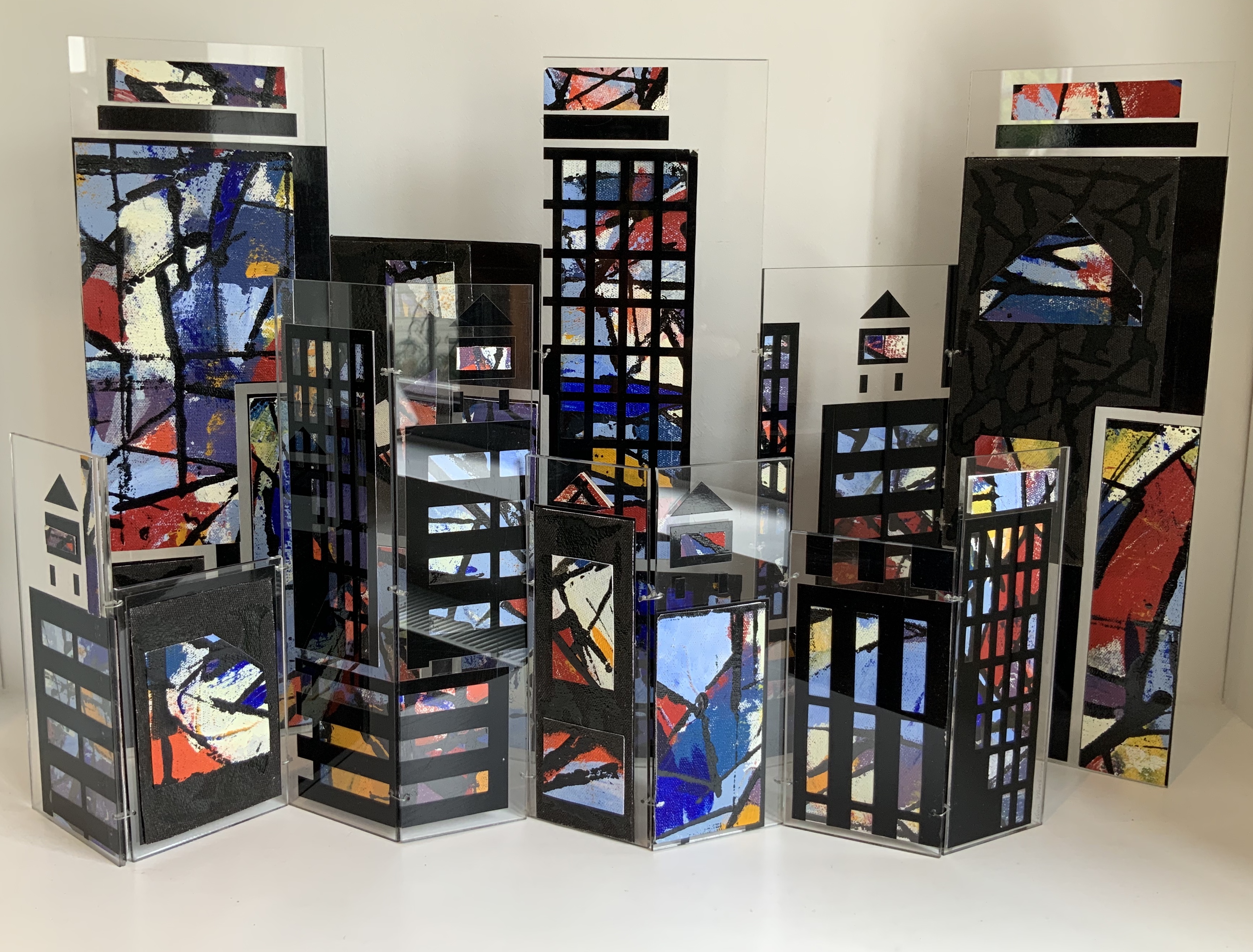
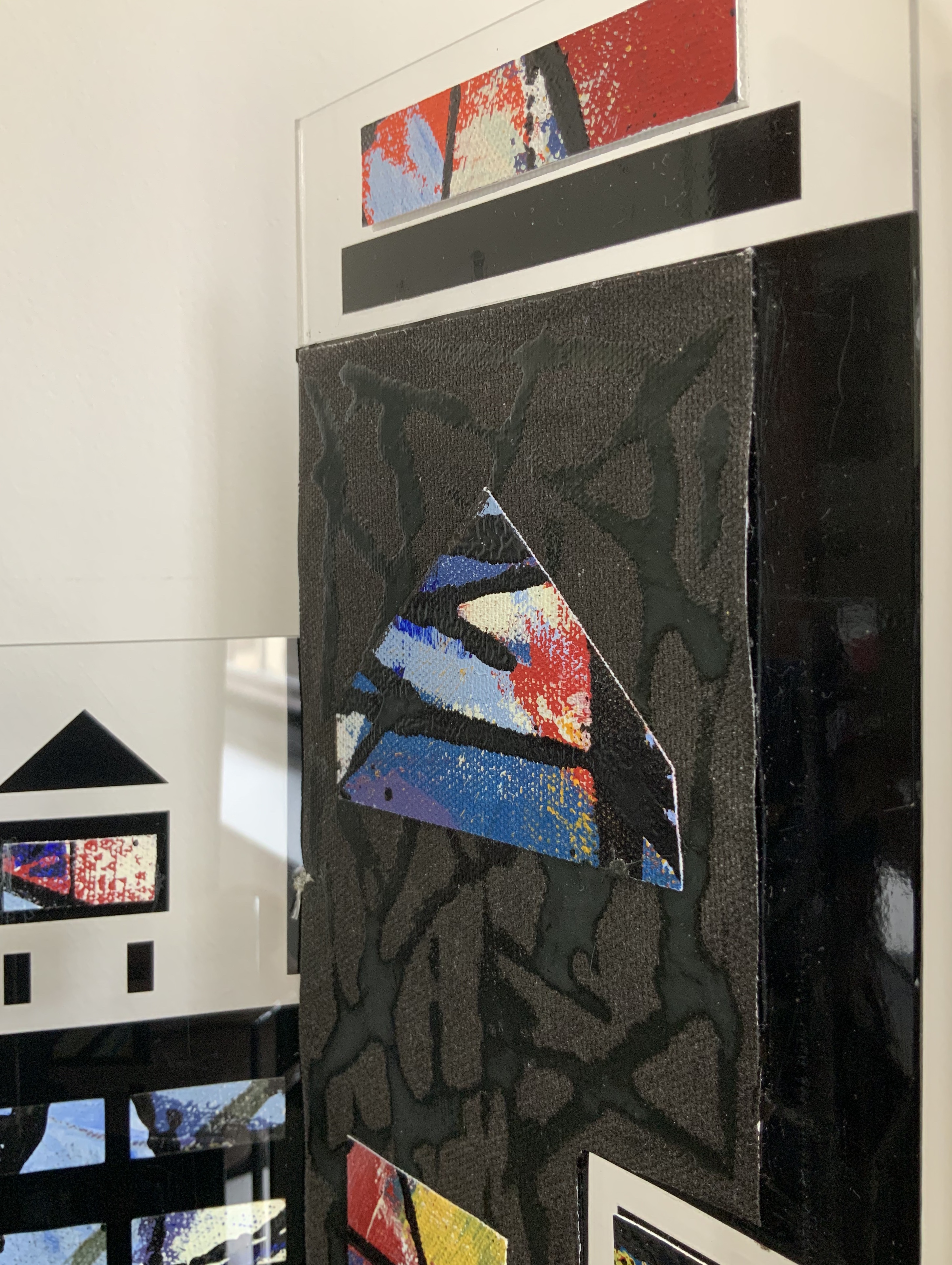
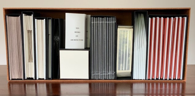
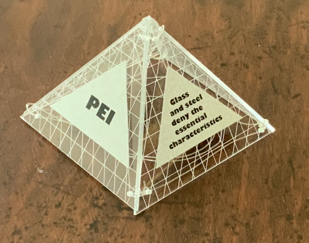
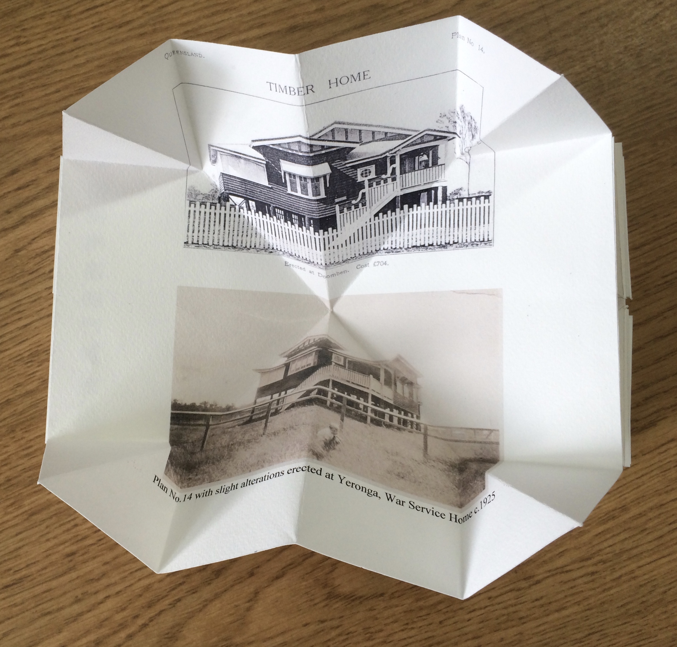
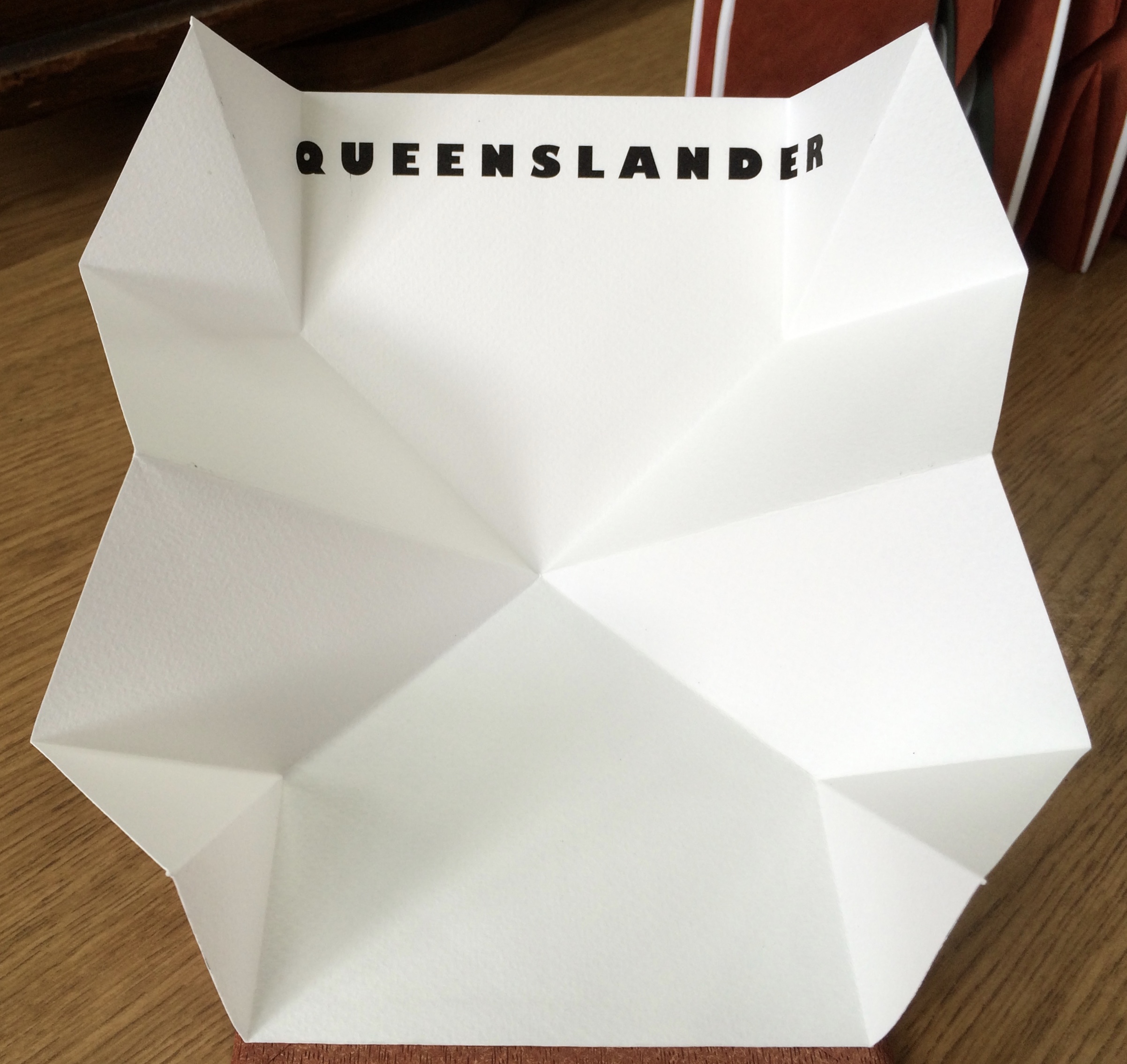
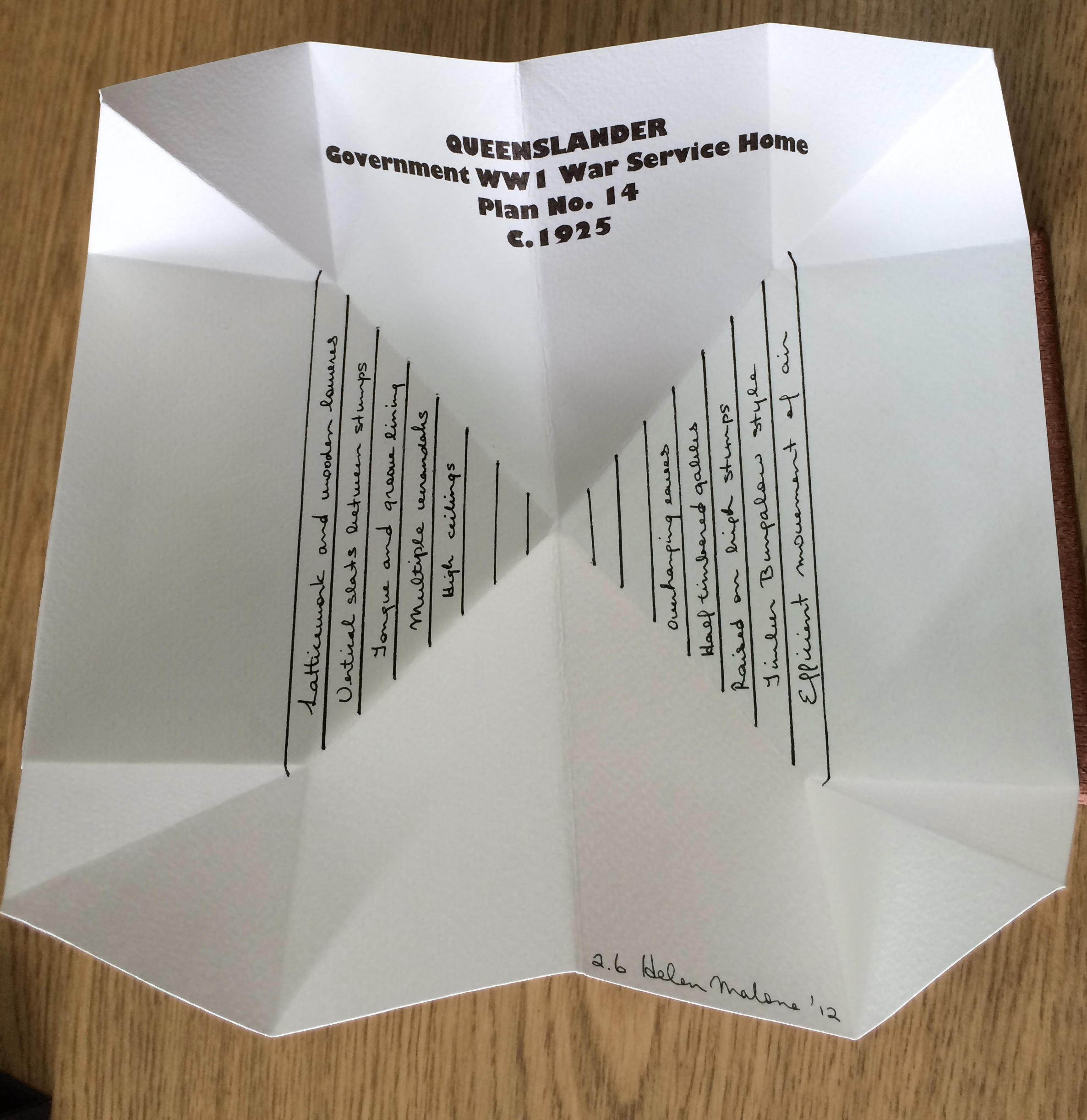
Open-sided box containing ten individual adapted book structures. Closed: H175 x W440 x D110 mm; Open: H500 x W600 mm. Version 4. Acquired from the artist, 24 November 2017. Photo: Books On Books Collection.
Inspired by De Architettura by Vitruvius and De Re Aedificatoria by Leon Battista Alberti, Malone created her first version of this work in 2006. Three others followed: in 2012, for the Pratt Institute; in 2013, for the State Library of Queensland; and in 2017, for this collection. In the 2012 version, the sixth book — Queenslander — differentiates that version from the others. The 2017 version is differentiated by its tenth book — Zaha Hahid.
These differentiators signal the abundant variety of structures within each version. Their unerring “rightness” for the subject of each “volume” astounds.
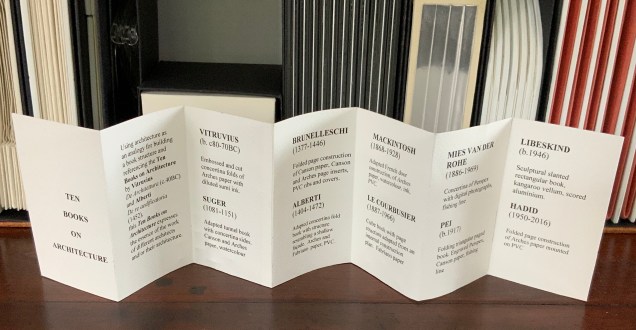
Book One — Vitruvius — consists of embossed and cut concertina folds of Arches paper with diluted sumi ink; when displayed, the line of columns suggests a Roman temple. Book Two — Suger — celebrates the French patron of Gothic architecture with an adapted tunnel book with cut concertina sides in Canson and Arches paper, ink and watercolor; when displayed, the structure suggests the stained glass windows of St. Denis. Book Three — Brunelleschi — is a folded page construction of Canson paper with page inserts of Canson and Arches paper, PVC ribs and covers; when displayed, it references the dome of the Cathedral of Santa Maria del Fiore in Florence, the internal colors of the cathedral and Brunelleschi’s credited invention of linear perspective. Book Four — Alberti — is a concertina fold book in Fabriano and Arches paper with PVC covers; its gutters and collaged pages make a structure resembling shallow facades on which several of Alberti’s statements elaborating Vitruvian principles are printed. Book Five — Mackintosh — adapts a French door construction in Arches paper, watercolor, ink and PVC to celebrate the Scottish architect and designer; when displayed, it echoes his design and its Japanese influences. Book Six — Le Corbusier — is a cube book of Fabriano paper and resembles a white concrete box; its page structure is adapted from Corbu’s internal construction plans with mezzanine floors. Book Seven — Mies van der Rohe — consists of a concertina of double Perspex pages linked with fishing line and containing digital photo images of Chicago taken by the artist; it can be manipulated to form various displays, with multiplying reflections suggesting the spread of the architect’s influence on twentieth-century cityscapes. Book Eight — Pei — is a folding triangular paged book made of Perspex and Canson paper, linked with fishing line; when displayed, the pyramid pays homage to Pei’s dome over the entrance to the Louvre. Book Nine — Libeskind — echoes the architect’s intentionally disorienting Jewish museum in Berlin; a slanted rectangular box book, made of kangaroo vellum and scored aluminum, presents its text in a way intentionally difficult to access and read. Book Ten — Zaha Hadid — consists of organic shapes and patterns on a folded pages construction of Arches paper mounted on PVC; when displayed, the book takes on a shape that echoes that of Hadid’s architectural designs.
Additional commentary and images for Ten Books of Architecture (2017) can be found here.
Exhibitions and collections:
2006 version was exhibited in Books.06, Ten and Beyond, Noosa Regional Gallery, 22 September – 22 October 2006 and was purchased from this exhibition by a private collector.
2012 version commissioned by The Pratt Institute, New York.The Collections on View at the Brooklyn Campus of the Pratt Institute and online, May – August 2013. Image published in 500 Handmade Books, Lark Publishers USA, September 2013.
2013 version commissioned by the State Library of Queensland, Brisbane.
2017 version commissioned by Books On Books Collection.
Bruce, Joan. 20 March 2023. “‘The River City’ by Helen Malone“. Queensland Memory. John Oxley Library, State Library of Queensland. Accessed 24 March 2023.
Cascio, Davide. Travel Architecture (2006). Compare with The Legacy of Absence and Silence.
Chen, Julie. 2013. 500 Handmade Books. Volume 2. New York: Lark. P. 144 (Ten Books).
Salamony, Sandra, and Peter and Donna Thomas. 2012. 1,000 Artists’ Books : Exploring the Book as Art. Minneapolis: Quarto Publishing Group USA. Pp. 95 (Tsunami), 170 (Shattered in the Shaky City).