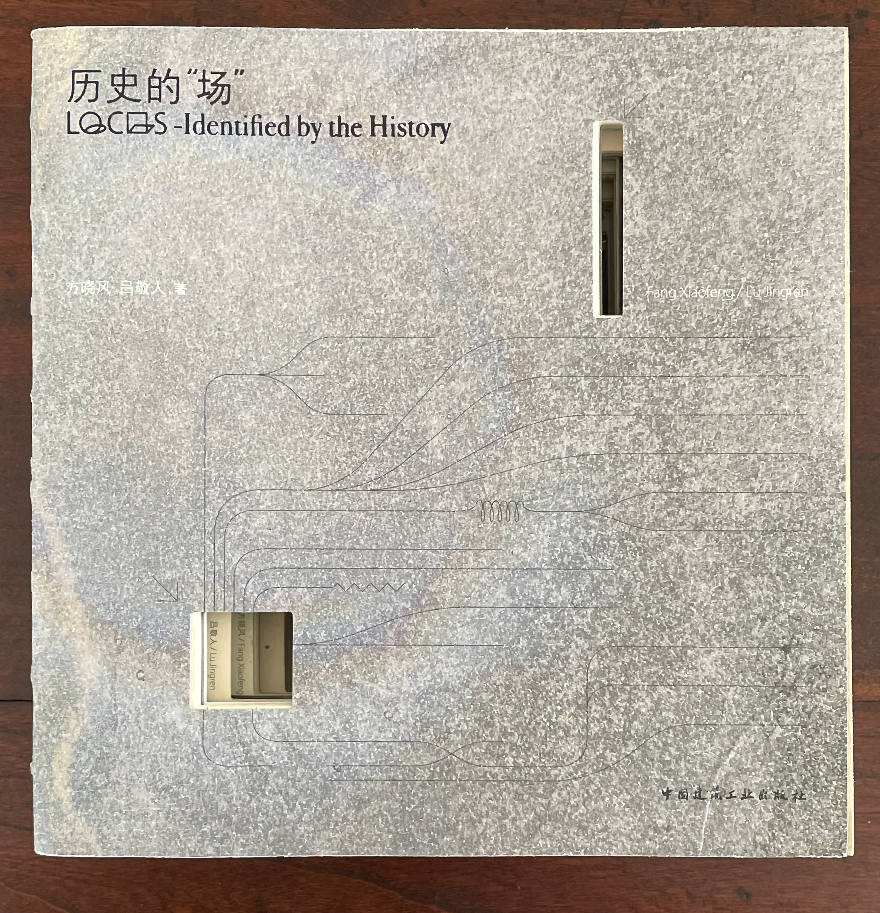
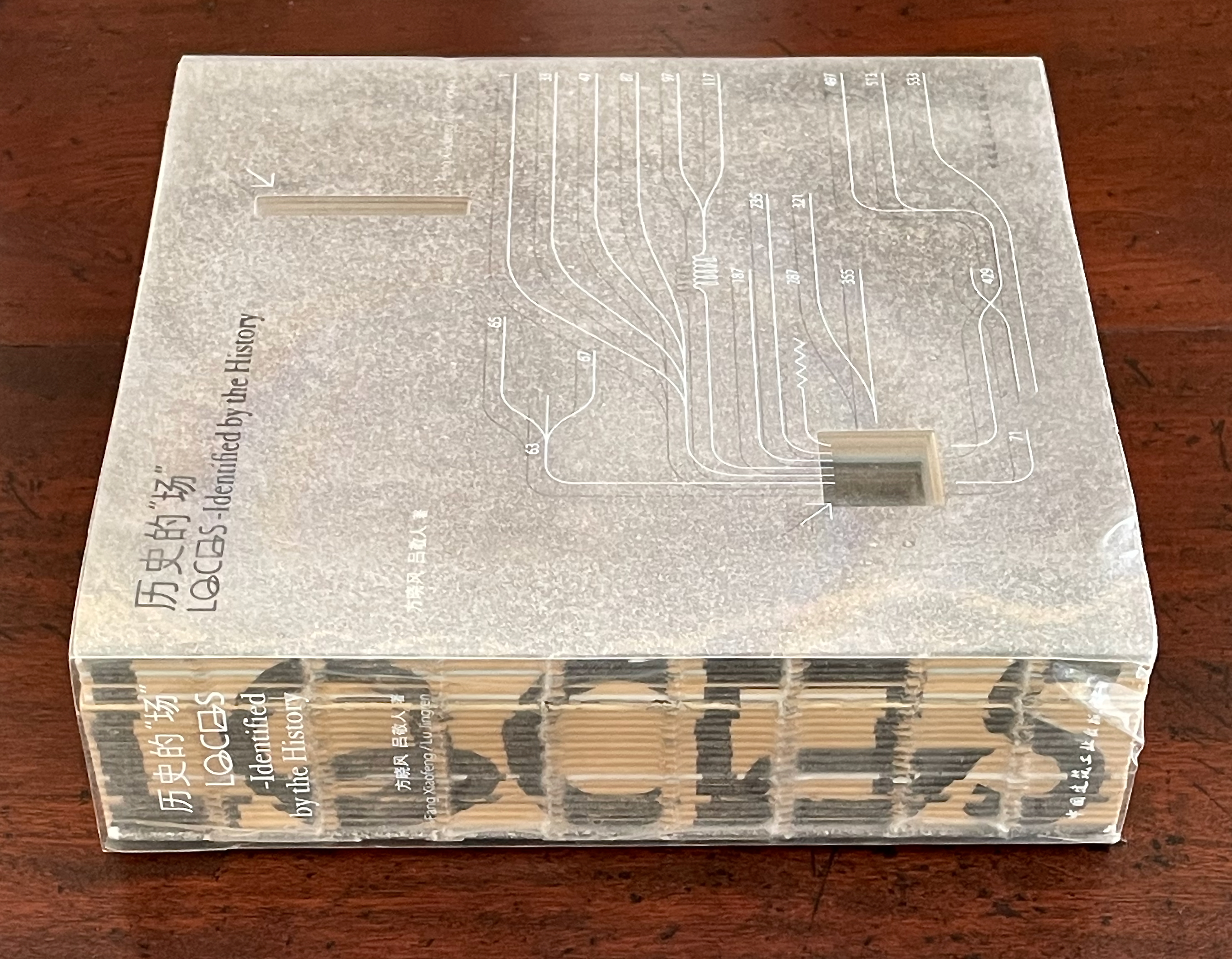
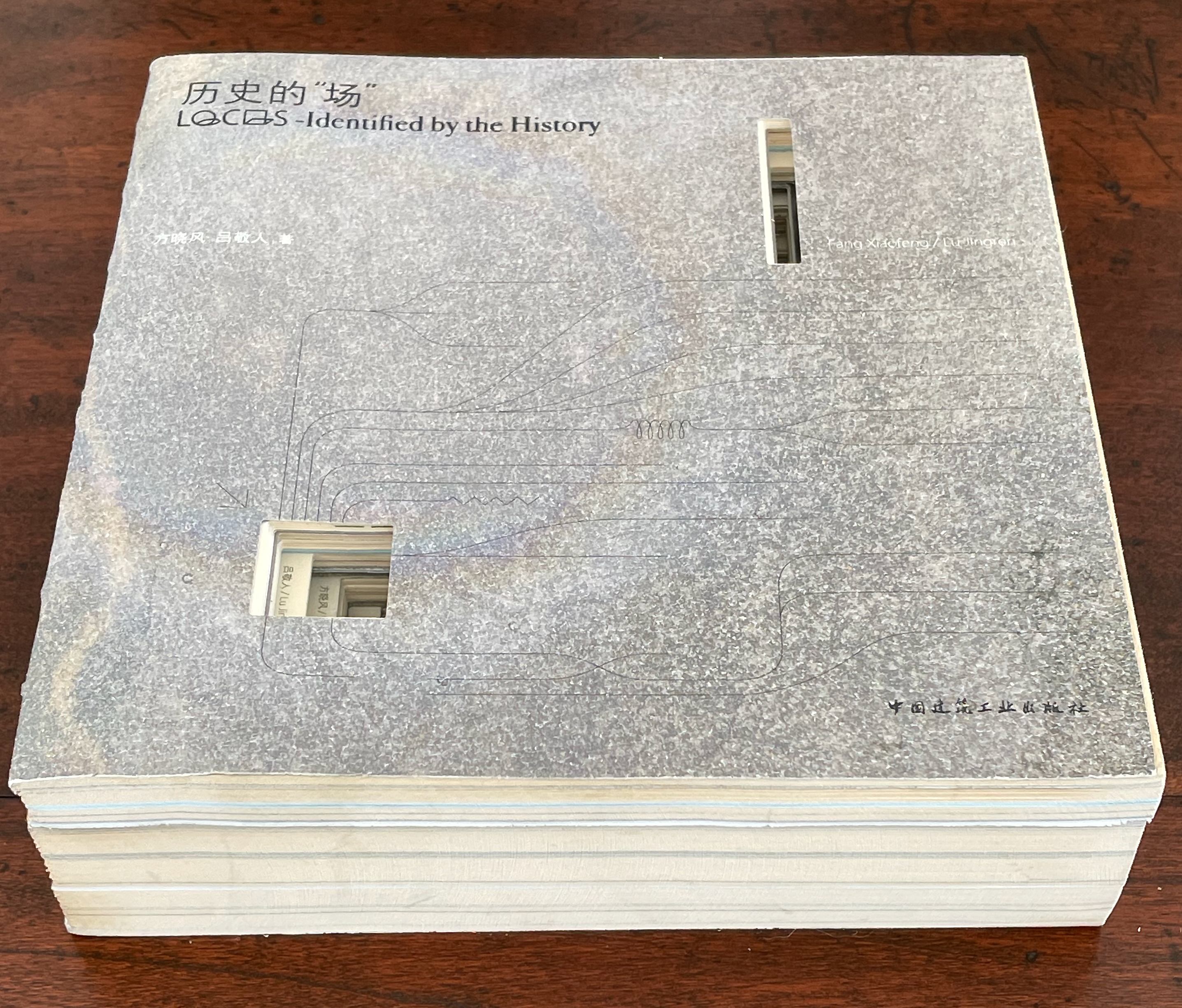
Books On Books Collection – Inscription: The Journal of Material Text, Issue 4 on Touch

Inscription: The Journal of Material Text, Issue 4 on Touch
Simon Morris, Gill Partington and Adam Smyth (eds.)
Cased perfect bound paperback, printed paper cover. 313 x 313 mm. 120 pages. ISSN: 2634-7210. Acquired from Information as Material, 29 November 2023.
Photos: Books On Books Collection.

Different readers will come to different conclusions on whether Inscription #4 dedicated to the subject of touch evokes the level of tactility in Melville’s famous Chapter 94 “A Squeeze of the Hand”. But all can agree that they share a certain seminality. Like Herman Melville with his preliminaries to Moby Dick, the editors of Inscription lead their fourth issue with definitions and choice quotations on the subject of “touch”, as much a Leviathan subject as that of Melville’s novel. Where Melville merged scholarly apparatus with narrative fiction to create a novel literary work, Simon Morris, Gill Partington and Adam Smyth have merged photography, poetry, augmented reality and audio with academic and critical essays to create a novel form of scholarship.

As noted in the review of Issue 2 on Holes, Inscription‘s composition is close to that of Aspen produced by Phyllis Johnson, and to this should be added the Fluxus productions inaugurated by George Maciunas, the AR Fluxus Box initiated by Art is Open Source (AOS) and Fake Press Publishing in 2010, and Franticham’s Assembling Box published by Redfoxpress (57 of them since 2010). Inscription‘s juxtaposition (sometimes fusion) of the imaginative with critical rigor continues to set it apart. In this particular issue, the contribution that most sets it apart from the preceding three is the editors’ reproduction of Robert Rauschenberg’s Automobile Tire Print (1953), with permission of the San Francisco Museum of Modern Art. The original consists of twenty attached sheets of paper over the length of which John Cage drove his car at Rauschenberg’s direction. Rauschenberg had placed a pool of sticky black paint in the car’s path. Here is the editor’s description of their use of the print:

To make the journal operate as an artist’s book for issue 4 of Inscription, we used Robert Rauschenberg’s Automobile Tire Print from 1953 to allow metaphorically John Cage to drive right through our journal, from left to right, following the direction of type and providing breaks (pun intended) that demarcate the space between different sections. (p. 111).

How is it that this makes the journal “operate as an artist’s book”? Well, perhaps as an Oulipean artist/editor’s book. The 726.4 cm of the Rauschenberg/Cage artwork is divided into double-page spreads of 62.6 cm (the journal’s trim size is 31.3 x 31.3) and thereby takes up 24 pages, leaving the editors 96 pages of the 120-page issue to allocate to the rest of the journal’s content. It is the internal frame for the artist’s book. The tire tread print provides a unifying thread and spatial constraint for the remaining contributions the artists/editors can accommodate. Some would-be contributor has to be left on the side of the road, or parts have to be ganged together into the trunk (or boot), or someone has to deliver urgent roadside assistance to fill in for a missing part. All to work with the Rauschenberg/Cage tire tread frame.

If this seems metaphorically far-fetched, consider the framing allusions in two of the issue’s sections: the table of contents and “The Grid” from the Fraser Muggeridge Studio. The former is the usually expected front matter signaling what’s to come, except for its unusual cross-hatch, frame-like layout; the second is the unusually extant appearance of the usually invisible set of guidelines for the layout of the pages, presumably offered up as the visible touchpoints or tracks that the rest of the issue follows and fills in. So the two standard unifying frames for any book allude with their line-crossing to that page-crossing, book-crossing internal frame of tire treads. And if, up to this point, the reader still doubts the allusion, a handprint and fingerprints in sticky black ink conclude the Muggeridge grid. This self-reflexivity is quintessentially how artists’ books operate.

Aside from the table of contents, the introductory Melvillean definitions and quotations, the Grid and the colophon, there are thirteen internal components to this issue of Inscription to be interspersed among the Rauschenberg/Cage skids. Most of them evoke the issue’s theme of touch visually, metaphorically and conceptually.

“Marking Readers: Pain, Pleasure, and the Nineteenth-Century Tactile Book” by Taylor Hare and John Gulledge explores the history of reading by touch “to argue that reading by touch … constituted an event in which reader and book each took the position of marker as well as marked, subject as well as object” and that “haptic encounters between books and readers … layered pain and pleasure overtop of one another in ways that scholars have yet to fully appreciate” (p. 6). Just as the body of the book can be studied to learn about humans’ reading, the bodies of readers by touch can be studied to learn about the body of the book.

“Make the Poem aka Language Fabric” by Ben Miller is a four-section extract from the long hand-scribed visual-textual poem Make, which has been excerpted in several literary magazines. Its thick lettering and doodles and its multidirectional, multipositioned text bleed across the gutter and off the top and bottom of the pages. On the lead-in page, there is a typeset “Aside to the kind reader” that instructs “Pick a point on the edge of each spread and slowly move a finger across the terrain at any angle. The action, repeated three times, is how I re-read for editing” (p. 21).

“‘The Divell’s Hand’: Touching Special Collections” by Matthew Shaw provides a special collection librarian’s and curator’s mixed views and metaphors on touch in an entertaining scroll from the anecdote about Charles II’s touching a purported demonic invocation inscribed in a 1539 linguistic history in the “divell’s hand” to anecdotes about the role of touch in the coronation of Charles III.

“All Fingers & Thumbs: Reading/Handling/Editing: Nabokov’s Pale Fire” by Gill Partington combines her exposition of her own altered-book revision of Vladimir Nabokov’s Pale Fire with a rumination on touch and reading.

Reading/Handling/Editing: Nabokov’s Pale Fire
Gill Partington

“Measuring the Sun –, 2023” by Jen Bervin and Deborah D. Mayer presents magnified photographs of embossments in packet VI of Fascicle 18 of Emily Dickinson’s poems held at the Harvard Houghton Library.

“The Felt Dimension: The Haptic Intuition of Hansjörg Mayer” by Bronac Ferran digs into the deep indentations that Mayer created in his Sixties works and makes the case that “we find traces of an early digital heritage embedded within the felt textures of print, given life within our fingers”.

“Sequences of Touch: Dried Flowers; Linen Rags; Rotten Potatoes; Wool Roving” by Sheryda Warrener, Claire Battershill, Amy E. Elkins, and Jayme Collins is a collaborative presentation of four hands-on engagements in craftwork: a poetry workshop based on the textile and matière-inspired work of Black Mountain artists Anni Albers, Josef Albers, Eva Hesse, Ruth Asawa and Sheila Hicks; an exploration of offcuts and hand papermaking; a revel in homemade inks potato prints; and a textile-production approach to Cecilia Vicuña’s poetry.

“Taction”, a poem by Vona Groarke, that challenges the reader: “bring your bare skin/ to the flesh of the words.”

“Letter as Monument: The Architectural Majuscule, the Inscriptional Page, and the Rise of Roman Type” by Katy Nelson makes a convincing case that the physicality of engraved Roman majuscules as well as their later ideal-driven geometric derivation secured their combination with the humanist miniscules in painting, manuscripts and printing.

“A Play Between Illusion and Awareness of Illusion” by the editors — Simon Morris, Gill Partington, and Adam Smyth — explores Natalie Czech’s prints that appear on the front and back covers as well as pages 84, 87-89 and 91-93. The prints’ trompe l’oeil character not only provides the theme of the essay, it prompts the shift from matte to coated paper. The Zephyr and Koh-In-All pencils look three-dimensional enough to roll off the covers and page if the issue is tilted.

This change of paper is surprisingly the only distinctive use of paper in the bound issue. There’s no other change of surface nor any use of embossing or debossing in the printing to address the reader’s sense of touch. Only two of the items included separately and shrink-wrapped with issue 4 do more than flirt with the physical sense of touch: Fraser Muggeridge Studio’s embossed card and Steve Ronnie’s and for you (love), which was originally produced with a Perkins mechanical Brailler.

Foilblock on 360 gsm Materica Gesso. Fraser Muggeridge Studio

Fabriano 5 300 gsm watercolor card with the characters “and for y” repeating over nine lines to surround the characters “love” in the fifth. Steve Ronnie.

Although all of the other items each vary in weight and finish, they primarily evoke the sense of touch visually, metaphorically or conceptually — like the bound issue except for its aforementioned one switch from matte to coated paper. There is one item, or rather feature, that has no weight or finish: a pair of QR codes, engineered by Katarina Rankovic and Ian Truelove, that enable the reader’s smartphone to activate the augmented reality features of Instagram when pointed at the front and back covers of Inscription 4 — and, of course, tapped with a finger.

First row, left to right: Leonora Barros, POEMA; Yoko Ono, Touch Poem for a Group of People; Harold Offeh, Holding On.
Second row: Alice Attie, Roland Barthes (from the series Annotations); Mohammed Hafeda, The touching of borders; Erica Baum, untitled (Finger-prints).
Third row: Graham Ellard & Stephen Johnstone, Geneva Express side of LP vinyl jacket; Geneva Express side of LP sleeve; jacket insert showing photo of Geneva Express installation; reverse of jacket insert showing photo of Wall of Death installation.
Fourth row: Ellard & Johnstone, Wall of Death side of LP vinyl record jacket; Wall of Death side of LP sleeve.

Papers made of stone, glass, plastic, metal, fabric and all sorts of vegetal material could have increased the variety of tactile sensations. Budget permitting, perhaps a future issue of Inscription will take the theme of “substrate” and demonstrate physically — as well as discuss and depict — how the surface of inscription contributes materially to the meaning of the inscribed. Nevertheless, like the previous three issues, Inscription 4 — as is — bursts with academic insights to appreciate and pursue, art and literature to enjoy and ponder, and production artistry at which to marvel.*

*In correspondence (21 February 2024), Simon Morris has mentioned a philatelic touch to be found in Jen Bervin and Deborah D. Mayer’s contribution on Emily Dickinson. To provide further clues would rob the feeling reader of the hunt and, perhaps, the editors of a subscription from a library yet to have recognized that any serious collection of works on art and literary theory or the history of the book or artists’ books must have these four issues (and those to come) on board.

Further Reading

Inscription 1“. 15 October 2020. Books On Books Collection.

Inscription 2“. 29 May 2022. Books On Books Collection.

Inscription 3“. Books On Books Collection.

Peter and Pat Gentenaar-Torley“. 10 October 2019. Editors of the seven Rijswijk Paper Biennial books. Books On Books Collection.

Fred Siegenthaler“. 10 January 2021. Books On Books Collection. Strange Papers presents dozens of sample papers made of exotic materials such as glass and asbestos as well as a wide range of vegetal sources.

Till Verclas“. 12 October 2019. Books On Books Collection. See Winterbook for an outstanding use of acetate as substrate.

Pallasmaa, Juhani. 1996. The Eyes of the Skin. London: Academy Editions.

Pallasmaa, Juhani. 2009. The Thinking Hand. Chichester, UK: Wiley.

Pallasmaa, Juhani. 2011. The Embodied Image. Chichester, UK: Wiley.

Books On Books Collection – Inscription: The Journal of Material Text, Issue 3 on Folds

Now here’s a rare thing — a journal issue that requires a video to show the reader h0w to open it.

Inscription: The Journal of Material Text, Issue 3 on Folds
Simon Morris, Gill Partington and Adam Smyth (eds.)
Printed boards over recurring origami square-base folded leaves. 300 x 300 mm. 120 pages. ISSN: 2634-7210. Acquired from Information as Material, 29 November 2022.
Photos: Books On Books Collection. [Front and back covers, Kimsooja’s bottari artwork commissioned for Inscription 3.]

The structure is built on the simple principle of an origami square base. A diagonal mountain fold bisects two corners of a square, followed by two perpendicular valley folds bisecting the edges of the square; then the north, south and west corners come together and down atop the east corner. For the printer, the not-so-simple principle is how one base connects to the next to make a book!

Inscription 3 has ten essays, including the editors’ introduction. As seen below, the latter neatly fits with the issue’s table of contents on a single unfolded sheet in a layout that offers considerable creative opportunities for structure and design to enact the theme of the issue.

The essays fall across eleven of these large unfolded sheets, with a twelfth sheet serving for the contributors’ biographies and description of the nine commissioned artworks shrinkwrapped with this journal issue. In general, each unfolded sheet breaks down into quadrants, and each quadrant breaks down into three columns to accommodate text and images. The designers run images across columns, across the vertical and horizontal folds dividing the quadrants and, later on, even in alignment with the diagonal fold.

The structure and layout of Inscription 3 take the star billing in this issue and, to varying degrees, interact with the content. Two essays in particular highlight this. In the issue’s first contributed essay (see above), Craig Dworkin and the editors seem to have conspired to present an essay that enfolds its subject with the design of Incription 3. While Dworkin’s essay explores Stéphane Mallarmé’s efforts to reconcile his ideal of the Book with his ambivalent inspiration for it from the spaciousness of newspaper print, it has to be read across a sheet of book paper unfolded like a Sunday newspaper spread out on the dining room table. To reveal the end of the essay, the sheet of pages must rise, fold and unfold like the wings of a bird. Compare that with Dworkin’s description of Mallarmé’s imagined fusion of newspaper and book in which his landmark poem Un Coup de Dés should appear:

Curving from their center fold like wings, the newspaper sheets in flight through the park – animated by the breeze and wafting like a feather from the birds they mimic – corroborate the operation of the mobile new book, in which the pages assume the rhythmic function of verse itself, abstracted and projected onto the architecture of the assembled volume with folded sheets smoothed into the single surface Un Coup de dés describes with the phrase insinuation simple [simple insinuation], where the etymology derives from the Latin insinuare [to fold in].

The second example coinciding with Inscription 3‘s structure and layout is Justine Provino’s “0, 1, 2, many folds”, which explores an artist’s book just as abstruse semantically and physically as Mallarmé’s poem:

What is the common denominator between the DNA of the fruitfly, the codex-form book and a floppy disk? They all fold. In a particular turn of events in the year 1992, DNA, codex and floppy disk managed to fold over each other through the collaborative making of the artist’s book Agrippa (a book of the dead), famous – or infamous – for the self-destructive intent programmed into it by its makers

Agrippa (a book of the dead) by Dennis Ashbaugh, Kevin Begos, Jr. and William Gibson incorporates each of these elements, as Provino creatively and critically explains, in ways that ask

what can – or should – an object that we call ‘book’ look like, and what purpose should it serve? We may easily visualise how pages of paper can be folded into a codex-form book to communicate and preserve reading matter. But can we establish an analogy between this topology underlying the functioning of a codex and the structures of DNA and floppy disk? Can we speak of ‘material texts’ (or even ‘books’) in the context of DNA and floppy disk in the way that we do for the codex?

As soon as the double helix of DNA structure is raised, the reader turning the pages of Inscription 3 will surely have a frisson of recognition.

The skill with which the structure and layout enhances the essays’ content presents a challenge to the nine standalone works of commissioned art. They are individually delightful, but only Daniel Jackson’s into and out of integrates with Inscription 3 “physically”, and then only by virtue of its augmented reality nature that works when pointed at artist Kimsooja’s bottari fabric art commissioned for the front and back covers.

First row: Daniel Jackson, into and out of; Pavel Büchler, Translate Here. Second row: Rick Adams & Simon Morris, Less is More. Third row: Eleanor Vonne Brown, War Unfolding. Fourth row: Marjorie Welish, Indecidability of the Sign; Erica Baum, Embrace. Fifth row: Daniel Starza Smith, Jana Dambrogio, Jessica Spring, and the Unlocking History research group (Letterlocked), It’s a Wonderful World [self-enveloping letter]. Sixth row: Abigail Reynolds, The Red Library. Last row: Nikos Stavropoulos, Folds [vinyl LP record jacket and sleeve, sides A and B].

One more point about structure and a pointer for the reader. This issue manages to include twelve diptychs on the reverse of the twelve large unfolded sheets. Each diptych presents a figure, diagram or list on one half and a sizable corresponding label on the other half. Getting to them is the trick not explained in the video.

Top-down edge view of figures, diagrams and lists. How to see them and their labels?

With a large unfolded sheet in view, turn (carefully!) the left half to the right. There is the label below the front cover. Now turn the whole over. There is the figure, diagram or list above the back cover. The figures, diagrams and lists deal with works by Samuel Beckett, Stéphane Mallarmé, James Joyce, Laurence Sterne, Daniel Spoerri, Guillaume Apollinaire, Italo Calvino, Raymond Queneau and (below) Christine Brooke-Rose.

By the way, the large unfolded sheet above is the last of the twelve in Inscription 3. In addition to providing the biographies of the contributors and the list of nine commissioned artworks, it offers one more diagonal flourish from the designers. Call it a cheeky parting kiss.

Further Reading

Inscription 1“. 15 October 2020. Books On Books Collection.

Inscription 2“. 29 May 2022. Books On Books Collection.

Inscription 4“. Books On Books Collection.

Hedi Kyle’s The Art of the Fold: How to Make Innovative Books and Paper Structures (2018)“. Bookmarking Book Art.

Bookmark – “The Chapter: A History”

The Venerable Bede working on his translation

Nicholas Dames’s readable New Yorker piece presents telling episodes in the history of authors’ use of the chapter in non-fictional and fictional works — from Cato the Elder, Pliny, the Venerable Bede, Caxton, Fielding, Gissing and others.

Latin capitulum, Spanish capítulo, French chapitre, Czech kapitola, German Kapitel, Romanian capitol, Italian capitolo, English chapter: is it anything different in the digital age? The page can “disappear”, scrolling down a window, replaced by a percentage of book completed. What about the chapter?

The following paragraph from Dames is telling when juxtaposed with the final chapters of Amaranth Borsuk’s The Book (MIT Press, 2018), which brings to bear on the history of the book and its elements the perspective of an artist; reviewed here.

Like the momentary lifting of a pianist’s fingers while a chord still resonates, the classic novelistic chapter evokes time by dwelling in a pause rather than a strong ending. We feel time in the novel by marking it out into bits, but only bits that have no strong shape, that fade or blur into one another in the recollection. The greatest practitioners of the chapter have preferred to cast their divisions as fleeting caesuras with lingering aftereffects, scarcely memorable in their specifics but tenacious in the feeling they evoke. (italics added) Situations yielding silently to new configurations, feelings fading imperceptibly or stealing upon us, shifts in the atmosphere around us: time in the novel is made up of these chromatic transitions, and the usual name for them in the history of the form is the chapter. 

Nicholas Dames, “The Chapter: A History“, The New Yorker, 29 October 2014

Bookmark – Who Owns the Findability Function?

Pompeii_300
Now where did we last see that book?

The Repository of Primary Sources has been running since 1995 at the University of Idaho. Under the wing of Terry Abraham, it lists “over 5000 websites describing holdings of manuscripts, archives, rare books, historical photographs, and other primary sources for the research scholar”, and “[all] links have been tested for correctness and appropriateness”.

So what has this to do with the evolution of the book? Well, in the world of book publishing, whose job has it been to make sure that a book is known about and can be found — not only on publication but after? Marketing, Promotion and Publicity, undoubtedly, but they would be among the first to shout if Editorial or someone had not registered the book’s metadata with Bowker or the equivalent local ISBN registry.

According to Google, there are 129,864,880 books in the entire world (as of 5 August 2010, 8:26AM), but that is a semi-statistical estimate for the modern era drawn from sources such as ISBN registrars and OCLC’s WorldCat. Bookfinder/JustBooks, launched in 1997 by Anirvan Chatterjee, claims that through its network, it searches over 150 million books for sale. With the great hoohah over Hugh Howey’s Amazonian extrapolation, we can safely assume that there are many, many more books out there probably without ISBNs, which after all only came into effect in the 1970s and, even so, now there are vociferous opponents to the ISBN calling it an offline anachronism.

There is no question to beg about the usefulness of metadata. So is there a Terry Abraham and cohort out there to whom publishers and self-publishing authors can turn to deposit metadata whose links will be “tested for correctness and appropriateness”? Of course, that begs the question of whether there should be someone or organizations out there to perform that function. Why not leave it to the power of the Internet or the power of the market? Even if a book goes unnoticed or after a time becomes an “orphan work“, the power has spoken.

Let’s leave the power politics for another bookmark. Whoever performs the function, what exactly is it? Let’s call it the “findability” function.  It goes beyond the usual social media marketing of a book or ebook that most publishers assign to Marketing.  It goes beyond the usual search engine optimization (SEO), although it is arguably a part of it.

It goes to making the book as locatable an object as it can be, endowing it with “ambient findability.” See Peter Morville’s book of that title and judge for yourself whether “endowing something with ambient findability” misconstrues what he is saying or how the Web works.  Nevertheless, …

Superfluous as they are claimed to be becoming, should publishers leave findability to the ISBN registries and librarians (until they become superfluous as well) or to the technorati?

As the book evolves, this “findability” function currently falls between the stools of Commissioning (where the editor discovers the author and pumps him or her not only for the ms but for connections leading to sales/marketing opportunities and further editorial opportunities), Editorial/Production (where the copyeditor, designer and production editor ensure that metadata is assigned and link-checks are run and the work is registered with the Library of Congress), Sales/Marketing (where marketeers scour the author’s questionnaire if it has arrived, create lists of mailing and emailing lists, compile the list of offline and online reviewers/bloggers and design the social media campaign and where a sales account manager with responsiblity for Amazon and other online accounts worries whether IT has included the work in the scheduled ONIX, EDI and customized catalog feeds) and Operations/Finance (where an accountant, analyst or inventory controller assigns the ISBN usually upon receipt of contract approval).

Who assigns and maintains the Digital Object Identifier (DOI) is a related beggarly question.

So if you are self-publishing or publishing books/ebooks, who attends to the ambient findability of what you are publishing?   As more and more books go online, isn’t this part of the new craft and art of the book?

By the way, I found Morville’s book one rainy Saturday afternoon while shelving books at the local Oxfam bookstore.   I bought it instead of shelving it.

Bookmark – Education for the Future of Publishing

The Elements, Theodore Gray

When it comes to acquiring skills and professional training in book publishing, from the early days of the printing press onwards, learning by doing has been book publishing’s order of the day.  Consider the following interview exchange between Mac Slocum (Tools of Change) and Theodore Gray (The Elements):

.

MS: What skills — or people with those skills — must be incorporated into the editorial process to produce something like the iPad/iPhone editions?

TG: Specifically in the case of “The Elements,” the skills required were writing, commercial-style stills photography, Objective-C programming, and a whole, whole lot of Mathematica programming to create the design and layout tool and image processing software we used to create all the media assets that went into the ebook.

Other ebooks might well require different skills. My next one, for example, is going to include a lot more video, so we’re gearing up to produce high-grade stereo 3D video. That’s one of the challenges in producing interesting ebooks: You need a wider range of skills than to produce a conventional print book.

Starting out in book publishing late in the last century, a novice would have consulted Marshall Lee’s Bookmaking and the Chicago Manual of Style to learn the basics of design, editorial and production.  If it were Trade publishing that beckoned, a familiarity with A. Scott Berg’s biography of Maxwell Perkins (“Editor of Genius”) would have been likely.

Maxwell Perkins, half-length portrait, seated ...
Maxwell Perkins, half-length portrait, seated at desk, facing slightly right / World Telegram & Sun photo by Al Ravenna. (Photo credit: Wikipedia)

If scholarly book publishing, then Harman’s The Thesis and the Book, Turabian’s A Manual for Writers and maybe Bailey’s The Art & Science of Book Publishing.

But as with the acquisition of print publishing skills through learning by commissioning, designing, editing, printing, marketing and selling, the acquisition of the skills required for ebook publishing could use a hand up from appropriate resources.   People like Joshua Tallent, Joel Friedlander, Liz Castro, Craig Mod, Matthew Diener are those resources — either by example or authoring — and novices today would do well to start bookmarking their output.

For notes on the availability of formal training and career conditions in publishing, see Thad McIlroy’s The Future of Publishing.

Related sources:

“Joshua Tallent of Ebook Architects on the State of Digital Publishing,” Bill Crawford, Publishing Perspectives

“Understanding Fonts & Typography,” Joel Friedlander, The Book Designer

html, xhtml, and css: 6th edition, Elizabeth Castro

“Our Future Book,” Craig Mod

“Resources,” Matthew Diener, David Blatner and Anne-Marie Concepcion, ePUBSecrets

The Chicago Manual of Style Online

English: Image of the cover of the 1906, 1st E...
English: Image of the cover of the 1906, 1st Edition of the Chicago Manual of Style (Photo credit: Wikipedia)

Bookmark — “How Old is Innovation before it’s New?” David Worlock

Fachbuchhandlung
Vienna’s Manz Bookstore, facade by Adolf Loos

Two interesting words: “semantic” and “innovation.”  Find yourself a good cup of coffee, a slice of sachertorte, the aroma of cinnamon and take the time to read this article by David Worlock.

“Getting” the fundamentals of digital publishing means “getting” semantics: the semantic web, taxonomies, ontologies, tagging and all that.  David Worlock’s article is a good place to start to understand why.

Richard Macmanus on “Medium” from Evan Williams and Biz Stone

We’re witnessing another sea change in Web publishing. From Pinterest at the beginning of this year to the launch this week of a new product from two Twitter founders, Medium, 2012 has been a year where the norms of publishing are being challenged.

So writes Richard Macmanus at ReadWriteWeb about a new platform for Web publishing.  But there have been books written in Twitter.   What if the same were to happen in Medium?  If the stream replaces the page, if topic maps replace authors, . . .

what will we mean when we say “book”?

Another and interesting perspective from which to view the browser vs app vs e-reader debate (see previous post, “Bookmark for your browser or your ereader?“).