Books On Books Collection – Moussa Kone

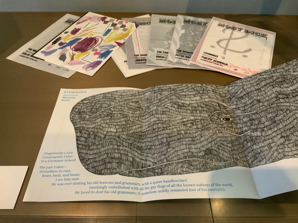
I first came across the artist Moussa Kone after subscribing to Harpune Verlag’s Moby-Dick “Filets”. Each filet is a section or chapter of Herman Melville’s Moby-Dick, The Whale (1851), which has been assigned to, or claimed by, an artist for illustration. About the time the subscription package arrived, the Bodleian Bibliographical Press announced the upcoming exhibition “Very Like a Whale”, for which artists were invited to create a print work in response to one of the eighty quotations making up the section “Extracts” prefacing Moby-Dick (1851). The Moby-Dick ”Filets” piqued the nearby Bodleian curators’ curiosity, so a loan was offered before I had opened and sorted through the catch. Moussa Kone’s handling of “Etymology”, which happens to precede “Extracts” in the novel, was selected and displayed prominently. And that is how I discovered this catch within the catch.

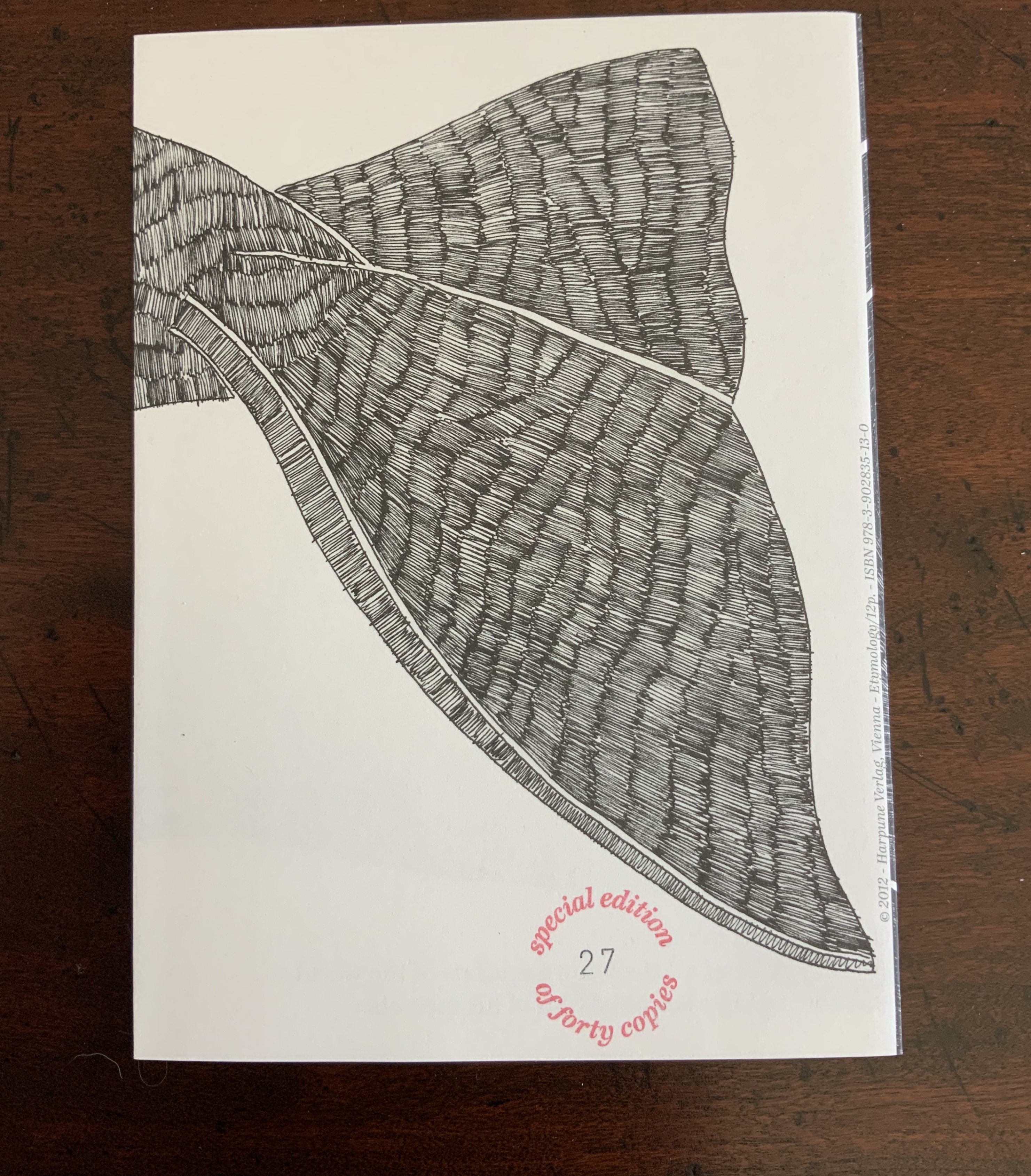
“Etymology”, Moby-Dick “Filets” (2012)

“Etymology”, Moby-Dick ”Filets” (Harpune Verlag, 2012)
Illustrated by Moussa Kone
Leporello in an edition of 460 numbered copies. Special edition of 40, of which this is #27, signed by the artist and including parts of the original drawing. Closed: H200 x W150 mm; open: H200 x W710 mm; 16 panels. Acquired from the artist, 11 December 2019.

Note the reflections of the whaler Pequod, Ahab’s chase boat, Ahab himself and the descending harpoon all caught in the corner of the whale’s eye. Being on the front cover, they are the most prominent of several telling details, two others being the selection of ocean-blue ink for the etymological terms through which the whale swims and the whale’s length extending over both sides of the leporello. The inventiveness to which the accordion, concertina or leporello structure lends itself seems endless.

The Abecedarium of the Artist’s Death: 26 Dangers for Your Career (2014)
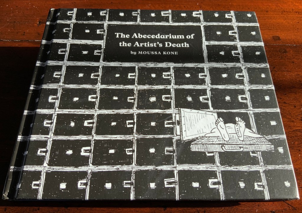
The Abecedarium of the Artist’s Death: 26 Dangers for Your Career (Verlag für moderne Kunst, 2014)
Moussa Kone
Hardcover, thread-bound, register-cut; layout by Martin Wunderer; 56 pages, 26 illustrations by Moussa Kone.
H145 x W170 mm. Acquired from the artist, 11 December 2019.
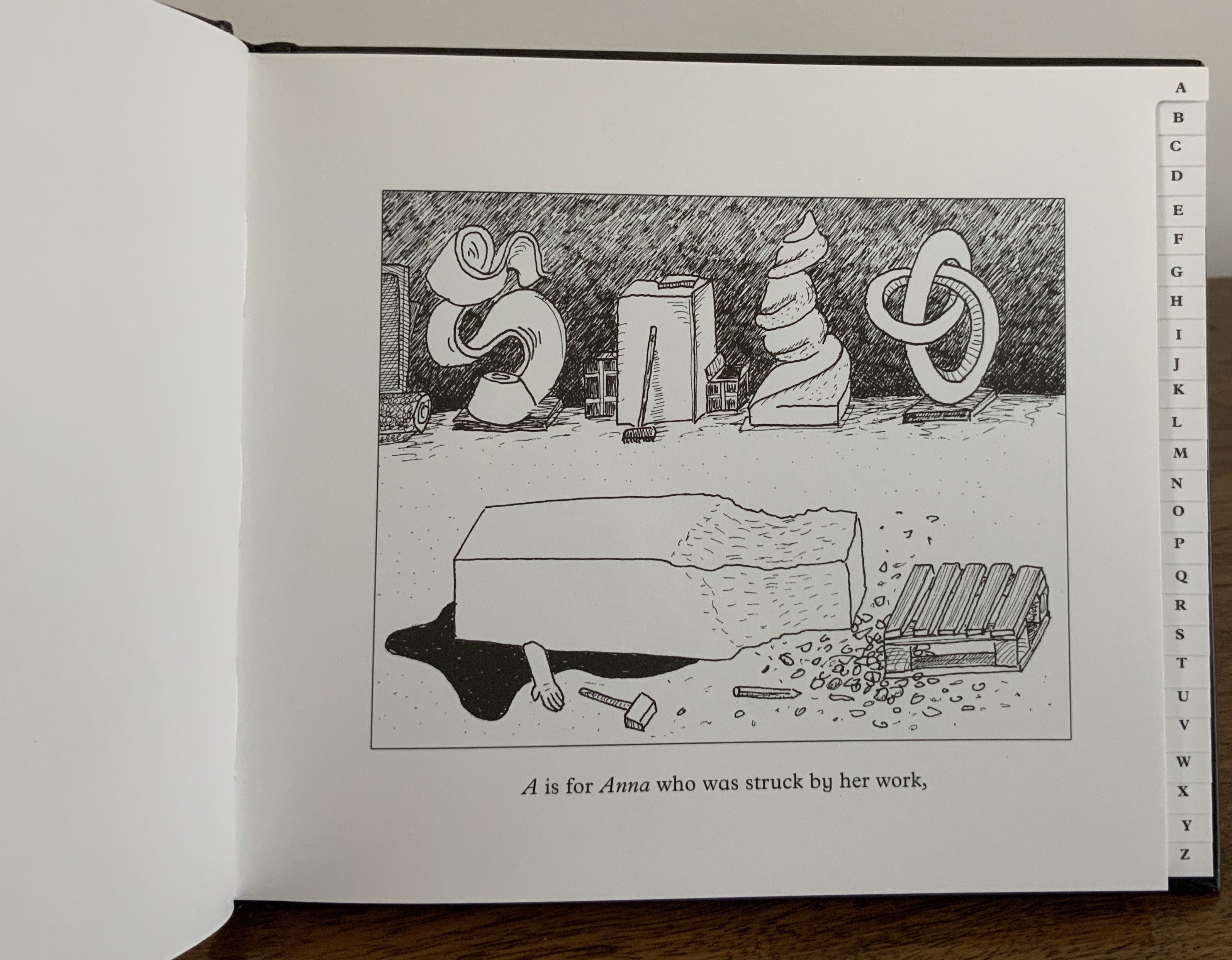
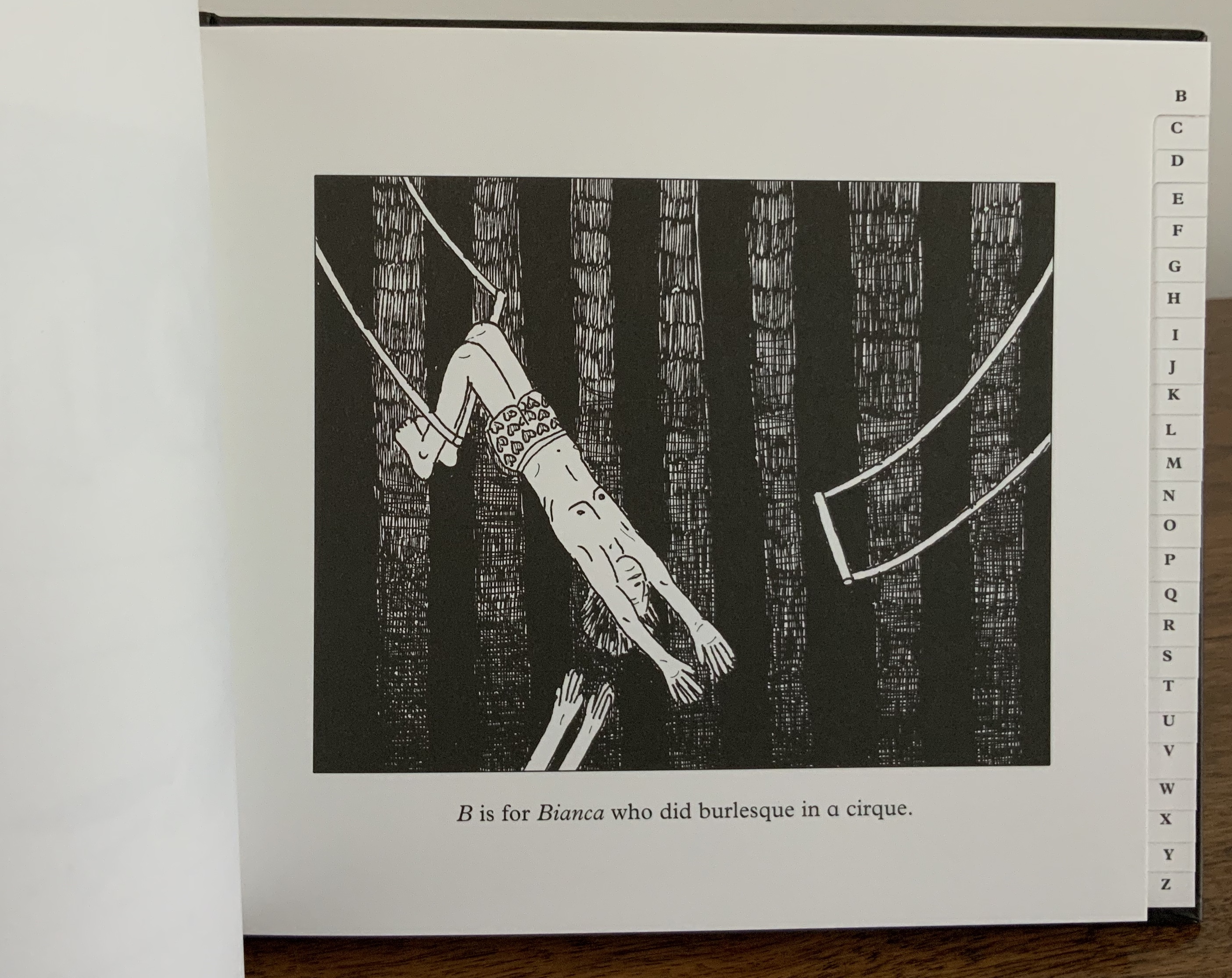
An abecedary seems to be de rigueur for book artists. The usual accompanying humor and puns of book art manifest themselves here not only in the illustrations paying homage to Edward Gorey’s The Gashlycrumb Tinies but also in the structure of the little black address book and its alphabetic tabs.

Nowhere Land (2017)

Nowhere Land (2017)
Moussa Kone
Map, offset printed on both sides. H152 x W112 cm. Acquired from the artist, 11 December 2019.

Nowhere Land follows on from The Abecedarium deeper into the realm of the outré. It was shown in the group exhibition Constructing Paradise, curated by Dieter Buchhart and Mathias Kessler at the Austrian Cultural Forum in New York (ACFNY), 31 January – 24 April 2017. The ACFNY’s announcement reads:

Constructing Paradise exhibits contemporary reinterpretations of notions of the “exotic” by artists based in Austria or the United States. Taking iconic artworks such as Paul Gauguin’s Noa Noa and Oskar Kokoschka’s Tiger Cat as starting points, the show assembles a diverse range of work from early contemporary to more recent artistic responses to the modernist imprint of desire and fantasy on contemporary culture. Particularly when juxta­posed with hyperbolized images of modern-day advertising, the exhibition explores the psychological impacts of the modernist image on image culture and the Western psyche. 

Photo: Courtesy of the artist.

Moussa Kone’s entry took the form of a Panoramic Map for tourists and was distributed among the exhibition visitors. The artist’s description is too arch and funny to paraphrase:

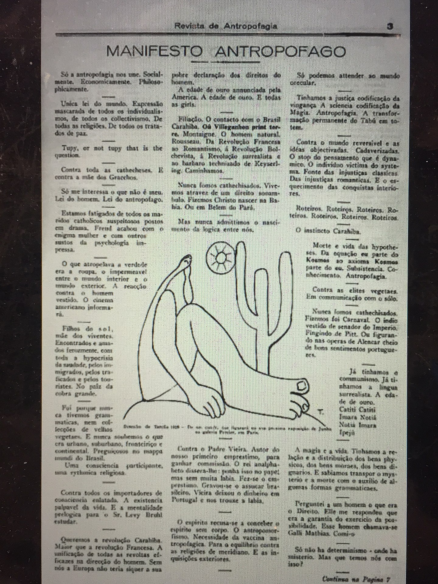
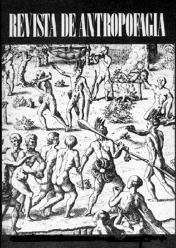
A nautical chart leads the reader to an island, where art historic images of the Brazilian Tupi people are combined with stills from 1980s Italian cannibal movies. It was the poet Oswald de Andrade, who declared in 1928 in his famous “Manifesto Antropófago” (Cannibal Manifest) a strategy of getting rid of the colonizer’s culture in Brazil through an exotic practice that was long attributed to the indigenous people. 
Left: Image of the Brazilian coastline from Maranhão to the Rio de Prata, from the “Miller Atlas,” created in 1519 and currently in the French National Library in Paris. — Brazil: Five Centuries of Change (Brown University, 2010~). Accessed 14 May 2020. Center: Oswald de Andrade, “Manifesto Antropófago”, Revista de Antropofagia, 1928, p. 3. Accessed 17 May 2020. Right: cover, Revista de Antropofagia, Ubuweb. Accessed 17 May 2020.

The map‘s exuberance shares more with the satire of De Andrade and Swift than with the gratuitous violence of Ruggero Deodato’s cannibal films or that of their 21st century offspring.

Eine Naht aus Licht und Schwarz (2018)
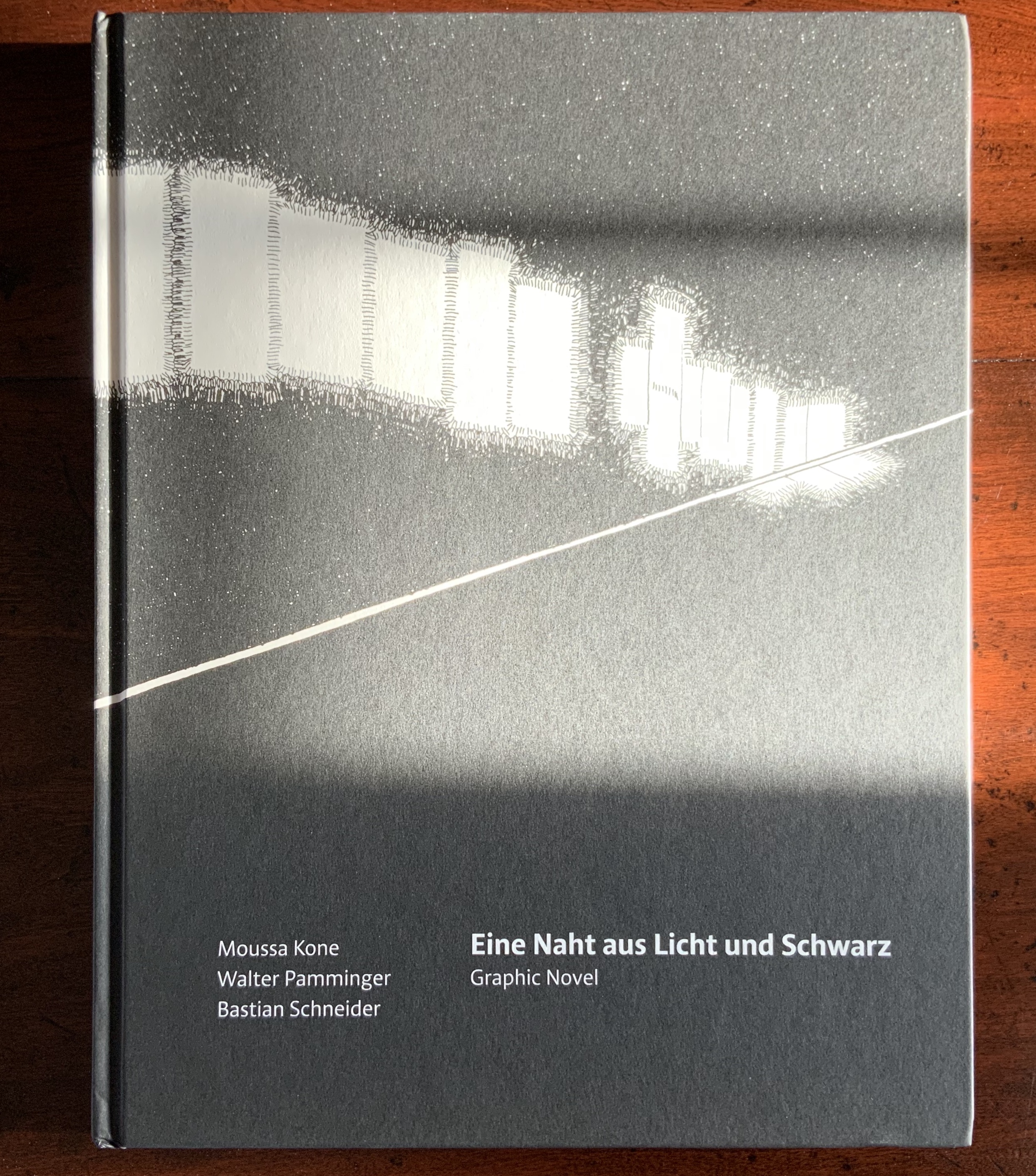
Eine Naht aus Licht und Schwarz (Sonderzahl Verlagsgesellschaft, 2018)
Moussa Kone, illustrations; Walter Pamminger, concept; Bastian Schneider, text; Wolfgang Homola, graphic design. Hardcover, sewn; 96 pages, 176 illustrations.
H303 x W235 mm. Acquired from the artist, 11 December 2019.

Although the creation of Eine Naht aus Licht und Schwarz (“A Seam of Light and Black”) was a collaborative effort, it originates in Kone’s experience working at the Albertina Museum in Vienna. He writes:

I was working there mainly at night and responsible for events, which took place in the rented Habsburg State Rooms and the exhibition halls. The entire book concept with its order of the drawings in this form was developed by Walter Pamminger, the texts are written by author Bastian Schneider. Image 1 to image 176 show a typical closing tour through the museum at 3 a.m. After all the party people, the catering staff and guards were gone, I had to make my final round through the empty building. Lights were turned off partly, and I was alone in the Viennese palace, with the art, and the history of the spot. That’s the story of the book: a view on the Albertina museum, which started as a private collection of drawings; a view from the worker’s perspective, the lowest one in the hierarchy of the institution, and the unseen labour, which is a hidden part of the art world. — Moussa Kone, correspondence, 18 December 2019.

But Eine Naht is more than that.

Text and image are arranged in a fluid grid of panels. The recto page above displays the starting pattern that appears and changes across the novel’s subsequent double-page spreads, challenging us in classic book-art fashion to re-learn how to read a book.
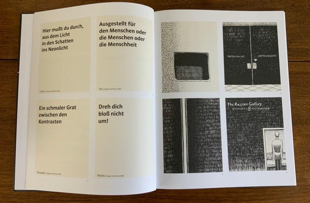
Panels 1-4 follow the opening diagram; four panels of text on the verso, with four panels of images correspondingly numbered on the recto.

On the verso, panels 5 and 6 shift to text then image; on the recto, the image in panel 5 corresponds to the text in panel 5 on the verso, and likewise the text in panel 6 on the recto corresponds to the image in panel 6 on the verso. Panels 7 and 8 follow the same pattern.
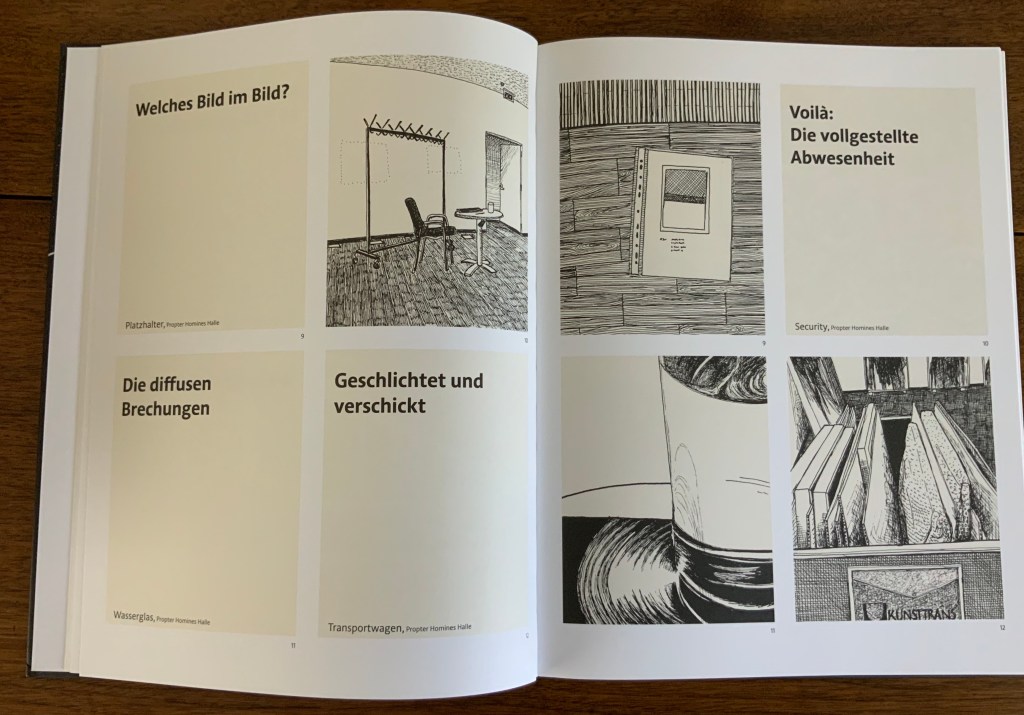
Here on the verso, panels 9 and 10 show text then image; on the recto, their corresponding panels run image then text. But panels 11 and 12 on the verso are both text; their corresponding panels of images appear across the gutter on the recto.

Again the pattern changes, with panels 13 and 14 both containing images, 15 and 16 containing text, and their matching panels of text and images mirrored on the recto.

The strong tendency to read a single page from left to right and downwards relents after a few sets of double-page spreads, but the change-ability of the back-and-forth between verso and recto requires a longer adjustment. Completely fluent adjustment would be hard to credit, but disorientation and the effort to concentrate, look harder and dwell on the relation between image and text becomes part of the atmosphere of the book. A partial translation into English exists online, which conveys the effect.

Kone’s range — from the intricacy of “Etymology” to the slapstick of The Abecedarium and Nowhere Land to a blend of conceptualism, self-reflexive book art and a twilight melancholy atmosphere in Eine Naht — makes his work an welcome addition to the collection.

Further Reading

“ABCs”, Books On Books, 29 November 2015.

“‘Very Like a Whale’ — The Bodleian Bibliographical Press’s Exhibition”, Books On Books, 24 November 2019.

Kone, Moussa and Walter Pamminger and Bastian Schneider. Trans. Verena Aschbacher. “A Seam of Light and Black“, Words Without Borders: An Online Magazine for International Literature, February 2020. Accessed 17 May 2020.
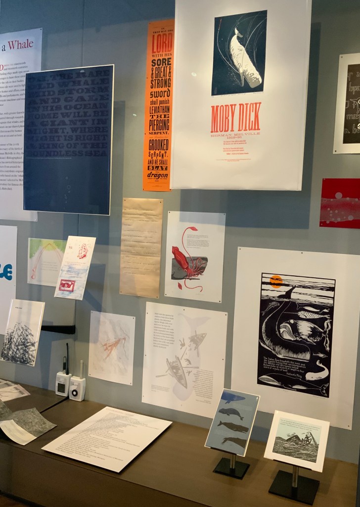
Bookmarking Book Art – “Very Like a Whale”, the Bodleian Bibliographical Press’s Exhibition

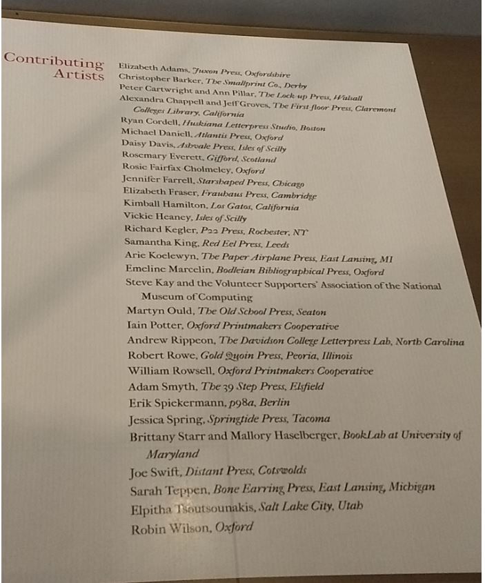
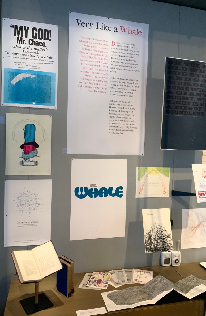
For the 200th anniversary of Herman Melville’s birth (1819), the Bodleian’s Bibliographical Press invited letterpress printers and artists to claim one of the eighty prefatory “Extracts” from Moby-Dick (1851) and create an artwork in response.

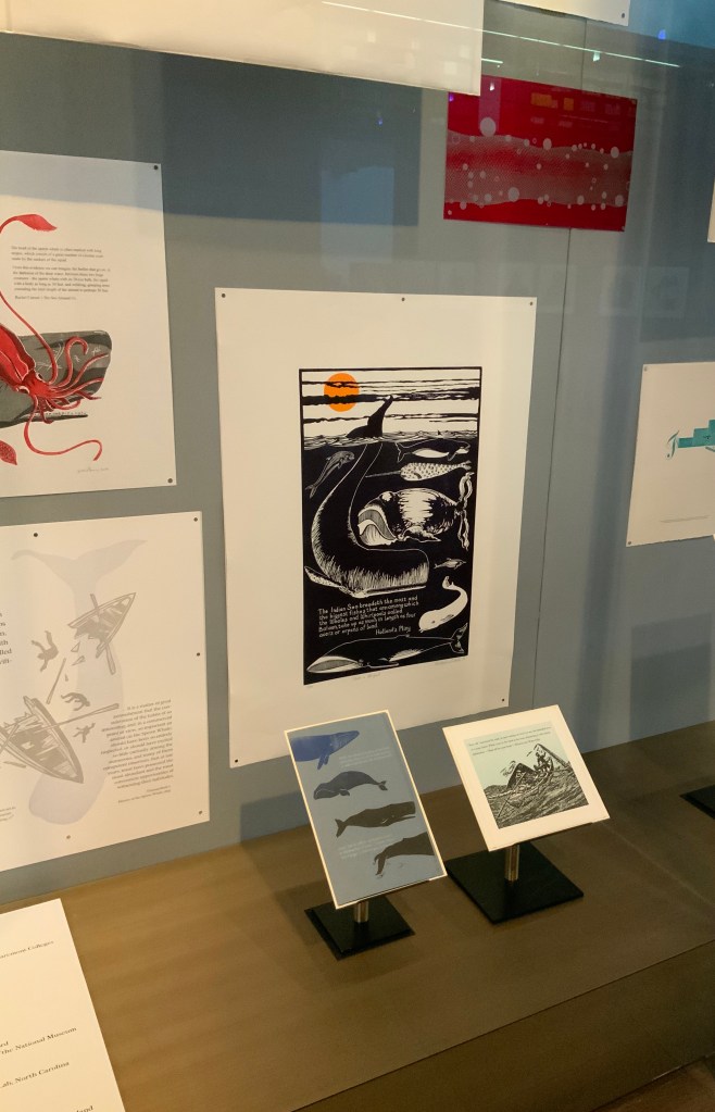
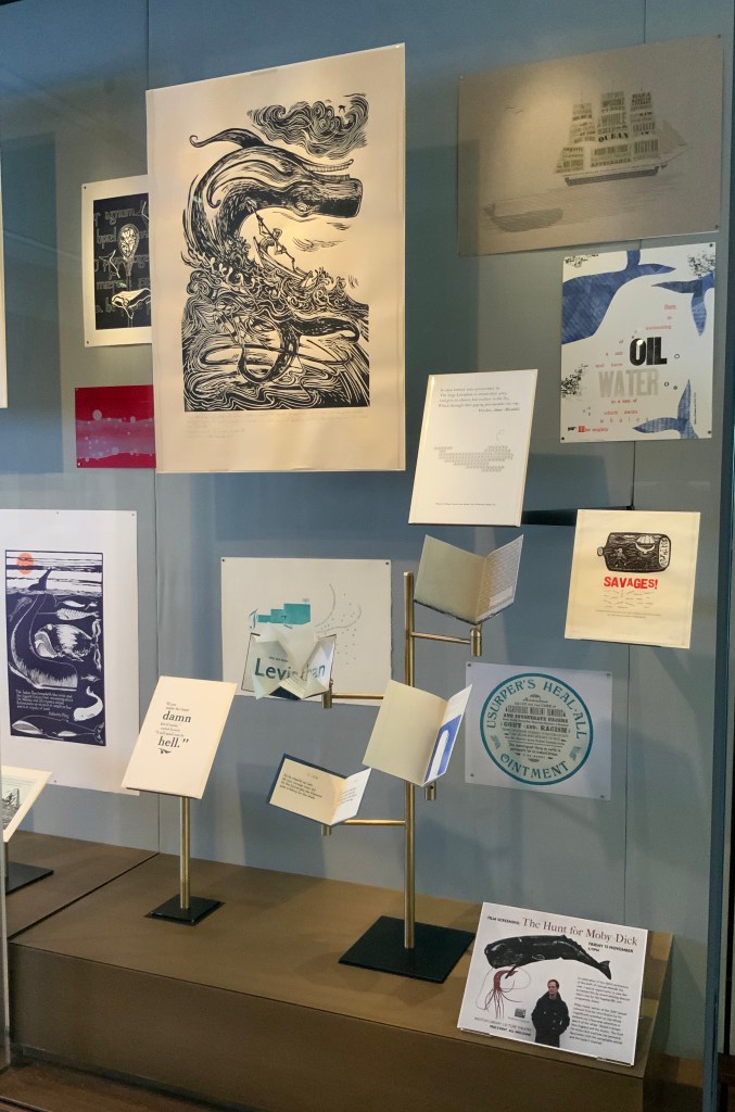
The Blackwell Hall exhibition case accommodates thirty of the eighty contributors‘ artworks, plus the rare three-volume version of the novel published by Richard Bentley in London as The Whale before Harper & Brothers issued it in November 1851 in New York as Moby-Dick; or, The Whale. Here are just four of the outstanding prints among the several artforms on display.

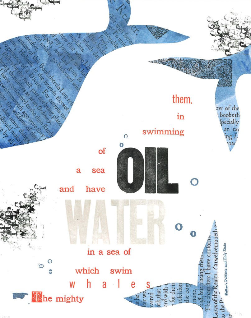
Extract 25:  ‘The mighty whales which swim in a sea of water, and have a sea of oil swimming in them.’ ─ Fuller’s Profane and Holy State
Brittany Starr and Mallory Haselberger, BookLab at University of Maryland
Mixed media (collage and letterpress). Printed on a Line-O-Scribe, Model 1411 on Strathmore printmaking paper using rubber and oil-based ink; includes Jenson, News Gothic and Bookman typefaces with Hamilton wood type.
Image courtesy of the Bibliographical Press and artists.

Notice how Starr and Haselberger integrate the verbal and visual to emphasise the seas of water/oil paradox that Melville plucked from his source. Like Melville’s hand, the artists’ manicule in the lower left points to the extract that reads/rises from the bottom to the top. Inside the shapes of whales around the extract appears the source of the extract (the verbal in the visual) against a seawater blue (another layer of the verbal in the visual). The letters “o” and “f” evoke bubbles and currents (the verbal for the visual). The words “oil” and “water” in contrasting inks but composed in the same typeface loom large at the heart of the artists’ embodiment of this paradoxical extract. (It is an insider’s paradox that the work surfaces from the BookLab, devoted to exploring the oil-and-water mix of the material and the digital.)

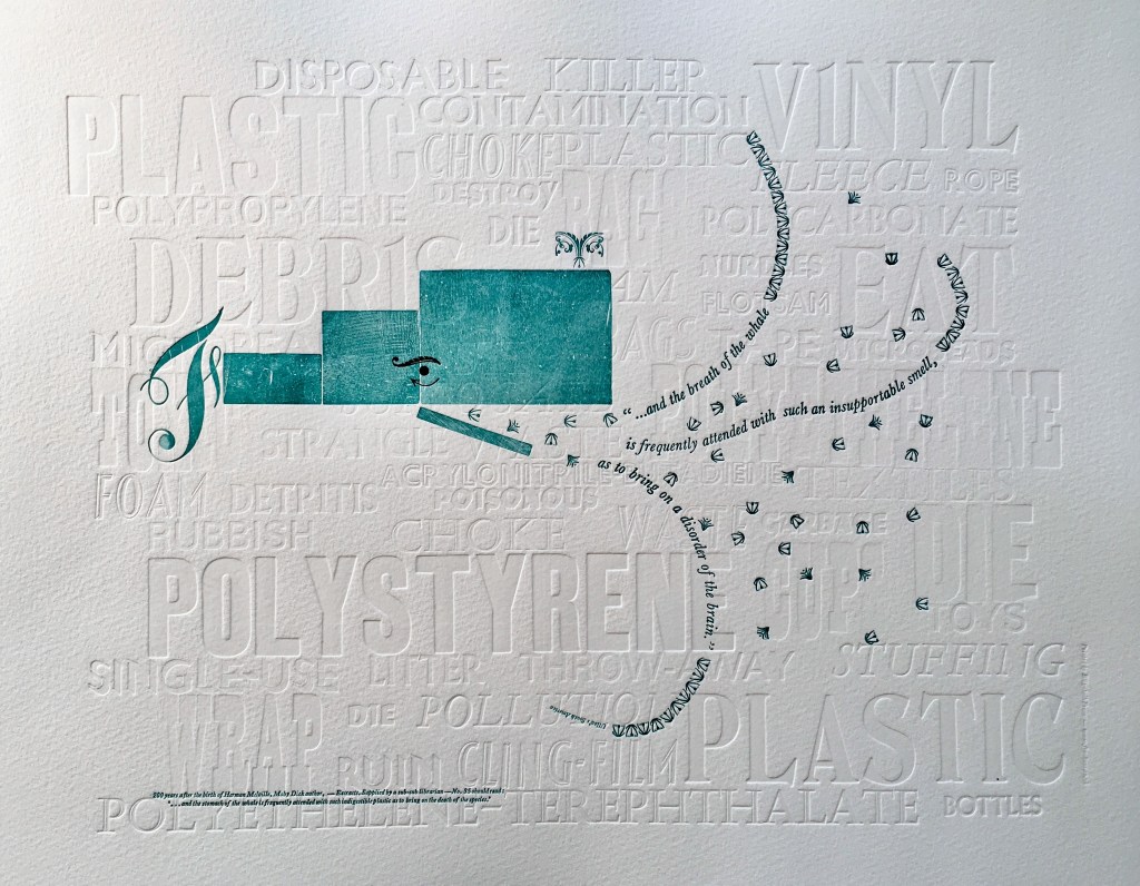
Extract 35:  ‘*  *  *  *  *  and the breath of the whale is frequently attended with such an insupportable smell, as to bring on a disorder of the brain.’ ─ Ulloa’s South America
Elizabeth Fraser, Frauhaus Press, Cambridge
Handset letterpress. Blind deboss using wood and metal type. Whale created from face and back of woodtype with ornaments for eye and spout. Text 12pt & 6pt Baskerville italic. Whale breath 12pt glint (Monotype B1309 & B1310). Printed on Somerset Velvet 300gsm soft white paper with a tabletop flatbed proofing press.

What attends the whale’s breath in Fraser’s print? The whale’s breath is the extract streaming into a sea of white blind-debossed words. That sea of human detritus is the source of the insupportable smell that attends the whale’s breath. The insupportable smell takes on “the whiteness of the whale”. The threatened whale takes on an environmental green. which Fraser creates with the non-verbal side of the woodtype. Even so, the carrier of the verbal makes up every visual aspect here, underscoring Fraser’s contemporary paradox: the insupportable smell disordering the brain has been brought on by the disordered brain of humankind.

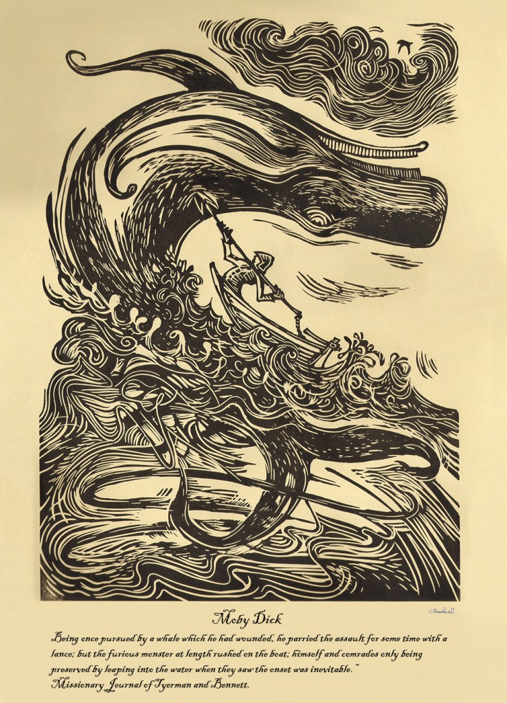
Extract 65:  ‘Being once pursued by a whale which he had wounded, he parried the assault for some time with a lance; but the furious monster at length rushed on the boat; himself and comrades only being preserved by leaping into the water when they saw the onset was inevitable.’ ─ Missionary Journal of Tyerman and Bennett
William Rowsell
Linocut on Japanese paper, printed on 1828 Albion press at the Oxford Printmakers Cooperative Workshop.
Image courtesy of the Bibliographical Press and artist. © William Rowsell

Rowsell’s linocut represents the more traditional entries in the exhibition. Capturing the furious struggle expressed in the extract, he locks whale, man, boat, sea, cloud and sky into a vigorous, swirling image on a paper and in a style that evoke the century in which Moby-Dick is set. As he pulled his prints from the 1828 Albion printing press, Rowsell might have wondered what the nine-year old Herman Melville was doing when hands were first laid on that Albion.

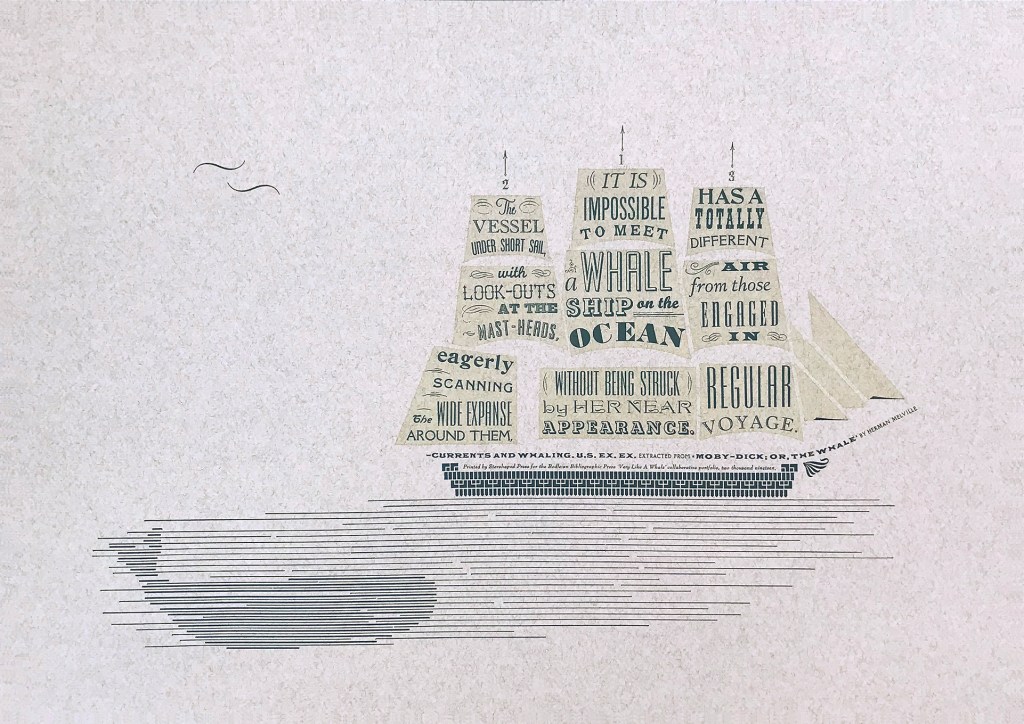
Extract 71,   ‘It is impossible to meet a whale-ship on the ocean without being struck by her near appearance. The vessel under short sail, with look-outs at the mast-heads, eagerly scanning the wide expanse around them, has a totally different air from those engaged in regular voyage.’ ─ Currents and Whaling. U.S. Ex. Ex.
Jennifer Farrell, Starshaped Press, Chicago
Letterpress: metal type + rule  linocut; Paper: Fabriano Tiziano printed on a Vandercook SP15.
Image courtesy of the Bibliographical Press and artist.

Starshaped Press is aptly named. Jennifer Farrell stars at wringing shapes from type and its surrounding furniture. The citation outlining the upper deck and bowsprit runs gracefully and appropriately under the sails on which the extract appears in that variety of display faces characteristic of nineteenth century flyposts.

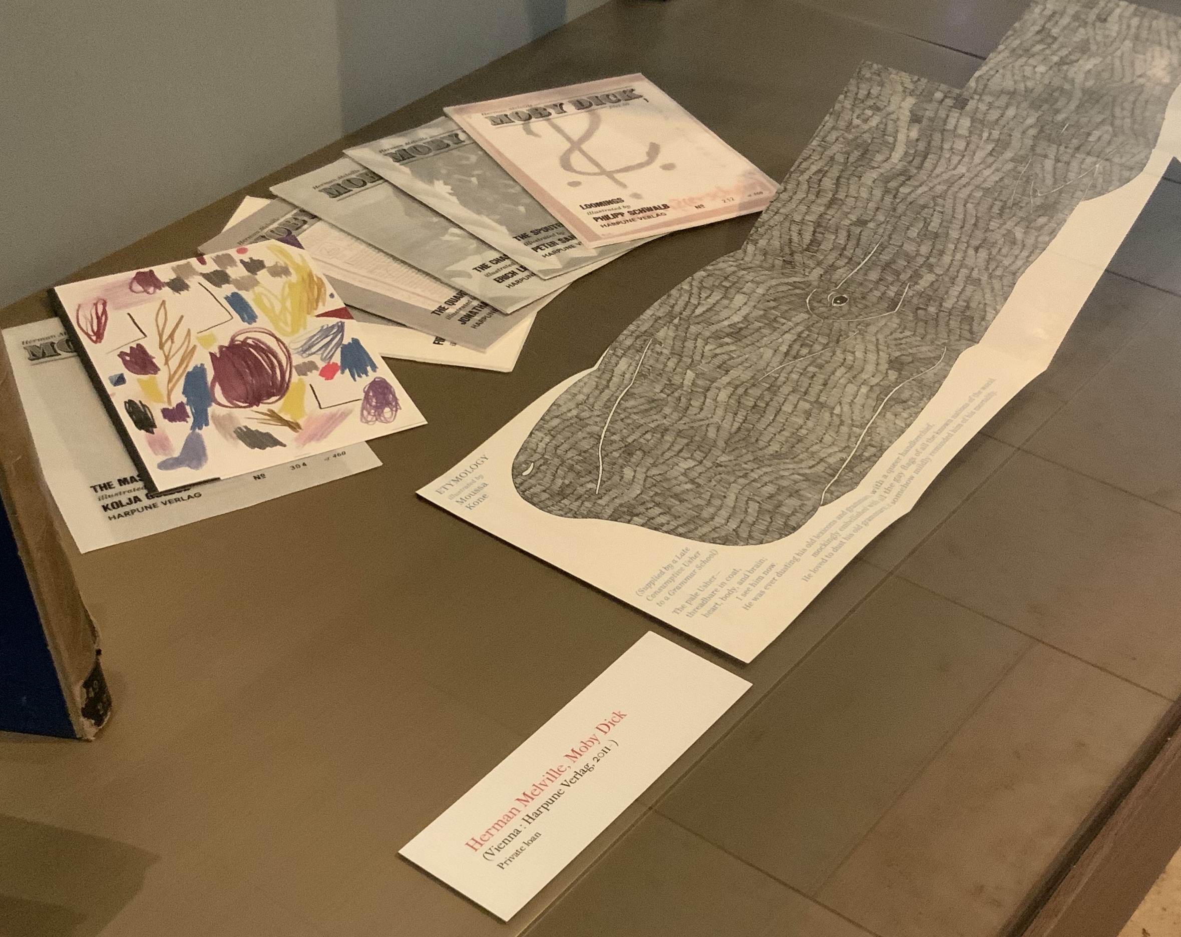
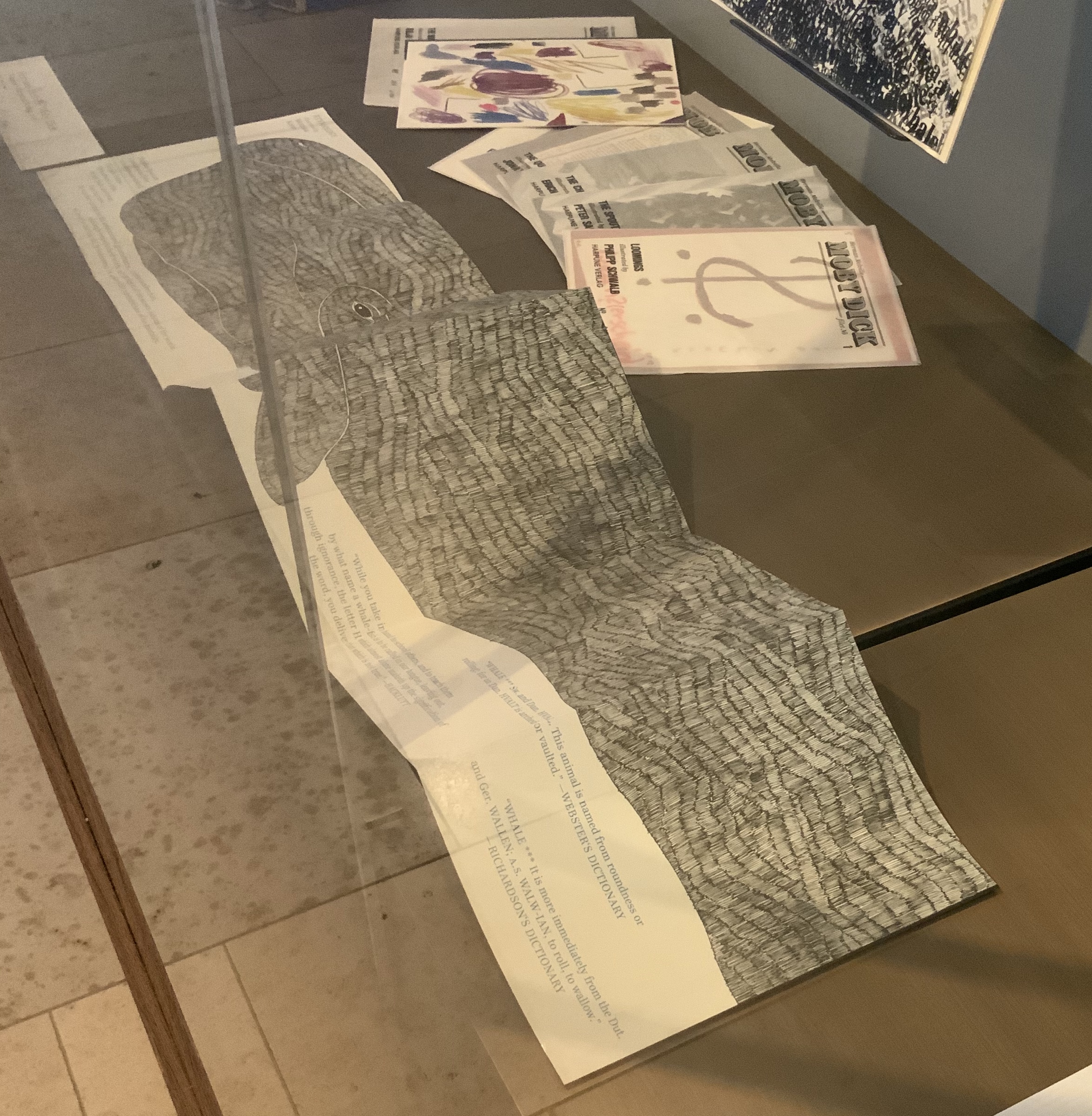
To round out the display with another multi-artist effort, the curators included Harpune Verlag’s Moby-Dick “Filets” (2011~). In 2011, Harpune Verlag Wien began publishing Melville’s masterpiece as a serialized subscription. To do justice to the book’s many voices, 136 different artists were invited, each to illustrate a chapter.

Etymology, Moby-Dick “filet” No. A (2012)
Moussa Kone
Leporello of 16 pages, 150 x 200 mm closed, 200 x 710 mm open.
Acquired from Harpune Verlag February 2019.

Published in non-chronological order at varying intervals and printed in a limited edition of 460 copies, 37 “filets” have appeared so far. At this rate, all of the filets may only be served up by the bicentennial of Moby-Dick’s publication! Fortunately for the Bibliographical Press’s display, Moussa Kone’s rendition of “Etymology”, the prefatory item preceding “Extracts”, is one of those already delivered. It makes a suitably lengthy and apropos link across cases.

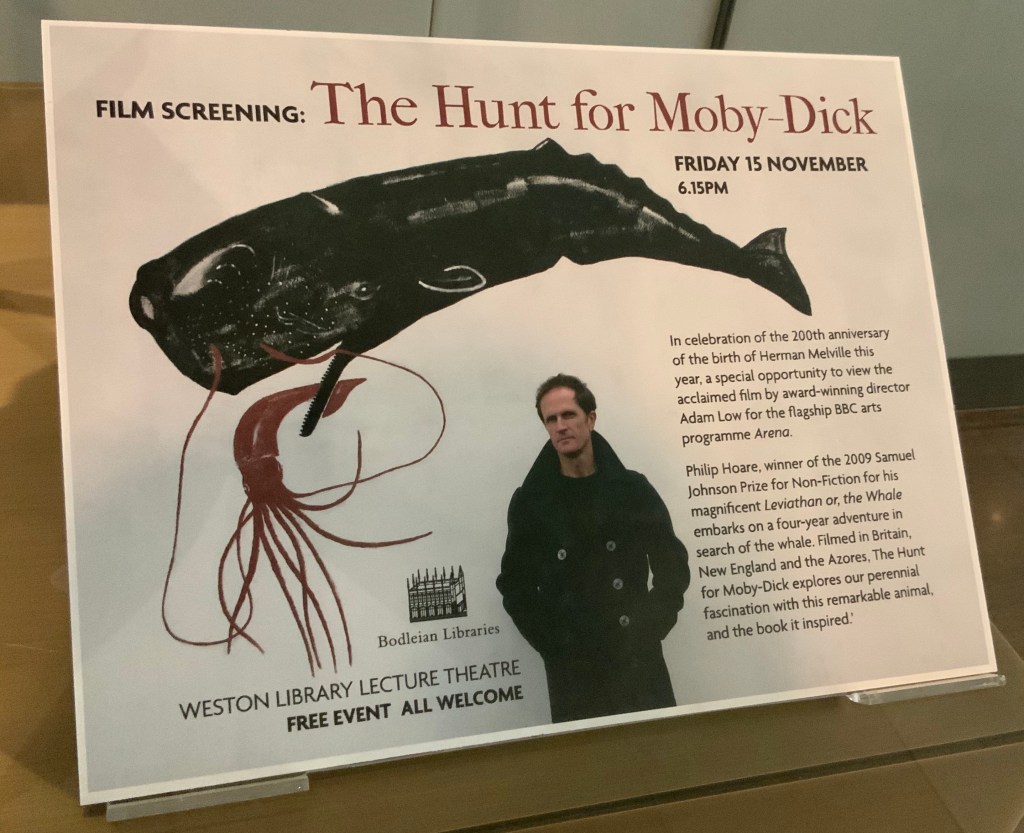
If, like Ishmael with “November in [his] soul”, you were walking down the damp, drizzly streets not of New Bedford but Oxford on the 15th this month, you might have substituted the Weston Library for The Spouter Inn. Inside, second copies of the remaining fifty “Extracts” submissions were on display in Blackwell Hall for viewing and handling after a screening of Philip Hoare’s The Hunt for Moby-Dick (2011). Ten years ago, Southampton-born Hoare won the 2009 BBC Samuel Johnson Prize for non-fiction for his book Leviathan, or the Whale. Hoare himself was on hand to introduce and take questions after the film.

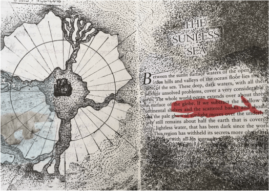
His lifelong passion for whales and Melville’s book is infectious and influential. UK book artist Chris Ruston traces her series of artist’s books Lost Voices — Whaling (2016-17) to Hoare’s Leviathan. Like Hoare’s work and many entries in “Very Like a Whale”, Ruston’s work challenges our anthropocene era. Hoare was also instrumental in organizing the Moby Dick Big Read (2012) — another multi-artist affair and effort to address the effects of the anthropocene era.

from Lost Voices — Whaling (2016-17)
Chris Ruston
Images courtesy of the artist.

Click on the screenshot to visit and listen to the Moby Dick Big Read.

The Big Read offers freely available readings of each chapter of the book. Individuals (well-known and unknown) contributed the readings, artists contributed artwork (viewable as thumbnails on the site), and the site offers an opportunity to donate to Whale and Dolphin Conservation (WDC).

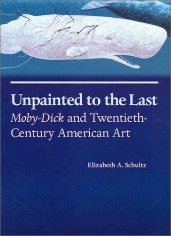
Hoare participated in another Melvillean documentary: David Shaerf’s Call Us Ishmael (2019). It is a multi-artist affair like the Big Read, Moby-Dick “Filets” and “Very Like a Whale”; includes a sighting of the New Bedford Whaling Museum’s annual days-long continuous reading of Moby-Dick; and features interviews with artists and other creatives inspired by Melville’s tale. One of those artists interviewed is Frank Stella. Uncanny, but Stella also appears in this book to be found in the Bodleian: Elizabeth Schultz’s Unpainted to the Last (1995).

From among the artists such as Ellsworth Kelly, Robert Motherwell, Jackson Pollock and others whom Schultz discusses, Stella serves best to tie off this fisherman’s tale and return to the title of the Bibliographical Press’s exhibition. About his Moby-Dick series of prints and metal-relief paintings to which he devoted a decade, Stella writes:

The idea of the wave and its various permutations is what drives this new series. Once I started on the wave shape, I saw it began to look like a whale — a combination of waves and whales. … The idea of the whale reminded me of “Moby Dick,” so I decided to go back and read the novel and the more I got into it, the more I thought it would be great to use the chapter headings of the novel for the titles of the pieces. — “1989 Previews from 36 Creative Artists,” New York Times, 1 January 1989, Sec. 2:1. Images here.

Indeed, “Very Like a Whale”, which runs until 5 January 2020. Admission free.

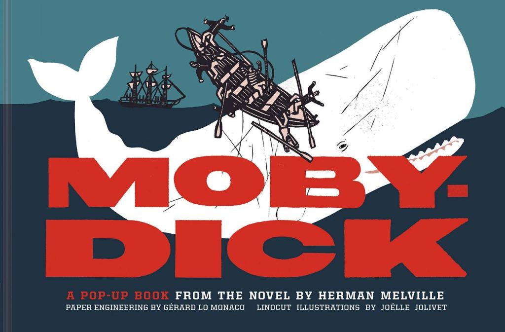
PPS And there is also celebratory Moby-Dick: A Pop-up Book from the Novel by Herman Melville (San Francisco: Chronicle Books, 2019). More to be seen here.