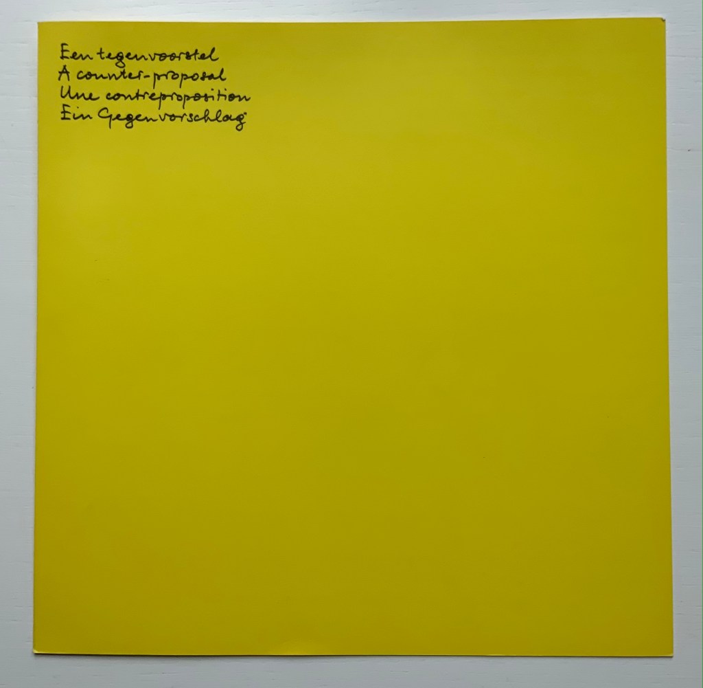
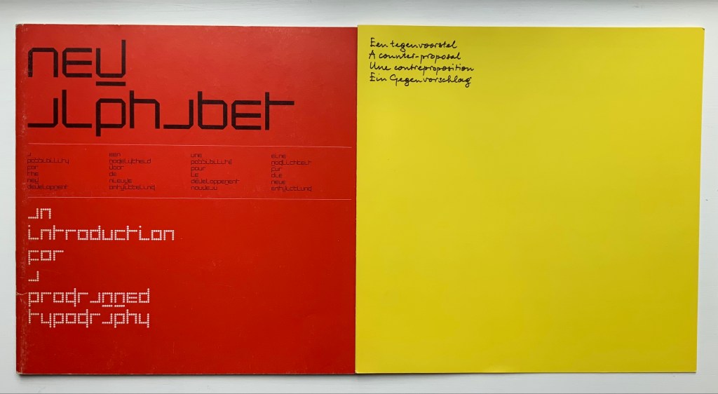
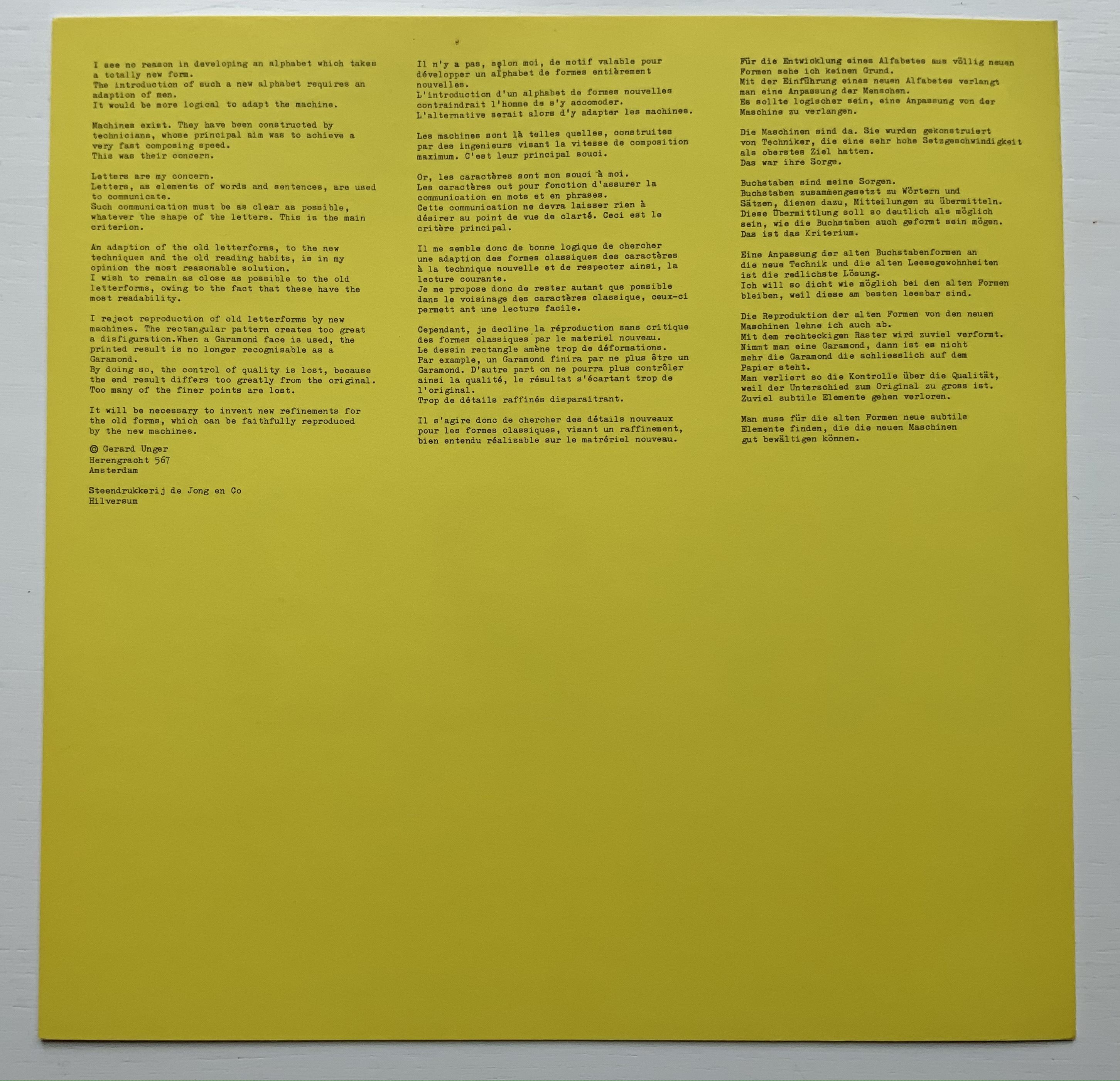
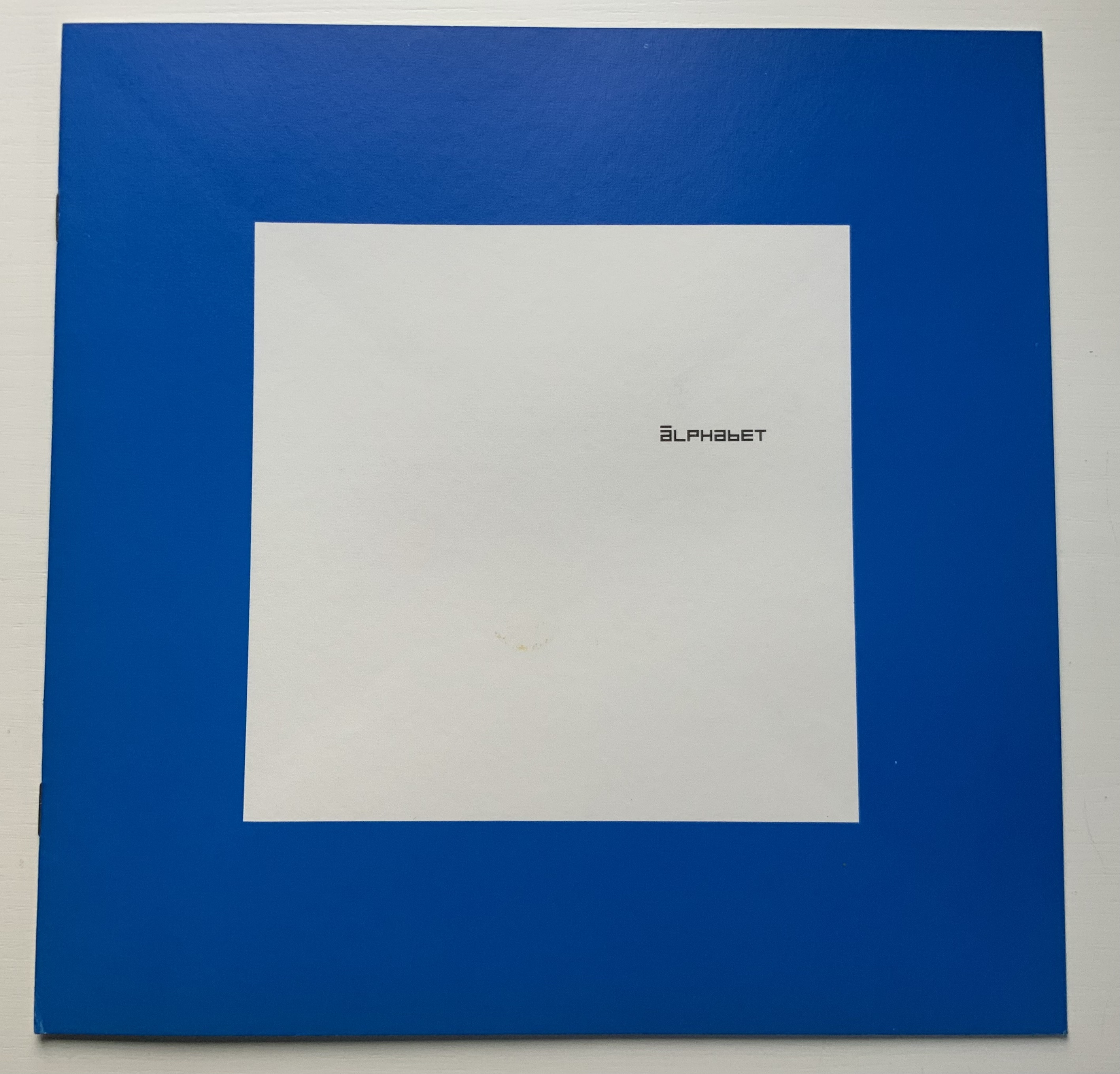
A few months after Pieter Brattinga issued Wim Crouwel‘s New Alphabet (below left), he followed up with this single-fold riposte from Gerard Unger, invited in fact by Crouwel.
Left: Crouwel. Right: Unger.
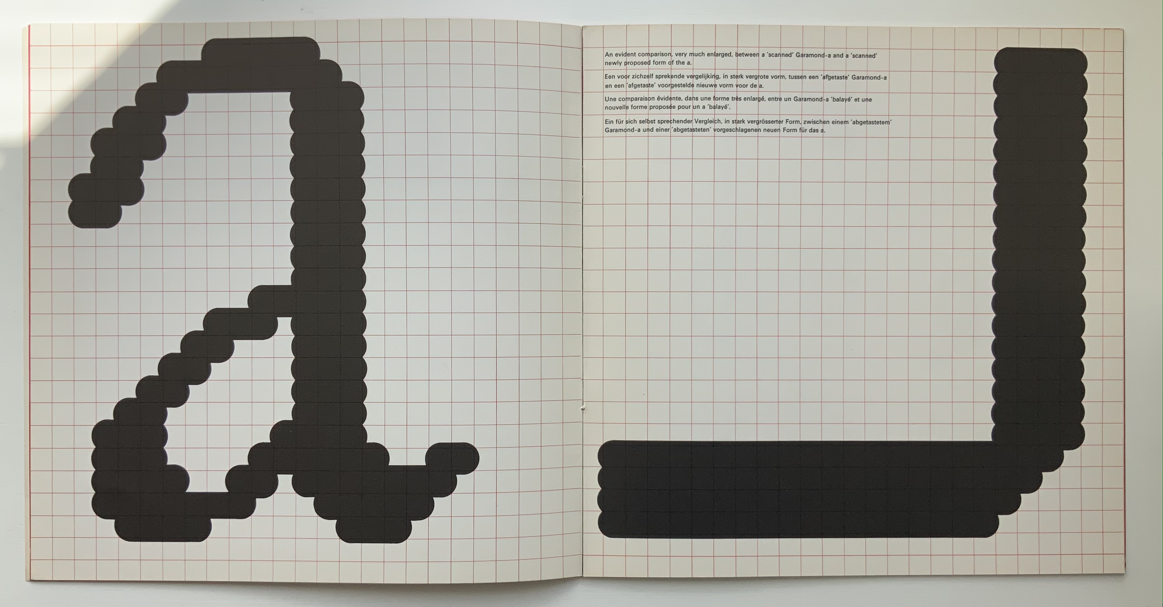
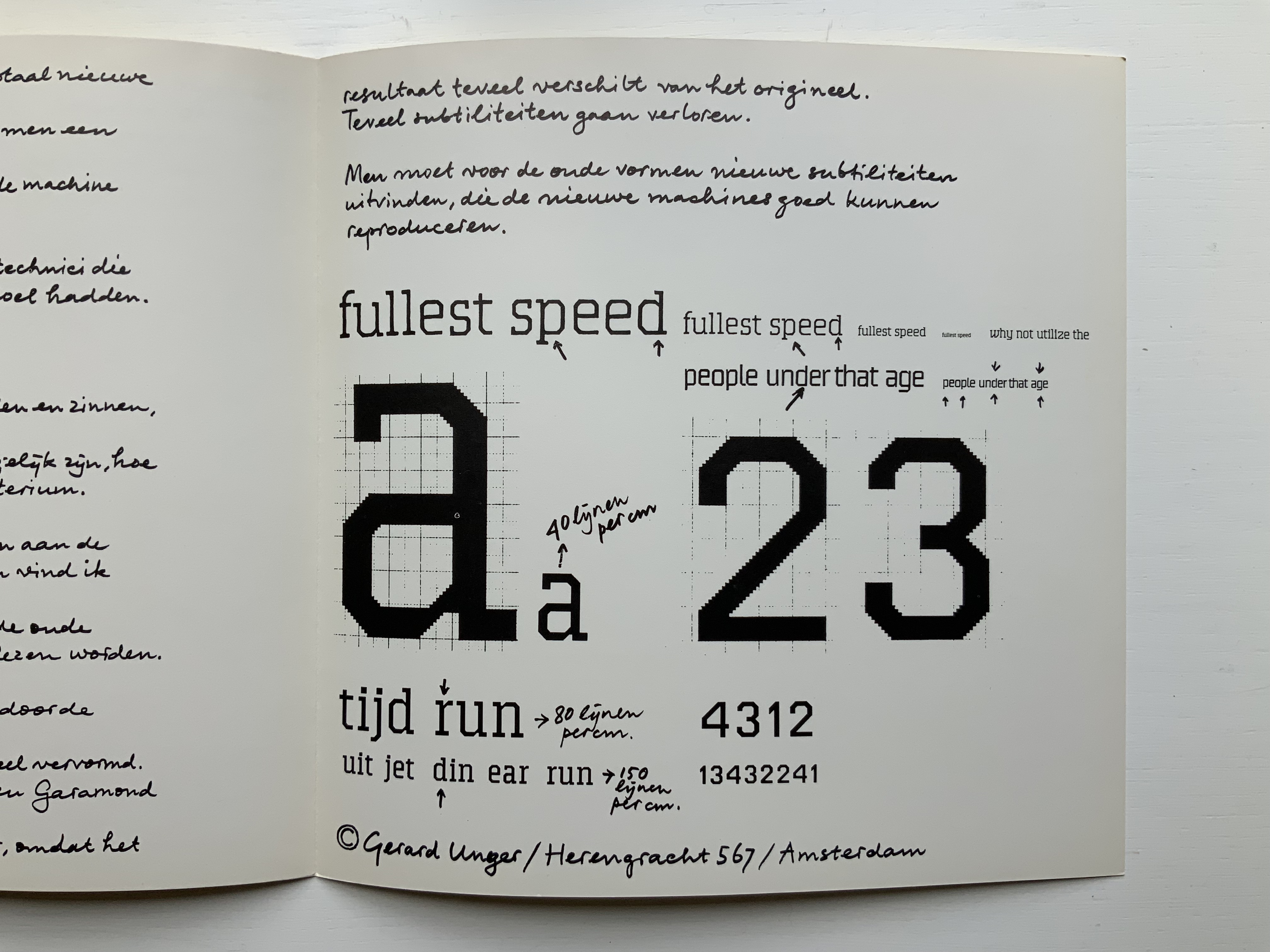
Unger urges designing or teaching machines to accommodate “human-readable” letterforms rather than inventing new fonts for machines. Given advances in digital type and artificial intelligence, Unger’s point may have been prescient, but there is still something to be said for the artistic stimulus of machine constraints.
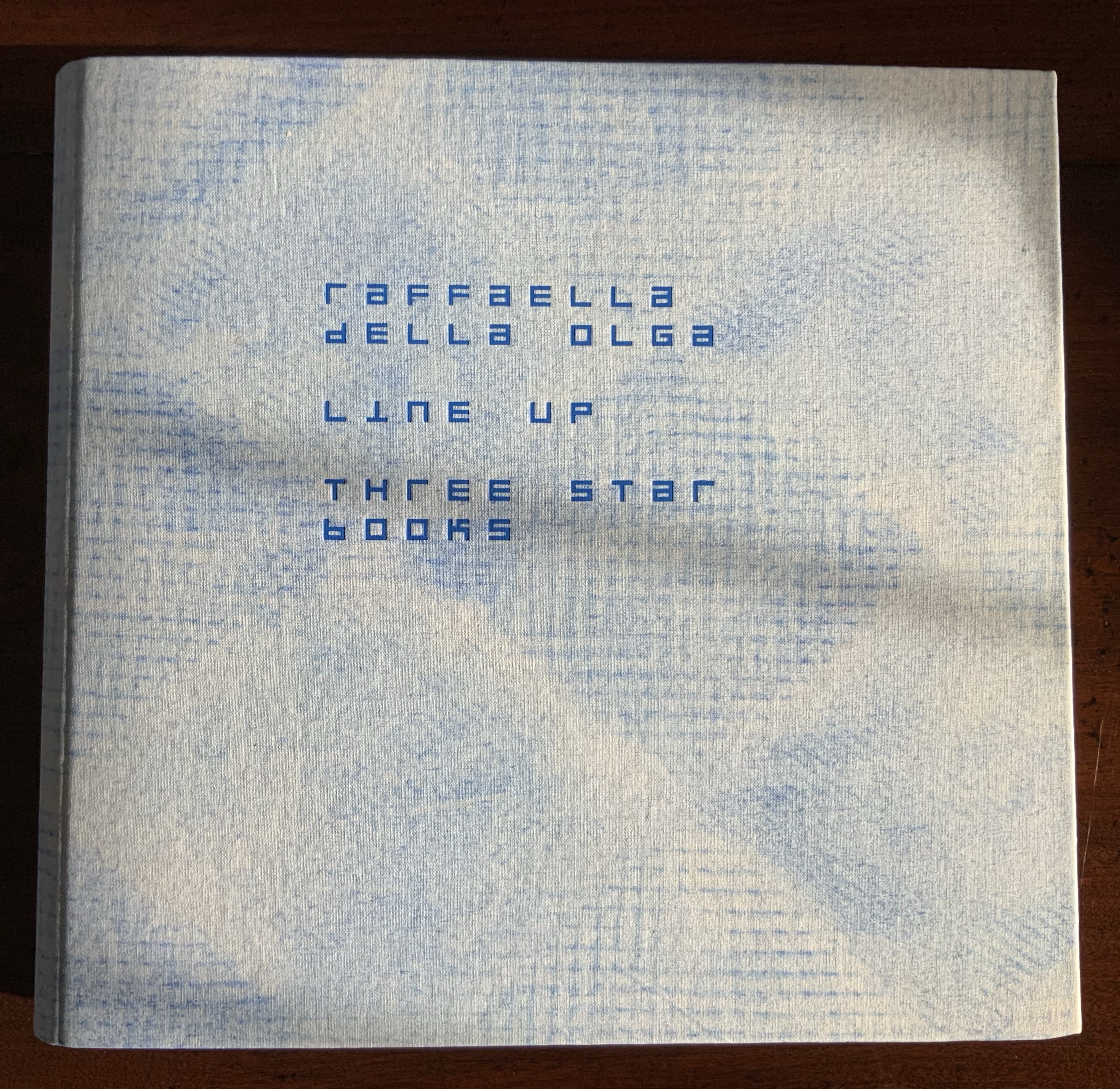
Brattinga extended the dialogue later to include Timothy Epps and Christopher Evans in 1970. If, as it did, the Epps/Evans alphabet led to LINE UP by Raffaella della Olga and Three Star Press, what other works of art have benefited from similar alphabetic and typographical dialogues?
Alphabet (1970), Timothy Epps and Christopher Evans; LINE UP (2020) Raffaella della Olga
Jeffrey Morin and Steven Ferlauto‘s Sacred Space (2003) has its roots in Ferlauto’s historical research into Roman capitals. Jennifer Farrell‘s The Well-Travelled Ampersand (2019) has its roots in the letterform and design thinking of Adrian Frutiger, Frederic Goudy, Dard Hunter, Edward Johnston and Russell Maret, among several others. Inclusion of source material like that by Crouwel, Epps and Evans, and Unger in the Collection offers paths to increased appreciation of those works of art inspired by them. Something for the future history of book art.
Isn’t it surprising that, given the greater frequency in human discourse of “yeah, but” over “yeah, and”, we can write “yeah, &”, but there is no logogram for “but”? No one can say that the last word has been said, written, printed or had about the ampersand. Someone will always be ready to append an & … but that has not stifled many an attempt. Apparently they have occurred every twenty years or so since 1936.
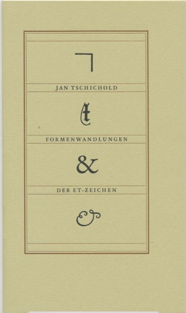
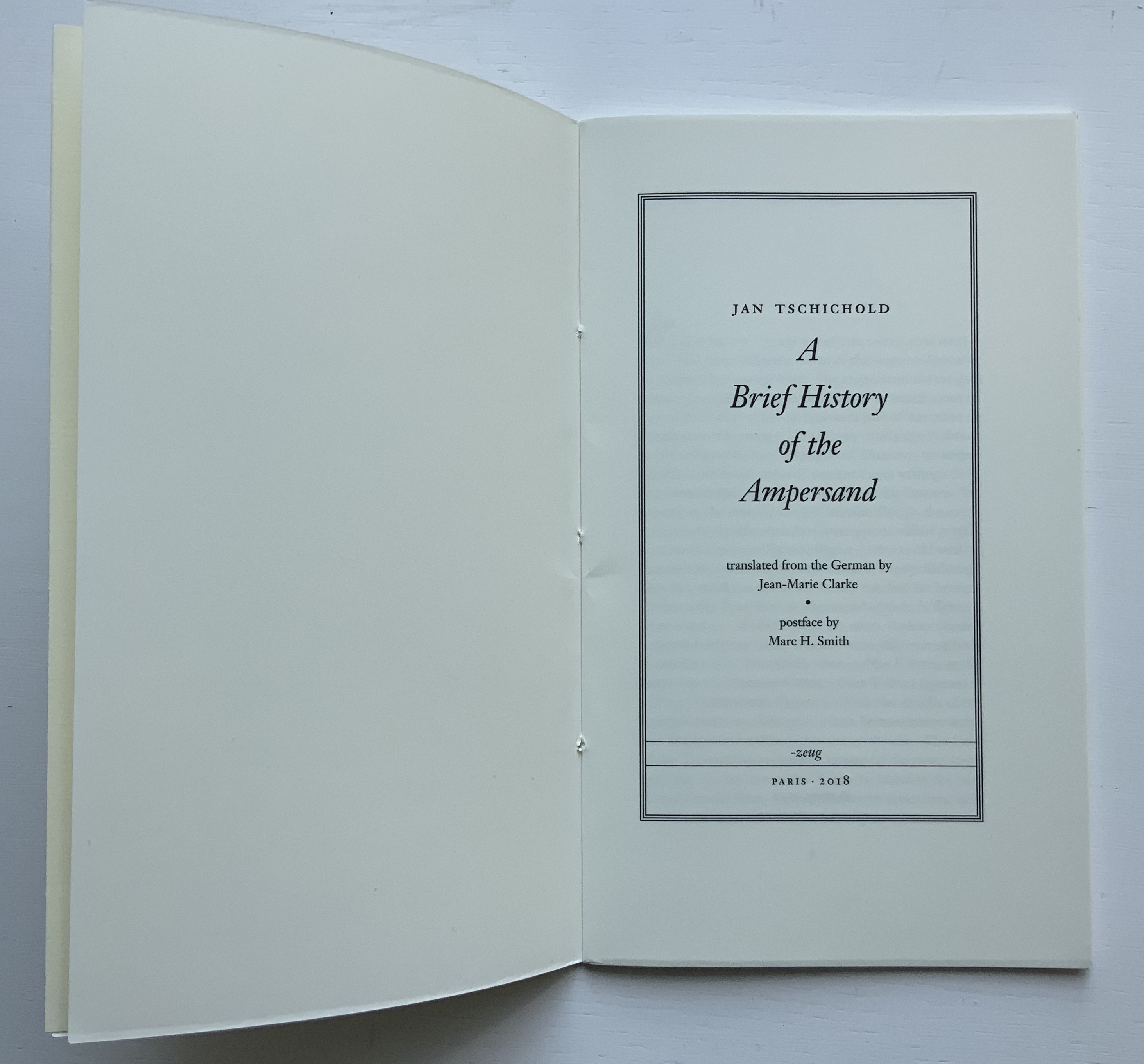
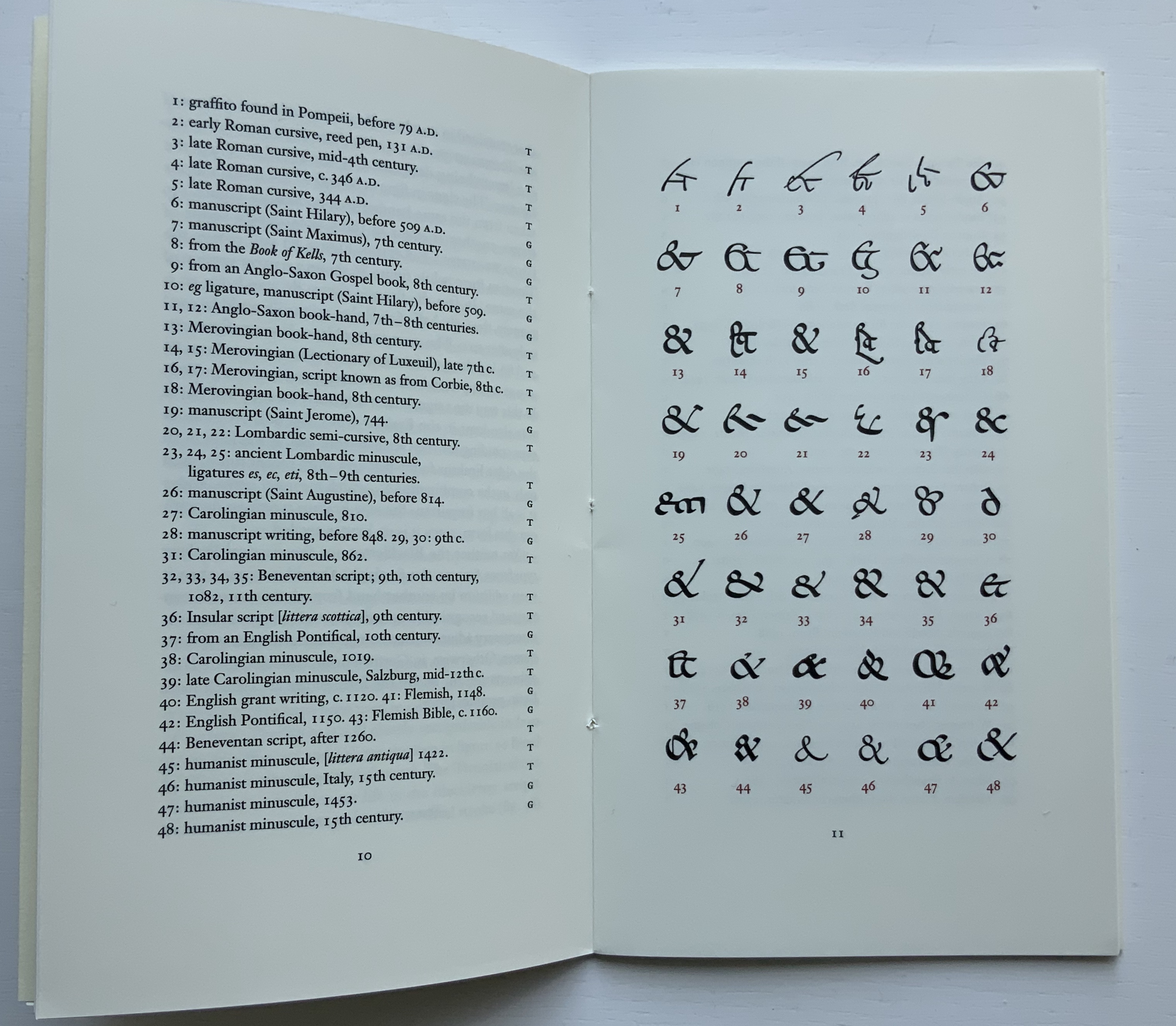
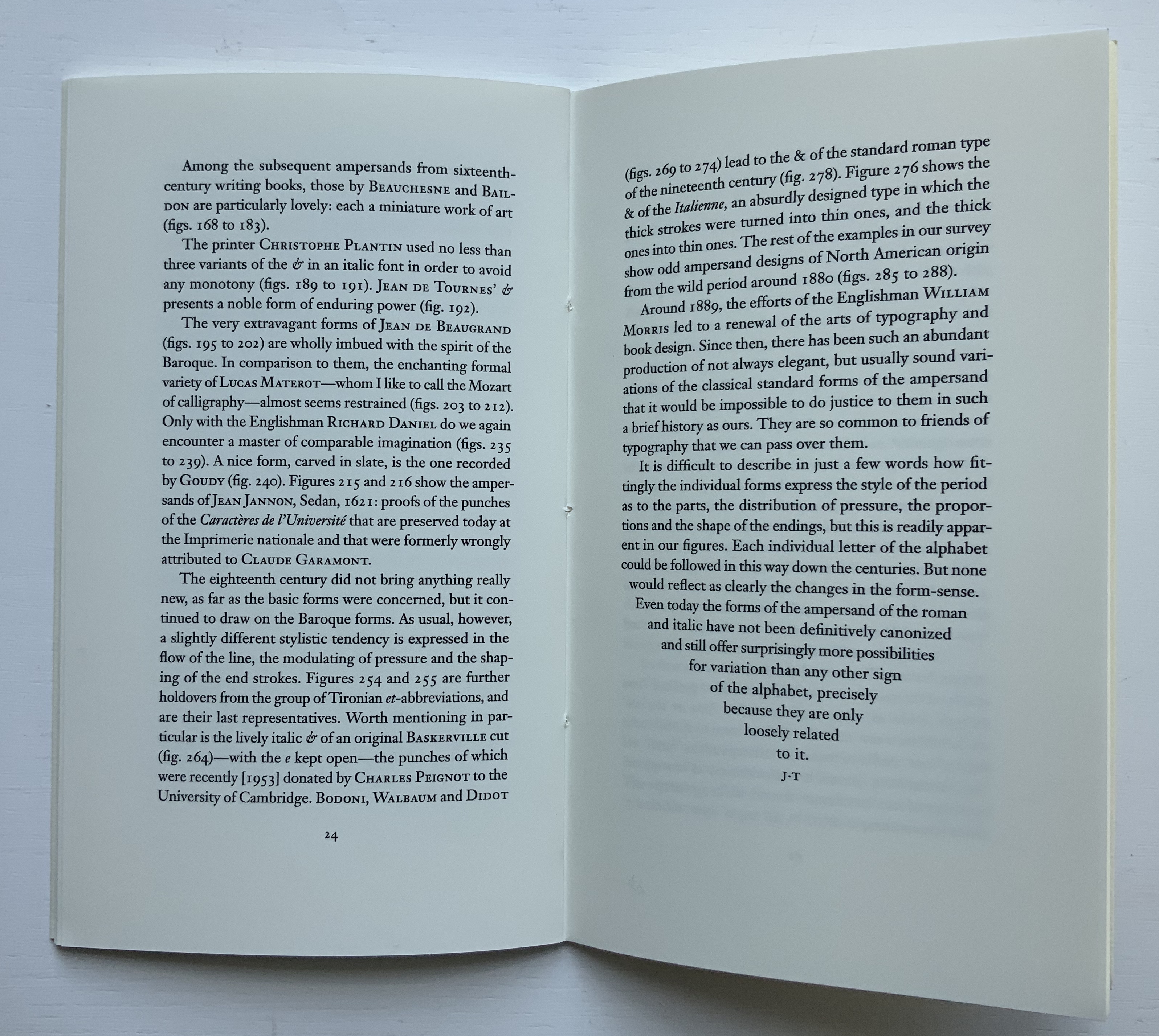
Some twenty years later along comes Jan Tschichold’s A Brief History of the Ampersand (1957), initially in German in 1953), which reproduced and updated Goudy’s set of examples and deepened the scholarship on the subject.
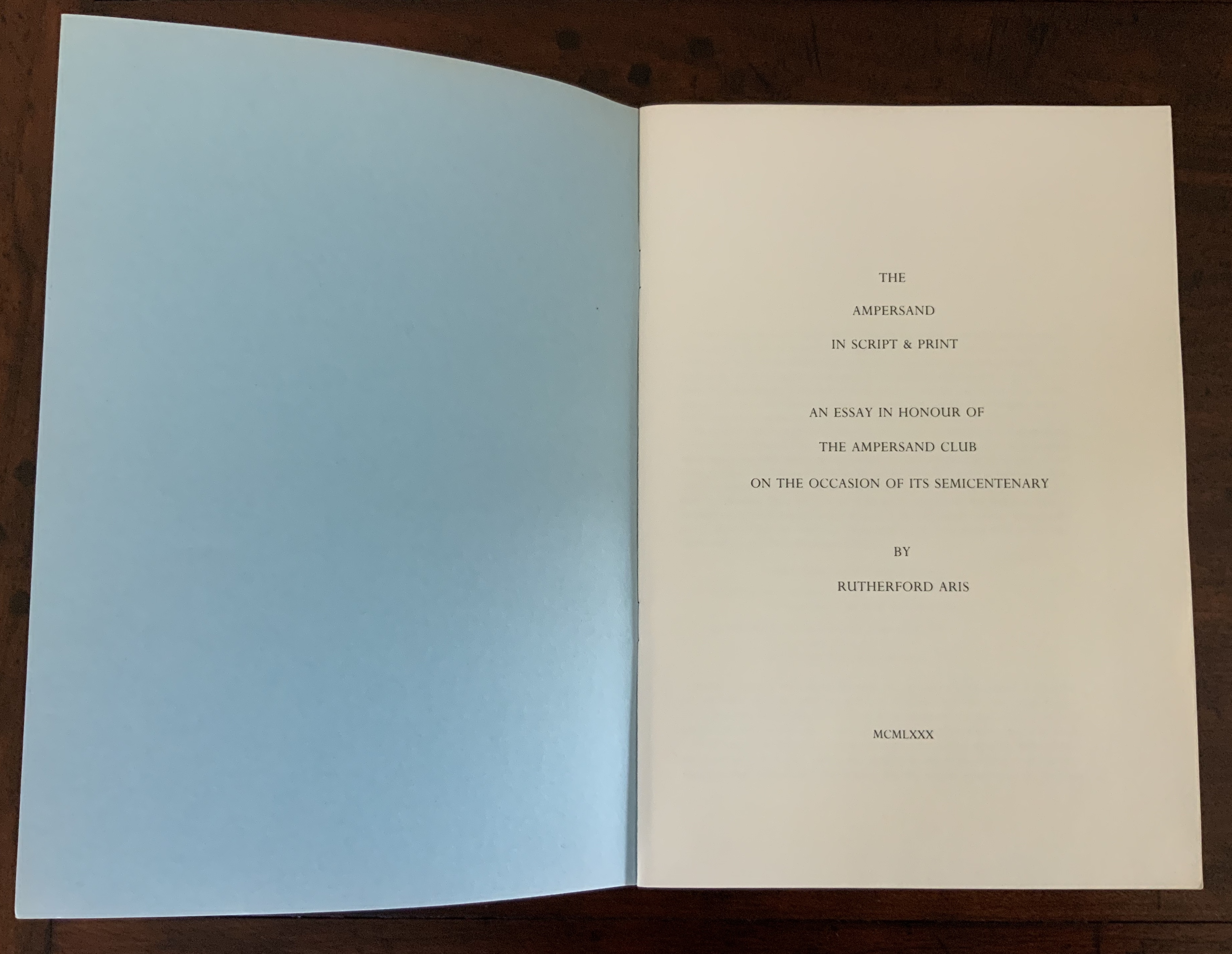
After Tschichold’s “last word”, The Ampersand Club (yes, there is one) invited one of its distinguished members — Rutherford Aris, Professor of Chemical Engineering (and Classics!) at the University of Minnesota — to attempt another “last word” in 1980.
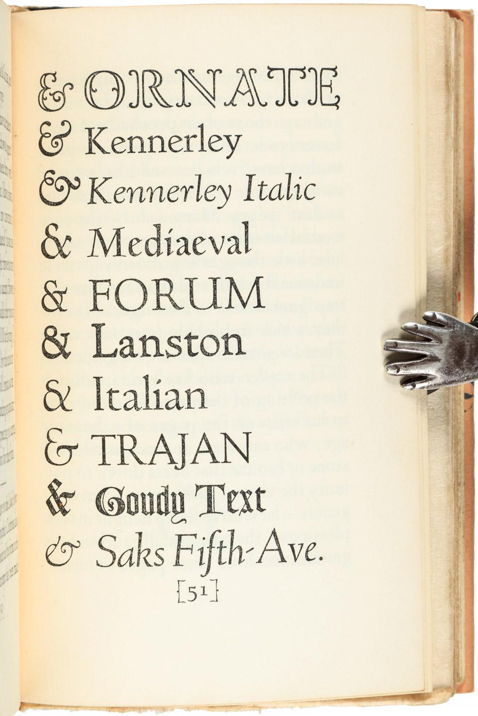
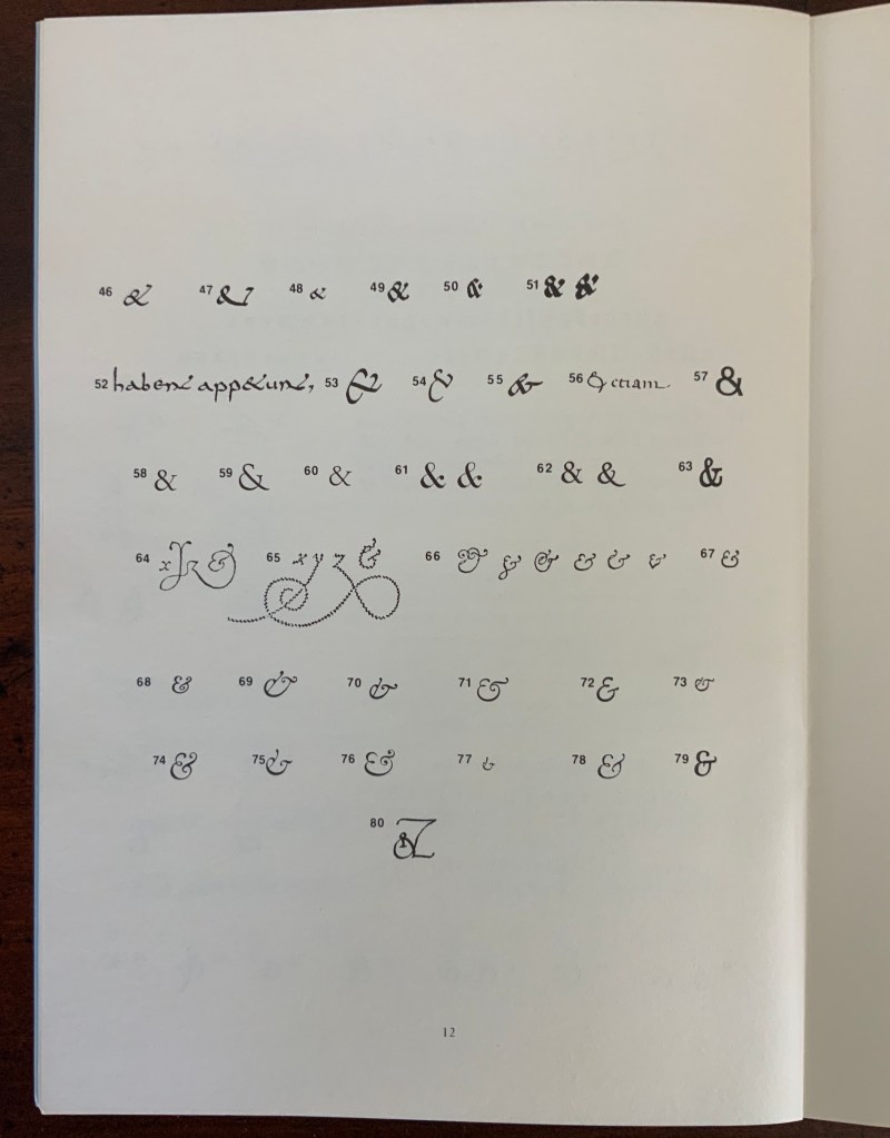
While there are a few publications falling around 1999/2000, nothing approaches the colophonic status of the Typophiles’, Tschichold’s or the Ampersanders’ efforts. It’s not as if ampersand aficionados were running out of &s. Consider Robert Slimbach’s Poetica™️ (1992), his family of type that boasts 62 different ampersands.
Robert Slimbach’s 62 ampersands in the Poetica™️ family
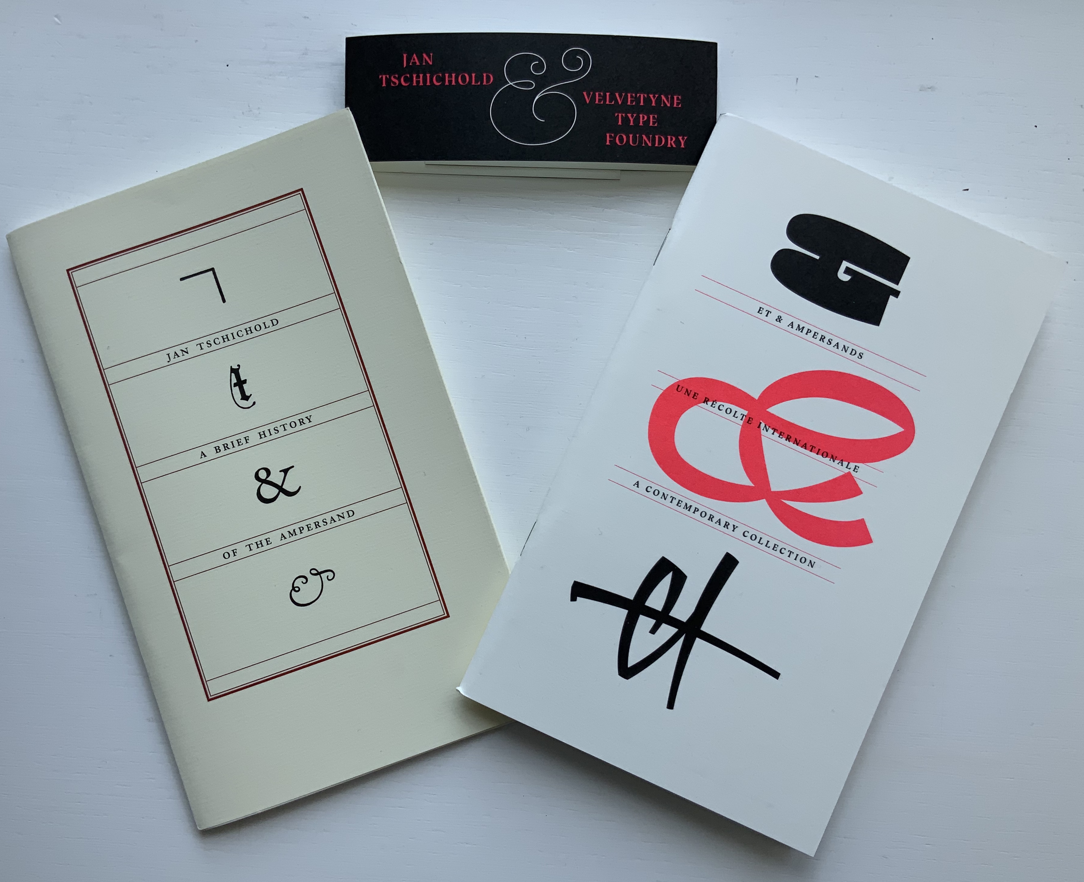
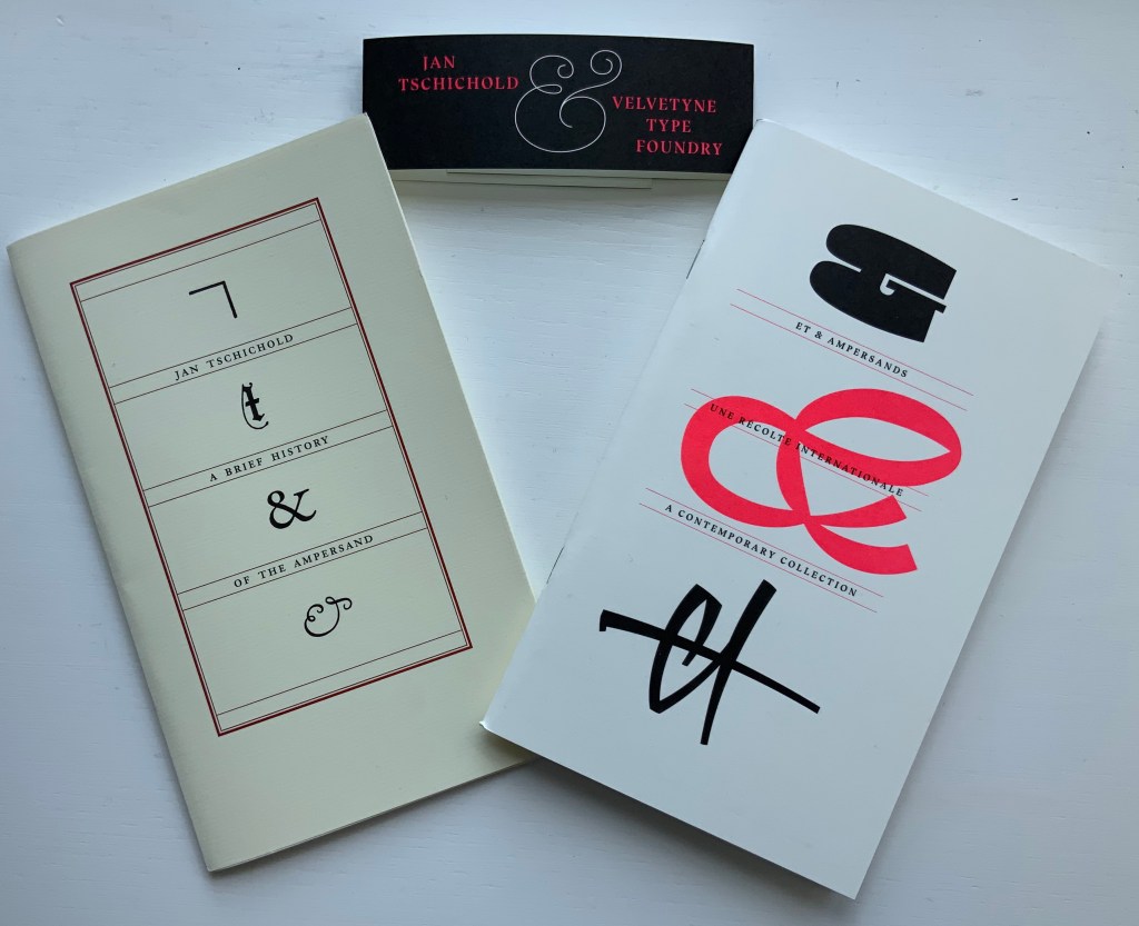
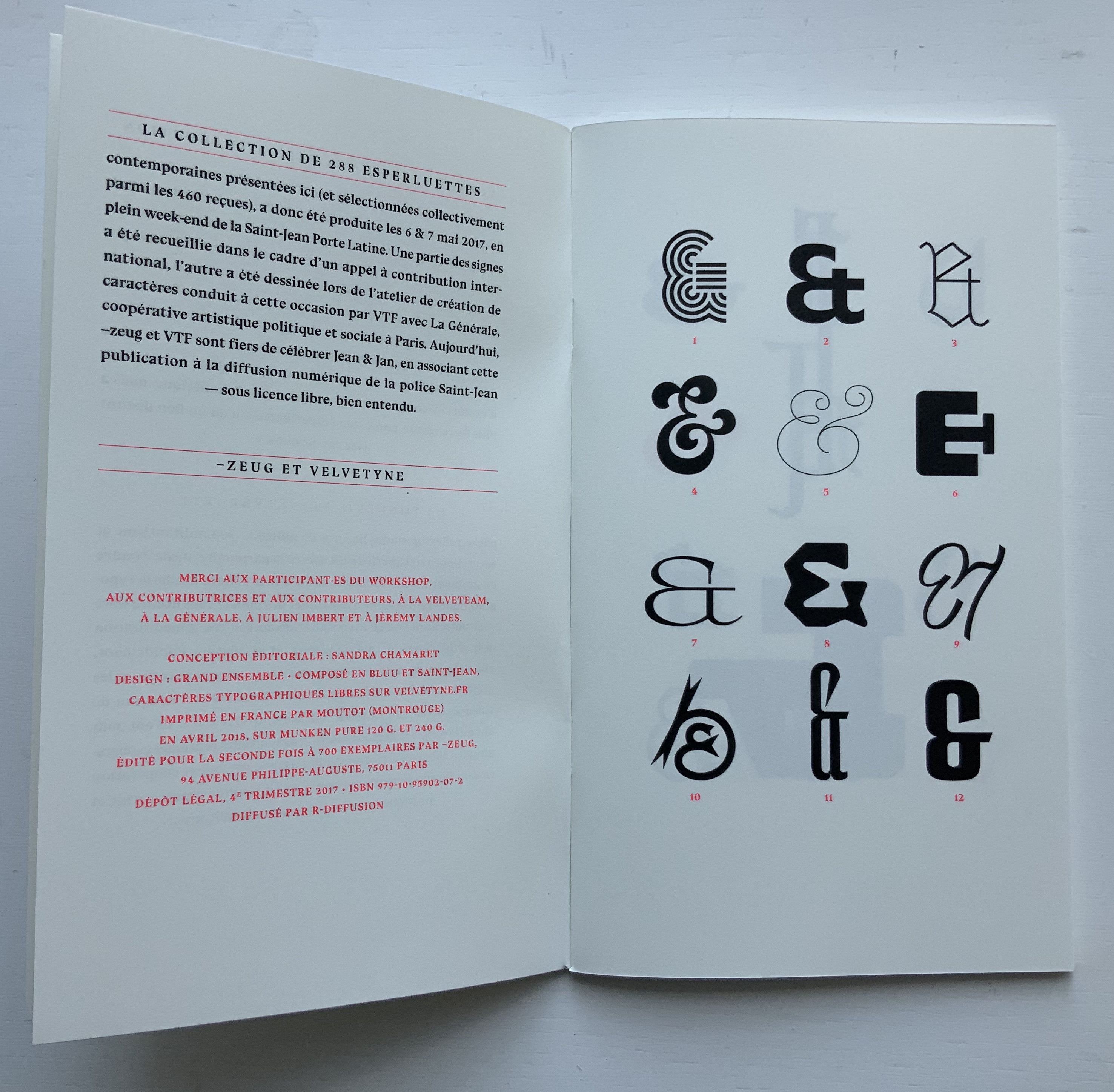
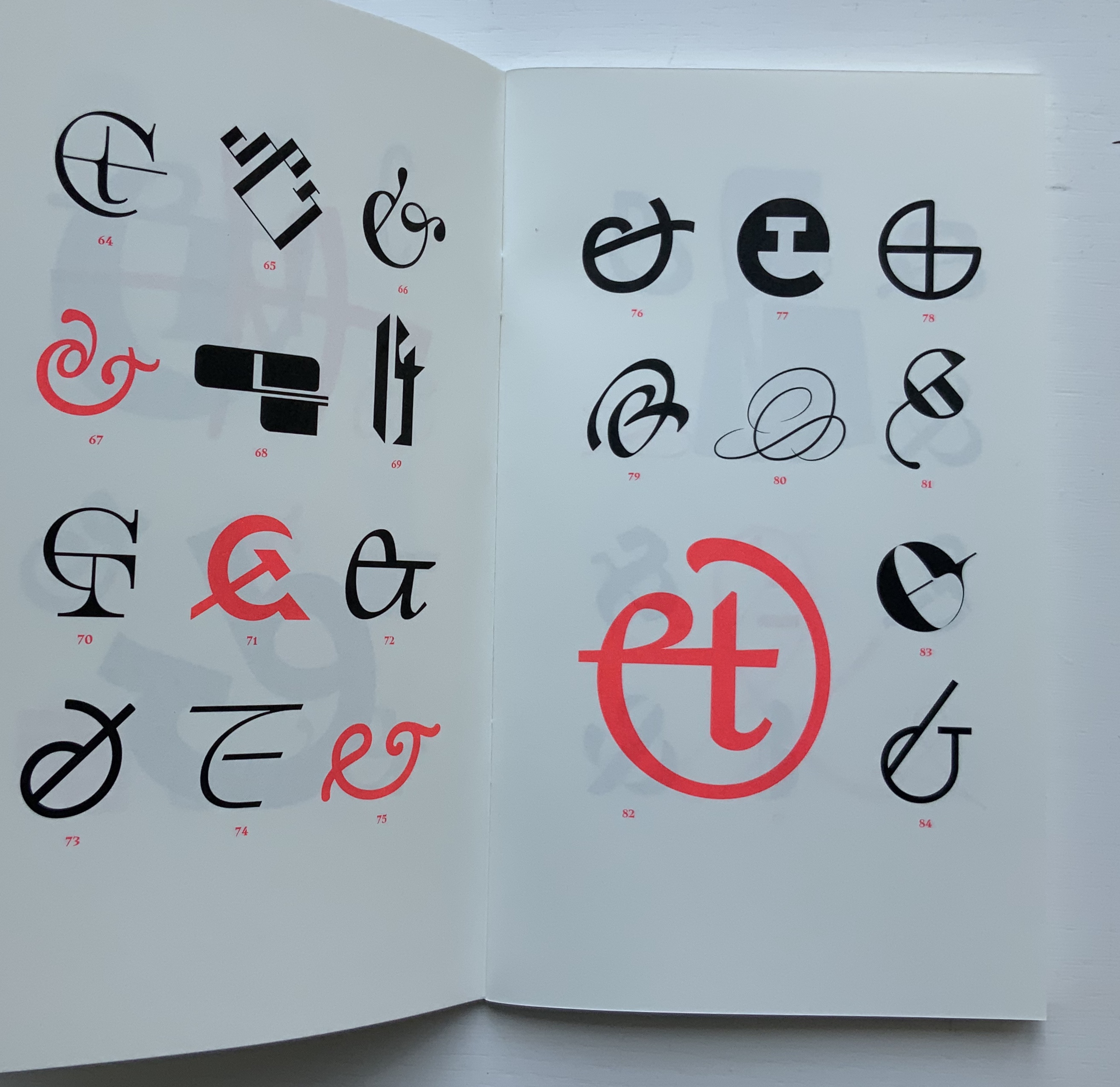
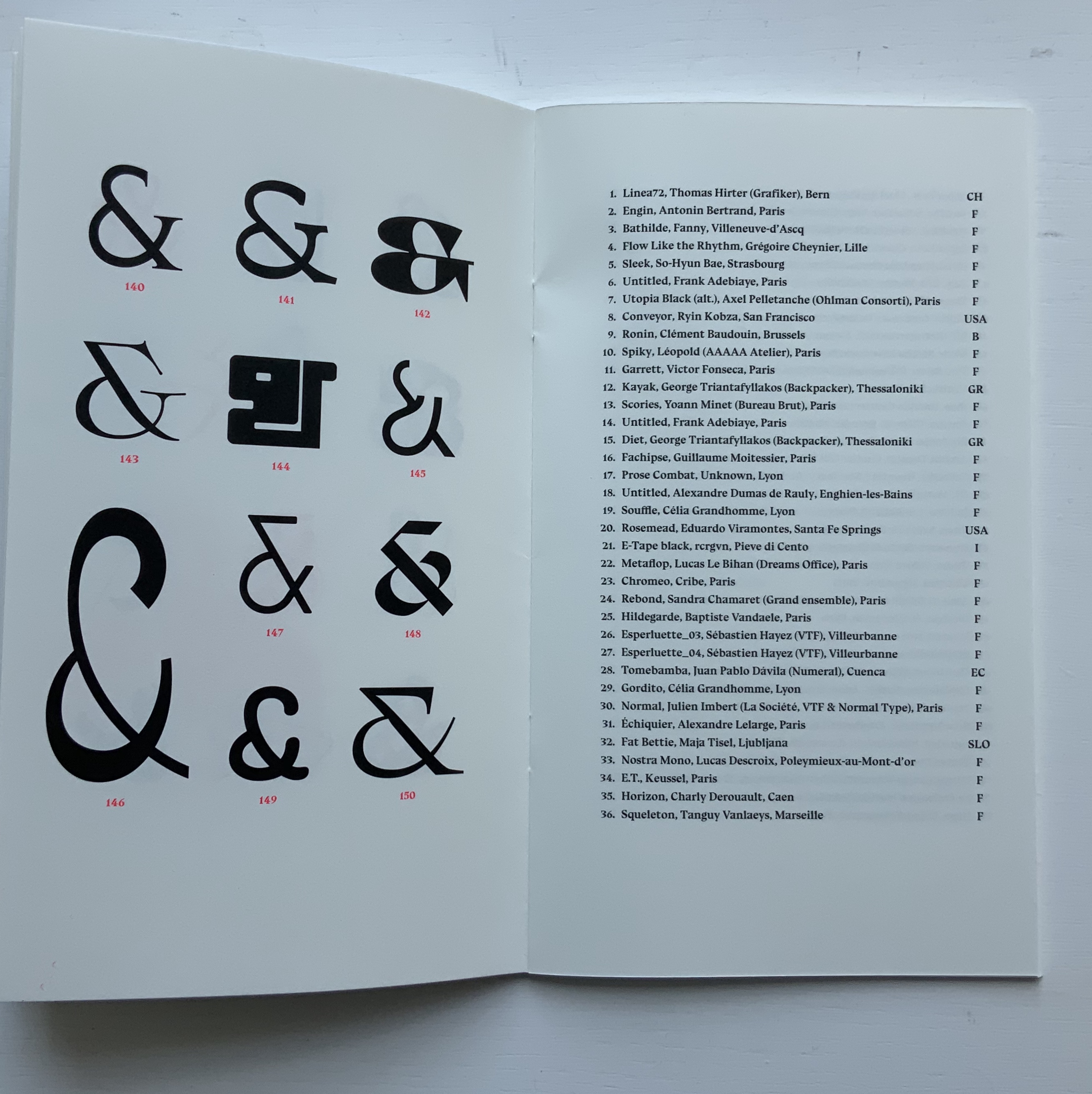
Jumping the gun on 2020, we have both the 2018 reissued edition of Tschichold’s “last word” on the subject and Ray Czapkowski‘s 2019 celebration of the Diggings of Many Ampersandhogs. It is somewhat fitting that the publisher of the reissue of Tschichold is named ~zeug, which is the German suffix appended to a verb to indicate the instrument for carrying out the verb’s activity — e.g., Spielen (to play), Spielzeug (toy). And entirely fitting, too, that ~zeug could not resist the urge to make up a deluxe version by adding Et & Ampersands: A Contemporary Collection to Tschichold’s A Brief History.
By definition, the Velvetyne/~zeug catalogue is not a last word, and its cataloging of newly designed ampersands attests to the ongoing “and-ness” of letter design, which brings us to the first item in this sub-collection within Books On Books …
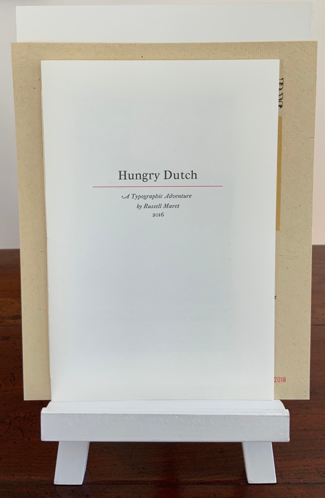
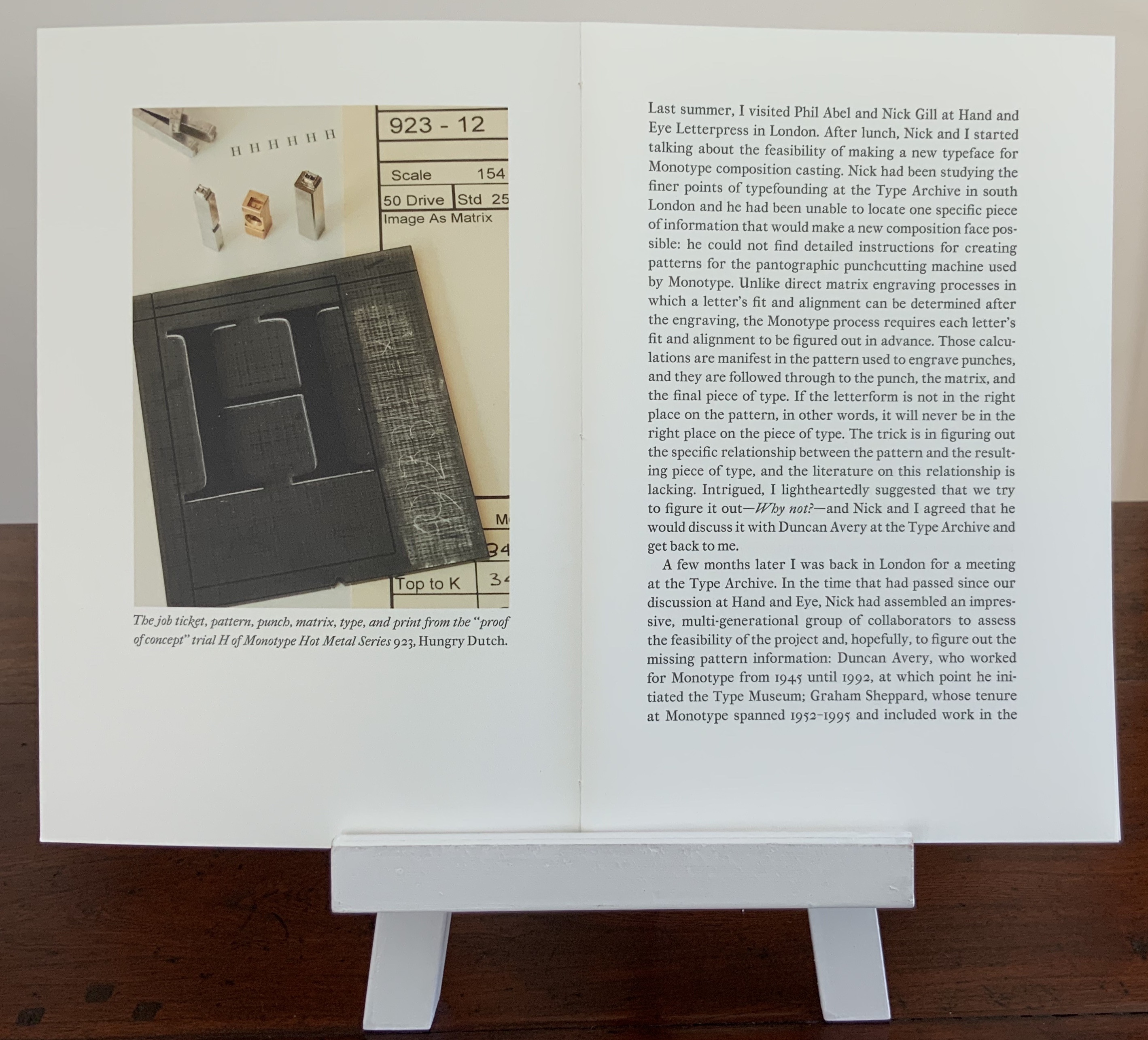
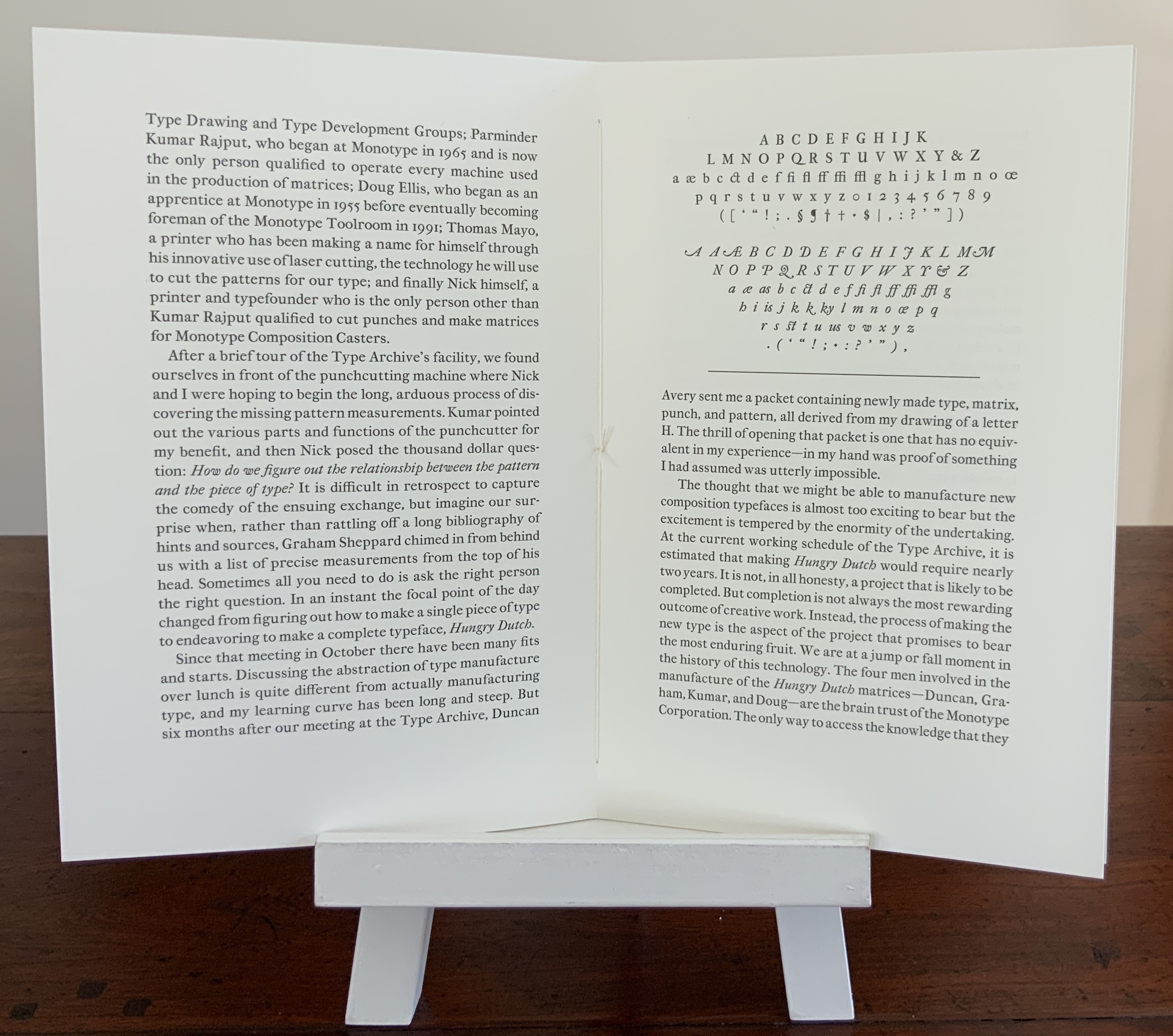
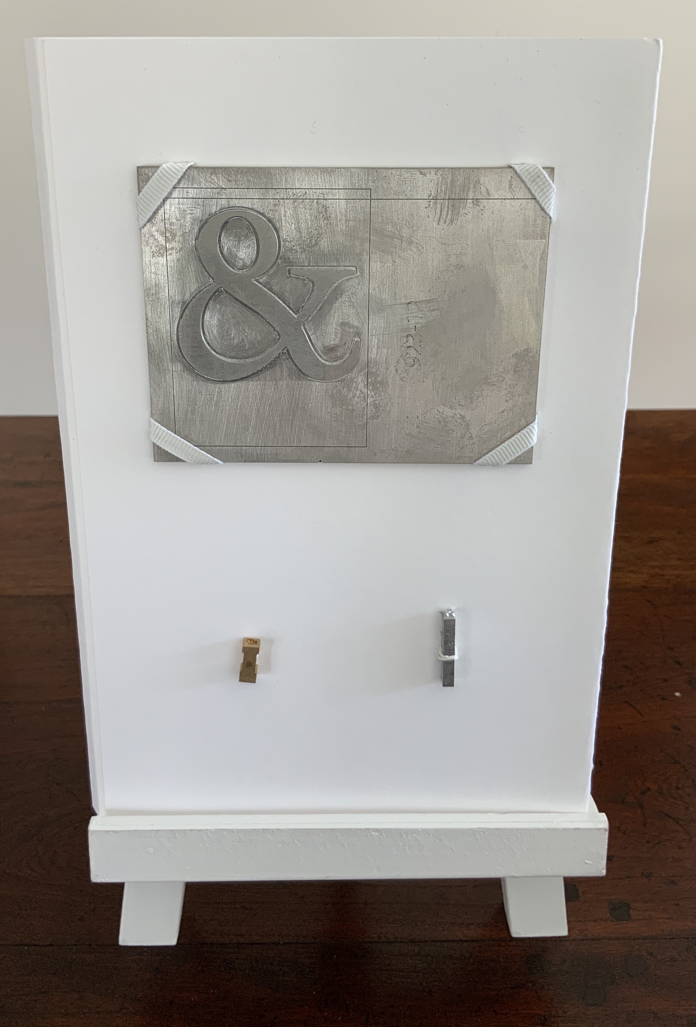
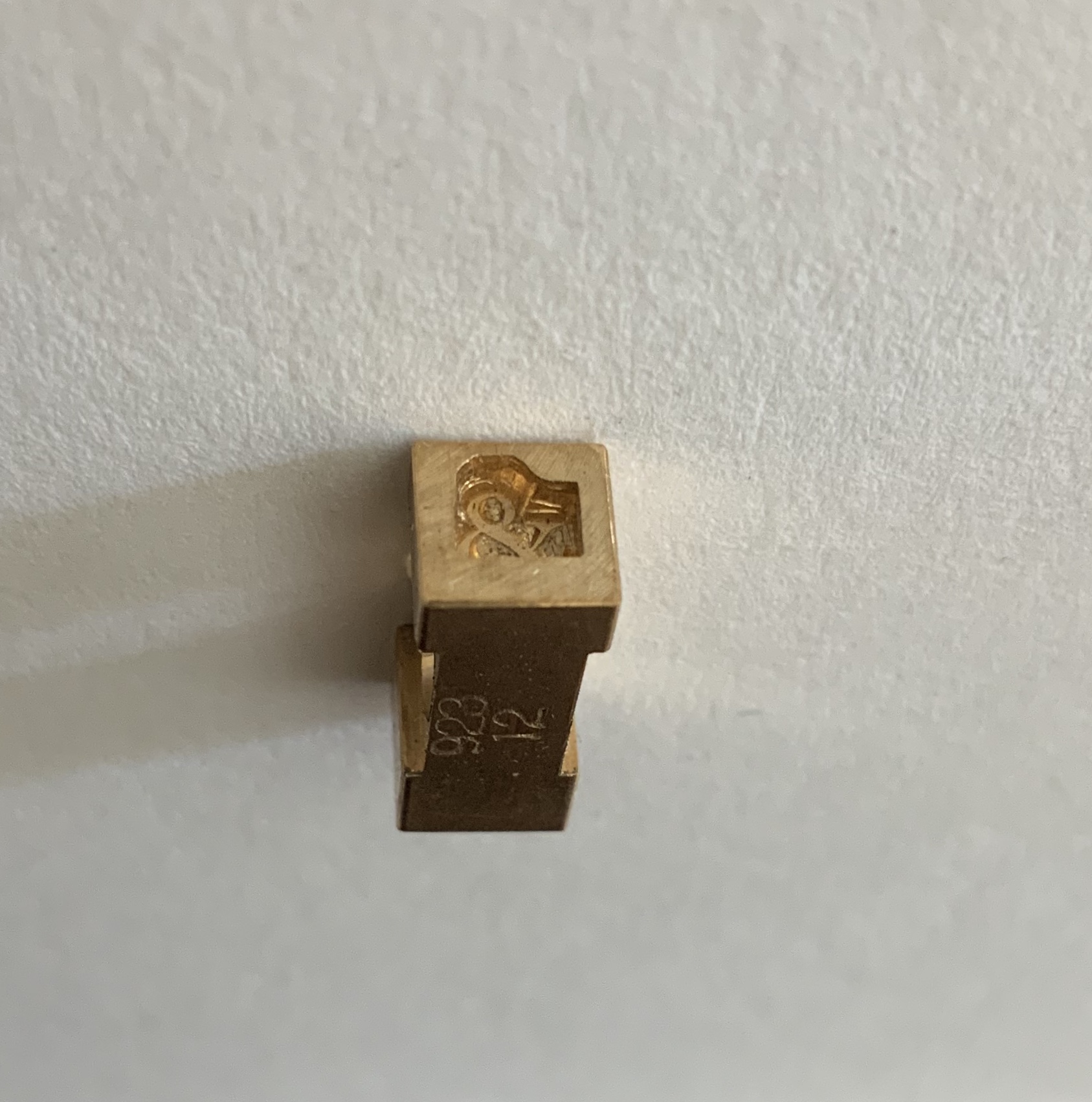
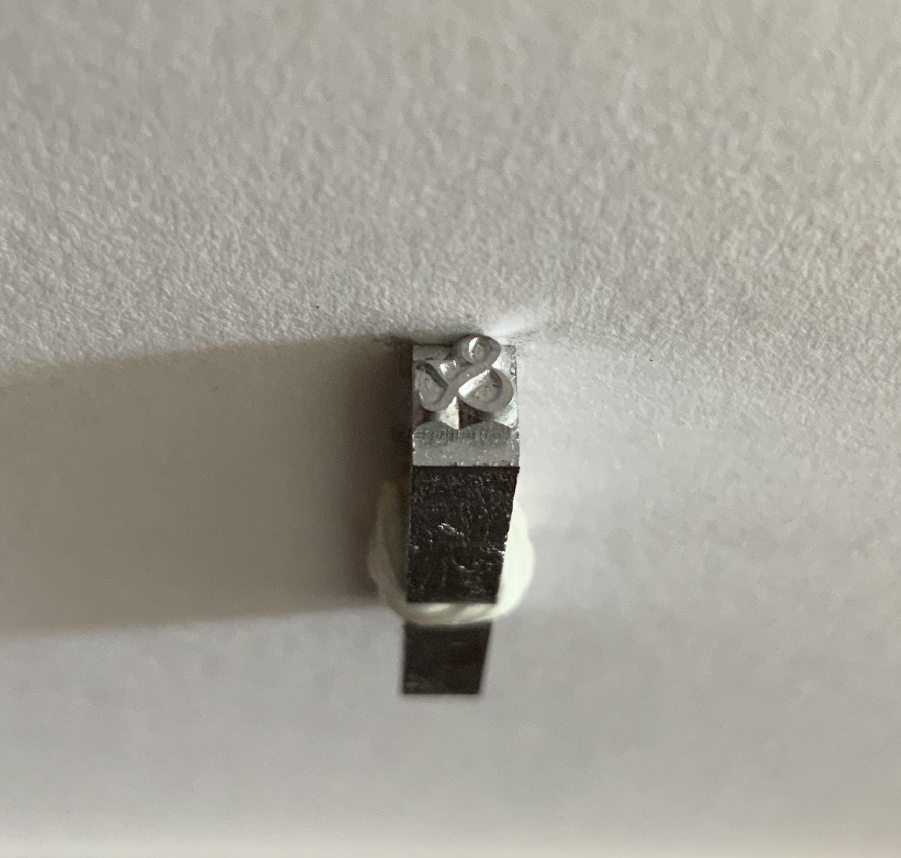
Maret’s pattern, matrix and punch for the Hungry Dutch ampersand came into the collection in 2020 as recognition of Books On Books’ contributing sponsorship of the design and manufacture of the typeface.
The endnoting to the pages displaying the numbered ampersands suits the publication of this scholarly “after-dinner” speech, which has one rocking back & forth between typographical puns and paleographical insights.
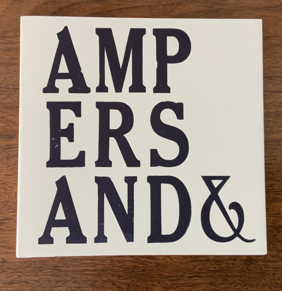
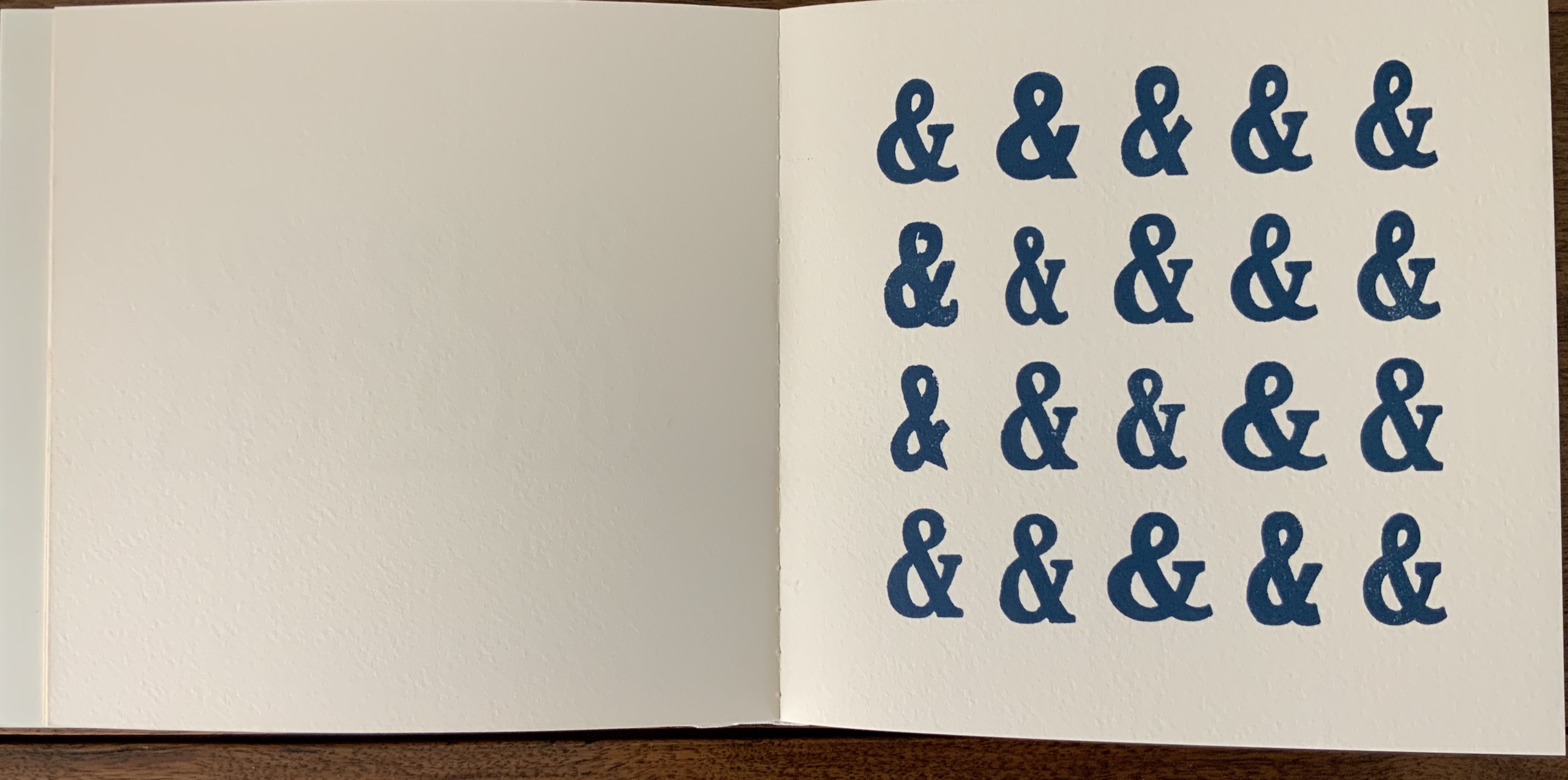
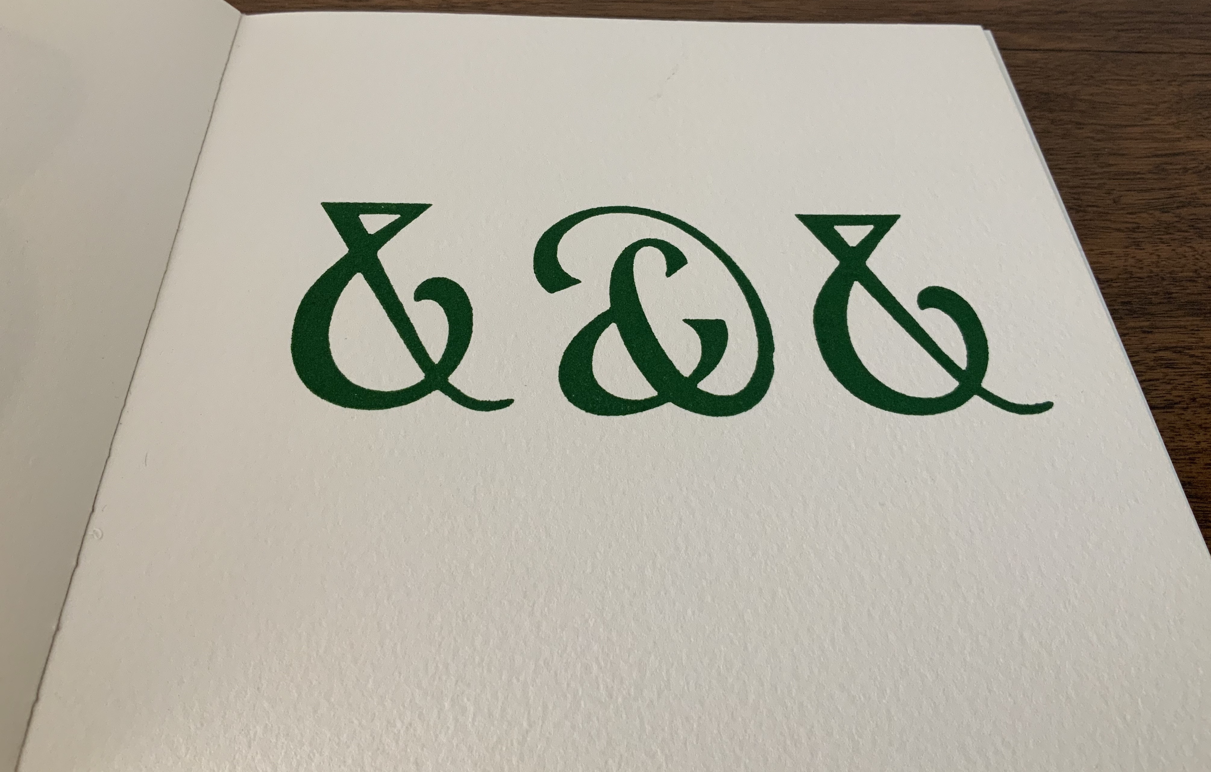
Board covers with a Caslon paper wrapper, cased over eleven linen-taped handsewn leaves of Somerset 300gsm, eleven images printed on a Vandercook proofing press. H175 x W180 mm. Acquired from the artist, 5 May 2020.
Printers have affection for the ampersand, not just because of its usefulness in shortening lines and in embellishing spaces, but also, I believe, because of its uniquely human shape; in one stroke it describes us, becomes a human pictogram. Placed together, ampersands appear endlessly various and take on human characteristics of slovenliness, arrogance, timidity and flamboyance. Ben Shahn said that the letters of the alphabet have an “austere dignity”, the ampersand in woodblock form, by contrast, is avuncular and buoyant. The book is a small celebration of the alphabet’s twenty-seventh letter and of design improvisation and characterisation within one simple symbolic form. It’s hard to identify all the fonts used as many wooden fonts are local variations of standard faces but the book includes Cheltenham, Windsor, Gill, Grotesque and Caslon as well as some ampersands hand cut for this production. The text on the final page is hand set in Albertus. — Information provided by the artist.
Book: Dustjacket and case over perfect binding of 34 pages, offset, multiple edition. 178 x 178 mm. Portfolio: Sleeve of gray French Kraftone encasing 16 prints on white French Kraftone. 305 x 305 mm. Edition of 50, of which this is #42. Acquired from the artist, 5 May 2020. Photos: Courtesy of the artist.
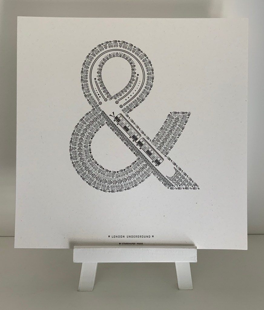
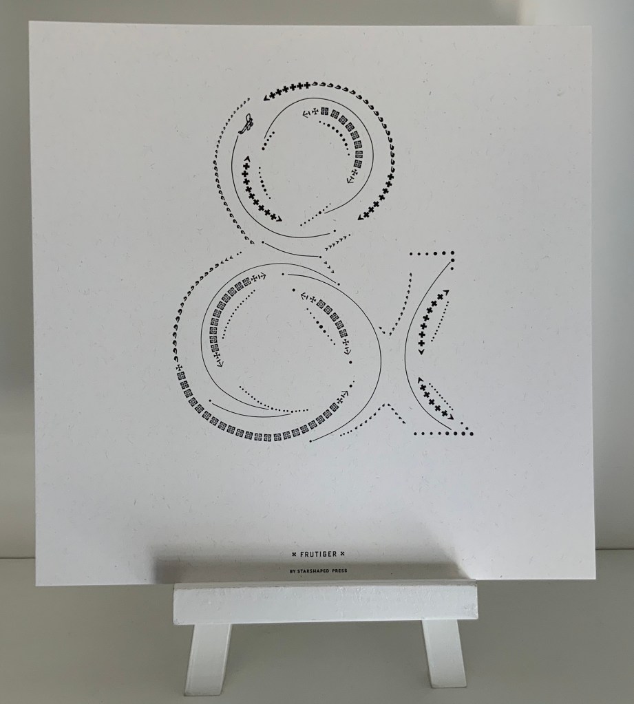
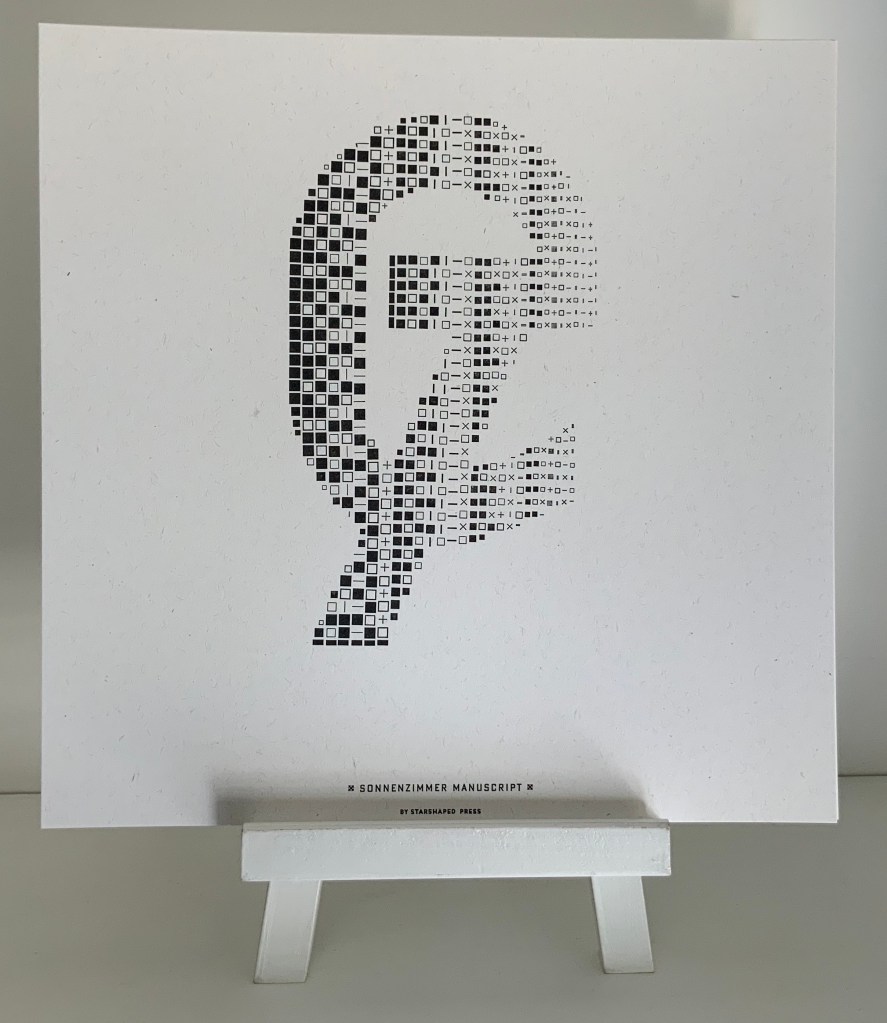
The book (2017) comes in response to interest in Farrell’s portfolio of sixteen prints of celebrated designers’ ampersands (2015-17). Farrell has constructed each designer’s ampersand with ornaments and flourishes carefully locked into shape with typesetting furniture forms. Each also contains images composed of ornaments, and each conveys the city or country associated with the original designer or typeface. The artist has provided extensive commentary and numerous photos here and here.
London: Johnston Underground (1916) Edward Johnston. Photo: Books On Books Collection.
Paris: Frutiger (1976) Adrian Frutiger. Photo: Books On Books Collection.
Switzerland: Sonnenzimmer (2015) Nick Butcher & Nadine Nakanishi. Photo: Books On Books Collection.
Further Reading (& Viewing)
“300&65 Ampersands” (NL: Ampersandampersand, ND). Accessed 19 June 2020.
Luse, Karen. An experiment in literary excavation (Portland, ME: Karen Luse, 2005). Cavity created in textblock within which sections of pages are removed to form an ampersand. book attached to painted wooden board.
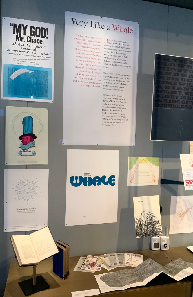
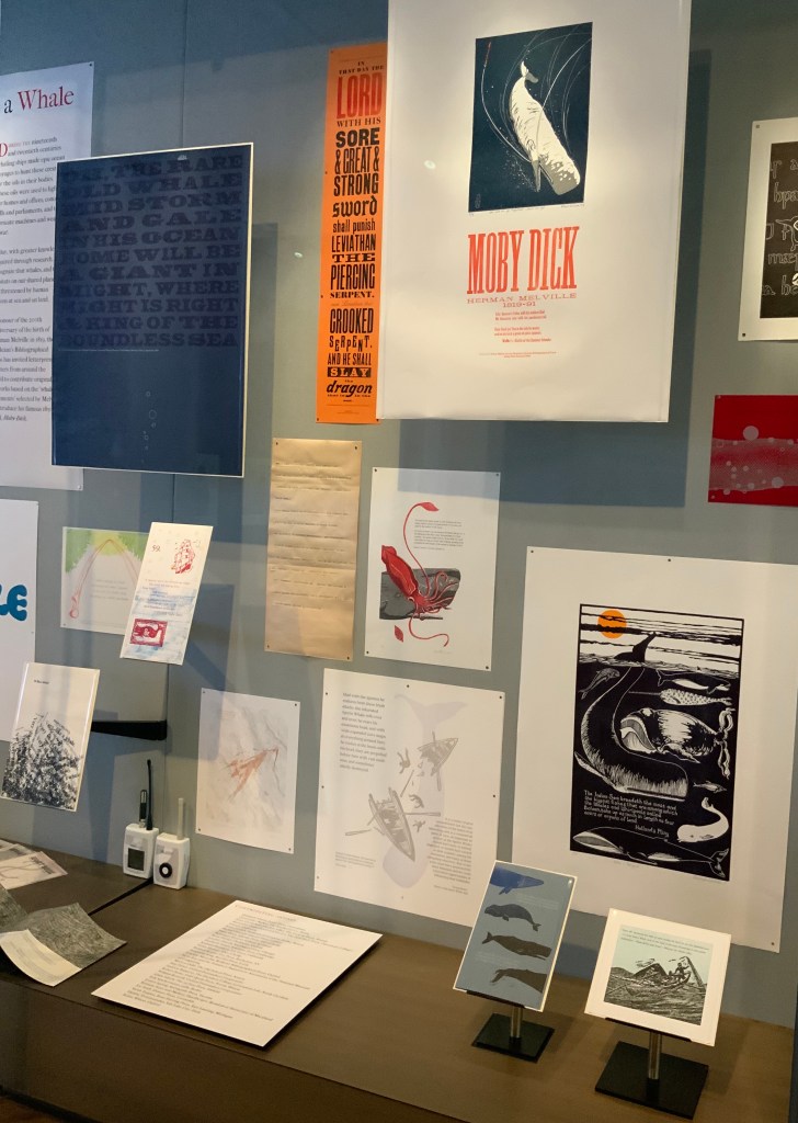
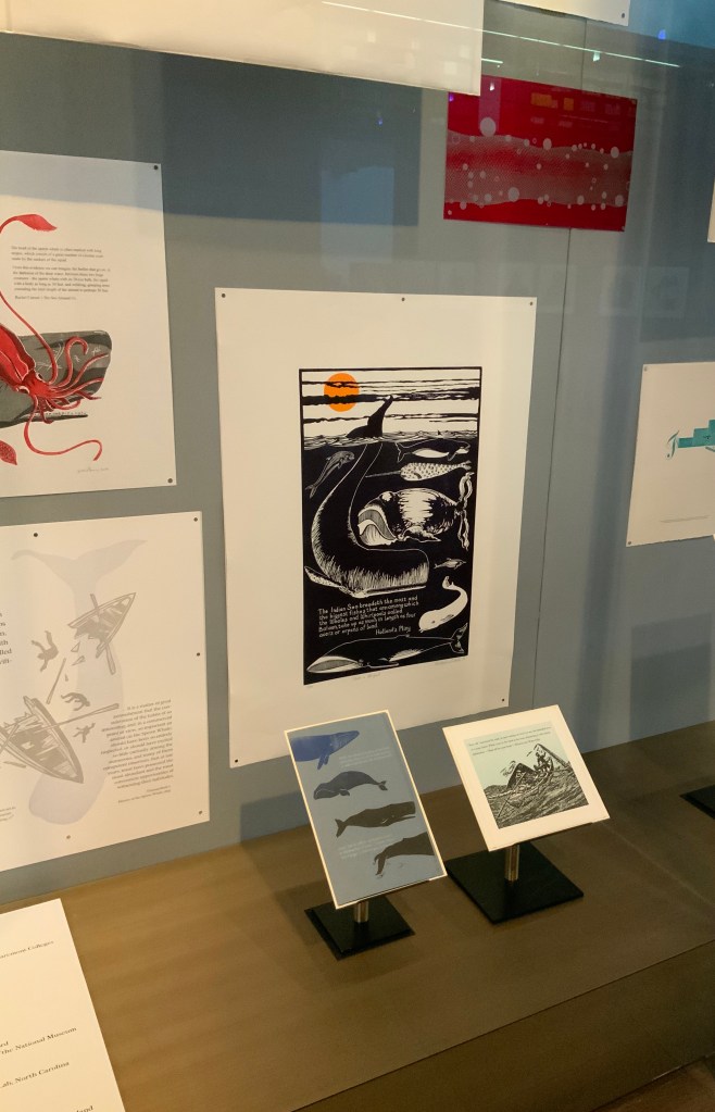
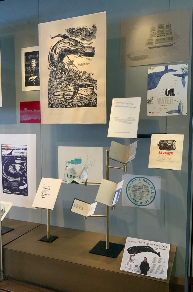
For the 200th anniversary of Herman Melville’s birth (1819), the Bodleian’s Bibliographical Press invited letterpress printers and artists to claim one of the eighty prefatory “Extracts” from Moby-Dick (1851) and create an artwork in response.
The Blackwell Hall exhibition case accommodates thirty of the eighty contributors‘ artworks, plus the rare three-volume version of the novel published by Richard Bentley in London as The Whale before Harper & Brothers issued it in November 1851 in New York as Moby-Dick; or, The Whale. Here are just four of the outstanding prints among the several artforms on display.
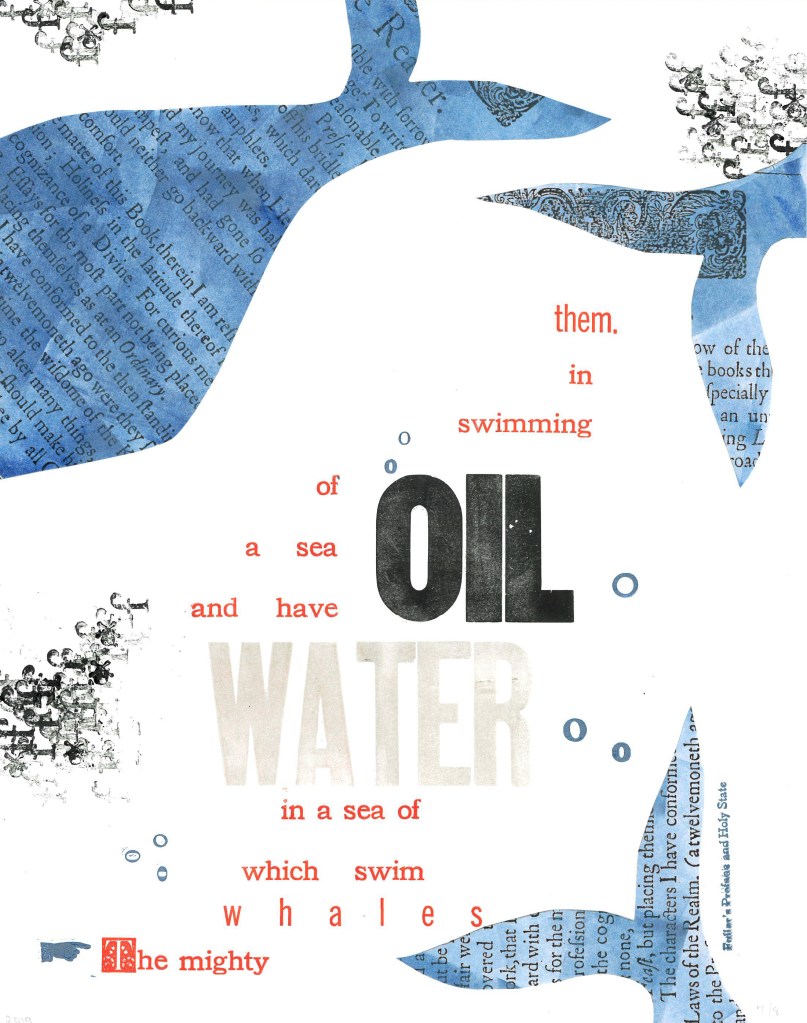
Extract 25: ‘The mighty whales which swim in a sea of water, and have a sea of oil swimming in them.’ ─ Fuller’s Profane and Holy State Brittany Starr and Mallory Haselberger, BookLab at University of Maryland Mixed media (collage and letterpress). Printed on a Line-O-Scribe, Model 1411 on Strathmore printmaking paper using rubber and oil-based ink; includes Jenson, News Gothic and Bookman typefaces with Hamilton wood type. Image courtesy of the Bibliographical Press and artists.
Notice how Starr and Haselberger integrate the verbal and visual to emphasise the seas of water/oil paradox that Melville plucked from his source. Like Melville’s hand, the artists’ manicule in the lower left points to the extract that reads/rises from the bottom to the top. Inside the shapes of whales around the extract appears the source of the extract (the verbal in the visual) against a seawater blue (another layer of the verbal in the visual). The letters “o” and “f” evoke bubbles and currents (the verbal for the visual). The words “oil” and “water” in contrasting inks but composed in the same typeface loom large at the heart of the artists’ embodiment of this paradoxical extract. (It is an insider’s paradox that the work surfaces from the BookLab, devoted to exploring the oil-and-water mix of the material and the digital.)
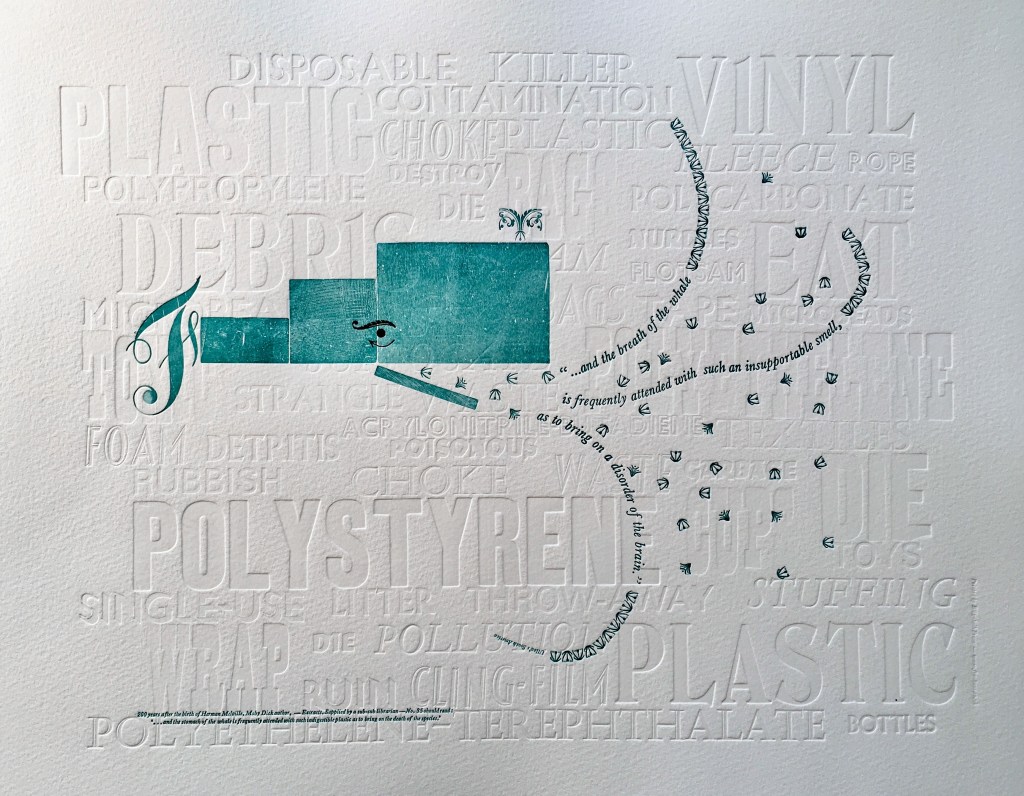
Extract 35: ‘* * * * * and the breath of the whale is frequently attended with such an insupportable smell, as to bring on a disorder of the brain.’ ─ Ulloa’s South America Elizabeth Fraser, Frauhaus Press, Cambridge Handset letterpress. Blind deboss using wood and metal type. Whale created from face and back of woodtype with ornaments for eye and spout. Text 12pt & 6pt Baskerville italic. Whale breath 12pt glint (Monotype B1309 & B1310). Printed on Somerset Velvet 300gsm soft white paper with a tabletop flatbed proofing press.
What attends the whale’s breath in Fraser’s print? The whale’s breath is the extract streaming into a sea of white blind-debossed words. That sea of human detritus is the source of the insupportable smell that attends the whale’s breath. The insupportable smell takes on “the whiteness of the whale”. The threatened whale takes on an environmental green. which Fraser creates with the non-verbal side of the woodtype. Even so, the carrier of the verbal makes up every visual aspect here, underscoring Fraser’s contemporary paradox: the insupportable smell disordering the brain has been brought on by the disordered brain of humankind.
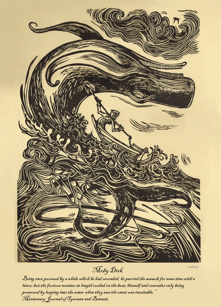
Rowsell’s linocut represents the more traditional entries in the exhibition. Capturing the furious struggle expressed in the extract, he locks whale, man, boat, sea, cloud and sky into a vigorous, swirling image on a paper and in a style that evoke the century in which Moby-Dick is set. As he pulled his prints from the 1828 Albion printing press, Rowsell might have wondered what the nine-year old Herman Melville was doing when hands were first laid on that Albion.
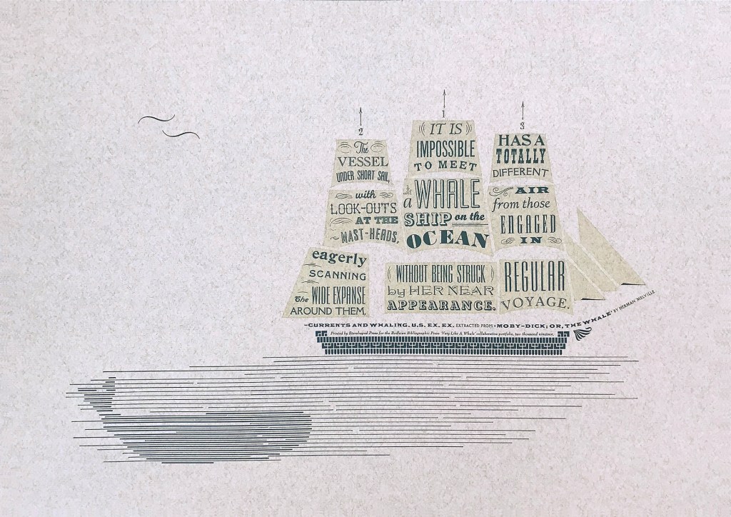
Extract 71, ‘It is impossible to meet a whale-ship on the ocean without being struck by her near appearance. The vessel under short sail, with look-outs at the mast-heads, eagerly scanning the wide expanse around them, has a totally different air from those engaged in regular voyage.’ ─ Currents and Whaling. U.S. Ex. Ex. Jennifer Farrell, Starshaped Press, Chicago Letterpress: metal type + rule linocut; Paper: Fabriano Tiziano printed on a Vandercook SP15. Image courtesy of the Bibliographical Press and artist.
Starshaped Press is aptly named. Jennifer Farrell stars at wringing shapes from type and its surrounding furniture. The citation outlining the upper deck and bowsprit runs gracefully and appropriately under the sails on which the extract appears in that variety of display faces characteristic of nineteenth century flyposts.
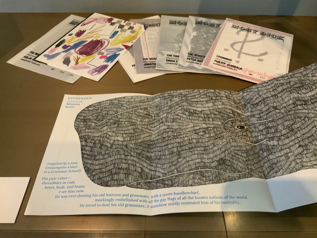
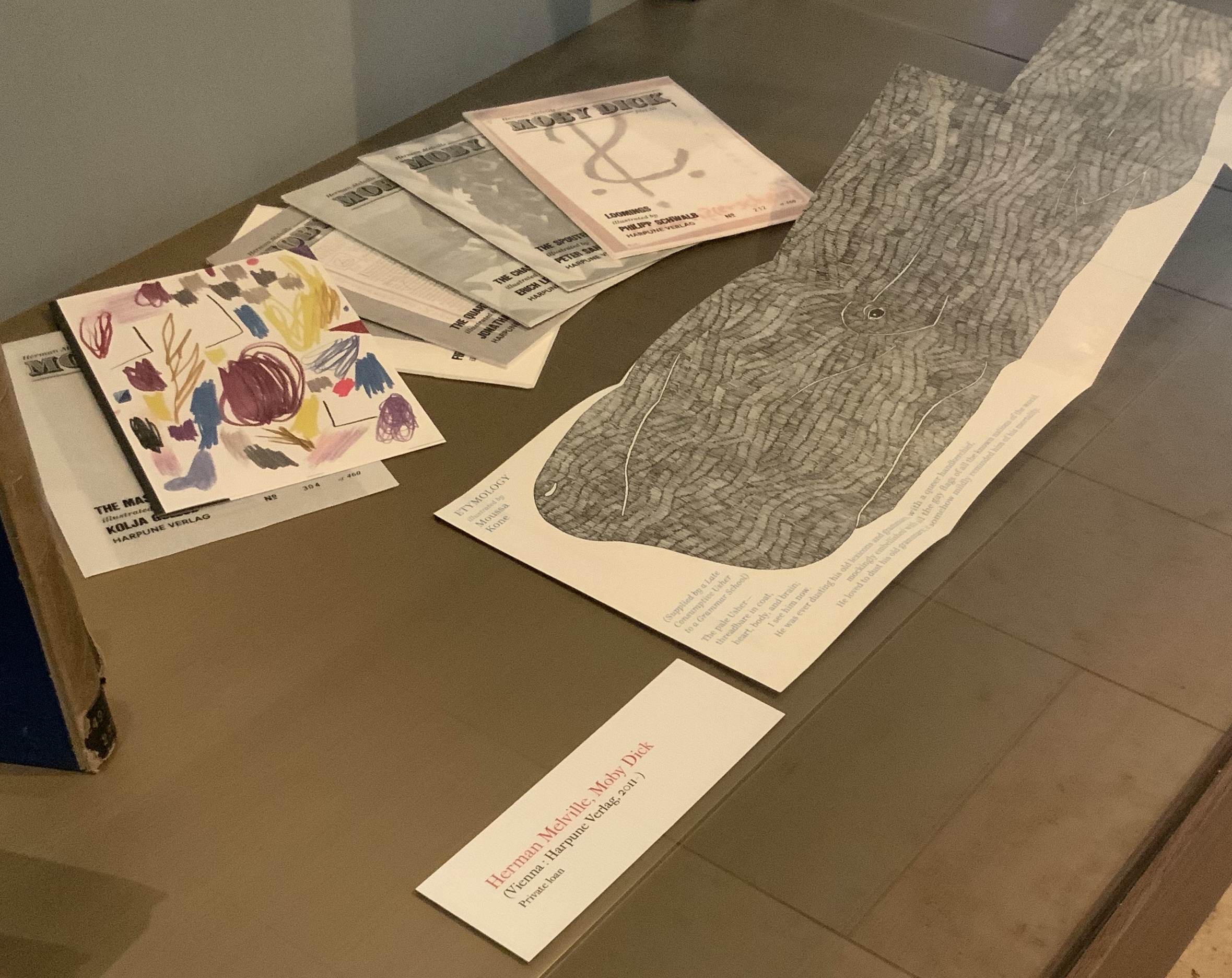
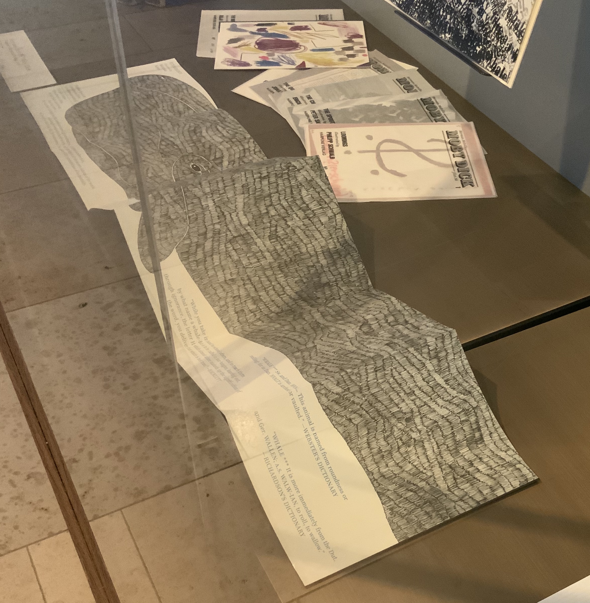
To round out the display with another multi-artist effort, the curators included Harpune Verlag’s Moby-Dick “Filets” (2011~). In 2011, Harpune Verlag Wien began publishing Melville’s masterpiece as a serialized subscription. To do justice to the book’s many voices, 136 different artists were invited, each to illustrate a chapter.
Etymology, Moby-Dick “filet” No. A (2012) Moussa Kone Leporello of 16 pages, 150 x 200 mm closed, 200 x 710 mm open. Acquired from Harpune Verlag February 2019.
Published in non-chronological order at varying intervals and printed in a limited edition of 460 copies, 37 “filets” have appeared so far. At this rate, all of the filets may only be served up by the bicentennial of Moby-Dick’s publication! Fortunately for the Bibliographical Press’s display, Moussa Kone’s rendition of “Etymology”, the prefatory item preceding “Extracts”, is one of those already delivered. It makes a suitably lengthy and apropos link across cases.
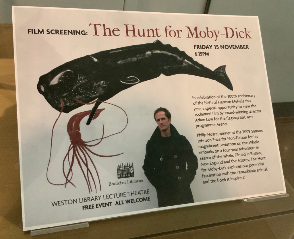
If, like Ishmael with “November in [his] soul”, you were walking down the damp, drizzly streets not of New Bedford but Oxford on the 15th this month, you might have substituted the Weston Library for The Spouter Inn. Inside, second copies of the remaining fifty “Extracts” submissions were on display in Blackwell Hall for viewing and handling after a screening of Philip Hoare’s The Hunt for Moby-Dick (2011). Ten years ago, Southampton-born Hoare won the 2009 BBC Samuel Johnson Prize for non-fiction for his book Leviathan, or the Whale. Hoare himself was on hand to introduce and take questions after the film.
His lifelong passion for whales and Melville’s book is infectious and influential. UK book artist Chris Ruston traces her series of artist’s books Lost Voices — Whaling (2016-17) to Hoare’s Leviathan. Like Hoare’s work and many entries in “Very Like a Whale”, Ruston’s work challenges our anthropocene era. Hoare was also instrumental in organizing the Moby Dick Big Read (2012) — another multi-artist affair and effort to address the effects of the anthropocene era.
Click on the screenshot to visit and listen to the Moby Dick Big Read.
The Big Read offers freely available readings of each chapter of the book. Individuals (well-known and unknown) contributed the readings, artists contributed artwork (viewable as thumbnails on the site), and the site offers an opportunity to donate to Whale and Dolphin Conservation (WDC).
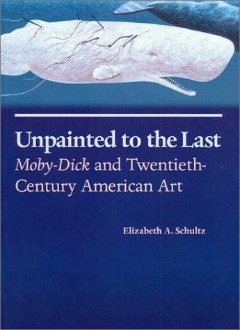
Hoare participated in another Melvillean documentary: David Shaerf’s Call Us Ishmael (2019). It is a multi-artist affair like the Big Read, Moby-Dick “Filets” and “Very Like a Whale”; includes a sighting of the New Bedford Whaling Museum’s annual days-long continuous reading of Moby-Dick; and features interviews with artists and other creatives inspired by Melville’s tale. One of those artists interviewed is Frank Stella. Uncanny, but Stella also appears in this book to be found in the Bodleian: Elizabeth Schultz’s Unpainted to the Last (1995).
From among the artists such as Ellsworth Kelly, Robert Motherwell, Jackson Pollock and others whom Schultz discusses, Stella serves best to tie off this fisherman’s tale and return to the title of the Bibliographical Press’s exhibition. About his Moby-Dick series of prints and metal-relief paintings to which he devoted a decade, Stella writes:
The idea of the wave and its various permutations is what drives this new series. Once I started on the wave shape, I saw it began to look like a whale — a combination of waves and whales. … The idea of the whale reminded me of “Moby Dick,” so I decided to go back and read the novel and the more I got into it, the more I thought it would be great to use the chapter headings of the novel for the titles of the pieces. — “1989 Previews from 36 Creative Artists,” New York Times, 1 January 1989, Sec. 2:1. Images here.
Indeed, “Very Like a Whale”, which runs until 5 January 2020. Admission free.