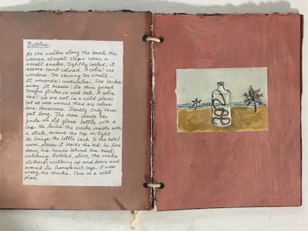
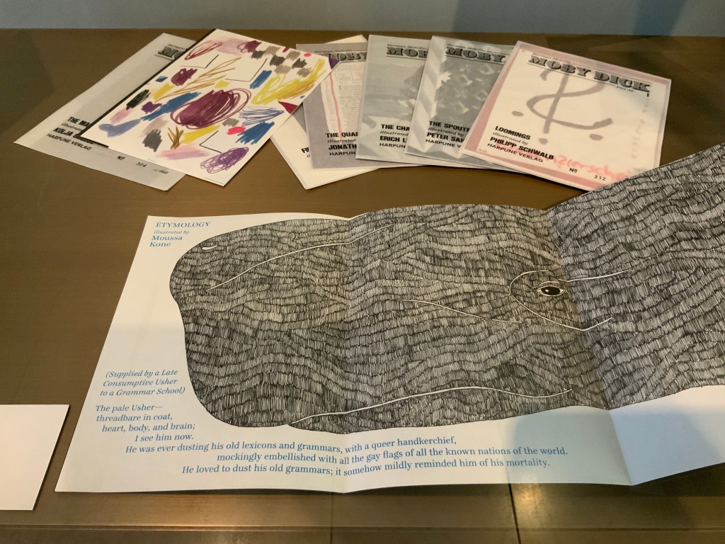
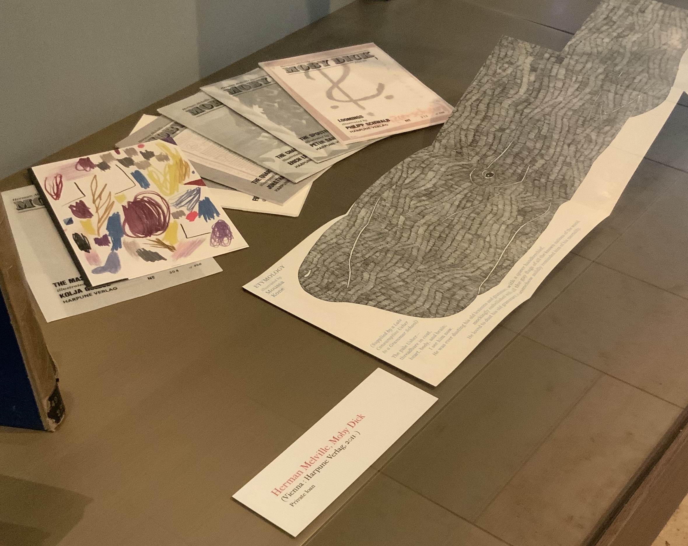
I first came across the artist Moussa Kone after subscribing to Harpune Verlag’s Moby-Dick “Filets”. Each filet is a section or chapter of Herman Melville’s Moby-Dick, The Whale (1851), which has been assigned to, or claimed by, an artist for illustration. About the time the subscription package arrived, the Bodleian Bibliographical Press announced the upcoming exhibition “Very Like a Whale”, for which artists were invited to create a print work in response to one of the eighty quotations making up the section “Extracts” prefacing Moby-Dick (1851). The Moby-Dick ”Filets” piqued the nearby Bodleian curators’ curiosity, so a loan was offered before I had opened and sorted through the catch. Moussa Kone’s handling of “Etymology”, which happens to precede “Extracts” in the novel, was selected and displayed prominently. And that is how I discovered this catch within the catch.
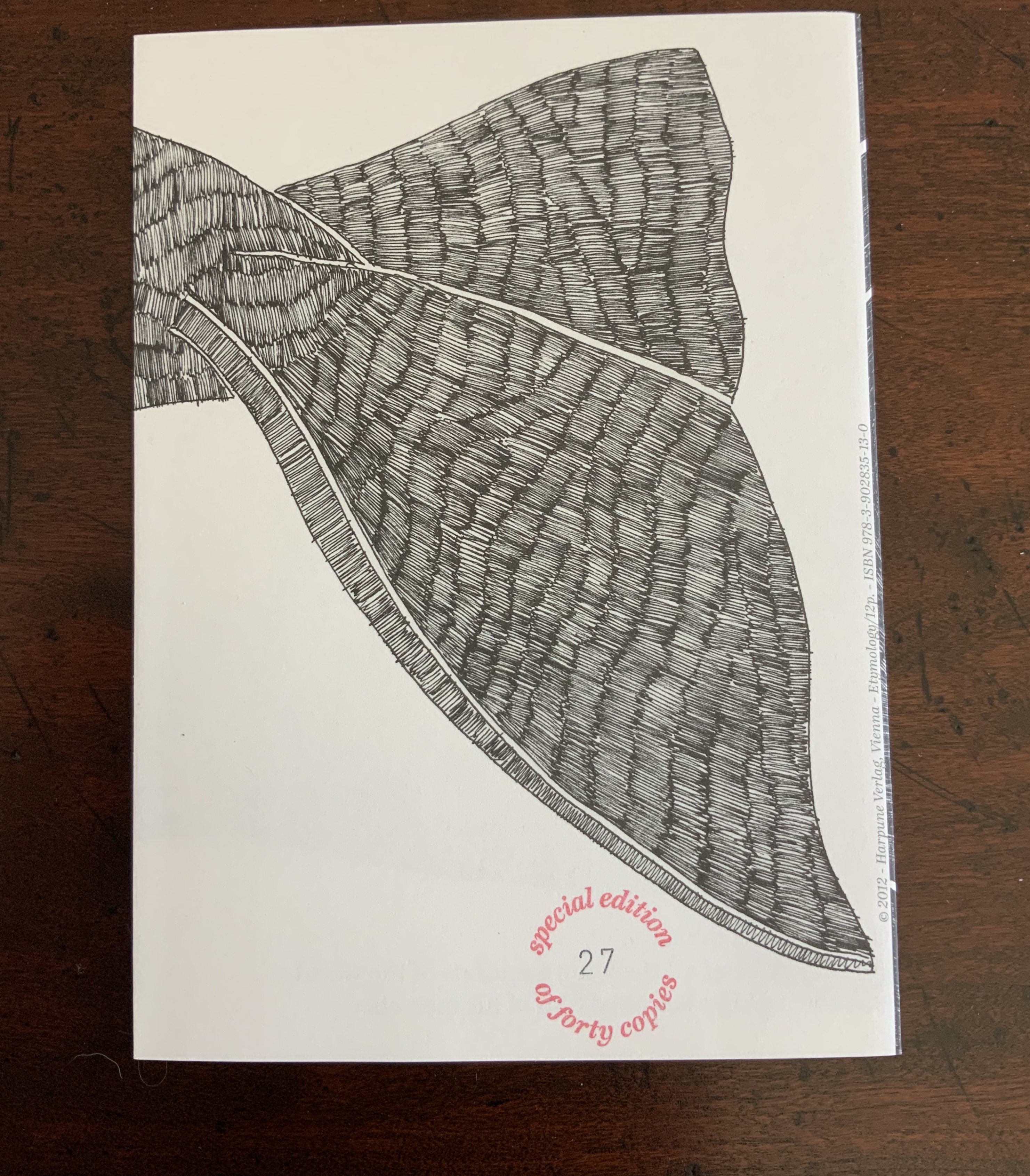
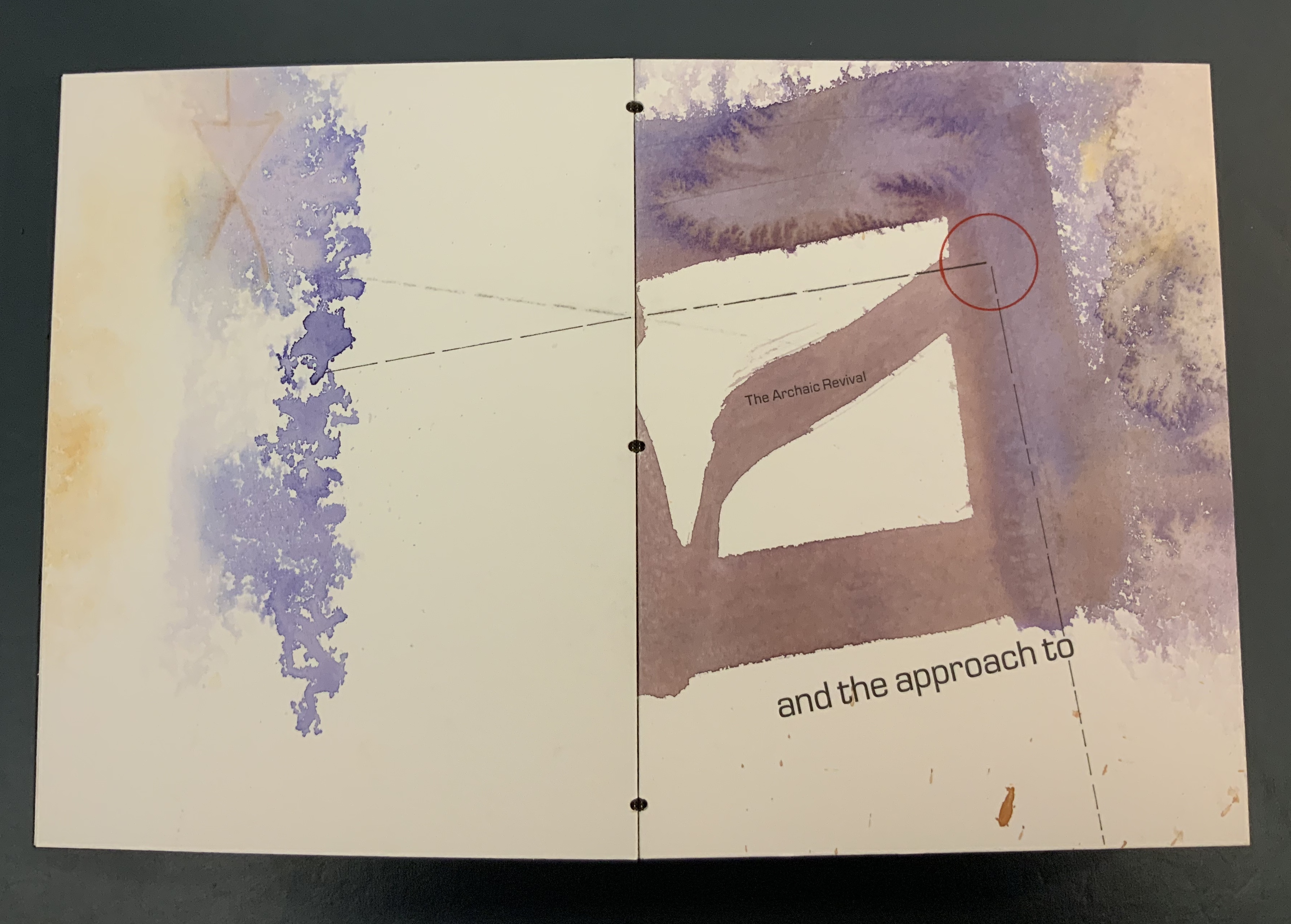
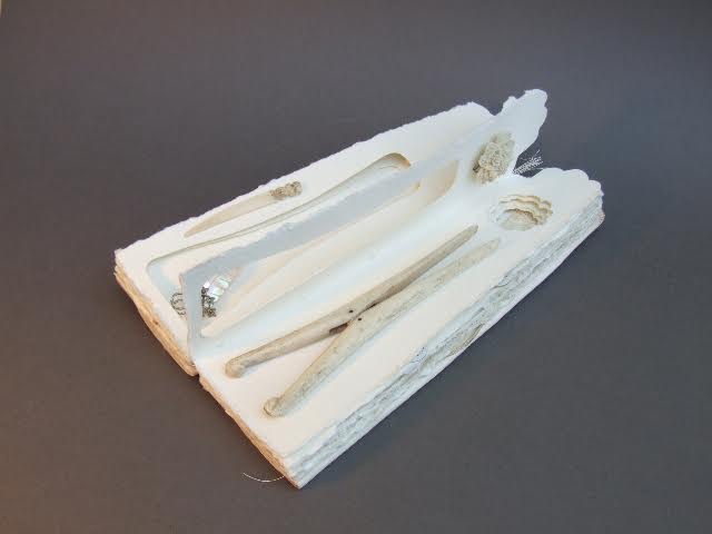
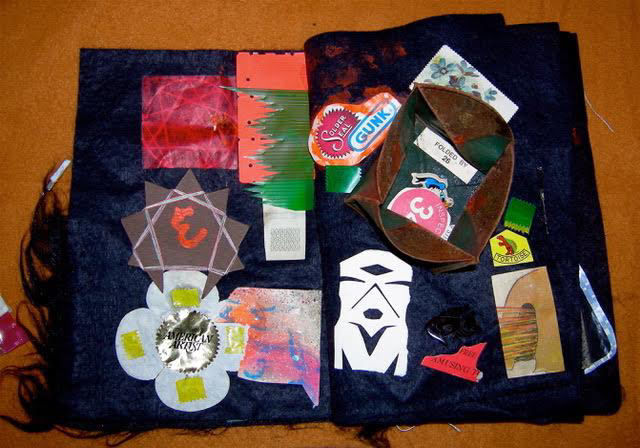
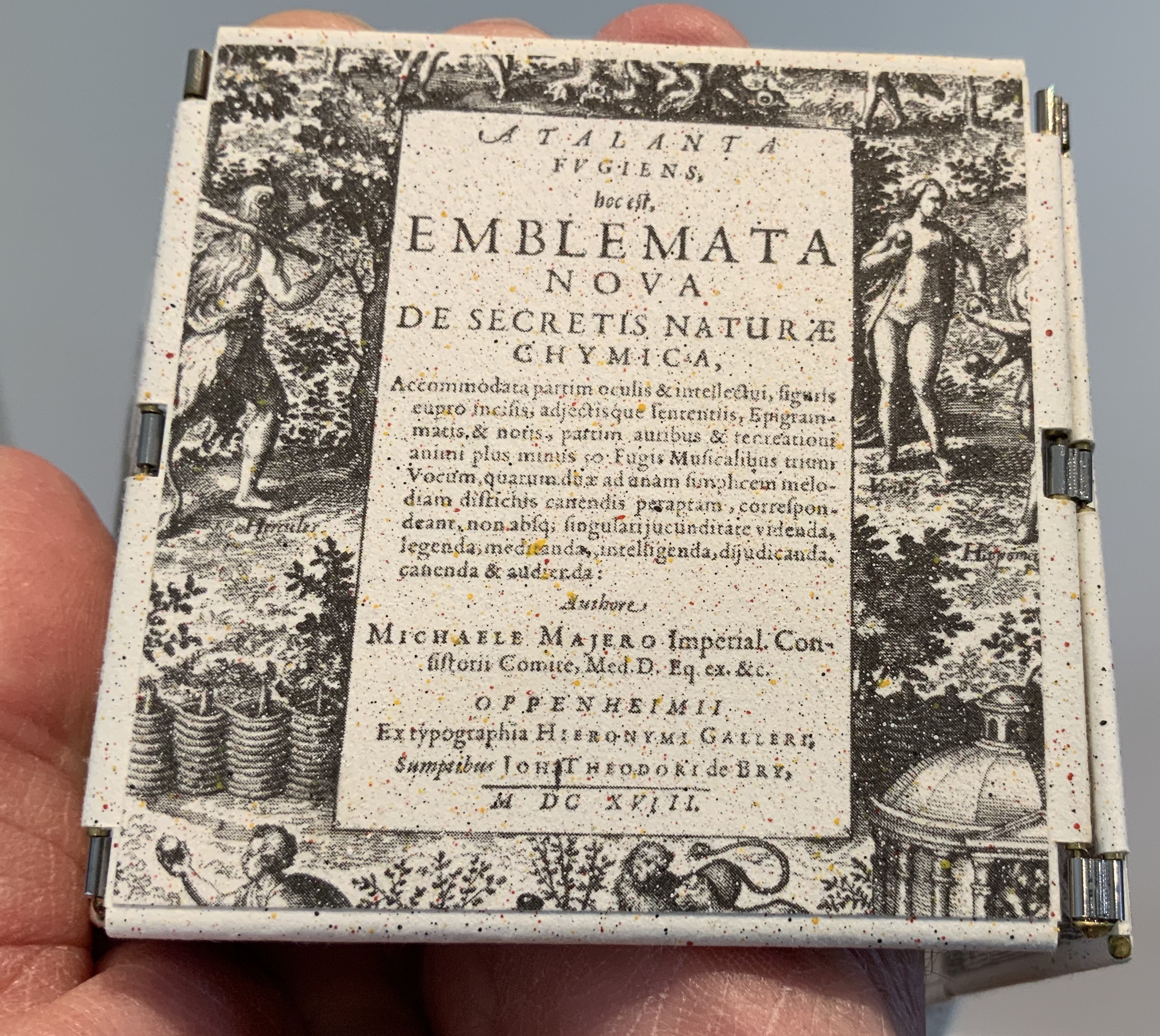
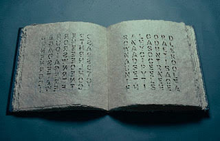
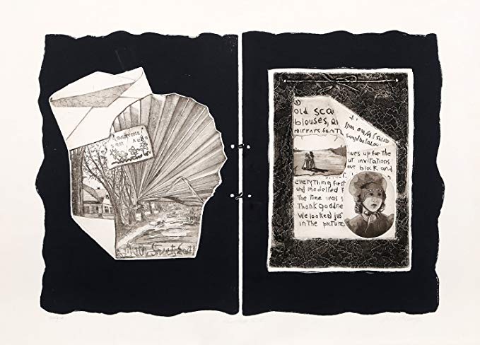
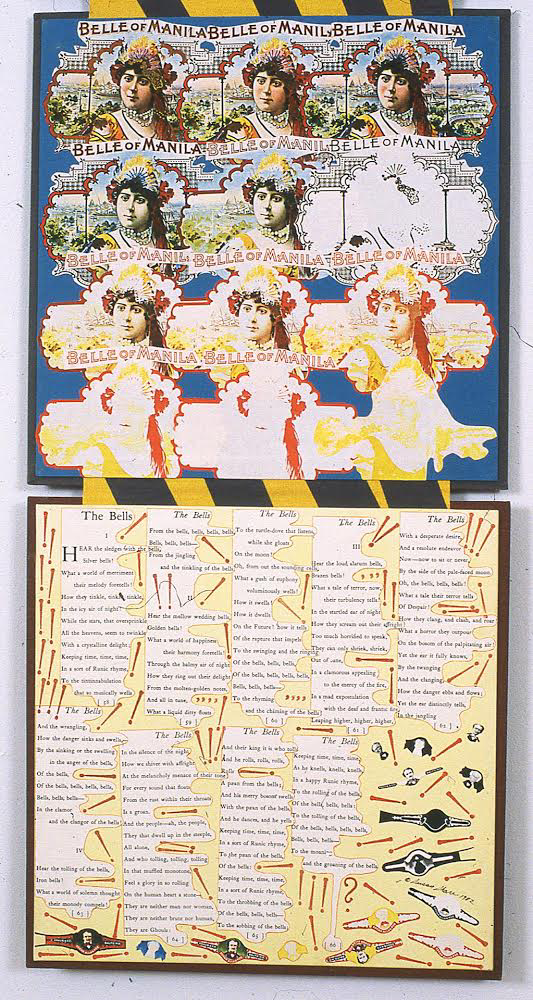
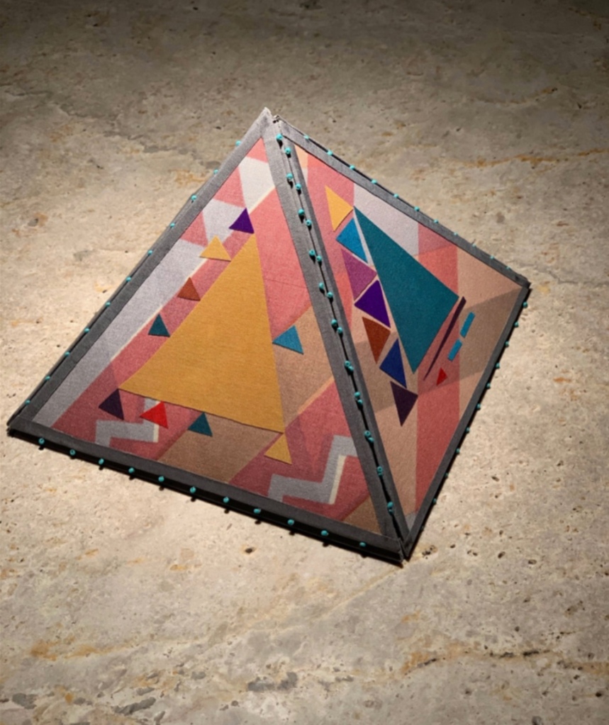
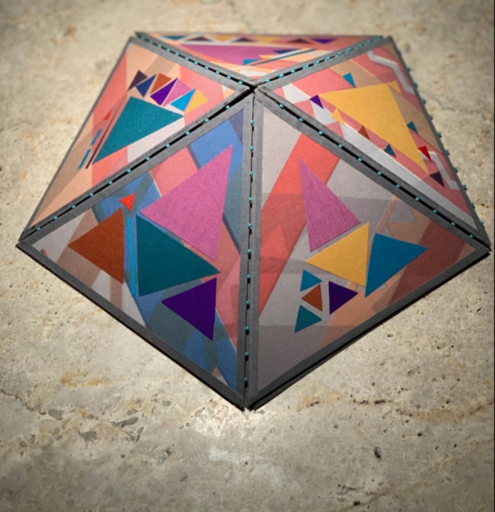
“Etymology”, Moby-Dick “Filets” (2012)
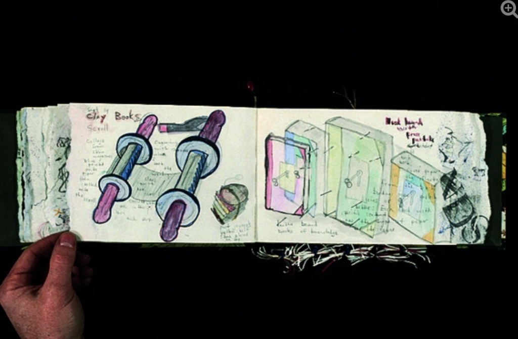
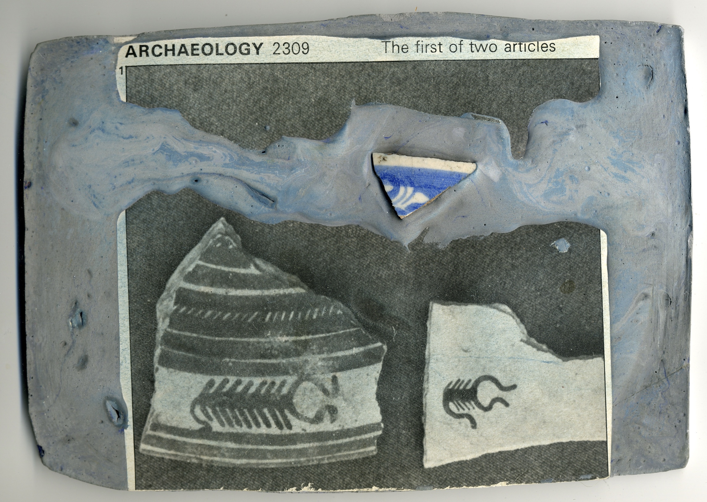
“Etymology”, Moby-Dick ”Filets” (Harpune Verlag, 2012) Illustrated by Moussa Kone Leporello in an edition of 460 numbered copies. Special edition of 40, of which this is #27, signed by the artist and including parts of the original drawing. Closed: H200 x W150 mm; open: H200 x W710 mm; 16 panels. Acquired from the artist, 11 December 2019.
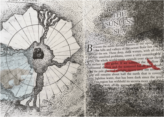
Note the reflections of the whaler Pequod, Ahab’s chase boat, Ahab himself and the descending harpoon all caught in the corner of the whale’s eye. Being on the front cover, they are the most prominent of several telling details, two others being the selection of ocean-blue ink for the etymological terms through which the whale swims and the whale’s length extending over both sides of the leporello. The inventiveness to which the accordion, concertina or leporello structure lends itself seems endless.
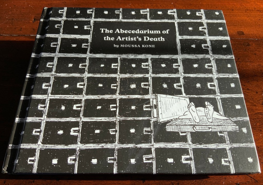
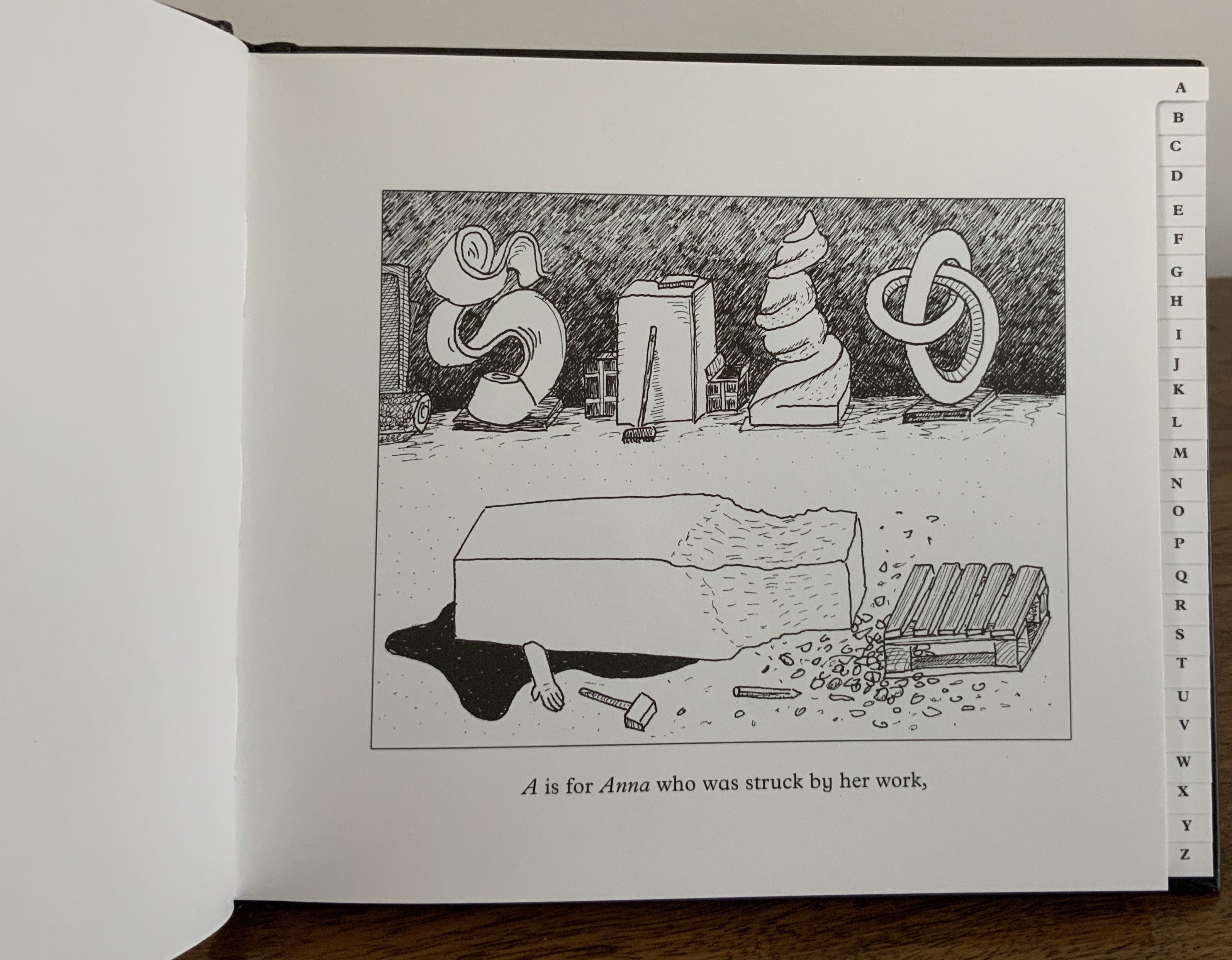
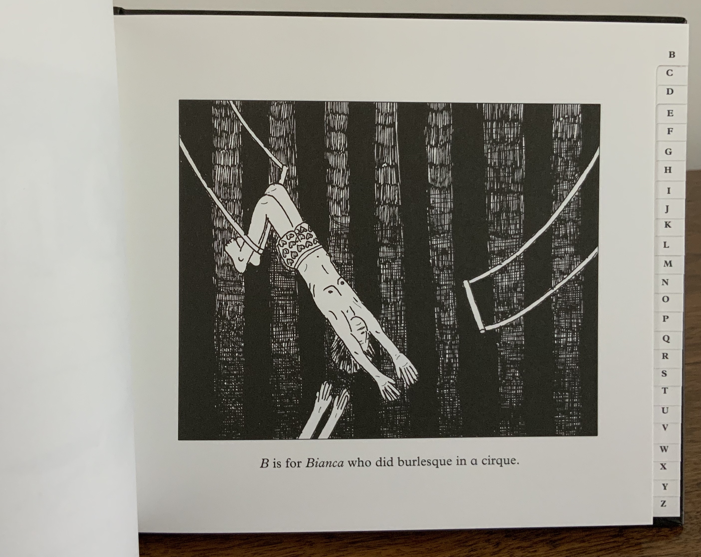
The Abecedarium of the Artist’s Death: 26 Dangers for Your Career (2014)
The Abecedarium of the Artist’s Death: 26 Dangers for Your Career (Verlag für moderne Kunst, 2014) Moussa Kone Hardcover, thread-bound, register-cut; layout by Martin Wunderer; 56 pages, 26 illustrations by Moussa Kone. H145 x W170 mm. Acquired from the artist, 11 December 2019.
An abecedary seems to be de rigueur for book artists. The usual accompanying humor and puns of book art manifest themselves here not only in the illustrations paying homage to Edward Gorey’s The Gashlycrumb Tinies but also in the structure of the little black address book and its alphabetic tabs.
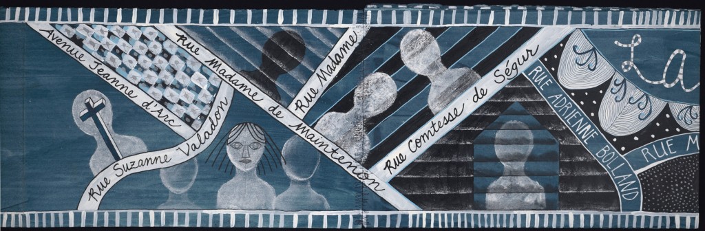
Nowhere Land (2017)
Nowhere Land (2017) Moussa Kone Map, offset printed on both sides. H152 x W112 cm. Acquired from the artist, 11 December 2019.
Nowhere Land follows on from The Abecedarium deeper into the realm of the outré. It was shown in the group exhibition Constructing Paradise, curated by Dieter Buchhart and Mathias Kessler at the Austrian Cultural Forum in New York (ACFNY), 31 January – 24 April 2017. The ACFNY’s announcement reads:
Constructing Paradiseexhibits contemporary reinterpretations of notions of the “exotic” by artists based in Austria or the United States. Taking iconic artworks such as Paul Gauguin’s Noa Noa and Oskar Kokoschka’s Tiger Cat as starting points, the show assembles a diverse range of work from early contemporary to more recent artistic responses to the modernist imprint of desire and fantasy on contemporary culture. Particularly when juxtaposed with hyperbolized images of modern-day advertising, the exhibition explores the psychological impacts of the modernist image on image culture and the Western psyche.
Photo: Courtesy of the artist.
Moussa Kone’s entry took the form of a Panoramic Map for tourists and was distributed among the exhibition visitors. The artist’s description is too arch and funny to paraphrase:
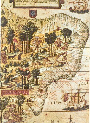
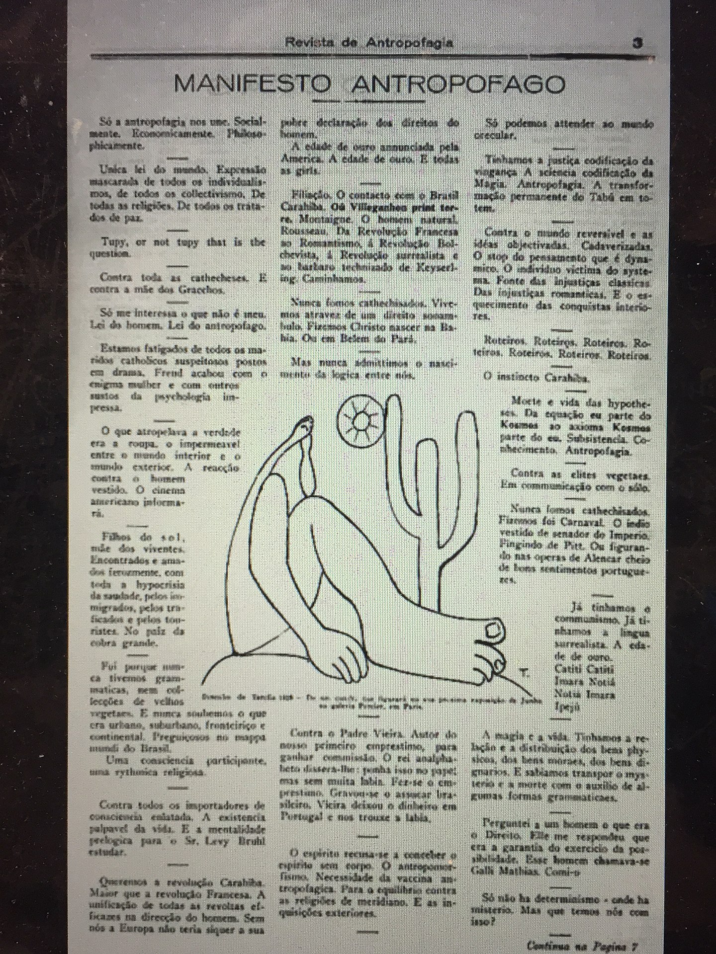
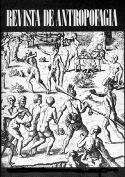
A nautical chart leads the reader to an island, where art historic images of the Brazilian Tupi people are combined with stills from 1980s Italian cannibal movies. It was the poet Oswald de Andrade, who declared in 1928 in his famous “Manifesto Antropófago” (Cannibal Manifest) a strategy of getting rid of the colonizer’s culture in Brazil through an exotic practice that was long attributed to the indigenous people.
Left: Image of the Brazilian coastline from Maranhão to the Rio de Prata, from the “Miller Atlas,” created in 1519 and currently in the French National Library in Paris. — Brazil: Five Centuries of Change (Brown University, 2010~). Accessed 14 May 2020. Center: Oswald de Andrade, “Manifesto Antropófago”, Revista de Antropofagia, 1928, p. 3. Accessed 17 May 2020. Right: cover, Revista de Antropofagia, Ubuweb. Accessed 17 May 2020.
The map‘s exuberance shares more with the satire of De Andrade and Swift than with the gratuitous violence of Ruggero Deodato’s cannibal films or that of their 21st century offspring.
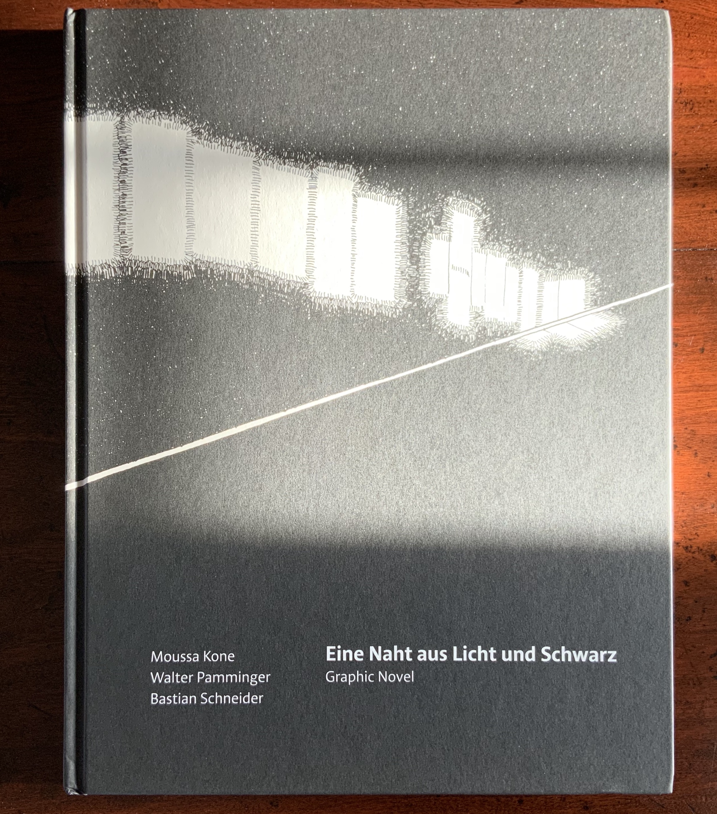
Eine Naht aus Licht und Schwarz (2018)
Eine Naht aus Licht und Schwarz (Sonderzahl Verlagsgesellschaft, 2018) Moussa Kone, illustrations; Walter Pamminger, concept; Bastian Schneider, text; Wolfgang Homola, graphic design. Hardcover, sewn; 96 pages, 176 illustrations. H303 x W235 mm. Acquired from the artist, 11 December 2019.
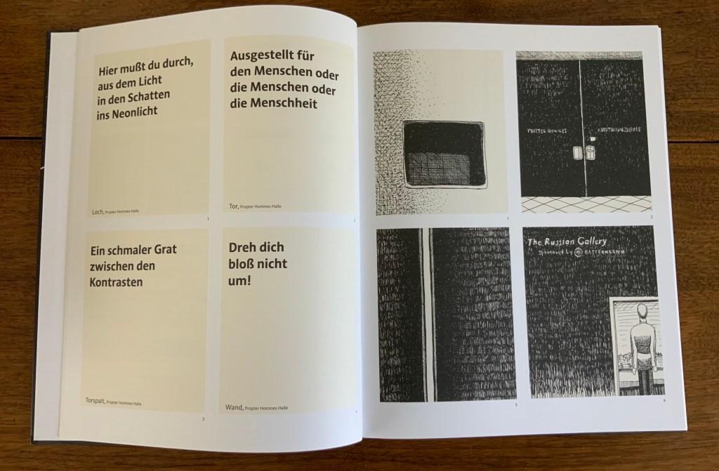
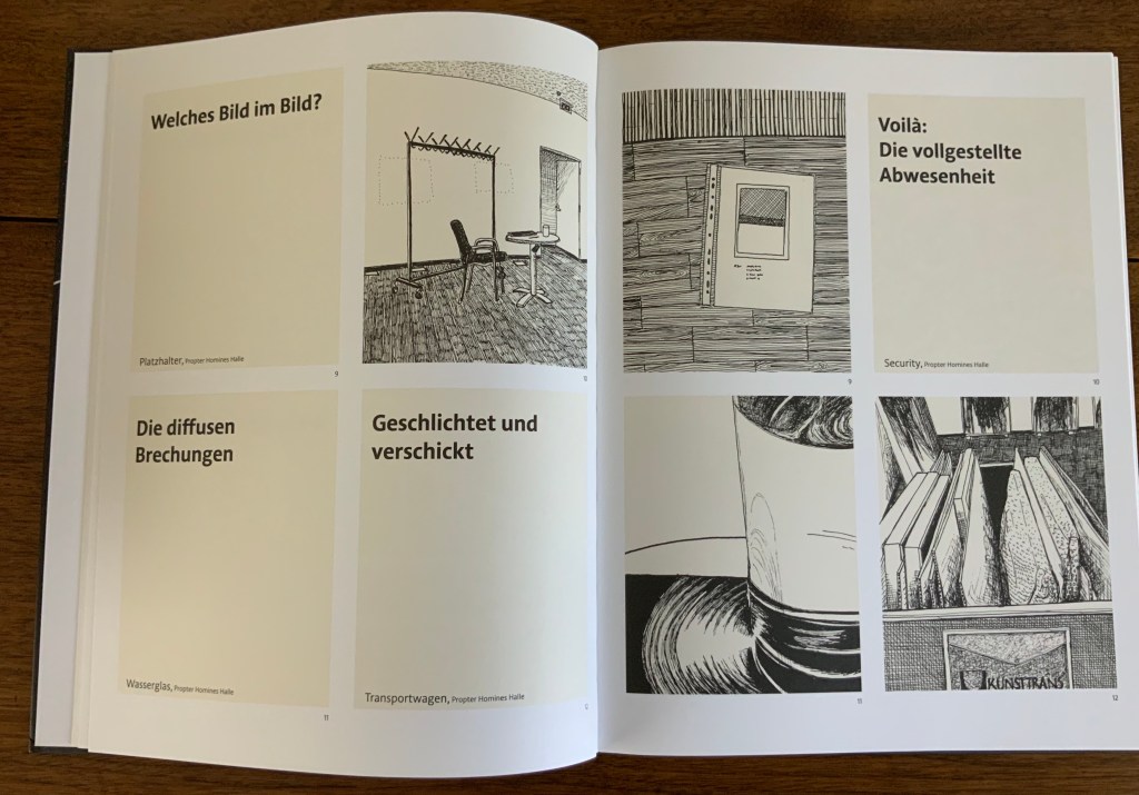
Although the creation of Eine Naht aus Licht und Schwarz (“A Seam of Light and Black”) was a collaborative effort, it originates in Kone’s experience working at the Albertina Museum in Vienna. He writes:
I was working there mainly at night and responsible for events, which took place in the rented Habsburg State Rooms and the exhibition halls. The entire book concept with its order of the drawings in this form was developed by Walter Pamminger, the texts are written by author Bastian Schneider.Image 1 to image 176 show a typical closing tour through the museum at 3 a.m. After all the party people, the catering staff and guards were gone, I had to make my final round through the empty building. Lights were turned off partly, and I was alone in the Viennese palace, with the art, and the history of the spot. That’s the story of the book: a view on the Albertina museum, which started as a private collection of drawings; a view from the worker’s perspective, the lowest one in the hierarchy of the institution, and the unseen labour, which is a hidden part of the art world. — Moussa Kone, correspondence, 18 December 2019.
But Eine Naht is more than that.
Text and image are arranged in a fluid grid of panels. The recto page above displays the starting pattern that appears and changes across the novel’s subsequent double-page spreads, challenging us in classic book-art fashion to re-learn how to read a book.
Panels 1-4 follow the opening diagram; four panels of text on the verso, with four panels of images correspondingly numbered on the recto.
On the verso, panels 5 and 6 shift to text then image; on the recto, the image in panel 5 corresponds to the text in panel 5 on the verso, and likewise the text in panel 6 on the recto corresponds to the image in panel 6 on the verso. Panels 7 and 8 follow the same pattern.
Here on the verso, panels 9 and 10 show text then image; on the recto, their corresponding panels run image then text. But panels 11 and 12 on the verso are both text; their corresponding panels of images appear across the gutter on the recto.
Again the pattern changes, with panels 13 and 14 both containing images, 15 and 16 containing text, and their matching panels of text and images mirrored on the recto.
The strong tendency to read a single page from left to right and downwards relents after a few sets of double-page spreads, but the change-ability of the back-and-forth between verso and recto requires a longer adjustment. Completely fluent adjustment would be hard to credit, but disorientation and the effort to concentrate, look harder and dwell on the relation between image and text becomes part of the atmosphere of the book. A partial translation into English exists online, which conveys the effect.
Kone’s range — from the intricacy of “Etymology” to the slapstick of The Abecedarium and Nowhere Land to a blend of conceptualism, self-reflexive book art and a twilight melancholy atmosphere in Eine Naht — makes his work an welcome addition to the collection.
Kone, Moussa and Walter Pamminger and Bastian Schneider. Trans. Verena Aschbacher. “A Seam of Light and Black“, Words Without Borders: An Online Magazine for International Literature, February 2020. Accessed 17 May 2020.
Artist, curator and historian Jeffrey Abt wrote that the “irresistible” idea of placing an exhibition of artists’ books alongside the University of Chicago Library’s collection “broadly representative of the history of the book” started with a visit to famed art dealer Tony Zwicker‘s studio. It was also, however, almost as if he were taking a cue from this statement by artist-printers Betsy Davids and Jim Petrillo just the year before:
A representative collection of artists’ books often does not seem visually remarkable in a gallery, where a wide range of visual experience is the norm. The same collection, installed in a library or bookstore, can seem visually startling almost beyond the limits of decorum. — “The Artist as Book Printer: Four Short Courses” in Artists’ Books: A Critical Anthology and Sourcebook, edited by Joan Lyons (Rochester, NY: Visual Studies Workshop Press, 1985).
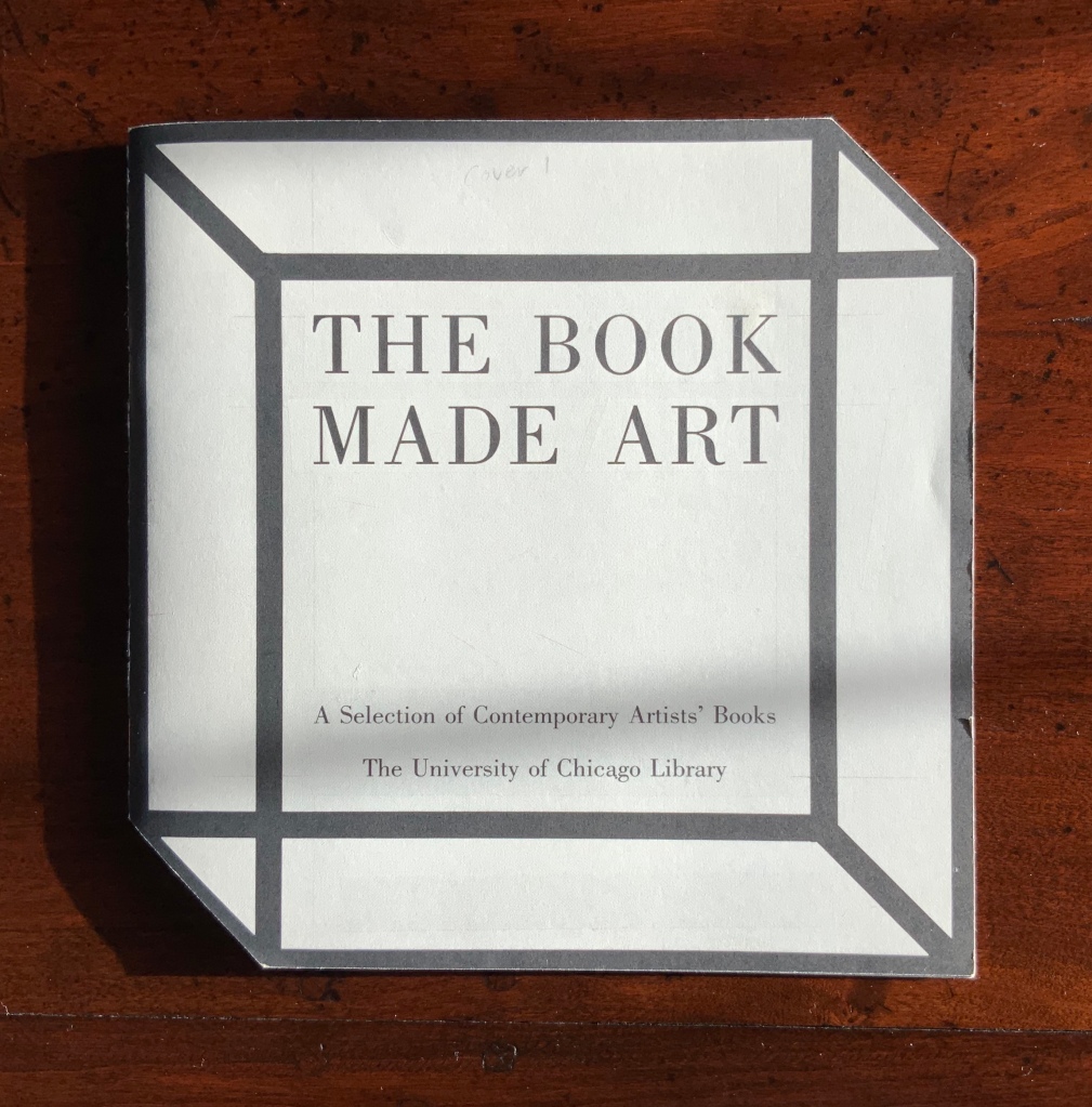
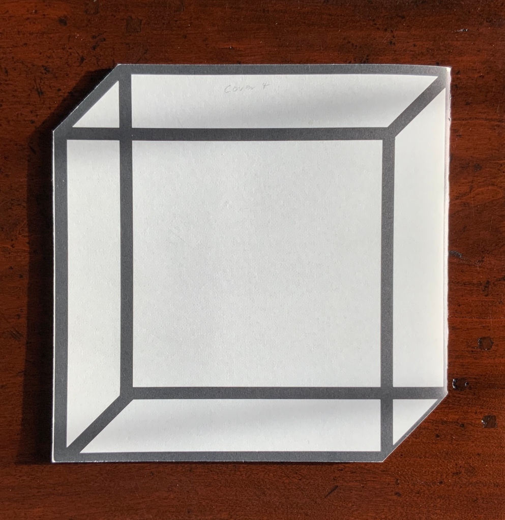
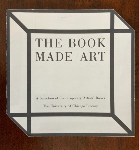
The handful of images below would lead anyone to suspect that the 49 works (many loaned by Zwicker) were selected to startle and, in a subtle way, challenge the notion that ”a representative collection of artists’ books often does not seem visually remarkable in a gallery”. The peculiar shape of the exhibition catalogue deepens the suspicion. The rest of its design and identity of its designer — Buzz Spector — clinch it.
While Abt’s introductory essay rings the historical changes on the roots of book art — once there was Mallarmé’s Un Coup de Dés, but before Mallarmé, there was William Blake — the works included and the catalogue’s design ring some chimes of their own about book art. One way or another, all book art self-consciously draws attention to some particularly bookish element. For the most part, the 49 works listed in the catalogue ring true. The catalogue design itself, however, chimes not only to that notion of self-reflexiveness but also to wider notions about the nature of book art within contemporary art.
Not long after this 1986 exhibition, Spector wrote of “the language of the book” and all its parts — pages, signatures and cover as well as its letter forms and their placement on the spread page — as having a syntax. With its pencil-circled numbers, alignment guides, pastedowns and other designer’s marks appearing throughout — as if a printer’s devil had run amok and let the marked-up proofs go to press unchanged — the catalogue draws attention to that syntax, the underlying processes of bookmaking and and this object’s “bookness”. The colophon’s note initialed by Jeffrey Abt to Buzz Spector and “pasted” on the last page seals the self-reflexive joke of the markings throughout the catalogue.
Page 36 and cover 3 from The Book Made Art (1986) Permission of the curator and designer.
The second chime comes in the catalogue’s verbal and visual punning. Like book art, punning is self-reflexive, words playing on words. The title ”the book made art” can be read with different meanings: “the book made into art”, “art that is bookish” and so on. The catalogue’s trim and two-dimensional representation of three-dimensions create the visual pun of a glass or white cube. The verbal and visual puns also play with Abt’s “irresistible” context. Here in the Joseph Regenstein Library was an exhibition catalogue, teasing the viewer with a reminder that vitrines separated them from the bookworks. Reviewing two other exhibitions of book art, Spector elaborated explicitly on his visual tongue-in-cheek irony:
The dilemma in staging exhibitions of books as art objects is the denial of access to the work that conservation necessarily demands. … and it is a morethan passing irony that implications of hermeticism and elitism should surround books shown to a public using the library as a means of gaining access to texts. — Buzz Spector, “Art Readings” in The Book Maker’s Desire (Pasadena, CA: Umbrella Editions, 1995), p.13.
The catalogue also teases with its title and design by suggesting that once books have been placed on display like this, the setting is no longer a library but a “white cube gallery“. As the catalogue progresses, black-and-white photos of items from the exhibition appear on the verso page in frames that appear to be hanging on the trompe l’oeil cube’s rear wall.
Pages 14 and 20 of The Book Made Art (1986) Permission of the curator and designer.
But a viewer standing in the “brutalist” construct of the Regenstein Library and holding this catalogue of The Book Made Art might have asked, “What makes these objects I cannot touch — or, in some cases even if I could, cannot read — art?” There is the catalogue’s third chime. From the start, book art has faced a constant definitional or identity crisis and even the challenge “but is it art?” The catalogue’s title echoes Lucy Lippard’s Duchampian proposition: “It’s an artist book if an artist made it, or if an artist says it is”. The catalogue’s design says, “This is the gallery, these are the objects on display in it, they are art”.
The “white cube gallery” brings on a fourth and final ironic chime. In the 1970s and early ‘80s, artists’ books were pitched as a “democratic” medium and means by which art could escape the clutches of the gallery and reach a wider public. In another catalogue — the one for the 1973 Moore College exhibition, nominated as the first of book art — John Perreault writes:
Books as art, from the artist’s point of view and the viewer’s point of view, are practical and democratic. They do not cost as much as prints. They are portable, personal, and, if need be, disposable. Because books are easily mailed, books as art are aiding in the decentralisation of the art system. — John Perreault, “Some Thoughts on Books as Art”, in Artists Books, Moore College of Art, 23 March – 20 April 1973 (Philadelphia, PA: Moore College of Art, 1973), p. 21.
By the mid-80s, lo and behold, The Book Made Art’s catalogue-cum-gallery jokingly recaptures “books as art”. And in a further irony, by the mid-80s and since, the increased rareness and price of such bookworks have made them into galleries‘ and museums’ expensive objects of desire.
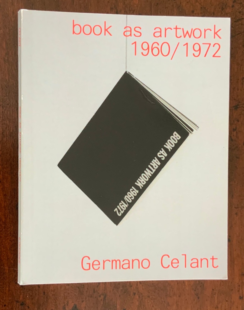
With the catalogue for The Book Made Art being so scarce and with its inclusion of images of only 13 of the 49 works displayed, it is difficult to reconstruct and imagine what the exhibition must have been like. Why try? By the mid-80s, book art had opened its arms to a variety of works not existing in the 1960s to mid-70s when the Moore College of Art and the Nigel Greenwood landmark exhibitions occurred. From what the catalogues for Dianne Perry Vanderlip’s Artists’ Books and Germano Celant’s Book as Artwork: 1960/72 convey, from the images for each that can be found, the experience in Philadelphia and London must have differed greatly from that in Chicago with The Book Made Art.
What follows is a resource for comparing and contrasting The Book Made Art with the two earlier catalogues. Although he is present in The Book Made Art through Spector’s Altered LeWitt entry, Lewitt and many of the earlier catalogues’ illuminati are missing: Art-Language (Atkinson, Baldwin, Burn, Hurrell, Kosuth and Ramsden), Carl Andre, John Baldessari, Mel Bochner, Stanley Brouwn, John Cage, Robert Filliou, Mario Merz, Bruce Nauman, Claes Oldenburg, Tom Phillips, Dieter Rot, Ed Ruscha, Daniel Spoerri, Lawrence Weiner and Emmet Williams. These omissions leave The Book Made Art with fewer works that are purely text-based, algorithmic or typographic (as in construction poetry). The overarching impression — urged on by Spector’s inspired design — is that The Book Made Art emphasizes more of the painterly and sculptural and offers a new group of claimants to the circle of book art illuminati: Beube, Broaddus, Löhr, Share, Smith, Spector, Van Horn and several others shown below.
In addition to images retrieved or provided by the artists, links to information about the artists, to sources or images of the displayed work or to images of similar work are offered. Where possible the links provided are persistent links (avoiding “Page Not Found” messages). As with the online annotation of Celant’s Book as Artwork: 1960/72 (see Further Reading), this one offers some comparison/contrast links to earlier and later bookworks to aid in appreciating continuities and departures.
Also under Further Reading, Jeffrey Abt has kindly provided additional context about the roles played by Tony Zwicker and Robert Rosenthal, Curator of Special Collections at the University of Chicago Library, in making The Book Made Art possible.
Caveat lector/observator: Even with a work’s measurements supplied by the catalogue, it is difficult to call to the mind’s eyes and hands the presence of the object — even harder to imagine the experience of an exhibition and its environment. Measure or scale is not the only issue. As one of the artists below — Timothy Ely — puts it: “Time is scale” and “On the scale of time, some books may well last a thousand years and a drawing on a beach only a few hours. Exhibits end and fortunes change.” But then that’s why it’s called an essay.
The Artists and their Works
Algardi, Alessandro. L’Immagine della scrittura [maquette]. Milan? (1983). Paint and graphite pencil over paper; codex binding in calf; 12 leaves. Signed. 20 3/16” x 14 1/4” x 3/4”. [No image of the work found]
Some of Algardi’s works can be seen here and more extensively and clearly in the online version of Ubeir Peeters’ book Alessandro Algardi (2006), pages 112-20 in particular. As a maquette, L’Immagine della scrittura (“The image of writing”) would have required the viewer to project in the mind the executed work. Algardi’s work ranges widely in materials: acrylic, oils, cementite, titanium, vinyl tempera, emulsified canvas and from large paintings to oversized and lesser books constructed of overpainted card and even plexiglas in various bindings, including the accordion. His constant subject (the written word) and use of impasto make Algardi’s work distinctive.
Detail from 28 works, Mythos (1995) at MutualArt. Accessed 3 February 2020.
Allen, Roberta. The Traveling Woman, Book IV (1985). Paint and ink over paper; codex binding with string loops and painted boards; 6 leaves. Signed. 8 15/16” x 6 5/8” x 5/8”.
The Traveling Woman, Book I (1985) Roberta Allen Photos: Courtesy of the artist.
Allen has provided images of Book I as all four books were similarly formatted. She notes, however, that the binding for all four books consists of archival paper, not boards. These artist’s books are one manifestation of The Traveling Woman oeuvre. Several stories from this vein of Roberta Allen’s imagination appeared in WhiteWalls, the magazine of writings by artists founded in Chicago in 1978, continuing up to 2002. In 1986, The Traveling Woman morphed into a novel.
The technique of roughly painted-over paper appeared among many of the works in The Book Made Art, thereby contributing to the exhibition’s painterly ambiance. While The Traveling Woman’s size is close to the US standard of 6 x 9 in., together with several other much larger painted-over paper bookworks, it must have created a colourful overall effect. It is a technique varying but traceable at least to the ‘70s if not earlier (for example, John Latham’s Skoob works) and continues today (for example, Bodil Rosenberg’s Vandstand).
Appel, Christian.Incontro di Dante con Beatrice (1983). Black-and-white and color photocopies, hand-coloured and mounted on binders’ boards; accordion-fold binding; 7 panels. Signed. 10 7/16” x 5 3/16” x 11/16”.
Appel is mentioned in the Umbrella archives as being associated with the short-lived review/cooperative KLAB, but there is little else online. This image of the encounter of Dante with Beatrice comes from the Walker Art Center Library (see the image’s lower right hand corner) and yields two of the seven panels of the twenty-edition work in accordion form, published out of Amsterdam by Da Costa Editions. Zooming in on the image behind the link, one can detect considerable and vigorous overdrawing. Vibrant turquoise, orange and lavender distinguish this work from these images of other works by Appel in the Bibliotheca Librorum apud Artificem. Appel’s Postkarten in the Joan Flasch Artists’ Book Collection shows up only in its slipcase.
Baltazar/Michel Butor.Zodiaque des Nuages (1984). Watercolor, ink, and pastel over paper; in codex gathering but not sewn; with rigid publishers’ cloth cover and slip case; 18 leaves with paper wrapper. Script in author’s hand. Signed by artist and author. With autograph postcard, decorated with collage, Butor to Baltazar, 10.19.85. 11 5/16” x 7 9/16” x 1 3/8”. [No image of the work found]
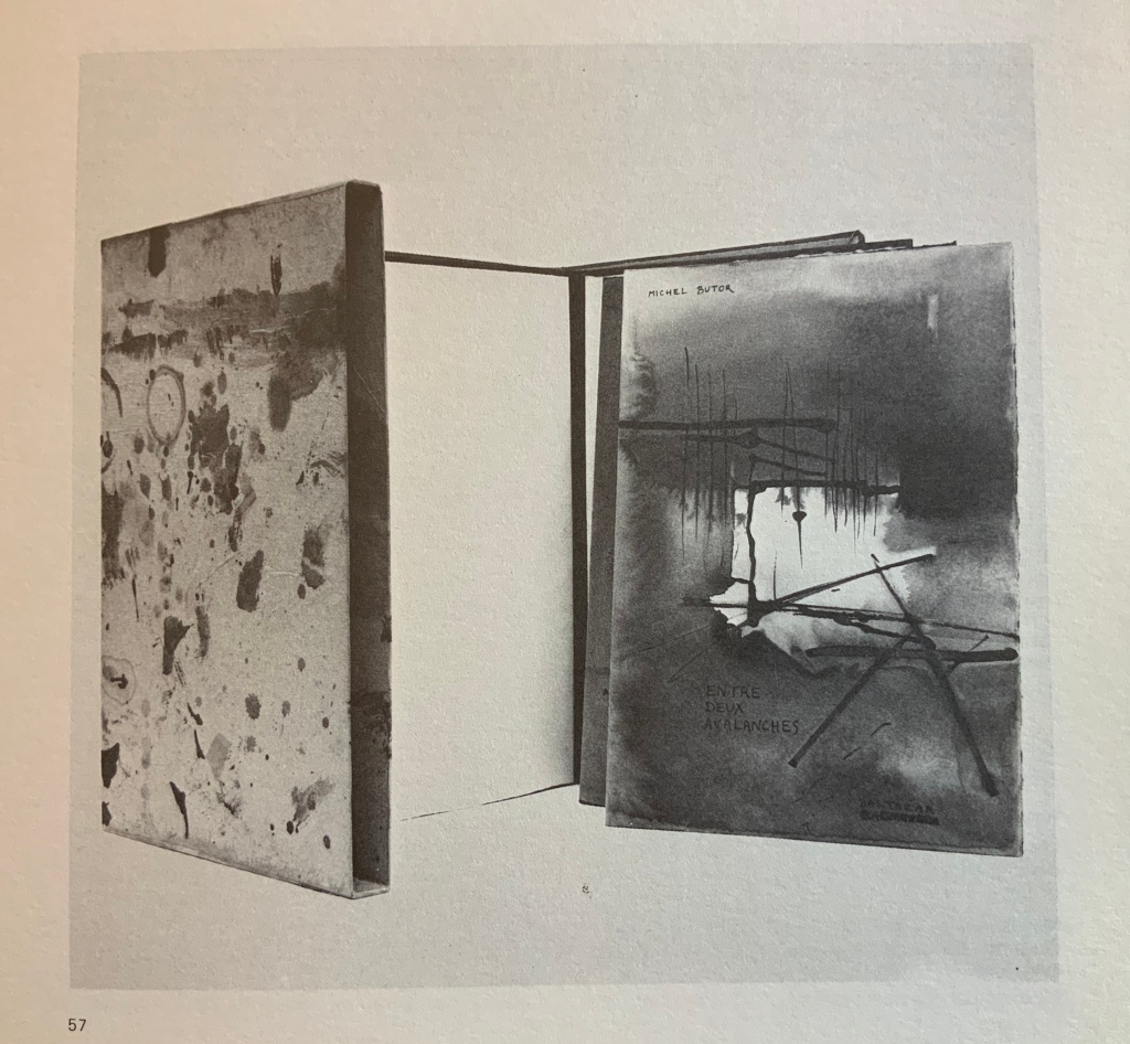
Baltazar is Hervé Lambion‘s nom de plume. He has created numerous livres d’artiste with many authors in addition to those with Butor. No online image of Zodiaque des Nuages is readily located. The image below shows a similar work: Entre Deux Avalanches (1980).
Two other artist’s books by Baltazar can be seen here in the Champetier Gallery, and several images and an analysis of another (with Butor’s text) — La main sur le mur — can be viewed here from the Koninklijke Bibliotheek in The Hague. Baltazar’s work with the author Michel Butor has been extensive enough to warrant this lengthy (but minimally illustrated) essay. As can be gathered from the images of these other works and from the essay, Baltazar’s contribution to The Book Made Art served as an exemplar of the traditional artist’s book.
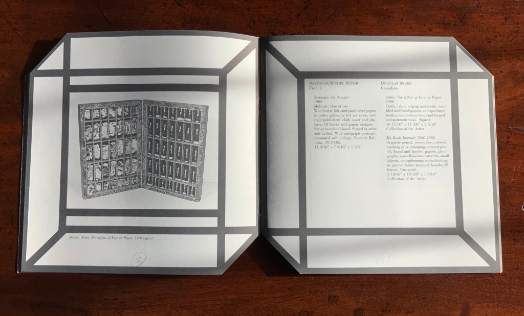
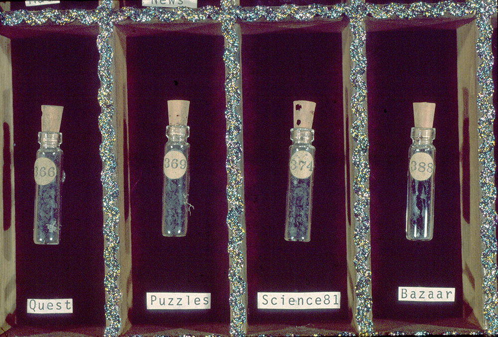
Beube, Douglas. Ashes: The Effect of Fire on Paper (1980). Cloth, fabric edging and cords, marbled and found papers, and specimen bottles; mounted on found and hinged compartment trays. Signed. 16 11/16” x 11 5/8” x 2 5/16”.
Pages 12 and 13 of The Book Made Art (1986) Permission of the curator and designer.
No online image seems available, and the one in the catalogue is black and white. Framed on the back wall of the page, it hangs there like a religious diptych. This work became the second in the M.A.D. trilogy (matches, ashes, dust), and full-color images of Ashes and the trilogy have been provided here by the artist. These can also be seen in full color and context in Beube’s Breaking the Codex (New York: Etc. Etc. The Iconoclastic Press, 2011), p. 186.
M.A.D. trilogy. Photo: Courtesy of the artist.
Beube has been extraordinarily inventive with the book as raw artistic material. His works have altered the codex form and deployed nearly every element of its “syntax” to address recurring political, social and philosophical themes. His outcomes range as well across larger sculptural works as well as action installations. Breaking the Codex documents the impression that Beube has foreshadowed and/or echoed nearly every variation of book art in play. With Beube’s Ashes and works below by Lori Christmastree, David Horton, Andrew Masullo, Anne Hicks Siberell and Paul Zelevansky, The Book Made Art gives a significant nod toward the tradition of the Cornellian “box” in book art (see “The Box from Duchamp to Horn” in Further Reading below).
____________. My Book Journal: 1980-1982. Graphite pencil, watercolor, coloured marking pens, stamping, coloured pencil, found and layered papers, photographs, miscellaneous materials, small objects, and ephemera; codex binding in printed fabric-wrapped boards; 33 leaves. Unsigned. 5 13/16” x 10 5/8” x 1 9/16”. [No image of the work found]
Images of bound sketchbooks from other date ranges can be found on the artist’s website. Here is Sketchbook #1: My Book Journal (1979), which comes closest to the work described for the exhibition.
Sketchbook #1: My Book Journal (1979) Doug Beube Collage, fabric, paper, gouache, graphite, water color, thread, silver gelatin print, rubber stamp. H6 x W10 x D2 1/2 in.
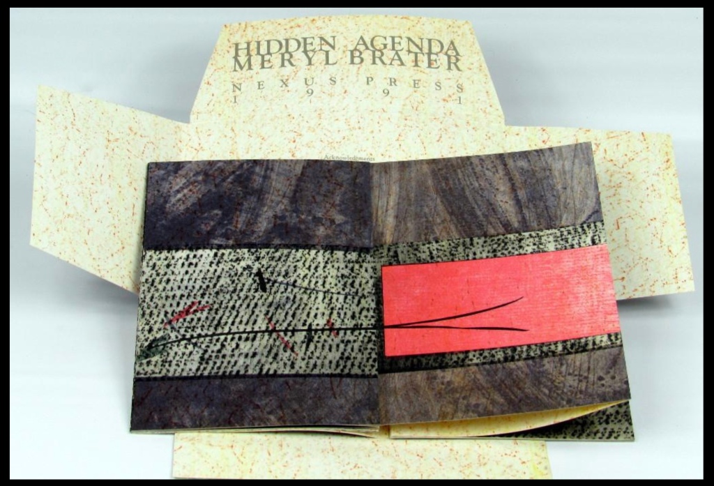
Brater, Meryl.Black Pool White Pillow #2 (1984). Graphite, graphite pencil, coloured pencil, and printing ink over paper with ribbon ties; combination codex and accordion bindings; four principal panels. Signed. 23 7/8” x 16 11/16” x 1 5/8”. [No image of the work found]
As described in the catalogue, this work combined codex and accordion structures. Another of Brater’s works — Hidden Agenda — appears to do the same but adds a protective four-fold envelope. The accordion form is well represented among the catalogue’s entries: Appel, Brater, Haynes, McCarney, Polansky, Robinson, Schnabel, Senser, Van Horn and Vogel.
This image of Brater’s Hidden Agenda (1991) appeared on AbeBooks (23 January 2020); a thumbnail image of the same appeared on Printed Matter’s website the same date; and an exterior-only view can be found in the Joan Flasch Artists’ Book Collection.
Broaddus, John Eric. Meridian Passage (1979). Paint and ink over paper; codex binding in painted boards; 9 leaves. Unsigned. 22 7/16th x 22 3/8” x 7/8”.
This unique work now resides with the Fine Arts Museums of San Francisco. Its record is “John Eric Broaddus, American, 1943–1990. Meridian Passage, 1979 Unique book, each page hand painted with acrylic, tempera, watercolor, and ink with abstract cut-outs Folio: 572 x 616 mm (22 1/2 x 24 1/4 in.) L15.99.2“.
Along with Allen’s, Apple’s and several others’ works below, the bold colours and cutouts of Meridian Passage underscore the painterly and sculptural nature of the book art celebrated by The Book Made Art. Despite the strong theme of democratic multiples around him, Broaddus explored the unique bookwork. Meridian Passage and the next work by Broaddus are unique, not limited editions or multiples.
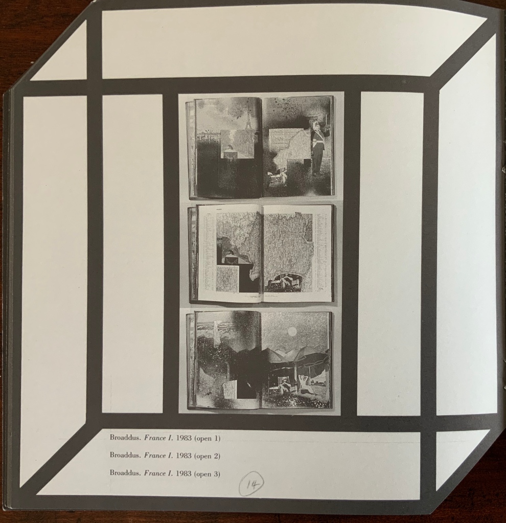
____________. France I (1983). Found printed codex [popular geography] altered with paint, ink, coloured pencil, glitter, and cutting; with painted slip case and painted cloth outer wrapper; 104 leaves. Signed. 12 1/8” x 9 1/16” x 1 11/16”.
At 104 leaves, this was one of the larger works in the exhibition. The three small black-and-white images of double-page spreads in the catalogue do not do the work justice, nor does the one in The Cutting Edge of Reading by Renée Riese Hubert and Judd D. Hubert. With the latter, however, we have this bit of description to aid in visualising the work:
By cutting away large sections of pages, Broaddus playfully establishes astonishing connections between well-known monuments as well as between them and his own imaginative creations. … By clever cutting, a cute photograph showing children observing an artist drawing, it would seem, their portraits, metamorphoses on the other side of the leaf into a gigantic statue consisting of Watteau’s famous Arlequin partly framed within a dark blue Broaddus abstraction. — Hubert, Renée Riese, and Judd D. Hubert. The Cutting Edge of Reading: Artists’ Books (New York: Granary Press, 1999), p. 230.
Best of all, though, for visualising the work, we have the tribute video from the Jaffe Center for Book Arts, which includes full-colour images and discussion by the Huberts and others.
Christmastree, Lori.You Have to Break the Glass to Get Out (1984). Graphite pencil, colored ink, watercolor, found materials, and glass shards over layered papers; unbound in double-lidded box with ribbon ties; 9 leaves. Signed. 25 1/4” x 19 1/8” x 2 3/16”.
You Have to Break the Glass to Get Out (1984) Lori Christmastree Photos of pages 3, 6 and 7: Courtesy of Misha Tomic via Buzz Spector.
Much of Lori Christmastree’s work and documentation of it were destroyed in a house fire. The artist Misha Tomic, her partner, kindly provided the images above, which echo her other works’ characteristic use of collage, ink and watercolour.
Crawford, Elsie. Willow Waterway (1985). Colored ink over wood veneer-backed paper scroll mounted on wooden dowel with leather tie; with hollowed-out tree stump case. Unsigned. 6 1/2” x 4 5/8” x 4” [No image of the work found]
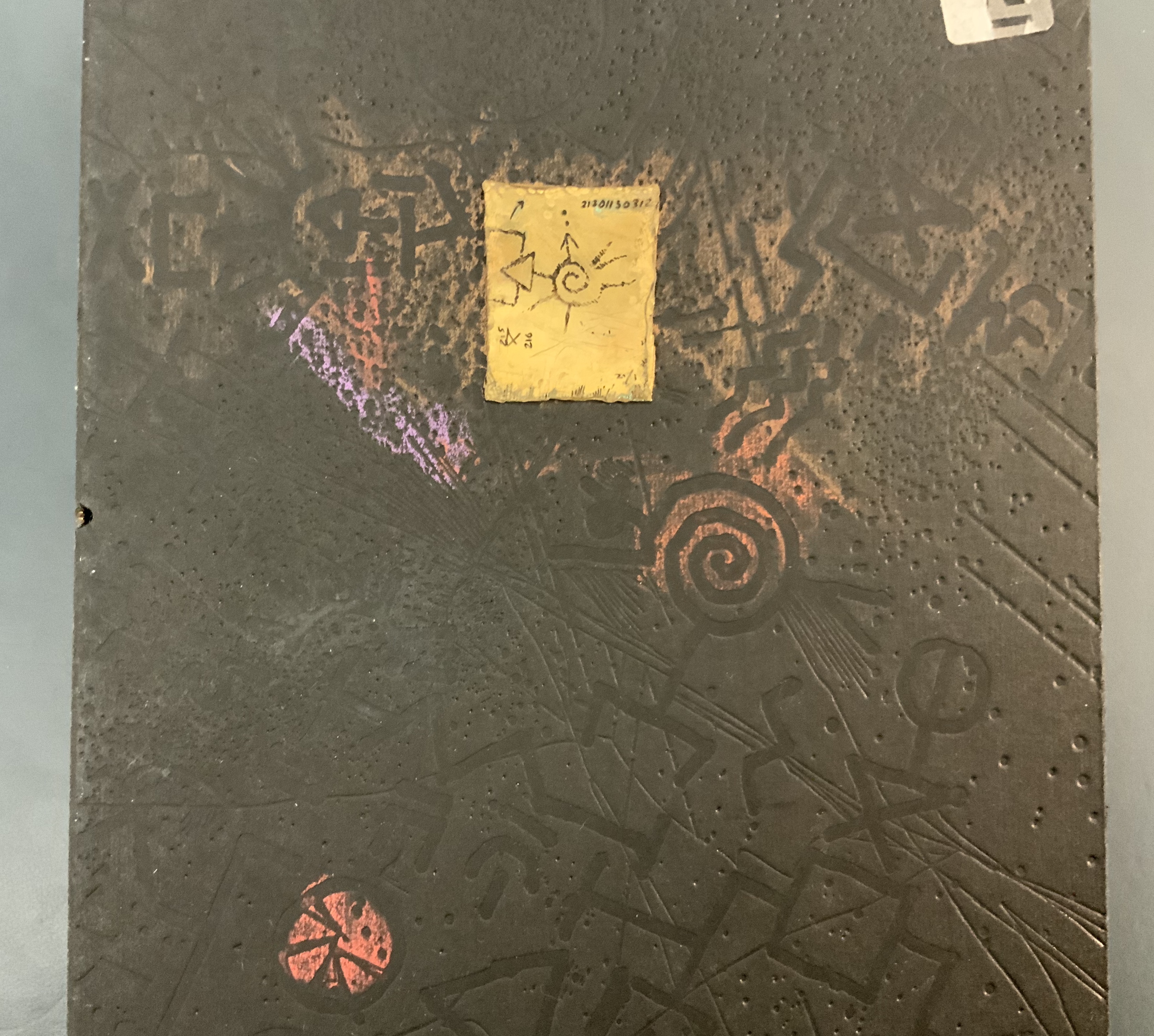
Ely, Timothy C.Field Points 3 (1985). Ink and watercolor over pigment, foil-stamped, and embossed paper; in codex binding with painted boards with collage elements, and pigment and foil stamping; in drop-spine book box with buckram covering; 26 leaves. Signed. 16 3/4” x 11 5/16” x 1 1/2”. [No image of the work found]
Synesthesia, a work that in some ways exemplifies Ely’s output but in others does not, provides a stand-in here. It contains drawn and painted images by Timothy Ely and text by Terence McKenna. The typography and printing are by Philip Gallo and The Hermetic Press; the binding is by Daniel E. Kelm and The Wide Awake Garage; and the publishing, by the Granary Press. It is a limited edition (75). Note the precision of production, especially in the binding, as well as the distinctive effect of ink and watercolor over pigment. Compare it with the Baltazar/Butor work above. This is a distinctively American livre d’artiste.
Synesthesia (1992) Timothy C. Ely Bound between black boards blind stamped with multiple symbols and shapes; boards have touches of copper, blue, and pink paint; copper triangle with symbols written on it is mounted on front board; exposed spine shows 3 bands of sewing attached at each end to a metal rod running through each board. In black cloth box. 250 mm in box of 270 mm. Photos: Books On Books.
Forget, Carol.The Diplomat’s Handbook (1981). White cloth gloves stuffed with miniature flags of various nations, sewn end to end. Signed on display instructions. 8 1/4” x 4 1/4” x 3 9/16”. [No image of the work found]
With its flag-stuffed gloves punning on its title, The Diplomat’s Handbook hands us the catalogue’s first “book-alluding object“. The use of gloves finds later echoes in the work of Jules Allen (below):
The Book of White (in progress) Jules Allen Kid leather gloves, hand made paper, housing a collection of utilitarian antiques and collectibles from the mid to late 20th century. H270 x W80 x D50 mm
Forget’s tongue-in-glove tendency is evident from these images of another work — Margin Release (1976), a collection of loose cards (no binding, thus releasing the margins) — and from the New York Times’ mention of yet another of her works: “A Formica steak on a base of shredded newsprint, for instance, is titled ’Model for the Historical Novel (Meat Plus Filler)’ by the artist Carol Forget of New York.“
____________. VHF Salvation (1984). Found printed codex [Bible] altered with cloth ribbons. Signed on display instructions. 11 3/8” x 5 11/16” x 1 5/8”.
VHF Salvation (1984) Carol Forget
The caption for this work tantalisingly refers to signed display instructions. With that (and unable to enact the instructions), the viewers must have felt their noses being rubbed in both the catalogue’s joking “vitrine” and the exhibition’s real glass case. It is a guess that the instructions helped the viewer to decipher this instance of an “altered-book object” (or, in keeping with its spirit, an altared-book object) that preserves the altered book.
VHF Salvation is a King James Version of the Holy Bible altered with a multitude of ribbon placeholders protruding from its lower edge to provide the “very high frequency” means of “saving one’s place“. In a special issue of Visible Language, Renée Riese Hubert describes the work as an “aggressive antibook” (p. 130). Even though VHF Salvation preserves the book being altered — unlike Beube’s Ashes diptych (above), which alters the book or books beyond recognition — some viewers might nevertheless have felt as uneasy as some viewers of Meg Hitchcock’s more aggressive alterations of the Bible, Koran and Bhavagad Gita.
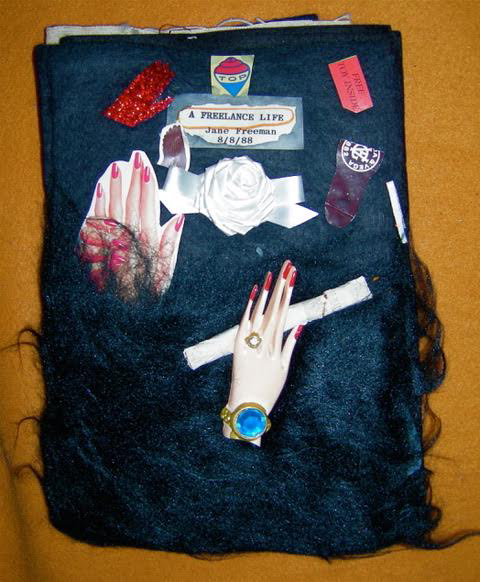
Freeman, Jane. The Book of Sisters (1978). Watercolor and color marking-pen ink over collage elements including packaging ephemera, postcards, clippings from magazines and books, and photographs; in codex binding with cloth-covered boards and fore-edge ties; 23 leaves. Unsigned. 5 9/16” x 8 7/8” x 1 9/16”.
The Book of Sisters (1978) Jane Freeman Photo: Courtesy of the artist.
As with Forget’s work, images of Freeman’s early works are hard to find. The description of the 23 leaves as a collage of packaging ephemera, postcards, magazine and book clippings and photographs — all covered by watercolour and colour-marking pen ink — serves well to capture Freeman’s approach in these additional images of another work — A Freelance Life (1988).
A Freelance Life (1988) Jane Freeman 9” x 6 1/2“ Photos: Courtesy of the artist.
____________. Worse Verse (1983). Found printed codex [poetry] altered with watercolor, color marking pen, and collage elements including string, postage stamps, and clippings from magazines and books; in codex binding in publisher’s cloth altered with paint; 12 leaves. Signed. 8 13/16” x 5 3/8” x 9/16”. [No image of the work found]
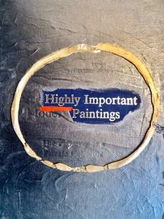
The New York Center for Book Arts shows four images of another work by Freeman — New, Improved (1985) — which is an altered Sotheby Parke-Bernet Inc. fine art auction catalogue. The artist has provided images of a similar work — Highly Important Paintings (1985) — shown below. With their heavily overpainted layers of acrylic and gouache obscuring and/or revealing parts of the underlying work and text and with tipped-in images and found bits of ephemera, these two works likely give an impression comparable to Worse Verse.
Highly Important Paintings (1985) Jane Freeman Auction house catalogue, each page collaged and painted. 10 1/4” x 8” closed. Photo: Courtesy of the artist.
As mentioned in the entry for Roberta Allen, the technique of painted-over pages has been widespread. So has the technique of painting over book and magazine pages and selectively allowing text to show through. Tom Phillips’ A Humument is perhaps the best known of the type that creates a new novel, a type not represented in the Chicago exhibition. The type that comments on the underlying form and content is well represented by Broaddus and Freeman.
Hartmann, Werner. Krankengeschichten (1979). White pencil over slate; assembled in cloth sleeves in codex format in cloth wrapper with ties; 10 slates. Signed. 11 5/16” x 7 7/8” x 2 1/4”.
In the catalogue, two images show Krankengeschichten (“Medical Records”) closed and open. Closed, it is a codex shape made up of page-size cloth sleeves; two cloth ties hold it closed like a hospital gown. Open, it displays one of ten dark slates removed from its sleeve and showing white-pencilled text and an image (a cross section? an X-ray?). Hartmann worked with images on slate in at least two other instances, but nothing as book-like as Krankengeschichten.
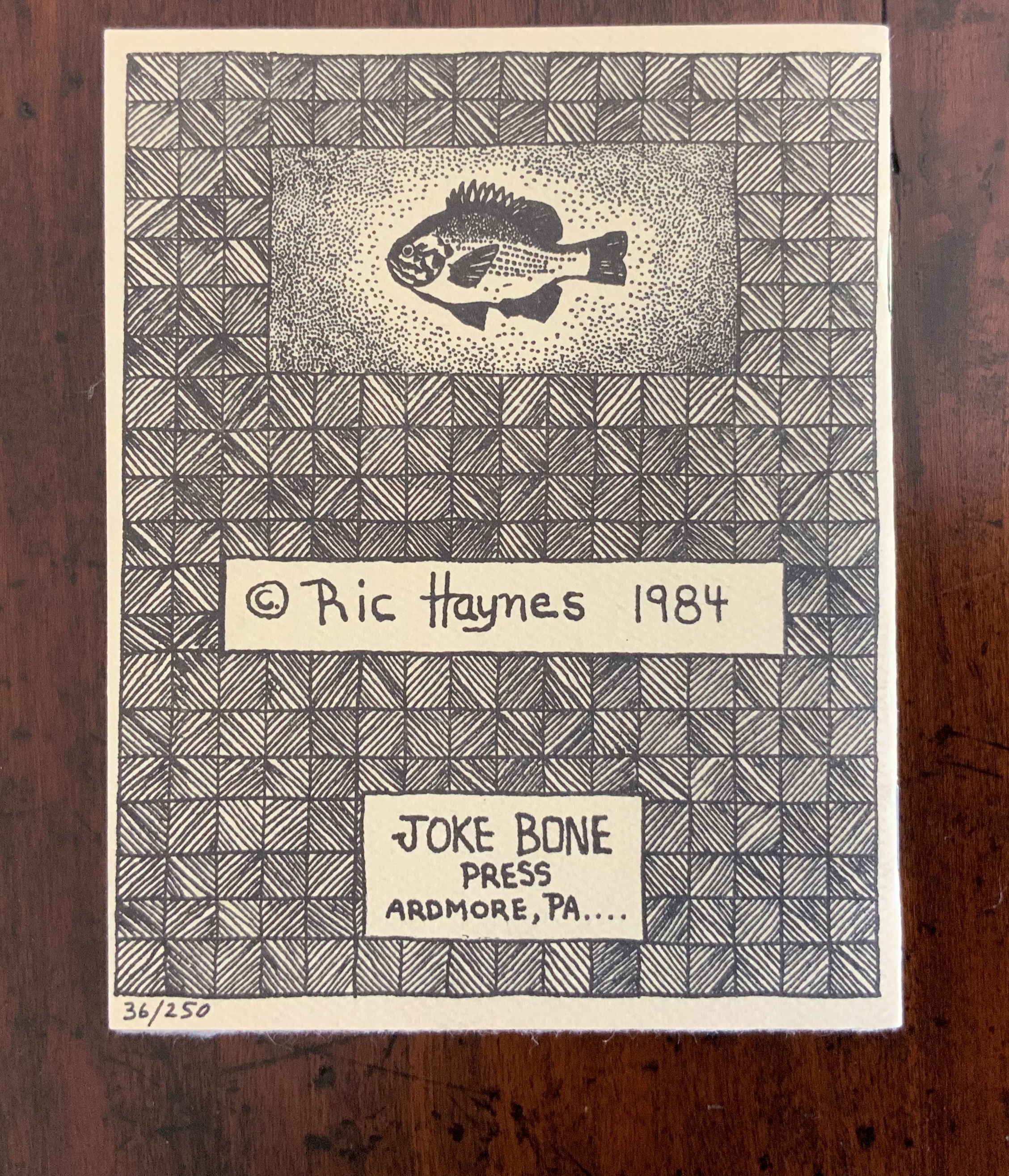
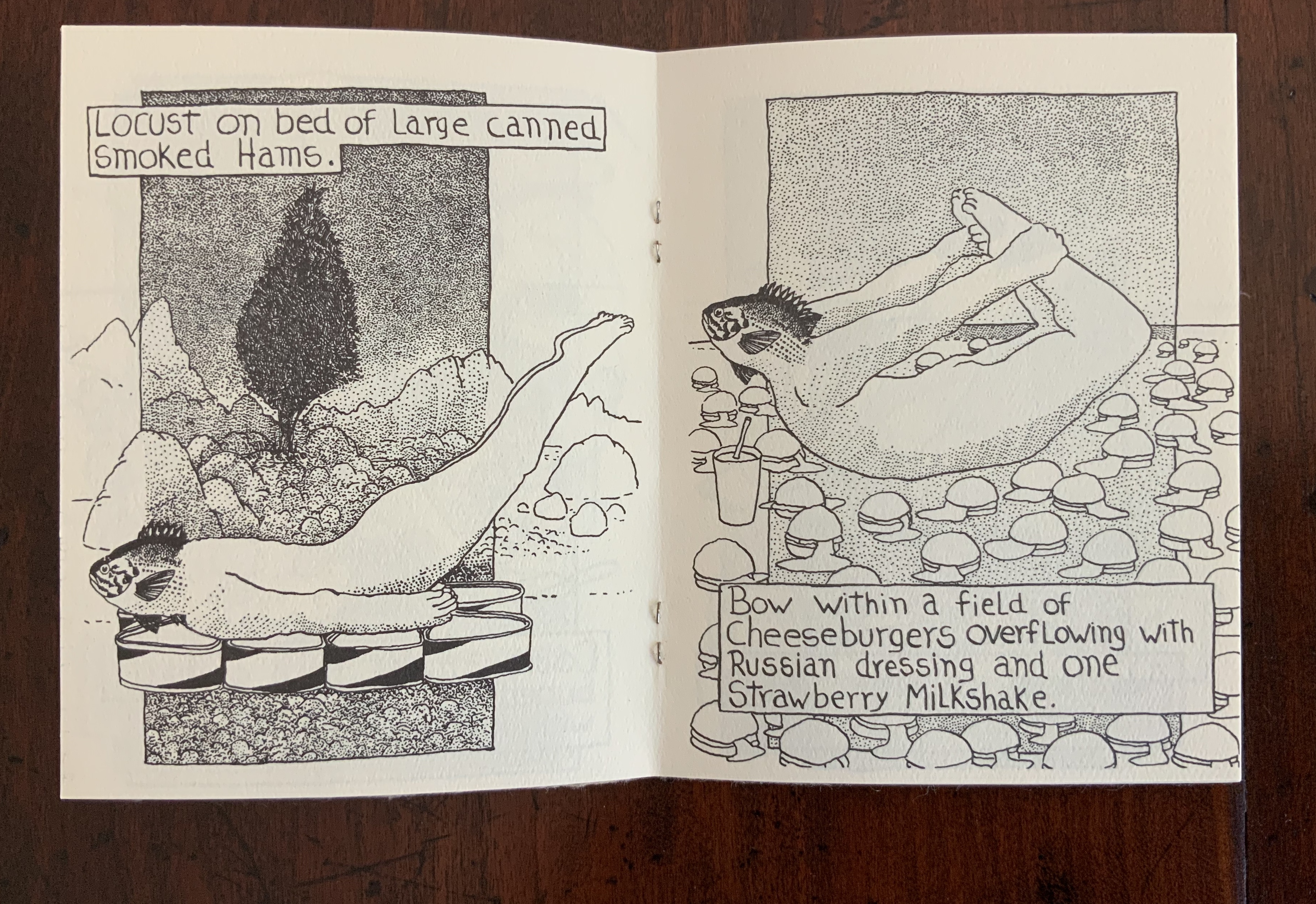
Haynes,Ric.Early Fish (1984). Paint, ink, and rubber stamping over layered papers in combination with decorative and marbled papers; in accordion-fold binding with rubber stamping and marbled-paper decorated slip case; 8 panels. Signed. 9 5/16” x 20 1/4” x 4 1/2”. [No image of the work found]
The description of Haynes’ entry conjures a work very different from his other work self-published under his Joke Bone Press imprint. With no image of Early Fish readily discoverable, Haynes’ Aquatic Yoga with Dangerous Foods (1984) may serve as an alternative with which to imagine what Early Fish depicts and to have a sense of Haynes’ sense of humor as well as to remind us of humor’s presence throughout The Book Made Art.
Photos: Books On Books Collection.
Aquatic Yoga subjects a number of targets to parody — including the New Age as well as the artist’s book as democratic multiple. His anecdote recounted in The Sun (March 1984) captures this:
Ric says that when he first published the book, “I took it to a ‘New Age’ bookstore and was thrown out for being insulting to the Art and Life of Yoga. However, I know that Yoga people, like the rest of us, get off on a nice chocolate mint-chocolate chip ice cream sundae with kaluha syrup on top and a shot or two of creme de cacao on the side once in a while. Maybe at least they dream of it. I am sure.” — The Sun (March 1984).
Although Aquatic Yoga has the irreverence of R. Crumb’s Mr. Natural (1970-77) and Fritz the Cat (1969), the description of Early Fish implies a nod toward the sort of livre d’artiste exemplified by Max Ernst’s Une Semaine de Bonté (1934) and Ludwig Zeller’s Alphacollage (1979). Continuing in this tradition are book artists such as Moussa Kone and Francesc Ruiz.
Hines, Kay. The Endless Filmscript [drehbuch] (1978). Found objects and motion-picture film altered with ink and mounted as a Möbius strip. Signed. 29 1/2” X 8” x 13 5/8”.
The Endless Filmscript [Drehbuch] (1978) Kay Hines Photo and video: Courtesy of the artist. Click on the image or title to see the video.
Along with her partner Dieter Froese (d.2006), Hines pioneered video installation art and co-founded Dekart Video. Both were part of the Fluxus movement. Displayed in the same space as Jana Kluge’s Untitled (see below), this loop of film altered with ink and mounted as a Möbius strip would certainly have contributed to the exhibition’s startle factor. The video behind the link shows the work more clearly and includes its reading by the performance artist Arleen Schloss. What a boon to book art exhibitions if each work displayed under glass were accompanied by similar videos.
Hines writes that the inspiration for The Endless Filmscript was twofold:
It was based on 2 concepts. One I wanted to correlate individual film frames with alphabet letters. And two, I was interested in the Möbius loop concept where the last sentence of a story leads back to the first. — Correspondence with Books On Books, 31 March 2020.
The Möbius strip is not uncommon in book art. Two outstanding examples are Daniel E. Kelm‘s Neo Emblemata Nova (2005) and Doug Beube’s Red Infinity #4 (2014). But combining the use of film with the allocation of one letter per film frame is one of the more uncommon challenges in book art to the page as a syntactic unit.
Hocks, Paula.No Caryatids(1982). Multiple: one of two. Black-and-white and color photocopy reproductions of collages; in codex binding with publisher’s cloth with inner and outer cloth wrappers; 115 leaves. Unsigned. 9 1/16” x 10 11/16” x 1 9/16”. [No image of the work found]
Founder of Running Women Press, Hocks (d.2003) relied on a photocopier to reproduce imagery and text that was hand written, typed, or clipped from printed material. This seems to have been more of financial necessity than allegiance to the ”democratic multiple”. Images of her other works can be found here. The Otis College of Art and Design has images of four of her works, including Head and Bodies 2, which illustrate the likely techniques of No Caryatids. The Paula Hocks archive resides at the New Mexico Museum of Art Library.
Horton, David.In Celebration of the Discovery of the Abandoned Star Factory(1982). Multiple: one of thirty. Paper maché and electric motor in commercial salesman’s samples case; with cloth pouch containing: David Horton. In Celebration of the Discovery of the Abandoned Star Factory. Atlanta, Georgia. Nexus Press, 1982 [halftone illustrations and text printed lithographically with serigraphed designs over paper and string collages, and silver print (photograph); in codex binding in publisher’s cloth; 12 leaves]. Construction: unsigned. 11 15/16” x 15 1/8” x 5 11/16”. Codex: signed. 9 15/16” x 8 11/16” x 1”. [No image of the work found]
As noted in Ric Haynes’ entry, Horton can be associated with the comic or cartoon book tradition in book art. Although In Celebration does not fall into that category, it predicts Horton’s fictional character “Dr. Thelonious Tinker, Cosmic Archeologist”. According to Horton’s entry at William Paterson University, “In addition to making artifacts, appliances and notebook pages, he is currently drafting writings and drawings for a series of graphic novels on this character’s life and adventures“. This work by Horton with its commercial salesman’s sample case reflects the Duchampian “boîte-en-valise” tradition in book art, and its introduction of moving parts and motors reflects another sub-genre in the field. See Regan Avery’s The Groton Avery Clan (2014) or Doug Beube’s Dis/Solve(2018).
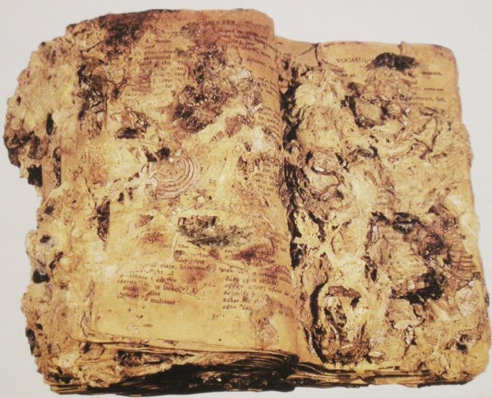
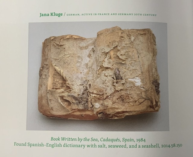
Kluge, Jana.[Untitled] (1984). Found printed codex [Spanish/English dictionary] altered with seawater borne vegetable and mineral matter. Signed. 4 9/16” x 5 7/8” x 1 11/16”.
The description above matches that for her work entitled se(e)a book (1984) displayed by Galerie Horst Dietrich in Berlin in 1987 as well as that for the description of the work entitled Book Written by the Sea, Cadaqués, Spain (1984) listed and shown in Odd Volumes: Book Art from the Allan Chasanoff Collection (2014). In correspondence with Books On Books, Kluge writes that the work was one of a series created over the summers of 1983-85 in Cadaqués, Spain. The technique or tradition in book art of creating a work by exposing it to the elements runs back to Marcel Duchamp’s Le Readymade Malheureux (1919) and forward to Mark Cockram’s Kintsugi (2013) and Decomp (2013) by Stephen Collis and Jordan Scott.
se(e)a book (1984) Spanish/English dictionary, covered under water with seaweed and seashells, being formed by movements of the sea, dried in the wind and by the sun); 23 x 18 x 7 cm. Photographer: Horst Dietrich. Photo: Courtesy of the artist.
Photo of page from Odd Volumes: Book Art from the Allan Chasanoff Collection (2014) Photo: Books On Books
From the late 80s though, Kluge felt another force impinging on the book form, and her work moved from collaboration with the elements to the communal and expanded into the digital. Her collaboration Gutenberg‘s Galaxy (2014) represents Marshall McLuhan’s themes of alphabetization, print culture and electronic medias altered by a “village” of artists employing audiovisual fantasies, video-works, digital art on paper and twelve electro-acoustical compositions.
Image: Courtesy of the artist
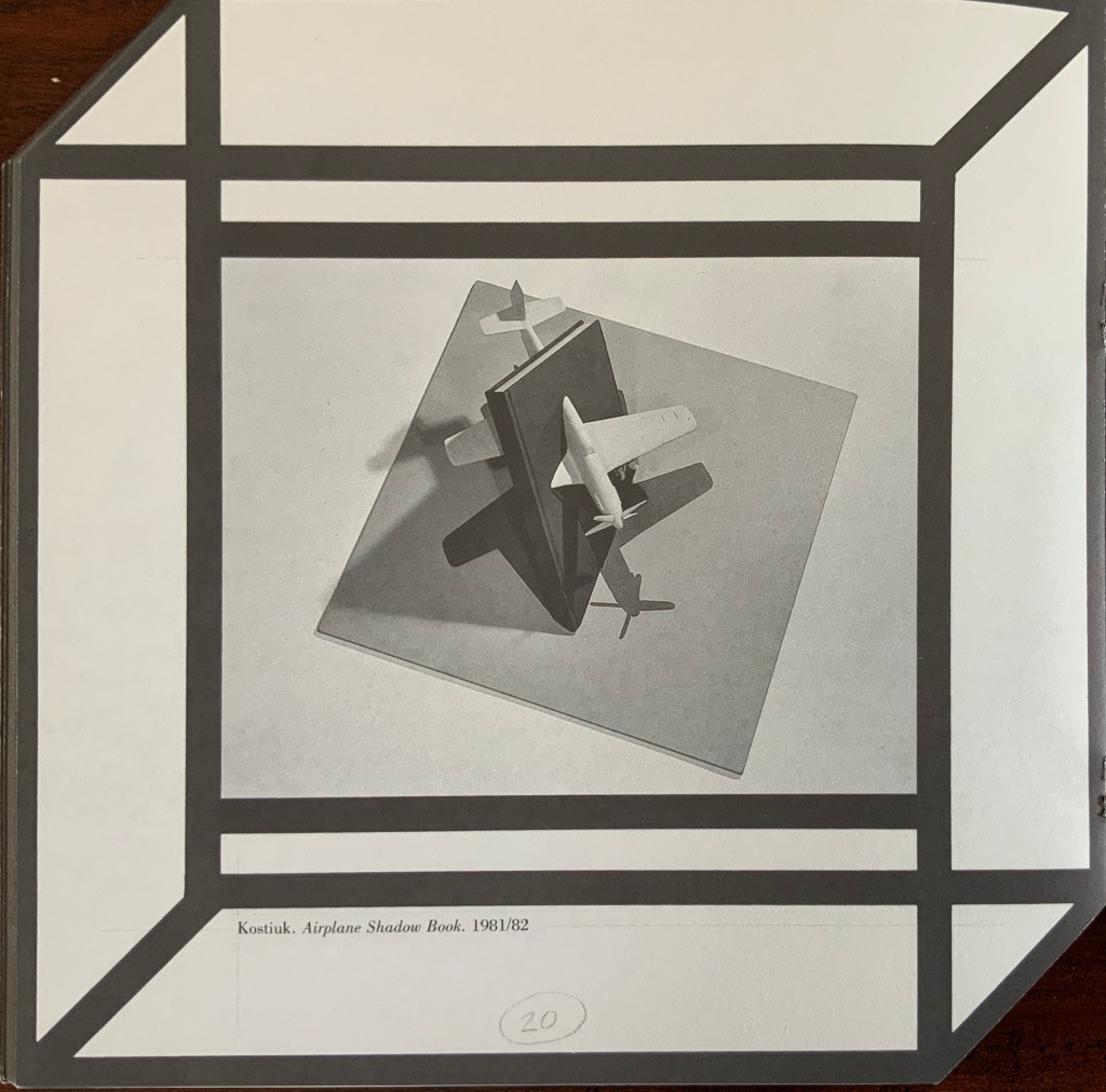
Kostiuk, Michael. Airplane Shadow Book (1981/82). Found codex, plastic airplane model, wood, and photolithography-offset reproduction altered with paint. Signed. 7 7/16” x 16 1/16” x 16 1/16”.
The found codex is apparently penetrated by a diving plastic model airplane (cut in two and attached to the back and front covers). From the Franklin Furnace “New Zealand Tour” of artists’ books, Kostiuk’s comments on his approach shed some light on Airplane Shadow Book, and images on his FaceBook page use an approach similar to that in Airplane Shadow Book.
I use the book format to involve the viewer personally and tactually [sic] by elements of surprise within the motion of opening and viewing the pop-up books and the physical or visual three-dimensionality of various works. Sometimes clear vinyl is used for pages, instead of paper, and are loose-leaf/ring bound, giving the viewer an option of hand viewing or, by attaching each grommeted page with push pins to a wall, linear viewing.
I use various artistic experiences to create an imagery that is both clearly stated and contradictory. The concepts are seen as paired imagery, visible speech narratives, and three-dimensional pop-ups, incorporated in various media of drawing, painting, and sculpture on photographic surfaces to create a personal style.
Kostiuk’s book penetration is quite distinct from those of, say, John Latham and Doug Beube. The Michael Kostiuk Collection is held at the University of Texas at Austin, but no online images are currently available there, and Airplane Shadow Book seems not to be part of the collection. Images of Kostiuk’s photography can be found in the Dallas Museum of Art.and archival material resides with New York’s MoMA.
Lavater, Warja.Jeu : livre en “papier modulé” (1980). Multiple: One of twenty-two. Cast paper, some color-dyed; in codex gathering but not sewn; in drop-spine book box with publisher’s cloth covering; 10 leaves. Signed. 18 1/2” x 11 11/16” x 1 7/16”. [No image of the work found]
Lazaron, Edna (d.2007). Terror (1985). Multiple: One of four. Black-and-white and color photocopies of collages over paper and transparent polyester, altered with ink, paint, and color photographs; in codex binding with foil over heavy paper front board altered with paint and string, and colored plastic back board, with electrical coil cord, string, and field clasp tie; in matte plastic draw-string bag; 6 leaves. Unsigned. 9” x 12 1/4” x 1 7/8”.
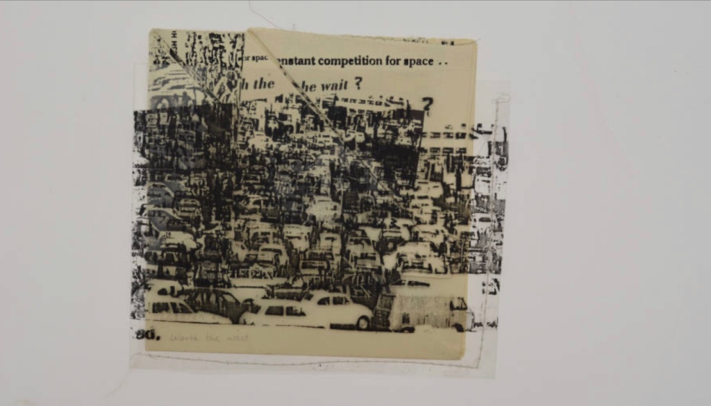
The catalogue shows two images of this work: closed and open. A related work — Terrorism (1985) — resides in New York’s Center for Book Arts and is shown in the catalogue Multiple, Limited, Unique (2011), p.88. The Joan Flasch Artists’ Books Collection holds two other works — Souvenir vignette/Yucatán (1982) and Markings (1985) — that suggest a penchant on Lazaron’s part for soft containers for her bookworks, further confirmed by the plastic sleeve enveloping Worth the Wait?, four images of which can be seen in the Artists’ Book Collection, University of Louisville Margaret M. Bridwell Art Library.
Worth the Wait? (197?) Edna Lazaron Unbound artists’ book folded to 11 x 11 cm with illustrations; 22 x 22 cm unfolded. Artists’ Book Collection, University of Louisville Margaret M. Bridwell Art Library.
Löhr, Helmut(d.2010). Blablabla (1985). Found codex wrapped in layered and rubber stamped colored tissue papers. Signed. 11 5/16” x 7 13/16” x 3 1/4”. [No image of the work found]
The many instances of Löhr’s works in the National Art Library at the Victoria & Albert Museum are nothing like that described in The Book Made Art. In Visual Poetry (1987), below, Löhr distorts blocks of type and the type within the blocks and presents them in irregular pentagrams. The text may be found text, but the production value is unlike that in most found codex works.
Visual Poetry (1987) Helmut Löhr Artist’s book, featuring typewriter art printed on double leaves cut in the shape of an irregular pentagram. Photos: Books On Books at National Art Library, Victoria & Albert Museum.
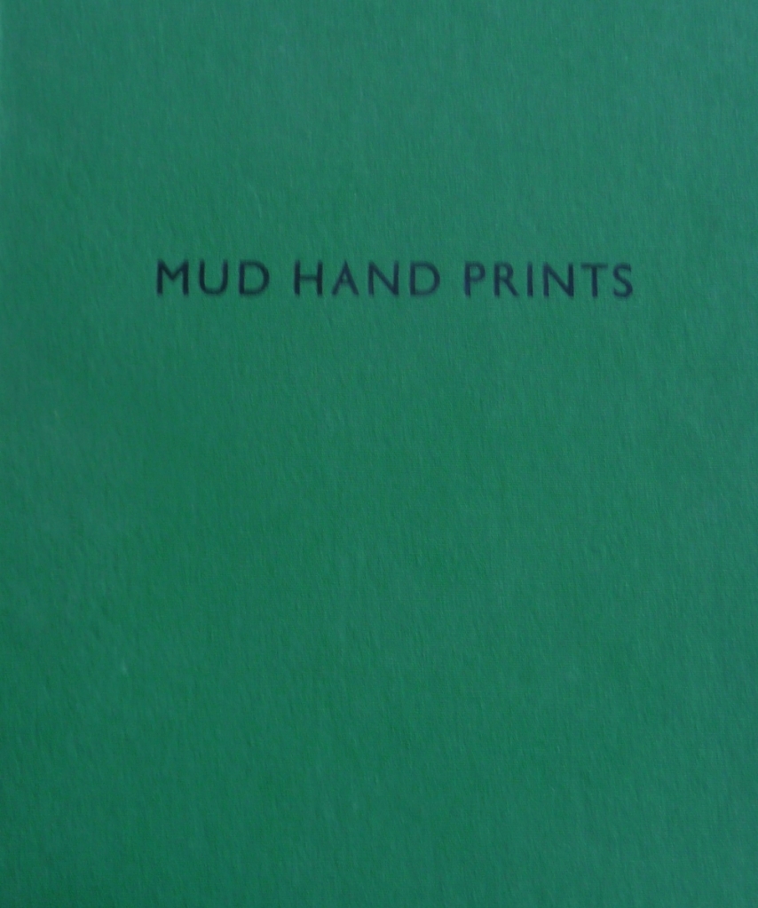
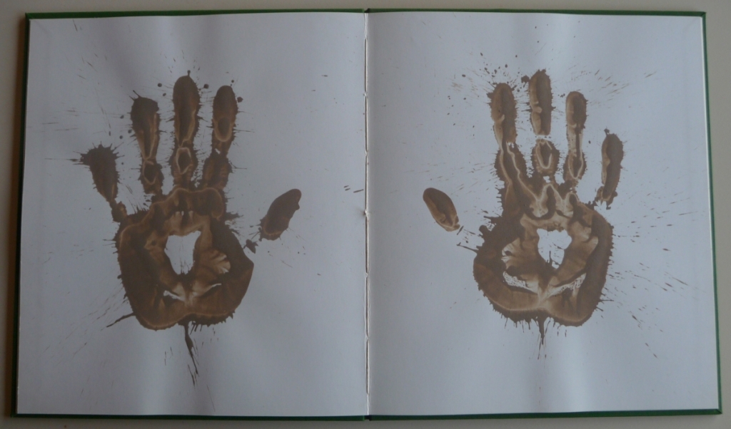
Long, Richard.Mud Hand Prints (1984). Multiple: One of one hundred. Dried mud over paper; 6 leaves. Unsigned. 13 1/2” x 11 5/8” x 5/8”.
Mud Hand Prints was published by an early champion of Long, Coracle Press, which is also represented in The Book Made Art by Erica Van Horn (below). The incorporation of raw natural material in book art has a long tradition and ongoing
Masullo, Andrew.Pandora (1985). Twenty tablets wrapped in letterpress- and photolithography-offset-printed papers; in hinged box with glass-covered compartments containing dried flowers, a photograph, and found papers; box covered with found and painted papers. Unsigned. 2 5/16” x 6 5/8” x 4 5/8”.
Masullo retains the work, and the only view of it is that in the catalogue. Like Beube’s entry in The Book Made Art, the description of Masullo’s will remind the viewer of Joseph Cornell’s boxes. According to Masullo, the work’s full title is 1029; Pandora. His subsequent works (mostly paintings in vibrant colours and numbered sequentially), the titles are simply the number reflecting the order in which they were created. According to most articles about Masullo, the numbers reflect his aim “to prevent the viewer from being unduly influenced by words“. More than that, as Masullo writes: “using words to explain my visual life is something I do my best to avoid“ (correspondence with Books On Books, 17 February 2020).
So if the work had been named only 1029, how might the viewer in 1986 have responded to this hinged box, closed with a “P”-shaped clasp and containing dried flowers in their glass-covered compartments, images of classical busts and the Sphinx, medical drawings of the human organs, a globe and twenty tablets wrapped in paper and embedded in the upper half of the box? From that clasp, might the viewer have sussed that it was “Pandora’s” box? Would the viewer have known what had been irretrievably released by opening the box? Hard to say: like Pandora, the viewer/reader today cannot un-know what is known when responding to this work of art. The conundrum does, however, focus attention on the role of words and text in book art.
McCarney, Scott.Home Sweet Home(1985). Multiple: One of four. Paper in accordion-fold binding with decorative and marbled paper-covered Boards; with paper-covered slip case. Signed. 11 5/8” x 9 1/12” x 1 3/4”.
Home Sweet Home (1985) Scott McCarney Photo: Courtesy of the artist.
The role of words and text in Scott McCarney’s art runs long and deep. McCarney’s use of the pop-up and leporello forms is most often seen in his abecedaries, a common genre in book art that is surprisingly not represented in The Book Made Art. As Spector might put it, in Home Sweet Home, McCarney is a master of the syntax of the book. Using the leporello and pop-up structures, the forms of letters and their placement on the spread page, he creates a striking effect of simultaneity.
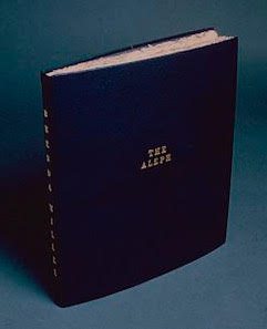
Miller, Brenda. The Aleph (1985). Pastel over stencil pattern-cut decorative paper [correction per correspondence with artist, 8 May 2020: “Blue editing pencil on hand made paper from sisal, cut from alphabet stencil“]; in codex binding with leather over boards and gold foil title stamping by Gérard Charrière; 31 leaves. Signed. 16 13/16” x 15 1/16” x 1 5/8”.
Miller’s other alphabet-related works differ from The Aleph in their size and in this work’s more literary inspiration (the Borges story, according to Miller in correspondence with Books On Books, 21 March 2020). This “blue editing pencil on hand made paper from sisal, cut from alphabet stencil“ and Miller’s Horizontal alphabet (26) south-east in the Harry Ransom Center Book Collection, University of Texas Austin, share Gérard Charrière as binder. Clearly from the title of the latter, it is closer to the spirit of the installations under the titles Vertical Alphabet and Horizontal Alphabet, which can be seen on the New York MoMA site. An interview with Barbara Haskell on the occasion of an exhibition at the Whitney explains Miller’s conceptual and systematic creative technique.
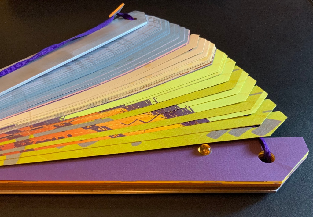
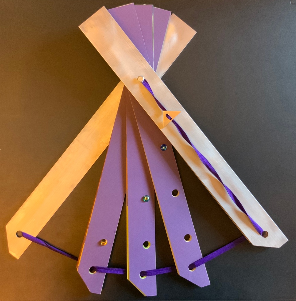
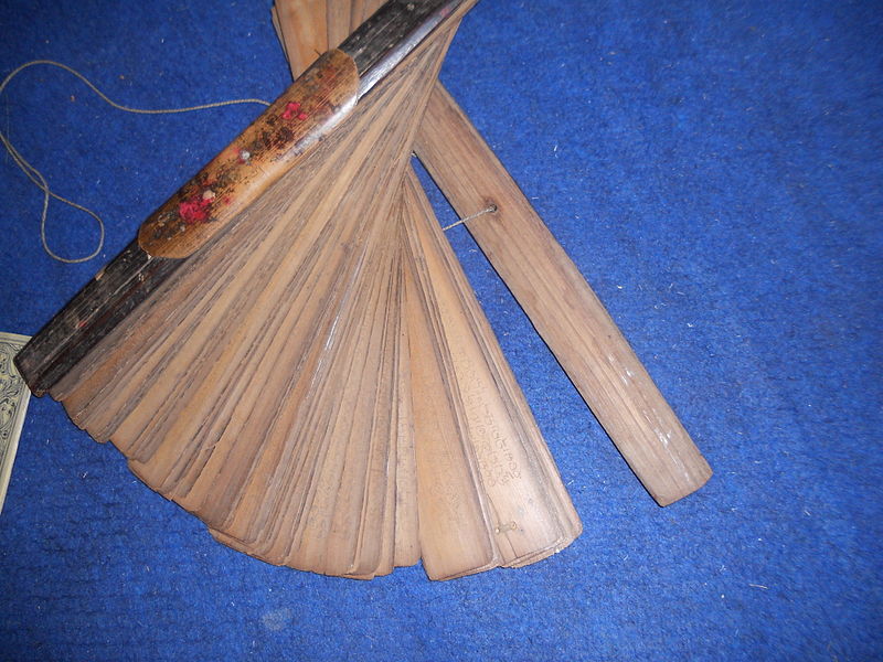
Osborn, Kevin.Vector Rev (1983). Multiple: One of one hundred. Color offset lithography over decorative die-cut papers with glass marbles; in fan-shape binding (hinged near base); with brushed aluminum outer covers and cloth ribbon tie with aluminum clasp; 140 leaves. Unsigned. 19 3/16” x 2 1/16” x 1 7/8”.
Like Kay Hines’ The Endless Filmscript and many other works displayed in The Book Made Art, Osborn’s Vector Rev challenges to the very structure of the book. But this challenge is rooted in the book’s historical structure. Books shaped like fans are an Asian and Indian tradition, dating back to manuscript sutras.
Photos: Left – “Pattra”, Cangminzho • CC BY-SA 4.0; Right – “Palm leaf manuscripts of 16th century in Odia script”, Manoj Choudhury • CC BY-SA 3.0.
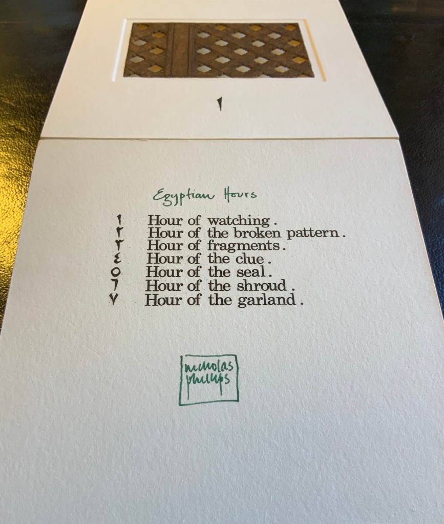
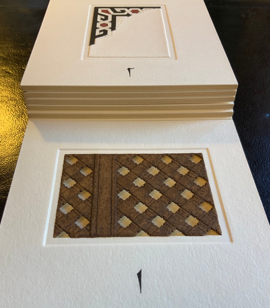
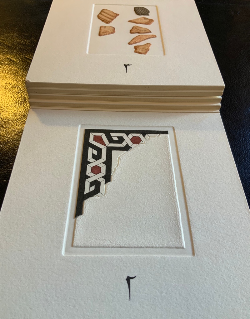
Phillips, Nicholas. Egyptian Hours (1980). Multiple: One of ninety. Color intaglio over paper altered with cutting, watercolors, thread, and graphite pencil; unbound in paperback edition leather folding case; 8 panels. Signed. 6 7/16” x 6 7/16” x 1 3/4”
Egyptian Hours falls somewhere between book and portfolio box. Somewhat like photos and captions in a photobook, text and relief images play off one another, but mediated by glyphs in the “table of contents”, the named hours are distant from the images associated with them. If the table of contents were held apart, the distance would shorten, but the images are so evocative, there is more pleasure in guessing the nature of the hour that the image represents: the image of a window lattice through which to watch, an image of a tile fragment or the image of archivally numbered shards.
Egyptian Hours (1980) Nicholas Phillips Photos: Books On Books at the National Art Library, Victoria & Albert Museum.
____________. Tales of the Floating World (1983). Multiple: One of forty-five. Color intaglio over paper; unbound with two protective boards in publisher’s cloth and paper-covered telescoping box; 9 leaves. Signed. 10 1/4” x 10 3/16” x 1 1/16”.
Photos: Courtesy of the artist.
A sequence of images where the viewer floats away from the earth and its orbit to the far reaches of the universe. Starting with a view of the pyramids at Kareima (from drawings I’d done from high up on the Gebel Berkal), thence a low earth orbit view of cloud formations over the ocean, and so on past the moon to be amongst the exploding galaxies. The images increase in size as we travel: from the single squares at the start to the doubles for space walk and moon to the final image where the view opens out across 3 side-by-side sheets. The colophon text, a quote from a 17th cent Buddhist priest [Tales of the floating world, by Asai Ryoi] says it all. — Nicholas Phillips
The words of Asai Ryoi, partially hidden in the first row’s center image, are
Living only for the moment, turning our full attention to the pleasures of the moon, the snow, the cherry blossoms, and the maple leaves; singing songs, drinking wine, diverting ourselves in just floating, floating …Tales of the Floating World (Columbus, OH: Ohio State University, 1984).
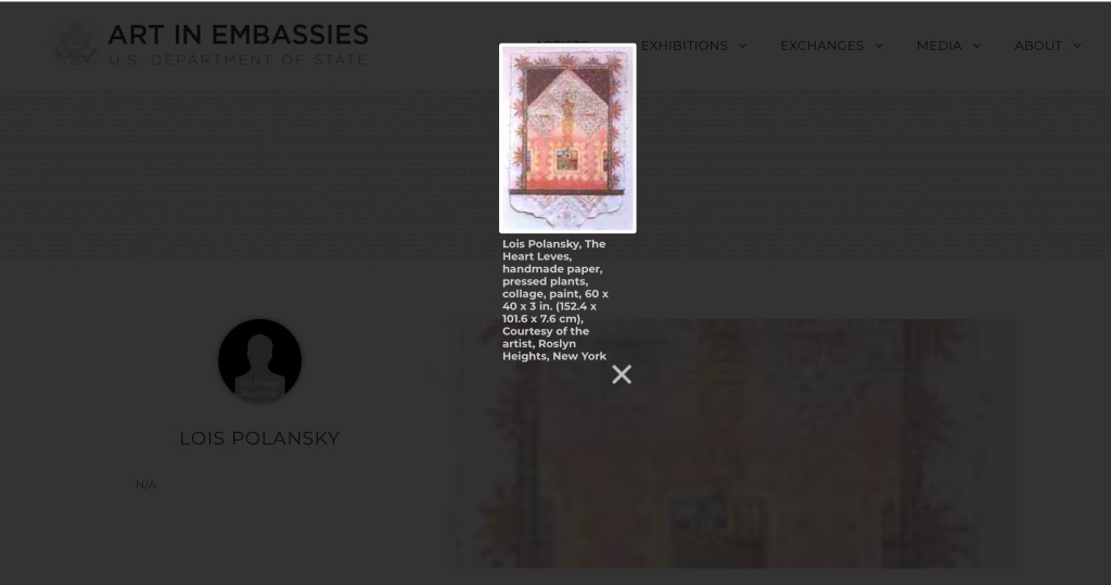
Polansky, Lois.Anatomical Digressions (1985). Gold ink, graphite pencil, charcoal, printing ink, watercolor, paint, and dry transfer and self-adhesive lettering over cast and machine-made papers; in accordion-fold binding; 12 panels. Signed. 15 3/8” x 11 1/2” x 3 3/4”. [No image of the work found]
U&LC, February 1985, Vol 11, No 4 contains “The Metamorphosis of a Book”, an essay on Polansky’s bookworks. A small thumbnail appears on the “Art in Embassies” site, and two loose album pages have been offered for sale by RoGallery (see below).
The Heart Leves (n.d.) Lois Polansky From “Lois Polansky”, Art in Embassies, U.S. Department of State, accessed 3 February 2020.
Album Pages IX & X (n.d.) Lois Polansky From RoGallery, accessed 5 February 2020.
Robinson, Aminah Brenda Lynn.Sapelo Hog Hammock Community (1984). Cloths, buttons, and embroidery yarns; in accordion-fold binding; 3 panels. Signed. 24” x 16 5/8” x 2 3/4”.
A halftone image of the bookwork is included in the catalogue, so the full glory of the work has to be appreciated by a look at its quilt work companion. The quilt work shown below surpasses the book work in size, but both thrust a vibrant narrative grounded in the African concept of Sankofa, “learning from the past in order to move forward“. Both works draw on her extended visits to Sapelo Island, Georgia, USA. [Image of the book art from Artnet]
Schnabel, Bruce.Companions in Spirit (1985). See Simon Toparovsky below.
Senser, Andreas.I remember Italy (1985). Paint, graphite pencil, and ink over layered papers, found illustrations and text, photographs, and clear polyester; in accordion-fold binding; 11 panels. Unsigned. 13 3/16” x 10 3/16” x 15/16”. [No image of the work found]
Images of thirteen works by Senser can be viewed at Visual AIDS. The one below is the only accordion-fold among them.
Untitled (poem), 1986 Andreas Senser Pigment on collaged paper, rag board, and wood, 6×10 1/2×4 Courtesy the estate of Andreas Senser and Visual AIDS.
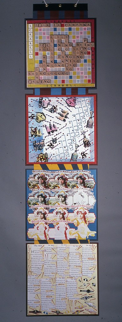
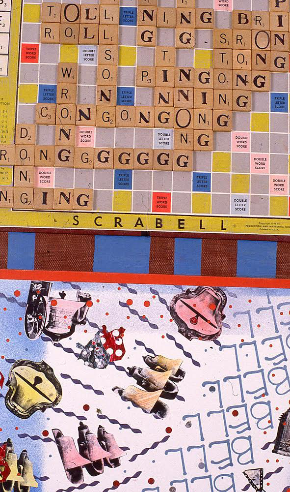
Share, Susan Joy.The Bell Show (1982). Game board and game board pieces, black-and-white and color photocopies of packing ephemera, found illustrations, and text, altered with watercolor, paint, and rubber stamping; mounted on painted publishers’ cloth-wrapped panels; in end-to-end gate-fold binding with brass snap-buttons on buckram band closure; 4 panels. Signed. 14 7/8” x 14 5/8” x 1 9/16”.
The Bell Show (1982) Susan Joy Share Photos: Courtesy of the artist.
Another example of Share’s “architectural” flair in making art of the book’s form, Vivian’s Photos (below) from the same period combines discarded photos of buildings and sidewalks with painted papers to create changing atmospheres and architectural formats. This work did not appear in The Book Made Art but did show up in Book Ar(t)chitecture, curated by Richard Minsky the year before.
Vivian’s Photos (1984) Susan Joy Share Cloth, board, photo, paper, acrylic, cord. The eight signatures are made from board-weight collaged panels, laminated to linen hinges. The signatures are oversewn onto a single common cord, creating a clothesline-like appearance. A collage folding-box contains the piece. 7” x 6.25” x 2.5” opening to 6.25” x 13″” x 30”. Photos: Hiro Ihara. Courtesy of the artist.
Update: Still more can be found in this interview with Helen Hiebert, accessed 15 November 2020. And more in this artist’s talk at New York’s Center for Book Arts in 2023.
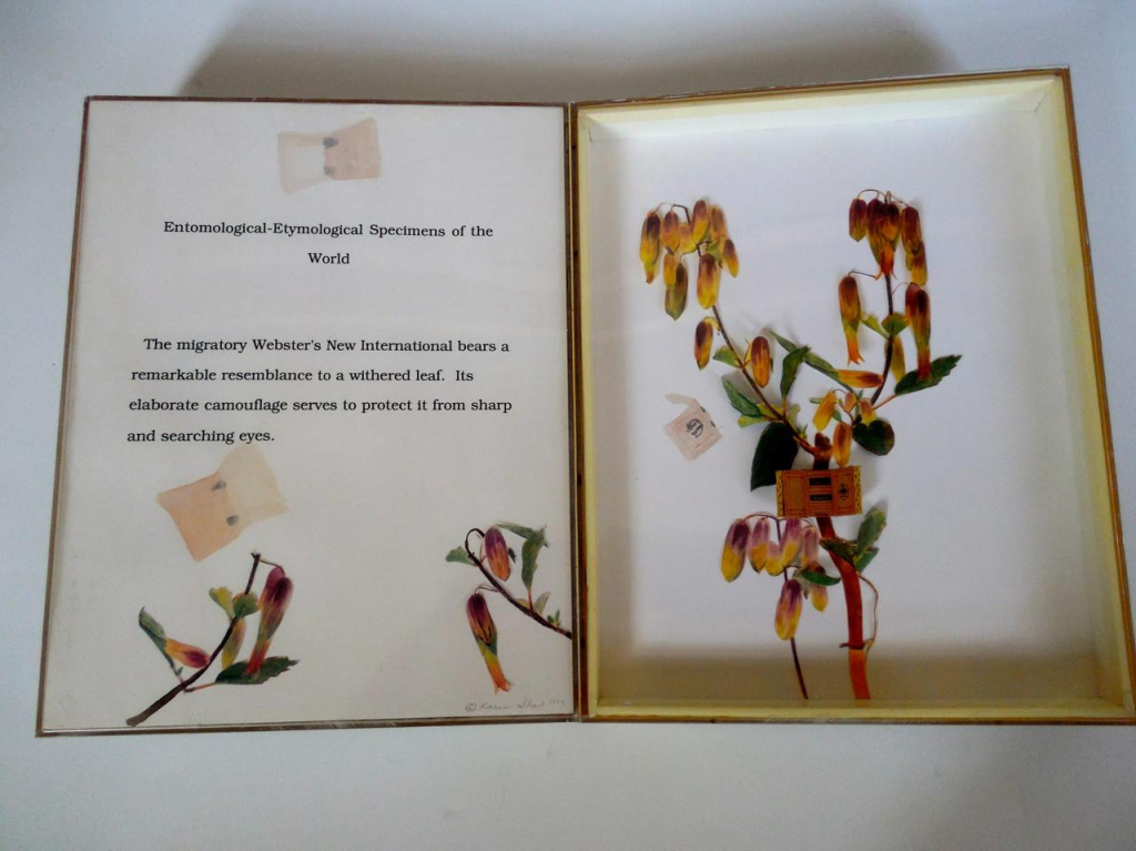
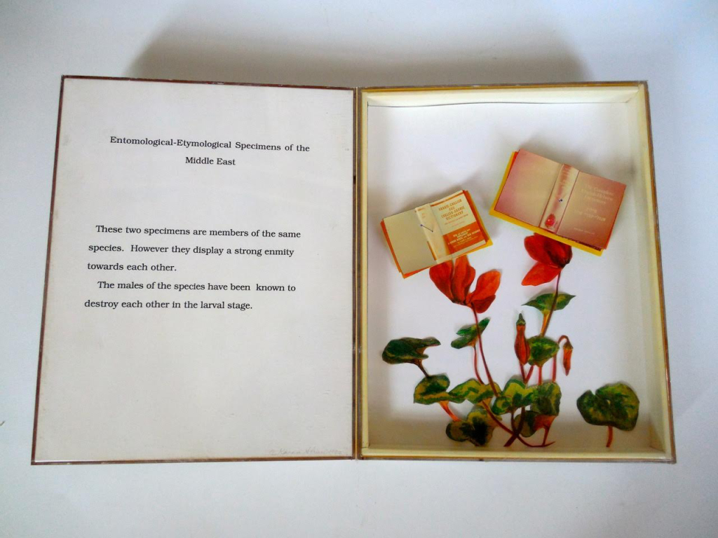
Shaw, Karen.Petit Larousse: Various Editions (1980). Found materials including twelve miniature blank books, pins, metal title plate, glass-lidded box, cotton, and small labels altered with dry-transfer lettering. Signed. 12 3/16” x 16 1/4” x 2 1/2”.
The catalogue provides a halftone image, but the zoomable, online images at the Yale Art Gallery, where the work is part of the Allan Chasanoff Collection, provides some of the color’s impact. Shaw’s bookworks have a great sense of humor, as does the best of book art. These images of another of her dictionary-related works demonstrate that humor well.
Entomological–Etymological Specimens Karen Shaw From a series of nine. Open: 14” x 22”. When these works were displayed, they were only partially open and mounted on the wall to resemble the shape of butterflies. Photos: Courtesy of the artist.
Siberell, Anne Hicks. Wotan (1984). Colored and cast plasters imbedded with found objects including photographic slide mount altered with paint, packaging labels, and ruler fragment; with wood box and cover and elastic band closure containing ink on vellum manuscript poem. Unsigned. 8” x 5 15/16” x 1 3/8”.
Wotan (1984) Anne Hicks Siberell Photo: Courtesy of the artist.
Unboxed: Wotan (1984) Anne Hicks Siberell Photo: Courtesy of the artist.
Clockwise from top left: Goddess Doormat (), Archaeology (), Three Blind Mice (), He Said She Said () and Pisa (). Anne Hicks Siberell. Photos: Courtesy of the artist.
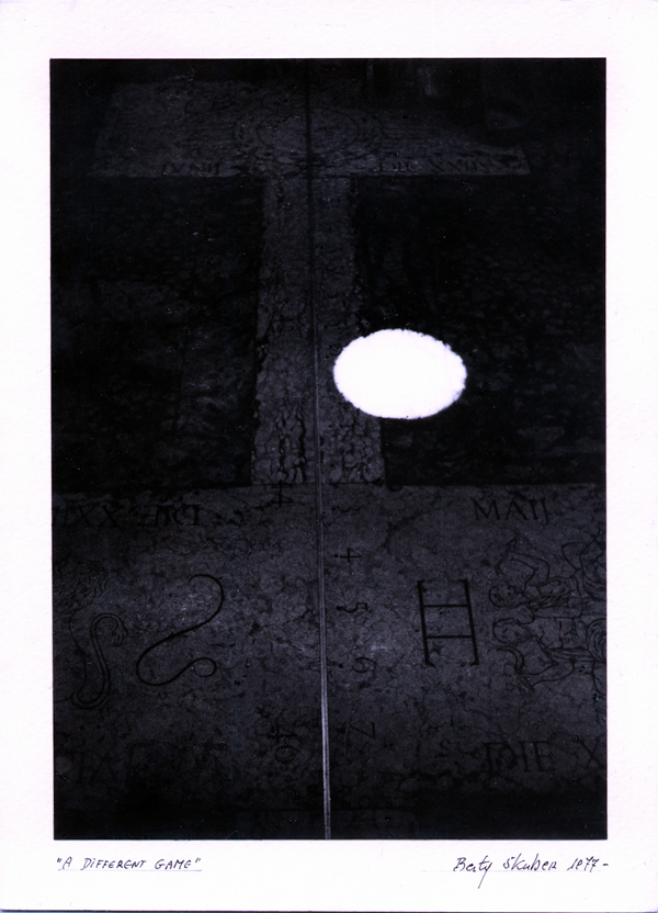
Skuber, Berty.A Different Game (1977). Ink, graphite pencil, and watercolor over paper in combination with black-and-white photocopies, black-and-white photographs, color photographs, and postage stamp; unbound in publishers’ cloth drop-spine book box; 16 leaves. Signed. 9 1/16” x 6 3/4” x 15/16”.
First and last “pages” from A Different Game (1977) Berty Skuber Photos: Courtesy of the artist.
This work has “long, strong legs”. It appeared as recently as 7 March – 7 June 2019 in the exhibition called Anatomia del linguaggio at the Galleria dell’Accademia di Belle Arti in Macerata, Italy. In requesting that the work be framed in two rows, one above the other, each eight pages long, and shown on a wall, or displayed in a vitrine, Skuber makes clear that she does not think of A Different Game as exclusively a book. In correspondence, she also notes, “This was the form most typical of my work at that time, most of which, like this piece, made use of photographs, India ink, watercolor, and elements of collage.“ In 2002, Henry Martin wrote an insightful piece in NY Arts Magazine about Skuber’s work then. Skuber’s work will be shown in New Orleans in 2020, and for that show she writes: “Words are an essential part of [my work], and another of its features is a constant return to grids and grid-like stuctures that also have something to do with a sense of the scansion of time. This is particularly clear, moreover, in my animated video collages, all of which are visible on my website, and three of which I’d especially call to your attention: Widdershins, parts 1 & 2 (2015-2016); Epicycles/eclipse (2013); and Sieben Farbraeume, for which the best English title might be “Seven Spaces, Seven Colors” (1996).
Smith, Keith A.Book 91 (1982). Multiple: One of fifty. Die-cut and embossed paper with string; in quarter publishers’ cloth and paper-sides binding; 24 leaves. Signed. 10 3/16” x 14 3/8” x 1 1/8”.
Phil Zimmerman published Book 91 under Spaceheater Editions 1984 and released the video above in 2013. Another example of how an accompanying video can somewhat counter the glass case. Also known as the ”String Book”, Book 91 boasts images at the Boston Athenaeum] and the Jaffe Center for Book Arts, which has an excellent descriptive essay by Judith Klau.
Spector, Buzz.Altered Lewitt (1985). Multiple: One of five. Found printed book [Sol Lewitt. (untitled. n.p.:) Sperone/Fisher, 1974. Edition: one of fifteen hundred.] altered by tearing and mounting text block in open position. Signed. 17 11/16” x 8 7/8” x 7/8”.
Photo: Courtesy of the artist. Taken during preparation for June 2020 exhibition at Saint Louis Art Museum.
Photo: Courtesy of the artist.
At the 1’55” mark, this video provides a view of Spector’s handling a similar work (a Jasper Johns catalogue). The technique of altering another book artist’s work or another artist’s catalogue of works is a recurrent practice among artists. Bruce Nauman’s 1968 Burning Small Fires plays with Ed Ruscha’s 1964 Various Small Fires and Milk, and Dennis Oppenheim’s 1970 Flower Arrangement for Bruce Nauman returns the favour. Noriko Ambe has come closest to Spector’s variation; she has altered catalogues of Koons, Lichtenstein, Richter, Warhol and several others.
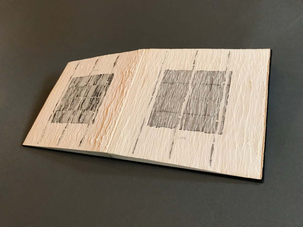
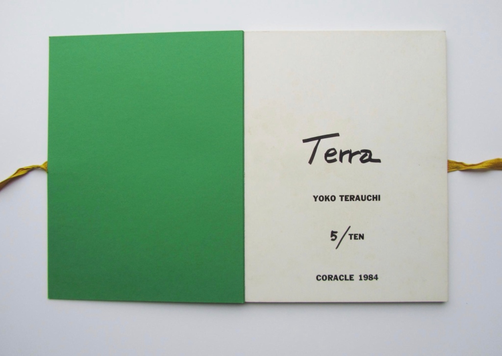
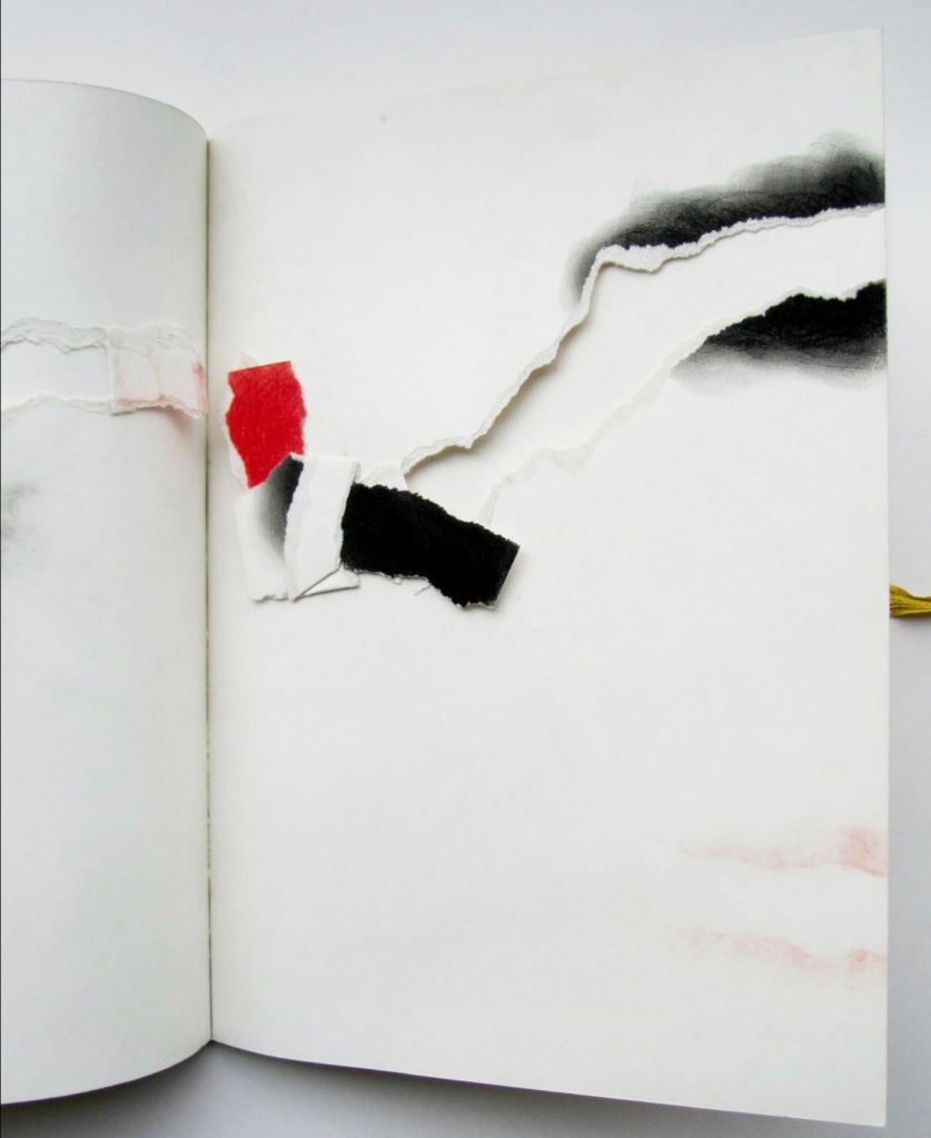
Terauchi, Yoko.Terra (1984). Multiple: One of ten. Powdered pigment and paper; in codex binding with cloth ribbon fore-edge ties. Unsigned [correction per artist’s correspondence: “the title Terra on the first page is handwritten by myself and it is my ‘signature’ for all my art works”]. 14 5/8” x 10 15/16” x 5/8”.
Terra was the first of several works that Terauchi published with Coracle.
Toparovsky, Simon. Companions in Spirit (1985). Sequins, wire, thread, and cloth over synthetic mesh in silk-wrapped mats; in accordion-fold binding with silk over shallow bas-relief covers; with drop-spine book box in silk-wrapped, embossed, and shallow bas-relief outer covers; 6 panels. Unsigned. 19 1/8” x 15 3/4” x 2 3/8”. [No image of the work found]
Bruce Schnabel taught bookbinding at the Otis College of Design. Around 1990, he abandoned book art and began sculptural work under the name Simon Toparovsky. Toparovsky writes, “I believe ‘Companions in Spirit’ is in Special Collections at the University of Southern California… The most similar book about which I have a record is in the Getty Research Institute– ‘Chaos Should be Regarded as Extremely Good News’.” (correspondence with Books On Books, 24 April 2020). Although a full description of the latter can be found under its link, there is no image there. The artist has been kind enough to provide images of other bookworks from the same period.
Healing Hand (1983) Simon Toparovsky Photos: Courtesy of the artist.
Tikal Codex (1982) Simon Toparovsky Photos: Courtesy of the artist.
The Mind Sees What the Eye Misses (1986) Simon Toparovsky From the artist’s collection: A screen book made of hand-dyed silk, heat tooled with gold and color foils over boards with onlays of hand-dyed silk. Bound with silk insertion stitches and glass seed beads. Edition of 9. Photos: Courtesy of the artist.
Van Horn, Erica.La Ville aux dames (“second state”). Vitry-sur-Seine: n.p., 1983. One-of-a-kind. Paint over paper; in accordion-style cover in publishers’ cloth with cloth ribbon ties on three sides; 12 leaves. Signed. 12 1/4” x 17 15/16” x 11/16”.
Permission of the artist. Additional images can be found in Yale University’s Beinecke Digital Collections.
The work is one sheet constructed of six sheets sewn together and folded accordion style. Displayed unfolded, the work exceeds seventeen feet. Nancy Kuhl’s The Book Remembers Everything (2010) shows images of La Ville aux Dames and places the work in context of Van Horn’s other works of that period.
Vogel, Cornelia.6 Livres (1982). Each book containing a number of collage elements including ink, graphite pencil, paint, and watercolor over paper with string, intaglio prints, color photographic transparencies, and cloth mesh; in accordion-fold bindings with similarly prepared paper covers; 6 leaves each. All signed. With painted compartment box. Unsigned. 3 1/2” x 3 11/16” x 4 15/16”. [No image of the work found]
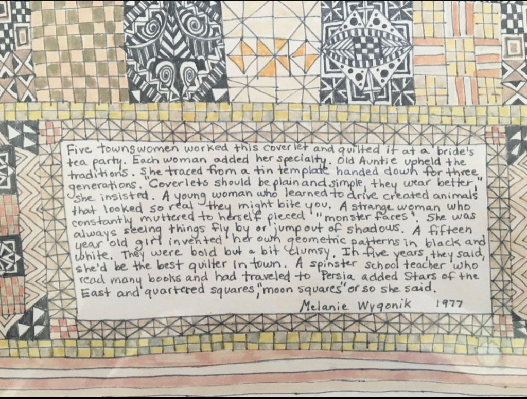
Wygonik, Melanie (d.2005). Lost Playground (1985). Colored pencil, graphite pencil, ink, and paint over layered and sewn papers in combination with collage elements including fabrics, fabric edgings; embroideries, embroidery threads, buttons, sequins, and charms; in codex binding; 7 leaves. Signed. 22 1/4” x 15 3/16” x 1 3/8”. [No image of the work found]
Images of some of the artist’s two-dimensional works can be easily found, not so for the three-dimensional. From the same decade, Just Desserts (1980) and Shimmering (1983) are representative; unfortunately the images are black and white. The detail from this untitled watercolour can be found here (accessed 25 February 2020).
Detail of untitled watercolor (1977) Melanie Wygonik From eBay, accessed 25 February 2020.
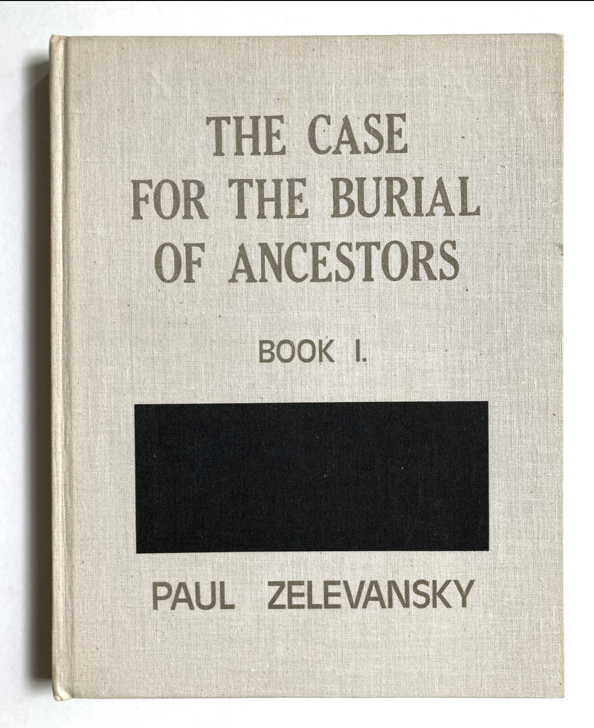
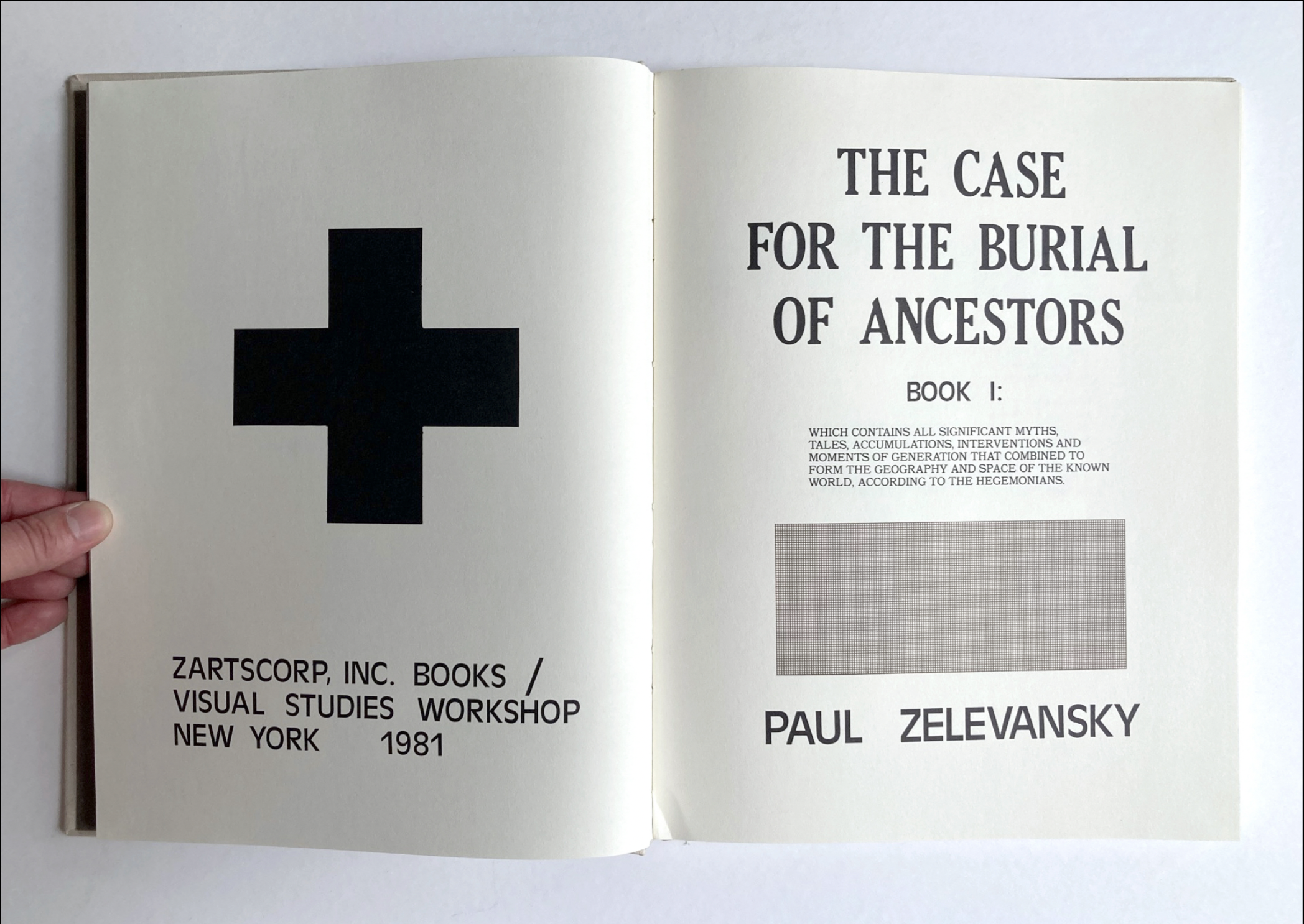
Zelevansky, Paul.The Case for the Burial of Ancestors, Book I (1979-81). Ink, watercolor, graphite and blue graphic layout pencils, rubber stamping, dry-transfer lettering, and typewriter printing over paper in combination with photographs and photolitho-offset reproductions; unbound in solander case with carrying handle; 101 leaves. Signed. [Partial manuscript for: Paul Zelevansky. The Case for the Burial of Ancestors, Book I. New York: Zartscorp, Inc. Books and Visual Studies Workshop, 1981.] 2 15/16” x 15 3/8” x 13 1/2”.
Zush. Portrait of New York City (1976-82). Found blank codex, with fore-edge leather ties, altered with ink, graphite pencil, and watercolor with the addition of found objects including photographs, string, metal scraps, fabric, vegetable matter, map fragment, and postcard. 23 leaves. Signed. 12 15/16” x 10 3/16” x 1 5/16”. [No image of the work found]
The Catalan artist Alberto Porta y Muñoz assumed the name Zush in 1968 and gradually switched to Evru starting in 2001. Portrait of New York City may have looked like the work Untitled (1979-1984) in Colleció “La Caixa”. Another work Uroxos (2000) is one of the last bookworks by Porta under the name Zush. Although Uroxos is an accordion-fold, its appearance alongside those of the accompanying prints and Untitled may stand in here for that of Portrait of New York City.
Credit for the exhibit’s inception goes to Tony Zwicker (1925-2000) a passionate, knowledgeable, courageous, and caring dealer of modern and contemporary artists books. I first met her on a visit to her home/gallery located in a former artist’s studio in the National Arts Club building overlooking Gramercy Park (on 20th Street in New York) around 1983 or 1984. With its nearly two-story tall glass wall facing north over the park, it was a memorable setting. I was visiting her in the company of Robert Rosenthal, Curator (head) of the Special Collections Research Center, University of Chicago Library, where I worked as exhibition coordinator. In addition to that job, I also advised Bob on the acquisition of artists books for the rare book collections; and we were there to learn and perhaps make some purchases. Tony not only knew the history of artists books and kept up to date on the latest developments, she was also discerning, insightful, and generous with her learning. When the idea for doing this show came about in thefollowing year, we did not–originally–intend to rely so heavily on her holdings, but it became inevitable because she was so widely connected and the artists she represented trusted her (nearly all the works in the exhibit were very fragile and had to be prepared for shipment by fine arts packers). Bob, who was nothing if not adventuresome in his approach to book culture, enthusiastically backed my proposal for the exhibition despite its cost and encouraged the University’s Library Society to fund it and publication of the exhibit catalogue.
Tony’s importance at this particular point in the development of contemporary artists books warrants further exploration. Her papers are preserved at the Art Institute of Chicago: Tony Zwicker Archive. — Jeffrey Abt, Professor Emeritus, James Pearson Duffy Department of Art and Art History, Wayne State University, 12 May 2020.
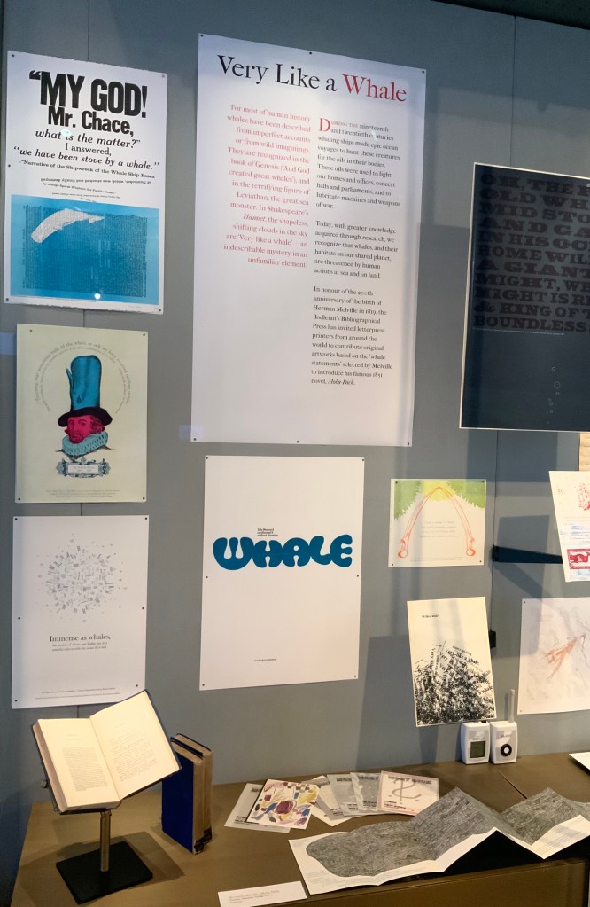
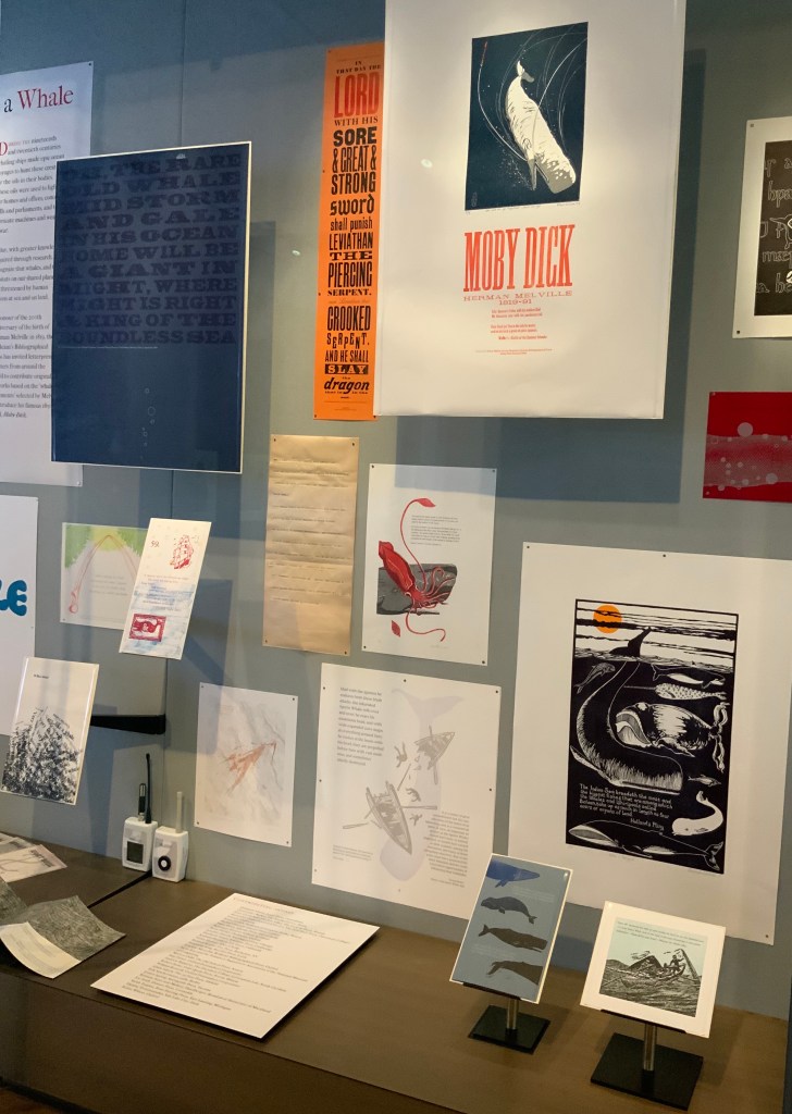
For the 200th anniversary of Herman Melville’s birth (1819), the Bodleian’s Bibliographical Press invited letterpress printers and artists to claim one of the eighty prefatory “Extracts” from Moby-Dick (1851) and create an artwork in response.
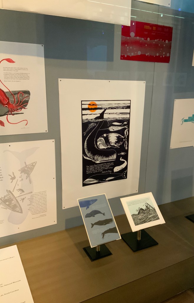
The Blackwell Hall exhibition case accommodates thirty of the eighty contributors‘ artworks, plus the rare three-volume version of the novel published by Richard Bentley in London as The Whale before Harper & Brothers issued it in November 1851 in New York as Moby-Dick; or, The Whale. Here are just four of the outstanding prints among the several artforms on display.
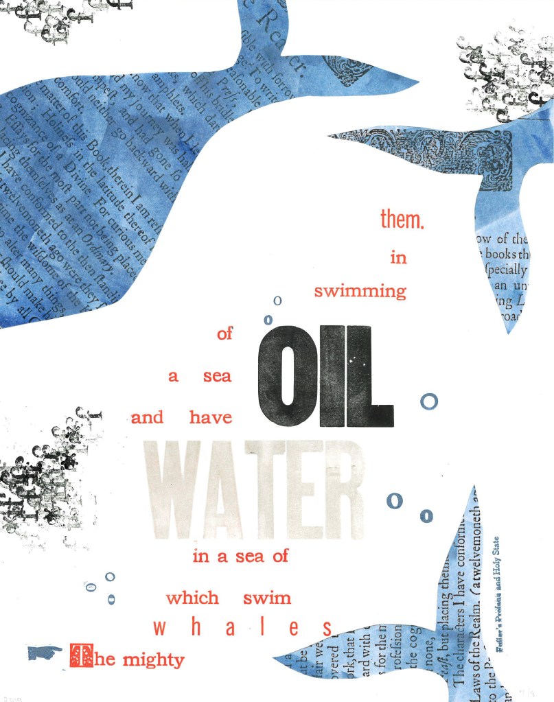
Extract 25: ‘The mighty whales which swim in a sea of water, and have a sea of oil swimming in them.’ ─ Fuller’s Profane and Holy State Brittany Starr and Mallory Haselberger, BookLab at University of Maryland Mixed media (collage and letterpress). Printed on a Line-O-Scribe, Model 1411 on Strathmore printmaking paper using rubber and oil-based ink; includes Jenson, News Gothic and Bookman typefaces with Hamilton wood type. Image courtesy of the Bibliographical Press and artists.
Notice how Starr and Haselberger integrate the verbal and visual to emphasise the seas of water/oil paradox that Melville plucked from his source. Like Melville’s hand, the artists’ manicule in the lower left points to the extract that reads/rises from the bottom to the top. Inside the shapes of whales around the extract appears the source of the extract (the verbal in the visual) against a seawater blue (another layer of the verbal in the visual). The letters “o” and “f” evoke bubbles and currents (the verbal for the visual). The words “oil” and “water” in contrasting inks but composed in the same typeface loom large at the heart of the artists’ embodiment of this paradoxical extract. (It is an insider’s paradox that the work surfaces from the BookLab, devoted to exploring the oil-and-water mix of the material and the digital.)
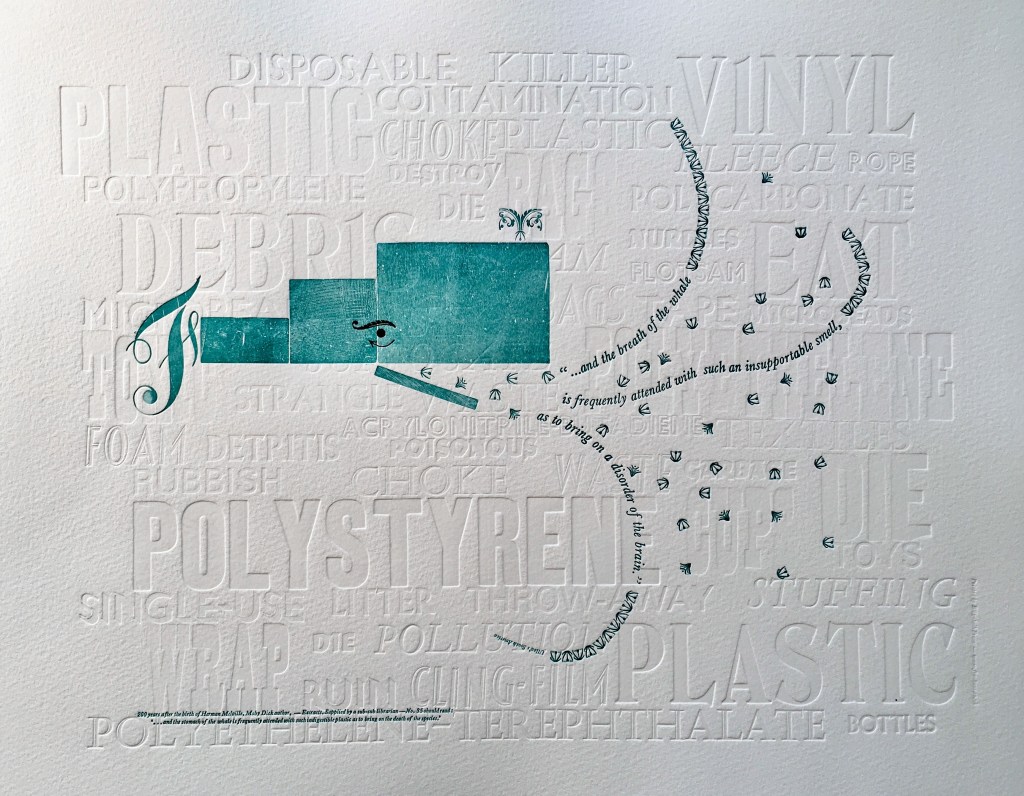
Extract 35: ‘* * * * * and the breath of the whale is frequently attended with such an insupportable smell, as to bring on a disorder of the brain.’ ─ Ulloa’s South America Elizabeth Fraser, Frauhaus Press, Cambridge Handset letterpress. Blind deboss using wood and metal type. Whale created from face and back of woodtype with ornaments for eye and spout. Text 12pt & 6pt Baskerville italic. Whale breath 12pt glint (Monotype B1309 & B1310). Printed on Somerset Velvet 300gsm soft white paper with a tabletop flatbed proofing press.
What attends the whale’s breath in Fraser’s print? The whale’s breath is the extract streaming into a sea of white blind-debossed words. That sea of human detritus is the source of the insupportable smell that attends the whale’s breath. The insupportable smell takes on “the whiteness of the whale”. The threatened whale takes on an environmental green. which Fraser creates with the non-verbal side of the woodtype. Even so, the carrier of the verbal makes up every visual aspect here, underscoring Fraser’s contemporary paradox: the insupportable smell disordering the brain has been brought on by the disordered brain of humankind.
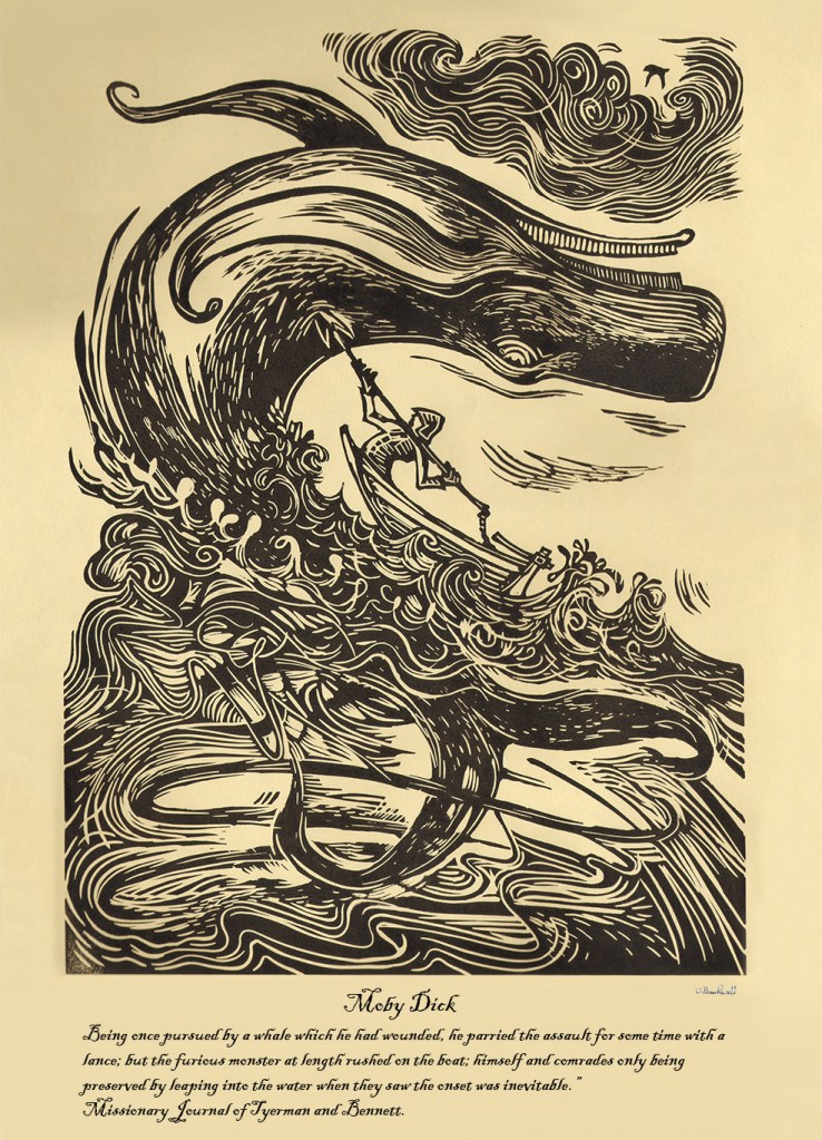
Rowsell’s linocut represents the more traditional entries in the exhibition. Capturing the furious struggle expressed in the extract, he locks whale, man, boat, sea, cloud and sky into a vigorous, swirling image on a paper and in a style that evoke the century in which Moby-Dick is set. As he pulled his prints from the 1828 Albion printing press, Rowsell might have wondered what the nine-year old Herman Melville was doing when hands were first laid on that Albion.
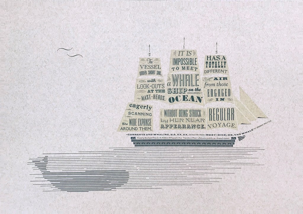
Extract 71, ‘It is impossible to meet a whale-ship on the ocean without being struck by her near appearance. The vessel under short sail, with look-outs at the mast-heads, eagerly scanning the wide expanse around them, has a totally different air from those engaged in regular voyage.’ ─ Currents and Whaling. U.S. Ex. Ex. Jennifer Farrell, Starshaped Press, Chicago Letterpress: metal type + rule linocut; Paper: Fabriano Tiziano printed on a Vandercook SP15. Image courtesy of the Bibliographical Press and artist.
Starshaped Press is aptly named. Jennifer Farrell stars at wringing shapes from type and its surrounding furniture. The citation outlining the upper deck and bowsprit runs gracefully and appropriately under the sails on which the extract appears in that variety of display faces characteristic of nineteenth century flyposts.
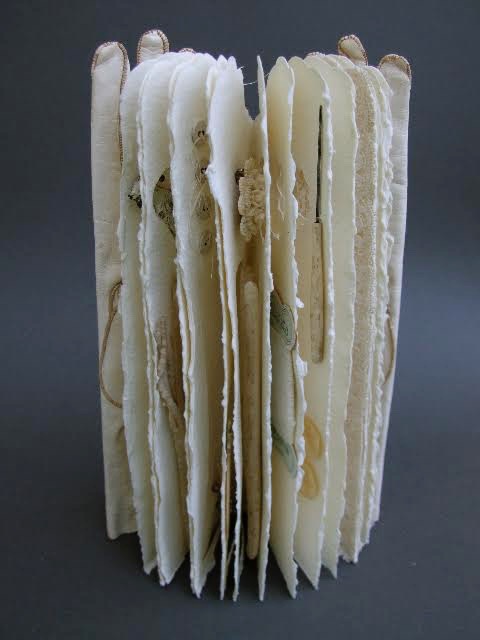
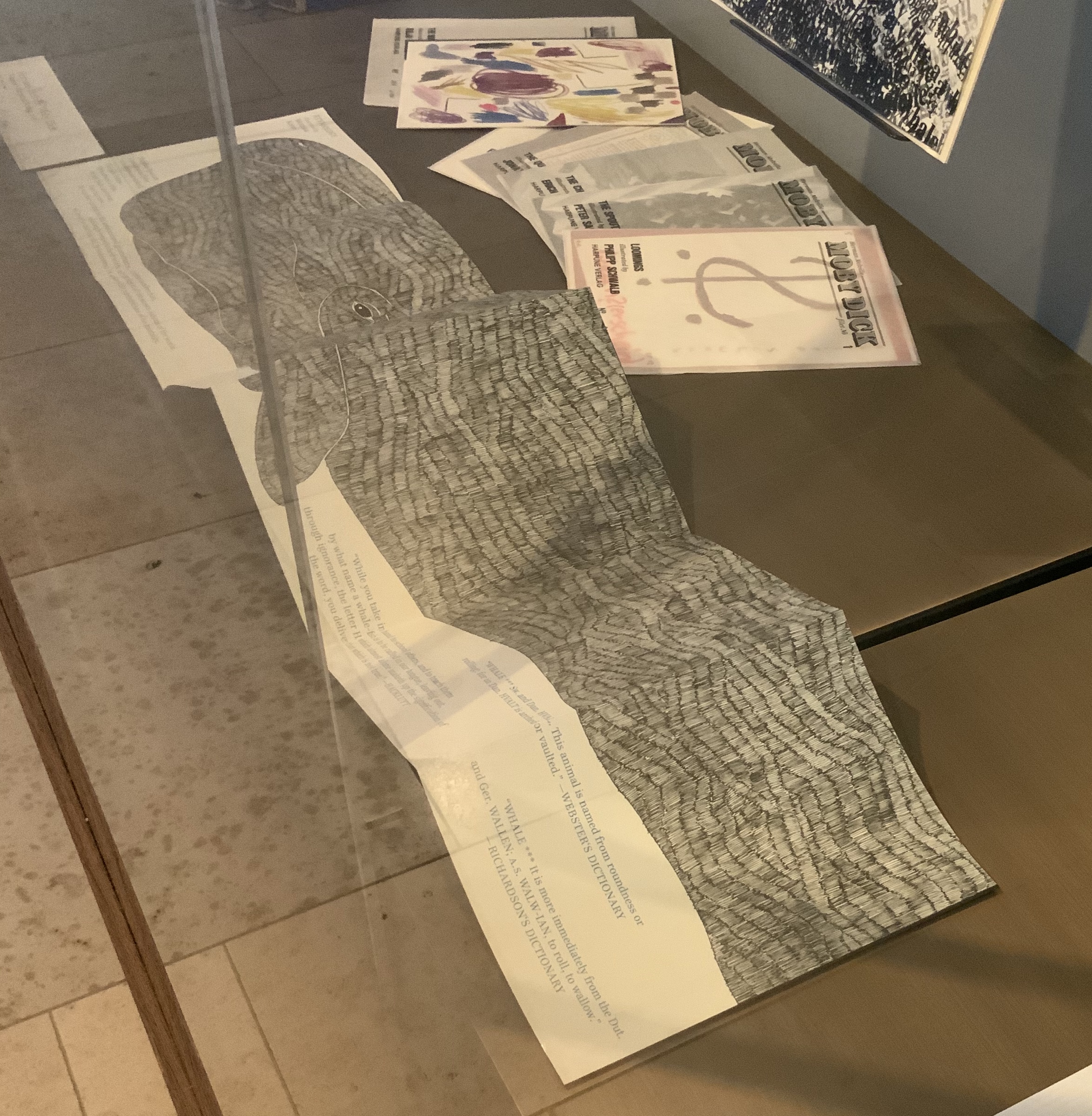
To round out the display with another multi-artist effort, the curators included Harpune Verlag’s Moby-Dick “Filets” (2011~). In 2011, Harpune Verlag Wien began publishing Melville’s masterpiece as a serialized subscription. To do justice to the book’s many voices, 136 different artists were invited, each to illustrate a chapter.
Etymology, Moby-Dick “filet” No. A (2012) Moussa Kone Leporello of 16 pages, 150 x 200 mm closed, 200 x 710 mm open. Acquired from Harpune Verlag February 2019.
Published in non-chronological order at varying intervals and printed in a limited edition of 460 copies, 37 “filets” have appeared so far. At this rate, all of the filets may only be served up by the bicentennial of Moby-Dick’s publication! Fortunately for the Bibliographical Press’s display, Moussa Kone’s rendition of “Etymology”, the prefatory item preceding “Extracts”, is one of those already delivered. It makes a suitably lengthy and apropos link across cases.
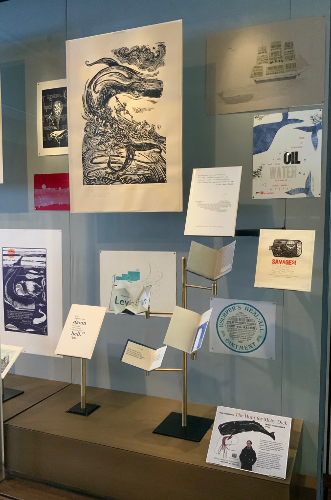
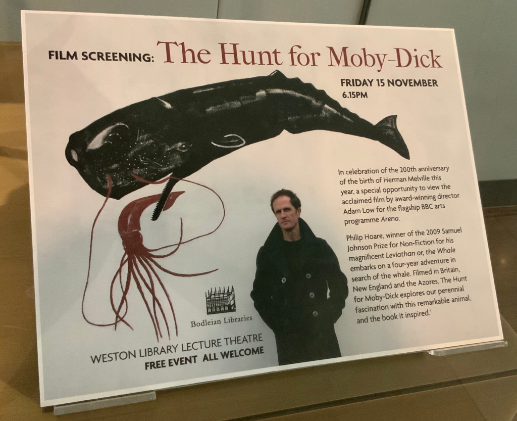
If, like Ishmael with “November in [his] soul”, you were walking down the damp, drizzly streets not of New Bedford but Oxford on the 15th this month, you might have substituted the Weston Library for The Spouter Inn. Inside, second copies of the remaining fifty “Extracts” submissions were on display in Blackwell Hall for viewing and handling after a screening of Philip Hoare’s The Hunt for Moby-Dick (2011). Ten years ago, Southampton-born Hoare won the 2009 BBC Samuel Johnson Prize for non-fiction for his book Leviathan, or the Whale. Hoare himself was on hand to introduce and take questions after the film.
His lifelong passion for whales and Melville’s book is infectious and influential. UK book artist Chris Ruston traces her series of artist’s books Lost Voices — Whaling (2016-17) to Hoare’s Leviathan. Like Hoare’s work and many entries in “Very Like a Whale”, Ruston’s work challenges our anthropocene era. Hoare was also instrumental in organizing the Moby Dick Big Read (2012) — another multi-artist affair and effort to address the effects of the anthropocene era.
Click on the screenshot to visit and listen to the Moby Dick Big Read.
The Big Read offers freely available readings of each chapter of the book. Individuals (well-known and unknown) contributed the readings, artists contributed artwork (viewable as thumbnails on the site), and the site offers an opportunity to donate to Whale and Dolphin Conservation (WDC).
Hoare participated in another Melvillean documentary: David Shaerf’s Call Us Ishmael (2019). It is a multi-artist affair like the Big Read, Moby-Dick “Filets” and “Very Like a Whale”; includes a sighting of the New Bedford Whaling Museum’s annual days-long continuous reading of Moby-Dick; and features interviews with artists and other creatives inspired by Melville’s tale. One of those artists interviewed is Frank Stella. Uncanny, but Stella also appears in this book to be found in the Bodleian: Elizabeth Schultz’s Unpainted to the Last (1995).
From among the artists such as Ellsworth Kelly, Robert Motherwell, Jackson Pollock and others whom Schultz discusses, Stella serves best to tie off this fisherman’s tale and return to the title of the Bibliographical Press’s exhibition. About his Moby-Dick series of prints and metal-relief paintings to which he devoted a decade, Stella writes:
The idea of the wave and its various permutations is what drives this new series. Once I started on the wave shape, I saw it began to look like a whale — a combination of waves and whales. … The idea of the whale reminded me of “Moby Dick,” so I decided to go back and read the novel and the more I got into it, the more I thought it would be great to use the chapter headings of the novel for the titles of the pieces. — “1989 Previews from 36 Creative Artists,” New York Times, 1 January 1989, Sec. 2:1. Images here.
Indeed, “Very Like a Whale”, which runs until 5 January 2020. Admission free.


