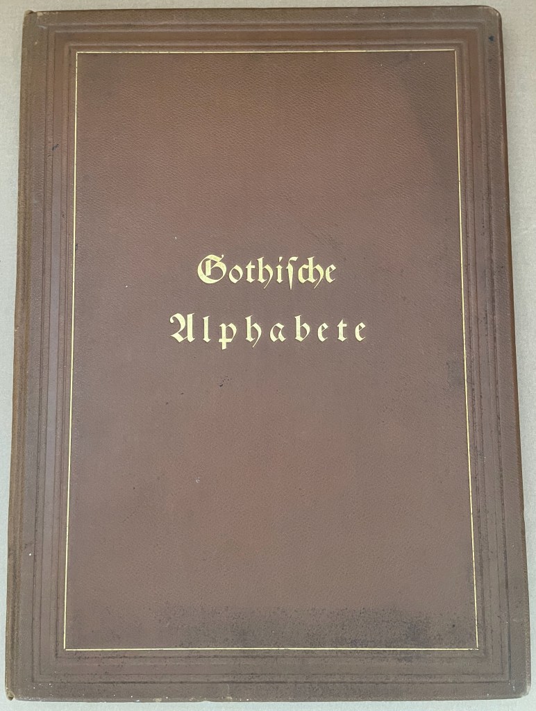
Gotische Alphabete (1897) Jaro Springer Casebound hardcover in leather with cover title and cover illustration in gold and blind embossing. H415 x W300 mm. 1 sheet, 8 pages, 3 sheets, 39 plates. Acquired from Antiquariat Braun, 14 November 2024. Photos: Books On Books Collection.
Every history of letters or script begins with a scrawl. Someone somewhere at some time made a mark tied to an object tied to a sound — A is for Ox — and some others in the same place and time accepted that this handmade mark or shape could conjure up that object in the mind. Perhaps it seemed magical, perhaps it seemed mundane as they imagined that somehow meaning and reality inhered in that shape or sound, the connection just waiting to be discovered.
Regardless, the shapes of characters and their relationship to the sound or meaning they represent is arbitrary, a prehistorical and historical function of social convention, a collective making by individuals. Jaro Springer’s art historical specimen book reminds us of the fantastical visual elaborations to which 15th-16th century artists’ hands would put those “shapes for sounds” we call the alphabet.
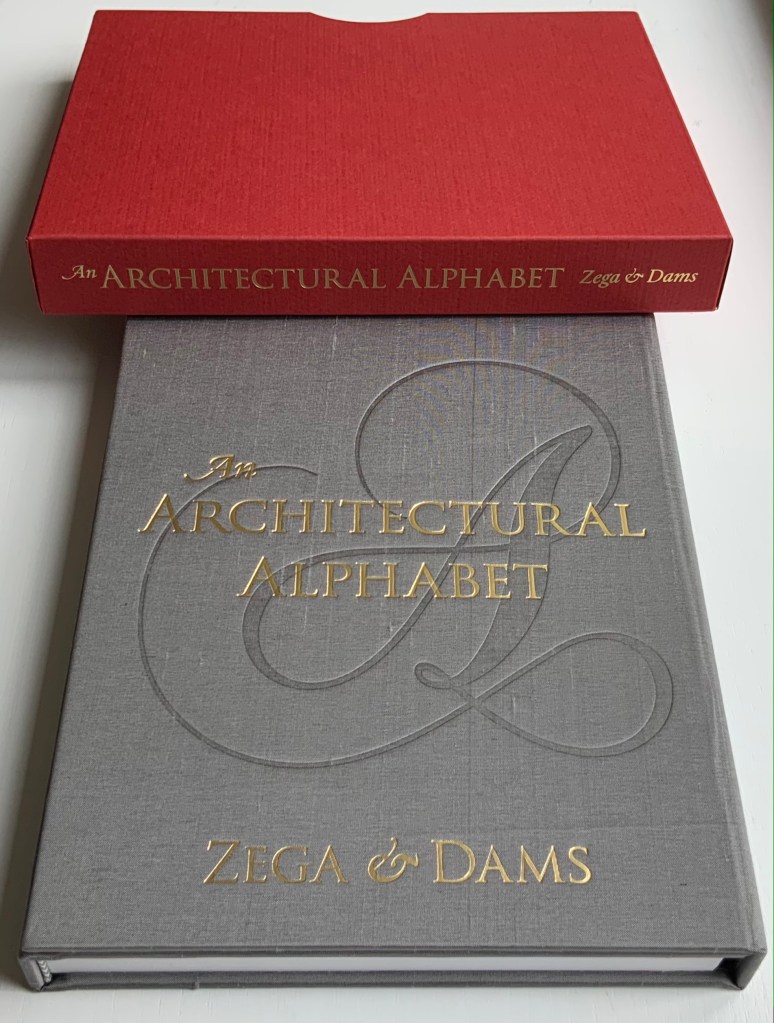
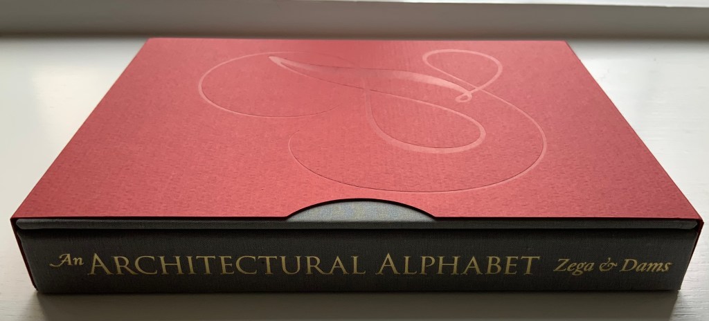
An Architectural Alphabet : ABC(2008) Edward Andrew Zega & Bernd H. Dams Slipcase, casebound in a variation of the Chinese fashion. H210 x W178 x D25 mm, 96 pages. Edition of 400, of which this is #21. Acquired from Architectural Watercolors, 8 April 2021. Photos: Books On Books Collection, displayed with permission of the artists.
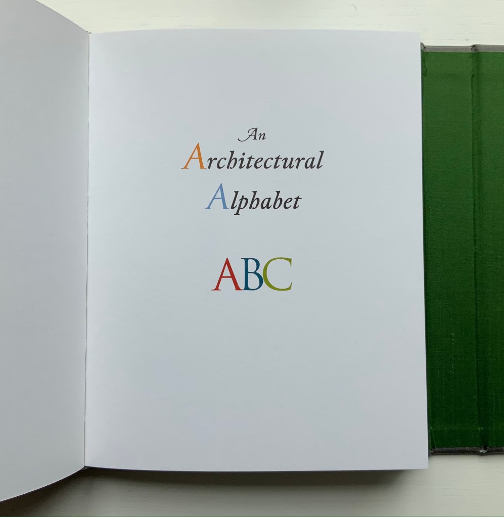
Since 1995, Zega & Dams have published several volumes of their architectural watercolors, almost all focused on the Ancien Régime but with some diversions to New York’s Central Park and Russia’s Tatarstan. An Architectural Alphabet is, however, not quite a diversion and certainly more than a divertissement. Two elegant essays — “Letter Pictures” and “Artists’ Alphabets” — bracket the elevational drawings of A to Z with their accompanying illustrations. The essays weave together reference points from the history of the Latin alphabet, architectural history, histories of architectural and natural science illustration and those of typography and graphic design. They do this lightly and knowingly just as the letters and images do, which play simultaneously with typographic and calligraphic traditions and the vocabulary of the architecture and decorative arts of the Ancien Régime and the Grand Tour.
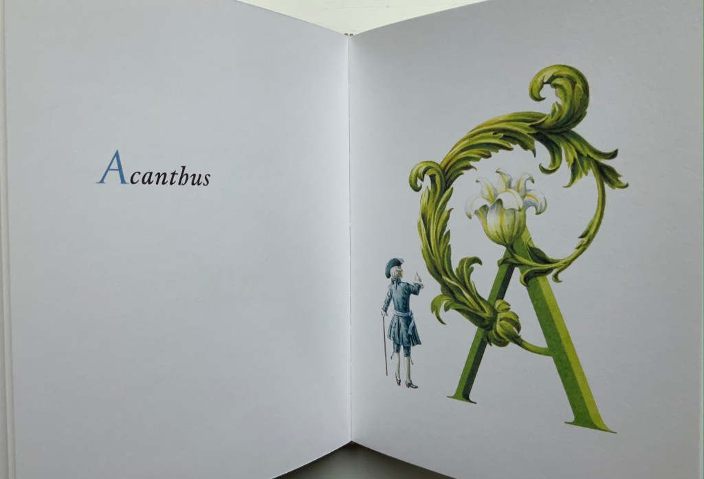
The acanthus leaf commonly used to decorate a column’s capital, hence the gentleman’s upward gaze.
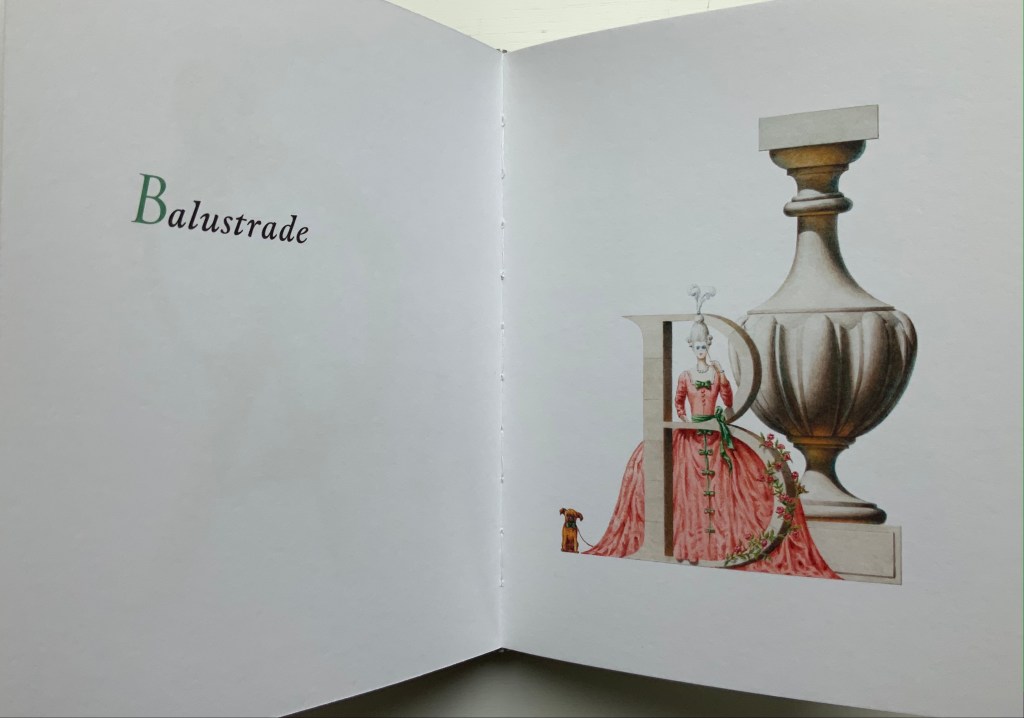
Balustrade: a rail supported by balusters (vase-shaped columns), used for balconies from which a lady might like to peer.
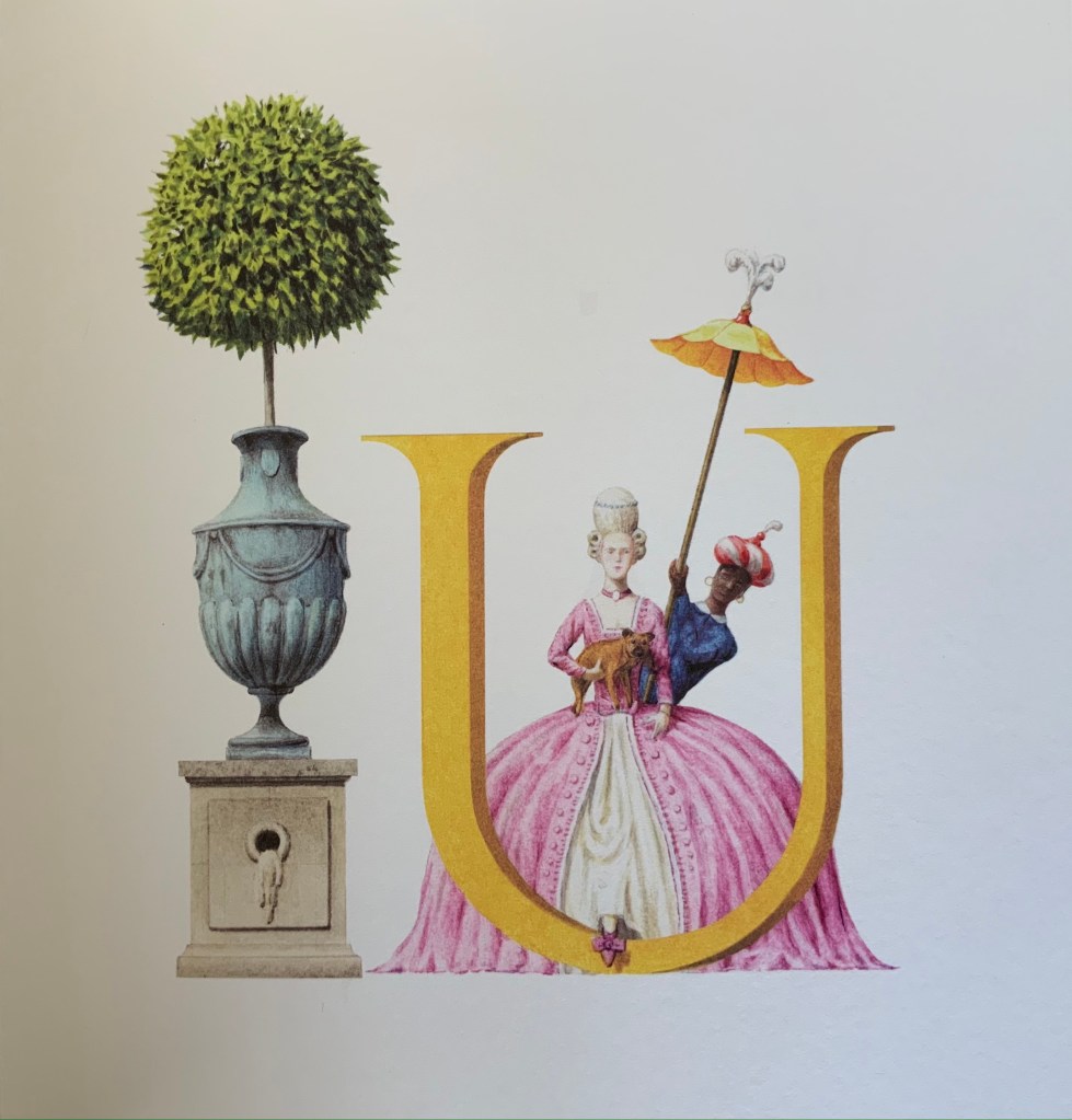
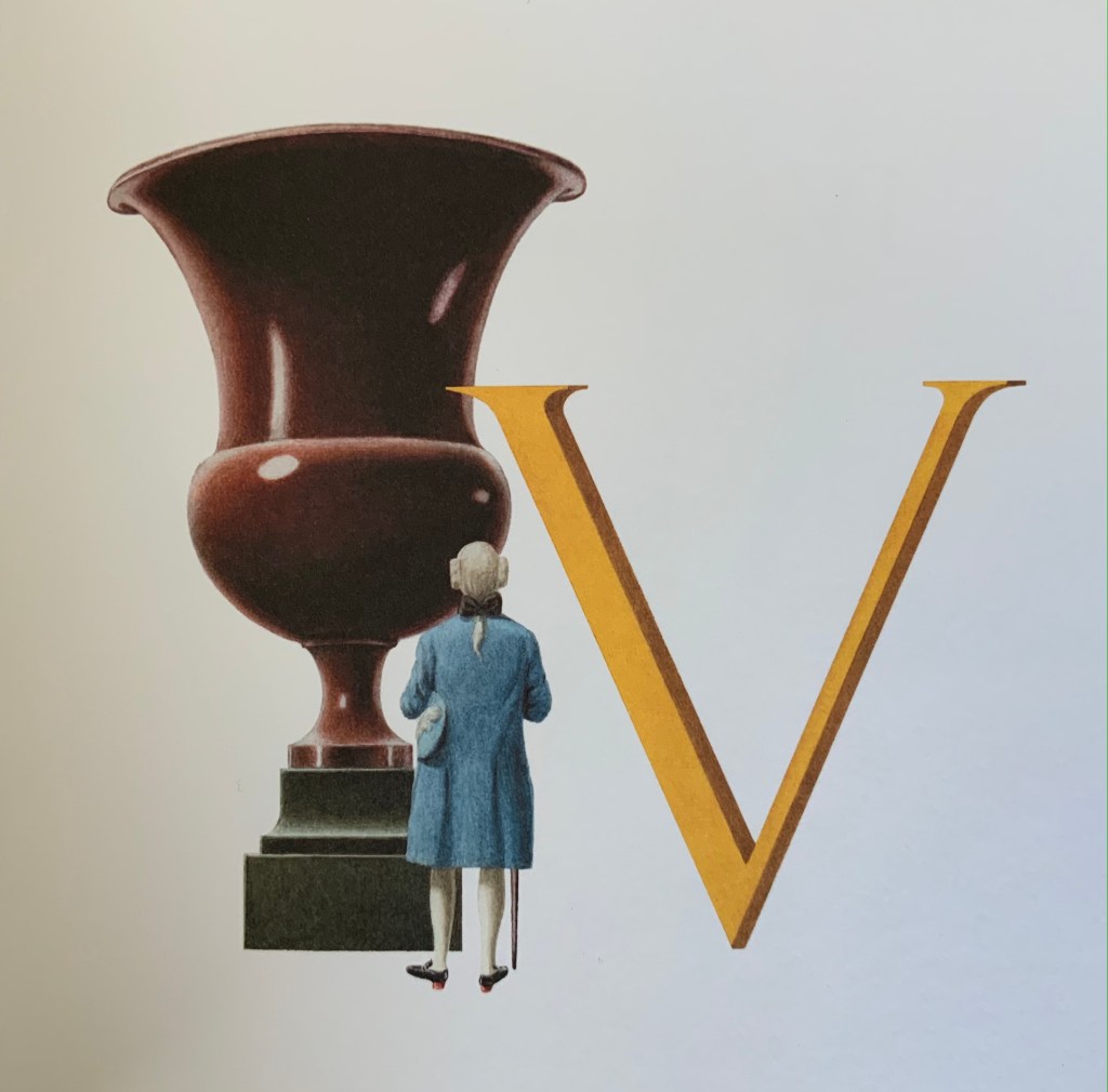
The authors/artists’ choice and use of fonts offer other examples of their subtle erudition. The body text is set in Capsa italic, a rather allusive and self-allusive choice. Dino dos Santos, its designer, was inspired by fonts created by the 18th-century type-founder Claude Lamesle. One of those Ancien Régime fonts is Gros Romain Ordinaire, whose name draws further attention to Zega & Dams’ decision to use italic in place of the usual Roman for the body text. With its “Romain” roots, Capsa italic performs as the perfect foil to the choice of display font, which also serves as the template for the “letter pictures”: Carol Twombly’s Trajan. The name and design are based on the Roman capitals entwining Trajan’s Column in Rome. The fact that the ancient Roman capitals had no letter U, only the letter V to stand in for both, provides the artists with the opening for the following visual joke.
Urn versusVase
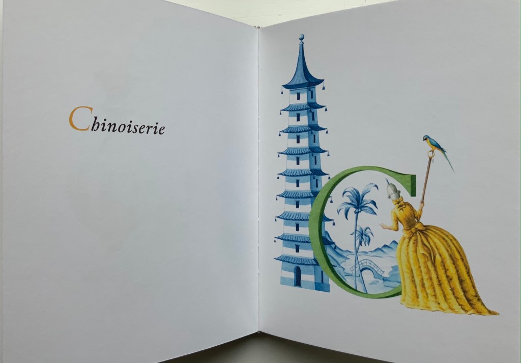
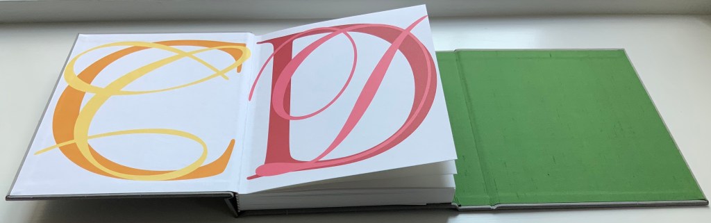
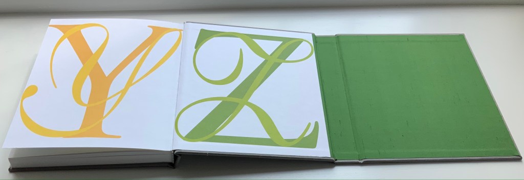
The authors take the stylistic development of chinoiserie during the Ancien Régime for two rides in the work: one for vocabulary with the letter C and another for structural allusion with the binding.
The binding is a variation on Chinese casebinding. Here the sewn book block has been placed on the middle board of three hinged boards and is attached to the left-hand and middle boards by the endpapers (CD and YZ, respectively). The right-hand board is hinged to fold on top of the left-hand board. The Curtis by Curtis 1.5 paper (a 200 gms vellum stock) is stiff, and the sewing is so tight that the book does not easily open or lie flat. The casing, however, allows extensive pressure without the hazard of breaking the spine’s covering. In two finishing Oriental touches, the artists called for grey silk for the board coverings and green for the inside of the right-hand board and hinge.
With its architectural and alphabetic themes, An Architectural Alphabet makes a fitting addition to the Books On Books Collection, and its essays serve as welcome reminders of the more discursive volumes by Laurence de Looze, Marian Macken, Hugh McEwen and Chrysostomos Tsimourdagkas (see Further Reading).