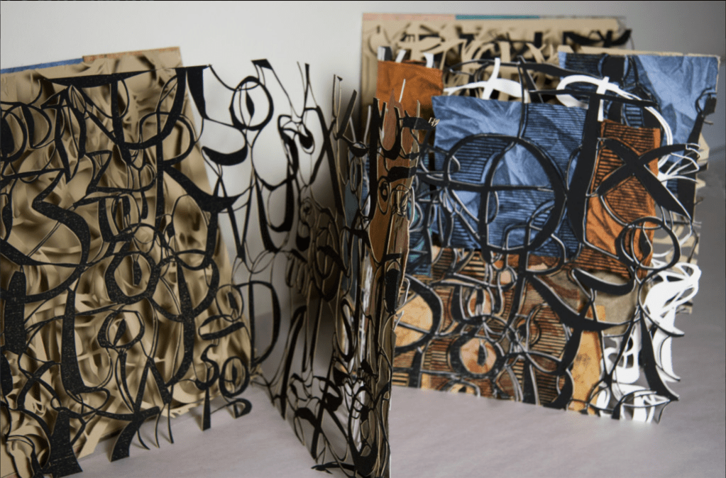
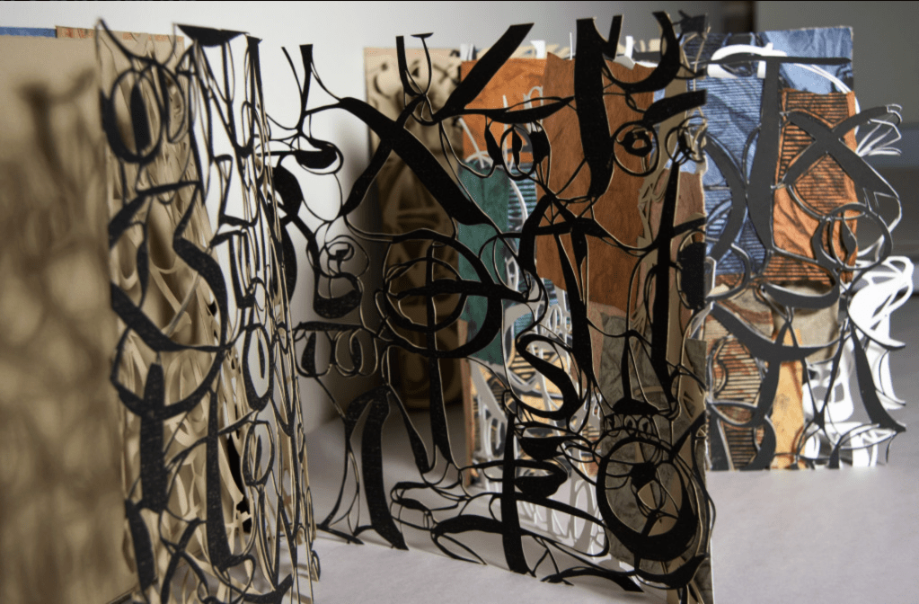
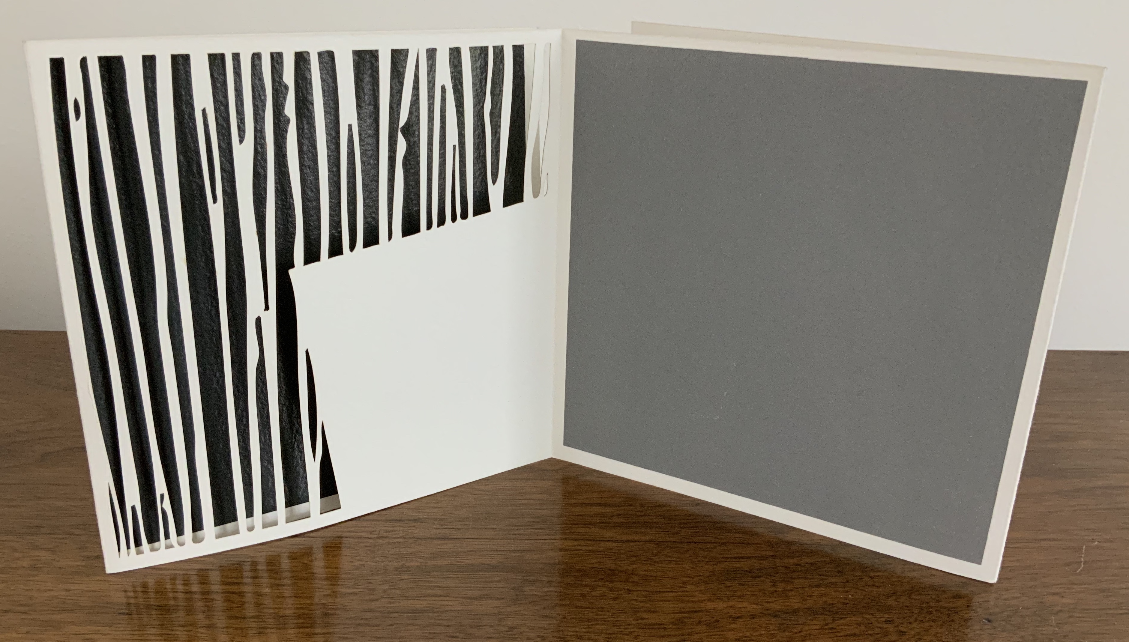
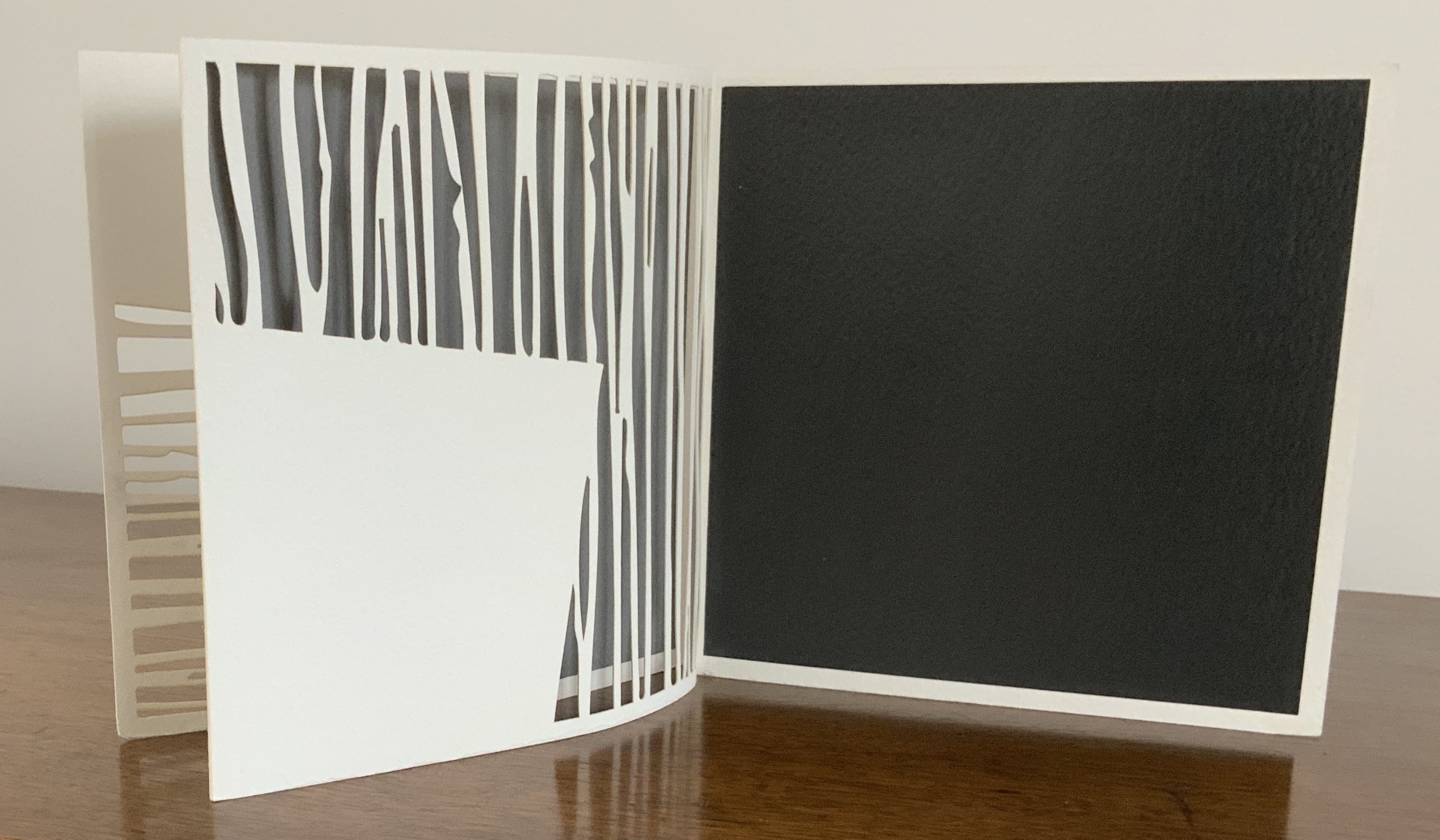
Calligrafitti #3 (2011) Merrill Shatzman Leporello. Closed: 235 x235 mm. Open: W282 cm. 10 panels.Unique. Acquired from the artist, 6 October 2017. Photos: Courtesy of the artist.
An extraordinarily fragile and rich work of print and sculpture, Calligrafitti #3 displays the inspiration that alphabets can provide for artists’ books. There are, of course, more inspirations or influence at work here.
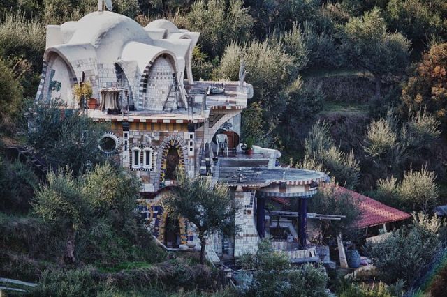
One artist mentioned by Merrill Shatzman as an influence on her art is Friedensreich Hundertwasser. The book’s three dimensionality, its colors throughout and the background striations echo the Hundertwasser House as well as the pattern of striations in several of the Hundertwasser paintings that can be found here. Certainly like Hundertwasser, Schatzman fuses the static and dynamic. In Calligrafitti #3, there’s something vegetative, almost animistic, and still architectural as carved letters can be.
Hundertwasser House, Greece
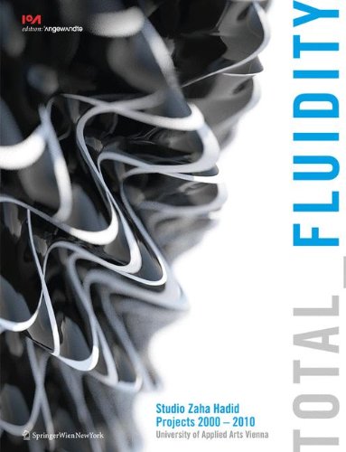
The fluidity and structure in Calligrafitti #3 recall another influence: Zaha Hadid.
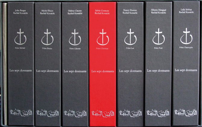
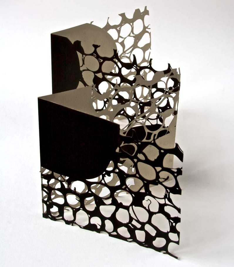
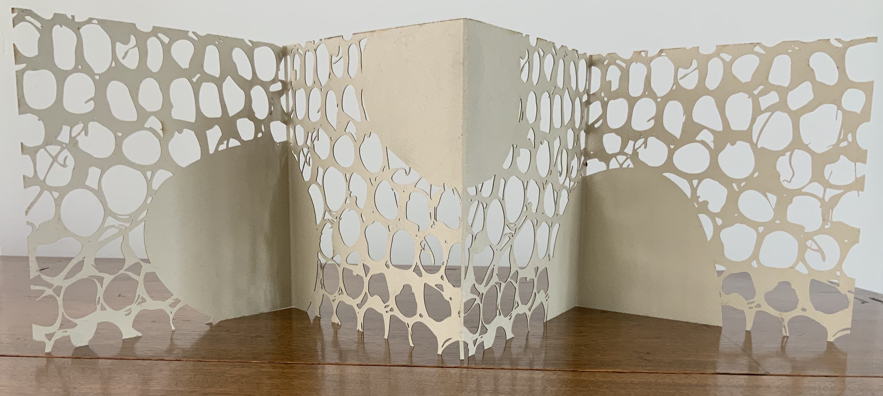
Two other visual influences that shine through — although disparate in time and dimensionality — are Rachid Koraïchi and Stuart Davis. The influences are more visual and formal than substantive, and the works below are emblematic selections.
If we were looking for a “Banksy” version of Rachid Koraïchi, we need look no further than eL Seed.
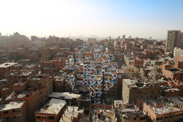
Perception, 2016 Manshiyat Nasr in Cairo, viewed from Moqattam Mountain
In my new project ‘Perception’ I am questioning the level of judgment and misconception society can unconsciously have upon a community based on their differences.
In the neighborhood of Manshiyat Nasr in Cairo, the Coptic community of Zaraeeb collects the trash of the city for decades and developed the most efficient and highly profitable recycling system on a global level. Still, the place is perceived as dirty, marginalized and segregated.
To bring light on this community, with my team and the help of the local community, I created an anamorphic piece that covers almost 50 buildings only visible from a certain point of the Moqattam Mountain. The piece of art uses the words of Saint Athanasius of Alexandria, a Coptic Bishop from the 3rd century …. el Seed
The words of Saint Athanasius referred to above are
‘إن أراد أحد أن يبصر نور الشمس، فإن عليه أن يمسح عينيه’
“Anyone who wants to see the sunlight clearly needs to wipe his eye first.”
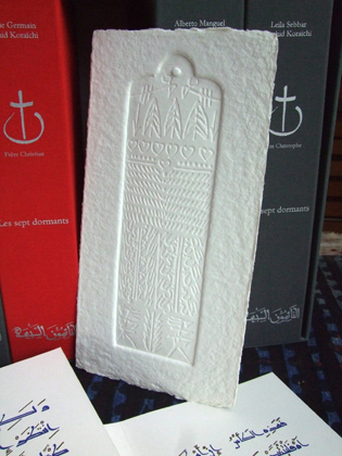
As with Camus, Algerian sunlight is strong in eL Seed’s work. As it also is in Koraïchi’s Lettres d’ Argile (Letters of Clay) and other ceramic works and arguably in the copperplates for Les Sept Dormants. As with Koraïchi’s work, humanism, poetry and bridging cultures are strong in eL Seed’s work.
The pseudonymous artist has created more “straightforward” street art installations in Tunisia, New York, Rio de Janeiro and Paris, all marked by the curvilinear linking of word and image that so often characterizes inspired book art. This reverse ekphrasis that book art frequently plays upon literature is heightened by calligraphy’s tight binding of art and craft to text. Perception‘s anamorphic enhancement of this binding is brilliant.
The relationship between word and image is “antagonistic sympathy”, according to the English book artist Telfer Stokes (“The Why and How I Make Books“, JAB 3, Spring 1995). In the hands and eyes of Koraïchi and eL Seed, the relationship — if it is a struggle, an agon — becomes more that of sunlight on water, or wind through a wheat field.
In addition to the installations and his book Lost Walls chronicling his painting of 24 walls in 4 weeks during a journey through Tunisia, eL Seed has produced a colorful body of lithographs and sculpture.
In this sculptural work inspired by a poem from Nizar Qabbani, el Seed says his intention is to invite the viewer to walk through a “conversation between the poem, the language, the form and me”. This may remind you of the influence that northern Africa had on the Finnish architect Juhani Pallasmaa, and how it led to his meditative exhortation to architects in The Eyes of the Skin to pursue a visual experience that offers a tactile and haptic quality, that also appeals to the realms of hearing, smell and taste and yet does not neglect the conceptual and rational. That, too, characterizes inspired book art.
Likewise it is interesting how this lithograph and the “calligraffiti” appearing on those broken walls and buildings touch eloquently on another theme characteristic of much book art — how the passage of time touches us, how we try to touch the passage of time.
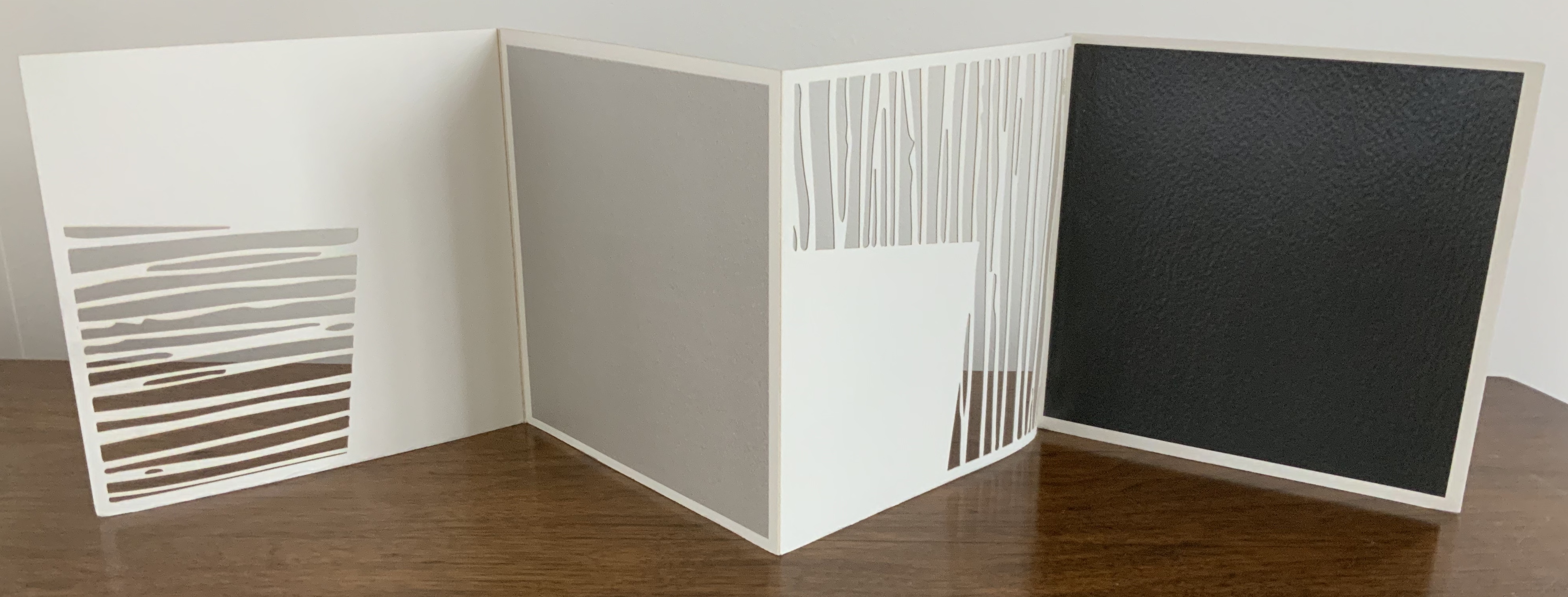
Untitled (2006) Jenny Smith Matte-beige slot-and-tab case containing eight-panel leporello, four panels lasercut and three screenprint. Case: 167 x 167 mm; Book: 165 x 165 mm. Edition of 25 of which this is #21. Acquired from the artist, 31 July 2017. Photo: Courtesy of the artist.
Photos: Books On Books Collection.
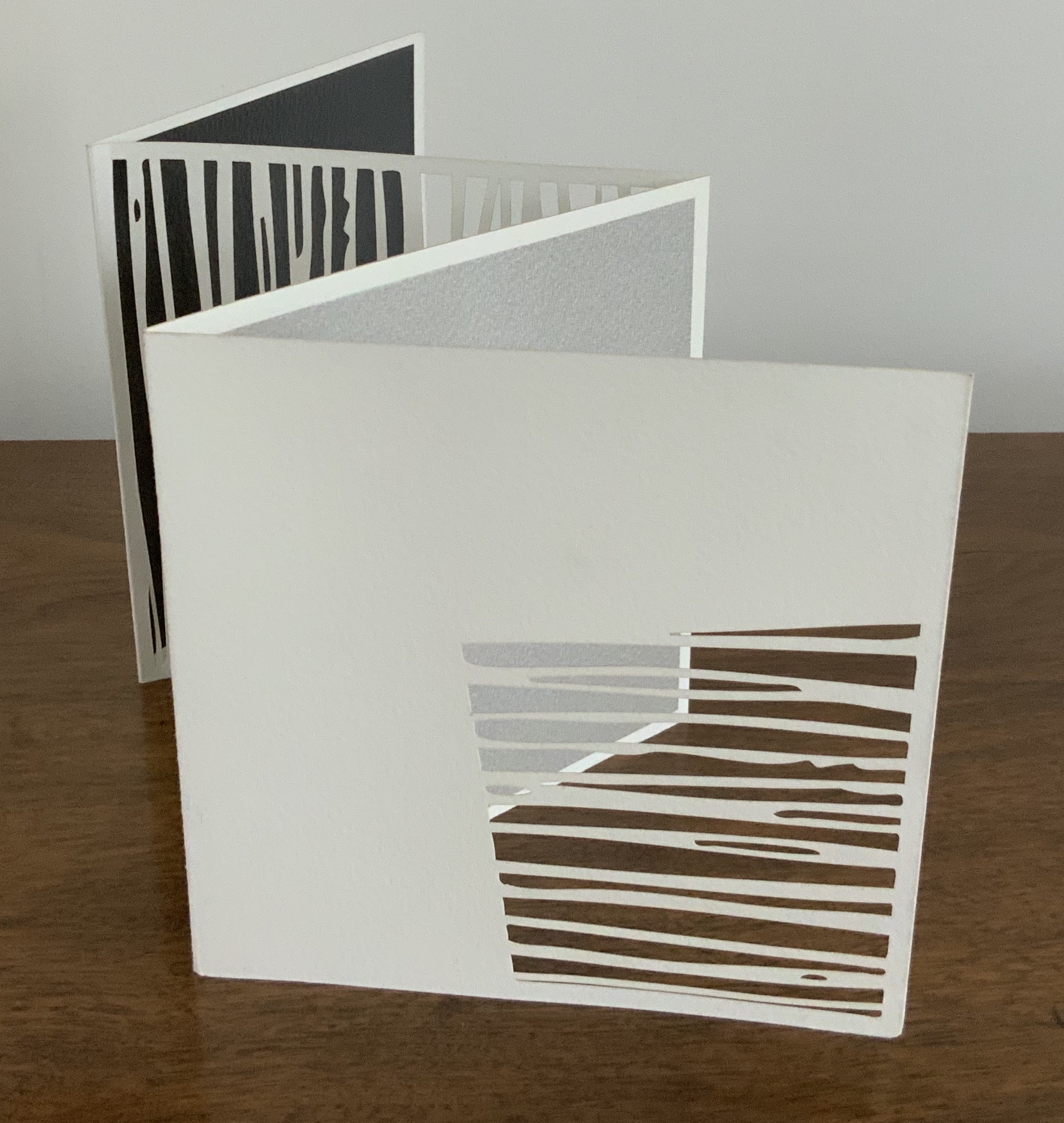
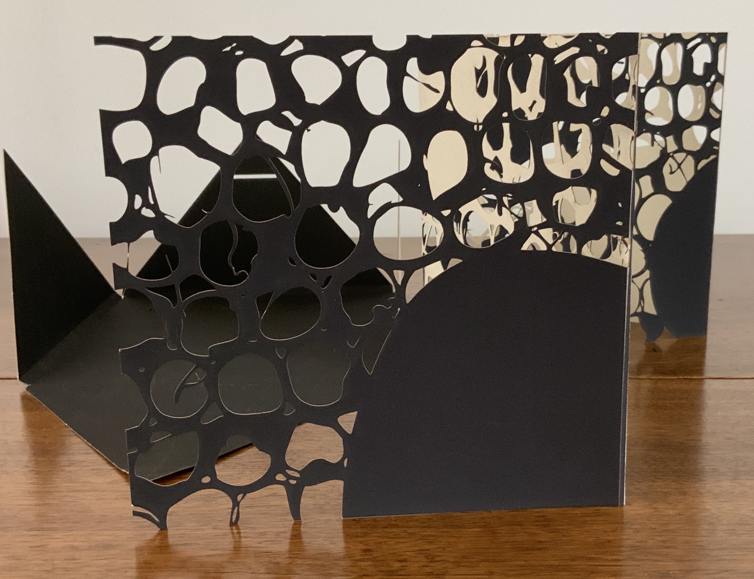
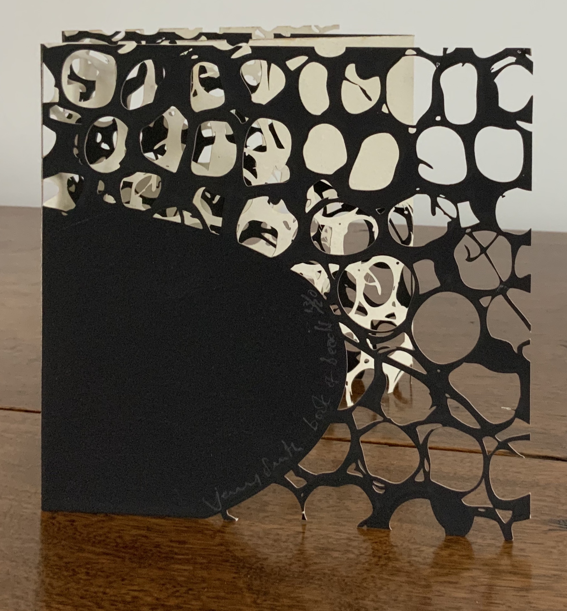
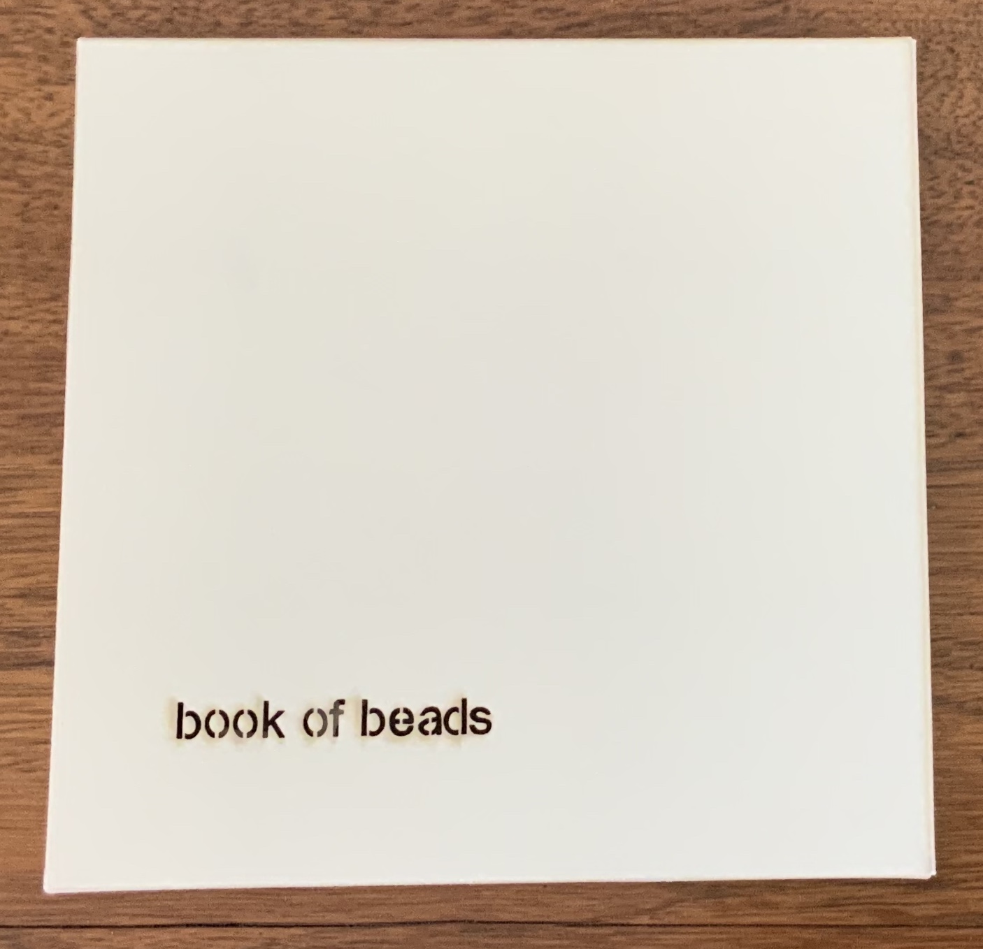
Book of Beads (2008)
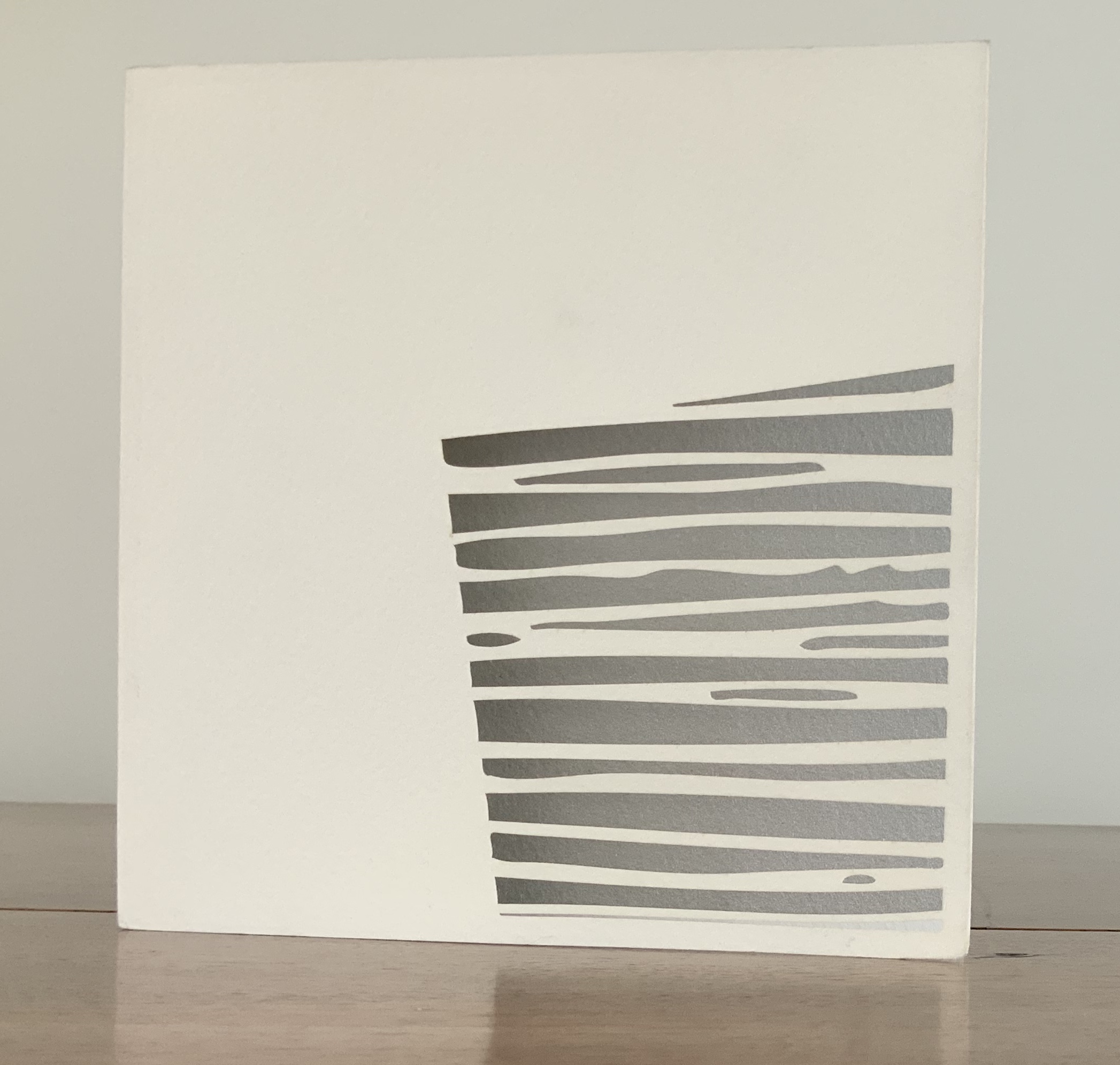
Book of Beads (2008) Jenny Smith Case of beige matte-finish, screenprint black interior, title lasercut: 165 x 165 mm; Book in accordion-fold, eight panels lasercut, taupe on one side, screenprint black on other, 160 x 160 mm Edition of 20 of which this is #13. Acquired from the artist, 31 July 2017. Photo: Courtesy of the artist.
Photos: Books On Books Collection.
The interlocking views of panels through panels foreshadow a work by Katumi Komagata:「Ichigu」(2015). The fine tendrils in the cutting may remind some of works by Béatrice Coron or Merrill Shatzman.
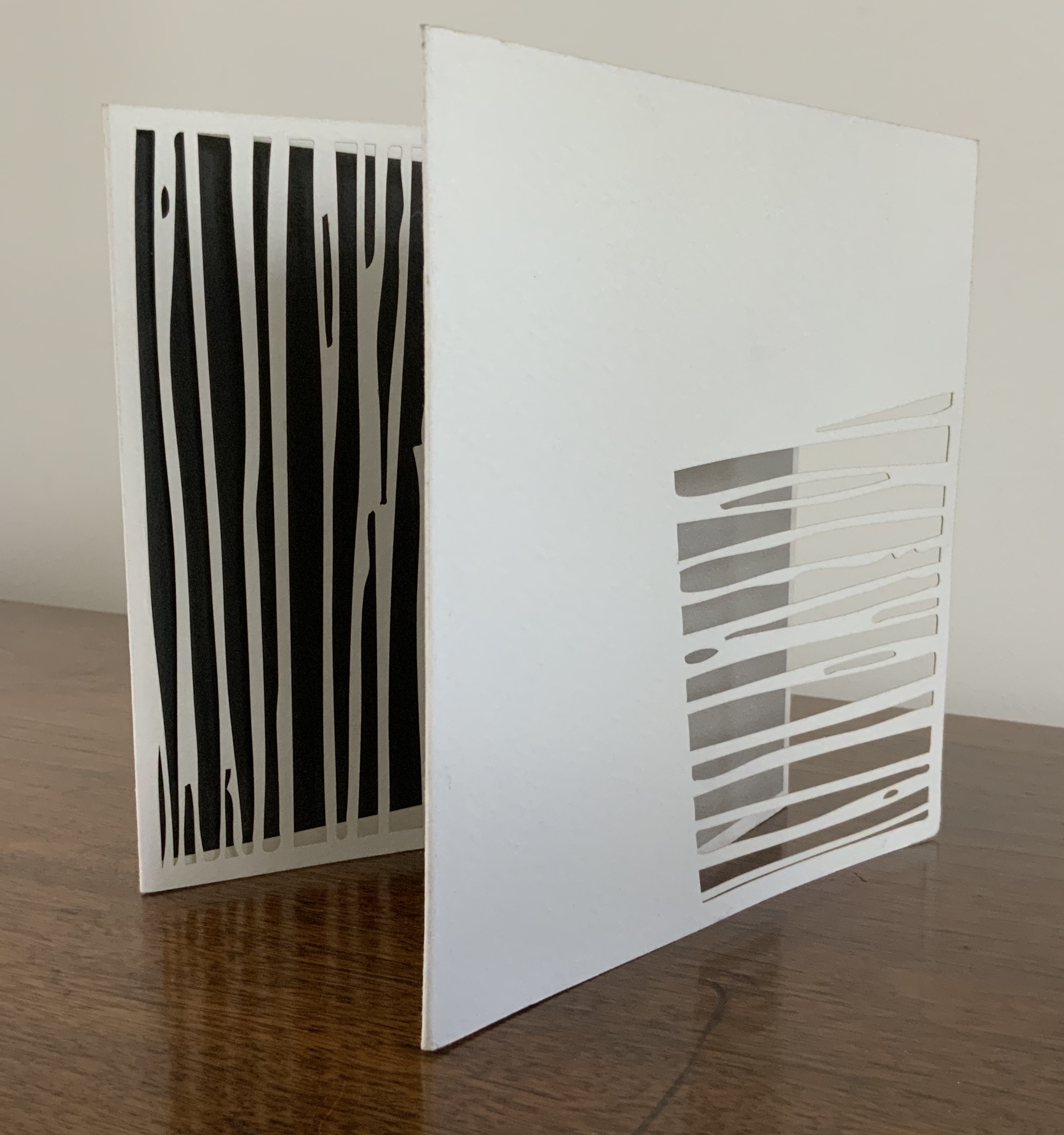
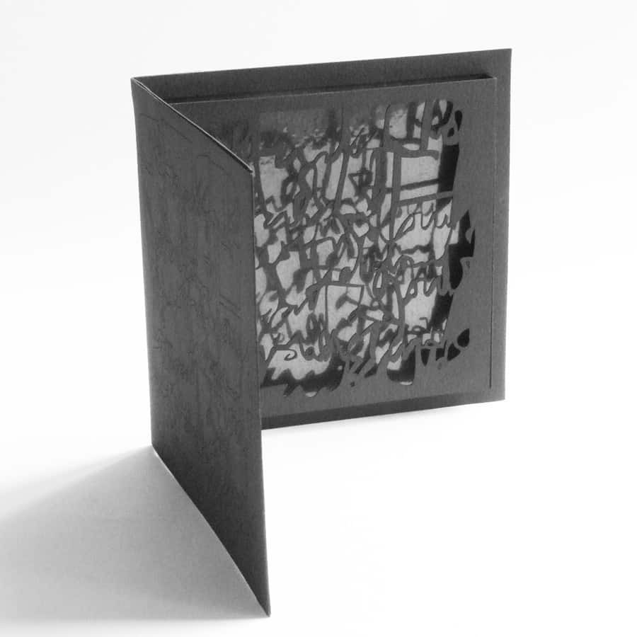
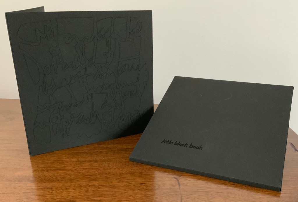
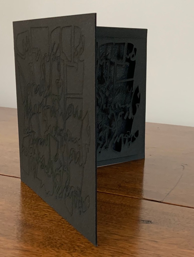
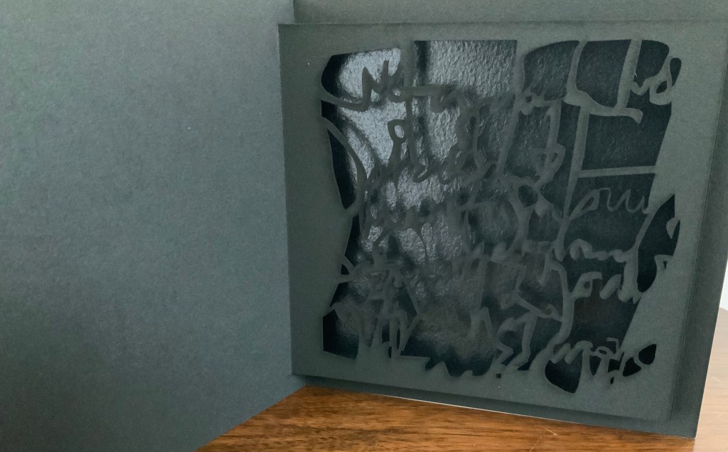
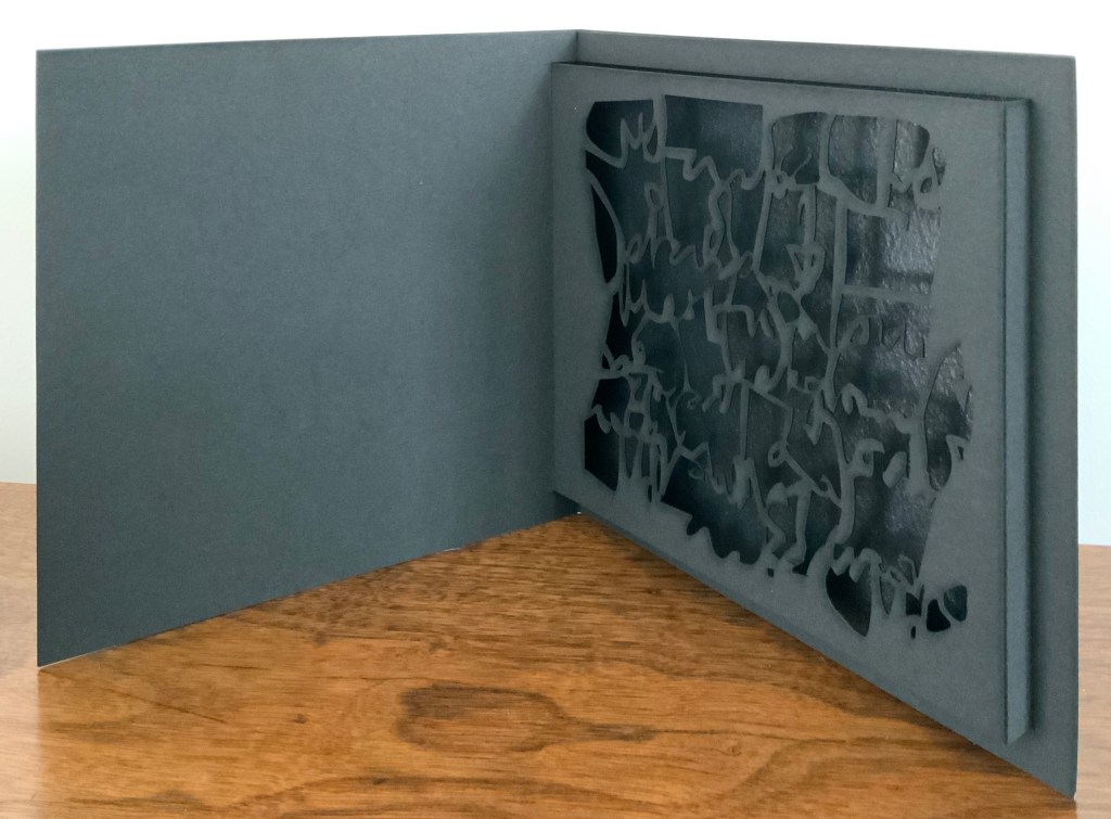
Little Black Book (2009)
Little Black Book (2009) Jenny Smith Matte-black slot-and-tab case containing matte-black single fold booklet; cover engraved with an abstract, calligraphic design that is cut out inside on the pop-up page and reappears in shadow against a gloss black screenprint insert behind the pop-up page. Case: 167 x 167 mm; Book: 160 x 160 mm; Pop-up page: H140 x W150 mm. Edition of 20, of which this is #14. Acquired from the artist, 31 July 2017. Photo: Courtesy of the artist.
The grassy nature of the 2013 installation and its engagement with children may remind the reader/viewer of Water on the Border (1994) by Helen Douglas and Telfer Stokes. For some, the interaction of cage and words in the 2016 installation may recall Bird Language (2003) by Xu Bing.
Further Reading
“Medicinal Art”, Studio Pavilion, 19 September 2019. Accessed 2 May 2020.