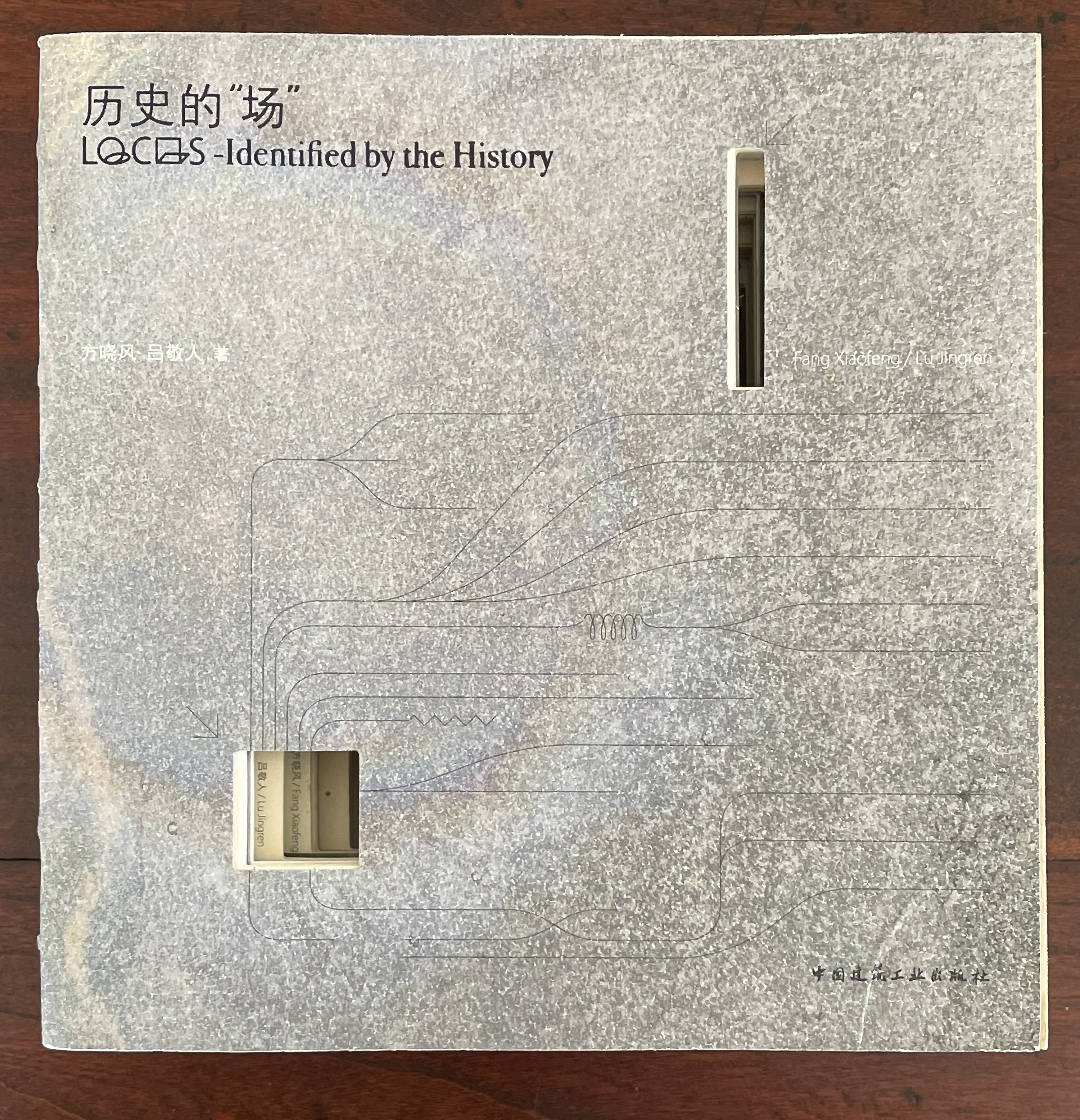
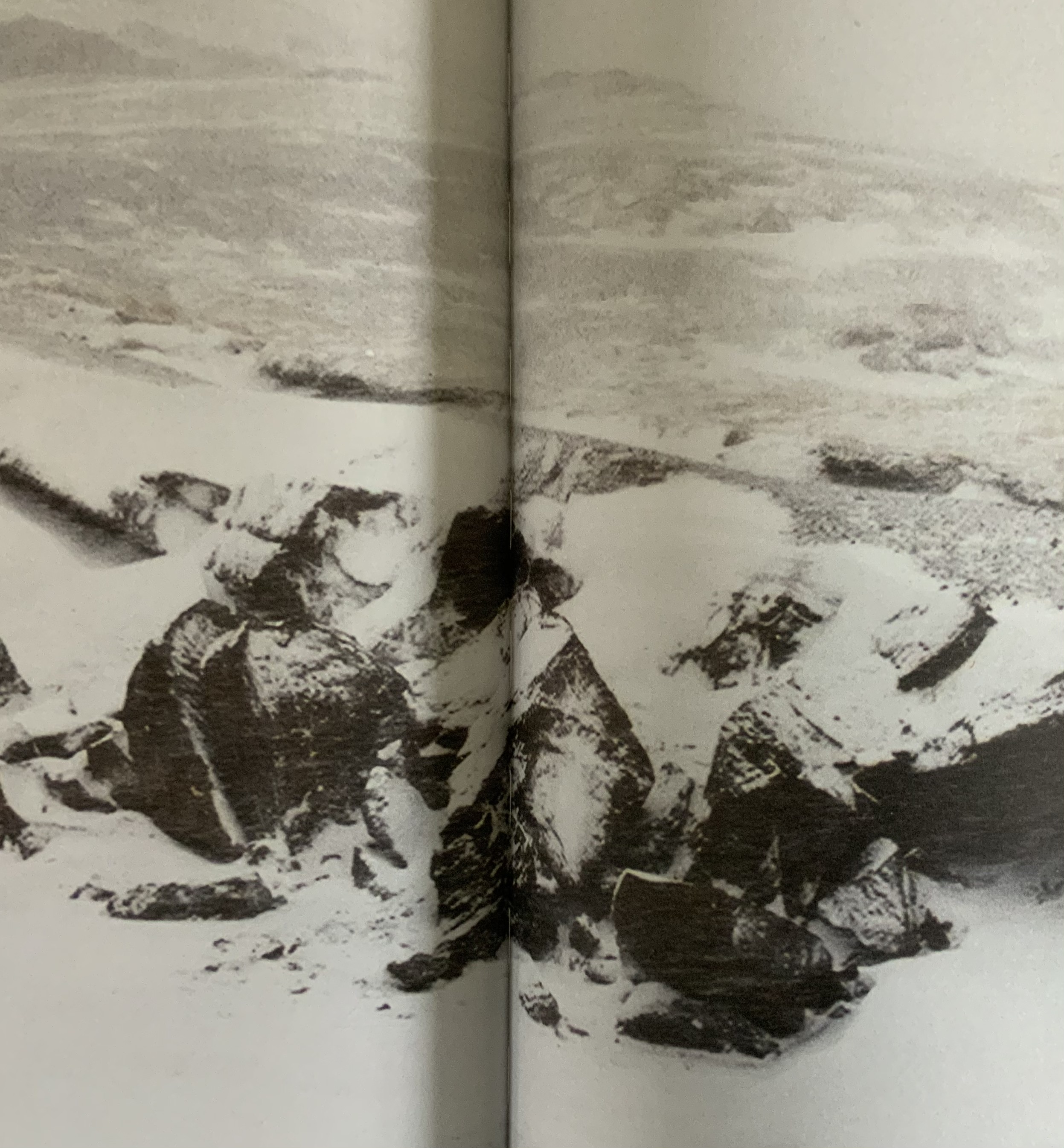
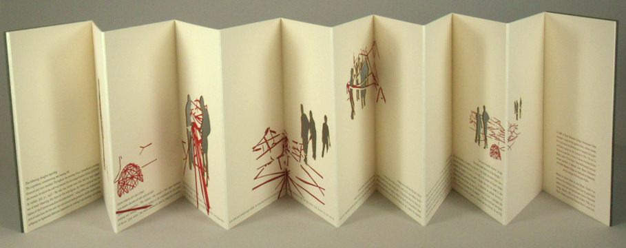
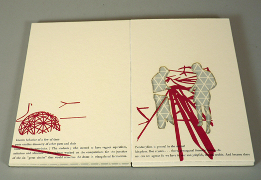
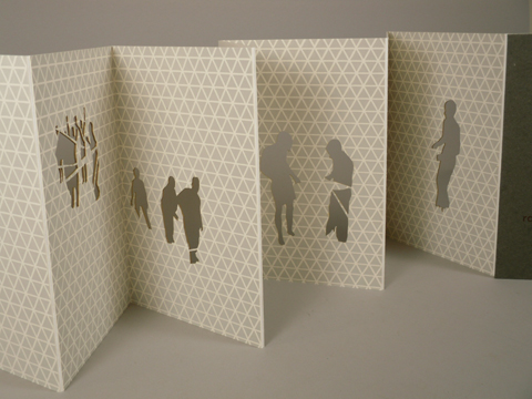
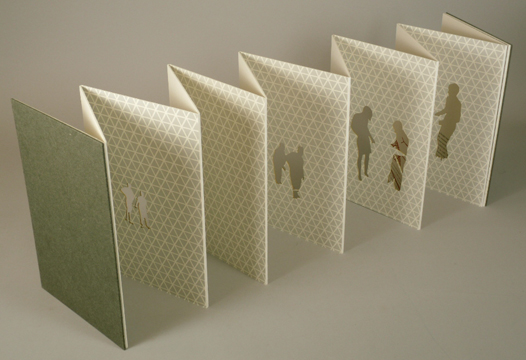
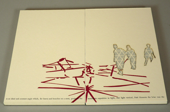
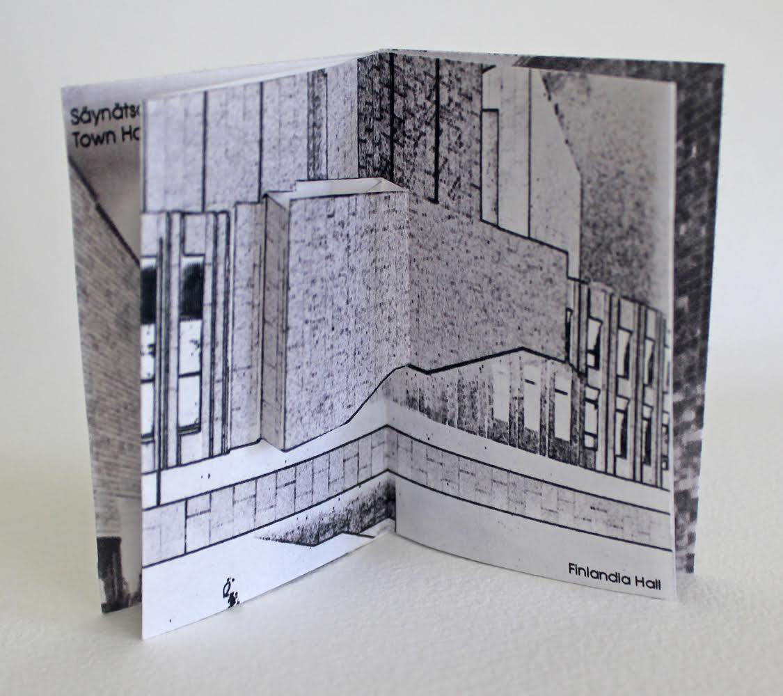
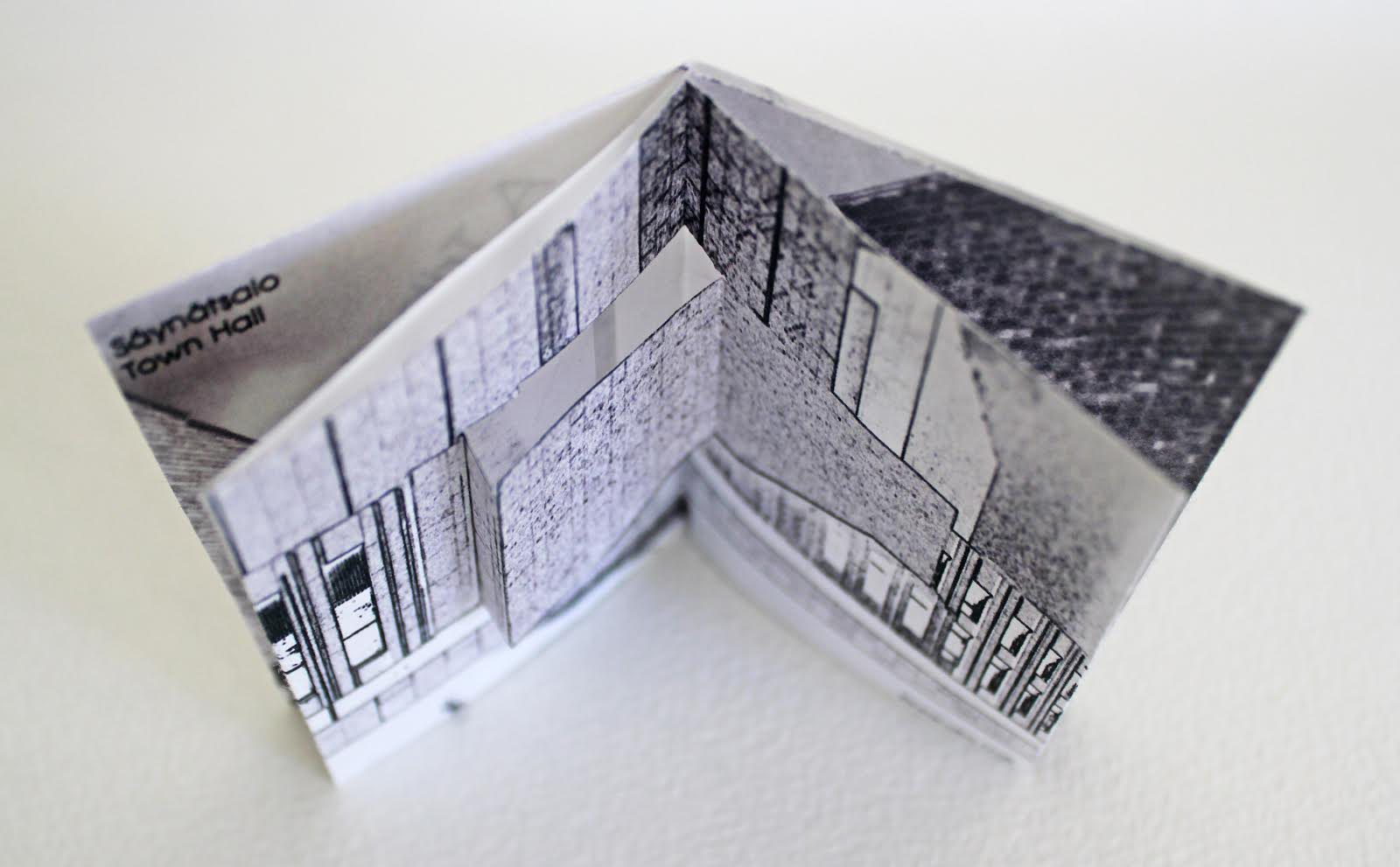
历史的”场 (Locus: Identified by the History) (2016) 方晓风 (Fang Xiaofeng) and 呂敬人 (Lu Jingren) Beijing Shi: Zhongguo jian zhu gong ye chu ban she.
Co-authored by architecture scholar Fang Xiaofeng and book designer Lu Jingren, Locus: Identified by the History (2016) springs from the Book – Architecture Project (书 – 筑 / Shu – Zhu Project), conceived by Lu Jingren, Fumihiko Maki (Japan), and Yi Ki-Ung (South Korea). The project initiated a multi-year series of exhibitions/forums called “Book – Architecture: Dialogues Between Architects and Book Designers” (2011-19) across all three countries. Locus was published on the occasion of the second exhibition/forum in 2016.
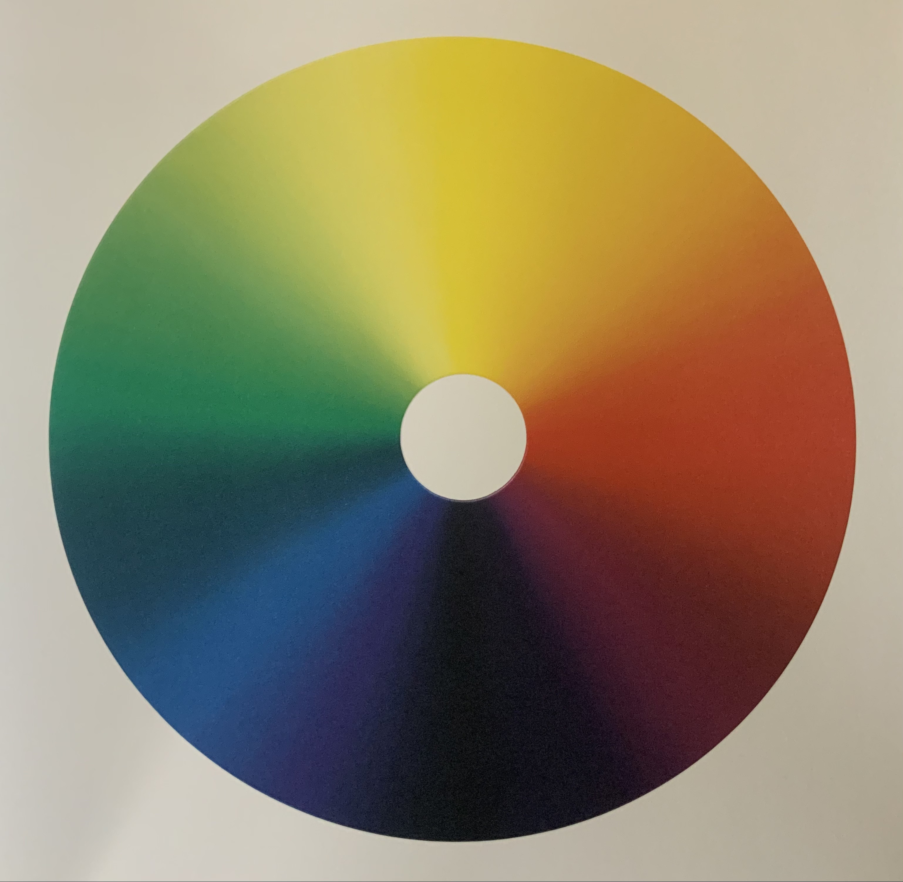
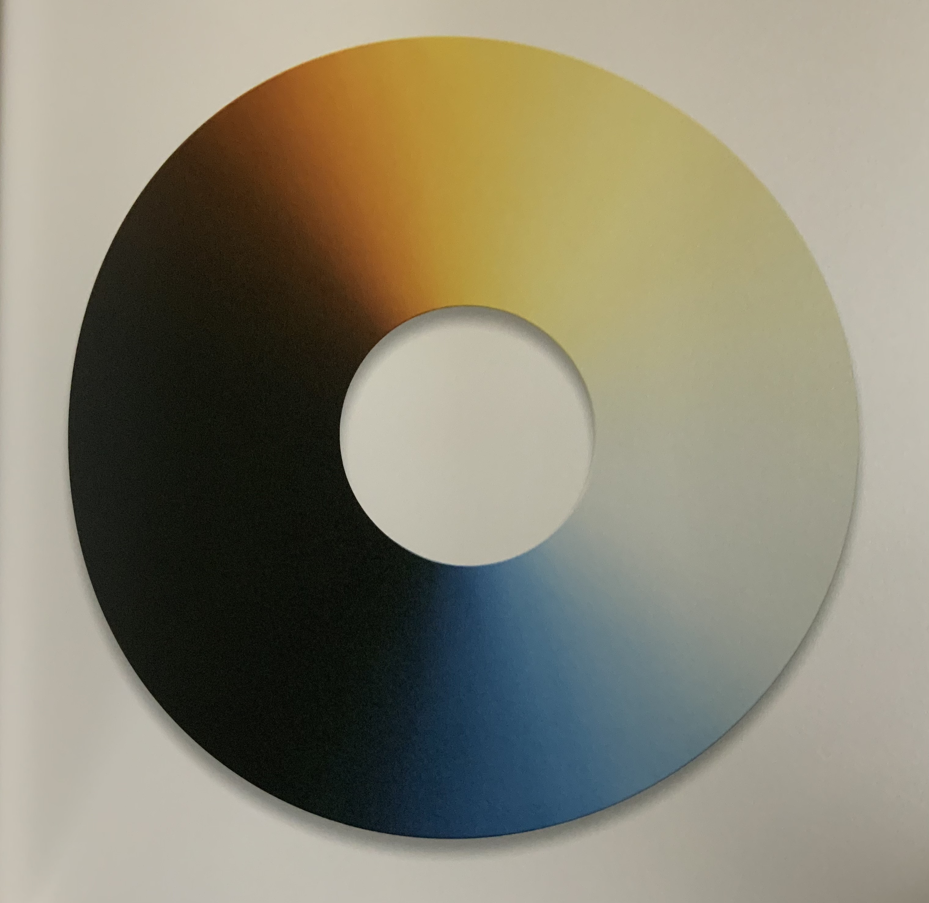
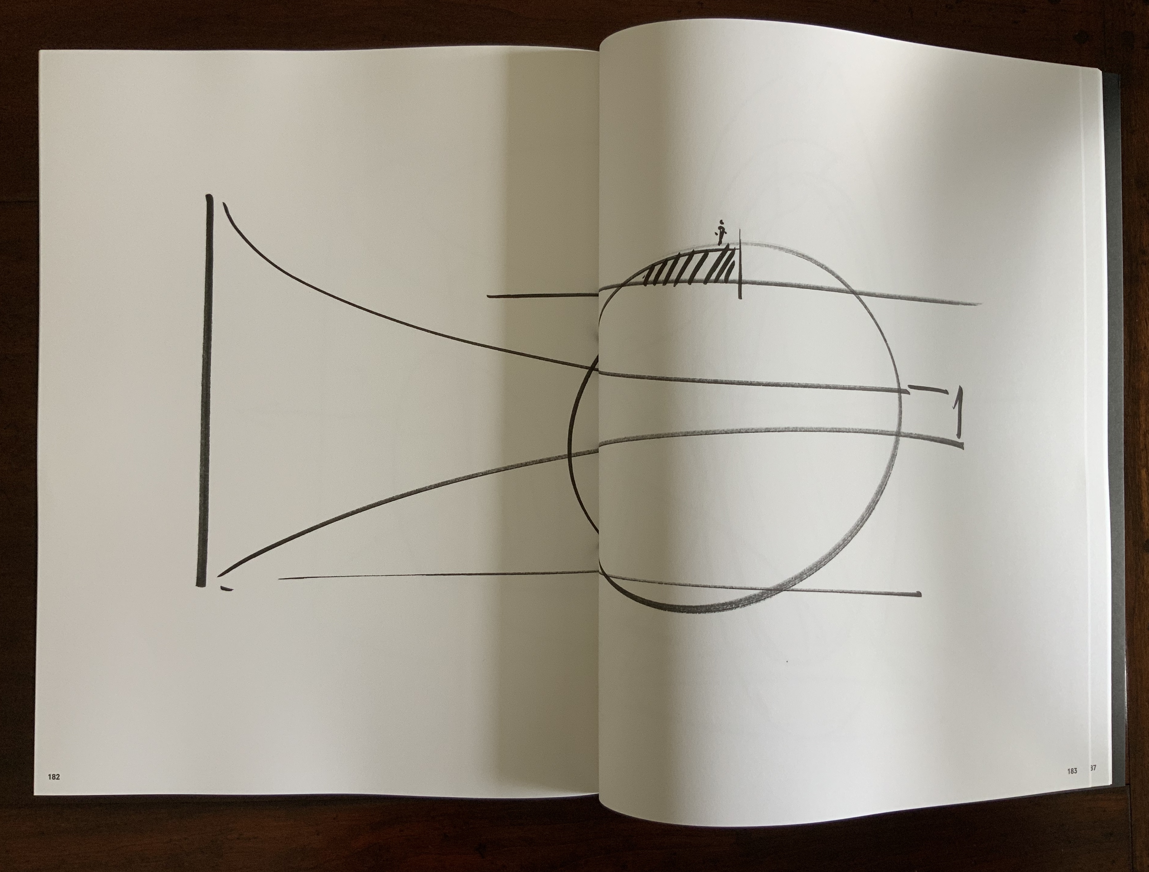
Locus pursues two overlapping lines of thought. The first and primary one rests on Lu’s design philosophy that a book is a built environment, a habitat for text and images to be engaged by readers and all five of their senses. Its layout, pacing, structure, and their interconnectedness with each other and the book’s materials mirror the architect’s design of rooms, hallways, stairs, windows, doors, thresholds, and their interconnectedness with each other and their materials. Likewise as habitats, they each have exteriors, are designed to occupy a locus in time and space, and relate to a world outside. In Lu’s philosophy, the design mechanics involve four pillars: binding + layout + editorial + information visualization. Successful execution results in an immersive spatial object (habitat) that triggers the reader’s visual, tactile, auditory, olfactory, and gustatory systems simultaneously.
What is it about artists’ books and architecture that they intersect so often? Architectural interiors and exteriors, ideas, themes, styles, landmark dwellings and edifices have found their metaphorical expression and embodiment in book art with such regularity that they make up a genre within the genre. Perhaps it is that, as Victor Hugo expresses it in Nôtre Dame de Paris (1831/1902),
… the human race has two books, two registers, two testaments: masonry and printing; the Bible of stone and the Bible of paper. … The past must be reread upon these pages of marble. This book, written by architecture, must be admired and perused incessantly; but the grandeur of the edifice which printing erects in its turn must not be denied. (Book V, Chapter 2, p. 187)
Or perhaps it is even more fundamental. As Hugo asserts in his posthumous The Alps and the Pyrenees (1890/1895):
All letters were signs at first, and all signs were images at first…. Human society, the world, man as a whole, is in the alphabet….A is the roof, the gable with its cross-beam, the arch, arx; … Z is the lightning, it is God. (pp. 64-65)
Beneath the mysticism and pareidolia, Hugo is on to something. Maybe the affinity of books and architecture lies in the origin of the raw material of books — the alphabet — whose second letter comes from a mark signifying shelter or house.
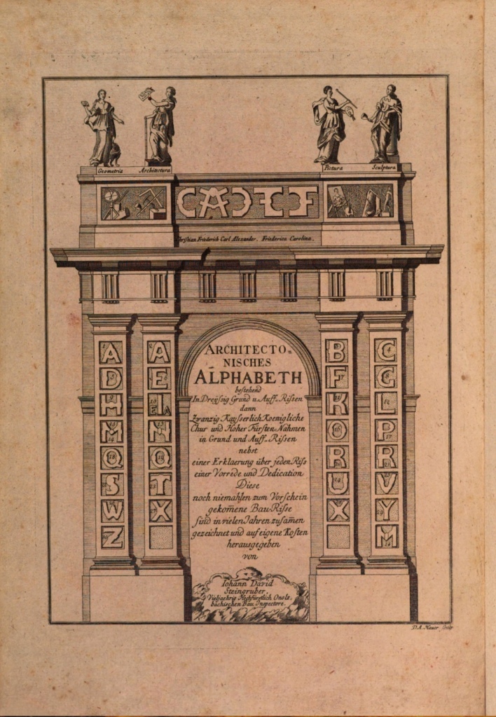
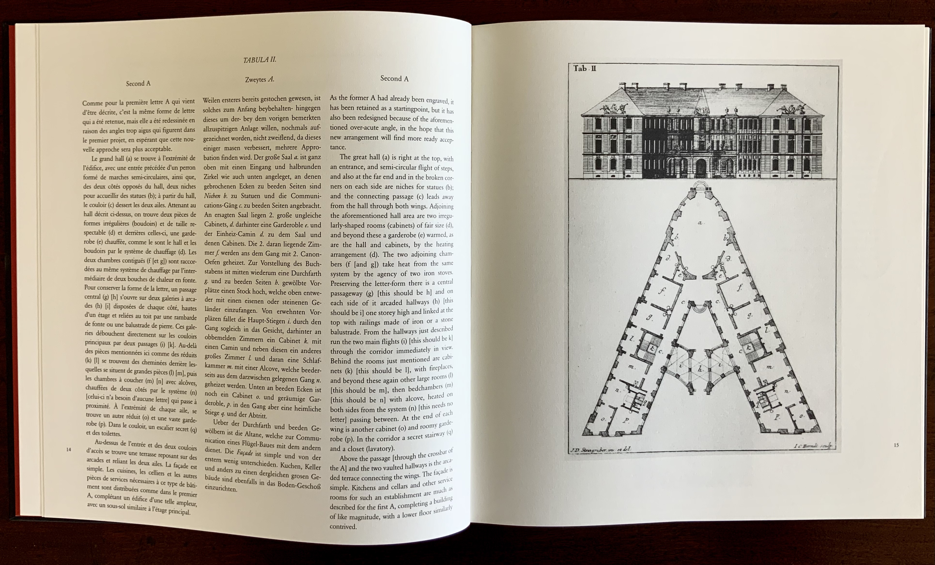
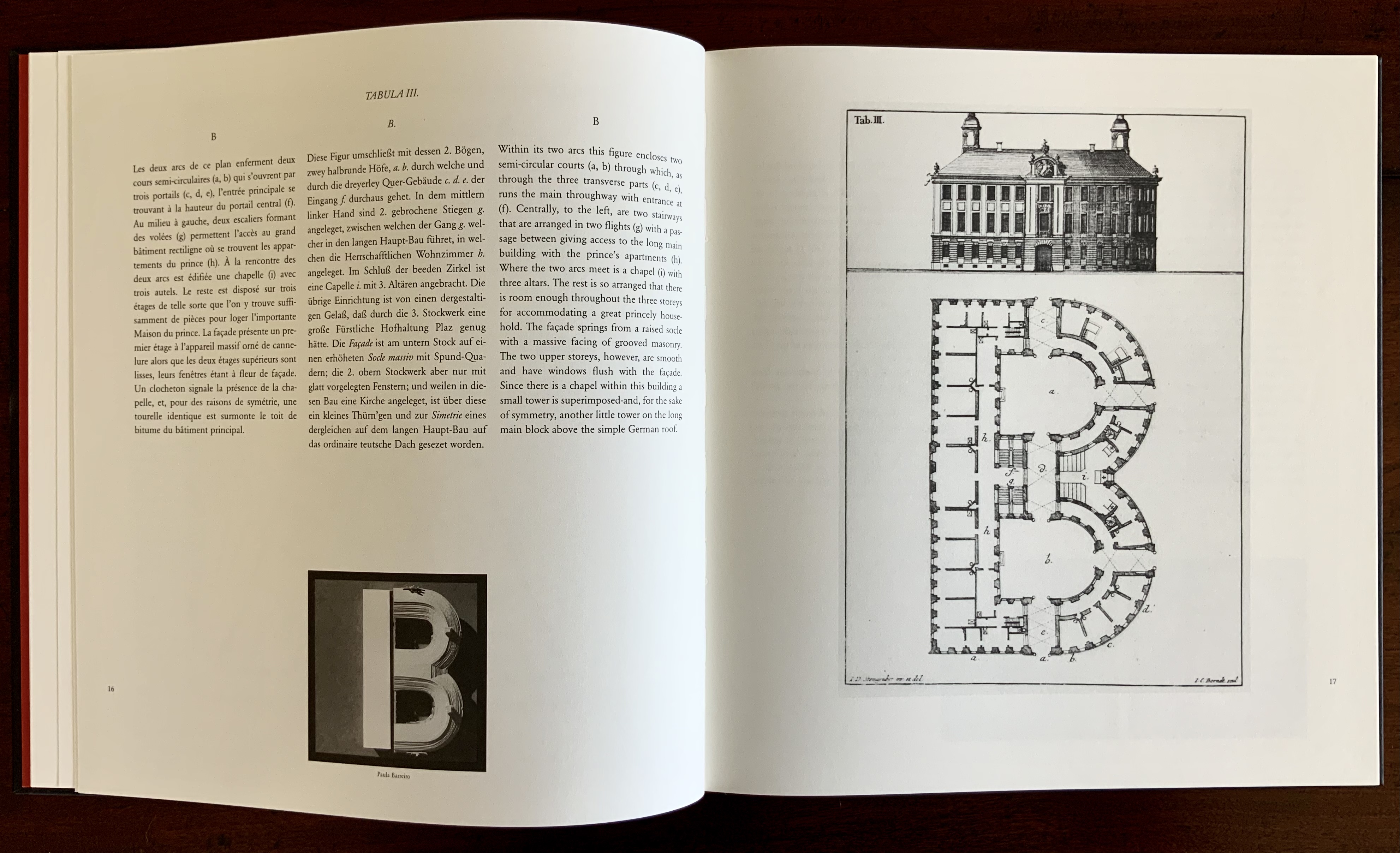
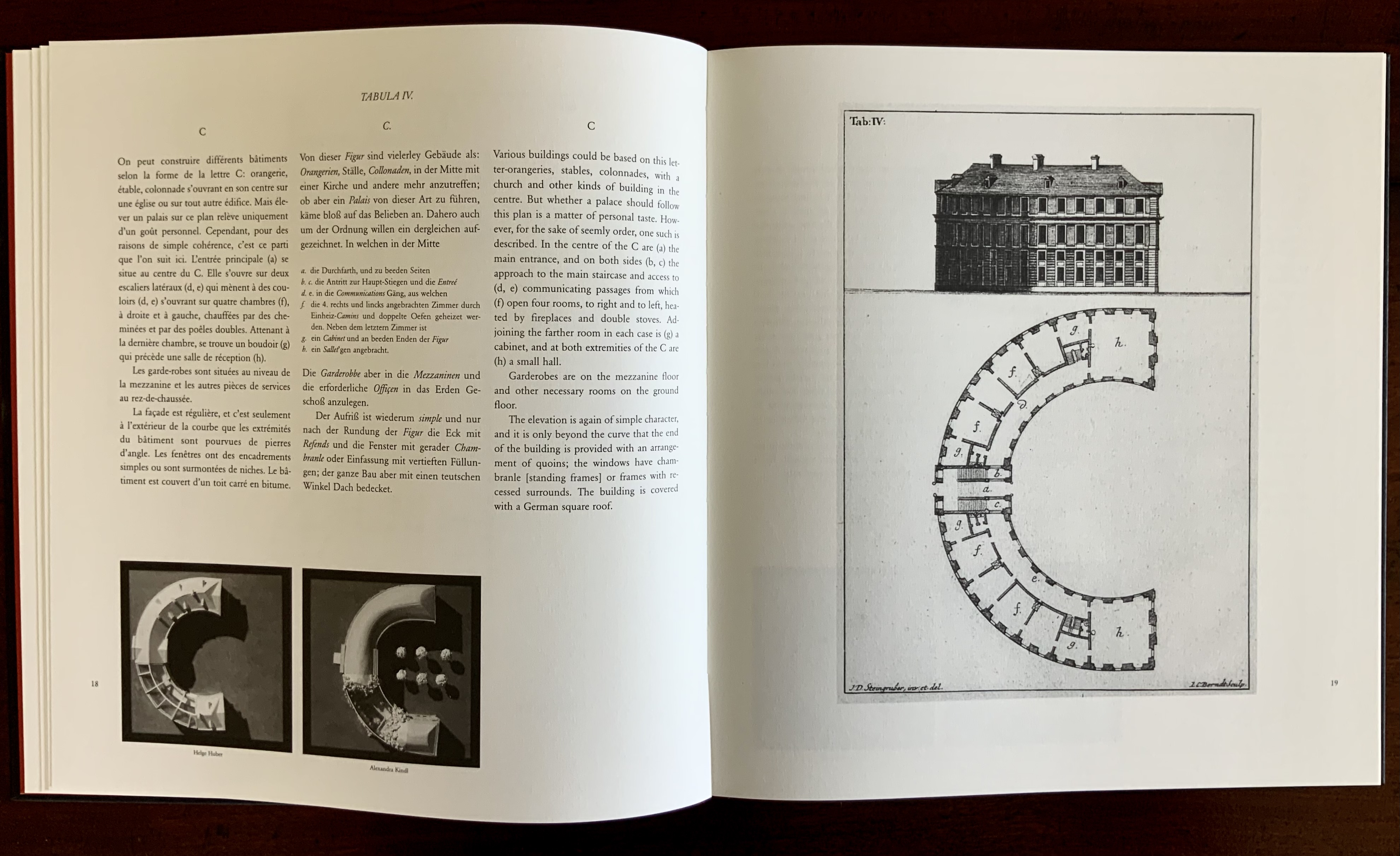
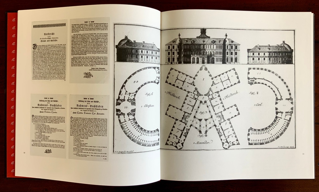
This wondering and wandering about the intersection of architecture and the artist’s book is prompted by the 250th anniversary of the publication of Johann David Steingruber’s Architectonisches Alphabeth(1773). This postcard-famous volume of print folios depicts architectural elevations and plans for residences in the shape of the letters of the alphabet. It is dedicated to Christian Friedrich Carl Alexander, Margrave of Brandenburg-Ansbach, not to be confused with the paying dedicatee of Bach’s Brandenburg Concertos, the Margrave of Brandenburg-Schwedt. By a baroque coincidence, however, the first Brandenburg concertos, the ones composed by Giuseppe Torelli and influencing Bach, are dedicated to the Margrave of Brandenburg-Ansbach, then George Friedrich II, Alexander’s great-uncle who employed Torelli as court composer. Unlike Bach, however, Torelli received no direct payment for his composition. Steingruber too had to be satisfied with his payment as an appointee (court and public surveyor, and later principal architect of the board of works).
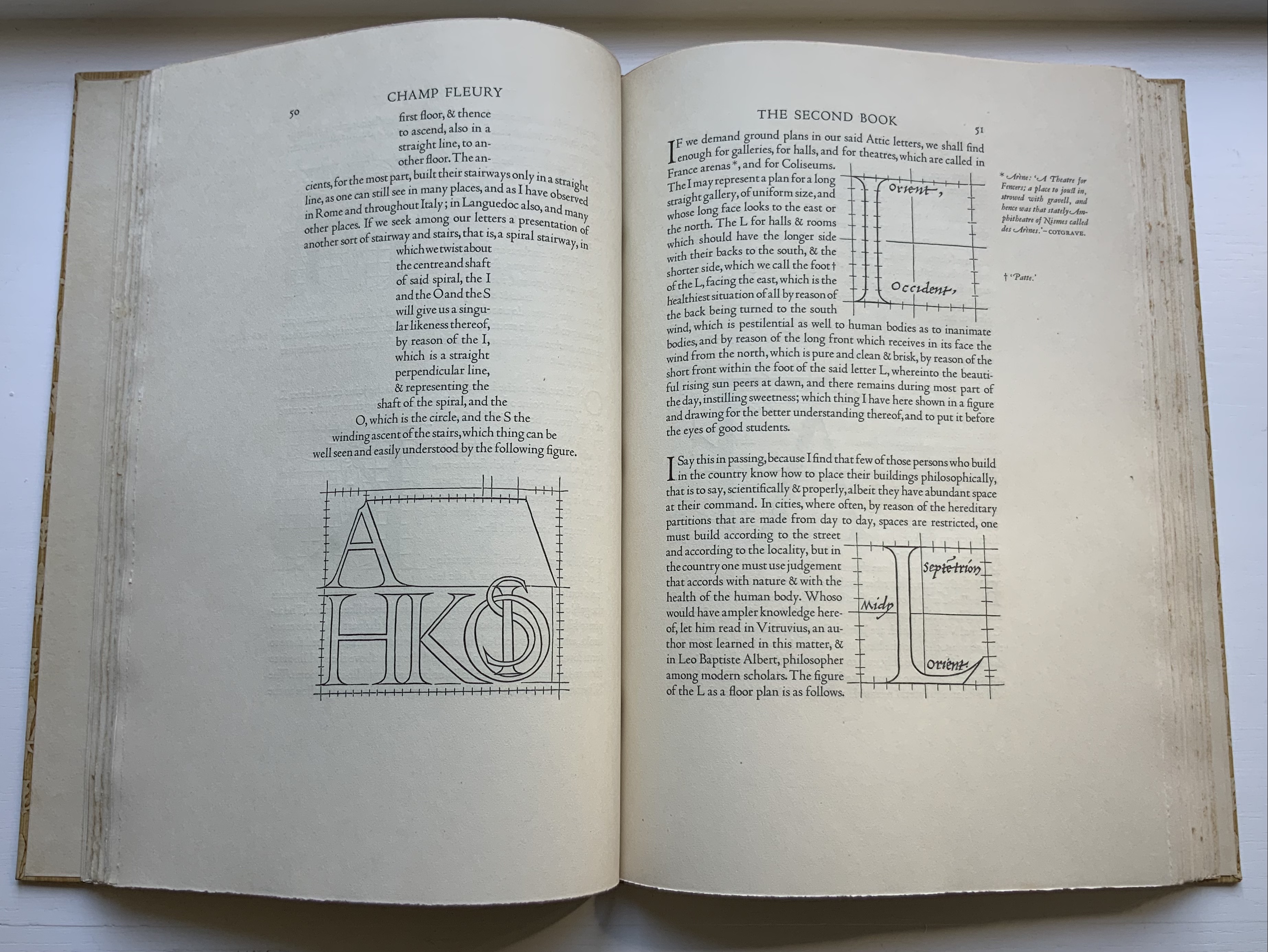
Steingruber may have felt he had good reason to be miffed. After all he had published the volume in installments at his own expense and made sure that the Margrave’s monogram (and that of Carolina Frederica, his wife) in building form appeared in the span above the roman arch on the title page. His elevations and plans draw attention to the heating, kitchen, toilet and servants’ arrangements as if conferring with a prospective client ready to commission one of these typographic palaces. Perhaps he was thinking, Who would not want a serif with a view? Or conduct guests on a tour of the bowl, capline, crossbar, stem, stroke and tail of the property? In a flourish that illustrates the intersection of book and architecture, the title page presents the title and subtitle inside an arch and serves double duty as a Table of Contents with thumbnail images of the letter-shaped buildings to come inscribed on the columns.
Munich, Bavarian State Library
To celebrate the Architectural Alphabet‘s 250th anniversary, this online essay/exhibition explores sixteen propositions about the affinity of architecture and artists’ books. Examples supporting each proposition include works from within and without the Books On Books Collection, and each example includes a link or links for additional views of the work. Every effort has been made to provide bibliographical (or webliographical?) links from WorldCat and the Internet Archive. The former will allow the reader to find local libraries that hold a copy of the exhibited work to be viewed in person; the latter will partly address the problem of broken links. Where broken links (or factual errors) do appear, readers are encouraged to alert the curator in the Comments section at the end of the essay/exhibition.
Proposition #1: The affinity of architecture and artists’ books lies in the alphabet.
Architectonisches Alphabeth (1773/1995) Prepared by Joseph Kiermeier-Debre and Fritz Franz Vogel for Ravensburger Verlag.
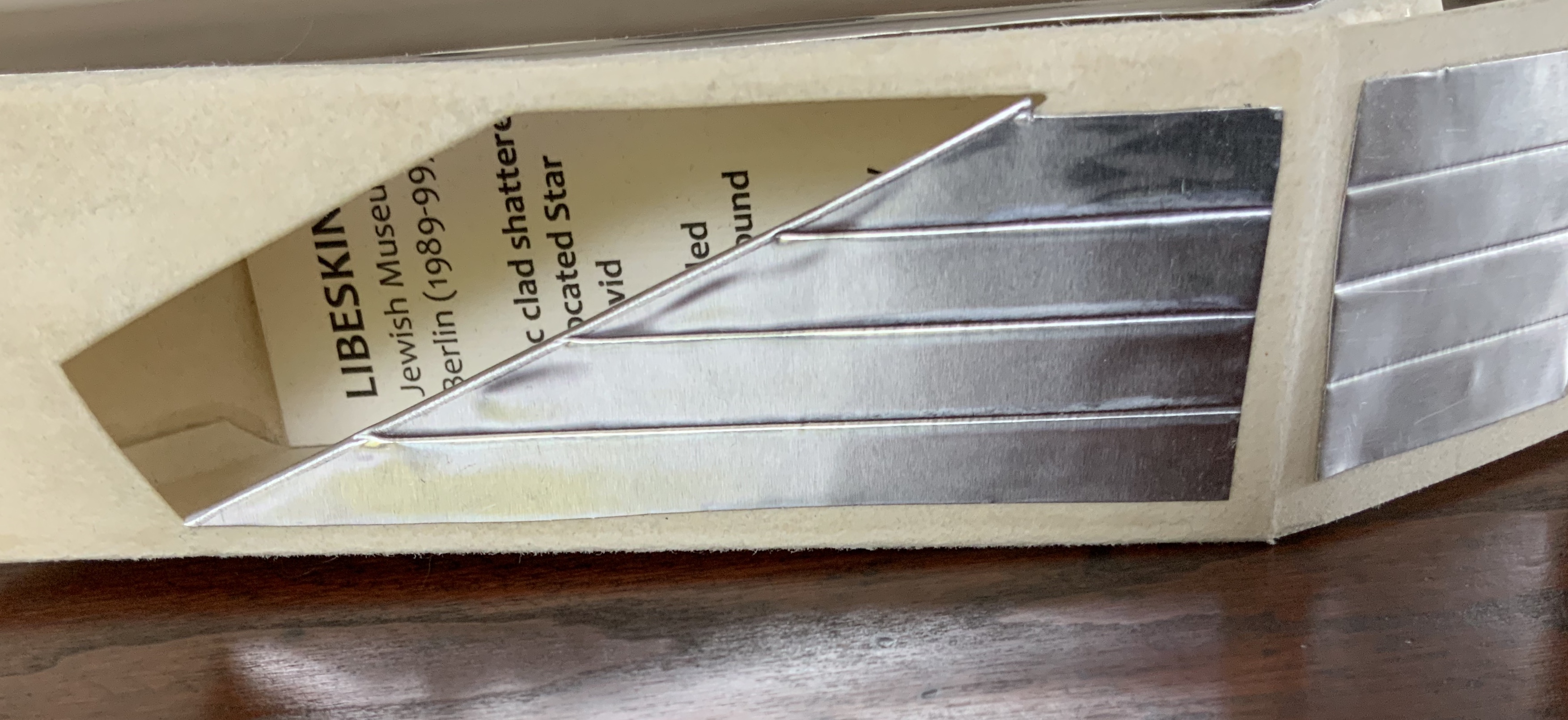
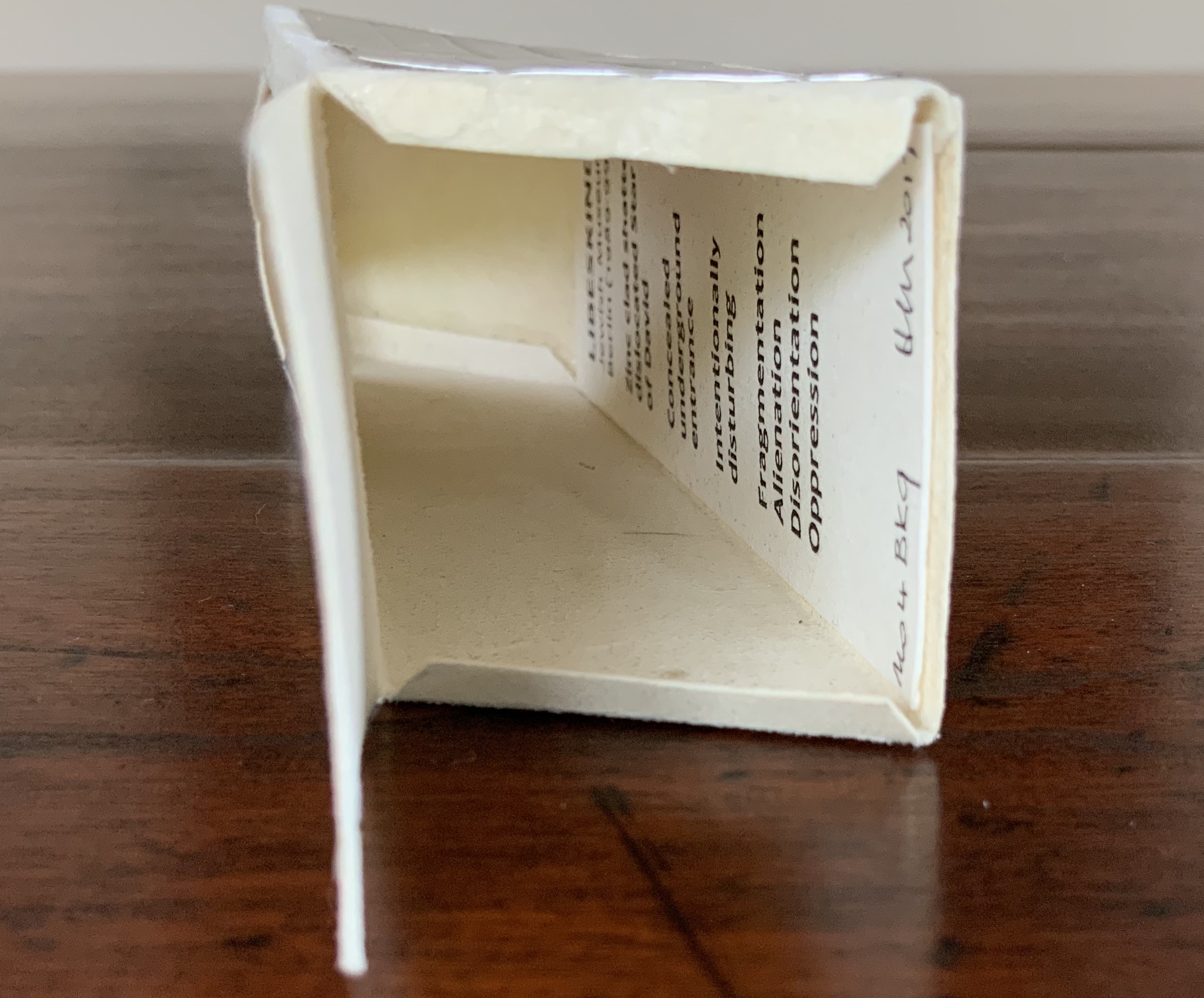
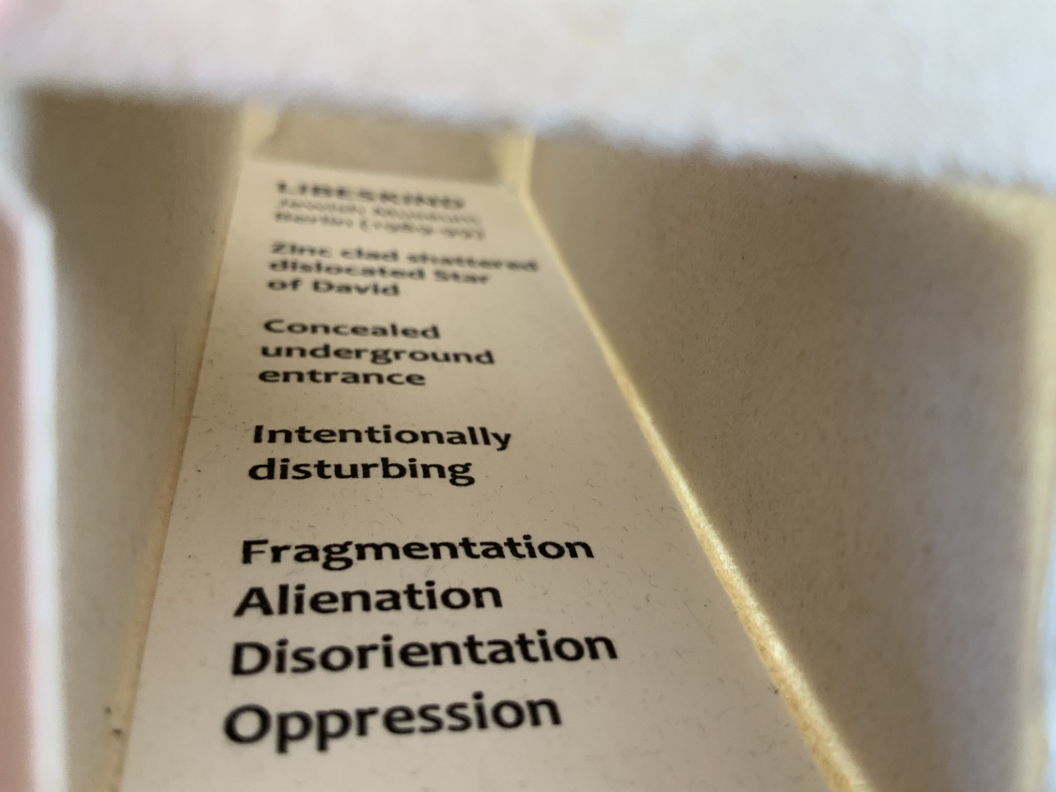
Of course the first exhibit would be Steingruber’s Architectural Alphabet, but related works — before and after, published or built — will clamor for admission: Geofroy Tory’s Champ Fleury (1529/1927/1998), Antonio Basoli’sAlfabeto Pittorico(1839/1998), Giovanni Battista de Pian’s Alphabetto Pittoresque (1842), and Daniel Libeskind’s Contemporary Jewish Museum (2000), whose form within the walls of a former power substation is composed of two Hebrew letters — the Yud and the Chet — which make up the word Chai (“Life”).
Left to right: Tory/Rogers, Basoli, Battista de Pian (Photos by Books On Books Collection), Libeskind (The Yud Gallery, Photo by Paul Dyer).
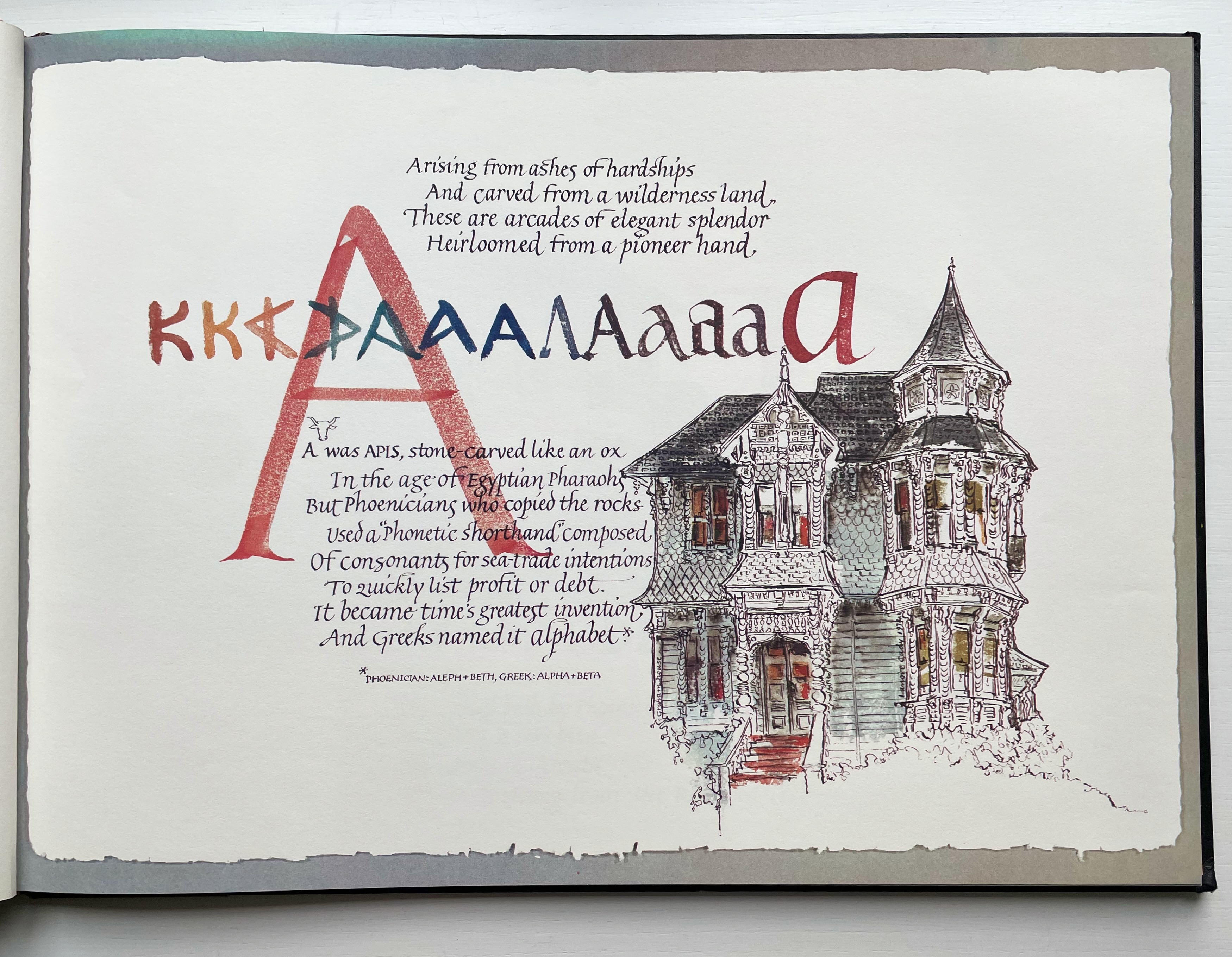
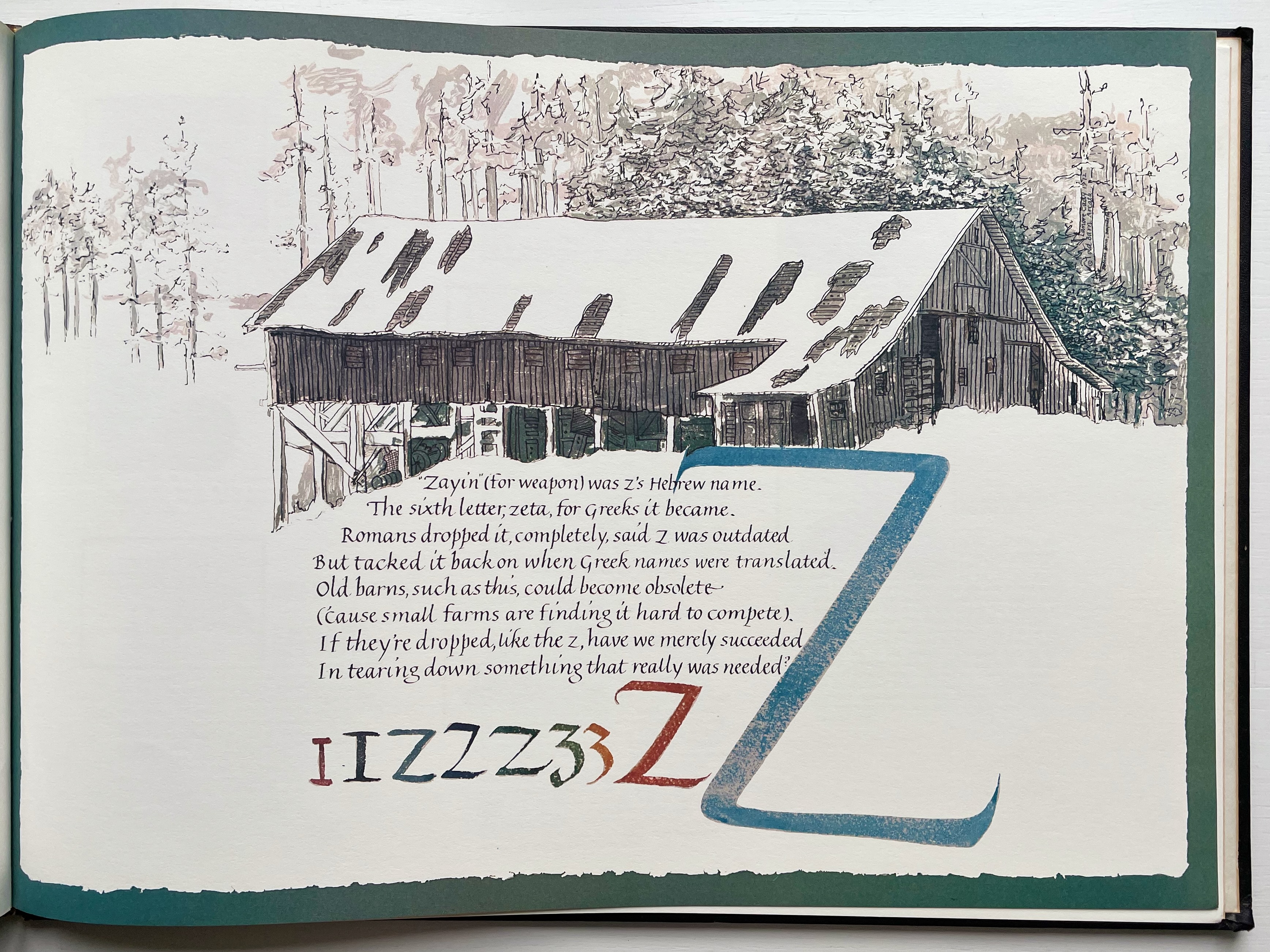
Lanore Cady’s Houses & Letters(1977) is another work supporting the proposition, in this case with calligraphy, watercolor and verse.
More than the novel inventions and historical associations above, though, the space within and around a letter, a building and the artist’s book suggests the real root of the affinity. As cultural historian Fiona MacCarthy put it: “‘the Italians knew by instinct what we are slowly grasping, that the meaning of the city is not so much a matter of the buildings as the spaces in between.’” To which John Ryder added: “‘This is exactly how typography works.’” (From David Esslemont’s Inside the Book, 2002). And it is exactly how book art works.
Proposition #2: The affinity of architecture and artists’ books lies in telling stories.
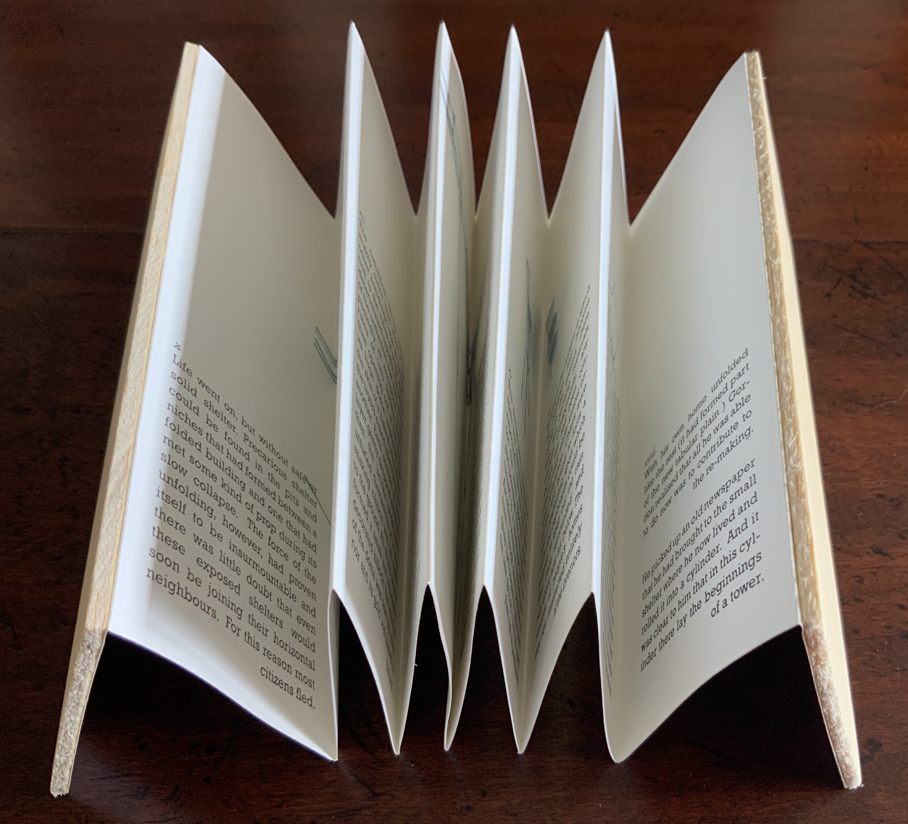
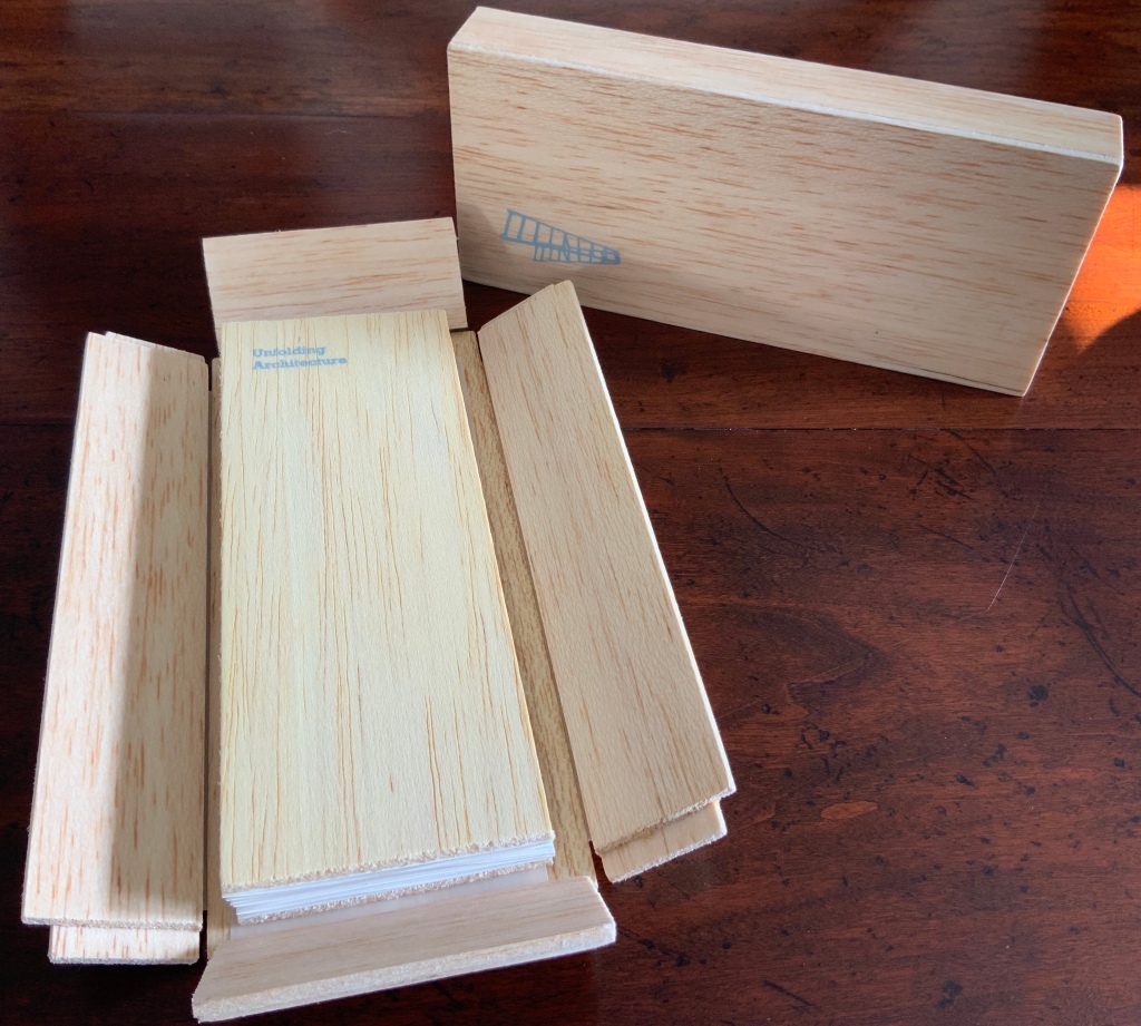
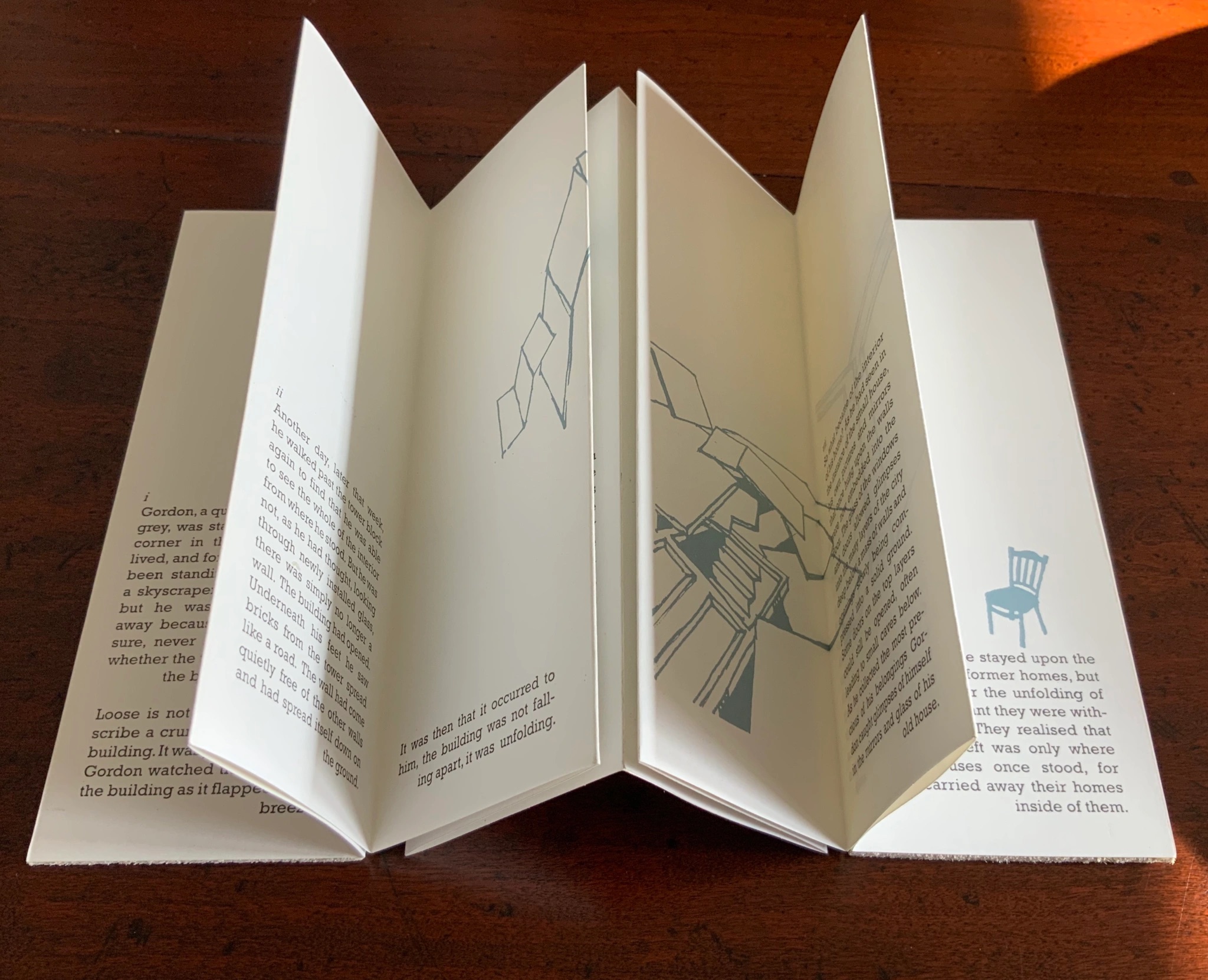
As Daniel Libeskind has said, “For me, a building is a medium to tell a story.” Emily Speed’s Unfolding Architecture (2007) tells the tale of Gordon, a city dweller who witnesses the collapse of public buildings and, ultimately, his own home as the urban fabric begins to unfold around him — a story replicated by the housing’s structure and the book’s accordion fold.
But Ulises Carrión denied that books are about narrative. Instead they are about space and time, which leads to the next proposition.
Proposition #3: The affinity of architecture and artists’ books lies in space and time.
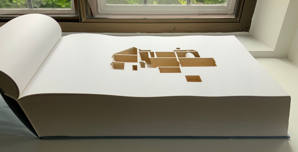
Olafur Eliasson’s Your House (2006) is a laser-cut model of his residence in Copenhagen at a scale of 1:85, which means that each page equates to a 220 mm section of the actual house. In the film Russian Ark (2003), Aleksandr Sokurov made cinematic history with his one continuous shot in 90 minutes, depicting a 17th century time traveller moving through different periods of history as he moves through the rooms of St. Petersburg’s Winter Palace. The film inspired Johan Hybschmann’sBook of Space (2009).
How do you read works like this? The size, weight and delicacy of Eliasson’s book and the fragility of Hybschmann’s book and its need for an armature to freeze-frame it defy a simple turning of pages. They must be turned slowly and carefully. Both works heed the task of the arts as posed by architect Juhani Pallasmaa for our age of speed: to defend the comprehensibility of time, its experiential plasticity, tactility and slowness (The Embodied Image, p. 78).
Proposition #4: The affinity of architecture and artists’ books lies in process.
A trained architect and book artist, Marian Macken articulates and illustrates in her book Binding Space why and how the artist’s book can serve as an important tool for design, documentation and critique of architecture. Macken’s perceptive descriptions show how to observe materiality and its functioning and understand how they contribute to the making of art.
Investigating bookness results in the book becoming a highly productive intervening medium with which one can imagine, investigate, analyze, represent and exhibit particular qualities — haptically, and with narrative and ambiguity — of a built environment and the design process. Through the book, we read spatial practice anew (p. 163).
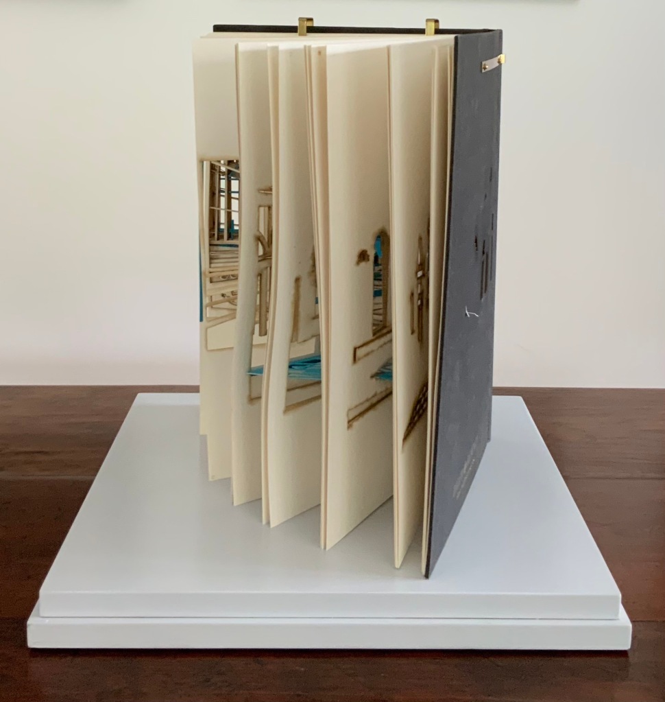
Reading Macken’s book will sharpen the ability of any reader or viewer to appreciate book art, especially her Ise Jingū: Beginning Repeated. Ise Jingū is a Shinto shrine complex in the Mie Prefecture, Japan. “Once every 20 years, since … the seventh century, every fence and building is completely rebuilt on an identical adjoining site, a practice of transposition known as shikinen-zōkan” (Binding Space, p. 101). For Macken, this ritualistic rebuilding poses architecture as performative process rather than as inert object; it “manifests the replication of a beginning, of a process” (p. 100).
Macken’s artwork consists of 61 loose sheets with a watermarked image within each, the number reflecting the 61 iterations of the shrine up until the making of this work of book art. The watermark is a perspective image based on Yoshio Watanabe’s photograph of the Inner Shrine, taken in 1953 on the occasion of the 59th rebuilding. The contrast of the watermark in kozo and the movement of its placement from one sheet to the next entice reflection on the phenomenon of representation and the architectural process of shikinen-zōkan.
Proposition #5: The affinity of architecture and artists’ books lies in phenomenology.
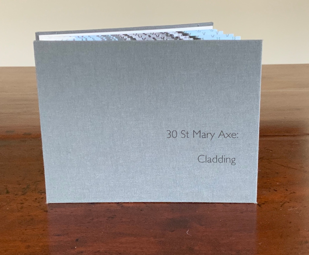
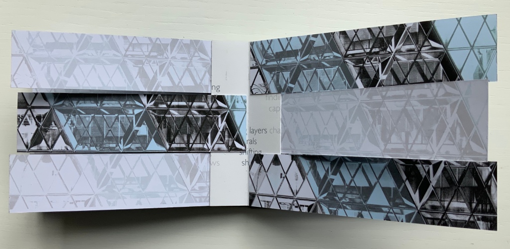
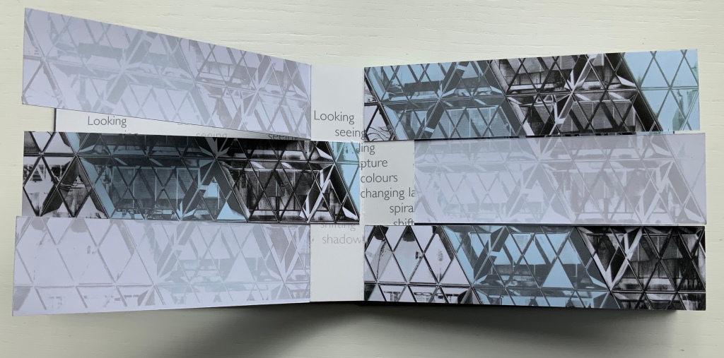
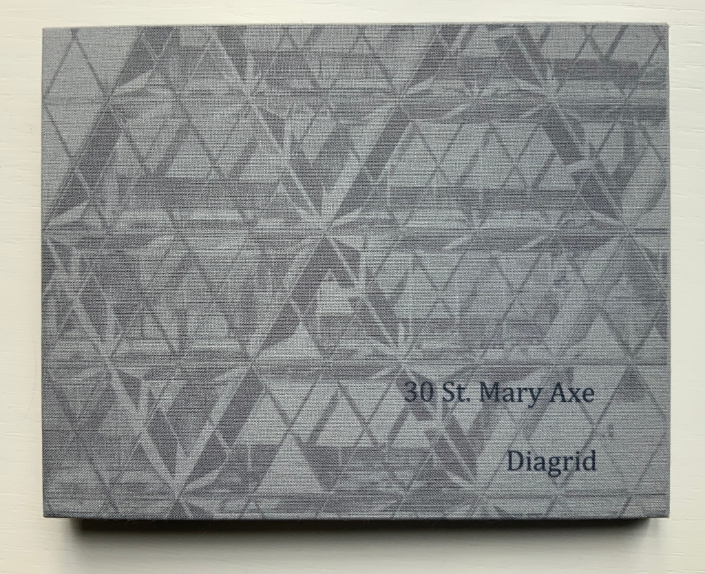
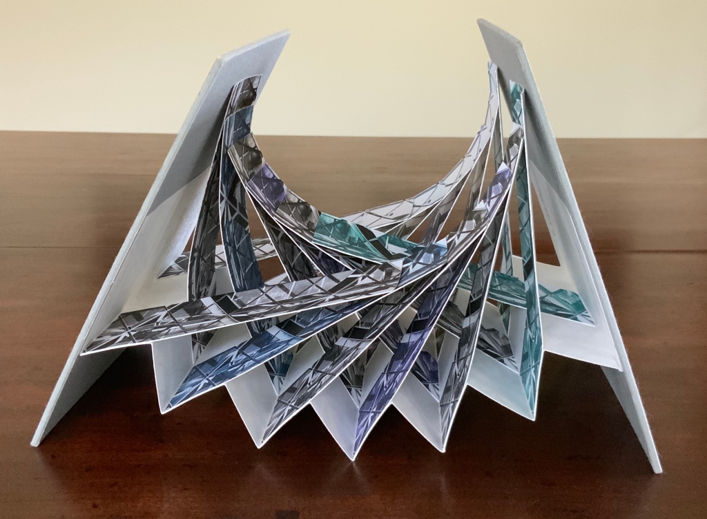
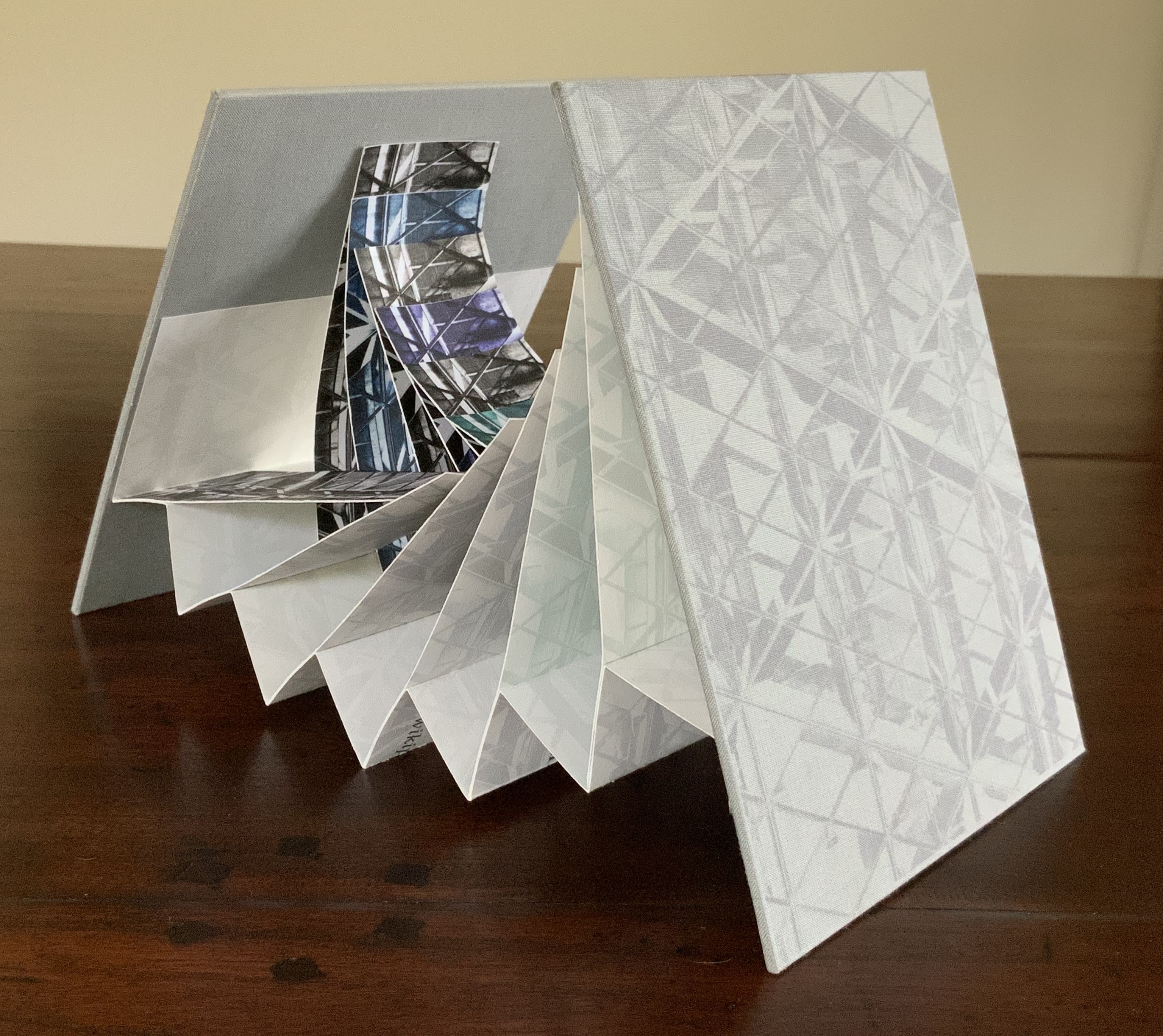
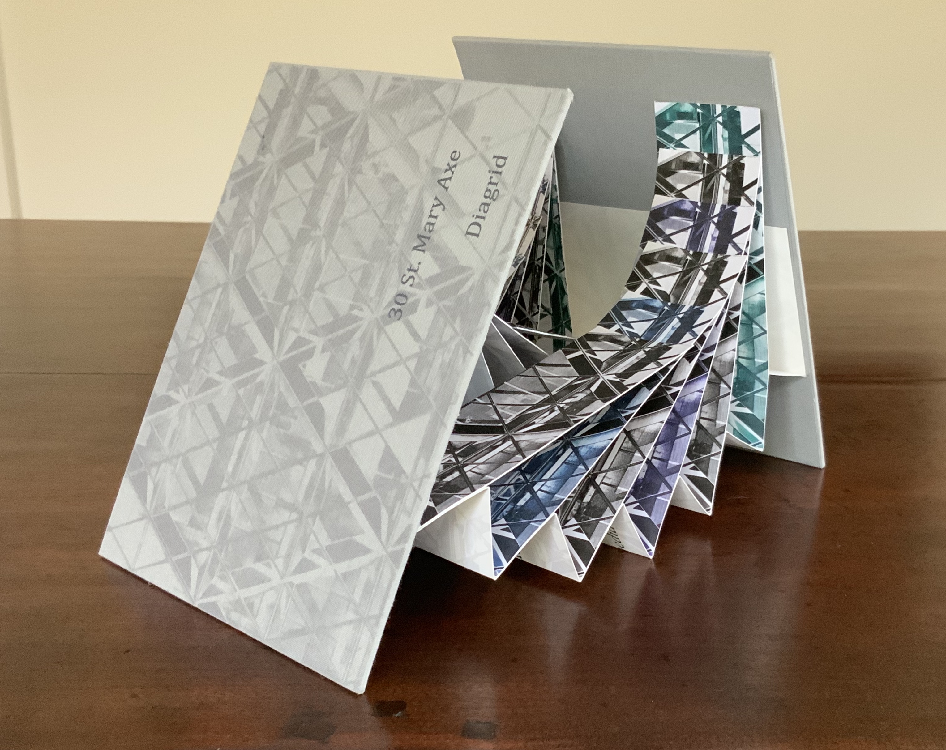
Architects such as Alfredo Muñoz and his firm ABIBOO, Juhani Pallasmaa and Peter Zumthor are among those often associated with architectural phenomenology, concerned with perception psychology, focused on the primacy of sensory and experiential qualities. Norman Foster and phenomenology are not so often yoked, but 30 St Mary Axe: Diagrid (2009) and 30 St. Mary Axe: Cladding(2009)– Mandy Brannan’s treatments of his iconic London office tower (aka “the Gherkin”) that refocus the perception and experience of it — might prompt reconsideration.
Proposition #6: The affinity of architecture and artists’ books lies in geometry.
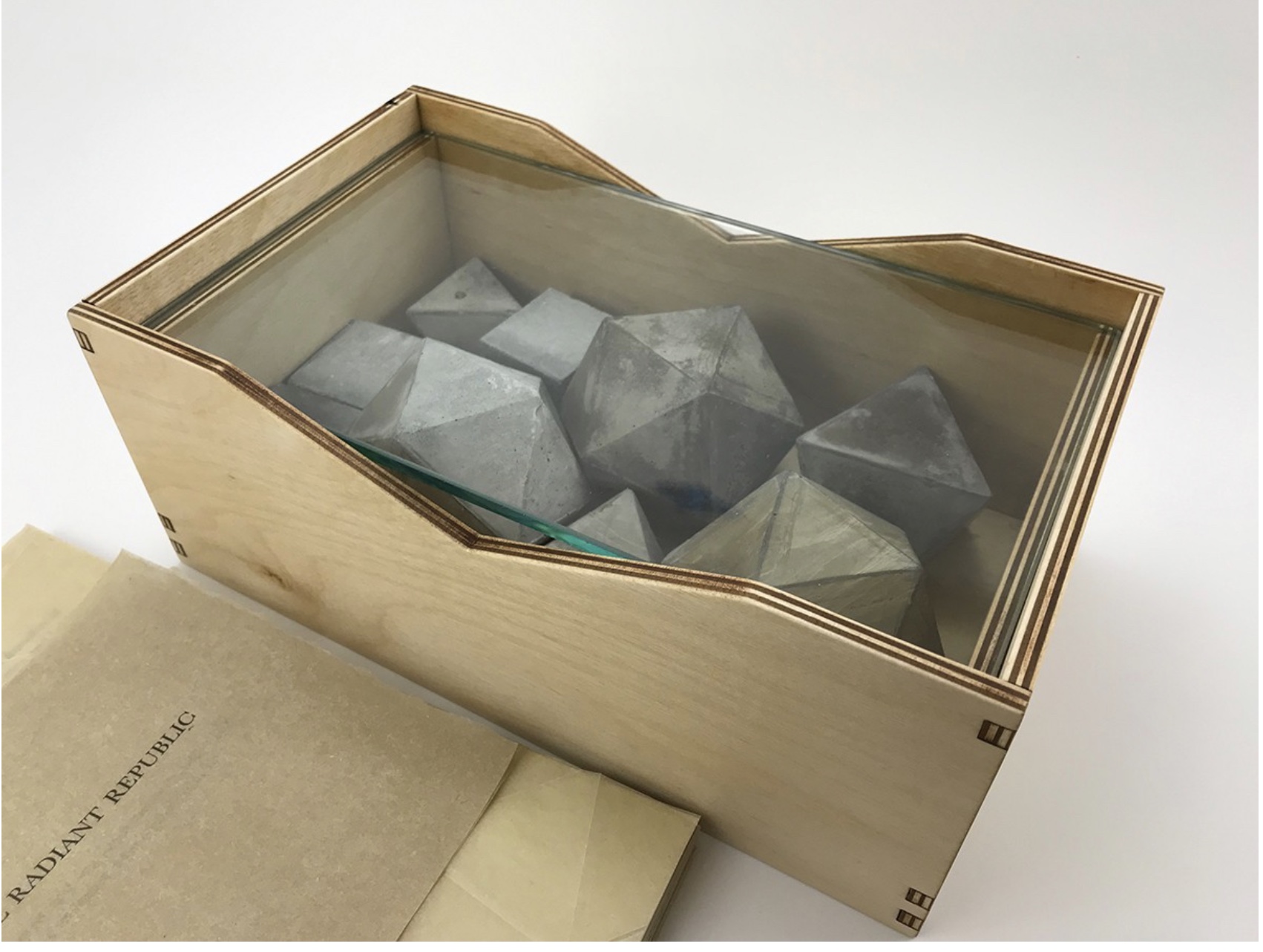
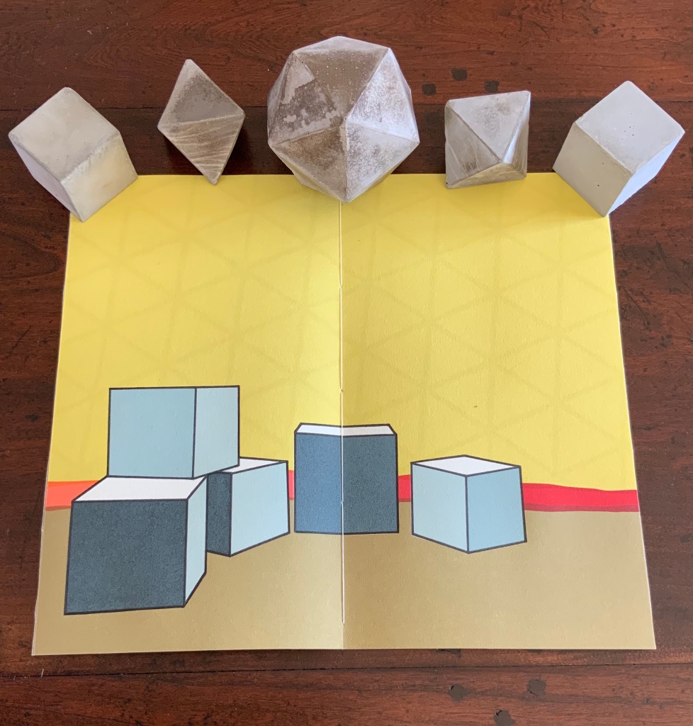
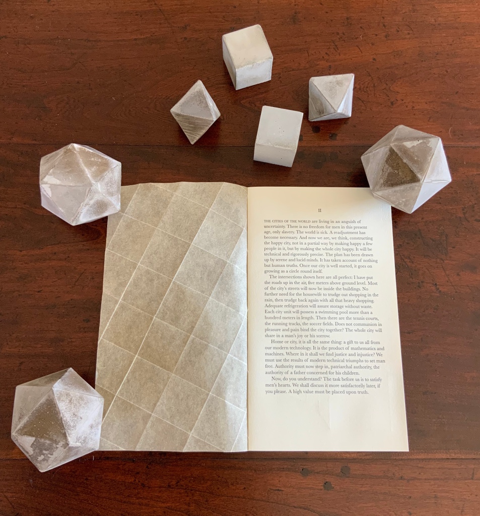
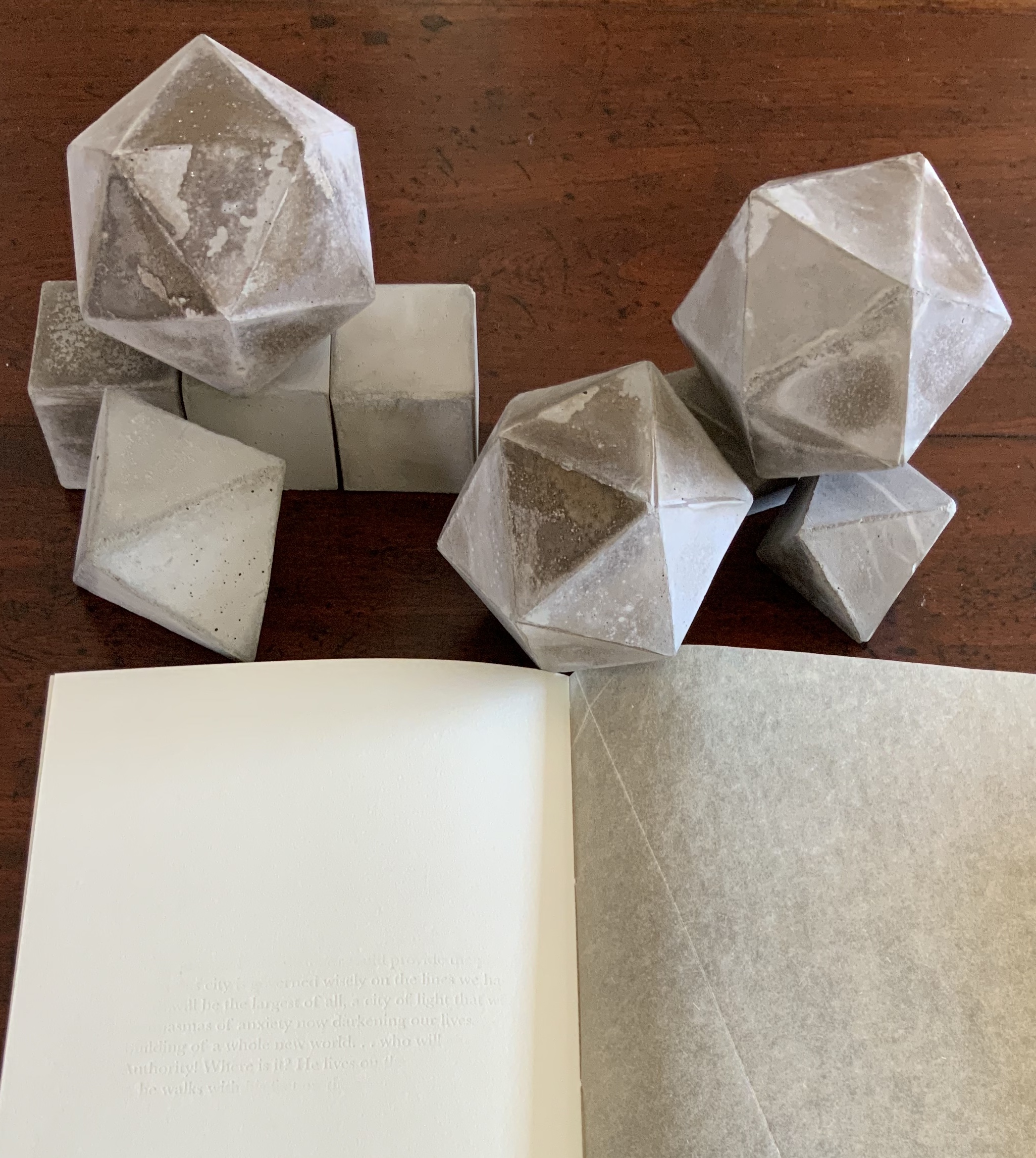
Sarah Bryant’s The Radiant Republic(2019) insightfully integrates Plato’s and Le Corbusier’s texts and ideas. The very physicality of the blond wood, linen cover, glass window, concrete representations of Platonic solids, embossed type and sewn papers could easily be a response to Juhani Pallasmaa’s comment: “The current overemphasis on the intellectual and conceptual dimensions of architecture contributes to the disappearance of its physical, sensual and embodied essence” (The Eyes of the Skin, p. 35).
Proposition #7: The affinity of architecture and artists’ books lies in modelling.
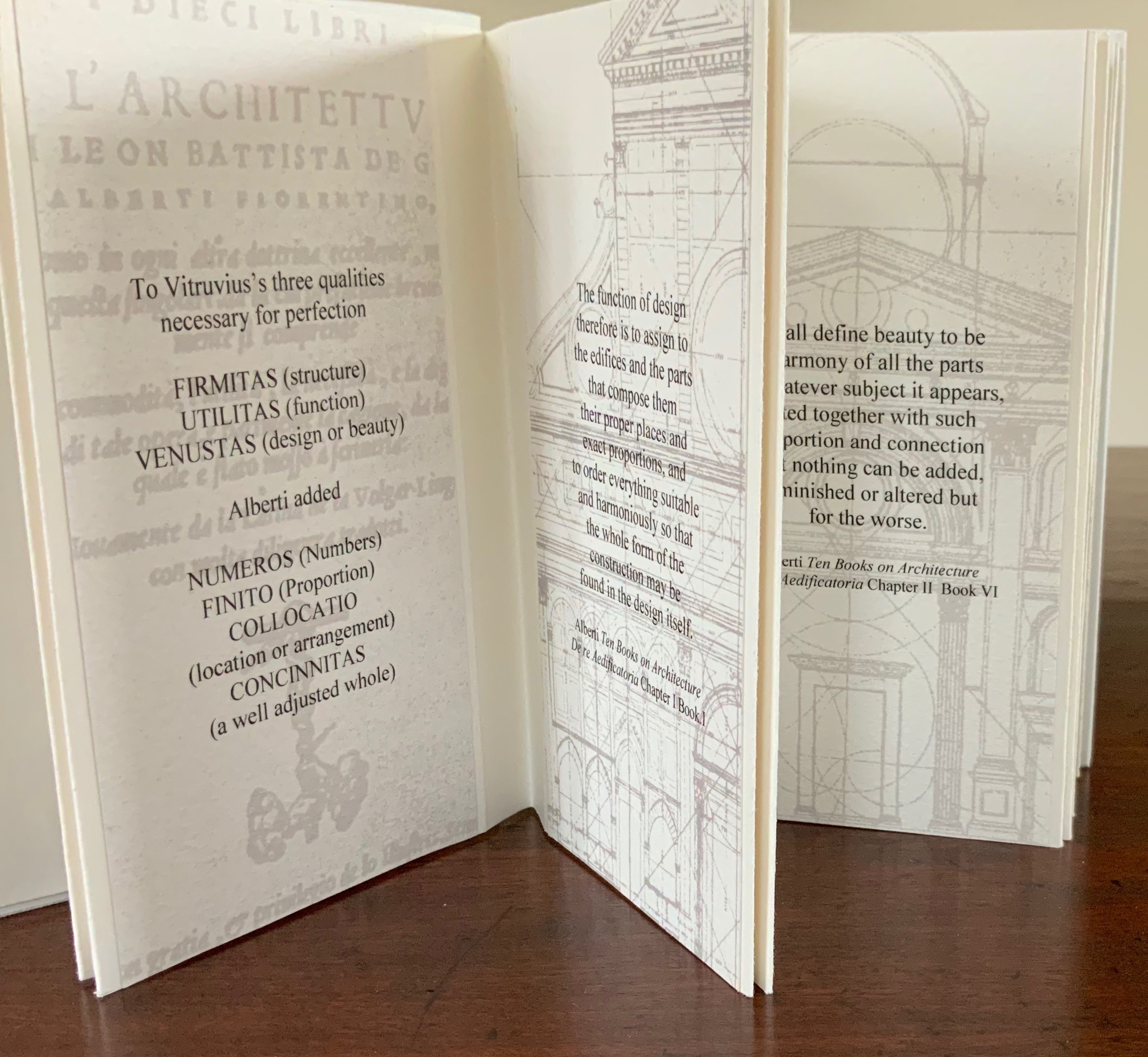
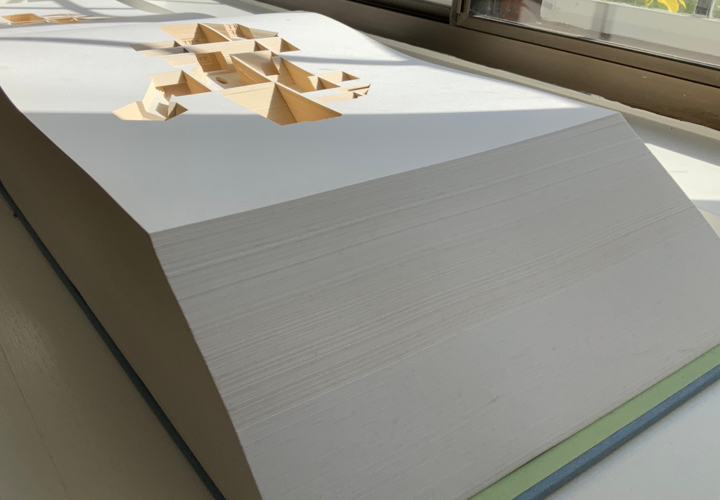
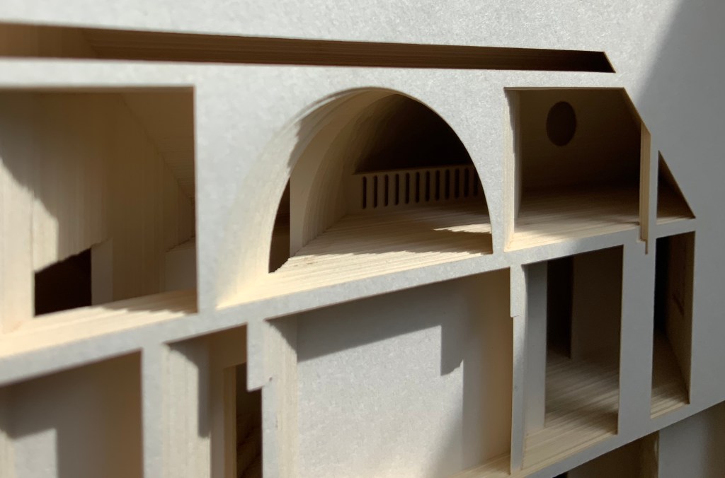
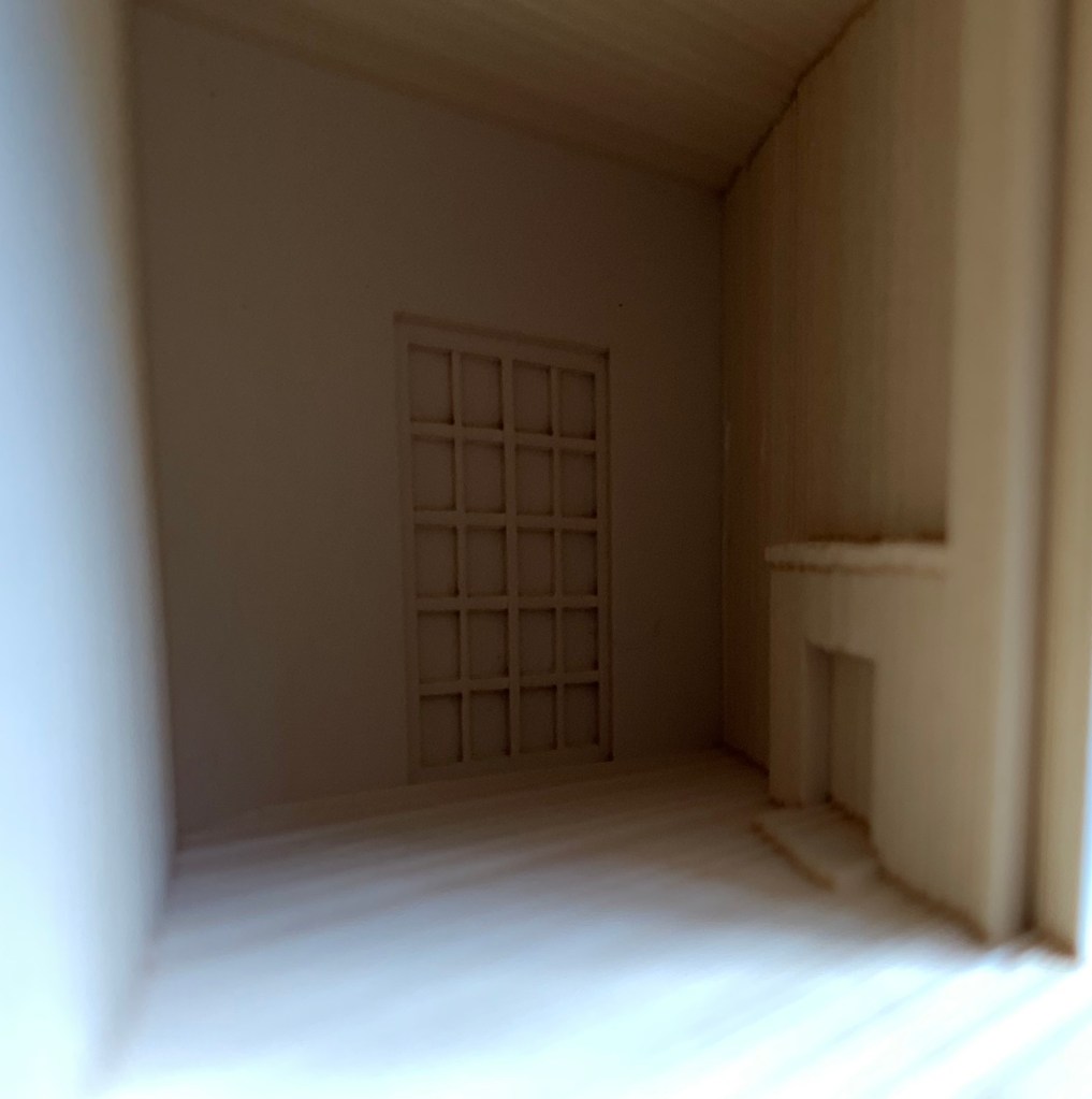
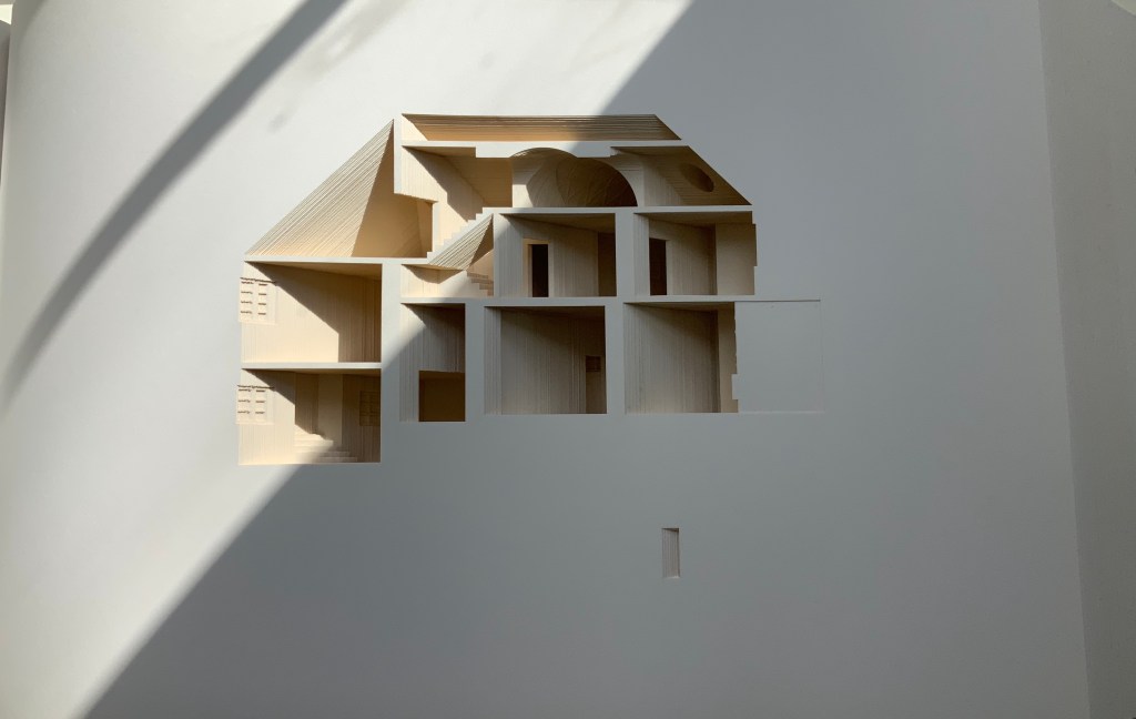
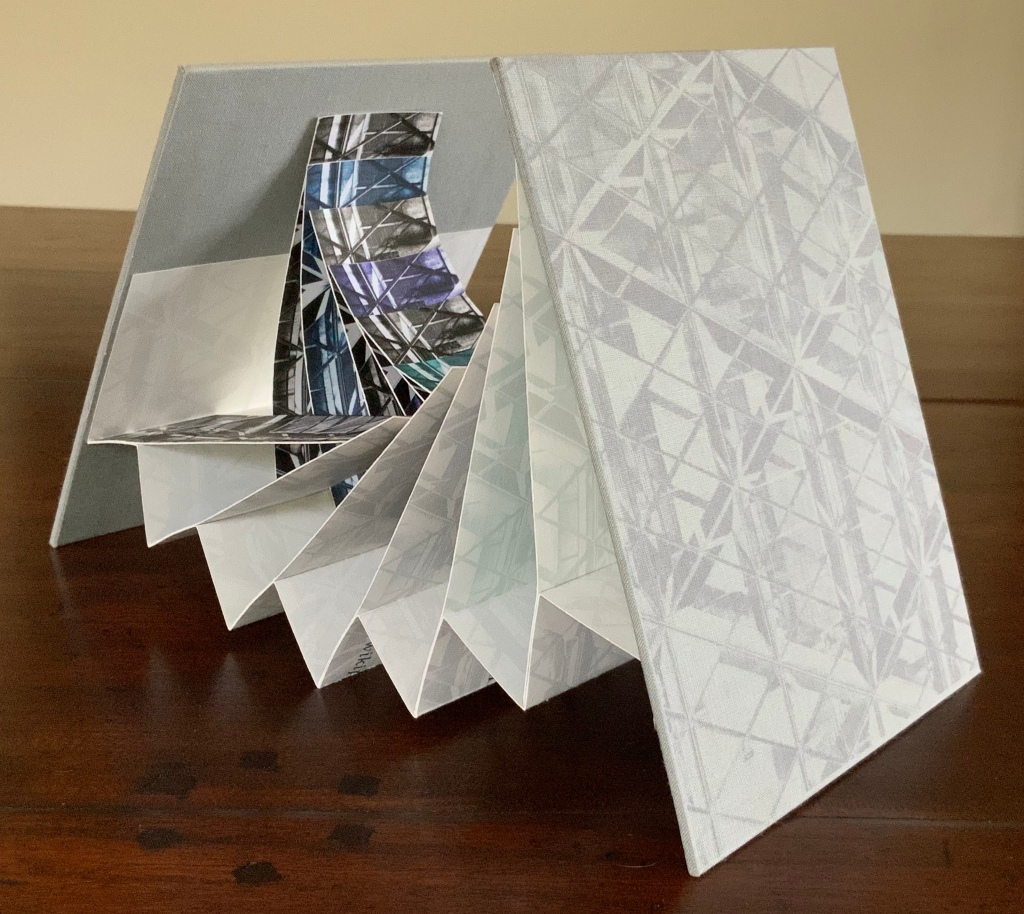
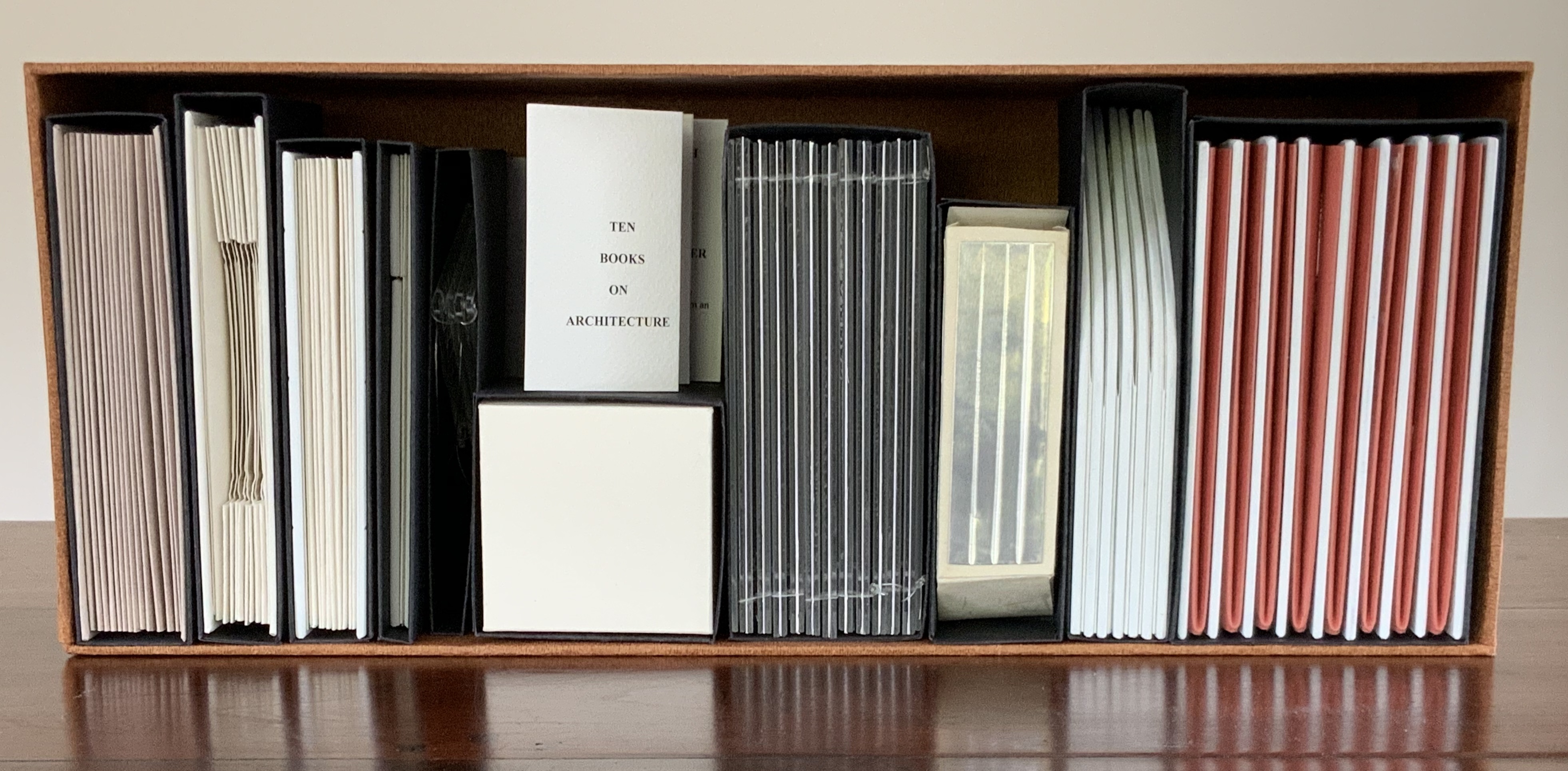
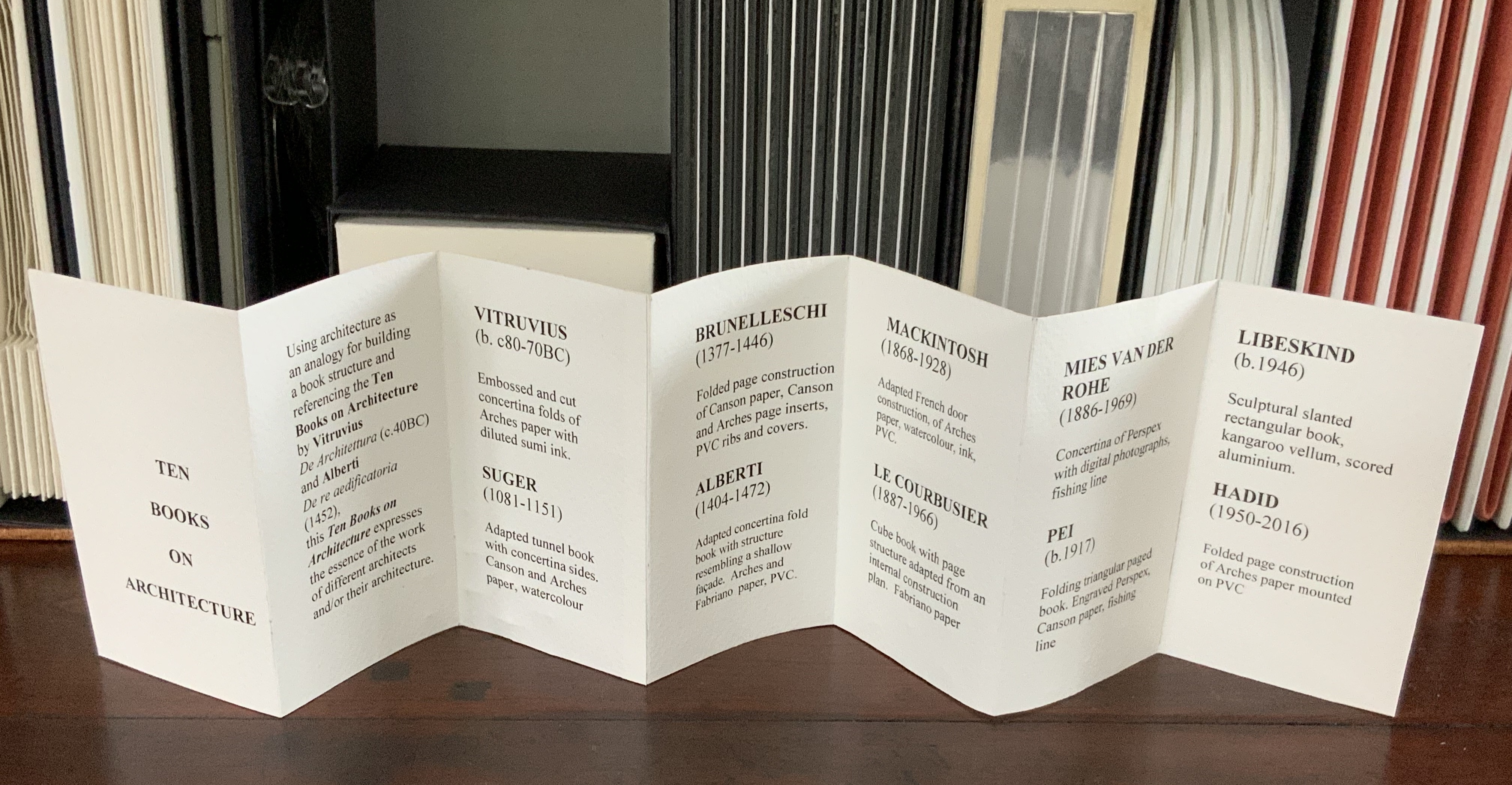
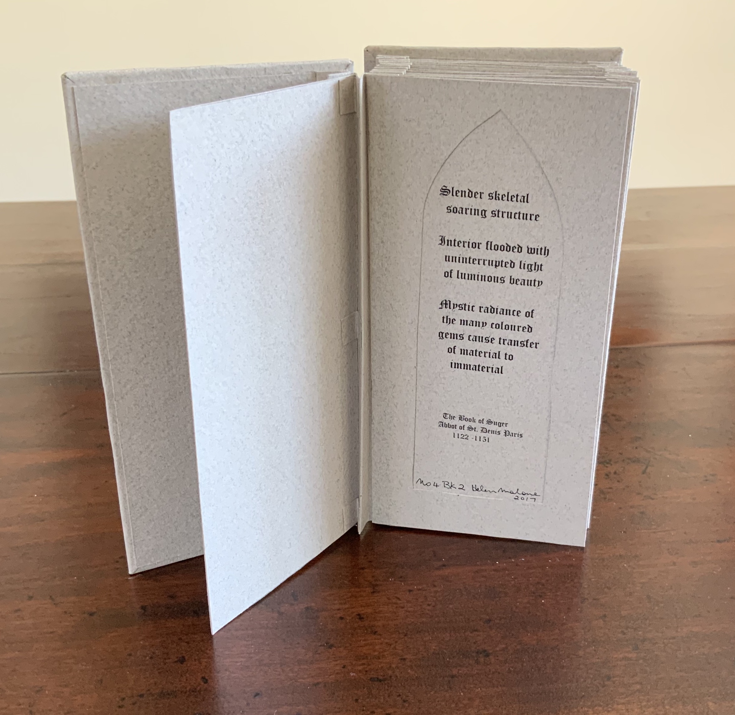
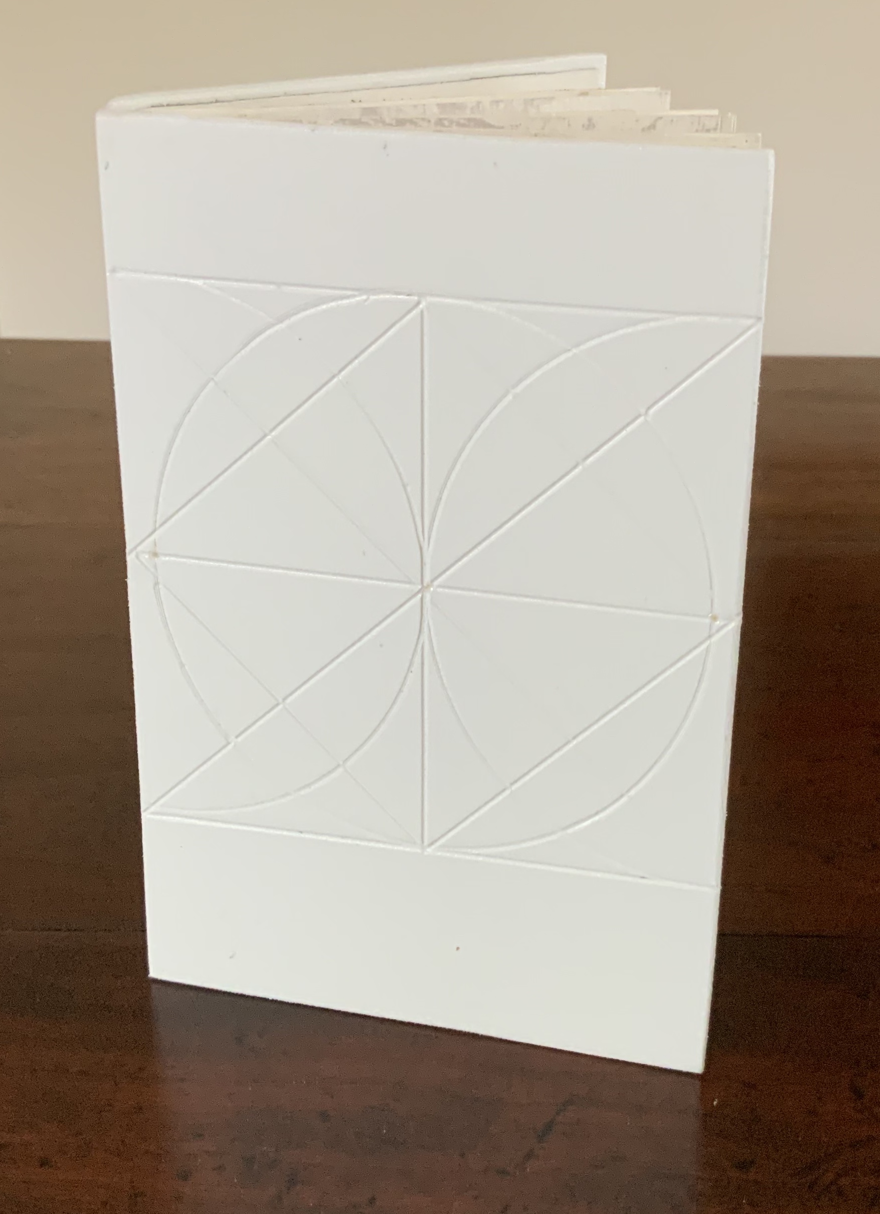
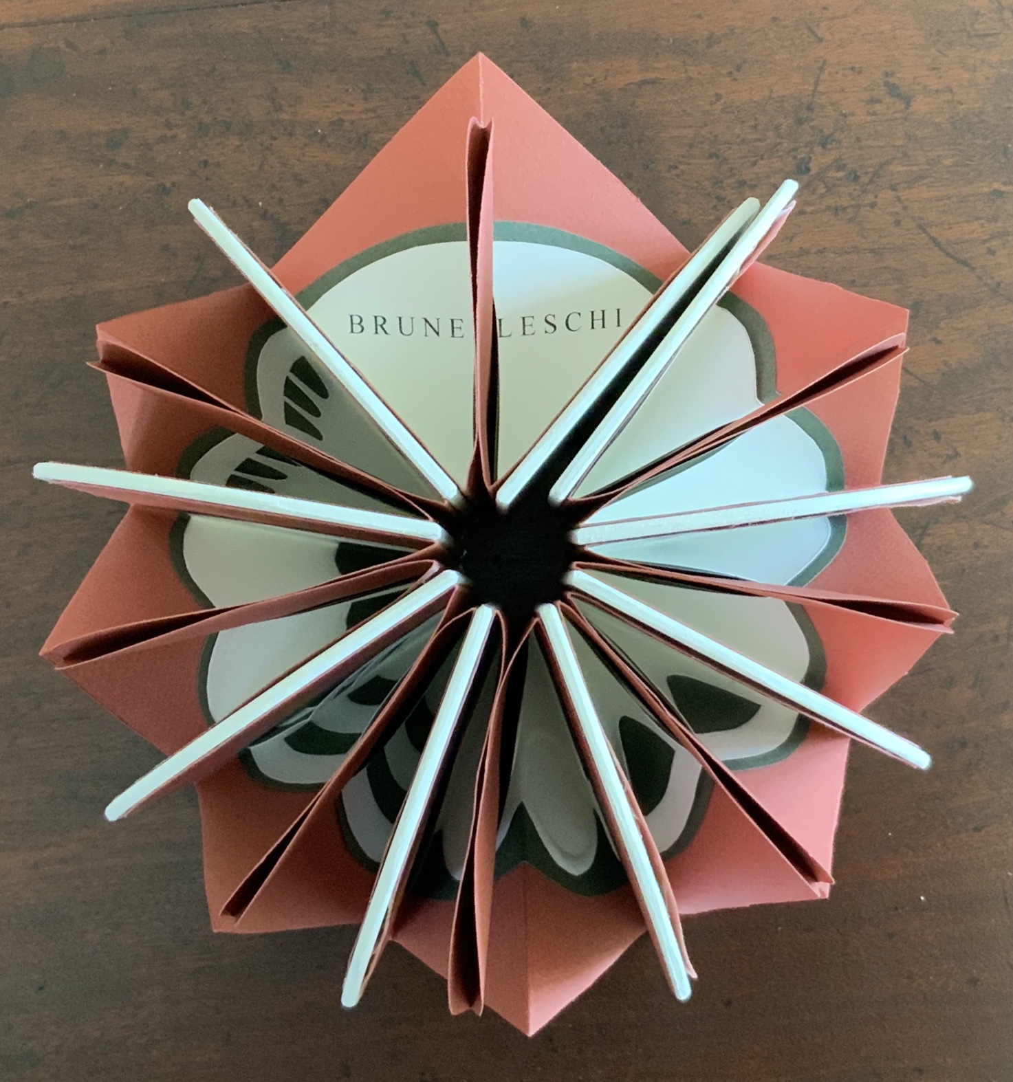
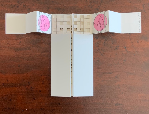
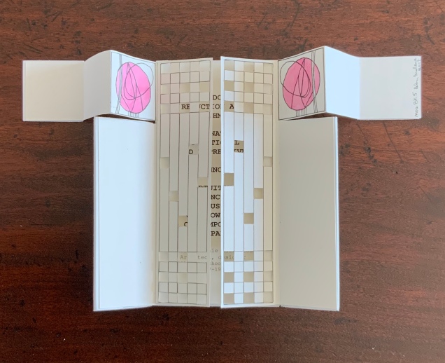
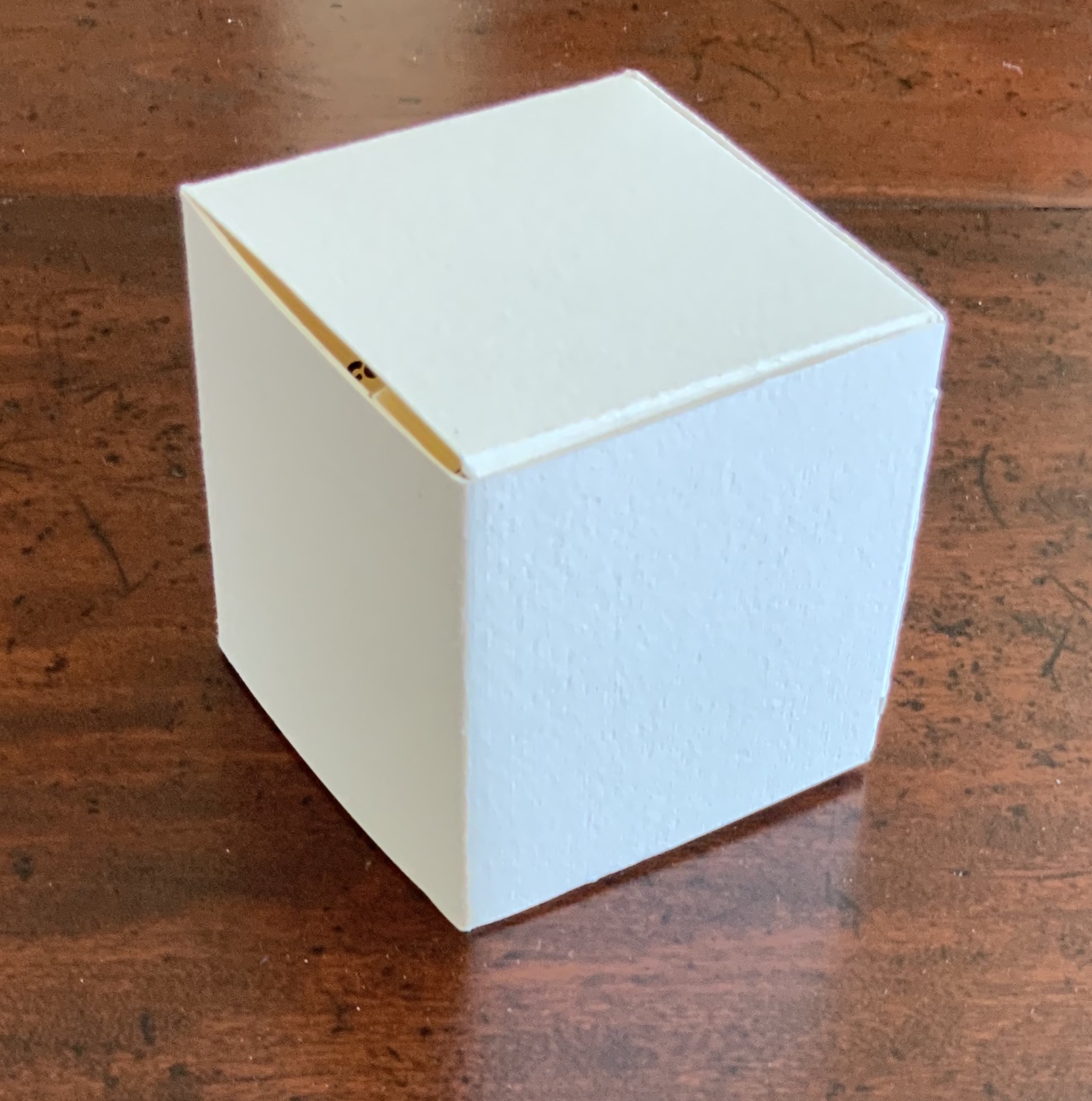
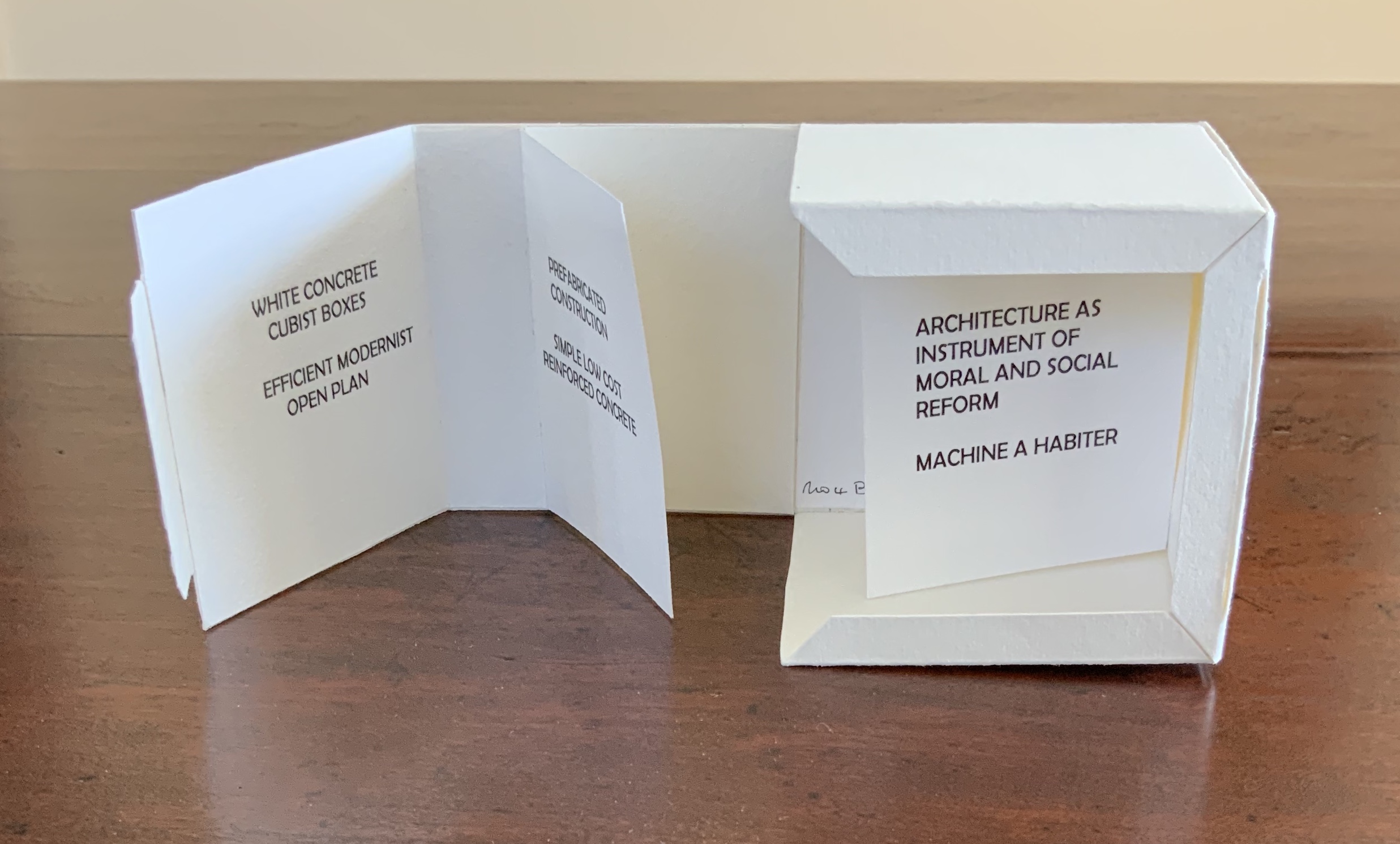
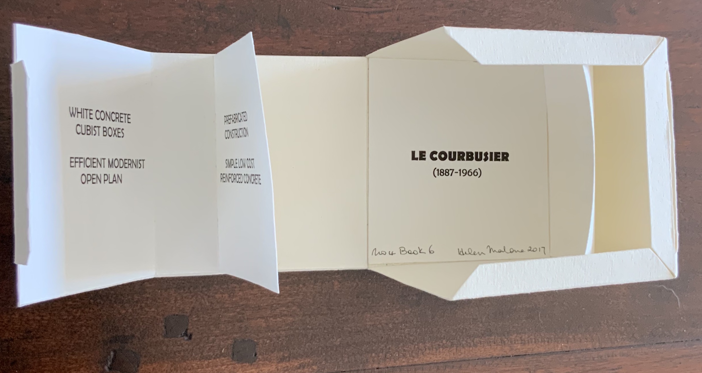
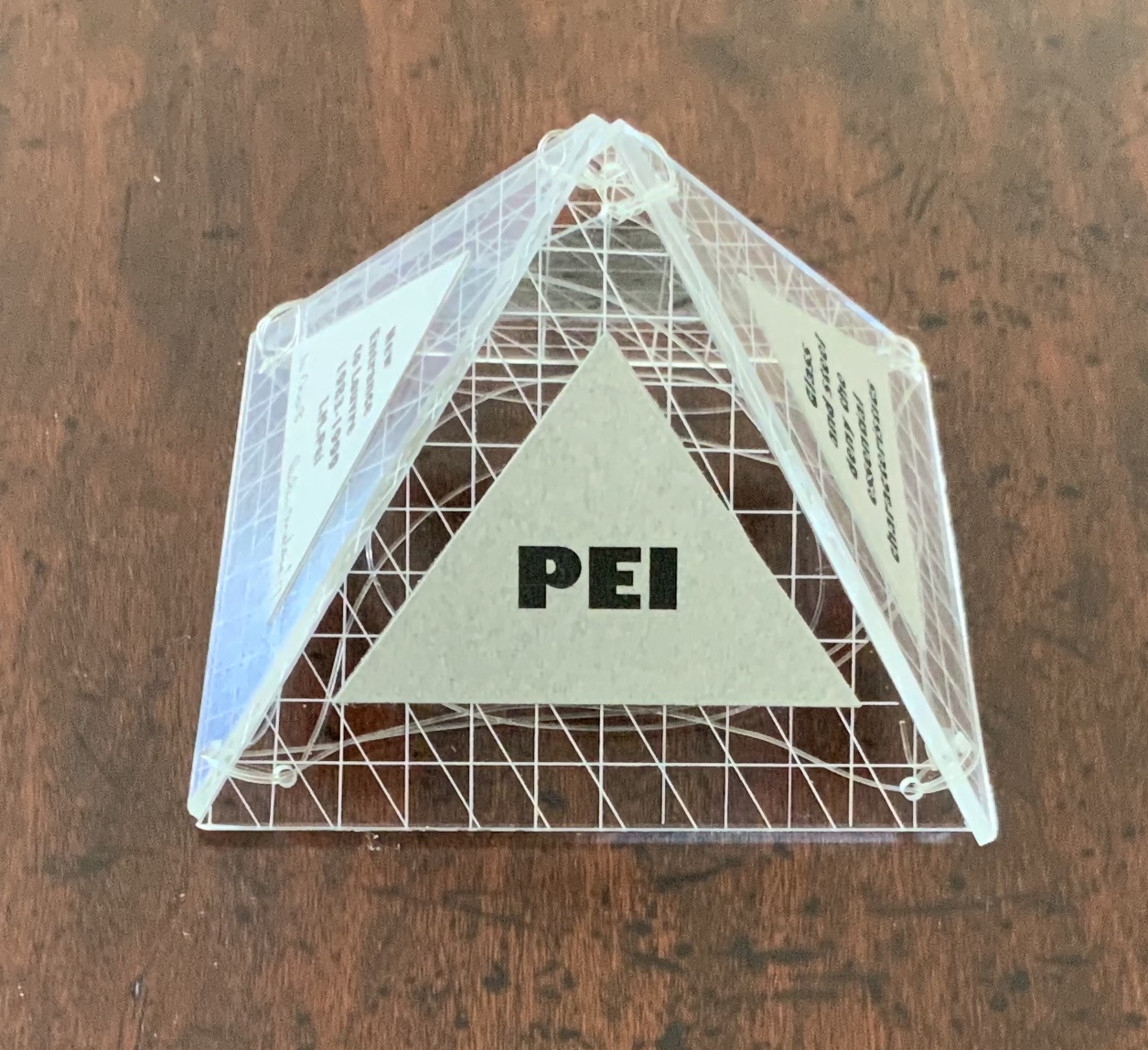
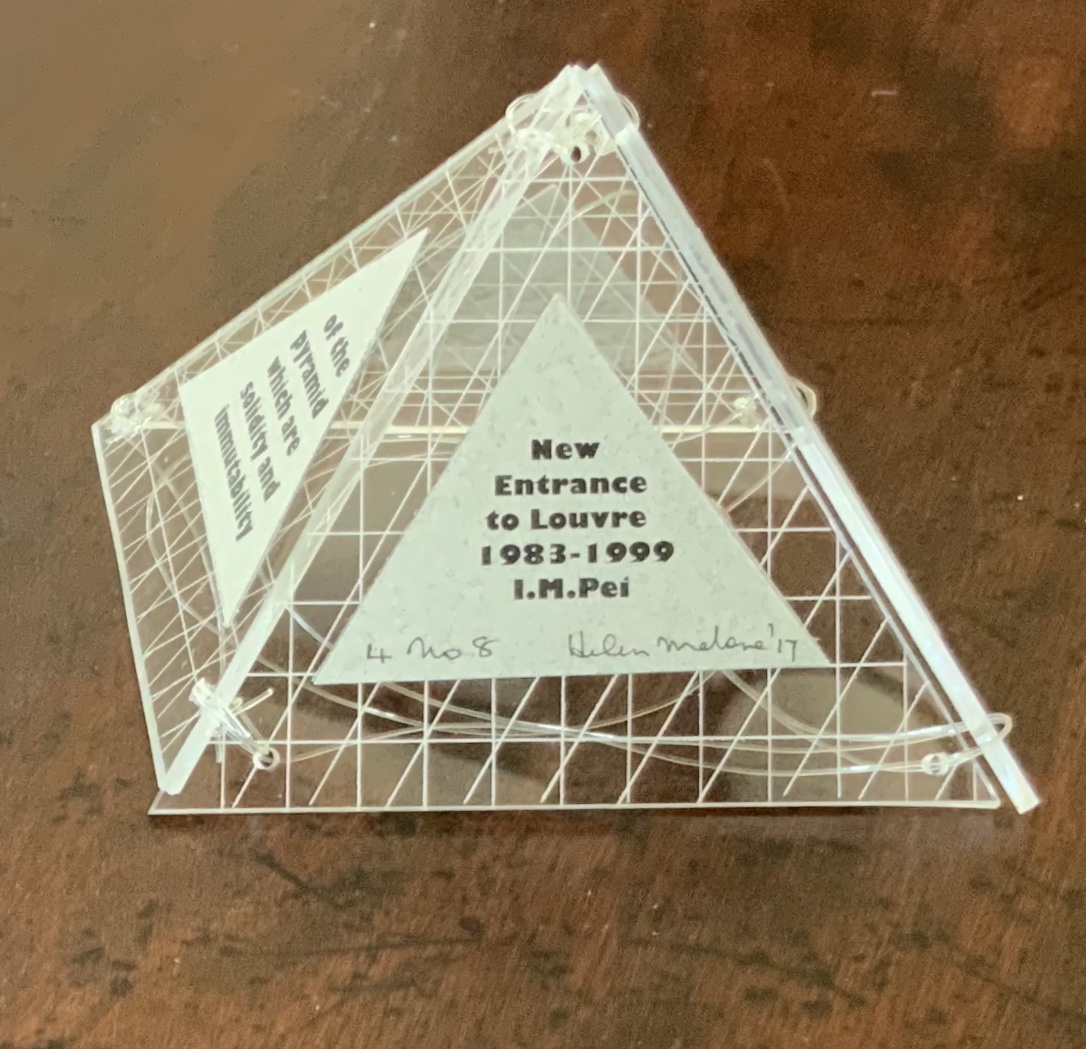
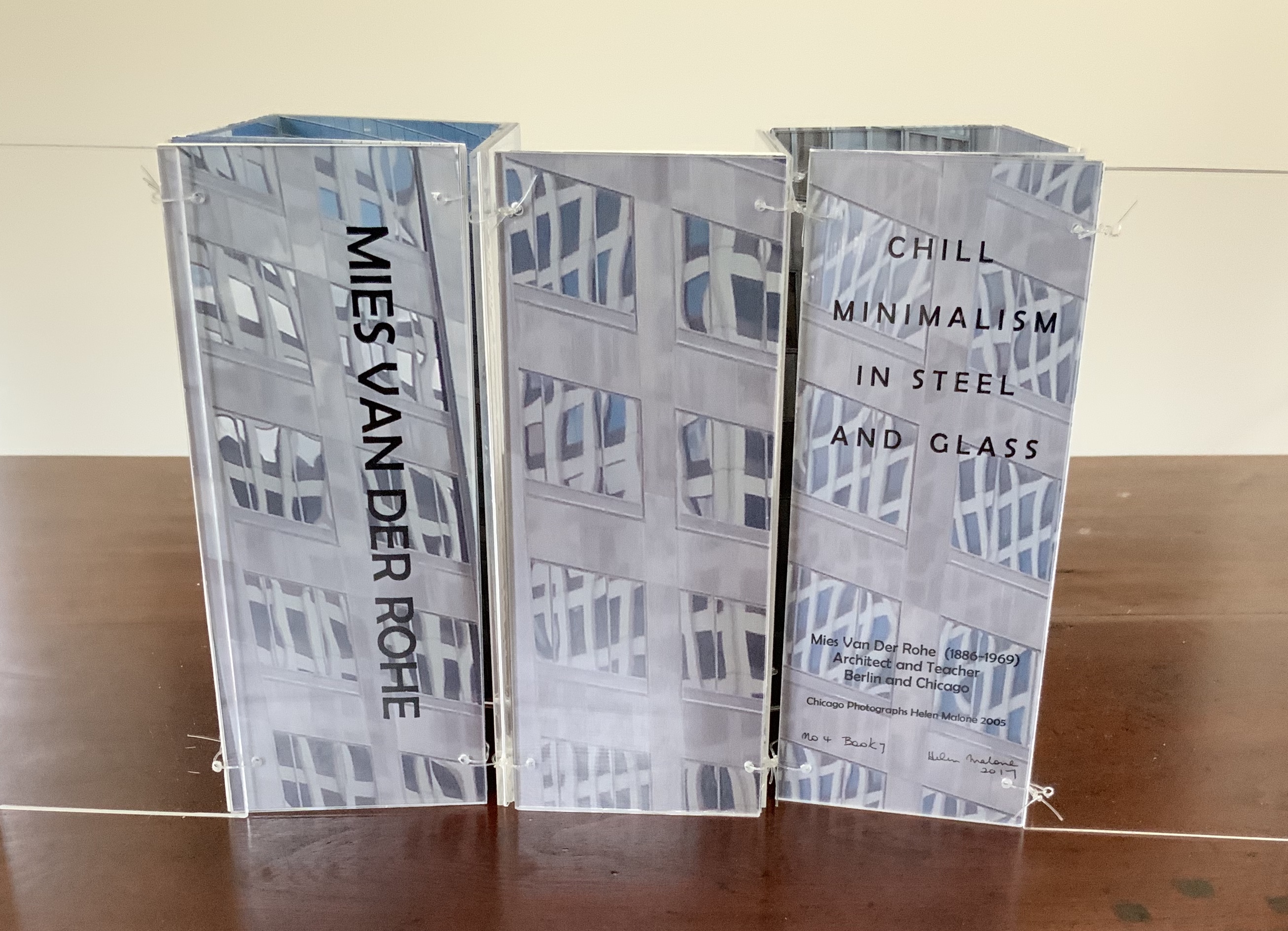
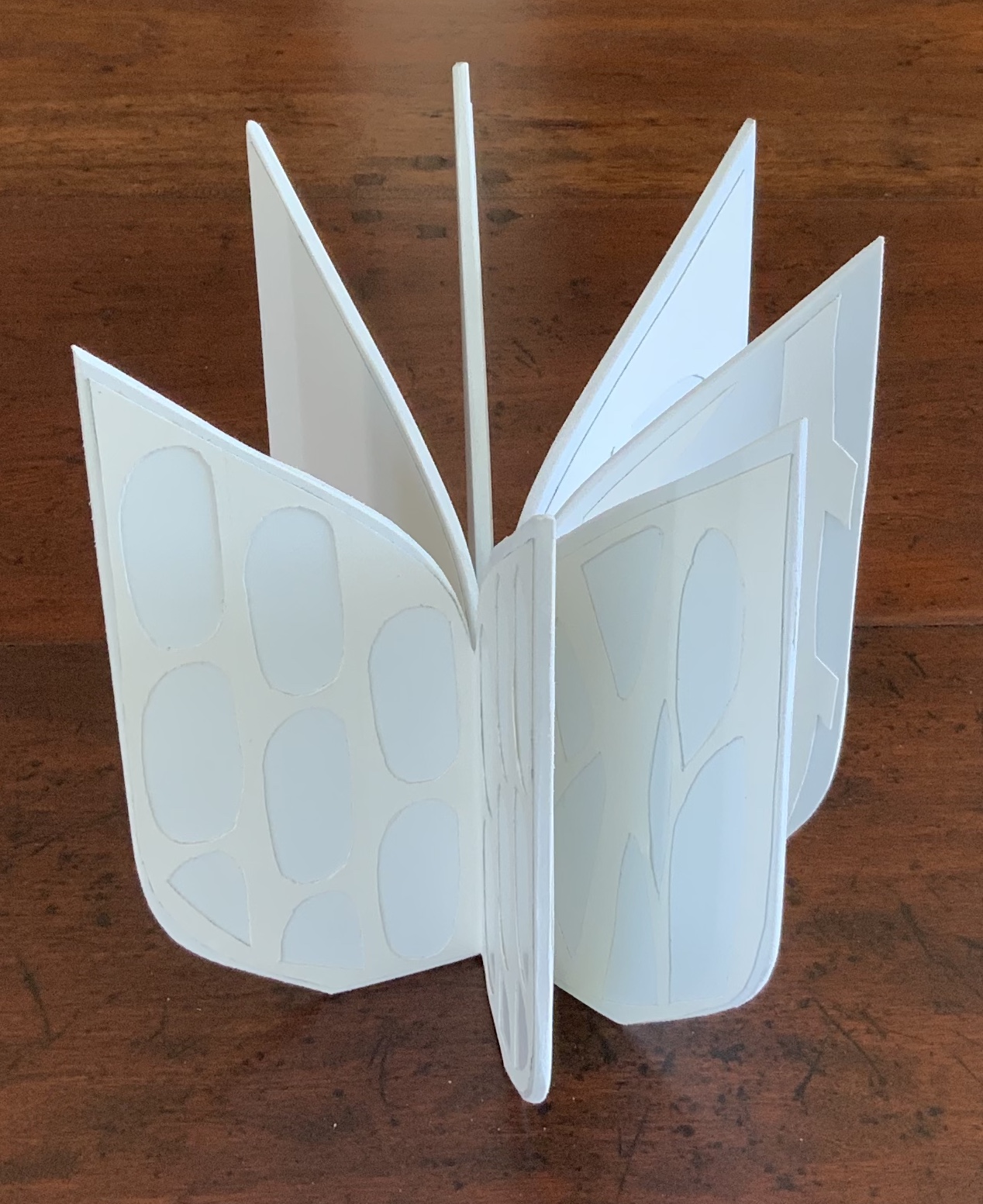
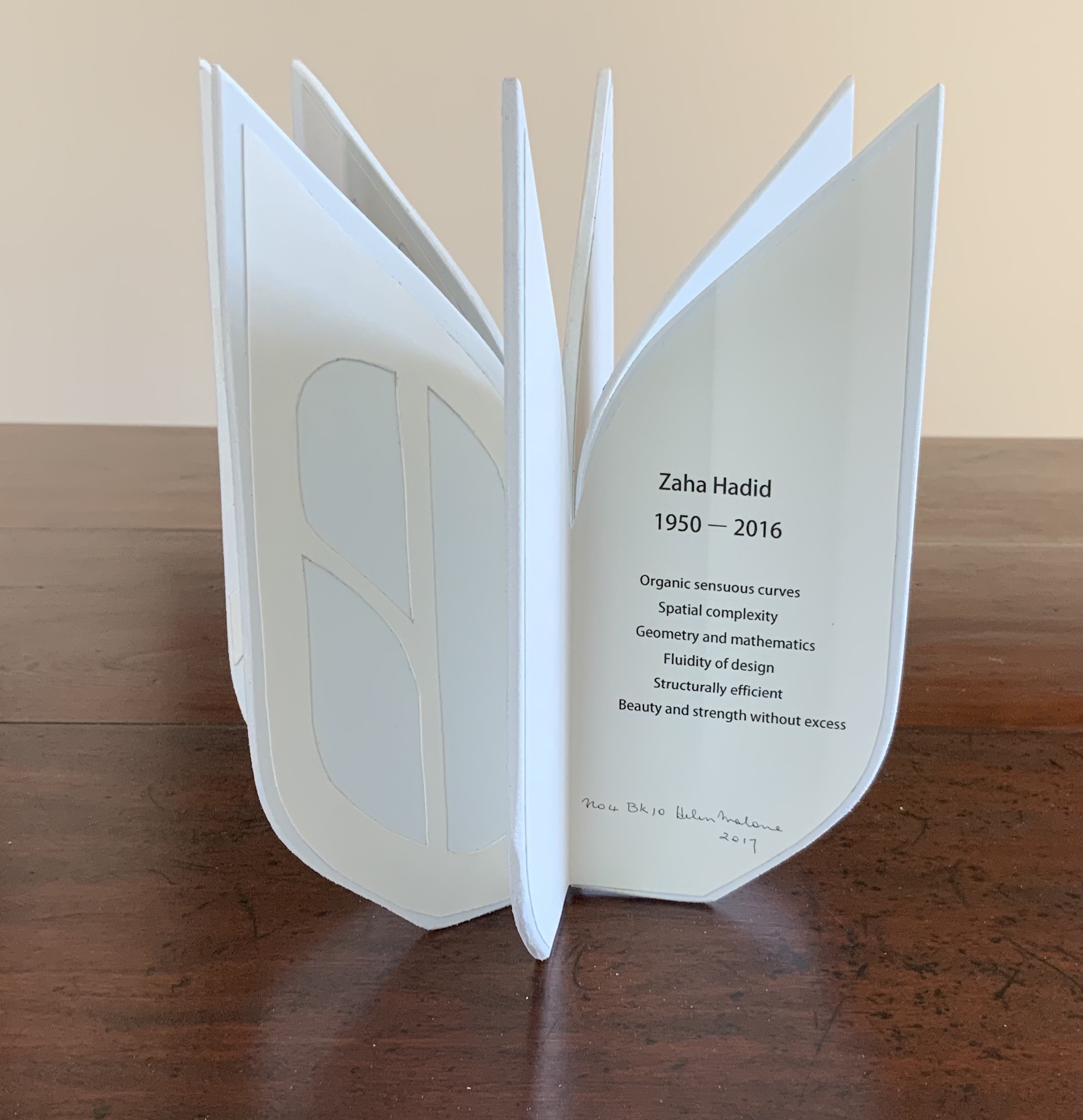
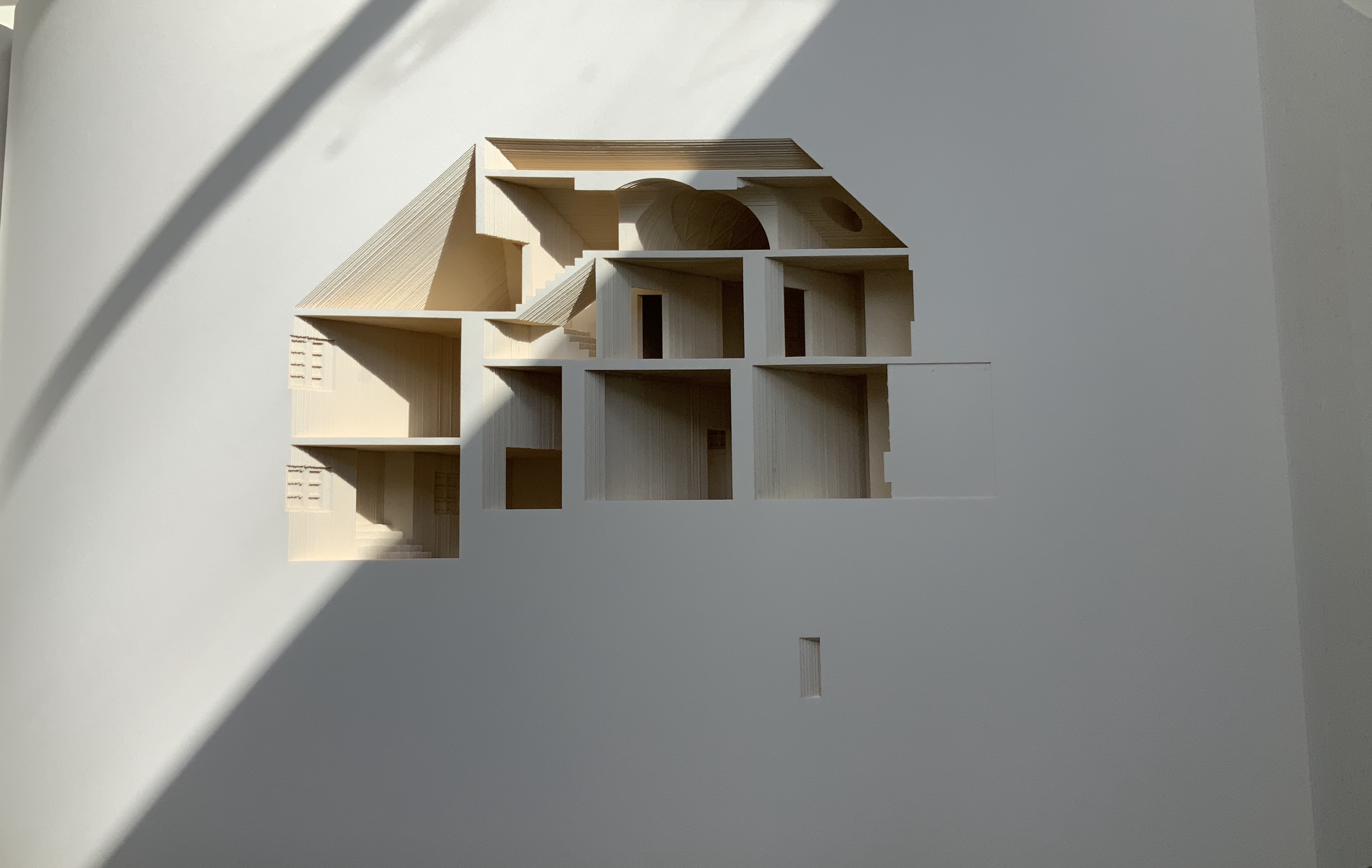
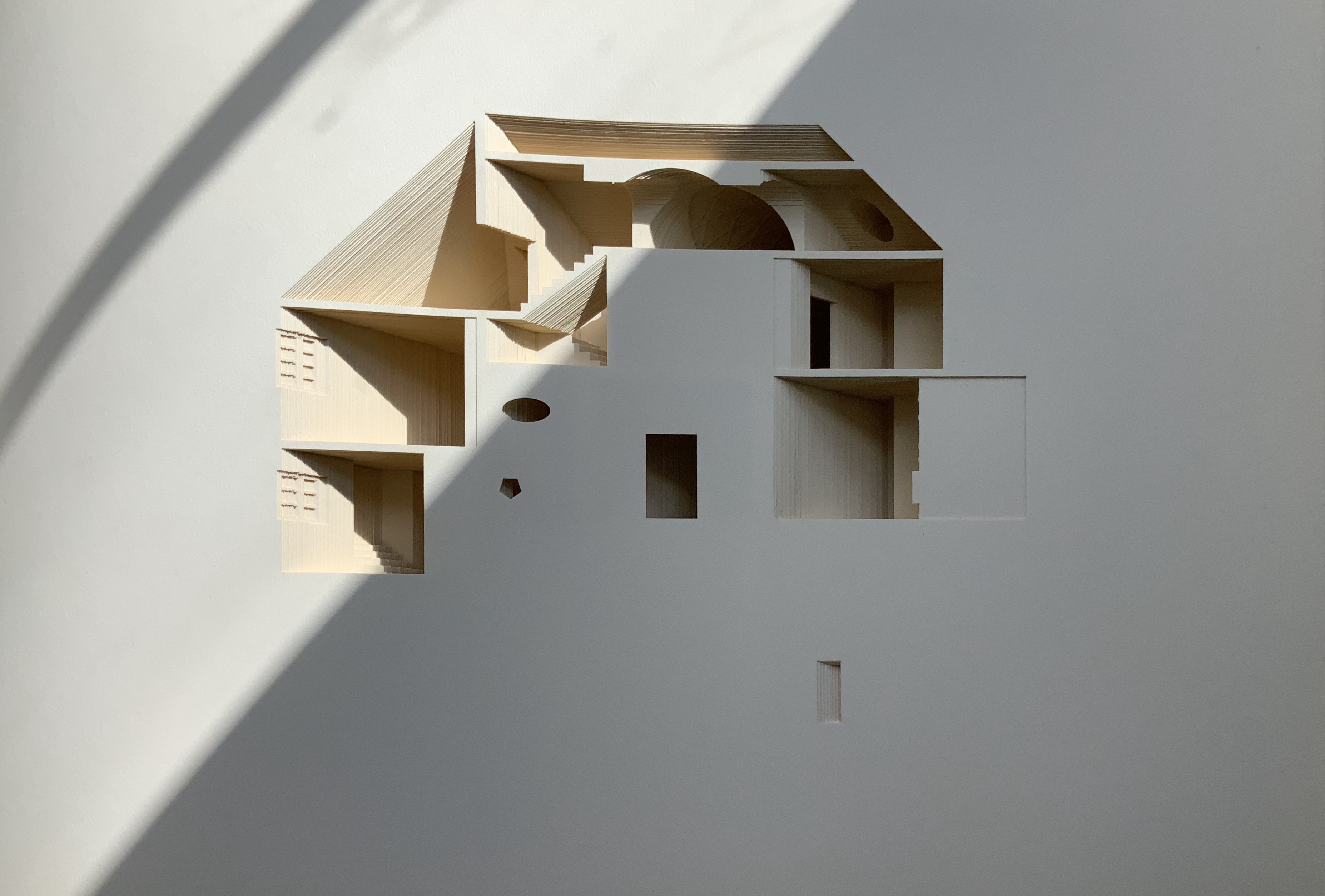
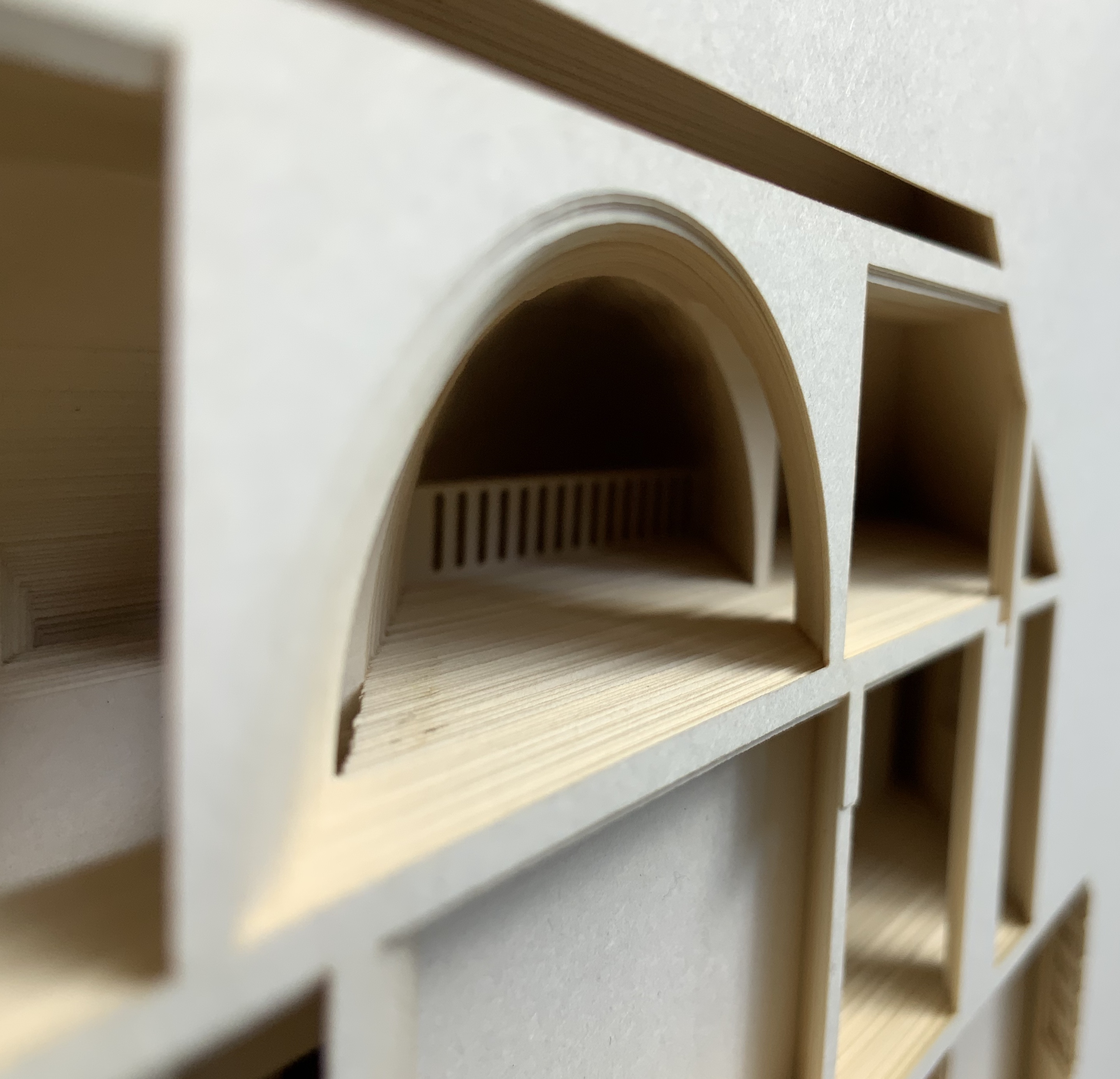
Helen Malone’s Ten Books of Architecture (2017) takes a broad historical and, most important, haptic view of architecture from Vitruvius to Hadid. Each of the ten books is a bookwork that models its architectural subject.
Proposition #8: The affinity of architecture and artists’ books lies in folding.
At the end of the 20th century, architects like Peter Eisenman, Jeffrey Kipnis and Greg Lynn latched on to computer-aided design and Gilles Deleuze’s Le pli: Leibniz et le baroque (1988) / The Fold: Leibniz and the Baroque (1993). This led to real constructions such as Eisenman’s Rebstock Park in Frankfurt as well as to the seminal books Folding in Architecture (1993), edited by Lynn, and Folding Architecture 92003) by Sophia Vyzoviti.
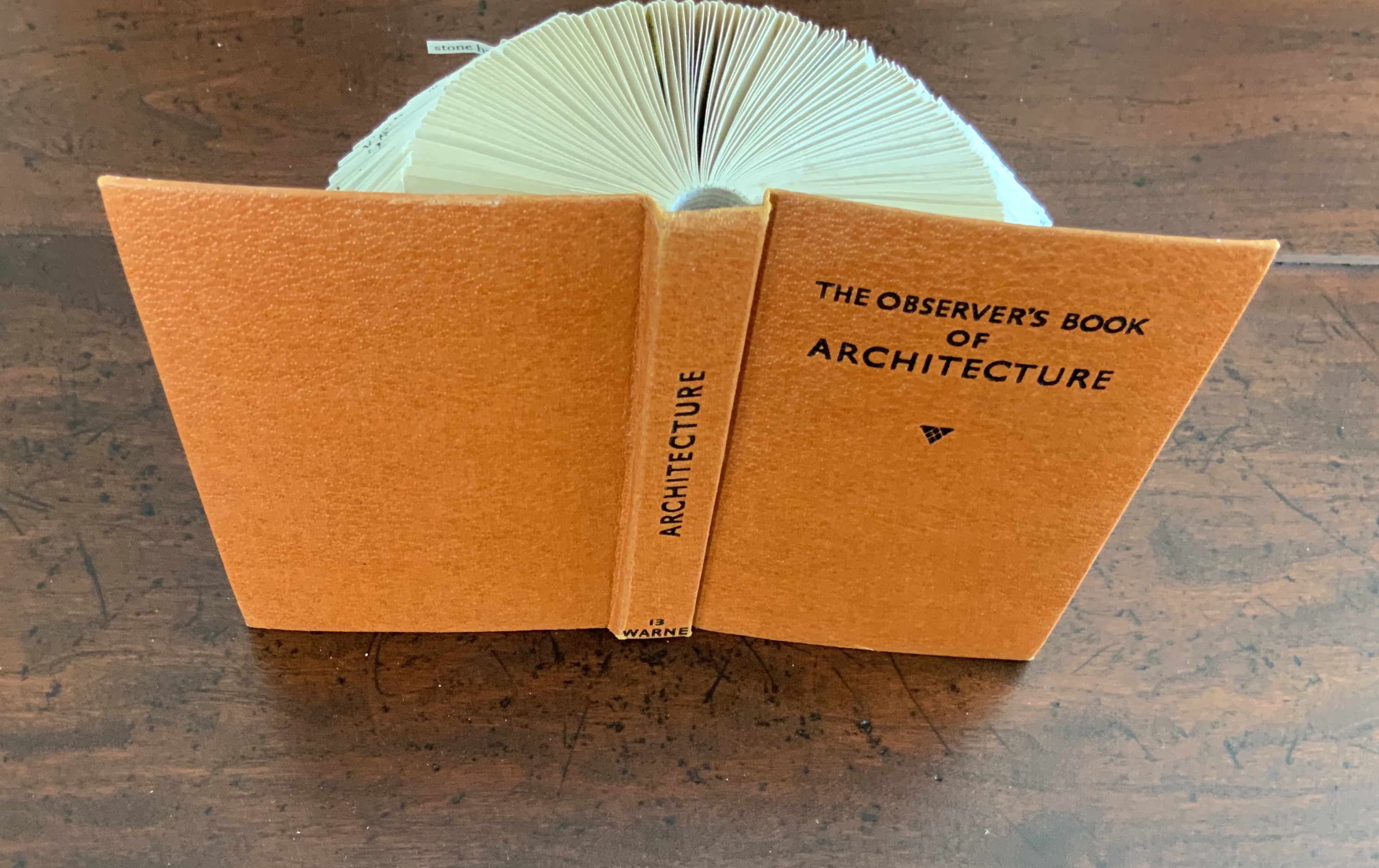
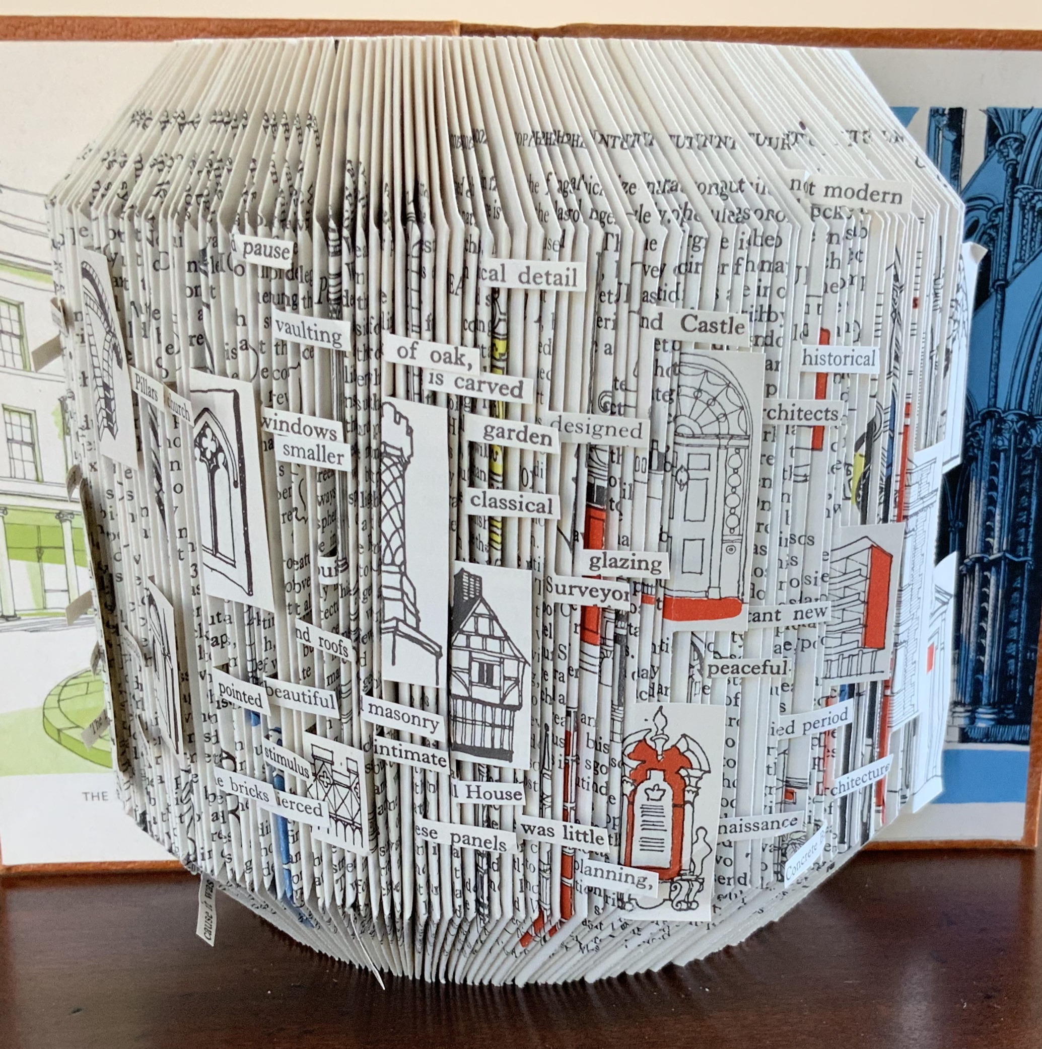
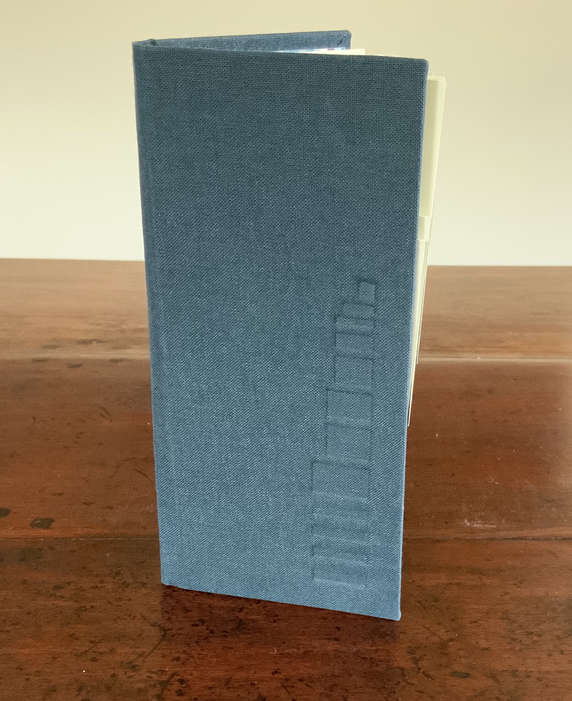
Folded book pages rarely generate a work that rises above mere craft. Heather Hunter’s Observer Series: Architecture(2009) achieves the necessary height. It combines the altered book with an accordion book that incorporates a found poem composed of the words excised and folded outwards from the folded pages of The Observer’s Book of Architecture.
Proposition #9: The affinity of architecture and artists’ books lies in light.
Marlene MacCallum’sTheme and Permutation(2012) is a response to the permutations and variations over time in five houses built to a common plan in Townsite area of Corner Brook, Newfoundland. MacCallum used digital tools to translate the original film source of eight different window images from the houses. A tritone image of a single Townsite window under translucent pages opens the book. As the pages turn, new window images appear and layer over each other, darkening up to the book’s mid-point. In the center spread, two text blocks appear speaking to the history, architectural permutations and economic shifts of the Townsite area. The tonality begins to lighten over the ensuing new combinations of window layers. A third text block of personal narrative is introduced, and a tritone image of one of the Townsite windows in its original condition concludes the work.
Proposition #10: The affinity of architecture and artists’ books lies in perspective.
Cees Nagelkerke’s Piranesian Window (1996) resides in the Vedute Foundation’s collection of “spatial manuscripts”, invited works that must conform to the dimensions of the Gutenberg Bible. Piranesian Window‘s form and title capture multiple meanings of vedute (“views”). Views are things seen — which this spatial manuscript is. Views are prospects from which to see — which a window offers. Views are perspectives — for which Giambattista Piranesi’s etchings are famous. Views are thoughts held — which “Piranesian” implies (the work’s title could be that of a manuscript on art history and philosophy). Piranesi’s mid-eighteenth century etchings Vedute di Roma(“Views of Rome”) and Carceri d’invenzione (“Imaginary Prisons”) are the obvious sources of inspiration, but Nagelkerke provides an interview describing the dream source of the work:
– … Please, continue relating your dream … – I wandered through vast ruins … along wrecked bridges … feeling remarkably at ease. – How did you find the window in this windowless world? – When a cool breeze wafted inside, I suddenly saw it. It showed a landscape, within the distance a city. There was complete tranquillity and harmony there, like in a painting by Piero della Francesca … I stood there for some considerable time and I became increasingly saddened, because I discovered that I was looking at something that had vanished forever. – But how did you manage to take the window? – I wanted to touch it … as a result, I immediately fell down. The gap left in the wall closed by itself … I picked it up and continued on my way, meeting people who spoke to me saying that I should leave the Carceri. I was taken to a gateway. No one looked at, or said anything about, the window… In the square where I found myself, there was an intense, chaotic commotion. The window still reflected something of the vast space I had left. The exterior showed traces of the wall in which it had been mounted. I looked through it and saw everyday life …
Proposition #11: The affinity of architecture and artists’ books lies in archaeology.
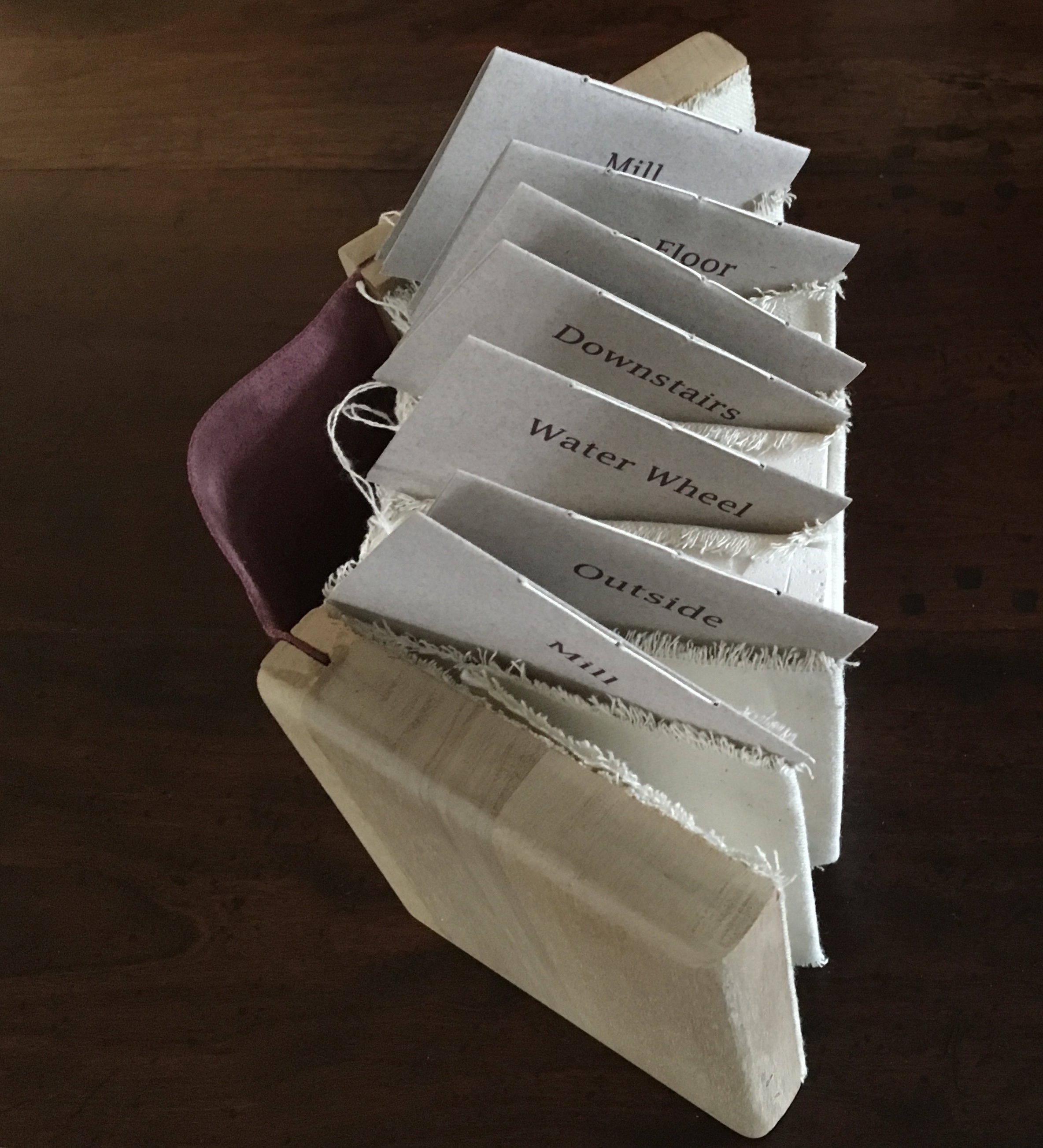
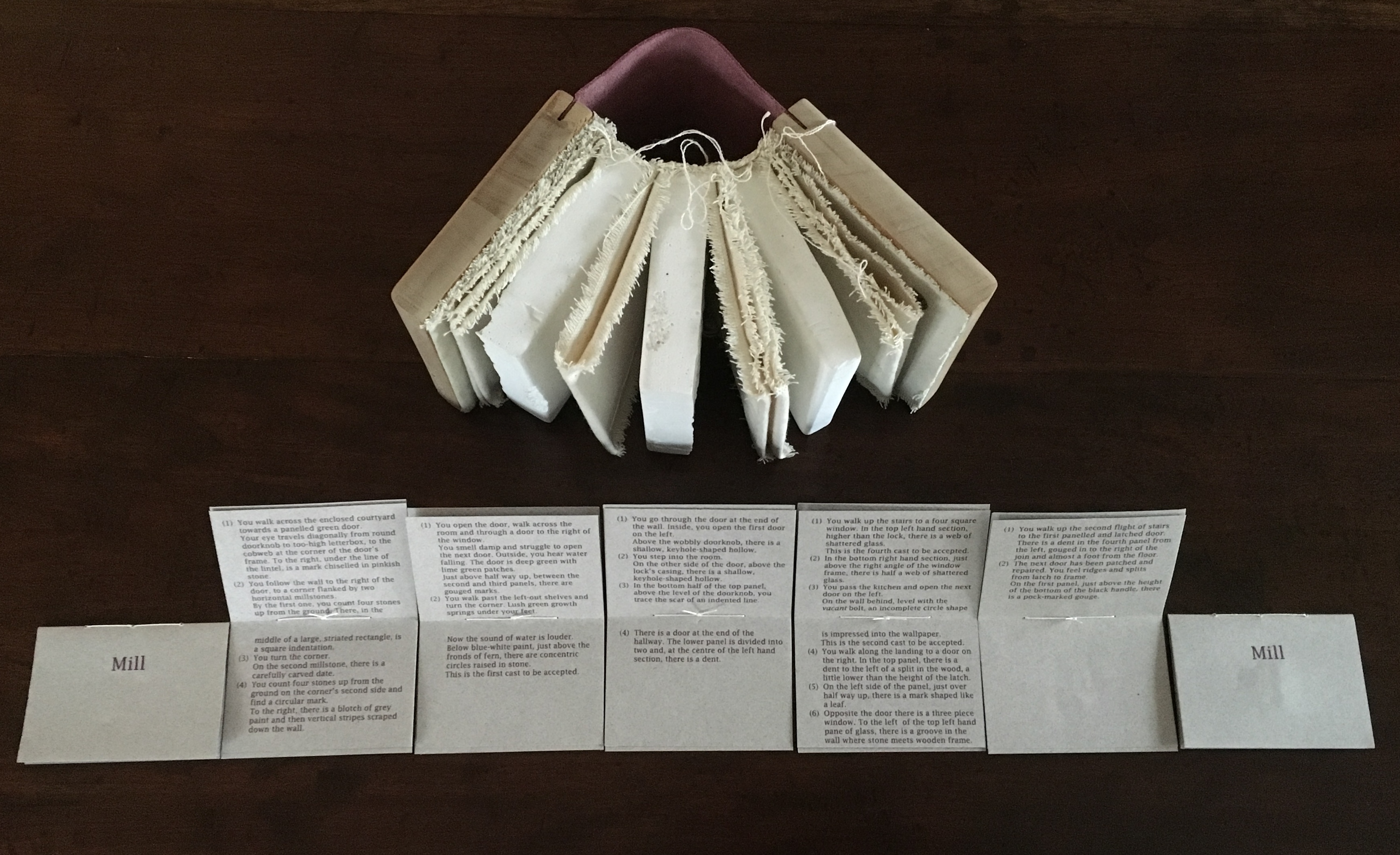
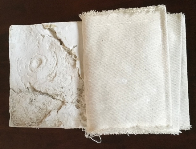
Mill: A journey around Cromford Mill, Derbyshire (2006) by Salt + Shaw (Paul Salt and Susan Shaw) is the result of the artists’ exploration of Cromford Mill in Derbyshire, the first water-powered, cotton-spinning mill developed by Richard Arkwright in 1771. Bound in a cover of recycled wooden library shelves, three plaster cast blocks and seven calico pocket pages containing hidden texts imply the hidden archaeological history to be found. The forensic-like casts are taken from interior surfaces, and the texts walk the reader step by step through each area of the mill.
Proposition #12: The affinity of architecture and artists’ books lies in assemblage and collage.
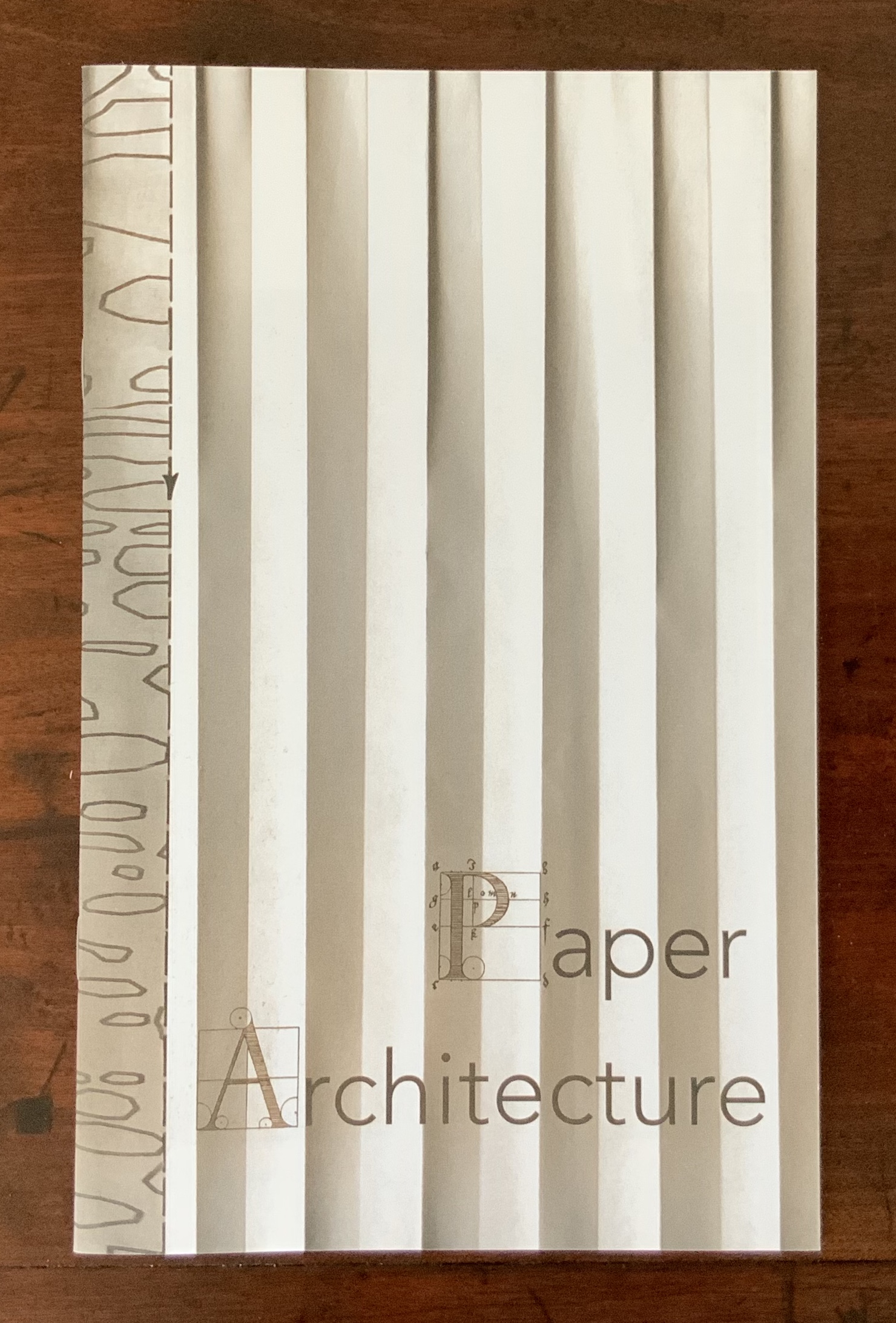
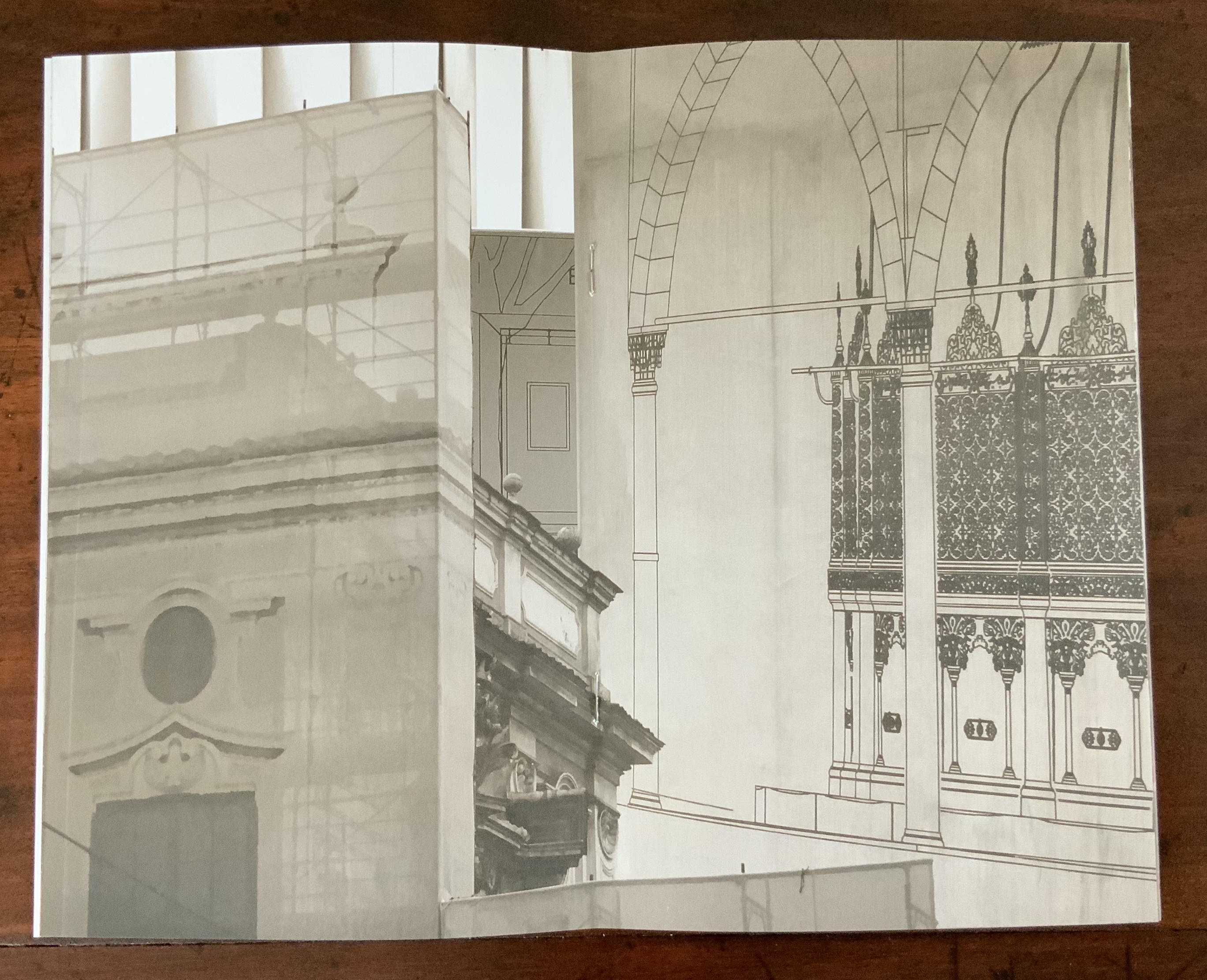
Based on an architectural installation at the Minnesota College for Art and Design and drawing on her photos of Ayvalik, Amsterdam, Florence, Istanbul, New York City, Rome, San Diego and Venice, Karen Wirth’sPaper Architecture (2017) certainly prompts a revisit to MoMA’s “Cut ’n’ Paste: From Architectural Assemblage to Collage City“, 10 July 2013 – 5 January 2015, to prove this proposition.
Proposition #13: The affinity of architecture and artists’ books lies in luxe.
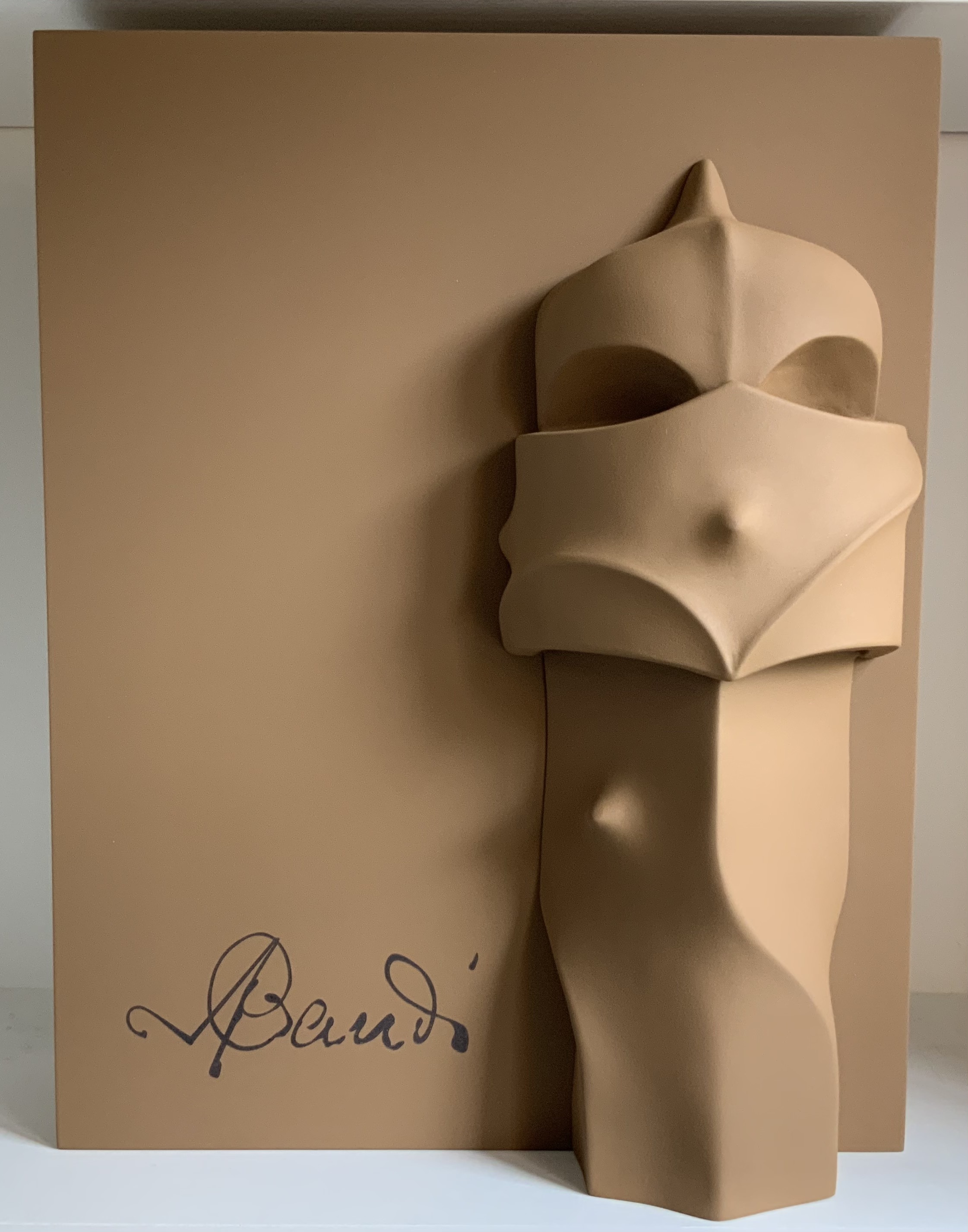
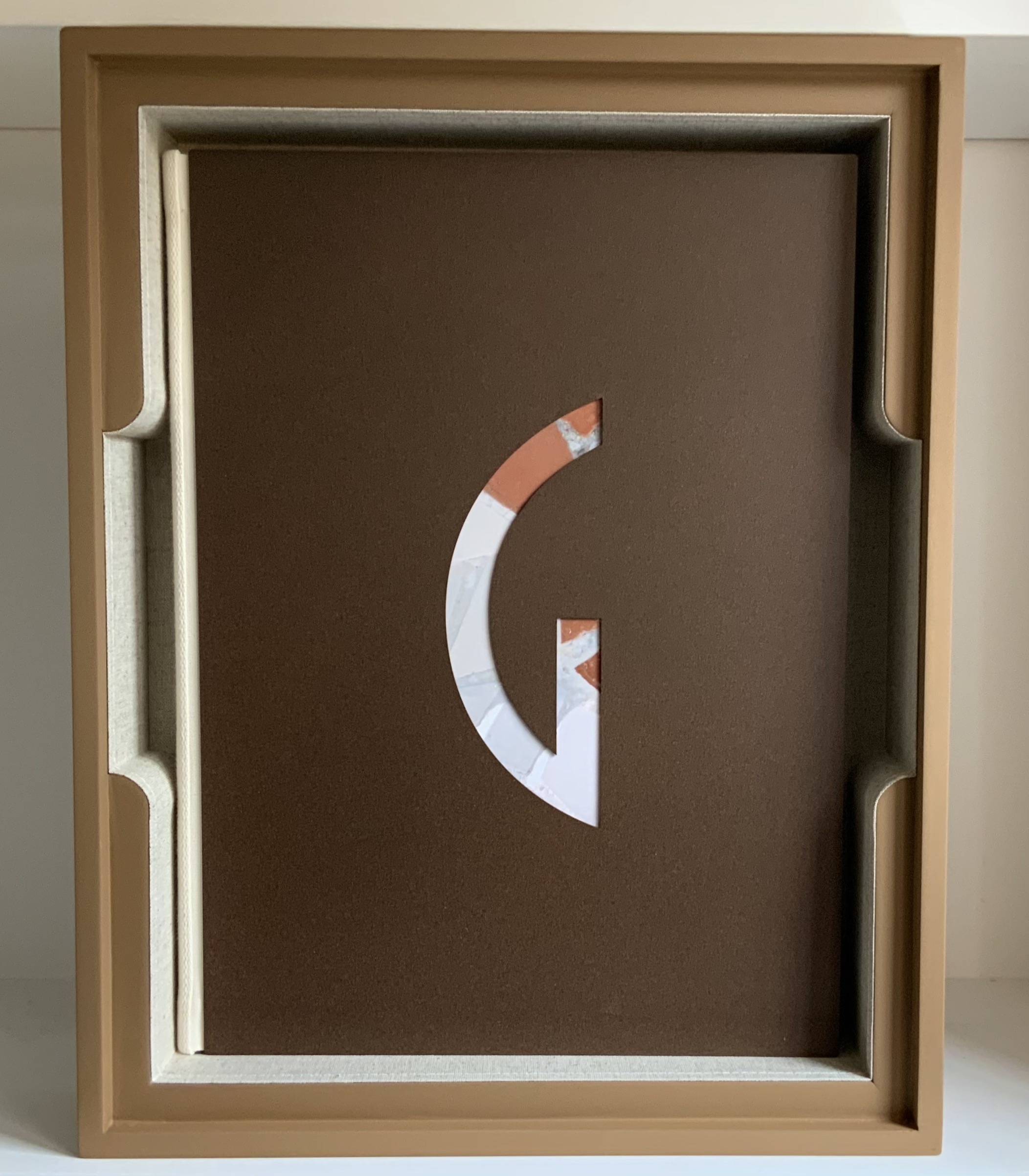
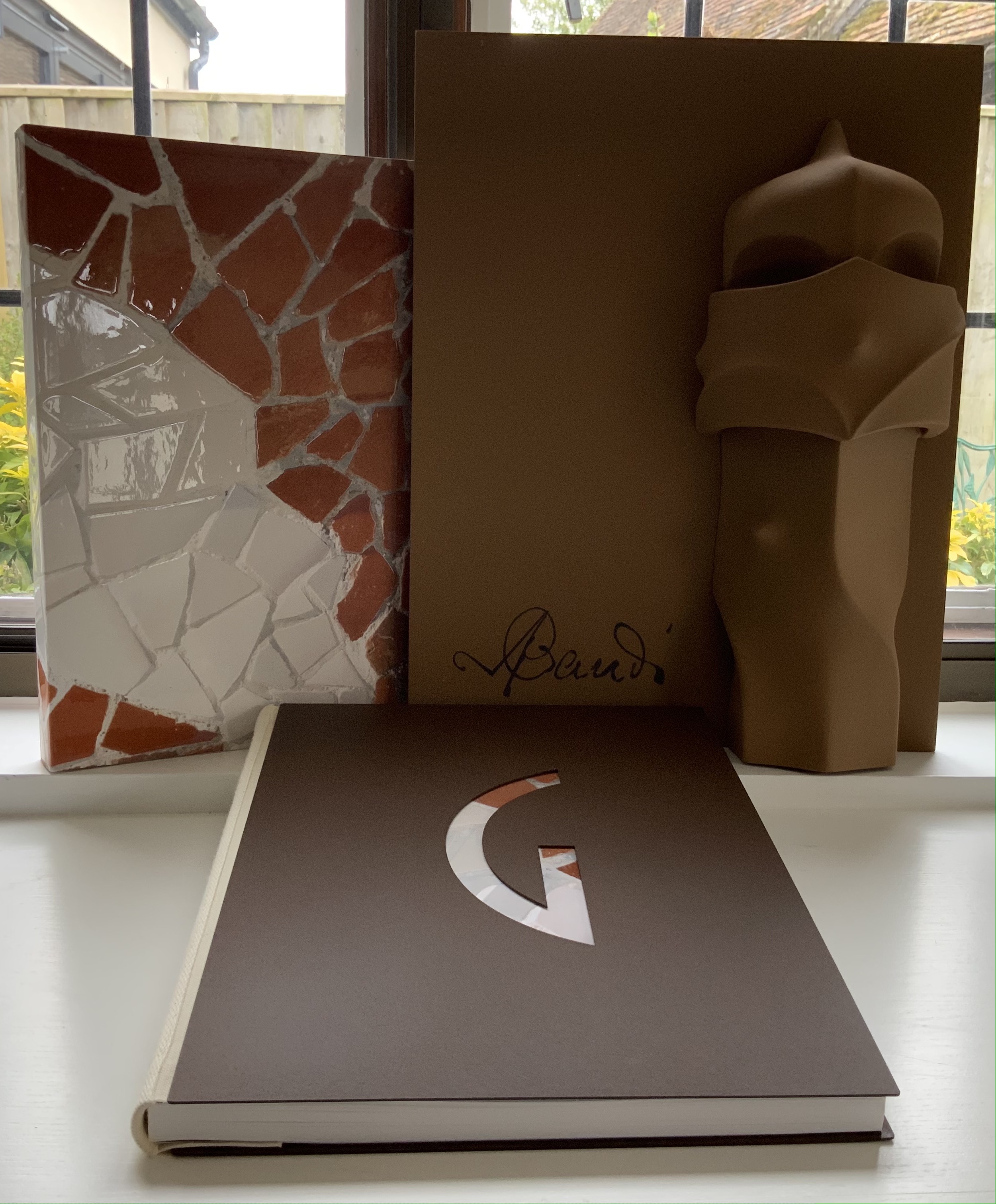
Early theorists, critics and artists of book art expended great effort to exclude livres d’artiste and deluxe productions from the definition of a form of art that struggled to find a name: artist’s book, artists’ books, bookworks, book art, etc. The spectrum from objects of conspicuous consumption to democratic multiples characterizes both architecture and book art. Antoni Gaudí’s architectural efforts easily span that spectrum — from his Casa Milà to his tiles found underfoot in Barcelona’s Passeig de Gràcia. Under the guidance of Juan José Lahuerta (chief curator at the National Museum of Art of Catalonia), the publisher Artika produced Gaudí Up Close(2020), enclosed in a wooden case with marble sculpture finished in paint, cement powder and anti-graffiti varnishes and lined with Naturlinnen fabric.
Gaudí Up Close(2020) Published by Artika. Photos: Books On Books Collection.
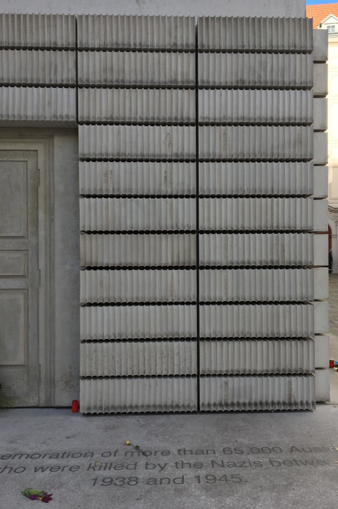
Proposition #14: The affinity of architecture and artists’ books lies in the memorial.
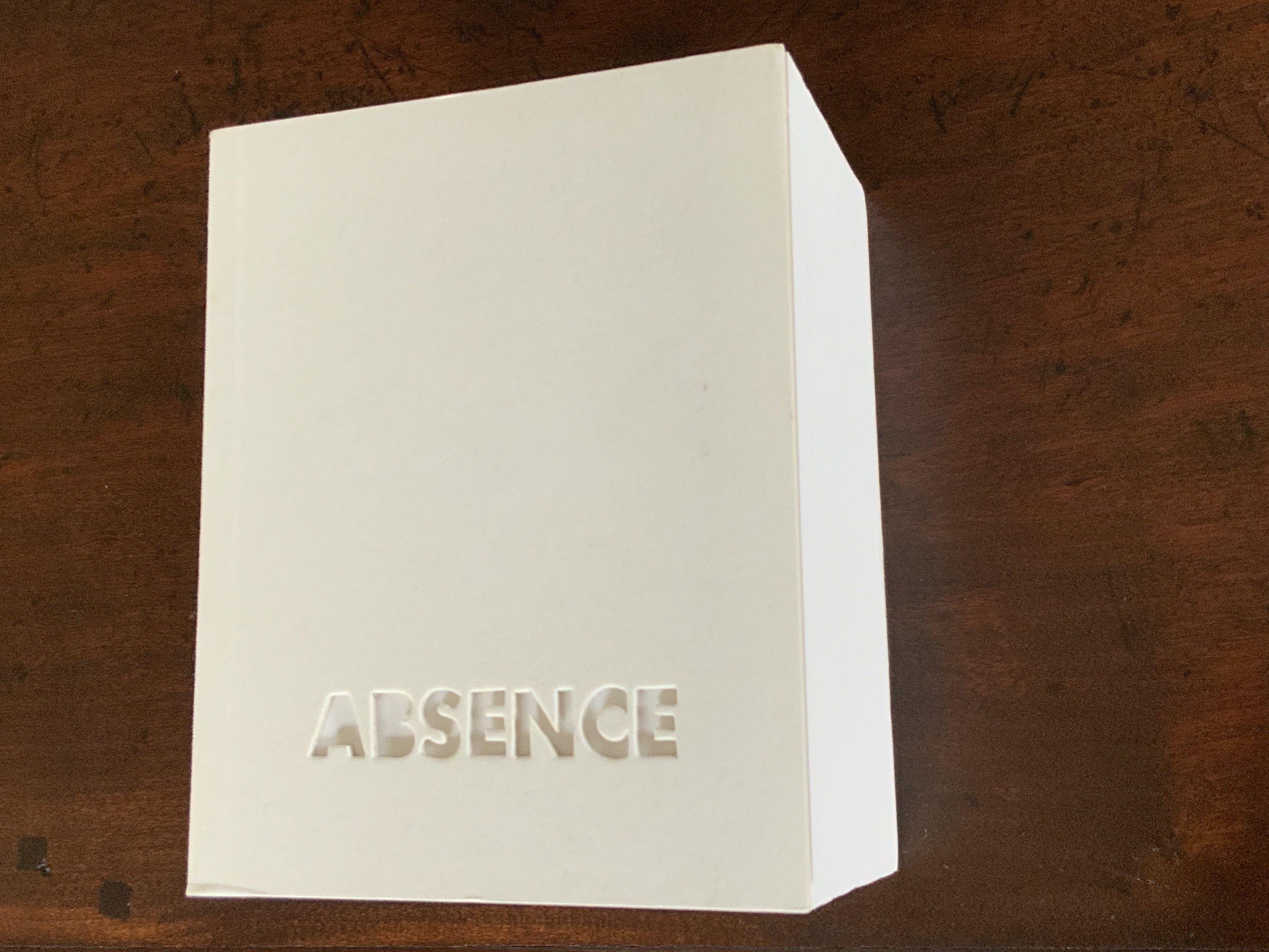
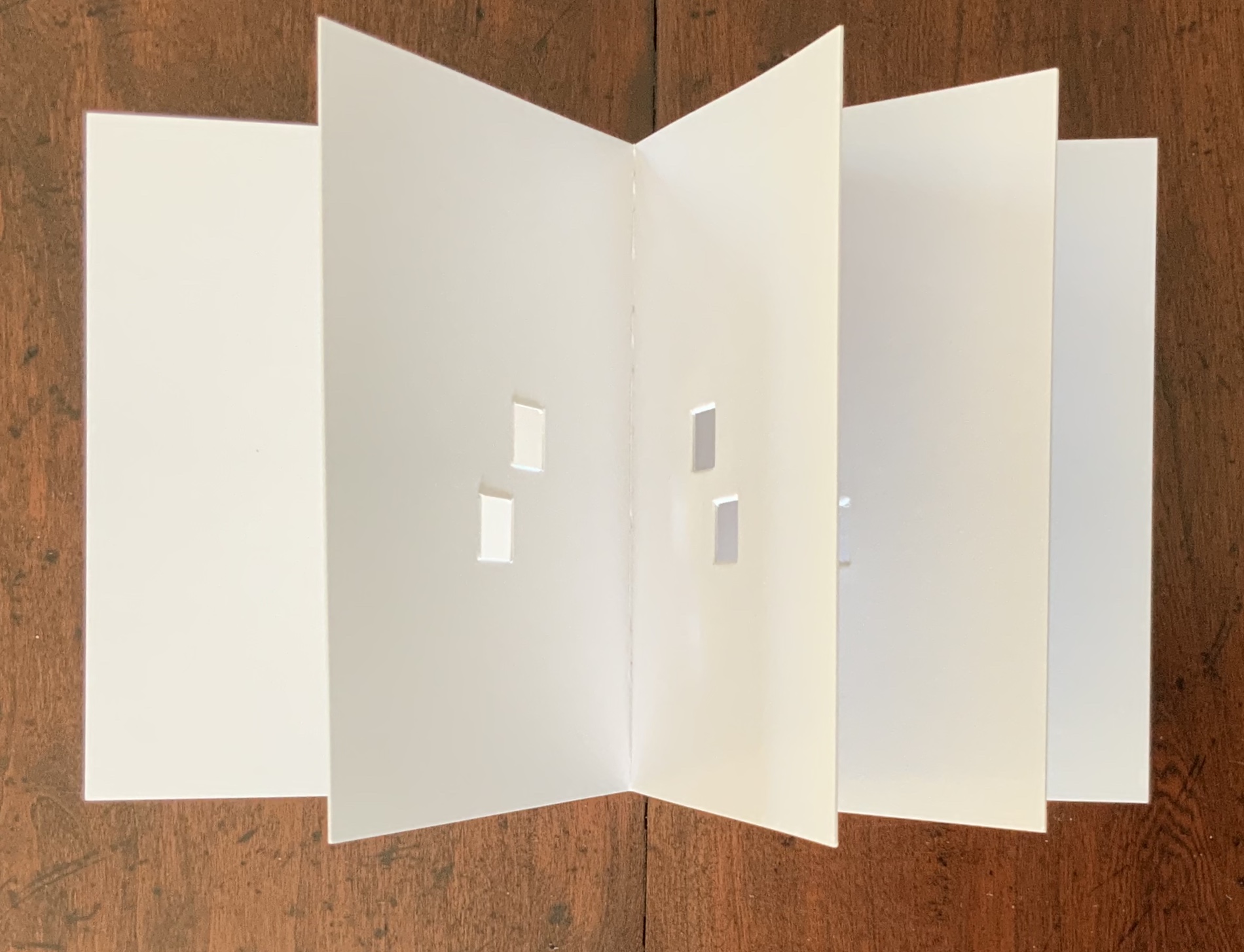
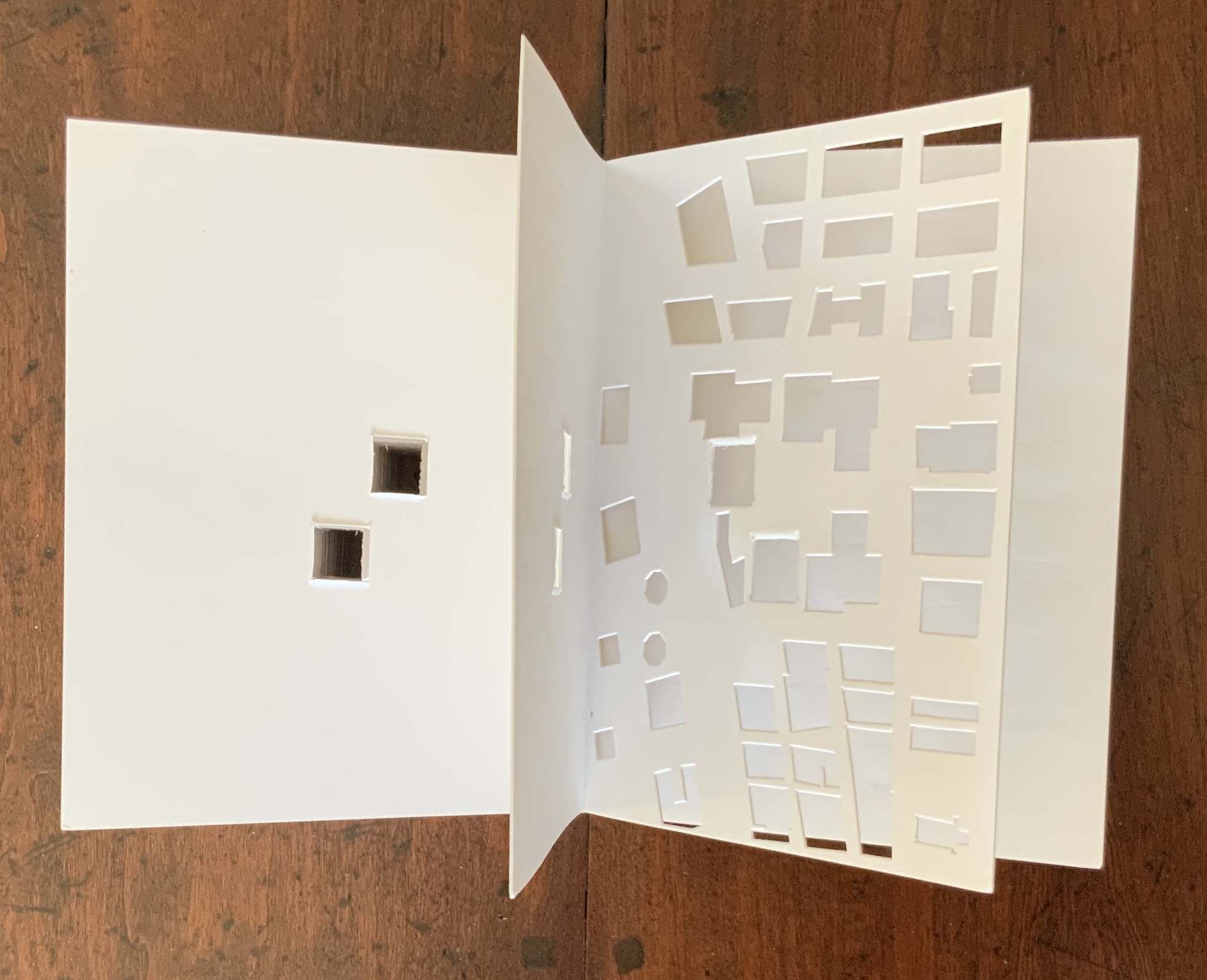
As you turn the corner into Judenplatz in Vienna, Rachel Whiteread’s great cube appears showing only the fore edge of book after book. As you hold J. Meejin Yoon’s small white brick of paper and turn its thick pages, a small pinhole appears on the page. Then two larger square holes emerge, one of which falls over the pinhole. Page after page, the two square holes repeat, creating two small dark wells in the field of white, until on the last page they take their place in the cut-out schematic footprint of the city blocks and buildings surrounding the Twin Towers. Whiteread’sNameless Library (2000) and Yoon’sAbsence (2004) surely underscore this proposition of memorial.
Proposition #15: The affinity of architecture and artists’ books lies in the sacred.
Jeffrey Morin and Steven Ferlauto’s Sacred Space (2003) is an intimate monument of book art. Made intimate by the content and texture of its book, made more intimate by the viewer’s having to construct the chapel. Made monumental by the echo of typographic history, made more monumental in Galileo Galilei’s echo from its floor: Mathematics is the alphabet with which God has created the universe.
Proposition #16: The affinity of architecture and artists’ books lies in collaboration.
In Victor Hugo’s Nôtre-Dame de Paris (1831), Archdeacon Claude Frollo points to the book in his hand and then to the cathedral and says, “This will kill that”. It is ironic that Hugo’s book (popularly known now by its English title The Hunchback of Nôtre-Dame) was written in large part to save the then-decaying cathedral (post-Revolution, it served as a warehouse), and it succeeded. It is also ironic that, while the fictional character’s metaphor has a point about the book’s permanence of replicability outlasting the building’s permanence of stone, it misses the collaborative foundations of both.
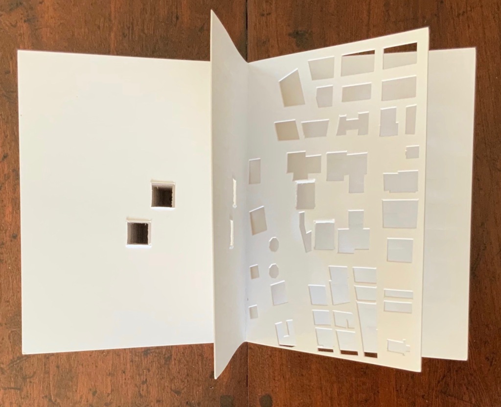
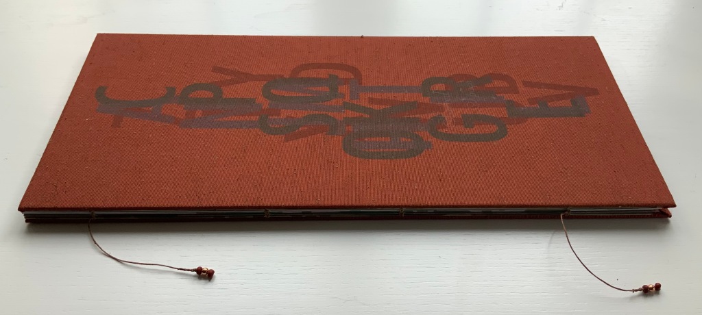
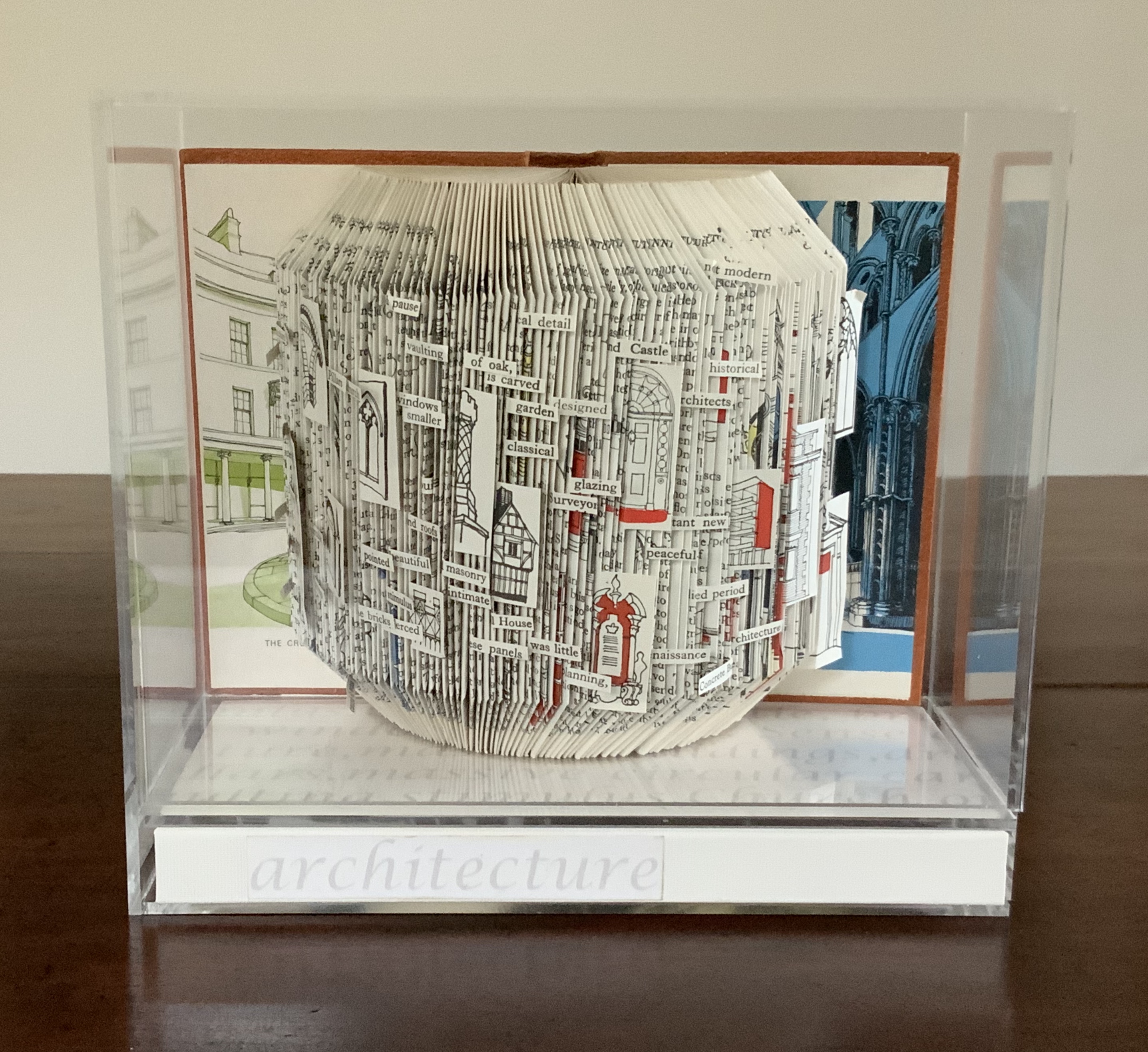
Created by ten students at Scripps College under the direction of Kitty Maryatt, Arch (2010) reminds us that the creation of a book — even a work of book art — is a collaborative effort.
Arch (2010) Kitty Maryatt, Jenny Karin Morrill, Ali Standish, Alycia Lang, Jennifer Wineke, Mandesha Marcus, Catherine Wang, Kathryn Hunt, Ilse Wogau, Jennifer Cohen, Winnie Ding Photos: Books On Books Collection
Maryatt’s preface to Arch is entitled “Blueprint” and is brief enough to warrant citing in full:
Books are inherently architectonic. Studying architecture would naturally be profitable to students building their own books.
On January 17, 2010, just days before class was to start, the Los Angeles Times published a fascinating article on contemporary women architects, highlighting a striking building by Jeannie Gang.
Earlier this year, the brand-new President of Scripps College chose The Genius of Women as her inaugural theme. What serendipity! This gave us the perfect inspiration for our artist book: the genius of women architects.
After extensive research and class discussion, a mission statement for the book evolved:
Architecture, like books, is a delicate balancing act between stability and motion, interior and exterior, aesthetic values and structural practicalities.
Books, like building, are fundamentally inhabited spaces. They are incomplete without human interaction.
The first portals were built of post and lintel construction. A curved arch is more difficult: the keystone is needed at the apex to lock the other pieces into position. Building a book is a similarly difficult feat. — Professor Kitty Maryatt
Conclusion: The affinity of architecture and artists’ books lies in our attraction to the beauty of form.
No doubt the proximity of the need for shelter and the need for oral and written language have played some gravitational role of mutual attraction for architecture and books (and latterly artists’ books). But equally, both architecture and artists’ books speak to our attraction to the beauty of form. All of the examples above are re-offered here in support of this proposition. Look at them again.
“Architecture”, “art” and “the book” are all fluid concepts. So it should be no surprise that we arrive at the equally fluid similes: architecture is like book art, book art is like architecture.
An earlier version of this essay appeared in The Blue Notebook, Volume 16 No 2, Spring – Summer 2022.
Further Reading
“Architecture“. 12 November 2018. Bookmarking Book Art.
Lynn, Greg. 2004. Folding in Architecture Rev. ed. Chichester, West Sussex: Wiley-Academy. See for references to Mario Carpo, Gilles Deleuze and Peter Eisenman.
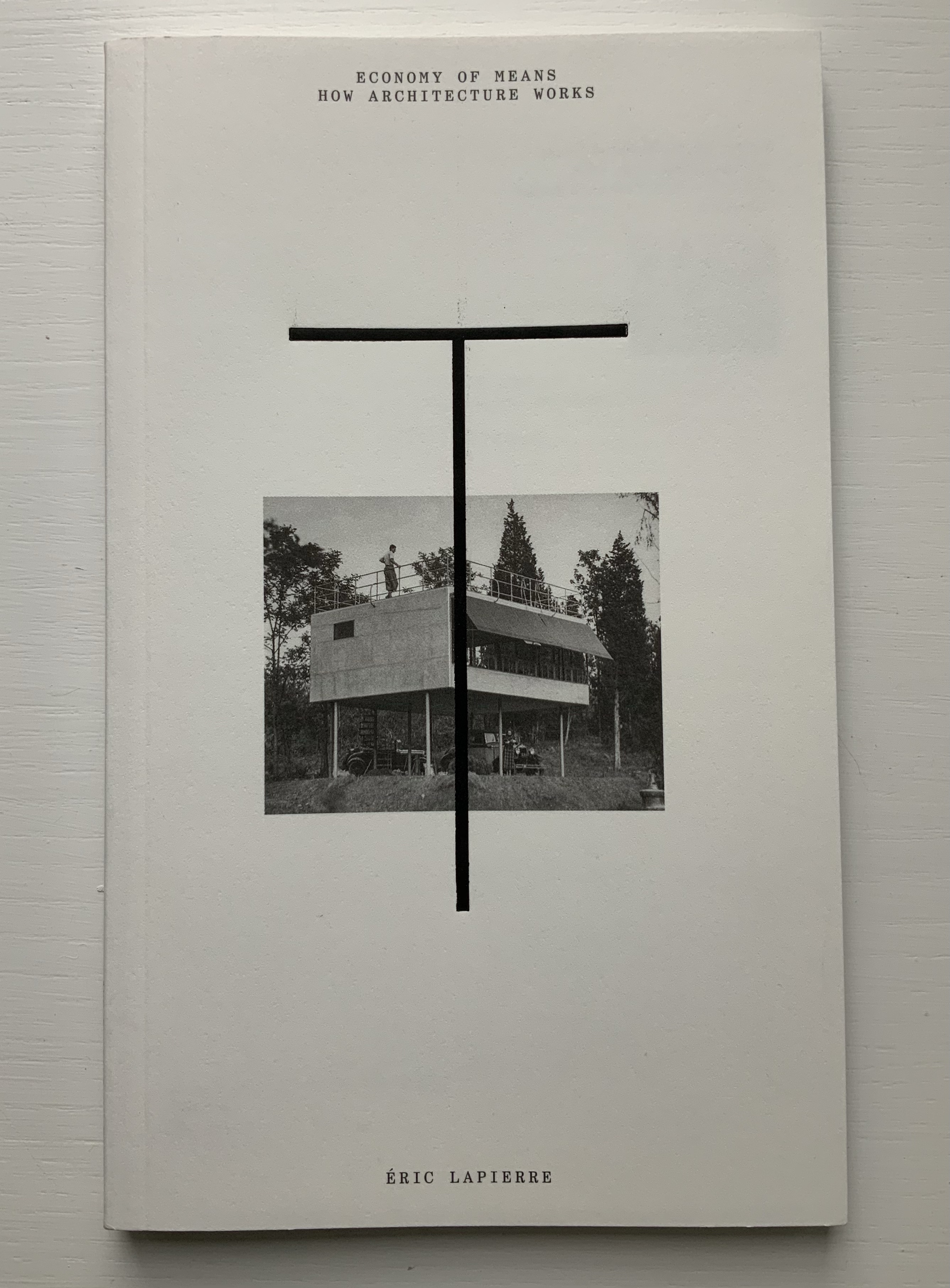
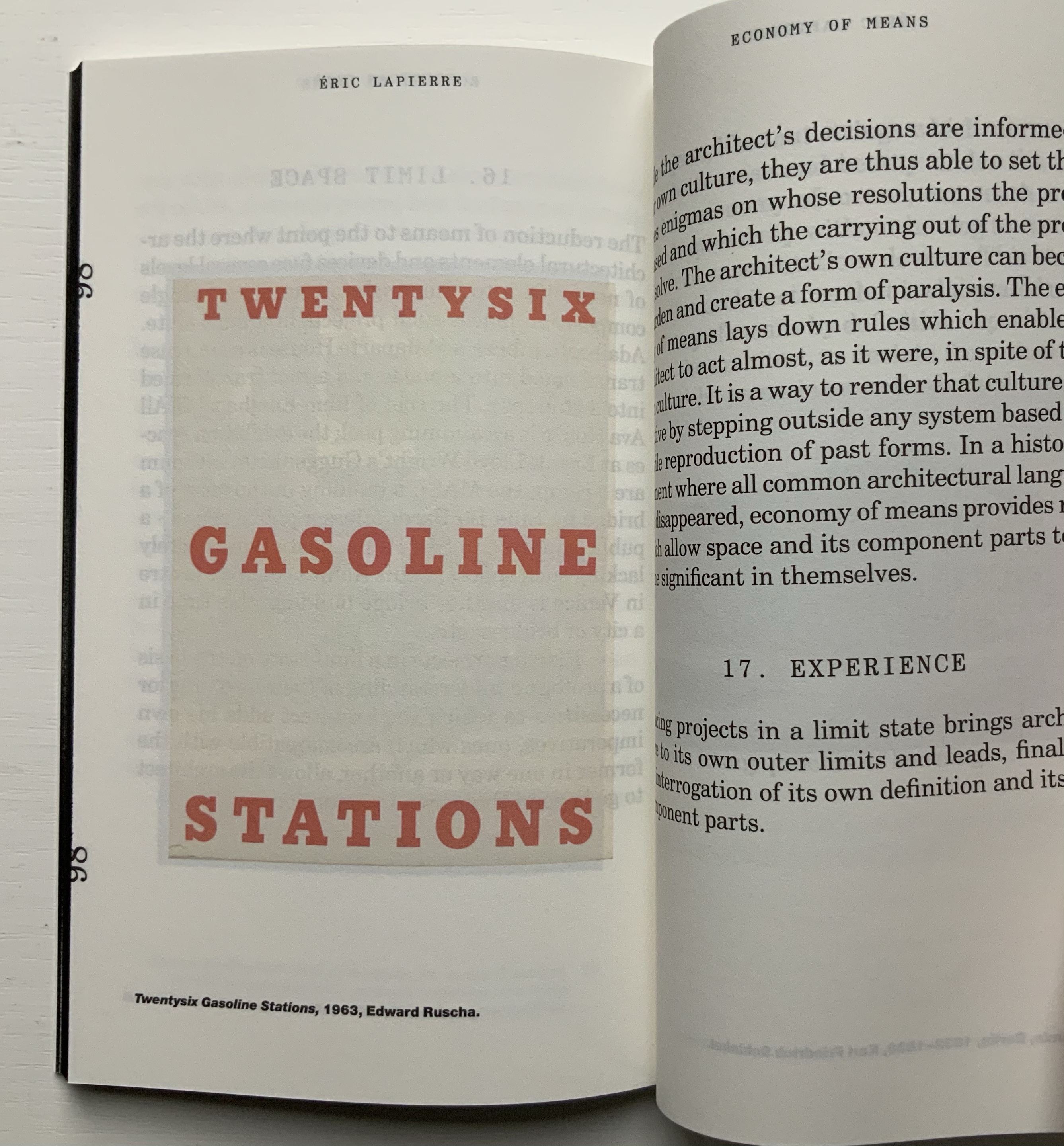
“The Poetics of Reason” was the title and theme for the fifth Lisbon Architecture Triennale in 2019 (the first was in 2007). Awarded the ADG Laus 2020 Golden Prize in the category of editorial graphic design, this work stands well with Bruno Munari’s three small 1960’s books on the square, circle and triangle, now available in a single volume, and calls to mind several works testifying to the relationship between architecture and book art. In the first of the five volumes, Éric Lapierre even interweaves with his text on architectural rationality illustrations from book artists such as Bernd and Hilla Becher, Sol Lewitt and Ed Ruscha — all without comment, in itself conveying their implicit relevance. His similar display of a page from Stéphane Mallarmé’s Un Coup de Dés Jamais N’Abolira le Hasard — that progenitor of modern and post-modern book art — speaks to the role that space — les blancs, as Mallarmé calls it — plays in these adjacent communities.
136 pages
The second volume, by Ambra Fabi and Giovanni Piovene, draws in Leon Battista Alberti, of course, whose columns ornament works by Mari Eckstein Gower, Helen Malone and many other book artists.
136 pages
Drawing on Gaston Bachelard and Juhani Pallasmaa as it does, the third volume, by Mariabruna Fabrizzi and Fosco Lucarelli, calls to mind the work of Olafur Eliasson and Marian Macken here in the Books On Books Collection and elsewhere. Anyone familiar with Richard Niessen’s The Typographic Palace of Masonry will appreciate Fabrizzi and Fosco’s exploration of where architecture, imagination and memory intersect.
136 pages
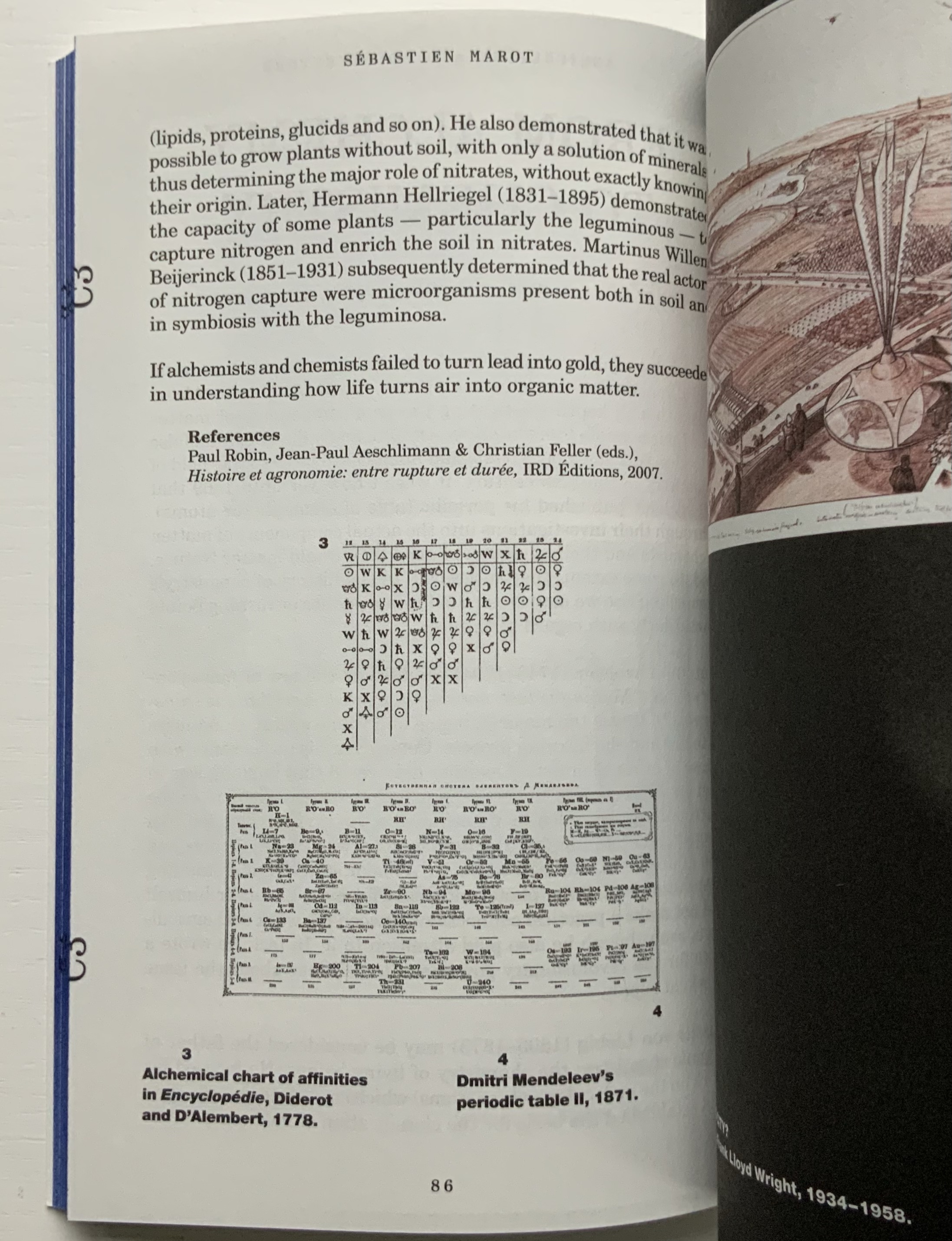
In the lengthiest of the five volumes, Sébastien Marot takes us into the territory of urban architecture and the anthropocene, also occupied by book artists Sarah Bryant, Emily Speed, Philip Zimmermann and many others.
216 pages
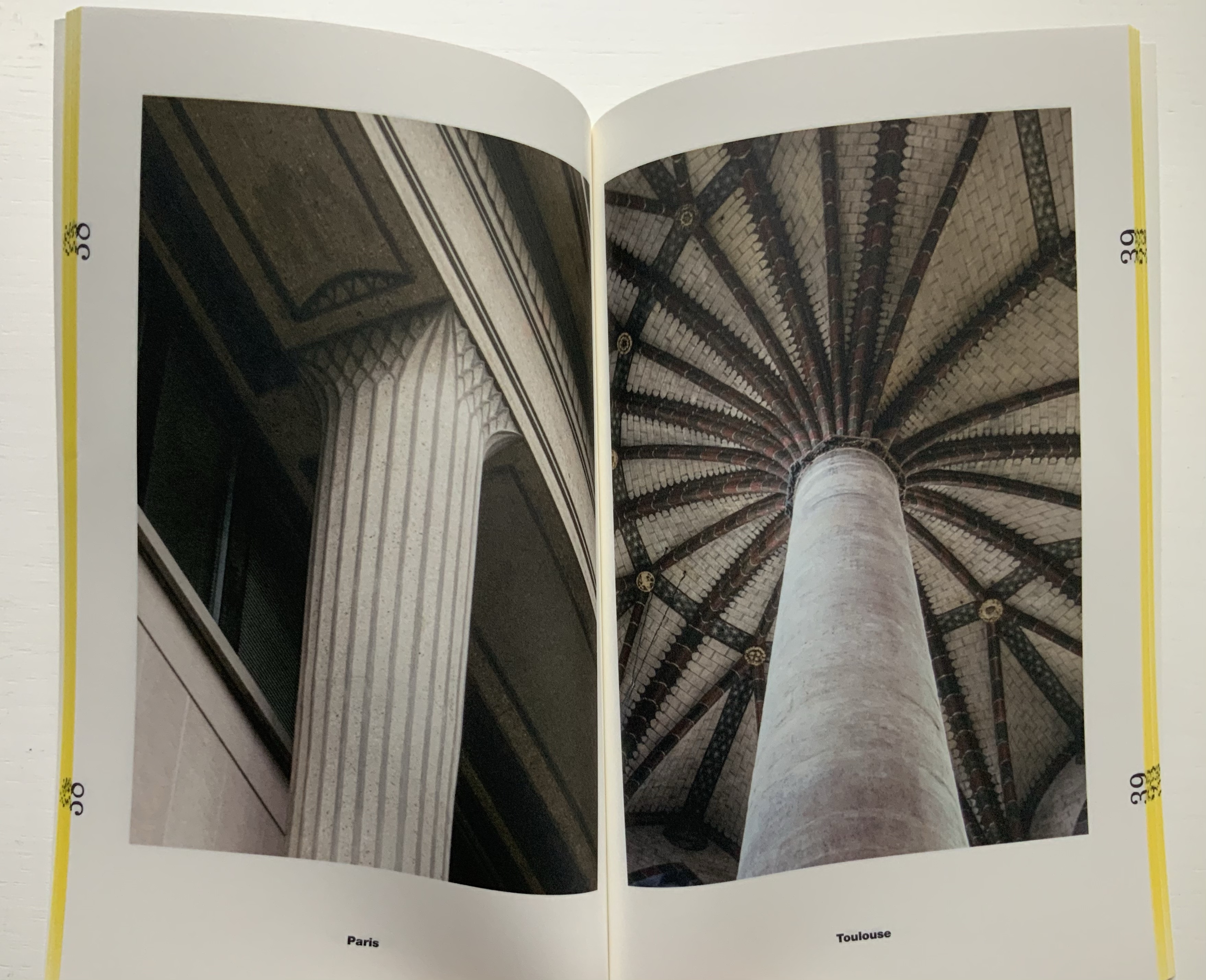
The last and shortest volume, put together by Laurent Esmilaire and Tristan Chadney, consists mostly of photos that may remind the viewer of Irma Boom’s Elements of Architecture, with Rem Koolhaas, or Strip, with Kees Christiaanse — especially in conjunction with the tinted fore edges.
88 pages
Referenced below, Pedro Vada’s review of the Triennale and the five separate sites across which it occurred in Portugal provides more insight into the five volumes themselves. Marco Ballesteros LETRA website provides additional images of the five volumes’ design.
Further Reading
“Architecture“. 12 November 2018. Books On Books Collection.
SOCKS Studio, an extraordinary website run by Fabrizzi and Lucarelli.
Your House (2006) Olafur Eliasson Hardback handbound with 454 laser cut leaves. H273 × W432 × D114 mm. Edition of 225, of which this is #210. Acquired from Carolina Nitsch Contemporary Art, August 2020. Photos: Books On Books Collection, displayed with permission of the artist.
Your House is a laser-cut model of Olafur Eliasson’s residence in Copenhagen at a scale of 1:85, which means that each page equates to a 220 mm section of the actual house. How do you read a work like this — physically? At the 22″ mark in the video below, the pages fall in a cascade like a flipbook, but for the most part, their size, accumulated bulk and weight — and delicacy — defy that handling. They must be turned slowly and carefully. Your House heeds the task of the arts as posed by the architect Juhani Pallasmaa, “in our age of speed, …to defend the comprehensibility of time, its experiential plasticity, tactility and slowness” (The Embodied Image, p. 78).
As you move from Your House‘s entrance to its exit, the outlines of walls, floors, stairs, doors, domes, windows, fireplaces and bookcases tremble in the air. Is this what Gaston Bachelard calls “the material imagination”? What Juhani Pallasmaa calls “the embodied image”?
Video: Books On Books Collection. Displayed with permission of Studio Olafur Eliasson.
Photos of the work: Books On Books Collection. Displayed with permission of Studio Olafur Eliasson.
There is something meditative about reading Your House properly. The cautious repetitive turning of pages can induce a daydream of inhabiting the space revealed. At some point in turning the pages, the empty shapes begin to become “your house”. Perhaps you see yourself moving through its spaces, and imagined furnishings occupying its rooms.
Photos of the work: Books On Books Collection. Displayed with permission of Studio Olafur Eliasson.
Or perhaps as in the sequence above — the end of one room (or chapter or part) and the start of another — you become a ghost — with all the work’s past and future readers — passing through the walls.
Video: Books On Books Collection. Displayed with permission of Studio Olafur Eliasson.
In The Poetics of Space, Bachelard writes of poetic time and prosodic time. The one is vertical, a spot in time, a frozen moment; the other is horizontal, a narrative, a continuity. But they are not mutually exclusive. Your House is a site where poetic and prosodic time occupy the same space. More than that, it is a site where temporality, as Eliasson puts it, “becomes something you perform by involving yourself physically over time” and thereby you become, “in the end, the createur” (“Not how, but why!”, p. 108).
Eliasson’s house in Hellerup, a suburb of Copenhagen, was advertised for sale in 2024. For comparison with the book, you can see photos of the exterior and interior here. Also, with thanks to Byopia Press, an X-ray documentation of the book can be found here.
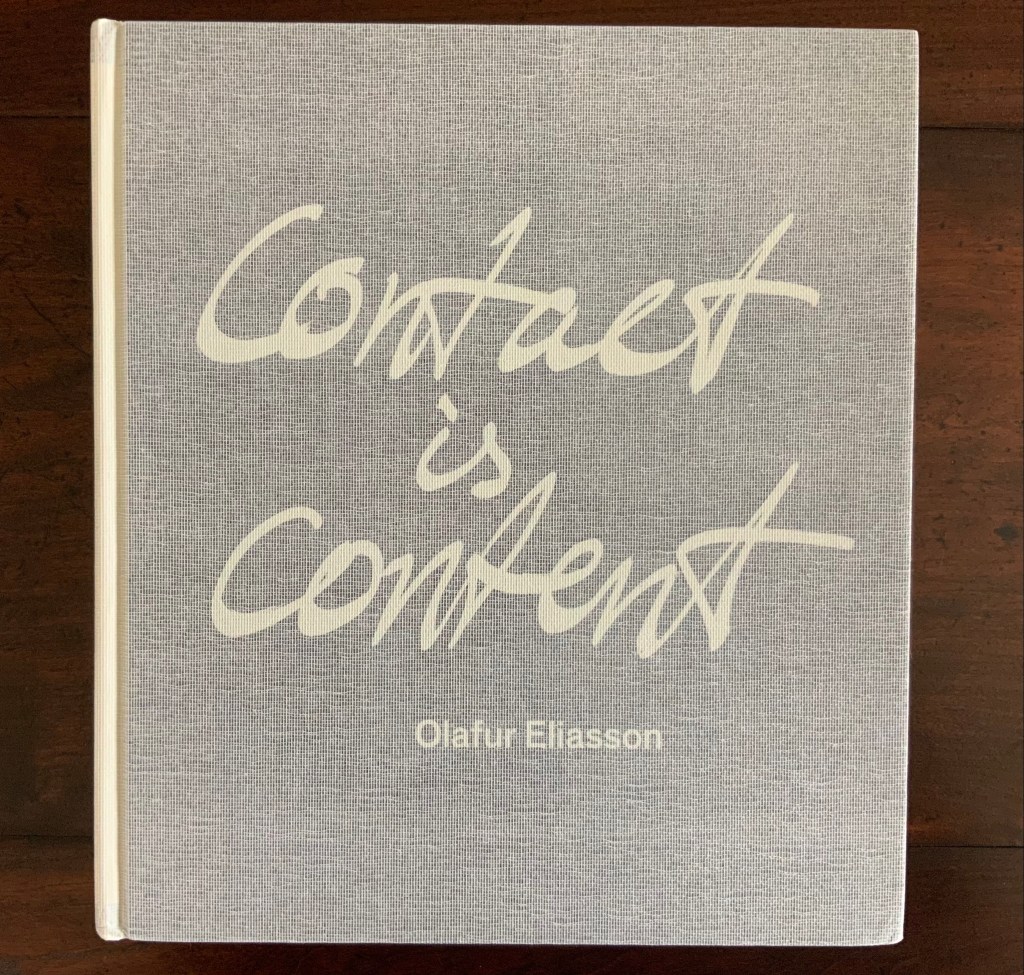
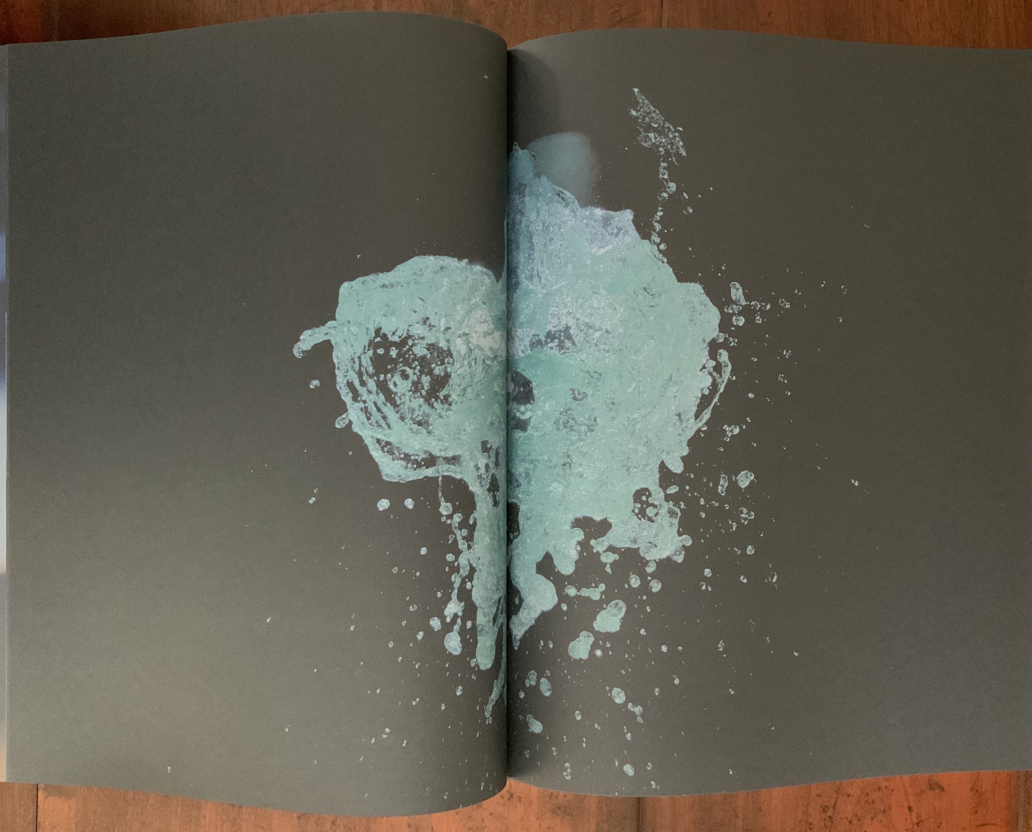
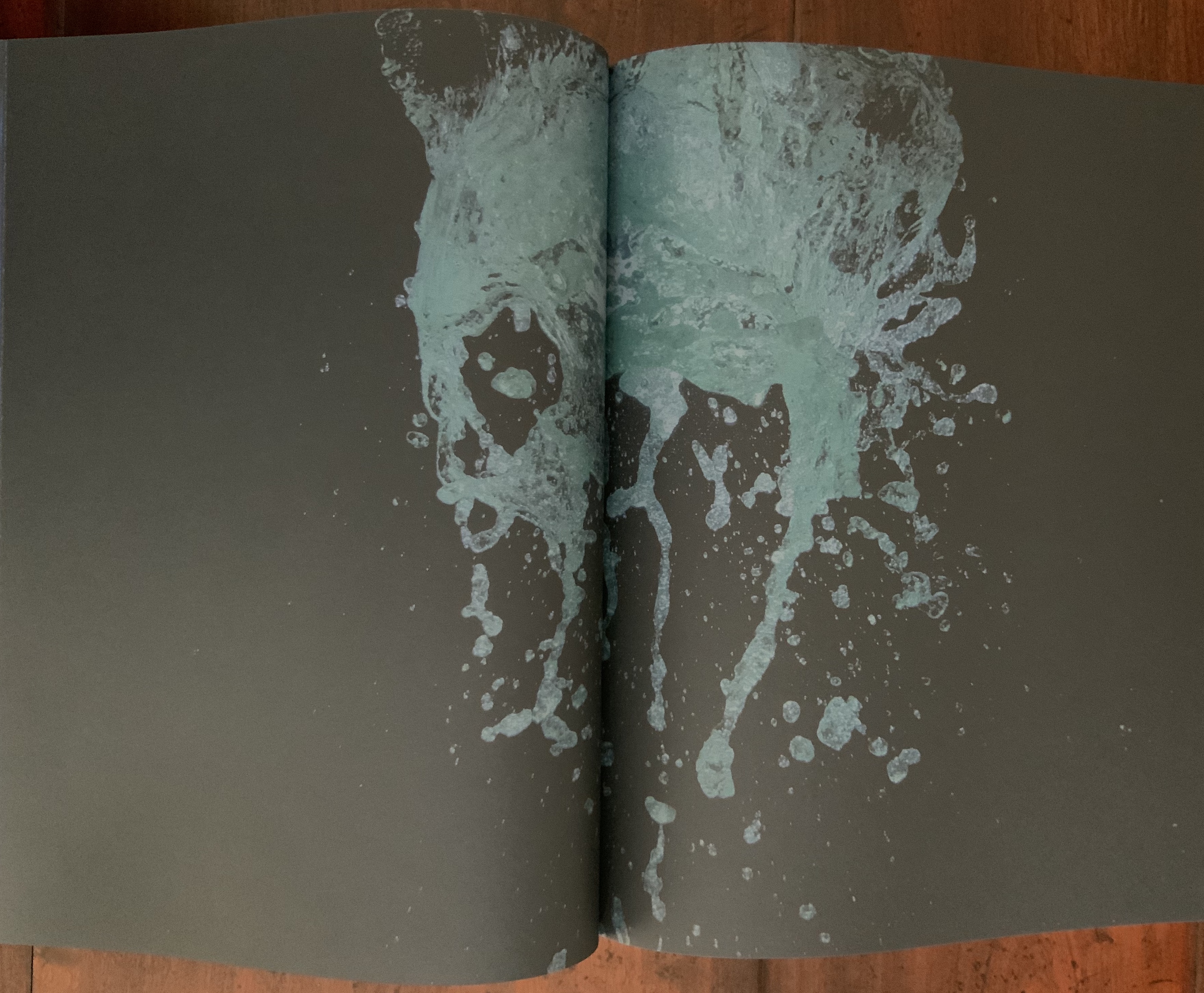
Contact is Content (2014)
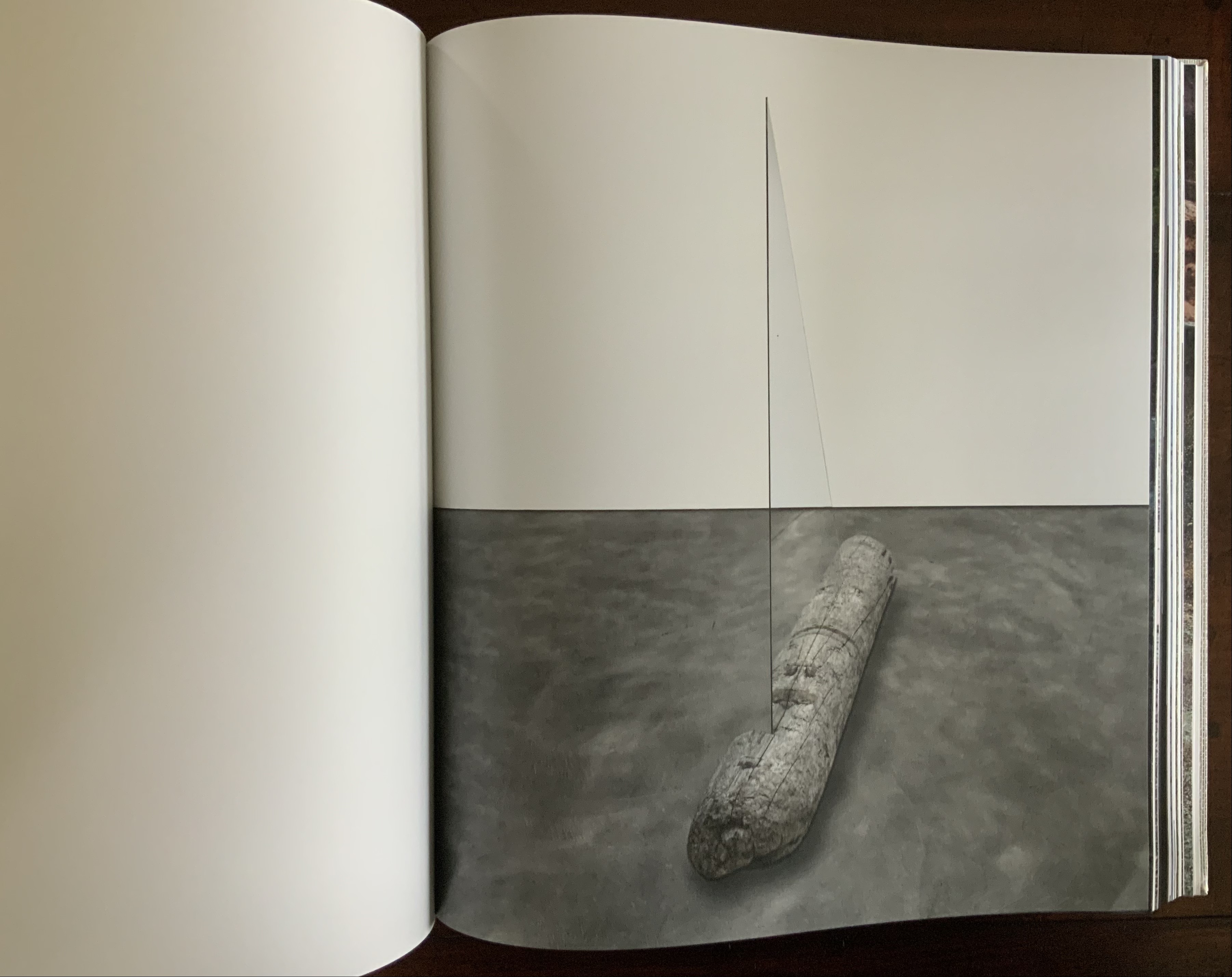
Contact is Content(2014) Olafur Eliasson Casebound, cloth mesh-covered board. H345 x W310 x D50 mm, 416 pages. Photos: Books On Books Collection. Displayed with permission of the artist.
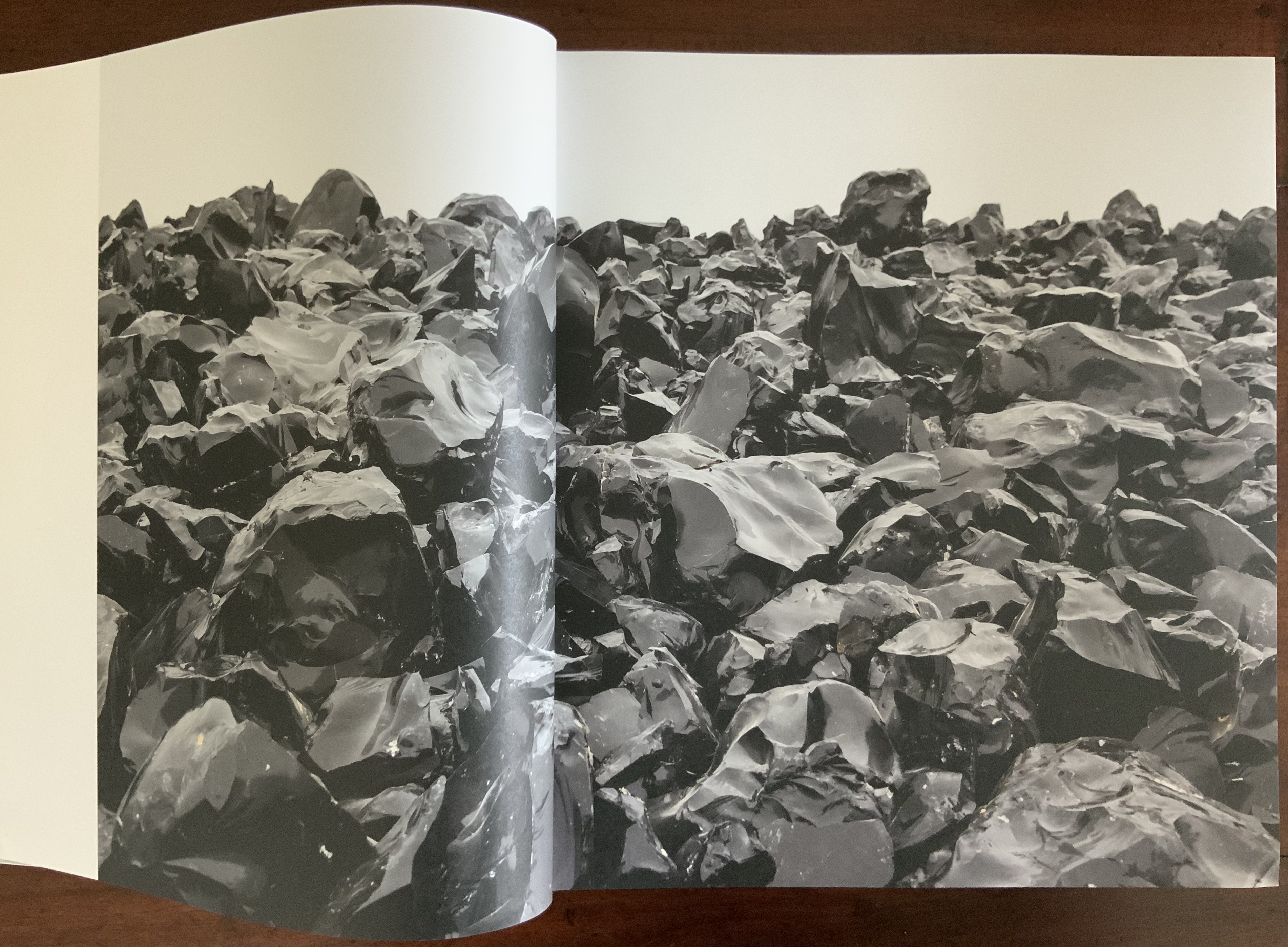
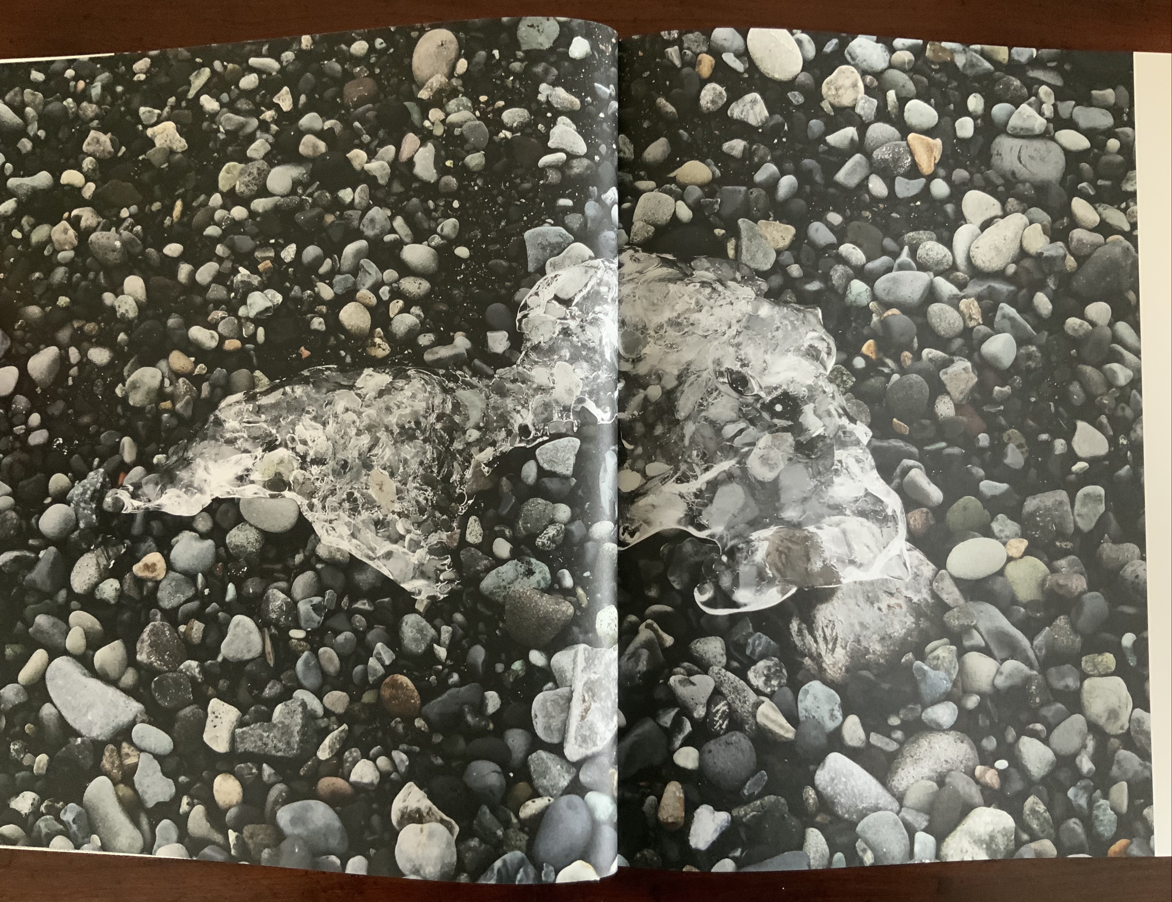
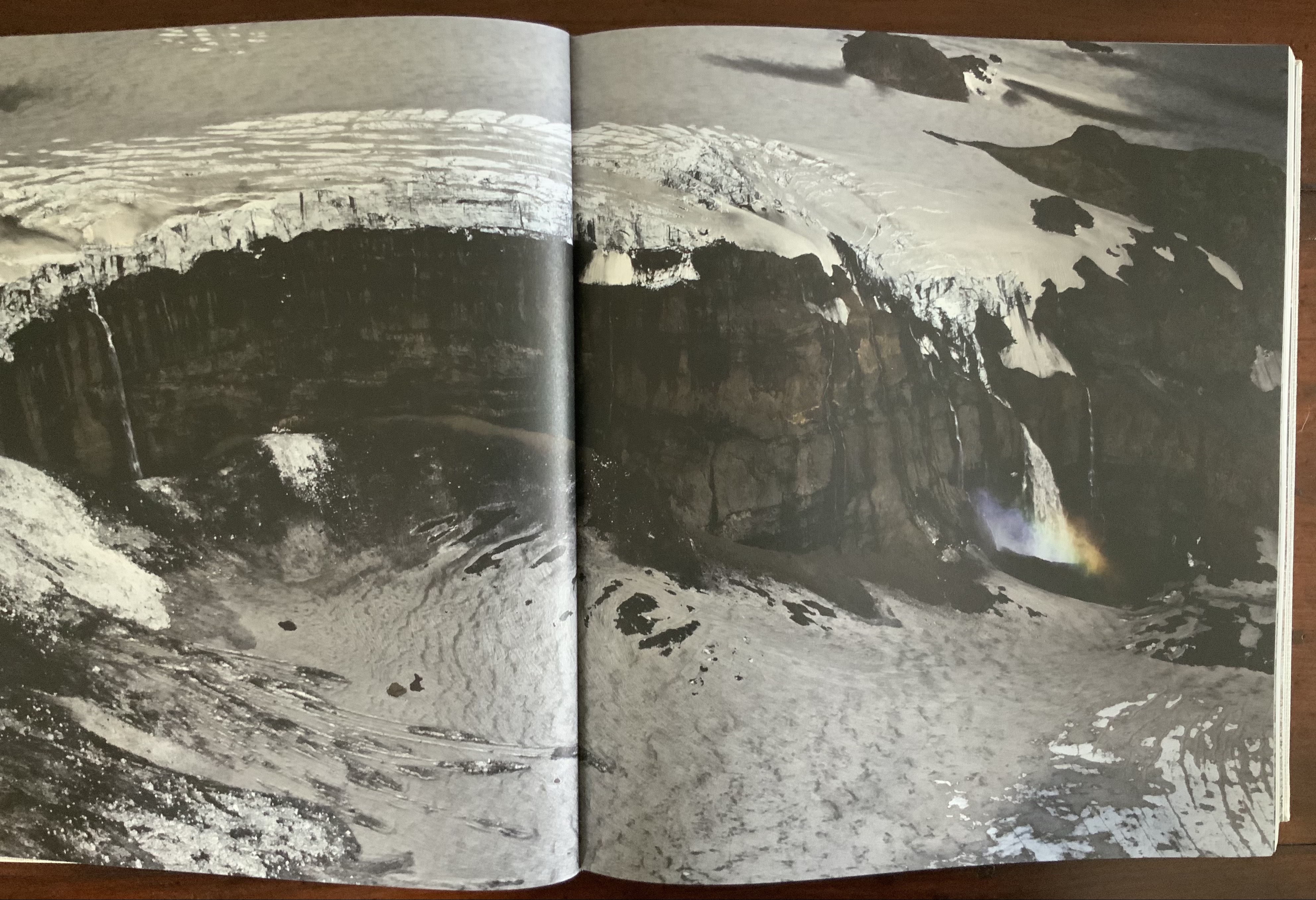
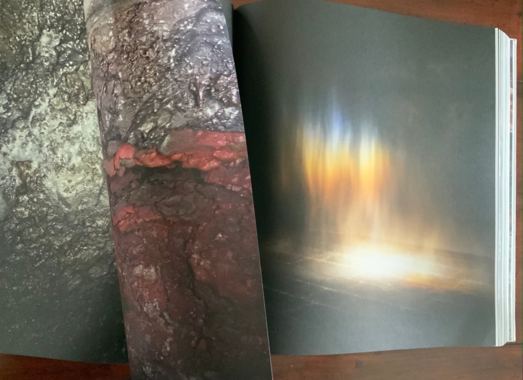
Like Your House, this work requires a slow, careful interaction in which viewing becomes learning the language of Eliasson’s images, discovering its syntax and exploring its rhymes and rhythms — reading the content presented with it. Unlike Your House, which focuses on contact with one source of content, Contact is Content draws on multiple sources: photographs Eliasson took in Iceland between 1986 and 2013 as well as images from his other projects and artworks. Over 80 different series make up the content of this work. The overwhelming number of round images — artificial and natural — in Contact is Content might suggest that Eliasson is completely sold on Bachelard’s pronouncement in The Poetics of Space that all being is round. But Eliasson’s world is spikier.
Within Contact is Content, images converse with one another — over near and far subjects, over aerial and ground level perspectives, over contrasting textures, over colors and their absence or presence, over artifice and nature
Often the conversations are reverse echoes: the reflective surface of blocks of ice echoes that of basalt.
The echo of near and far becomes a theme in itself: black-and-white aerial views of landscapes elide into black-and-white close-ups.
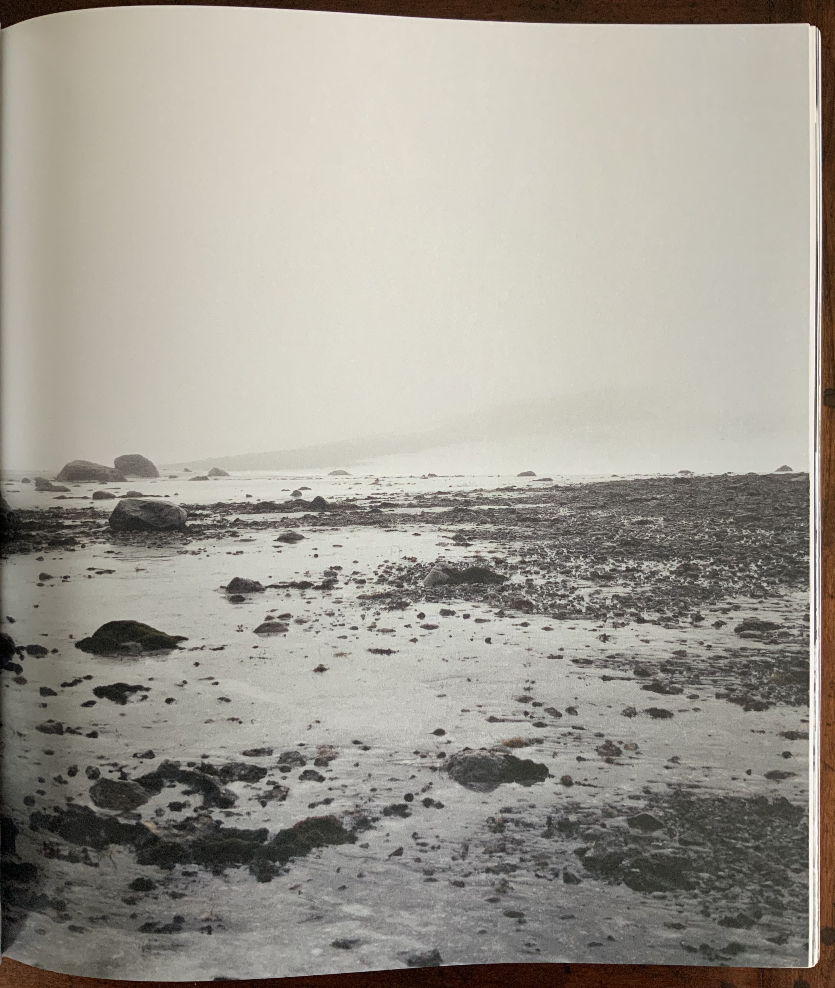
The absence and presence of color also emerges as a theme in its own right that interweaves with that of “near and far”: waterfalls without color vs waterfalls with the barest hint of color; close-ups of rocky terrain without color vs those dotted with intensely green or blue flora.
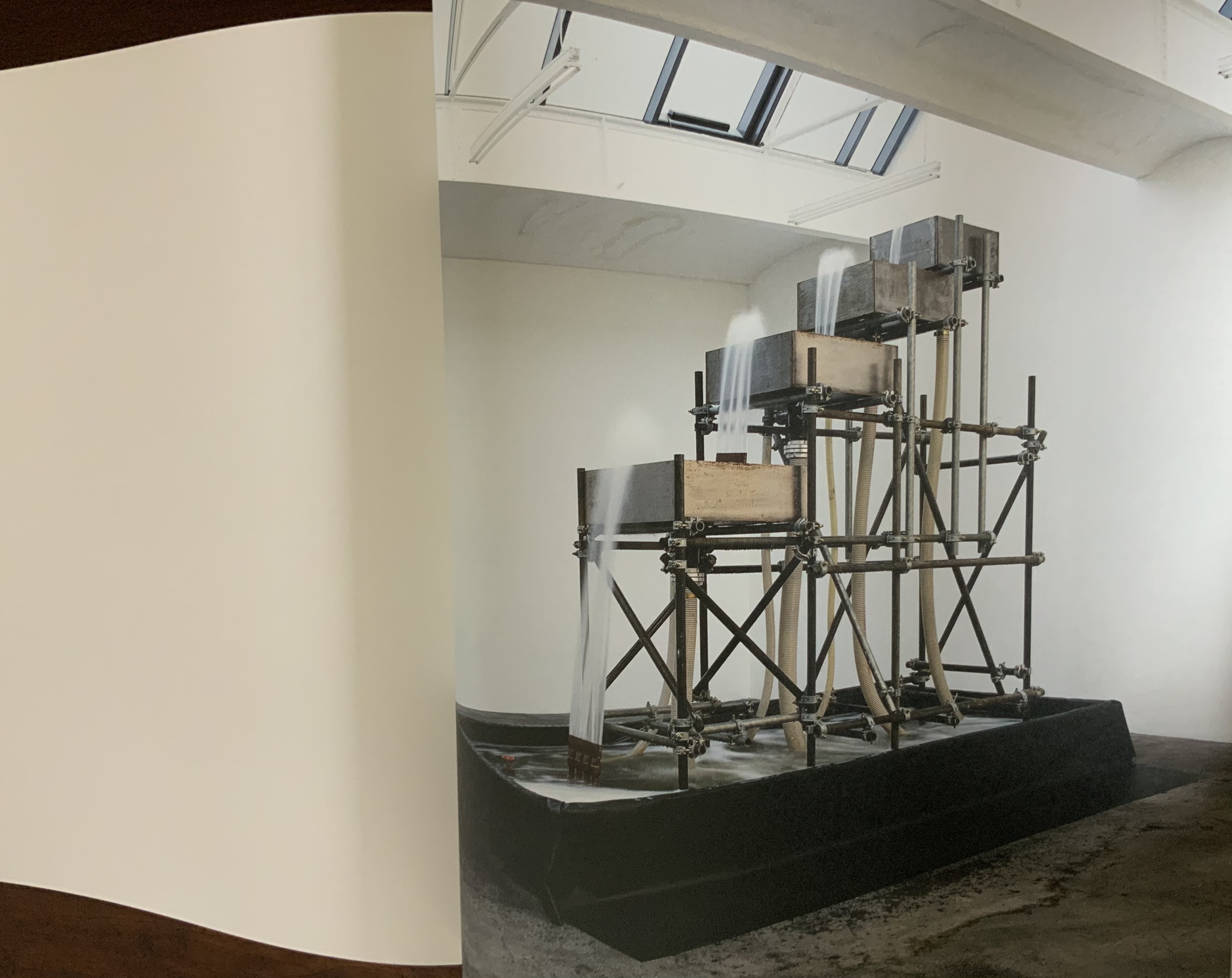
Some reverse echoes are the artificial conversing with nature: a gallery room containing a construction pumping water upwards over four levels echoes an Icelandic waterfall; or shorescapes under fog echo human outlines swallowed up in gallery rooms flooded with color-lit mists. Down to up; outside to inside; black-and-white to color; nature to artifice. And back.
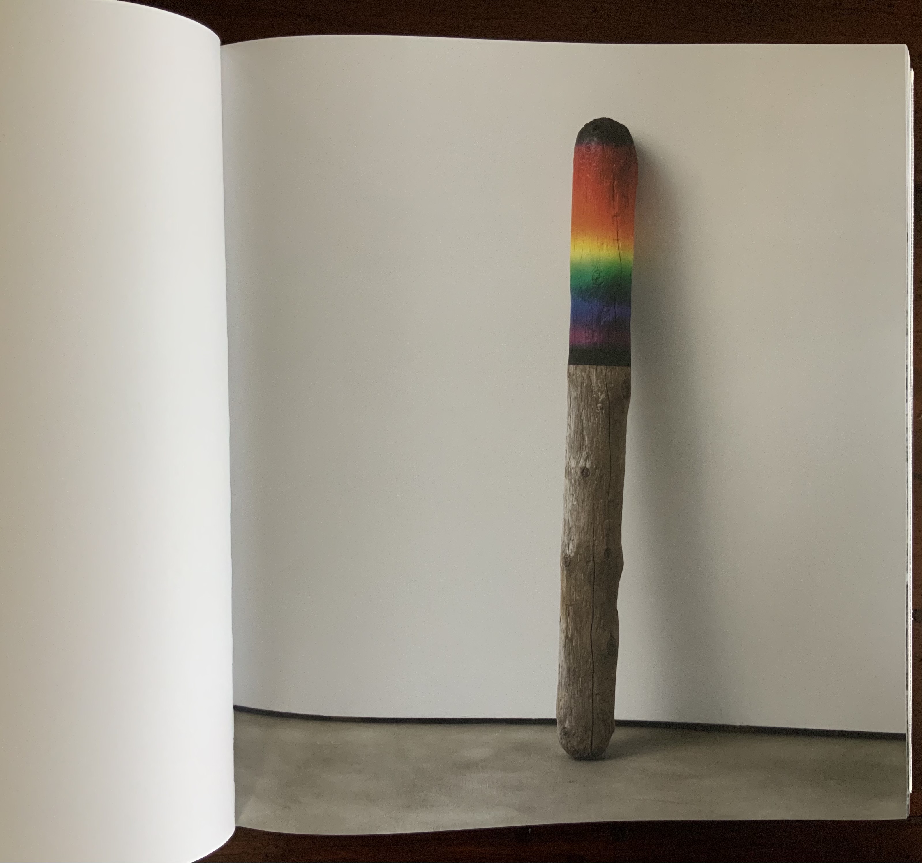
Some of these artifice/nature echoes are compressed into one image: a brightly half-painted stick of driftwood echoes the multiple color wheels used to punctuate the stretches of landscape images.
Other echoes occur within the span of artifice (whole color wheels echoed by sliced black ones) before colliding with nature (a piece of driftwood impaled by a glass triangle) and then jumping back to artifice (round mirrors bisected at floor and wall and cascading upwards to be bisected by wall and ceiling).
Some echoes occur across dozens and dozens of pages. Still others occur in the single turn of a page.
These are but a few of the themes that Eliasson weaves into a narrative with his images, artworks and projects. Every encounter with this book as container seems to reveal a new theme.
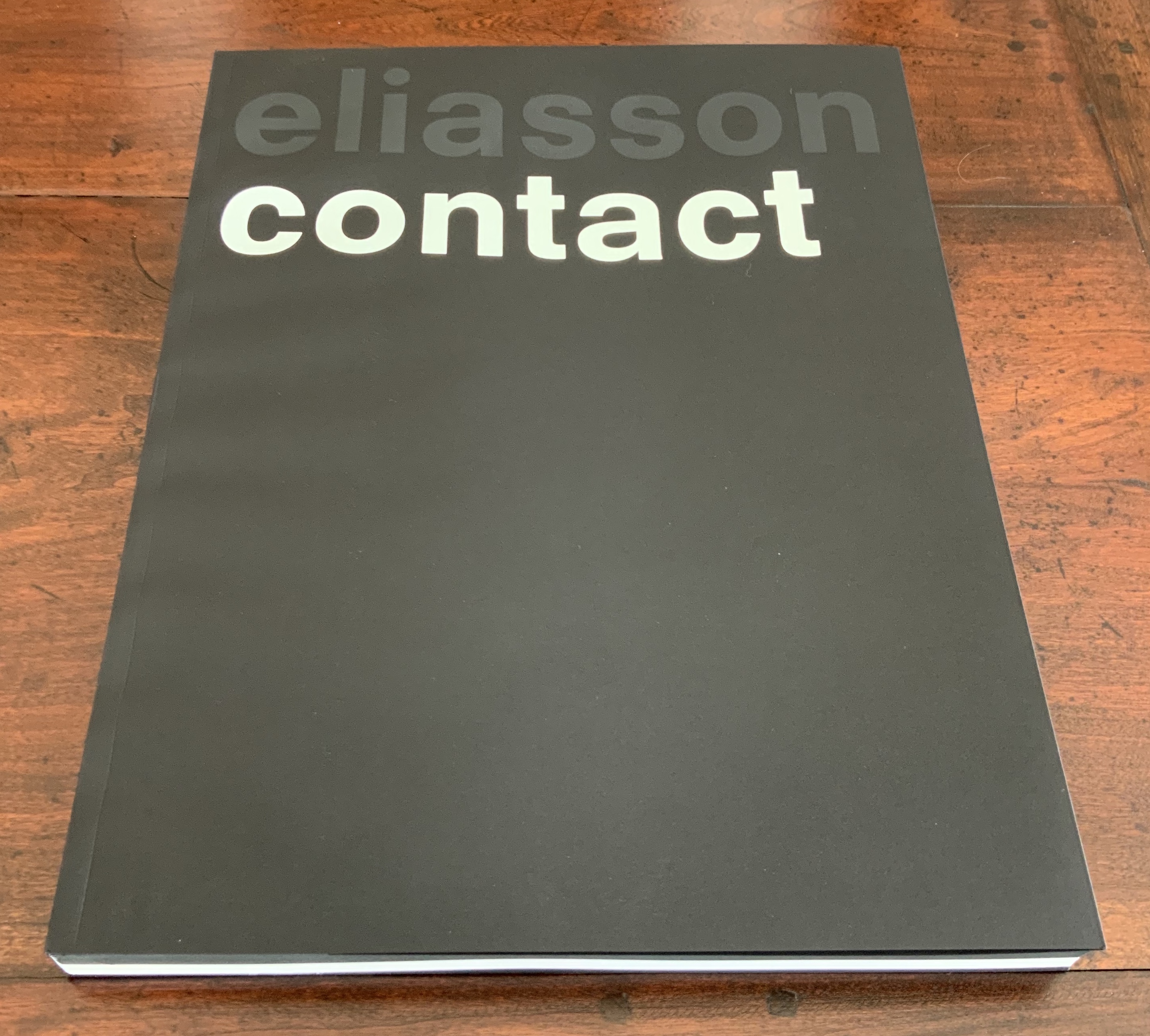
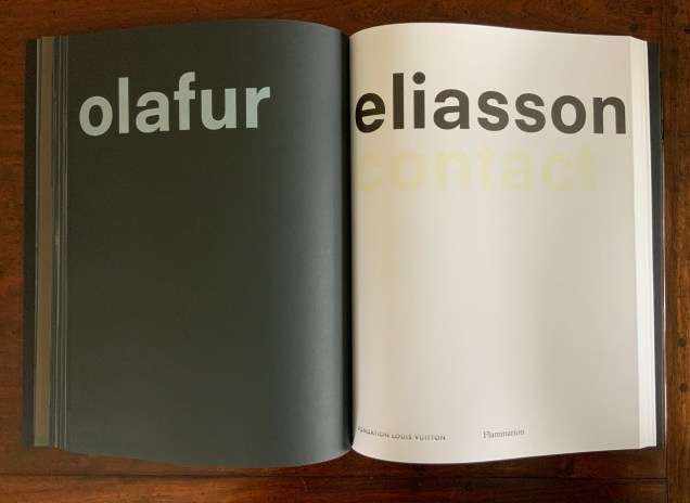
Contact (2014)
Contact (2014) Olafur Eliasson Front and back covers and center spread of exhibition catalogue in paperback. Designed by Irma Boom. Acquired from Artbooksonline.eu, 27 September 2020. Photos of the work: Books On Books Collection. Displayed with permission of Studio Olafur Eliasson.
Contact interprets the eponymous site-specific exhibition, commissioned by the Fondation Louis Vuitton and held in its Frank Gehry-designed building, 17 December 2014 through 23 February 2015. Here is the artist’s statement on Contact:
being in contact is the opposite of being disconnected. to be in contact is to be aware of the consequences that your actions have in and on the world. contact is about experience rather than consumption. to be in contact is to be in touch with the good things in life as well as with the difficult things in life. contact can be a greeting, a smile, the feeling of another person’s hand in your hand. contact is not a picture, it is not a representation; it is about your ability to reach out, connect, and perhaps even put yourself in another person’s place. for me, contact is where inclusion begins. contact is the highest luxury of all. olafur eliasson
Contact is also between page and page. Eliasson and Irma Boom, “the queen of books”, have worked together on several works. Boom’s mastery of the full bleed, double-page spread and gutter is the perfect match for this volume that brings the virtual into contact with the material.
Contact is also between paper and ink, between black and white as well as between dark and light when the book’s fluorescent title glows in a darkened room. The cover’s fluorescent ink, however, is not integral enough with the rest of the book to rise above an amusing touch; whereas contact between black and white extends to the division of the book into black and white halves.
In the first half of the book, photographs on entirely black paper present a codex-experience of the exhibition. In the second half of the book, drawings take the viewer behind the scenes of the exhibition’s design and, retrospectively, train the eye to read the book as exhibition.
This incorporation of design drawings draws attention to time, and Contact is very much about our perception of time. In her book Binding Space: The Book as Spatial Practice, Marian Macken refers to “the tenses of the book”. Especially when presented in a book, architectural plan drawings “are not fixed in their sequence, but instead may be read and interpreted as existing within a range of times, such as the time of their making, of the present of the reader, the future they may refer to, and the contextual moment of apprehension” (p. 157). In the case of this “book of the exhibition”, published to coincide with the exhibition, the plan drawings and photographs exist in the exhibition’s past and present. For an exhibition attendee, they exist as a reminder of a personal past performance of contact with the exhibition. For attendees and non-attendees, they bring the exhibition’s past and future together in the present in a performance of contact guided by the architecture of the book.
How appropriate it is that, in her essay in the book’s white section, Caroline A. Jones writes, “Personally, I will not have seen the installations that the present text accompanies” — as is/will be the case for many of us experiencing Contact only in its book form. Jones’ essay is entitled “Event Horizon: Olafur Eliasson’s Raumexperimente”, which confirms that contact is not only about perception of time, but of space as well. While Jones teases out how the exhibition will play/plays/played with the astrophysical conundrum, she cites a comment from Eliasson in conversation that captures a simpler view: “There is a tradition of the horizon as a boundary between the known and unknown. But as you approach, it fades in, or comes into your experience. You can think of it as a space” (p. 133).
Space — which brings up the awkward point of the setting in which the exhibition occurred. Since the Renaissance, imagination in art and science has sat sometimes uneasily, sometimes too easily with wealth and privilege. There may be nothing democratic in Eliasson’s expensive, spectacular art, but Contact’s fusion of science, art, nature (Earth-bound and cosmic) and social connectedness contrasts pointedly and paradoxically with its setting in the opulent property of a global luxury brand — “the blandishments of follies and bling” as Jones puts it. As Eliasson’s artist statement asserts: “contact is about experience rather than consumption….is where inclusion begins….is the highest luxury of all”. But without the Fondation’s patronage, the experience of Contact in situ or even in these artfully designed pages would be denied.
Somewhat less reconcilable is the statement “contact is not a picture,… is not a representation”. Placing contact with art (a picture, a representation) in opposition to contact through human touch and empathy is not quite right. Just as Your House resonates with the perspective of the physicist/philosopher/humanist Bachelard, for whom the image is language, so too does the language of Contact as exhibition, images, objects, book — and experience. We cannot have contact without it.
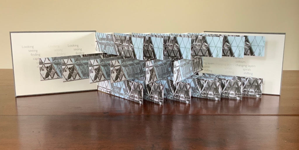
30 St Mary Axe is a skyscraper in London’s main financial district. Designed by Sir Norman Foster architectural studio, built in 2001-2003. (Photo credit: Wikipedia)
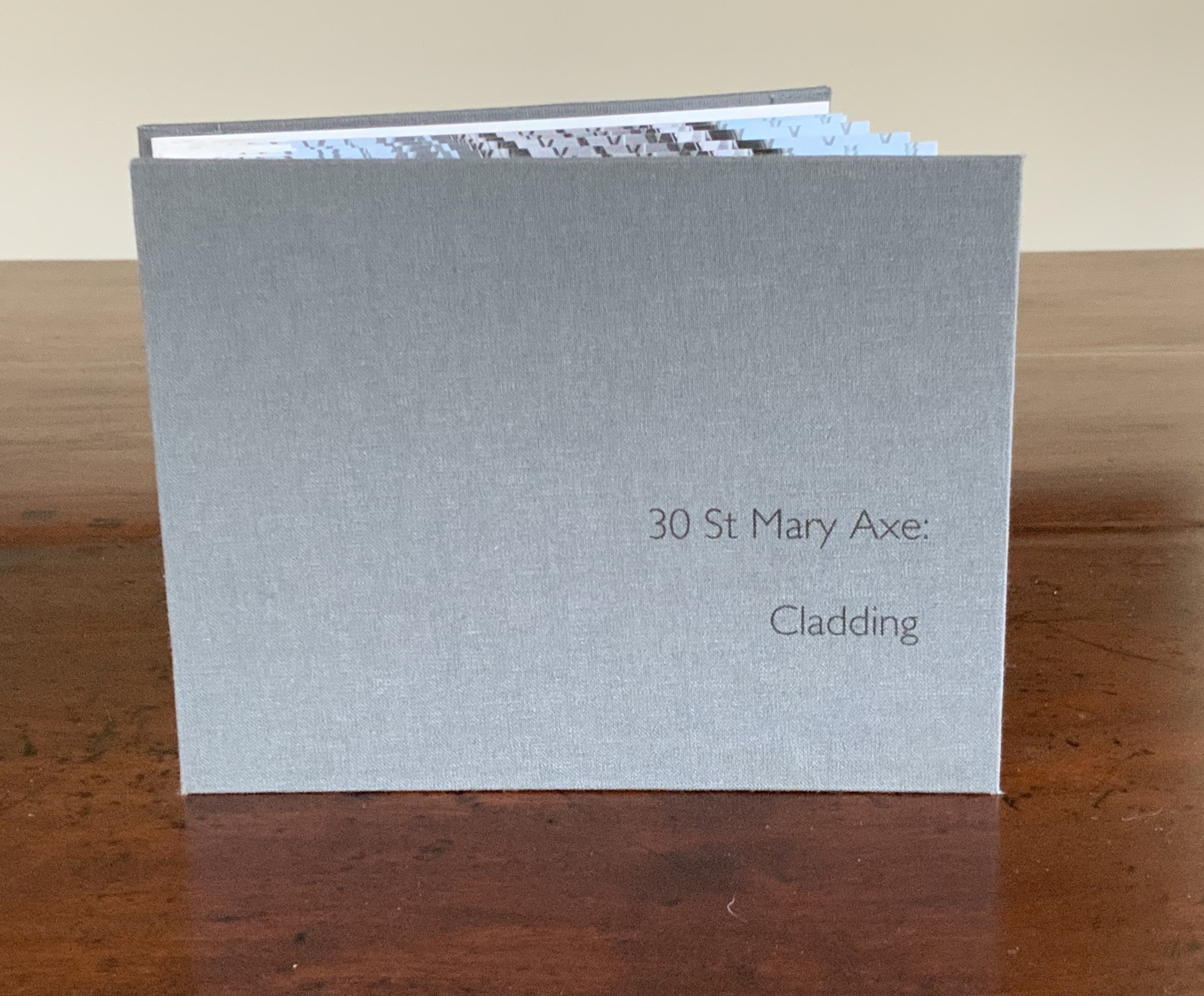
London’s 30 St Mary Axe is referred to as “the Gherkin,” which a glimpse of the building on the skyline proves unmistakably appropriate. Mandy Brannan’s bookwork homage to the Gherkin is as architecturally intricate as the building’s cladding, and somehow more satisfying, perhaps because it’s less pickled.
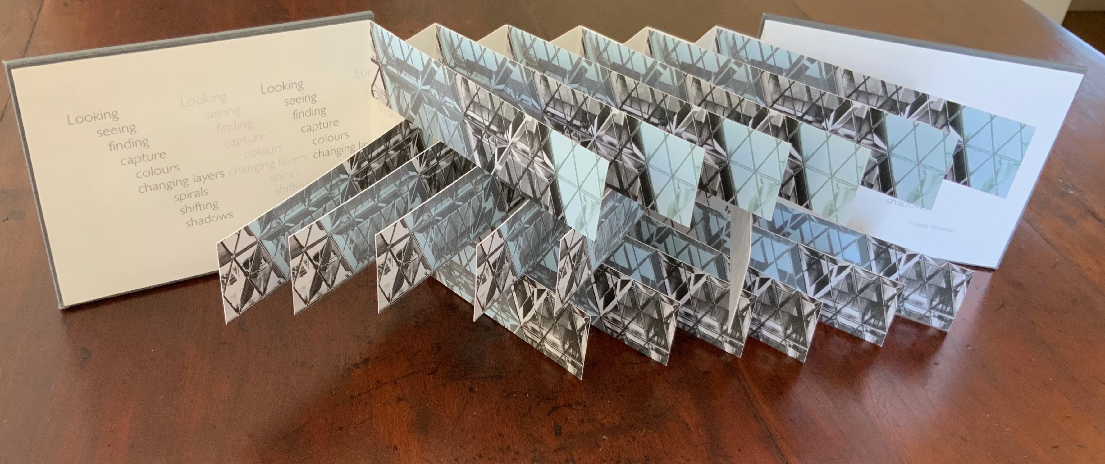
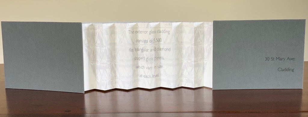
30 St Mary Axe: Cladding (2009)
30 St Mary Axe: Cladding (2009) Mandy Brannan Flagbook. H102 x W134 mm. Edition of 20, unnumbered. Acquired from the artist, 20 March 2019. Photo: Books On Books Collection
This work 30 St. Mary Axe: Cladding(2009) and 30 St Mary Axe: Diagrid (2009) are among several architecture-inspired works of book art that Brannan has created. The text in the one called Situated could have come straight from Pallasmaa, Bachelard or Merleau-Ponty:
Being situated is generally considered to be part of being embodied, but it is useful to consider each perspective individually. The situated perspective emphasizes that intelligent behaviour derives from the environment and the agent’s interactions with it.
Clearly we are not dealing with some mere mimetic piece of craftwork.
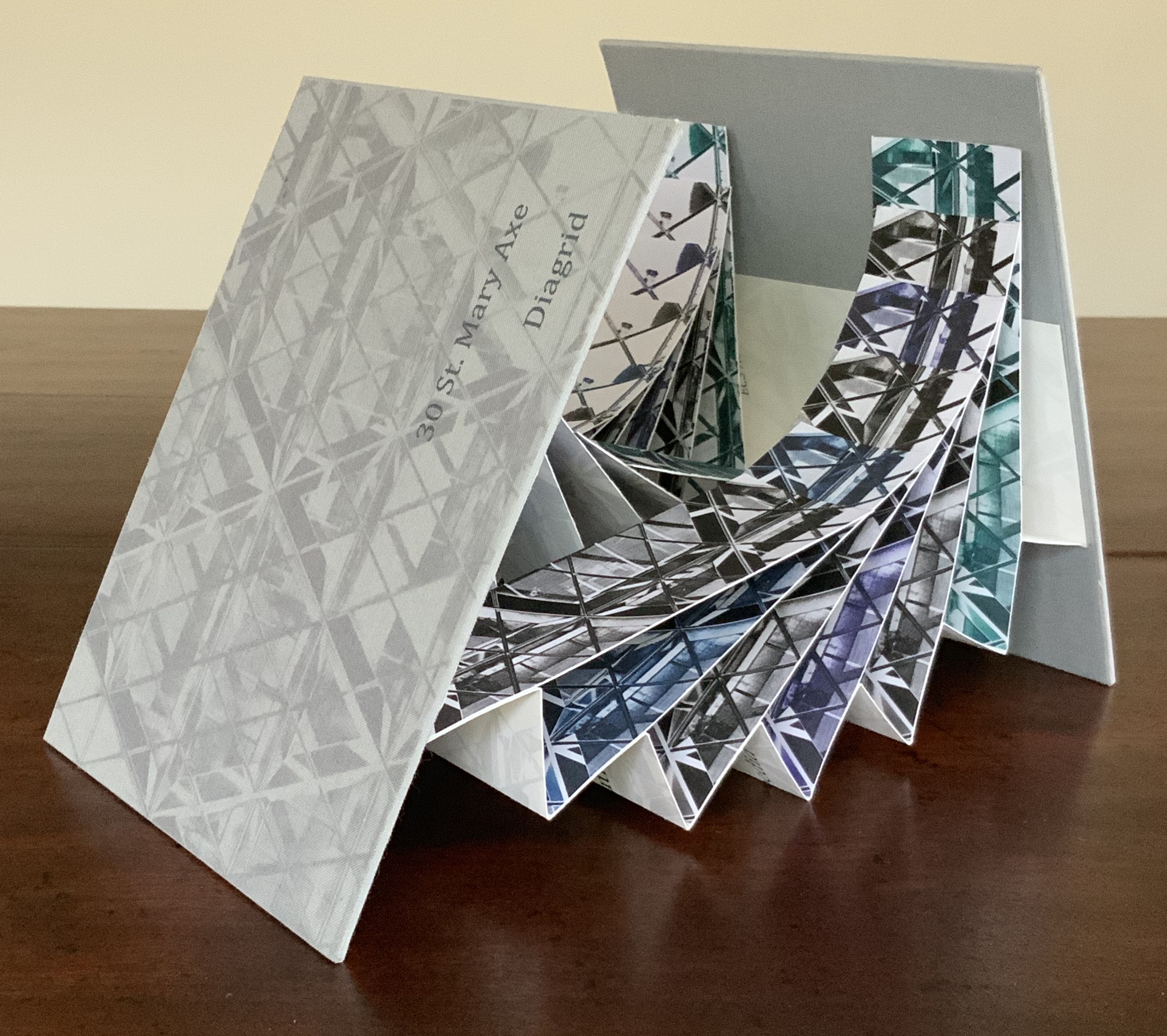
30 St Mary Axe: Diagrid (2009)
30 St Mary Axe: Diagrid (2009) Mandy Brannan Modified flagbook. H121 x W154 mm. Edition of 20, unnumbered. Acquired from the artist, 20 March 2019. Photos: Books On Books Collection
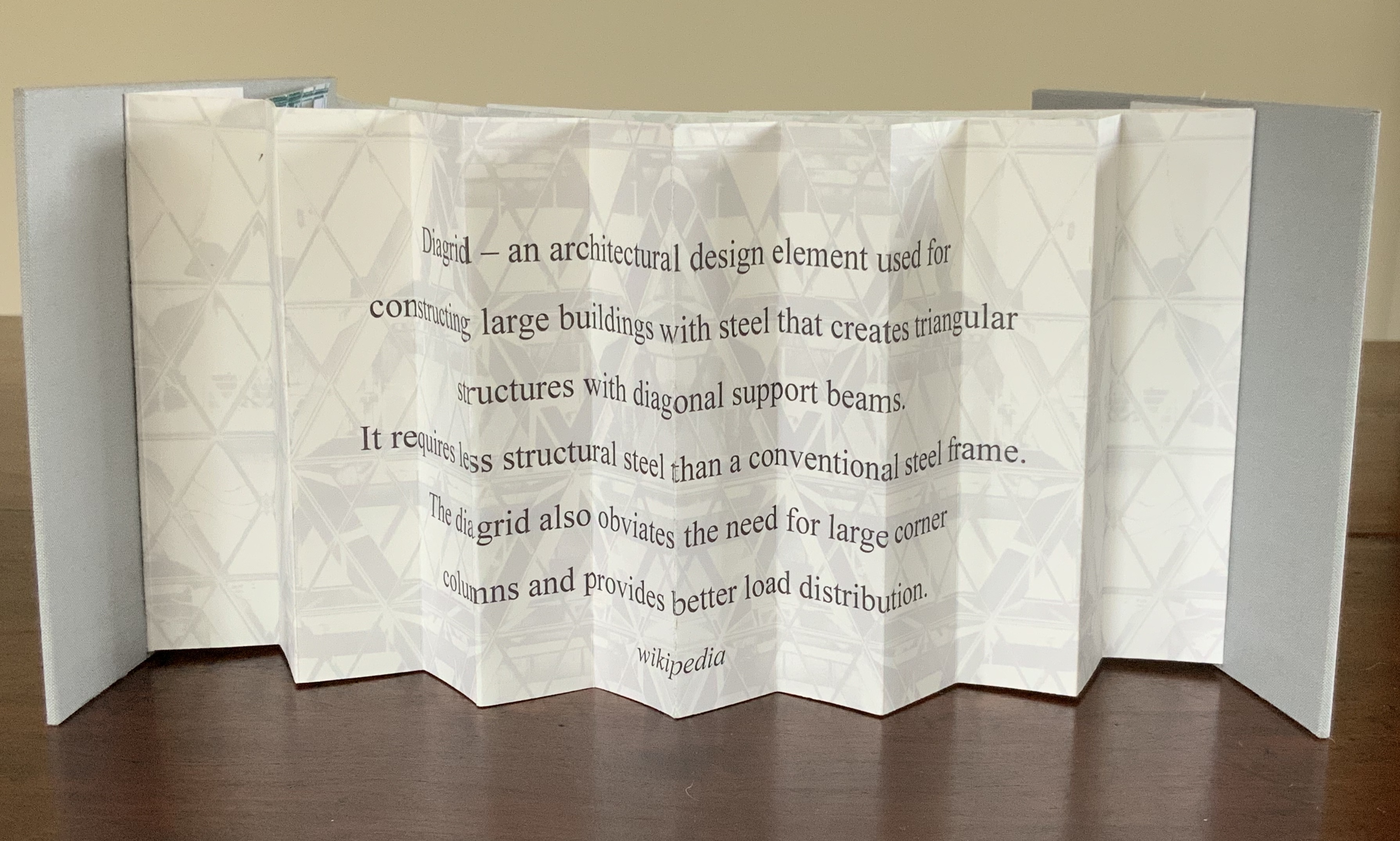
Cladding uses a straightforward flagbook structure, but not only is it double-sided with the architectural photographs, it also places text on the inner side of the accordion support and a statement about the 5,500 panels of glass cladding on the Gherkin. The modification in Diagrid is the inward curving of the flags and their formation of the shape recalling the Gherkin. The wording on the reverse of the accordion is the definition of the architectural term diagrid: “a design element used for constructing large buildings with steel that creates triangular structures with diagonal support beams”.
In addition to the flagbook- and modified-flagbook arrangements of the photos, Brannan has enriched the substance of these works with her manipulation of her photograph of 30 St Mary Axe, reflecting a nearby building. Using several different methods, digital programs and then printer settings for digitally printing, she delivers an almost kaleidoscopic, reflective and self-reflexive effect in each work. In a sense, the work demonstrates the artist’s behavior — her choices of material, subject, text and technique in each work’s making — and how it derives from her environment and her interactions with it. By integration of text, image, color, structure and material, Brannan also situates the “Gherkin’s” architecture in our hands and gives us the opportunity to contemplate, appreciate and perhaps experience the sense of being situated and embodiment.
Further Reading
“Architecture“, Bookmarking Book Art, 12 November 2018.
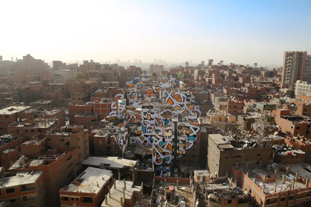
If we were looking for a “Banksy” version of Rachid Koraïchi, we need look no further than eL Seed.
Perception, 2016 Manshiyat Nasr in Cairo, viewed from Moqattam Mountain
In my new project ‘Perception’ I am questioning the level of judgment and misconception society can unconsciously have upon a community based on their differences.
In the neighborhood of Manshiyat Nasr in Cairo, the Coptic community of Zaraeeb collects the trash of the city for decades and developed the most efficient and highly profitable recycling system on a global level. Still, the place is perceived as dirty, marginalized and segregated.
To bring light on this community, with my team and the help of the local community, I created an anamorphic piece that covers almost 50 buildings only visible from a certain point of the Moqattam Mountain. The piece of art uses the words of Saint Athanasius of Alexandria, a Coptic Bishop from the 3rd century …. el Seed
The words of Saint Athanasius referred to above are
‘إن أراد أحد أن يبصر نور الشمس، فإن عليه أن يمسح عينيه’
“Anyone who wants to see the sunlight clearly needs to wipe his eye first.”
As with Camus, Algerian sunlight is strong in eL Seed’s work. As it also is in Koraïchi’s Lettres d’ Argile (Letters of Clay) and other ceramic works and arguably in the copperplates for Les Sept Dormants. As with Koraïchi’s work, humanism, poetry and bridging cultures are strong in eL Seed’s work.
The pseudonymous artist has created more “straightforward” street art installations in Tunisia, New York, Rio de Janeiro and Paris, all marked by the curvilinear linking of word and image that so often characterizes inspired book art. This reverse ekphrasis that book art frequently plays upon literature is heightened by calligraphy’s tight binding of art and craft to text. Perception‘s anamorphic enhancement of this binding is brilliant.
The relationship between word and image is “antagonistic sympathy”, according to the English book artist Telfer Stokes (“The Why and How I Make Books“, JAB 3, Spring 1995). In the hands and eyes of Koraïchi and eL Seed, the relationship — if it is a struggle, an agon — becomes more that of sunlight on water, or wind through a wheat field.
In addition to the installations and his book Lost Walls chronicling his painting of 24 walls in 4 weeks during a journey through Tunisia, eL Seed has produced a colorful body of lithographs and sculpture.
In this sculptural work inspired by a poem from Nizar Qabbani, el Seed says his intention is to invite the viewer to walk through a “conversation between the poem, the language, the form and me”. This may remind you of the influence that northern Africa had on the Finnish architect Juhani Pallasmaa, and how it led to his meditative exhortation to architects in The Eyes of the Skin to pursue a visual experience that offers a tactile and haptic quality, that also appeals to the realms of hearing, smell and taste and yet does not neglect the conceptual and rational. That, too, characterizes inspired book art.
Likewise it is interesting how this lithograph and the “calligraffiti” appearing on those broken walls and buildings touch eloquently on another theme characteristic of much book art — how the passage of time touches us, how we try to touch the passage of time.
Architecture — be it theory, principles, practices or instances — inspires book art. Lay the book flat; you have a foundation. Open and turn it on its fore-edge; you have a roof beam or arcade. Stand it upright; you have a column or tower. Turn the front cover; you open a door. Put the text and types under a microscope; you have a cityscape. As the examples in this virtual exhibition show, architecture-inspired book art goes beyond these simple analogies.
There are seemingly unrelated texts that help considerably in going there. The Eyes of the Skin (2005) and The Embodied Image (2010) by Juhani Pallasmaa, architect, teacher and critic, are two of them. He writes as if he were an artist preparing an artist’s statement or descriptions of the book art below. The title of his earlier book gives away his alignment with the visual and tactile nature of book art. Pallasmaa’s two books will enrich anyone’s enjoyment of the works shown and mentioned here.
“Book. Space. House. Space of Movement“. Exhibition curated by Susanne Padberg, 7 May – 26 June 2026. Padberg, Susan (curator). 7 May – 26 June 2026. at Galerie Druck & Buch, Vienna, Austria. Accessed 22 May 2026. “The artist’s book as a three-dimensional space: forming a house, outlining, remembering, mimicking—thinking the human being within space. Between object and narrative, books unfold as architectural structures, as inhabitable thought-spaces, as reflections of individual and collective experience. The exhibition brings together artistic positions that expand the book as a spatial body.”
Malone’s Ten Books of Architecture is a good place to start in the collection. Like Pallasmaa, Malone takes a broad historical and, most important, haptic view of architecture from Vitruvius to Hadid. Each of the ten books is a bookwork that exemplifies its subject.
Adapted tunnel book with accordion sides Photo: Books On Books Collection
A watercolour at the tunnel’s end to evoke the stained glass clerestory windows in the Basilique Saint-Denis, Paris Photo: Books On Books Collection
The aspiration to fuse the cosmic and the human, divine and mortal, spiritual and material, combined with the systems of proportion and measure deriving simultaneously from the cosmic order and human figure, gave architectural geometries their meaning and deep sense of spiritual life.The Embodied Image, p. 23.
And further apropos the link between the book and architecture, consider the connection that Vasari drew between Gutenberg and Alberti:
In the year 1457 [sic], when the very useful method of printing books was discovered by Johann Gutenberg the German, Leon Batista [sic], working on similar lines, discovered a way of tracing natural perspectives and of effecting the diminution of figures by means of an instrument, and likewise the method of enlarging small things and reproducing them on a greater scale; all ingenious inventions, useful to art and very beautiful. Lives of the Most Eminent Painters, Sculptors and Architects, vol. 1, trans. Gaston Du C. de Vere (London: Medici Society/ Philip Lee Warner, 1912-1914), 494.
In “An Architectural Confession”, Pallasmaa writes:
One’s most important teacher may have died half a millennium ago; one’s true mentor could well be Filippo Brunelleschi or Piero della Francesca. I believe that every serious artist — at the edge of his/her consciousness — addresses and offers his/her work to a superior colleague for approval.The Eyes of the Skin, p. 82.
This curiously textured cube sits perfectly alongside Pallasmaa’s observation: “The basic geometric shapes have their symbolic connotations, but more important than their conventional meanings are their conceptual and visual organising powers” (The Embodied Image, p. 58).
A short trip around this small pyramid as a reminder of the entrances that were always on the far side of museums you visited Photos: Books On Books Collection
This edition of Malone’s Ten Books is unique in its inclusion of Hadid, who is not mentioned in either of Pallasmaa’s books but whose artistry and turn to the organic and curves of nature certainly fit with their spirit. Photo: Books On Books Collection
Malone’s Ten Books has a predecessor in Laura Davidson’s contribution to the 1994 Smithsonian show on book art inspired by its collection of rare science books (see section below). Although there is also Karen Wirth’s sculptural take on the Ten Books as well as Ron Keller’s take (see section below) on Palladio’s Fours Books of Architecture, which is Palladio’s take on Vitruvius, I have not found any other Vitruvian-inspired works of book art. (Pointers welcome.)
These two works — 30 St Mary Axe: Diagrid (2009) and 30 St. Mary Axe: Cladding(2009) — are among several architecture-inspired works of book art that Brannan has created. The text in one of those several — Situated — could have come straight from Pallasmaa, Bachelard or Merleau-Ponty:
Being situated is generally considered to be part of being embodied, but it is useful to consider each perspective individually. The situated perspective emphasizes that intelligent behaviour derives from the environment and the agent’s interactions with it.
30 St Mary Axe: Diagrid(2009) Mandy Brannan London has nicknamed the building at 30 St. Mary Axe “the Gherkin”. Photo: Books On Books Collection
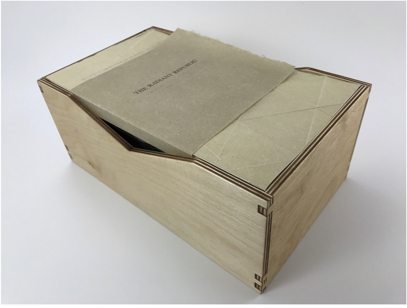
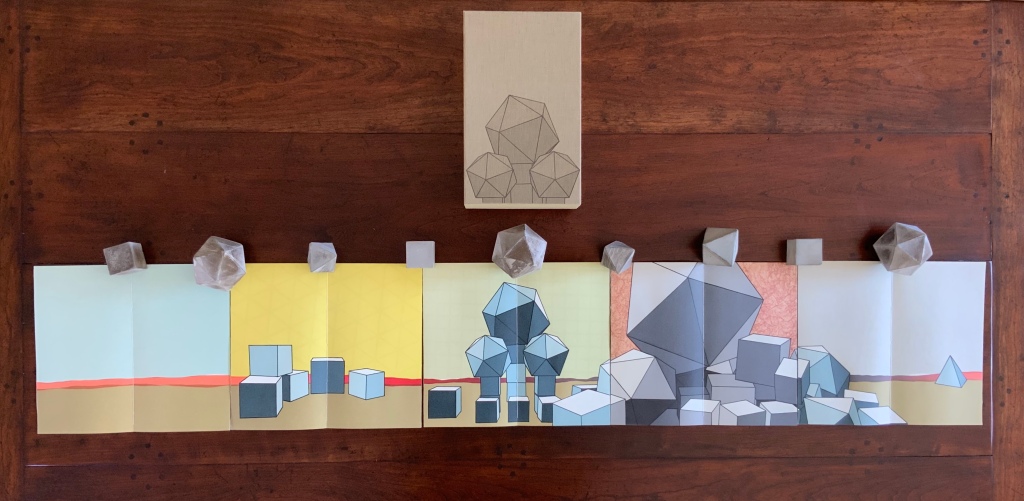
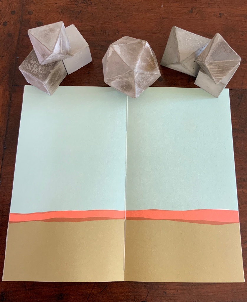
In the The Radiant Republic (2019), Sarah Bryant (Big Jump Press) brings together concrete, wood, glass, paper, ink and embossed printing, sewn binding, box container and texts from Plato and Le Corbusier.
Note the embossed text on the verso. Across the five volumes, the embossed text is the same as that printed in ink, but it runs in fragments backwards from this last page of the last volume to the last page of the first volume. Photo: Books On Books Collection
Bryant’s insightful integration of Plato’s and Le Corbusier’s texts and ideas and her setting them in the physicality of the blond wood, linen cover, embossed type and sewn papers could easily be a response to Pallasmaa’s comment in The Eyes of the Skin: “The current overemphasis on the intellectual and conceptual dimensions of architecture contributes to the disappearance of its physical, sensual and embodied essence.” (p. 35)
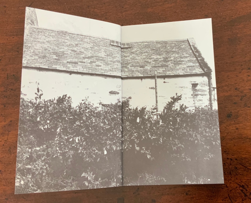
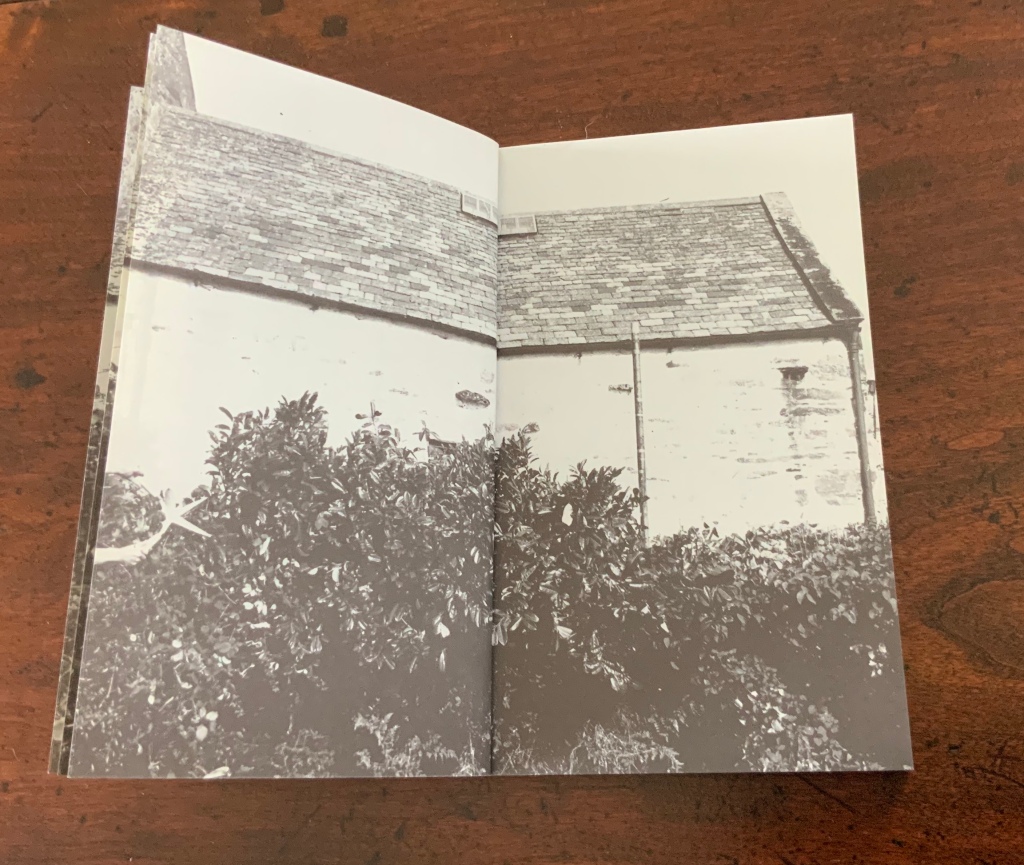
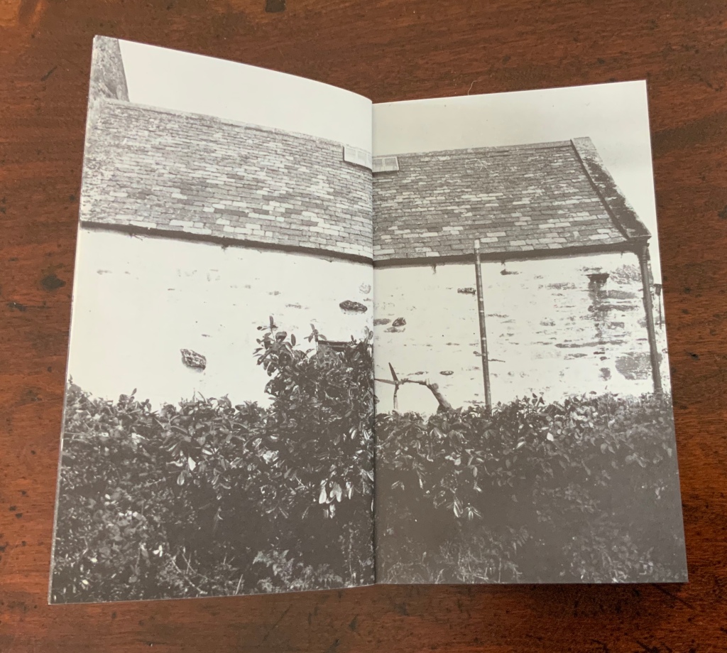
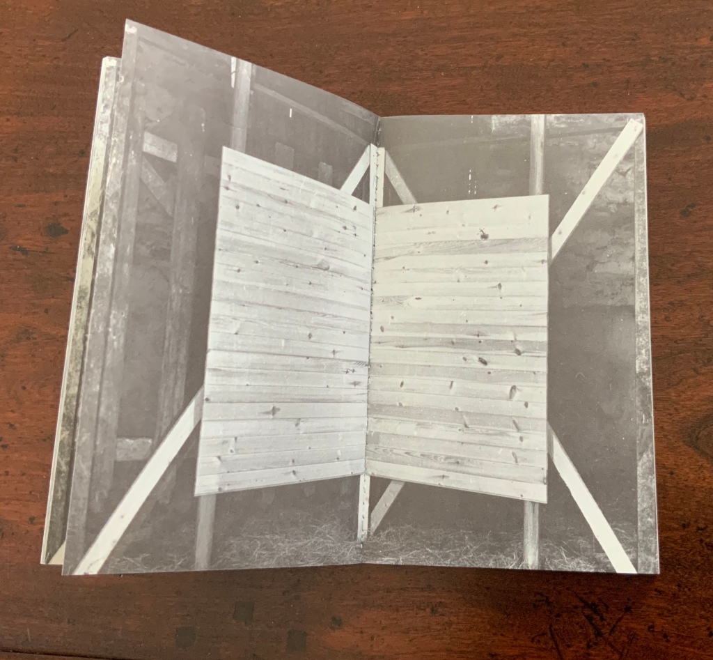
Chinese Whispers (1975) is conceptual, visual and spatial narrative that takes the reader into a “game of embedded games”: a game of Chinese Whispers used by the artists to combine the process of making a book with the process of recovering an old cottage, making a corner cupboard, making jam, making ideas and making an exit.
Chinese Whispers(1975) Helen Douglas and Telfer Stokes Photo: Books On Books Collection
The selection of images above begins with the front cover’s photo of a patch of grass outside an abandoned farm building and ends with the back cover’s photo of the underside of the patch of grass. In between, the pages take the viewer through the trimmed hedge and the doorway into the room, through the building, the stocking of the shelves, using of the stock and closing of the shed cupboard, and so back to the other side of the patch of grass. As Stokes explained in the Journal of Artist’s Books (Vol. 12, 1999):
We started with the corner cupboard, that was the part that occupied our thinking most, that and the two colour vignettes (as we called them) printed on different stock. But then we started to think backward to what might be before the cupboard’s construction. To the thing before that, and the thing before that, and the thing before that which was cutting of the hedge and before that which was the boot brush which we called the hedgehog- that was where the book started. Then we started to photograph from that point forward, through the book.
The work blends the features of book structure, collage and montage to create something that resonates uncannily with Pallasmaa’s approving citations of Bachelard’s central idea of the hearth and domicile as central to our time-bound “being-in-the-world”.
Your House is a laser-cut model of Olafur Eliasson’s residence in Copenhagen at a scale of 1:85, which means that each page equates to a 220 mm section of the actual house. How do you read a work like this — physically? At the 22″ mark in this video, the pages fall in a cascade like a flipbook, but for the most part, their size, accumulated bulk and weight — and delicacy — defy that handling. As in the video below, they must be turned slowly and carefully. Your House heeds the task of the arts as posed by the architect Juhani Pallasmaa, “in our age of speed, …to defend the comprehensibility of time, its experiential plasticity, tactility and slowness” (The Embodied Image, p. 78).
Folded book pages rarely generate a work that rises above mere craft. Heather Hunter’s Observer Series: Architecture (2009) achieves the necessary height. It combines the altered book with an accordion book that incorporates a found poem composed of the words excised and folded outwards from the folded pages of The Observer’s Book of Architecture.
The very fact of a found poem made of excised words that happen to fall at the folds shaping a column from a book on architecture chimes with the title of Bachelard’s The Poetics of Space.
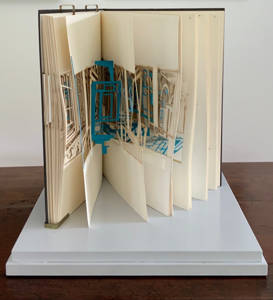
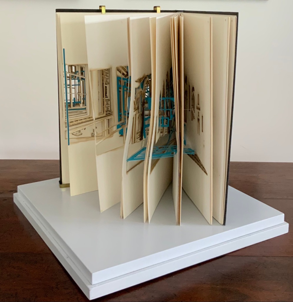
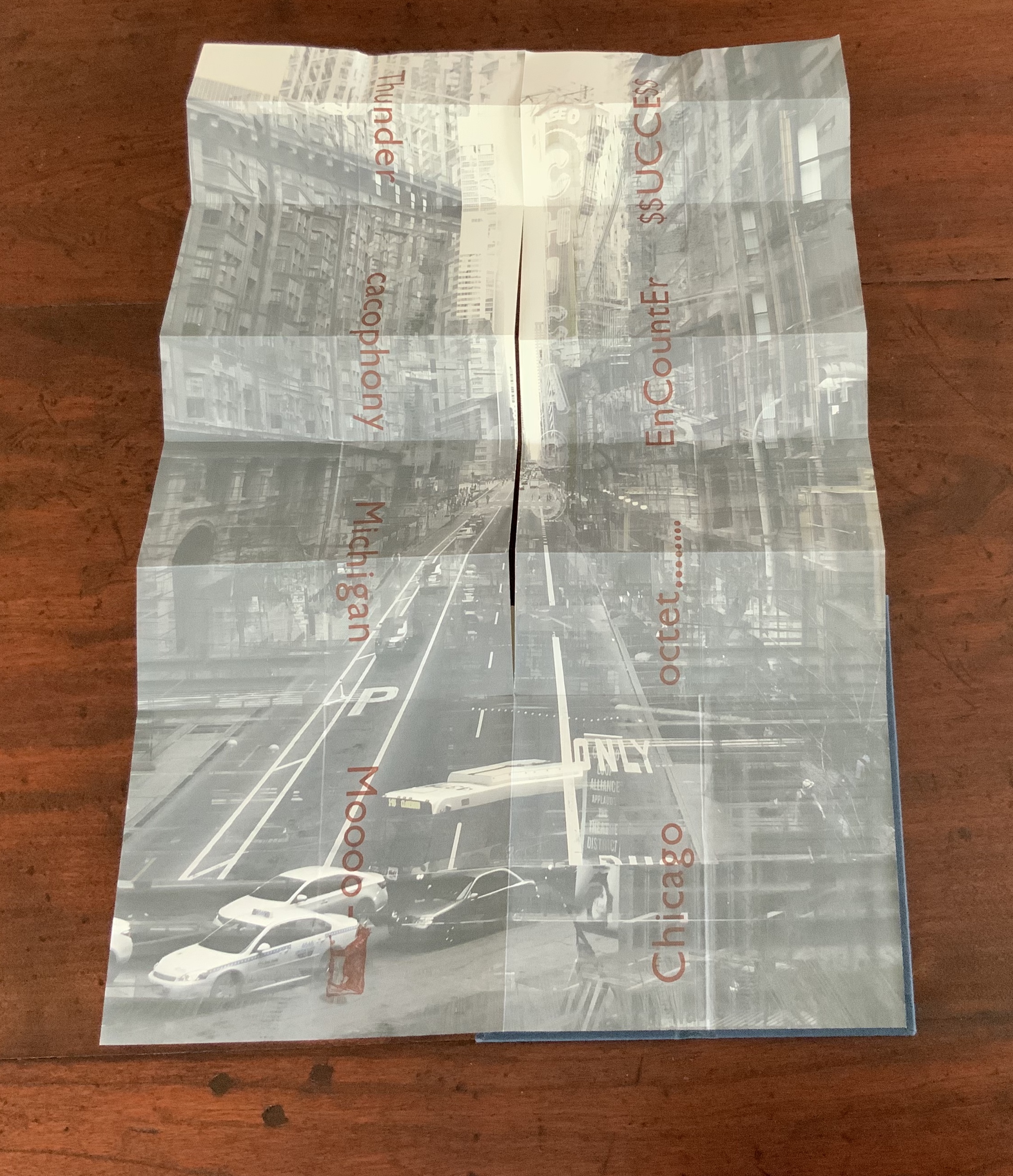
Chicago Octet (2014) byMarlene MacCallum embodies the collaborative creative approach often taken in architects’ practices. Collaborative working arises almost as frequently in book art. Think of Blaise Cendrars and Sonia Delaunay, Helen Malone and Jack Oudyn, Julie Chen and Clifton Meador, Robin Price and Daniel Kelm. Many more can be added. As described by MacCallum:
From May 19 – 26, 2014 a group of eight gathered at the Columbia College Center for Book and Paper Arts for a final collaborative project. This event was organized by Clifton Meador and myself and included David Morrish, Scott McCarney, and four Grenfell Campus BFA (Visual Arts) grads, Stephen Evans, Maria Mercer, Virginia Mitford, and Meagan Musseau…. The letterpress printing consisted of a word selected by each participant printed on one of Scott’s folded structures. The images were a digital layering of every cityscape photograph that I made and then inkjet printed on top of the letterpress. The final folded structure was designed by Mary Clare Butler. The case was designed and built by Scott McCarney, the front cover embossment was by David Morrish and Clifton Meador.
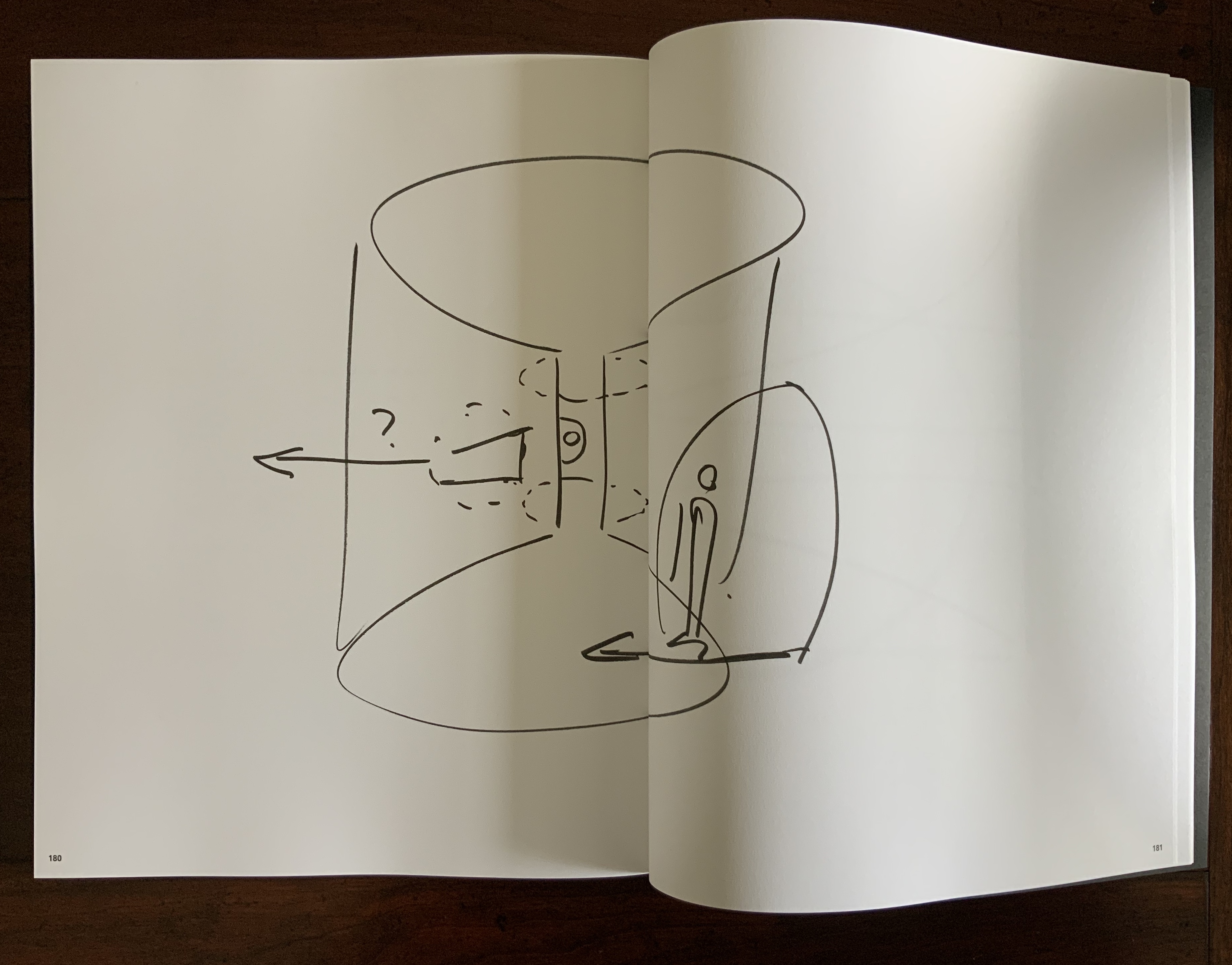
Chicago Octet(2014) Marlene MacCallum Hand bound artist’s book with folded paper structure, letterpress and inkjet printing, 6.5 × 3 × 0.5 inches (closed dimension). Photo: Books On Books Collection
Photo: Books On Books Collection
Chicago Octet fully unfolded, 17.5 × 11.5 inches Photo: Books On Books Collection
Can you hear the traffic and sense the layers of experience? What Pallasmaa writes here of rock art in Africa and Australia reminds me of Chicago Octet (or is it vice versa?): “
At the same time that great works of art make us aware of time and the layering of culture, they halt time in images that are eternally new. … Regardless of the fact that these images may have been painted 50,000 years ago, … we can … hear the excited racket of the hunt.The Embodied Image, p. 109.
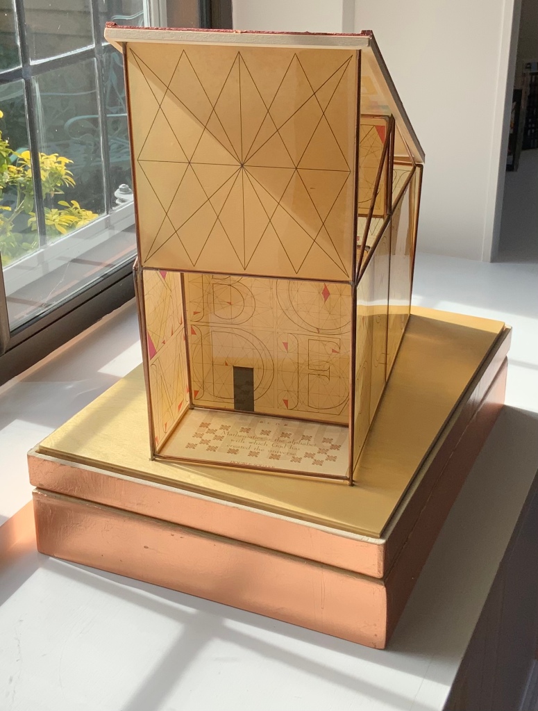
Sacred Space(2003) is an intimate monument of book art. Made intimate by the content and texture of its book, made more intimate by the viewer’s having to construct the chapel. Made monumental by the echo of typographic history, made more monumental in Galileo Galilei’s echo from its floor: Mathematics is the alphabet with which God has created the universe.
Sacred Space (2003) Jeffrey Morin and Steven Ferlauto Book: Reduction linoleum prints with typographic illustrations using overprinting of letterforms; open spine sewn with brown cord binding; brown cloth-covered boards; title and design on front board; endpapers of handmade paper from Nepal. Book: 6 x 14.25″; 17 leaves. Chapel kit: Six walls, roof, base. Walls: copper rod skeleton with Okawara rice paper skin covered with a casting resin. Book and kit housed in wooden box. Roof copper-leafed Davey board. Roof forms the tray in which the book rests. Base: Box lid becomes the base for the chapel. Brass holes in the base allow the rods to fit exactly. Print pattern on the base becomes the floor pattern. Box painted with copper leaf. Sculpture base 15.75 x 11.5″, height 12″. Edition of 35, of which this is #23. Photo: Books On Books Collection.
Mill: A journey around Cromford Mill, Derbyshire (2006) is the result of the artists’ exploration of Cromford Mill in Derbyshire, the first water-powered, cotton-spinning mill developed by Richard Arkwright in 1771. Solid, plaster cast blocks are held softly between calico pages containing hidden texts, bound in recycled wooden library shelf covers that indicate there is history to be found within.
Mill: A journey around Cromford Mill, Derbyshire (2006) Salt + Shaw (Paul Salt and Susan Shaw) Photo: Books On Books Collection
Having Mill is like having the building inside your house.
When Emily Speed is not creating architectural costumes for architectural performative art, she creates artist’s books to express her inner edifices. Unfolding Architecture (2007) coheres title, metaphor, narrative, image, technique of silk-screening, letterpress, texture of paper and wood, the workings of the accordion and box enclosure — all — into an artwork about un-cohering.
Unfolding Architecture(2007) Emily Speed Double-sided accordion book, attached to balsa wood covers, housed in a hinged, covered box of balsa wood. Book – H190 x W70 x D18 mm (closed), H190 x ~W2280 (open); Box – H203 x W88 x D63 mm; 24 panels, including cover panels. Edition of 90, of which this is #7. Acquired from the artist, 24 October 2020.
Architecture plays more than an inspirational role in Karen Wirth’s portfolio. As mentioned above, she has created her own take on Vitruvius’ Ten Books. She designed the Gail See Staircase at Open Book and the Hiawatha Light Rail Station, both in Minneapolis. The collage work Paper Architecture is based on an architectural installation at the Minnesota Center for Arts Design and draws on Wirth’s photos of Ayvalik, Amsterdam, Florence, Istanbul, New York City, Rome, San Diego and Venice.
In The Embodied Image, Pallasmaa singles out “the collaged image” as creating “a dense non-linear and associative narrative field through initially unrelated aggregates, as the fragments obtain new roles and significations through the context and dialogue with other image fragments” (pp.71-72). The materially disparate words in the title of Wirth’s work imply the dialogues she creates among paper, designs of letters and architecture, buildings across time and the globe, and photos tinted, four-colour, and black-and-white in palimpsest.
For Wirth’s own comments about the intersection of book art and architecture, see her interview with Betty Bright.
Former professor and head of the Department of Architecture at MIT’s School of Architecture and Planning, Yoon is now Gale and Ira Drukier Dean of the College of Architecture, Art and Planning at Cornell University. She is also cofounder of Höweler + Yoon, a design-driven architecture practice. Absence appears to be her only work of book art so far.
When you hold this small white brick of paper and turn its thick pages, a small pinhole appears on the page. Then two larger square holes emerge, one of which falls over the pinhole. Page after page, the two square holes repeat, creating two small dark wells in the field of white, until on the last page they take their place in the cut-out schematic footprint of the city blocks and buildings surrounding the Twin Towers of New York City. What you hold in your hands at the end is an object of art and book of memorial prayer.
Absence (2003) J. Meejin Yoon Photo: Books On Books
Other sites, other works
Twice a semester, the Environmental Design Library at the University of California, Berkeley hosts “Hands On: An Evening with Artists’ Books”. In 2017, one evening’s theme was “Building on the Built”, illustrated by 25 works of book art. Organised by 23 Sandy Gallery in the same year, “BUILT“ was an international juried exhibition featuring 66 artist books by 51 artists examining the relationship between contemporary book art practices and architecture, engineering, landscape and construction.
Arranged alphabetically by artist’s name, this section provides links to works from these two exhibitions as well as other collections, exhibitions, installations and recommendations from the Book-Arts listserv members.
A Crisis Ethicist’s Directions for Use: Or How to be at Home in a Residence-cum-Laboratory (2003) Inge Bruggeman Photos: Courtesy of the artist
On her site, Bruggeman writes, “This book/box project is built around excerpts from Architectural Body by Madeline Gins and Arakawa…. incorporates a blueprint of their Bioscleave House as part of the imagery….”. Somewhat like A Clockwork Orange or perhaps more like Heideigger’s tomes, the Gins and Arakawa book is a challenge to the reader’s expectations of diction and syntax.
Richard Minsky: Model of Buckminster Fuller’s Tetrascroll (1979). See also Polly Lada-Mocarski, Richard Minsky and Peter Seidler, “Book of the Century: Fuller’s Tetrascroll“, Craft Horizons, October 1977 (Vol. 7, No. 35). For one (very helpful) reading of Tetrascroll see Jessica Prinz’s “The ‘Non-Book’: New Dimensions in the Contemporary Artist’s Book” in The Artist’s Book: The Text and its Rivals, a special two-issue volume of Visible Language, Vol. 25, Nos. 2/3, edited by Renée Riese Hubert (Providence, RI: Rhode Island School of Design, 1991), pp. 286-89.
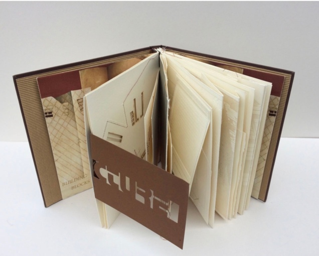
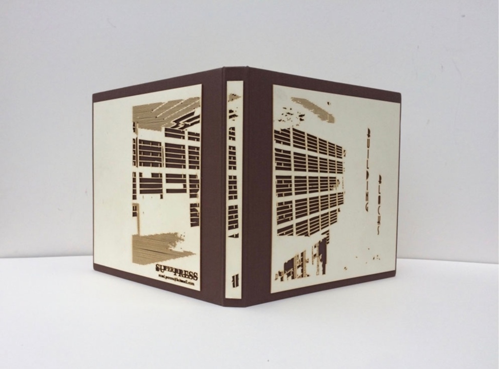
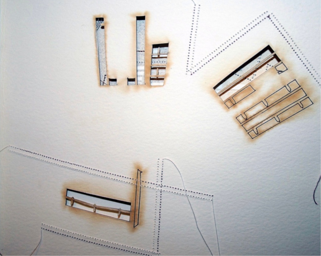
Building Blocks Book XVII (2017) Sumi Perera Photos by artist’s permission
Going against the usual structure of the book, that of a beginning, a middle and an end, Perera provides a space for infinite possibilities and multiple authors, creating “modules that can be re-sequenced and re-aligned to develop variable permutations and encourage participatory involvement, to share the final editorial control with the viewer to transform the ever-evolving work”.These possibilities for variable permutations are no more evident than in her constantly evolving project, Building Blocks Book, and its numerous subsequent iterations including The Negative Space of Architecture and The House That Jack Never Built (2008). Once again we find Perera exploring human interaction, not only with the concepts and her quizzical ideas surrounding architectural and public spaces and how we build between and move within, but also the physical interaction with the artists’ books she produces – the rearrangement and reinsertion of pages which allow the audience and participants new opportunities and pathways to proceed. Through the positive and negative space of the page or the type font, the Underground versus over ground, the artist takes us on journeys that are at once fluid and at other times obstructive. In these cityscapes, the U-turn is as common as the page turn – a necessary rupture in a free-flowing narrative. Chris Taylor, From Book to Book (Leeds: Wild Pansy Press, 2008).
Robbin Ami Silverberg: Home Sweet Home (2006). Artist’s description — “an architectural album of an imaginary middle-class suburban house, … its plans and layout [filled] with the many proverbs I’ve found about women in the home. The book was printed to look like the almost obsolete technique of Diazo printing (blue-printing), but in fact, it is archival inkjet.”
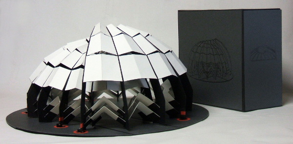
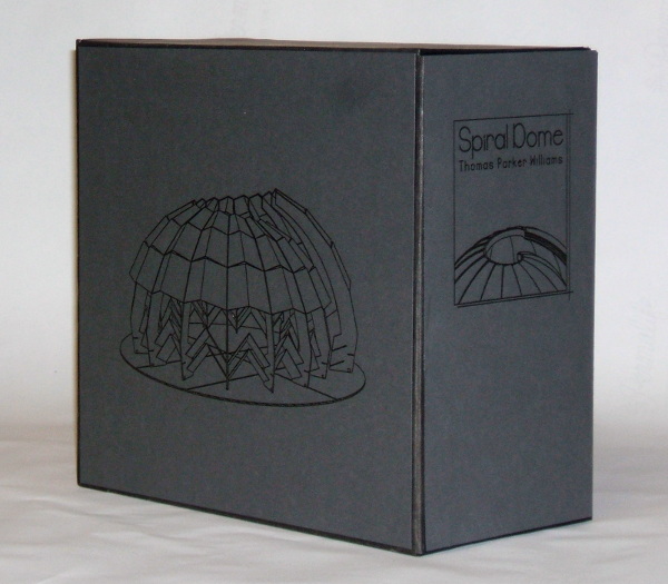
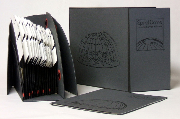
Spiral Dome: Sculptures in Paper and Steel (2016) Thomas Parker Williams Photos: Courtesy of the artist
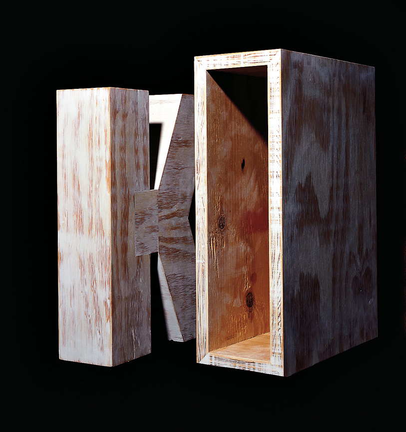
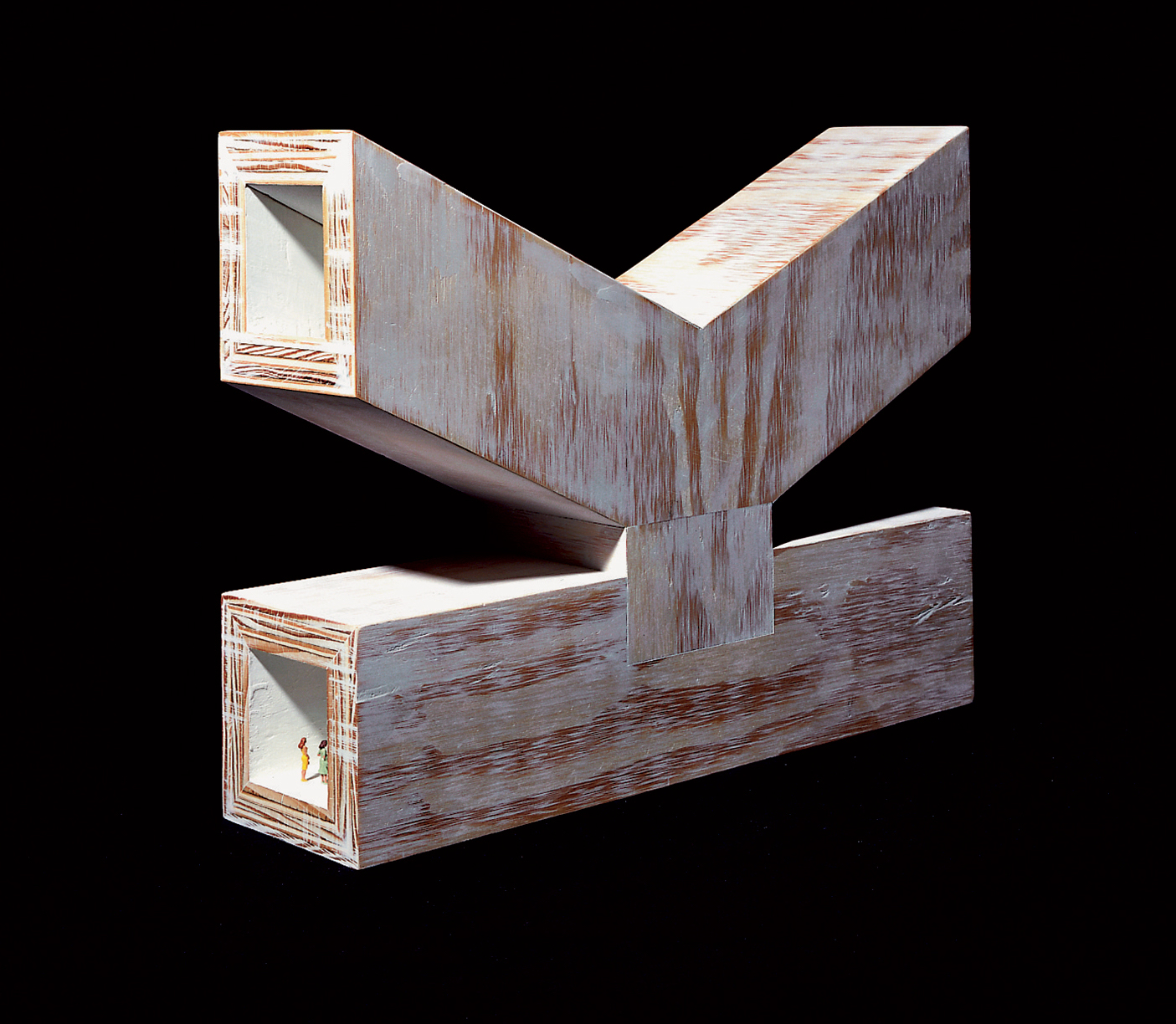
Update: With the addition of Marian Macken’s book Binding Space, mentioned above, comes the Vedute Foundation, a collection of objects/manuscripts by artists/designers/architects created within the constraint that each work has the proportion of the Gutenberg Bible and the relationship of ‘Text’ and ‘Form’ as its subject. For this essay in Books On Books and for the Books On Books Collection’s acquisition of the Merrion edition of Johann David Steingruber’s Architectural Alphabet, the most apropos and favorite work in the Vedute collection is K (1996) by Peter Wilson.
K(1996) Peter Wilson “This contribution (a double volume) is based on the letter ‘K’ (an atom of language), materialised within the Gutenberg proportions in sturdy plywood. It is the responsibility of an architect not only to ‘give form’ but also to explore latent interiorities, potential spatialities. Here the ‘K’ interior has its own inherent geometric agenda − a tunnel, a tube, an inverting telescope (apex mirror). Object becomes instrument (a window to the antipodes even), a trigger for multiple ‘K’ vectors (textural and spatial).” Bolles+Wilson
23 Sandy Gallery. 2017. Built: an international exhibition of contemporary artist books, April 7-May 27, 2017. Portland, Oregon: 23 Sandy Gallery. “… examining the relationship between contemporary book art practices and architecture, engineering, landscape and construction as form, function and structure. Book artists took this opportunity to re-image the ways we as designers, of either books or buildings can inhabit and shape the world around us. Our disciplines have a natural synergy. After all, books and buildings are both kinetic, sequential, structural and time based. BUILT examines the relationship between the built and the book. BUILT features 66 artist books by 51 artists from across the country and as far away as Canada, United Kingdom and Australia.” Publisher’s website.
Sophia Kramer, “Variations of Vitruvius: Four Centuries of Bookbinding and Design”, The Met, 22 August 2018. This essay reviews and illustrates the conservation and rehousing of ninety-five copies of De Architectura libri decem (The Ten Books of Architecture) by Marcus Pollio in the collection of the Department of Drawings and Prints. They are part of a donation of 356 publications from the architect William Gedney Beatty (1869–1941). For book artists, the section on a 1556 edition with double volvelles to display a theater design should be of interest.
Marian Macken, Binding Space: The Book as Spatial Practice (London: Taylor and Francis, 2018). A trained architect and book artist, Macken articulates and illustrates the how and why of the overlap between architecture and book art.
David Sume, The architectural nature of the illustrated books of Iliazd : (Ilia Zdanevich, 1894-1975, University of Montreal, 2019. This dissertation is a reminder that the importance of architecture to book art reaches back to the avant-garde and modernists of the early 20th century — and more important, that its importance may lie beneath the surface.
Elizabeth Williams, “Architects Books: An Investigation in Binding and Building”, The Guild of Book Workers Journal, Volume 27, Number 2, Fall 1989. This essay not only pursues the topic of architecture-inspired book art but turns it on its head. An adjunct professor at the time, Williams set her students the task of reading Ulises Carrión’s The New Art of Making Books (Nicosia: Aegean Editions, 2001) then, after touring a bindery, “to design the studio and dwelling spaces for a hand bookbinder on an urban site in Ann Arbor, Michigan”. But before producing the design, the students were asked “to assemble the pages [of the design brief and project statement] in a way that explored or challenged the concept of binding”. In other words, they had to create bookworks and then, inspired by that, create their building designs. Williams illustrates the essay with photos of the students’ bookworks. [Special thanks to Peter Verheyen for this reference.]


