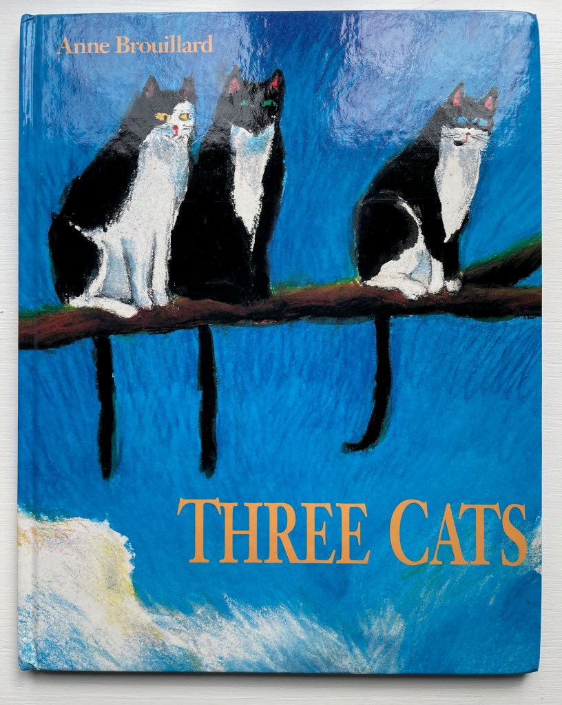
Three Cats (1992) Anne Brouillard Casebound, illustrated paper over boards, sewn, dustjacket. H280 x W223 mm. [28] pages. Acquired from private seller, 27 August 2023. Photos: Books On Books Collection.
This wordless picture book tells a humorous brief tale of three curious cats and three insouciant fish. It marks an early stage in Anne Brouillard’s journey from picture book artist to book artist.
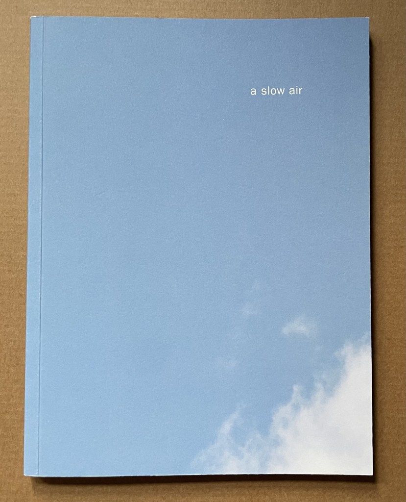
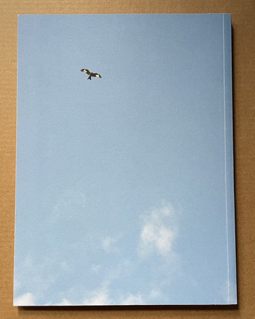
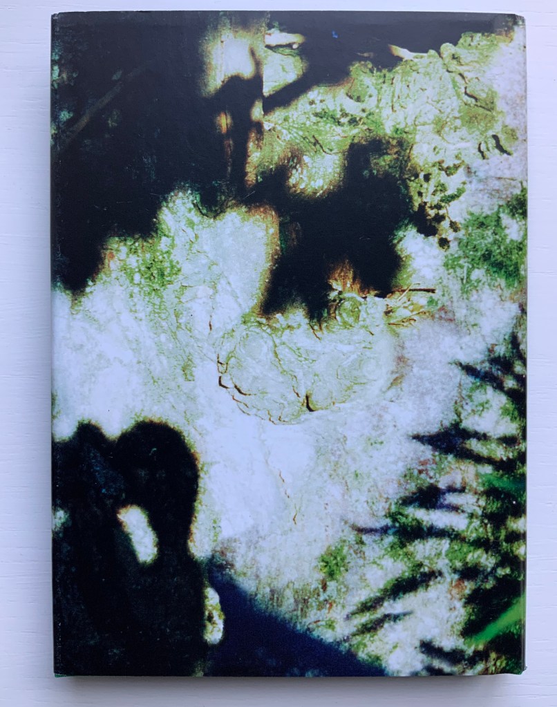
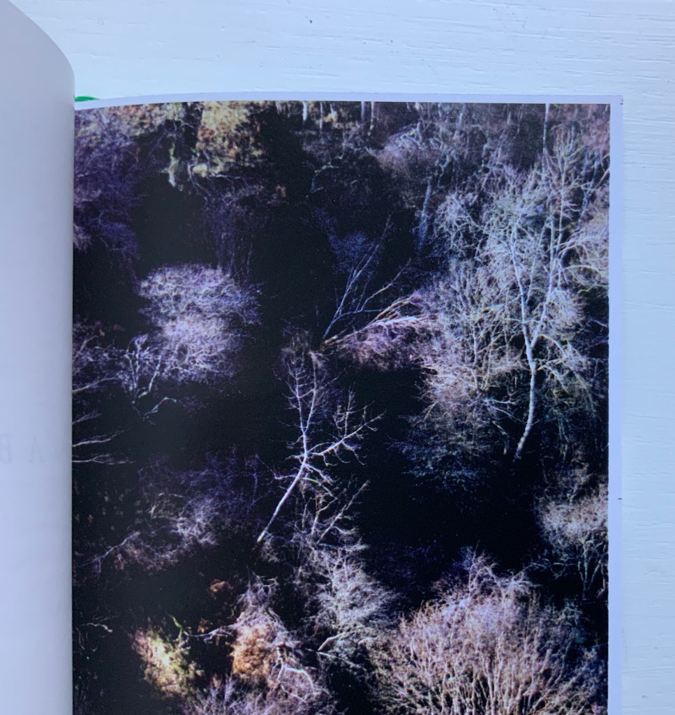
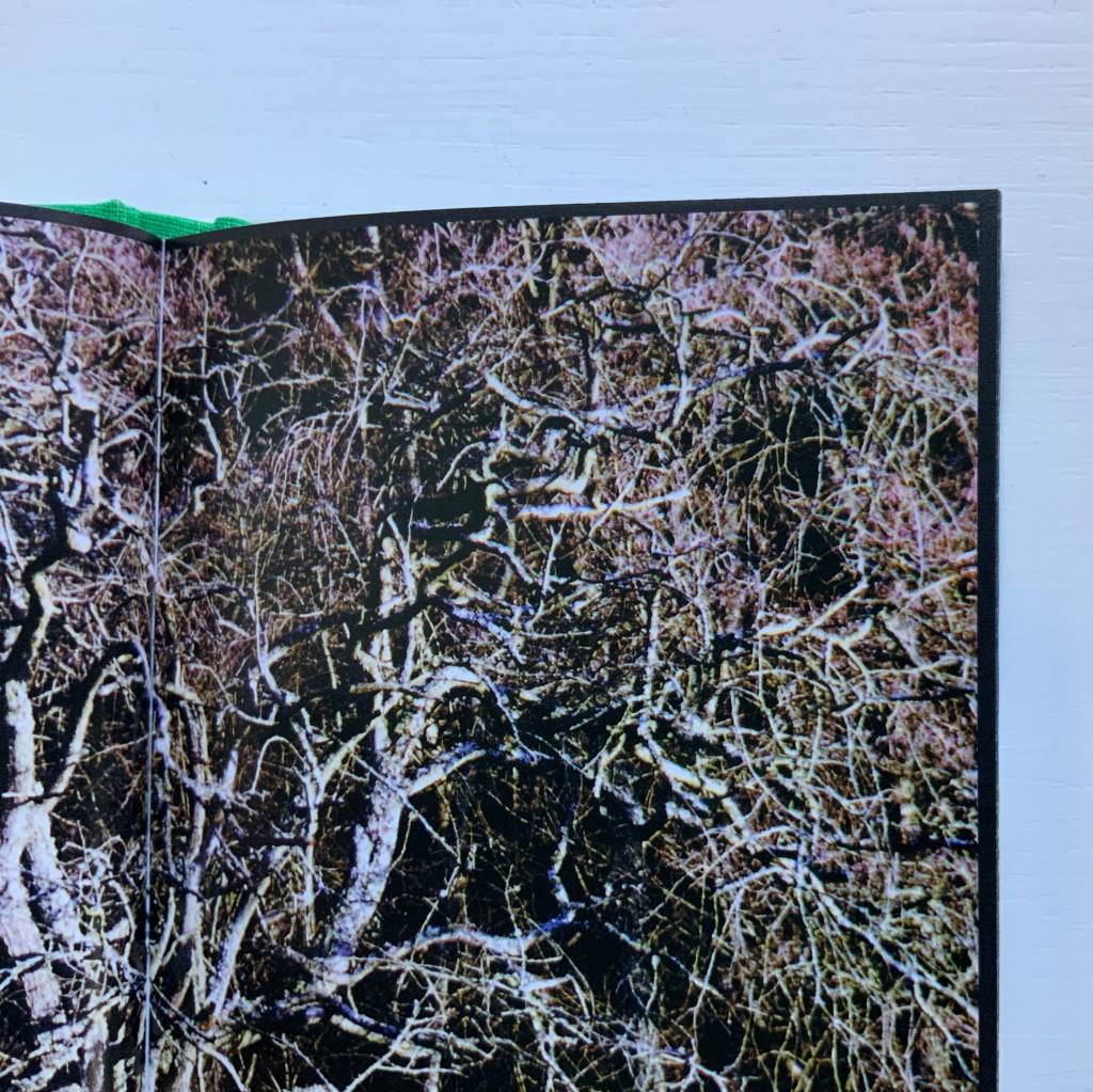
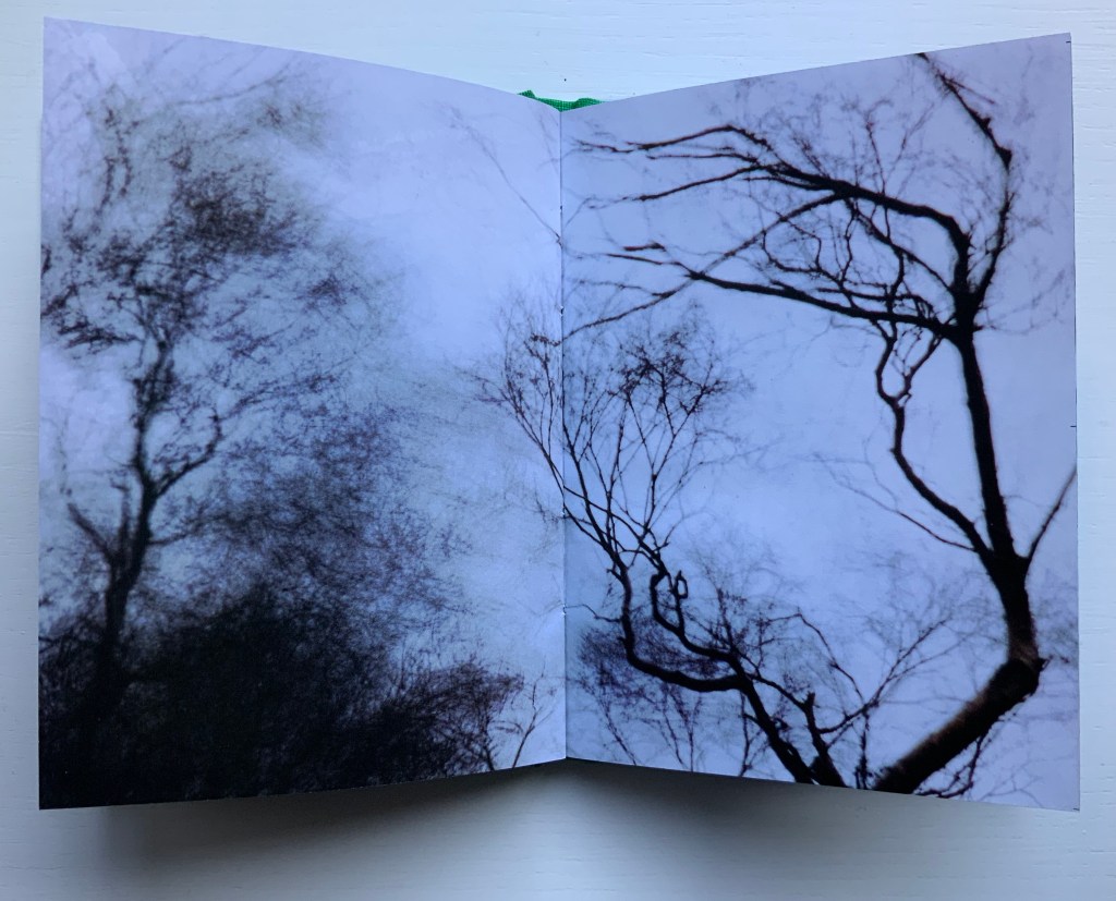
A Slow Air (2016) Thomas A. Clark and Diane Howse Perfect bound softcover. H200 x W150 mm. 64 pages. Edition of 750. Acquired at the Small Publishers Book Fair, London, in 2018. Photos of the work: Books On Books Collection.
If you live where red kites thrive, you will see them most often singly, in pairs or threes. If you are lucky, you may see as many as eight or ten at a time. Near Harewood House in West Yorkshire where red kites were reintroduced in 1999, there are hundreds. In 2016, photographer/artist Diane Howse (Countess of Harewood) and poet/artist Thomas A. Clark collaborated on an exhibition at Harewood House: the grove of delight. Using objects, words and images, the exhibition turned the house’s Terrace Gallery into a symbolic grove; also displayed was a series of 15 photographs by Howse of red kites over Harewood. For the exhibition and under the direction of Peter Foolen, the diligent Dutch publisher of herman de vries, Peter Liversidge and others, A Slow Air (the book) was produced and published by Harewood House. Foolen and the artists have assembled and manipulated the photos in a sequence of color and image that exerts a forward movement like a film or narrative. Like a real sighting of these birds circling and banking as if to a slow musical air, the book mesmerizes.
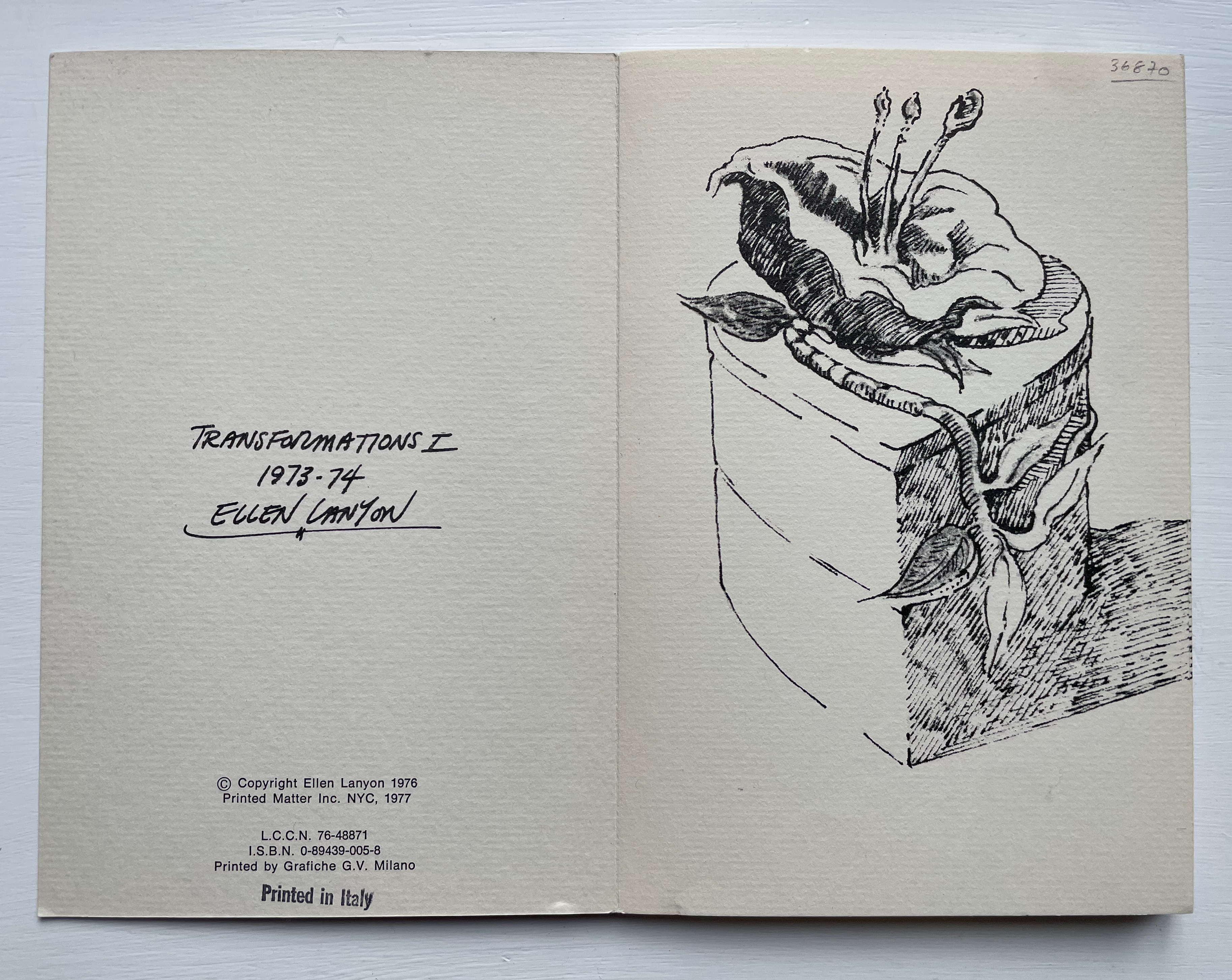
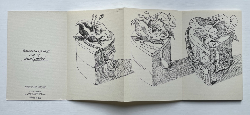
Transformations is a book as drawing. Across 24 panels of this accordion-fold book, Ellen Lanyon develops a surreal graphical fantasia from a single image.
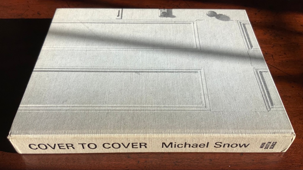
I tried to “define the book” when I designed (one of my books) Cover to Cover hoping that the “reader” would have a multi-sensory experience of the nature of what she/he held in her/his hands. (from The Book: 101 Definitions)
Cover to Cover (1975)
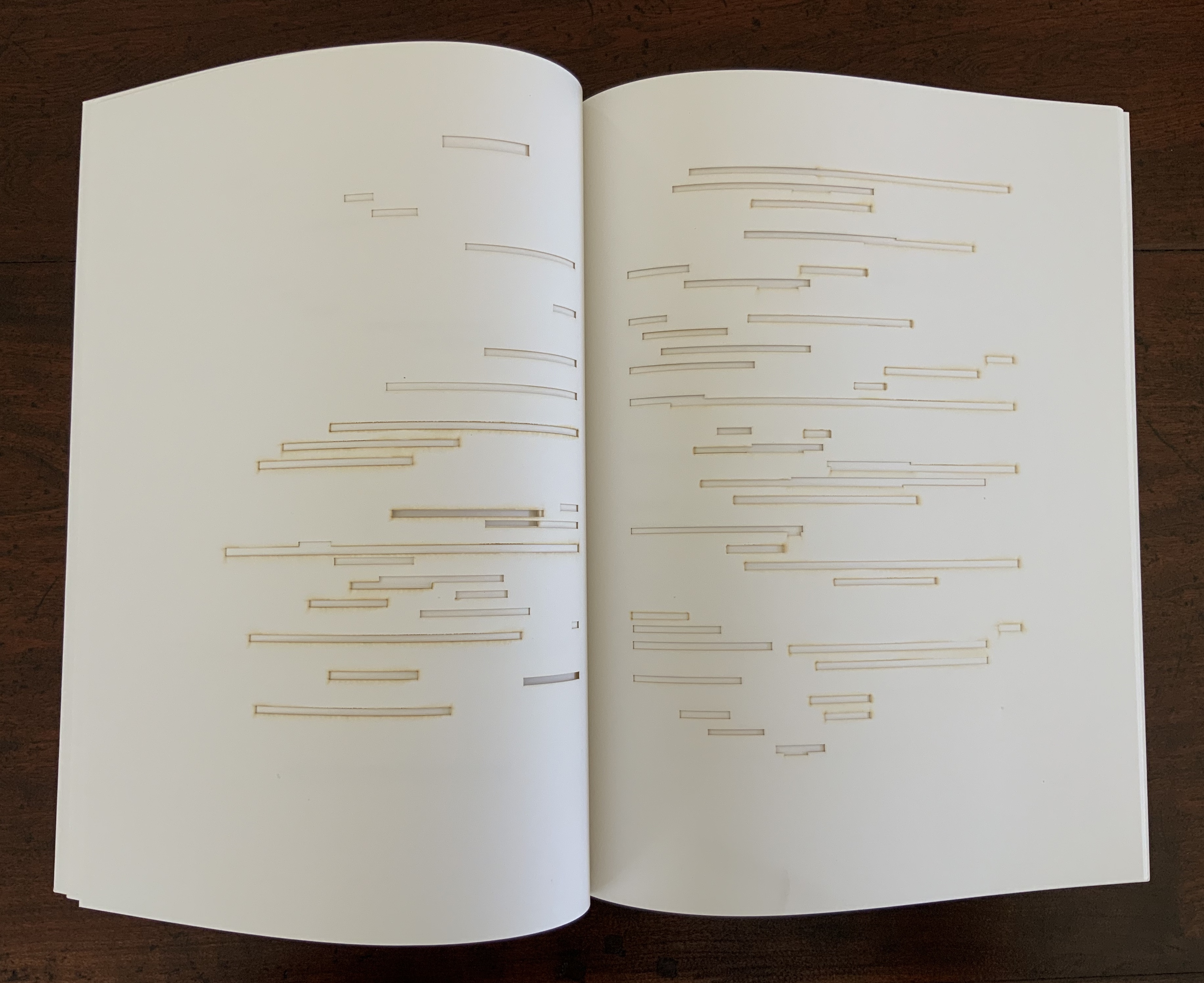
Cover to Cover (1975) Michael Snow Cloth on board, sewn and casebound. H230 x W180 mm. 310 unnumbered pages. Published by Nova Scotia College of Art and Design. Unnumbered edition of 300. Acquired from Mast Books, 10 December 2020. Photos of the work: Books On Books Collection.
After a long search since first sight of it in 2016 at Washington, D.C.’s now defunct Corcoran Gallery library, the original hardback edition of Michael Snow’s Cover to Cover (1975) finally joins the Books On Books Collection. Thanks to Philip Zimmermann, more readers/viewers have the chance to experience Cover to Cover — if only through the screen — than the original’s 300 copies and Primary Information’s 1000 facsimile paperback copies will allow.
Amaranth Borsuk describes the work and experience of it in The Book(2018), as do Martha Langford in Michael Snow (2014), Marian Macken in Binding Spaces (2017) and Zimmermann in his comments for the exhibition “Book Show: Fifty Years of Photographic Books, 1968–2018” (for all, see links below). Like Chinese Whispers by Telfer Stokes and Helen Douglas and Theme and Permutation by Marlene MacCallum, Michael Snow’s Cover to Cover evokes an urge to articulate what is going, how the bookwork is re-imagining visual narrative, how it is making us look, and how it makes us think about our interaction with our environs and the structure of the book.
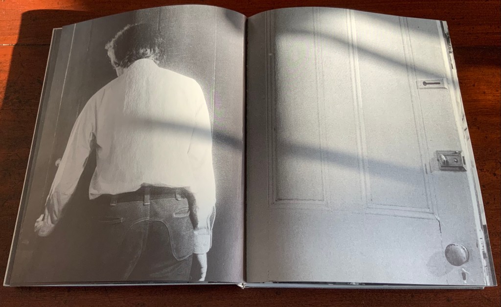
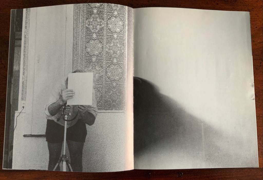
The already existing commentary about Cover to Cover sets a high hurdle for worthwhile additional words. One thing going on in the book, though, seems to have gone unremarked. Some critics have asserted that, other than its title on the spine, the book has no text. There is text, however. It occurs within what I would call the preliminaries, and they show us how to read the book.
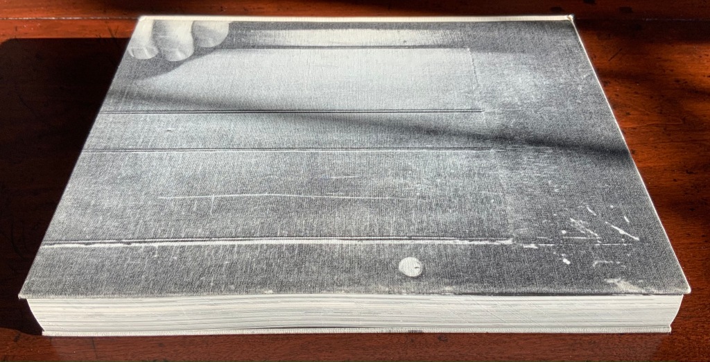
On the front cover, we see a door from the inside. Then, on its pastedown endpaper, the author outside the door with his back to us.
Front cover; pastedown end paper and page “1”.
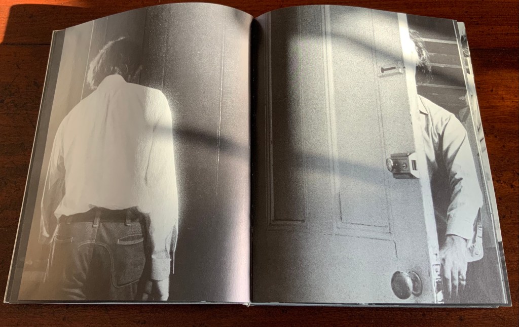
On turning the “inside door” (page “1” of the preliminaries), we see in small type a copyright assertion and the Library of Congress catalogue number appearing vertically along the gutter of pages “2-3” (a tiny clue as to what is going on).
Pages “2-3”
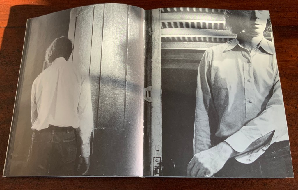
Over pages “4” through “14” from the same alternating viewpoints, the author reaches for the door handle, the door is seen opening from the inside, and the artist is seen walking through the door (from the outside) and into the room (from the inside). But who is recording these views?
Pages “10-11”, “12-13”, “14-15”
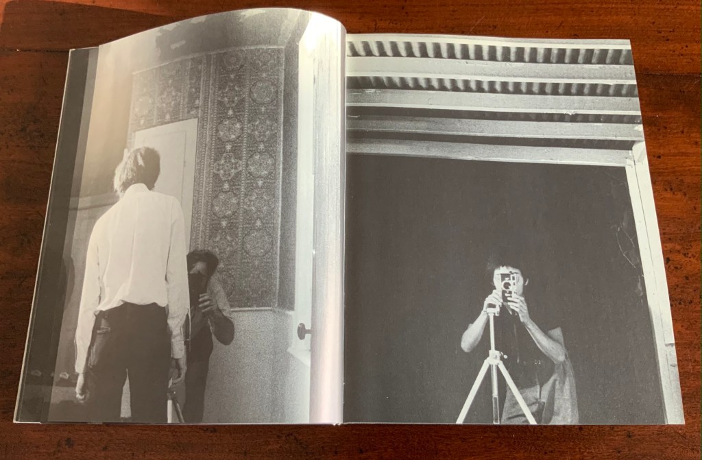
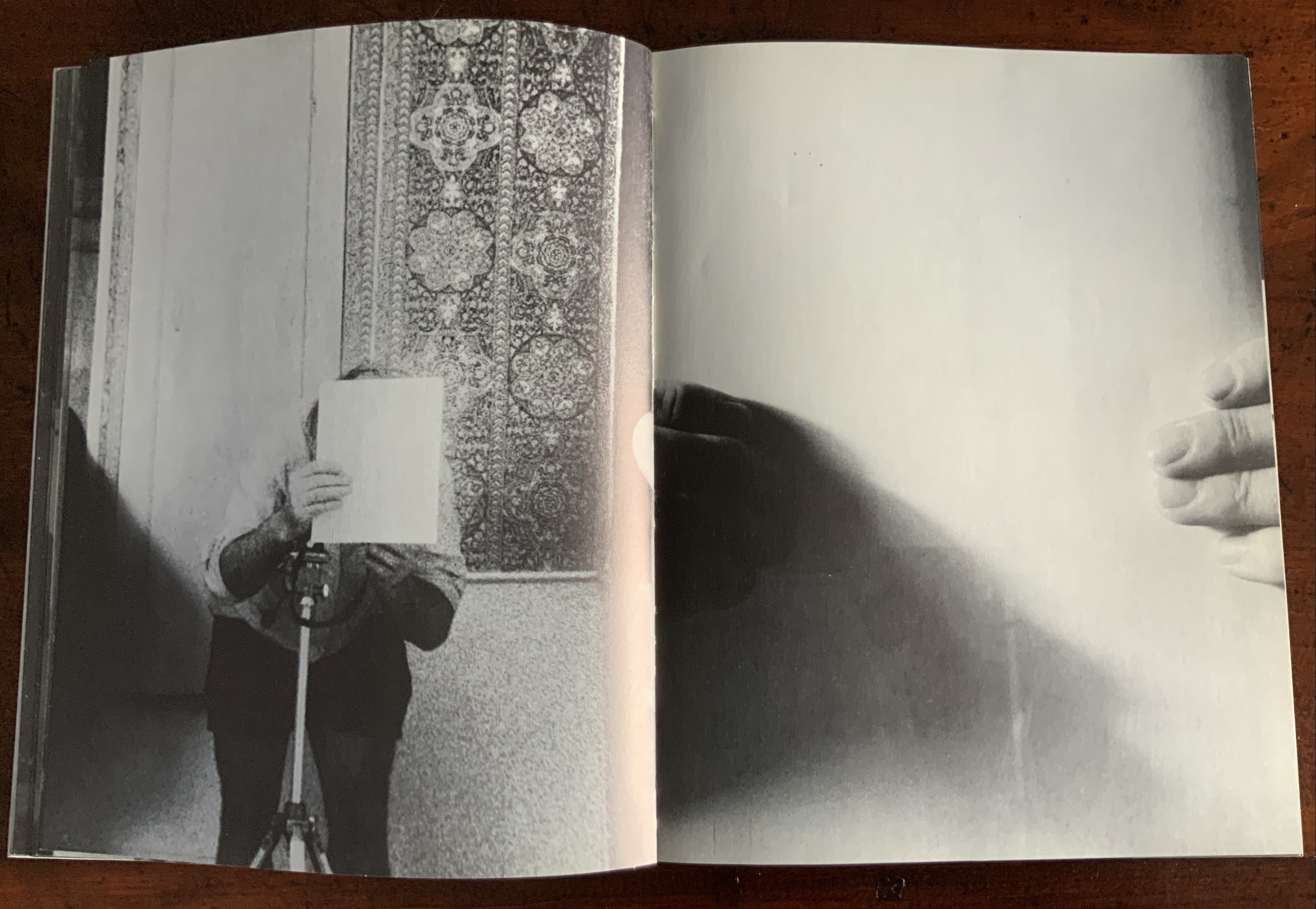
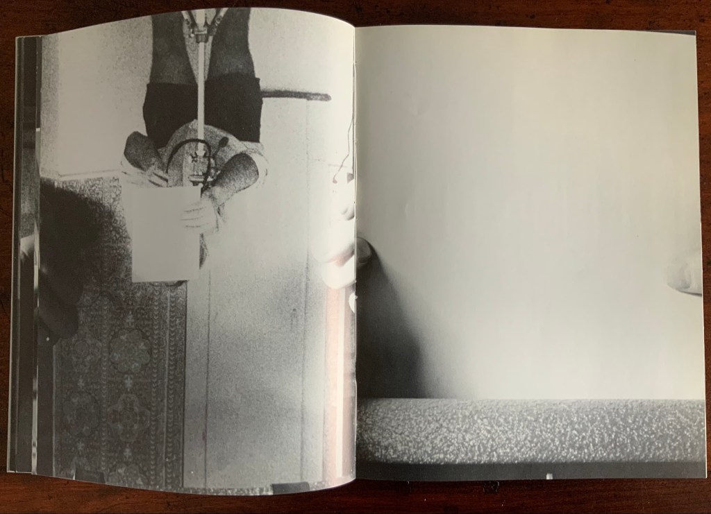
Over pages “16” through “24”, two photographers appear. Facing us, they are bent over their cameras — the one outside, clean shaven and wearing a short-sleeved shirt, is behind the author, and the one inside, bearded and wearing shorts, is in front of the author. As the author moves out of the frame, we see that the photographer inside is holding a piece of paper in his right hand. All of this occurs through the same alternating viewpoints. At page “21”, the corner of that paper descends into the frame of the inside photographer’s view of the outside photographer, and after the next switch in viewpoint that confirms what the inside photographer is doing, we see a completely white page “23”, presumably the blank sheet that is blocking the inside photographer’s camera aperture. Page “24” is the outside photographer’s view of the inside photographer whose face and camera are blocked by the piece of paper.
Pages “16-17”, pages “20-21” and pages “24-25”
After the sequence above, something stranger still happens: on the left, a photo of the inside photographer holding the blank paper in front of his face appears. We can tell it is a photo by the tip of the thumb holding it (look in the gutter) between pages “26 and 27”. It is the developed photo the outside photographer just took of the inside photographer with his face and camera hidden by the sheet of paper. The image on page “27” is the reverse of that photograph. We can tell by the fingers on the right holding it.
Pages “26-27”
We are looking at images of images. But on pages “30-31”, whose fingers are holding the image of images?
Pages “30-31”
From there on, we see images of this piece of paper being manipulated by one pair of hands. The thumbs appear on the verso (the view from the outside photographer’s perspective), the fingers on the recto (the view seen by the inside photographer). By page “34”, it has been flipped upside down (the inside photographer is standing on his head), and on page “35”, we see a close up of the blank reverse side of the paper being held between the two photographers. By page “37”, we can see the blank side of the photo paper being fed into a manual typewriter. The pair of hands feeding the paper into the typewriter cannot belong to one of the photographers. Who is the typist — the author?
Pages “34-35” and pages “36-37”
For both pages “42” and “43”, the perspective is that of a typist advancing the photo paper and typing the title page of the book. On both pages, we can see the ribbon holder in the same position. As it progresses, more and more of the outside photographer’s camera appears above the typed page. Page “45” presents itself as the full text of the book’s title page, curling away from the typist and revealing the inside photographer on the other side of the typewriter. Page “46” shows the upside-down view of the title page as it moves toward the inside photographer and reveals the outside photographer on the other side of the typewriter. Not only are we seeing images of images, we are witnessing the making of the book’s preliminaries.
Pages “42-43”, “44-45”, and “46-47”.
From page “48” through page “54”, the photographers alternate views of blank paper advancing through the typewriter. By pages “55” and “56”, the typewriter has moved out of the frame. Look carefully at page “56”, however, and you can see the impression of the typewriter’s rubber holders on the paper. As a book’s preliminaries come to a close, there is often a blank verso page before the start of the book. If Cover to Cover is following that tradition, page “56” is that blank page at the end of the preliminaries, and page “57”, showing a record player, is the start of the book.
Pages “56-57”.
Zimmermann notes that, at somewhere near the book’s midpoint, the images turn upside down, and that readers who then happen to “flip the book over and start paging from the back soon realize that they are looking at images of images produced by the two-sided system, and indeed the very book that they are holding in their hands”. He notes this as another mind-bender added to the puzzlement of the two-sided system with which the book begins. Yet the long set of preliminaries foretold us that the upside-downness, back-to-frontness and self-reflexivity of images of images were on their way. Without doubt, Cover to Cover is an iconic work of book art.
Further Reading
Afterimage (1970). No. 11, 1982/83. On the occasion of an exhibition of his films at Canada House in London, an entire issue on Snow’s work.
… Cover to Cover is the result of another distanced use of self in the course of art-making. Snow is subject/participant as he and his actions are observed and analyzed by two 35 mm cameras… simulataneously recording front and back, the images then placed recto-verso on the page… Snow is subject observed in the book at the same time that he is also choosing and making decisions about images. Cover to Cover in 360 pages, [sic] becomes a full circle — front door to back door or the reverse. The book is designed so that it can be read front to back and in such a way that one is forced to turn it around at its centre in order to carry on. Regina Cornwell in Snow Seen and “Posting Snow”, Luzern catalogue.
But as the scene “progresses,” an action is not completed within the spread, but loops back in the next one, so that the minimal “progress” extracted from reading left to right is systematically stalled each time a page is turned, and the verso page recapitulates the photographic event printed on the recto side from the opposite angle. This is the disorienting part: to be denied “progress” as one turns the page seems oddly like flashback, which it patently is not; it might be called “extreme simultaneity.” Two versions of the same thing (two sides of the story) are happening at the same time. Zimmerman.
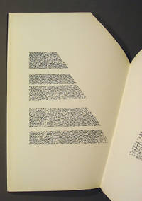
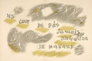
Appropriated and sculpted bookwork was taking off in numerous forms even before 1964 when Marcel Broodthaers half-embedded the last fifty copies of his poetry book Pense-Bête in plaster. Bruno Munari had introduced libri illeggibili (“unreadable books”) in 1949. John Latham had already encased books with plaster in Shelf Number 2 (1961) and much else in his various skoob works. Tom Phillips’ line-by-line, found-book alteration A Humument was underway, first appearing in 1970, as was Dieter Roth’s string of sausage books Literaturwurst (1961-74). So Broodthaers could have taken any of several directions before deciding to replace Mallarmé’s lines of verse in Un Coup de Dés N’Abolira le Hasard: Poéme (1914) with printed and engraved placeholders in paper and anodized aluminum, respectively, to create Un Coup de Dés N’Abolira le Hasard: Image (1969).
Son of Giorgio Maffei (bookseller, curator, scholar and book artist in his own right), Giulio Maffei has made video catalogues for Studio Bibliografico Giorgio Maffei since 2015. Each catalogue is a work of video. In this twenty-sixth outing, Maffei has created a video from the 1914 edition and Broodthaers’ 1969 Image version of Un Coup de Dés.
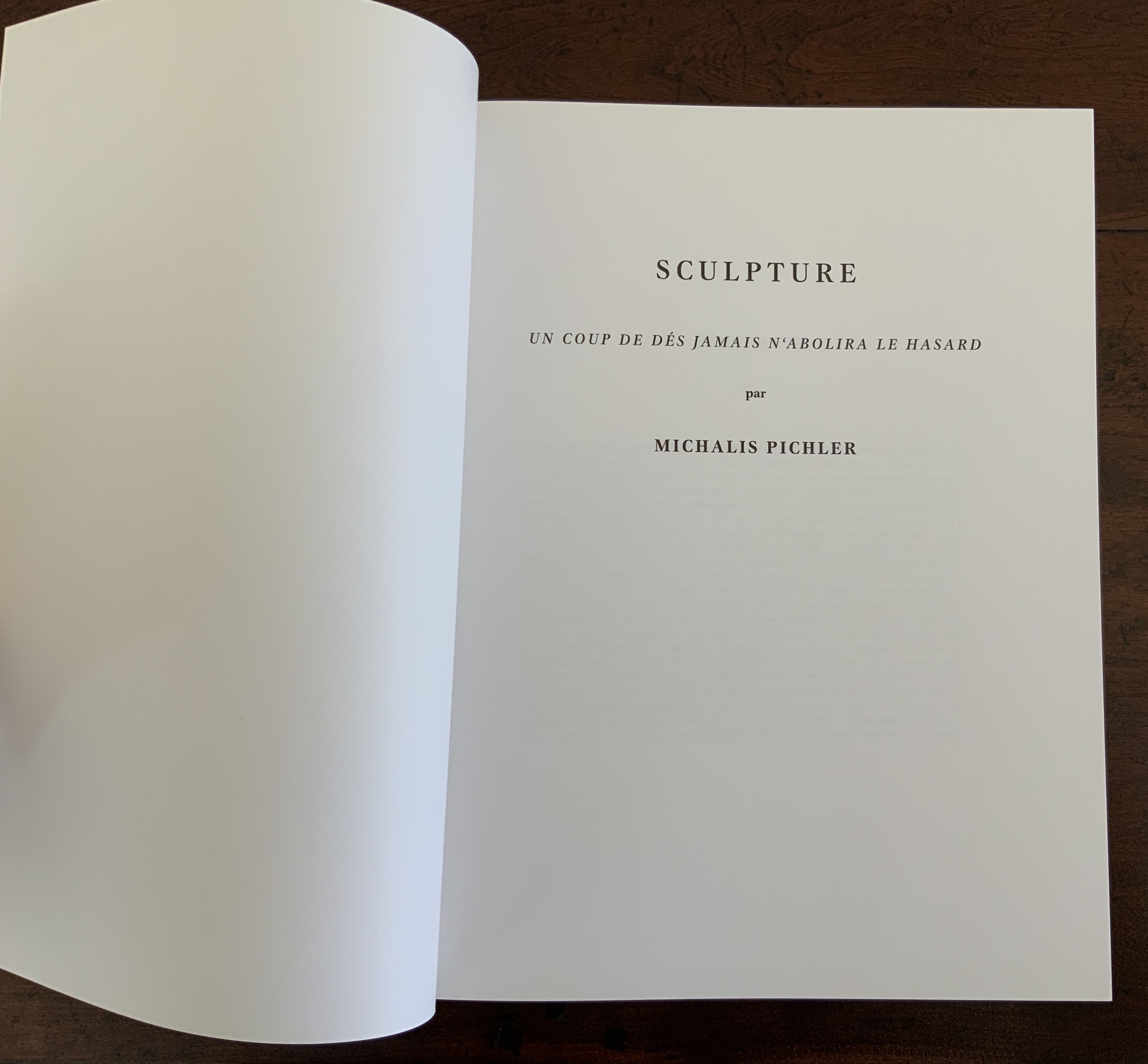
By 2008, Michalis Pichler had an even greater wealth of forms from which to choose for his double appropriation/homage to Mallarmé’s Poème and Broodthaers’ Image. Since the ’80s scores of book artists had been introduced to ingenious structures by Hedi Kyle and Keith A. Smith, among others, so why not an Aunt Sally’s shipwreck of string, canvas and torn paper? Long-Bin Chen had been sanding books and phone directories into busts since the ’90s, so why not a bust of Mallarmé from old editions of Un Coup de Dés and a bust of Broodthaers from catalogues of his works (a variation on Buzz Spector’s treatment)?
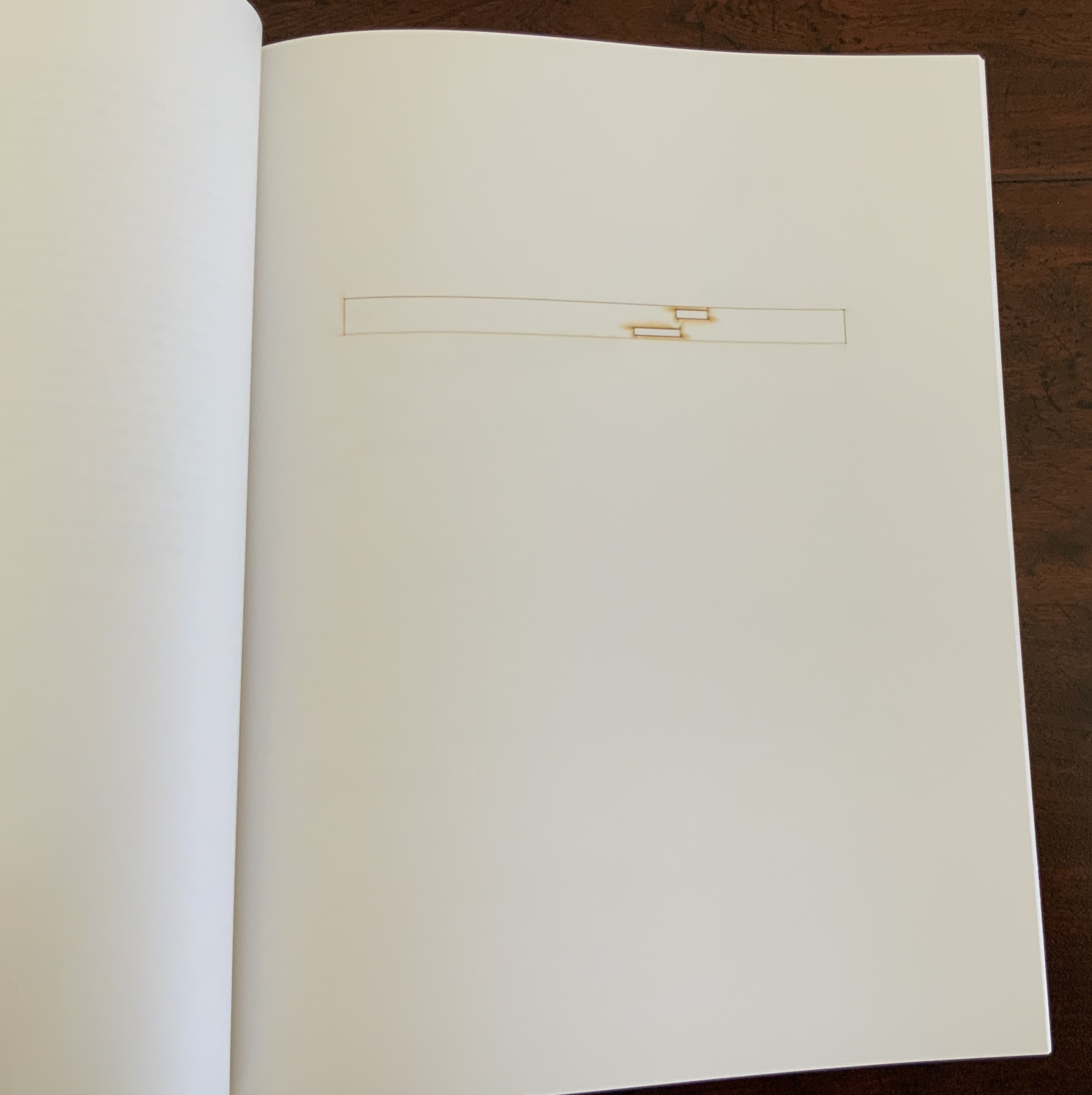
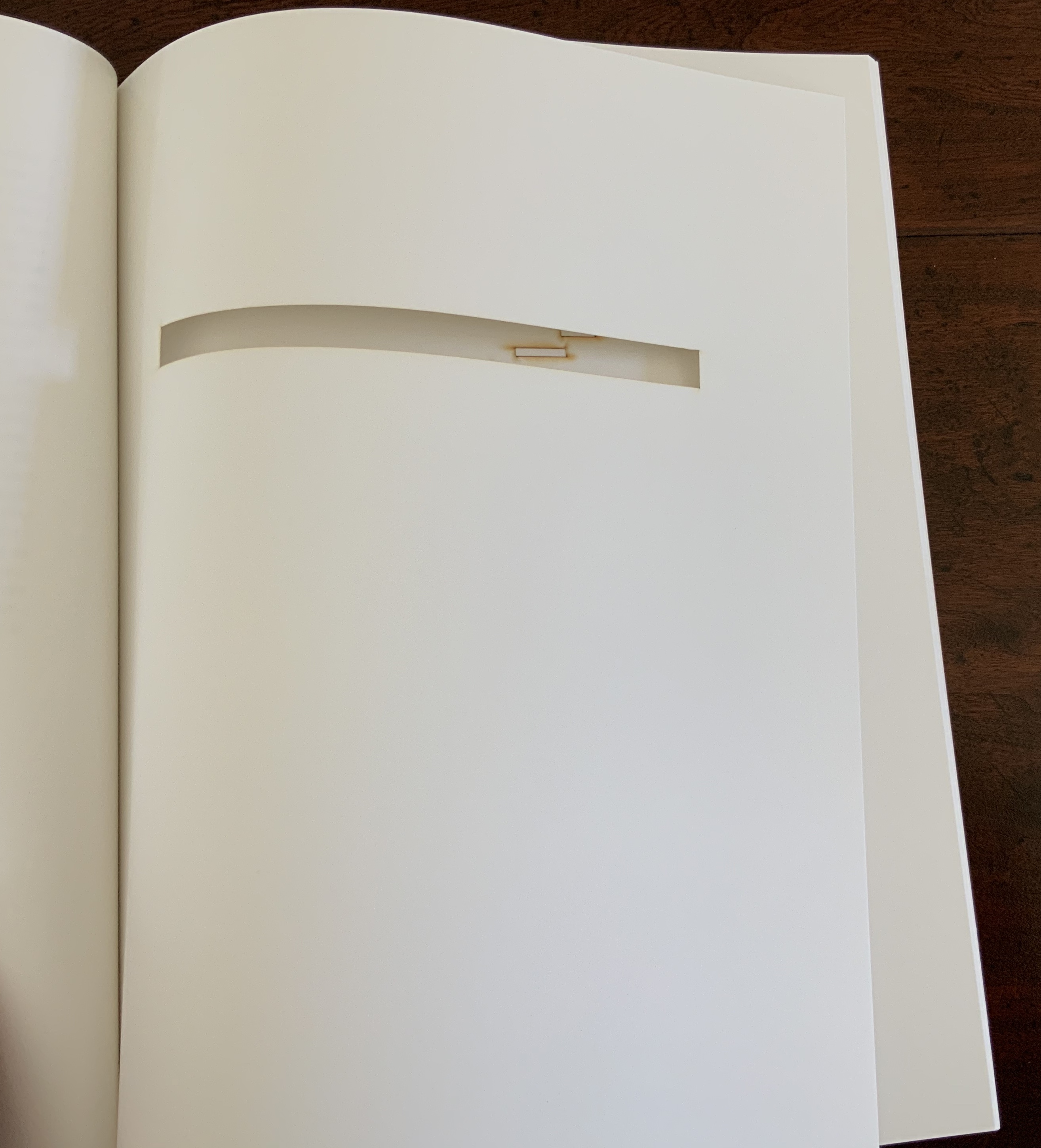
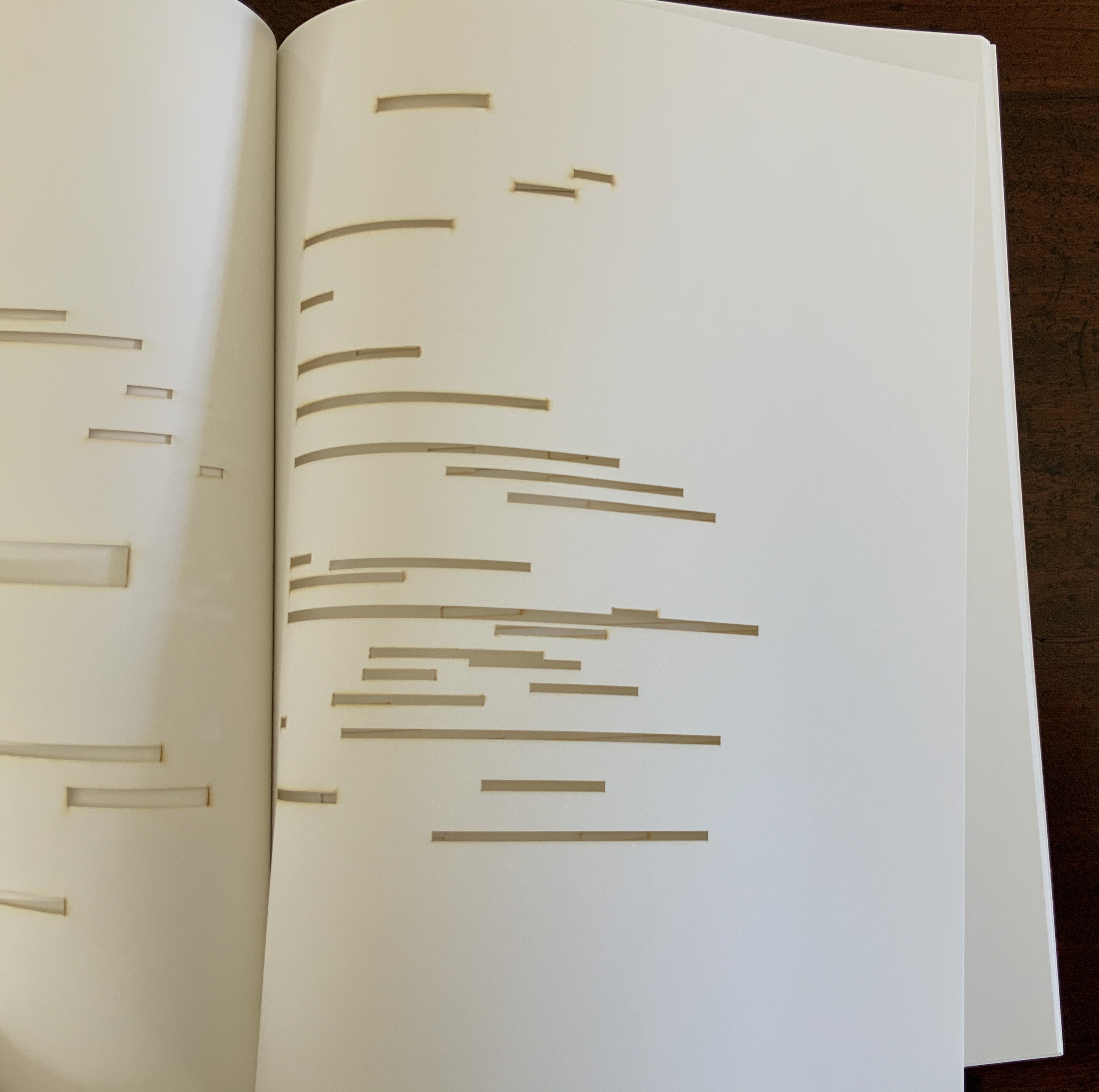
Instead Pichler appropriates Mallarmé through Broodthaers’ design and production: an efficient and direct double appropriation. He follows the trim size and layout of the 1914 and 1969 works. Further underscoring the double appropriation, he reprints verbatim Broodthaers’ preface (the full text of Mallarmé’s poem set in small type as a single paragraph with obliques separating the lines of verse). Like Broodthaers, he produced limited editions of three versions: 10 copies in plexiglas (rather than Broodthaers’ 10 in anodized aluminum), 90 copies in translucent paper (just as Broodthaers had done) and 500 copies in paper (rather than Broodthaers’ 300). Where Broodthaers had solid black stripes, though, Pichler substitutes laser cuts in the translucent and paper editions and engraving or abrasion in the plexiglas edition. Hence Sculpture (2008), rather than Image (1969) or Poème (1914).
Not until 2016, though, was Pichler able to cap his double appropriation. Just as Broodthaers had held an exhibition entitled “Broodthaers: Exposition littéraire autour de Mallarmé” (Antwerp, December 1969), Pichler held one entitled “Pichler: Exposition Littéraire autour de Mallarmé” (Milan, December 2016). Like the Broodthaers exhibition, Pichler’s was an opportunity to showcase his own work: it was his first solo exhibition in Italy. Like Broodthaers, he included the Nrf 1914 edition, but also included numerous other editions and translations that had occurred since. Also, key to Pichler’s artistic intent, he included a host of other artists who by appropriation had made homage to Un Coup de Dés … Poème and, in some cases, Broodthaers’ … Image.
Book art is so self-referential in its instances (think of Real Fiction: An Inquiry into the Bookeresque by Helen Douglas and Telfer Stokes) and as a genre (think Burning Small Fires by Bruce Nauman) that appropriation offers a natural next step. In Pichler’s case, the subtlety of that step comes in how he reaches through Broodthaers’ Image all the way back to elements of Mallarmé’s Poème to achieve his aims.
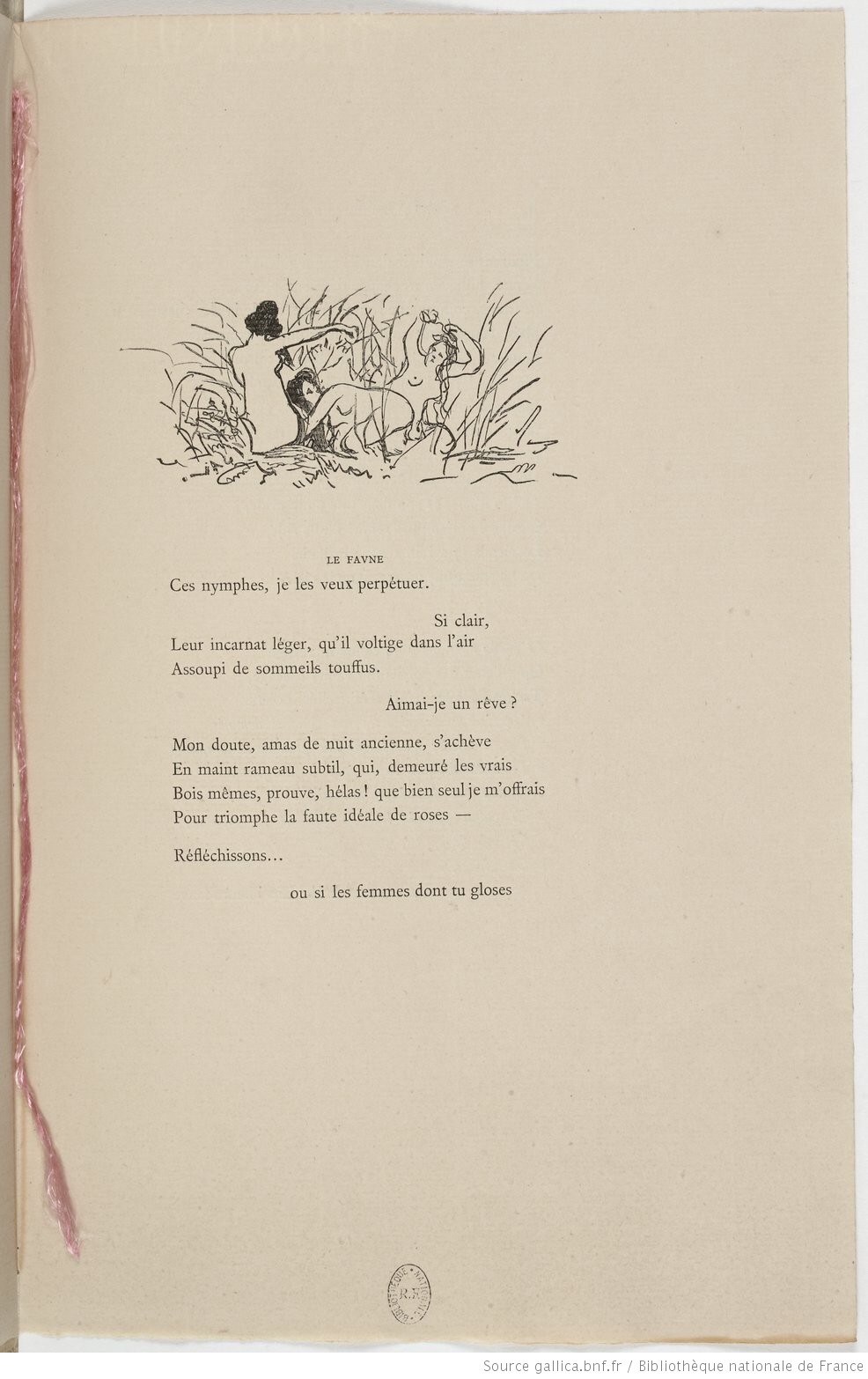
When Broodthaers first appropriated Mallarmé’s layout, type sizes and roman/italic styles, he was engaged in a kind of reverse ekphrasis. Usually ekphrasis runs from the work of art (say, a Grecian urn) to the text in response (“Ode on a Grecian Urn”). Here, the poem and its shape come first, then the work of art — the Image of the poem. By calling his exhibition an exposition littéraire, Broodthaers underscored this. By calling out the shapes on the page, he elevated the original’s semblances of waves, an abyss, a foundering ship and a constellation and, in exposing them, performed a kind of literary study as well as artistic work.
Count it down from Pichler’s appropriation of Broodthaers’ exposition littéraire, from the inclusion/appropriation of other artists’ appropriations of Poème and/or Image, from his own work of book art Sculpture, from his own other works: Pichler’s appropriative ekphrasis is squared, cubed or perhaps raised to the fourth power. Clearly, book art and appropriation are Pichler’s chief palettes — or rather his twin decks from which, as DJ, he mixes what he calls “Greatest Hits”. The phrase simultaneously names Pichler’s imprint on Sculpture‘s cover and the series on his website. The series includes other appropriations such as Every Building on the Ginza Strip (2018) from Ed Ruscha and Some More Sonnet(s) aka Poem(s) (2011) from Ulises Carríon. “Greatest Hits”, however, suggests another subtlety in Sculpture, albeit one best appreciated in the context of all the exhibitions.
The first instance of Broodthaers’ exhibition in Antwerp included a continuous playing of the artist’s tape-recorded reading of the poem. In Cologne for its second instance, Broodthaers renamed it Exposition littéraire et musicale autour de Mallarmé. Broodthaers was simply taking Mallarmé’s musical cue in Un Coup de Dés’spreface, which advises reading the poem as if it were a “score” for music to be heard at a concert and its blank spaces as “silences”.
Taking Mallarmé’s and Broodthaers’ musical cues and that of his piano-roll-like slots in Sculpture, Pichler created for his exhibition Un Coup de Dés Jamais N’Abolira le Hasard: Musique, a piano-roll version of the poem to be played by any visitor who cared to sit and pedal the pianola on which it was installed. So in further appropriation of Mallarmé through Broodthaers, Pichler’s piano roll turns the empty spaces, where the words and black strips would be, into music while the blanks around them become what Magnus Wieland calls “white noise”.
In traditional literary ekphrasis, the referring text can stand on its own. Homer’s description of Achilles’ shield does not require a side-by-side engraving or painting of what Hephaestus forged. Nor does Auden’s exposition of Breughel’s Landscape with the Fall of Icarus (c. 1560) need an art history book to hand.
But without the context of the exhibition, the presence of other appropriations, or even Pichler’s translucent and plexiglas editions, what to make of Pichler’s paper edition on its own? The traditional Nrf cover design suggests no surprise to come, although the trim size looks non-traditional in today’s market. The book’s slimness, subtitle and preliminaries also warrant a raised eyebrow: how can this be a sculpture? Turning the pages, the reader/viewer comes to the cuts and sees through to the pages beneath. Shadows move through the leaves. The laser cut technique hints at something that a die cut does not. Do the burnt edges where the laser has cut suggest a more surgical approach to book burning, an allusion to burning decks, or a 19th century and 20th century legacy to the white spaces?
Both Mallarmé and Broodthaers noted the intent to draw attention to the white space of the page. Pichler appropriates both the poet’s and artist’s form and intent. He sculpts a conceptual double-palimpsest not by overwriting the first level of overwriting but by removing it and the original layer altogether. The core subtlety of Pichler’s paper edition of Un Coup de Dés lies in those empty spaces defined at their burnt edges and by the blankness around them. For Sartre, Mallarmé was the poet of nothingness. Broodthaers appropriated the nothingness with black ink. Pichler has appropriated both. The paradox is a work that stands on its own by invoking and eliminating what it appropriates.
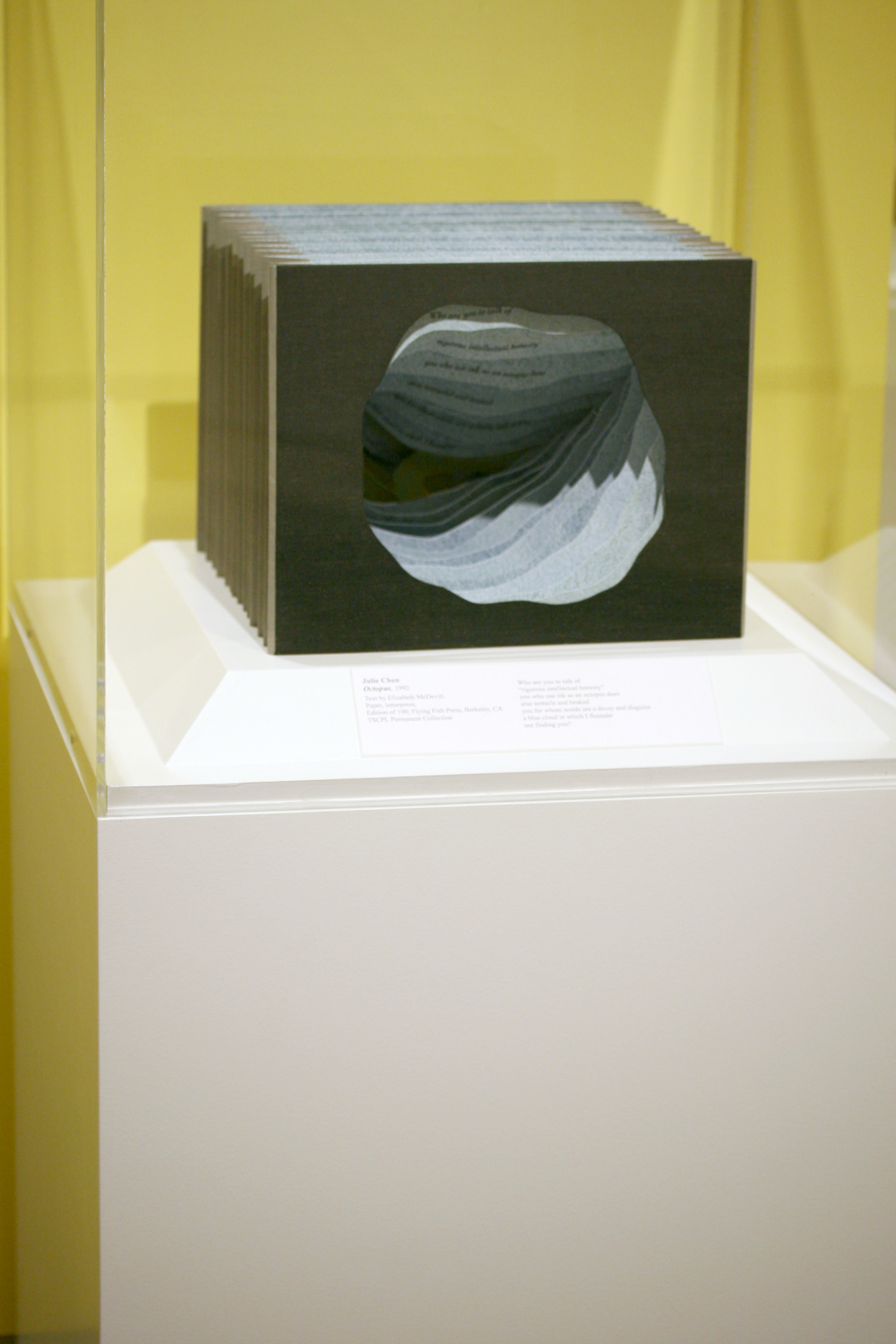
If we were looking for a “Banksy” version of Rachid Koraïchi, we need look no further than eL Seed.
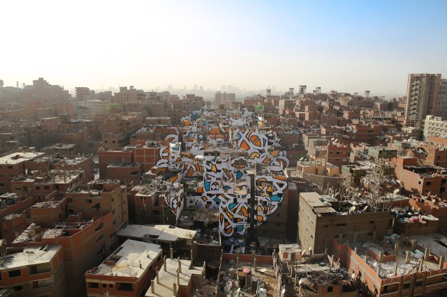
Perception, 2016 Manshiyat Nasr in Cairo, viewed from Moqattam Mountain
In my new project ‘Perception’ I am questioning the level of judgment and misconception society can unconsciously have upon a community based on their differences.
In the neighborhood of Manshiyat Nasr in Cairo, the Coptic community of Zaraeeb collects the trash of the city for decades and developed the most efficient and highly profitable recycling system on a global level. Still, the place is perceived as dirty, marginalized and segregated.
To bring light on this community, with my team and the help of the local community, I created an anamorphic piece that covers almost 50 buildings only visible from a certain point of the Moqattam Mountain. The piece of art uses the words of Saint Athanasius of Alexandria, a Coptic Bishop from the 3rd century …. el Seed
The words of Saint Athanasius referred to above are
‘إن أراد أحد أن يبصر نور الشمس، فإن عليه أن يمسح عينيه’
“Anyone who wants to see the sunlight clearly needs to wipe his eye first.”
As with Camus, Algerian sunlight is strong in eL Seed’s work. As it also is in Koraïchi’s Lettres d’ Argile (Letters of Clay) and other ceramic works and arguably in the copperplates for Les Sept Dormants. As with Koraïchi’s work, humanism, poetry and bridging cultures are strong in eL Seed’s work.
The pseudonymous artist has created more “straightforward” street art installations in Tunisia, New York, Rio de Janeiro and Paris, all marked by the curvilinear linking of word and image that so often characterizes inspired book art. This reverse ekphrasis that book art frequently plays upon literature is heightened by calligraphy’s tight binding of art and craft to text. Perception‘s anamorphic enhancement of this binding is brilliant.
The relationship between word and image is “antagonistic sympathy”, according to the English book artist Telfer Stokes (“The Why and How I Make Books“, JAB 3, Spring 1995). In the hands and eyes of Koraïchi and eL Seed, the relationship — if it is a struggle, an agon — becomes more that of sunlight on water, or wind through a wheat field.
In addition to the installations and his book Lost Walls chronicling his painting of 24 walls in 4 weeks during a journey through Tunisia, eL Seed has produced a colorful body of lithographs and sculpture.
In this sculptural work inspired by a poem from Nizar Qabbani, el Seed says his intention is to invite the viewer to walk through a “conversation between the poem, the language, the form and me”. This may remind you of the influence that northern Africa had on the Finnish architect Juhani Pallasmaa, and how it led to his meditative exhortation to architects in The Eyes of the Skin to pursue a visual experience that offers a tactile and haptic quality, that also appeals to the realms of hearing, smell and taste and yet does not neglect the conceptual and rational. That, too, characterizes inspired book art.
Likewise it is interesting how this lithograph and the “calligraffiti” appearing on those broken walls and buildings touch eloquently on another theme characteristic of much book art — how the passage of time touches us, how we try to touch the passage of time.
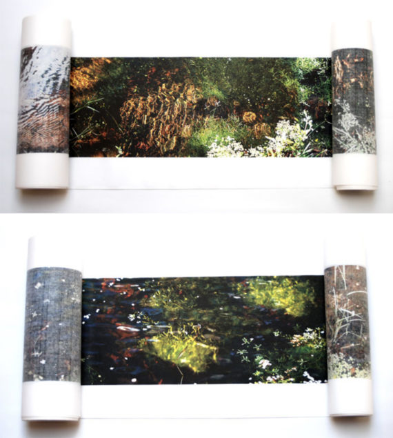
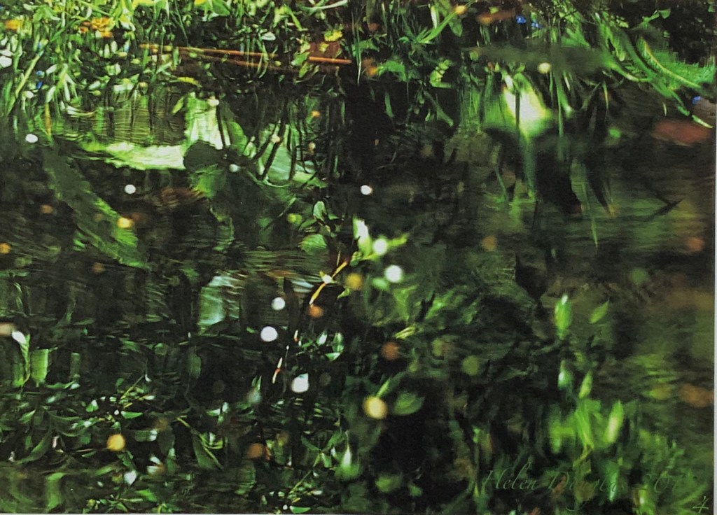
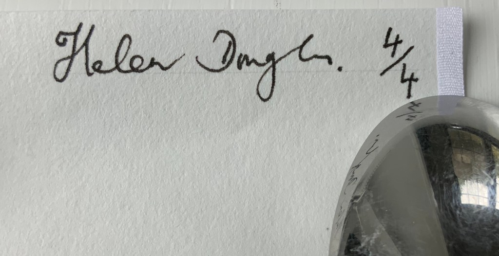
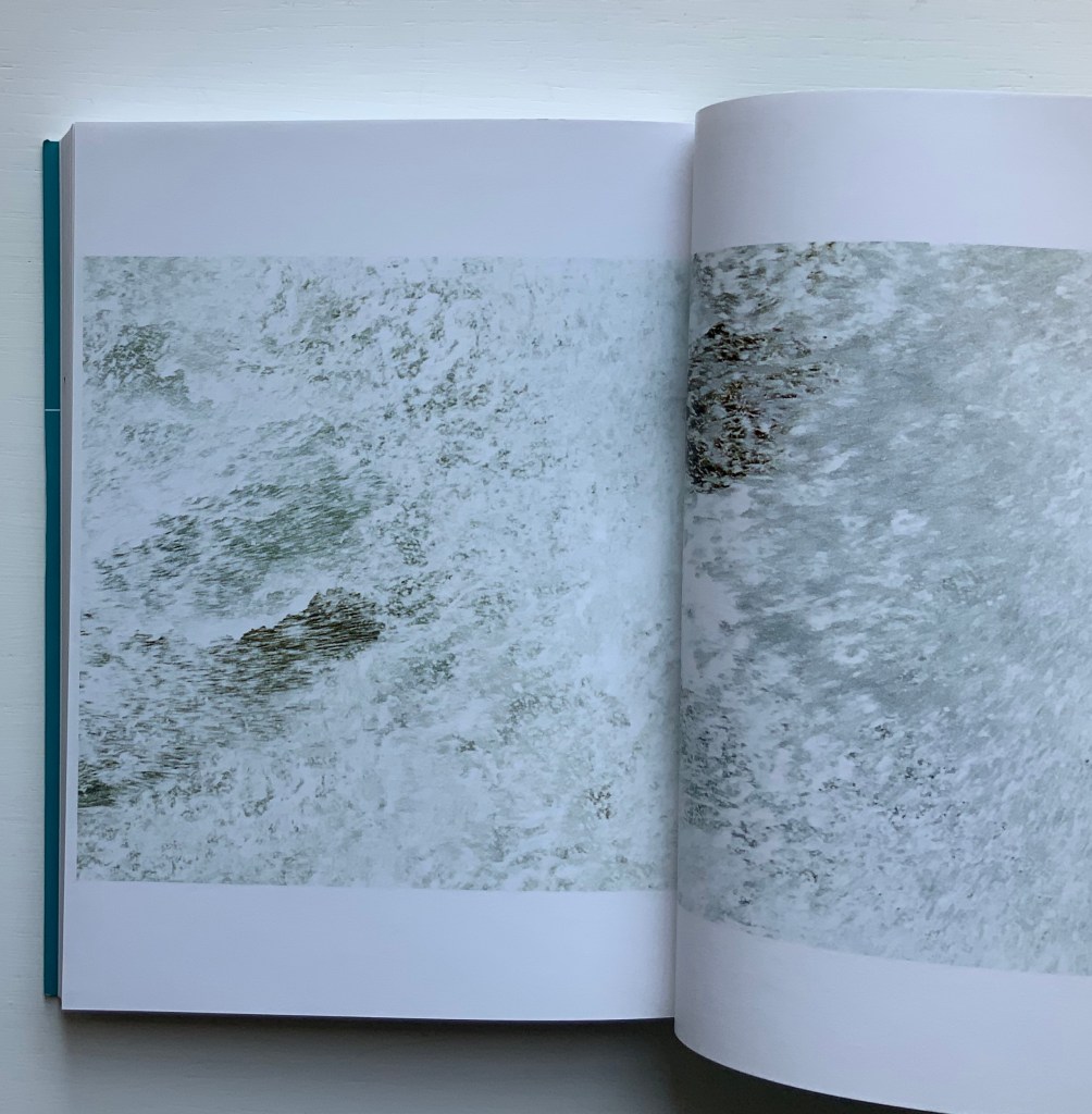
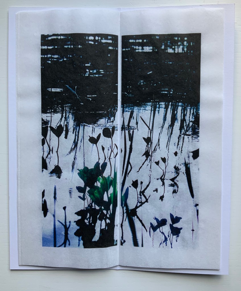
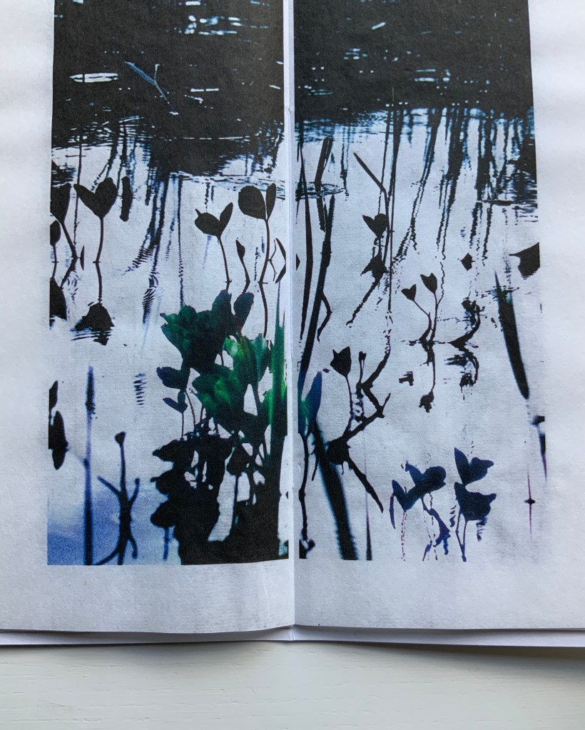
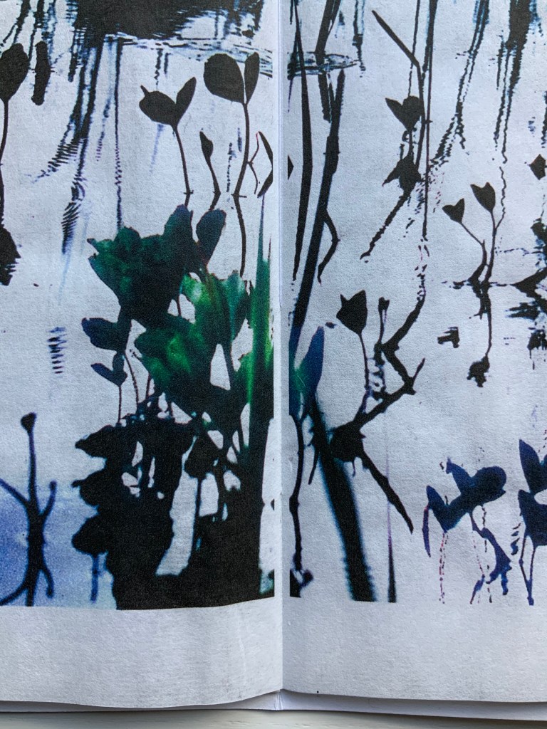
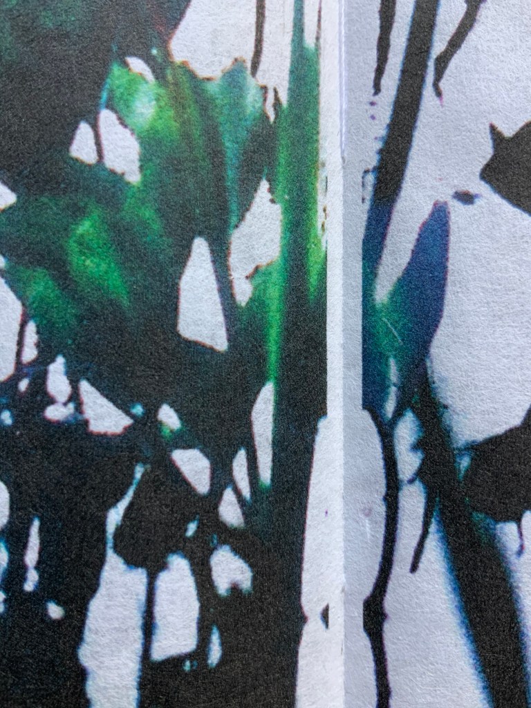
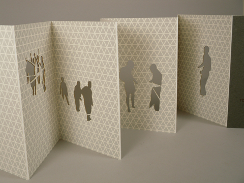
The Pond at Deuchar (2011) Helen Douglas Hand scroll, printed on Chinese Xuan paper, ultra chrome inks. Silk ribbon edged. 14 metres x 270 mm. Edition of 4. Photos: Weproductions.
Details from end of The Pond at Deuchar (2011) Edition of 4, of which this is #4. Acquired from the artist, 18 February 2019. Photos: Books On Books.
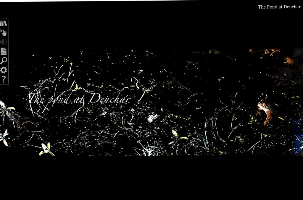
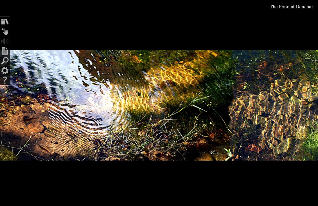
The Pond at Deuchar (2013) Helen Douglas Online version produced by Armadillo Systems. Screen captures: Books On Books.
Shortly after orchestrating the series of workshops Transforming Artist Books (2012), during which Helen Douglas created the digital version of The Pond at Deuchar (2011), art historian Beth Williamson marvelled at how the gestures of digital reading affect “our thinking as our (digital) hand navigates around the screen and thinks through the work”. That phrase “as our hand thinks” is magic in its aptness for all of Helen Douglas’s works. Helen Douglas is a book artist who makes our hands think. But what does that mean? Consider these three excerpts:
[t]he hand does not only grasp and catch, or push and pull. The hand reaches and extends, receives and welcomes — and not just things: the hand extends itself, and receives its own welcome in the hands of others. The hand holds. The hand carries … [e]very motion of the hand in every one of its works carries itself through the element of thinking, every bearing of the hand bears itself in that element. All the work of the hand is rooted in thinking.
Martin Heidegger, What Is Called Thinking? trans. J. Glenn Gray (New York: Harper Perennial, 19 68). P. 16.
… the digital hand is […] a version of what the artist’s hand, the craftsman’s hand, the poet or scholar’s hand, and the lover’s hand has always been: a means of marking, touching, selecting, interacting, molding, expressing, and refusing that remains essential to human thinking, even when that thought takes place increasingly in an immaterial environment ….
When talking about her art and the “breadth” or ”span” of the spreads and their “flow” — as she did at the London Book Fair in 2013 and the British Library in 2020 — Douglas gestures in ways that evoke those words of Heidegger, Miller and Diconson. When experiencing The Pond at Deuchar — whether in its scroll edition or its digital version — the reader/viewer makes similar gestures — spreading arms wide, sweeping with the hands; or tapping, pointing, pinching, spreading and swiping with the fingers.
In its scroll edition and its digital version, The Pond at Deuchar draws the reader/viewer into two different literacies but with a continuity between them that does not yet exist between reading a print book and reading its ebook version. Are hand and eye more allied when processing the visual whether on paper or screen than when processing words? Is The Pond at Deuchar a special case because unrolling a scroll and scrolling across a screen are more gesturally similar than turning pages in a codex format and tapping a screen?
Douglas’s own description of the next work Between the Two (1997) brings this question about visual and textual literacies front and center.
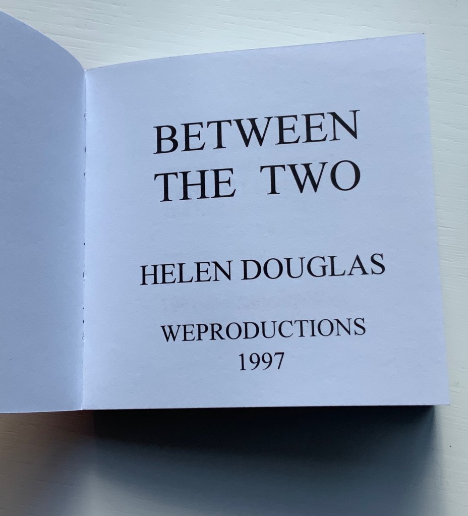
Between the Two (1997)
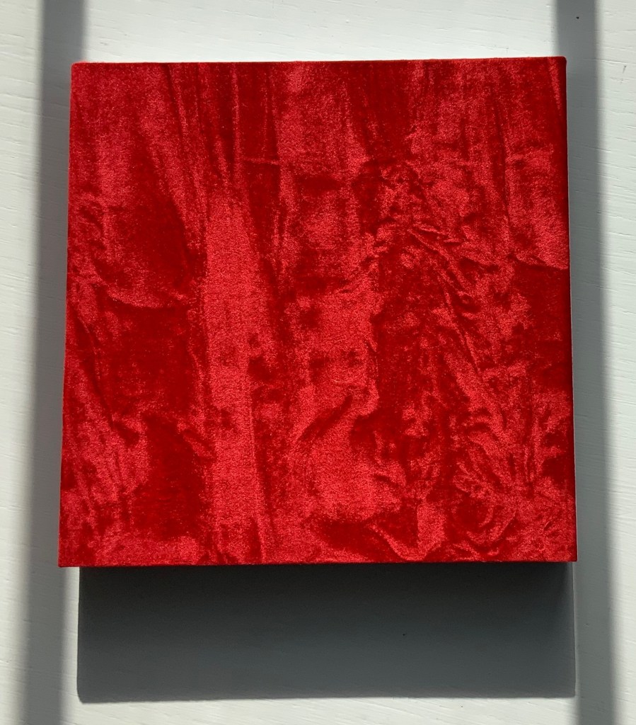
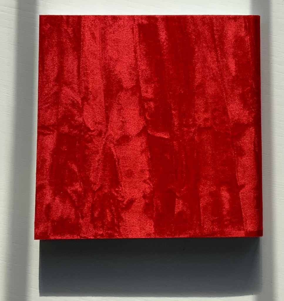
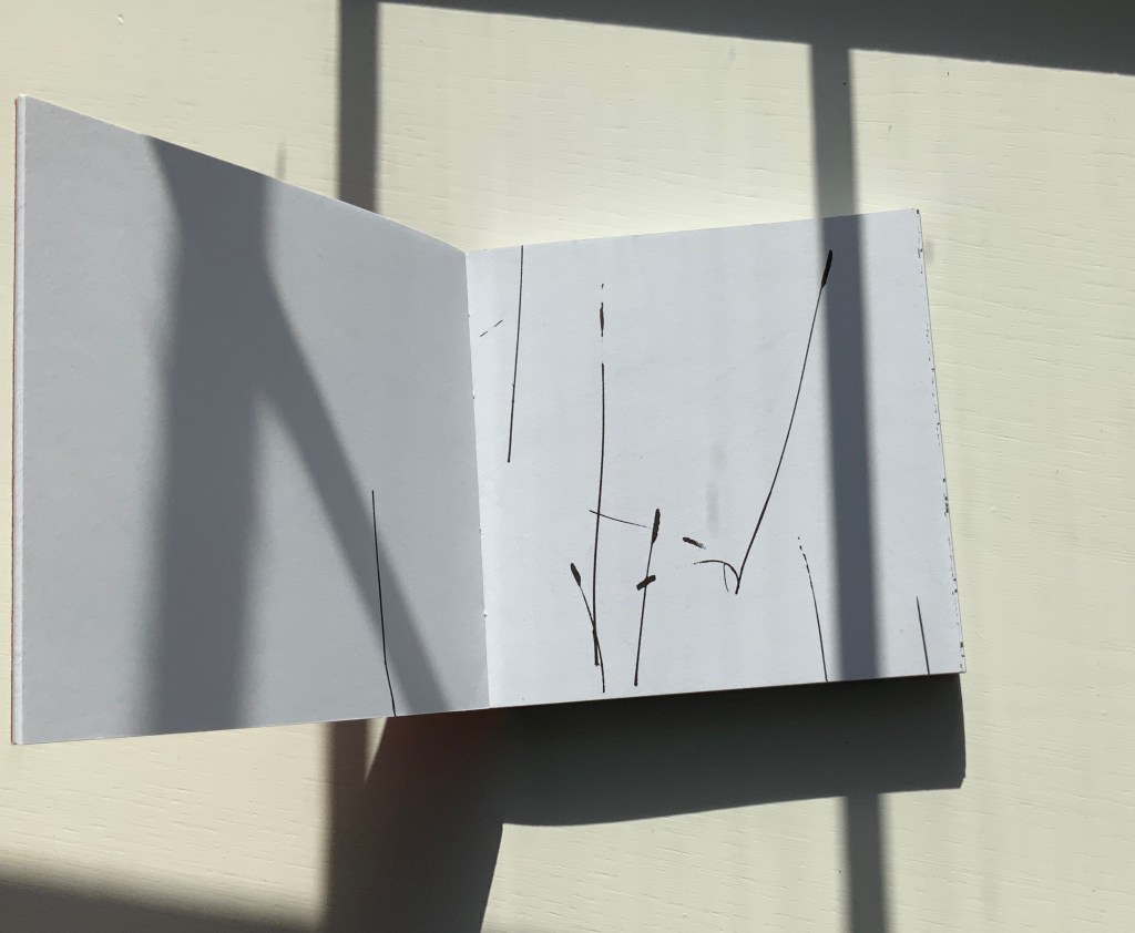
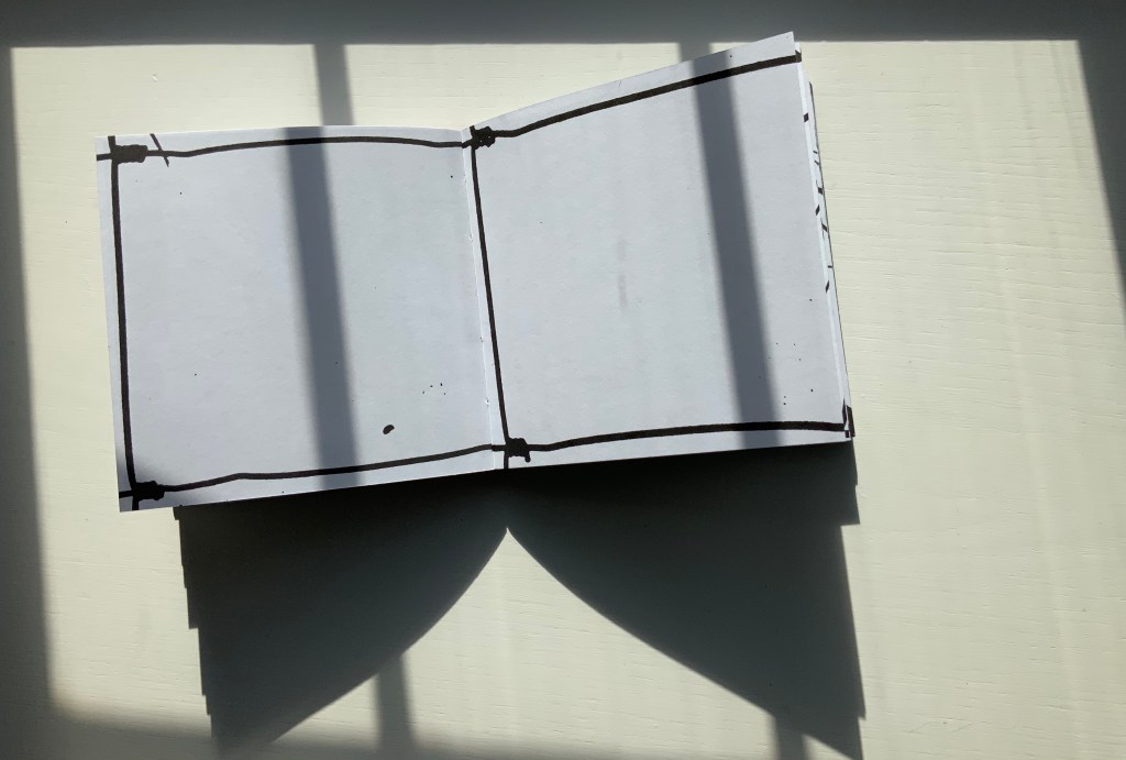
This bookwork is constructed to unravel across the open spread and around the edge of the page to express one continuous visual narrative. It begins with sparse photographic renderings of grasses as black line on white, progresses into a softer tonal sequence embodying flight and finally, in the latter part of the book, develops an arabesque dance of tendrical peas, as light on dark, leading to a flowering of the book. Black and white throughout, the book is bound in scarlet crushed velvet.
Between the Two (1997) Helen Douglas Offset, 130 x 130 mm, 168pp. Acquired from the artist, 29 November 2018.
Reading “around the edge of the page” in Between the Two is a “hard read”. Most turns from recto to verso effect a sense of continuity with stalks, fence, tendrils, etc., wrapping over the edge into the verso page; others do not. The codex format inherently presents this challenge. The edge of the page is a scant plane, although the earlier work Water on the Border (1994) exploits it well (see below). There are other visual strategies that work. Think of Michael Snow’s Cover to Cover (1975) and consider the following work from the same year.
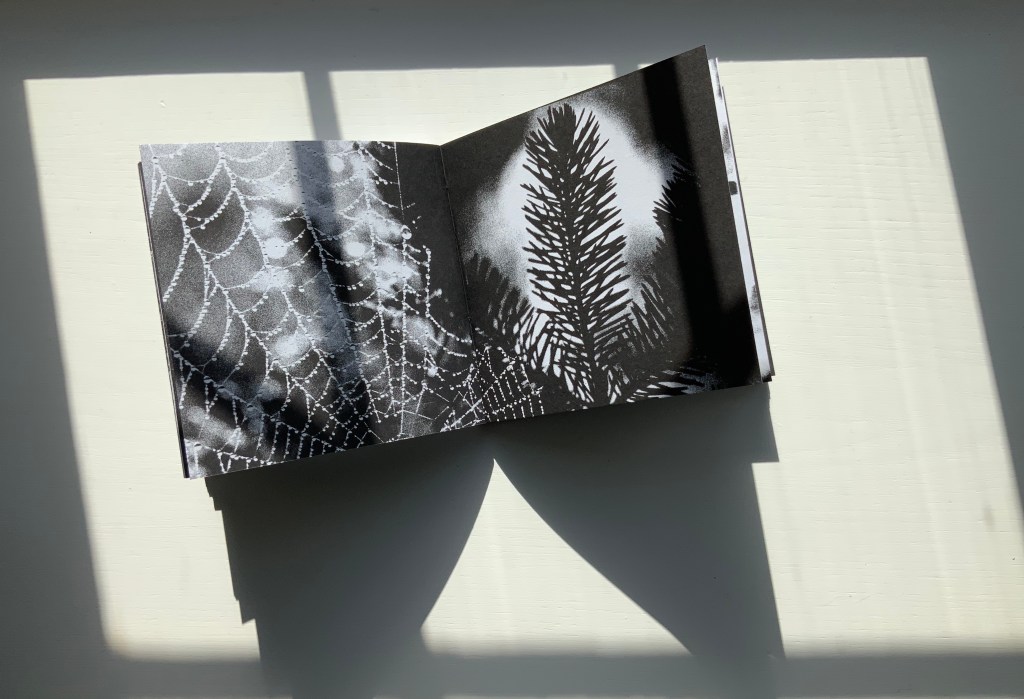
Chinese Whispers (1975)
Douglas has created numerous visual narratives in the codex format, but none of them have been reproduced in a digital format. If Chinese Whispers — one of her first books in partnership with Telfer Stokes — were delivered in a “tap-to-turn-the-page” digital format, would a sense of continuity between the different literacies occur or diminish? The tightness of the binding of Chinese Whispers makes full appreciation of the spreads and flow difficult, but on the other hand, the meeting in the gutter of the two photos on each double-page spread is essential. Say that two copies of the book were unbound, the “freed” double-page spreads would have to be displayed somehow in a way that still captures that meeting in the gutter. On a gallery wall? As Clive Phillpot has pointed out, to do so with Douglas’s work is to destroy what is going on in moving across and turning from one double-page spread to the next. A digital version would need to be fiendishly quirky in its own way to find a parallel semantic and artistic solution to its codex counterpart’s effects.
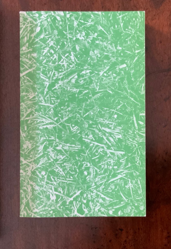
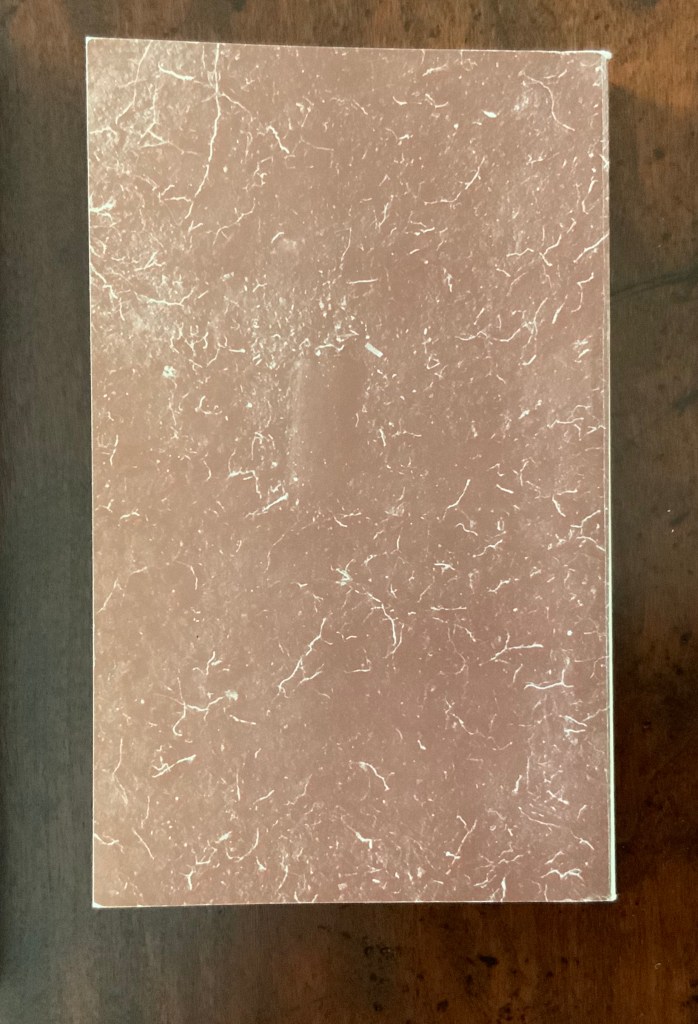
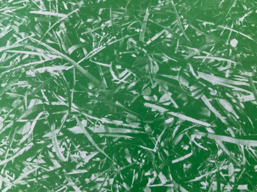
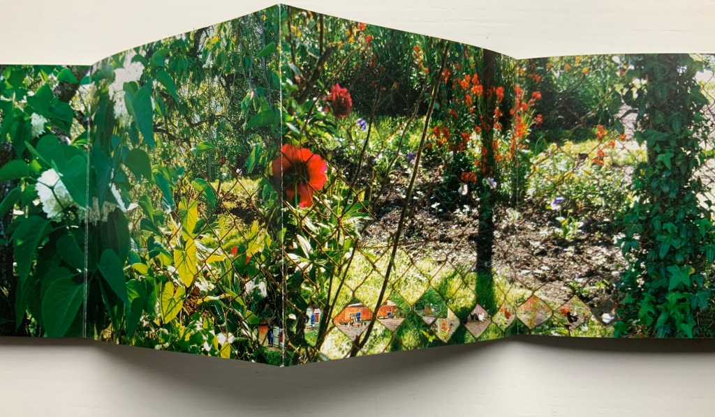
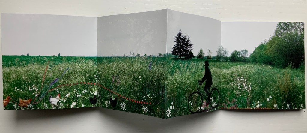
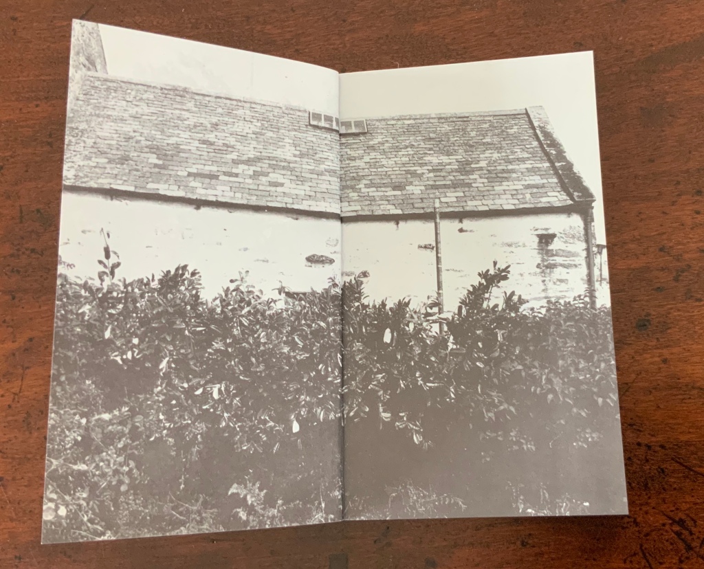
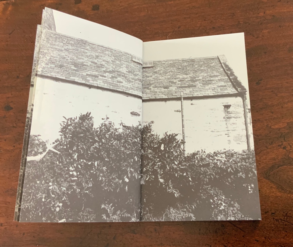
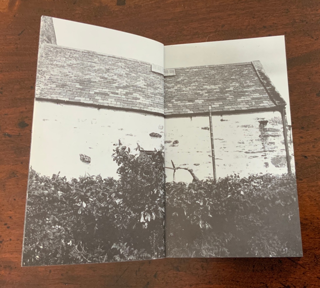
The front cover of Chinese Whispers (1975) shows lush green grass in a photo that bleeds to all four edges. Flip the book over and find another edge-to-edge photo showing the dirt and roots beneath the front cover’s patch of grass.
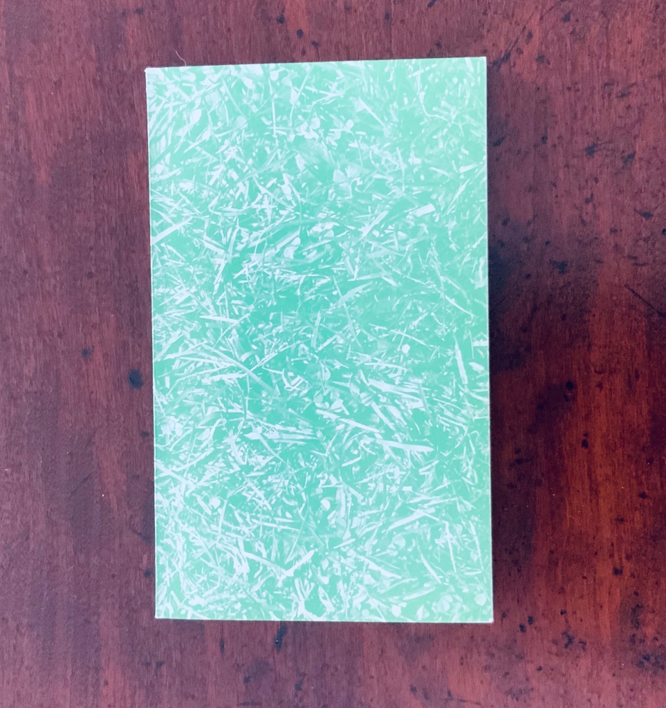
Chinese Whispers(1975) Helen Douglas and Telfer Stokes Offset, 110 x 180 mm, 176pp. Acquired from the artist, 29 November 2018. Photos: Books On Books.
Doing this is a bit like jumping to the end of a detective story; it is literally jumping to the end of the game of visual Chinese Whispers to which the book invites us. Decades after the book’s appearance, Brandon S. Graham revealed some of the behind-the-scenes process, driving home the filmic character of the book. In correspondence with Books On Books, Douglas confirms the “absolutely continuous narrative” of Chinese Whispers, emphasising how the artists would “come up with a concept and starting point together and then … would go backwards and forwards“ (20 March 2020).
Like the give and take of a word game, this book was scripted, planned page by page and section by section. Stokes would suggest a starting point and a concept, Douglas would interpret the idea slightly differently, add to it and relay it back to Stokes. Stokes would run with the evolved idea and it would start again. In this way the book evolved as an honest representation of the collaborative process that yielded it. The photography began once they had the whole object planned. … For the cover image, Douglas and Stokes used a spade to cut a rectangle of sod to the exact dimensions of the finished book and took a photo.
Brandon S. Graham, “Chinese Whispers“, Fiction Doldrums, 26 July 2011. Accessed 9 December 2018.
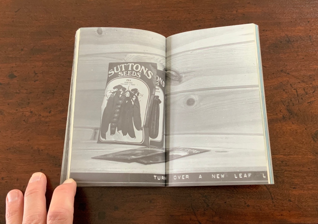
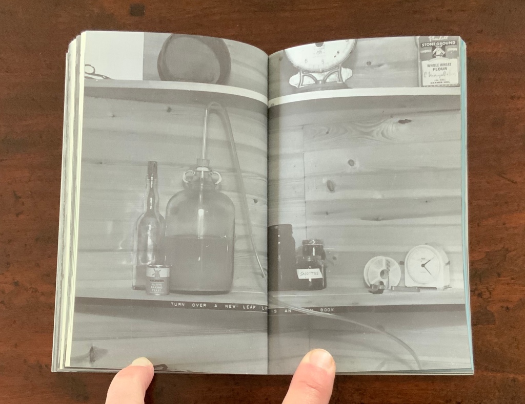
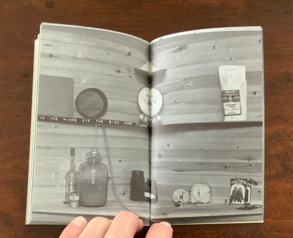
The visual narrative takes us from trimming the overgrowth from the outside of a derelict cottage, entering it and starting the process of building a corner cupboard, populating its shelves with a breadbox, a coffee pot and many other objects that lead from one element of the narrative to the next. Packets of seeds lead to a cabbage and pea pod. A bunch of berries leads to jam in a jar. Toward the end, a pair of scissors and sheet of paper lead to a cut-out butterfly whose wings gradually close along with the two “wings” of the corner cupboard, leaving us in the dark with a double-spread of black pages. Below are close-ups of the front and back covers. Notice the impression in the dirt-side photo? It looks like a rectangle the trim size of the book; whether it is or not, Chinese Whispers is a bookwork of continuous page-turning inside (and outside) jokes.
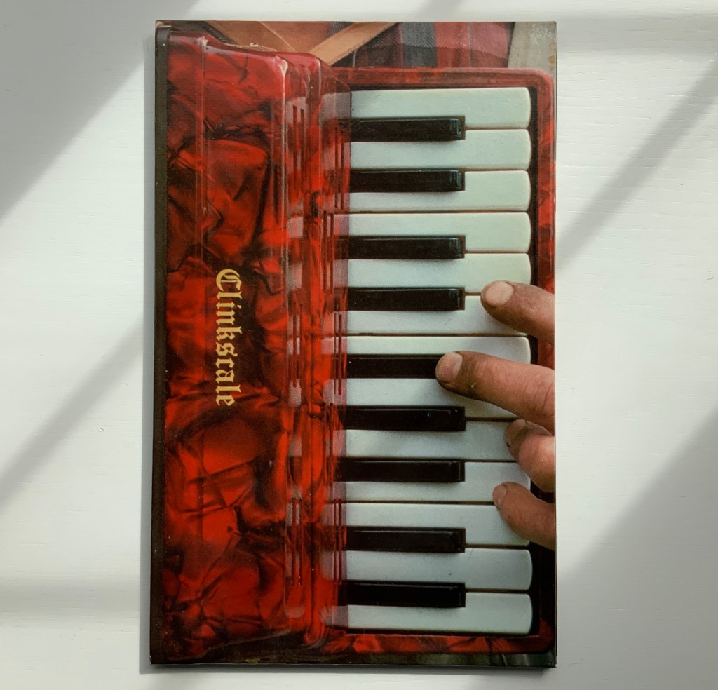
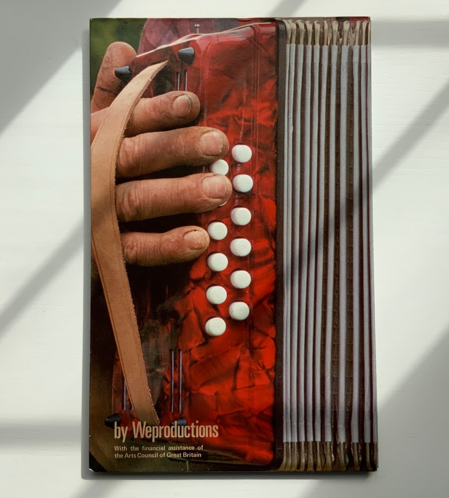
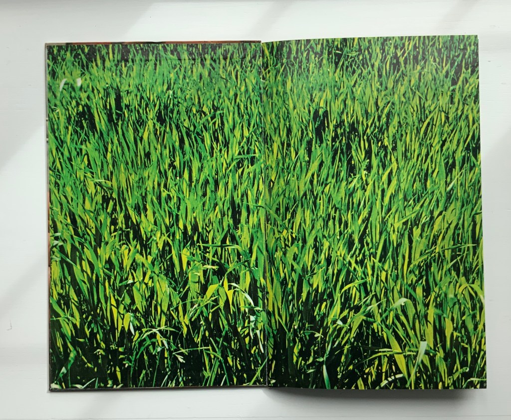
Clinkscale (1977)
“Clinkscale” is the name of a company that specialised in the musical instrument photographed by Douglas for the bookwork of the same name. Perhaps every book art collection has a one-note joke. Clinkscale is almost that for the Books On Book Collection. Brandon S. Graham defended the work against the characterisation years ago:
It would be easy to dismiss this as a clever one liner: accordion with an accordion fold format. But on closer examination there is more going on. Over top of the accordion body a band of atmospheric and biographical information can be observed: the blue sky, the green of the field, the bright spring sunlight, the work shirt and threadbare work coat. When one looks closely at Telfer’s hands and nails, particularly the thumb on the back cover, one can see a criss-cross of the shallow cuts that have been stained with dirt. All of these details speak of a place and a time and a situation. They are a record of standing in a field in rural Scotland on a crisp spring day, a record of the work that Telfer’s hands are performing on the Mill. These details ground the work and tie the work to a person at a moment in time. It is a record, a document.
Taken in this context there is another layer of meaning evident in Clinkscale: the idea of breath, air, anticipation, rejuvenation and renewal. As a viewer holds the book with the bellows closed the viewer sees Telfer’s fingers poised. This builds anticipation of a motion and perhaps a sound. As the book is opened the accordion inhales, the bellows expand and the rush of air stirs the spring grass. The hands are those of a workman. The workman is standing in a field with an accordion, taking a break; taking a breather. The sea of green spring grass is symbolic of rejuvenation and renewal.
Brandon S. Graham, “Telfer Stokes”, FictionDoldrums, 8 April 2011. Accessed.17 March 2020.
Clinkscale (1977) Helen Douglas and Telfer Stokes Accordion binding, two hardboards joined by a single leaf; full colour photograph commercially printed. H278 x W174 mm (closed), W1708 mm (open). Acquired from Douglas, 29 November 2018.
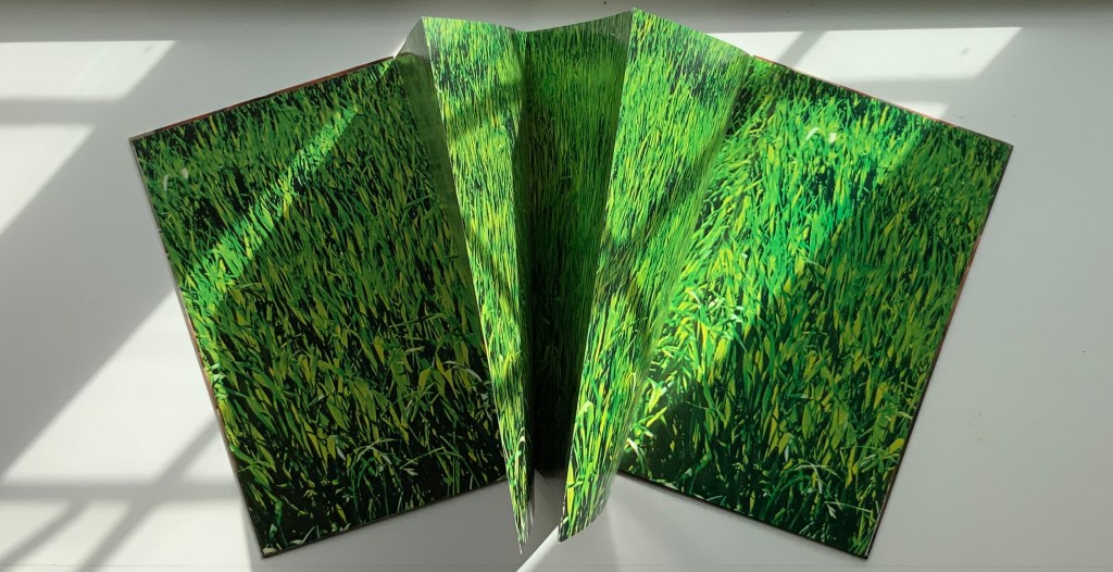
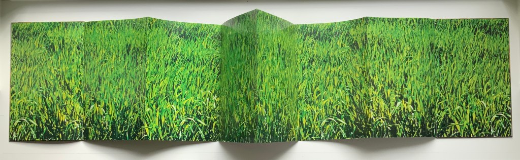
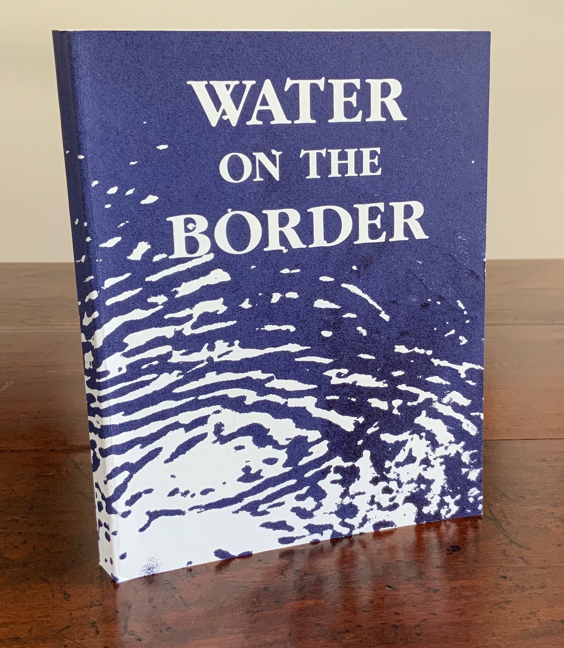
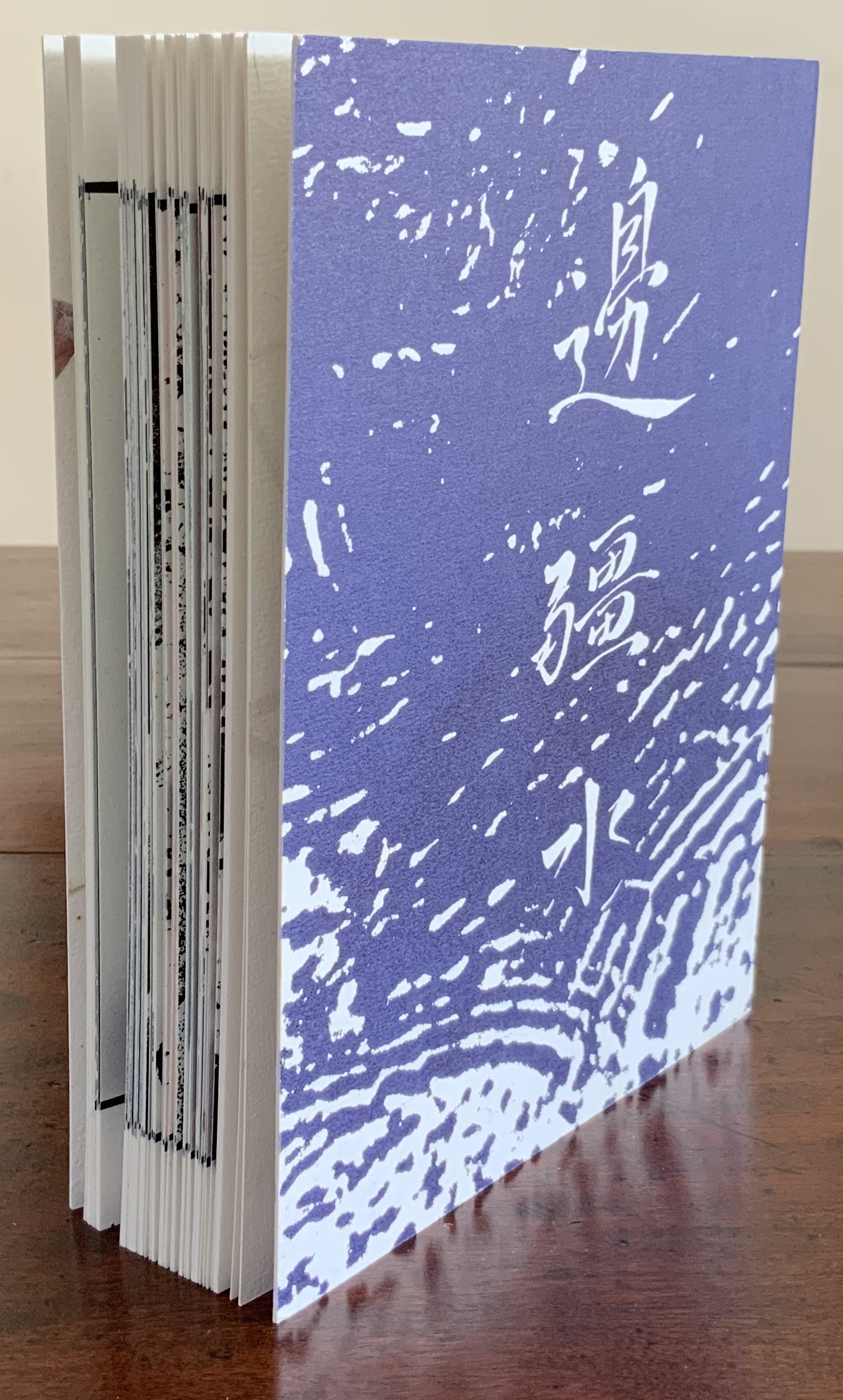
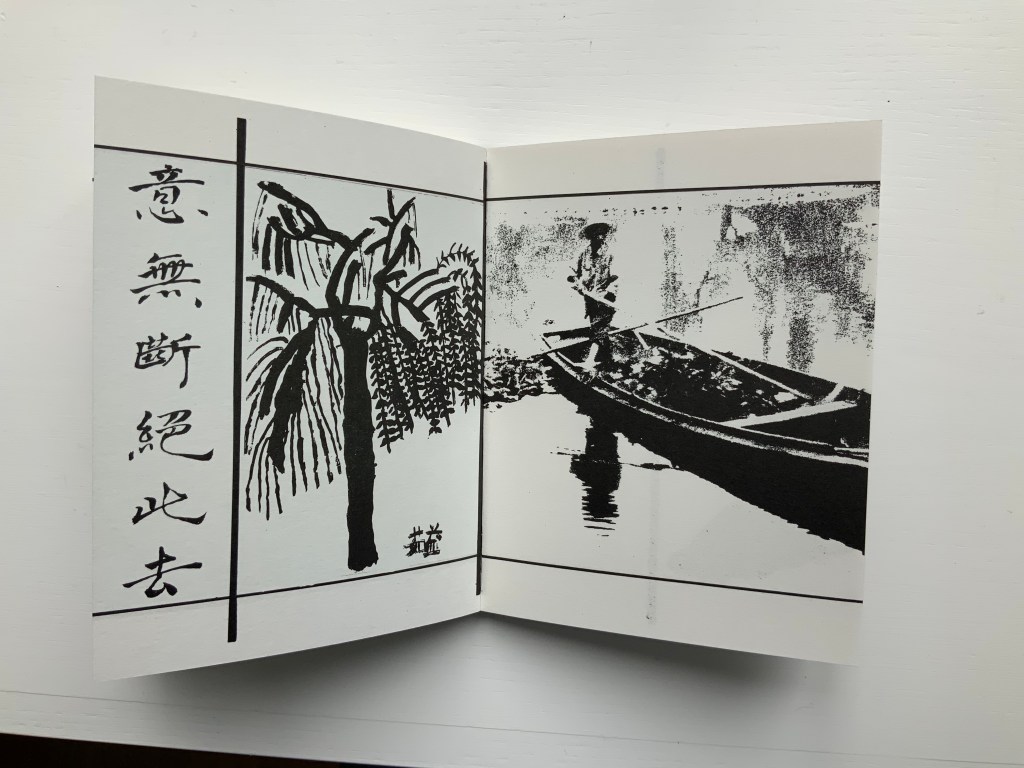
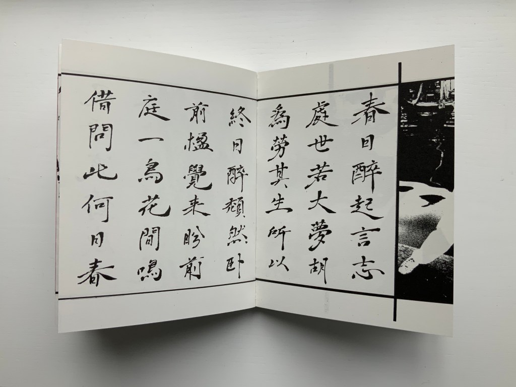
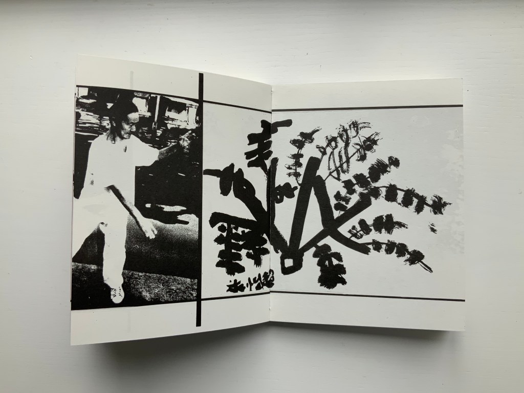
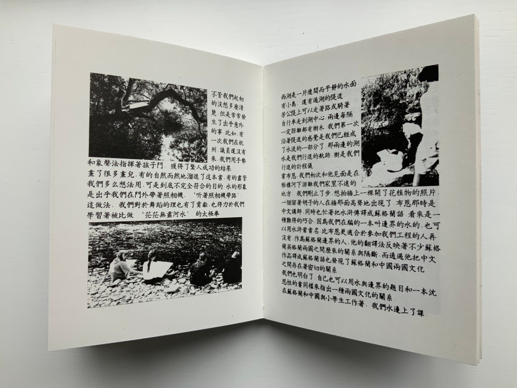
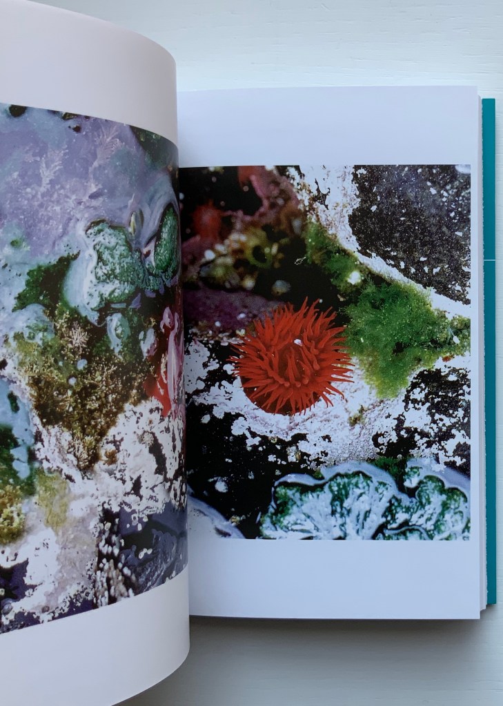
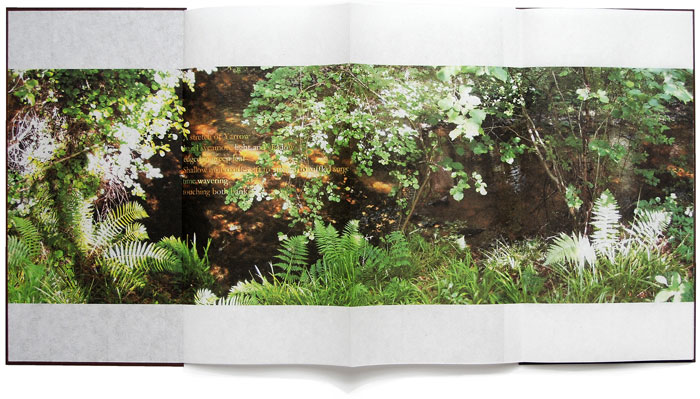
Water on the Border (1994)
Water on the Border (1994) Helen Douglas Offset, 150 x 190 mm, 124pp. Acquired from the artist, 29 November 2018. Photos: Books On Books.
The two pairs of double-page spreads below demonstrate the artist’s success in taking the reader/viewer “around the edge of the page”. In the first pair, after the boat‘s prow disappears at the edge of the recto page and reappears from the verso’s, the artist introduces a vertical border at the tip of the prow. On the other side of the border is a photographic tracing of a building’s reflection in water. It is not necessarily the same stretch of water on either side of the border, but it feels that it is.
In the second pair, the seven columns of characters of a Chinese poem precede the picture of the lower part of a right leg that wraps around the edge of the recto page into the image of a man performing T‘ai Chi. As above, the verso page of that double-page spread is divided by a vertical border, which is followed by a child’s ink drawing that falls across the verso and recto pages. As with the continuity of water above, there is a continuity of the man’s pose on one side of the border and the lines of the drawing on the other side.
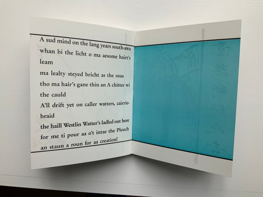
Water on the Border engages sides of multiple borders. Six Chinese poems rendered in calligraphy balance against Brian Holton’s transcriptions into Scots (first image, top row, below). Children from Scotland and China provided the drawings (second and third images, top row, and fourth image, below). The reflective images photographically traced come from the water surfaces of Yarrow Water Scotland and West Lake, Hangzhou.
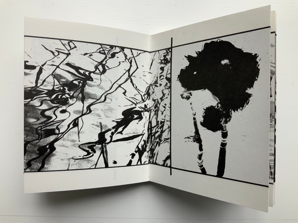
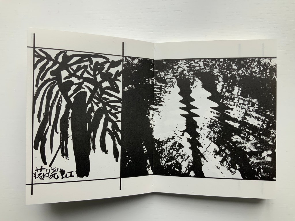
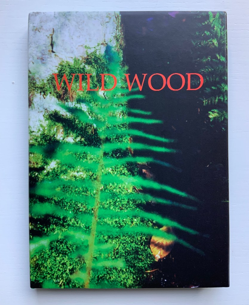
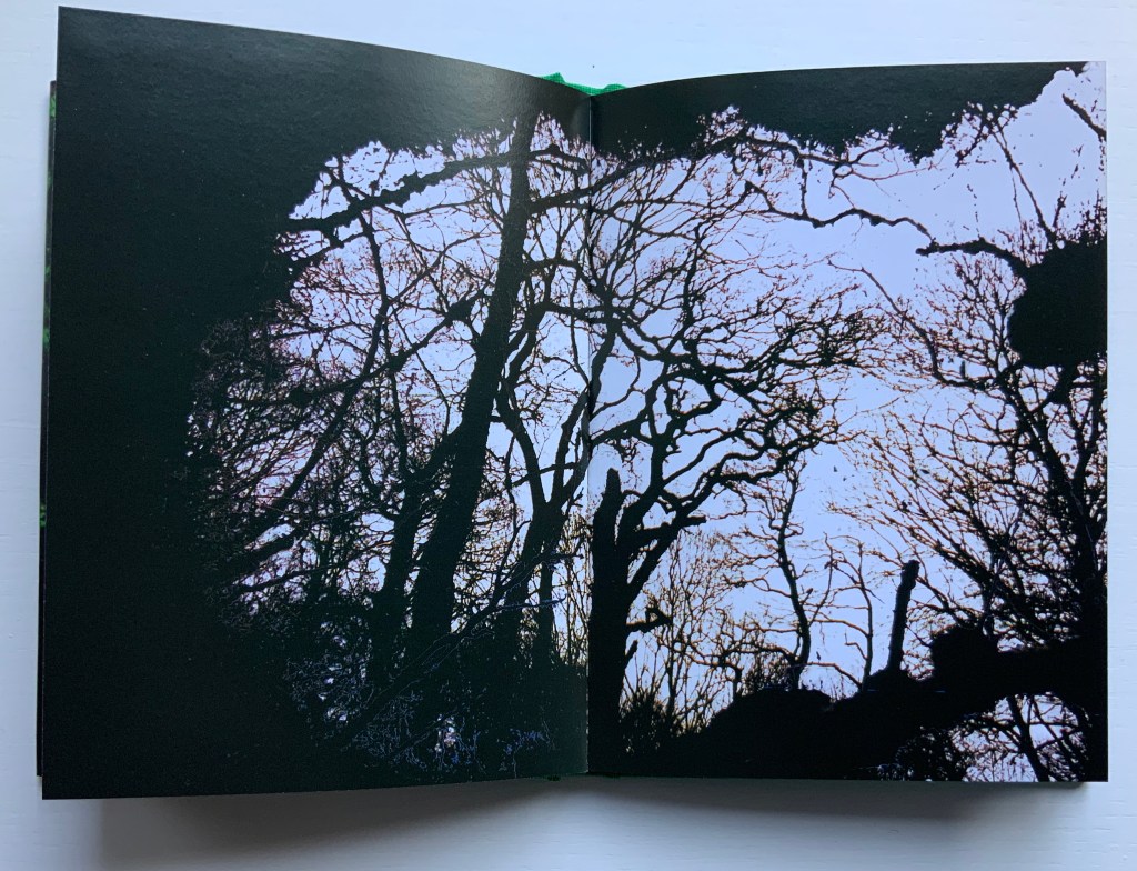
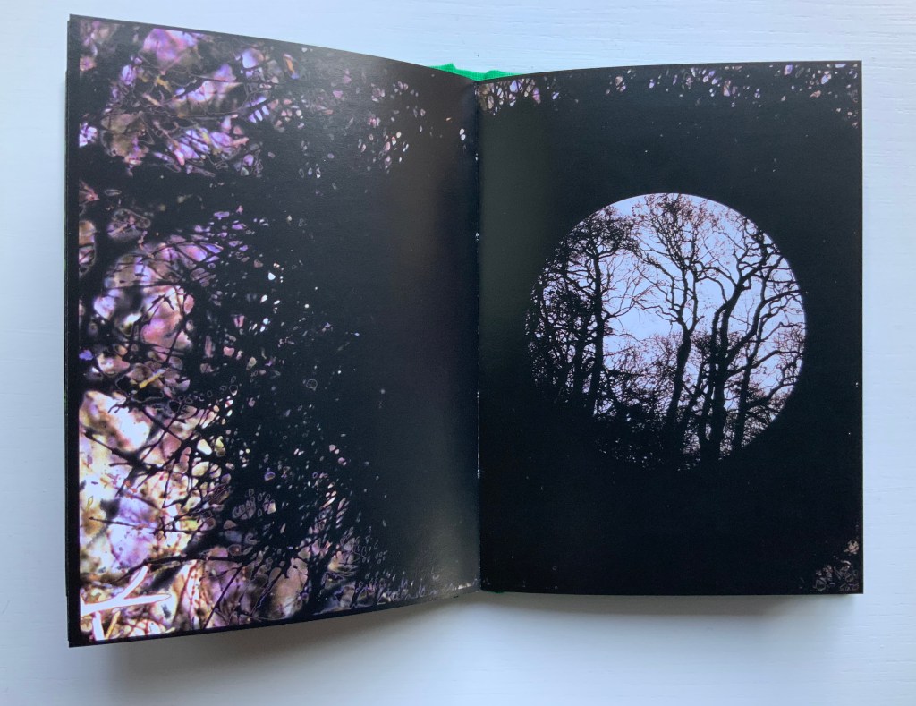
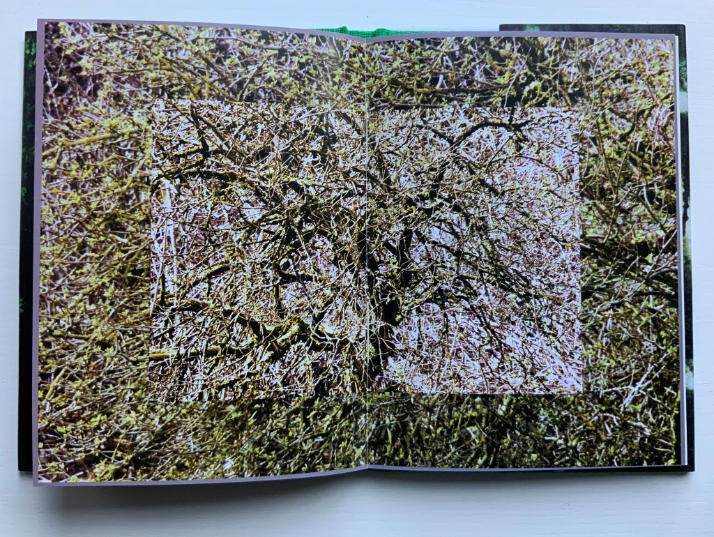
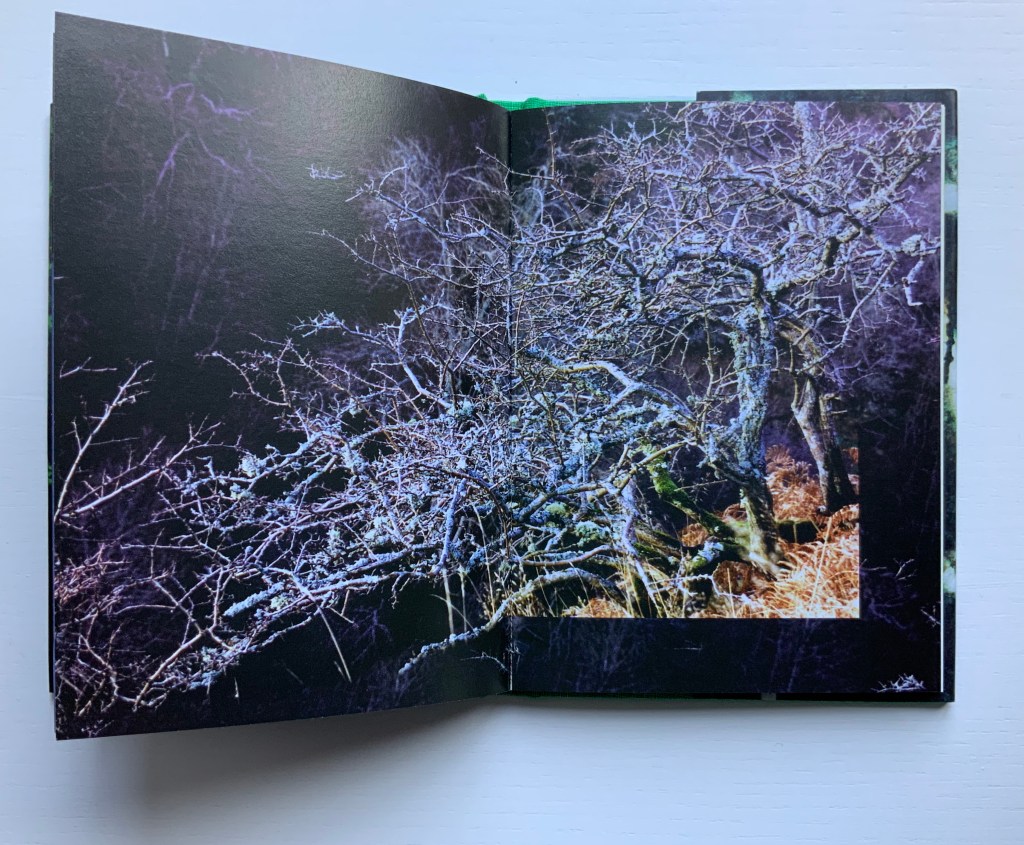
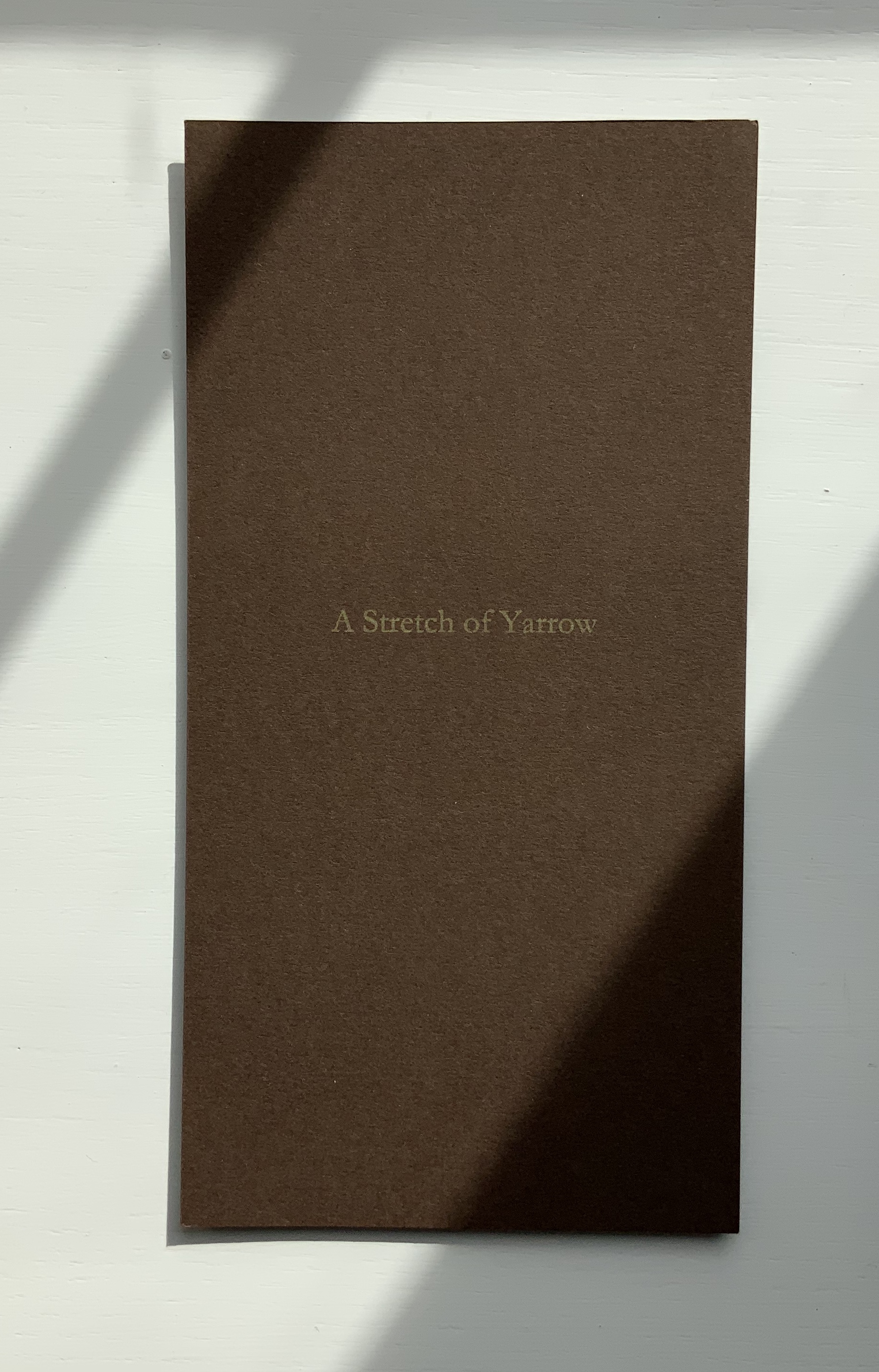
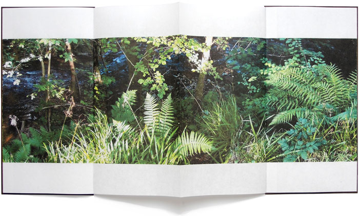
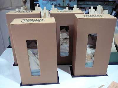
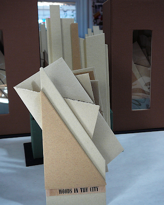
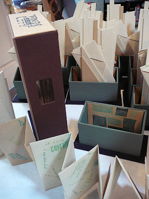
Wild Wood: A Border Ballad (1999)
Wild Wood: A Border Ballad(1999) Helen Douglas Offset, 116 x 160 mm, 144pp. Acquired from the artist, 29 November 2018. Photos: Books On Books.
Wild Wood has been conceived as a Border Ballad and takes as its inspiration the Carrifran Wildwood project and the ancient woods at Deuchar and Tinnis Stiel in Yarrow. In 2000 Wild Wood won The Nexus Press Atlanta Book Prize. Opening the book and turning the pages is analogous to entering and exploring the Wild Wood where different moods and feelings move the viewer through the visual narrative.
A fair enough and fair description of this bookwork, but what astounds is the manipulation of borders and the framing of photos within photos. Below, on the left, a thin white border around a recto page; on the right, a thin black border encircling a double-page spread (notice also the precision of alignment from verso to recto.
Borders yield to full-page bleeds (first spread below), and full-page bleeds are manipulated to create frames of images (second spread below).
Strange roundel vignettes of the forest appear within close-ups of a tree.
Photos of the wood create a border for other photos of the wood, and some burst wildly beyond those borders.
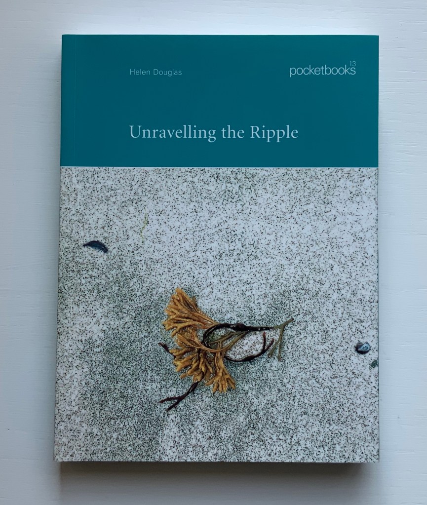
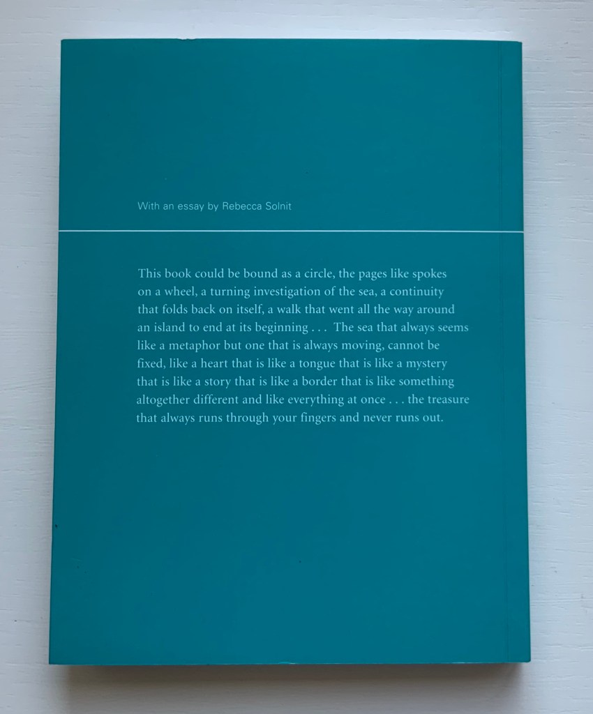
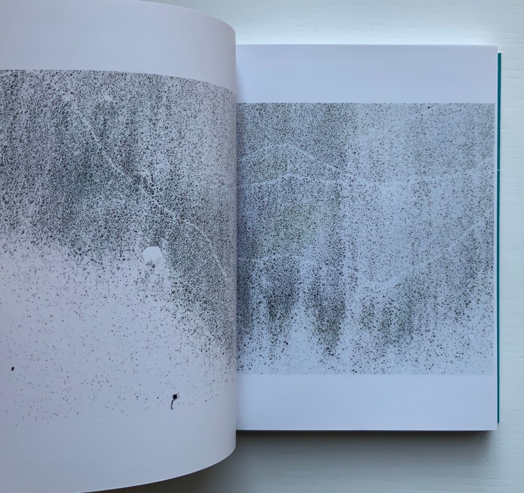
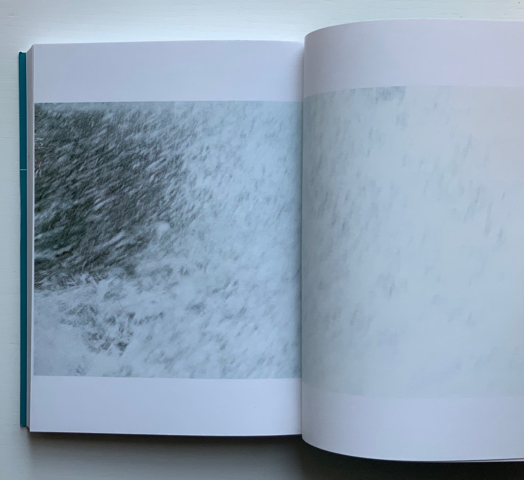
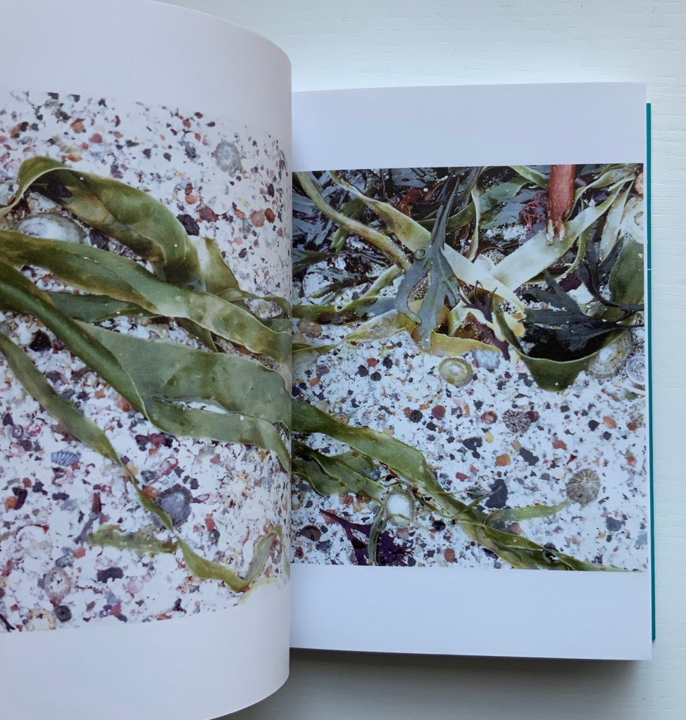
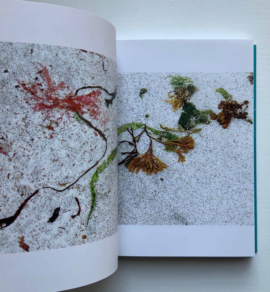
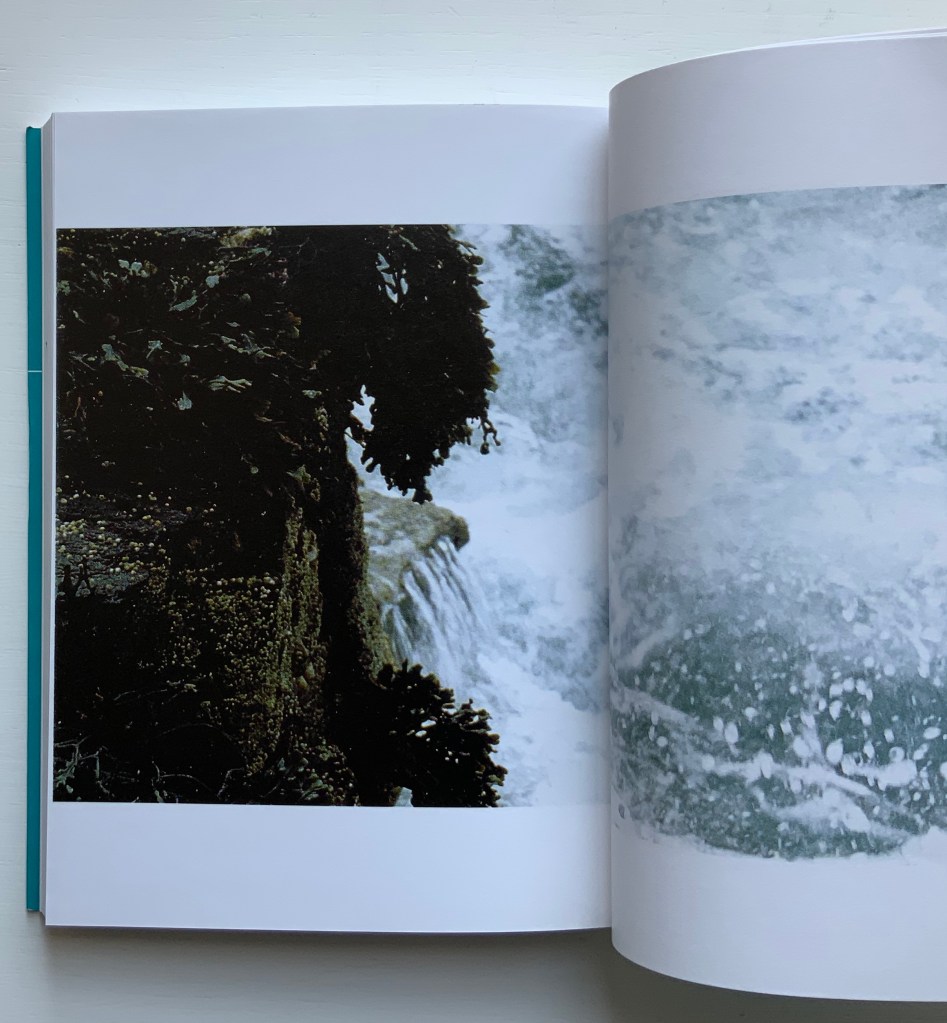
Unravelling the Ripple (2001)
Unravelling the Ripple (2001) Helen Douglas, Rebecca Solnit Offset, 170 x 127 mm, 76pp. Perfect bound. Acquired from retail, 15 November 2019.
The opening and close of Unravelling the Ripple. Photos: Books On Books.
Like three of the following works — Illiers Combray, A Venetian Brocade and In Mexico — Unravelling the Ripple takes the reader/viewer on a journey away from the Scottish Borders to one along the coastline of a Hebridean island. Among the book’s many striking features is the precision of alignment across the double-page spreads. Slowly opening, then closing, then opening each spread is as much a pleasure as the sensation of peering through clear water at the sea wrack, urchins and shells. Moving the view from tidal pool to crashing waves and moving from greys to full colour then back to greys, the bookwork delivers on the back cover’s assertions. The assertion that “the book could be bound in a circle”, however, begs for an answer to the question “what if it were bound in a circle?” A variety of more sculptural solutions are possible: one of Hedi Kyle’s “blizzard book” variations or the Chinese dragon-scale binding. Without the codex structure, though, that pleasure of the double-page spreads would be lost. So the work must depend on the reader/viewer’s memory and perception to recognise the beginning in the end.
While Solnit’s essay is lyrically in keeping with the body of the bookwork, it stands apart. Where the livre d’artiste most often begins with the text and follows with the art, Unravelling the Ripple clearly starts with the art.
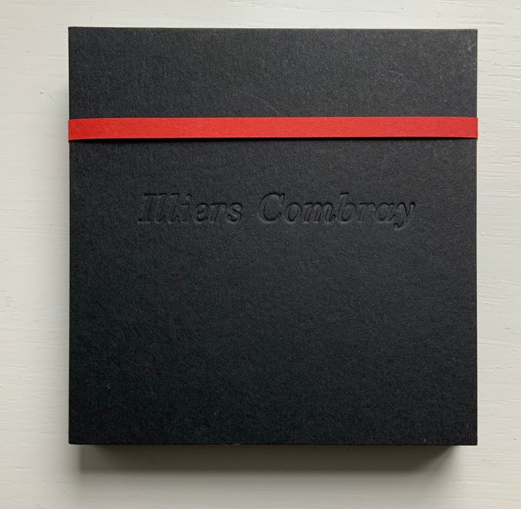
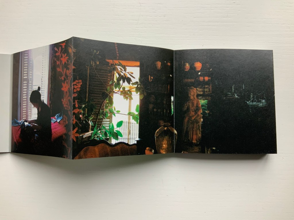
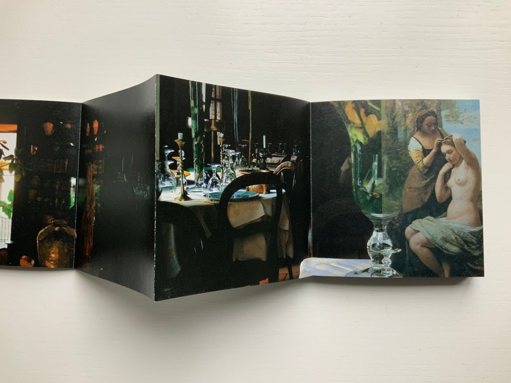
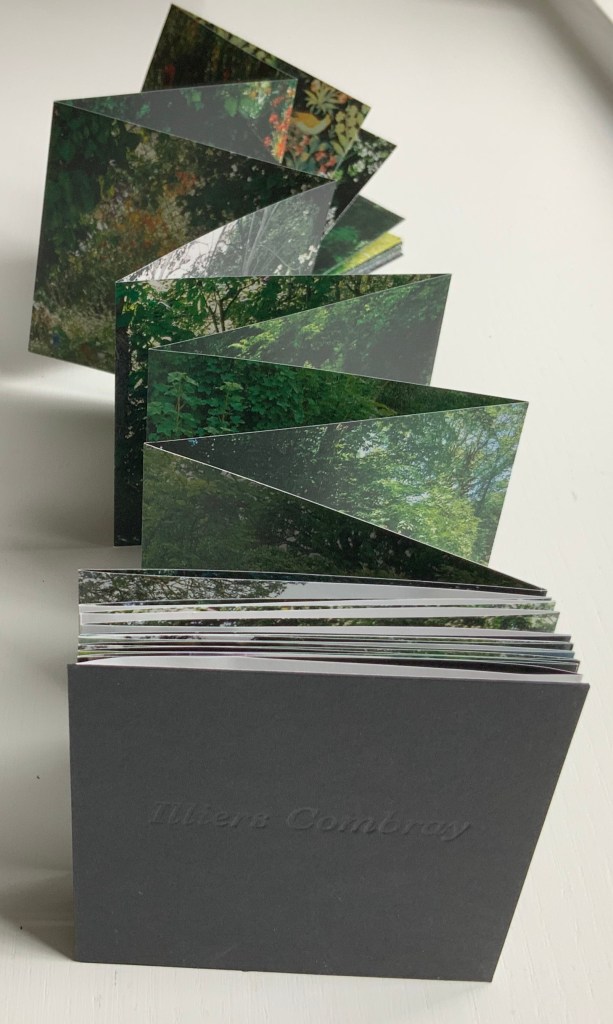
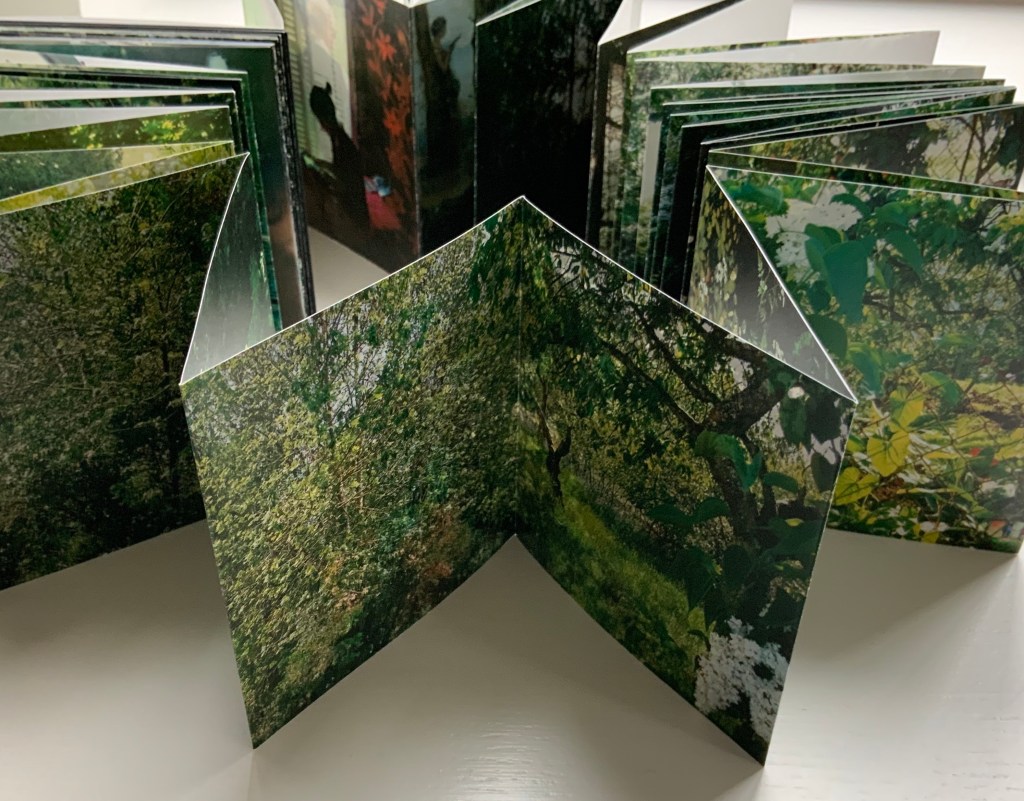
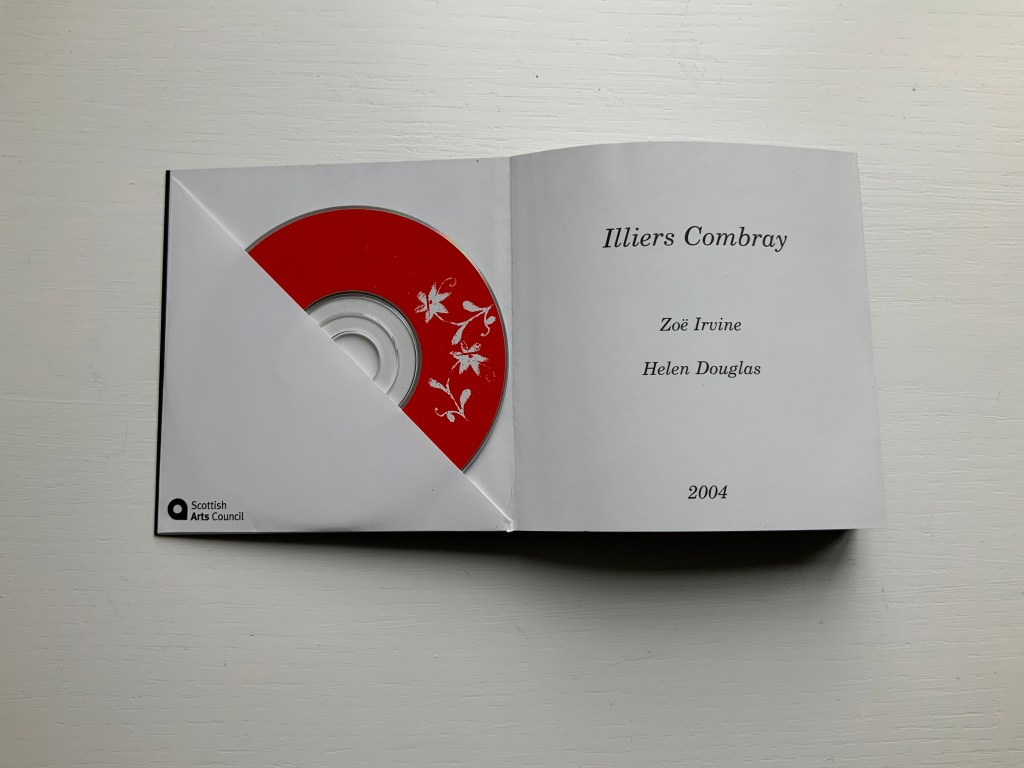
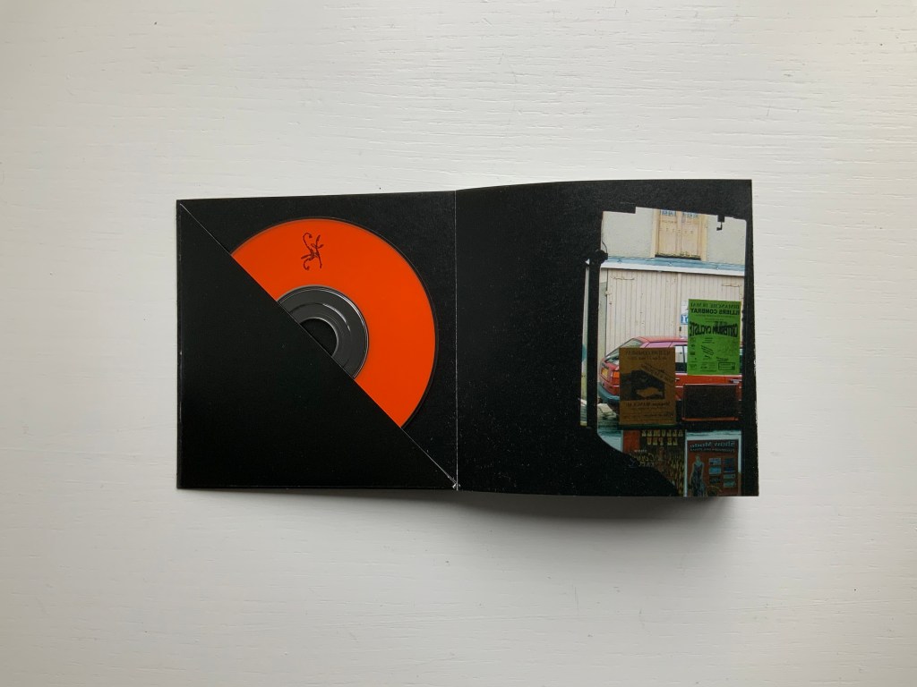
Illiers Combray (2004)
Illiers Combray (2004) Helen Douglas and Zoë Irvine Offset, four colour, 92 x 92 mm, 120 pages; two mini audio CDs, (18 mins each) placed in end pockets on board covering the two-sided accordion book; embossed title, red fastening band. Acquired from the artist, 29 November 2018. Photos: Books On Books Collection.
The journey to this small French town immortalised by Proust‘s In Search of Lost Time intensifies a recurrent feature or element of Helen Douglas’s art: the surreal weaving of images (drawn or photographed, present or past) into the photographed townscape and its environs — where the warp of the townscape/environs meets a weft of images taken from paintings, still-life arrangement of objects, poppy-coloured stitches, and words or ornaments that run like strings from panel to panel.
Sound artist Zoë Irvine and visual artist Helen Douglas collaborate to create a richly textured, multi layered soundscape composition (2 CDs: Irvine) and ornately interwoven visual narrative (2 sided concertina book: Douglas), exploring a sense of memory and place. Inspired in the month of May by a week long visit to Illiers Combray, the small town immortalized by Marcel Proust in his epic novel In Search of Lost Time, Irvine and Douglas weave together their own distinct mythologies and reveries; their subjective responses elliptically united by their shared sense of place. This book won the Birgit Skiöld Memorial Trust Award LAB 04 and the Seoul International Book Arts Award 2005.
In their obsolescence and presence in the front and back covers, the two mini-CDs bracket a gap that the artists’ collaborative effort could perhaps only close in performance or an installation. Irvine’s soundscape is available online, which, as long as the link lasts, overcomes the obsolescence of the mini-CDs but not necessarily the gap. Perhaps the technology of augmented reality could close the gap if Douglas integrated NFC (near field communication) tags in a new edition of Illiers Combray.
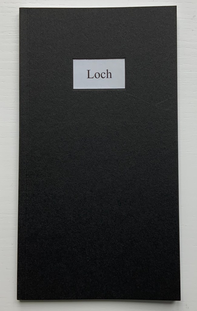
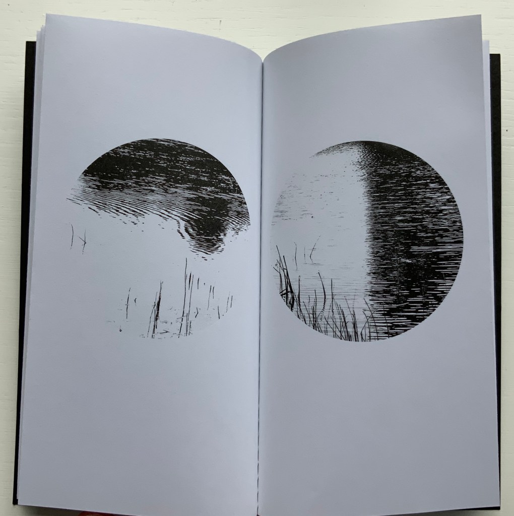
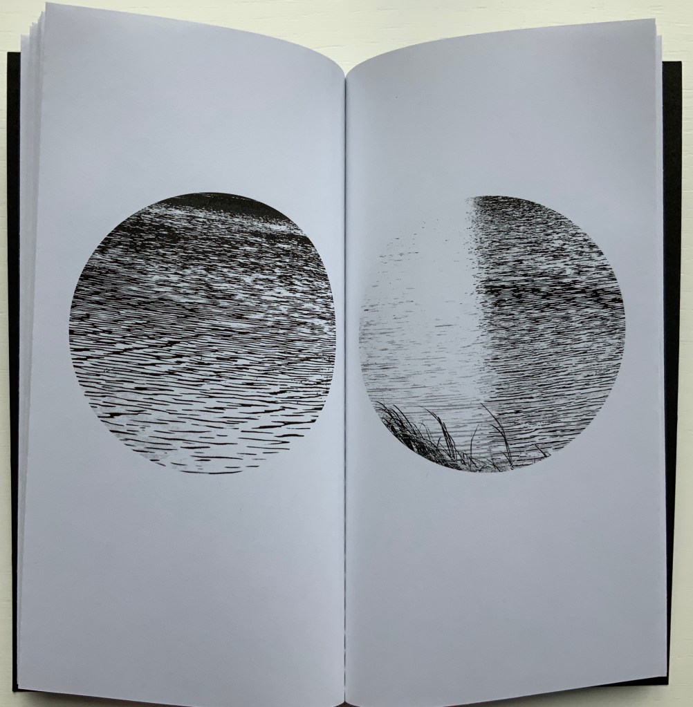
Loch (2005)
Loch (2005) Helen Douglas Offset b&w, french folds, 195 x 105mm, 28 pages; black cover with inset title. Acquired from the artist, 29 November 2018.
Loch consists of twenty images facing each other across eleven uncut leaves. The roundel vignettes capture a sense of wind and light moving across the loch’s surface. These roundels standing in their white space naturally differ from those in Wild Wood. They are more similar to those in a work unfortunately not in the Books On Books Collection: Winter: Celestial Mountain (2015).
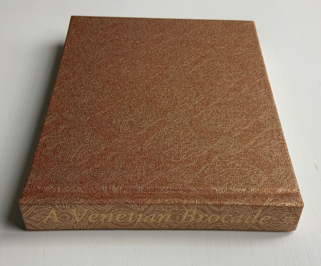
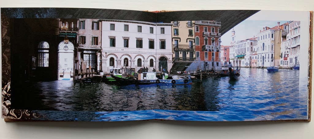
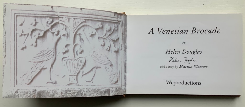
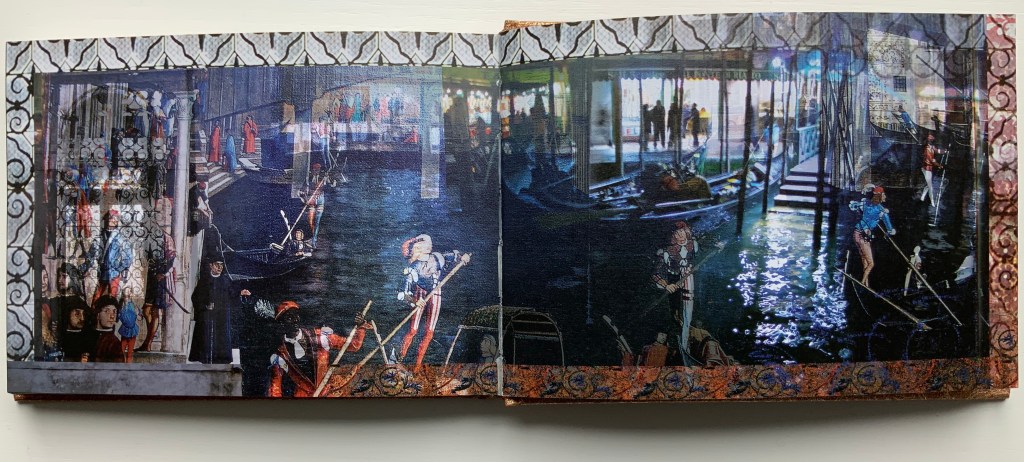
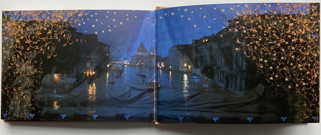
A Venetian Brocade (2010)
A Venetian Brocade (2010) Helen Douglas, Marina Warner Case bound in Ratchfords Inspiration with foil blocking. Offset, four-colour, on Hello Extra Matt 130gsm. 128×180 mm, 180 pages. Acquired from the artist, 6 September 2014.
The journey here crosses space (the cityscape of Venice) and time (present and historic figures). The warp-and-weft technique from Illiers Combray blends with the bordering technique from Wild Wood. But what Douglas does with the double-sided accordion format of Illiers Combray and the codex format of A Venetian Brocade attests to her ambidextrous mastery of both.
From Tommaso Mocenigo’s tomb – its great curtain drawn back – the city of Venice unfolds in the hands of Douglas’ rich visual narrative, delighting in textural contrast and intricate layerings. As oneiric zone that Venice embodies, stone, brick, water, inside and out, near, far, night, day, east, west, past in present are juxtaposed and woven as one continuous brocade. Within each landscape-format spread an inner page is floated and embellished at its edge. Borders of brick dissolve as sky, images shift, merge and overlay, water laps and floods, whilst reflective glimmerings morph into mosaic and golden threads. As masterful threading within this Venetian Brocade – at its fore, Marina Warner contributes a dexterous story of unique, wondrous wide-eyed looking from East to West.
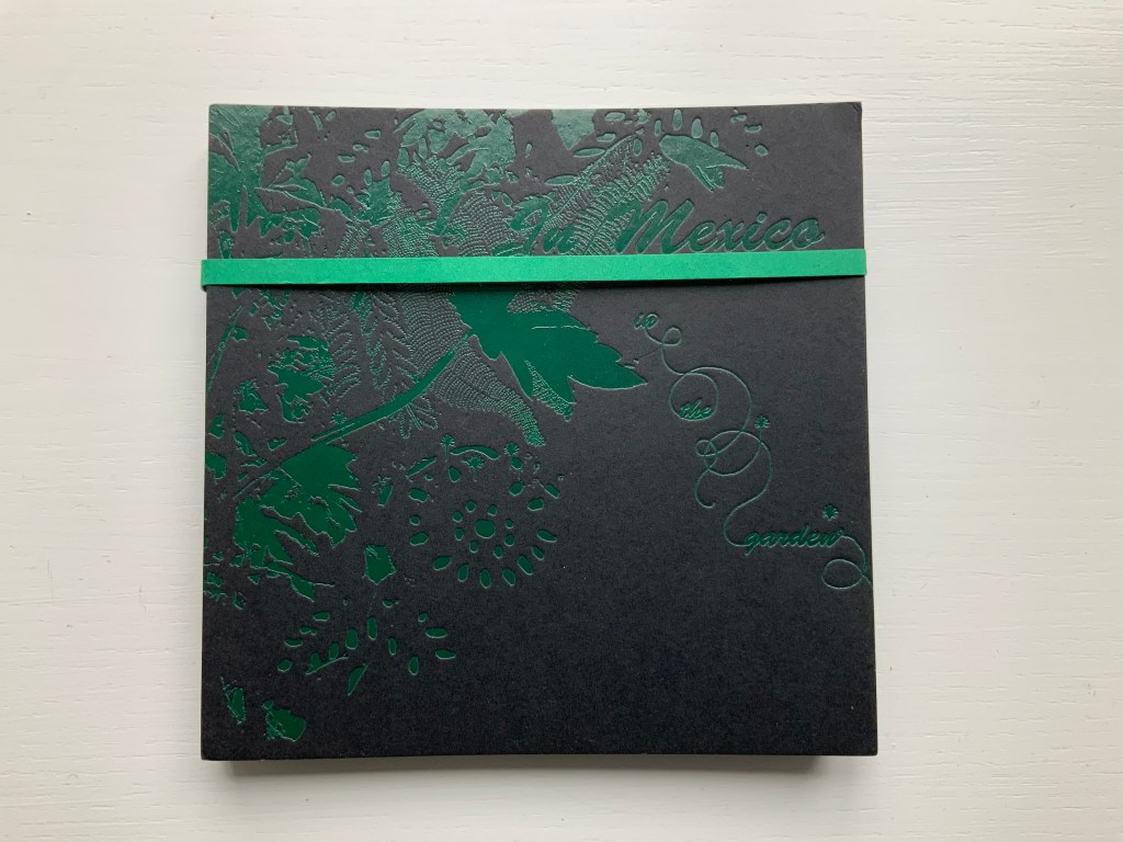
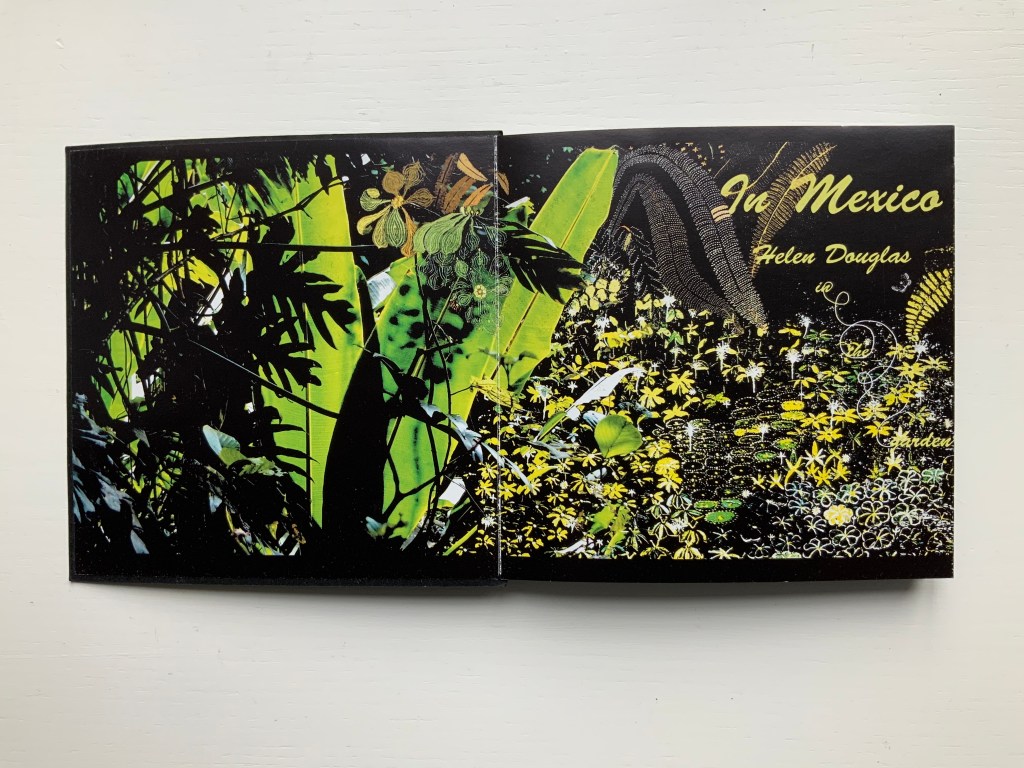
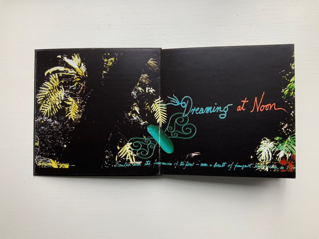
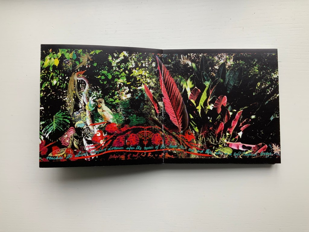
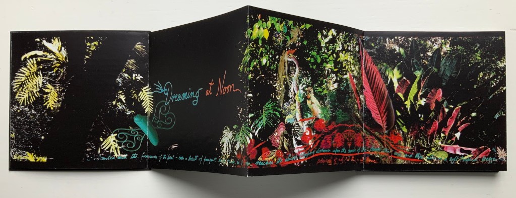
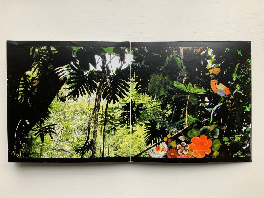
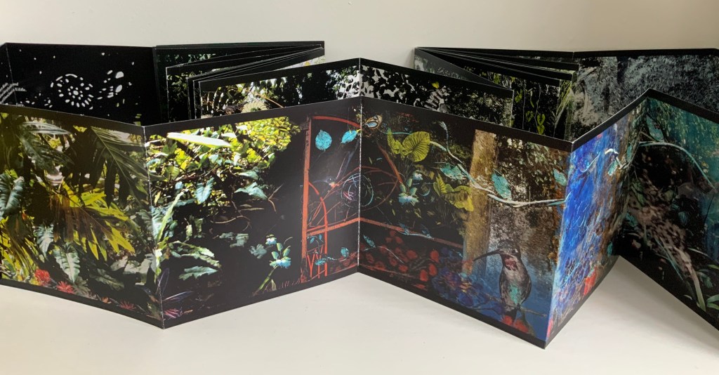
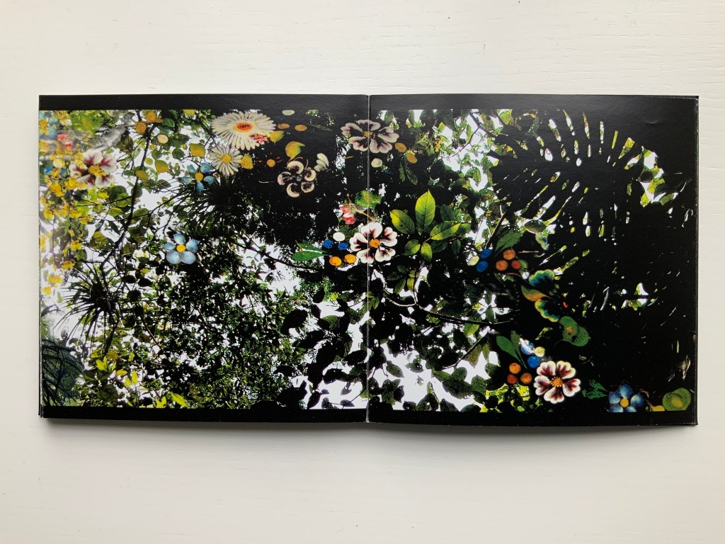
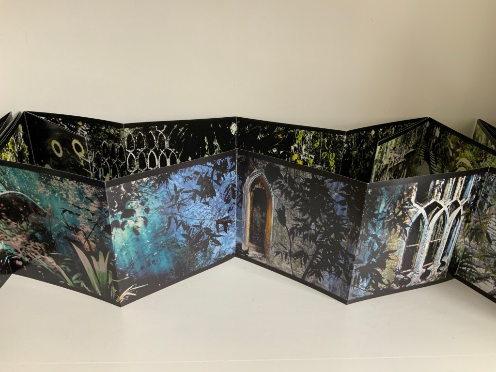
This concertina opens in vibrant colour to reveal in progressive spreads of two, four and six pages a rich sensory exploration of Edward James’ surreal jungle garden Las Posaz, in Mexico. Lush vegetation intertwines with the constructed buildings and staircases of James’ imagination and with Douglas’ own, in experiencing this garden and the rich culture of Mexico. Within the book the abundant garden is interwoven on the page with decorative threads from Mexican embroidery and feather work. Patterns of leaves are echoed by cut paper craft whilst the delicate encrustation of flora and fauna is enriched with ancient Indian beadwork. With the unfolding pages, from ground to tree tops, the viewer can ascend with the staircases and flit with the butterflies of the garden, suspending gravity and disbelief, venturing through gates and windows to boughs and fern vaults in the sky. And in so doing experience, within the small intimacy of book, something of the unfolding immensity of the garden and its timeless fusion of earth and paradise, real and surreal.
In Mexico (2014) Helen Douglas Offset, four-colour, 145 x 145 mm, 92 pages; green paper band around green foiled card covers, enclosing double-sided concertina. Acquired from the artist, 10 February 2015.
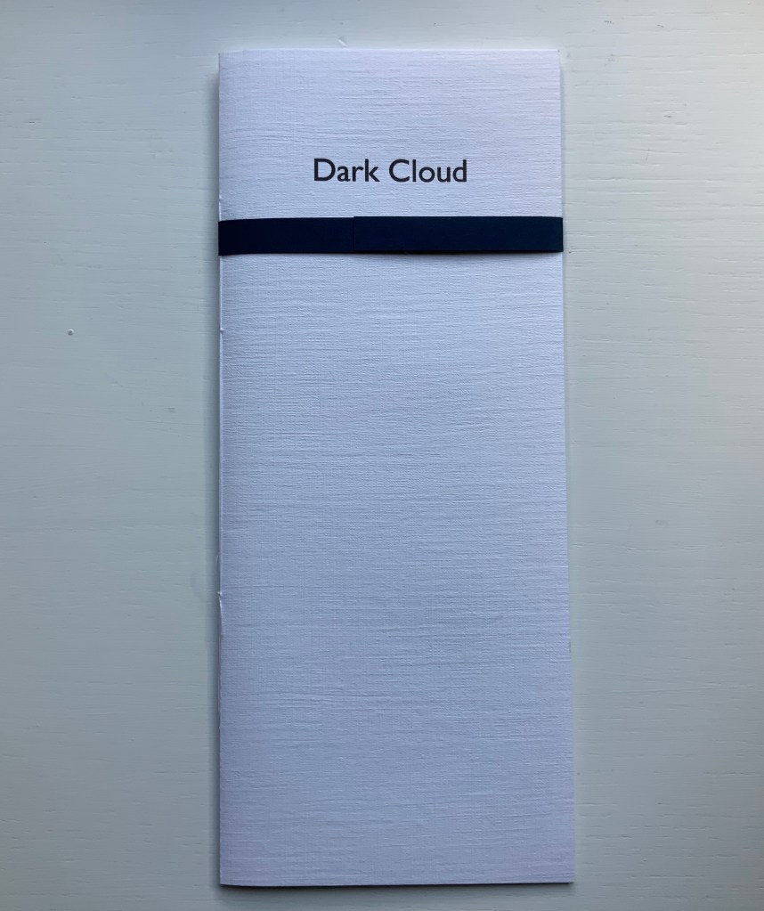
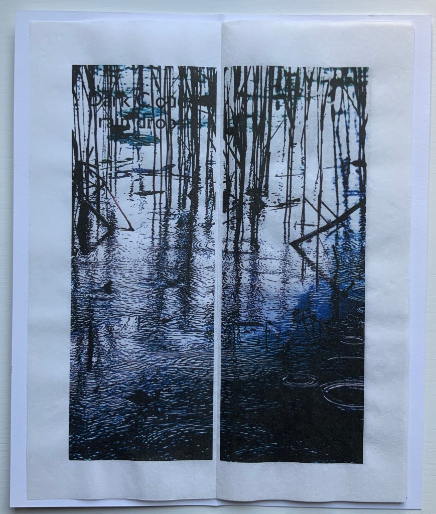
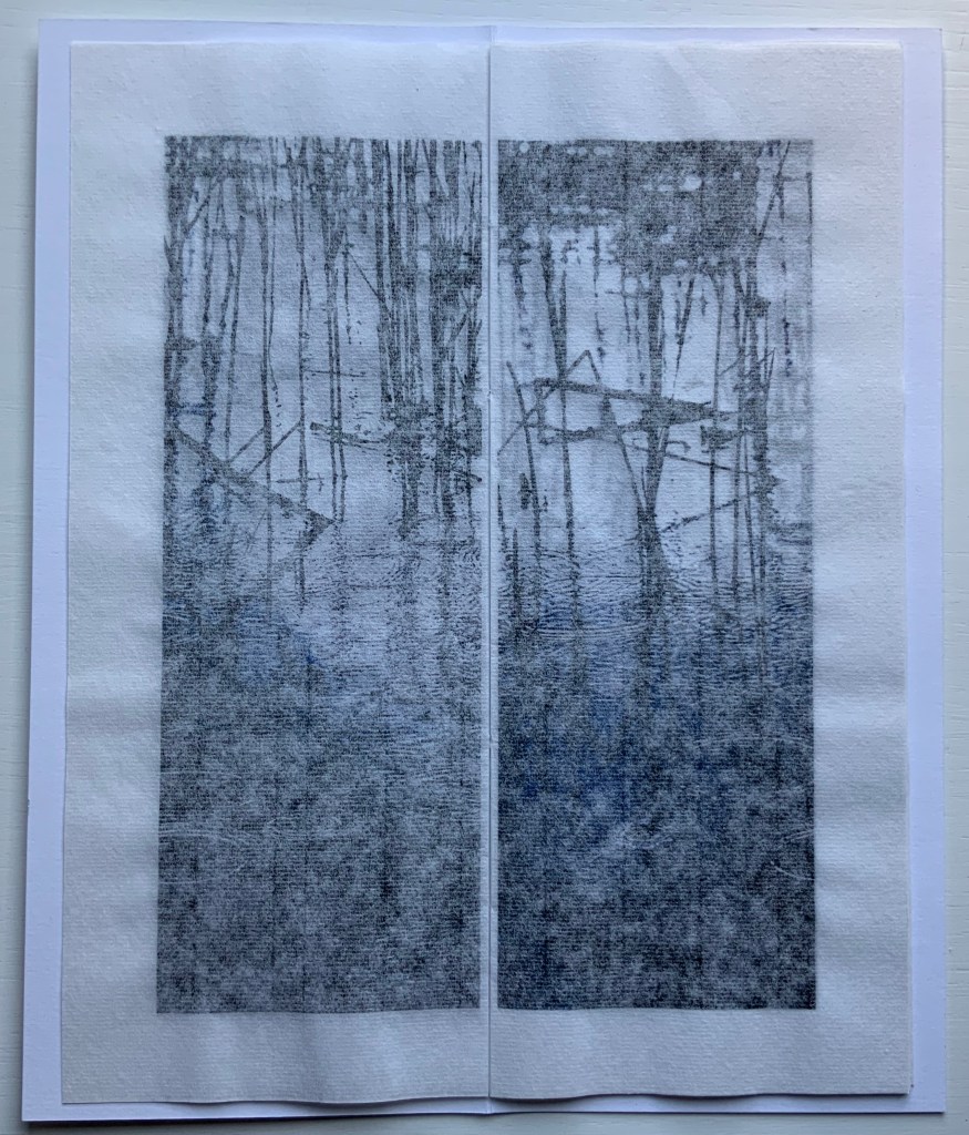
Dark Cloud (2015)
Dark Cloud (2015) Helen Douglas Printed on Toshu paper with ultra chrome inks, 105 x 250 mm, 24 pages; blue fastening paper band around card cover over 6 folded leaves hand stitched. Acquired from the artist, 29 November 2018.
The images, colours and texture’s appearance create an expectation that the paper will feel wet to the touch. The double spreads of the unprinted side of the leaves create a surface mist or cloud across the images.
Odd to say, but the physical sensation — of fingers trailing in the water — created by the digital version of The Pond at Deuchar is best replicated by Dark Cloud and the next work.
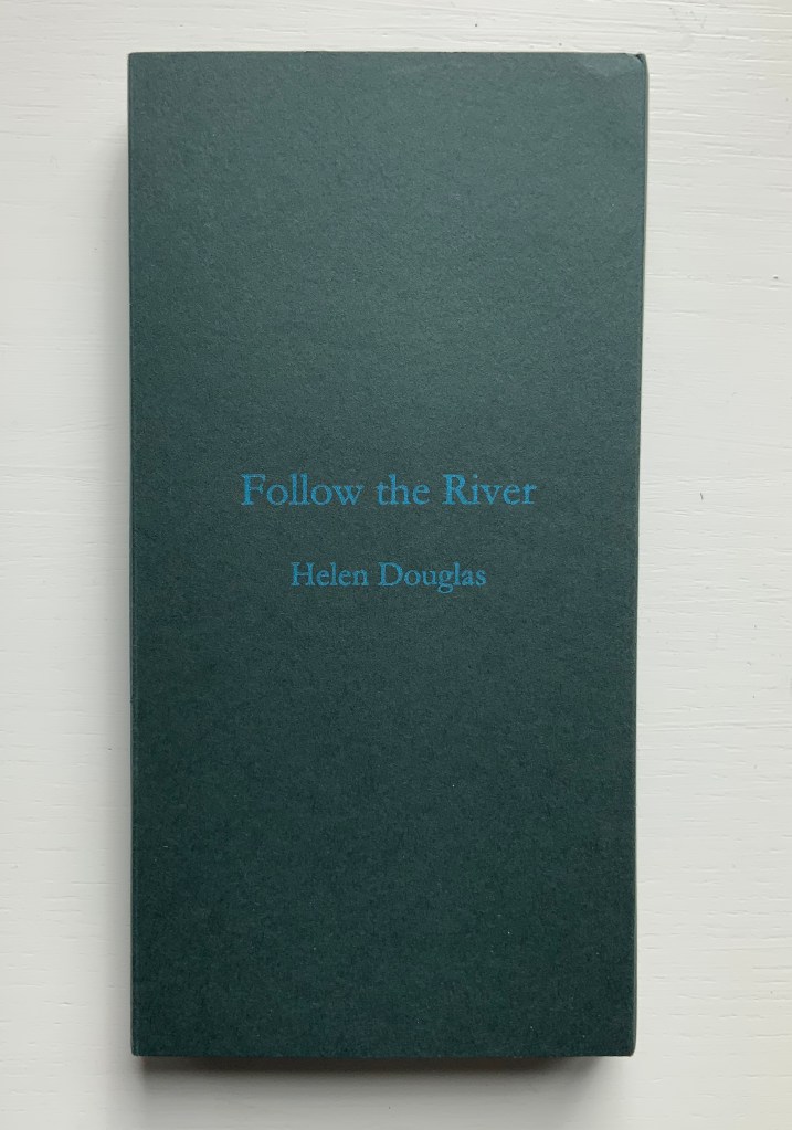
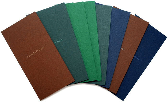
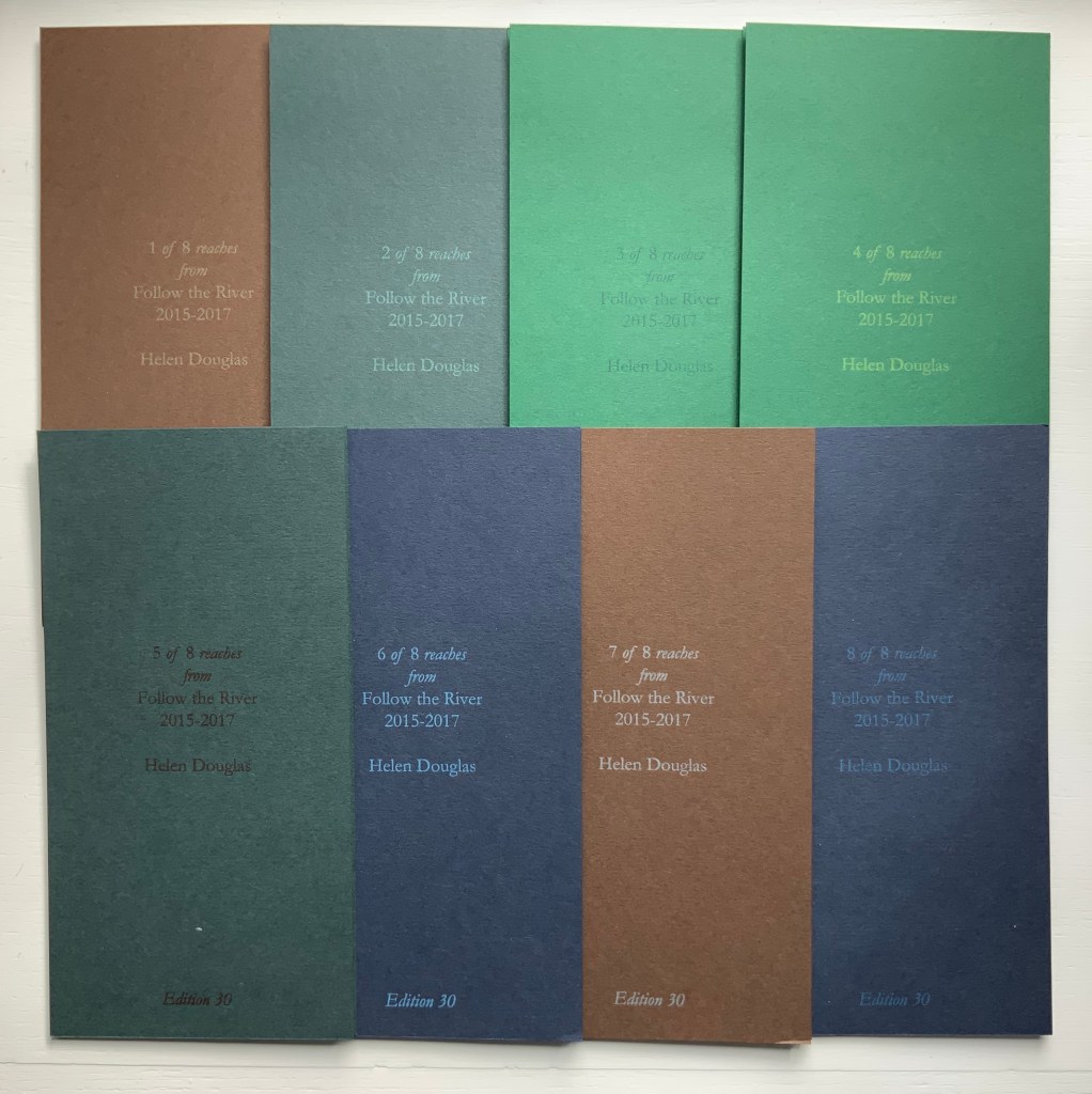
Follow the River (2015-17)
Follow the River (2105-17) Helen Douglas A set of 8 books, 930 x 183 mm; concertina binding; varying from 12 to 14 to 16 pages; printed on Chinese Paper, with Surecolour Inks; colour card end covers, letterpress title with back cover information of set number, date and edition; edition of 30, of which 25 sets are encased in a protective card sleeve produced in 4 different colours with the title Follow the River. Acquired from the artist, 29 November 2018.
Follow the River (2017) takes the river’s stretches, bordering vegetation, and its seasonal changes as “narrative structure”, yet the eight pamphlets lend themselves to separate viewings and to composite views arranged vertically or horizontally. But this is the wrong way for the reader to seek structure.
Douglas provides a phrase that redirects the quest when she describes “the concertina form as unfolding arm’s breadths, each one with a distinct theme of light, colour and mood” (Weproductions). This returns to the gestures associated with The Pond at Deuchar.
Douglas continues:
Each open spread can be viewed individually, or in runs of 4, 6, 8 or more pages. The first spread contains a text poem, which, integral to the reach of the river draws the eye into the book and a close reading of its pages. Leaves, grasses, ferns, flowers and trees form part of following the river, at its edge. In light and shadow they frame and are interwoven with the water’s movement: its flow, light and shade, and reflective colour, taking in its nuanced surroundings, as one contemplative whole.
Be it scroll, codex or accordion — Douglas’s structural goal would seem to be arrival at that contemplative whole. By leading our hands to think, Douglas takes us with her.
“Ellen Lanyon“. 25 June 2024. Books On Books Collection. For comparison of Chinese Whispers with Transformations I (1977).
Admin, studiesinphotography.com. 24 March 2020. “Photography and the Artist’s Book: Helen Douglas in Conversation With Alex Hamilton“. News & Reviews, Studies in Photography. Accessed 15 June 2025. Re Water on the Border: “… with our own press and smaller sheet size we were able to work with many more papers, and to explore the textural relationship between photographic image, print and surface. With the book Mim, an exploration of mimicry in surface pattern and texture of clothing and architecture, we used different textured papers including wallpapers, throughout as an integral part of the visual and tactile reading of the book. We spliced photographic images together at the film stage to build the pages of the book. Flip-flopping images between positive and negative, we were able to drop tone, gain contrast and create negative backing for positive text. This was also possible with Water on the Border (1994), a book made in Scotland and China where line drawings by children were butted up next to photographic images of water and reflections. The latter were screened with a mezzotint half-tone screen which gave a beautiful velvety touch to the image and stroked the paper. The scaffolding armature of horizontals and verticals was made from offcuts of exposed film. Our artwork for the book was no longer layouts of continuous tone bromides but layouts of half-tone film.”
CDLA (Le Centre des livres d’artistes). “Helen Douglas — Telfer Stokes”, le cdla: Expositions publications et collection de livres d’artistes, 26 February 2020. Accessed 26 February 2020. A “catalog raisonné”-like listing of 30 works by Douglas, 9 of which are co-creations with Telfer Stokes.
Douglas, Helen. Video of talk on The Pond, given at Winchester School of Art, University of Southampton on 20 March 2013.
Graham, Brandon S. “Telfer Stokes”, FictionDoldrums, 8 April 2011. Accessed.17 March 2020. Commentary on Chinese Whispers.
Williamson, Beth. “What Does It Mean Not to Touch a Book?” in Code—X, edited by Danny Alfred and Emmanuel Wackerlé (London: bookRoom, 2015), pp. 01:53-2:06.
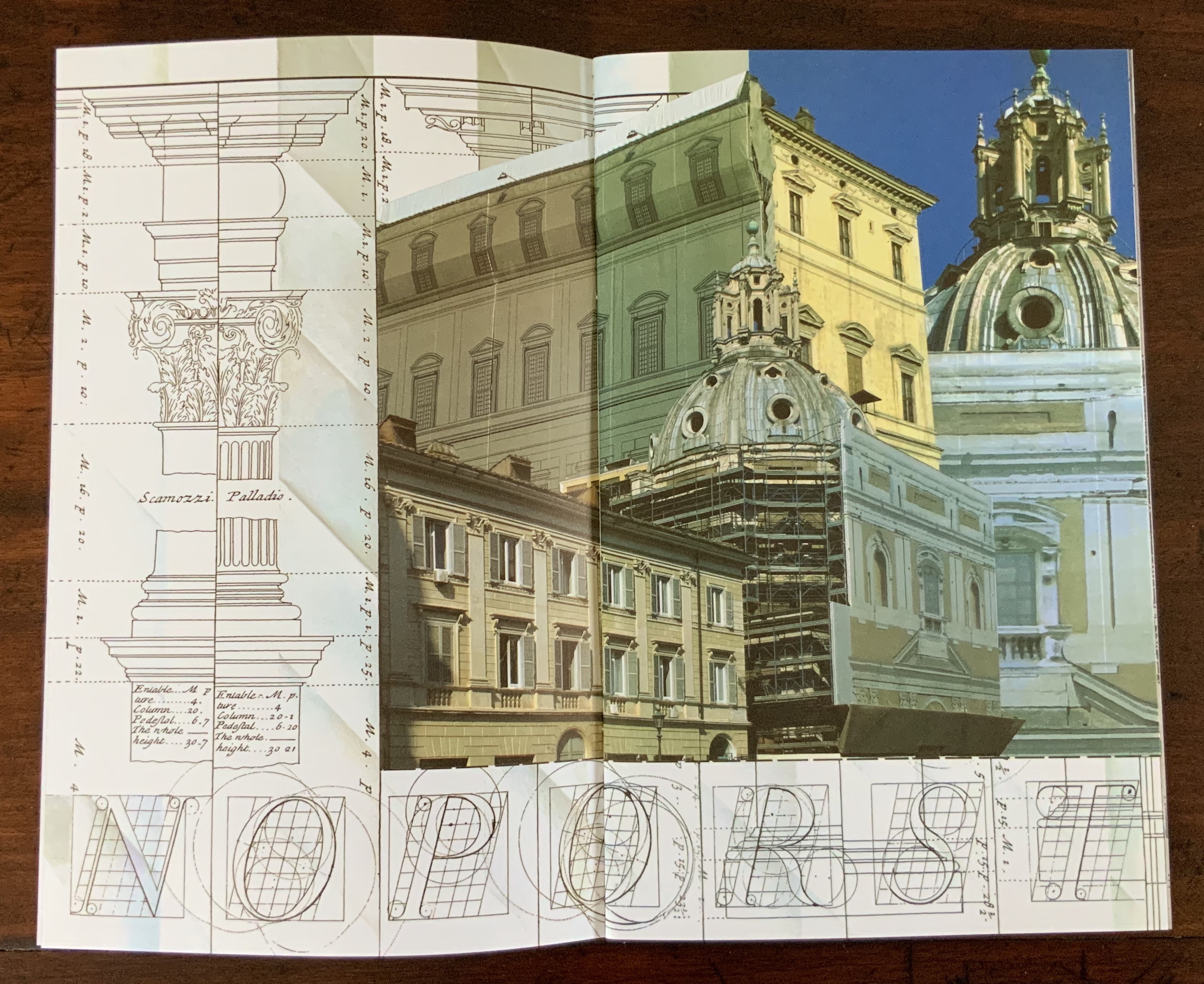
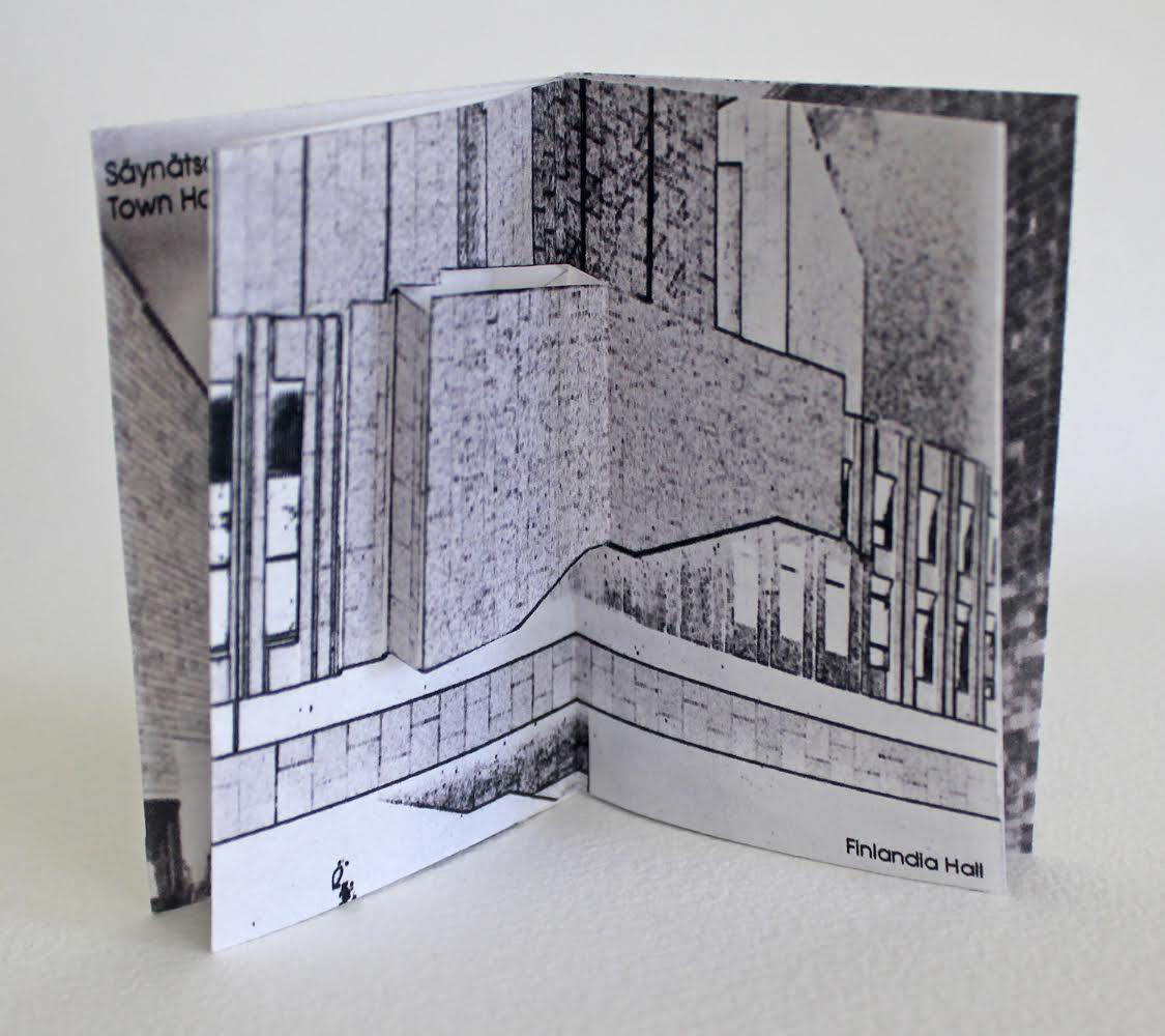
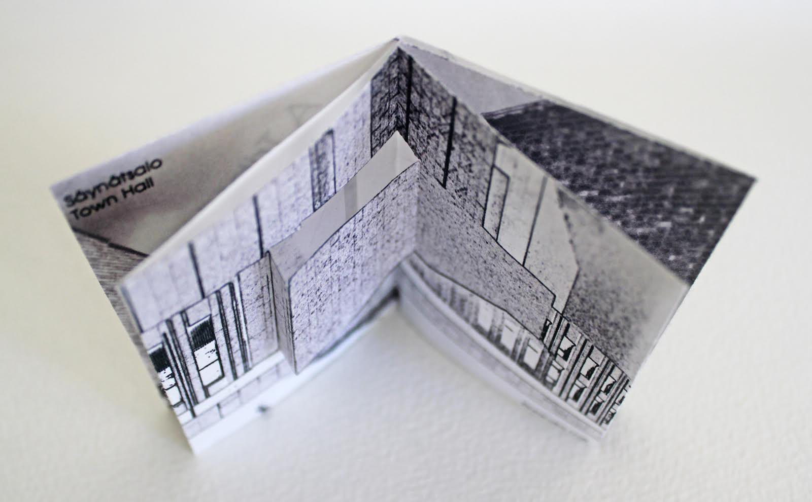
Architecture — be it theory, principles, practices or instances — inspires book art. Lay the book flat; you have a foundation. Open and turn it on its fore-edge; you have a roof beam or arcade. Stand it upright; you have a column or tower. Turn the front cover; you open a door. Put the text and types under a microscope; you have a cityscape. As the examples in this virtual exhibition show, architecture-inspired book art goes beyond these simple analogies.
There are seemingly unrelated texts that help considerably in going there. The Eyes of the Skin (2005) and The Embodied Image (2010) by Juhani Pallasmaa, architect, teacher and critic, are two of them. He writes as if he were an artist preparing an artist’s statement or descriptions of the book art below. The title of his earlier book gives away his alignment with the visual and tactile nature of book art. Pallasmaa’s two books will enrich anyone’s enjoyment of the works shown and mentioned here.
“Book. Space. House. Space of Movement“. Exhibition curated by Susanne Padberg, 7 May – 26 June 2026. Padberg, Susan (curator). 7 May – 26 June 2026. at Galerie Druck & Buch, Vienna, Austria. Accessed 22 May 2026. “The artist’s book as a three-dimensional space: forming a house, outlining, remembering, mimicking—thinking the human being within space. Between object and narrative, books unfold as architectural structures, as inhabitable thought-spaces, as reflections of individual and collective experience. The exhibition brings together artistic positions that expand the book as a spatial body.”
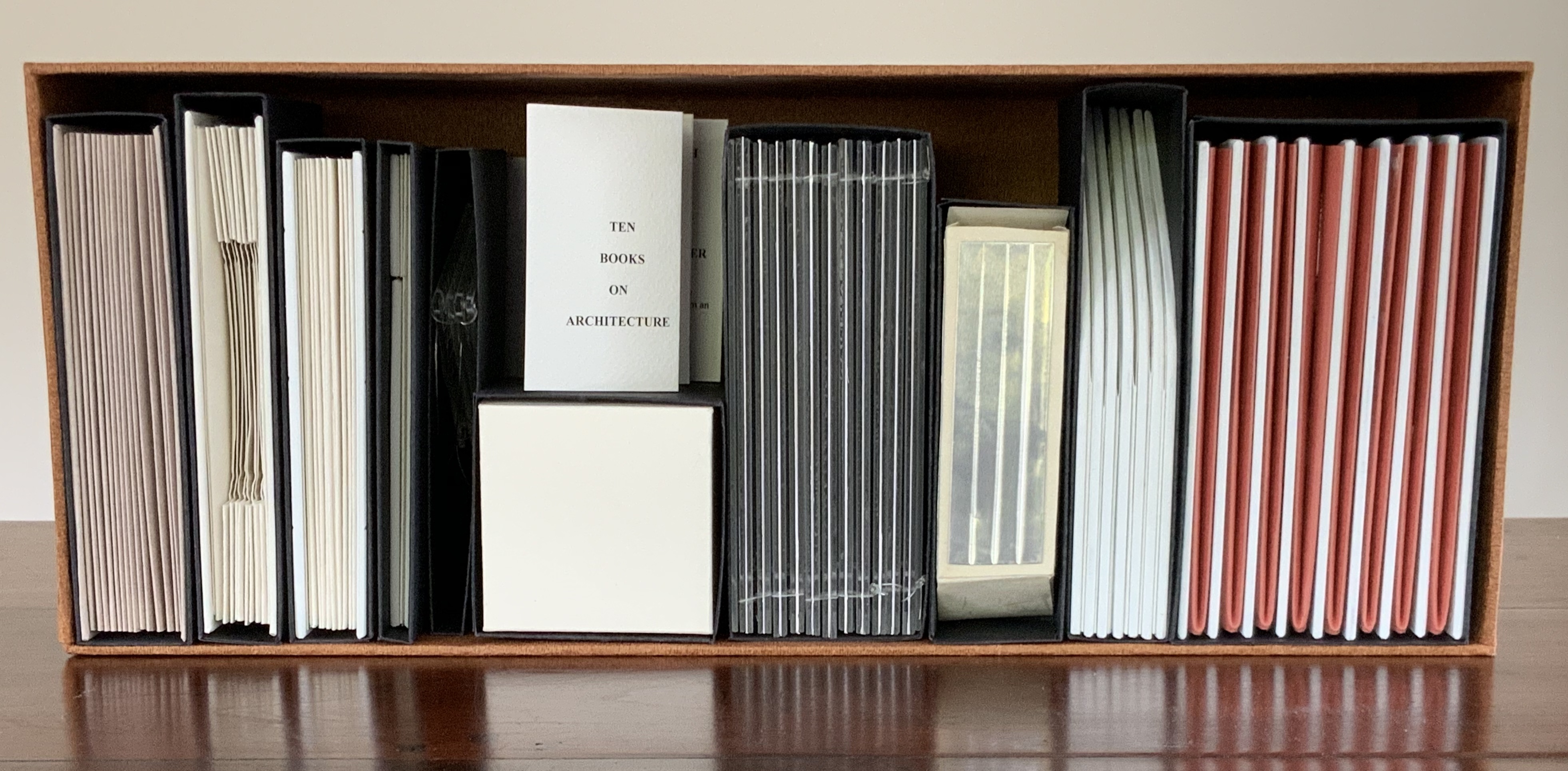
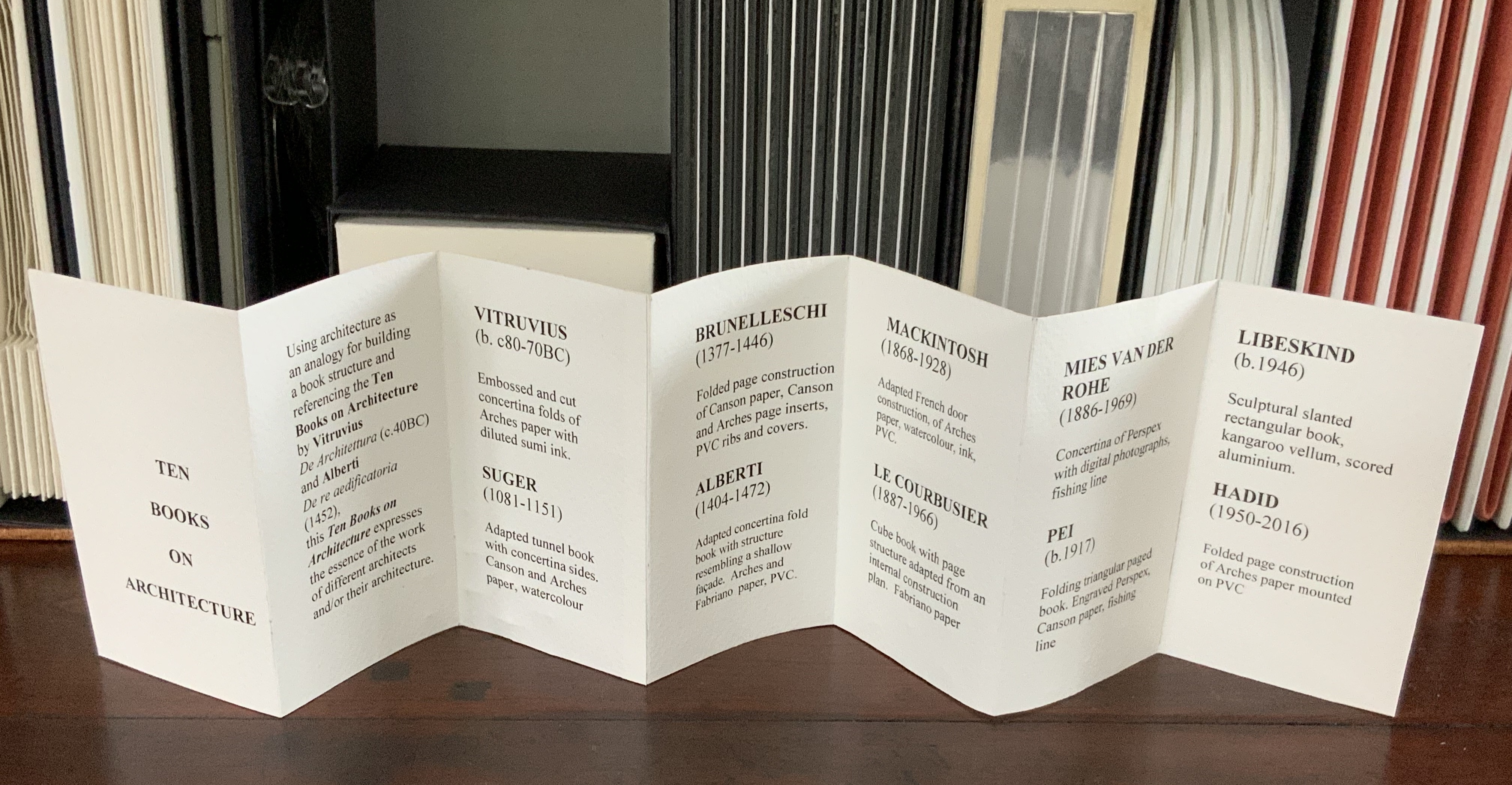
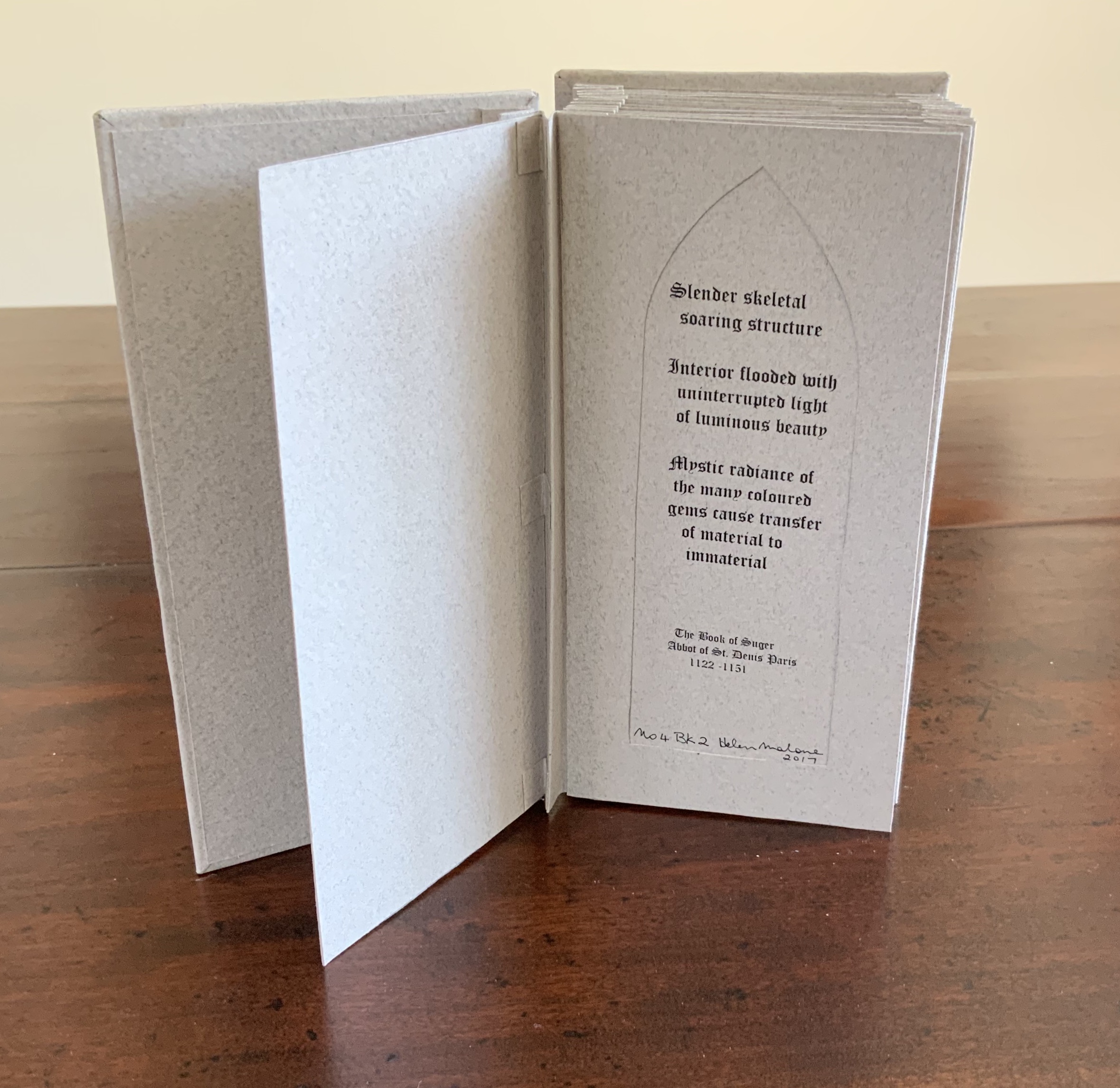
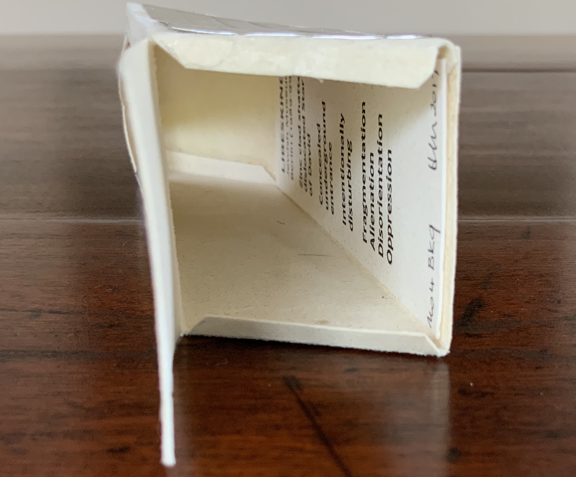
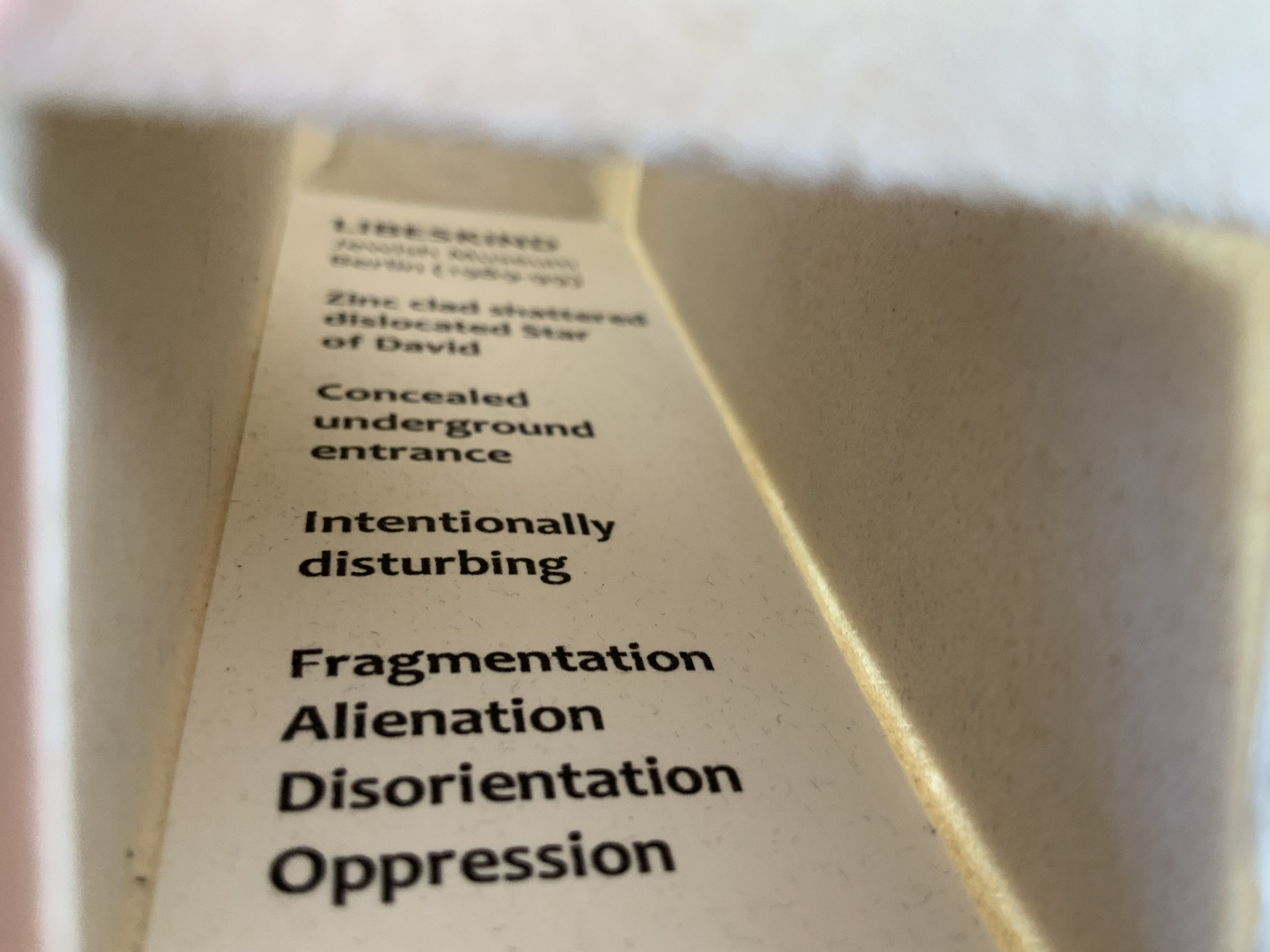
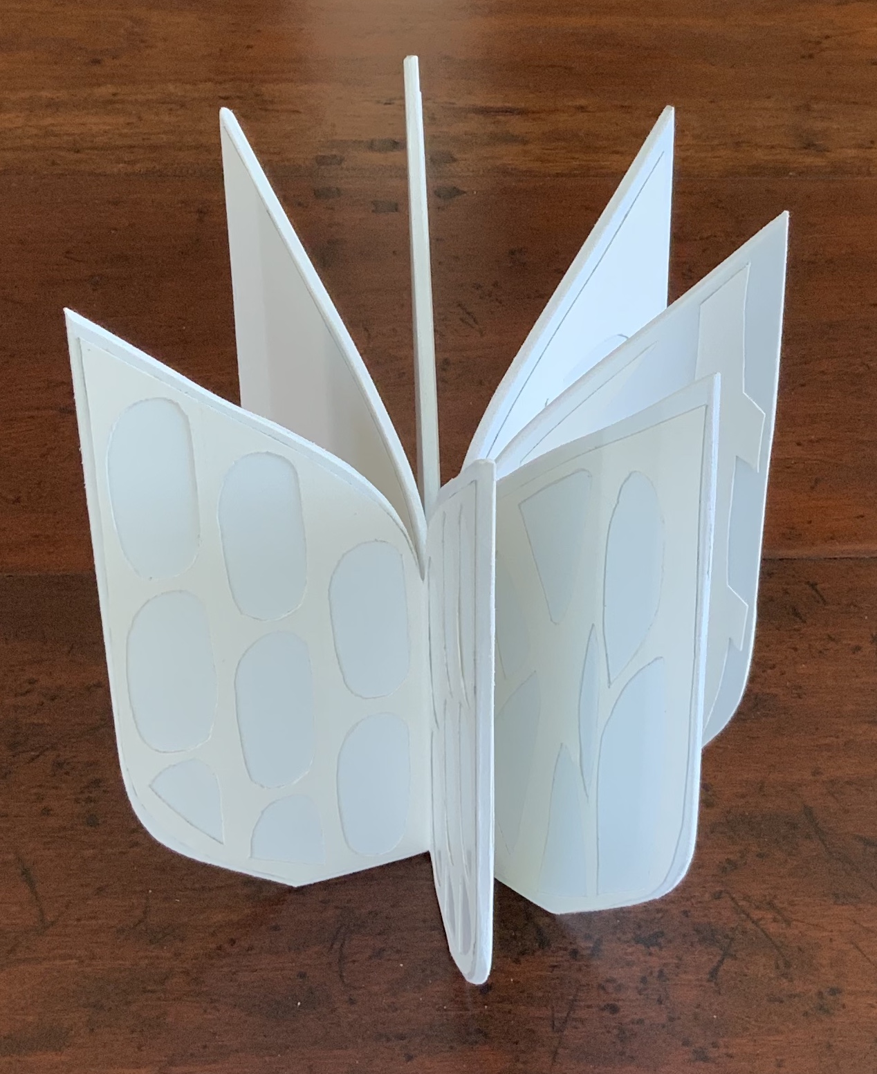
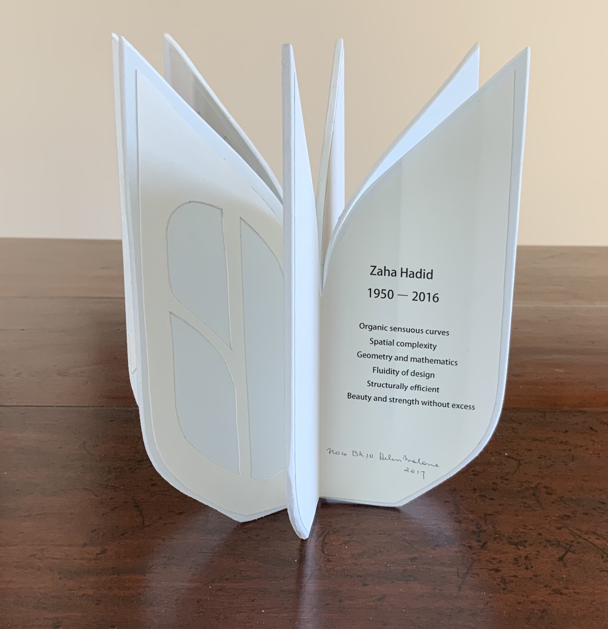
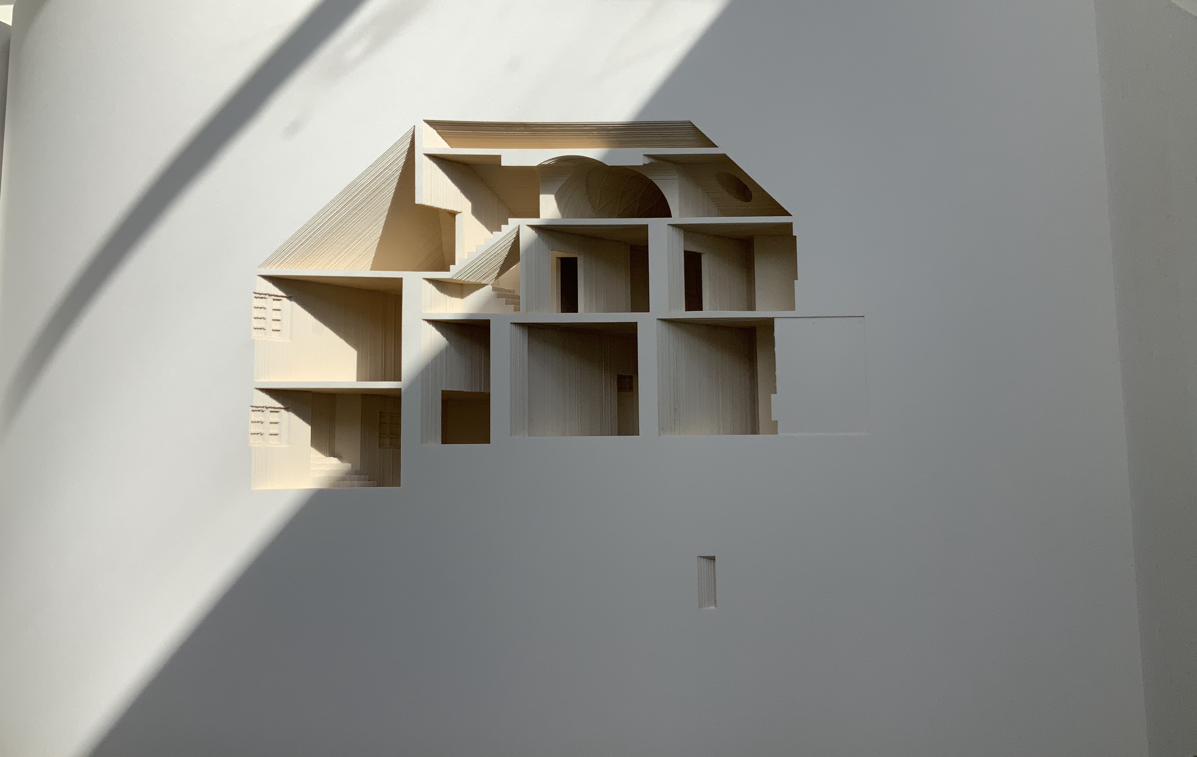
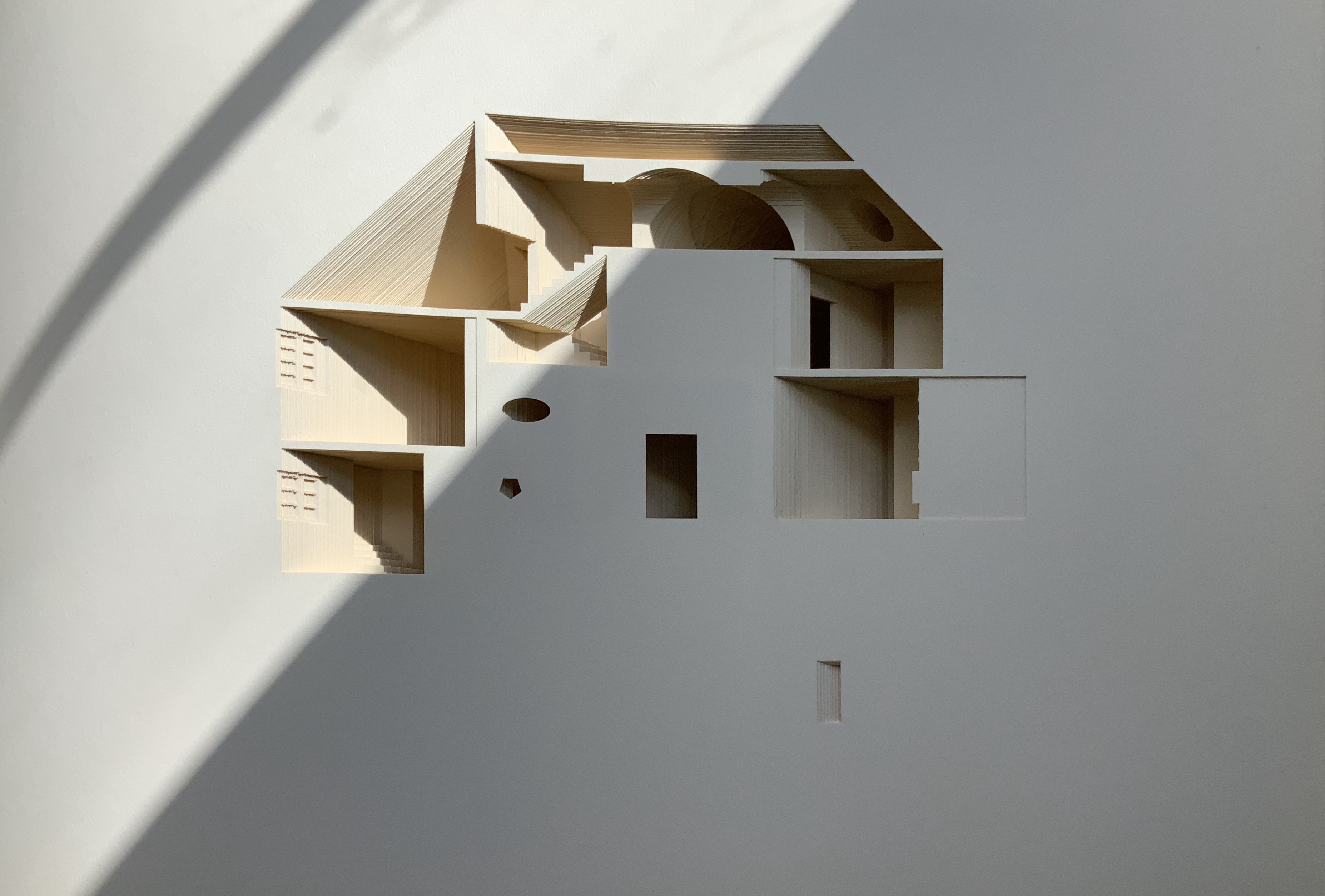
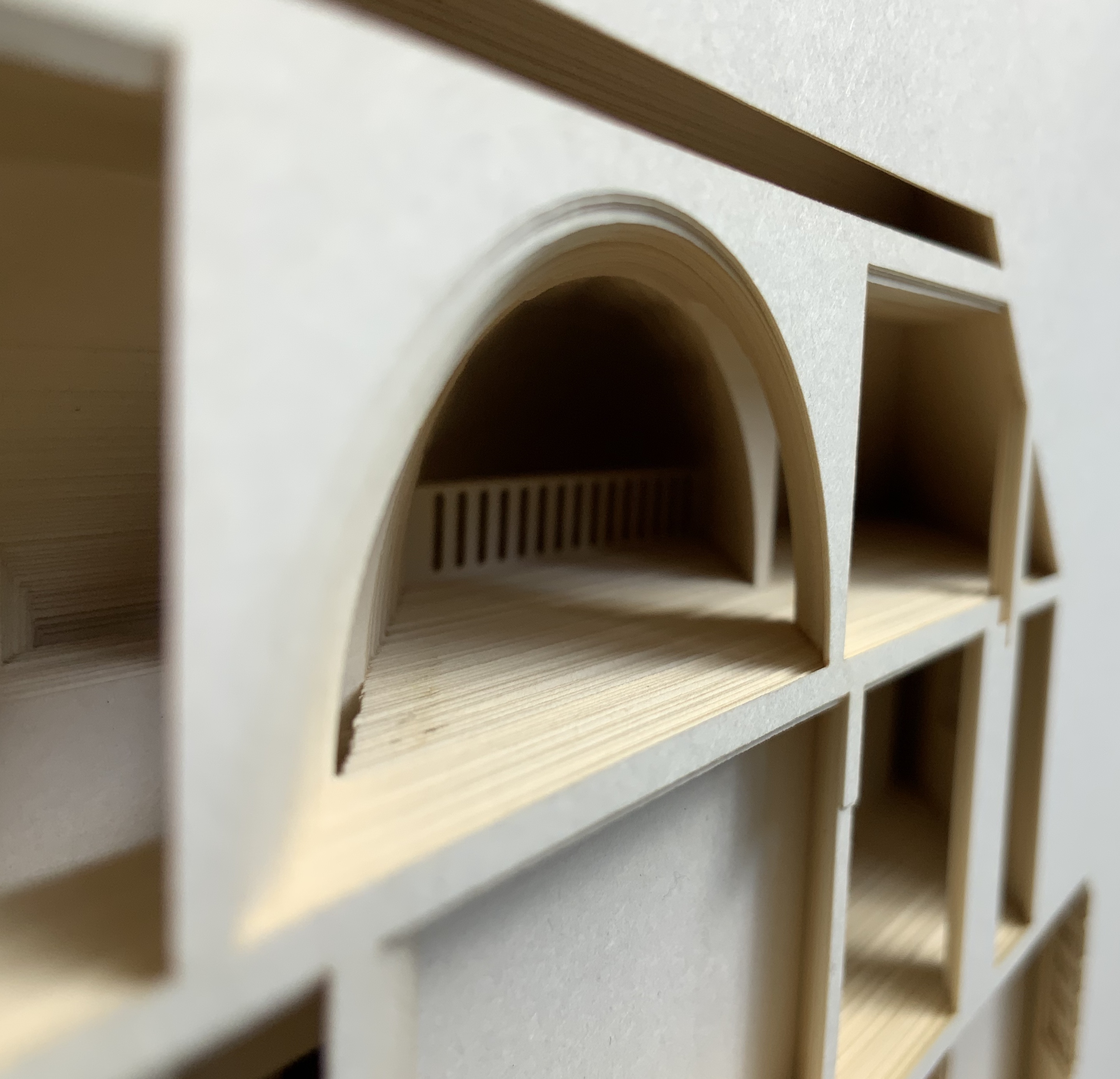
Malone’s Ten Books of Architecture is a good place to start in the collection. Like Pallasmaa, Malone takes a broad historical and, most important, haptic view of architecture from Vitruvius to Hadid. Each of the ten books is a bookwork that exemplifies its subject.
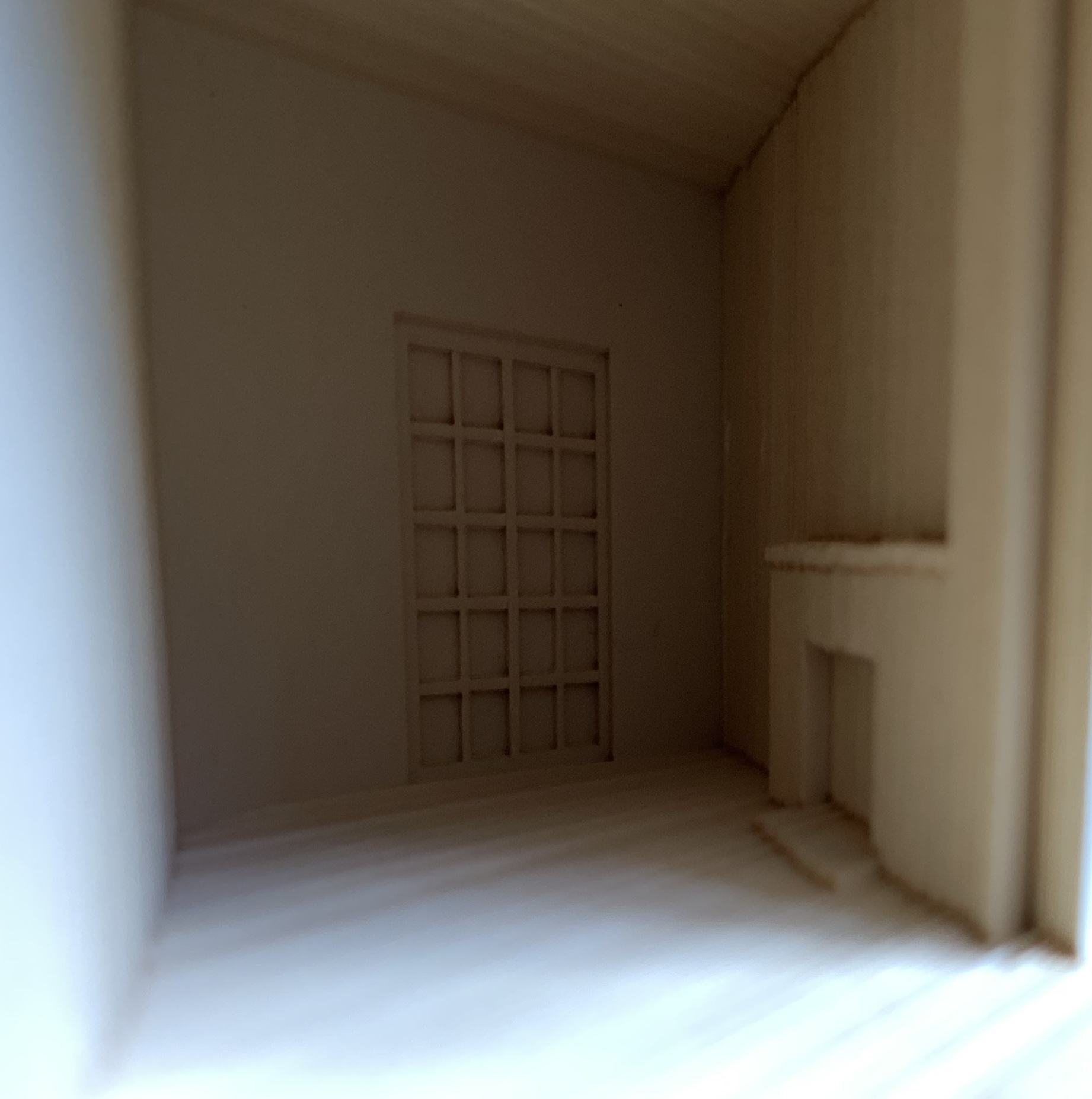
Adapted tunnel book with accordion sides Photo: Books On Books Collection
A watercolour at the tunnel’s end to evoke the stained glass clerestory windows in the Basilique Saint-Denis, Paris Photo: Books On Books Collection
The aspiration to fuse the cosmic and the human, divine and mortal, spiritual and material, combined with the systems of proportion and measure deriving simultaneously from the cosmic order and human figure, gave architectural geometries their meaning and deep sense of spiritual life.The Embodied Image, p. 23.
And further apropos the link between the book and architecture, consider the connection that Vasari drew between Gutenberg and Alberti:
In the year 1457 [sic], when the very useful method of printing books was discovered by Johann Gutenberg the German, Leon Batista [sic], working on similar lines, discovered a way of tracing natural perspectives and of effecting the diminution of figures by means of an instrument, and likewise the method of enlarging small things and reproducing them on a greater scale; all ingenious inventions, useful to art and very beautiful. Lives of the Most Eminent Painters, Sculptors and Architects, vol. 1, trans. Gaston Du C. de Vere (London: Medici Society/ Philip Lee Warner, 1912-1914), 494.
In “An Architectural Confession”, Pallasmaa writes:
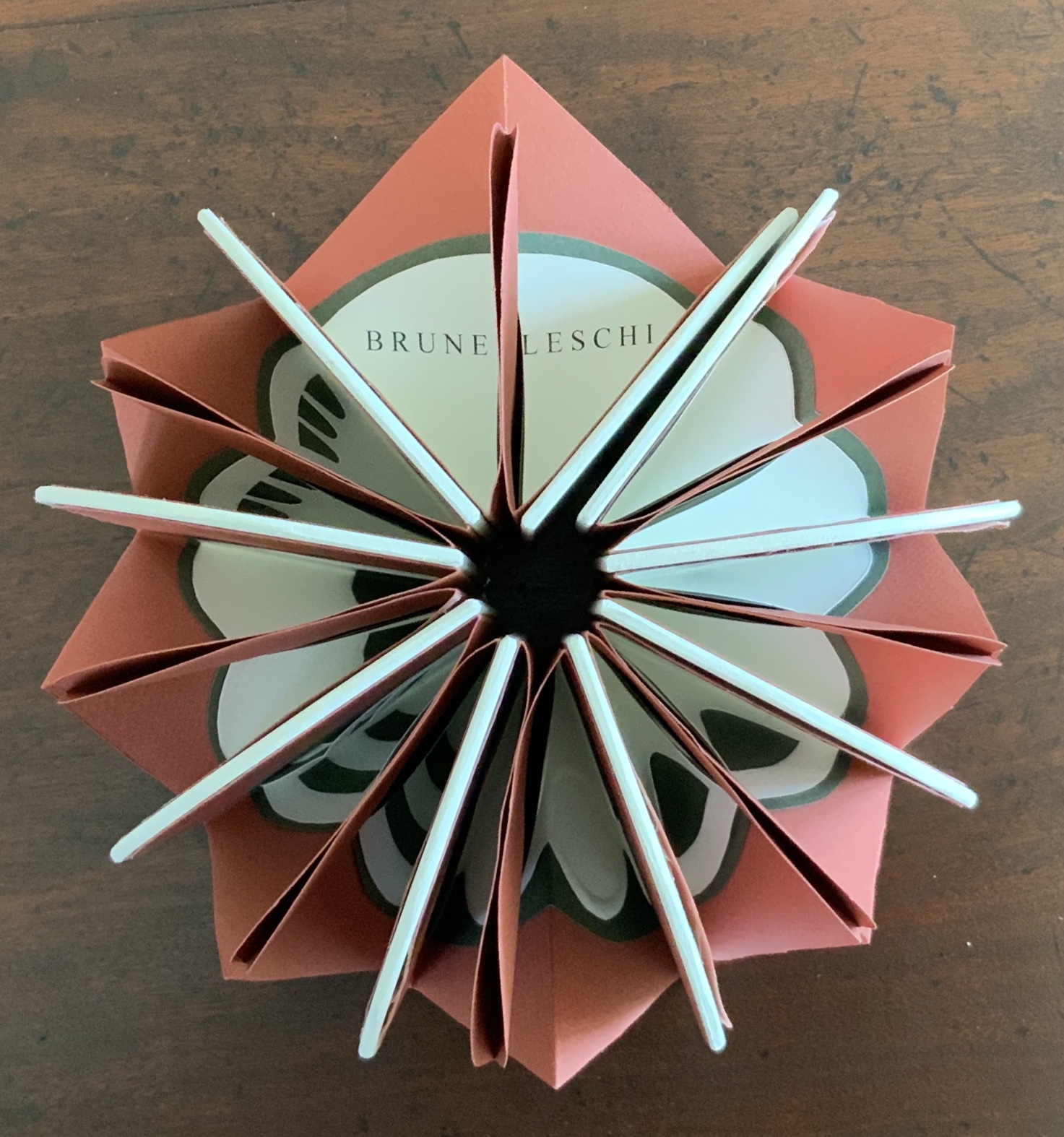
One’s most important teacher may have died half a millennium ago; one’s true mentor could well be Filippo Brunelleschi or Piero della Francesca. I believe that every serious artist — at the edge of his/her consciousness — addresses and offers his/her work to a superior colleague for approval.The Eyes of the Skin, p. 82.
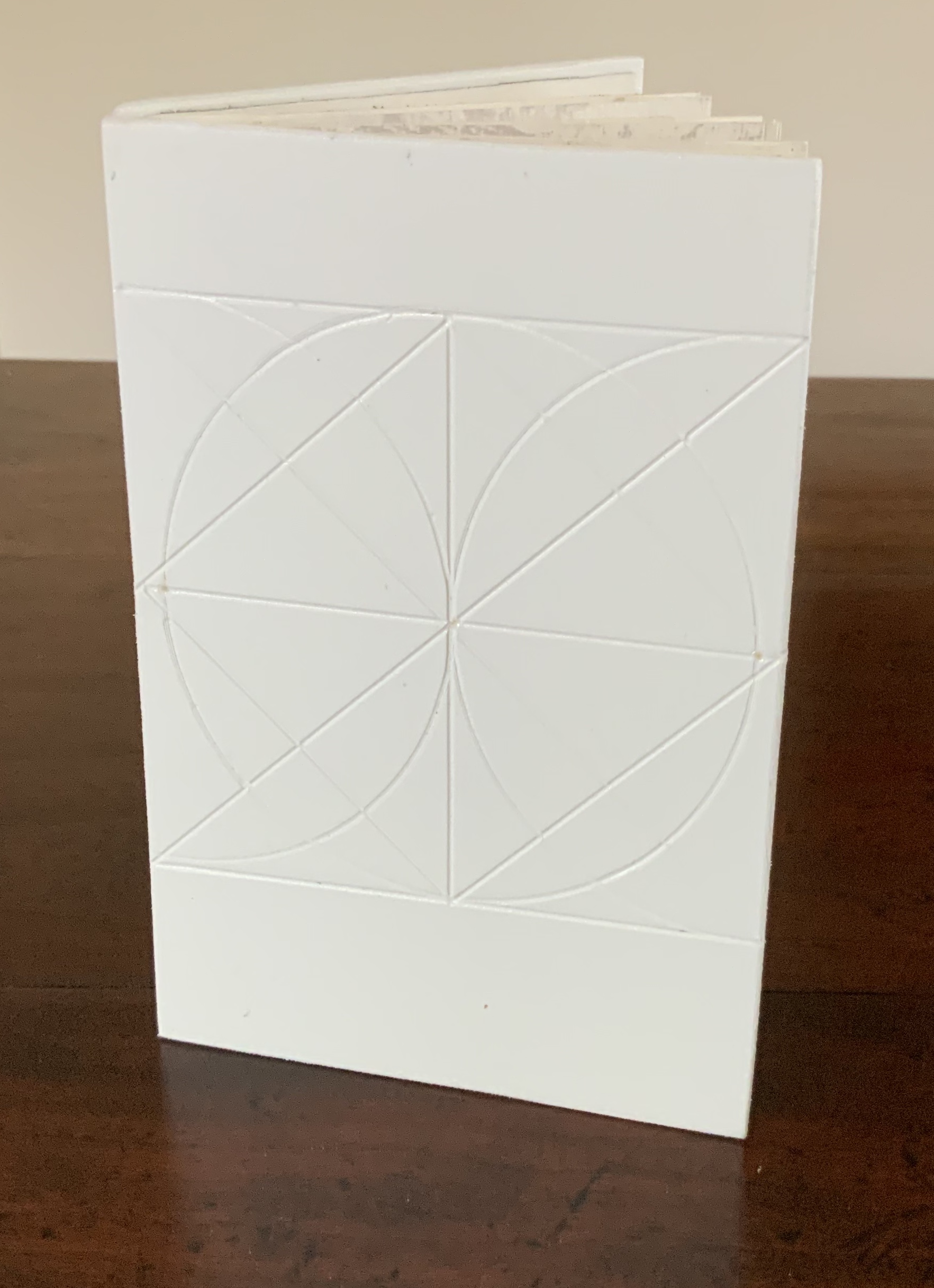
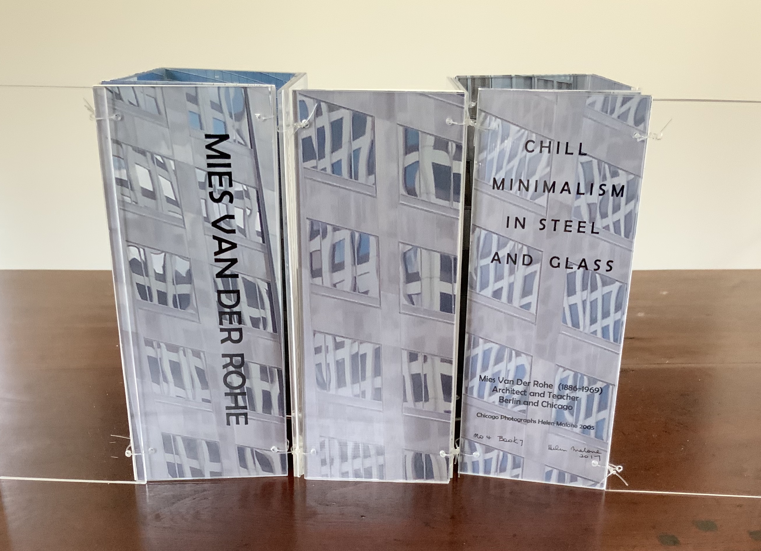
This curiously textured cube sits perfectly alongside Pallasmaa’s observation: “The basic geometric shapes have their symbolic connotations, but more important than their conventional meanings are their conceptual and visual organising powers” (The Embodied Image, p. 58).
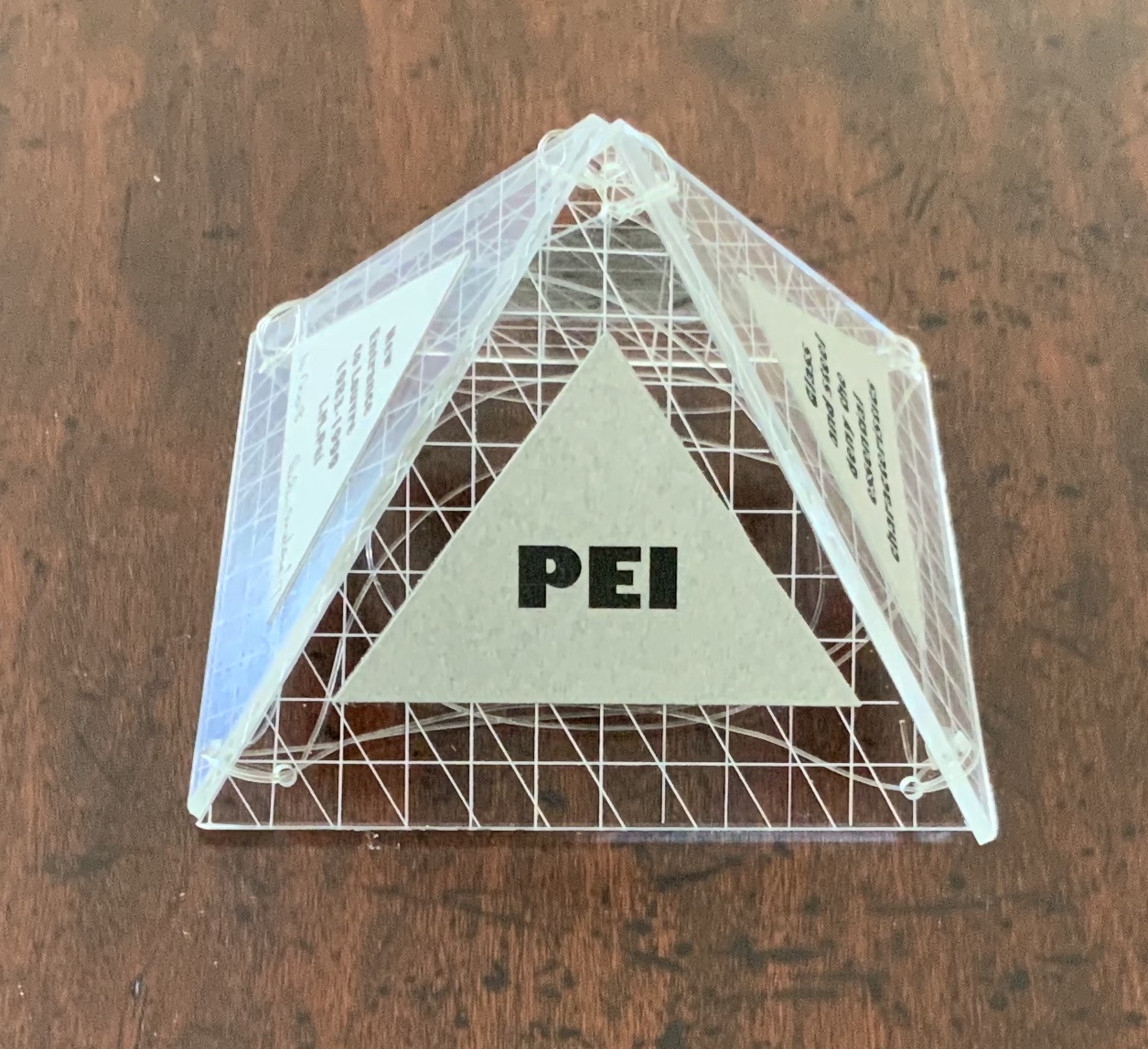
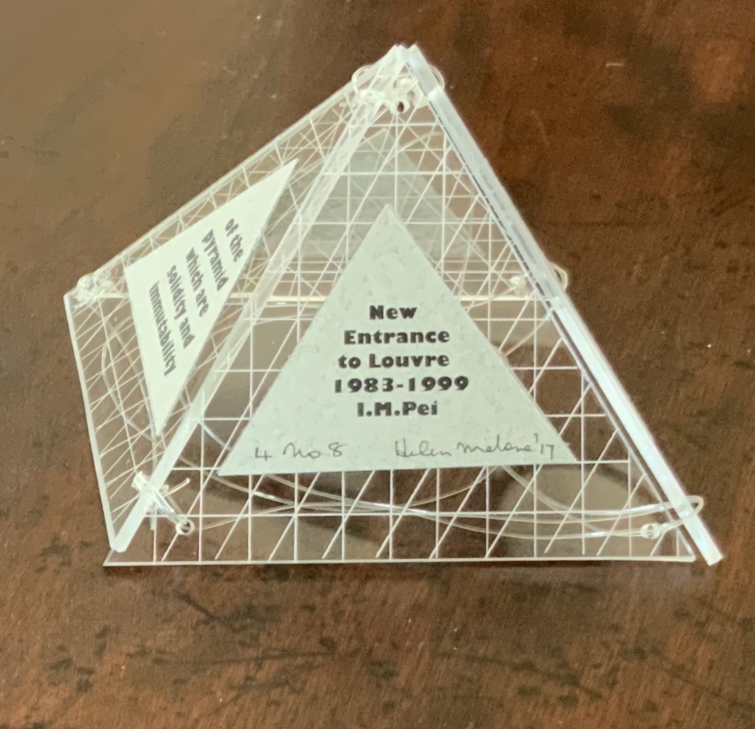
A short trip around this small pyramid as a reminder of the entrances that were always on the far side of museums you visited Photos: Books On Books Collection
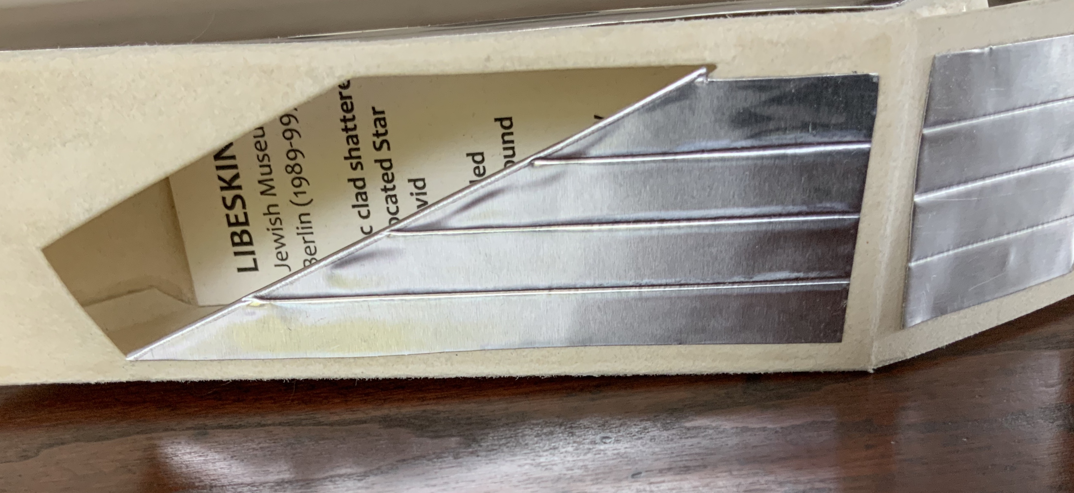
This edition of Malone’s Ten Books is unique in its inclusion of Hadid, who is not mentioned in either of Pallasmaa’s books but whose artistry and turn to the organic and curves of nature certainly fit with their spirit. Photo: Books On Books Collection
Malone’s Ten Books has a predecessor in Laura Davidson’s contribution to the 1994 Smithsonian show on book art inspired by its collection of rare science books (see section below). Although there is also Karen Wirth’s sculptural take on the Ten Books as well as Ron Keller’s take (see section below) on Palladio’s Fours Books of Architecture, which is Palladio’s take on Vitruvius, I have not found any other Vitruvian-inspired works of book art. (Pointers welcome.)
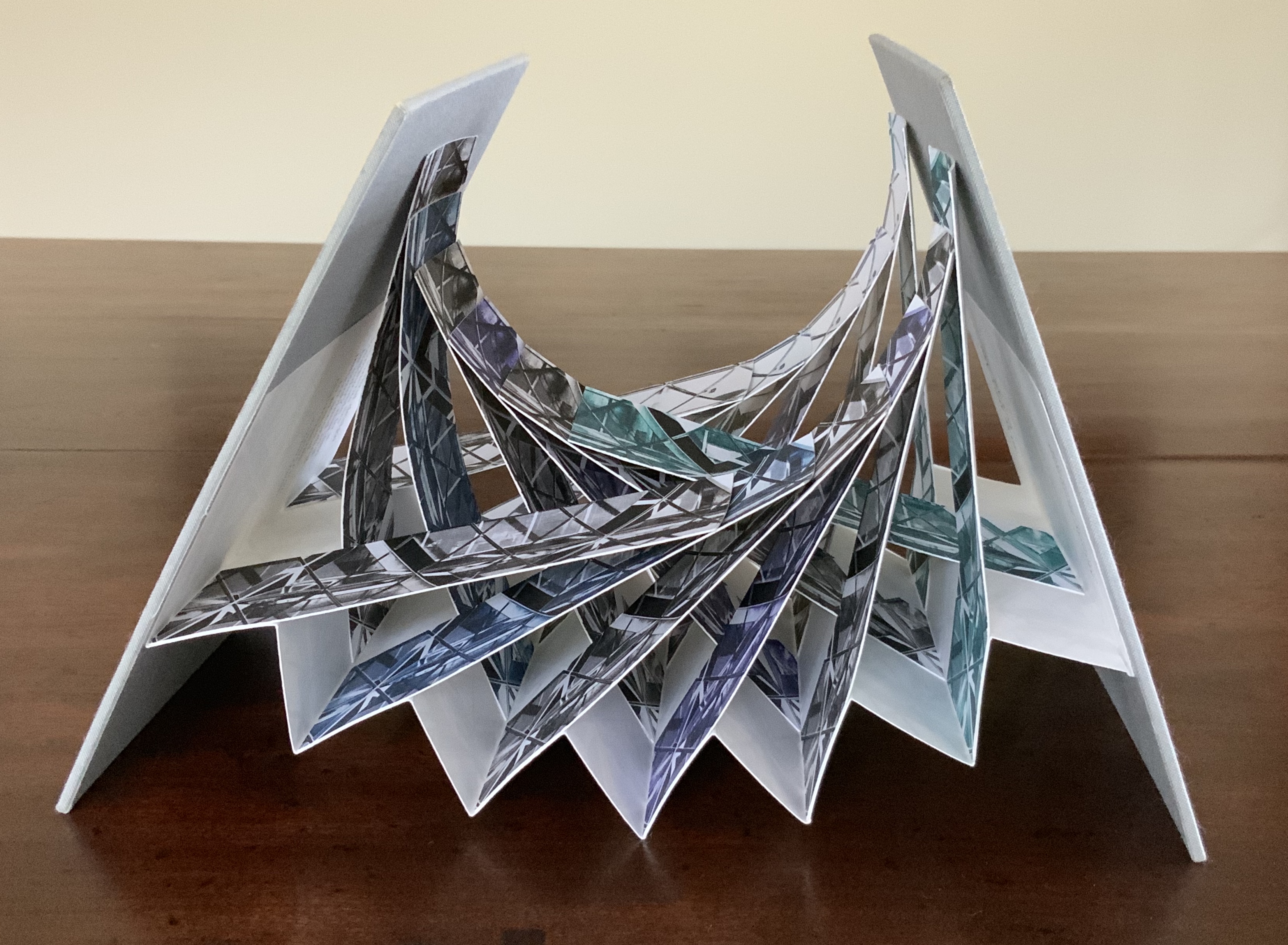
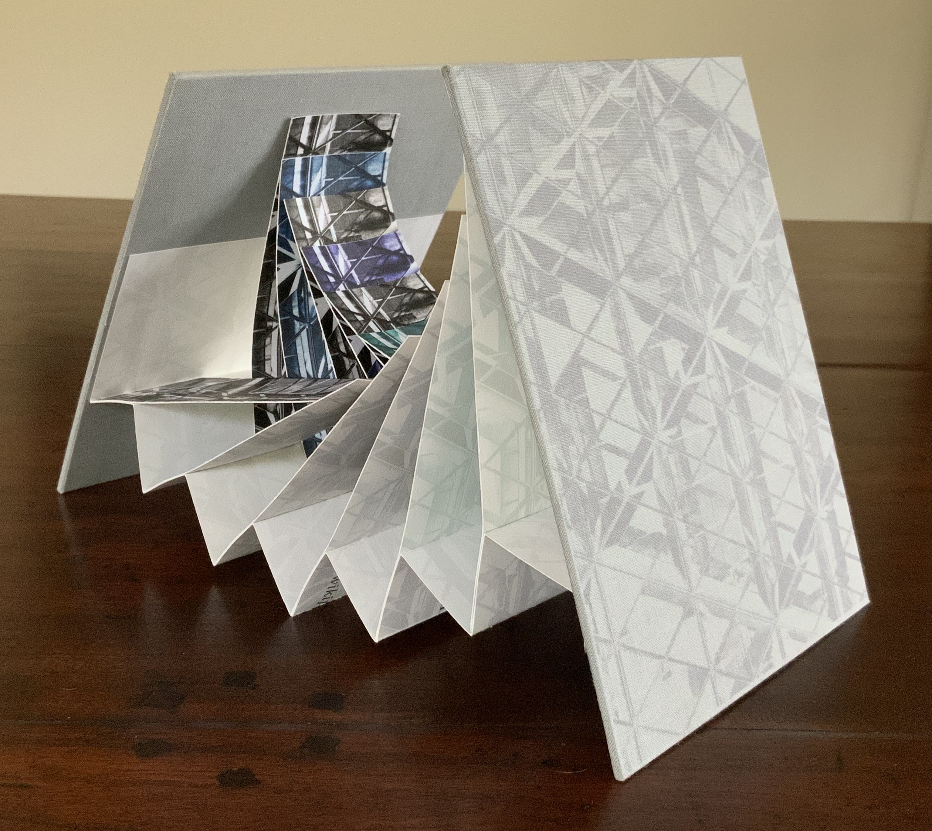
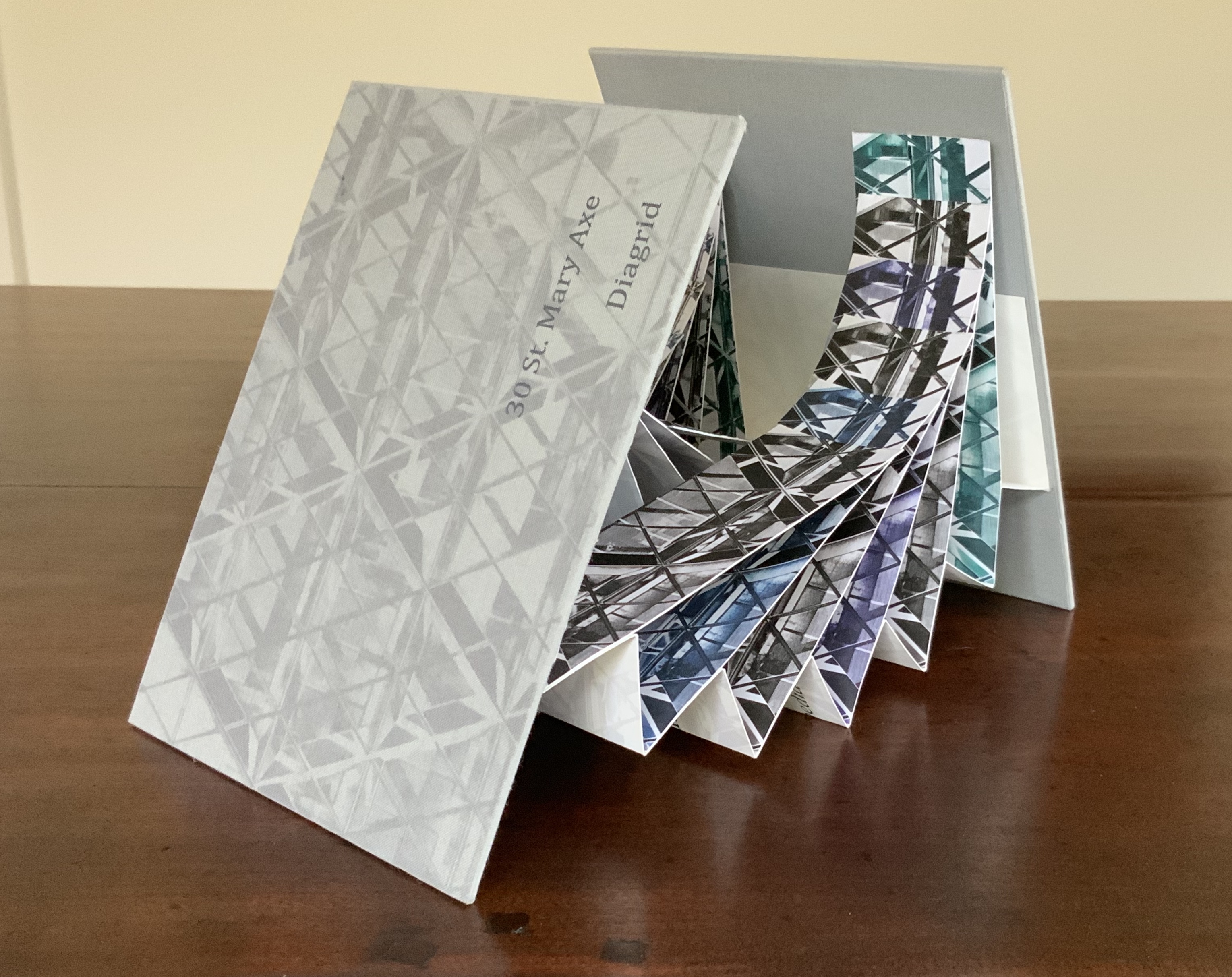
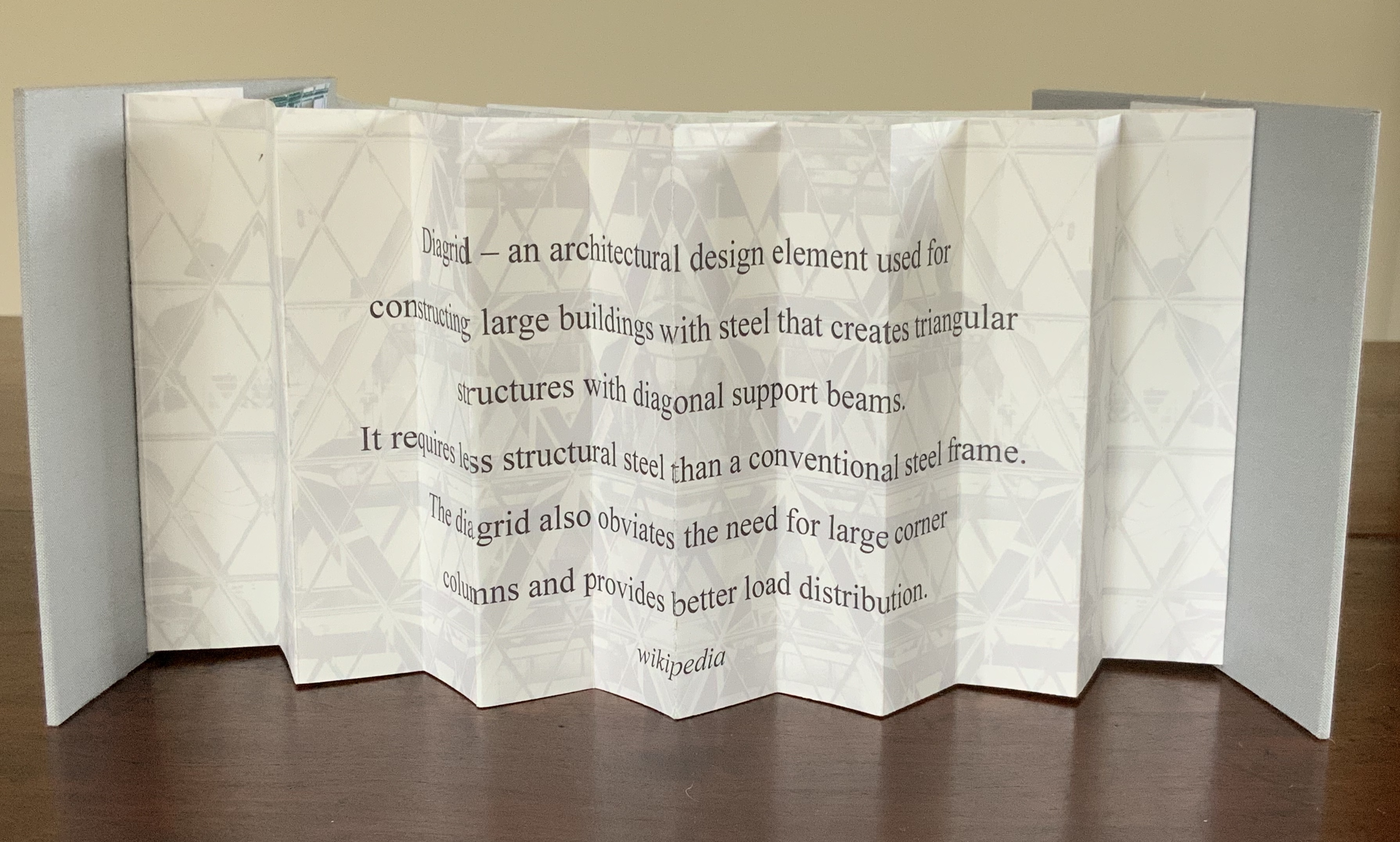
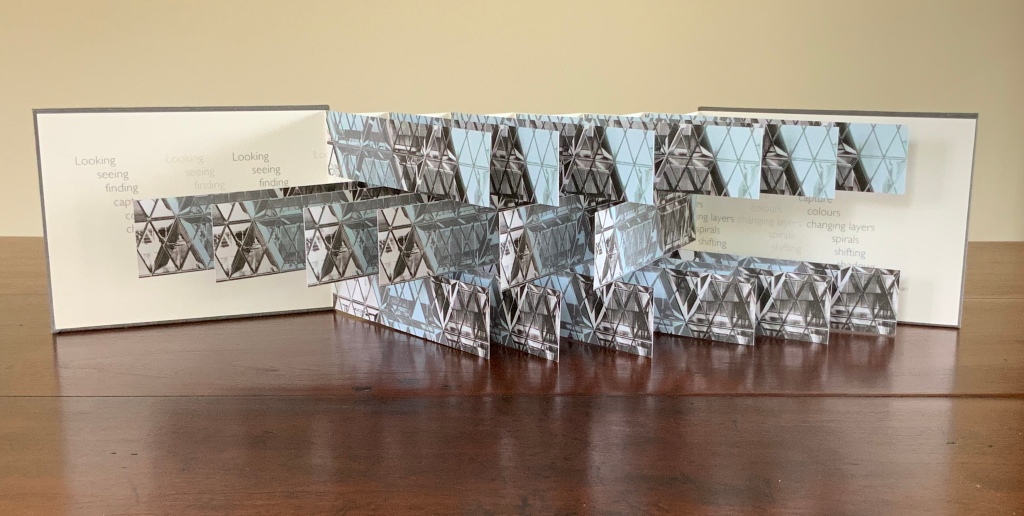
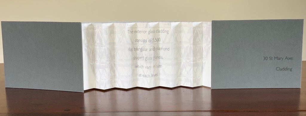
These two works — 30 St Mary Axe: Diagrid (2009) and 30 St. Mary Axe: Cladding(2009) — are among several architecture-inspired works of book art that Brannan has created. The text in one of those several — Situated — could have come straight from Pallasmaa, Bachelard or Merleau-Ponty:
Being situated is generally considered to be part of being embodied, but it is useful to consider each perspective individually. The situated perspective emphasizes that intelligent behaviour derives from the environment and the agent’s interactions with it.
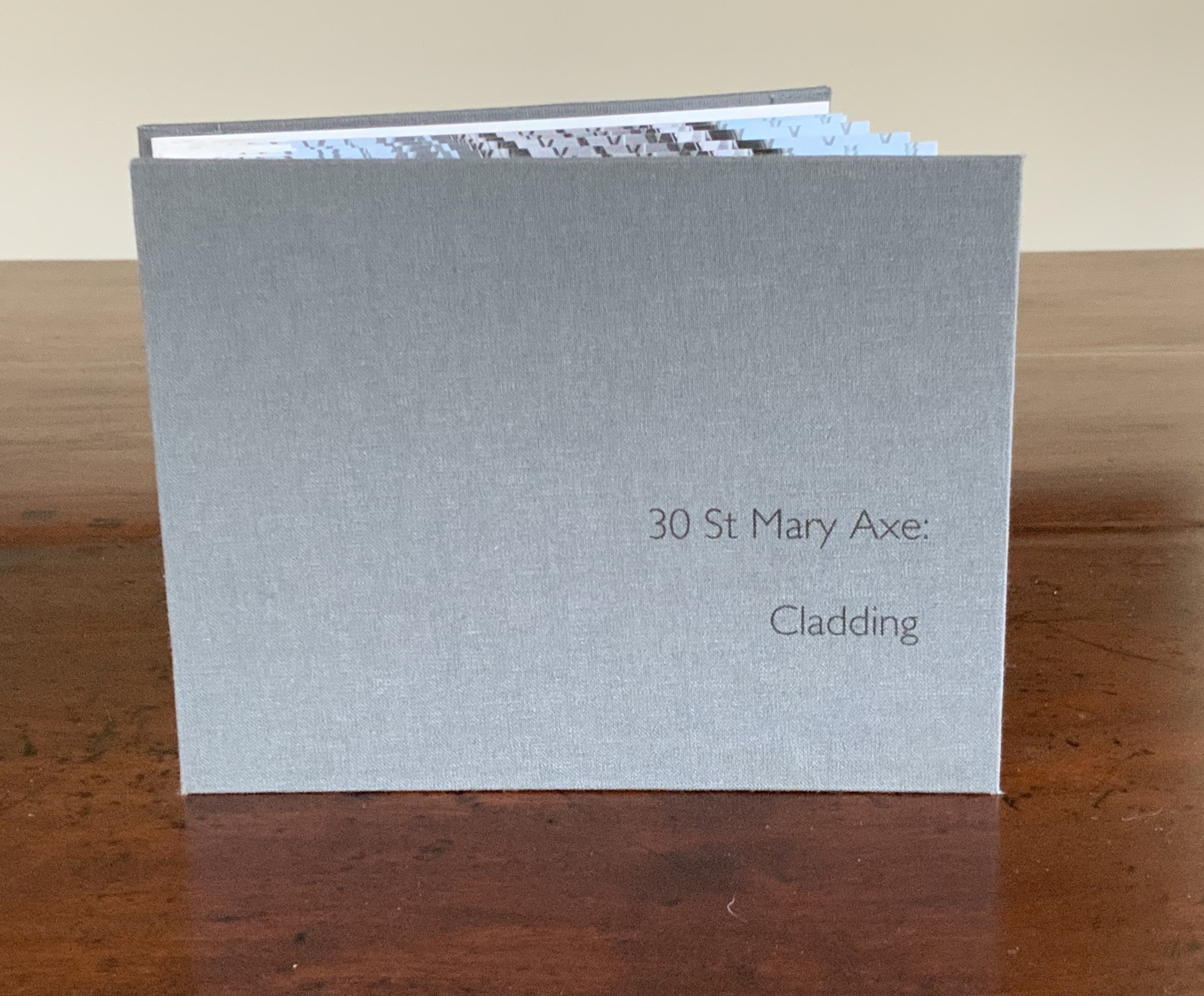
30 St Mary Axe: Diagrid(2009) Mandy Brannan London has nicknamed the building at 30 St. Mary Axe “the Gherkin”. Photo: Books On Books Collection
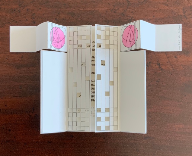
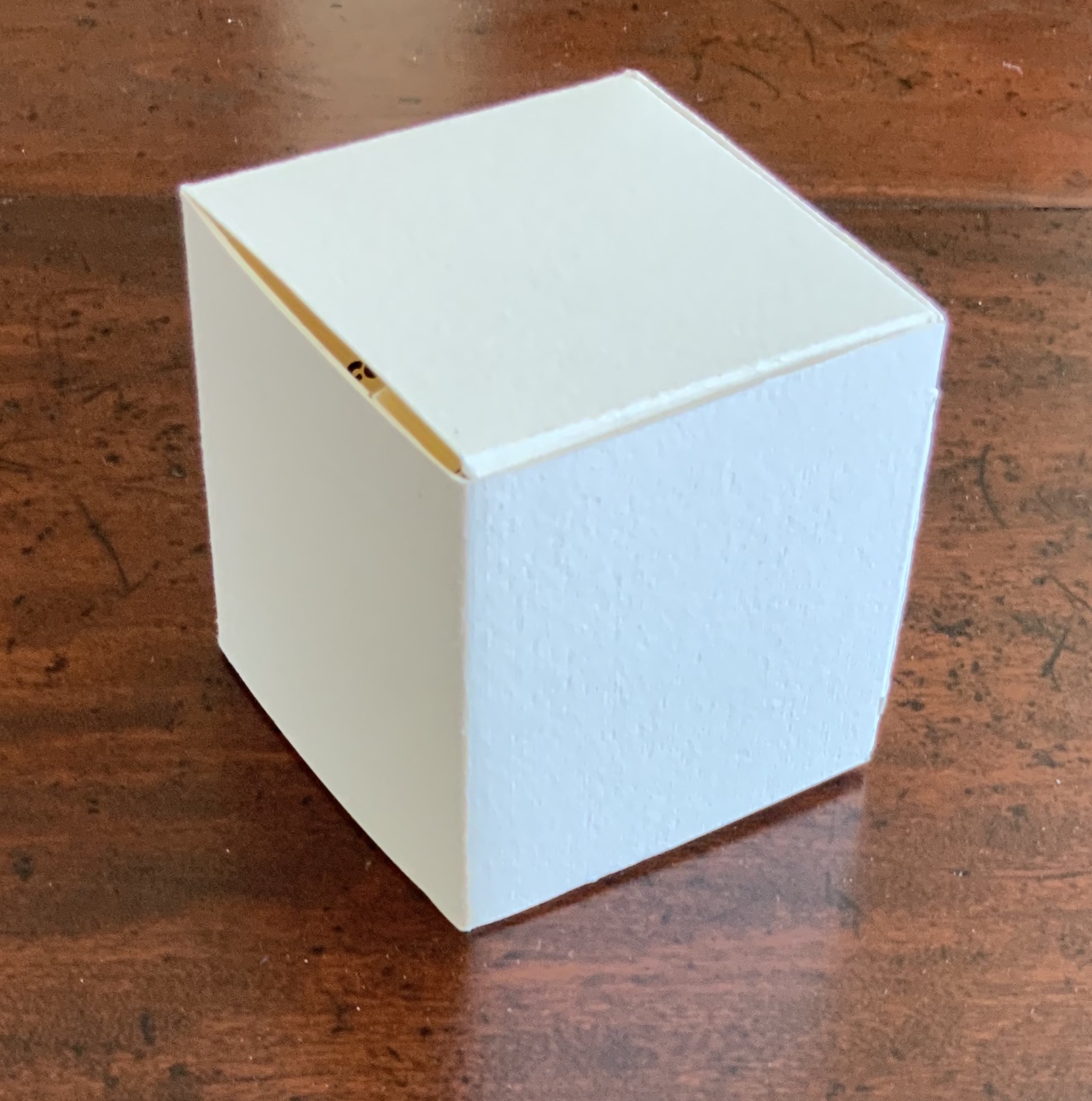
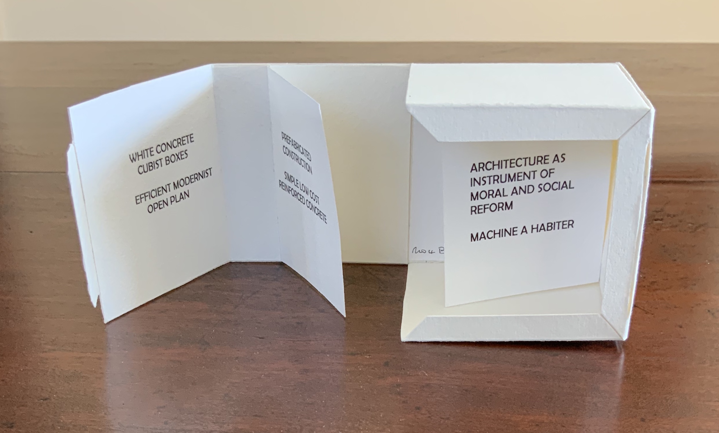
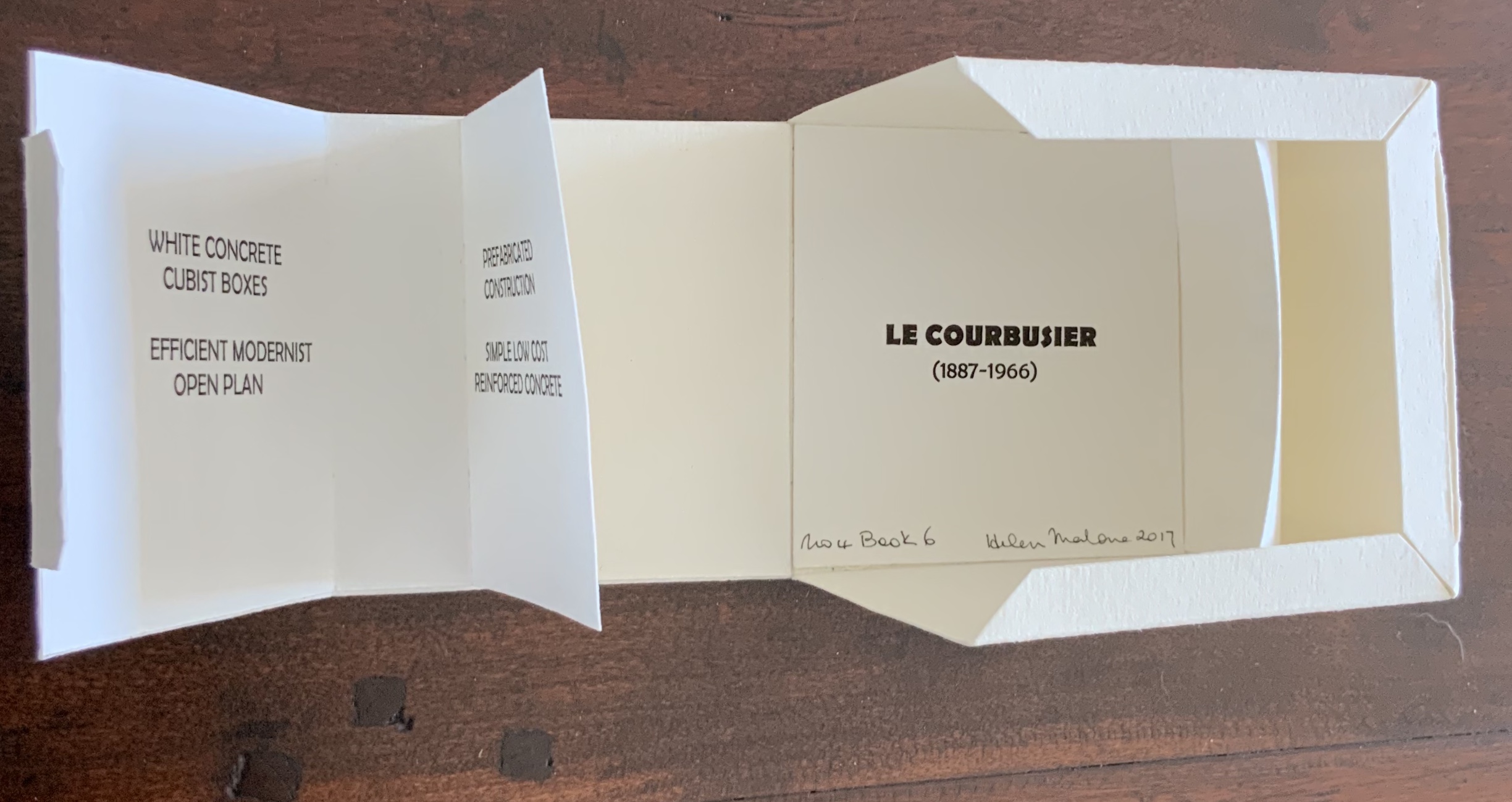
In the The Radiant Republic (2019), Sarah Bryant (Big Jump Press) brings together concrete, wood, glass, paper, ink and embossed printing, sewn binding, box container and texts from Plato and Le Corbusier.
Note the embossed text on the verso. Across the five volumes, the embossed text is the same as that printed in ink, but it runs in fragments backwards from this last page of the last volume to the last page of the first volume. Photo: Books On Books Collection
Bryant’s insightful integration of Plato’s and Le Corbusier’s texts and ideas and her setting them in the physicality of the blond wood, linen cover, embossed type and sewn papers could easily be a response to Pallasmaa’s comment in The Eyes of the Skin: “The current overemphasis on the intellectual and conceptual dimensions of architecture contributes to the disappearance of its physical, sensual and embodied essence.” (p. 35)
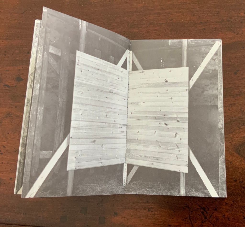
Chinese Whispers (1975) is conceptual, visual and spatial narrative that takes the reader into a “game of embedded games”: a game of Chinese Whispers used by the artists to combine the process of making a book with the process of recovering an old cottage, making a corner cupboard, making jam, making ideas and making an exit.
Chinese Whispers(1975) Helen Douglas and Telfer Stokes Photo: Books On Books Collection
The selection of images above begins with the front cover’s photo of a patch of grass outside an abandoned farm building and ends with the back cover’s photo of the underside of the patch of grass. In between, the pages take the viewer through the trimmed hedge and the doorway into the room, through the building, the stocking of the shelves, using of the stock and closing of the shed cupboard, and so back to the other side of the patch of grass. As Stokes explained in the Journal of Artist’s Books (Vol. 12, 1999):
We started with the corner cupboard, that was the part that occupied our thinking most, that and the two colour vignettes (as we called them) printed on different stock. But then we started to think backward to what might be before the cupboard’s construction. To the thing before that, and the thing before that, and the thing before that which was cutting of the hedge and before that which was the boot brush which we called the hedgehog- that was where the book started. Then we started to photograph from that point forward, through the book.
The work blends the features of book structure, collage and montage to create something that resonates uncannily with Pallasmaa’s approving citations of Bachelard’s central idea of the hearth and domicile as central to our time-bound “being-in-the-world”.
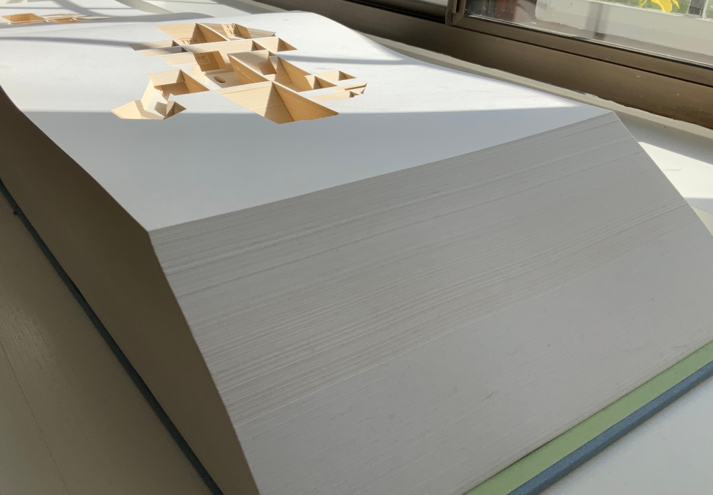
Your House is a laser-cut model of Olafur Eliasson’s residence in Copenhagen at a scale of 1:85, which means that each page equates to a 220 mm section of the actual house. How do you read a work like this — physically? At the 22″ mark in this video, the pages fall in a cascade like a flipbook, but for the most part, their size, accumulated bulk and weight — and delicacy — defy that handling. As in the video below, they must be turned slowly and carefully. Your House heeds the task of the arts as posed by the architect Juhani Pallasmaa, “in our age of speed, …to defend the comprehensibility of time, its experiential plasticity, tactility and slowness” (The Embodied Image, p. 78).
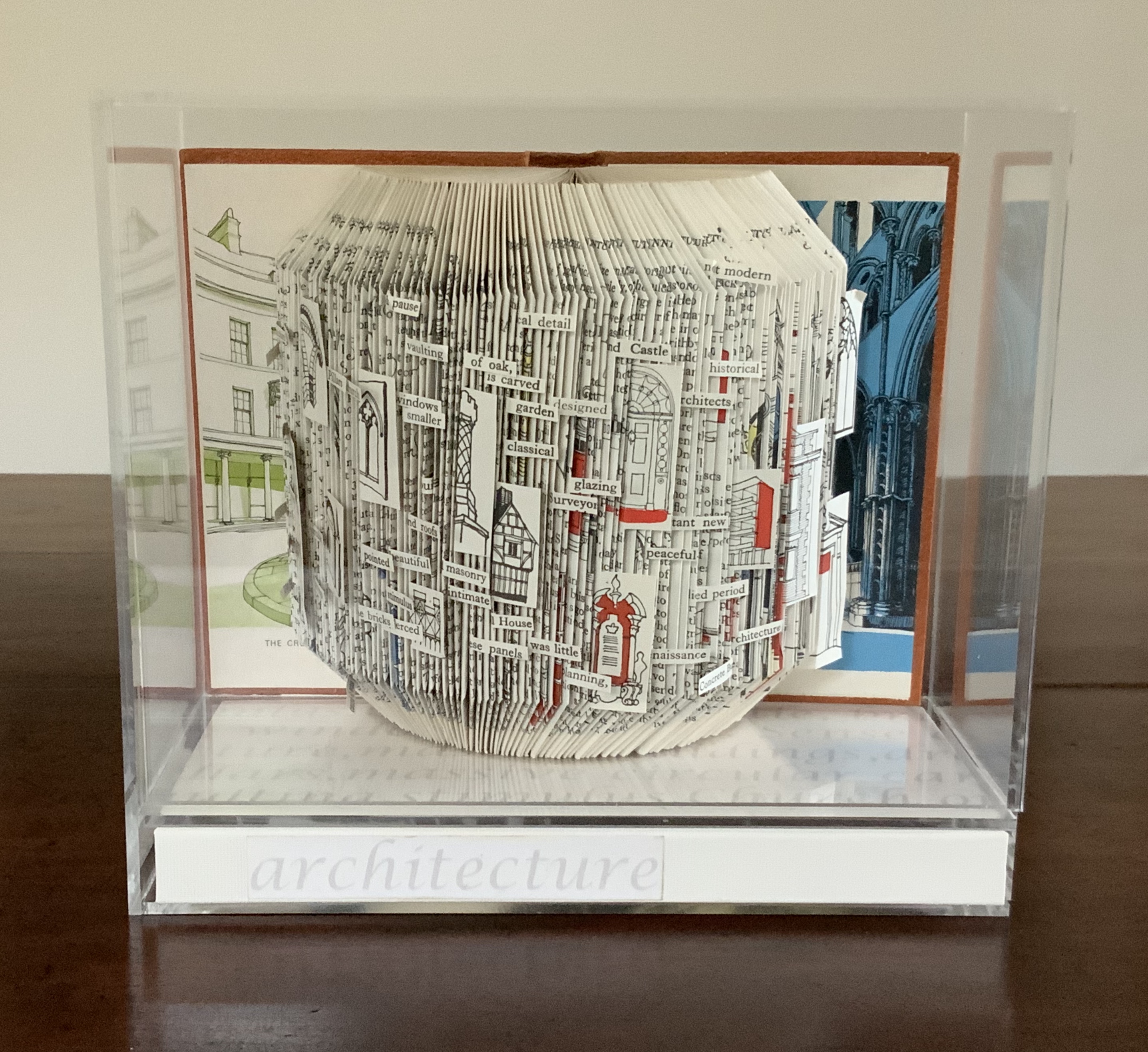
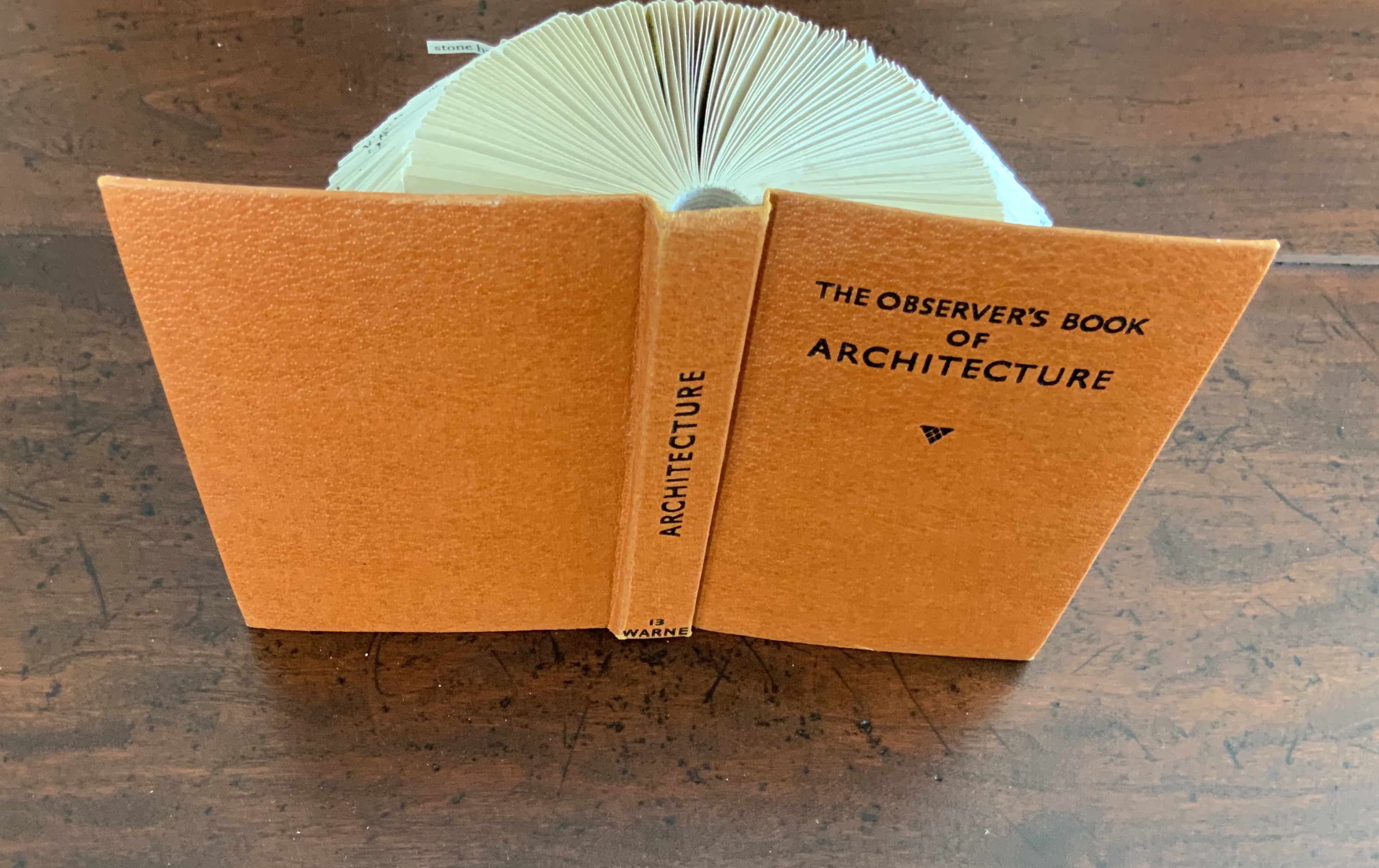
Folded book pages rarely generate a work that rises above mere craft. Heather Hunter’s Observer Series: Architecture (2009) achieves the necessary height. It combines the altered book with an accordion book that incorporates a found poem composed of the words excised and folded outwards from the folded pages of The Observer’s Book of Architecture.
The very fact of a found poem made of excised words that happen to fall at the folds shaping a column from a book on architecture chimes with the title of Bachelard’s The Poetics of Space.
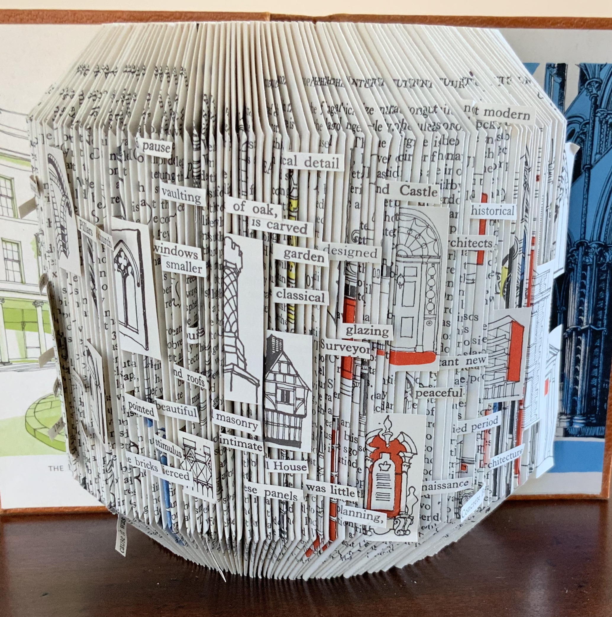
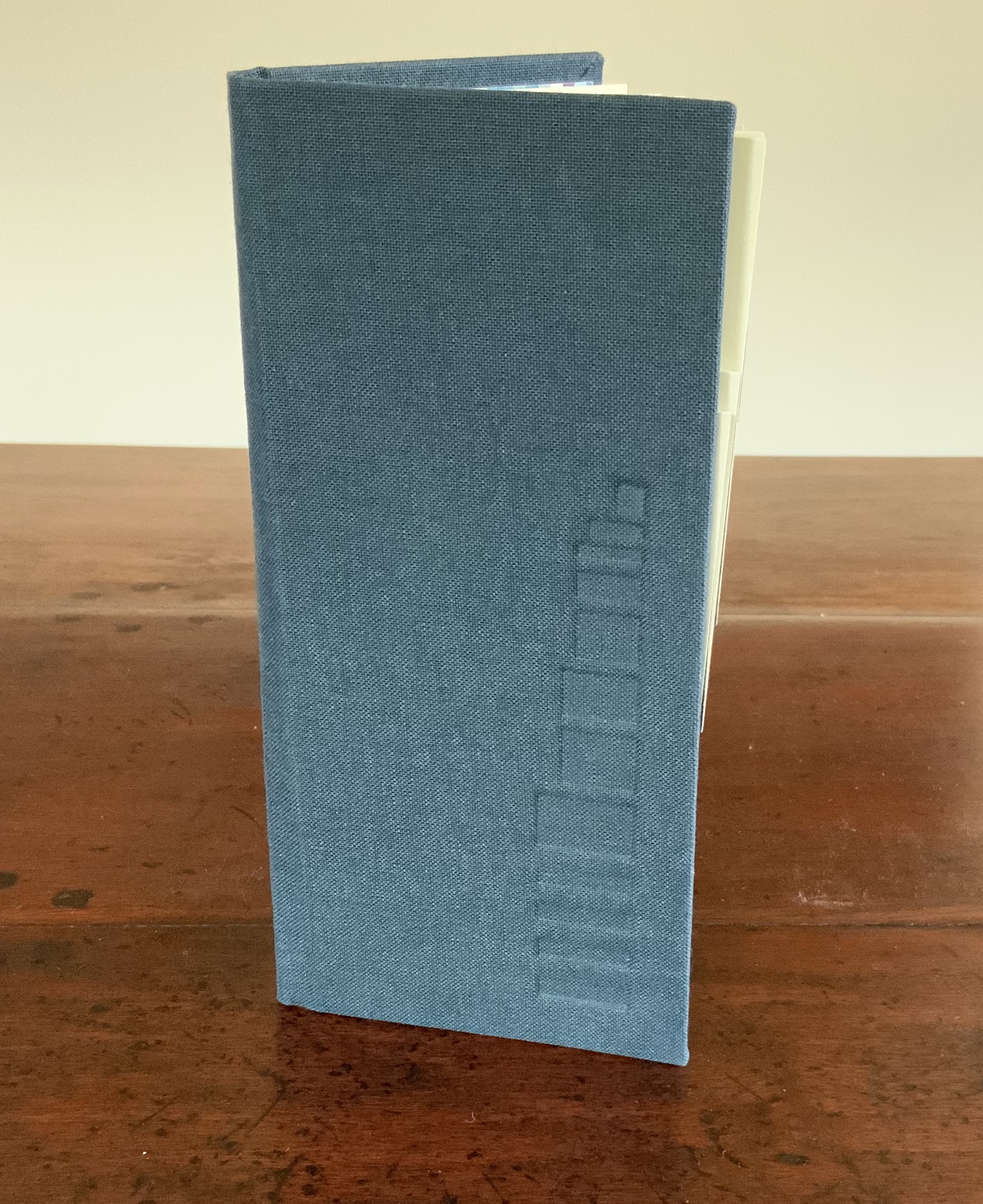
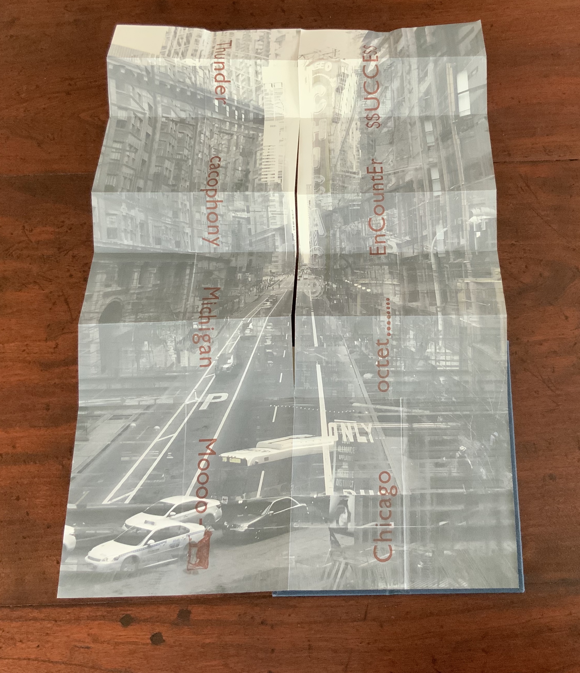
Chicago Octet (2014) byMarlene MacCallum embodies the collaborative creative approach often taken in architects’ practices. Collaborative working arises almost as frequently in book art. Think of Blaise Cendrars and Sonia Delaunay, Helen Malone and Jack Oudyn, Julie Chen and Clifton Meador, Robin Price and Daniel Kelm. Many more can be added. As described by MacCallum:
From May 19 – 26, 2014 a group of eight gathered at the Columbia College Center for Book and Paper Arts for a final collaborative project. This event was organized by Clifton Meador and myself and included David Morrish, Scott McCarney, and four Grenfell Campus BFA (Visual Arts) grads, Stephen Evans, Maria Mercer, Virginia Mitford, and Meagan Musseau…. The letterpress printing consisted of a word selected by each participant printed on one of Scott’s folded structures. The images were a digital layering of every cityscape photograph that I made and then inkjet printed on top of the letterpress. The final folded structure was designed by Mary Clare Butler. The case was designed and built by Scott McCarney, the front cover embossment was by David Morrish and Clifton Meador.
Chicago Octet(2014) Marlene MacCallum Hand bound artist’s book with folded paper structure, letterpress and inkjet printing, 6.5 × 3 × 0.5 inches (closed dimension). Photo: Books On Books Collection
Photo: Books On Books Collection
Chicago Octet fully unfolded, 17.5 × 11.5 inches Photo: Books On Books Collection
Can you hear the traffic and sense the layers of experience? What Pallasmaa writes here of rock art in Africa and Australia reminds me of Chicago Octet (or is it vice versa?): “
At the same time that great works of art make us aware of time and the layering of culture, they halt time in images that are eternally new. … Regardless of the fact that these images may have been painted 50,000 years ago, … we can … hear the excited racket of the hunt.The Embodied Image, p. 109.
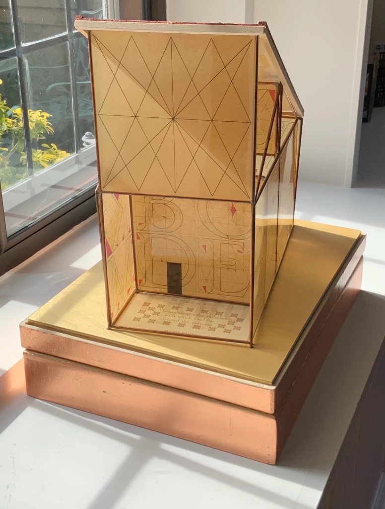
Sacred Space(2003) is an intimate monument of book art. Made intimate by the content and texture of its book, made more intimate by the viewer’s having to construct the chapel. Made monumental by the echo of typographic history, made more monumental in Galileo Galilei’s echo from its floor: Mathematics is the alphabet with which God has created the universe.
Sacred Space (2003) Jeffrey Morin and Steven Ferlauto Book: Reduction linoleum prints with typographic illustrations using overprinting of letterforms; open spine sewn with brown cord binding; brown cloth-covered boards; title and design on front board; endpapers of handmade paper from Nepal. Book: 6 x 14.25″; 17 leaves. Chapel kit: Six walls, roof, base. Walls: copper rod skeleton with Okawara rice paper skin covered with a casting resin. Book and kit housed in wooden box. Roof copper-leafed Davey board. Roof forms the tray in which the book rests. Base: Box lid becomes the base for the chapel. Brass holes in the base allow the rods to fit exactly. Print pattern on the base becomes the floor pattern. Box painted with copper leaf. Sculpture base 15.75 x 11.5″, height 12″. Edition of 35, of which this is #23. Photo: Books On Books Collection.
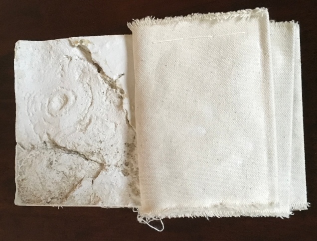
Mill: A journey around Cromford Mill, Derbyshire (2006) is the result of the artists’ exploration of Cromford Mill in Derbyshire, the first water-powered, cotton-spinning mill developed by Richard Arkwright in 1771. Solid, plaster cast blocks are held softly between calico pages containing hidden texts, bound in recycled wooden library shelf covers that indicate there is history to be found within.
Mill: A journey around Cromford Mill, Derbyshire (2006) Salt + Shaw (Paul Salt and Susan Shaw) Photo: Books On Books Collection
Having Mill is like having the building inside your house.
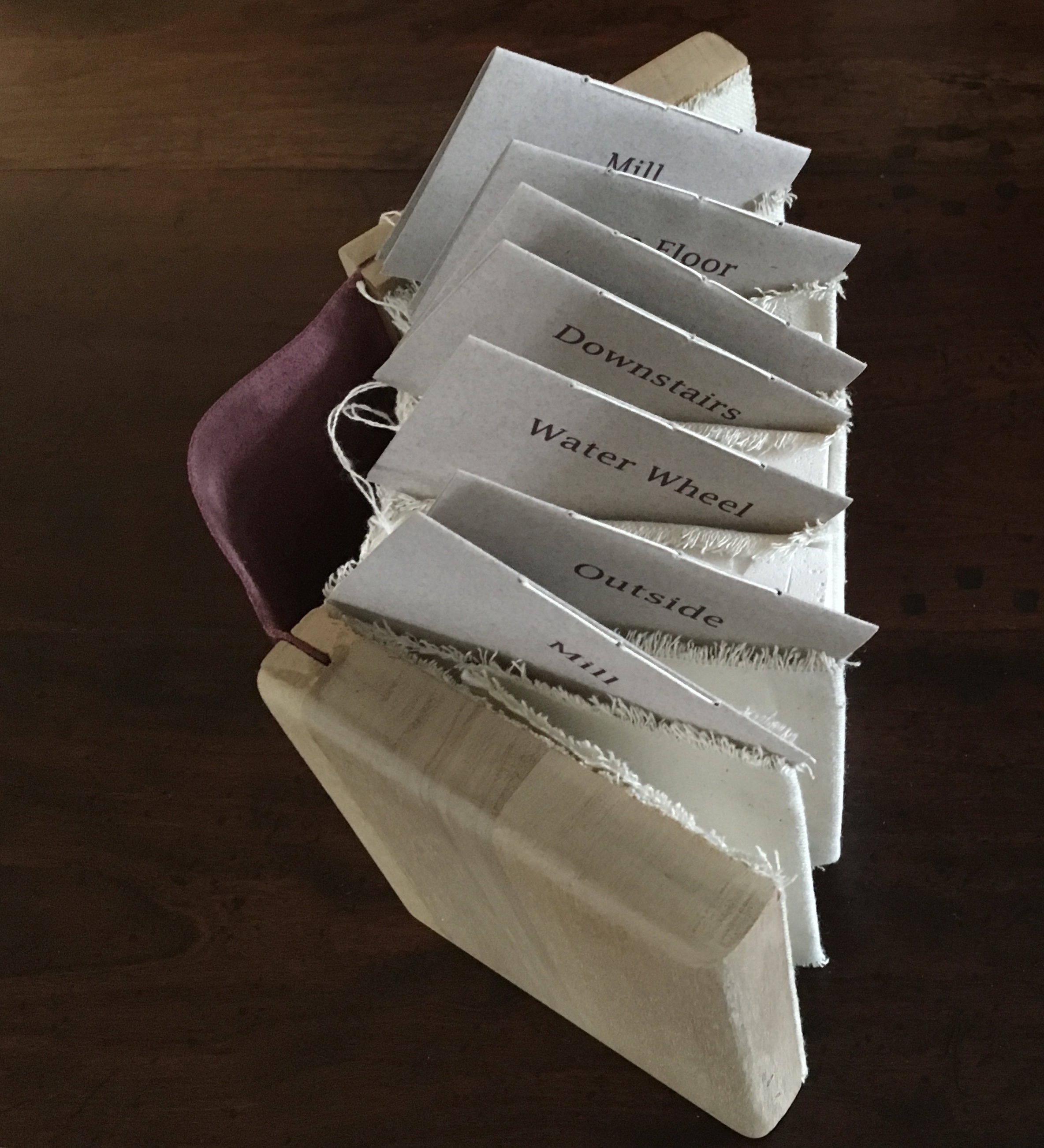
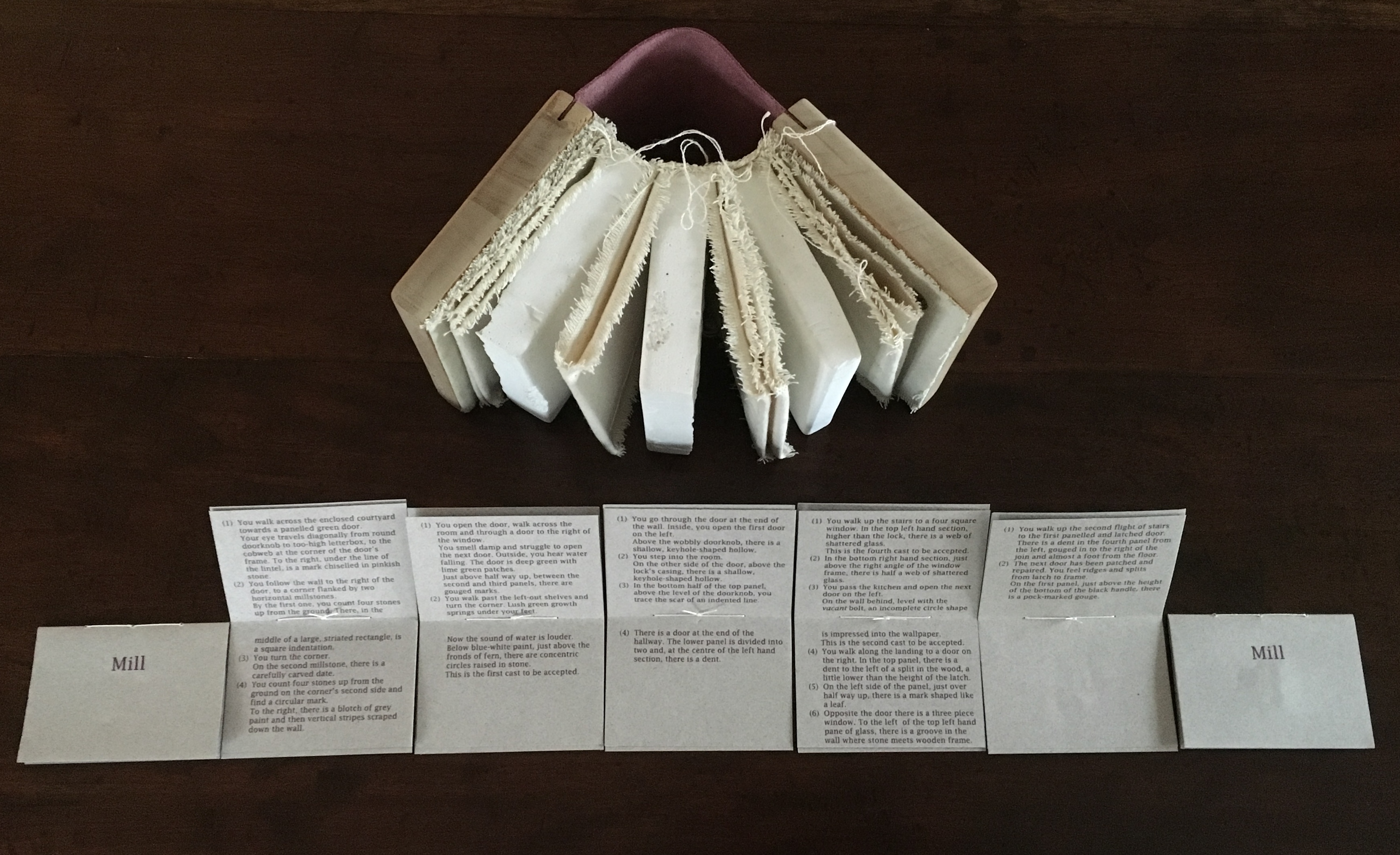
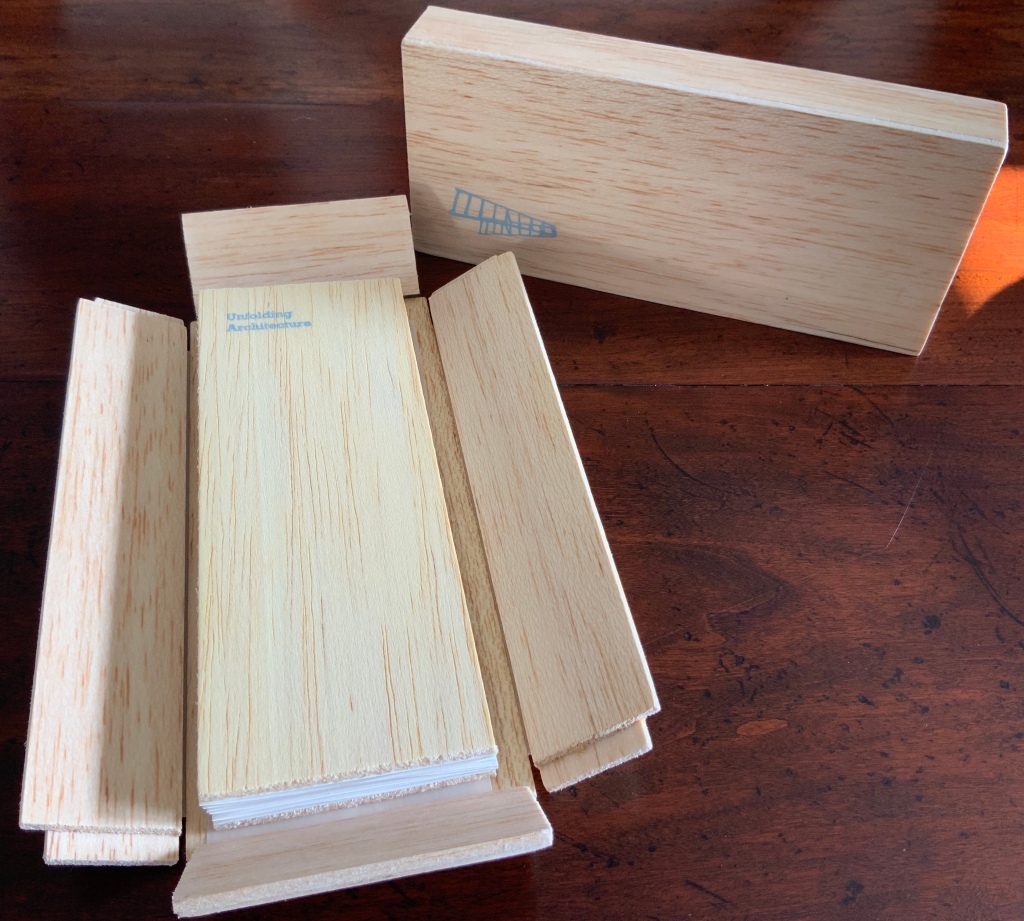
When Emily Speed is not creating architectural costumes for architectural performative art, she creates artist’s books to express her inner edifices. Unfolding Architecture (2007) coheres title, metaphor, narrative, image, technique of silk-screening, letterpress, texture of paper and wood, the workings of the accordion and box enclosure — all — into an artwork about un-cohering.
Unfolding Architecture(2007) Emily Speed Double-sided accordion book, attached to balsa wood covers, housed in a hinged, covered box of balsa wood. Book – H190 x W70 x D18 mm (closed), H190 x ~W2280 (open); Box – H203 x W88 x D63 mm; 24 panels, including cover panels. Edition of 90, of which this is #7. Acquired from the artist, 24 October 2020.
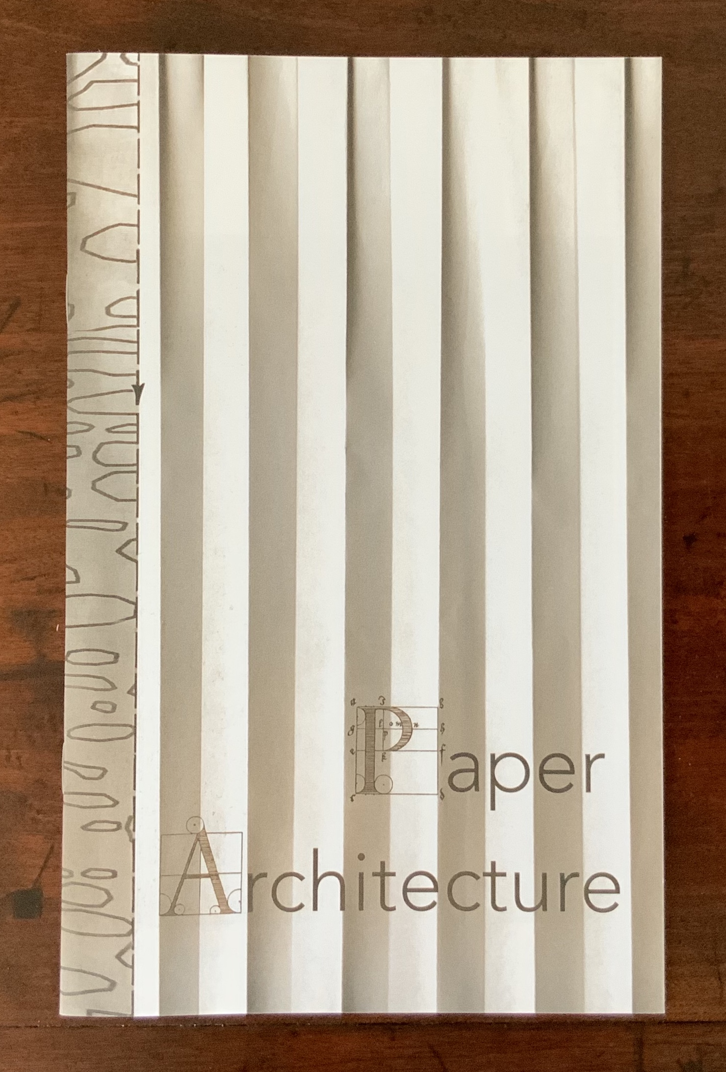
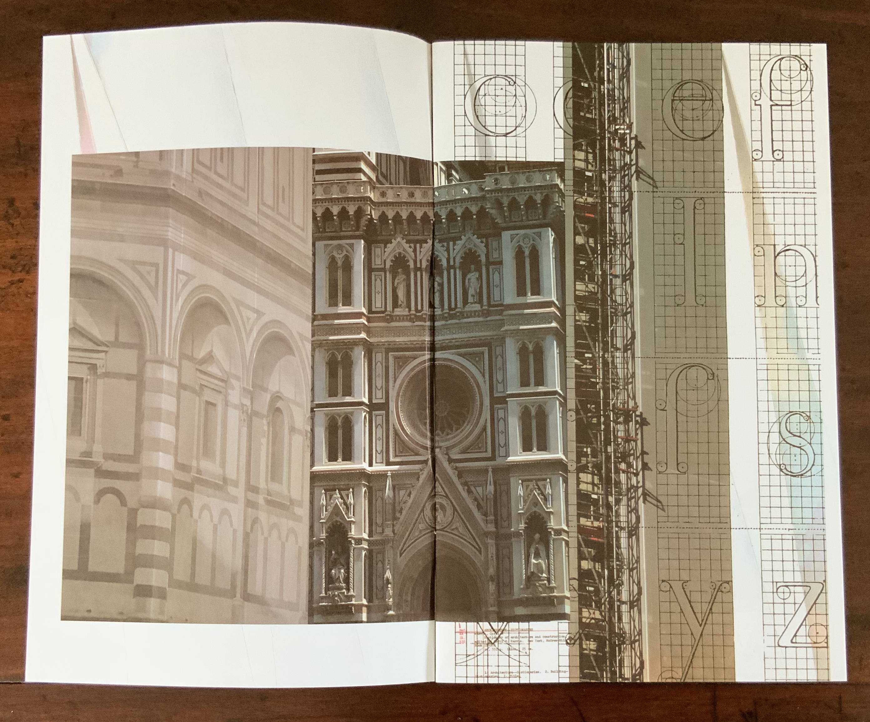
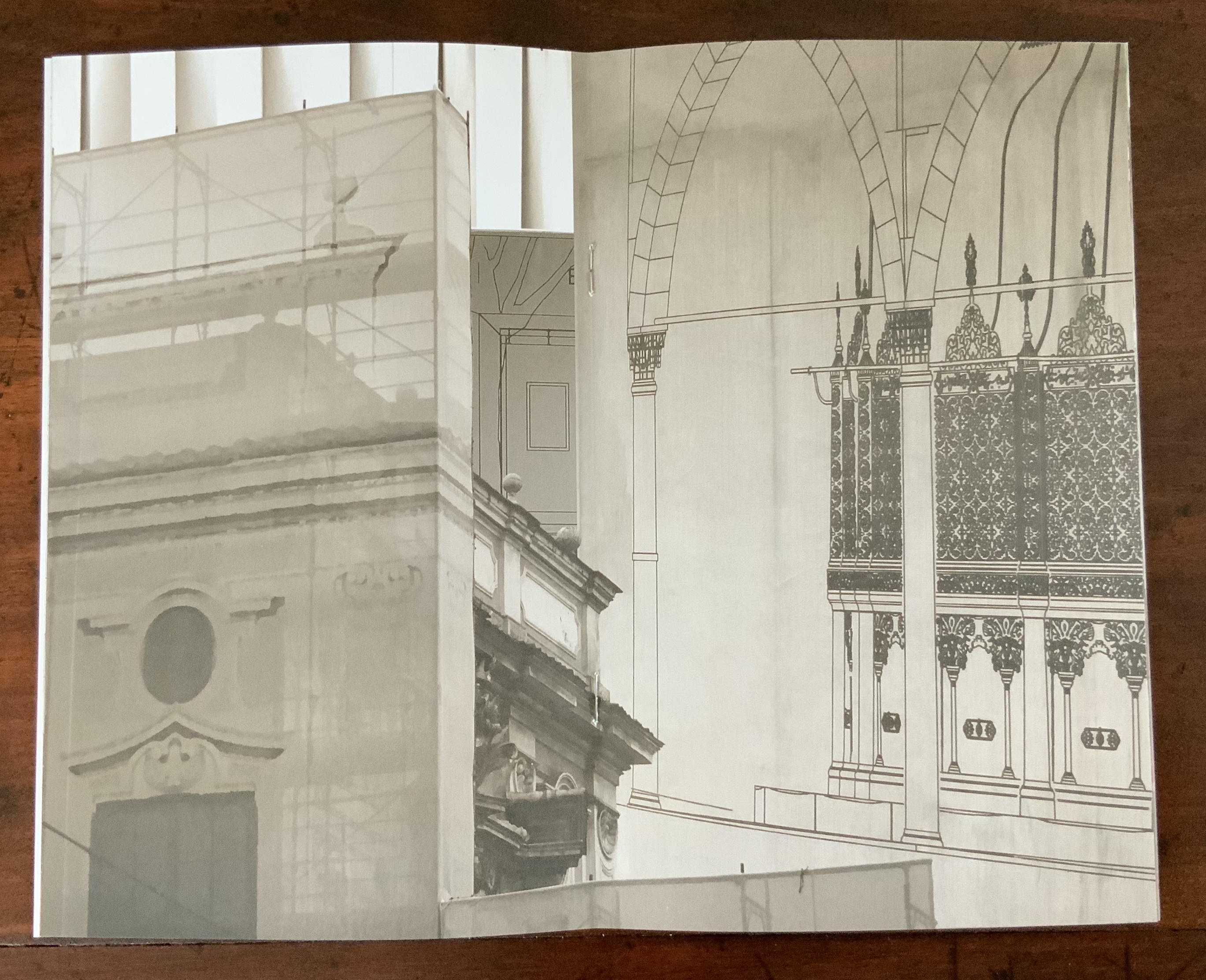
Architecture plays more than an inspirational role in Karen Wirth’s portfolio. As mentioned above, she has created her own take on Vitruvius’ Ten Books. She designed the Gail See Staircase at Open Book and the Hiawatha Light Rail Station, both in Minneapolis. The collage work Paper Architecture is based on an architectural installation at the Minnesota Center for Arts Design and draws on Wirth’s photos of Ayvalik, Amsterdam, Florence, Istanbul, New York City, Rome, San Diego and Venice.
In The Embodied Image, Pallasmaa singles out “the collaged image” as creating “a dense non-linear and associative narrative field through initially unrelated aggregates, as the fragments obtain new roles and significations through the context and dialogue with other image fragments” (pp.71-72). The materially disparate words in the title of Wirth’s work imply the dialogues she creates among paper, designs of letters and architecture, buildings across time and the globe, and photos tinted, four-colour, and black-and-white in palimpsest.
For Wirth’s own comments about the intersection of book art and architecture, see her interview with Betty Bright.
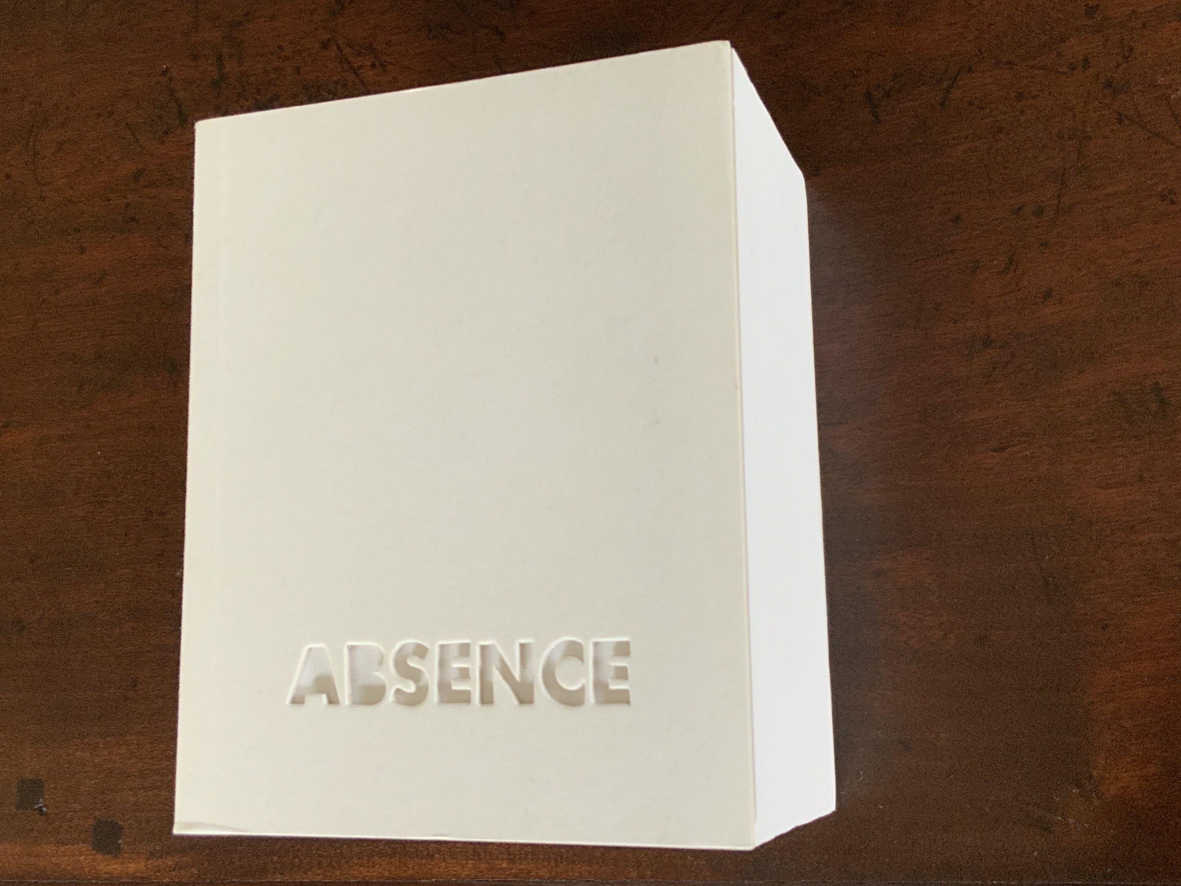
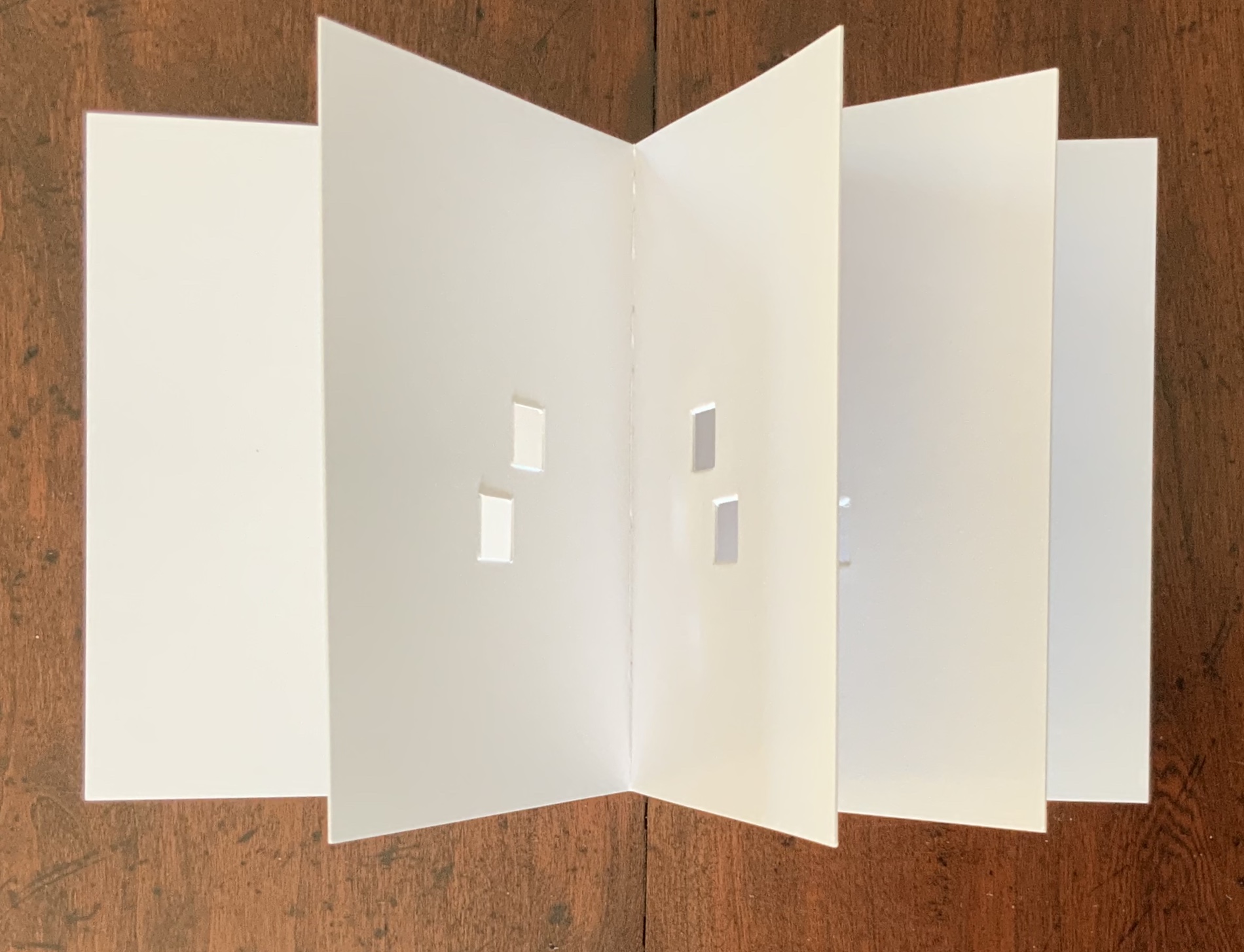
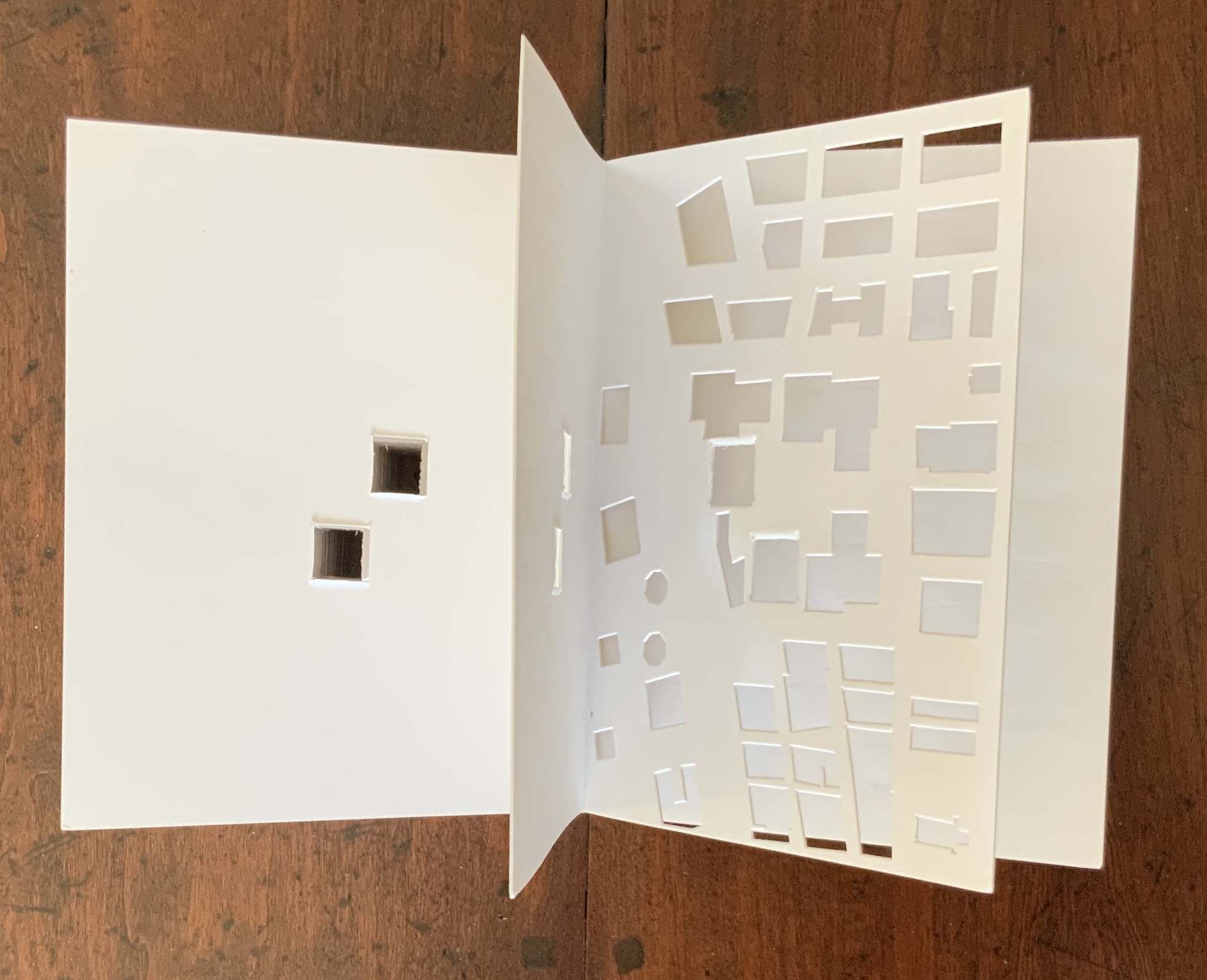
Former professor and head of the Department of Architecture at MIT’s School of Architecture and Planning, Yoon is now Gale and Ira Drukier Dean of the College of Architecture, Art and Planning at Cornell University. She is also cofounder of Höweler + Yoon, a design-driven architecture practice. Absence appears to be her only work of book art so far.
When you hold this small white brick of paper and turn its thick pages, a small pinhole appears on the page. Then two larger square holes emerge, one of which falls over the pinhole. Page after page, the two square holes repeat, creating two small dark wells in the field of white, until on the last page they take their place in the cut-out schematic footprint of the city blocks and buildings surrounding the Twin Towers of New York City. What you hold in your hands at the end is an object of art and book of memorial prayer.
Absence (2003) J. Meejin Yoon Photo: Books On Books
Other sites, other works
Twice a semester, the Environmental Design Library at the University of California, Berkeley hosts “Hands On: An Evening with Artists’ Books”. In 2017, one evening’s theme was “Building on the Built”, illustrated by 25 works of book art. Organised by 23 Sandy Gallery in the same year, “BUILT“ was an international juried exhibition featuring 66 artist books by 51 artists examining the relationship between contemporary book art practices and architecture, engineering, landscape and construction.
Arranged alphabetically by artist’s name, this section provides links to works from these two exhibitions as well as other collections, exhibitions, installations and recommendations from the Book-Arts listserv members.
A Crisis Ethicist’s Directions for Use: Or How to be at Home in a Residence-cum-Laboratory (2003) Inge Bruggeman Photos: Courtesy of the artist
On her site, Bruggeman writes, “This book/box project is built around excerpts from Architectural Body by Madeline Gins and Arakawa…. incorporates a blueprint of their Bioscleave House as part of the imagery….”. Somewhat like A Clockwork Orange or perhaps more like Heideigger’s tomes, the Gins and Arakawa book is a challenge to the reader’s expectations of diction and syntax.
Richard Minsky: Model of Buckminster Fuller’s Tetrascroll (1979). See also Polly Lada-Mocarski, Richard Minsky and Peter Seidler, “Book of the Century: Fuller’s Tetrascroll“, Craft Horizons, October 1977 (Vol. 7, No. 35). For one (very helpful) reading of Tetrascroll see Jessica Prinz’s “The ‘Non-Book’: New Dimensions in the Contemporary Artist’s Book” in The Artist’s Book: The Text and its Rivals, a special two-issue volume of Visible Language, Vol. 25, Nos. 2/3, edited by Renée Riese Hubert (Providence, RI: Rhode Island School of Design, 1991), pp. 286-89.
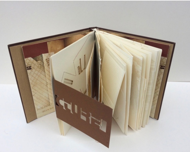
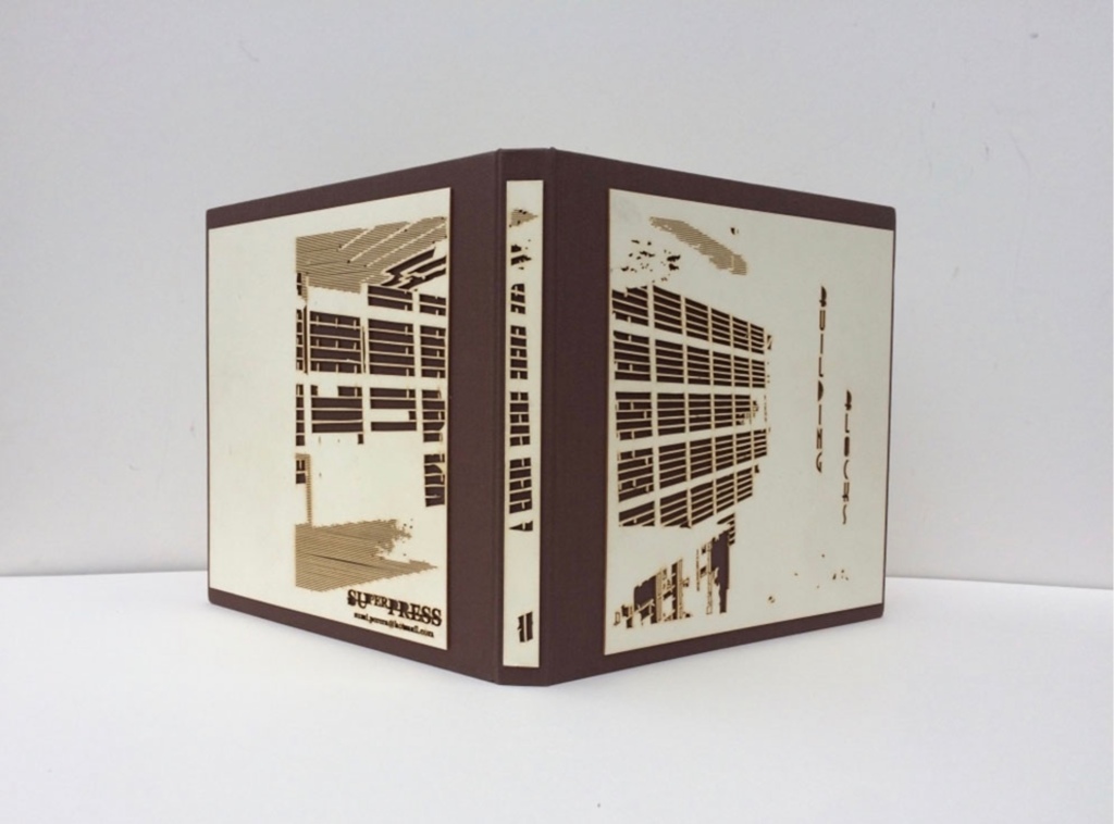
Building Blocks Book XVII (2017) Sumi Perera Photos by artist’s permission
Going against the usual structure of the book, that of a beginning, a middle and an end, Perera provides a space for infinite possibilities and multiple authors, creating “modules that can be re-sequenced and re-aligned to develop variable permutations and encourage participatory involvement, to share the final editorial control with the viewer to transform the ever-evolving work”.These possibilities for variable permutations are no more evident than in her constantly evolving project, Building Blocks Book, and its numerous subsequent iterations including The Negative Space of Architecture and The House That Jack Never Built (2008). Once again we find Perera exploring human interaction, not only with the concepts and her quizzical ideas surrounding architectural and public spaces and how we build between and move within, but also the physical interaction with the artists’ books she produces – the rearrangement and reinsertion of pages which allow the audience and participants new opportunities and pathways to proceed. Through the positive and negative space of the page or the type font, the Underground versus over ground, the artist takes us on journeys that are at once fluid and at other times obstructive. In these cityscapes, the U-turn is as common as the page turn – a necessary rupture in a free-flowing narrative. Chris Taylor, From Book to Book (Leeds: Wild Pansy Press, 2008).
Robbin Ami Silverberg: Home Sweet Home (2006). Artist’s description — “an architectural album of an imaginary middle-class suburban house, … its plans and layout [filled] with the many proverbs I’ve found about women in the home. The book was printed to look like the almost obsolete technique of Diazo printing (blue-printing), but in fact, it is archival inkjet.”
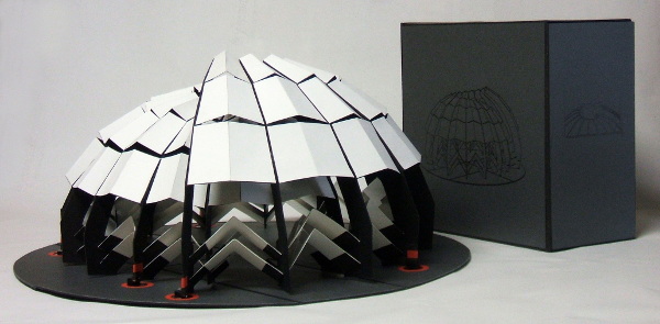
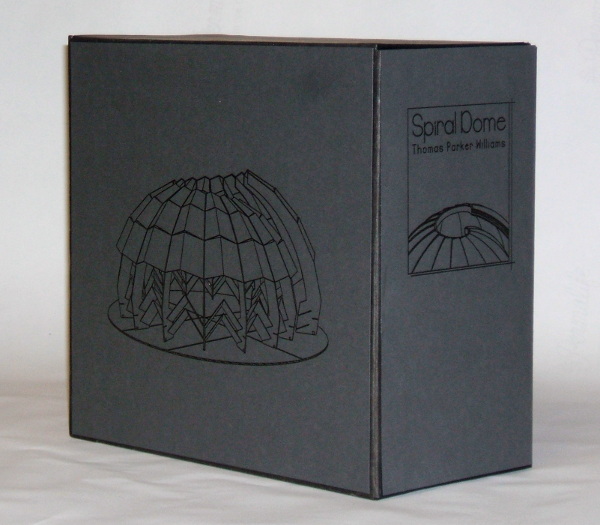
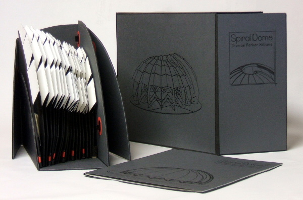
Spiral Dome: Sculptures in Paper and Steel (2016) Thomas Parker Williams Photos: Courtesy of the artist
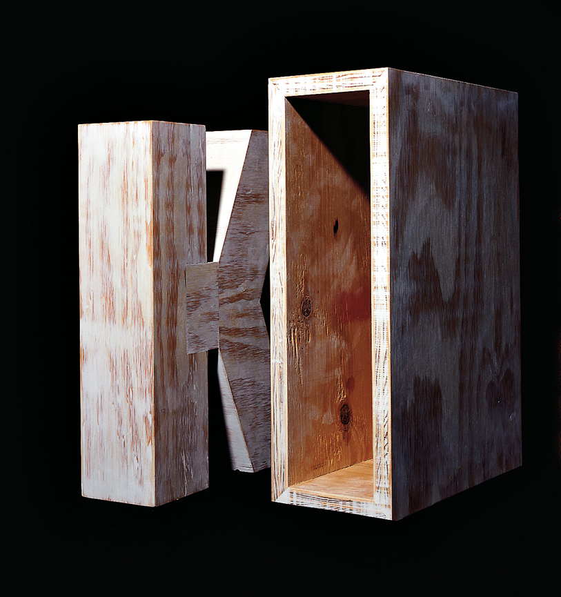
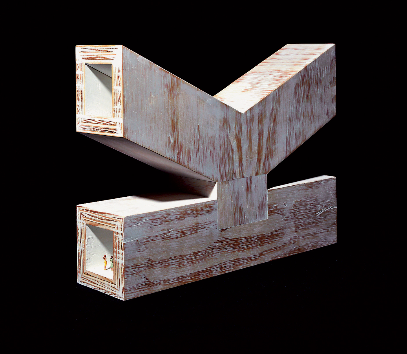
Update: With the addition of Marian Macken’s book Binding Space, mentioned above, comes the Vedute Foundation, a collection of objects/manuscripts by artists/designers/architects created within the constraint that each work has the proportion of the Gutenberg Bible and the relationship of ‘Text’ and ‘Form’ as its subject. For this essay in Books On Books and for the Books On Books Collection’s acquisition of the Merrion edition of Johann David Steingruber’s Architectural Alphabet, the most apropos and favorite work in the Vedute collection is K (1996) by Peter Wilson.
K(1996) Peter Wilson “This contribution (a double volume) is based on the letter ‘K’ (an atom of language), materialised within the Gutenberg proportions in sturdy plywood. It is the responsibility of an architect not only to ‘give form’ but also to explore latent interiorities, potential spatialities. Here the ‘K’ interior has its own inherent geometric agenda − a tunnel, a tube, an inverting telescope (apex mirror). Object becomes instrument (a window to the antipodes even), a trigger for multiple ‘K’ vectors (textural and spatial).” Bolles+Wilson
23 Sandy Gallery. 2017. Built: an international exhibition of contemporary artist books, April 7-May 27, 2017. Portland, Oregon: 23 Sandy Gallery. “… examining the relationship between contemporary book art practices and architecture, engineering, landscape and construction as form, function and structure. Book artists took this opportunity to re-image the ways we as designers, of either books or buildings can inhabit and shape the world around us. Our disciplines have a natural synergy. After all, books and buildings are both kinetic, sequential, structural and time based. BUILT examines the relationship between the built and the book. BUILT features 66 artist books by 51 artists from across the country and as far away as Canada, United Kingdom and Australia.” Publisher’s website.
Sophia Kramer, “Variations of Vitruvius: Four Centuries of Bookbinding and Design”, The Met, 22 August 2018. This essay reviews and illustrates the conservation and rehousing of ninety-five copies of De Architectura libri decem (The Ten Books of Architecture) by Marcus Pollio in the collection of the Department of Drawings and Prints. They are part of a donation of 356 publications from the architect William Gedney Beatty (1869–1941). For book artists, the section on a 1556 edition with double volvelles to display a theater design should be of interest.
Marian Macken, Binding Space: The Book as Spatial Practice (London: Taylor and Francis, 2018). A trained architect and book artist, Macken articulates and illustrates the how and why of the overlap between architecture and book art.
David Sume, The architectural nature of the illustrated books of Iliazd : (Ilia Zdanevich, 1894-1975, University of Montreal, 2019. This dissertation is a reminder that the importance of architecture to book art reaches back to the avant-garde and modernists of the early 20th century — and more important, that its importance may lie beneath the surface.
Elizabeth Williams, “Architects Books: An Investigation in Binding and Building”, The Guild of Book Workers Journal, Volume 27, Number 2, Fall 1989. This essay not only pursues the topic of architecture-inspired book art but turns it on its head. An adjunct professor at the time, Williams set her students the task of reading Ulises Carrión’s The New Art of Making Books (Nicosia: Aegean Editions, 2001) then, after touring a bindery, “to design the studio and dwelling spaces for a hand bookbinder on an urban site in Ann Arbor, Michigan”. But before producing the design, the students were asked “to assemble the pages [of the design brief and project statement] in a way that explored or challenged the concept of binding”. In other words, they had to create bookworks and then, inspired by that, create their building designs. Williams illustrates the essay with photos of the students’ bookworks. [Special thanks to Peter Verheyen for this reference.]
Renée Riese Hubert and Judd D. Hubert’s The Cutting Edge of Reading: Artists’ Books (Granary Books, 1999) is a signal work of appreciation and analysis of book art. Nearly twenty years on, it can be read and appreciated itself more vibrantly with a web browser open alongside it.
To facilitate that for others, here follows a linked version of the bibliography in The Cutting Edge of Reading — a “webliography”. Because web links do break, multiple, alternative links per entry and permanent links from libraries, repositories and collections have been used wherever possible. These appear in the captions as well as the text entries. Also included are links to videos relating to the works or the artists. At the end of the webliography, links for finding copies of The Cutting Edge (now out of print) are provided.
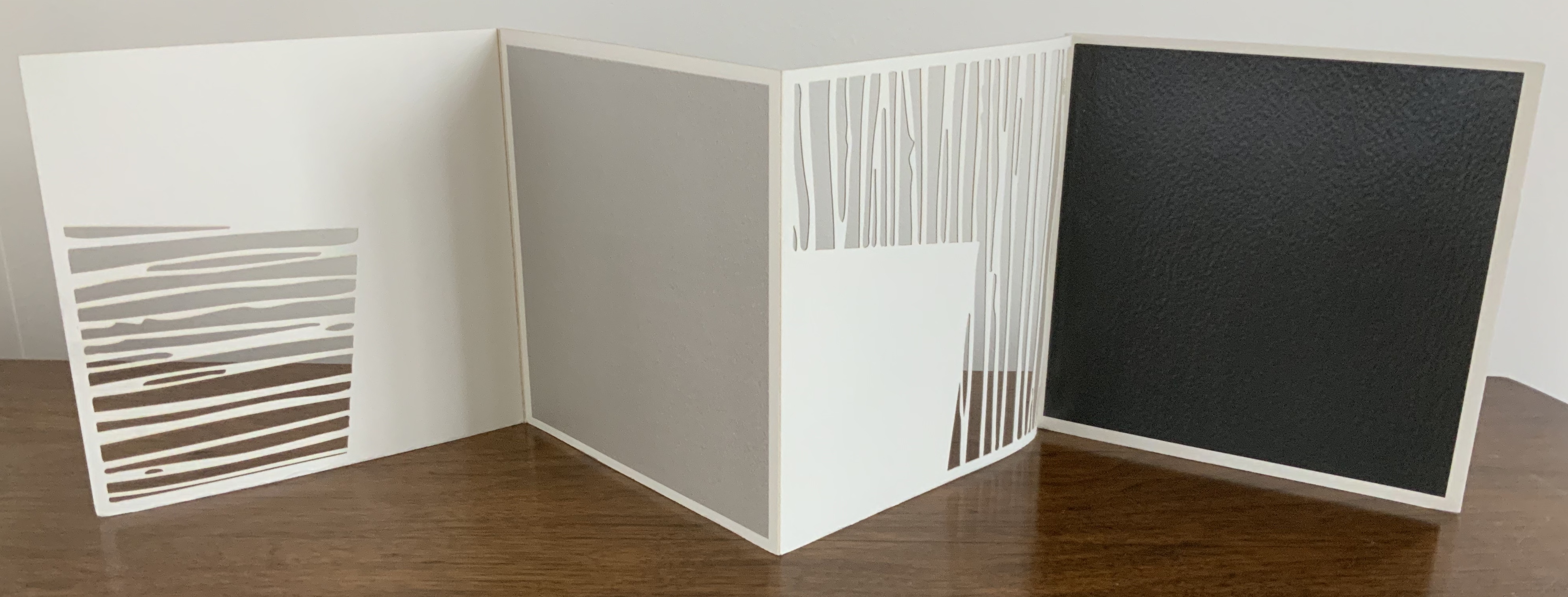
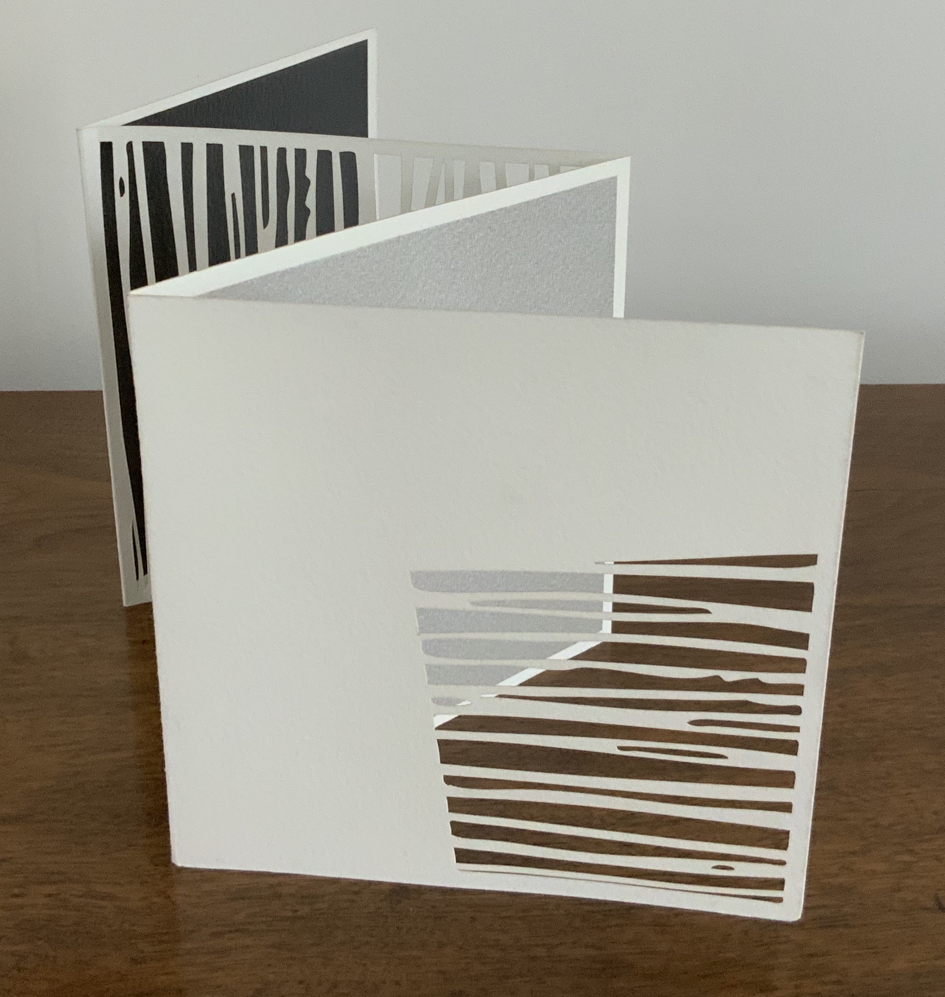
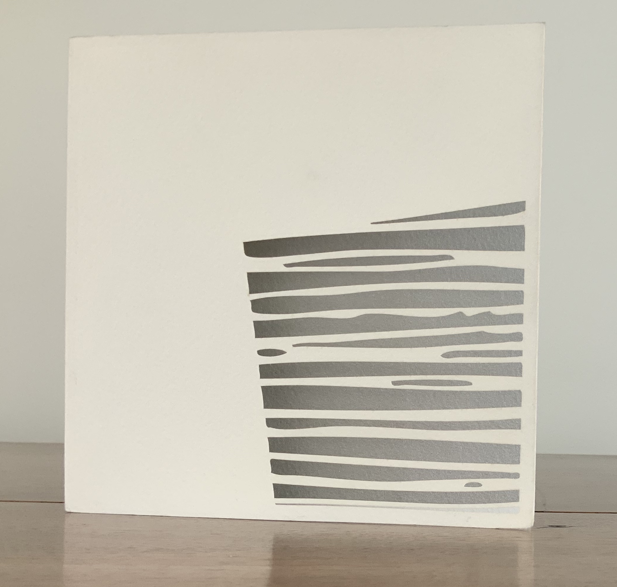
Untitled (2006) Jenny Smith Matte-beige slot-and-tab case containing eight-panel leporello, four panels lasercut and three screenprint. Case: 167 x 167 mm; Book: 165 x 165 mm. Edition of 25 of which this is #21. Acquired from the artist, 31 July 2017. Photo: Courtesy of the artist.
Photos: Books On Books Collection.
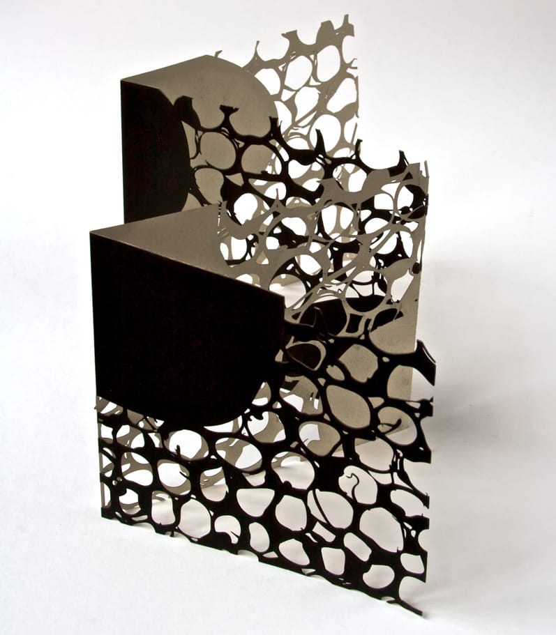
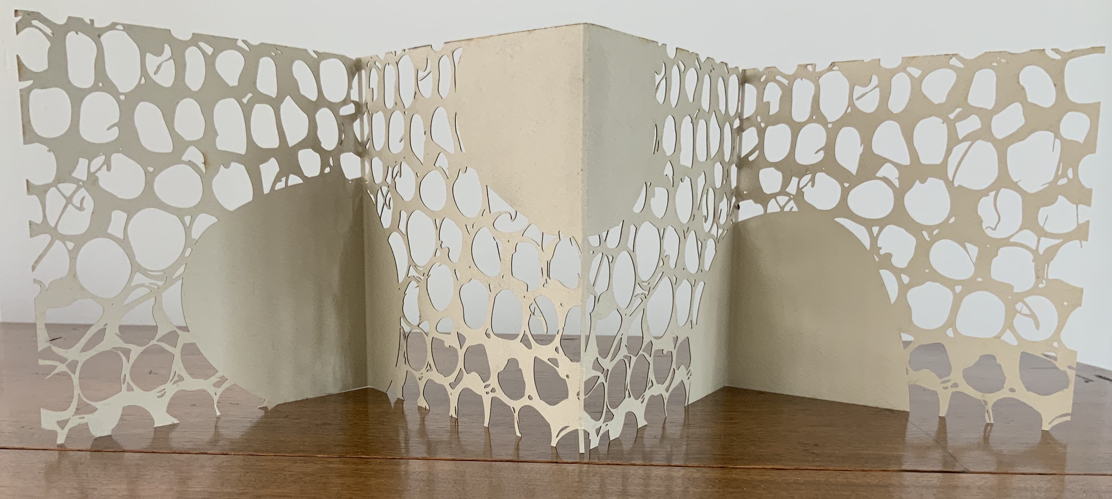
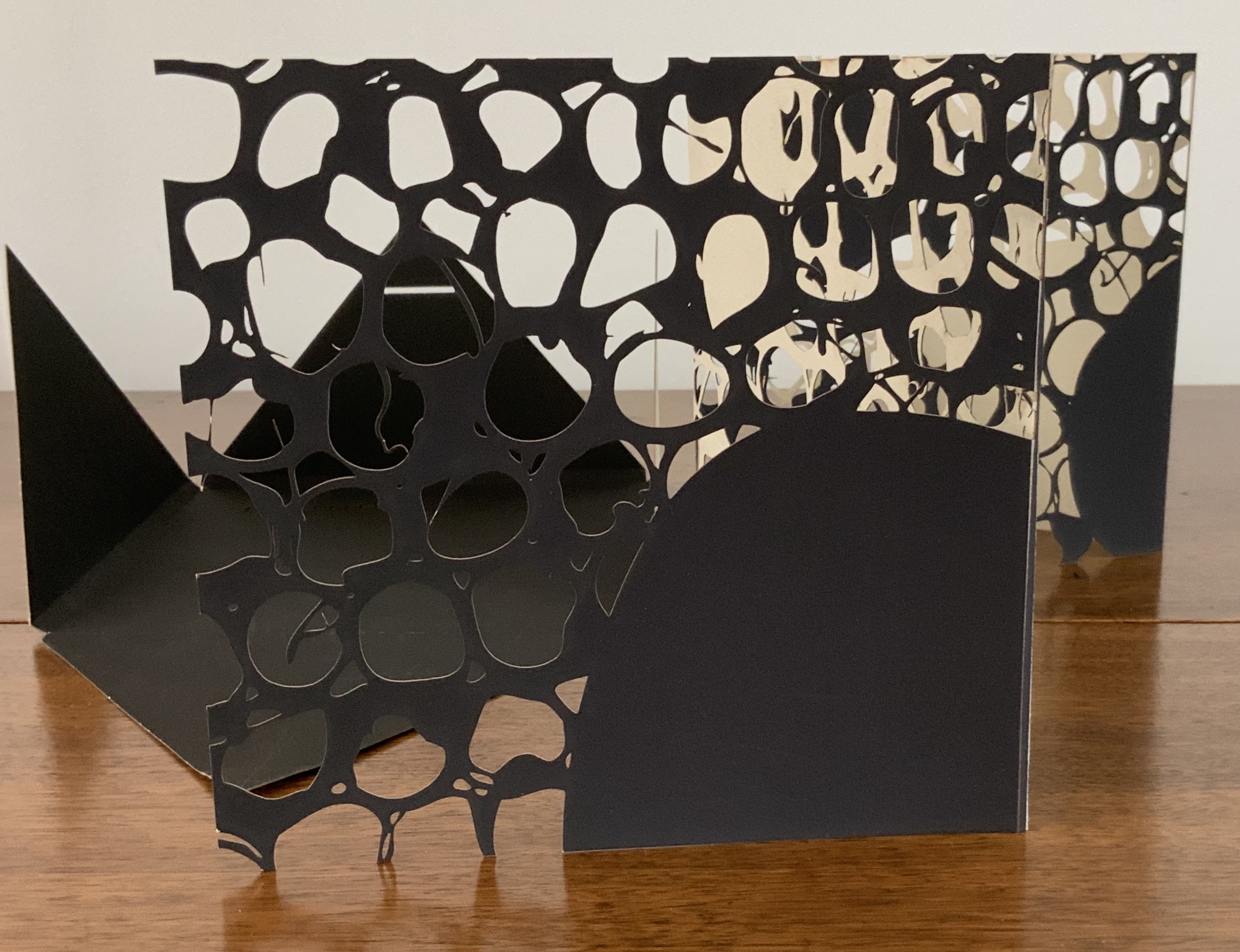
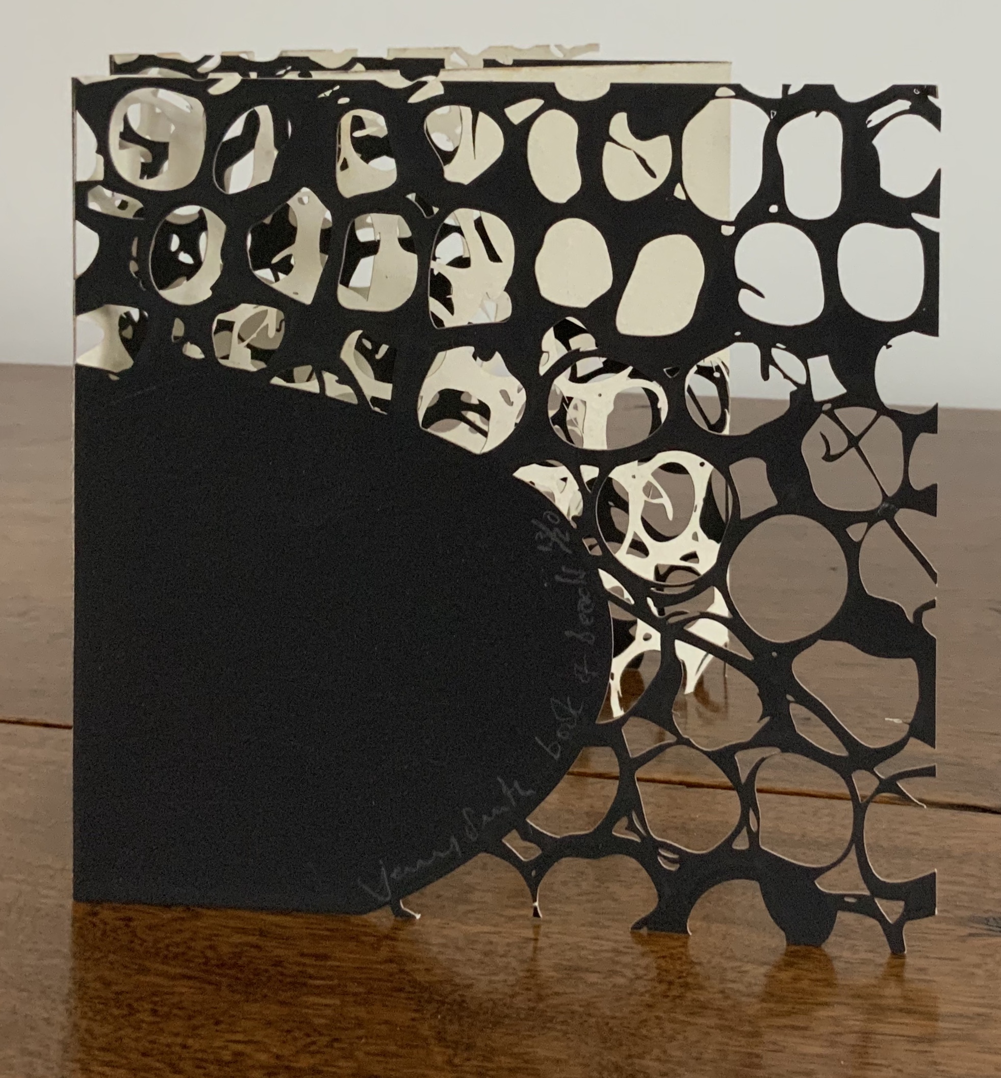
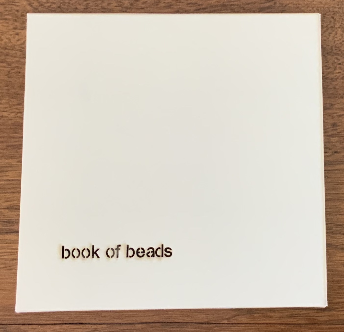
Book of Beads (2008)
Book of Beads (2008) Jenny Smith Case of beige matte-finish, screenprint black interior, title lasercut: 165 x 165 mm; Book in accordion-fold, eight panels lasercut, taupe on one side, screenprint black on other, 160 x 160 mm Edition of 20 of which this is #13. Acquired from the artist, 31 July 2017. Photo: Courtesy of the artist.
Photos: Books On Books Collection.
The interlocking views of panels through panels foreshadow a work by Katsumi Komagata:「Ichigu」(2015). The fine tendrils in the cutting may remind some of works by Béatrice Coron or Merrill Shatzman.
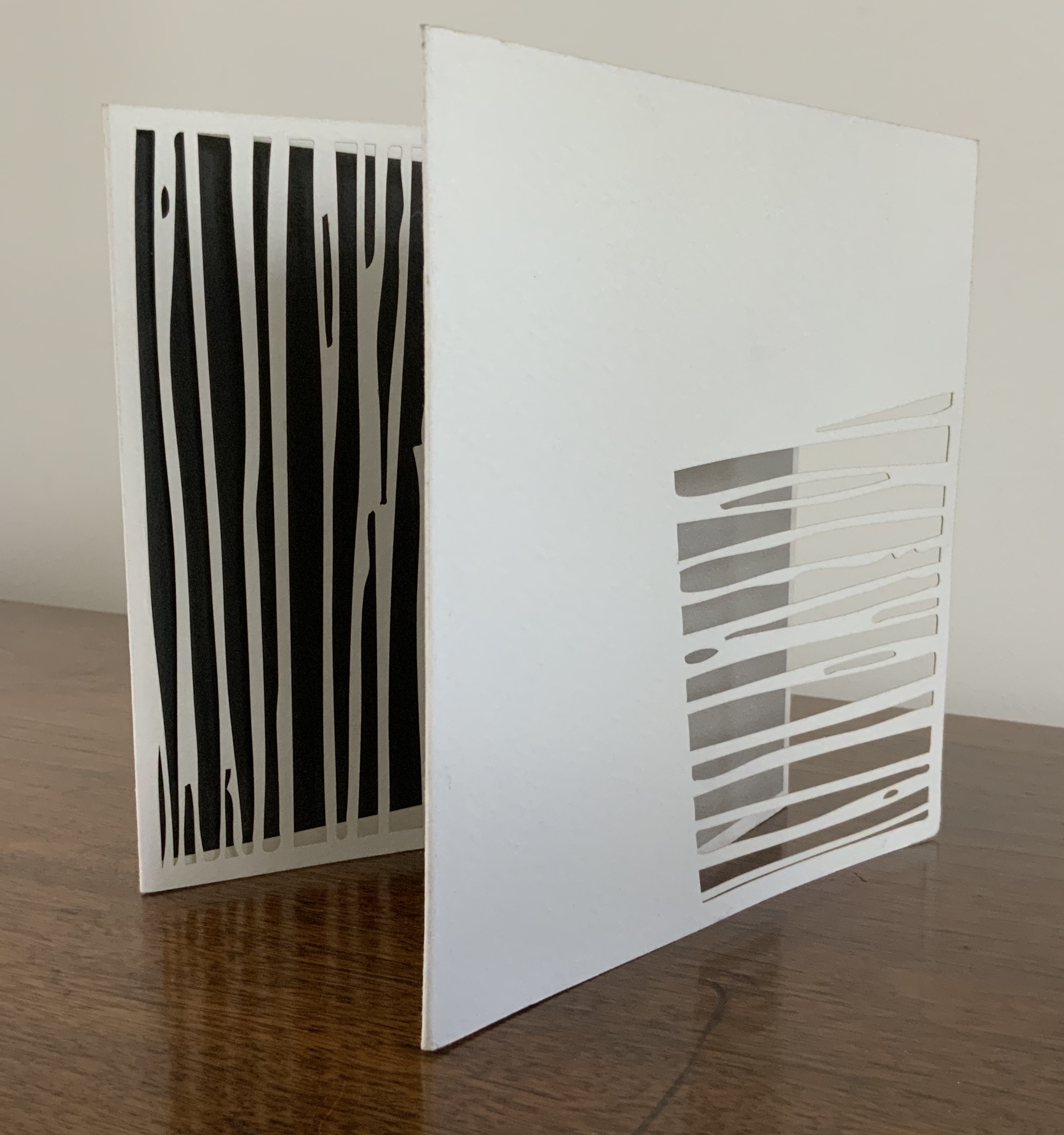
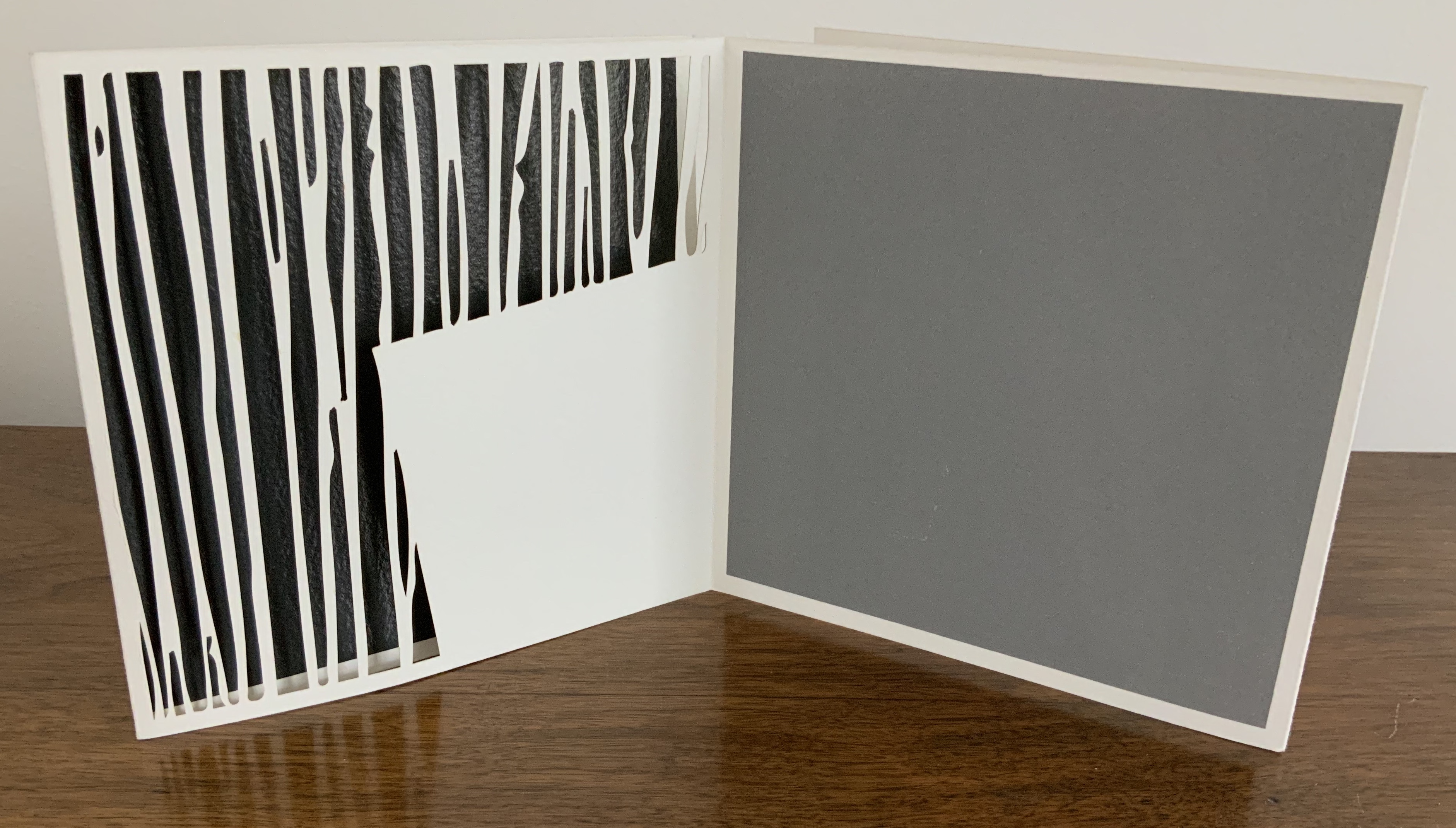
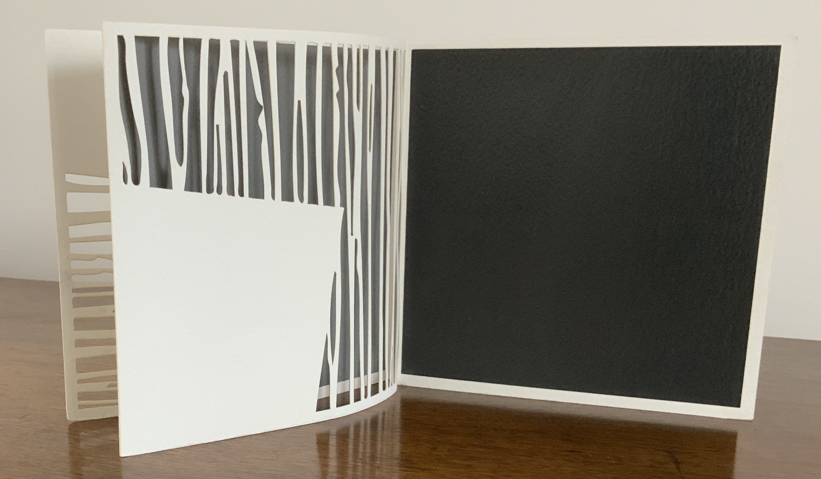
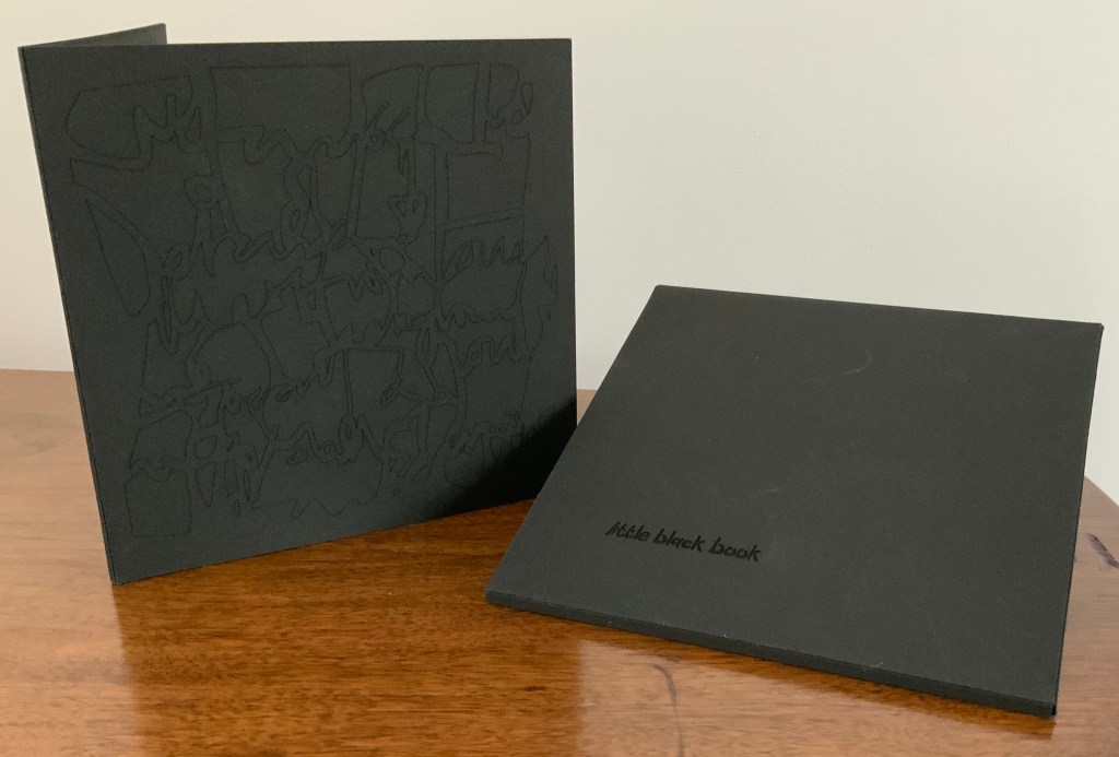
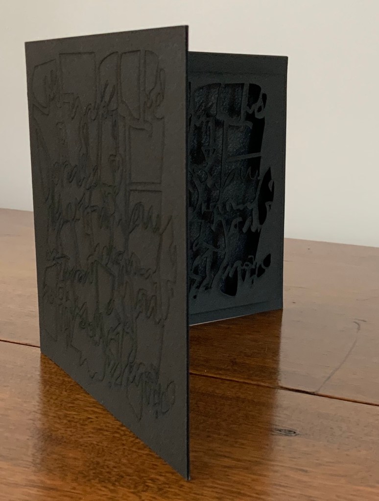
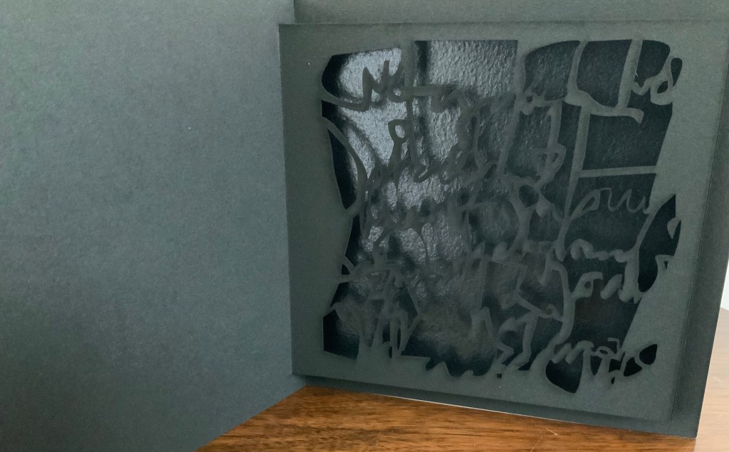
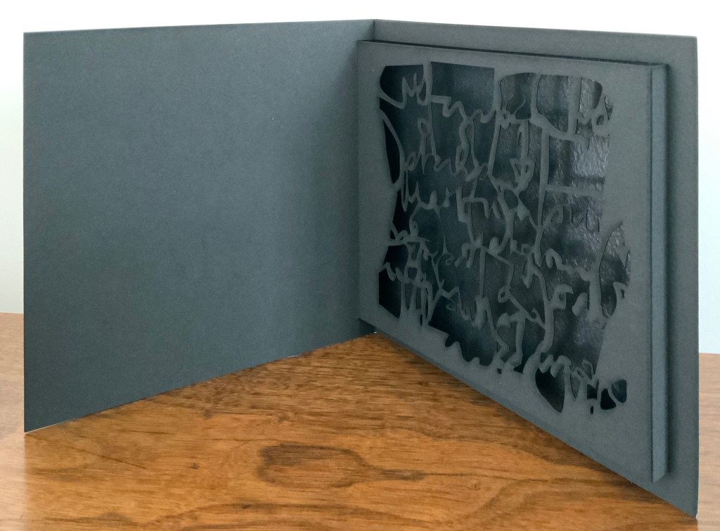
Little Black Book (2009)
Little Black Book (2009) Jenny Smith Matte-black slot-and-tab case containing matte-black single fold booklet; cover engraved with an abstract, calligraphic design that is cut out inside on the pop-up page and reappears in shadow against a gloss black screenprint insert behind the pop-up page. Case: 167 x 167 mm; Book: 160 x 160 mm; Pop-up page: H140 x W150 mm. Edition of 20, of which this is #14. Acquired from the artist, 31 July 2017. Photo: Courtesy of the artist.
The grassy nature of the 2013 installation and its engagement with children may remind the reader/viewer of Water on the Border (1994) by Helen Douglas and Telfer Stokes. For some, the interaction of cage and words in the 2016 installation may recall Bird Language (2003) by Xu Bing.
Further Reading
“Medicinal Art”, Studio Pavilion, 19 September 2019. Accessed 2 May 2020.


