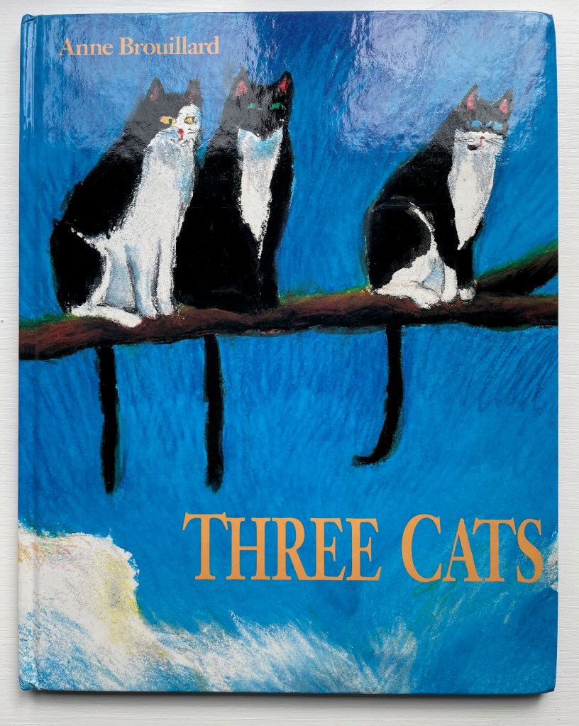
Three Cats (1992) Anne Brouillard Casebound, illustrated paper over boards, sewn, dustjacket. H280 x W223 mm. [28] pages. Acquired from private seller, 27 August 2023. Photos: Books On Books Collection.
This wordless picture book tells a humorous brief tale of three curious cats and three insouciant fish. It marks an early stage in Anne Brouillard’s journey from picture book artist to book artist.
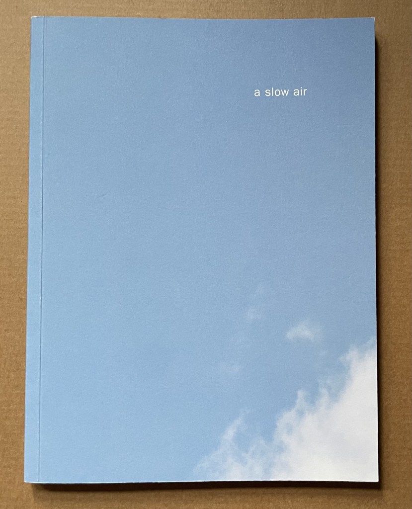
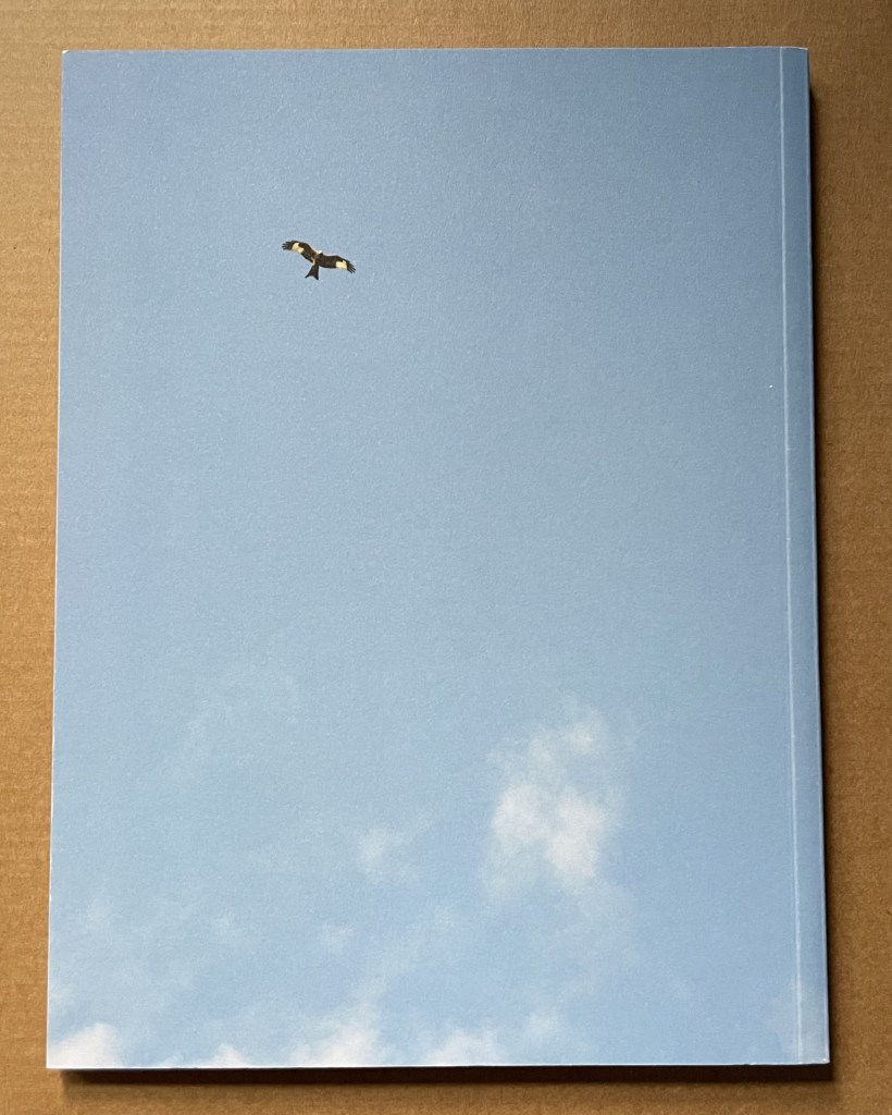
A Slow Air (2016) Thomas A. Clark and Diane Howse Perfect bound softcover. H200 x W150 mm. 64 pages. Edition of 750. Acquired at the Small Publishers Book Fair, London, in 2018. Photos of the work: Books On Books Collection.
If you live where red kites thrive, you will see them most often singly, in pairs or threes. If you are lucky, you may see as many as eight or ten at a time. Near Harewood House in West Yorkshire where red kites were reintroduced in 1999, there are hundreds. In 2016, photographer/artist Diane Howse (Countess of Harewood) and poet/artist Thomas A. Clark collaborated on an exhibition at Harewood House: the grove of delight. Using objects, words and images, the exhibition turned the house’s Terrace Gallery into a symbolic grove; also displayed was a series of 15 photographs by Howse of red kites over Harewood. For the exhibition and under the direction of Peter Foolen, the diligent Dutch publisher of herman de vries, Peter Liversidge and others, A Slow Air (the book) was produced and published by Harewood House. Foolen and the artists have assembled and manipulated the photos in a sequence of color and image that exerts a forward movement like a film or narrative. Like a real sighting of these birds circling and banking as if to a slow musical air, the book mesmerizes.
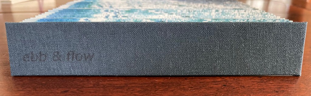
Ebb and Flow (2023) Jane Cradock-Watson Concertina book with cloth hard bound covers. H155 x W27 mm (closed), W680 mm (open). 64 panels. Edition of 20. Acquired from the artist, 21 January 2024. Photos: Books On Books Collection. Displayed with artist’s permission.
An exploration, both visually and physically, the ‘edge’ of the sea where it meets the land, with its continuous ebb and flow of the breaking waves, rhythmically rolling back and forth onto the sand. (Artist’s description)
With the binding and her photography in Ebb and Flow, Jane Cradock-Watson has sculpted and painted the sea’s edge. Four digital photographs printed on Zerkal paper have been spliced together between two cloth-covered boards. The flexibility and extent of the concertinaed paper create an undulating structure that turns seascape stills into mesmerising cinema.
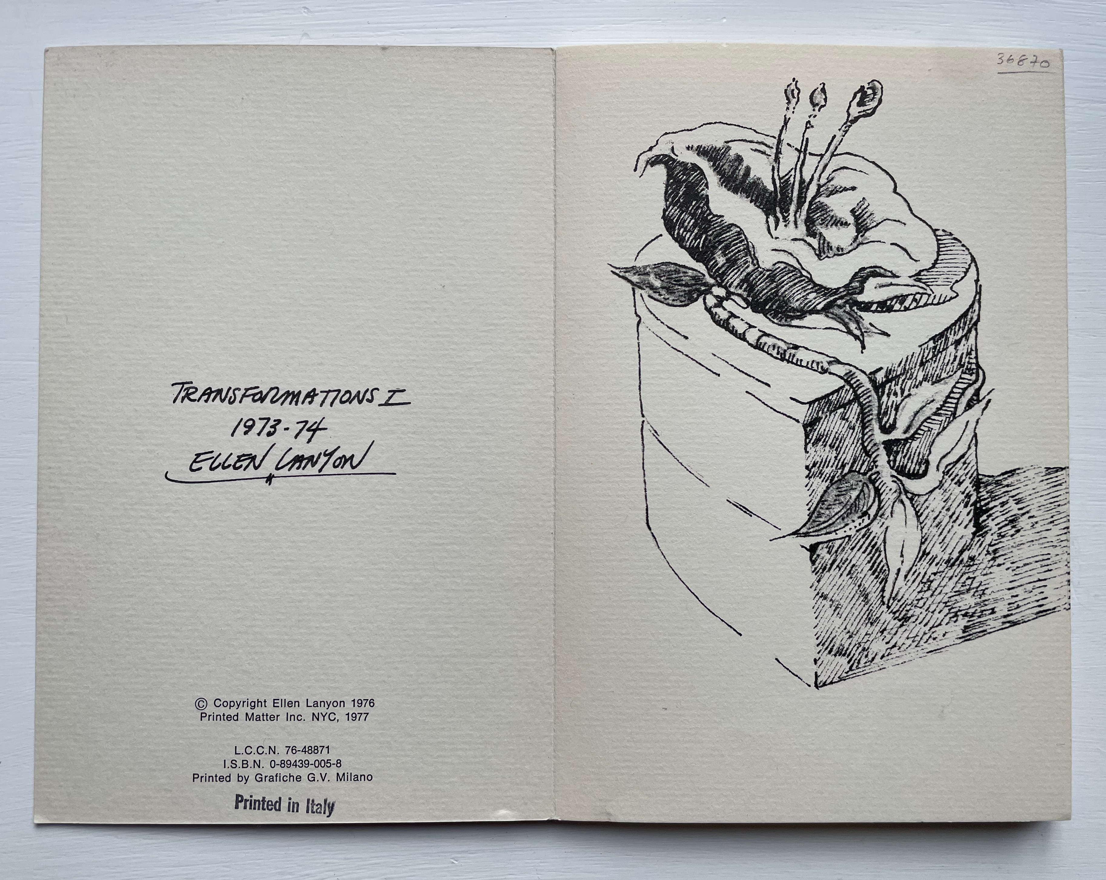
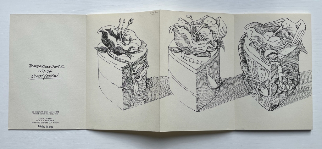
Transformations is a book as drawing. Across 24 panels of this accordion-fold book, Ellen Lanyon develops a surreal graphical fantasia from a single image.
Breaking Waves (2023) Emmy van Eijk Sculptural book. 140 x 140 x 40 mm (closed). Unique work. Acquired from Papertrail Handmade Books, 22 January 2024. Photos: Books On Books Collection.
Breaking Waves spills over at least three categories of bookmaking: the bound blank book, designer bookbinding and sculpture. It would take a bold owner, however, to use the work in its first category. Fortunately that invitation quickly yields to another.
STÉPHANE MALLARMÉ: Un coup de dés jamais n’abolira le hasard (ND)
STÉPHANE MALLARMÉ: Un coup de dés n’abolira le hasard (ND) Estelle J. Self-covering accordion format with three tipped-in pages. H245 x 185 mm closed, 2100 mm open. Twenty-four panels and flap-insert for closing. Edition of 6 variations, of which this #6. Acquired from Studio Montespecchio, 22 February 2022. Photos: Books On Books Collection.
Little information has emerged about this artist or her work that arrived in a shipment from a dealer based in Italy. He seemed to recall that she was young and at a table of her own at an exhibition in … was it Barcelona or Madrid? There is only the artist’s signature at the end of the work and an indication that it is the sixth of six copies. The dealer remembers that each of the six varied due to their handmade nature.
With its three tipped-in pages inside a double-sided accordion structure, with their mix of laser-cut and printed text, with the bright collage of abstract and figurative images (screen printed?), the work speaks for itself. But where in the collection does this work belong? First and foremost, it belongs among the many works of homage to Stéphane Mallarmé’s Un Coup de Dés Jamais N’Abolira le Hasard such as those by Christopher Brennan or Benjamin Lord.
The cover gives the poem’s title in French, but the abridged text is in English, some of it laser-cut and some printed, all on tipped-in pages. The unhappy translation comes from the Oxford University Press’ World Classics. The cuts place it among the “works of homage by redaction”, for example, those by Jérémie Bennequin or Michel Lorand. As the burnt edges suggest, it comes chronologically after the adoption of laser cutting in artists’ books, which has growing representation in the collection, for example, in works by Jaz Graf or Islam Aly. In its combination of letter and geometric shapes, the work falls between Scott McCarney and Aaron Cohick.
A collage of abstract and figurative images, letters and numbers rolls across both sides of the accordion, structurally recollecting the works of Helen Douglas or Sibyl Rubottom and Jim Machacek.
The paper is a heavy card, susceptible to fine cuts and sturdy enough to hold them.Colors of black, yellow, orange, silver and red cover the inner side, while those on the outer side adhere to an orange-gold-yellow palette. Its bright colors place it among the bursts of color from Shirley Sharoff and Andrew Morrison.
Perhaps the mystery artist will stumble across this entry, have a view on where it belongs and share some of its background, technique, process and materials — and what the other five versions look like.
I tried to “define the book” when I designed (one of my books) Cover to Cover hoping that the “reader” would have a multi-sensory experience of the nature of what she/he held in her/his hands. (from The Book: 101 Definitions)
Cover to Cover (1975)
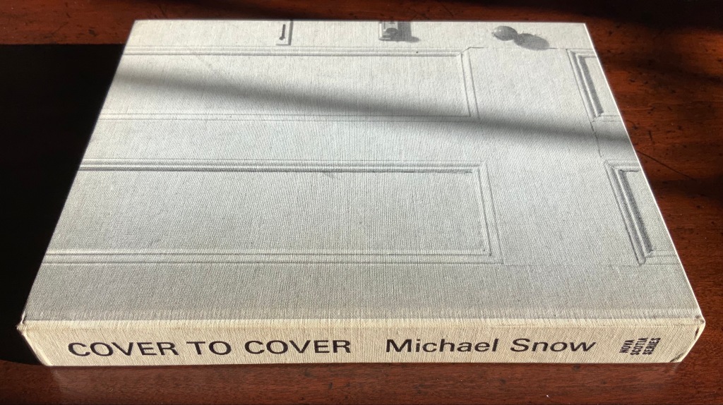
Cover to Cover (1975) Michael Snow Cloth on board, sewn and casebound. H230 x W180 mm. 310 unnumbered pages. Published by Nova Scotia College of Art and Design. Unnumbered edition of 300. Acquired from Mast Books, 10 December 2020. Photos of the work: Books On Books Collection.
After a long search since first sight of it in 2016 at Washington, D.C.’s now defunct Corcoran Gallery library, the original hardback edition of Michael Snow’s Cover to Cover (1975) finally joins the Books On Books Collection. Thanks to Philip Zimmermann, more readers/viewers have the chance to experience Cover to Cover — if only through the screen — than the original’s 300 copies and Primary Information’s 1000 facsimile paperback copies will allow.
Amaranth Borsuk describes the work and experience of it in The Book(2018), as do Martha Langford in Michael Snow (2014), Marian Macken in Binding Spaces (2017) and Zimmermann in his comments for the exhibition “Book Show: Fifty Years of Photographic Books, 1968–2018” (for all, see links below). Like Chinese Whispers by Telfer Stokes and Helen Douglas and Theme and Permutation by Marlene MacCallum, Michael Snow’s Cover to Cover evokes an urge to articulate what is going, how the bookwork is re-imagining visual narrative, how it is making us look, and how it makes us think about our interaction with our environs and the structure of the book.
The already existing commentary about Cover to Cover sets a high hurdle for worthwhile additional words. One thing going on in the book, though, seems to have gone unremarked. Some critics have asserted that, other than its title on the spine, the book has no text. There is text, however. It occurs within what I would call the preliminaries, and they show us how to read the book.
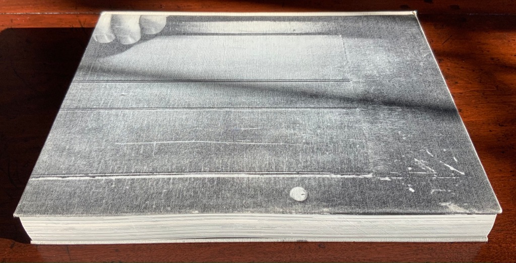
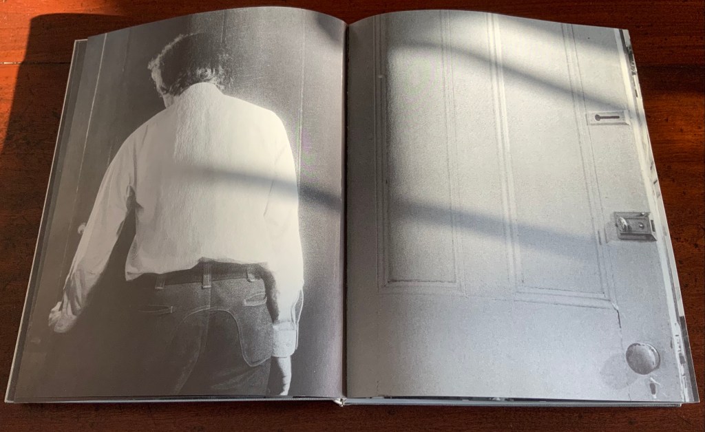
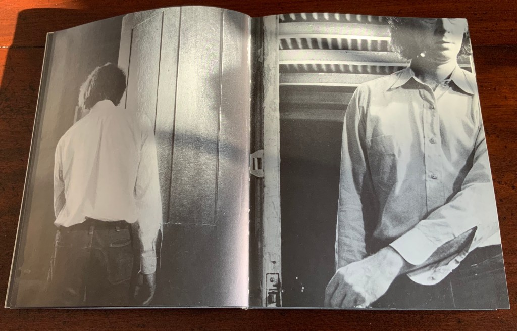
On the front cover, we see a door from the inside. Then, on its pastedown endpaper, the author outside the door with his back to us.
Front cover; pastedown end paper and page “1”.
On turning the “inside door” (page “1” of the preliminaries), we see in small type a copyright assertion and the Library of Congress catalogue number appearing vertically along the gutter of pages “2-3” (a tiny clue as to what is going on).
Pages “2-3”
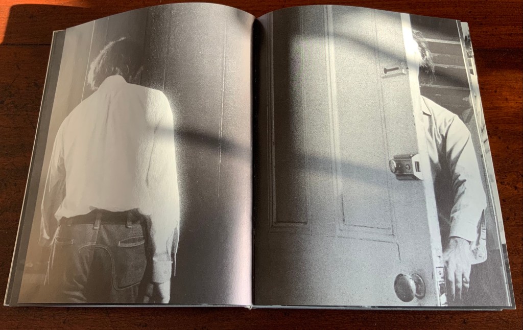
Over pages “4” through “14” from the same alternating viewpoints, the author reaches for the door handle, the door is seen opening from the inside, and the artist is seen walking through the door (from the outside) and into the room (from the inside). But who is recording these views?
Pages “10-11”, “12-13”, “14-15”
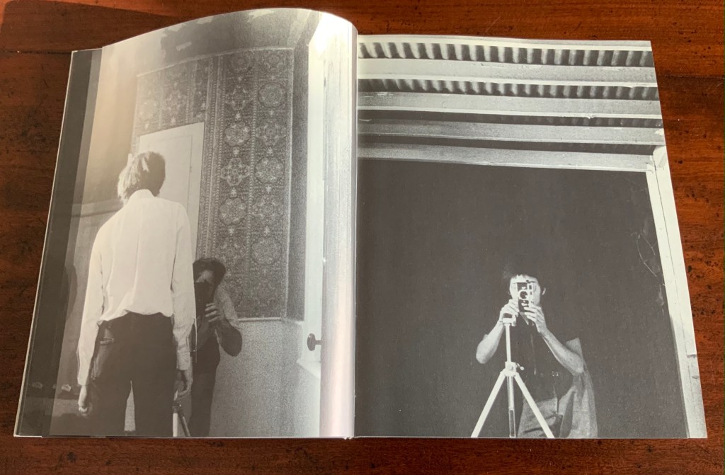
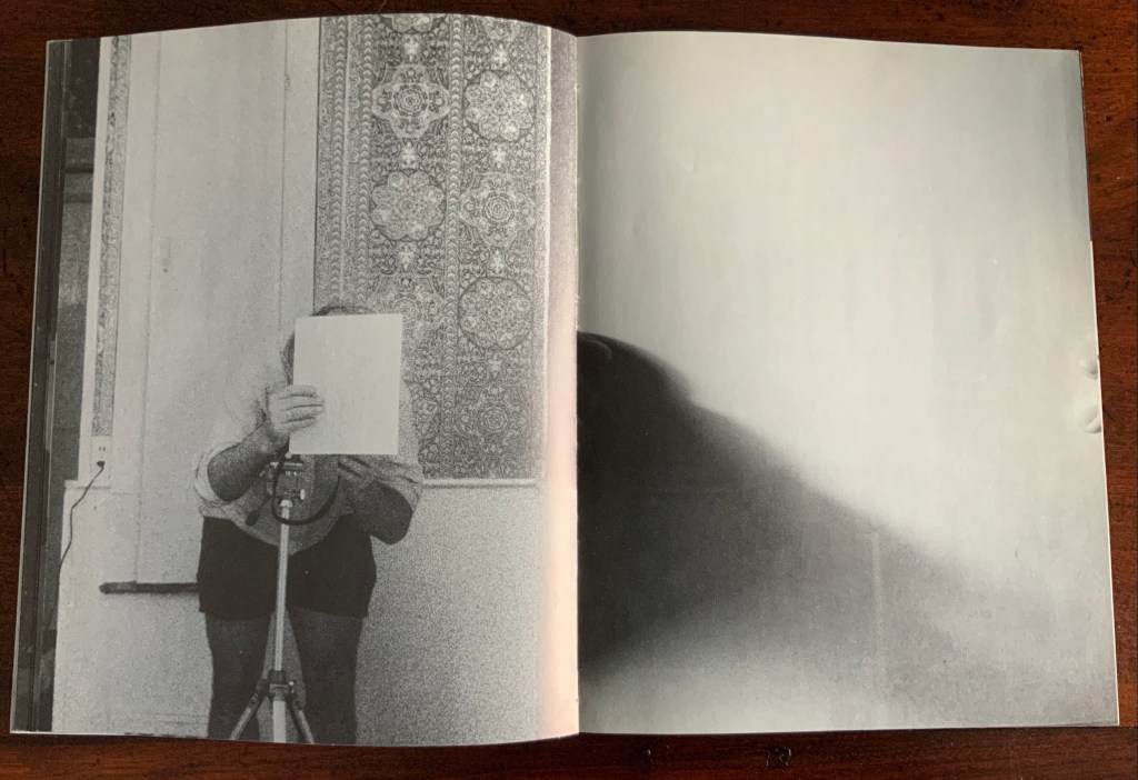
Over pages “16” through “24”, two photographers appear. Facing us, they are bent over their cameras — the one outside, clean shaven and wearing a short-sleeved shirt, is behind the author, and the one inside, bearded and wearing shorts, is in front of the author. As the author moves out of the frame, we see that the photographer inside is holding a piece of paper in his right hand. All of this occurs through the same alternating viewpoints. At page “21”, the corner of that paper descends into the frame of the inside photographer’s view of the outside photographer, and after the next switch in viewpoint that confirms what the inside photographer is doing, we see a completely white page “23”, presumably the blank sheet that is blocking the inside photographer’s camera aperture. Page “24” is the outside photographer’s view of the inside photographer whose face and camera are blocked by the piece of paper.
Pages “16-17”, pages “20-21” and pages “24-25”
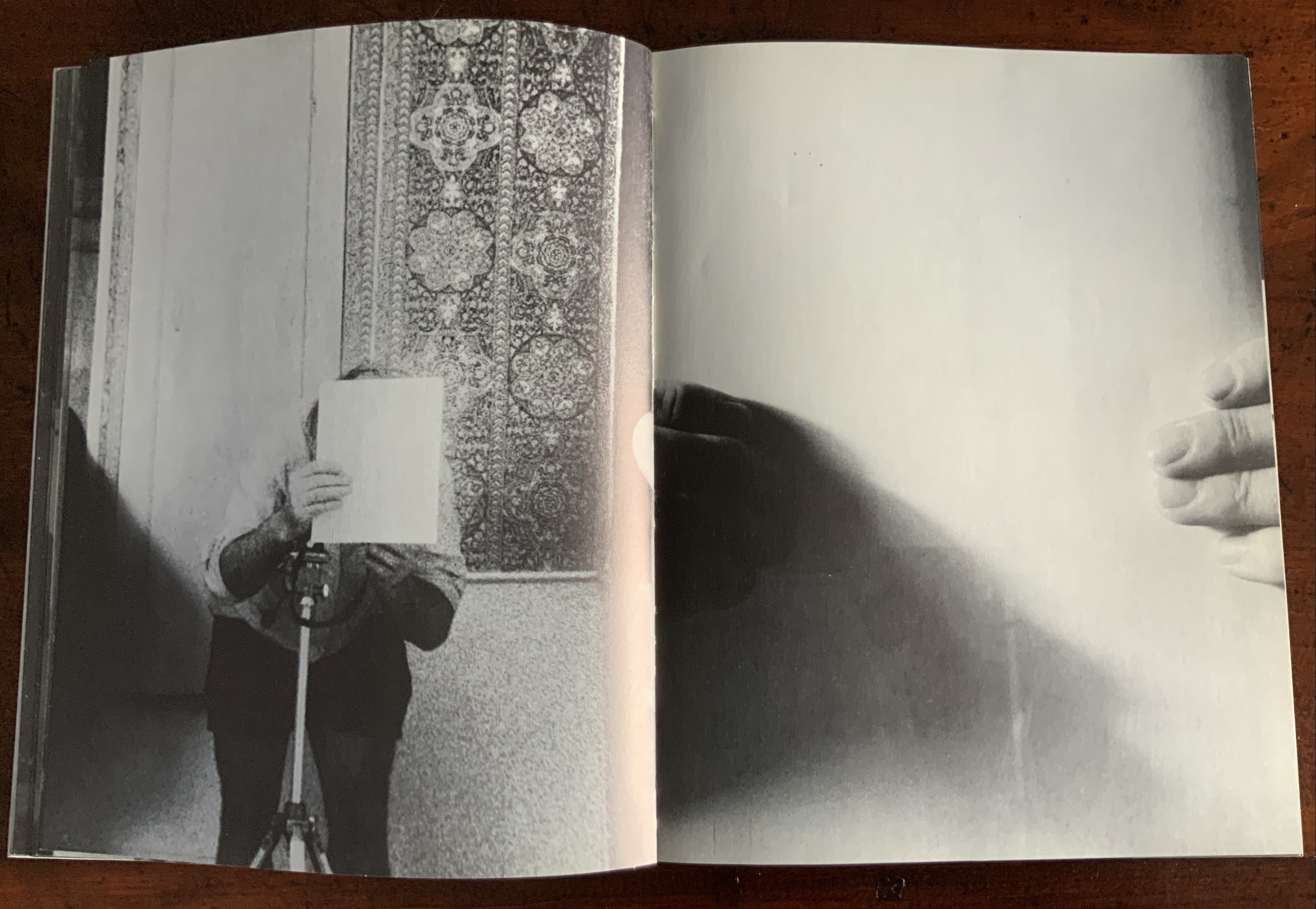
After the sequence above, something stranger still happens: on the left, a photo of the inside photographer holding the blank paper in front of his face appears. We can tell it is a photo by the tip of the thumb holding it (look in the gutter) between pages “26 and 27”. It is the developed photo the outside photographer just took of the inside photographer with his face and camera hidden by the sheet of paper. The image on page “27” is the reverse of that photograph. We can tell by the fingers on the right holding it.
Pages “26-27”
We are looking at images of images. But on pages “30-31”, whose fingers are holding the image of images?
Pages “30-31”
From there on, we see images of this piece of paper being manipulated by one pair of hands. The thumbs appear on the verso (the view from the outside photographer’s perspective), the fingers on the recto (the view seen by the inside photographer). By page “34”, it has been flipped upside down (the inside photographer is standing on his head), and on page “35”, we see a close up of the blank reverse side of the paper being held between the two photographers. By page “37”, we can see the blank side of the photo paper being fed into a manual typewriter. The pair of hands feeding the paper into the typewriter cannot belong to one of the photographers. Who is the typist — the author?
Pages “34-35” and pages “36-37”
For both pages “42” and “43”, the perspective is that of a typist advancing the photo paper and typing the title page of the book. On both pages, we can see the ribbon holder in the same position. As it progresses, more and more of the outside photographer’s camera appears above the typed page. Page “45” presents itself as the full text of the book’s title page, curling away from the typist and revealing the inside photographer on the other side of the typewriter. Page “46” shows the upside-down view of the title page as it moves toward the inside photographer and reveals the outside photographer on the other side of the typewriter. Not only are we seeing images of images, we are witnessing the making of the book’s preliminaries.
Pages “42-43”, “44-45”, and “46-47”.
From page “48” through page “54”, the photographers alternate views of blank paper advancing through the typewriter. By pages “55” and “56”, the typewriter has moved out of the frame. Look carefully at page “56”, however, and you can see the impression of the typewriter’s rubber holders on the paper. As a book’s preliminaries come to a close, there is often a blank verso page before the start of the book. If Cover to Cover is following that tradition, page “56” is that blank page at the end of the preliminaries, and page “57”, showing a record player, is the start of the book.
Pages “56-57”.
Zimmermann notes that, at somewhere near the book’s midpoint, the images turn upside down, and that readers who then happen to “flip the book over and start paging from the back soon realize that they are looking at images of images produced by the two-sided system, and indeed the very book that they are holding in their hands”. He notes this as another mind-bender added to the puzzlement of the two-sided system with which the book begins. Yet the long set of preliminaries foretold us that the upside-downness, back-to-frontness and self-reflexivity of images of images were on their way. Without doubt, Cover to Cover is an iconic work of book art.
Further Reading
Afterimage (1970). No. 11, 1982/83. On the occasion of an exhibition of his films at Canada House in London, an entire issue on Snow’s work.
… Cover to Cover is the result of another distanced use of self in the course of art-making. Snow is subject/participant as he and his actions are observed and analyzed by two 35 mm cameras… simulataneously recording front and back, the images then placed recto-verso on the page… Snow is subject observed in the book at the same time that he is also choosing and making decisions about images. Cover to Cover in 360 pages, [sic] becomes a full circle — front door to back door or the reverse. The book is designed so that it can be read front to back and in such a way that one is forced to turn it around at its centre in order to carry on. Regina Cornwell in Snow Seen and “Posting Snow”, Luzern catalogue.
But as the scene “progresses,” an action is not completed within the spread, but loops back in the next one, so that the minimal “progress” extracted from reading left to right is systematically stalled each time a page is turned, and the verso page recapitulates the photographic event printed on the recto side from the opposite angle. This is the disorienting part: to be denied “progress” as one turns the page seems oddly like flashback, which it patently is not; it might be called “extreme simultaneity.” Two versions of the same thing (two sides of the story) are happening at the same time. Zimmerman.
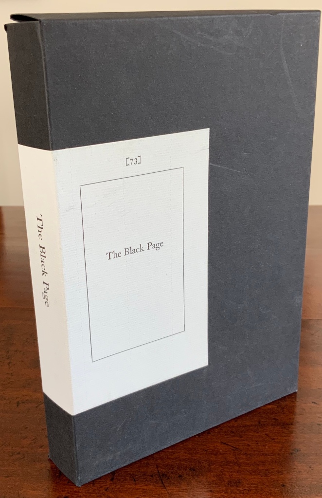
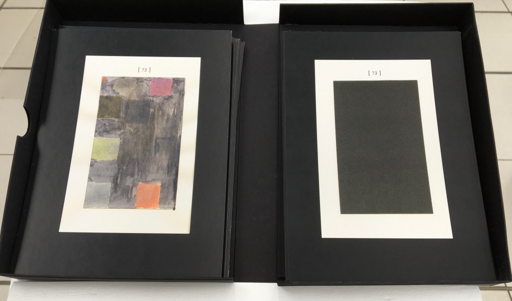
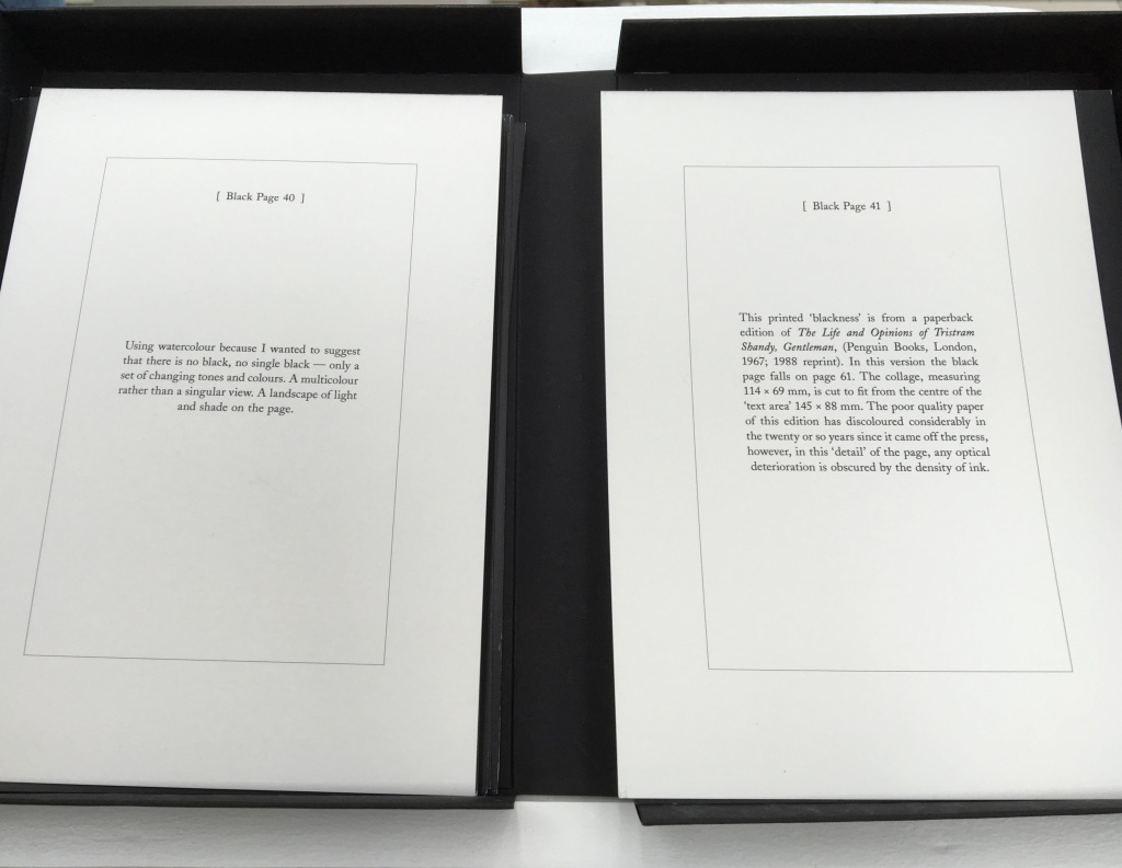
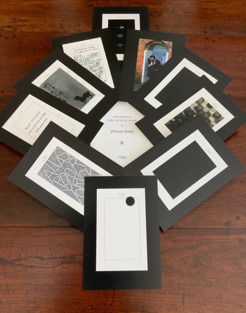
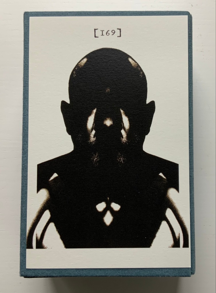
The Black Page Catalogue(2010) Coxwold, UK: Printed by Graham Moss (Incline Press) for The Laurence Sterne Trust. Contains 73 numbered leaves in a matte black card box (H235 x W168 mm). The leaves are glossy cards (210 x 148 mm) on which contributed texts and illustrations (chiefly colour) are printed; the reverse of each provides the contributor’s comments on the text or illustration and the “page” number. Also enclosed are a single-sheet folded pamphlet (“Printing the Black Page” by Graham Moss, Incline Press) and two cards, one of which is the invitation to the exhibition inspired by the ‘black page’, p. 73 of the first edition of The Life and Opinions of Tristram Shandy, Gentleman, held at Shandy Hall, Coxwold, North Yorkshire, 5 Sept.-31 Oct. 2009, and the other, sealed in an envelope, being the index of the contributors and their page numbers. Edition of 73. Acquired from the Trust. Photos: Books On Books Collection.
Collectors come up with the most ingenious reasons for acquiring things. In this case — along with astrological, numerological and other rational rationale — Rebecca Romney’s reminder that The Life and Opinions of Tristram Shandy, Gentleman is one of the earlier instances of book art led inevitably to my acquiring Shandy Hall’s The Black Page Catalogue. But it took time.
Several months after enjoying the Romney essay, I met Brian Dettmer in February 2015 by happenstance at a book art exhibition in New Haven, CT. As we chatted about past inspirations of book art, Tristram Shandy came up, so he told me of an upcoming event called “Turn the Page” in Norwich, UK, where I could more easily see some of his work — and one in particular having to do with Tristram Shandy. So in May 2015, I went.
Tristram Shandy (2014) Brian Dettmer Carved and varnished, two copies of the 2005 Folio Society edition of Tristram Shandy. H230 x W190 mm Commissioned by The Laurence Sterne Trust, Coxwold, UK. Photos: Books On Books Collection.
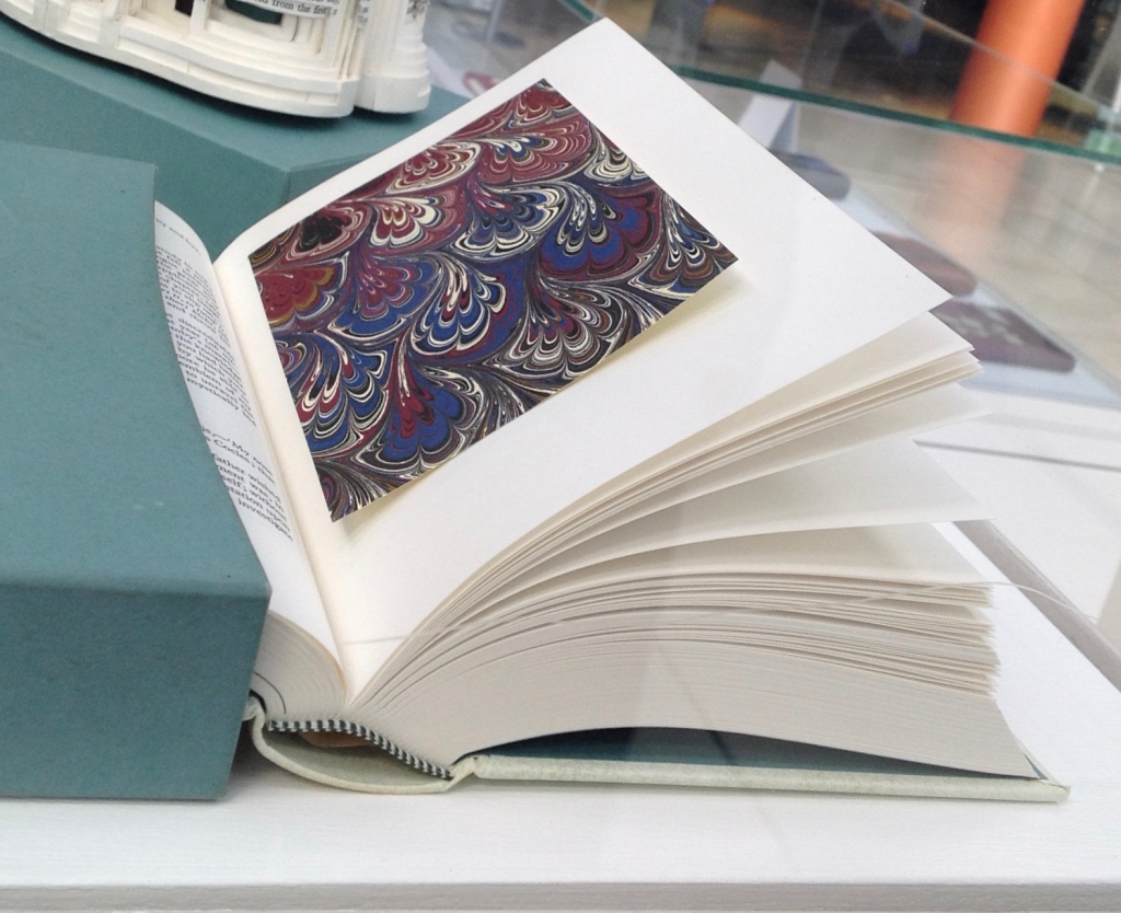
The marbled page, an “emblem of my work”, p. 169. The Life and Opinions of Tristram Shandy, Gentleman (1759) by Laurence Sterne Illustrated with wood engravings by John Lawrence. Set in ‘Monotype’ Plantin, printed by Cambridge University Press on Caxton Wove Paper. New York: Folio Society, 2005.
So a year passed. Another visit to “Turn the Page” was made. And as I was leaving, lo, a sign and small display came unto me:
Only a negligent collector would ignore such clear signs.
Parson-Yoricks-to-be can select their own favorites here.
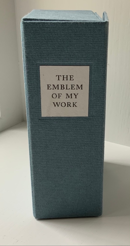
Emblem of My Work (2013)
Emblem of My Work (2013) Coxwold, UK: The Laurence Sterne Trust. Consists of a 24-page booklet and 170 numbered cards in a hinged blue paper-covered box (H160 x W105 x D60 mm. The leaves of this catalogue are bright white cards (152 x 92 mm) on which the artwork is printed; the reverse of each provides the “page” number and the contributor’s comments on the art. The booklet provides alphabetical and numerically ordered indexes listing the contributors and their page numbers. Edition of 225, of which this is #79. Acquired from Shandy Hall, 1 October 2019. Photos: Books On Books Collection.
Volume III of Sterne’s work was the first to be handled by a publisher. Presumably the famous success of the first two self-published volumes helps to explain James Dodsley’s agreement to printing copies in which each page 169 and each page 170 showed uniquely marbled squares. Images from an original copy held at the British Library can be seen here. As Patrick Wildgust, director of Shandy Hall, explains in the booklet:
The central section of p. 169 was laid upon the marbled mixture in order that a coloured impression could be taken as cleanly as possible. This was left to dry and then reverse-folded so the other side of the paper could also receive its marbled impression. This side of the paper became page [170]. As a result, the marbled page in every copy of Vol. III is different — each impression being a unique handmade image. In the text opposite on p. 168, Sterne tells the reader that the marbled page is the “motly emblem of my work” — the page communicating visually that his work is endlessly variable, endlessly open to chance.
Two favorites — one for page [169], one for [170] — artists with other works in the Books On Books Collection. Left: Ken Campbell. Right: Eric Zboya.
Paint Her To Your Own Mind (2018) Coxwold, UK: The Laurence Sterne Trust. Contains 147 numbered leaves in a brown paper-covered box (174 x 124 mm). The leaves are bright white cards (145 x 105 mm) on which contributed texts and illustrations (chiefly colour) are printed; the reverse of each provides the contributor’s comments on the text or illustration and the “page” number. Also enclosed are a “title page” and “index leaf” listing the contributors and their page numbers. Edition of 200. Acquired from Shady Hall, 6 June 2018. Photos: Books On Books Collection.
Page 147 of Sterne’s sixth volume of Tristram Shandy is blank. On the preceding page, he metaphorically throws up his hands over any attempt to describe the most beautiful woman who has ever existed and exhorts the reader: “To conceive this right, —call for pen and ink—here’s paper ready to your hand, —Sit down, Sir, paint her to your own mind—as like your mistress as you can—as unlike your wife as your conscience will let you—‘tis all one to me—please your own fancy in it.” So, accordingly, Shandy Hall invited 147 artists/writers/composers to follow Sterne’s instruction to fill the blank page 147. From the 9th through 30th of September 2016, their efforts were displayed in the Shandy Hall Gallery, Coxwold, York.
The curious reader can choose his or her own favorites here.
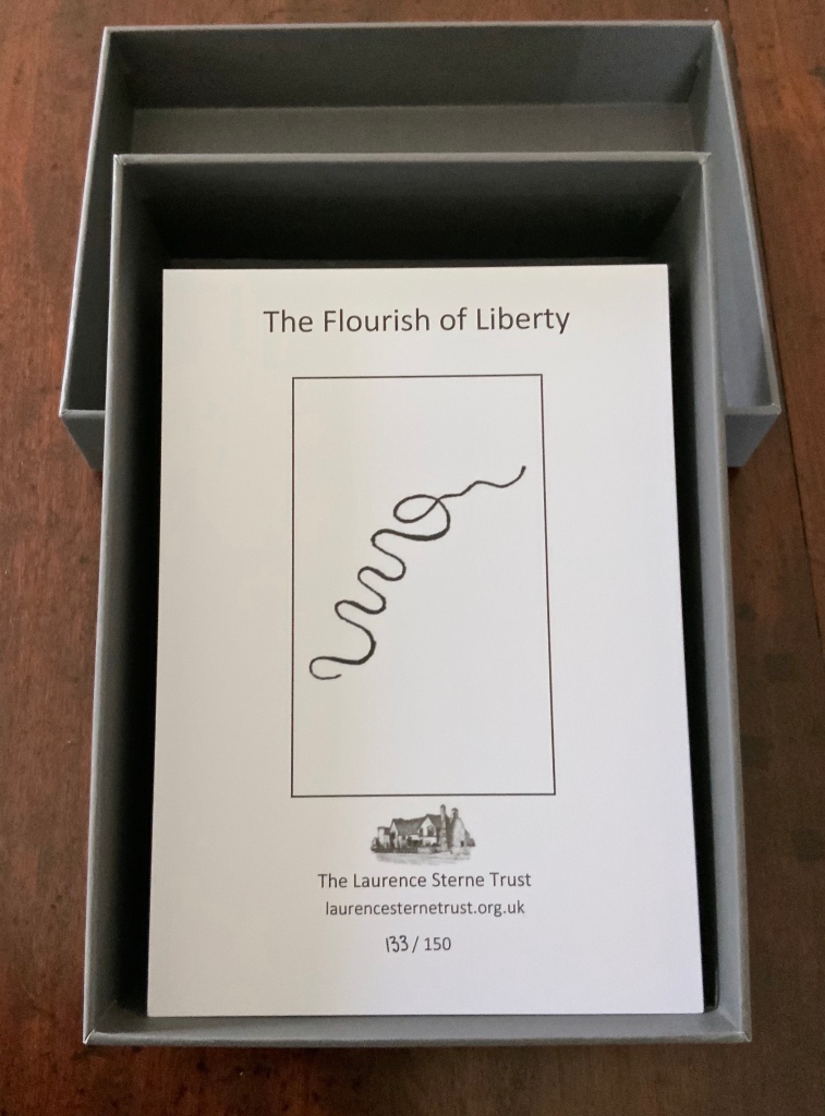
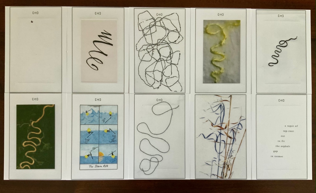
The Flourish of Liberty (2019)
In Volume IX on p. 17, the reader reads Corporal Trim’s advice to Uncle Toby, who stands at the Widow Wadman’s threshold about to propose marriage:
Nothing, continued the Corporal, can be so sad as confinement for life — or so sweet, an’ please your honour, as liberty. Nothing, Trim — said my Uncle Toby, musing — Whil’st a man is free — cried the corporal, giving a flourish with his stick thus —
The Flourish of Liberty (2019) Coxwold, UK: The Laurence Sterne Trust. Contains 103 numbered leaves in a gray paper-covered box (174 x 124 mm). The leaves are bright white cards (148 x 105 mm) on which contributed texts and illustrations (black and white, several in colour) are printed; the reverse of each provides the contributor’s comments on the text or illustration and the “page” number. Also enclosed are a “title page” and “index leaf” listing the contributors and their page numbers. Edition of 150, of which this is #133. Acquired from Shandy Hall, 26 October 2020. Photos: Books On Books Collection.
The rest of Corporal Trim’s flourishes flourish here.
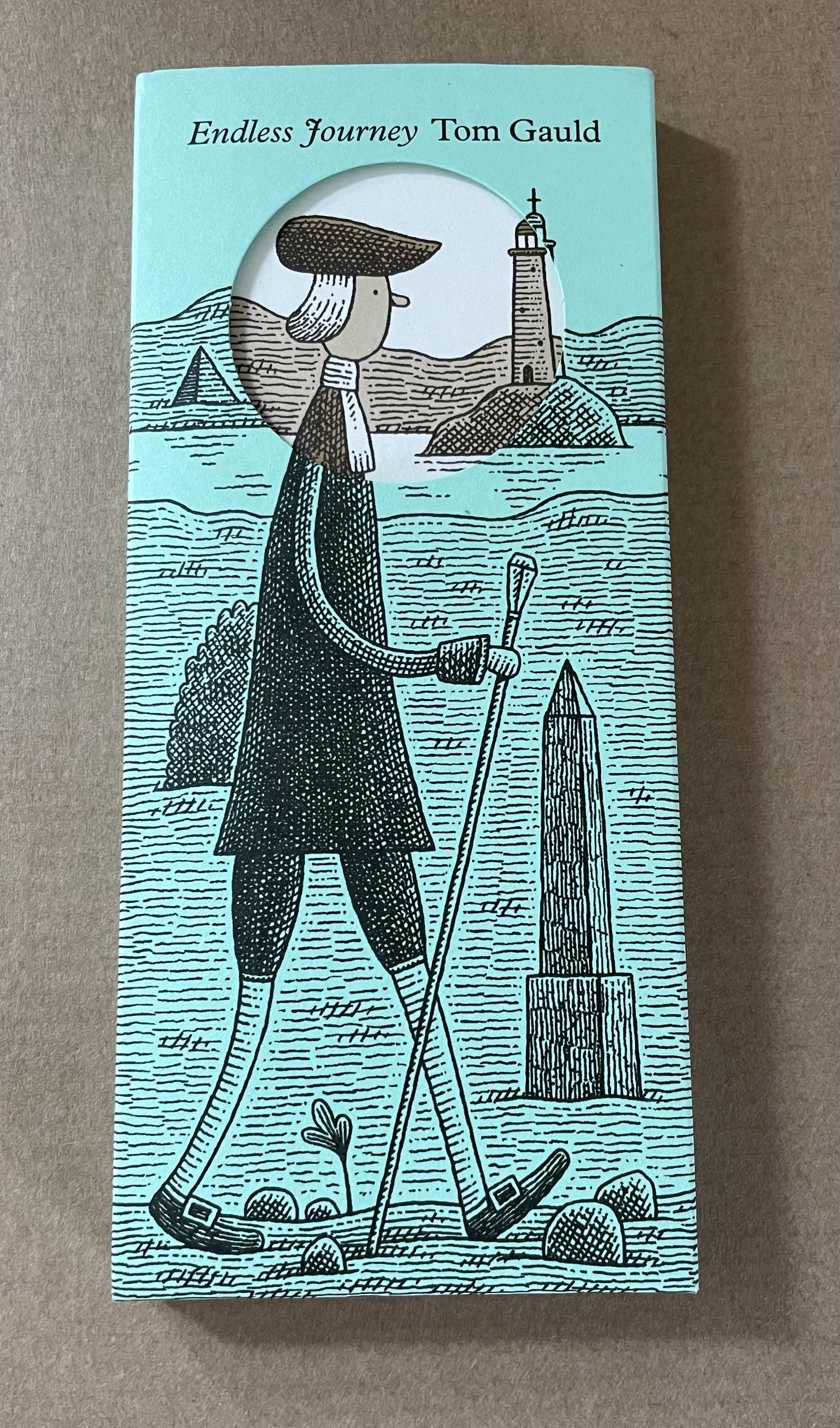
Endless Journey (2015)
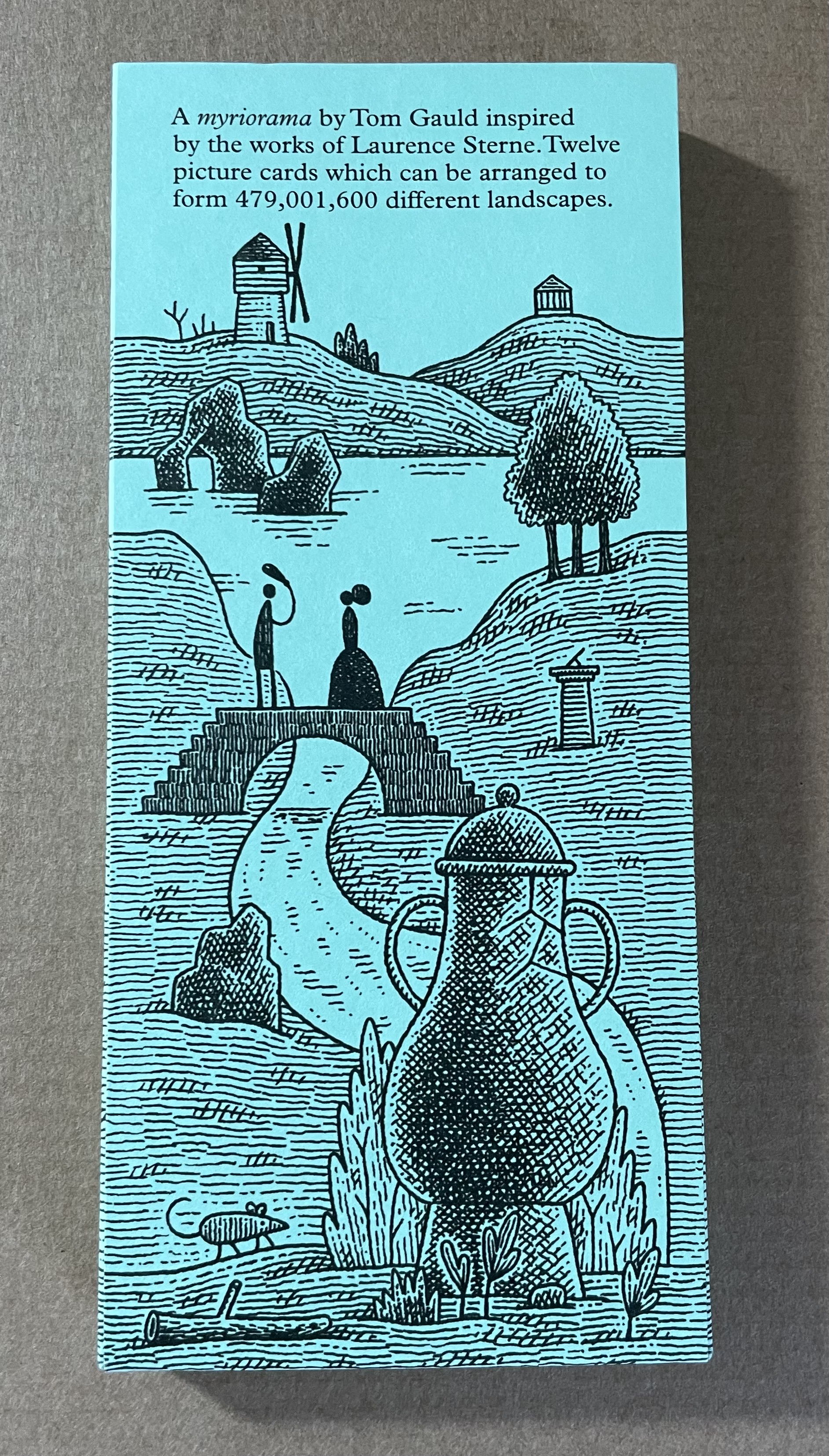
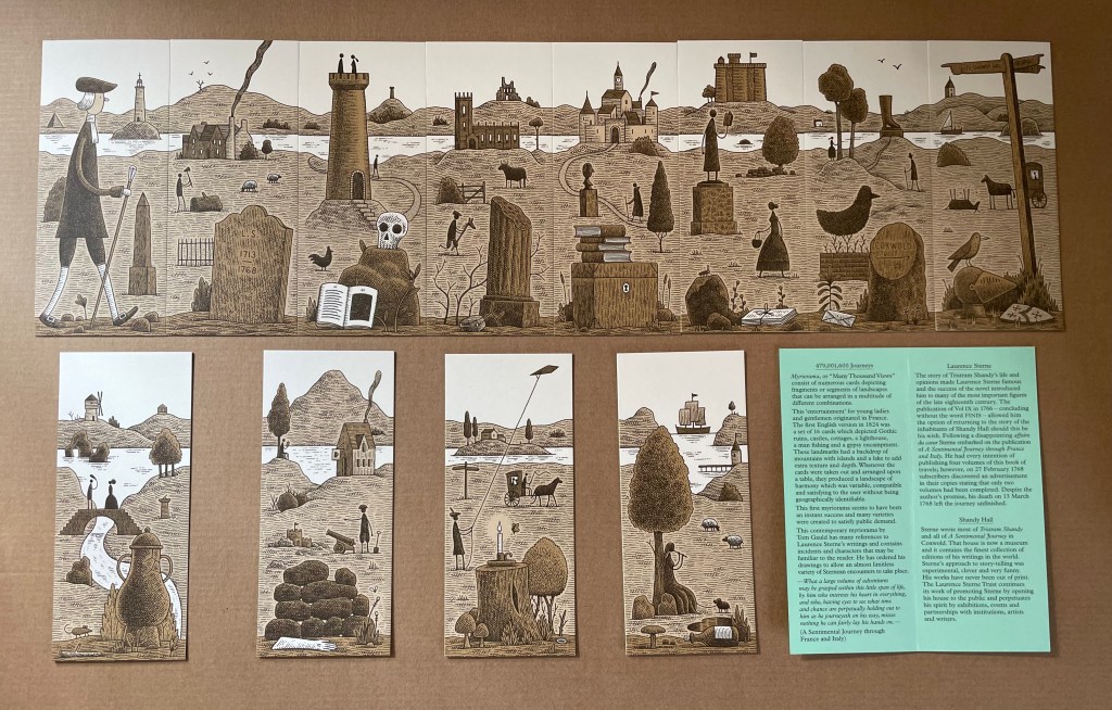
Endless Journey (2015) Tom Gauld Printed slipcase, twelve cards, leaflet. H165 x W73 mm. Acquired from the Laurence Sterne Trust. Photos: Books On Books Collection.
Appropriated and sculpted bookwork was taking off in numerous forms even before 1964 when Marcel Broodthaers half-embedded the last fifty copies of his poetry book Pense-Bête in plaster. Bruno Munari had introduced libri illeggibili (“unreadable books”) in 1949. John Latham had already encased books with plaster in Shelf Number 2 (1961) and much else in his various skoob works. Tom Phillips’ line-by-line, found-book alteration A Humument was underway, first appearing in 1970, as was Dieter Roth’s string of sausage books Literaturwurst (1961-74). So Broodthaers could have taken any of several directions before deciding to replace Mallarmé’s lines of verse in Un Coup de Dés N’Abolira le Hasard: Poéme (1914) with printed and engraved placeholders in paper and anodized aluminum, respectively, to create Un Coup de Dés N’Abolira le Hasard: Image (1969).
Son of Giorgio Maffei (bookseller, curator, scholar and book artist in his own right), Giulio Maffei has made video catalogues for Studio Bibliografico Giorgio Maffei since 2015. Each catalogue is a work of video. In this twenty-sixth outing, Maffei has created a video from the 1914 edition and Broodthaers’ 1969 Image version of Un Coup de Dés.
By 2008, Michalis Pichler had an even greater wealth of forms from which to choose for his double appropriation/homage to Mallarmé’s Poème and Broodthaers’ Image. Since the ’80s scores of book artists had been introduced to ingenious structures by Hedi Kyle and Keith A. Smith, among others, so why not an Aunt Sally’s shipwreck of string, canvas and torn paper? Long-Bin Chen had been sanding books and phone directories into busts since the ’90s, so why not a bust of Mallarmé from old editions of Un Coup de Dés and a bust of Broodthaers from catalogues of his works (a variation on Buzz Spector’s treatment)?
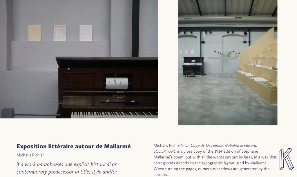
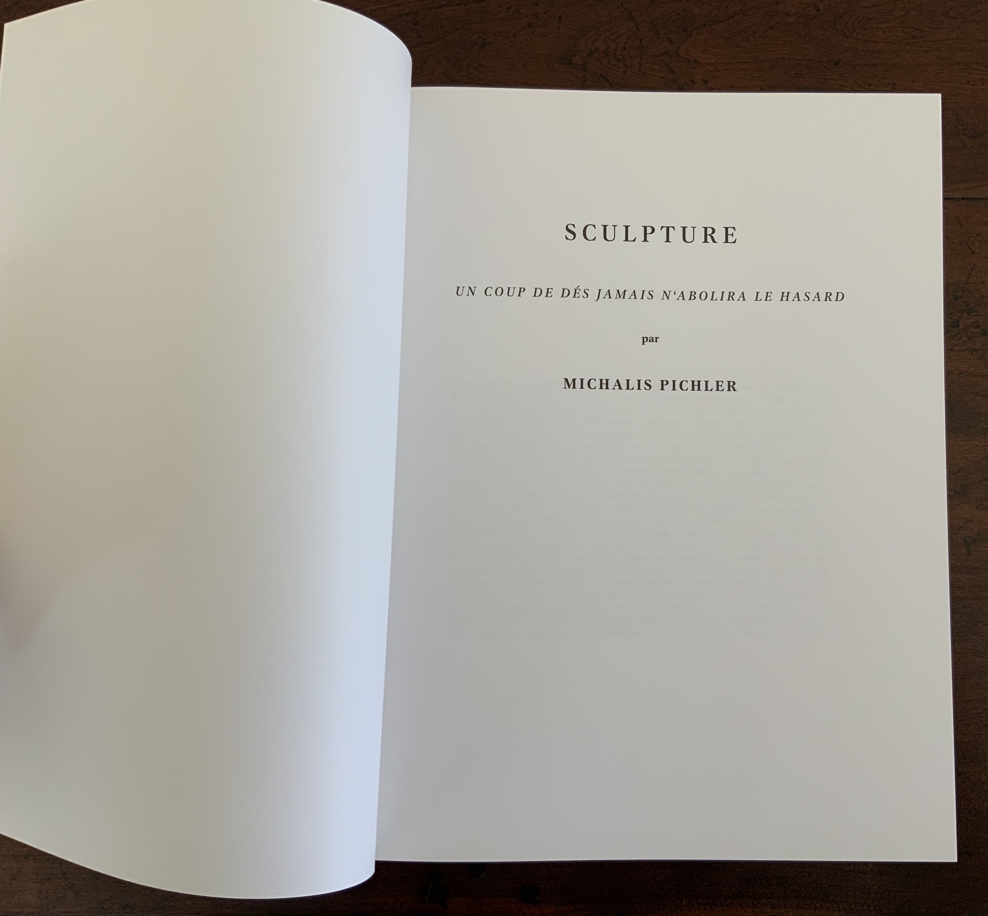
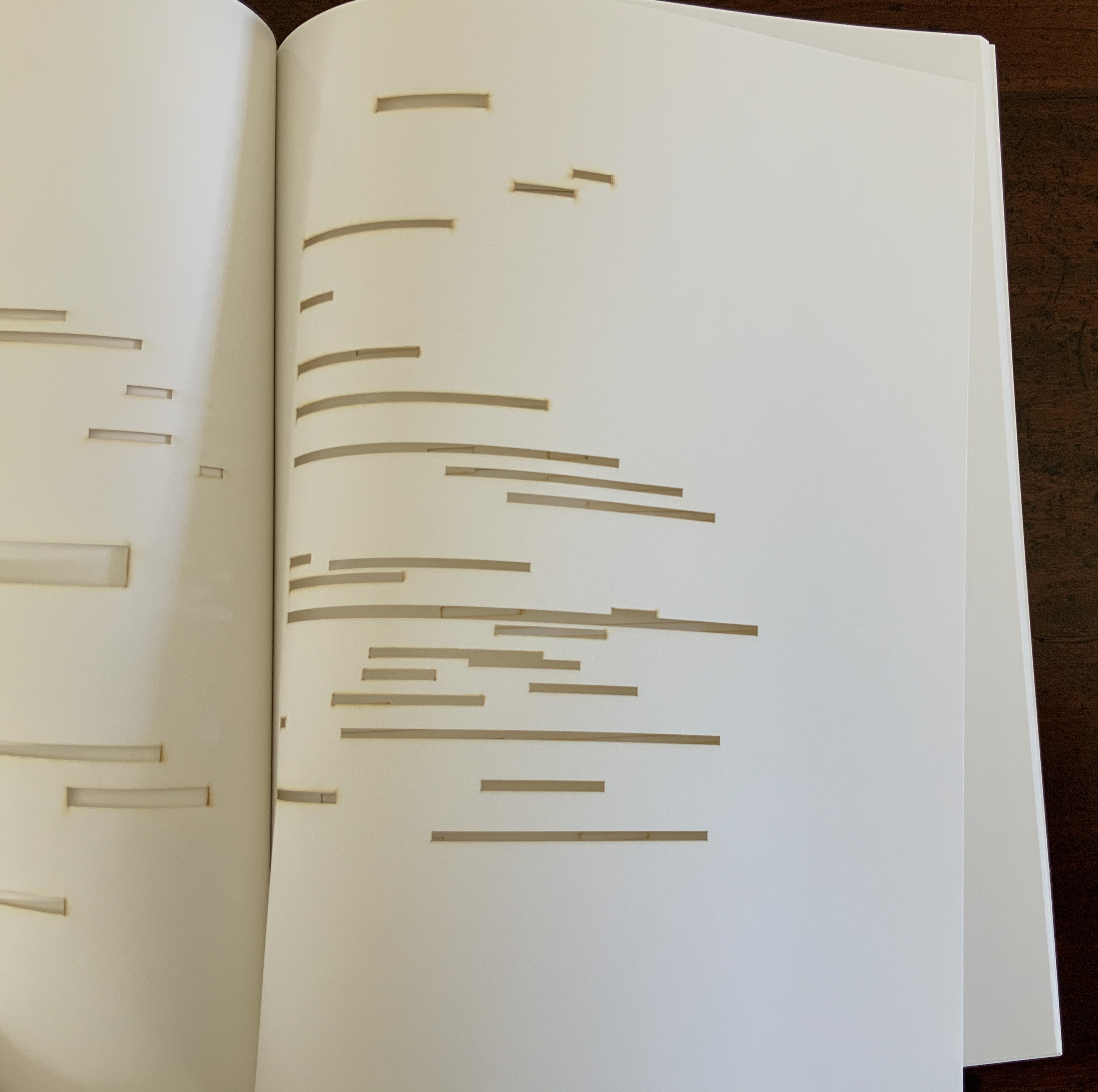
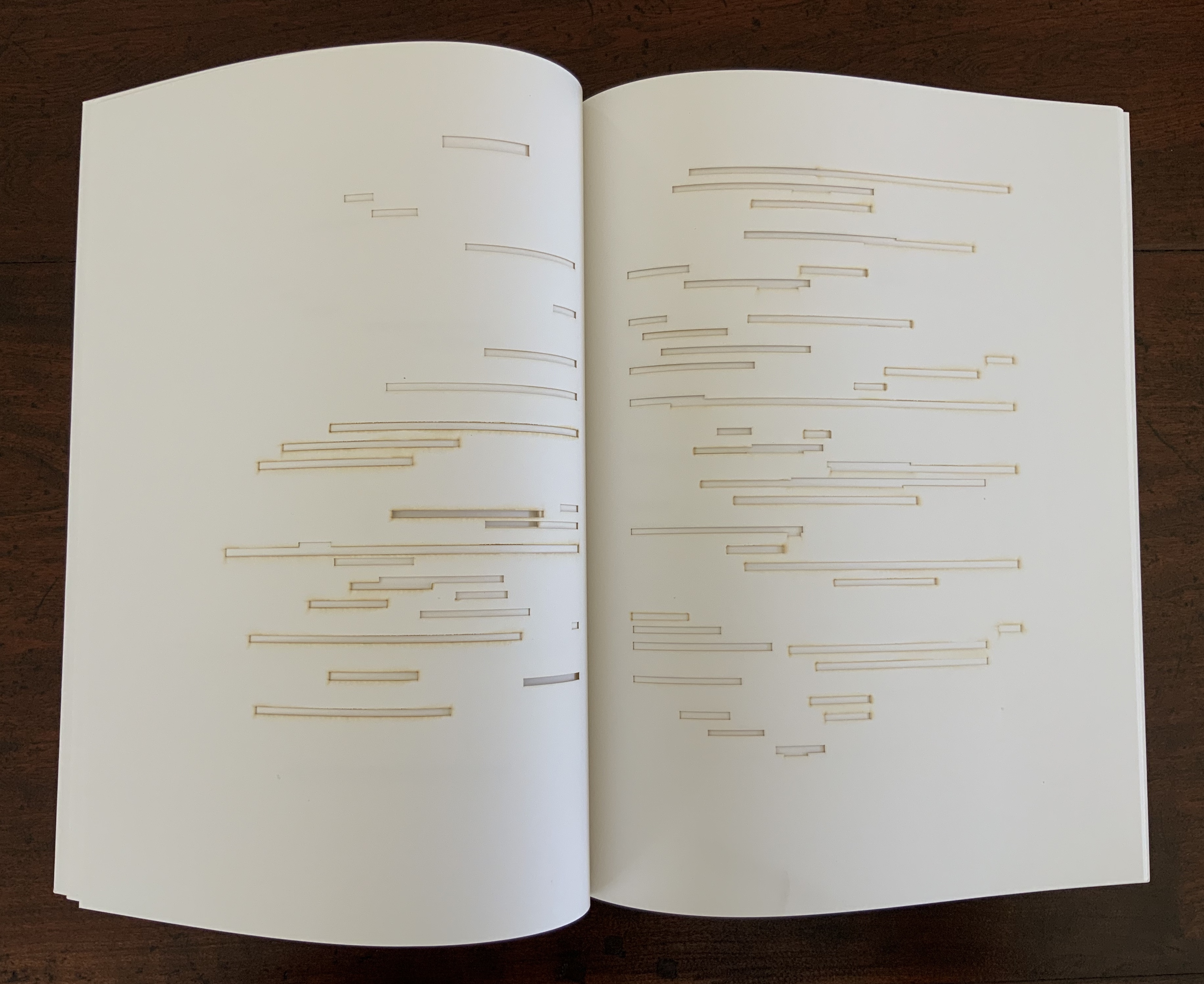
Instead Pichler appropriates Mallarmé through Broodthaers’ design and production: an efficient and direct double appropriation. He follows the trim size and layout of the 1914 and 1969 works. Further underscoring the double appropriation, he reprints verbatim Broodthaers’ preface (the full text of Mallarmé’s poem set in small type as a single paragraph with obliques separating the lines of verse). Like Broodthaers, he produced limited editions of three versions: 10 copies in plexiglas (rather than Broodthaers’ 10 in anodized aluminum), 90 copies in translucent paper (just as Broodthaers had done) and 500 copies in paper (rather than Broodthaers’ 300). Where Broodthaers had solid black stripes, though, Pichler substitutes laser cuts in the translucent and paper editions and engraving or abrasion in the plexiglas edition. Hence Sculpture (2008), rather than Image (1969) or Poème (1914).
Not until 2016, though, was Pichler able to cap his double appropriation. Just as Broodthaers had held an exhibition entitled “Broodthaers: Exposition littéraire autour de Mallarmé” (Antwerp, December 1969), Pichler held one entitled “Pichler: Exposition Littéraire autour de Mallarmé” (Milan, December 2016). Like the Broodthaers exhibition, Pichler’s was an opportunity to showcase his own work: it was his first solo exhibition in Italy. Like Broodthaers, he included the Nrf 1914 edition, but also included numerous other editions and translations that had occurred since. Also, key to Pichler’s artistic intent, he included a host of other artists who by appropriation had made homage to Un Coup de Dés … Poème and, in some cases, Broodthaers’ … Image.
Book art is so self-referential in its instances (think of Real Fiction: An Inquiry into the Bookeresque by Helen Douglas and Telfer Stokes) and as a genre (think Burning Small Fires by Bruce Nauman) that appropriation offers a natural next step. In Pichler’s case, the subtlety of that step comes in how he reaches through Broodthaers’ Image all the way back to elements of Mallarmé’s Poème to achieve his aims.
When Broodthaers first appropriated Mallarmé’s layout, type sizes and roman/italic styles, he was engaged in a kind of reverse ekphrasis. Usually ekphrasis runs from the work of art (say, a Grecian urn) to the text in response (“Ode on a Grecian Urn”). Here, the poem and its shape come first, then the work of art — the Image of the poem. By calling his exhibition an exposition littéraire, Broodthaers underscored this. By calling out the shapes on the page, he elevated the original’s semblances of waves, an abyss, a foundering ship and a constellation and, in exposing them, performed a kind of literary study as well as artistic work.
Count it down from Pichler’s appropriation of Broodthaers’ exposition littéraire, from the inclusion/appropriation of other artists’ appropriations of Poème and/or Image, from his own work of book art Sculpture, from his own other works: Pichler’s appropriative ekphrasis is squared, cubed or perhaps raised to the fourth power. Clearly, book art and appropriation are Pichler’s chief palettes — or rather his twin decks from which, as DJ, he mixes what he calls “Greatest Hits”. The phrase simultaneously names Pichler’s imprint on Sculpture‘s cover and the series on his website. The series includes other appropriations such as Every Building on the Ginza Strip (2018) from Ed Ruscha and Some More Sonnet(s) aka Poem(s) (2011) from Ulises Carríon. “Greatest Hits”, however, suggests another subtlety in Sculpture, albeit one best appreciated in the context of all the exhibitions.
The first instance of Broodthaers’ exhibition in Antwerp included a continuous playing of the artist’s tape-recorded reading of the poem. In Cologne for its second instance, Broodthaers renamed it Exposition littéraire et musicale autour de Mallarmé. Broodthaers was simply taking Mallarmé’s musical cue in Un Coup de Dés’spreface, which advises reading the poem as if it were a “score” for music to be heard at a concert and its blank spaces as “silences”.
Taking Mallarmé’s and Broodthaers’ musical cues and that of his piano-roll-like slots in Sculpture, Pichler created for his exhibition Un Coup de Dés Jamais N’Abolira le Hasard: Musique, a piano-roll version of the poem to be played by any visitor who cared to sit and pedal the pianola on which it was installed. So in further appropriation of Mallarmé through Broodthaers, Pichler’s piano roll turns the empty spaces, where the words and black strips would be, into music while the blanks around them become what Magnus Wieland calls “white noise”.
In traditional literary ekphrasis, the referring text can stand on its own. Homer’s description of Achilles’ shield does not require a side-by-side engraving or painting of what Hephaestus forged. Nor does Auden’s exposition of Breughel’s Landscape with the Fall of Icarus (c. 1560) need an art history book to hand.
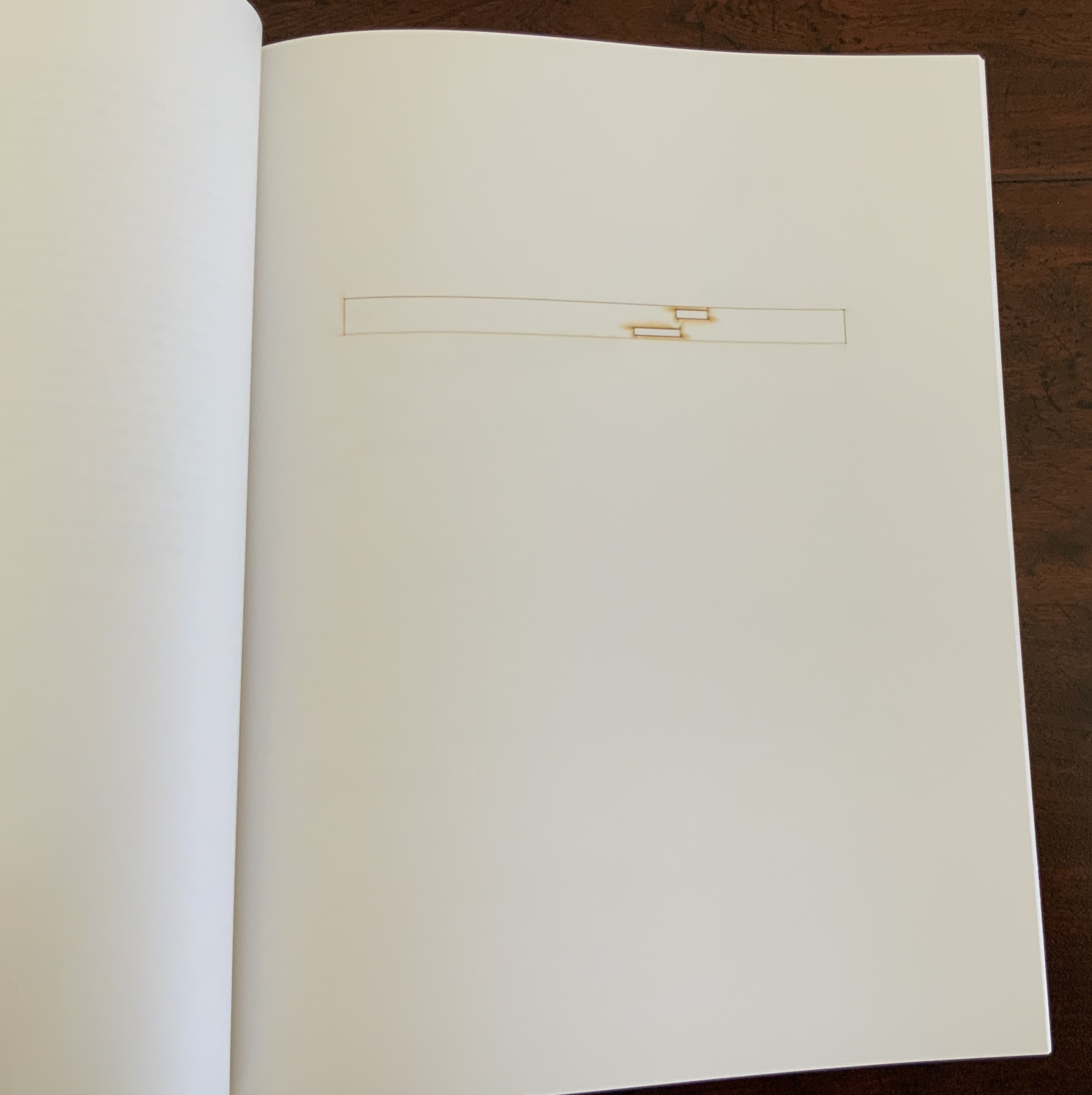
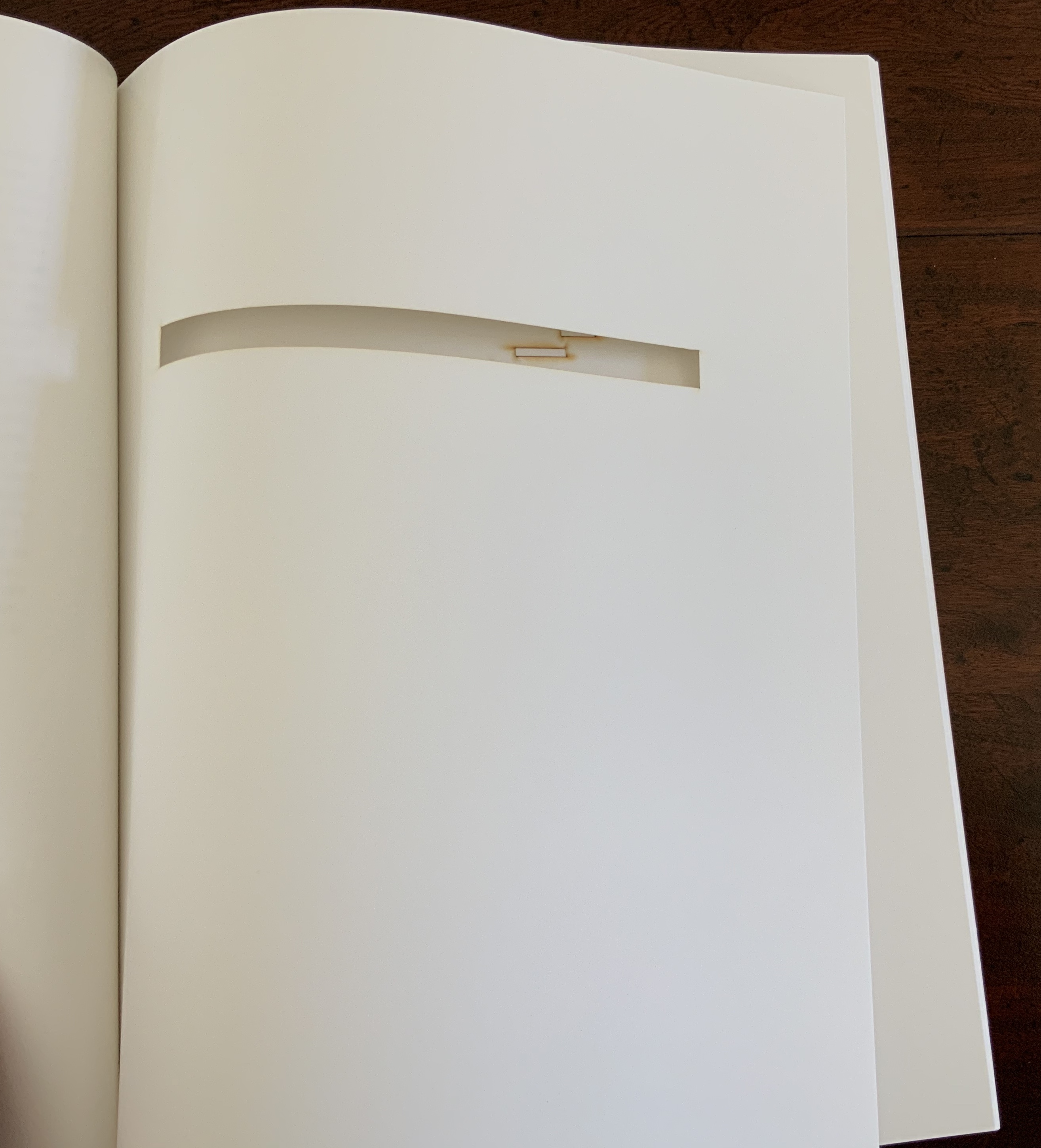
But without the context of the exhibition, the presence of other appropriations, or even Pichler’s translucent and plexiglas editions, what to make of Pichler’s paper edition on its own? The traditional Nrf cover design suggests no surprise to come, although the trim size looks non-traditional in today’s market. The book’s slimness, subtitle and preliminaries also warrant a raised eyebrow: how can this be a sculpture? Turning the pages, the reader/viewer comes to the cuts and sees through to the pages beneath. Shadows move through the leaves. The laser cut technique hints at something that a die cut does not. Do the burnt edges where the laser has cut suggest a more surgical approach to book burning, an allusion to burning decks, or a 19th century and 20th century legacy to the white spaces?
Both Mallarmé and Broodthaers noted the intent to draw attention to the white space of the page. Pichler appropriates both the poet’s and artist’s form and intent. He sculpts a conceptual double-palimpsest not by overwriting the first level of overwriting but by removing it and the original layer altogether. The core subtlety of Pichler’s paper edition of Un Coup de Dés lies in those empty spaces defined at their burnt edges and by the blankness around them. For Sartre, Mallarmé was the poet of nothingness. Broodthaers appropriated the nothingness with black ink. Pichler has appropriated both. The paradox is a work that stands on its own by invoking and eliminating what it appropriates.