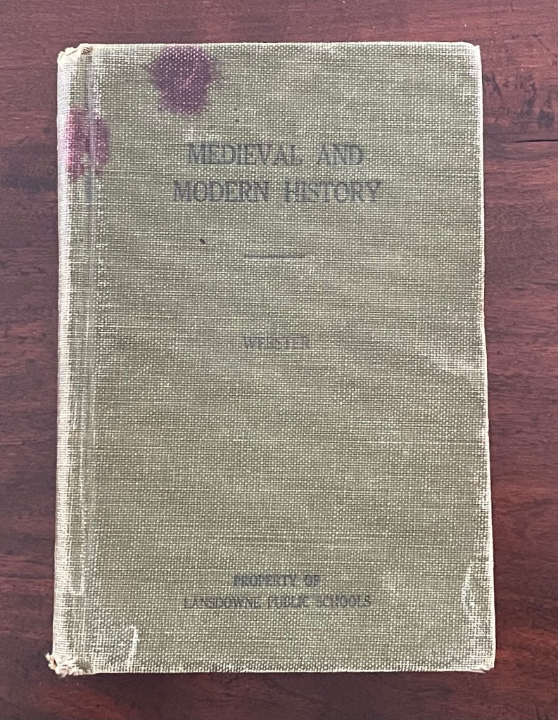
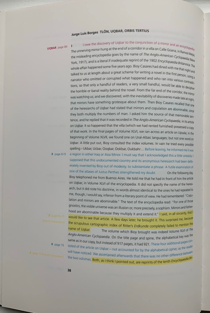
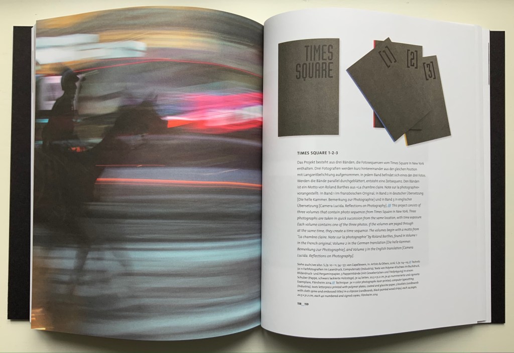
Here are two works that show how the substrate of the book can be the primary element of making art and meaning. When it comes to paper, the fireworks in most artists’ books focus on printing or structural displays. Susan Mills describes herself as not just a book artist but “a conceptual rural urban bookbinding poet artist working in book form” (Mills, 2025). She does not practice printing or printmaking. She produces her books without the use of a printing press and handbinds them using innovative structures, bindings, and materials. She lets the paper itself shine — as surface and as “paint”.
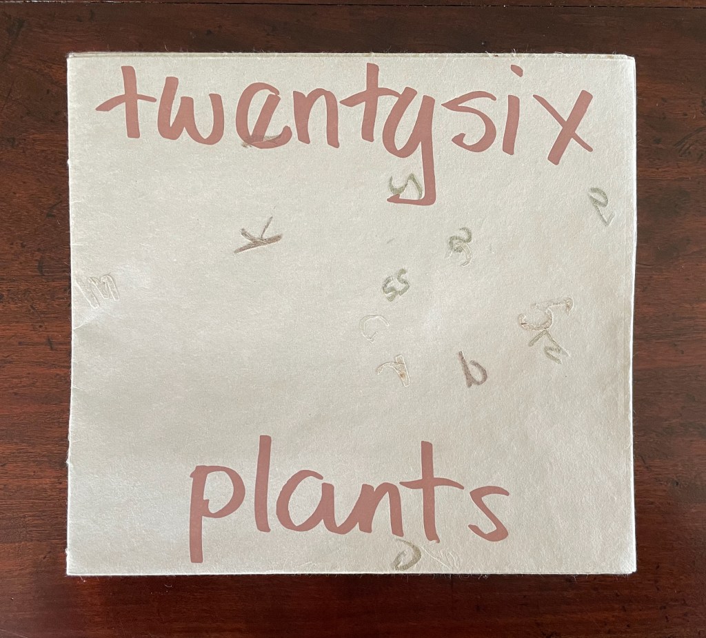
Twentysix Plants (2013)
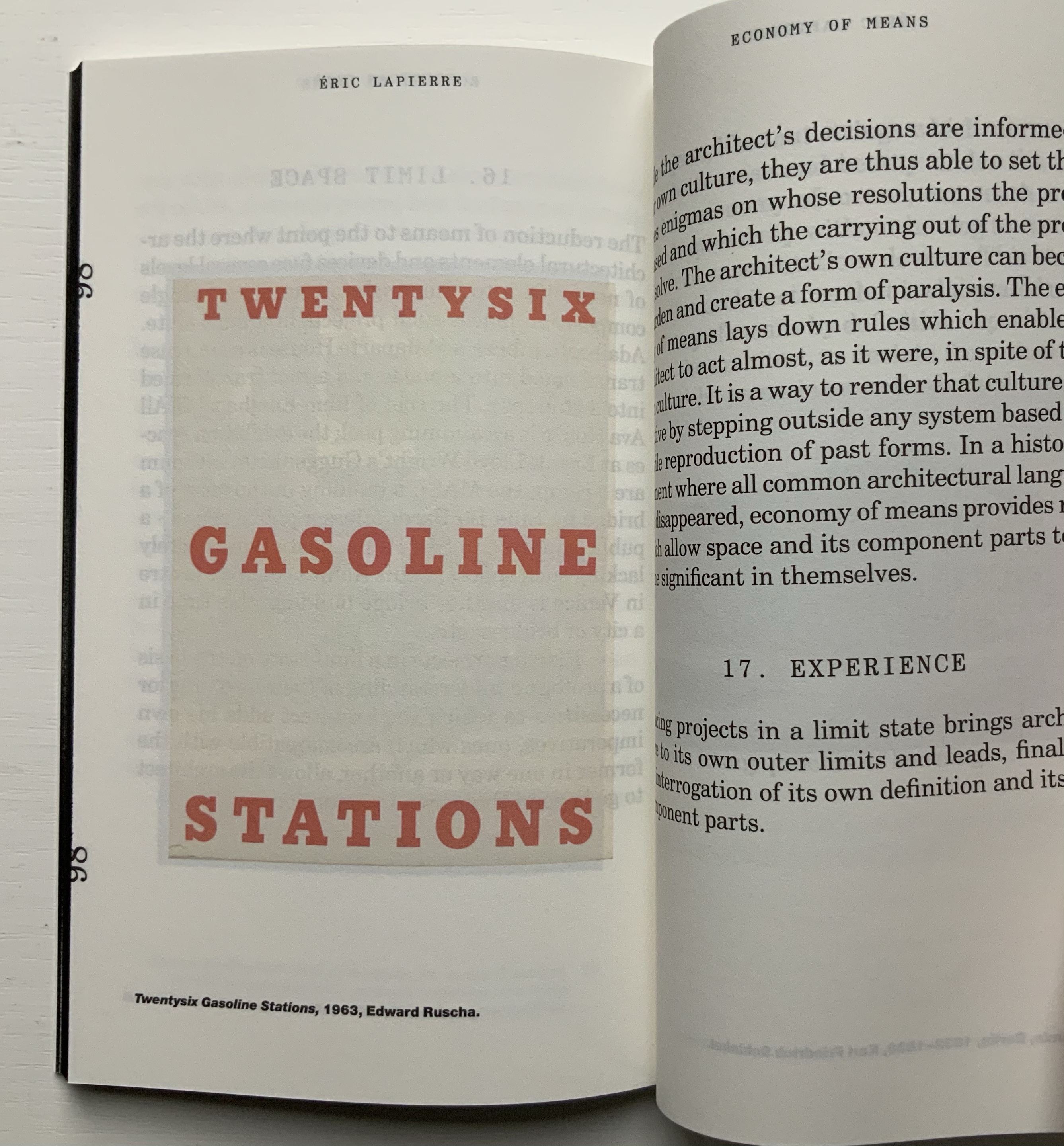
Susan Mills’ Twentysix Plants puts handmade paper at the center of its artistry as it nods to Ed Ruscha’s Twentysix Gasoline Stations (1963). It consists of twenty-seven different papers. Twenty-six of them were each made from one of twenty-six different plants. A small amount of abaca was added to the different pulps to ease them through the Hollander Beater. After the sheets were couched, dried, and readied for use, Mills “labeled” them by cutting out the name of the constituent plant in distinctive callitomic letters. For the cover paper, the twenty-seventh paper, the twenty-six cut-out scripts went into the vat.
If Twentysix Plants were an abecedarium, it would be arguable that, just as our words are made from the alphabet’s letters, so the cover of Twentysix Plants is made from all the plants used in the book. There they are, embodied in their fragmented names, embedded in the cover. But neither Twentysix Plants nor Twentysix Gasoline Stations is an A-Z.
Twentysix Plants (2013) Susan Mills Softcover with exposed spine, link-stitch and kettle-stitch sewn, and non-adhesive interlocking folios. H205 x W225 mm. [26] pages. Edition of 50, of which this is #4. Acquired from the artist, 9 February 2026. Photos: Books On Books Collection.
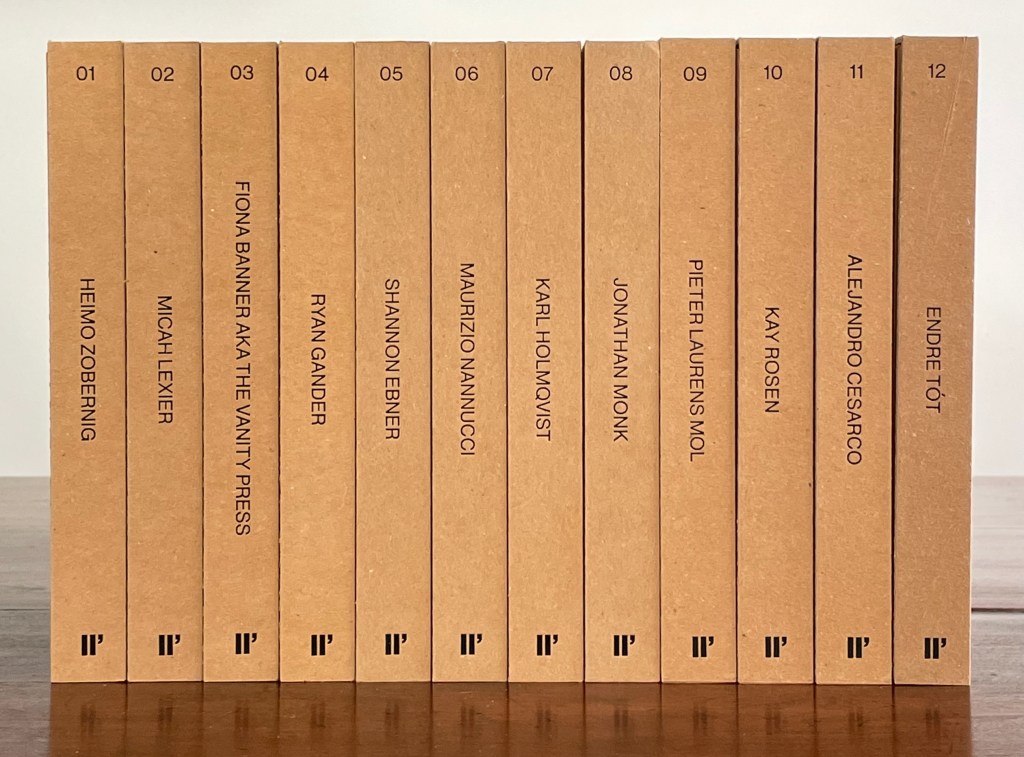
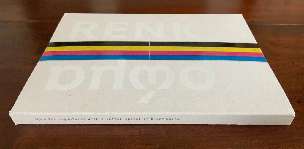
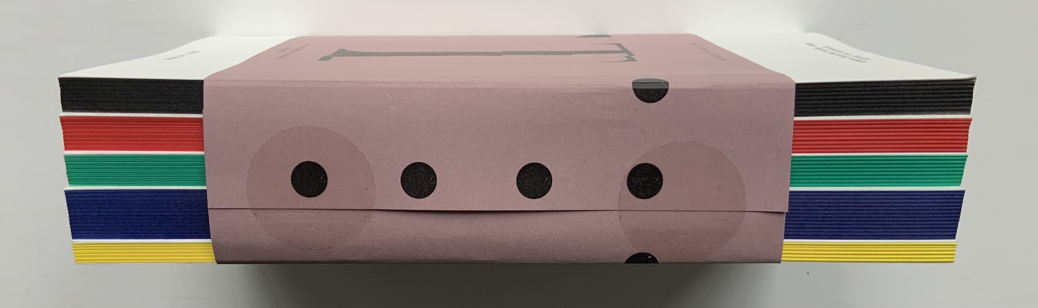
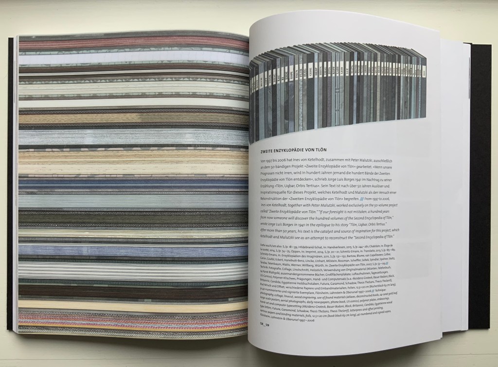
Enthusiasts and collectors of artists’ books should congratulate LL’Editions (Göteborg, Sweden) on its leporello series not only for the artists enlisted so far but for the constraint to inspire them. Critics of book art have opined that book artists turned to the accordion structure in the 20th century for more freedom with visual images and another tool with which to question the notion of the book as book. LL’Editions has challenged its invited artists with a constraint: a fixed-format leporello of ten panels, nine folds and always H140 x W100 mm (closed). The works are printed on Mohawk Superfine Eggshell paper. Housed in a custom box with the title hot foiled both on its front and spine, each volume in the series is limited to 250 numbered copies.
The real pleasure in each work and across the series is how each artist handles the shape to make it dance to a personal style or stamp. With each new addition — brick by brick — LL’Editions is building a monument to book art’s most common structure.
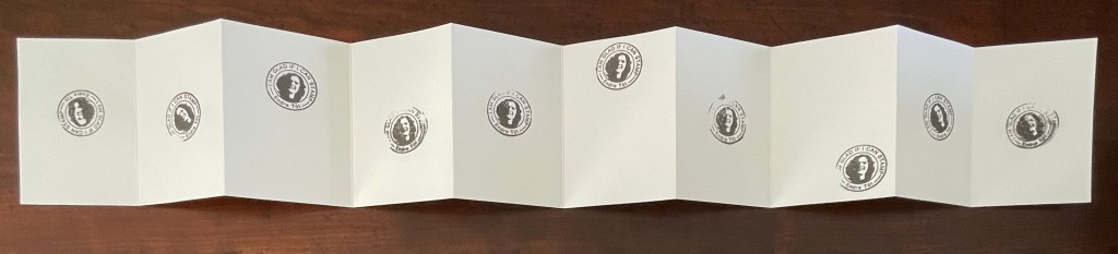
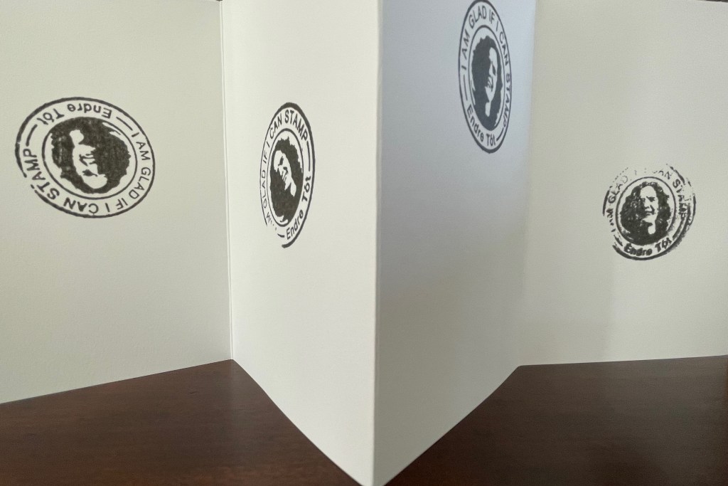
Leporello #12 (2025)
Leporello #12 (2025) Endre Tót Box: 148×191×23 mm. Leporello: H142 x W99 mm (closed); W990 mm (open). 10 panels. Edition of 250, of which this #70. Acquired from LL’Editions, 28 August 2025. Photos: Books On Books Collection. Displayed with permission of LL’Editions.
Bespoke Eska Board 1260 G/M2, Insert: F-Flute Black 500 G/M2, Hot-foiled title on front and spine. Mohawk Superfine Eggshell Ultrawhite 175 gsm.
Endre Tót has worked with a wide range of media: telegrams, postcards, posters, actions, and artist’s books. This one self-reflexively celebrates his signature gladness statements “We are glad if we are happy”, “I am glad that I have stood here”, “I’m glad that I can write one sentence after another”, “We are glad if we can demonstrate” and so on.
I am glad to have Endre Tót’s work in the Books On Books Collection.
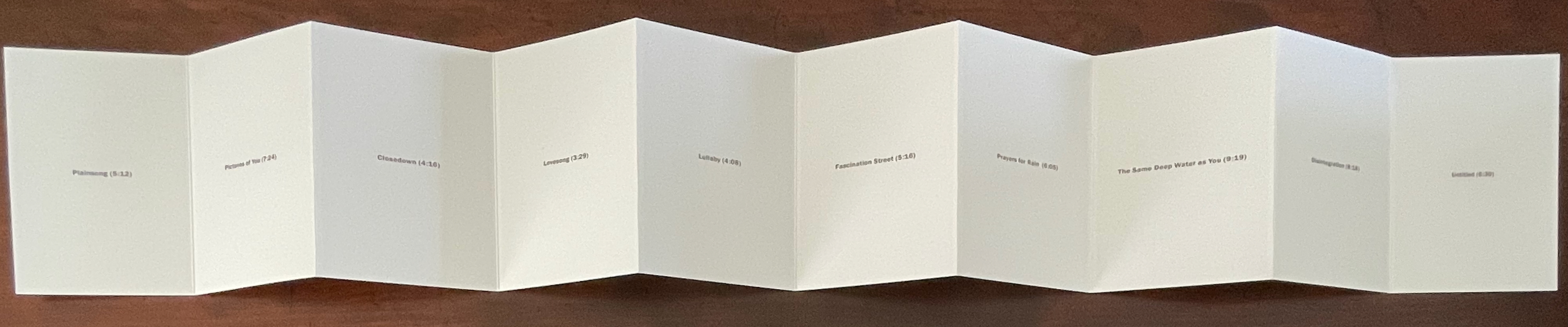
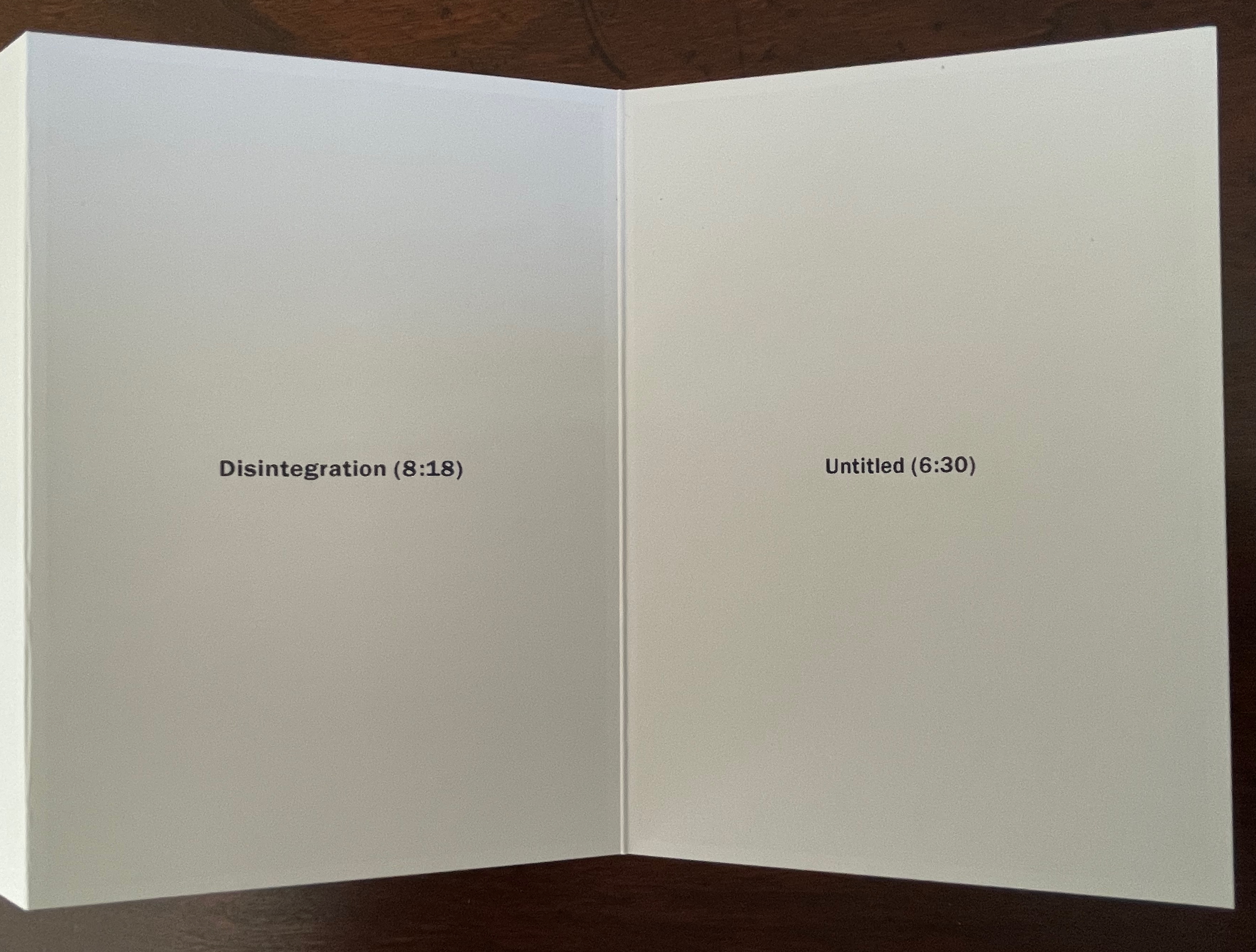
Leporello #11 (2024)
Leporello #11(2024) Alejandro Cesarco Box: H191 x W148 x D 23 mm. Leporello: H142 x W99 mm (closed). W990 mm (open). 10 panels. Edition of 250, of which this #229. Acquired from LL’Editions, 14 November 2024. Photos: Books On Books Collection. Displayed with permission of LL’Editions.
These are the titles and durations of the songs making up The Cure’s 1989 album. With each song on its own panel, Cesarco (b. 1975) seems to have created a photo album to remind himself of his youth. Given his artworks referencing/co-opting/implicating/appropriating John Baldessari, Marcel Broodthaers, Félix Gonzáles-Torres, Allen Ruppersberg, Ed Ruscha, and other book artists, the less-than-fans of The Cure may wonder if Cesarco is deliberately wrong-footing their expectations for his tackling the book artist’s platform. If you are one of them, consider that your horizons have been widened and that The Ramones (An Autobiography) (2008) — his list in chronological order of every Ramones song that begins with the pronoun “I” — does not neatly divide by 10.
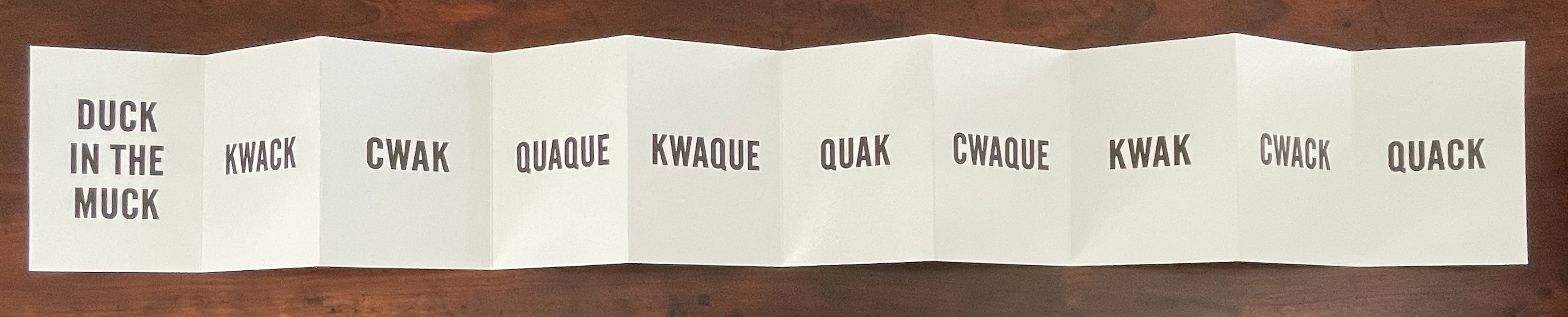
Leporello #10 (2024)
Leporello #10 (2024) Kay Rosen Box: H191 x W148 x D 23 mm. Leporello: H142 x W99 mm (closed). W990 mm (open). 10 panels. Edition of 250, of which this #116. Acquired from LL’Editions, 14 November 2024. Photos: Books On Books Collection. Displayed with permission of LL’Editions.
There’s a lengthy and excellent essay entitle “The Gravity of Language” about Rosen’s work in Osmos Magazine (Winter 2019) by Stephanie Cristello. In it, she writes:
You will notice, by now, that the works discussed here are united by their allusions to the motions of up and down. Does this seem arbitrary to you? Or strike you as the imposition of a rule-based physics upon an artistic practice whose oeuvre certainly contains variances, divergences, and oddities–cut out for the purpose of being explored through a particular force?Perhaps. (Cristello, 2019)
Somehow this more recent artist’s book seems to confirm and repudiate the critic’s approach. As if to say, “Yes, I’m stuck in the muck despite my variances, divergences and oddities”, or “No, ducky, there’s no gravitas or gravity here”. Or perhaps it’s Rosen’s visual way of using permutations on language (starting with a common expression) to poke fun at LL’Editions’ constraint: “So you want to confine me like a duck in the muck? Well, quack, the joke’s on you”.
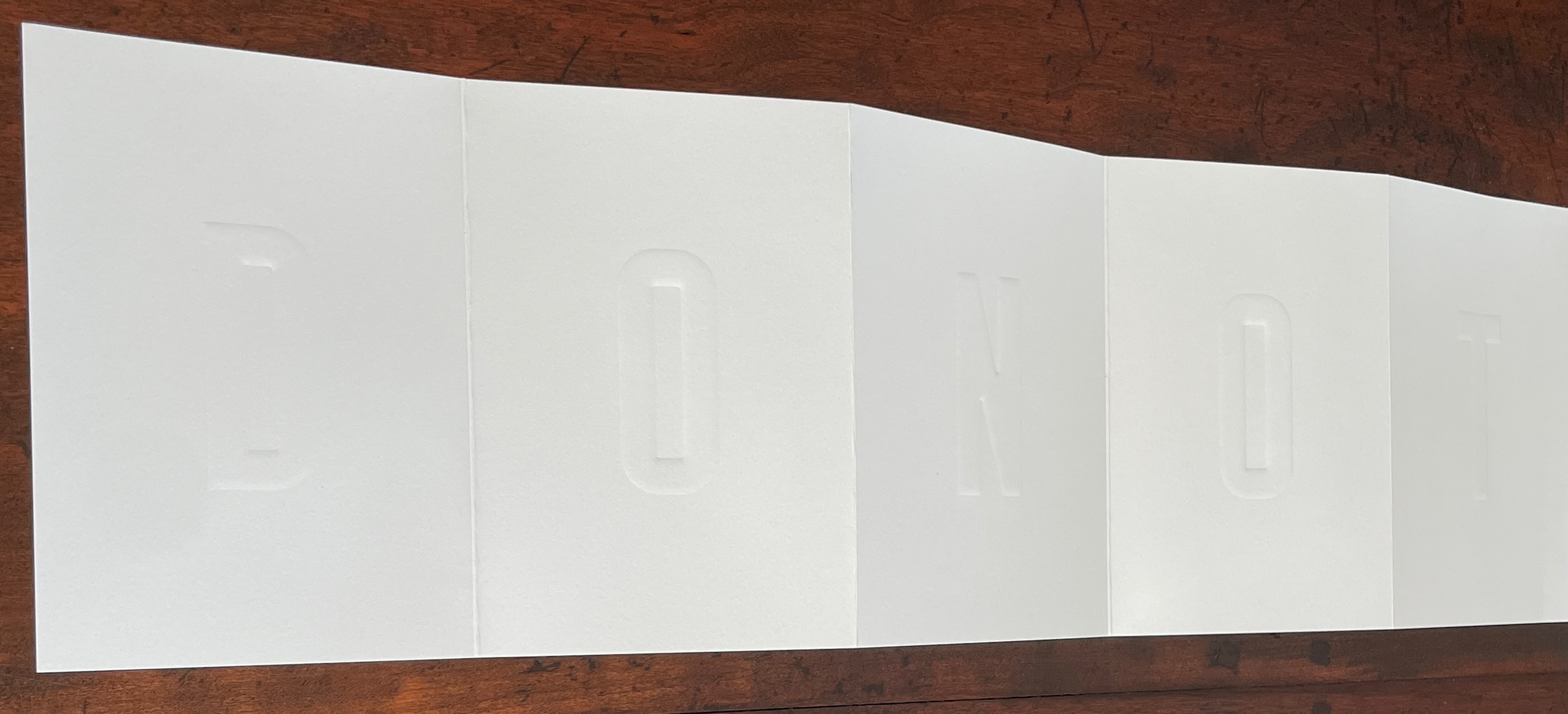
Leporello #9 (2024)
Leporello #9 (2024) Pieter Laurens Mol Box: H191 x W148 x D 23 mm. Leporello: H142 x W99 mm (closed). W990 mm (open). 10 panels. Edition of 250, of which this #111. Acquired from LL’Editions, 14 November 2024. Photos: Books On Books Collection. Displayed with permission of LL’Editions.
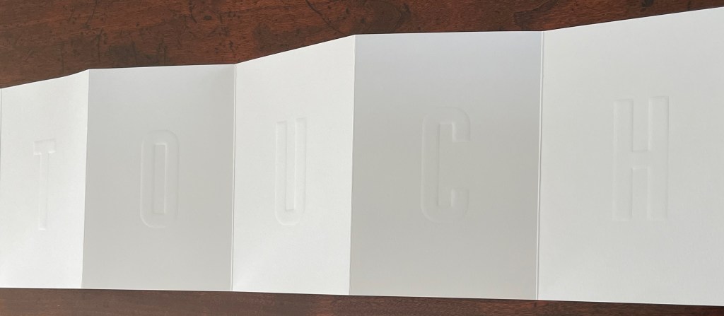
How many artists before and after Marcel Duchamp’s Prière de Toucher (1947) have played this joke in an artist’s book? Where Duchamp’s displayed work played against the usual museum injunction, Pol’s embraces and wrong-foots it with blind embossing.
Leporello #8 (2022)
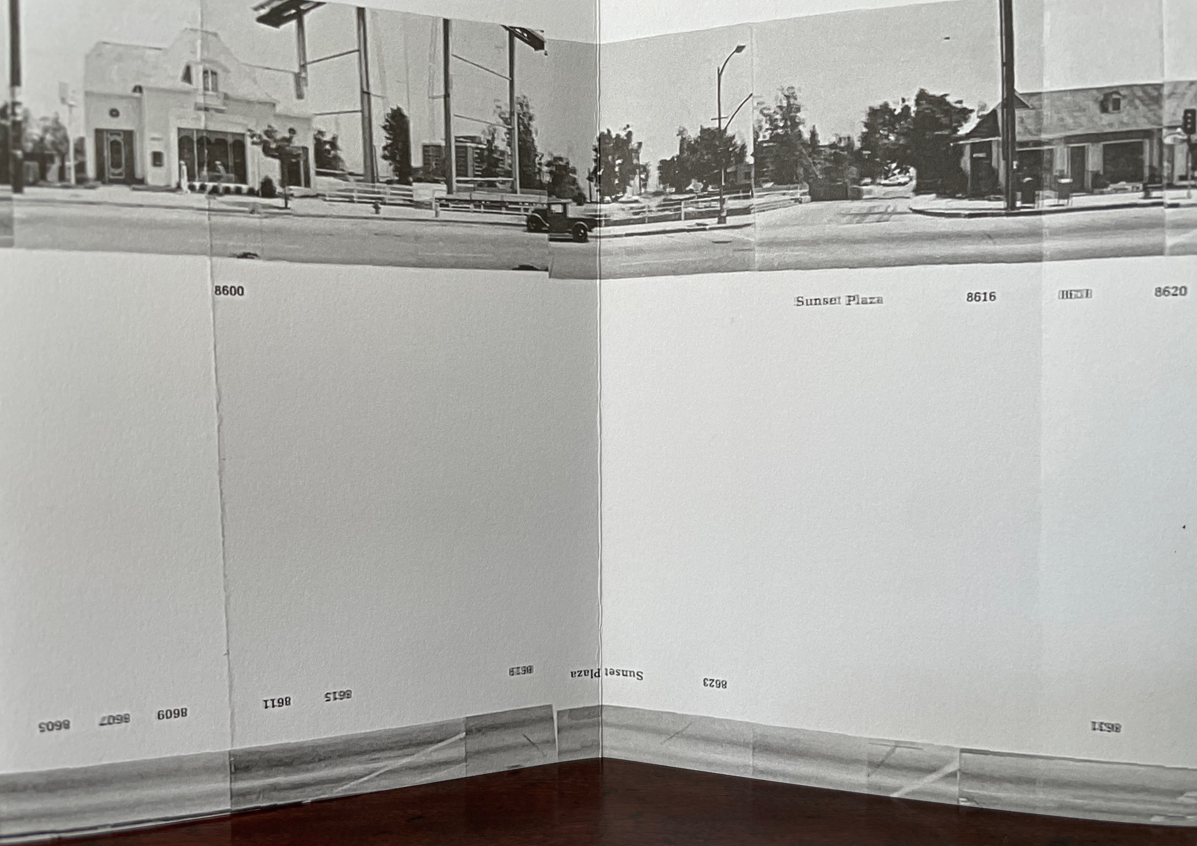
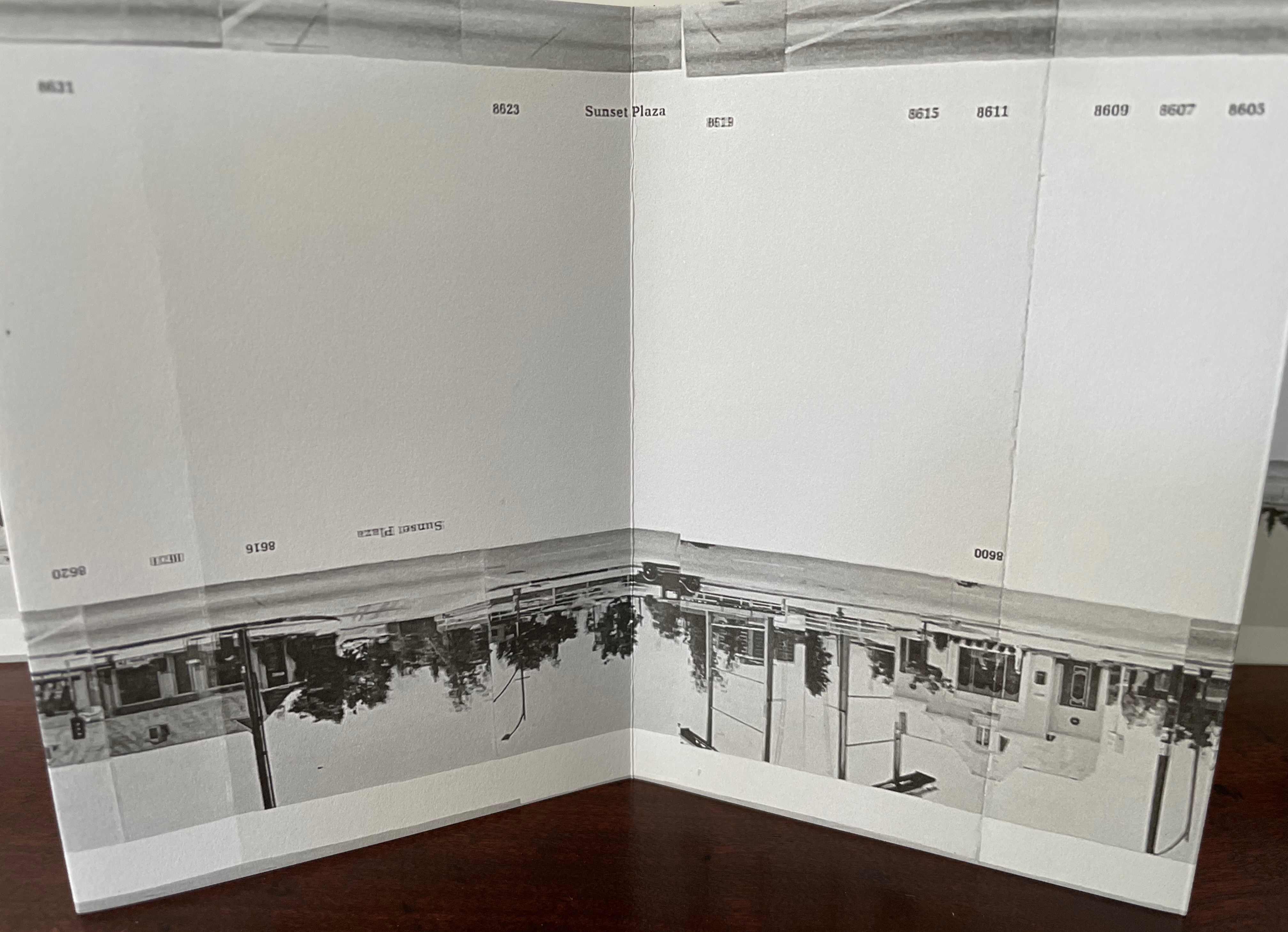
Leporello #8 (2022) Jonathan Monk Box: H191 x W148 x D 23 mm. Leporello: H142 x W99 mm (closed). W990 mm (open). 10 panels. Edition of 250, of which this #175. Acquired from LL’Editions, 14 November 2024. Photos: Books On Books Collection. Displayed with permission of LL’Editions.
It helps to know or remember that in 2002, Jonathan Monk published None of the buildings on Sunset Strip with Revolver. Here, he has used his iPhone in panoramic mode to appropriate again Ed Ruscha’s Every Building on the Sunset Strip (1966). But when Monk’s leporello is turned over, notice that this side of the Strip has been truncated. Monk’s thoughts on appropriation and self-reflexivity can also be enjoyed in the three-handed interview Books on Books (2011) with Jérôme Saint-Loubert Bié and Yann Sérandour.
Leporello #7 (2022)
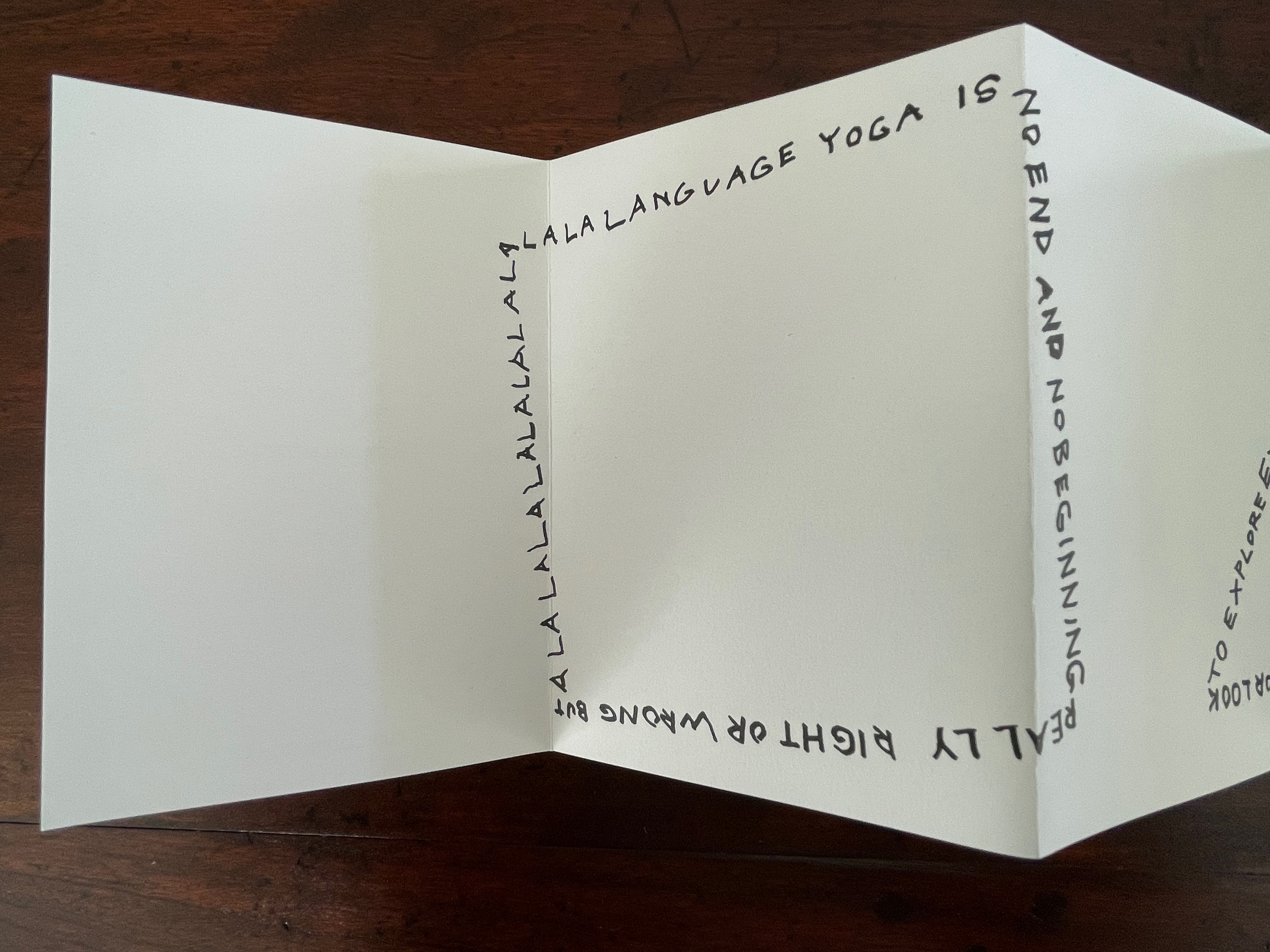
Leporello #7 (2022) Karl Holmqvist Box: H191 x W148 x D 23 mm. Leporello: H142 x W99 mm (closed). W990 mm (open). 10 panels. Edition of 250, of which this #110. Acquired from Unoriginal Sins, 14 November 2024. Photos: Books On Books Collection. Displayed with permission of LL’Editions.
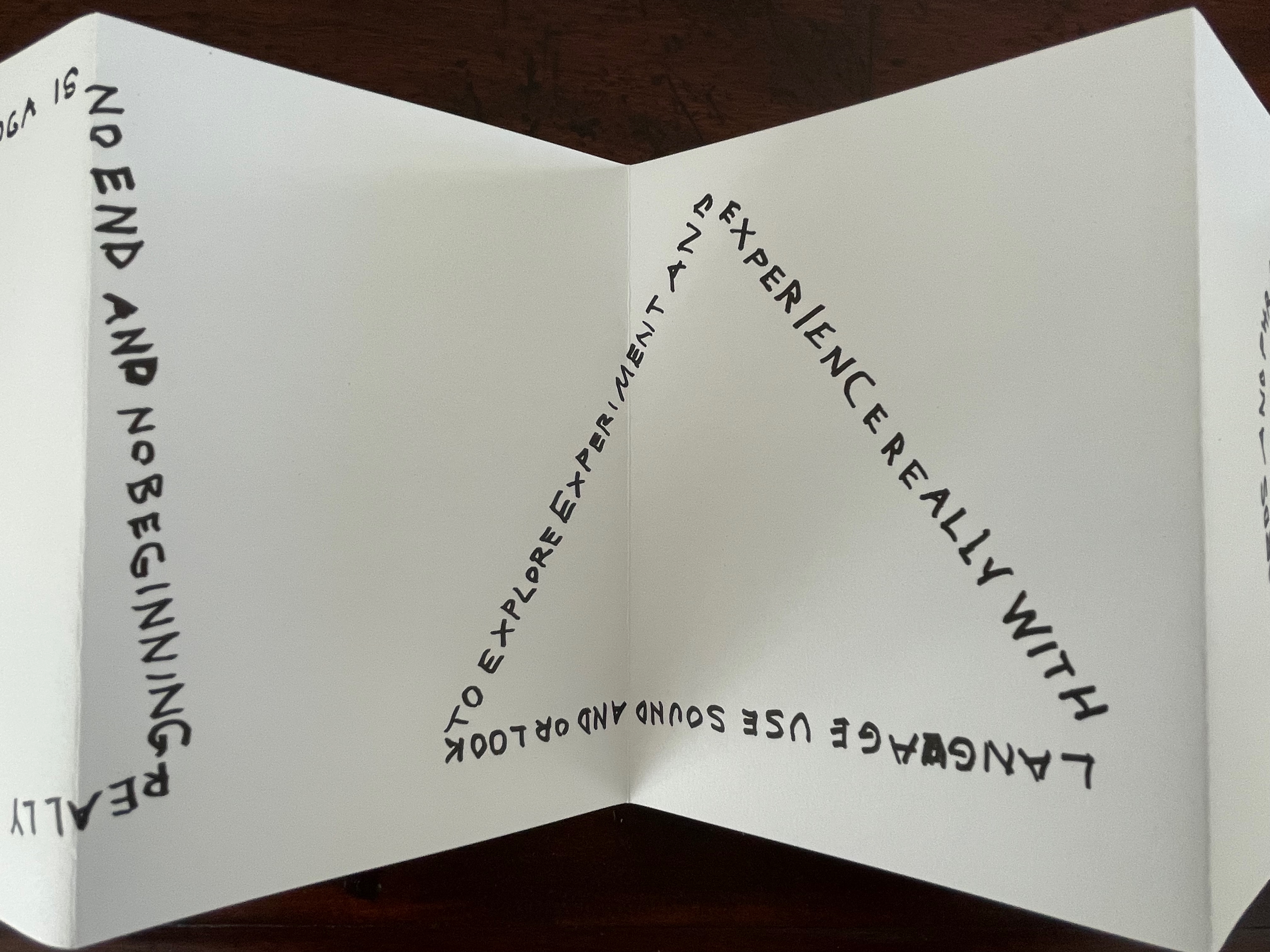
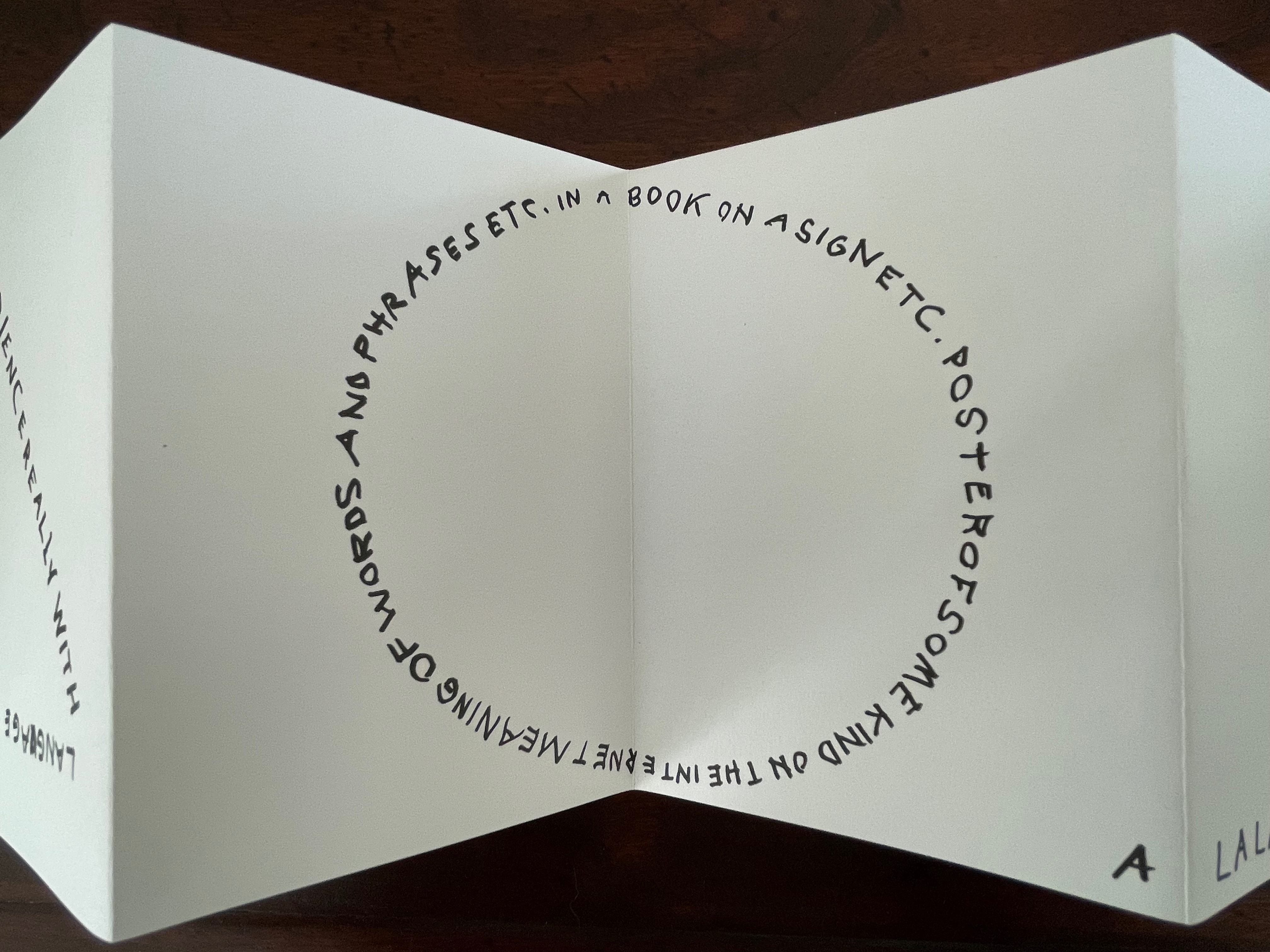
Here’s one to add to Bruno Munari‘s collection of squares, circles, and triangles. While the yoga may also remind you of Ric Haynes‘s Aquatic Yoga with Dangerous Foods (1984), this leporello is a welcome opportunity to experience this Swedish artist’s ability to weld language and shapes together in perceptive and humorous (and sometimes acerbic) ways. Galerie Neu in Berlin has been astute enough to hold three solo exhibitions for Holmqvist since 2013; their display of his works here provides views of his several sculptures that chime with Leporello #7.
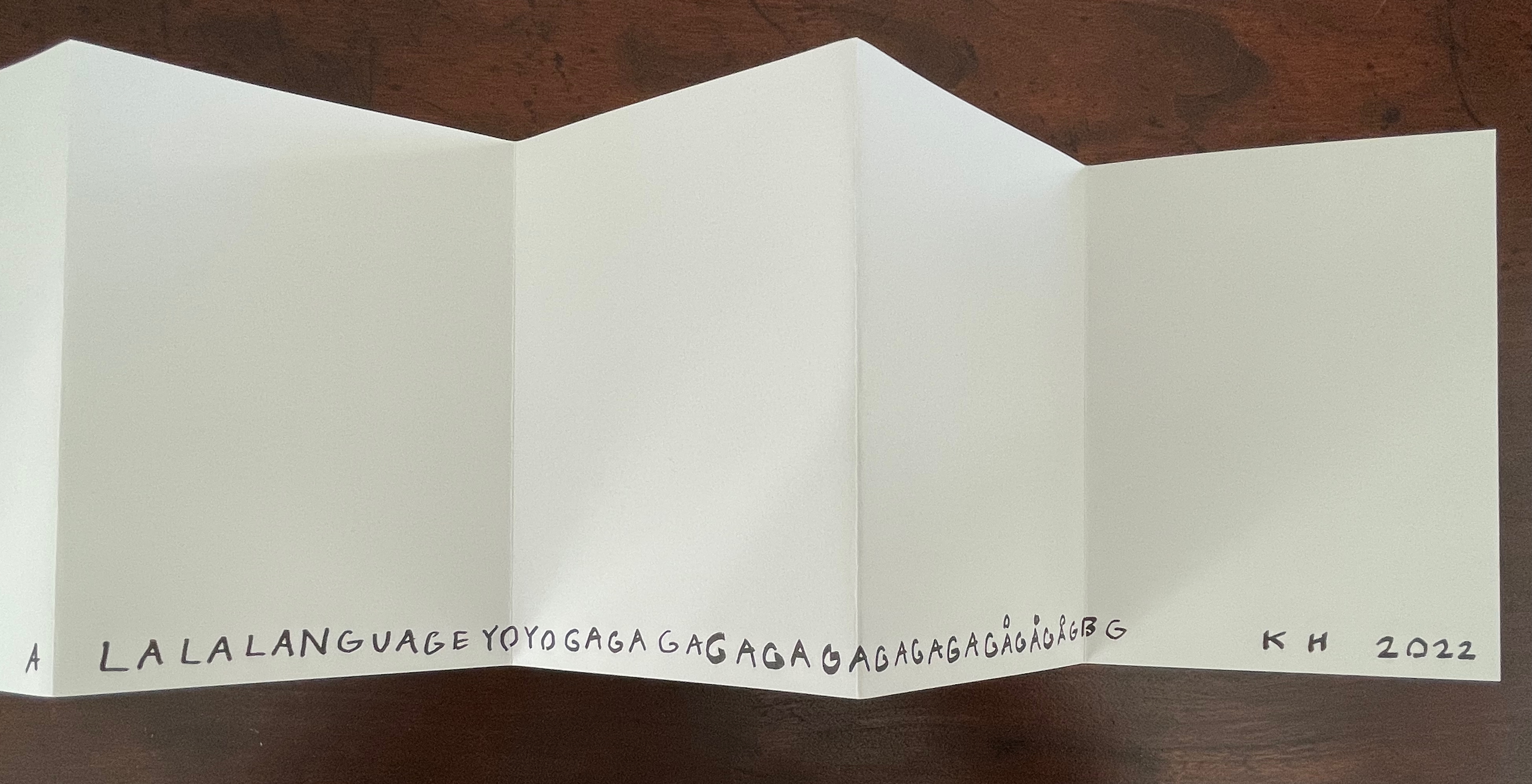
Leporello #6 (2022)
Leporello #6 (2022) Maurizio Nannucci Box: H185 x W148 x D 23 mm. Leporello: H143 x W90 mm (closed). W900 mm (open). 10 panels. Edition of 250, of which this #106. Acquired from Unoriginal Sins, 14 November 2024. Photos: Books On Books Collection. Displayed with permission of LL’Editions.
It’s hard to believe that Leporello #6 may be one of only three accordion books produced by this prolific and inventive artist associated with Fluxus. The other two are Sessanta Verdi Naturali (Sixty Natural Greens)(1977) and Up Above the Wor(l)d/A Guide for Aliens (1981). In Leporello #6, he has made the accordion structure, panel layout, and language reinforce one another simultaneously to create an ouroboros artwork.
Leporello #5 (2022)
Leporello #5(2022) Shannon Ebner Box: H185 x W148 x D 23 mm. Leporello: H143 x W90 mm (closed). W900 mm (open). 10 panels. Edition of 250, of which this #132. Acquired from Unoriginal Sins, 14 November 2024. Photos: Books On Books Collection. Displayed with permission of LL’Editions.
Since her participation in MoMA’s Ecstatic Alphabets/Heaps of Language in 2012, Shannon Ebner has been a book artist to watch for bringing the alphabet and the artist’s book together.
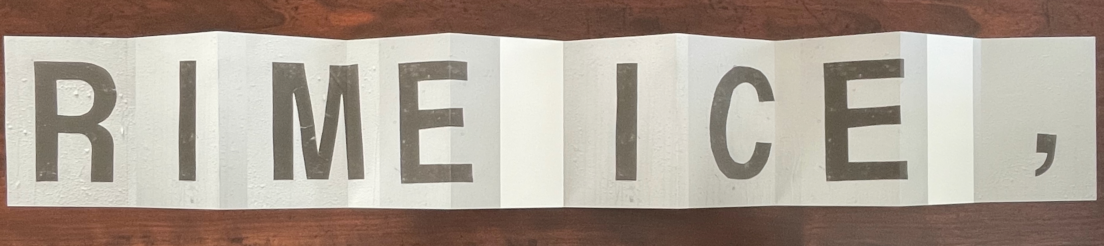
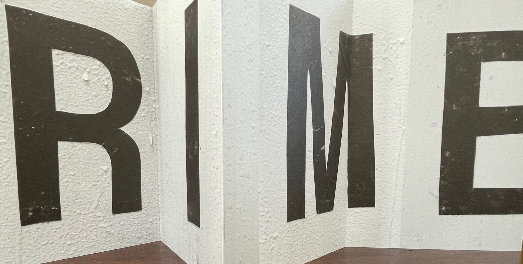
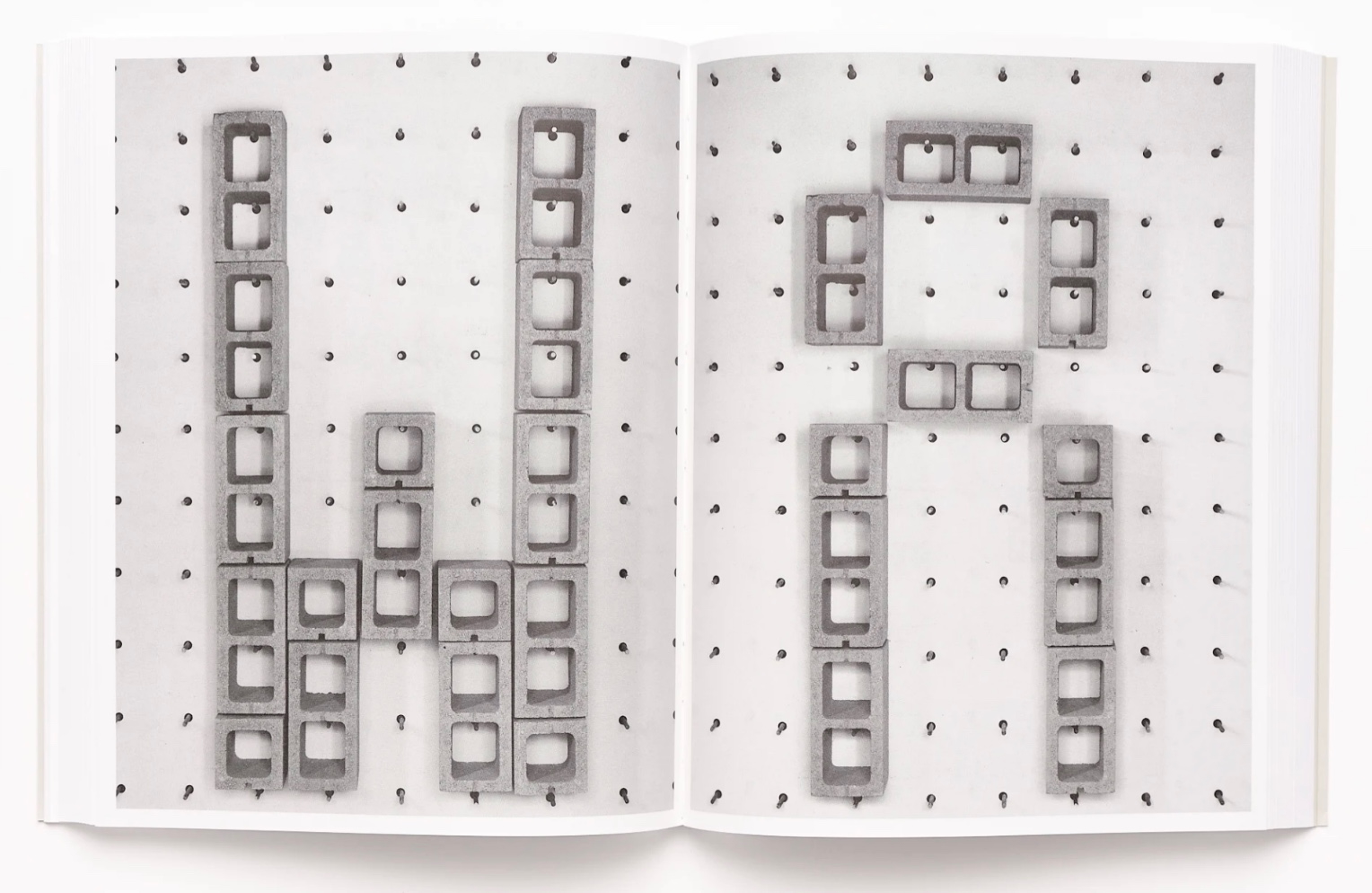
Her Strike (2014) concretely rewarded the alert. The textures of melting ice in Leporello #05 and concrete blocks in Strike seem to leap off the letters and paper. From the LL’Editions’ description of Leporello #05:
Ebner has selected specific materials based on their self-reflexive relationship to the subject of the writing itself. Each photographic typeface is in essence a material response to the various cultural conditions and societal pressures at hand. For Ebner’s leporello, the meteorological term RIME ICE is its single subject, though the phenomenon itself falls into two categories, soft or hard rime. In either case it is rime ice that forms when liquid droplets comprised of supercooled water freeze onto surfaces. RIME ICE is an outtake from Ebner’s recent exhibition FRET SCAPES (2022). FRET is acronym for the Forecast Reference Evapotranspiration Report, a report that is generated by climate scientists to measure the rate at which water that falls to the ground will evaporate to the sky.
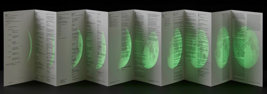
Leporello #04 (2021)
Leporello #04 (2021) Ryan Gander Box: H191 × W148 x D23 mm. Leporello: H142 x W99 mm (closed), W990 mm (open). 10 panels. Edition of 250, of which this #32. Acquired from Unoriginal Sins, 14 November 2024. Photos: Books On Books Collection. Displayed with permission of LL’Editions.
Ryan Gander has repurposed his installation Staccato Reflections (2017-20) to create Leporello #04. The tiny text originates from the artist’s notebook. In Staccato Reflections, it appears in a normal-sized font in business-directory format on a freestanding reflective screen. Gander describes the installation this way in an interview in Art in America:
Staccato Reflections is based on the idea of the self in culture, the obsession with the me and the selfie and the narcissist wand. The surface is mirrored, so as you read the words, you see yourself. The work has devices in it that are self-referential. It asks you to touch the screen, and then says “don’t touch the screen.” So it seems like it is responding to you, but it’s not.” (Fullerton, 107)
With its miniscule print requiring the enclosed rectangular plastic magnifying glass, and with its overprint in glow-in-the-dark ink of a waxing full moon, Leporello #04 marks quite a departure from the installation.
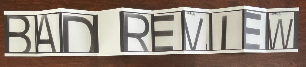
Leporello #03 (2021)
Leporello #03 (2021) Fiona Banner Box housing leporello. Box: H185 xW140 xD25 mm. Leporello: H140 x W100 mm. 10 panels. Numbered edition of 250, of which this #42. Acquired from Unoriginal Sins, 14 November 2024. Photos: Books On Books Collection. Displayed with permission of LL’Editions.
With Leporello #03, Fiona Banner repurposes the previously repurposed conceptual artwork Bad Review. It has appeared as a C-typeprint with the words overlaid on a rearview mirror and as a sculpture. To reproduce the two words, Banner uses found letters photographed held up by hand and badly positioned. Is it serendipity or cheeky genius that, like readymades, the nine letters and space of Banner’s conceptual artwork fit the ten panels imposed by LL’Editions to give us another re-view?
Leporello #02 (2021)
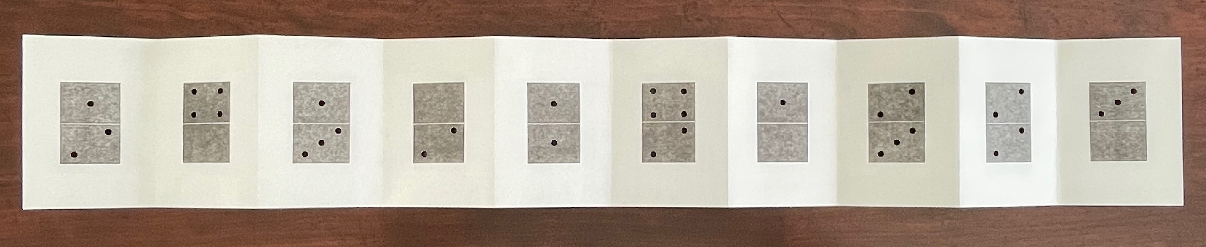
Leporello #02(2021) Micah Lexier Box housing leporello. Box: H185 xW140 xD25 mm. Leporello: H140 x W100 mm. 10 panels. Edition of 250, of which this #171. Acquired from Unoriginal Sins, 14 November 2024. Photos: Books On Books Collection. Displayed with permission of LL’Editions.
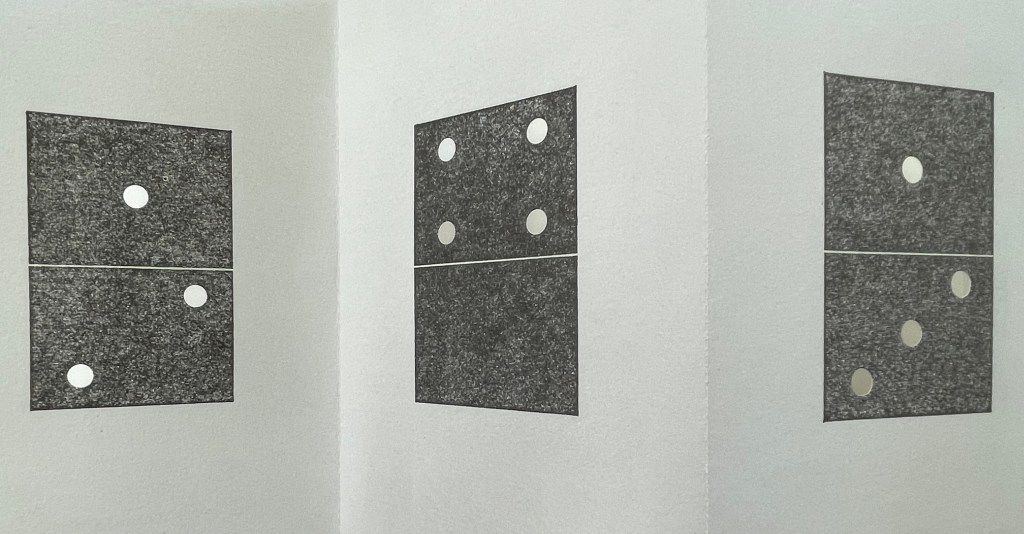
Publisher’s description: A number of years ago Micah Lexier purchased a small paperback publication about the game of dominoes. The very end of the book consisted of a series of pages that reproduced a complete set of twenty-eight domino tiles. The images were printed on right-hand pages, four to a page, while the left-hand pages were blank. The idea was that you were supposed to cut these images out of the book and glue them to empty matchboxes to create your own do-it-yourself set. That sequence of pages, combined with the quality of their reproductions, was the inspiration for Lexier’s leporello. To that, he added two favourite print techniques – perforations and die-cut holes – to create a set of ten domino tiles. Lexier chose the denomination of each tile and its order in the leporello so that none of the thirty-four die-cut holes line up with each other, allowing each hole to be misread as a printed white domino dot.
If you stand Leporello #02 on its edge on a table and then lean forward to view the panels at eye level, the domino images seem to have grown into oversized hangings on gallery walls. You can see some of the die-cut holes if you look closely at the lower right corner below.
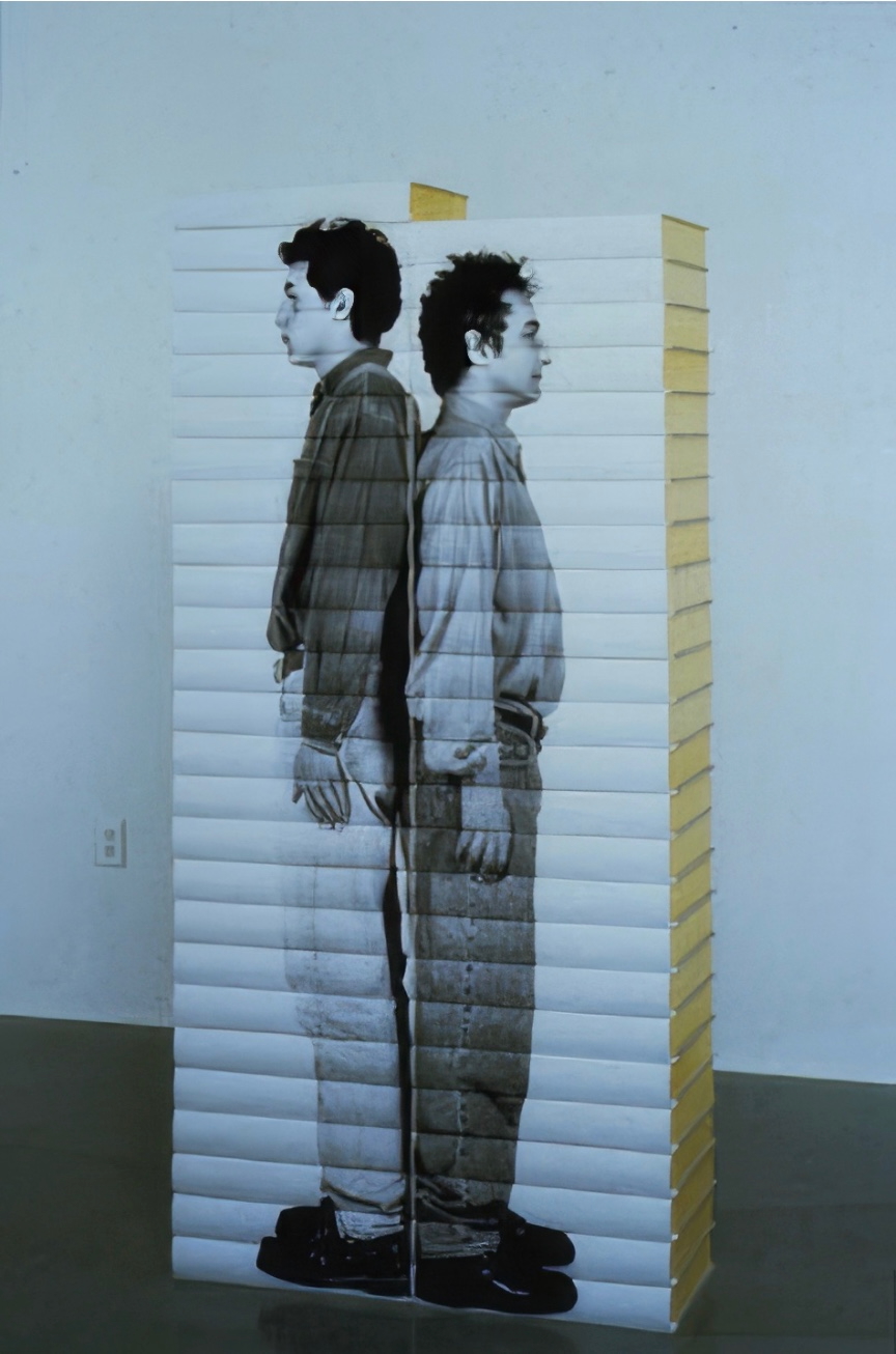
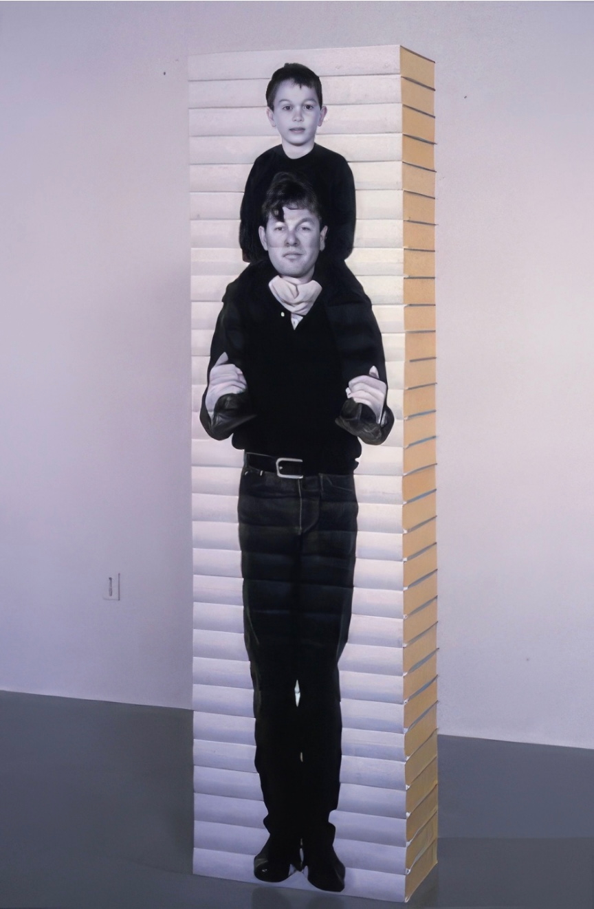
It’s a peculiar sensation, but it echoes Lexier’s website, which highlights mostly installations and large-scale works. Even more so it echoes Robert Birch Gallery in Toronto, which emphasizes his large wall displays. On both sites, Lexier’s play with patterns, shapes, tiles, and contrasts of black and white stands out. Although it’s not clear from those current sites, he has many book-related works. In the ’90s, he produced book sculptures in which each spine in a stack of books would have part of a life-size photo of a human subject printed on it. Properly stacked, the books display the human figure.
As can be seen in Leporello #02 and other works on display in the CCCA Canadian Art Database Project, Lexier likes to work with found objects. As can be seen in the book sculptures above and in the Database Project, Lexier’s art also reflects on relationships and community. Leporello #02 neatly and abstractly brings these two themes together with the found dominoes game book and the game’s communal roots.
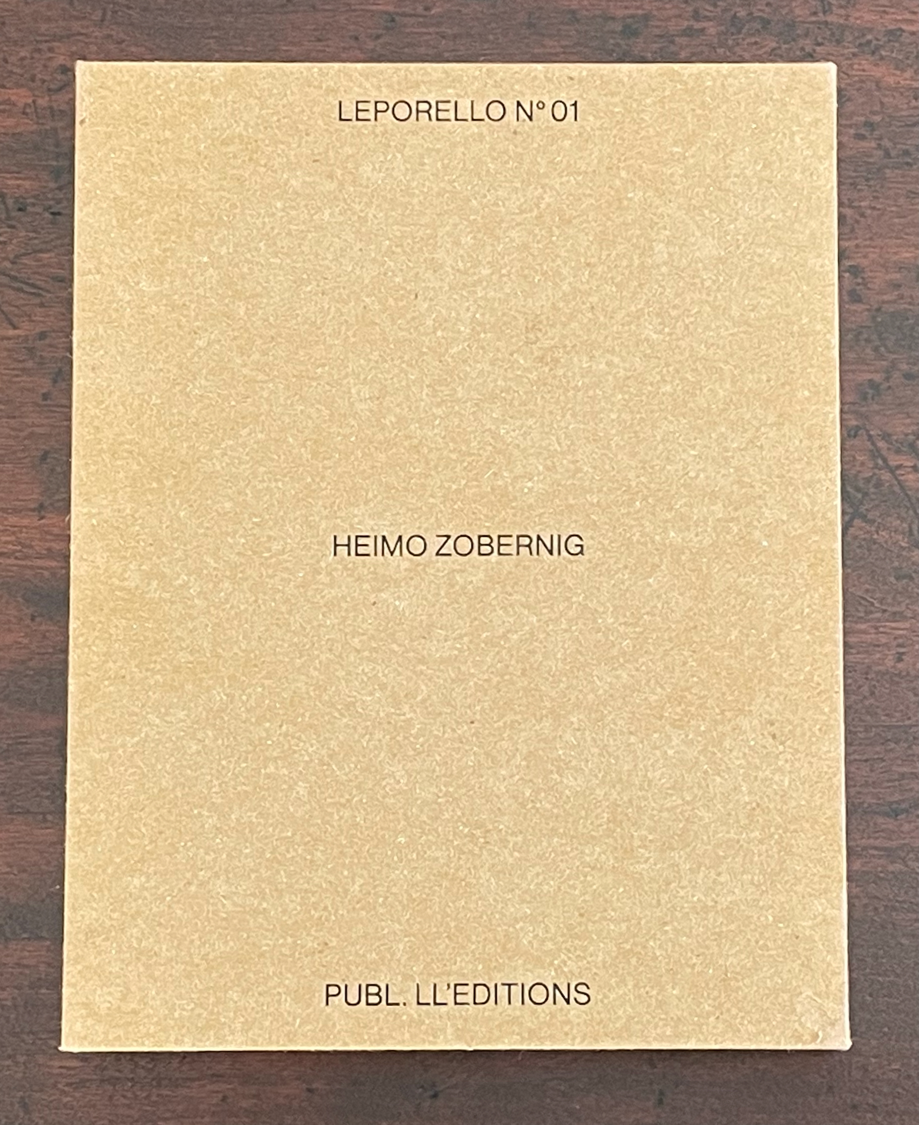
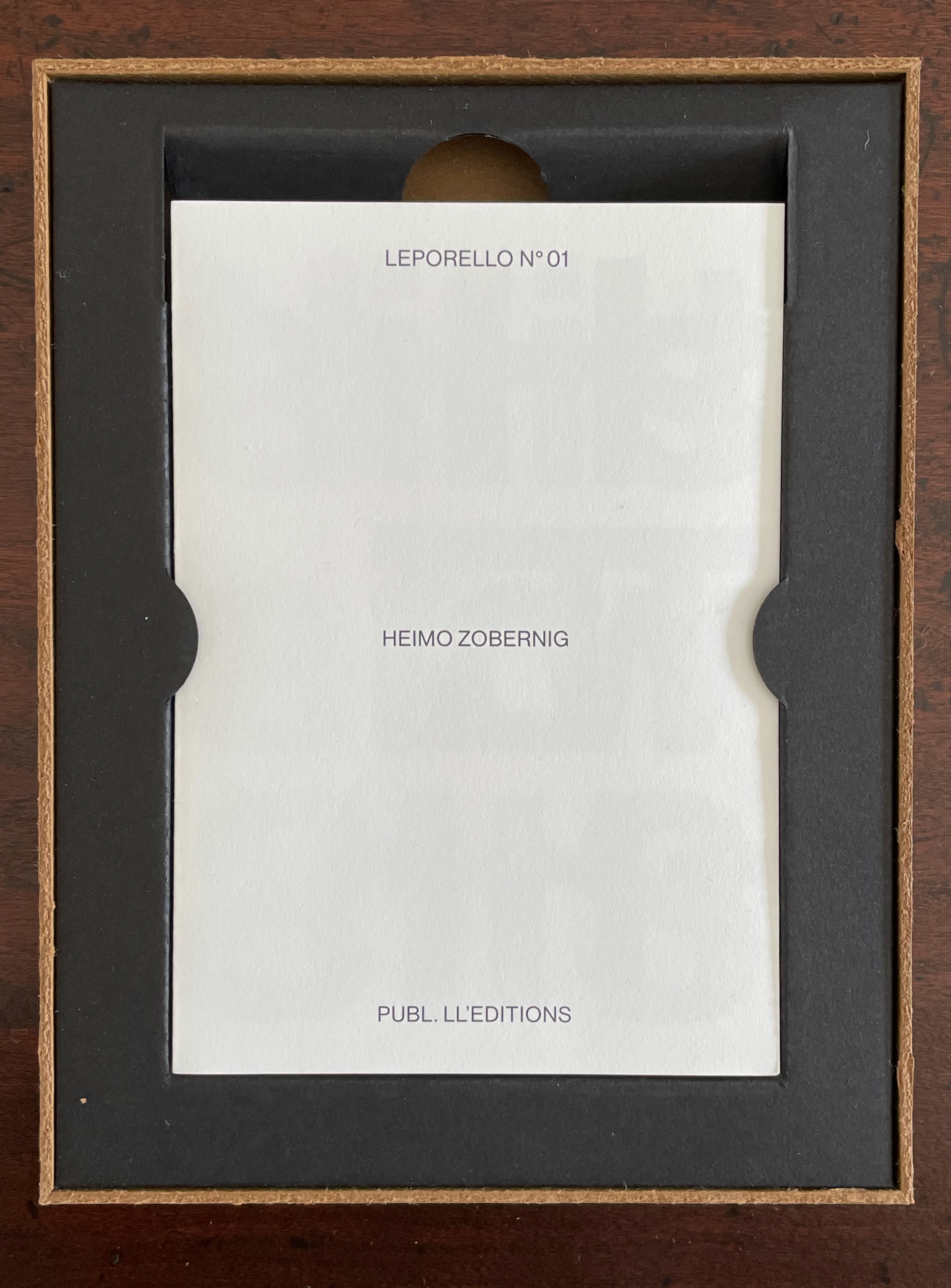
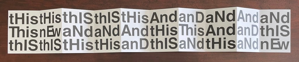
Leporello #01 (2021)
Leporello #01 (2021) Heimo Zobernig Box housing leporello. Box: H185 xW140 xD25 mm. Leporello: H140 x W100 mm. 10 panels. Edition of 250, unnumbered. Acquired from Unoriginal Sins, 14 November 2024. Photos: Books On Books Collection. Displayed with permission of LL’Editions.
If you extend Leporello #01 fully, you are likely at first glance to project onto it the common expression “this and that”, but thwarted, you then start looking for another phrase comprised of “His”, “IS”, “And”, but you run into “Ew” or “nEw”, which throws you into renewed pattern-seeking behavior. Should you count the “this’s” and “and’s” in each row? Maybe there’s something in the pattern of lowercasing and uppercasing? Is there anything to the fact that the word “new” never begins with an uppercase N, or that it occurs only twice? Maybe you should read the rows aloud? With that, you may remember that, in earliest writings, words were not spaced and mixed majuscule and miniscule didn’t come along until later. Now you see how the folds are the primary means of separating the words in this book. This becomes clearer if you read the book panel by panel, or page by page codex-style. But now there are other possible patterns: does the book begin with “thIs, This, thIS” and proceed to “tHis, nEw, thIS”, and so on?
Somehow the acronym “WYSIWYG” — what you see is what you get — pops to mind, but Leporello #01 seems also a case of “WYGIWYS” — what you get is what you see. Fully extended or panel by panel, Leporello #01 offers more to see than a glance will get you.
Leporello #01 continues Zobernig’s love affair with Helvetica, which is also on display in Farben Alphabet (2018) and CMYK (2013), also in the Books On Books Collection.
Fullerton, Elizabeth. 28 April 2017. “In the Studio: Ryan Gander“. Art in America. Accessed 7 November 2025.
Hubert, Renée Riese, and Judd David Hubert. 1999. The Cutting Edge of Reading : Artists’ Books. New York City: Granary Books. See chapter 6, “Variations on the Accordion”, pp. 97-122.
Altered books as artists’ books present a seemingly endless variety.
Some may be the conversion of old books into just-legible new ones as in A Humument redacted with ink, paint, excision, and collage by Tom Phillips, Tree of Codes mechanically excised by Jonathan Safran Foer, or The Eaten Heart scalpeled into existence by Carolyn Thompson. They give us a new work to read page by page extracted page by page from the earlier work, which remains more or less (mainly less) present in our hands.
Others like Marcel Broodthaers’ page-by-page redactions of Mallarmé’s Un Coup de Dés by ink in one case and excision in another or Michalis Pichler’s similar reformatting and excision of the same poem in clear acrylic or Jérémie Bennequin’s page-by-page erasures of Proust’s Remembrance of Things Past give us artists’ books that make the altered books illegible but still accessible page by page.
Other altered books as artists’ books are mainly one-off spatial objects that can be taken in in one go — not necessarily in just a glance but in the look or gaze given to a sculpture or painting. The ground up and encased works in Literaturwurst by Dieter Roth. The sealed, painted, nailed, and “hairied” works of Barton Lidice Beneš. The torn works of Buzz Spector. The sandblasted works of Guy Laramée. The glued and carved works of Brian Dettmer. The bullet-hole-ridden Point Blank by Kendell Geers. The pun-packed moebius-sculpted Red Infinity #4 by Doug Beube. They give us artists’ books that make the altered books illegible and inaccessible as books.
Artists ‘ book s are often self-conscious about the elements of book structure. This can involve self-reflexive humor or serious philosophical interrogations of a book’s identity. Disturbing conventions of reading by calling attention to these structures is often a feature of artists ‘ books through an emphasis on the features of the page and pointing to the book as a whole. But a book can also be a self-conscious record of its own production – it can simply examine itself as a proposition – one laden with specific ideas about the ways a book can embody an idea through its material forms. There are really two subtexts here. One is the “idea of the book as Idea” – the self-reflexive creation of books · which are about being books, or what a book can be as an idea in form. The other is the “idea of the book as art idea” – which takes these investigations of the book into a dialogue with the concept of art, and shows that books are an art idea. — Drucker, 2004.
Books on Books (2011)
Books on Books (2011) Jérôme Saint-Loubert Bié, Yann Sérandour & Jonathan Monk Perfect bound paperback. H160 x W115. 260 pages. Acquired from Chapitre.com, 29 November 2023. Photos: Books On Books Collection.
Animalphabet (1996) Department of Special Publications, The Museum of Metropolitan Art Hardcover, casebound sewn. H120 x W150 mm, 60 unnumbered pages. Acquired from Aardvark Books, 1 August 2021. Photos: Books On Books Collection.
Animalphabet is a reminder of the close connection between animals and alphabet books. Think of the several same-titled works, e.g., Julia Donaldson’s Animalphabet (2018) or Sharon Werner and Sharon Forss’ AlphaBeasties (2009) or Alan James Robinson and Suzanne Moore’s A Fowl Alphabet (1986). It also highlights an aspect of book art.
Although the museum’s little book does not rise to the level of art, its self-reflective textual/visual puns are a hallmark of much book art. In it, the museum staff selects an ink scroll depiction of donkeys by Huang Chou for “Ass-embly”, François Pompon’s Polar Bear for “Bear Minimum”, and a 10th-11th-century bookcover carving of the emblem of Luke the Evangelist for “Holy Cow”. The Met’s choice of Pompon’s Minimalist bear to pun on the art movement comes closest to the rampant punning of homages to Ed Ruscha’s “various” iconic works of book art, distilled in Various Small Books (MIT Press, 2013).
Because it is hard to think of a textual/visual/genre pun among artists’ books that is more multilevel than the Met’s final letter, the little book should have the last word.
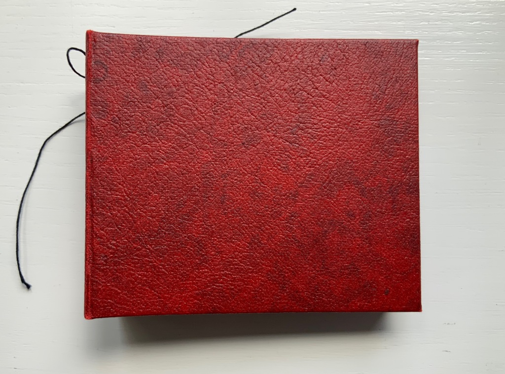
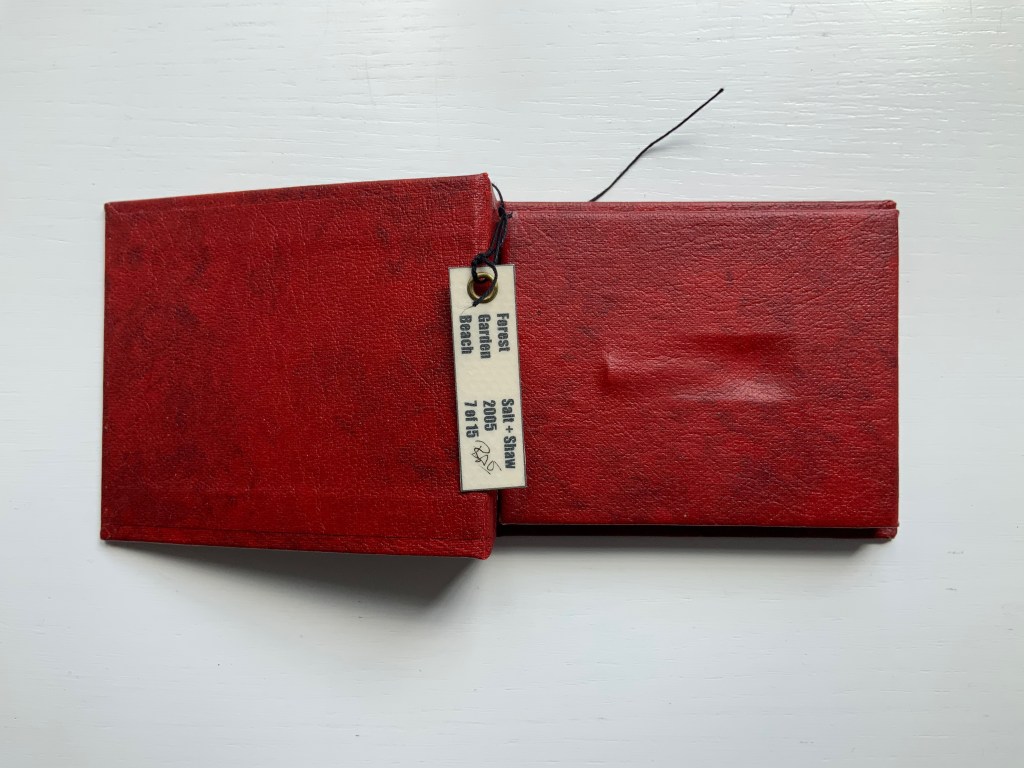
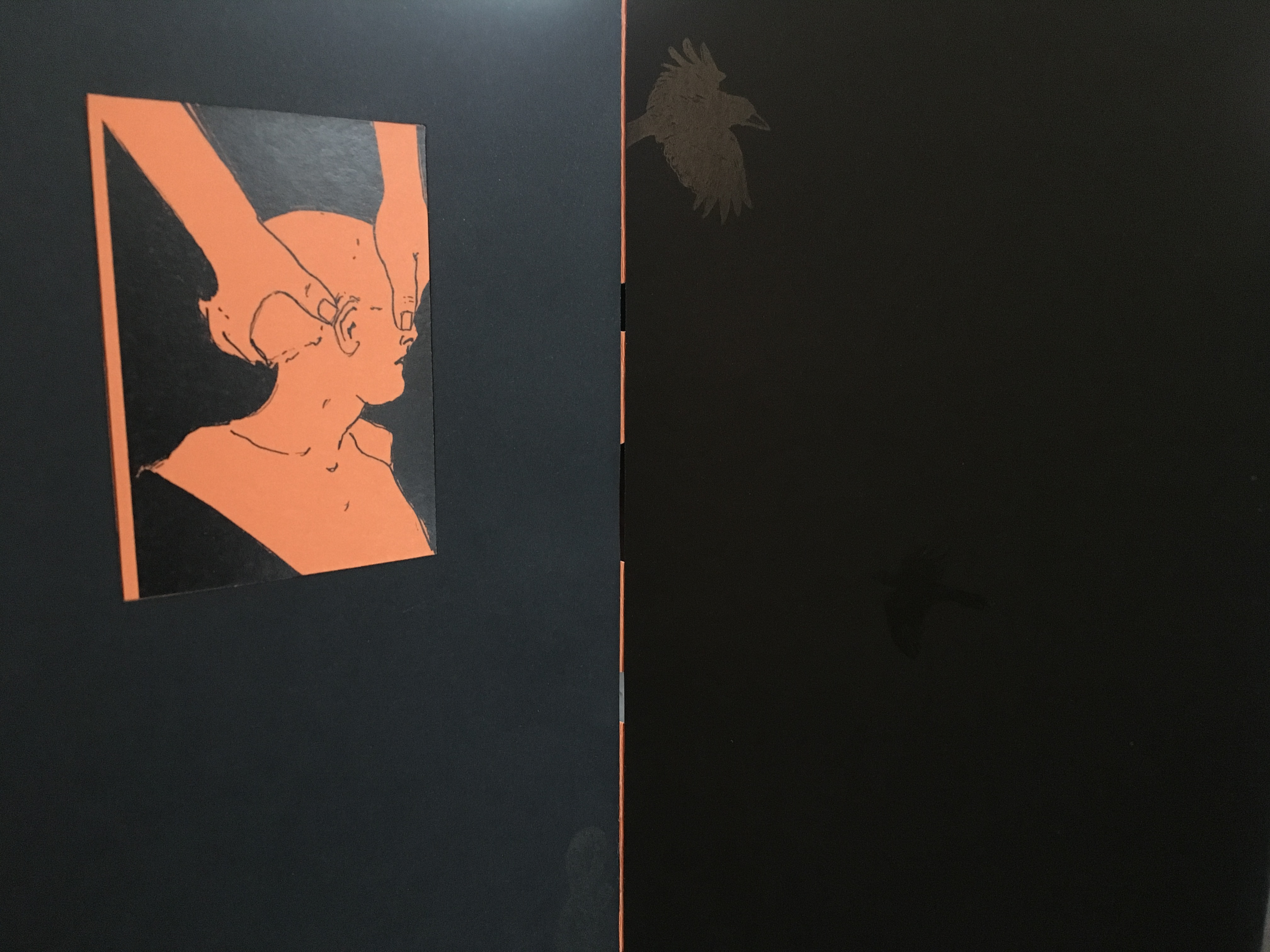
Paul Salt and Susan Shaw collaborate under the name Salt+Shaw. Individually and together, they present a wide range of book art. Much of it finds its most striking expressions in unusual bindings, sometimes to the extent that the binding absorbs the content — as is the case with a spent bullet in Forest Beach Garden.
FOREST GARDEN BEACH (2005)
FOREST GARDEN BEACH(2005) Salt + Shaw Hardcover. H90 x W110 x 30 mm. Edition of 15, of which this is #7. Acquired from the artist, 13 December 2021. Photos: Books On Books Collection. Displayed with permission of the artist.
The book block between the covers here is not a book block of pages. The only text in Forest Garden Beach is found on the tag attached to the work. On one side is the title, artists’ names, date and edition. On the other are UK National Grid Reference coordinates for locations in Scotland, South Yorkshire and East Yorkshire. The coordinates’ suggestion of precision, however, run into visual, tactile and textual ambiguities. This book shape opens on something concealed. The red leather case binding holds and withholds.
The shape seen and felt beneath it seems to be that of a bullet’s shell casing. There is an indentation, almost like a rifle chamber from which the casing is being ejected. According to the artists’ online description, it is a spent bullet “found in a forest, on a beach or in the garden”. But that is information apart, or evidence external to the work and its tag. Even if it were squeezed onto the tag somehow, the information leaves ambiguities: from which of the three locations did this single found object, now covered by leather, come; and why the precision of the coordinates if the source is uncertain?
Fusing location with the element(s) of the book form that they have chosen to exploit is another frequent characteristic of Salt+Shaw’s combined work. The next item is one of their most effective works of “local color”.
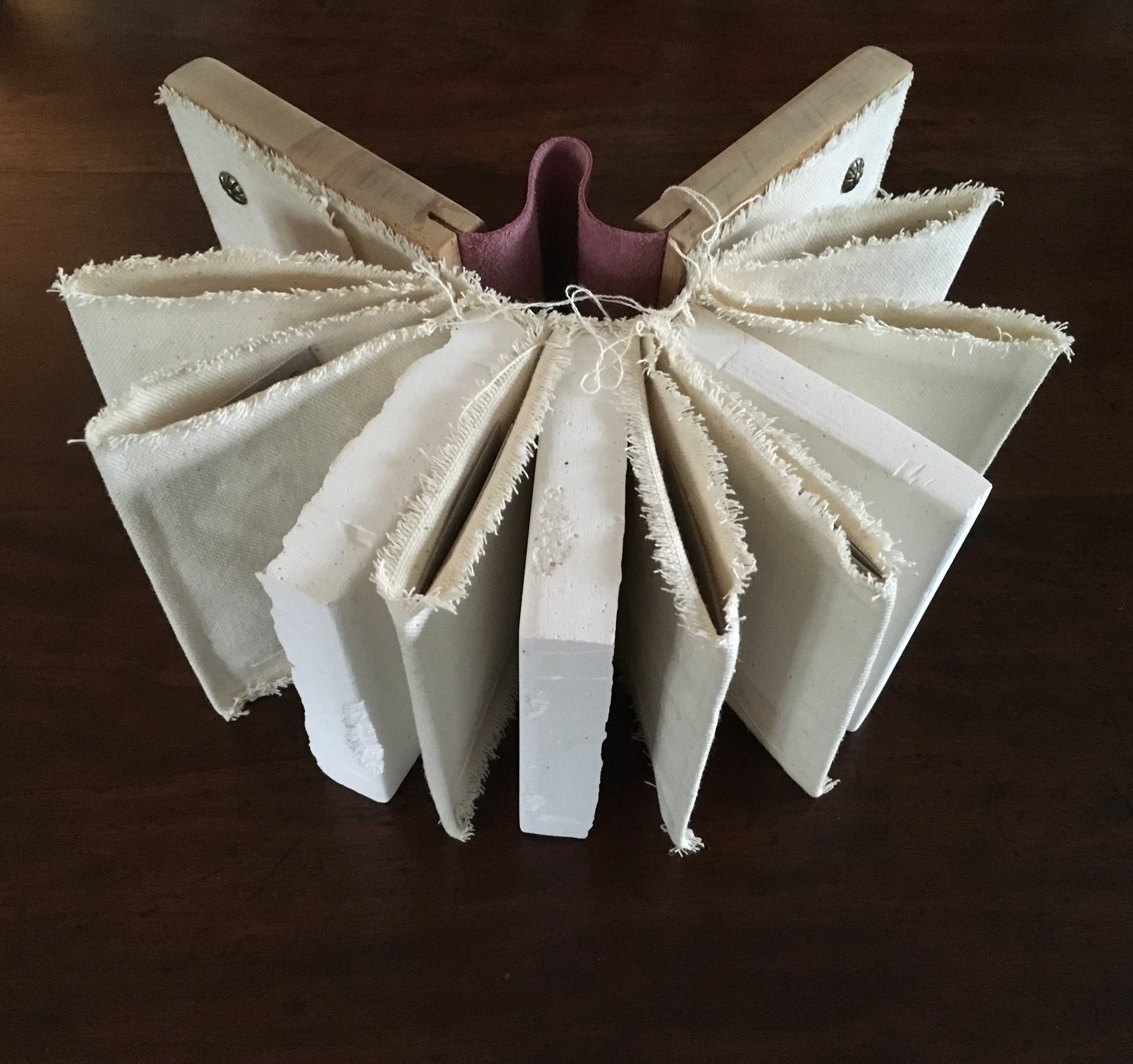
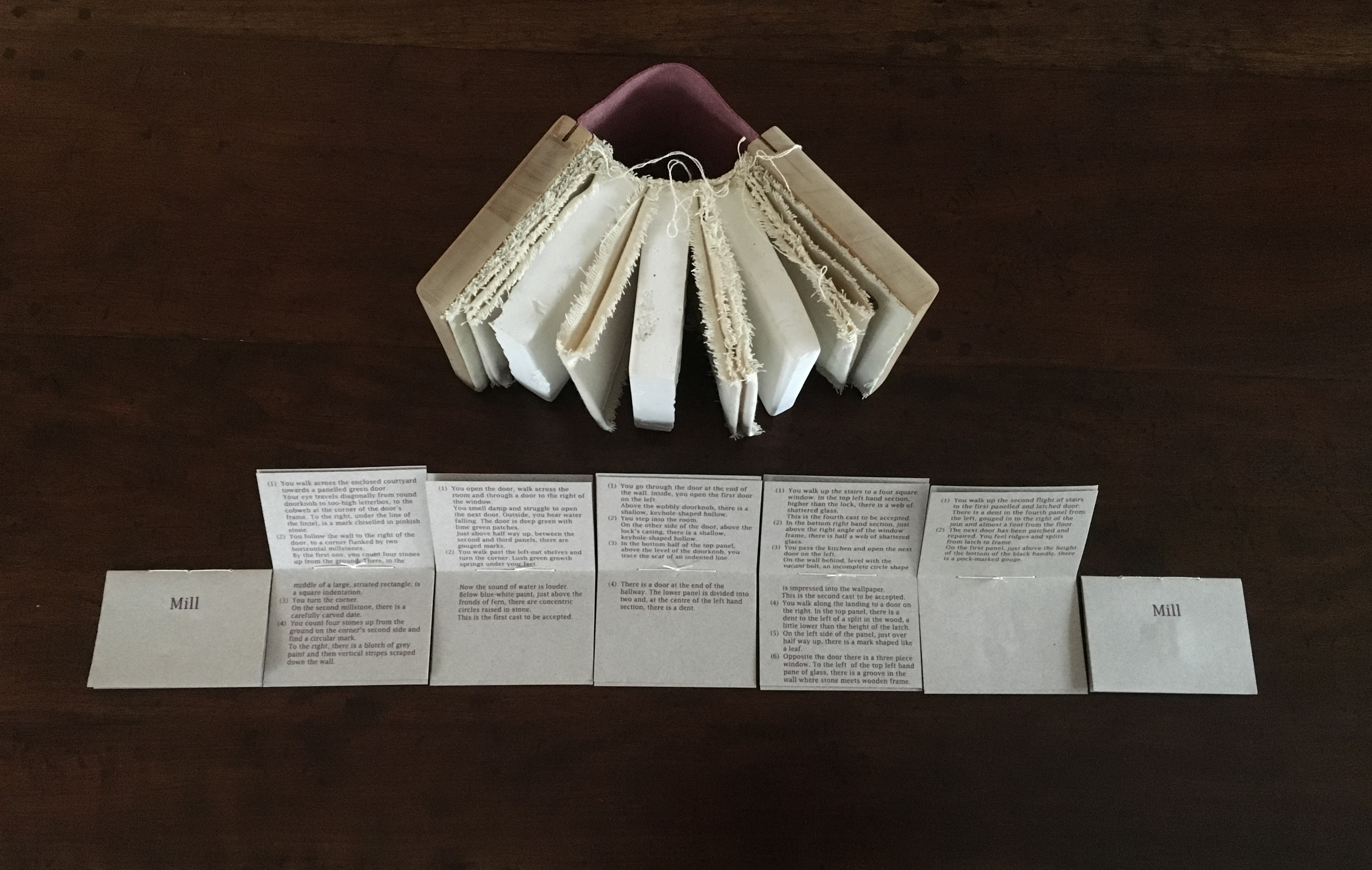
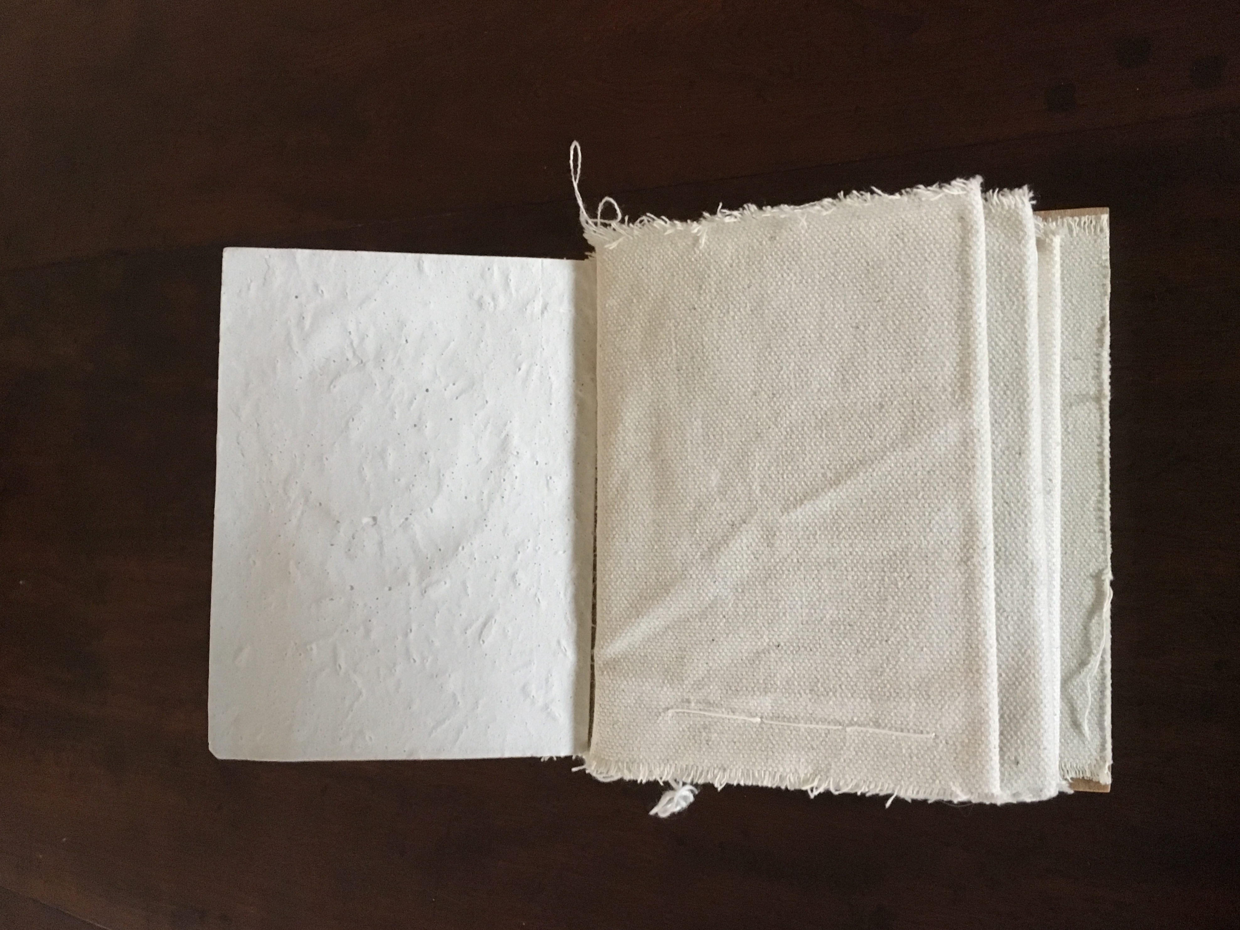
Mill (2006)
Mill (2006) Salt+Shaw Wood and leather binding, using discarded library shelves, canvas and upholstery nails. Plaster cast and canvas pages with individual pamphlet book text inserts printed on Canson paper. Casts made using water extracted in dehumidifying the building. H143 x W114 mm closed, H143 x W310 mm open. Edition of 24, of which this is #2. Acquired from the artists, 25 November 2018.
The work is a tactile exploration of the interior and exterior space of a corn mill in Cromford, built c.1780 to grind grain for workers at Arkwright’s cotton mill.A journey around Cromford Mill, Derbyshire.
Mill is an investigation of the marks of passage, which have become part of the fabric of the space and reveal time, energy, endeavour and change:
(i) recording the interaction of the human body with the building
(ii) recording the impact of natural forces upon the built environment
(iii) locating the marks that reveal a momentary connection or repetitious action
(iv) examining clues and ephemera.
Silicone moulds were taken from marks of usage around the mill, including the spotwhere a door handle impressed upon a wall and the shape of a break in a pane of glass. Plaster casts were then produced, using water from a dehumidifier within the building to make the plaster. A text piece, contained within canvas pocket pages, creates a unique map of the mill and takes a journey through the building – both to experience the environment and locate the plaster casts. [Correspondence from the artists, 5 December 2018.]
Just as the spent object in Forest Garden Beach lies buried or hidden but still tangible beneath the cover of the work, the spent object of Mill is plain to the touch but only through plaster impressions of it. Where the text related to Forest Garden Beach plays a game with precision and ambiguity, the text of Mill plays a game of hide-and-seek or blind man’s bluff.
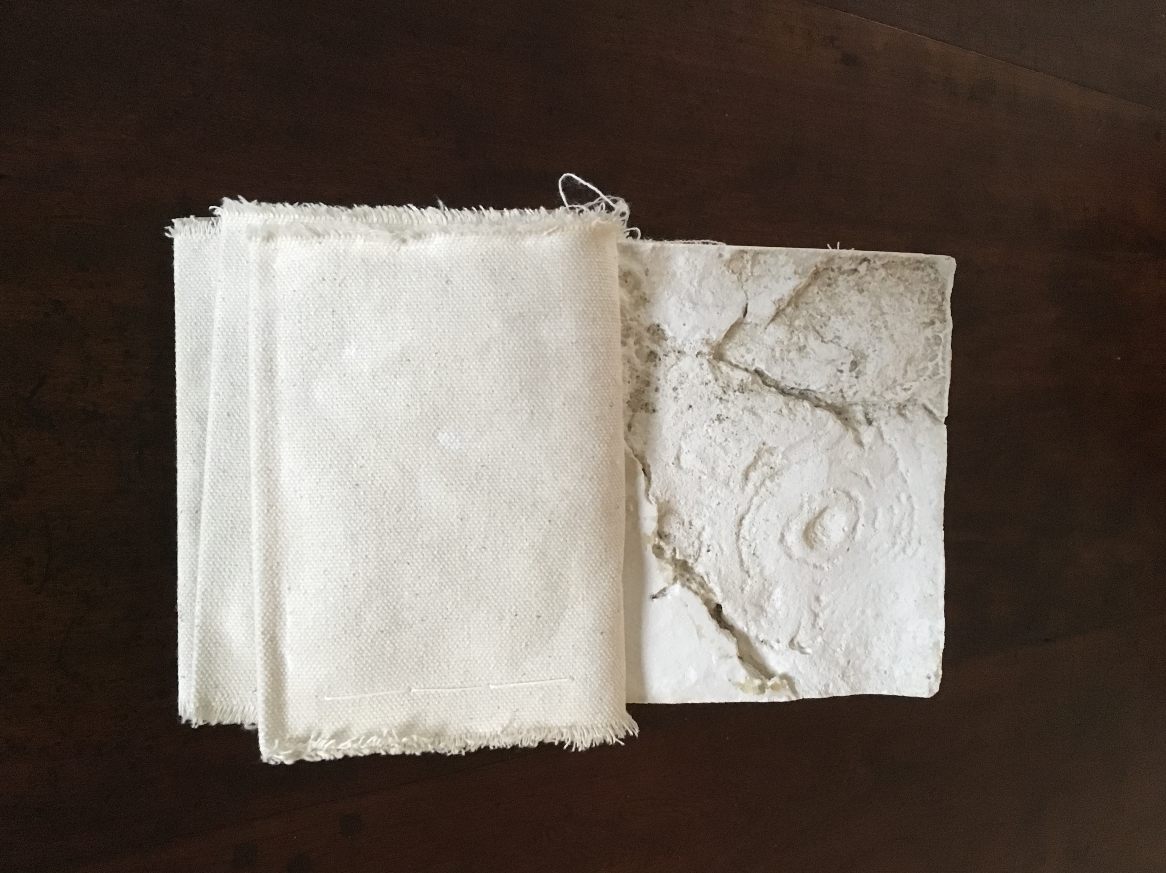
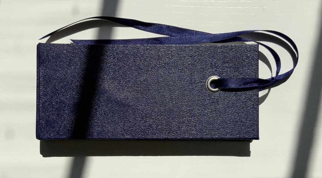
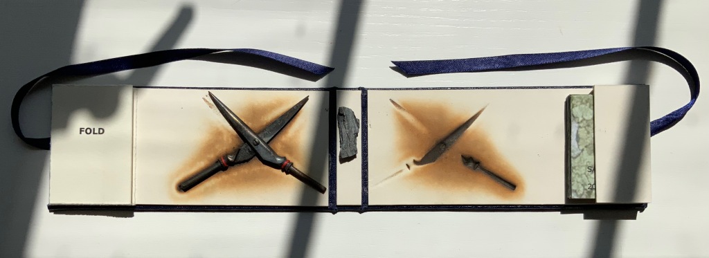
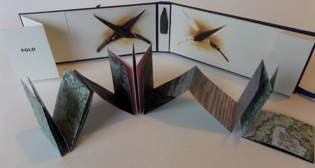
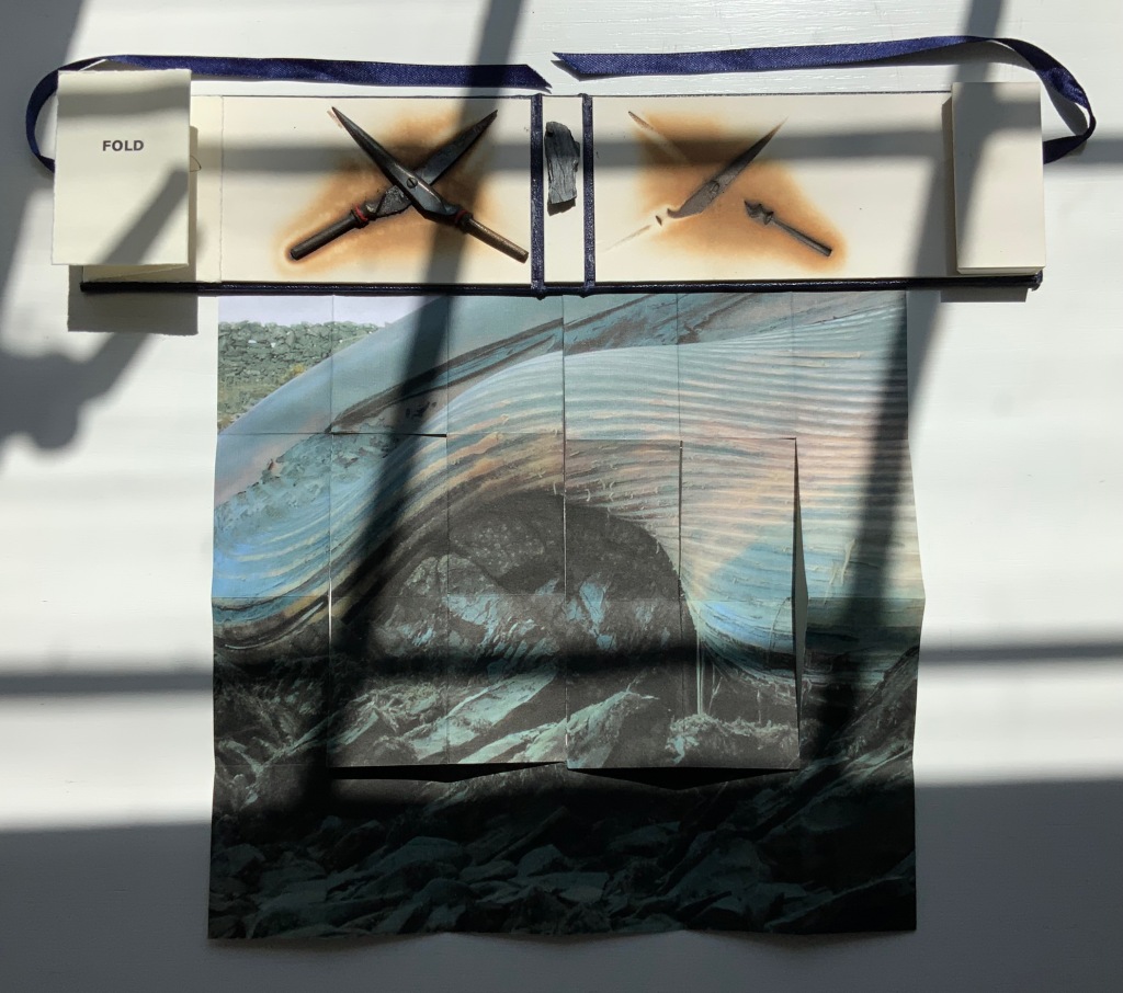
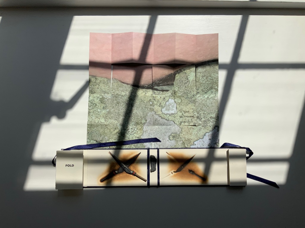
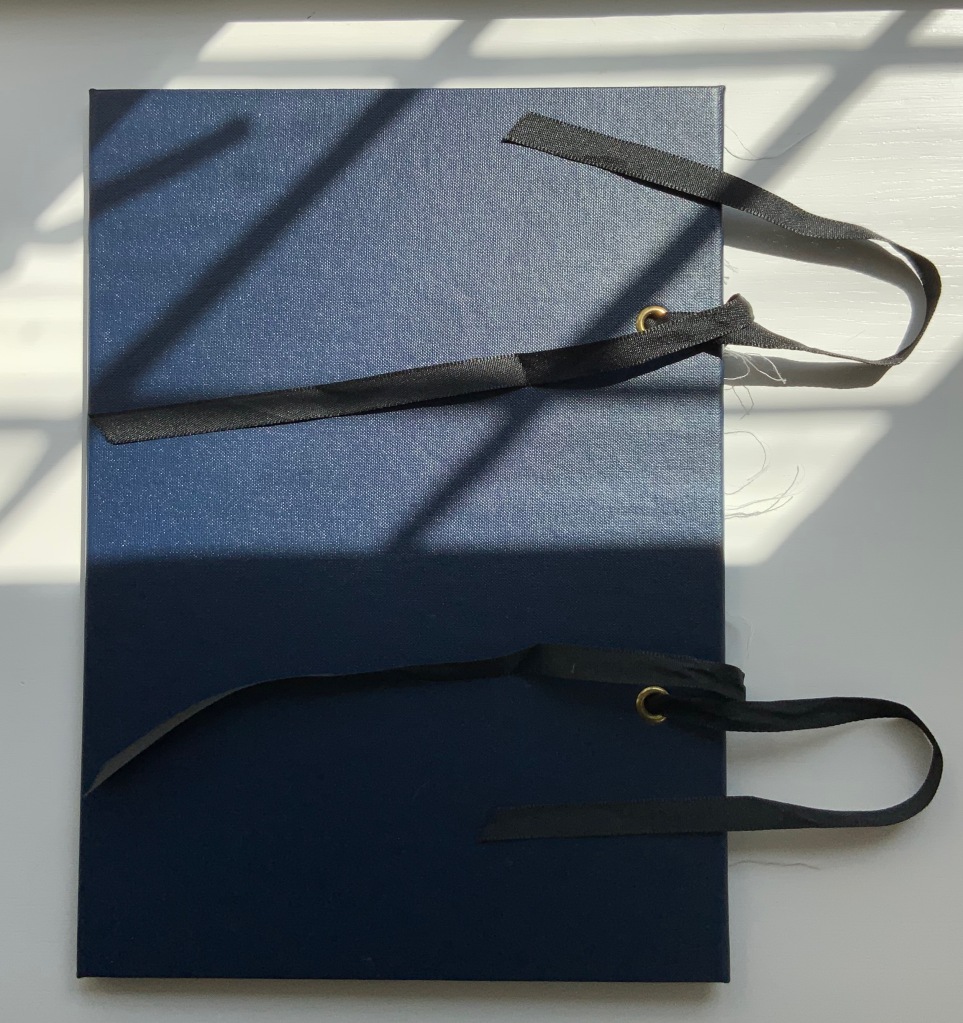
FOLD (2008-2015)
FOLD (2015) Salt + Shaw Cloth over board with eye-and-ribbon closing. H60 x W140 x D1.5 mm. Edition of 35, of which this is #19. Acquired from the artists, 13 December 2021. Photos: Provided by the artists and Books On Books Collection. Displayed with artists’ permission.
The cloth-over-board binding opens to reveal a single-fold title page on the inside front cover and a small book tucked into a receptacle on the inside back cover. Bolted to the inside front cover, a found miniature pair of Sheffield scissors. Glued to the inside spine, a small rock. And imprinted on the inside back cover, a rust-transferred reverse image of the scissors.
On removal and opening, the small book turns out to be a single sheet of paper in a “meander” fold.
On one side, it displays a close-up photograph of a beached whale’s skin lying in folds over rocks and shingle. On the other side is a close-up of human skin resting on a similar bed.
So here is a fourth option in the game of Rock-Paper-Scissors, but the game is one rather of Risk in which, whatever the craft, whatever the objects found and whatever the strategy played in rock-paper-scissors, the environment enfolds and binds.
This sort of implicit visual/verbal play becomes more explicit in the next work.
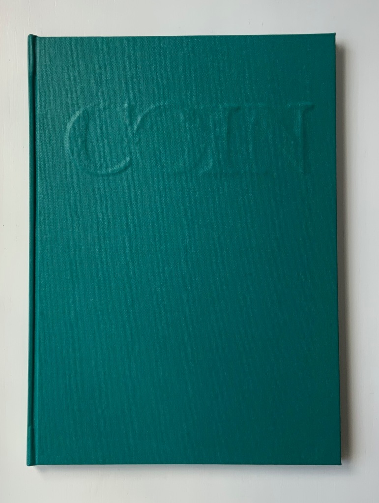
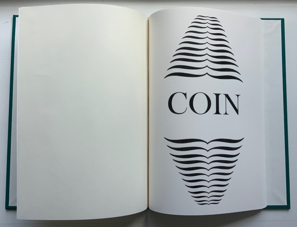
COIN (2017)
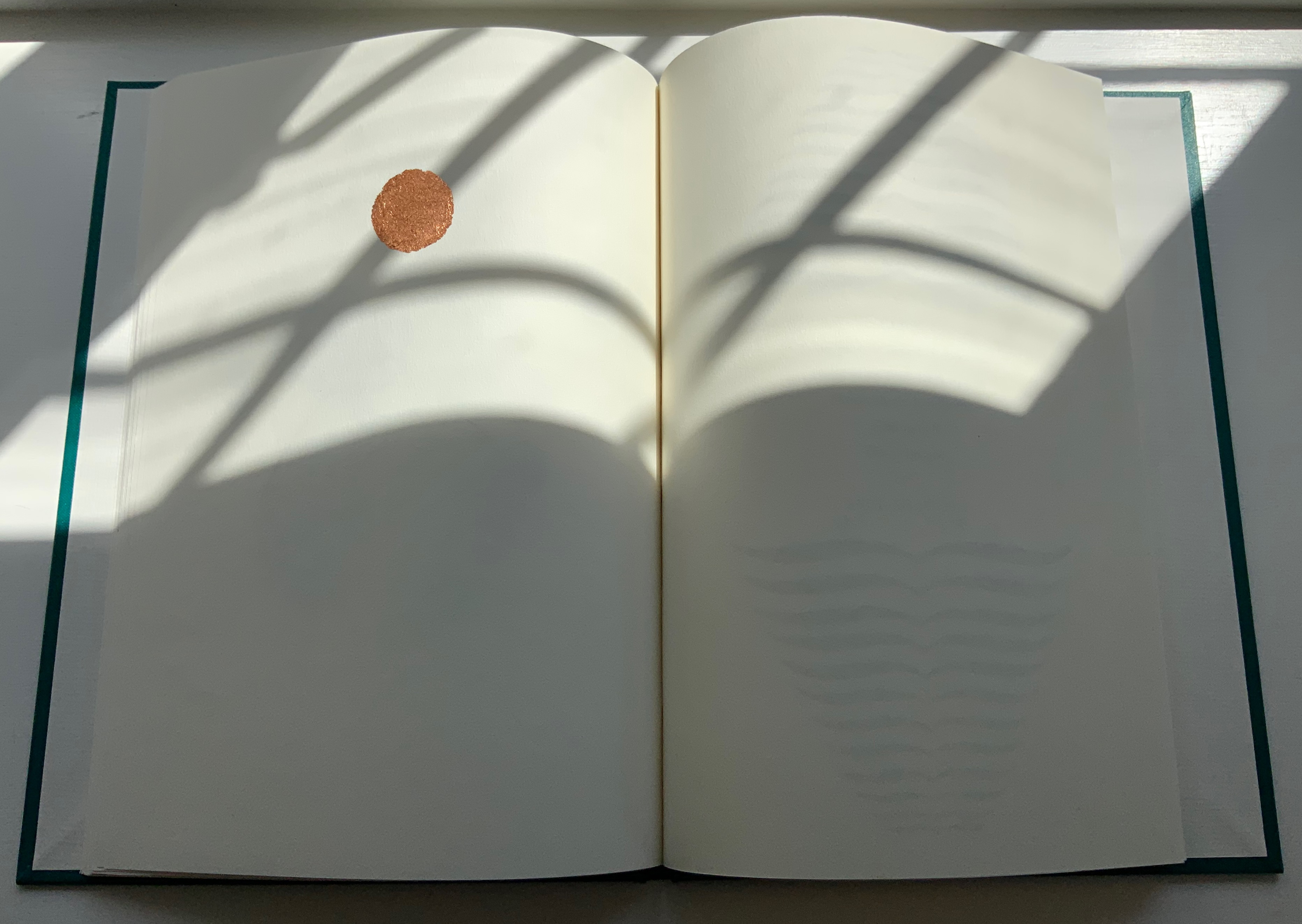
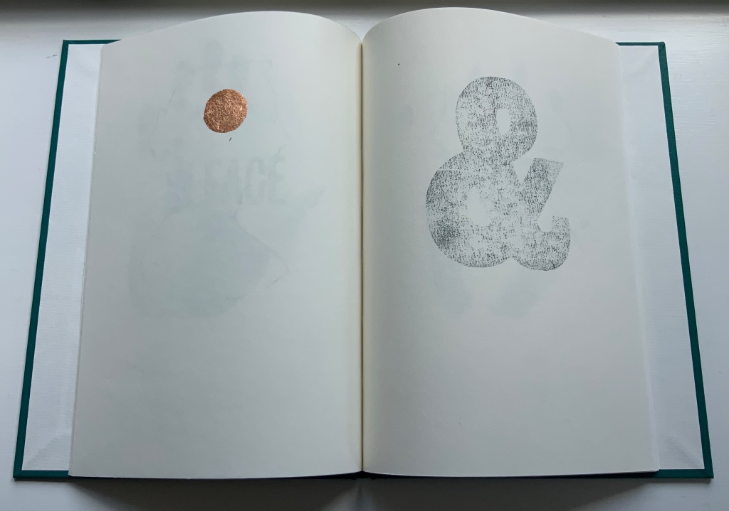
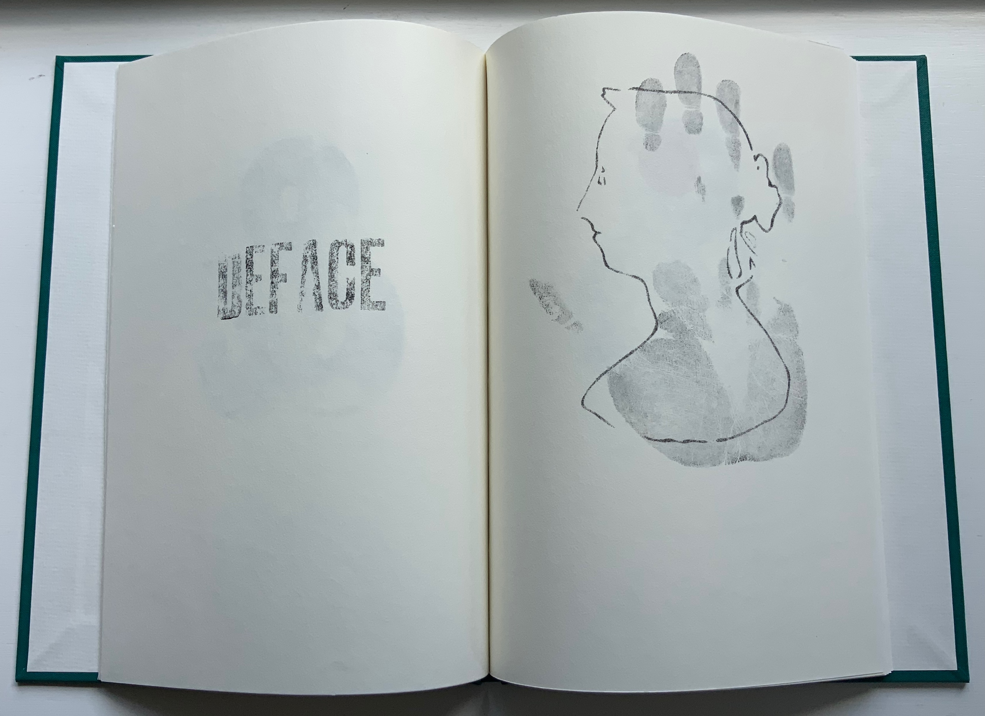
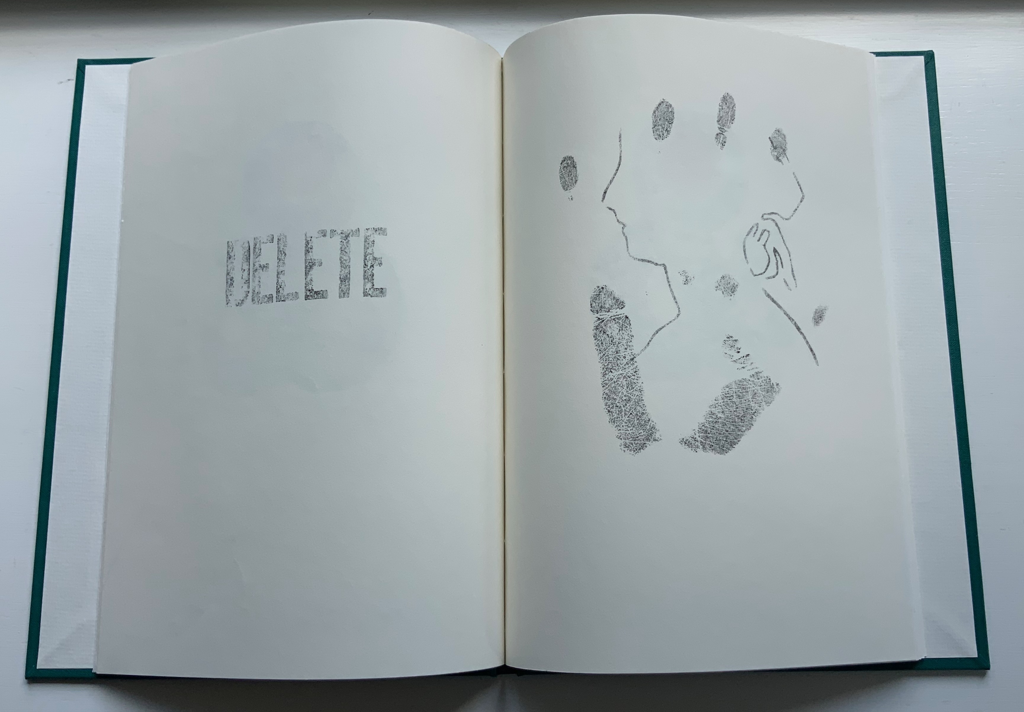
COIN (2017) Salt + Shaw Hardcover. H300 x W215 mm, 44 unnumbered pages. Edition of 9, of which this is #2. Acquired from the artists, 13 December 2021. Photos: Books On Books Collection. Displayed with permission of the artists.
Faint handprints from nine individuals. Light imprints from an ampersand and a series of words all prefixed with “de”. A gradually disappearing profile of Queen Victoria. A hand-worn 1860-1894 penny coin fixed to a splatter of copper leaf. Along with the front cover’s embossed, eroded letters, this progression of letterpress and stencil work toward that coin echoes the archaeological aura of Forest Garden Beach, Mill and Fold, but through its progression, COIN enacts the strange movement through time that such found objects take.
The brackets on either side of the word on the title page might suggest a coin dropped in a pool of time, except that the brackets narrow rather than widen outwards. So, maybe the coin is rising through time. Or, look again at the title page and the coin on the last page, and maybe the brackets should be seen as “leaking” from the word just as the copper leaf can be seen as “leaking” from the coin.
Like the tangible shell casing in Forest Garden Beach beneath the leather, the letters of the word “COIN” rise beneath the front cover cloth. Take another look at those letters, and it becomes clear that their forms beneath the cloth are eroded, just as the bullet is spent and just as the copper coin has been worn. The mix of “de” words and the handprints over the queen’s deteriorating profile add the kind of irony to be found in Shelley’s sonnet “Ozymandias“.
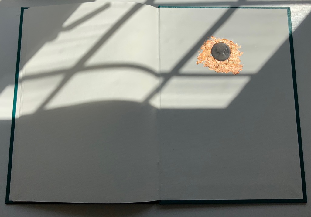
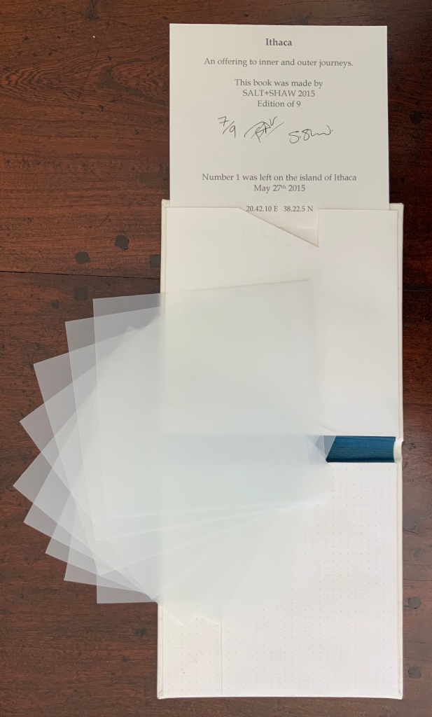
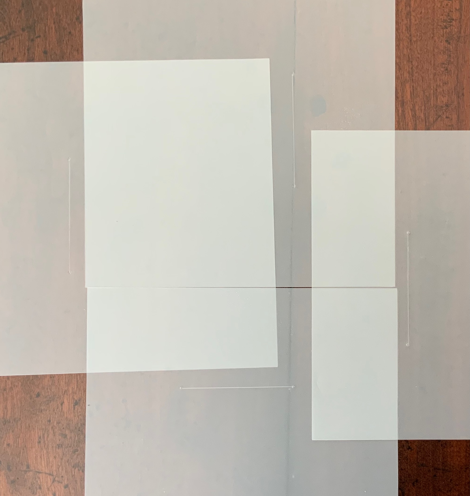
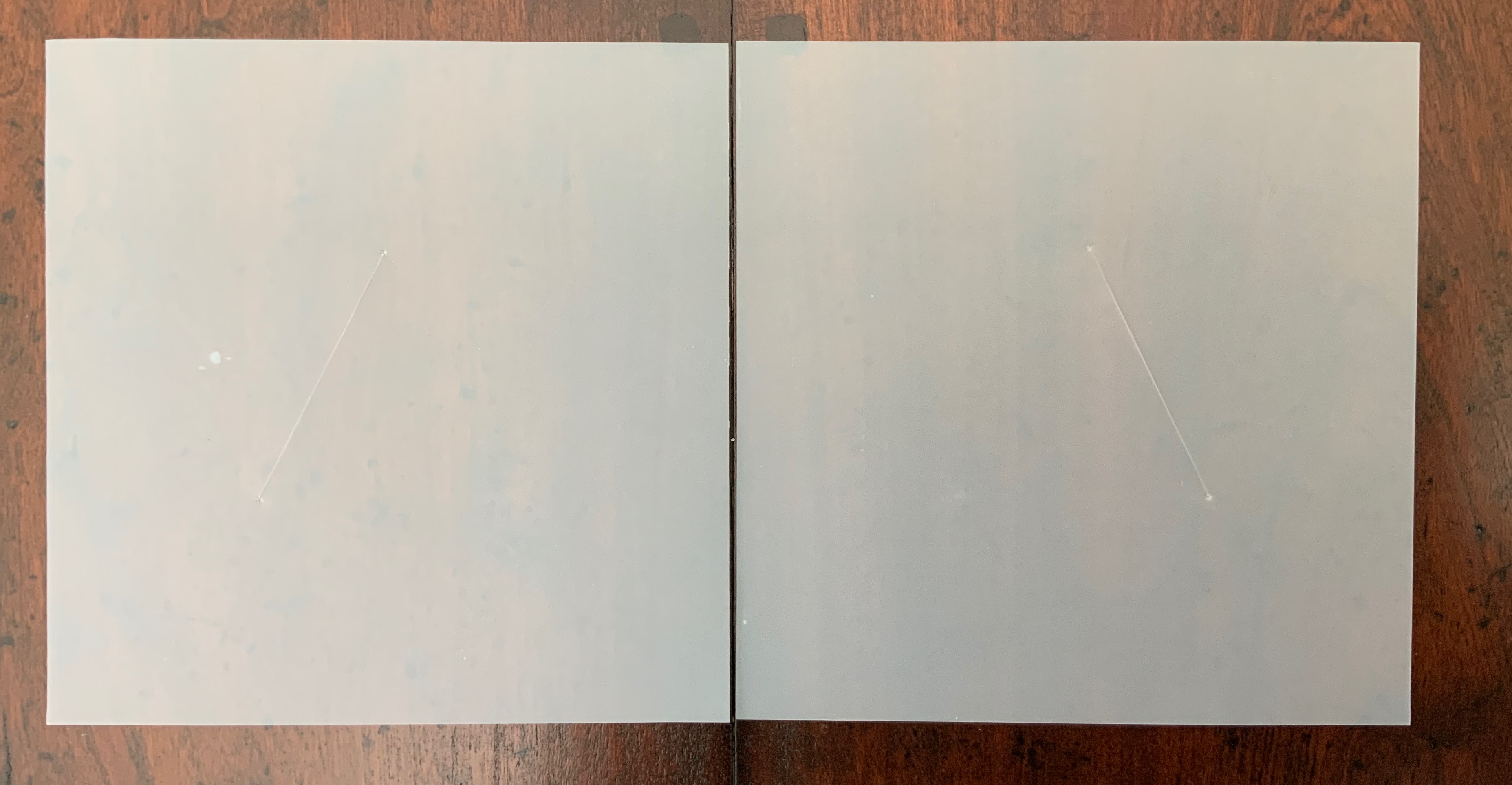
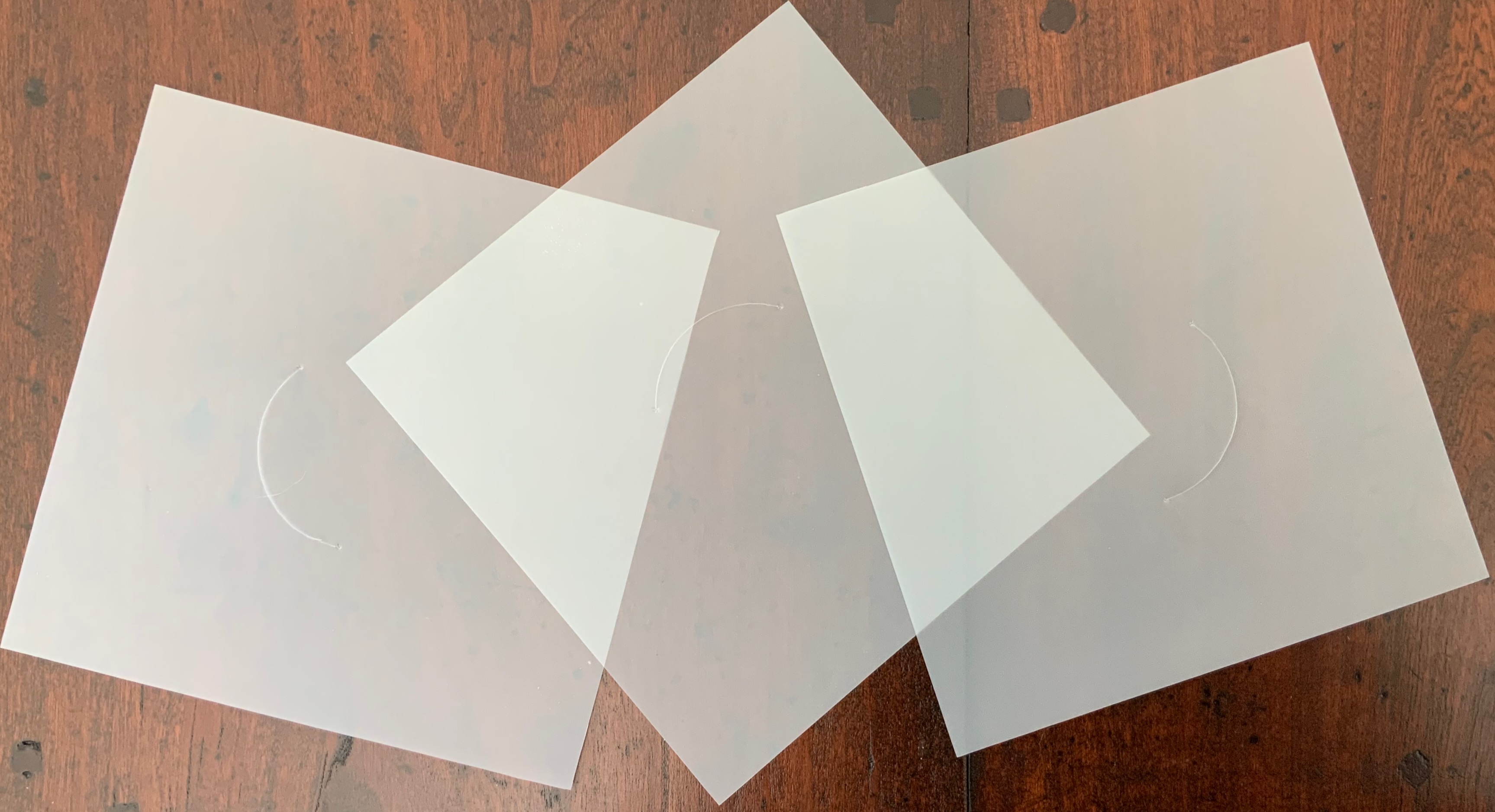
ITHACA(2015)
ITHACA(2015) Salt + Shaw Hardcover. 140 x 140 mm, 9 sheets of architectural tracing paper with hand-cut lines. Edition of 9, of which this is #7. Acquired from the artists, 13 December 2021. Photos: Books On Books Collection. Displayed with permission of the artists.
Ithaca gives a few twists both to the theme of the present’s interaction with the past and to the artists’ affection for blind printing. As the colophon indicates, the first copy of the edition of nine was left on the island of Ithaca and performs the act of an offering, much as objects left as offerings to the gods. “Journeys” and the work’s title, of course, suggest the most famous of journeying heroes — Odysseus; however,
the journeys to which the offering is dedicated are “inner and outer”, suggesting an allusion beyond the hero. The nine translucent sheets of architecture paper bear cuts whose shapes are each replicated by an embossed printing on the back (or front) cover of the work. If the sheets are rightly arranged, they will replicate the image of the circle and triangle embedded in the square on the front (or back cover).
The combined images of square, circle and triangle and the reference to inner and outer journeys suggest associations with sacred geometry (reflected elsewhere in the Books On Books Collection: Bruno Munari’s compendia on the square, circle and triangle and Jeffrey Morin’s and Steven Ferlauto’s two works) and with Zen (also reflected elsewhere in the collection: Julie Johnstone’s works).
The playing with the sheets of paper — a kind of inner and outer journey itself — to which Ithaca invites us highlights a growing insistence on audience interaction in all the works so far and especially so in the next.
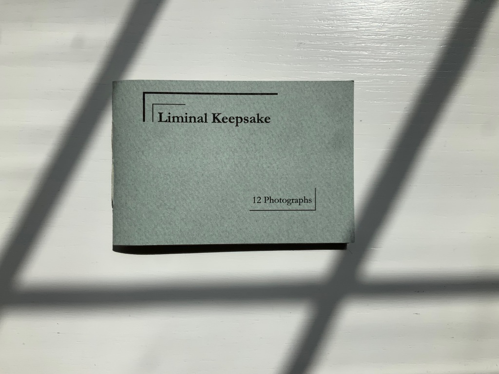
LIMINAL KEEPSAKE (2015)
LIMINAL KEEPSAKE (2015) Salt + Shaw Pamphlet book. H70 x W105 mm, 12 unnumbered pages, half-sheet insert. Edition of 15, of which this is #11. Acquired from the artists, 13 December 2021. Photos: Books On Books Collection. Displayed with permission of the artists.
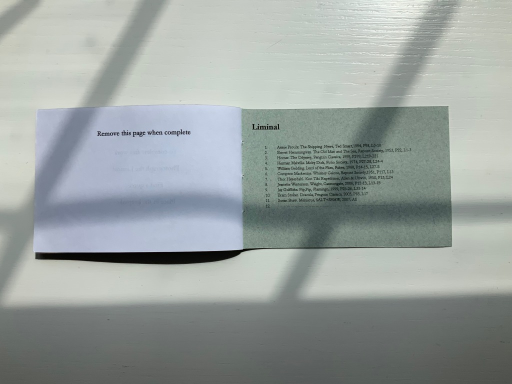
Liminal Keepsake realizes the sea:land allusion of Ithaca‘s title by presenting its audience with eleven photographs of sea and land meeting. The photos, unique to each copy in the edition, are held in hand-cut mounts. “Liminal” refers to “a space between” or “where edges meet”. The photos in Liminal Keepsake seem to be a collection of memories about where the edges of the sea and land meet.
But on the inside back cover is a list of references to literary works, each of which has a passage that aligns with the photo matching in the sequence. Here is another space between — the space between the images and the passages — a space into which any curious viewer is thrust. If the viewer expects to enjoy this work fully, the viewer has to seek out the passages in that list to see how the text matches the photo. Not that easy a task since each text is specific to a specific edition of the cited literary work. The For instance, the tenth photo in the sequence is aligned to a passage from Bram Stoker’s Dracula — specifically from page 85, line 17 of the 2003 Penguin edition. Fortunately, that edition can be easily found online. Here’s the passage (the 17th line is in bold):
… The day / was unusually fine till the afternoon, when some of the gossips / who frequent the East Cliff churchyard, and from that com- / manding eminence watch the wide sweep of sea visible to the / north and east, called attention to a sudden show of ‘mares’- / ‘tails’ high in the sky to the north-west. …
And here is the relevant photo in the collection’s copy of Liminal Keepsake.
So the viewer has to become researcher and reader to experience Liminal Keepsake fully, and the viewer/researcher/reader has to become something even more to finish Liminal Keepsake. Just as Ithaca invites its audience to arrange its translucent sheets to form the symbol on its cover, Liminal Keepsake invites its completion by the viewer/researcher/reader-cum-artist’s taking a photo of “the Liminal” and a bibliographical reference that echoes the photo.
In pondering completion of the work, would-be artists come across across other “spaces between” — the space between the visual and textual imaginations and the space between concept and execution. Apparently the artists took their photos, then found the texts to match. To hold an image in mind and be constantly on the lookout for matching text in whatever literary work happens to be in hand seems a tall order. To start the other way around — to have some sea:land text in hand and then seek a setting in which an appropriate image is likely to be found — looks easier to the more textual imagination. On top of this are the artist-manqué’s anxiety of crossing that space between concept and execution and the curator’s anxiety of sacrificing the object as-was and the aura of possibilities for perhaps a lesser object and one definitely without the aura of possibilities.
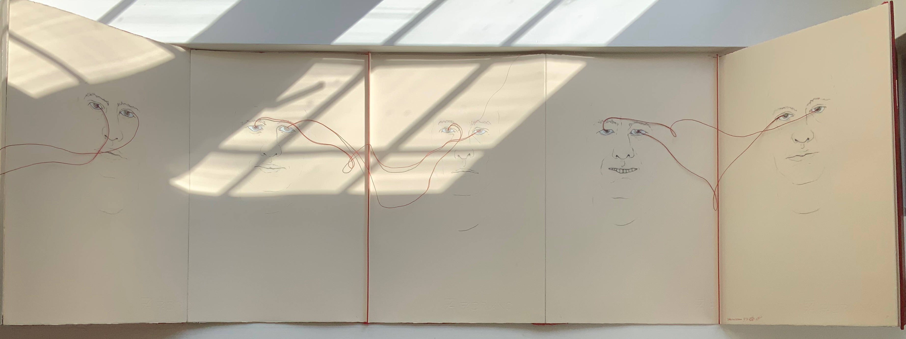
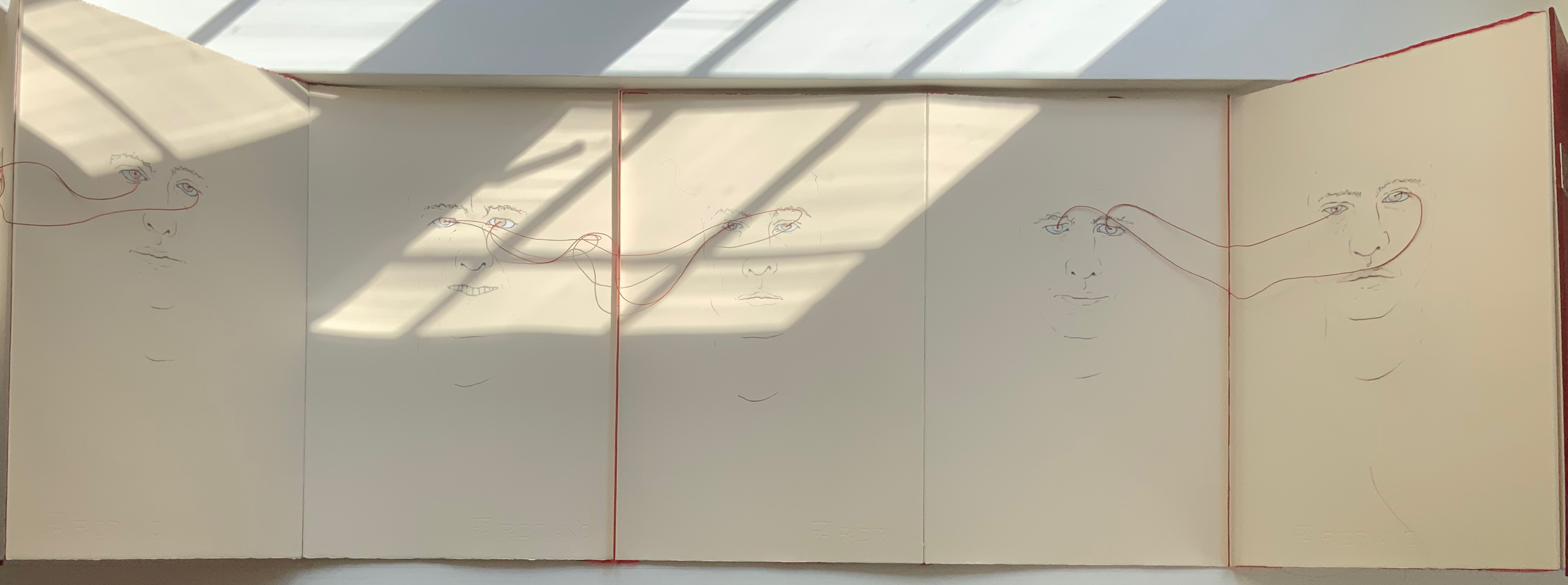
LOOK(2021)
LOOK (2021) Salt + Shaw Hardcover, double-sided concertina book. H350 x W230 mm, 10 unnumbered panels. Edition of 3, of which this is #1. Acquired from the artists, 13 December 2021. Photos: Books On Books Collection. Displayed with permission of the artists.
The core features of two individuals’ faces head-on have been drawn on both sides of this concertina book — “core” meaning no delimitation by hair, ears or other details at the edges of the visages. The red thread connecting the pairs of eyes with one another draws attention back to the title: Is it an instruction for the viewer to look? Is it a noun referring to appearance, the look of the faces? Or to expression, the look in the faces? Is it a noun referring to an action occurring between the depicted faces — if only via the thread connecting the pairs of eyes? Only when the concertina is closed do the faces face one another. Yet the color red, echoed between the cover and thread, suggests an intensity connecting these looks, these gazes.
A more textual predecessor to Look is Whorl (2007).
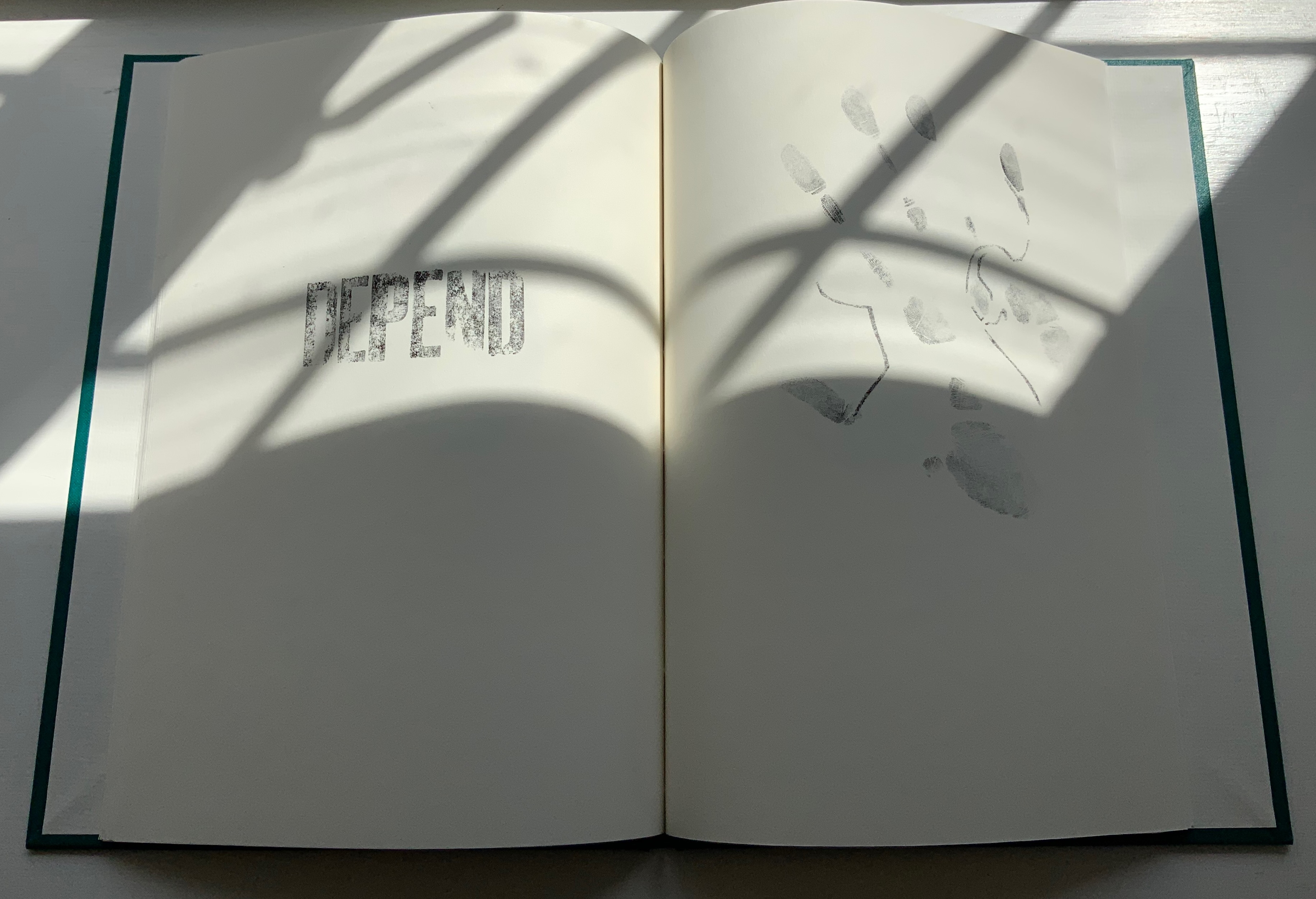
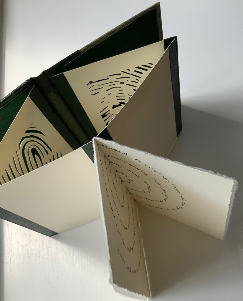
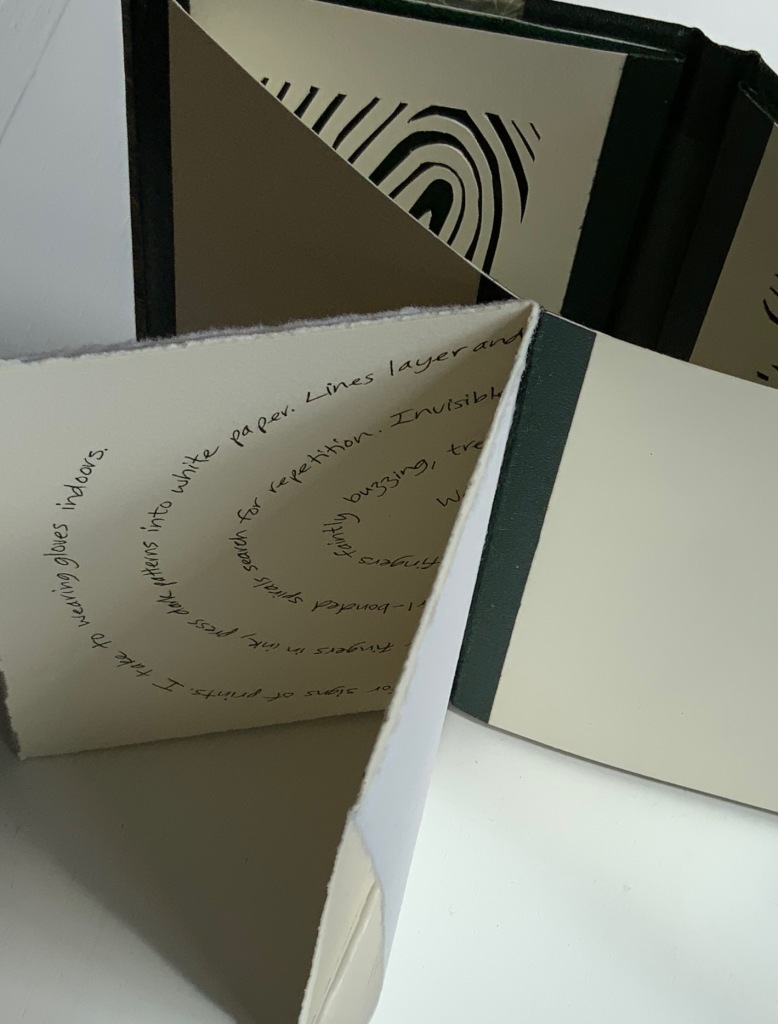
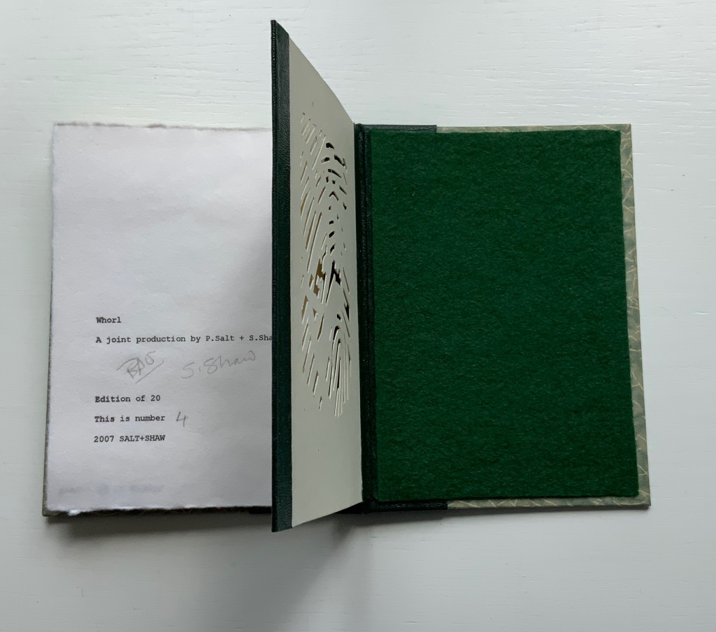
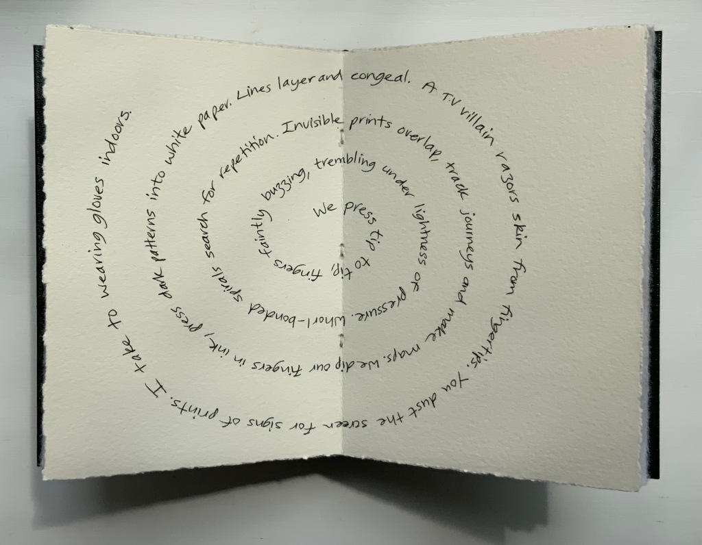
WHORL(2007)
WHORL(2007) Salt + Shaw Hardcover, modified concertina and pamphlet book, H115 x W155 mm, 4 unnumbered panels, 2 unnumbered central sheets. Edition of 20, of which this is #4. Acquired from the artists, 13 December 2021. Photos: Books On Books Collection. Displayed with permission of the artists.
Here is a rare instance of a poem’s metaphysicality being physically enacted by the surface and structure on which the poem is inscribed. On a double-page spread at the work’s center, a poem begins at the center of its spiral, or whorl, with the words “We press tip to tip fingers ….” Pull the double-page spread outwards away from the spine. Because the spread’s centerfold serves to bind four panels into a diamond shape, two hand-cut stencils of two different fingerprints approach (“tremblingly” as the poem describes) to touch one another when the double-page spread is pulled completely outwards and away from the spine. If this does not renind the reader of John Donne’s poetry, nothing will.
The following works are individual to Susan Shaw and Paul Salt, respectively. Shaw’s individual works also deliver complete textual works — short stories or a poem — that fuse with their containers.
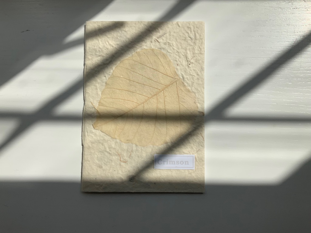
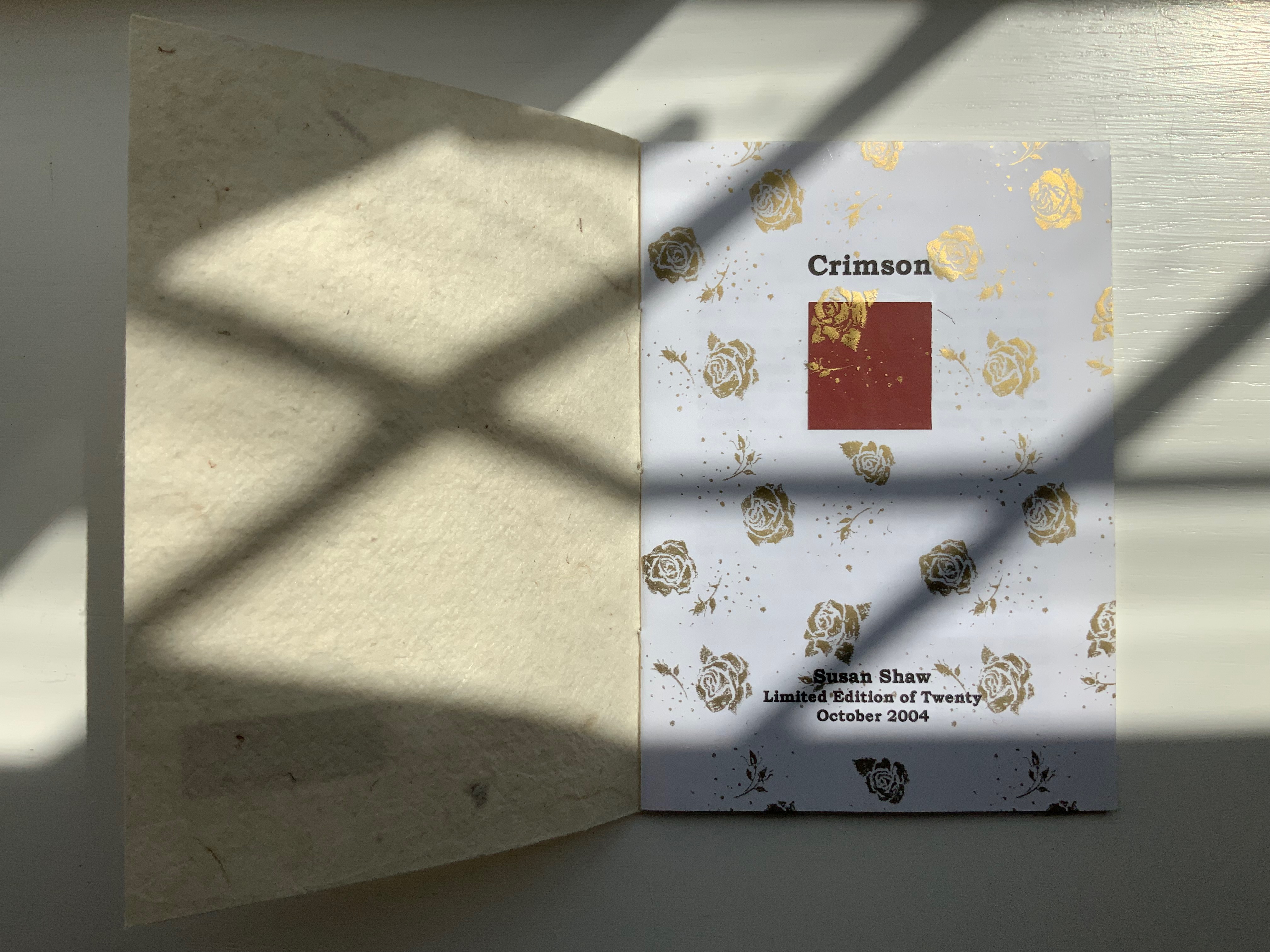
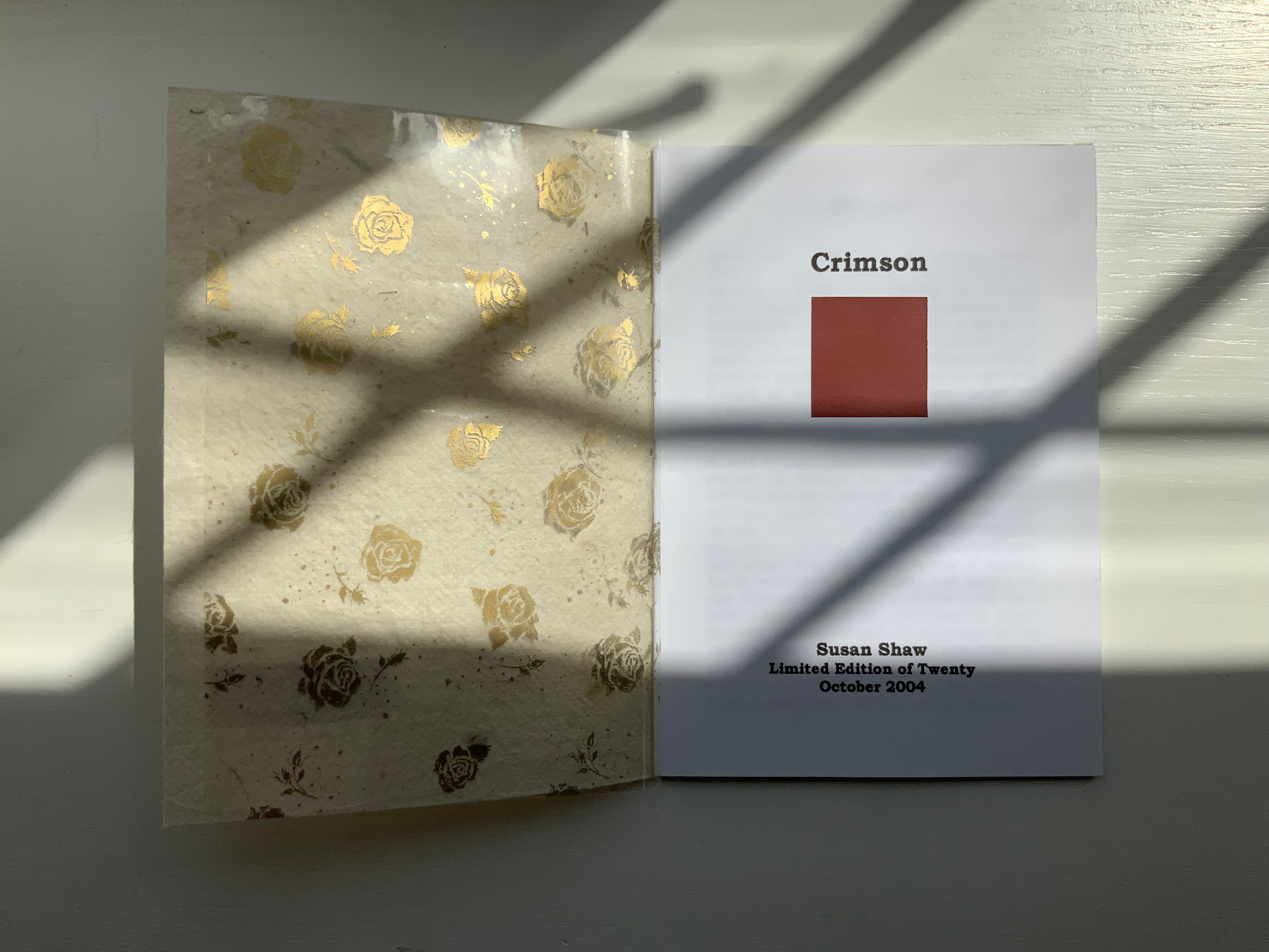
CRIMSON(2004)
Crimson(2004) Susan Shaw Hand-made paper cover. H155 x W110 mm, 8 unnumbered pages. Edition of 10, of which this is #2. Acquired from the artist, 13 December 2021. Photos:Books On Books Collection. Displayed with permission of the artist.
The washed-out cover, pressed fallen leaf and faded title signal the conclusion of the short story Crimson, in which a couple seemingly argue incessantly about choice of colors, both indoors and out in their garden.
Shaw’s attraction to fiction narrative perspective flutters recurs in the next work, but its leporello structure and photos add a different otherworldly touch.
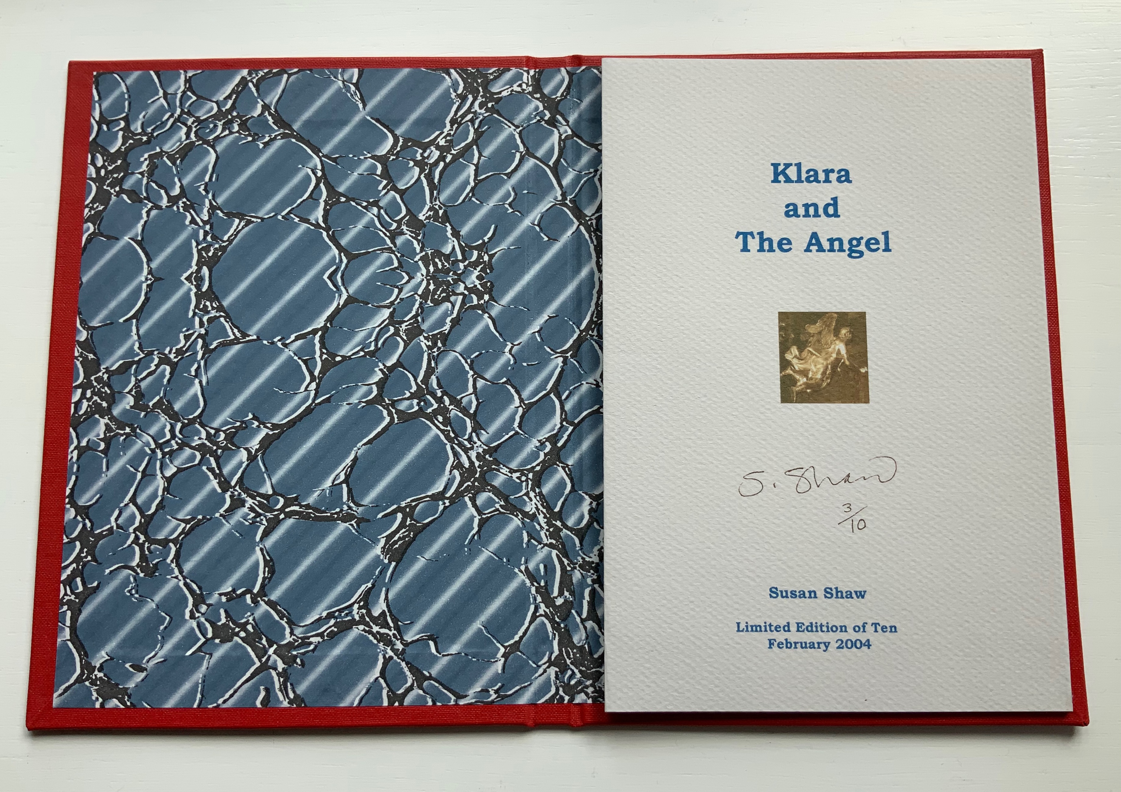
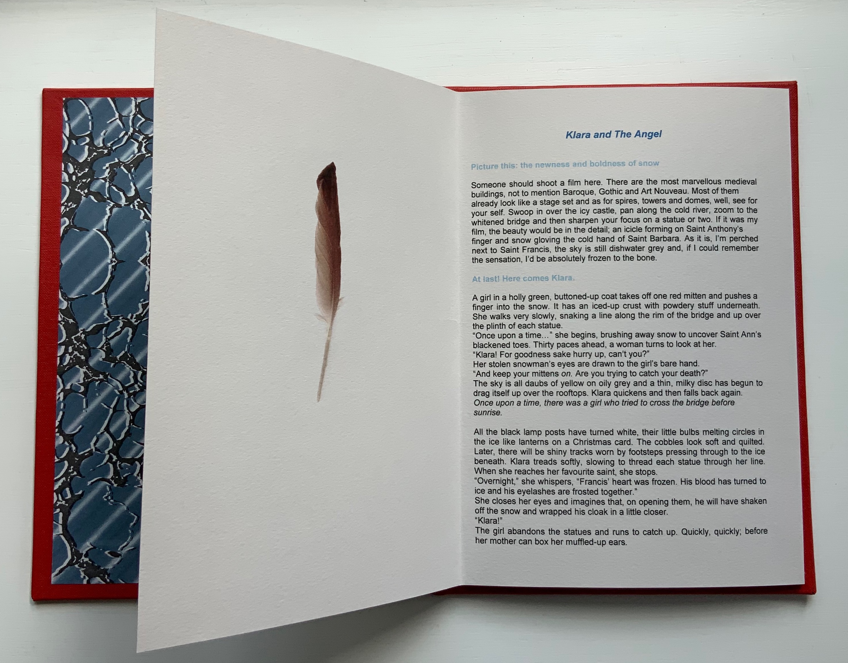
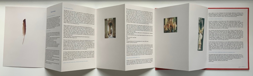
KLARA AND THE ANGEL (2004)
KLARA AND THE ANGEL(2004) Susan Shaw Hardcover, double-sided concertina book. H220 x W160 mm, 15 unnumbered panels. Edition of 10, of which this is #3. Acquired from the artists, 13 December 2021. Photos: Books On Books Collection. Displayed with permission of the artists.
The story begins in a Prague cemetery covered in snow, to which the reader’s attention is directed by the narrator’s direct address in light blue type. As the type shifts into black, the narrator continues to address the reader, and with the reference to being perched on St. Francis’s shoulder, the narrator gives some of the game but then deflects with the introduction in blue of Klara’s arrival. As the leporello unfolds, so does Klara’s story and the narrator’s identity as the angel with whom Klara has an appointment.
Snow and evocative photos feature in the next work but with less drama.
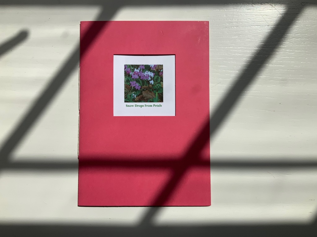
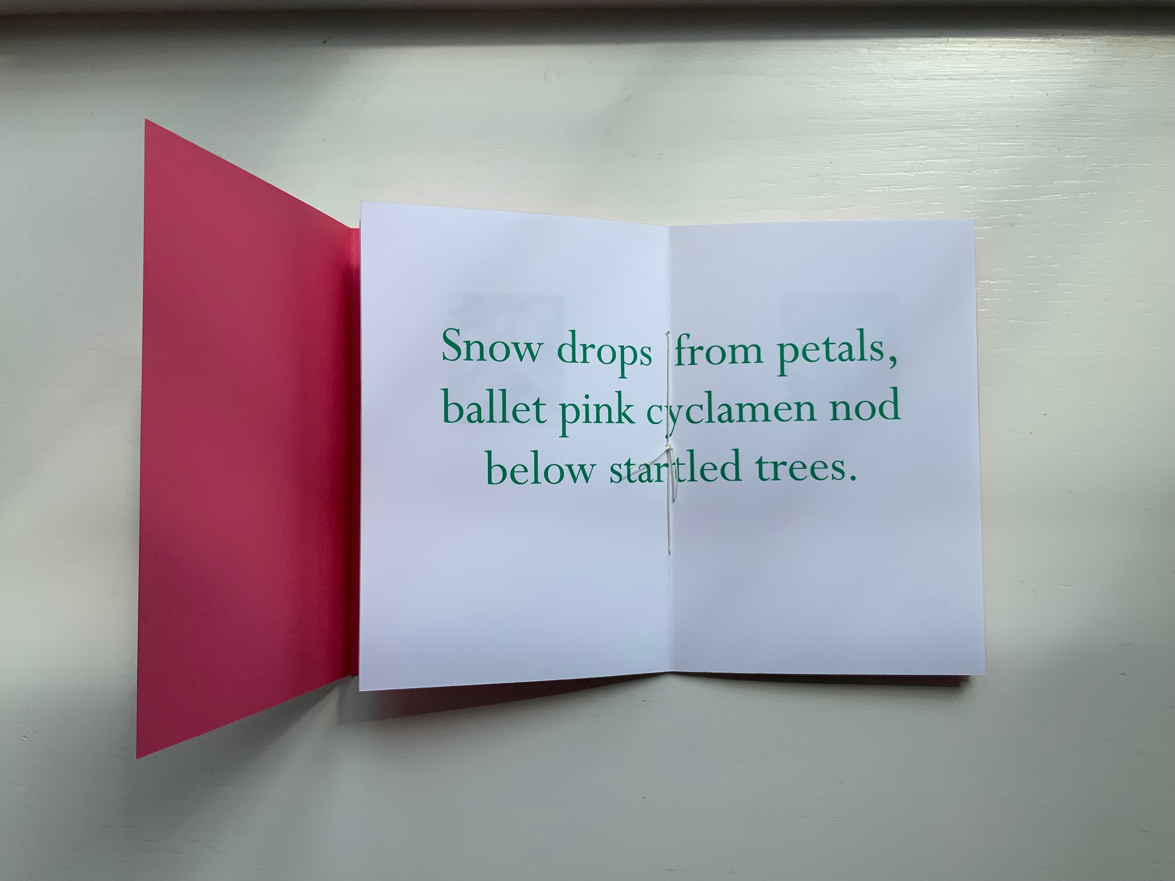
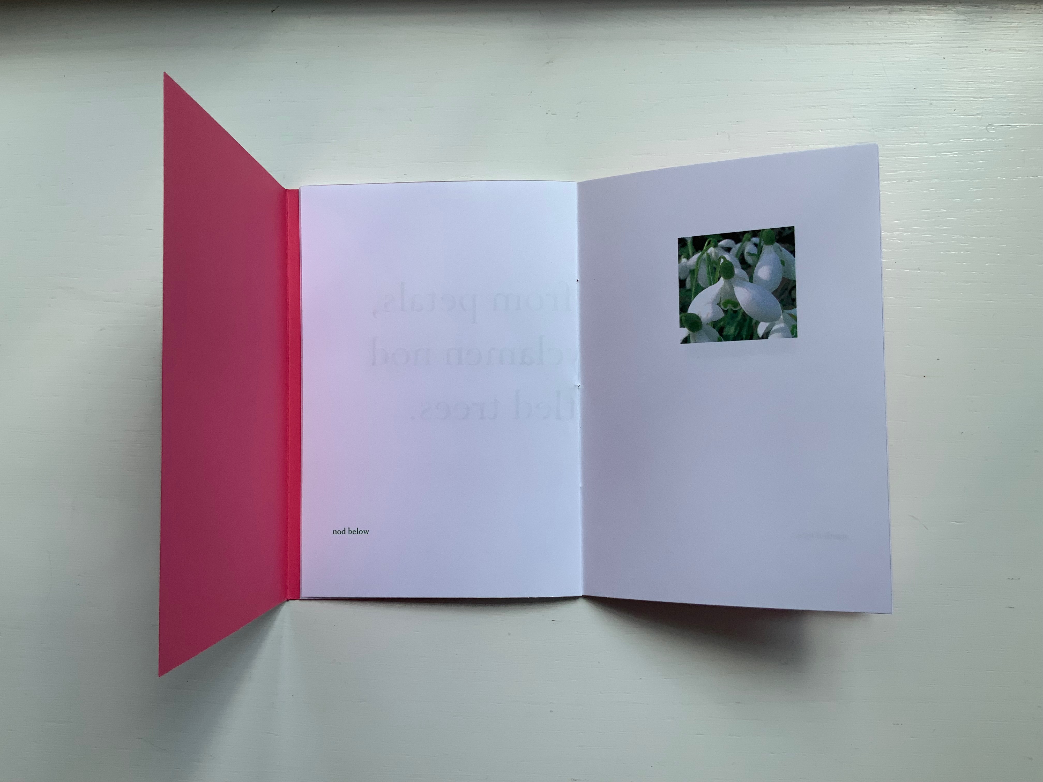
SNOW DROPS FROM PETALS(2008)
SNOW DROPS FROM PETALS(2008) Susan Shaw Pamphlet book. H150 x W105 mm, 12 unnumbered pages. Edition of 17, of which this is #4. Acquired from the artist, 13 December 2021. Photos: Books On Books Collection. Displayed with permission of the artist.
The front cover wraps around to overlap the back cover, which is rather like the way in which words often play multiple roles in poems. Here, the subject snow and its verb drops coincide with the flower’s name and its two photos that appear later. The center of the work presents the entire haiku, but more interesting and curious, the haiku’s traditional structure (lines of 5, 7 and 5 syllables) breaks up into four segments (5, 6, 3, 3) to appear on verso pages facing a photo.
Daffodils face the first line. Snow drops face the words “ballet pink cyclamens”. More snow drops face the words “nod below”. A bee perched on a blossom faces the words “startled trees”. The effect is to send the reader back and forth across these spreads and page turns like a bee moving from flower to flower.
Paul Salt’s individual works in the collection take a more sculptural expression. Even though this next work is garden-inspired like Snow Drops, its physical presentation reflects the more sculptural garden that inspired it.
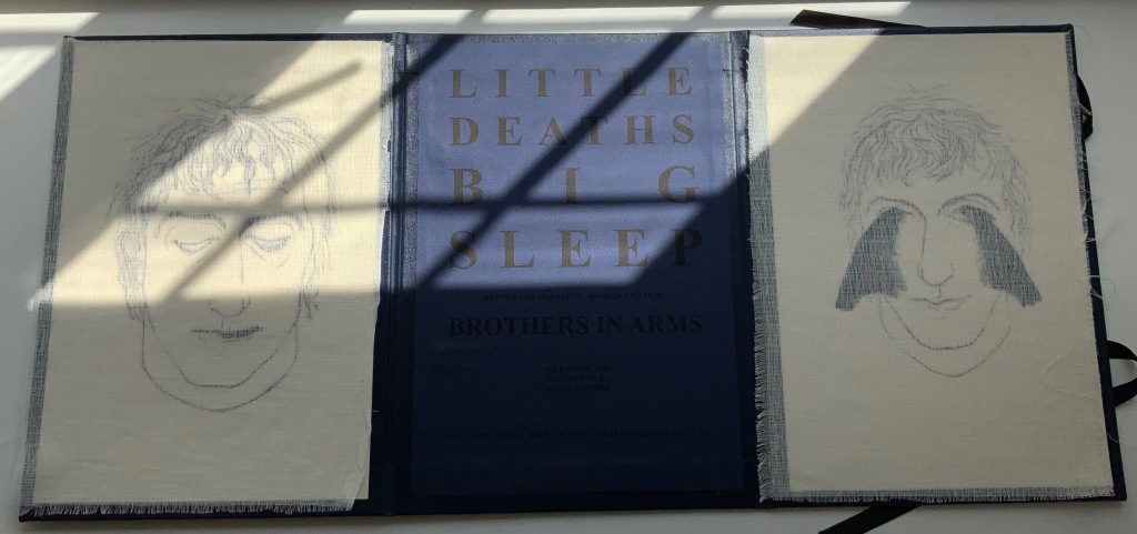
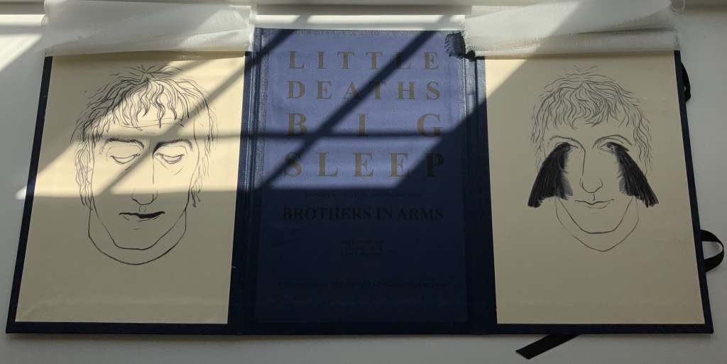
BROTHERS IN ARMS(2008)
BROTHERS IN ARMS(2008) Paul Salt Hardcover, folio. H300 x W220 mm close, W655 open. Edition of 24, of which this is #2. Acquired from the artist, 13 December 2021. Photos: Books On Books Collection. Displayed with permission of the artist.
The garden in question here is the more severe but still playful Little Sparta, created by Ian Hamilton Finlay. On a visit there, Salt found a pair of wings at the base of one of the sculptures.
In its imagery and structure, the final work by Salt reflects the physicality and preoccupations found in many of the works above: especially Mill, Coin and Fold. Although it has less whimsy than Coin or Fold, its abrupt title recalls Ed Ruscha’s humorous rule of thumb for distinguishing between bad and good art: Bad art makes you say ‘Wow! Huh?’ Good art makes you say ‘Huh? Wow!’
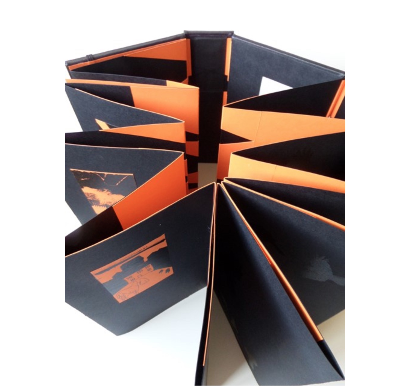
What …? (2018)
What …? (2018)
Salt+Shaw Hardback, boxed-bound, black book cloth, concertina book with magnetised and elasticated fastening. Drawings and collages printed on black and orange Canson card. Letterpress. Hinges engineered in Canson card to create a spring in the turning of the pages. H213 x W80 mm closed, H213 x W830 mm open Edition of 5, of which this is #2. Acquired from the artists, 25 November 2018.
What? is a book about finding solutions, both in its construction and content. Made over a period of several years, from the first drawing to the final binding, it prefers to raise questions, rather than provide answers. Hence the title. The relationship between What? and viewer therefore depends upon response, perception and making connections. Clues could include: • William Blake • harbingers • manipulation • dislocation • loss • finding a way out • George Orwell. [Correspondence with artists, 5 December 2018.]
What? … Wow!
Further Reading
Sarah Bodman (University of Western England) has highlighted their work in a-n News with some outstanding photos:
“At the recent 21st International Contemporary Artists’ Book Fair in Leeds, they launched Ocean Bestiary, a unique book of strange and miraculous Medieval-inspired sea creatures that features a concertina construction, letterpress text, acrylic paint, gold foil, whale bone and a leather inlay.” Sarah Bodman, “Artists’ Books #28: Salt+Shaw, collaborative book makers“, a-n News, 6 March 2018.
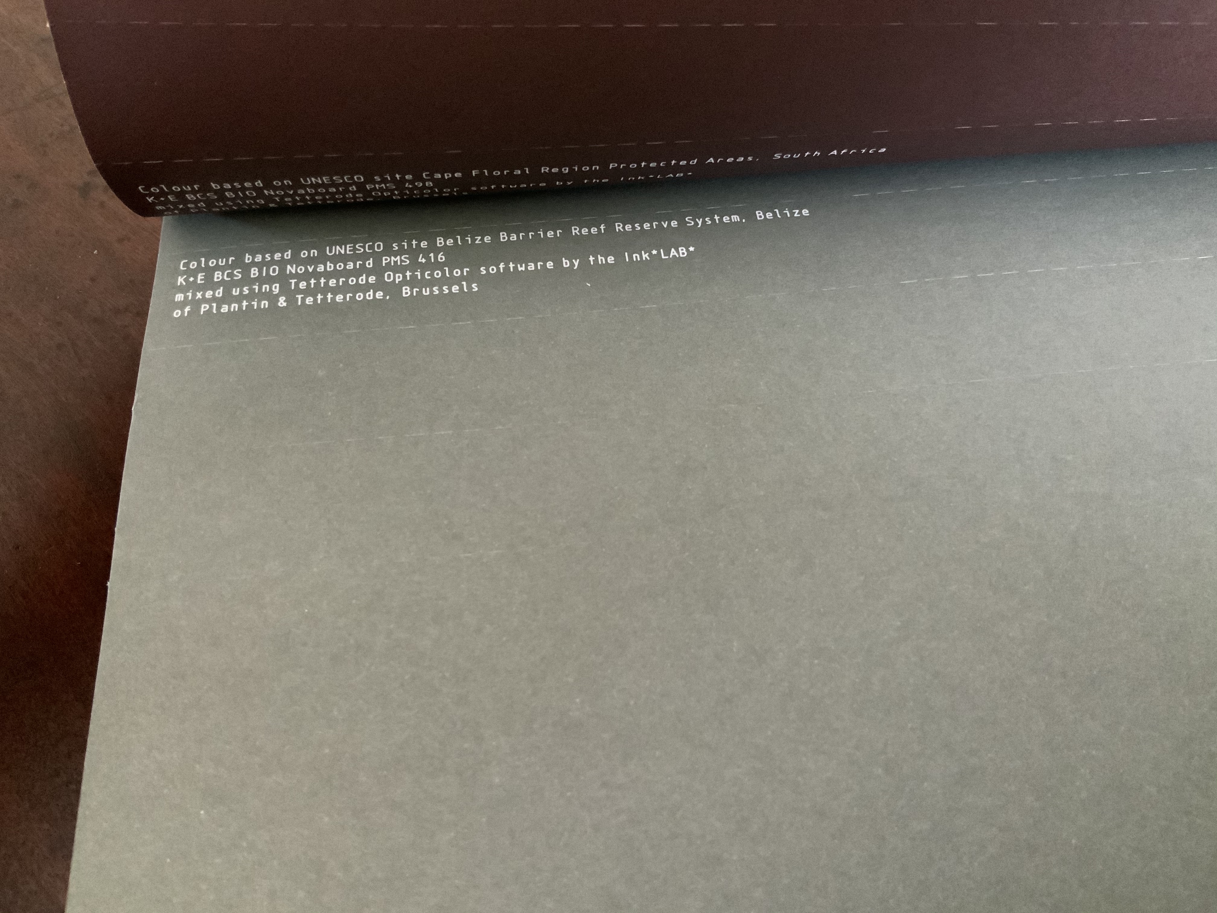
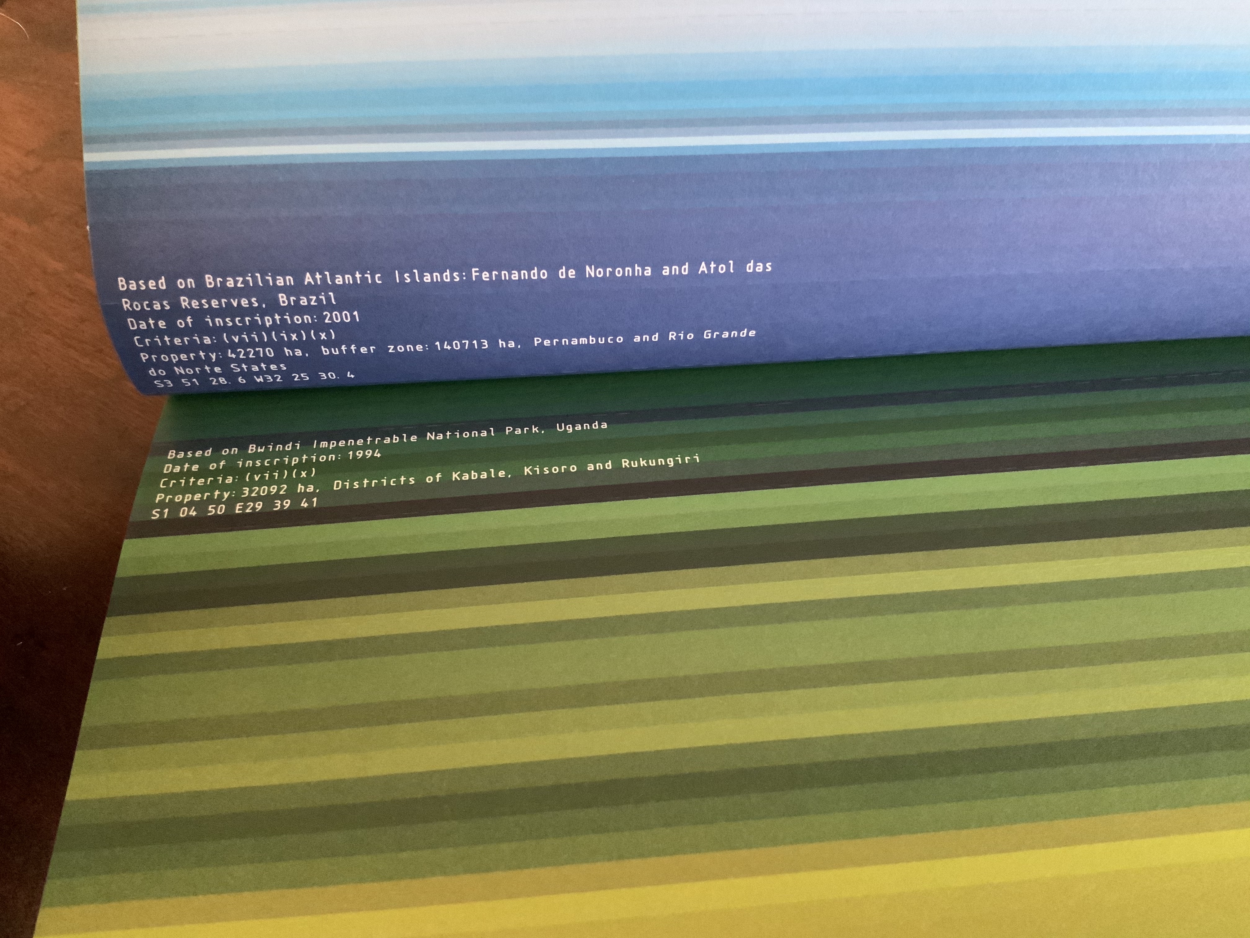
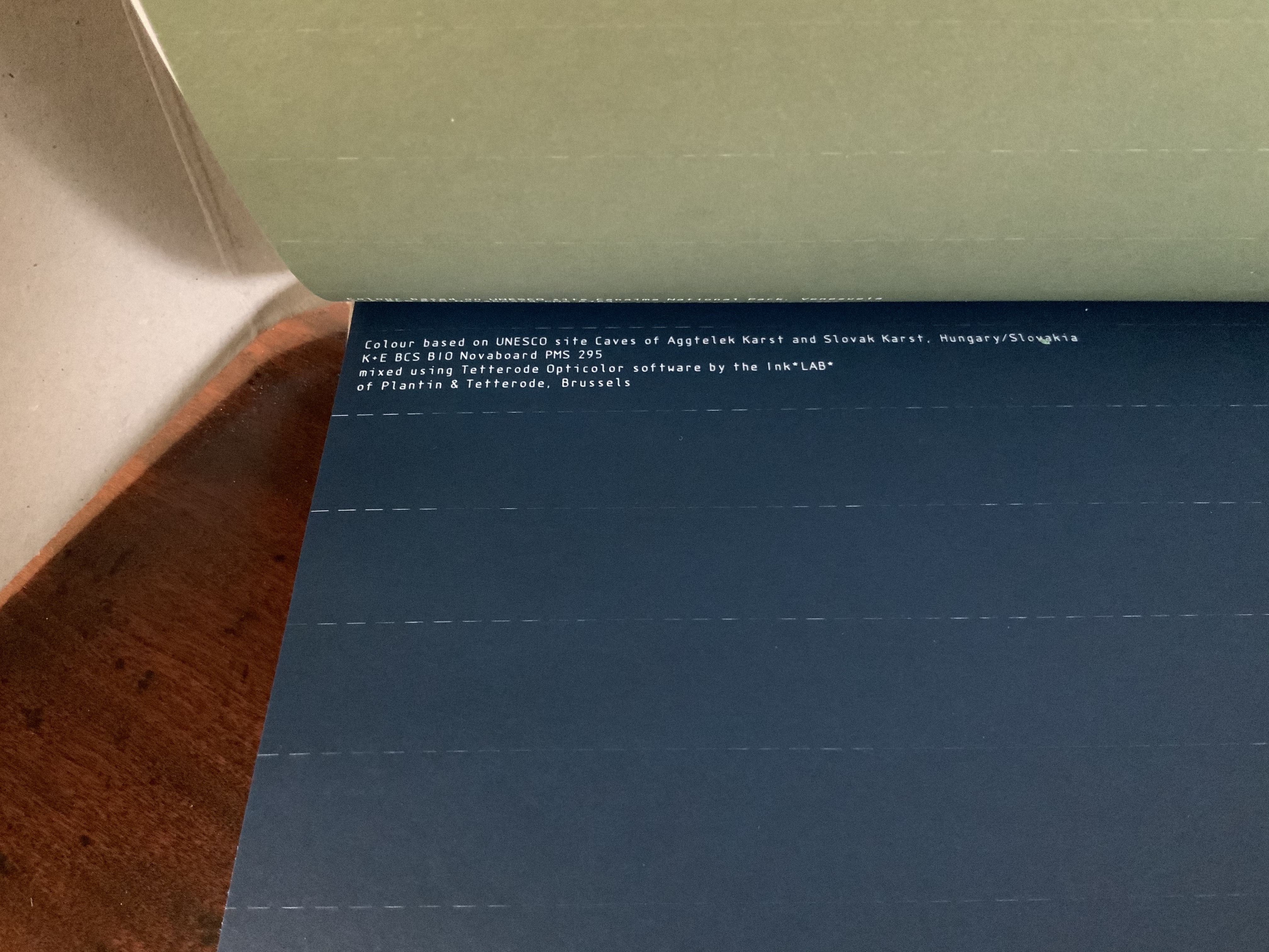
Colour — Based on Nature (2012) Irma Boom Box holding softcover. H320 x W240 mm, 170 pages. Acquired from Ursus Books & Gallery, 16 November 2020. Photos: Books On Books Collection.
This work of art in the form of a book explores and associates colors with 80 UNESCO World Heritage sites across the globe. On the exterior of each folio, all of them uncut, a single, solid color appears. As the folio is cut, the interior reveals striated variations on the exterior color.
The striations act like lines of rhymed and unrhymed verse. The whole volume could serve as a textbook on theory of colors, the destructive act needed to access the color reminding student and teacher of the fragility of the heritage sites being celebrated.
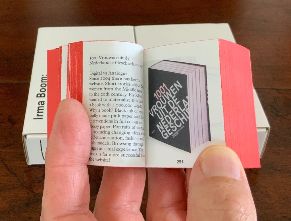
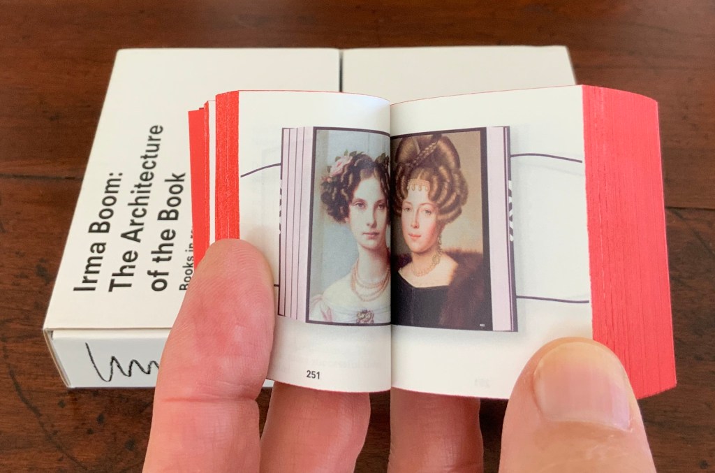
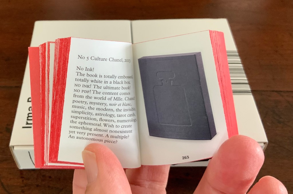
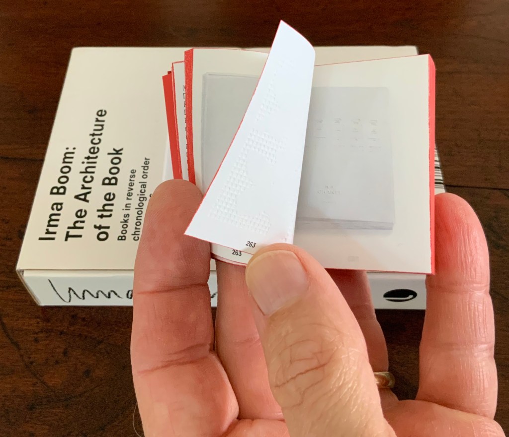
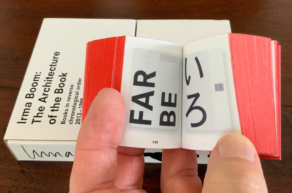
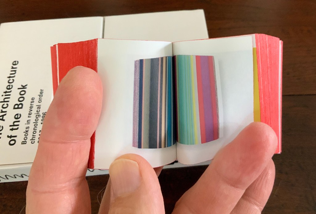
Irma Boom: The Architecture of the Book (2013)
Irma Boom: The Architecture of the Book (2013) Irma Boom Box holding miniature softcover. Box: H153 x W118 x D31 mm; Book: H55 x W44 x D30 mm; 800 pages. Acquired from Amazon, 3 June 2015. Photos: Books On Books Collection.
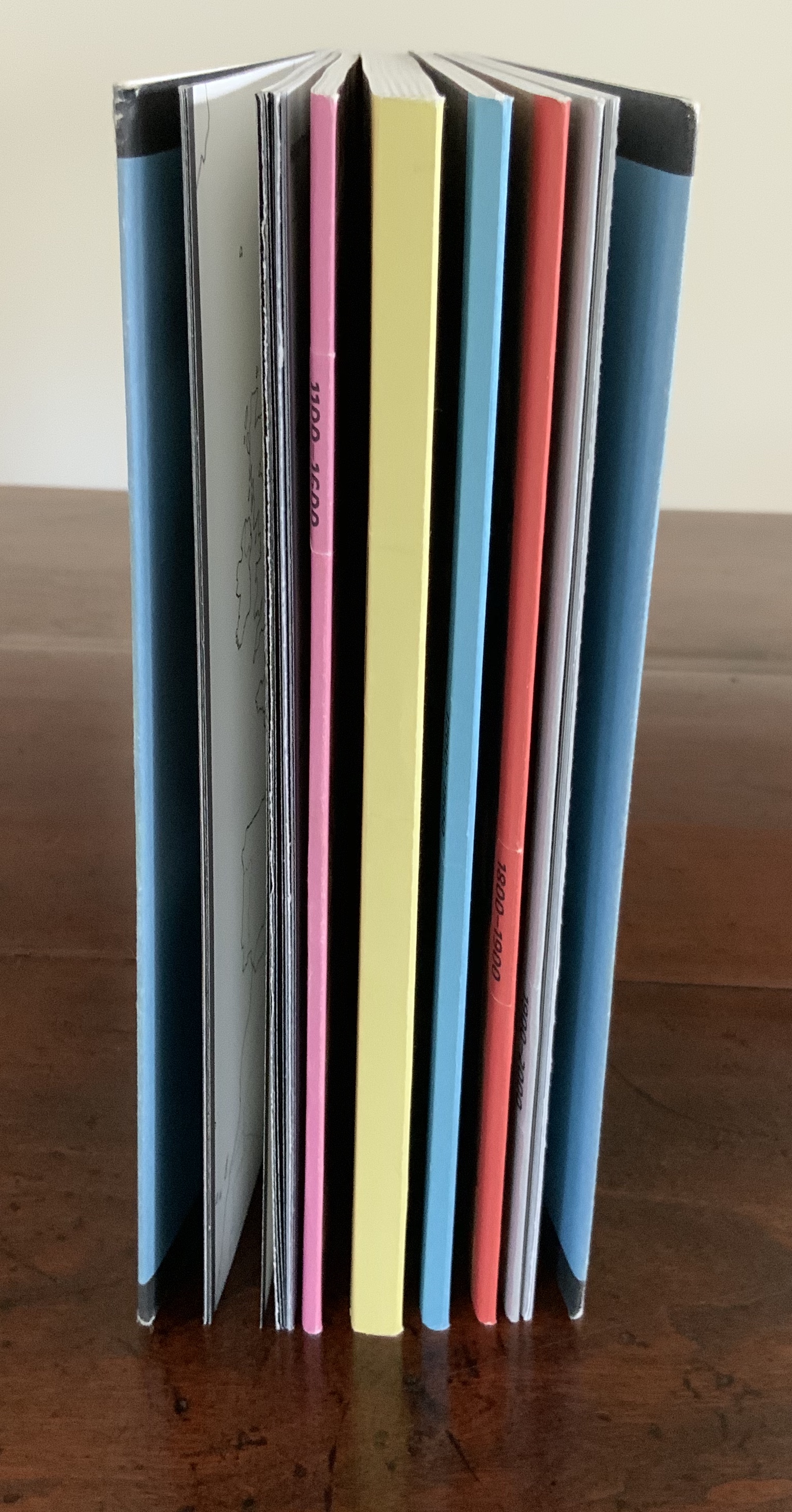
In and of itself, a legible miniature book astounds. Add to it the design genius of Irma Boom and the astounding becomes book art. Recording her books in reverse chronological order 2013-1986 (with reverse pagination as well), Irma Boom: The Architecture of the Book uses its structure and contents to make us think again and again about the reach of the book’s technology.
In 2013 the newly renovated Rijksmuseum opened with a new logo, new typeface design and publications design — all by Irma Boom and her studio. The new typeface — de Rijksmuseum — was developed by Paul van de Laan of Blue Monday under Boom’s artistic direction and appeared in museum signage and publications. The new typeface marks an interesting shift from DTL Documenta, the previous corporate font, designed by Frank E. Blokland. Blokland had studied with Gerrit Noordzij and later succeeded him at the Dutch Royal Academy of the Arts (The Hague). He founded the Dutch Type Library in the 1990s.
The previous style sheet leads with the serif version of DTL Documenta, while the de Rijksmuseum style sheet leads with the sans serif. Having applied to intern at Total Design in Amsterdam and been rejected by Wim Crouwel’s colleagues for her experimentalism, Boom must have especially enjoyed winning this commission. Just as much as the typographic differences, though, it is Boom’s roots in book design that differentiates the new from the old.
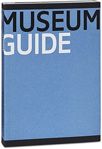
Guide Rijksmuseum (2013) Eric Spaans (text),Irma Boom (design) Softcover with multiple foldout maps. Acquired at the Rijksmuseum. Photos of the work: Books On Books Collection.
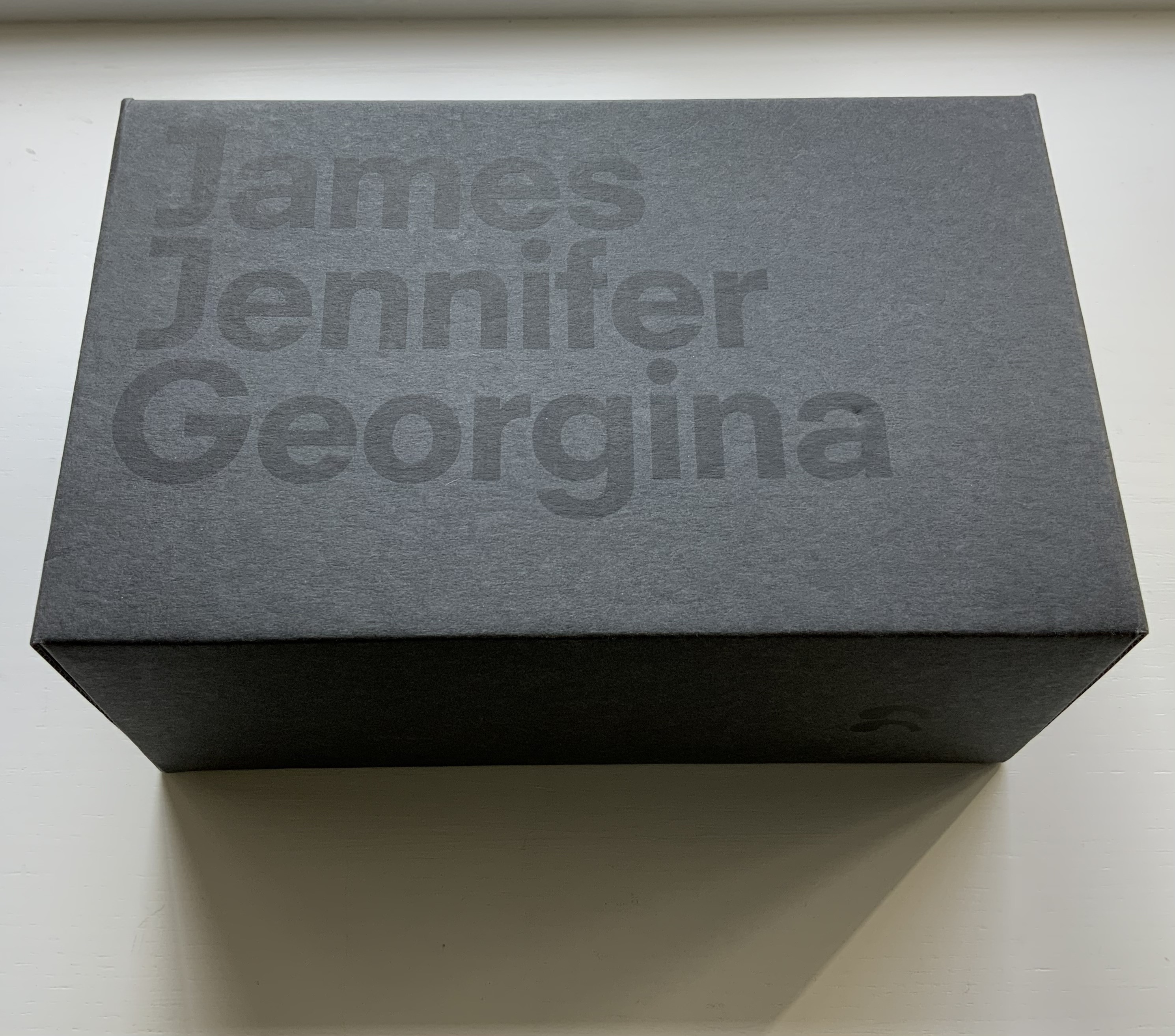
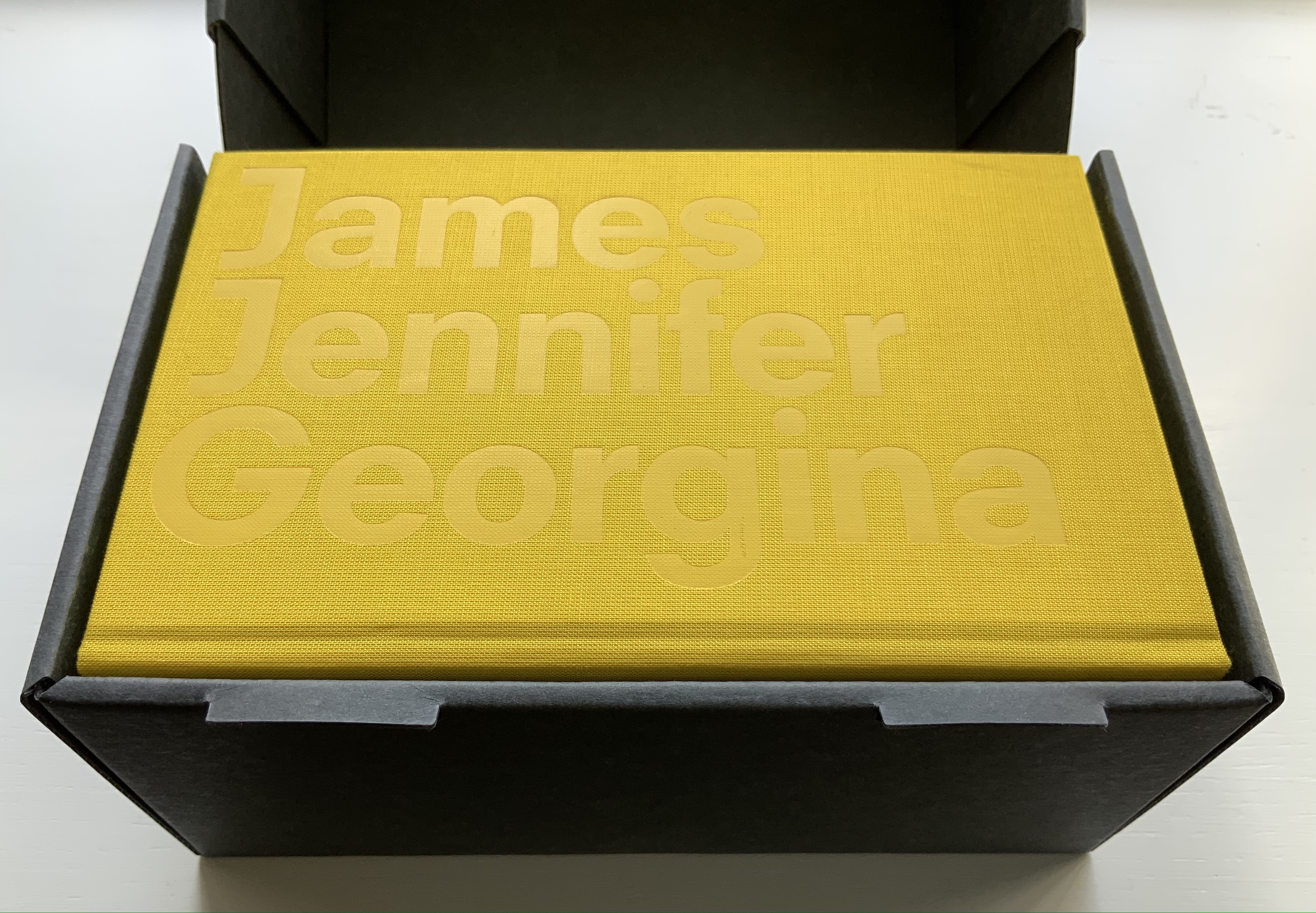
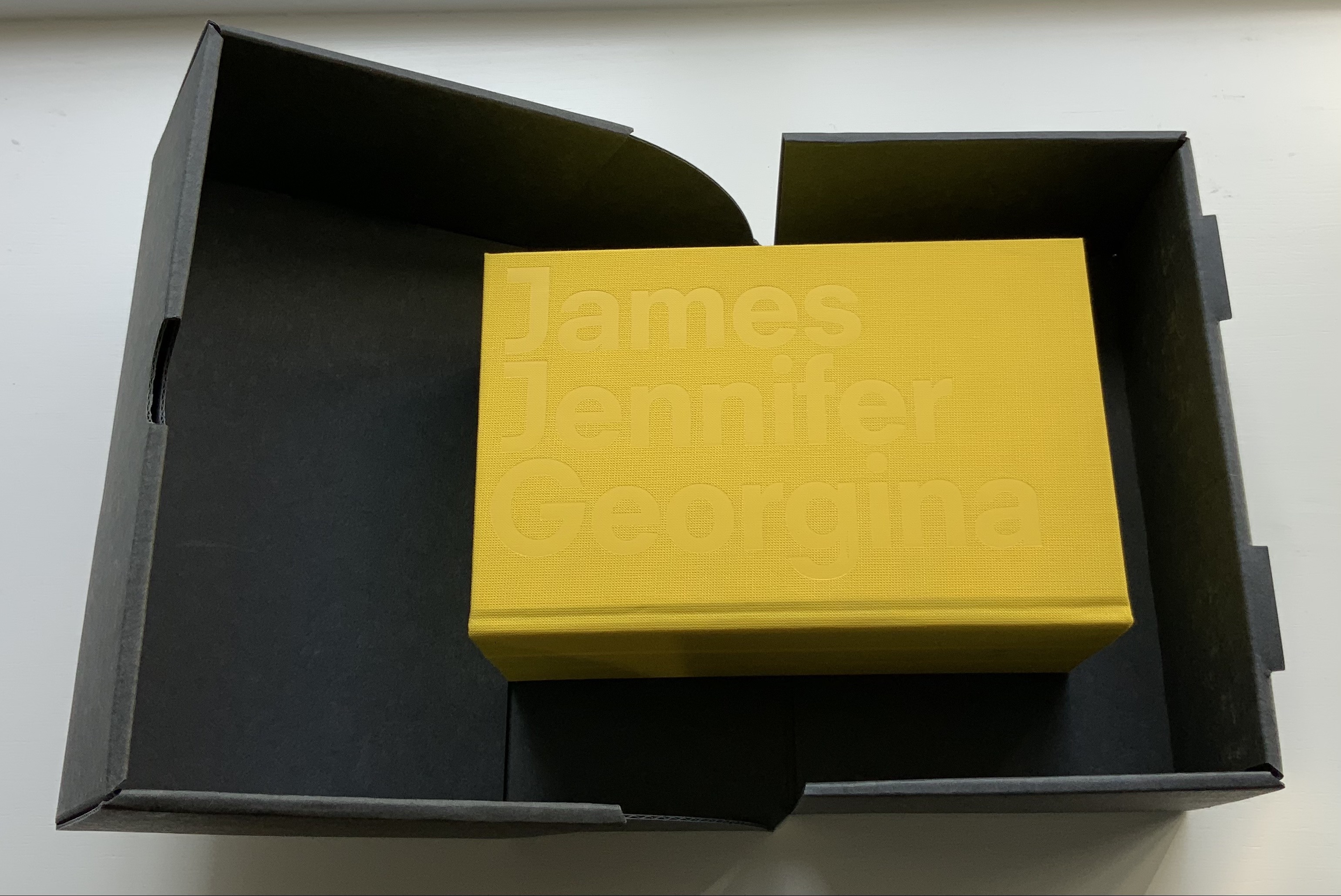
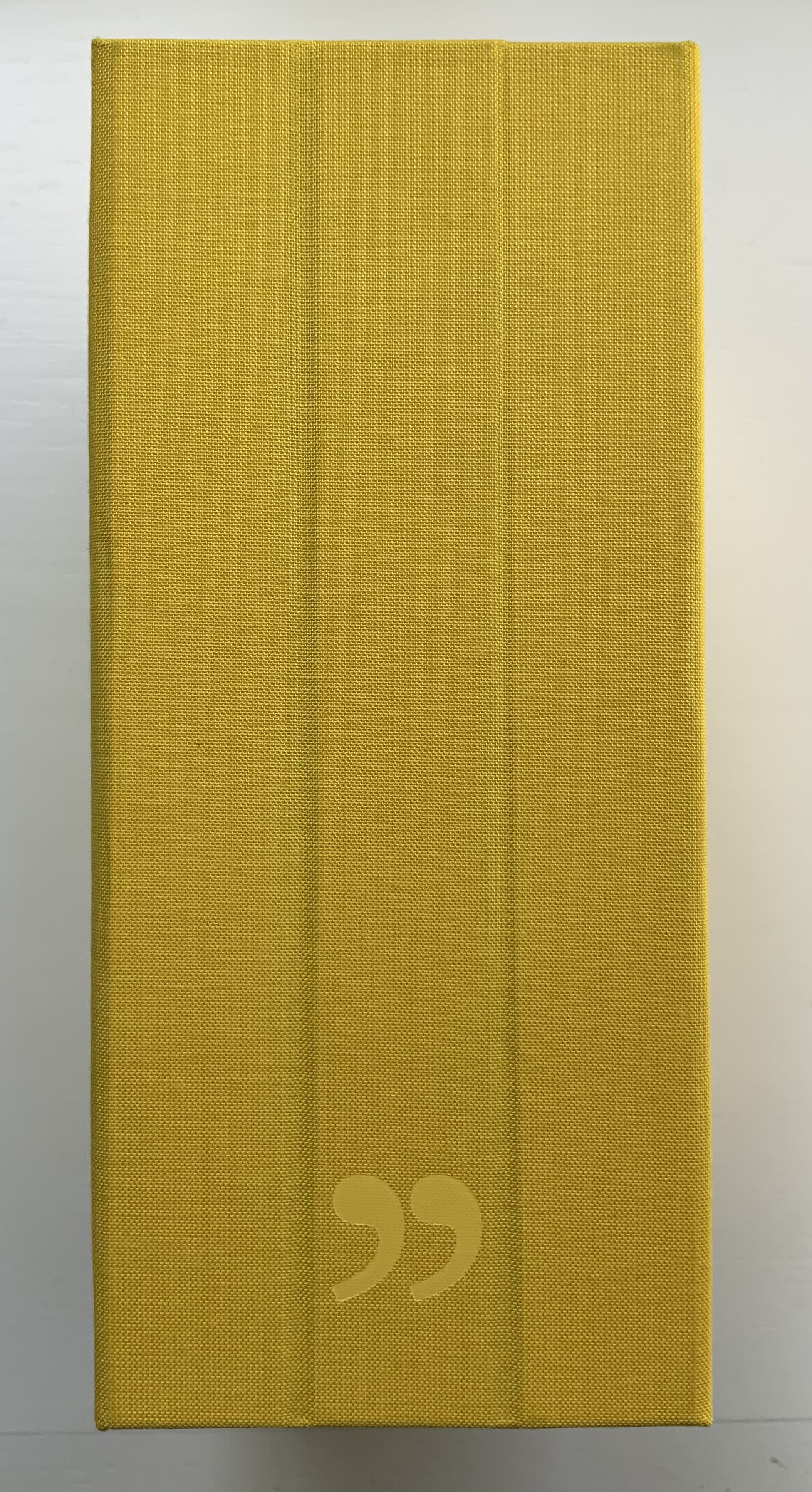
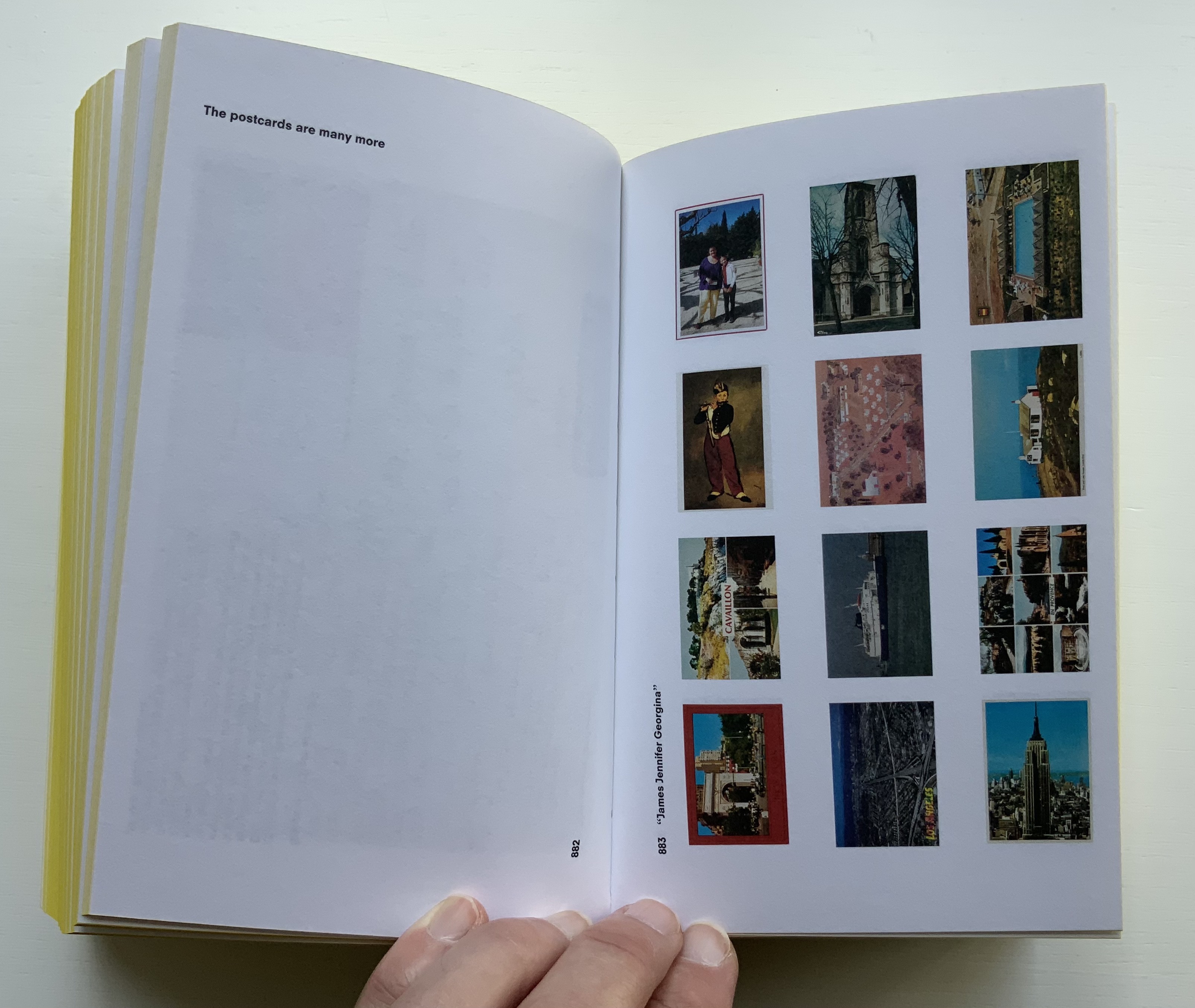
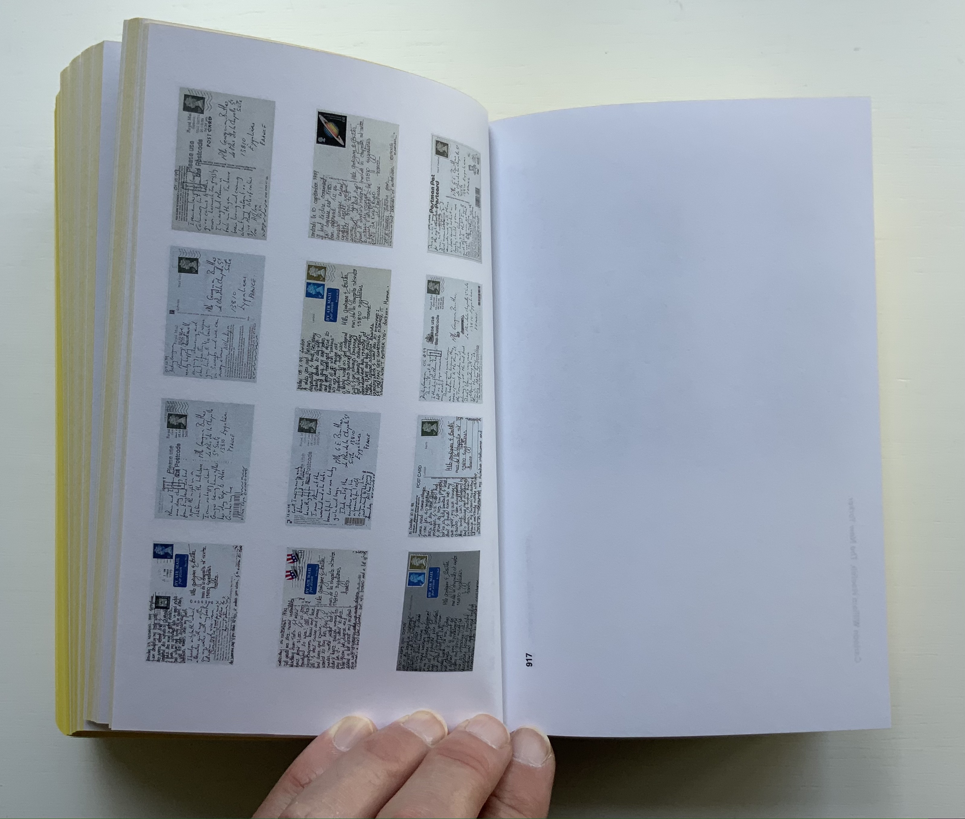
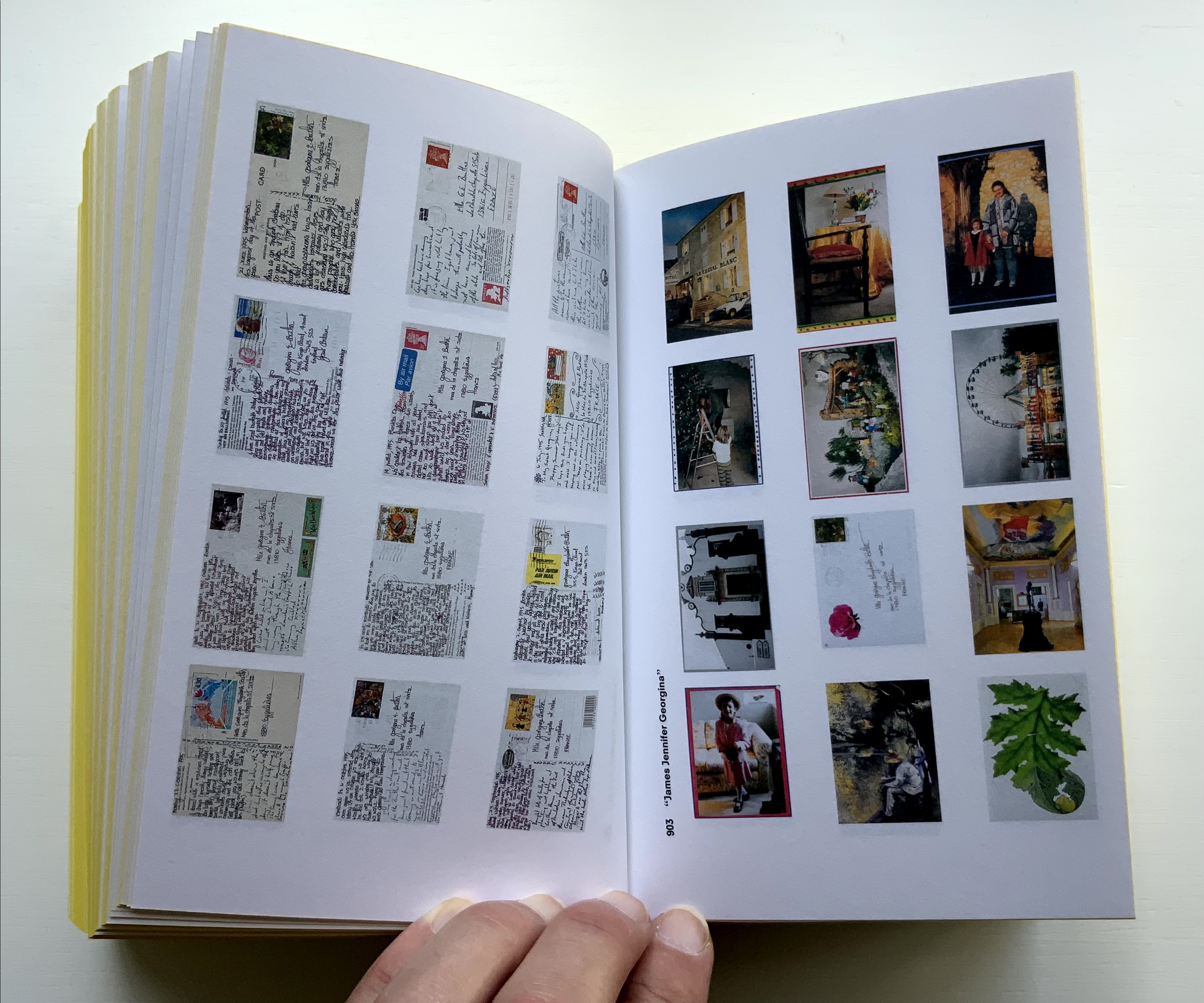
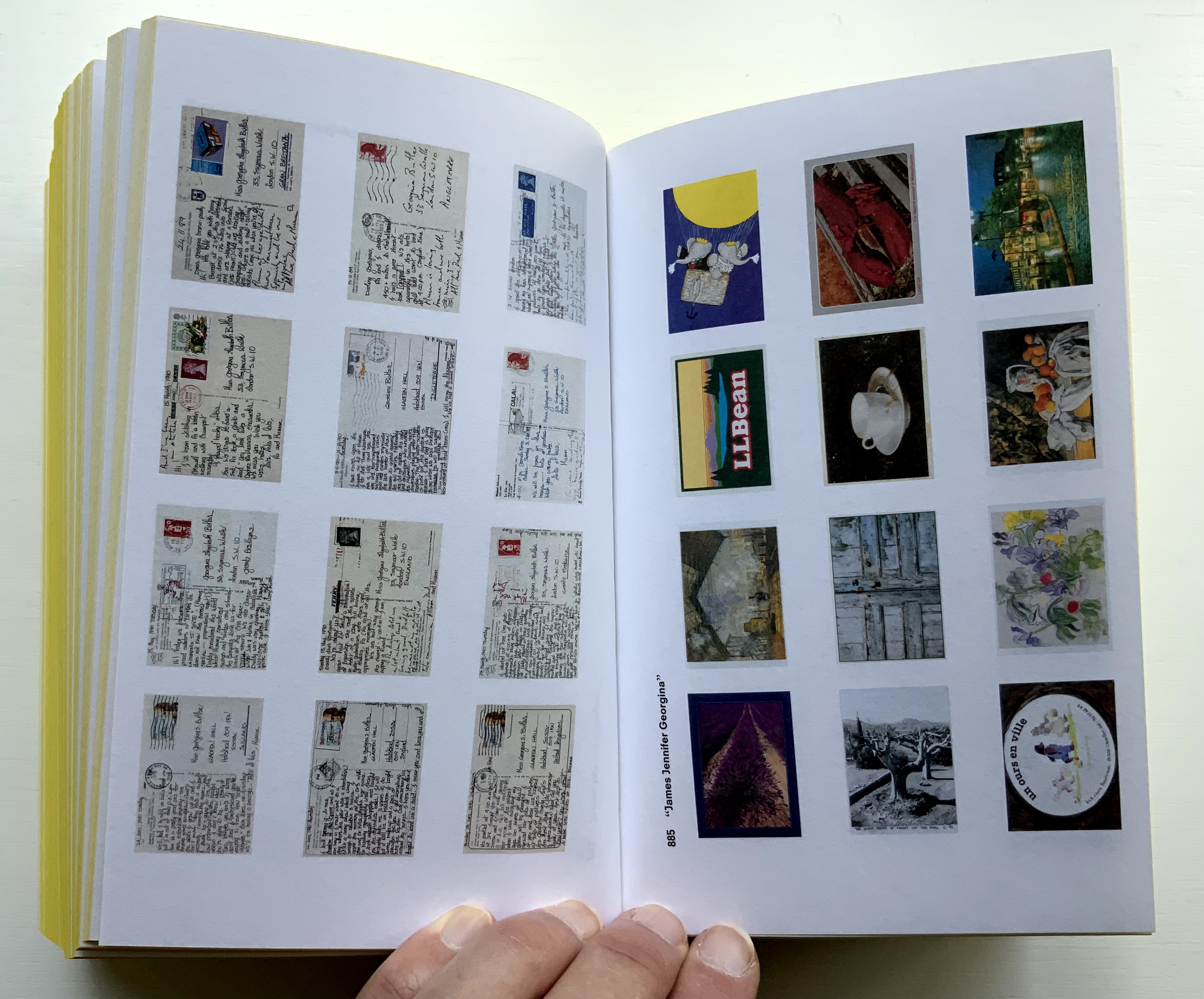
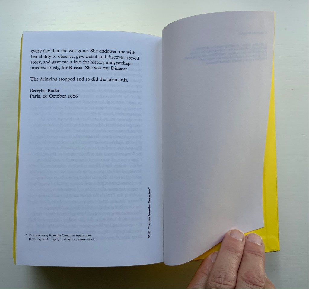
James Jennifer Georgina (2010)
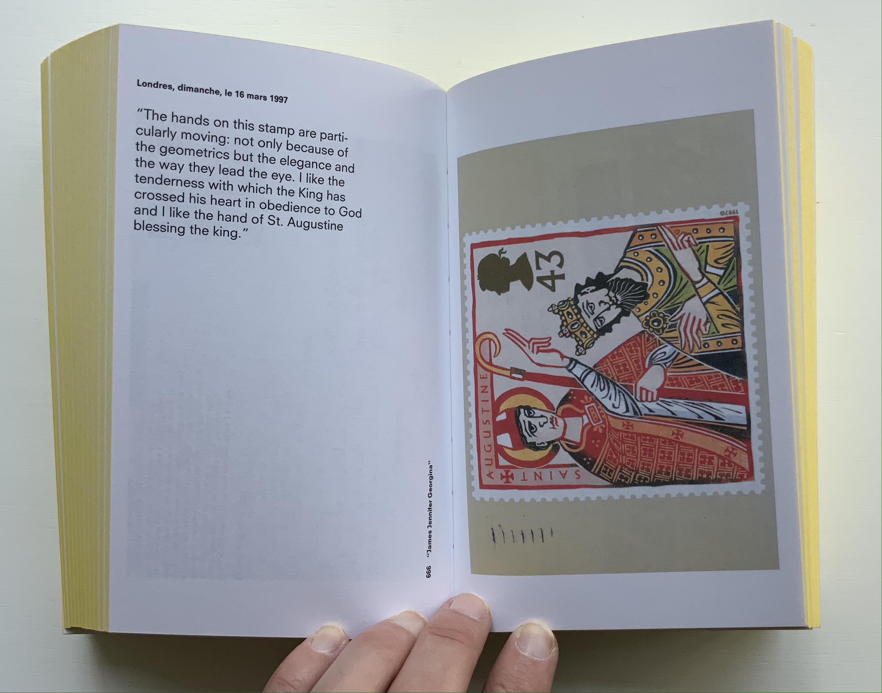
James Jennifer Georgina(2010) Irma Boom Box holding casebound book. Box: H220 x W140 x D100 mm. Book: H194 X W126 X D90 mm; 1198 pages. Edition of 999, of which this is #699. Acquired from Bubb Kuyper, 28 May 2021. Photos: Books On Books Collection.
James Jennifer Georgina is book art as epic family portrait, created with the fronts and backs of 1136 postcards, spanning ten years of travel by the Butler family. At 1198 pages, it comes close to War and Peace, and in one theme, it comes close to Anna Karenina. Tolstoy writes at the beginning of the latter, “All happy families are alike; each unhappy family is unhappy in its own way.” After poring over JJG, I wonder if that should have been “each unhappy family thinks it is unhappy in its own way”. In the end, the family portrait is one of considerable privilege, culture, shame, pain and love. What distinguishes the Butler family’s unhappiness besides that context of privilege is its form of documentation and, above all, Boom’s transformation of it into this monument of book design. Its three-part spine especially developed to allow this nine centimeters-thick book to open effortlessly to any page .
Boom’s other outstandingly designed hefty works include SHV (1996) commissioned by Steenkolen Handelsvereeniging (SHV), Sheila Hicks: Weaving as Metaphor (2006) and Artist, Work, Lisson (2017) commissioned by the Lisson Gallery. They can be viewed here, here and here, respectively.
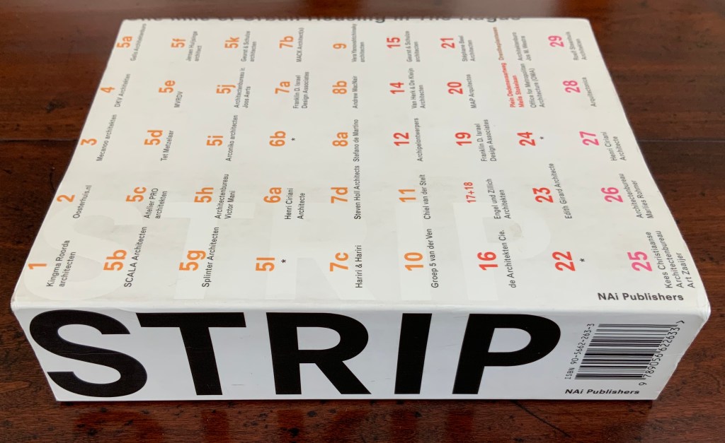
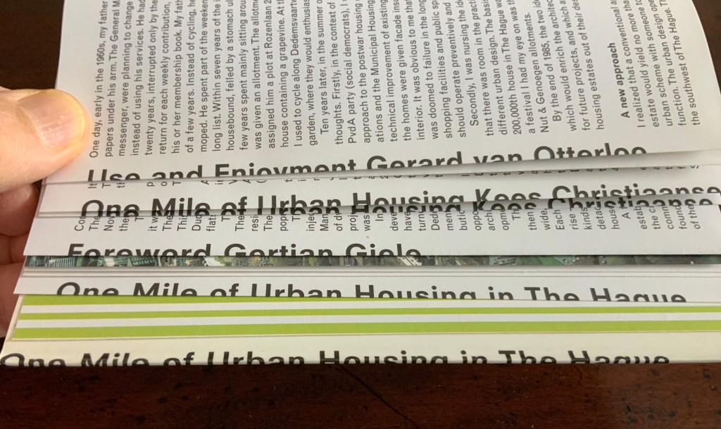
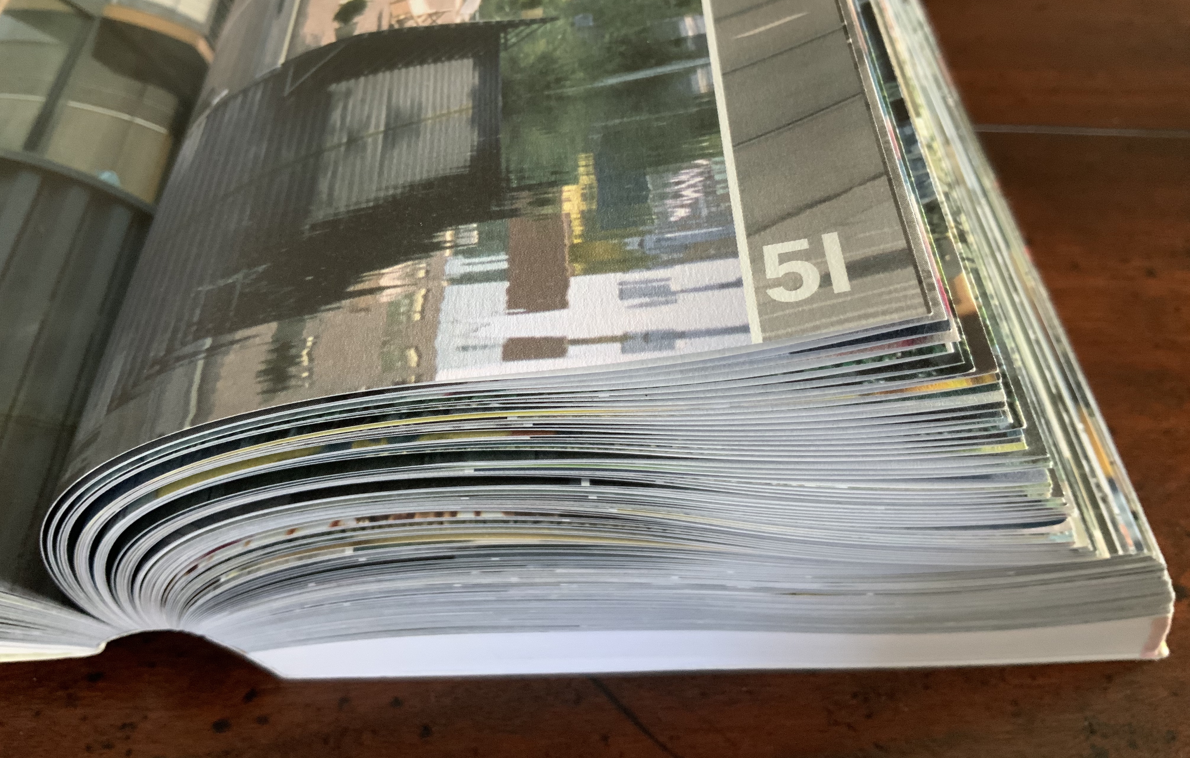
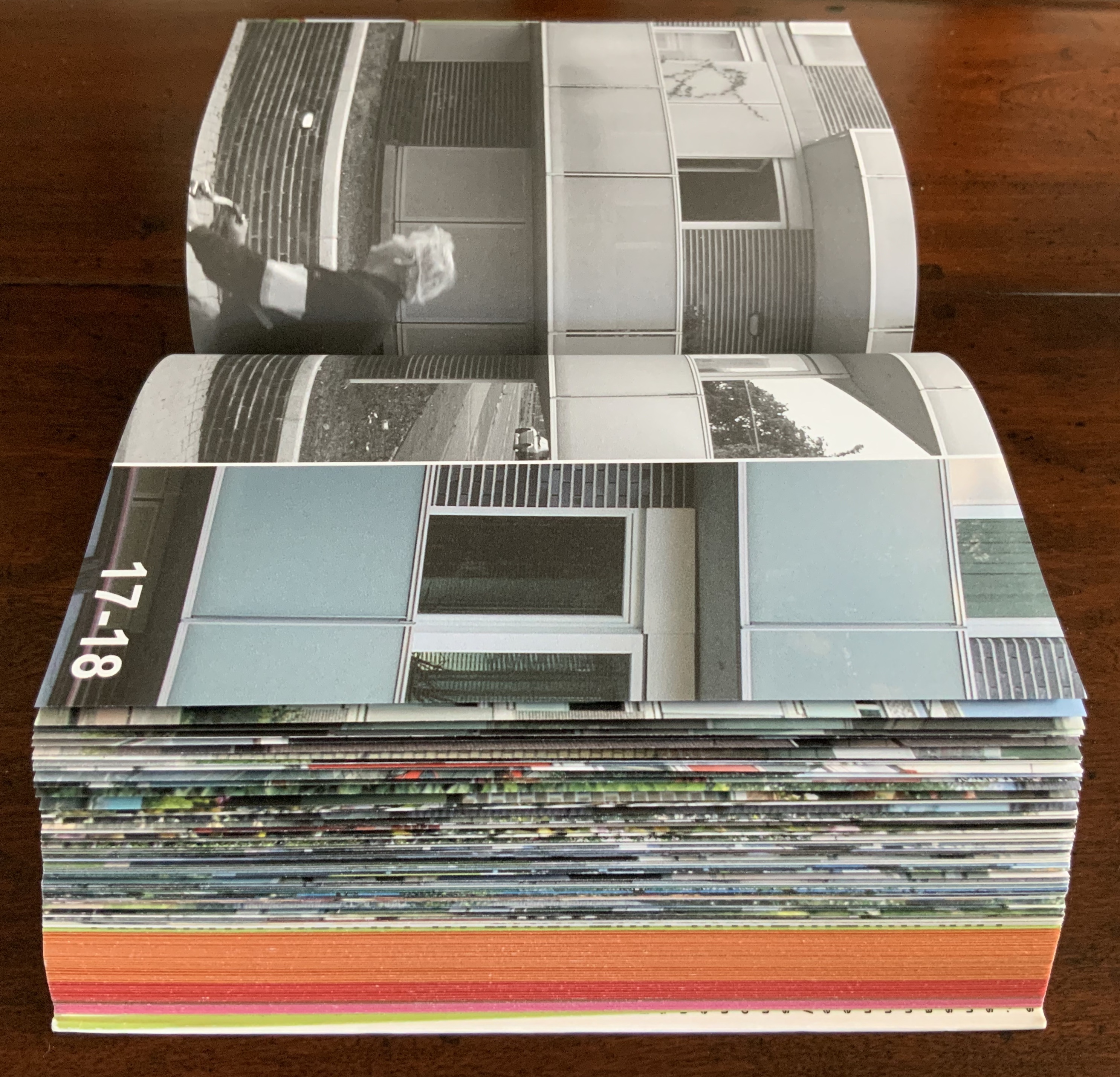
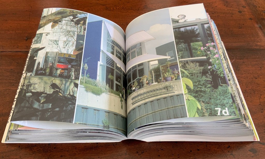
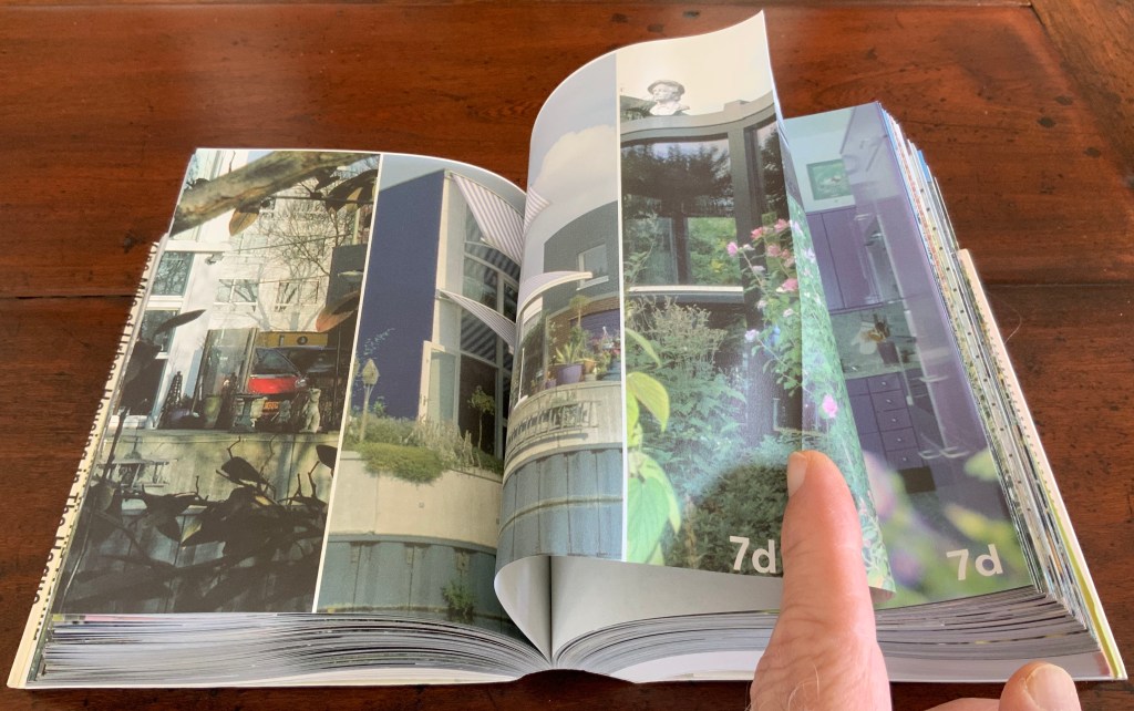
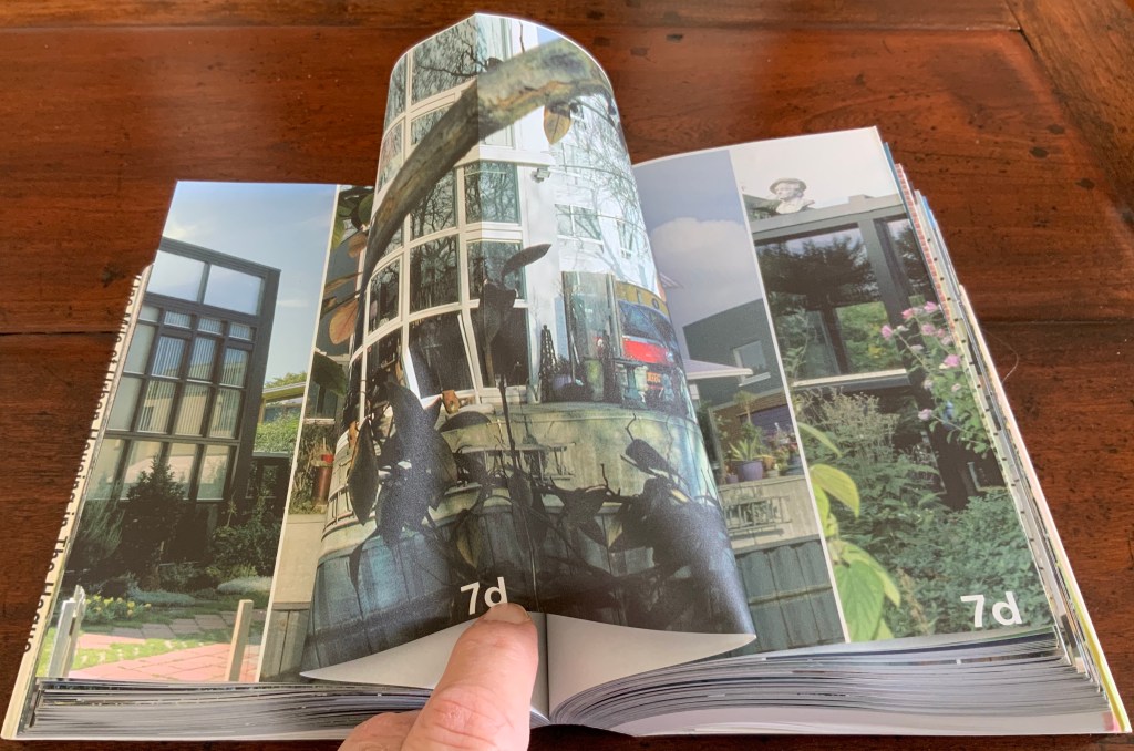
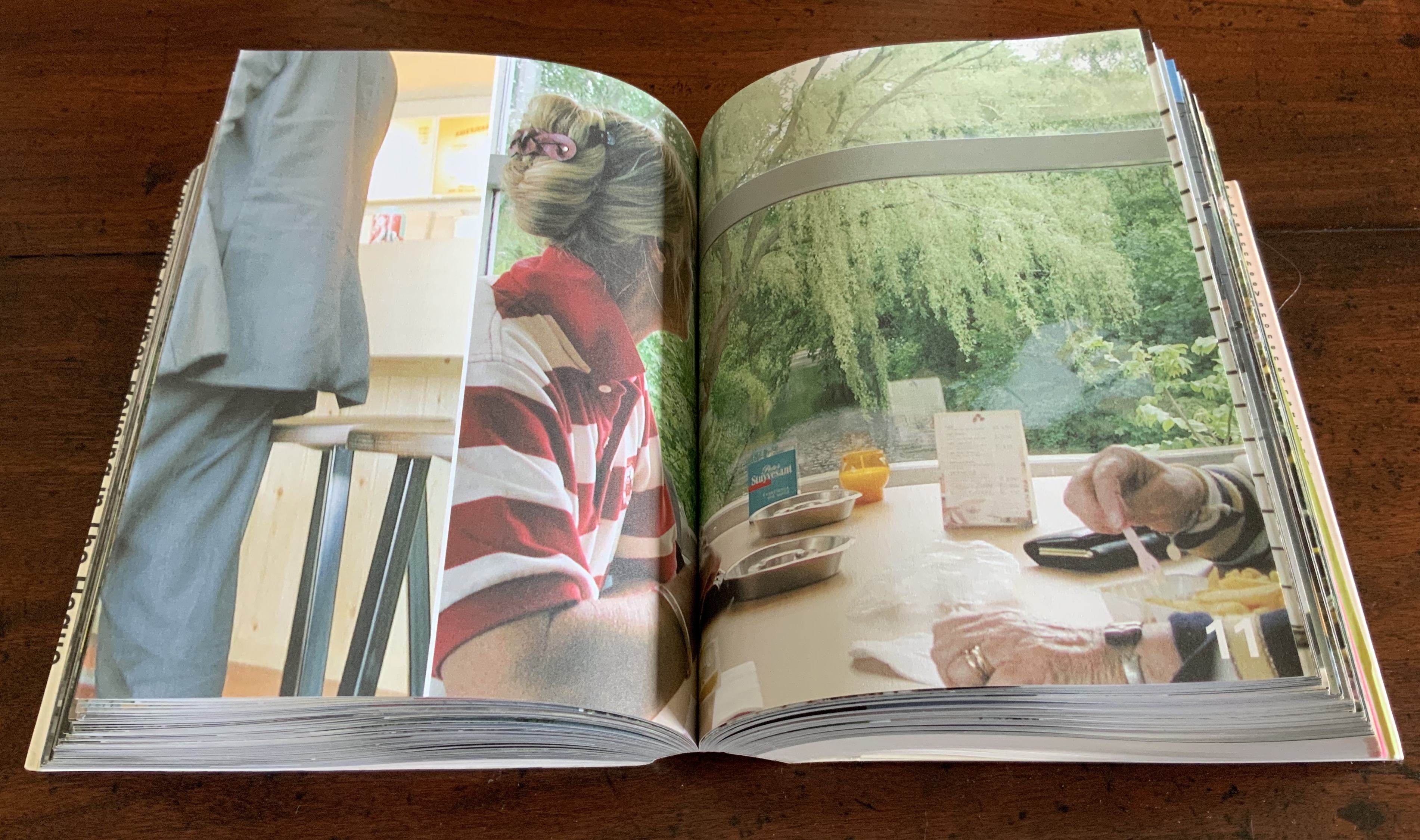
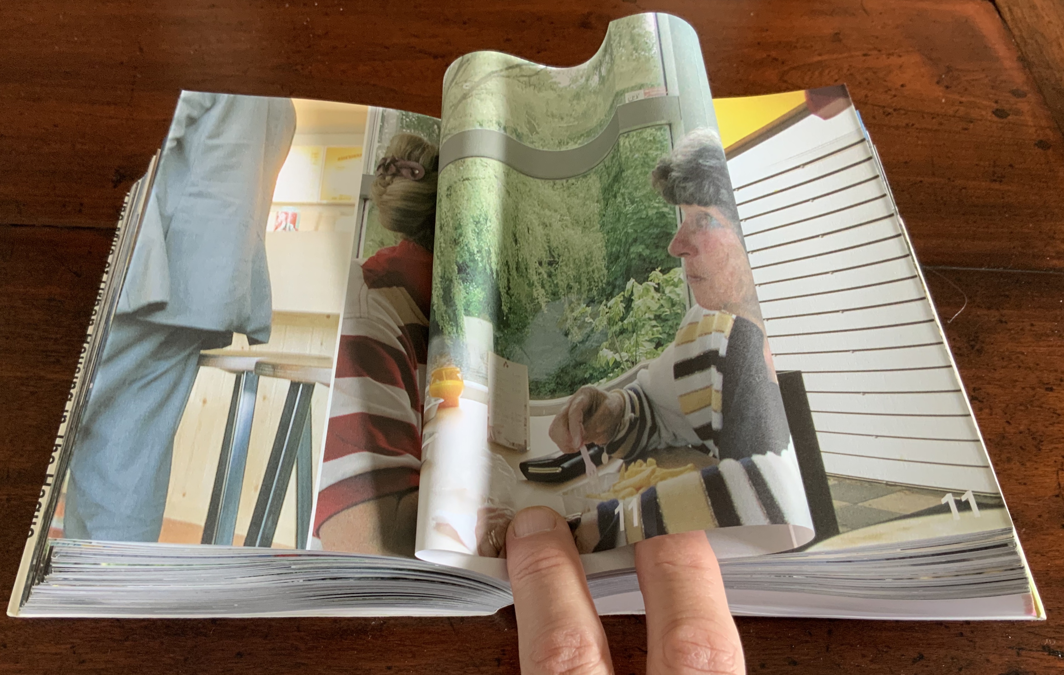
Strip: One Mile of Urban Housing in The Hague (2003)
Strip: One Mile of Urban Housing in The Hague (2003) Marja van der Burgh, Kees Christiaanse, Gertjan Giele and Gerard van Otterloo (eds.); Design by Irma Boom and Sanne Beeren; Photography by Hans Werleman. Paperback, perfect bound, H175 x W142 x D40 (spine) and D48 (fore edge)mm. 256 uncut folios. Acquired from Galileo Alby, 28 September 2020. Photos: Books On Books Collection.
The primary purpose of Strip could not be further from that of Ed Ruscha’s Every Building on the Sunset Strip; nevertheless, its title and design pay a sort of homage to that accordion book with one side of the Sunset Strip at the top and other at the bottom. With its Chinese-fold pages, Strip has the same problem with thickness that any single-sided accordion has. Of course the Chinese fold offers the same advantage offered by the accordion fold: note how the section titles and photos wrap over the uncut folios, foreshadowing the treatment of the Rijksmuseum Guide above. Also like the Guide but unlike Every Building, Boom’s book is a form of information sculpture.
In some ways, Strip has more in common with the first edition of Robert Venturi’s Learning from Las Vegas, designed by Muriel Cooper at MIT Press, than with Ruscha’s Every Building on the Sunset Strip. Just as Learning from Las Vegas is intent on architectural and urban design theory, so too is Strip. Just as Cooper’s monumental design swamped the textual content (so much so that the authors successfully pressed for a reduced-size paperback), Boom’s design almost does the same to Strip‘s content. Almost, but not quite. Strip‘s blockiness, its rubbernecking around the corner of pages and its jumps in perspective match up with the authors’ intent — to document an environment and its residents.
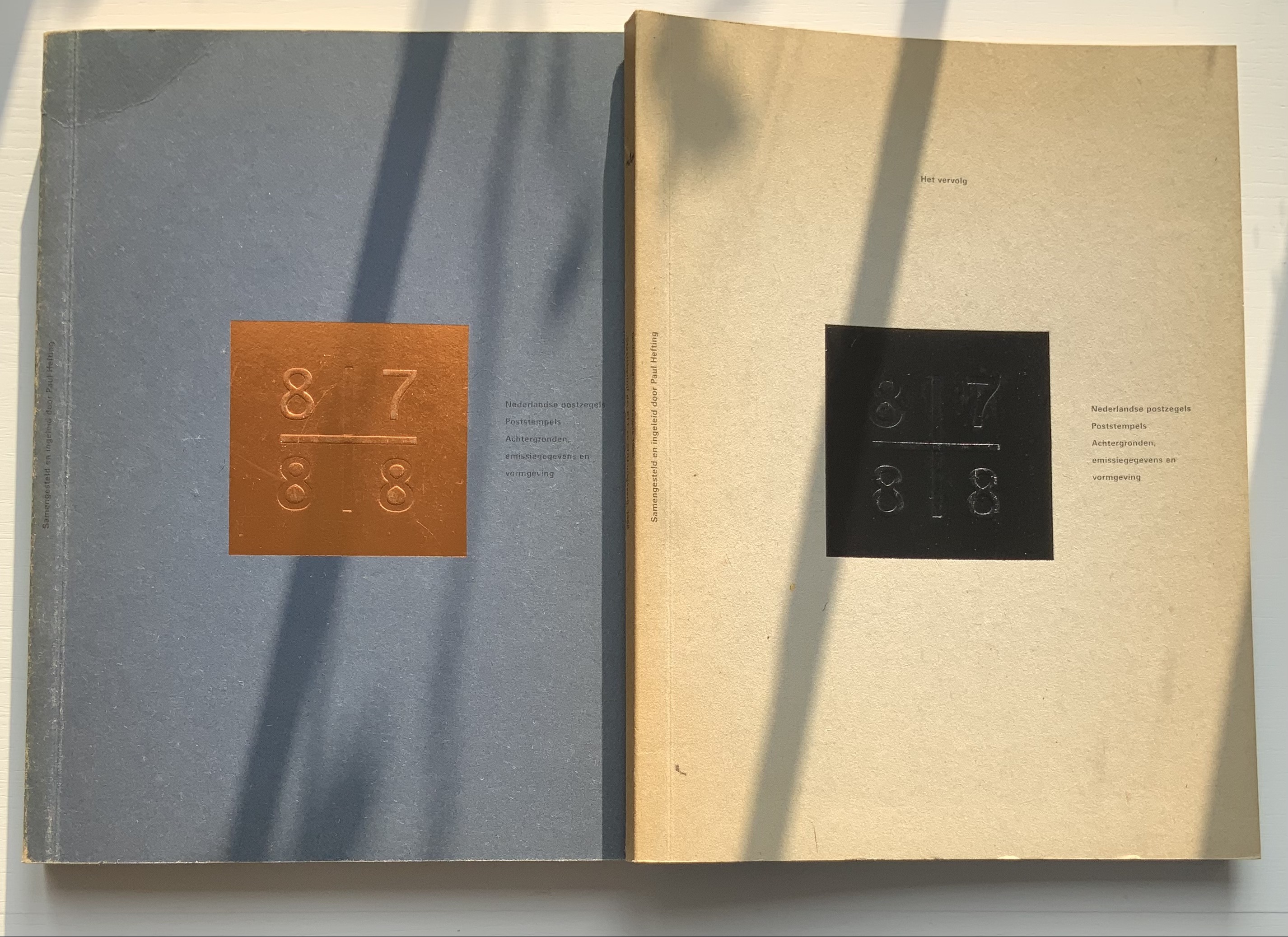
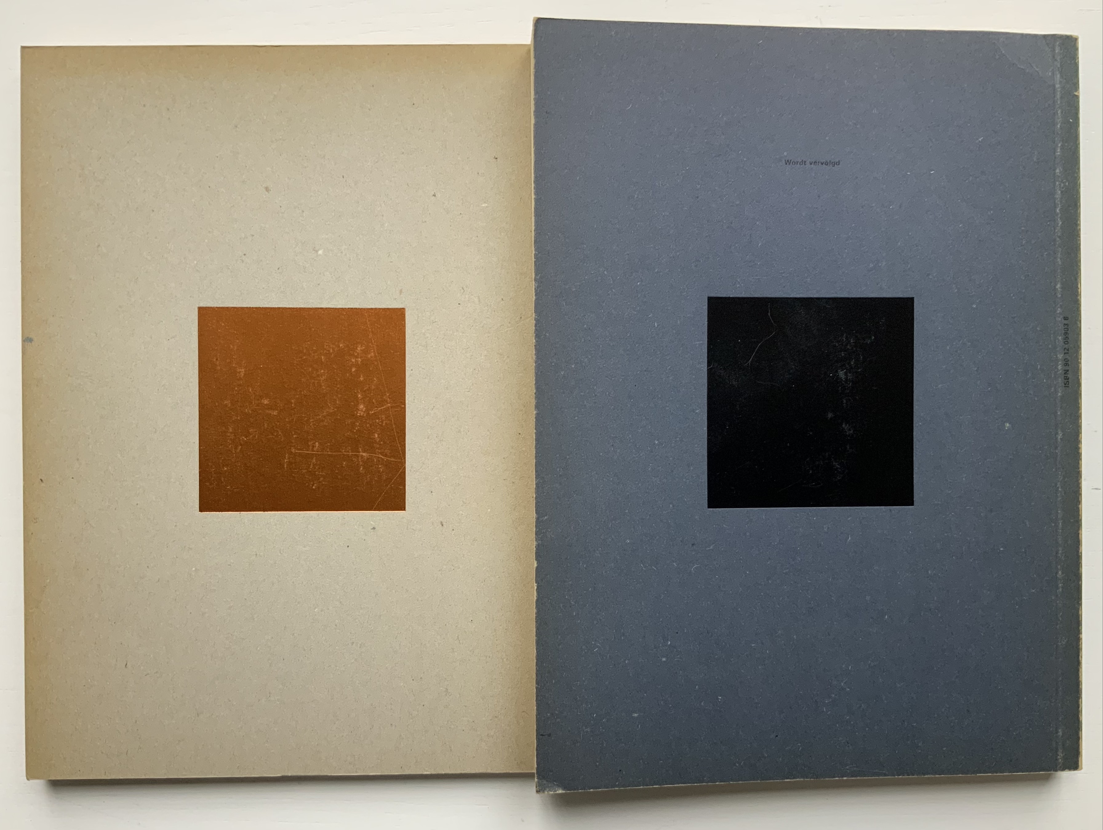
Nederlandse Postzegels, Poststempels 87/88 (1988)
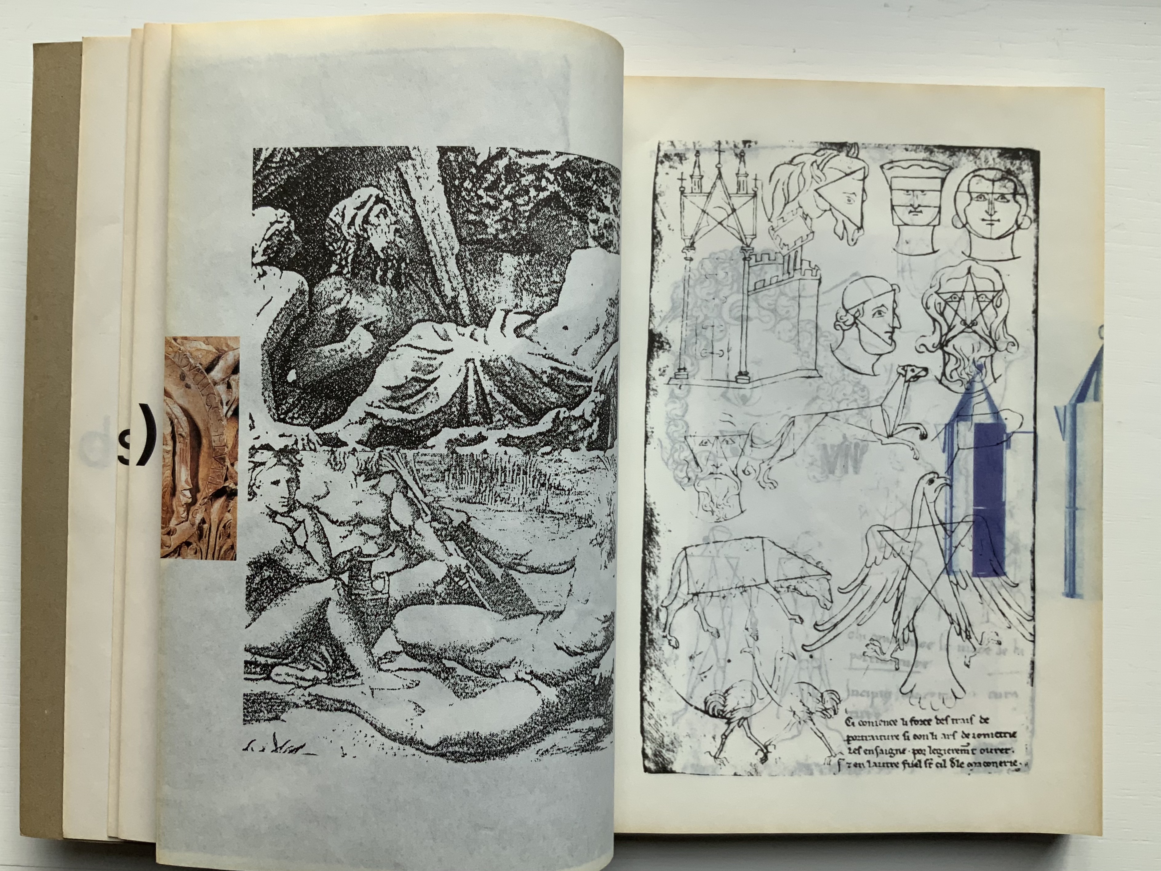
Nederlandse Postzegels, Poststempels87/88: Achtergronden, Emissiegegevens en Vormgeving (1988) [“Dutch stamps, postmarks 87/88: background, issuance data and design”] Irma Boom (design), Paul Hefting (text) and Piet Janmaat (photography) Two softcover volumes. H250 x W188 mm, 228 pages combined. Acquired from Cornelis Verheij, 9 January 2022. Photos of the work: Books On Books Collection.
This two-volume set accounts for Boom’s first published book design and her first book design award. It celebrates the special edition stamp designs commissioned by the Dutch PTT during 1987 and 1988 and features an index of the different postal cancellations used during those years.
Foreshadowing Strip, the interior pages are created in the Oriental style of single-fold folios bound with the fold at the fore edge. In Nederlandse Postzegels, however, printing occurs on both sides of the folios. The outer sides are printed with 4-color offset lithography, presenting images and text sometimes in portfolio and sometimes in landscape layout. Whether in portfolio or landscape, images will often run from the recto to verso page, wrapping around the fold. In the section on the designers and their designs, the main text shows in landscape and, like the images, runs over the fold at the fore edge.
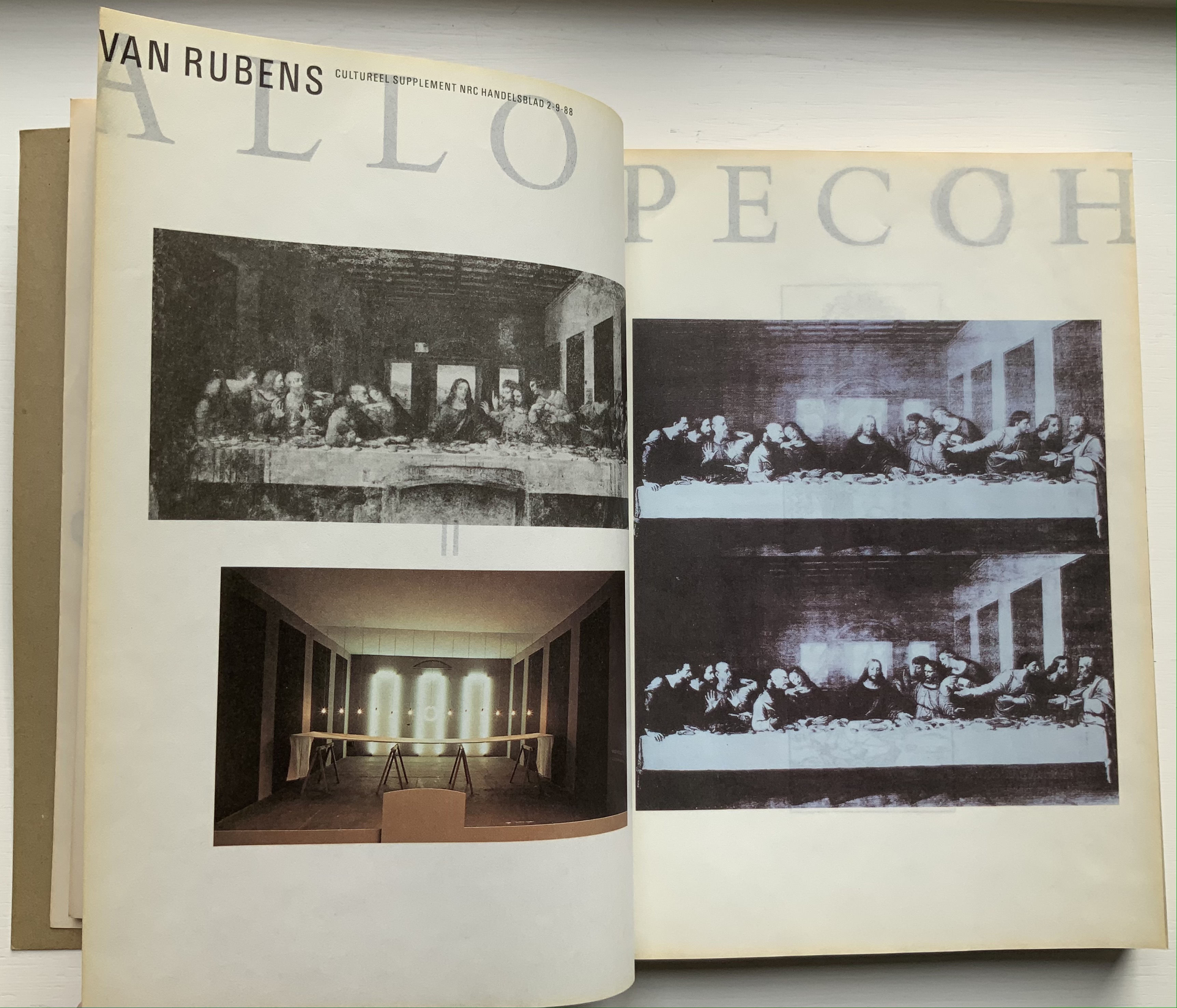
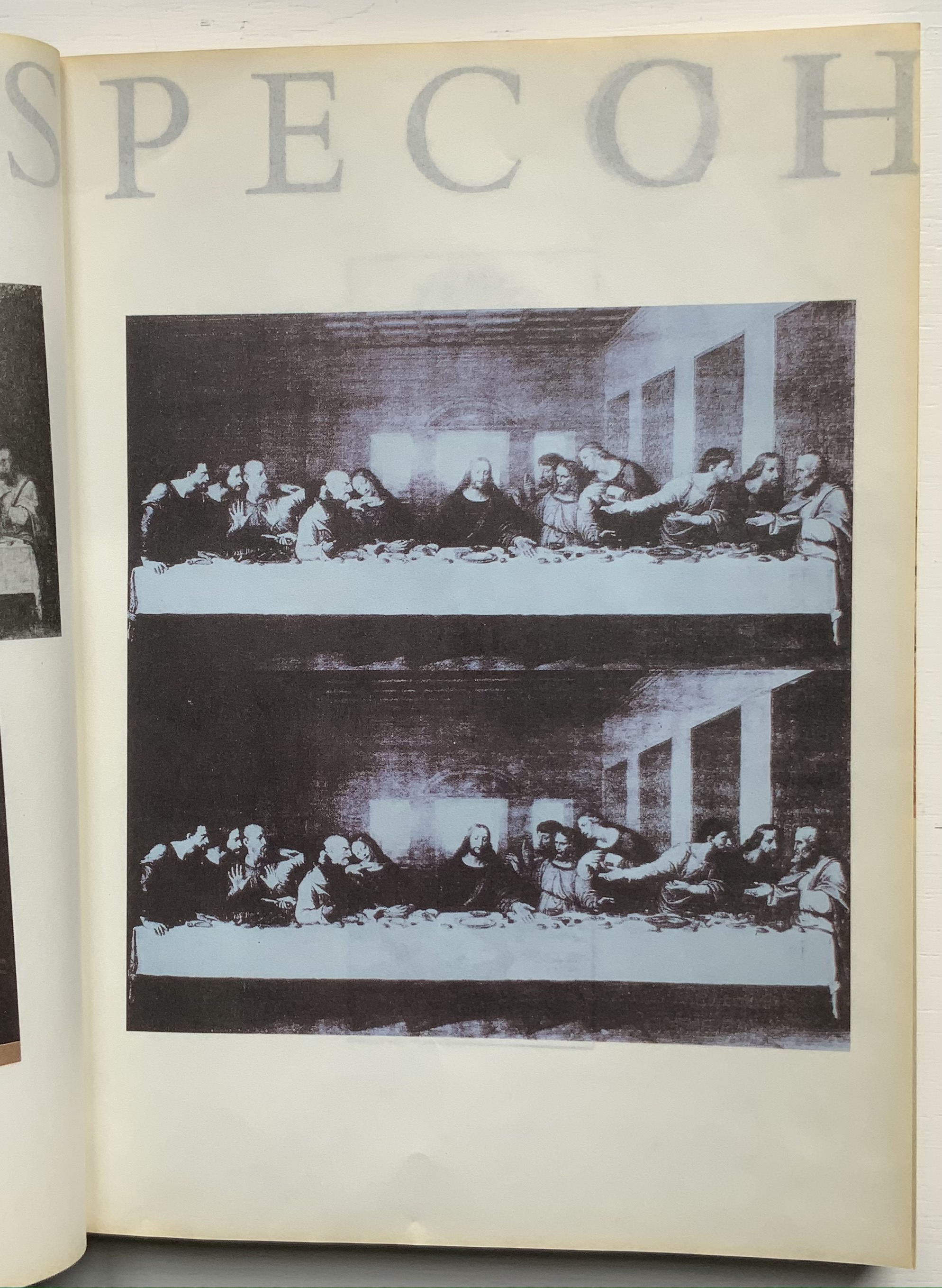
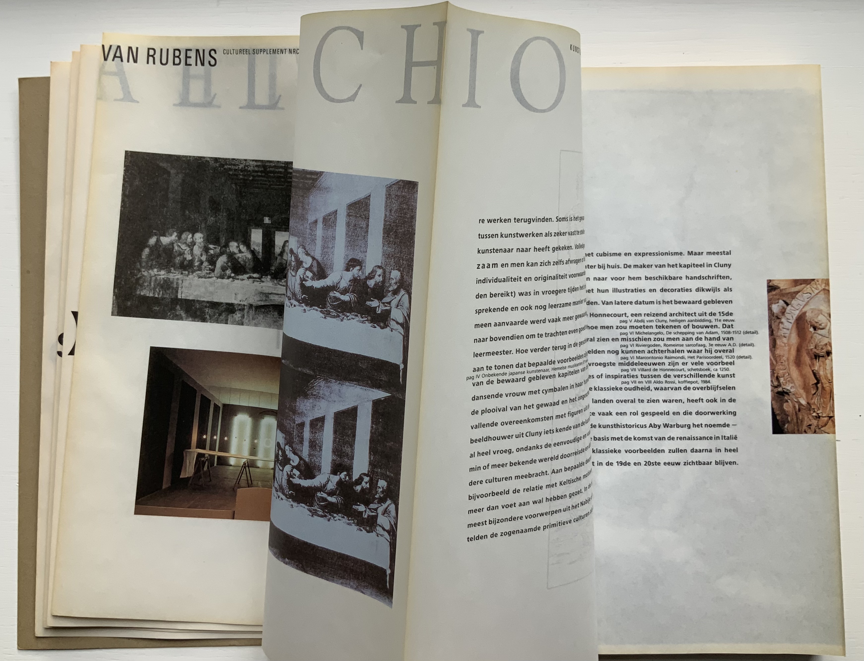
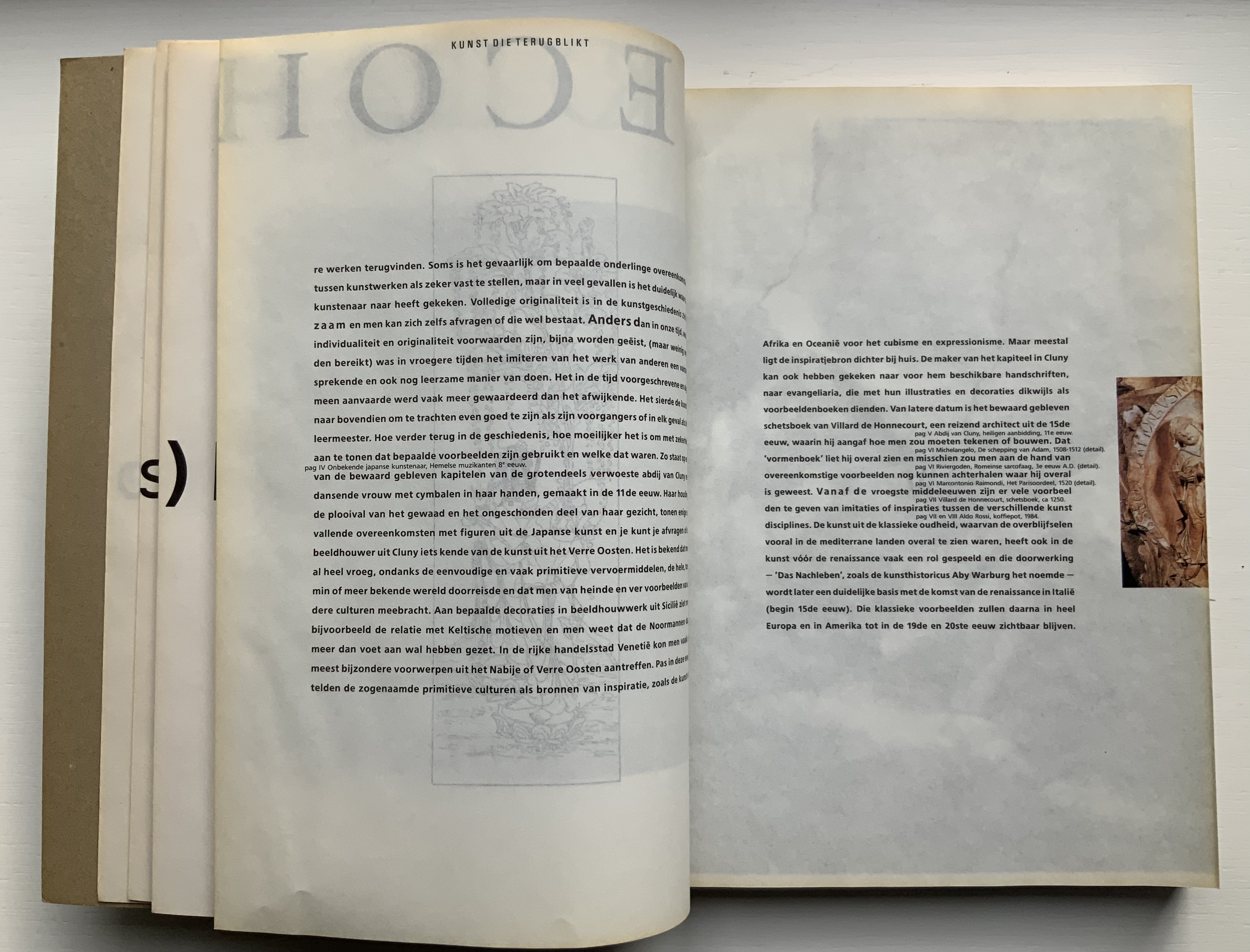
The inner sides are printed single color — black — creating shadow images on the outer side. Only by cutting through each fold (as encouraged by the perforations in Colour Based on Nature) can the inner-side images be examined closely, but this would destroy the work and the intent. With the shadows from the inner side, the outer side takes on a collage-like appearance. The print on the inner side also often serves for communication. For example, in the illustrated historical survey of design with which the first volume opens, the roman numerals for numbering plates appear on the reverse side of the plates to which they are assigned. Of course, the roman numeral has to be printed in reverse on the inner side so that it reads aright on the outer side, which is especially appropriate for this section labelled — from behind, of course — ARTE ALLO SPECCHIO (“art in the mirror”).
Copyright page and Table of Contents (pages D and E); inner side of page D.
ARTE ALLO SPECCHIO (“Art in the Mirror”) printed on the inner sides of unpaginated pages I, J, K and L, with specchio running over the fold between K and L.
Clockwise: Unpaginated pages L and M; plate IV printed in reverse on inner side of page L (note on page L the interlinear caption for plate IV — pag IV Onbekende japanse kunstenaar, Hemelse muzikanten 8 eeuw [“plate IV, Unknown Japanese artist, Heavenly musicians 8th century”]); note image running over the fold between pages M and N; pages N and O.
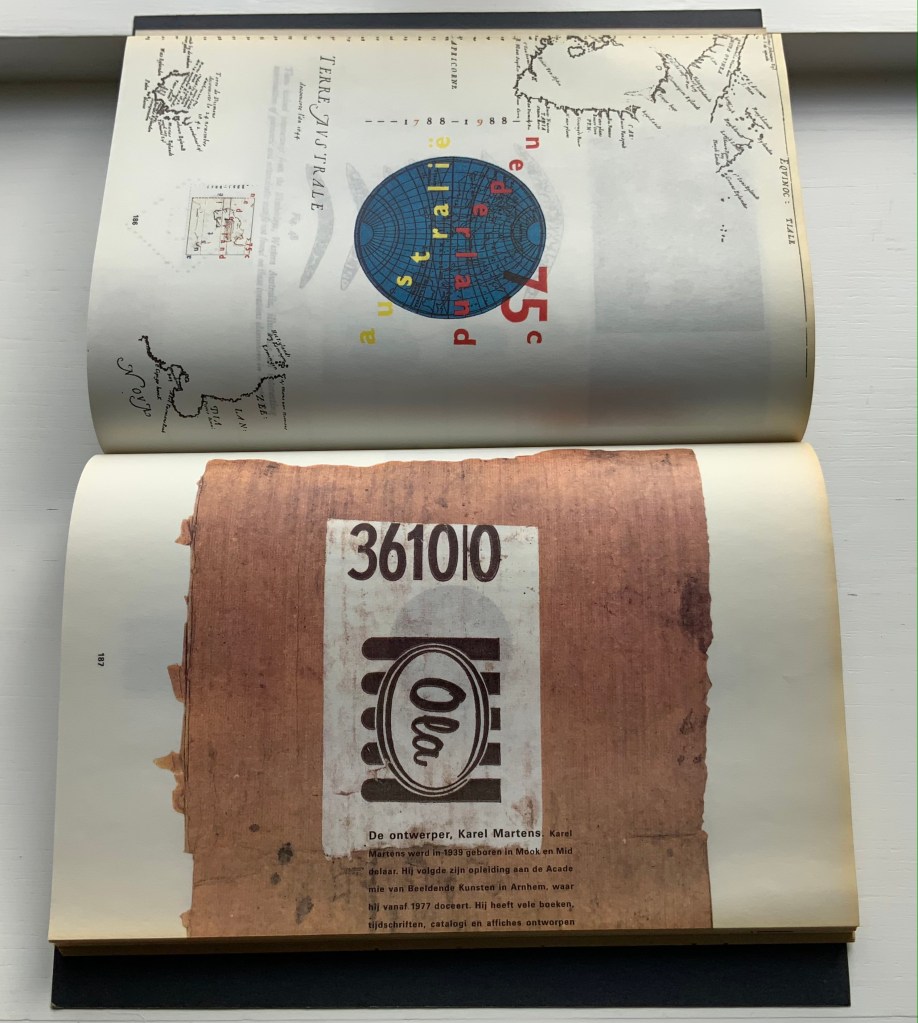
Like all of Boom’s other works in this collection, Nederlandse Postzegels is not a quick read or easily navigated reference work. Its design demands from the reader an awareness that should translate into thoughtfulness about the accomplished designers and their designs, among whom are Anton Beeke, Henk Cornelissen, Wim Crouwel, Reynoud Homan, Cees de Jong, Frans van Lieshout, Karel Martens, Rick Vermeulen, Tessa van der Waals, Piet Zwart and many others.
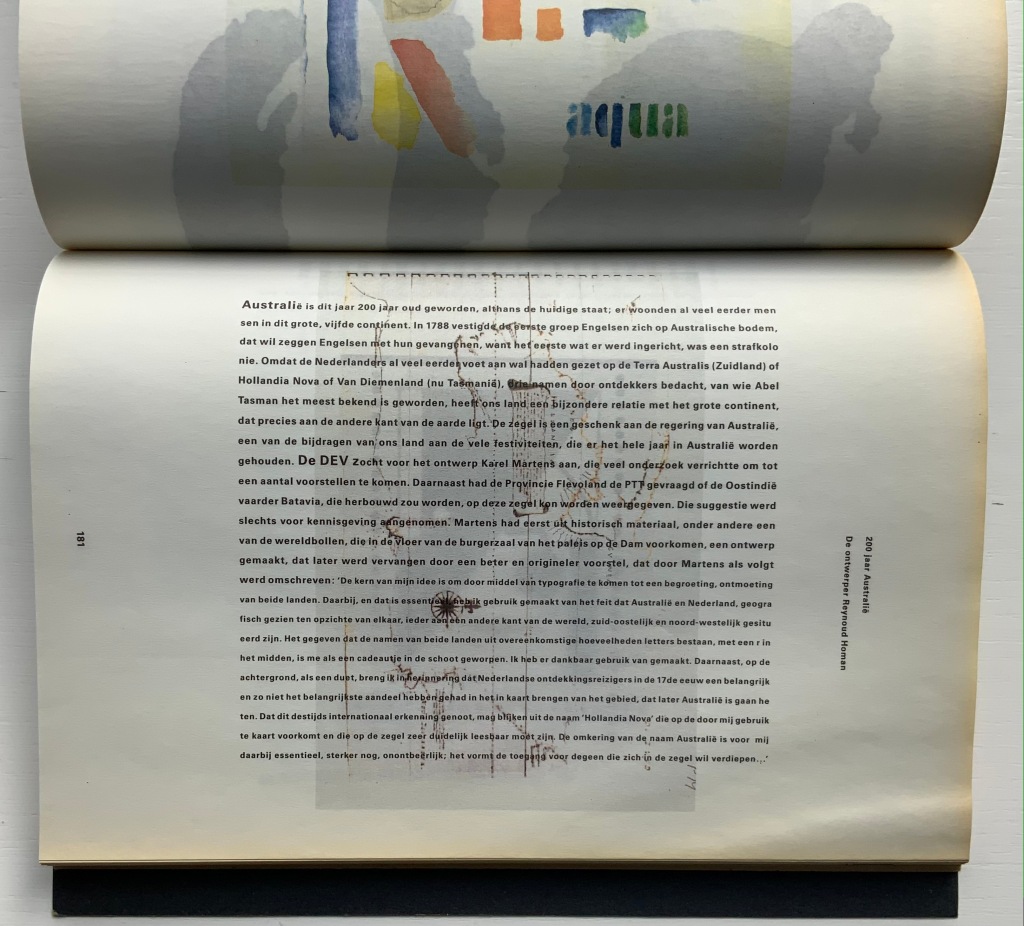
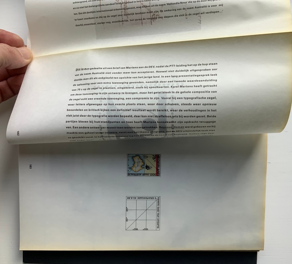
The selected pages and their “inside surfaces” recount the separate efforts of Karel Martens and Reynoud Homan to design the Dutch stamp commemorating Australia’s bicentennial in 1988. Martens’ design conflicted with PTT requirements, so Homan stepped in. The descriptive text follows a landscape layout and reads over the fore edge fold, but page numbers and some of the illustrations follow a portfolio layout.
Pages 181-83.
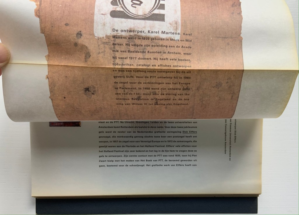
Pages 186-87.
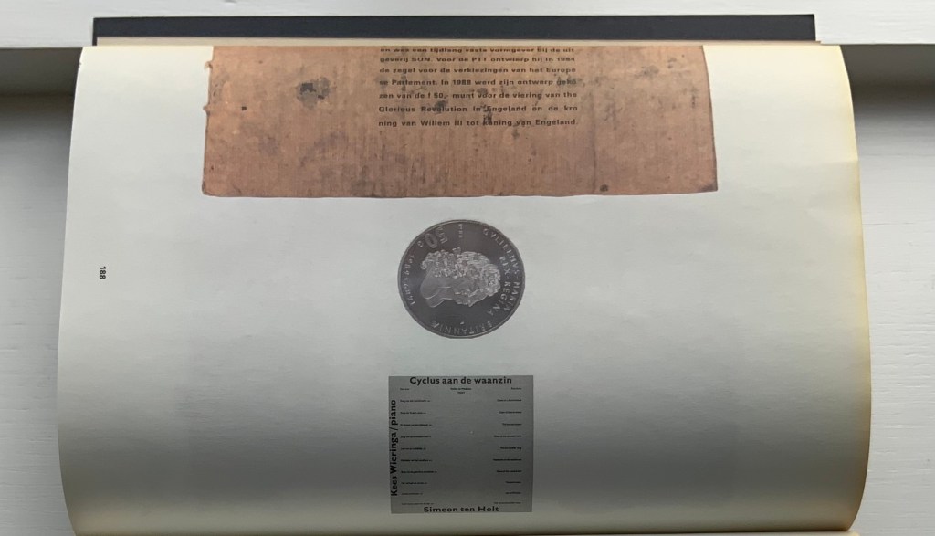
Top to bottom: Page 187’s text running over the fold to page 188; page 188 showing Karel Martens’ design of the coin commemorating William & Mary’s 300th anniversary of accession; inner side of page 188 cheekily showing the reverse side of the Martens coin.
Comparing herself to the kind of architect who produces social housing, Boom asserts, “books are industrially made and they need to be made very well. I am all for industrial production. I hate one-offs. On one book you can do anything, but if you do a print run, that is a challenge. It’s never art. Never, never, never.” But no less an institution than the Museum of Modern Art holds a copy of Nederlandse Postzegels. Display the book alongside the other five works above and the temptation to take Boom’s stance to be just as arch as that of Marcel Duchamp (“It’s art if I say so.”) is hard to resist. Nevertheless, ending with Nederlandse Postzegels, this entry defers to Boom and gives her the last word — at least on how the work came to be:
Since 1920, the PTT Art & Design Department had commissioned artists, architects and designers to design its services and products. To me, the whole idea of Dutch design comes from the design policy of PTT, especially in the 1970s and 80s when Ootje Oxenaar was head of the department.
Working at the Staatsdrukkerij meant enormous creative freedom. Those were the heydays of art-book publishing. If you made a book cover, they would encourage you to use foil or special printing techniques. The department was a springboard for young designers who would work there for one or two years and go on to something more exciting. After my internship, I went to Dumbar and the Dutch television (NOS) design department. After I graduated I went back to the Staatsdrukkerij, and ended up staying for five-and-a-half years. I learned a lot. In retrospect, it was a very productive and super-creative time.
I did jobs nobody else wanted, like the advertisements for the publishing department, which was – thinking of it now – a smart thing to do because I could experiment. Those assignments were completely under the radar but they were seen by Oxenaar. He invited the designer of the ‘crazy ads’ to do one of the most prestigious book jobs: the annual Dutch postage-stamp books.
Places like the Staatsdrukkerij don’t exist any more. When I started working there after graduation, I was immediately a designer (not a junior), and I quickly became a team leader. At that time I was very naive and fearless. I was not aware of an audience, and certainly not a critical audience! This vacuum is no longer possible for designers starting out today. I only became aware of the outside world after the prestigious postage-stamp yearbooks were published: hate mail from stamp collectors and design colleagues started to come in. But there was also fan mail.
The books polarised the design community. They won all the awards and a Best Book Award, my first one. In the jury report they mentioned ‘a brilliant failure’. Suddenly people knew who I was. I realised negative publicity has an enormous impact, more than positive publicity.” — Miltenburg, “Reputations: Irma Boom“.
Further Reading & Viewing
“Olafur Eliasson“. 17 May 2021. Books On Books Collection. Irma Boom designed the Eliasson catalogue called Contact, which is shown in that entry.
Boom, Irma, Julia Blume, and Günter Karl Bose. 2002. Irma Boom. Leipzig : Institut für Buchkunst.
Lehkoživová, Irena. 23 November 2016 –14 January 2017. “Irma Boom“. Vi Per Gallery, Prague, Czech Republic. Well-illustrated with photos by Peter Fabo.
With the exception of Unpacking my Library and Between the Sheets, Spector’s works in the Books On Books Collection fall into the category of ephemera. More than most book artists’ ephemera such as invitations, broadsides and the like, however, Buzz Spector’s ephemera have that self-reflexiveness so characteristic of book art.
Artist, curator and historian Jeffrey Abt wrote that the “irresistible” idea of placing an exhibition of artists’ books alongside the University of Chicago Library’s collection “broadly representative of the history of the book” started with a visit to famed art dealer Tony Zwicker‘s studio. It was also, however, almost as if he were taking a cue from this statement by artist-printers Betsy Davids and Jim Petrillo just the year before:
A representative collection of artists’ books often does not seem visually remarkable in a gallery, where a wide range of visual experience is the norm. The same collection, installed in a library or bookstore, can seem visually startling almost beyond the limits of decorum. — “The Artist as Book Printer: Four Short Courses”).
While Abt’s introductory essay rings the historical changes on the roots of book art — once there was Mallarmé’s Un Coup de Dés Jamais N’Abolira Le Hasard, but before Mallarmé, there was William Blake — the works included and the catalogue’s design ring some chimes of their own about book art. One way or another, all book art self-consciously draws attention to some particularly bookish element. For the most part, the 49 works listed in this catalogue ring true. The catalogue’s design itself, however, not only chimes to that notion of self-reflexiveness but also to wider notions about the nature of book art within contemporary art.
Not long after this exhibition, Spector wrote of “the language of the book” and all its parts — pages, signatures, cover, letter forms and their placement on the page, etc. — as having a syntax (“Going Over the Books”). With its pencil-circled numbers, alignment guides, pastedowns and other designer’s marks appearing throughout — as if a printer’s devil had run amok and let the marked-up proofs go to press unchanged — the catalogue draws attention to that syntax, the underlying processes of bookmaking and, therefore, this object’s “bookness”. The colophon’s note initialed by Jeffrey Abt to Buzz Spector and “pasted” on the last page jokingly rings the self-reflexive chime of the markings throughout the catalogue.
The second chime comes in the catalogue’s verbal and visual punning. Like book art, punning is self-reflexive, words playing on words. The title ”the book made art” can be read with different meanings: “the book made into art”, “art that is bookish” and so on. The catalogue’s trim and two-dimensional representation of three-dimensions create the visual pun of a glass or white cube. The verbal and visual puns also play with Abt’s “irresistible” context. Here in the Joseph Regenstein Library was an exhibition catalogue, teasing the viewer with a reminder that vitrines separated them from the bookworks. Reviewing two other exhibitions of book art, Spector elaborated explicitly on his visual tongue-in-cheek irony:
The dilemma in staging exhibitions of books as art objects is the denial of access to the work that conservation necessarily demands. … and it is a morethan passing irony that implications of hermeticism and elitism should surround books shown to a public using the library as a means of gaining access to texts. — “Art Readings”.
The catalogue also teases with its title and design by suggesting that once books have been placed on display like this, the setting is no longer a library but a “white cube gallery“. As the catalogue progresses, black-and-white photos of items from the exhibition appear on the verso page in frames that appear to be hanging on the trompe l’oeil cube’s rear wall.
Poster distributed on the University of Chicago campus. The image combines Michael Kostiuk’s Airplane Shadow Book (1981/82) with a variation of the catalogue cover. Photo: Courtesy of the artist.
But a viewer standing in the “brutalist” construct of the Regenstein Library and holding the finished catalogue might have asked, “What makes these objects I cannot touch — or, in some cases even if I could, cannot read — art?” There is the catalogue’s third chime. From the start, book art has faced a constant definitional or identity crisis and even the challenge “but is it art?” The catalogue’s title echoes Lucy Lippard’s Duchampian proposition: “It’s an artist book if an artist made it, or if an artist says it is”. The catalogue’s design says, “This is the gallery, these are the objects on display in it, they are art”.
The “white cube gallery” brings on a fourth and final ironic chime. In the 1970s and early ‘80s, artists’ books were pitched as a “democratic” medium and means by which art could escape the clutches of the gallery and reach a wider public. In another catalogue — the one for the 1973 Moore College exhibition, nominated as the first of book art — John Perreault writes:
Books as art, from the artist’s point of view and the viewer’s point of view, are practical and democratic. They do not cost as much as prints. They are portable, personal, and, if need be, disposable. Because books are easily mailed, books as art are aiding in the decentralisation of the art system. — “Some Thoughts on Books as Art”.
By the mid-80s, lo and behold, The Book Made Art’s catalogue-cum-gallery jokingly recaptures “books as art”. And in a further irony, by the mid-80s and since, the increased rareness and price of such bookworks have made them into galleries‘ and museums’ expensive objects of desire. Including this catalogue.
The Library of Babel (1991)
The Library of Babel Curated and edited by Todd Alden; catalogue designed by Buzz Spector. Dos-à-dos binding, offset. H241 x 177 mm Buffalo, NY: Hallwalls Contemporary Art Center, Hallwalls Inc., 1991. Photo of the work: Books On Books Collection.
As with The Book Made Art, Spector uses the cover (this time with a photograph of The Library of Babel) to introduce the self-reflexivity so characteristic of book art, but he does not stop there. Pagination and the back-to-back binding structure work together to evoke a mirror’s reflection; the last page of the first half “faces” the last page of the second half.
Photo of the work: Books On Books Collection.
The first half contains Todd Alden’s essay “The Library of Babel: Books to Infinity”, Paul Holdengräber’s “Unpacking Benjamin’s Library: Bibliomania in Dark Times”, and a checklist of the 34 works by their 10 artists.
Photo of the work: Books On Books Collection.
The second half contains half-tones of selected works and brief CVs of the artists. Among the half-tones are also photographs of works referenced by Alden (one by Jasper Johns, two by Marcel Broodthaers). Notice how the rules change position in the footers of the two halves, again evoking the back-to-front theme of the dos-à-dos binding.
Photo of the work: Books On Books Collection.
As in The Book Made Art, Spector had an entry in “The Library of Babel“ exhibition. With its torn pages, North Sea (for M.B.) (1990) echoes Altered LeWitt (1985), further below, but it is instead a work 10 feet long and presented on a table appropriately jutting out from the wall like a pier. “M.B.” is Marcel Broodthaers, to whose works there are multiple and layered references. The eleven “waves” of torn pages placed in a row on top of the steel shelf are the excised material from another of Spector’s works: Marcel Broodthaers, made from eleven copies of the Walker Art Center’s 1987 catalogue to Broodthaers’s first U.S. retrospective. Spector painted all the pages in each copy with white gesso before excising them and leaving behind his 1990 “altered Broodthaers”.
Marcel Broodthaers (1990) Buzz Spector An altered copy of: Marcel Broodthaers (Minneapolis/New York: Walker Art Center/Rizzoli, 1989). Photos: Courtesy of Buzz Spector.
He saved the excised “wedges” and bound them at the fore edges. Because the gesso does not completely obscure the text and images from the catalogues, viewers who come close to the work can see slivers of some of Broodthaers’ works along with the word fragments typical of Spector’s altered books.
North Sea (for M.B.) (1990) Buzz Spector Books, steel, gesso, 25 x 96 x 10 inches Collection Orange County Museum of Art,CA; Museum purchase with additional funds provided by Peter and Eileen Norton and the National Endowment for the Arts, a federal agency. Photo: Courtesy Orange County Museum of Art.
Spector’s library contains a copy of Broodthaers’ 1974 artist book, A Voyage on the North Sea. These layered references and self-references — direct references to Broodthaers’ A Voyage, indirect references through the self-reference to Spector’s Marcel Broodthaers (1990) — bring into sparkling focus two features of book art and, in particular, late 20th century book art: reverse ekphrasis and bookworks in conversation with one another.
When a visual work of art inspires poetry or prose, the literary result is called ekphrastic: “the verbal representation of visual representation”. But where the poets Keats, Auden and Jarrell, for example, use words to “recreate”, re-present, evoke or respond to works of art — an antique urn, a painting by Brueghel and Donatello’s sculpture of “David” — book artists have in turn used the letter, words, actual books, the physical materials of the book or even the shape of books, their functions or processes of making them to create works of art. A kind of ekphrasis in reverse.
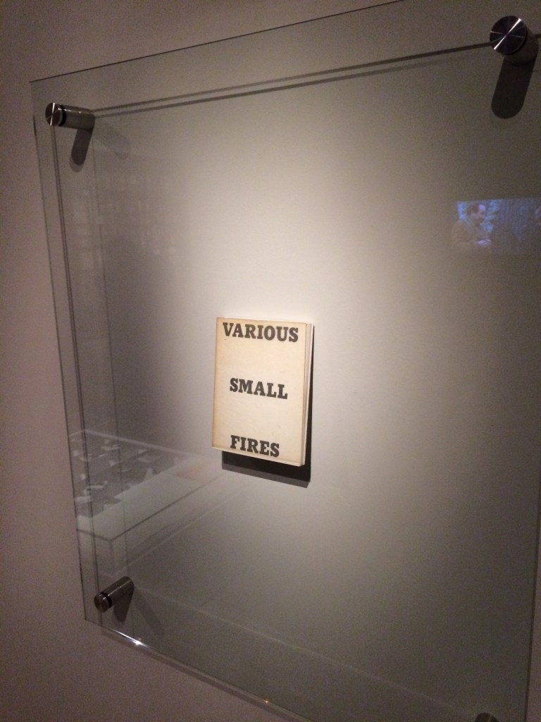
Not only does Spector perform this reverse ekphrasis with exhibition catalogues in North Sea (M.B.), he does it in conversation with a multimedia work by Broodthaers. Works in conversation with one another is also a common occurrence in poetry. An entire anthology showcases these poems that talk to other poems. The later work not only evokes the earlier work, it illuminates and adds to it. In book art, other instances include Bruce Nauman’s Burning Small Fires (1968), a one-sheet folded book of photos of Ed Ruscha’s Various Small Fires and Milk (1964) being set on fire and burning to ash, and Dennis Oppenheim’s Flower Arrangement for Bruce Nauman (1970), a leporello which refers to Nauman’s Flour Arrangements (1967), a video in which the artist pours over 50 pounds of flour on a mock talk-show studio floor and then sculpts it into ephemeral shapes. Nauman’s shift to an ingenious folded single-sheet structure and Oppenheim’s shift (and pun) to an accordion view of flowers are part of the addition to their conversations with their very structurally different counterparts. Spector’s shift to the sculptural is part of the addition to his conversation with Broodthaers’ book and video. Consider not only Spector’s gessoed sea of pages and the pier, but also those two 19th century black bronze sailing ship bookends evoking the 19th century nautical painting that Broodthaers appropriated in A Voyage on the North Sea.
North Sea (for M.B.) (1990) Buzz Spector Books, steel, gesso, 25 x 96 x 10 inches Collection Orange County Museum of Art,CA; Museum purchase with additional funds provided by Peter and Eileen Norton and the National Endowment for the Arts, a federal agency. Photo: Courtesy Orange County Museum of Art.
Unpacking my Library (1994-95) Buzz Spector Leporello full-colour offset printed; folded H100 x W155 mm, unfolded W3600 mm; Cleveland Center for Contemporary Art. Installation exhibited at the San Diego State University Art Gallery, 1-31 October 1994. Photo of the work: Books On Books Collection.
Clearly from his entry in The Library of Babel, Spector’s artistic output extends beyond altered books and catalogue design to larger scale installations. One of the more well-known, Unpacking my Library imposes multiple orders on what Walter Benjamin called “the chaos of memories”. How “multiple orders”? First, because of its subtleties; second, because of its several forms.
From the start at the San Diego State University Art Gallery, 1-31 October 1994, the installation imposed the order of “descending height” on Spector’s library, unpacked and displayed across one shelf attached along the white walls of a room in the gallery. The single shelf ran 188 feet.
Although Spector is rejecting the library’s traditional method of making sense of a collection of books — ordering by academic category — in favor of a physical criterion, the title imposes another method of making sense — allusion. The installation makes “more” sense if you have read Walter Benjamin’s essay “Unpacking My Library — A Talk on Collecting” (1931). If you haven’t, then, on the reverse of the leporello produced with the Cleveland Center for Contemporary Art, are these two sentences from the essay:
This or any other procedure is merely a dam against the spring tide of memories which surges toward any collector as he contemplates his possessions. Every passion borders on the chaotic, but the collector’s passion borders on the chaos of memories.
So what has ordering by height to do with the chaos of memories? Well, if the order of the personal library had been chronological by acquisition, that would be an assertion against chaos, a kind of aide- mèmoire. If the order had been by the library’s traditional method, again that would be an assertion against chaos. Benjamin and Spector embrace the chaos. Spector’s at-first amusing and puzzling organization of his library prods the viewer into the chance to do somewhat the same — to wander along the shelf with that phrase of process hovering in the mind and be reminded of books once read (when? where?), familiar and almost-familiar names and places (from when or where?) and subjects studied (what did that cover?). But the viewer also experiences a surge of unknown names, places and subjects, and spines that mystify.
The allusion to Benjamin’s essay offers another way of making sense of this experience into which the viewer is prodded. If a personal library is a kind of self portrait you can detect from the clues that its usual groupings into fiction, biographies, history, science, etc., give us about the owner, then here the order by height washes them and the portrait away. And if the viewer knows the essay, Benjamin’s last sentence may come to mind:
So I have erected one of [the real collector’s] dwellings, with books as the building stones, before you, and now he going to disappear inside, as is fitting. — Walter Benjamin, “Unpacking My Library”
Spector mentions this disappearance in a video record of the making and showing of the installation. Whether or not the installation’s spectator knows Benjamin’s essay, the installation’s title is a clue to the imposition of a fictional order. “Unpacking my library” is a phrase implying an activity that is just getting going. For his essay, Benjamin created the fiction of the reader’s being present as the library is being unpacked. Likewise for Spector’s installation, any spectator walking into it has entered a fiction. Spector’s library has already been unpacked, sorted on the floor and placed on the single shelf running around the room.
Of course, however, the owner of the leporello form of Unpacking my Library does not experience this fiction as directly. The opening and arranging of the leporello is a hands-on activity; the unpacking of Spector’s library occurs panel by panel in the reader’s hands. The library’s arrangement by height appears more gradually than in the gallery. Once the bookwork is fully extended, the installation’s fiction then becomes more readily available to the leporello’ s reader/viewer.
Photo of the work: Books On Books Collection.
As fictions, Benjamin’s essay and Spector’s installation need an ending. Benjamin’s technique is to disappear into his collection. Spector chooses a different technique. In correspondence with Books On Books, he writes:
The length of all the publications in my library was 165 feet; the single shelf, at the UCSD Art Gallery, on which they were placed ran 188 feet. That additional space implied a future, and life-affirming, growth of my collection. — Buzz Spector, 26 March 2020.
Photo of the work: Books On Books Collection.
Whether it is leporello or installation, the reader/viewer of Unpacking my Library is launching and launched on this open-ended ending.
The Book Maker’s Desire (1995)
The Book Maker’s Desire: Writings on the Art of the Book Buzz Spector Pasadena, CA: Umbrella Editions, 1995. 2nd printing. Cover design by Buzz Spector. Image: History of Europe (1983) by Buzz Spector; plaster over found book, 10.5 x 12 x 15 inches. Photo of the work: Books On Books Collection.
Spector’s essays are tonic. His comments on Margaret Wharton’s bookworks could refresh any reader and viewer lucky enough to see her works (Union League Club-Chicago or Yale) or remind the viewer of them when looking at works by later artists such as Thomas Wightman or the “Mystery Book Artist of Edinburgh”. In the past few months, Walter Hamady and John Baldessari have died, and Spector’s essays on them bring them both and particular works of theirs to present life. His essay and letter on Broodthaers would enhance any reading of the artists who have stood on Broodthaers’ shoulders to address Mallarmé’s Un Coup de Dés: Bennequin, Mutel, Pichler, Wyn Evans, Zboya. The essay “Going Over the Books” may have inspired Alden’s curation of ‘The Library of Babel” exhibition.
The essays are not entirely the point of having The Book Maker’s Desire in the Books On Books Collection. What completes the point is the cover design. The object on the book’s front cover is Spector’s own work History of Europe (1983), which pays homage to Broodthaers’ Pense-Bête (1964). But look closer. The cover stock has elements of text and colour seeping through, almost as if it were made of shredded books. The aptness and artistry of the cover design make The Book Maker’s Desire an object of desire in and of itself.
Detail of cover: Books On Books Collection.
Along with Unpacking my Library, Between the Sheets (2003) is the only other of Spector’s limited edition artist’s books in the Books On Books Collection. It is the solo exhibition to the joint exhibition of The Book Made Art (1986), described at the outset of this entry. In Between the Sheets, Spector again shows the self-reflexiveness of book art but also demonstrates how originality can spring from it.
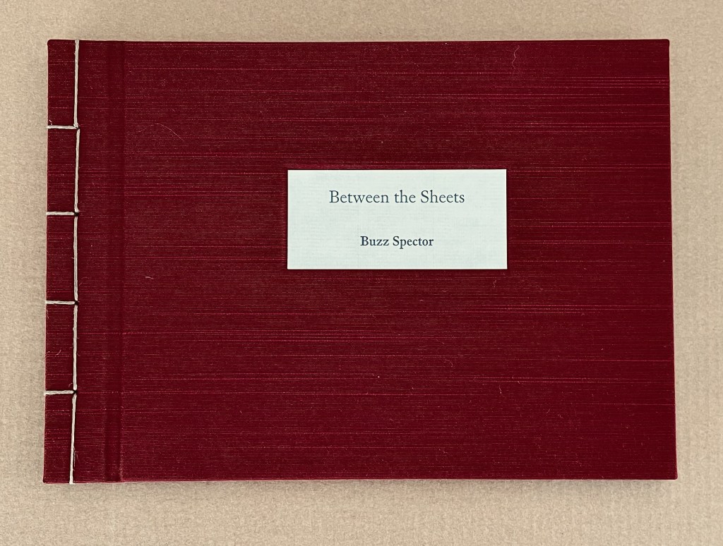
Between the Sheets (2003)
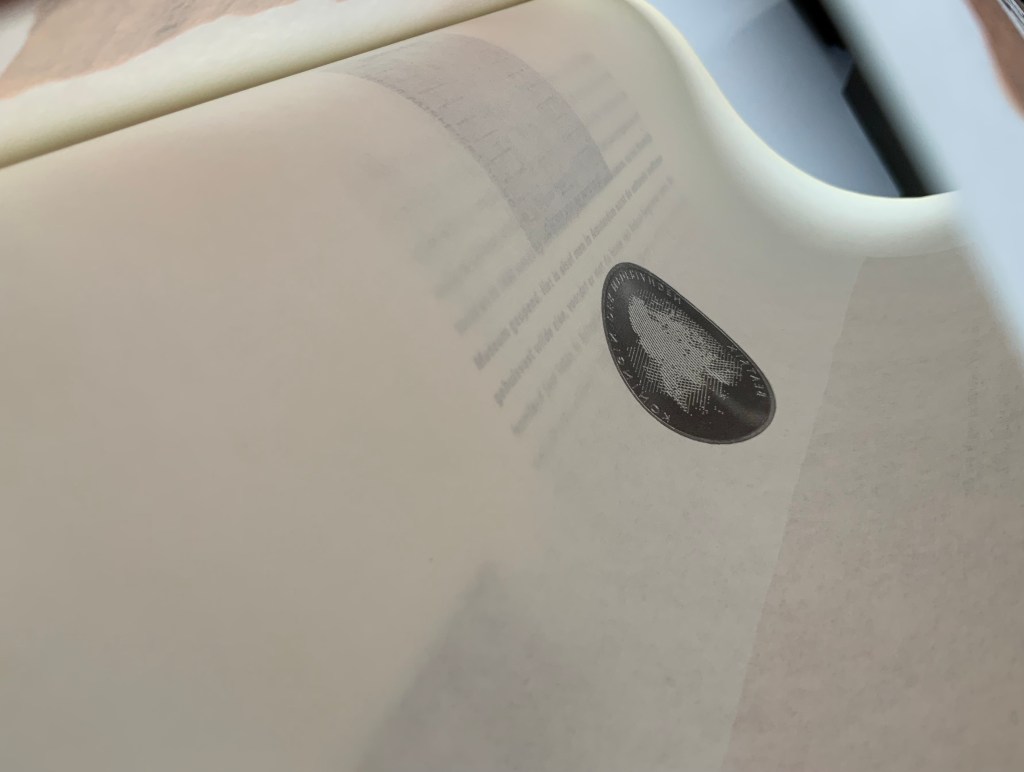
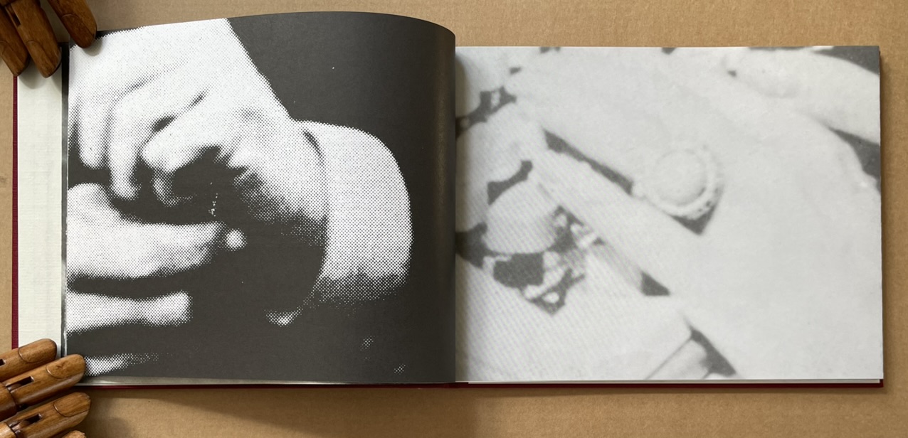
Between the Sheets (2003) Buzz Spector Cloth over boards, Japanese stab binding, 15 folded sheets, outer sides offset printed with enlarged “authors’ photos” clipped from dust jackets of art books repurposed by Spector for his bookworks, inner side printed (recto only) with text by and selected by Spector. H157.5 x W216 x D12.7 mm. Edition of 40, of which this is #40. Acquired from Olive Branch Press, 26 June 2020. Photos of the work: Books On Books Collection.
Unlike Altered Lewitt (1985) and North Sea (for M.B.) (1990), which appropriate and alter named works, Between the Sheets is made at two or three removes from its source material. In the first instance, Spector clipped authors’ photos from the dust jackets of their books (unnamed), then rephotographed and printed them at enlarged scale in offset editions. These prints were then bound together to make books. As with Altered Lewitt and other works, Spector then tore strips in a sequence of decreasing increments from the spreads so as to form a wedge-shaped cross section of the image block. In the next remove, this process left a pile of torn strips, and from these torn strips, Spector has proceeded to create Between the Sheets. With images on one side and text imposed on the reverse, these folios are folded and bound at their open ends with Japanese stab binding.
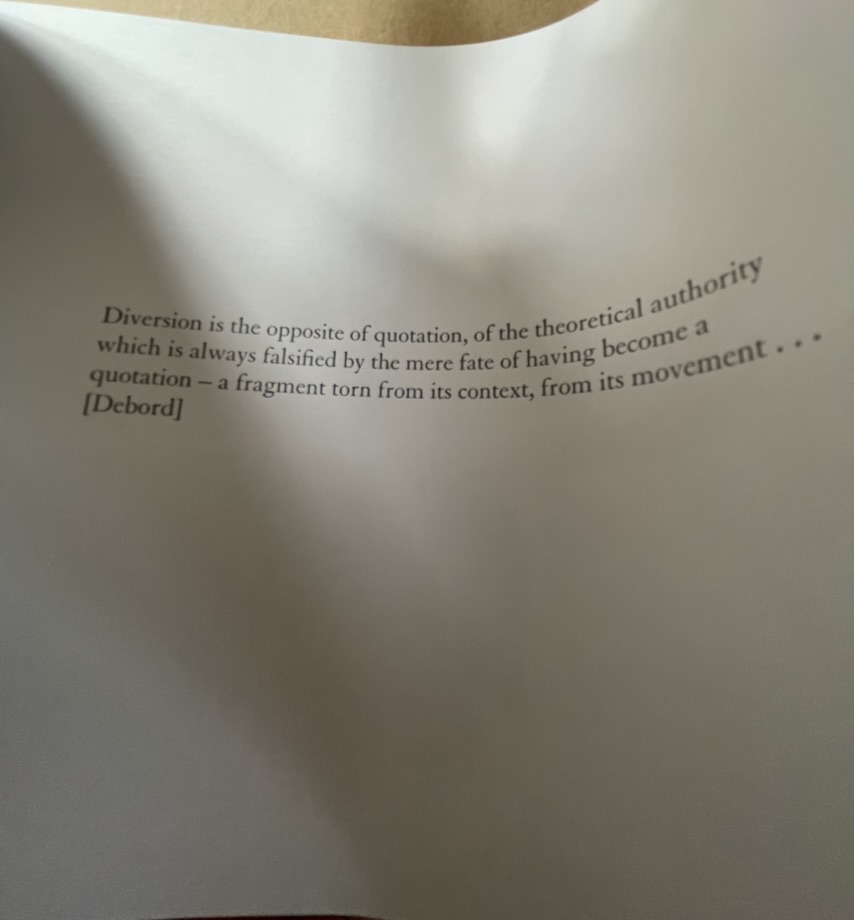
The work’s main thrust is philosophically, artistically and self-reflexively aesthetic. It quotes from the French philosopher Guy Debord, the Belgian artist Marcel Broodthaers and Spector himself. The quotation from Debord comes early on, the first after the title page and two of prefatory explanation, and very much sets the tone.
Diversion is the opposite of quotation, of the theoretical authority which is always falsified by the mere fate of having become a quotation — a fragment torn from its context, from its movement … [Debord]
With Between the Sheets, we have on our hands a decidedly multi-layered diversion. At one layer, it diverts by questioning Debord’s own words, consigning their “theoretical authority” to a fate of falsification by “having become a quotation — a fragment torn from its context”. Like a fun-house mirror, the page bows to give this distorted reflection of Debord’s words.
But is it a diversion? After all, the “truth” of Between the Sheets rests at least in part in its composition from fragments. At this other layer, Between the Sheets “quotes” the fragments torn from the context of another of Spector’s artwork. In turn, that other artwork was composed of prints of photographic “quotations”, the fragments torn from authors’ images on dust jackets (the coverlets for the source books and their sheets). It is no accident that, when the sheets of Between the Sheets are bowed to permit a look inside, the images bracket the text pages like single quotation marks.
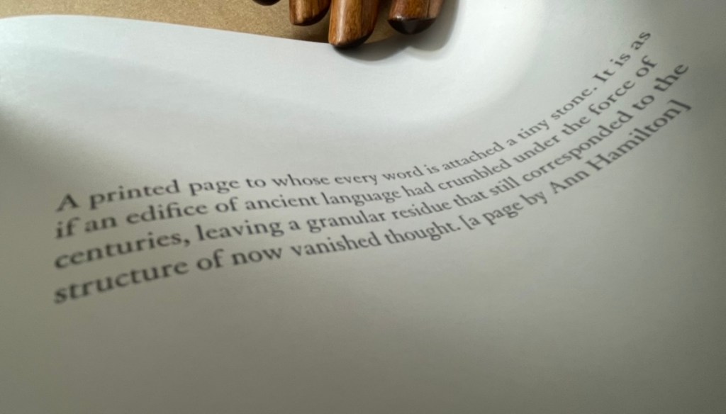
Another quotation resting between the sheets comes from Spector’s own essay on Ann Hamilton in The Book Maker’s Desire (p.63):
A printed page to whose every word is attached a tiny stone. It is as if an edifice of ancient language had crumbled under the force of centuries, leaving a granular residue that still corresponded to the structure of now vanished thought. [a page by Ann Hamilton]
Spector runs the risk of “Debord-ing” himself here with his self-quotation, but he only succeeds in diverting this reader back to the essay on Hamilton’s work and specifically the four works commissioned to benefit The New Museum of Contemporary Art in New York:
The artist chose a total of fifty four volumes (40 in the edition, plus 14 artist’ proofs) for the untitled project. These found books, mostly old novels or poetry, were selected for a variety of physical characteristics –size, wear, and paper quality — and for their typographic layout. Each book was opened to its middle, where six or eight pages were cut from the text block and reattached, edge-to-edge, to the right-hand side of the opened page spread, making an accordian-fold [sic] extension from the book. The eight pages thus displayed were meticulously rendered unreadable by Hamilton and several attendants who glued tiny stones over every word on the visible side. (p. 63)
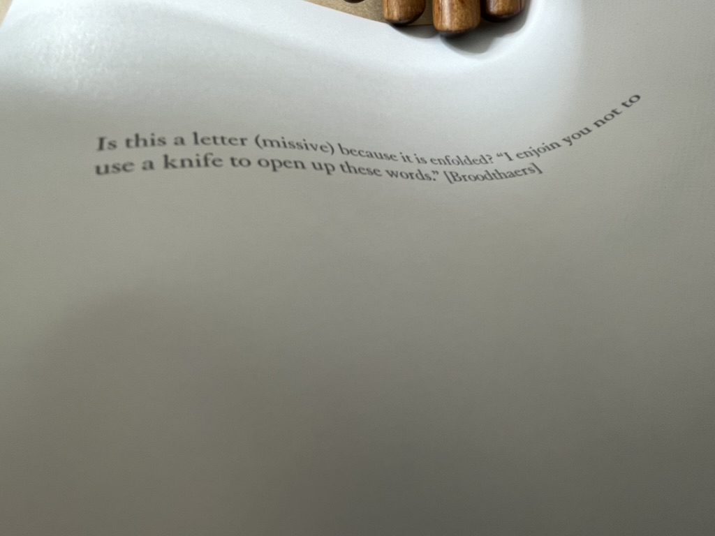
Is it a coincidence that Between the Sheets also consists of 40 in the edition just like Hamilton’s commission? Spector quotes not only images and words from others’ works and his own, he quotes the details of their production and form. It is certainly no coincidence that Between the Sheets quotes the stab bound structure of Marcel Broodthaers’ A Voyage on the North Sea. After all, in his hidden prefatory explanation, Spector makes no bones about the fact that Between the Sheets arose in part from his astonishment at finding the page numbers hidden within the bound edge of A Voyage. But how did he find them? In the process of creating his own North Sea (for M.B.) (1990). So yet another self-quotation of production process.
Spector’s forthright quotations are divertingly sly. When he cites Broodthaers between these sheets,
he is also echoing Broodthaers’ injunctions in A Voyage on the North Sea:
Before cutting the pages the reader had better beware of the knife he will be wielding for the purpose. Sooner than make such a gesture, I would prefer him to hold back that weapon, dagger, piece of office equipment which, swift as lightning, might turn into an indefinite sky. … These pages must not be cut.
Of course, Spector did not cut the pages; he tore them.
Another sly diversion is sex. By using photos of male and female authors and by interposing suggestive phrases inside the folds (“a movement of bodies together as one body” and “peek between the sheets”), Spector spices up the obvious diversion of sex in his work’s title. But the slyness re-diverts via Broodthaers to Mallarmé, whose poem Un Coup de Dés Jamais N’Abolira le Hasard (1897) Broodthaers “knifed up” at the very level of the words and whose contemplations of the letter, the page and the fold have taken on an erotic tone that Spector embraces in A Book Maker’s Desire:
When Stéphane Mallarmé described the folded and uncut signatures of books as “virginal,” awaiting the penetration of the “paper knife,” he identified an erotics of reading. (p.15)
The topography of an open book is explicit in its erotic associations: sumptuous twin paper curves that meet in a recessed seam. Page turning is a series of gentle, sweeping gestures, like the brush of fingers on a naked back. Indeed, the behavior of readers has more in common with the play of intimacy than with the public decorum of art viewing or music listening. Most of us read lying down or seated and most of us read at least partially unclothed. We dress up to go out and look at art; undressed, in bed, we read. We seek greater comfort while reading than the furnishings of museums or concert halls will ever grant us. When we read — the conventional distance between eye and page is around fourteen inches — we often become the lectern that receives the book: chest, arms, lap, or thighs. This proximity is the territory of embrace, of possession; not to be entered without permission. (p.17)
There is much more between the sheets of Between the Sheets. I wish that the 40 copies could find many more readers/lovers to embrace its diversions.
Buzz Spector: Alterations (2020)
Buzz Spector: Alterations (2020) Buzz Spector Gretchen L. Wagner; Elizabeth Wyckoff; Andrea Ferber Brochure. H254 x W256 mm, 4 unnumbered pages. Acquired from the artist, 23 June 2020. Photos of the work: Books On Books Collection.
Three items of ephemera conclude this entry. The first is a pristine copy of the announcement for Spector’s retrospective at the Saint Louis Art Museum, held 20 November 2020 through 31 May 31 2021, along with a copy of it with the front cover hand torn by the artist. The second is the catalogue from his show in 2021 Between the Lines. With both, Spector makes an ephemeral piece echo the works in the exhibition. The third item is a hand torn postcard reproducing his drawing Torn Flag (2022).
Between the Lines (2021)
Between the Lines (2021) Buzz Spector Elizabeth Wyckoff, Gretchen L. Wagner, Meredith Malone, Michael Garzel, Jane E. Neidhardt Perfect bound paperback. H268 x W 230 mm, 81 pages. Acquired from the artist, 10 March 2021. Photo of the work: Books On Books Collection.
The Zolla/Lieberman Gallery, which has supported Spector’s work since 1995, sponsored this monograph following 2020/21 retrospective held at the Saint Louis Art Museum. As a slightly less ephemeral item, it neatly rounds off this entry. Its cover image shows one of Spector’s well-known alterations: Altered LeWitt (1985), one of five of the found and hand-torn catalogue: Sol LeWitt, Drawing Series I, II, III, IIII A & B (Turin, Italy, at the Galleria Sperone, 1974). Compare it with North Sea (for M.B), above, which Spector created five years after Altered LeWitt. Spector extends the technique and concept across the two works in distinctive ways to echo two distinctive artists and yet also speak to commonalities and originality among the three artists.
Photo of Between the Lines (pp. 12-13): Books On Books Collection.
Between the Lines‘ presentation of the works is spectacular. Recalling the effect in The Book Made Art (above), they seem to float three dimensionally on the page. The detail photo of Unpacking my Library across a double-page spread offers a good example, especially when compared with the images above.
Photo of Between the Lines (pp.16-17): Books On Books Collection.
Between the Lines also provides the opportunity to end this entry with an image of the work incorporating an image of the author and his generosity toward his fellow bookworkers. Note in particular the reference to Michael Garzel, the monograph’s designer and creator of the typeface used so strikingly on the cover, for chapter titles and here in the heading “Acknowledgments”.
Photo of Between the Lines (pp. 4-5): Books On Books Collection.
Torn Flag (2024)
Torn Flag(2024) Buzz Spector Postcard. Acquired from the artist, 26 February 2024. Photos: Books On Books Collection.
Revisiting Spector’s works this time was prompted by an invitation from the Center for Book Arts to “BookTalk: Full Dress or Half Dress, Not Casual with Buzz Spector” on 8 October 2024. The postcard reproduces the drawing Torn Flag (2022), a 565 × 1118 mm drawing (graphite on paper) that appeared in the Zolla/Lieberman Gallery. Spector describes the postcard as an “(informal) edition … Elegy to the Divided States”. Ephemeral though the postcard may be, its tearing makes a self-reflexive artistic gesture. But it also serves as an injunction: Vote. Always.
Revised entry: 7 October 2024; 24 September 2021; original entry, 31 March 2020.
Further Reading
“Buzz Spector“, Bookmarking Book Art, 12 March 2016.
Davids, Betsy, and Jim Petrillo. “The Artist as Book Printer: Four Short Courses” in Artists’ Books: A Critical Anthology and Sourcebook, edited by Joan Lyons (Rochester, NY: Visual Studies Workshop Press, 1985), p. 160.
Drucker, Johanna. 2004. The Century of Artists’ Books [Second edition] ed. New York City: Granary Books. See pages 118-19 for perceptive comments on Spector’s A Passage (1994) and his method of torn pages.
Lippard, Lucy. “New Artist’s Books” in Artists’ Books. A Critical Anthology and Sourcebook, edited by Joan Lyons (Rochester, NY: Visual Studies Workshop Press,1985), p. 53.
Mathews, Emily, and Sylvia Page. “Off the Shelf and Into the Gallery: Librarians on Spector”, Buzz Spector: Off the Shelf, Grunwald Gallery of Art, October 19 — November 16, 2012 (Bloomington, IN: Grunwald Gallery of Art, Indiana University, 2012), pp. 9-15.
Otten, Liam. “A sea of torn pages“, The Source, Washington University in St. Louis, 26 February 2010. Accessed 26 March 2020.
Perloff, Nancy. 2016. Explodity : Sound, Image, and Word in Russian Futurist Book Art. Los Angeles, California: Getty Research Institute. See pages 179-81 for perceptive comments on Spector’s A Passage (1994), a variant on biblioclasm and example of what Spector calls “a ‘conceptual purity’ because it engages completely with the book as a book.” (p.180)
Perrault, John. “Some Thoughts on Books as Art” in Artists Books, Moore College of Art, 23 March – 20 April 1973, curated by Dianne Perry Vanderlip (Philadelphia, PA: Moore College of Art, 1973), p. 21.
Schlesinger, Kyle. “The Missing Book”, Buzz Spector: Off the Shelf, Grunwald Gallery of Art, October 19 — November 16, 2012 (Bloomington, IN: Grunwald Gallery of Art, Indiana University, 2012), pp. 17-25.
Spector, Buzz. “Going Over the Books” in The Book Maker’s Desire (Pasadena, CA: Umbrella Editions, 1995), p. 8.
Spector, Buzz. “Art Readings” in The Book Maker’s Desire (Pasadena, CA: Umbrella Editions, 1995), p. 13.
Spector, Buzz. “I stack things. I tear stuff up”, Buzz Spector: Shelf Life: selected works, Bruno David Gallery, January 22 — March 6, 2010 (Saint Louis, MO: Bruno David Gallery, 2010).
Spector, Buzz. 25 March 2021. “Art Speaks“. Saint Louis Art Museum. Video series of artists’ talks. Accessed 23 August 2021.
“The Poetics of Reason” was the title and theme for the fifth Lisbon Architecture Triennale in 2019 (the first was in 2007). Awarded the ADG Laus 2020 Golden Prize in the category of editorial graphic design, this work stands well with Bruno Munari’s three small 1960’s books on the square, circle and triangle, now available in a single volume, and calls to mind several works testifying to the relationship between architecture and book art. In the first of the five volumes, Éric Lapierre even interweaves with his text on architectural rationality illustrations from book artists such as Bernd and Hilla Becher, Sol Lewitt and Ed Ruscha — all without comment, in itself conveying their implicit relevance. His similar display of a page from Stéphane Mallarmé’s Un Coup de Dés Jamais N’Abolira le Hasard — that progenitor of modern and post-modern book art — speaks to the role that space — les blancs, as Mallarmé calls it — plays in these adjacent communities.
136 pages
The second volume, by Ambra Fabi and Giovanni Piovene, draws in Leon Battista Alberti, of course, whose columns ornament works by Mari Eckstein Gower, Helen Malone and many other book artists.
136 pages
Drawing on Gaston Bachelard and Juhani Pallasmaa as it does, the third volume, by Mariabruna Fabrizzi and Fosco Lucarelli, calls to mind the work of Olafur Eliasson and Marian Macken here in the Books On Books Collection and elsewhere. Anyone familiar with Richard Niessen’s The Typographic Palace of Masonry will appreciate Fabrizzi and Fosco’s exploration of where architecture, imagination and memory intersect.
136 pages
In the lengthiest of the five volumes, Sébastien Marot takes us into the territory of urban architecture and the anthropocene, also occupied by book artists Sarah Bryant, Emily Speed, Philip Zimmermann and many others.
216 pages
The last and shortest volume, put together by Laurent Esmilaire and Tristan Chadney, consists mostly of photos that may remind the viewer of Irma Boom’s Elements of Architecture, with Rem Koolhaas, or Strip, with Kees Christiaanse — especially in conjunction with the tinted fore edges.
88 pages
Referenced below, Pedro Vada’s review of the Triennale and the five separate sites across which it occurred in Portugal provides more insight into the five volumes themselves. Marco Ballesteros LETRA website provides additional images of the five volumes’ design.
Further Reading
“Architecture“. 12 November 2018. Books On Books Collection.
SOCKS Studio, an extraordinary website run by Fabrizzi and Lucarelli.
Alpha Beta (2017) Ines von Ketelhodt, text by Michel Butor Plexiglass slipcase (287 x 203 x 14 mm) containing two volumes (278 x 198 x 3 mm), 48 unnumbered pages. Edition of 35, of which this is #18. Acquired from the artist, 14 December 2020. Photos: Books On Books Collection, displayed with the artist’s permission.
Paul van Capelleveen, curator at the National Library of the Netherlands, writes in his contribution to Ines von Ketelhodt’s exhibition catalogue Bücher///Books (2019):
The artist’s book is, perhaps, more than other book forms, a stage where conventions and innovations may be brought to life. On this stage, typography is a means of text interpretation; it can be visual, decorative, or alienating. It should be noted that typography is only one of the key players in artists’ books. We have to consider the book’s materiality (paper, binding, weight, size, etc.), its images or blank spaces, and interventions such cutting, erasing, pasting, embossing, and covering. The reader is a spectator, listener, and in many cases an actor as well. (P. 18)
With Alpha Beta, we are reader, spectator, listener and actor. Its plexiglas slipcase must be shaken sharply to start the two thin volumes slipping out. On acetate, the first recto page presents an extract from an essay by Michel Butor describing a fantastical library. The acetate pages crinkle and mesmerize as they turn. Alphabetically, letter by letter, the transparency lifts from Butor’s text all the instances of that sans serif character into the air, falls leftward and settles onto the accumulation of clear verso pages showing the letters reversed.
Traditionally the cellophane or transparent overlay and their predecessor the “flap book” were meant to reveal the layers of the human body, a geological formation or an edifice — to show us how something is made or built up. With an alphabet and punctuation, an infinite number of words, sentences, essays and books can be made. In Alpha Beta, however, as letter by letter is removed, what was made becomes indecipherable, disintegrates. Page by page, what was there depends on memory, or the eye’s ability to decipher from what is left, or a willingness to flip back to the beginning. We know, of course, that Butor did not piece together his disintegrating text letter by letter alphabetically in the first place, but materially and typographically that is what von Ketelhodt did to present the full text to us on the first recto page. If we return to that page to fix the text in memory, we notice that not only is it justified left and right, its words break at the end of a line without hyphenation or regard for syllabification. This is not typography in transparent service to legibility but rather to its own materiality and a concept or concepts. But what is it, what are they?
Just as strange is that Alpha Beta is materially multilingual. The first volume, Alpha, presents and disintegrates Butor’s text in its original French. The second, Beta, does the same in German.
Why this multilingual materiality? Could it be the advantage of appealing to two language markets? Could it be as simple as the text’s being available in French and German? There’s no denying von Ketelhodt’s multilingual proclivity. Many of her solo works involve multiple languages, but it is how and why that count. Consider her sequential photographic work Times Square 1-2-3 (2014). In it, she uses a quotation from Roland Barthes’ Camera Lucida: Reflections on Photography in its French original for volume 1, German for volume 2, and English for volume 3. Von Ketelhodt took three photos in quick succession, with time exposure, from the same spot in Times Square. She then split the photos across the three volumes. To see the sequence, we have to look across the three volumes. By virtue of its focus on the effects of photography on the spectator and its availability in three languages, Camera Lucida was the ideal source from which to draw a quotation as inspiration and compositional material for Times Square 1-2-3.
So why this particular text from Michel Butor? A bilingual market advantage was probably decisive for Campus Verlag, publisher of Butor’s volume of essays in which von Ketelhodt found the text. If a trilingual market advantage had outweighed the additional production costs for Campus Verlag, von Ketelhodt might have created Alpha Beta Gamma instead. The essay she selected from Butor is “Les bibliothèques/Die Bibliotheken” (“The libraries”), which appears in the collection’s second part: “Itinéraires à travers l’univers de Maria-Helena Vieira da Silva/Reiserouten durch das Universum von Maria-Helena Vieira da Silva” (“Itineraries through the universe of Maria-Helena Vieira da Silva”). None of Butor’s essays are about the alphabet. So, still, why this particular text?
Butor wrote extensively in response to Da Silva’s works. A French-Portuguese abstract/figurative artist, she drew on cityscapes, railway stations, bridges as well as books and libraries for her source of figures. The libraries led to a series of canvases with titles such as Bibliothèque Humoristique, La Bibliothèque, and La bibliothèque en feu. The latter appears dimly reflected in the upper left-hand corner of this photograph from the Paris exhibition La Pliure (2015). A clearer image can be found on the Calouste Gulbenkian Museum’s site.
Display of Ed Ruscha’s Various Small Fires and Milk, 1964, at Pliure: La Part du Feu, 2 February – 12 April 2015, Paris. Photo: Books On Books. Reflected in the lower left hand corner is the display of Bruce Nauman’s Burning Small Fires; in the upper right corner, the film clip of Truffaut’s 1966 Fahrenheit 451; and in the upper left, Maria Helena Vieira da Silva’s La bibliothèque en feu, 1974.
In its capture of Bruce Nauman’s referencing Ed Ruscha’s Various Small Fires, the photo is serendipitously apropos to Alpha Beta and its use of Butor’s “Les bibliothèques”. Butor’s essay is ekphrastic, built on the premise of referencing a visual artwork. It does not, however, describe the details of any particular one of the paintings; it is rather a fantasia on all of them, distilling them into a universal library. Von Ketelhodt’s ABC book is built on the very premises of Butor’s extract as well as on the premise of referencing the subject of Butor’s essay. Alpha Beta does not describe Butor’s essay; rather, it physically reaches into the text, extracts and abstracts from it an ABC book letter by letter. As the letters fly up, they could be those “birds that fly upward when you turn the pages”. The light reflected from the transparent pages could be that of the “soft lamps hovering”. The transparent pages recall the libraries’ “crystalline sonnets” and their “glass ceiling that reflects back the drowsiness, the leafing”. (See full English translation under Further Reading below.)
Von Ketelhodt’s work of art is far from an illustration of Butor’s universal library just as Butor’s essay is far from a verbal attempt to describe any one of Da Silva’s paintings. If this response to Alpha Beta seems “too clever by half”, consider the multilingual, self-referencing and self-referential complexity of the next work in the collection.
Zweite Enzyklopädie von Tlön (2007)
Zweite Enzyklopädie von Tlön (2007) Ines v. Ketelhodt and Peter Malutzki Catalogue casebound, thread-stitching, in printed linen-over-board cover with embossed spine title. H302 x W217 x D25 mm, 256 pages. Acquired from the artists, 21 August 2017. Photos: Books On Books Collection, displayed with permission of the artists.
Inspired by Jorge Luis Borges’ epilogue to his short story “Tlön, Uqbar, Orbis Tertius”, von Ketelhodt and Peter Malutzki embarked on their fifty-volume multilingual masterpiece Zweite Enzyklopädie von Tlön (2006), two decades before Alpha Beta (2017). Between 1997 and 2006, the fifty volumes appeared. For the catalogue, they collaborated with twenty-three authors. The site devoted to the project provides a look inside all of the volumes and its companion catalogue. The catalogue alone, however, works well as the tip “of the tip” of the book-berg as von Ketelhodt and Malutzki call it:
Now the fifty volumes lie before us, and we see they are actually only a tiny part of a huge ice-berg that is really a book-berg. Most of it we cannot see because it is below the surface, but we are aware of its existence. We see the project connected to a multitude of other books and are happy that, by the incorporation into public collections, it is now literally close to an enormous number of other books.
The fifty-volume work’s residence in libraries and collections around the world matters to the artists not only financially but conceptually. Only in that setting or frame does the artwork “converse” multilingually with simulacra of the Tlön library. The catalogue includes text in English, French, German and Spanish, and its own system of internal and external cross-referencing is enacted typographically and in color across Spanish, German and English in that order. After all, Borges’ short story was the origin of the work, and it is in Spanish.
Bücher /// Books (2019)
Bücher /// Books(2019) Ines von Ketelhodt Catalogue for the exhibition at the Klingspor Museum Offenbach, 3 March to 19 May 2019. Card slipcase (H281 x W233 x 21 mm), Perfect bound, photographic-board covered book (H280 x W230 x D19 mm), 192 pages. Acquired from the artist, 22 November 2018. Photos: Books On Books Collection, displayed with permission of the artist.
Catalogue entry for Alpha Beta. Photo: Books On Books Collection, displayed with artist’s permission.
Catalogue entry for Zweite Enzyklopädie von Tlön. Photo: Books On Books Collection, displayed with artist’s permission.
Catalogue entry for Times Square 1-2-3. Photo: Books On Books Collection, displayed with permission of the artist.
Photo: Books On Books Collection, displayed with artist’s permission.
Alpha Beta is von Ketelhodt’s primary solo work in the collection. As such, it does not reflect her extraordinary talent with photos (B/W and color) in making book art. The description above of Times Square 1-2-3, its representation in this catalogue of her work, and the catalogue’s cover have to suffice as place holders for now.
Further Reading
Princeton University holds Alpha Beta in its Graphic Arts Collection and provides two (unattributed) English translations of the extract. Accessed 18 August 2020. Here is one of them:
Arranged like bottles on their shelves, the volumes age in the large cellar, soft lamps hovering over creased or ringleted foreheads lowered in their attempts to decipher the comments. Here are the dictionaries, the espaliers of languages; in that aisle over there, the crystalline sonnets and haikus, the gemlike ballads. Opening a grating, you find yourself in a lofty reading room with a glass ceiling that reflects back the drowsiness, the leafing, the ecstasies. Like a climbing plant, the long sentence twines around the railing that runs along the galleries of the Romans-fleuves [sic; means “saga novels”] with their barges full of families, inheritances, conflicts, collapses, wearinesses and kisses. A bit farther on: the natural history shelves with their plant posters and flora; the birds that fly upward when you turn the pages and circle around the iron columns, touch their skulls [sic; “bump their heads”?] and then return to their leather and linen aviaries to sleep; the beasts of prey roaring and the fish gliding by the aquarium windows.
“Lizzie Brewer“. 4 July 2023. Books On Books Collection. For another homage to Borges.
“Peter Malutzki“, Books On Books Collection, 11 November 2019.
“Aurélie Noury“. 9 November 2020. Books On Books Collection. For another homage to Borges.
“Hanna Piotrowska (Dyrcz)“. 13 December 2019. Books On Books Collection. For another homage to Borges.
“Benjamin Shaykin“. 3 December 2022. Books On Books Collection. For another homage to Borges.
“Rachel Smith“. In progress. Books On Books Collection. For another homage to Borges.