RAGE PEN (2025) David Blackmore and Michael Hampton Soft cover, mitre sawn head and foot, perforated fore-edge. H210 x W148 mm. [108] pages. Edition of 100. Acquired from Folium, 13 November 2025. Photos: Books On Books Collection.
Folium, the publisher, describes RAGE PEN as “developed from a relational piece of the same name held at Chisenhale Studios 2017/18”. Per the Museum of Modern Art, relational aesthetics is
A mode of art practice that establishes spaces, situations, or environments for a variety of social interactions. In essence, the social space or interaction becomes the work of art itself. The term was popularized by French critic and curator Nicholas Bourriaud in 1998.
RAGE PEN‘s environment was a safe rage room equipped with a variety of handheld tools. Anonymous members of the public, or “ventees”, were invited to name an object that had caused them frustration, don protective equipment, and enter the shuttered room to smash said objects. The interactions filmed and photographed by David Blackmore formed the images in RAGE PEN the book. Holding the book with its mitre-sawn top and bottom edges and its perforated, still-sealed fore-edges, we might suspect that we are being invited into our very own private relational aesthetic piece.
Enthusiasts and collectors of artists’ books should congratulate LL’Editions (Göteborg, Sweden) on its leporello series not only for the artists enlisted so far but for the constraint to inspire them. Critics of book art have opined that book artists turned to the accordion structure in the 20th century for more freedom with visual images and another tool with which to question the notion of the book as book. LL’Editions has challenged its invited artists with a constraint: a fixed-format leporello of ten panels, nine folds and always H140 x W100 mm (closed). The works are printed on Mohawk Superfine Eggshell paper. Housed in a custom box with the title hot foiled both on its front and spine, each volume in the series is limited to 250 numbered copies.
The real pleasure in each work and across the series is how each artist handles the shape to make it dance to a personal style or stamp. With each new addition — brick by brick — LL’Editions is building a monument to book art’s most common structure.
Leporello #12 (2025)
Leporello #12 (2025) Endre Tót Box: 148×191×23 mm. Leporello: H142 x W99 mm (closed); W990 mm (open). 10 panels. Edition of 250, of which this #70. Acquired from LL’Editions, 28 August 2025. Photos: Books On Books Collection. Displayed with permission of LL’Editions.
Bespoke Eska Board 1260 G/M2, Insert: F-Flute Black 500 G/M2, Hot-foiled title on front and spine. Mohawk Superfine Eggshell Ultrawhite 175 gsm.
Endre Tót has worked with a wide range of media: telegrams, postcards, posters, actions, and artist’s books. This one self-reflexively celebrates his signature gladness statements “We are glad if we are happy”, “I am glad that I have stood here”, “I’m glad that I can write one sentence after another”, “We are glad if we can demonstrate” and so on.
I am glad to have Endre Tót’s work in the Books On Books Collection.
Leporello #11 (2024)
Leporello #11(2024) Alejandro Cesarco Box: H191 x W148 x D 23 mm. Leporello: H142 x W99 mm (closed). W990 mm (open). 10 panels. Edition of 250, of which this #229. Acquired from LL’Editions, 14 November 2024. Photos: Books On Books Collection. Displayed with permission of LL’Editions.
These are the titles and durations of the songs making up The Cure’s 1989 album. With each song on its own panel, Cesarco (b. 1975) seems to have created a photo album to remind himself of his youth. Given his artworks referencing/co-opting/implicating/appropriating John Baldessari, Marcel Broodthaers, Félix Gonzáles-Torres, Allen Ruppersberg, Ed Ruscha, and other book artists, the less-than-fans of The Cure may wonder if Cesarco is deliberately wrong-footing their expectations for his tackling the book artist’s platform. If you are one of them, consider that your horizons have been widened and that The Ramones (An Autobiography) (2008) — his list in chronological order of every Ramones song that begins with the pronoun “I” — does not neatly divide by 10.
Leporello #10 (2024)
Leporello #10 (2024) Kay Rosen Box: H191 x W148 x D 23 mm. Leporello: H142 x W99 mm (closed). W990 mm (open). 10 panels. Edition of 250, of which this #116. Acquired from LL’Editions, 14 November 2024. Photos: Books On Books Collection. Displayed with permission of LL’Editions.
There’s a lengthy and excellent essay entitle “The Gravity of Language” about Rosen’s work in Osmos Magazine (Winter 2019) by Stephanie Cristello. In it, she writes:
You will notice, by now, that the works discussed here are united by their allusions to the motions of up and down. Does this seem arbitrary to you? Or strike you as the imposition of a rule-based physics upon an artistic practice whose oeuvre certainly contains variances, divergences, and oddities–cut out for the purpose of being explored through a particular force?Perhaps. (Cristello, 2019)
Somehow this more recent artist’s book seems to confirm and repudiate the critic’s approach. As if to say, “Yes, I’m stuck in the muck despite my variances, divergences and oddities”, or “No, ducky, there’s no gravitas or gravity here”. Or perhaps it’s Rosen’s visual way of using permutations on language (starting with a common expression) to poke fun at LL’Editions’ constraint: “So you want to confine me like a duck in the muck? Well, quack, the joke’s on you”.
Leporello #9 (2024)
Leporello #9 (2024) Pieter Laurens Mol Box: H191 x W148 x D 23 mm. Leporello: H142 x W99 mm (closed). W990 mm (open). 10 panels. Edition of 250, of which this #111. Acquired from LL’Editions, 14 November 2024. Photos: Books On Books Collection. Displayed with permission of LL’Editions.
How many artists before and after Marcel Duchamp’s Prière de Toucher (1947) have played this joke in an artist’s book? Where Duchamp’s displayed work played against the usual museum injunction, Pol’s embraces and wrong-foots it with blind embossing.
Leporello #8 (2022)
Leporello #8 (2022) Jonathan Monk Box: H191 x W148 x D 23 mm. Leporello: H142 x W99 mm (closed). W990 mm (open). 10 panels. Edition of 250, of which this #175. Acquired from LL’Editions, 14 November 2024. Photos: Books On Books Collection. Displayed with permission of LL’Editions.
It helps to know or remember that in 2002, Jonathan Monk published None of the buildings on Sunset Strip with Revolver. Here, he has used his iPhone in panoramic mode to appropriate again Ed Ruscha’s Every Building on the Sunset Strip (1966). But when Monk’s leporello is turned over, notice that this side of the Strip has been truncated. Monk’s thoughts on appropriation and self-reflexivity can also be enjoyed in the three-handed interview Books on Books (2011) with Jérôme Saint-Loubert Bié and Yann Sérandour.
Leporello #7 (2022)
Leporello #7 (2022) Karl Holmqvist Box: H191 x W148 x D 23 mm. Leporello: H142 x W99 mm (closed). W990 mm (open). 10 panels. Edition of 250, of which this #110. Acquired from Unoriginal Sins, 14 November 2024. Photos: Books On Books Collection. Displayed with permission of LL’Editions.
Here’s one to add to Bruno Munari‘s collection of squares, circles, and triangles. While the yoga may also remind you of Ric Haynes‘s Aquatic Yoga with Dangerous Foods (1984), this leporello is a welcome opportunity to experience this Swedish artist’s ability to weld language and shapes together in perceptive and humorous (and sometimes acerbic) ways. Galerie Neu in Berlin has been astute enough to hold three solo exhibitions for Holmqvist since 2013; their display of his works here provides views of his several sculptures that chime with Leporello #7.
Leporello #6 (2022)
Leporello #6 (2022) Maurizio Nannucci Box: H185 x W148 x D 23 mm. Leporello: H143 x W90 mm (closed). W900 mm (open). 10 panels. Edition of 250, of which this #106. Acquired from Unoriginal Sins, 14 November 2024. Photos: Books On Books Collection. Displayed with permission of LL’Editions.
It’s hard to believe that Leporello #6 may be one of only three accordion books produced by this prolific and inventive artist associated with Fluxus. The other two are Sessanta Verdi Naturali (Sixty Natural Greens)(1977) and Up Above the Wor(l)d/A Guide for Aliens (1981). In Leporello #6, he has made the accordion structure, panel layout, and language reinforce one another simultaneously to create an ouroboros artwork.
Leporello #5 (2022)
Leporello #5(2022) Shannon Ebner Box: H185 x W148 x D 23 mm. Leporello: H143 x W90 mm (closed). W900 mm (open). 10 panels. Edition of 250, of which this #132. Acquired from Unoriginal Sins, 14 November 2024. Photos: Books On Books Collection. Displayed with permission of LL’Editions.
Since her participation in MoMA’s Ecstatic Alphabets/Heaps of Language in 2012, Shannon Ebner has been a book artist to watch for bringing the alphabet and the artist’s book together.
Her Strike (2014) concretely rewarded the alert. The textures of melting ice in Leporello #05 and concrete blocks in Strike seem to leap off the letters and paper. From the LL’Editions’ description of Leporello #05:
Ebner has selected specific materials based on their self-reflexive relationship to the subject of the writing itself. Each photographic typeface is in essence a material response to the various cultural conditions and societal pressures at hand. For Ebner’s leporello, the meteorological term RIME ICE is its single subject, though the phenomenon itself falls into two categories, soft or hard rime. In either case it is rime ice that forms when liquid droplets comprised of supercooled water freeze onto surfaces. RIME ICE is an outtake from Ebner’s recent exhibition FRET SCAPES (2022). FRET is acronym for the Forecast Reference Evapotranspiration Report, a report that is generated by climate scientists to measure the rate at which water that falls to the ground will evaporate to the sky.
Leporello #04 (2021)
Leporello #04 (2021) Ryan Gander Box: H191 × W148 x D23 mm. Leporello: H142 x W99 mm (closed), W990 mm (open). 10 panels. Edition of 250, of which this #32. Acquired from Unoriginal Sins, 14 November 2024. Photos: Books On Books Collection. Displayed with permission of LL’Editions.
Ryan Gander has repurposed his installation Staccato Reflections (2017-20) to create Leporello #04. The tiny text originates from the artist’s notebook. In Staccato Reflections, it appears in a normal-sized font in business-directory format on a freestanding reflective screen. Gander describes the installation this way in an interview in Art in America:
Staccato Reflections is based on the idea of the self in culture, the obsession with the me and the selfie and the narcissist wand. The surface is mirrored, so as you read the words, you see yourself. The work has devices in it that are self-referential. It asks you to touch the screen, and then says “don’t touch the screen.” So it seems like it is responding to you, but it’s not.” (Fullerton, 107)
With its miniscule print requiring the enclosed rectangular plastic magnifying glass, and with its overprint in glow-in-the-dark ink of a waxing full moon, Leporello #04 marks quite a departure from the installation.
Leporello #03 (2021)
Leporello #03 (2021) Fiona Banner Box housing leporello. Box: H185 xW140 xD25 mm. Leporello: H140 x W100 mm. 10 panels. Numbered edition of 250, of which this #42. Acquired from Unoriginal Sins, 14 November 2024. Photos: Books On Books Collection. Displayed with permission of LL’Editions.
With Leporello #03, Fiona Banner repurposes the previously repurposed conceptual artwork Bad Review. It has appeared as a C-typeprint with the words overlaid on a rearview mirror and as a sculpture. To reproduce the two words, Banner uses found letters photographed held up by hand and badly positioned. Is it serendipity or cheeky genius that, like readymades, the nine letters and space of Banner’s conceptual artwork fit the ten panels imposed by LL’Editions to give us another re-view?
Leporello #02 (2021)
Leporello #02(2021) Micah Lexier Box housing leporello. Box: H185 xW140 xD25 mm. Leporello: H140 x W100 mm. 10 panels. Edition of 250, of which this #171. Acquired from Unoriginal Sins, 14 November 2024. Photos: Books On Books Collection. Displayed with permission of LL’Editions.
Publisher’s description: A number of years ago Micah Lexier purchased a small paperback publication about the game of dominoes. The very end of the book consisted of a series of pages that reproduced a complete set of twenty-eight domino tiles. The images were printed on right-hand pages, four to a page, while the left-hand pages were blank. The idea was that you were supposed to cut these images out of the book and glue them to empty matchboxes to create your own do-it-yourself set. That sequence of pages, combined with the quality of their reproductions, was the inspiration for Lexier’s leporello. To that, he added two favourite print techniques – perforations and die-cut holes – to create a set of ten domino tiles. Lexier chose the denomination of each tile and its order in the leporello so that none of the thirty-four die-cut holes line up with each other, allowing each hole to be misread as a printed white domino dot.
If you stand Leporello #02 on its edge on a table and then lean forward to view the panels at eye level, the domino images seem to have grown into oversized hangings on gallery walls. You can see some of the die-cut holes if you look closely at the lower right corner below.
It’s a peculiar sensation, but it echoes Lexier’s website, which highlights mostly installations and large-scale works. Even more so it echoes Robert Birch Gallery in Toronto, which emphasizes his large wall displays. On both sites, Lexier’s play with patterns, shapes, tiles, and contrasts of black and white stands out. Although it’s not clear from those current sites, he has many book-related works. In the ’90s, he produced book sculptures in which each spine in a stack of books would have part of a life-size photo of a human subject printed on it. Properly stacked, the books display the human figure.
As can be seen in Leporello #02 and other works on display in the CCCA Canadian Art Database Project, Lexier likes to work with found objects. As can be seen in the book sculptures above and in the Database Project, Lexier’s art also reflects on relationships and community. Leporello #02 neatly and abstractly brings these two themes together with the found dominoes game book and the game’s communal roots.
Leporello #01 (2021)
Leporello #01 (2021) Heimo Zobernig Box housing leporello. Box: H185 xW140 xD25 mm. Leporello: H140 x W100 mm. 10 panels. Edition of 250, unnumbered. Acquired from Unoriginal Sins, 14 November 2024. Photos: Books On Books Collection. Displayed with permission of LL’Editions.
If you extend Leporello #01 fully, you are likely at first glance to project onto it the common expression “this and that”, but thwarted, you then start looking for another phrase comprised of “His”, “IS”, “And”, but you run into “Ew” or “nEw”, which throws you into renewed pattern-seeking behavior. Should you count the “this’s” and “and’s” in each row? Maybe there’s something in the pattern of lowercasing and uppercasing? Is there anything to the fact that the word “new” never begins with an uppercase N, or that it occurs only twice? Maybe you should read the rows aloud? With that, you may remember that, in earliest writings, words were not spaced and mixed majuscule and miniscule didn’t come along until later. Now you see how the folds are the primary means of separating the words in this book. This becomes clearer if you read the book panel by panel, or page by page codex-style. But now there are other possible patterns: does the book begin with “thIs, This, thIS” and proceed to “tHis, nEw, thIS”, and so on?
Somehow the acronym “WYSIWYG” — what you see is what you get — pops to mind, but Leporello #01 seems also a case of “WYGIWYS” — what you get is what you see. Fully extended or panel by panel, Leporello #01 offers more to see than a glance will get you.
Leporello #01 continues Zobernig’s love affair with Helvetica, which is also on display in Farben Alphabet (2018) and CMYK (2013), also in the Books On Books Collection.
Fullerton, Elizabeth. 28 April 2017. “In the Studio: Ryan Gander“. Art in America. Accessed 7 November 2025.
Hubert, Renée Riese, and Judd David Hubert. 1999. The Cutting Edge of Reading : Artists’ Books. New York City: Granary Books. See chapter 6, “Variations on the Accordion”, pp. 97-122.
recomp (2013-23) Cathryn Miller Hinged and clasped diptych, housing an altered book, explanatory booklet, and loose colophon. Unique. Acquired from Vamp & Tramp Booksellers, 2025. Photos: Books On Books Collection.
Recomp (2013-2023) is a collaboration with a colony of bald-faced hornets. Having reviewed Stephen Collis and Jordan Scott’s decomp (2013), their artists’ book devised by exposing several copies of Darwin’s On the Origin of Species to the elements, Cathryn Miller followed suit and hung her reviewer’s copy of decomp in a tree. Over time, the wind, rain, and snow sent the book to the forest floor where it fell apart. Hornets had done their part in its decomposition, nibbling away at its edges and weakening the structure. Their conversion of the book into cellulose for their nest was also the start of their artistic partnership with Miller. Eventually the nest, too, became prey to the elements or marauders and fell and broke apart on the ground. Miller and photographer husband David recorded all this and gathered up the book fragments and broken nest.
Valise for Mallarmé(1997) Kathy Bruce Valise, altered book, X-ray film, wood, glass, die, collage. H8.5″ x W10.5″ x D5″. Unique. Acquired from the artist, 3 November 2021. Photos of the work: Books On Books Collection.
Any artist who flirts with surreality is likely to begin or end up carryingMarcel Duchamp‘s bags or bearing Joseph Cornell‘s boxes. Cornell himself was influenced by Duchamp. He assisted Duchamp with the latter’s Boîte-en-Valise series, 1935-41, and assembled a few of his own suitcase- or valise-based works, such asUntitled (The Life of Ludwig II of Bavaria), 1941-52, and Untitled (The Crystal Cage: Portrait of Berenice), 1934-67. Boxes though became his forté. Although Cornell sourced a substantial amount of collage material from books, he did not frequently use altered books (especially excavated ones) as an object within an object, a container of objects or object in itself. One excavation example is his Object (glass, dust and plastic spoon), 1939. Another, which however embodies all the permutations, is Untitled (To Marguerite Blachas), c.1939, a thorough-going alteration of the Journal d’Agriculture Practique (Volume 22, 1911). A variation with Volume 21 was discovered after his death in 1972.
So, since 1972, how to make anything not merely derivative? Hefting the influences lightly, Kathy Bruce takes Duchamp and Cornell in an original direction and replaces their mysterious surreality with the mysteries of Stéphane Mallarmé’s poem Un Coup de Dés Jamais N’Abolira le Hasard (1897) and with her own surreality arising from chance-found objects and chosen juxtaposition. Cornell remarked that his boxes “are life’s experiences aesthetically expressed”. Valise for Mallarmé and the four other of Bruce’s works described below are aesthetic expressions of her experiences of the poem that “made us modern”.
This Duchampian valise opens to show that it has been pressed into a Mallarméan voyage. In the deeper compartment sits a Cornellesque glass-covered wooden box. It contains a red die; collage of an engraving of penguins, a spouting whale, a ship under sail against towering glaciers and a flight of birds; scraps of paper marked with Chinese ideograms and handwritten numbers and symbols; and mechanical diagrams. A reflective, smoky blue sheet surrounds the glass-covered “raft”. It is a piece of X-ray film discarded from Gramercy Hospital in New York City. The film is face down and affixed to a sheet of paper that later developed ripples. The artist “liked the way it looked– like waves in the water, so it stayed” (correspondence with the artist, 11 December 2021).
On the shallow side of Valise for Mallarmé is an altered book, excavated to fit around the “raft” and show a passage from Un Coup de Dés pasted at the bottom of the excavation and covered with translucent paper. The book is John L. Stoddard’s Lectures (Ireland, Denmark, Sweden, Supplementary Vol 1). Stoddard was a prolific writer (16 volumes in his lecture and photograph series) and prodigious traveller (26 countries and multiple states in the US visited). The lecture series appeared 1897 to 1898, haply coinciding with Mallarmé’s poem and death. Strangely enough, where Mallarmé ended his spiritual voyage from Catholicism to atheism, Stoddard ended his from atheism to Catholicism. The combination of coincidence and divergence from this found readymade no doubt confirmed it to Bruce as the right choice of color, shape and material to echo the poem’s last line — Toute pensée émet un Coup de Dés (All thought emits a roll of the dice).
Conmoción, Contución y Compresión Cerebrales (1998)
Conmoción, Contución y Compresión Cerebrales (1998) Kathy Bruce Framed, altered book, surrounded by white cloth and containing an embedded box containing another box with dice and collage. H15″ x W12″ x D3″. Unique. Acquired from the artist, 3 November 2021. Photos of the work: Books On Books Collection.
Were it not for the preceding work, the presence of dice and and the image of a ship pasted to the back of the glass-covered box embedded in the altered book framed here, we might miss that Mallarmé’s poem inspired Conmoción, Contución y Compresión Cerebrales. The altered book’s title, difficult to make out on the spine, is Patología y clínica quirúrgicas (1873), a medical manual by Joseph-Auguste Fort, a French contemporary of Mallarmé. Fort had travelled in Spain, voyaged to South America and studied medical education and practice in several countries there, hence the Spanish of his book.
The shredded book pages packed around the box within the box embedded in the medical manual could be compared to The Wasteland‘s “fragments I have shored against my ruins”, but T.S. Eliot’s fragments are snippets of civilisation (lines from a nursery rhyme, Dante’s Purgatorio, a Latin poem, etc.) that his speaker uses to shore against his contemporary wasteland. Bruce’s snippets come from that medical manual and serve a dual purpose. First, to provide the title of her work. Second, to insulate and secure the box containing the dice and print of the ships under sail. The title appears in the bottom space between the boxes and comes from a section heading in the book, a phrase that “speaks to the chaos and confusion of the wrecked ship at sea” (correspondence with the artist, 12 December 2021).
So, from what is the packing insulating that inner box? Loose in the tilted embedded box, the dice can still roll; tilted in the box, the ships are continually bound to founder. How can conmoción, contución y compresión cerebrales (cerebral concussion, contusion and compression) be avoided? What can protect against Chance that any roll of the dice can never abolish or against the “bookwreck” in which they are embedded? What surrounds the altered book implies that they cannot. The crumpled white cloth (from the poem’s velours chiffonné) evokes not only a fallen sail but also a coffin’s lining in which the book lies. How appropriate then that Mallarmé’s poem confronting le néant (nothingness) and inspiring this work of book art is here but not here.
Solitary Plume Lost(1998 or 2000)
Solitary Plume Lost(1998 or 2000) Kathy Bruce Small cigar box, feather, pine wood, collage, cloth. Closed H1.5″ x W6.5″ x D3.5″. Unique. Acquired from the artist, 3 November 2021. Photos of the work: Books On Books Collection.
Inside the box:
Lining the cigar box, a piece of white crumpled velvet, which refers to the poem’s velours chiffonné.
A scrap of stiff, dark blue, glittering felt, a kind from which a toque de minuit (a hat or cap the color of midnight) might be made.
A triangular block of pine wood on which three translated lines of the poem are pasted along the hypotenuse surface, a 1998 commemorative stamp with Mallarmé’s likeness is pasted on the top surface, an image of the Aquila constellation with its main stars Altair, Tarazed and Alshain is pasted on the bottom surface, and constellation markings for the hypergiant stars of Draco are pasted along the two remaining sides.
A white feather, which refers to (plume solitaire éperdue/solitary lost plume), attached to the inside surface of the box’s top.
Among the best known images of Mallarmé is the portrait by Edouard Manet in 1876. Cross-legged in an armchair, the poet leans toward his right hand resting on a side table and holding a cigar from which smoke curls. It is so well known that, after puzzling over the constellations and text on the other sides of the block, it is a surprise that the image on the stamp has not somehow changed into it.
Navigating the Abyss I (1998)
Navigating the Abyss I (1998) Kathy Bruce Altered book, wood, lenses, collage, thread. H7.5″ x W5″ x D3″. Unique. Acquired from the artist, 3 November 2021. Photos of the work: Books On Books Collection.
Bruce brings her sculpture outside any enclosure with Navigating the Abyss I. Rigging-like thread wraps around a copy of Intermediate Reader, a relic from a series of readers compiled between 1867 and 1927 for the Brothers of the Christian Schools, headquartered in Montreal, which recalls Mallarmé’s school-teaching days. Three triangles of wood panelling are attached to the book’s back cover, a deft choice of material for the sail-like seams and shape. A glossy piece of postcard or a cut from the cover of an art book depicting a gilded hand, open as if having just rolled the dice, occupies one corner of the cover. It’s impossible to say whether it is the lower or upper, left or right, as the book has been turned upside down and back to front in its altering (note the photos above). The three loose lenses add to this effect of shipwreck detritus, as does the convex lens embedded like a porthole in the book and revealing a torn page and part of a handwritten letter presumably left in the book. Across from the convex lens, the pasted-down diagram is a scaled drawing of a template for what appears to be a rigging pulley with a diameter of 9 and 3/4 inches. The collaged precision diagram alludes not only to the ship but also to the poem’s reference to anciens calculs. It adds to the artifice and abstraction of poem, book, ship and flotsam that Bruce has created.
The paragraph pasted on the book’s front cover (the artwork’s “back cover”) comes from the Intermediate Reader. The content is uncannily apt:
Far in the horizon, they thought they saw a beautiful lake, with branching palm-trees. They longed for the water and the cool shade; but their ____ guide told them there was no lake in the place where it seemed to be; that it was only the mirage — a seductive illusion floating in the air.
The small rectangle excised from this passage is pasted face down among the other detritus on the opposite side. It is another bit of controlled artifice that not only alludes to the use of empty space (les blancs) in Un Coup de Dés but contributes to the work’s surreality.
Navigating the Abyss II (1999)
Navigating the Abyss II (1999) Kathy Bruce Altered book, camera lens, collage, thread. H9″ x W7″ x D5″. Unique. Acquired from the artist, 3 November 2021. Photos of the work: Books On Books Collection.
A withdrawn library copy of Jean-Jacques Rousseau’s 18th century bestseller Julie, ou la nouvelle Heloïse, with one-sixth leather binding over marbled boards, provides Bruce with the raw “stone” for her second sculpted version of Navigating the Abyss. Headed for the graveyard of pulping or burying in landfills, this culled copy, stamped WITHDRAWN in black on all of its faded marbled edges, is destined never to be opened again, a point underscored by the tangle of black thread holding it closed. The inaccessible content is the epistolary tale of Julie d’Étange, an aristocrat who falls in love with her tutor Saint-Preux, is married off to the tolerant atheist Lord von Wolmar, becomes devout to overcome her attraction to Saint-Preux, and dies of hypothermia after plunging into water to save her child. The inauthenticity into which Rousseau throws religious belief makes Bruce’s choice of this marbled stone appropriate for paying homage to Mallarmé who chose to navigate the abyss without God.
Although both versions of Navigating the Abyss have a similarity, somehow this second version is bleaker than the first. Looked at on edge, the black lens and marbled book appear to be a funerary sculpture on a plinth. Unlike the embedded lens in the first version, a single Cyclopean camera lens sits atop the book into which a hole has been bored. The darkness at the lens’ center evokes the idea of an abyss or whirlpool, especially as the words and letters from the torn pages circle around the edges like detritus being pulled down. A black-and-white version of Goya’s Saturn Devouring his Son provides the ghostly image floating in the lens. While it isn’t necessary to know the source of the image or that the series from which Goya’s mural painting comes is called The Black Paintings, the details add to the funereality evoked by the black thread, the black stamp and decayed state of the book.
Würfelwurf: fragmentarische Annäherung an Stéphan Mallarmé (1992) Reinhold Nasshan Slipcase, embossed spine, casebound in paper-covered boards, front cover decorated with title set on slip of paper woven into the cover, block sewn and glued, with relief prints as pastedowns. Slipcase: H360 x W248 mm; Book: 351 x 243 mm, 4 gatherings of folios of varying size cut, tucked or folded to fit within the binding’s dimensions. Unique. Acquired from the artist, 24 February 2021. Photos of the work: Books On Books Collection. Displayed with artist’s permission.
“Throw of the dice”, “dice throw” or “throwing dice” are all reasonable translations of Würfelwurf, but not “a throw of the dice”, which most German translators render as ein Würfelwurf when tackling Mallarmé’s Un Coup de Dés. But then Reinhold Nasshan is not translating the poem. As the subtitle indicates, he is making “a fragmentary approach”, an approximation.
The very structure and working of Nasshan’s Würfelwurf underscore his title’s distinction between a single act and repetition of the act. On its front cover, the word würfelwurf splits in two, one half printed over the other on the slip woven into the slits in the front cover. The slip angles downward from left to right suggesting action, which comes aplenty inside the book.
Some pages are cut, their corners folded and tucked in. One gathering consists of a sheet 688 x 470 mm that is creased with mountain- and valley-folds and untrimmed at the bottom edge so that it unfolds into a base that spills out beyond the covers. Pages take on dice-shaped edges and planes that seem to roll from within and against the book. The achieved effect of motion recalls Marcel Duchamp’s Nude Descending a Staircase (No. 2) or Umberto Boccioni’s Unique Forms of Continuity in Space.
Although the title of Mallarmé’s poem appears, most of the text scattered across the surfaces comes from his other writings; for example, peindre, non la chose, mais l’effet qu’elle produit (“to paint, not the thing, but the effect it produces”); tout, au monde, existe pour aboutir à un livre (“everything in the world exists to end up in a book”); and Das Buch ist eine totale Expansion des Buchstabens (“The book is a total expansion of the letter”). When that large folded gathering comes, though, the Mallarmé’s words begin to be jumbled: Ein Würfelwurf wird nie das Würfelspiel abschaffen (“A throw of the dice will never abolish the game of dice”) and Ein Wurf Gottes wird nie den Zufall abschaffen (“A throw from God will never abolish chance”).
Strangest of all is the mangling of émet from the poem’s final line Toute pensée émet un coup de dés (“All thought emits a throw of the dice”). The word becomes éinet. Not French, not German. Perhaps a typo of “in” for “m”? As it turns out, according to the artist, it is a fluke that the letter “m” available in the font on hand printed poorly, so “i” and “n” provided an alternative three vertical strokes.
Un Coup: Stéphane Mallarmé (1997)
Un Coup: Stéphane Mallarmé (1997) Reinhold Nasshan Flexible triangular cloth-covered book boards, 4 cotton paper squares folded into origami water bomb base and glued. Triangle: 127 x 127 x 179 mm; Square “pages”: 166 x 166 mm. Acquired from the artist, 24 February 2021. Photos of the work: Books On Books Collection. Displayed with artist’s permission.
Nasshan also refers to this as a “letter sculpture”. Inviting the reconfiguring as with the works of Eleonora Cumer or Bruno Munari, or simply constant fiddling as with a paper fortune teller, Un Coup is more three-dimensional than Würfelwurf. As with Würfelwurf, this work lets the “moment of movement itself, the transition between the throw and the impact of the dice, emerge graphically” (moment der bewegung selbst den ubergang zwischen dem werfen und dem auftreffen der wurfel, graphisch hervortreten zu lassen). With less surface than Würfelwurf, though, it has fewer extracts from Mallarmé’s writings. Indeed, along with the physical shape shifting, the enlarged letters overprinted at multiple angles to one another combine to make this work more abstract than extract. But because text and book are material from which, on which and with which Nasshan creates, the abstract retains its links to the book.
Also a painter, Nasshan’s works fall into two categories or surfaces — painted books and painted canvases. Though lacking the shape of a book, his abstract paintings retain that link to “the world of Letters” in shapes and figures that evoke hieroglyphics, Chinese characters, typography and even cave paintings. His influences appear equally eclectic — though more Kandinsky, Klee and Miró than Pollock or Rothko — which matches up with his choice of substrates in fiction and nonfiction. When not choosing works from the ancient, classical or Romantic periods (from Gilgamesh to Seneca to Hölderlin), he chooses Apollinaire, Beckett, Celan, Joyce or Wittgenstein among others from the Modern period.
A wider audience would profit from Nasshan’s works. At least these two and others that might enter the Books On Books Collection will be available in the 2022 exhibitions celebrating the 125th anniversary of the publication of Un Coup de Dés in Cosmopolis (May 1897).
Flyer designed by Alexis Papatzaneteas with image from Ken Campbell’s Pantheon (2000).
Ken Campbell’s works hold a special place in the Books On Books Collection. Some connect with other artists’ works in the collection. Some connect with techniques, structures or themes pursued in other works. One, however, lays claim to being the original seed to the collection.
Sometime in 1987, after the Radcliffe’s neuropsychologist Dr. John C. Marshall introduced me to his associate Dr. Ruth Campbell, she invited my wife and me to dinner. A growly, jovial bear in hearing aids shouted us in with a greeting about his deafness, and a journey toward book art began. By the time we left, I had purchased a proof of his print called “In the Door Stands a Jar”. The artist’s book Ken Campbell describes below was in the works, but at the time, I had had no exposure to this form of art that a life with books and ebooks would finally teach me to appreciate.
Over the years, the print’s blend of textual and visual puns played out from the wall. A door that stands ajar is partly open, partly closed. Half-open, half-closed, the door exposes its hinge and the hour-glass shape the hinge makes. A shape that suggests “a jar” or a pair of breasts, the nipples being the screwheads. The center line of the hinge is askew, a visual pun on “ajar”. Until 2012, I had been happy enough to have the print. But then I finally woke up to book art, and it felt a bit alone, hanging on the wall — or rather “in the door … a jar”.
In the Door Stands a Jar (1987)
In the Door Stands a Jar(1987) Ken Campbell Slipcase (245 x 245 mm) enclosing handsewn casebound book (240 x 240 mm, 44 pages unnumbered). Edition of 40, of which this is #18. Acquired from Vamp & Tramp Booksellers, 2 March 2015. Photos: Books On Books Collection, displayed with artist’s permission.
It took three years to track down a copy. After the initial sense of accomplishment, and looking from print to book and back, I had to ask: Why a book? Instead of being printed back to back and casebound, the images could have been served up in a portfolio as prints to be framed; the text of its poem, in a chapbook tucked inside the portfolio. But they weren’t. As a book, they stand almost three dimensionally, served up as, and in, an object to be held half-open, half-closed, sequences to be puzzled out and followed, and colors and shapes shifting and overlapping like the syntax of the poem. Later, coming across Campbell’s description of the work, I learned that there was much more than that going on:
There’s usually some kind of formal problem in the books – a way of dividing space up for good clear reason and for making things work in a useful sequence. I had a notion of putting a reduced version of the book’s two-page spread, which is a designer’s term for an opened book, on one page and putting the same two-page spread reduced on the opposite page, so you’re looking at a kind of visual pun: two spreads on the whole spread.
Left: Double-page spread with title, author and date. Right: Final page, numbered and signed, and pastedown endpaper.
The last two lines of the poem across two double-page spreads: A MAN AMEN IN THE DOOR STANDS A JAR
The centerline of the grid on each page provides the visual key to the double-page spread embedded in each single page. The centerline itself and the images falling across it almost encourage the reader/viewer to fold the single pages in half to see how the halves of the image match up or shift. Like closing and opening a door. And so the page and double-page spread become elements in the composition itself. Campbell goes on to explain that there is even still more to it:
On each page is another, smaller two-page spread printed on a black background. In each smaller spread is what is left after I have printed black solids as a window over and around the female forms. Black over colour gives ghostly images of the complete form. The poem runs laterally through the colour and bleeds off into the darkness on either side. There are very large dark borders. I had started to play with borders both as ways of containing the work in a field and as a dark space at the edge of things; a free-fire zone in which things seen in other parts of the book and things remembered can affect that which stands in the light.
I wanted to bury words in those borders as a kind of visual echo of the words being used in the poem, a metaphor for where words come from in one way of creating poetry: hearing echoes of sound and meaning from other places. This process is pursued in other, later books.
I cut a female form out of a background of zinc and wood, and then cut it in half so that there were four blocks which were then manipulated and printed in a variety of colours. The jar that stands in the door is both a woman’s thick-waisted torso, and a jar which is cut up, dismembered and moved around. It was a tilt back to my designer past, making a page move almost in a cinematographic way through the book, in the spaces between the two verses. It was a very formal piece, a very sculptural thing to do. So the book is about joy and darkness, and the sensual face of this world, and the fact that death moderates all. — Ken Campbell
For some, Campbell’s door will recall Marcel Duchamps’ various door/porte works, in particular Porte, 11 rue Larrey (1927), which Duchamps had a carpenter build. The door is hinged at the angle between two walls, each of which has a door frame to receive the door, making it a door that is always closing and opening at the same time. The direct reference to sexual engagement in Campbell’s door (and many of his other works) will also recall Duchamps’ eroticism in his Given (1946-66) doorway work. Conceptually, Campbell’s comments on the hinge, grid and edge of surfaces will draw comparison with Duchamps’ infrathin principle: “both a surface and an interval, whose deictical character points in two different directions at the same time” (Judovitz, Unpacking Duchamps).
In an insightful review of Campbell’s body of work (Parenthesis 22, Spring 2012, Mark Dimunation, Chief of Rare Books at the Library of Congress, notes these verbal, visual and conceptual doubles:
contemplation of the double emerges in several of [his] works. Opening phrases reappear in reverse at the close of a text. Positives are given counterpoint by a negative. Images flip, rotate and respond to each other as they move across the page. Phrases repeat, disassemble, and then reunite.
With its twenty-two double-page spreads, the book In the Door Stands a Jar not only doubles and re-doubles down on the visual layering of doubles — the “two spreads on the whole spread” —it also doubles and re-doubles down with its centering poem on the verbal/visual punning that hinges joy and darkness, opening and closing, and love and death together in this work. What an introduction to this form of art.
AbaB (1984)
AbaB (1984) Ken Campbell Formed from 17 joined sheets as one leporello, pasted onto heavy endboards of varnished wood, in a cloth slipcase. Silkscreened by Jim Birnie at Norwich School of Art on Heritage Rag acid-free paper. Edition of 50, of which this is #9. Acquired from the artist, 18 December 2020. Photos: Books On Books Collection, displayed with artist’s permission.
Campbell’s fourth work of book art, AbaB is the earliest of his works in the collection. It is certainly the most lighthearted of the works in the collection and, possibly, among all Campbell’s works. The text relays a conversation between ‘A’ (Campbell) and ‘B’ (Bruce Brown, a colleague at the Norwich School of Art), a conversation probably driven by the Cutty Sark to which it refers:
A: Think of a sea.
B: You mean the letter?
A: No, an ocean made of paper, upon which sits an open book: made of glass. On the water in the book bobs a bottle made of paper. The ship, afloat upon the label, we name the Cutty Sark.
B: Is that what you are going to do?
A: It just got done.
While the work is the only example of an accordion structure and silk-screen printing in Campbell’s work, and its use of varnished plywood for binding appears only in Father’s Hook (1978), the choice of the two typefaces reflects two processing characteristics to be found in almost every one of Campbell’s works.
I had two cases of woodletter, of different printing heights: one Anglo-American, an extra fatfaced serif; the other Didot, a Continental sans serif, very condensed and beautiful. They were so different in their respective fatness and thinness that they represented the polar ends of type design. As an act of cussedness I thought to do a book that brings the two together and see what happens.Ken Campbell
So, cussedness (or contrariety) and chance intertwined. The chance of two cases of woodletter, of different printing heights, contrary in weight and style, meets Ken Campbell, cussed and contrary enough to bring them to bear on a pun that launches an inside-outside pun: the message in a bottle becomes a message on a paper bottle afloat on an open book made of glass that sits on a sea/C of paper.
Another element of technique in AbaB stands out as recurrent in almost every one of Campbell’s works. It is an effect Campbell calls “stammering progress”. In AbaB he achieves it by running the conversation at different starting points in overlapping parallel lines that break awkwardly across the accordion’s panels. In other works, the awkward breaks come from words split across grid sections (as above with In the Door) or lines of verse split across recto to verso pages (again, as above, and below in -s wings, -s wings). Again, for Campbell, the page is not simply a surface, it is an element in a sculptural composition.
Hadrian’s Dream (1990)
Hadrian’s Dream (1990) Asa Benveniste (text) and Ken Campbell (design and art) Folded stiff paper cover over handsewn chapbook. Cover: H298 x W202 mm. Text block: H292 x W197 mm. Twenty pages unnumbered including two three-panelled fold-outs. Edition of 120 published by Circle Press Publications, of which this is #16. Acquired from Circle Press Publications, 22 June 2015.
In interviews and in most of his works, Campbell comes across as a solitary worker, possessed by tenacious vision, images, metaphors and engagement with the tools of his craft (one printing press he named “Lucille”). Hadrian’s Dream and the two exhibition flyers in the collection, however, shed light on moments of collaboration besides Jim Birnie’s screenprinting in AbaB.
Asa Benveniste was an expatriate American poet (1925-90), introduced to Campbell by Ron King in 1977. Later, King wanted to produce a series of chapbooks to celebrate the move of his studio to London and asked Campbell to take on “Hadrian’s Dream”. Benveniste’s poem is a striking one, actually about the creative process, and given Campbell’s recollection of a key line from the poem in a 2017 interview with Nancy Campbell (no relation, see below), it must have struck a lasting chord in his imagination. In the final result, though, Hadrian’s Dream is more Campbell than Benveniste.
A simple single-fold folio embracing all the other folios opens the chapbook. The half-title of the chapbook falls on the first recto panel. After that, things become less simple — either by virtue of image or fold. A second single-fold folio follows the first, and the full title page falls on its first recto panel, but inside this second folio on the copyright page (the fourth panel in the chapbook) is a glimpse of dark brown bricks that continue behind the other folios onto that second folio’s last recto panel (see below). Here the bricks turn a lighter brown then back to dark brown as they build an image of a wall, brick path or stairs, on which is superimposed a black print — an old-fashioned shadeless electric bulb emitting a jagged black corona of light and musical notes.
In correspondence (26 December 2020), Campbell notes, “the ‘bricks’ are the underside of the type used for the poem turned upside down and used to print from”. Delving into and repurposing his material at hand is a characteristic feature of Campbell’s art.
But who reads a book this way? Perhaps anyone who is puzzled after that copyright page by the succession of panels in which the seventh panel is actually part of a six-panel foldout opening leftwards. Inside the foldout on panel nine appears Benveniste’s poem, which with lines about “sunlight in the window”, a “desk lamp” and “everywhere there is only music” begins to shed light on the images. On closing this foldout and turning panels eleven and twelve, another surprise comes: a new foldout opening rightwards. It seems to be a four-panel foldout but is actually six. The missing two have already shown up before the first foldout! The complete image on the inside of this second foldout folio can be seen only when the folios it embraces are pinched together (see below).
This is the clue to go back to the copyright page and pinch together the folios between it and the penultimate panel (see below).
In the catalogue for his 1996 Yale exhibition “The Word Returned”, even Campbell comments: “the way the thing folds and unfolds is a bit confusing”. Nevertheless, Hadrian’s Dream provides lessons on reading Campbell’s art. Image, text and structure connect in multiple, meaningful dimensions. Where Benveniste’s last line reads “the start of the endless poem”, Campbell’s images facing the poem are two desk lamps connected by a single cord — light feeding light. For Campbell, “sunlight in the window” evokes the four quadrants through which the sun moves daily and, thus, the four panes of the window through which Benveniste sees Hadrian’s dream. With Campbell, in looking/reading and reading/looking, there are always more than “a few ways through the window”.
A few ways through the window: An exhibition of books, related prints and sculpture by Ken Campbell (1990)
The title of this exhibition flyer is also the title of the first book in Campbell’s catalogue The Maker’s Hand (on which more below). The flyer and entry in the catalogue intensify the desire to see that book from 1975 — whose text is printed letterpress in Univers type on the rough side of poster paper and photos of tall inward-opening windows and outward-opening wooden shutters printed on the smooth side. The flyer’s main text comes from the neuropsychologist John Marshall, who introduced me to Ken and Ruth Campbell all those years ago.
Execution: The Book: An exhibition of limited edition artists’ books, related prints and small sculpture (1990)
The title of this exhibition flyer is also the title of a book described in The Maker’s Hand. The year 1990 must have been one of Campbell’s most productive; it certainly brought recognition from the book and art worlds (Circle Press, London; Granary Books, New York; MoMA, Oxford). As will be expanded below, the exhibition flyers serve a particular function alongside Campbell’s bookworks in the collection.
-‘s wings, -‘s wings (1999)
-‘s wings, -‘s wings (1999) Ken Campbell Black laserprinted images overprinted with polychrome letterpress. Bound by Charles Gledhill using an adaptation of the seventeenth-century limp vellum form and wrapped in a folded black cloth. H197 x W140 mm, 64 pages unnumbered. Edition of 30, of which this is #18. Acquired from the artist, 20 December 2018. Photos: Books On Books Collection, displayed with permission of the artist.
-‘s wings, -‘s wings is a dark, rich and more than tactile work. Following what happens in it demands more of the reader/viewer’s faculties. Unwrapping it from the cloth that envelops it, you feel engaged in some sort of rite. The feel of the binding lies somewhere between softcover and hardcover. An oily ink smell emerges. So precisely aligned with the grid image, the long stitches of beige or white thread exposed down the center of unnumbered pages 4-5 and 60-61 (both shown below) barely register to the eye.
When, however, pages 10-11 are reached (shown below on the left), the threads emerge more plainly against a dark background. The whiter vertical lines elsewhere on the page highlight the threads’ drawing function — or grouting function. By now, the oily smell is stronger, and fingers feel an almost sticky thickness to the pages. As light moves across the turning page’s surface, layers and pock marks appear and disappear much like the rising and falling of the threads. As In the Door but more so, it has an impasto effect from layering and layering brought about by Campbell’s aforementioned cussedness and chance-taking in running the sheets through the printer over and over.
Against this background, images of wings dance and pull away from the center. Over those images and background, the letterpressed text introduces a chant to Agni (the Hindu fire god) and Kali (goddess of love and the great mother) and a poem describing a forest fire spread by birds with wings aflame and falling into the undergrowth. As in other works, Campbell breaks words, punctuation and lines across multiple pages and double-page spreads. In this instance, seventeen pages carry the text. The loose transcription below does not replicate the word and line breaks within pages, only those from page to page; the double-page spreads are indicated. The chant and poem reverse themselves (not quite verbatim) after the first double-page spread, which reminds me of the palindrome In Girum Imus Nocte Et Consumimur Igni (“We go round and round at night and are consumed by fire”).
-S WINGS AGNI I KALI I
I KALI I AGNI -S WINGS

-S WINGS AGNI KALI I

BIRDS FLY OUT (THE) FO

REST FIRE (THEIR) WING

S AFLAME FALL DEAD (T

O) IGNITE THE AWAITING

BUSH

AGNI I THANK                [double-page spread]
DANCE (YOU)
IN MY BONE
FIRE

FIRE BONE                      [double-page spread]
ME IN (YOU)
DANCE
THANK I KALI

BUSH (A)WA

ITING IGNITE (&) DEAD F

ALL (A)FLAME FIRE FORE

ST OUT FLY (THE) BIRDS

I KALI I AGNI -S WINGS

I KALI I AGNI -S WINGS
-S WINGS AGNI I KALI I
The chant and poem also remind me of the image of birds and animals fleeing a forest fire in Elizabeth Bishop’s “The Armadillo” (a very different poem), but other readers will bring different memories to bear, and yet again this work of art will make a fine thing of chance.
The Maker’s Hand (2001)
The Maker’s Hand: Twenty Books by Ken Campbell (2001) Ken Campbell Perfect bound paperback. H305 x W240 mm, 104 pages. Acquired from the artist, 20 December 2018. Photo: Books On Books Collection, displayed with permission of the artist.
Like the exhibition flyers above, The Maker’s Hand is a work of ephemera — a catalogue of a selection of Campbell’s output. They are nonetheless important to the collection, not only because it wants certain key works by Campbell but also because together the ephemera document an important characteristic of Campbell’s oeuvre. The image on the cover should look familiar. It appears reproduced in whole and part in solid colors in the exhibition flyers above. It is an emblem of connectedness, the physical, conceptual and spiritual continuity of one work with another. It is also a reminder of the personal-ness of the art. The last book covered in The Maker’s Hand is Pantheon (2000), from which the catalogue’s final image is taken:
The self-portrait of the artist drives home the pairing of a life-long consistency of image and vision with life-long artistic growth and development. Life in art, art in life. For which this curator is grateful.
Postscript
It was an honor to be invited to Ken Campbell’s wake on 22 November 2022. Well attended and boisterous, with even a vase breaking in a corner, the event would have pleased him. Perhaps as much as the news he phoned about in June that year: that the Library of Congress was acquiring as near to an archive of his work as was possible.
John Howard, who wrote Ken’s obituary for The Guardian, spoke furiously about its best bits being cut: that Ken Campbell was the Fuller Brush Man of artists’ books and that his success was as much down to his being a brilliant hustler of his work to collectors, museums, libraries and galleries in the US as to his great talent. He went on to regale the crowd with memories, including breaking Ken’s leg in a VW van accident and loaning him a fine capacious briefcase for a ferry journey to France only to have it wordlessly returned reeking of sick. Filmmaker John Smith hailed Ken’s teaching and encouragement and noted Ken’s and Ruth’s much-needed support for his early films. Painter David Atkinson recalled the shouts from the street below his atelier in Paris — “Daveed At-Keen-Sawnh” — over and over because Ken had remembered the street but forgotten the address. While revealing that the British Library’s staff always know from the overpowering smell of ink when Ken’s books are out for display and study, poet and curator Richard Price reminded the party of Ken’s fierce and tender poetry so core to his work.
From now on, the toasts of thanks to Ken Campbell and his family will echo with every touch and look at In the Door Stands a Jar.
Dimunation, Mark. “Breaking Rules: The Insistent Vision of Ken Campbell”, Parenthesis 22, Fine Press Book Association. Accessed 13 December 2020. Clear commentary on Broken Rules and Double- Crosses (1984), AbaB (1984), A Knife Romance (1988), Father’s Garden (1989), Execution (1990), Firedogs (1991), Skute Awabo (1992), Ten Years of Uzbekistan (1994), The Word Returned (1996), Pantheon (2000) and Wall (2008).
Perhaps there is some peculiar feature of “the book as intellectual instrument” that explains the phenomenon of book-artist-cum-impresari. In the last century, we had Ulises Carrión and Dick Higgins among others. In this century, we have Alicia Bailey, Sarah Bodman, Hubert Kretschmer, Antoine Lefebvre, Laura Russell to mention only a few. They flourish and with such variety. Some manifest as curators, others as gallerists, and others as publishers. Some transform that manifestation into a form of art itself. Aurélie Noury verges on doing this with the works under her imprint Éditions Lorem Ipsum.
El Ingenioso Hidalgo Don Quijote de la Mancha by Pierre Ménard (after Jorge Luis Borges, “Pierre Ménard, auteur du Quichotte” in Fictions) (2009)
El Ingenioso Hidalgo Don Quijote de la Mancha by Pierre Ménard(after Jorge Luis Borges, “Pierre Ménard, auteur du Quichotte” in Fictions) (2009) Aurélie Noury Perfect bound with folded cover, H170 × W120 mm, 38 pages. Photos: Books On Books Collection.
Borges would be the first to congratulate Noury on her persistence, diligence and taste. Of course, he would be biased, but what else to call her recovery of these pages so briefly mentioned in his short story “Pierre Ménard, author of Quixote”, how else to describe their careful resetting in the precise order mentioned, and what other choice of fonts could be suggested than Garamond for the cover and Times New Roman for the text?
For any reader finishing the discourse on what the narrator calls Ménard’s unfinished oeuvre, it is a solace to turn to Noury’s reproduction and see exactly where Ménard left things hanging in the fragment of Chapter XXII that the narrator mentions so tantalizingly. It is a vicarious thrill to share with the narrator the strangeness of that fragment appearing after the ninth and thirty-eighth chapters!
Given the intrepidness of our artiste éditrice, it may seem churlish to mention the acute accent that appears in the last name of the latter-day author of Don Quixote. No such accent appears in the original Spanish of Borges’ story. Perhaps the Argentinian or his secretary had a momentary lapse. Then again, to give Noury the benefit of doubt and Borges the gift of future vision, the narrator’s Pierre Ménard (or Menard) could very well have been the ancestor of the eponymous founder of a micro vineyard in the Loire Valley who cannot seem to settle on one spelling or the other. It cannot be an accident that this vineyard recently produced a vintage named “Chaos” (2017), a wine that, one critic writes, “should not exist”.
Borges invented other authors besides Ménard and his bio-bibliographical narrator. Borges and his life-long friend Adolfo Bioy Casares came up with Honorio Bustos Domecq, a fictitious detective under whose name they wrote numerous short stories and through whom they introduced other fictitious authors — one such was Federico Juan Carlos Loomis. In “A List and Analysis of the Sundry Books of F. J. C. Loomis”, “Bugsy” Domecq chronicles the work of the legendary writer and critic. Loomis’s chief claim to fame is his collection of six books, whose contents consist solely of their titles.
Were it not for Aurélie Noury’s translating and publishing skills, the Francophone population would have to remain content with Domecq’s Spanish listing and analysis. (Saving, of course, the one title that Loomis wrote in French: Béret Basque.) Regardless of fluency in French or Spanish, the attentive reader will appreciate how the publisher’s sensitive translations capture the denotative, connotative, spiritual and cultural intent of Federico Juan Carlos Loomis’s singular texts.
Each of the French versions is tastefully set in Cochin on the cover and Times Roman in the text. The works’ restrained design (H190 x W130 mm, four pages, three covers in black & white, three with the addition of colored rule) complements their minimal contents.
Many book artists have paid homage to Borges (see Further Reading below). These seven works surely secure a place of honor and humor among them for Aurélie Noury.
Un coup de dés jamais n’abolira le hasard (poster) (2008)
Un coup de dés jamais n’abolira le hasard (poster) (2008) Aurélie Noury H100 x W700 mm. Photo: Courtesy of the artist.
Except for her Rubik’s Coup de Dés, Noury’s poster version of Mallarmé’s poem would be the thing for summarizing, critiquing, parodying and paying homage to le Maître‘s work. Why not collapse all of the spacing and text in its varied type sizes and styles into one double-page spread? But then, if the game is “the total expansion of the letter”, the dispersal of letters from keywords in the poem across the 54 spaces on a Rubik’s cube would be the thing. Unfortunately, at the moment, this particular thing does not reside in the Books On Books Collection, so the following photos (courtesy of the artist) stand as a collector’s reminder.
Noury’s inventive literary/artistic appropriation does not end with Borges and Mallarmé. Marcel Duchamp, Honoré de Balzac, John Irving and Louis Aragon also come in for varying treatments at her hands. Her choices for these reversals of ekphrasis — proceeding from an existing text to a newly created work of art, rather vice versa — are clever. But it is her combination of the techniques of appropriation, homage and parody and intermedial play with the various techniques of print and digital publications in a distinctive way for each target text that is ingenious.
No doubt there could be many more such works to come, but even the most ingenious of appropriators finds her time appropriated by other ventures. As directrice of the imprint Éditions Incertain Sens, she engages with the works acquired for Le Cabinet du livre d’artiste (CLA) at the University of Rennes 2 as well as with their documentation in the CLA’s newspaper Sans niveau ni mètre. These ventures have been apropos and obviously influential for Noury. Éditions Incertain Sens and the CLA were founded by Leszek Brogowski, who has written extensively on book artists such as Bernard Villers. The furniture of CLA was made by artist and writer Bruno di Rosa, who has appropriated and extended the works of Gustave Flaubert and Joachim du Bellay. The situation could be only more apropos if Éditions Incertain Sens had been founded by Mallarmé and Borges at some point in the future!
“Sean Kernan“, Books On Books Collection, 23 February 2013. For a photographic homage to Borges.
“Jacqueline Rush Lee”, Books On Books Collection, 8 October 2019. For more on reverse-ekphrasis.
“Antoine Lefebvre”, Books On Books Collection, 28 September 2020. For another artiste éditeur.
“Peter Malutzki“, Books On Books Collection, 11 November 2019. For an homage to Borges’ Encyclopedia of Tlön from the short story “Tlön, Uqbar, Orbis Tertius”.
“Michalis Pichler”, Books On Books Collection, 19 August 2020. For a prolific hommageur of Mallarmé.
“Hanna Piotrowska (Dyrcz)“, Books On Books Collection, 13 December 2019. For an “earthy” homage to Borges.
“Benjamin Shaykin“. 3 December 2022. Books On Books Collection. For another homage to Borges.
“Rachel Smith“. In progress. Books On Books Collection. For another homage to Borges.
“Barbara Tetenbaum”, Bookmarking Book Art, 26 June 2013. For more on reverse-ekphrasis.
The 125th anniversary of the publication of Stéphane Mallarmé’s Un Coup de DésJamais N’Abolira le Hasard (1897) approaches, and Trevor Stark’s book is a welcome harbinger. Its title comes from Mallarmé’s essay/poem “The Book, Intellectual Instrument”:
The book, total expansion of the letter, should derive from it directly a spacious mobility, and by correspondences institute a play of elements that confirms the fiction (p. 6).
Often with Mallarmé, context is all (not to mention translation in the face of elliptical syntax!) — context is wrapped in self-enshrouded context. His seemingly cryptic sentence above becomes clearer only when the precedent to the word “it” (elle) is understood as la composition typographique from the essay/poem’s preceding paragraph, extolling the alphabet, language and typography.
Un miracle prime ce bienfait, au sens haut ou les mots, originellement, se réduisent à l’emploi, doué d’infinité jusqu’à sacrer une langue, des quelque vingt lettres — leur devenir, tout y rentre pour tantôt sourdre, principe — approchant d’un rite la composition typographique. (my emphasis)
So, the sentence is a proscription for what “the book” should get from typographic composition. Metaphorically (fictionally), the book is a total expansion of the typeset letter, or mark. As such, it should derive from the “near rite of typographic composition” a spaciousness and mobility and a play among elements that confirms the metaphor that it is a “total expansion of the letter”. Still a bit cryptic, but after all, this is what Mallarmé calls a “critical poem”, and the sentence is hardly more cryptic than the opening pronouncement: “everything in the world exists to end up in a book”.
It is a good choice of title for Stark’s endeavor. “Total expansion of the letter” juggles Mallarmé’s “heroic” vision for the book with the material world of metal type, idea with ink, the sacred with the profane. In painting, sculpture, music, dance, theater and film, the avant-gardists certainly brought together intellectuality and physicality forcefully. Stark shows that, in doing so, they also consciously and unconsciously raided Mallarmé’s open larder of skepticism about language and communication. The letter (or any mark of signifying, for that matter), scraps of newspaper, musical scores, dance notation, dresses and costumes (or lack thereof), wanted posters, financial bonds, and much more became ready objects for avant-garde art but only on the condition of their “becoming dysfunctional and incommunicative” (p. 7). Stark wants to know why.
Mallarmé’s skepticism about language and communication is Stark’s touchstone throughout: that language has an “ineradicable degree of chance built into” it; that there is inherently a suspension — a temporal gap, blank, void, lacuna, an “unfinished” state — between the sign’s expressed materiality and its meaning; and that, therefore, every act of communication as a historical and aesthetic phenomenon is like an anonymous, “impersonified” throw of the dice, “tossed into eternal circumstances’” (p.29). Applying that touchstone, he crosses the borders insightfully time and again “between the nineteenth and twentieth centuries, between dance, music, and letters, and between art history, the philosophy of language, politics, and poetics” (p. 30). Never reductive, he explores the continuities and variations between Mallarmé’s achievements and those of Paul Cezanne, Pablo Picasso, Georges Braque, Francis Picabia, Tristan Tzara, Hugo Ball, F.T. Marinetti, Marcel Duchamp, the Laban school of dance and others of the avant-garde. As he offers a reciprocal interpretation of Mallarmé and of avant-garde art, individual poems, paintings, collages, performances of dance and theater yield new clarities and sharpened expression of received assessments.
Consider Stark’s comparative reading/viewing of Mallarmé’s “Sonnet en X” (1887) and Picasso’s The Dressing Table (1910). Across eight pages of text and photographs of art, Stark helps the reader to follow Mallarmé’s “quest for a word that literally means nothing, ptyx, a word produced by the frolic of language”, a signifier that “attains a materiality and an opacity, allowing the poem to display a linguistic Void, to raise it from the latent to the patent.” The materiality to which Stark draws our attention is twofold: the bright rhymes (-yx, -ix, -ixe) that almost single-handedly drive the invention of the word ptyx and the mirror on the credenza in the poem that captures the empty room, its window and the constellation Ursa Major showing through it. Across the same pages, Stark conducts the viewer through Picasso’s painting — again a mirror, the surface of a dressing table, the drawer from which a key protrudes, a drawer handle, a glass with the long handle of a toothbrush and its bristles poking out, but all scattered into planes of reflection and refraction, their shapes “mutually implicated to the point of structural ambiguity”. Then, he draws them together: “In Mallarmé and Picasso, representation destroyed the object in order to proclaim its own mute materiality and, thereby, regain continuity with the world by becoming simply one more thing within it”(pp. 101-108).
In pursuing these reciprocal readings of Mallarmé and his avant-garde descendants, Stark keeps a bright light on the “between” — between an object and its reflection, between a word’s or sound’s utterance and its meaning, the blanks between words, the blanks between brushstrokes or those between them and the boundary of the painting, between the cosmic and domestic, between one media and another when brought together in a work, between the individualism of subjective imagination and impersonal modes of production, between author/artist and word/image and reader/viewer. His term for these spaces is intermedial. In her endorsement of Stark’s book, Julia Robinson (New York University) calls his neologism “luminous”. The term refers to “the zone of indeterminacy between mediums, social practices, and temporalities” into which Mallarmé found himself outwardly propelled even as he inwardly sought “absolute language”.
Looking back on the avant-gardists and his own contemporaries, Dick Higgins — the late twentieth century language-, book-, and publishing-artist — rejuvenated Samuel Taylor Coleridge’s term intermediation, a neologism similar and related to intermedial. It is not the same thing as intermediality or mixed media. As Higgins expressed it, “Many fine works are being done in mixed media: paintings which incorporate poems within their visual fields, for instance. But one knows which is which. In intermedia, on the other hand, the visual element (painting) is fused conceptually with the words” (p. 52). It can be argued that works of intermedia are one way in which artists address intermediality — that zone of indeterminacy.
The argument is ultimately a phenomenological one, a perspective that Stark embraces. When he applies the ideas of Edmund Husserl, Martin Heidegger, Maurice Merleau-Ponty, Theodor Adorno, Maurice Blanchot and others to Mallarmé’s poems and the artistic expressions of his “descendants”, both the philosophers and the artists become more accessible. Consider this passage summarizing Maurice Blanchot’s account of the history and function of language and its four stages:
The first was that of an Adamic or nomenclaturist model of language, which conceived words as names for the objects of the world. The second, dominant from Plato to Descartes, was the idealist model in which language constituted the link between sensible reality and the eternal realm of the Idea, and thus the guarantee of our ‘entrance into the intelligible world.’ [fn 223] Third, the ‘expressionist model’ of Hegel and Leibniz considered language itself the embodiment of what is sayable, thinkable, and possible at any given historical juncture, serving, therefore, as the medium of the progress of Spirit. Finally, illustrated with a quote from Valèry, the fourth stage was the ‘dialectical function of discourse,’ in which language regained an ‘essential power of constestation’ in the negativity of modern literature:
‘Literature seeks to revoke from language the properties that give linguistic signification, that make language appear as an affirmation of universality and intelligibility. But it doesn’t arrive at this goal (if it does arrive at this goal) by destroying language or through contempt of its rules. It wants to render language to what it believes to be its veritable destiny, which is to communicate silence through words and to express liberty through rules, which is to say to evoke language itself as destroyed by the circumstances that make it what it is.’ [fn 224] (pp. 110-11)
Clearly that passage links back to the touchstone of Mallarmé’s skepticism about language and communication. The strength of the touchstone is that it can also be fruitfully applied to the numerous works of homage to Mallarmé from contemporary book artists such as Jérémie Bennequin, Michael Maranda, Michalis Pichler, Eric Zboya and many others. Likewise it can used to shed light on the “material text” approach to understanding book art. A case in point is the first issue of Inscription: the Journal of Material Text – Theory, Practice, History, a work of book art in its own right.
Consider the hole drilled through the center of the journal. Does it not echo Stark’s reminder of Braque’s citing Mallarmé’s utterance: “‘The point of departure is the void'” (p. 88)? Consider the journal’s spatial challenge to the act of reading (a dos-à-dos binding, a text block that rotates around that hole). Does that not echo this passage from Total Expansion of the Letter?
But what remains after the ‘suspension’ of the represented object and the objectification of the means of representation? For Mallarmé, the ‘residuum’ was the act of reading itself, conceived not as a process of cognitive reconstruction, but instead as a gamble on the very possibility of forging meaning out of opacity and contingency of linguistic matter. As Mallarmé wrote in ‘The Mystery of Letters’
‘To read —
That practice —
To lean, according to the page, on the blank, whose innocence inaugurates it, forgetting even the title that would speak too loud: and when, in a hinge [brisure], the most minor and disseminated, chance is conquered word by word, unfailingly the blank returns, gratuitous earlier but certain now, concluding that there is nothing beyond it [rien au-delà] and authenticating the silence –‘” (pp. 108-109).
Not since Anna Sigrídur Arnar’s The Book as Instrument: Stéphane Mallarmé, the Artist’s Book and the Transformation of Print Culture (2011) has there been as useful a tool for appreciating Mallarmé, art and artist’s books as Trevor Stark’s Total Expansion of the Letter. On the eve of the 125th anniversary of Un Coup de Dés, it will be interesting to see whether Stark and others extend his work to art and book art after the avant-garde.
Higgins, Dick, and Hannah Higgins. “Intermedia“, republished in Leonardo, Volume 34, Number 1, February 2001, pp. 49-54.
McCombie, Elizabeth. Mallarmé and Debussy: Unheard Music, Unseen Text (Oxford: Oxford University Press, 2004). It would have been interesting to see how Stark would relate his exploration with McCombie’s exploration of Mallarmé’s views on poetry and music.
Artist, curator and historian Jeffrey Abt wrote that the “irresistible” idea of placing an exhibition of artists’ books alongside the University of Chicago Library’s collection “broadly representative of the history of the book” started with a visit to famed art dealer Tony Zwicker‘s studio. It was also, however, almost as if he were taking a cue from this statement by artist-printers Betsy Davids and Jim Petrillo just the year before:
A representative collection of artists’ books often does not seem visually remarkable in a gallery, where a wide range of visual experience is the norm. The same collection, installed in a library or bookstore, can seem visually startling almost beyond the limits of decorum. — “The Artist as Book Printer: Four Short Courses” in Artists’ Books: A Critical Anthology and Sourcebook, edited by Joan Lyons (Rochester, NY: Visual Studies Workshop Press, 1985).
The handful of images below would lead anyone to suspect that the 49 works (many loaned by Zwicker) were selected to startle and, in a subtle way, challenge the notion that ”a representative collection of artists’ books often does not seem visually remarkable in a gallery”. The peculiar shape of the exhibition catalogue deepens the suspicion. The rest of its design and identity of its designer — Buzz Spector — clinch it.
While Abt’s introductory essay rings the historical changes on the roots of book art — once there was Mallarmé’s Un Coup de Dés, but before Mallarmé, there was William Blake — the works included and the catalogue’s design ring some chimes of their own about book art. One way or another, all book art self-consciously draws attention to some particularly bookish element. For the most part, the 49 works listed in the catalogue ring true. The catalogue design itself, however, chimes not only to that notion of self-reflexiveness but also to wider notions about the nature of book art within contemporary art.
Not long after this 1986 exhibition, Spector wrote of “the language of the book” and all its parts — pages, signatures and cover as well as its letter forms and their placement on the spread page — as having a syntax. With its pencil-circled numbers, alignment guides, pastedowns and other designer’s marks appearing throughout — as if a printer’s devil had run amok and let the marked-up proofs go to press unchanged — the catalogue draws attention to that syntax, the underlying processes of bookmaking and and this object’s “bookness”. The colophon’s note initialed by Jeffrey Abt to Buzz Spector and “pasted” on the last page seals the self-reflexive joke of the markings throughout the catalogue.
Page 36 and cover 3 from The Book Made Art (1986) Permission of the curator and designer.
The second chime comes in the catalogue’s verbal and visual punning. Like book art, punning is self-reflexive, words playing on words. The title ”the book made art” can be read with different meanings: “the book made into art”, “art that is bookish” and so on. The catalogue’s trim and two-dimensional representation of three-dimensions create the visual pun of a glass or white cube. The verbal and visual puns also play with Abt’s “irresistible” context. Here in the Joseph Regenstein Library was an exhibition catalogue, teasing the viewer with a reminder that vitrines separated them from the bookworks. Reviewing two other exhibitions of book art, Spector elaborated explicitly on his visual tongue-in-cheek irony:
The dilemma in staging exhibitions of books as art objects is the denial of access to the work that conservation necessarily demands. … and it is a morethan passing irony that implications of hermeticism and elitism should surround books shown to a public using the library as a means of gaining access to texts. — Buzz Spector, “Art Readings” in The Book Maker’s Desire (Pasadena, CA: Umbrella Editions, 1995), p.13.
The catalogue also teases with its title and design by suggesting that once books have been placed on display like this, the setting is no longer a library but a “white cube gallery“. As the catalogue progresses, black-and-white photos of items from the exhibition appear on the verso page in frames that appear to be hanging on the trompe l’oeil cube’s rear wall.
Pages 14 and 20 of The Book Made Art (1986) Permission of the curator and designer.
But a viewer standing in the “brutalist” construct of the Regenstein Library and holding this catalogue of The Book Made Art might have asked, “What makes these objects I cannot touch — or, in some cases even if I could, cannot read — art?” There is the catalogue’s third chime. From the start, book art has faced a constant definitional or identity crisis and even the challenge “but is it art?” The catalogue’s title echoes Lucy Lippard’s Duchampian proposition: “It’s an artist book if an artist made it, or if an artist says it is”. The catalogue’s design says, “This is the gallery, these are the objects on display in it, they are art”.
The “white cube gallery” brings on a fourth and final ironic chime. In the 1970s and early ‘80s, artists’ books were pitched as a “democratic” medium and means by which art could escape the clutches of the gallery and reach a wider public. In another catalogue — the one for the 1973 Moore College exhibition, nominated as the first of book art — John Perreault writes:
Books as art, from the artist’s point of view and the viewer’s point of view, are practical and democratic. They do not cost as much as prints. They are portable, personal, and, if need be, disposable. Because books are easily mailed, books as art are aiding in the decentralisation of the art system. — John Perreault, “Some Thoughts on Books as Art”, in Artists Books, Moore College of Art, 23 March – 20 April 1973 (Philadelphia, PA: Moore College of Art, 1973), p. 21.
By the mid-80s, lo and behold, The Book Made Art’s catalogue-cum-gallery jokingly recaptures “books as art”. And in a further irony, by the mid-80s and since, the increased rareness and price of such bookworks have made them into galleries‘ and museums’ expensive objects of desire.
With the catalogue for The Book Made Art being so scarce and with its inclusion of images of only 13 of the 49 works displayed, it is difficult to reconstruct and imagine what the exhibition must have been like. Why try? By the mid-80s, book art had opened its arms to a variety of works not existing in the 1960s to mid-70s when the Moore College of Art and the Nigel Greenwood landmark exhibitions occurred. From what the catalogues for Dianne Perry Vanderlip’s Artists’ Books and Germano Celant’s Book as Artwork: 1960/72 convey, from the images for each that can be found, the experience in Philadelphia and London must have differed greatly from that in Chicago with The Book Made Art.
What follows is a resource for comparing and contrasting The Book Made Art with the two earlier catalogues. Although he is present in The Book Made Art through Spector’s Altered LeWitt entry, Lewitt and many of the earlier catalogues’ illuminati are missing: Art-Language (Atkinson, Baldwin, Burn, Hurrell, Kosuth and Ramsden), Carl Andre, John Baldessari, Mel Bochner, Stanley Brouwn, John Cage, Robert Filliou, Mario Merz, Bruce Nauman, Claes Oldenburg, Tom Phillips, Dieter Rot, Ed Ruscha, Daniel Spoerri, Lawrence Weiner and Emmet Williams. These omissions leave The Book Made Art with fewer works that are purely text-based, algorithmic or typographic (as in construction poetry). The overarching impression — urged on by Spector’s inspired design — is that The Book Made Art emphasizes more of the painterly and sculptural and offers a new group of claimants to the circle of book art illuminati: Beube, Broaddus, Löhr, Share, Smith, Spector, Van Horn and several others shown below.
In addition to images retrieved or provided by the artists, links to information about the artists, to sources or images of the displayed work or to images of similar work are offered. Where possible the links provided are persistent links (avoiding “Page Not Found” messages). As with the online annotation of Celant’s Book as Artwork: 1960/72 (see Further Reading), this one offers some comparison/contrast links to earlier and later bookworks to aid in appreciating continuities and departures.
Also under Further Reading, Jeffrey Abt has kindly provided additional context about the roles played by Tony Zwicker and Robert Rosenthal, Curator of Special Collections at the University of Chicago Library, in making The Book Made Art possible.
Caveat lector/observator: Even with a work’s measurements supplied by the catalogue, it is difficult to call to the mind’s eyes and hands the presence of the object — even harder to imagine the experience of an exhibition and its environment. Measure or scale is not the only issue. As one of the artists below — Timothy Ely — puts it: “Time is scale” and “On the scale of time, some books may well last a thousand years and a drawing on a beach only a few hours. Exhibits end and fortunes change.” But then that’s why it’s called an essay.
The Artists and their Works
Algardi, Alessandro. L’Immagine della scrittura [maquette]. Milan? (1983). Paint and graphite pencil over paper; codex binding in calf; 12 leaves. Signed. 20 3/16” x 14 1/4” x 3/4”. [No image of the work found]
Some of Algardi’s works can be seen here and more extensively and clearly in the online version of Ubeir Peeters’ book Alessandro Algardi (2006), pages 112-20 in particular. As a maquette, L’Immagine della scrittura (“The image of writing”) would have required the viewer to project in the mind the executed work. Algardi’s work ranges widely in materials: acrylic, oils, cementite, titanium, vinyl tempera, emulsified canvas and from large paintings to oversized and lesser books constructed of overpainted card and even plexiglas in various bindings, including the accordion. His constant subject (the written word) and use of impasto make Algardi’s work distinctive.
Detail from 28 works, Mythos (1995) at MutualArt. Accessed 3 February 2020.
Allen, Roberta. The Traveling Woman, Book IV (1985). Paint and ink over paper; codex binding with string loops and painted boards; 6 leaves. Signed. 8 15/16” x 6 5/8” x 5/8”.
The Traveling Woman, Book I (1985) Roberta Allen Photos: Courtesy of the artist.
Allen has provided images of Book I as all four books were similarly formatted. She notes, however, that the binding for all four books consists of archival paper, not boards. These artist’s books are one manifestation of The Traveling Woman oeuvre. Several stories from this vein of Roberta Allen’s imagination appeared in WhiteWalls, the magazine of writings by artists founded in Chicago in 1978, continuing up to 2002. In 1986, The Traveling Woman morphed into a novel.
The technique of roughly painted-over paper appeared among many of the works in The Book Made Art, thereby contributing to the exhibition’s painterly ambiance. While The Traveling Woman’s size is close to the US standard of 6 x 9 in., together with several other much larger painted-over paper bookworks, it must have created a colourful overall effect. It is a technique varying but traceable at least to the ‘70s if not earlier (for example, John Latham’s Skoob works) and continues today (for example, Bodil Rosenberg’s Vandstand).
Appel, Christian.Incontro di Dante con Beatrice (1983). Black-and-white and color photocopies, hand-coloured and mounted on binders’ boards; accordion-fold binding; 7 panels. Signed. 10 7/16” x 5 3/16” x 11/16”.
Appel is mentioned in the Umbrella archives as being associated with the short-lived review/cooperative KLAB, but there is little else online. This image of the encounter of Dante with Beatrice comes from the Walker Art Center Library (see the image’s lower right hand corner) and yields two of the seven panels of the twenty-edition work in accordion form, published out of Amsterdam by Da Costa Editions. Zooming in on the image behind the link, one can detect considerable and vigorous overdrawing. Vibrant turquoise, orange and lavender distinguish this work from these images of other works by Appel in the Bibliotheca Librorum apud Artificem. Appel’s Postkarten in the Joan Flasch Artists’ Book Collection shows up only in its slipcase.
Baltazar/Michel Butor.Zodiaque des Nuages (1984). Watercolor, ink, and pastel over paper; in codex gathering but not sewn; with rigid publishers’ cloth cover and slip case; 18 leaves with paper wrapper. Script in author’s hand. Signed by artist and author. With autograph postcard, decorated with collage, Butor to Baltazar, 10.19.85. 11 5/16” x 7 9/16” x 1 3/8”. [No image of the work found]
Baltazar is Hervé Lambion‘s nom de plume. He has created numerous livres d’artiste with many authors in addition to those with Butor. No online image of Zodiaque des Nuages is readily located. The image below shows a similar work: Entre Deux Avalanches (1980).
Two other artist’s books by Baltazar can be seen here in the Champetier Gallery, and several images and an analysis of another (with Butor’s text) — La main sur le mur — can be viewed here from the Koninklijke Bibliotheek in The Hague. Baltazar’s work with the author Michel Butor has been extensive enough to warrant this lengthy (but minimally illustrated) essay. As can be gathered from the images of these other works and from the essay, Baltazar’s contribution to The Book Made Art served as an exemplar of the traditional artist’s book.
Beube, Douglas. Ashes: The Effect of Fire on Paper (1980). Cloth, fabric edging and cords, marbled and found papers, and specimen bottles; mounted on found and hinged compartment trays. Signed. 16 11/16” x 11 5/8” x 2 5/16”.
Pages 12 and 13 of The Book Made Art (1986) Permission of the curator and designer.
No online image seems available, and the one in the catalogue is black and white. Framed on the back wall of the page, it hangs there like a religious diptych. This work became the second in the M.A.D. trilogy (matches, ashes, dust), and full-color images of Ashes and the trilogy have been provided here by the artist. These can also be seen in full color and context in Beube’s Breaking the Codex (New York: Etc. Etc. The Iconoclastic Press, 2011), p. 186.
M.A.D. trilogy. Photo: Courtesy of the artist.
Beube has been extraordinarily inventive with the book as raw artistic material. His works have altered the codex form and deployed nearly every element of its “syntax” to address recurring political, social and philosophical themes. His outcomes range as well across larger sculptural works as well as action installations. Breaking the Codex documents the impression that Beube has foreshadowed and/or echoed nearly every variation of book art in play. With Beube’s Ashes and works below by Lori Christmastree, David Horton, Andrew Masullo, Anne Hicks Siberell and Paul Zelevansky, The Book Made Art gives a significant nod toward the tradition of the Cornellian “box” in book art (see “The Box from Duchamp to Horn” in Further Reading below).
____________. My Book Journal: 1980-1982. Graphite pencil, watercolor, coloured marking pens, stamping, coloured pencil, found and layered papers, photographs, miscellaneous materials, small objects, and ephemera; codex binding in printed fabric-wrapped boards; 33 leaves. Unsigned. 5 13/16” x 10 5/8” x 1 9/16”. [No image of the work found]
Images of bound sketchbooks from other date ranges can be found on the artist’s website. Here is Sketchbook #1: My Book Journal (1979), which comes closest to the work described for the exhibition.
Sketchbook #1: My Book Journal (1979) Doug Beube Collage, fabric, paper, gouache, graphite, water color, thread, silver gelatin print, rubber stamp. H6 x W10 x D2 1/2 in.
Brater, Meryl.Black Pool White Pillow #2 (1984). Graphite, graphite pencil, coloured pencil, and printing ink over paper with ribbon ties; combination codex and accordion bindings; four principal panels. Signed. 23 7/8” x 16 11/16” x 1 5/8”. [No image of the work found]
As described in the catalogue, this work combined codex and accordion structures. Another of Brater’s works — Hidden Agenda — appears to do the same but adds a protective four-fold envelope. The accordion form is well represented among the catalogue’s entries: Appel, Brater, Haynes, McCarney, Polansky, Robinson, Schnabel, Senser, Van Horn and Vogel.
This image of Brater’s Hidden Agenda (1991) appeared on AbeBooks (23 January 2020); a thumbnail image of the same appeared on Printed Matter’s website the same date; and an exterior-only view can be found in the Joan Flasch Artists’ Book Collection.
Broaddus, John Eric. Meridian Passage (1979). Paint and ink over paper; codex binding in painted boards; 9 leaves. Unsigned. 22 7/16th x 22 3/8” x 7/8”.
This unique work now resides with the Fine Arts Museums of San Francisco. Its record is “John Eric Broaddus, American, 1943–1990. Meridian Passage, 1979 Unique book, each page hand painted with acrylic, tempera, watercolor, and ink with abstract cut-outs Folio: 572 x 616 mm (22 1/2 x 24 1/4 in.) L15.99.2“.
Along with Allen’s, Apple’s and several others’ works below, the bold colours and cutouts of Meridian Passage underscore the painterly and sculptural nature of the book art celebrated by The Book Made Art. Despite the strong theme of democratic multiples around him, Broaddus explored the unique bookwork. Meridian Passage and the next work by Broaddus are unique, not limited editions or multiples.
____________. France I (1983). Found printed codex [popular geography] altered with paint, ink, coloured pencil, glitter, and cutting; with painted slip case and painted cloth outer wrapper; 104 leaves. Signed. 12 1/8” x 9 1/16” x 1 11/16”.
At 104 leaves, this was one of the larger works in the exhibition. The three small black-and-white images of double-page spreads in the catalogue do not do the work justice, nor does the one in The Cutting Edge of Reading by Renée Riese Hubert and Judd D. Hubert. With the latter, however, we have this bit of description to aid in visualising the work:
By cutting away large sections of pages, Broaddus playfully establishes astonishing connections between well-known monuments as well as between them and his own imaginative creations. … By clever cutting, a cute photograph showing children observing an artist drawing, it would seem, their portraits, metamorphoses on the other side of the leaf into a gigantic statue consisting of Watteau’s famous Arlequin partly framed within a dark blue Broaddus abstraction. — Hubert, Renée Riese, and Judd D. Hubert. The Cutting Edge of Reading: Artists’ Books (New York: Granary Press, 1999), p. 230.
Best of all, though, for visualising the work, we have the tribute video from the Jaffe Center for Book Arts, which includes full-colour images and discussion by the Huberts and others.
Christmastree, Lori.You Have to Break the Glass to Get Out (1984). Graphite pencil, colored ink, watercolor, found materials, and glass shards over layered papers; unbound in double-lidded box with ribbon ties; 9 leaves. Signed. 25 1/4” x 19 1/8” x 2 3/16”.
You Have to Break the Glass to Get Out (1984) Lori Christmastree Photos of pages 3, 6 and 7: Courtesy of Misha Tomic via Buzz Spector.
Much of Lori Christmastree’s work and documentation of it were destroyed in a house fire. The artist Misha Tomic, her partner, kindly provided the images above, which echo her other works’ characteristic use of collage, ink and watercolour.
Crawford, Elsie. Willow Waterway (1985). Colored ink over wood veneer-backed paper scroll mounted on wooden dowel with leather tie; with hollowed-out tree stump case. Unsigned. 6 1/2” x 4 5/8” x 4” [No image of the work found]
Ely, Timothy C.Field Points 3 (1985). Ink and watercolor over pigment, foil-stamped, and embossed paper; in codex binding with painted boards with collage elements, and pigment and foil stamping; in drop-spine book box with buckram covering; 26 leaves. Signed. 16 3/4” x 11 5/16” x 1 1/2”. [No image of the work found]
Synesthesia, a work that in some ways exemplifies Ely’s output but in others does not, provides a stand-in here. It contains drawn and painted images by Timothy Ely and text by Terence McKenna. The typography and printing are by Philip Gallo and The Hermetic Press; the binding is by Daniel E. Kelm and The Wide Awake Garage; and the publishing, by the Granary Press. It is a limited edition (75). Note the precision of production, especially in the binding, as well as the distinctive effect of ink and watercolor over pigment. Compare it with the Baltazar/Butor work above. This is a distinctively American livre d’artiste.
Synesthesia (1992) Timothy C. Ely Bound between black boards blind stamped with multiple symbols and shapes; boards have touches of copper, blue, and pink paint; copper triangle with symbols written on it is mounted on front board; exposed spine shows 3 bands of sewing attached at each end to a metal rod running through each board. In black cloth box. 250 mm in box of 270 mm. Photos: Books On Books.
Forget, Carol.The Diplomat’s Handbook (1981). White cloth gloves stuffed with miniature flags of various nations, sewn end to end. Signed on display instructions. 8 1/4” x 4 1/4” x 3 9/16”. [No image of the work found]
With its flag-stuffed gloves punning on its title, The Diplomat’s Handbook hands us the catalogue’s first “book-alluding object“. The use of gloves finds later echoes in the work of Jules Allen (below):
The Book of White (in progress) Jules Allen Kid leather gloves, hand made paper, housing a collection of utilitarian antiques and collectibles from the mid to late 20th century. H270 x W80 x D50 mm
Forget’s tongue-in-glove tendency is evident from these images of another work — Margin Release (1976), a collection of loose cards (no binding, thus releasing the margins) — and from the New York Times’ mention of yet another of her works: “A Formica steak on a base of shredded newsprint, for instance, is titled ’Model for the Historical Novel (Meat Plus Filler)’ by the artist Carol Forget of New York.“
____________. VHF Salvation (1984). Found printed codex [Bible] altered with cloth ribbons. Signed on display instructions. 11 3/8” x 5 11/16” x 1 5/8”.
VHF Salvation (1984) Carol Forget
The caption for this work tantalisingly refers to signed display instructions. With that (and unable to enact the instructions), the viewers must have felt their noses being rubbed in both the catalogue’s joking “vitrine” and the exhibition’s real glass case. It is a guess that the instructions helped the viewer to decipher this instance of an “altered-book object” (or, in keeping with its spirit, an altared-book object) that preserves the altered book.
VHF Salvation is a King James Version of the Holy Bible altered with a multitude of ribbon placeholders protruding from its lower edge to provide the “very high frequency” means of “saving one’s place“. In a special issue of Visible Language, Renée Riese Hubert describes the work as an “aggressive antibook” (p. 130). Even though VHF Salvation preserves the book being altered — unlike Beube’s Ashes diptych (above), which alters the book or books beyond recognition — some viewers might nevertheless have felt as uneasy as some viewers of Meg Hitchcock’s more aggressive alterations of the Bible, Koran and Bhavagad Gita.
Freeman, Jane. The Book of Sisters (1978). Watercolor and color marking-pen ink over collage elements including packaging ephemera, postcards, clippings from magazines and books, and photographs; in codex binding with cloth-covered boards and fore-edge ties; 23 leaves. Unsigned. 5 9/16” x 8 7/8” x 1 9/16”.
The Book of Sisters (1978) Jane Freeman Photo: Courtesy of the artist.
As with Forget’s work, images of Freeman’s early works are hard to find. The description of the 23 leaves as a collage of packaging ephemera, postcards, magazine and book clippings and photographs — all covered by watercolour and colour-marking pen ink — serves well to capture Freeman’s approach in these additional images of another work — A Freelance Life (1988).
A Freelance Life (1988) Jane Freeman 9” x 6 1/2“ Photos: Courtesy of the artist.
____________. Worse Verse (1983). Found printed codex [poetry] altered with watercolor, color marking pen, and collage elements including string, postage stamps, and clippings from magazines and books; in codex binding in publisher’s cloth altered with paint; 12 leaves. Signed. 8 13/16” x 5 3/8” x 9/16”. [No image of the work found]
The New York Center for Book Arts shows four images of another work by Freeman — New, Improved (1985) — which is an altered Sotheby Parke-Bernet Inc. fine art auction catalogue. The artist has provided images of a similar work — Highly Important Paintings (1985) — shown below. With their heavily overpainted layers of acrylic and gouache obscuring and/or revealing parts of the underlying work and text and with tipped-in images and found bits of ephemera, these two works likely give an impression comparable to Worse Verse.
Highly Important Paintings (1985) Jane Freeman Auction house catalogue, each page collaged and painted. 10 1/4” x 8” closed. Photo: Courtesy of the artist.
As mentioned in the entry for Roberta Allen, the technique of painted-over pages has been widespread. So has the technique of painting over book and magazine pages and selectively allowing text to show through. Tom Phillips’ A Humument is perhaps the best known of the type that creates a new novel, a type not represented in the Chicago exhibition. The type that comments on the underlying form and content is well represented by Broaddus and Freeman.
Hartmann, Werner. Krankengeschichten (1979). White pencil over slate; assembled in cloth sleeves in codex format in cloth wrapper with ties; 10 slates. Signed. 11 5/16” x 7 7/8” x 2 1/4”.
In the catalogue, two images show Krankengeschichten (“Medical Records”) closed and open. Closed, it is a codex shape made up of page-size cloth sleeves; two cloth ties hold it closed like a hospital gown. Open, it displays one of ten dark slates removed from its sleeve and showing white-pencilled text and an image (a cross section? an X-ray?). Hartmann worked with images on slate in at least two other instances, but nothing as book-like as Krankengeschichten.
Haynes,Ric.Early Fish (1984). Paint, ink, and rubber stamping over layered papers in combination with decorative and marbled papers; in accordion-fold binding with rubber stamping and marbled-paper decorated slip case; 8 panels. Signed. 9 5/16” x 20 1/4” x 4 1/2”. [No image of the work found]
The description of Haynes’ entry conjures a work very different from his other work self-published under his Joke Bone Press imprint. With no image of Early Fish readily discoverable, Haynes’ Aquatic Yoga with Dangerous Foods (1984) may serve as an alternative with which to imagine what Early Fish depicts and to have a sense of Haynes’ sense of humor as well as to remind us of humor’s presence throughout The Book Made Art.
Photos: Books On Books Collection.
Aquatic Yoga subjects a number of targets to parody — including the New Age as well as the artist’s book as democratic multiple. His anecdote recounted in The Sun (March 1984) captures this:
Ric says that when he first published the book, “I took it to a ‘New Age’ bookstore and was thrown out for being insulting to the Art and Life of Yoga. However, I know that Yoga people, like the rest of us, get off on a nice chocolate mint-chocolate chip ice cream sundae with kaluha syrup on top and a shot or two of creme de cacao on the side once in a while. Maybe at least they dream of it. I am sure.” — The Sun (March 1984).
Although Aquatic Yoga has the irreverence of R. Crumb’s Mr. Natural (1970-77) and Fritz the Cat (1969), the description of Early Fish implies a nod toward the sort of livre d’artiste exemplified by Max Ernst’s Une Semaine de Bonté (1934) and Ludwig Zeller’s Alphacollage (1979). Continuing in this tradition are book artists such as Moussa Kone and Francesc Ruiz.
Hines, Kay. The Endless Filmscript [drehbuch] (1978). Found objects and motion-picture film altered with ink and mounted as a Möbius strip. Signed. 29 1/2” X 8” x 13 5/8”.
The Endless Filmscript [Drehbuch] (1978) Kay Hines Photo and video: Courtesy of the artist. Click on the image or title to see the video.
Along with her partner Dieter Froese (d.2006), Hines pioneered video installation art and co-founded Dekart Video. Both were part of the Fluxus movement. Displayed in the same space as Jana Kluge’s Untitled (see below), this loop of film altered with ink and mounted as a Möbius strip would certainly have contributed to the exhibition’s startle factor. The video behind the link shows the work more clearly and includes its reading by the performance artist Arleen Schloss. What a boon to book art exhibitions if each work displayed under glass were accompanied by similar videos.
Hines writes that the inspiration for The Endless Filmscript was twofold:
It was based on 2 concepts. One I wanted to correlate individual film frames with alphabet letters. And two, I was interested in the Möbius loop concept where the last sentence of a story leads back to the first. — Correspondence with Books On Books, 31 March 2020.
The Möbius strip is not uncommon in book art. Two outstanding examples are Daniel E. Kelm‘s Neo Emblemata Nova (2005) and Doug Beube’s Red Infinity #4 (2014). But combining the use of film with the allocation of one letter per film frame is one of the more uncommon challenges in book art to the page as a syntactic unit.
Hocks, Paula.No Caryatids(1982). Multiple: one of two. Black-and-white and color photocopy reproductions of collages; in codex binding with publisher’s cloth with inner and outer cloth wrappers; 115 leaves. Unsigned. 9 1/16” x 10 11/16” x 1 9/16”. [No image of the work found]
Founder of Running Women Press, Hocks (d.2003) relied on a photocopier to reproduce imagery and text that was hand written, typed, or clipped from printed material. This seems to have been more of financial necessity than allegiance to the ”democratic multiple”. Images of her other works can be found here. The Otis College of Art and Design has images of four of her works, including Head and Bodies 2, which illustrate the likely techniques of No Caryatids. The Paula Hocks archive resides at the New Mexico Museum of Art Library.
Horton, David.In Celebration of the Discovery of the Abandoned Star Factory(1982). Multiple: one of thirty. Paper maché and electric motor in commercial salesman’s samples case; with cloth pouch containing: David Horton. In Celebration of the Discovery of the Abandoned Star Factory. Atlanta, Georgia. Nexus Press, 1982 [halftone illustrations and text printed lithographically with serigraphed designs over paper and string collages, and silver print (photograph); in codex binding in publisher’s cloth; 12 leaves]. Construction: unsigned. 11 15/16” x 15 1/8” x 5 11/16”. Codex: signed. 9 15/16” x 8 11/16” x 1”. [No image of the work found]
As noted in Ric Haynes’ entry, Horton can be associated with the comic or cartoon book tradition in book art. Although In Celebration does not fall into that category, it predicts Horton’s fictional character “Dr. Thelonious Tinker, Cosmic Archeologist”. According to Horton’s entry at William Paterson University, “In addition to making artifacts, appliances and notebook pages, he is currently drafting writings and drawings for a series of graphic novels on this character’s life and adventures“. This work by Horton with its commercial salesman’s sample case reflects the Duchampian “boîte-en-valise” tradition in book art, and its introduction of moving parts and motors reflects another sub-genre in the field. See Regan Avery’s The Groton Avery Clan (2014) or Doug Beube’s Dis/Solve(2018).
Kluge, Jana.[Untitled] (1984). Found printed codex [Spanish/English dictionary] altered with seawater borne vegetable and mineral matter. Signed. 4 9/16” x 5 7/8” x 1 11/16”.
The description above matches that for her work entitled se(e)a book (1984) displayed by Galerie Horst Dietrich in Berlin in 1987 as well as that for the description of the work entitled Book Written by the Sea, Cadaqués, Spain (1984) listed and shown in Odd Volumes: Book Art from the Allan Chasanoff Collection (2014). In correspondence with Books On Books, Kluge writes that the work was one of a series created over the summers of 1983-85 in Cadaqués, Spain. The technique or tradition in book art of creating a work by exposing it to the elements runs back to Marcel Duchamp’s Le Readymade Malheureux (1919) and forward to Mark Cockram’s Kintsugi (2013) and Decomp (2013) by Stephen Collis and Jordan Scott.
se(e)a book (1984) Spanish/English dictionary, covered under water with seaweed and seashells, being formed by movements of the sea, dried in the wind and by the sun); 23 x 18 x 7 cm. Photographer: Horst Dietrich. Photo: Courtesy of the artist.
Photo of page from Odd Volumes: Book Art from the Allan Chasanoff Collection (2014) Photo: Books On Books
From the late 80s though, Kluge felt another force impinging on the book form, and her work moved from collaboration with the elements to the communal and expanded into the digital. Her collaboration Gutenberg‘s Galaxy (2014) represents Marshall McLuhan’s themes of alphabetization, print culture and electronic medias altered by a “village” of artists employing audiovisual fantasies, video-works, digital art on paper and twelve electro-acoustical compositions.
Image: Courtesy of the artist
Kostiuk, Michael. Airplane Shadow Book (1981/82). Found codex, plastic airplane model, wood, and photolithography-offset reproduction altered with paint. Signed. 7 7/16” x 16 1/16” x 16 1/16”.
The found codex is apparently penetrated by a diving plastic model airplane (cut in two and attached to the back and front covers). From the Franklin Furnace “New Zealand Tour” of artists’ books, Kostiuk’s comments on his approach shed some light on Airplane Shadow Book, and images on his FaceBook page use an approach similar to that in Airplane Shadow Book.
I use the book format to involve the viewer personally and tactually [sic] by elements of surprise within the motion of opening and viewing the pop-up books and the physical or visual three-dimensionality of various works. Sometimes clear vinyl is used for pages, instead of paper, and are loose-leaf/ring bound, giving the viewer an option of hand viewing or, by attaching each grommeted page with push pins to a wall, linear viewing.
I use various artistic experiences to create an imagery that is both clearly stated and contradictory. The concepts are seen as paired imagery, visible speech narratives, and three-dimensional pop-ups, incorporated in various media of drawing, painting, and sculpture on photographic surfaces to create a personal style.
Kostiuk’s book penetration is quite distinct from those of, say, John Latham and Doug Beube. The Michael Kostiuk Collection is held at the University of Texas at Austin, but no online images are currently available there, and Airplane Shadow Book seems not to be part of the collection. Images of Kostiuk’s photography can be found in the Dallas Museum of Art.and archival material resides with New York’s MoMA.
Lavater, Warja.Jeu : livre en “papier modulé” (1980). Multiple: One of twenty-two. Cast paper, some color-dyed; in codex gathering but not sewn; in drop-spine book box with publisher’s cloth covering; 10 leaves. Signed. 18 1/2” x 11 11/16” x 1 7/16”. [No image of the work found]
Lazaron, Edna (d.2007). Terror (1985). Multiple: One of four. Black-and-white and color photocopies of collages over paper and transparent polyester, altered with ink, paint, and color photographs; in codex binding with foil over heavy paper front board altered with paint and string, and colored plastic back board, with electrical coil cord, string, and field clasp tie; in matte plastic draw-string bag; 6 leaves. Unsigned. 9” x 12 1/4” x 1 7/8”.
The catalogue shows two images of this work: closed and open. A related work — Terrorism (1985) — resides in New York’s Center for Book Arts and is shown in the catalogue Multiple, Limited, Unique (2011), p.88. The Joan Flasch Artists’ Books Collection holds two other works — Souvenir vignette/Yucatán (1982) and Markings (1985) — that suggest a penchant on Lazaron’s part for soft containers for her bookworks, further confirmed by the plastic sleeve enveloping Worth the Wait?, four images of which can be seen in the Artists’ Book Collection, University of Louisville Margaret M. Bridwell Art Library.
Worth the Wait? (197?) Edna Lazaron Unbound artists’ book folded to 11 x 11 cm with illustrations; 22 x 22 cm unfolded. Artists’ Book Collection, University of Louisville Margaret M. Bridwell Art Library.
Löhr, Helmut(d.2010). Blablabla (1985). Found codex wrapped in layered and rubber stamped colored tissue papers. Signed. 11 5/16” x 7 13/16” x 3 1/4”. [No image of the work found]
The many instances of Löhr’s works in the National Art Library at the Victoria & Albert Museum are nothing like that described in The Book Made Art. In Visual Poetry (1987), below, Löhr distorts blocks of type and the type within the blocks and presents them in irregular pentagrams. The text may be found text, but the production value is unlike that in most found codex works.
Visual Poetry (1987) Helmut Löhr Artist’s book, featuring typewriter art printed on double leaves cut in the shape of an irregular pentagram. Photos: Books On Books at National Art Library, Victoria & Albert Museum.
Long, Richard.Mud Hand Prints (1984). Multiple: One of one hundred. Dried mud over paper; 6 leaves. Unsigned. 13 1/2” x 11 5/8” x 5/8”.
Mud Hand Prints was published by an early champion of Long, Coracle Press, which is also represented in The Book Made Art by Erica Van Horn (below). The incorporation of raw natural material in book art has a long tradition and ongoing
Masullo, Andrew.Pandora (1985). Twenty tablets wrapped in letterpress- and photolithography-offset-printed papers; in hinged box with glass-covered compartments containing dried flowers, a photograph, and found papers; box covered with found and painted papers. Unsigned. 2 5/16” x 6 5/8” x 4 5/8”.
Masullo retains the work, and the only view of it is that in the catalogue. Like Beube’s entry in The Book Made Art, the description of Masullo’s will remind the viewer of Joseph Cornell’s boxes. According to Masullo, the work’s full title is 1029; Pandora. His subsequent works (mostly paintings in vibrant colours and numbered sequentially), the titles are simply the number reflecting the order in which they were created. According to most articles about Masullo, the numbers reflect his aim “to prevent the viewer from being unduly influenced by words“. More than that, as Masullo writes: “using words to explain my visual life is something I do my best to avoid“ (correspondence with Books On Books, 17 February 2020).
So if the work had been named only 1029, how might the viewer in 1986 have responded to this hinged box, closed with a “P”-shaped clasp and containing dried flowers in their glass-covered compartments, images of classical busts and the Sphinx, medical drawings of the human organs, a globe and twenty tablets wrapped in paper and embedded in the upper half of the box? From that clasp, might the viewer have sussed that it was “Pandora’s” box? Would the viewer have known what had been irretrievably released by opening the box? Hard to say: like Pandora, the viewer/reader today cannot un-know what is known when responding to this work of art. The conundrum does, however, focus attention on the role of words and text in book art.
McCarney, Scott.Home Sweet Home(1985). Multiple: One of four. Paper in accordion-fold binding with decorative and marbled paper-covered Boards; with paper-covered slip case. Signed. 11 5/8” x 9 1/12” x 1 3/4”.
Home Sweet Home (1985) Scott McCarney Photo: Courtesy of the artist.
The role of words and text in Scott McCarney’s art runs long and deep. McCarney’s use of the pop-up and leporello forms is most often seen in his abecedaries, a common genre in book art that is surprisingly not represented in The Book Made Art. As Spector might put it, in Home Sweet Home, McCarney is a master of the syntax of the book. Using the leporello and pop-up structures, the forms of letters and their placement on the spread page, he creates a striking effect of simultaneity.
Miller, Brenda. The Aleph (1985). Pastel over stencil pattern-cut decorative paper [correction per correspondence with artist, 8 May 2020: “Blue editing pencil on hand made paper from sisal, cut from alphabet stencil“]; in codex binding with leather over boards and gold foil title stamping by Gérard Charrière; 31 leaves. Signed. 16 13/16” x 15 1/16” x 1 5/8”.
Miller’s other alphabet-related works differ from The Aleph in their size and in this work’s more literary inspiration (the Borges story, according to Miller in correspondence with Books On Books, 21 March 2020). This “blue editing pencil on hand made paper from sisal, cut from alphabet stencil“ and Miller’s Horizontal alphabet (26) south-east in the Harry Ransom Center Book Collection, University of Texas Austin, share Gérard Charrière as binder. Clearly from the title of the latter, it is closer to the spirit of the installations under the titles Vertical Alphabet and Horizontal Alphabet, which can be seen on the New York MoMA site. An interview with Barbara Haskell on the occasion of an exhibition at the Whitney explains Miller’s conceptual and systematic creative technique.
Osborn, Kevin.Vector Rev (1983). Multiple: One of one hundred. Color offset lithography over decorative die-cut papers with glass marbles; in fan-shape binding (hinged near base); with brushed aluminum outer covers and cloth ribbon tie with aluminum clasp; 140 leaves. Unsigned. 19 3/16” x 2 1/16” x 1 7/8”.
Like Kay Hines’ The Endless Filmscript and many other works displayed in The Book Made Art, Osborn’s Vector Rev challenges to the very structure of the book. But this challenge is rooted in the book’s historical structure. Books shaped like fans are an Asian and Indian tradition, dating back to manuscript sutras.
Photos: Left – “Pattra”, Cangminzho • CC BY-SA 4.0; Right – “Palm leaf manuscripts of 16th century in Odia script”, Manoj Choudhury • CC BY-SA 3.0.
Phillips, Nicholas. Egyptian Hours (1980). Multiple: One of ninety. Color intaglio over paper altered with cutting, watercolors, thread, and graphite pencil; unbound in paperback edition leather folding case; 8 panels. Signed. 6 7/16” x 6 7/16” x 1 3/4”
Egyptian Hours falls somewhere between book and portfolio box. Somewhat like photos and captions in a photobook, text and relief images play off one another, but mediated by glyphs in the “table of contents”, the named hours are distant from the images associated with them. If the table of contents were held apart, the distance would shorten, but the images are so evocative, there is more pleasure in guessing the nature of the hour that the image represents: the image of a window lattice through which to watch, an image of a tile fragment or the image of archivally numbered shards.
Egyptian Hours (1980) Nicholas Phillips Photos: Books On Books at the National Art Library, Victoria & Albert Museum.
____________. Tales of the Floating World (1983). Multiple: One of forty-five. Color intaglio over paper; unbound with two protective boards in publisher’s cloth and paper-covered telescoping box; 9 leaves. Signed. 10 1/4” x 10 3/16” x 1 1/16”.
Photos: Courtesy of the artist.
A sequence of images where the viewer floats away from the earth and its orbit to the far reaches of the universe. Starting with a view of the pyramids at Kareima (from drawings I’d done from high up on the Gebel Berkal), thence a low earth orbit view of cloud formations over the ocean, and so on past the moon to be amongst the exploding galaxies. The images increase in size as we travel: from the single squares at the start to the doubles for space walk and moon to the final image where the view opens out across 3 side-by-side sheets. The colophon text, a quote from a 17th cent Buddhist priest [Tales of the floating world, by Asai Ryoi] says it all. — Nicholas Phillips
The words of Asai Ryoi, partially hidden in the first row’s center image, are
Living only for the moment, turning our full attention to the pleasures of the moon, the snow, the cherry blossoms, and the maple leaves; singing songs, drinking wine, diverting ourselves in just floating, floating …Tales of the Floating World (Columbus, OH: Ohio State University, 1984).
Polansky, Lois.Anatomical Digressions (1985). Gold ink, graphite pencil, charcoal, printing ink, watercolor, paint, and dry transfer and self-adhesive lettering over cast and machine-made papers; in accordion-fold binding; 12 panels. Signed. 15 3/8” x 11 1/2” x 3 3/4”. [No image of the work found]
U&LC, February 1985, Vol 11, No 4 contains “The Metamorphosis of a Book”, an essay on Polansky’s bookworks. A small thumbnail appears on the “Art in Embassies” site, and two loose album pages have been offered for sale by RoGallery (see below).
The Heart Leves (n.d.) Lois Polansky From “Lois Polansky”, Art in Embassies, U.S. Department of State, accessed 3 February 2020.
Album Pages IX & X (n.d.) Lois Polansky From RoGallery, accessed 5 February 2020.
Robinson, Aminah Brenda Lynn.Sapelo Hog Hammock Community (1984). Cloths, buttons, and embroidery yarns; in accordion-fold binding; 3 panels. Signed. 24” x 16 5/8” x 2 3/4”.
A halftone image of the bookwork is included in the catalogue, so the full glory of the work has to be appreciated by a look at its quilt work companion. The quilt work shown below surpasses the book work in size, but both thrust a vibrant narrative grounded in the African concept of Sankofa, “learning from the past in order to move forward“. Both works draw on her extended visits to Sapelo Island, Georgia, USA. [Image of the book art from Artnet]
Schnabel, Bruce.Companions in Spirit (1985). See Simon Toparovsky below.
Senser, Andreas.I remember Italy (1985). Paint, graphite pencil, and ink over layered papers, found illustrations and text, photographs, and clear polyester; in accordion-fold binding; 11 panels. Unsigned. 13 3/16” x 10 3/16” x 15/16”. [No image of the work found]
Images of thirteen works by Senser can be viewed at Visual AIDS. The one below is the only accordion-fold among them.
Untitled (poem), 1986 Andreas Senser Pigment on collaged paper, rag board, and wood, 6×10 1/2×4 Courtesy the estate of Andreas Senser and Visual AIDS.
Share, Susan Joy.The Bell Show (1982). Game board and game board pieces, black-and-white and color photocopies of packing ephemera, found illustrations, and text, altered with watercolor, paint, and rubber stamping; mounted on painted publishers’ cloth-wrapped panels; in end-to-end gate-fold binding with brass snap-buttons on buckram band closure; 4 panels. Signed. 14 7/8” x 14 5/8” x 1 9/16”.
The Bell Show (1982) Susan Joy Share Photos: Courtesy of the artist.
Another example of Share’s “architectural” flair in making art of the book’s form, Vivian’s Photos (below) from the same period combines discarded photos of buildings and sidewalks with painted papers to create changing atmospheres and architectural formats. This work did not appear in The Book Made Art but did show up in Book Ar(t)chitecture, curated by Richard Minsky the year before.
Vivian’s Photos (1984) Susan Joy Share Cloth, board, photo, paper, acrylic, cord. The eight signatures are made from board-weight collaged panels, laminated to linen hinges. The signatures are oversewn onto a single common cord, creating a clothesline-like appearance. A collage folding-box contains the piece. 7” x 6.25” x 2.5” opening to 6.25” x 13″” x 30”. Photos: Hiro Ihara. Courtesy of the artist.
Update: Still more can be found in this interview with Helen Hiebert, accessed 15 November 2020. And more in this artist’s talk at New York’s Center for Book Arts in 2023.
Shaw, Karen.Petit Larousse: Various Editions (1980). Found materials including twelve miniature blank books, pins, metal title plate, glass-lidded box, cotton, and small labels altered with dry-transfer lettering. Signed. 12 3/16” x 16 1/4” x 2 1/2”.
The catalogue provides a halftone image, but the zoomable, online images at the Yale Art Gallery, where the work is part of the Allan Chasanoff Collection, provides some of the color’s impact. Shaw’s bookworks have a great sense of humor, as does the best of book art. These images of another of her dictionary-related works demonstrate that humor well.
Entomological–Etymological Specimens Karen Shaw From a series of nine. Open: 14” x 22”. When these works were displayed, they were only partially open and mounted on the wall to resemble the shape of butterflies. Photos: Courtesy of the artist.
Siberell, Anne Hicks. Wotan (1984). Colored and cast plasters imbedded with found objects including photographic slide mount altered with paint, packaging labels, and ruler fragment; with wood box and cover and elastic band closure containing ink on vellum manuscript poem. Unsigned. 8” x 5 15/16” x 1 3/8”.
Wotan (1984) Anne Hicks Siberell Photo: Courtesy of the artist.
Unboxed: Wotan (1984) Anne Hicks Siberell Photo: Courtesy of the artist.
Clockwise from top left: Goddess Doormat (), Archaeology (), Three Blind Mice (), He Said She Said () and Pisa (). Anne Hicks Siberell. Photos: Courtesy of the artist.
Skuber, Berty.A Different Game (1977). Ink, graphite pencil, and watercolor over paper in combination with black-and-white photocopies, black-and-white photographs, color photographs, and postage stamp; unbound in publishers’ cloth drop-spine book box; 16 leaves. Signed. 9 1/16” x 6 3/4” x 15/16”.
First and last “pages” from A Different Game (1977) Berty Skuber Photos: Courtesy of the artist.
This work has “long, strong legs”. It appeared as recently as 7 March – 7 June 2019 in the exhibition called Anatomia del linguaggio at the Galleria dell’Accademia di Belle Arti in Macerata, Italy. In requesting that the work be framed in two rows, one above the other, each eight pages long, and shown on a wall, or displayed in a vitrine, Skuber makes clear that she does not think of A Different Game as exclusively a book. In correspondence, she also notes, “This was the form most typical of my work at that time, most of which, like this piece, made use of photographs, India ink, watercolor, and elements of collage.“ In 2002, Henry Martin wrote an insightful piece in NY Arts Magazine about Skuber’s work then. Skuber’s work will be shown in New Orleans in 2020, and for that show she writes: “Words are an essential part of [my work], and another of its features is a constant return to grids and grid-like stuctures that also have something to do with a sense of the scansion of time. This is particularly clear, moreover, in my animated video collages, all of which are visible on my website, and three of which I’d especially call to your attention: Widdershins, parts 1 & 2 (2015-2016); Epicycles/eclipse (2013); and Sieben Farbraeume, for which the best English title might be “Seven Spaces, Seven Colors” (1996).
Smith, Keith A.Book 91 (1982). Multiple: One of fifty. Die-cut and embossed paper with string; in quarter publishers’ cloth and paper-sides binding; 24 leaves. Signed. 10 3/16” x 14 3/8” x 1 1/8”.
Phil Zimmerman published Book 91 under Spaceheater Editions 1984 and released the video above in 2013. Another example of how an accompanying video can somewhat counter the glass case. Also known as the ”String Book”, Book 91 boasts images at the Boston Athenaeum] and the Jaffe Center for Book Arts, which has an excellent descriptive essay by Judith Klau.
Spector, Buzz.Altered Lewitt (1985). Multiple: One of five. Found printed book [Sol Lewitt. (untitled. n.p.:) Sperone/Fisher, 1974. Edition: one of fifteen hundred.] altered by tearing and mounting text block in open position. Signed. 17 11/16” x 8 7/8” x 7/8”.
Photo: Courtesy of the artist. Taken during preparation for June 2020 exhibition at Saint Louis Art Museum.
Photo: Courtesy of the artist.
At the 1’55” mark, this video provides a view of Spector’s handling a similar work (a Jasper Johns catalogue). The technique of altering another book artist’s work or another artist’s catalogue of works is a recurrent practice among artists. Bruce Nauman’s 1968 Burning Small Fires plays with Ed Ruscha’s 1964 Various Small Fires and Milk, and Dennis Oppenheim’s 1970 Flower Arrangement for Bruce Nauman returns the favour. Noriko Ambe has come closest to Spector’s variation; she has altered catalogues of Koons, Lichtenstein, Richter, Warhol and several others.
Terauchi, Yoko.Terra (1984). Multiple: One of ten. Powdered pigment and paper; in codex binding with cloth ribbon fore-edge ties. Unsigned [correction per artist’s correspondence: “the title Terra on the first page is handwritten by myself and it is my ‘signature’ for all my art works”]. 14 5/8” x 10 15/16” x 5/8”.
Terra was the first of several works that Terauchi published with Coracle.
Toparovsky, Simon. Companions in Spirit (1985). Sequins, wire, thread, and cloth over synthetic mesh in silk-wrapped mats; in accordion-fold binding with silk over shallow bas-relief covers; with drop-spine book box in silk-wrapped, embossed, and shallow bas-relief outer covers; 6 panels. Unsigned. 19 1/8” x 15 3/4” x 2 3/8”. [No image of the work found]
Bruce Schnabel taught bookbinding at the Otis College of Design. Around 1990, he abandoned book art and began sculptural work under the name Simon Toparovsky. Toparovsky writes, “I believe ‘Companions in Spirit’ is in Special Collections at the University of Southern California… The most similar book about which I have a record is in the Getty Research Institute– ‘Chaos Should be Regarded as Extremely Good News’.” (correspondence with Books On Books, 24 April 2020). Although a full description of the latter can be found under its link, there is no image there. The artist has been kind enough to provide images of other bookworks from the same period.
Healing Hand (1983) Simon Toparovsky Photos: Courtesy of the artist.
Tikal Codex (1982) Simon Toparovsky Photos: Courtesy of the artist.
The Mind Sees What the Eye Misses (1986) Simon Toparovsky From the artist’s collection: A screen book made of hand-dyed silk, heat tooled with gold and color foils over boards with onlays of hand-dyed silk. Bound with silk insertion stitches and glass seed beads. Edition of 9. Photos: Courtesy of the artist.
Van Horn, Erica.La Ville aux dames (“second state”). Vitry-sur-Seine: n.p., 1983. One-of-a-kind. Paint over paper; in accordion-style cover in publishers’ cloth with cloth ribbon ties on three sides; 12 leaves. Signed. 12 1/4” x 17 15/16” x 11/16”.
Permission of the artist. Additional images can be found in Yale University’s Beinecke Digital Collections.
The work is one sheet constructed of six sheets sewn together and folded accordion style. Displayed unfolded, the work exceeds seventeen feet. Nancy Kuhl’s The Book Remembers Everything (2010) shows images of La Ville aux Dames and places the work in context of Van Horn’s other works of that period.
Vogel, Cornelia.6 Livres (1982). Each book containing a number of collage elements including ink, graphite pencil, paint, and watercolor over paper with string, intaglio prints, color photographic transparencies, and cloth mesh; in accordion-fold bindings with similarly prepared paper covers; 6 leaves each. All signed. With painted compartment box. Unsigned. 3 1/2” x 3 11/16” x 4 15/16”. [No image of the work found]
Wygonik, Melanie (d.2005). Lost Playground (1985). Colored pencil, graphite pencil, ink, and paint over layered and sewn papers in combination with collage elements including fabrics, fabric edgings; embroideries, embroidery threads, buttons, sequins, and charms; in codex binding; 7 leaves. Signed. 22 1/4” x 15 3/16” x 1 3/8”. [No image of the work found]
Images of some of the artist’s two-dimensional works can be easily found, not so for the three-dimensional. From the same decade, Just Desserts (1980) and Shimmering (1983) are representative; unfortunately the images are black and white. The detail from this untitled watercolour can be found here (accessed 25 February 2020).
Detail of untitled watercolor (1977) Melanie Wygonik From eBay, accessed 25 February 2020.
Zelevansky, Paul.The Case for the Burial of Ancestors, Book I (1979-81). Ink, watercolor, graphite and blue graphic layout pencils, rubber stamping, dry-transfer lettering, and typewriter printing over paper in combination with photographs and photolitho-offset reproductions; unbound in solander case with carrying handle; 101 leaves. Signed. [Partial manuscript for: Paul Zelevansky. The Case for the Burial of Ancestors, Book I. New York: Zartscorp, Inc. Books and Visual Studies Workshop, 1981.] 2 15/16” x 15 3/8” x 13 1/2”.
Zush. Portrait of New York City (1976-82). Found blank codex, with fore-edge leather ties, altered with ink, graphite pencil, and watercolor with the addition of found objects including photographs, string, metal scraps, fabric, vegetable matter, map fragment, and postcard. 23 leaves. Signed. 12 15/16” x 10 3/16” x 1 5/16”. [No image of the work found]
The Catalan artist Alberto Porta y Muñoz assumed the name Zush in 1968 and gradually switched to Evru starting in 2001. Portrait of New York City may have looked like the work Untitled (1979-1984) in Colleció “La Caixa”. Another work Uroxos (2000) is one of the last bookworks by Porta under the name Zush. Although Uroxos is an accordion-fold, its appearance alongside those of the accompanying prints and Untitled may stand in here for that of Portrait of New York City.
Credit for the exhibit’s inception goes to Tony Zwicker (1925-2000) a passionate, knowledgeable, courageous, and caring dealer of modern and contemporary artists books. I first met her on a visit to her home/gallery located in a former artist’s studio in the National Arts Club building overlooking Gramercy Park (on 20th Street in New York) around 1983 or 1984. With its nearly two-story tall glass wall facing north over the park, it was a memorable setting. I was visiting her in the company of Robert Rosenthal, Curator (head) of the Special Collections Research Center, University of Chicago Library, where I worked as exhibition coordinator. In addition to that job, I also advised Bob on the acquisition of artists books for the rare book collections; and we were there to learn and perhaps make some purchases. Tony not only knew the history of artists books and kept up to date on the latest developments, she was also discerning, insightful, and generous with her learning. When the idea for doing this show came about in thefollowing year, we did not–originally–intend to rely so heavily on her holdings, but it became inevitable because she was so widely connected and the artists she represented trusted her (nearly all the works in the exhibit were very fragile and had to be prepared for shipment by fine arts packers). Bob, who was nothing if not adventuresome in his approach to book culture, enthusiastically backed my proposal for the exhibition despite its cost and encouraged the University’s Library Society to fund it and publication of the exhibit catalogue.
Tony’s importance at this particular point in the development of contemporary artists books warrants further exploration. Her papers are preserved at the Art Institute of Chicago: Tony Zwicker Archive. — Jeffrey Abt, Professor Emeritus, James Pearson Duffy Department of Art and Art History, Wayne State University, 12 May 2020.
With apologies to the preacher: Of making many books [on books] there is no end.
(Ecclesiastes 12:12)
With the choir of its forebearers, Amaranth Borsuk’s The Book (MIT Press, 2018) sounds an “amen” to that truth. The proliferation of degree programs in book studies covering the history of the book, the book arts and even book art ensures The Book will not be the last. What distinguishes Borsuk’s book are her perspective as an artist and the book’s breadth and depth despite its brevity.
The book has a long history of existential crises. What is a book? Is the end of the book nigh? For more than a century, those questions have returned again and again. The most recent recurrence stems from the ebook’s threat to dematerialize the book and the online world’s threat to take us into a post-text future. Even before these latest threats, book artists have long lived and worked with their own existential questions, a kind of higher existential calculus, or derivative of, the book’s crises: What is an artist’s book? What is book art? Stephen Bury, Riva Castleman, Johanna Drucker, Joan Lyons, Stefan Klima, Clive Philpott and many others in the last quarter of the 20th century dwelt on defining and categorizing book art.
Borsuk belongs to a later generation of book artists that has embraced these existential crises and recognized that the book’s existential crises are what make the book a rich medium in which and with which to create art — from bio-art miniature to the biblioclastic human-scale to large-scale installations and performances. Even to the digital.
The Origin of Species (2016) Dr. Simon Park, Guildford, Surrey “The small book shown here was grown from and made entirely from bacteria. Not only is the fabric of its pages (GXCELL) produced by bacteria, but the book is also printed and illustrated with naturally pigmented bacteria. ” Posted 27 March 2016. Photo credit: Dr. Simon F. Park
Silenda: Black Sea Book (2015) Jacqueline Rush Lee Transformed Peter Green‘s translation of Ovid’s Tristia and the Black Sea Letters H9.5″ x W12″ x D6.5.” Manipulated Text, Ink, Graphite Photo credit: Paul Kodama. In Private Collection, NL
Field (2015) Johannes Heldén Produced, and premiered, at HUMlab, Umeå University Reproduced with permission of the artist
Performance artist and academic as well, Borsuk brings that later generational and creative perspective to the existential question — What is the book? — and, with an artist’s perception of her medium of choice, displaces the old companion existential question — Is the end of the book nigh? — with an altogether more interesting one — Where next for the book?
To see where books might be going, we must think of them as objects that have experienced a long history of experimentation and play. Rather than bemoaning the death of books or creating a dichotomy between print and digital media, this guide points to continuities, positioning the book as a changing technology and highlighting the way artists in the twentieth and twenty-first centuries have pushed us to rethink and redefine the term. (pp. xiii-xiv)
In The Book, the future is not far from the physical past. Where once we had text on scrolls, now we scroll through text (albeit more vertically than horizontally). Where once human consciousness changed with the invention of the alphabet and writing, now it may be altering with our reading and writing through networked digital devices. Like the many historians before her, Borsuk starts with cuneiform (those wedge-shaped accounting marks on baked clay), hieroglyphics and the invention of the alphabet to set the scene for the advent of the book and its ongoing physicality:
its shape (scroll, accordion, codex)
its material (papyrus, vellum, paper, charcoal or mineral-based watercolor and ink)
its manufacture (scribing, printing by woodblock and movable type, design and typography, illumination and illustration, folding into pages, methods of binding)
its constituent and navigational parts (cover, book block, title page, table of contents, page numbering, index).
But Borsuk reminds us — from Sumer’s clay to Amazon’s Kindle, from Johannes Gutenberg to Project Gutenberg — the book as human artifact exists in a social, political, technological, economic and even ecological context. Who is allowed to make it, how it is transacted, how and where we use it, how we perceive and speak of it — all have affected the physicality of the book object and are reflected in it.
In the first half of The Book, Borsuk steers us through these interdependencies to a turning point. That turning point is where the pinnacle of the book arts — Beatrice Warde‘s and Jan Tschichold‘s vision of the book as a crystalline container of content — and the book’s commodification combine to cause the book’s physicality to disappear because it is so taken for granted, leaving us with “the book as idea”.
With the perception that books are ideas bestowed on readers by an authorial genius whose activity is purely intellectual, the book’s object status vanished for much of the reading public as we raised a glass to happily consume its contents…. Even though innumerable material elements come together to make the book, these features have been naturalized to such a degree that we now hardly notice them, since we have come to see content as the copyrightable, consumable, marketable aspect of the work. (pp. 106-9)
At this turning point — where “the historic relationship between materiality and text is severed” (p. 112) — the second half of The Book introduces book art. It is telling that the longest chapter in the book begins the second half, that it is called “The Book as Idea” and that it comes before any extended engagement with the digital dematerialization of the book. It is a wry pivot: the artistic genius supplants the authorial genius; what the latter takes as invisible background, the former re-makes as self-regarding foreground. As Borsuk shows and her book’s cover neatly demonstrates, works of book art are inevitably self-referential and self-aware.
As such, works of book art
have much to teach us about the changing nature of the book, in part because they highlight the “idea” by paradoxically drawing attention to the “object” we have come to take for granted. They disrupt our treatment of the book as a transparent container for literary and aesthetic “content” and engage its material form in the work’s meaning. (p. 113)
Rather than offer a chronological history of book art to explore what “artists’ books have to teach us about a path forward for the book”, Borsuk offers “flashpoints” that represent “the energies motivating artwork in book form”(p. 117). These “flashpoints” are William Blake, Stéphane Mallarmé, Ed Ruscha and Ulises Carrión. Following these flashpoints, Borsuk organizes the rest of the chapter into “key themes that recur throughout artists’ books of the twentieth century: spatiotemporal play, animation, recombinant structures, ephemerality, silence, and interactivity” (pp. 146-47).
Oddly, Blake as flashpoint does not illuminate these six particular themes. Rather Borsuk notes three other recurrent themes or “energies motivating artwork in book form” that Blake and his work represent: centering or re-centering the production processes on the author/artist; using the book as a sociopolitical and visionary platform; and redefining, developing and challenging the relationship between word and image.
Blake refers to himself as “The Author & Printer W. Blake,” making clear the union of creativity and craft in his work. (p. 121)
Blake’s engagement with the social issues of his day, and his use of book form to respond to child labor, urban squalor, and slavery, established an important trend in both artists’ books and independent publishing—the utility of the book as a means of spreading social justice. (pp. 121, 124)
Blake used his craftsmanship to develop the relationship between word and image (p. 140)
One need not look far among twentieth and twenty-first century book artists for resonance with those themes. That Blakean union of creativity and craft resurfaces in artists such as Ken Campbell (UK), Cathryn Miller (Canada), Pien Rotterdam (Netherlands), Barb Tetenbaum (US) and Xu Bing (China) — some of them even to the point of carving or setting their own type, making their own paper, pulp printing on it themselves or binding the finished work themselves. Vision and sociopolitical observation have risen up in the works of artists such as Doug Beube (Canada), Julie K. Dodd (UK), Basia Irland (US), Diane Jacobs (US), Anselm Kiefer (Germany) and Chris Ruston (UK). Blake’s redefining the relationship of word (or text) to image often reappears book artists’ abecedariesand their children’s books such as A Dictionary Storyby Sam Winston (UK).As for emulators of Blake in technical innovation, consider the analogue example of Australian Tim Mosely’s works created with his patented pulp printing process, where the “ink” is actually colored pulp, or the digital example of Borsuk’s work Between Page and Screen, where the pages contain no text—only QR codes that, when scanned with a webcam, activate the text’s appearance on the reader’s browser screen.
For her second flashpoint, Borsuk selects another visionary, Stéphane Mallarmé, who like Blake was reacting to his own perceived Satanic mills draining poetry of its spirituality. Mallarmé’s Satanic mills dispensed rigid columns of newsprint to the masses and bland expanses of poetry and fiction set by Linotype machines in the neo-classical Didot font. With his famous visionary dictum — “everything in the world exists in order to end up as a book” (p. 135) — Mallarmé nudged the book toward pure concept and opened its mystical covers to the Dadaists, Surrealists, Futurists, Vorticists, Lettrists, Conceptualists and biblioclasts. With spatiotemporal play — mixing type sizes and fonts, breaking up the line and even breaking the page — Mallarmé used text to evoke image and, in his view, remake the book as a “spiritual instrument”. His post-humous book-length poem Un coup de Dés jamais n’abolira le Hasard (A Throw of the Dice Will Never Abolish Chance), published in 1897, embodies that vision and continues to cast its flashpoint light across multiple generations of book artists’ efforts. From Marcel Broodthaers in 1969, we have his homage to Un Coup de Dés. From Jérémie Bennequin in 2014, we have his serial “omage” to Broodthaers’ homage. And, most recently, we have the 2015 new bilingual edition A Roll of the Dice by Jeff Clark and Robert Bononno, for which Borsuk provides a perceptive reading.
Where Mallarmé’s flashpoint enlisted his vision alongside the cry “épater le bourgeois” from Baudelaire and other late nineteenth-century poets, Ed Ruscha’s later flashpoint illuminates a democratic counterpoint, a Zen-like vision and a very different way of changing the relationship of text to image. Ruscha’s self-published photobooks were cheap and distributed outside the gallery-controlled channels of art. As Borsuk shows — directly with Ruscha and indirectly with the many book artists influenced by him — the text is restricted to the book’s title, which interacts with a series of deadpan photos and their layout to deliver a wry, tongue-in-cheek work of book art. Ruscha’s spatiotemporal play manifests itself across the accordion book format and out-of-sequence juxtapositions. Ironically Ruscha’s works now command thousands of dollars per copy, and one has more chance of seeing them in an exhibition than in a roadside stop’s rack of newspapers, magazines and mass-market paperbacks.
Mexico’s Ulises Carrión — polemicist, European bookshop owner, conceptual artist and Borsuk’s fourth choice of flashpoints — is a counter-flashpoint to Ruscha. Where Ruscha reveled in self-publishing commodification, Carrión sneered at the book in its traditional commercial form. Where Ruscha has resisted the label “conceptual artist”, Carrión played the role to the hilt. Where Ruscha’s work has elicited numerous homages (see Various Small Books from MIT Press in 2013) and achieved a high profile, Carrión’s work, much lower in profile, has provided a more compelling range of hooks or influences on which to hang many different manifestations of book art (or bookworks as Carrión preferred). In fact, Borsuk’s six stated key themes or “energies motivating artwork in book form” come from Carrión’s manifestos (pp. 146-47).
The first theme — “spatiotemporal play” — comes from Carrión’s initial definition of the book as a “sequence of spaces”, which Borsuk traces to tunnel books, pop-ups and even large-scale constructs, the latter illustrated by American Alison Knowles‘ inhabitable The Big Book (1968). One more possible future of the book implied by spatiotemporal play manifests itself in Borsuk’s own augmented-reality (AR) works, those of Caitlin Fisher (Canada) and Carla Gannis’ Selfie Drawings (2016), in which portraits on the hardcover book’s pages animate and change when viewed through smartphone or tablet.
Borsuk takes the second theme, that of “animation”, from Carrión’s dictum: “Each of these spaces is perceived at a different moment— a book is also a sequence of moments”. As her several examples illustrate, much book art is cinematic. Borsuk’s exposition of Canadian Michael Snow‘s Cover to Cover (1975) comes closest to reproducing the experience I enjoyed of “watching” that photo bookwork from cover to cover several times at the now closed Corcoran Art Gallery. Borsuk is quick and right to remind that the cinematic future of the book has been with us for a long time, even before the cinema. She bookends her exposition of Snow’s book and the text animation of American Emmett Williams‘ Sweethearts (1967) on one side with Victorian flip-books and on the other with American Bob Brown‘s 1930s The Readies (presumably pronounced “reedies” to follow Brown’s comparison of his scrolling one-line texts with the cinema’s “talkies”).
A forgotten modernist, Brown declared the obsolescence of the book, predicted a new form of reading and technology to enable it, an optical projector emitting text into the ether and directly into the eyeball. But what does this tell us about the future of the book? Borsuk notes Craig Saper‘s resurrection of Brown’s Roving Eye Press and how he even put together a website that emulates Brown’s reading machine. In her phrase describing the machine’s effect of “turning readers themselves into a kind of machine for making meaning” (p. 168), Borsuk hints at a future of digitally interactive books, which she takes up in the next section and more extensively in the next chapter. At this point, however, the reader could use a hint of practicality and skepticism. Linear-one-word-at-a-time reading, however accelerated, eliminates affordances of the page, ignores graphics and strains against the combination of peripheral vision and rapid eye movement we unconsciously (even atavistically?) deploy as we “read” whatever we see. Although in the next section Borsuk does bring on more likely examples of the book’s future exploitation of its cinematic affordances (manga, graphic novels and children’s books), this section’s treatment of animation misses the chance to cite actual recent successes like Moonbot Studios‘ The Fantastic Flying Books of Mr. Morris Lessmore (2012) and others.
Once into the third theme — “recombinant structure” — it is clear that Borsuk’s chosen Carriónesque themes overlap one another. Like the cinematic, the recombinant structure manifests itself in accordion books. It extends, however, to something more interactive: volvelles (or medieval apps as Erik Kwakkel calls them), interactive pop-ups, harlequinades (flap books) and more. Borsuk uses Raymond Queneau‘s harlequinade Cent mille milliards de poèmes ( One hundred thousand billion poems, 1961), Dieter Roth‘s slot books and works by Carolee Schneemann to illustrate book art’s celebration of the concept. The fact that Queneau’s book is still easily available on Amazon vouches for book art’s predictive qualities. The example of Marc Saporta’s Composition No.1 (Éditions du Seuil, 1962), “a box of 150 leaves printed on only one side that the reader is instructed to shuffle at the outset”, goes Queneau one better —ironically. In 2011, Visual Editions reissued Composition No. 1 in print and app forms. Alas, the former is out of print, and the latter is no longer available for download (although a video of it is available here).
Composition No. 1 (2011) Marc Saporta Translation by Richard Howard, Introduction by T.L. Uglow, Google Creative Lab, Diagrams by Salvador Plascencia and Designed by Universal Everything Photo credit: Books On Books
Borsuk draws her fourth theme — ephemerality — from Carrión’s dictum:
I firmly believe that every book that now exists will eventually disappear. And I see here no reason for lamentation. Like any other living organism, books will grow, multiply, change color, and, eventually, die. At the moment, bookworks represent the final phase of this irrevocable process. Libraries, museums, archives are the perfect cemeteries for books. (p. 145)
To illustrate, Borsuk begins with the physical biblioclasts — those who in Doug Beube‘s phrase are “breaking the codex“. They include Beube himself, Bruce Nauman (see above), Brian Dettmer, Cai Guo-Qiang, Marcel Duchamp, Dieter Roth and Xu Bing. While some of these artists reflect a twenty-first century surge of interest in altered books and book sculpture, “facilitated by the overarching notion that the book is an artifact not long for this world” (pp.82-84), others have taken a more generative archaeological approach — erasing or cutting away a book’s words to reveal another. Examples include Tom Phillips‘ A Humument (1966-2014) and Jonathan Safran Foer‘s Tree of Codes(2010). Phillips’ bookwork serves multiple purposes for Borsuk’s arguments. Not only does it represent the book art of “erasure”, its success across multiple editions, digital formats and presence in art galleries supports her notion of book art’s predictive qualities.
There is a variant on her theme that Borsuk does not illustrate and is worth consideration for her next edition: the self-destructing yet regenerative work of book art. Examples could include American Basia Irland‘s series ICE BOOKS: Ice receding/Books reseeding (2007-), which gives a formidably tangible and new meaning to “publishing as dissemination”; and Canadian Cathryn Miller‘s tail-chasing Recomp (2014); and Argentinian Pequeño Editor‘sMi Papa Estuvo en la Selva (2015), which after reading can be planted to grow into a jacaranda tree.
Recomp (2014) Cathryn Miller Copy of Decomp, Collis and Scott (2013) nailed to a tree. Photo credit: David G. Miller
Recomp (2015) Photo credit: David G. Miller
Recomp vandalized (2015) Photo credit: David G. Miller
The last section in this chapter expands on the fifth theme — silence — drawn from Carrión’s statement:
The most beautiful and perfect book in the world is a book with only blank pages, in the same way that the most complete language is that which lies beyond all that the words of a man can say. Every book of the new art is searching after that book of absolute whiteness in the same way that every poem searches for silence. Ulises Carrión, Second Thoughts (1980), pp. 15-16.
Among her several examples are Pamela Paulsrud‘s Touchstones (2007-10), which look like stones but are books sanded-down into stone-like shapes, and Scott McCarney‘s 1988 Never Read(Opposed to Ever Green), a sculpture composed of stacked library discards that narrows as it ascends. Paulsrud’s, McCarney’s, Irland’s and Miller’s works are what Borsuk calls “muted objects”, but they speak and signify nevertheless:
Muted books take on a totemic [metaphoric] significance…. The language of the book as a space of fixity, certainty, and order reminds us that the book has been transmuted into an idea and ideal based on the role it plays in culture…. Defining the book involves consideration for its use as much as its form. (pp. 193-95)
Never Read (Opposed to Ever Green) (1988) Scott McCarney Reproduced with permission of the artist
Never Read (Opposed to Ever Green) (1988) Scott McCarney Reproduced with permission of the artist
Never Read (Opposed to Ever Green) (1988) Scott McCarney Reproduced with permission of the artist
Borsuk is a superb stylist of the sentence and expository structure. The words above, concluding chapter three, launch the reader into Borsuk’s final theme of interactivity and her unifying metaphor: “the book as interface”. Owners of Kindles, buyers from Amazon, perusers of Facebook — we may think we know what’s coming next in The Book and for the book, but Borsuk pushes the reader to contemplate the almost real-time evolutionary change we have seen with ebook devices and apps, audiobooks, the ascension of books to the cloud via Project Gutenberg, the Internet Archive and Google Books, and their descent to Brewster Kahle‘s physical back-up warehouse (to be sited in Canada in light of recent political events) and into flattening ebook sales of late. Chapter 4 is a hard-paced narrative of the book’s digital history from the Memex in Vannevar Bush‘s 1945 classic “As we may think” to T.L. Uglow‘s 100-author blockchain collaboration in 2017, A Universe Explodes from Visual Editions’ series Editions at Play.
Borsuk reminds us:
Our current moment appears to be much like the first centuries of movable type, a cusp. Just as manuscript books persisted into the Gutenberg era, books currently exist in multiple forms simultaneously: as paperbacks, audiobooks, EPUB downloads, and, in rare cases, interactive digital experiences. (p. 244)
Borsuk weaves into this moment of the book’s future a reminder that print affordances such as tactility (or the haptic) and the paratextual (those peripheral elements like page numbers, running heads, ISBNs, etc., that Gary Frost argues “make the book a book”) have been finding fresh ways into the way we read digitally. The touchscreen enables us to read between the lines literally in the novella Pry (2014) by Samantha Gorman and Danny Cannizaro (2014). Breathe (2018) by Kate Pullinger, another work in the Editions at Play series, uses GPS to detect and insert the reader’s location, the time and weather, and when the reader tilts the device or rubs the screen, hidden messages from the story’s (the reader’s?) ghosts appear.
At this point, an earlier passage from The Book should haunt the reader:
Artists’ books continually remind us of the reader’s role in the book by forcing us to reckon with its materiality and, by extension, our own embodiment. Such experiments present a path forward for digital books, which would do well to consider the affordances of their media and the importance of the reader, rather than treating the e-reader as a Warde-ian crystal goblet for the delivery of content. (p. 147)
Borsuk convinces. Art, artifact, concept — wrought by hand and mind, hands and minds — the book is our consensual tool and toy for surviving beyond our DNA. So now what? Metaphor, hints and historical flashpoints may illuminate where we have been, how it shows up in contemporary books and book art and where we may be going with it. In ten or one hundred years though, how will a book publisher become a book publisher? Given the self-publishing capability today’s technology offers, will anyone with a file on a home computer and an internet connection consider himself or herself a book publisher? Borsuk thinks not:
The act of publication — of making public — is central to our cultural definition of the book. Publication might presume some cultural capital: some editorial body has deemed this work worthy of print. It might also presume an audience: a readership clamors for this text. But on a fundamental level, publication presumes the appendage of elements outside the text that help us recognize it as a book, even when published in digital form. (pp. 239-40)
How will future book publishers learn to master the appendage of these elements outside the text (the paratext) that make a book a book “even when published in digital form”? Borsuk’s commentary on the ISBN as one of these elements sheds oblique light on that. She points to the artist Fiona Banner’s uses of the ISBN under her imprint/pseudonym Vanity Press — tattooing one on her lower back, publishing a series Book 1/1(2009) consisting of sixty-five ISBN’d pieces of mirrored cardstock and then collecting them in a photobook entitled ISBN 978-1-907118-99-9 in order to deposit those one-offs with the British Library as required by the UK’s Legal Deposit Libraries Act. What can a future ebook publisher deduce from this?
That the use of a globally unique identifier (GUID) matters.
The backstory of the transition from ISBN10 to ISBN13 and that of ebooks, ISBNs and Digital Object Identifiers (DOIs) might provide interesting fodder. The notion that the book industry was running out of 10-digit ISBNs was a red herring used to convince industry executives to adopt the more widely used format of unique identifiers overseen by GS1. The real reason for moving to ISBN13 — reduced friction in the supply chain — was too hard to sell. About the same time, some major publishers proposed incorporating the ISBN into the DOI for an industry-standard ebook identifier. The DOI offered an existing digital, networked infrastructure already being used by most of the world’s scientific, technical and medical journals publishers. It is an offshoot of the Handle System, established by Robert Kahn. Sad to say, few book publishers adopted the DOI for their ebooks; still fewer used the DOI’s application- and network-friendliness to enable their ebooks to take advantage of the network’s digital affordances.
The DOI shares with the ISBN a feature that Borsuk points out as a limitation to more widespread use: it is not free. A significant percentage of ebooks exist without ISBNs, much less DOIs. If a digital GUID is to be used in ways that help us recognize the identified digital object as a book, future book publishers and their providers of a network ecosystem supporting ebooks, linking with the print ecosystem and reducing friction in the supply chain still have wide gaps in commerce and knowledge to close. Perhaps this particular paratextual element is unnecessary for the book’s digital future, but until those gaps are narrowed, the ecosystem for eBooks will remain balkanized by Amazon, Apple, Google, Lulu and the more digitally literate denizen of the print publishing industry. In the meantime, as Borsuk’s examples throughout her book show, there are boundless other print and digital affordances with which publishers, authors, editors, designers, typographers, developers and readers can play as they continue to shape the book.
The Book‘s publication month, June 2018, is auspicious, being the same for the Getty Center’s exhibition “Artists and Their Books/Books and Their Artists“, June 26 – October 28. The Center and MIT Press would do well to have stacks of The Book on hand. The Book will also serve as an excellent introductory textbook for courses on book art or the history of the book. And by virtue of its style and artist’s perspective, Borsuk’s book will appeal to anyone with even a passing interest in this essential technology of civilization and its growing role as a material and focus of art in the twentieth and twenty-first centuries.
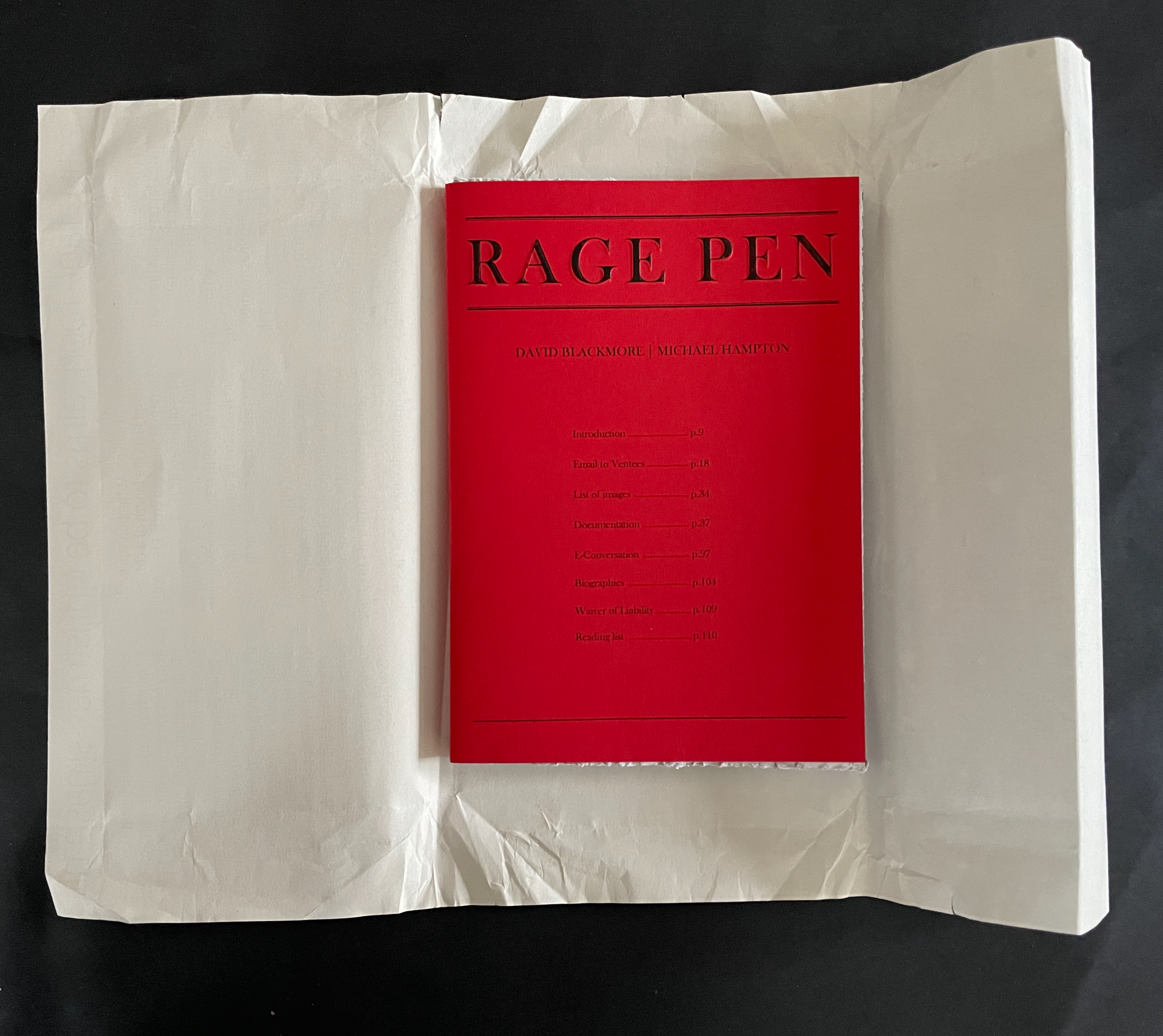
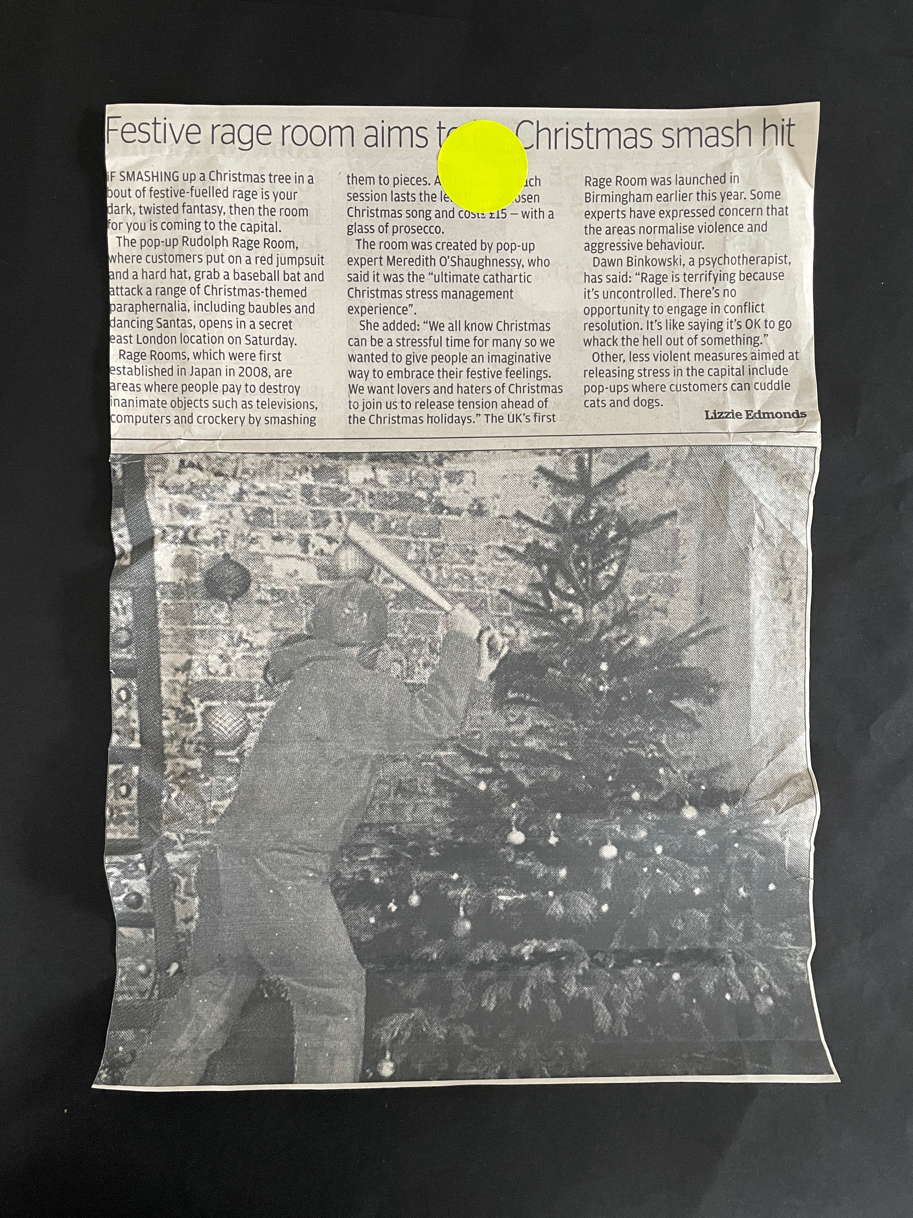
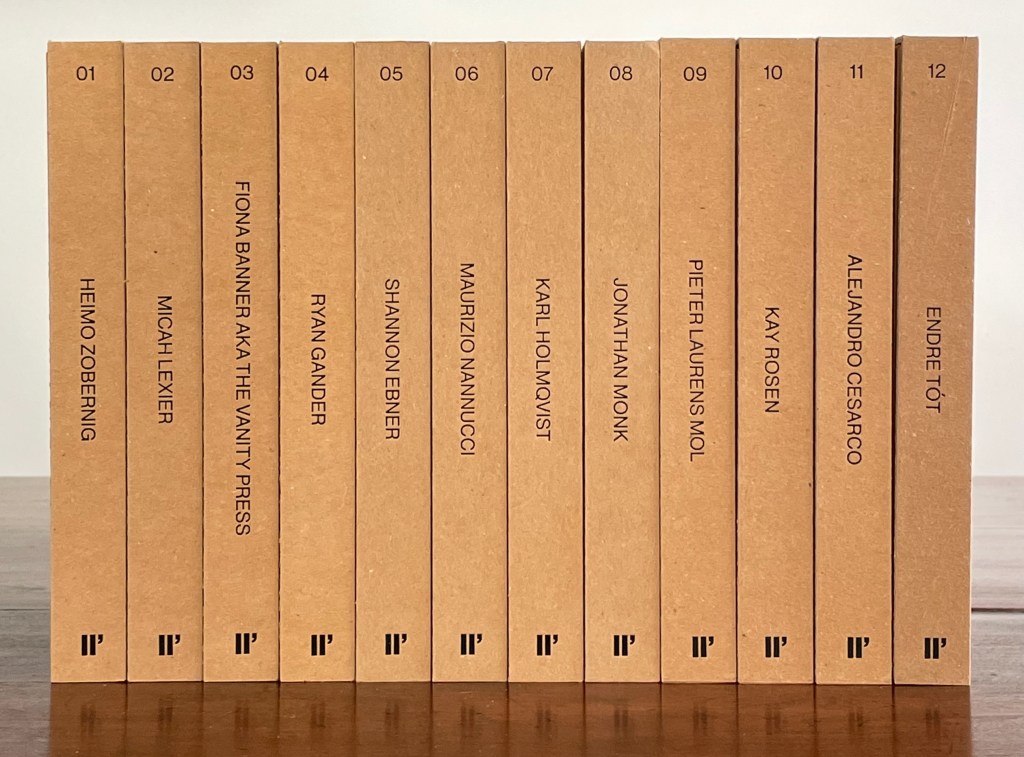
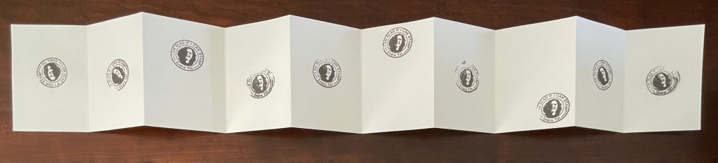
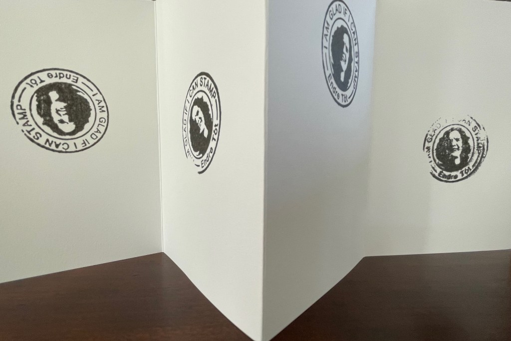
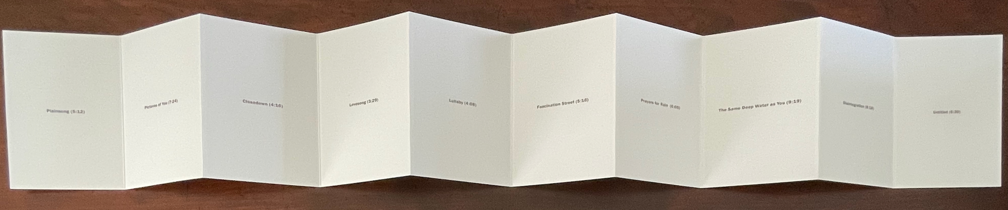
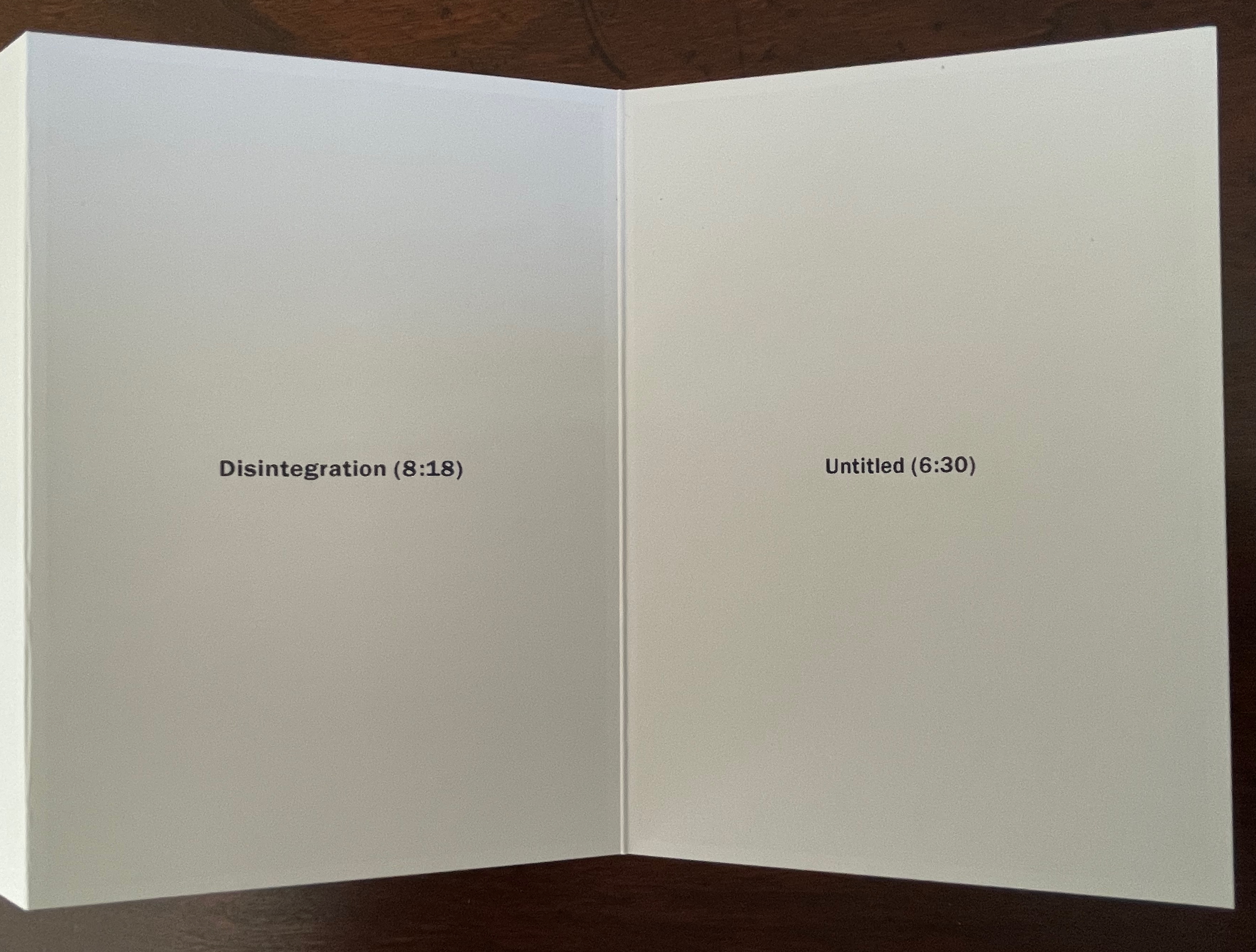
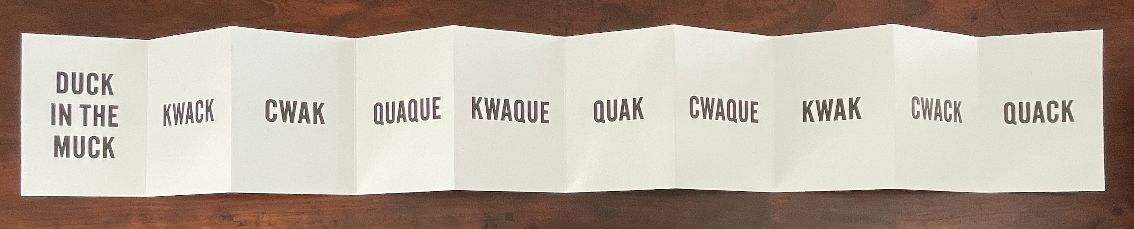
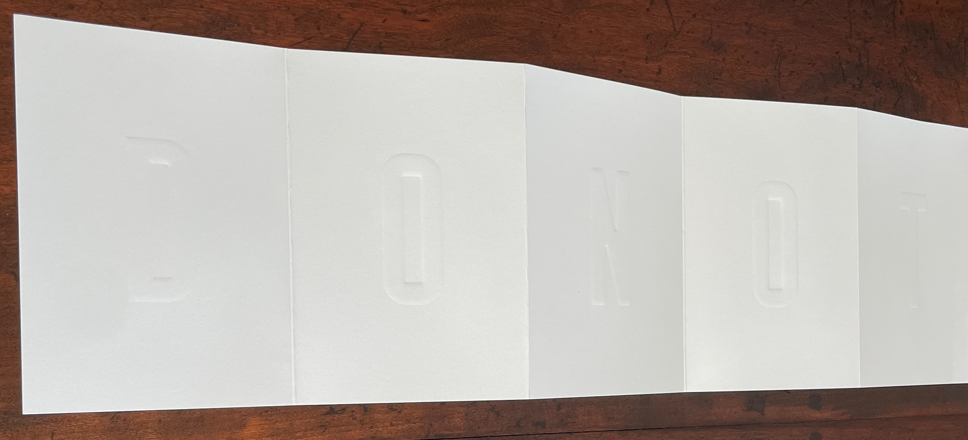
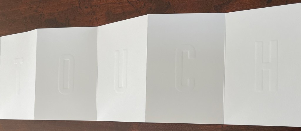
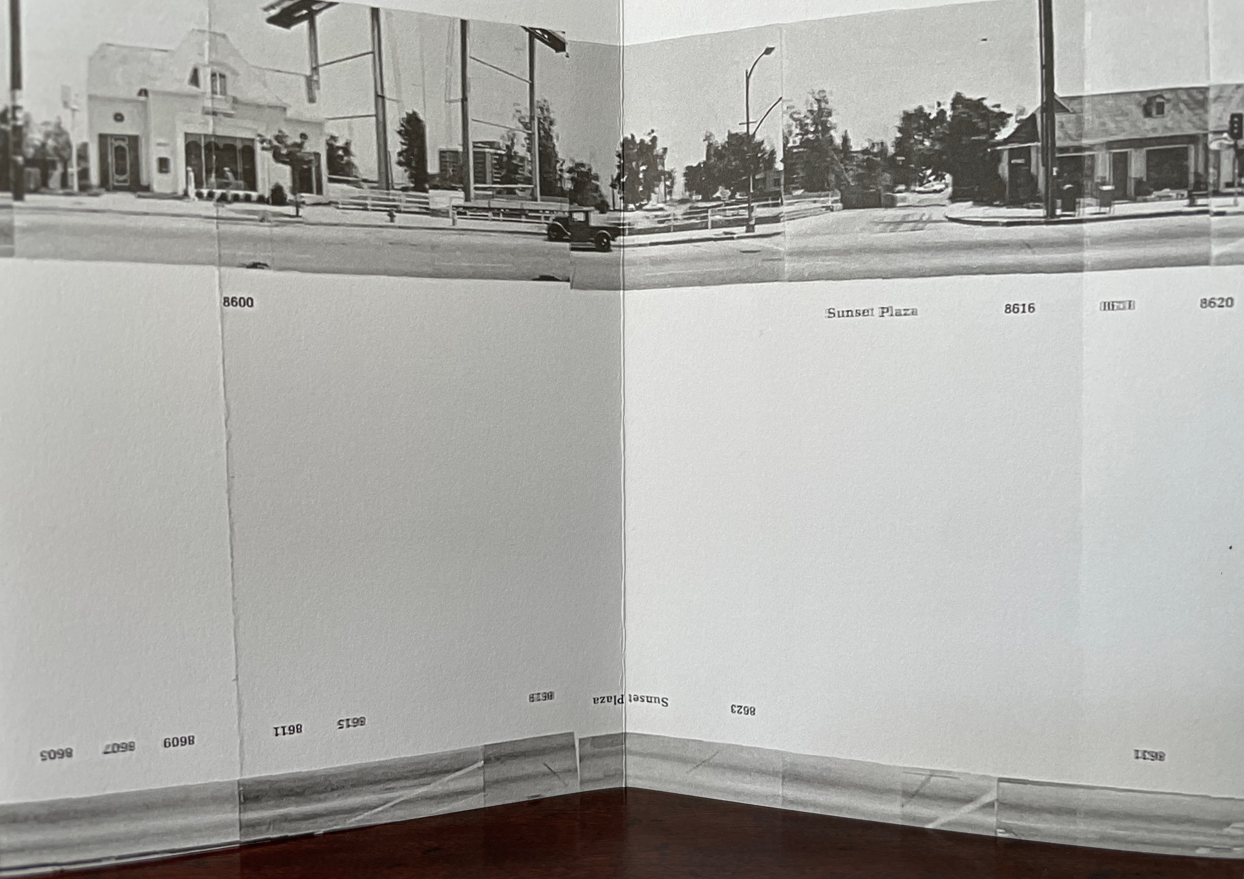
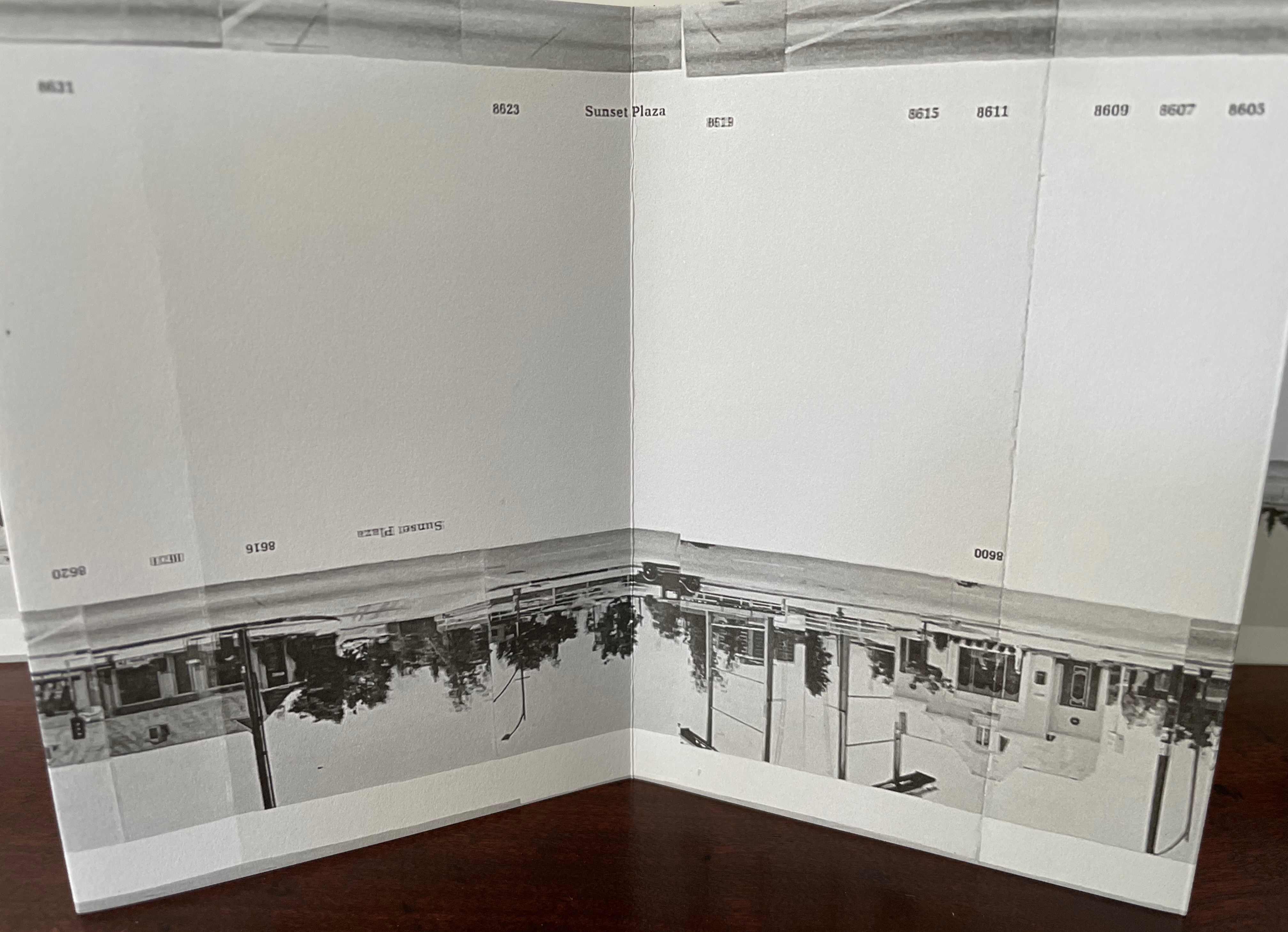
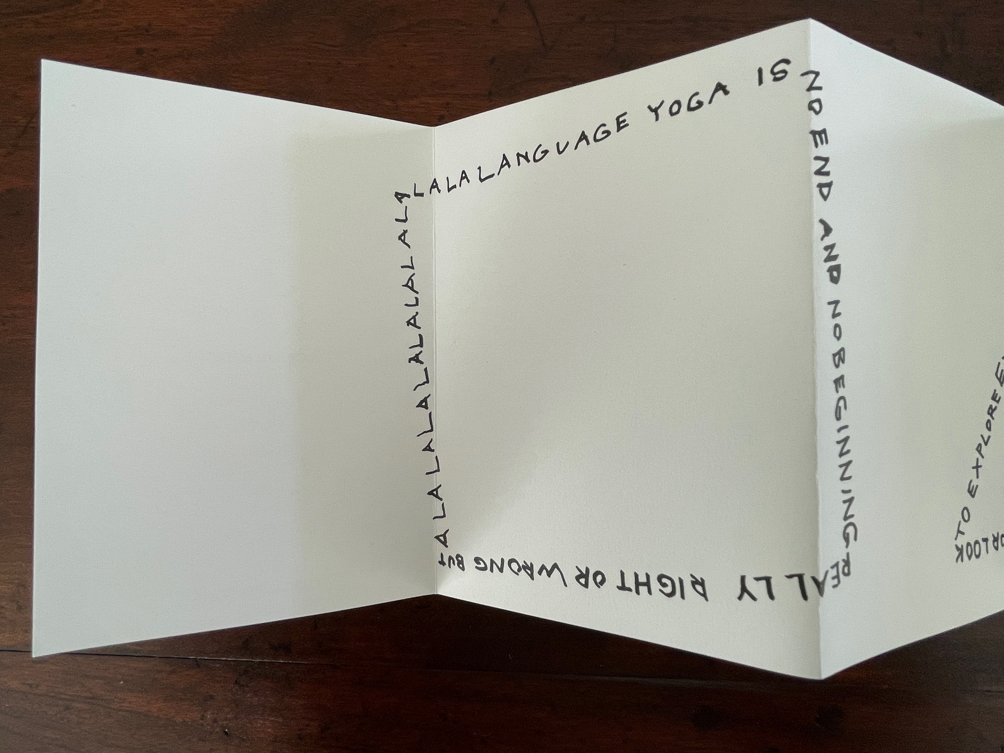
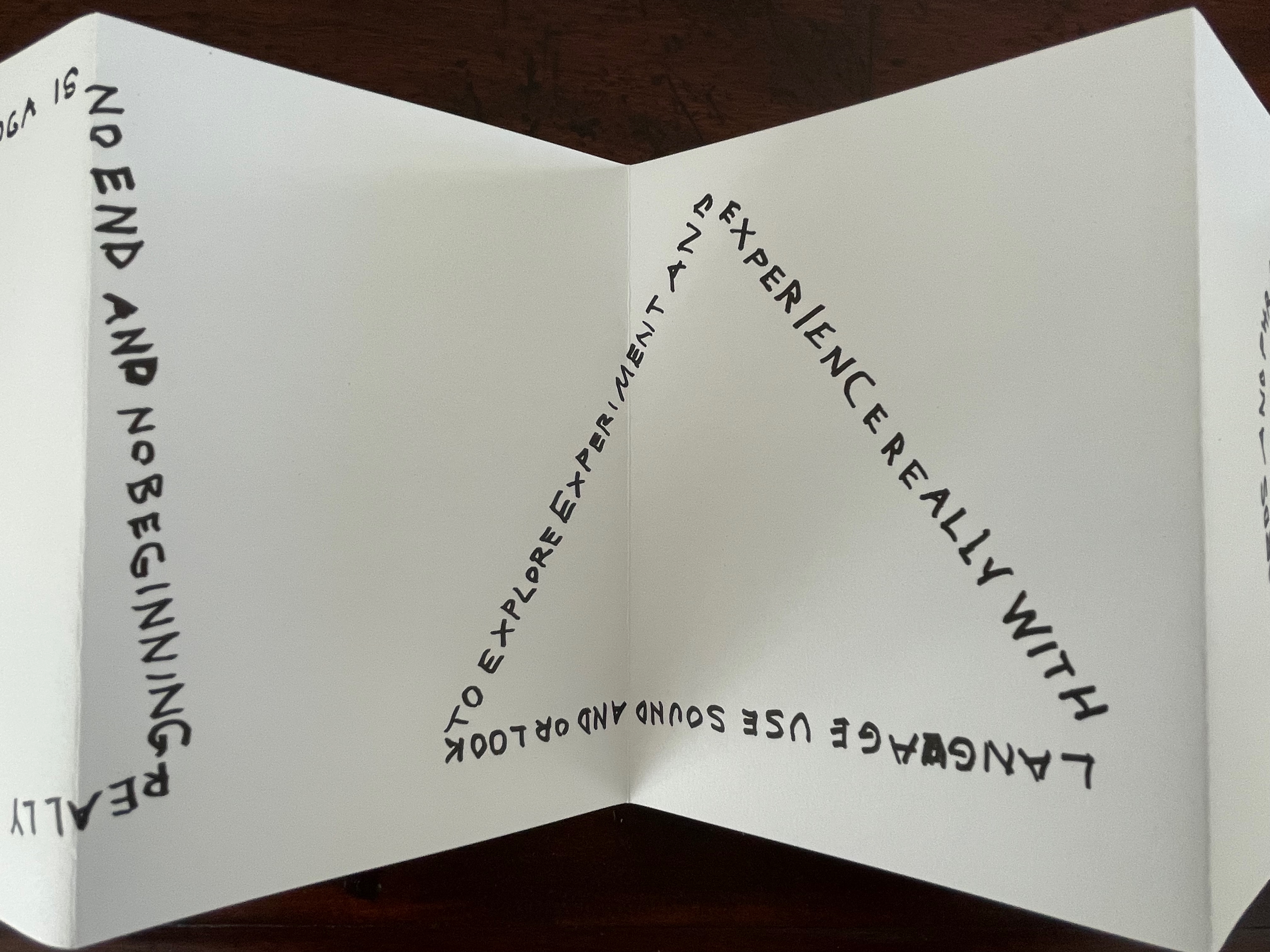
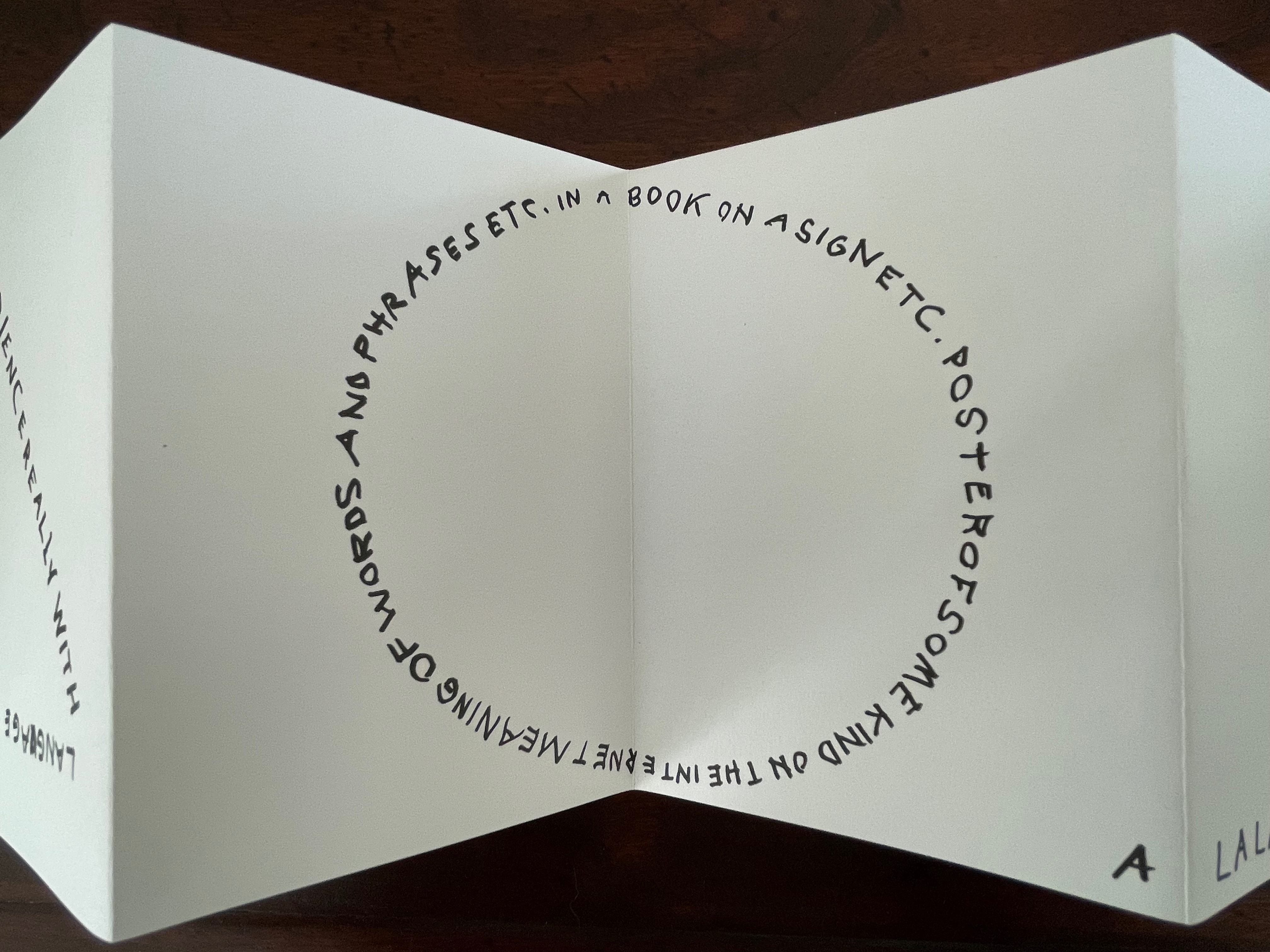
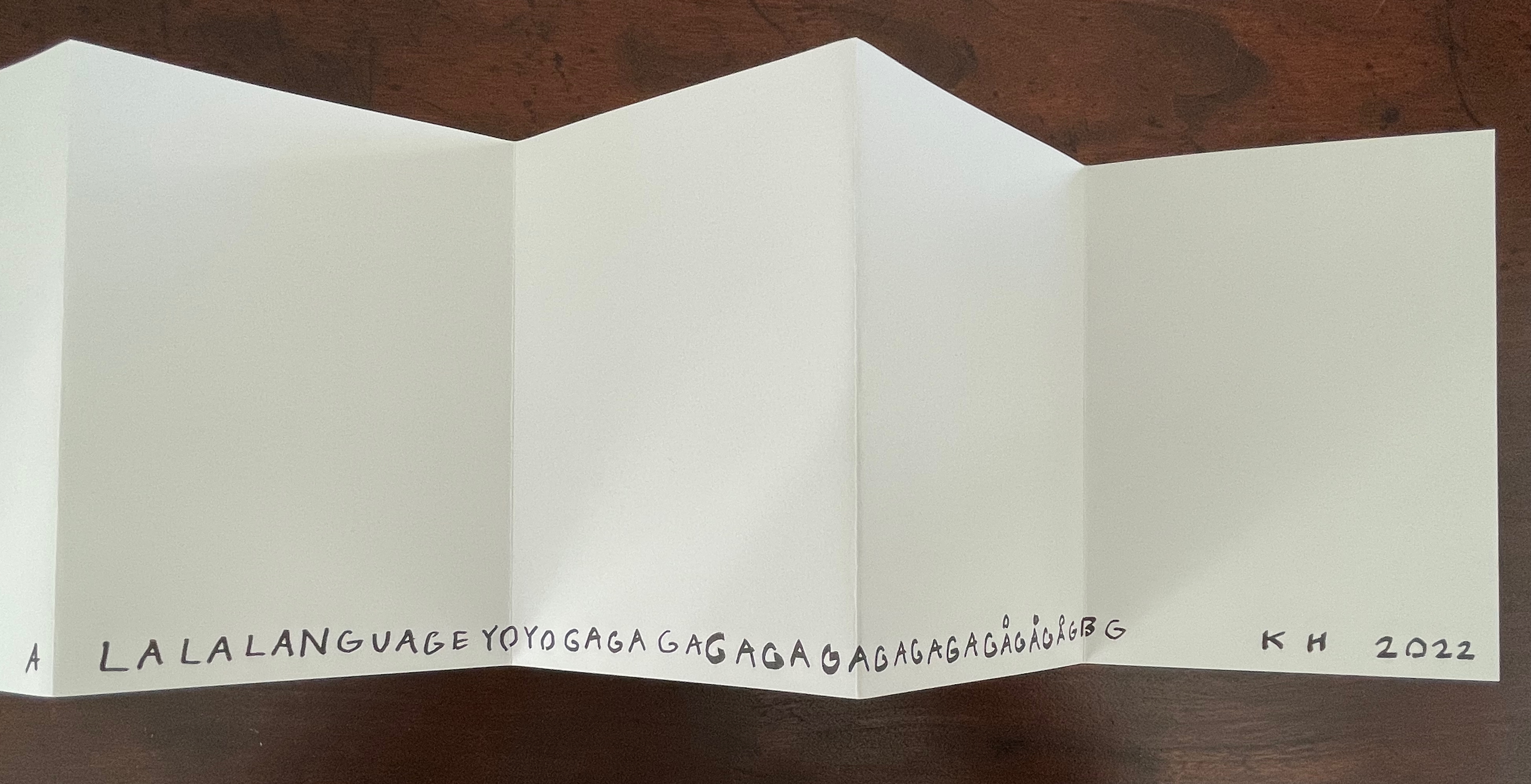
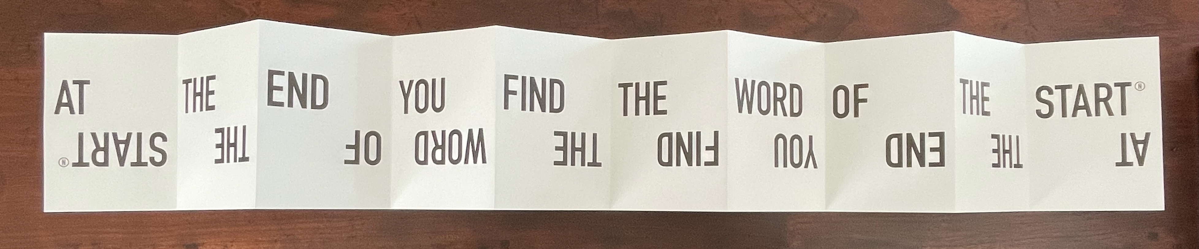
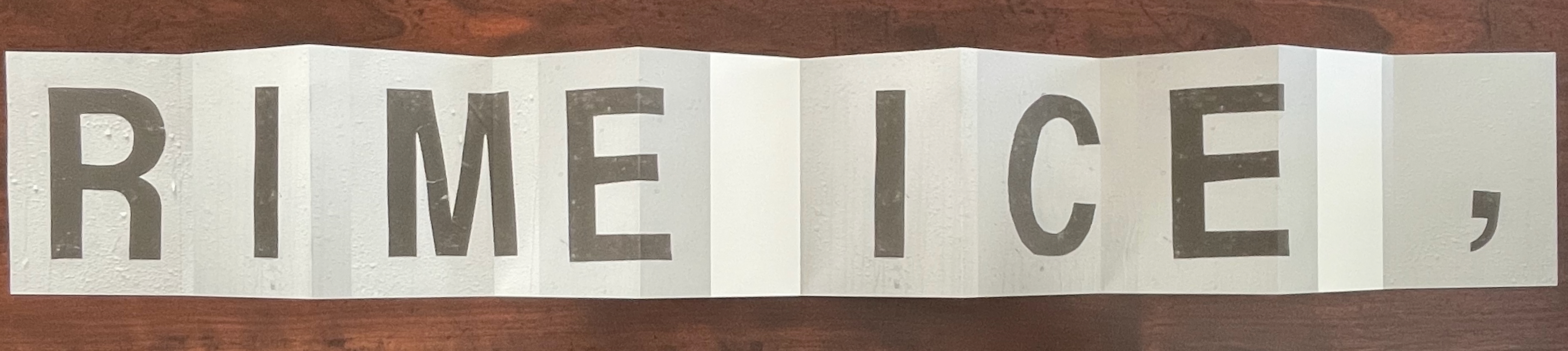
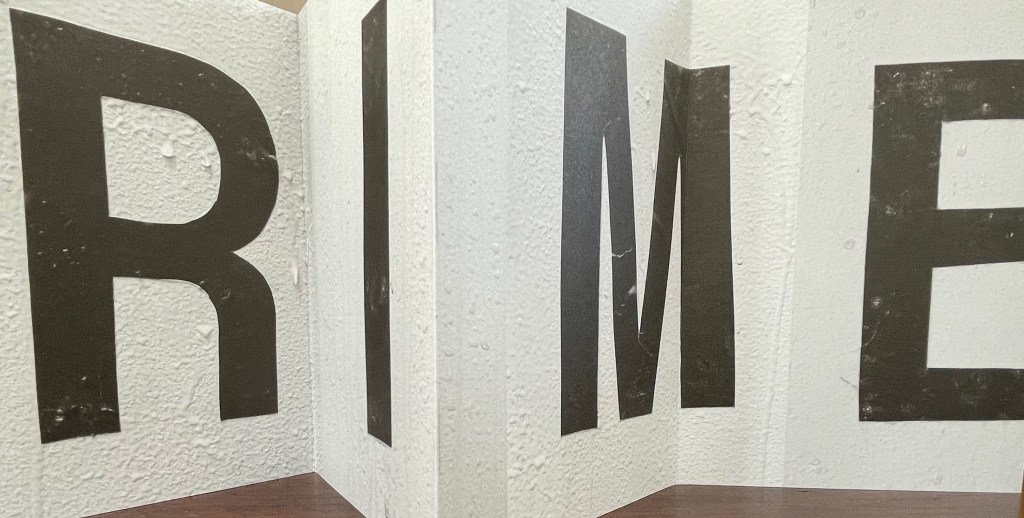
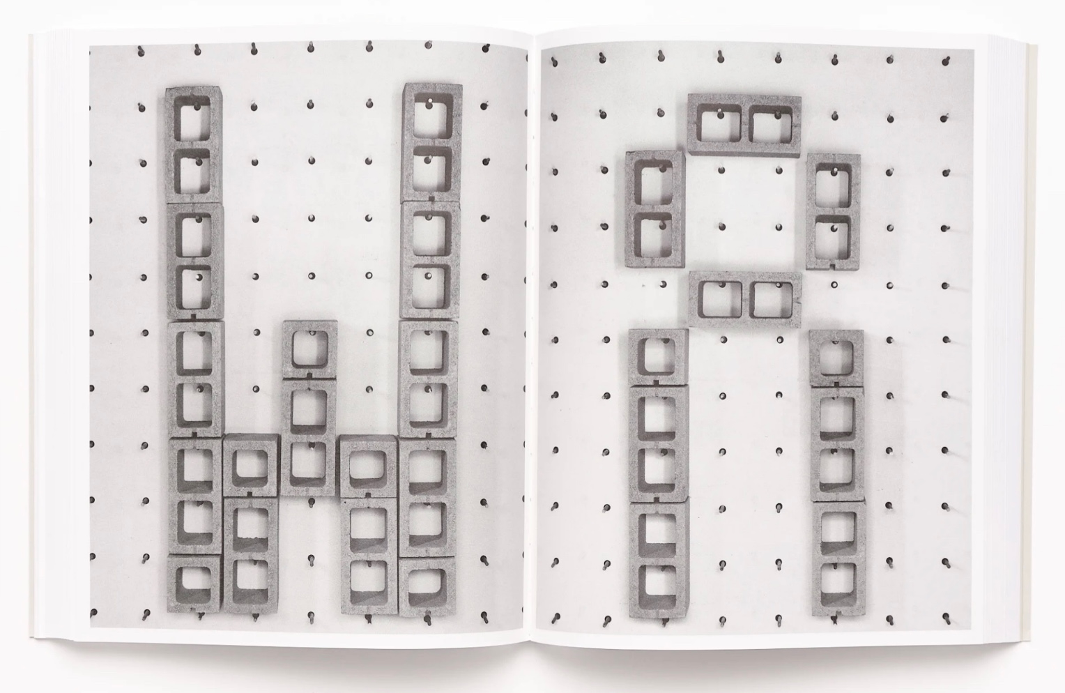
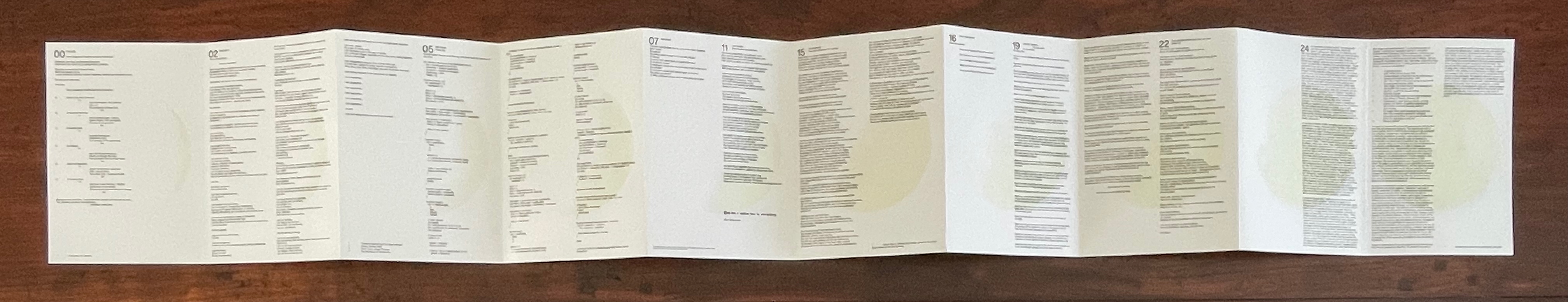

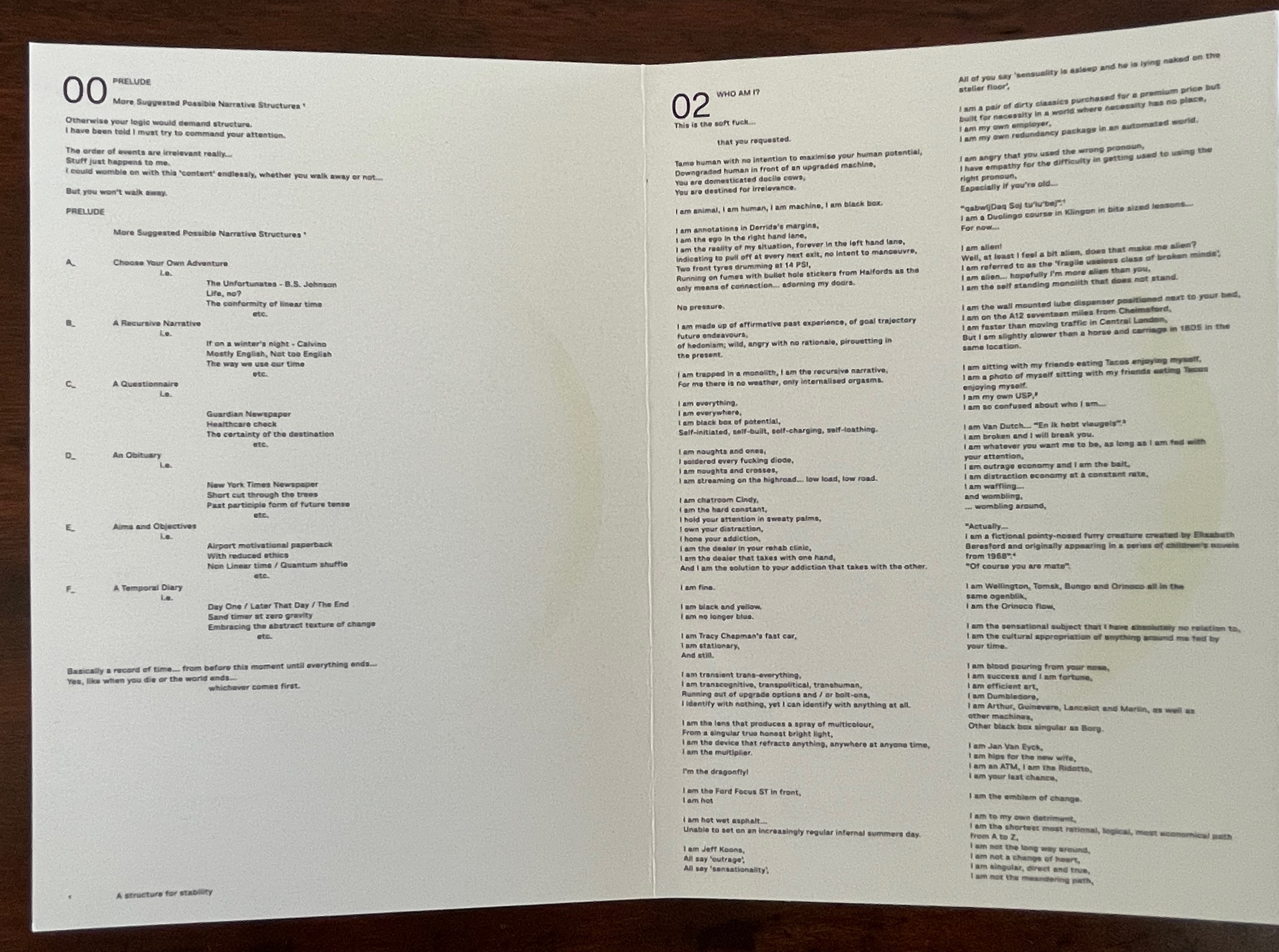
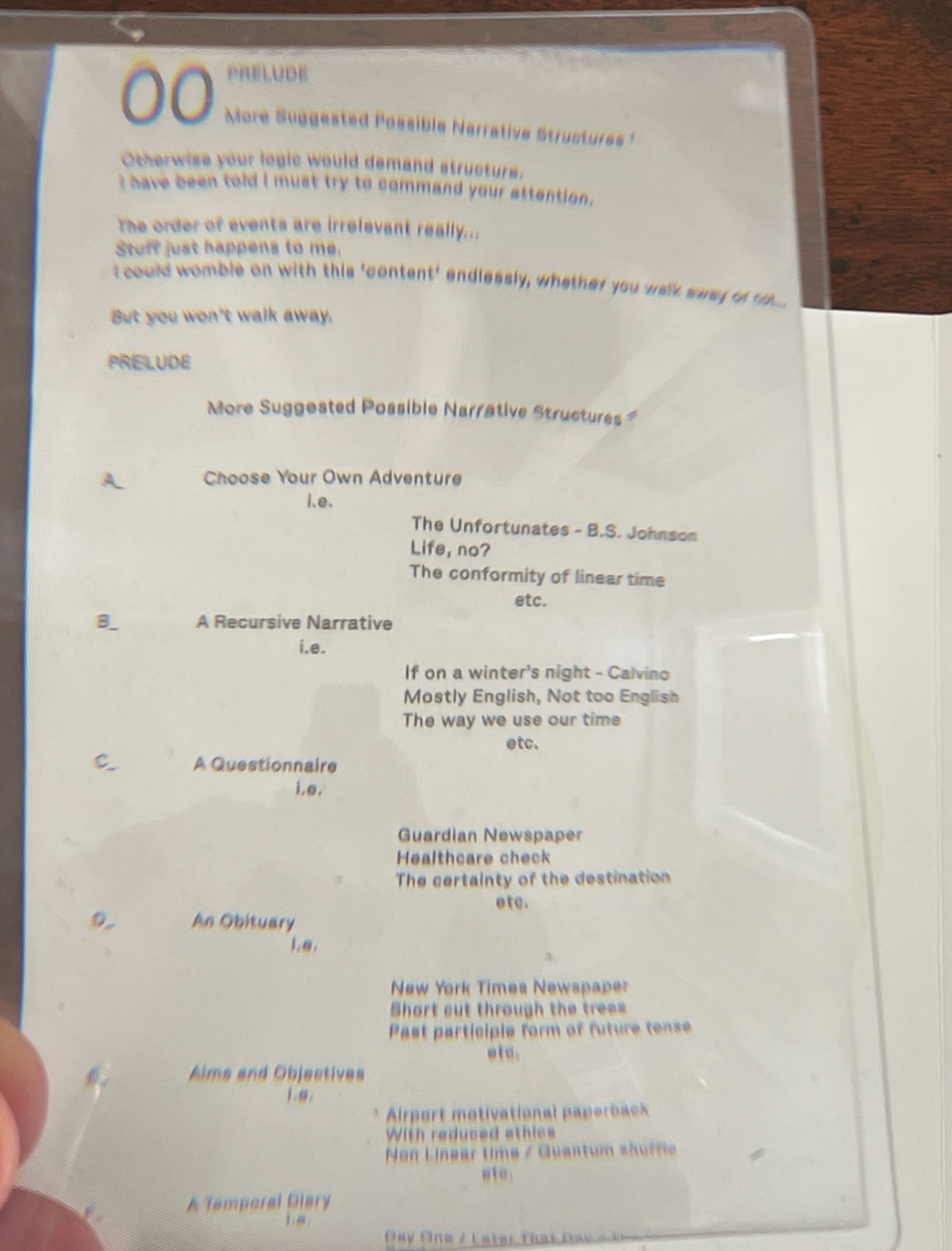
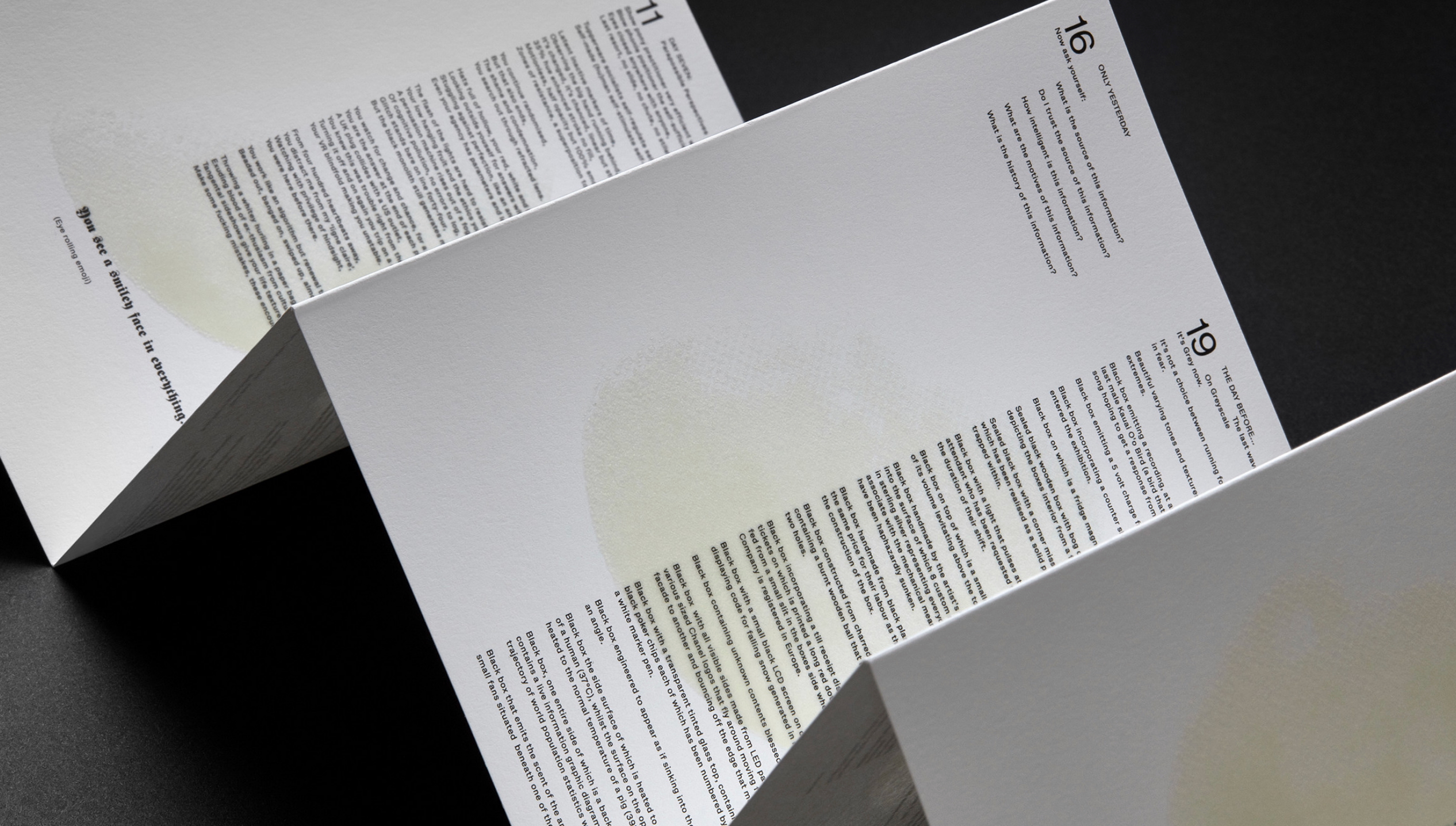
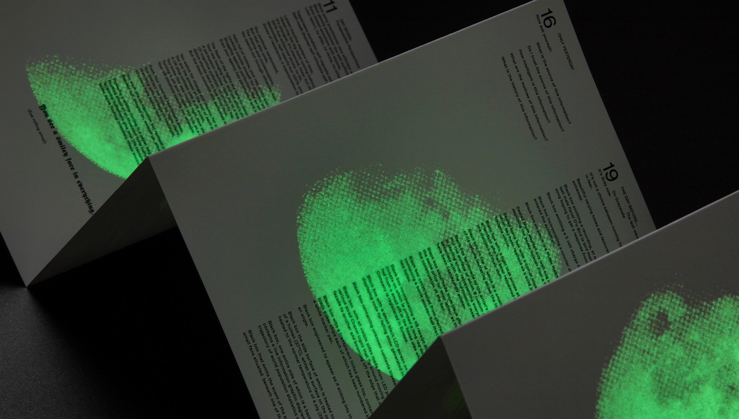
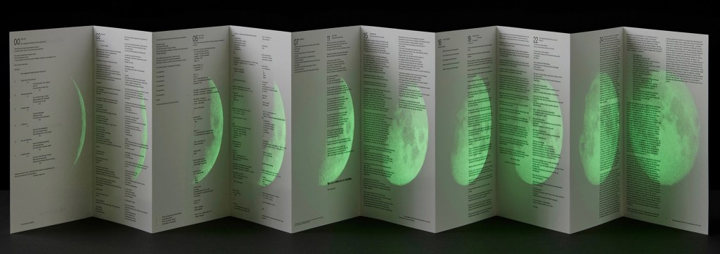
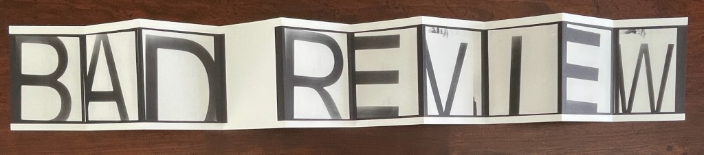
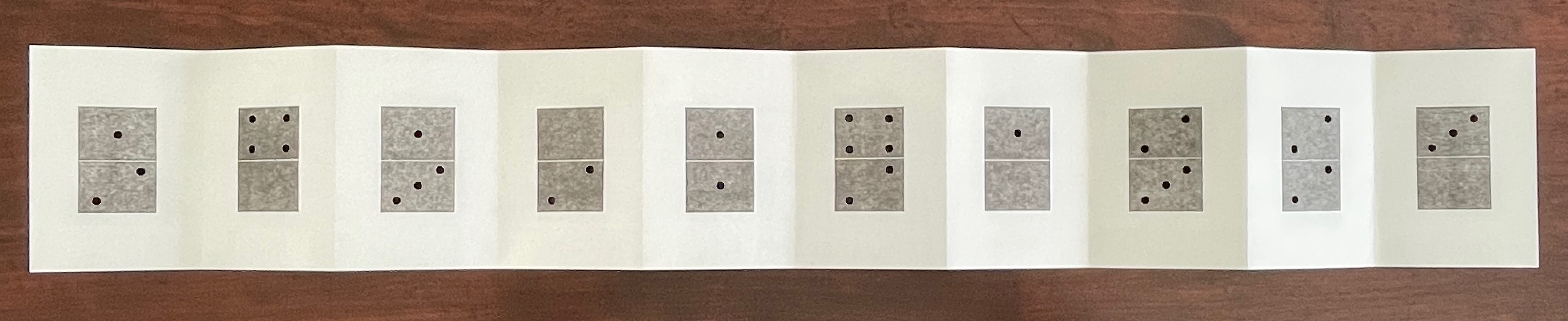
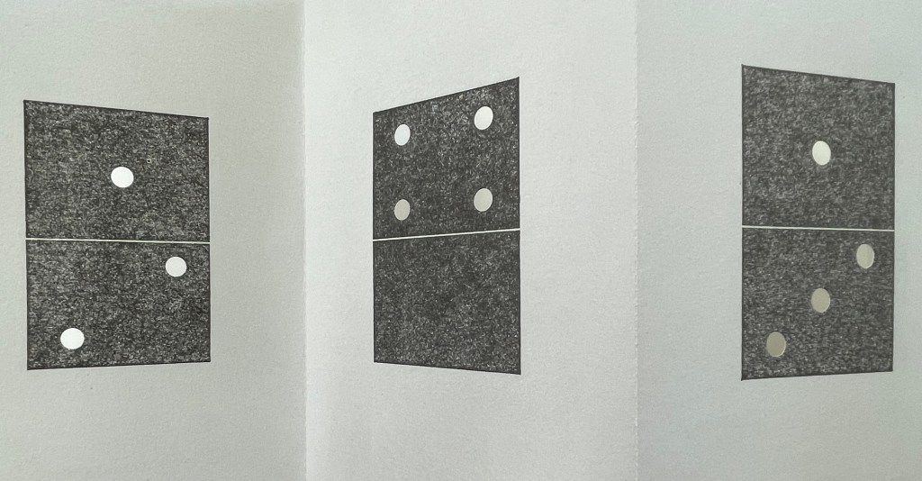
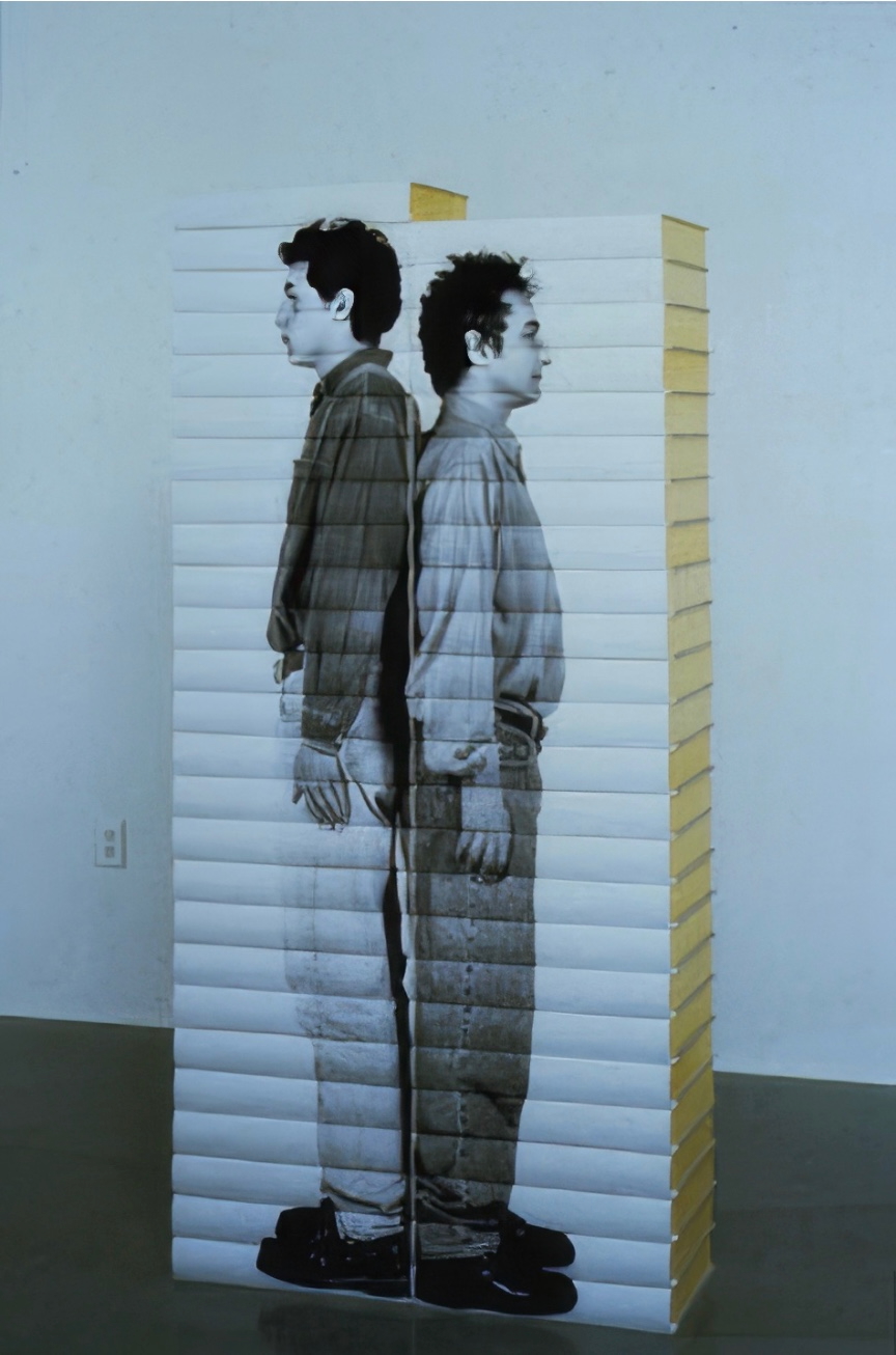
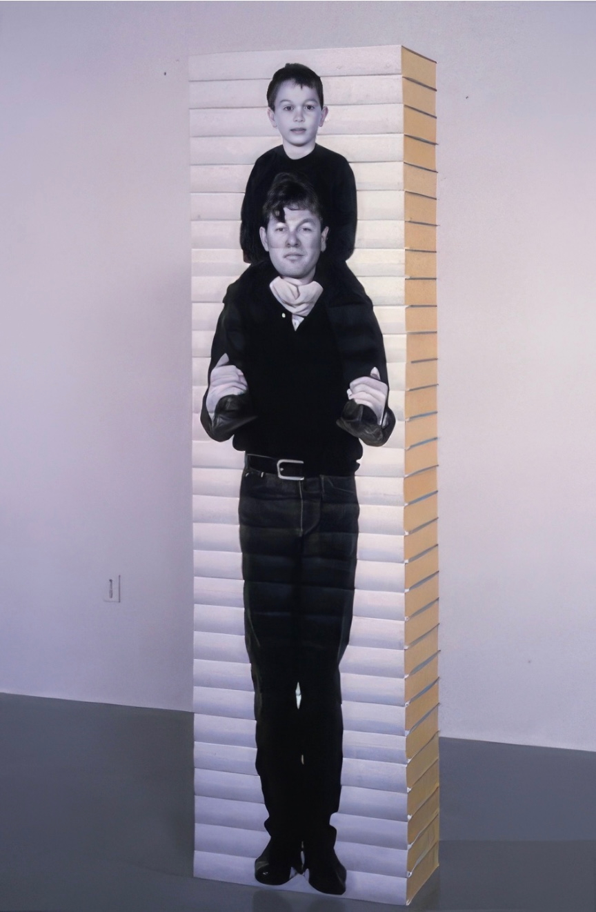
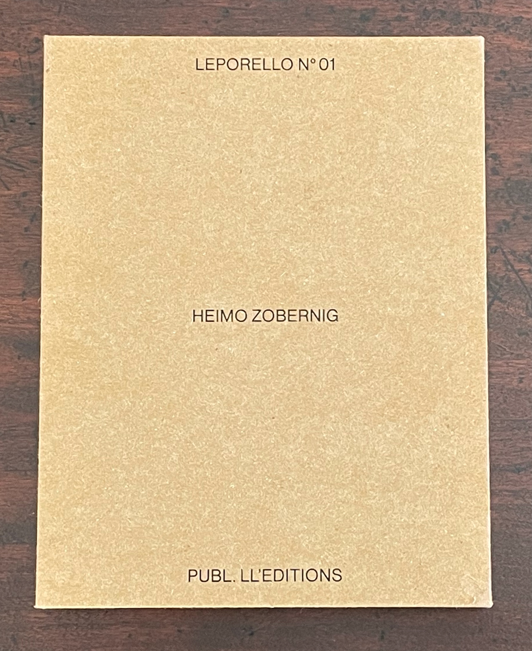
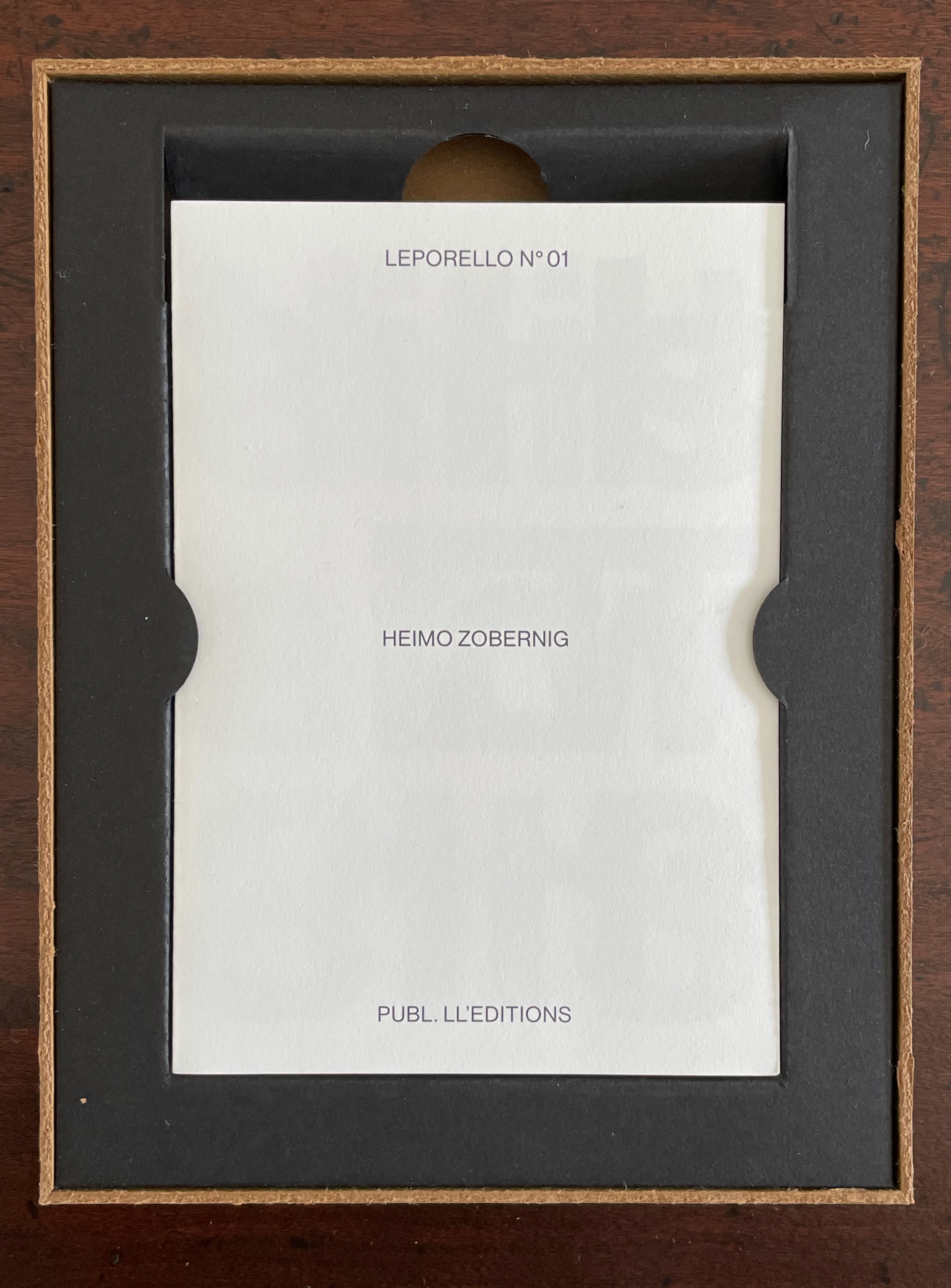
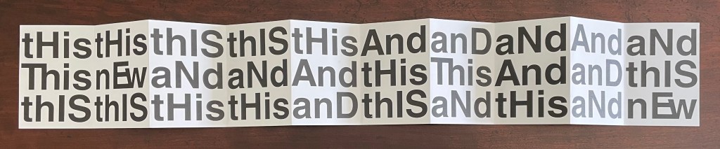
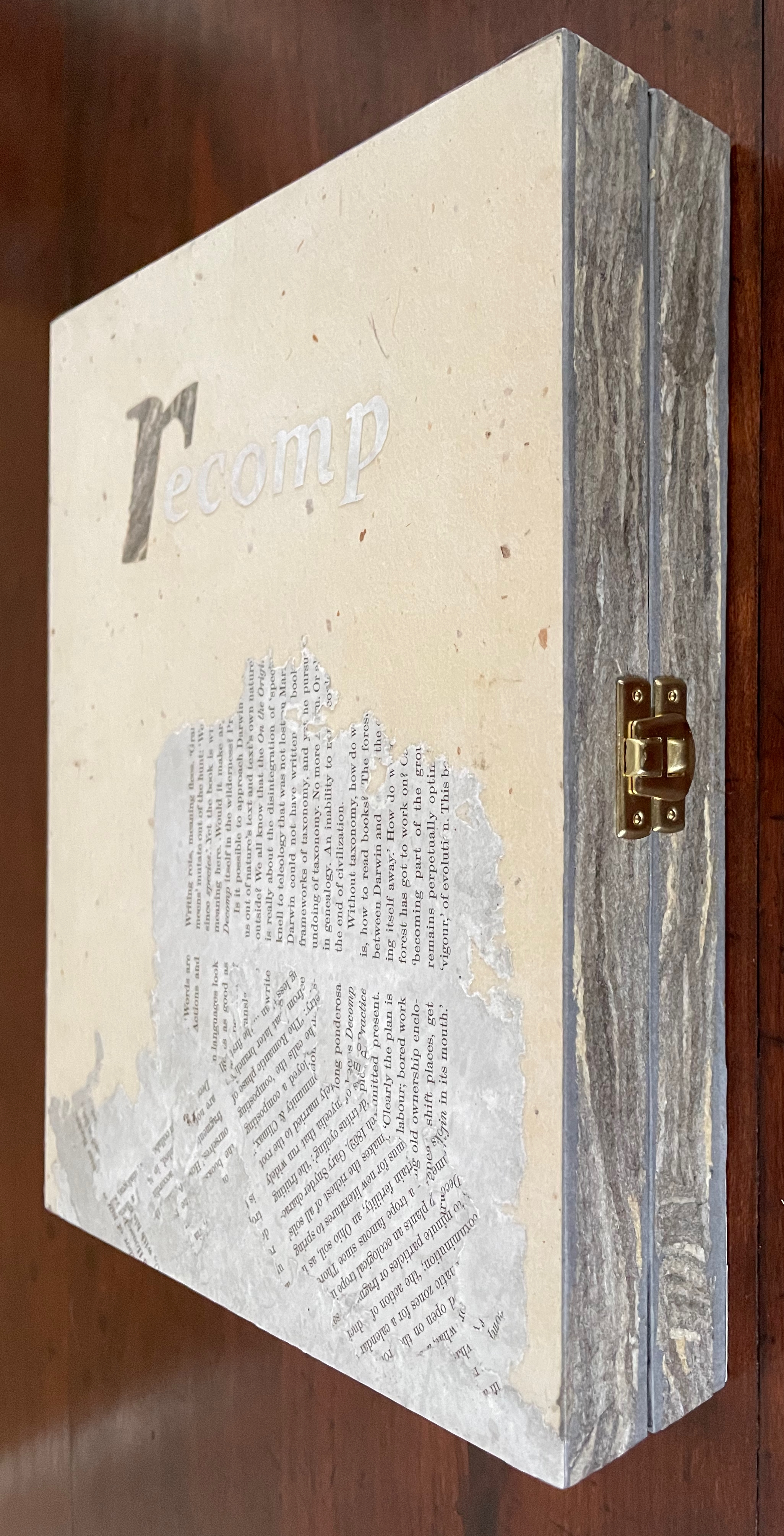
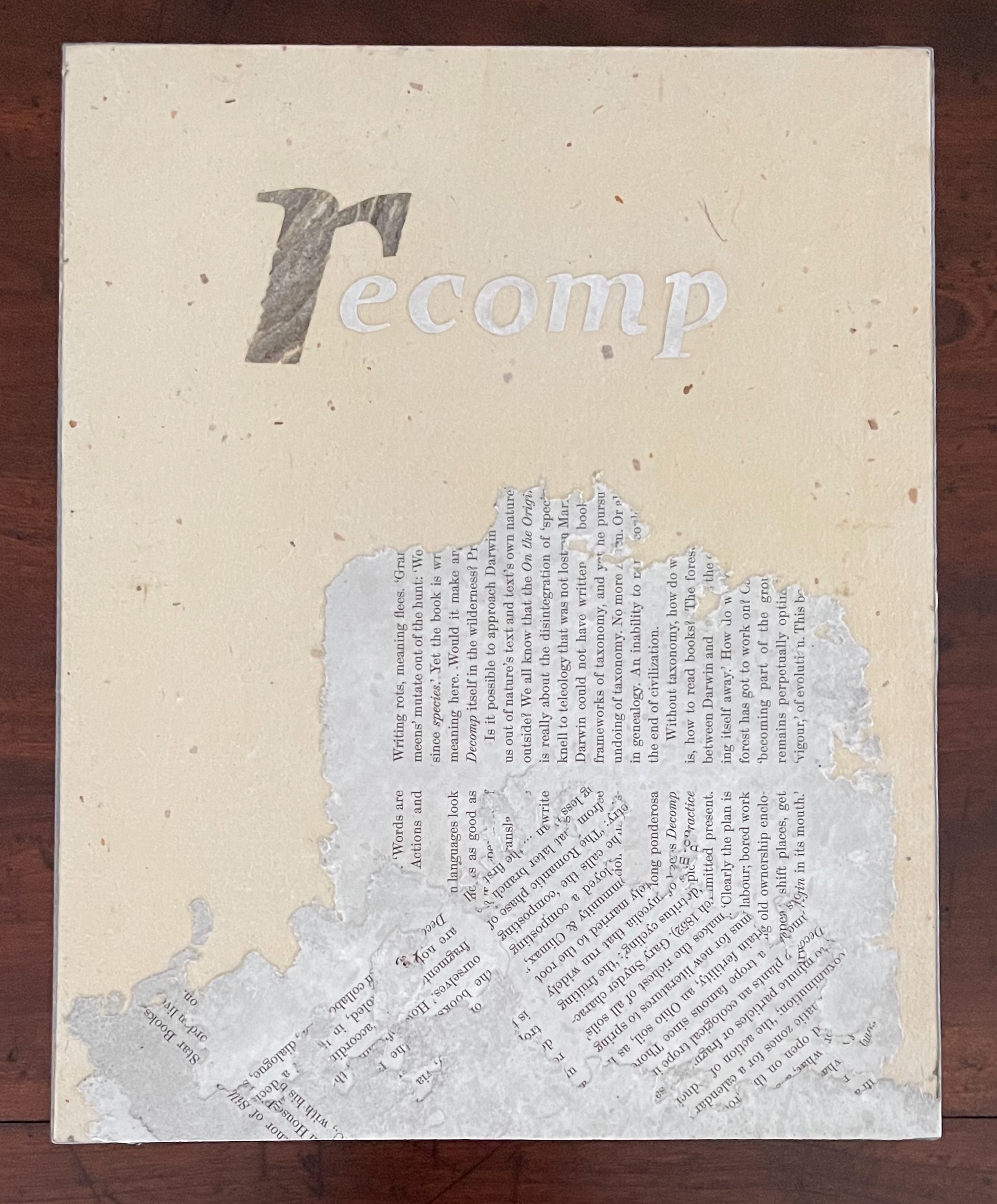
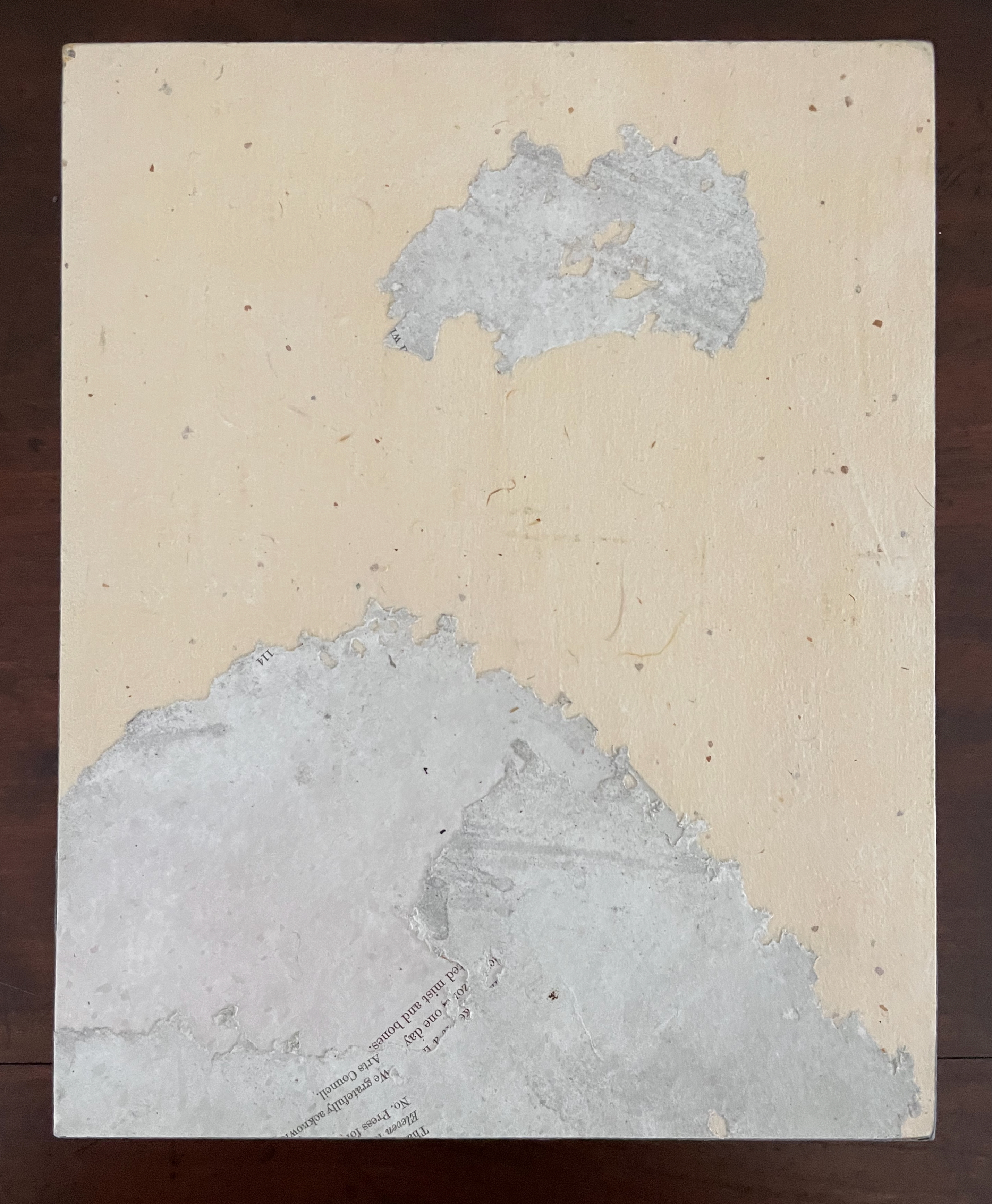


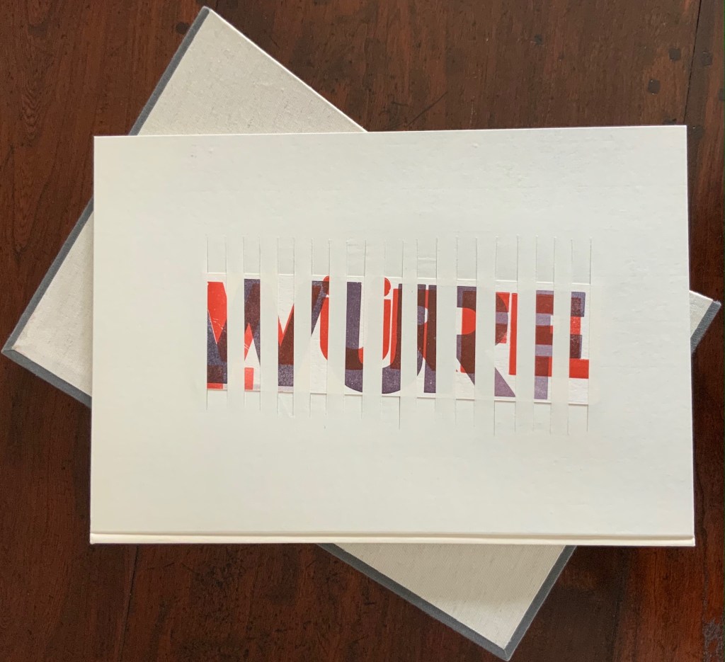
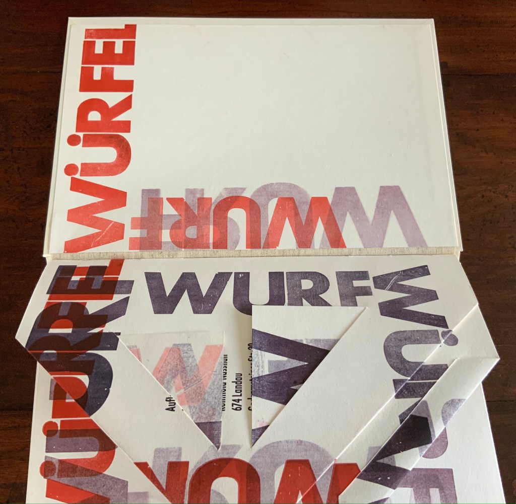
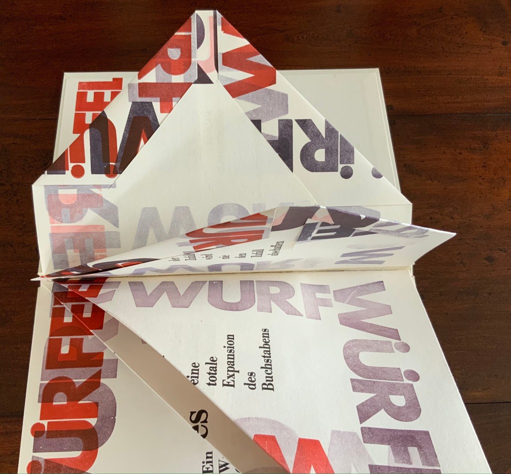
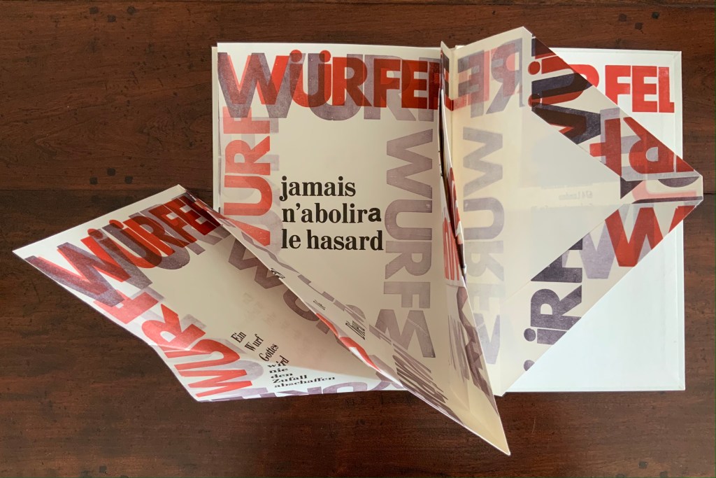
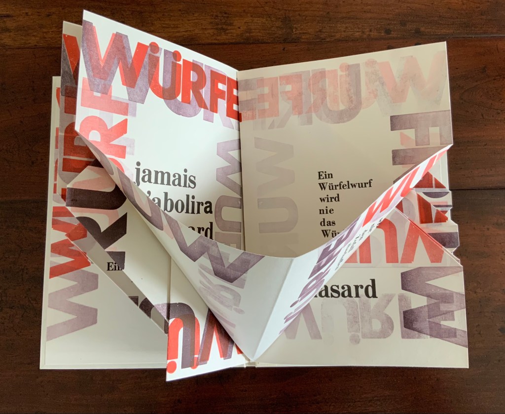
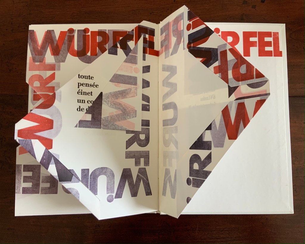
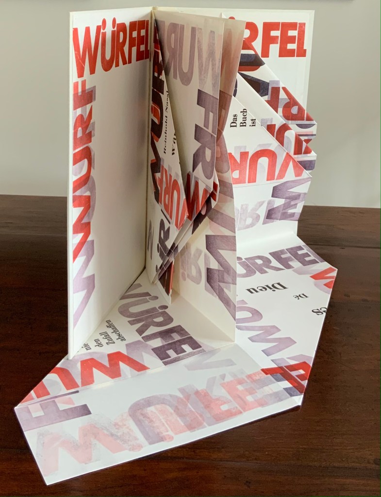
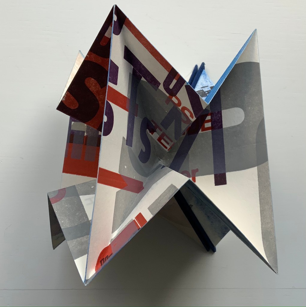
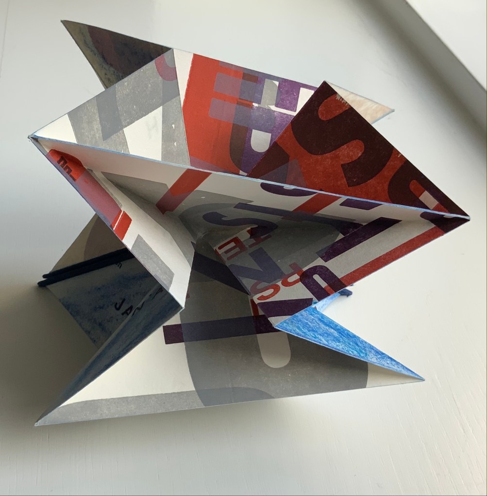
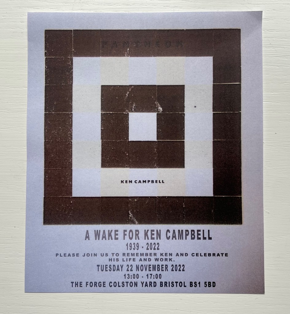
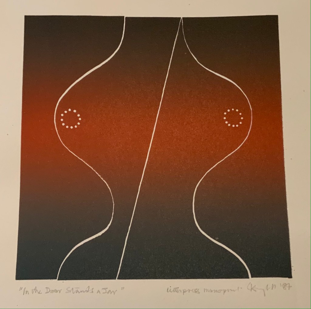
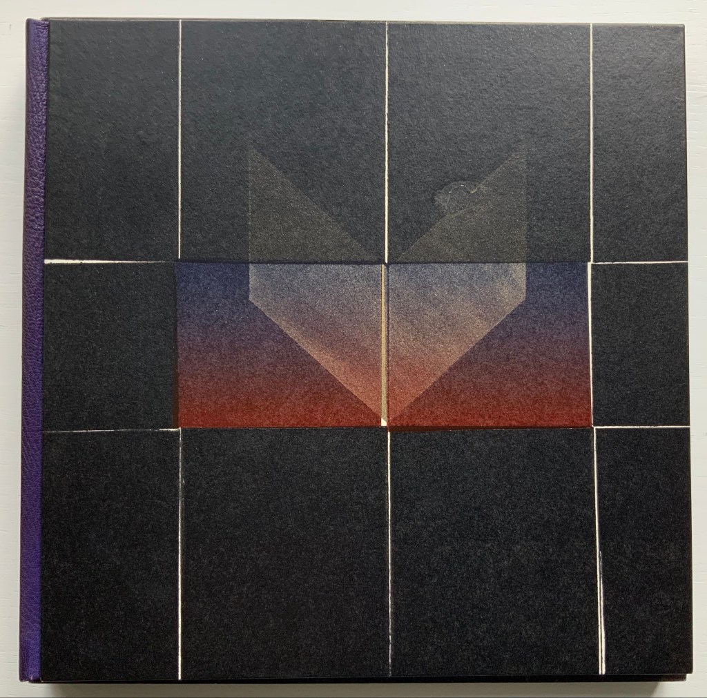
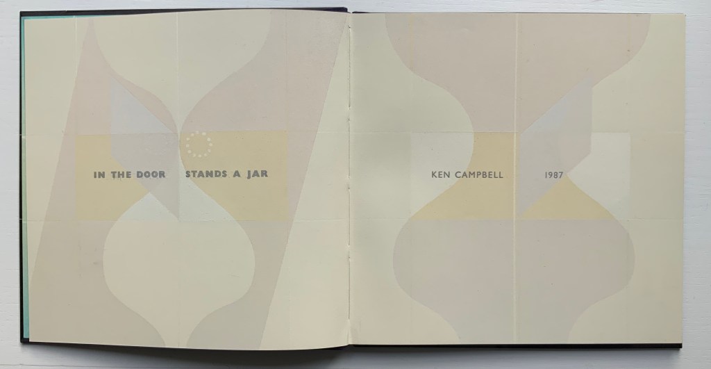
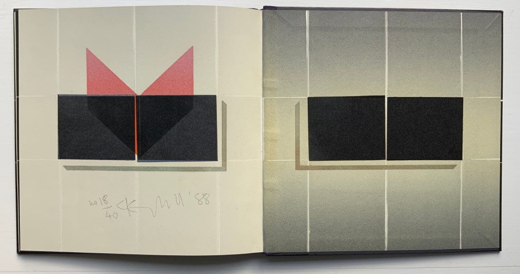
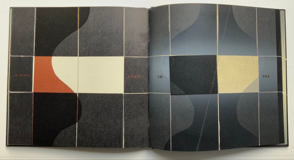
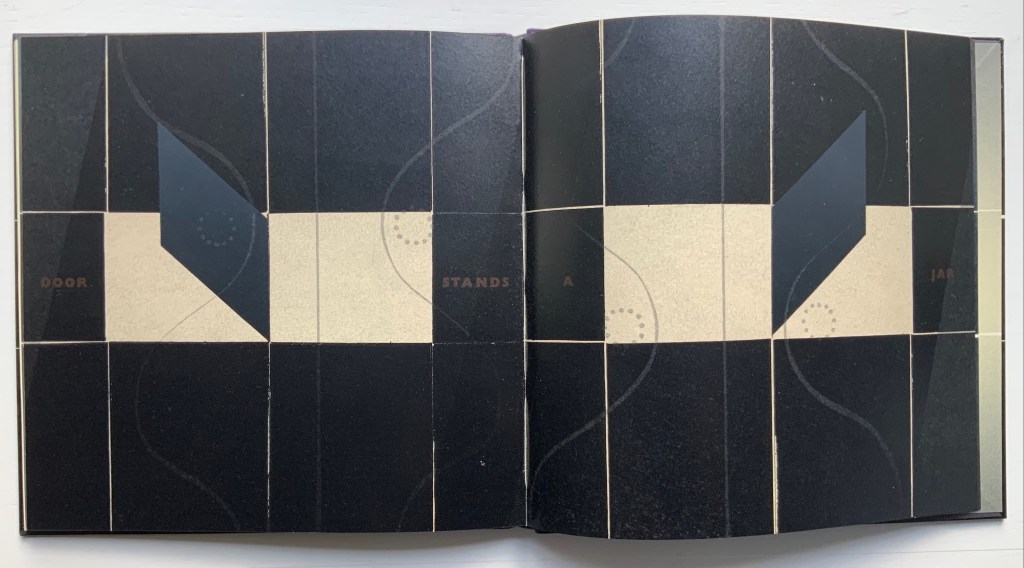
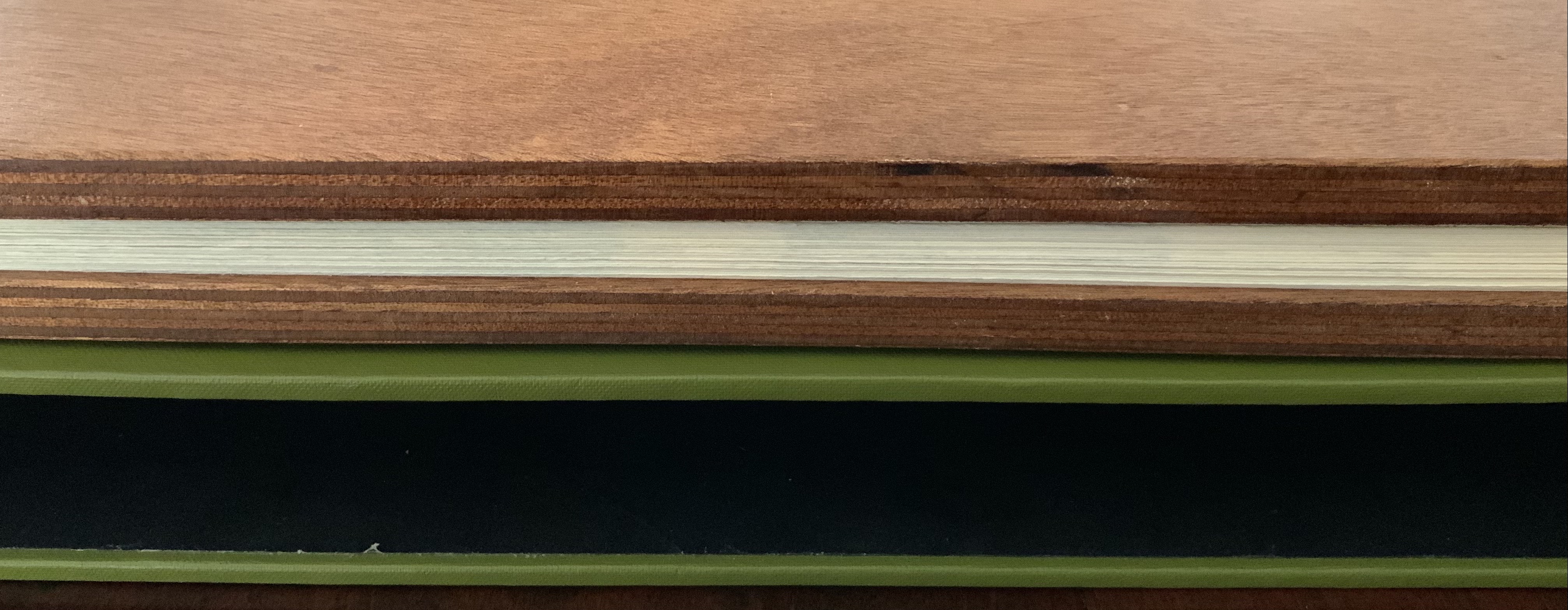
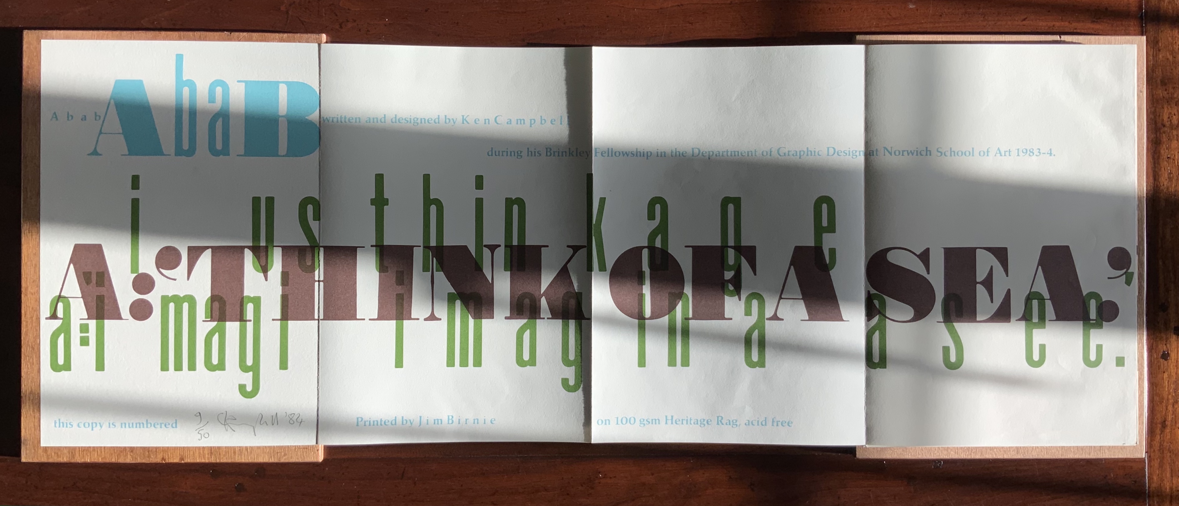
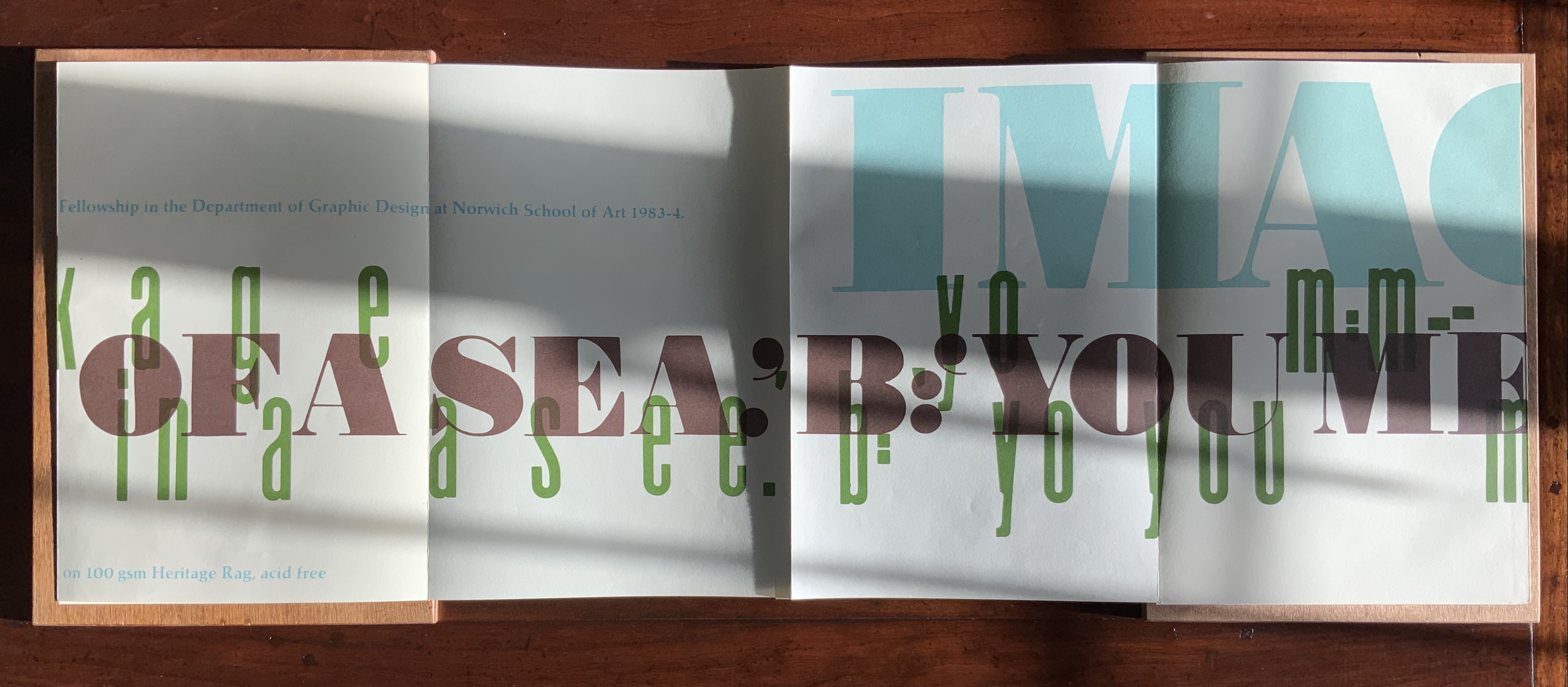
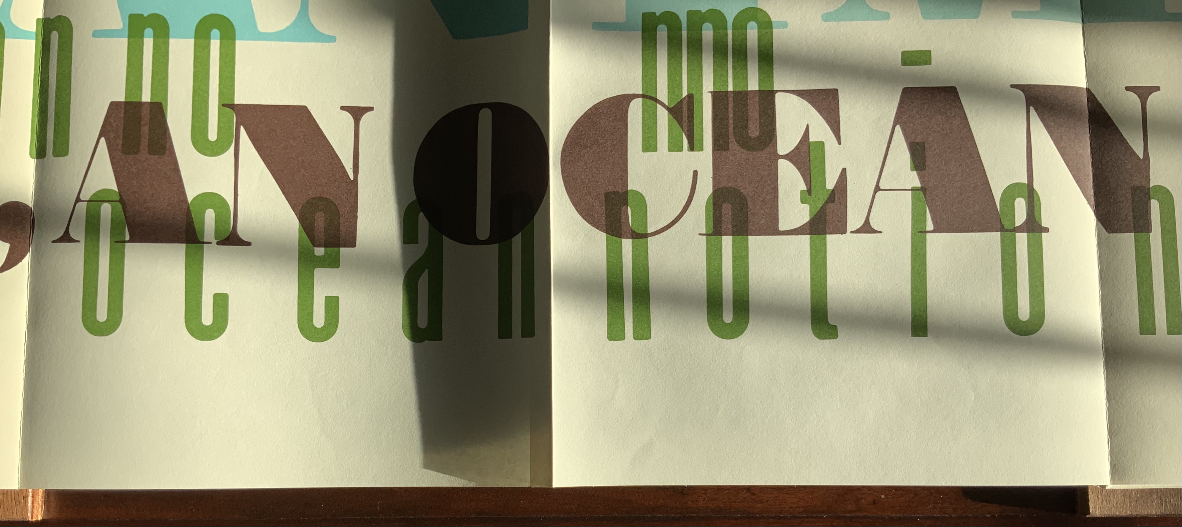
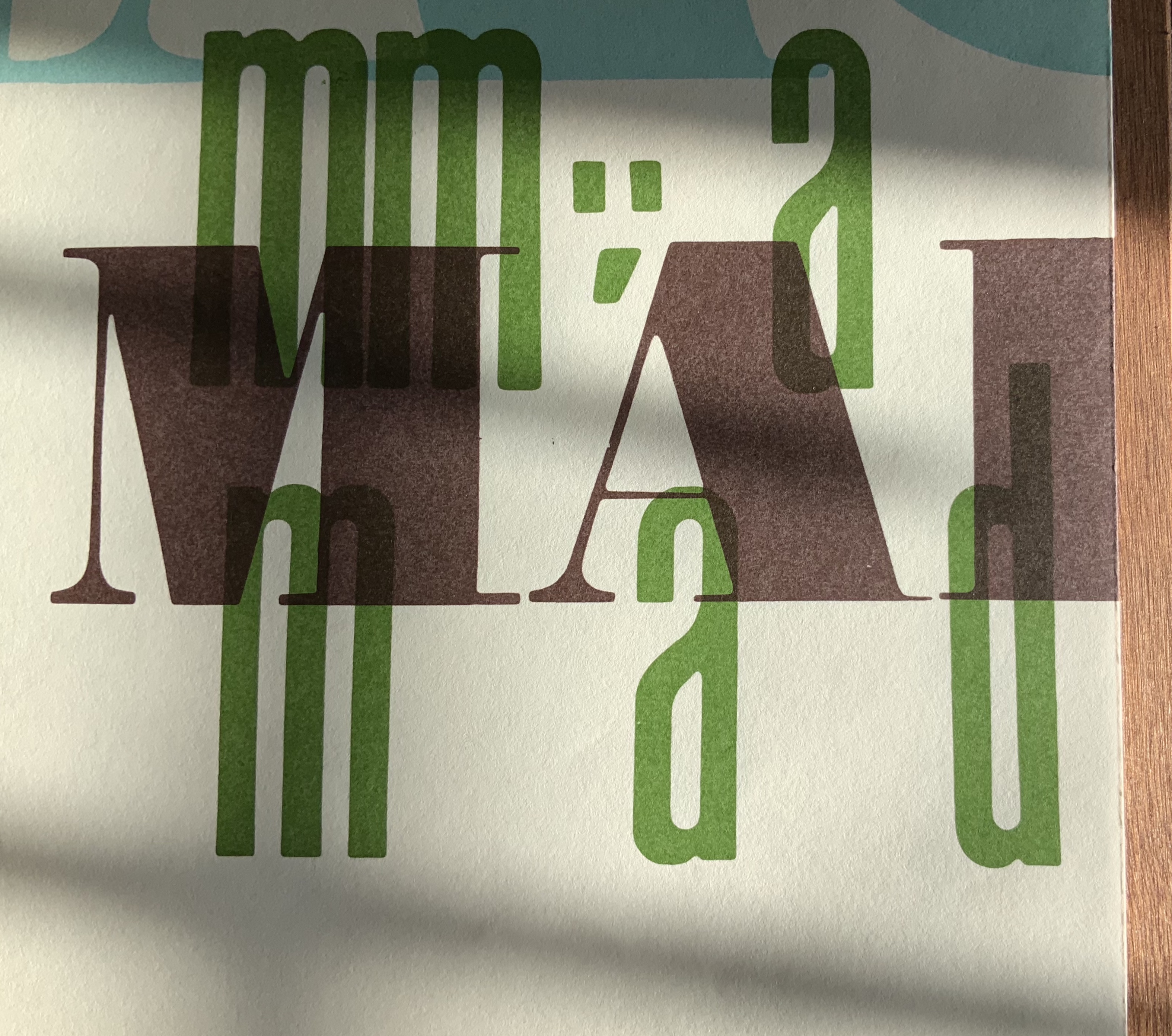
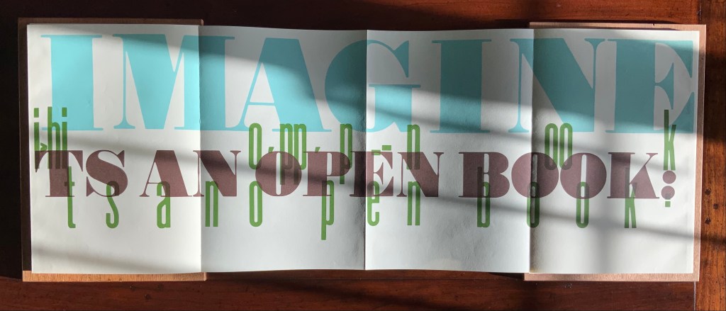
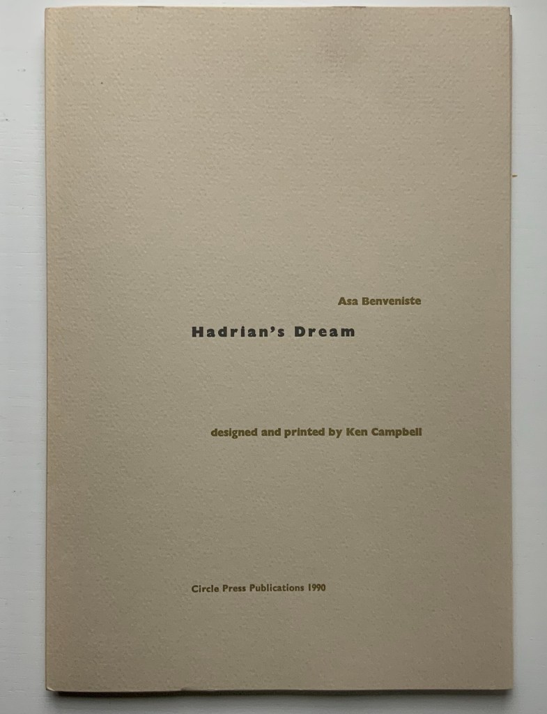
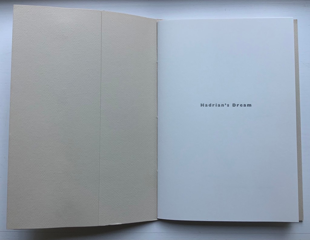
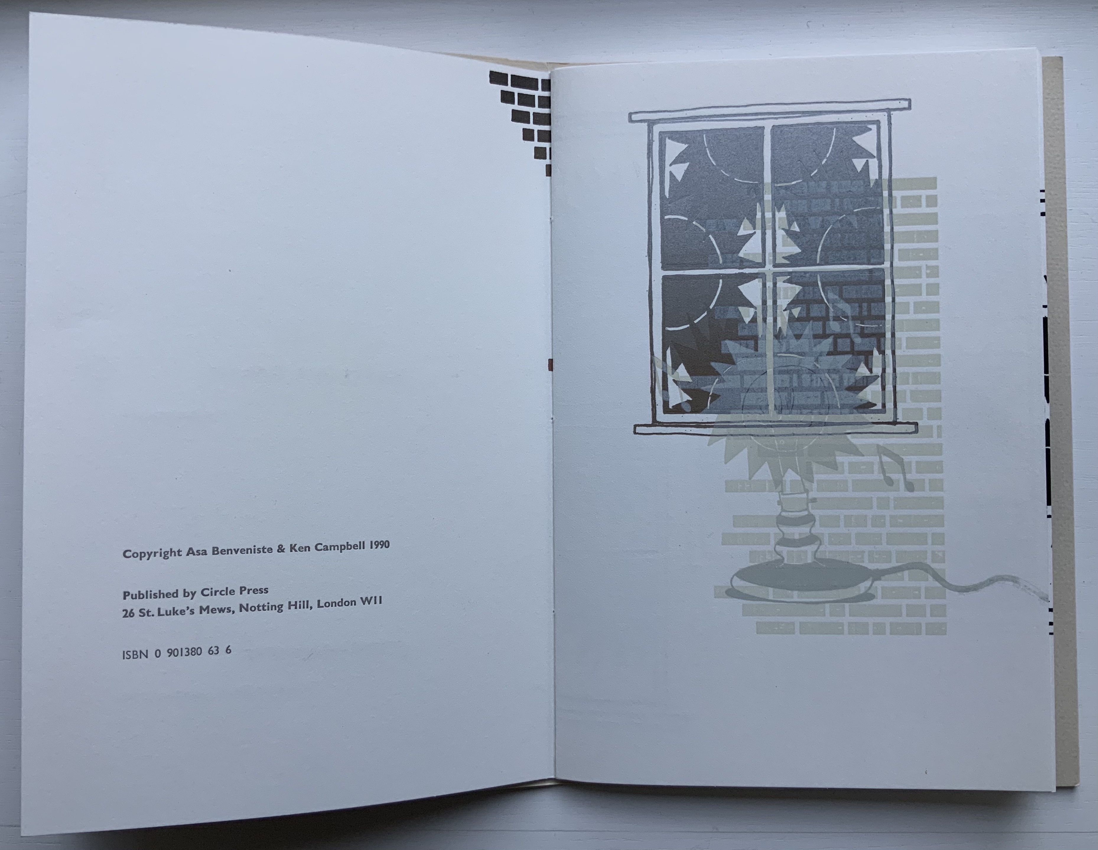
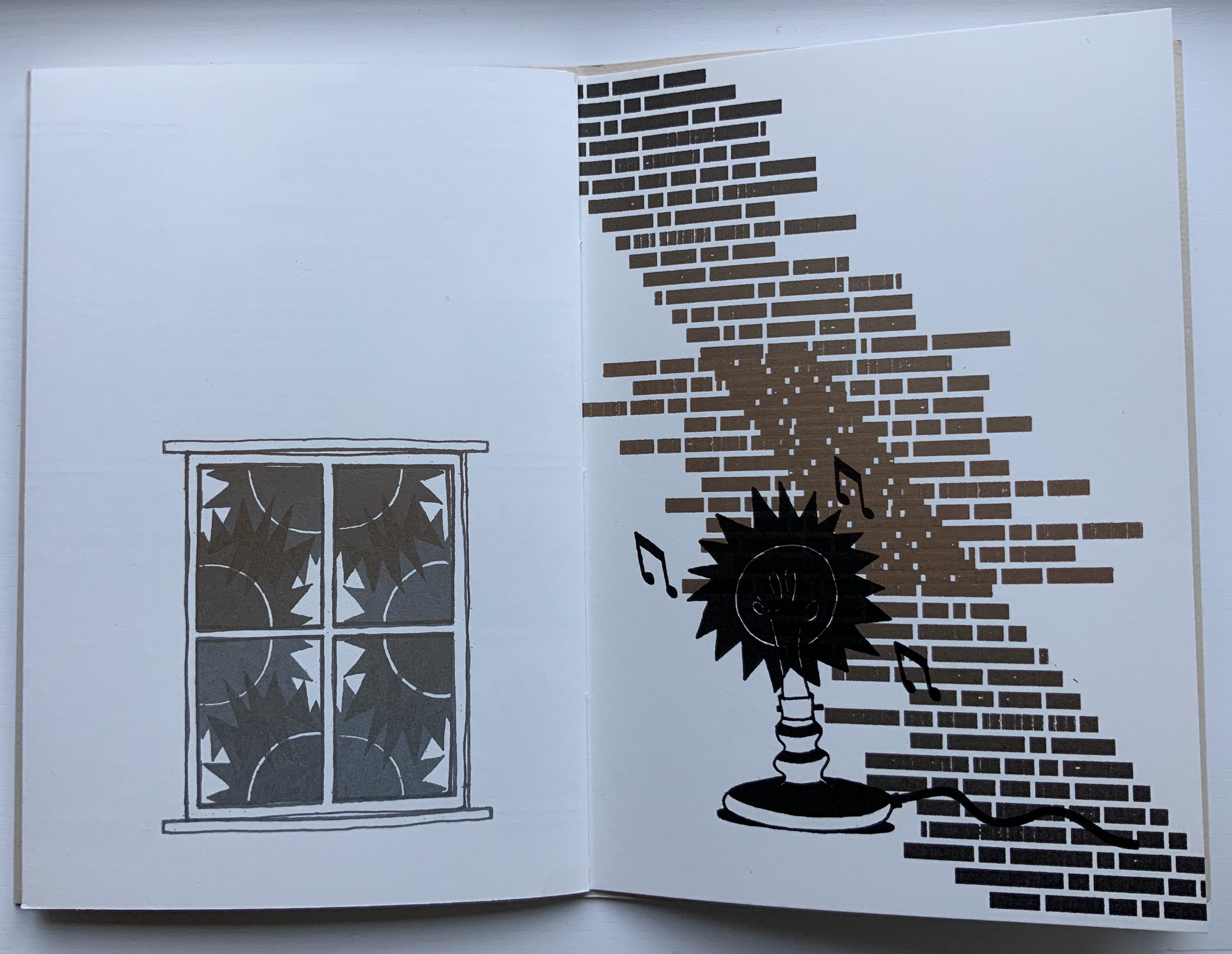
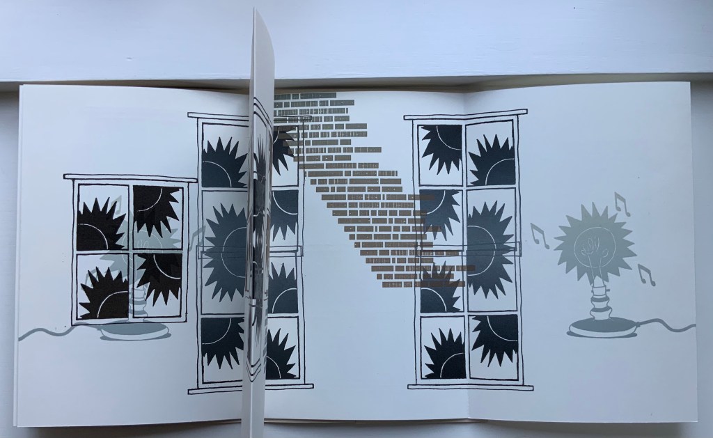
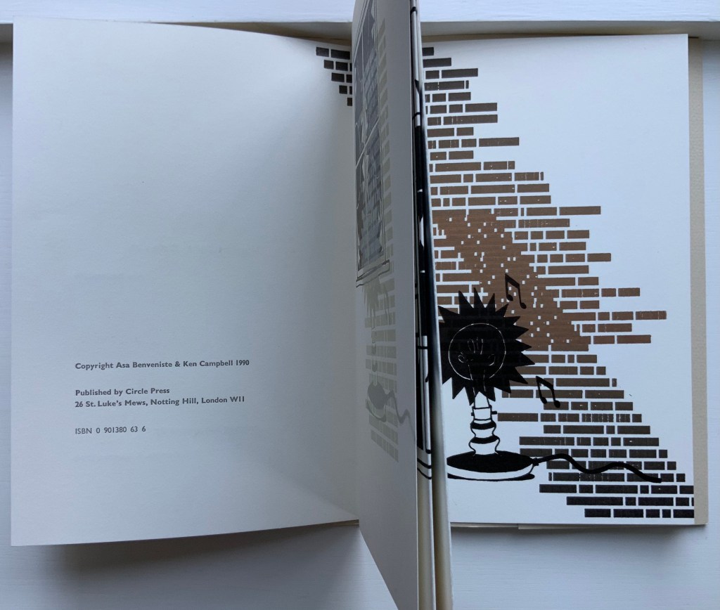
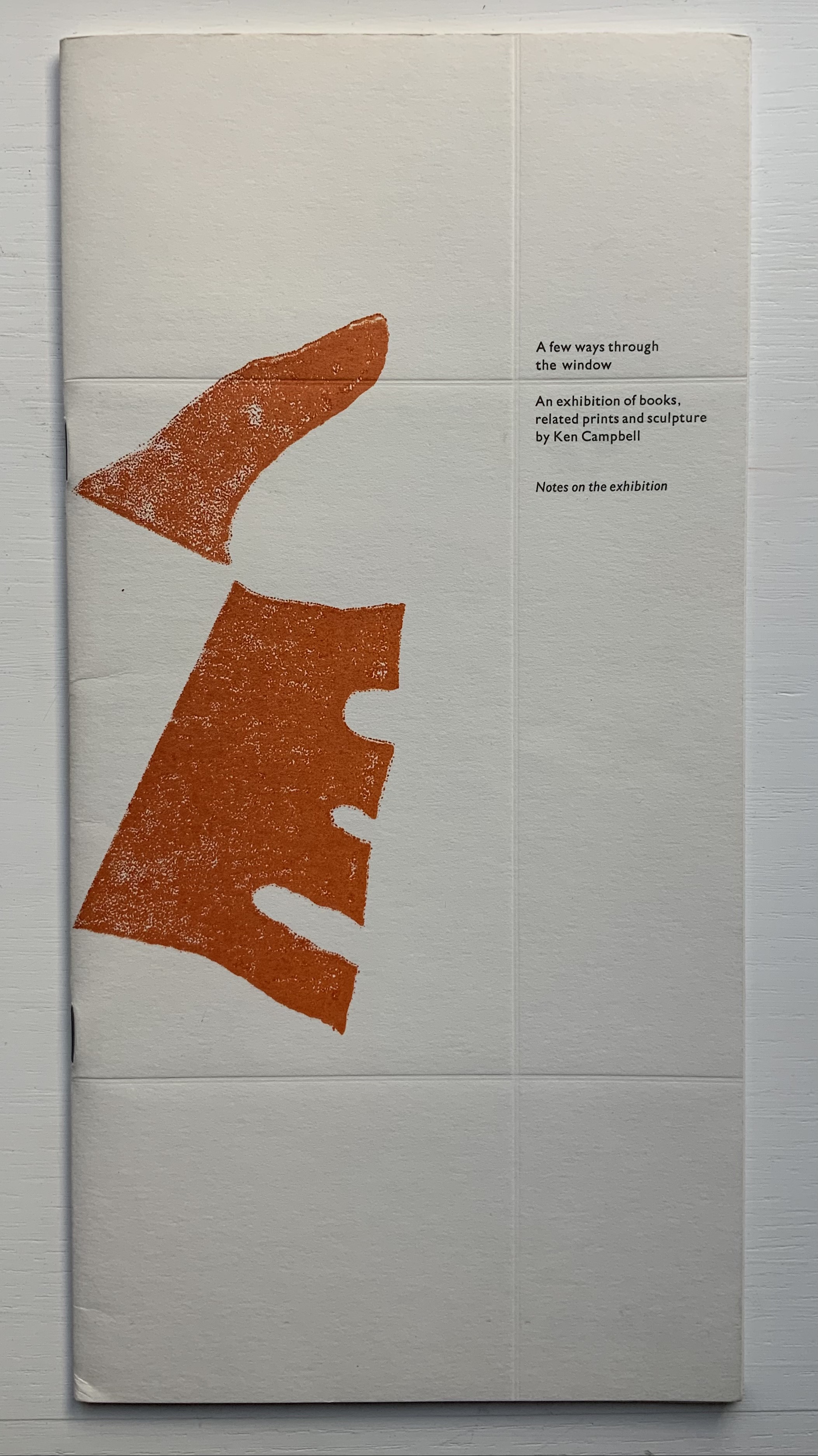
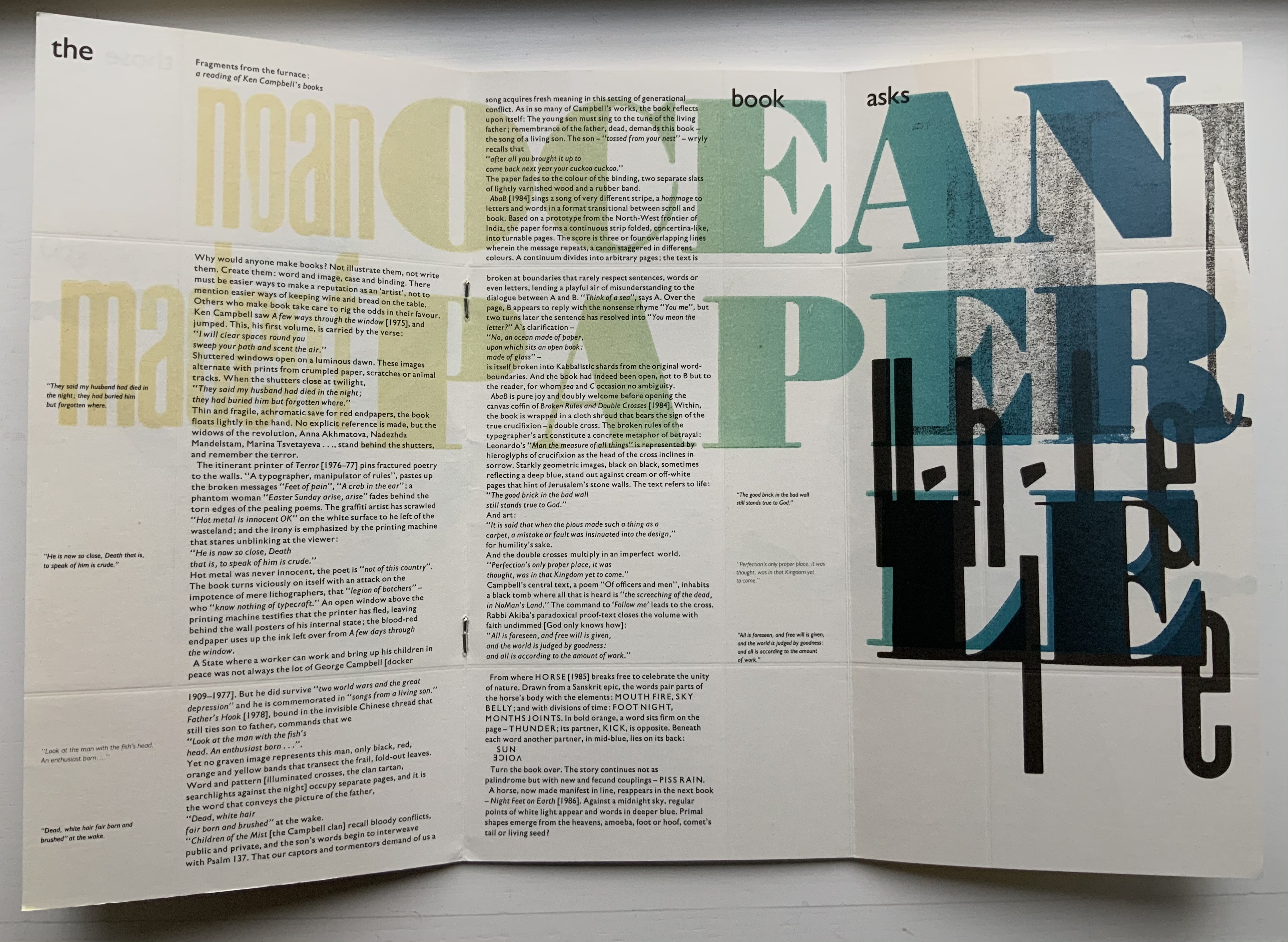
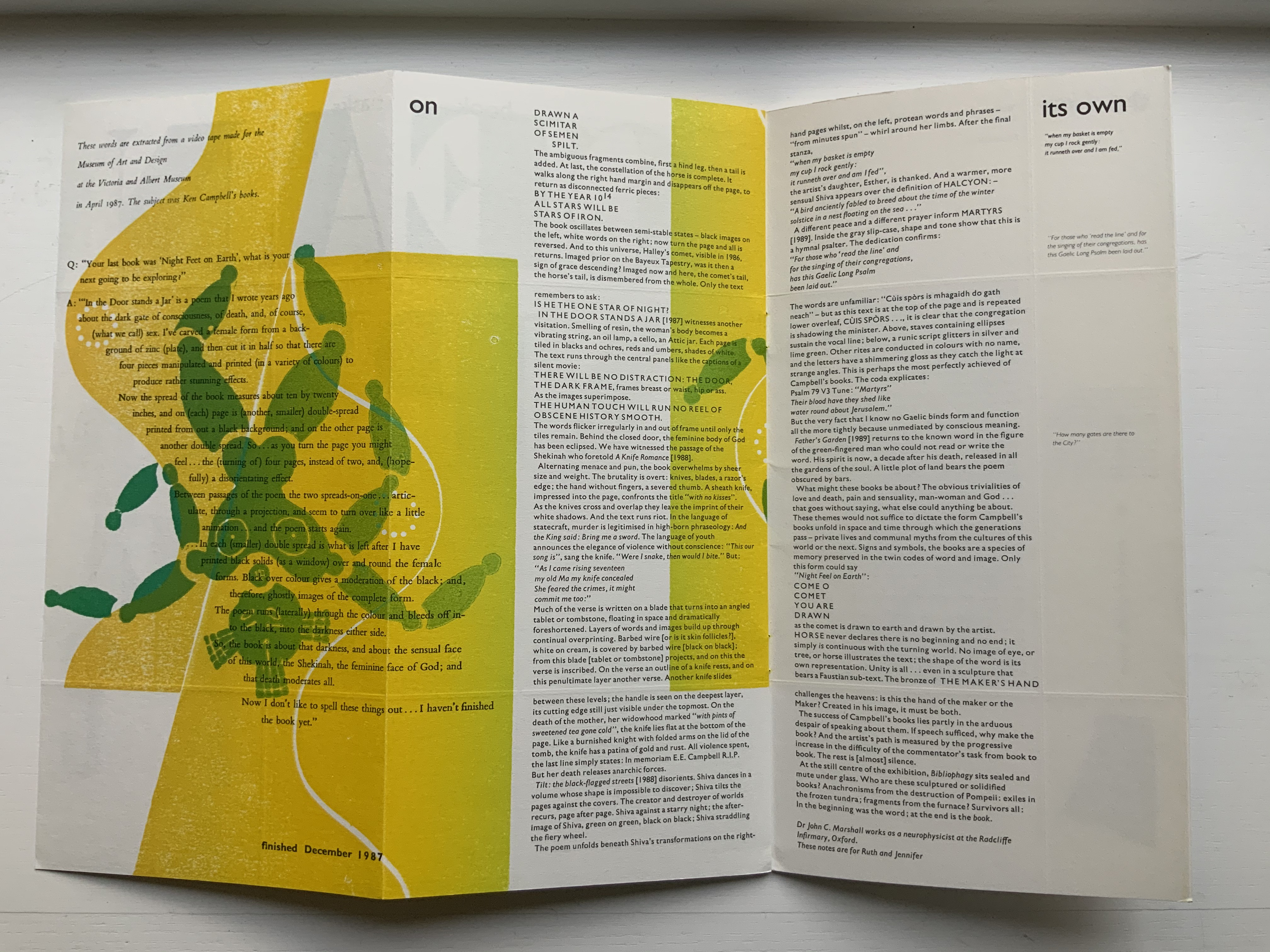
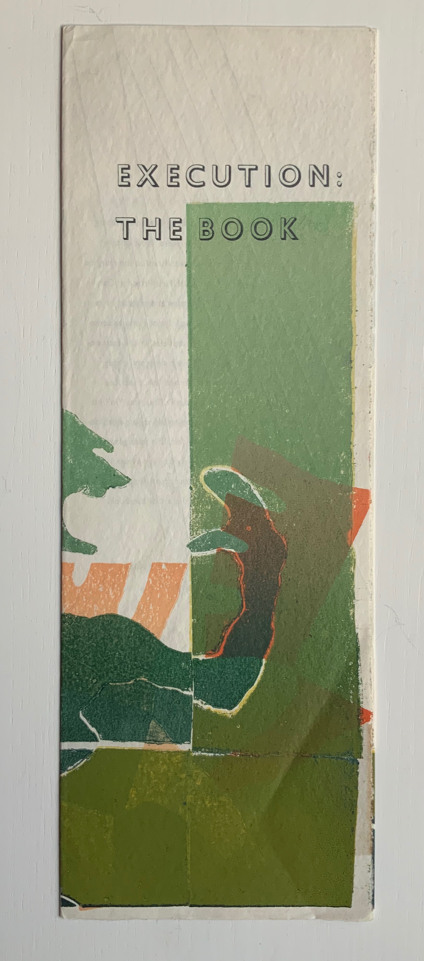
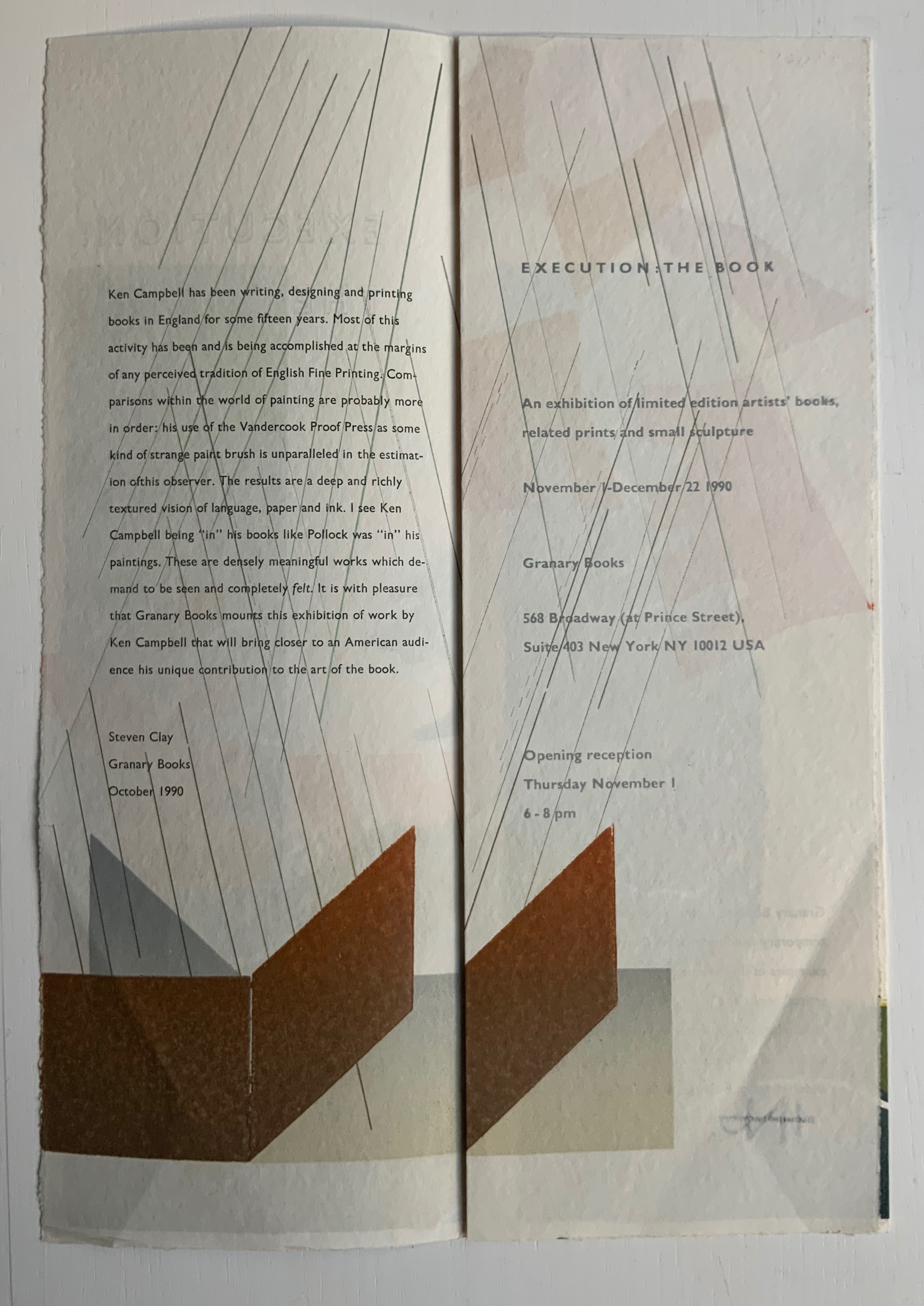
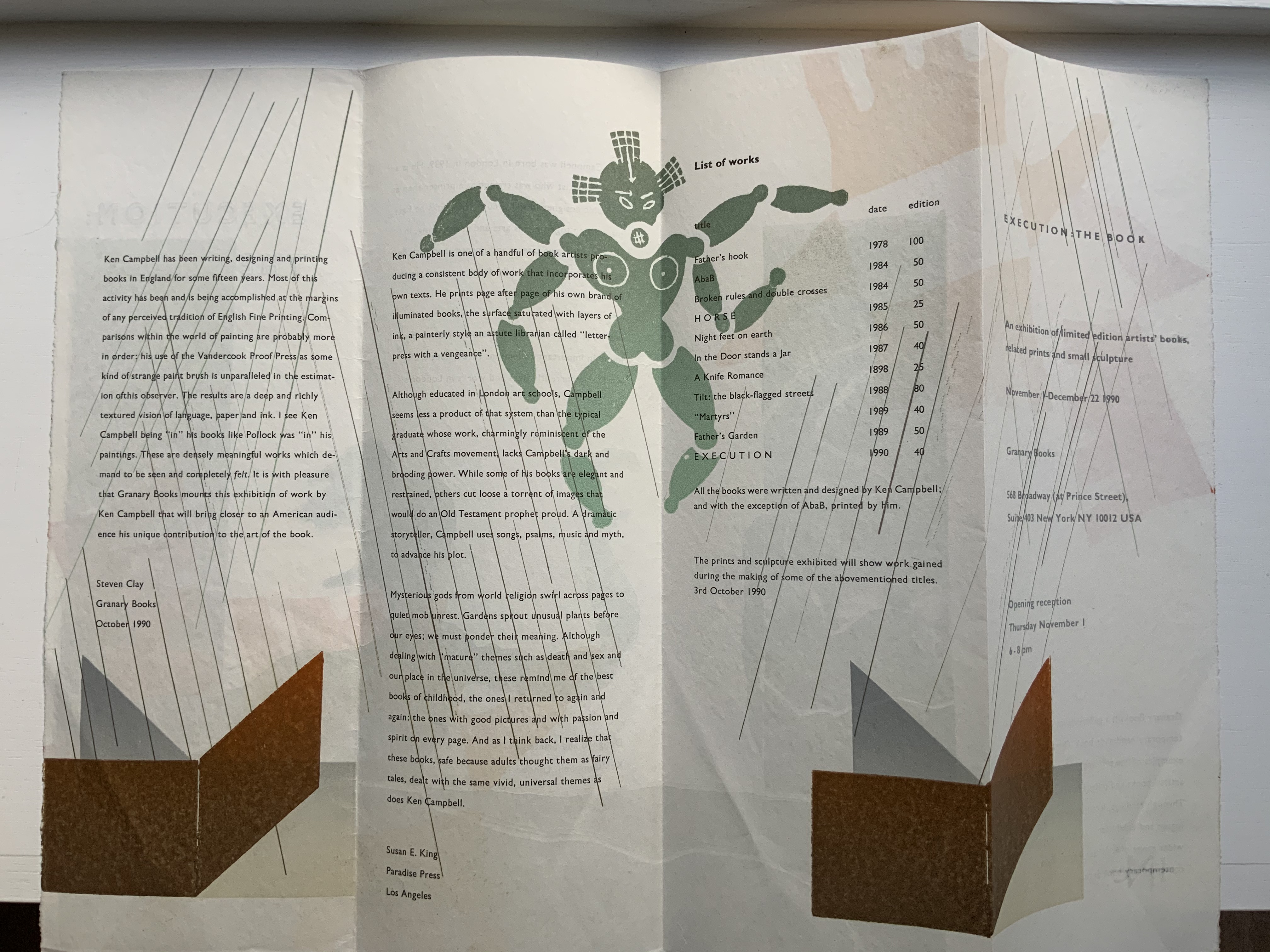
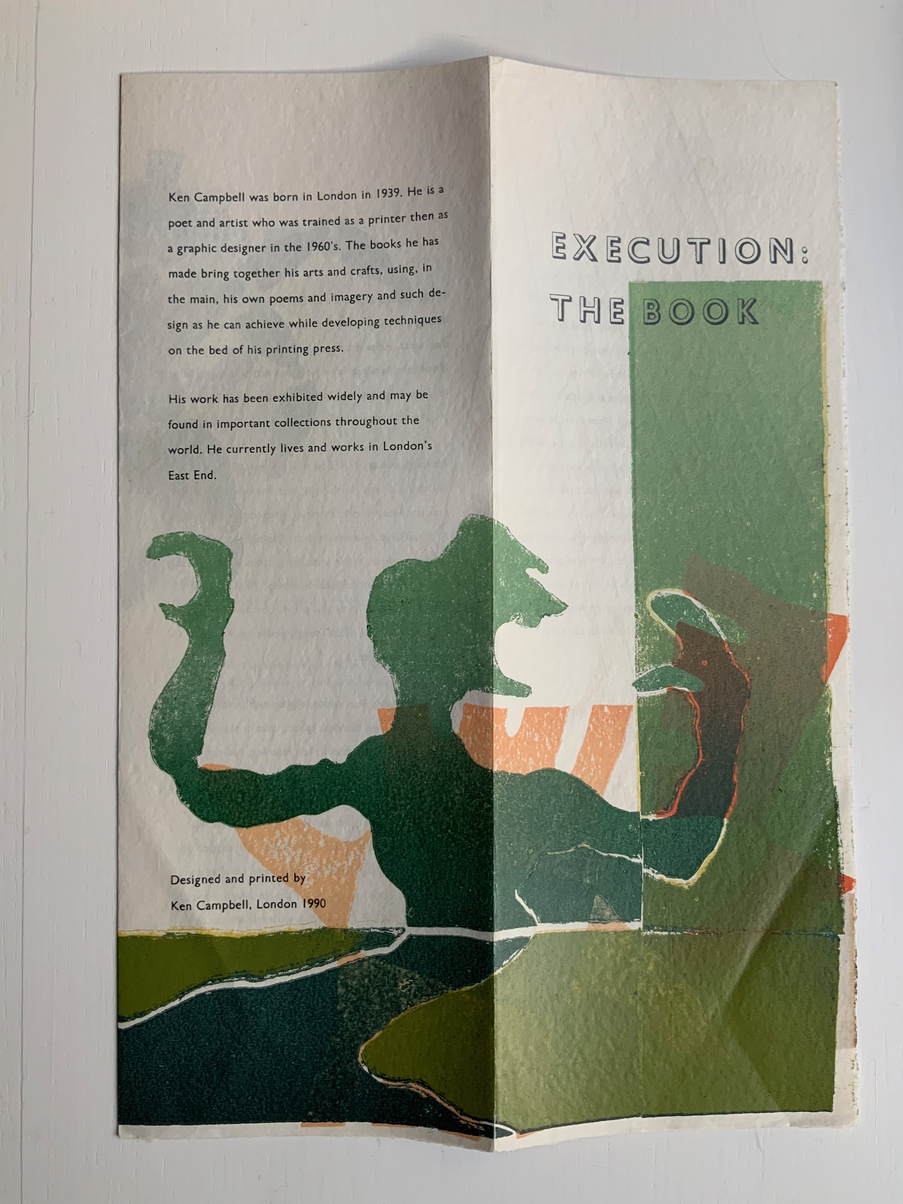
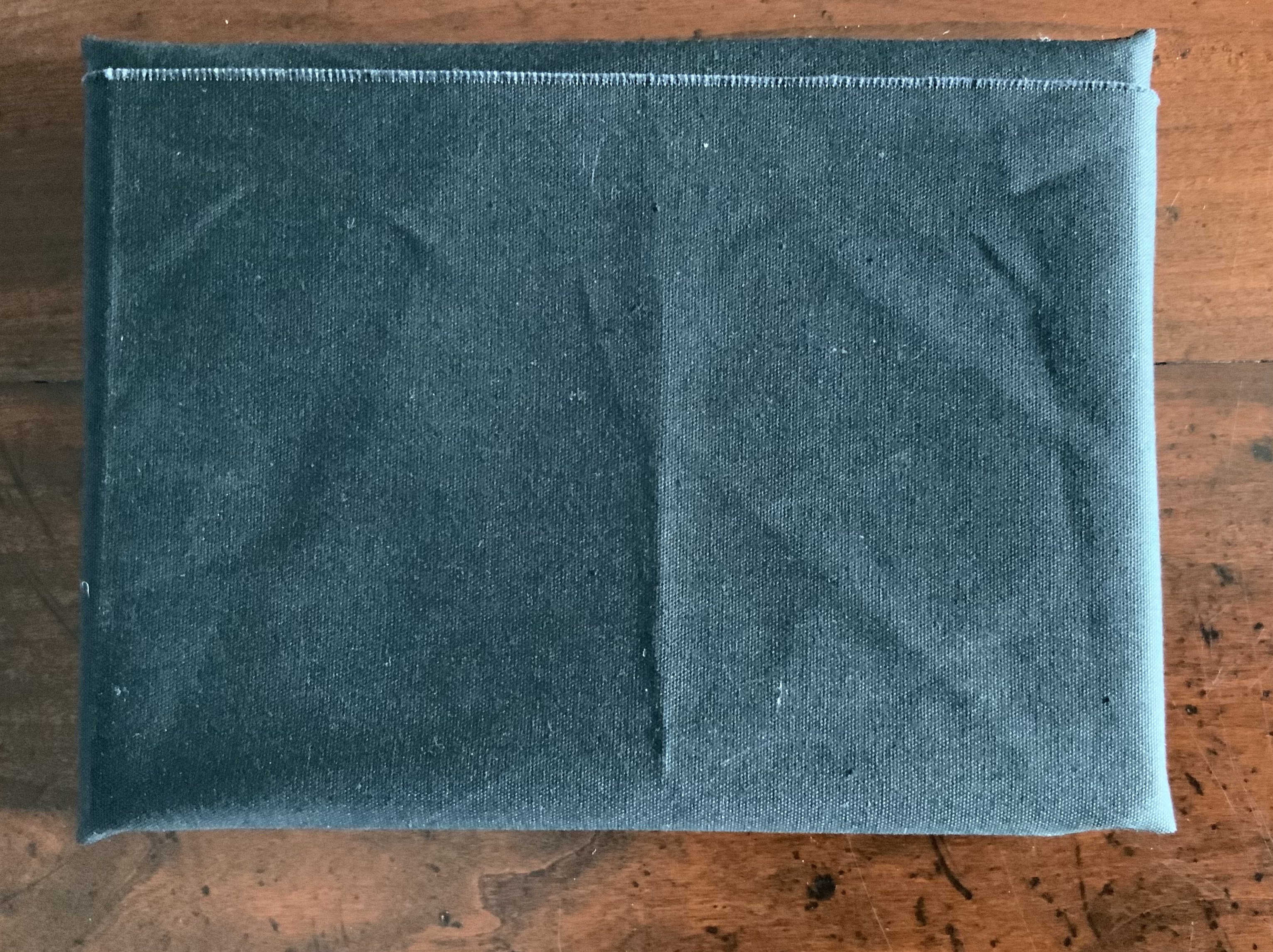
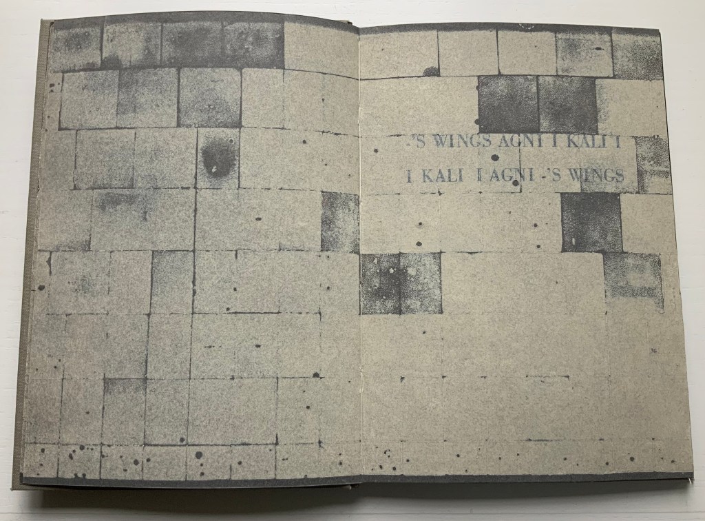
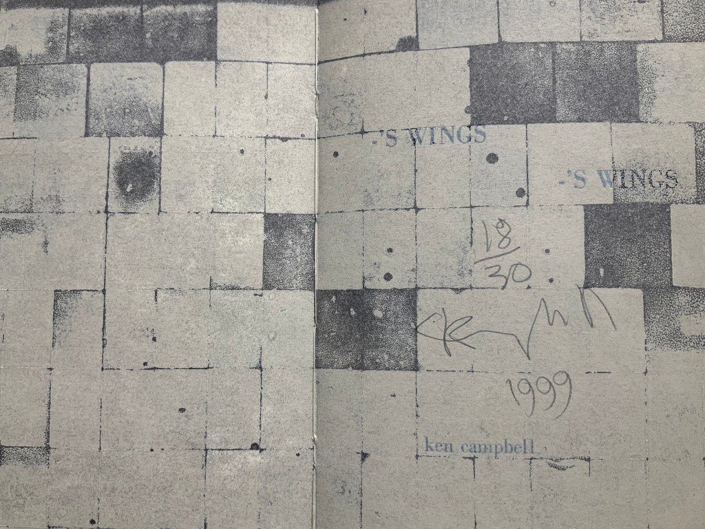
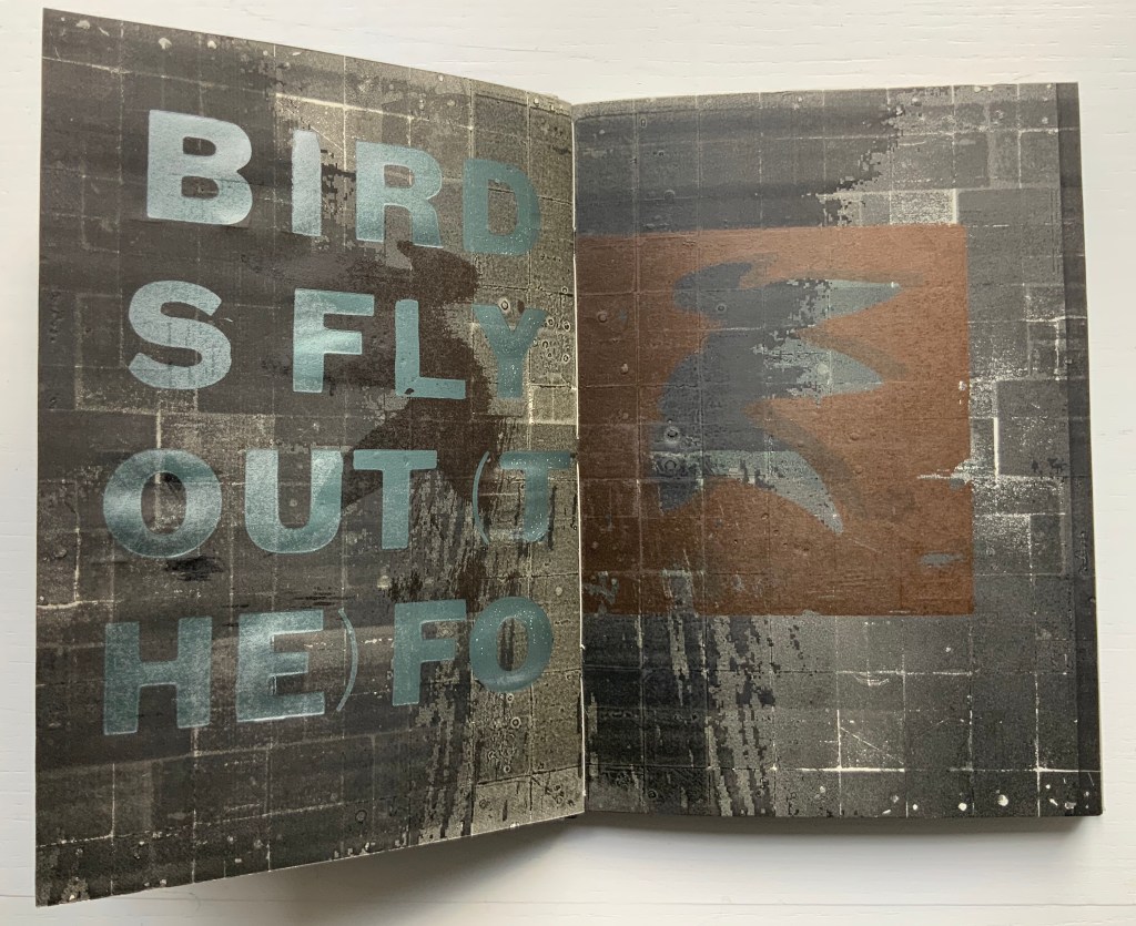
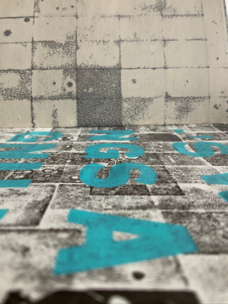
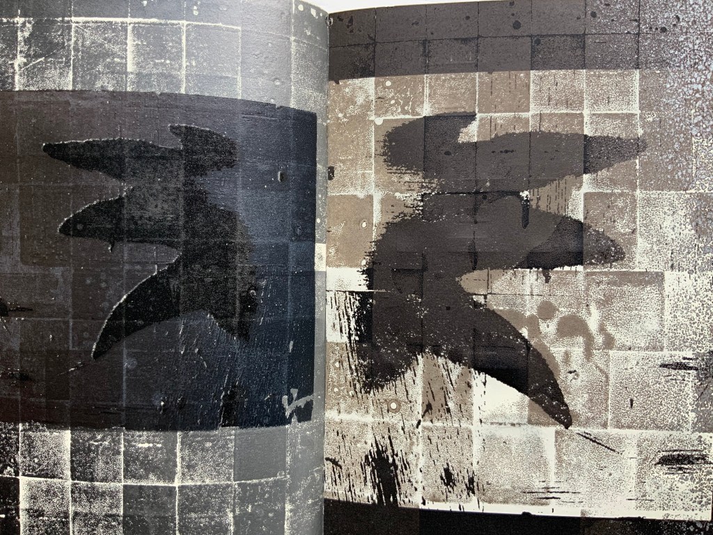
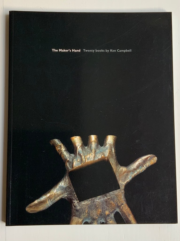
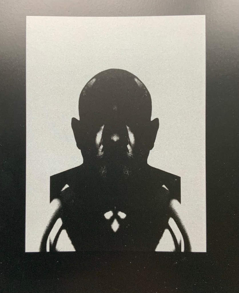
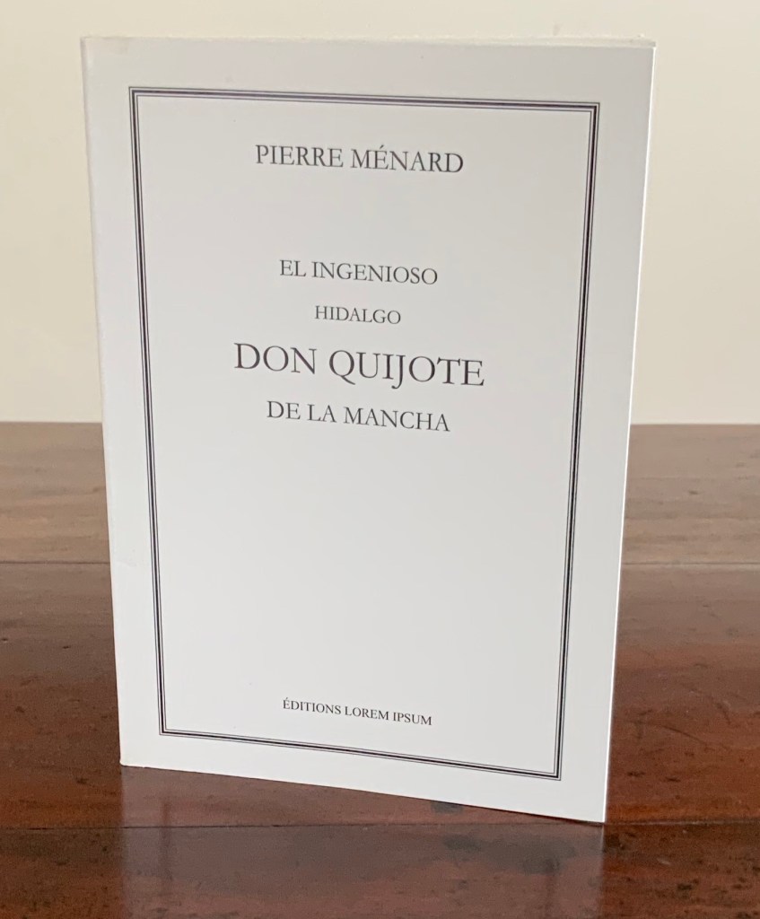
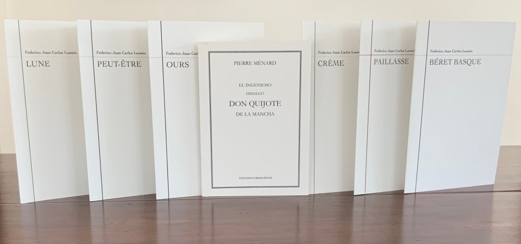
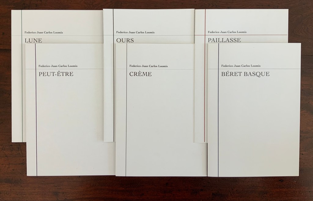
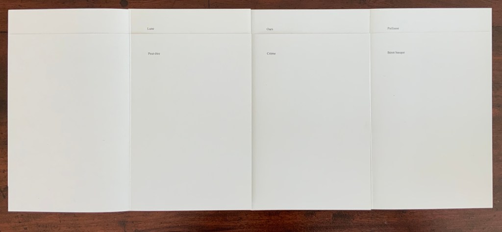
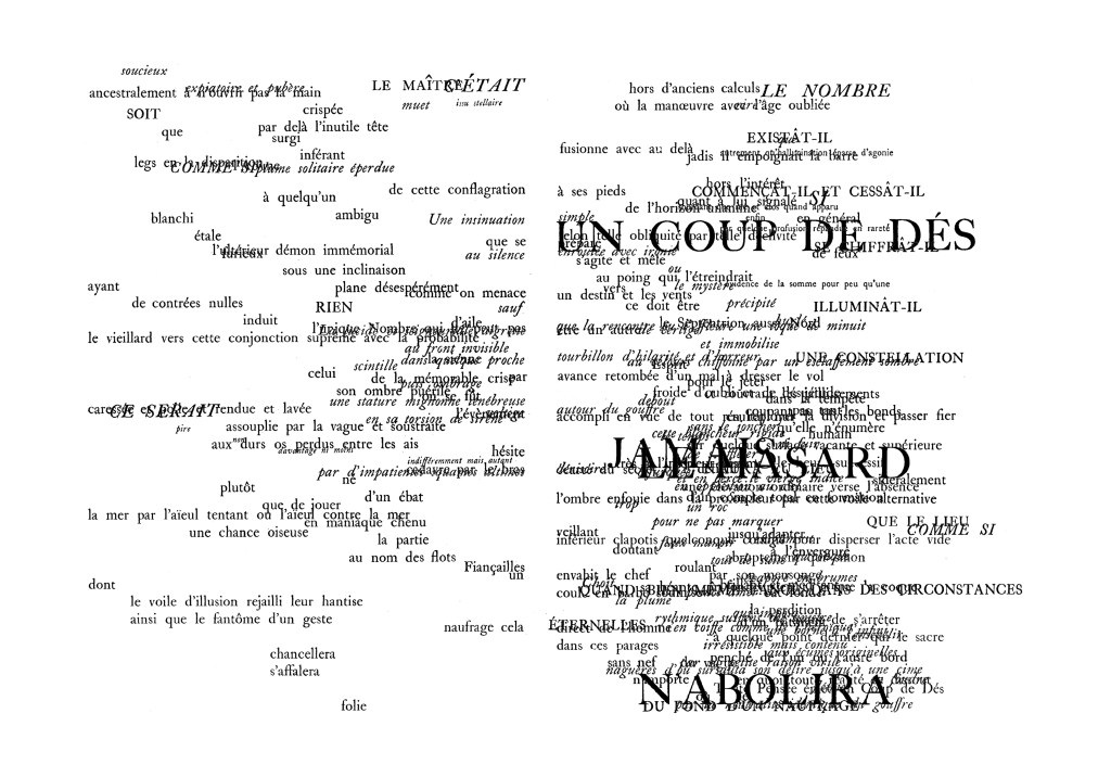
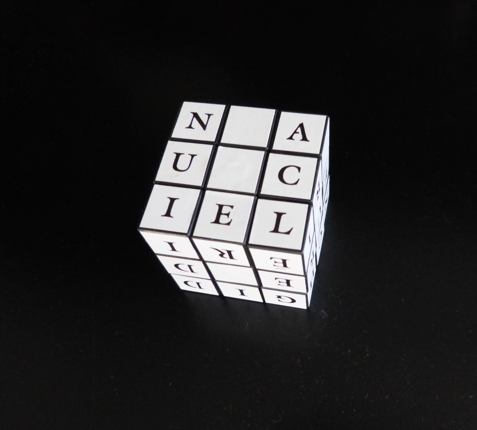
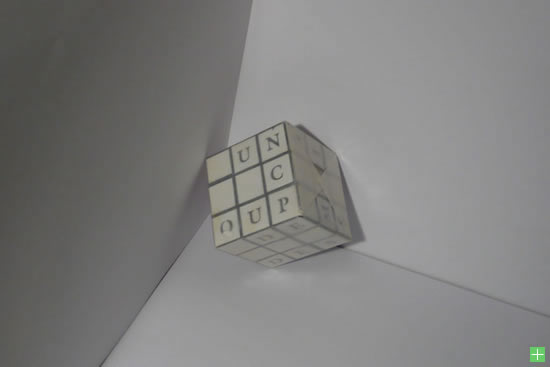
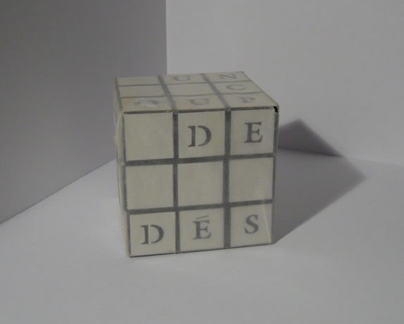
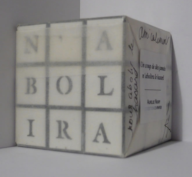
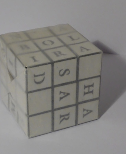
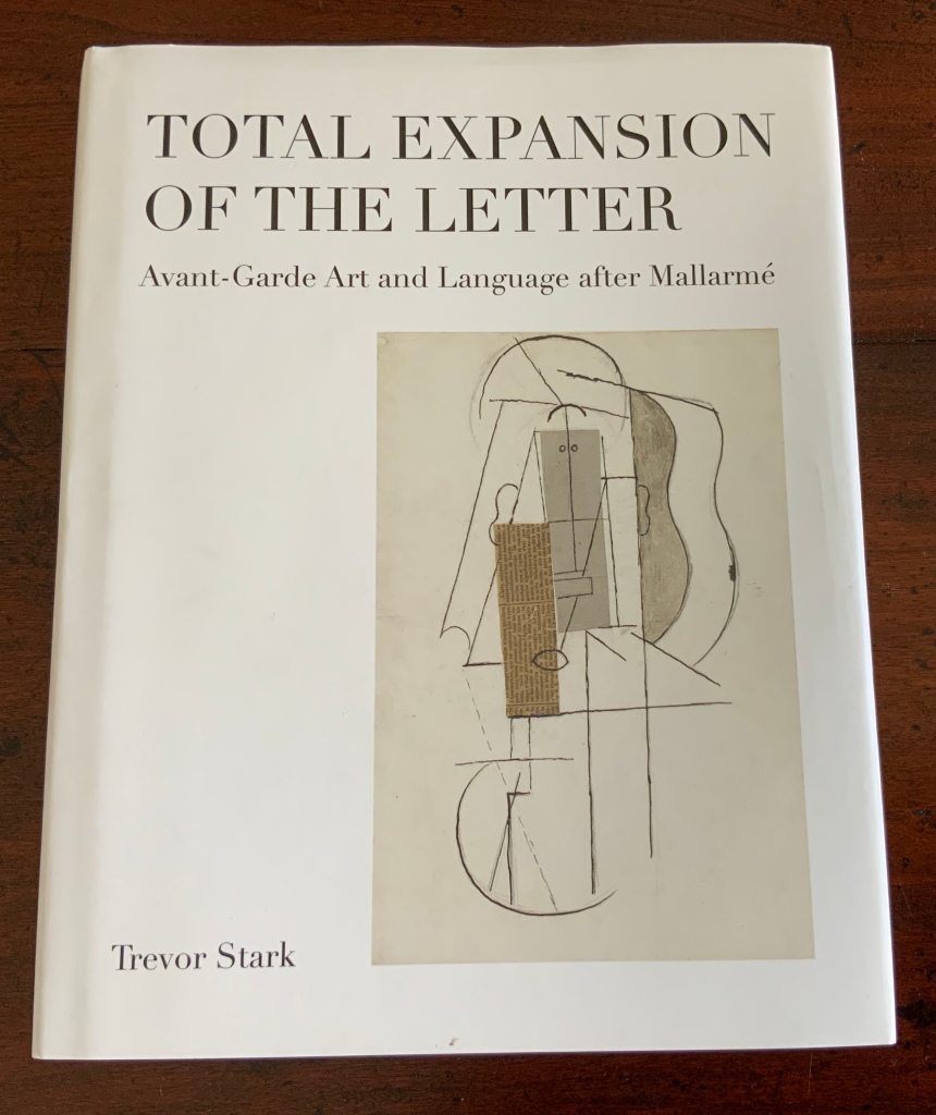


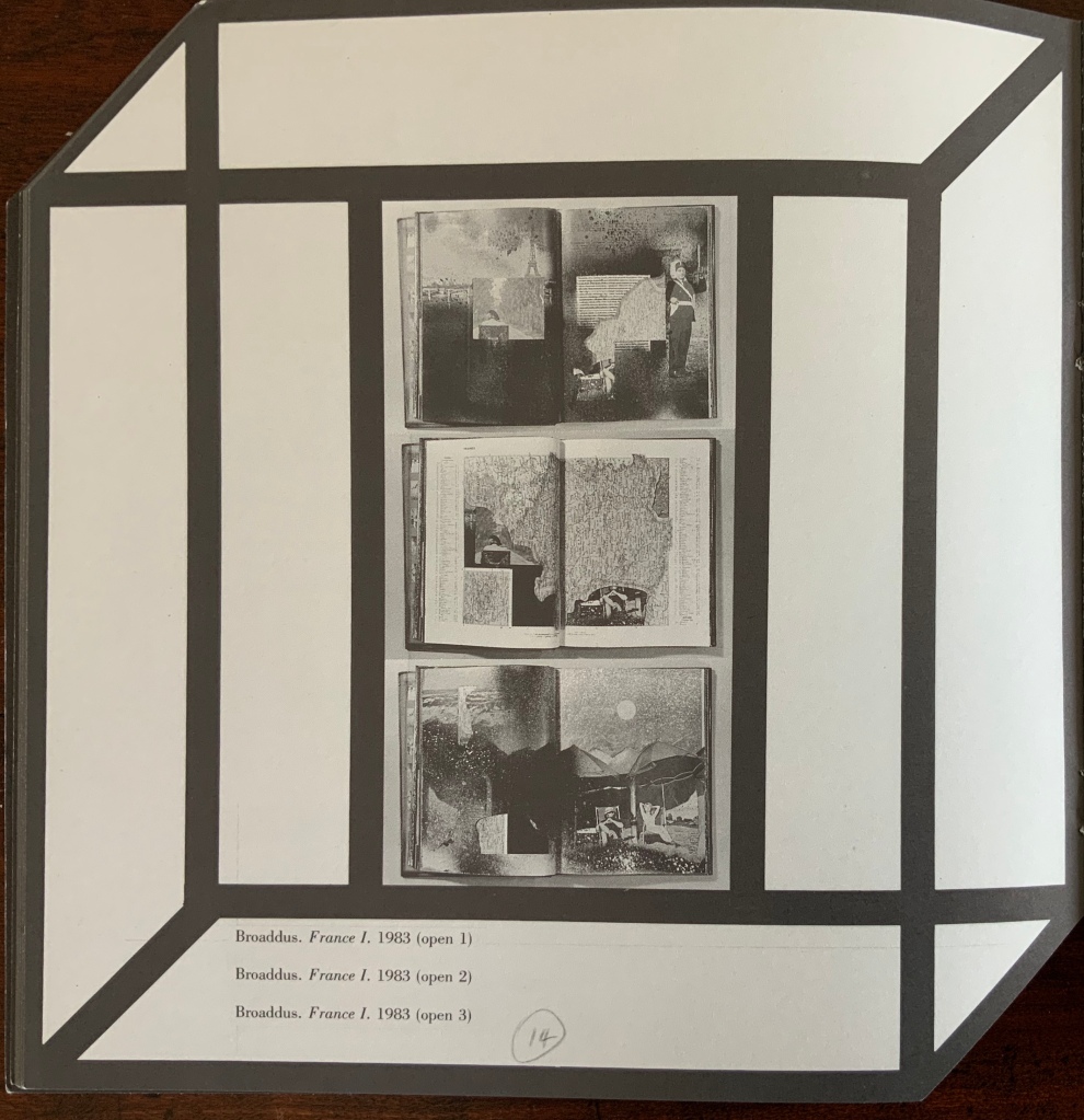

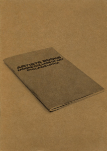
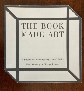


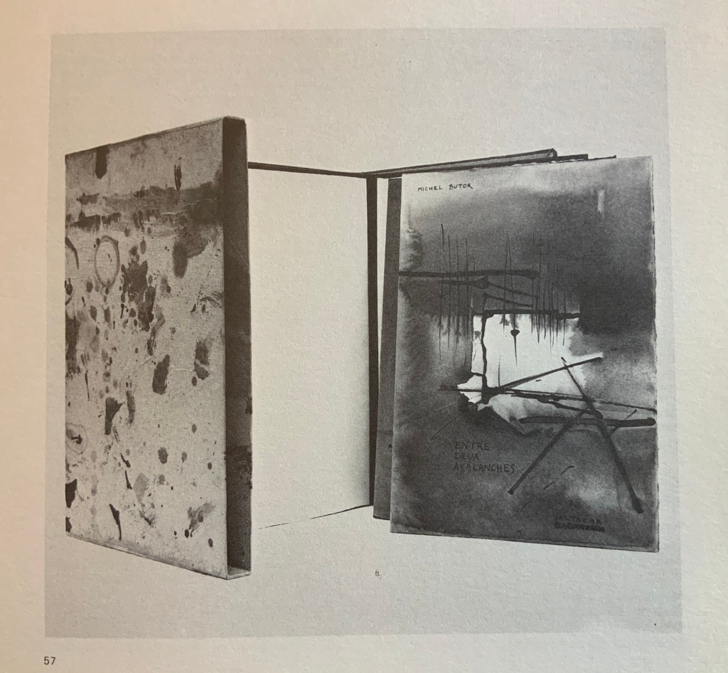


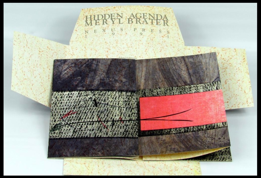


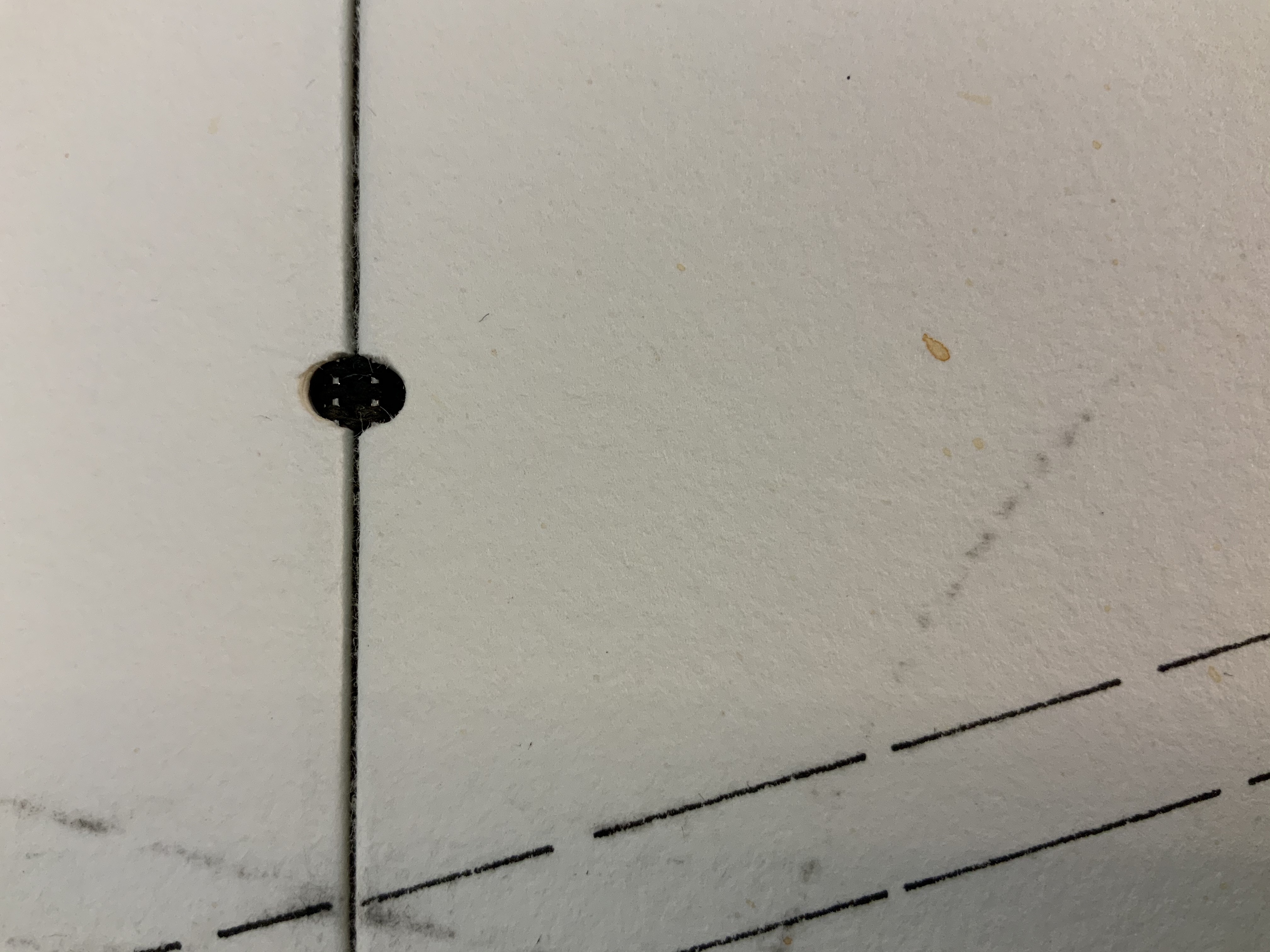
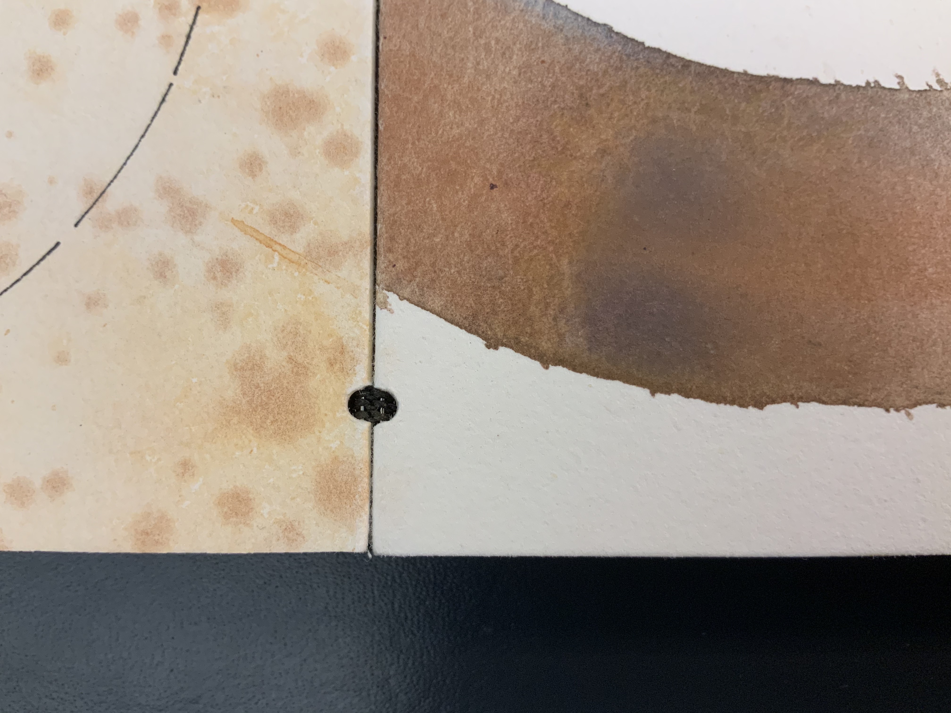
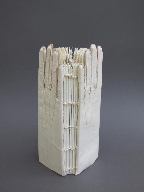
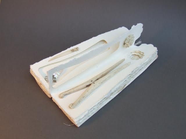
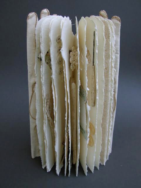

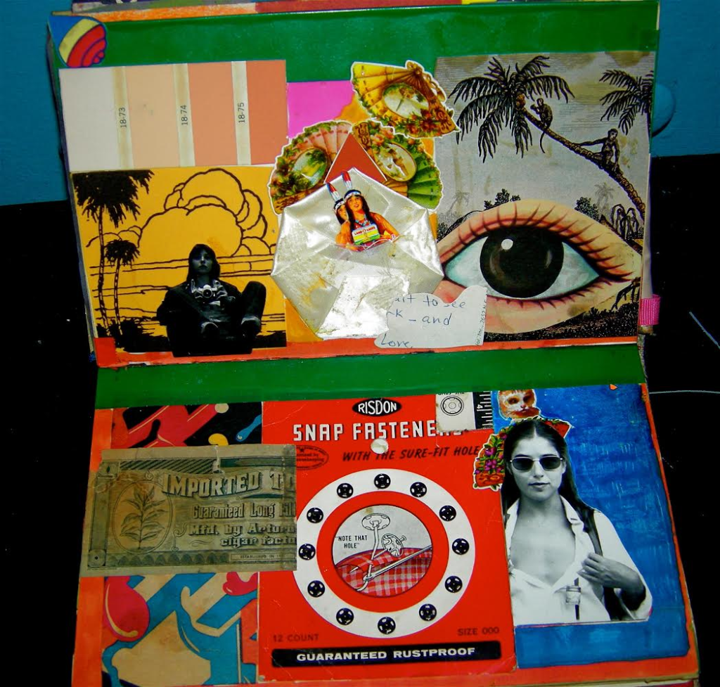
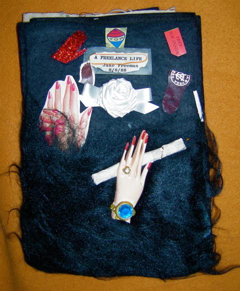


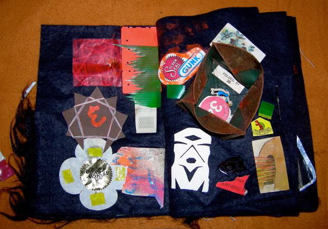


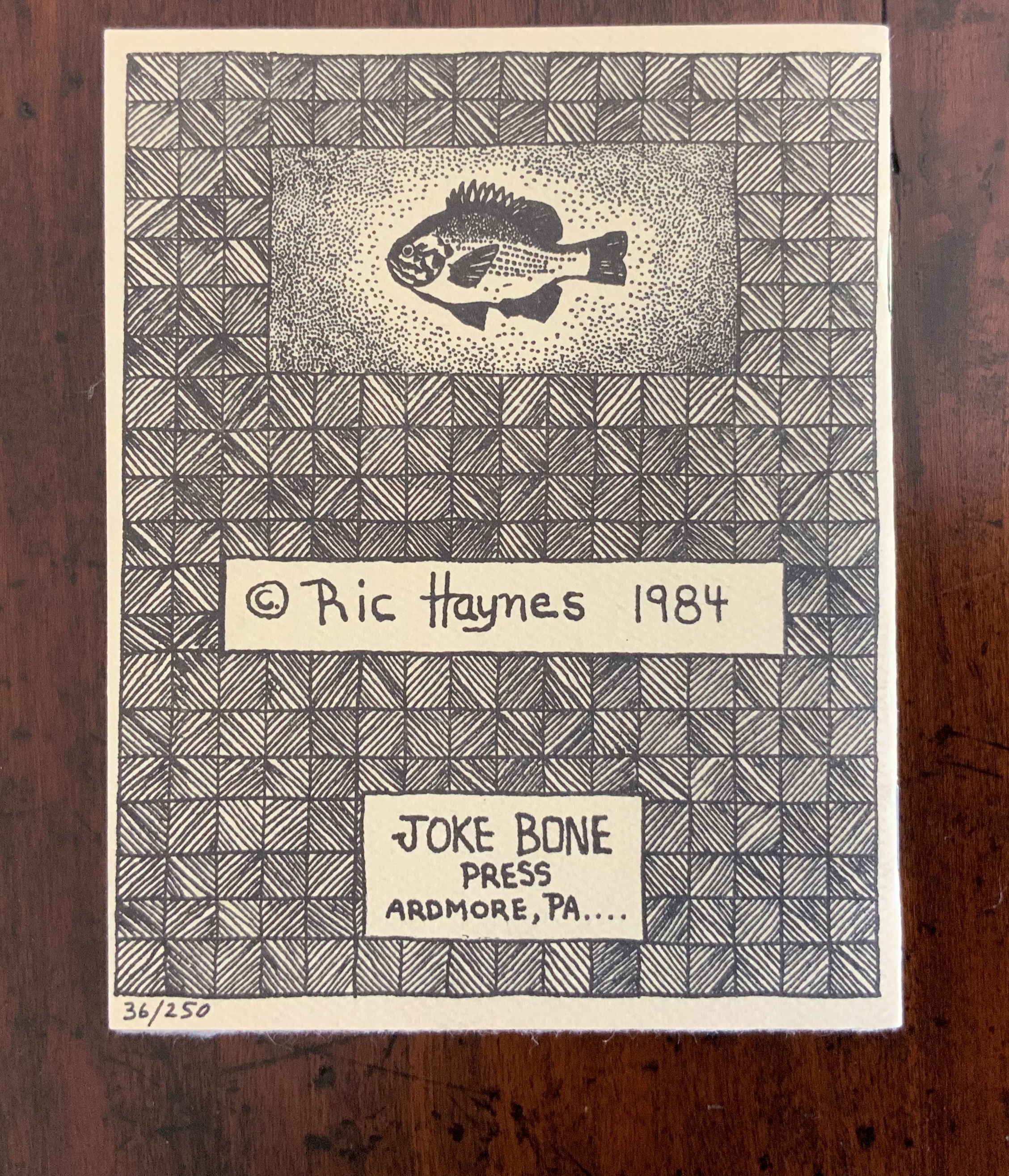
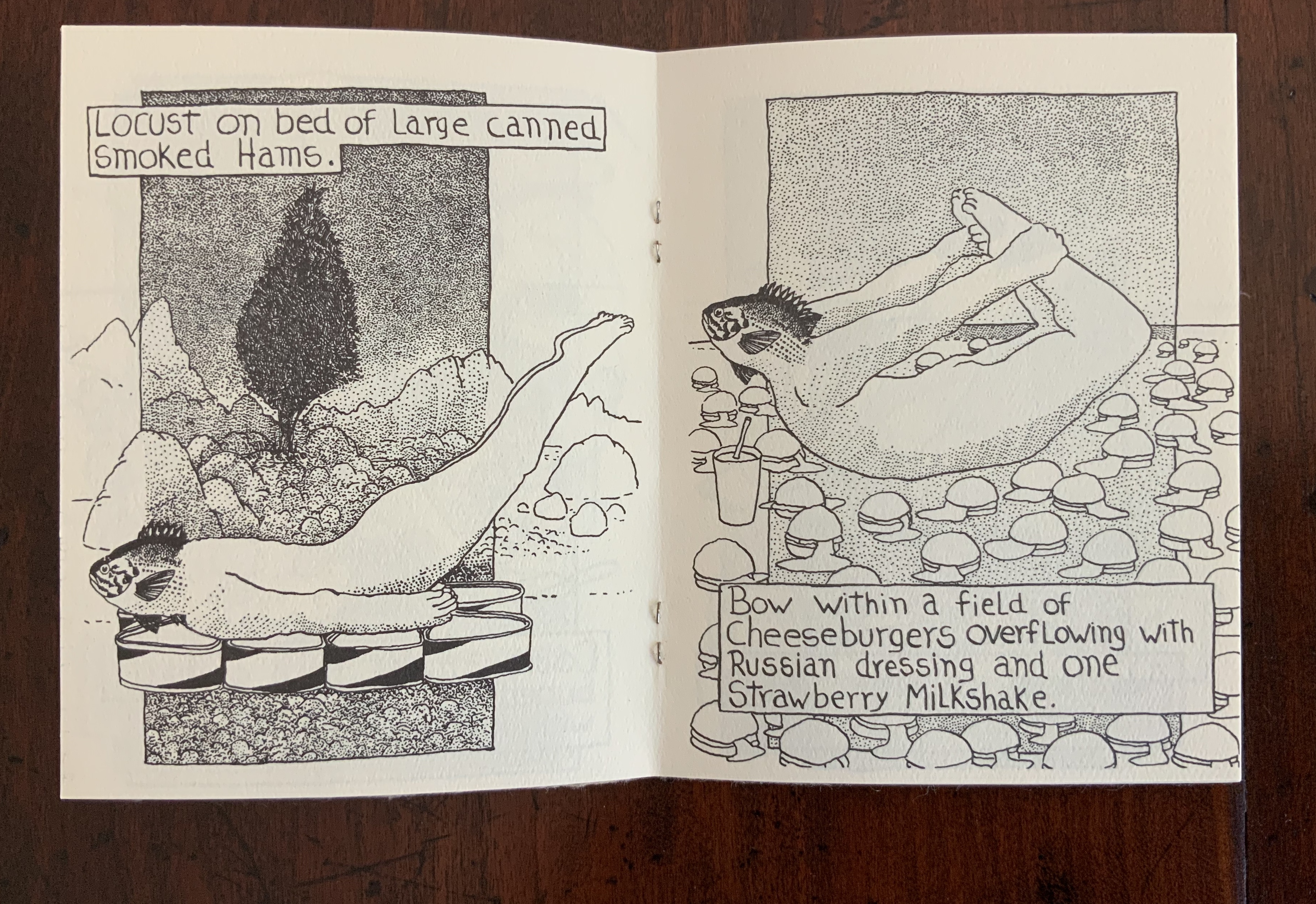


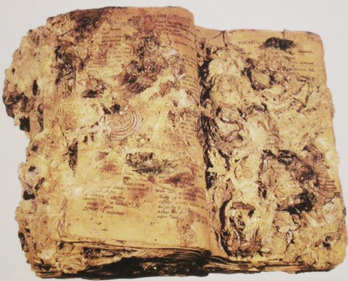


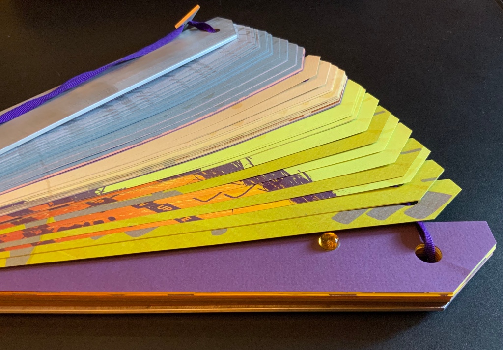

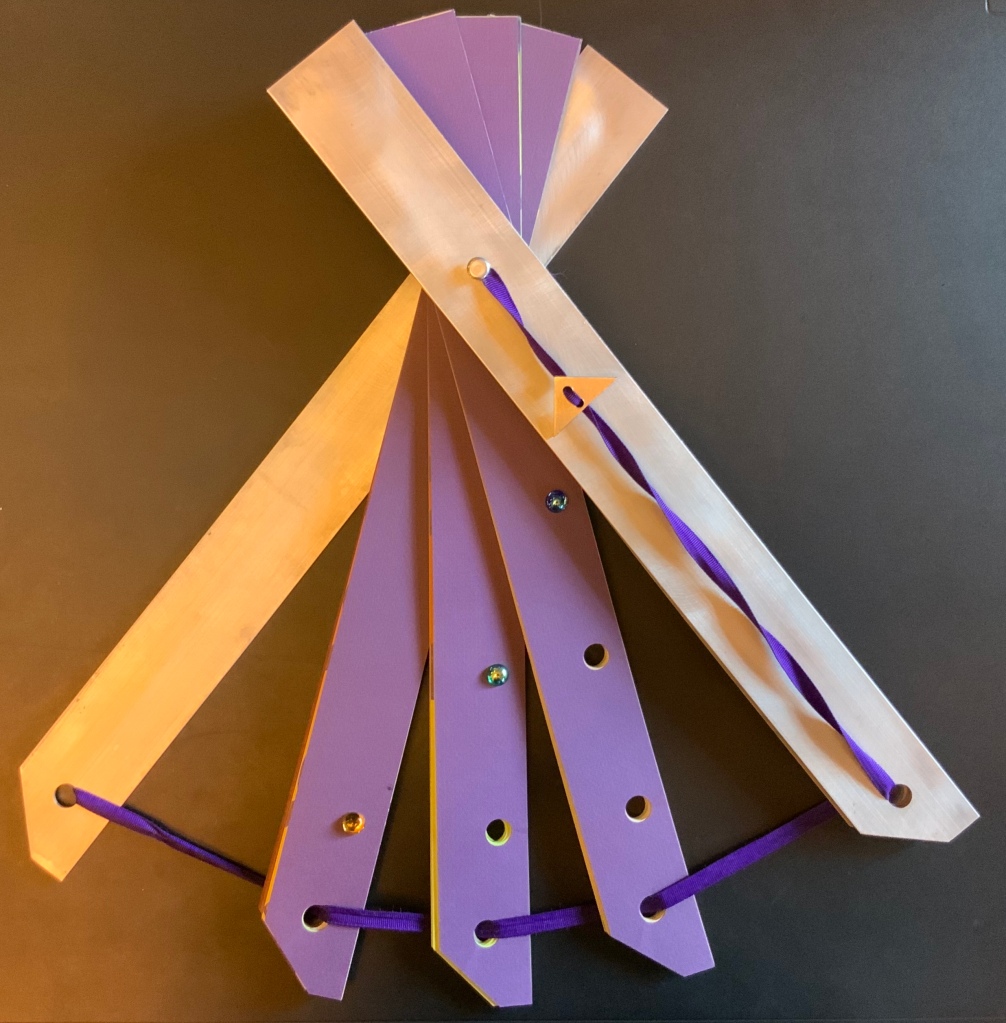

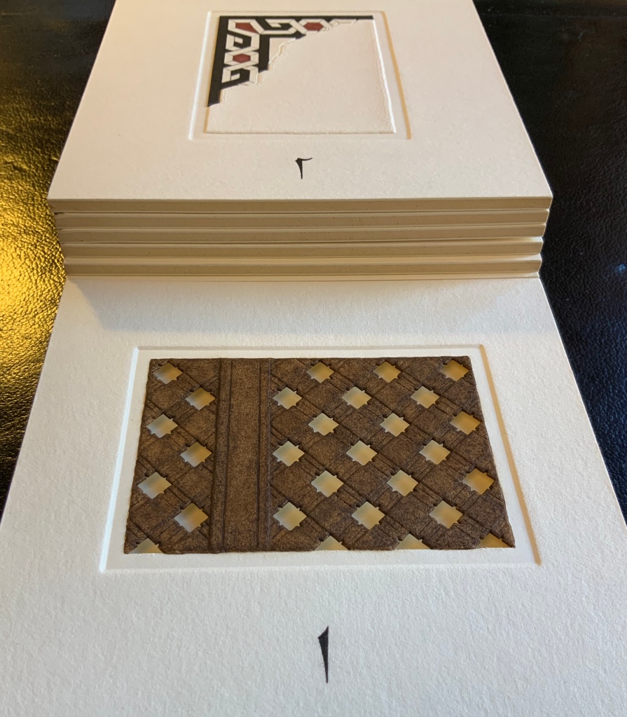
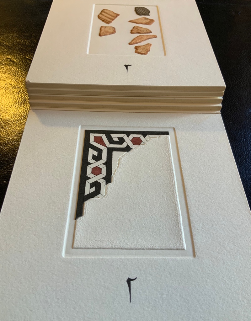


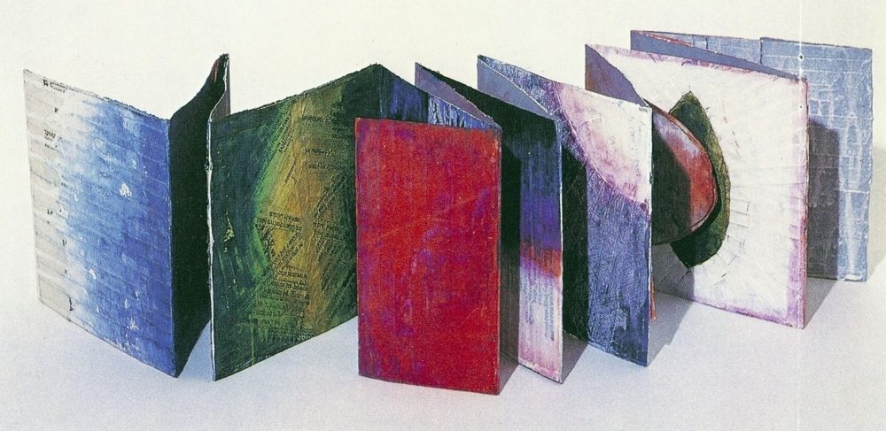
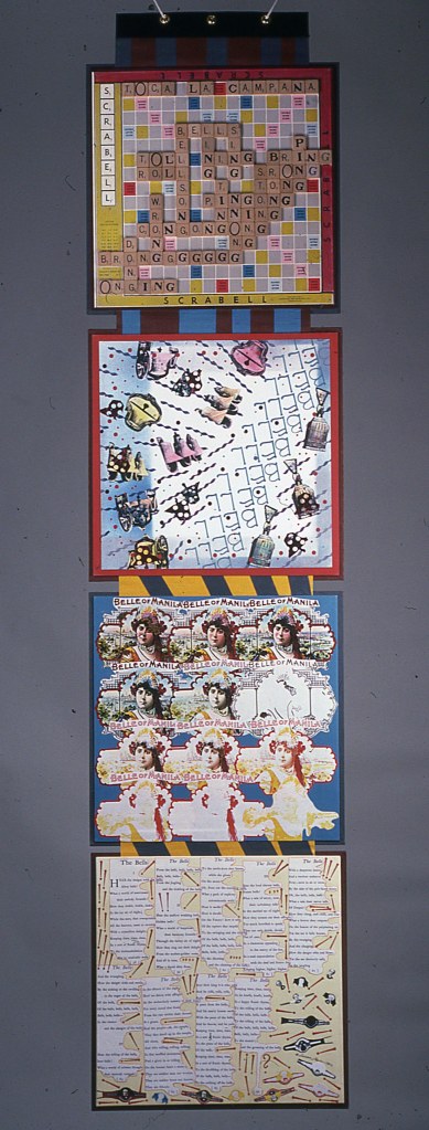

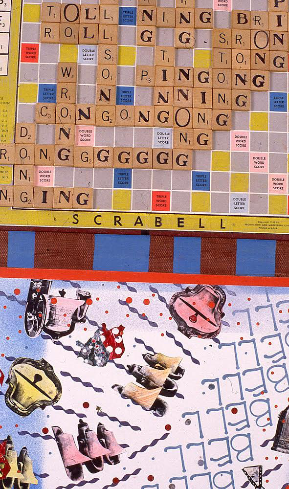
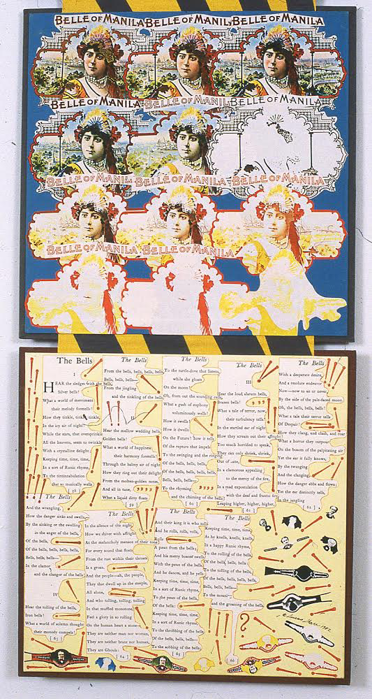

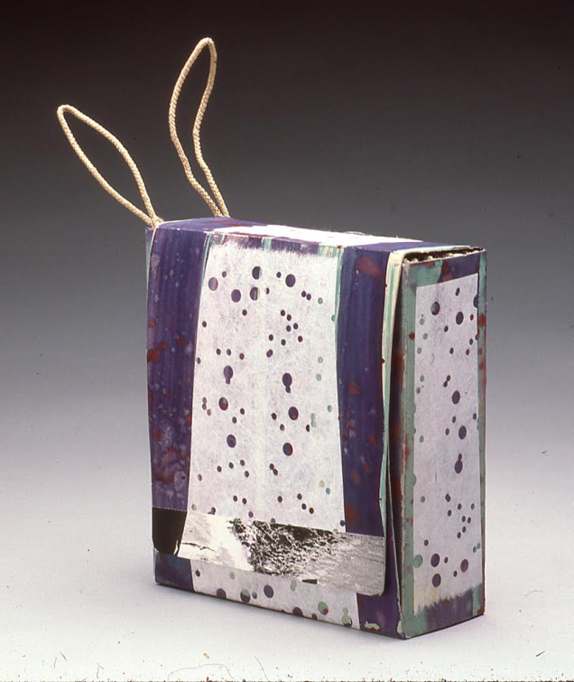

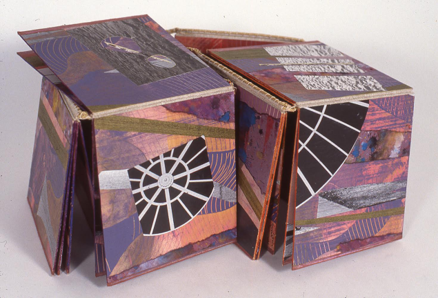
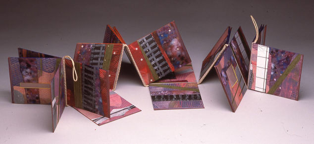

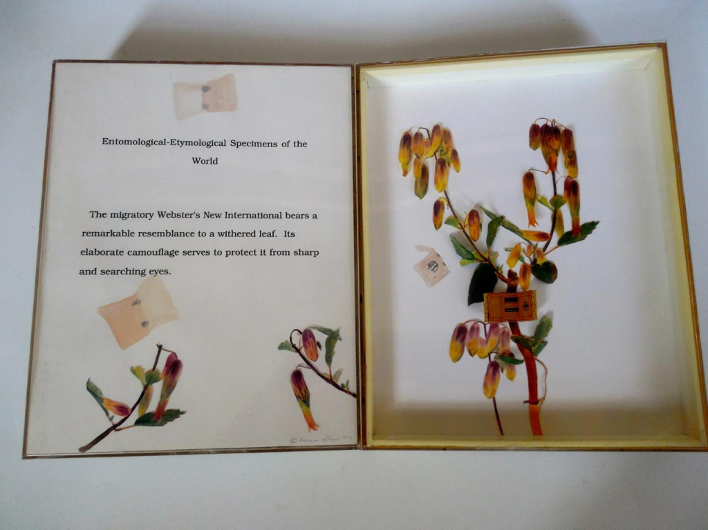
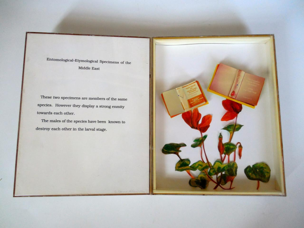
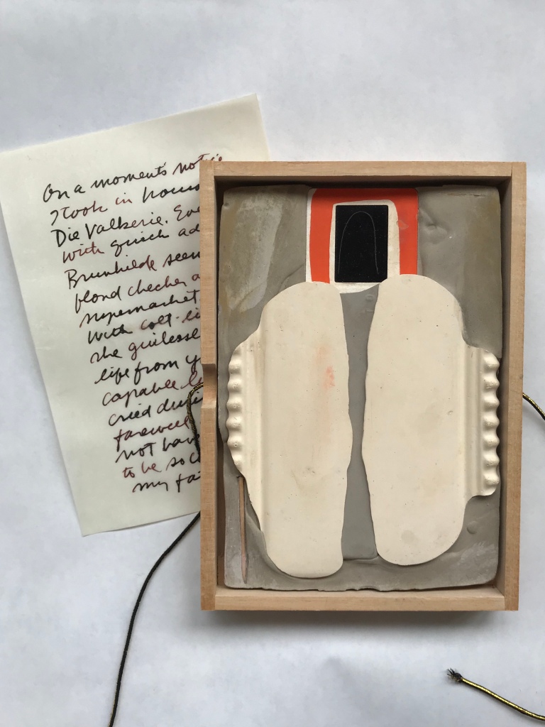

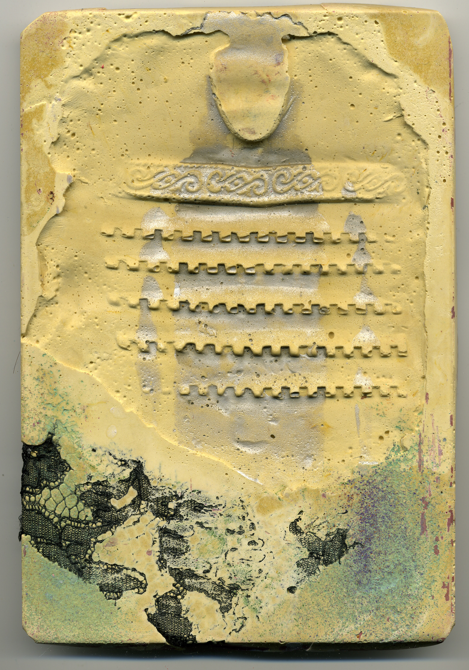
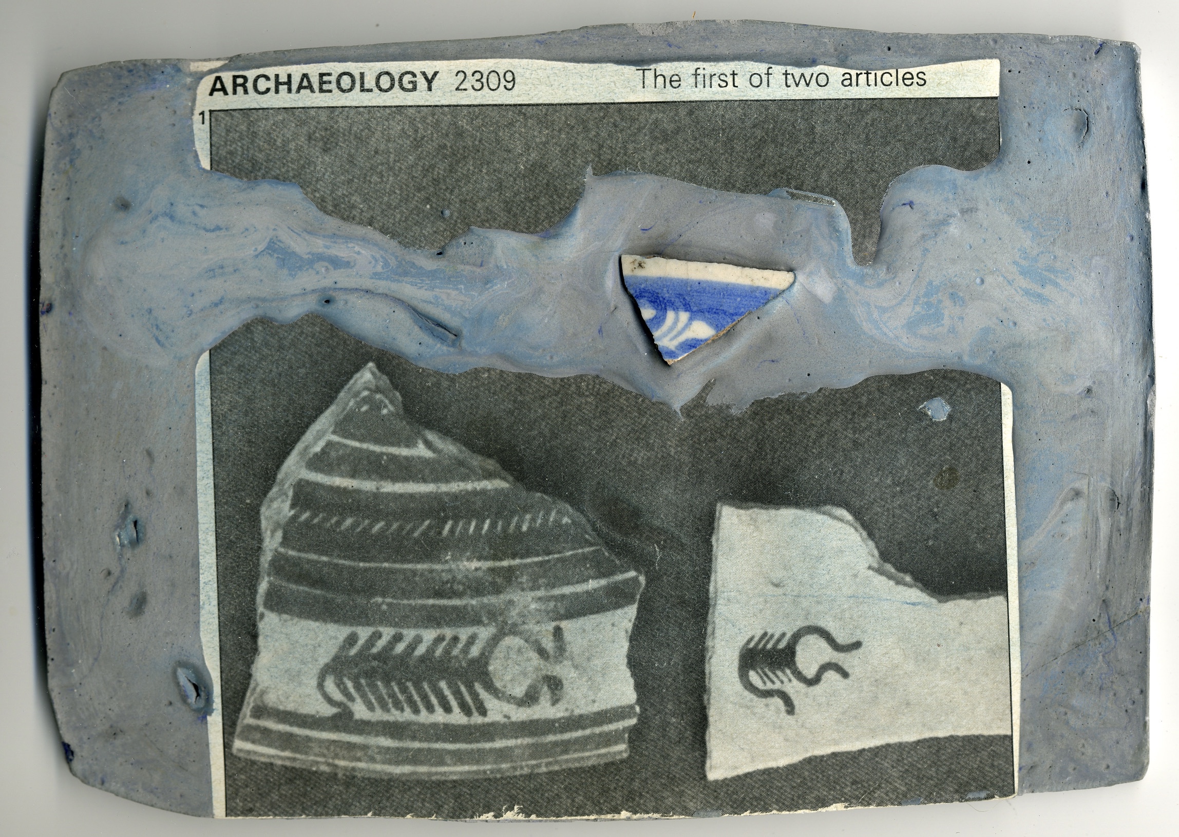

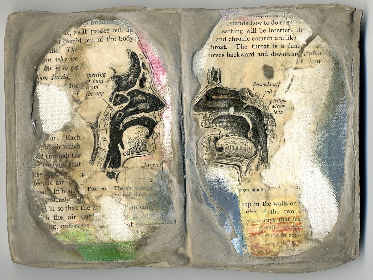

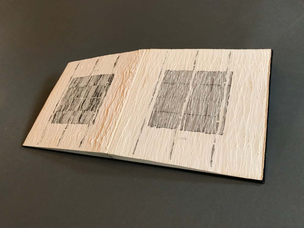


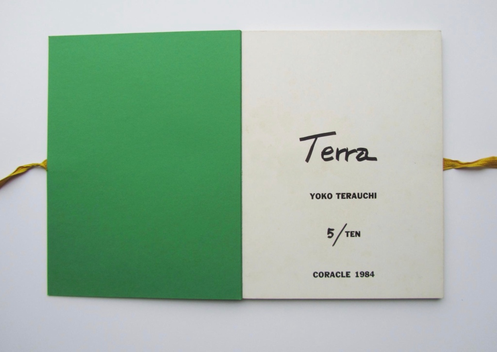


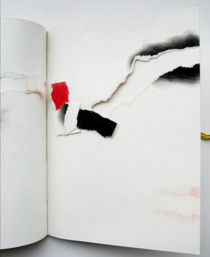


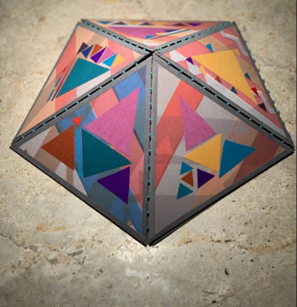
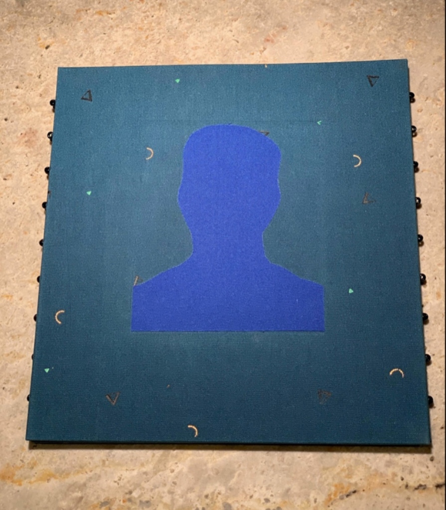
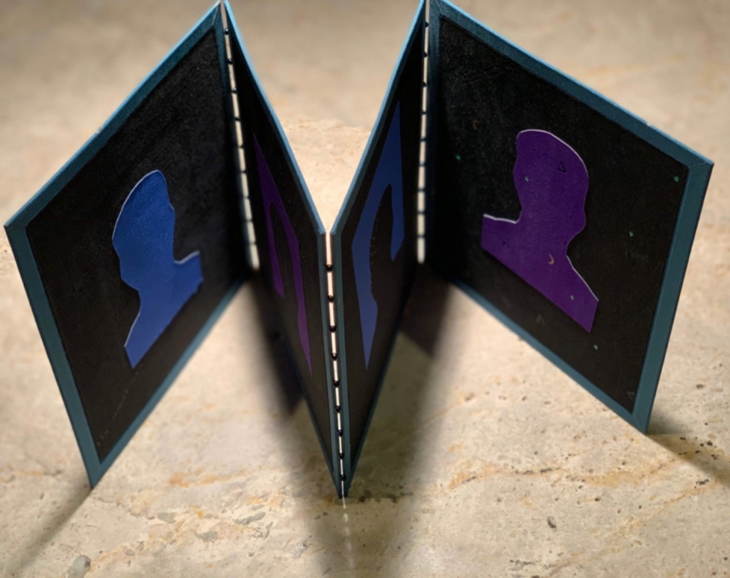


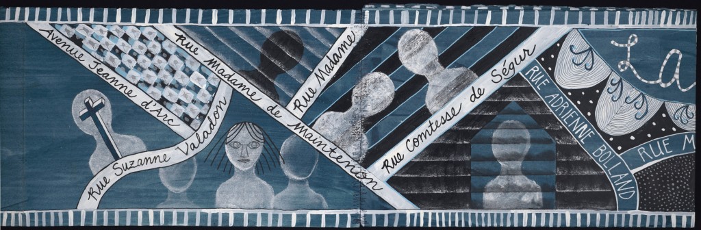
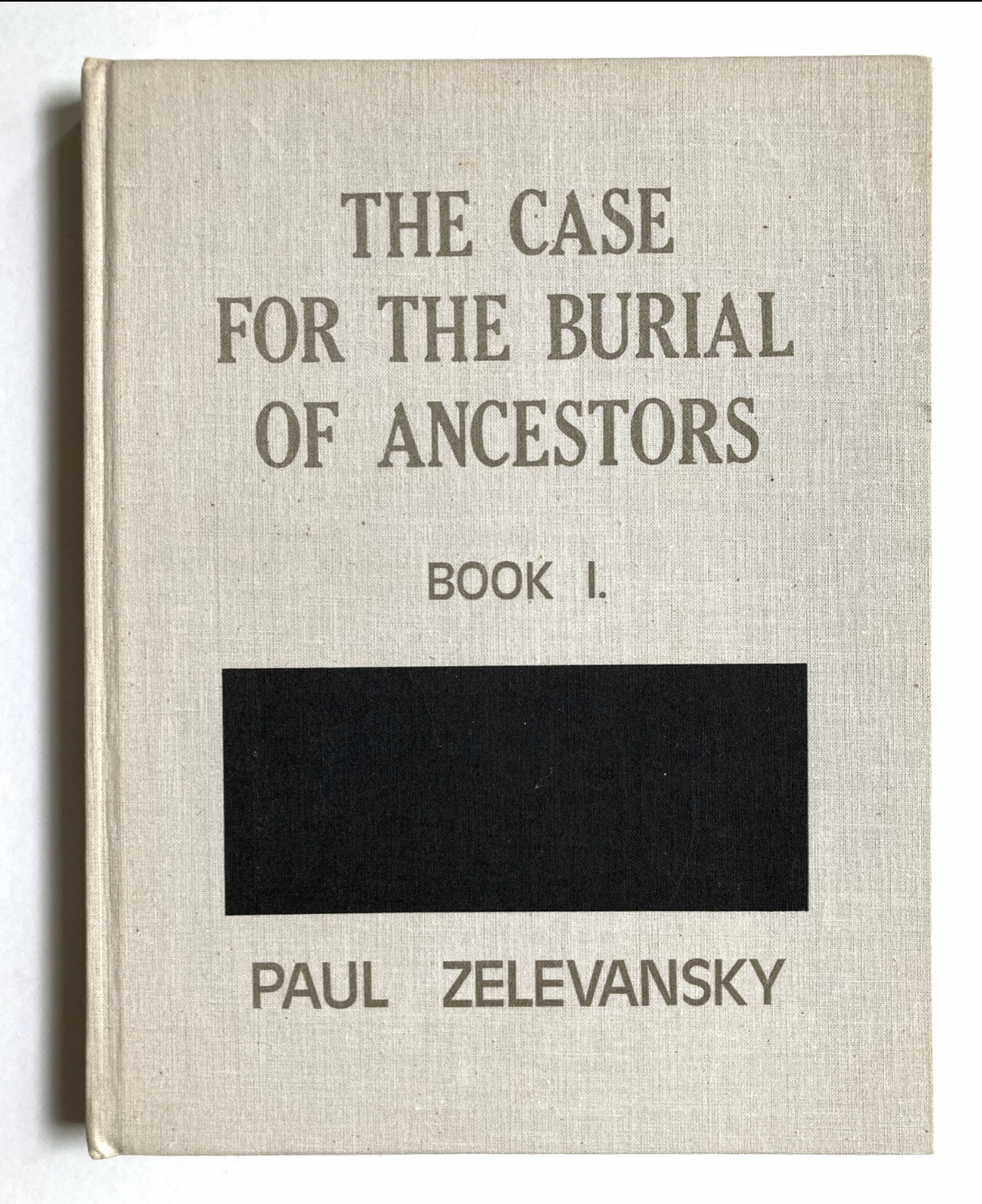


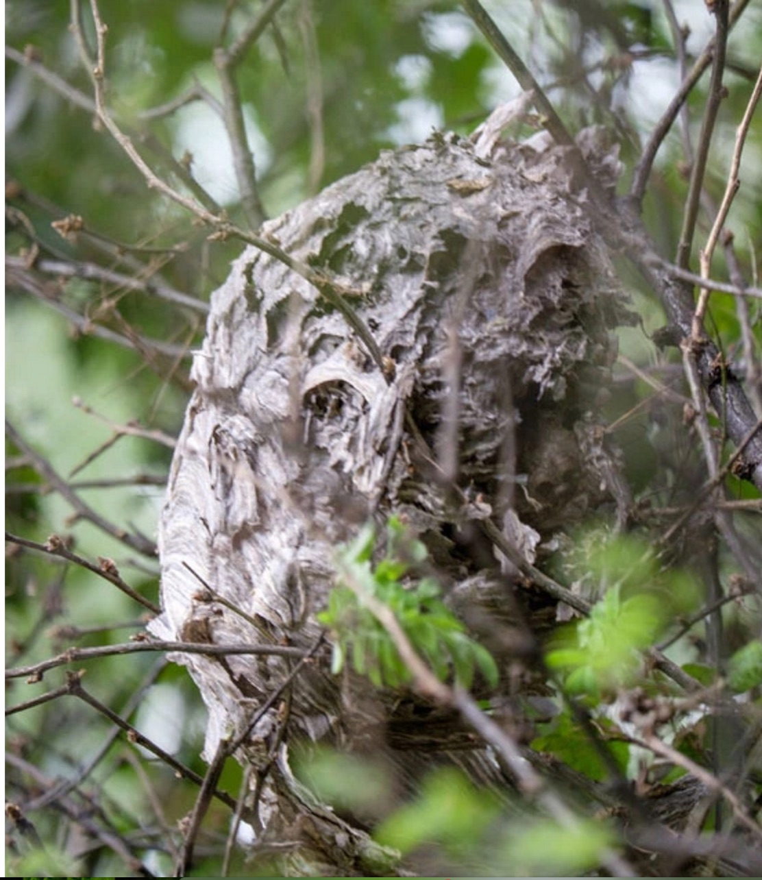


